1
2
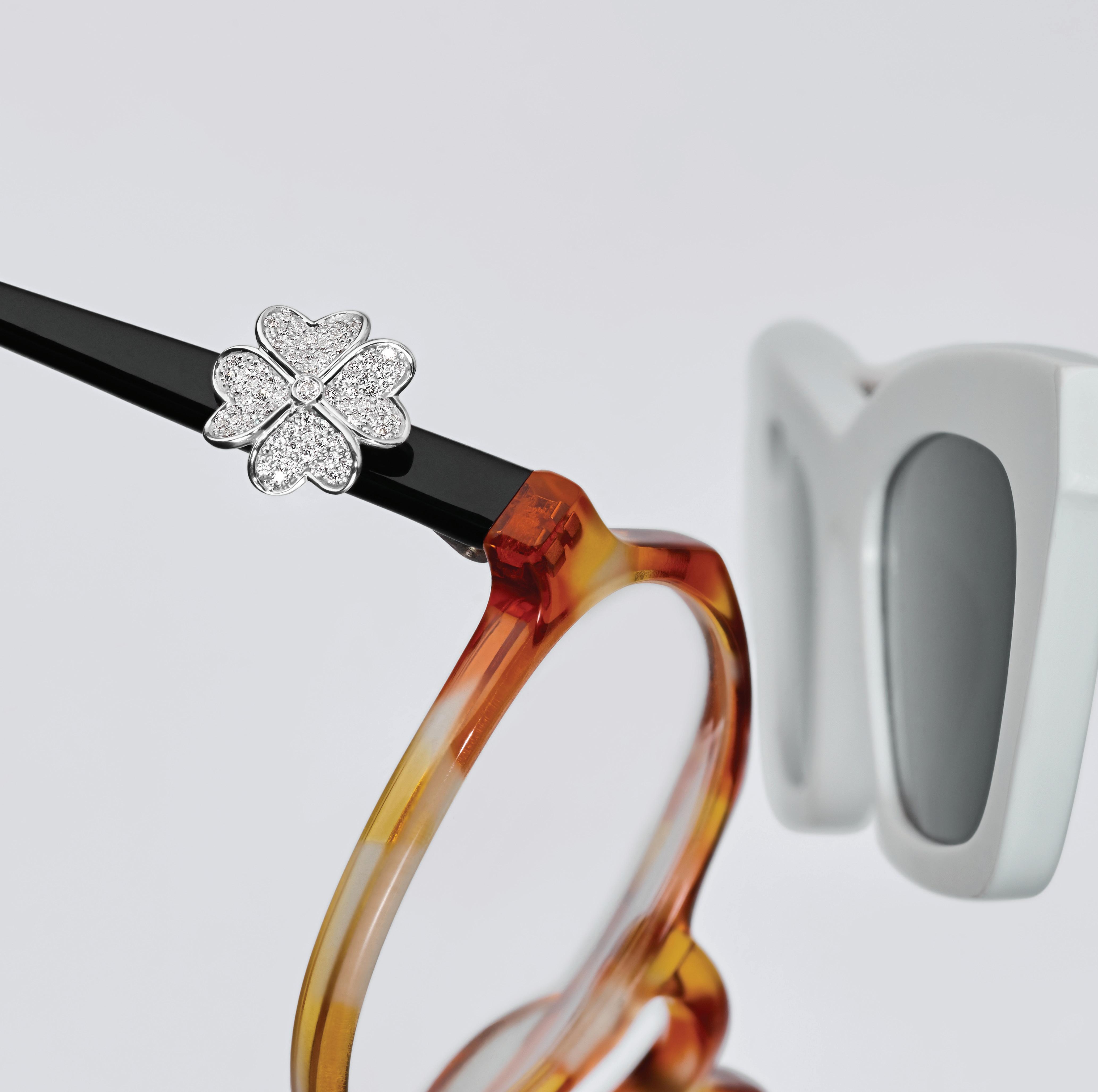
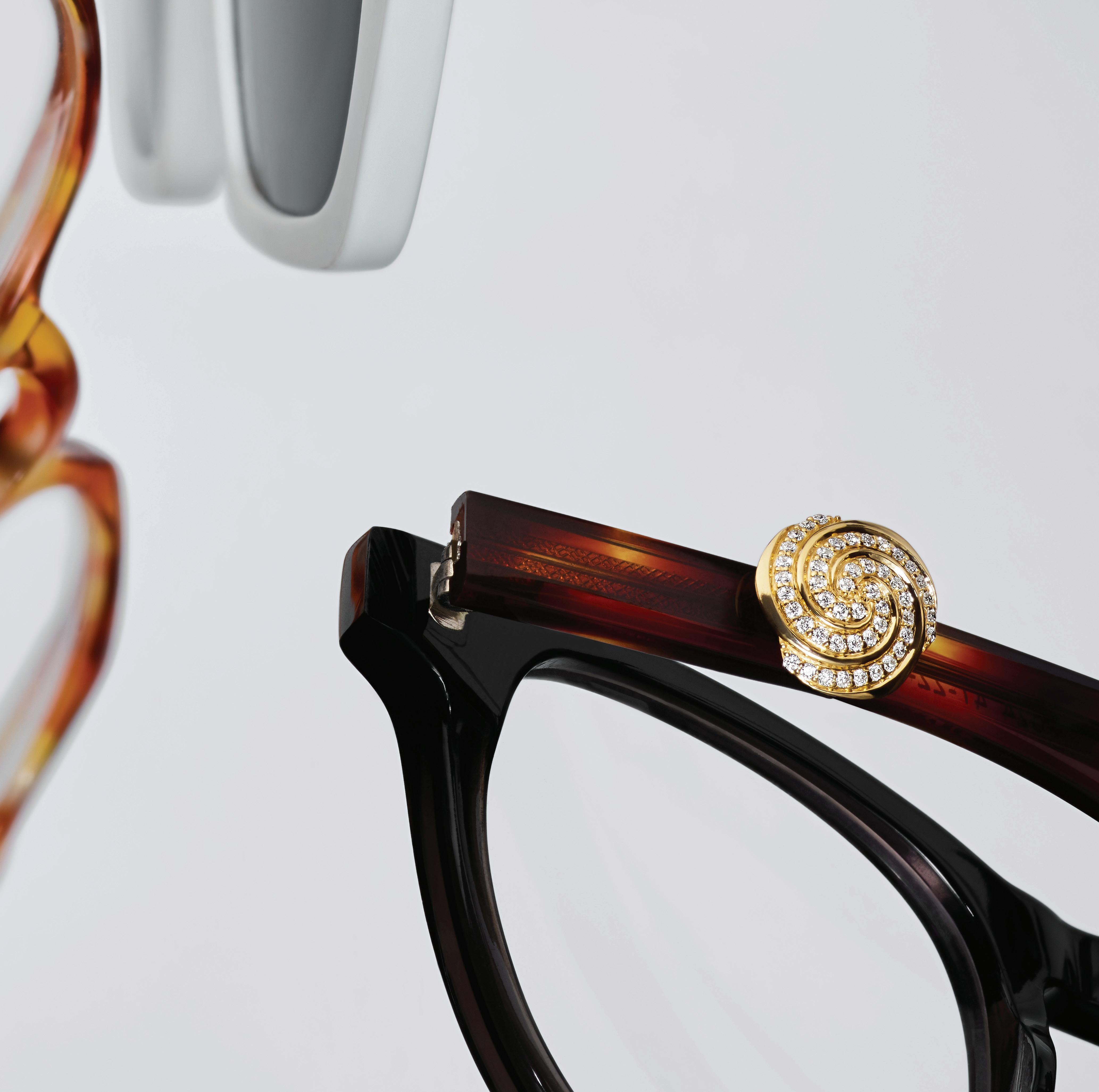
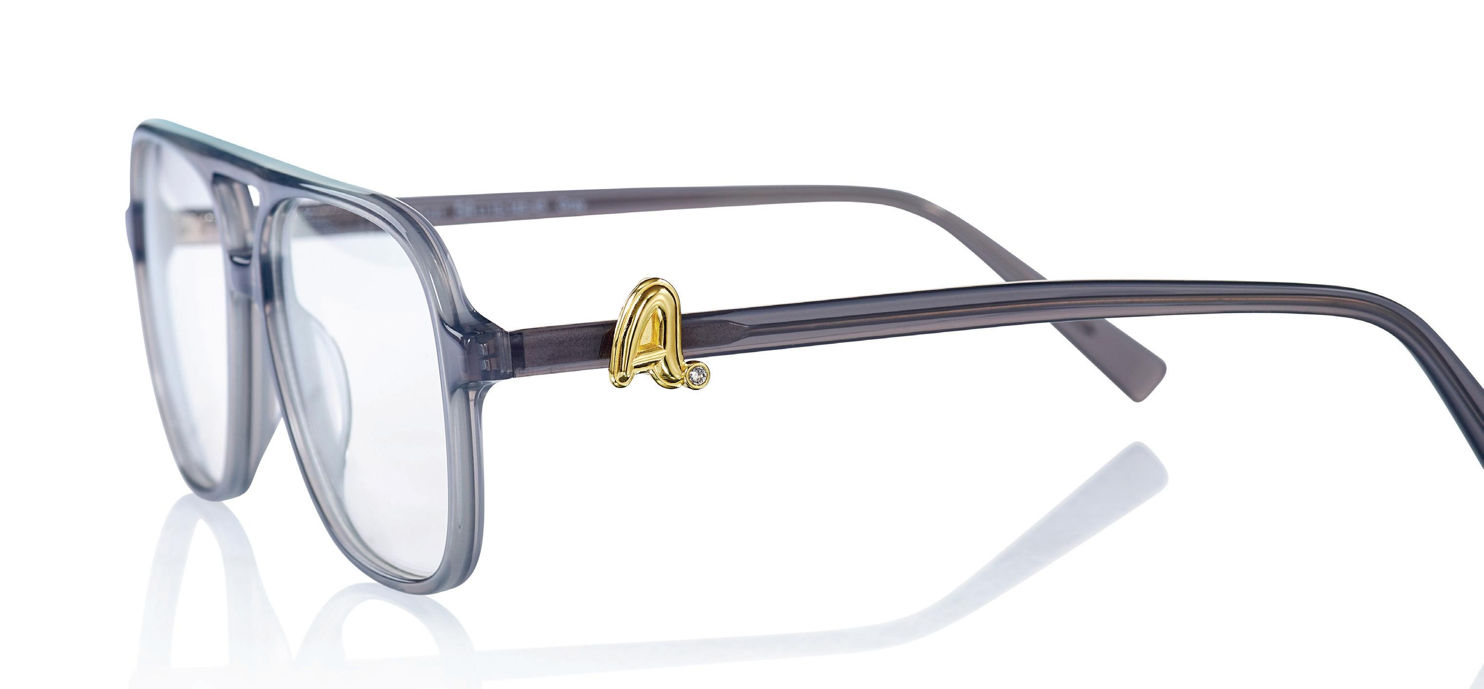
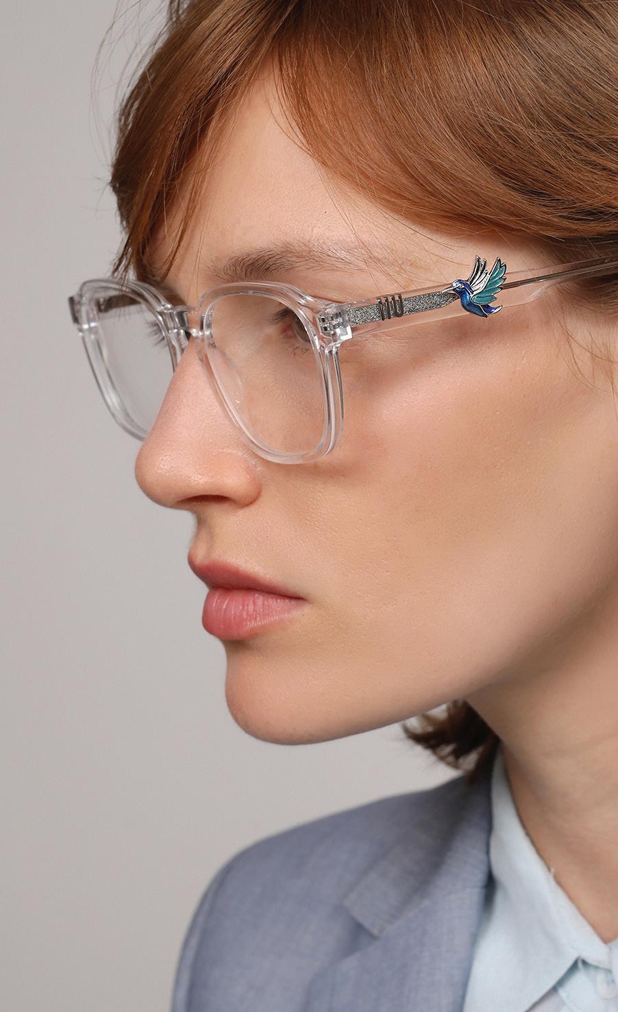
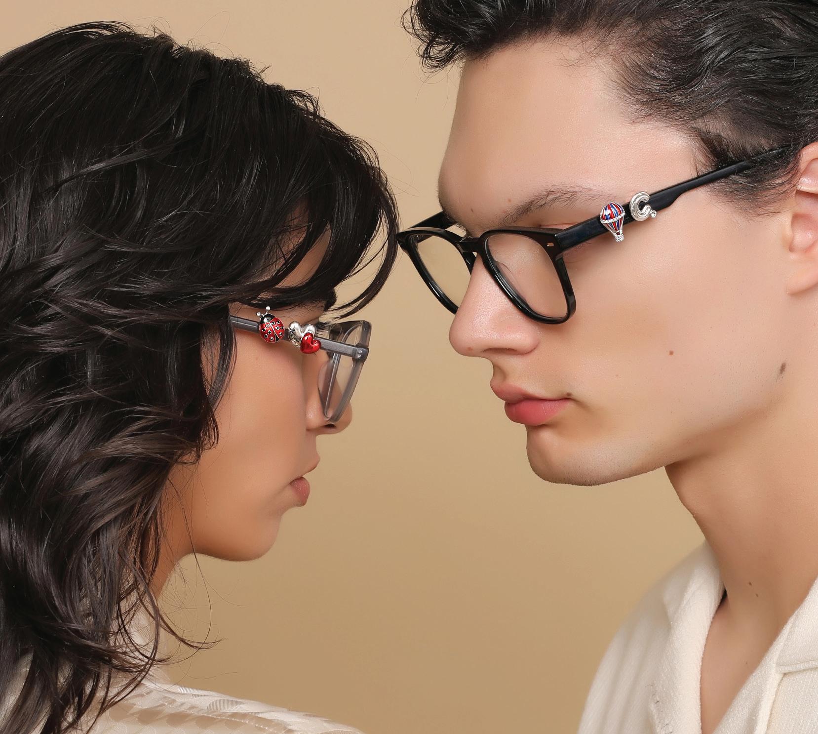
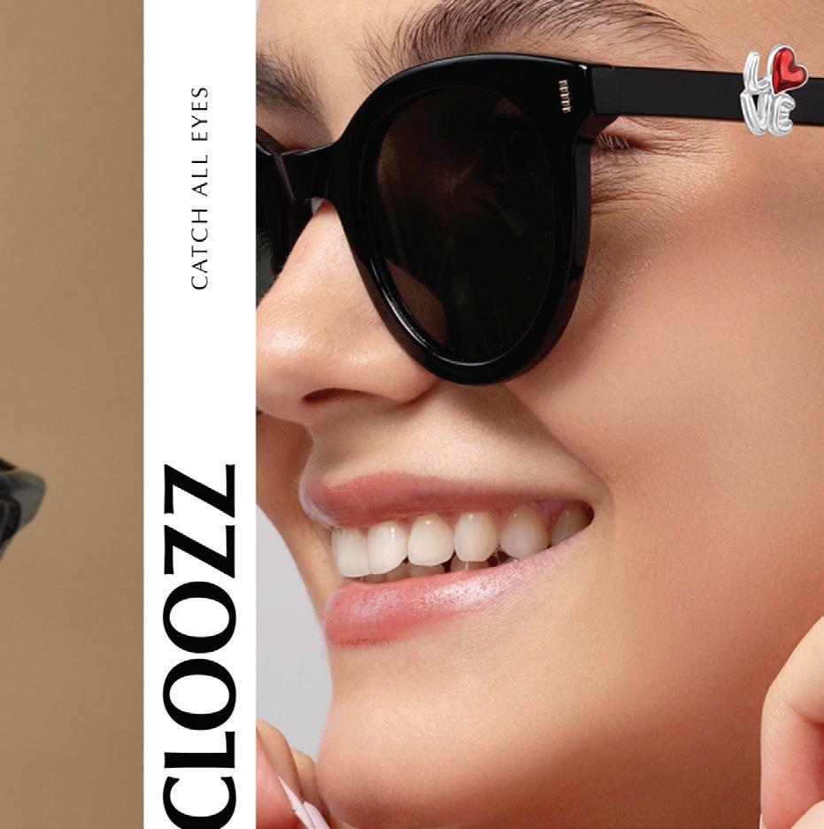
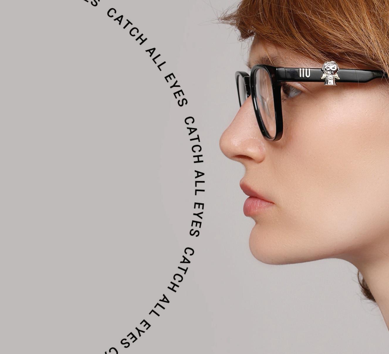
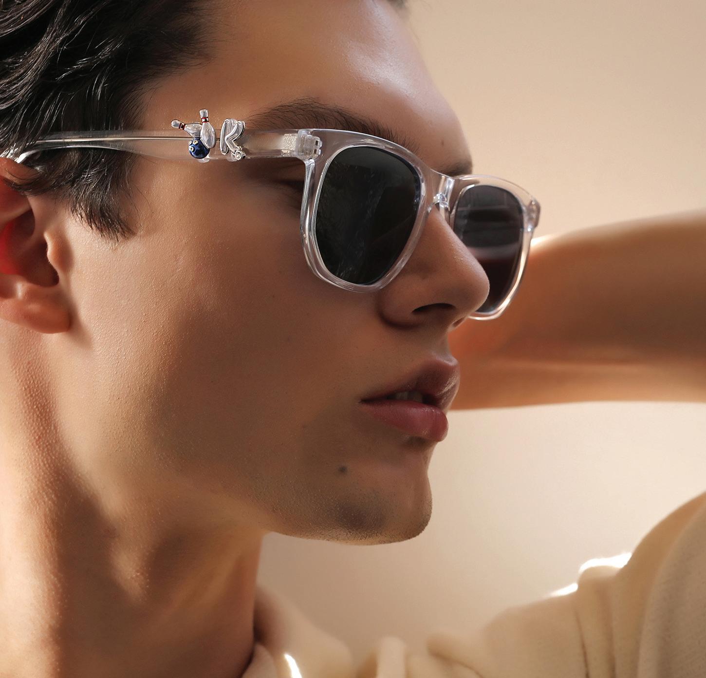
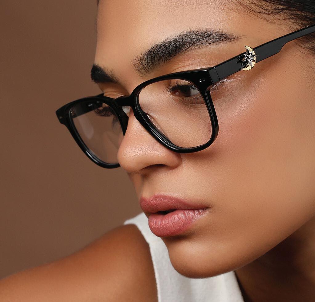
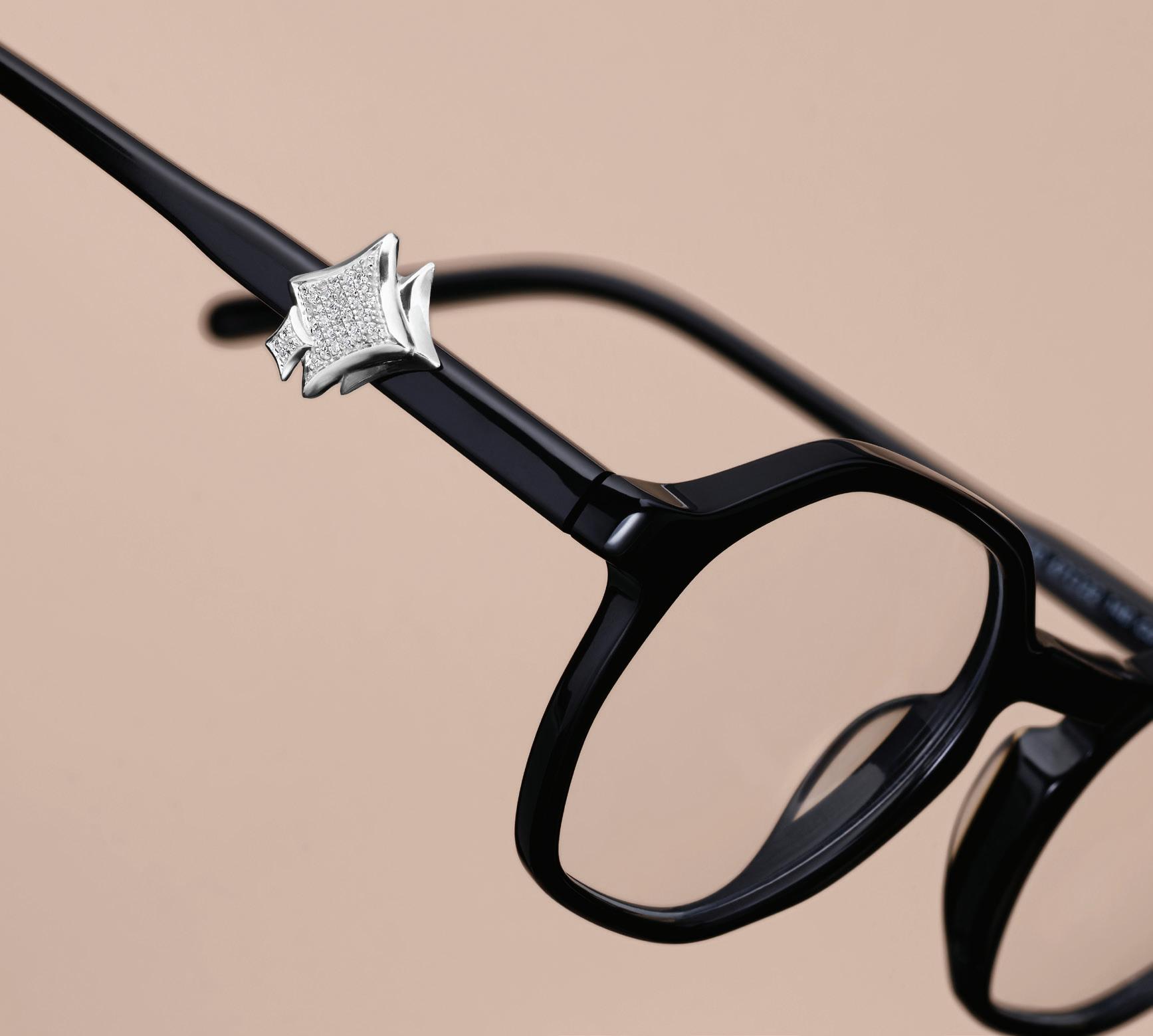
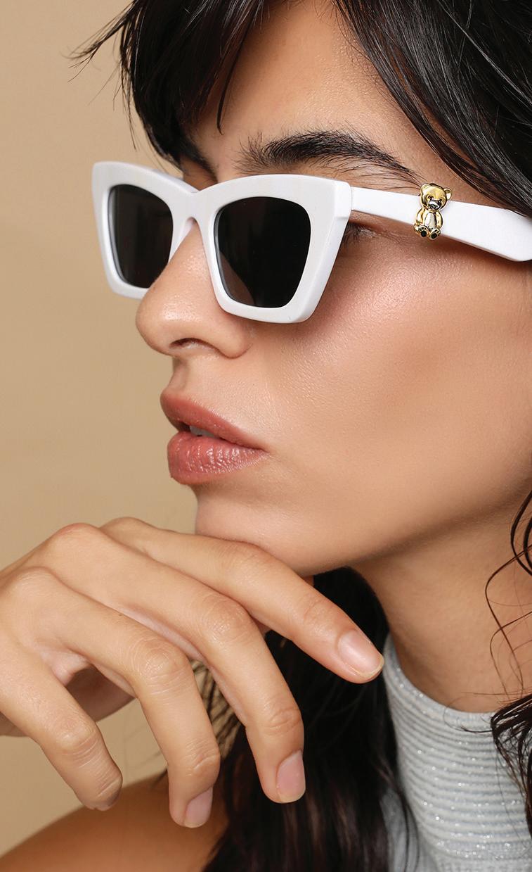
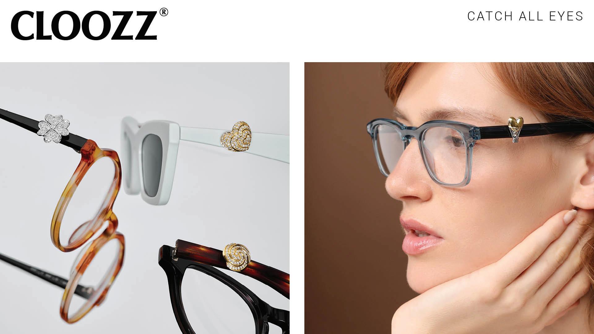
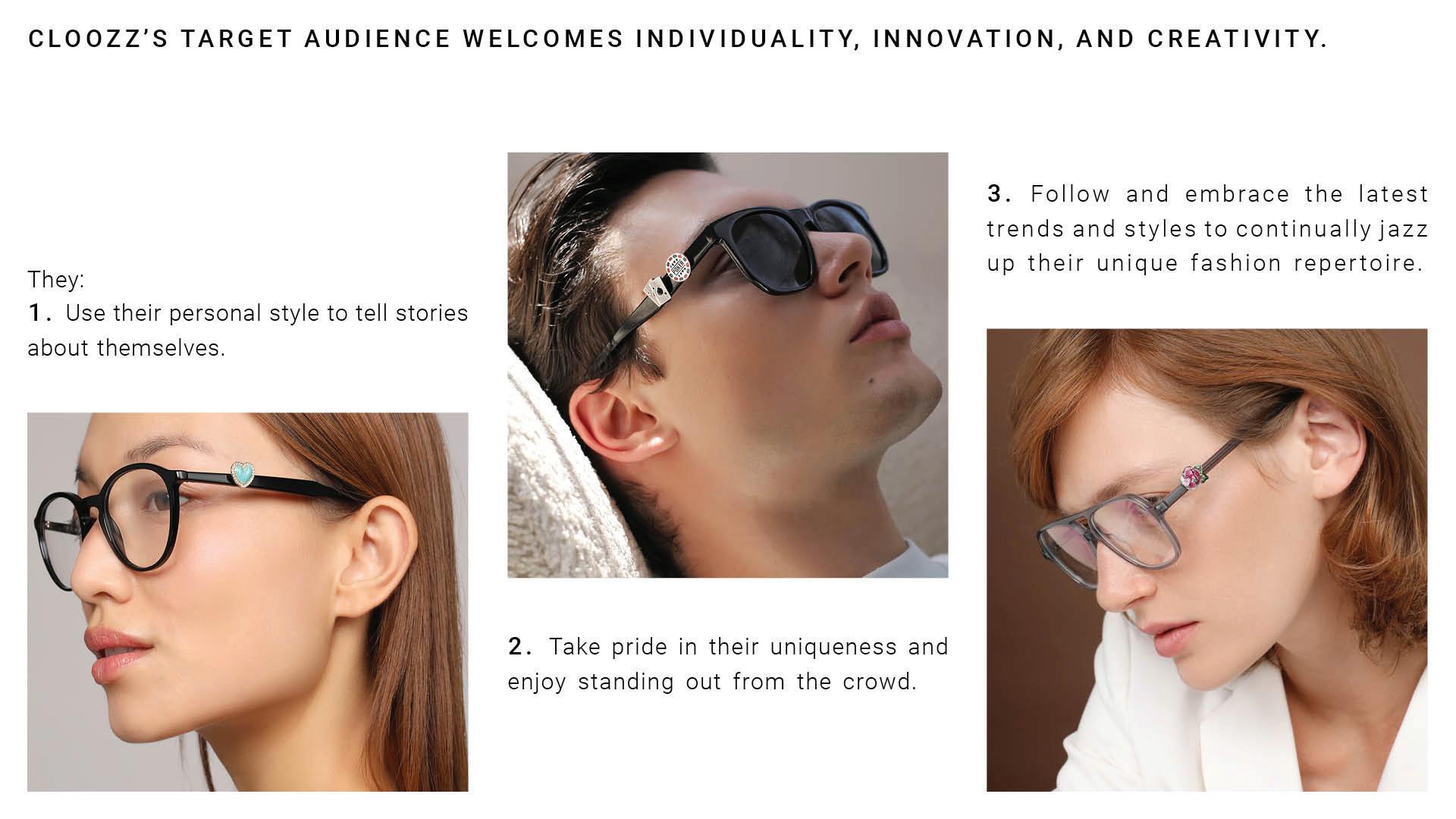
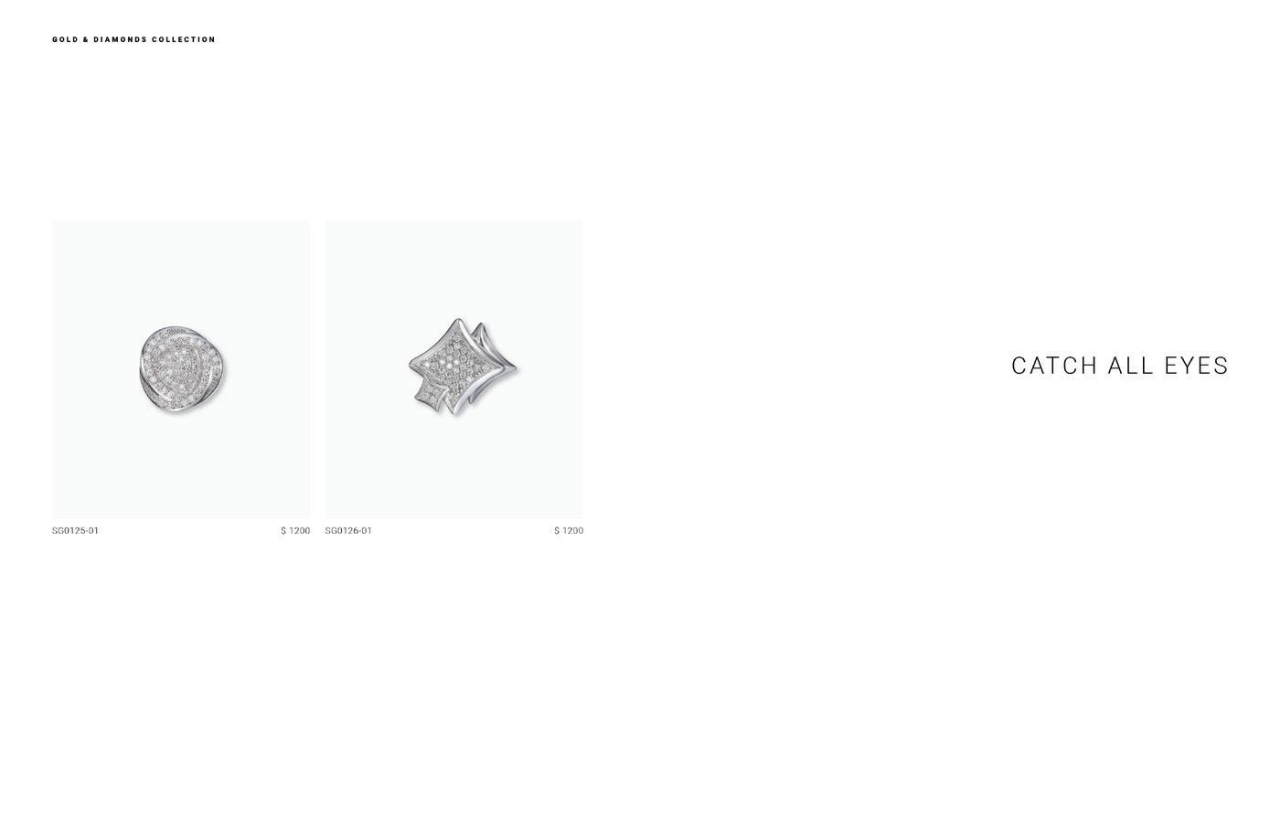
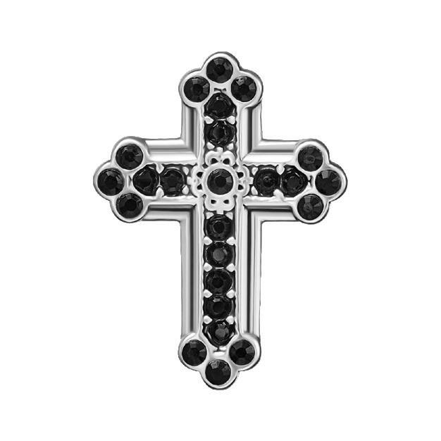
CATCH ALL EYES
3
4


5

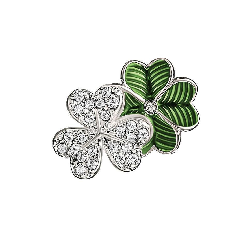
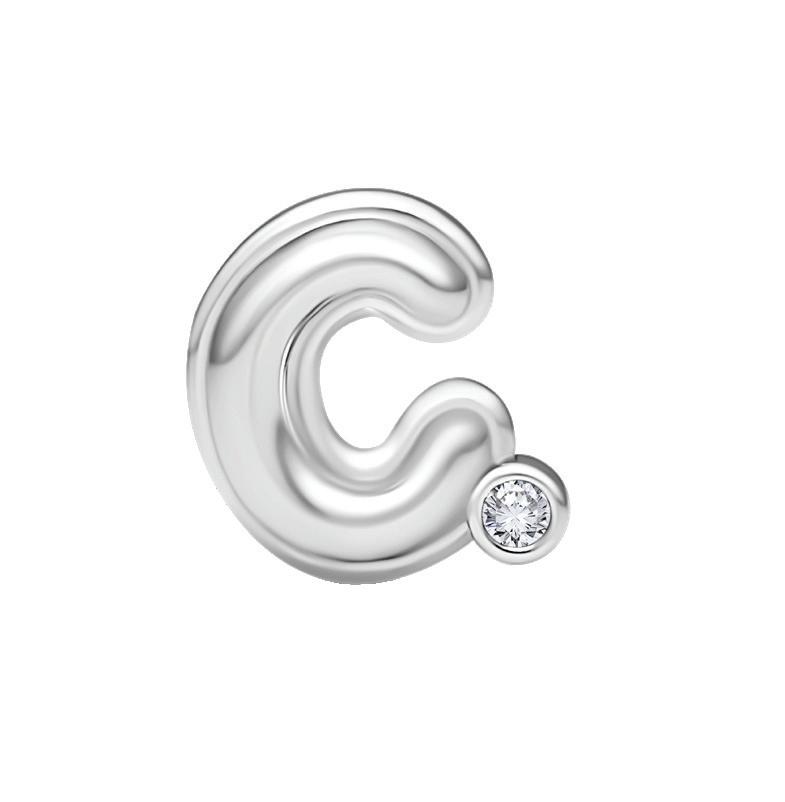
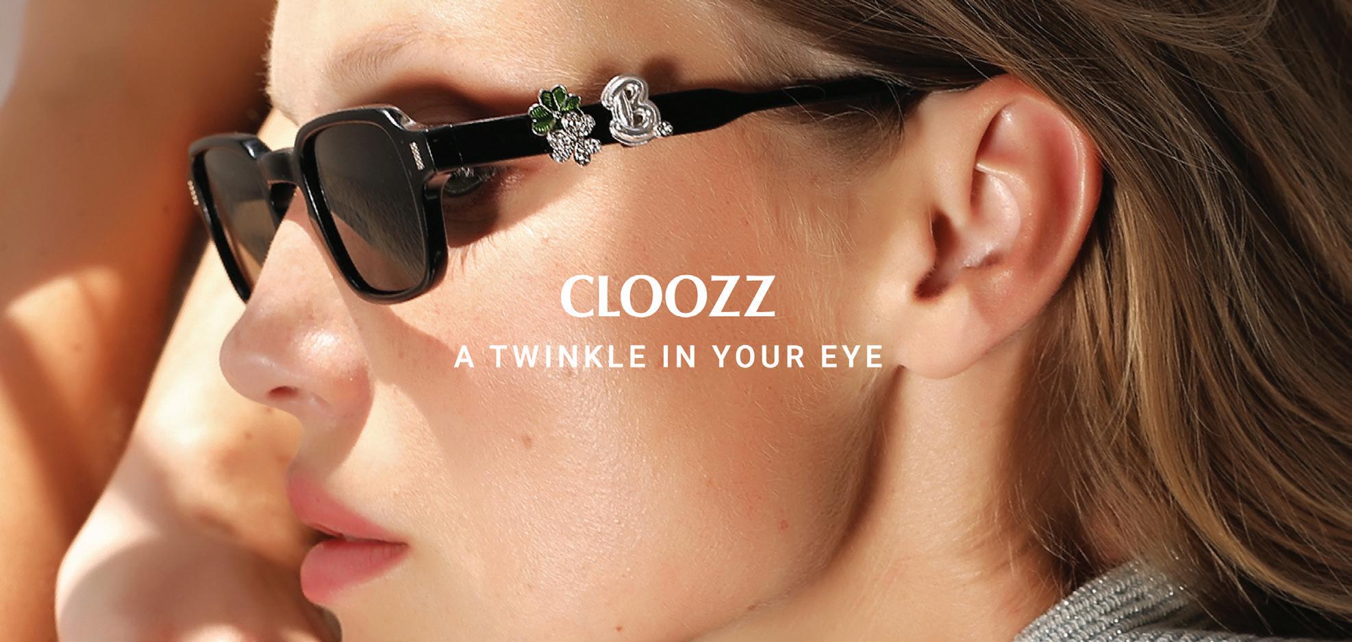
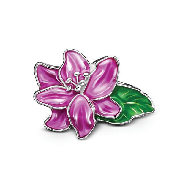
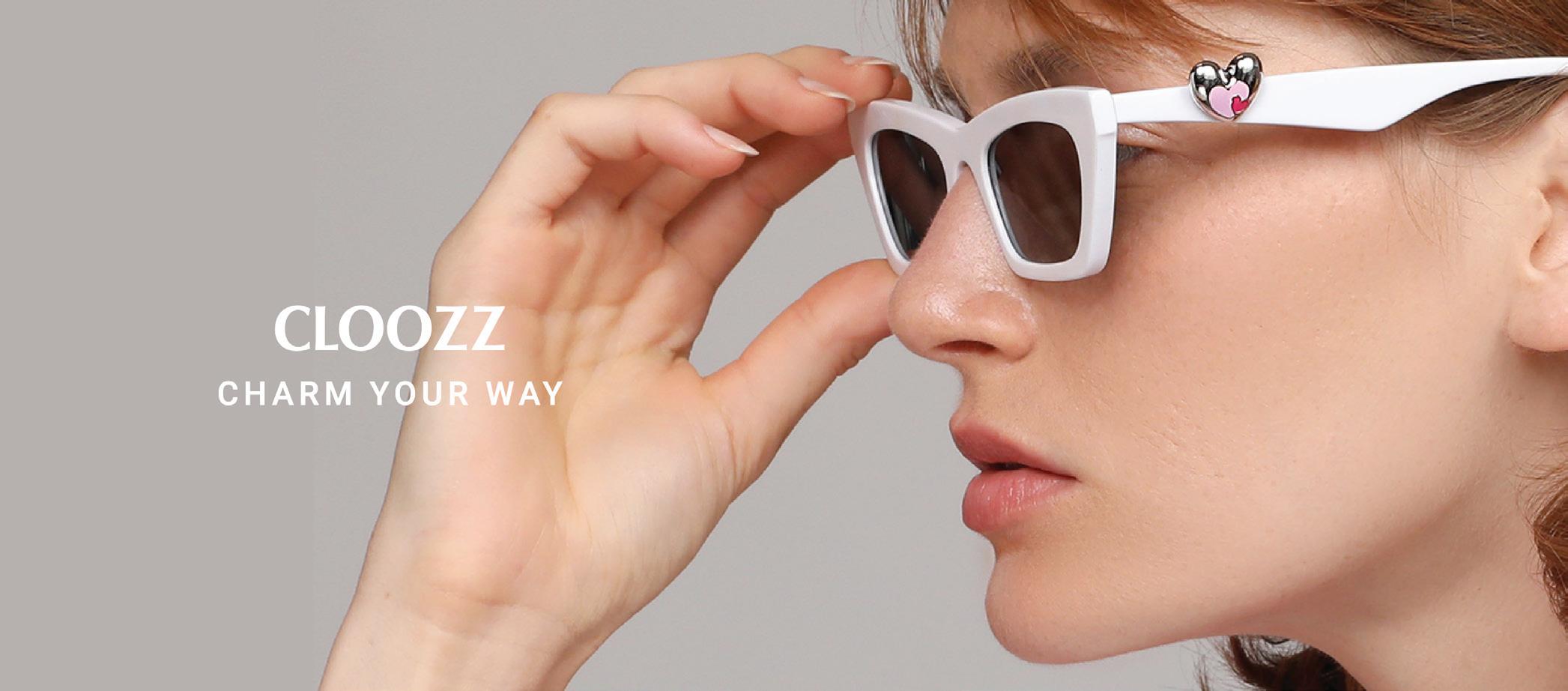
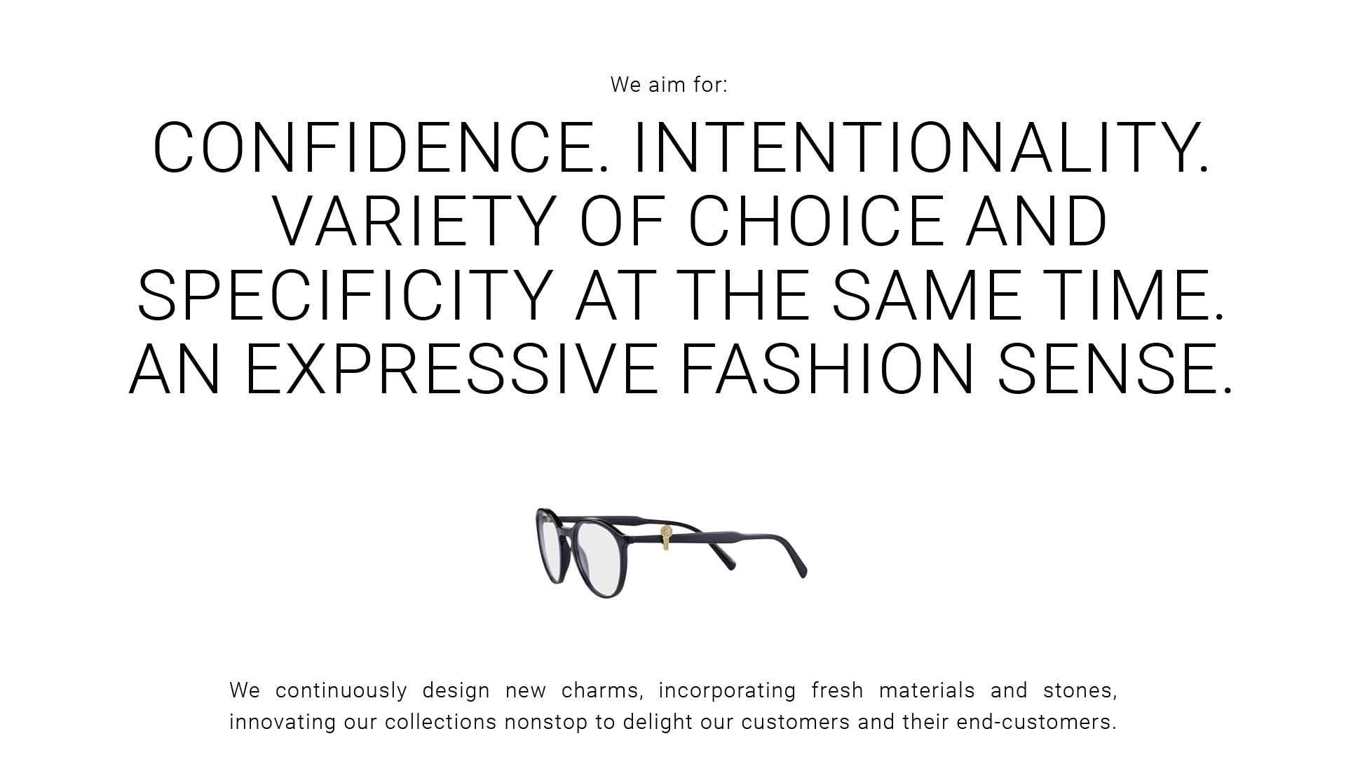
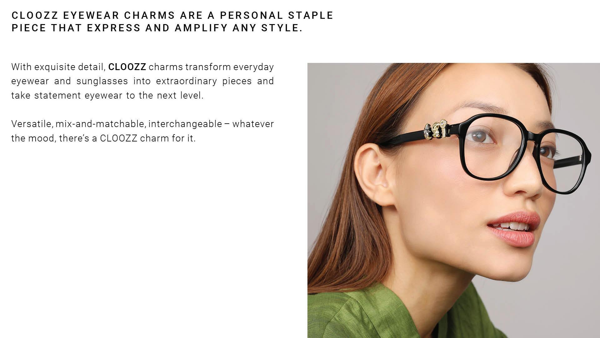
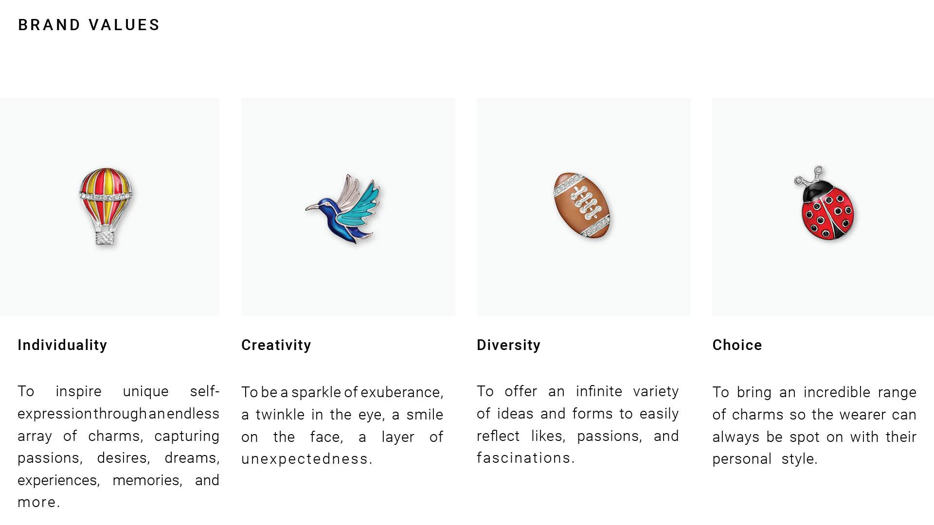
ARE DESIGNED TO BE A PERSONAL STAPLE PIECE, EXPRESSING AND AMPLIFYING ANY STYLE.
Create unparalleled synergy between jewelry and eyewear
Add elegance and a unique touch to the eyewear offering at your point of sale
Elevate sales and generate profit
Add value and contribute to end-customer satisfaction
The purpose of this document is to provide actionable guidance on the proper use of the brand logo, visuals, language, and other essential brand elements across various marketing channels.
Whether in advertising, web presence, packaging or other marketing materials, this resource aims to ensure consistency and effectiveness in communicating the CLOOZZ brand identity.


Main messaging
Personality
Tone of voice
Brand presentation in written content
Personality
Tone of voice
Brand presentation in written content
We are individuals full of creative energy. We have the liberty to express style, playfulness and personality.
As you move forward, don’t lose sight of this personality and tone.
Confident, to the point, elegant. Writing in a conversational tone that mirrors natural speech.
Brand presentation in written content
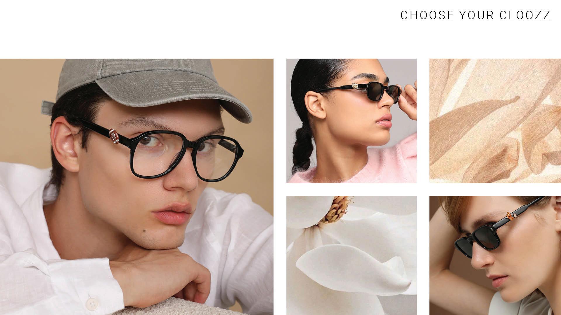
For banners, web content, social campaigns, and other materials, you may only use the following taglines: Catch all eyes
Choose your Cloozz Mix, match, gift, love & repeat
A twinkle in your eye
Go with Cloozz as your muse
You look fabulous
Always in the frame
Our design system is composed of three core elements:
Logo Typography with specific shapes, patterns and graphic symbols
Colors
Logo
The CLOOZZ brand logo is the default choice, as it delivers universal recognition for the brand. It represents CLOOZZ and its core values. Simple yet powerful, it attracts attention and effortlessly stands out from the clutter.
Optical kerning, refined weight, defined clear space, and the uniquely angled double-O ensure the logo is instantly recognizable across all sizes and contexts. The main version of the logo is horizontal. The vertical format of the logo is also acceptable.
Logo clear space
The ammount of clear space around the logo should be equal or greater than the hight of the “C” in CLOOZZ.
Logo colors
The full color logo should only be used in black or white.
For a fancier look or highlight, use silver logo on white or black background


Logo color variations
The CLOOZZ logo exists in four color variations to enhance legibility on different backgrounds. The logo should be white on darker backgrounds, black on lighter backgrounds. Both colors may be used on sage green background.
Logo sizes
The standard version for logo application:
1 . Horizontal for web – 70 pixels min, for print – 24,5 mm min.
2 . Vertical for web – 15 pixels min, for print – 5,3 mm min.
1. The logo may not be rotated.
2. When rotating the page, the logo should stay horizontal and in a straight line.
Movement should feel smooth and fun.
1. Do not add effects like drop shadows or gradients.
2. Don’t use blur or scale animation properties to add fluidity.
3. Do not distort or manipulate the logo in the end state.
Glitch effects, squash, and stretch are acceptable during transition states.
Online and offline logo usage
The logo placement on the type of communication and use: Aligning the logo should follow clear space, placement and rotation rules. The logo should always be in front or near of the charms.
1. In ads and banners, when there is more than one brand logo in the same banner, CLOOZZ charms will always appear on top of or under the CLOOZZ logo.
2. The logo should always appear when the using CLOOZZ media.
3. CLOOZZ charms will always appear with the CLOOZZ logo.
Online and offline
incorrect logo usage
1. Don’t recreate the logo by typing it with a font.
2. Don’t stretch, distort, or manipulate the logo.
3. Don’t add effects like drop shadows or gradients.
4. Don’t change the logo color.
5. Don’t place the logo on a background that reduces its legibility.
6. Don’t outline or create a keyline around the logo.
7. Don’t use the brand logo as a profile picture. You are only allowed to place it next to CLOOZZ charms.

Logo in combination with customer logo or other company’s logo
1. When using the CLOOZZ logo in combination with customer logo or another company logo in the same frame, the CLOOZZ logo should be the same size with the customer and/or other company logo.
2. The customer/ company logo and the CLOOZZ logo must never appear too close together.
3. The impression that the customer company and CLOOZZ are affiliate companies, partners or associated with each other must be avoided by all means.
4. The CLOOZZ logo can be positioned in the right or left but preferably always in the same prominent position as the customers logo.
Typography with specific shapes, patterns and graphic symbols
What to avoid in typography system
1. Don’t use the wrong or non-approved typefaces.
2. Don’t apply gradients to type.
3. Don’t put pictures or patterns in type.
You look fabulous


4.
5. Don’t use type sizes that are too close in value.
6. Don’t apply drop shadow or other effects.
Colors
Our color palette utilizes the established CLOOZZ brand colors, which hold significant brand equity. These colors are carefully selected to embody the creativity and contemporary energy synonymous with the CLOOZZ brand.
Color palette
Digital: use RGB color values for all digital applications.
Print: use Pantone color values when printing stationary or logo to ensure the correct branding color.
Primary Colors: Black White Sage Green
Silver
Secondary Colors: Beige Orange
Primary Colors:
Secondary Colors:
Black
RGB: 0/0/0
Pantone: Black
White
RGB: 255/255/255
Pantone: White
Green Sage
RGB: 175/194/179
Pantone: 345C
Beige
RGB: 242/242/345
Pantone: 9064C

Silver
Pantone: 887C
Orange
RGB: 225/140/102
Pantone: 7576C
Color palette rules
Black and silver can be used to highlight text.
1. Avoid color overload in backgrounds. Full-bleed backgrounds work well, but when too many colors are used it can be overwhelming. Limit background color to one per composition.
2. Create focus. Use brand colors with black or white to bring dimension and focus to a composition.
3. Don’t create new colors.
YOU LOOK FABULOUS

YOU LOOK FABULOUS
YOU LOOK FABULOUS
YOU LOOK FABULOUS
YOU LOOK FABULOUS
YOU LOOK FABULOUS
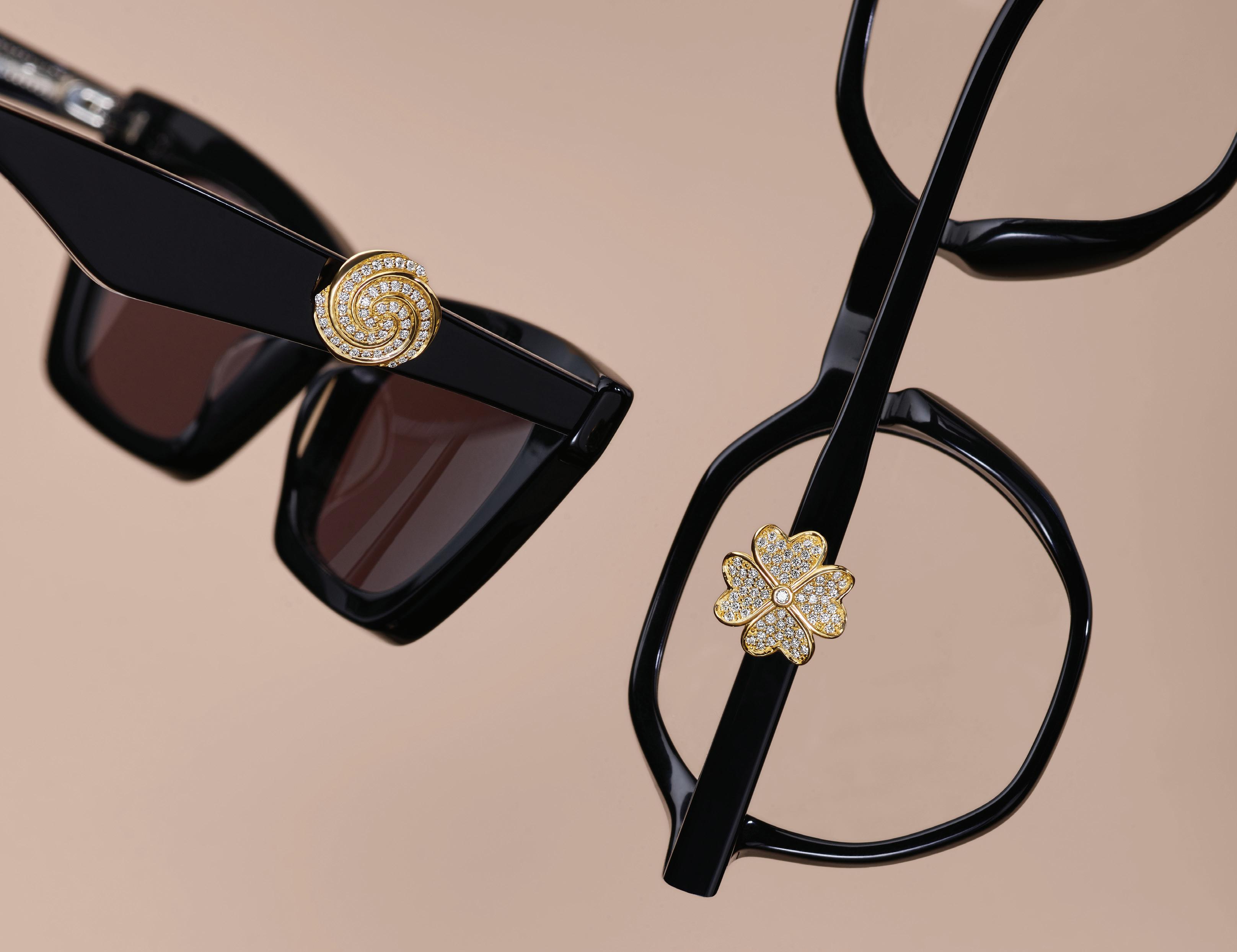
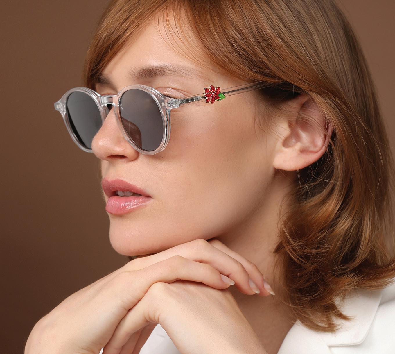
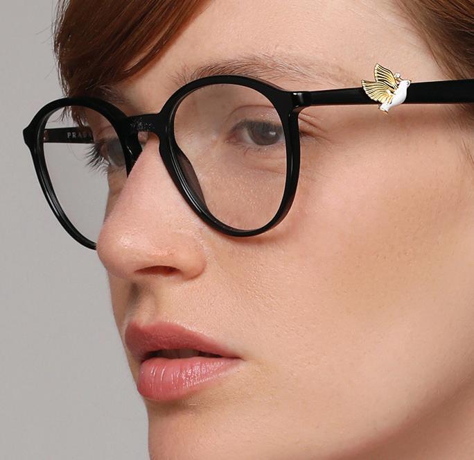
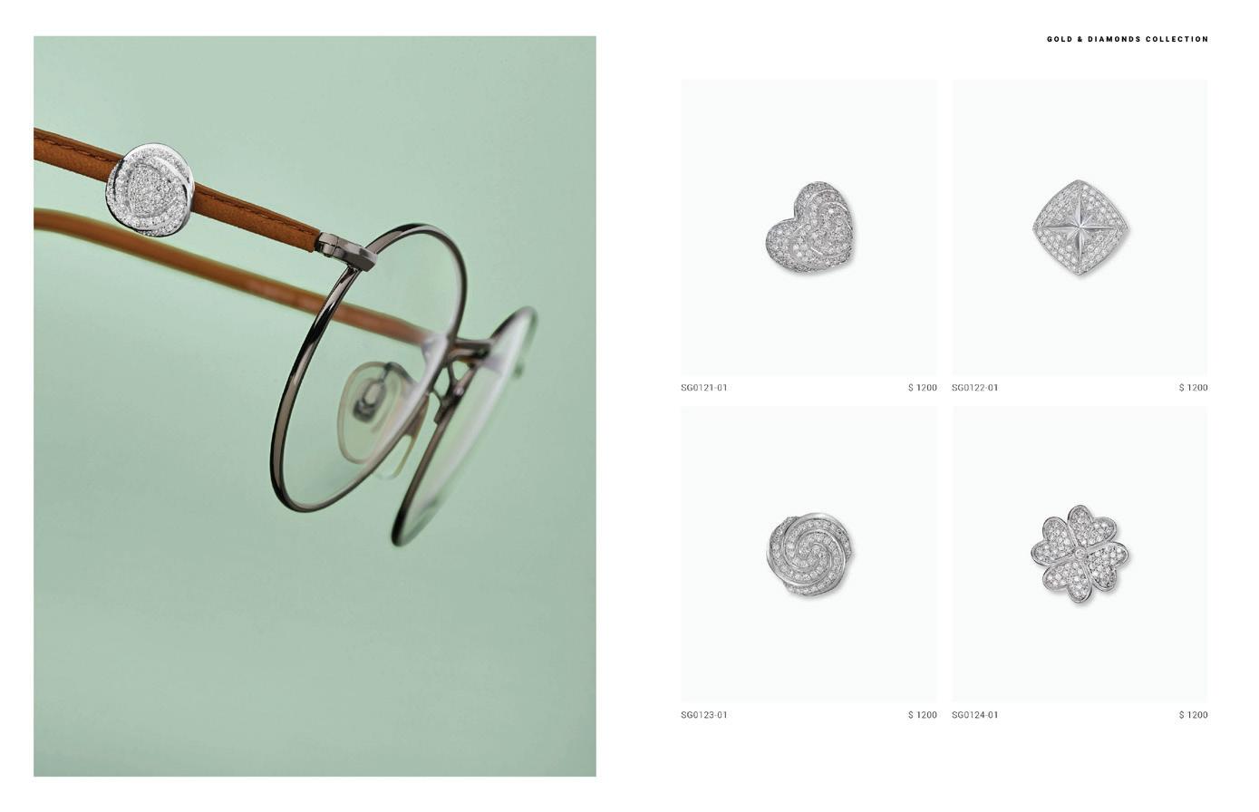
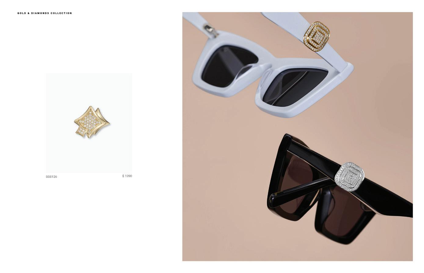
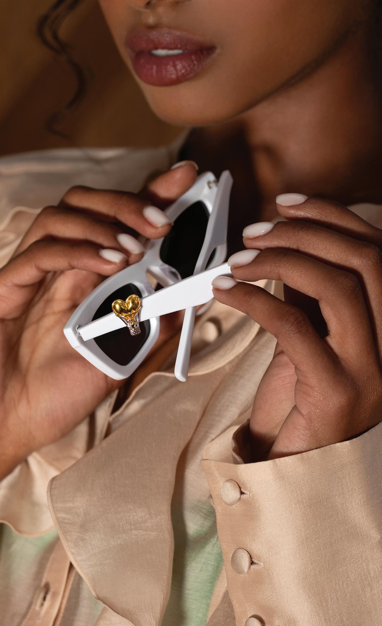
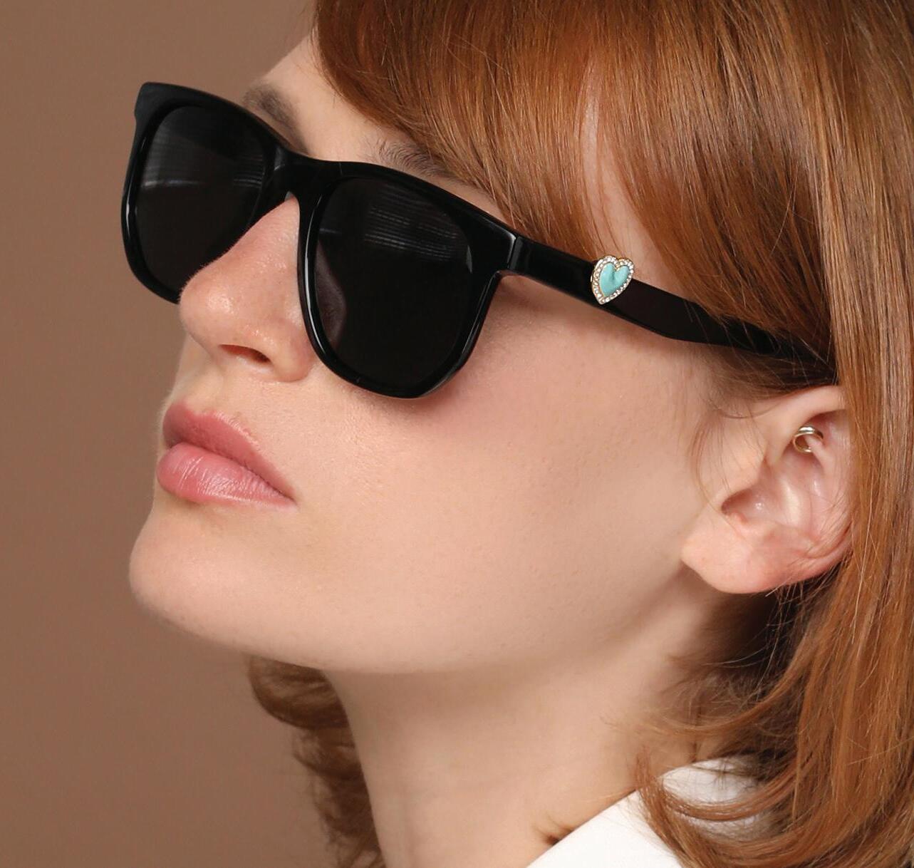
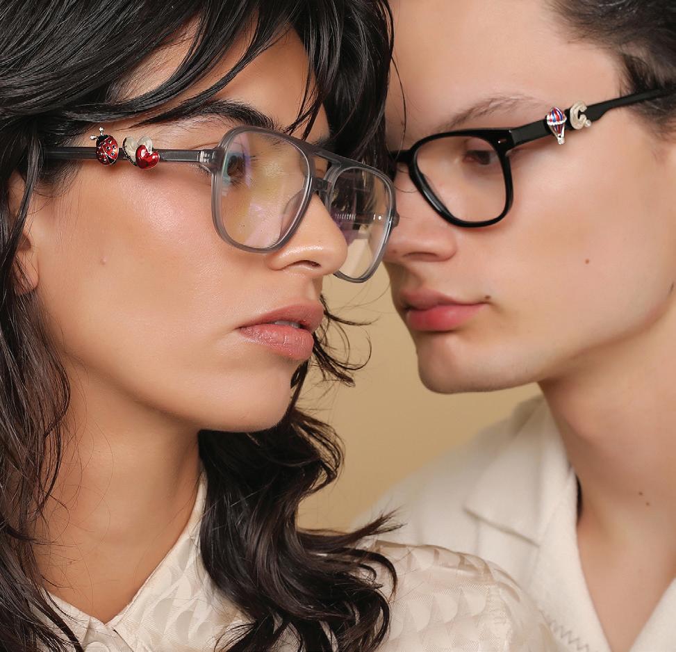
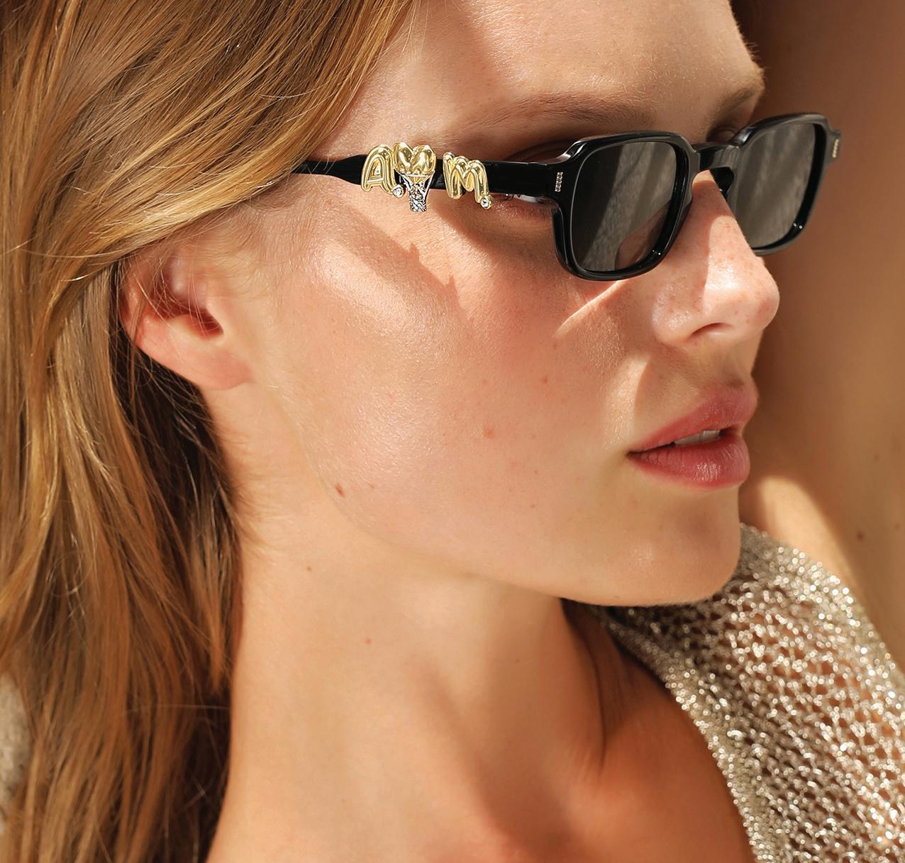
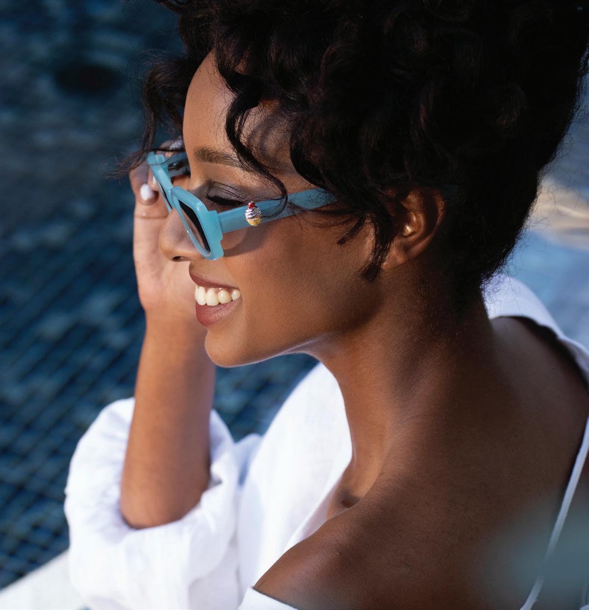
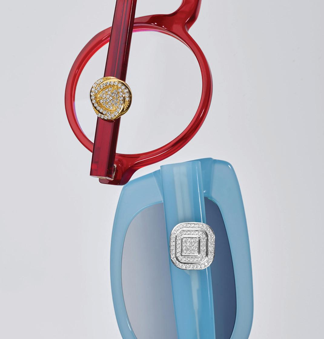
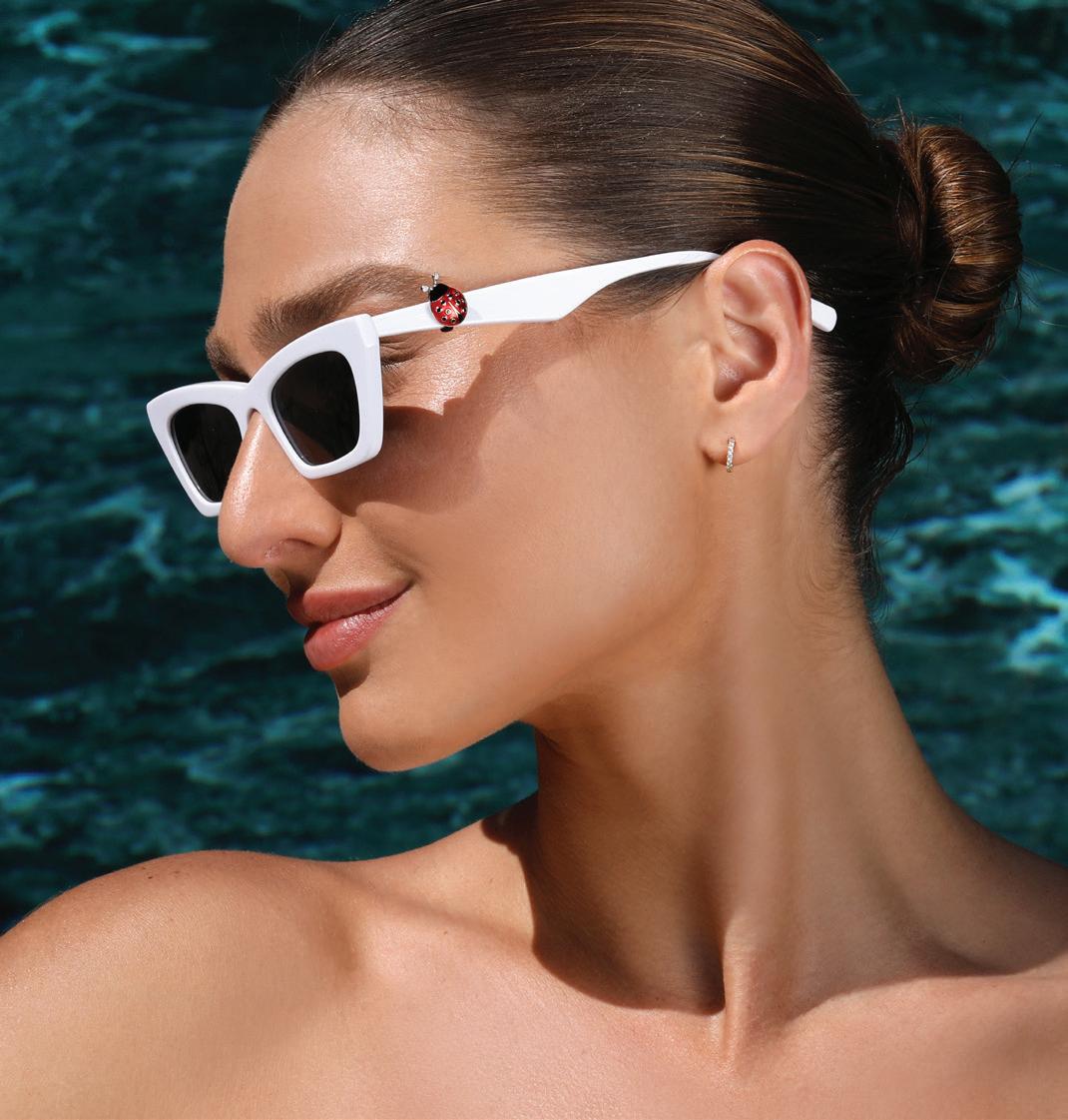
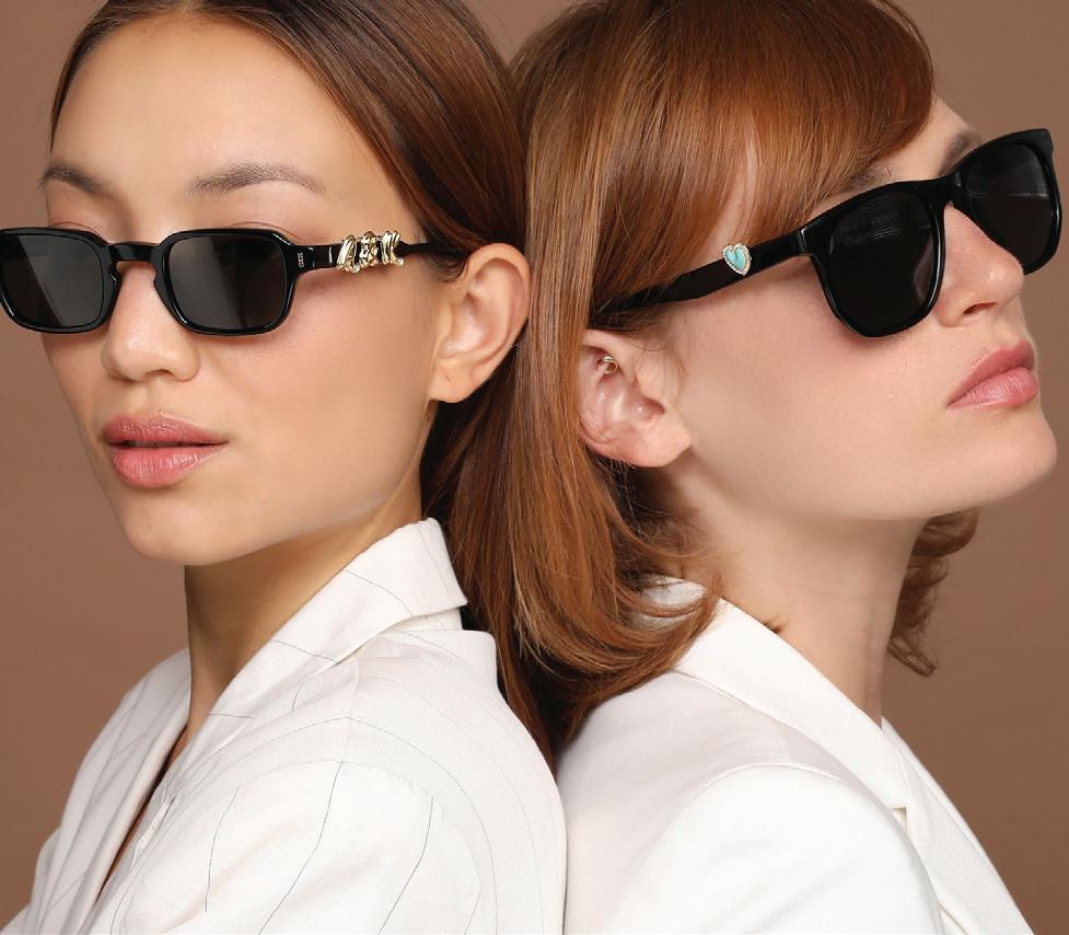
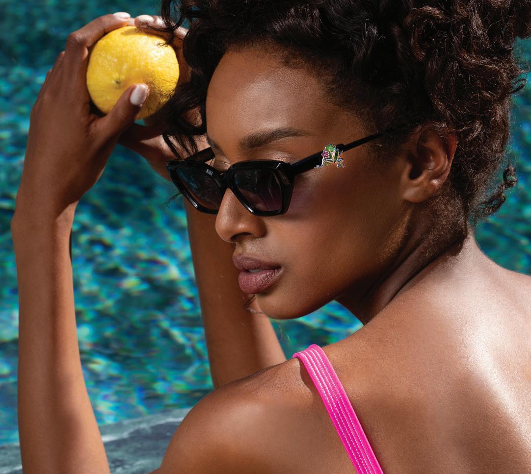
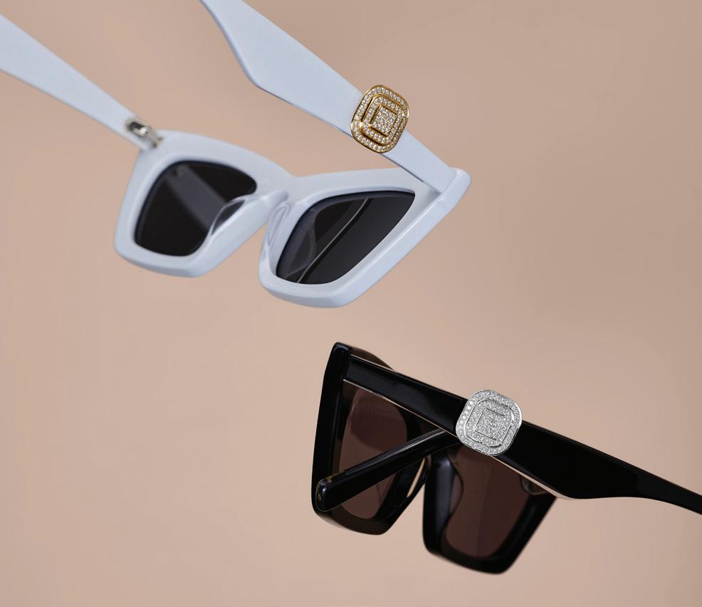
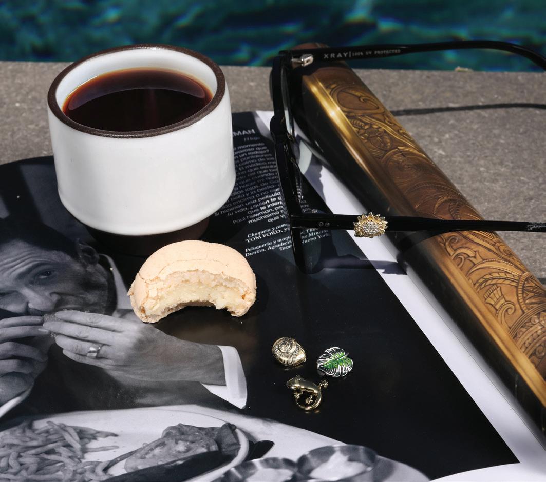
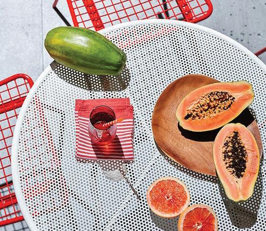
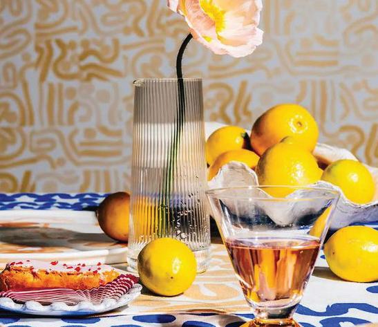
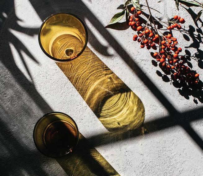
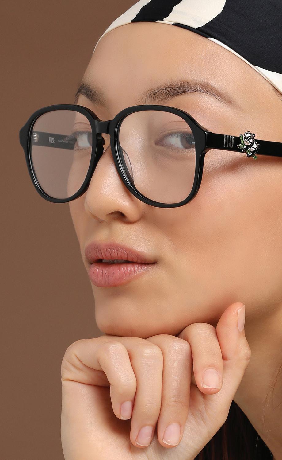
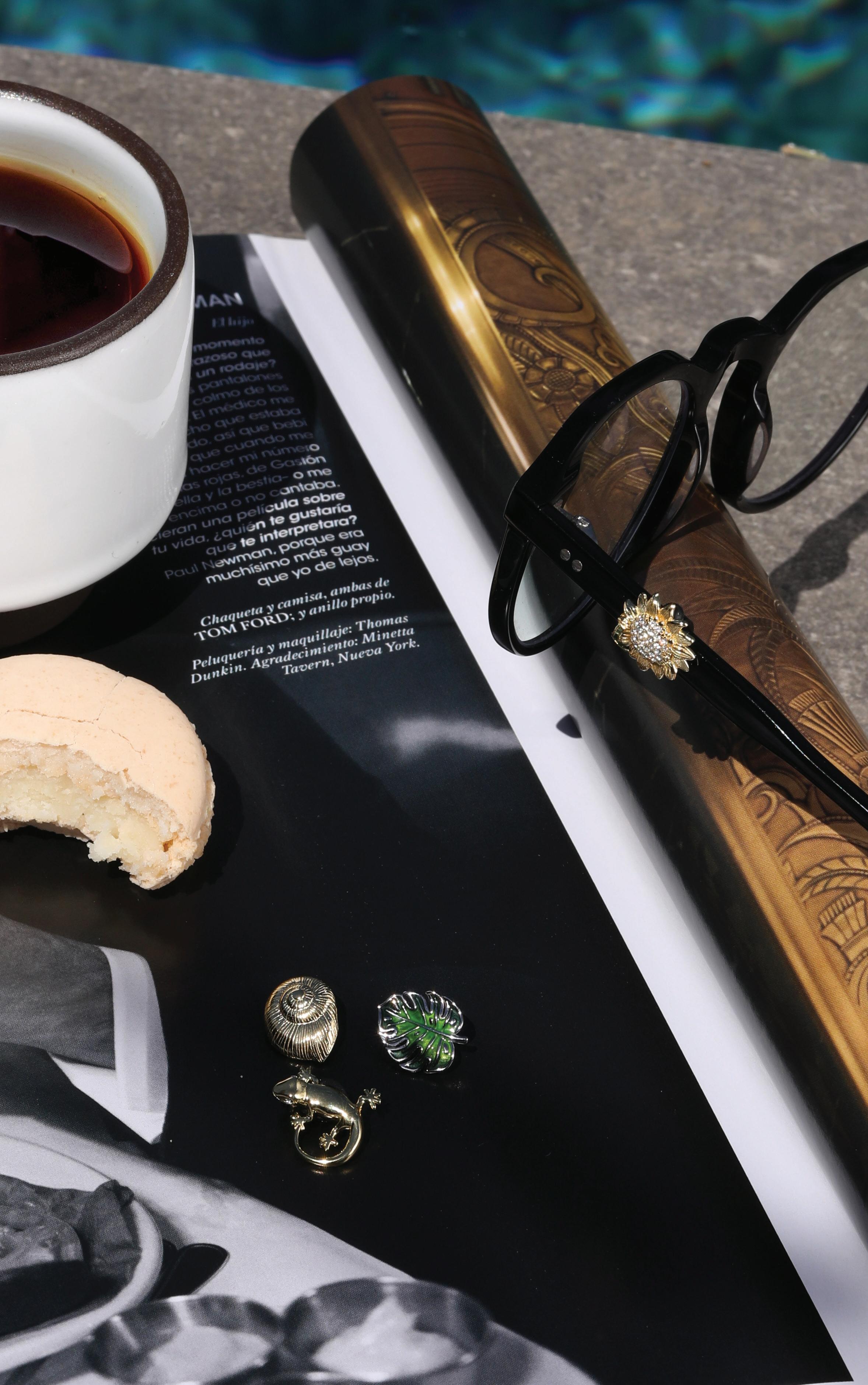
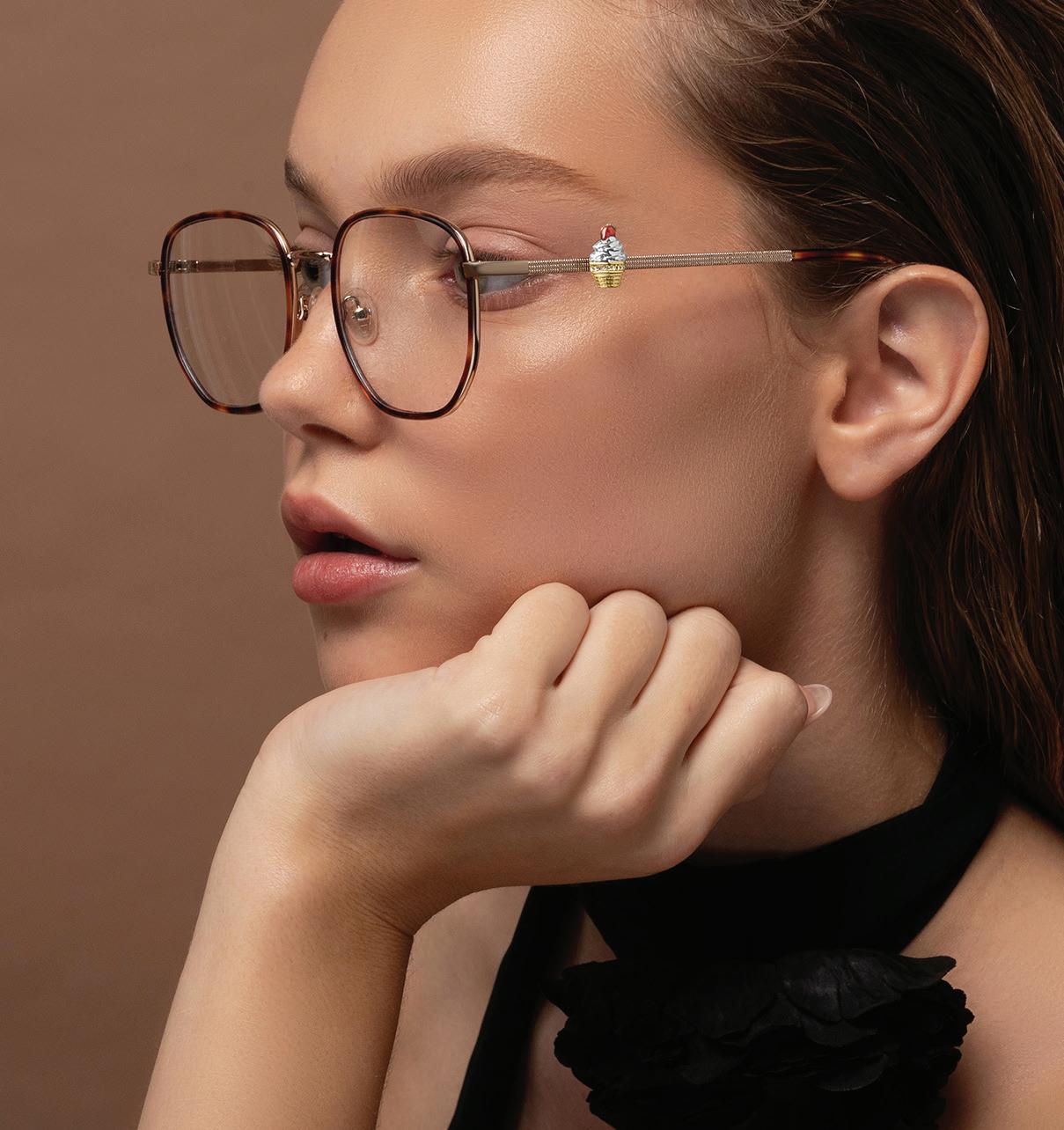
Clean. Using monochrome colors such as beige, white, nude, and the CLOOZZ brand colors. The layout can be geometric and give a sophisticated and prestigious feel. The charm will always be the main subject and will appear as a packshot on a model or on eyewear.
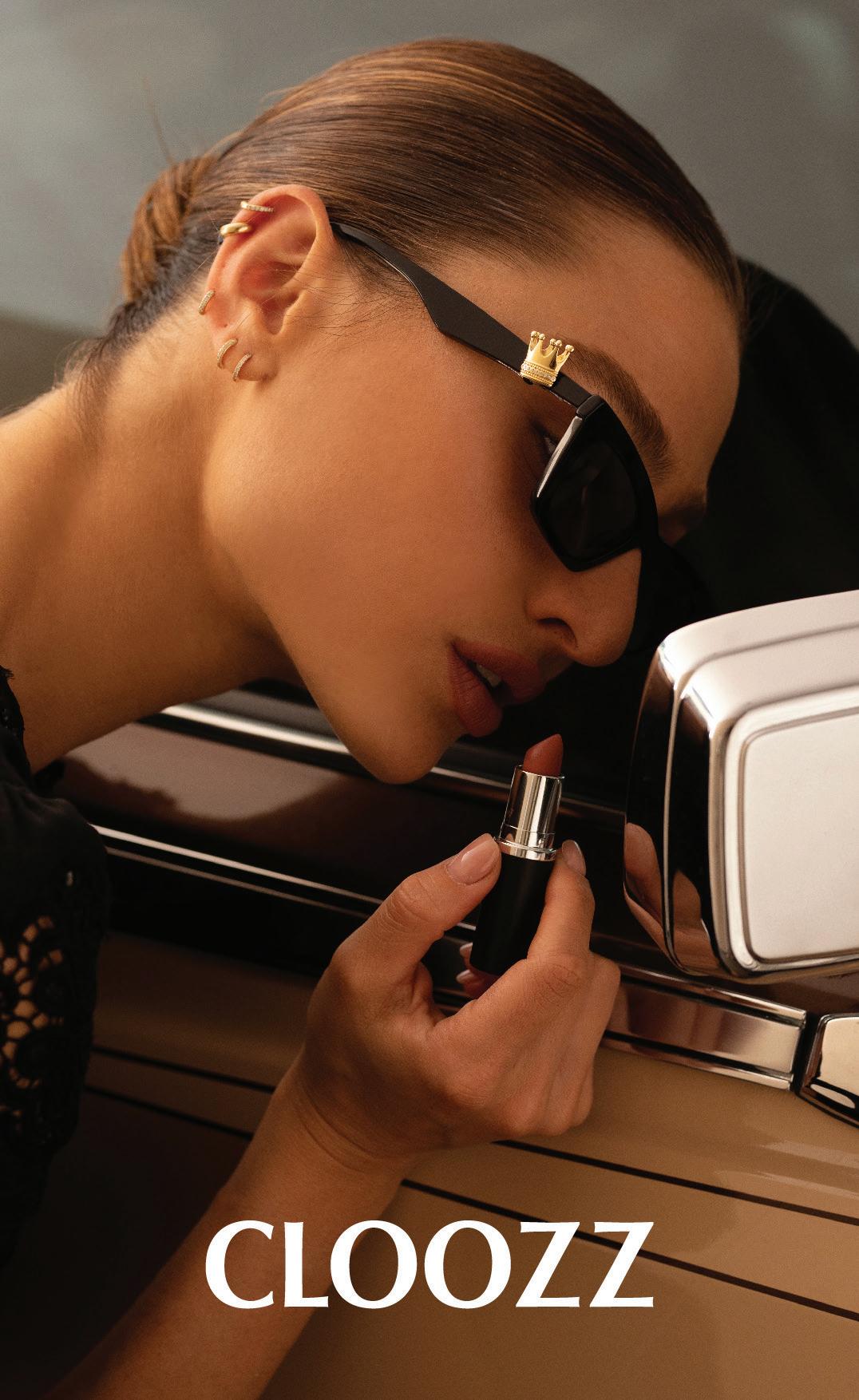
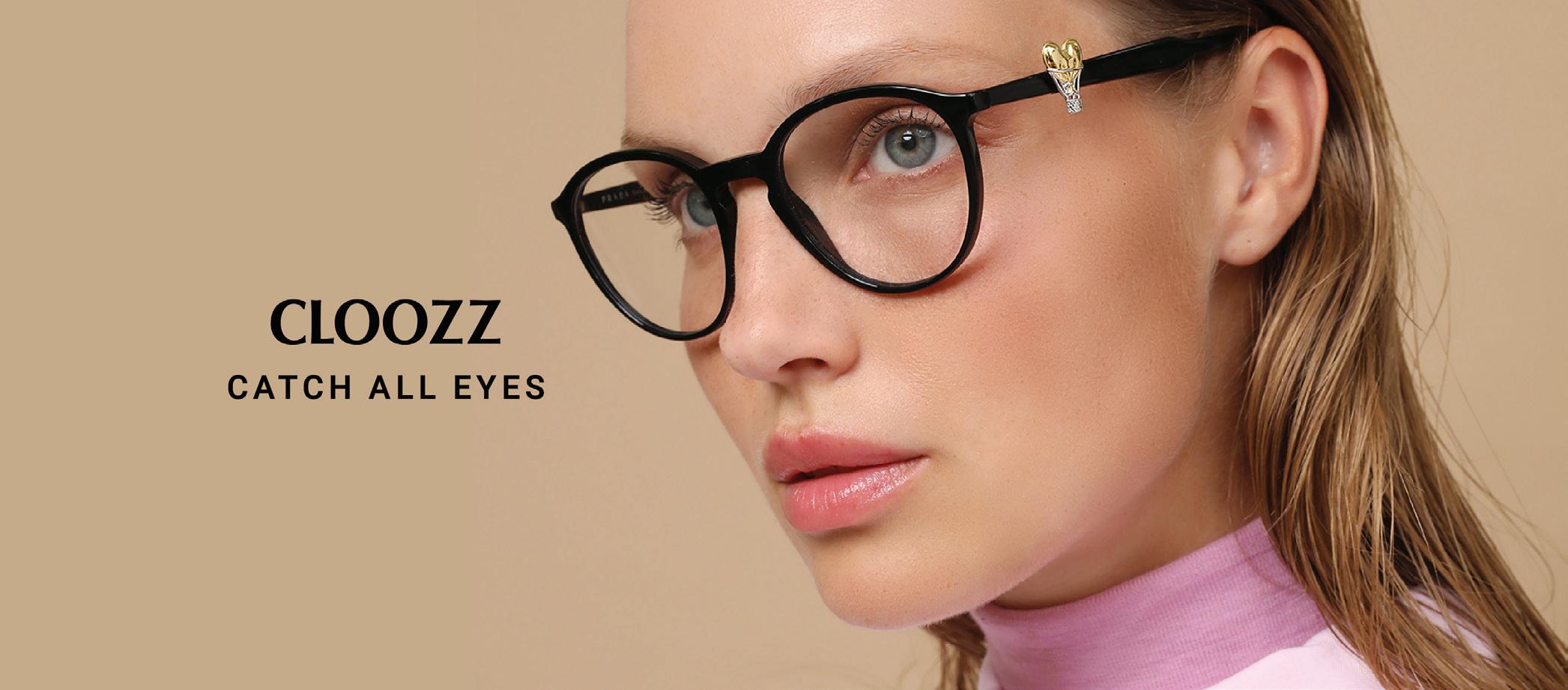
The design, look and feel should always use the same design language both online and offline. Keep a minimalist look. Don’t use a busy background, dominant colors or too many images on the same page.
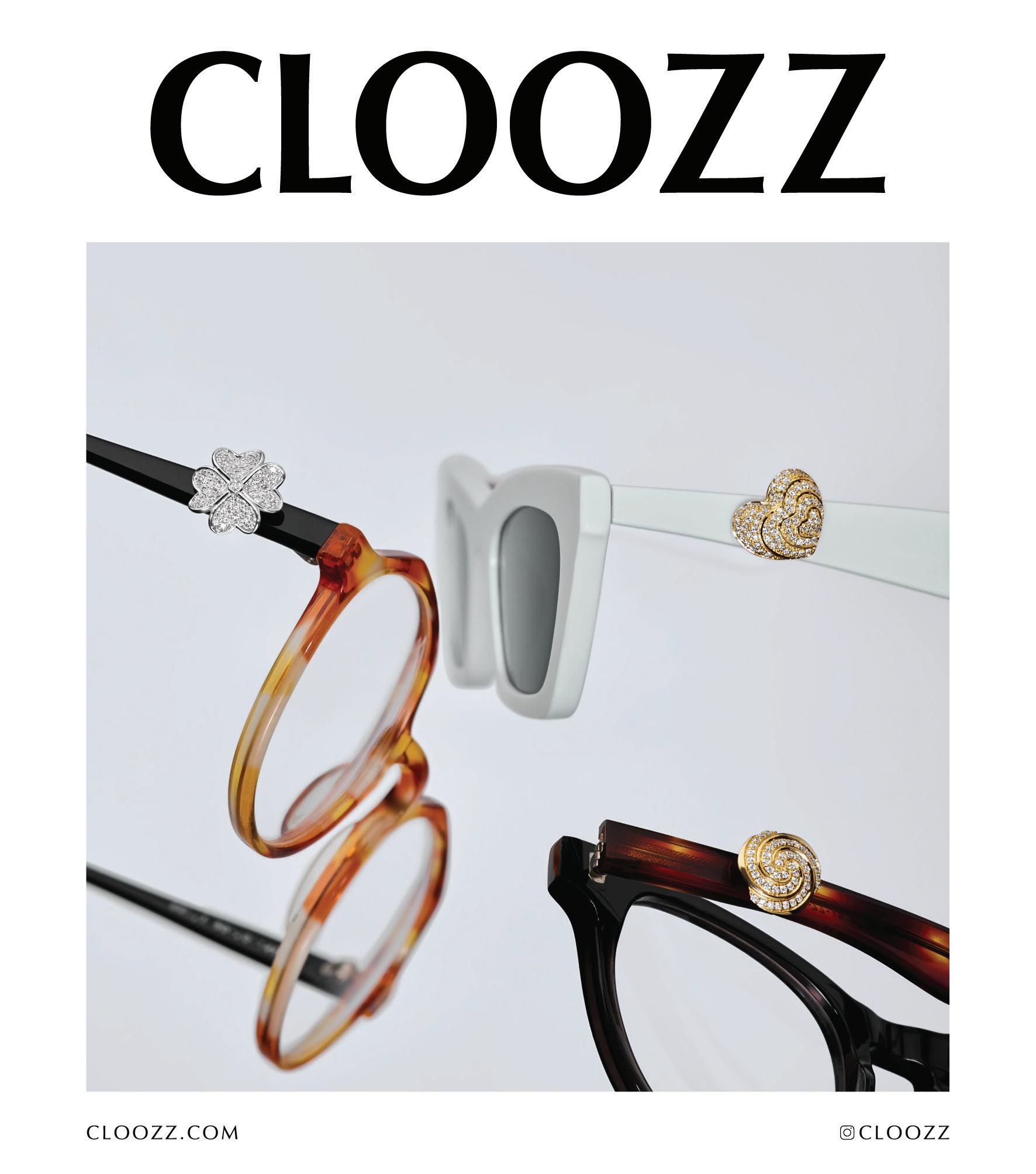
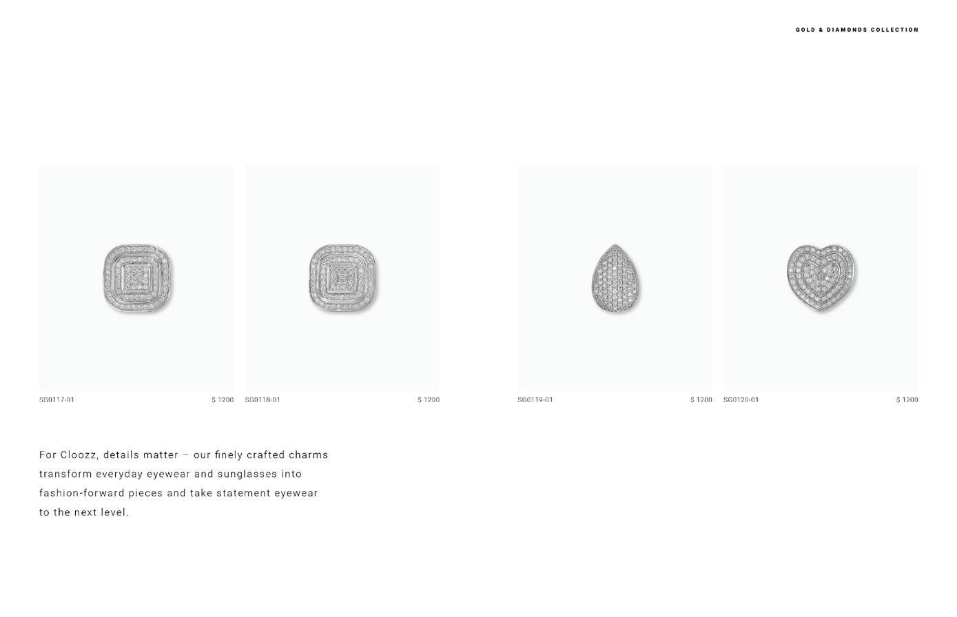
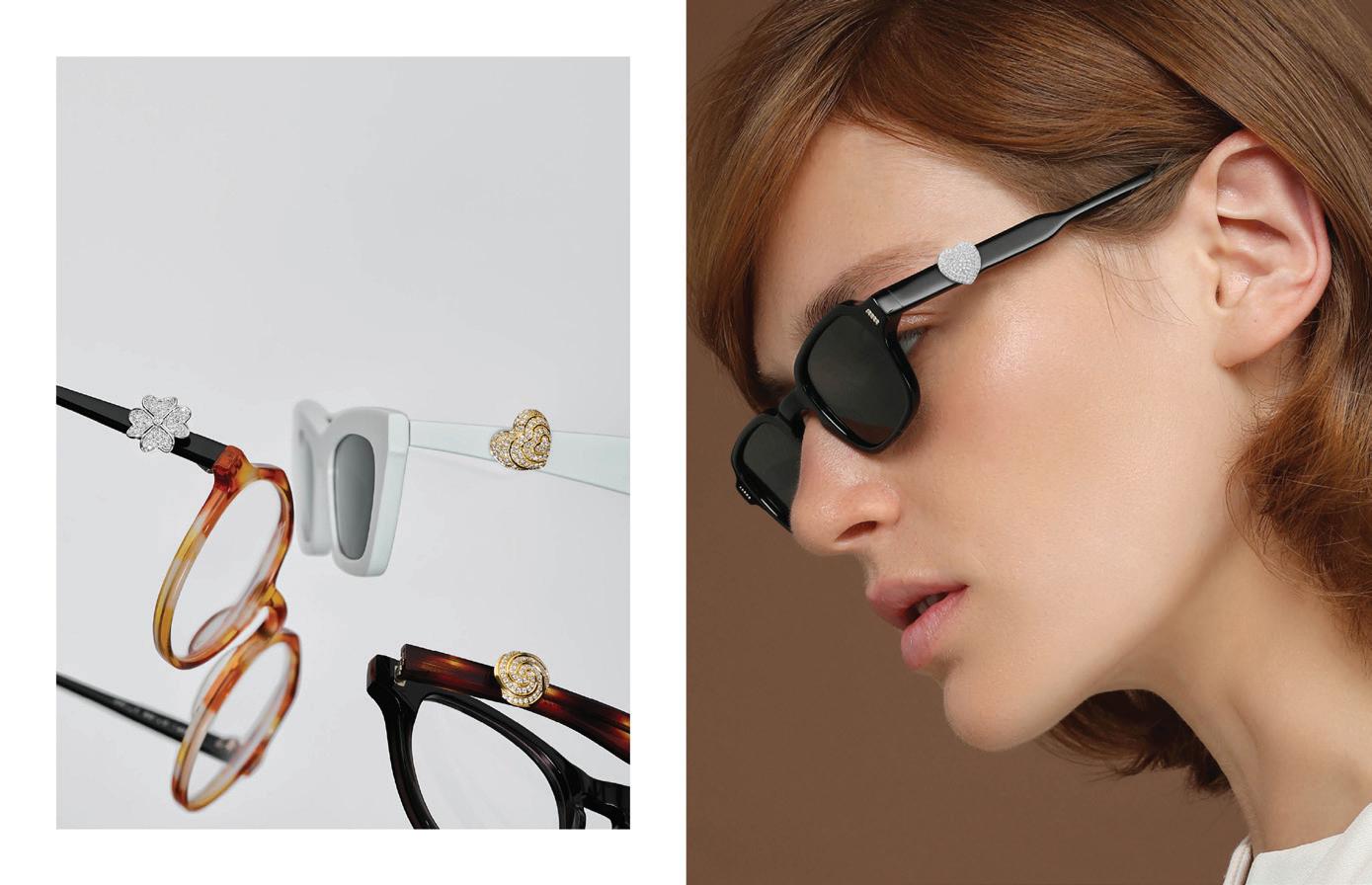
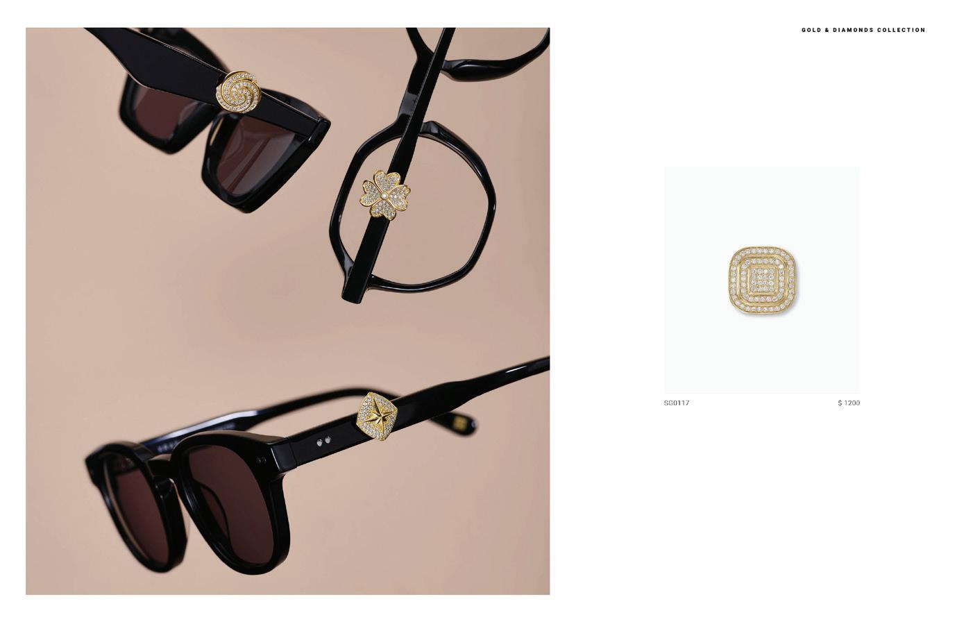
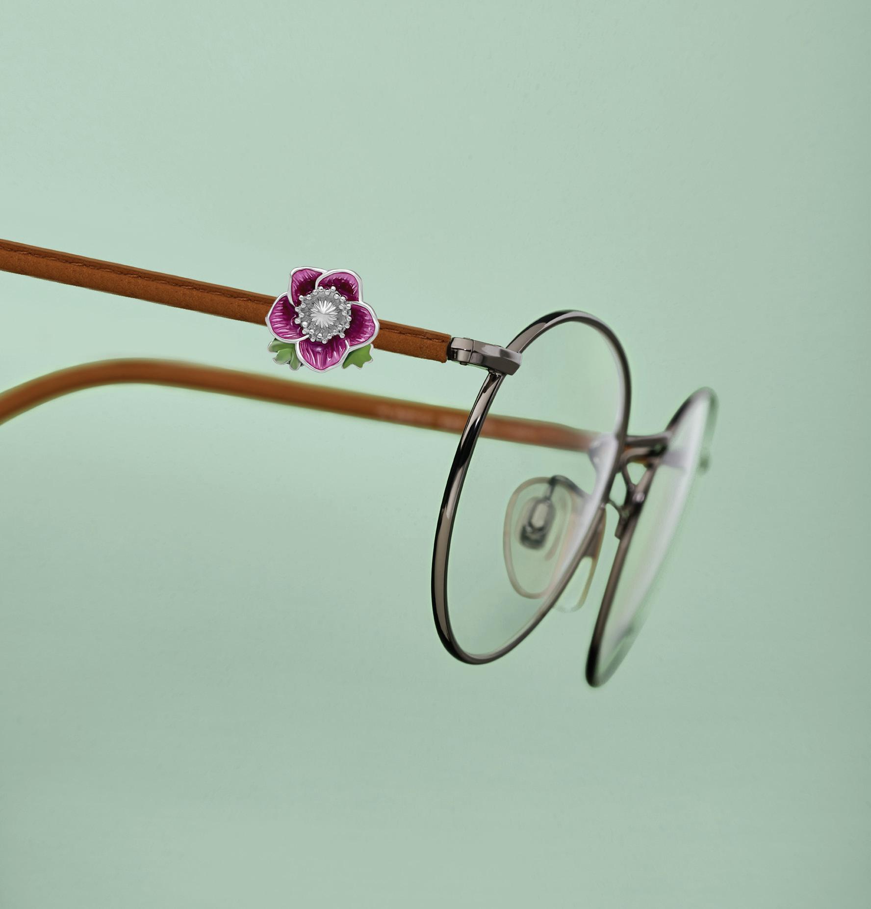
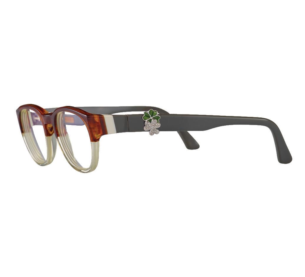
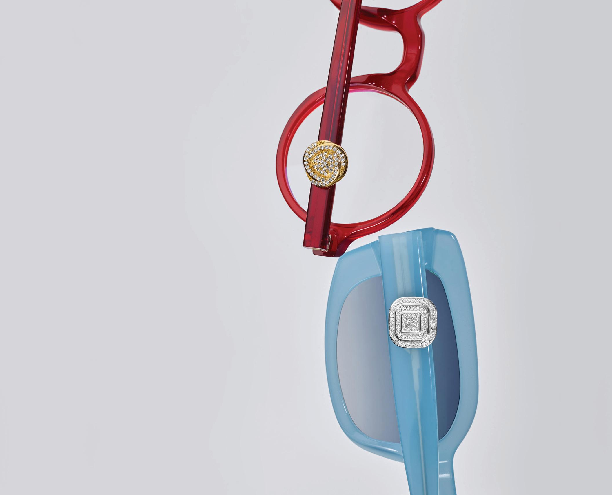
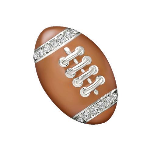
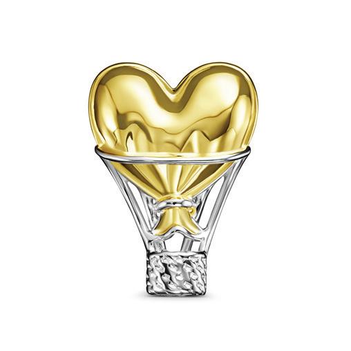
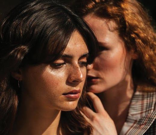
The goal behind any and all our photo shoots is to capture and convey the beauty of our charms including their exquisite details, as well as the innovative spirit and creativity of our brand.
Diversity Photography should reflect the diverse communities that wear CLOOZZ charms. Always be inclusive by showing and casting diversity whether it is race, gender, age, size, abilities, culture, and region.

Photography guidelines
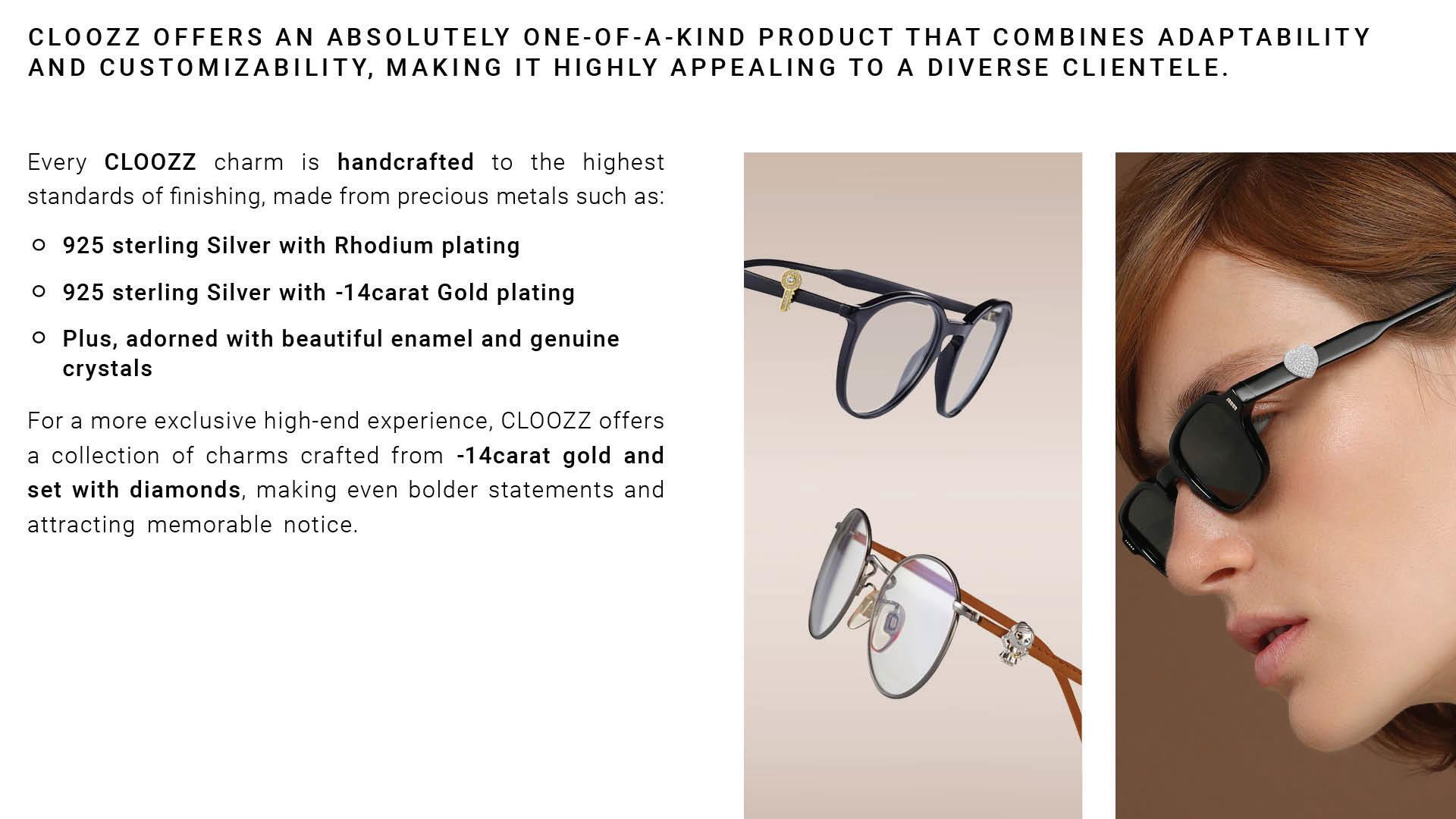
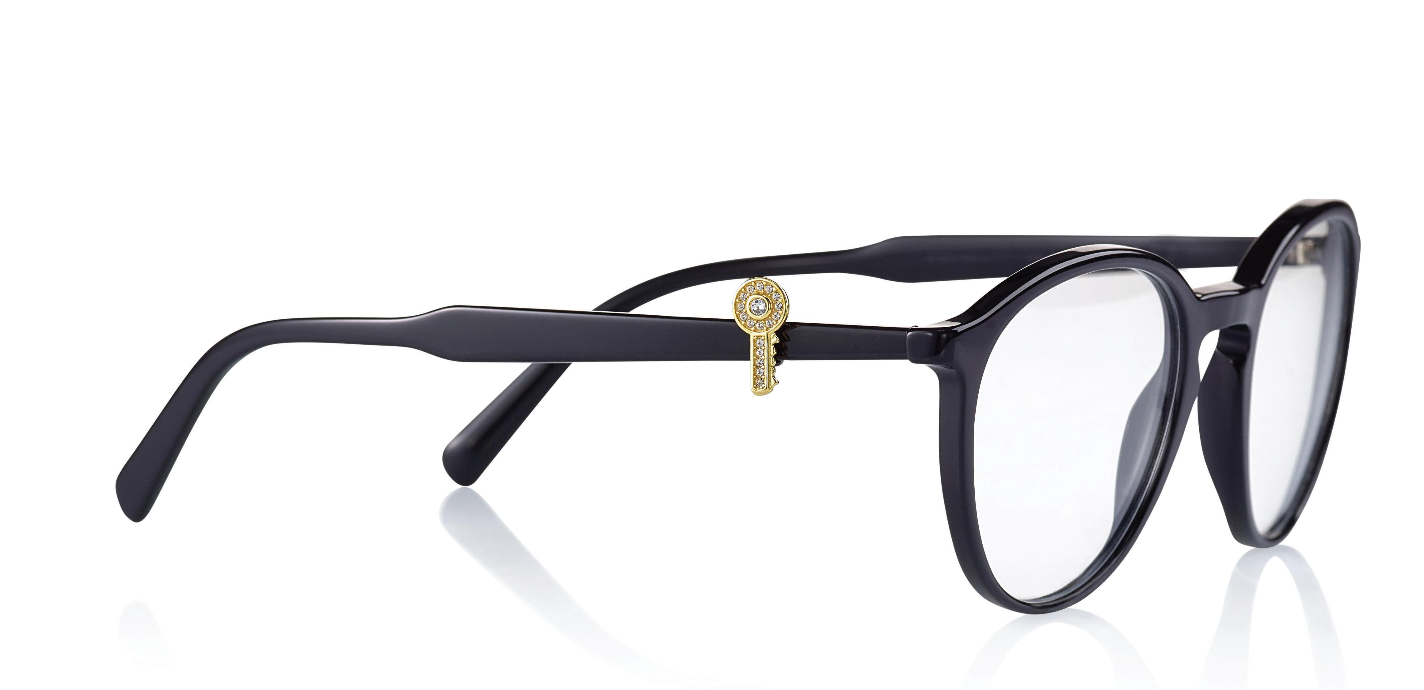
When photographing charms, ensure they are captured as jewelry pieces while minimizing reflections on metals and stones. For model shoots, maintain a medium frame with the charm prominently positioned in the foreground, free from any competing elements.
Create an atmosphere that is relaxed, enjoyable, and elegant, with dynamic and varied compositions.
Photography should consistently convey a sense of fun, light-heart edness, and optimism.

Avoid using CLOOZZ media without the accompanying CLOOZZ logo.
All CLOOZZ media is exclusively intended for company marketing purposes and should not be used for other purposes without prior authorization.
Style properties
Natural light. Colors that emphasize the charms. Not too busy and colorful.
Content
Diverse cast, action, art, food, creativity, community.
What to avoid
1. Busy foreground elements.
2. Harsh shadows or lighting that creates reflections and blurs, as they can obscure the visibility of the charm.
3. Cluttered and complex compositions that distract from the main object.
4. Limiting models to a single gender or race.

Customer social media page should only use their own branding and corporate identity and should not include any reference to CLOOZZ in the username or header.
All commercial images that are created must be approved in the preproduction phase by CLOOZZ branding team.
As a global company, CLOOZZ carefully crafts its branding, style, and overall aesthetic to empower and deliver precise creative expression through different mediums, online and offline.
As you’ve seen in these pages, our branding and brand language are
part of our mission to ensure that CLOOZZ charms become an integral part of people’s self-expression. We remain committed to providing the highest quality products to our customers and their end-consumers, constantly innovating, and collaborating with diverse artists, sports icons, musicians, and more, to be ahead of the curve.