+
HELLO!
My name is Clarissa Jennifer, but you can call me Jennifer.
I am a graphic designer and digital imaging artist, based in Jakarta.
I put a high interest in visual design, especially digital imaging and illustration.
I am willing to learn more about art and design.
0877 82 117 228 jenniferclarissa94@gmail.com +
Clarissa Jennifer. H Female Jakarta, 31 January , 1994
EDUCATION EXPERIENCE
Bina Nusantara University 2012-2016
TKK - SMAK IPEKA Sunter 1997 - 2012
Freelance Artist 2016 Works at Dragon Capital Center 2016-2017
WHIR Graphicemotion Sept 2015-March 2016 Titik Dua Magazine 2014-2015
Scholarship Mentor Binus Student Learning centre 2013-2014
YORS (PT. Kreasi Asia Pasifik) March 2017-November 2017 Watermark Indonesia (PT. Sinematik Anak Bangsa) 2020-2022
SELF INTRODUCTION
EXHIBITION PARARA
Panen Raya Nusantara, Infographic and Social campaign for Desa Kelumbi, Borneo. 2015 HOMETOWN International Exhibition Intercultural Academic Illustration Forum Arjuna Gallery 27 Nov-1 Dec 2016
+
Adobe
Ai Ps
SKILLS
Selected Works
1 BRANDING
LOGOGRAM

clarissa
jennifer x x x
x heriyanto
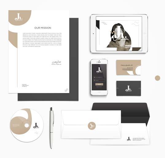
CJH
CJH is the innitial of Clarissa Jennifer Heriyanto. In this personal branding, I want to make simple design with a little bit decorative element to represent myself as calm but also has cheerful personality.
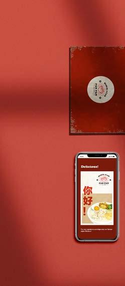
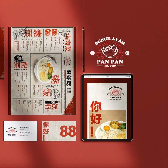
Bubur Panpan
The concept of Bubur Panpan comes from the number “88” which is believed as a lucky number in Chinese culture. Bubur Panpan is a small culinary business that sells porridge and Hainanese chicken rice. The client want me to put a vintage touch on the brand, so i put the warm color combined with rustic style illustration.
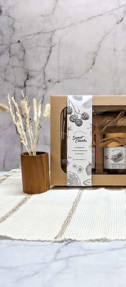
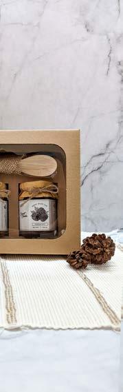
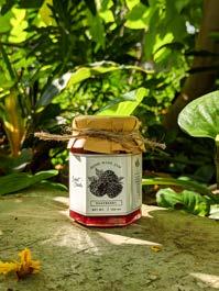
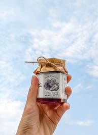
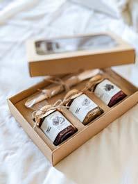
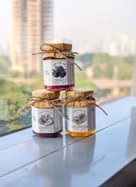
Sweet Cheeks Jam
During the pandemic, I found a new interest in making fruit jams. I make a small brand and sell it casually by experimenting and filling my empty hours. The brand name comes from my memories of my passed grandfather who likes to pinch my cheeks and sing while putting me on his lap. It’s such a sweet memory to remember.


2 DIGITAL IMAGING
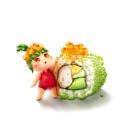
Bisnisdong.com


This is some steps and stock images for making 5 minutes motiongraphics video for Bisnisdong.com during my internship program at WHIR Graphicemotion.
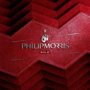
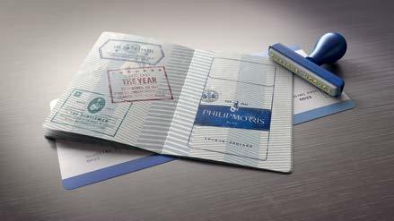
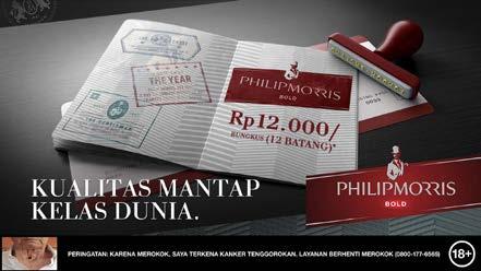
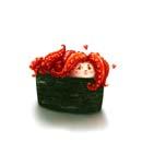
Philip Morris
Philip Morris is one of the cigarette brands in Indonesia. In this project, I was working as a freelance digital imaging artist. I was challenged to change the visual from blue to red color, also adding a few graphic elements to the artwork. And it requires me to work in detail with textures and lines.
3 EVENTS
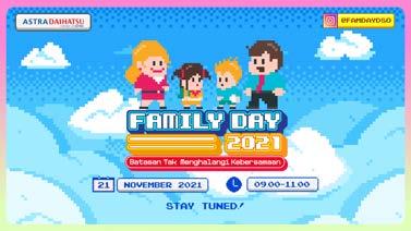
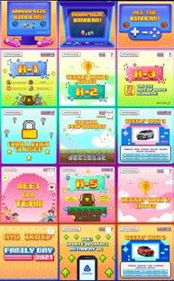
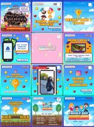
Daihatsu Sales Operation
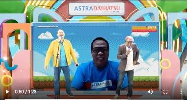
This is an internal event for DSO, called Family day. The event is full of games and fun activities, also awarding day for those who have contributed during the whole year. For the concept, we use pixel style with a colorful tone to cheer up the mood.
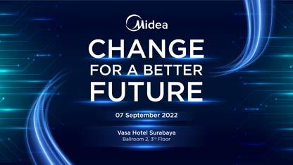
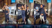
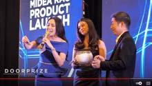
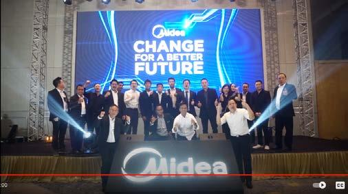
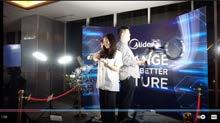
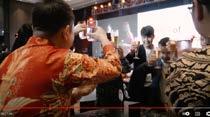
MIDEA Dealer Gathering 2022
MIDEA is a brand that sells Air conditioners and home appliances based in China but has been spread all over the countries. For this event, they want to make a dealer gathering in 3 cities: Jakarta, Surabaya, and Yogyakarta.
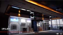
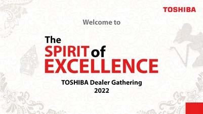
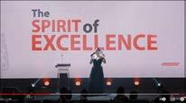
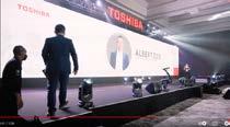
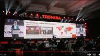
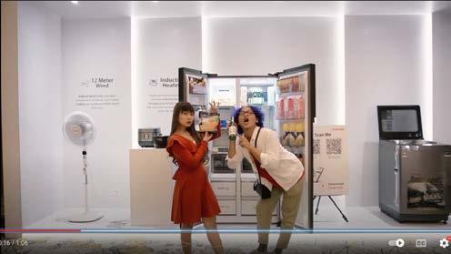
TOSHIBA Dealer Gathering 2022
After being vacuumed for a long time, the TOSHIBA brand is back in Indonesia under the Midea Group. So in this event, they want to hold a dealer gathering and display their hero products: refrigerators and home appliances.
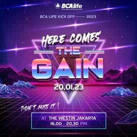
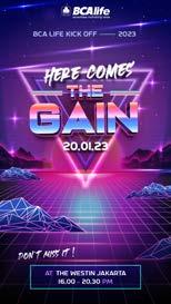
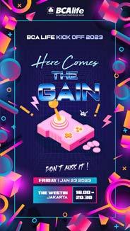
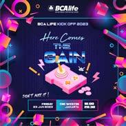
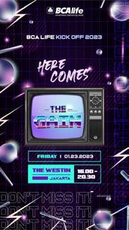
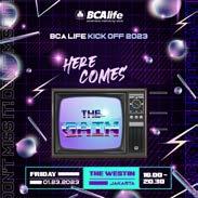
BCA Life Kick Off 2023
Although we didn’t win the pitching process in this event, I feel quite satisfied with the key visual that I’ve made. They want to bring back the 80’s vibe into the project, so I use retro color tones and elements in the design.
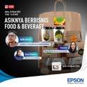
EPSON Instagram Live
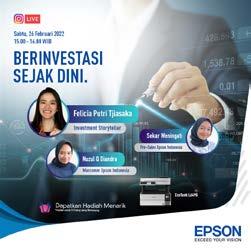
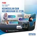
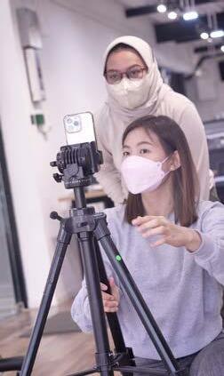
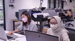
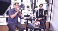
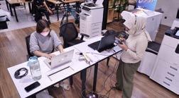
Epson has a weekly Instagram Live, where they invite a KOL as a speaker while selling their products to the audience through the Instagram live sessions. I was working behind the table and managed to do the Q&A from the comments, also helping with the setup and what the client needs at that time.


OTHER WORKS
4
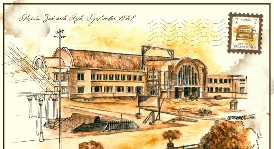
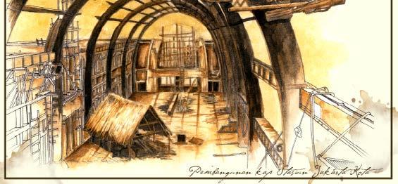
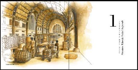
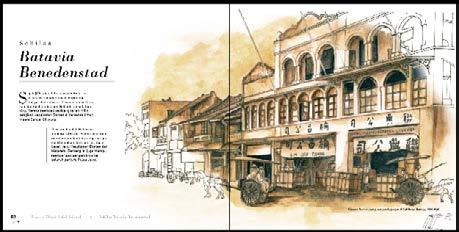
Book Publication
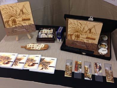
“Perhentian Klasik Kota Batavia”
This is my final project for Binus University. The main topic of this project is the History of Jakarta Kota Station, so I choose the sepia color and used a combination of outline and watercolor techniques for the illustration. For the cover, I chose engraved wood to give an exclusive and vintage mood. I made this book to prove that history books can be delivered nicely and are easy to learn by balancing the text and image proportion.
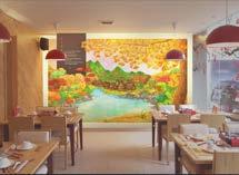
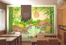
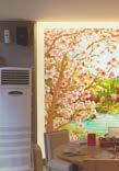

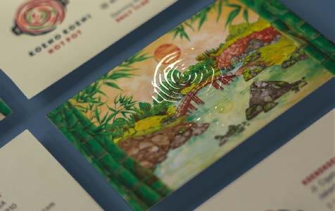
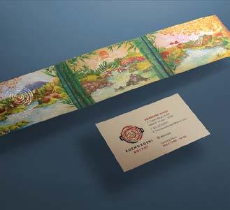
Koeno Koeni Hotpot
During my internship program at WHIR Graphicemotion, I also made 3 series of wall graphic paintings for “Koeno Koeni” Hotpot Restaurant using watercolor technique and then edit it digitally. The original pictures were divided by 6-8 parts of A3 canson paper before we scan it and made it as a whole picture.
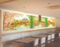
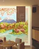
The concept of this project is spring, summer, and autumn seasons, represented by sakura, bamboo, and ginkgo tree as the symbol for each seasons.


Paintings & Illustrations
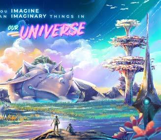
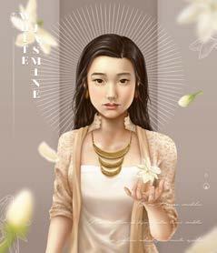
Here are some of my digital drawings. I feel challenged to do a couple of styles on my illustrations, but you can tell that semi-realistic is one of my favorite ones. And drawing is one of my interests in art subject. It helps me to be more observant and diligent in the process.

5 WEB
& APPS
Yors mobile app
Yors (Yself) is mobile application for beauty and wellness. The reason for using turquoise colour is that the founder doesn’t want the app to be too feminine, because they will expand the service not only for beauty in the future.
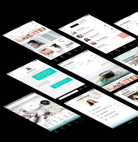
Yors mobile app
In this project I also contribute on making the brand identity before designing the UI . Sometimes I also editing the image for application use.

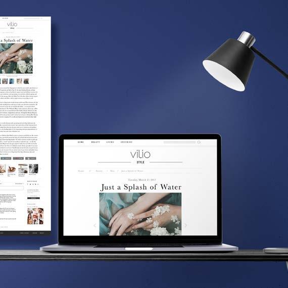
Vilio Beauty Blog
This is Vilio, a dummy of blog and article website about beauty and wellness. The concept is using bright and feminine colour and also keep the simplicity of the visual.