cameronknight/portfolio
warning: organized chaos within
logo
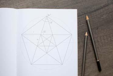
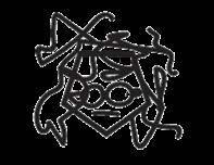
Designing my own personal logo was a challenge. I needed to represent my design process — and ultimately, a large part of my personality — with one symbol. My logo, sometimes affectionately called “Lil’ Cam” by others in the design industry, condenses a few important aspects of my work into a monoline self-portrait. The pentagonal face shape and circular glasses/goggles showcase my affinity for mathematics and minimalism, while the asymmetrical hair lines represent the wild, chaotic nature of my art. The two aspects in combination should convey a balance of leftbrain and right-brain thought.

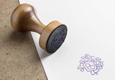
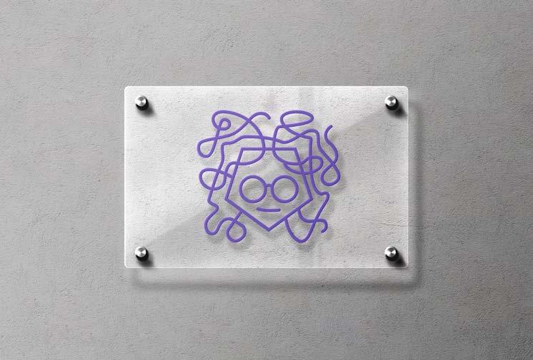
The main color I have chosen to represent my brand is a close approximation of Pantone’s 2018 Color of the Year. As such, “ultraviolet” serves as a benchmark for my starting point as a professional designer. In general, purple hues evoke creativity and spirituality which portray my methods as both fun and cerebral.



I chose a pentagonal shape for the base of my logo because of its relationship to the Golden ratio, a proportion that has fascinated artists and mathematicians alike throughout history. The meandering shape of my hair was based on a rapid gestural sketch and then edited, taking inspiration from scientific plots of chaotic systems, such as the path of a double pendulum.
My logo has evolved over the years as my brand itself has evolved. For example, I now have a smiling face as opposed to a vacant expression. Not only does this change likely appeal more to an audience; it also represents a positive change in my own mental health. The expressive potential of a self-portrait as a brand mark has warranted further exploration such as adding accessories during holidays and the recent pandemic, as seen on the left.
typeface Bluenote
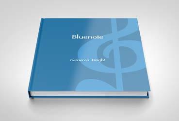


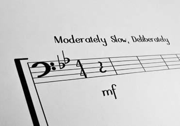
While sharing an apartment with a musician, I learned that jazz sheet music is traditionally printed using typefaces designed to appear handwritten. This helps the musician to stay loose and comfortable with improvisation. The problem is that, according to my musician friend, these typefaces are difficult to read quickly while playing. Bluenote is a legible alternative that carries the improvisational essence of jazz.
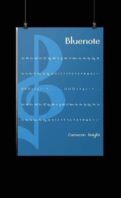
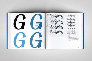
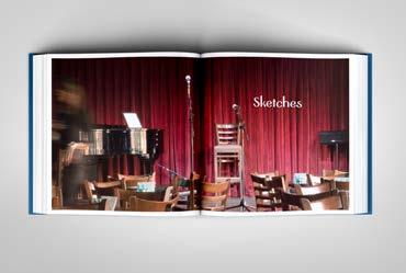
After analyzing the existing faces designed for jazz sheet composition, I sketched the letterforms and revised them until I had a set of precise drawings, ready to be scanned and traced meticulously as a digital font. I documented the entire design process in a book, ending with typographic specimen pages. Additionally, I have showcased Bluenote in a poster design.
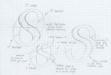
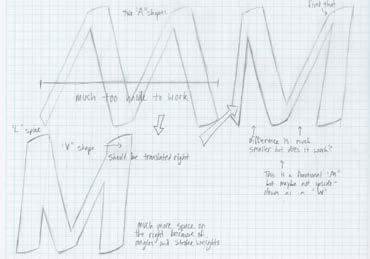
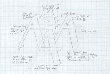
To mimic the dynamic nature of jazz, I decided that the weight of the letterforms should range from lighter on the upstroke to heavier on the downstroke. Not only does the dynamic stroke weight give the text a syncopated rhythm; it also works in combination with slightly rounded terminals to resemble handwritten text.
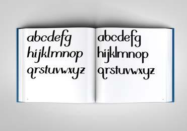
Since it is meant to be used for sheet music, I have replaced some typographic symbols with musical glyphs such as notes, rests, and clefs.
publication Coaevum
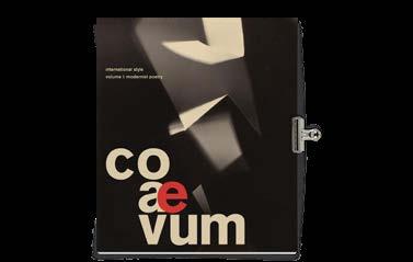
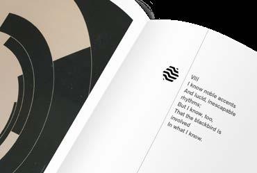
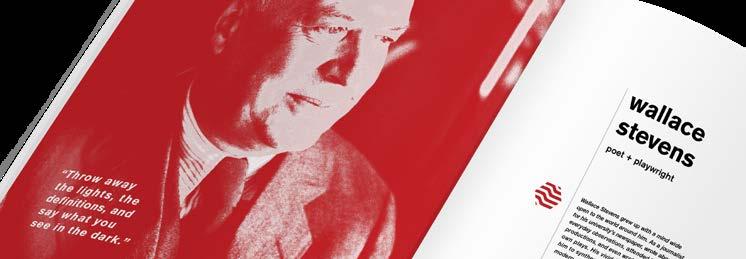
Coaevum is a Latin adjective meaning “at the same time.” Four designers — Mariana Poveda, Michaela Staton, Abigail Whigham, and myself — designed this magazine to encourage designers to research deeply into the arts and into world history. The magazine presented information about the International Style of design alongside the six tenets of Modernist Poetry and how the two movements may have influenced each other. Our goal was to compare the styles of individual designers and poets, and ultimately to reveal that no great artist works in a vacuum.
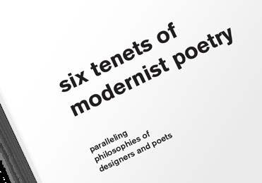
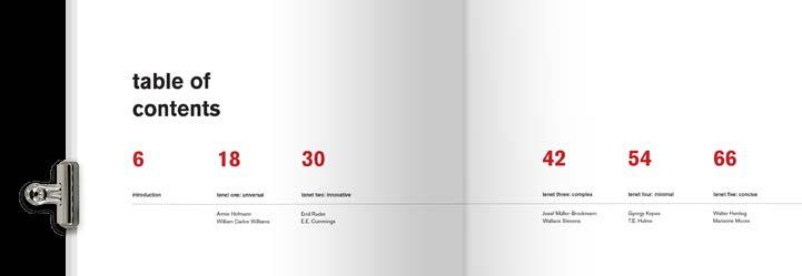
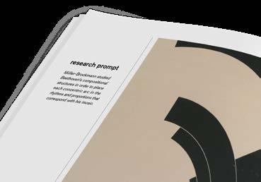
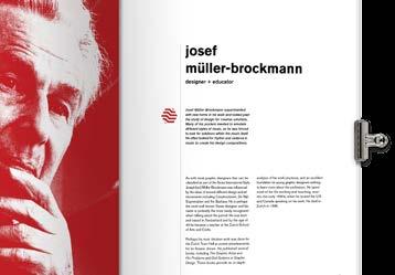
My roll in designing Coaevum largely included page layouts and typography throughout the publication, especially the table of contents and the index of resources. I was also tasked with selecting artworks and poems to feature in the third section, addressing the third tenet — absolute freedom in choice of subject. It was my decision to summarize this tenet by naming the section Complex. The two featured artists, Josef Müller-Brockmann and Wallace Stevens were capable of making complex cognitive connections, using their vivid imaginations to synthesize intangible concepts, music, and other sounds into modern poetic and visual forms.


logo Academy Bands

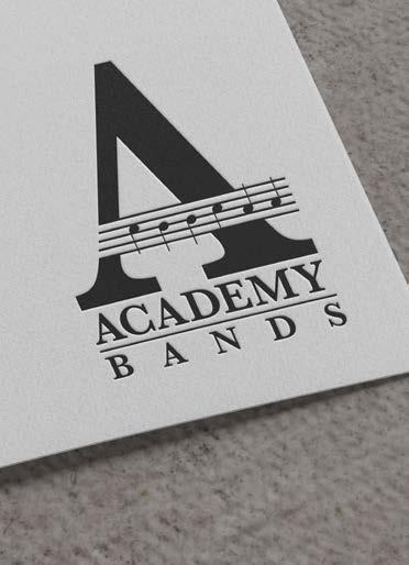
Academy Bands is a division of the musical department of Cyril B. Busbee Creative Arts Academy. The department’s faculty members wanted me to draw something with a music stand or some instruments. However, they were quite pleased with this typographical logo featuring a large A made from a treble staff, marked with notes C B B C A A — the initials of the school’s name.
logo
Aquora Tax
The partners at Aquora Tax described their brand values as accuracy, professionalism, and reliability. The use of a geometric face such as Futura allowed me to incorporate an arrow and bullseye without it becoming cartoon-ish, and to render an appropriate mood for a tax advisory firm.

book jackets Into the Dark
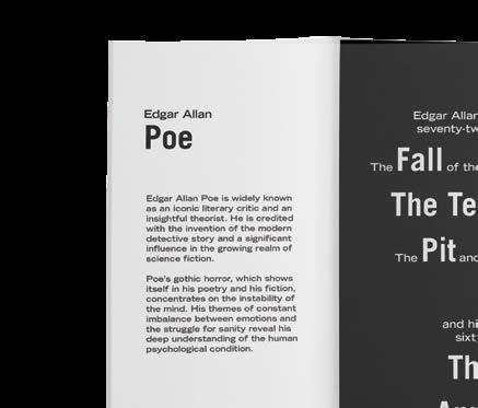
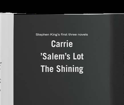
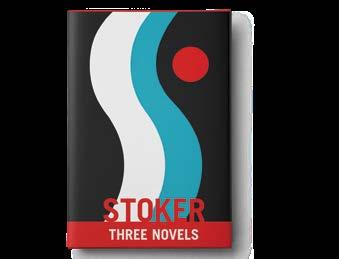
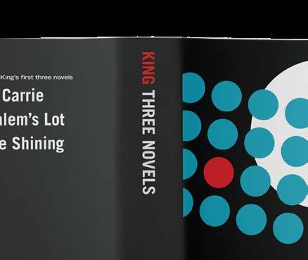
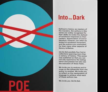
I designed this set of book jackets for four existing Barnes & Noble Leatherbound Classics, creating a cohesive series of compiled horror fiction. Into the Dark celebrates the work of four authors — Edgar Allan Poe, Bram Stoker, H.P. Lovecraft, and Stephen King — written throughout the 19th and 20th centuries. Defined in history as masters of the macabre, these authors are widely recognized for their ability to evoke the darkest of emotional responses in their readers. Appreciation of horror literature, however, can often be limited to emotional movement, and the authors are overlooked for their other aspects of literary brilliance.
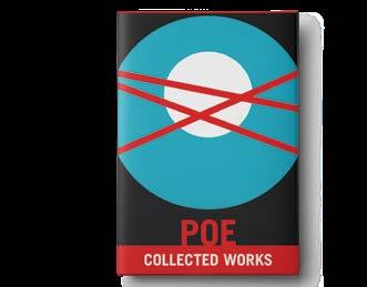
A modern book jacket design for an older literary work emphasizes its worthiness of being studied in a modern world. I wanted the appearance of the series to encourage readers to appreciate the content beyond the feelings of terror and passion, to recognize literary devices at play, and to evaluate the writing style of an author alongside the three others.
The circles on Poe’s cover reference the old man’s “vulture eye” in The Tell-Tale Heart, while the red strokes represent wounds, scars, or blood vessels. Like his work, the design evokes emotional instability and a struggle for sanity.
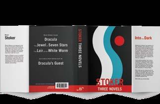
As a reference to Dracula, the Stoker jacket features a long curving curtain and a full moon. The shape of the curtain suggests the silhouette of a woman’s torso in the negative space. This is because much of Stoker’s work inspires much commentary on gender roles and sexual desire.
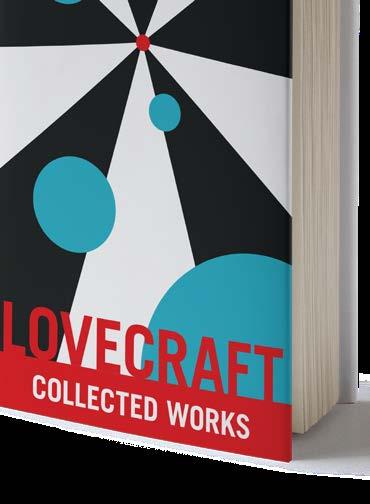
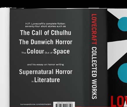
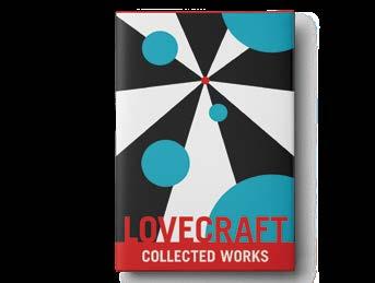
Because Lovecraft introduced the idea of cosmic horror, the small red dot in the center of his cover represents the world of humans, and the larger circles are for the ancient terrible beings which gaze down with indifference.
On Stephen King’s cover, the red circle isolated among the crowd of blue circles, lined in front of a larger white circle symbolize his themes of the individual at conflict with an institution or the uniting of many against a large, powerful common enemy.

typeface Geometer


