LOGO GUIDELINES
LOGO
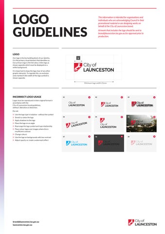
Our logo is the key building block of our identity, it is the primary visual element that identifies us. Our primary logo is the full colour, inline logo as shown opposite which must be displayed on a white background.
It is important to keep the logo clear of any other graphic elements. To regulate this, an exclusion zone marked X (the width of the logo symbol) is shown opposite.
INCORRECT LOGO USAGE
Logos must be reproduced in their original format in accordance with the City of Launceston brand guidelines, without alteration or distortion.
Do not:
X Use the logo type in isolation - without the symbol
X Stretch or skew the logo
X Apply shadows to the logo
X Place the logo on an angle
X Rearrange the logo symbol and type relationship
X Place colour logos over images where this is insufficient contrast
X Change colours
X Use the logo on backgrounds with low contrast
X Adjust opacity or create a watermark effect
brand@launceston.tas.gov.au launceston.tas.gov.au
This information is intended for organisations and individuals who are acknowledging Council in their promotional material or are designing works on behalf of the City of Launceston brand.
Artwork that includes the logo should be sent to brand@launceston.tas.gov.au for approval prior to production.