Brand Book


Index .02 .01 Prelude ......................................... Core Story .................................. .09 .08 Typography ................................ 36 3 41 5 47 12 16 50 14 24 .07 .06 Branches .................................... Colour Palette ........................... .03 .04 Positioning ................................. Tone of Voice ............................ .10 .11 Graphic Compositions ............ Imagery ....................................... .05 Logo ............................................ Brand Activations .................... CIM ICM Brand Book - 2024 32
Prelude
CIM ICM Brand Book - 2024 1
Context Opportunity
As the world around us continues to evolve, and cultural and societal perspectives shift, so does CIM.
CIM branches and societies are uniquely positioned to help shape the Canadian mining landscape, inspire the next generation of practitioners and influence how the industry is perceived by society.
Together, each one of us is vital to evolving norms through diversity and sustainability to create positive impact.
And, with evolution comes opportunity.
CIM connects professionals to address relevant industry issues through local and national conferences, networking opportunities and social events.
We welcome individuals, groups and organizations from various disciplines and areas of the industry, regardless of experience level, to foster learning, mentorship and expertise-building.
We are committed to supporting the industry's global leadership in sustainable and responsible mining, providing continuous technical resources and professional development opportunities, including scholarships and awards.
CIM ICM Brand Book - 2024
4
Core Story
CIM ICM Brand Book - 2024 3
Our History
CIM is part of Canada's history. It was formed by individuals within the mining industry who sought a vehicle for collaboration and the communication of ideas and expertise.
Since 1898, we have grown from a small association to Canada's leading professional association for minerals-related industries, with technical societies, committees and local branches.
CIM ICM Brand Book - 2024
6
Our Mission
To cultivate knowledge, leading practices and innovation to support our members, improve society’s awareness of our industry & evolve the sector responsibly.
CIM ICM Brand Book - 2024 7
OneCIM
Working collectively to advance industry practices towards a more responsible future.
OneCIM is representative of our complete community: made up of our technical societies, local branches, regional chapters, expert committees, student chapters, and dedicated volunteers.
CIM members
1 STANDARDS, GUIDELINES AND LEADING PRACTICES DIRECTORATE
11 12
Societies
Committees
30
Local & international branches
10K+
CIM ICM Brand Book - 2024 8
Our Purpose
To empower a network of professionals to collaborate towards a sustainable future and accelerate the development of the industry.
CIM ICM Brand Book - 2024 9
Collaboration
We believe that collaboration leads to a sustainable future.
What we believe
Membership
We believe that membership fosters personal and professional development.
Engagement
We believe engagement expands the awareness of the essential contribution mining makes to society.
CIM ICM Brand Book - 2024
10
Our Vision
Collaborate for a sustainable future.
CIM ICM Brand Book - 2024 11
Positioning
CIM ICM Brand Book - 2024 10
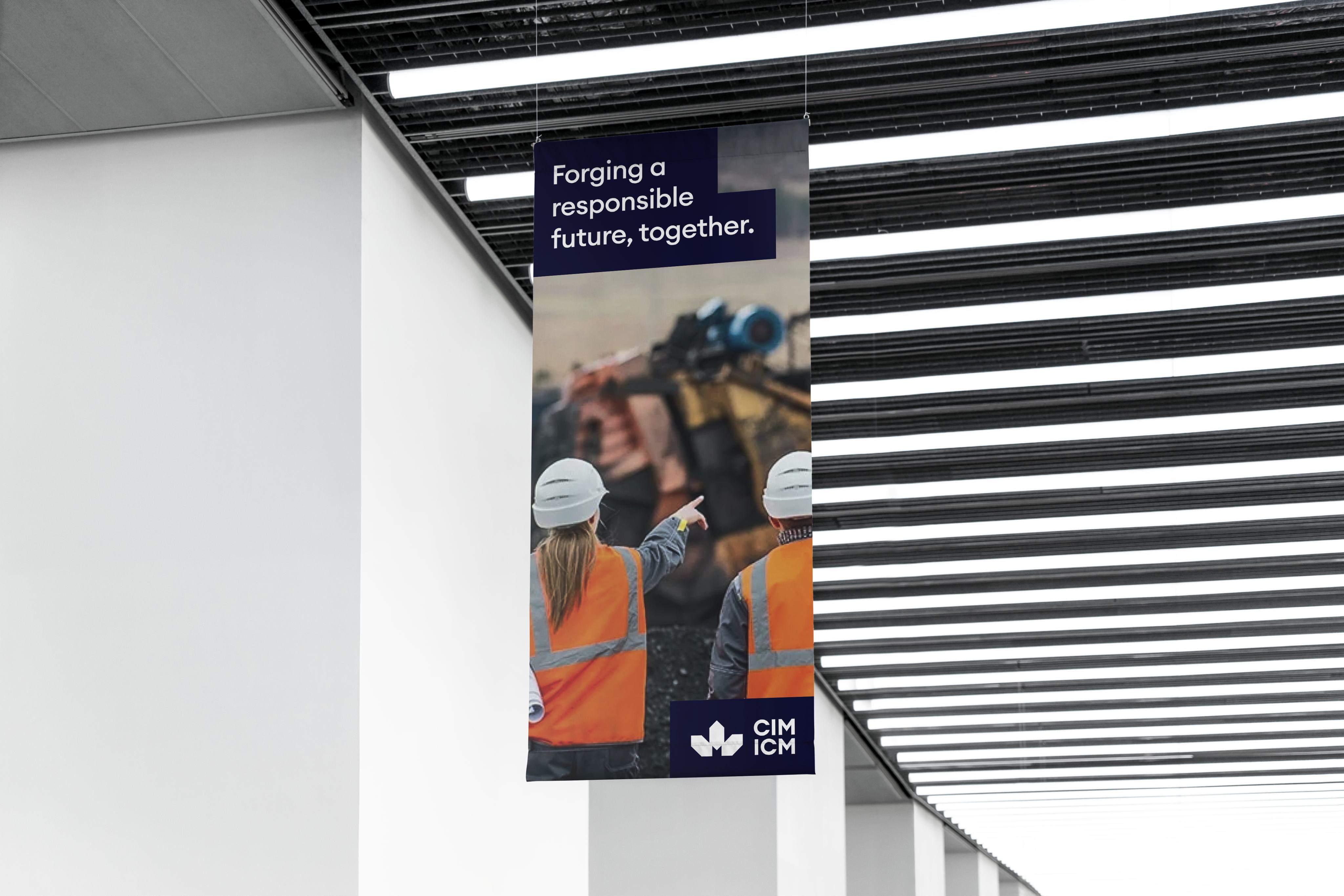
Forging a responsible
future, together
For over 125 years, CIM has supported a community of mining professionals seeking to propel our industry toward a more responsible future.
A future where our diverse voices and expertise come together to reshape perceptions, seek sustainability and evolve ways of working from the inside out.
Each branch, society and member plays a role in developing leading practices that positively impact our industry and align with the expectations and values of modern society.
At CIM, we help professionals like you bridge the path to the future by integrating a conscious culture within mining. As one of our members, you become part of a culture that celebrates new perspectives and individual wins within the collective growth.
Together, we can achieve a sustainable industry and pave the way to a more prosperous future for mining within society.
CIM ICM Brand Book - 2024 13
Position statement
Tone of Voice
CIM ICM Brand Book - 2024 12
Messaging Framework
CIM’s voice is essential to establishing trust amongst our many audiences. Consistency in language and style ensures we convey our values and act as leaders and enlighteners regardless of perception.
We speak out of wisdom, reminiscent of a modern educator, mentor or advisor. We are an established organization focused on uniting our network and we use inclusive language and messaging to enable collective growth and a sustainable future within our industry.
Professional & approachable
Insightful & educative
Inclusive & trustworthy
Tone
of voice
In general, our tone is conversational. We talk to our audience in a way that comes naturally to us, knowledgable and casual. As experts, we seek to foster a place for collective growth. We speak to our community first, but ensure not to alienate others. We recognize and celebrate their contributions to our greater goals.
Wise, but not dull
As thought leaders we write in an active voice to sound more direct and confident. We use an optimistic tone so as to be perceived as monotone, and avoid using complex vocabulary when possible, unless it feels natural.
Conversational, but not informal
We articulate our messaging in an approachable and casual tone of voice to
ensure true relevancy across our vast audience demographics, but avoid inappropriate humour to maintain trust and professionalism.
Confident, but not pretentious
We are confident communicators, with a heritage and decades of impact to prove our authority and expertise in the industry. We are not arrogant, we celebrate our history, and lead with our community and goals for the future.
Personality
*The simple guide to how
approach communication – look here
inspiration
support in concept
we
for
and
and copy development.
CIM ICM Brand Book - 2024
15
Logo
CIM ICM Brand Book - 2024 14
Full Logo
The full logo can be used in all communications material, print and digital, to ensure a coherent expression across all platforms, in instances where the full name of the institute can be easily legible. The logo is not to be altered in any way.
CIM ICM Brand Book - 2024
17
Logo Construction
Whenever the logo is being used or constructed, it should always be surrounded by a clear space in order to ensure visibility and consistency.
For this reason, an exclusion zone is added around the logo, which determines the closest that any other graphic element or text can be placed in relation to the logo.
Creating the Exclusion Zone:
The minerals forming the CIM ICM maple leaf are made up of 2 squares of equal size. The square is used as a guide in order to define the spacing between the different elements of the logo as well as around the full logo. The area of white space shown in the example is the exclusion zone for the full logo and should not be changed in any way.
An exclusion zone should be applied to all CIM ICM logos and branch logos.
CIM ICM Brand Book - 2024
h Horizontal Spacing
1 Square Vertical Spacing
1 Square Spacing between elements
1 Square Exclusion Zone
1 Square
18
Short Logo
The short logo can be used in all communications material where space is limited (for example, social media posts). The short logo is not to be altered in any way.
CIM ICM Brand Book - 2024
19
Logomark
A logomark is used to enhance brand identity – it is an image or symbol used to represent our company/brand. The logomark can be used in all communications where space is limited, for example, on social media profiles.
CIM ICM Brand Book - 2024
20
Favicon
A favicon is a browser icon that represents a brand or website – we use the logomark to create a favicon whenever the entire version of the logo does not fit. For example, on favicons, app icons, and social media profiles.
CIM ICM Brand Book - 2024
21
Logo Colour Usage
The colours of the logomark and wordmark should always be in black or white. Ensuring there is a clear contrast with the background should always be kept in mind.

CIM ICM Brand Book - 2024
22
Incorrect Logo Usage
Our logo should always be used in the same way according to our guidelines to ensure we avoid confusion and maintain consistency.
1. Do not distort the logo.
2. Do not rotate the logo.
3. Do not change the proportions.
4. Do not add an effect to the logo.
5. Do not rearrange the elements of the main logo.
6. Never use the logo without the logomark.
CIM ICM Brand Book - 2024
1. 4. 5. 6. 2. 3. 23
Branches
CIM ICM Brand Book - 2024 22
Branch Logos
The Branch logo can be used in all communications material, print and digital, to ensure a coherent expression across all platforms, in instances where the full name of the branch can be easily legible. The logo is not to be altered in any way.
Unilingual
French
Unilingual
English
Bilingual
English / French
CIM ICM Brand Book - 2024
25
Branch Logo Construction
For clear visibility and consistency when using or constructing the Branch logo, always ensure it is surrounded by an exclusion zone. This zone determines the closest proximity allowed for any other graphic element or text in relation to the logo.
The Branch logo comprises the mineral leaf, CIM hhtICM acronym, branch name, and the word "Branch." This structure ensures two lines of text, even with a short branch name.
To establish the exclusion zone for all versions of CIM and sub-brand logos, refer to the instructions on page 16.
CIM ICM Brand Book - 2024
26
Spacing between elements
1 Square
Unilingual
French
Bilingual
English / French

CIM ICM Brand Book - 2024 27
Unilingual
English
Bilingual
English / French

CIM ICM Brand Book - 2024 28
Unilingual
English
Bilingual
English / French

CIM ICM Brand Book - 2024 29
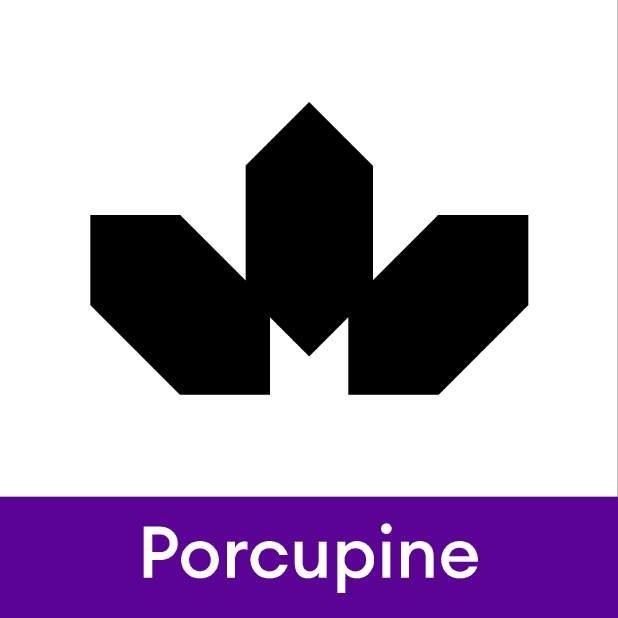
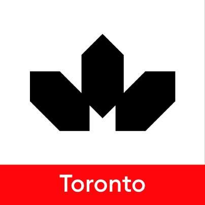
Branch Social Media Logos
Since social media profiles do not allow for much flexibility in constructing brand logos, a simplified version is required. In this simplified version, the brand symbol is placed atop a rectangular background that includes the branch name, as illustrated in the following examples.
CIM ICM Brand Book - 2024
30
Branch Social Media Logo
Construction
To create this version of the branch logo, we take the rectangular background containing the branch name from the full branch logo and position it at the bottom of a square. Only the symbol is visible on top, centered and aligned within the white space.
The amount of space on the right and left of the symbol is directly proportional to the square created within the mineral shape, as demonstrated in the example.
The size of the text should be increased 40% to improve visibility.
CIM ICM Brand Book - 2024
31 Original
Branch Logo
Branch social Media logo
Construction
Colour Palette
CIM ICM Brand Book - 2024 43
Colour Palette – Primary
Our primary colour palette consists of Black, Navy Blue and White.
R: 20 G: 20 B:60
C: 99 M: 95 Y: 42 K:53
Pantone: 2766 C
#14143C
CIM ICM Brand Book - 2024
BLACK
#000000 NAVY BLUE
33
WHITE
#FFFFFF
Colour Palette – Secondary
Our secondary colour palette consists of a multitude of tones that can be used as background colours or graphic compositions on marketing and promotional material, on social media or on the web.
It is important to only use one colour at a time and to not use the colours for typography. The typography and/or logo should always be set in black or white and should sit on colours that create enough contrast for legibility.
#F7BD13
#FF6204
#980003
#47932A
#0B7392
#5A0394
#FBDE89 #FFB081 #9BDB82 #FF4C50 #5BD0F2 #3B50F0 #B64FFB #A4ABC3
#BCE7AC #FCE9B0 #FFCBAB #FF888A #4878F0 #7ACF58 #92E0F7 #CE8AFC #BAC0D2 #FAD362 #FF9658 #2E3CB4 #DEF3D5 #FF1015 #24C1EE #9E15FA #7B8193 #55A0F0 #FEF4D8 #FFE5D5 #FFC3C5 #C8EFFB #E7C4FE #D1D5E1 34 CIM ICM Brand Book - 2024
#14143C #292B31
#F9C83A #5BBC36 #FF7C2E #D30005 #212878 #0F9EC8 #7D05CE #525662
Dos and Don’ts
The following are rules and examples of how to use the colours on the colour palette.
When applying a colour from the colour palette, the background colour should be carefully considered on a caseby-case basis.
Rules:
1. Make sure the contrast between text colour and background colour does not compromise legibility. If choosing a light-coloured background, opt to use black text. Or, if choosing a dark-coloured background, opt to use white text.
2. Do not use colour for text, other than black or white.
3. When choosing a colour for any graphic material, do not combine colours on the graphic material. Choose only one colour for consistency.

CIM ICM Brand Book - 2024
Lorem Ipsum
Lorem Ipsum
Lorem Ipsum
1. 2. 3. 35 Lorem
Lorem ipsum dolor sit amet, consecteturous adipiscing.
Lorem Ipsum
ipsum dolor sit amet, consecteturous adipiscing.
Typography
CIM ICM Brand Book - 2024 47
Euclid Circular A Medium
The medium weight should be used for headlines, as well as for marketing and promotional material.
The core CIM typeface is Euclid Circular. It is at the heart of the CIM identity and is the foundation for all branding elements and collateral. Distinctive and legible, its simplicity of form allows it to be applied in various ways.
Each typographic element contributes to the successful rendition or the overall style. Consider the text alignment,
line spacing, together with consistent methods of emphasis and hierarchy.
The Euclid Circular font family can be found here:
https://www.swisstypefaces.com/fonts/euclid/ #Circular%20A
In case Euclid is not available, please free download and install Poppins typeface family from here:
https://fonts.google.com/specimen/Poppins
CIM ICM Brand Book - 2024
AaBbCc
37
Euclid Circular A Regular
The core CIM typeface is Euclid Circular. It is at the heart of the CIM identity and is the foundation for all branding elements and collateral. Distinctive and legible, its simplicity of form allows it to be applied in various ways.
The regular weight should be used for setting longer pieces of text. When the use of Euclid Circular is not possible, please use Arial or Helvetica.
Each typographic element contributes to the successful rendition or the overall style. Consider the text alignment,
line spacing, together with consistent methods of emphasis and hierarchy.
The Euclid Circular font family can be found here:
https://www.swisstypefaces.com/fonts/euclid/ #Circular%20A
In case Euclid is not available, please free download and install Poppins typeface family from here:
https://fonts.google.com/specimen/Poppins
CIM ICM Brand Book - 2024
AaBbCc
38
Type Hierarchy
Type hierarchy has a major affect on legibility and influences the look of the final piece. It should be carefully considered and well executed to achieve a clean result.
Titles should always be set in Euclid Circular A Medium. Subtitles and text should be set in Euclid Circular A Regular. Subtitles should be at least 20% smaller than titles. For instance, if the title is set to 40 points, the subtitle should be set to 32 points or less. In order to maintain consistency, the use of uppercase is strongly discouraged.
Line height should always be set to 144% of the font size.
Statement of Cash Flows
Financial Statement
Lorem ipsum dolor sit amet, consectetur adipiscing elit. In malesuada tincidunt sapien, at semper risus ultrices vel. Quisque tristique felis in leo placerat porttitor. Aliquam a quam tortor. Praesent vel cursus justo. Duis metus erat, elementum eu euismod id, consequat id ex. Vestibulum ante dui, pharetra quis pharetra id, congue nec dolor. In ac quam commodo, interdum velit quis, imperdiet felis. Nulla faucibus a metus quis maximus. Morbi semper rutrum eros, at feugiat purus rhoncus a. Cras viverra ultricies vulputate. Ut lobortis sapien in ipsum volutpat, ornare dapibus turpis consectetur. Nunc tincidunt quis risus ut luctus. Sed vitae nisi nibh.
Title
Euclid Circular A
Medium Subtitle
Euclid Circular A
Regular Body
Euclid Circular A
Regular CIM ICM Brand Book - 2024
39 x x 0.5x
Statement of Cash Flows
Financial Statement
Lorem ipsum dolor sit amet, consectetur adipiscing elit. In malesuada tincidunt sapien, at semper risus ultrices vel. Quisque tristique felis in leo placerat porttitor. Aliquam a quam tortor. Praesent vel cursus justo. Duis metus erat, elementum eu euismod id, consequat id ex. Vestibulum ante dui, pharetra quis pharetra id, congue nec dolor. In ac quam commodo, interdum velit quis, imperdiet felis. Nulla faucibus a metus quis maximus. Morbi semper rutrum eros, at feugiat purus rhoncus a. Cras viverra ultricies vulputate. Ut lobortis sapien in ipsum volutpat, ornare dapibus turpis consectetur. Nunc tincidunt quis risus ut luctus. Sed vitae nisi nibh.
STATEMENT OF CASH FLOWS
Financial Statement
Lorem ipsum dolor sit amet, consectetur adipiscing elit. In malesuada tincidunt sapien, at semper risus ultrices vel. Quisque tristique felis in leo placerat porttitor. Aliquam a quam tortor. Praesent vel cursus justo. Duis metus erat, elementum eu euismod id, consequat id ex. Vestibulum ante dui, pharetra quis pharetra id, congue nec dolor. In ac quam commodo, interdum velit quis, imperdiet felis. Nulla faucibus a metus quis maximus. Morbi semper rutrum eros, at feugiat purus rhoncus a. Cras viverra ultricies vulputate. Ut lobortis sapien in ipsum volutpat, ornare dapibus turpis consectetur. Nunc tincidunt quis risus ut luctus. Sed vitae nisi nibh.
DO NOT use all caps for titles
DO NOT remove the spacing above and below text elements
DO NOT use bold on body text.
CIM ICM Brand Book - 2024 Do’s Don’ts
40 1. 2. 3.
Graphic Compositions
CIM ICM Brand Book - 2024 52
Graphic Compositions
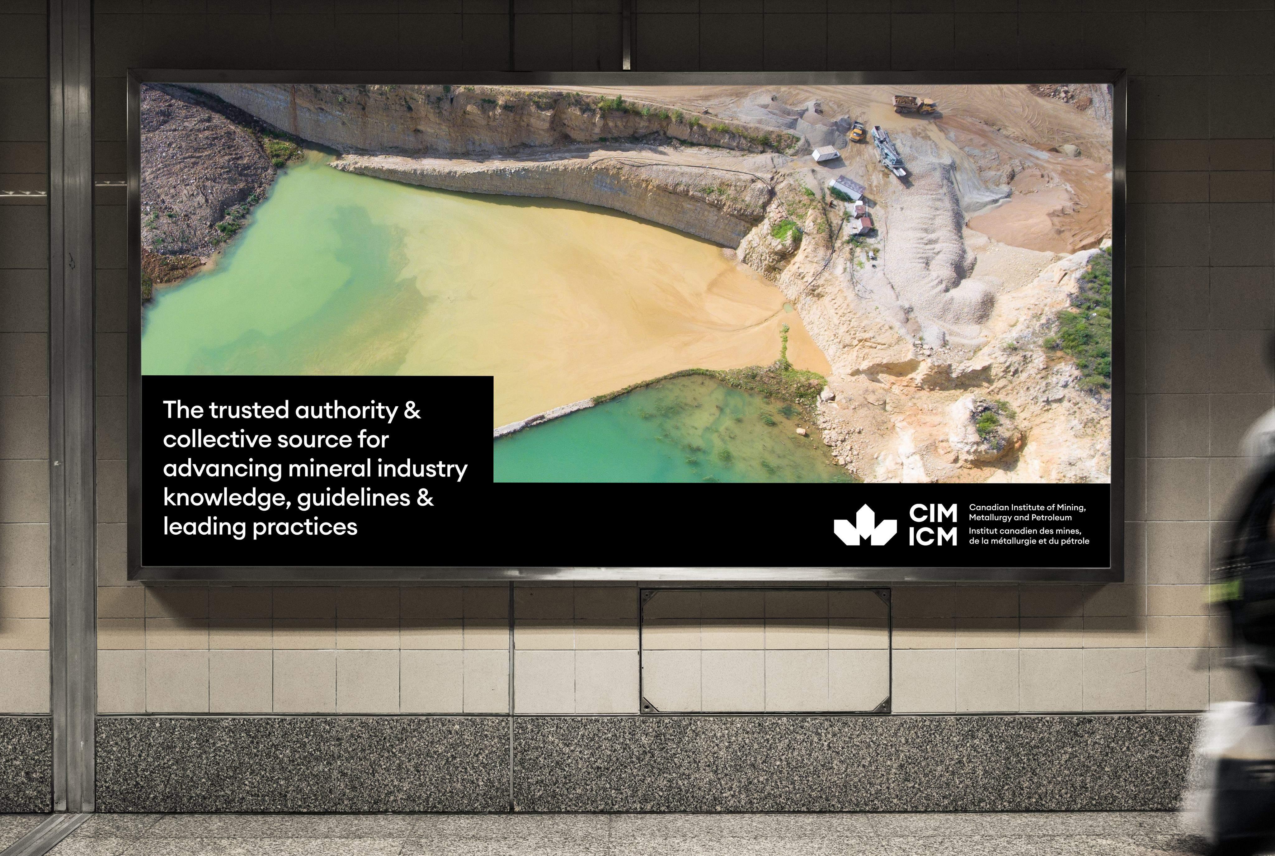
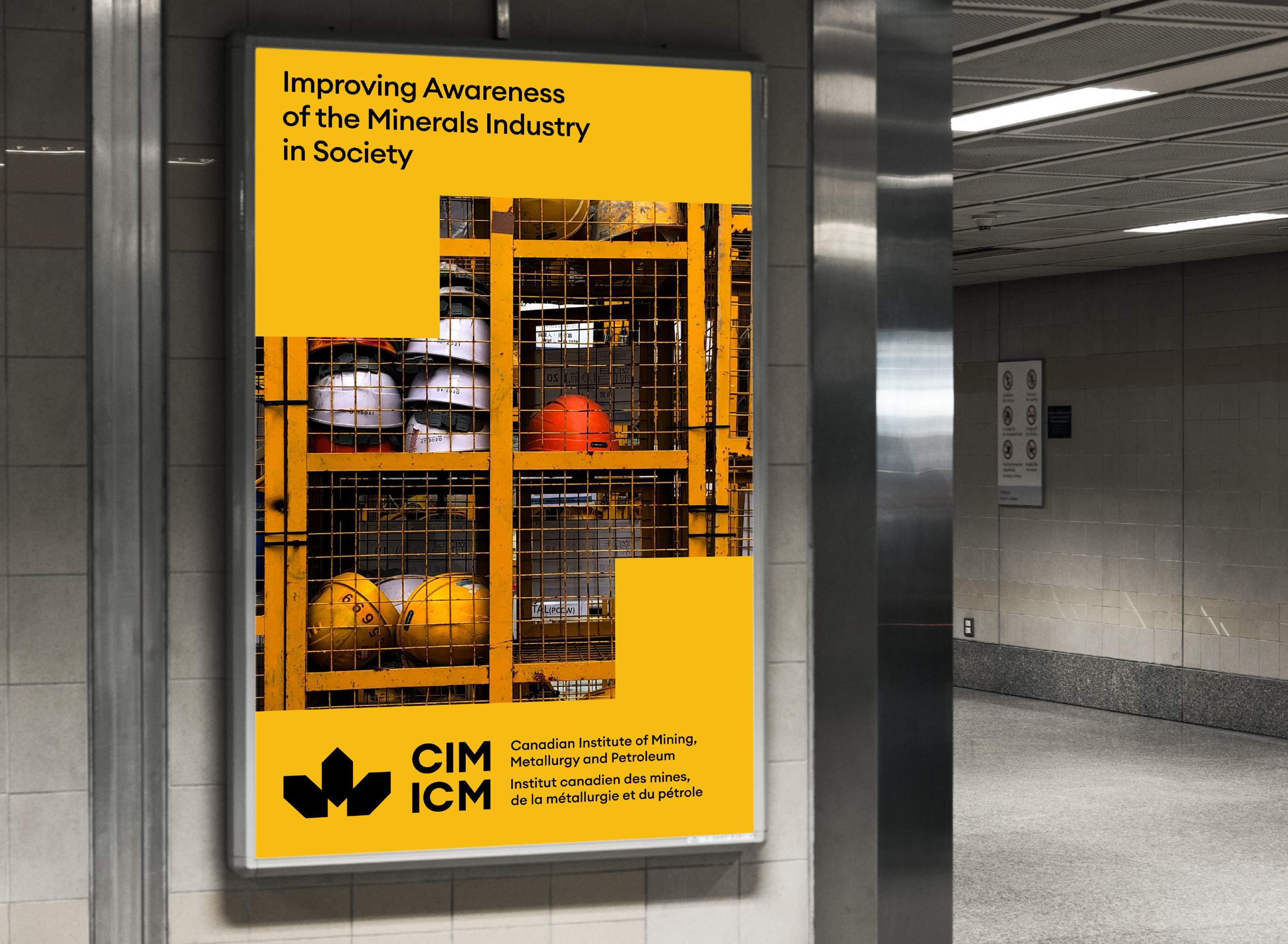
A key item of the CIM brand that is used throughout several collateral pieces is the modular block system.
The system is designed to create an infinite amount of layouts, based on the size of the document.
The colour blocks in which the text and logo can sit
should add up to a total of 50% of the document’s height and 40% of the document’s width, or vice versa.
The colour blocks can be divided in an infinite amount
of ways and sizes, as long as spacing, hierarchy and legibility are considered.
The image should always sit behind the block(s) of
colour and should take up 100% of the height and
width of the page.
You can find some examples of layouts here and more detailed examples on the next page.
CIM ICM Brand Book - 2024 42
Lorem Ipsum

Lorem ipsum dolor sit amet, consecteturous adipiscing.

Lorem Ipsum
CIM ICM Brand Book - 2024
Lorem ipsum dolor sit amet, consectetur adipiscing elit. Nullam fermentum pellentesque arcu ac eleifend. Fusce imperdiet, est a pharetra pulvinar, purus neque semper arcu, sit amet auctor risus nisl vitae nisl. Duis condimentum euismod urna vitae pretium. Ut vitae urna sit amet mi elementum hendrerit non sed nulla. Integer iaculis accumsan imperdiet. Donec sed tristique sapien, non laoreet lacus. Praesent sapien velit, volutpat sed cursus vel, cursus a nisi. Nulla auctor massa leo, ac facilisis ante feugiat fermentum. Donec aliquet suscipit metus, in consequat quam porttitor eget. Donec sed tristique sapien, non laoreet lacus. Praesent sapien velit, volutpat sed cursus vel, cursus a nisi. Nulla auctor massa leo, ac facilisis ante feugiat fermentum. Donec aliquet suscipit metus, in consequat quam porttitor eget.
elit.
Lorem ipsum dolor sit amet, consectetur adipiscing
Lorem ipsum dolor sit amet, consectetur adipiscing elit. Nullam fermentum pellentesque arcu ac eleifend. Fusce imperdiet, est pharetra pulvinar, purus neque semper arcu, sit amet auctor risus nisl vitae nisl. Duis condimentum euismod urna vitae pretium. Ut vitae urna sit amet mi elementum hendrerit non sed nulla. Integer iaculis accumsan imperdiet. Donec sed tristique sapien, non laoreet lacus. Praesent sapien velit, volutpat sed cursus vel, cursus nisi. Nulla auctor massa leo, ac facilisis ante feugiat fermentum. Donec aliquet suscipit metus, consequat quam porttitor eget. Donec sed tristique sapien, non laoreet lacus. Praesent sapien velit, volutpat sed cursus vel, cursus nisi. Nulla auctor massa leo, ac facilisis ante feugiat fermentum. Donec aliquet suscipit metus, in consequat quam porttitor eget.
43

Improving Awareness
of the Minerals Industry
in Society
Imagery
CIM ICM Brand Book - 2024 58
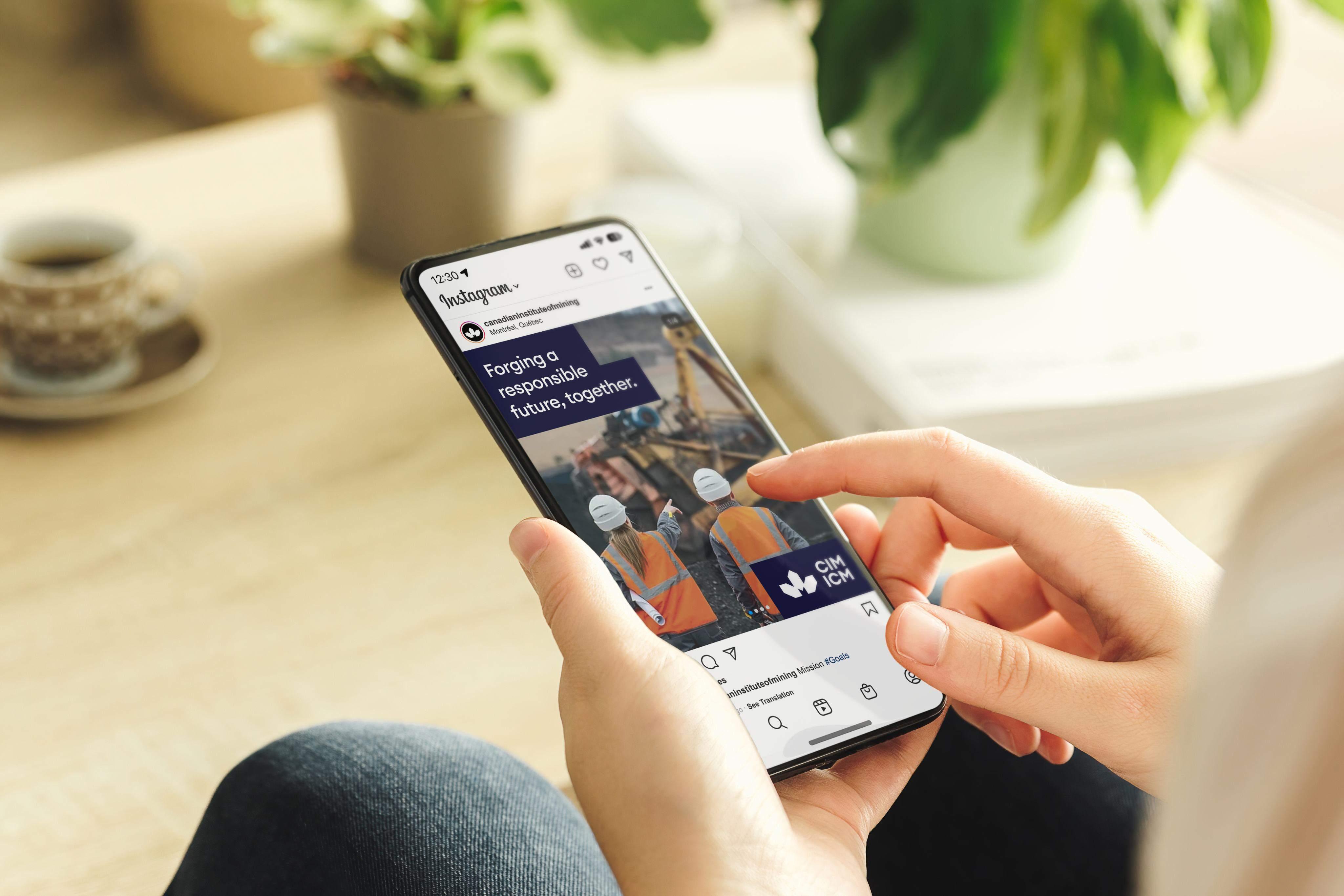
Imagery
Our imagery is meant to project our overall messaging and brand essence. It serves as a clear identifier of our industry and core values. We are inspired by our brand colours and try to find them within the imagery we use to evoke the same characteristic to keep a consistent look and feel in our
visual identity.


CIM ICM Brand Book - 2024
48


49
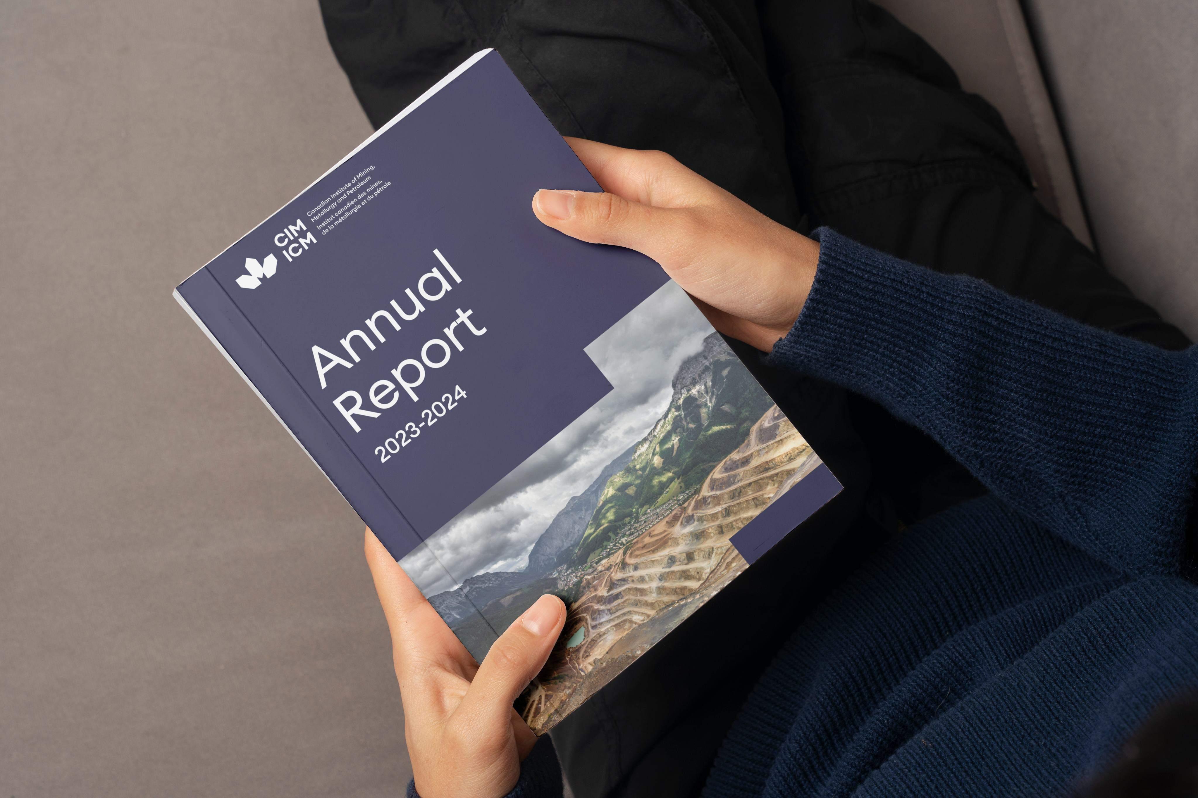
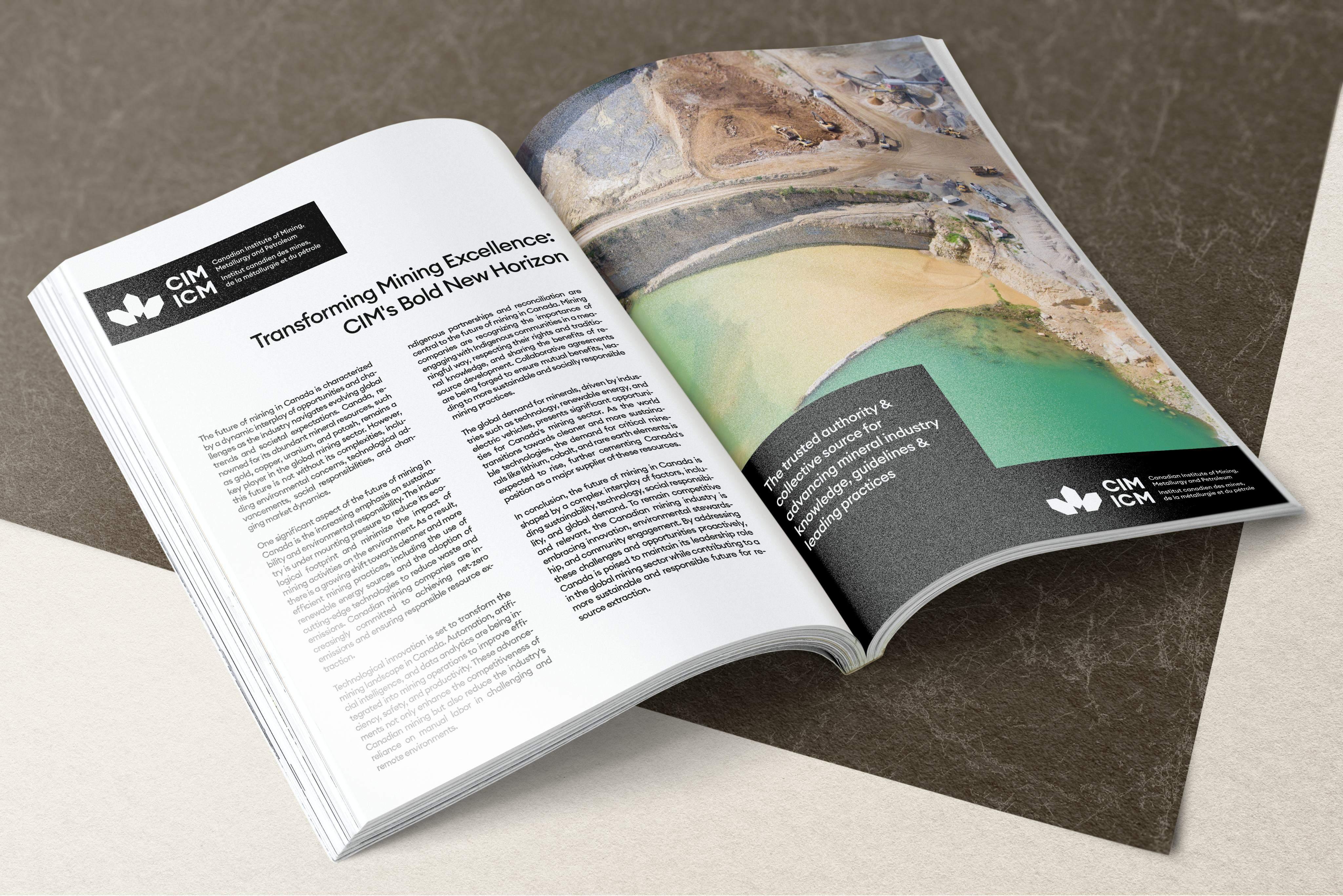
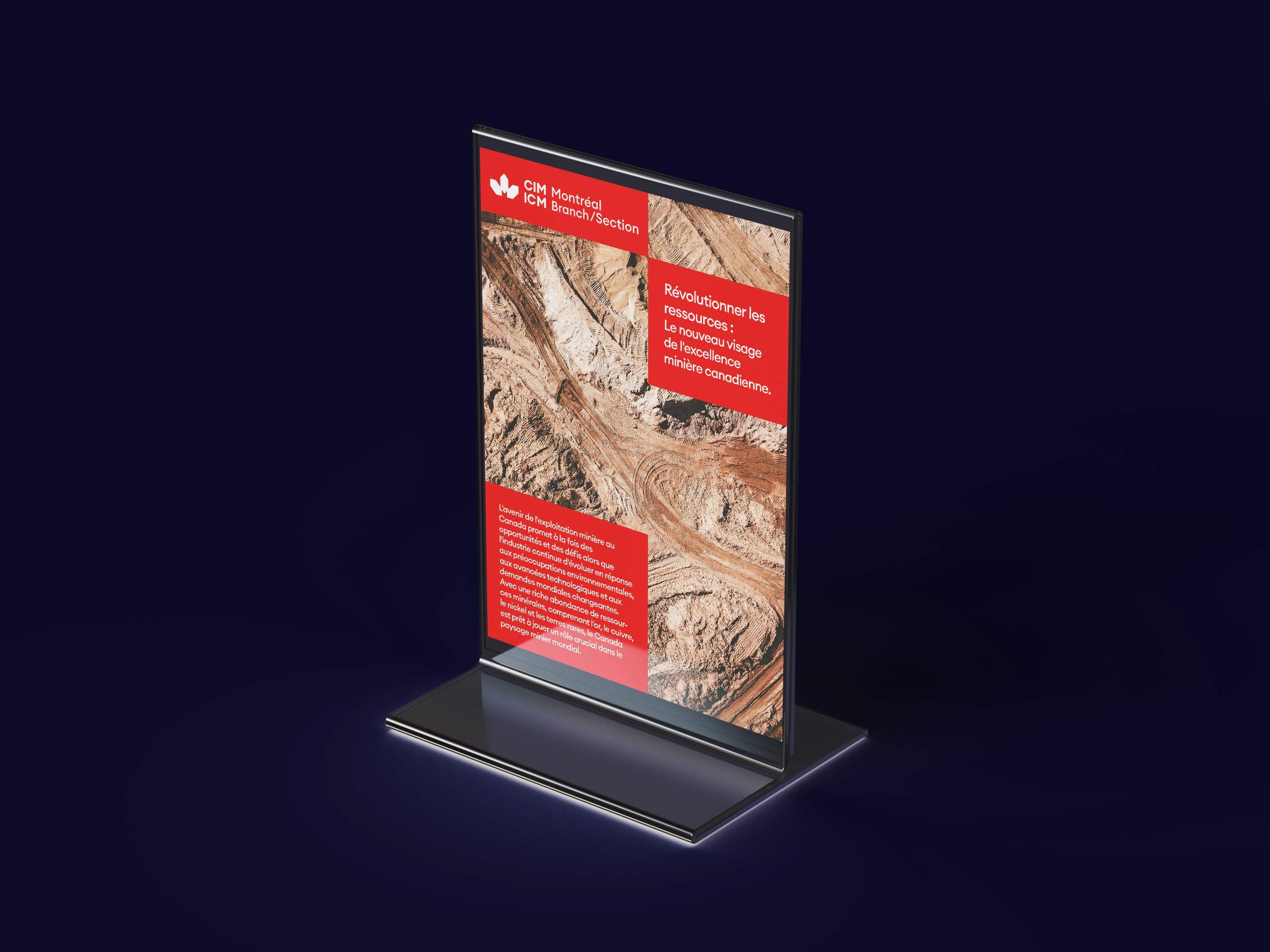
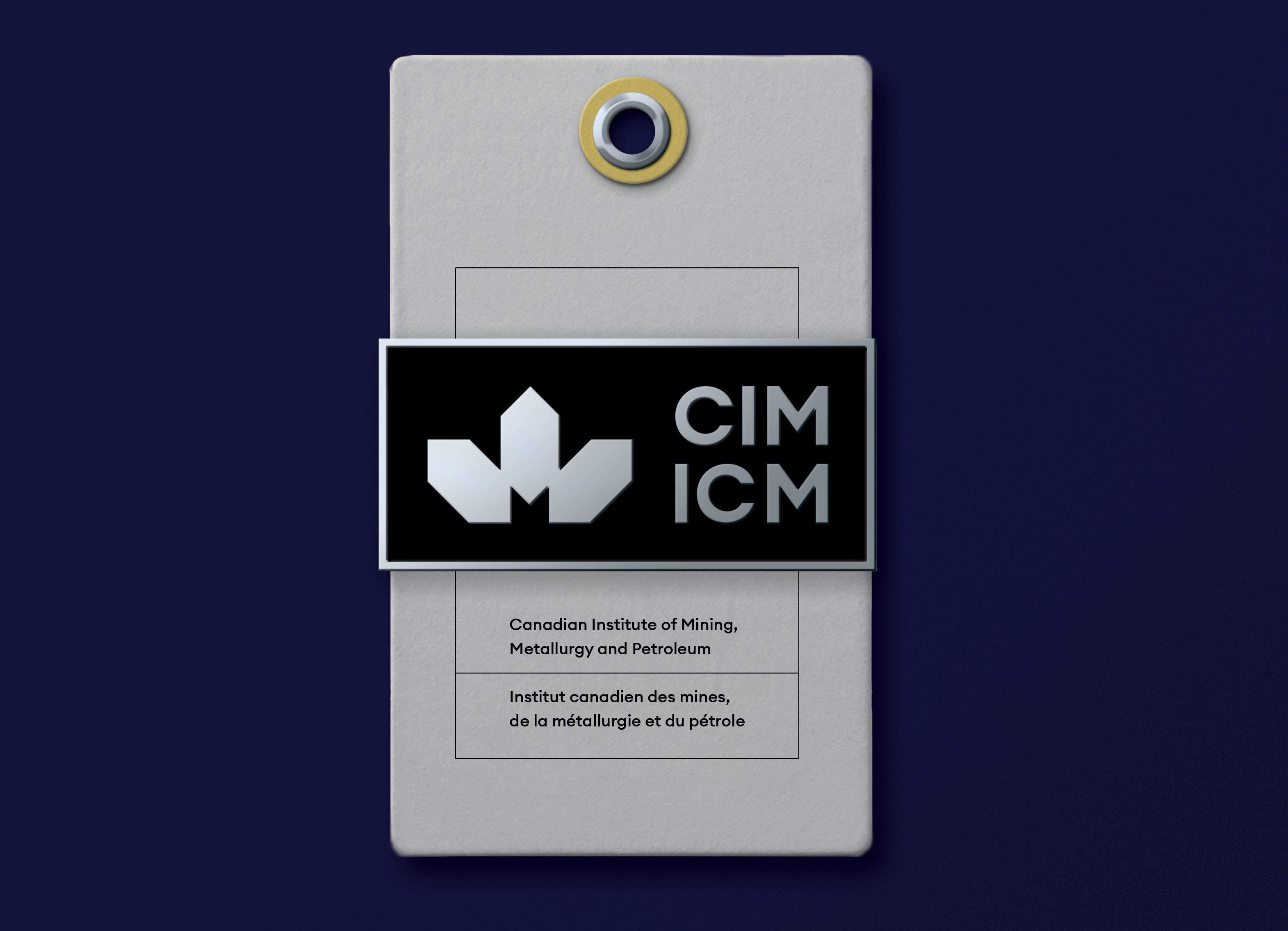
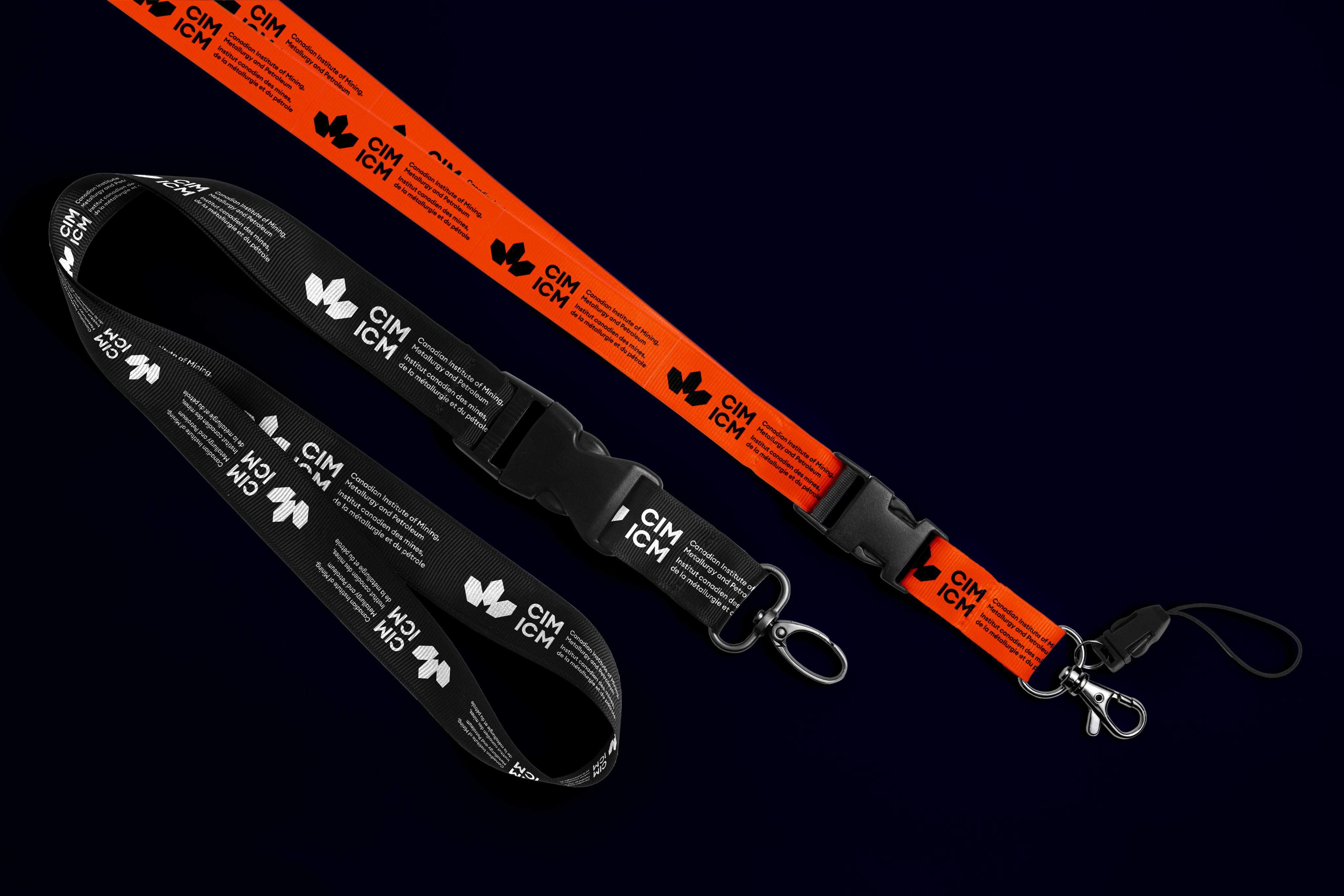
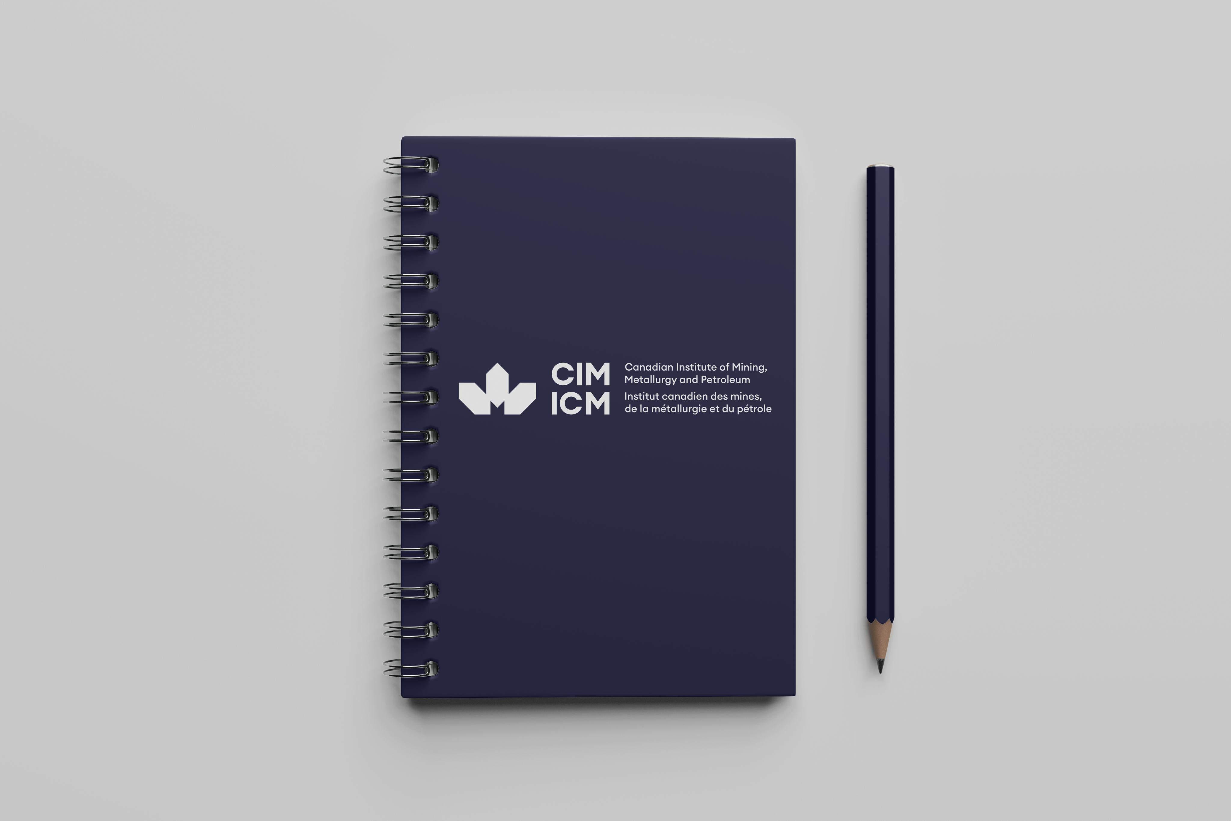
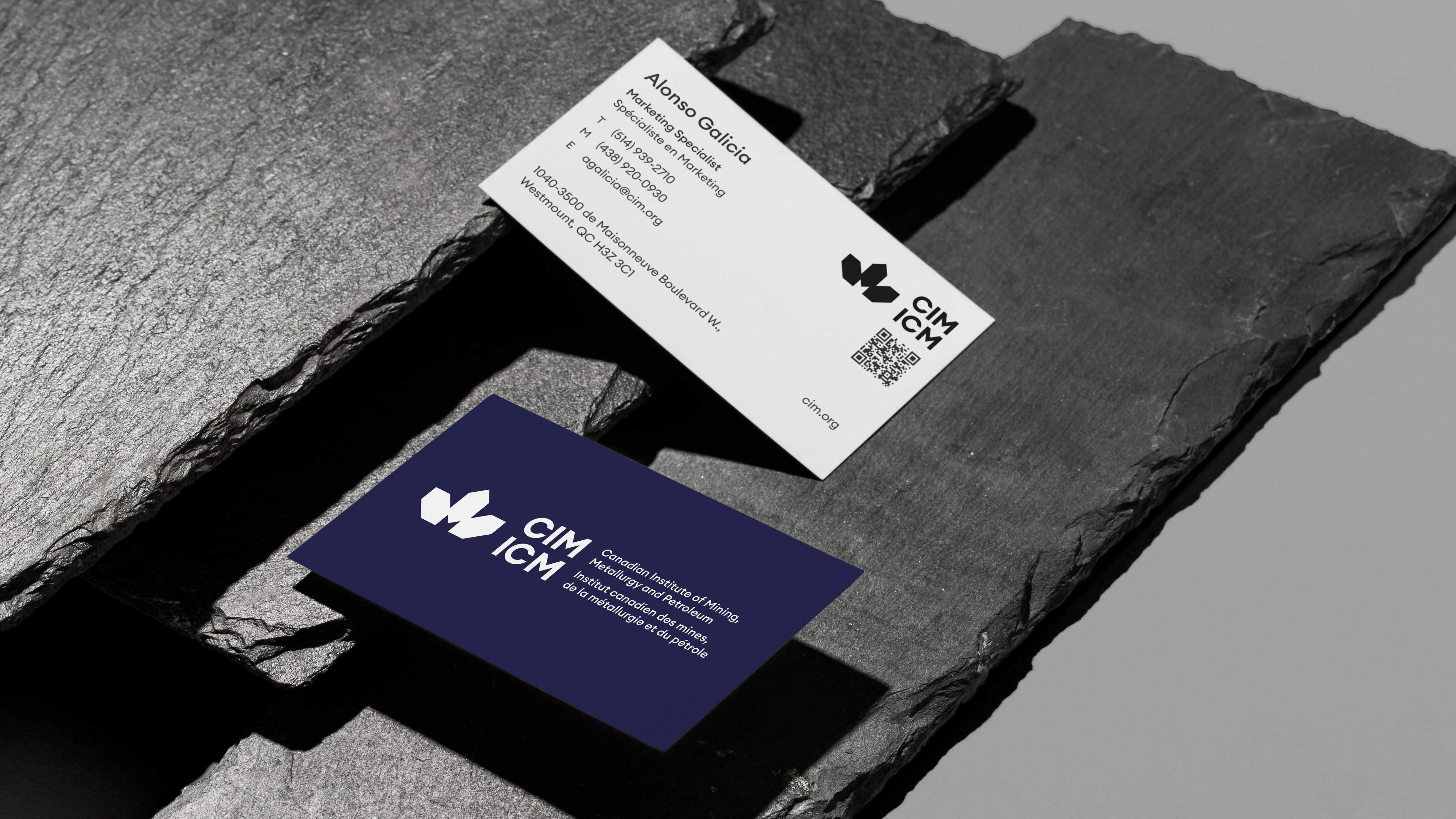
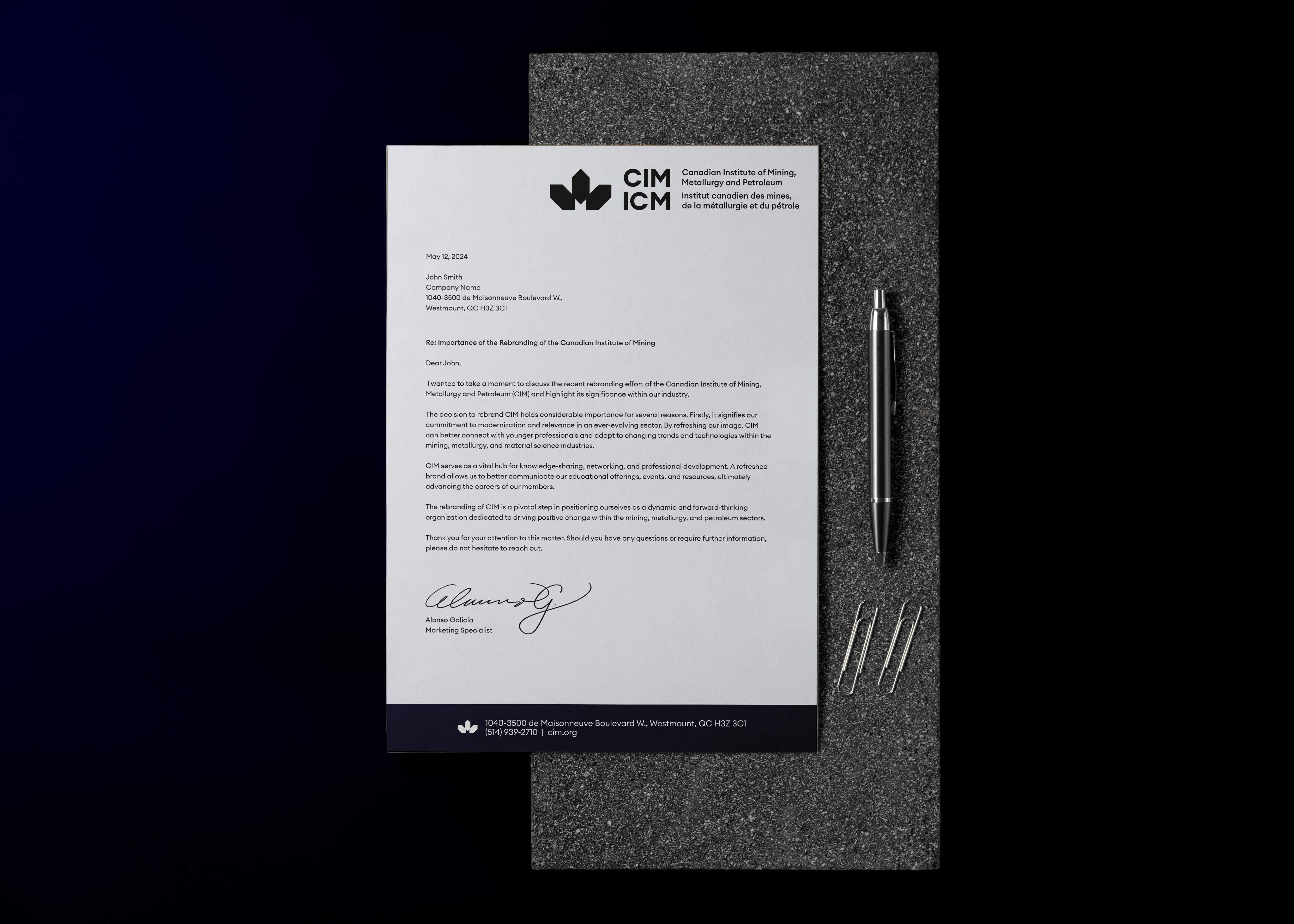
Brand Activations
CIM ICM Brand Book - 2024 61
CIM ICM Brand Book - 2024
CIM ICM Brand Book - 2024
CIM ICM Brand Book - 2024
CIM ICM Brand Book - 2024
CIM ICM Brand Book - 2024

CIM ICM Livre de marque - 2024
CIM ICM Brand Book - 2024
CIM ICM Brand Book - 2024
CIM ICM Brand Book - 2024
CIM ICM Brand Book - 2024
CIM ICM Brand Book - 2024
CIM ICM Brand Book - 2024
CIM ICM Brand Book - 2024
CIM ICM Brand Book - 2024
CIM ICM Brand Book - 2024
© 2024. CIM ICM. All Rights Reserved.
