FORM Feeling.


TO MY PARENTS, THE SACRIFICES ENDURED BY MANY, DO NOT COMPARE TO THE ONES YOU BOTH WEATHERED IN YOUR LIFETIME I TOO, WILL WEATHER THROUGH
2
1
ARTIST Bio
BETTERTOGETHER
Past Partnerships, collabs, and features CREATIVE Statement


Christopher Reyes is a Toronto based creative visionary, and a true example of a modern day Multi-Hyphenate Creative
Educated at the Ryerson School of Interior Design, Christopher has always proven himself a leader of the pack when it comes to sifting out the stylistic noise and identifying the KEY Trends, Colours, Techniques, Applications, Textures, Nods, Undertones, Social Innuendoes, Typography and Products that will captivate, stick, and IDENTIFY and MEMORABLE to the the MARKET that matter
His 10+ years as a Creative Senior Leadership role in at HUDSON'S BAY, HUDSON'S BAY EUROPE expansion and HOME OUTFITTERS He led the entire retail company's Visual , Styling and Merchandising endeavours with one goal in mind to carve out a new and fresh "home destination" image for the retailer, so that HBC Department stores will be synonymous to TREND FORWARD and TOP OF MIND DESTINATION for Home Decor, Kitchen, OUTDOOR, and BRIDAL GIFT REGISTRY SHOP & TRADE SHOW events all throughout CANADA
Christopher's was on the CBC'S STEVEN and CHRIS Show as they highlighted the spaces of toronto's influential bloggers, and then hired on as part of the set dec team on "CBC's Special: A Christmas with STEVEN and CHRIS"
The TASTE LEVEL that is truly innate and a polished CURATED sense of self & style he has honed is sought after and has gained a following of over 10K on SOCIAL MEDIA and (instagram @ChristopherReyesDesign)
Described as a Multi-hyphenate Creative, Christopher Reyes strives to transcend the conventional boundaries of design, merging functionality with aesthetic innovation Rooted in a passion he sought a formal education in interior design and put in over a decade-long journey in national merchandise presentation management and corporate trend/styling/visual direction roles for notable mid to luxury brands, The workpresented on ChristopherReyesDesigncom is a testament to the fusion of creativity and practicality
‘My creations draw inspiration from the rich tapestry of experiences and interactions, reflecting a deep understanding of the ever-evolving dynamics of the design world Each piece is a manifestation of my commitment to not only meet but exceed expectations, offering a harmonious blend of form and function
Exploring a spectrum that ranges from contemporary minimalism to bold, expressive compositions, my portfolio mirrors the diversity inherent in design With a keen eye for detail and an unwavering dedication to craftsmanship, every project is a narrative woven with precision and passion
At the core of my artistic philosophy lies a belief in the transformative power of design It goes beyond the visual appeal; it is a visceral experience that influences emotions and enriches environments Through my work, I aim to evoke a sense of connection, inviting individuals to engage with spaces on a profound level
Christopher Reyes Design is not merely a showcase of creations but a journey into the intersection of functionality, innovation, and timeless aesthetics It is an invitation to explore the boundless possibilities that design offers, creating spaces that resonate with both purpose and beauty
Welcome to a realm where design is not just a visual endeavor but a sensory voyage, curated by Christopher Reyes


The wonderful brands, studios, publications and designers that Christopher Reyes Design has had an opportunity to partner with in various capacities Some featured my work, Others I’ve collaborated with,, publications that wrote about projects I’ve spearheaded. Thank you for the support -Christopher


B
For most Canadians, Hudson’s Bay Company is a name that has been a part of their ives for as long as they can remember The company, which is Canadas longest continually running department store, was established in 1670 Since that day two and a half centuries ago it has continued to expand and fine tune its innovative operations firmly establishing itself as a brand that its millions of customers love and trust Today, there are 90 Hudson’s Bay Company stores two outlet stores and thebaycom under the companys umbrella alongside the Home Outfitters brand in Canada and the Lord & Taylor brand in the United States ‘Home is the companys homewares department, and in 2014, it opened a newly designed space called Home on Seven, on the 7th floor of its Toronto Queen Street premises, that became one of five Global Honorees in the 2015 IHA Global Innovation Awards (gia)
Every year, a jury comprising editors and publishers of the leading home and houseawares trade publications around the world and four retail experts compare the merits of 25 retail stores that have been nominated as the finest in their country This year, the jury found Home on Seven to stand out from the nationa winners not only due to its exceptional use of attention-grabbing graphics and signage, but also for its inspiring visual merchandising, which has become synonymous with the company ’ s overall brand
As the Senior Vice President of Home Alison Coville says, the aim of Home on Seven was to “build upon our strength in the market as a home and leading Gift Registry destination and enhance the bridal experience by grouping all relevant and related businesses on the one floor including china housewares small electrical cookware and bakeware, décor, giftware, gift registry, the Birks and Godiva shops and concierge, creating a onestop shop for brides-to-be”
From the outset, the store’s mission was to make the experience of organizing a wedding stress-free and enjoyable To enhance the enjoyment factor and give the chosen warehouse space a residential loft-like feel it first had to be turned into a calming haven, so windows were created to let in natural light From there, the finest of details for each space in the store was considered
The gift registry space for example, is pivotal at Home on Seven, so it has become a stylish, welcoming space with a large consultation table and four private suites divided by glass walls The design created a shop-within-a-shop feel for casual dining, and after it was enclosed with a metal cage and dark distressed wood panel bases a classic storefront feel was achieved


All sections of Home on Seven had to have their own distinct character to make customers feel less overwhelmed which can often be part and parcel of a large department store experience The housewares section for instance is decked out with dark metals and woods and veined counter tops while light metals and white lacquer wood were applied in the china and gift registry section Concretefinish vinyl tiles were used in the store aisles and warm vinyl wood planks were used in the casual dning area
Everything about Home on Seven is about achieving warmth relaxation and the wecoming feel people have when they enter the home of a friend or family member In the gift registry area a whitewash wood composite floor was laid and accents of powder blue were applied to the walls to bring out the original black-trimmed warehouse windows
The meticuous planning regarding the store’s design was something that impressed a of the judges with special note being made of the fully-equipped modernized demonstration kitchen imbued with an old-world European feel; the suspended distressed pine wood slat ceiling; the placement of interesting pieces of furniture oozing character to create a residential fee and the smattering of inspiration boards to highlight home fashions from across the world
Home on Seven is al about making t easy for the customer to explore the store’s different areas and find new products while being continually inspred so ‘Trend Zones’ have been mapped out to ensure cohesive flow And first impressions do count so as soon as customers step out of the elevator or arrive at the top of the escalator they are visually stimuated and led from one exhibit of products to the next
One of the many stimulating set-ups in the store is the street-like zone that resembes a market running down the middle of the Casual Dning Department “This allows for strong trend seasona and occasion merchandse stores to be highlighted explans Coville And feature display tables within both the casua and forma dining departments provide a blank canvas for our visua merchandising teams to create inspiring entertainment presentations for customers to mimc in therownhomeswhenentertaining”
The fun use of colorful graphics and funky signage (often incorporating plays on words) throughout Home on Seven adds artistic flourishes while also giving customers something to ponder upon as they locate everything they need From lit-up vintage sgns to graphics created by an artist to emulate backboard scribb ngs directives are relaxing and hepfu again adding to the stress-free environment Betsy the much-oved lfe-szed red cow, for instance, standing by the entrance with a helpful floor plan painted on her side has become the stores icon and her fgure on canvas – Andy Warholstyle–canalsobefoundthroughoutthestore
Each year, Hudson’s Bay Company pubishes four Home’ catalogs that are high quality magazinestye publications Fans of the company love them and they are styled shot and written by some of Canada’s best publishing talent Products from Home on Seven are regularly featured in the catalogs sending the Hudson’s Bay Company message further afied filing Canadians with endless nspration
That message is a cear and strong one: Hudson’s Bay Company makes shopping a wonderful stress-freeexperience withsomefunandfrivo tythrowninforgoodmeasure
“
…
-are two of the many things the jury loved about the stylish Canadian haven to include them as one of the 2015 gia global honorees

PROJECT/HUDSONSBAYTORONTOFLAGSHIP HOMECOMMODITIIES “RIGHTSIZING’
7THFLOOROFTHESIMPSONTOWER,TORONTO ASIT’SNEWHOMEANDONESTOPMARKET CONCEPTANDSTYLE”;

7THFLOOROFTHESIMPSONTOWER,TORONTO ASIT’SNEWHOMEANDONESTOPMARKET CONCEPTANDSTYLE”; PROJECT/HUDSONSBAYTORONTOFLAGSHIP HOMECOMMODITIIES “RIGHTSIZING’

HUDSONS BAY DOWNTOWN TORONTO
HUDSONS BAY DOWNTOWN TORONTO


HUDSONS BAY DOWNTOWN TORONTO


HUDSONS BAY DOWNTOWN TORONTO


HUDSONS BAY NEW STORE OPENING


+ CREATIVE DIRECTION
+ GRAPHIC DESIGN AND PRODUCTION
+ VENDOR MANAGEMENT
BUFFALO CHECK HOLIDAY CHARM

+ CREATIVE DIRECTION
+ GRAPHIC DESIGN AND PRODUCTION
+ VENDOR MANAGEMENT


+ CREATIVE DIRECTION
+ GRAPHIC DESIGN AND PRODUCTION
+ VENDOR MANAGEMENT


HBC IN AMSTERDAM / HUDSONS BAY ‘S FIRST INTERNATIONAL VENTURE CHOSEN AS LEAD TRAINER VISUAL AND STYLIST, MYSELF AND A SELECT 6 OTHER PEERS SET OFF TO EUROPE IN AMSTERDAM, NETHERLANDS HBC REVAMPED AND OCCUPIED 3-4 BUILDINGS RIGHT IN CITY CENTRE EACH OF THE BUILDINGS ARE EXTREMELY UNIQUE AND NO TWO ARE ALIKE, THE HISTORIC BUILDING IN THE IMAGE TO THE LEFT WAS SOLELY DEVOTED TO BABY, TODDLER ABD YOUTH COMMODITIES


LAYOFTHELAND/ALLHOMEDEPARTMENTSSUCHASDÉCOR COOKWARE DINNERWARE ANDEVENSTATIONERYWASPLANNEDALLUNDERONEHISTORIC ROOFJUSTASTONESTHROWAWAYFROMTHEAPPARELBUILDINGS THISMADESHOPPINGFORYOURHOMEAONESTOPDESTINATION SETINWHATUSEto BEAMEATSLAUGHTERFACTORY THESOARINGHIEGHTSOFTHIS RUSTICLOFTONVERSIONALLOWEDFOR4FLOORSOFRETALSPACEANDOFFCES


CARVINGOUTSOMECANADIAN EGVINGALITTLE CANADIANKNOD WEHADTHECHALLENGEINBREAKNGUPAQUITE NARROWPORTIONOFTHEBUILDNG MERCHANDISE N THISSECTIONAREGADGETSANDSTATIONERY
WECREATEDAVISUALHIGHLIGHTDOWNTHECENTRE BYANCHORINGALIFESIZEDCANOEFROMTHEMETAL RAFTERS THSVISUALLYCARVEDOUTAMN HIGHLGHTOPPORTUNITY ISNCETHESIGNATURE STRIPESHOPWASTUCKEDAWAYAND LOCATED AT THEVERYBACKOFTHEBUILDNG WECREATEDAN OUTPOSTWITHTWOFORMS
PROJECT / HBC EUROPE – HOME DEPARTMENT
(PHOTO RIGHT) GADGET AND STATIONERY AISLE
CREATED A HBC STR PE OUTPOST H GHL GHT
USOING S USPEN
(PHOTO BELOW) HAYS BRAND SETS UP SHOP
AROUND THE ORIGINAL ART DECO MA N FLOOR
ELEVATOR SHAFT


PROJECT&STRATEGY/WITHNTHISHISTORCREPURPOSEDBULDINGWHICHONCEWAS USEDASAMEATBUTHERINGMLL SNOWAONESTOPDESTINATIONWHENSHOPPINGFOR ONESHOME COMMODITESSUCHASDÉCOR COOKWARE DINNERWARE ANDEVEN STATONERYWASPLANNEDALLUNDERONEHISTORICROOFJUSTASTONESTHROWAWAY FROMTHEAPPARELBUILDINGS THSMADESHOPPINGFORYOURHOMEAONESTOP DESTINATION SETINWHATUSETOBEAMEATSLAUGHTERFACTORY,THESOARINGHIEGHTS OFTHISRUSTCLOFTONVERSONALLOWEDFOR4FLOORSOFRETALSPACEANDOFFCESIN THEBADK
TWESTYLEDACUSTOMGRDLIKEMONDRANSTRUCTUREWTH NTERCHANGINGPANELSALLOW
FOREASE ANDVERSATILITY NSEASONALFLOORCHANGES PLACINGATABLE NTHECENTRE
GIVESUSTHEOPPORTUNITYTOLIFESTYLETHEMANENTRYGVNGOURCUSTOMERSA WOW
MOMENTUPONENTRY FORGRANDOPENINGWEWENTABITARTSYANDCONCEPTUALTHAN NORMAL CREATING A MUSEUMLIKE NSTALLATIONWHEREAMXOFVISUALPROPPINGAND MERCHANDISEDARESTYLED TOPERFECTION THEIDEAWASLOCAL GUESTSARTST/STYLT WOULDBEINVTEDTOSUBMITPROPOSALSPERSEASONONHOWTHEYWOULD MAGNEA SEASONALDREAMTABLESCAPE


WE ENSURED THERE WAS A DESTNATON FOR BOOKSALWAYS ADDING WARMTH AND CHARACTER TO A LFESTYLED ENVIRONMENT BOOKS PLAY SUCH AN IMPORTSNT ROLE N SETTING THE TONE HAVNG BOOKS ALSO GAVE US THE OPPORTUNTYU TO USE VARIOUS TITLES TO CROSS MERCHANDISE WITHIN OUTPOSTS THROUGHOUT THE STORE DISPAYED AMONSGST STYLED MANNQUNS FURNITURE HOME & DECORINACKLEANINIMALCHICSEASONALTRENDVIGNETTE

“FIND YOUR STYLE AND SCAN””


“FIND YOUR STYLE AND SCAN””


CREATIVE DIRECTION & VISUAL DESIGN


PROJECT/SPRNG 2020 ALL STORE - NATONAL SPRNG TABLETOP VISUAL DRECTON FOR HUDSONSBAYSTORES
SITUATED NDNNERWAREANDDÉCORTRENDASLE NALLHOUSEWARESDEPARTMENTS
IPRODUCEDANDDESGNED DSTRBUTEDCREATVEASSETSTOSUPPORTSETUPASWELL
AS MERCHANDISNG AND STYLNG GUDELNES COMMUNICATED NATIONALLY FOR INDVIDUALSTORESTOFOLLOW


CREATIVE DIRECTION & VISUAL DESIGN

SPRINGTREND
FEATURETABLES
VISUAL
MERCHANDISING
ANDSTYLING
DIRECTIVE


CREATIVE DIRECTION & VISUAL DESIGN


CREATIVE DIRECTION AND PRODUCTION FALL TREND TABLESCAPE
COLOR PALETTE DISCUSSION FOR THIS FALL SEASON OUR AIM WAS TO PRESENT COLORS THAT ARE DELICIOUS ENTICING, AND TRULY TANTALIZING – THE KIND THAT AWAKENS YOUR TASTE BUDS WITH VIBRANT REDS LEADING THE WAY, WE SHOWCASED OUR BEST COLOR BLOCKS ALONGSIDE SLEEK AND MINIMALISTIC MERCHANDISING +


COLOUR PALETTE FOR FALL: INDULGENT, TEMPTING, AND MOUTHWATERING THIS SEASON WE AIMED TO PRESENT COLORS THAT ARE DELICIOUS AND IRRESISTIBLE, THE KIND THAT EXCITES YOUR SENSES VIBRANT RED HUES AND HOT COLORS WERE SHOWCASED IN STUNNING COLOR BLOCKS, COMPLEMENTED BY SLEEK AND MINIMALISTIC MERCHANDISING


PROJECT / WWW CHRISTOPHERREYESDESIGN COM OBJECTIVE / AN ONLINE PRESENCE OF MY WORK AND STOREFRONT BELOW / THE INTERFACE MOCK UP OF VARIOUS LANDING PAGES AS WEL AS PRODUCT SHOTS AND PRODUCT PAGES

OBJECTIVE / ONLINE THE CHARACTERISTICS OF A MAGAZINE COVER THEN RE WORK THE MAGAZINE COVERS LANDING PAGES OF MY WEBSITE


TYPE AND IMAGE EXCERCISE

R E - C O V E R O F V O G U E
RE CREATE AN EXISTIONG VOGUE COVER CHANGE AND SWAP OUT ELEMENTS FOR DIFFERENT NARRATIVE


TYPE AND IMAGE EXCERCISE, EDITORAIL CAMPAIGN SHOT


CHRISTOPHER REYES FOR BETTENCOURT MANOR


E-COMMERCE CREATIVE MATERIAL TO PROMOTE AND SHOP COLLECTION VIA SOCIAL MEDIA AND EMAIL MARKETING


JANUARY 2022 GLUCKSTEIN HOME POP UP


+ CREATIVE DIRECTION
+ VM SET UP GUIDE
+ SHOP,GRAPHICS,SIGNAGE, AND STYLING


CHARACTERS THROUG ILLUSTRATION


PRODUCT LAUNCH / ON ECO BEDD NG MADE FROM PLASTIC
WATER BOTTLES
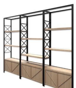
PROJECT / SEASONAL SHOP CREATIVE DESIGN –MERCHANDISING WAYFINDING SIGNAGE, & OUTPOSTS


PROJECT/BACKTODORMSEPTEMBERFURNTURE
HGHLIGHT WANTEDTOHIGHLIGHTTHEASORTMENTOF COMPACTMULTIFUNCTIONALPIECESOFFURNITURETHEHBC CARREDBYREPLCATNGADOWNTOWNCONDO BLUEPRINT
+CREATIVE DIRECTION
+VENDOR MANAGRMENT
+GRAPHIC SIGNAGE DESIGN +COLLATERAL PRODUCTION

CITY HOMES SHOP BACK TO DORM EVENT


COST EFFECTIVE AND OVERSIZED LETTERING TO ECHO

OVERSIZED DIRECTIONAL QUOTES / HBC EUROPE –BRIOUGHT IN AN ESSENCE OF WHIMSY WITH IMPACTFUL COSR EFFECTIVE DIRECTIONAL SIGNAGE

+ + + V I S U A L
C O M M U N I C A T I O N
W A Y F I N D I N G
PROJECT HBC EUROPE NETHERLANDS
CREATIVE WAYFINDING SIGNAGE
MARKETING COLLATTERAL


LOBLAW OUTDOOR LIVING TREND


+ P R A C T I V A T I O N + E V E N T D E S I G N & P R O D U C T I O N
PROJECT / JOE FRESH HOME / LOBLAWS OUTDOOR LIVING MEDIA PREVIEW PR EVENT
OBJECTIVE / TO TRANSFORM THE LOBLAWS SHOWROOM INTO SA COLOURFUL EASTCOAST SUMMER CASUAL DESTINATION TO HOST A MYRIAD OF SOCIAL MEDIA INFLUENCERS AS WE TALK ABOUT WHAT EXCITING PRODUCTS WEVE DESIGNED DEVLOPED AND WILL SOON BE AVAILABLE IN STORES


PROJECT/JOEFRESHHOME/LOBLAWSOUTDOORLIVING MEDIAPREVIEWPREVENT
TRANSFORMING THE LOBLAWS SHOWROOM INTO A VIBRANT EAST COAST SUMMER CASUAL DESTINATION TO HOST NUMEROUS SOCIAL MEDIA INFLUENCERS WE WILL SHOWCASE
THE EXCITING PRODUCTS WE HAVE DESIGNED, DEVELOPED, AND WILL SOON BE AVAILABLE IN THEIR NEAREST LOBLAWS SUPERMARKET AISLES


AN EVENING TUSCAN AL FRESCO
PRESIDENTIAL DINNER
+ EVENT DESIGN & PRODUCTION
+ PROP SOURCING & STYLING
PROJECT / PRESIDENT OF HUDSONS BAY RICHAD
BAKER HOSTS A SEMI CASUAL AL FRESCO
DINNER WITH NVESTORS OFFERING A TUSCAN
THEMED MENU THE VISUALS PROPS AND DESIGN PLACED THEM AMONGST THE GLOW OF THE SETTING SUN AS THEY DINE UPON THE ROLLING HILLS BETWEEN V NYAARDS
OBJECTIVE/ TO TRANSFORM THE COURTYARD
LOCATED AT KLIENF ELDS CANADA NTO A TUSCAN
VILLA D NING EXPERIENCE F T FOR HBC S PRESIDENT
MR R CHARD BAKER
CREATIVE DESIGN / TAKING A QUE FROM THE TUSCAN CUISINE TO BE SERVED THE NIGHT OF WE TOOK A CHANCE FOR THE SAKE OF AMBIENCE AND TO TAKE ADVANTAGE OF THE SUMMER
WEATHER AND THE BEAUTIFUL CITY VIEW SKY
TERRACE OUR VERY OWN DESIGNERS DESIGNED TO BE PART OF THE KLEINFIELDS CANADA
EXPER ENCE THE VISUALS PROPING IMAGERY AND OVERALL EVENT DESIGN STRATEGY WAS FOR THEM TO FEEL LIKE THEY VE BEEN TRANSPORTED TO TUSCANY AND EXPERIENC NG D NNER AL FRESO AMONGST THE WARM GLOW OF THE SETTING M DSUMMERNIGHTS SUN AS THEY D NE AND S P VINO UPON THE P CTURESQUE ROLLING H LLS SITUATED BETWEEN VINYAARDS


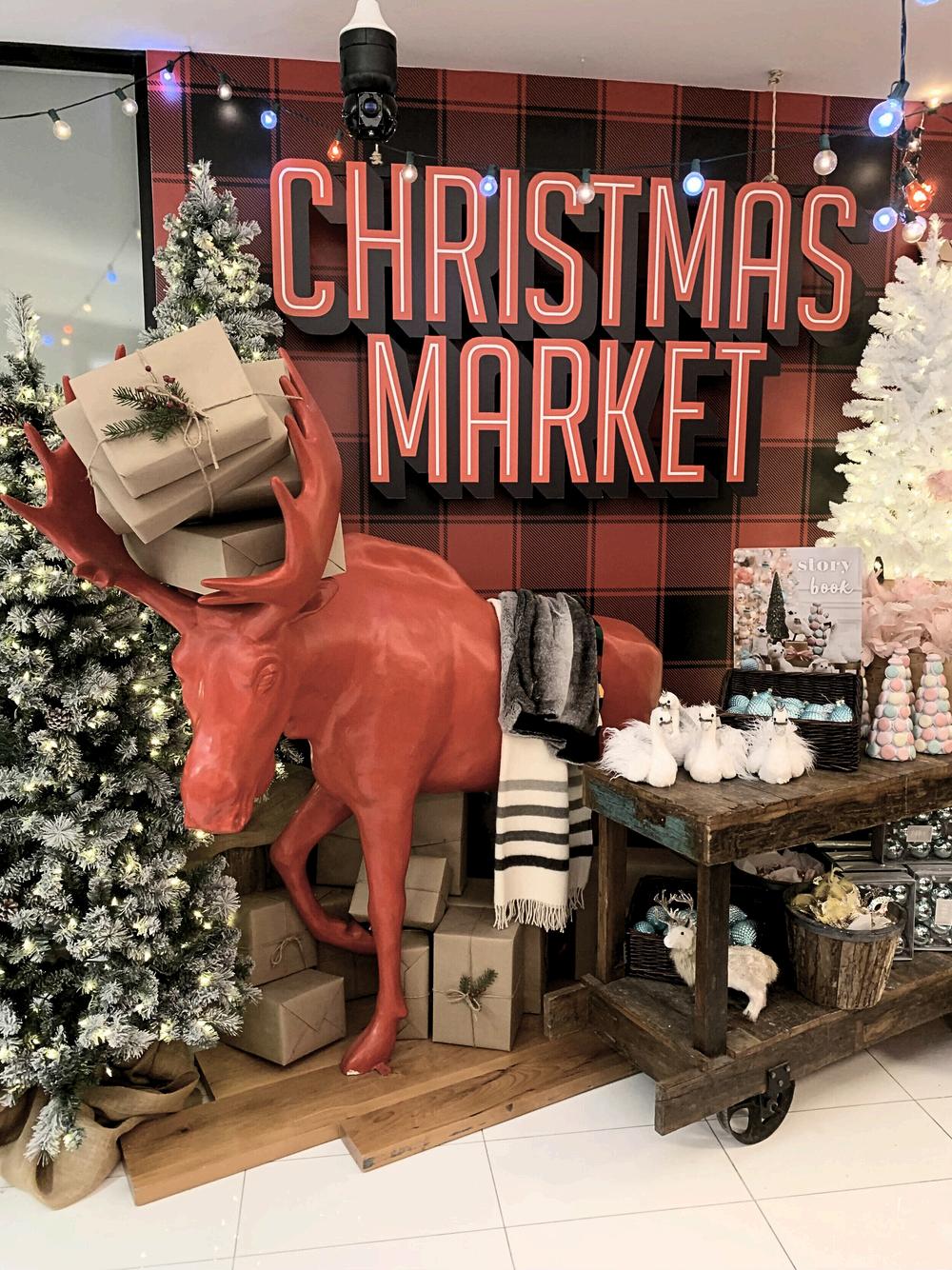
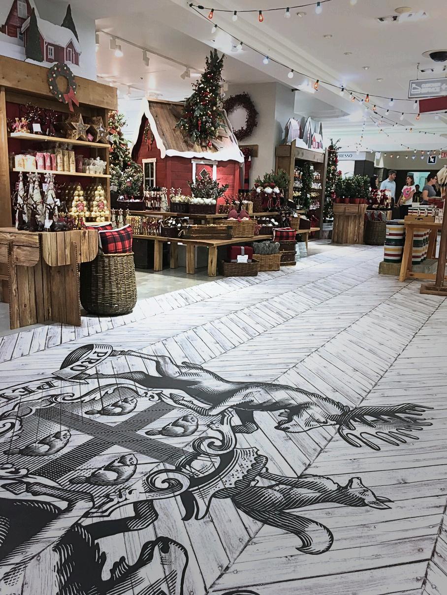
HUDSON’S BAY CHRISTMAS MARKET


THE HBC SIGNATURE STRIPES COLLECTION


2024 / 2025


HBC SIGNATURE COLLECTION SUMMER
TORONTO QUEEN STREET4


C A N A D A ’ S C H R I S T M A S S T O R E


S C H R I S T M A S S T O R E
C A N A D A


PROJECT RE DESIGN AN EXISTING PUBL C MENS WASHROOM TO ALLOW FOR FULL ACCESS BLE USE
SOLUTION CREATING EACH STALL AND RECEPT CLE FULLY SELF SUFFICIENT SUCH THAT THERE IS NO COMMUNAL TOUCH POINT NESESSARY


SYNOPSIS/HISTORIALLY DURING THE LULL OF POST CHRISTMA BLUES HOME RETAILERS TEND TO FOCUS ON COMMODITIES THAT ALLOW US TO NOURISH AND NURTURE OURSELVES NEW YEARS RESOLUATIONS ARE TOP OF MIND AND THE PUBLIC WANTS TO DETOX EAT CLEAN AND RE CENTRE FROM THE ANXIETIES HOLIDAY SEASON CAN BRING


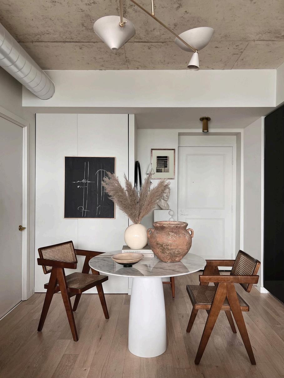
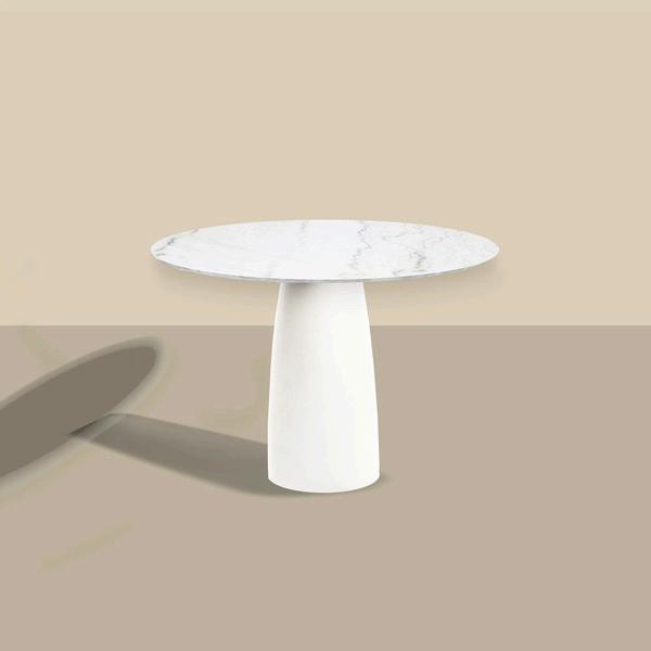
PRIVATE, RESIDENCE
TORONTO, ONTARIO

PRIVATE, RESIDENCE
TORONTO, ONTARIO


PROJECT /RIVERSIDE COUPLES ABODE– KITCHEN PHASE
OBJECTIVE / RECONFIGURE LAYOUT TO MAXIMIZE
STORAGE SPACE CONCEAL MICROWAVE AND ADJUST
ISLAND
FOOTPRINT TO GAIN MORE LIVING ROOM SPACE


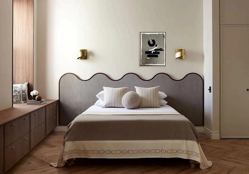
ONE KING BED
TWO DIFFERENT MOODS

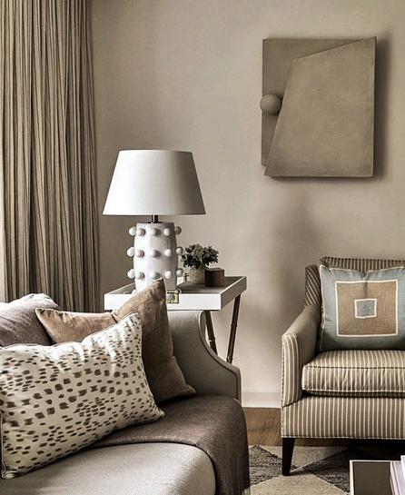
PROJECT / RIVERSIDE LO FT PRINCIPAL BEDROOM
OBJECTIVE / TO CREATE A SERENE, NON FUSSY VERY CASUAL, CALMING, UNCLUTTERED SANCTUARY FOR A YOUNG COUPLE WHO LIVE HECTIC AND BUSY LIVES
FEATURED IN:


SYMPHONYACRYLIC +
DESIGNED BY CHRISTOPHER


There had to be a 2023 answer or version to those midcentury vinyl seat upholstered, wire legged stools our grandparents had I am pretty sure some still linger in the blast from the past basements of today Nonetheless, my point is that that the TUSH stool came from necessity It’s SO hard to find a stool now adays that isn’t an ottoman that has an upholstered seat TUSH was born! We took our Mochi Stool and had it upholstered in faux shearling for extra comfort and whimsy! Now available in the shop


SAYS GOODBYE BUILDERS BASIC AND GOES FOR ORGANIC MINIMAL MCM MASHUP


SYMPHONY


Japandi is a mashup of Zen Japanese interiors and Scandinavian aesthetic I wanted to explore for a client who had a Japandi interior what kind of art work or what shapes or articulation and in what medium would best compliment such a space How minimal? How Maximal? OSAKA was the winning choice for my client


ACCENT STOOLS


EXCLUSIVE ORIGINAL PHOTO RIGHTS
SOCIAL MEDIA PRODUCT PLACEMENT


PROJECT / COASTAL MPRESSIONS DESIGN BUILD X CHRISTOPHER REYES DESIGN.
OBJECTIVE / CREATE LARGE DRAMATIC YOUTHFUL CONTEMPORARY ART FOR THREE PROPERTIES THEY ARE DEVELOPING IN BLUE MOUNTAIN


BETTENCOURT MANOR
COLLAB COLLECTION


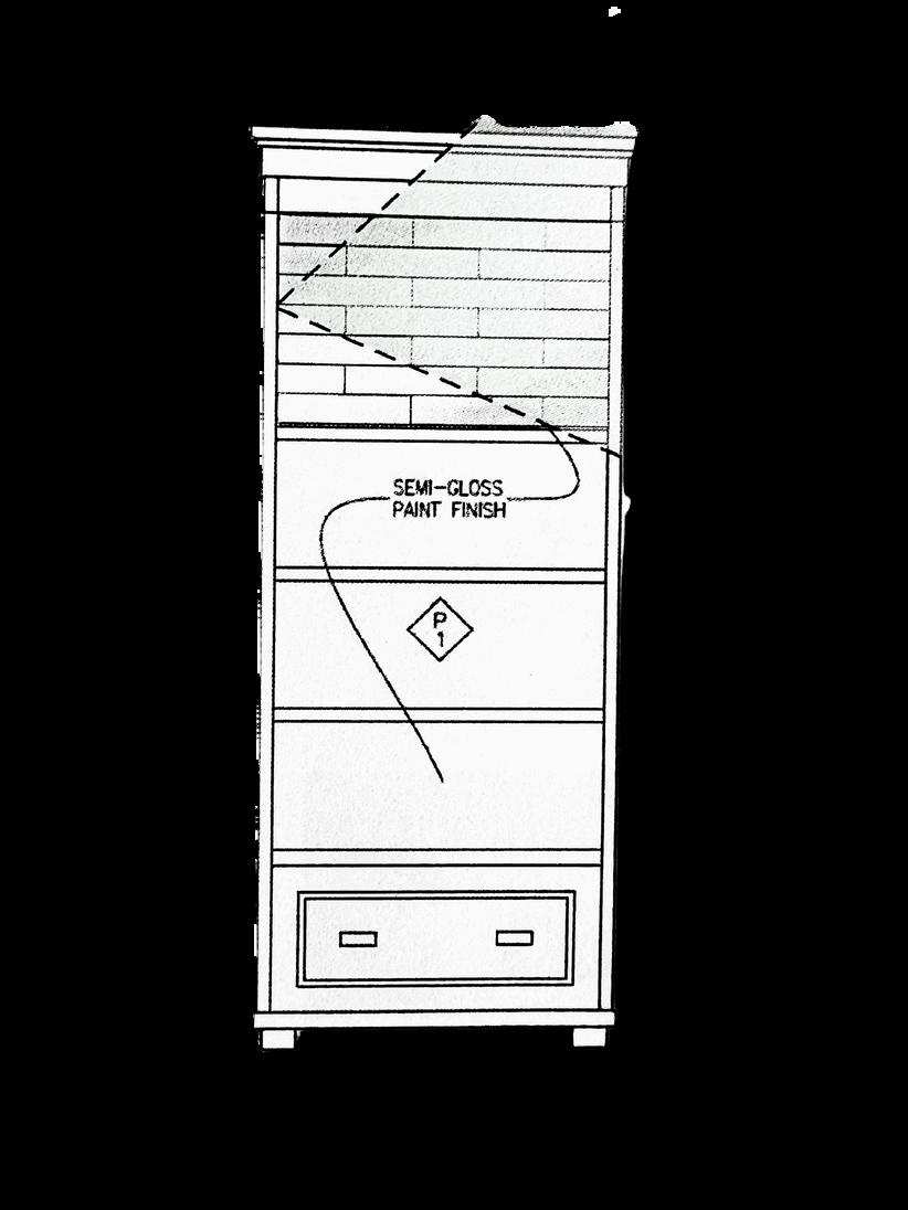
PROJECT / BETTENCOURT MANOR COLLABORATION OBJECTIVE / TO CREATE A EMI WALL SCULPTURAL COLLECTION THAT WORL WELL WITH THE BETTENCOURT SHOP AND AESTHET C WITH THE S GNATURE CHR STOPHER REYES ATTENTION TO DETAIL BELOW / PAGES FROM THE PROPOSAL DECK THAT WAS PRESENTED TO STORE OWNERS


PRIVATE CLIENT TORONTO


F/W 23 “FORM” COLLECTION


8


7:30PM 10:00 PM
T H A T ’ S A W R A P .


