Selected Work Project Management, Concept to Execution
GRAPHICS
Selected Works, Projects
2
2
2
2
2
EVENTS
Selected Works,Planning, Production & Design
3
INTERIORS&FURNITURE
Selected Works , Spaces Design & Styling
COLLABORATIONS
ART,SCULPTUREMIXEDMEDIA
Selected Works, Production & Design
Bio
Past Partnerships, collabs, and f CREATIVE Statement
Resumè/CV BETTERTOGETHER
BIO
Christopher Reyes is a Toronto based creative visionary, and a true example of a modern day Multi-Hyphenate Creative
Educated at the Ryerson School of Interior Design, Christopher has always proven himself a leader of the pack when it comes to sifting out the stylistic noise and identifying the KEY Trends, Colours, Techniques, Applications, Textures, Nods, Undertones, Social Innuendoes, Typography and Products that will captivate, stick, and IDENTIFY and MEMORABLE to the the MARKET that matter
His 10+ years as a Creative Senior Leadership role in at HUDSON'S BAY, HUDSON'S BAY EUROPE expansion and HOME OUTFITTERS He led the entire retail company's Visual , Styling and Merchandising endeavours with one goal in mind to carve out a new and fresh "home destination" image for the retailer, so that HBC Department stores will be synonymous to TREND FORWARD and TOP OF MIND DESTINATION for Home Decor, Kitchen, OUTDOOR, and BRIDAL GIFT REGISTRY SHOP in all CANADA
lDuring his tenure at HB, Christopher’s online blog and infectious creative energy earned him his 15 minutes and caught a CBC producers eye Christopher's was chosen to be on the CBC'S STEVEN and CHRIS Show as they highlighted the spaces of toronto's influential interior bloggers, he then was hired on as part of the set dec team on for their Christmas special "CBC's Special: Christmas with STEVEN and CHRIS"
The TASTE LEVEL that is truly innate and a polished CURATED sense of self & style he has honed is sought after and has gained a following of over 10K on SOCIAL MEDIA and (instagram @ChristopherReyesDesign)
ARTISTIC
STATE MENT
Described as a Multi-hyphenate Creative, Christopher Reyes strives to transcend the conventional boundaries of design, merging functionality with aesthetic innovation Rooted in a passion he sought a formal education in interior design and put in over a decade-long journey in national merchandise presentation management and corporate trend/styling/visual direction roles for notable mid to luxury brands, The workpresented on ChristopherReyesDesigncom is a testament to the fusion of creativity and practicality
‘My creations draw inspiration from the rich tapestry of experiences and interactions, reflecting a deep understanding of the ever-evolving dynamics of the design world Each piece is a manifestation of my commitment to not only meet but exceed expectations, offering a harmonious blend of form and function
Exploring a spectrum that ranges from contemporary minimalism to bold, expressive compositions, my portfolio mirrors the diversity inherent in design With a keen eye for detail and an unwavering dedication to craftsmanship, every project is a narrative woven with precision and passion
At the core of my artistic philosophy lies a belief in the transformative power of design It goes beyond the visual appeal; it is a visceral experience that influences emotions and enriches environments Through my work, I aim to evoke a sense of connection, inviting individuals to engage with spaces on a profound level
Christopher Reyes Design is not merely a showcase of creations but a journey into the intersection of functionality, innovation, and timeless aesthetics It is an invitation to explore the boundless possibilities that design offers, creating spaces that resonate with both purpose and beauty
Welcome to a realm where design is not just a visual endeavor but a sensory voyage, curated by Christopher Reyes
TOGETHER BET TER
The wonderful brands, studios, publications and designers that Christopher Reyes Design has had an opportunity to partner with in various capacities Some featured my work, Others I’ve collaborated with,, publications that wrote about projects I’ve spearheaded Thank you for the support.
-Christopher
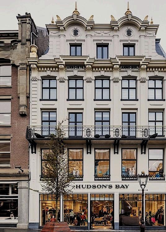
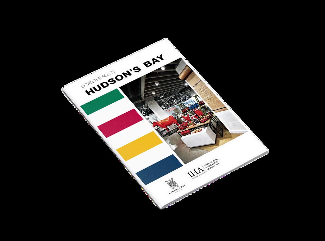
DOWN THE AISLES: Hudson’s Bay
For most Canadians, Hudson’s Bay Company is a name that has been a part of their lives for as long as they can remember The company, which is Canada’s longest continually running department store, was established in 1670 Since that day two and a half centuries ago, it has continued to expand and fine tune its innovative operations, firmly establishing itself as a brand that its millions of customers love and trust Today, there are 90 Hudson’s Bay Company stores, two outlet stores, and thebay com under the company ’ s umbrella, alongside the Home Outfitters brand in Canada and the Lord & Taylor brand in the United States ‘Home’ is the company ’ s homewares department, and in 2014, it opened a newly designed space called Home on Seven, on the 7th floor of its Toronto Queen Street premises, that became one of five Global Honorees in the 2015 IHA Global Innovation Awards (gia)
Every year, a jury comprising editors and publishers of the leading home and houseawares trade publications around the world and four retail experts compare the merits of 25 retail stores that have been nominated as the finest in their country This year, the jury found Home on Seven to stand out from the national winners not only due to its exceptional use of attention-grabbing graphics and signage, but also for its inspiring visual merchandising, which has become synonymous with the company ’ s overall brand
As the Senior Vice President of Home Alison Coville says, the aim of Home on Seven was to “build upon our strength in the market as a home and leading Gift Registry destination and enhance the bridal experience by grouping all relevant and related businesses on the one floor, including china, housewares, small electrical, cookware and bakeware, décor, giftware, gift registry, the Birks and Godiva shops and concierge, creating a one-stop shop for brides-to-be ”
From the outset, the store’s mission was to make the experience of organizing a wedding stress-free and enjoyable To enhance the enjoyment factor and give the chosen warehouse space a residential loft-like feel, it first had to be turned into a calming haven, so windows were created to let in natural light From there, the finest of details for each space in the store was considered
The gift registry space, for example, is pivotal at Home on Seven, so it has become a stylish, welcoming space with a large consultation table and four private suites divided by glass walls The design created a shop-within-a-shop feel for casual dining, and after it was enclosed with a metal cage and dark distressed wood panel bases, a classic storefront feel was achieved
All sections of Home on Seven had to have their own distinct character to make customers feel less overwhelmed, which can often be part and parcel of a large department store experience The housewares section, for instance, is decked out with dark metals and woods and veined counter tops, while light metals and white lacquer wood were applied in the china and gift registry section Concretefinish vinyl tiles were used in the store aisles, and warm vinyl wood planks were used in the casual dining area
Everything about Home on Seven is about achieving warmth, relaxation and the welcoming feel people have when they enter the home of a friend or family member In the gift registry area, a whitewash wood composite floor was laid, and accents of powder blue were applied to the walls to bring out the original black-trimmed warehouse windows
The meticulous planning regarding the store’s design was something that impressed all of the judges, with special note being made of the fully-equipped, modernized demonstration kitchen imbued with an old-world European feel; the suspended, distressed pine wood slat ceiling; the placement of interesting pieces of furniture oozing character to create a residential feel, and the smattering of inspiration boards to highlight home fashions from across the world
Home on Seven is all about making it easy for the customer to explore the store’s different areas and find new products, while being continually inspired, so ‘Trend Zones’ have been mapped out to ensure cohesive flow And first impressions do count, so as soon as customers step out of the elevator or arrive at the top of the escalator, they are visually stimulated and led from one exhibit of products to the next
DOWN THE AISLES: Hudson’s Bay
One of the many stimulating set-ups in the store is the street-like zone that resembles a market running down the middle of the Casual Dining Department “This allows for strong trend, seasonal and occasion merchandise stories to be highlighted,” explains Coville “And feature display tables within both the casual and formal dining departments provide a blank canvas for our visual merchandising teams to create inspiring entertainment presentations for customers to mimic in their own homes when entertaining ”
The fun use of colorful graphics and funky signage (often incorporating plays on words) throughout Home on Seven adds artistic flourishes while also giving customers something to ponder upon as they locate everything they need From lit-up vintage signs to graphics created by an artist to emulate blackboard scribblings, directives are relaxing and helpful, again adding to the stress-free environment Betsy, the muchloved life-sized red cow, for instance, standing by the entrance with a helpful floor plan painted on her side, has become the store’s icon, and her figure on canvas – Andy Warhol style – can also be found throughout the store
Each year, Hudson’s Bay Company publishes four ‘Home’ catalogs that are high quality magazine-style publications Fans of the company love them, and they are styled, shot and written by some of Canada’s best publishing talent Products from Home on Seven are regularly featured in the catalogs, sending the Hudson’s Bay Company message further afield, filling Canadians with endless inspiration That message is a clear and strong one: Hudson’s Bay Company makes shopping a wonderful, stress-free experience, with some fun and frivolity thrown in for good measure
“ … Beautiful visual merchandising and attention catching signage.
...are two of the many things the jury loved about the stylish Canadian haven to include them as one of the 2015 gia global honorees.
HBC IN AMSTERDAM / HUDSONS BAY ‘S FIRST INTERNATIONAL VENTURE CHOSEN AS LEAD TRAINER VISUAL AND STYLIST, MYSELF AND A SELECT 6 OTHER PEERS SET OFF TO EUROPE IN AMSTERDAM, NETHERLANDS HBC REVAMPED AND OCCUPIED 3-4 BUILDINGS RIGHT IN CITY CENTRE EACH OF THE BUILDINGS ARE EXTREMELY UNIQUE AND NO TWO ARE ALIKE, THE HISTORIC BUILDING IN THE IMAGE TO THE LEFT WAS SOLELY DEVOTED TO BABY, TODDLER ABD YOUTH COMMODITIES
CARVING OUT SOME CANADIAN EGVING A LITTLE CANADANKNOD
WE HAD THE CHALLENGE IN BREAKING UP A QUITE NARROW PORTION OF THE BULDNG MERCHANDISE IN THISSECTONAREGADGETSANDSTATIONERY
WE CREATED A VISUAL HIGH LIGHT DOWN THE CENTRE BY ANCHORING A LIFE SIZED CANOE FROM THE METAL RAFTERS THIS VISUALLY CARVED OUT A MN HGHLGHT OPPORTUNITY I SINCE THE SGNATURE STRIPE SHOP WAS TUCKED AWAY AND LOCATED AT THE VERY BACK OF THE BULDNG WE CREATED AN OUTPOSTWTHTWOFORMS
MOMENTUPONENTRY FORGRANDOPENINGWEWENTABITARTSYANDCONCEPTUALTHAN NORMAL CREATING A MUSEUMLIKE NSTALLATIONWHEREAMXOFVISUALPROPPINGAND MERCHANDISEDARESTYLED TOPERFECTION THEIDEAWASLOCAL GUESTSARTST/STYLT WOULDBEINVTEDTOSUBMITPROPOSALSPERSEASONONHOWTHEYWOULD MAGNEA SEASONALDREAMTABLESCAPE
WE ENSURED THERE WAS A DESTNATON FOR BOOKSALWAYS ADDING WARMTH AND CHARACTER TO A LFESTYLED ENVIRONMENT BOOKS PLAY SUCH AN IMPORTSNT ROLE N SETTING THE TONE HAVNG BOOKS ALSO GAVE US THE OPPORTUNTYU TO USE VARIOUS TITLES TO CROSS MERCHANDISE WITHIN OUTPOSTS THROUGHOUT THE STORE DISPAYED AMONSGST STYLED MANNQUNS FURNITURE HOME & DECORINACKLEANINIMALCHICSEASONALTRENDVIGNETTE
2024 / 2025
CREATIVE DIRECTION AND GRAPHIC TREATMENT FOR AN EVENING CHARITY EVENT
BRIDAL GIFT REGISTRY
“FIND YOUR STYLE AND SCAN””
BRIDAL GIFT REGISTRY
“FIND YOUR STYLE AND SCAN””
HOLIDAY PLANOGRAM
PACKAGING PROPOSAL THEME STICKER
PATIO & BBQ GRAPHIC PLANO REVIEW
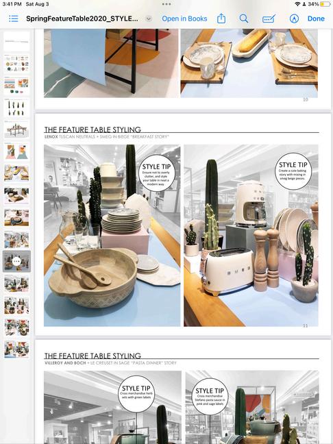
SPRING TREND TABLES
CREATIVE DIRECTION & VISUAL DESIGN
PROJECT/SPRNG 2020 ALL STORE - NATONAL SPRNG TABLETOP VISUAL DRECTON FOR HUDSONSBAYSTORES
AS MERCHANDISNG AND STYLNG GUDELNES COMMUNICATED NATIONALLY FOR INDVIDUALSTORESTOFOLLOW
MARKET FIXTURE PROTOTYPICALSIDE A
MARKET FIXTURE PROTOTYPICALSIDE B
MARKET FIXTURE PROTOTYPICALSIDE B
SPRING TREND TABLES
CREATIVE DIRECTION & VISUAL DESIGN
SPRINGTREND
FEATURETABLES
VISUAL
MERCHANDISING
ANDSTYLING
DIRECTIVE
TABLESCAPE TREND ZONE
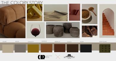
AUTUMNSBLUSH
COLOR PALETTE DISCUSSION FOR THIS FALL SEASON OUR AIM WAS TO PRESENT COLORS THAT ARE DELICIOUS ENTICING, AND TRULY TANTALIZING – THE KIND THAT AWAKENS YOUR TASTE BUDS WITH VIBRANT REDS LEADING THE WAY, WE SHOWCASED OUR BEST COLOR BLOCKS ALONGSIDE SLEEK AND MINIMALISTIC MERCHANDISING +
ColourPalette#2
are all about hue of blues the deep navy of the crisp autumnal midnight sky the shift from warm er sun drenched days to cooler, cuddlier nights are represented in this years fall palette offset this ombre with cooler grey tones that give a cleansing visual pause
Mix in a contrasting black for excitement and provide grounding and earthy wood grains when thinking composition and a full visual story
FALL FOR BLUE HUES
CREATIVE DIRECTION
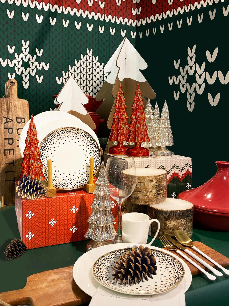
2020 Holiday’s over arching corporate messaging was live a colourful holiday season The meaning being truly embracing ones authentic self, unapologetically and being proud The ugly sweater come to mind because the idea and concept of wearing an ugly christmas sweater is about showing off even the not so perfect or pretty side of things Here we show the knit patterns playing so well with our more classic christmas dinnerware and decor programs in a Non traditional , cool, and trendy way
it’s about working with what you already have or own, and making it work, not jsut for the hoilidays, but 365 days of the yea
UGLY SWEATER CHRISTMAS
HOLIDAY 2020 HOUSEWARES TREND
NATIONAL ROLL OUT CREATIVE DIRECTION +GRAPHIC DESIGN + PROJECT/VENDOR MANAGEMENT
E-COMMERCE WEB DESIGN GRAPHIC DESIGN
PROJECT / WWW CHRISTOPHERREYESDESIGN COM
OBJECTIVE / AN ONLINE PRESENCE OF MY WORK AND STORE
FRONT
BELOW / THE INTERFACE MOCK UP OF VARIOUS LANDING PAGES
AS WEL AS PRODUCT SHOTS AND PRODUCT PAGES
COVER THEN RE WORK THE MAGAZINE COVERS LANDING PAGES OF MY WEBSITE M A G A Z I N E A N A T O M Y
MAGAZINE RE:COVER TYPE AND IMAGE
OBJECTIVE / ONLINE THE CHARACTERISTICS OF A MAGAZINE
R E - C O V E R O F V O G U E
RE CREATE AN EXISTIONG VOGUE COVER CHANGE AND SWAP OUT ELEMENTS FOR DIFFERENT NARRATIVE
MAGAZINE RE:COVER TYPE AND IMAGE
KNORR SIDEKICKS
OJECT / TO REDES GN THE RR FAVOURITE SUB BRAND CKS MA NTAIN THE KNORR BRAND ON THE TOP LEFT
JECTIVE / CHANGE AND RE GINE THE PACKAGE BRAND
ARCHITECTURE OF KNORR S DEKICKS
SUB BRAND PACKAGE ARCHITECTURE RE DESIGN.
KNORR SIDEKICKS
COLLAB COLLECTION
CHRISTOPHER REYES FOR BETTENCOURT MANOR
E-COMMERCE CREATIVE MATERIAL TO PROMOTE AND SHOP COLLECTION VIA SOCIAL MEDIA AND EMAIL MARKETING
PRODUCT COLLECTION LAUNCH DESIGN
TYPE AND IMAGE EXCERCISE, EDITORAIL CAMPAIGN SHOT
PRODUCT COLLECTION LAUNCH DESIGN
TYPE AND IMAGE EXCERCISE EDITORAIL CAMPAIGN SHOT CREATE A CAMMPAIGN SHOT FOR THE LAUNCH OF A NEW PRODUCT OR COLECTION
OVERSIZED DIRECTIONAL QUOTES / HBC EUROPE –BRIOUGHT IN AN ESSENCE OF WHIMSY WITH IMPACTFUL COSR EFFECTIVE DIRECTIONAL SIGNAGE
+ + + V I S U A L
C O M M U N I C A T I O N
W A Y F I N D I N G
PROJECT HBC EUROPE NETHERLANDS
CREATIVE WAYFINDING SIGNAGE
MARKETING COLLATTERAL
2024 / 2025
MEDIA PREVIEW EVENT
LOBLAW OUTDOOR LIVING TREND
MEDIA PREVIEW EVENT
LOBLAW OUTDOOR LIVING TREND
MEDIA PREVIEW EVENT
LOBLAW OUTDOOR LIVING TREND
+ P R A C T I V A T I O N
+ E V E N T D E S I G N &
P R O D U C T I O N
PROJECT / JOE FRESH HOME / LOBLAWS OUTDOOR LIVING MEDIA PREVIEW PR EVENT
OBJECTIVE / TO TRANSFORM THE LOBLAWS SHOWROOM INTO SA COLOURFUL EASTCOAST SUMMER CASUAL DESTINATION TO HOST A MYRIAD OF SOCIAL MEDIA INFLUENCERS AS WE TALK ABOUT WHAT EXCITING PRODUCTS WE’VE DESIGNED AND DEVELOPED FOR THE SEASON WHICH WILL SOON BE AVAILABLE IN STORES
EAST COAST SUMMER CASUAL DESTINATION TO HOST NUMEROUS SOCIAL MEDIA INFLUENCERS WE WILL SHOWCASE THE EXCITING PRODUCTS WE HAVE DESIGNED, DEVELOPED, AND WILL SOON BE AVAILABLE IN THEIR NEAREST LOBLAWS
SUPERMARKET AISLES
AN
EVENING TUSCAN AL FRESCO
PRESIDENTIAL DINNER
+ EVENT DESIGN & PRODUCTION
+ PROP SOURCING & STYLING
PROJECT / PRESIDENT OF HUDSONS BAY
R CHAD BAKER HOSTS A SEMI CASUAL AL FRESCO DINNER WITH INVESTORS OFFER NG A TUSCAN THEMED MENU THE VISUALS PROPS AND DESIGN PLACED THEM
AMONGST THE GLOW OF THE SETTING SUN AS THEY DINE UPON THE ROLLING HILLS BETWEEN V NYAARDS
OBJECTIVE/ TO TRANSFORM THE COURTYARD
LOCATED AT KL ENFIELDS CANADA INTO A TUSCAN V LLA DIN NG EXPER ENCE FIT FOR HBC S PRES DENT MR R CHARD BAKER
CREATIVE DESIGN / TAKING A QUE FROM THE TUSCAN CU SINE TO BE SERVED THE N GHT OF, WE TOOK A CHANCE FOR THE SAKE OF AMBIENCE AND TO TAKE
ADVANTAGE OF THE SUMMER WEATHER AND THE BEAUTIFUL CITY VIEW SKY TERRACE OUR VERY OWN DES GNERS DESIGNED TO BE PART OF THE KLE NFIELDS CANADA EXPER ENCE THE VISUALS PROPING IMAGERY AND OVERALL EVENT DES GN
STRATEGY WAS FOR THEM TO FEEL LIKE THEY VE BEEN TRANSPORTED TO TUSCANY AND EXPERIENCING DINNER AL FRESO
AMONGST THE WARM GLOW OF THE SETTING M DSUMMERNIGHTS SUN AS THEY D NE AND SIP VINO’ UPON THE P CTURESQUE ROLL NG HILLS S TUATED BETWEEN VINYAARDS
AT
EXTRAVAGANCE
AT THE GOLDEN GATE SPEAKEASY
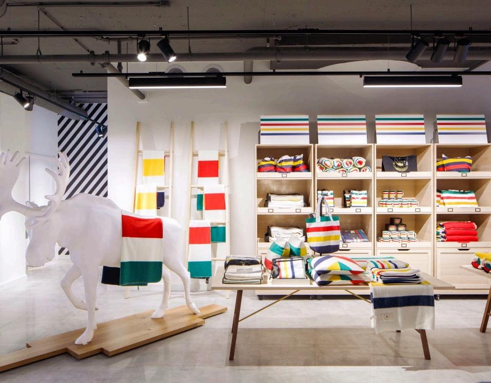
150TH GRAND PORTAGE CAMPAIGN
ANNIVERSARY COLLECTION CAMPAIGN CREATIVE DIRECTION & MOCK UP
THE RE STYLE / FOR CANADA 150 HUDSONS BAY RELEASED THE GRAND PORTAGECOLLECTON ITCONSISTOFAPPARELANDACCESSORESGEAREDFOR
THE OUTDOORSMAN AS AN OMNI CHANNEL RETAILER VSUAL MERCHANDISING
AND SHOP AND AD STYLNG TO FOLLOW SUT TO GVE OUR SGNATURE SHOPS
MORE NUDE MNIMALST EARTHY AESTHETIC LOOK AND STYLE WE SET OUT FORMORENUETRALTONES ASABACKDROPTOTHECLASSCSTRPES NSTEAD OFASTARKWHTE
PRODUCTLAUNCH/HBCSTRPES+GRANDPORTAGE
150TH GRAND PORTAGE CAMPAIGN
ANNIVERSARY COLLECTION CAMPAIGN CREATIVE DIRECTION & MOCK UP
THE RE STYLE / FOR CANADA 150 HUDSONS BAY RELEASED THE GRAND PORTAGECOLLECTION TCONSSTOFAPPARELANDACCESSORIESGEAREDFOR THE OUTDOORSMAN AS AN OMN CHANNEL RETALER VISUAL MERCHANDSNG AND SHOP AND AD STYLING TO FOLLOW SUIT TO GVE OUR SGNATURE SHOPS MORE NUDE MNMALIST EARTHY AESTHETC LOOK AND STYLE WE SET OUT FORMORENUETRALTONES ASABACKDROPTOTHECLASSCSTRIPES NSTEAD OFASTARKWHITE PRODUCTLAUNCH/HBCSTRPES+GRANDPORTAGE
HBCSIGNATURECOLLECTION SUMMER
TORONTO QUEENSTREET4
CANADA’S CHRISTMAS STORE
HUDSON’S BAY “HOLIDAY WARMTH”
WINDOWS
HUDSON’S BAY “HOLIDAY WARMTH” WINDOWS
SYNOPSIS/ HISTORIALLY, DURING THE LULL OF POST CHRISTMA BLUES HOME RETAILERS TEND TO FOCUS ON COMMODITIES THAT ALLOW US TO NOURISH AND NURTURE OURSELVES NEW YEARS RESOLUATIONS ARE TOP OF MIND AND THE PUBLIC WANTS TO DETOX, EAT CLEAN AND RE CENTRE FROM THE ANXIETIES HOLIDAY SEASON CAN BRING
GLUCKSTEIN HOME “RECENTRE"
QUEEN ST X BAY ST WINDOW
BRICKWORKS BATHROOM GOES EVERGREEN
EVERGREEN BRICKWORK PUBLIC BATHROOM, TORONTO
BRICKWORKS BATHROOM GOES EVERGREEN
PROJECT RE DESIGN AN EXISTING PUBL C MENS WASHROOM TO ALLOW FOR FULL ACCESS BLE USE
SOLUTION CREATING EACH STALL AND RECEPT CLE FULLY SELF SUFFICIENT SUCH THAT THERE IS NO COMMUNAL TOUCH POINT NESESSARY
QUAINT AT QUEENS QUAY
PRIVATE, RESIDENCE
QUAINT AT QUEENS QUAY
PRIVATE, RESIDENCE
TORONTO, ONTARIO
QUAINT AT QUEENS QUAY
RIVERSIDE LOFT
PRIVATE RESIDENCE TORONTO, ONTARIO
PROJECT /RIVERSIDE COUPLES ABODE– KITCHEN PHASE
OBJECTIVE / RECONFIGURE LAYOUT TO MAXIMIZE
STORAGE SPACE CONCEAL MICROWAVE AND ADJUST
ISLAND
FOOTPRINT TO GAIN MORE LIVING ROOM SPACE
ONE KING BED
TWO DIFFERENT MOODS
PROJECT / RIVERSIDE LO FT PRINCIPAL BEDROOM
OBJECTIVE / TO CREATE A SERENE, NON FUSSY VERY CASUAL, CALMING, UNCLUTTERED SANCTUARY FOR A YOUNG COUPLE WHO LIVE HECTIC AND BUSY LIVES
FEATURED IN:
SYMPHONYACRYLIC +
A BESPOKE BACHELOR
SAYS GOODBYE BUILDERS BASIC AND GOES FOR ORGANIC MINIMAL MCM MASHUP
+ DESIGNED BY CHRISTOPHER
YUNADINING
TRAXACRYLIC +
BOBBLE TEXTURED PLINTH
MENDITEA LIGHT SCONCE
A BESPOKE BACHELOR
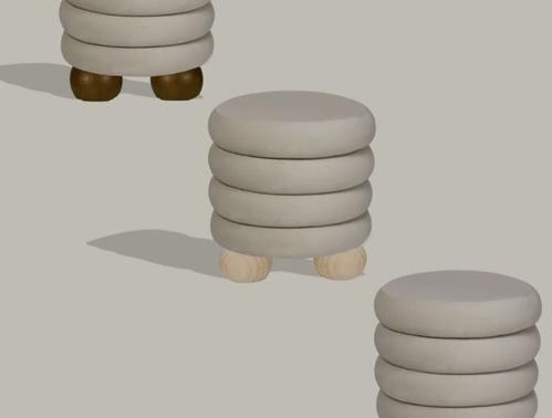
CUSTOMSTOOLDESIGN,2023
There had to be a 2023 answer or version to those midcentury vinyl seat upholstered, wire legged stools our grandparents had I am pretty sure some still linger in the blast from the past basements of today Nonetheless, my point is that that the TUSH stool came from necessity It’s SO hard to find a stool now adays that isn’t an ottoman that has an upholstered seat TUSH was born! We took our Mochi Stool and had it upholstered in faux shearling for extra comfort and whimsy! Now available in the shop
TUSHtripodupholsteredstool
A BESPOKE BACHELOR
SAYS GOODBYE BUILDERS BASIC AND GOES FOR ORGANIC MINIMAL MCM MASHUP
PRISM FORM + SCULPT XL
JAPANDI IS THE NEW SCANDI.
Japandi is a mashup of Zen Japanese interiors and Scandinavian aesthetic I wanted to explore for a client who had a Japandi interior what kind of art work or what shapes or articulation and in what medium would best compliment such a space How minimal? How Maximal? OSAKA was the winning choice for my client
PRODUCT DESIGN & PRODUCTION
MIDCENTURY TRII LEG STOOL OBSESSION
PRODUCT DESIGN & PRODUCTION
THE SOMIE 2 0 STOOL
PRODUCT
DESIGN, DEVELOPEMENNT & PRODUCTION
ACCENT STOOLS
CUSTOM SMALL FURNITURE
PROJECT / WWW CHR STOPHERREYESDES GN COM
OBJECTIVE / AN ONLINE PRESENCE OF MY WORK AND STOREFRONT
E COMM DIGITAL ASSETS
CHRISTOPHER REYES DESIGNCOM UNVEIL COLLECTION
EXCLUSIVE ORIGINAL PHOTO RIGHTS
SOCIAL MEDIA PRODUCT PLACEMENT
MONTANA LABELLE COLLAB
SARAH BERNIE INTERIORS COLLAB
ARTFUL ROWHOUSE RENO
DESIGN BUILD COLLAB
COASTAL IMPRESSION DESIGN BUILD
PROJECT / COASTAL MPRESSIONS DESIGN BUILD X CHRISTOPHER REYES DESIGN.
OBJECTIVE / CREATE LARGE DRAMATIC YOUTHFUL CONTEMPORARY ART FOR THREE PROPERTIES THEY ARE DEVELOPING IN BLUE MOUNTAIN
PROJECT / HOW CRD PRODUCTS LOOK LIKE IN YOUR HOMES
OBJECTIVE / TO SHARE IMAGES OF MY ART LIVING IN CLIENTS HOMES SHOW HOW STYLISTICALLY TRANSITIONAL ART FROM CHRISTOPHER REYES CAN BE
CLIENTS SHOW OFF THEIR CRD
PROJECT / HOW CRD PRODUCTS LOOK LIKE IN YOUR HOMES OBJECTIVE / TO SHARE IMAGES OF MY ART IN REAL NOMES AND SHOW HOW STYLISTICALLY VERSITILE ALL THE PIECES CAN
UNVEIL S/S 2024 ART COLLECTION “UNSPOKEN” IN PRINCIPAL BEDROOM
PROJECT / HOW CRD PRODUCTS LOOK LIKE IN YOUR HOMES OBJECTIVE / TO SHARE IMAGES OF MY ART IN REAL NOMES AND SHOW HOW STYLISTICALLY VERSITILE ALL THE PIECES CAN BE
UNVEIL S/S 2024 ART COLLECTION “UNSPOKEN” IN PRINCIPAL BEDROOM
BETTENCOURT COLLAB
THE FORM COLLECTION
THE FORM COLLECTION IS A MINIMALIST MOMENT OF HIGH TEXTURED FORMS
THE FORM COLLECTION ALLOWS SIMPLISTIC SHAPES TO HAVE SOPHISTICATED COLOURS AND SCRUMPTIOUS LAYERED TEXTURAL SURFACES