
SARA MIDDA a
Retrospective
Copyright © Chris Beetles Ltd 2025
8 & 10 Ryder Street
St James’s
London SW1Y 6QB
020 7839 7551
gallery@chrisbeetles.com www.chrisbeetles.com
ISBN 978-1-914906-17-6
Cataloguing in publication data is available from the British Library
A Chris Beetles Gallery Publication
Edited by Alexander Beetles, Phoebe Bowsher, Fiona Nickerson and Pascale Oakley-Birch
Design by Pascale Oakley-Birch
Photography by Giulio Sheaves
Photograph portrait © Sarah Fitzgerald, page 4
Reproduction by www.cast2create.com
Colour separation and printing by Geoff Neal Printworks
Front cover: In and Out of the Garden Envelope (detail) [184 ]
Front endpaper: Baby Book (detail) [257 ]
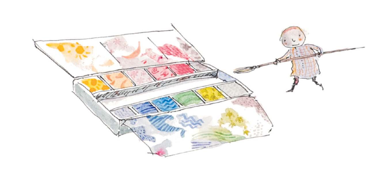
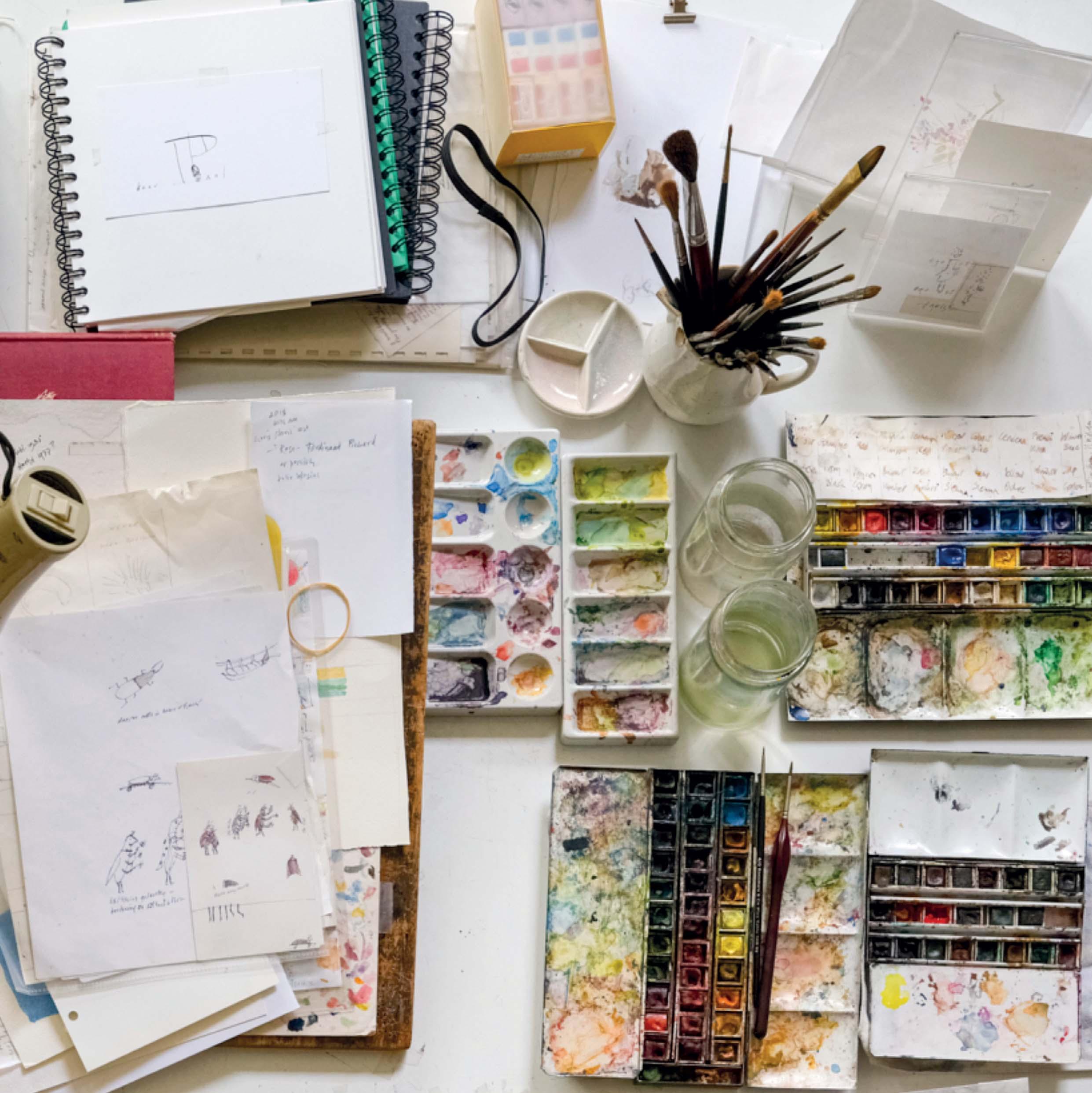
This page: Sara’s paint palette
Page 1:
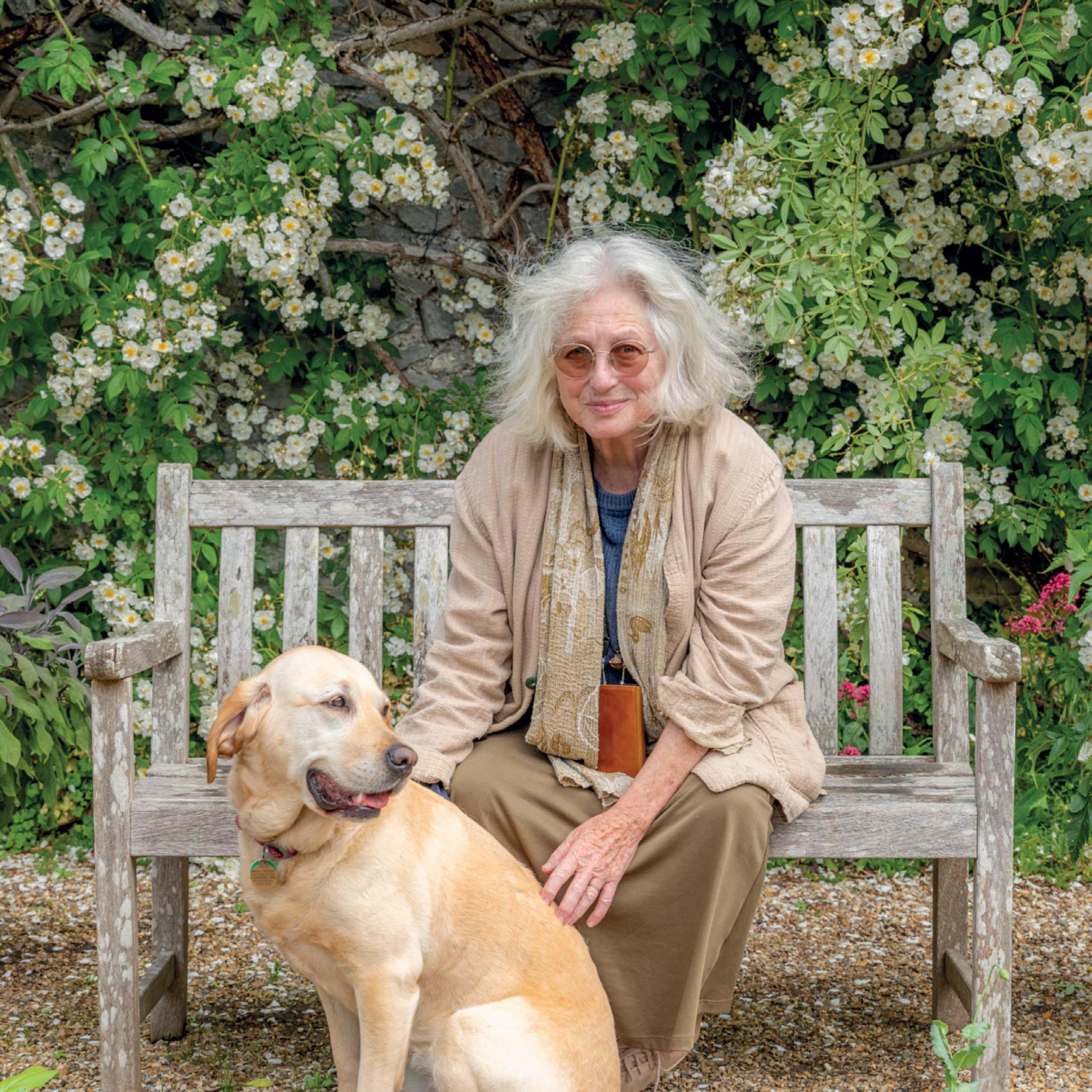
Sara and Meg at home in West Sussex, May 2025
Title page: My Paint Box [104 ]
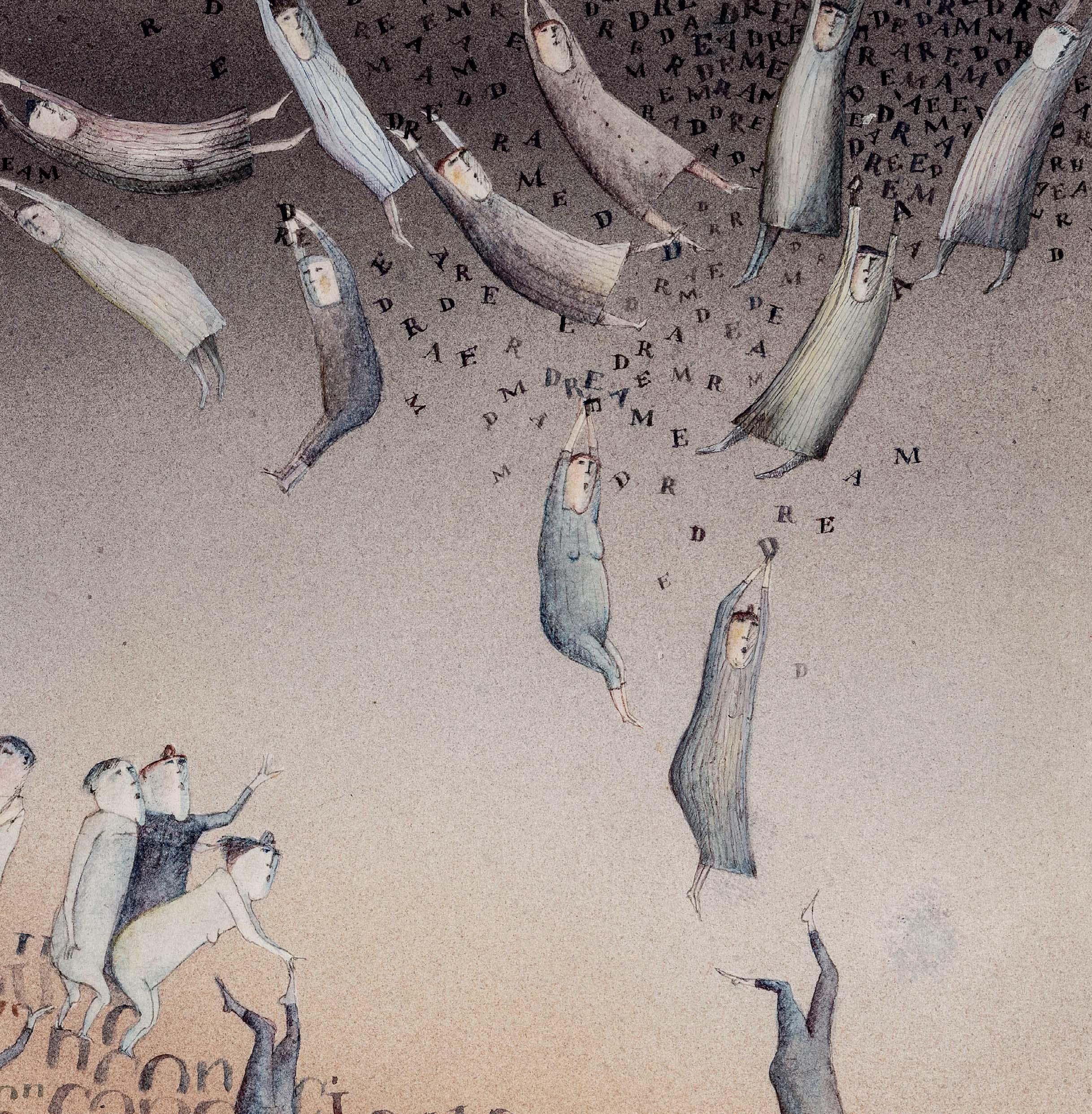
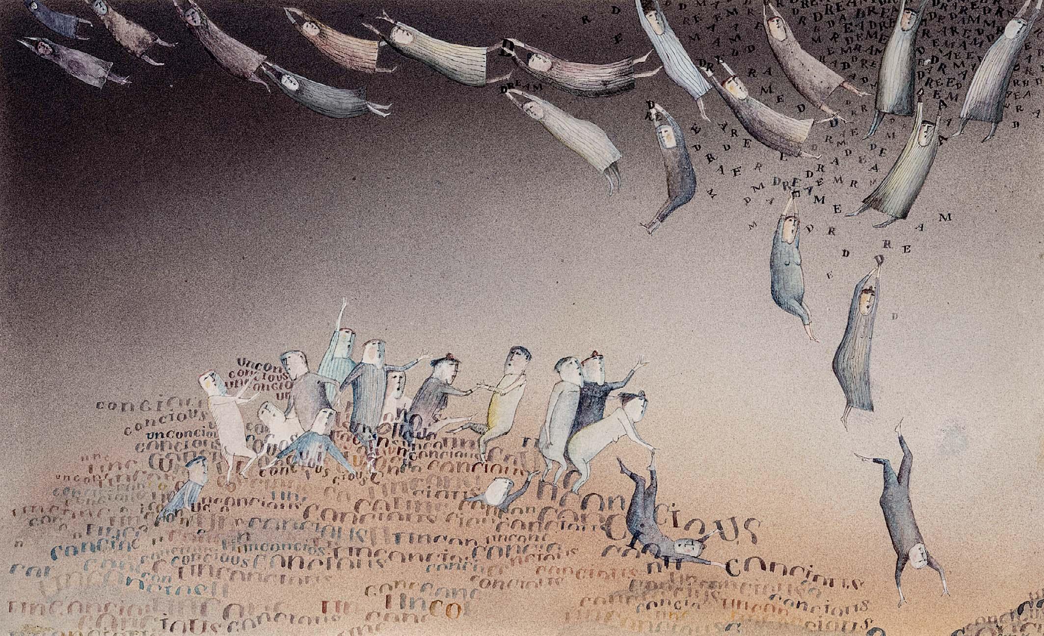
Back endpaper: Dreams and Consciousness (detail) [45 ]
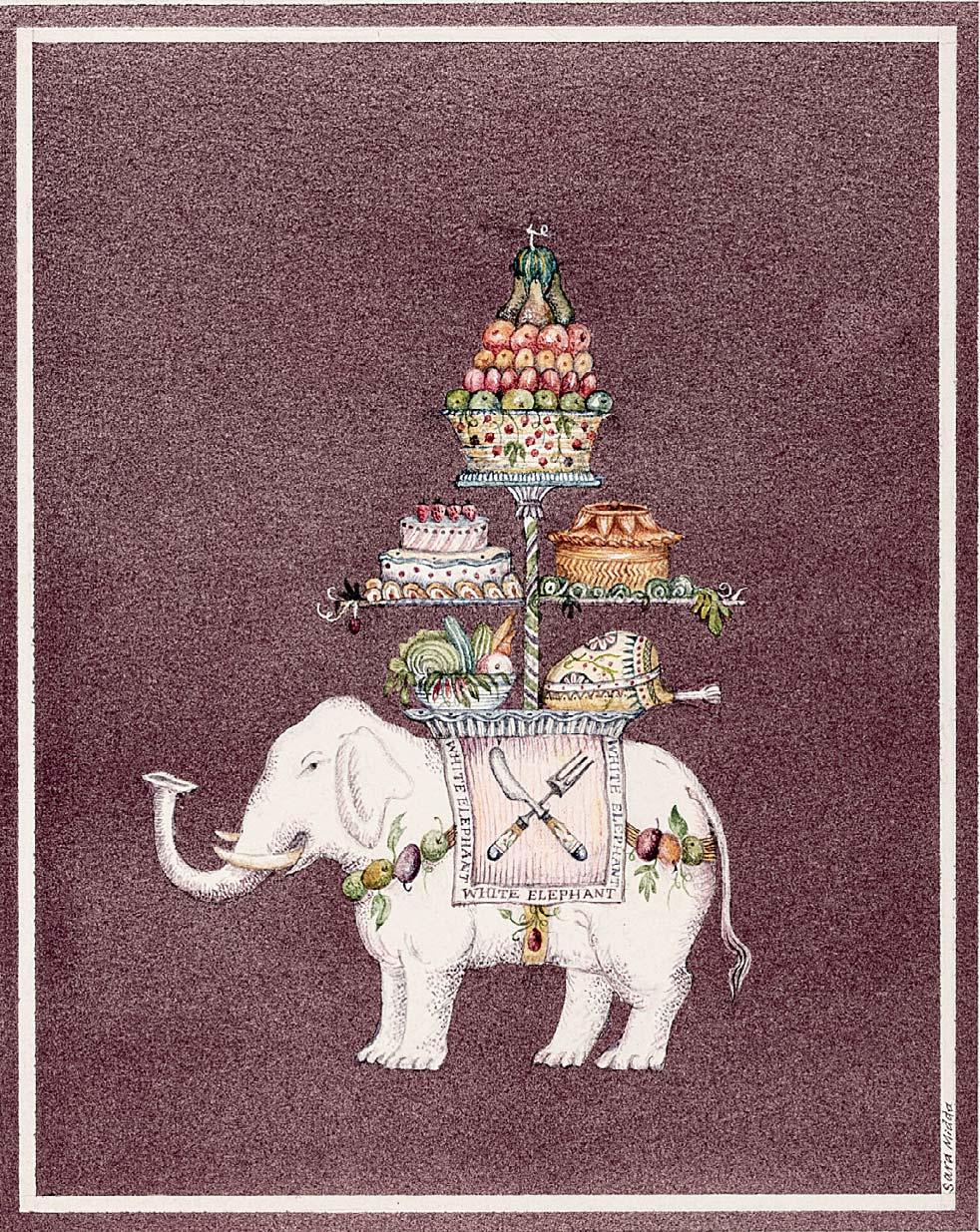
Back cover: The White Elephant [107 ]


A RETROSPECTIVE
CHRIS BEETLES GALLERY
SARA MIDDA (born 1951)
Sara Midda (née Davis) was born in Brighton, Sussex, on 8 November 1951. Her mother trained as a fashion designer and her parents encouraged her creativity from an early age. She remembers ‘drawing since my earliest recollection and certainly since I was 2 years old’ (Suzanne Slesin, ‘Stylemakers: Sara Midda: Illustrator’, The New York Times, 9 April 1989).
Sara took a two-year foundation course at Eastbourne College of Art before moving to London to study Graphics at Goldsmiths, where her tutors were Tessa Adams, Wendy Coates-Smith and Ron Van de Meer. She then did a postgraduate course in Illustration and Print-making at Saint Martins School of Art. Among her teachers, Silvie Turner and Fritz Wegner were particularly inspiring.
Soon establishing herself as a freelance illustrator, Sara began to design cards, and contribute to such periodicals as Cosmopolitan, the Guardian, Harpers and Queen, The New York Times, Radio Times and The Sunday Times. She illustrated her rst books in the mid-1970s. By this time, Sara had developed a form of illustration in which lettering played an integral part with the image. The groundbreaking book, In and Out of the Garden (1981), extended the fusion of word and image into parterres of prose and beds of lettering. It gave her an opportunity to exhibit her skills as a watercolourist in pages that are a combination of precise observation and exuberant fantasy. With In and Out of the Garden, Workman Publishing of New York became Sara’s regular publisher. On her visits to the city, she developed happy working relationships with Peter Workman (founder), Carolan Workman, Sally Kovalchick (editor-in-chief) and Paul Hanson (creative director) – and also with Ted Riley, who, for the few years before his death, was her agent. Together they gave her creative freedom.
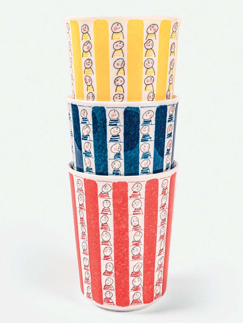
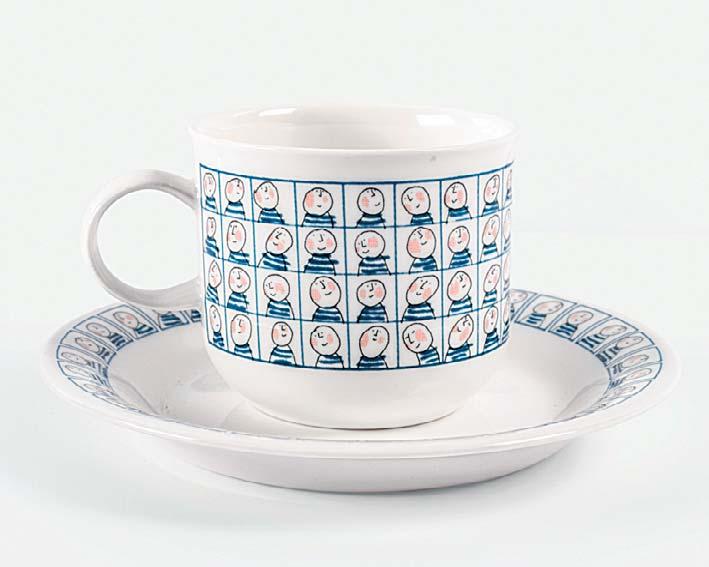
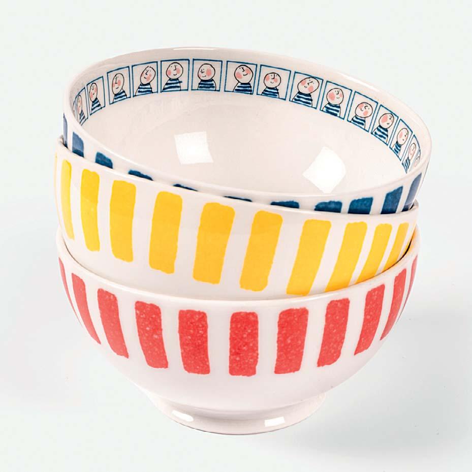
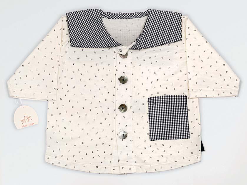
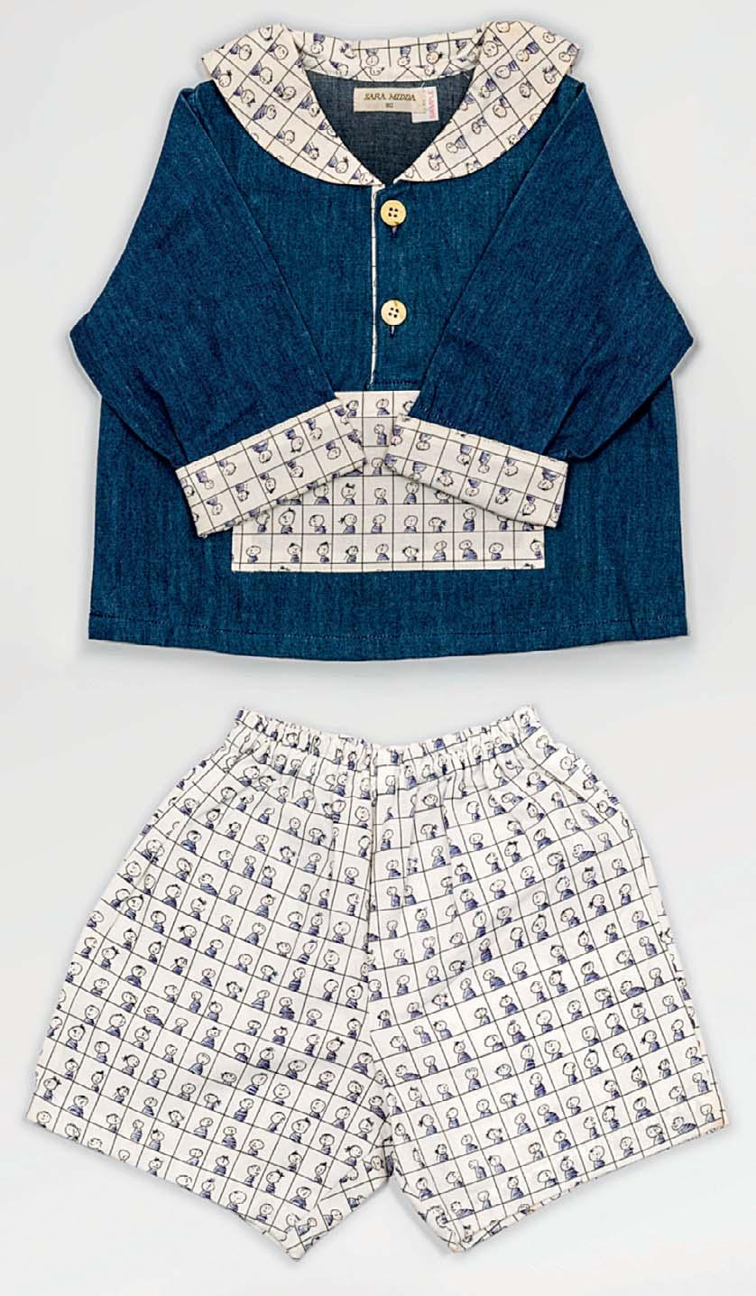
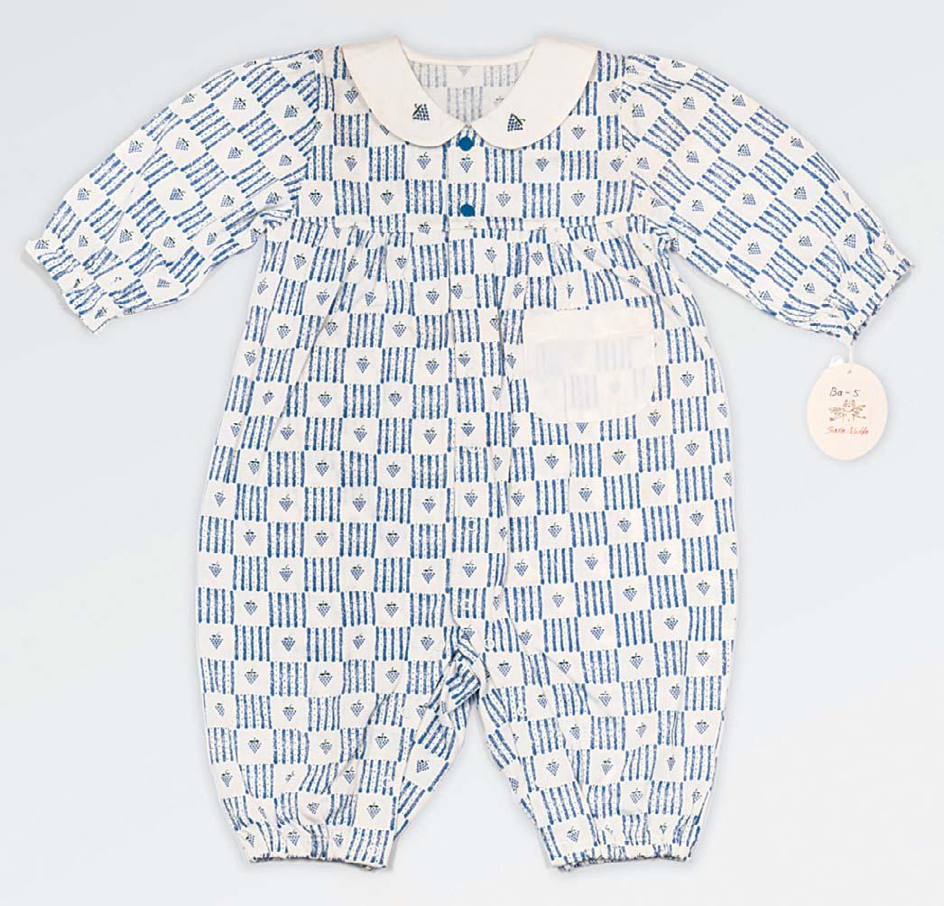
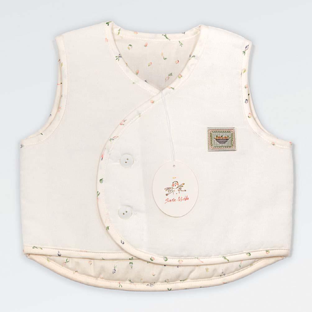
Winning the V&A’s Francis Williams Award in 1982 for the best descriptive illustration, In and Out of the Garden also attracted the attention of Toru Ando, the art director of Mitsukoshi, the Japanese department store company. After a preliminary visit to Japan, she began a 20-year collaboration in which she was very much part of the design team, and designed babywear and linen, crockery and glass, and stationery and product packaging. Sara also collaborated with Workman on various items of stationery, including the In and Out of the Garden day book and companion books.
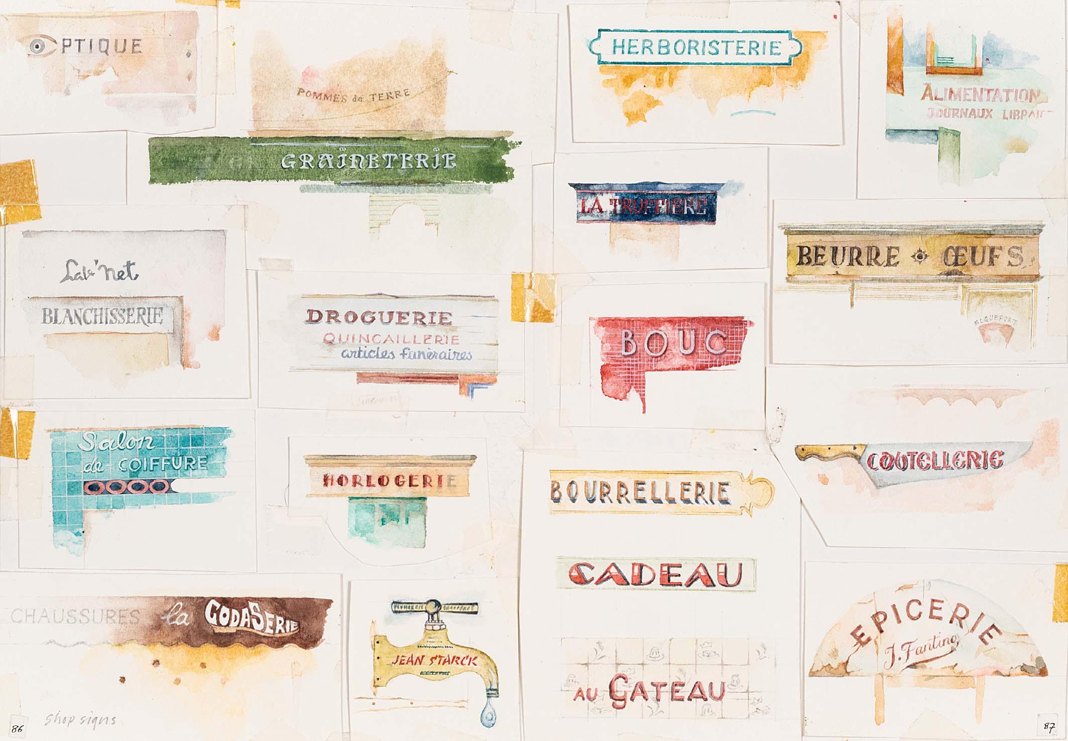
After spending much time in France, on the suggestion of Peter Workman Sara produced South of France: A Sketchbook, which Workman published in 1990. Combining images, photographs and hand-written texts, it provided a rich scrapbook of a year of experiences, from anthologies of house fronts and shop signs to varied depictions of mouth-watering foods. In the early 1990s she met her husband, Heinz Propper. They bought a house in France in the late 1990s and occasionally came back to London. They moved to West Sussex together in 2006.
Having exhibited at Mel Calman’s Workshop Gallery, Sara began to show work at Chris Beetles Gallery in 1991. In the books produced through the following decade, she applied her unique view of the world to the human condition, from birth through growing up to growing older. First published by Jonathan Cape in 1994, Growing Up and Other Vices was a magical evocation of the mysteries of childhood and also a gentle satire on adulthood. Through her captivating ink and watercolour text and illustrations, Sara Midda conveys the perceptions and inner feelings of children in a way that is both profound and revealing. It had been developed with the editorial encouragement of Tom Maschler, the head of Jonathan Cape, who was introduced to Sara by Alan Manham. The book won the Bologna Ragazzi Award in 1995. Following its success, Baby Book was published in 1999. The book is an illustrated journal and touching keepsake for new parents.
In 2002 Sara’s love of lettering led her to produce A is for Adultery, Angst, and Adults Only, an illustrated alphabet book for adults. Later, she then revisited an idea from her early work that an alphabet could be created from just 11 components. Paul Hanson of Workman Publishing saw her drawings of little gures hauling shapes to build letters, and helped to create a kit to help children understand how the alphabet is formed. The result was published as How to Build an A in 2008.
In 2014, she returned to the subject of food in A Bowl of Olives: On Food and Memory, approaching the format in a similar style to South of France. The book was a culmination of her love for cooking, eating and sharing with friends.
More recently, Sara has been working on new ideas including a new book and designs. Sara lives in West Sussex with her labrador retriever, Meg.
SARA MIDDA
In conversation at her home in West Sussex
Can you tell us how you began painting from such an early age?
My brother Simon was allowed to paint rst. He’s a little bit older. My mother said when I was about two or three I’d be allowed to paint. So she set up this little table with her paintbrushes, paints and two boxes of Liquorice Allsorts which disappeared rapidly. Still a strong memory.
Were you growing up in a house like this in the countryside?
No, our house was very tidy unlike mine! I grew up in Brighton, Hove really. There was a garden where we spent a lot of time. We picked the raspberries, currants, blackberries; weeded and shucked the peas. This love of gardening has stayed with me. We had cats, a disastrous episode with tortoises and later rabbits, who multiplied overnight. Simon, the woodworker, built elaborate hutches and pens for them. We were given a little plot of garden. Simon grew things. His seeds always came up, mine didn’t. I would be picking the earth to see what was happening underground so I wasn’t really successful as a gardener. We spent Saturday mornings scouring the second-hand bookshops in the Lanes of Brighton. Tables of almost disintegrating tomes, and musty book smell. Bliss.
We know your mother was creative. Can you tell us a bit about her?
She was studying fashion design at Saint Martins during the war with Miss Pemberton, whom she often talked about. Finally, my grandfather stopped her travel to London from Oxford because of the doodle bugs. Many years ago, Chris Beetles Gallery had a Muriel Pemberton show. I took my mother, who went up to her and Miss P said, ‘I remember you.’ A delighted mother. She was creative in many ways most of her life. My parents married in 1948 after the war.
Was she encouraging of your creativity growing up?
Yes, both of my parents were. My father loved books. They were supportive of what we wanted to do. Simon went on to be an eminent zoo archaeologist. For the last 35 years he has been living and working in Lisbon with his late wife Cathy, and their lovely daughter Miriam.
How did you begin your art education?
I went to Eastbourne School of Art to do a two year foundation course, followed by Goldsmiths for graphic design, and, nally Saint Martins to do a postgraduate course in illustration and printmaking.
How did you nd London, after Brighton?
Exciting, large – though I missed the country – I was not a city dweller, even though I did end up staying for 26 years. After a very brief rst marriage, I then went to live in Chalk Farm and began work.
How did you nd the courses that you were doing in London?
Saint Martins was great. At that time it was in the middle of Soho and there were wonderful people there. One of them being Fritz Wegner, the illustrator, who was an important gure in my life. Also Silvie Turner, in printmaking, who started the St Martin’s Press. I was lucky they published and printed their rst book, my rst book. At Goldsmiths, there was Wendy Coates-Smith, Tessa Adams and Ron Van de Meer. Exchanging ideas with other students was so important.
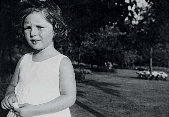
Sara, August 1955 (age 3)
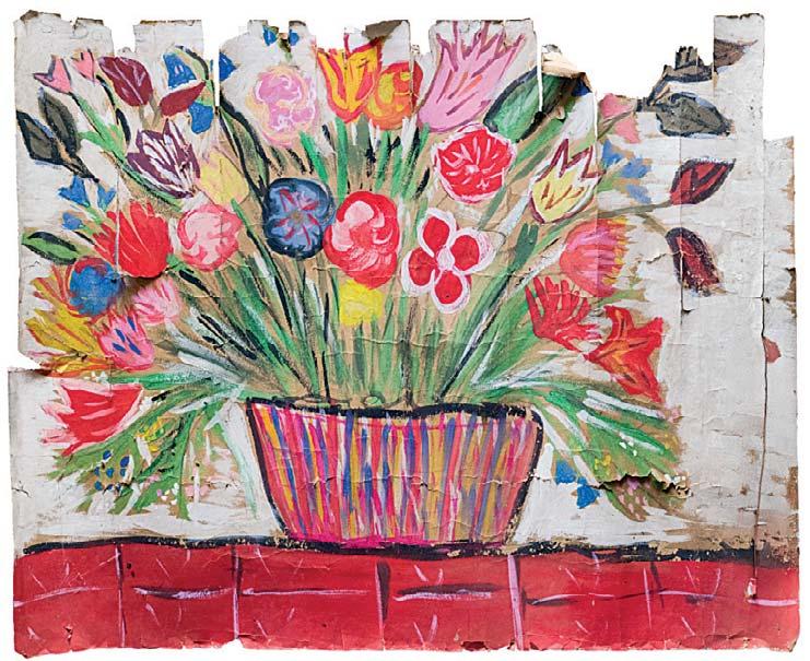
Sara’s childhood painting (age 4)
Did people start to show interest in your work after your degree show?
Yes. Arnold Schwarzman commissioned my rst piece – a medical series for the The Sunday Times Magazine. I did the heart with coloured lettering, but I’m not sure it was totally accurate. David Holmes was putting together a folder of prints and text for publicity for a whisky company in the Spey Valley with drawings of the distillery and surrounding countryside. They gave me a bicycle with no gears to explore and paint the area. I was drawing in a hedge, a croft. I remember it was snowing and I had freezing hands. The crofter came out. He and his wife took me inside for tea and scones, and gave me bowls of hot water for my ngers. It was very lovely – everywhere smelt of whisky.
I started drawing for Harpers and Queen, the Radio Times, Habitat Calendar, Cosmopolitan, Guardian, The Sunday Times Magazine, alongside working on ideas for myself. Mel Calman had the vibrant Workshop Gallery. They put on fun mixed shows, and I had my rst solo exhibition there.
Was it interesting to nd yourself doing lots of commercial work, when you originally wanted to be a book illustrator?
I liked the contrast. Then I went to New York with my portfolio. Being totally naïve, I walked into The New York Times and was given a meeting with Steve Heller on the Book Review and did commissioned work for him. He introduced me to Ruth Ansell on the magazine. I worked with her both there and when I was back home. He also suggested I should have an agent in New York. He named two people. The rst one was not taking on anyone new and the second one, Ted Riley, also was not taking on anyone. But he said to come on Sunday morning and we’ll have a co ee, which stretched into lunch. He took me on. Ted was unique, and we had a very exciting few days that time in New York. We worked together for six years before he died.
How did your relationship with Workman Publishing start?
Ted Riley and I left my portfolio with them the day before I was leaving for London and met with Peter Workman and Sally Kovalchik, who became my editor. The following day, Peter said, ‘What book would you like to do rst?’ and I replied, ‘The gardening book’. He suggested we went next door into the Japanese garden and talked it over. Then we had lunch, and I ew back to England. That’s how my happy relationship with Workman and Ted started. I stopped on the way to the airport, to tell an old friend who also happened to be in New York, my exciting news.
I would regularly return to New York, taking my new work and spending a lot of time with Sally Kovalchik. I miss working with the team at Workman Publishing, and Paul Hanson, the designer.
Had you already been working on ‘In and Out of the Garden’?
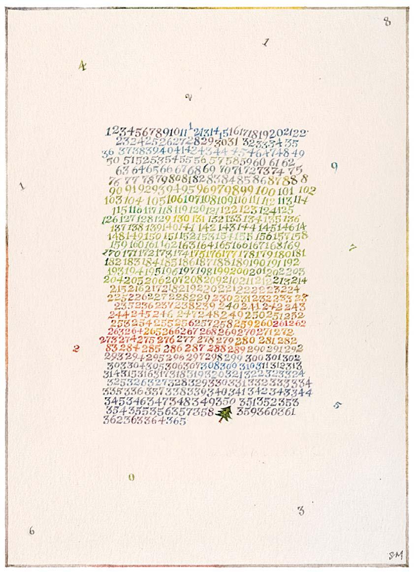
Yes, I was already working on ideas for myself but it took four years to complete it. Happily, editorial work continued. With John Gorham and for Stella Richman, I did illustrations for the White Elephant Club. Then a one sheet calendar, 365 jagged squares with colour re ecting the year and the number of the relevant days, the Christmas tree on the 359th day. It was for a type company.
Where did your love of lettering begin?
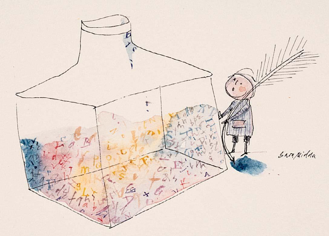
I remember at school learning to write which I don’t think happens anymore. You traced o the letters with a pencil. And when you
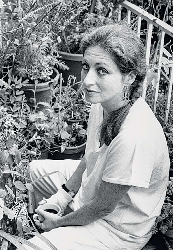
Sara on her London balcony garden
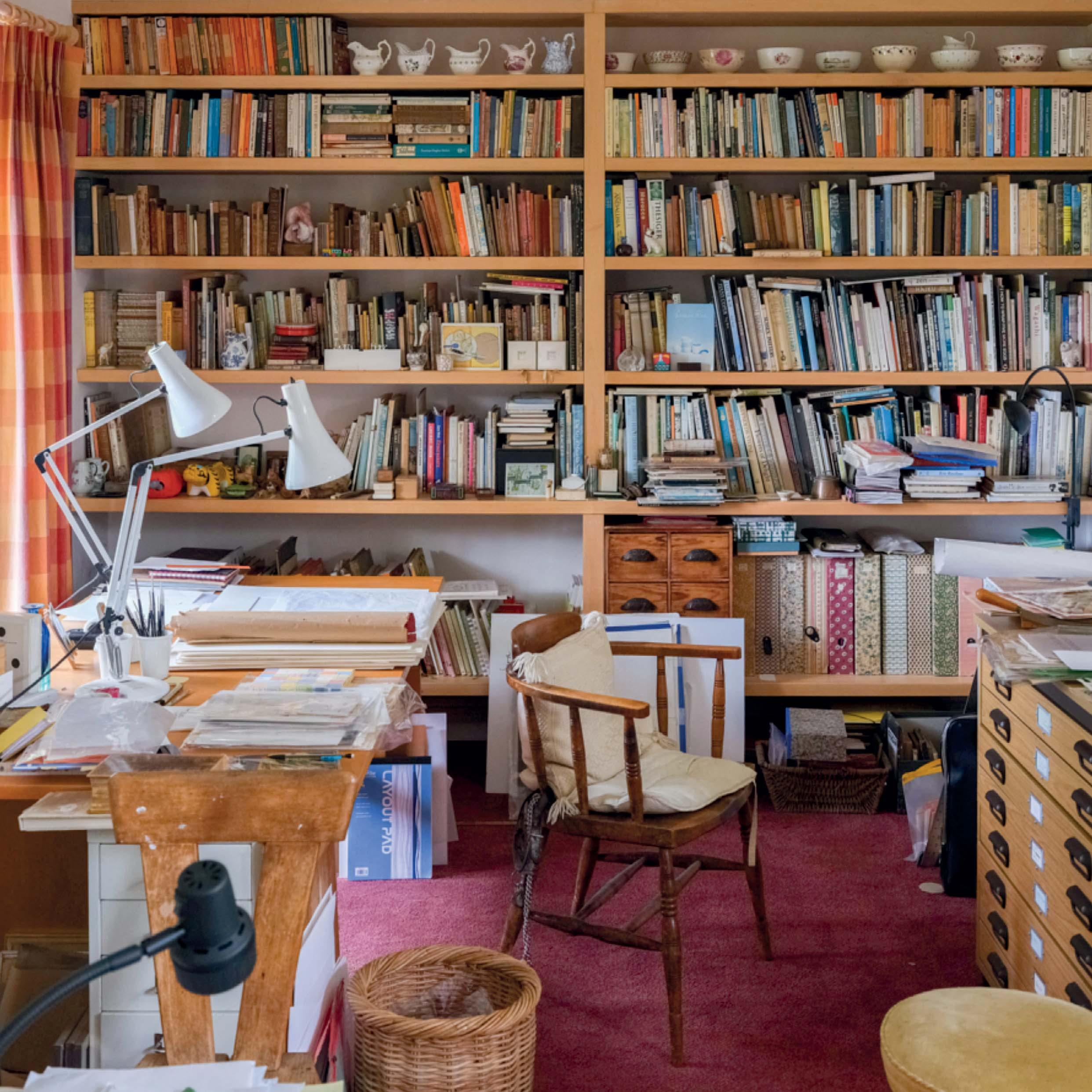
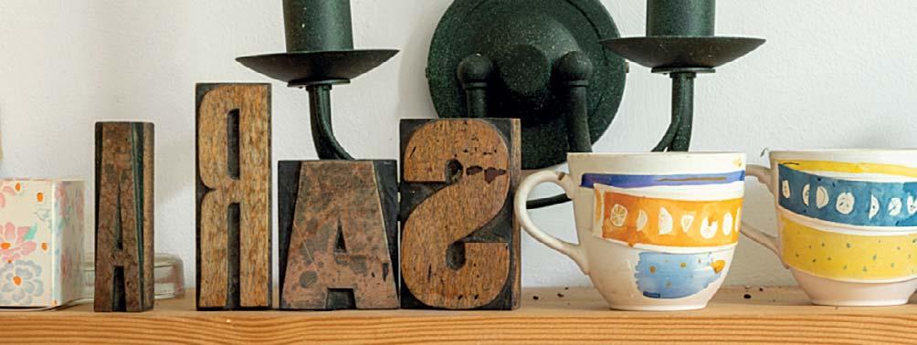
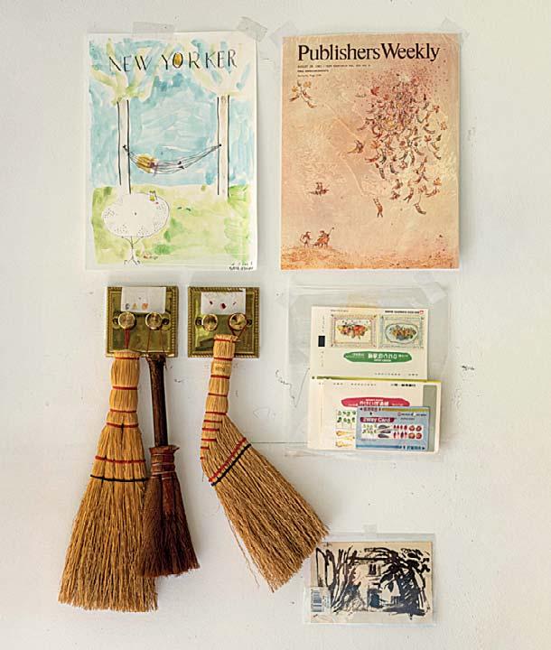
Shelf in Sara’s studio
were good enough, progressing to a dip pen, a little ceramic inkwell set into your desk, lled up at the start of each class. At some point I could write, it all came together. The physical making of letters was very exciting.
At Goldsmiths, I made seven Bible images made up of letters, in watercolour and ink, and a bit larger. It then became important to me that lettering was part of the image and not a separate entity. We also did type-setting and I discovered typography and loved it. I like to collect early manuscripts and ephemera which are constantly inspiring.
How did you begin working on such a small scale?
For me, it’s a natural size as I prefer to work in the same size. At Eastbourne I made large oil paintings. It was a medium I couldn’t get on with; I was too messy to handle them. There’s no photographic evidence of these paintings, but I do have a large powder paint image of owers in a basket that I made at school aged four. [See page 6]
What were some of the initial inspirations for ‘In and Out of the Garden’?
I became interested in gardens – exploring them with an old friend, attending RHS shows at Vincent Square in London, spending time in Sussex and Dorset.
I found a copy of The Old English Gardening Books by Eleanour Sinclair Rohde in an old bookshop in Colchester in 1978, and a facsimile copy of A New Orchard and Garden by William Lawson, rst published in 1618. These were inspiring.
In London, I had a small balcony crammed with pots, two stools, a tiny table. In spring and summer, it became another room. Mainly owers, herbs and wild strawberries from the strawberry farm in Dorset.
Well your garden is beautiful right now …
Thanks to great help from three friends! There’s a piece in the book by William Lawson that says ‘If you build a house, put it in the middle of an Orchard.’ When my husband Heinz and I moved here, there was little in the garden. We planted fruit trees. We came here 20 years ago; Heinz very sadly died 12 years ago. Gradually I’ve emerged with the help of very good friends.
You had a long working relationship with the department store Mitsukoshi. How was your experience in Japan?
Their chief designer Toru Ando saw In and Out of The Garden and had the idea of creating a line of products. I was very nervous about it all. Ted said, ‘Go. Fight for quality, have fun and learn Japanese.’ So I went. First there were fairly daunting meetings of about 50 men, just three women. Then it all started. It was wonderful and has been such an important part of my life. I’d wanted to go to Japan, and felt comfortable there. I certainly miss that time. The project was led by, amongst others, Toru Ando, Ken Shigematsu, Rie Sekine, Mrs Ohta, Miss Tanaka, Michaharu Takahashi, Mr Yagi, Mr Kobayashi, Mrs Miyadera, the wonderful design team, product managers and manufacturers.
[Mitsukoshi and Isetan in 2011 merged and became Isetan Mitsukoshi Holding Ltd]
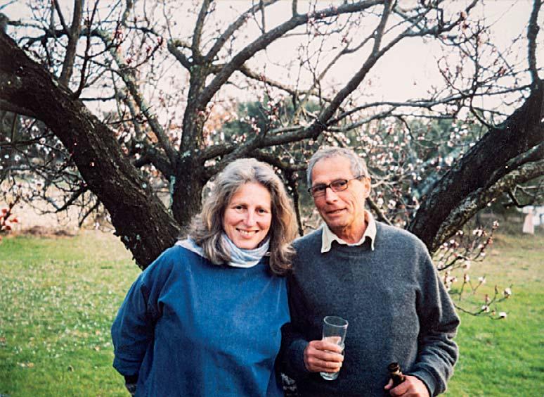
Sara and her late husband, Heinz Propper


What was the starting point for the relationship, did they want to start with anything in particular?
When I rst went, it was soap, fabrics, china, towels, bedding, and then it grew. They were terri c to work with. They were extremely patient with someone who had never worked in any of these disciplines. Every spring I’d take new designs. We’d look at the designs with all the di erent manufacturers. They would go away for a few days, returning with suggestions about how the work could be applied. It would be discussed. They had a London o ce too where dummies were sent, and usually once a week they would come to my at to show me things. Every year a group would come for a few days for a meeting in my at. The baby collection and the soap became particularly fun to be involved with.
When the baby collection rst came about, had you already done the Baby Book?
No, the baby collection started in a small way when I was working on the French book. I was sort of working parallel with Mitsukoshi and Workman. Ann Kostick, then Annie Brody, then Carolan Workman came as agents. In Japan, Tachi Nagasawa and Miko Yamanouchi were the Japanese agents who translated and were a great support.
Let’s talk about travel – around Japan, and we know that you brie y worked in a ceramic factory, in Italy?
I travelled in Japan, with Mitsukoshi who are spread throughout the country, visiting stores or manufacturers. Long weekends to go
travelling, as far north as Sapporo and south as Taketomi Jima, and in between mainly with Carolan.
In Italy, it was at an old pottery in Umbria, working in the studio painting on un- red cups and plates. Nothing came of it, but it was a great experience.
France has also been an important inspiration for you. How did you nd yourself there?
Because of a relationship I was spending a lot of time in southern France by the Italian border. Sketchbook came out of the period.
Years later, a very insightful friend introduced me to Heinz Propper. He ran a printing company and amongst his favourite things were programs for the Royal Opera House and many concert venues. We were together for 20 years. ‘Best thing that ever happened to Sara,’ said my father. We bought an old house at the foothills of the Cevennes. Isolated, three Cypress trees, olive trees, wild boars and wild owers, including orchids. And some years later an abandoned dog.
How was the shift from drawing gardens and France to ‘Growing Up’ and the ‘Baby Book’?
It was a progression. Things change. For a while, I had an agent here who re-introduced me to Tom Maschler. He came to the at to talk about the possibilities of us working together. His rst thought was that I might do something related to the Bible. When he saw a print I had done called Table Manners For Children, that was how Growing Up started. I think once a month we would have long sessions in his o ce. It was such fun to work on.
Mitsukoshi products
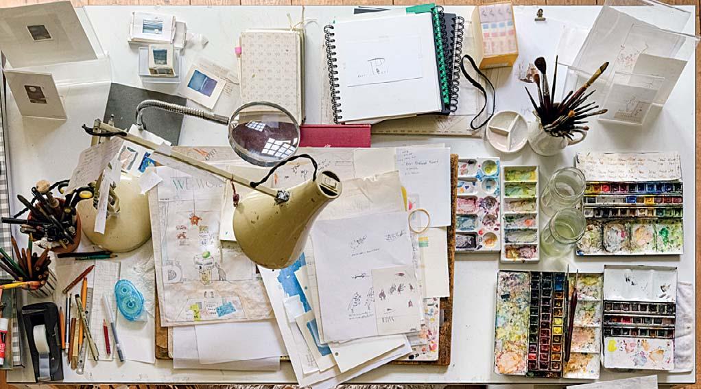
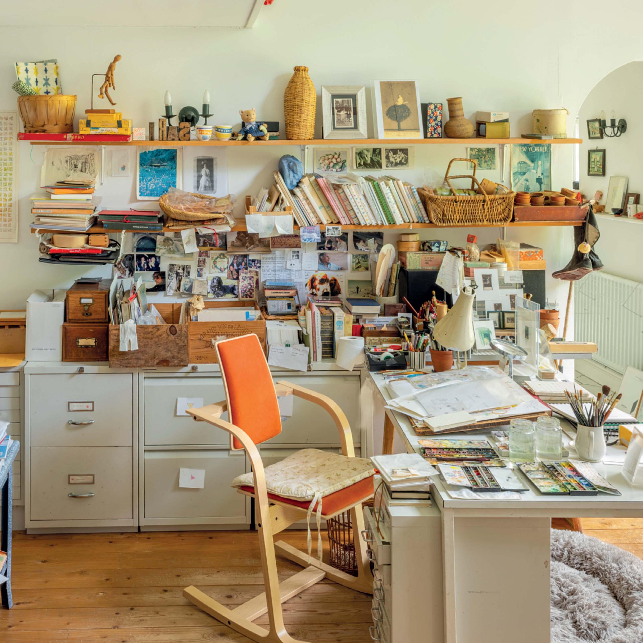
Sara’s studio desk
We know that your artwork doesn’t have any underdrawings – can you talk us through your process?
The sort of looser watercolours have no underdrawing. In fact, most of the pen and ink work doesn’t either. I lose the freedom of line. If it’s a complicated layout I will have minimal pencil guidance. It’s hopeless if you try to draw lettering in pencil and then ink over. They just don’t match in length and size. It does mean that there are many drawings before a nal one. I work with watercolour and sometimes pen and ink. Growing Up is all pen and ink with tiny watercolour details.
And you like to use pans of watercolour, and sometimes … potatoes?
I have dried up tubes, but I’m so messy. It’s rather hopeless so I use pans. They all become very grubby. For the garden book, I used triple 0 sable brushes.
I used to take a potato and half it, dry the surfaces, cover with lots of white paint and squash it down on paper. Lovely e ect. It certainly loosened my mind. I made ip books using potato prints and printed black line, screwed together by me – a limited edition of four titles.
How much time do you spend drawing per day?
I now work or try to work in the mornings, usually for about three or four hours concentratedly. Doing the garden book I would be up at 6am reading and then working through with lunch and dinner breaks with a friend. Often late into the night. I found that time very undisturbed.
As we talk to you now, we are joined by your lovely Labrador Retriever Meg. How have animals shaped your life and work?
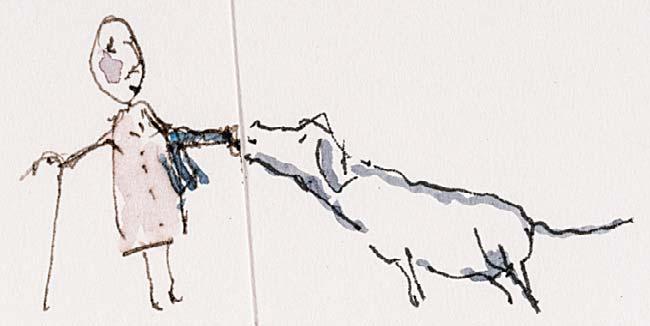
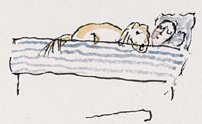
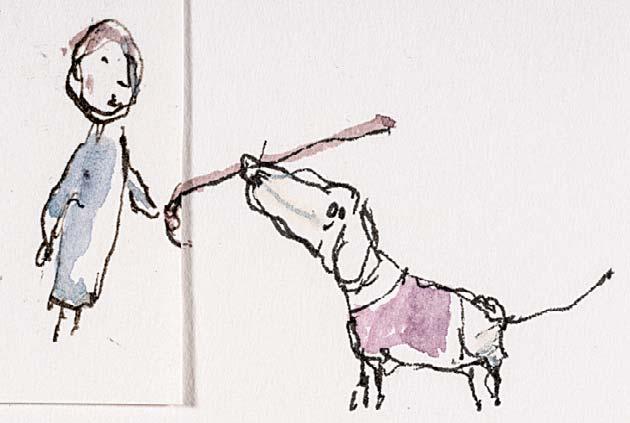
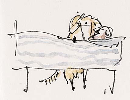
A lot actually. My rst dog attended two art schools with me. The next travelled extensively between France and England. Then there was my rst Canine Partner, Sally. Meg is my second. Canine Partners is a wonderful charity for people with disabilities. The dogs are extraordinary and they match them to humans. Friends of mine found out that I was eligible to apply.
Sally was retired but remained with me, and I was introduced to Meg. It was a lovely period having the two of them. Such di erent characters, and what a change they have made to my life.
Where does your world come from, and the little gures that feature in it?
I don’t really know, they’re just sort of generic humans. They exist amongst all the chaos and horror that’s going on in the world.

Sara’s collection of olive tins
CATALOGUE OF WORKS
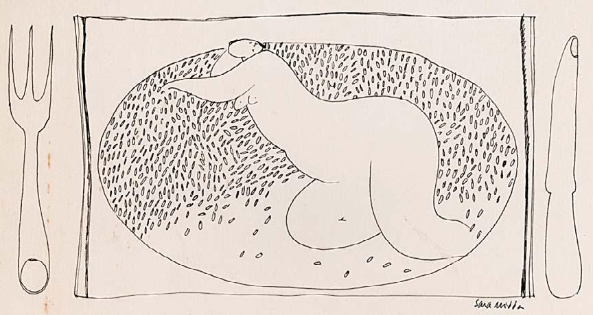
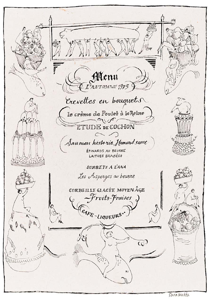
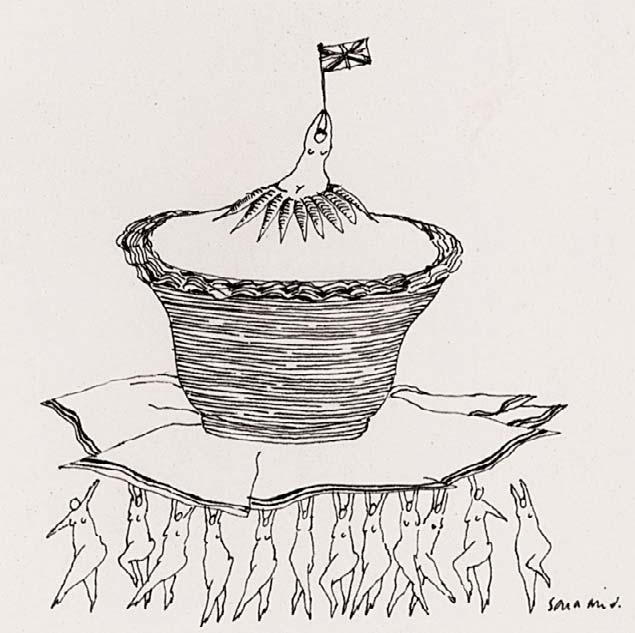
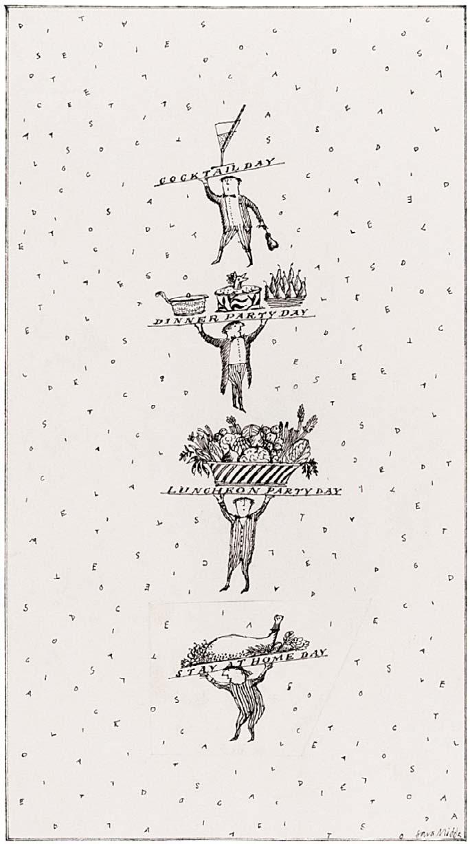
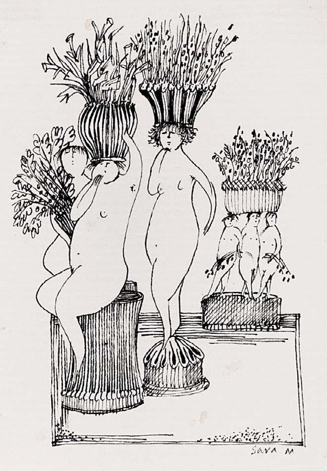
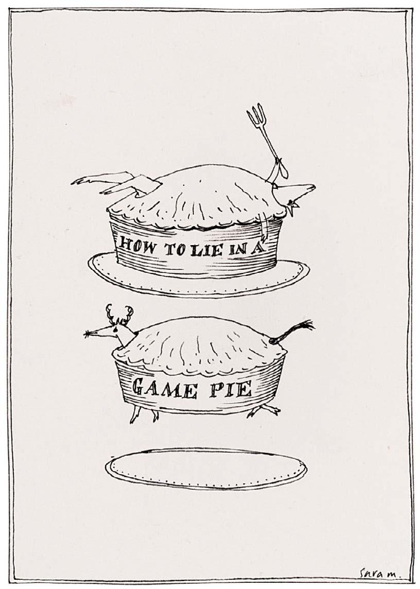
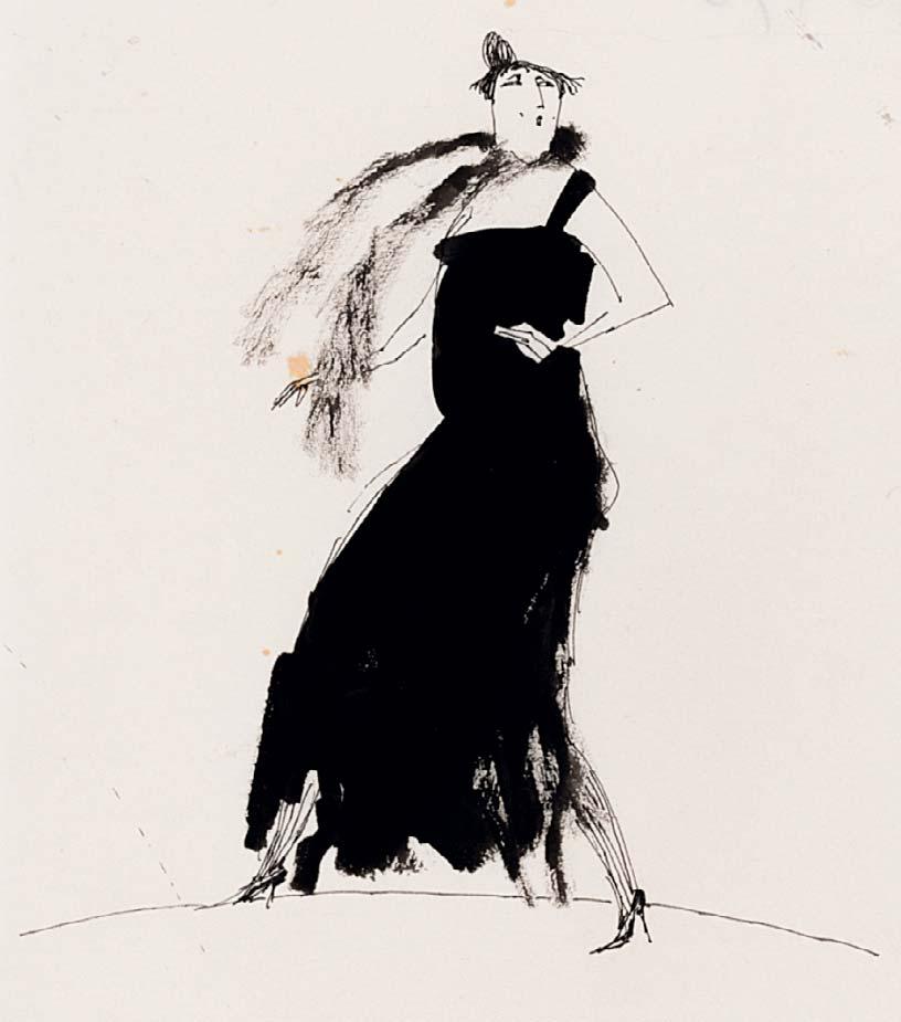
Nos 1-8 are all executed in ink and illustrated in Harper’s & Queen Magazine, circa 1975
1 LIFE DRAWING PLACE SETTING Signed 3 ½ x 6 ¼ inches




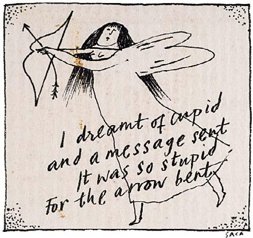
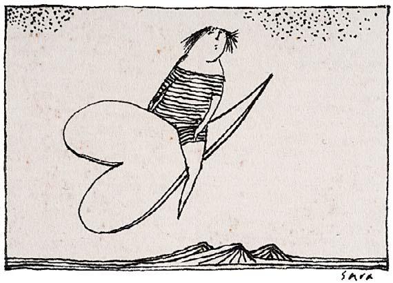
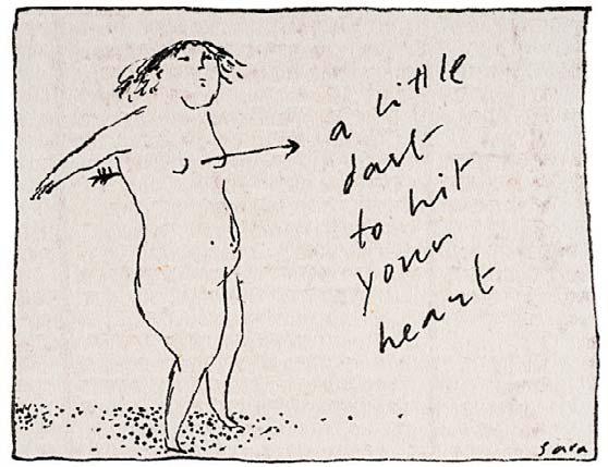
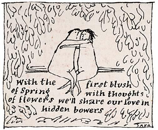
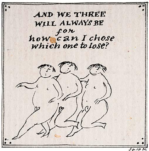
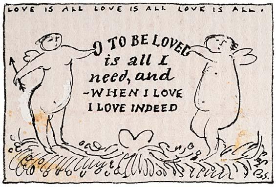
3 x 4 inches
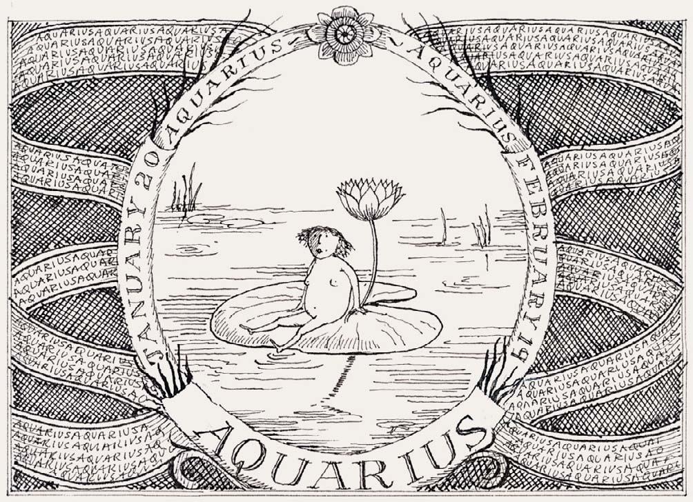
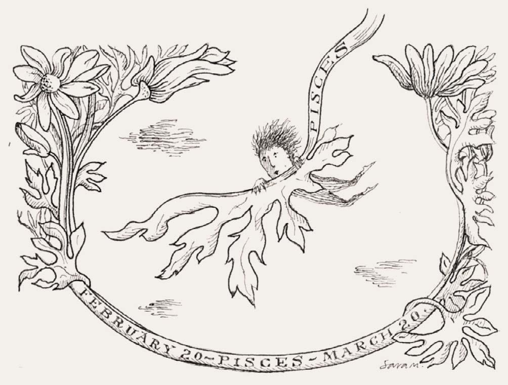
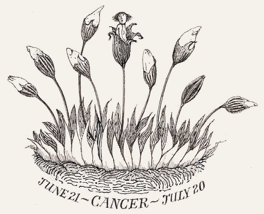
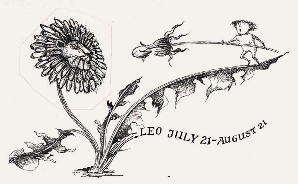
Nos 22-44 are all executed in ink and were illustrated in Cosmopolitan; Nos 22-32 were all illustrated in Cosmopolitan, circa 1980s
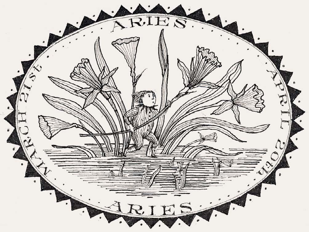

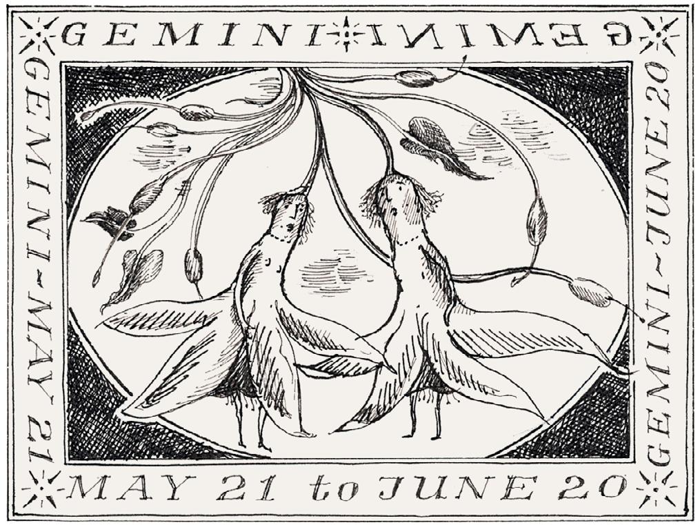
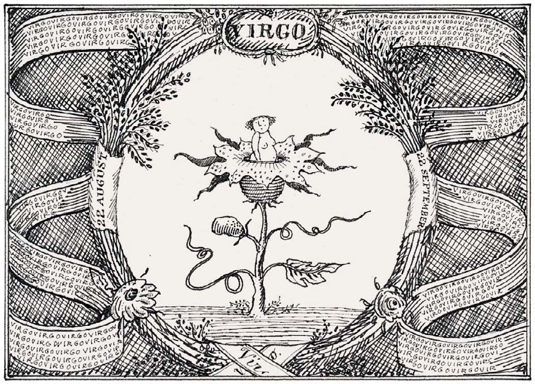
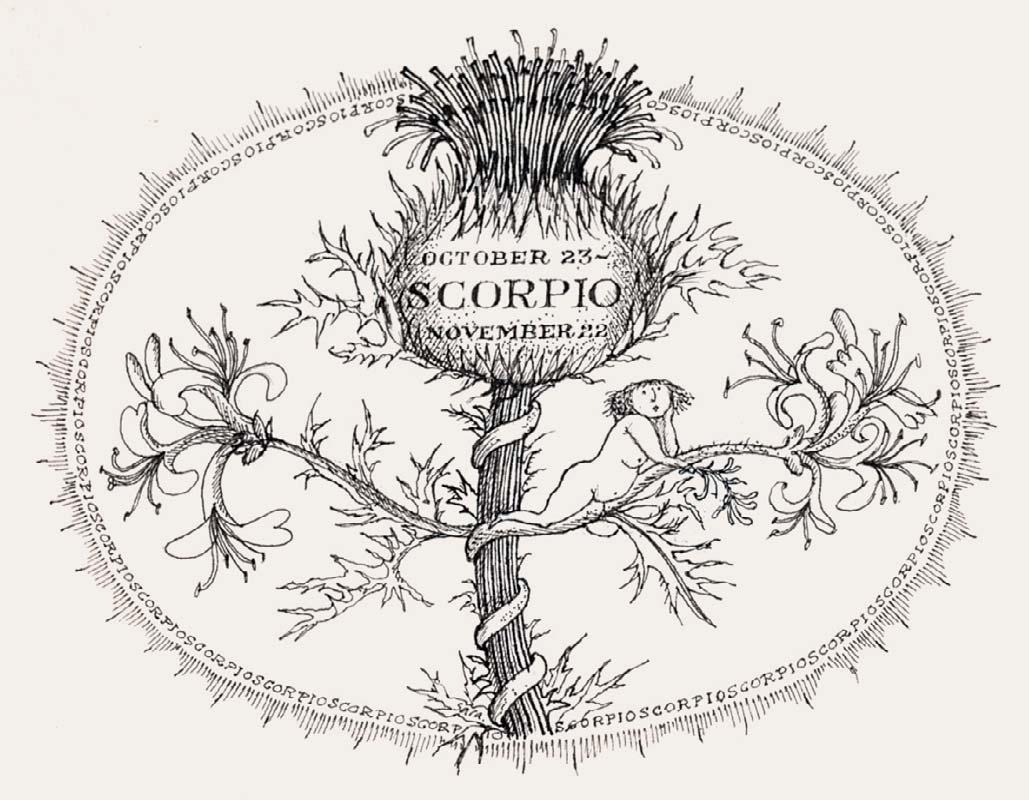
GEMINI
x 4 inches
2 ¾ x 4 ½ inches
CANCER 3 x 4 inches
VIRGO 3 ½ x 4 ¾ inches


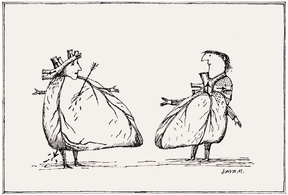
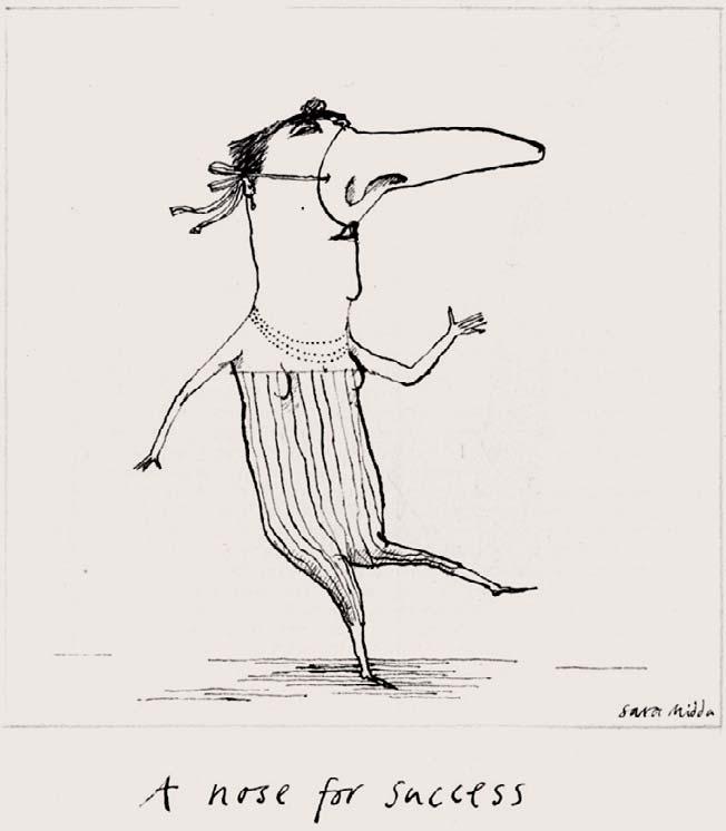

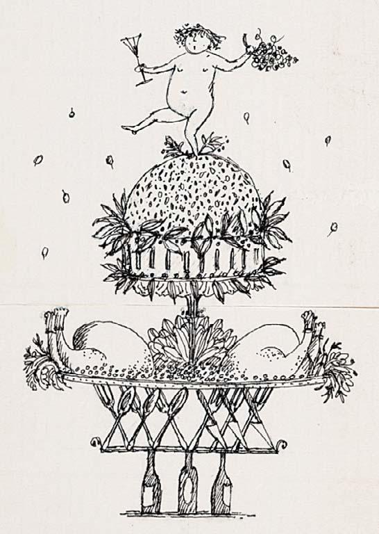
1 x 3 ½ inches
The New Yorker, 1993
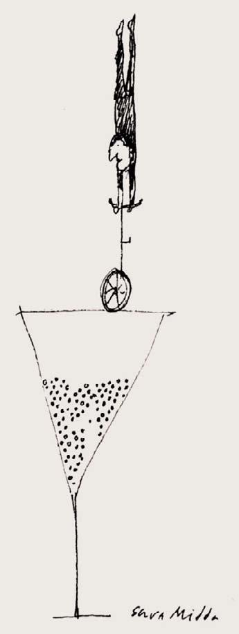
TRICKS
3 x 1 ¼ inches Illustrated: The New Yorker, 1993
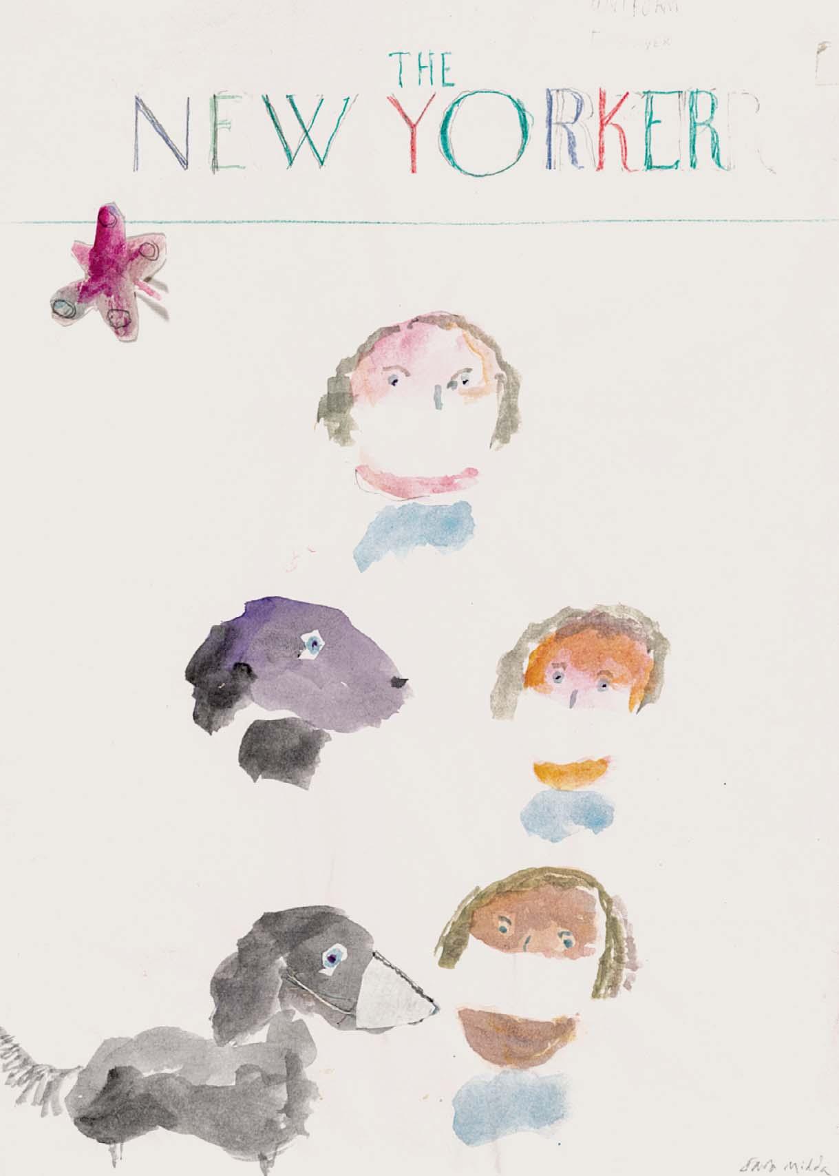
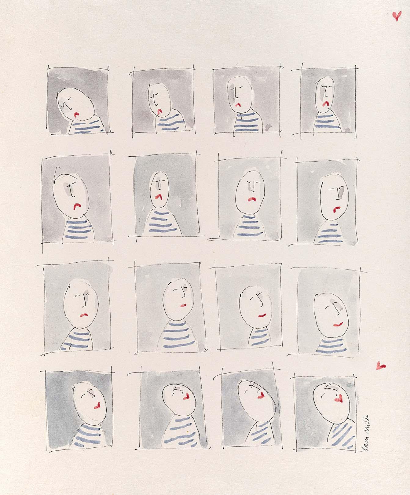
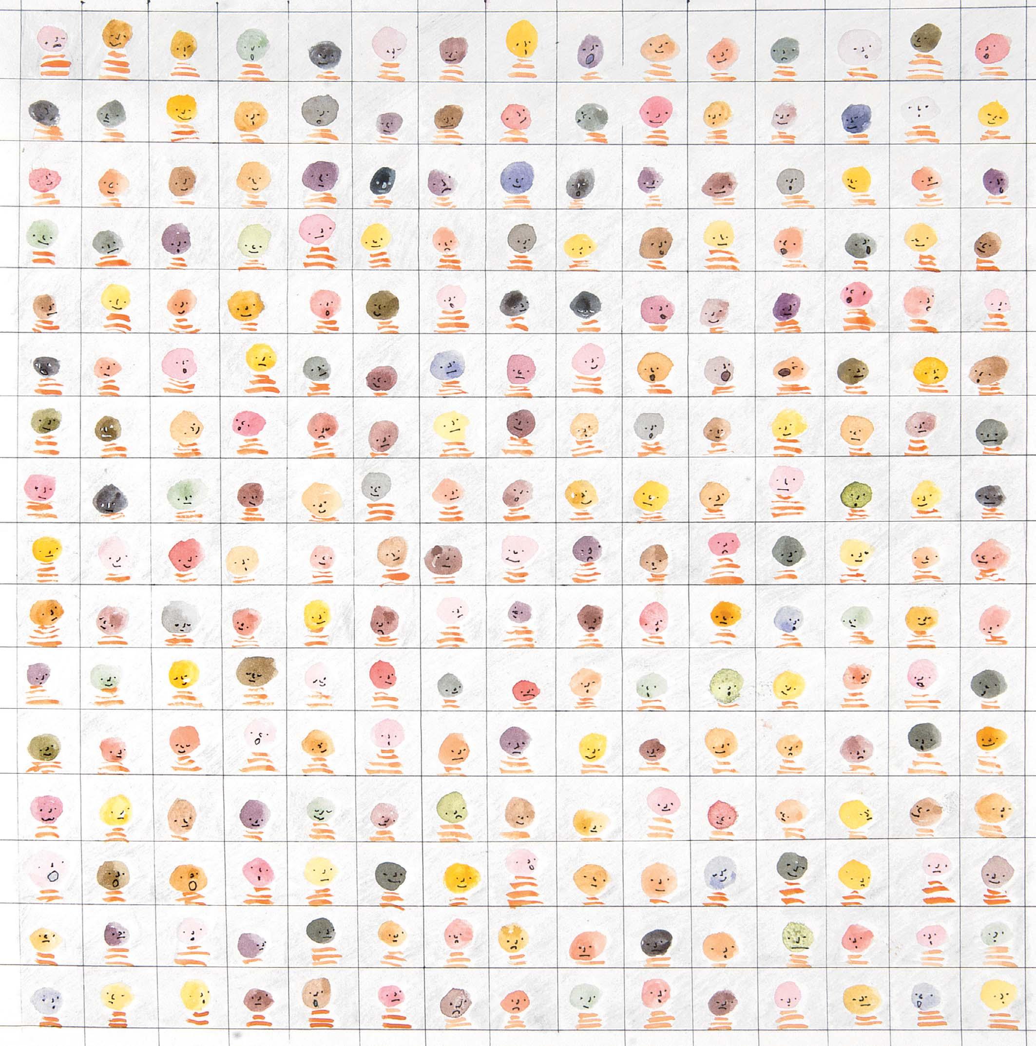
55 LOCKDOWN FACEMASKS Signed Watercolour with coloured pencil 11 x 8 ¼ inches Drawn for but not illustrated in The New Yorker, cover, 2021

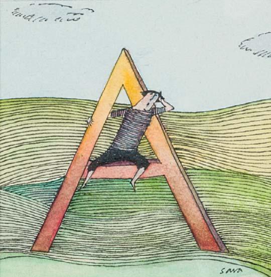
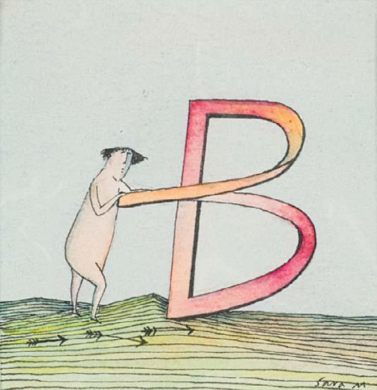
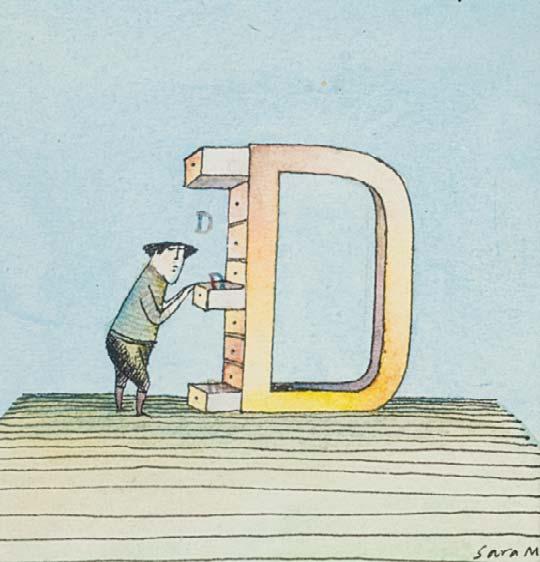
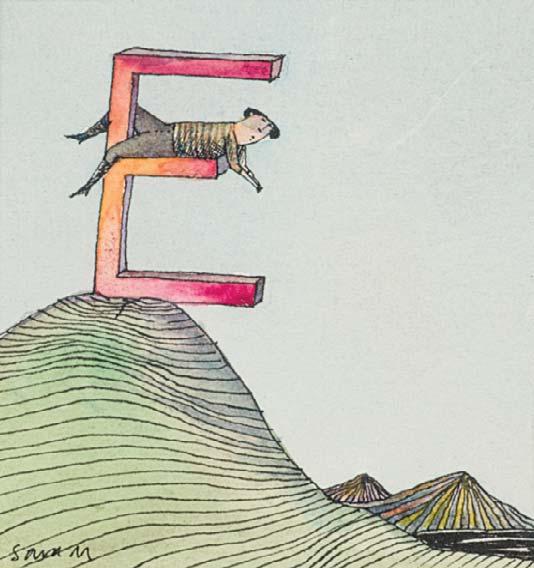
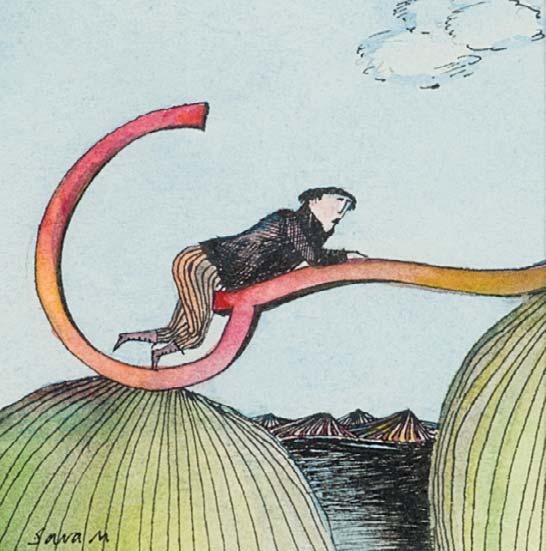
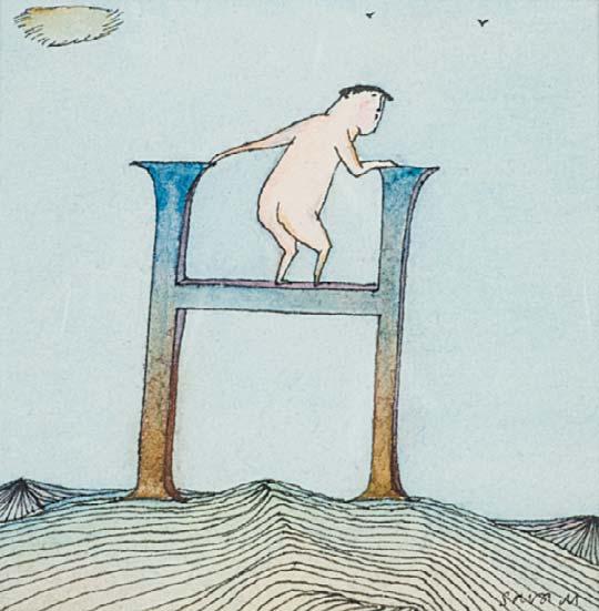

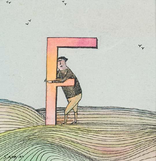

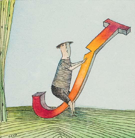
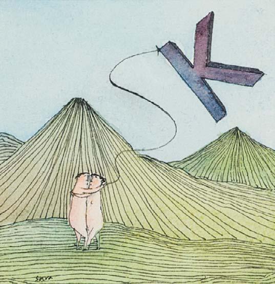
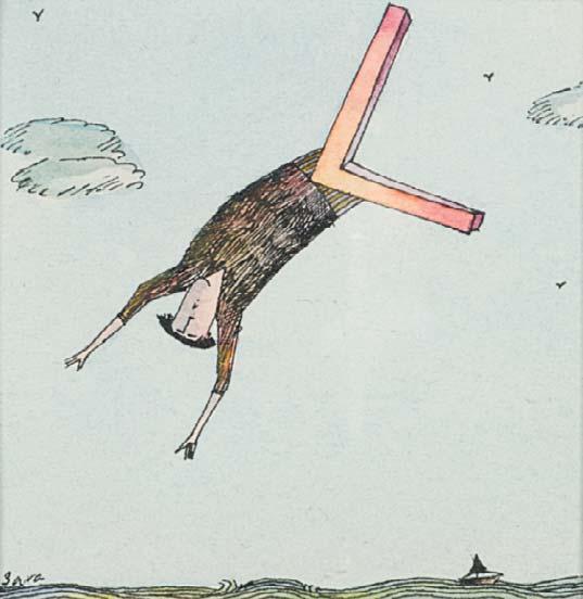
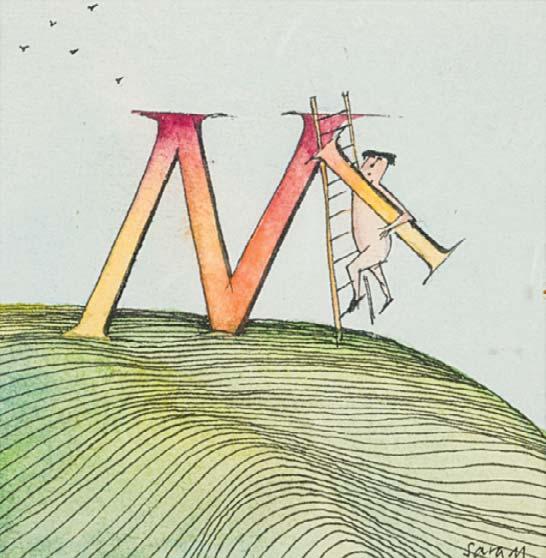
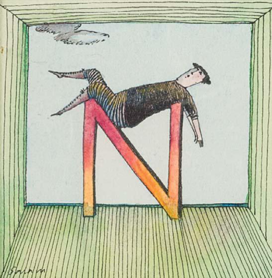
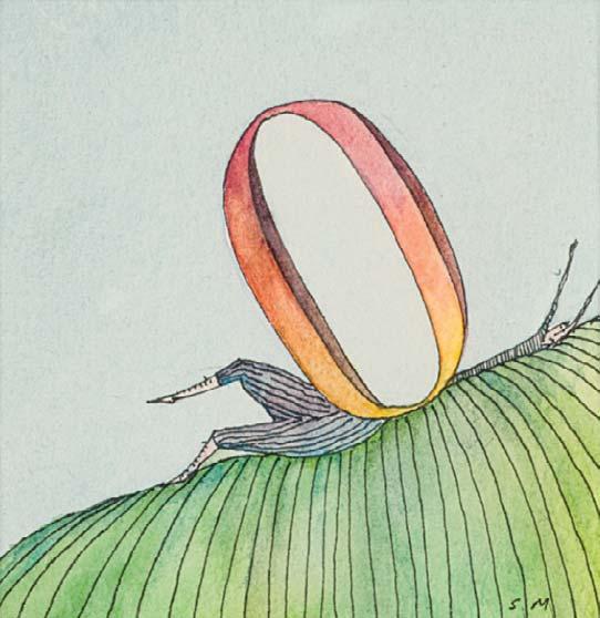
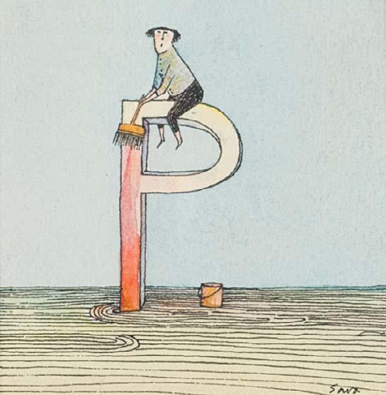
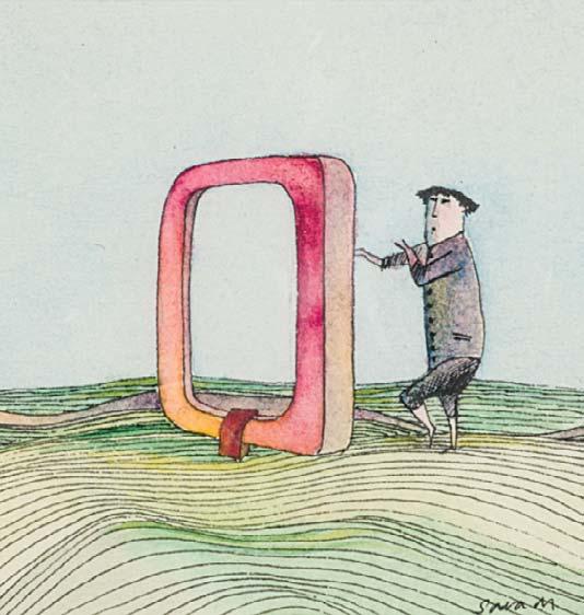
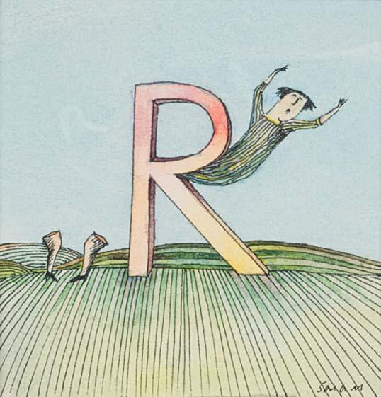
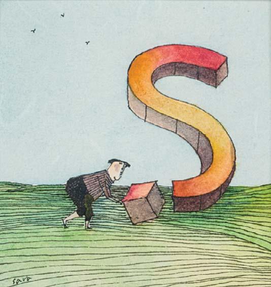
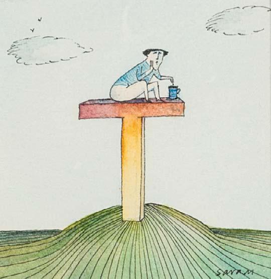
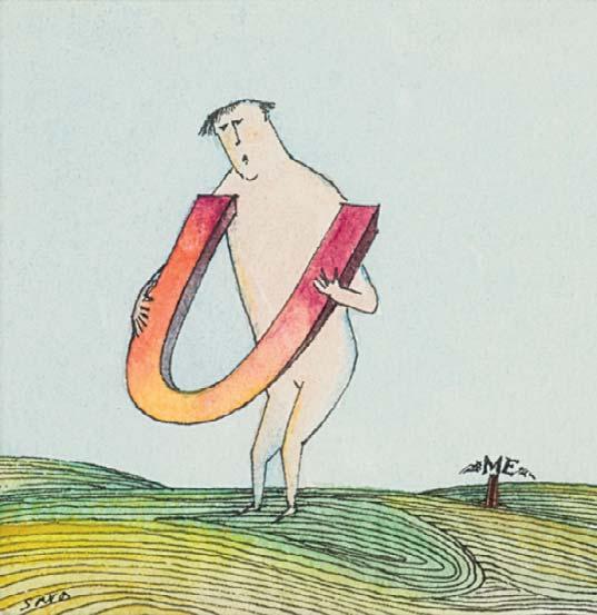
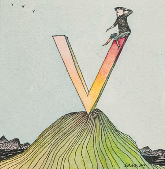
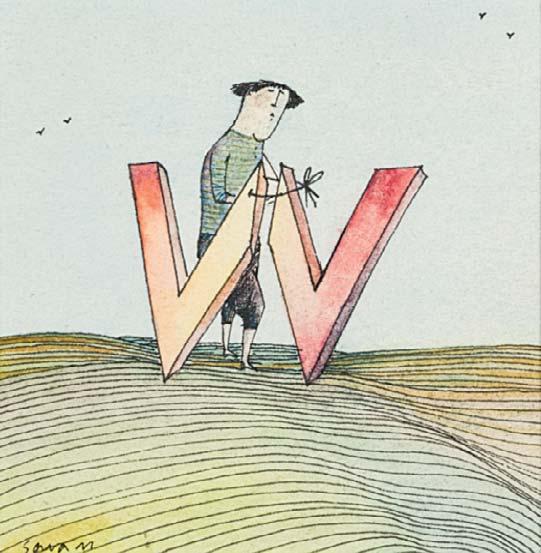

Signed on 13 of 16 panels
Ink
15 ¾ x 12 inches
This work was created in 2025 and reworked on an idea from the 1980’s.
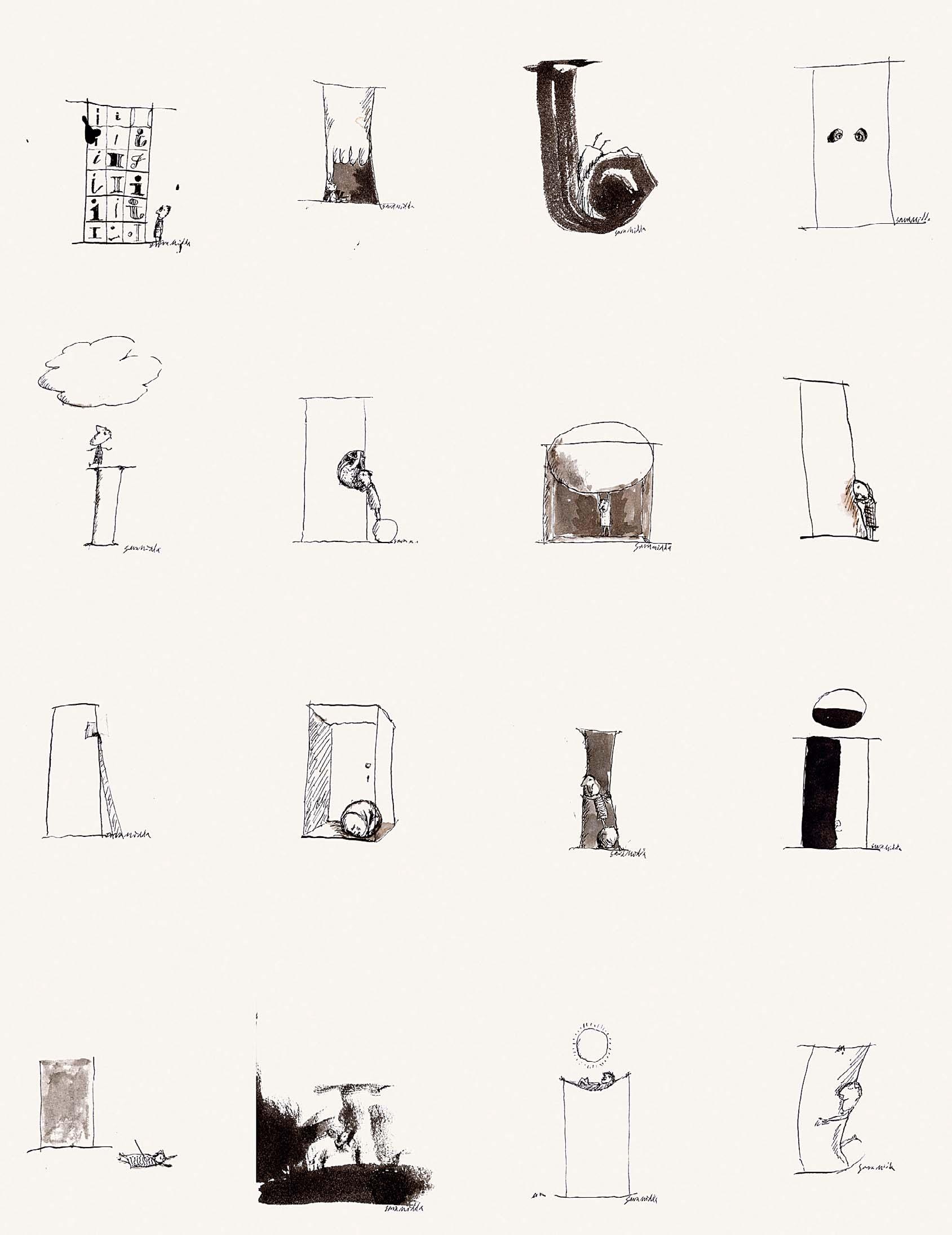
‘I’ SERIES
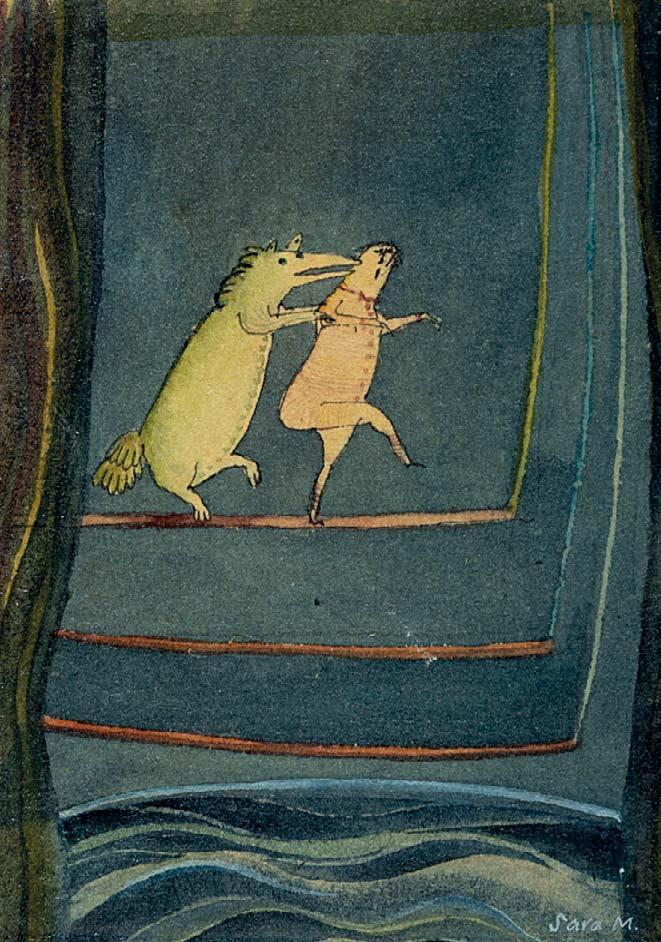
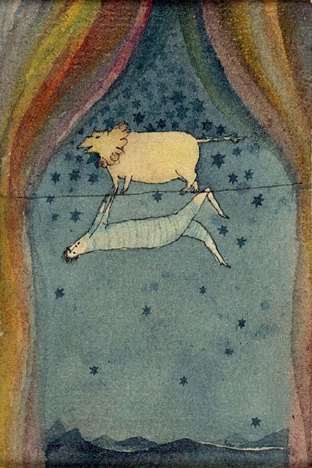
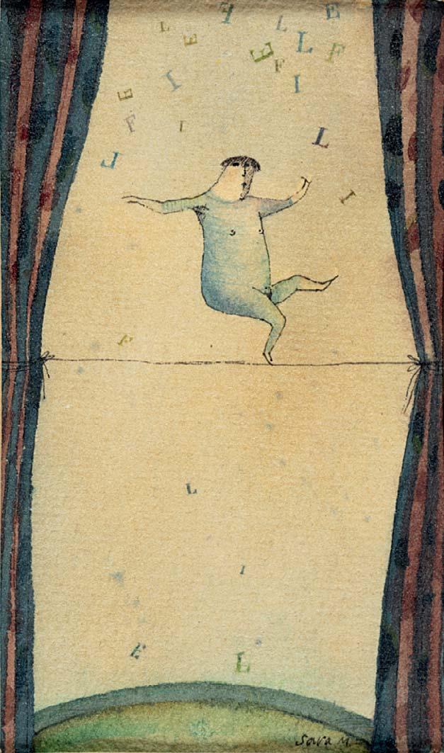
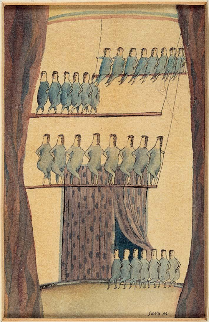
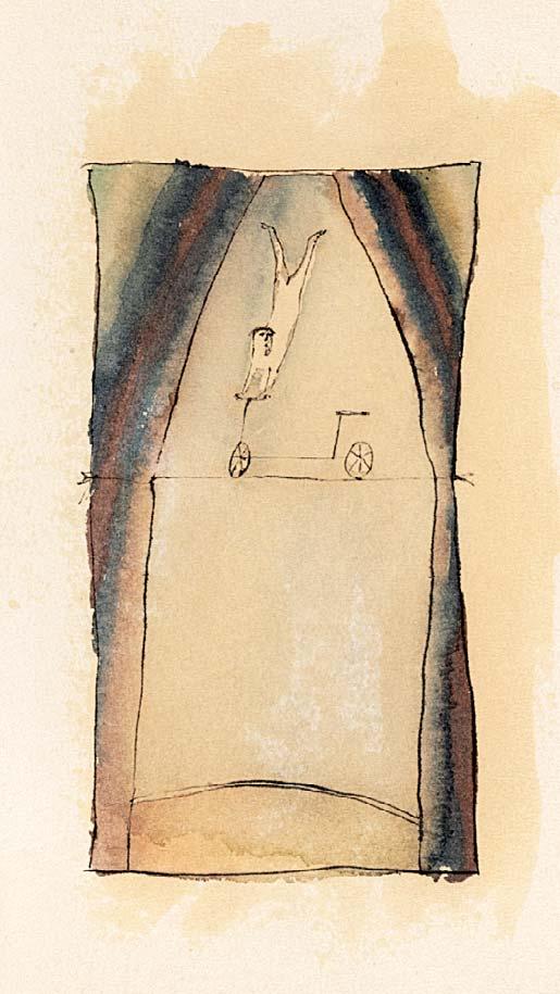
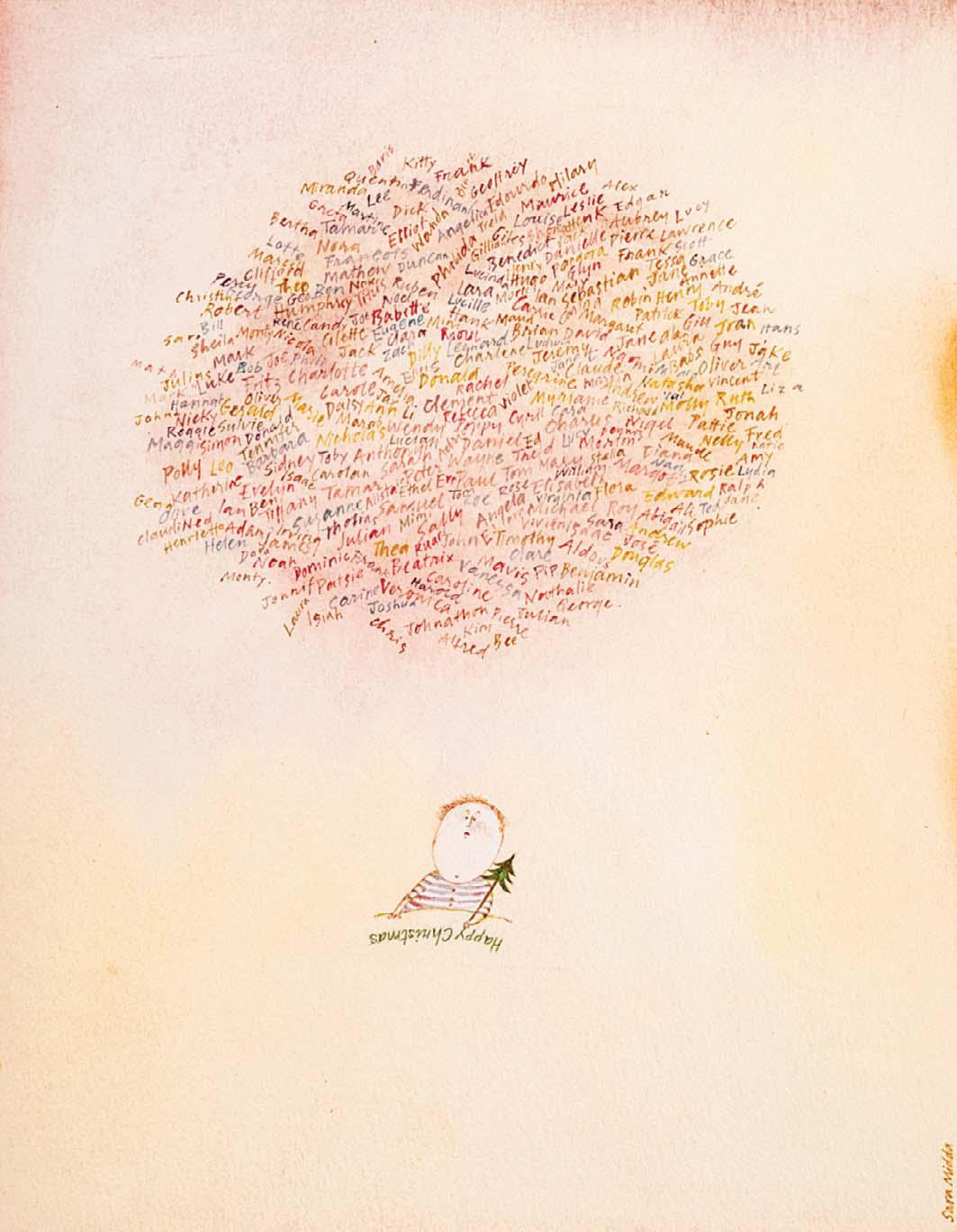
Nos 88-92 are all Christmas Card designs for Workman Publishing, New York, circa 1980s
88
Signed with initials
Watercolour
6 ¾ x 5 ¼ inches
89
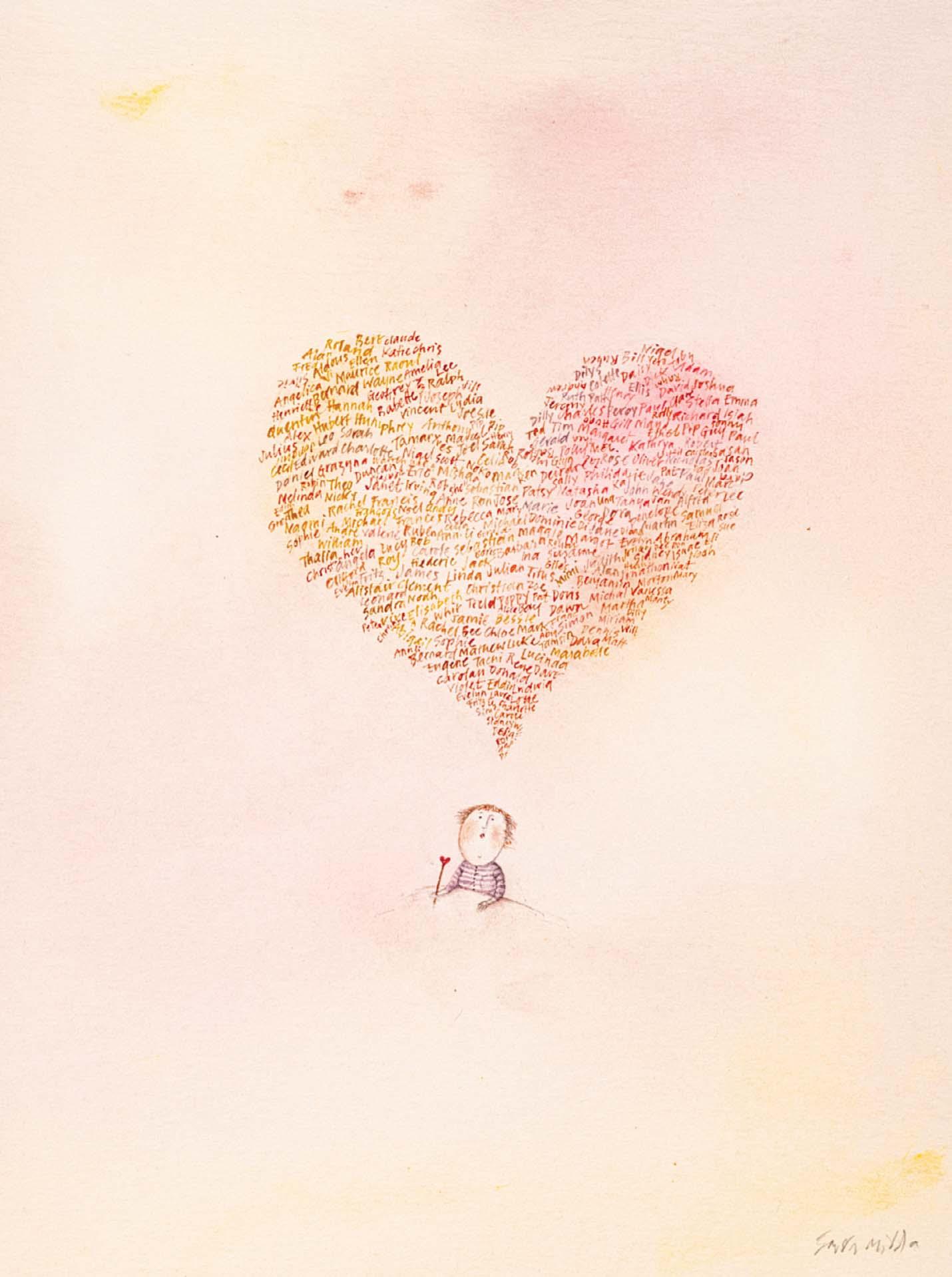
CHRISTMAS CARD LIST
Signed
Watercolour
7 ½ x 6 inches
90
Signed with initials
Watercolour with pencil
5 x 3 ½ inches
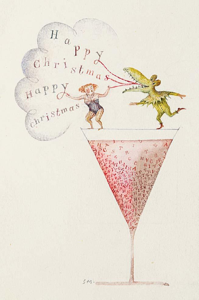
CHRISTMAS COCKTAIL
CHRISTMAS CALENDAR
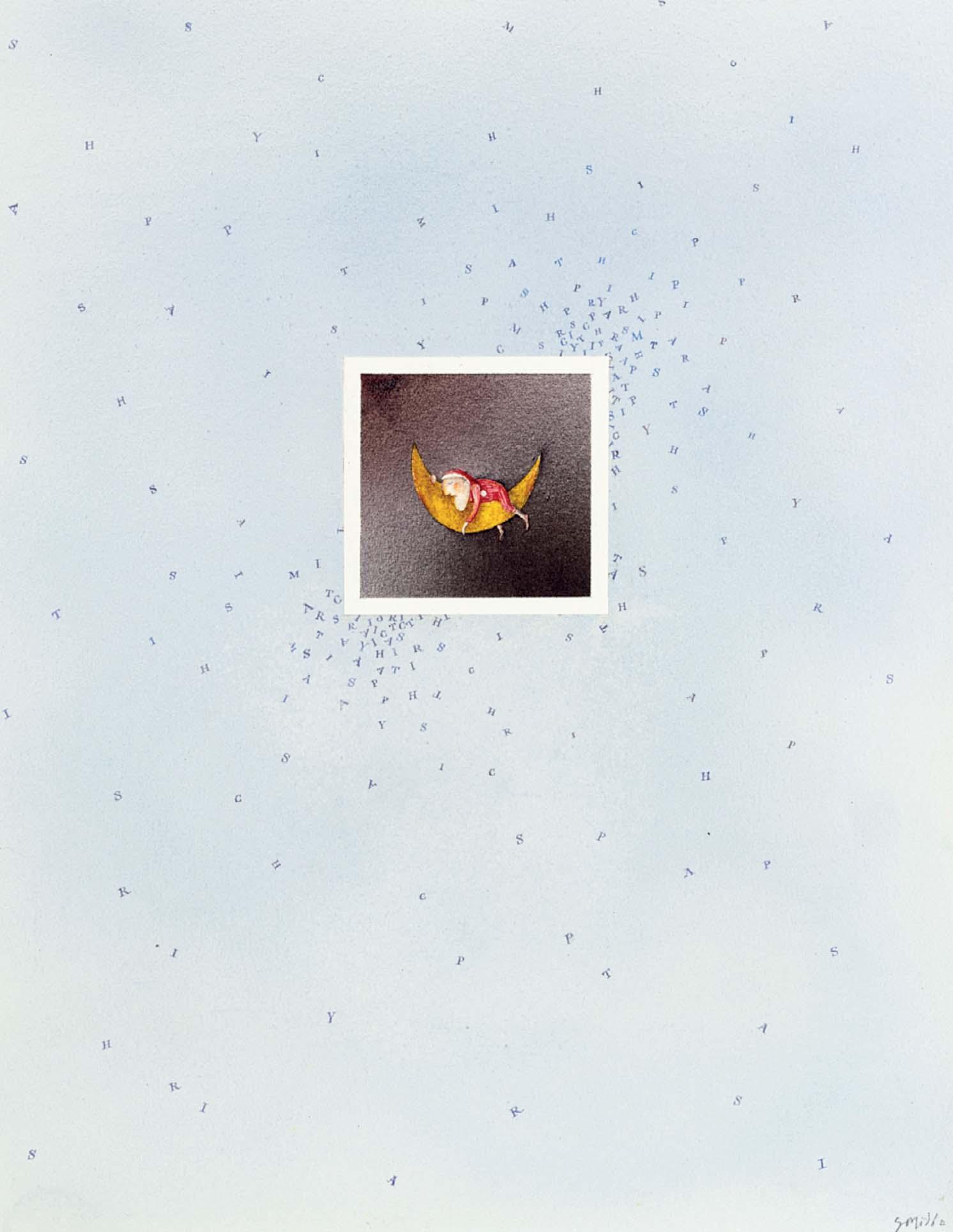
SLEEPING FATHER CHRISTMAS
Watercolour
10 ¼ x 8 inches
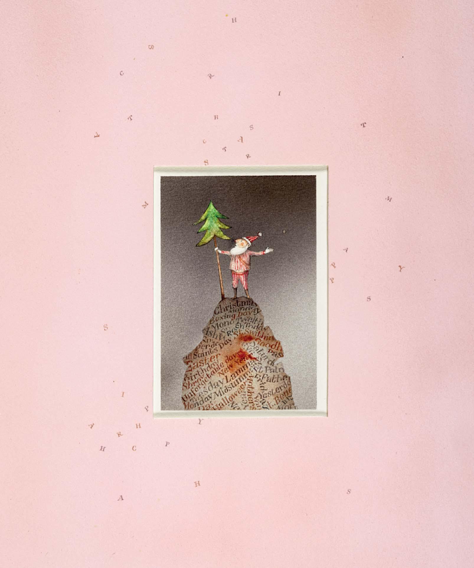
SCALING THE CHRISTMAS MOUNTAIN
Watercolour 9 x 7 inches
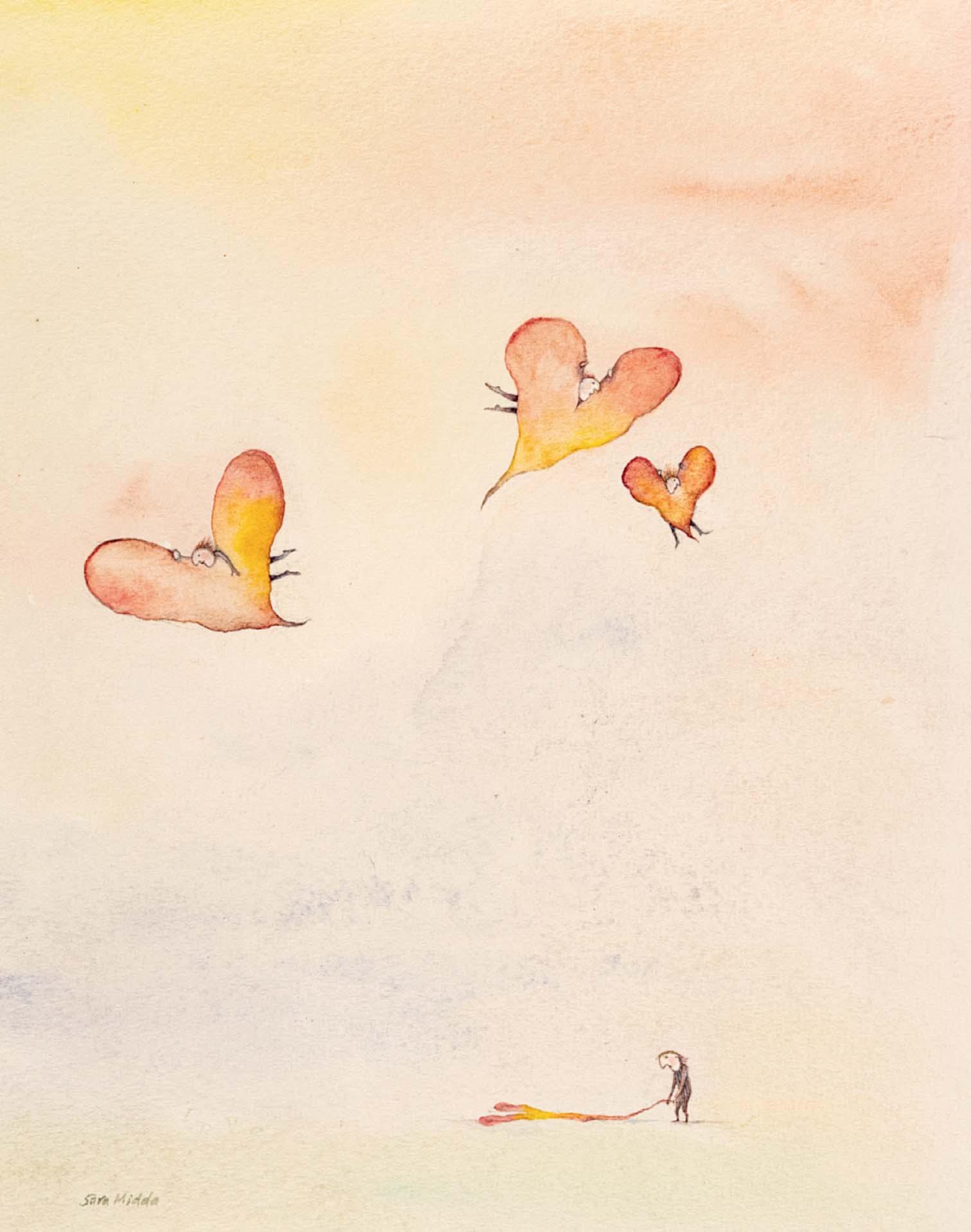
SOMETIMES THINGS GO WRONG
Nos 93-95 were all designs for Workman Publishing, New York, circa 1980s
Watercolour 9 ¾ x 8 inches
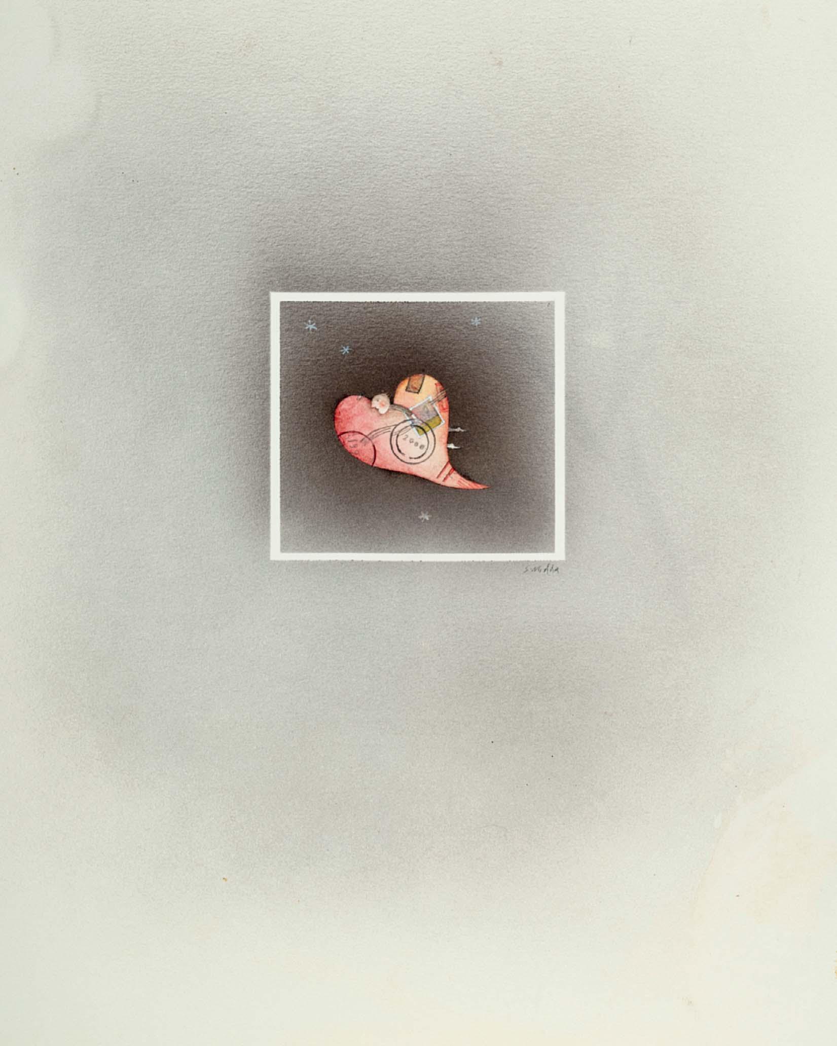
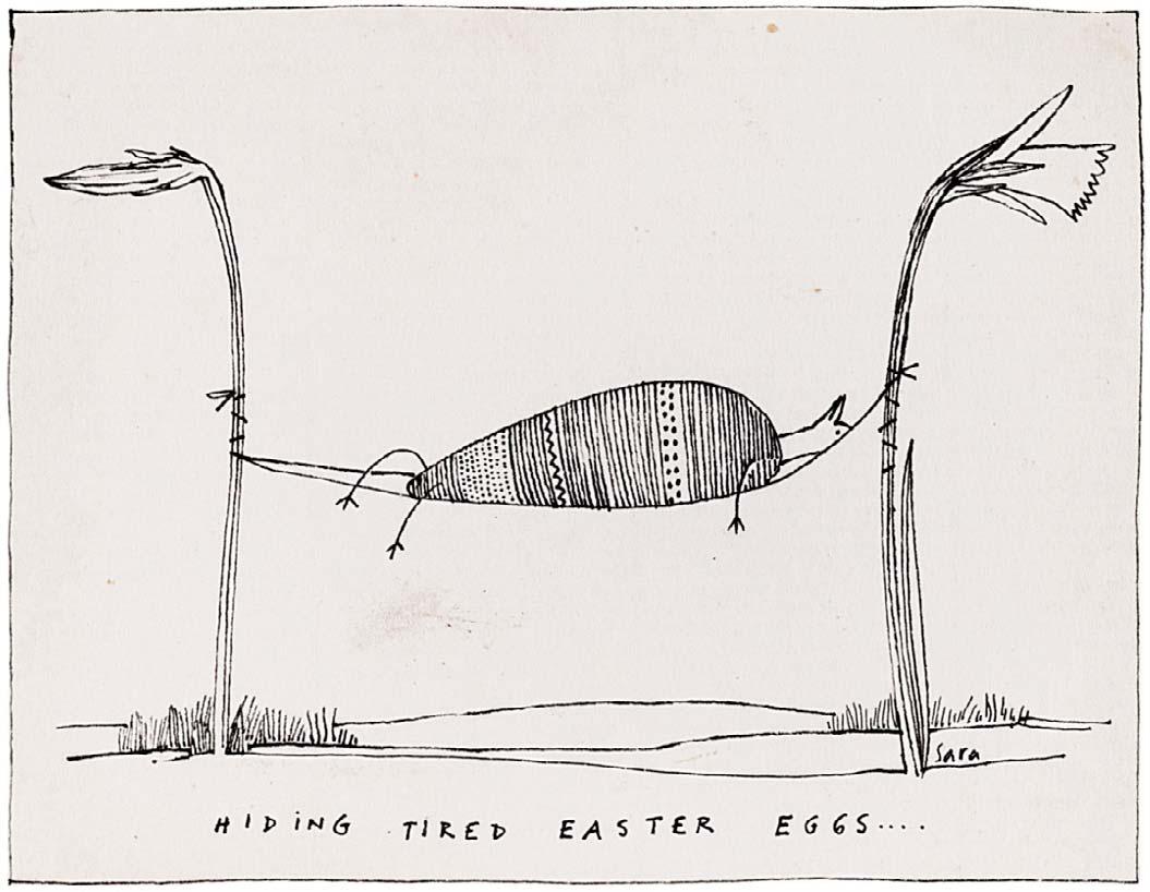
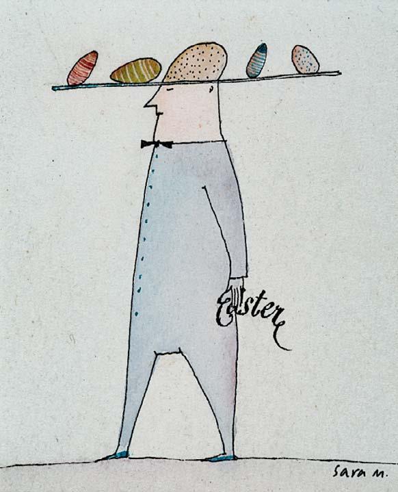
HIDING TIRED EASTER EGGS ...
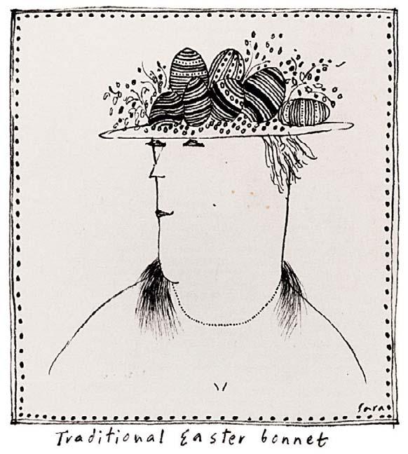
TRADITIONAL EASTER BONNET
Signed and inscribed with title
¾ x 2 ½ inches
AN EASTER HAT
Signed
and watercolour
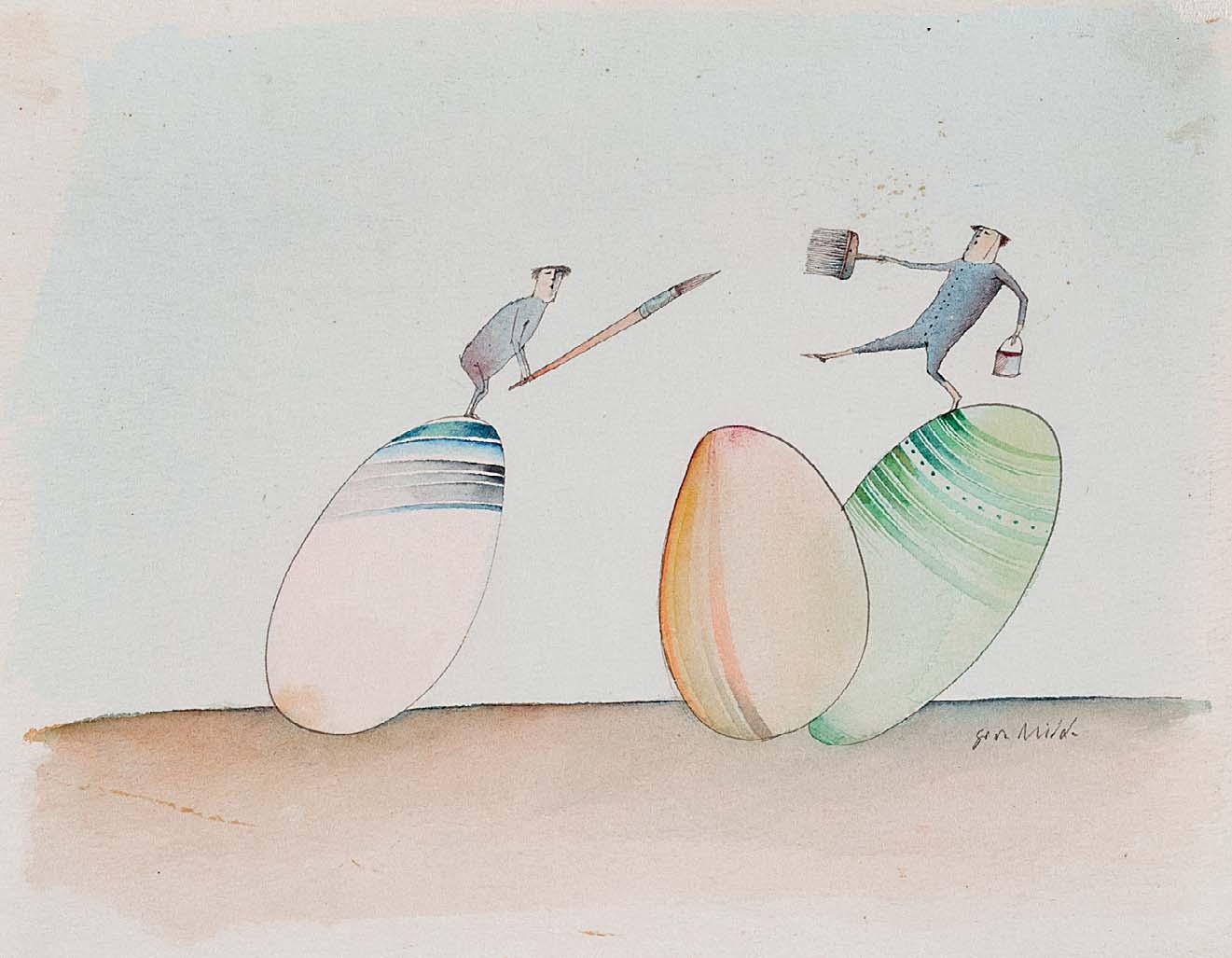
x 2 ¼ inches 100 PAINTING EASTER EGGS
5 ¾ x 7 inches
3 ¼ x 6 ½ inches
2 ¼ x 4 ½ inches
4 ½ x 2 inches
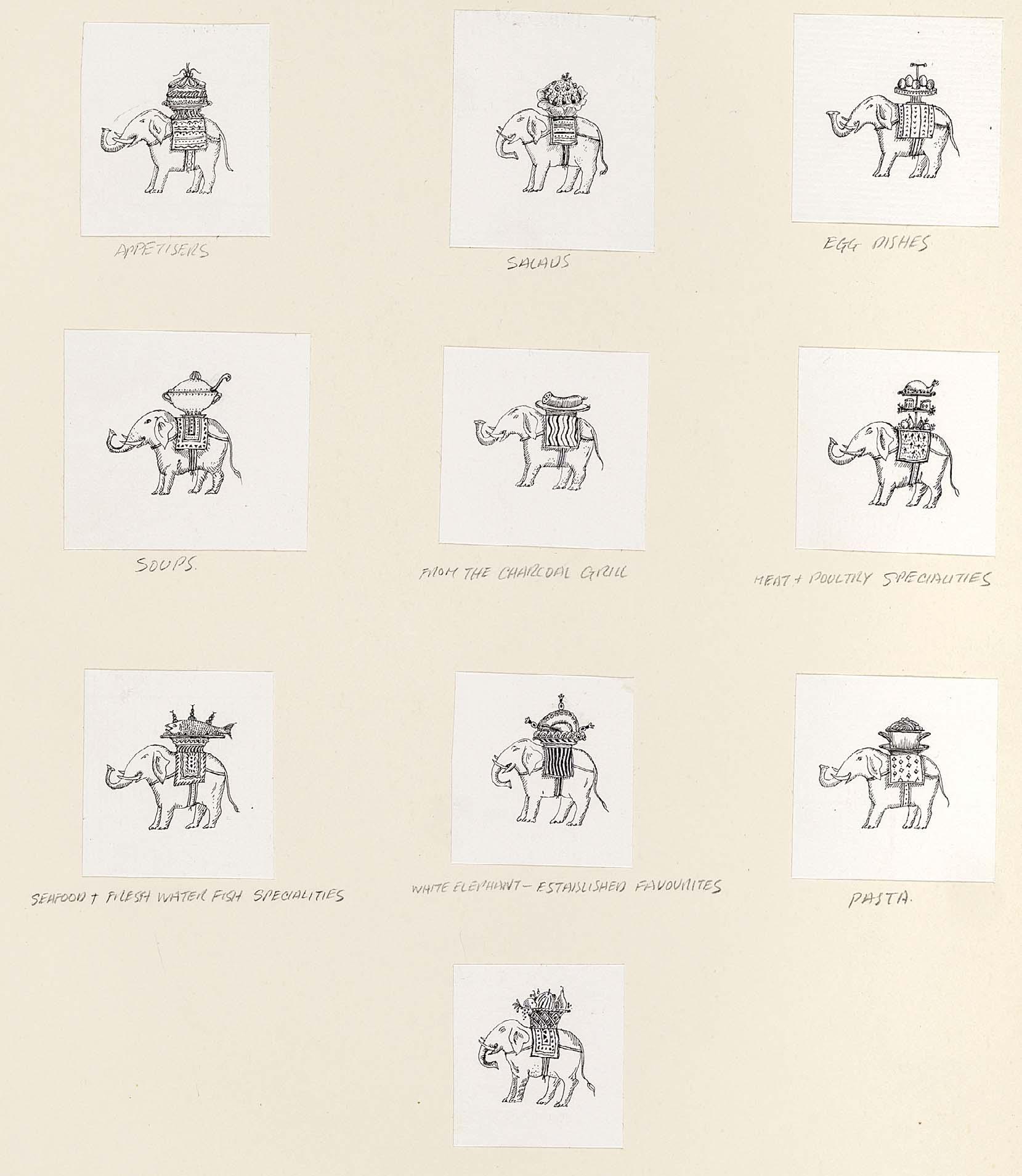
WHITE ELEPHANT CLUB MENU SECTIONS
10 ¾ x 9 ½ inches
Illustrated: Menu design for The White Elephant Club, London
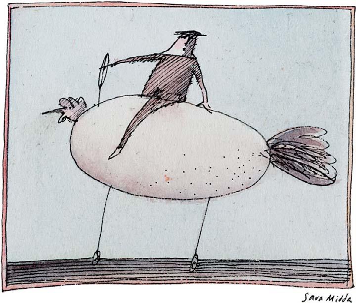
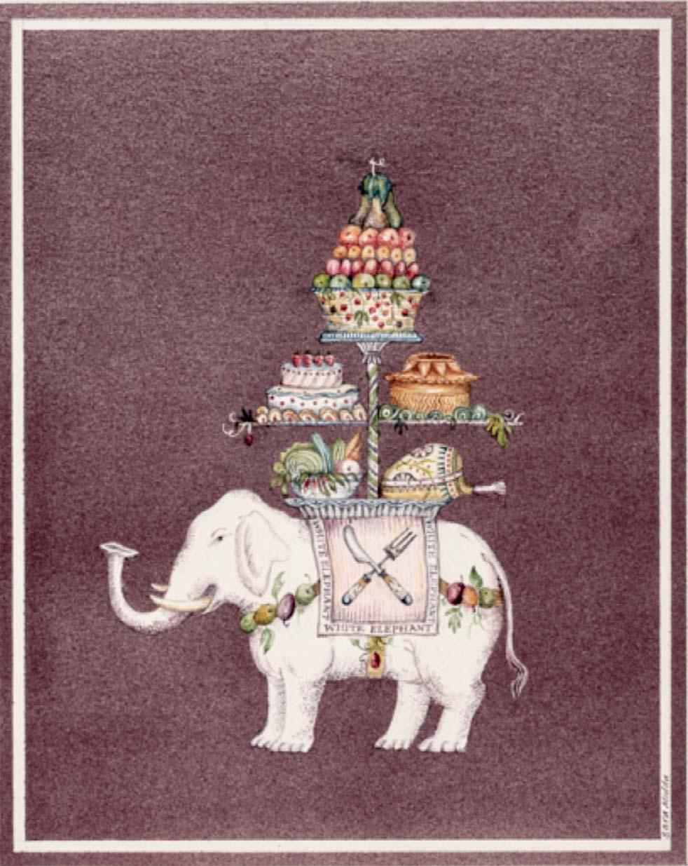
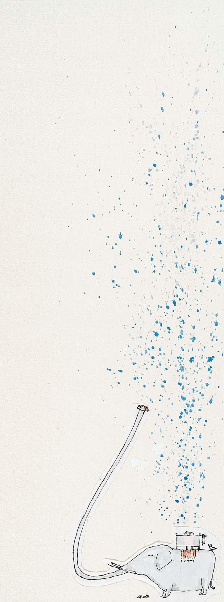
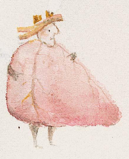
107 THE WHITE ELEPHANT
Signed
Watercolour and ink with bodycolour
5 x 4 inches
Illustrated: Menu design for The White Elephant Club, London
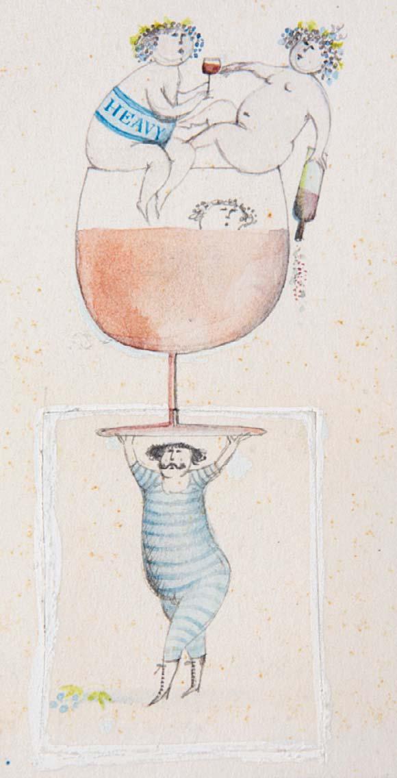
108 HEAVY
Watercolour
4 x 2 ¼ inches
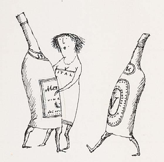
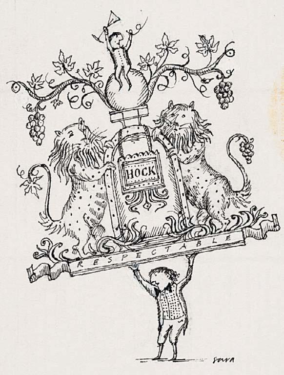
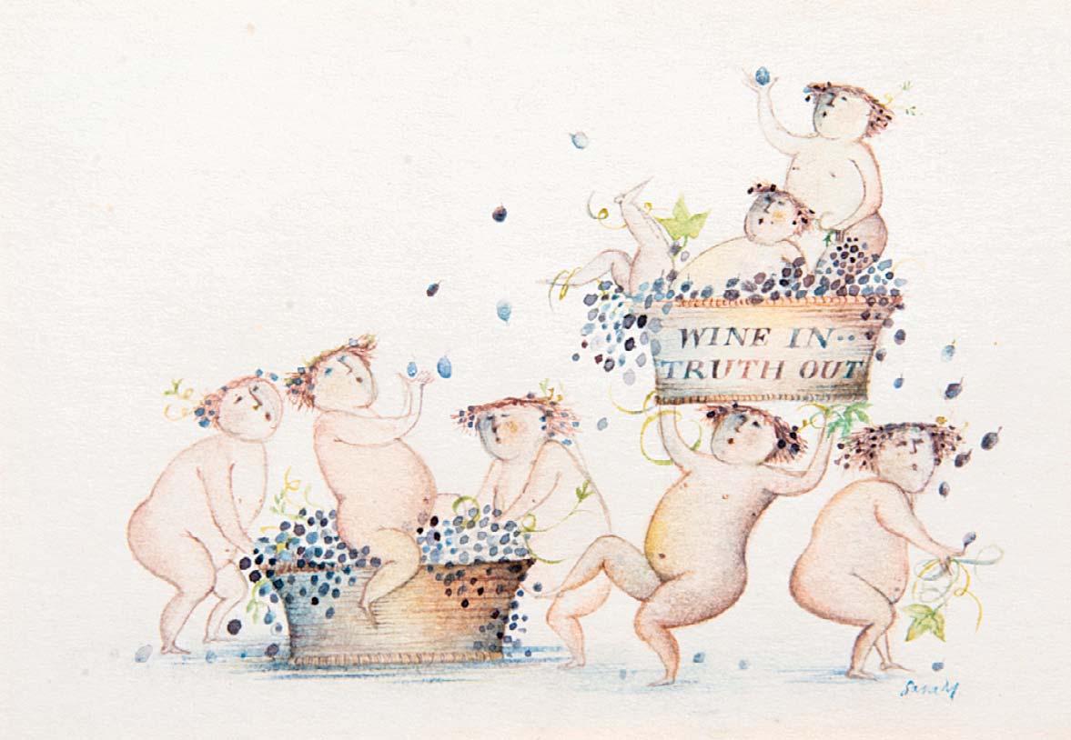
109 WINE IN TRUTH OUT
Signed
Watercolour
3 x 4 ¼ inches
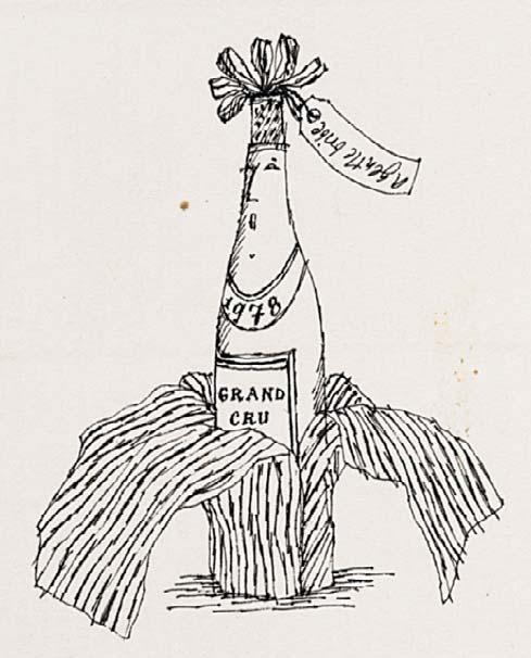
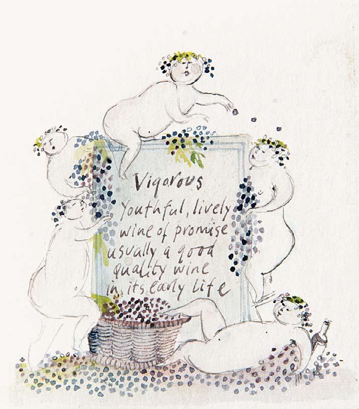
110 VIGOROUS YOUTHFUL, LIVELY WINE OF PROMISE, USUALLY A GOOD QUALITY WINE IN ITS EARLY LIFE
Watercolour
3 x 2 ½ inches
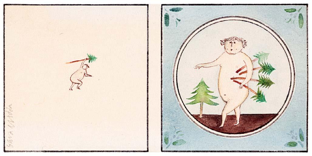
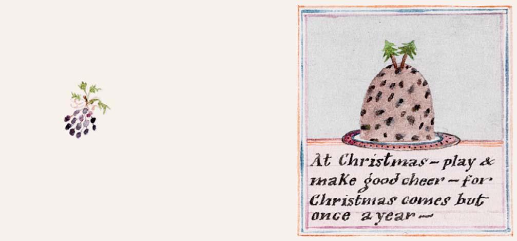
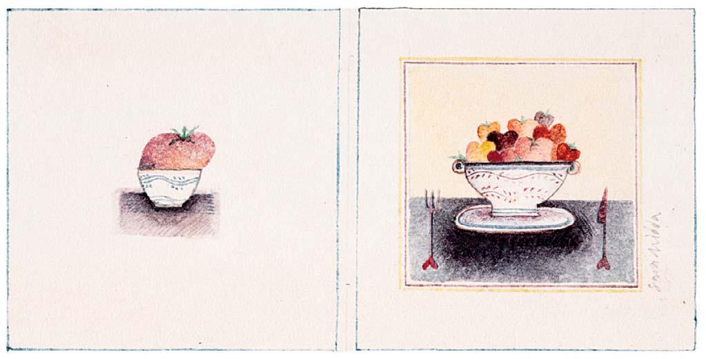

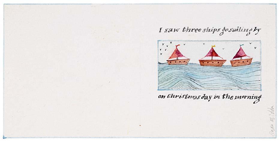
Nos 111-117 are all executed in watercolour and are designs for ‘Gallery 5’ gift tags
COLLECTING FIR TREES
CHRISTMAS – PLAY & MAKE GOOD CHEER
FOR CHRISTMAS COMES BUT ONCE A YEAR
I SAW THREE SHIPS GO SAILING BY ON CHRISTMAS DAY IN THE MORNING
(above)
(above)
(below)
(below)
BOOKS

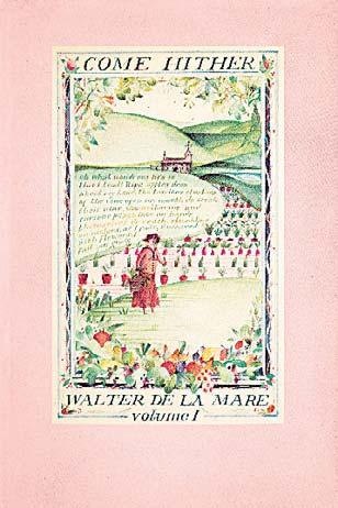
Walter de la Mare, Come Hither, volume I,
Middlesex: Kestrel Books, 1978
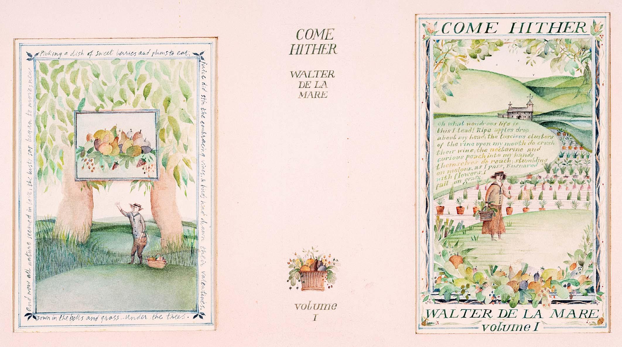
118 COME HITHER VOLUME I
Watercolour and ink
9 ¼ x 13 ¾ inches
Illustrated: Walter de la Mare, Come Hither, volume I, Middlesex: Kestrel Books, 1978, dust jacket


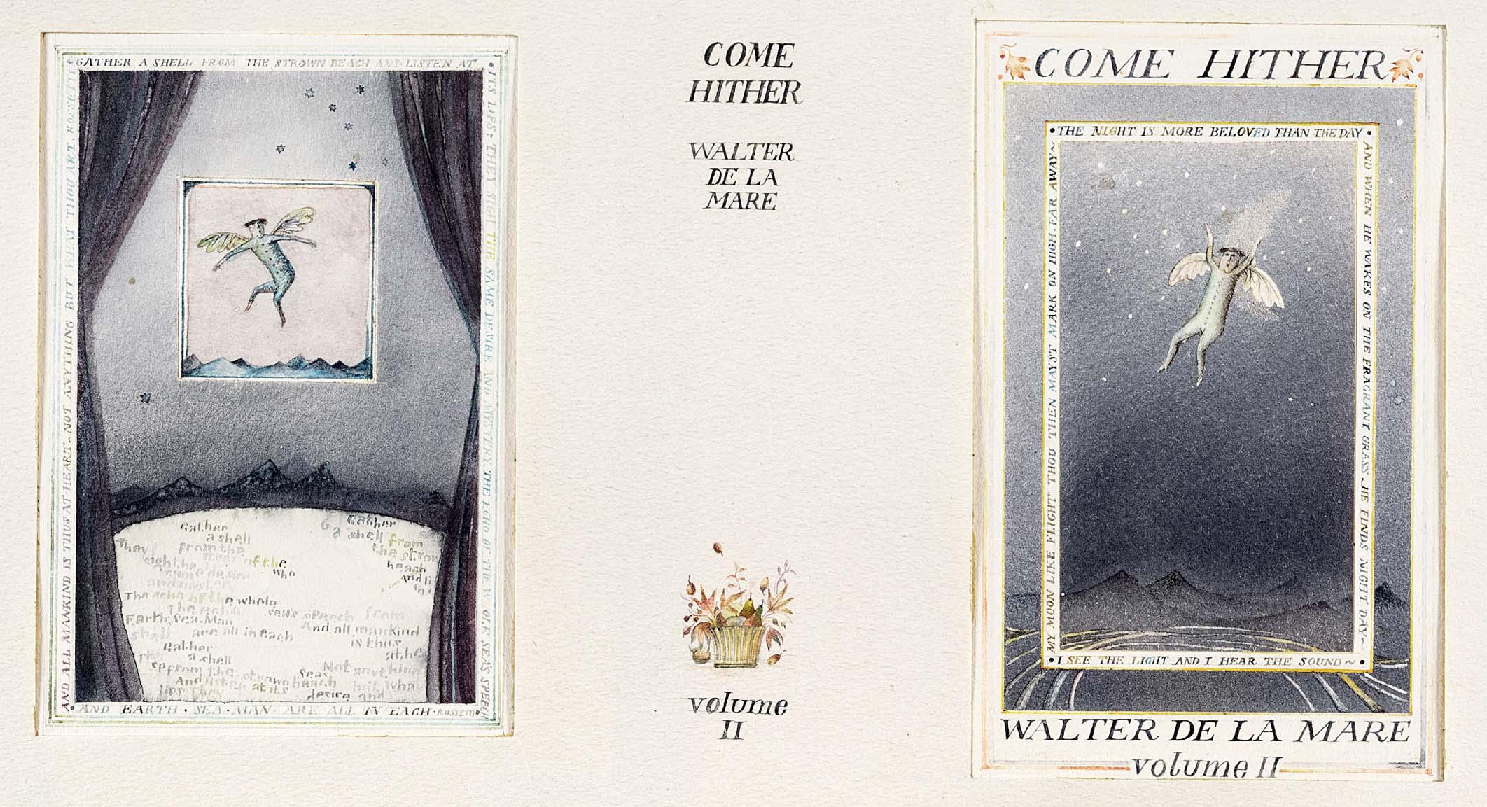
Walter de la Mare, Come Hither, volume II, Middlesex: Kestrel Books, 1978
119
COME HITHER VOLUME II
Watercolour and ink
9 ¼ x 13 ¾ inches
Illustrated: Walter de la Mare, Come Hither, volume II, Middlesex: Kestrel Books, 1978, dust jacket
120
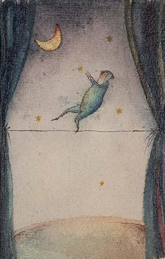
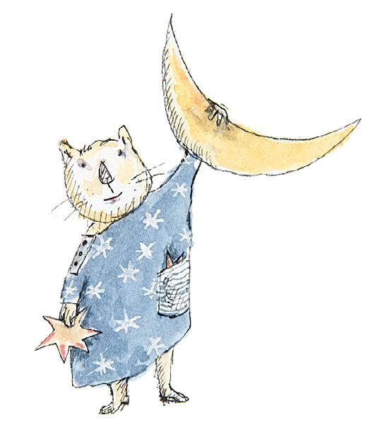
REACHING FOR THE MOON
Signed below mount
Watercolour with ink and varnish
5 x 3 ¼ inches
Preliminary cover design for Walter De La Mare, Come Hither, volume II, Middlesex: Kestrel Books, 1978

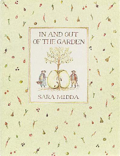
Sara Midda, In and Out of the Garden, New York: Workman Publishing, 1981
Nos 121-183 are all illustrated in
Sara Midda, In and Out of the Garden, New York: Workman Publishing, 1981 [unpaginated]

122
POTATO MAN
Watercolour 1 ¼ x 1 ¼ inches
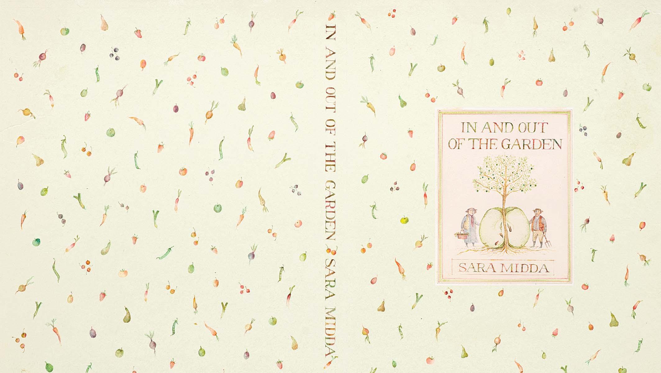
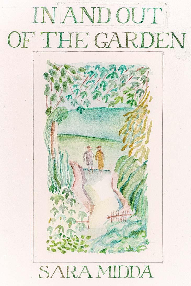
121 IN AND OUT OF THE GARDEN
Ink and watercolour
9 x 14 ¼ inches
Illustrated: cover and dust jacket
Sara Midda’s rst book, published in 1981, is a wonderous and whimsical celebration of gardens and gardening. In and Out of the Garden evokes a nostalgic and romantic view of English country life through Sara’s delicate watercolours, poetic contemplations and personal re ections.
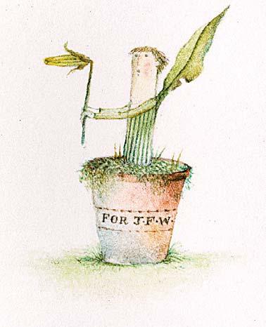
FOR JFW
Ink and watercolour
1 ½ x 1 ¼ inches
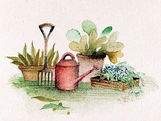
WATERING CAN AND GARDENING FORK
Watercolour
1 ½ x 1 ¾ inches 126
IN AND OUT OF THE GARDEN TITLE PAGE
Watercolour
3 ¾ x 2 ¾ inches
Illustrated: title page
WHAT WAS PARADISE? ... Signed
Watercolour
4 x 2 ¾ inches
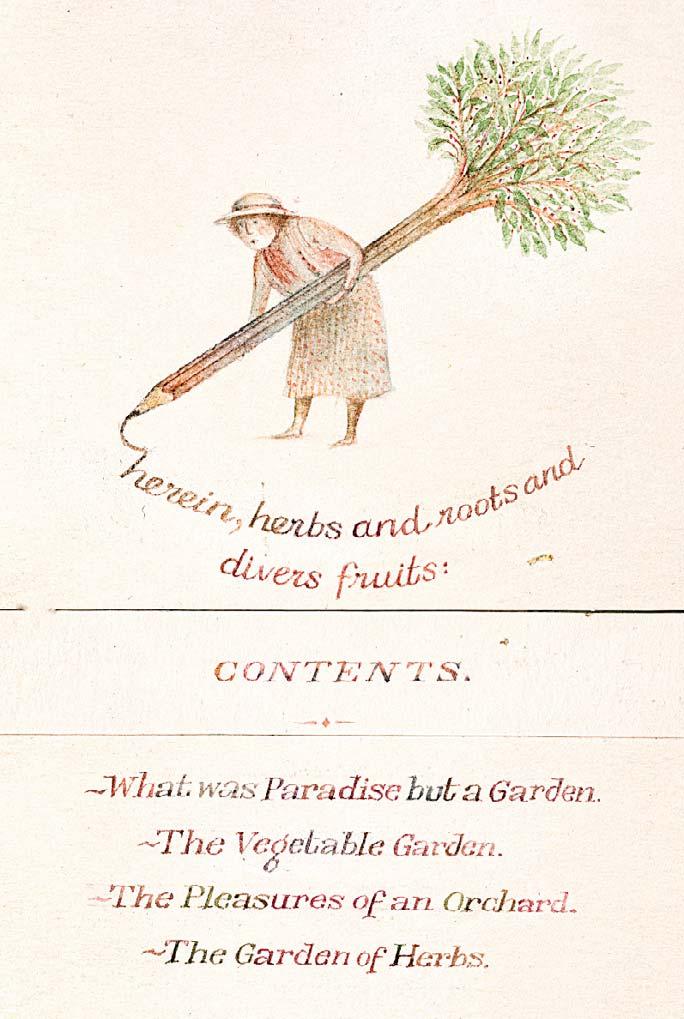
HEREIN, HERBS AND ROOTS AND DIVERS FRUITS Ink and watercolour
3 ½ x 2 ¼ inches
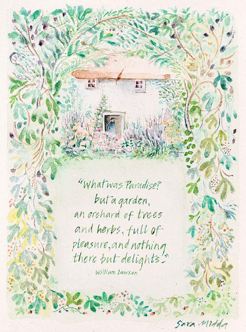
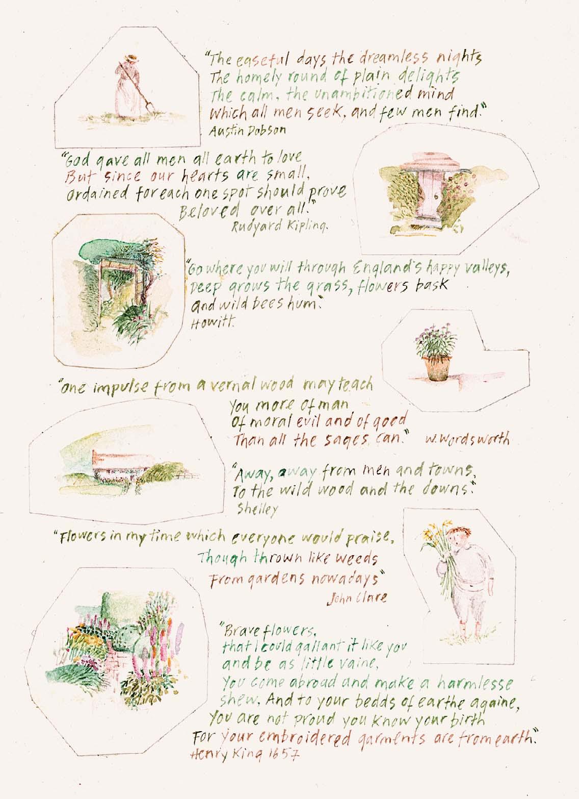
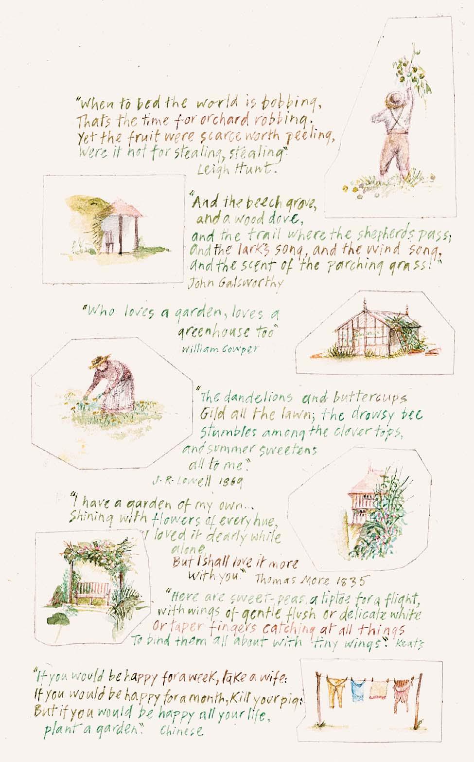
panels, each measuring 5 1 2 x 4 inches
QUOTES ON THE GARDEN
Two
Watercolour
5 ½ x 9 ½ inches
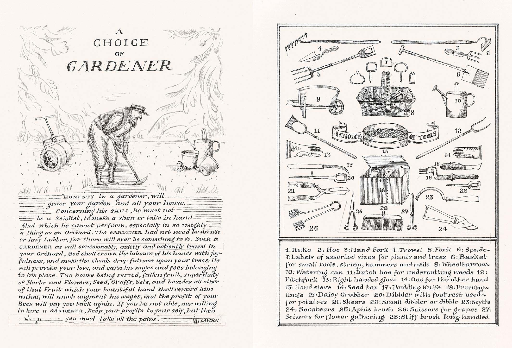
Two panels each measuring 5 x 3 1 2 inches Ink with pencil 5 x 9 ½ inches
129 A CHOICE OF GARDENER
132
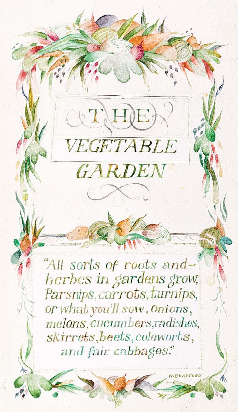
THE VEGETABLE GARDEN
5 ¼ x 3 ½ inches
130
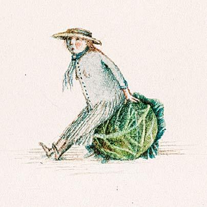
CABBAGE LADY
Watercolour with pencil 1 x 1 inches
Watercolour
4 ½ x 2 ¼ inches
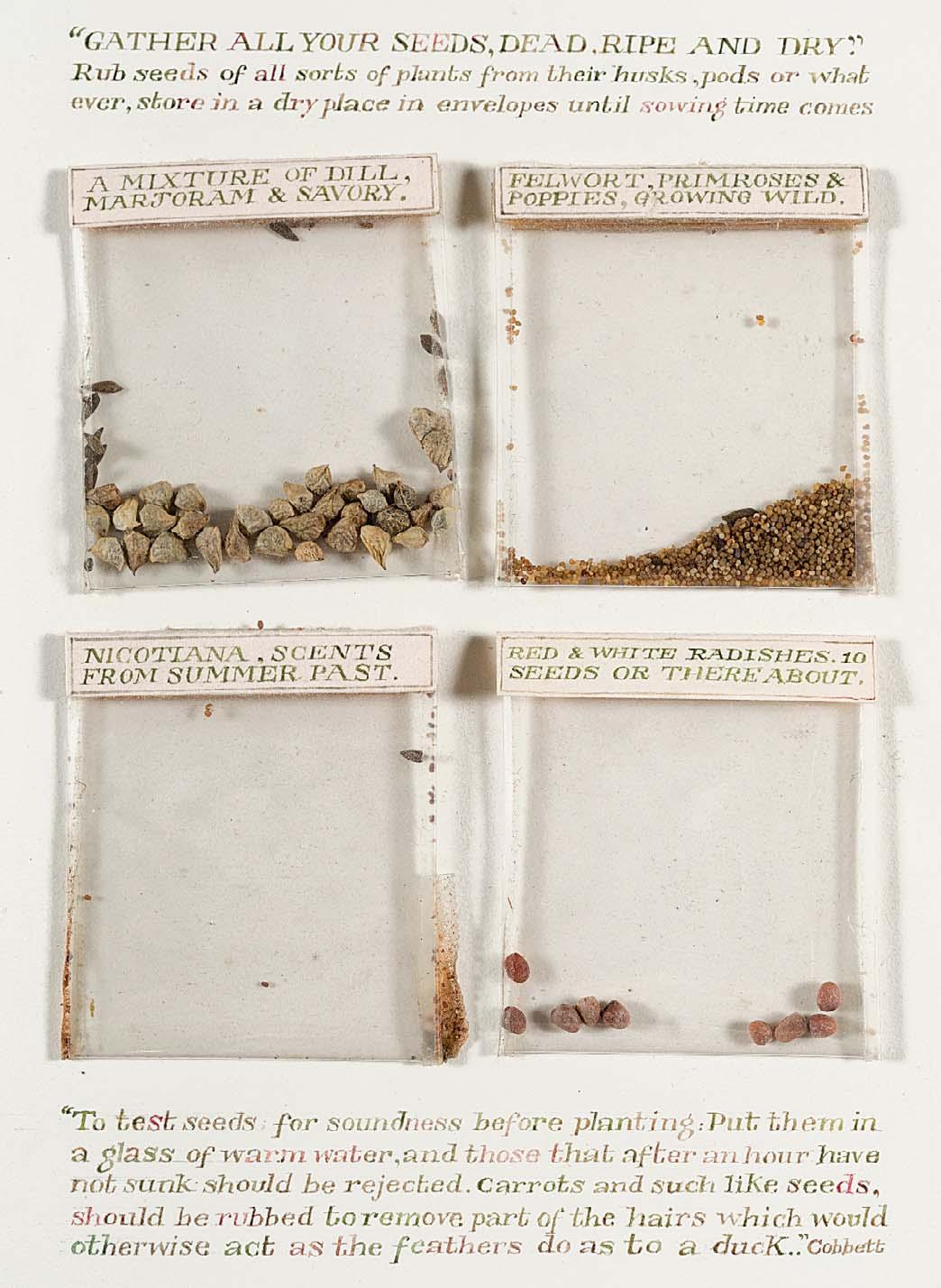
GATHER ALL YOUR SEEDS, DEAD, RIPE AND DRY
Watercolour with seed packets and seeds a xed
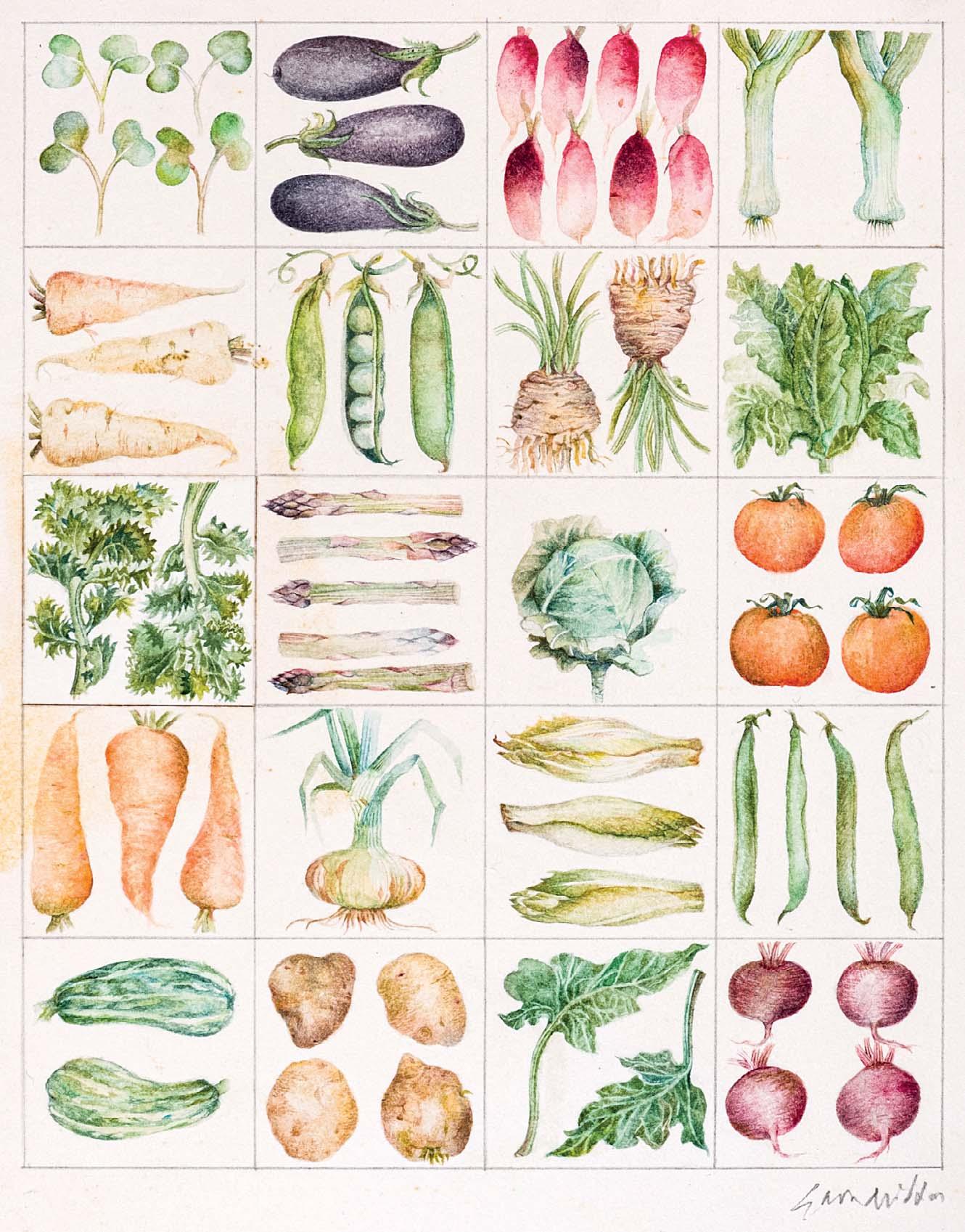
Both artworks are being sold together as one
Ink and watercolour
8 x 12 inches
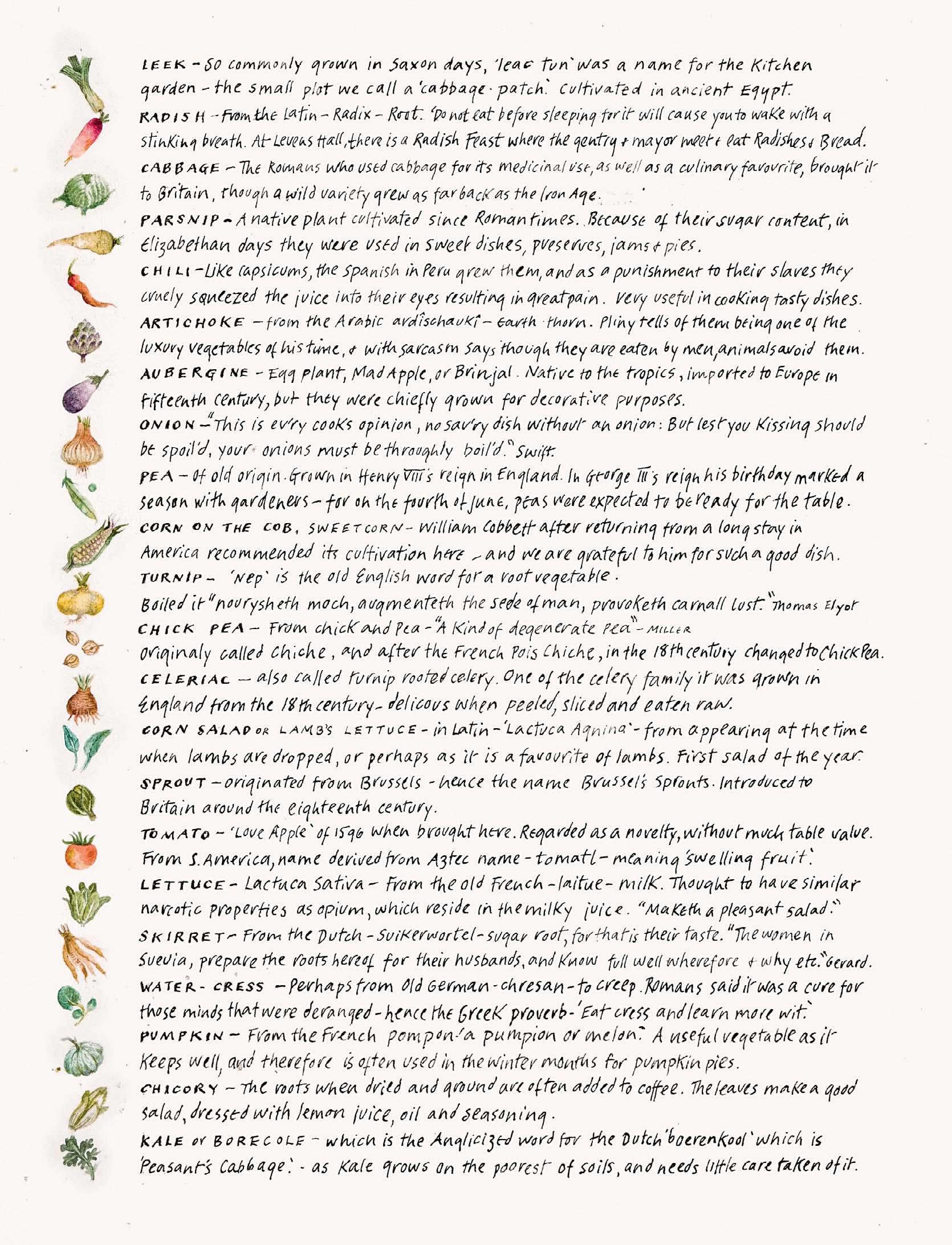
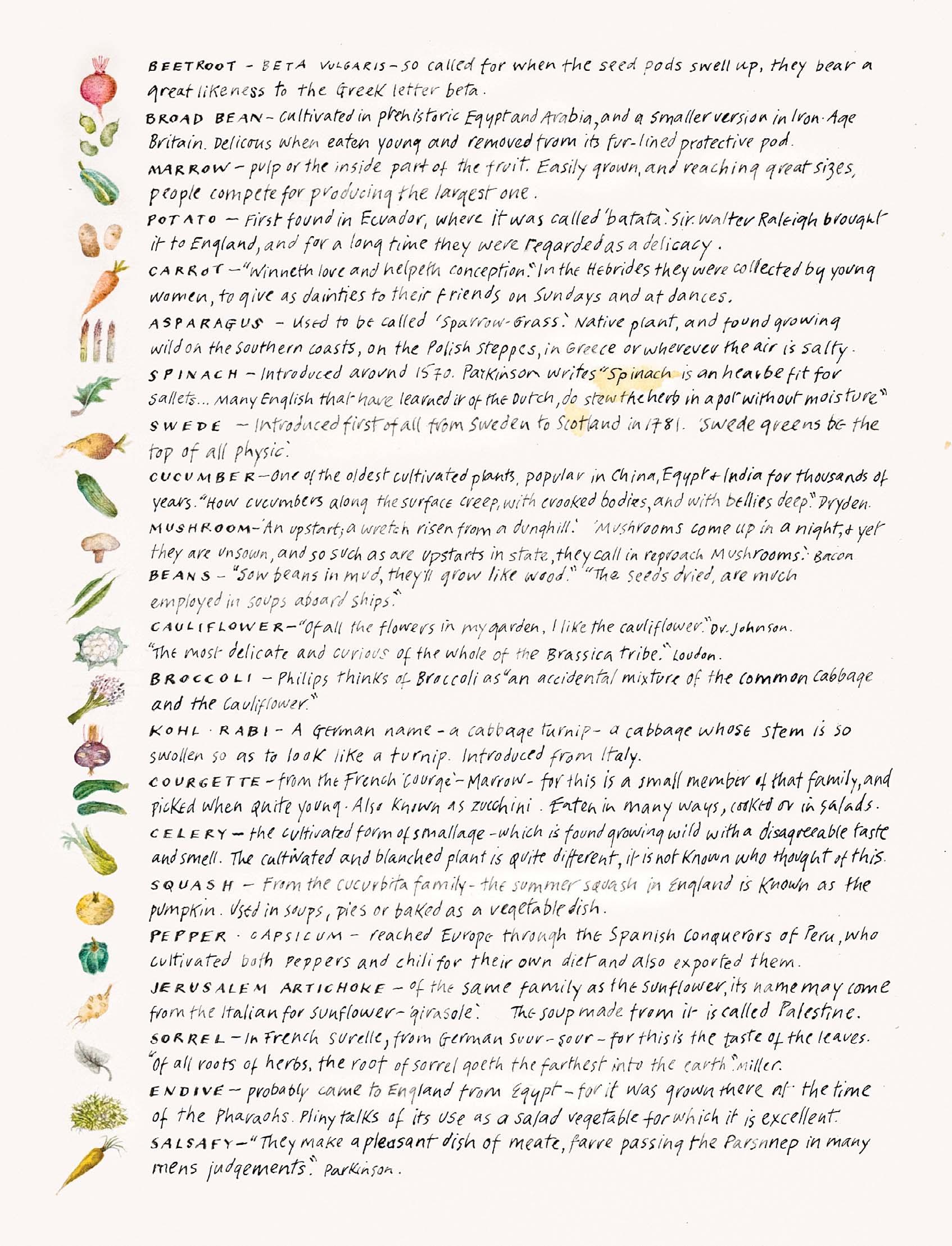

IN EARLY SPRING SOME SEEDS WE SOW, AND WITH WHAT HOPE WE WATCH THEM GROW ...
Watercolour with seed packet and seeds a xed 8 x 7 inches
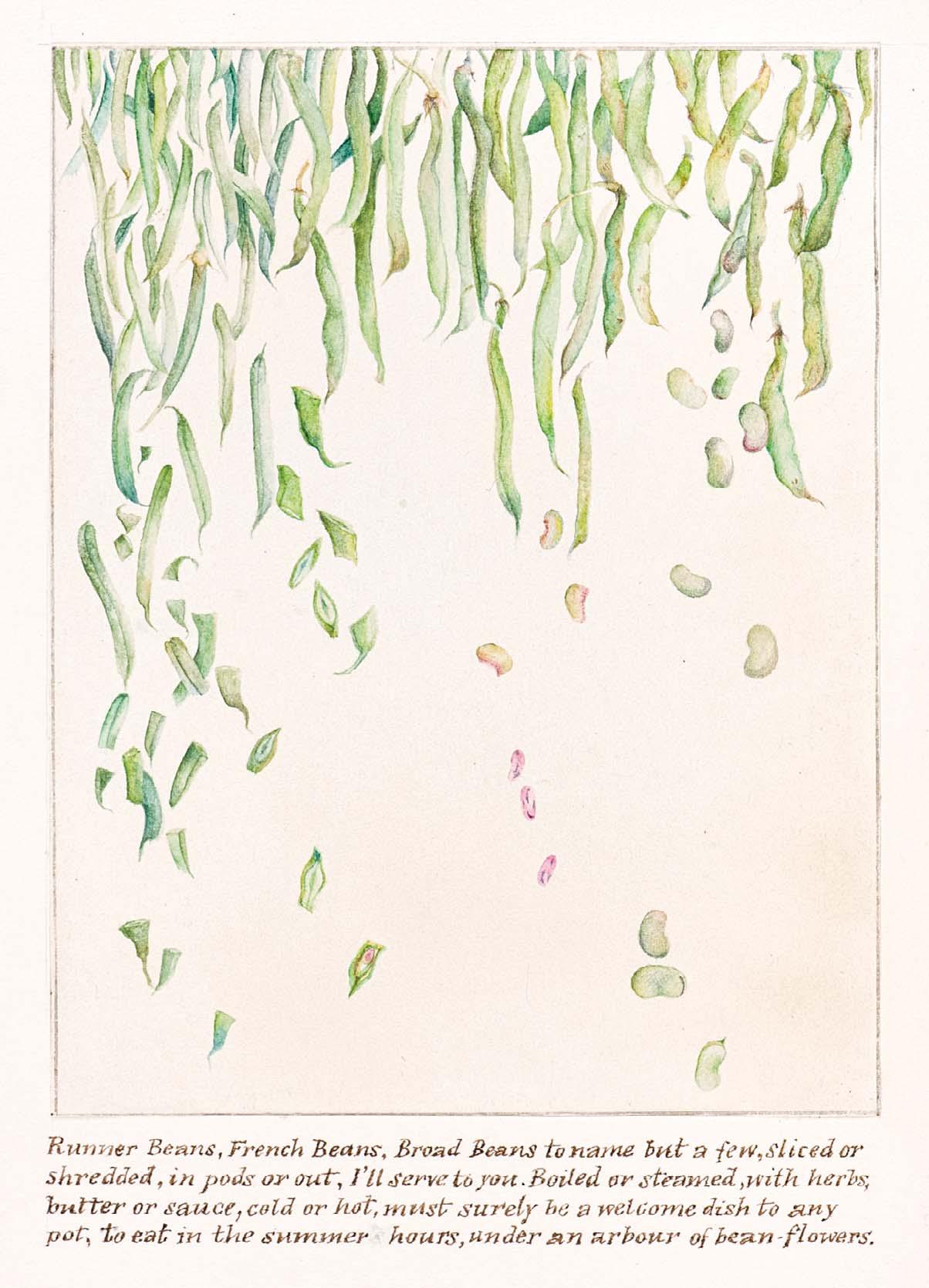
RUNNER BEANS, FRENCH BEANS, BROAD BEANS TO NAME BUT A FEW, SLICED OR SHREDDED, IN PODS OR OUT, I’LL SERVE TO YOU
Watercolour with pencil
5 x 3 ½ inches
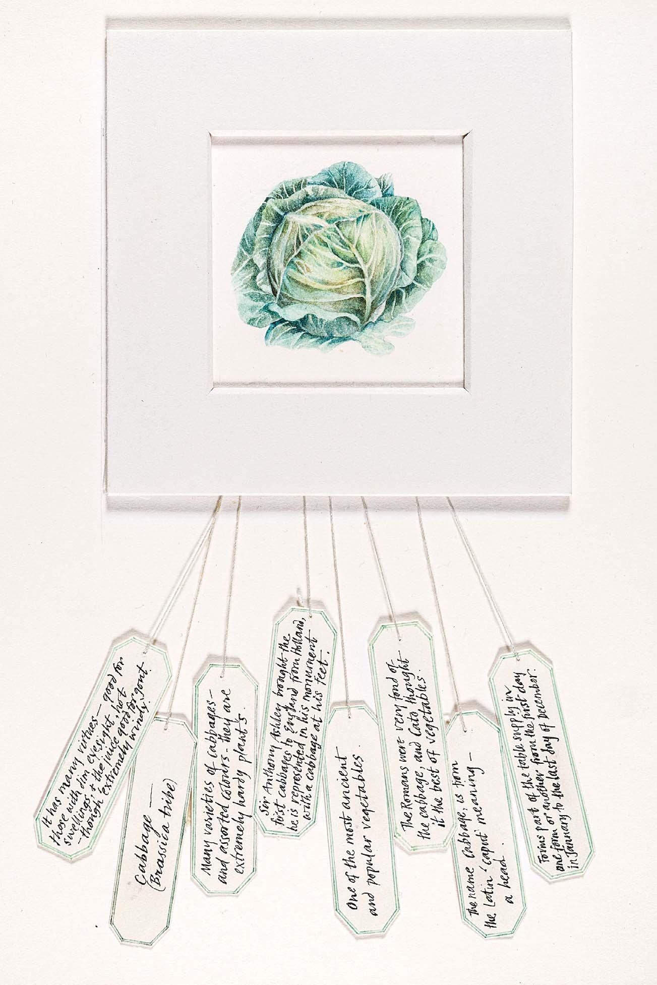
CABBAGE
Watercolour and ink with string
8 x 6 inches
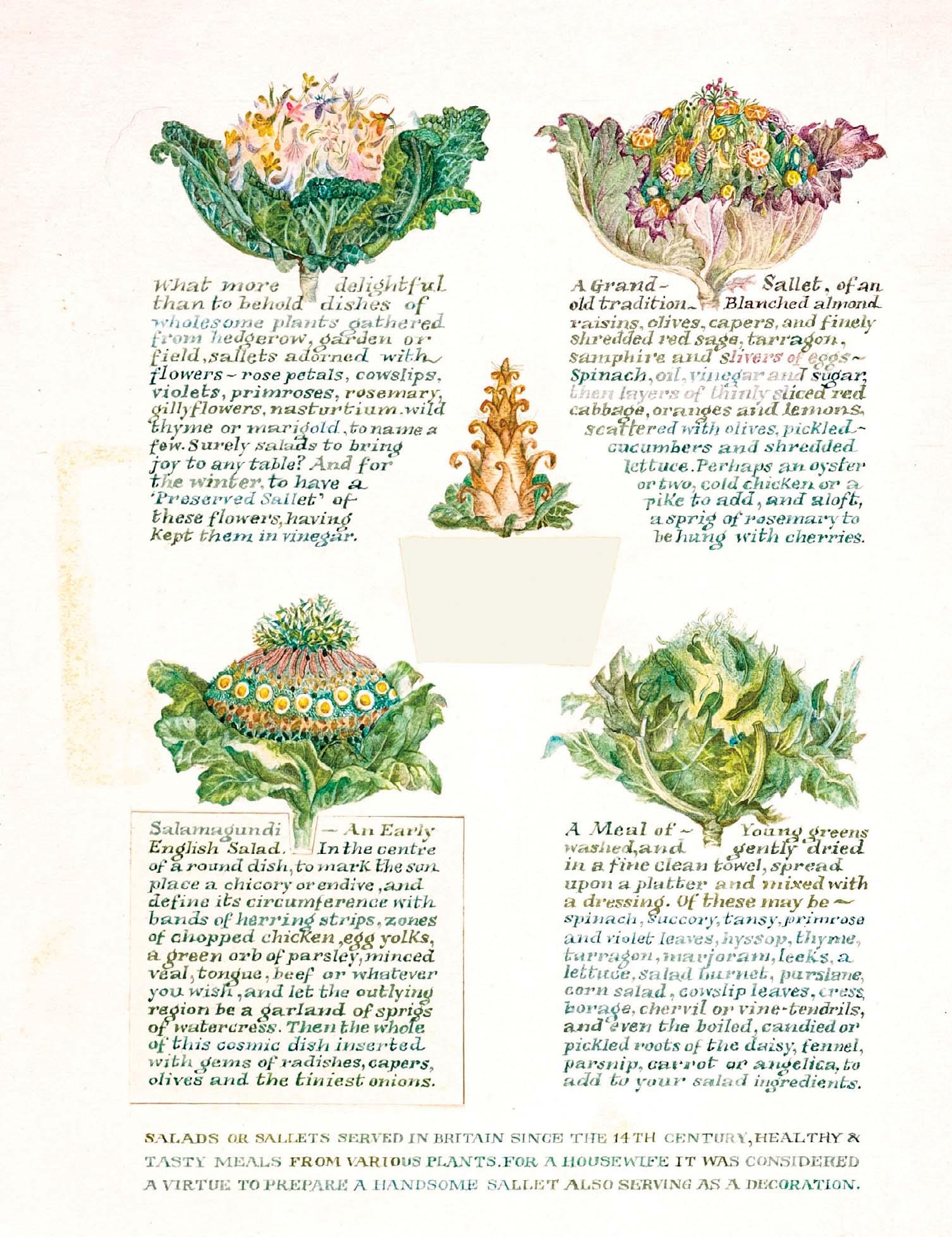
Watercolour
8 x 6 inches

139
GREEN PEAS WITH CREAM
Watercolour with ink
8 x 6 inches
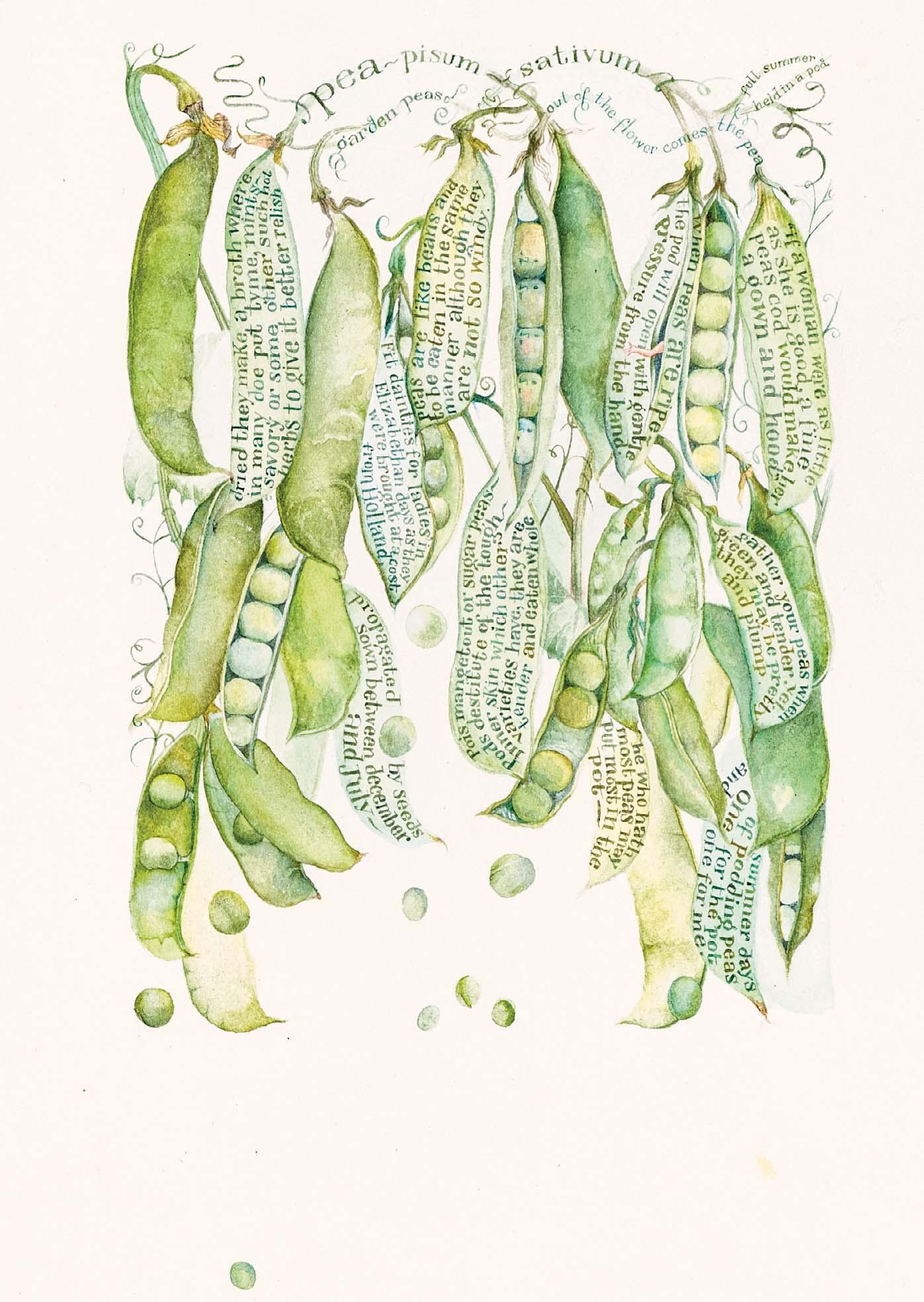
Watercolour with ink
8 x 6 inches
141
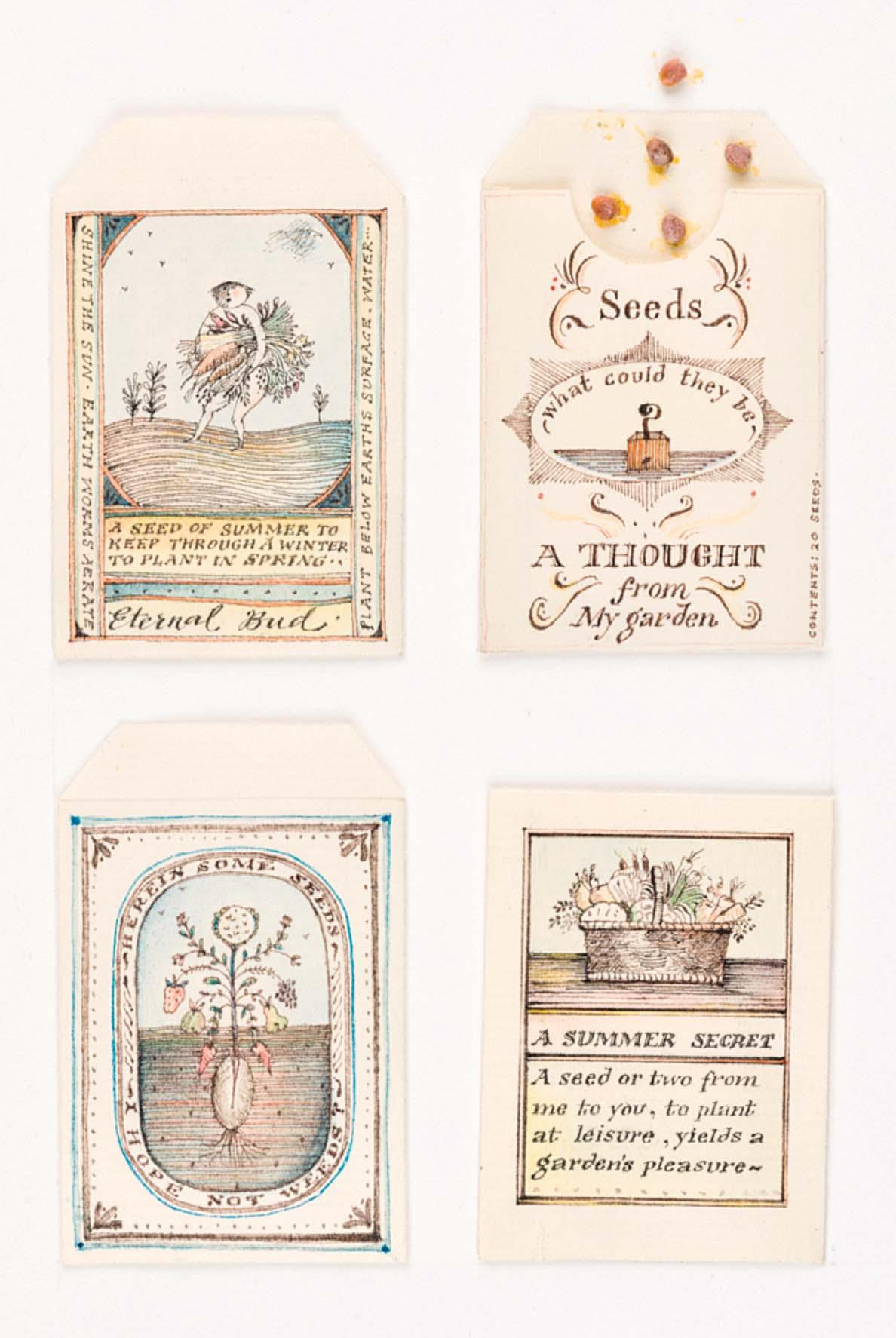
SEED PACKETS
Ink and watercolour on seed packets with seeds a xed 7 ¾ x 5 ½ inches
142
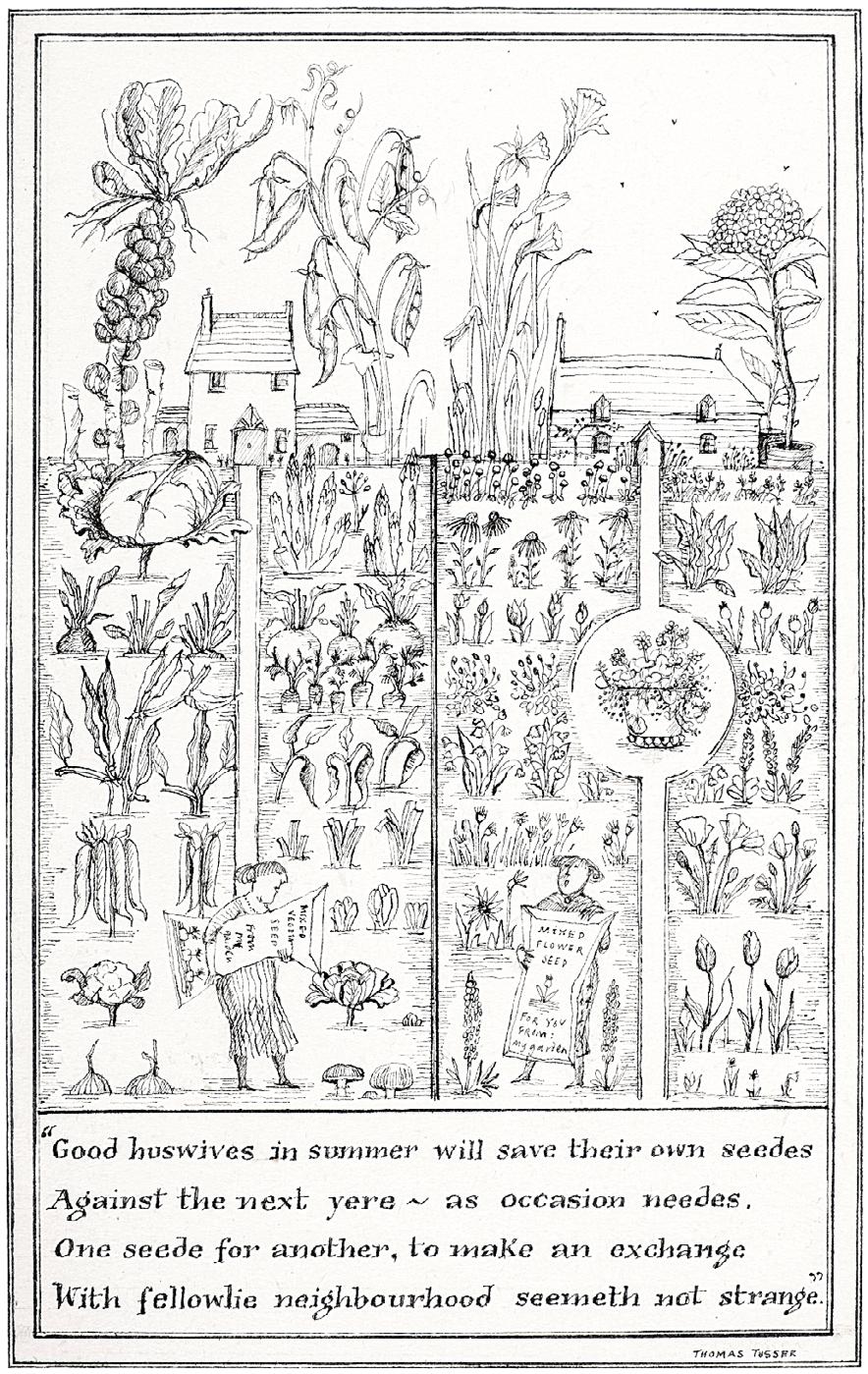
GOOD HUSWIVES IN SUMMER WILL SAVE THEIR OWN SEEDES
5 ½ x 3 ¼ inches
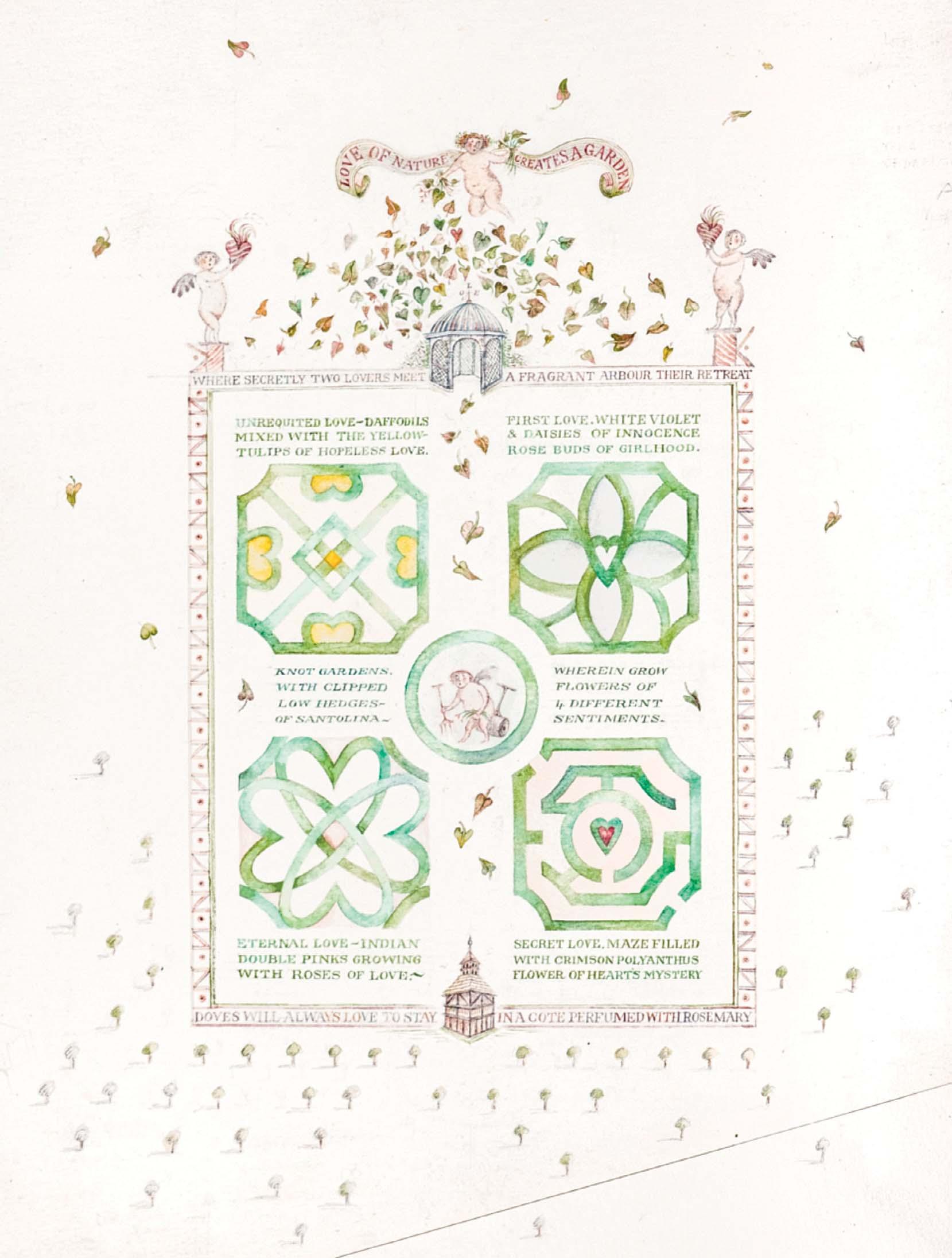
LOVE OF NATURE
CREATES A GARDEN
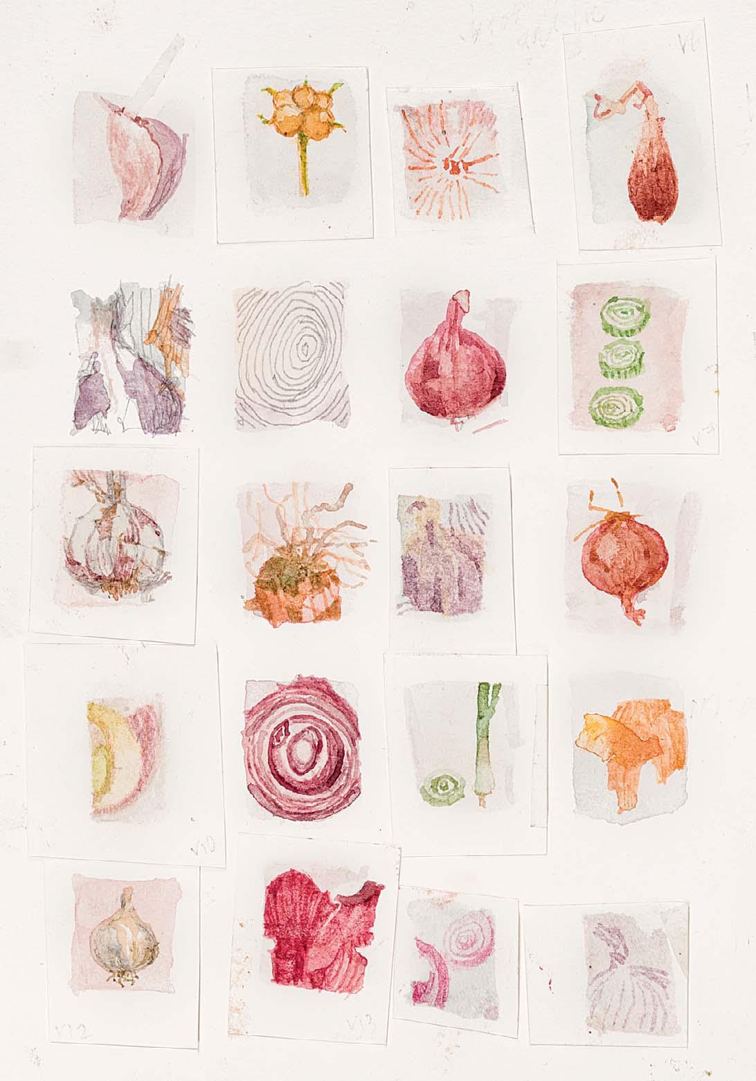
Watercolour and ink
8 x 6 inches
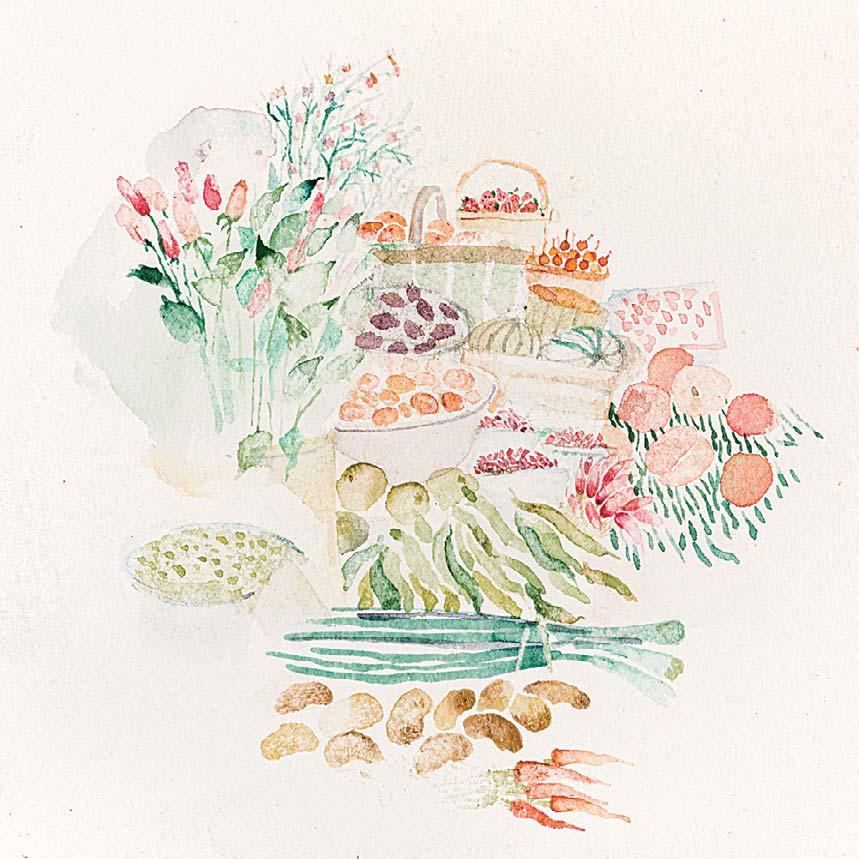
Watercolour 2 ¾ x 2 ¾ inches
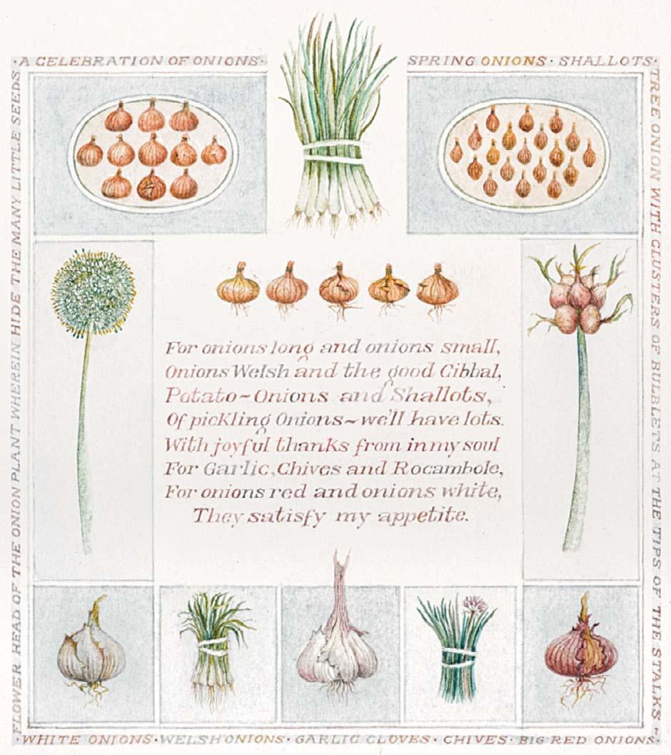
A CELEBRATION OF ONIONS
Watercolour and ink
3 ¾ x 3 ¼ inches
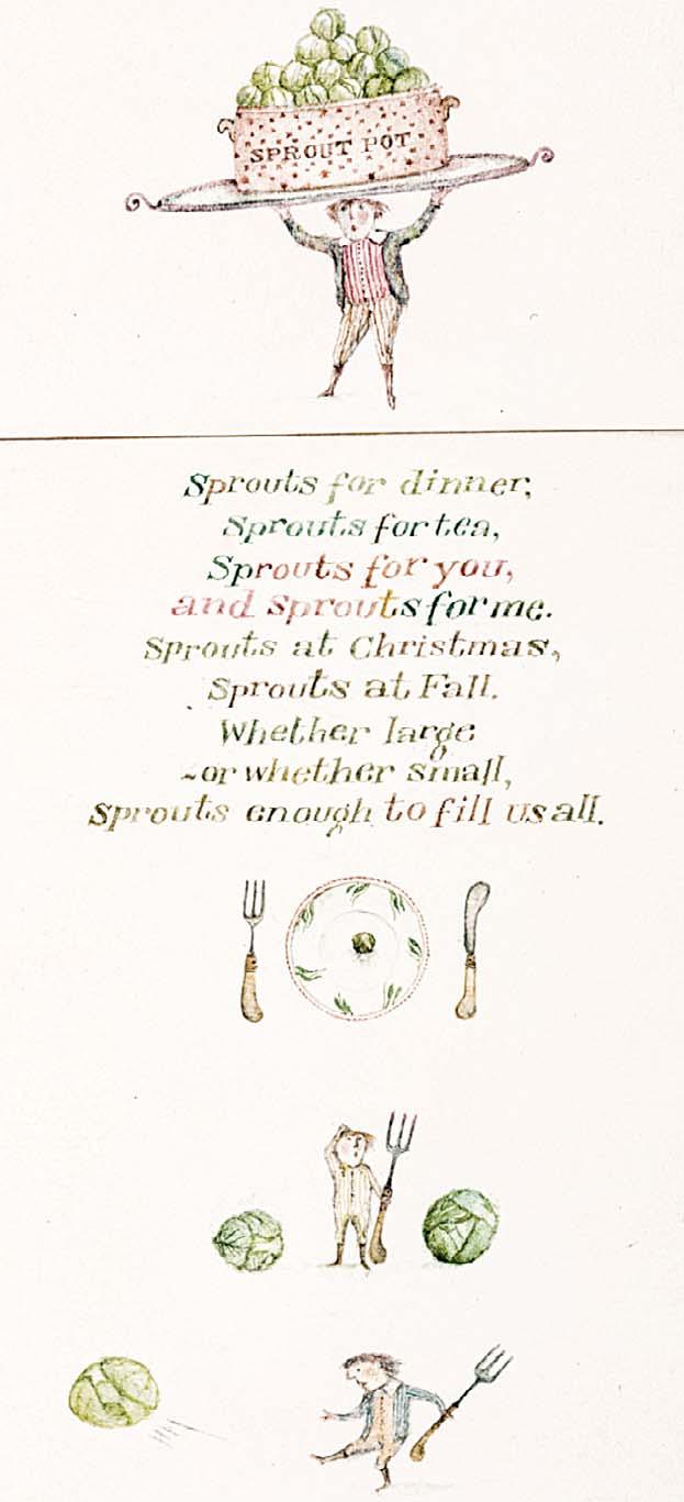
SPROUTS FOR DINNER, SPROUTS FOR TEA, SPROUTS FOR YOU, AND SPROUTS FOR ME
Watercolour and ink
4 ½ x 2 inches
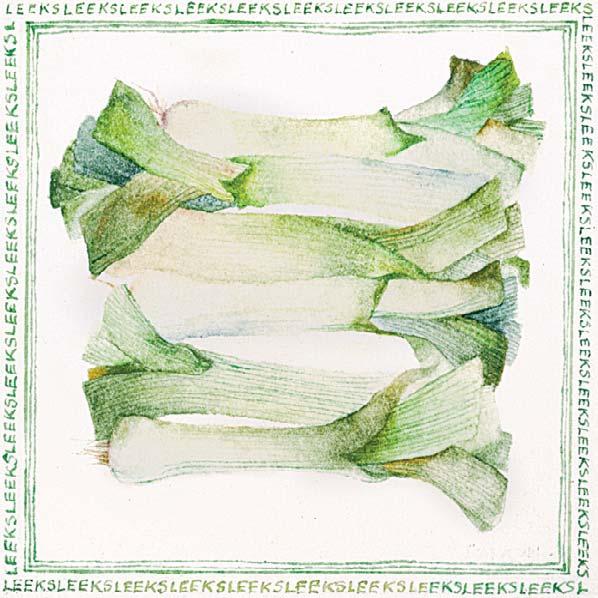
147 LEEKS
Watercolour and ink
2 x 2 inches
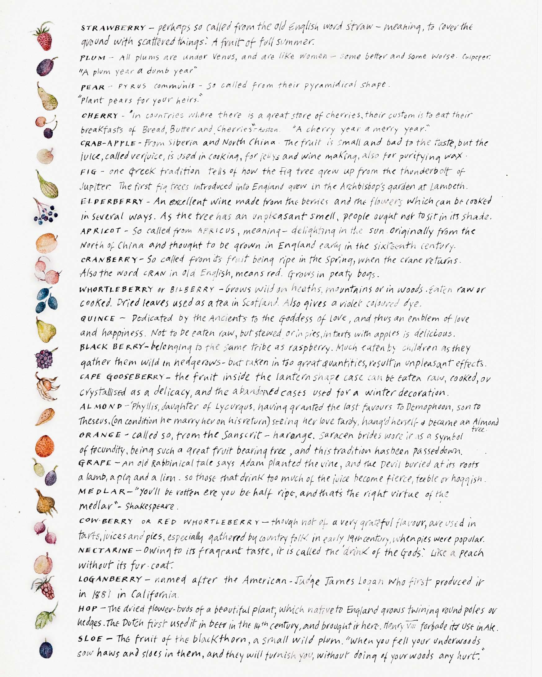
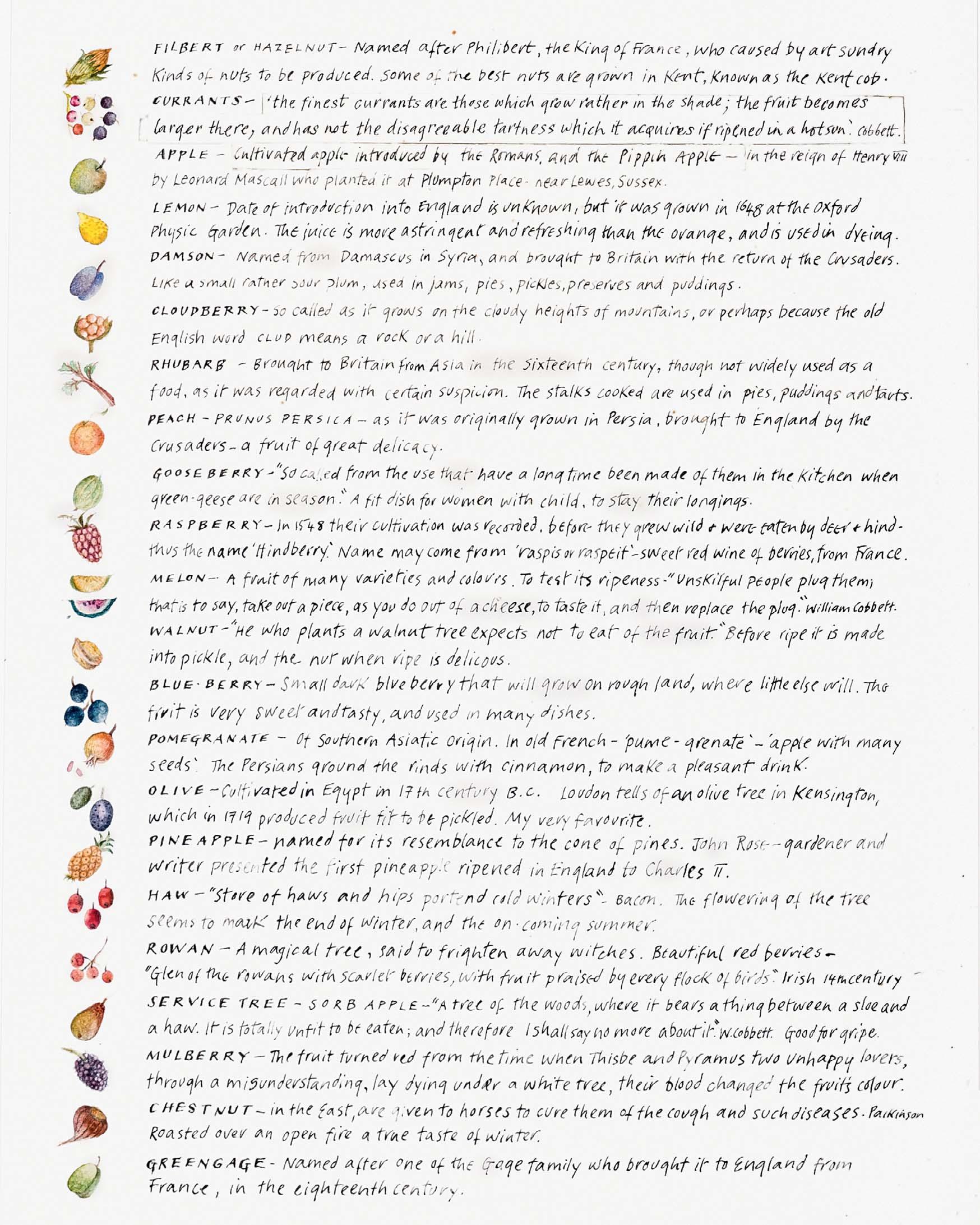
148 THE PLEASURES OF AN ORCHARD
Signed Ink and watercolour
4 x 3 ¼ inches

149
DOUBTLESS GOD COULD HAVE MADE A BETTER BERRY BUT DOUBTLESS GOD NEVER DID Watercolour
8 x 6 inches
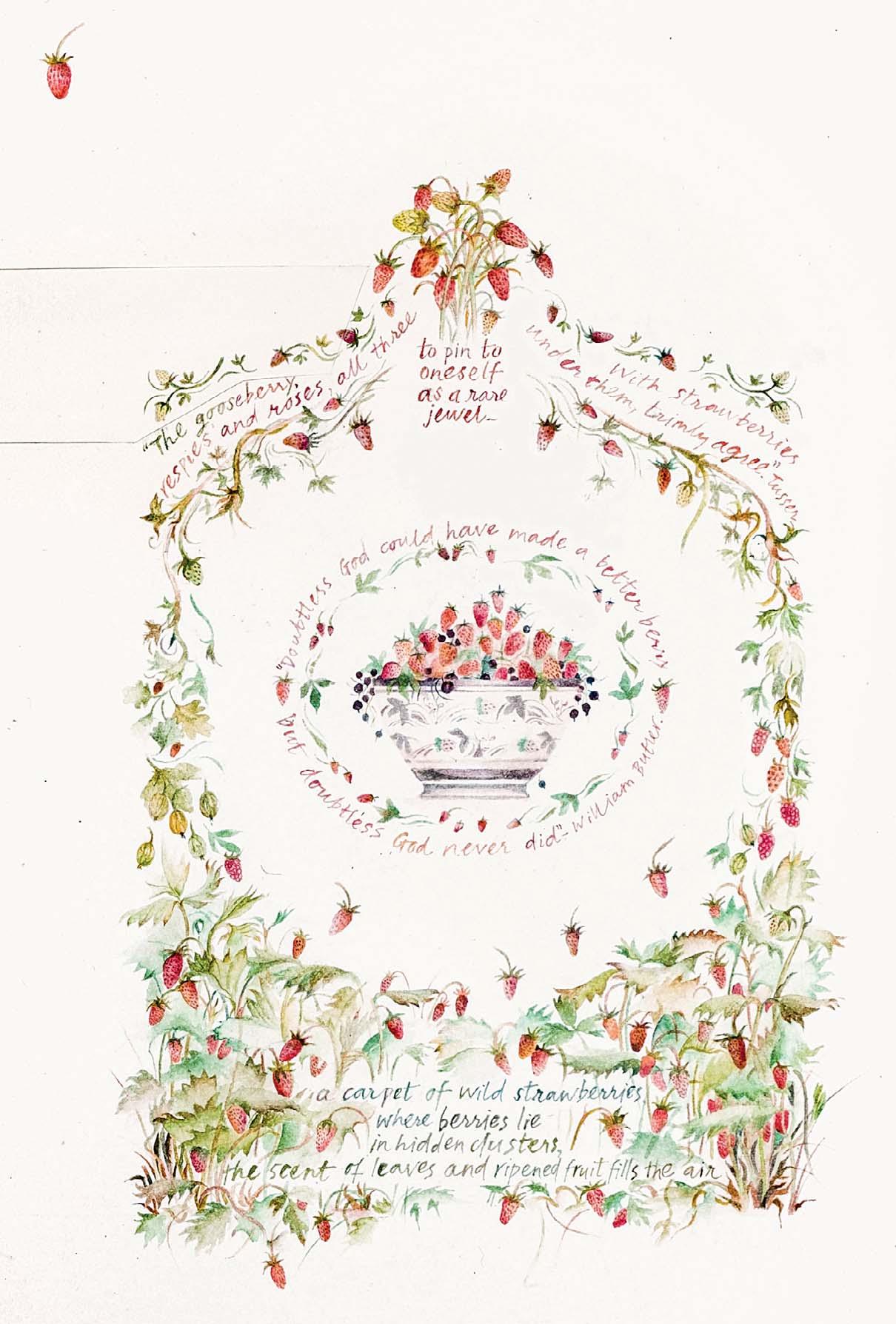
Both artworks are being sold together as one
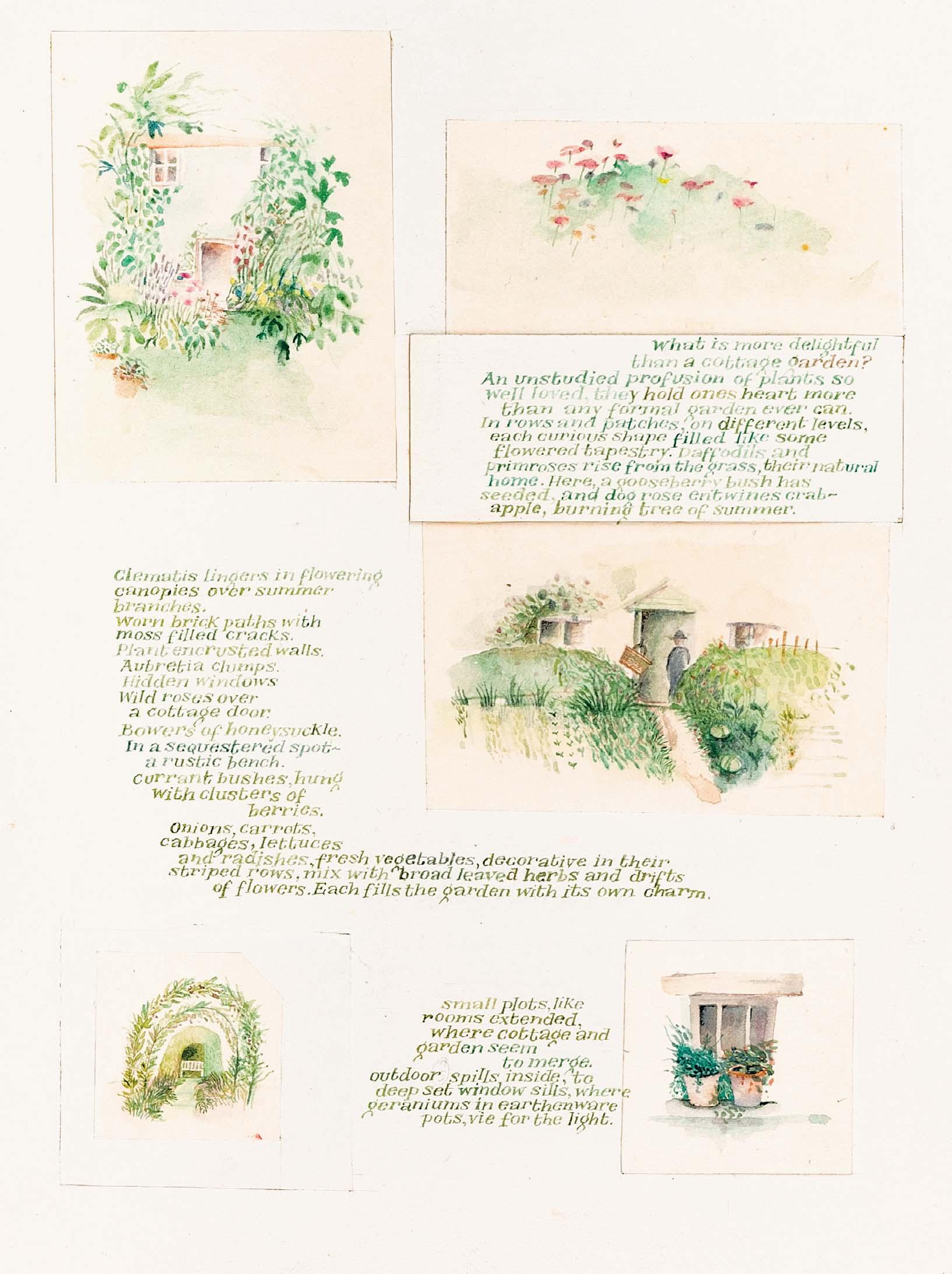
THE COTTAGE GARDEN
Watercolour and ink
8 x 12 ¼ inches
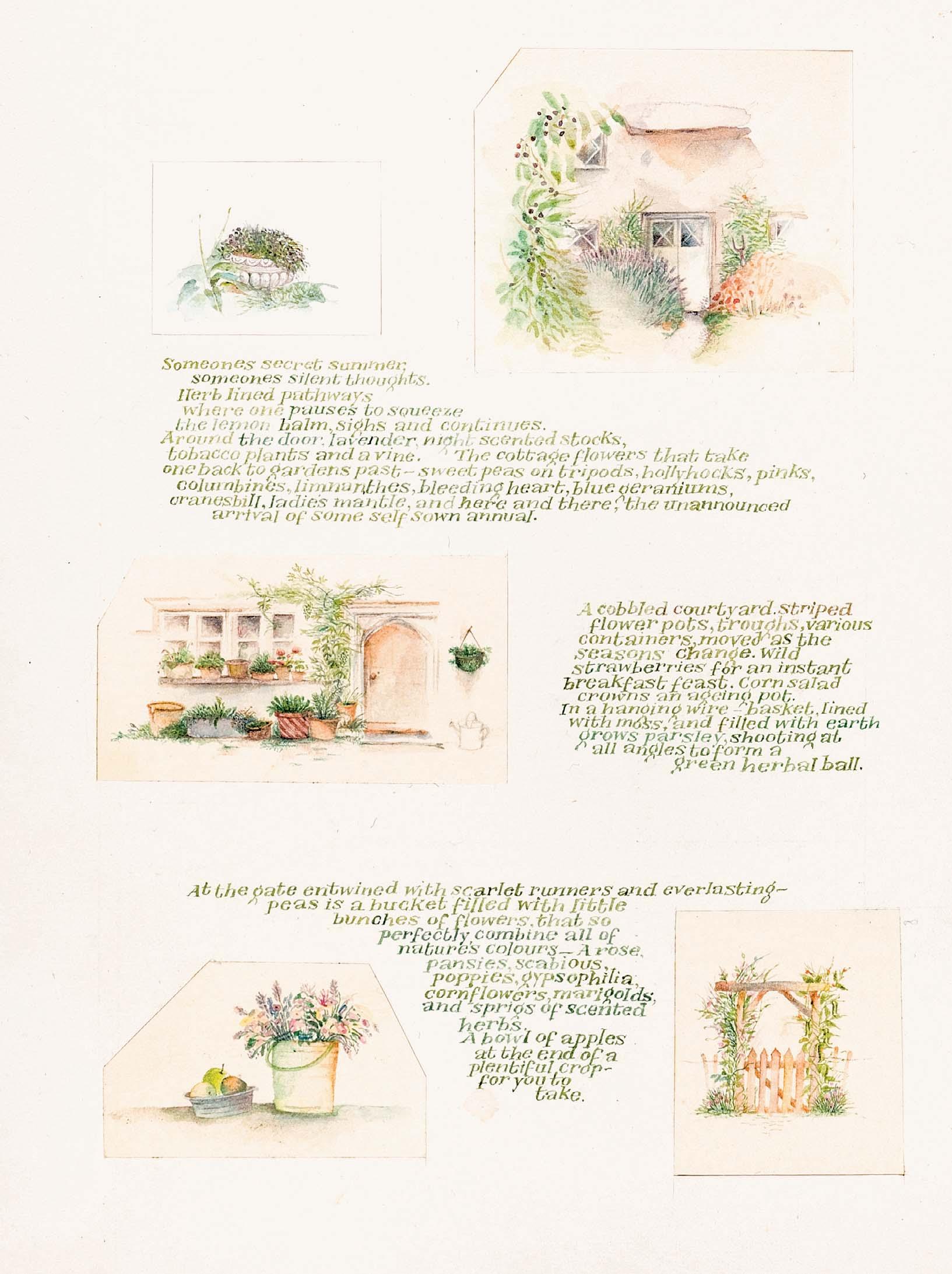
Both artworks are being sold together as one
A CHILDHOOD GARDEN
OF ONES VERY OWN Ink and watercolour

8 x 12 inches
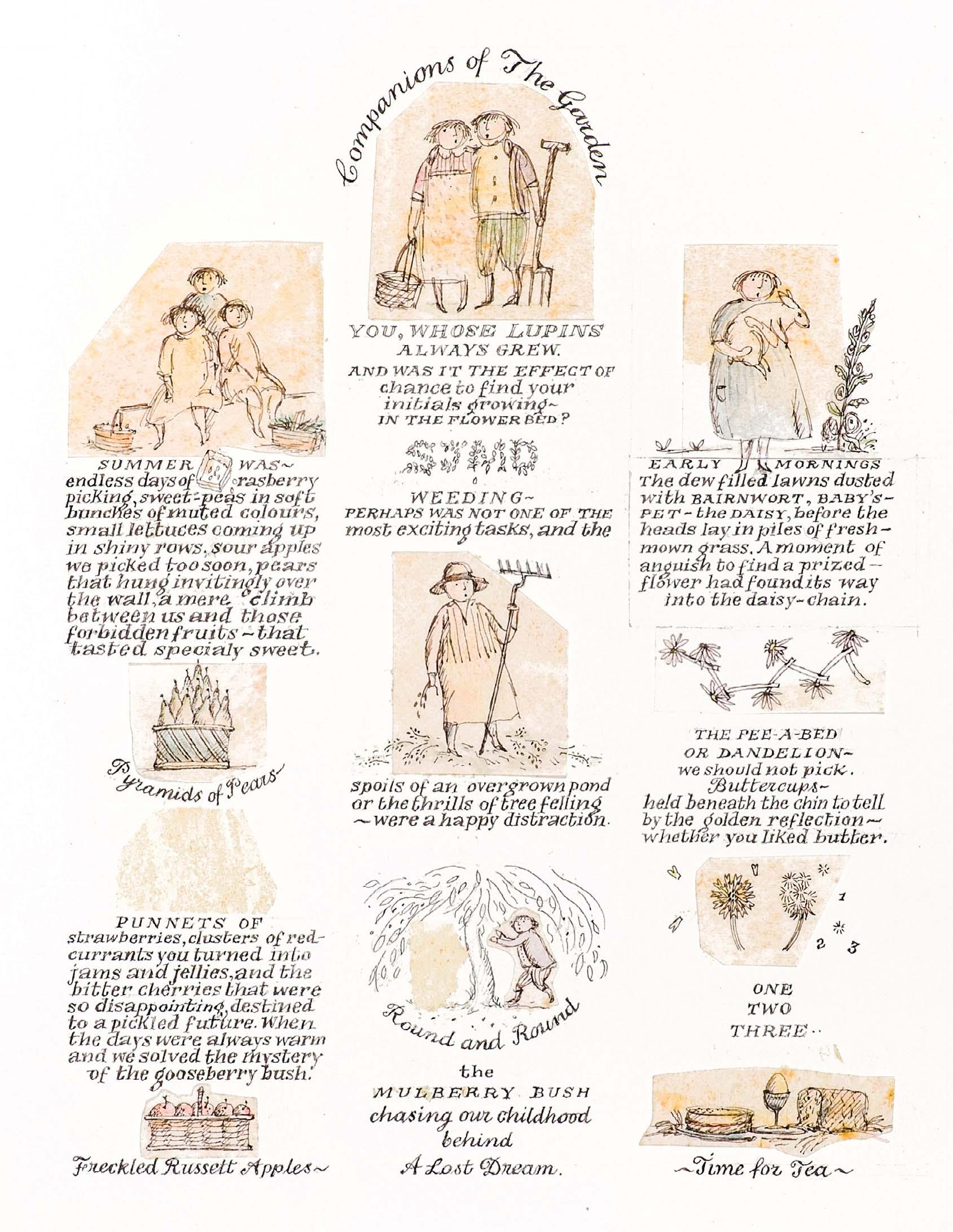
Both artworks are being sold together as one
Ink and watercolour
8 x 12 inches
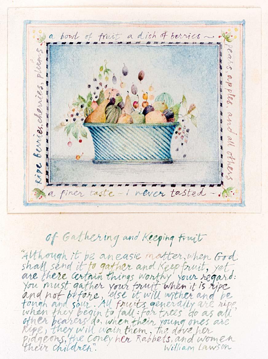
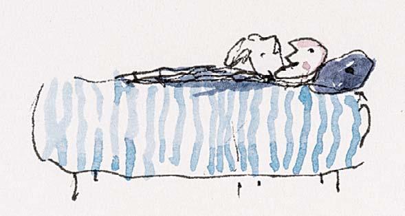
Ink, watercolour and pressed owers
6 ¼ x 5 ½ inches 154 OF GATHERING AND KEEPING FRUIT
4 ½ x 3 ¼ inches
Watercolour and ink
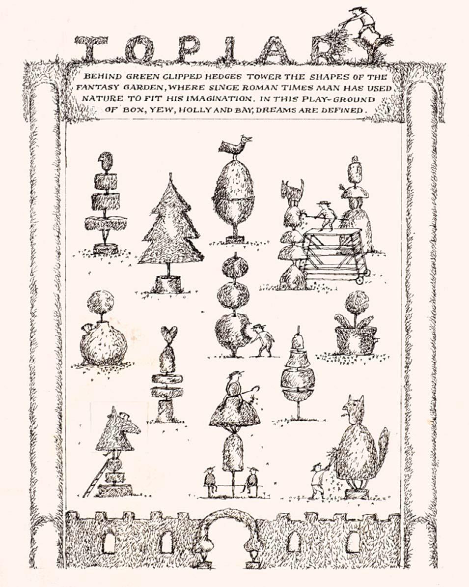
THROUGH THE DAY,
TOPIARY Ink
5 ¼ x 4 inches
156
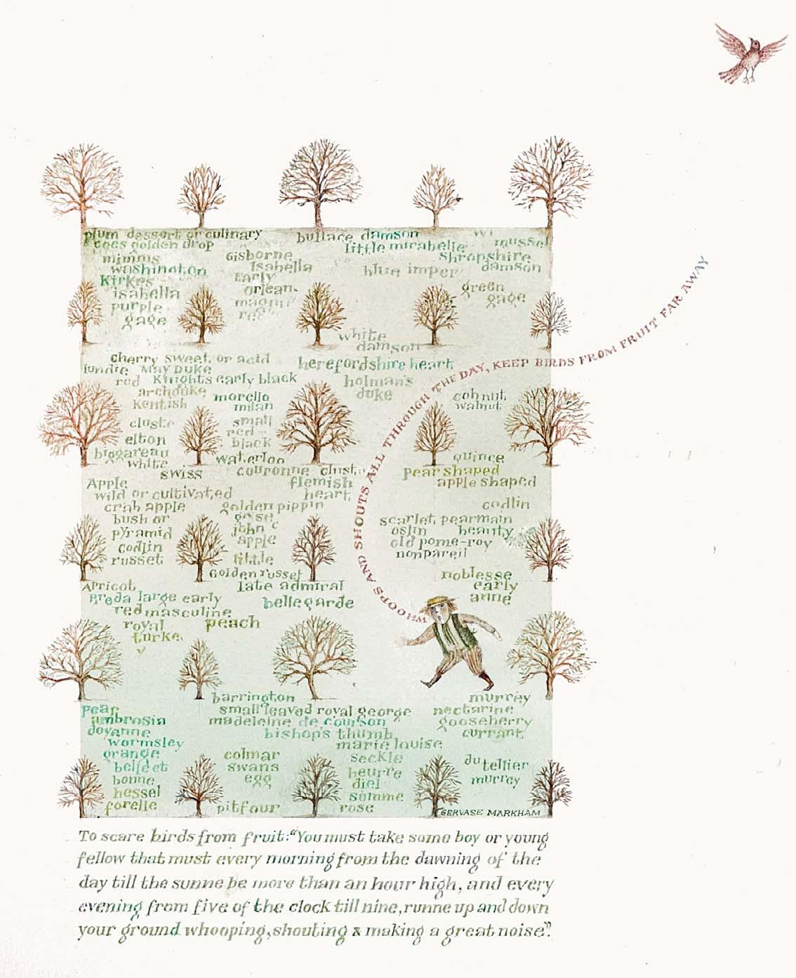
WHOOPS AND SHOUTS ALL
KEEP BIRDS FROM FRUIT FAR AWAY
Watercolour and ink
6 x 5 inches
158
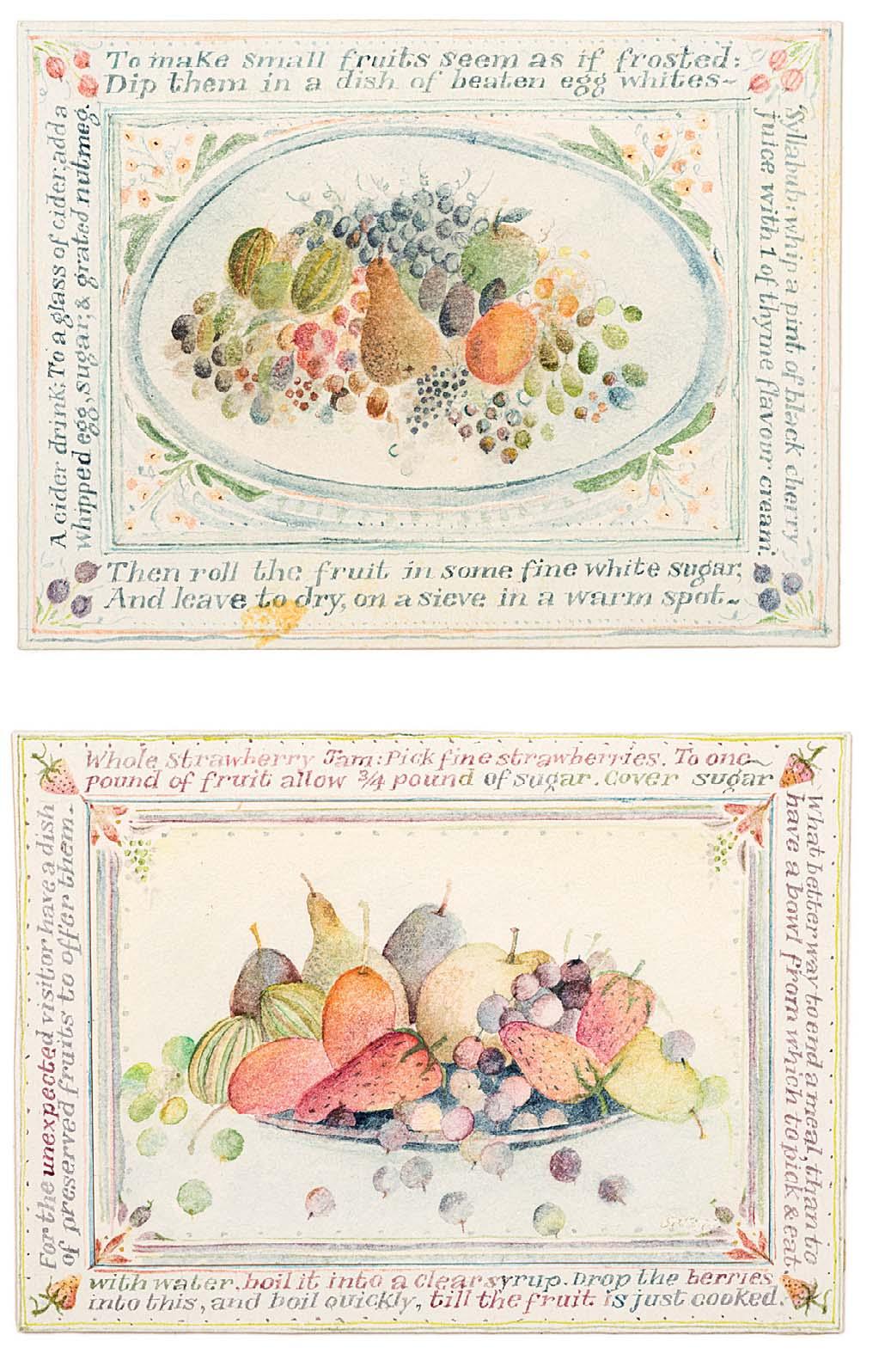
RECIPES FOR FRUIT
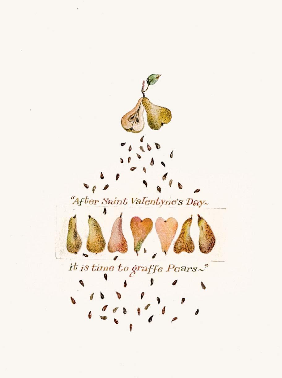
AFTER SAINT VALENTYNE’S DAY –IT IS TIME TO GRAFFE PEARS
Watercolour
8 x 7 inches
157
Watercolour and ink
8 x 6 inches
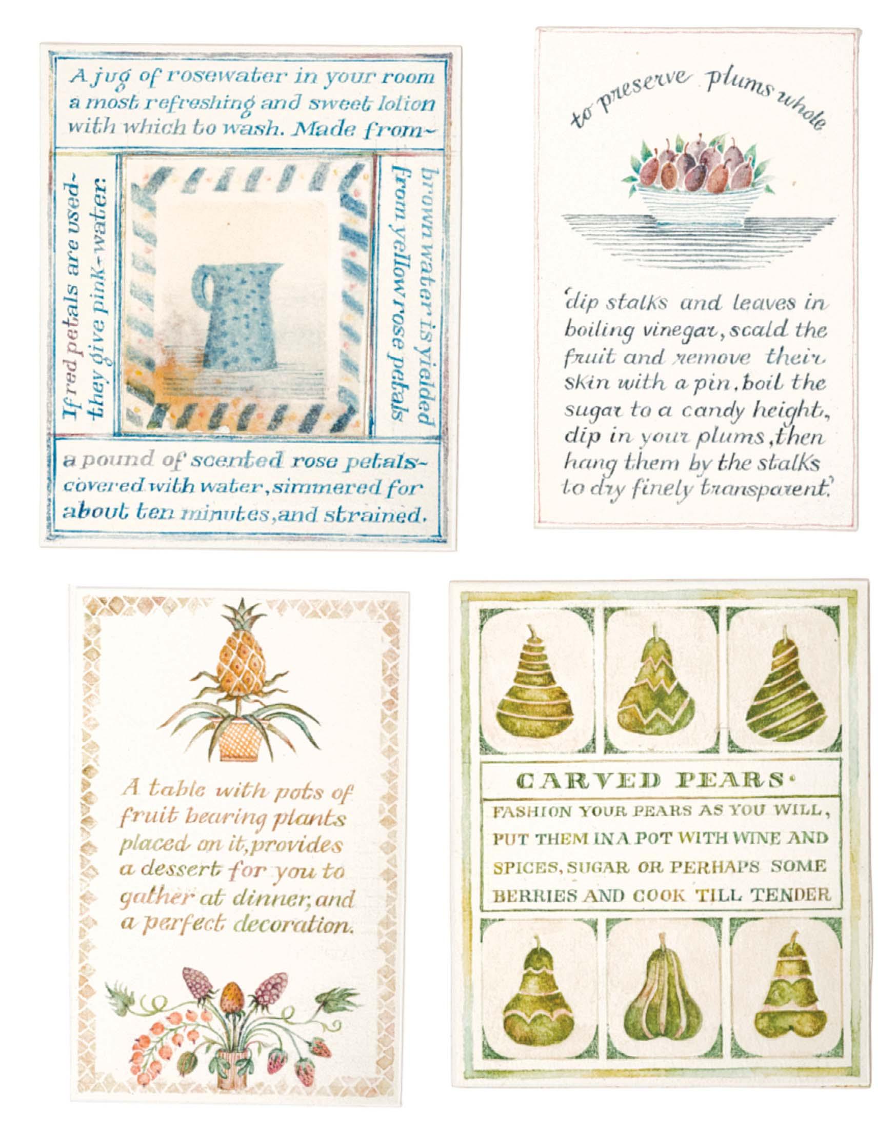
PRESERVED PLUMS AND CARVED PEARS
Watercolour and ink
8 x 6 inches
160
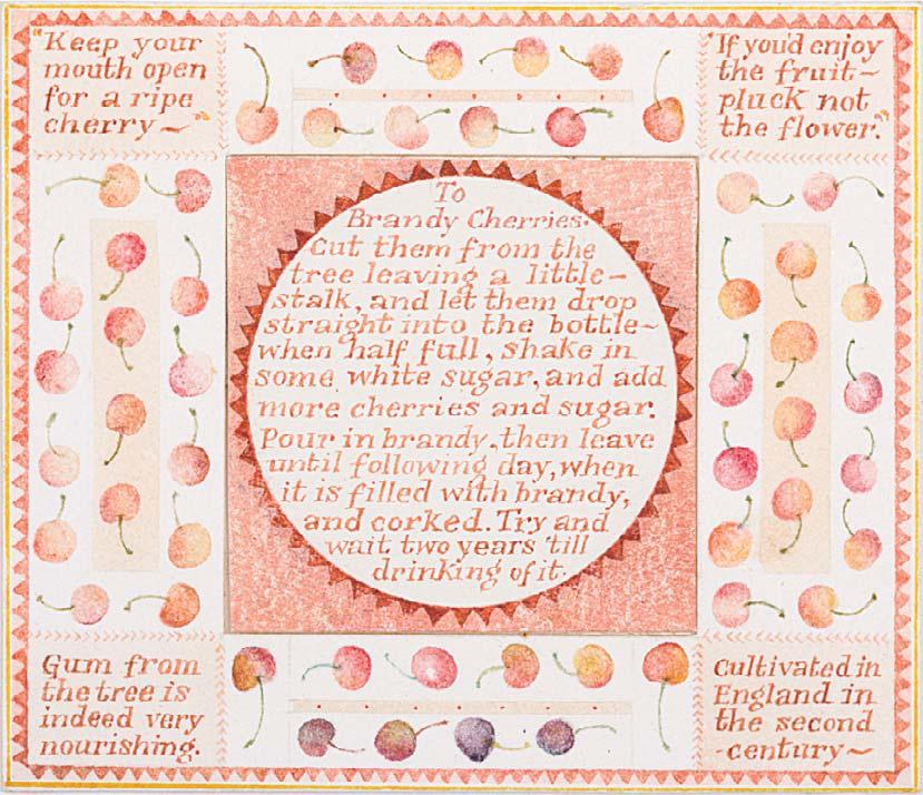
KEEP YOUR MOUTH OPEN FOR A RIPE CHERRY
Watercolour and ink
2 ¼ x 2 ¾ inches
161
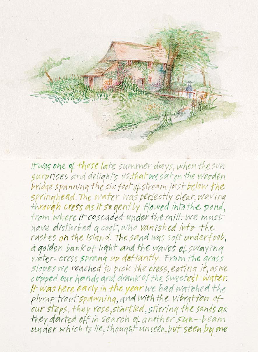
IT WAS ONE OF THOSE LATER SUMMER DAYS ...
Watercolour and ink
4 x 3 ¼ inches
162
ALL HEDGEROWS SHOULD BE PLANTED WITH FRUIT TREES ...
Signed
Watercolour and ink
5 ¼ x 3 ½ inches

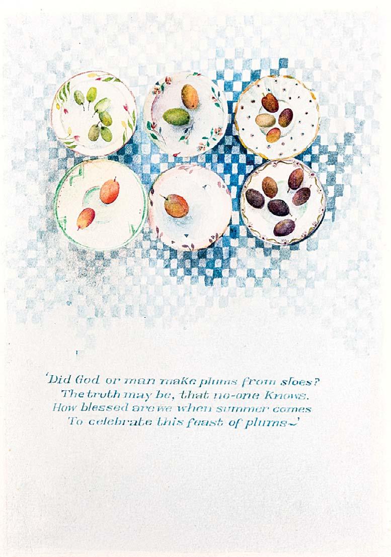
163 DID GOD OR MAN MAKE PLUMS FROM SLOES?
and ink
3 ¾ x 3 ½ inches
164
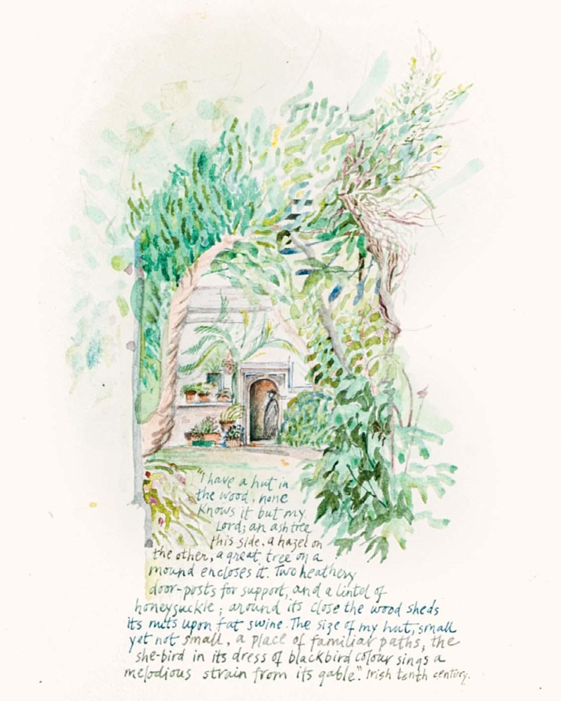
I HAVE A HUT IN THE WOOD, NONE KNOWS IT BUT MY LORD
Watercolour and ink
5 x 3 ¼ inches
Watercolour
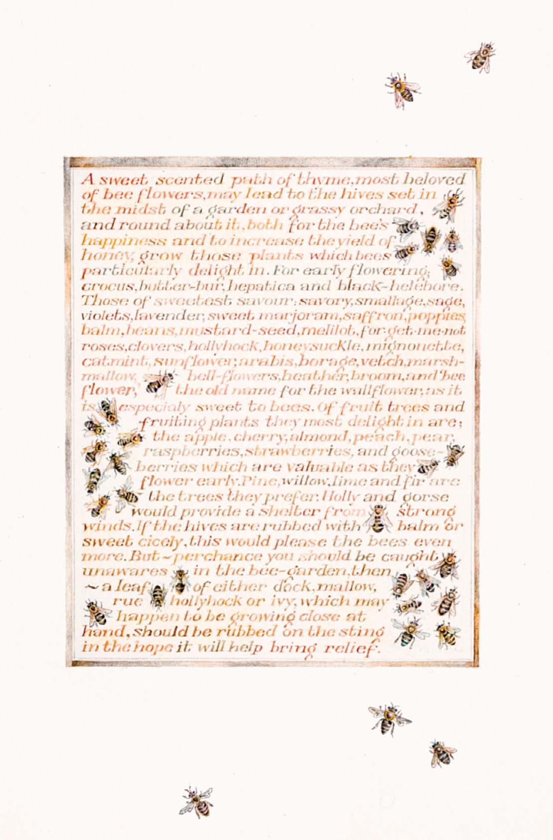
165
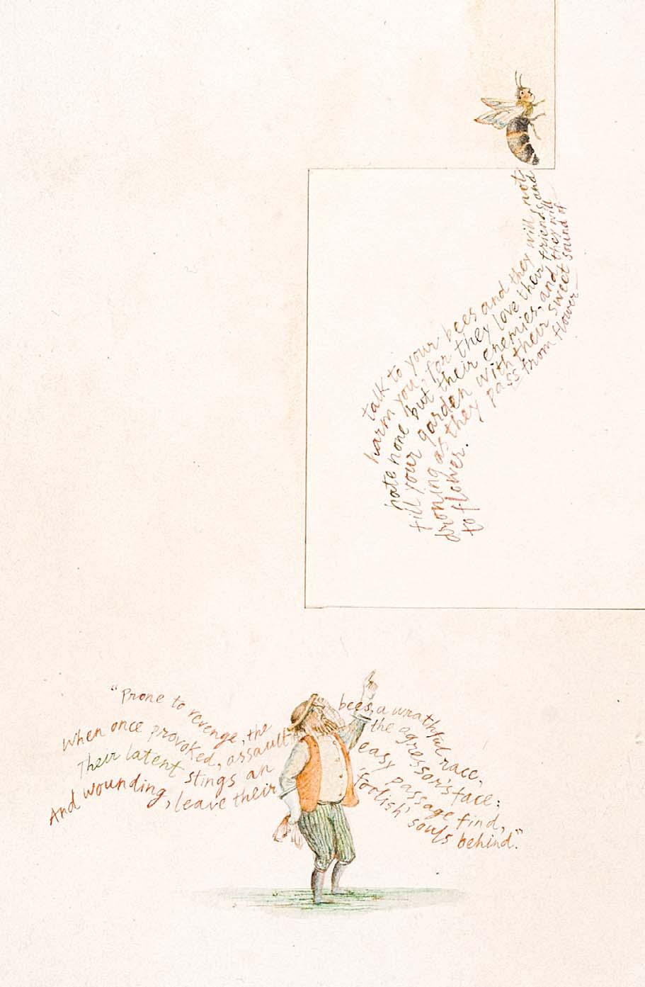
TALK TO YOUR BEES AND THEY WILL NOT HARM YOU, FOR THEY LOVE THEIR FRIENDS
5 ½ x 3 ¼ inches
166 A SWEET SCENTED PATH OF THYME, MOST BELOVED OF BEE FLOWERS, MAY LEAD TO THE HIVES SET IN THE MIDST OF A GARDEN OR GRASSY ORCHARD ... Watercolour and ink
8 x 6 inches
Watercolour and ink
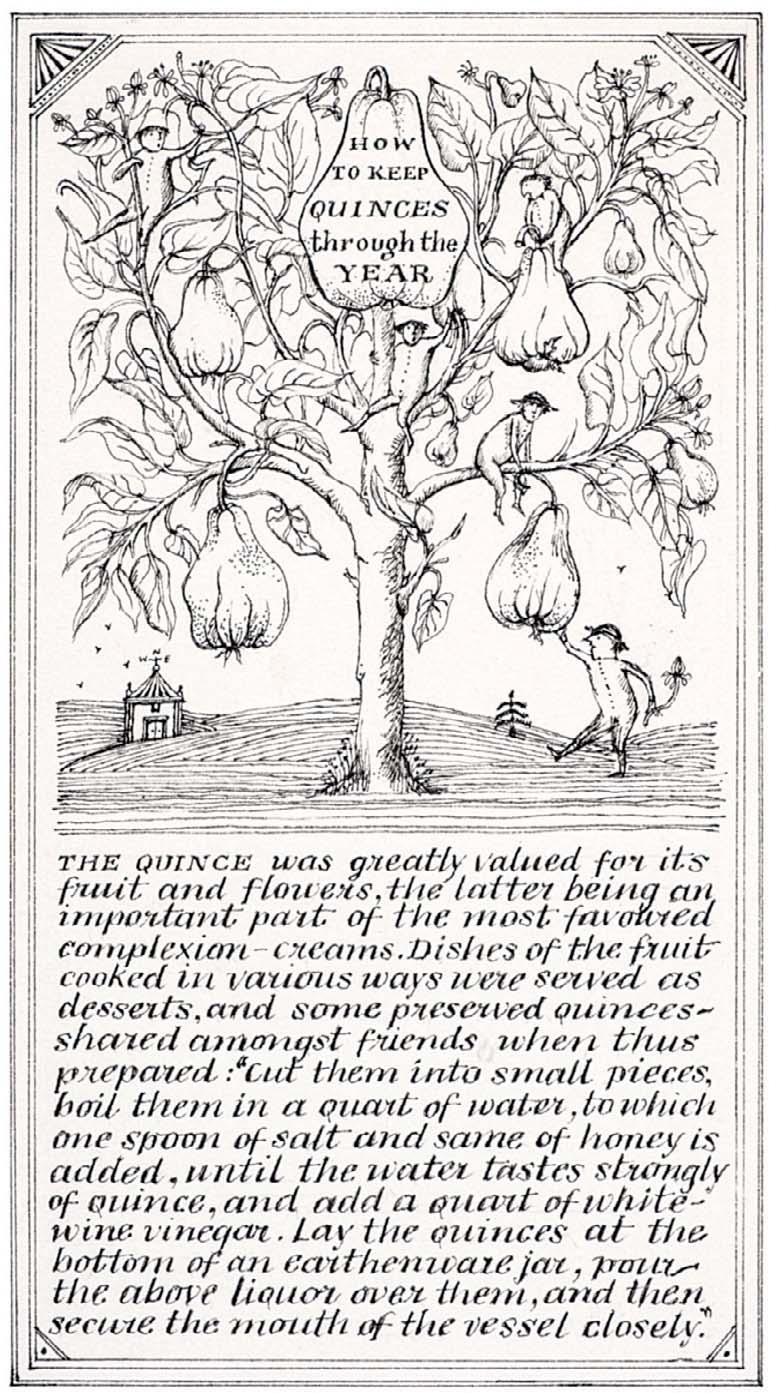
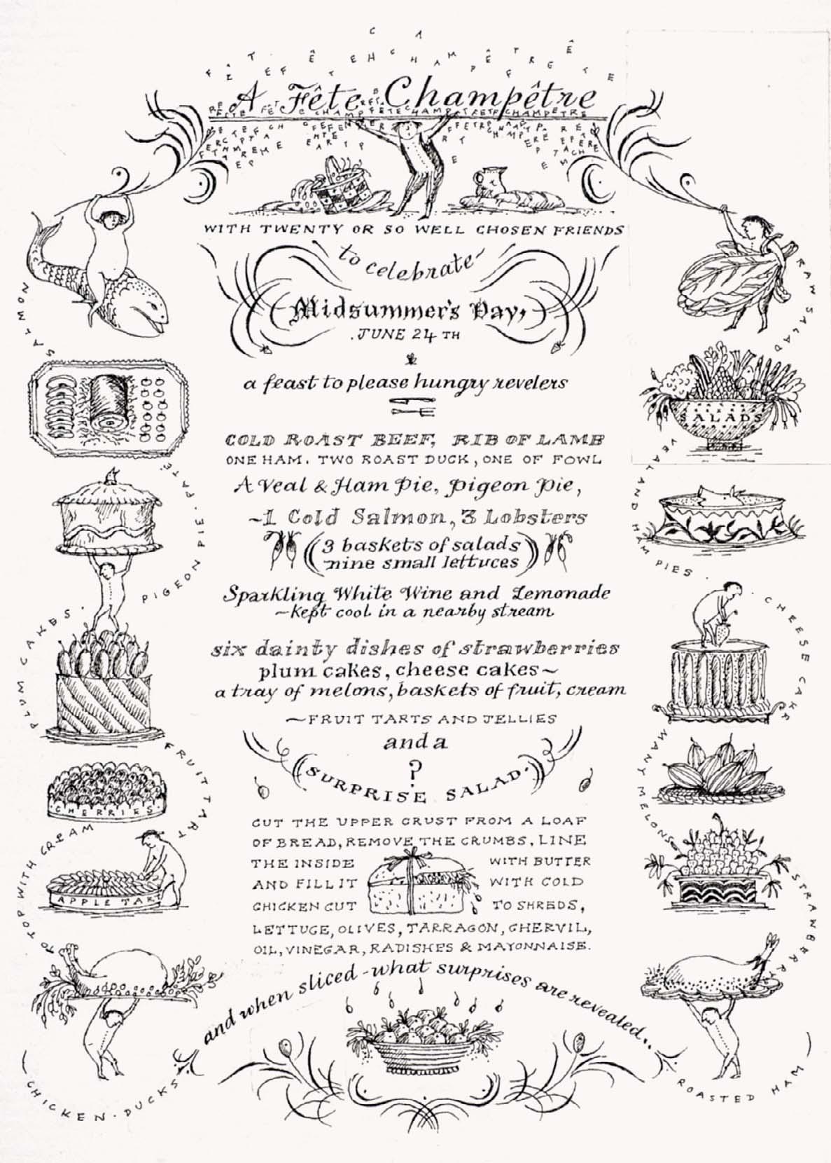
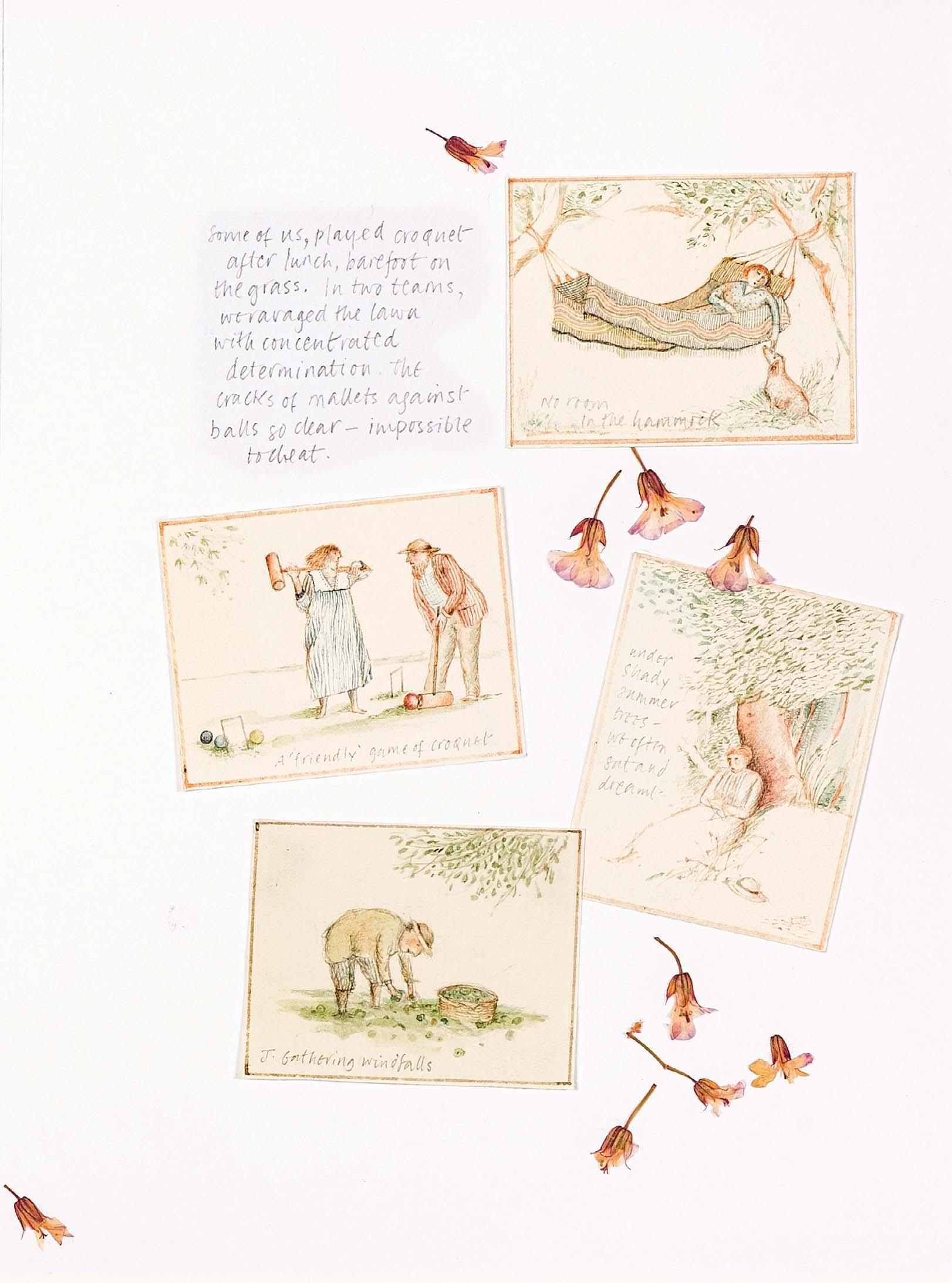
Both artworks are being sold together as one

Watercolour and pencil with pressed owers
7 ¾ x 11 ¾ inches
170
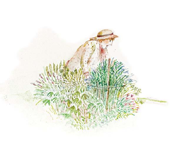
AMONG THE HERBS
Watercolour with ink
1 ¼ x 2 inches
A COVERED PATH
Watercolour
4 ½ x 3 inches 172
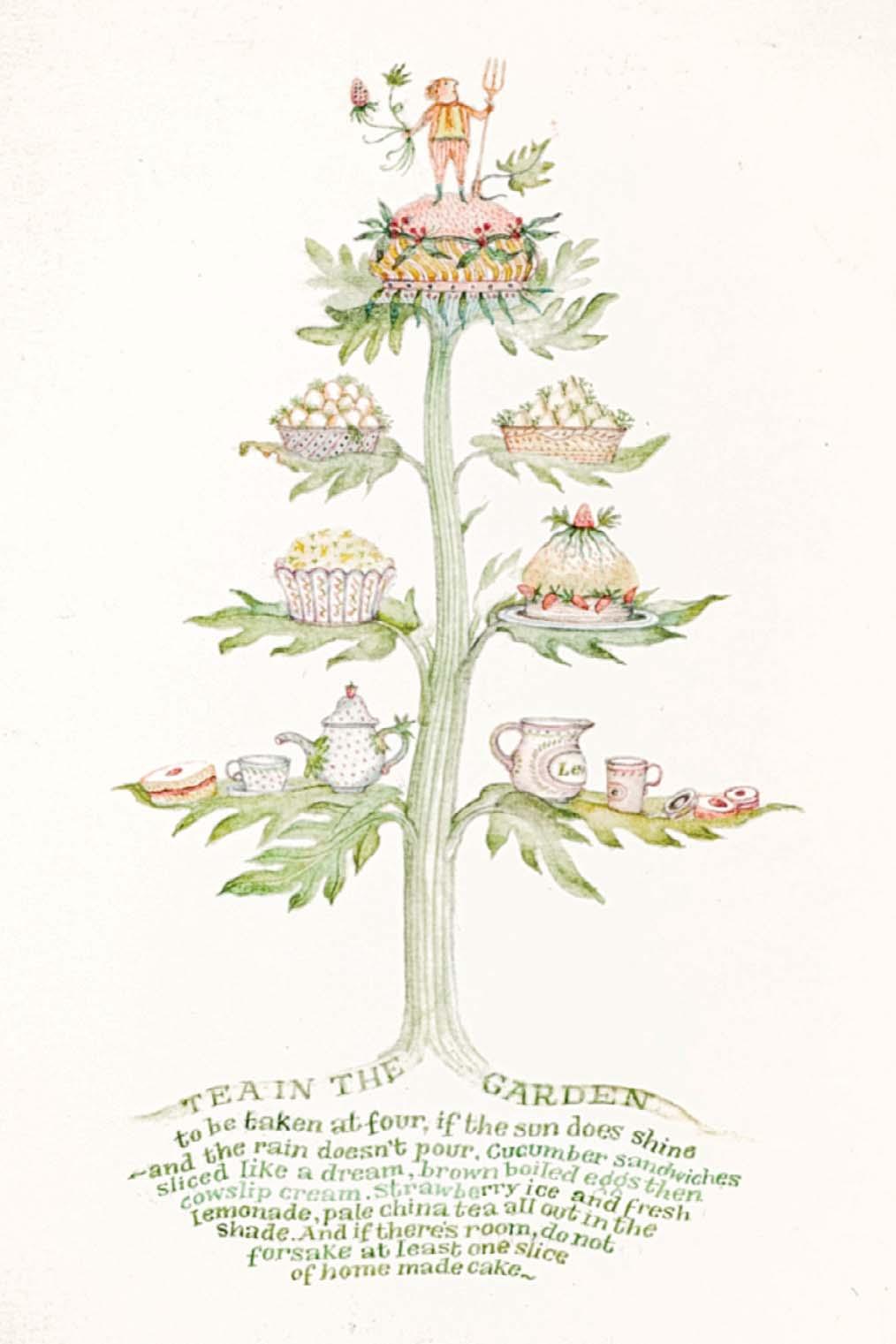
TEA IN THE GARDEN
Watercolour and ink
4 ½ x 2 ¾ inches
4 ¼ x 3 inches 171
Watercolour and ink

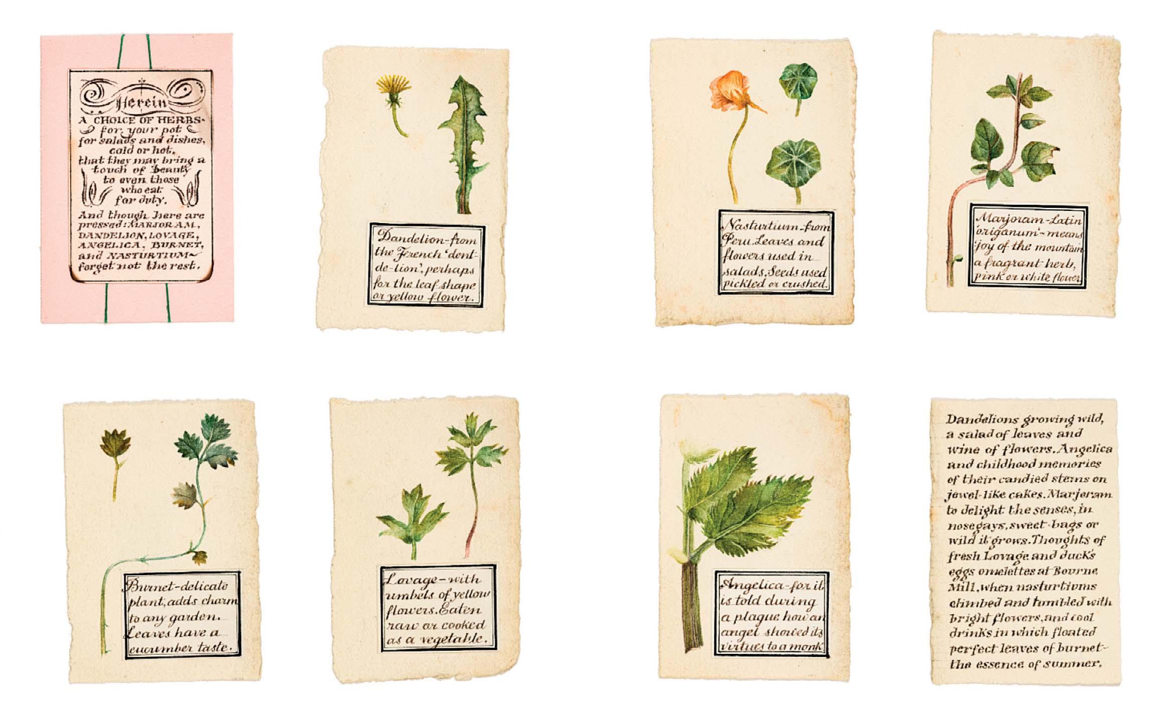
A CHOICE OF HERBS
Watercolour and ink
8 x 12 inches
Both artworks are being sold together as one
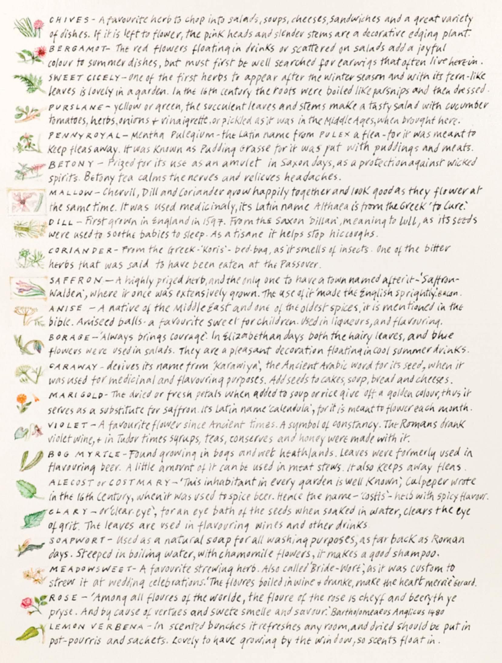
AND FLOWERS
Ink and watercolour 7 ¼ x 12 inches
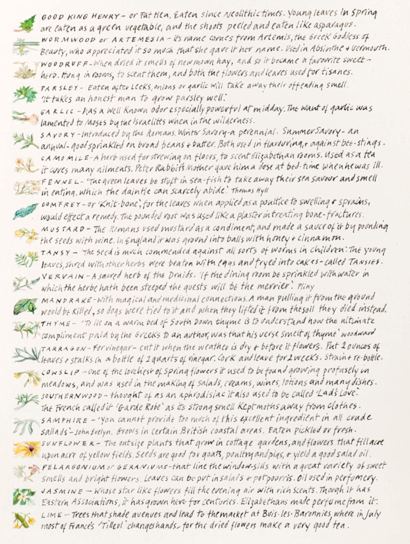
176
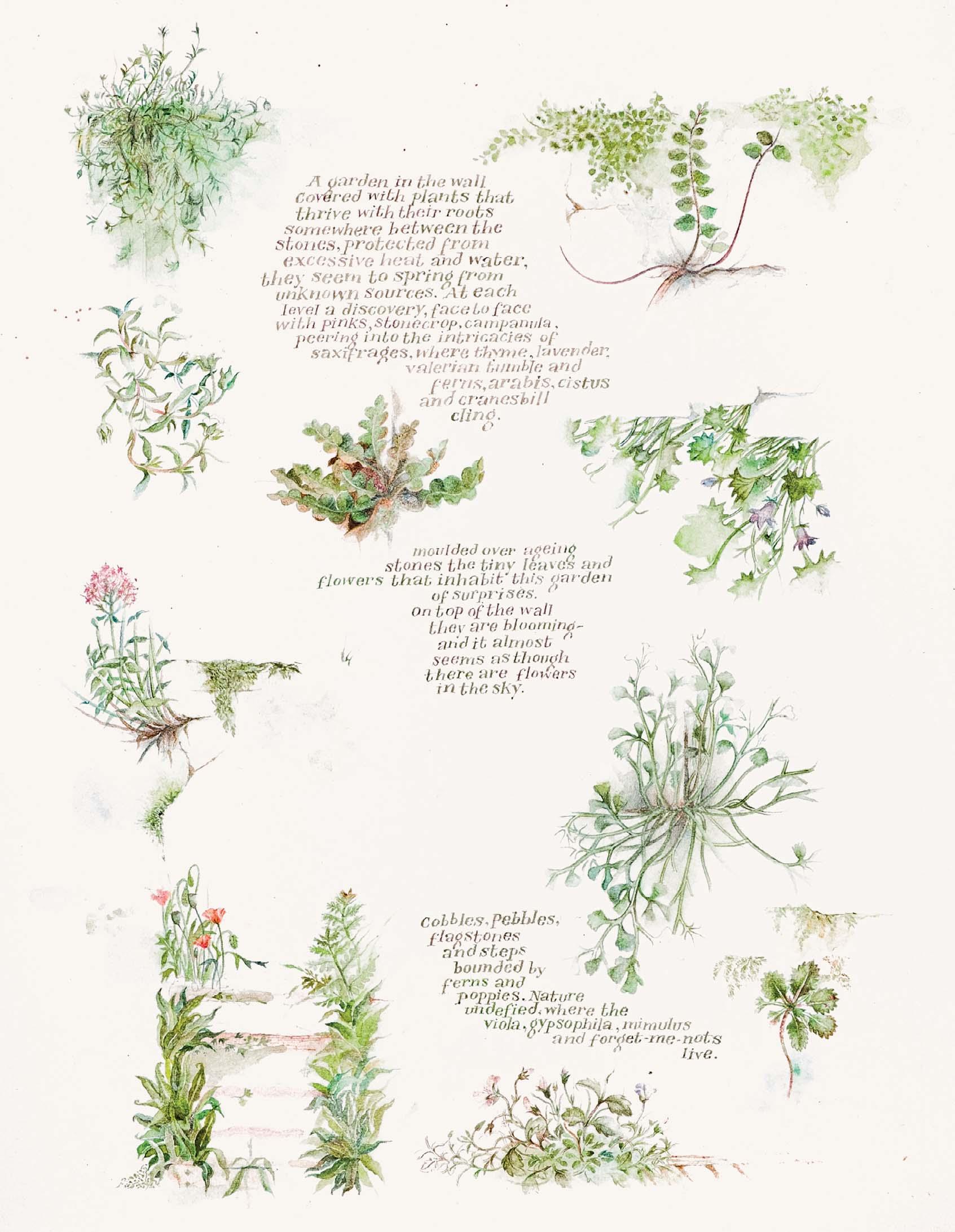
A GARDEN IN THE WALL COVERED WITH PLANTS THAT THRIVE WITH THEIR ROOTS SOMEWHERE BETWEEN THE STONES ... Watercolour and ink
7 ½ x 5 ¾ inches
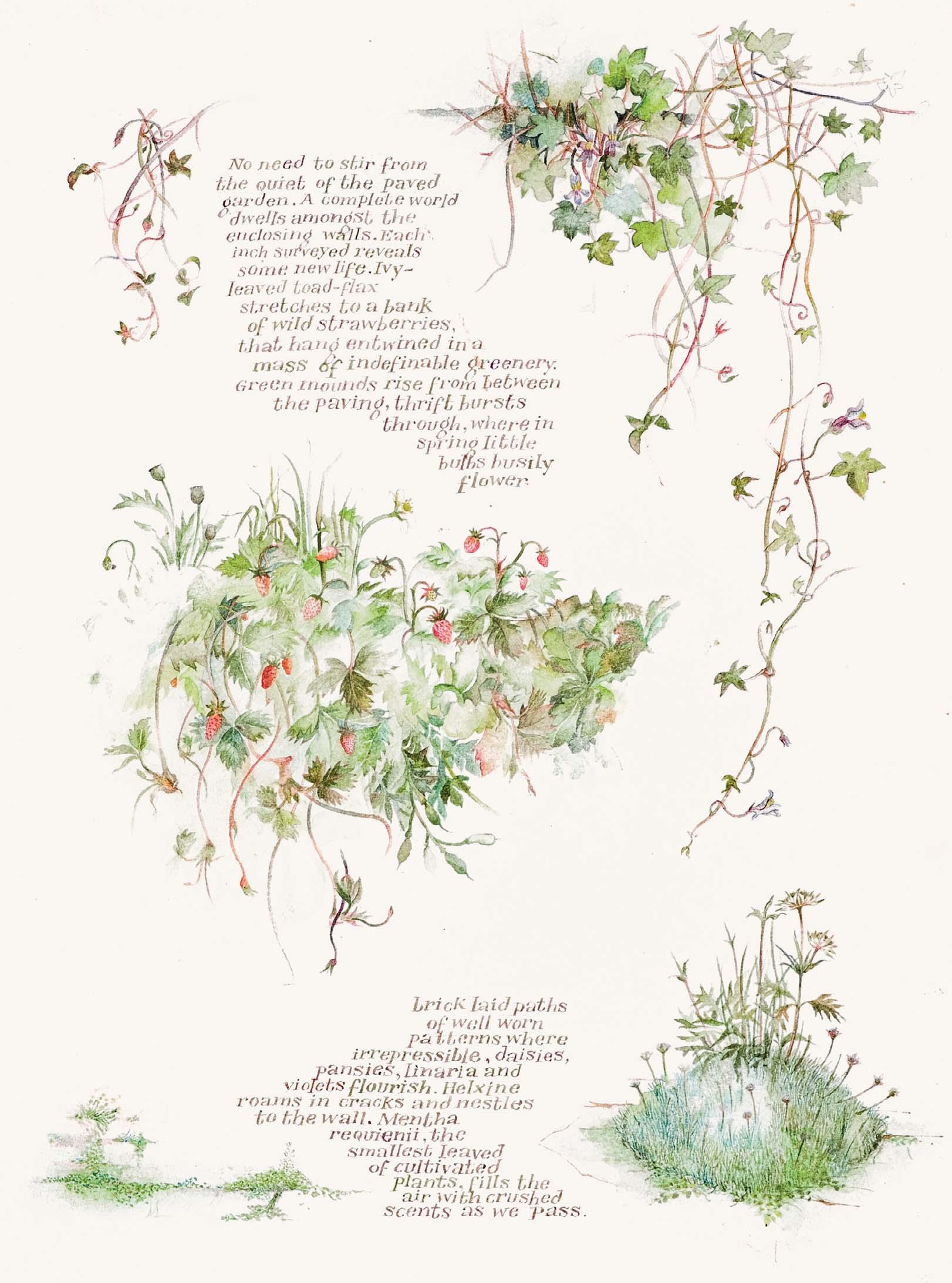
NO NEED TO STIR FROM THE QUIET OF THE PAVED GARDEN. A COMPLETE WORLD DWELLS AMONGST THE ENCLOSING WALLS
Watercolour and ink
7 ¾ x 6 inches
178
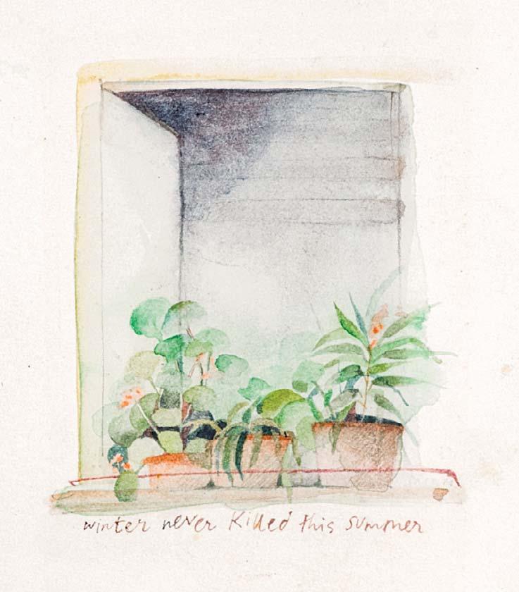
WINTER NEVER KILLED THIS SUMMER
Watercolour with ink
2 ¾ x 2 ½ inches
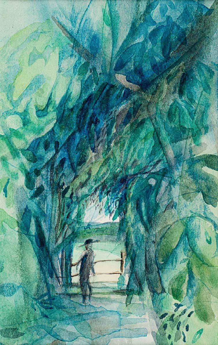
179 BY THE FENCE IN THE WOODS
Watercolour
4 x 2 ½ inches
180 THE GARDEN OF HERBS
Watercolour and ink
4 x 3 ¼ inches

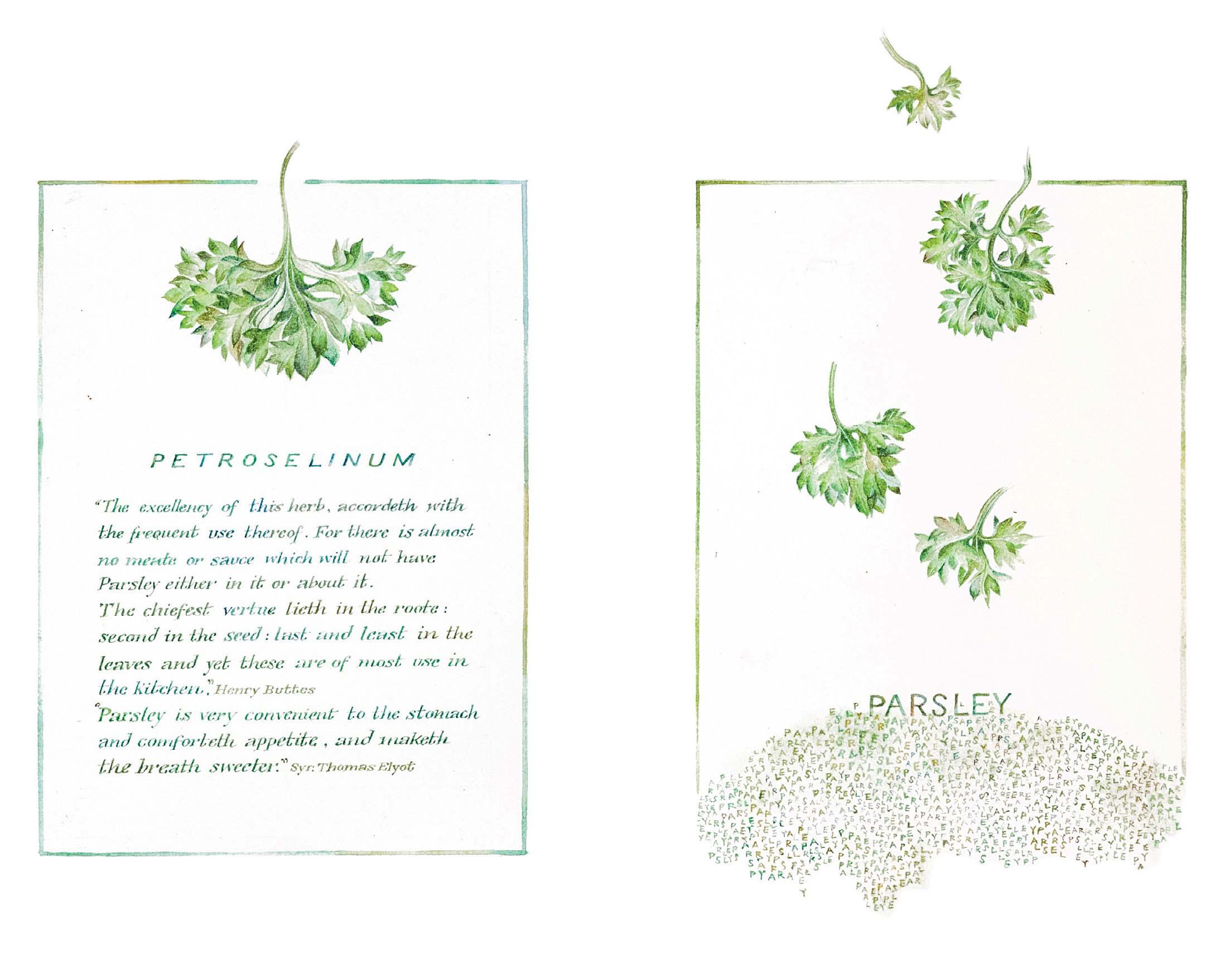
Overall size: 6 ½ x 9 ½ inches
First panel: 5 1 2 x 4 inches
Second panel: 6 1 2 x 4 inches
PETROSELINUM OR PARSLEY
Watercolour and ink
Both artworks are being sold together as one
Watercolour and ink
8 x 12 inches
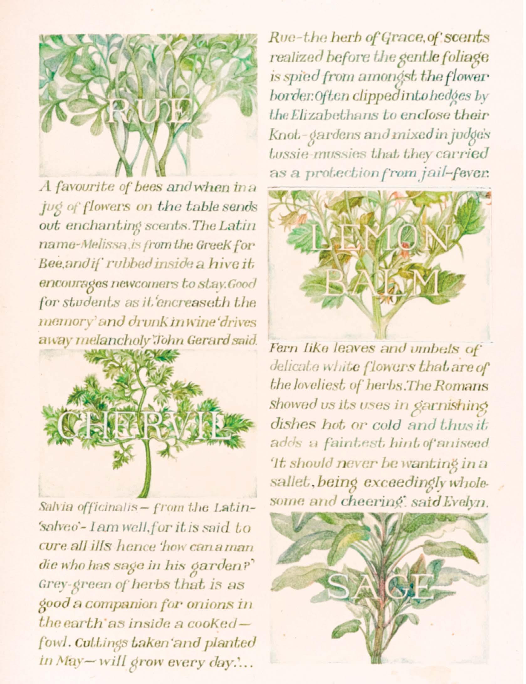
RUE, LEMON BALM, CHERVIL AND SAGE
HYSSOP, BAY LEAF, BASIL AND MINT
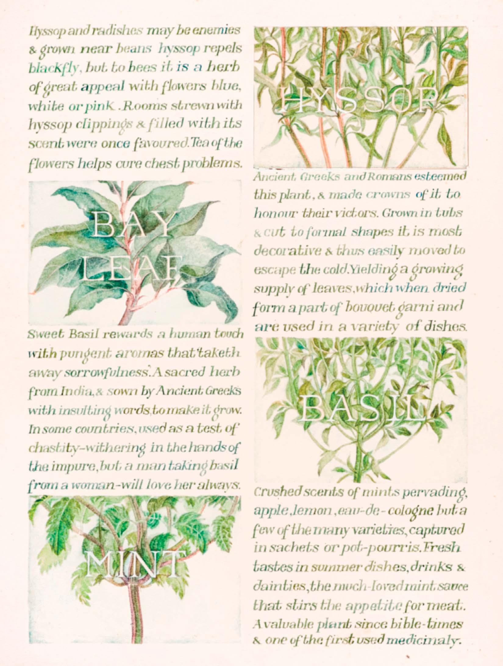

AWAKE, OH NORTH WIND; AND COME, THOU SOUTH; BLOW UPON MY GARDEN, THAT THE SPICES THEREOF MAY FLOW OUT
Signed
Watercolour and ink
7 x 12 inches
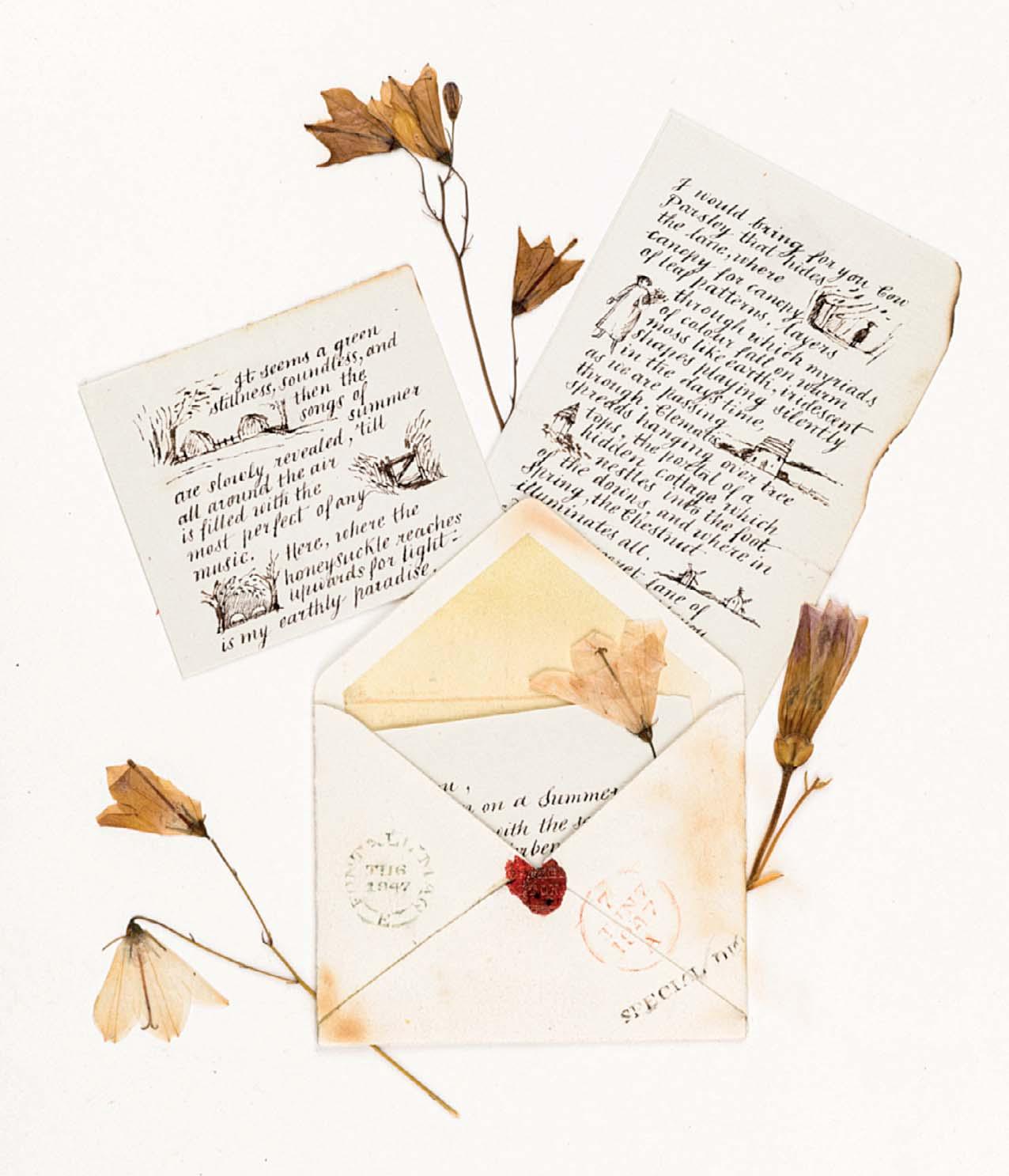
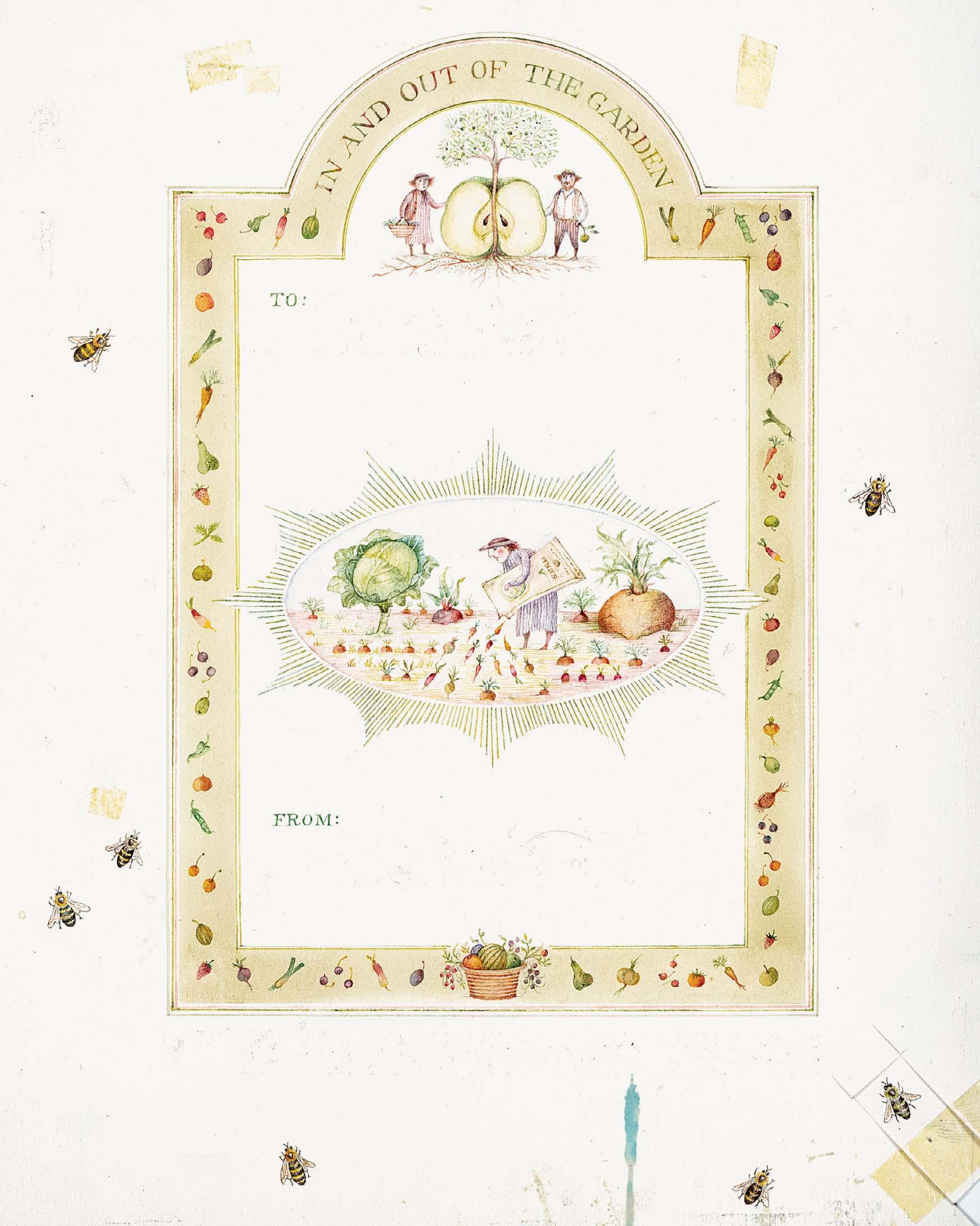
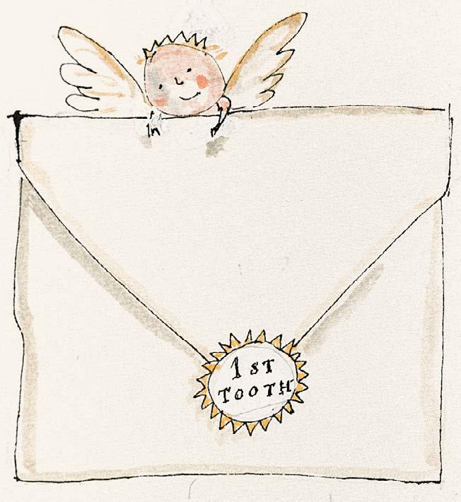
184 IN AND OUT OF THE GARDEN ENVELOPE
Ink and watercolour
9 ½ x 7 ¼ inches
Design for a gift envelope for Sara Midda, In and Out of the Garden

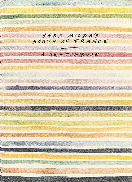
Sara Midda’s South of France: A Sketchbook, New York: Workman Publishing, 1990
Nos 185-225&227 are all illustrated in Sara Midda’s South of France: A Sketchbook, New York: Workman Publishing, 1990
South of France is an intimate and tenderly illustrated record of Sara’s year sojourn in the countryside. Through beautiful watercolours and handwritten notes and discoveries, you are immersed in the South of France’s scenery, feel its warm summer air, taste its delicious produce, and experience its idyllic way of life.
185
SARA MIDDA’S SOUTH OF FRANCE: A SKETCHBOOK
Watercolour and ink
7 ¾ x 13 inches
Illustrated: cover

186
THE ROOM WITH A VIEW
Inscribed with title below mount
Watercolour with ink
3 x 2 ¼ inches
Illustrated: page 2
187
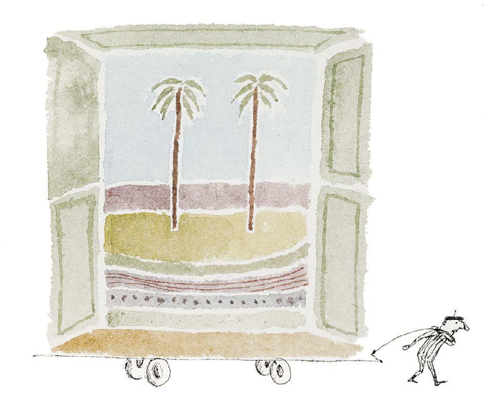
PORTABLE VIEW
Watercolour with ink
2 ¼ x 2 ¾ inches
Illustrated: title page
188
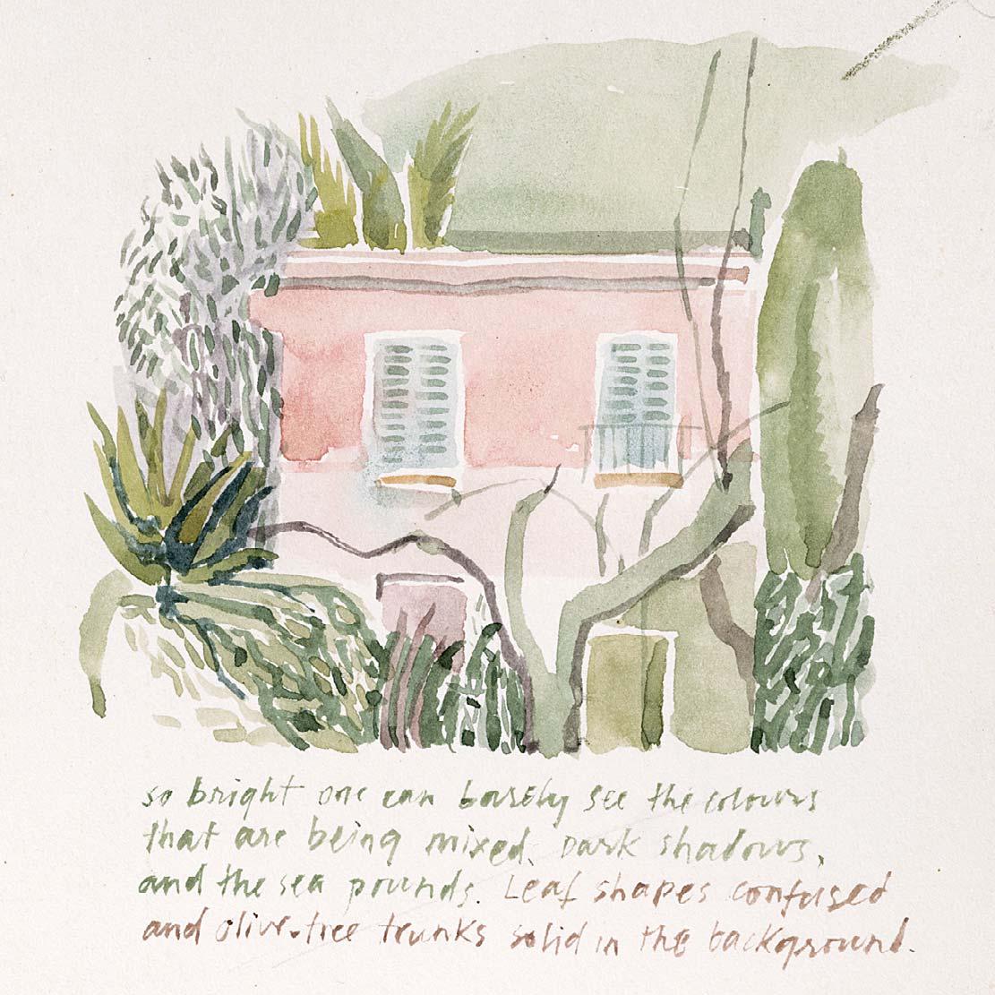
SO BRIGHT ONE CAN BARELY SEE THE COLOURS THAT ARE BEING MI ED ...
Watercolour
4 ¼ x 3 ¾ inches
Illustrated: page 13

BUILDINGS OF THE SOUTH OF FRANCE
Watercolour and ink
8 ¼ x 13 ½ inches
Illustrated: pages 14 and 15
...
Watercolour of a terracotta pot on reverse
Watercolour and ink
7 ½ x 9 inches
Illustrated: pages 16 and 17
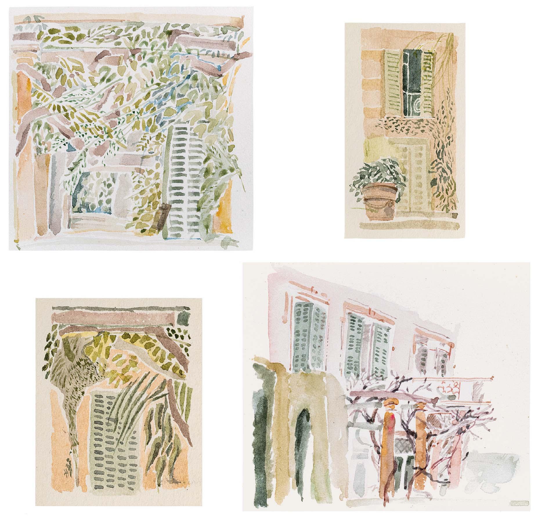
Top left: 2 ¾ x 2 ¾ inches
Top right: 2 ½ x 1 inches
Bottom left: 2 x 1 ½ inches
Bottom right: 2 ¾ x 3 inches
190 PORTES – FENêTRES, GREEN PEELING SHUTTERS

191
RACING ESPADRILLE
Watercolour and ink
1 x 1 ¾ inches
Illustrated: page 24
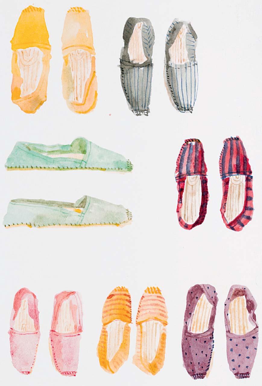
193 ESPADRILLES
Watercolour
4 x 2 ¾ inches
Illustrated: page 25
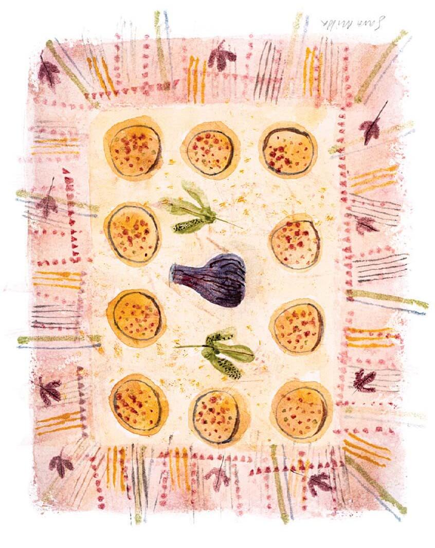
192 FIGS
Signed [upside down]
Watercolour
6 ½ x 5 ¼ inches
Illustrated: page 43
194 WATERMELON
Watercolour and ink
4 ¾ x 3 ¾ inches
Illustrated: page 63

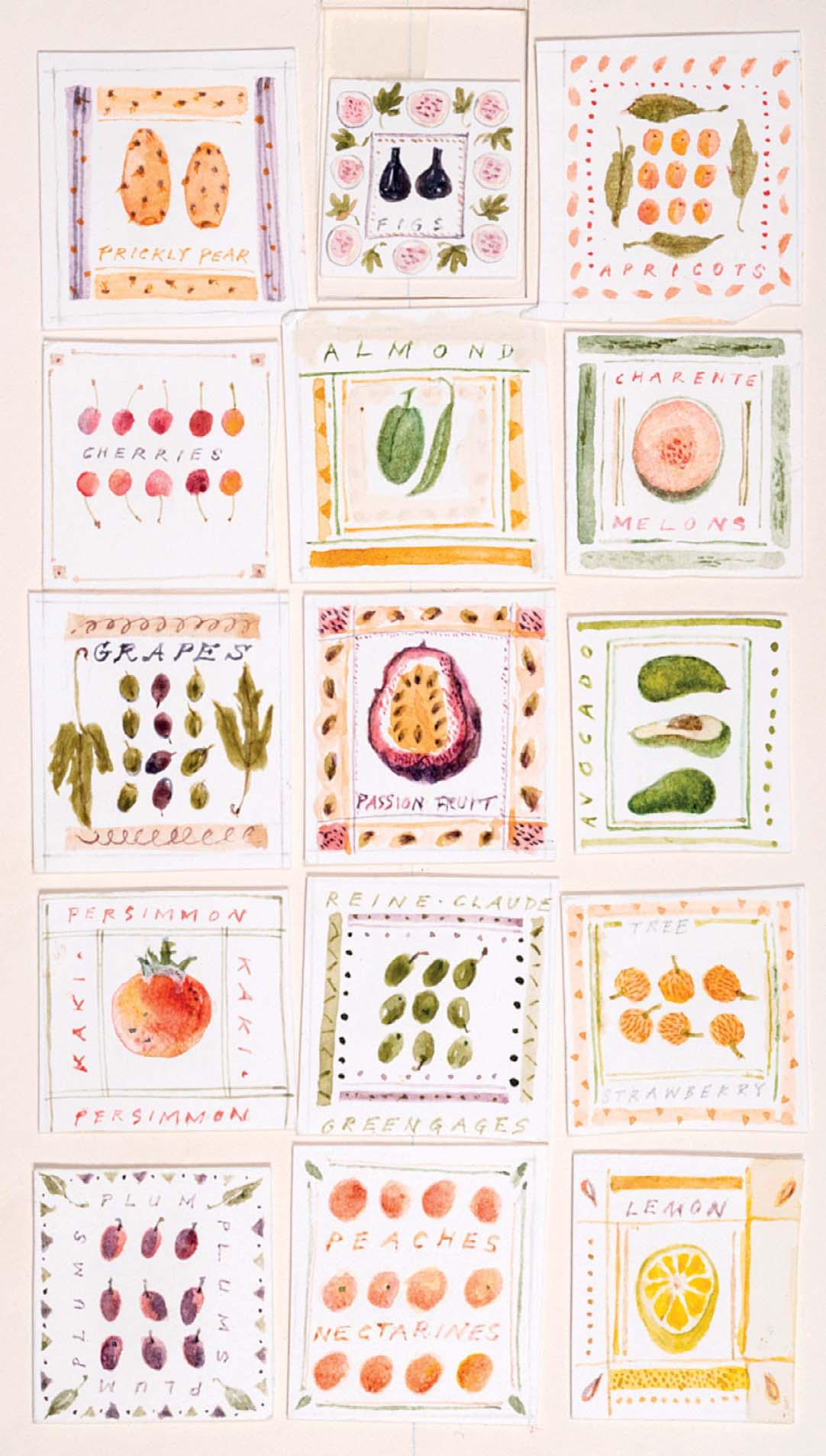
Watercolour and
5 x 4 inches
Illustrated: page 62
Watercolour
6 x 3 ½ inches
Illustrated: page 54

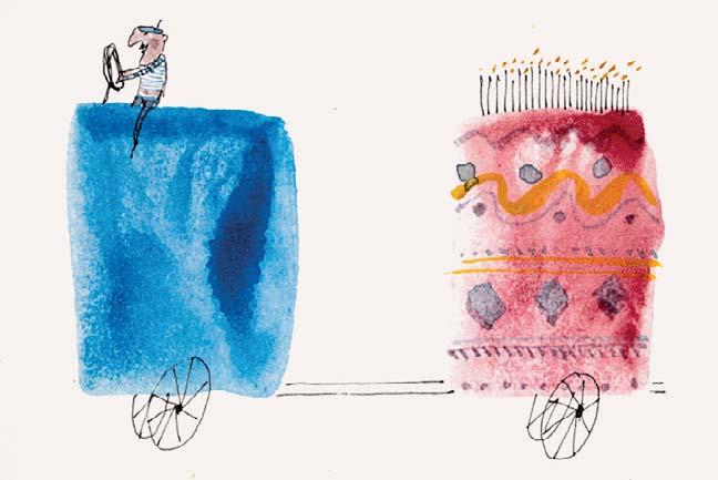
197 A FRENCH BIRTHDAY
Watercolour and ink
2 x 3 inches
Illustrated: page 48
200
FAIRE UNE PAUSE
Watercolour and ink
1 ½ x 2 ½ inches
Illustrated: page 49
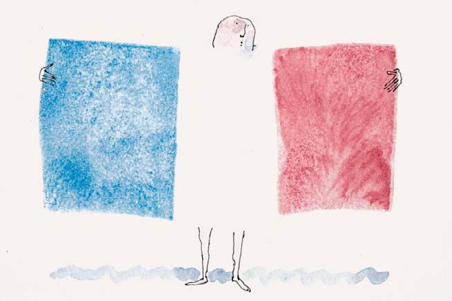
198 UNDRESS
Watercolour and ink
1 ½ x 3 inches
Illustrated: page 49
201
PRESENTATION EN FRANÇAIS
Watercolour and ink
2 ¼ x 3 inches
Illustrated: page 48
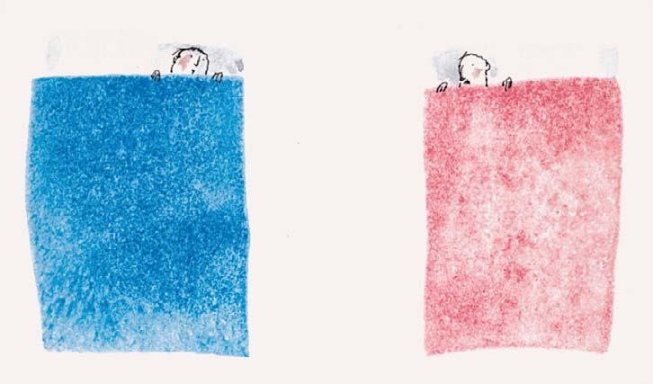
199 FRENCH BED
Watercolour and ink
1 ¾ x 3 inches
Illustrated: page 48
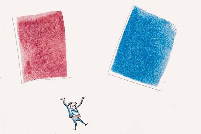
202 DANS LES AIRS
Watercolour and ink
2 ¾ x 3 ¾ inches
Illustrated: page 49
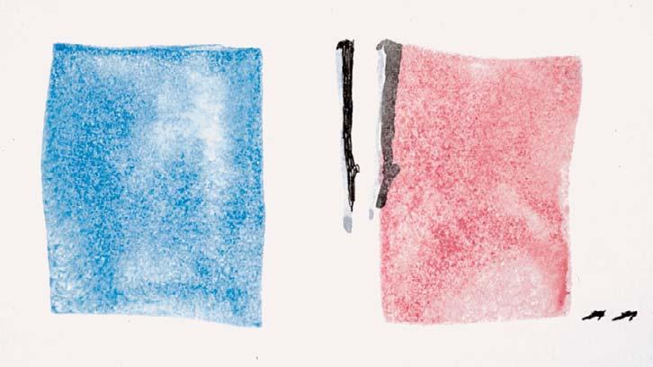
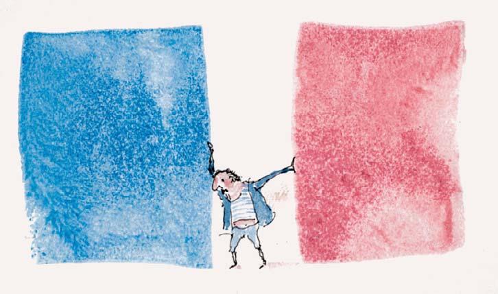
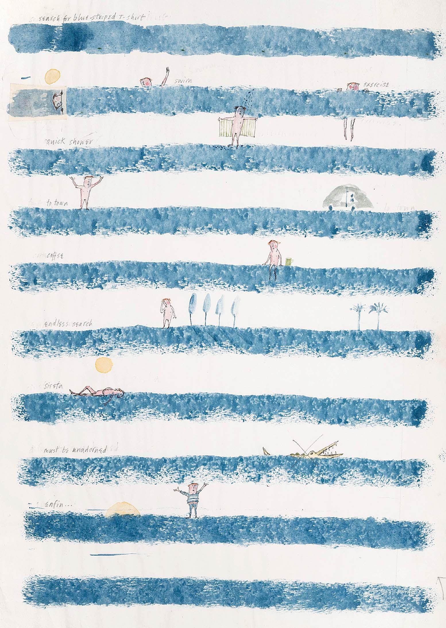
SEARCH FOR BLUE-STRIPED T-SHIRT
11 ¾ x 8 ¼ inches
Illustrated: page 60
Watercolour with ink and pencil
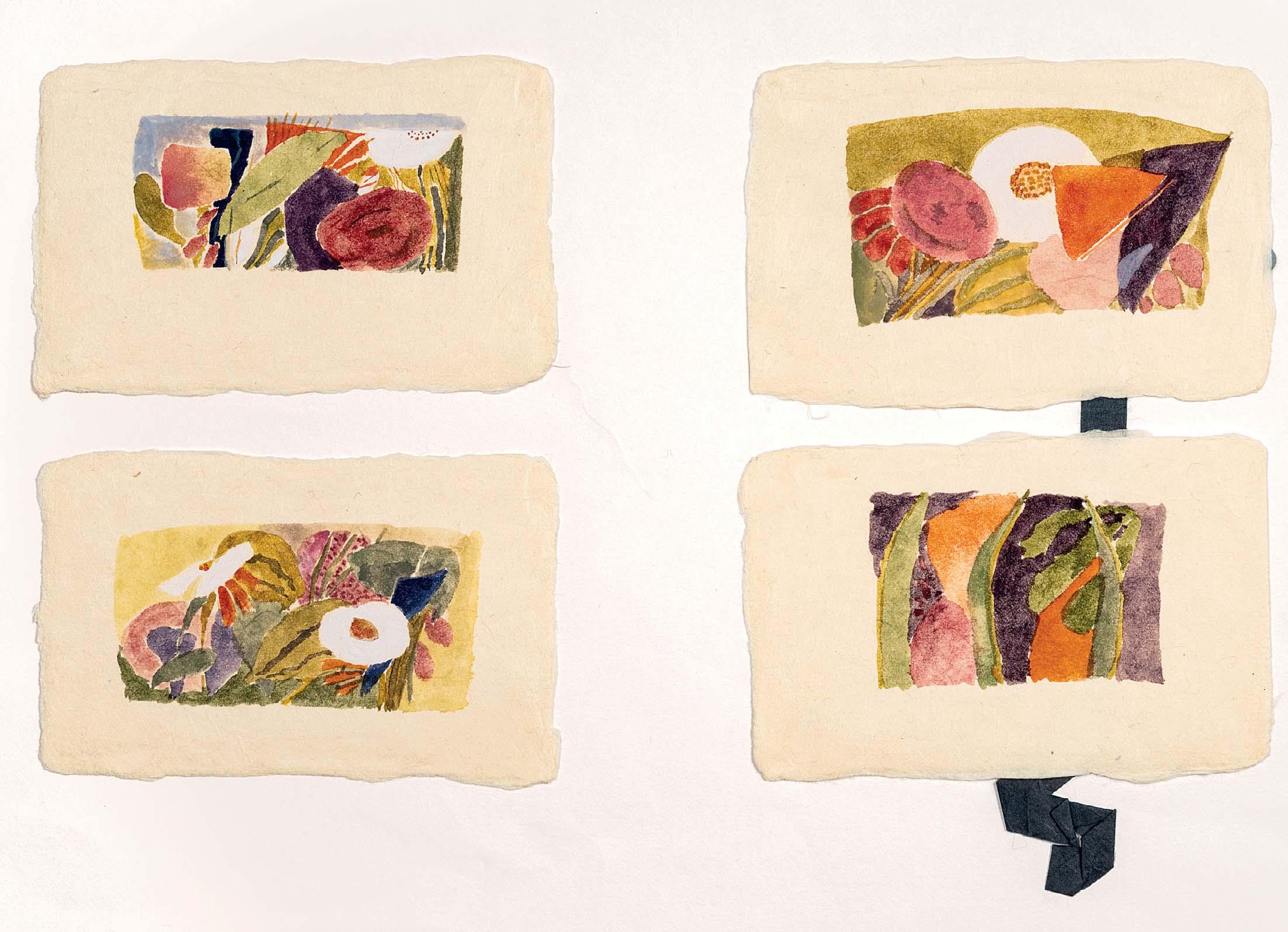
6 ¼ x 9 inches
Illustrated: pages 28 and 29
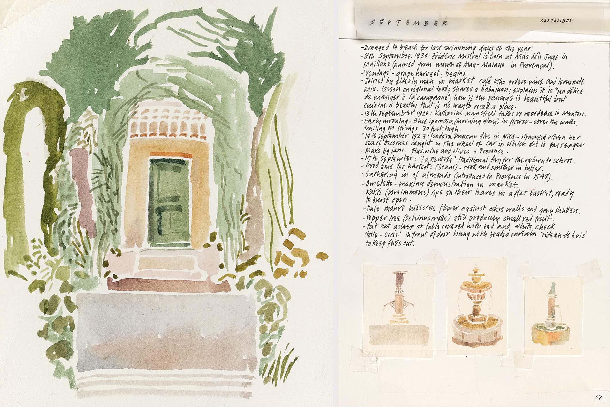
Illustrated: pages 66 and 67
THE GREEN DOOR – SEPTEMBER
Watercolour
5 ¼ x 5 ½ inches

206
SCENES FROM A FRENCH MARKET
Watercolour with ink
7 x 5 inches
Illustrated: page 79
Illustrated: page 77
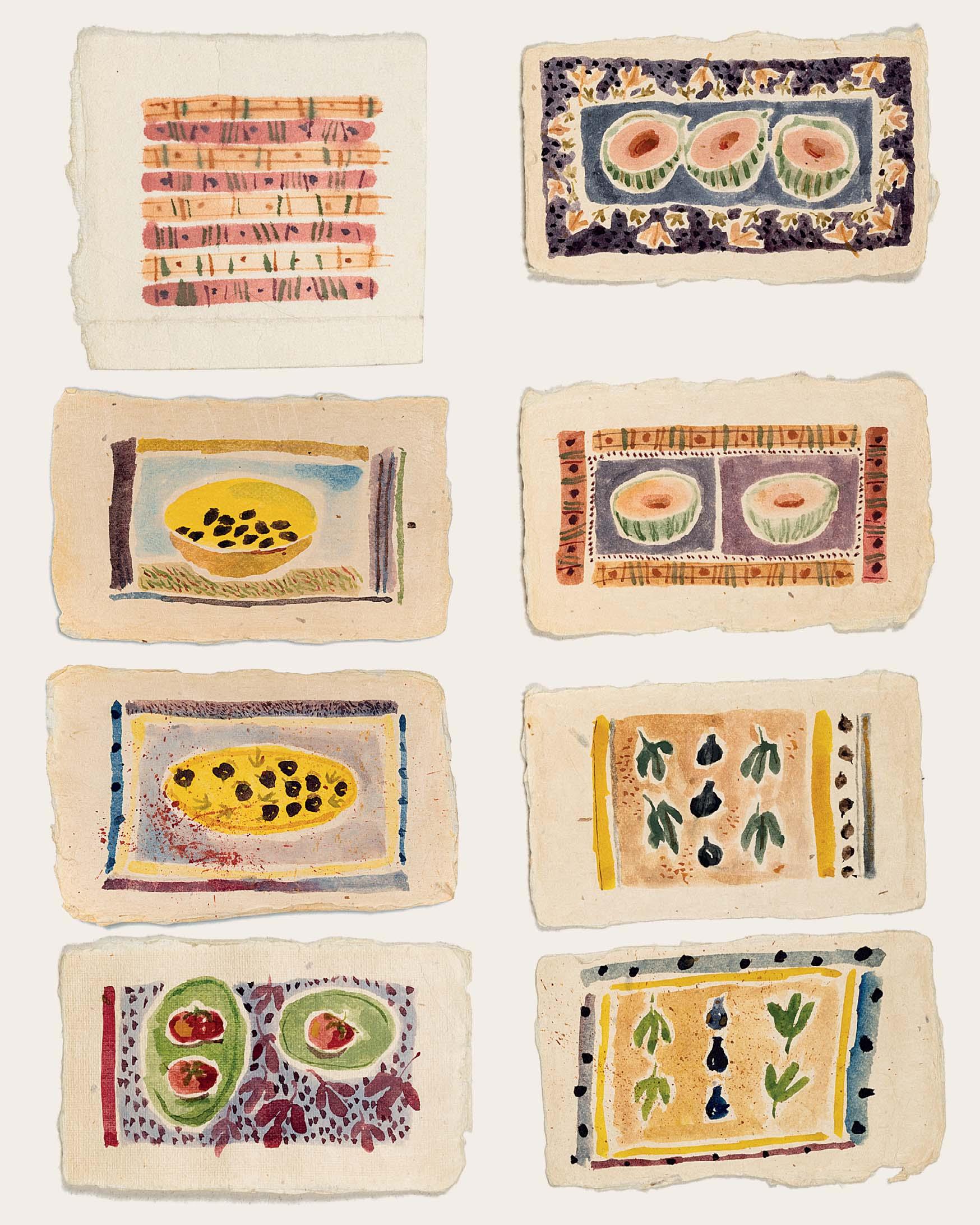
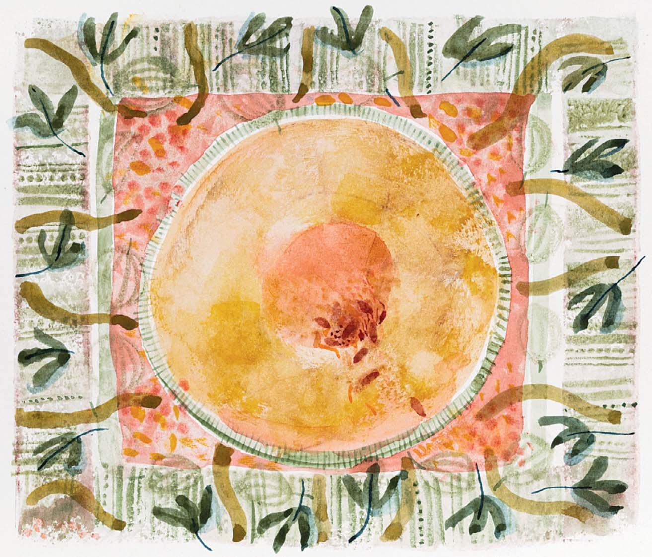
FIGS, TOMATOES, OLIVES AND MELONS
Watercolour
12 x 9 ½ inches
208
Watercolour
5 ½ x 6 inches
Illustrated: page 84
209
Watercolour
4 x 5 inches
Illustrated: page 85
CHARENTAIS MELON
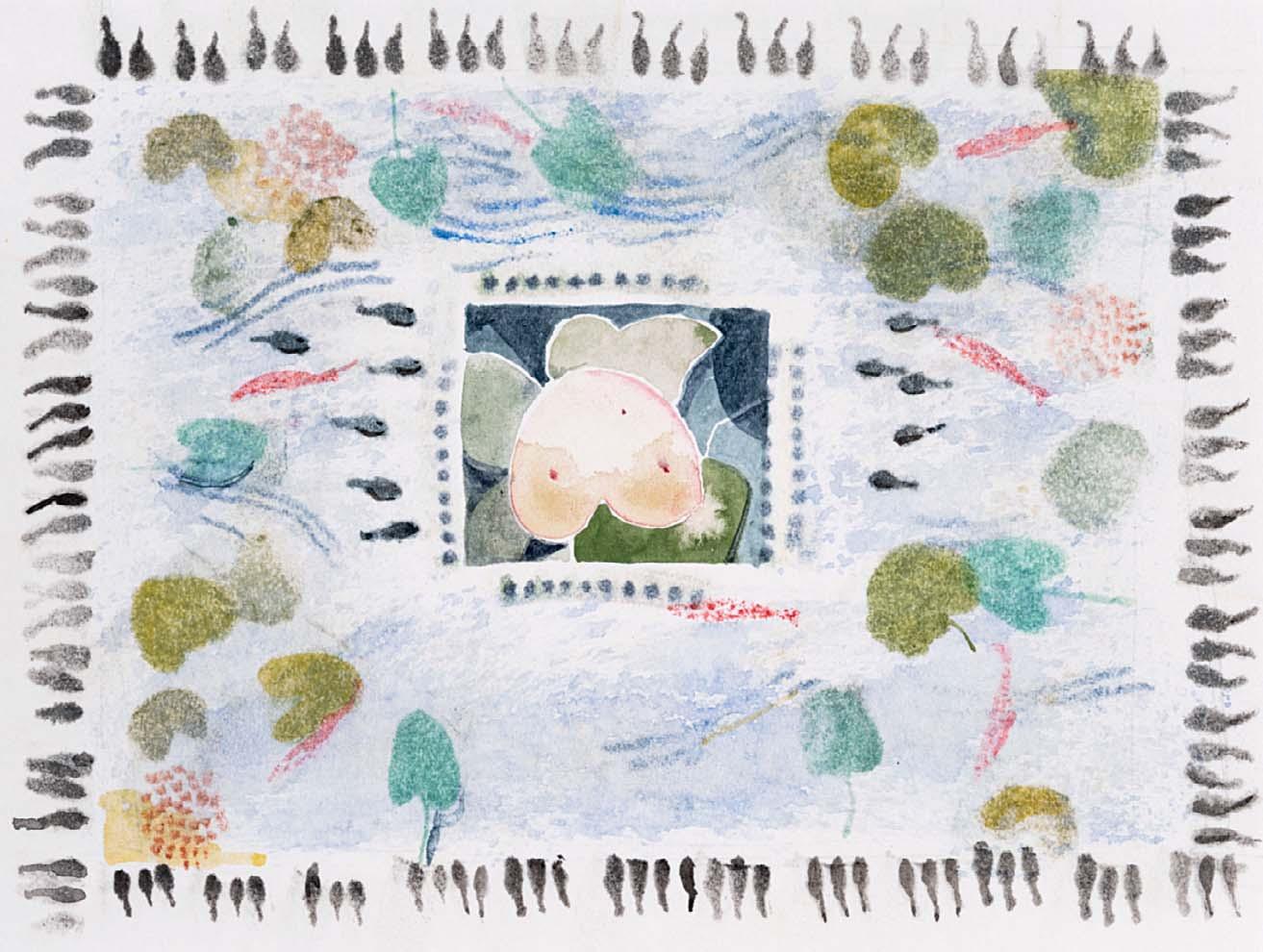
POND – LILIES – TADPOLES
7 x 10 inches
Illustrated: pages 86 and 87
210 SHOP SIGNS
Watercolour
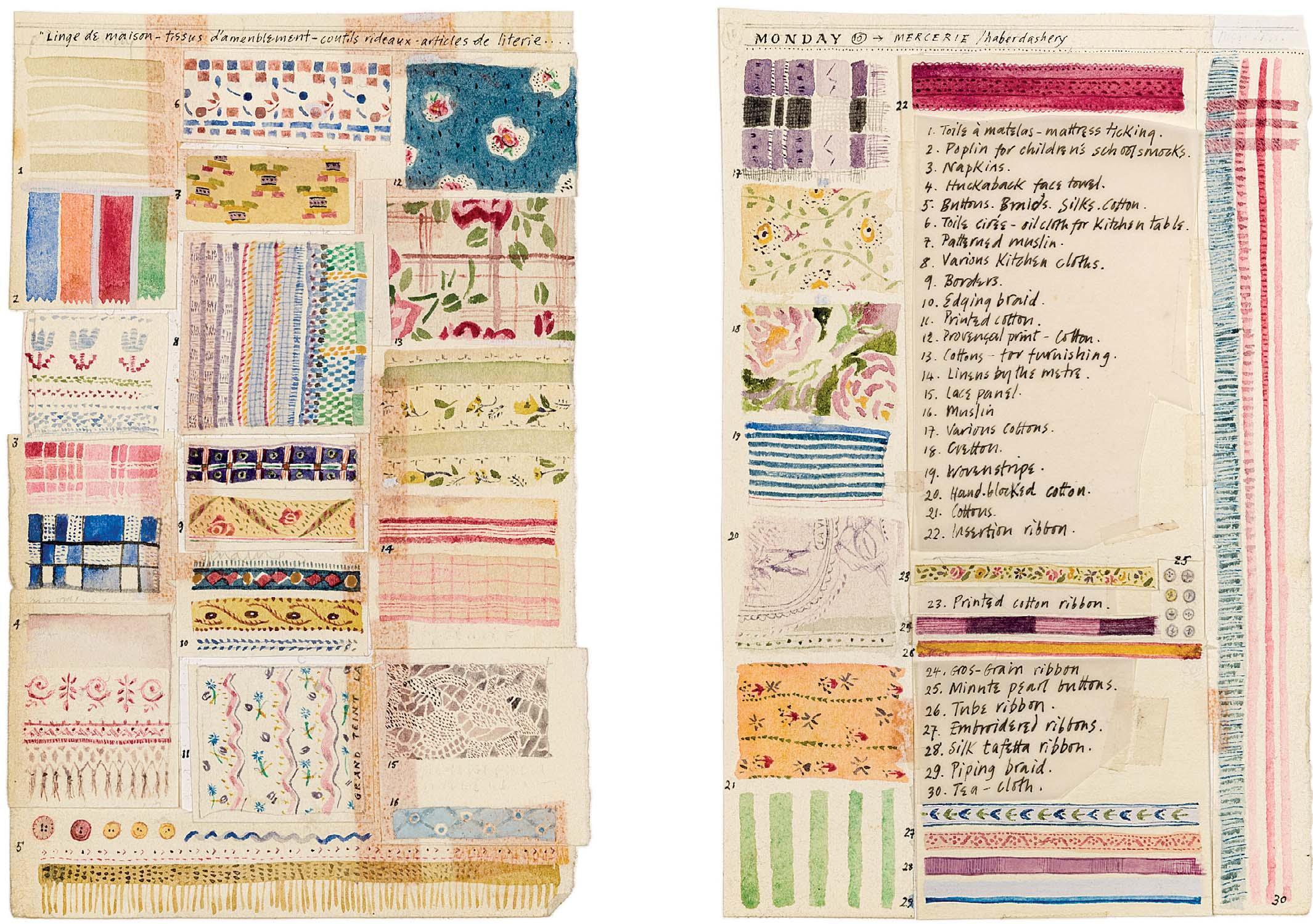
FABRICS AND PATTERNS
Watercolour with ink
6 ¾ x 9 ½ inches
Two panels, each measuring:
6 1 2 x 4 1 4 inches
Illustrated: pages 88 and 89
Illustrated: pages 92 and 93
212
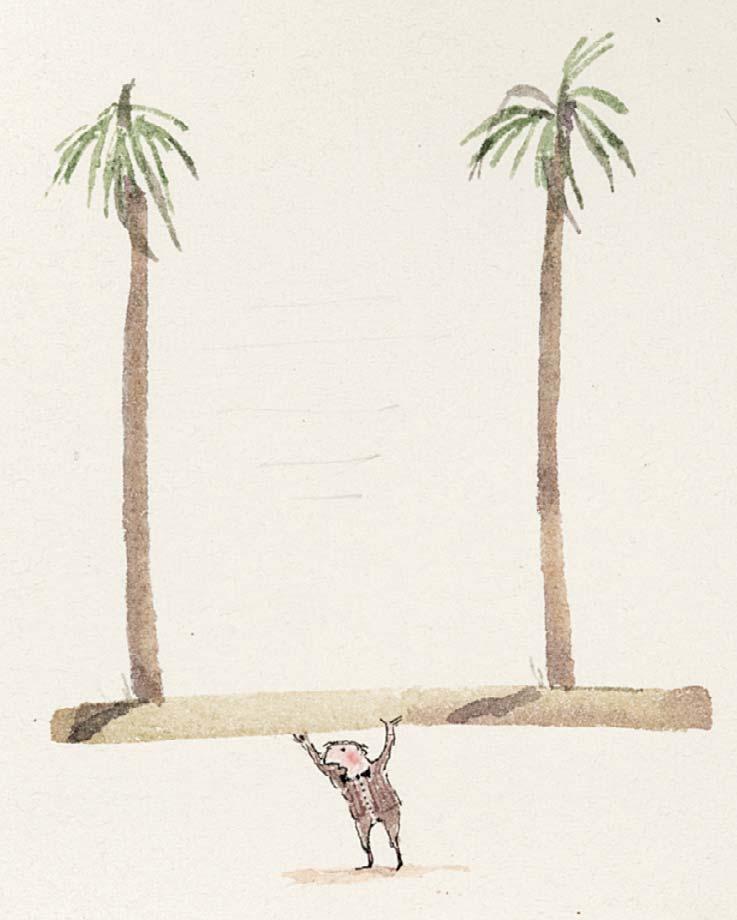
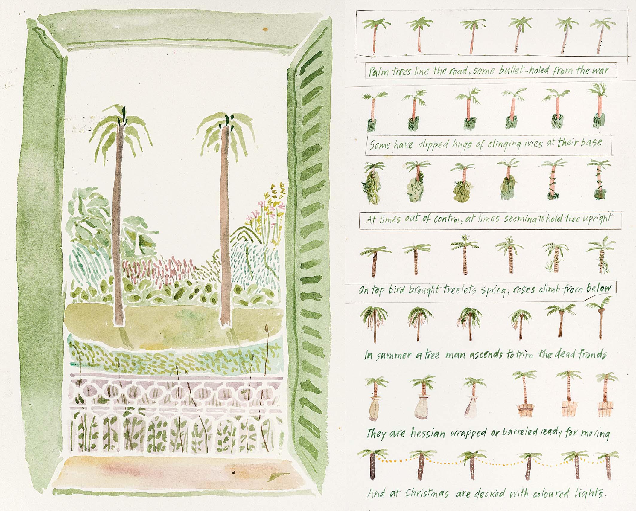
PALM TREES
Watercolour
5 ½ x 8 ½ inches
Illustrated: page 95
6 x 4 inches
Illustrated: page 76
213
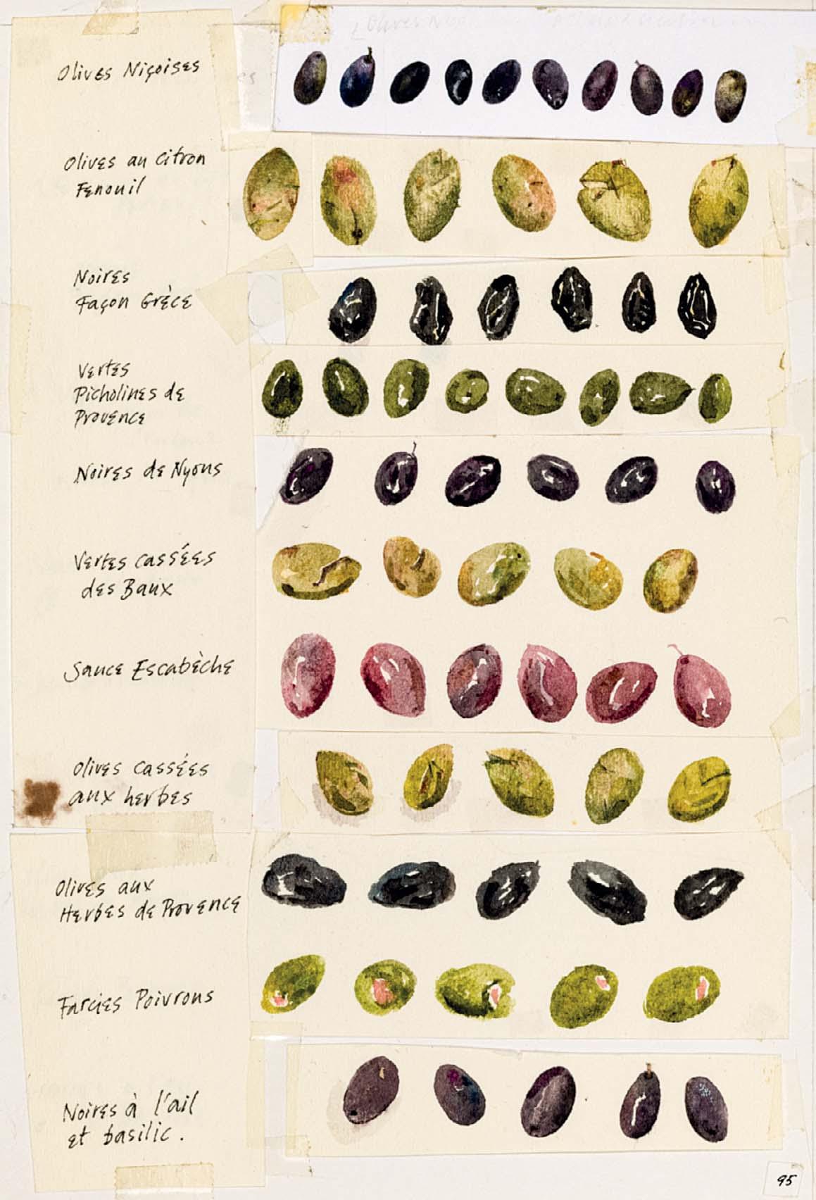
VARIOUS OLIVES
Watercolour with ink
7 x 4 ¾ inches
214
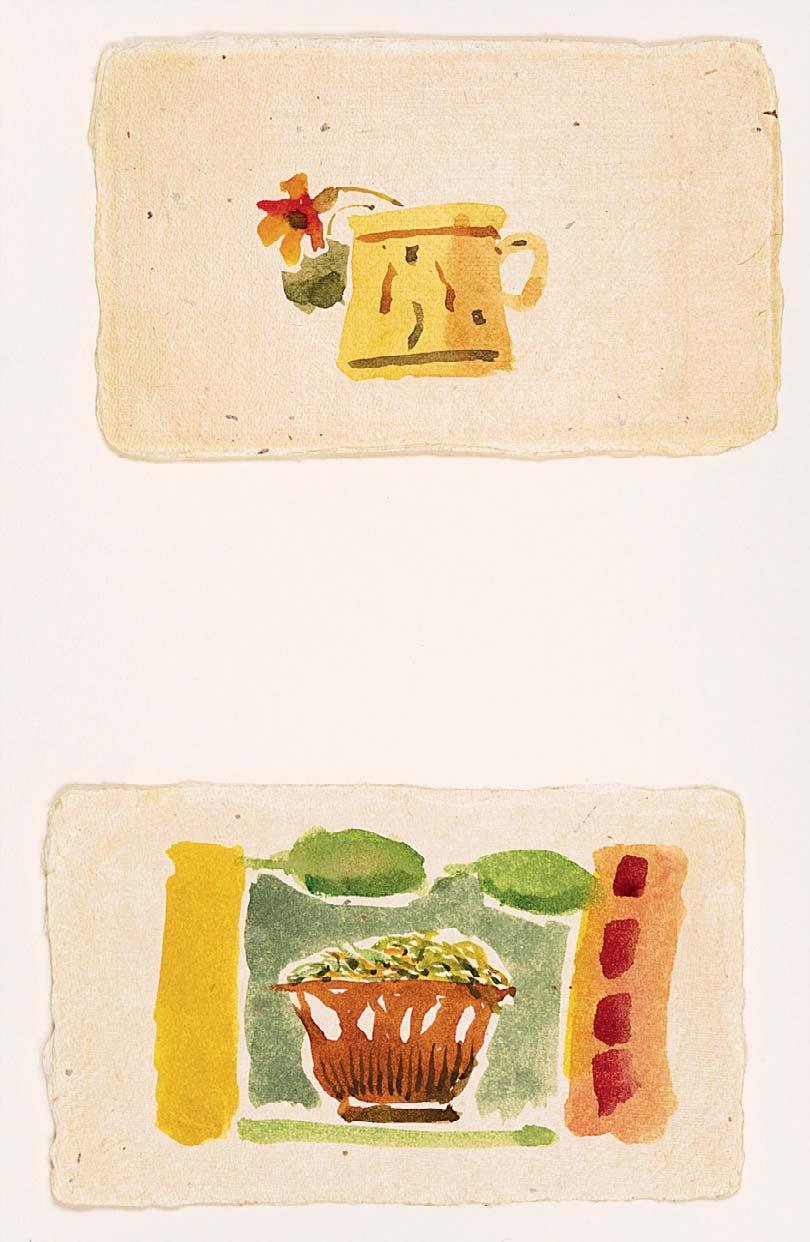
PLANT POT AND SALAD BOWL
Watercolour
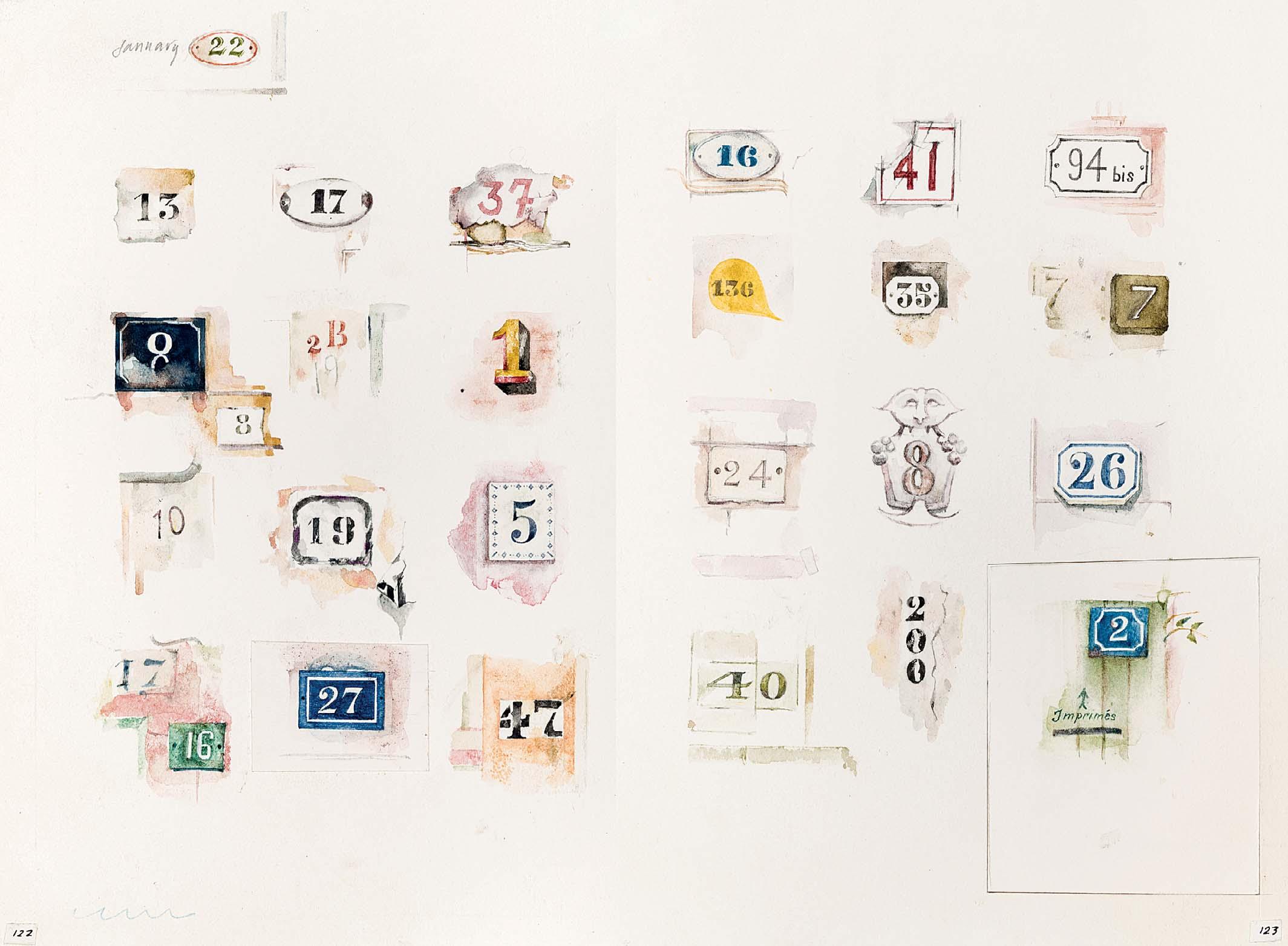
ASSORTED HOUSE NUMBERS
and ink
Illustrated: pages 122 and 123
Watercolour
6 ¼ x 9 ½ inches
ESSENTIALS:
9 x 4 inches
Illustrated: pages 96 and 97
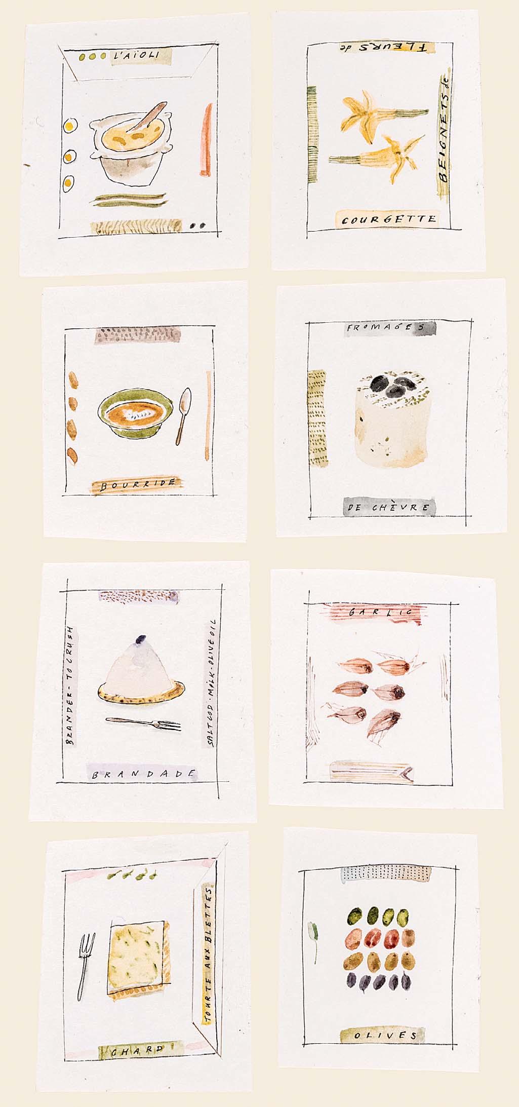
L’A OLI TO OLIVES Ink and watercolour
pages 98 and 99
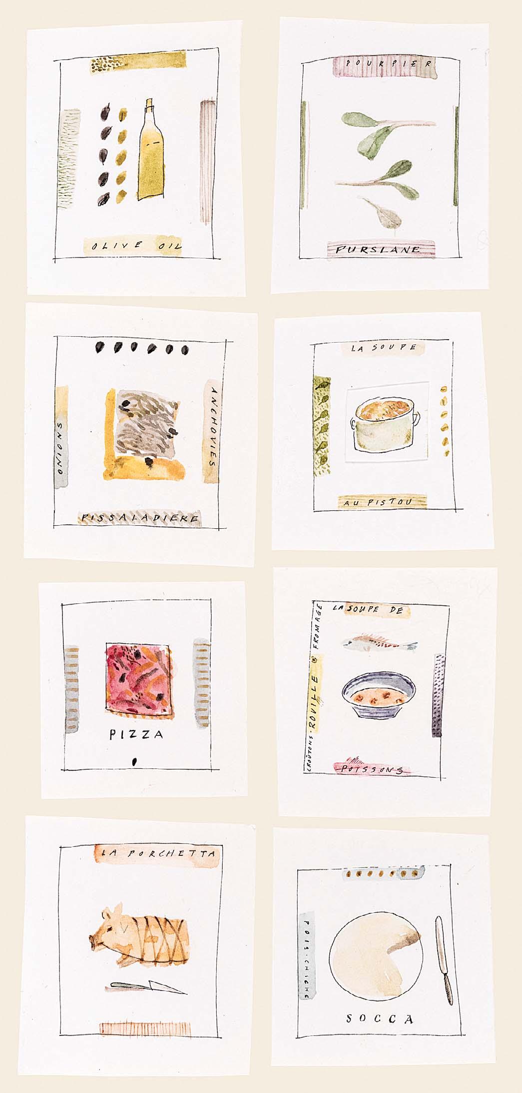
ESSENTIALS:
OLIVE OIL TO SOCCA Ink and watercolour 9 x 4 inches Illustrated:
Illustrated: page 106
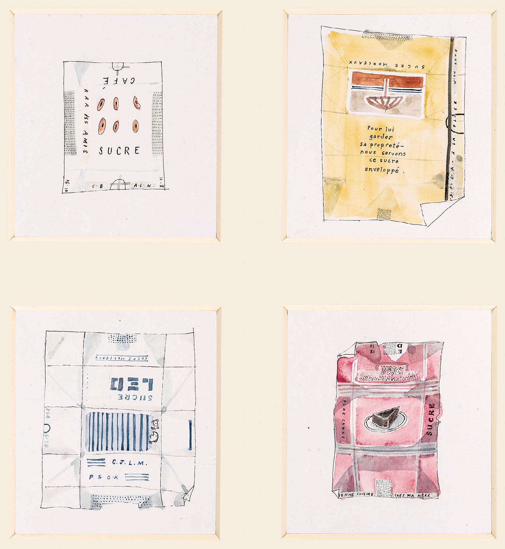
218
SUGAR PACKETS I Ink and watercolour
9 x 6 ½ inches

page 107
219
SUGAR PACKETS II Ink and watercolour 9 x 6 ½ inches Illustrated:
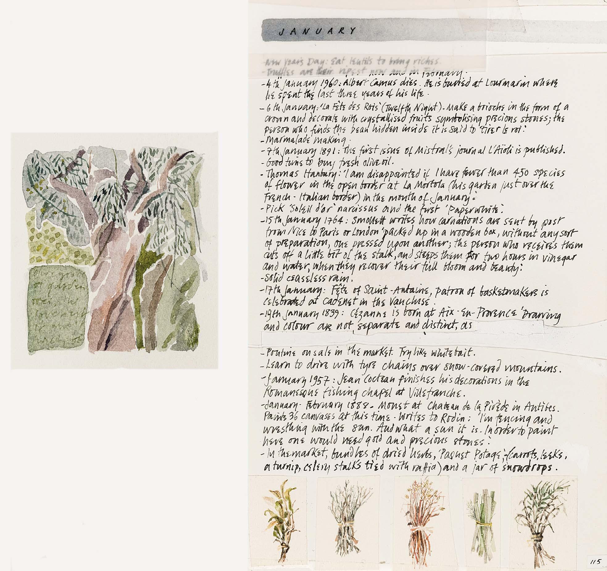
Illustrated: pages 114 and 115
GNARLED TREE – JANUARY
Watercolour
7 x 9 inches
Watercolour and ink
7 x 11 inches
Illustrated: pages 134 and 135
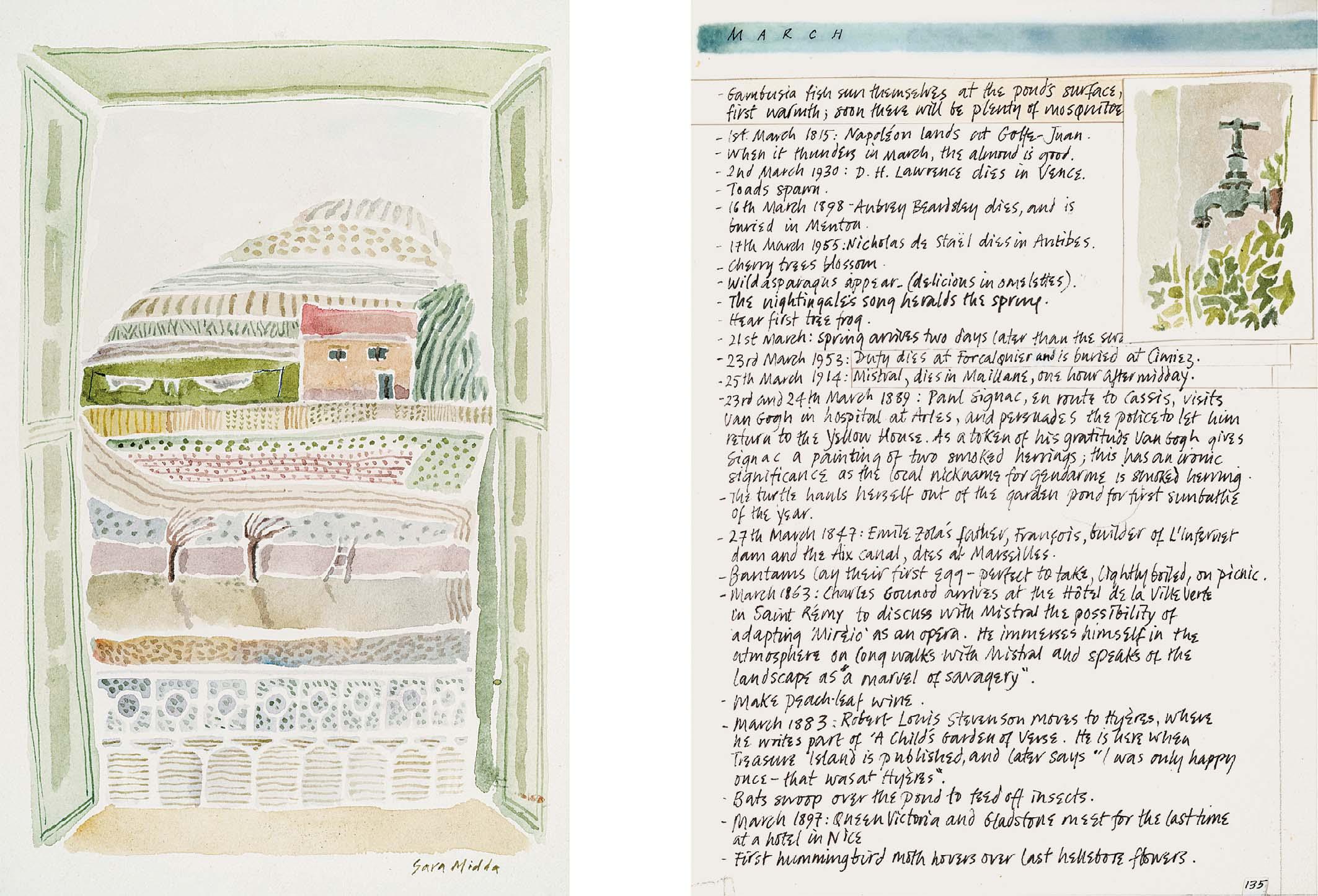
GAMBUSIA FISH SUN THEMSELVES – MARCH Signed
222
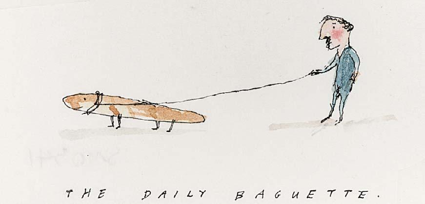
THE DAILY BAGUETTE
Inscribed with title
Watercolour and ink
1 ½ x 2 ¾ inches
Illustrated: page 121
223
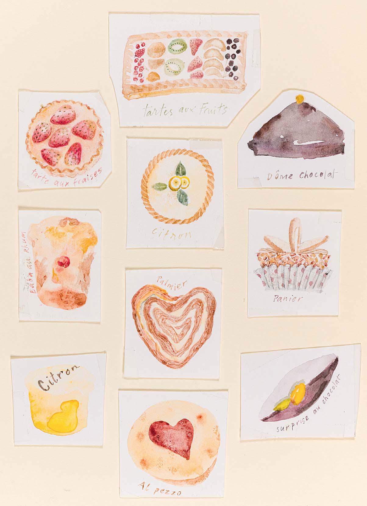
PATISSERIES
Watercolour
7 x 5 inches
Illustrated: page 109
224
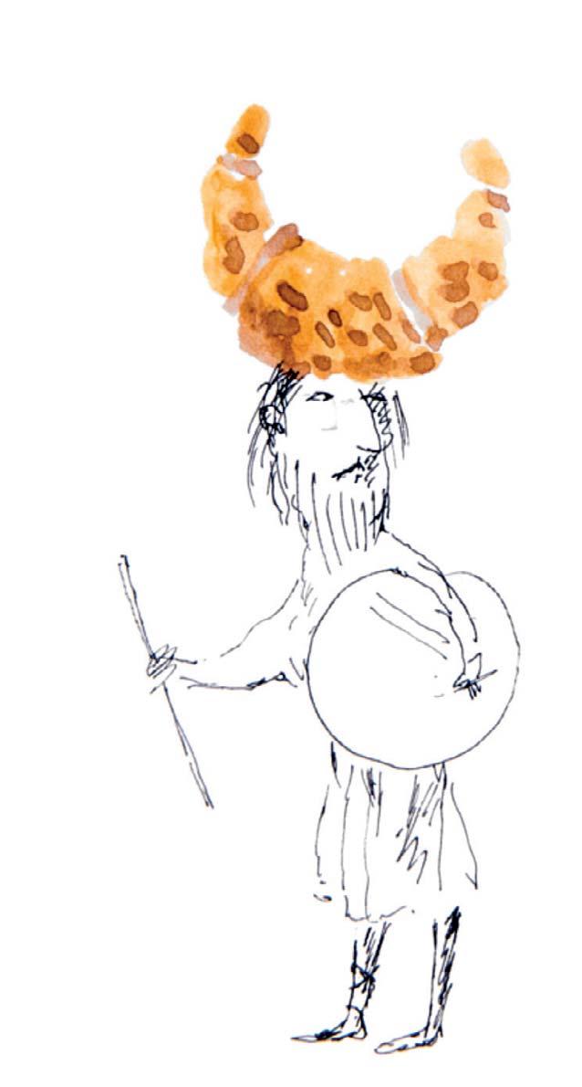
VIKING CROISSANT
Ink and watercolour
3 ½ x 2 ¼ inches
Illustrated: page 118
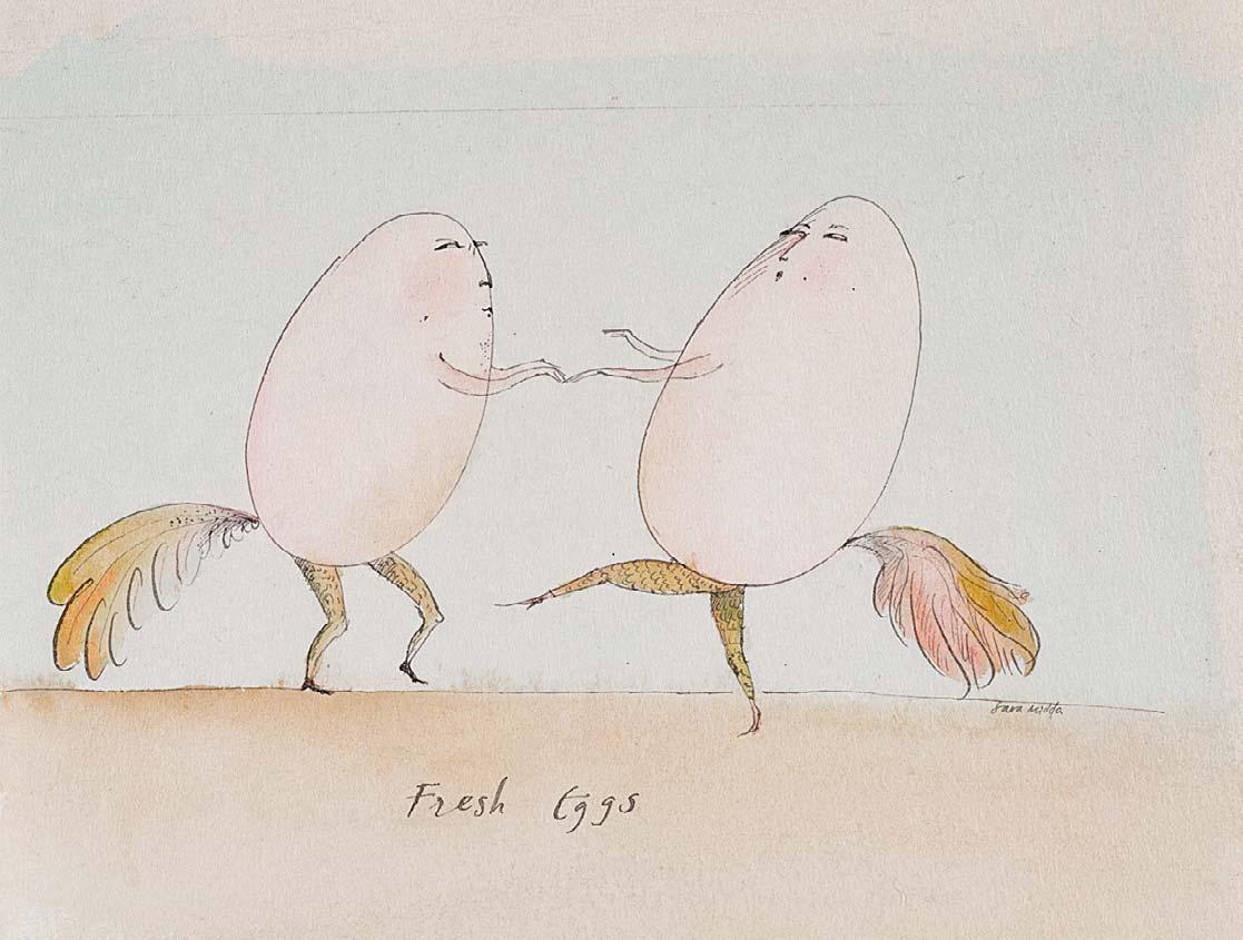
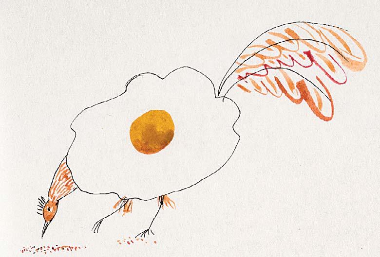
225 FRESH EGGS
Signed and inscribed with title
Ink and watercolour
5 x 6 ½ inches
Illustrated: page 21
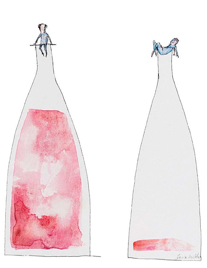
226 TWO BOTTLES OF CôTE DE PROVENCE
Signed
Ink with watercolour
5 ½ x 4 ½ inches
Illustrated: Similar to page 102
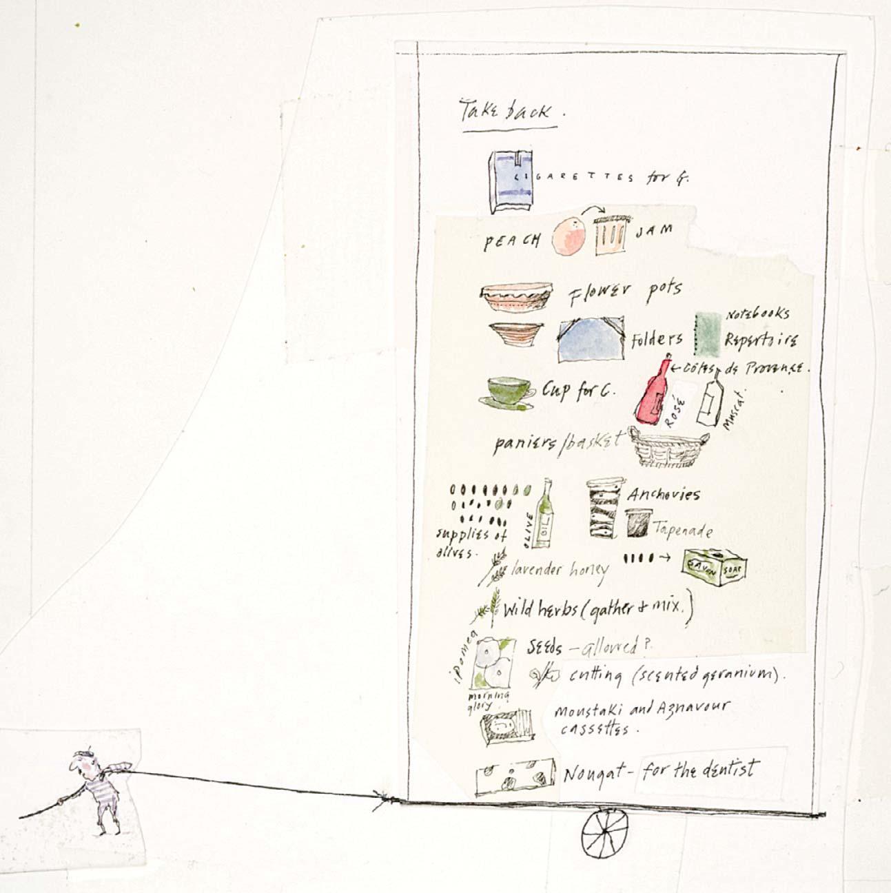
227 GIFTS TO TAKE HOME
Ink with watercolour
5 x 5 inches
Illustrated: page 144
227
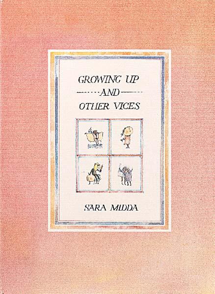

Sara Midda, Growing up and Other Vices, London: Jonathan Cape, 1994
Nos 229-252 are all illustrated in Sara Midda, Growing Up and Other Vices, London: Jonathan Cape, 1994 [unpaginated]
Enchanting, touching and sensitive, Growing Up and Other Vices is an exploration of the emotions, charms and di culties of childhood.
In exquisitely rendered watercolours, Sara journeys through the trials and tribulations of growing up and the imperfections of adulthood, in her beautiful and gently satirical style.
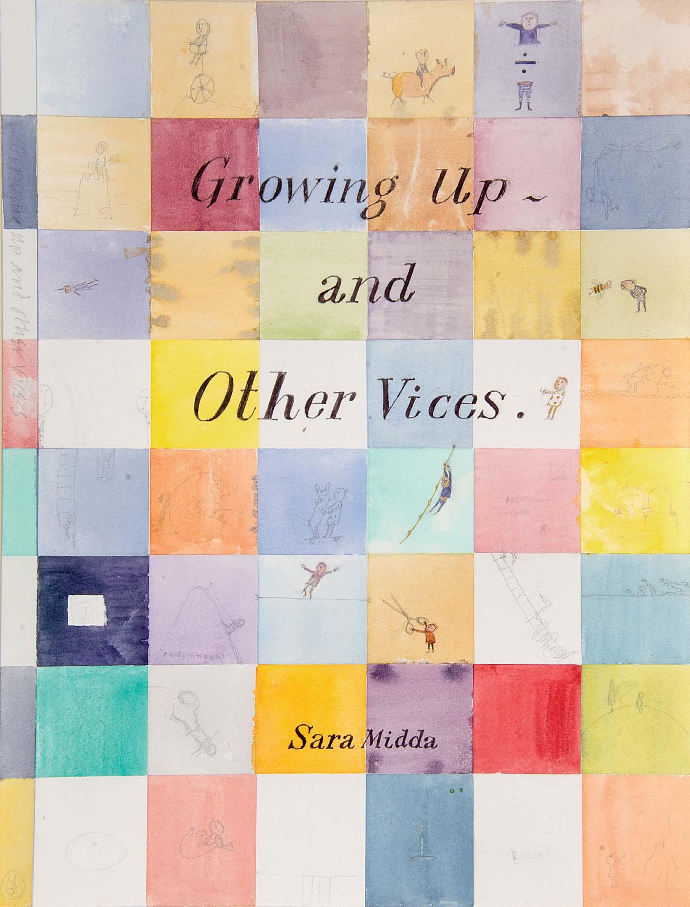
228
GROWING UP AND OTHER VICES
ALTERNATIVE COVER DESIGN
Ink and watercolour with pencil
11 ½ x 8 ¾ inches
Alternative cover design
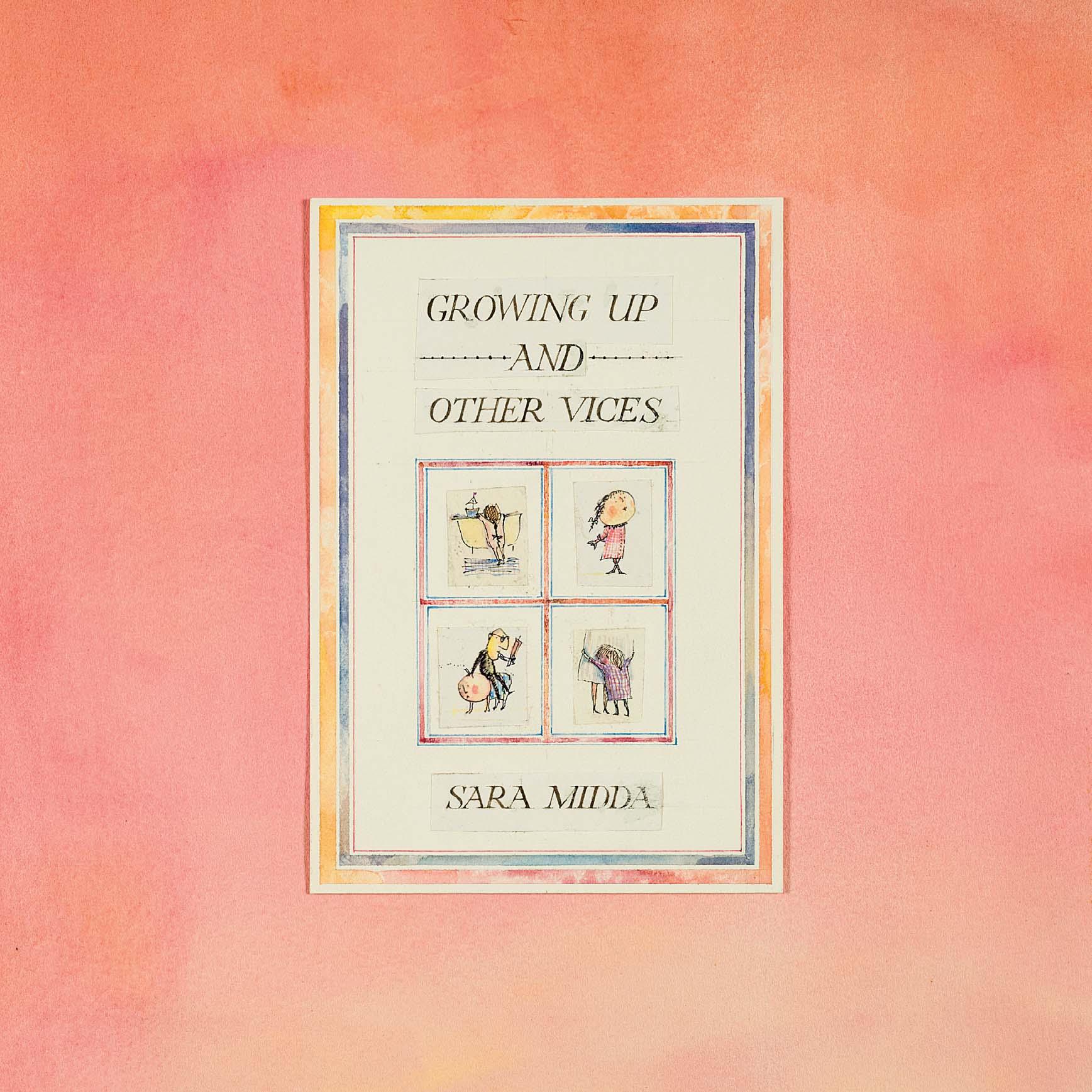
Watercolour and ink with printed matter 10 ½ x 10 inches
Illustrated: cover
GROWING UP AND OTHER VICES
Both artworks are being sold together as one
ON DEPARTURE FROM THE WOMB
NO ONE TOLD US ABOUT ...
and ink

Watercolour
¼ x 16 ½ inches

Both artworks are being sold together as one
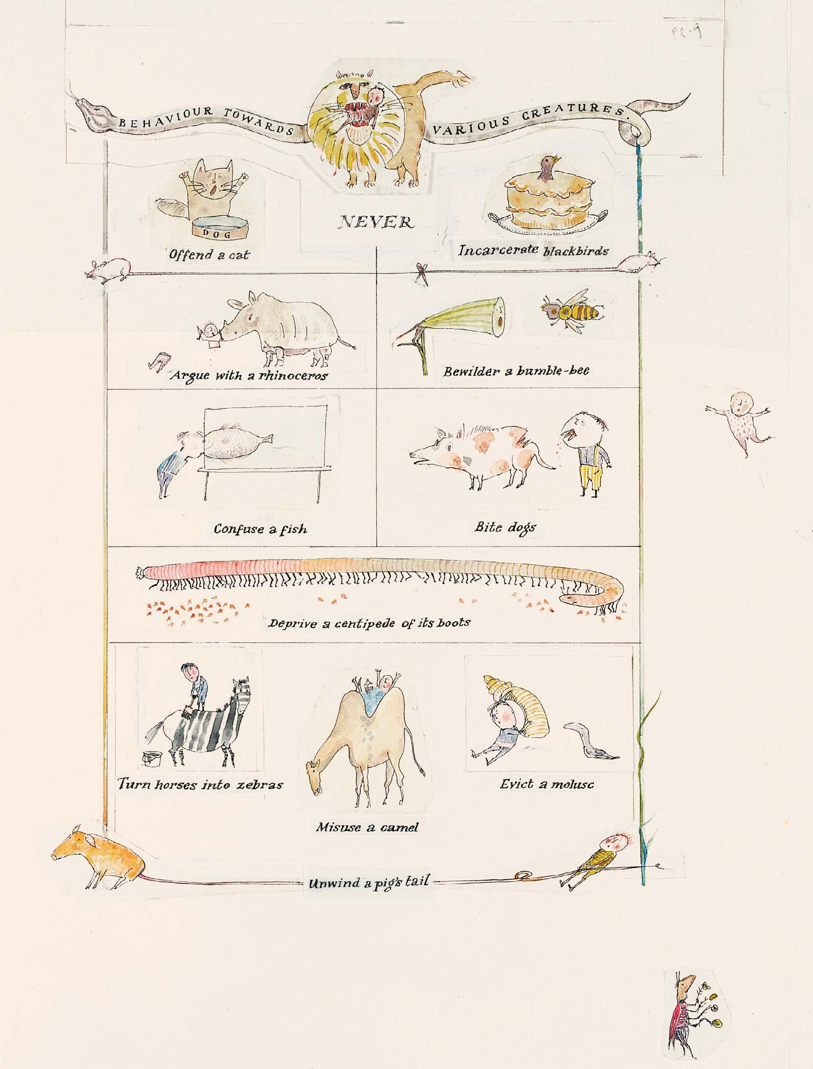
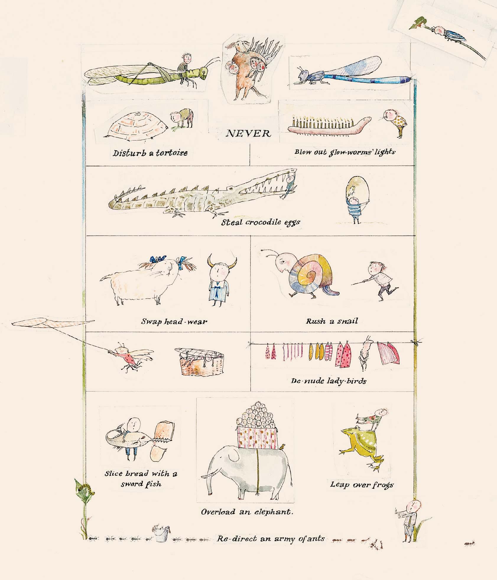
BEHAVIOUR TOWARDS VARIOUS CREATURES
Watercolour and ink
11 ¼ x 16 ½ inches
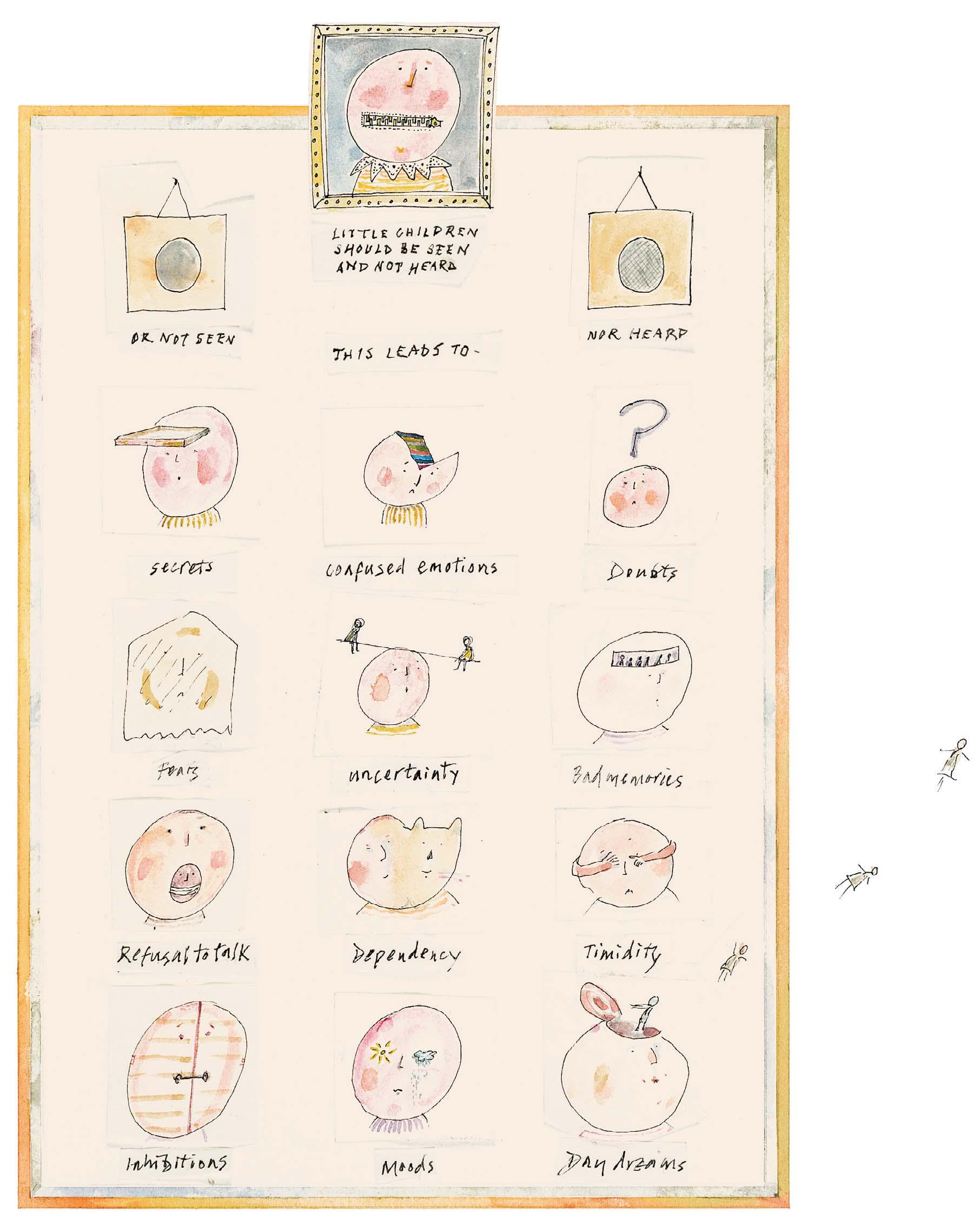
LITTLE CHILDREN SHOULD BE SEEN AND NOT HEARD
Watercolour and ink
8 ½ x 7 inches
THINGS YOU ARE SUPPOSED TO GROW OUT OF ...
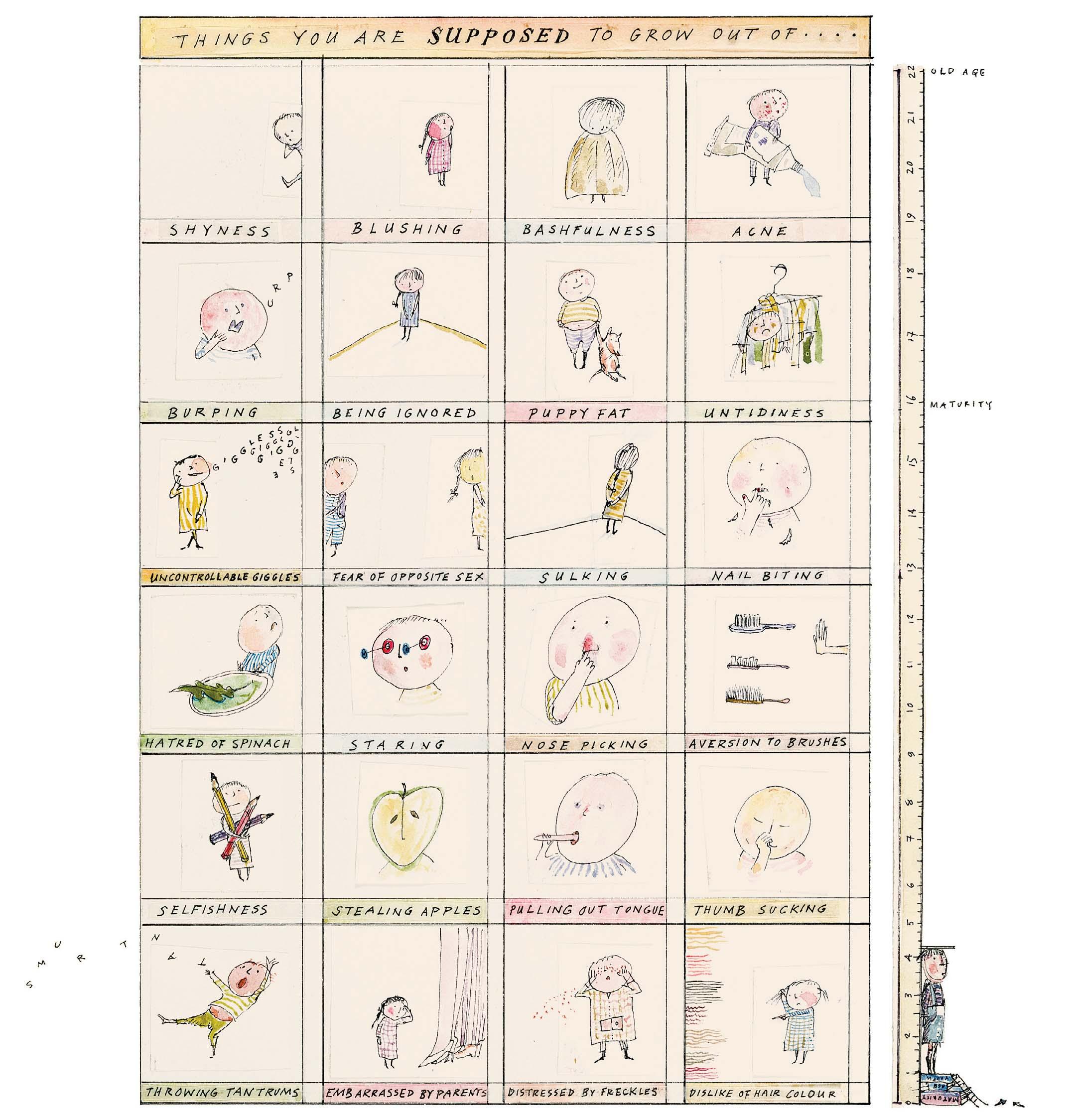
Watercolour and ink
8 x 7 ½ inches
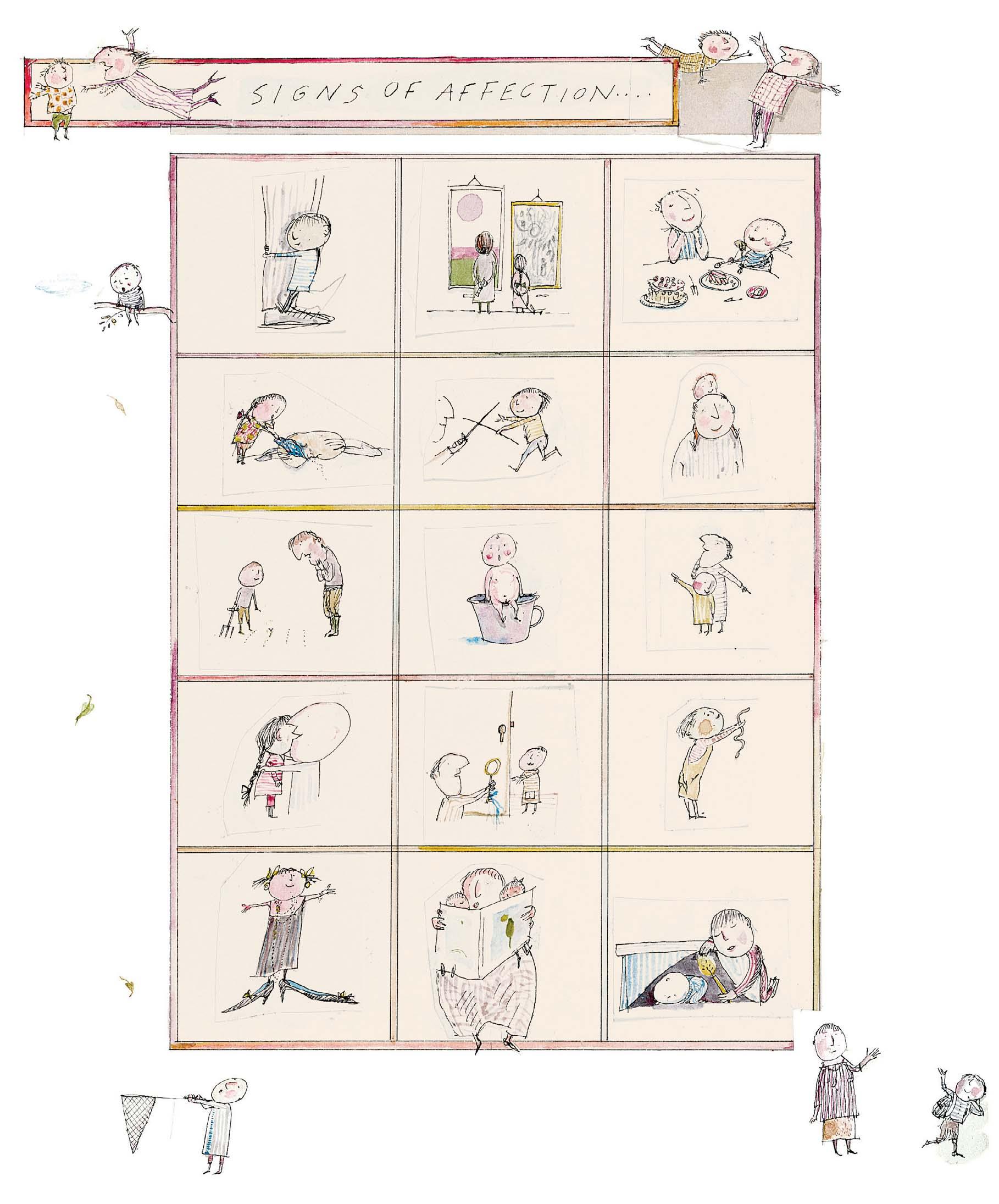
SIGNS OF AFFECTION
and ink
Watercolour
9 ¾ x 8 ¼ inches
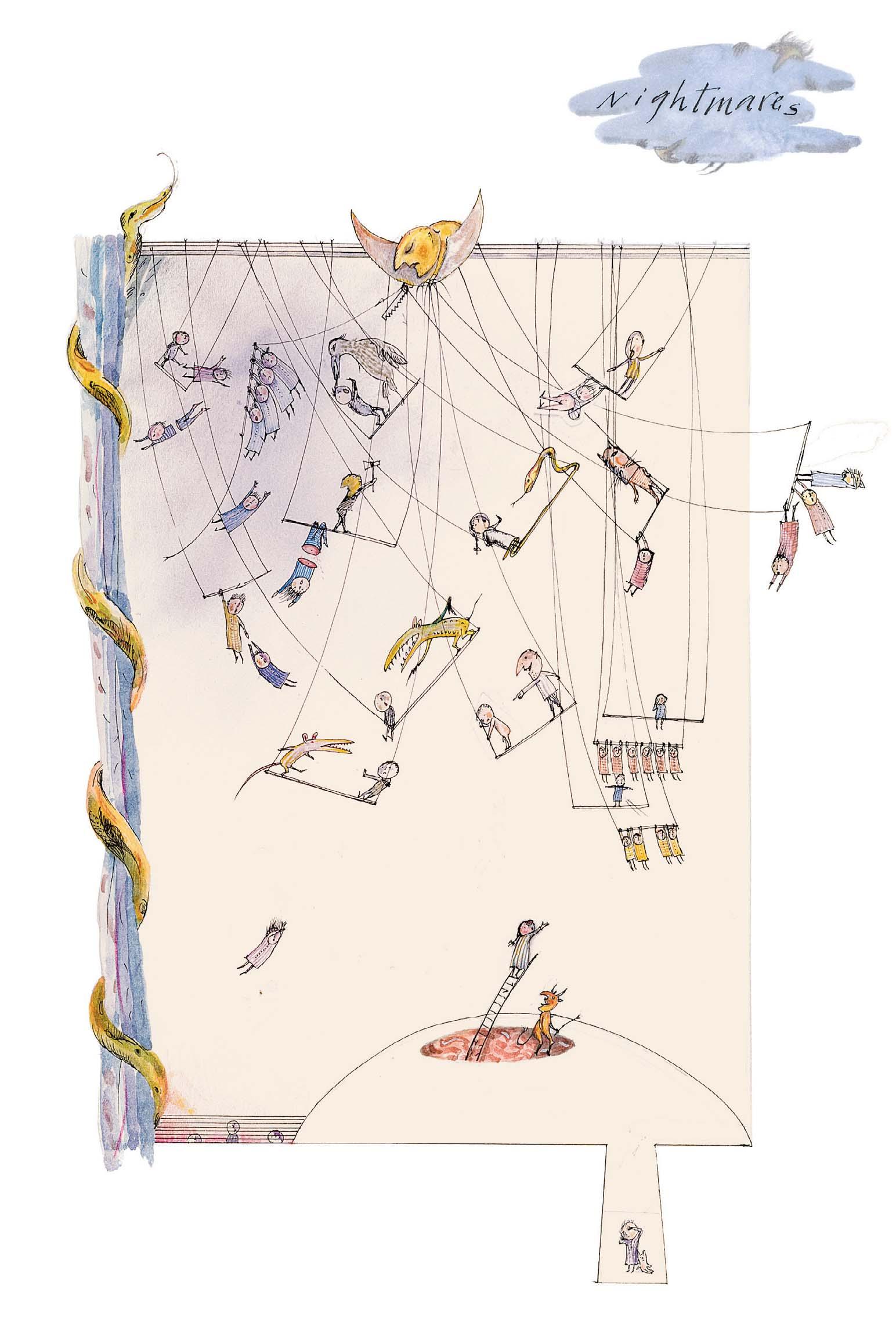
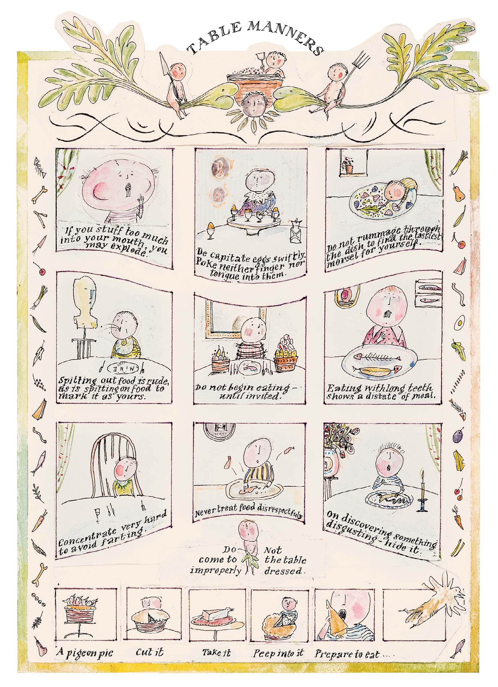
TABLE MANNERS
Watercolour and ink
8 ¼ x 5 ¾ inches
237 ON MATTERS CONCERNING THE STOMACH
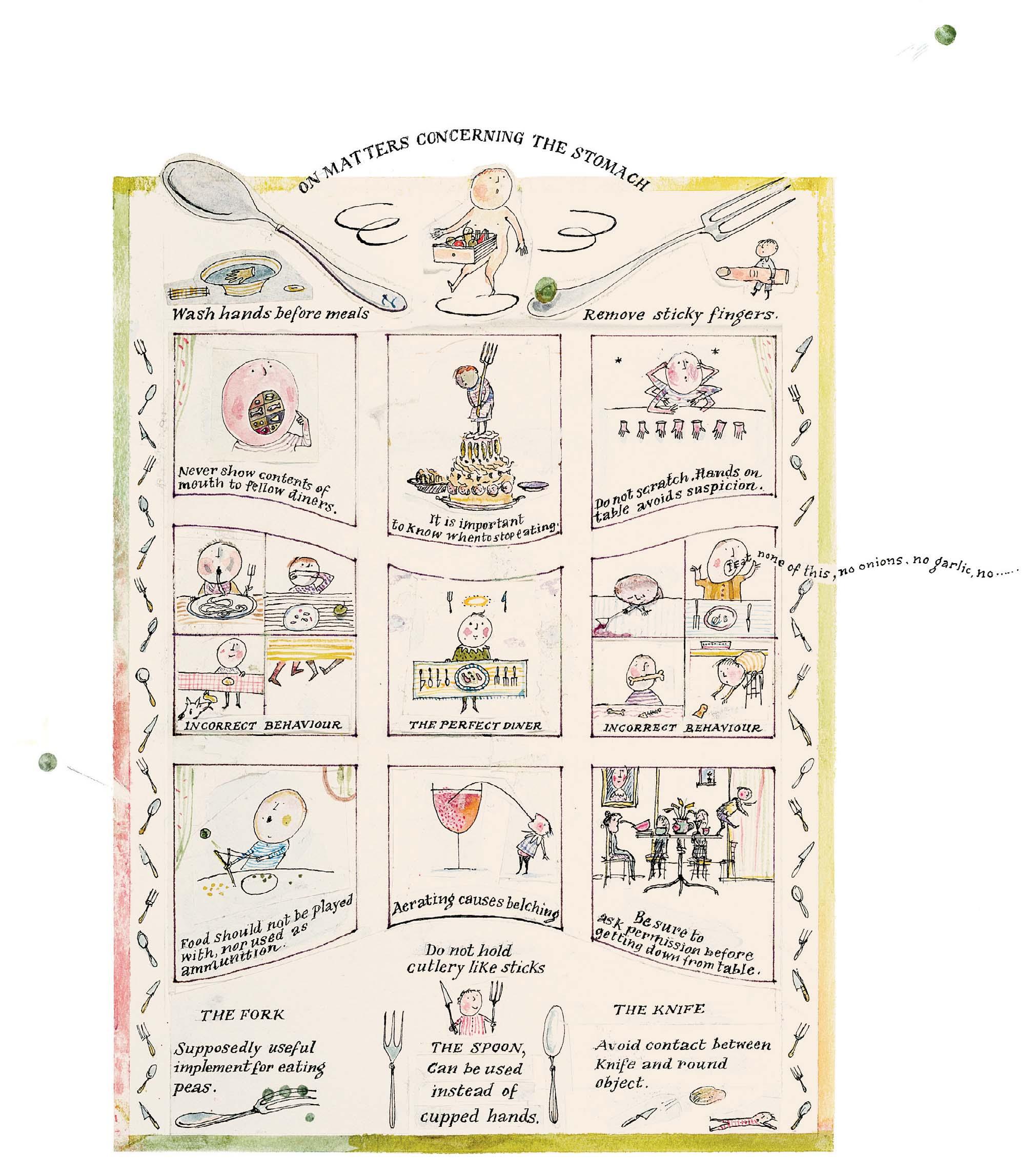
Watercolour and ink
9 ¼ x 8 inches

238
CHILD AS VICTIM
Watercolour and ink
10 ½ x 6 ½ inches
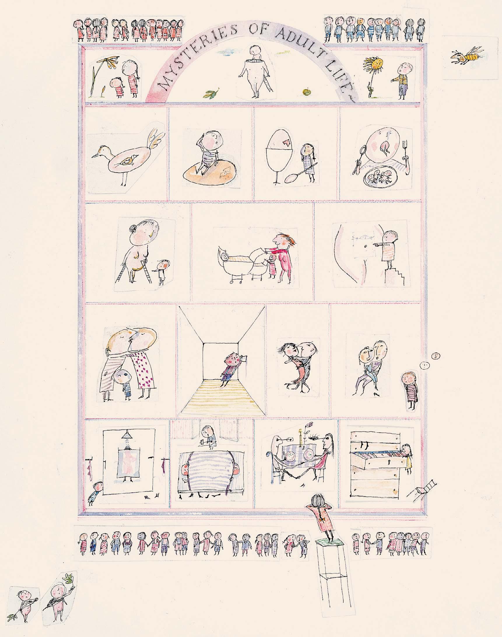
Watercolour and ink 10 ¼ x 8 ¼ inches
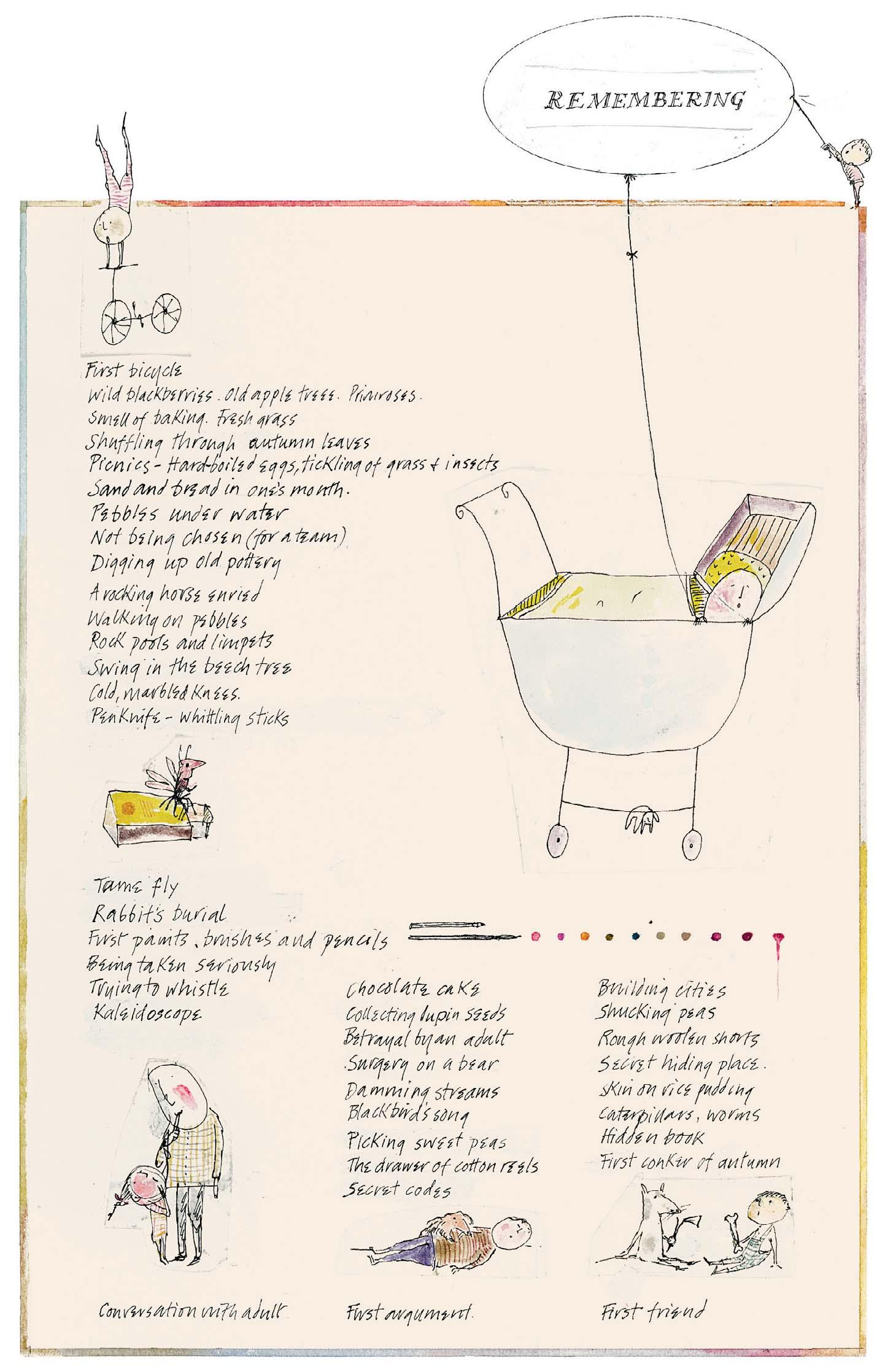
Watercolour and ink 9 ½ x 5 ¾ inches
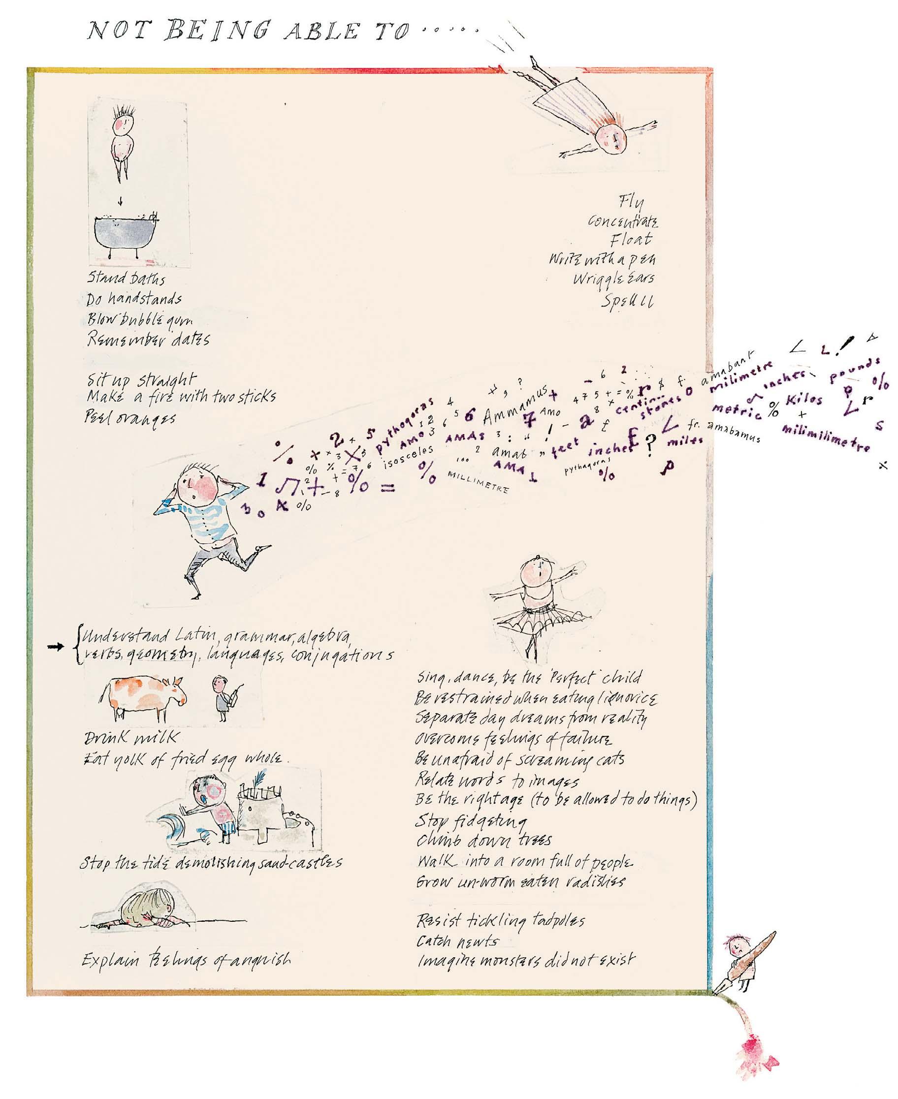
8 ½ x 7 ¼ inches
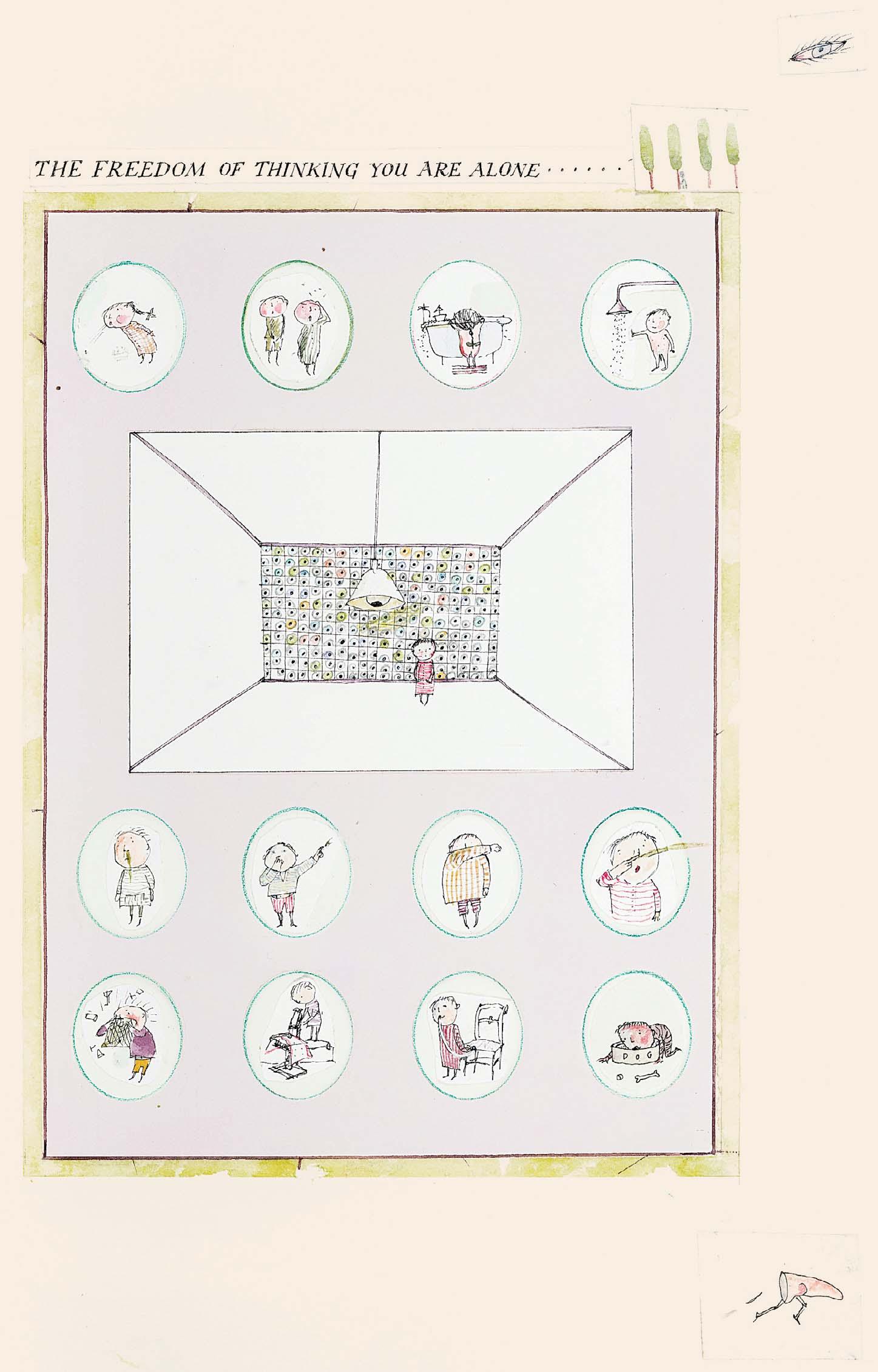
242
THE FREEDOM OF THINKING YOU ARE ALONE ... Watercolour and ink
13 x 7 ¼ inches
A NOISE BROUGHT ON BY NATURE ... AND HOW TO DEAL WITH IT
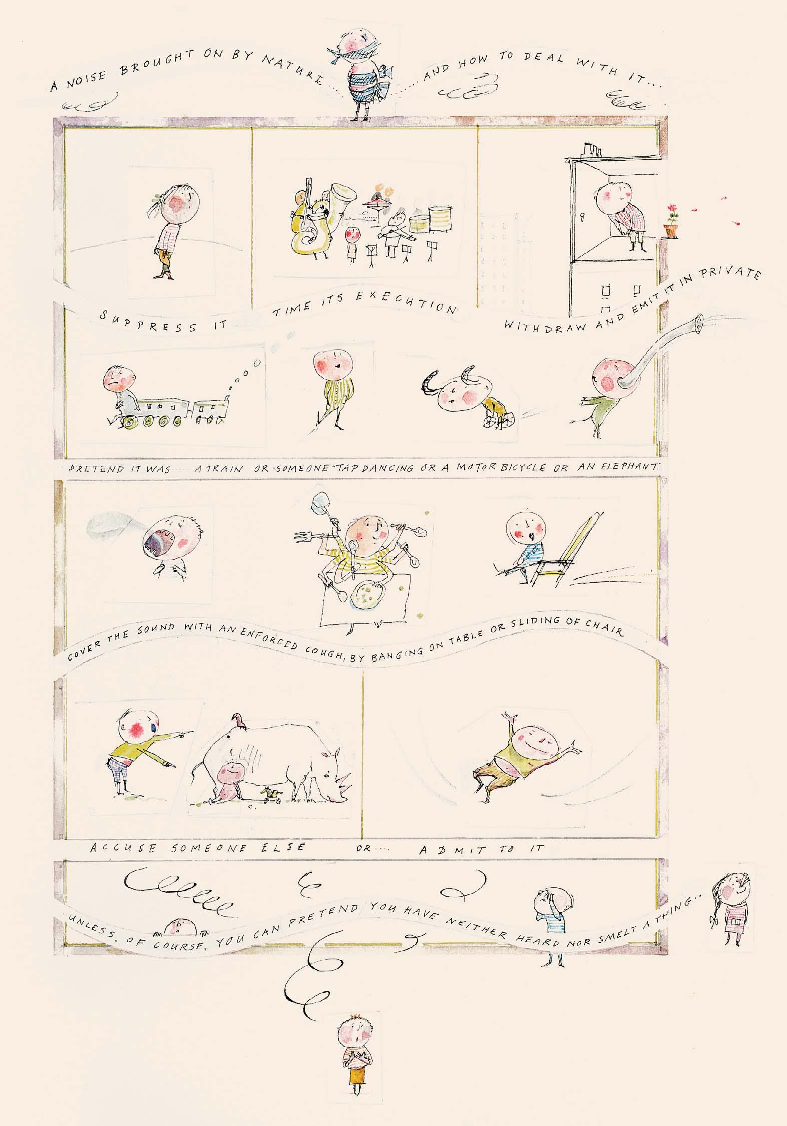
Watercolour and ink
10 ¾ x 7 ½ inches
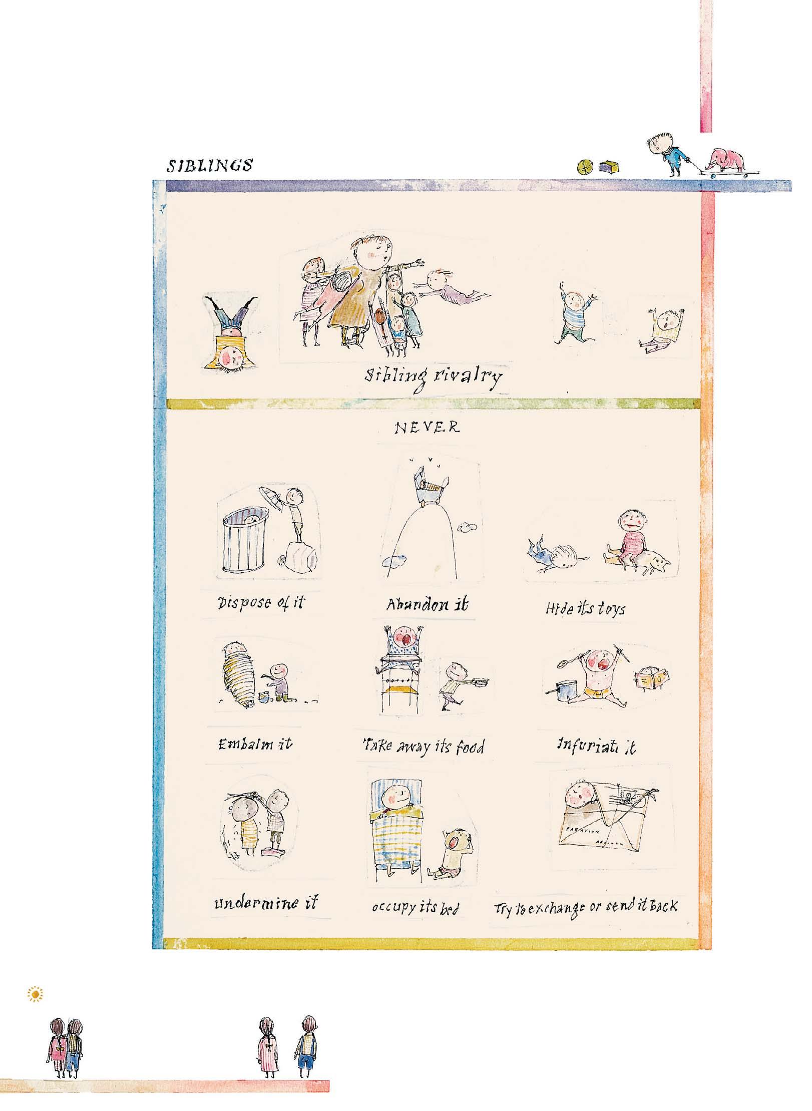
244
SIBLINGS
Watercolour and ink
10 ¼ x 8 ¼ inches
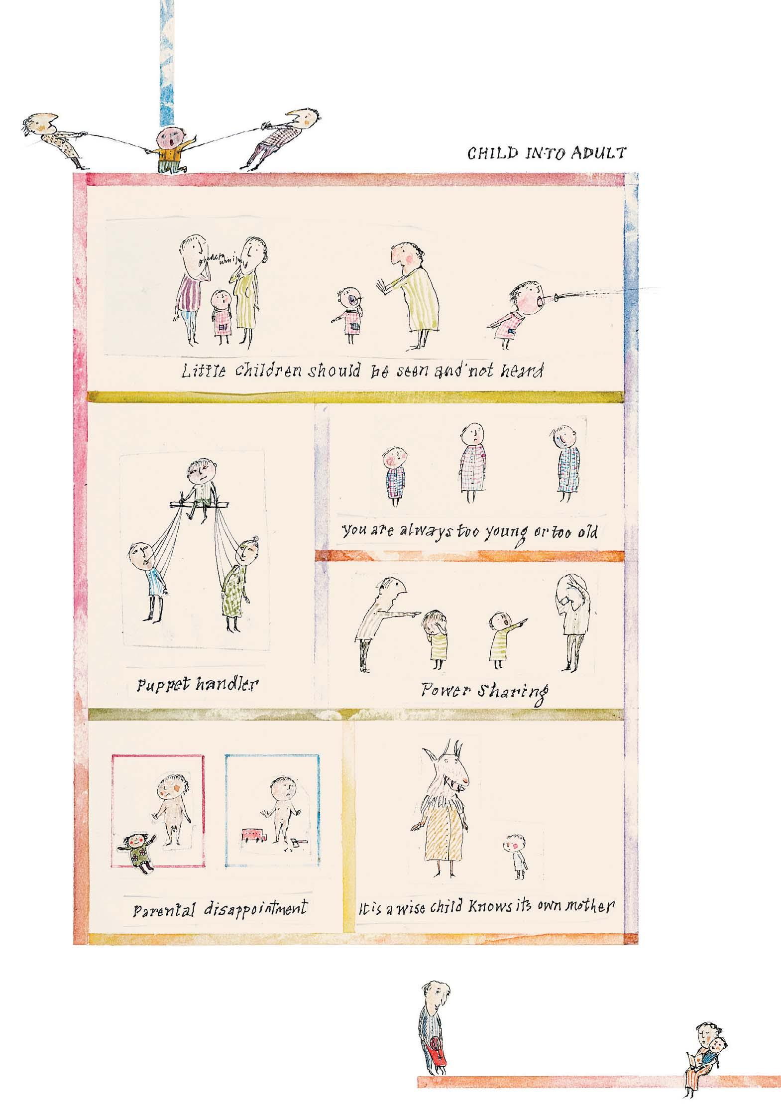
CHILD INTO ADULT
Watercolour and ink
10 ¾ x 8 ½ inches
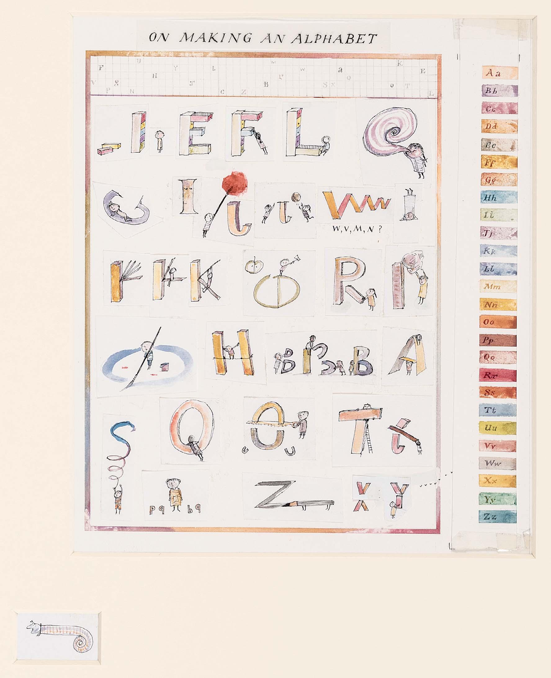
246 ON MAKING AN ALPHABET
Watercolour and ink 11 ¼ x 8 ¼ inches
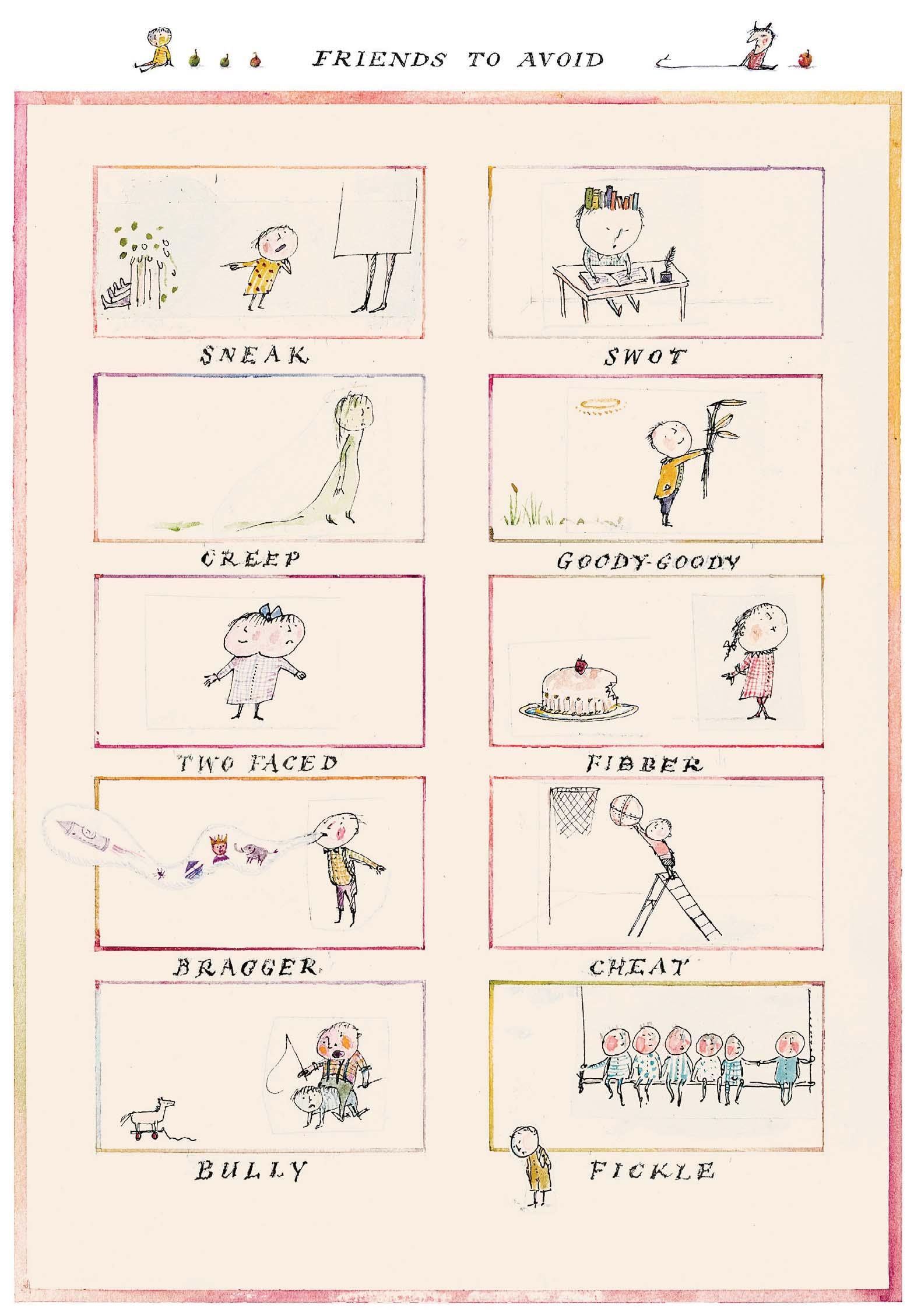
FRIENDS TO AVOID
Watercolour and ink
8 ¼ x 6 inches
Both artworks are being sold together as one
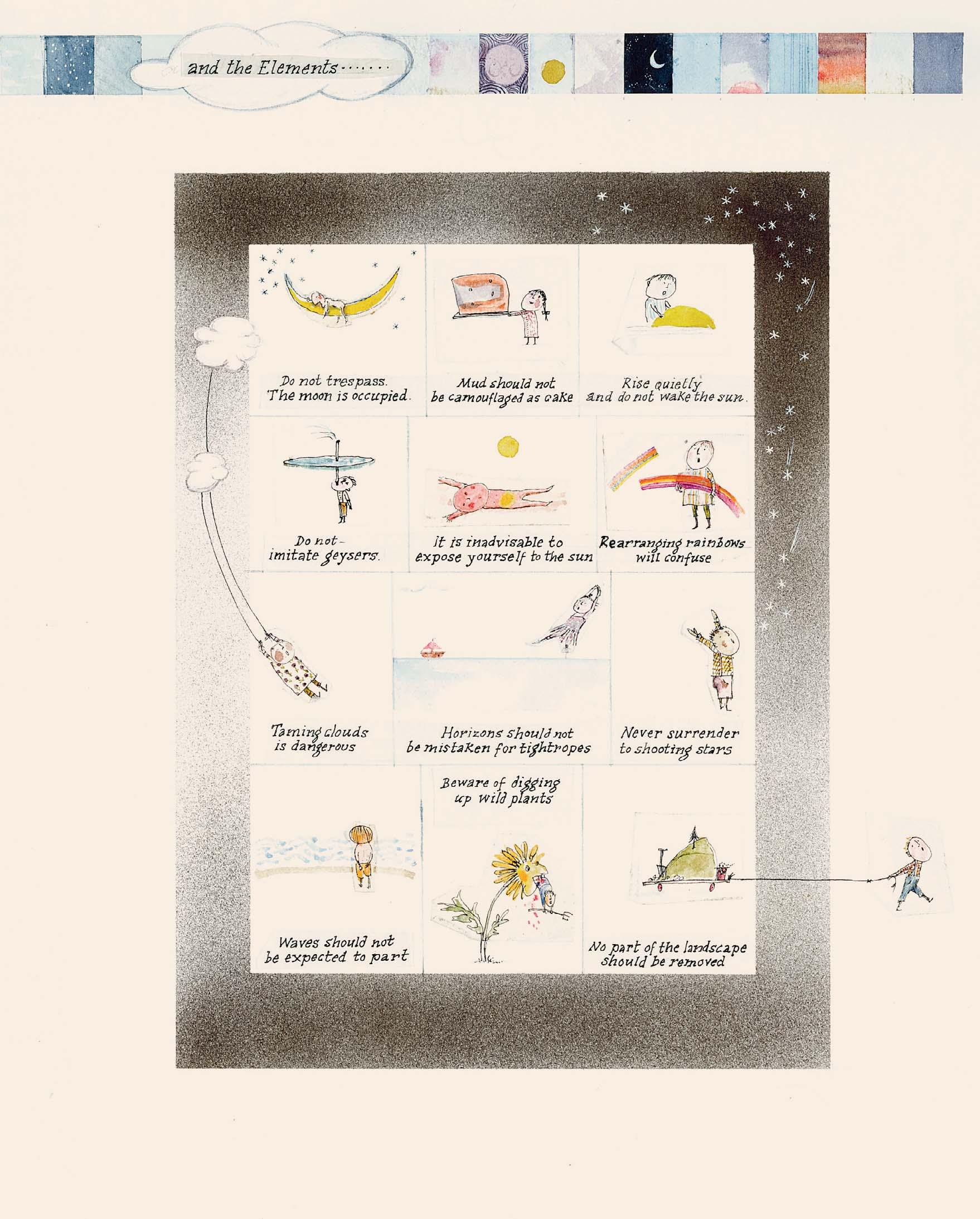
CONCERNING NATURE AND THE ELEMENTS ...
and ink
9 x 16 ½ inches
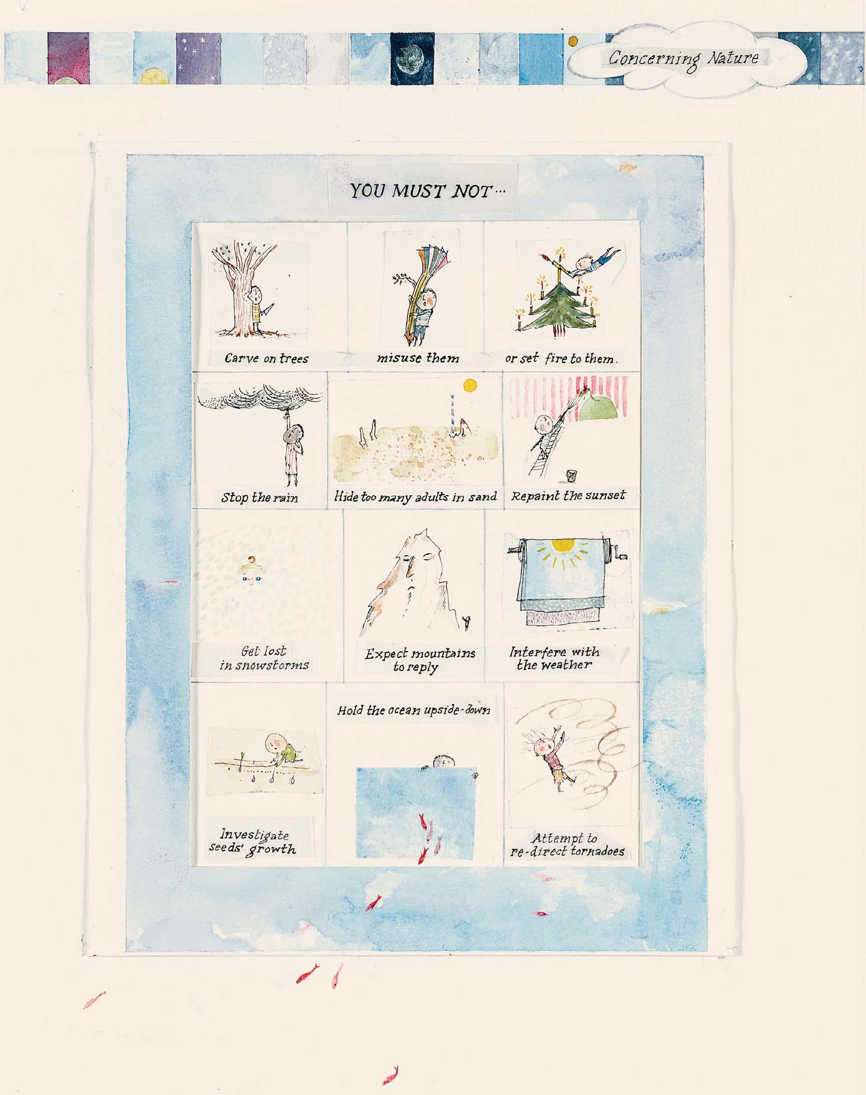
Watercolour
Both artworks are being sold together as one
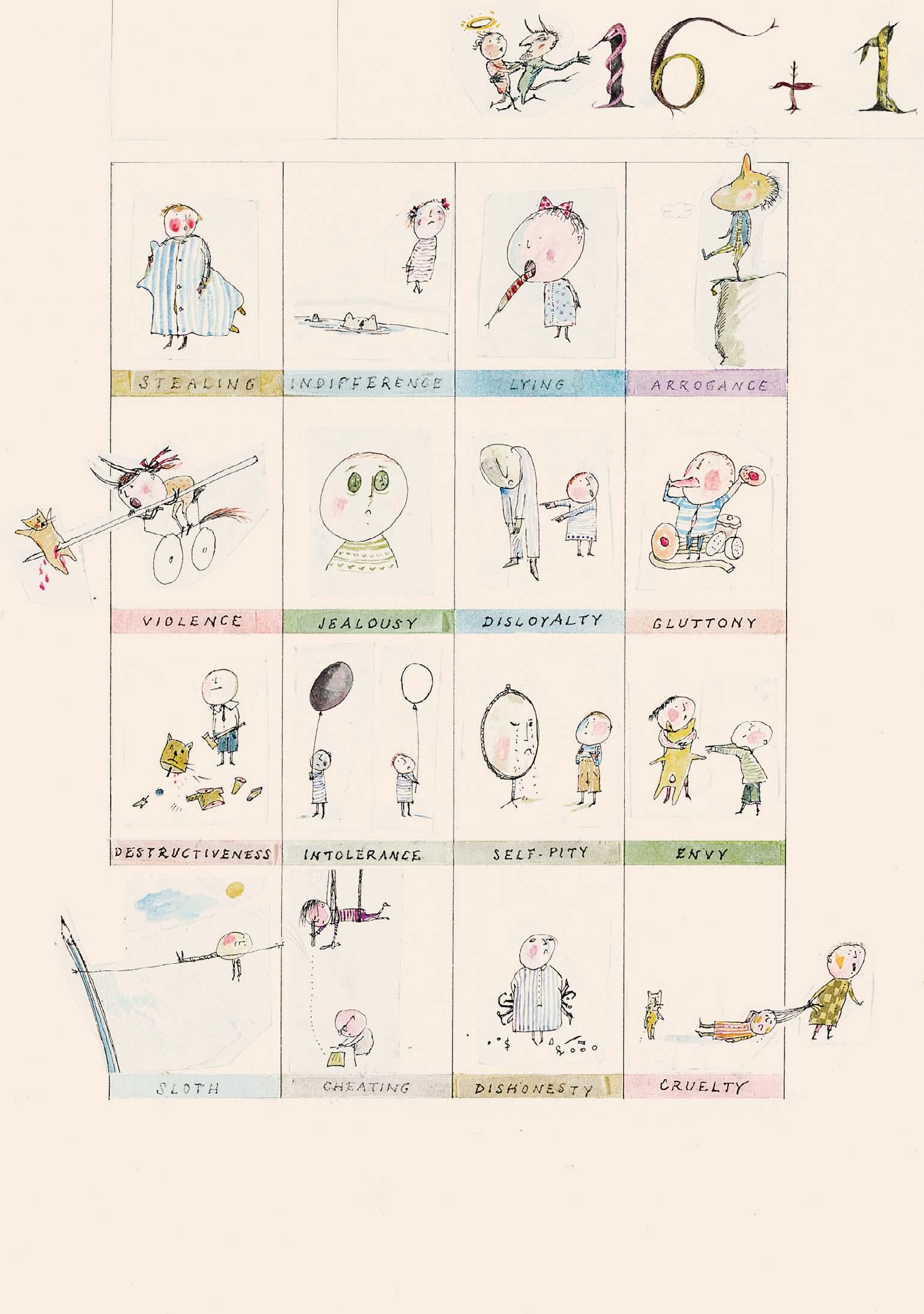
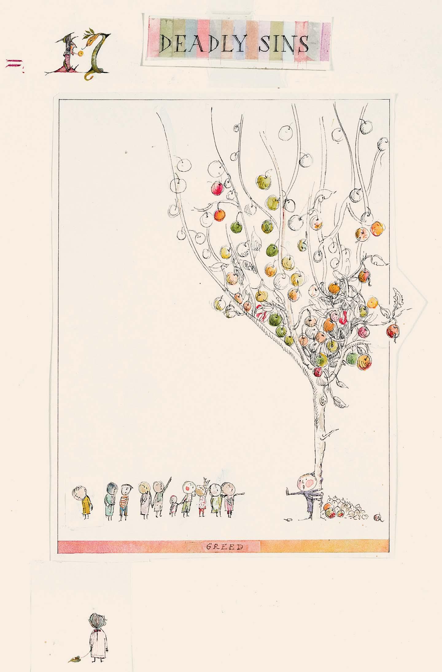
17 DEADLY SINS
and ink
¼ x 16 inches
Watercolour
250 (left)
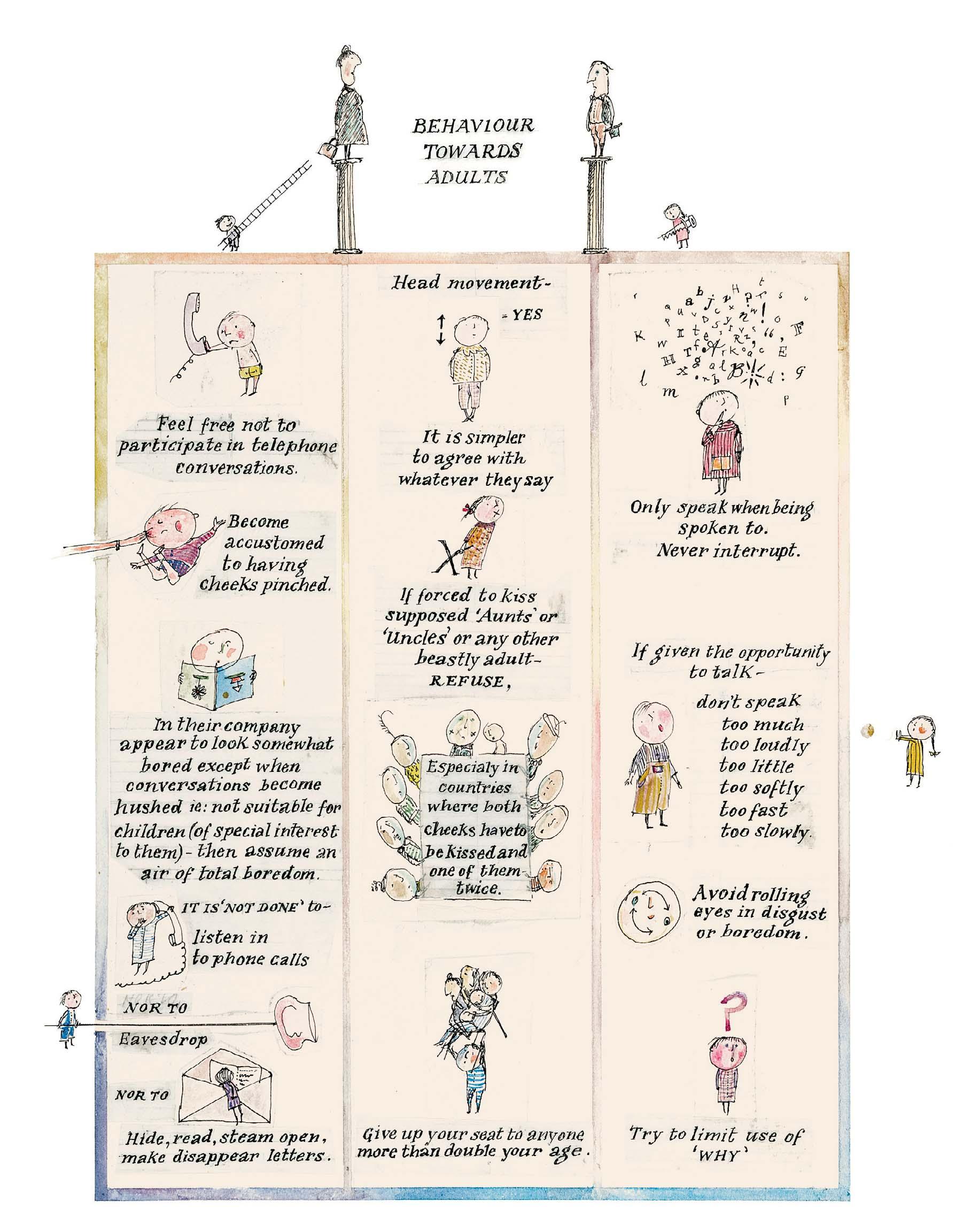
BEHAVIOUR TOWARDS ADULTS
Watercolour and ink
9 ¼ x 7 ¼ inches
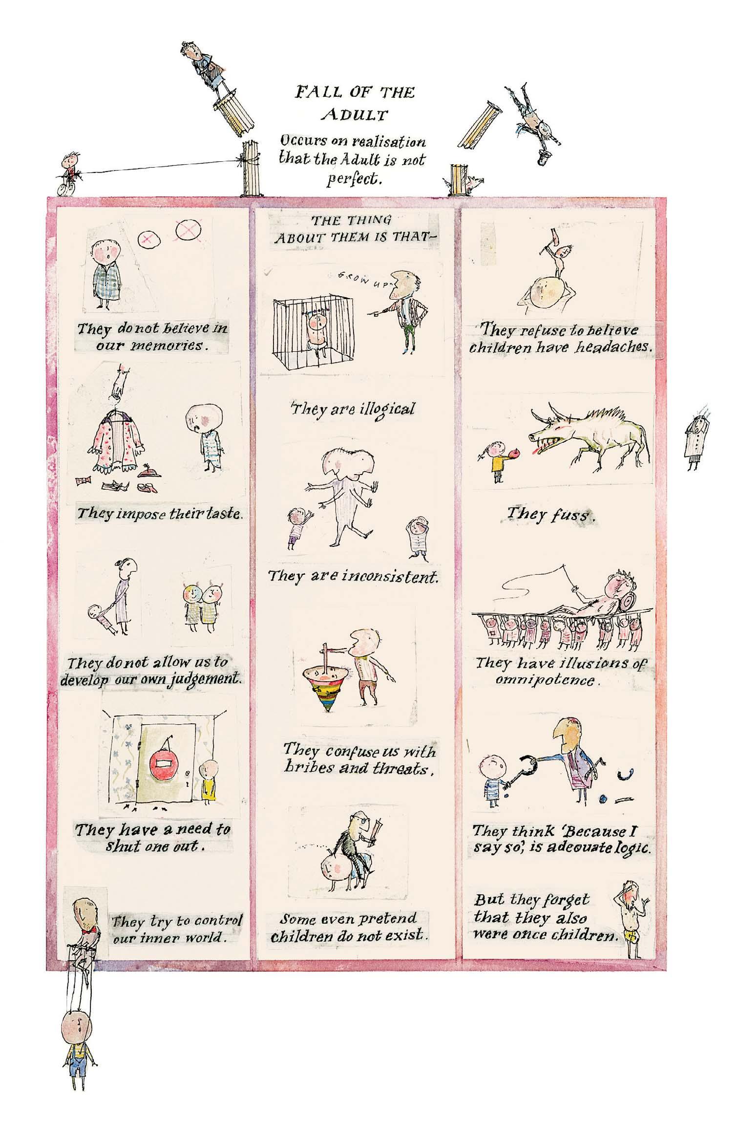
251 (opposite)
FALL OF THE ADULT
OCCURS ON REALISATION THAT THE ADULT IS NOT PERFECT
Watercolour and ink
10 ¼ x 8 inches
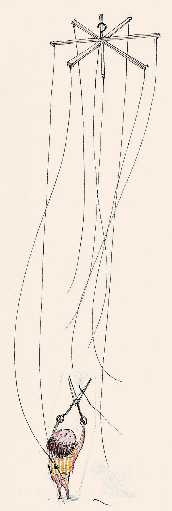
CUTTING THE STRINGS Ink with watercolour
½ x 2 ½ inches
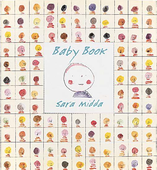

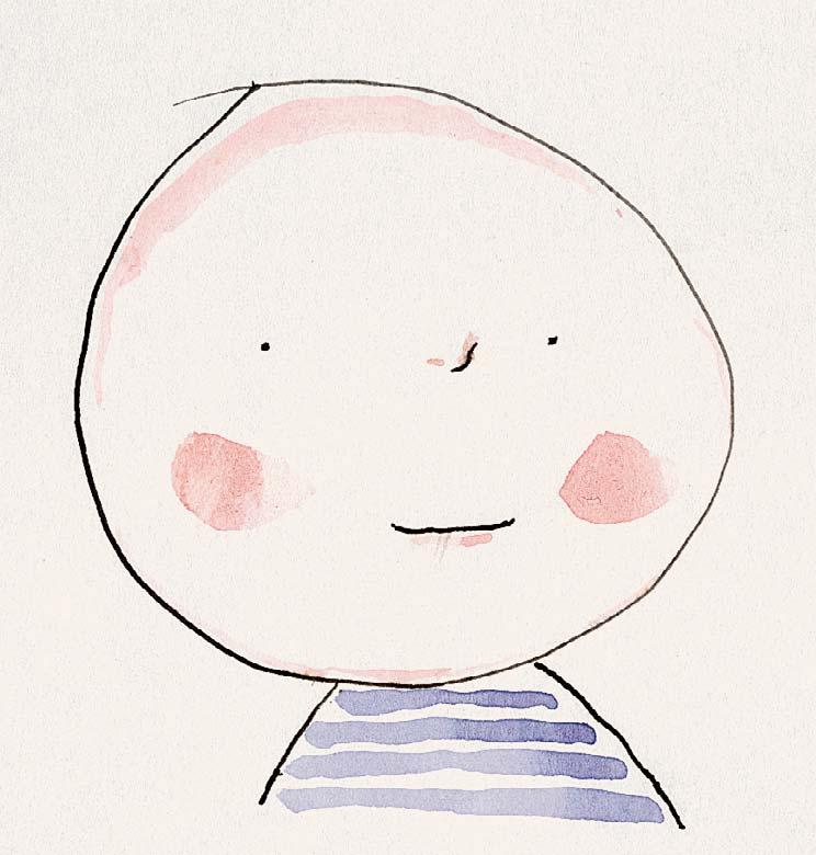
A reimagining of the traditional scrapbook-style baby journal, Baby Book is a charming and sentimental souvenir of a child’s rst year.
Sara Midda, Baby Book, New York: Workman Publishing, 1999
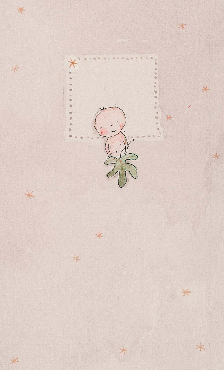
Nos 254-269 are all illustrated in Sara Midda, Baby Book, New York: Workman Publishing, 1999 [unpaginated]
with
¼ x 2 ¾ inches
Illustrated: Similar to Sara Midda, Baby Book, New York: Workman Publishing, 1999
(opposite page)
½ x 8 ¾ inches
cover

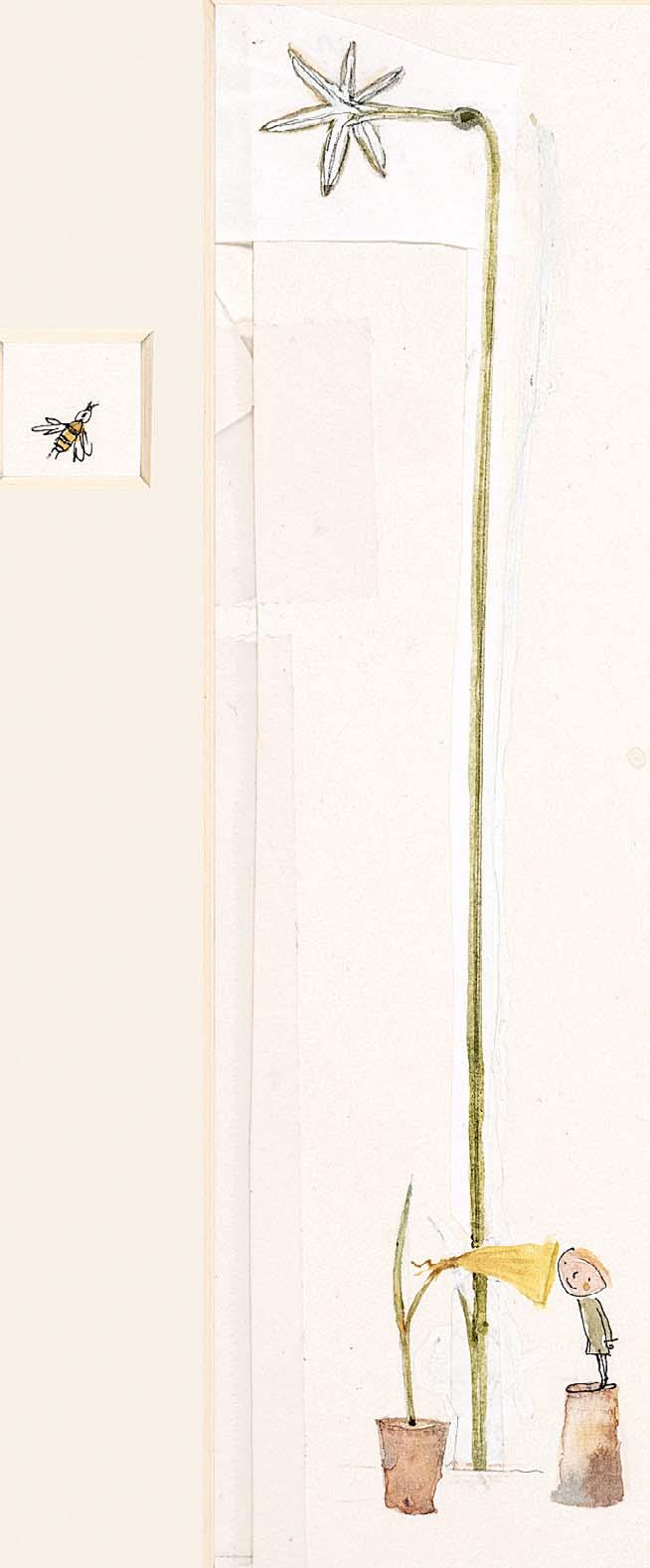

258
TANTRUMS
Watercolour and ink
8 x 1 ½ inches
259
RESPONSE TO NATURE
Watercolour with ink
7 ½ x 3 ¼ inches
260
SMILES
Watercolour with ink
8 ½ x 1 ½ inches


Watercolour and ink
7 ¼ x 1 ¼ inches 263 LULLABIES
Watercolour with ink
9 ¼ x 2 ½ inches
262 MUSIC
Watercolour with ink
9 ½ x 2 inches


Ink with watercolour
1 x 1 ¼ inches
268 TRIUMPHS
Signed
Ink and watercolour
3 x 3 ¾ inches
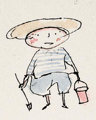
269
Signed
Ink and watercolour
5 ½ x 2 ½ inches 270
Ink and watercolour
1 ¼ x 1 inches
271
Ink and watercolour
1 ½ x 1 inches
272
Ink and watercolour
1 ¼ x 1 ¼ inches
273
Inscribed ‘For book’ below mount
Ink and watercolour
1 ½ x 1 ½ inches
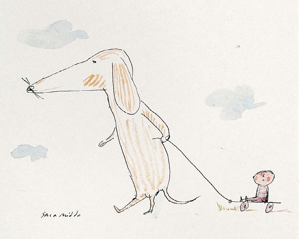
Nos 270-273 are all drawn for but not illustrated in Sara Midda, Baby Book, New York: Workman Publishing, 1999 [unpaginated]
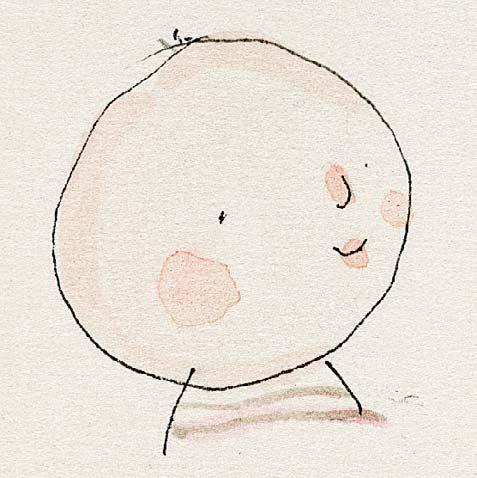
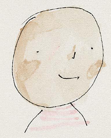
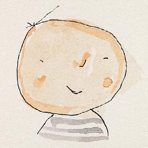
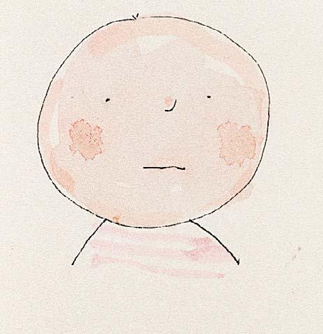
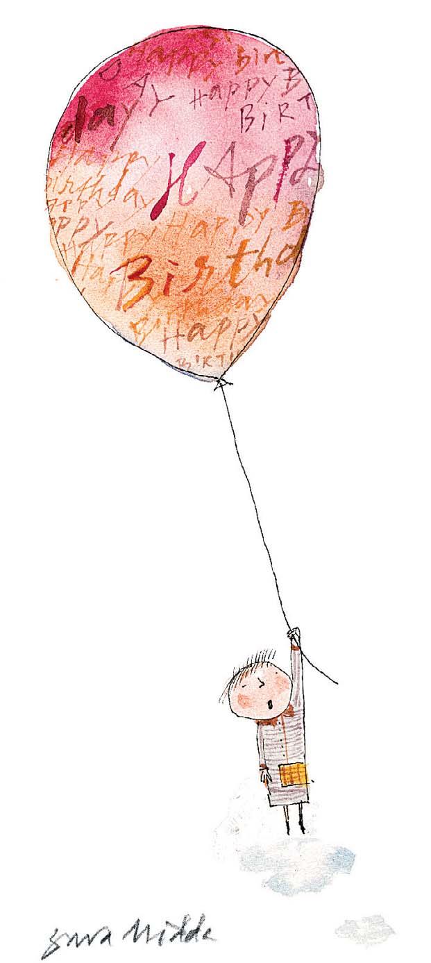
BIRTHDAY BALLOON
BABY I
BABY II
BABY III
BABY IV

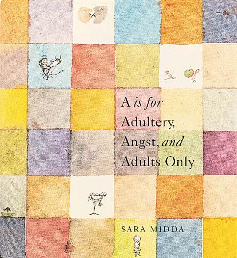
Sara Midda, A is for Adultery, Angst, and Adults Only, New York: Workman Publishing, 2002
Nos 275-289 are all illustrated in Sara Midda, A is for Adultery, Angst, and Adults Only, New York: Workman Publishing, 2002 [unpaginated]
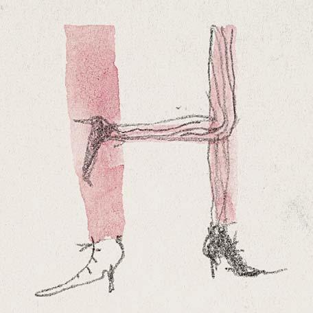
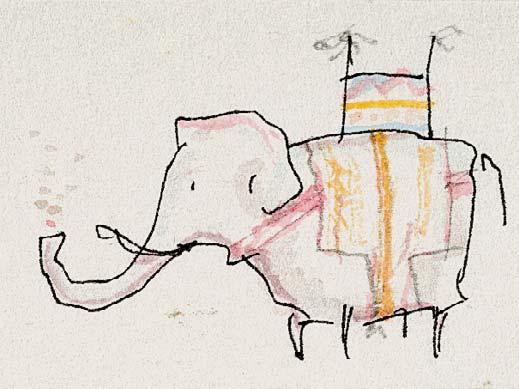
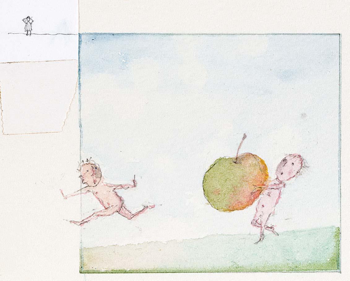
Sara Midda’s Alphabet book for adults considers each letter of the alphabet and lls each page with playful, often naughty vignettes and hidden wordplay. A is for Adultery is a witty, grown up game and gorgeous keepsake.
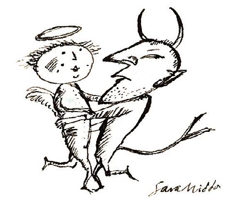
274
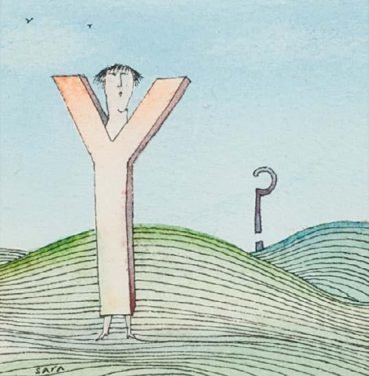
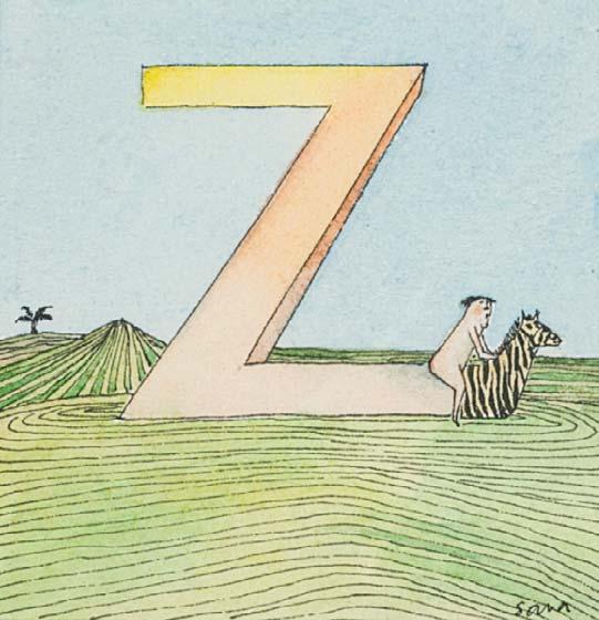
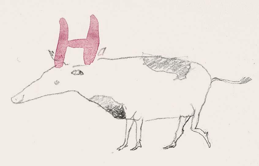
H IS FOR HEAVEN AND HELL Signed Ink
1 ¾ x 1 ¾ inches
Similar to Sara Midda, A is for Adultery, Angst, and Adults Only, New York: Workman Publishing, 2002 [unpaginated]
275
H IS FOR HEEL Pencil and watercolour 1 ½ x 1 ¼ inches
276
H IS FOR HOWDAH Ink with watercolour 1 x 1 ½ inches
277
A IS FOR APPLE
Watercolour with ink
3 x 4 inches
IS FOR
with watercolour 2 ¼ x 2 inches
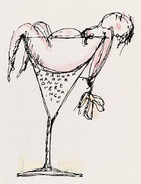
H IS FOR HANGOVER
with watercolour
2 x 1 ¾ inches
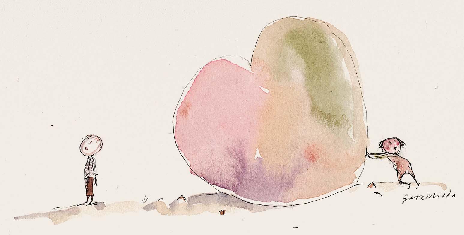
H IS FOR HEART II
Watercolour with pencil 1 ½ x 1 ½ inches
1 ¾ x 2 ¾ inches
H IS FOR HEART I
H IS FOR HORNY
with watercolour
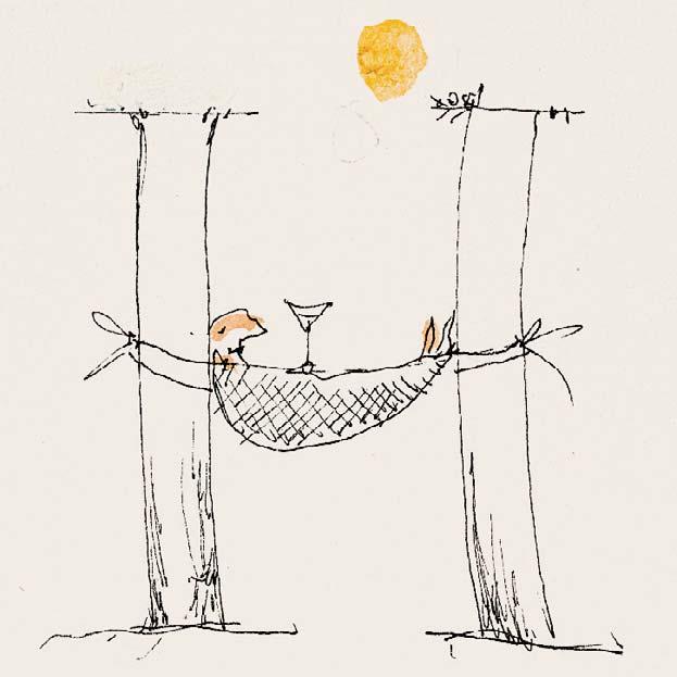
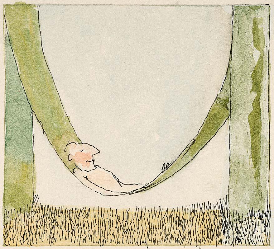
HAMMOCK
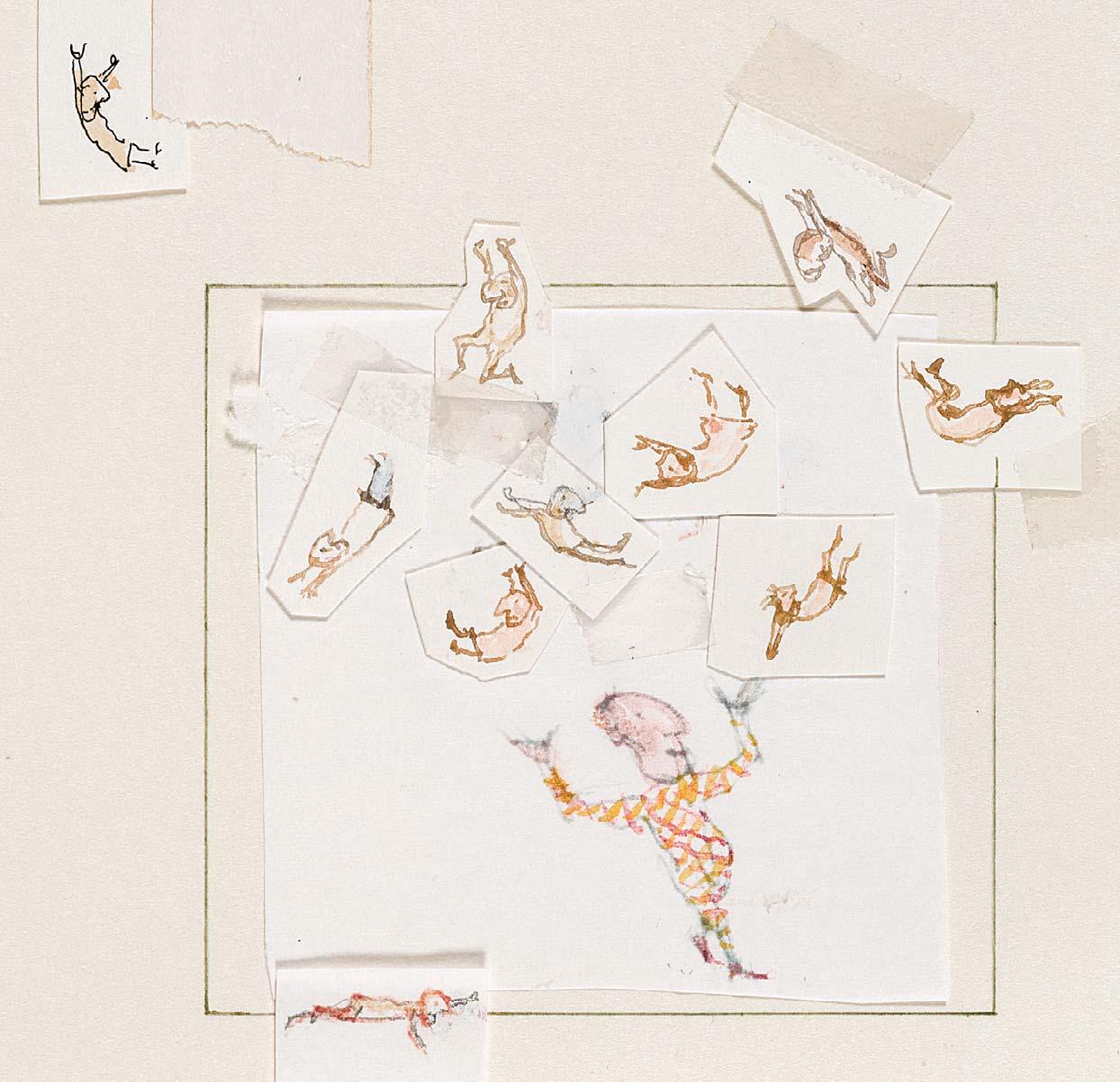
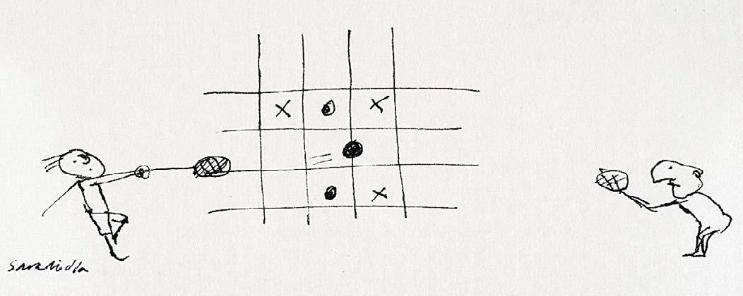
J IS FOR JUGGLING
Watercolour with pencil
4 ½ x 4 inches
284
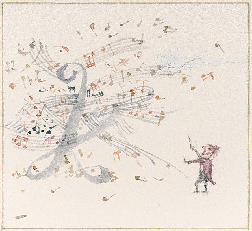
K IS FOR KAPELLMEISTER
Watercolour
2 ¾ x 3 inches
285
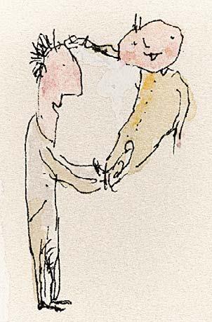
M IS FOR MAN
Watercolour and ink
2 ¾ x 3 inches

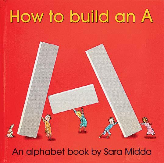

Sara Midda, How to build an A, New York: Artisan, 2008
Nos 290-294 are all illustrated in Sara Midda, How to build an A, New York: Artisan, 2008 [unpaginated]
A wonderful example of Sara’s lifelong fascination with the art of lettering, How to Build an A teaches children how to build each letter of the alphabet using just 11 shapes, and accompanying each letter with Sara’s beautiful watercolours.
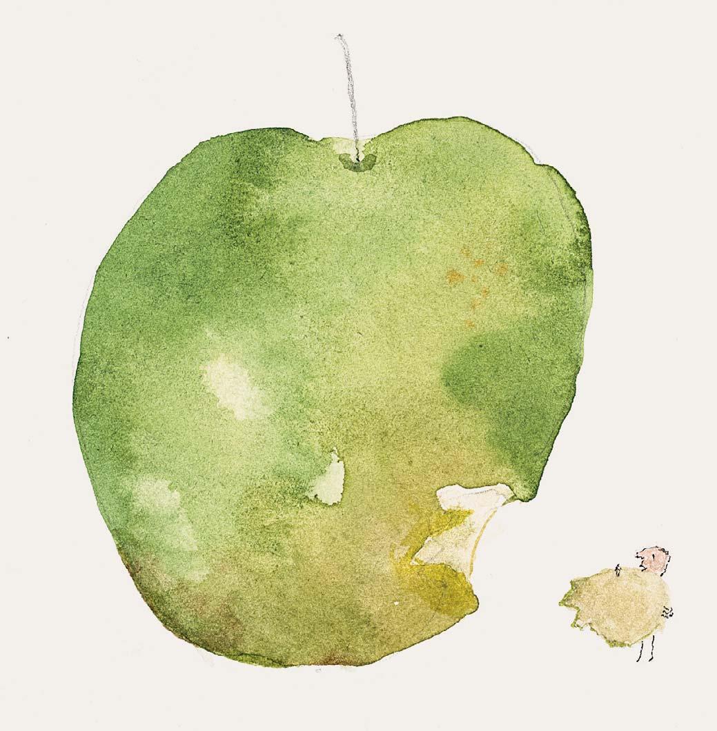
290 A IS FOR APPLE
Watercolour with ink and pencil
4 ¼ x 4 inches
291 H IS FOR HEART
Watercolour with ink and pencil
6 ¾ x 6 ¾ inches

Watercolour with ink and pencil
5 ½ x 3 ½ inches
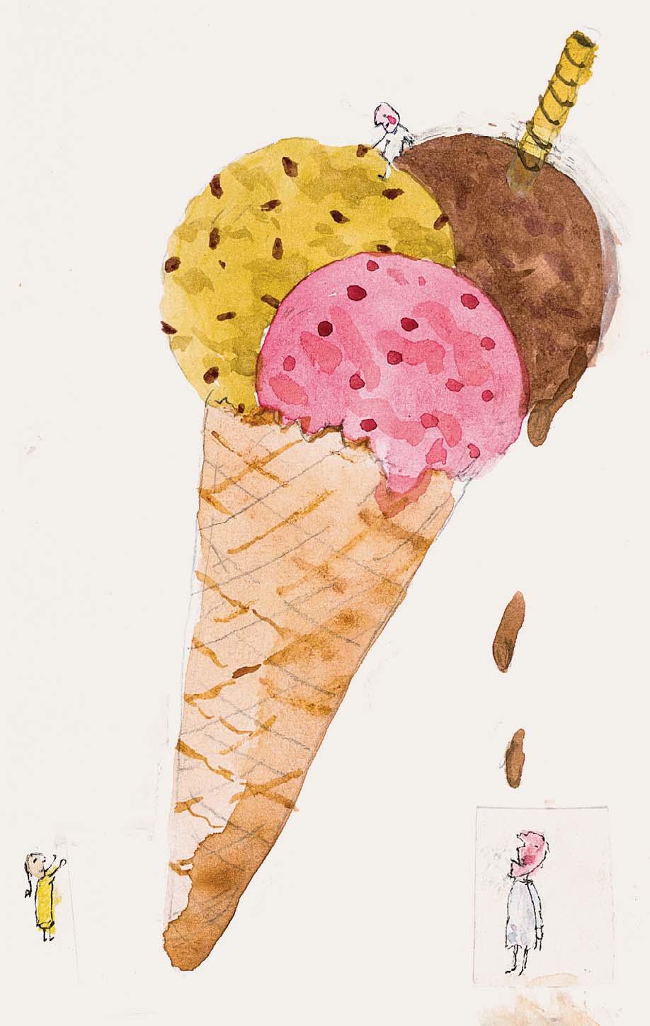
294
292
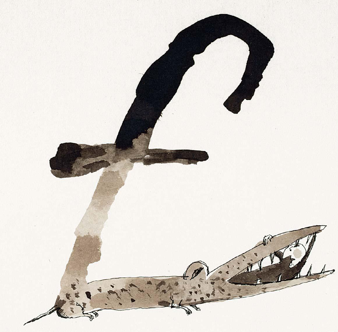
I IS FOR ICE CREAM
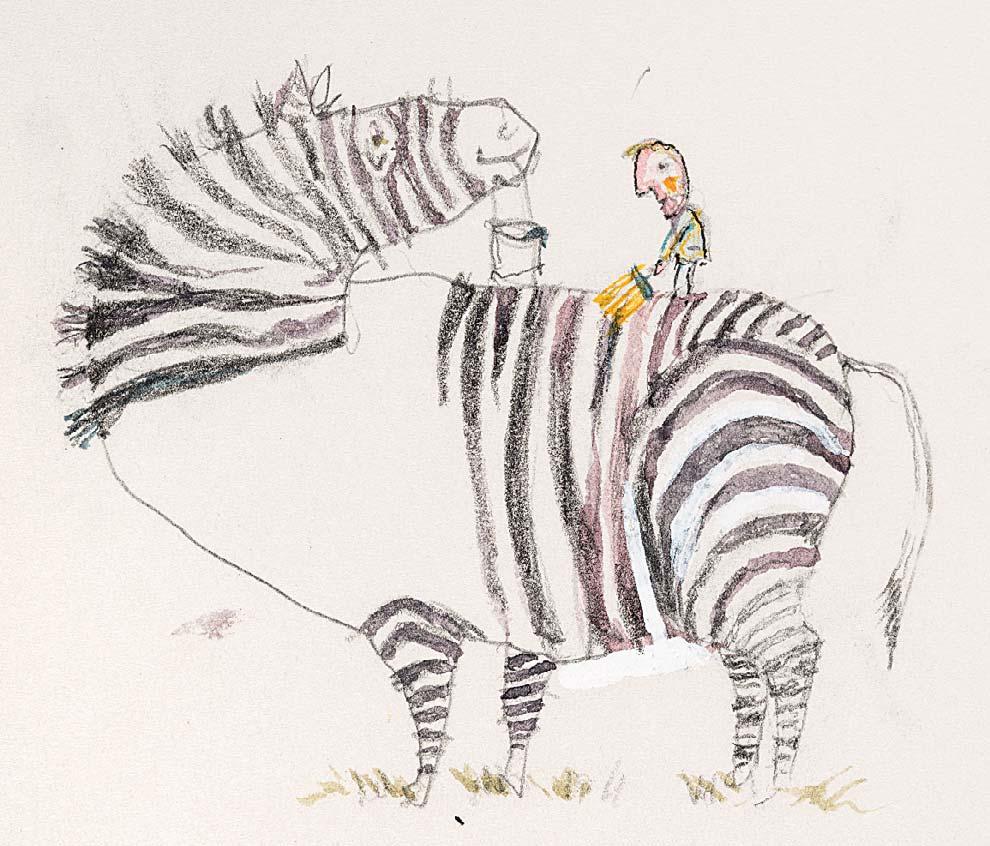
293 IS FOR EBRA
Pencil with watercolour 3 x 3 ¼ inches
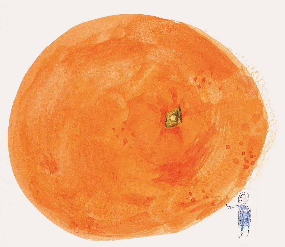
O IS FOR ORANGE
Watercolour with ink 6 x 6 inches

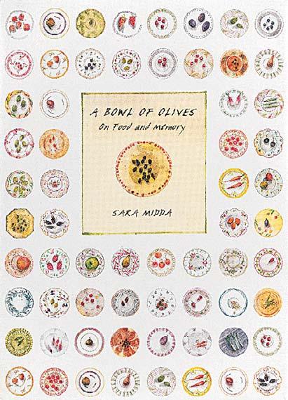
Sara Midda, A Bowl of Olives: On
Food and Memory
, New York: Workman Publishing, 2014
Nos 295-298&300-307 are all illustrated in Sara Midda, A Bowl of Olives: On Food and Memory, New York: Workman Publishing, 2014
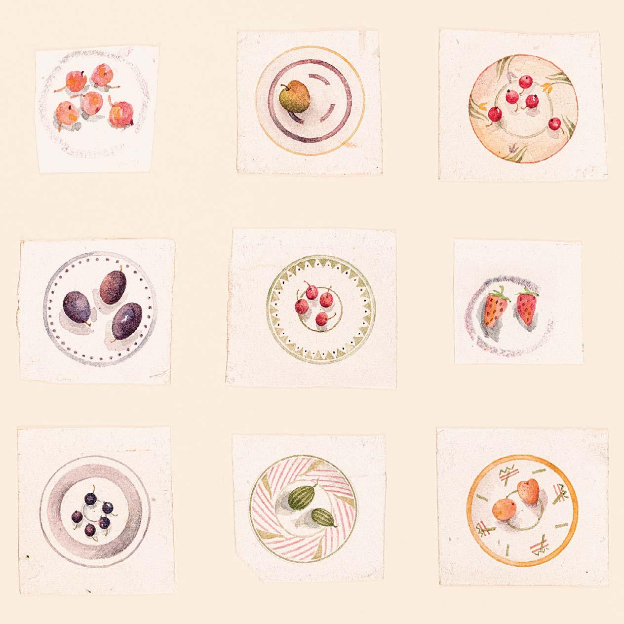
Drawn from Sara’s wealth of experiences and memories, A Bowl of Olives is a book designed for all who love food and cooking. It is a captivating celebration of fruits, vegetables and simple ingredients, and the joy of sharing food with friends and family.
295
BOWLS OF OLIVES I
Watercolour
5 ¾ x 5 ¼ inches
Illustrated: cover design
296
BOWLS OF OLIVES II
Watercolour
3 ½ x 2 ½ inches
Illustrated: cover design
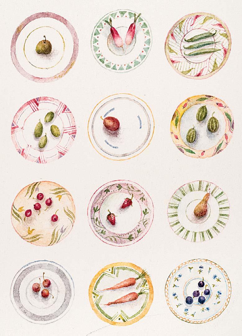
Ink and watercolour
2 ¼ x 3 inches
Illustrated: page 28
298
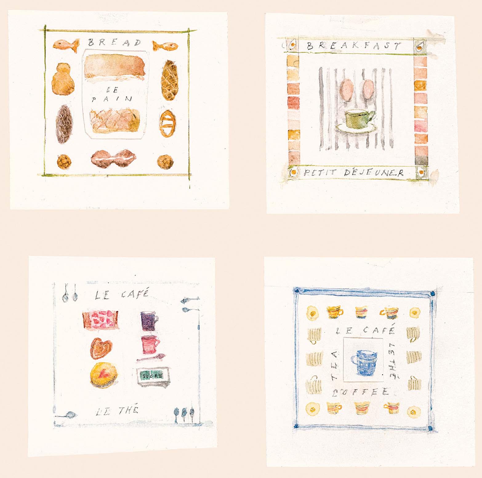
BREAKFAST
Four panels, each measuring 2 1 2 x 2 1 4 inches
Watercolour
6 x 5 ½ inches
Illustrated: pages 67 and 68
299
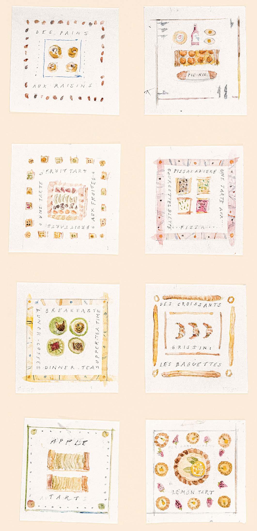
FROM THE BOULANGERIE
Eight panels, each measuring 2 1 2 x 2 1 4 inches
Watercolour
10 ½ x 5 inches
Drawn for but not illustrated in Sara Midda: A Bowl of Olives, On Food and Memory, New York: Workman Publishing, 2014 [Lemon Tart panel illustrated page 51]
300
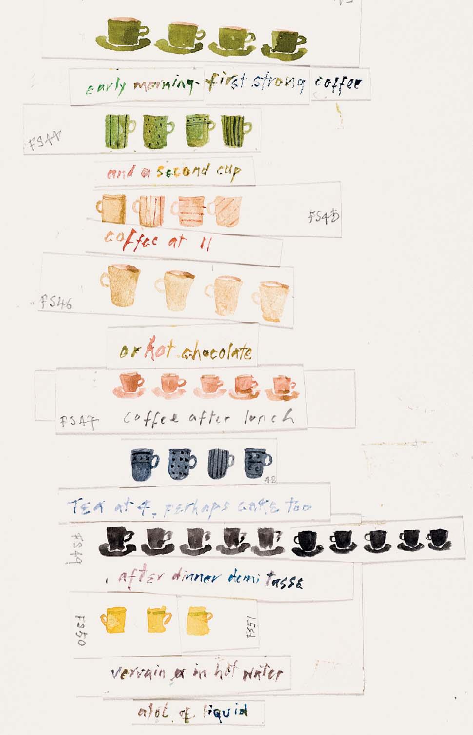
EARLY MORNING – FIRST STRONG COFFEE ...
Watercolour
7 ¼ x 4 inches
Illustrated: page 66
302 APPLES
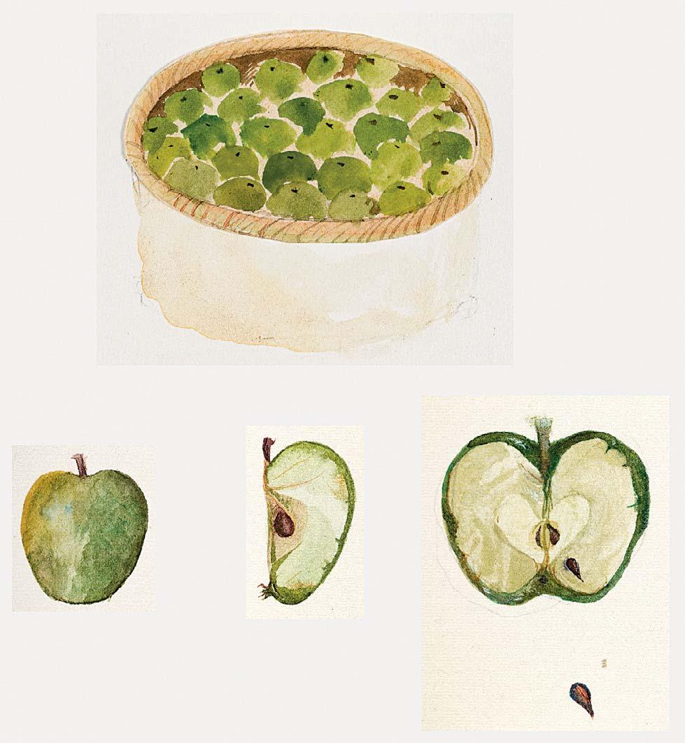
Watercolour
5 ¼ x 5 ½ inches
Four panels:
First Panel: 2 1 4 x 2 1 2 inches
Second Panel: 1 1 4 x 1 inches
Third Panel: 1 1 4 x 1 inches
Fourth Panel: 2 x 1 1 2 inches
Illustrated: page 99
301
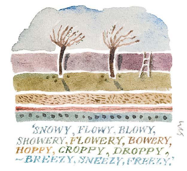
SNOWY, FLOWY, BLOWY, SHOWERY, FLOWERY, BOWERY, HOPPY, CROPPY, DROPPY, – BREE Y, SNEE Y, FREE Y
Signed with initials
Watercolour
1 ¾ x 1 ¾ inches
Illustrated: page 53
303
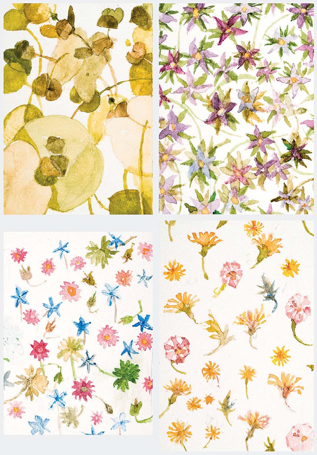
A CONTINUOUS CHANGING CARPET
Watercolour
7 x 6 inches
Four panels, each measuring 2 1 4 x 1 3 4 inches
Illustrated: pages 54 and 55
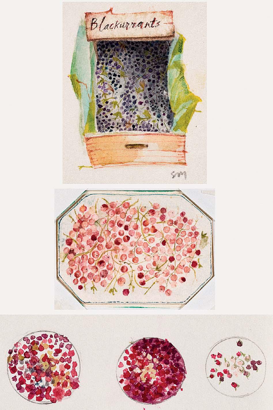
305
BLACKCURRANTS AND REDCURRANTS
Signed with initials on rst panel
7 x 3 ¼ inches
304
5 ½ x 4 inches
Illustrated: page 113
Three panels:
First Panel: 2 1 4 x 1 1 2 inches
Second Panel: 1 1 4 x 1 3 4 inches
Third Panel: 1 1 4 x 3 1 2 inches
Illustrated: page 100
Watercolour
ONION
Watercolour
306
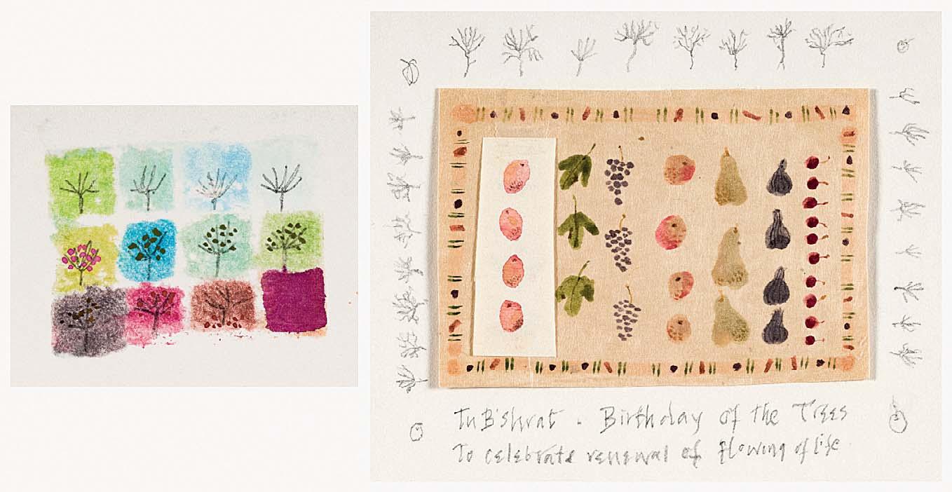
TU B’SHRAT – BIRTHDAY OF THE TREES TO CELEBRATE RENEWAL OF FLOWING OF LIFE
Inscribed with title on second panel
Watercolour and pencil
3 x 7 ¾ inches
Two panels:
First Panel: 1 1 2 x 2 inches
Second Panel: 3 x 3 3 4 inches
Illustrated: pages 108 and 109
307
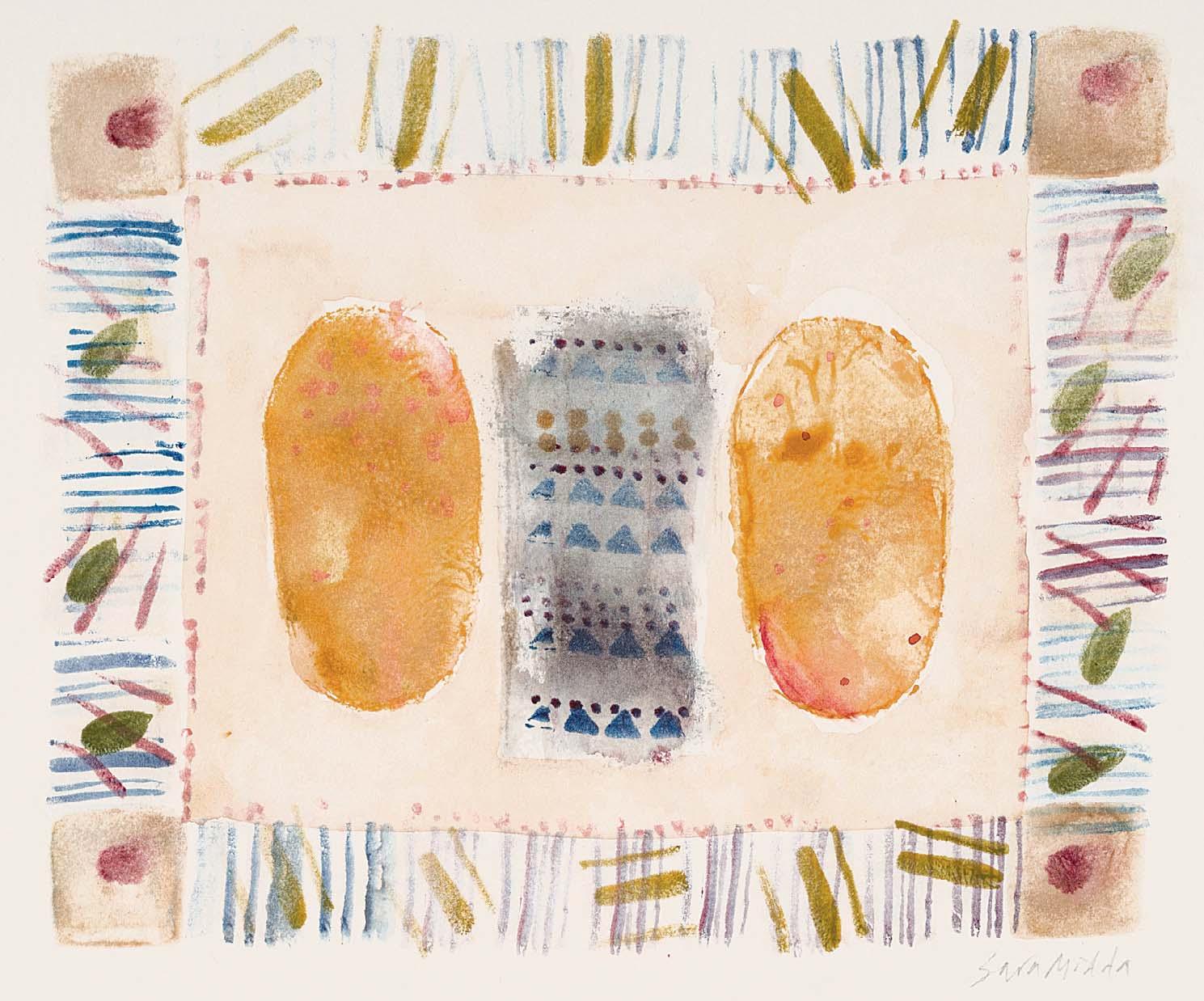
POTATO AND CHEESE PIE
Signed Watercolour
5 x 6 inches
Illustrated: page 112
308
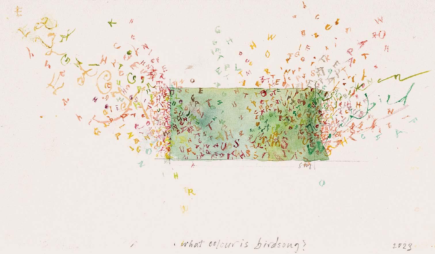
WHAT COLOUR IS BIRDSONG?
Inscribed with title and dated 2023
Watercolour
4 x 6 ½ inches
309
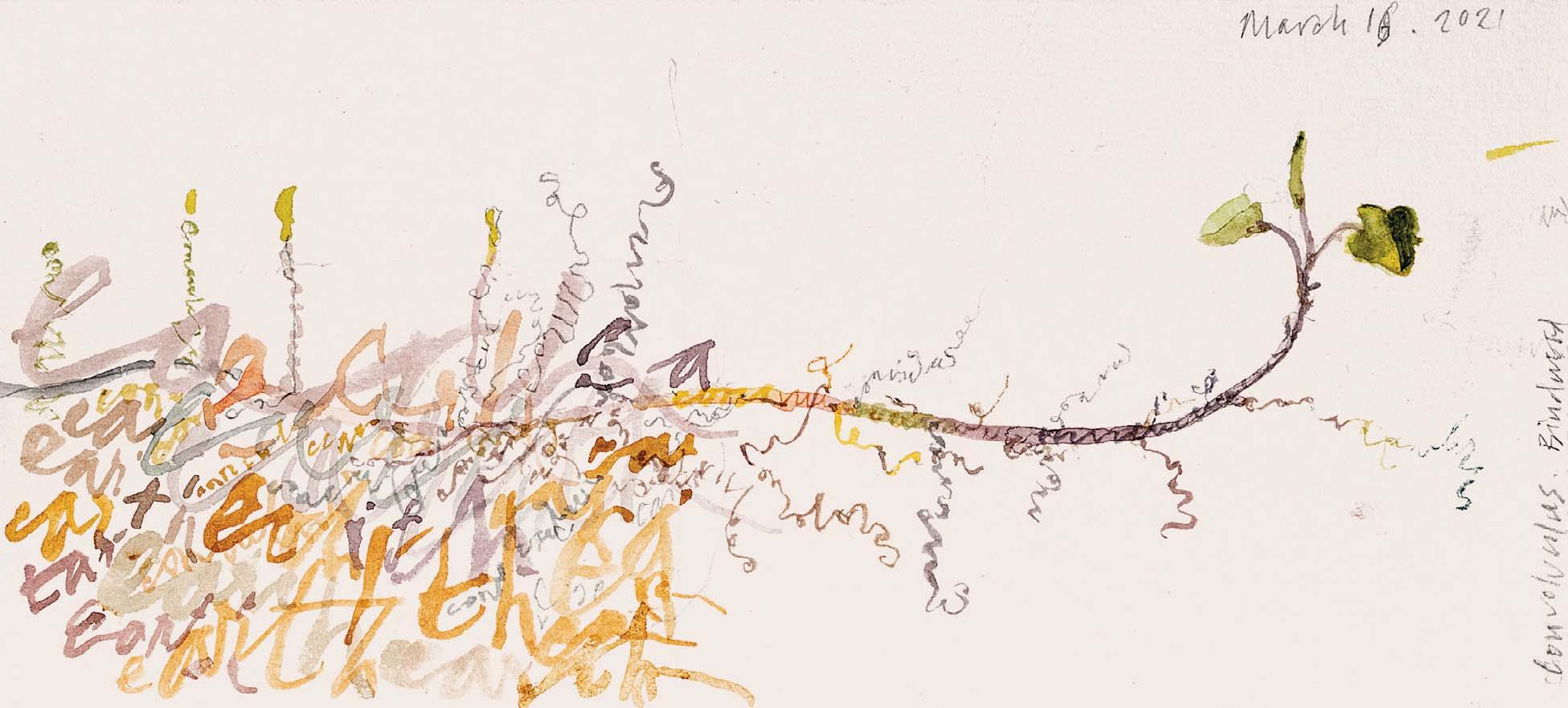
CONVOLVULUS BINDWEED
Inscribed with title and dated ‘March 16 2021’
Watercolour
8 ¼ x 4 inches
Signed with initials
Watercolour with ink and bodycolour 11 x 8 inches
Design for a book cover
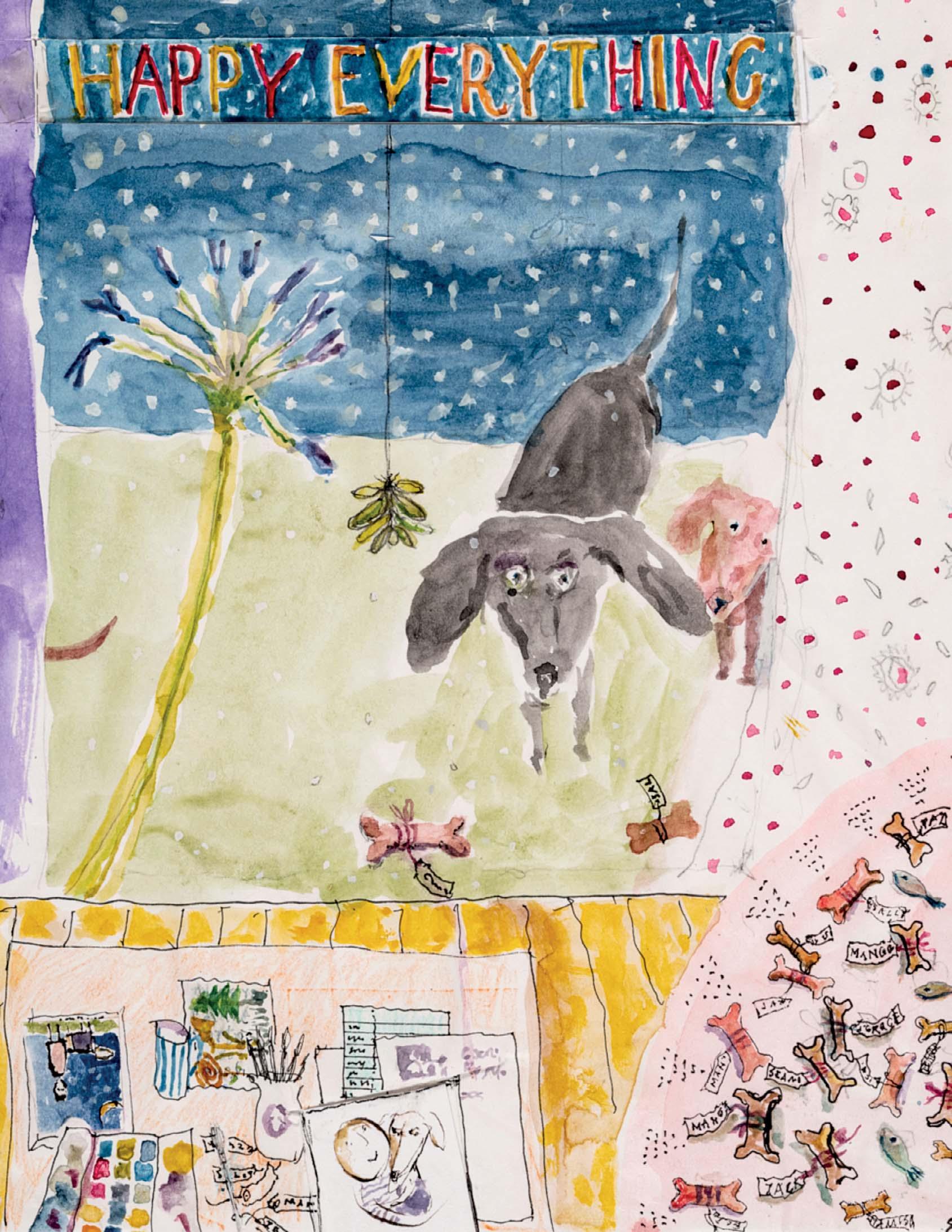
310 HAPPY EVERYTHING
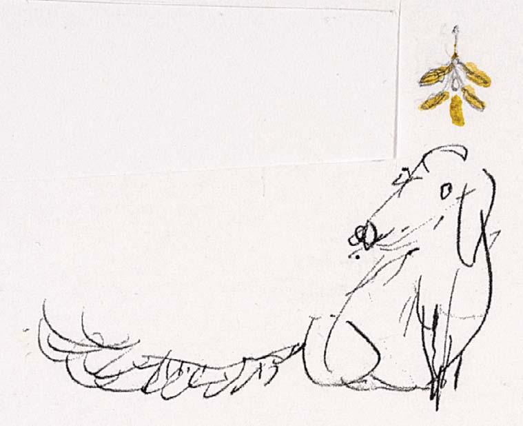
311
UNDER THE MISTLETOE Ink with watercolour 2 x 2 ¾ inches
312
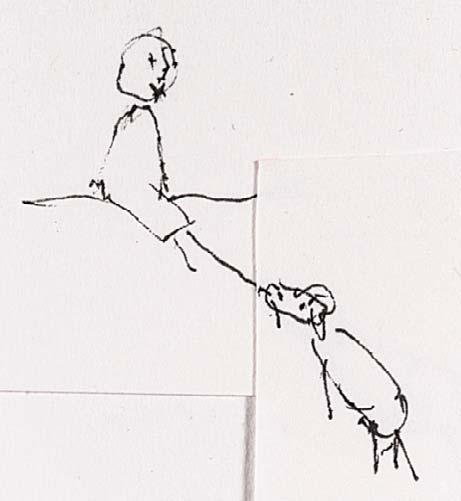
BRINGING THE REMOTE Ink with watercolour
1 ¼ x 1 ½ inches
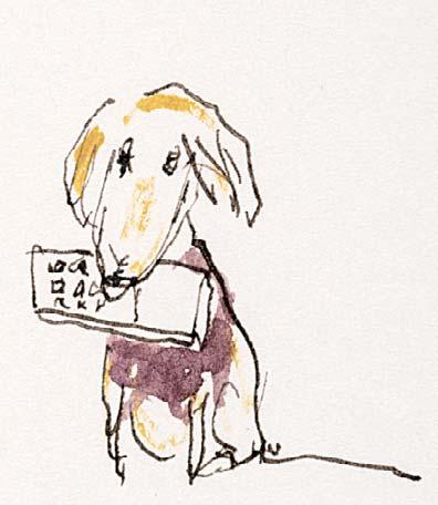
313 SIT!
Watercolour
1 ¼ x 1 ¾ inches
314
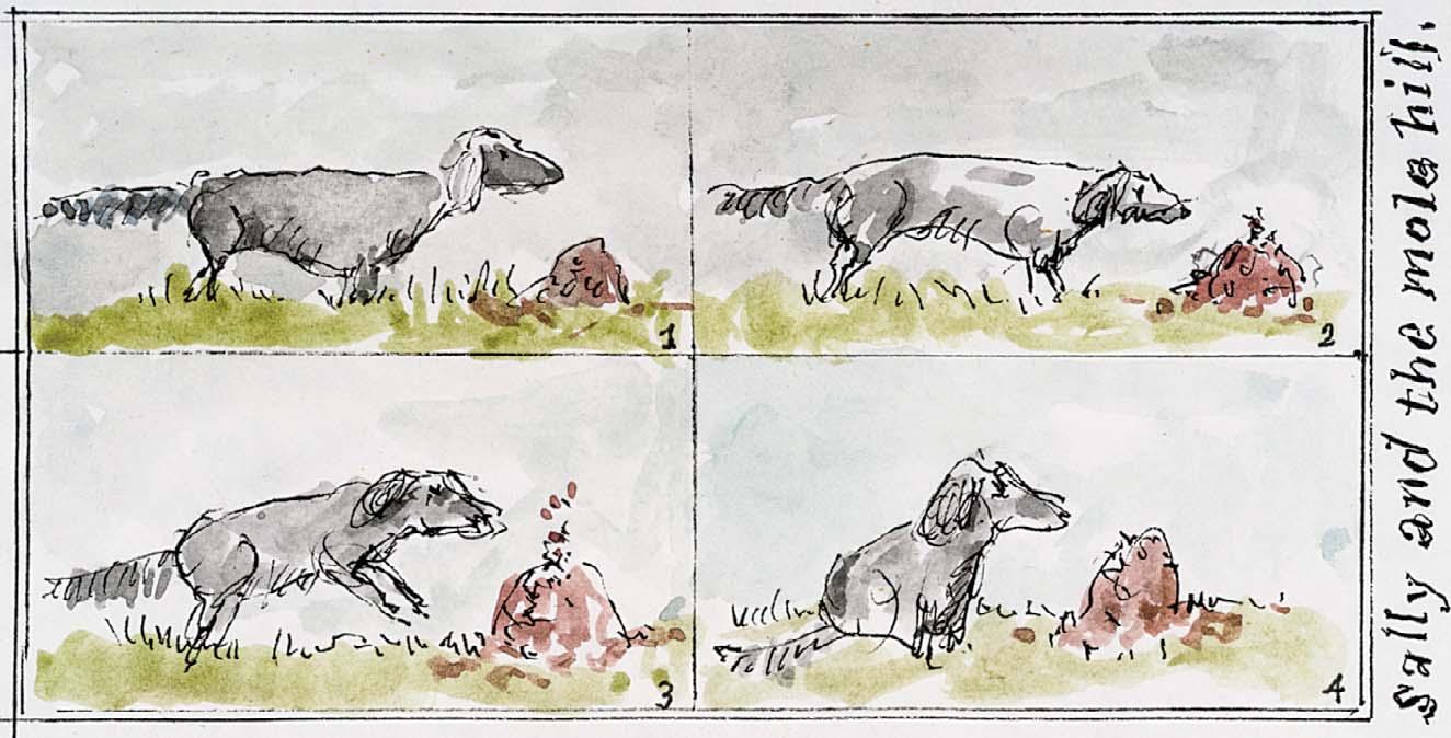
SALLY AND THE MOLE HILL
Inscribed with title Ink and watercolour
2 ¼ x 4 ¼ inches
¼ x 2 inches

325
322
I WANTED TO WRITE YOU THE LONGEST LETTER ABOUT DREAMS SHARED THOUGHTS MEMORIES I COULDN’T FOR SO LONG YOU’D UNDERSTAND WITHOUT WORDS
Signed
Watercolour
9 ¼ x 2 inches
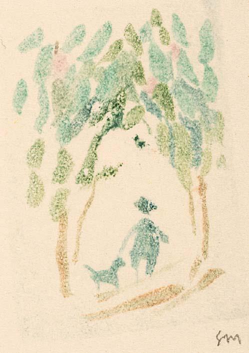
323 WALKIES
Signed with initials
Watercolour
2 ¼ x 1 ¾ inches
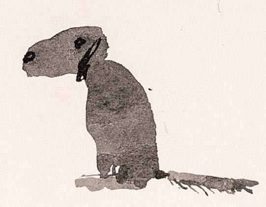
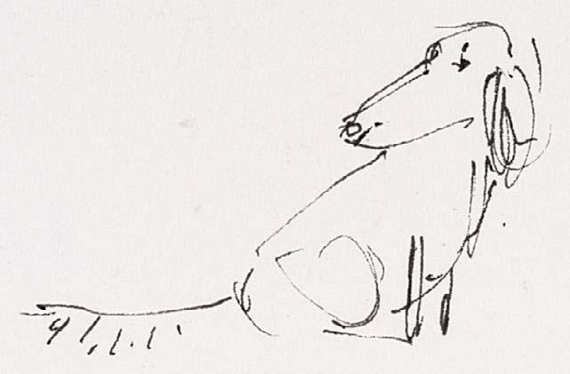
324 SALLY Ink
1 ¼ x 1 ¾ inches
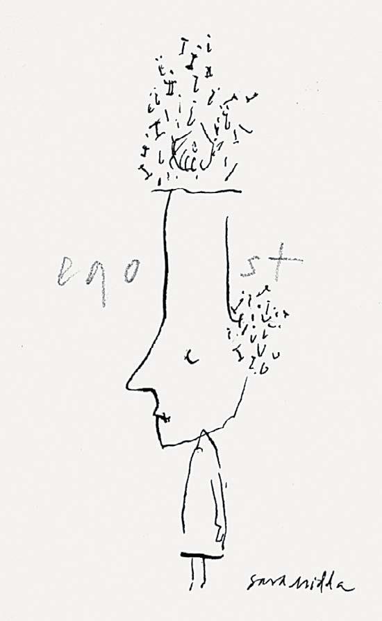
325 EGOIST
Signed Ink with pencil
3 ¼ x 2 inches
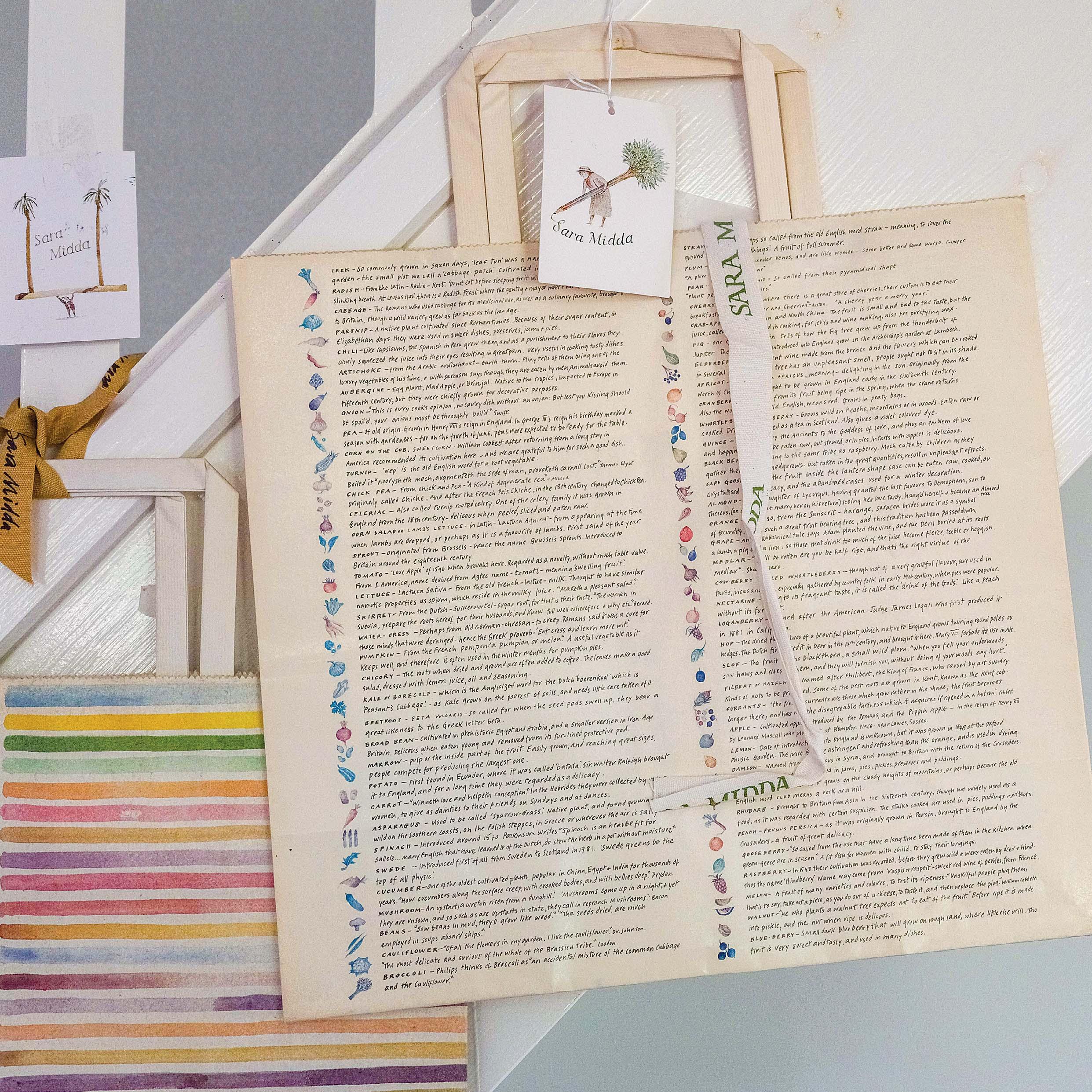
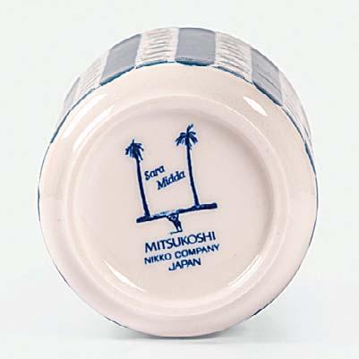
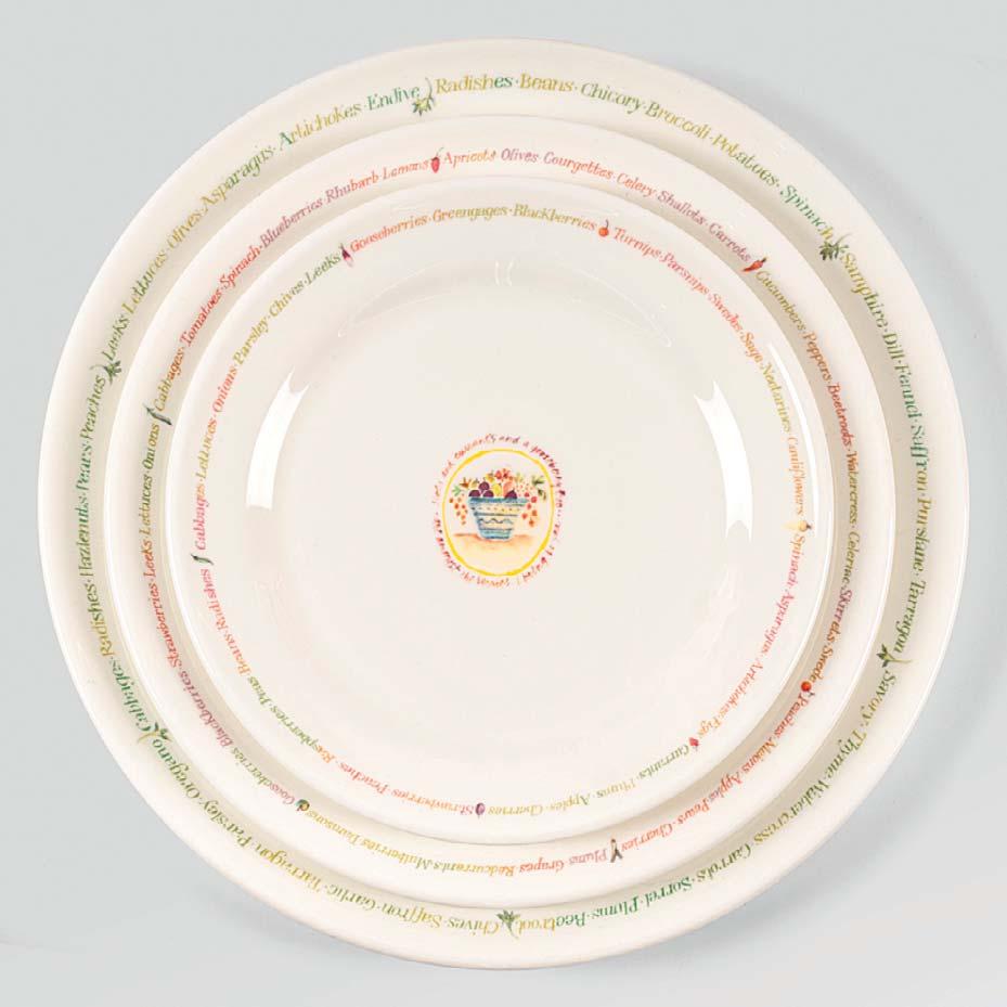
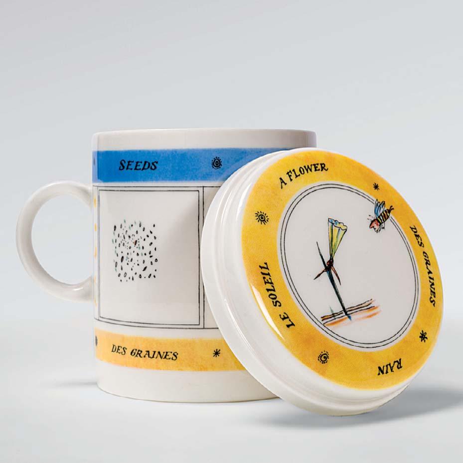
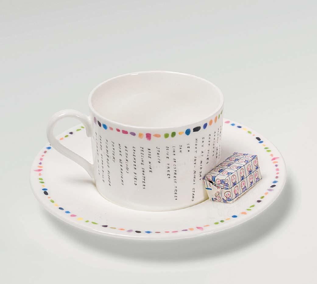
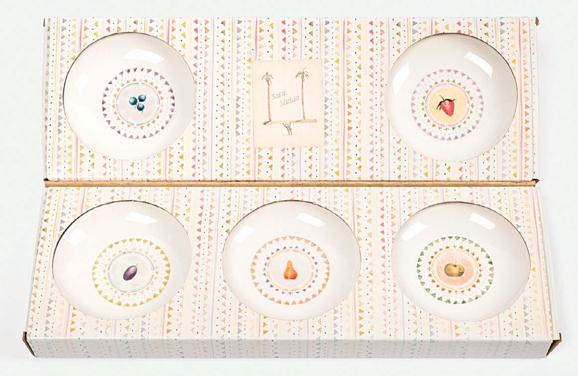
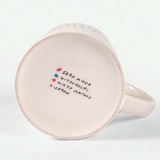
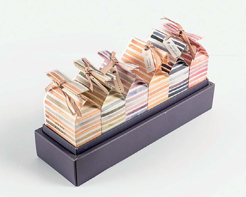
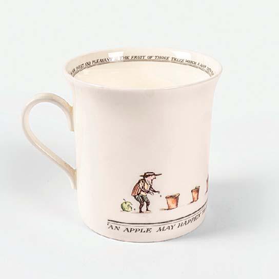
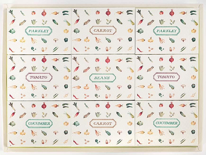
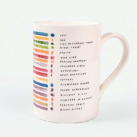
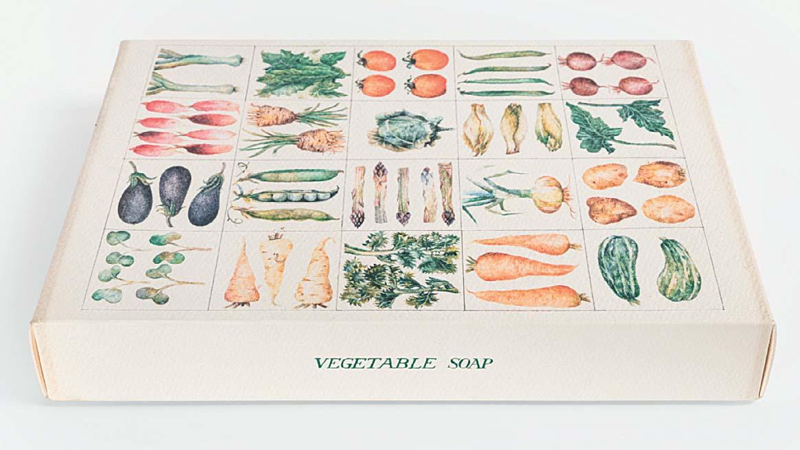
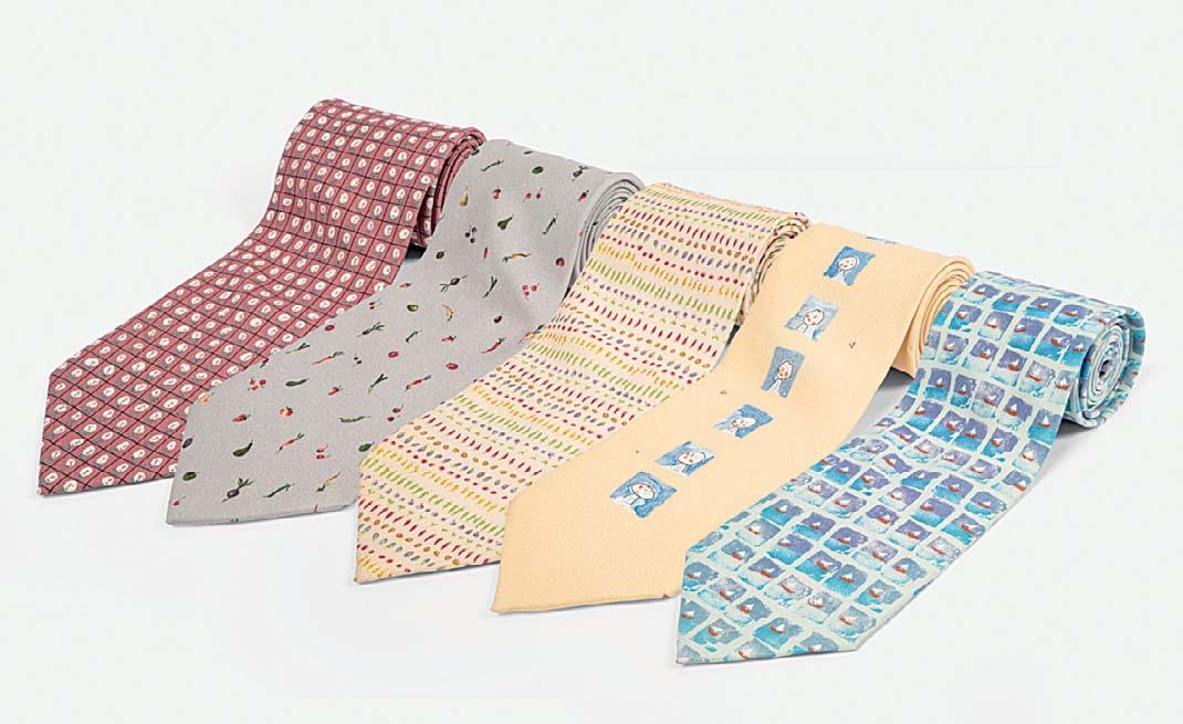
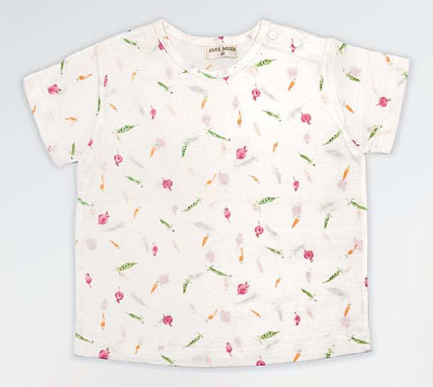
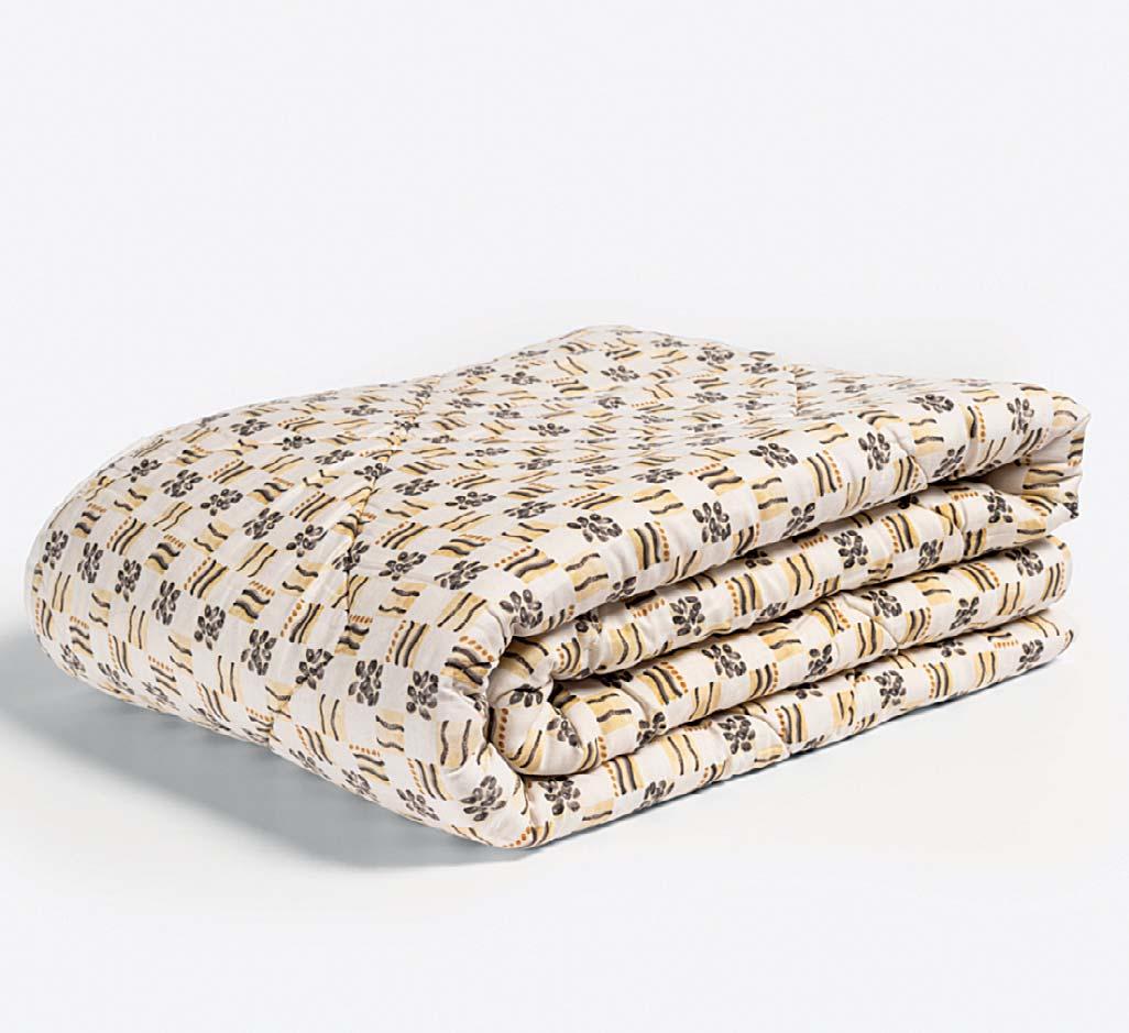
Sara Midda’s 20-year collaboration with Mitsukoshi, Japan’s rst department store resulted in a variety of products. The collection was sold exclusively in Japan and showcases Sara’s illustration across a range of materials.
Art Director Toru Ando rst approached Sara after discovering her debut, In and Out of the Garden: ‘I adored the energy and skill in her work. She uses watercolours with great delicacy and produces work of exquisite detail.’ This translated beautifully onto ceramics, fabrics, bath products and babywear, and earned Sara her international reputation in the early 1990s.
TheproductsfeaturedaresamplesfromSara’s personalcollection,andarenotforsale.
