CHLOE CLAYBOUR
INTERIOR DESIGN PORTFOLIO
CC
01 Institutional Studio Project Workplace Studio Project Healthcare Studio Project 02 03 04 Retail Studio Project 05 Hospitality Studio Project 06 Residential Studio Project
TABLE OF CONTENTS
hello!
My name is Chloe Claybour and I am a Senior Interior Design student at Arizona State University. I believe that my love for design is something that I was born with. For as long as I can remember, I’ve had a fascination with the way that a space can make you feel. User experience and holistic design are two concepts that I value very deeply and I hope that my designs can provide happiness and comfortability.
This portfolio contains major projects done throughout my design studies, including work in numerous sectors of design. Thank you for taking time to review my work!
01
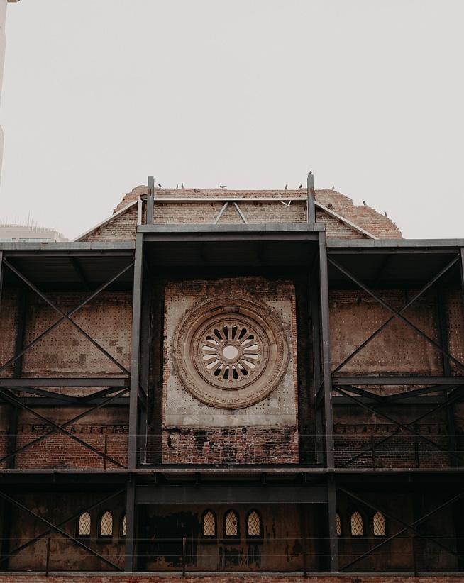
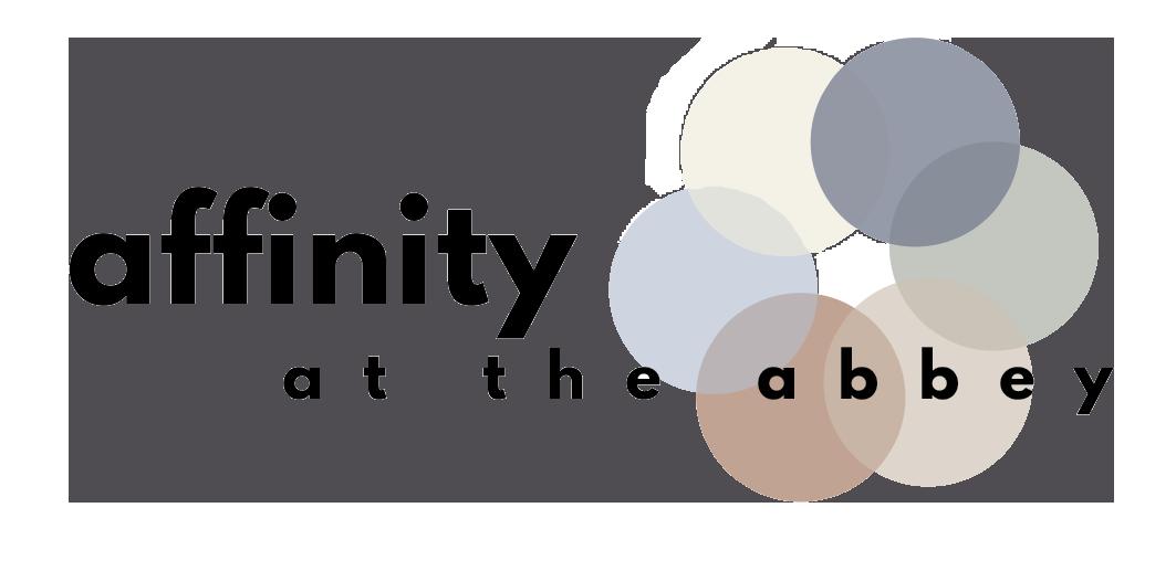
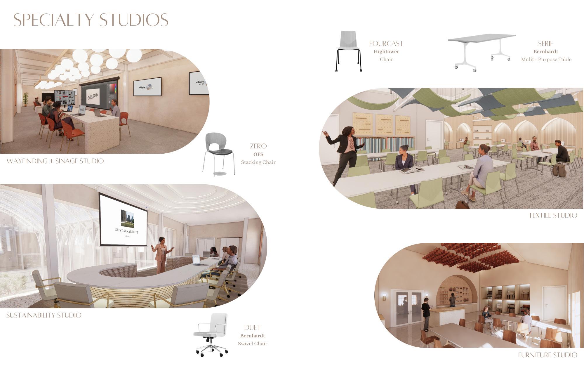
affinity at the abbey spring 2024
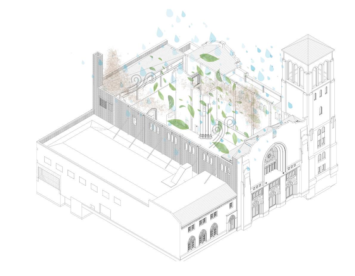
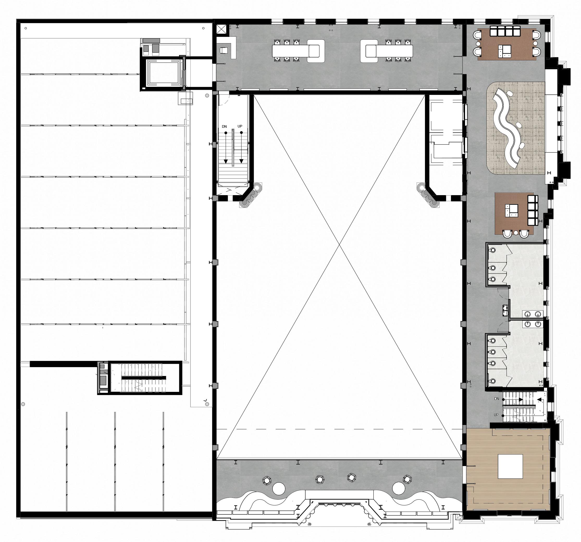
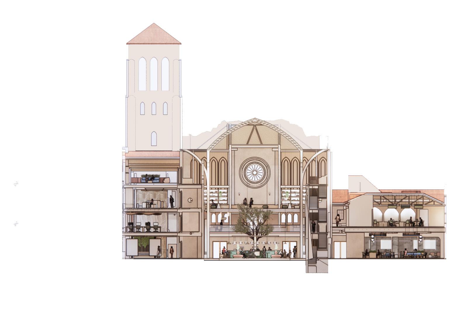
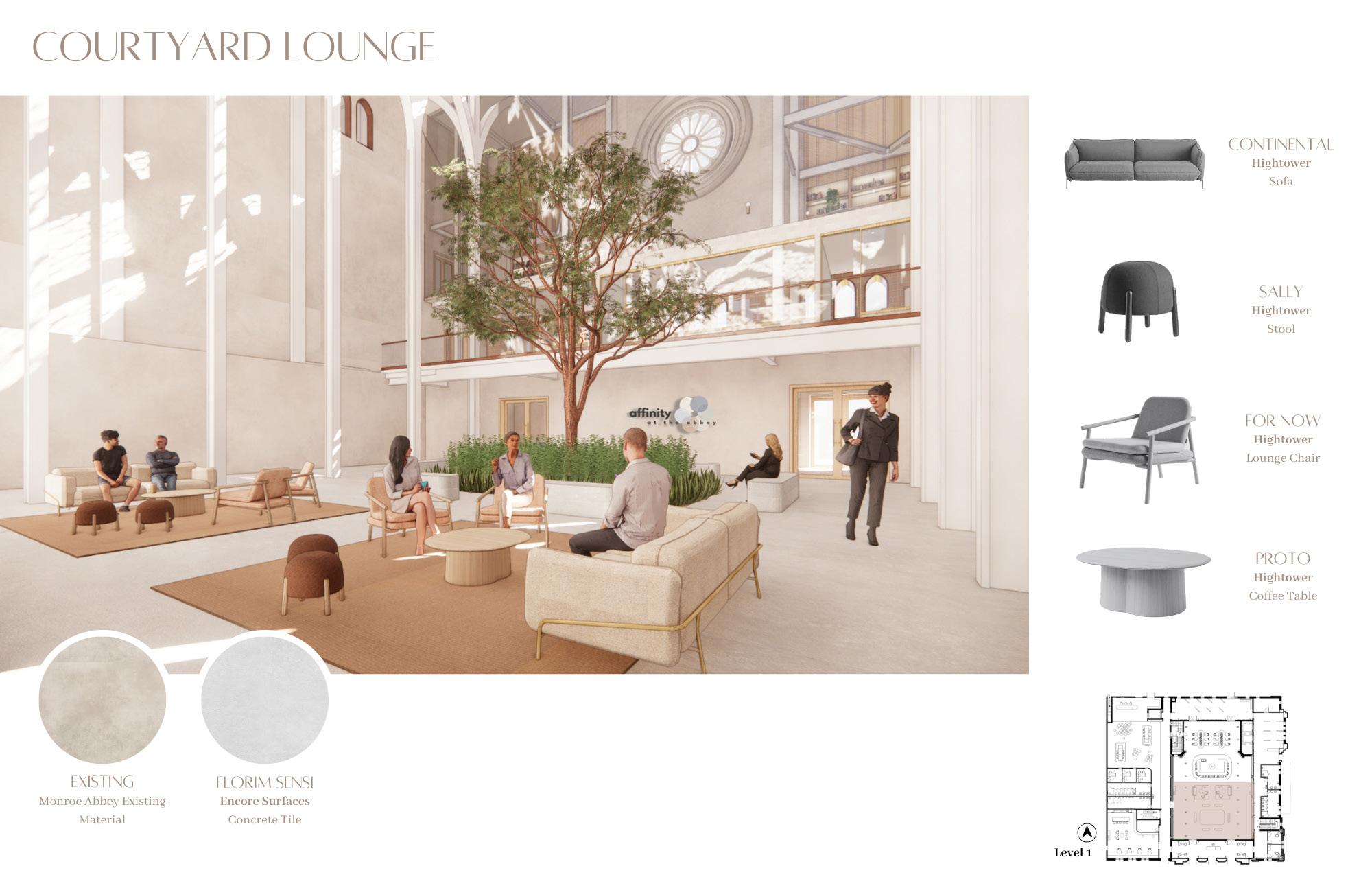
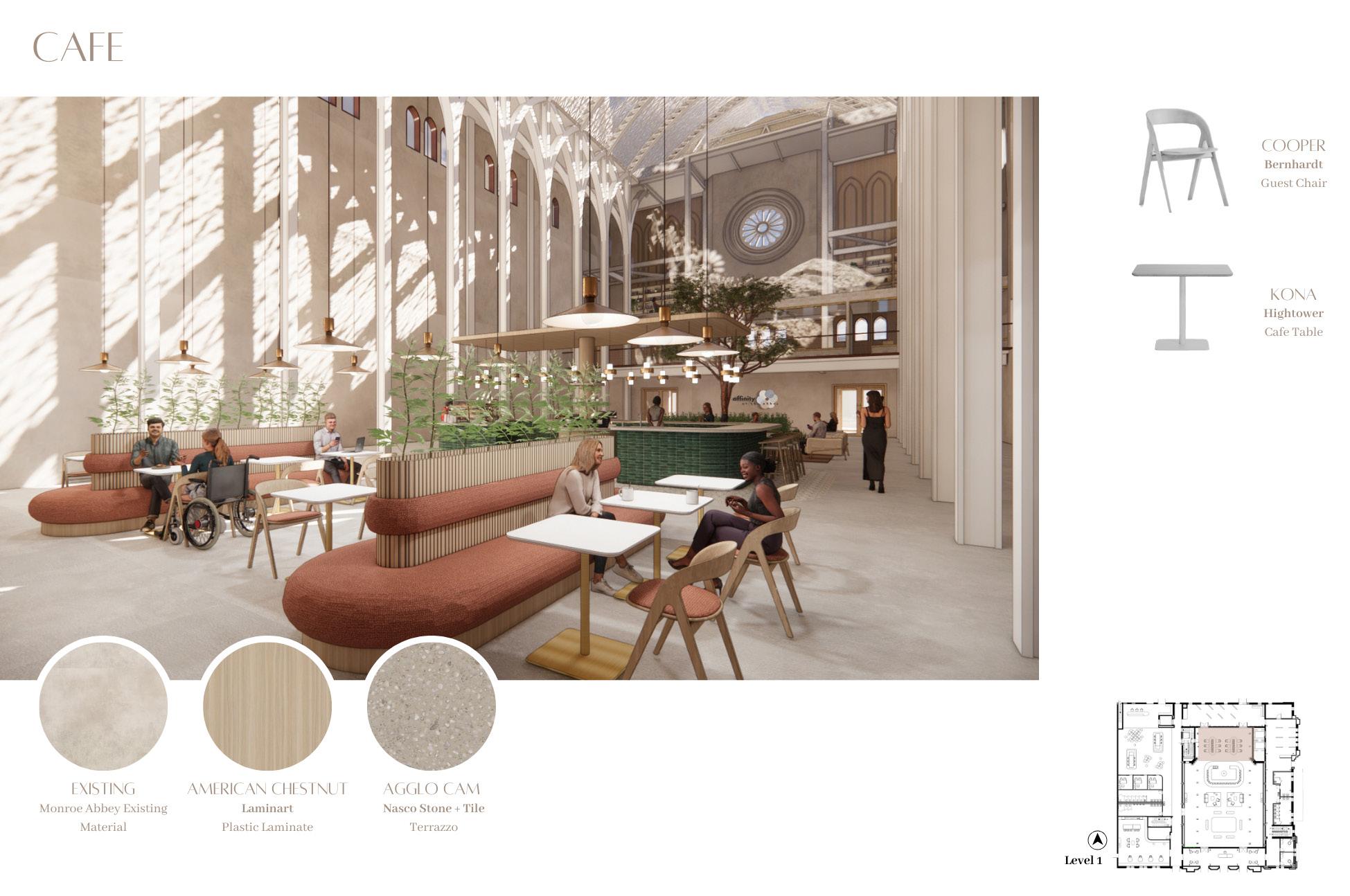
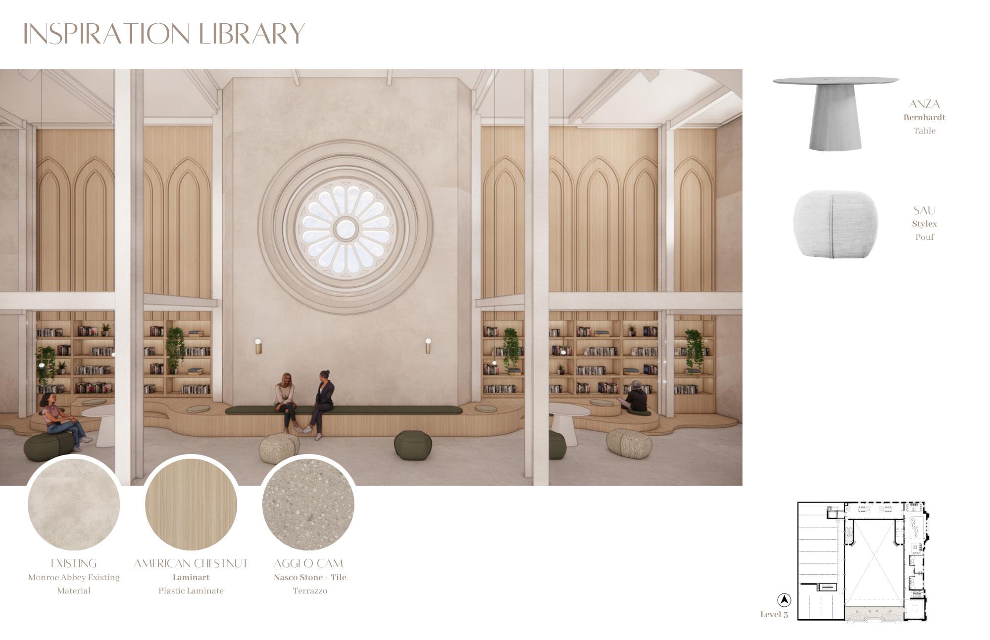
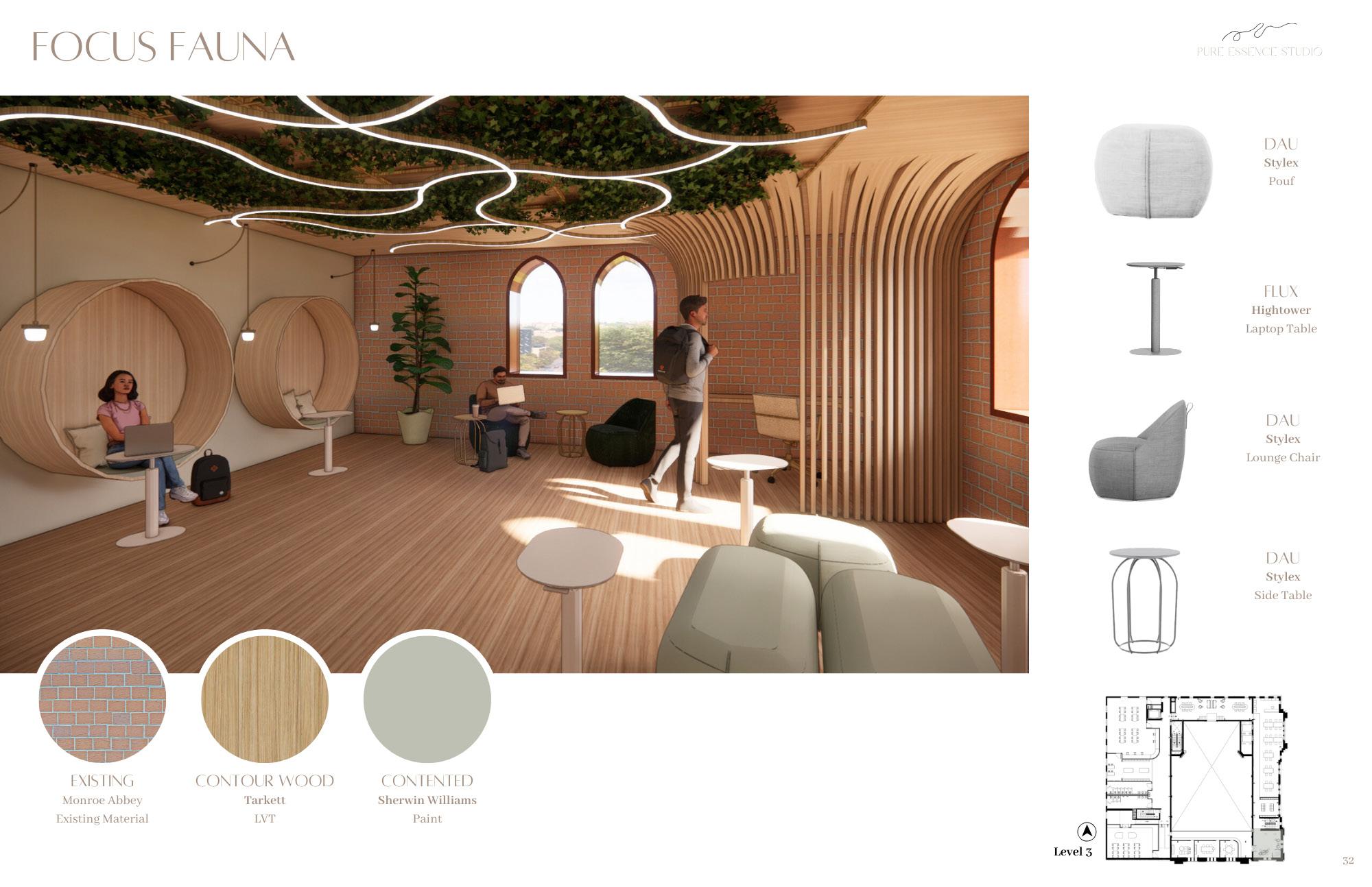
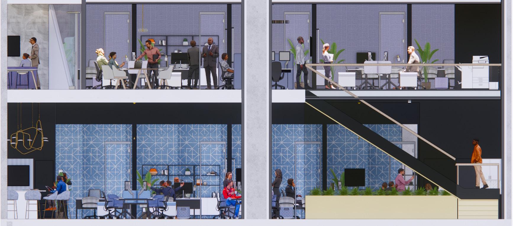
aboutMy final studio course focused on institutional design; and more specifically historic preservation. Our site was the Monroe Street Abbey in Phoenix, Arizona and our client was Arizona State University. The goal of the overall project was to create an extension of the Tempe campus for design disciplines to collaborate and connect with the community.
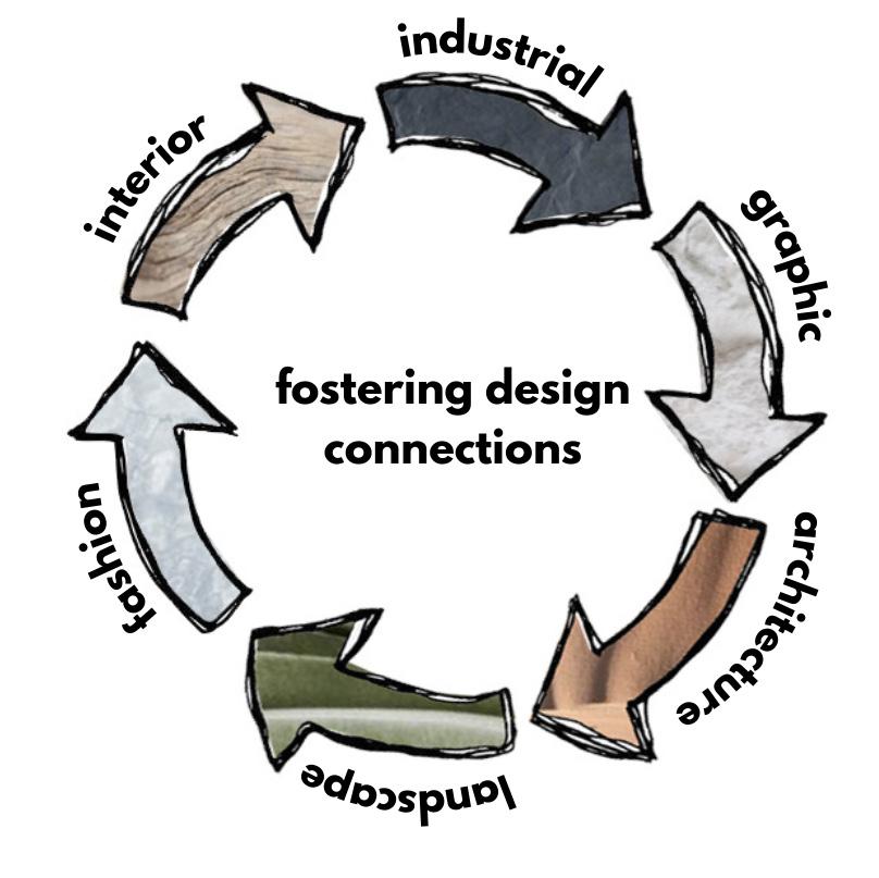
Interdisciplinary design creates for many design opportunities and key connections. The program includes unique specialty studios where multiple disciplines can collaborate and bring their own background to a project. We also included support spaces and resources such as a mentorship lounge, gallery, inspiration library, focus fauna, and more.
My team and I chose to use a doll house approach when working with this historic building. We kept the entire building shell intact, cleaned up existing finishes, and inserted new interior walls, flooring, and furniture.
institutional studio project group project with carissa carney + jordan korb
skills used:
• Revit
• SketchUp
• Enscape
• Photoshop
concept + branding
ecosystem of connectivity
Within an ecosystem there is a harmonization of elements and organisms that work together to create a thriving environment. Our team was inspired by connectivity in the ecosystem and view each design discipline as a piece of the puzzle that makes design thrive. This is similar to how each element and organism of the ecosystem help each other thrive. The Abbey has always been an ecosystem of connectivity not only for the member of the church to connect but also in developing a strong community connection
Why affinity?
Definition: “Affinity refers to a similarity of characteristics that suggests a relationship, particularly a resemblance in structure observed between animals, plants, or languages. It implies an inherent connection or natural attraction based on shared qualities or traits.”
As our concept heavily relies on the idea of diverse connections and its role in nature, the word affinity embodies both of these things. My team wanted to create a name that ties back to the importance of collaboration between people whether its the design diciplines with each other, faculty members, or the community.
roof design
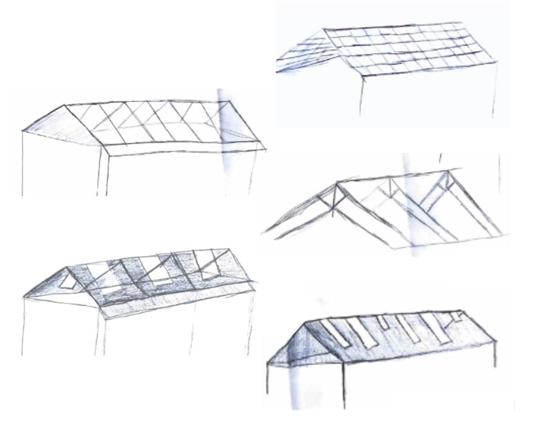
Pitched shape to remember the shape of the orignial roof
the story
As a proposed “betterment,” my team decided to design a new roof for the Abbey as the original roof was destroyed in a fire. The Monroe Abbey’s courtyard has been exposed to nature for 40 years since fire set inside the church in 1940. This exposure has led to the natural elements infiltrating the building. The infiltration of nature through the exposed courtyard has been important part of The Abbey’s story throughout history. We intend to celebrate nature throughout patterns and textures in our roof.
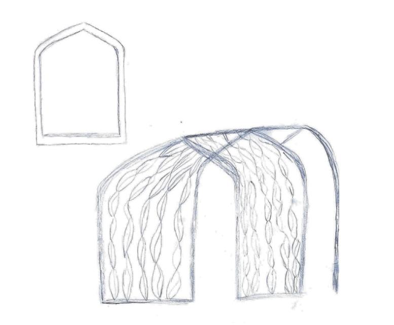
Slight Curve to honor the iconic window shape + leaf pattern to bring the element of nature back in
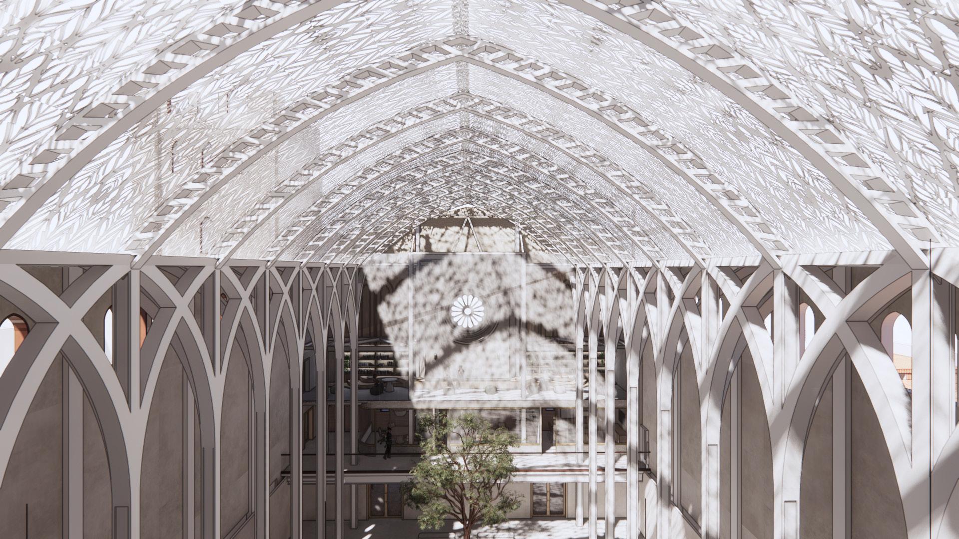
final roof design
SPACE PLANNING
SPACE TYPES + BLOCKING DIAGRAMS
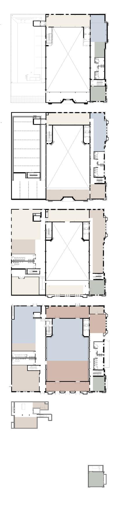
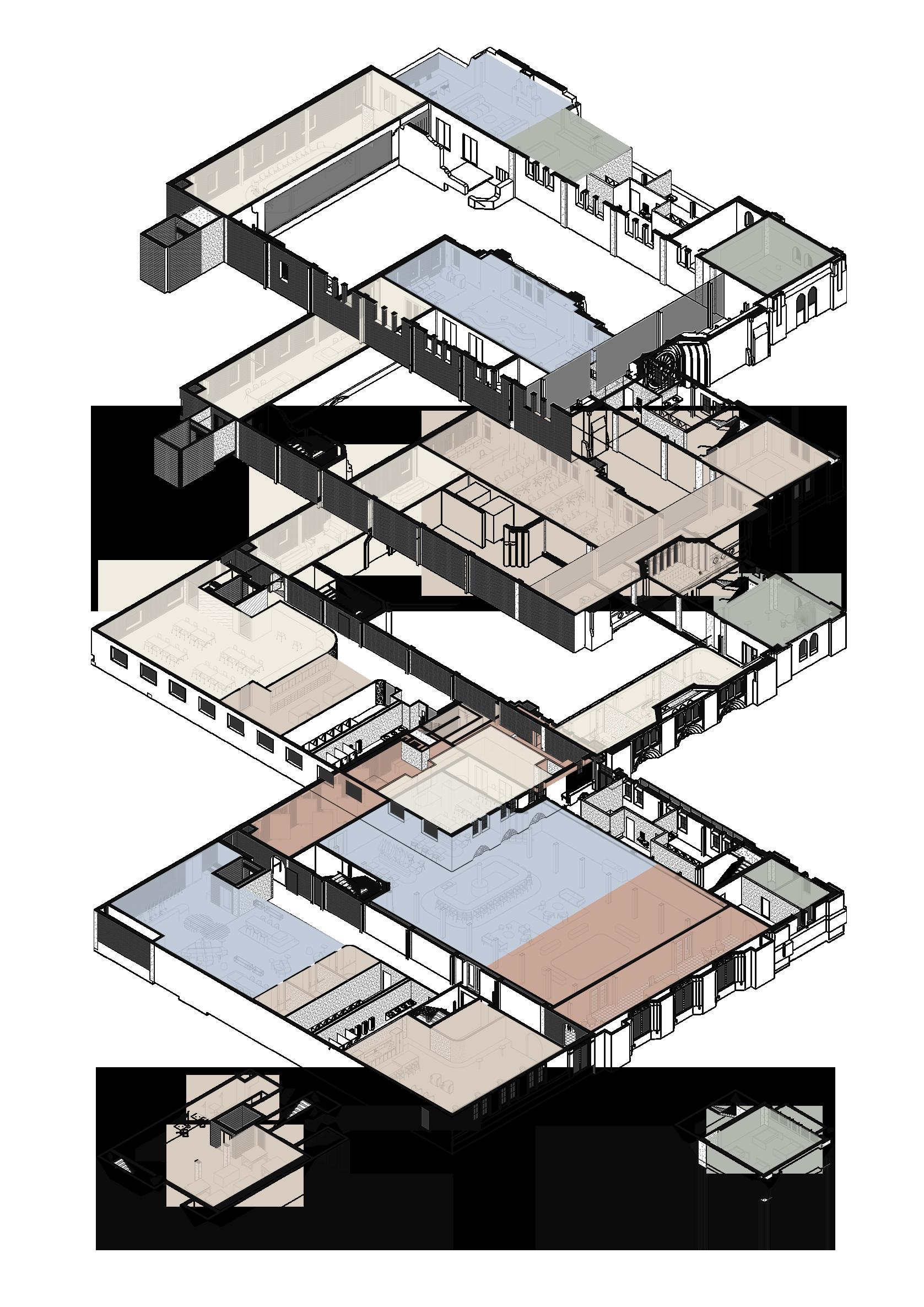
STACKING DIAGRAM
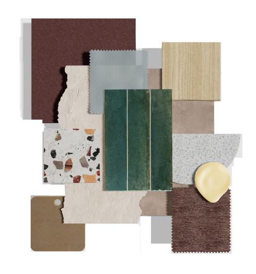
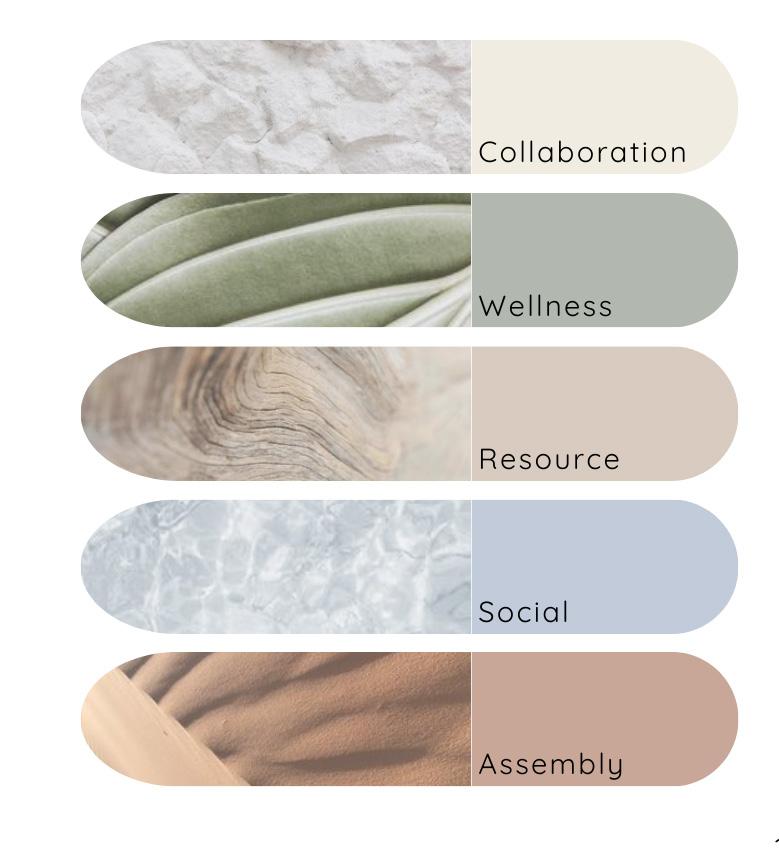
branded material palette
asu materials
As a team we wanted to curate a palette that alludes to the ASU signature maroon and gold without it being too literal. We used colors in the terracotta family to represent maroon and pulled warmer wood tones and brass to represent the gold.
design school materials
Representing the design school is the complementary materials within the palette. Creativity and color runs strong through the design school and we wanted to represent this through pops of color throughout.
1 2 3
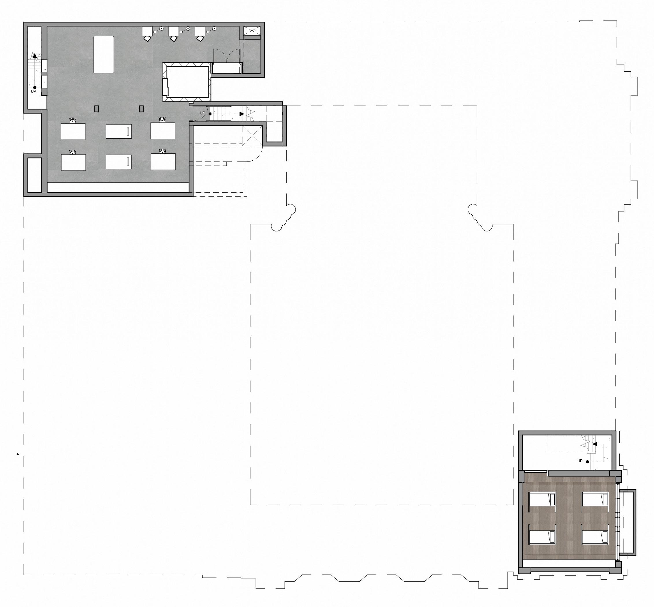
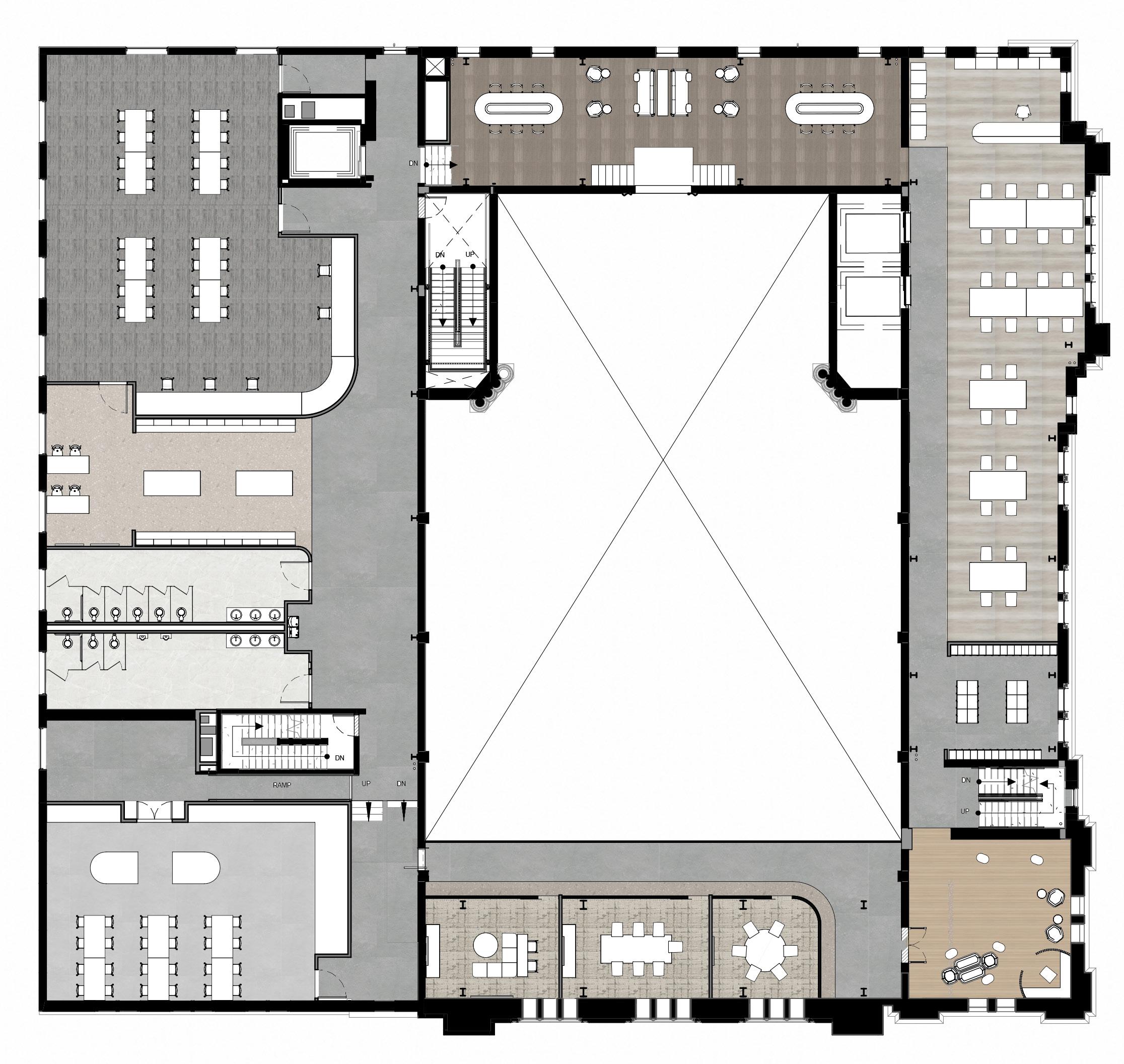
basement floor plan first floor plan second floor plan
1. Photography Studio
2. Model Shop
3. Hibernation Pods 4. Lobby
5. Break Room
8.
9.
10.
11.
12.
13.
14.
15.
4 5 6 7 8 9 10 11 12 13 14 15 16. Huddle Room 17. Furniture Studio 18. Restrooms 19. Material Library 20. Textile Studio 21. Open Collaboration 22. Print Center 23. Computer Lab 24. Lockers 25. Focus Fauna 16 17 18 19 20 21 22 23 24 25
6. Restrooms 7. Staff Offices
Mentorship Lounge
Gallery
Storage
Gallery
Restrooms
Mother’s / Wellness
Courtyard
Cafe
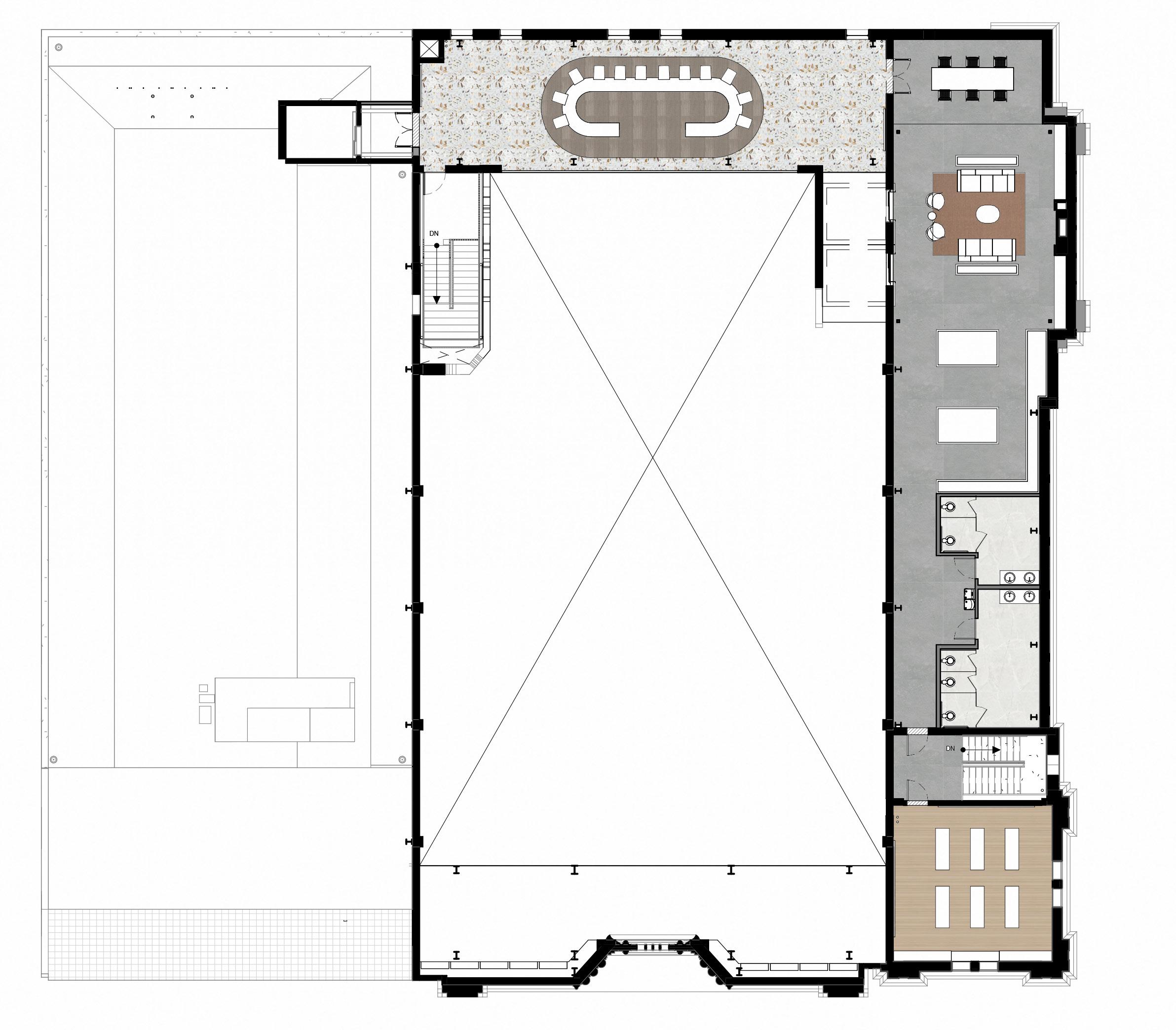
third floor plan fourth floor plan
26. Inspiration Library 27. Hall of Fame 28. Restrooms 29. Lounge 30. Wayfinding / Signage Studio 26 27 28 29 30 31. Mediation Oasis 32. Restrooms 33. Garden 34. Patio Lounge 35. Sustainability Studio 35 key
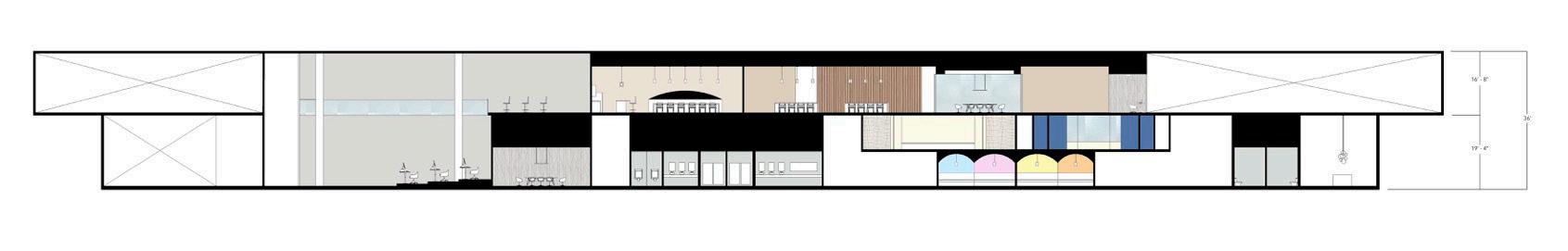
section
steelcase next student competition
fall 2023
about
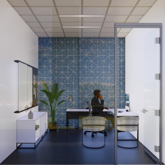
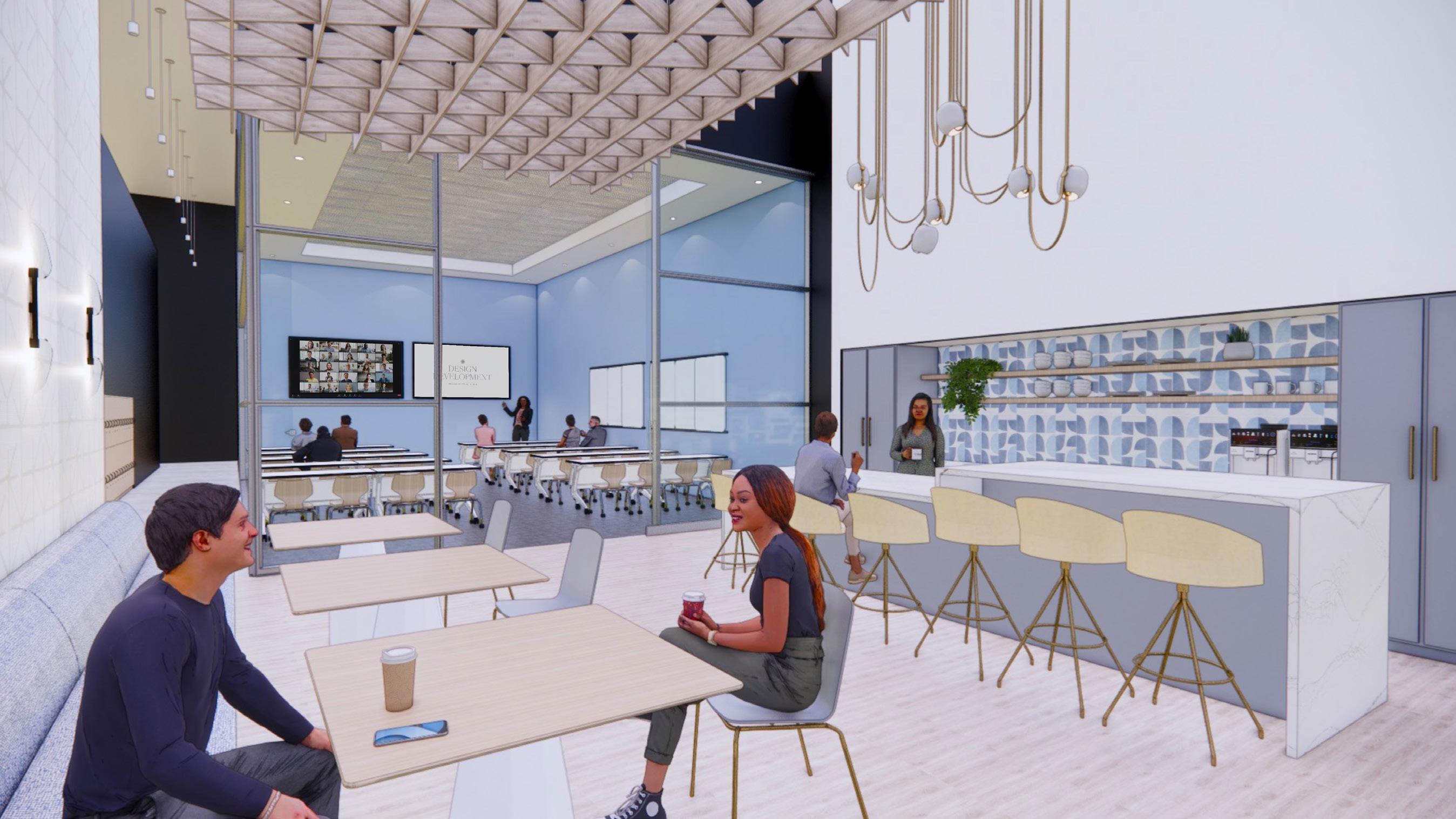
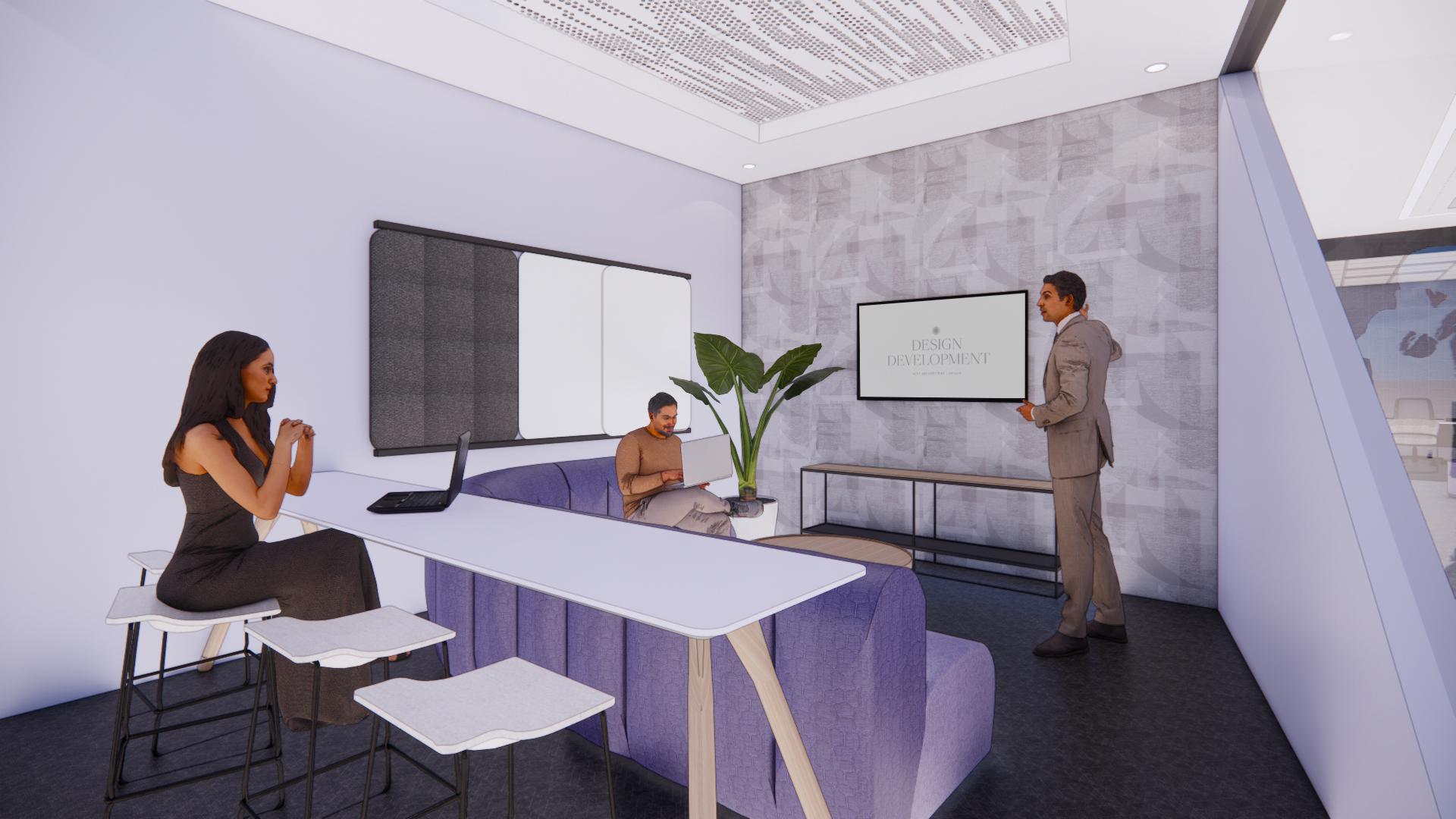
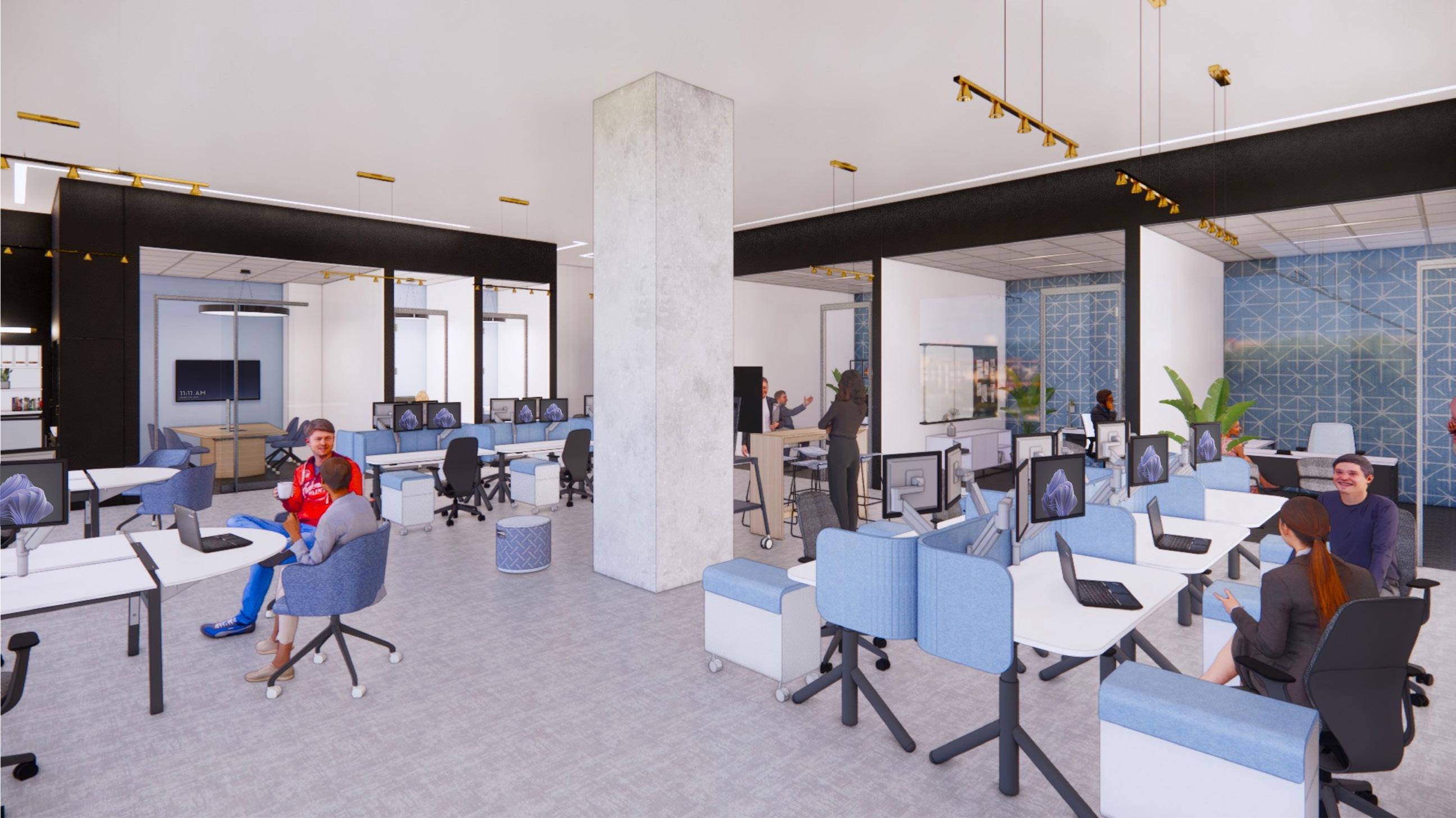
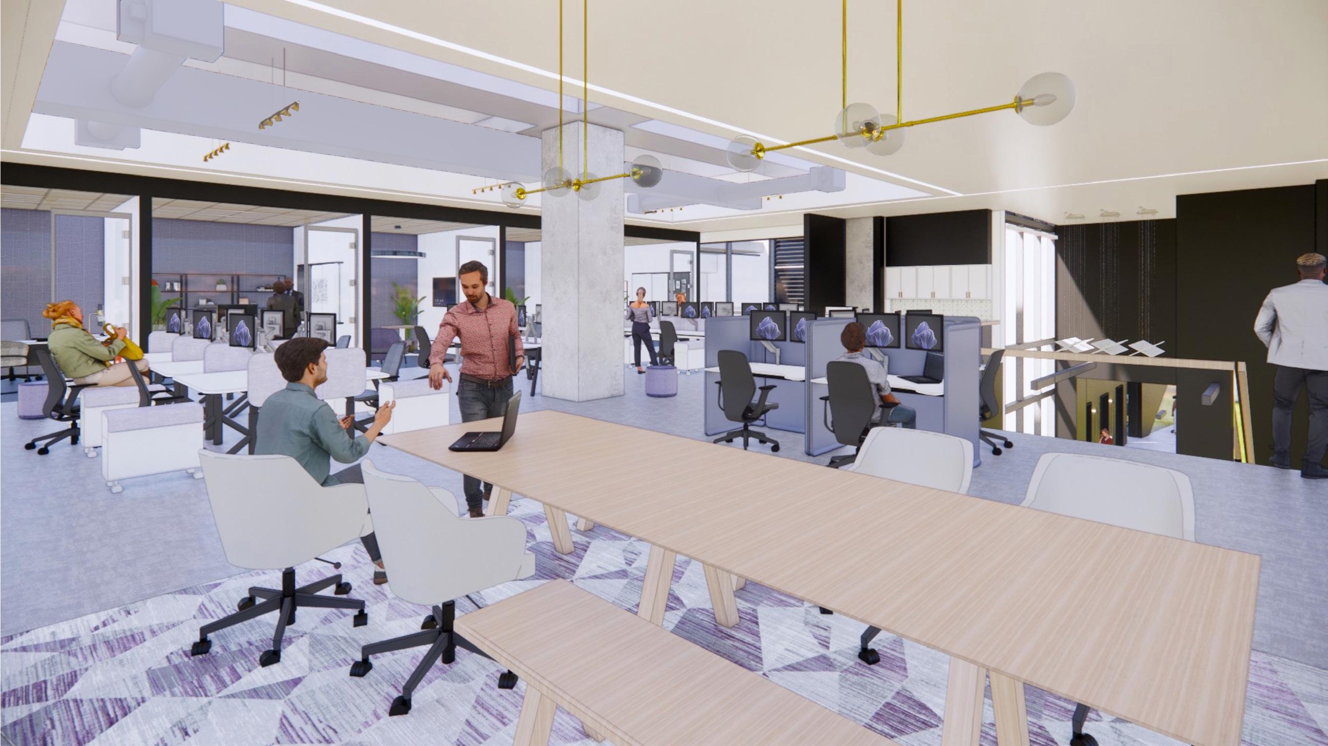
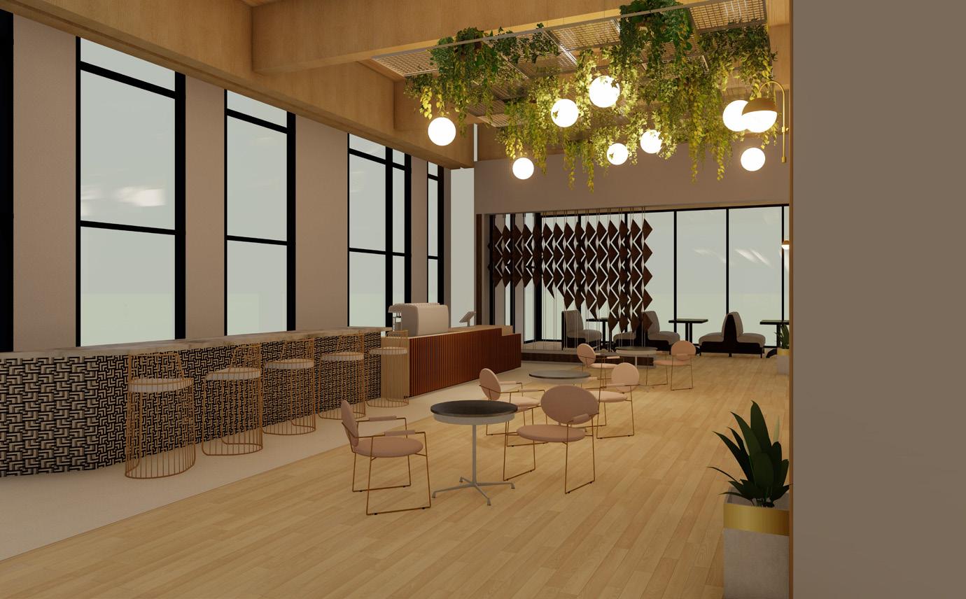
workplace studio project
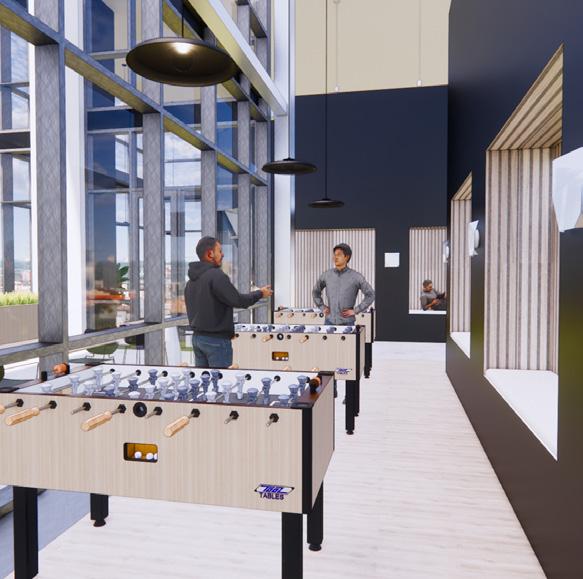
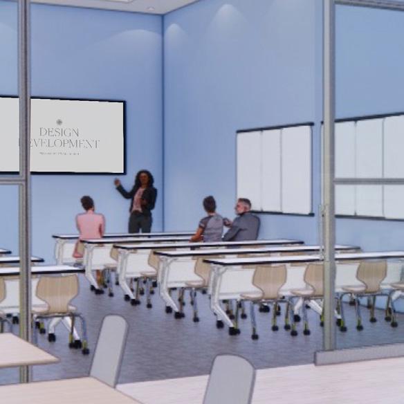
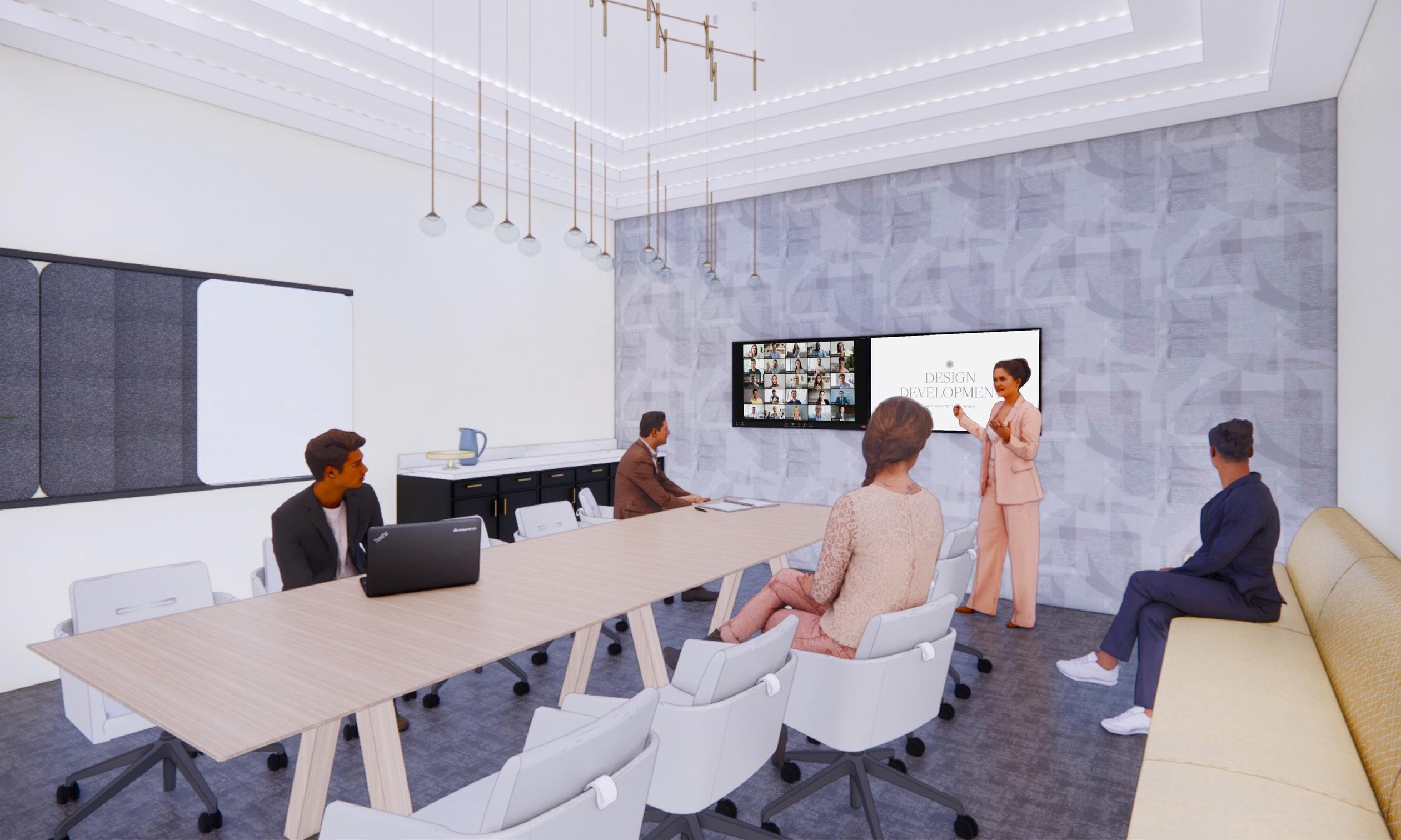
During my senior year workplace studio, my classmates and I were given the opportunity to compete in the annual Steelcase NEXT Student Design Competition. As an interior design program, Arizona State was only allowed to submit 8 projects to Steelcase, and I was one of the students chosen by my professors to represent ASU. Not only was this a great accomplishment for me, but it was also a project that I ended up being very proud of because of the thoughtful concept-driven design decisions made throughout.
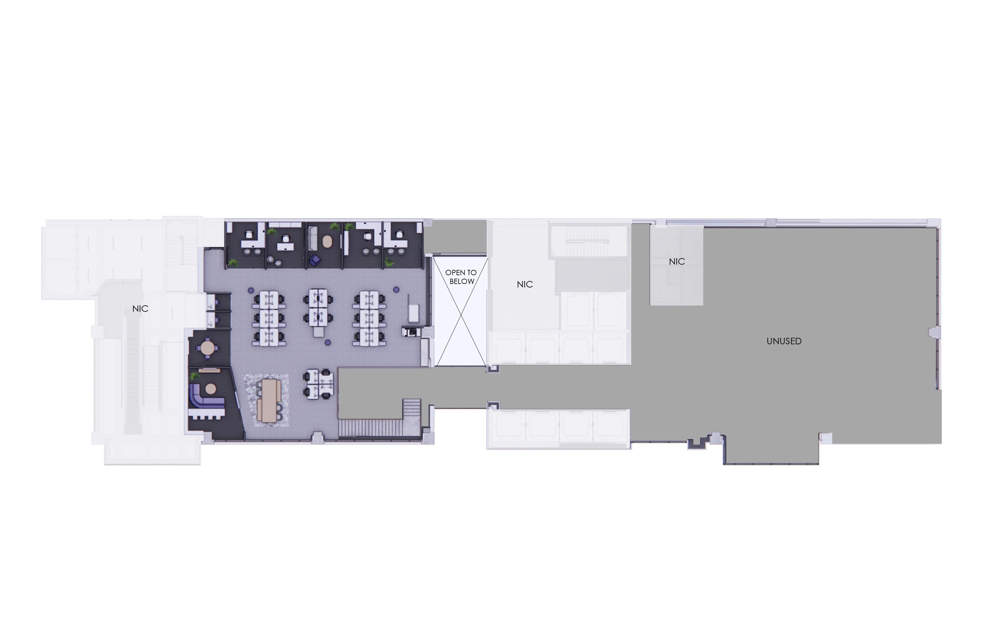
Steelcase provided the client, program, and site for this competition. The client is a fictitious architecture and design firm, called NEXT, that is based in Los Angeles, California. With 27 locations and 3,000 employees, NEXT is future-focused and is looking to open a satellite office in Dallas, Texas. The suite is located in the Victory Commons One building on the third floor which has 30 foot ceilings. To make use of the double height, students were also required to add an ADA compliant mezzanine level with a maximum of 3,666 square feet. The provided floor plan is a dumbbell shape with the building’s existing elevators in the center. Because of this, I decided to separate the private, work side from the more public, client-facing side. The public side has views of the iconic American Airlines Center.
skills used:
• Revit
• Enscape
• Photoshop
Focus rejuvenation collaboration social learning
02
conceptual design
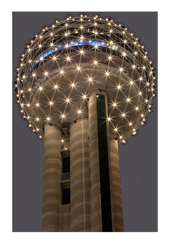
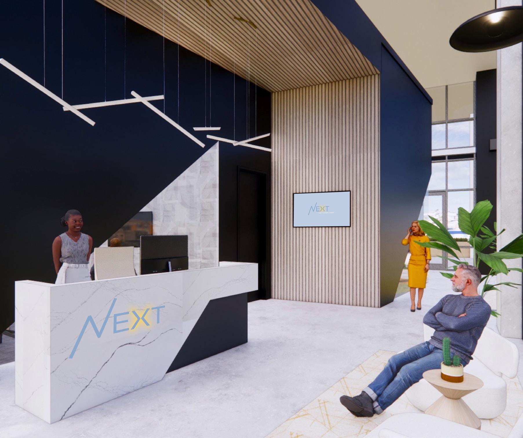
I started my design with a long, yet rewarding, process of developing a strong concept. As the site is located in Dallas, I wanted to create a space that reflects something special to the city. After researching Dallas and studying the client, I came up with a concept that I loved: Reunion Tower. Reunion Tower is one of the most iconic buildings in the Dallas skyline. Standing 561 feet tall, Reunion Tower can be seen from over 15 miles away from its point. The Tower features an observation deck providing 360 degree panoramic views of Dallas. Three words that symbolize both NEXT and Reunion Tower are unity, celebration, and forward thinking. These three words helped me make design decisions and curate a space that reflects the company. From the materials and color palette to symbolism through forms such as diagonal walls and special lighting, I made sure that everything in the space had a purpose and reasoning behind it.
reunion tower
floor plan - level 3


2.
3.
4.
5.
6.
7.
8.
9.
10.
1. Elevator Lobby
Reception
Meeting Room
Storage
Client Presentation Room
Lockers
Phone Pod
Patio
Game Room
Mother’s Room
11.
12.
13.
14.
15.
16.
17.
18.
19.
20.
Wellness Room
Work Cafe
Training Classroom
Monumental Stair
Open Collaboration
Resource Center
Huddle Room
Lift
Innovation Lab
Model Shop
Private Offices
Work Cafe & Training Classroom
Client Presentation Room

 1. Monumental Stair
2. Open Collaboration
3. Meeting Room
4. Huddle Room
5. Phone Rooms
6. Private Offices
7. Huddle Room
8. Private Offices 9. Open Office
1. Monumental Stair
2. Open Collaboration
3. Meeting Room
4. Huddle Room
5. Phone Rooms
6. Private Offices
7. Huddle Room
8. Private Offices 9. Open Office
10. Lift 11. Resource Center
floor plan - mezzanine
Meeting Room
Mezzanine Open Office
client-facing spaces
ARCHITECTURE + DESIGN
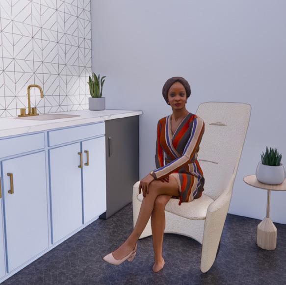
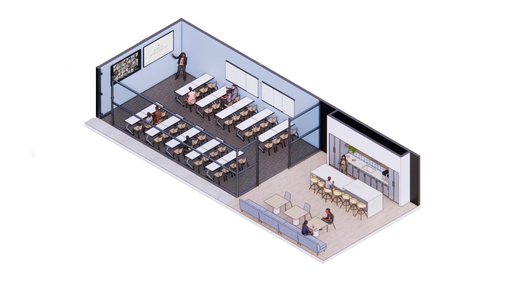
work cafe
Large break room for employees to recharge during the work day or meet casually with a client. Adjacent to this space is the training classroom, which seats 40 people comfortably and opens up to the work cafe, serving as additional seating for larger gatherings.
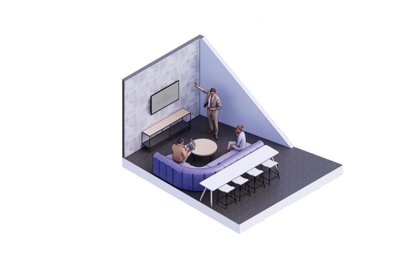
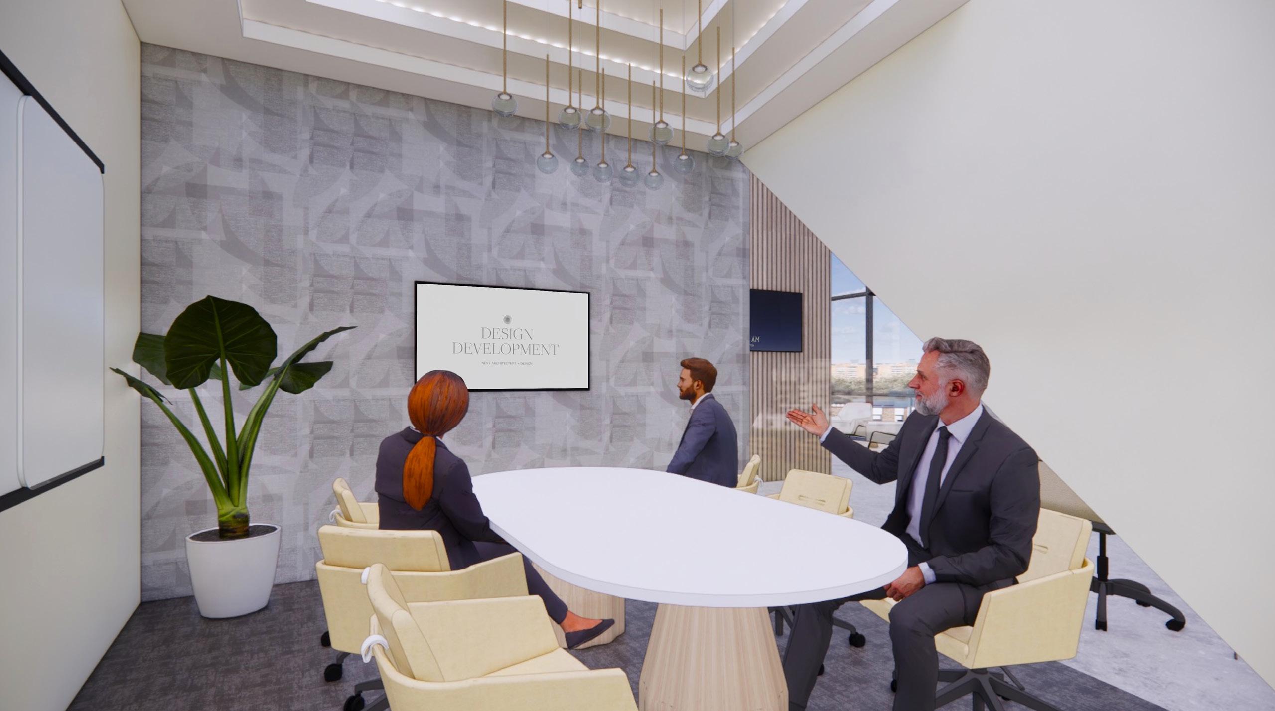
celebration of connection
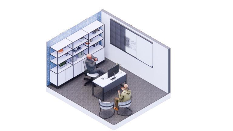
Medium sized meeting room adjacent to reception that seats up to six people. Pops of yellow and tray ceiling detail with cove lighting ymbolize the celebration of people coming together.

Reflected ceiling plan - level 3


 1. Armstrong Acoustic Gypsum Board
3. Arktura Vapor Trail Paneling
1. Armstrong Acoustic Gypsum Board
3. Arktura Vapor Trail Paneling
1 2 1 3
2. Armstrong 2x2 Acoustic Ceiling Tile
unity
Meeting room found on the mezzanine for easy access for employees. Purple accents symbolize NEXT’s value of unity and togetherness. The ceiling features a ceiling panel that provides both lighting and acoustic solutions.
Reflected ceiling plan - mezzanine

 1. Armstrong Acoustic Gypsum Board
3. Arktura Vapor Trail Paneling
2. Armstrong 2x2 Acoustic Ceiling Tile
4. Painted Exposed Ceiling
1. Armstrong Acoustic Gypsum Board
3. Arktura Vapor Trail Paneling
2. Armstrong 2x2 Acoustic Ceiling Tile
4. Painted Exposed Ceiling
1 2 3 4 1 5
5. Arktura Trella Panels
open
 office - level 3
open office - mezzanine
office - level 3
open office - mezzanine
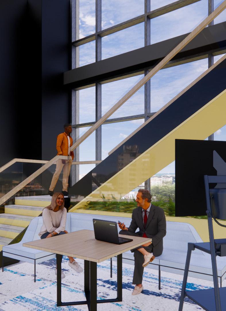
monumental stair
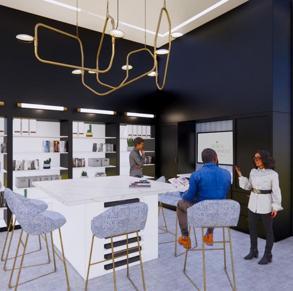
The NEXT Dallas office features a monumental staircase connecting the third level and the mezzanine. This custom stair has modern glass panels, sleek wood railings, and a planter. The use of yellow underneath the stair and on the planter symbolizes the celebration of the connection between floors.
Directly adjacent to the staircase is an open collaboration space, featuring Steelcase soft seating, wood table, and a portable monitor for presentation purposes. This space also serves as a buffer between the focus space and the public elevators.


Unity Celebration Foward Thinking
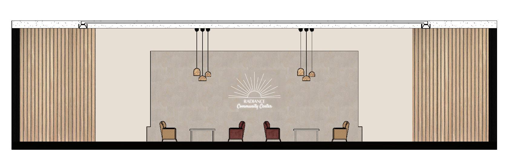
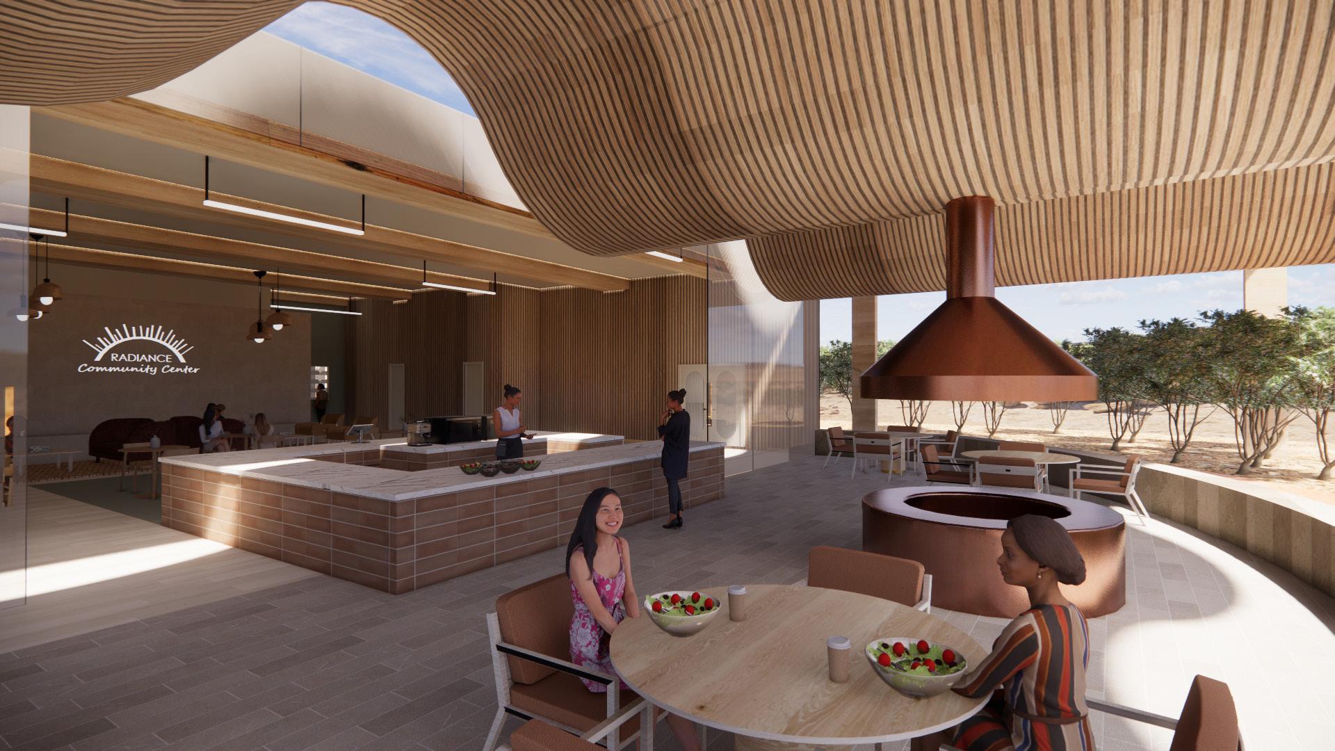
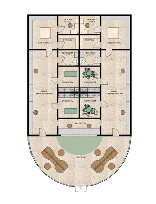
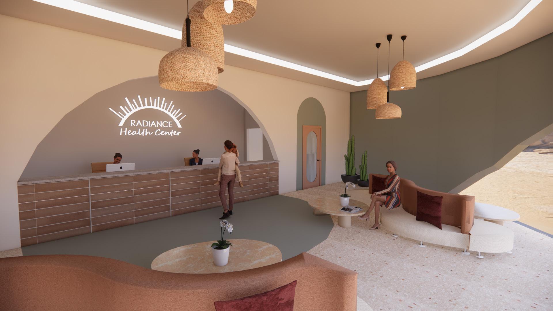
radiance women’s shelter
spring 2023
aboutMy third year Spring studio course was definitely one that taught me about many different areas of design including industrial design, architecture, landscape architecture, and of course, interior design. During this semester, our goal was to design a living community and transitional housing shelter for a specific demographic within the homeless community. As a team of three, my colleagues and I chose to design a safe haven for women and children who have experienced and fled from domestic violence.
My personal responsibilities within the team consisted of the space planning and drawing of all floor plans, designing the ramps to work with the topography, drawing and rendering sections and elevations, 3D modeling the living pods, medical center, and site, and rendering all major spaces.
healthcare studio project group project with carissa Carney + Jordan korb
skills used:
• Revit
• SketchUp
• Enscape
• Photoshop
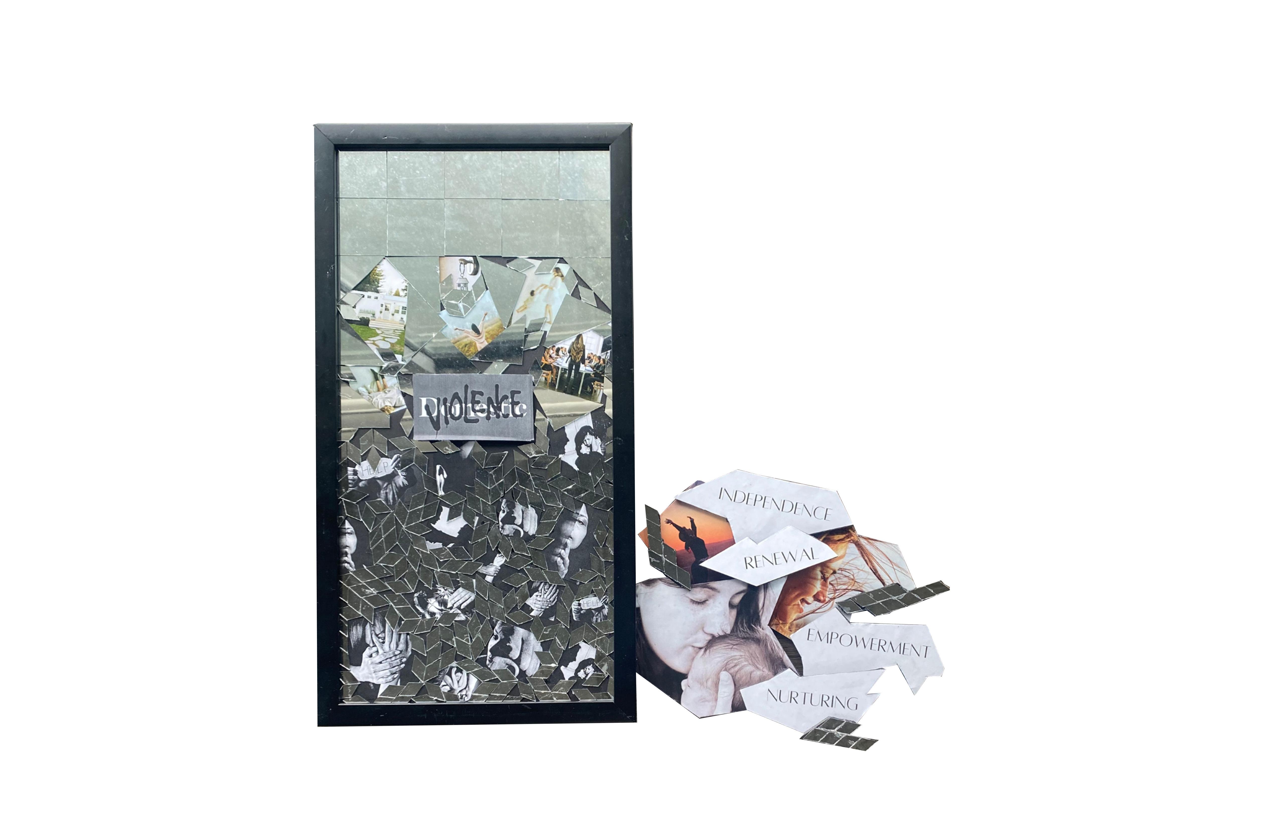
collage narrative
The collage above depicts a broken mirror. The mirror represents reflection and the feeling of beauty. When a woman goes through an experience like domestic violence, their sense of beauty and femininity can be lost. Our design strives to help rebuild and empower these women so they can get back out into the world and thrive.
03
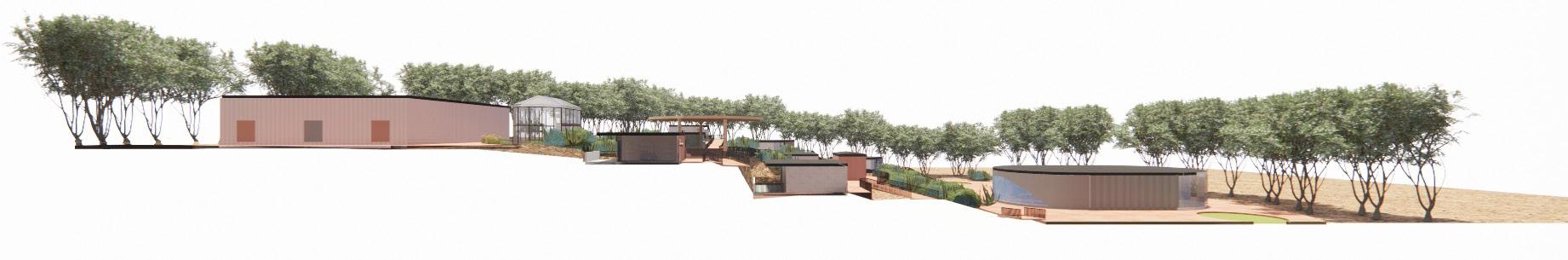
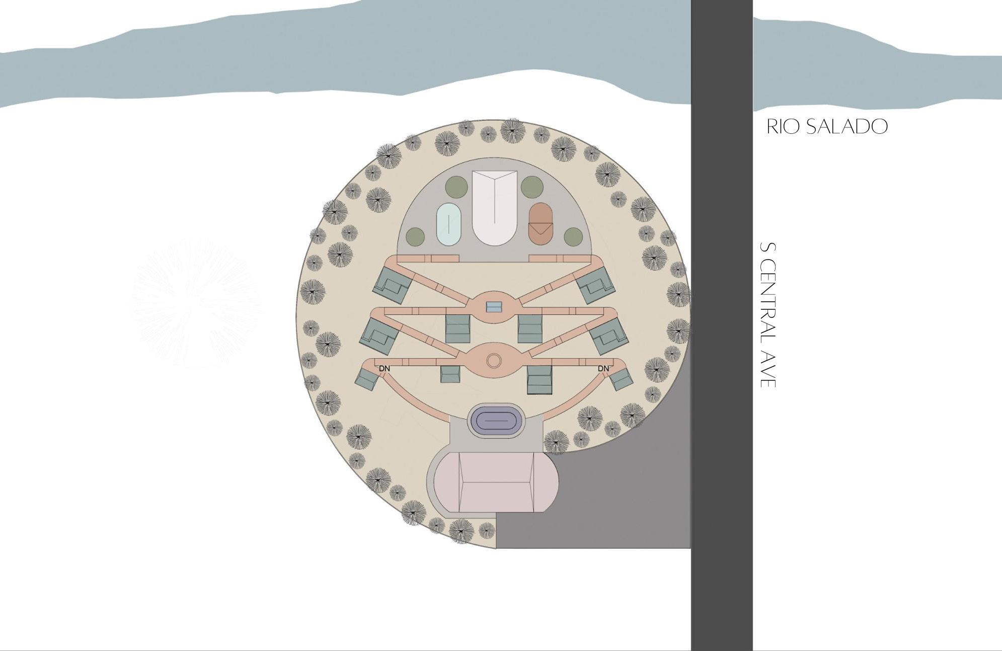
the site
The class was given a large piece of land spanning miles along the Salt River in Central Phoenix. My team and I chose a site located directly off Central Avenue on the south side of the river. We chose to place our community close to Central Avenue for ease of transportation and south of the river to be closer to the serene mountains. There is also a lightrail stop adjacent to our chosen site which provides convenience for those without a car. Since one of our goals is to help these women get back on their feet, this would provide a means of transportation to go to a job interview or other opportunities.
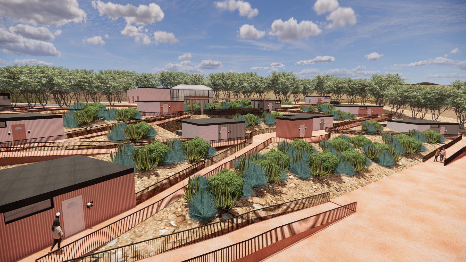
The land also features 25 foot sloped topography. Along this slope, we scattered the living pods with ramps in between each pod for accessibility.
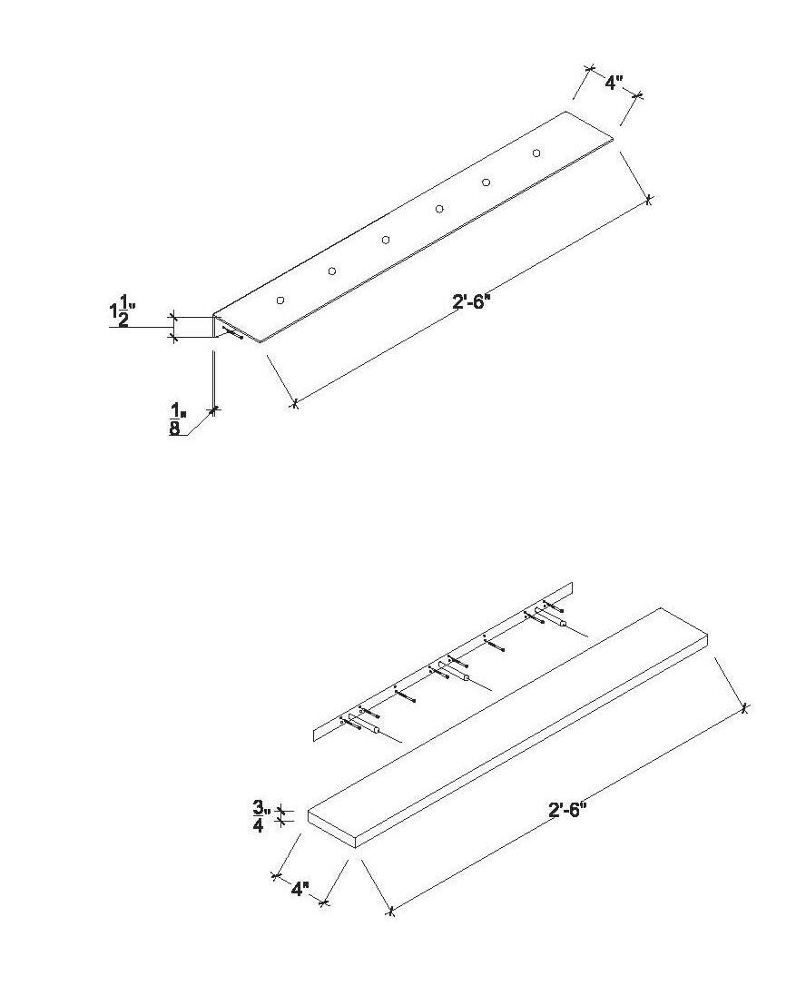
shipping container
living pods
The first half of the semester, teams focused on the design of the living pods for the homeless shelter. We were challenged to design these pods out of shipping containers. My team decided to create three options to accommodate the needs of our residents: single woman, women with young children, and a family sized unit which also doubles as an ADA unit.
For our final design, we used a combination of 8x20 ft. and 8x10 ft. containers as well as additional construction built out of 8x16 in. masonry units to house the primary wet wall.
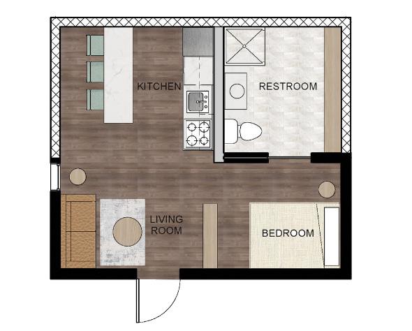
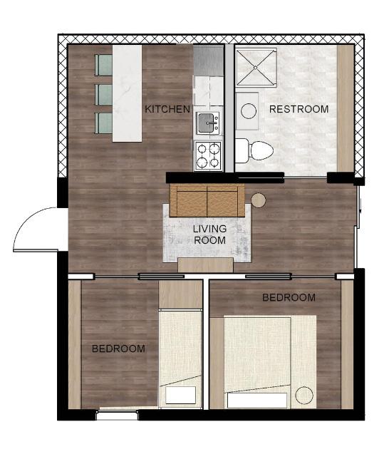
single woman pod woman + children pod family pod
living room
Each living pod has a spacious living room to make the resident feel at home. High windows and a large skylight bring in natural light while keeping the space private.
kitchen + dining
Residents are able to cook and dine in their own personal kitchen. Food is available at the communal pantry located in the community center for residents to cook with.
Bright, light finishes used in the bathrooms to open up the space and make the resident feel clean and enhance their beauty. There is extra counter space next to the sink and built in cabinetry added to maximize storage.
freshen up
children’s bedroom
This bedroom is located in the living pod designed for women with small children. The custom bunk bed has extra drawer space built into the steps and bed frame as well as shelving and a personal light.
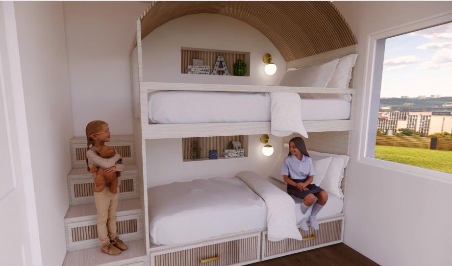
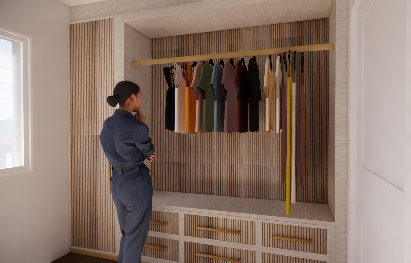
built-in closets
Each bedroom has a built in closet to maximize space and provide the resident with enough storage for their belongings. Radiance strives to make the resident feel at home throughout their time in the community.
A
Section A
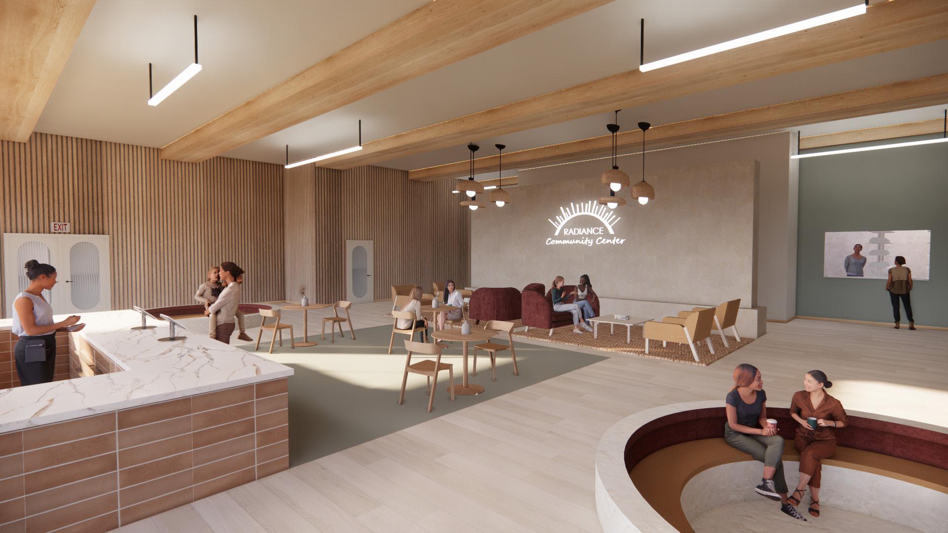
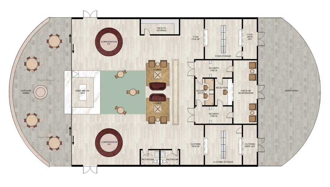
Central gathering space for all residents to socialize, grab a bite to eat, or pick up donated clothing or food from the pantry.
community center
and check
desk
both general and
medical center Waiting area
in
for
dental care
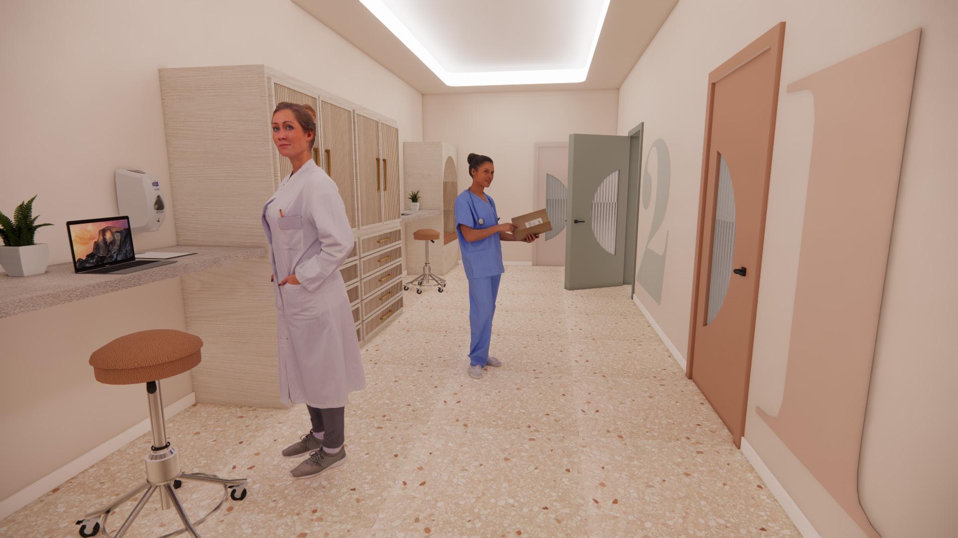
Nurse stations located in the hallway between exam rooms.
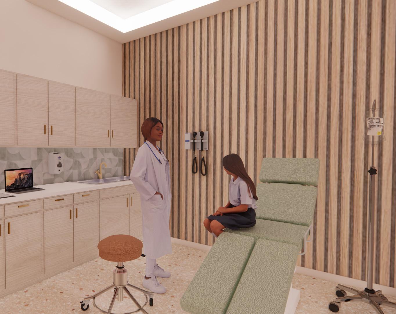
The program includes two exam rooms for primary care and two rooms for dental care.
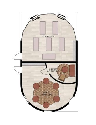
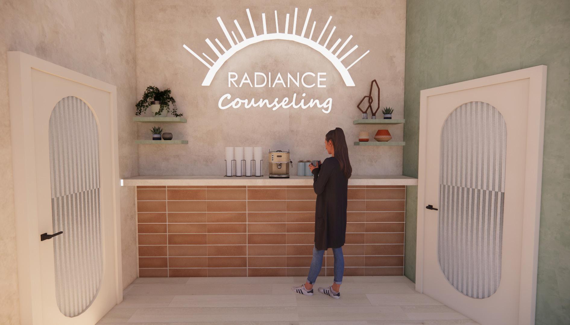
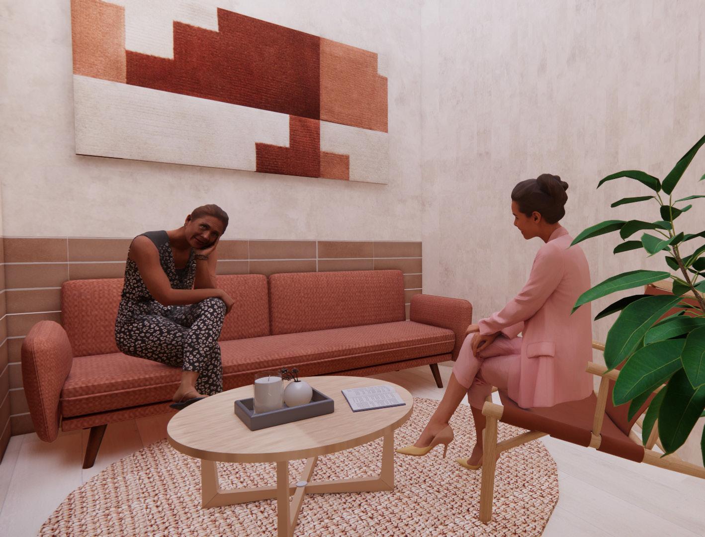
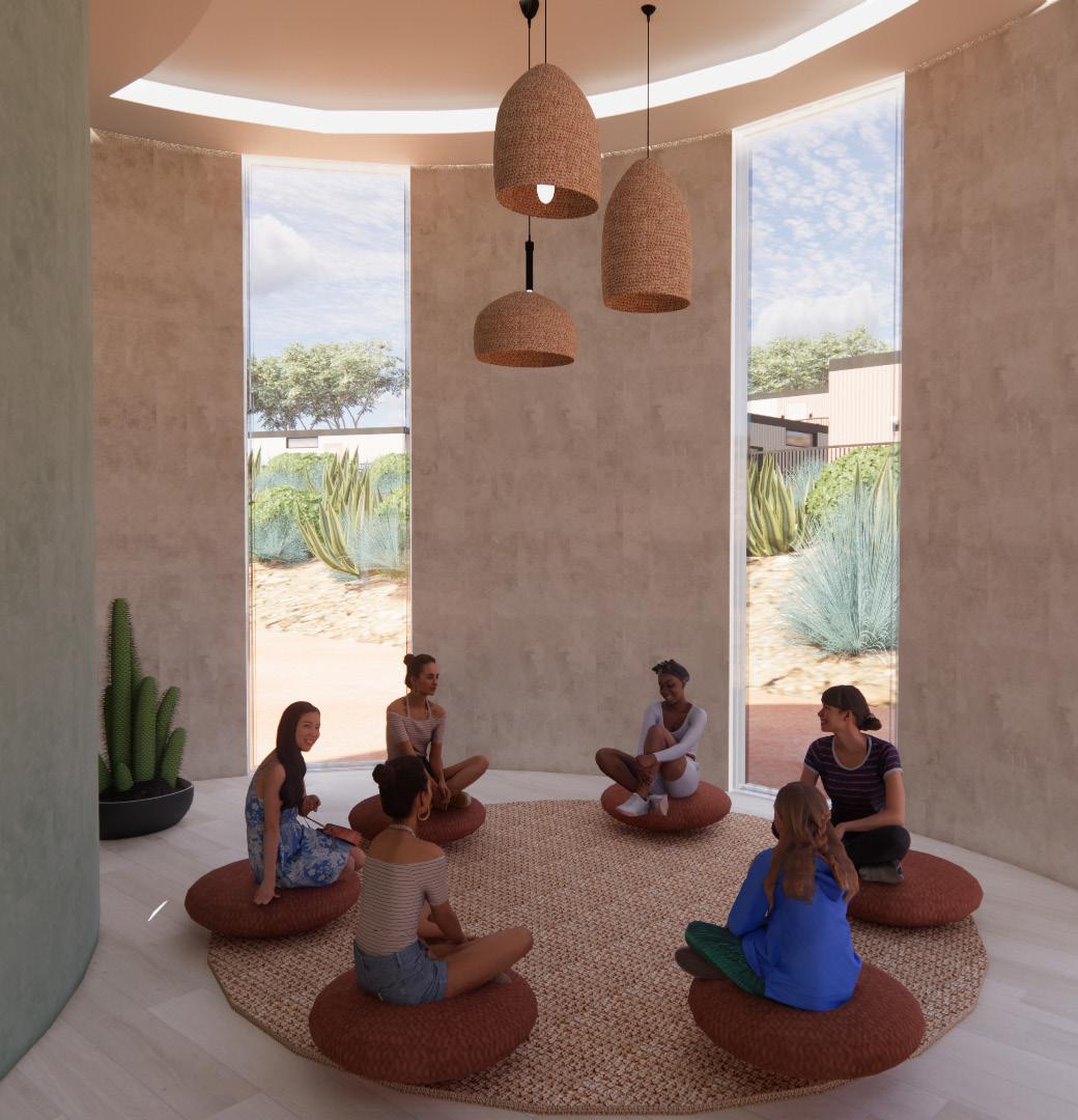
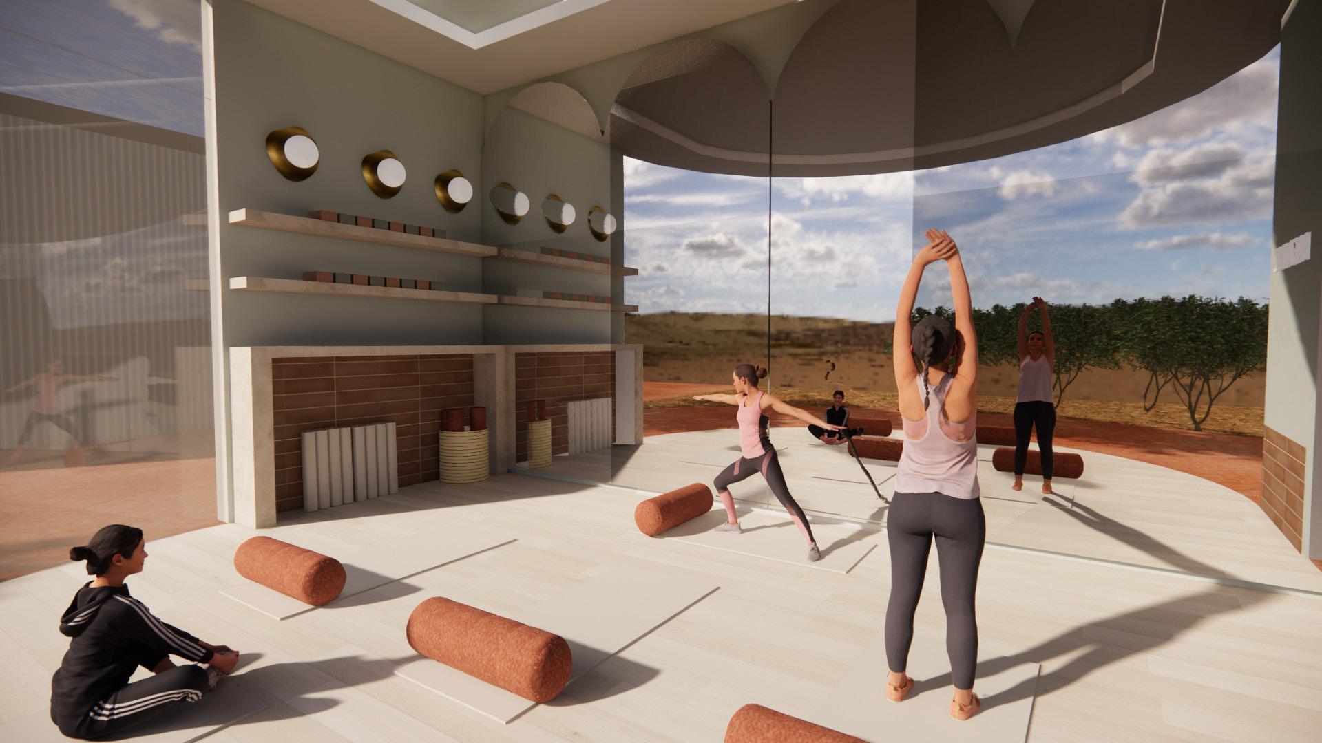
yoga & counseling
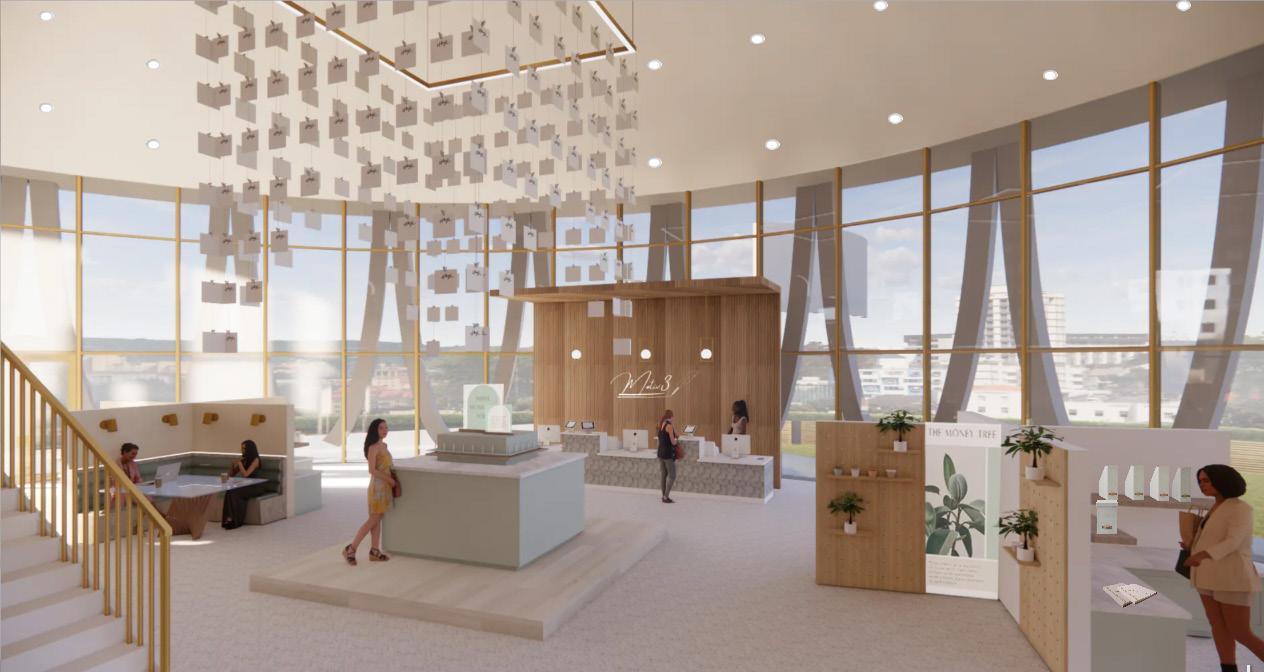
motiv3 flagship store
spring 2023
about
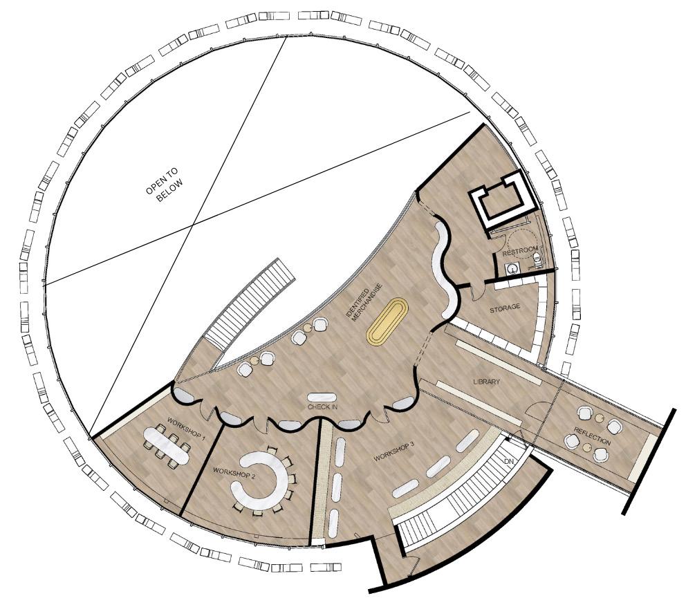
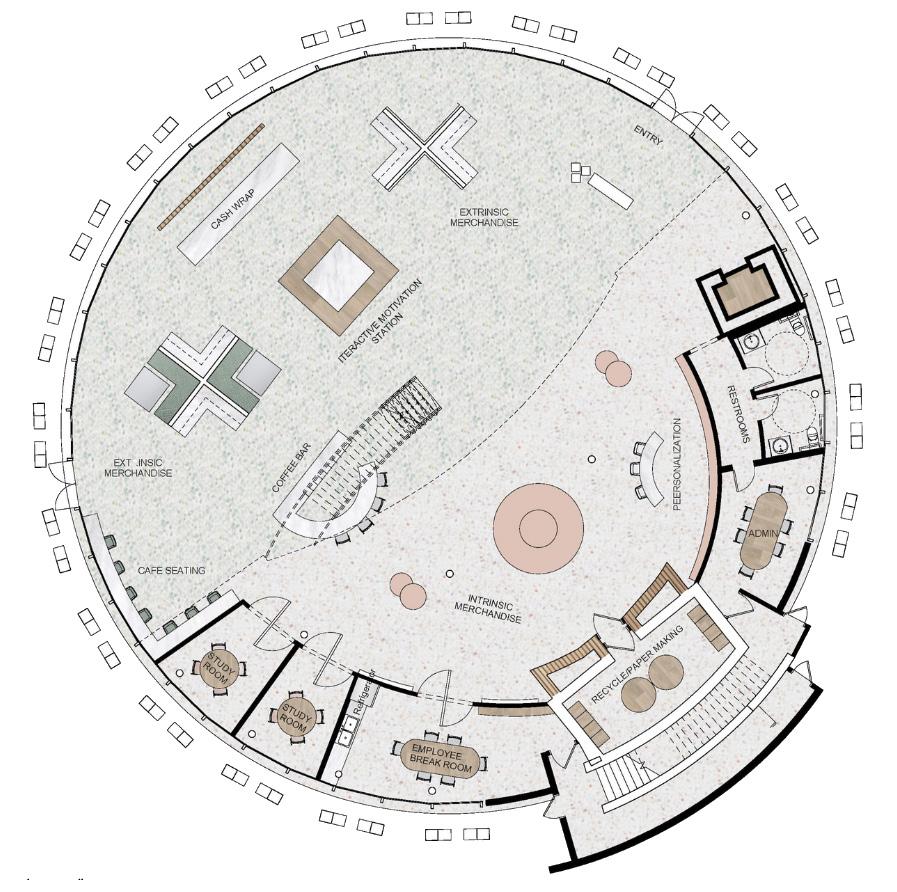
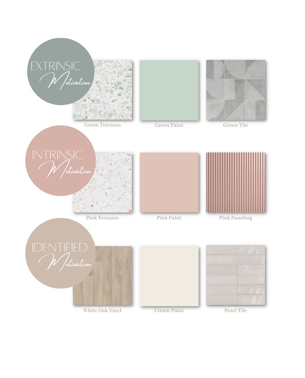
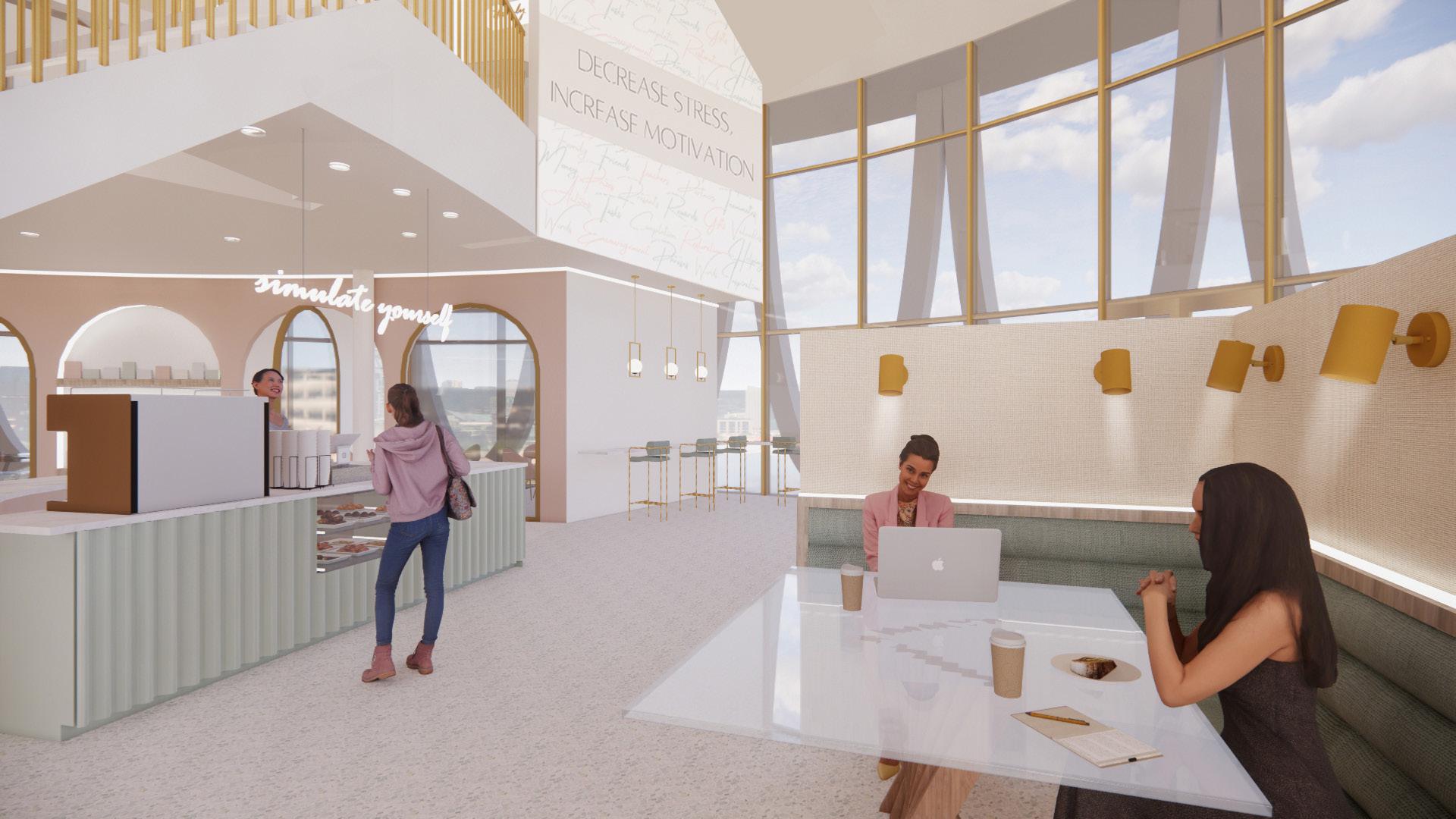
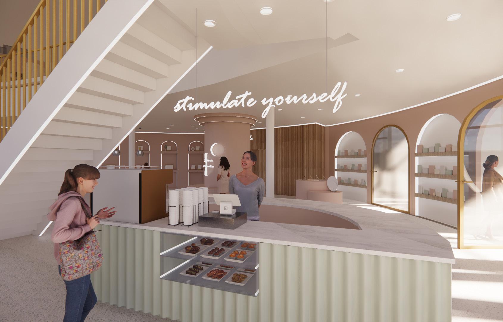
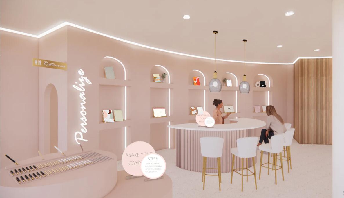
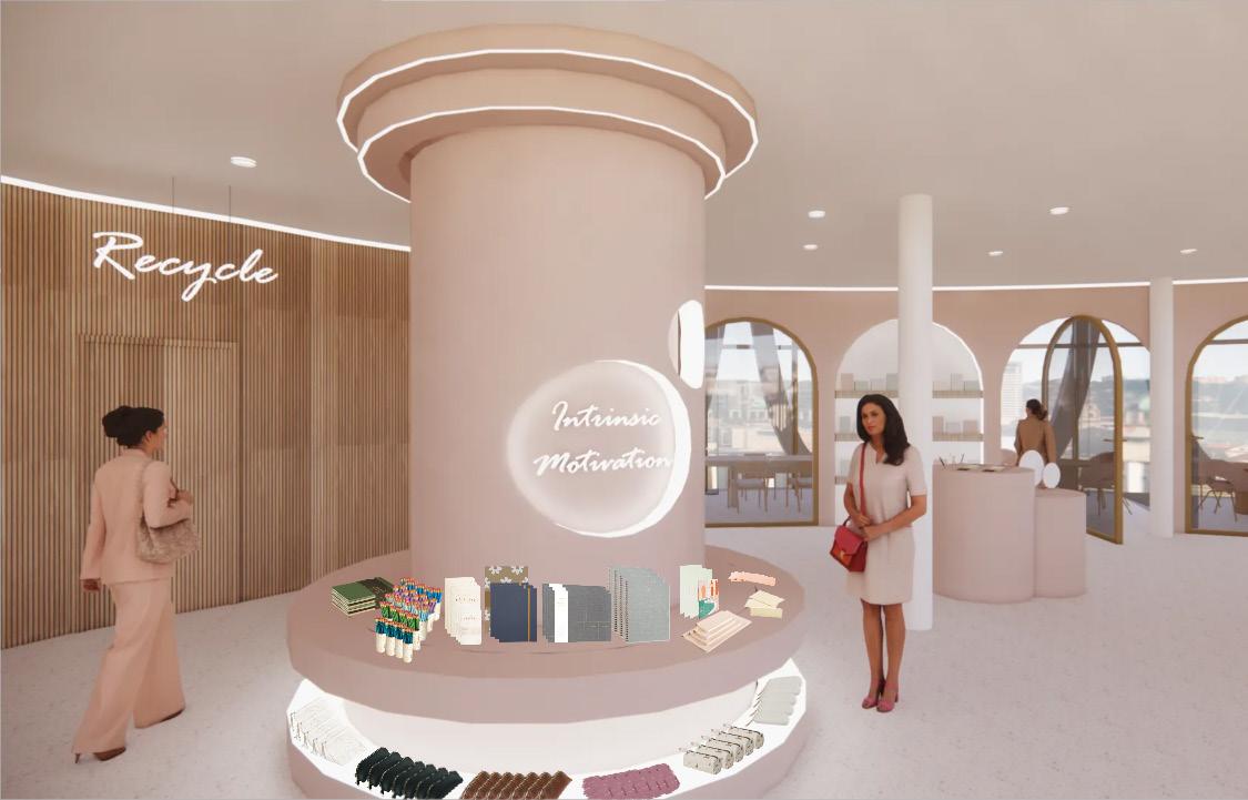
The third year fall semester interior design studio focused on retail design. This was an individual project where we each developed our own retail brand of any kind and then designed its flagship store. The brand that I came up with is called Motiv3, which is a stationery brand that sells products catered toward all 3 main types of motivation: Intrinsic, Extrinsic, and Identified.
The site we worked with is the south rotunda of the Phoenix Financial Center. The program includes areas for all 3 types of merchandise, back of house needs, a coffee bar, study rooms, a paper recycling station, a personalization station, and learning workshops.
skills used:
• Revit
• SketchUp
• Enscape
• Photoshop
04
retail studio project
ground floor plan
mezzanine floor plan
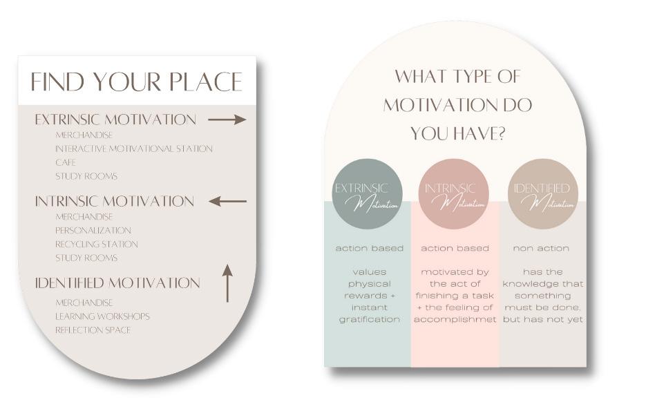
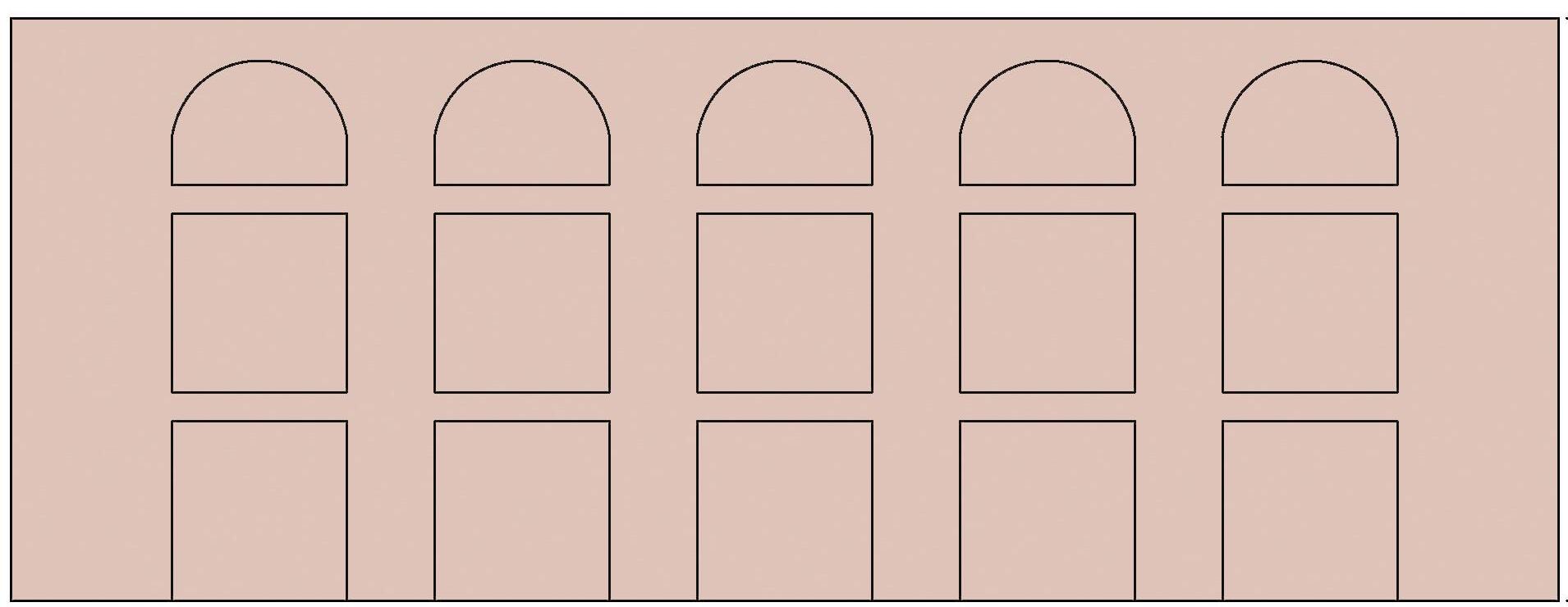
wayfinding
materiality + signage
extrinsic motivation retail displays
motivation station
The motivation station is centrally located in the Motiv3 flagship store and is an interactive space where guests can write down what motivates them and them hang it on the custom chandelier above.
1
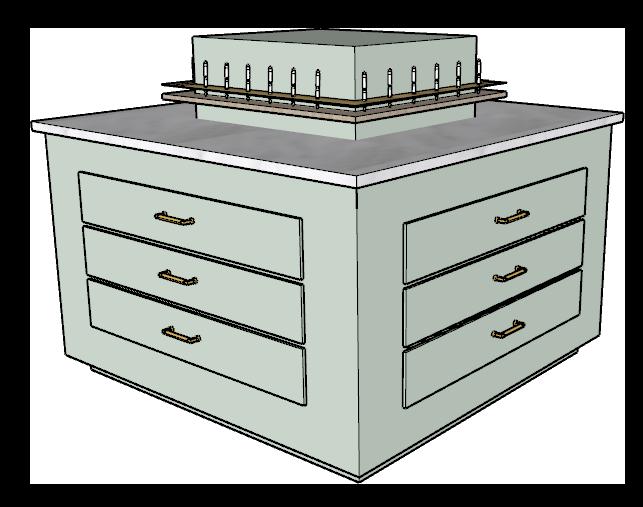
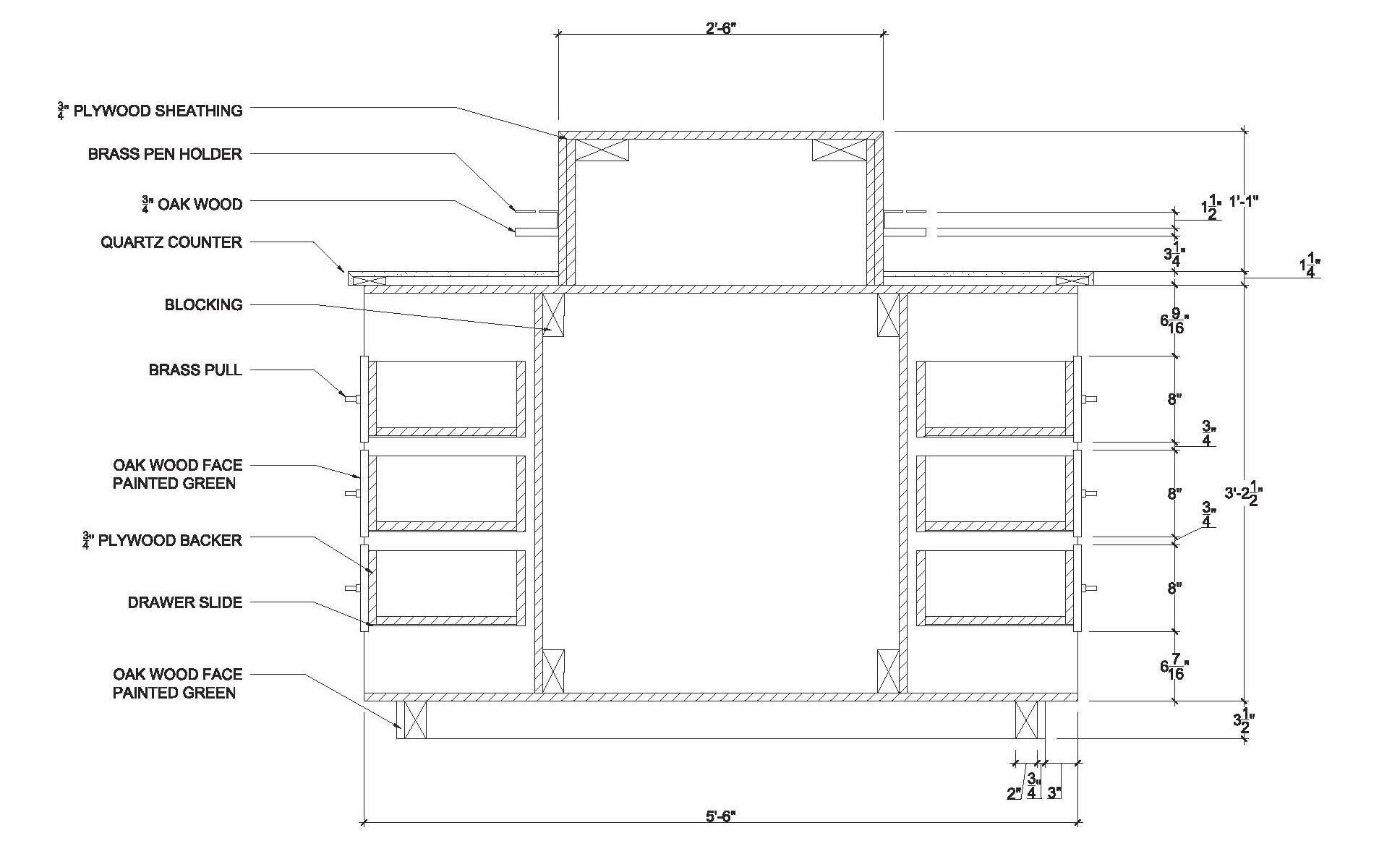
2 shelving detail mounting details
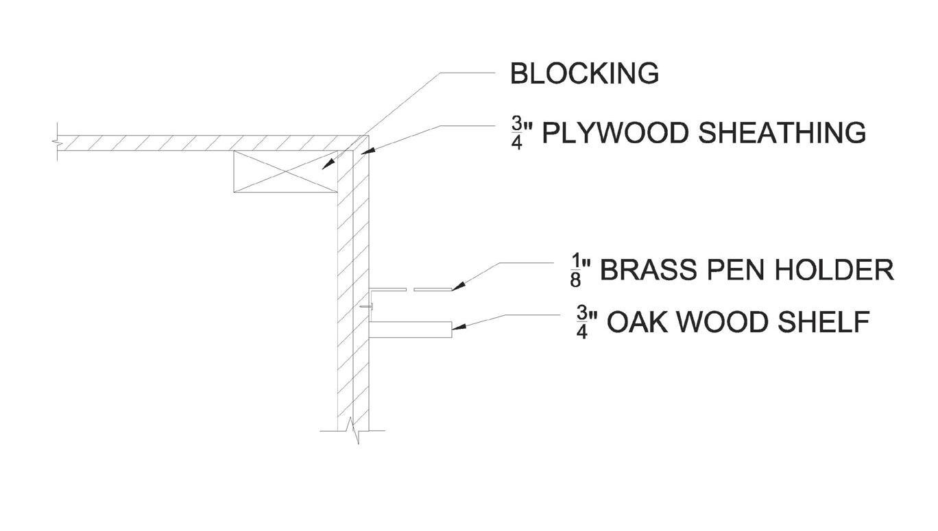
PEN HOLDER
WOOD SHELF
BRASS
OAK
PROMOTING PRODUCTIVITY
Multiple options for work spaces are integrated throughout the store including banquette seating, counter seating, and private study rooms.
COFFEE BAR
Grab & go coffee bar provided to keep good energy flowing and help guests get motivated to get their tasks done.
PERSONALIZATION WALL ELEVATION
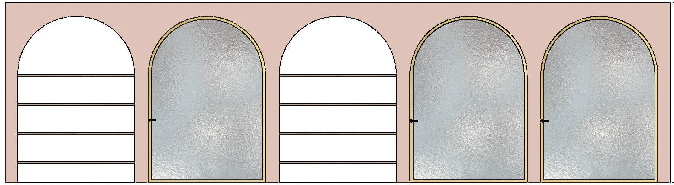
arched
doors + shelving Wall Elevation
05
the beam on farmer ft. the room spring 2022
hospitality studio project group project with jose arreola + hanah johnson
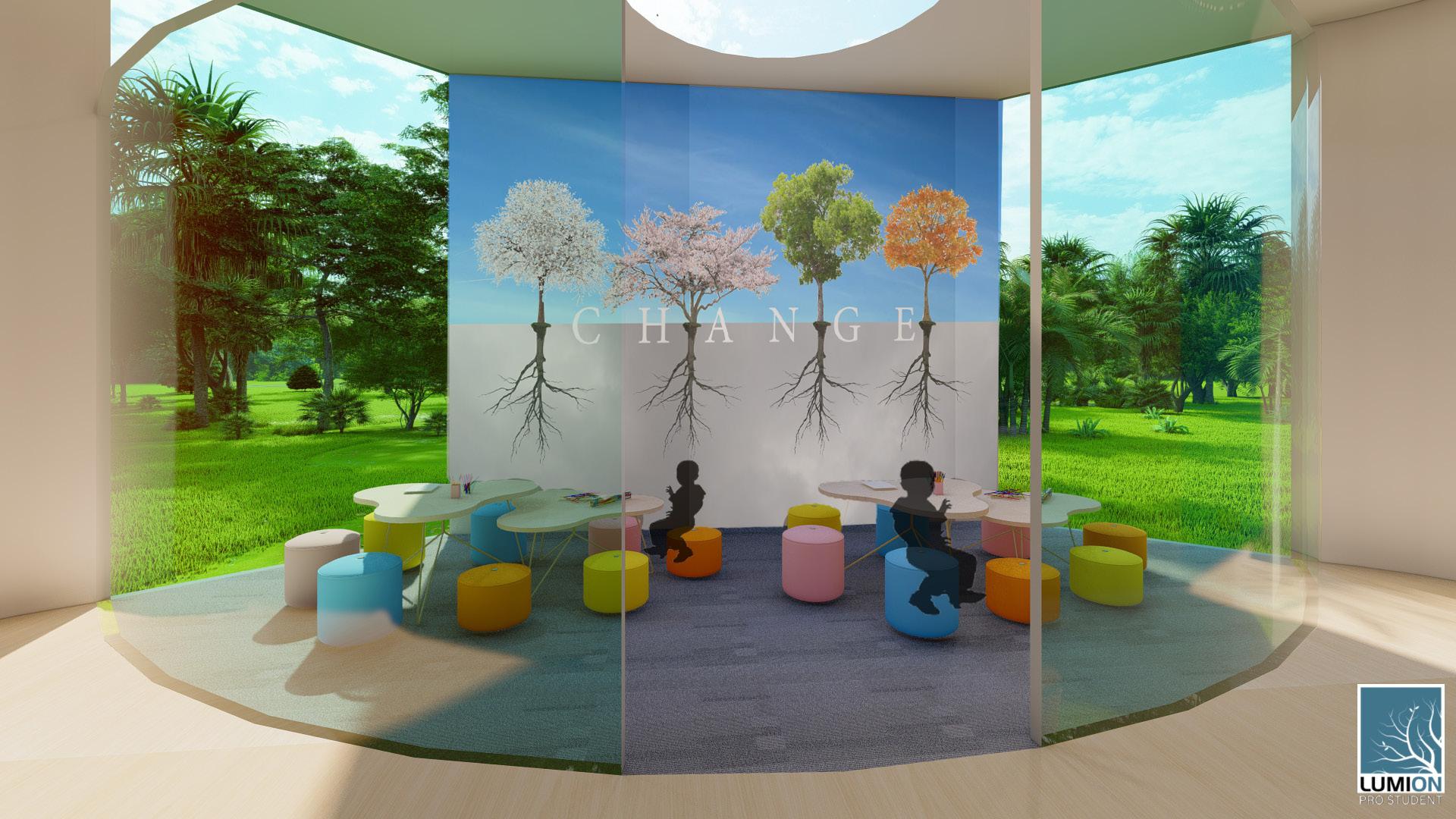
My Hospitality Studio course took place during the Spring semester of my Sophomore year. This course had two major projects that blended into each other: an individual project called “The Room” and a group project called “The Beam on Farmer.”
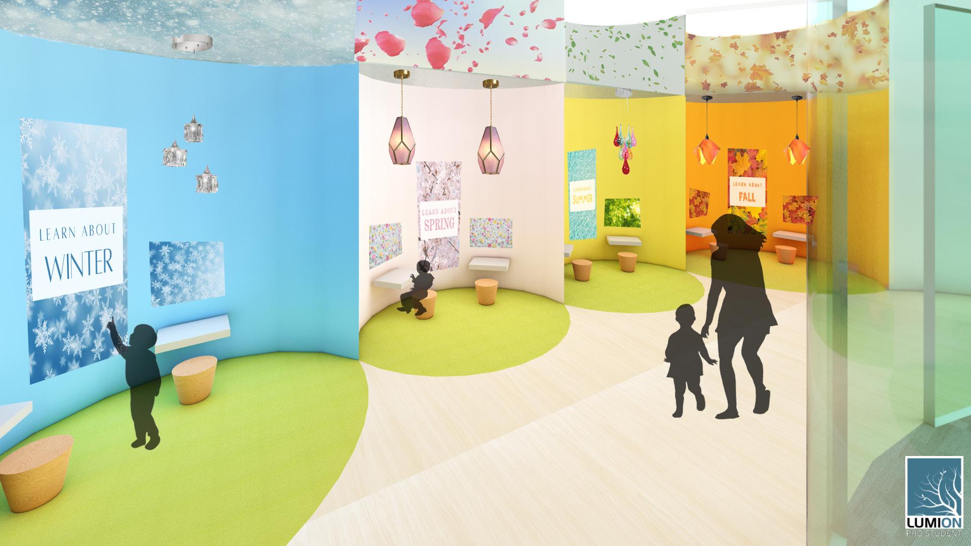
“The Room” focused on a point of wonder of ours that is currently eing impacted by climate change. My chosen point of wonder was the changing of the seasons. This space developed into a children’s learning space where one can learn about the seasons in an interactive way.
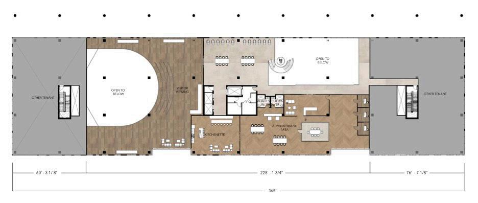
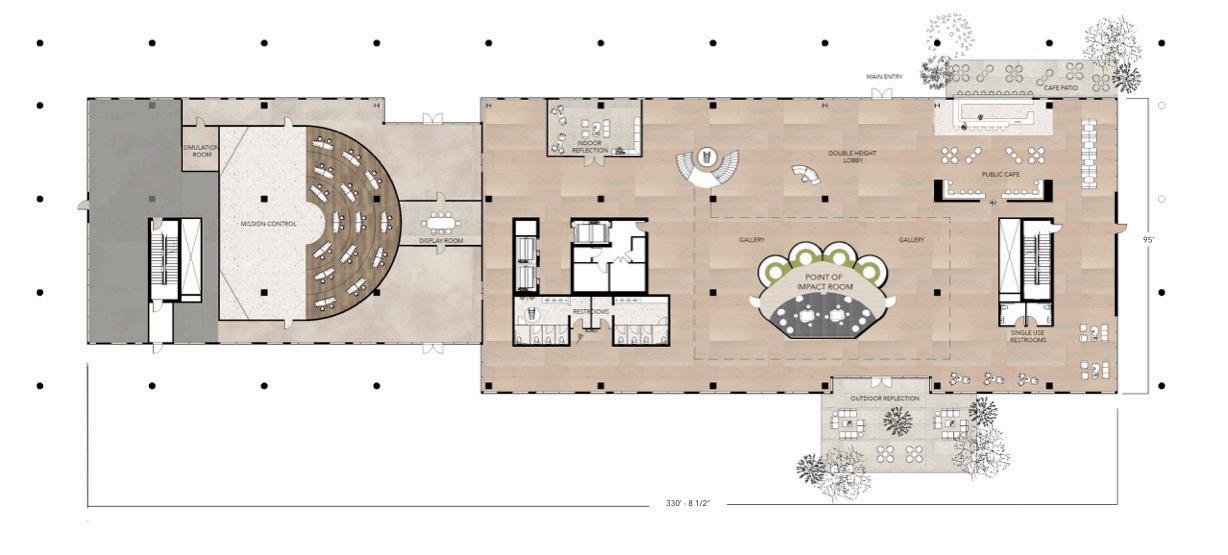
The second half of the semester we were split up into groups of three to design first two floors of “The Beam on Farmer,” located in Tempe, Arizona. The main use of this space was an Earth Operations Center and included each of our previous assignments from “The Room” as well as a public cafe, an administrative space, a gallery, and more. about

wonder collage
skills used:
• AutoCAD
• SketchUp
• Lumion
• Photoshop
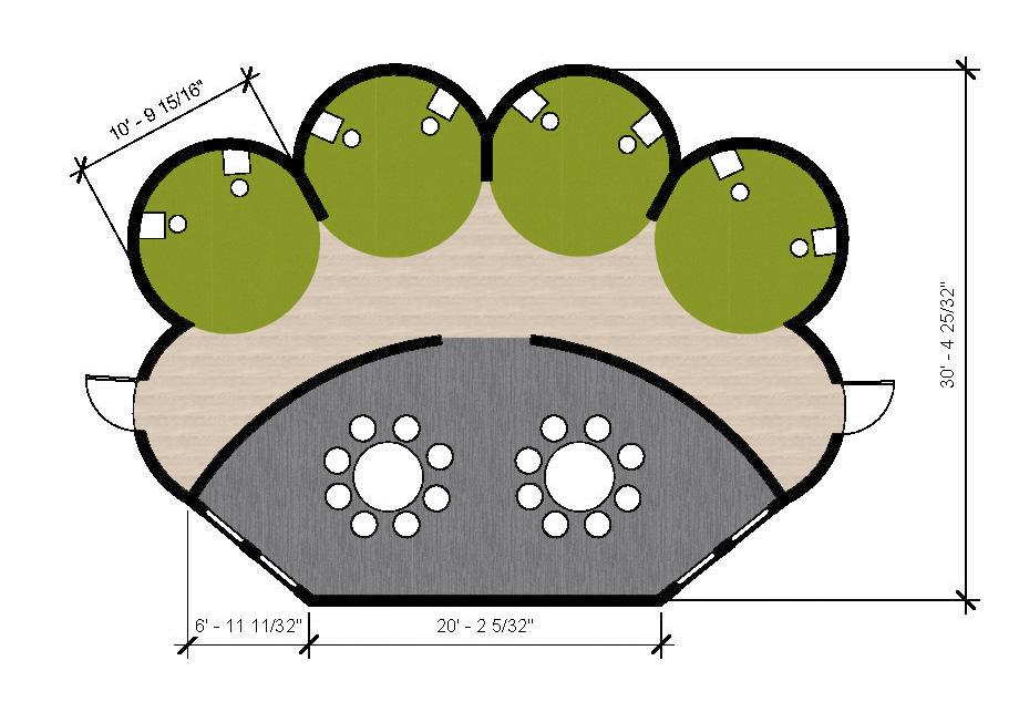
floor plan
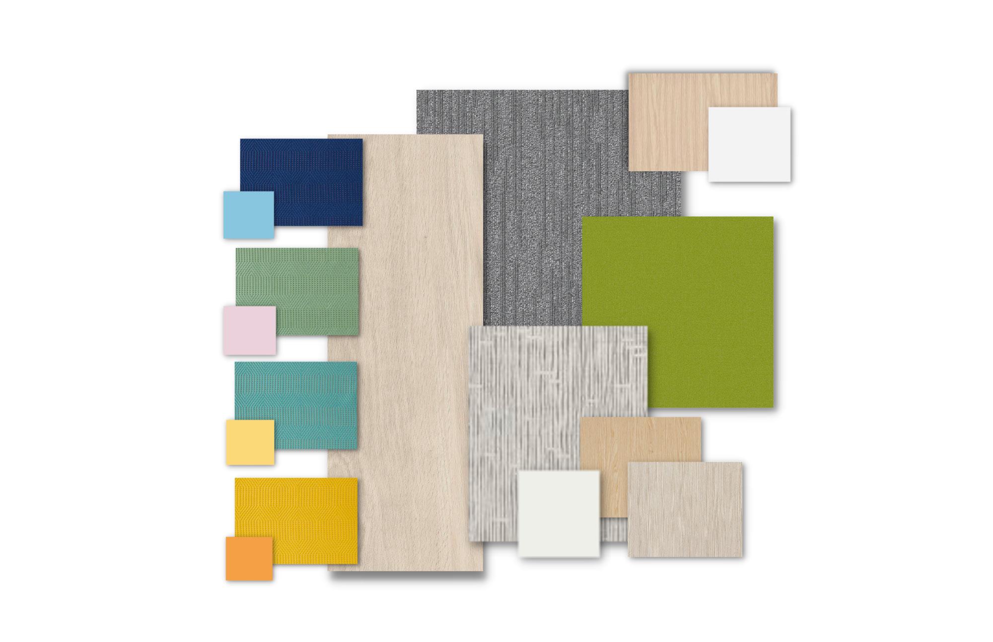
material palette
Second floor plan
1. Visitor Viewing
2. Kitchenette/Break Room
3. Administrative Area
4. ADA Restrooms
5. Open Collaboration
Mezzanine
1. Open Seating
2. The Room - Jose
3. The Room - Hanah
first floor plan
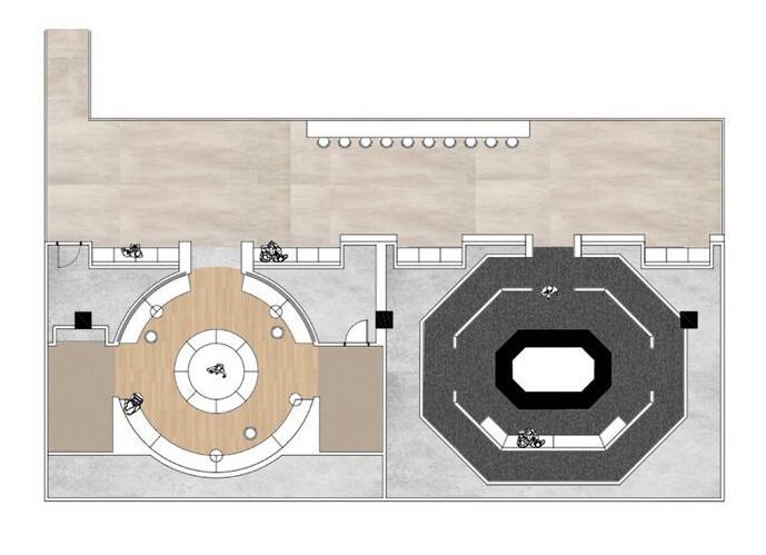
1. Double Height Lobby
2. Public Cafe
3. Gallery
4. The Room - Chloe
5. Outdoor Reflection
6. Restrooms
7. Indoor Reflection
8. Display Room
9. Mission Control
10. Simulation Room
1 2 3 4 5
1 2 3 4 5 6 6 7 8 9 10
1 2 3
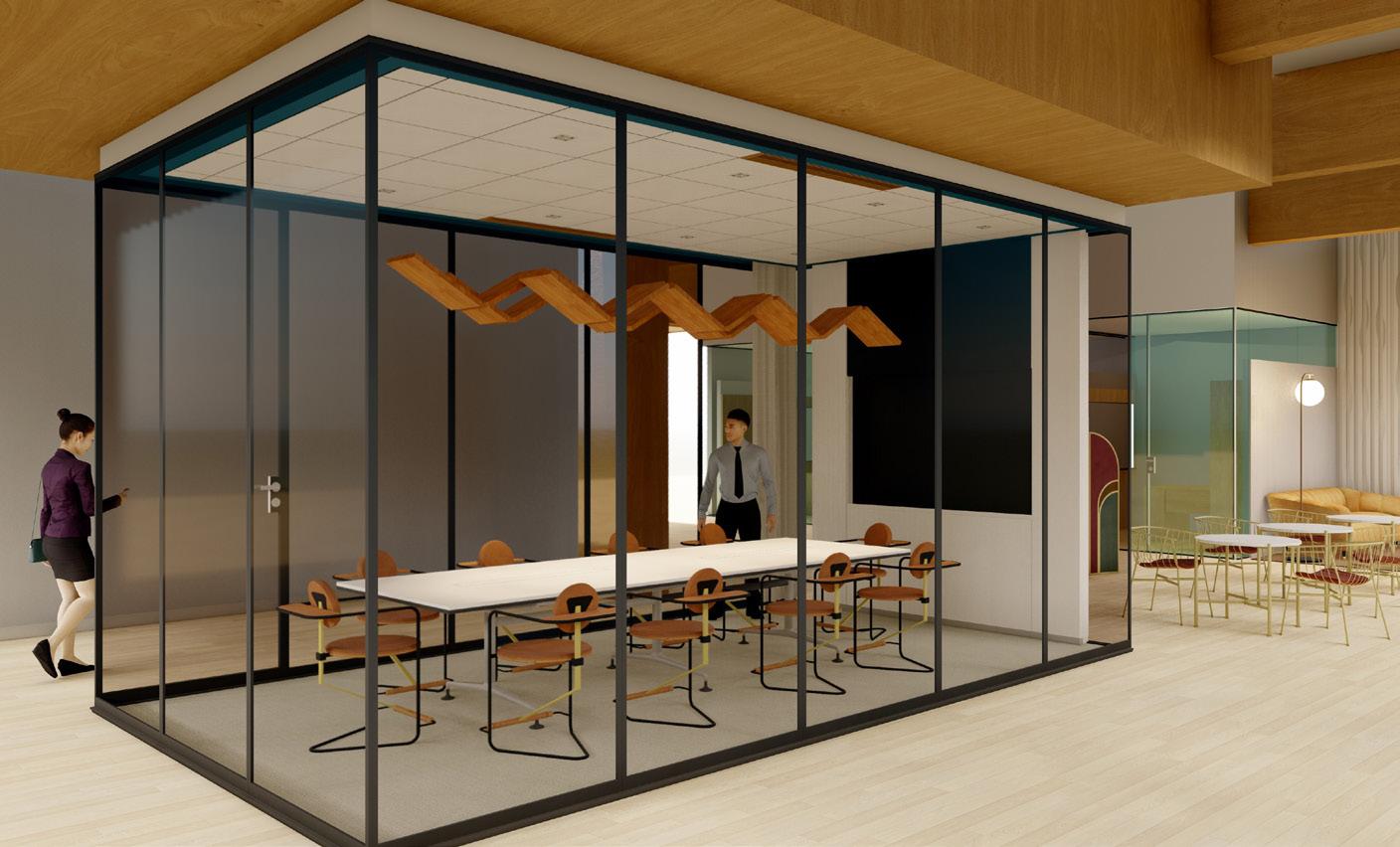
 Conference room public cafe
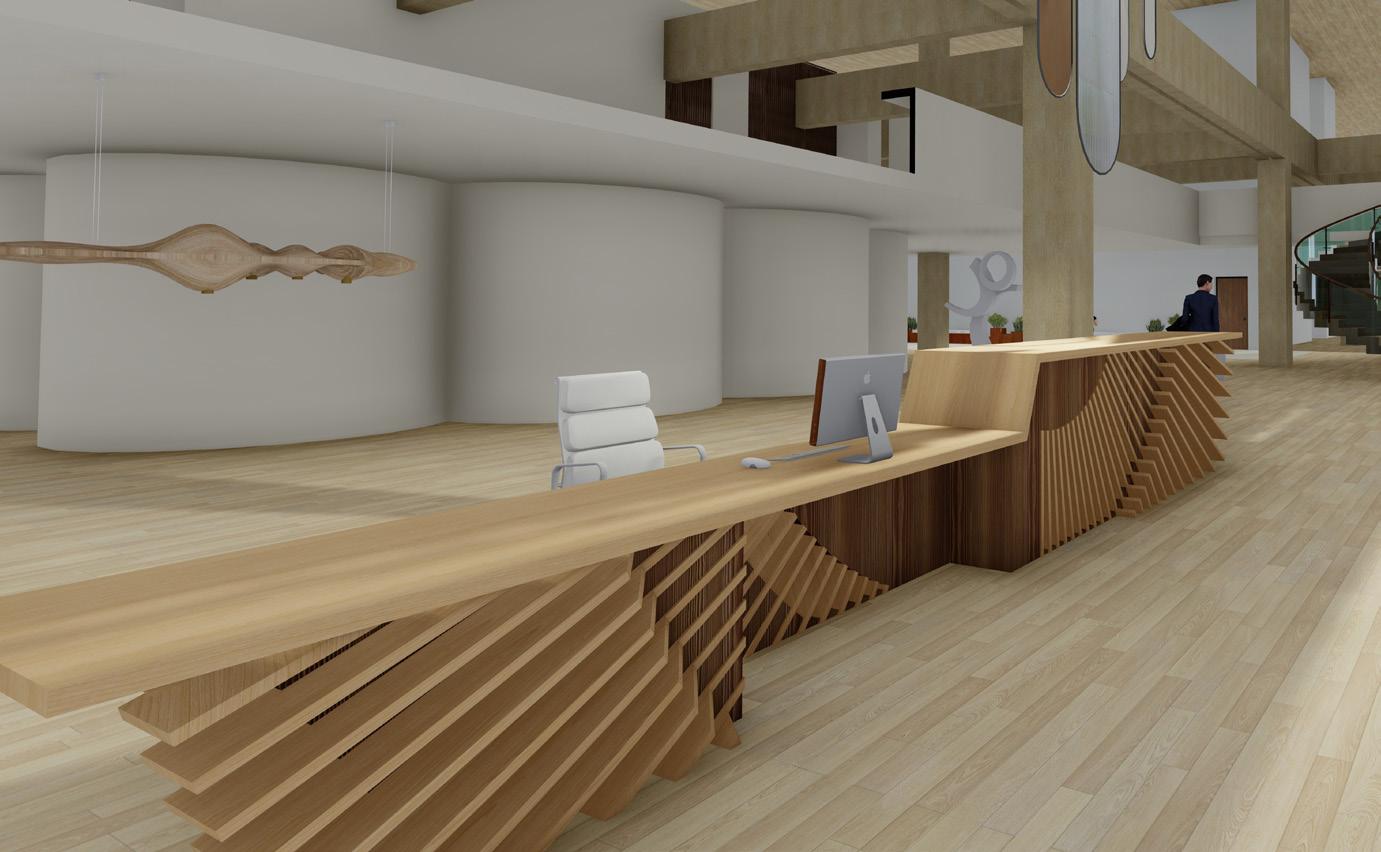
double height lobby
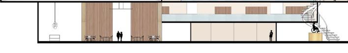
building section
mezzanine section
Conference room public cafe
double height lobby
building section
mezzanine section
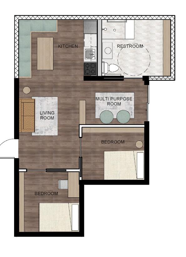
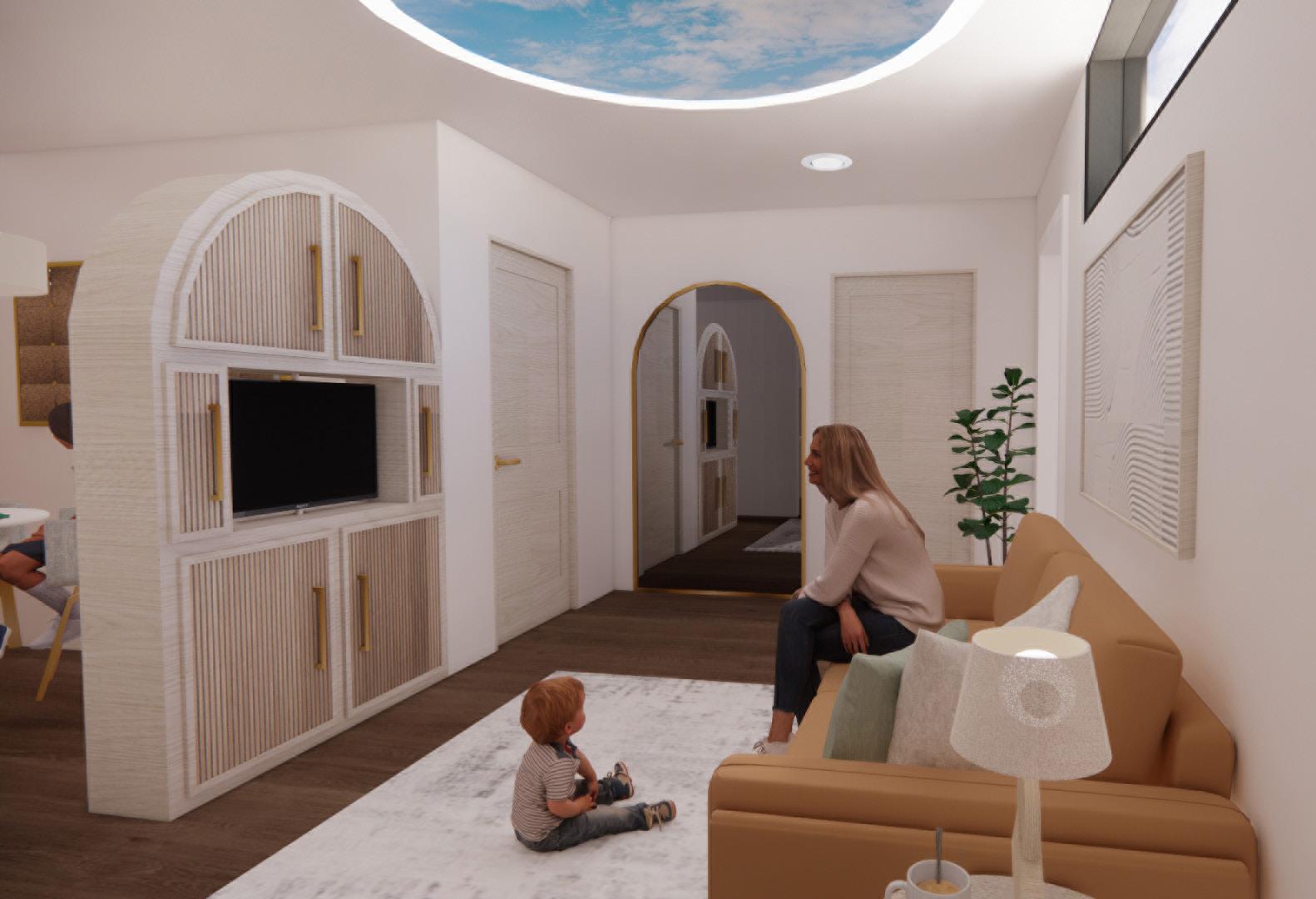
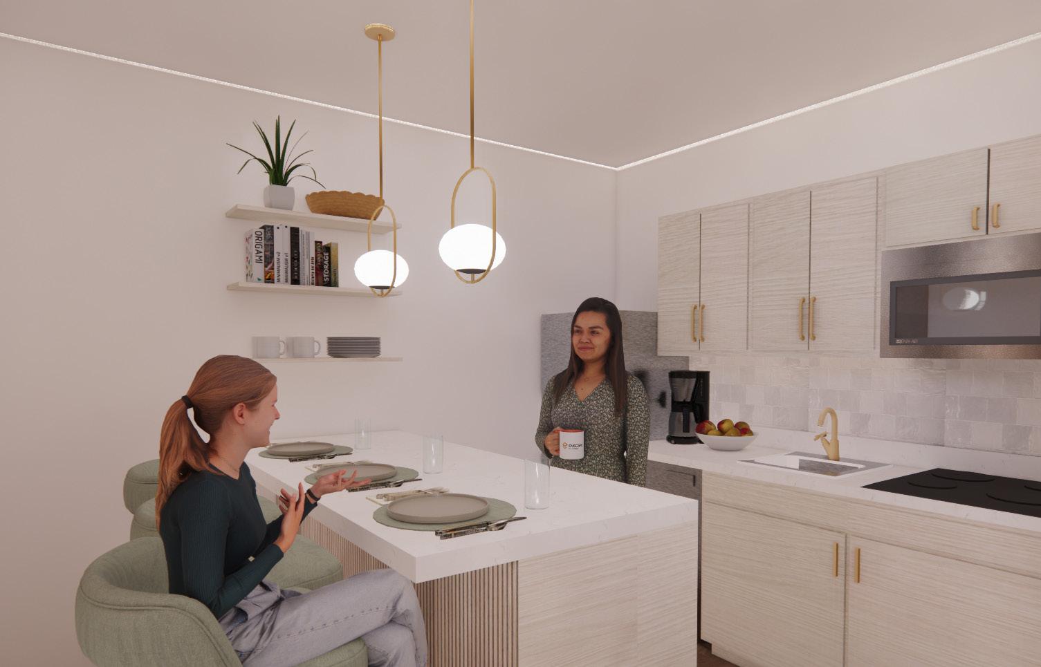
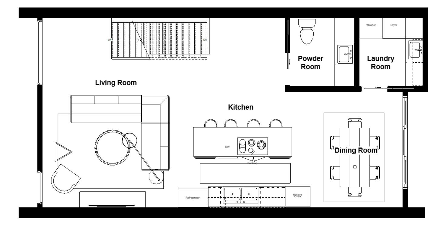
arthaus townhome fall 2021
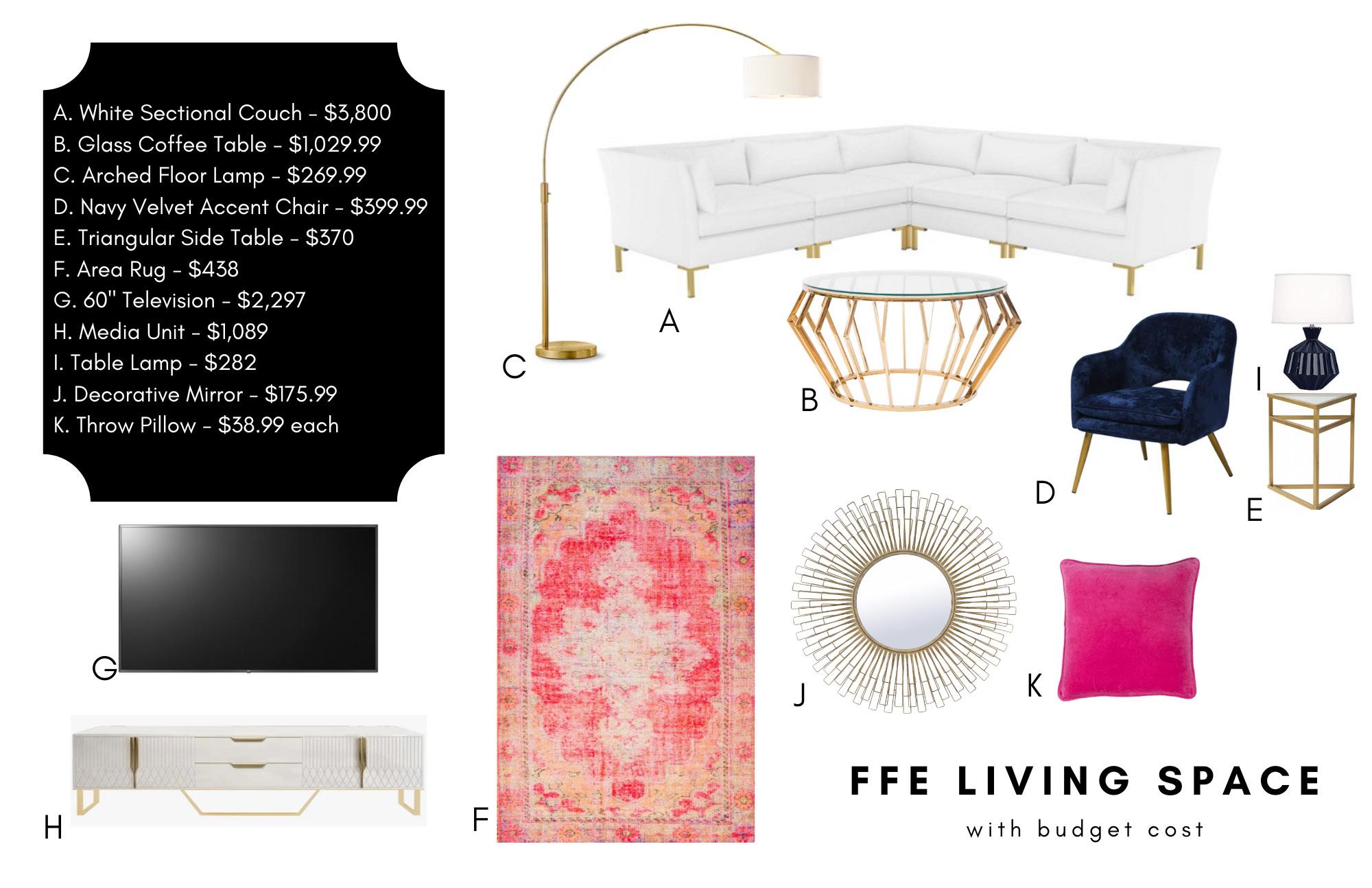
During my Residential Studio course, we were given a fictional client to interview and design a townhome for. Our site was located in Phoenix, Arizona in the new Arthaus 3-story townhomes. My client was a 26 year old fashion designer who lives alone, but wanted a space to accommodate herself, her cat, and her boyfriend who occasionally stays over. She also hosts dinner parties frequently, so she wanted an open main floor that accommodates 10 people. As someone who frequently works from home, she also needed a room designated to her desk and textile storage. This space could also be used as a guest room with a sofa bed. Her desired space relects her love for fashion design which includes bight colors and patterns, but she also wants it to feel very bright and airy within the finishes.
third floor plan
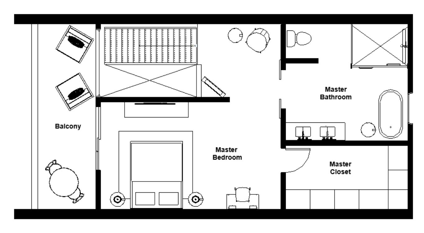
second floor plan
skills used:
• Revit
• Photoshop
first floor plan
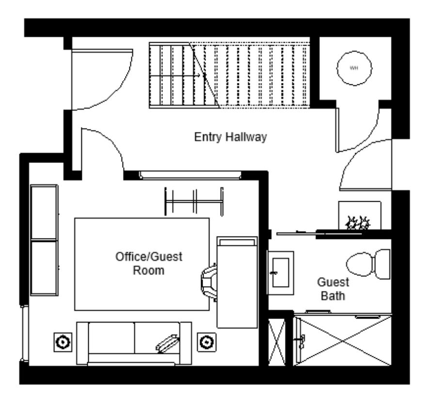
06
about residential studio project
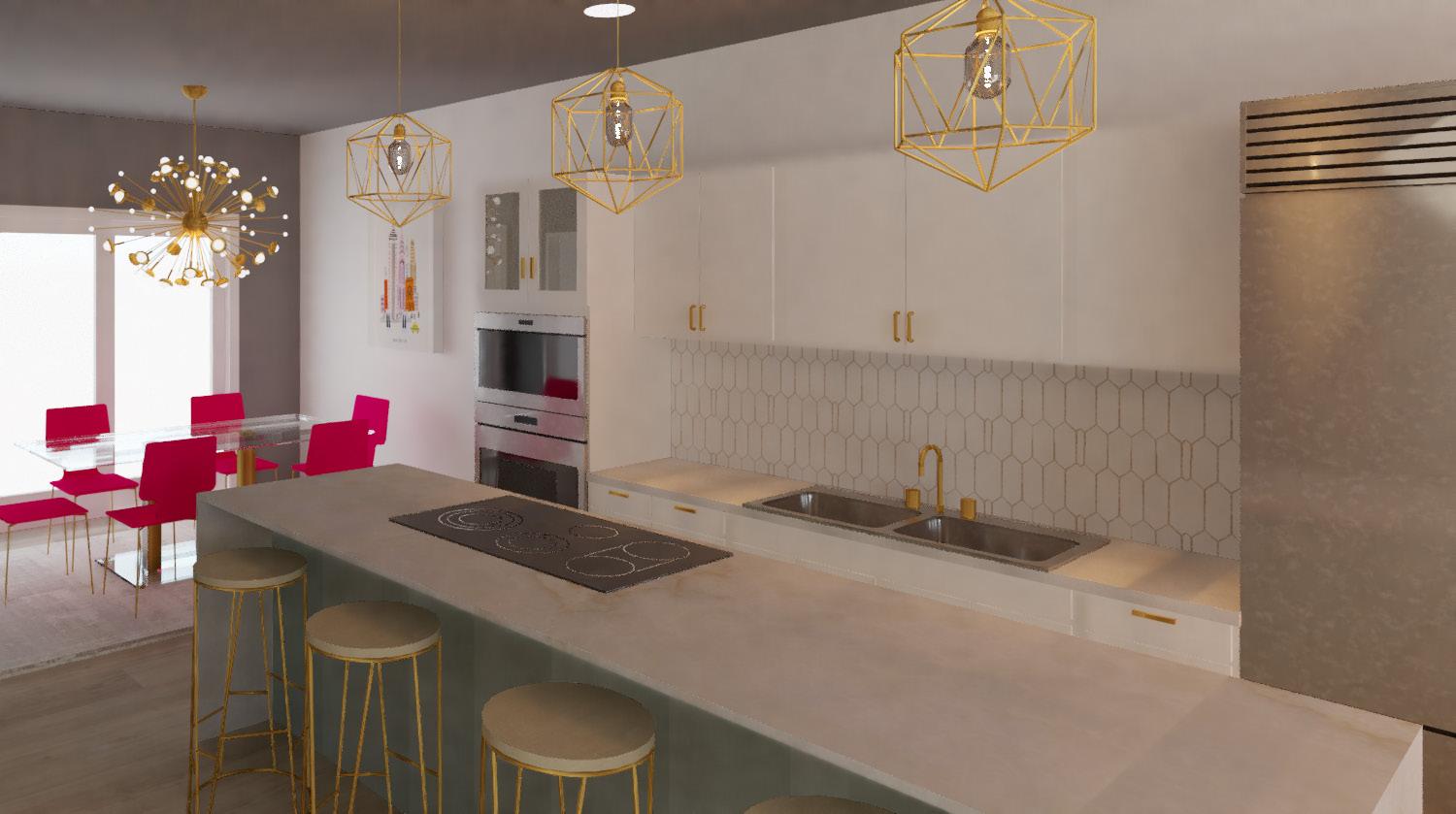
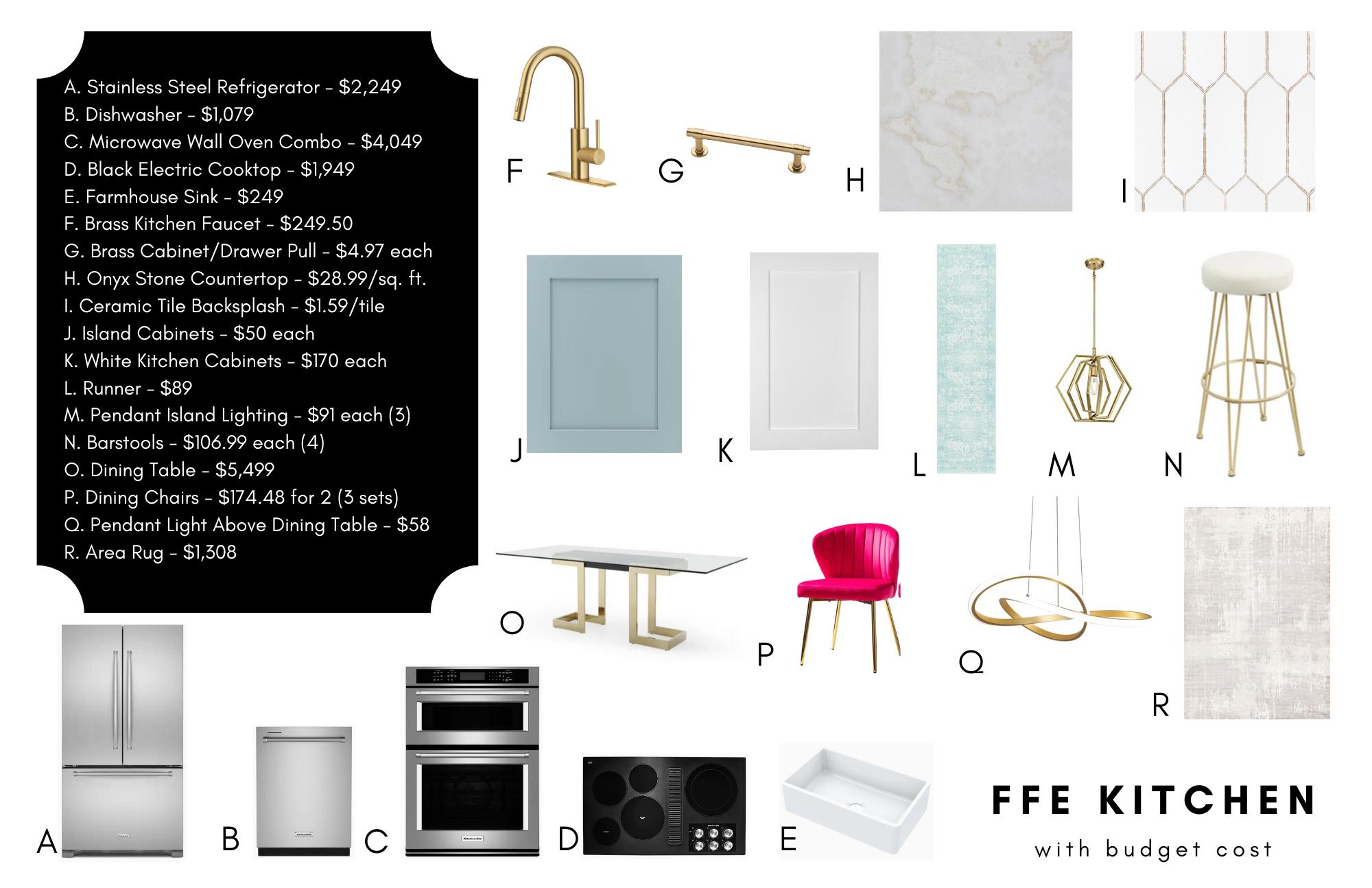
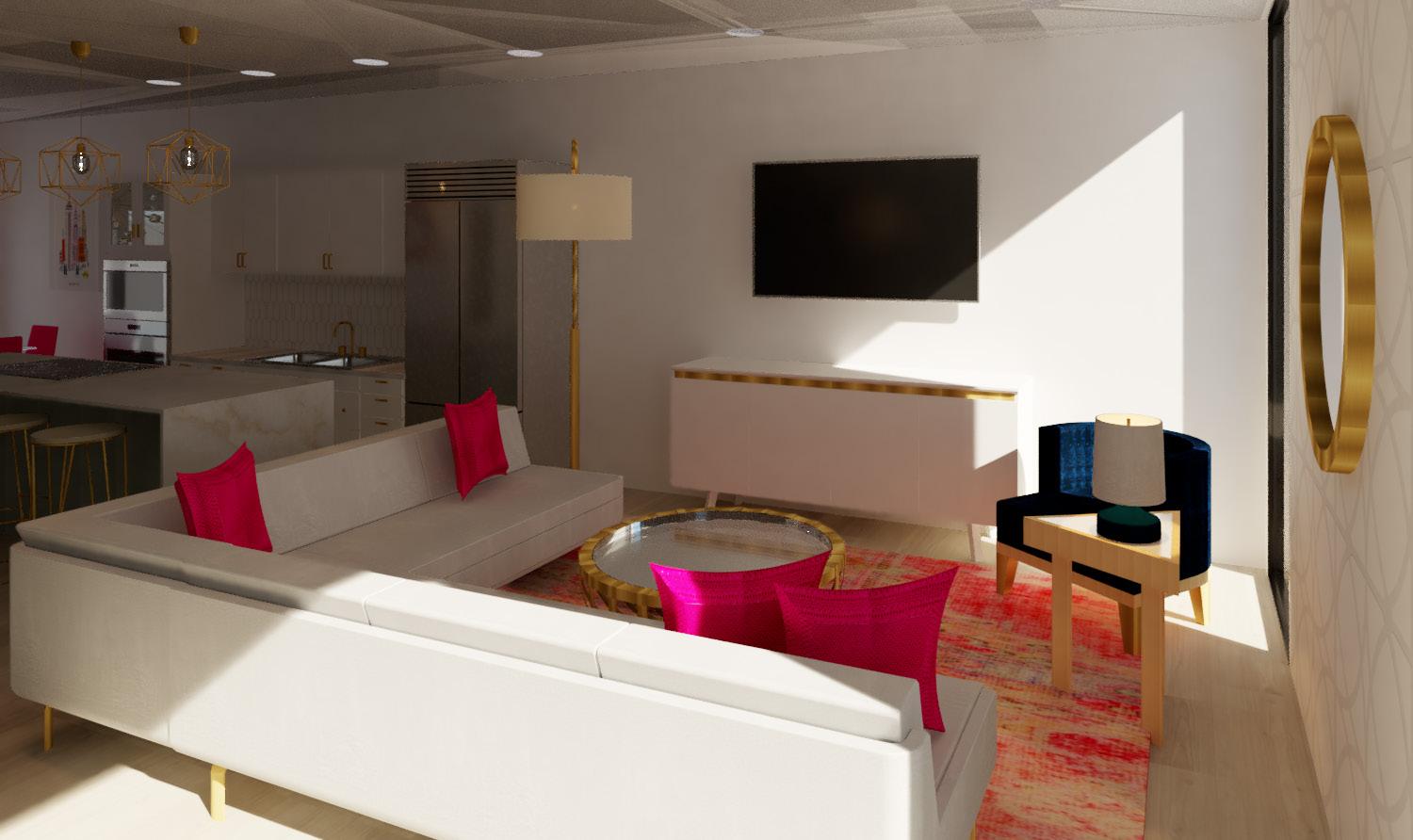 kitchen + dining rendering
living room rendering
kitchen + dining rendering
living room rendering
thank you! CC Chloe Claybour chloeclaybour@gmail.com