2017 2023
P ORTFOLIO Chinling Chen N G C H E N , Graphi c D e s i g n e r HC e s i g n e r NILNIHCG C H E ,N ihparG c D e s i g n
GRAPHIC DESIGN
+���-���-���-���
chen����@gmail.com
Japanese-Language Proficiency Test N�
Japanese-Language Proficiency Test N�
Japanese-Language Proficiency Test N�
Adobe Illustrator
Adobe Photoshop
Microsoft Office
Mac OS
����-����
University for the Creative Art , UK
Graphic Design & Communication
MA
����-����
Chinese Culture University
Advertisement
BA
Nearly �� years of experience as a graphic designer. During my time in event company, I have developed quick on-the-spot responsiveness. Working in advertising agency, I discovered my abilities in time management and generating multiple ideas. I excel in listening and communication, using design to solve problems.

I have an open, positive, and optimistic personality, and I enjoy interacting with others.

����-����
YOMIKO Advertising agency
Art Director
In Yomiko, I have resiponsible for clients from various industries, including Japanese commercial facilities, maternity and baby products, men's grooming, real estate, motorcycles, eyewear, beer, and skincare.
My design scope has encompassed creating key visual identities and their related collateral materials includes designing websites, social media graphics, brochures, packaging, and other promotional materials.
Managing timelines
Cross-department communication
Concept ideation and execution
Guidance of design team members
Instructions for on-site photography
Extension of main visual in post-production
Client proposals
����-����
Rouge Creative Marketing
Graphic Designer
During my tenure, I have successfully completed �� projects, The majority of my clients have been from the financial industry and real estate press conferences, annual banquets, and product launch events.
Communication and outsourcing for large-scale productions, print materials, and T-shirt. Site visits and supervision during setup and dismantling. Worked as on-site staff for various events.
Designed and coordinated the production of gifts and giveaways.
����-����
FabCafe
Graphic Designer
I am responsible for graphic design, product photography, and event photography. I create a wide range of marketing materials and promotional content for online platforms and events. I also plan and execute different events and design schemes based on seasons and festivals. Additionally, I have experience as a laser cuttingoperator and engage in discussions with participants to provide operational training on-site.
Execution of pre-event planning for workshops
On-site staff during events
Web editing, including pre-event promotional content and post-event documentation Laser cutting operator, capable of operating laser cutting machines and creating digital files


In the ���� advertising campaign, OWNDAYS used overseas endorsers for the first time. The visuals were set to be simple and clean, with the focus on the endorsers and the main copy.

To convey a strong sense of "I don't want," the endorsers' expressions and eye contact needed to portray determination and confidence. The use of shadows on the characters was also intensified to add a sense

of solidity to the overall image. The choice of handwritten font for the main copy was not only to break away from the usual framework but also to resonate with the copy, as if it spoke the endorser's inner thoughts, sparking more associations in the viewers.
For the second phase of the campaign, four internet celebrities were chosen, and the strong impact from the first phase was continued, creating a contrasting effect different from the internet celebrities' usual image.


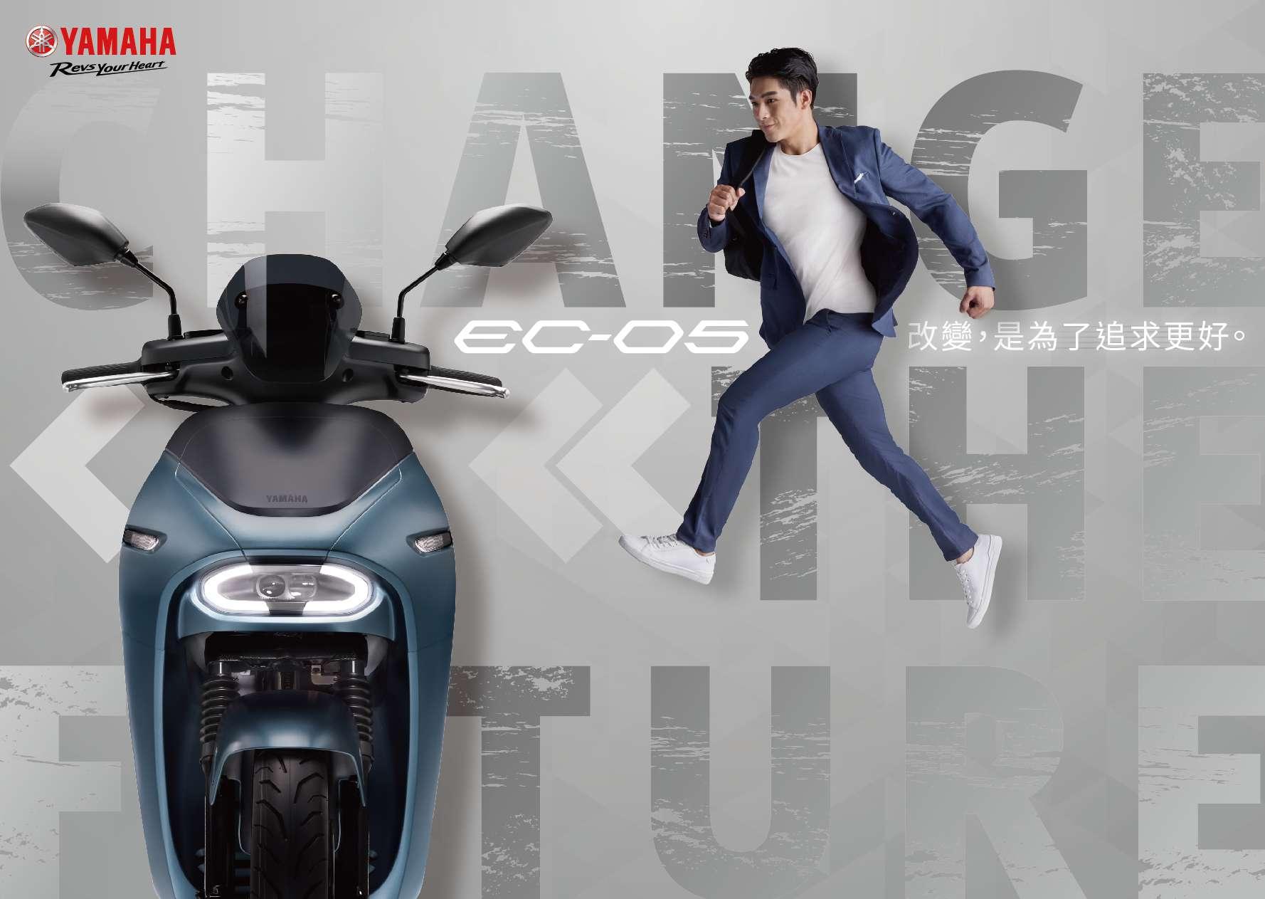

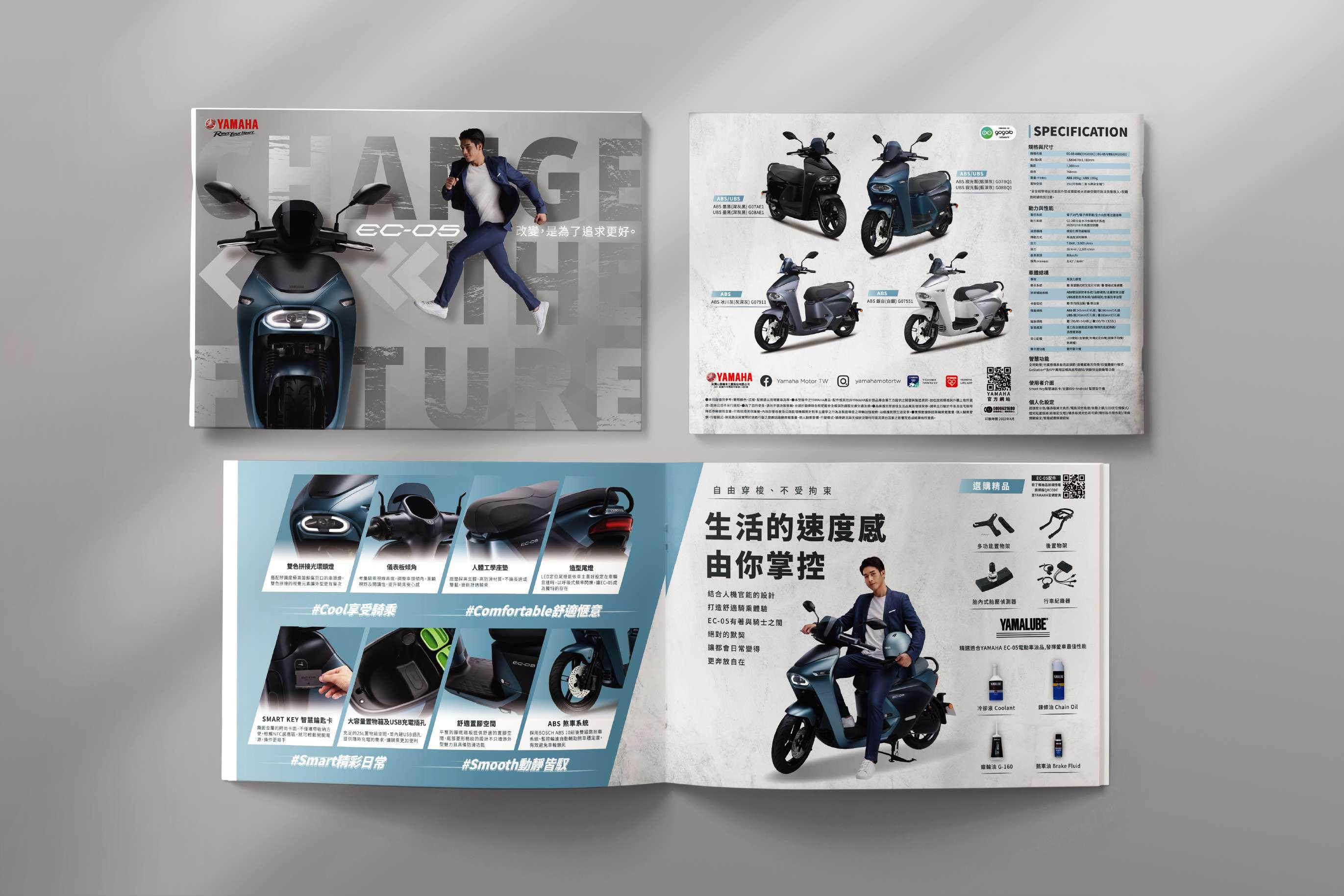
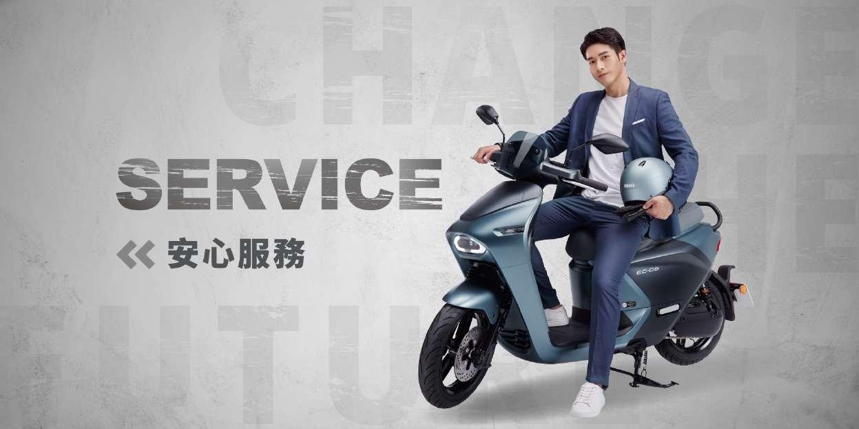
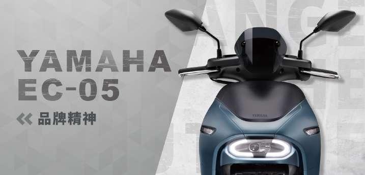
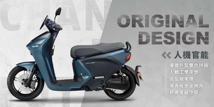
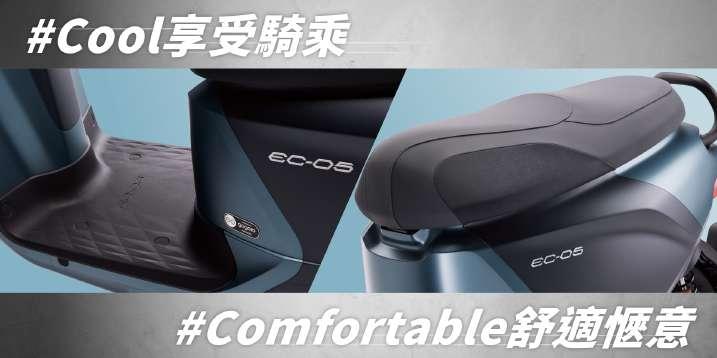
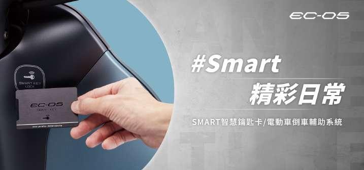
For the relaunch of the new EC-�� model, the emphasis is on creating a futuristic feel. As a result, a metallic gradient background has been chosen. The motorcycle itself is positioned prominently in the center of the frame, allowing viewers to instantly see the EC-�� at first glance.
The main character in the scene is depicted as effortlessly moving towards the future. With a relaxed and confident smile, they approach the motorcycle, creating a connection in the viewers' minds between the EC-��, the concept of the future, and the idea of improvement.


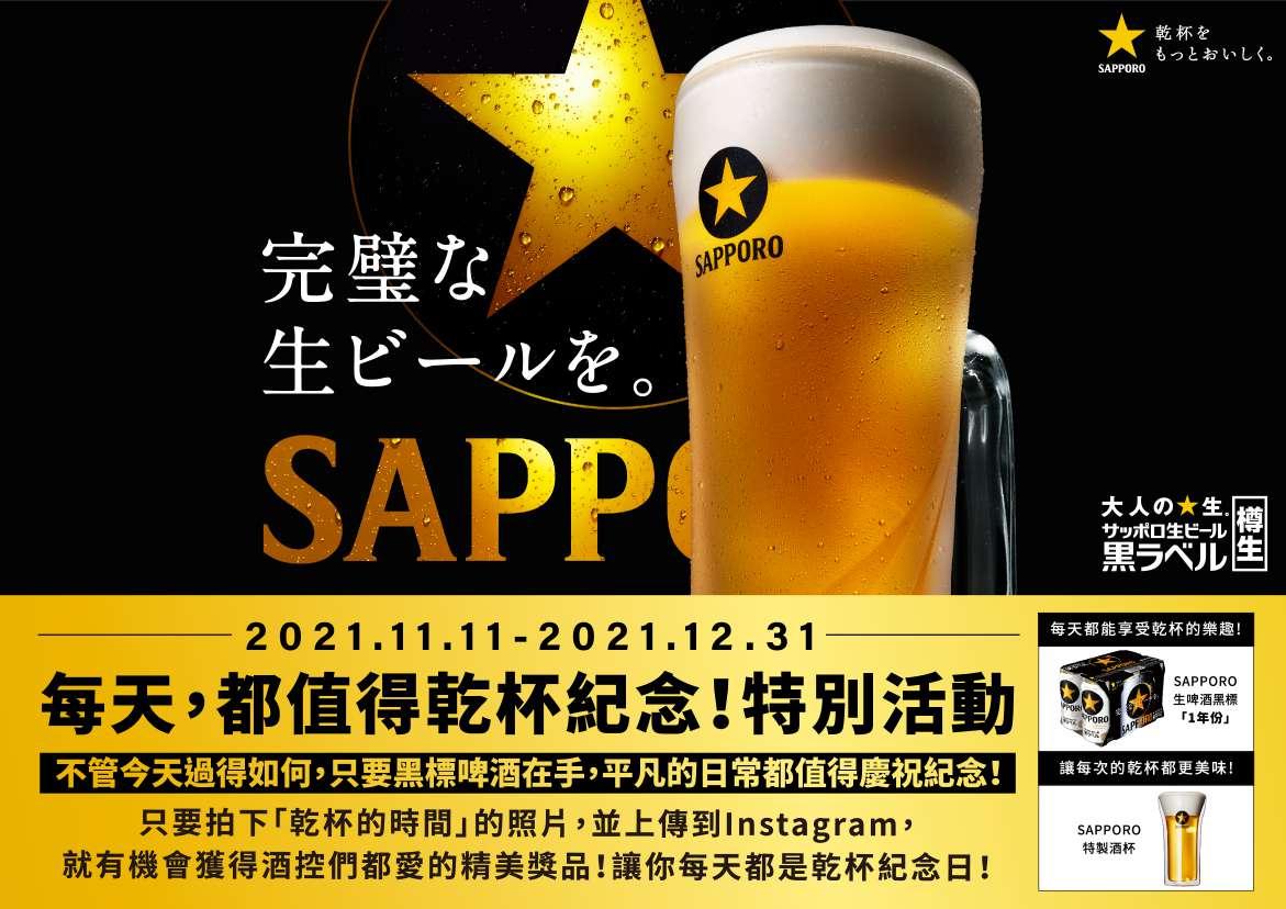
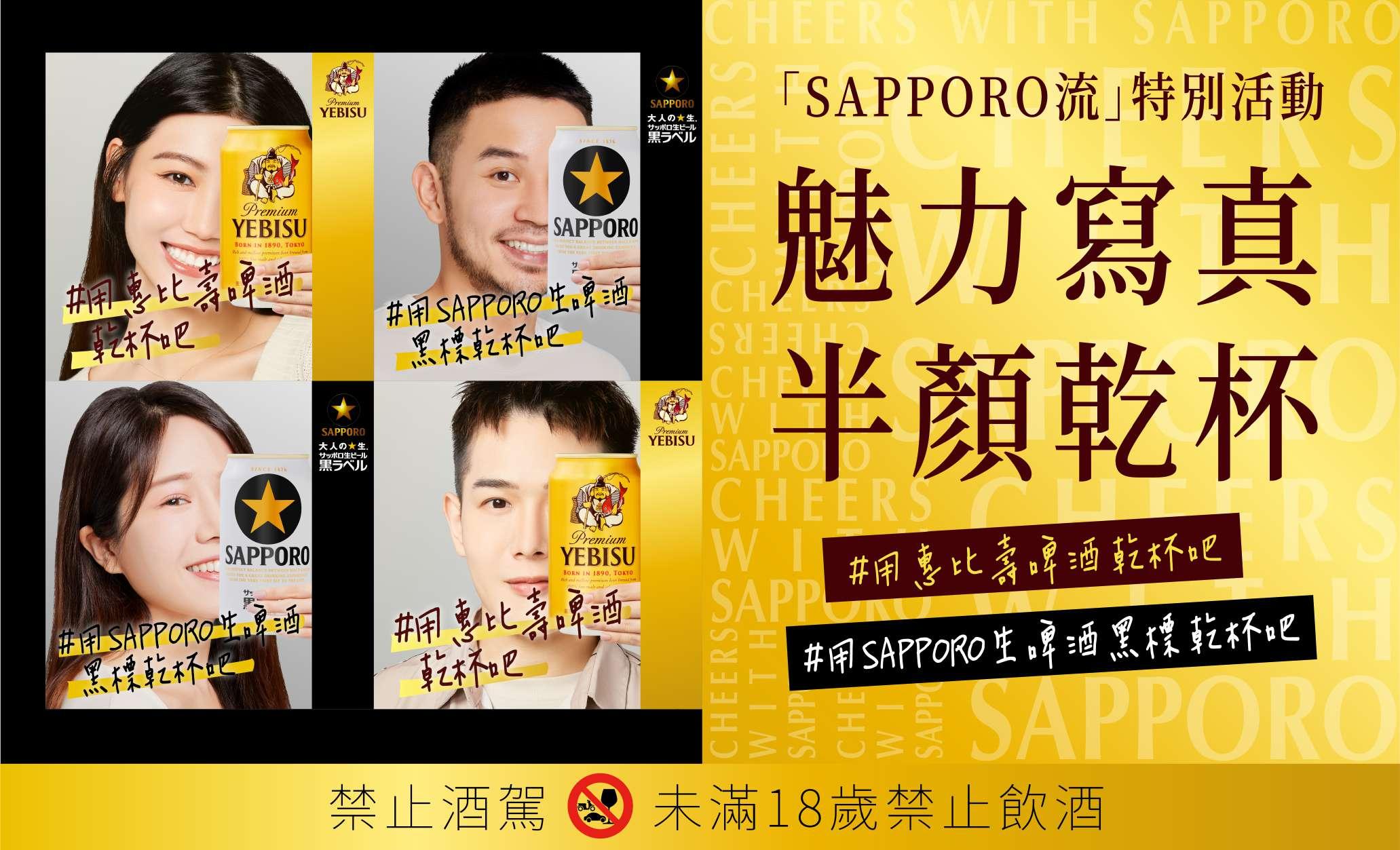
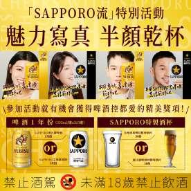
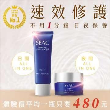
By using gold and black as the foundation of the brand's tone, SAPPORO maintains a consistent and cohesive visual identity. This approach helps create a strong and recognizable brand presence, as well as evoking a sense of sophistication and premium quality.


Clients
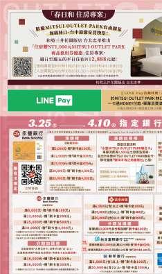
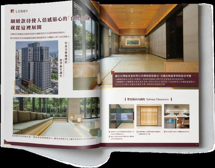
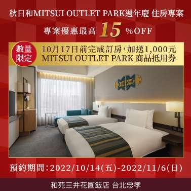
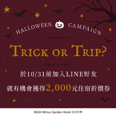
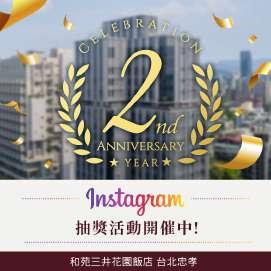
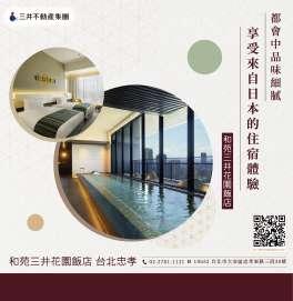
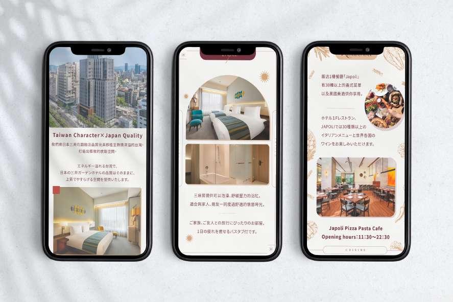
Mitsui Garden Hotel, originating from Japan, has made its first foray into Taiwan. Despite the challenges posed by the pandemic, the hotel aims to offer Taiwanese people a chance to experience Japanese-style hospitality without leaving the country. To achieve this, the visual design incorporates elements of traditional Japanese Washi paper as the foundation, complemented by elements and colors inspired by the themed rooms in the hotel. This aesthetic is extended throughout a series of promotional materials and items created for the hotel's opening.


Clients


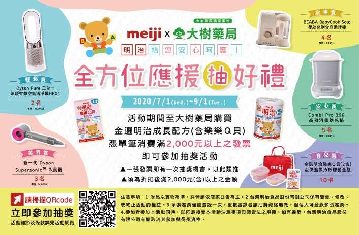
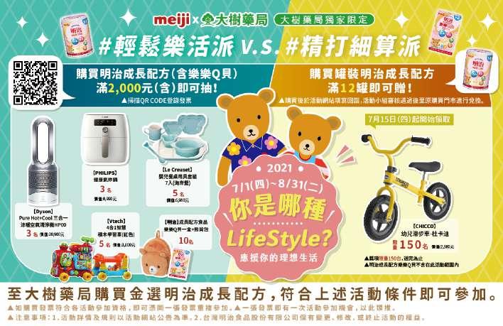
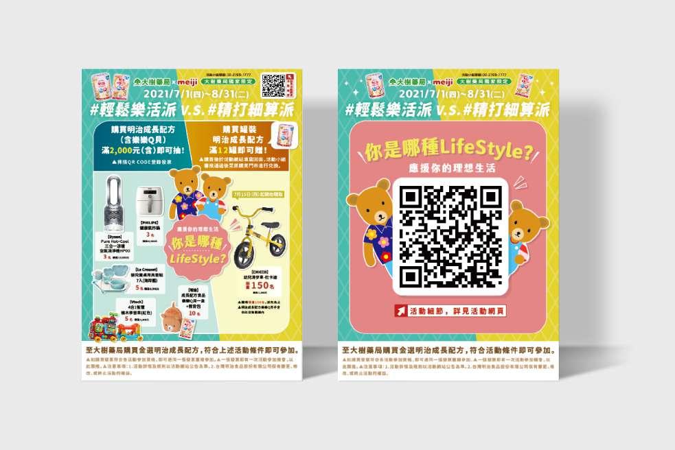
To capture attention in the infant and toddler market, Meiji focuses its designs primarily on a vibrant, adorable, and lively style.


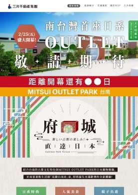
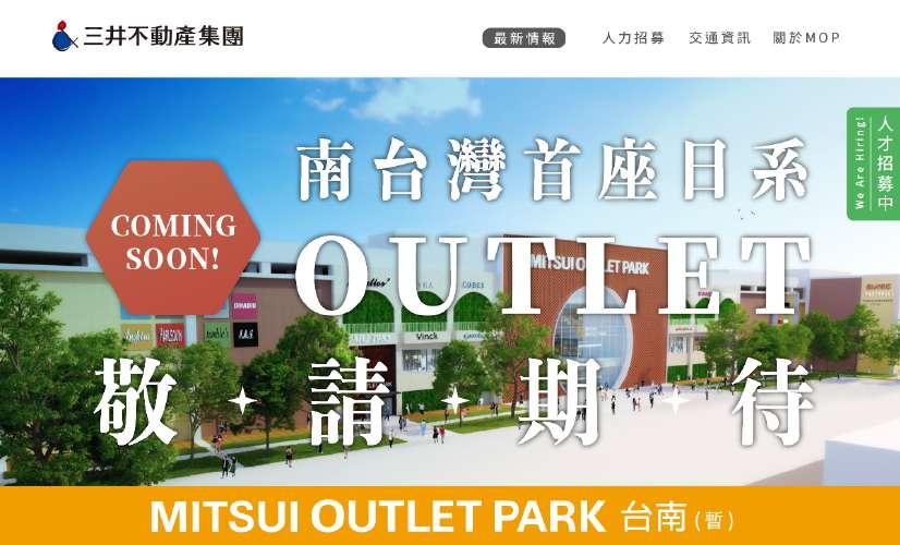
For the pre-opening teaser site, the goal is to convey a sense of the traditional charm of Tainan. To achieve this, the main color scheme selected for the website is inspired by the vibrant red, green, and blue colors commonly found in Taiwanese-style Qazidao bags. These colors evoke a strong Taiwanese aesthetic and cultural connection. Additionally, the site is adorned with decorative elements such as flower window patterns and motifs inspired by old bricks, which are commonly seen in Tainan.


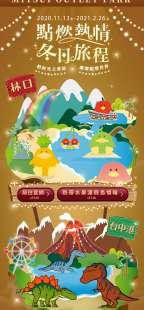

The design concept for this project is based on a combination of “Toripicals”,“SHAKUREL DINOSAUR”, and New Year's illumination. It incorporates the unique features of commercial facilities, such as a vacation-themed palm tree, Ferris wheel, and volcano, to create a whimsical island-themed world.


Clients
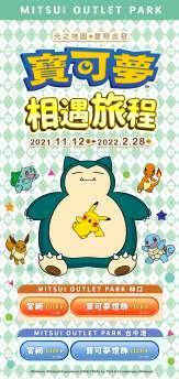
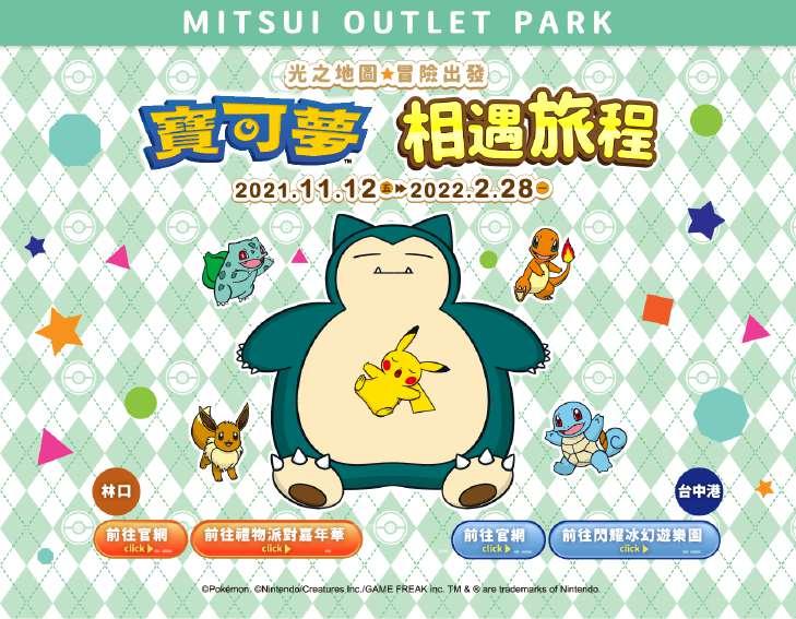
The main title can feature playful and vibrant typography, resembling the iconic Pokémon logo style. The letters can be bold, energetic, and visually engaging, reflecting the dynamic nature of the Pokémon world.


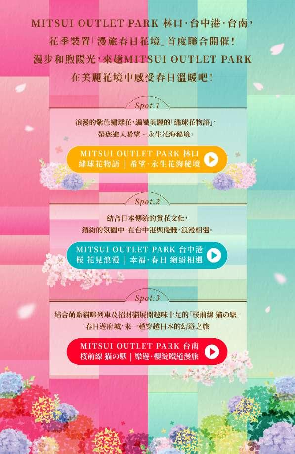

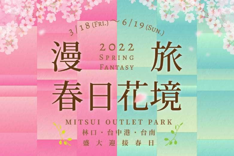

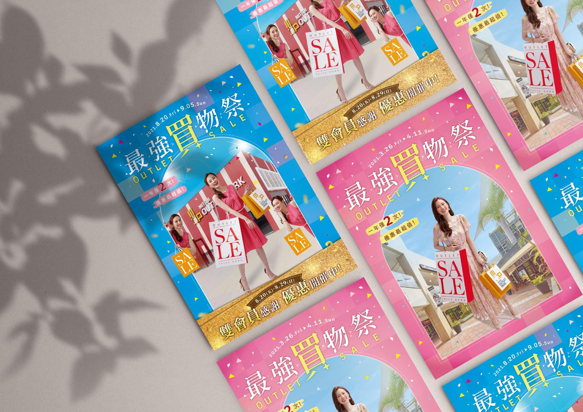
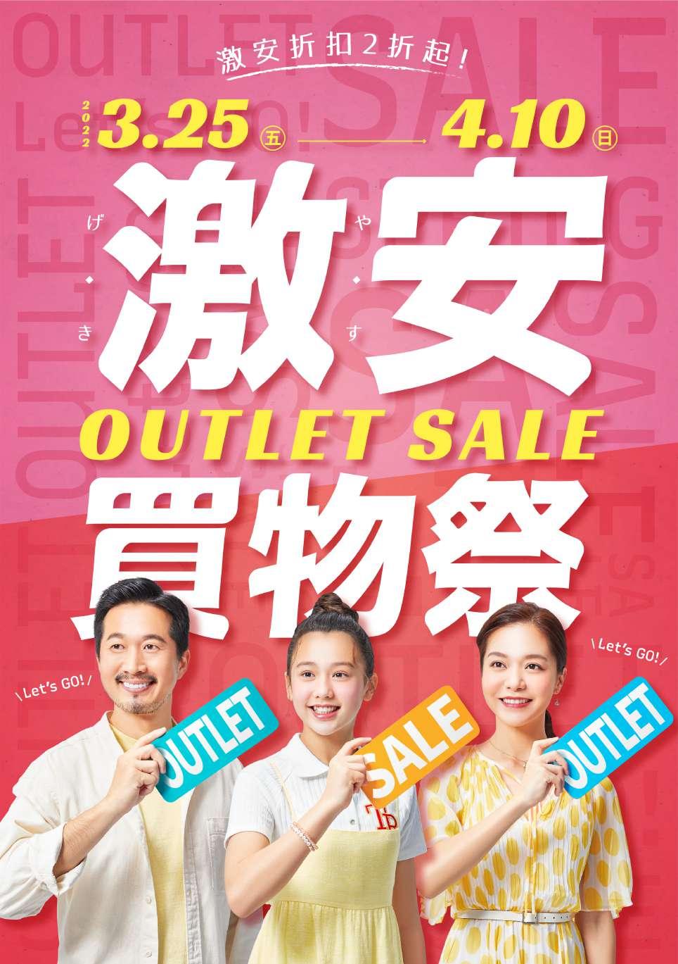
The design theme is centered around the springtime floral landscape within the facilities. The focal points are two separate facilities adorned with cherry blossoms and hydrangeas respectively. The design aims to capture the romantic essence of spring, aligning with the main theme of a leisurely journey. Therefore, a soft color palette is chosen as the background, with accents of cherry blossoms and hydrangea imagery.


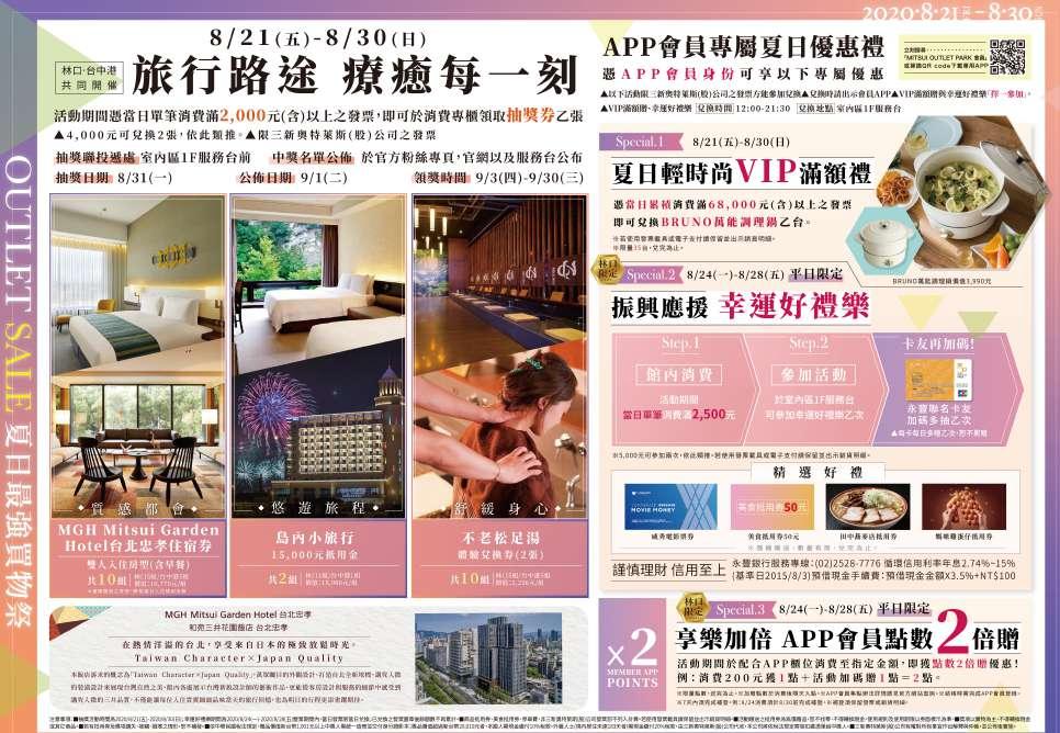

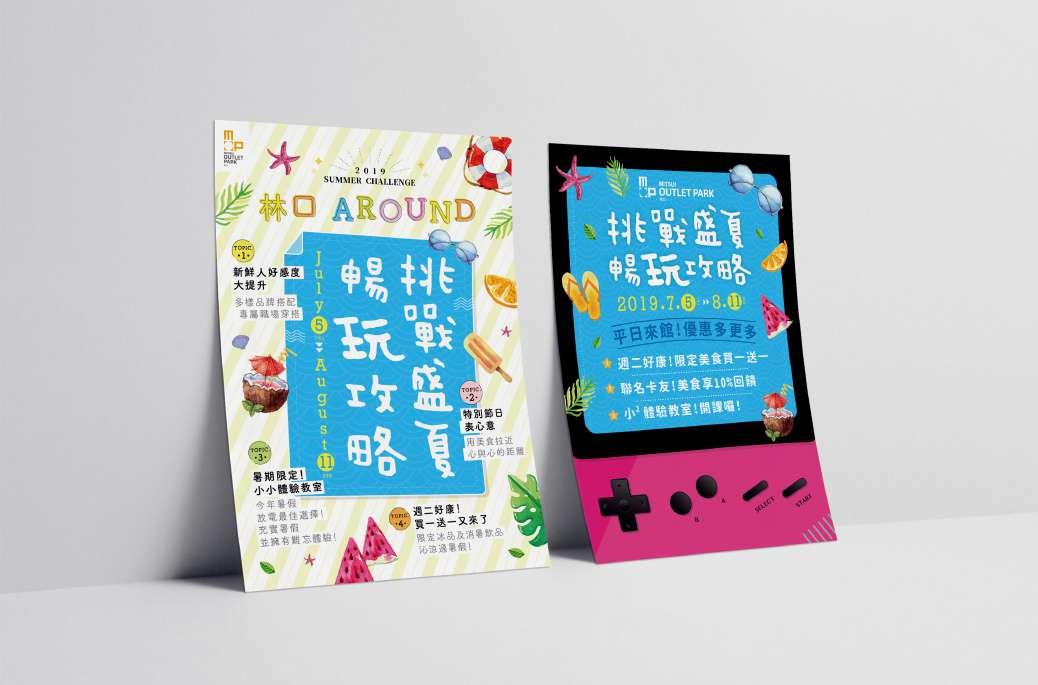
To represent the seasonal Sales of spring and summer, the creative design can incorporate elements such as � to � models, facility illustrations (one for Linkou and one for Taichung Harbor), a lively atmosphere, and a sense of the overall year-long series.