NMarketSt
NSan PedroSt
SSan PedroSt NThirdSt
Design & Photographed by Chi Hang
WSantaClaraSt
SMarketSt
LightstonAI
NFirstSt
NSecondSt
SSecondSt
SFirstSt


NMarketSt
NSan PedroSt
SSan PedroSt NThirdSt
Design & Photographed by Chi Hang
WSantaClaraSt
SMarketSt
LightstonAI
NFirstSt
NSecondSt
SSecondSt
SFirstSt
Downtown San Jose, originally established as part of the Pueblo de San José de Guadalupe in 1777, grew from a small agricultural settlement to become the city’s urban center. In the late 19th century, it experienced growth with the arrival of the railroad, facilitating trade and transportation. The downtown area saw development in the form of Victorian-era buildings, many of which still stand today as part of the historic district. During the mid-20th century, downtown San Jose underwent significant changes with urban renewal projects and the construction of modern buildings. However, by the late 20th century, the downtown area faced challenges such as urban decay and suburbanization. In the late 20th and early 21st centuries, efforts were made to revitalize downtown San Jose. This included the development of cultural institutions like the San Jose Museum of Art and the Tech Museum of Innovation, as well as the expansion
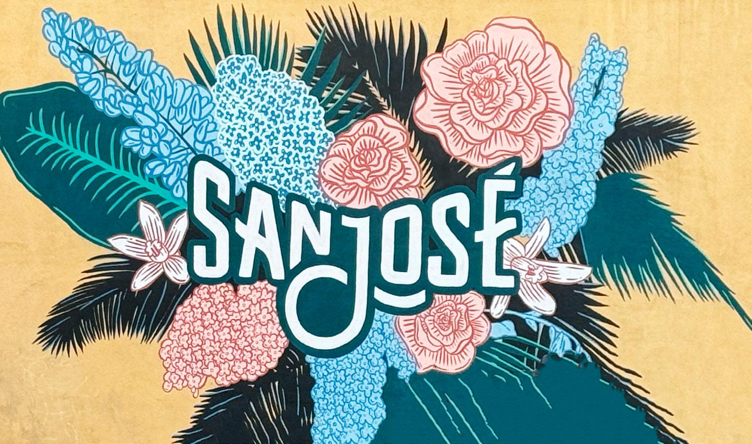
of entertainment venues and dining options. Today, downtown San Jose is a vibrant hub of activity featuring a mix of historic architecture, modern skyscrapers, cultural attractions, and bustling nightlife. It continues to evolve as a dynamic urban center, attracting residents, visitors, and businesses alike.
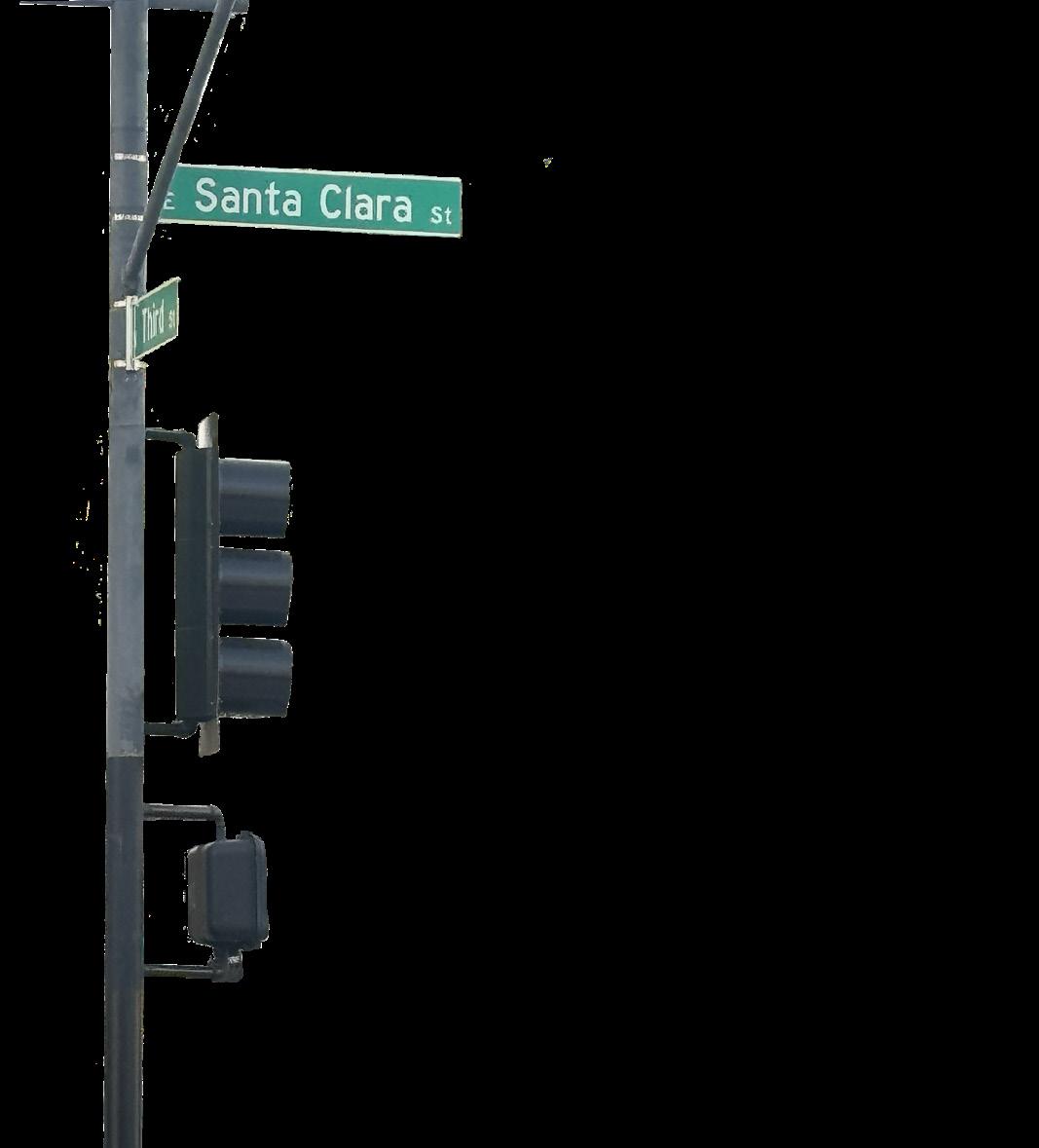
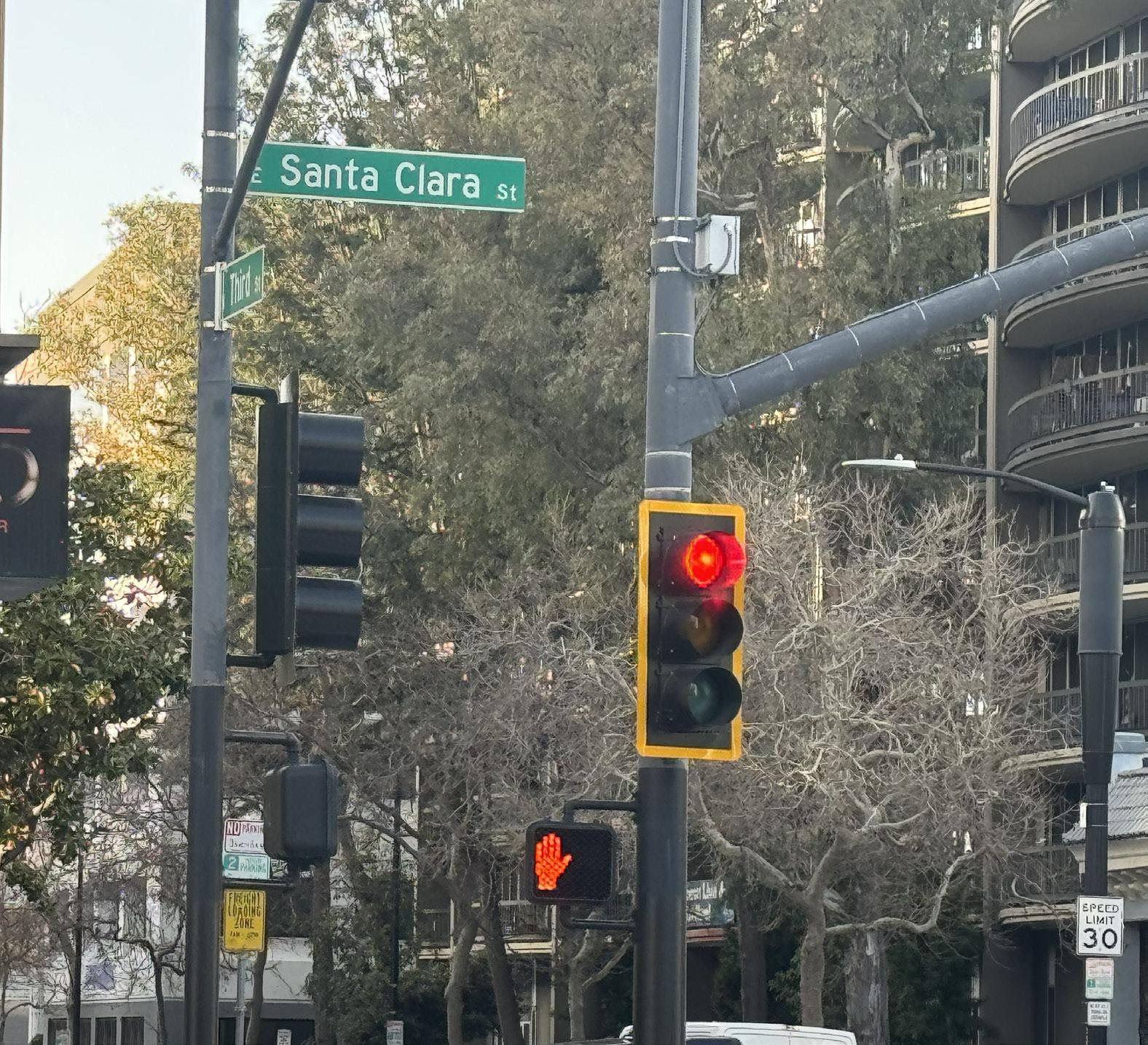
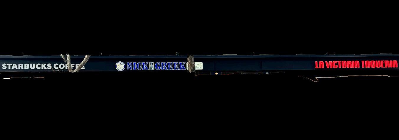
Santa Clara Street in San Jose is the vibrant backbone of downtown, beginning at Market Street amidst iconic landmarks like the San Jose Convention Center and the Tech Museum of Innovation. Stretching eastward, it winds through diverse neighborhoods like Japantown and the SoFA District, eventually intersecting with key streets such as First Street, Fourth Street, and Alum Rock Avenue. Along this bustling thoroughfare, typography serves as a silent storyteller, capturing the essence of Santa Clara Street’s evolution. From weathered hand-painted signs of the past to the sleek logos of modern startups,
typography reflects the enduring spirit of entrepreneurship and resilience. As commerce and culture intersect, Santa Clara Street remains a vital artery of the city’s urban landscape, where tradition and innovation converge in a visual narrative of growth and continuity.

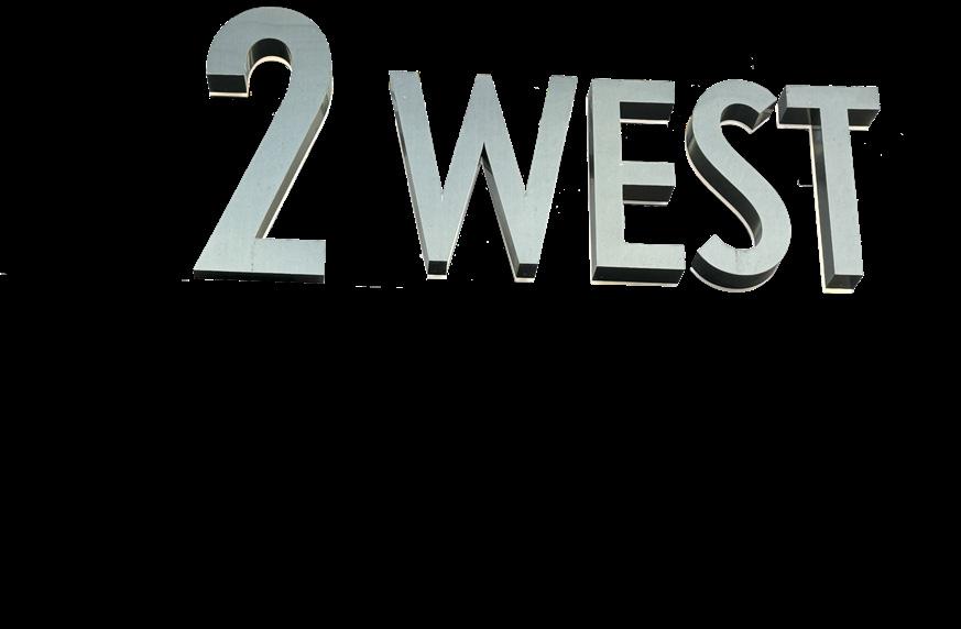
Located at the entrance of San Jose City Hall, the address sign immediately captures visitors’ attention with its clean lines, modern typography, and distinctive design. The use of sans-serif lettering imparts a sense of clarity and professionalism, ensuring that the address is easily legible from a distance and in various lighting conditions. Moreover, the sleek and minimalist aesthetic of the typography reflects the city’s position as a hub of innovation and technology, while its simplicity conveys a sense of accessibility and openness to all. The typography of the address sign at San Jose City Hall is a powerful symbol of the city’s identity and values, communicating its commitment to innovation, transparency, and civic engagement through its bold design, minimalist aesthetic, and functional clarity.



Located on E Santa Clara St, San Jose, between Fourth and Fifth Streets, Rollati Ristorante has established itself as a beloved culinary destination known for its authentic Italian cuisine and warm hospitality. Rollati Ristorante’s name signage is often illuminated to enhance its visibility, especially during evening hours. Soft, warm lighting may gently illuminate the signage, creating a welcoming glow that beckons diners to step inside and experience the warmth and hospitality of the restaurant. Alternatively, LED or neon lighting may be incorporated into the signage to add a touch of drama and sophistication, further enhancing its visual impact and creating a memorable impression.

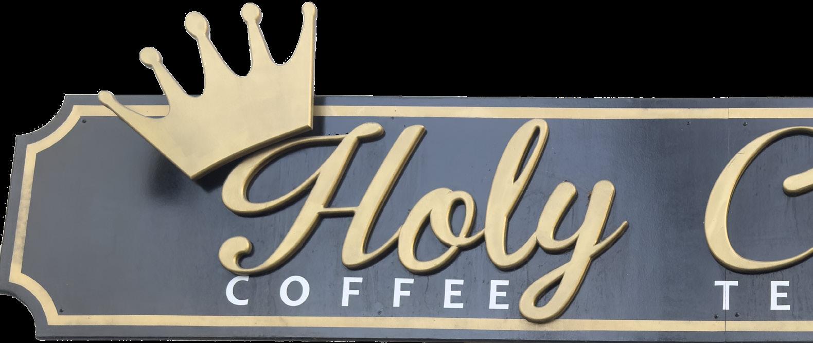
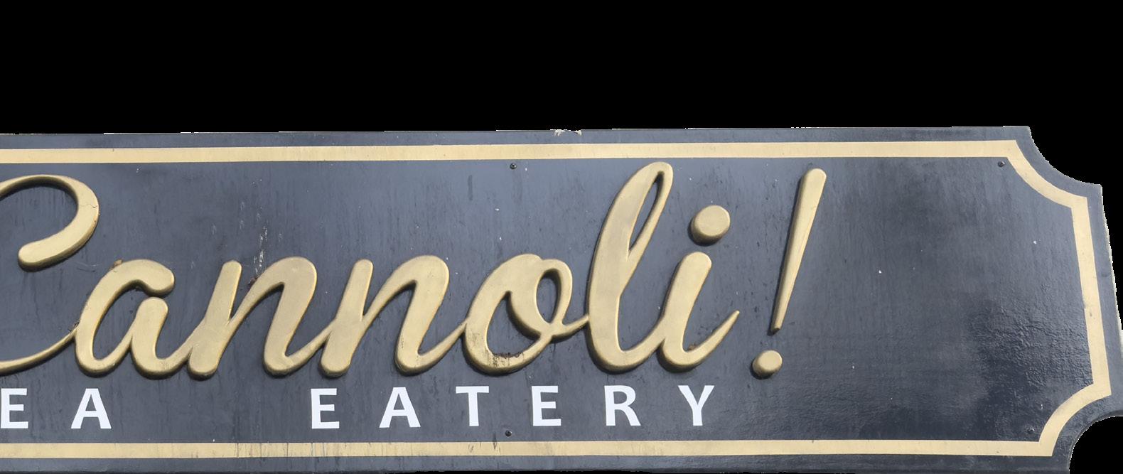
Nestled in the heart of downtown San Jose, California, Holy Cannoli! Cafe’s signage serves as a beacon for dessert lovers and coffee aficionados, inviting them to indulge in a delightful culinary experience. The typography of Holy Cannoli! Cafe’s name signage is playful and eye-catching, reflecting its lighthearted approach to dessert
and its commitment to creating memorable moments for its patrons. Bold, hand-drawn lettering evokes the feeling of a vintage Italian bakery, with flourishes and curls that add a touch of whimsy and charm. The use of a golden coffee color further enhances the signage’s visual appeal, capturing the richness and warmth of freshly brewed espresso.
MiniBoss’s name signage is a bold statement reflecting the establishment’s essence. Situated in the heart of downtown San Jose, California, MiniBoss’s signage serves as a beacon for gamers, nostalgia seekers, and enthusiasts of all ages, inviting them to enter a world of retro gaming and immersive experiences. The typography of MiniBoss’s name signage is dynamic and eye-catching, conveying a sense of adventure and excitement. Bold, blocky lettering evokes the aesthetic of classic arcade games, with sharp angles and geometric shapes that command attention. Vibrant colors, such as neon/electric yellow, further enhance the signage’s visual impact, drawing passersby into the immersive gaming world.

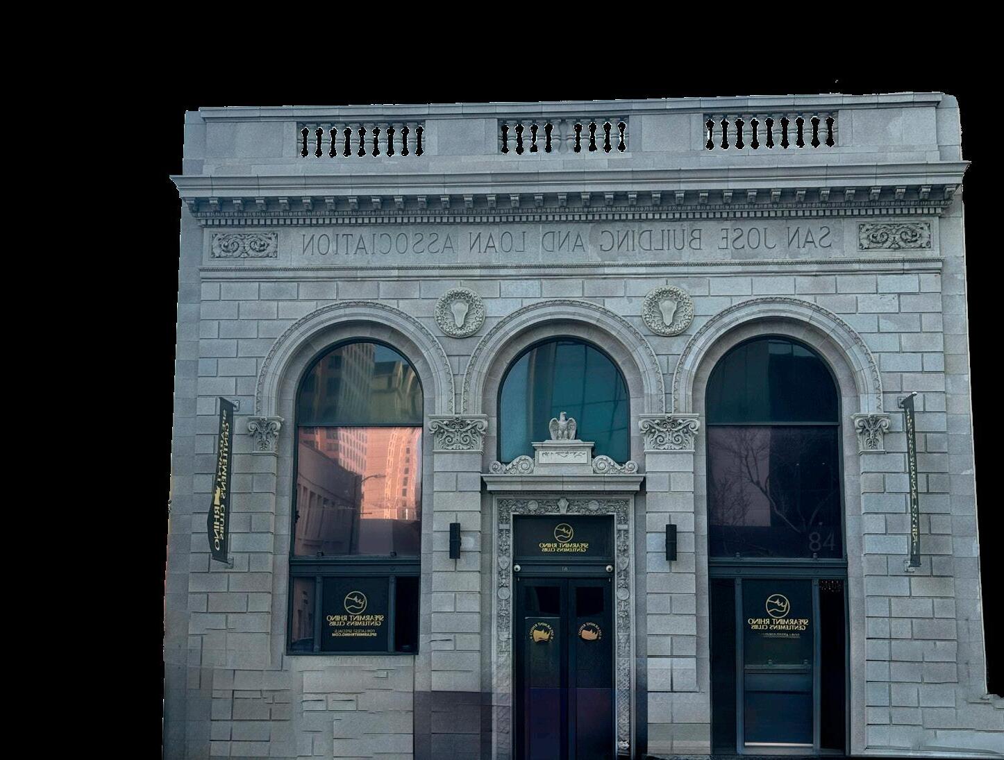
The typography of the San Jose Building and Loan Association building played a crucial role in conveying the institution’s professionalism, stability, and trustworthiness to the community. Located in downtown San Jose, California, the building’s typography was a key element of its architectural design, reflecting the era in which it was built and the values it sought to uphold. The typography used on the San Jose Building and Loan Association building was likely traditional and conservative, characteristic of financial institutions of the early to mid-20th century. Serif fonts were commonly employed to convey a sense of formality, authority, and reliability. These fonts were chosen for their legibility and timeless appeal, ensuring that the building’s signage would be easily recognizable and convey a sense of professionalism to passersby. The building name engraved into the stone facade of the signage served as a reassuring presence, signaling to the community that the association was a trusted partner in their financial journey.
Santa Clara Street is more than just a thoroughfare—it is a living canvas reflecting San Jose’s soul. Through its typography, we can uncover the stories of the city’s past, celebrate its diverse cultural heritage, and envision its future as a dynamic and vibrant urban center. As we stroll along Santa Clara Street, let us not only admire its architectural beauty but also pause to appreciate the typographic treasures that adorn its storefronts, for they are windows into the heart and soul of San Jose.
