A UI and graphic designer with both creative and logical thinking, specializing in concept-driven design with a keen eye for detail and strong observational skills. Chien Yi Chen previously worked at a game company in New Zealand, where she collaborated with PMs, engineers, 3D designers, and web designers, gaining firsthand experience with Western work culture and honing her communication and time management skills.
Driven by curiosity and a passion for learning, Chen Yi Chen enjoys pushing boundaries, solving problems with creativity, and staying up to date with new technologies and design trends through self-learning. She believes that great design is not only about aesthetics but also about logic and functionality. She looks forward to working closely with a team to create innovative and practical designs that enhance user experiences and bring real value to users!
Contact
+886 987033384
chienyichen.cyc@gmail.com issuu.com/chien-yi_chen
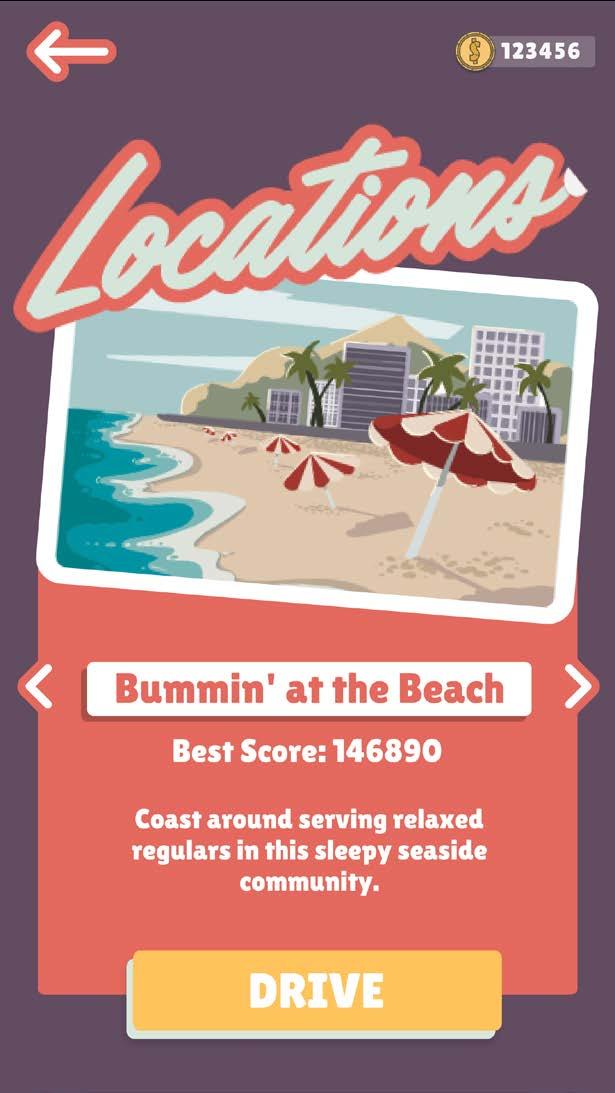
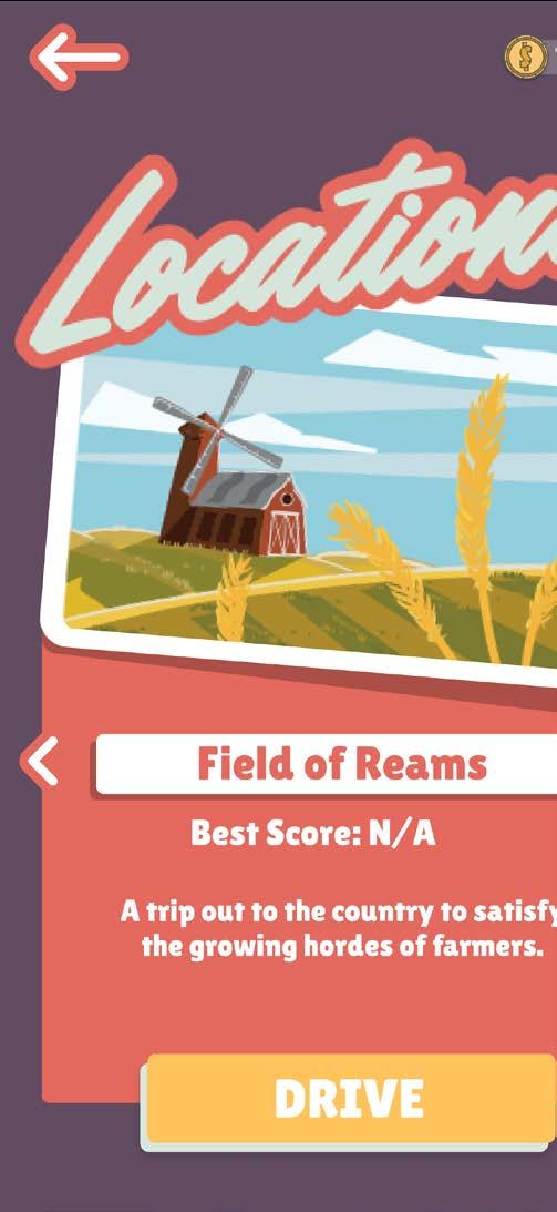
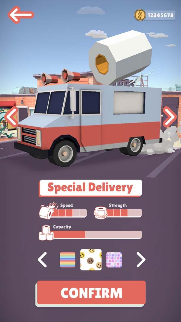
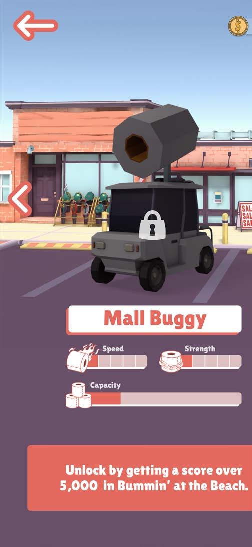
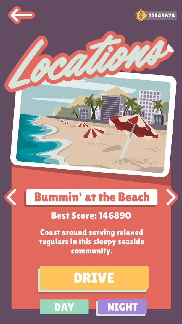
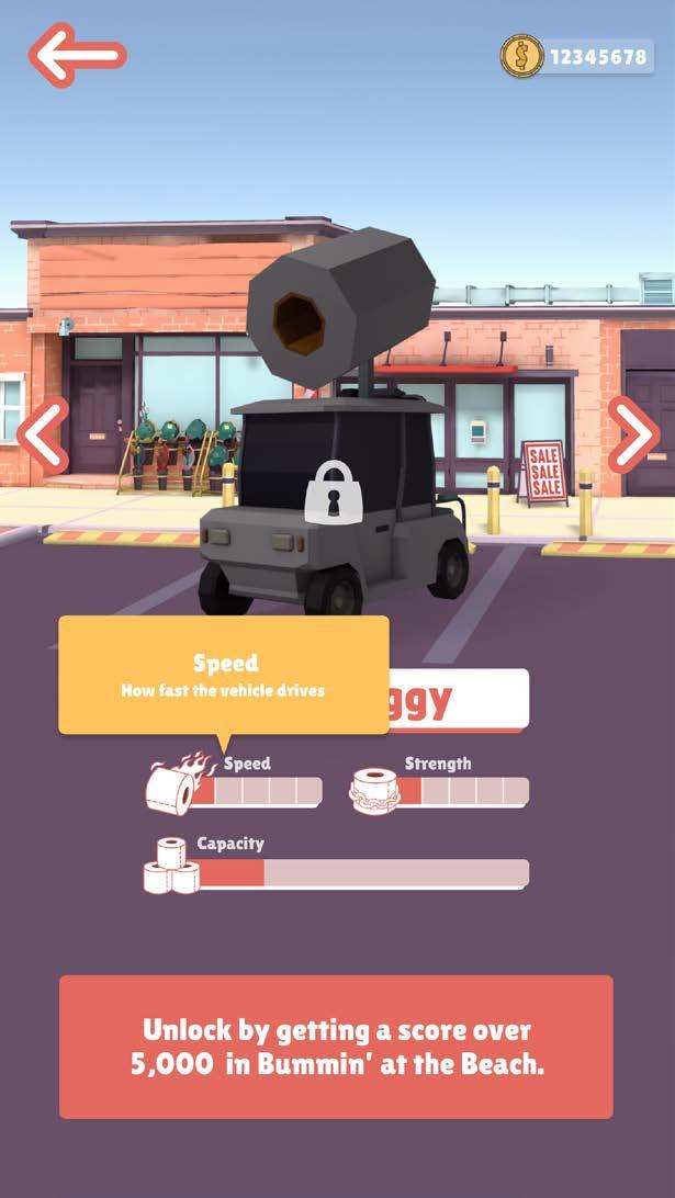
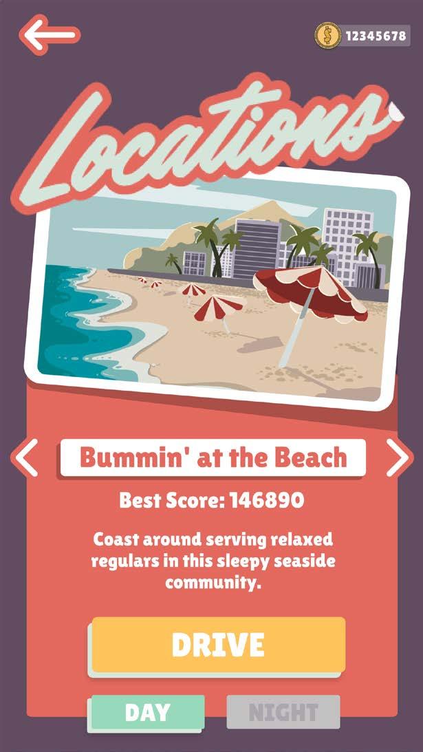
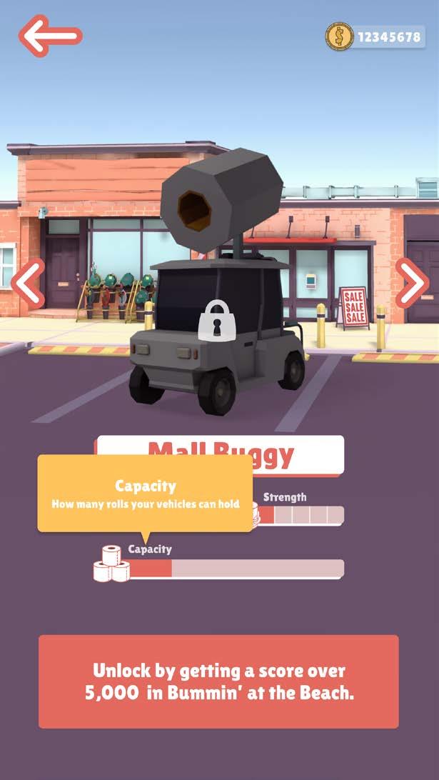
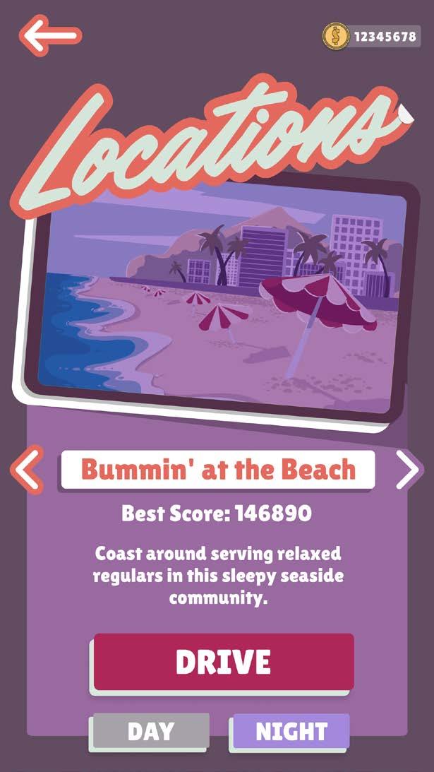
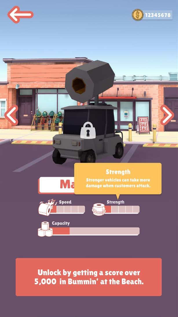
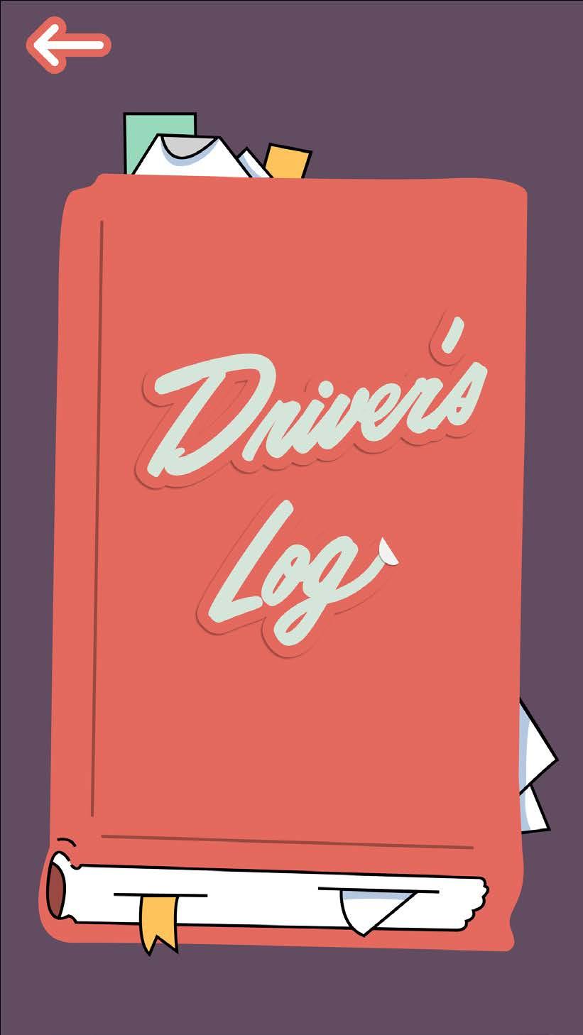
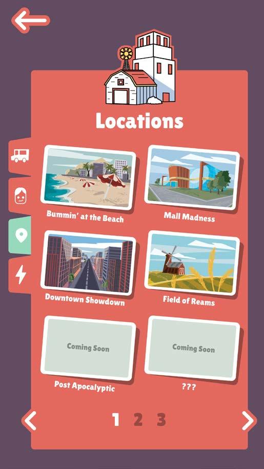
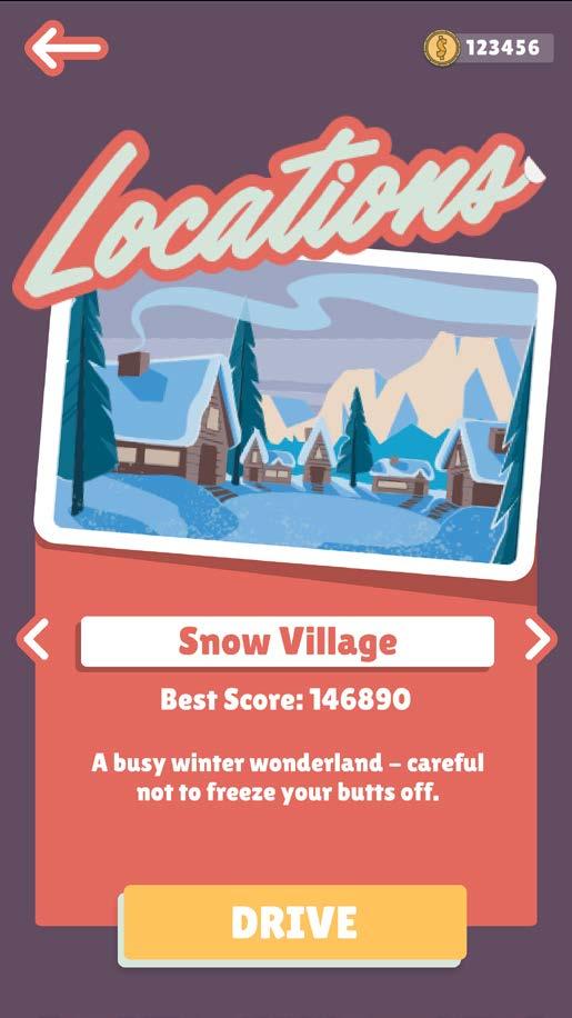
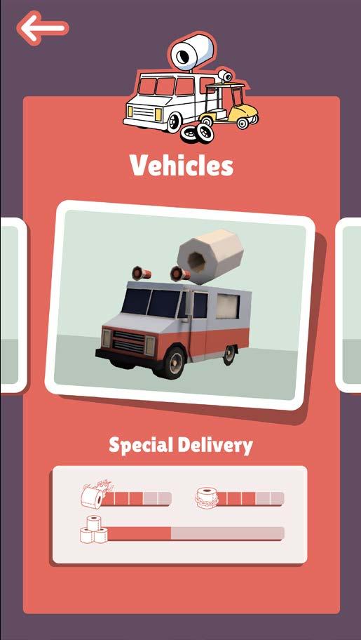
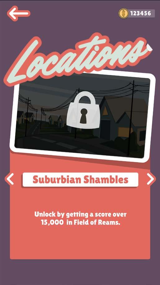
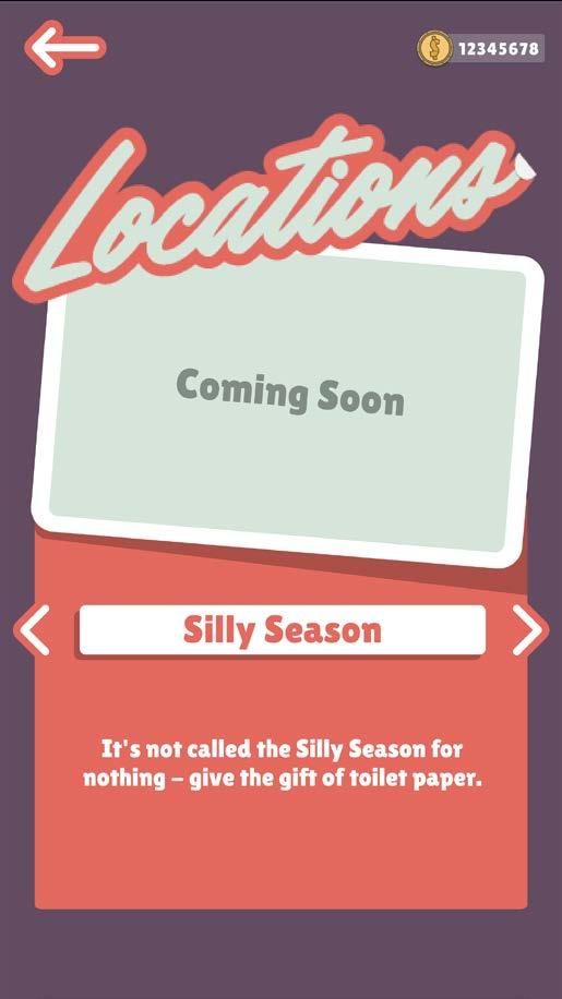
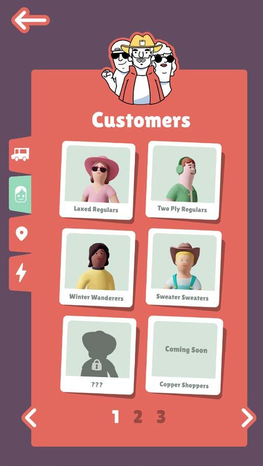
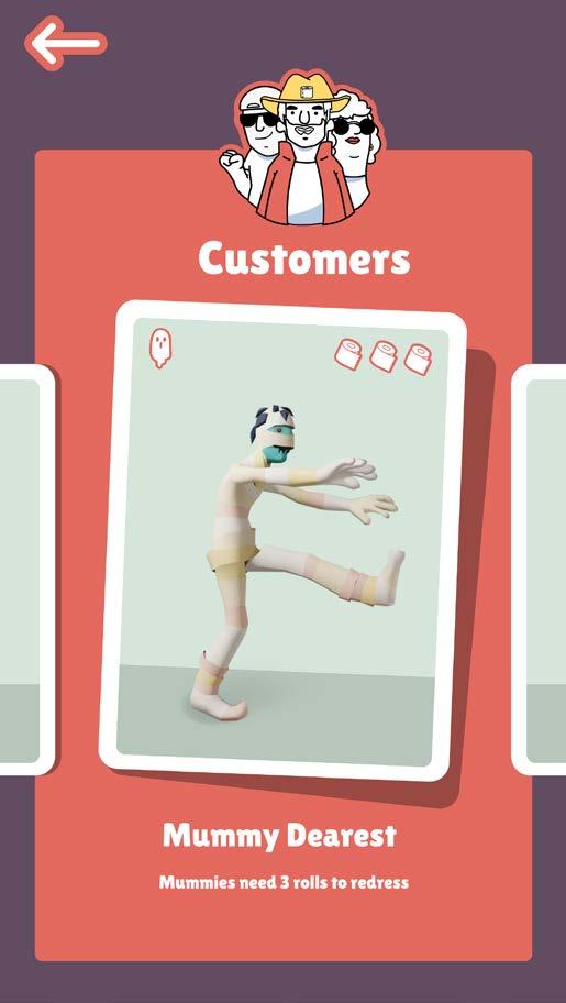
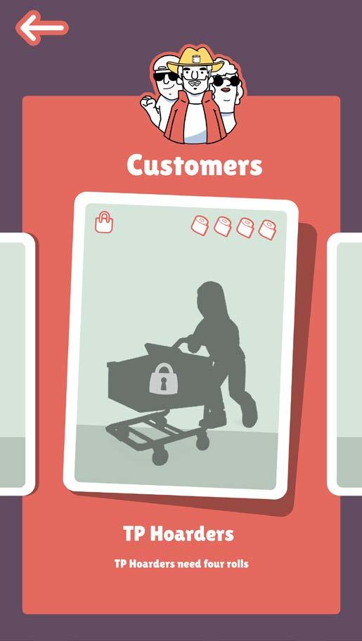
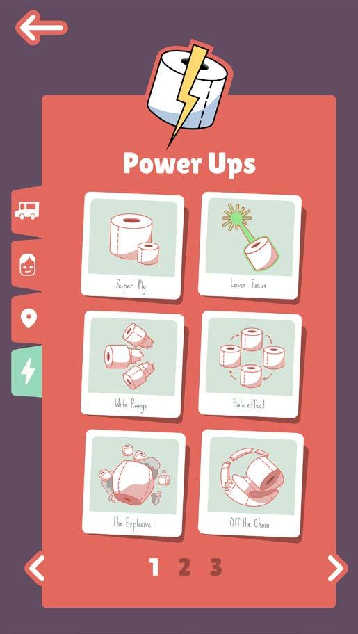
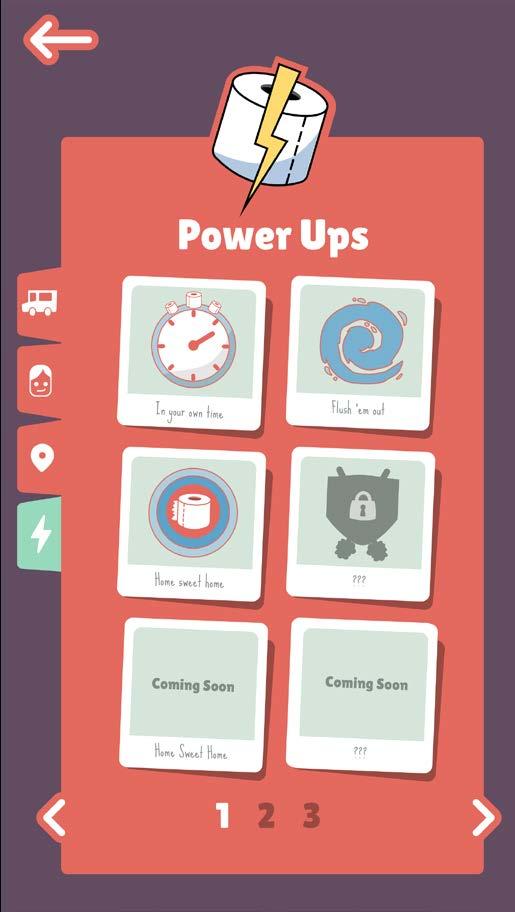
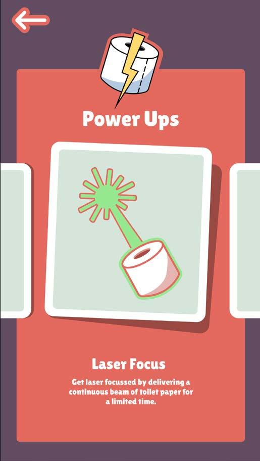
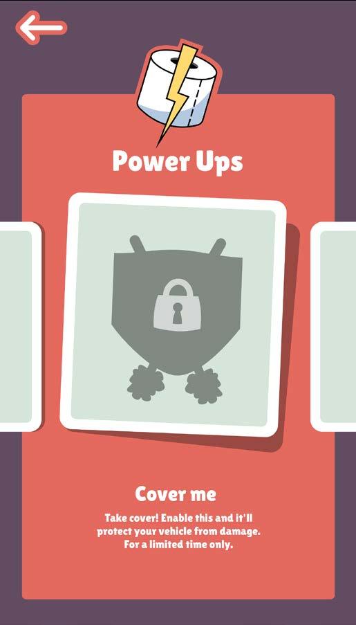
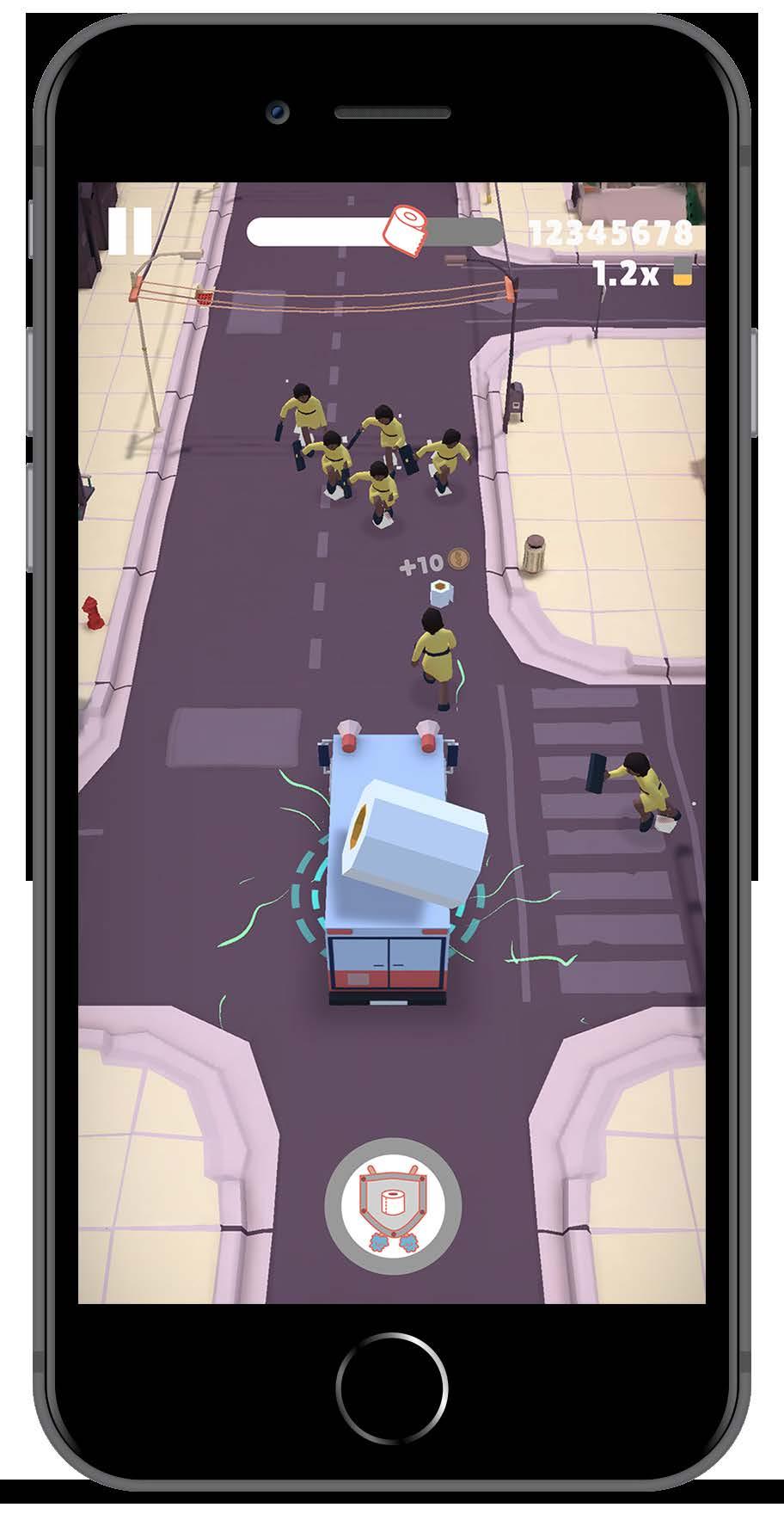
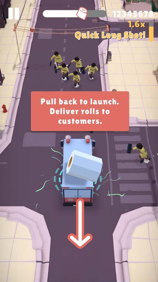
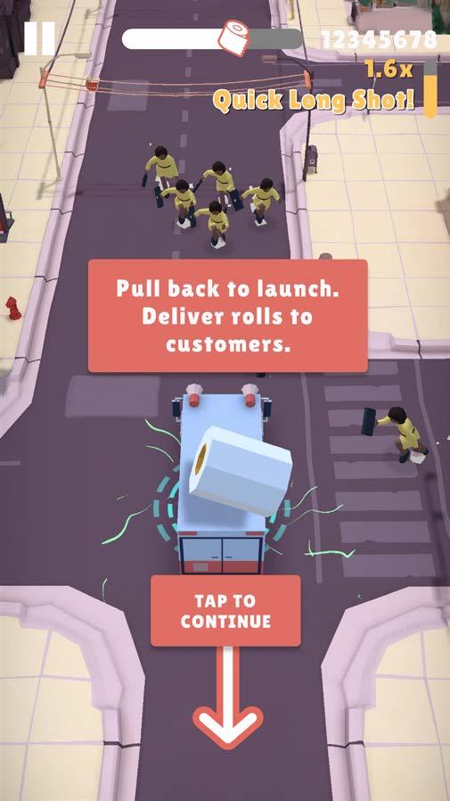
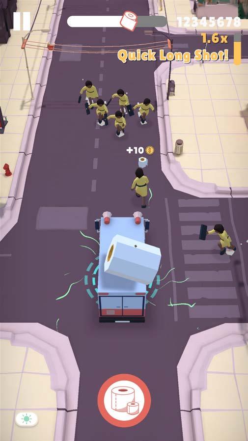
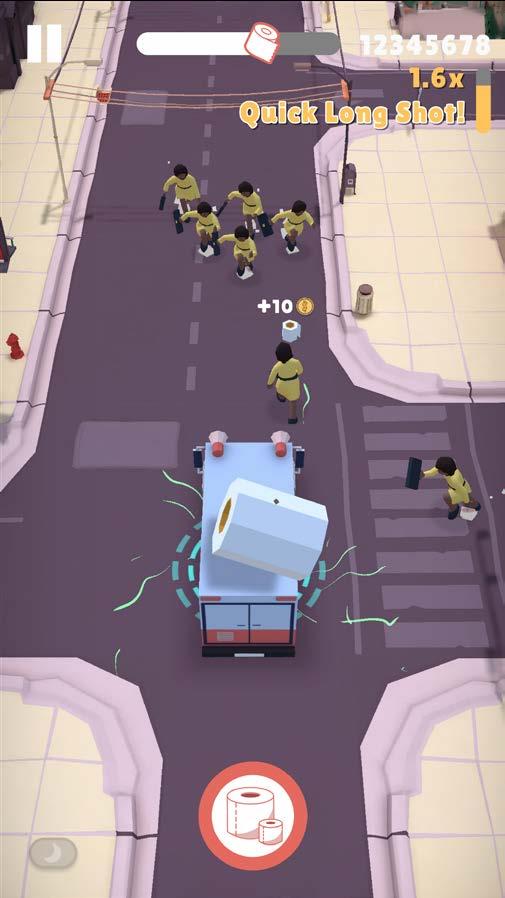
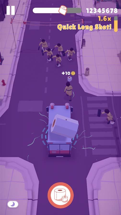
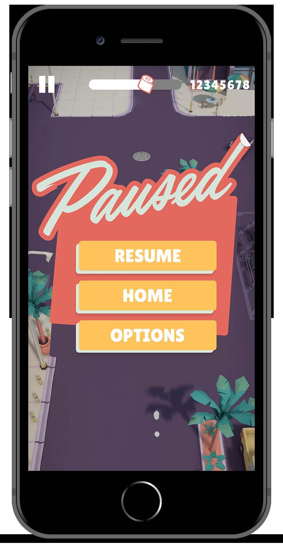
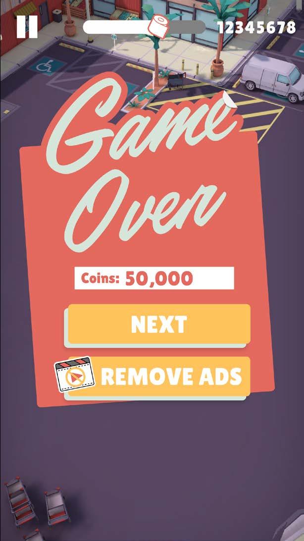
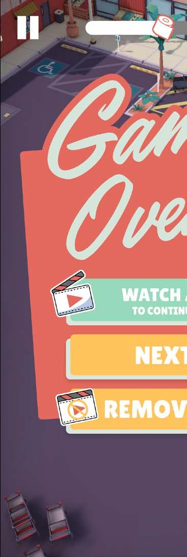
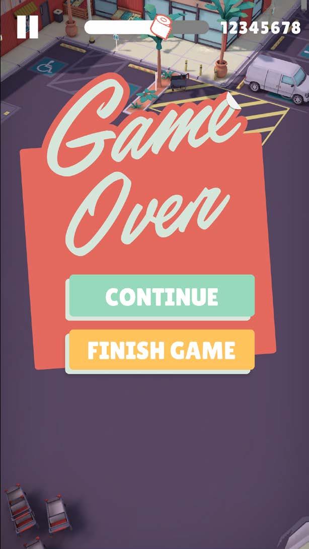
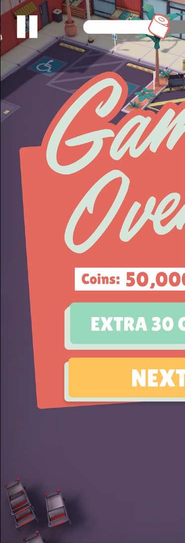
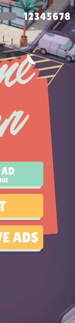
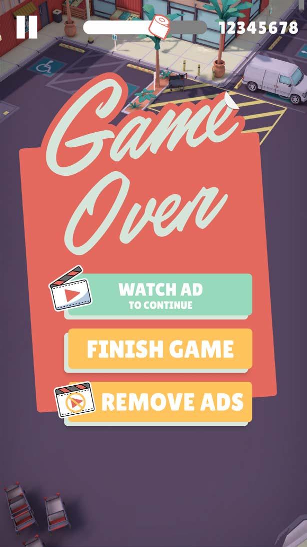
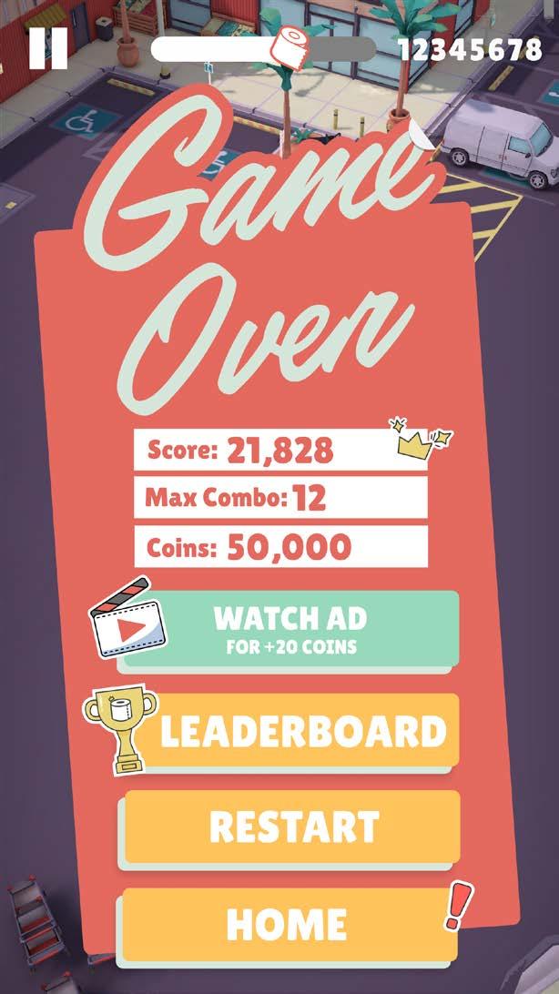
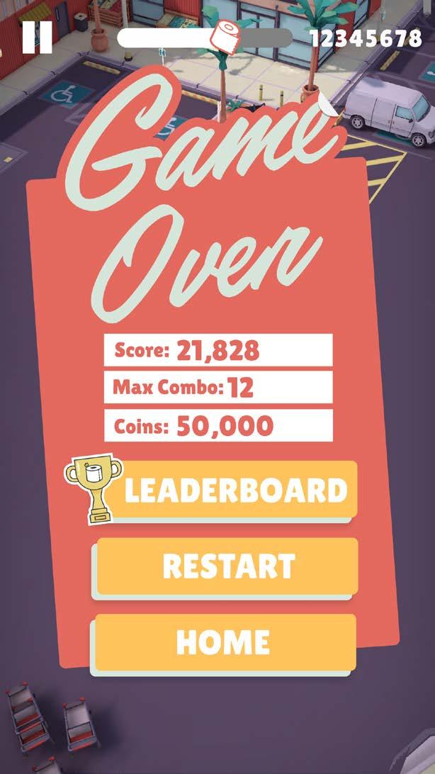
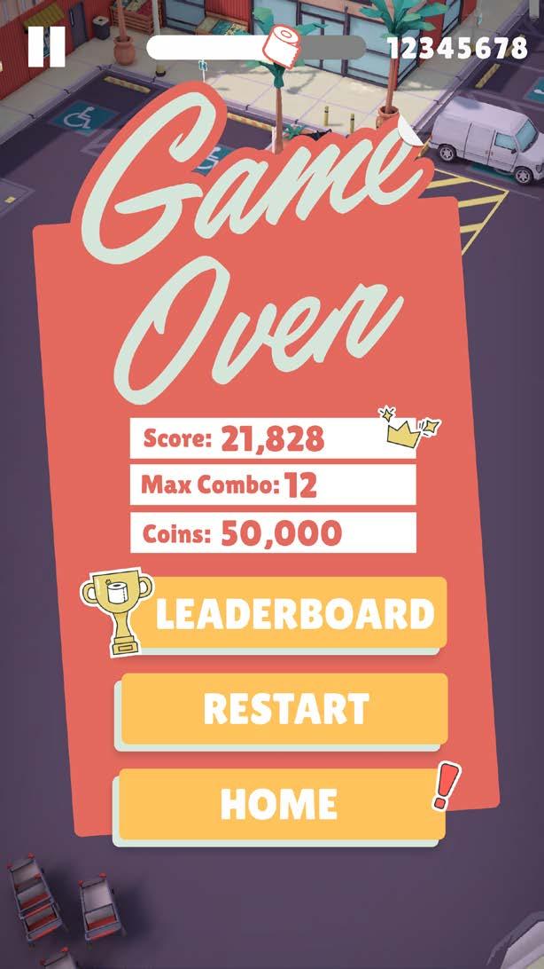
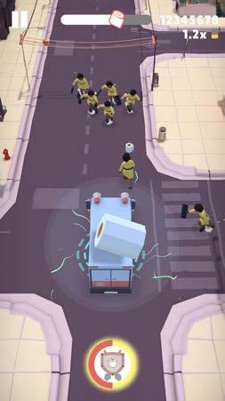
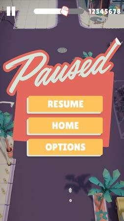
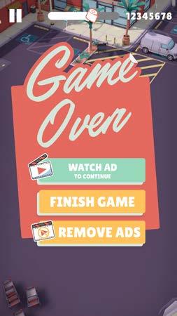
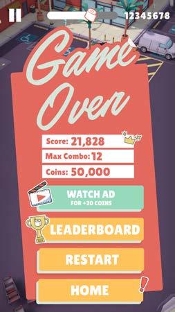
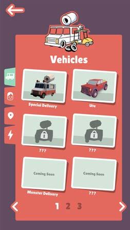
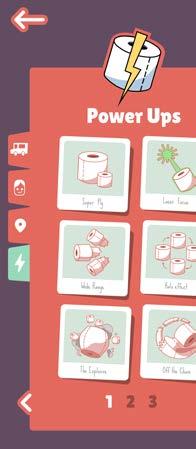
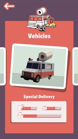
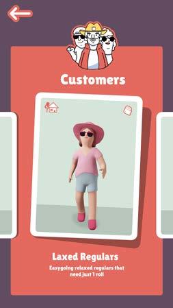
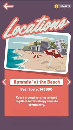
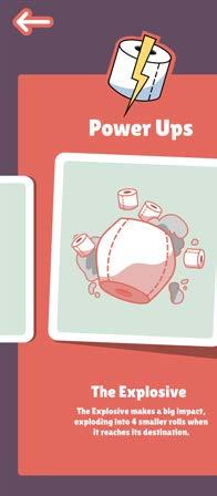
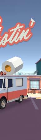
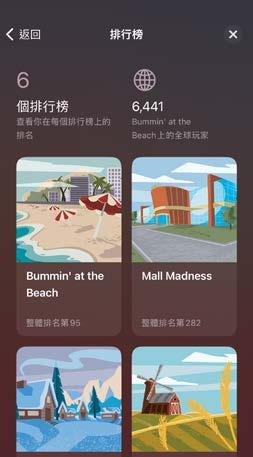
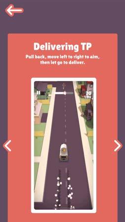
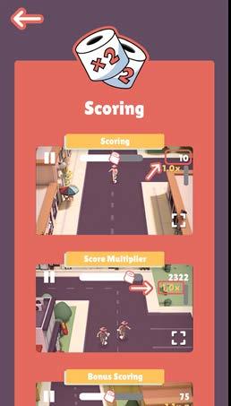
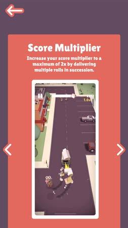
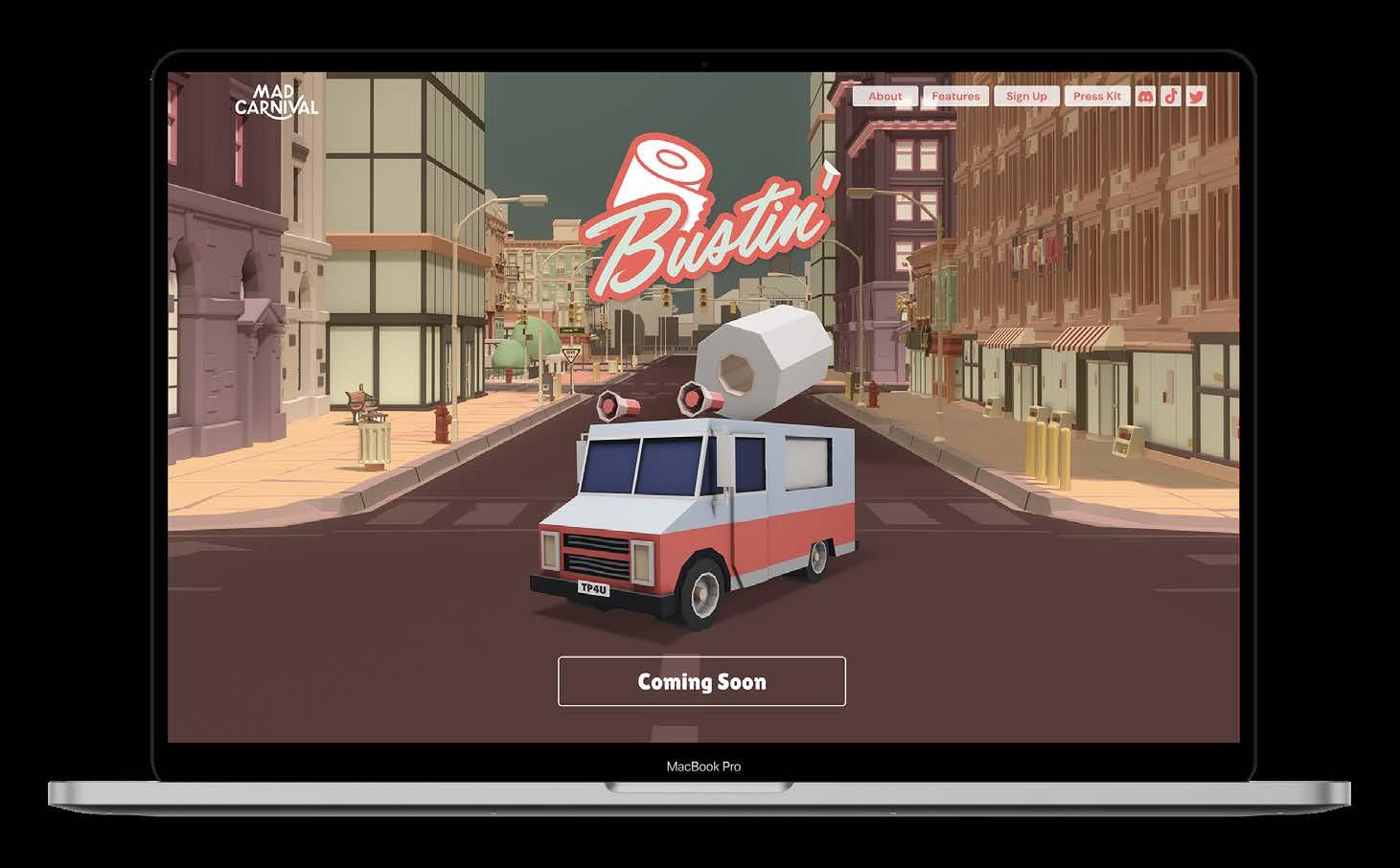
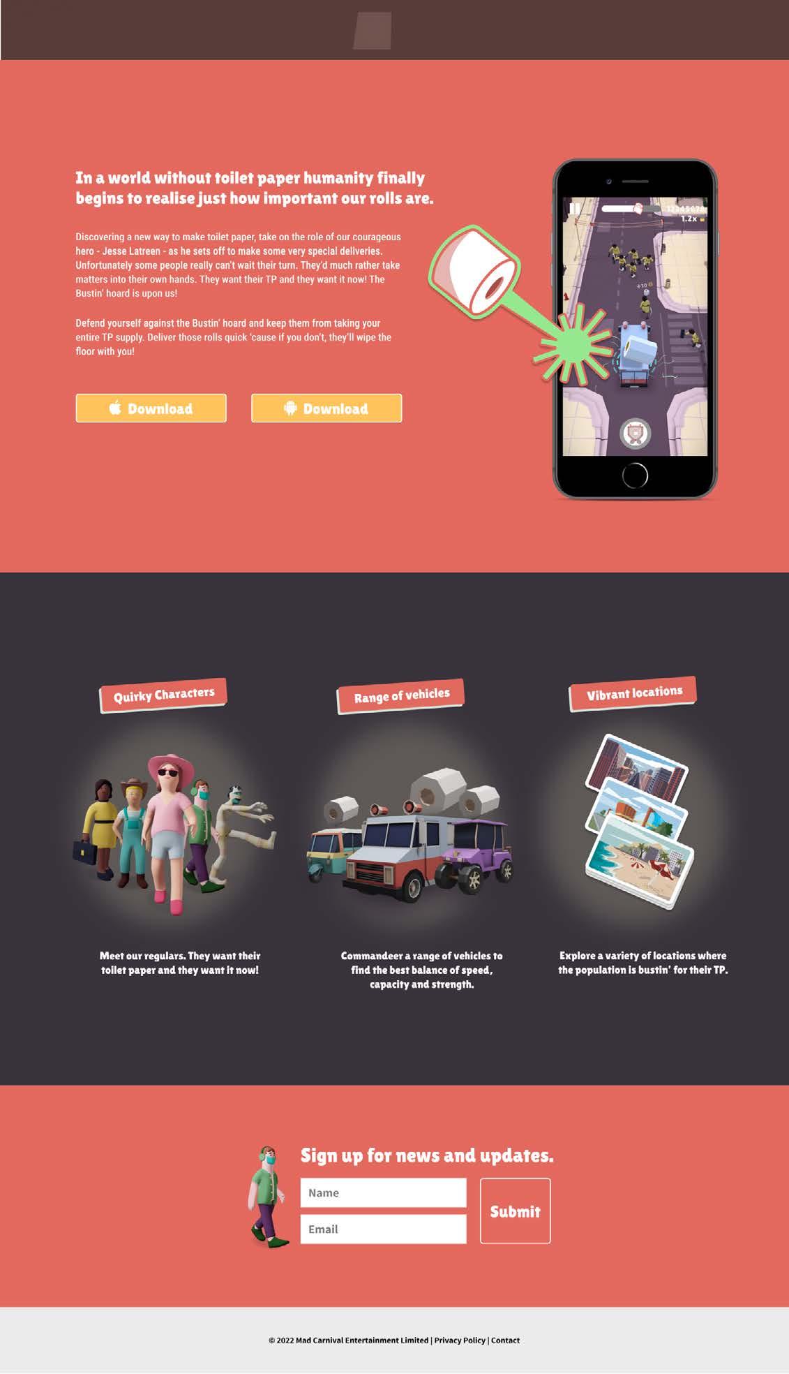
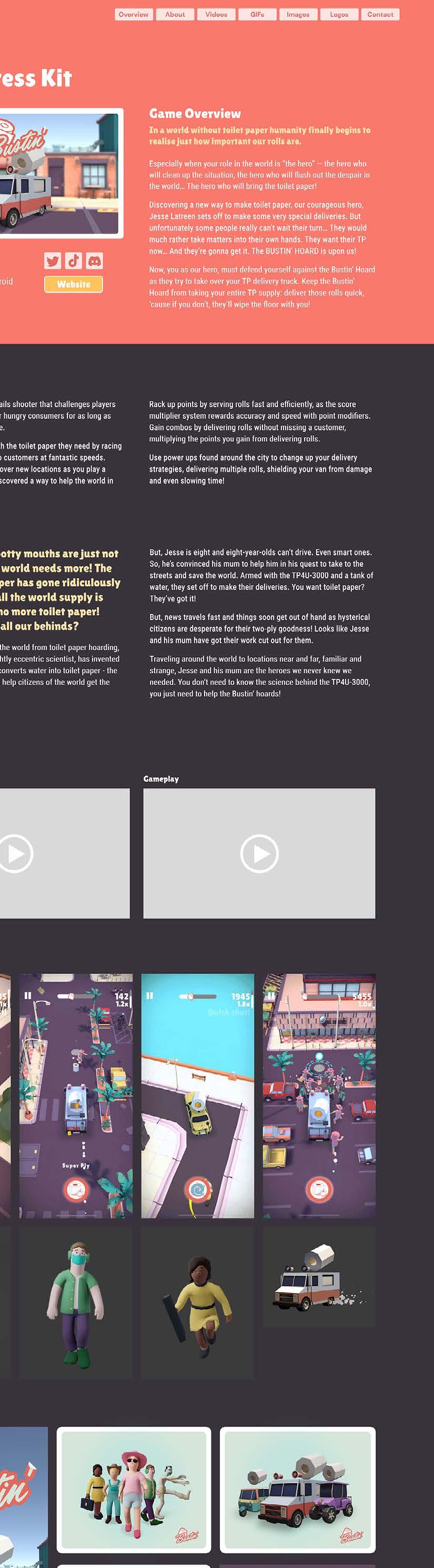
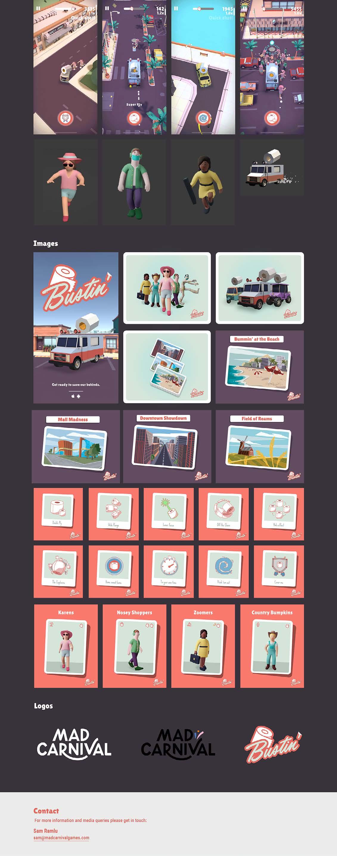
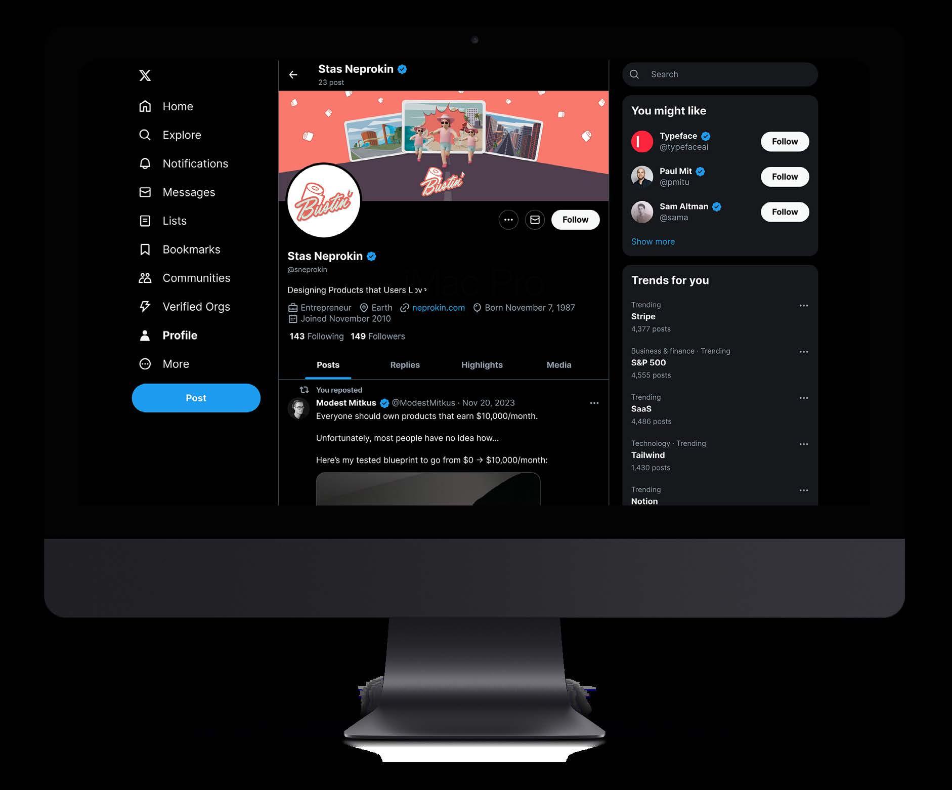
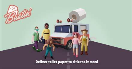
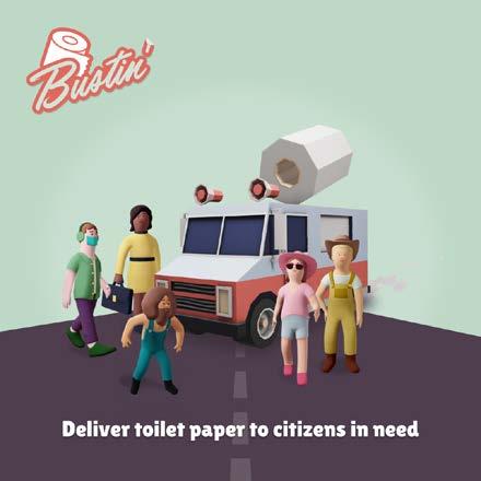
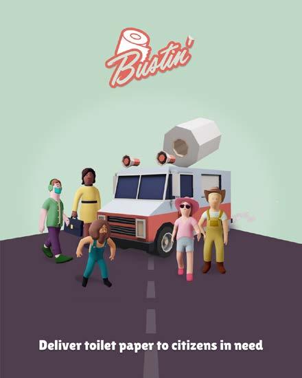
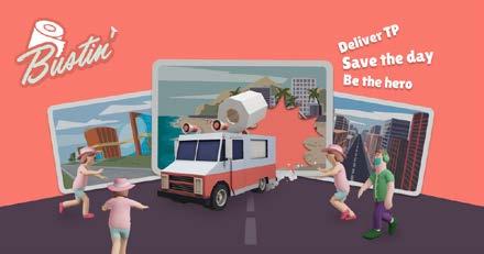
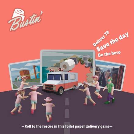
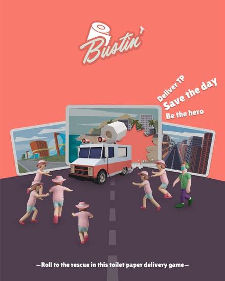
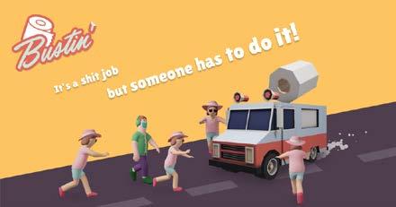
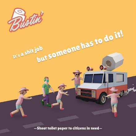
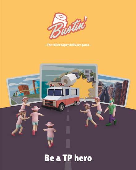
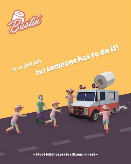
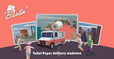
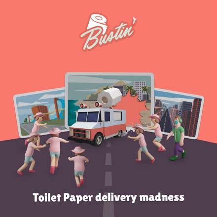
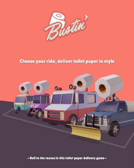
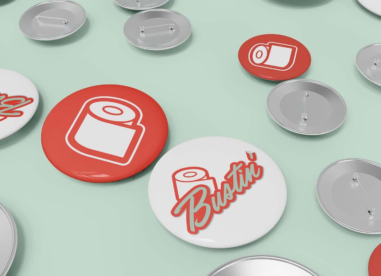
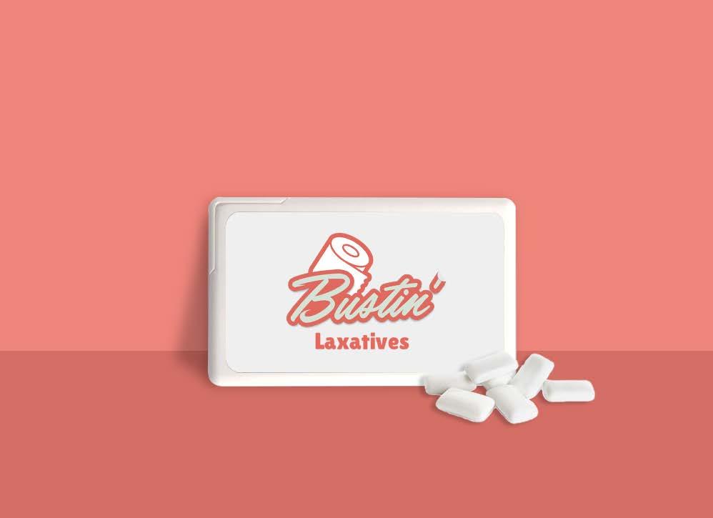
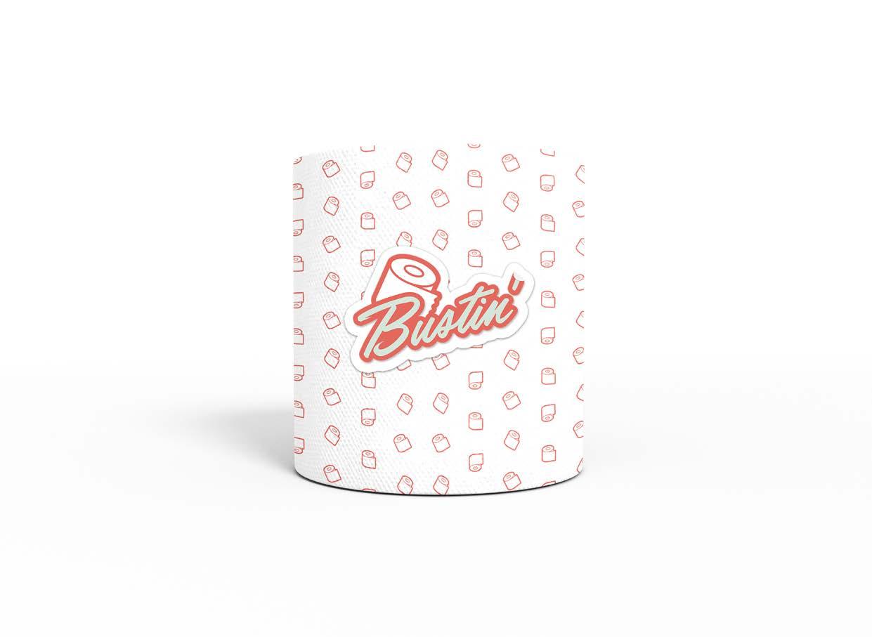
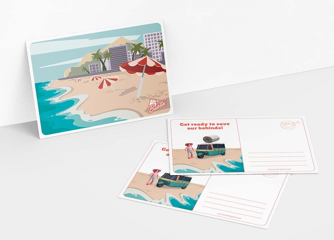
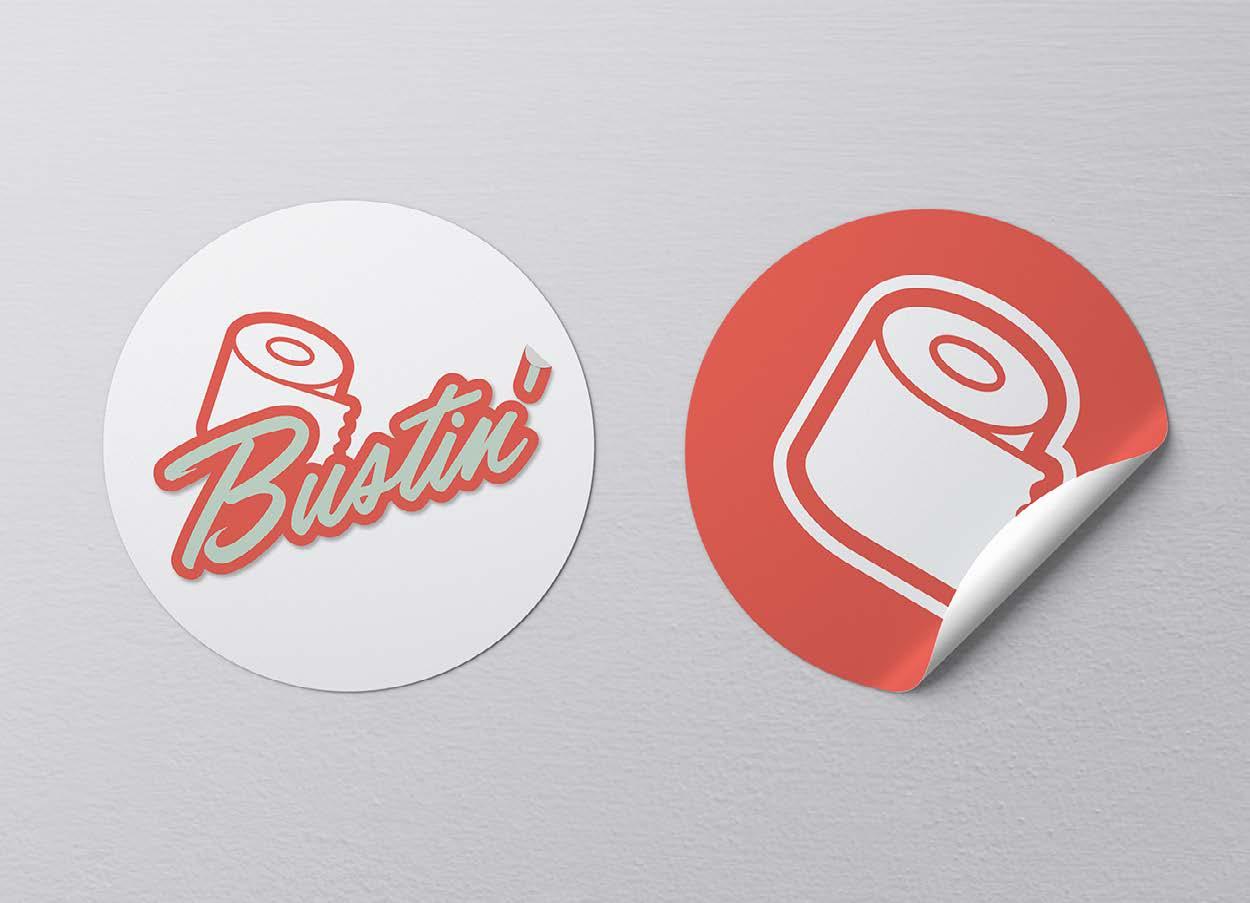
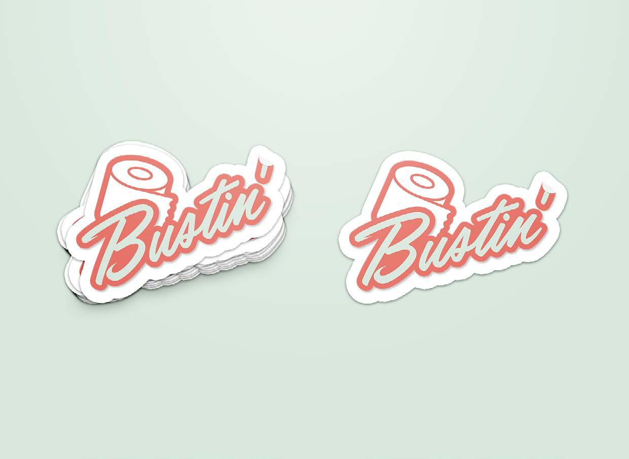
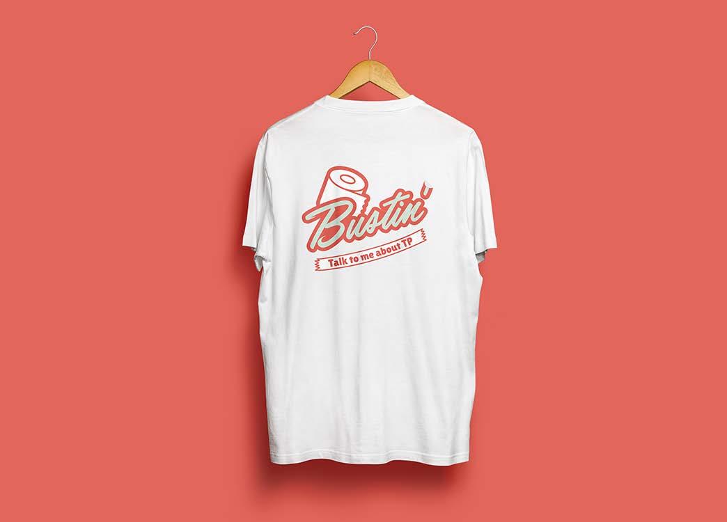
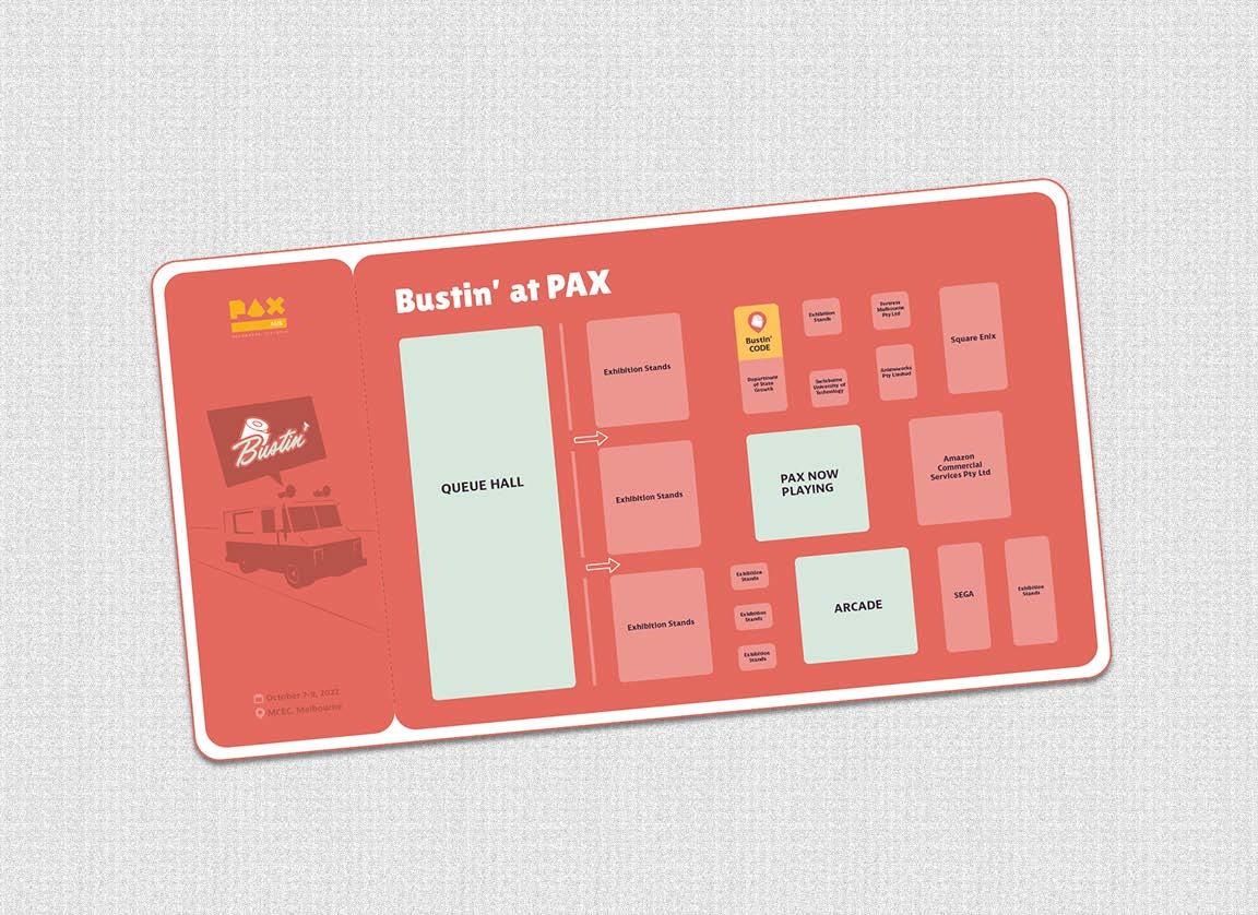
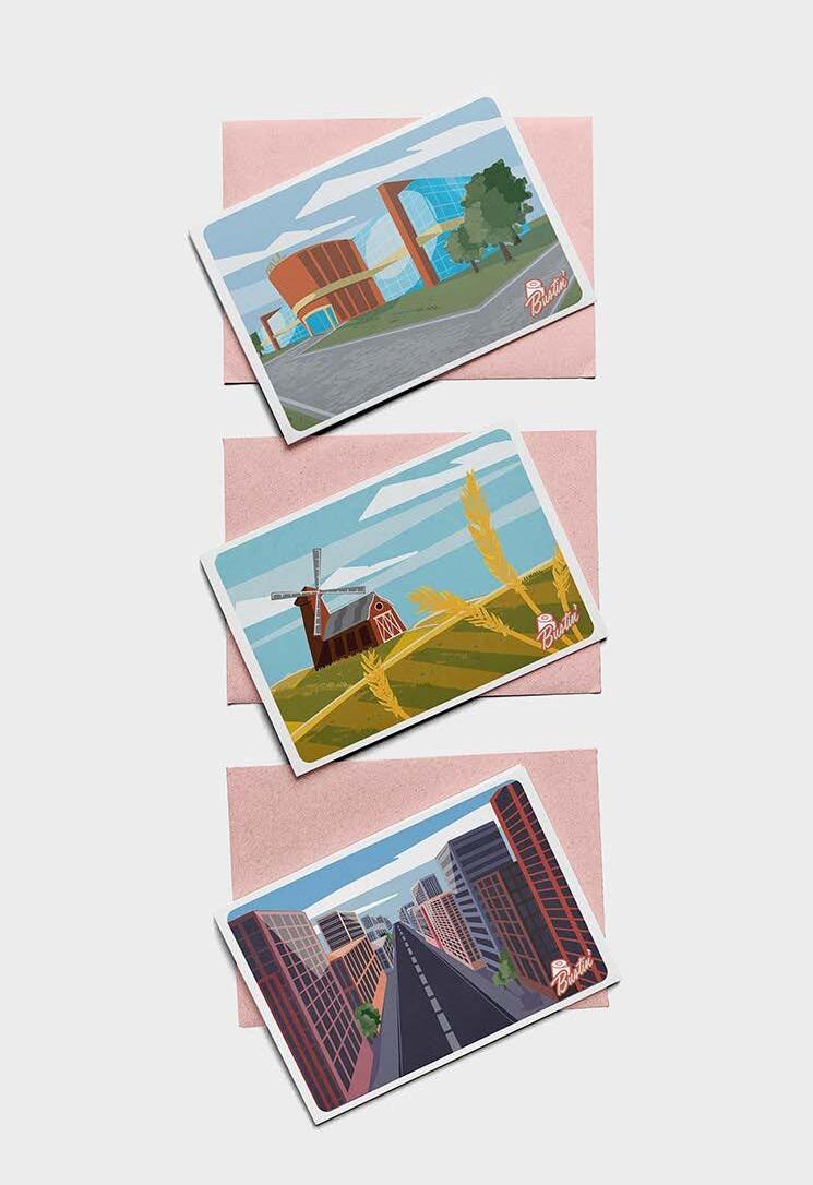
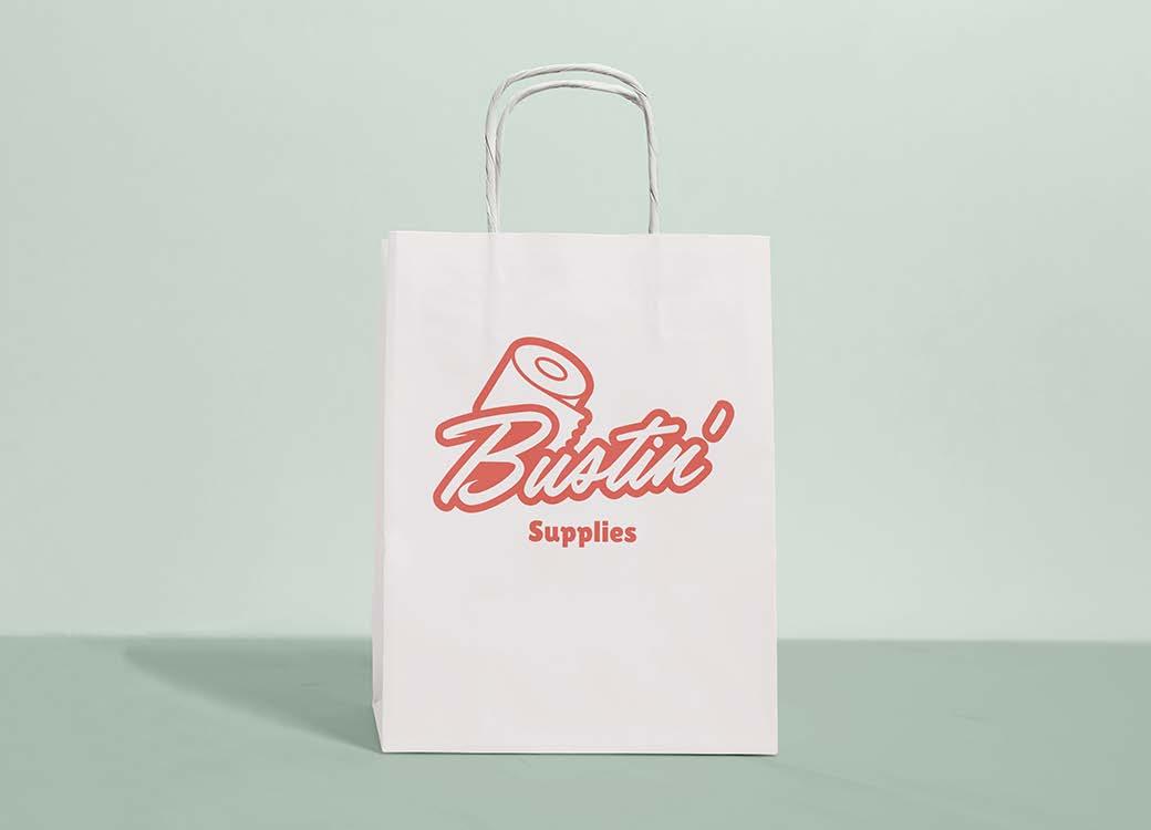
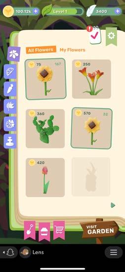
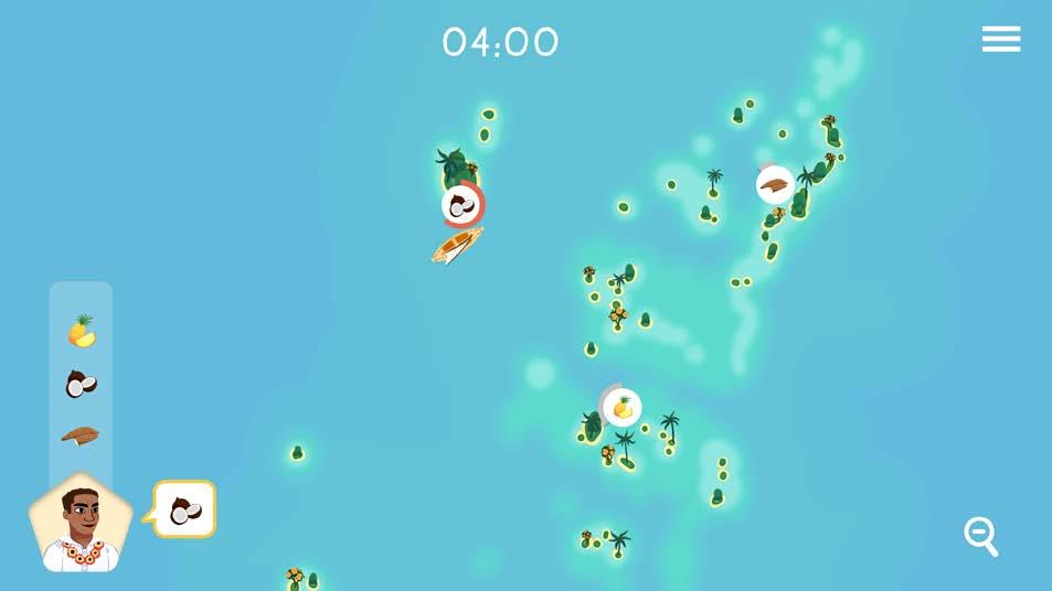
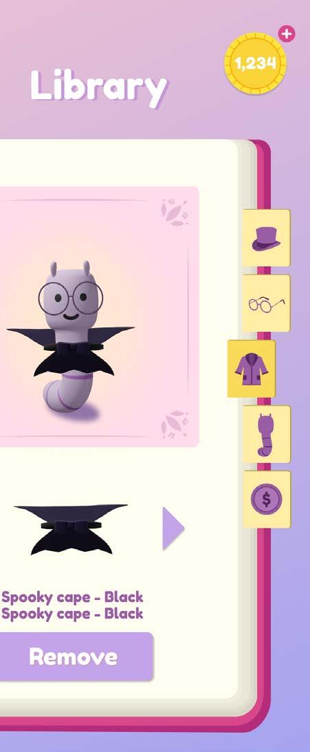
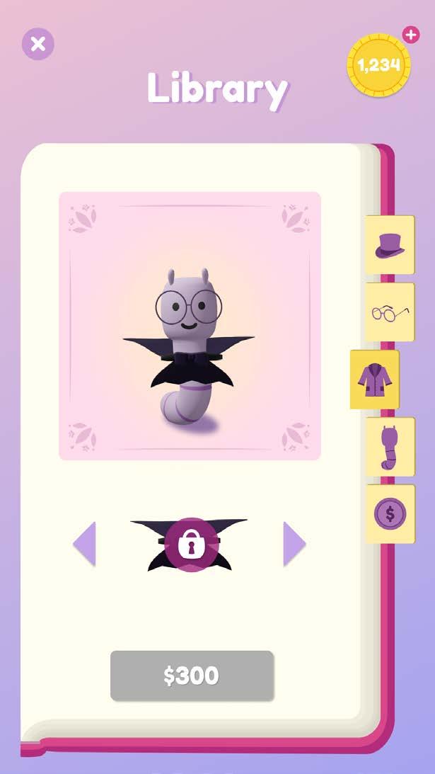
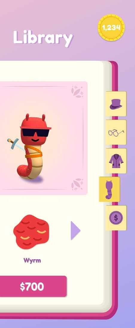
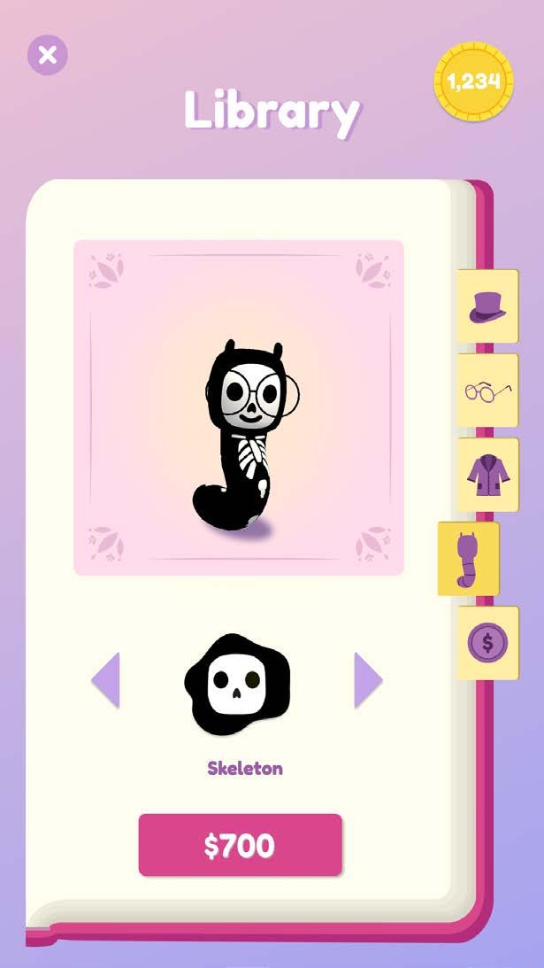
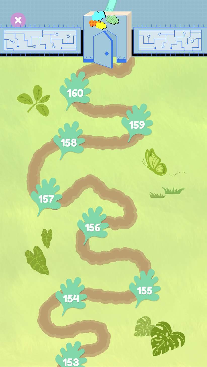
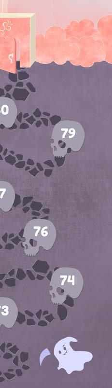
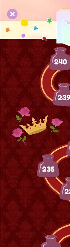
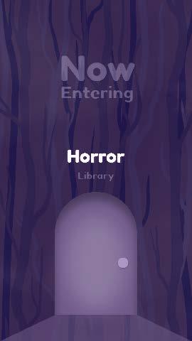
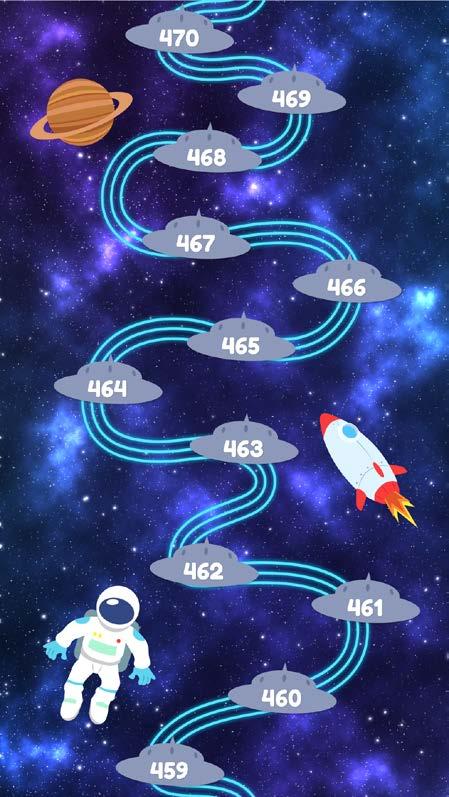
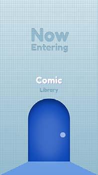
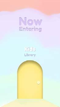
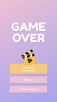
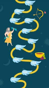
An arcade, action, on-rails, wholesome shooter, Bustin' challenges the player to deliver toilet paper rolls to a range of desperate customers, racking up points through fast and efficient service. Use power-ups found around the streets to help cater to all your customers' needs and gain combos as you master your skills.
Category Mad Carnival Project
Size Multiple Sizes
Credit Funder/Executive Producer | Sam Ramlu
Producer | Flavia da Silva
Game UI/Web/Merchandise Design | Chien Yi Chen
In-Game Tutorial Video | Chien Yi Chen
Listing & Marketing Assets | Chien Yi Chen
3D Artist | Nadezhda Keniya
Illustratior | Caitlin Palmer
Lead Developer | Attiq Khan
Developer | Roshan Shaffeq, Leslie Crooks
Web Developer | Caitlin Palmer
Animation | Lahiru De Silva
Sound Effect | James Dean

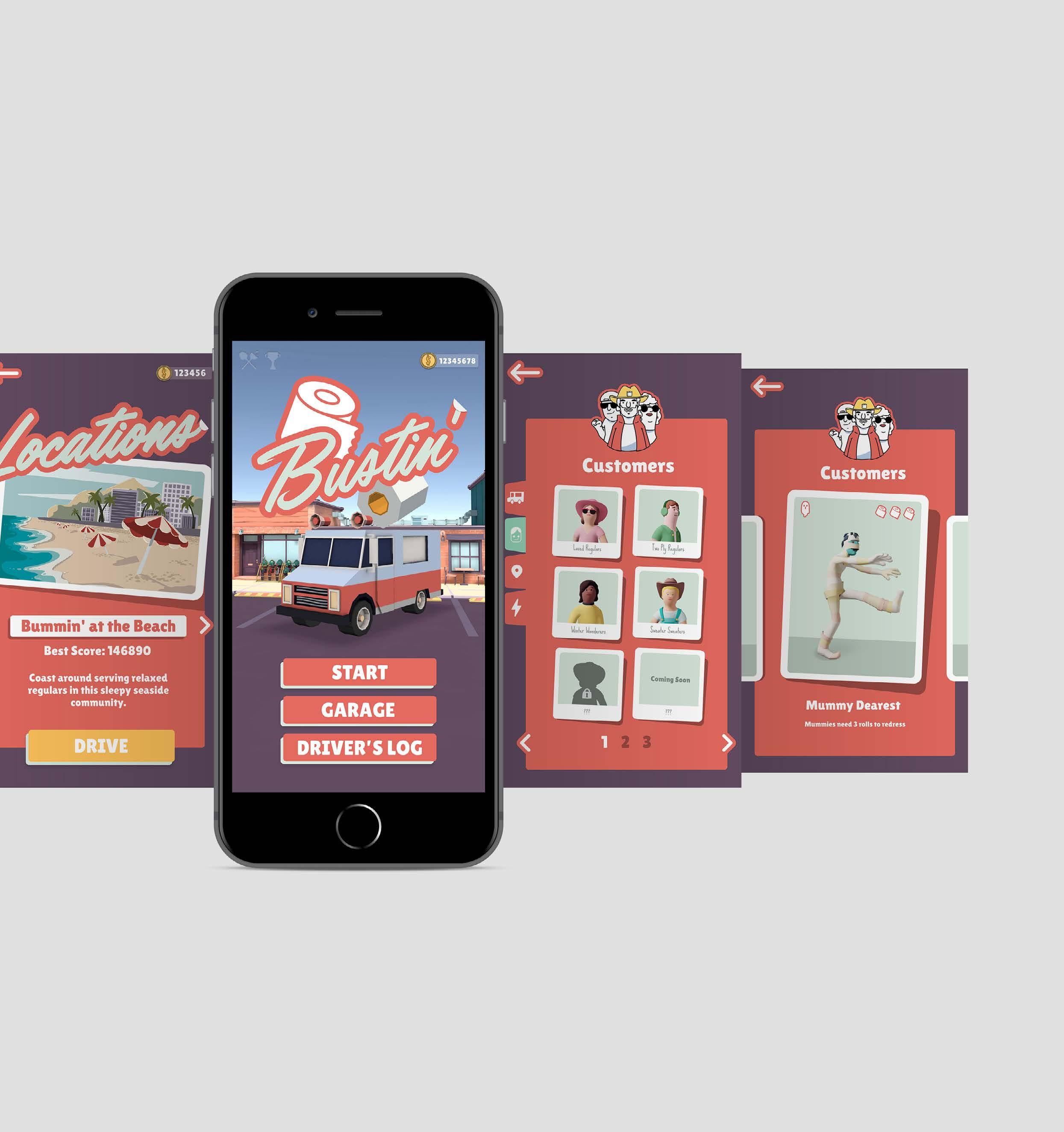
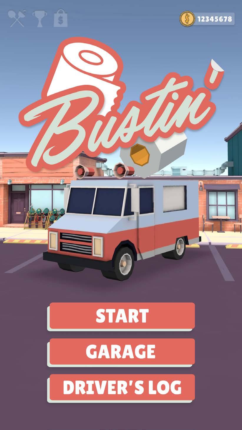
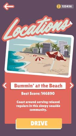
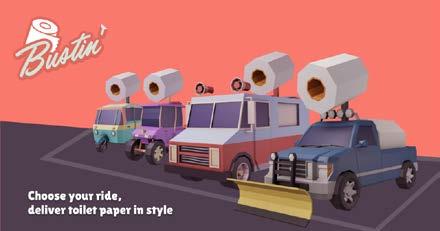
Start_Locations Select Screens
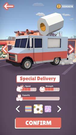
Garage_Vehicle Traits


Tutorial (Animated)
Power-Up Indicator

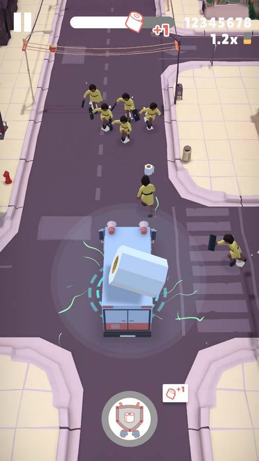
Unlocked Notification
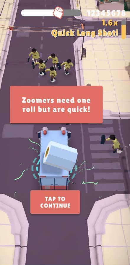
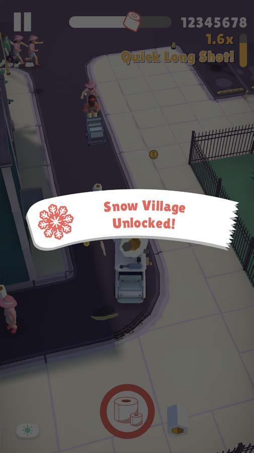
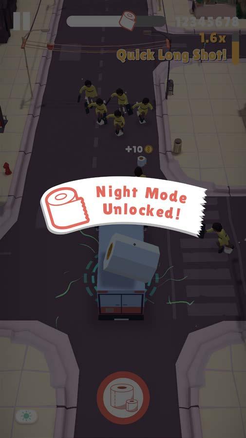
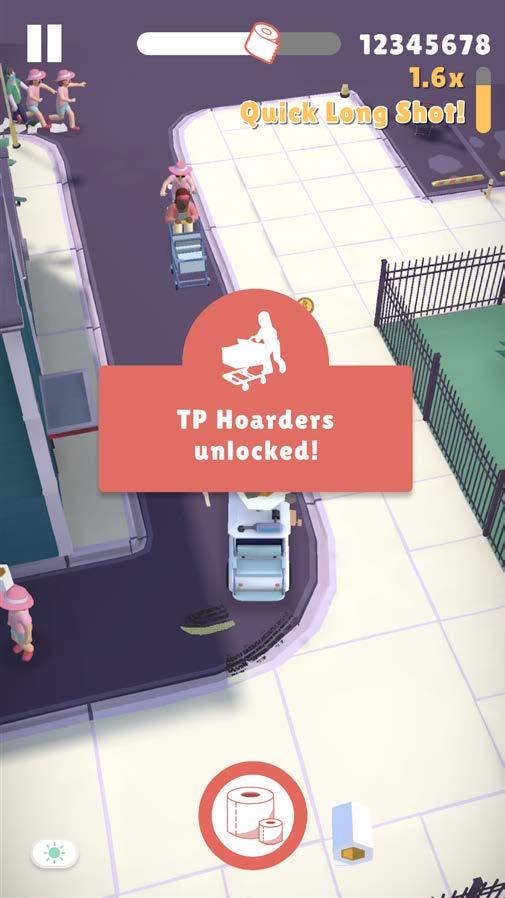
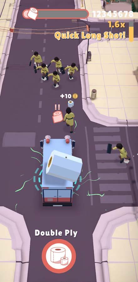
Day/Night Level Indicator


X Page

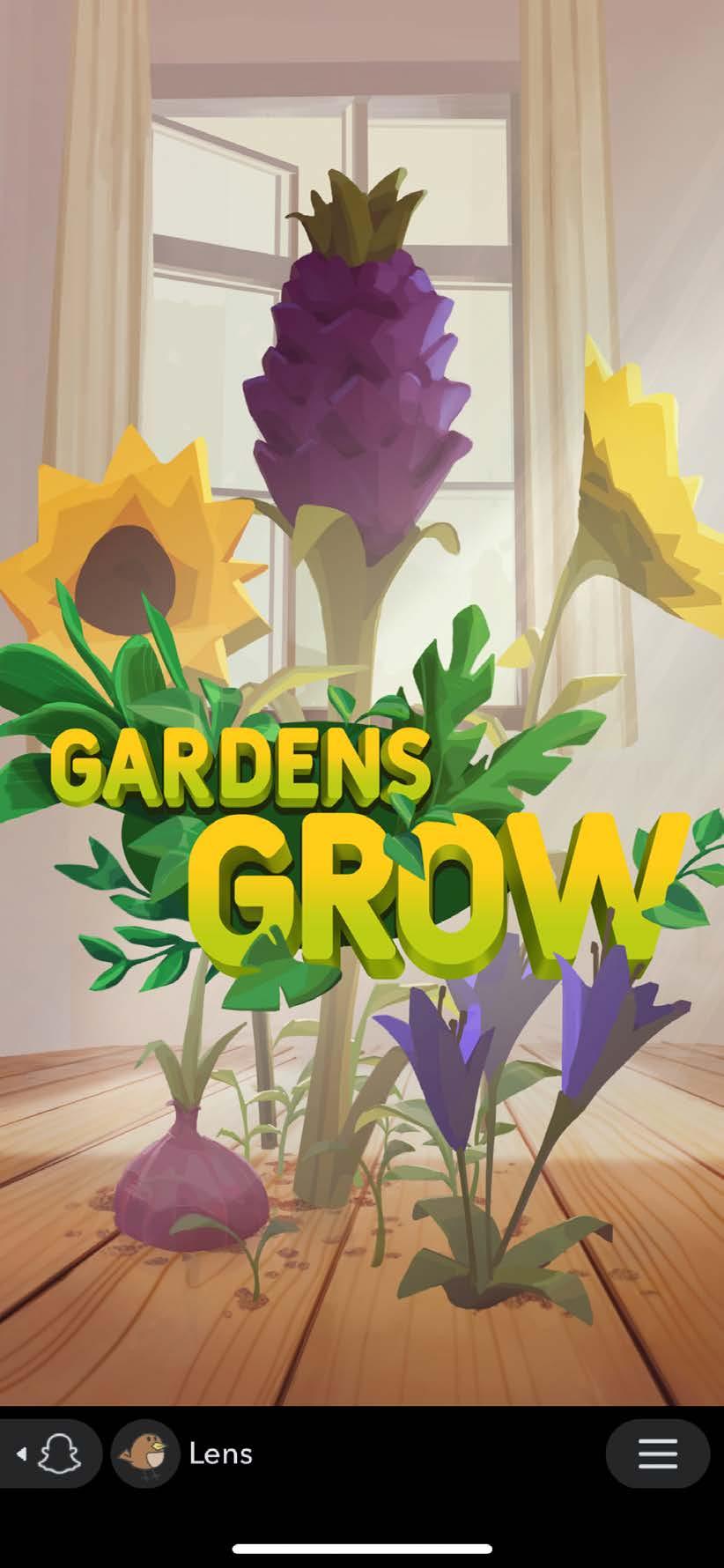
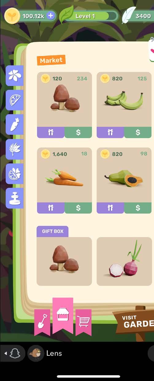
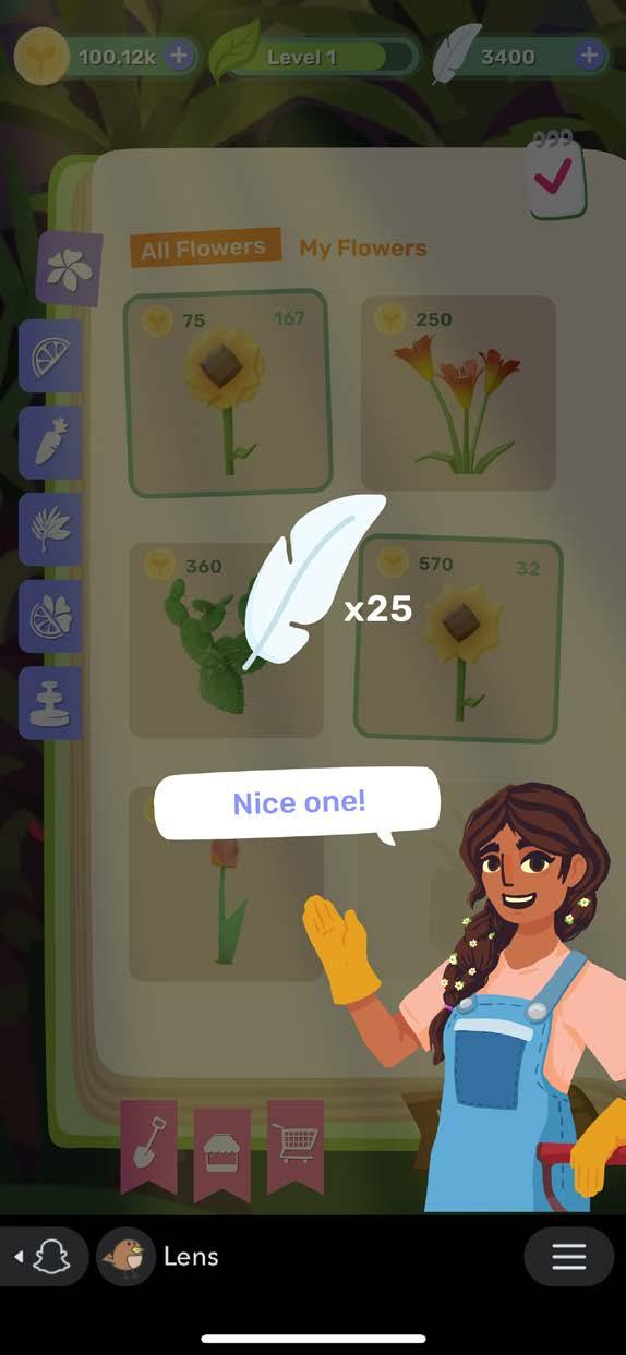
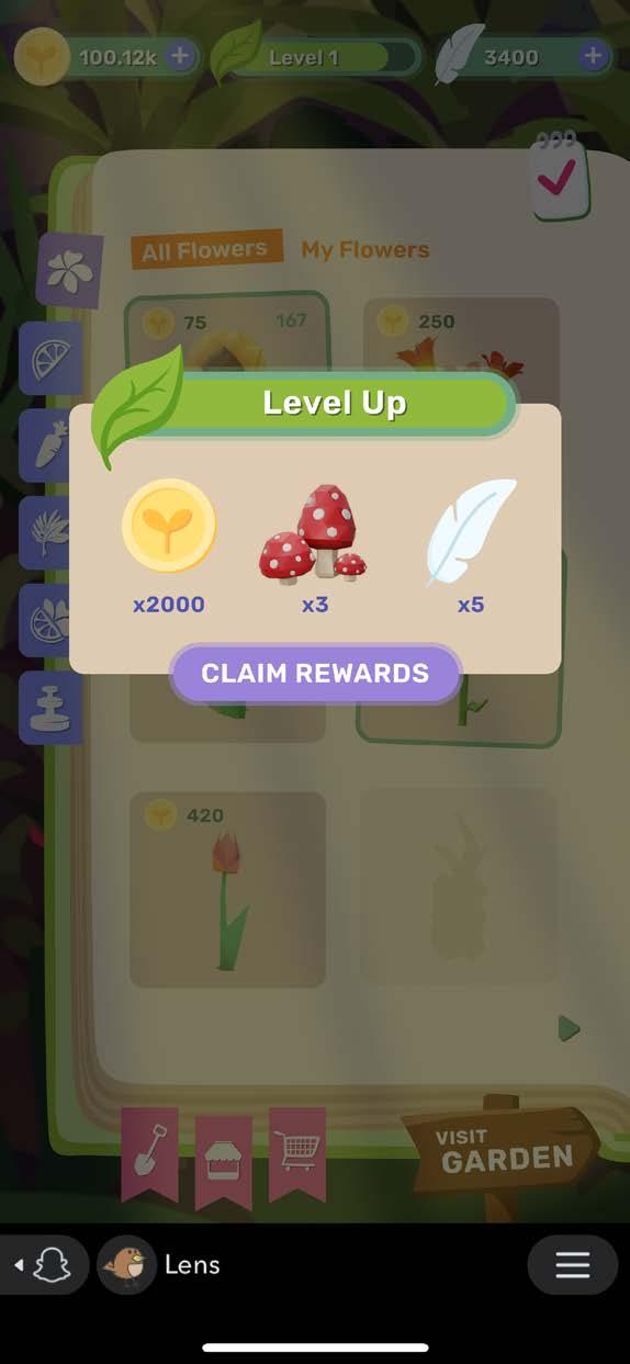
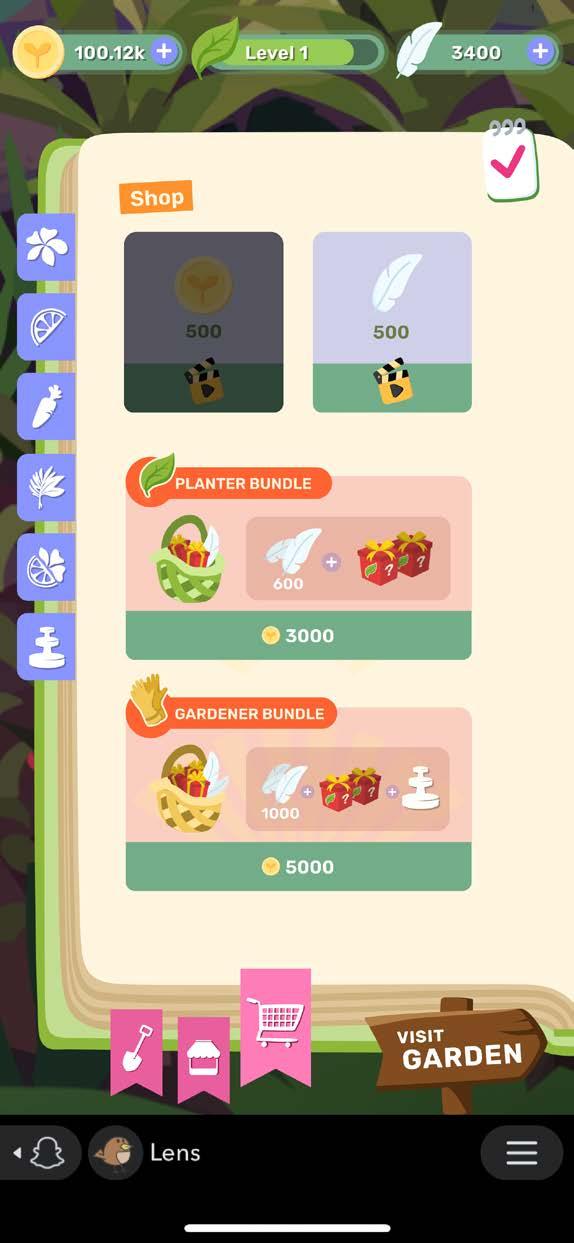
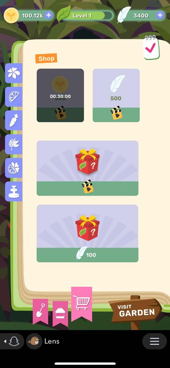
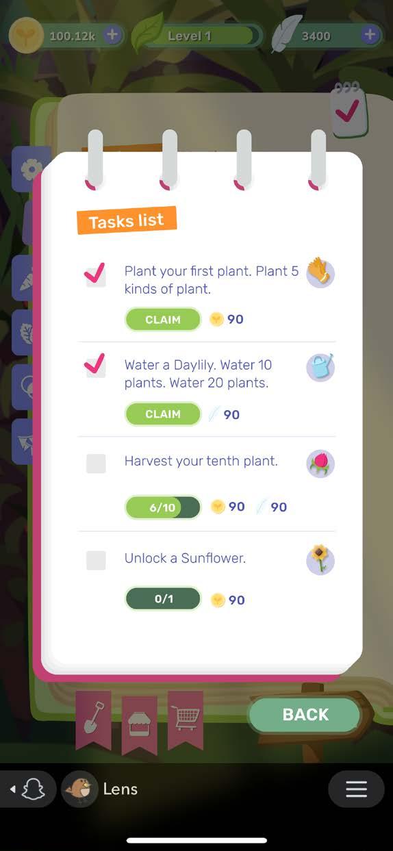
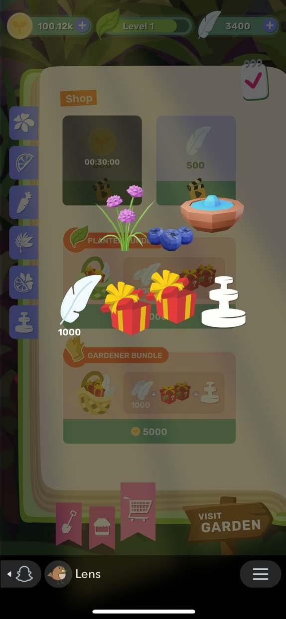
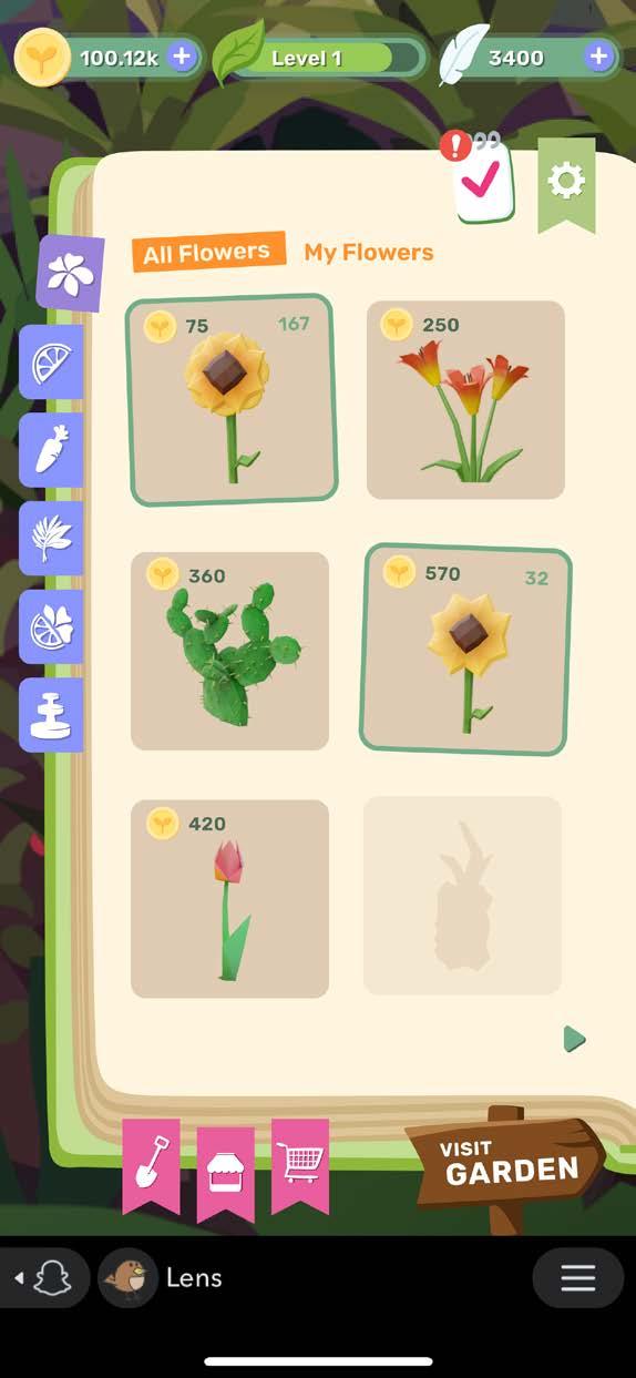
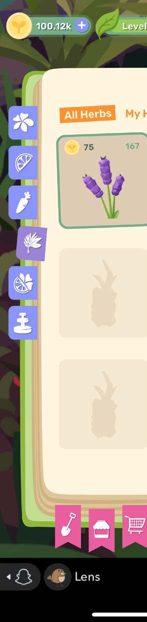
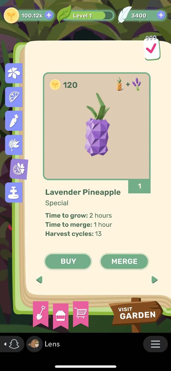
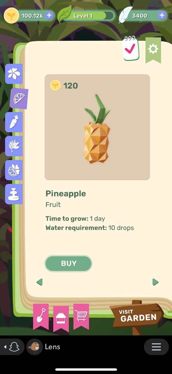
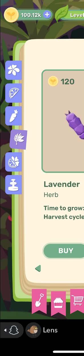
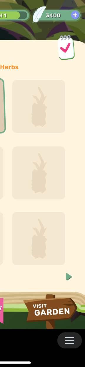
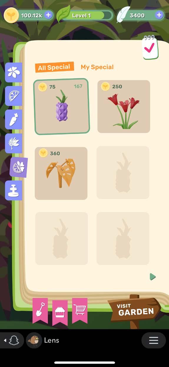
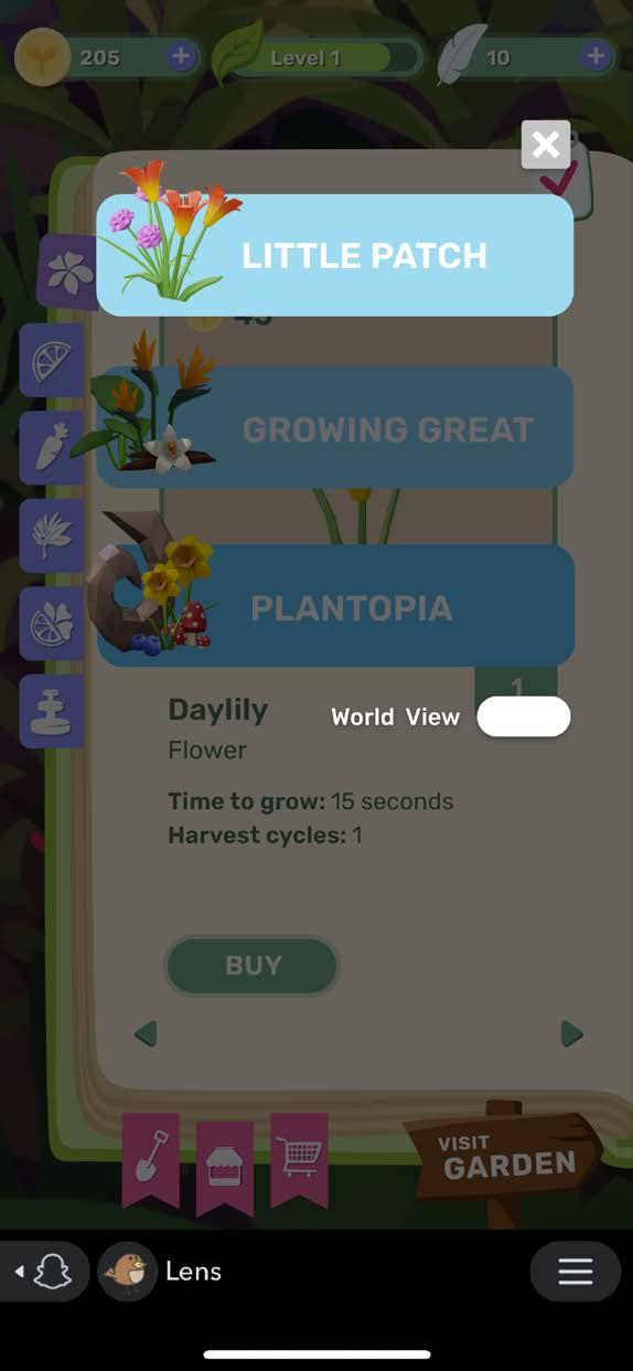
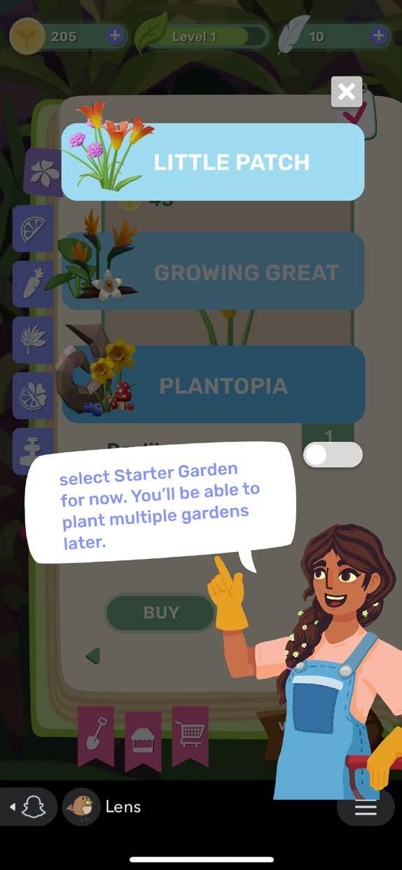
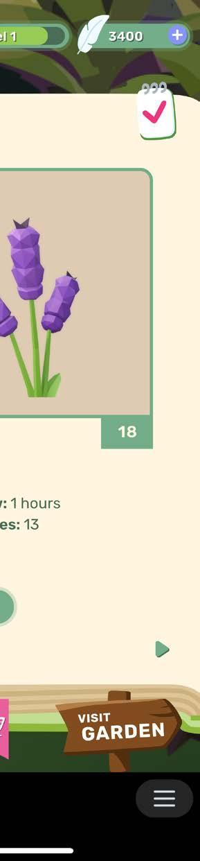
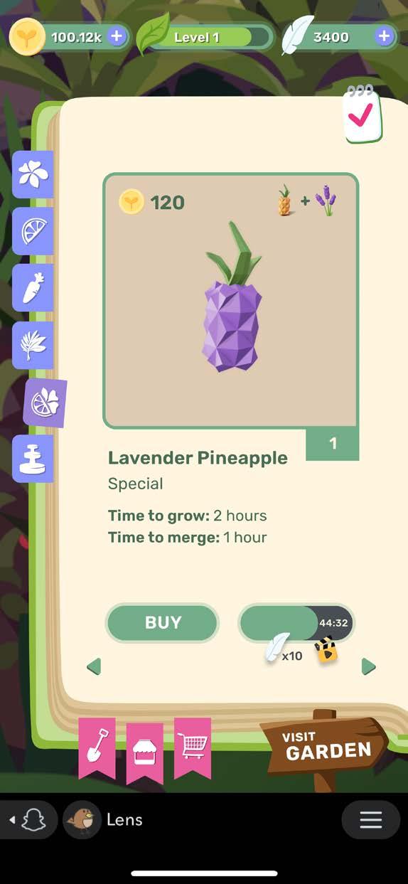
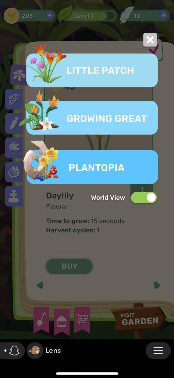
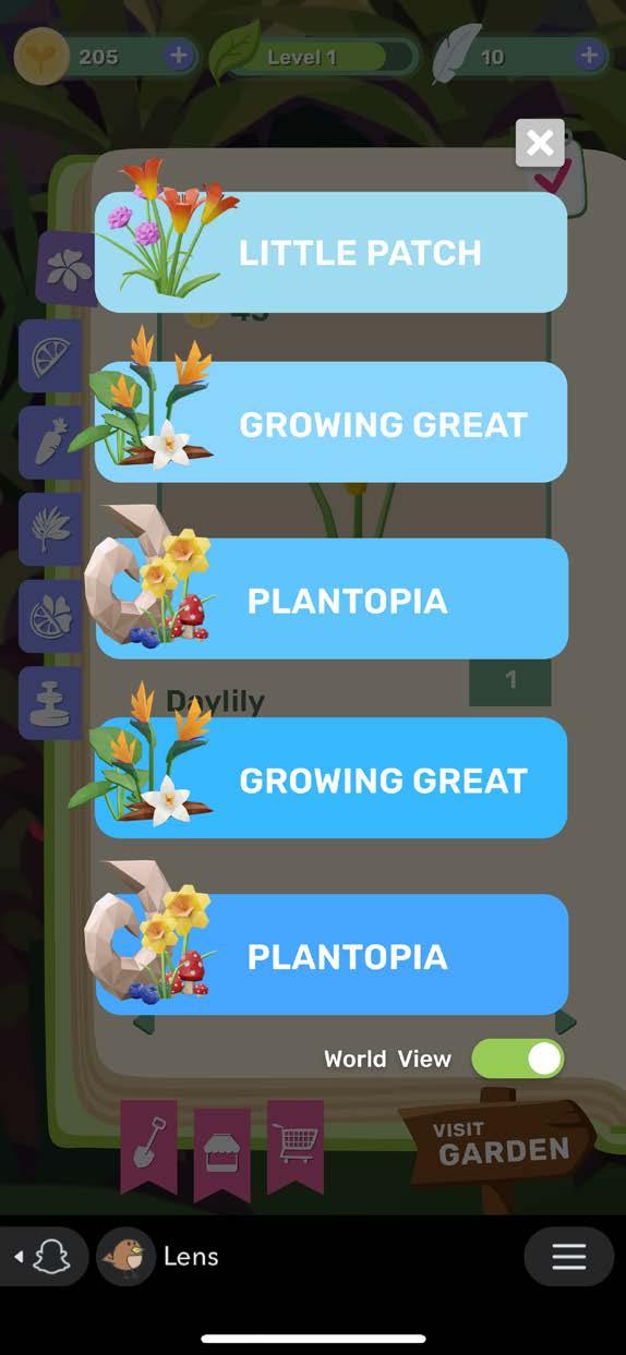
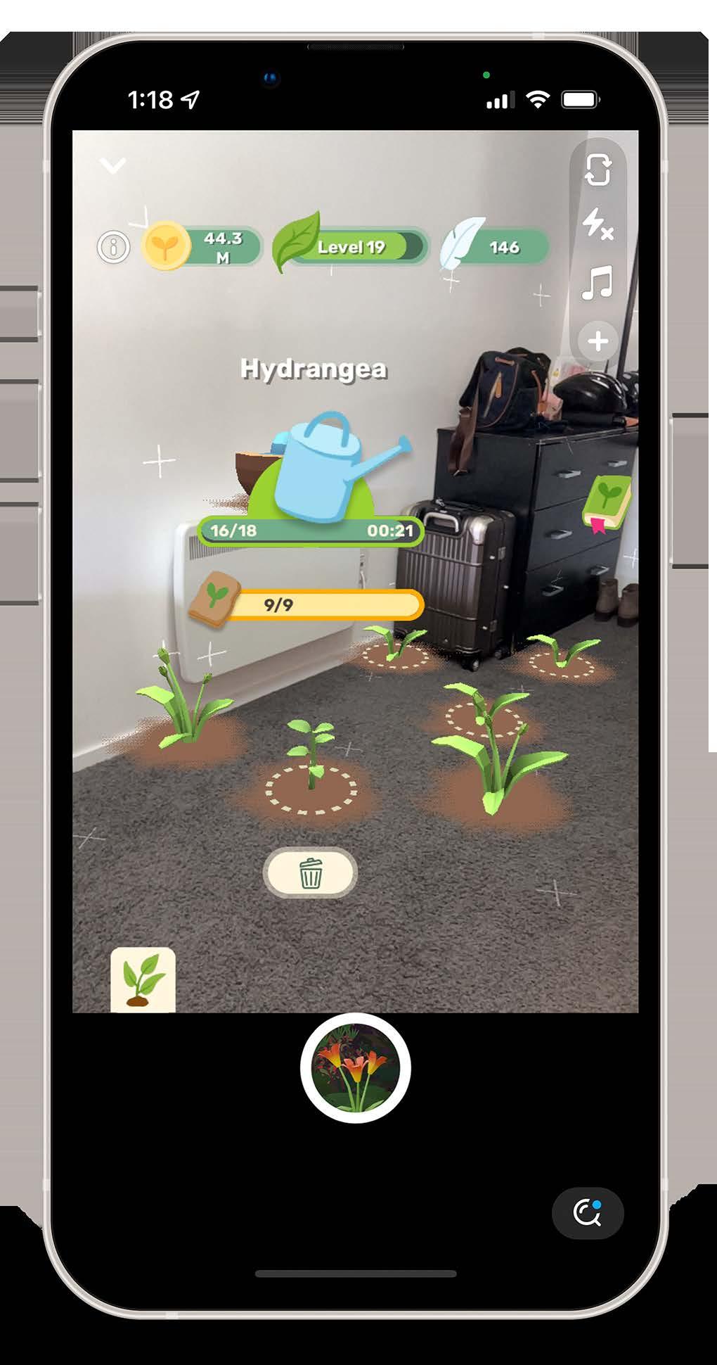
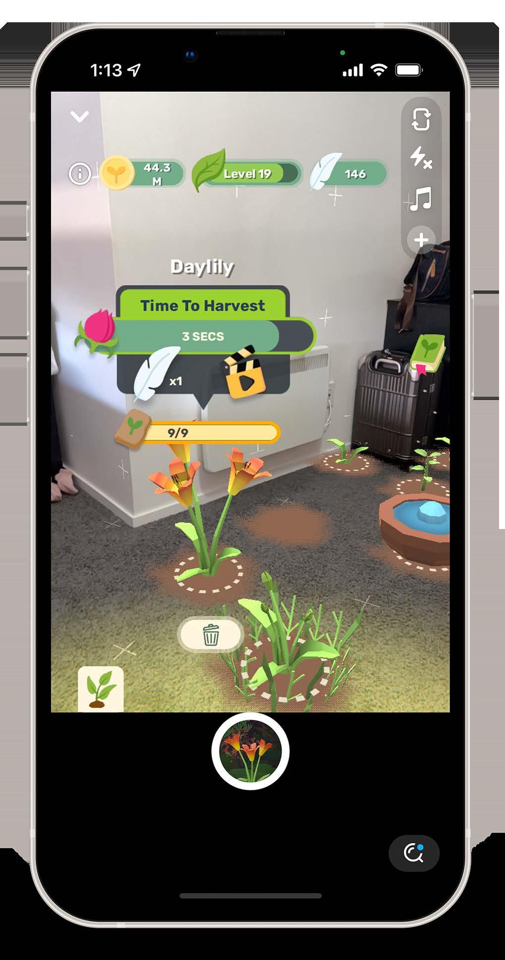
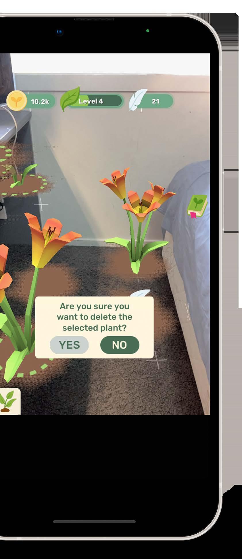
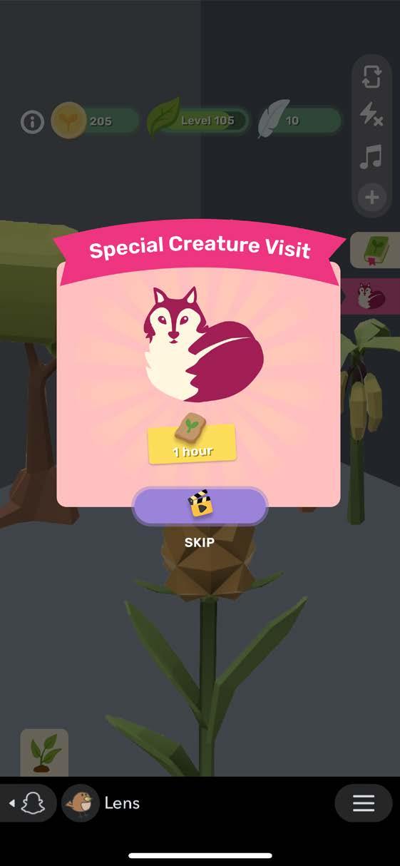
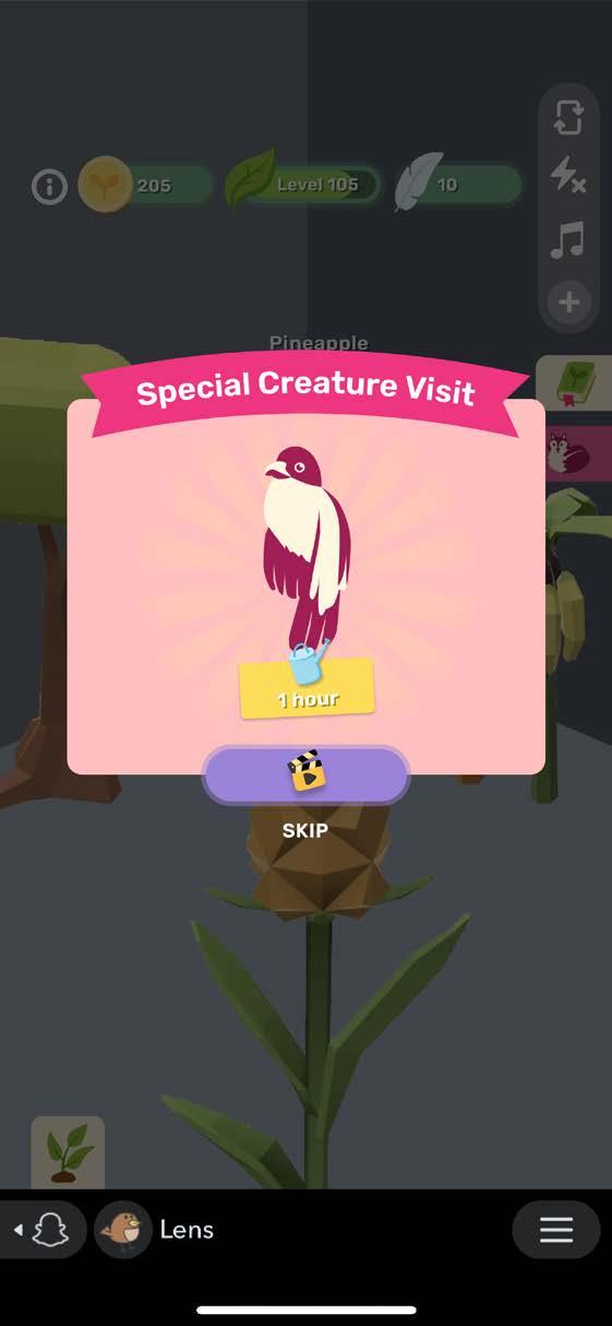
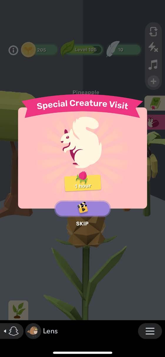
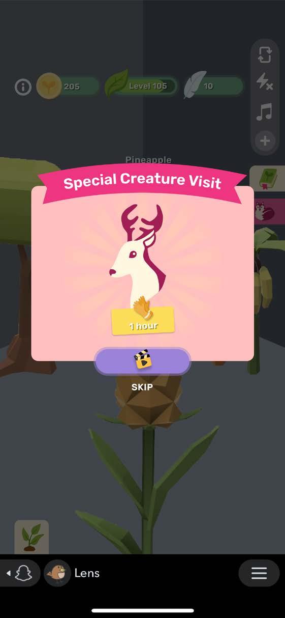
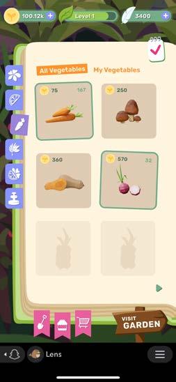
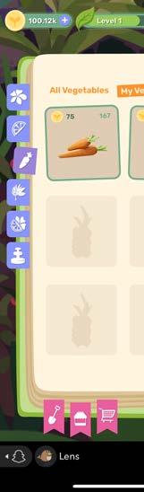
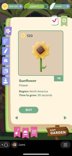
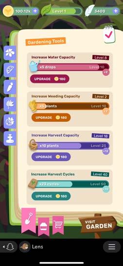
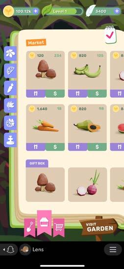
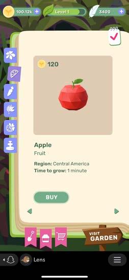
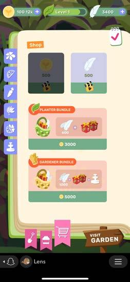
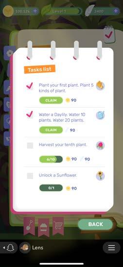
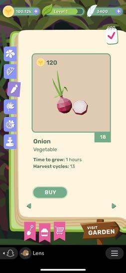
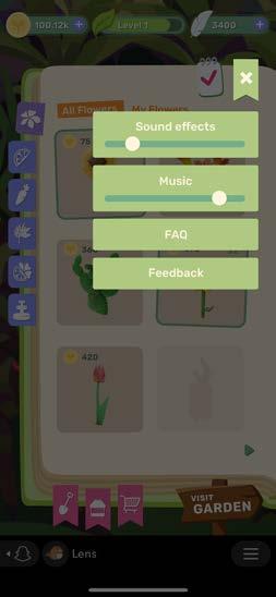
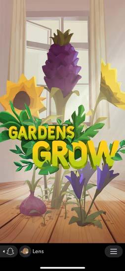
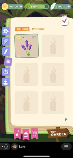
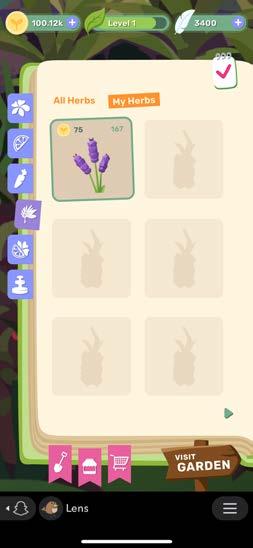
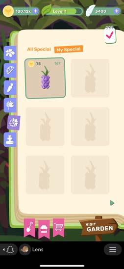
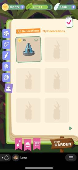
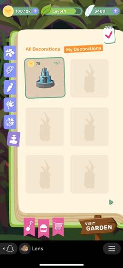
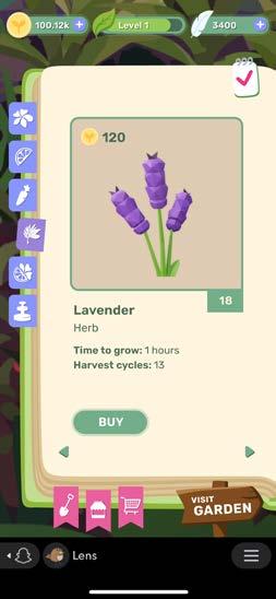
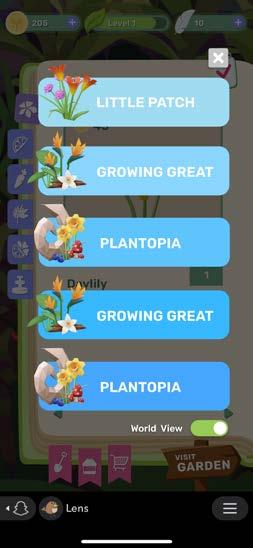
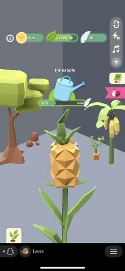
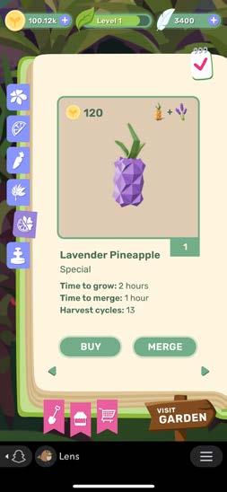
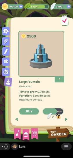
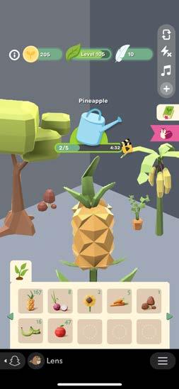
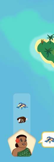
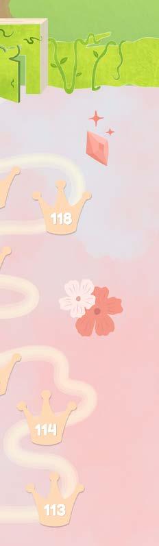
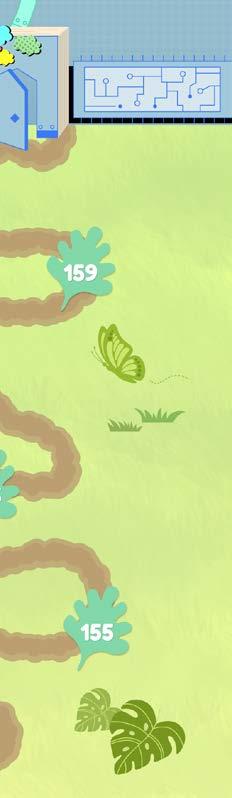
Gardens Grow is a cozy, AR garden simulator, where players plant, grow, and tend to gardens at home and in their community.
This game grows with the player and as they level up so do new activities. Outside their home, they can visit community gardens, trading plants and tending to spaces out in the world.
Category Mad Carnival Project (Snapchat)
Size Multiple Sizes
Credit Funder/Executive Producer | Sam Ramlu
Producer | Flavia da Silva
Initial UI Design | Sophie Douglas
Game UI Design | Chien Yi Chen
Listing & Marketing Assets | Chien Yi Chen
3D Artist | Nadezhda Keniya
Illustratior | Caitlin Palmer
Developer | Roshan Shaffeq, James Reed, Leslie Crooks
Animation | Lahiru De Silva
Sound Effect | James Dean

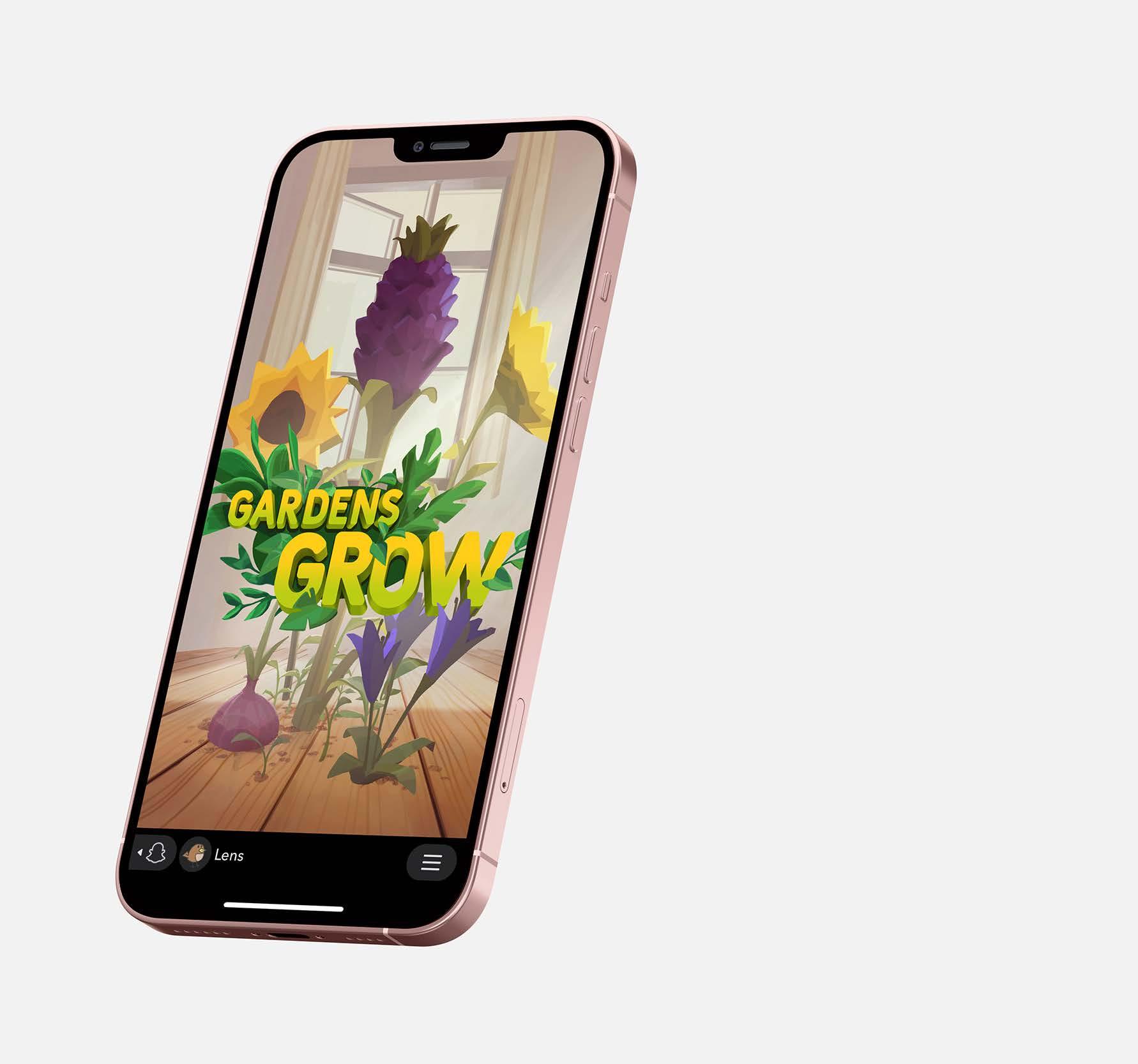
Title Screen


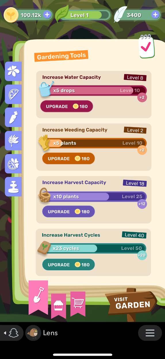


Tutorial Prototypes
- Onboarding - Tools - Fertillizer - Market
- Decoration
- Tasks - Lens View - Decoration_Lens


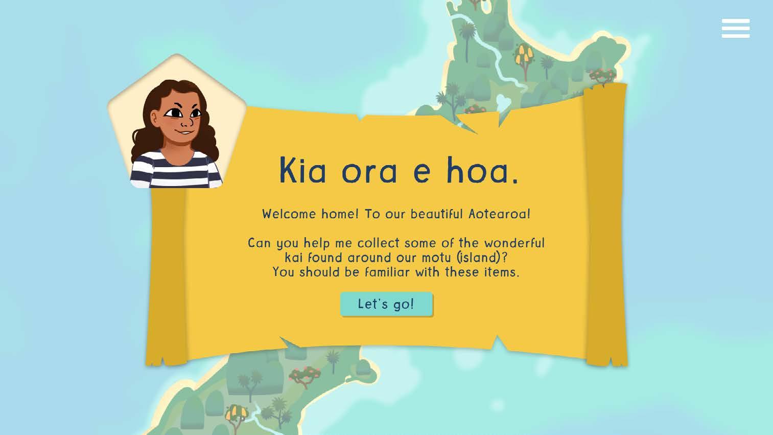
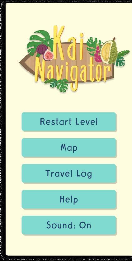
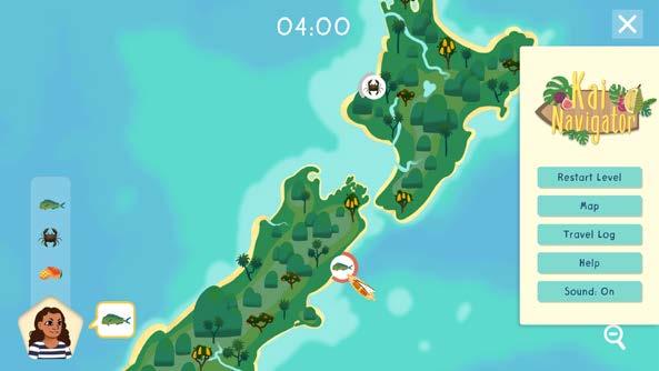
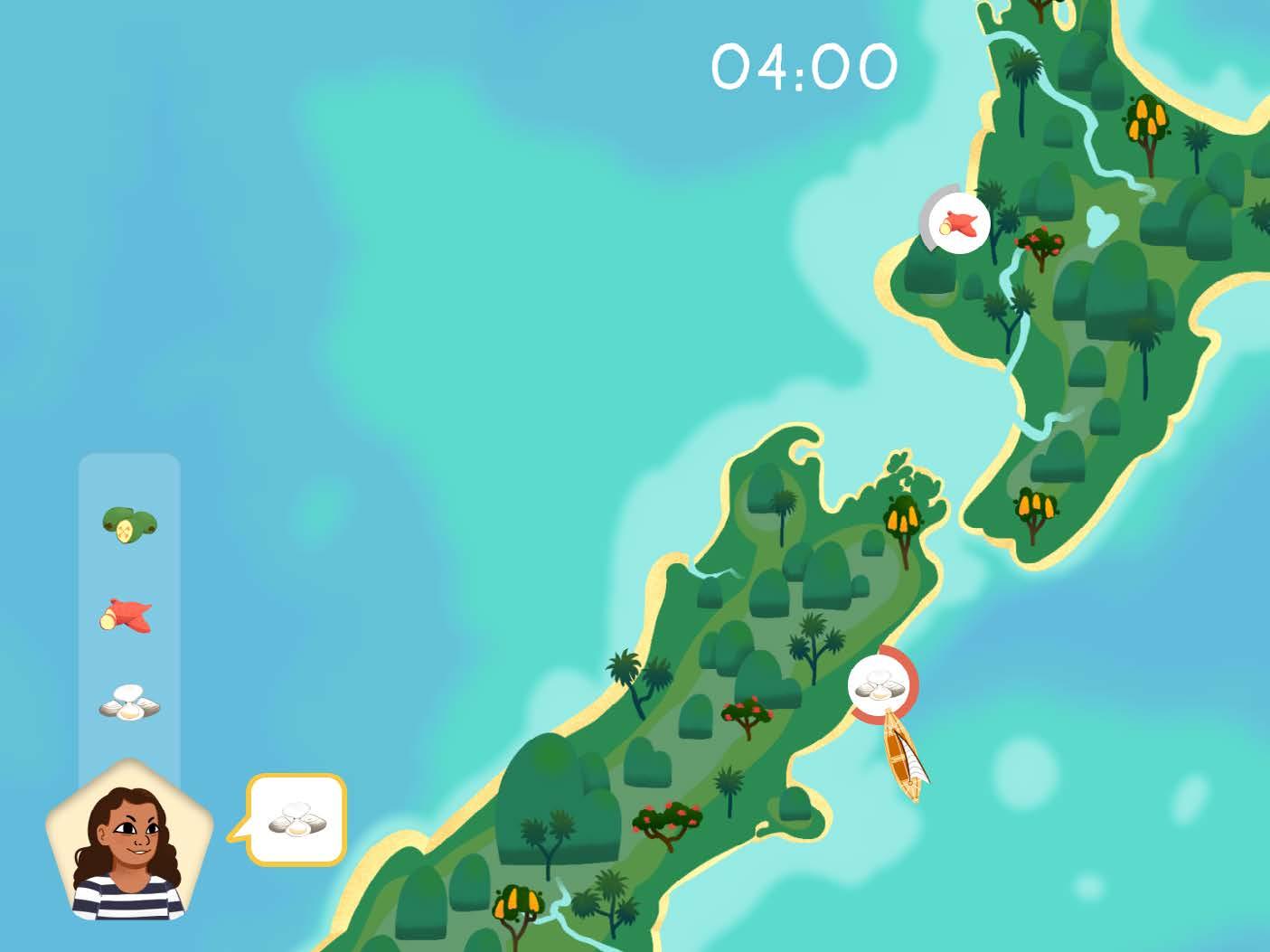
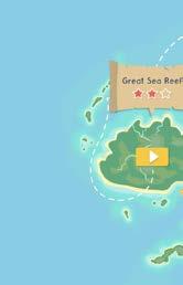
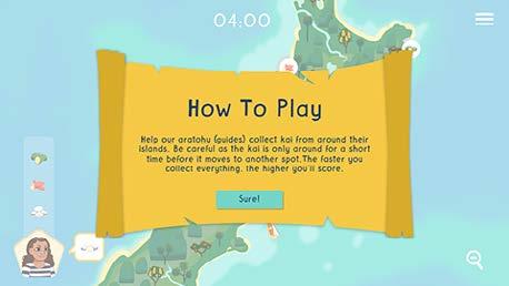
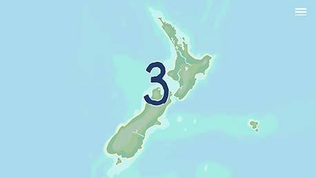
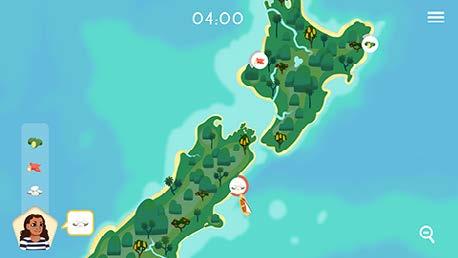
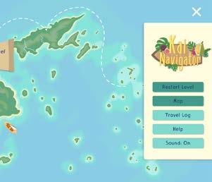
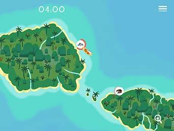
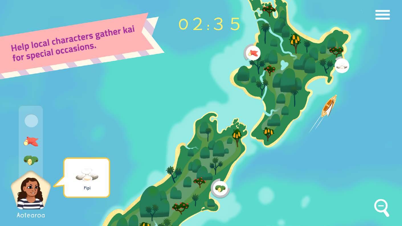
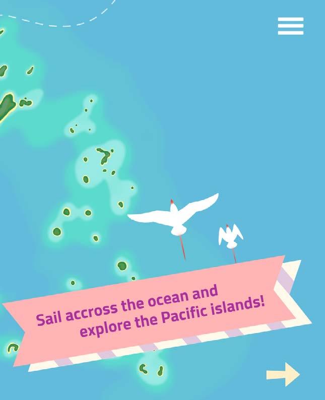
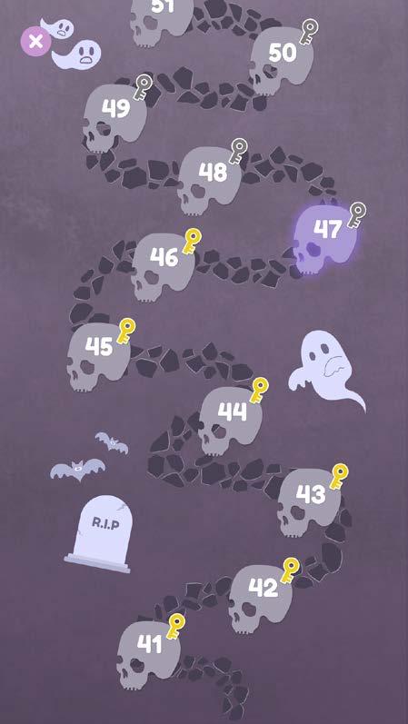
Kai Navigator is a race-the-clock scavenger hunt game. Simple navigation and race mechanics are the key to this game where kids become Kiara - an explorer, navigator and food gatherer.
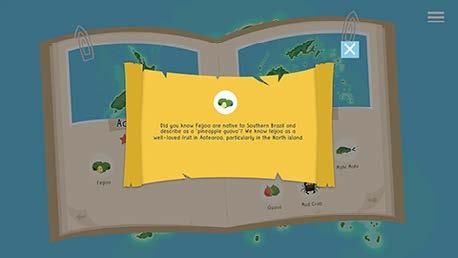
A fearless young navigator, Kiara is on a mission to discover more about the origins of some of the food we love while finding out about those less familiar in her homeland of Aotearoa, New Zealand.
Category Mad Carnival Project
Size 1920x1080px, 667x375px
Credit Funder/Executive Producer | Sam Ramlu
Producer | Flavia da Silva
Game UI Design | Chien Yi Chen
Marketing Assets | Chien Yi Chen
2D Artist | Nadezhda Keniya
Developer | Roshan Shaffeq, James Reed, Leslie Crooks
Sound Effect | James Dean


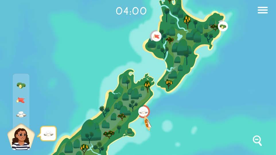


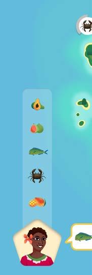


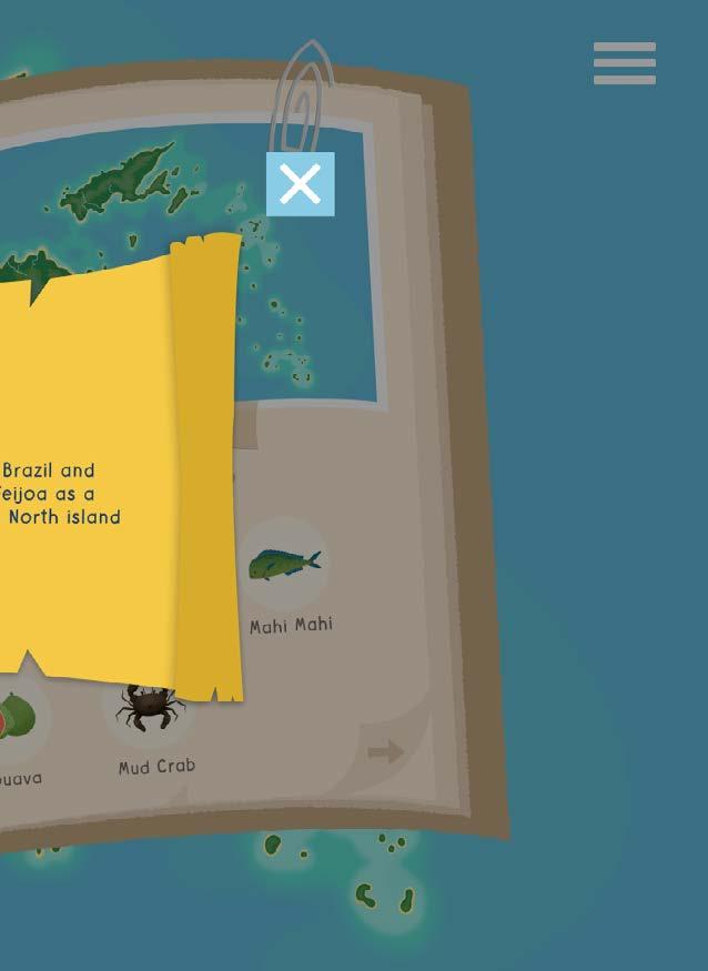
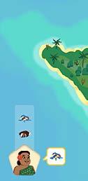
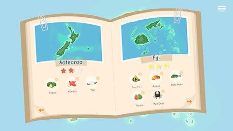
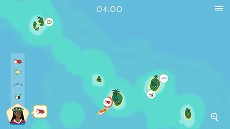
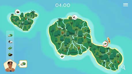
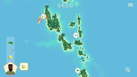
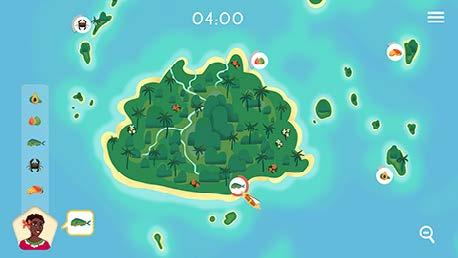
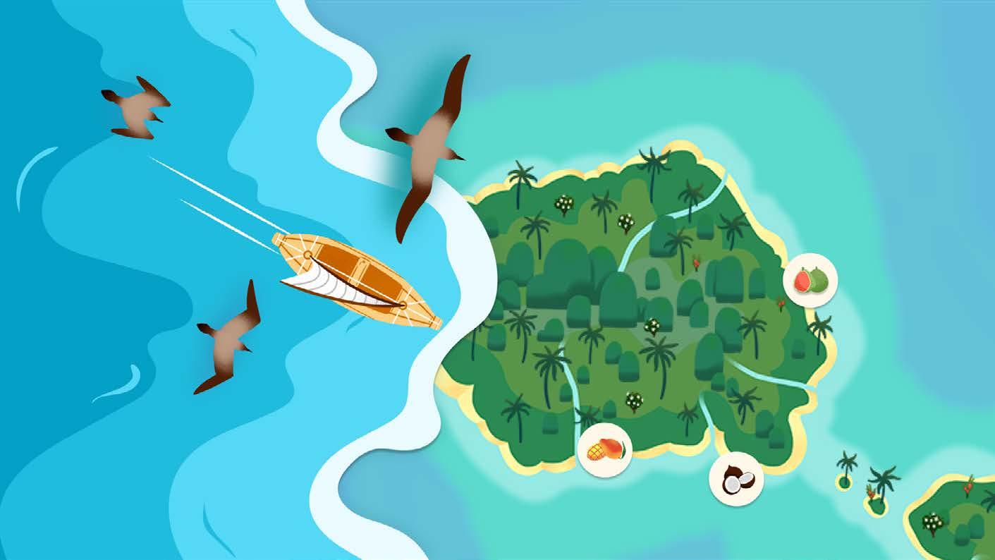
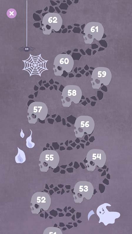
Traveling to beautifully illustrated island nations, on their journey the players will meet local guides who present them with challenges to collect food from around the island.
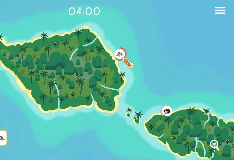
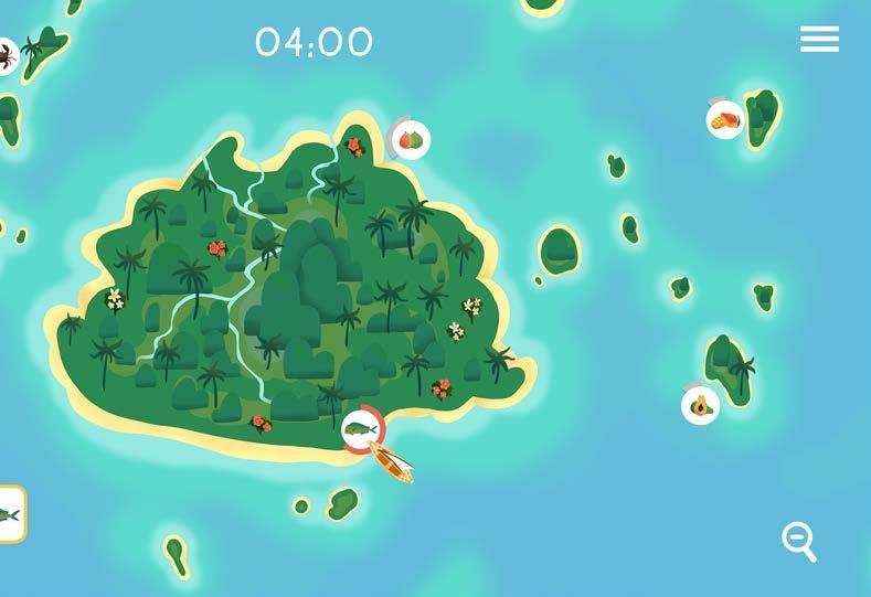
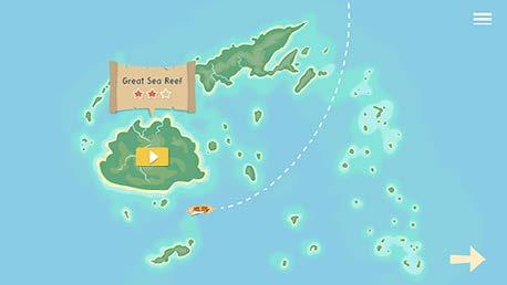
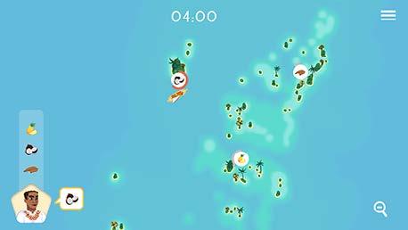
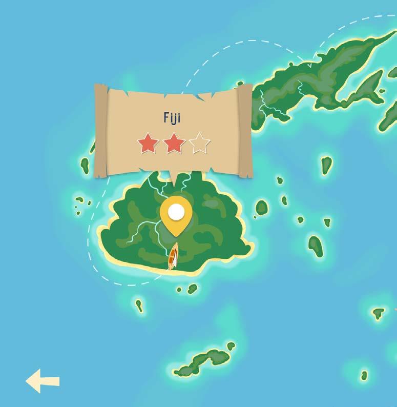
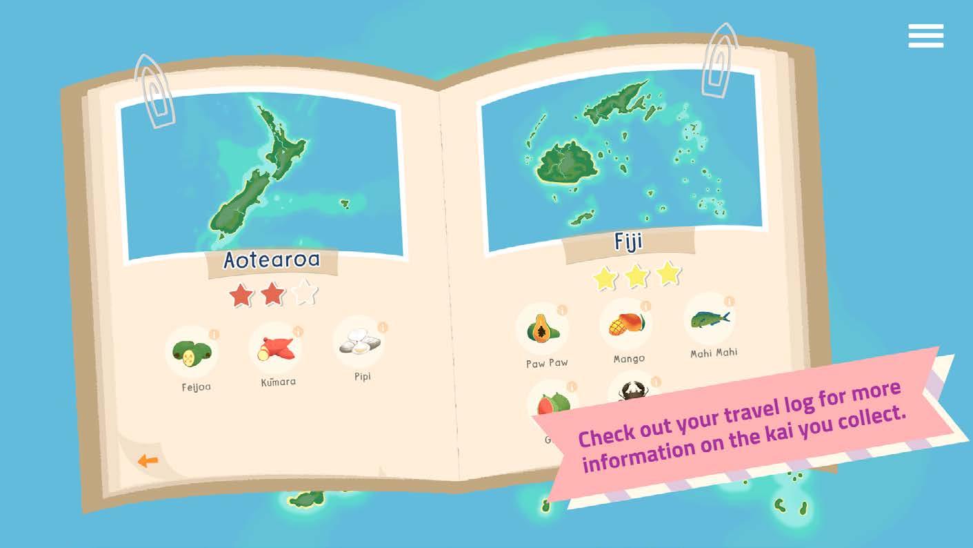
Cooks Islands
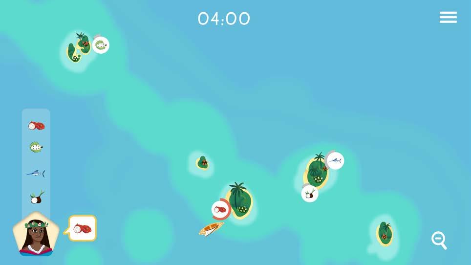
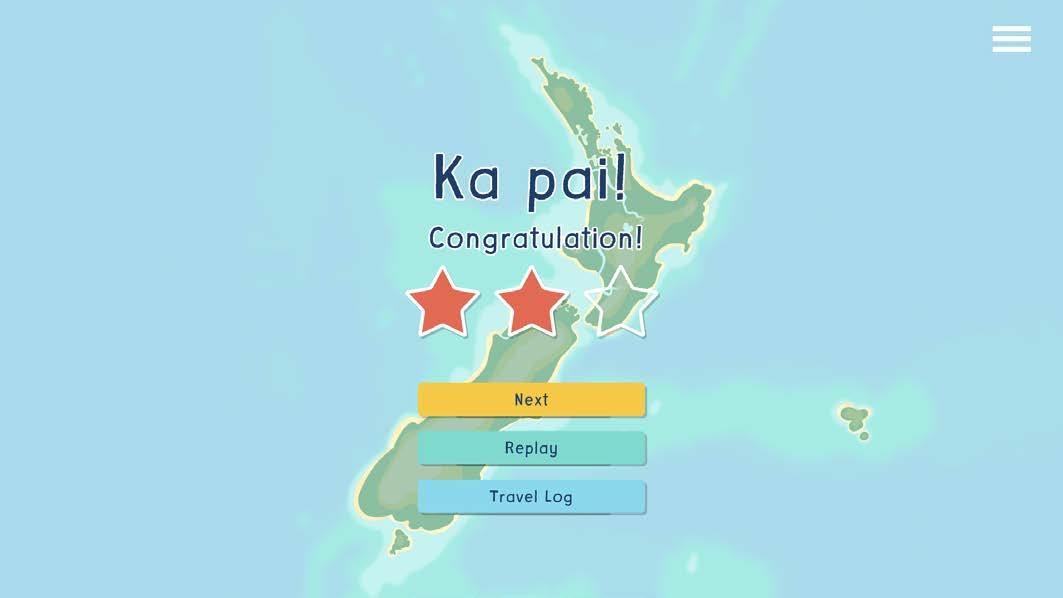
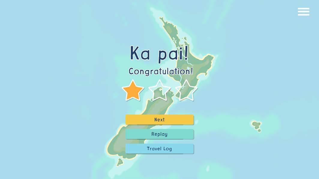
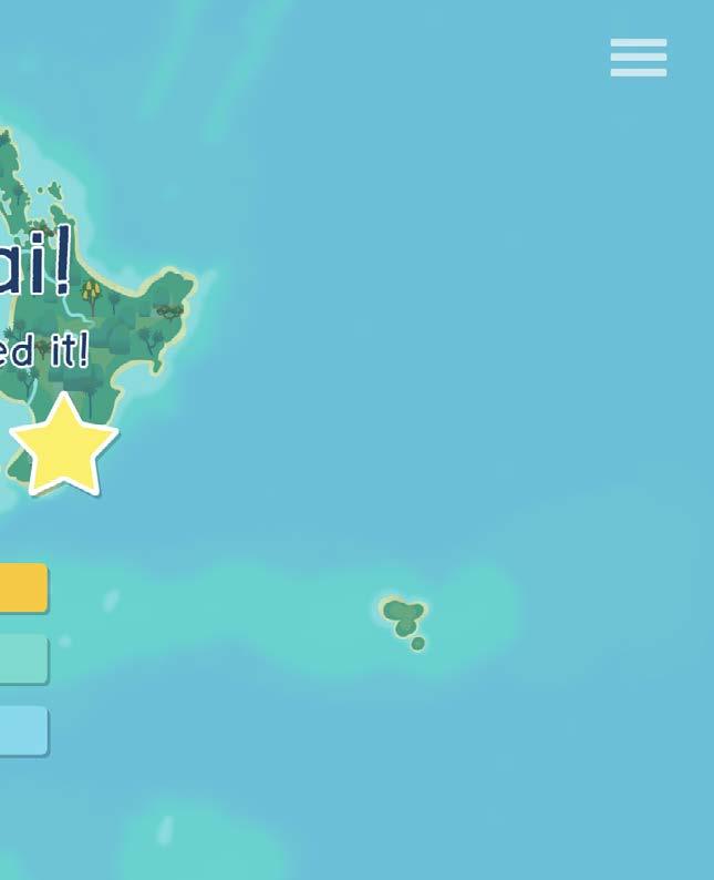
In total, there will be 7 different maps/islands available. Each map represents a Pacific Island, starting with Aotearoa and increasing in difficulty as the player progresses through them.
Play it Here!
https://www.heihei.nz/game/173/kai-navigator
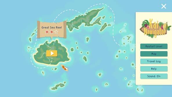

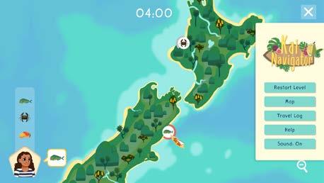
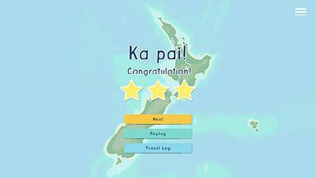
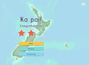
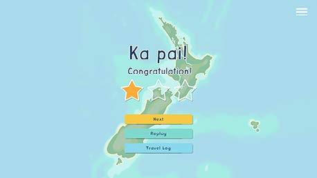
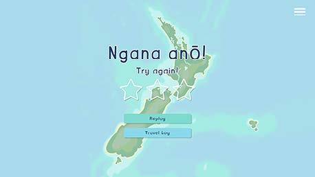
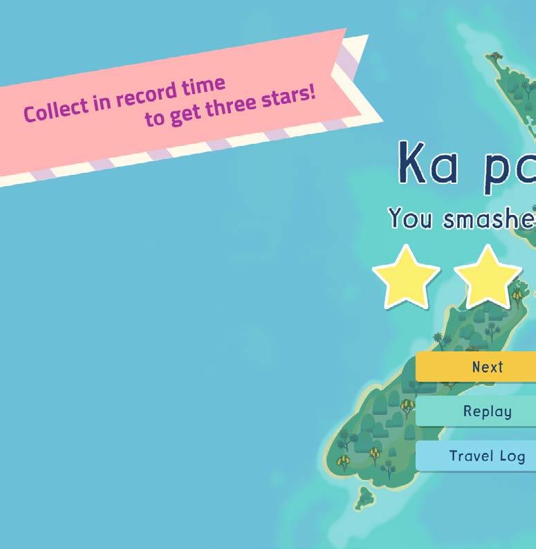
The ship will sail to the next island after finishing a level and once the player completes several levels, they can sail among these islands to challenge themselves to get three stars.


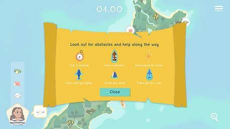
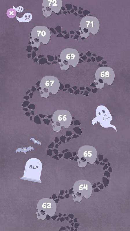
Help
How to Play-1
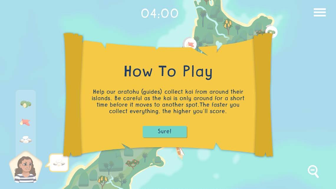
How to Play-2
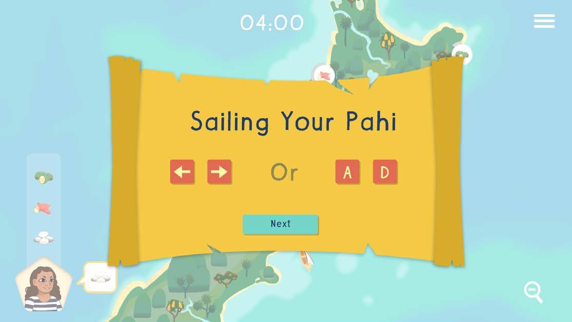
How to Play-3
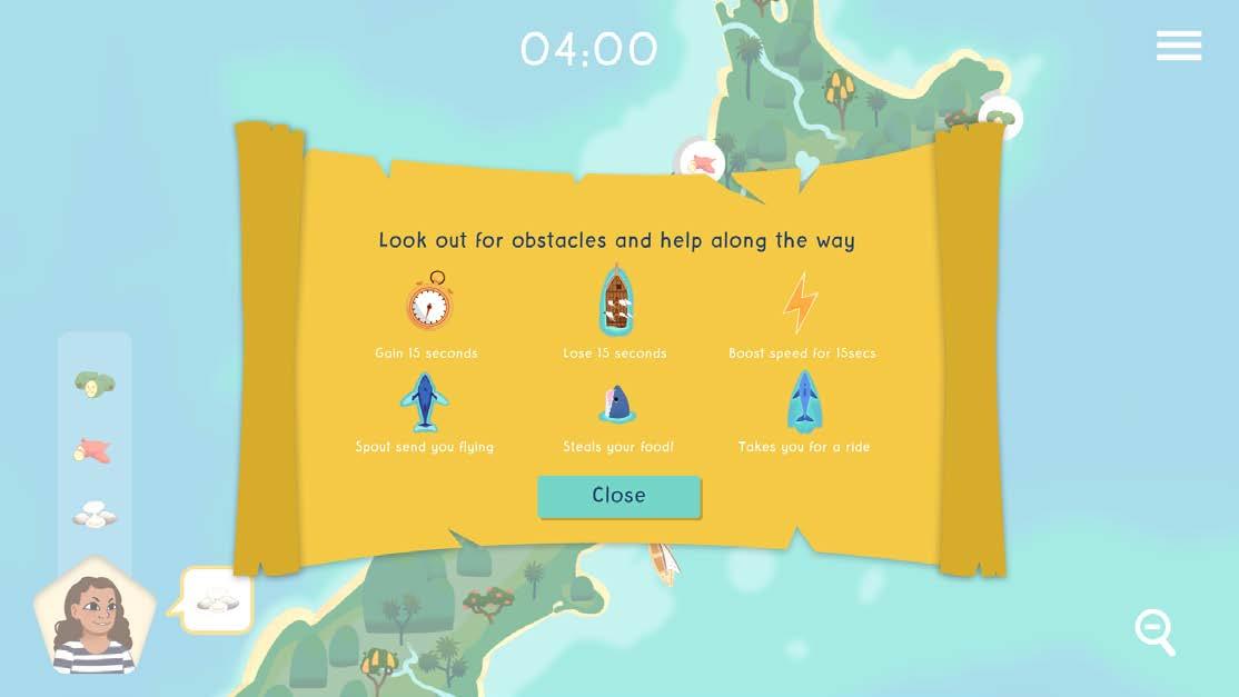

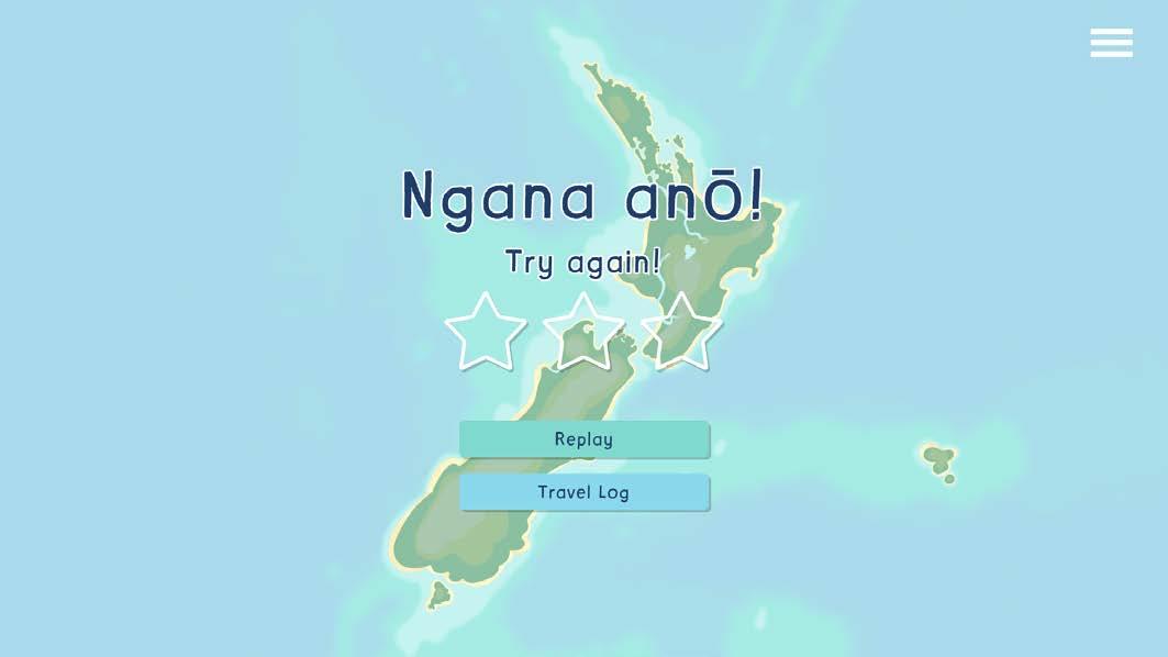
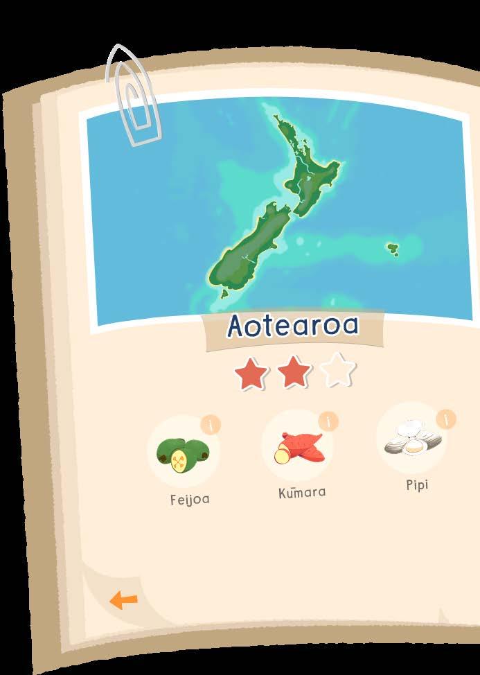
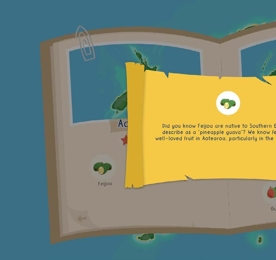
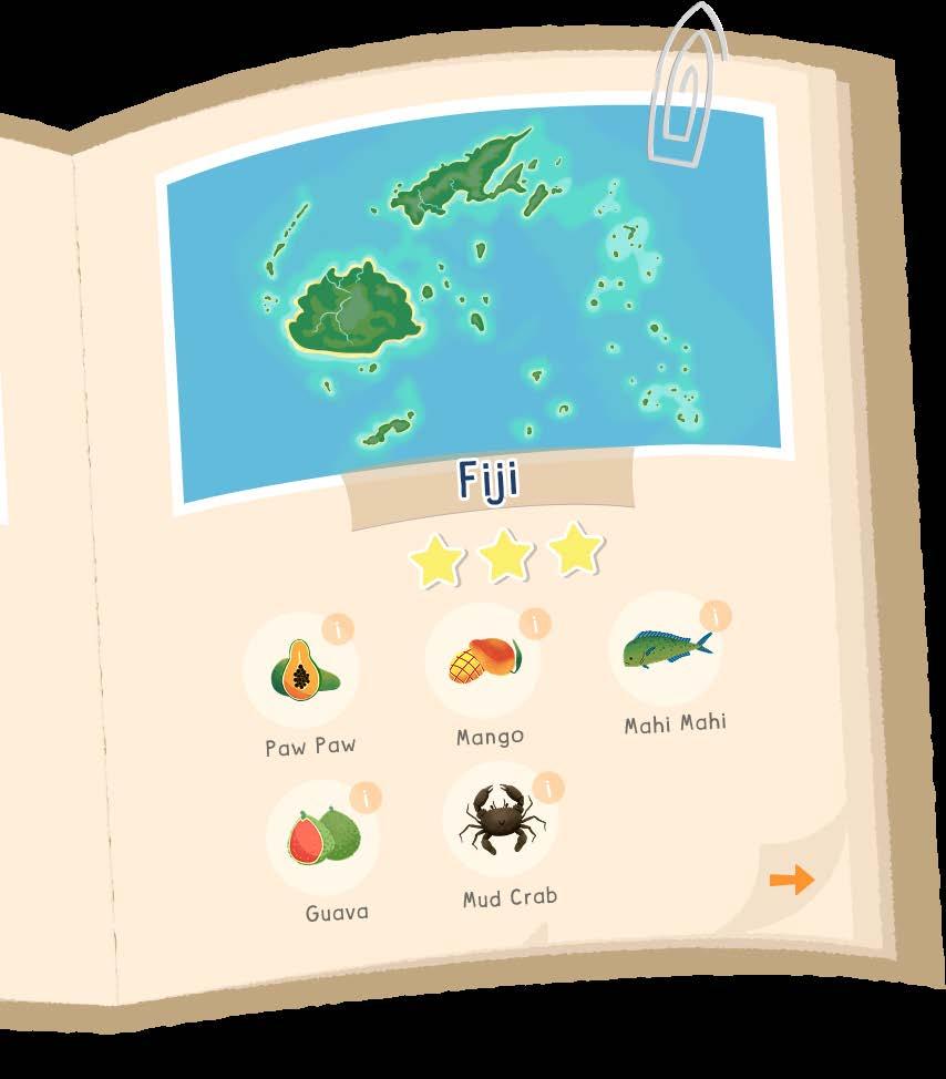

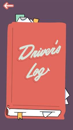
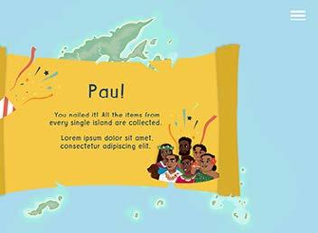
The log book of foods comes up at the end of each level, which lets the player see a summary of the island and foods.
Finish All Levels


How To Play-1


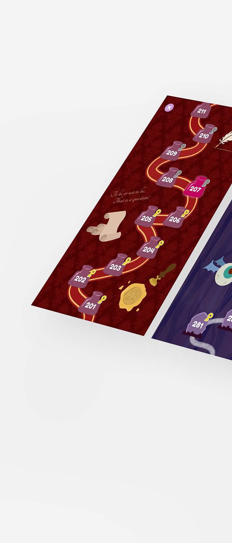
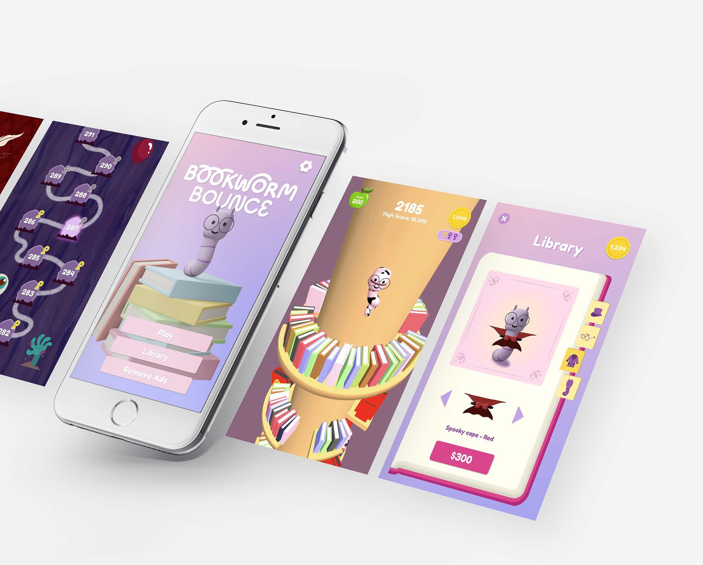
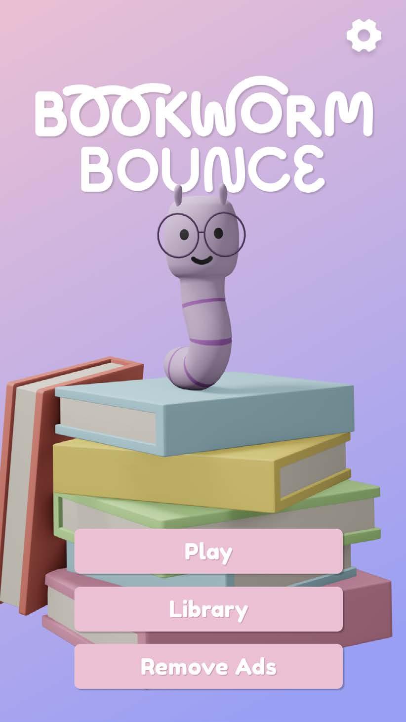
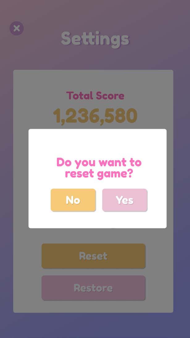
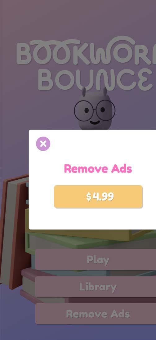
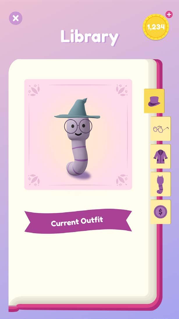
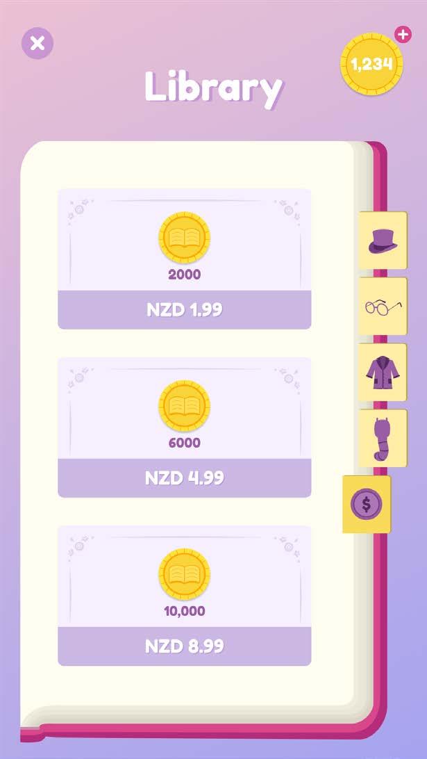
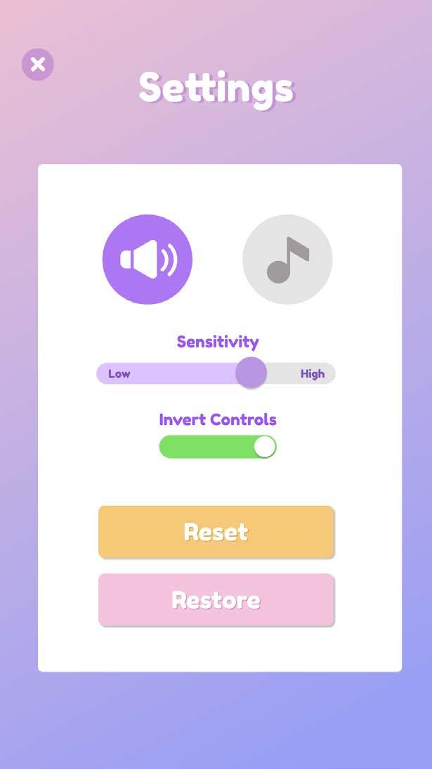
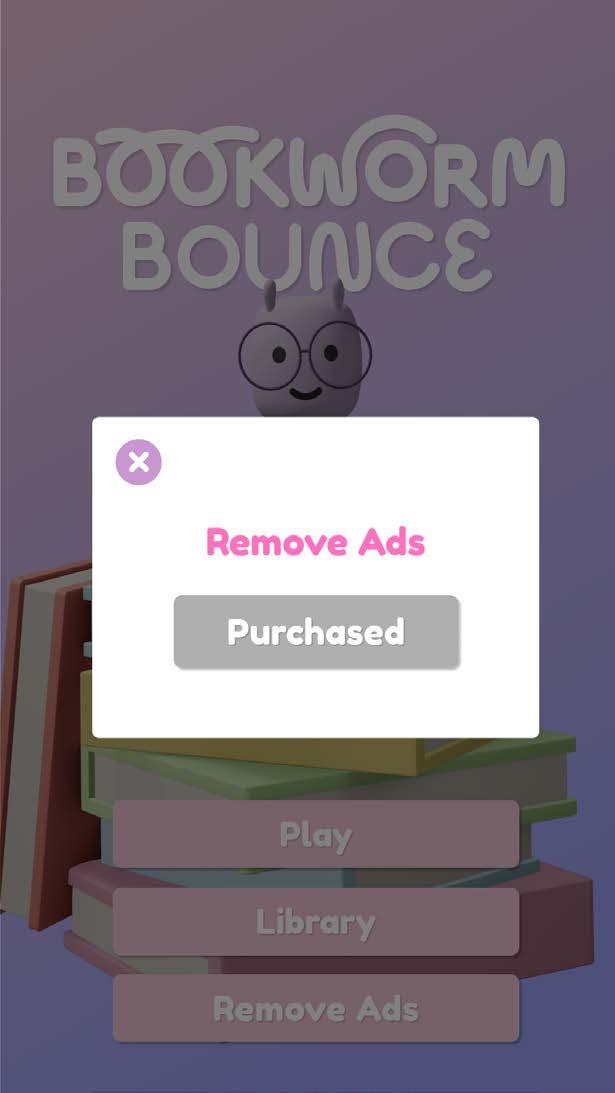
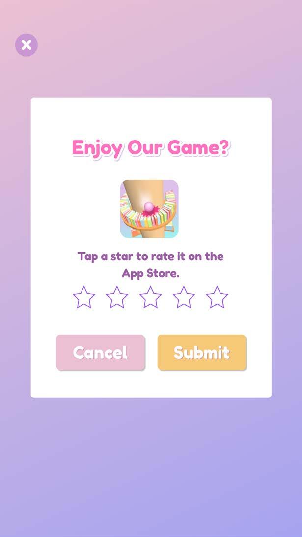
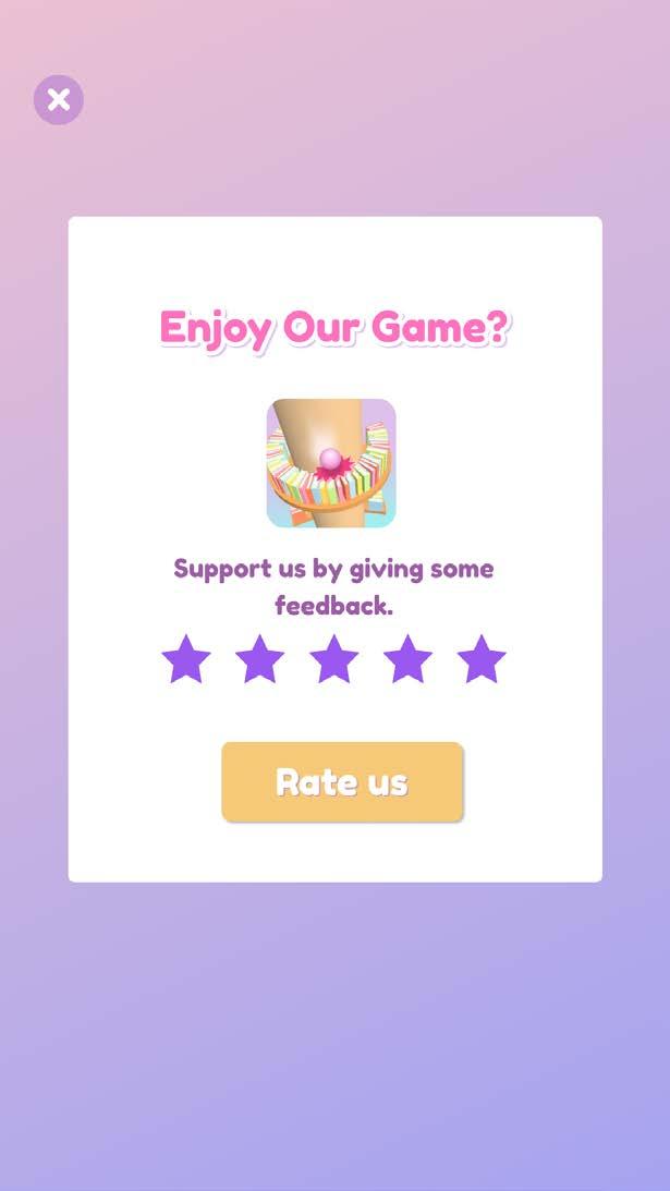
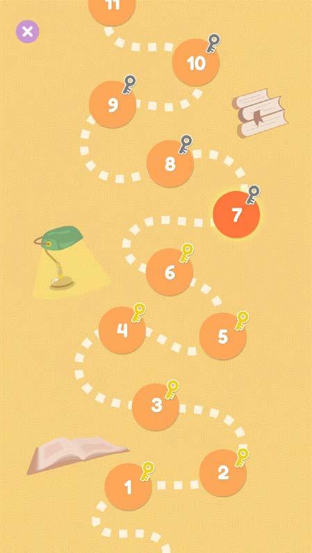
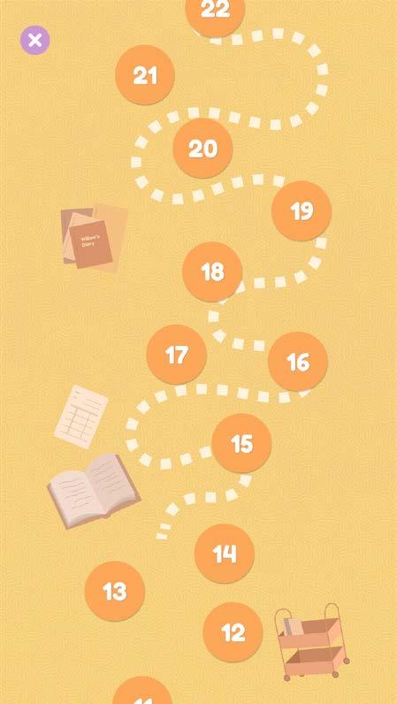
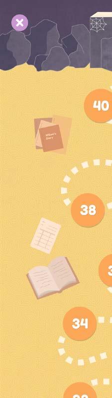
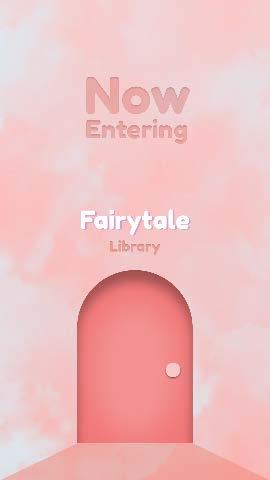
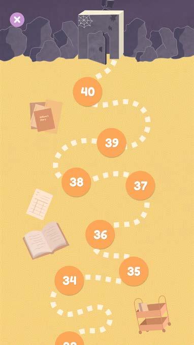
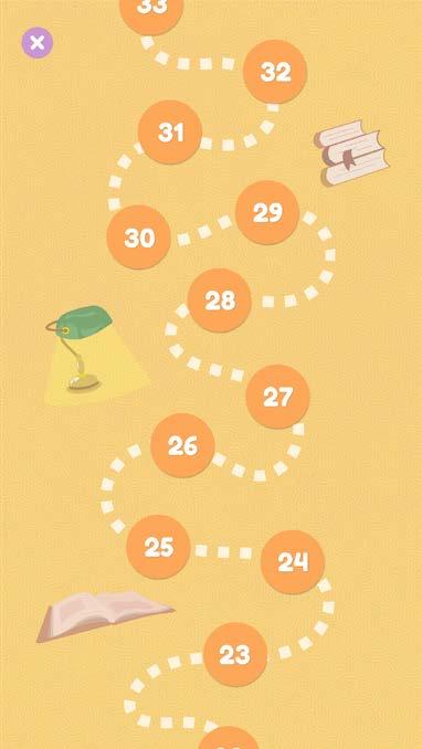
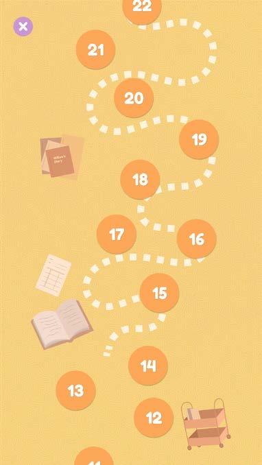
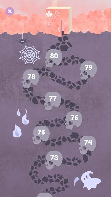
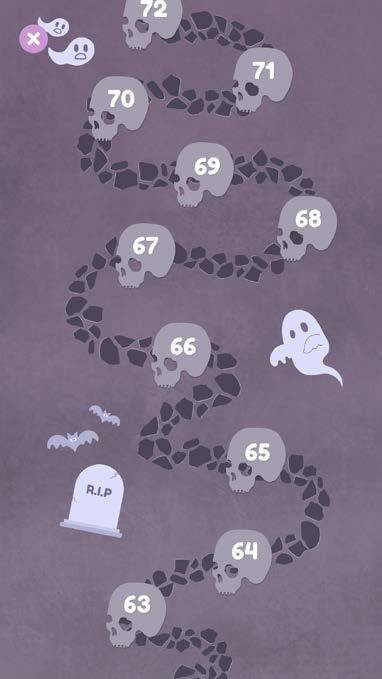
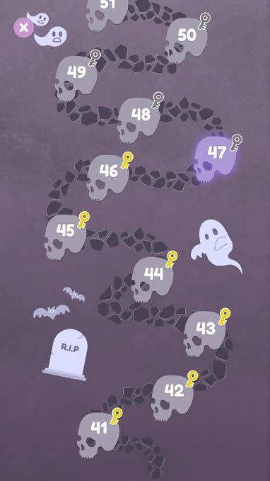
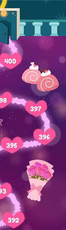
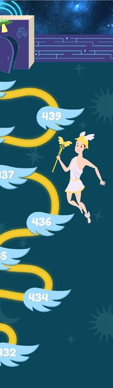
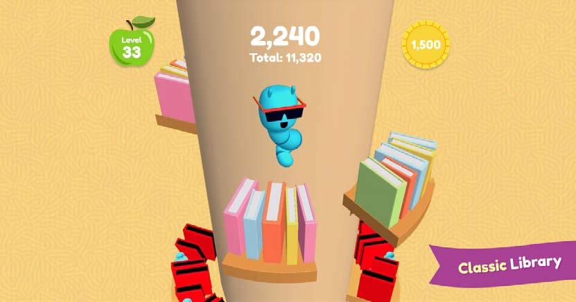
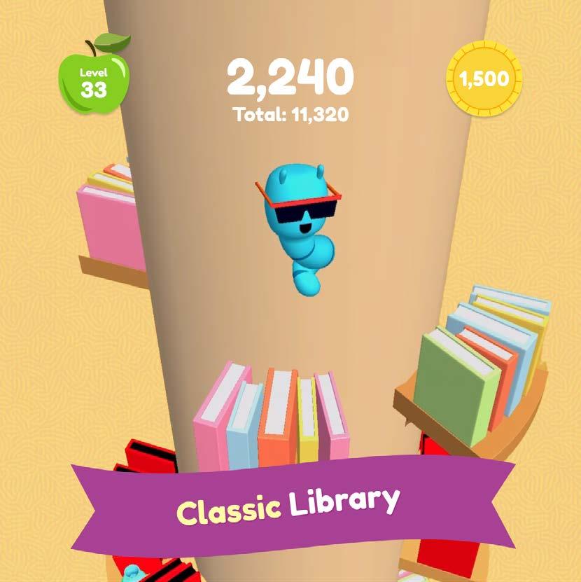
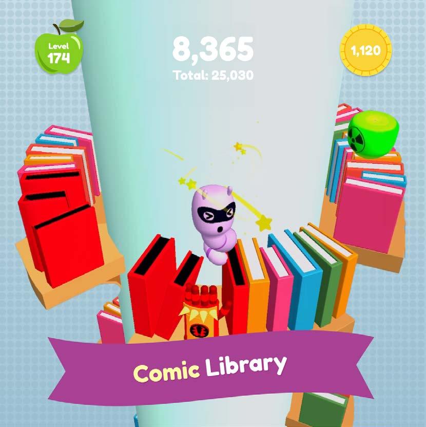
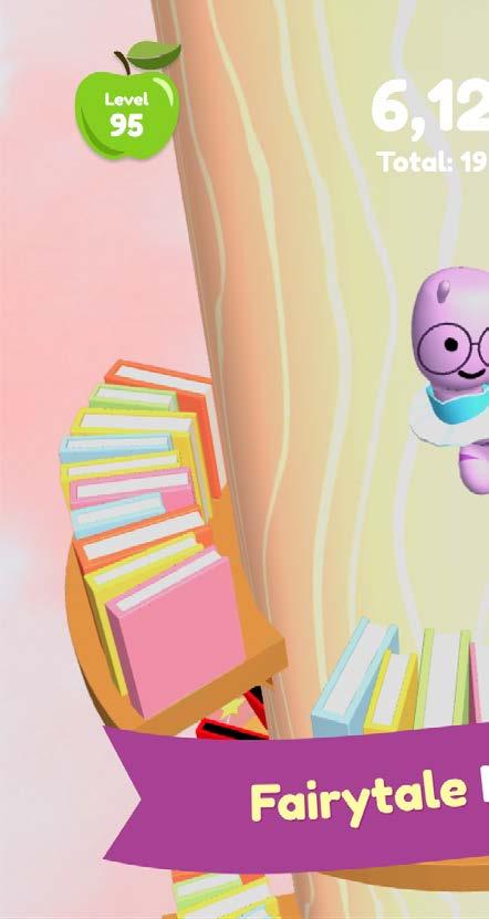
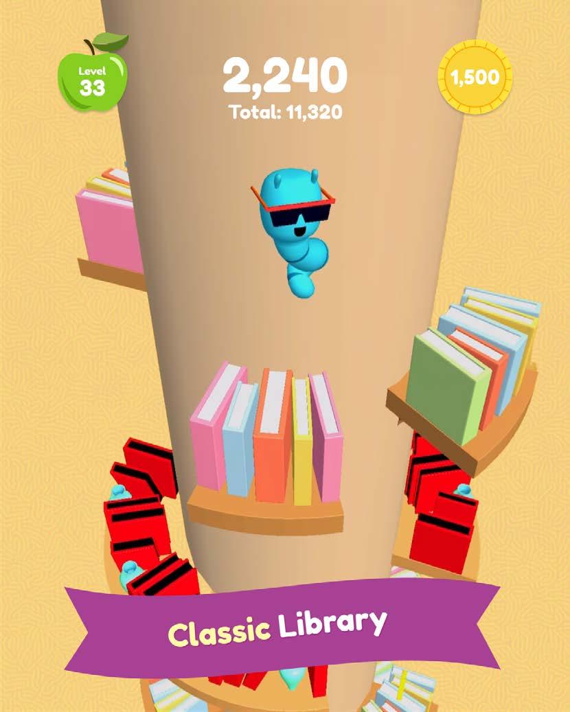
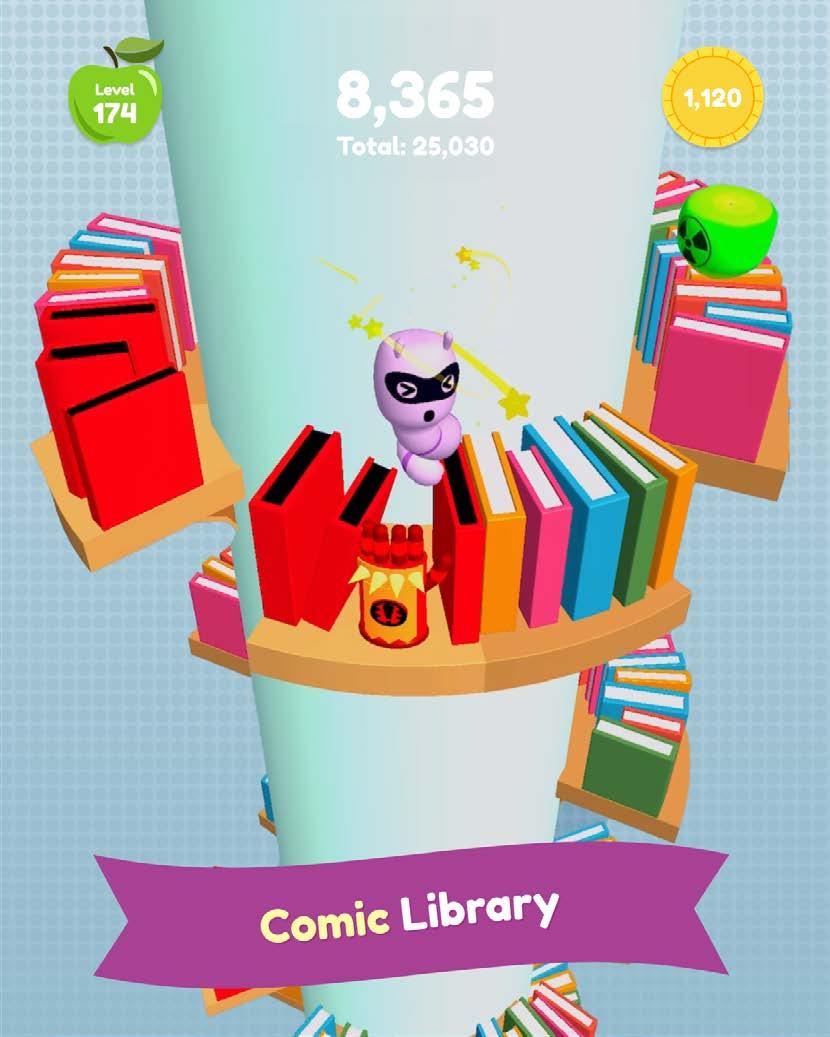
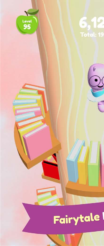
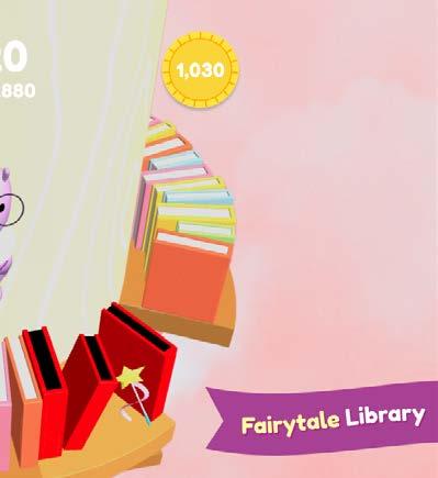
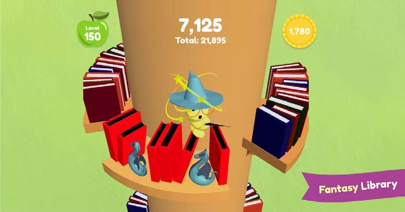
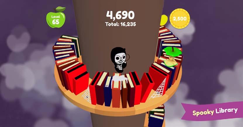
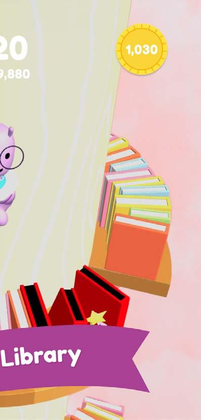
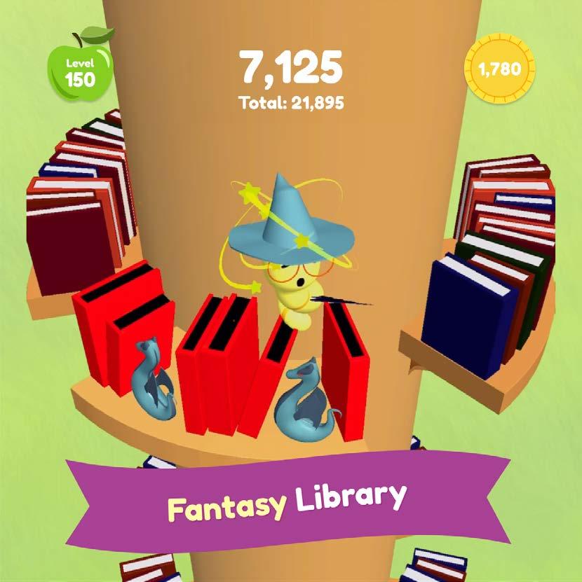
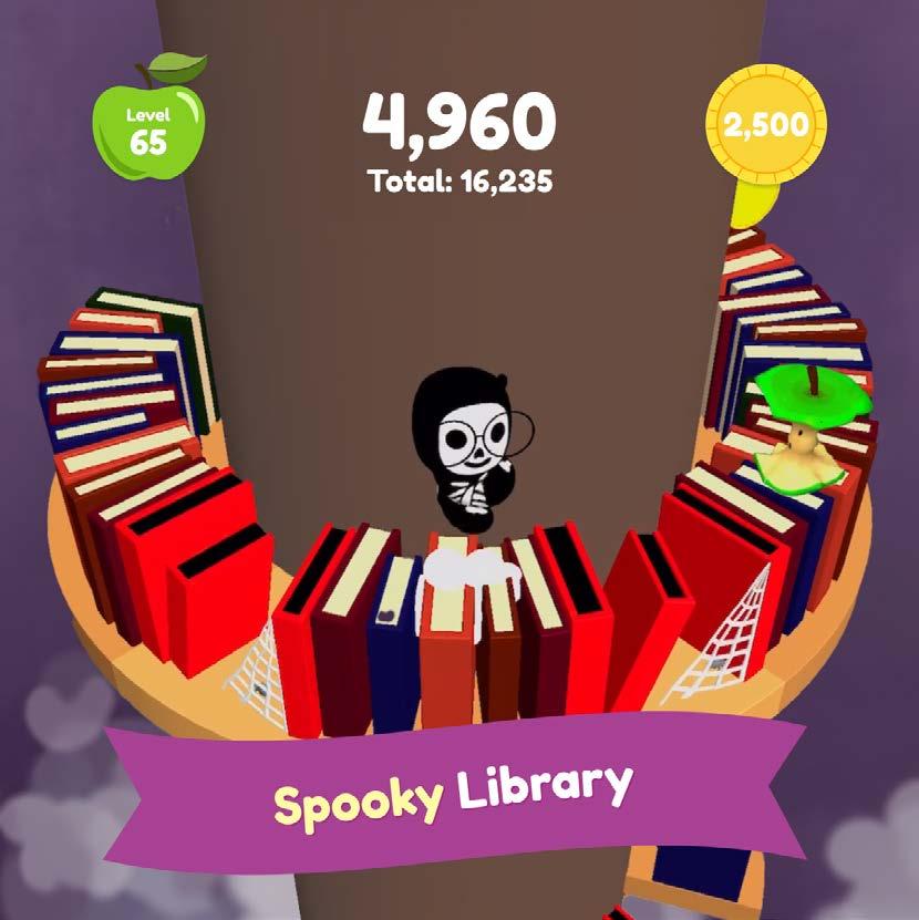
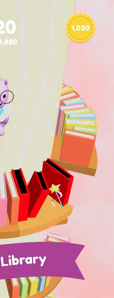
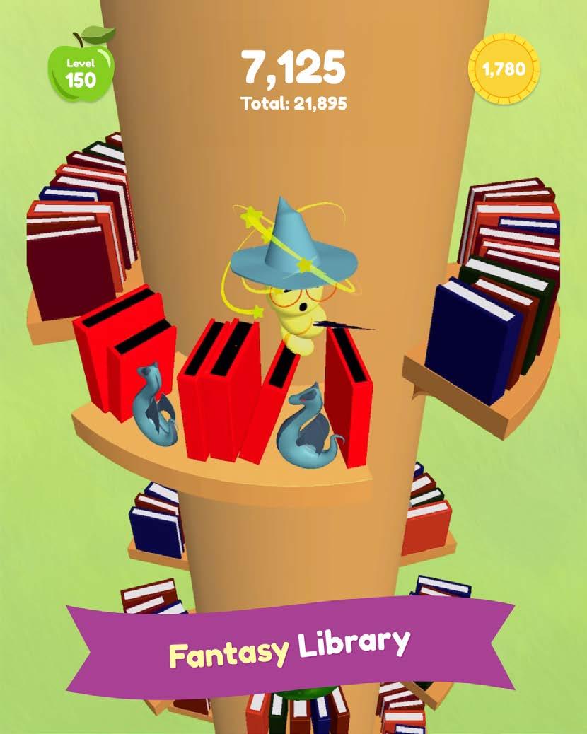
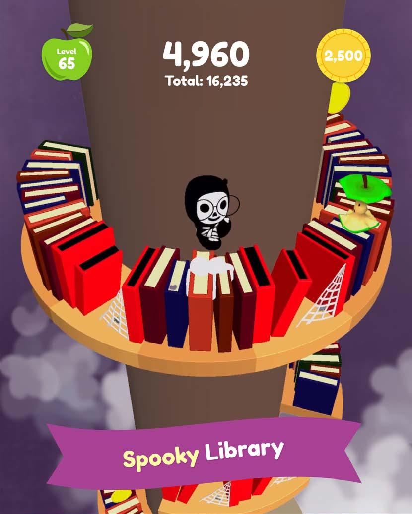
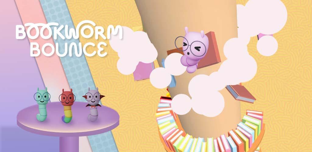
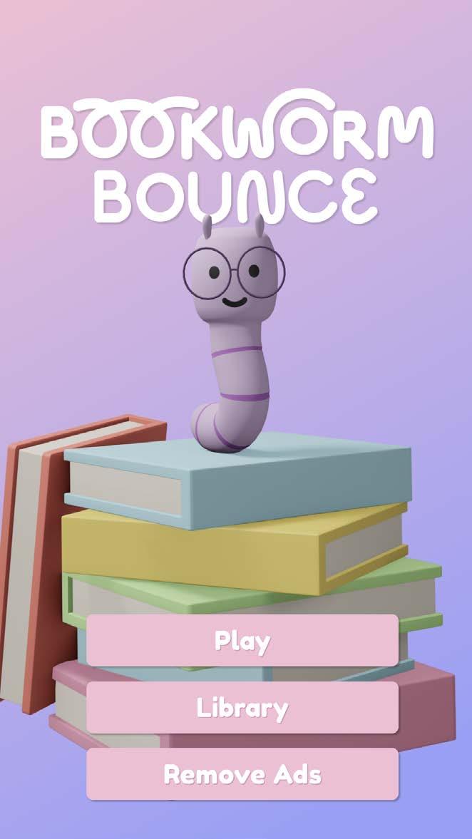
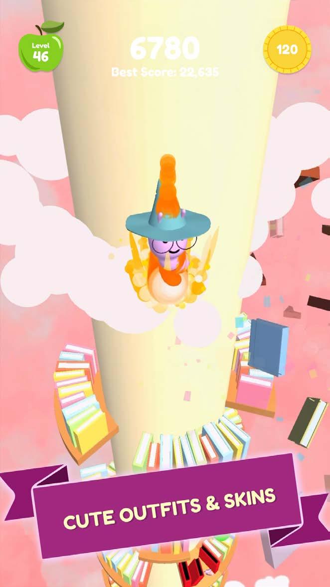
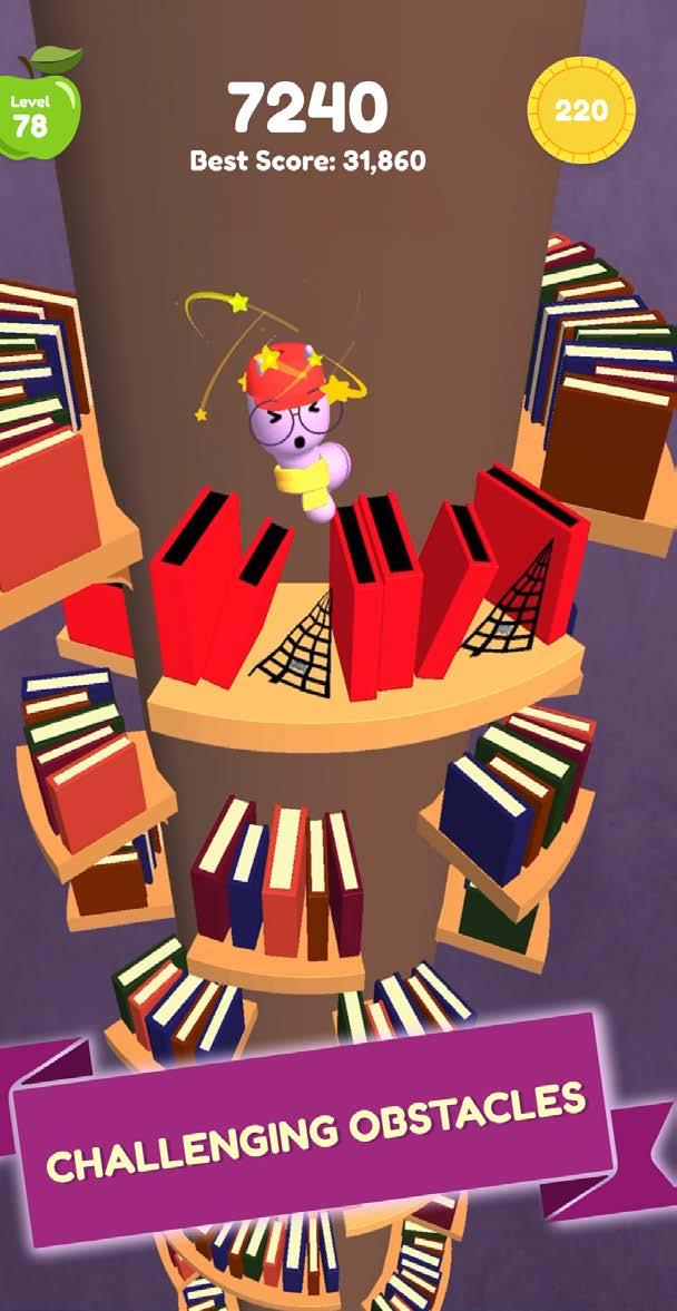
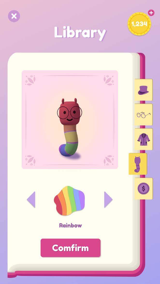
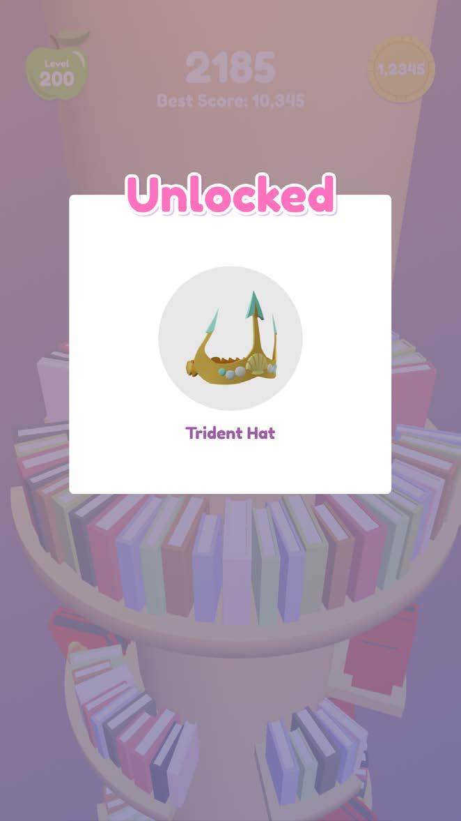
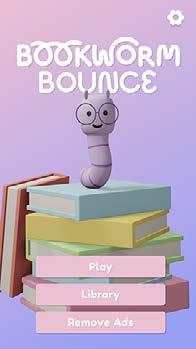
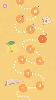
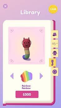
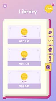
Bookworm Bounce is a hyper-casual mobile game where you guide Willow through circular platforms of books. Slide the platforms left to right using your finger to find a break in the platform that Willow can travel through and onto the next platform. But be careful, if you land on a red book or obstacle your streak is over and the level has failed!
Category Mad Carnival Project
Size 1920x1080px
Credit Funder/Executive Producer | Sam Ramlu
Producer | Flavia da Silva
Game UI Design | Chien Yi Chen
Listing & Marketing Assets | Chien Yi Chen
3D Artist | Nadezhda Keniya
Lead Developer | Attiq Khan
Developer | Roshan Shaffeq, Leslie Crooks
Animation | Lahiru De Silva
Sound Effect | James Dean


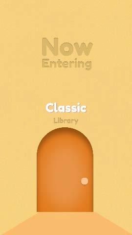
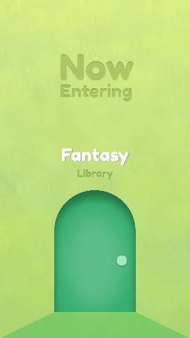
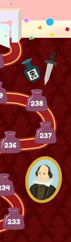
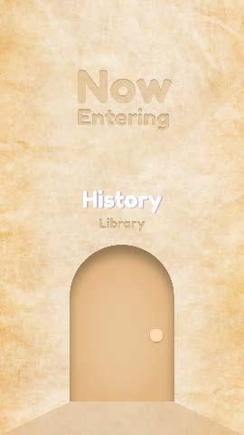
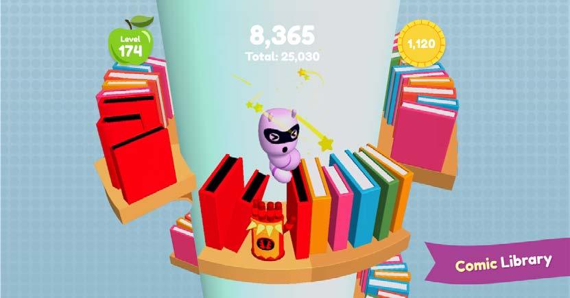
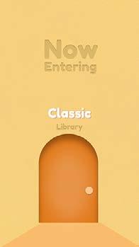
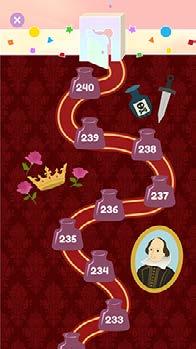
The End of the Previous Theme
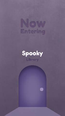
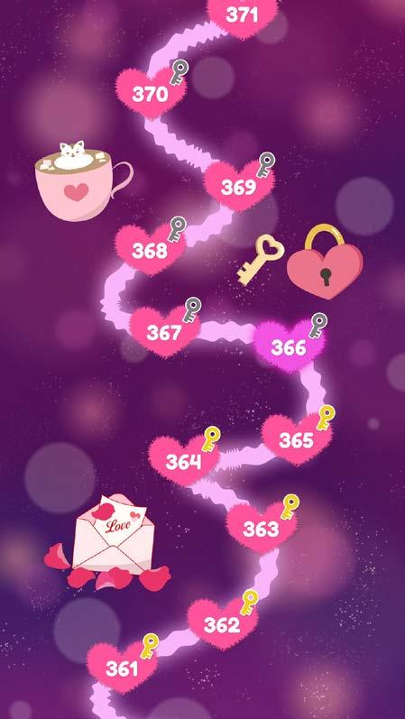
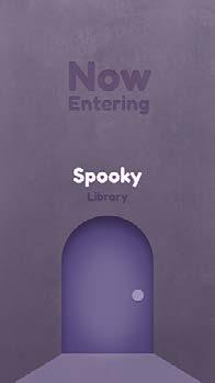
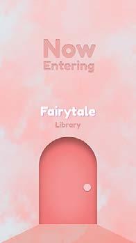
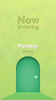
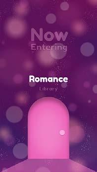
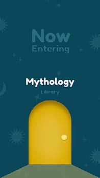
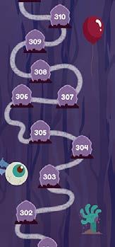
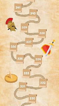
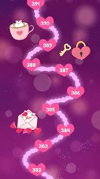
The player will travel through different literary-themed worlds and gain new power-ups. Each world is themed toward a new literary genre, with new obstacles and power-ups to match.
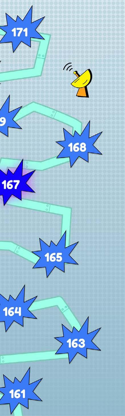

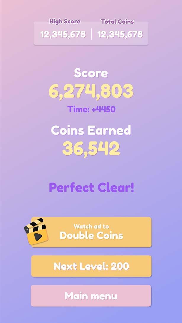
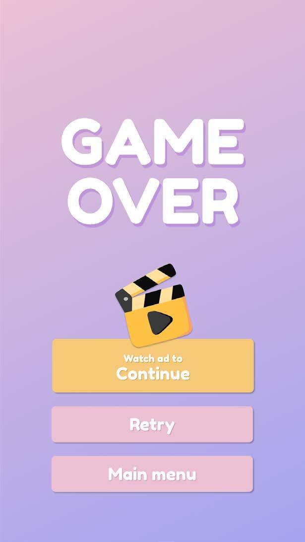
Score and Coins Earned-2 Game Over
Seamless Map


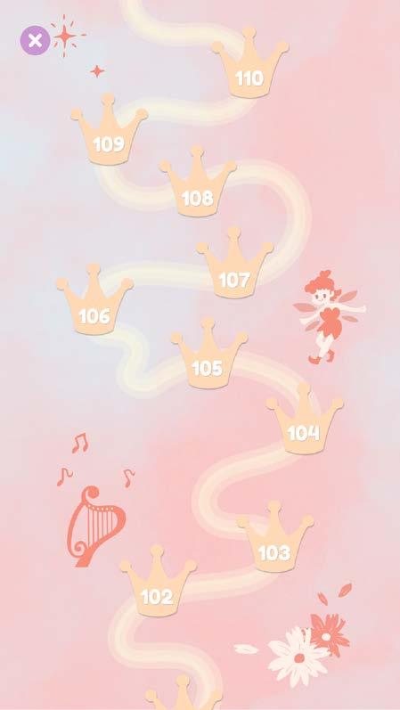
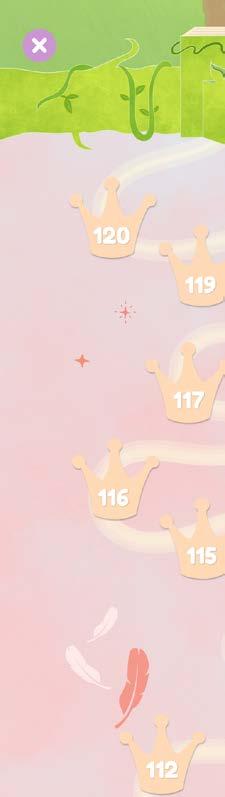
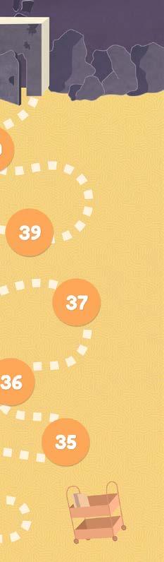
Seamless Maps


Seamless Maps


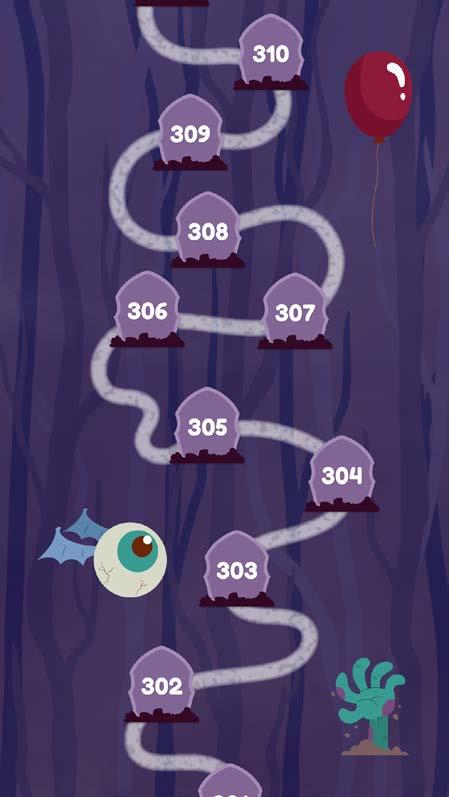
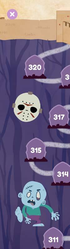

Seamless Maps


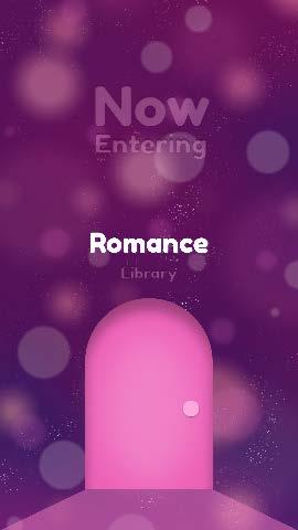
Romance
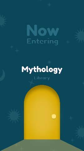
Mythology


Seamless Maps

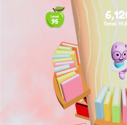

Screenshots


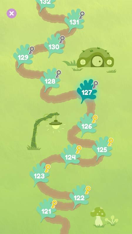
The player must complete the previous level before heading to the next one. After unlocking a level, the player can return to any level they want among the unlocked ones and play it again.


Client
BeGuava, a startup on Kickstarter that concern about climate issue.
Goal
Rebrand the product, an app called Project Eco.
Brandmark Positioning
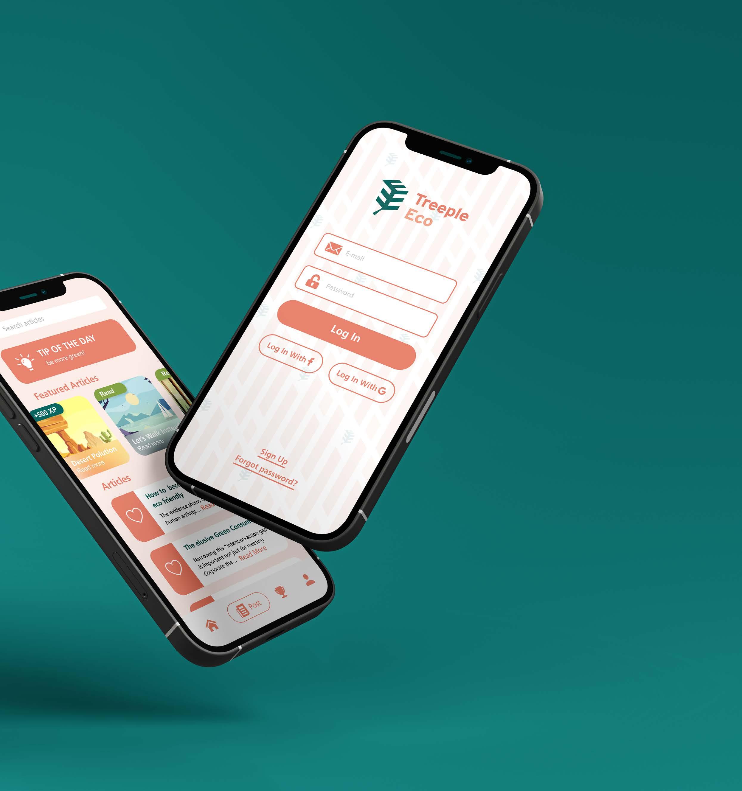
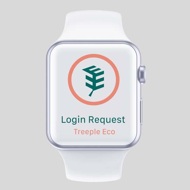
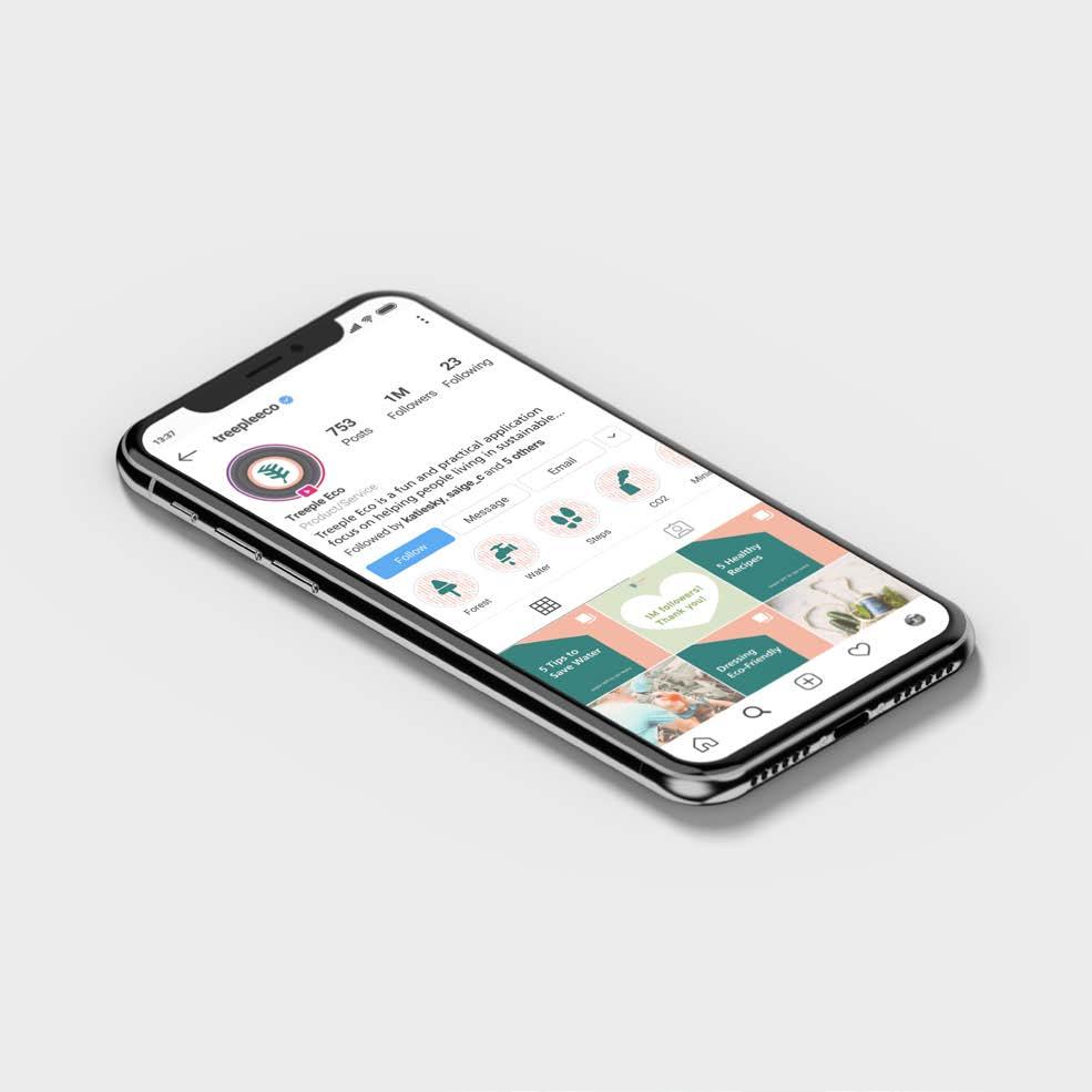
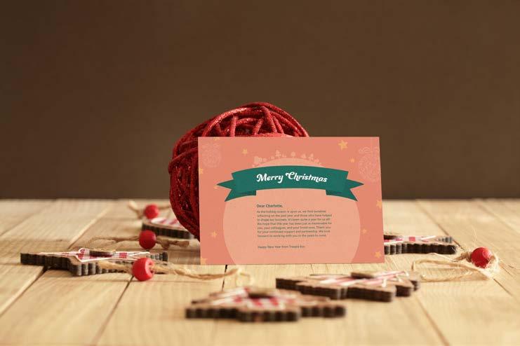
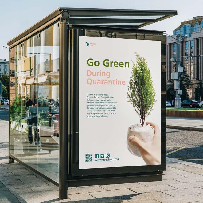
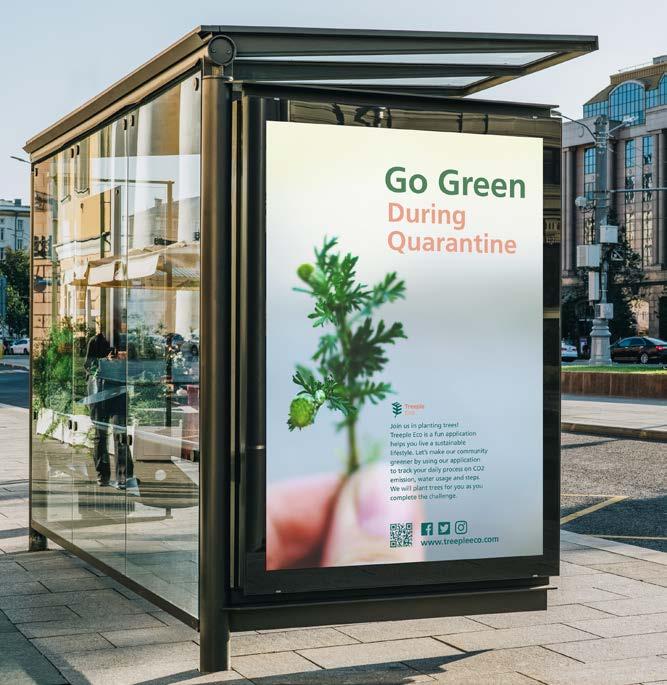
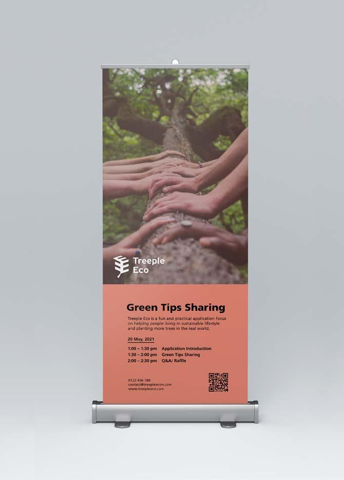
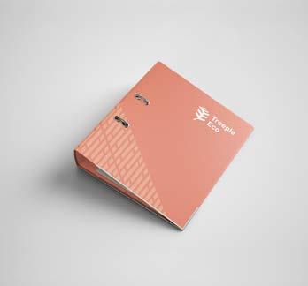
Treeple Eco is a app aiming to provide fun, innovative and sustainable service on daily emission tracking. Once the users complete the missions and achieve the goal, they can plant trees in the real world.
To maintain the values and personalities of the brand, there is an opportunity for the brand to develop in a young and enjoyable direction.
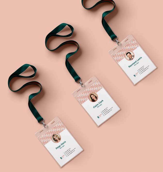
Category University Project, Rebrand Size Multiple Sizes

Eco Combo
Ecoventure
Eco Journey
Eco Guide
Eco Savior
Eco Gamer
Green Hero
Green Action
Green Steps
Green Record
Green Life
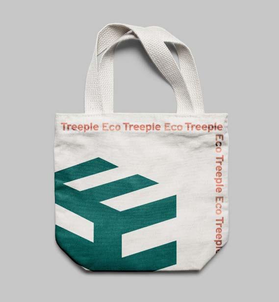
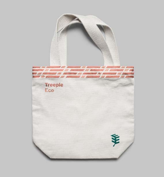
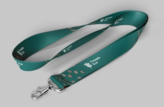
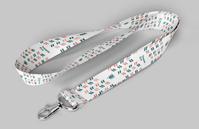
Treeple Eco
Woody Goody
Seed Through You
Motivate
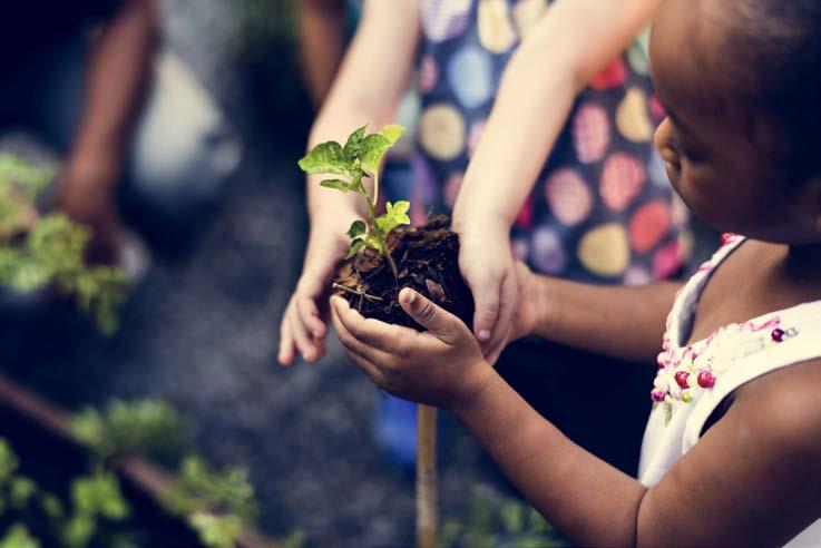
Everyone can be an eco-hero starting with tracking their daily routines and learning how to live a more eco-friendly lifestyle by using this application.
Users will be rewarded by earning points after they devote themselves to eco-actions.
Making small and incremental changes to plant trees both in the virtual forest and real life. Make a real impact on the world.
Impact
Innovative
Seeing others’ achievement will cheer you on and encourage you to invite your friends, family and colleagues to join in.
Sustainable
Project Eco is a practical and enjoyable application. Tracking daily carbon footprint becomes a farming simulation game. Grow your trees in virtual land and real life.
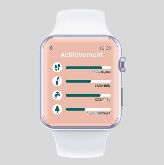
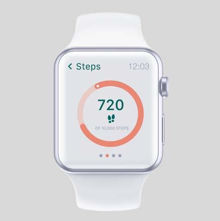
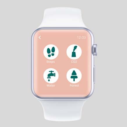
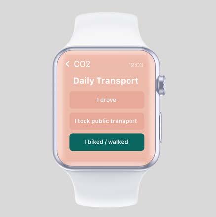
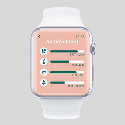
Uses can make our planet better by answering simple questions to track users’ CO2 emission, water usage and how much deforestation they are contributing to. As well as measuring their daily steps.
Guide
Sociable
Providing useful tips and advice on how to live a more eco-friendly lifestyle with regular articles and blog posts.
Building a community for people to interact with others and share their achievement across social media accounts. Everyone can be an eco-hero and influent others.
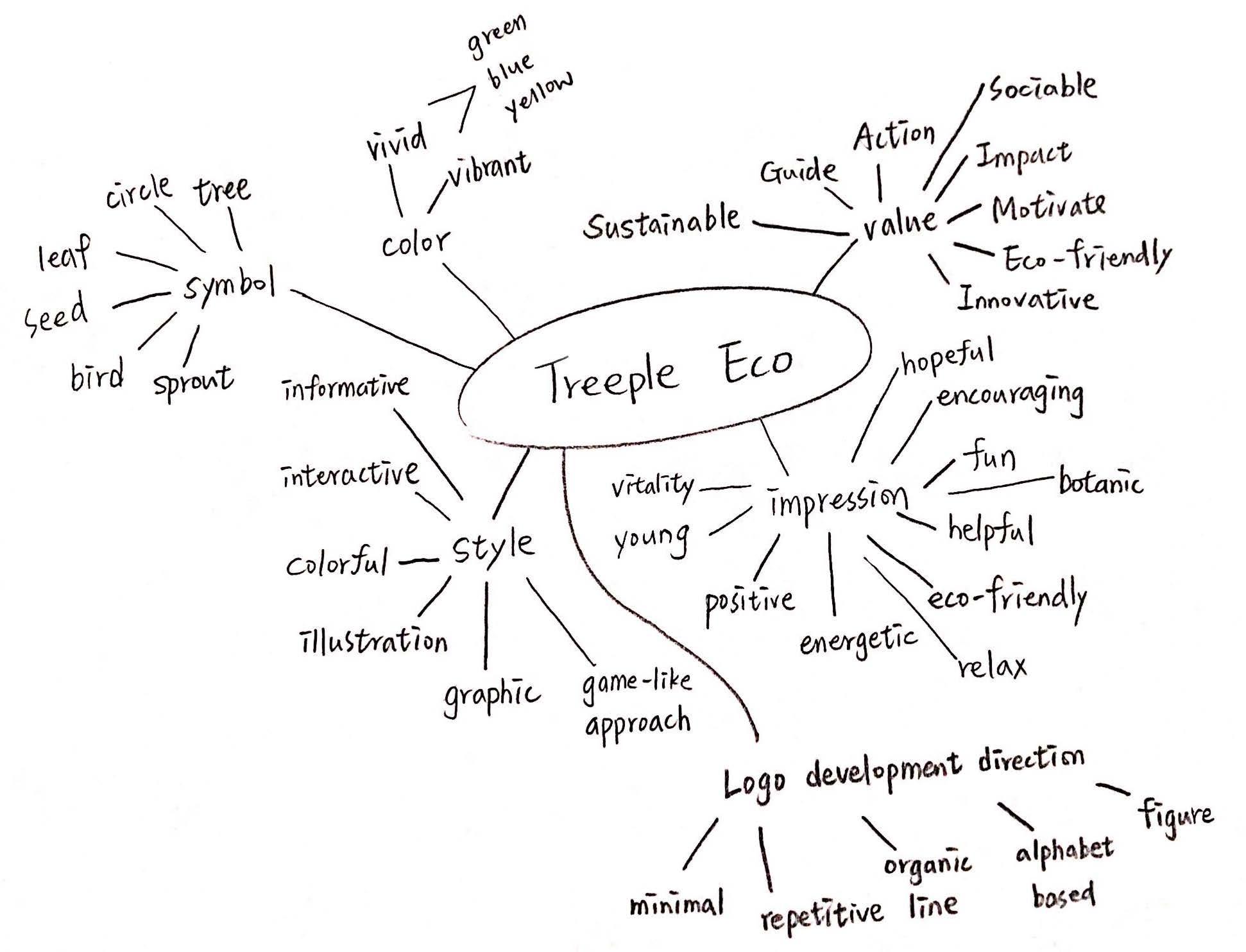
Keywords
• tree
• leave
• bird
• seed
• treeple
• simplicity
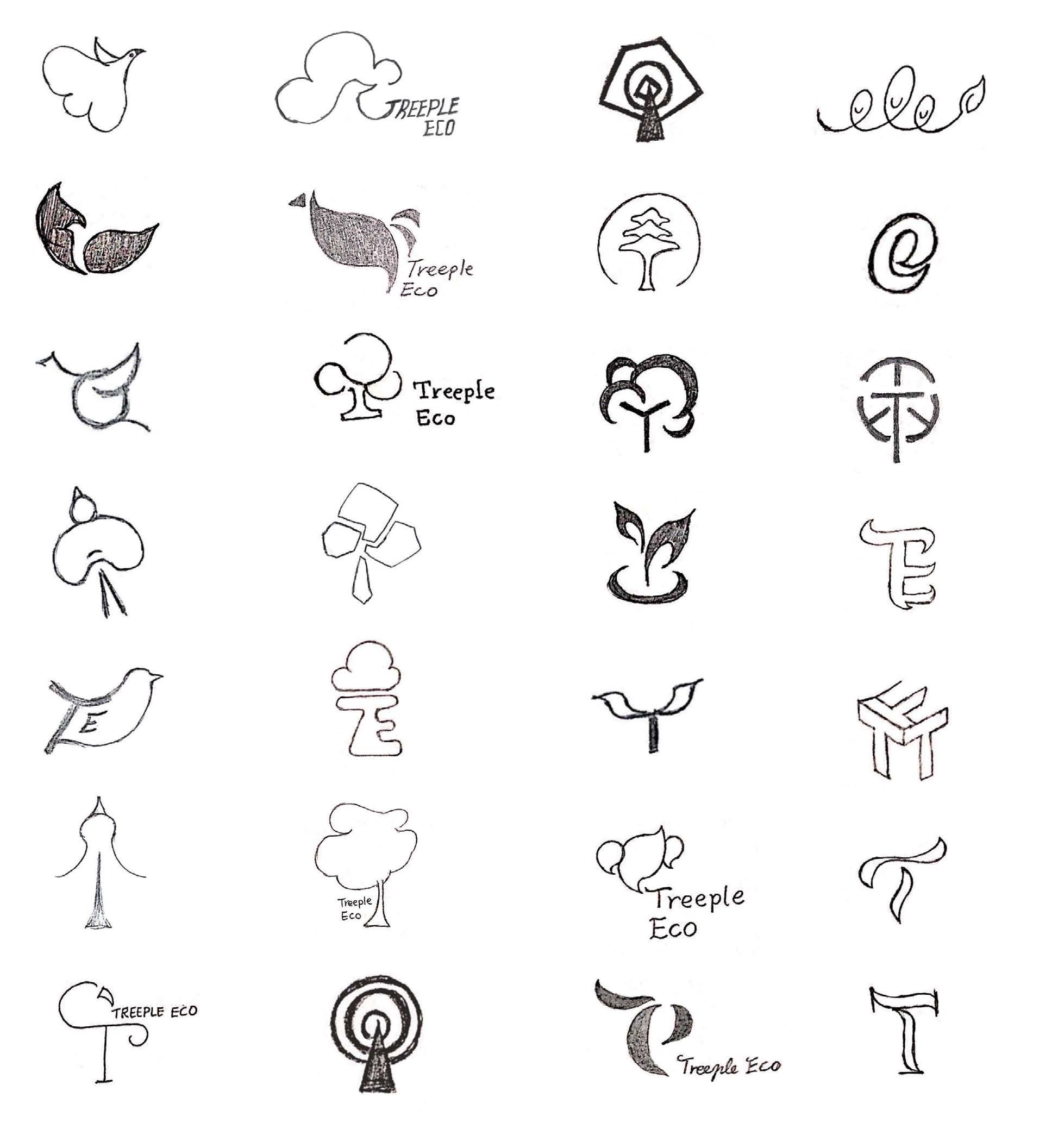
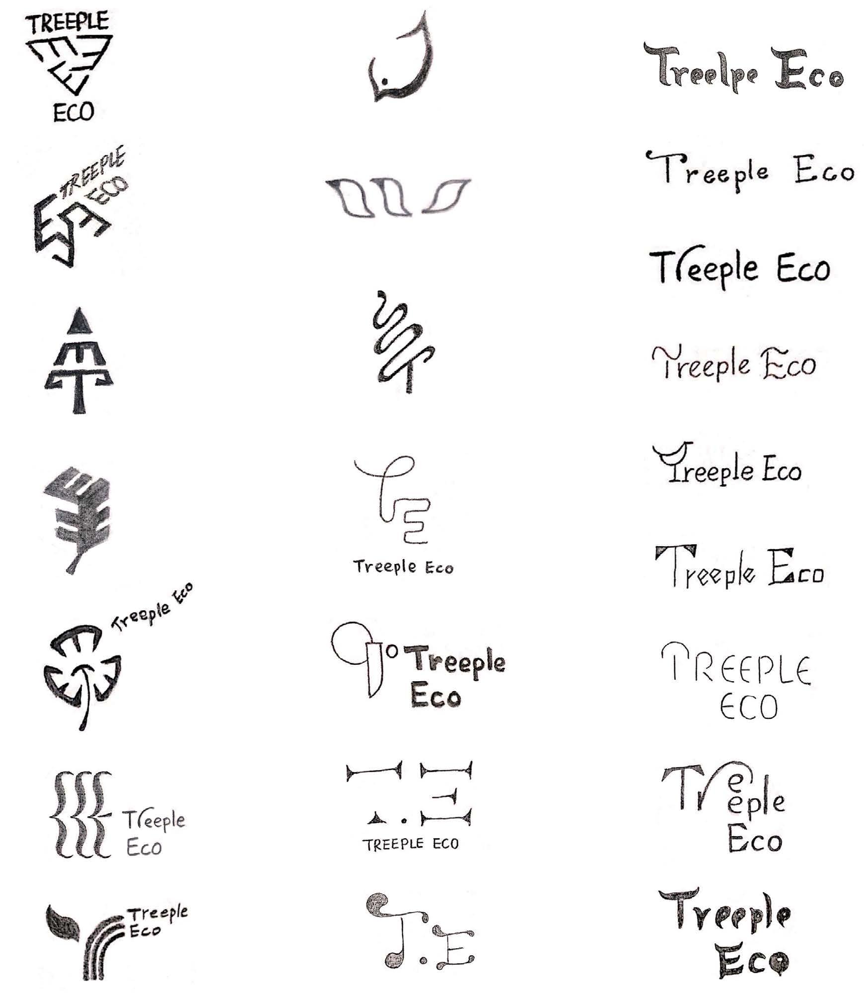
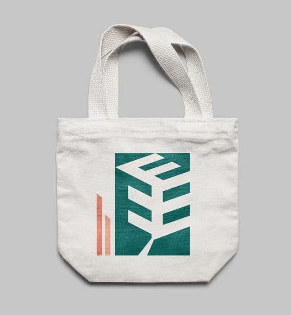
My three designs are all looking for a clear, concise and young direction although they are quite different from each other. I have chosen option 2 as it adequately responds to the name of the brandmark, Treeple Eco. The image is composed of three capital letters E and they are formed into a leaf as well. This design captures the values and personalities of the brand: eco-friendly, innovative ands enjoyable.
The leaf, as a hint of referring to a tree, is highly related to the brand’s core value which is encouraging people to plant more trees. Its threedimensional structure provides a uniform and appealing appearance. On the other hand, the figure has a great potential to create optical perception art brand extensions.
Rationale
The brand name is a homophone of the words triple and treeple makes the brand name memorable and easy to say. Based on its nature, I utilize three capital letters E to design the logo making a good connection between brand name and brandmark.
The color scheme aims at bringing energetic and young characteristics into the brandmark. The contrast between the color of the figure and text makes the logo stand out from numerous greenish logos in the same field. The san serif font "Interstate" in bold font weight has sharp, oblique ascender and descender which correspond to the feature of the brandmark.


Mobile Application
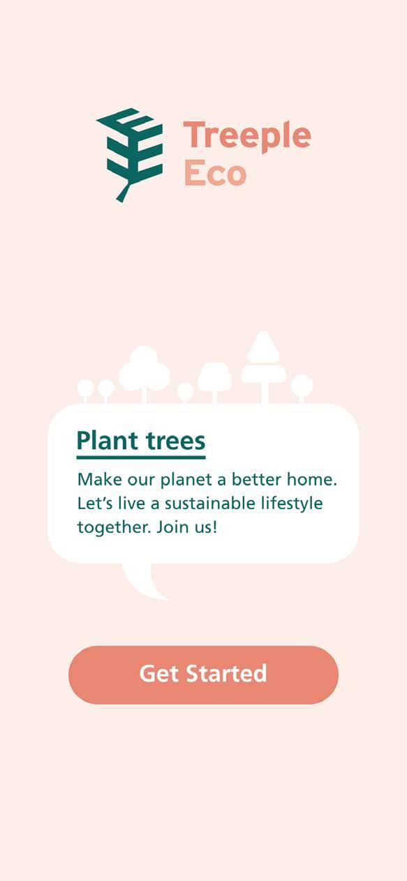
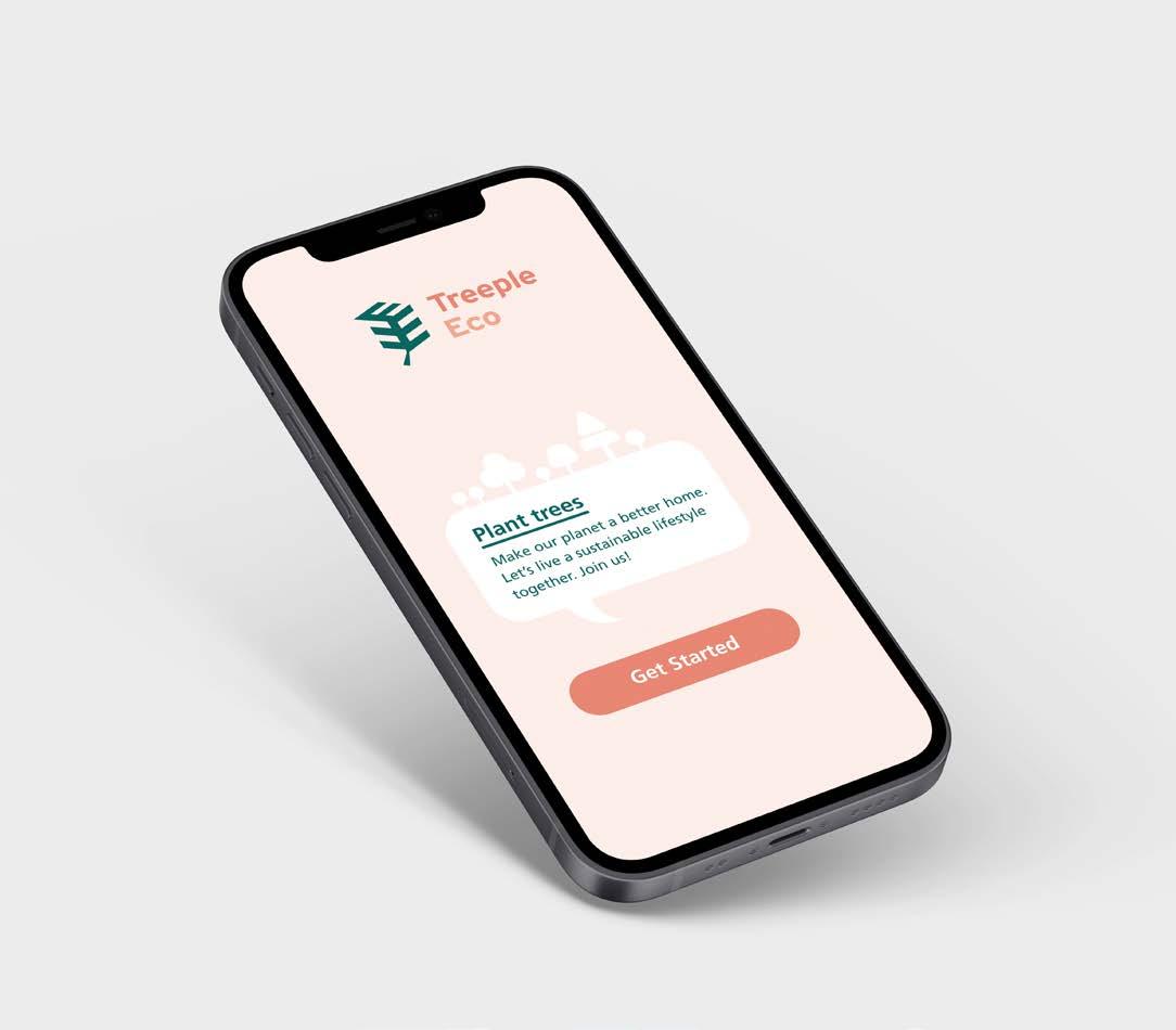
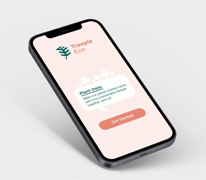
Welcome Page
Greeting, brief introduction to the application and call to action.
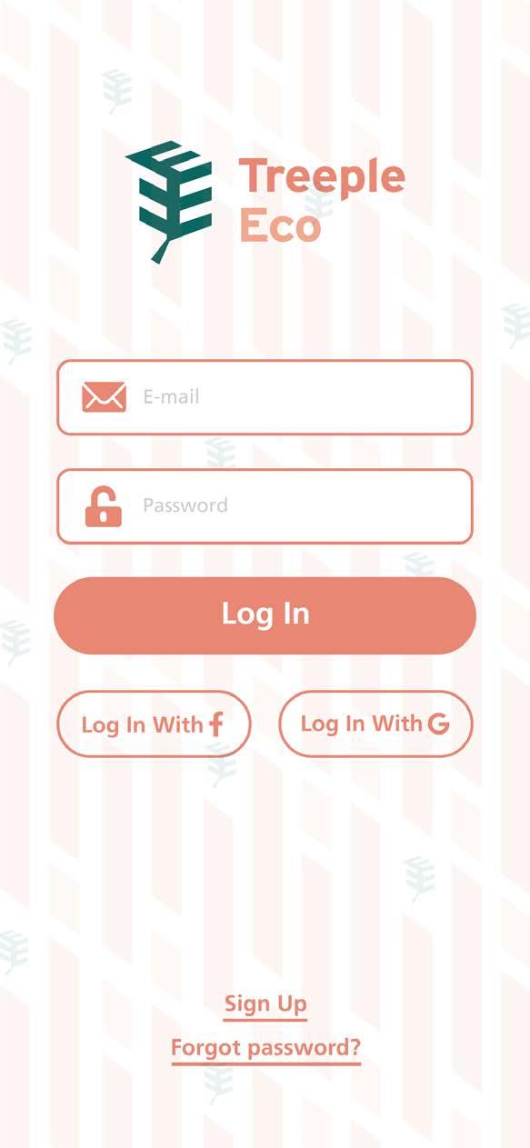
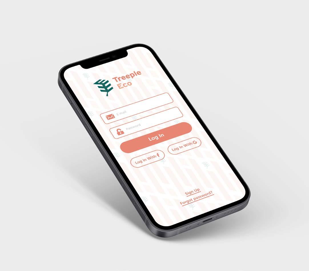
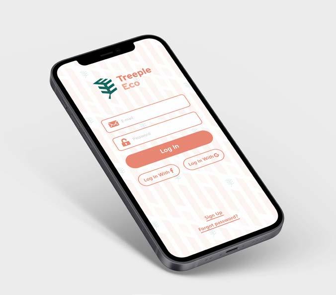
Login Page
Sing up to join Treeple Eco community or log in with various media accounts. Login helps users connect with people within the application and data maintenance.
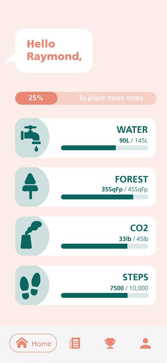
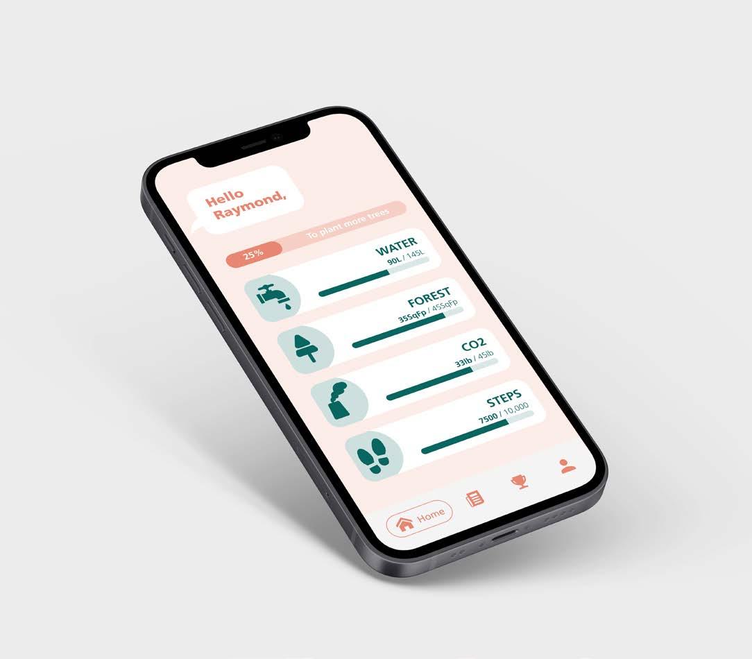
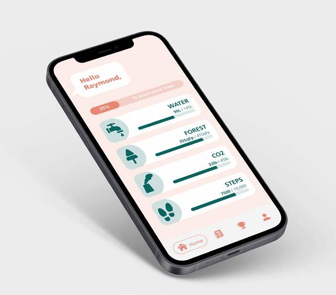
Home Page
Dashboard of each tracking item. Users can monitor their progress here and link to the specific item page as well.
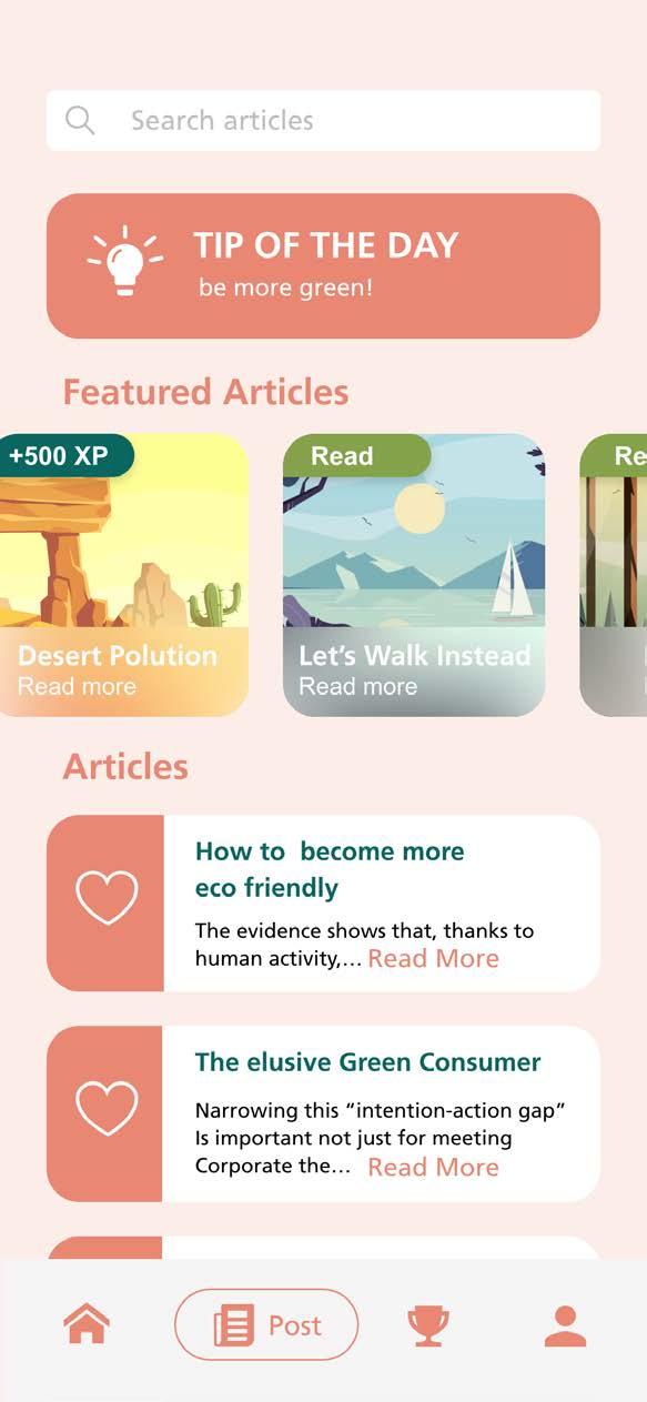
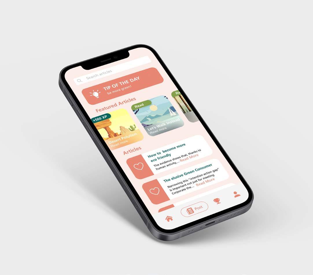
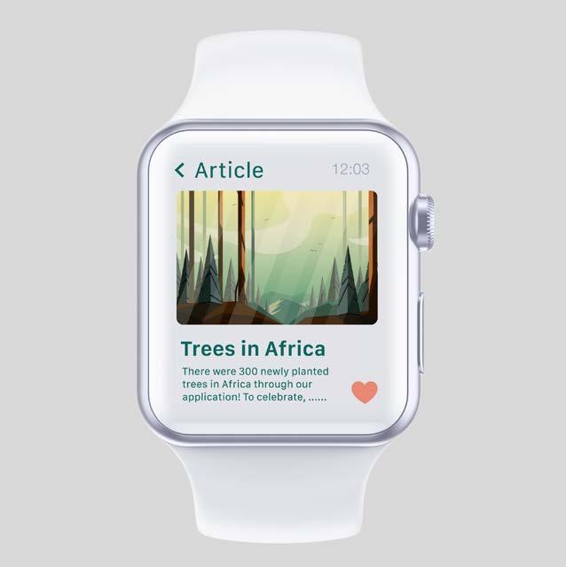
Post Page
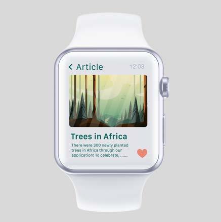
Daily feed and bonus tasks to engage users. Useful information about sustainable lifestyle. Articles can be added to the user’s favorite list for rereading again anytime.
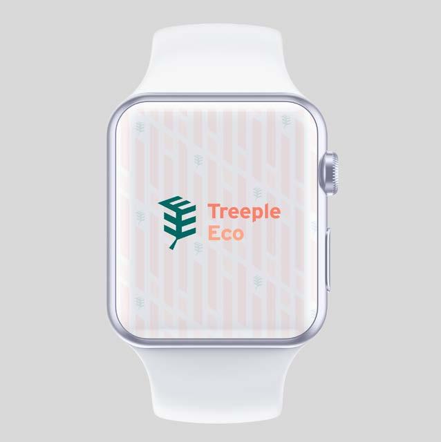
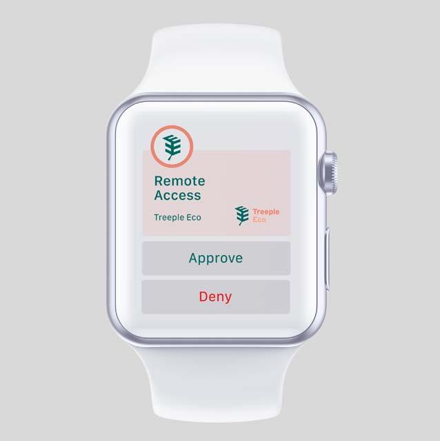
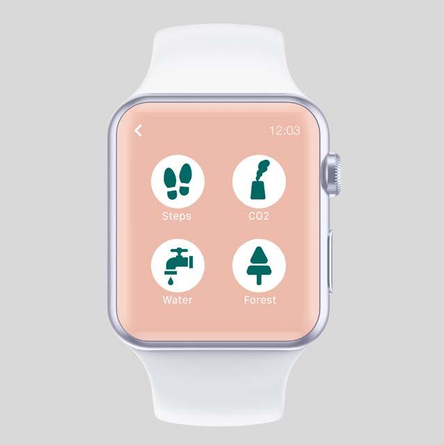
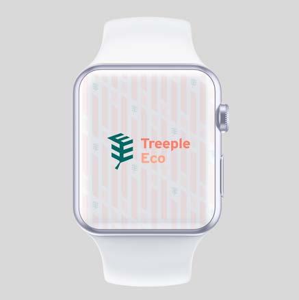
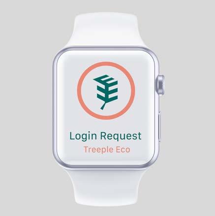
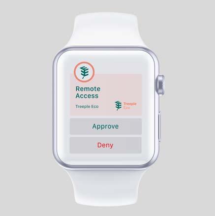
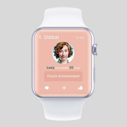
Users can easily track their daily process via the apple watch without taking out the phone or in the situation that the mobile is not available.


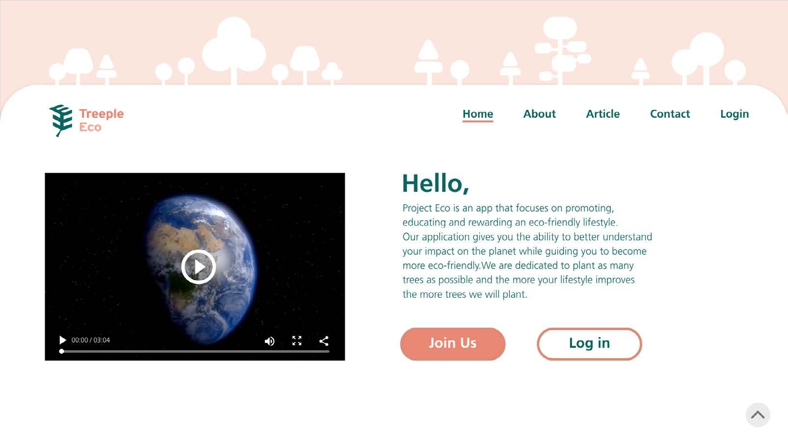
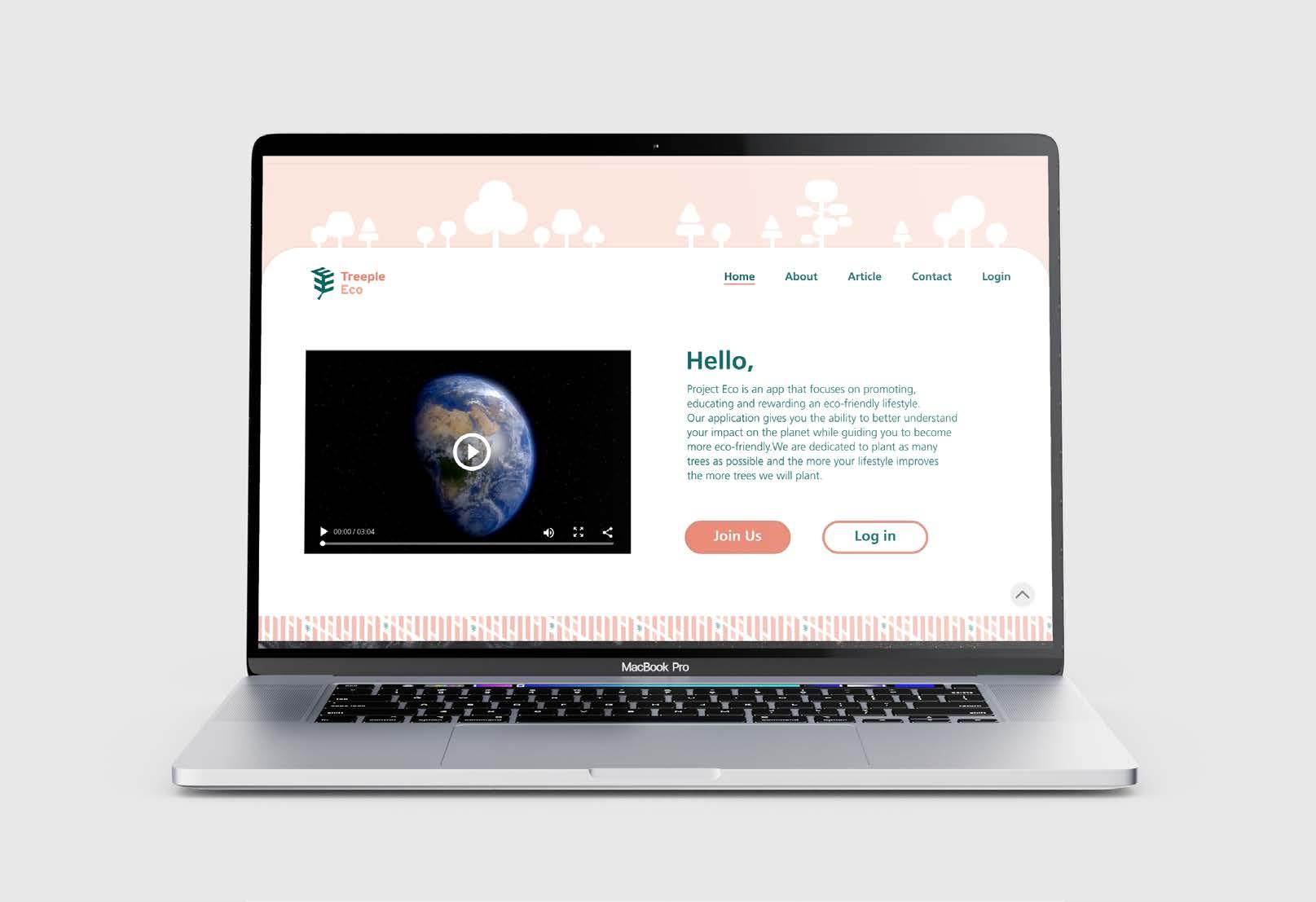
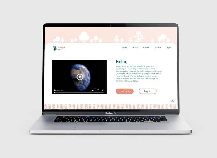
The website design is mainly adapted from the mobile application. For promoting, it provides more detailed information about the application The users can monitor their daily process on the desktop as well.
Homepage
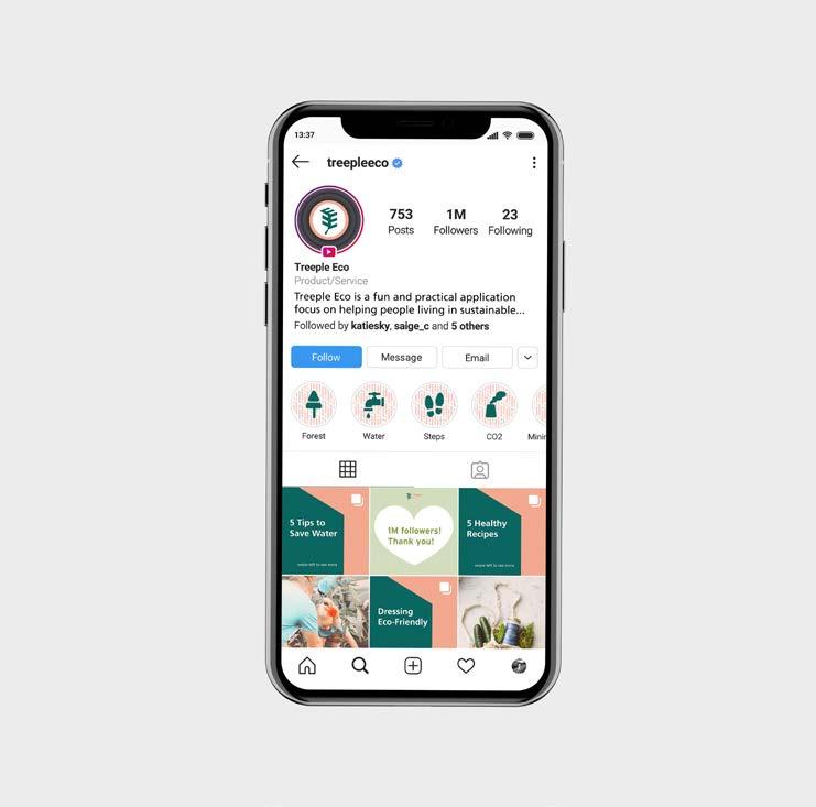
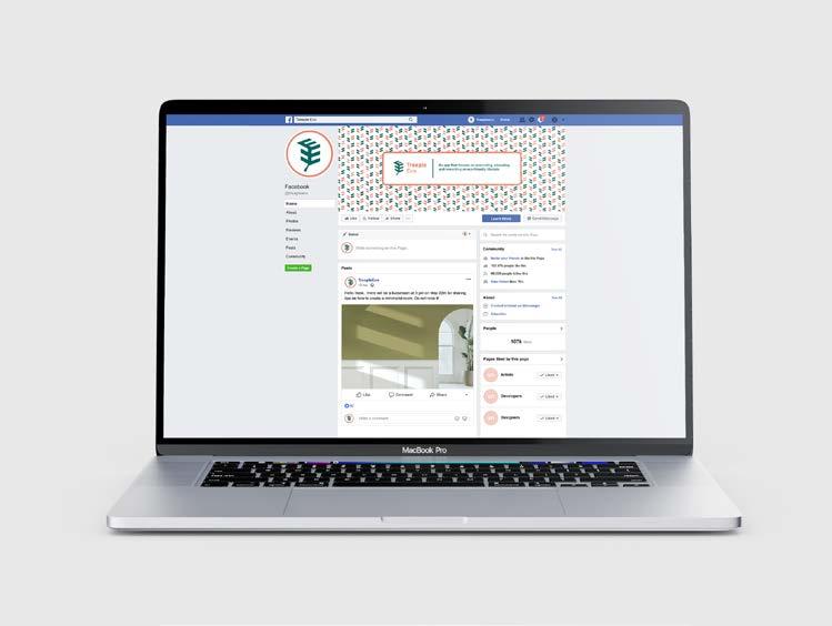
Instagram is one of the platforms for interacting with the users and potential users. Promotion and information which are related to eco issue will be posted on here.
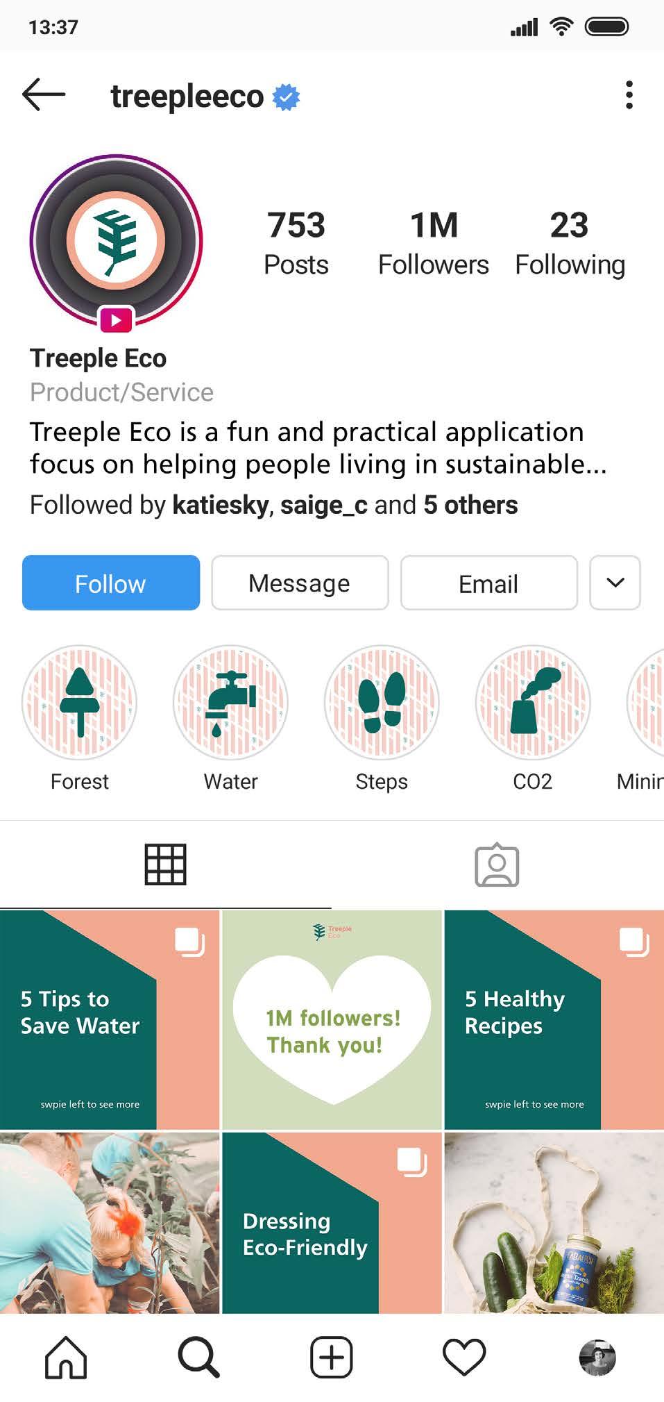
The post on the Instagram should be simplify version from Facebook since it is a image dominated platform.


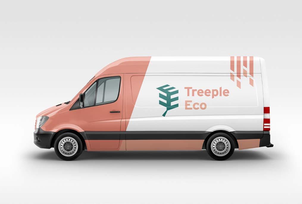

Full color
Primary brandmark. Logo is displayed across any coloured applications.
Monochromatic
Secondary brandmark. The logo is presented for applications that do not concern colour or on a colorful background making brandmark unrecognizable.
Reversed out
White logo is used in applications that have dark coloured or black background colours.
Figure mark
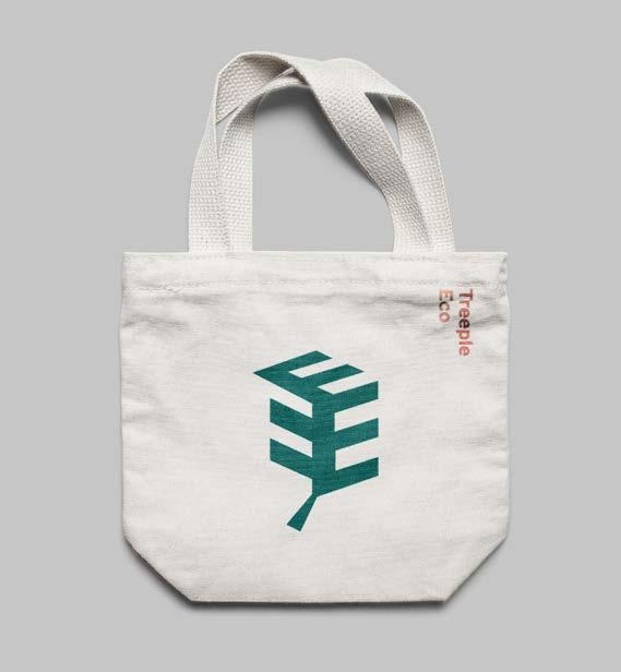
Figure mark is presenter for the application that has limited space or do not need text.
The Interstate bold font is applied to the headings, sub-headings and pull-quotes.
The Frutiger typeface is applied to the body text.
ABCDEFGHIJKLMNOPQRSTUVWXYZ abcdefghijklmnopqrstuvwxyz 0123456789
ABCDEFGHIJKLMNOPQRSTUVWXYZ abcdefghijklmnopqrstuvwxyz 0123456789
Primary color scheme
CMYK
C89 M40 Y59 K23
RGB R10 G102 B97
Hex #a6661
CMYK
C5 M58 Y52 K0
RGB R233 G135 B115
Hex #e98773
The minimum clear space surrounding the brandmark should be equivalent to the capital letter ” T” from the logo.
Primary Brandmark
The use of imagery should be high resolution and eco-related. For the style, it should be lively, delightful and friendly.
Secondary color
mark
CMYK
C2 M39 Y39 K0
RGB R242 G170 B145
Hex #f2aa91
CMYK
C53 M21 Y91 K3
RGB R133 G162 B75
Hex #85a24b
Width 15 mm Height 6.6 mm
Width 4.8 mm
Height 6.6 mm
DO NOT warp or stretch the logo.
DO NOT flip the figure in the logo.
DO NOT apply a stroke to the logo.
DO NOT use the color outside of Treeple Eco color scheme .
DO NOT change the alignment of the text in the logo .
DO NOT alter the positioning of the letters in the logo.
DO NOT place the logo on a full color imagery. The reversed logo should be applied if needed.
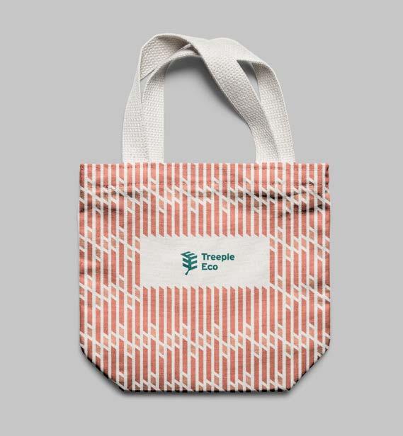
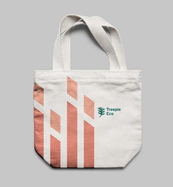
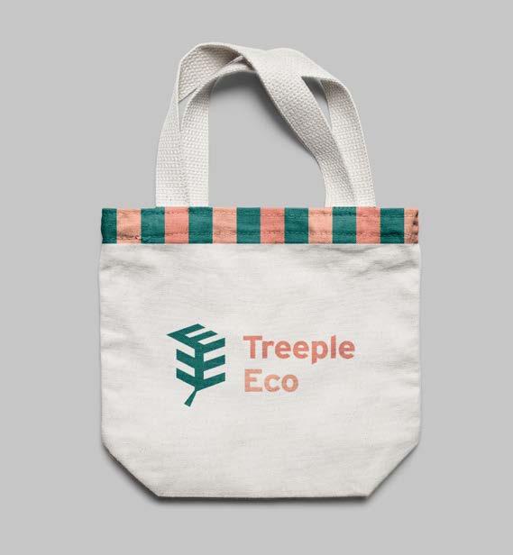
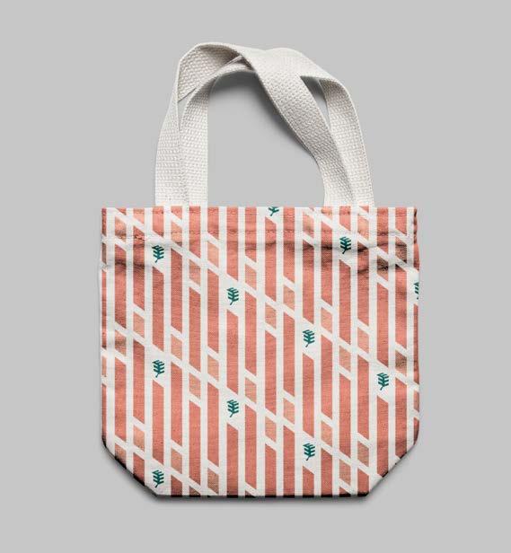
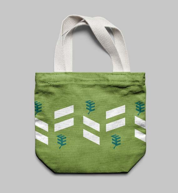
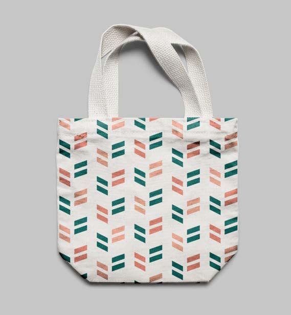
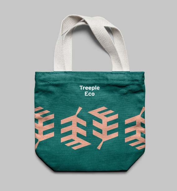
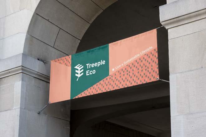
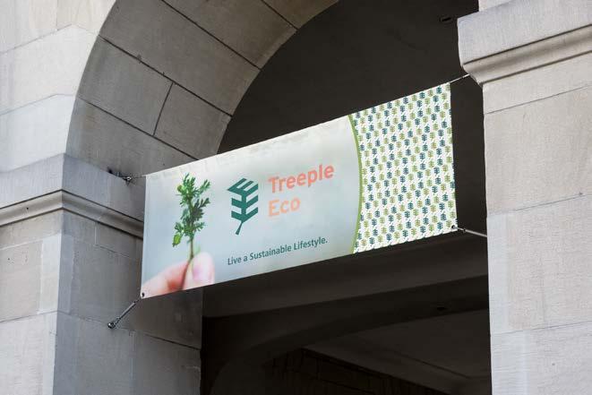
Four patterns have been provided for company use. The slanted angular stripes have captured the three-dimensional characteristics of the brandmark and are applied to all the pattern designs.
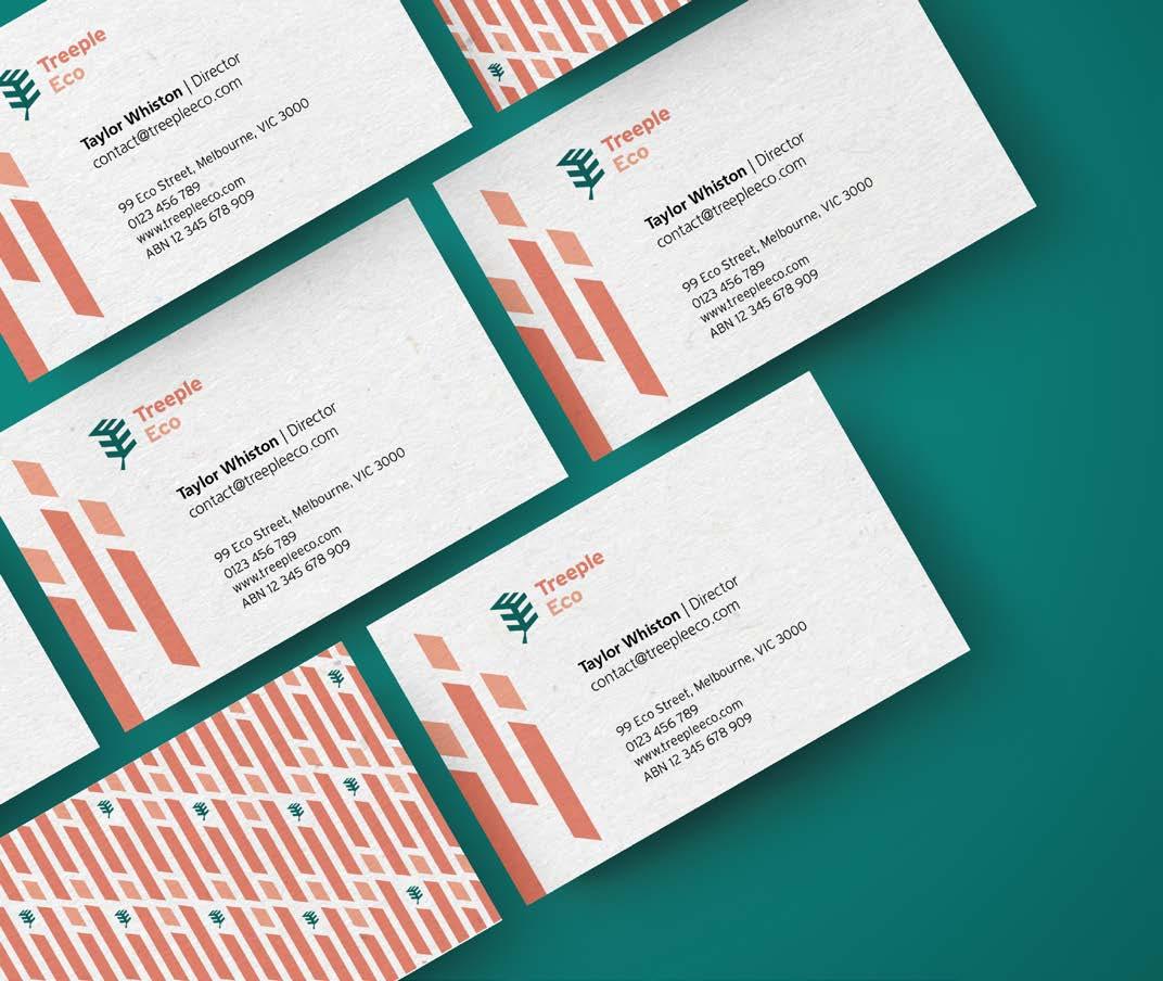
The patterns may be applied to the stationery and brand application as decorative elements such as business card, folder and mobile application. The pattern should be applied on white or light background.
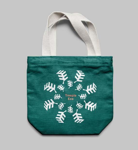
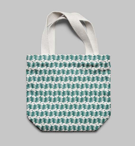
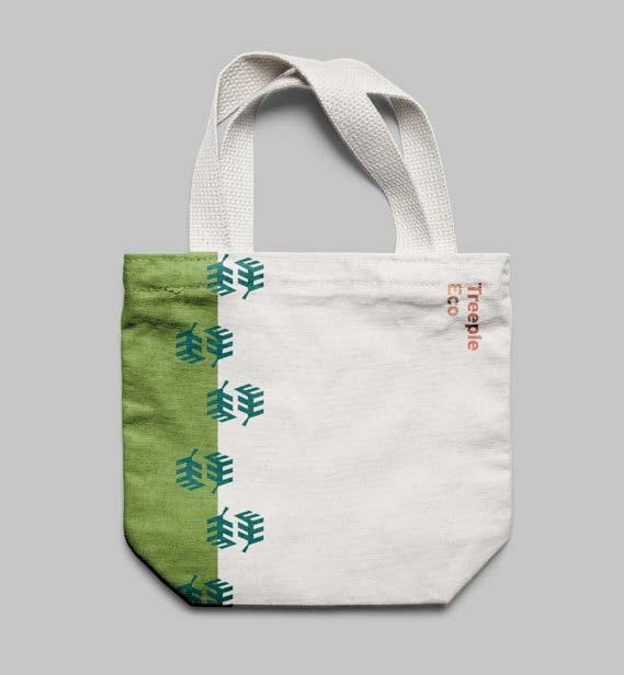
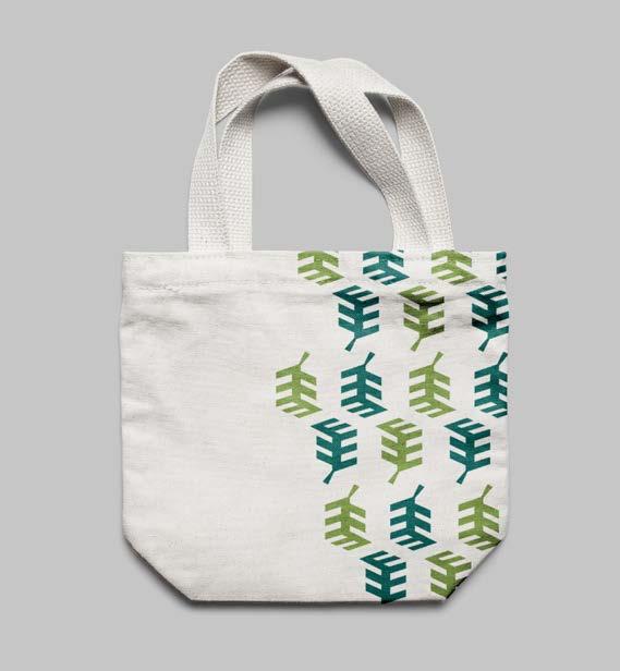
The illustrations are mainly apply to the mobile application and website as an icon. It can also be used as decoration in other brand applications.
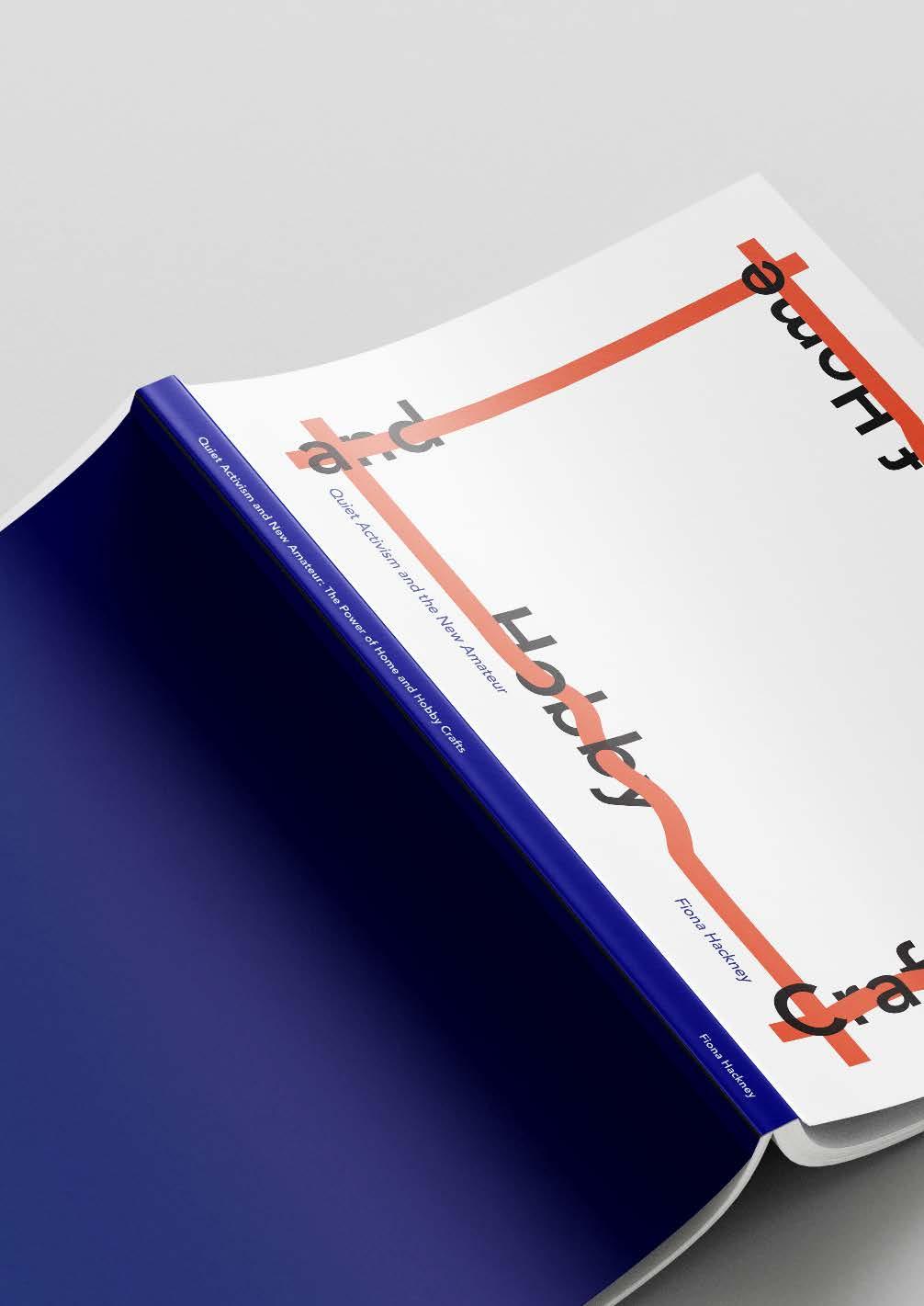
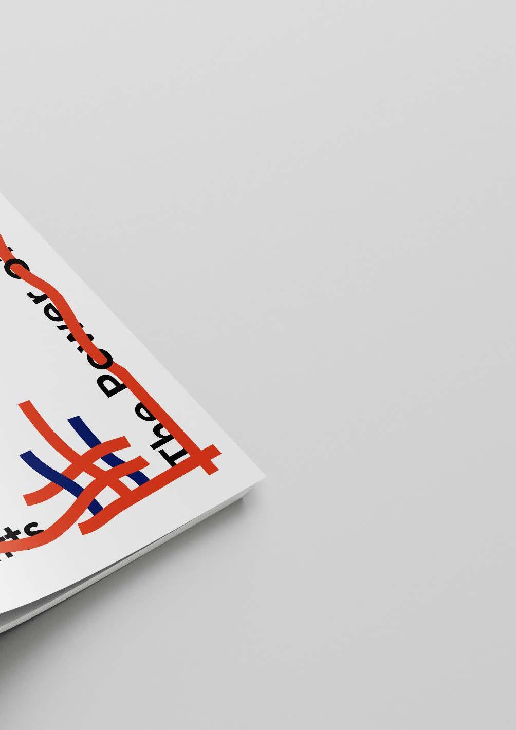
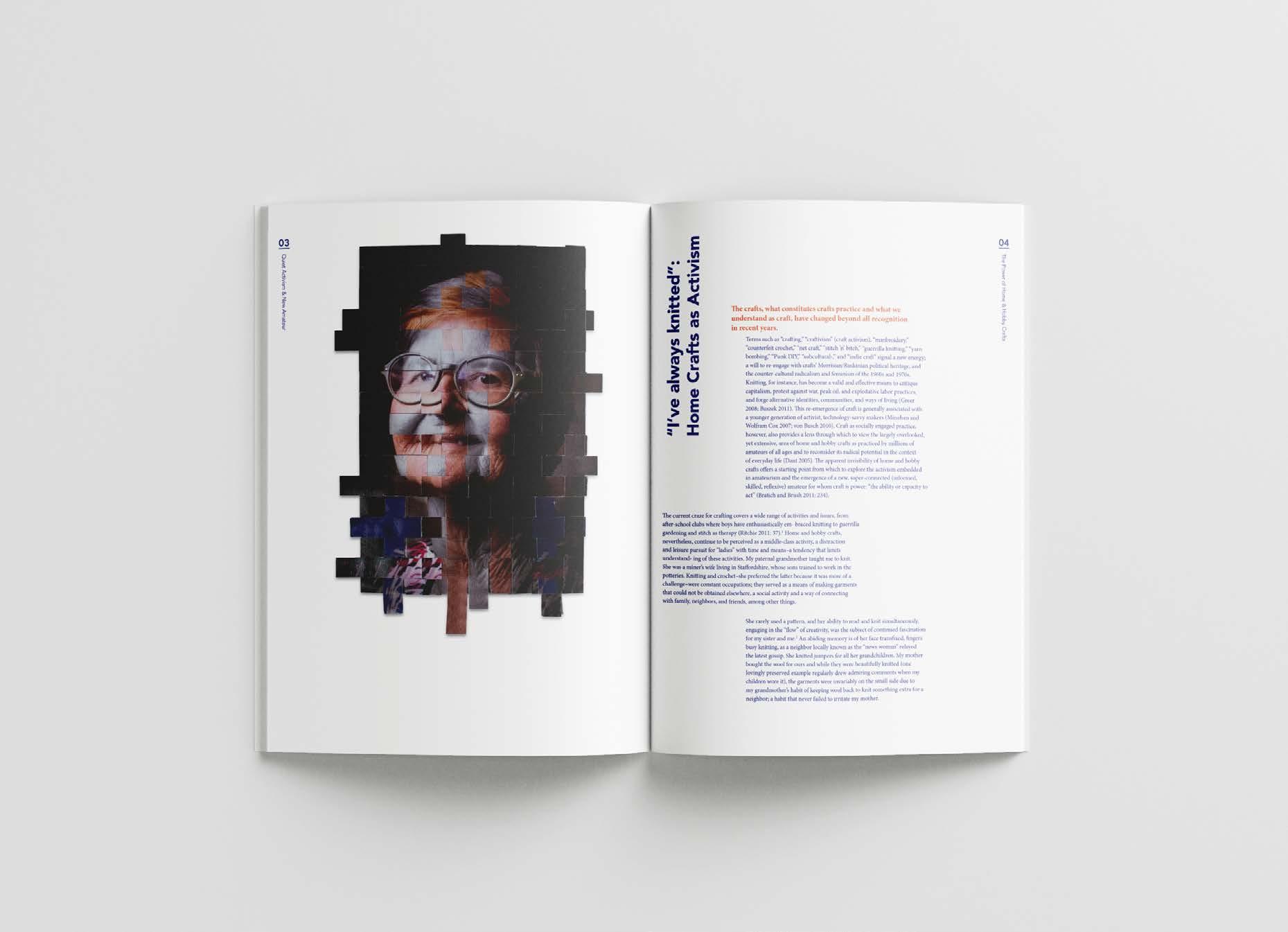
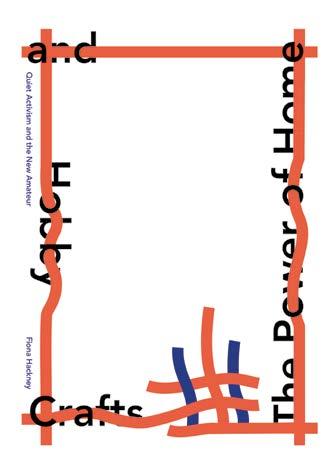
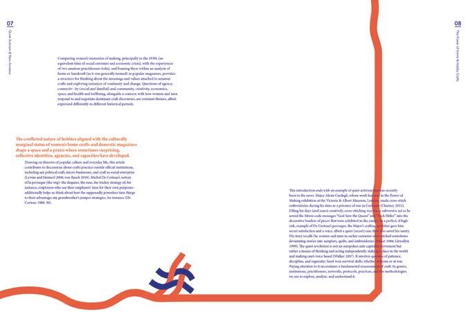
Goal
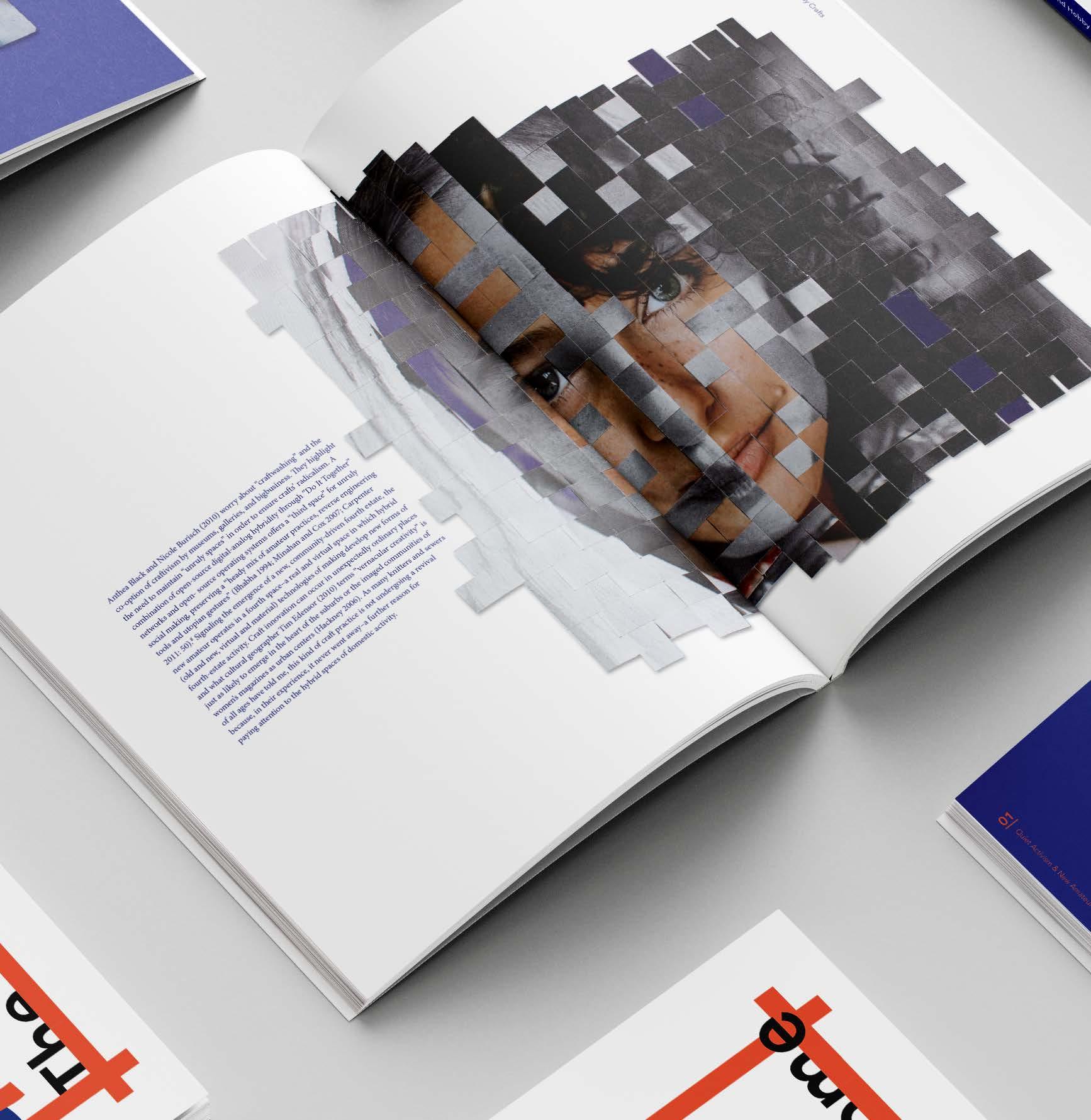
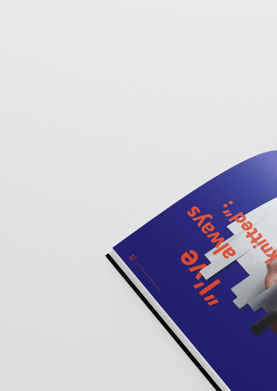
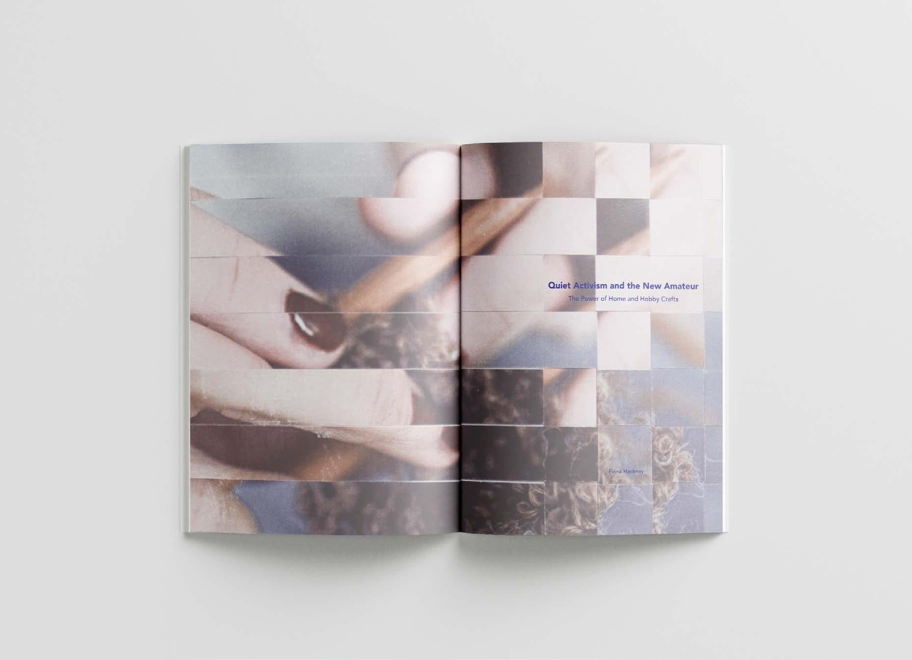
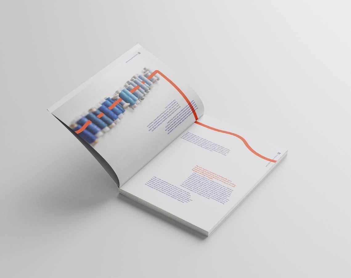
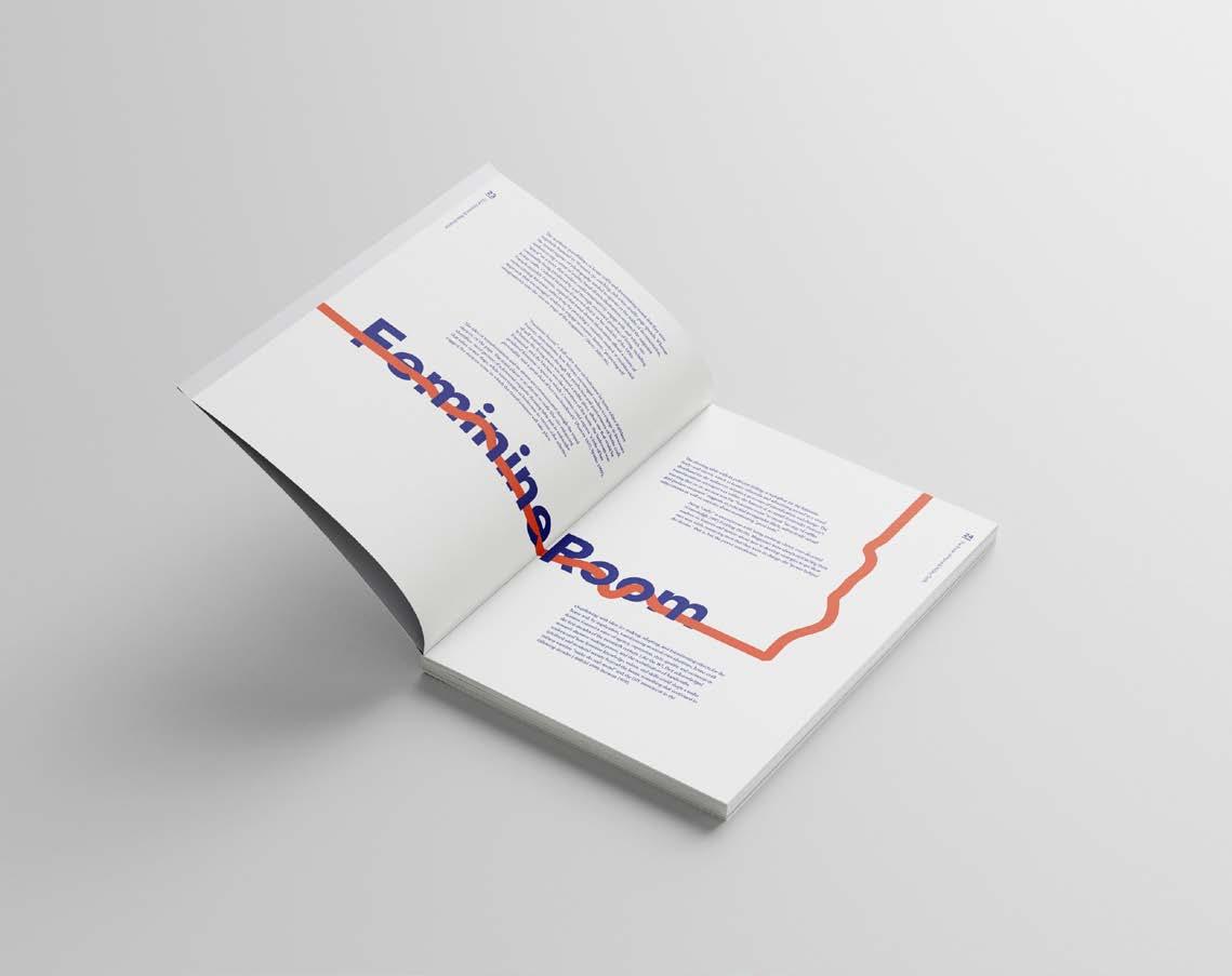
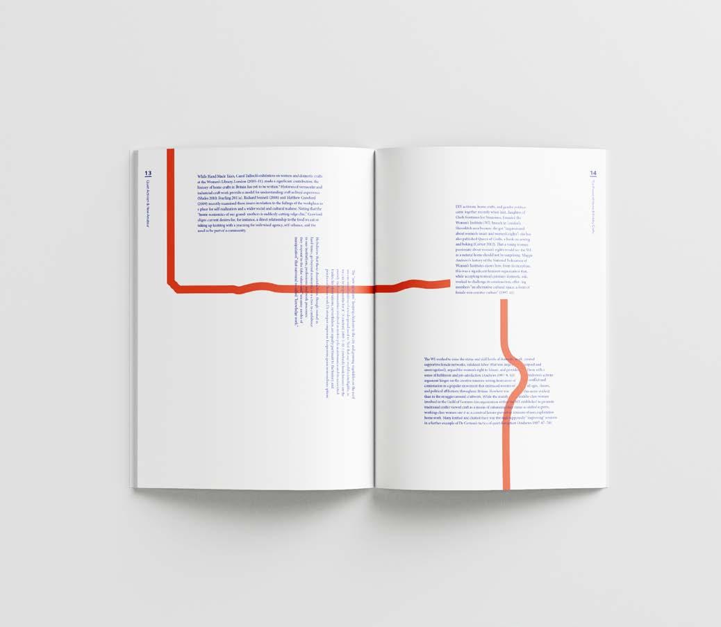
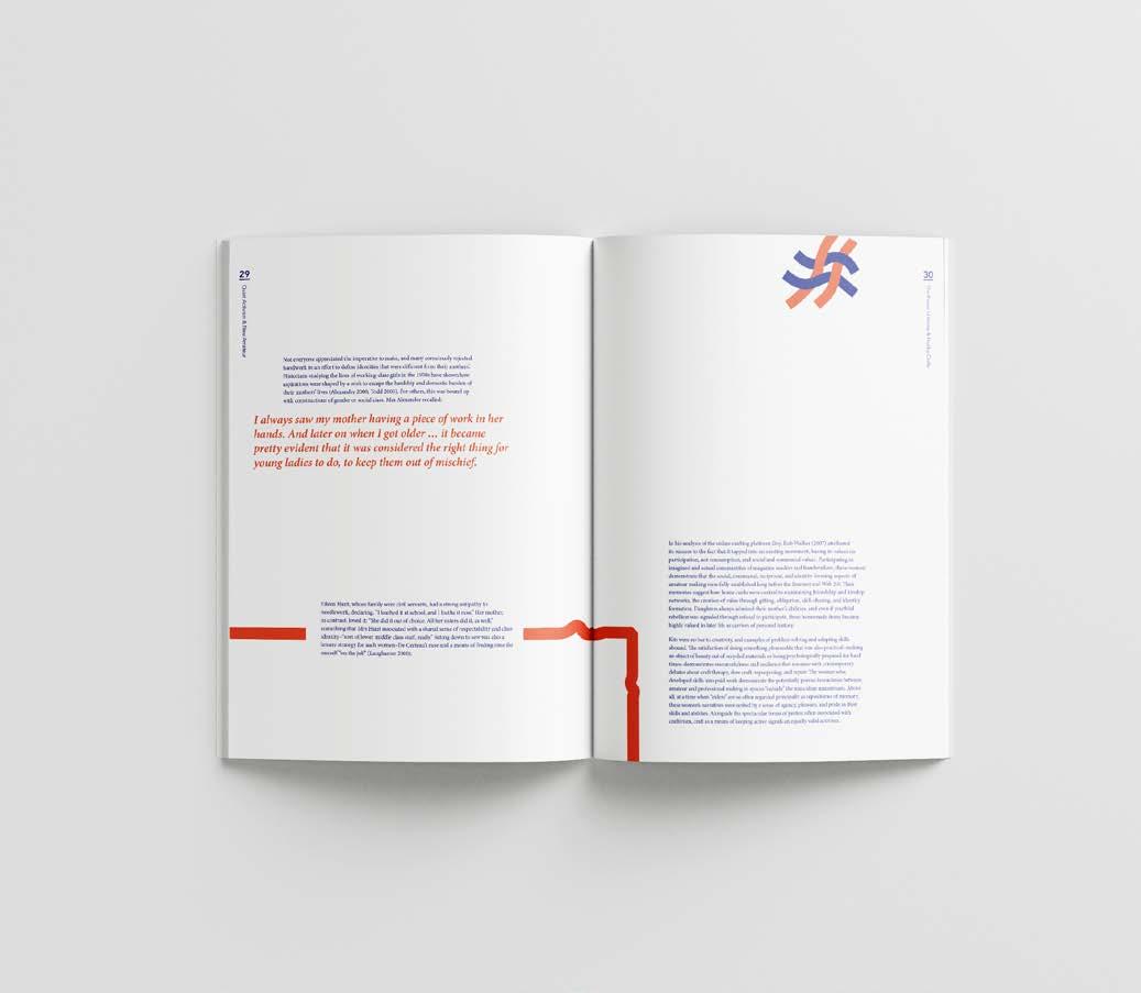
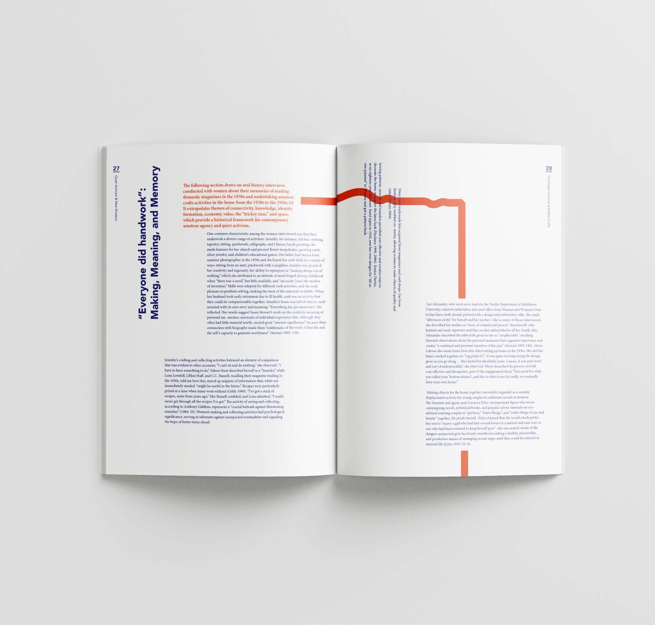
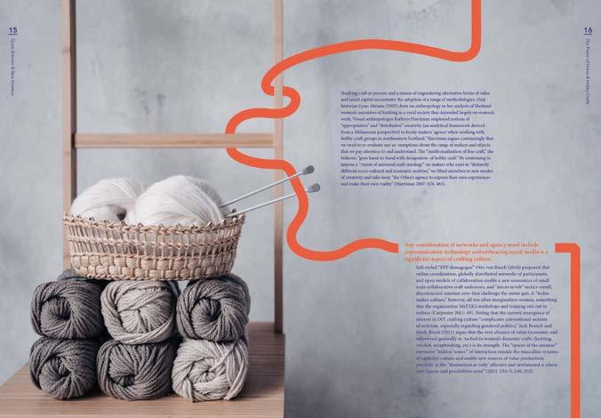
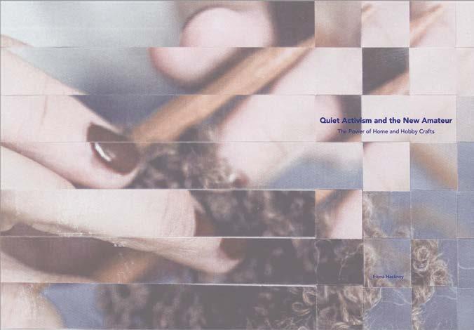
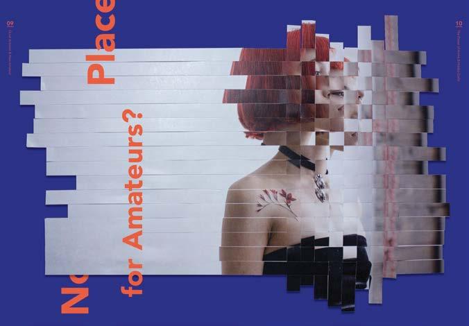
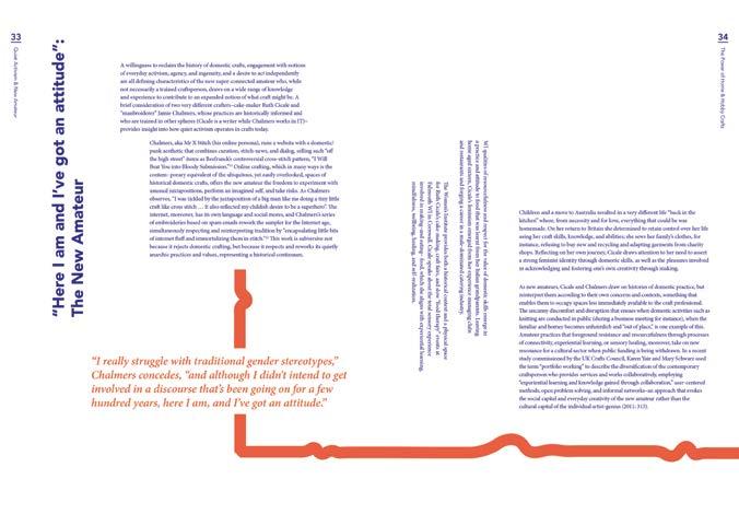
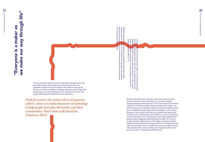
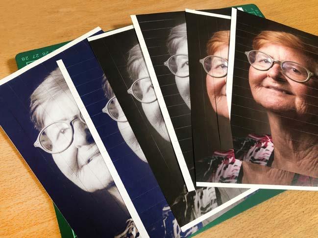
As knitting is viewed as domestic culture and home craft, it has been undervalued as well as amateur. This publication design aims to communicate the influence of craftivism on women by capturing the features of knitting.
Concept
The concept is "identity formation". Women started to express their own voice and build social connections through knitting which made a remarkable change in their identity formation and self-identification.
Text
Sourced Online Image
Sourced Online
Category University Project Size 180 x 250mm
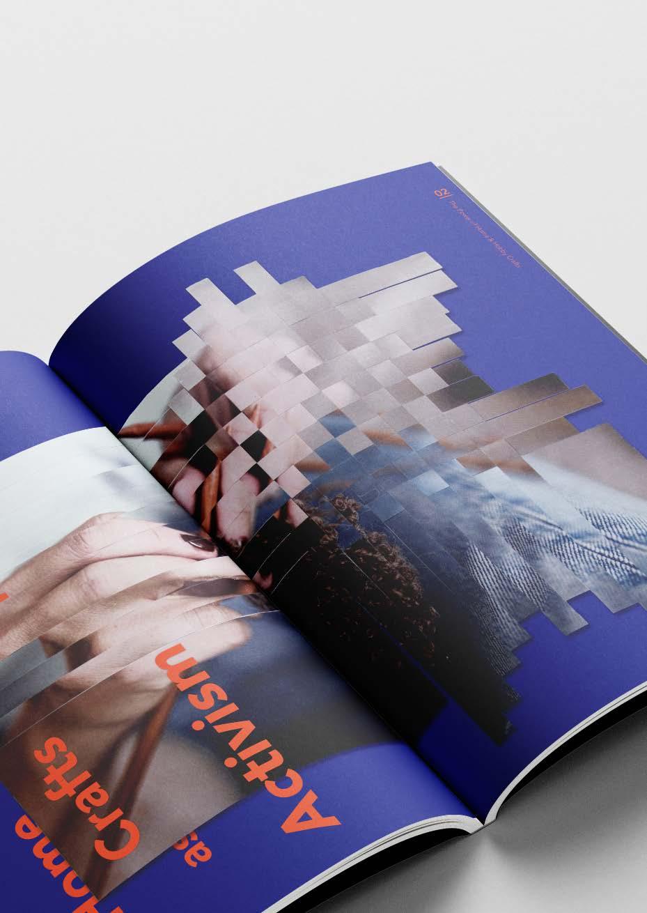
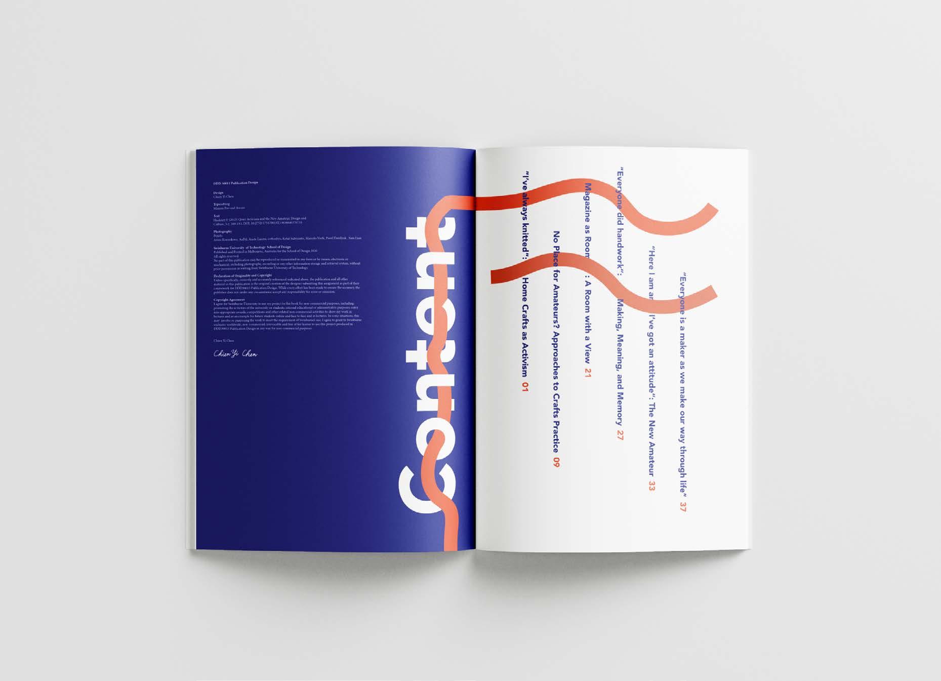
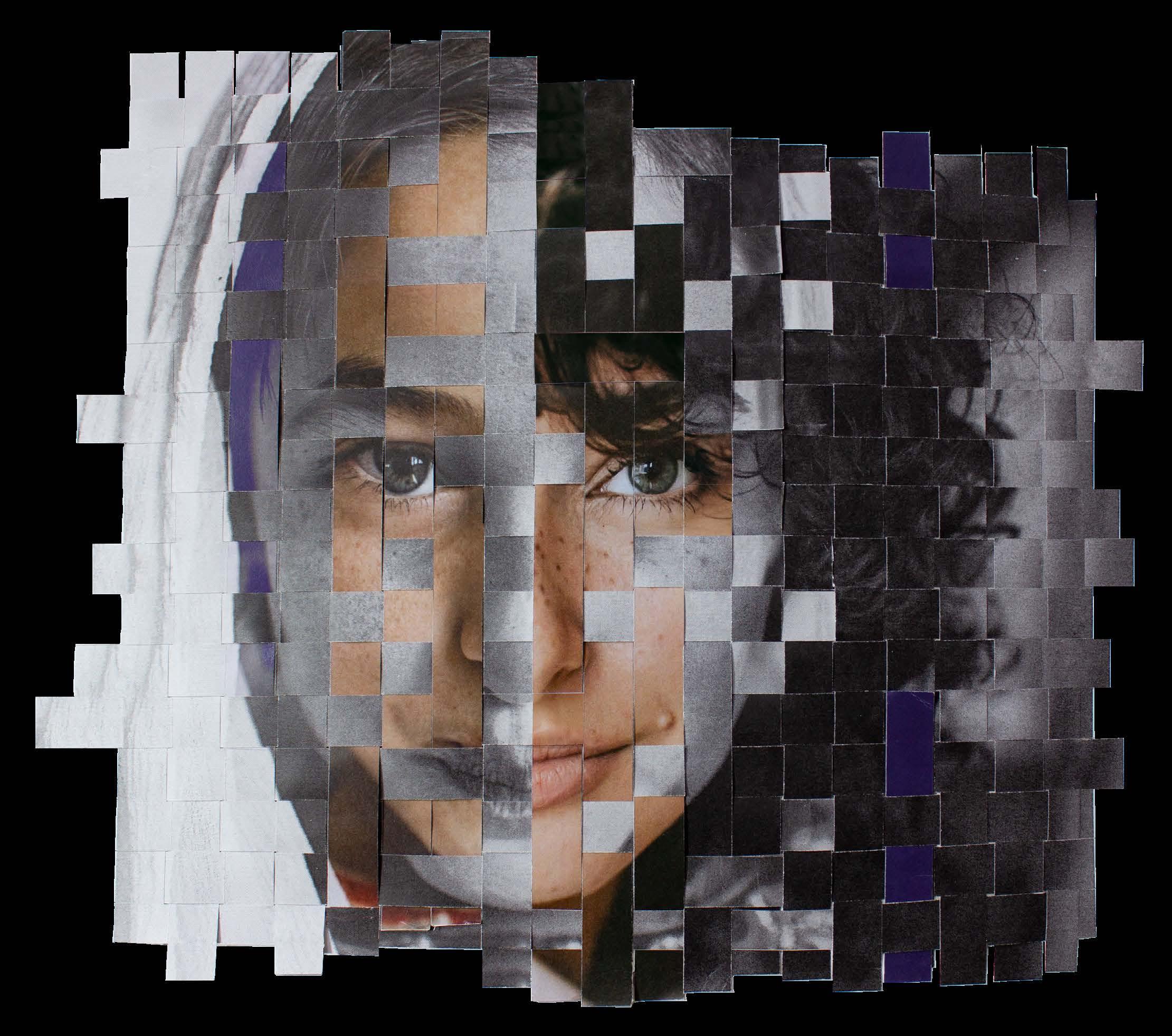
Entire Layout
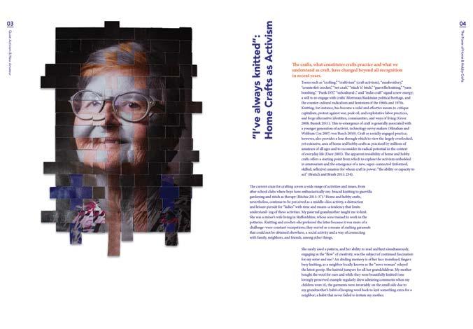


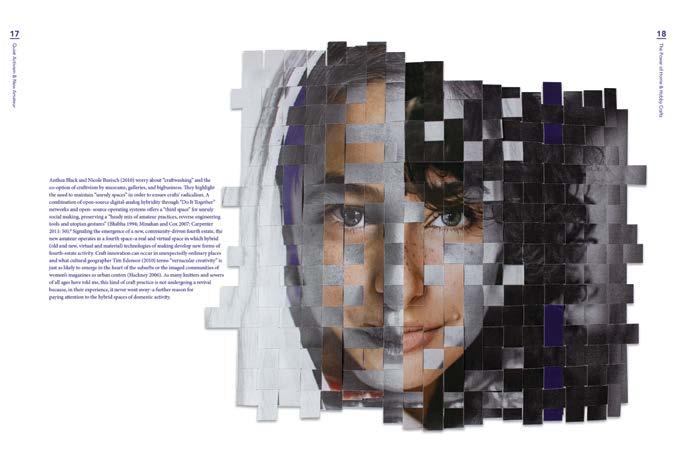
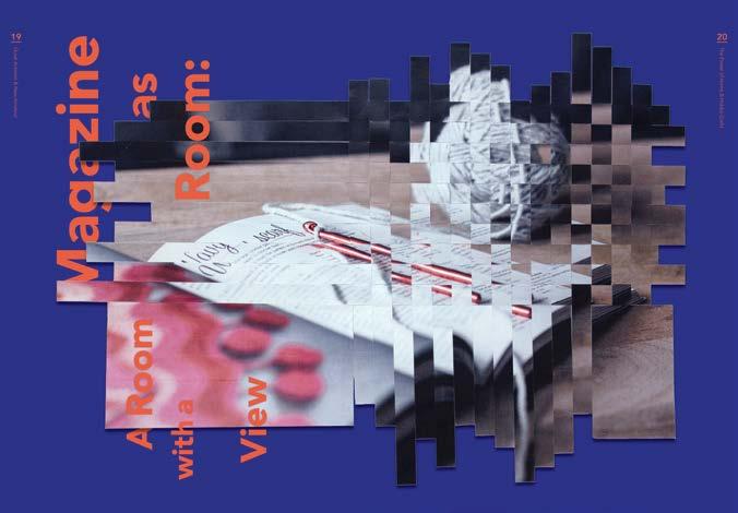
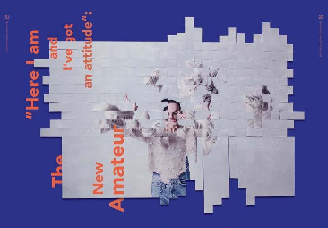
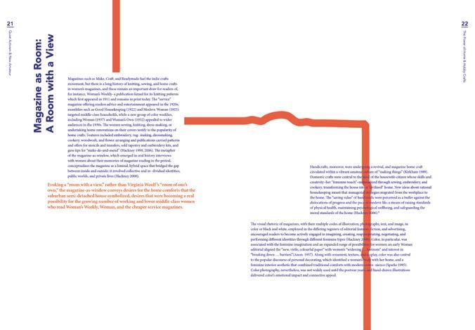
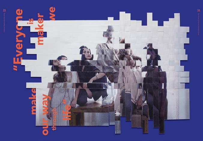

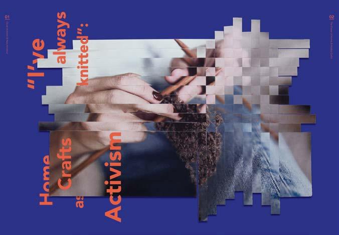
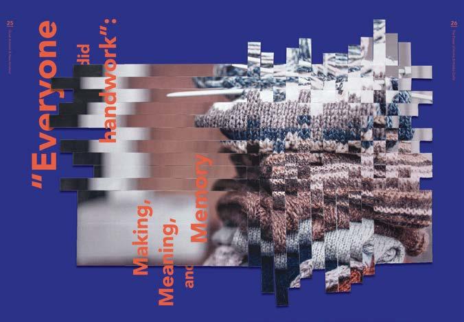
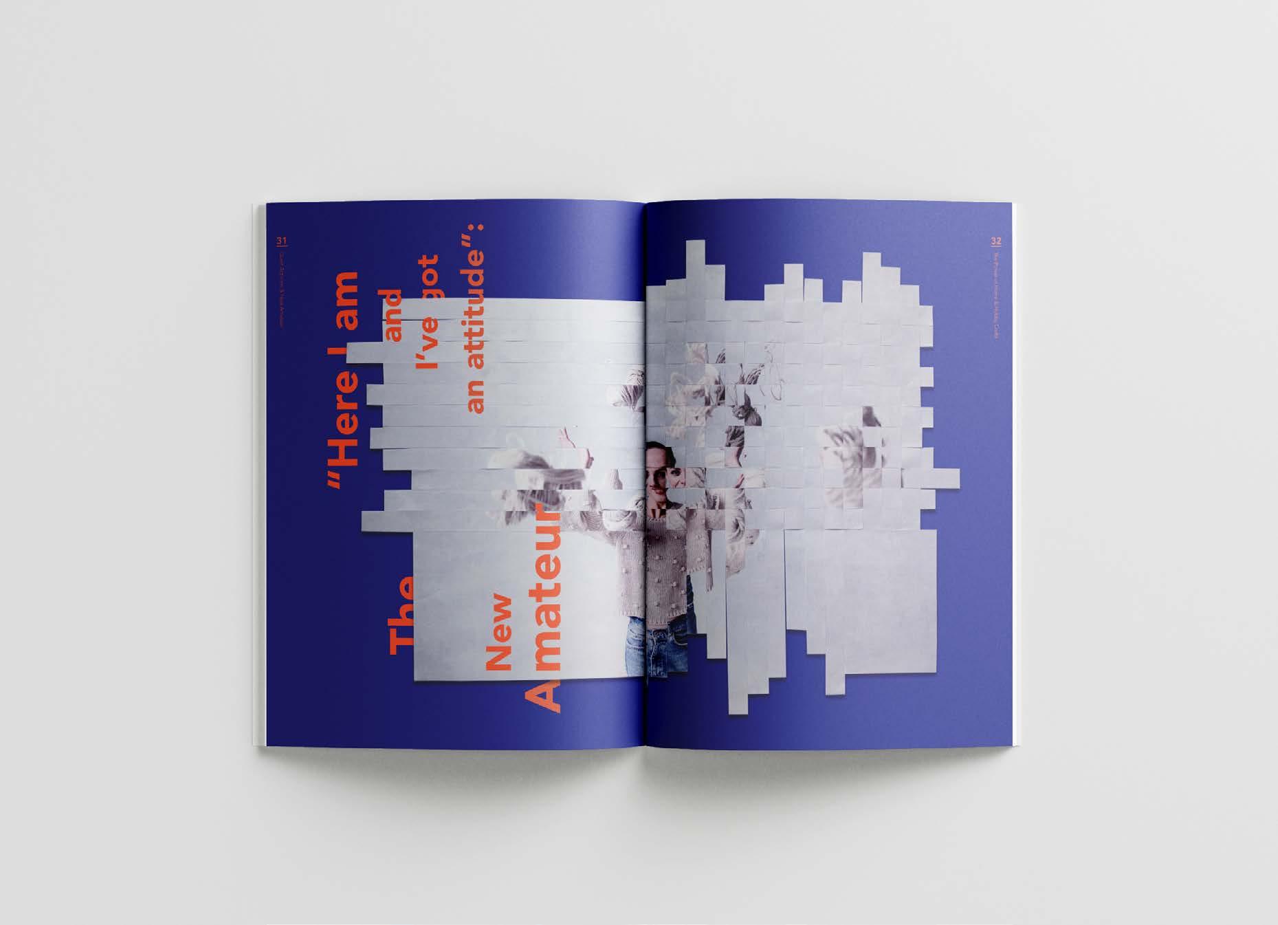
For the image treatment, the edited photograph was printed in three version, grayscale, monochromatic and full color, then cut into strips and weaved into new images to convey the idea of identity formation and transformation.
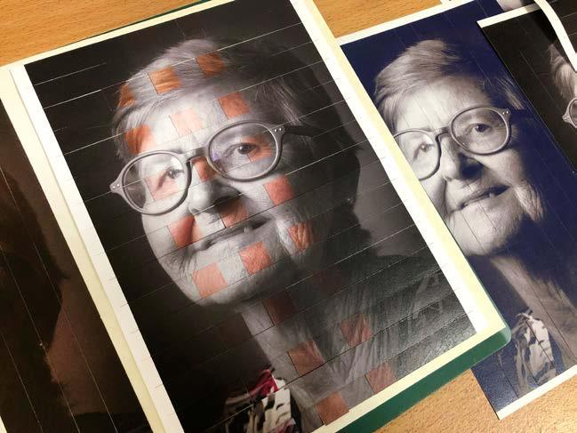
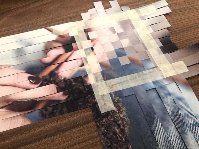
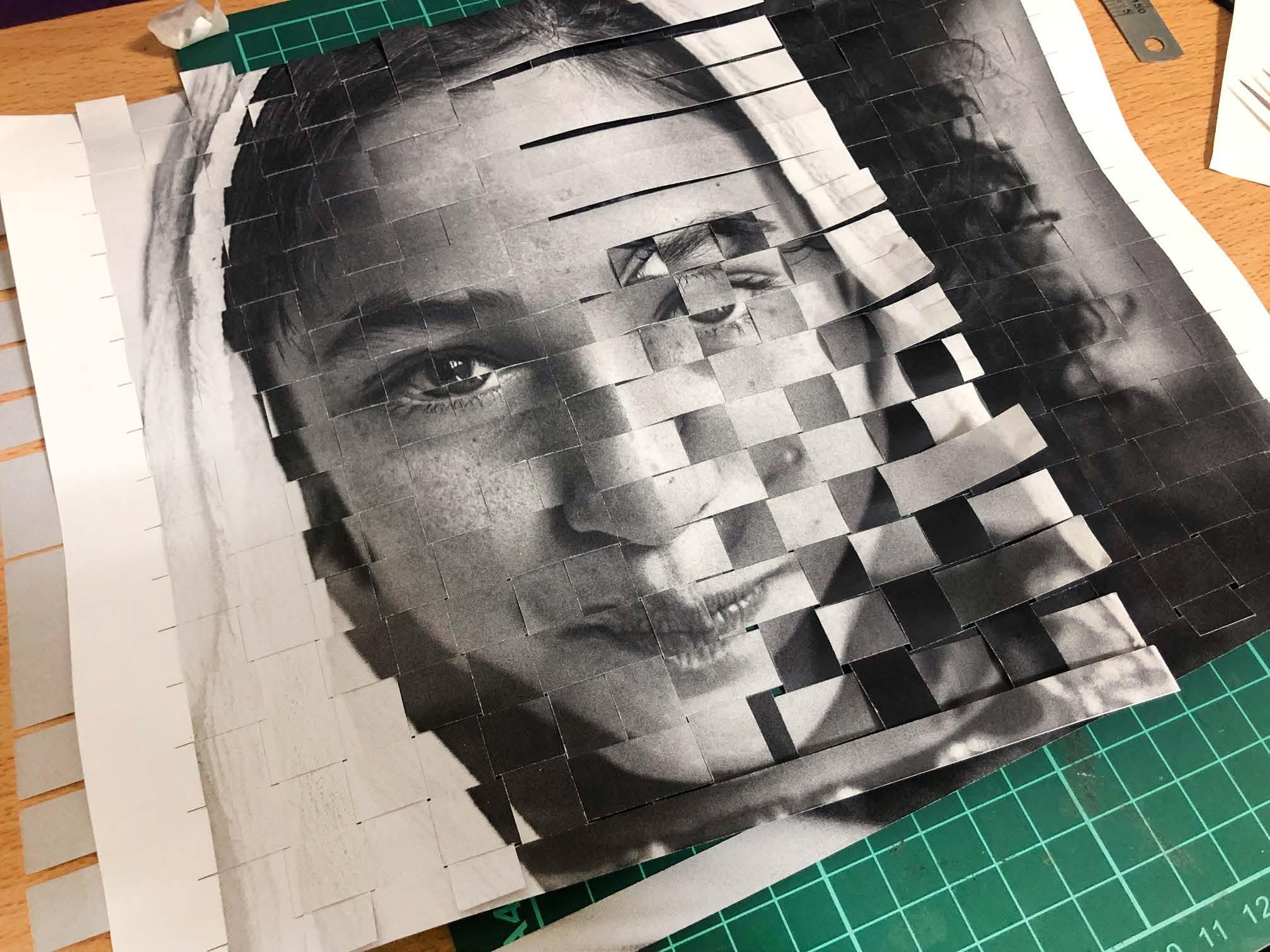
I wove the photos of a young girl and woman together to imply that as the girl grows into a woman, craftivism has maturely developed into a form of quiet activism; on the other hand, craftivism plays a vital role in women's identity formation and transformation.
Goal
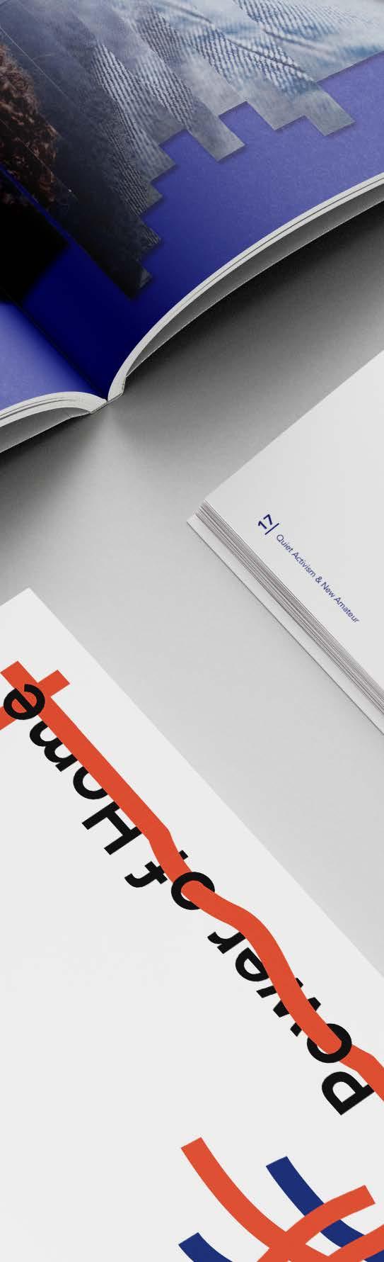
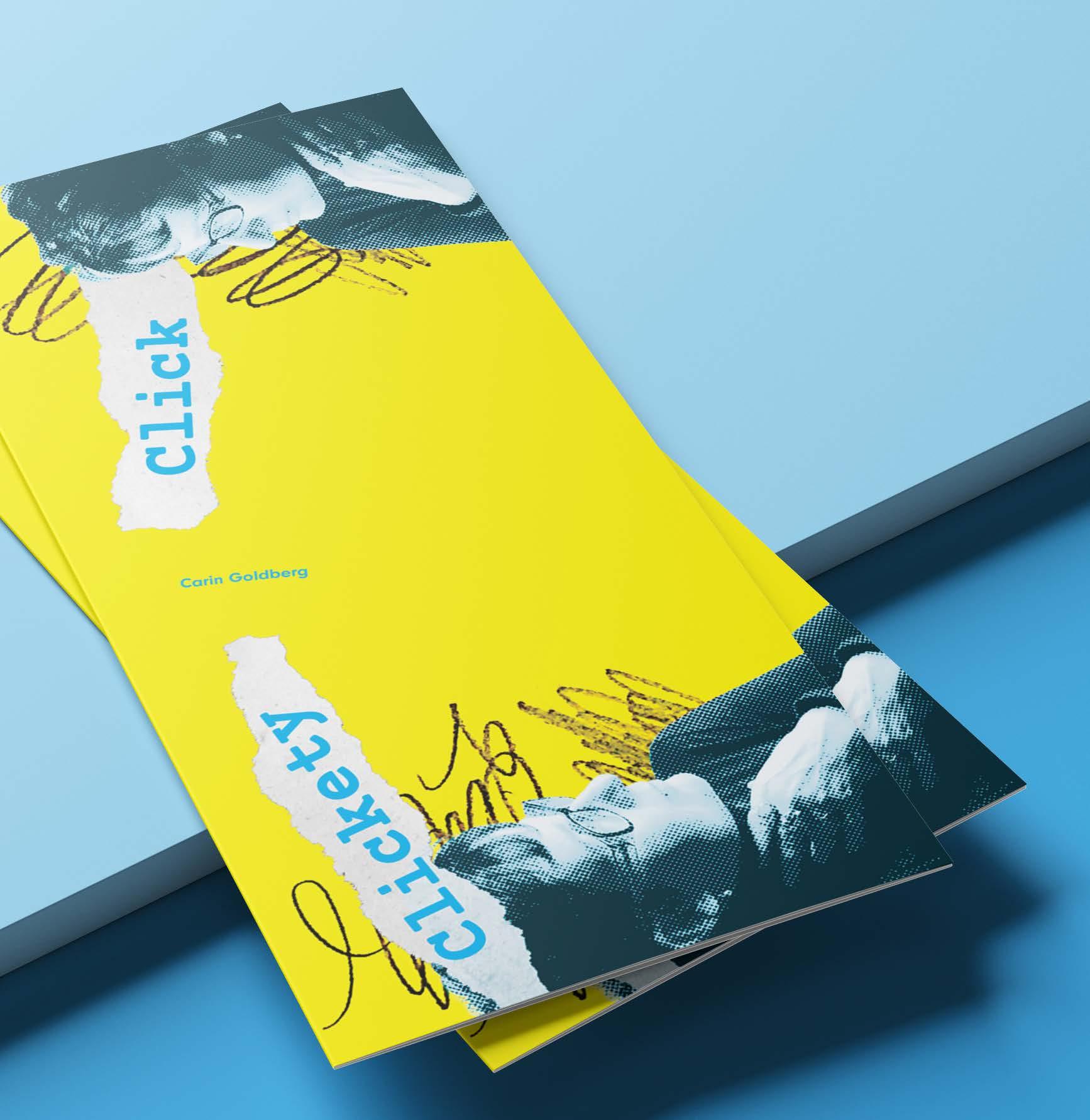
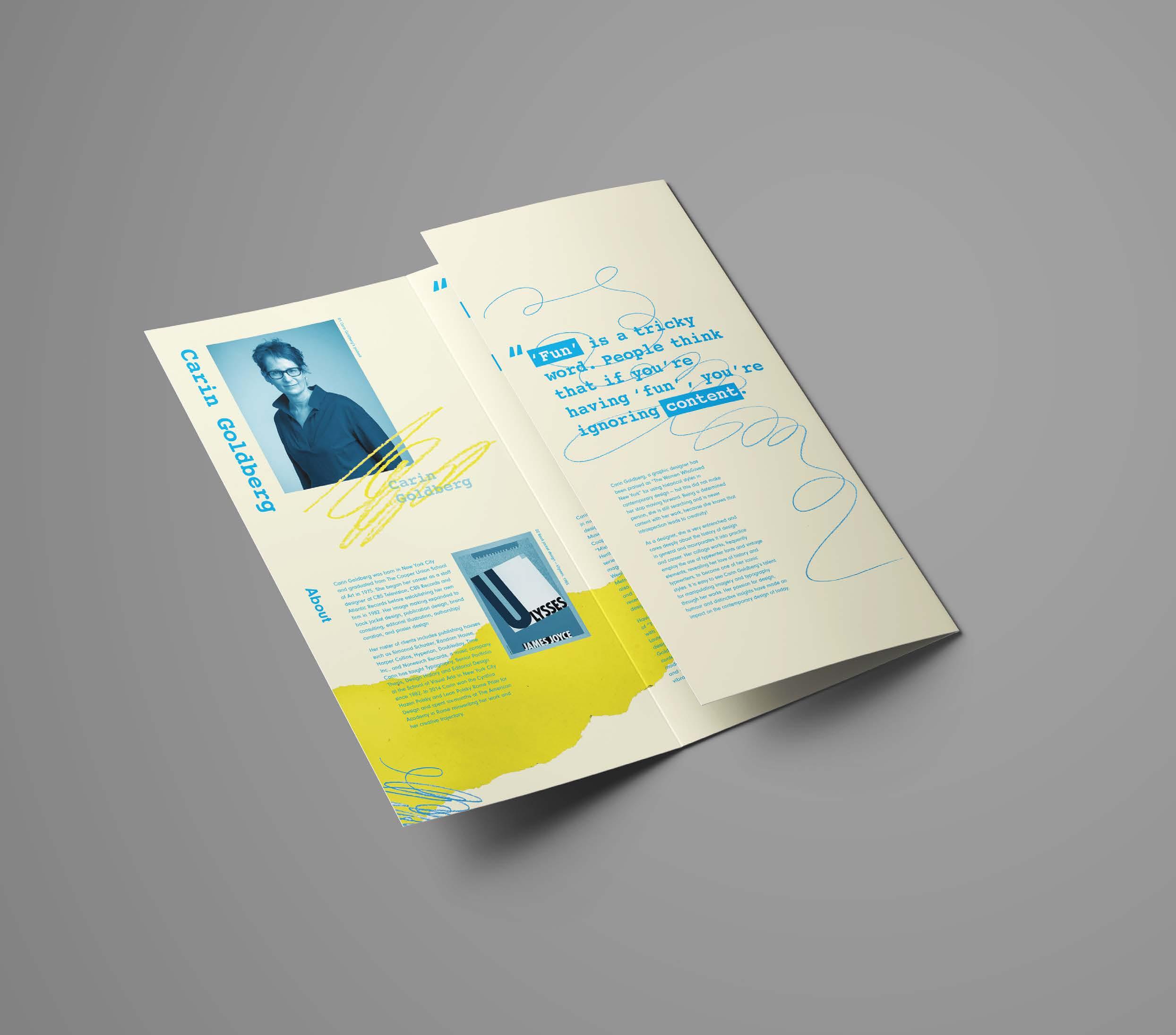
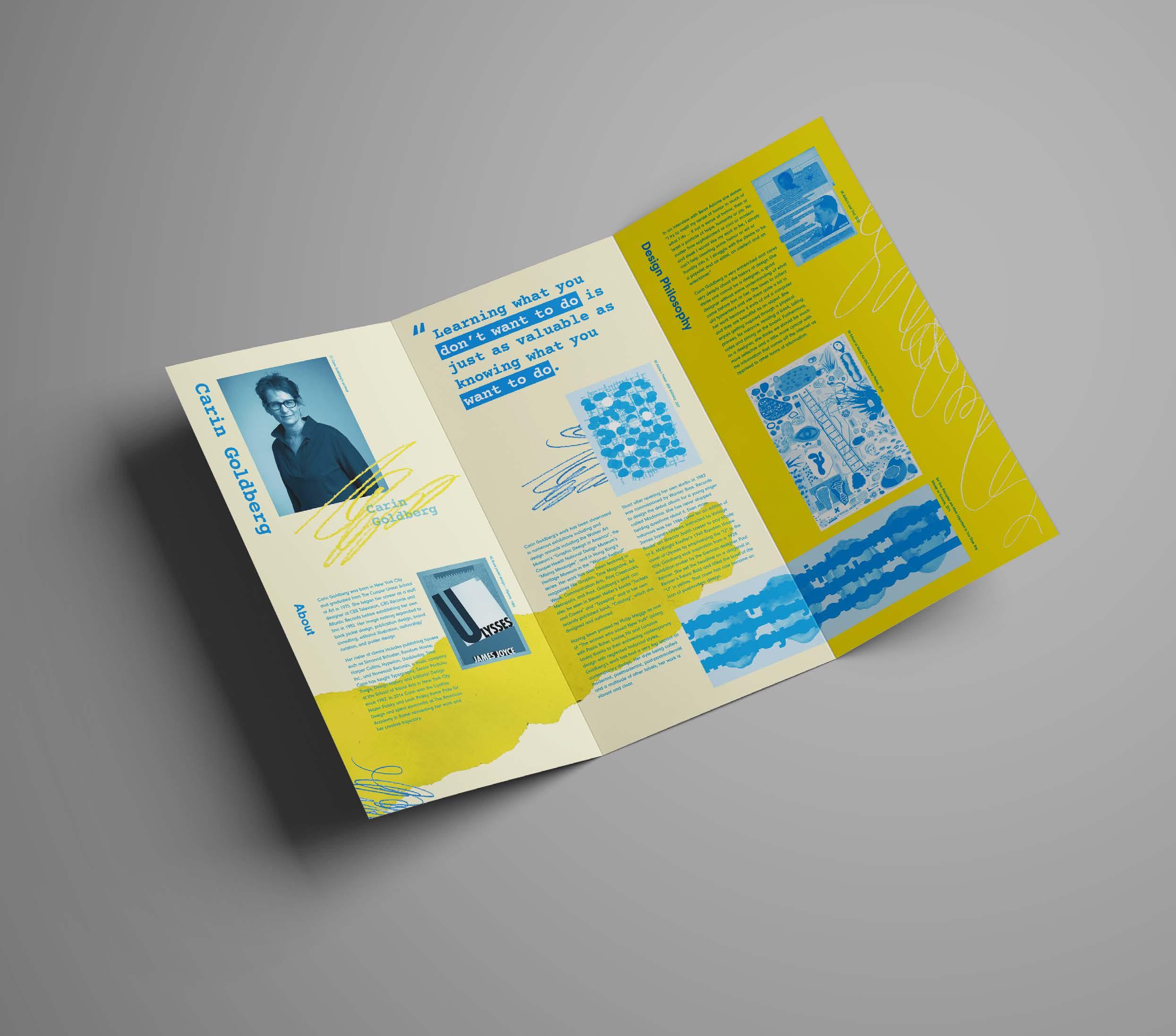
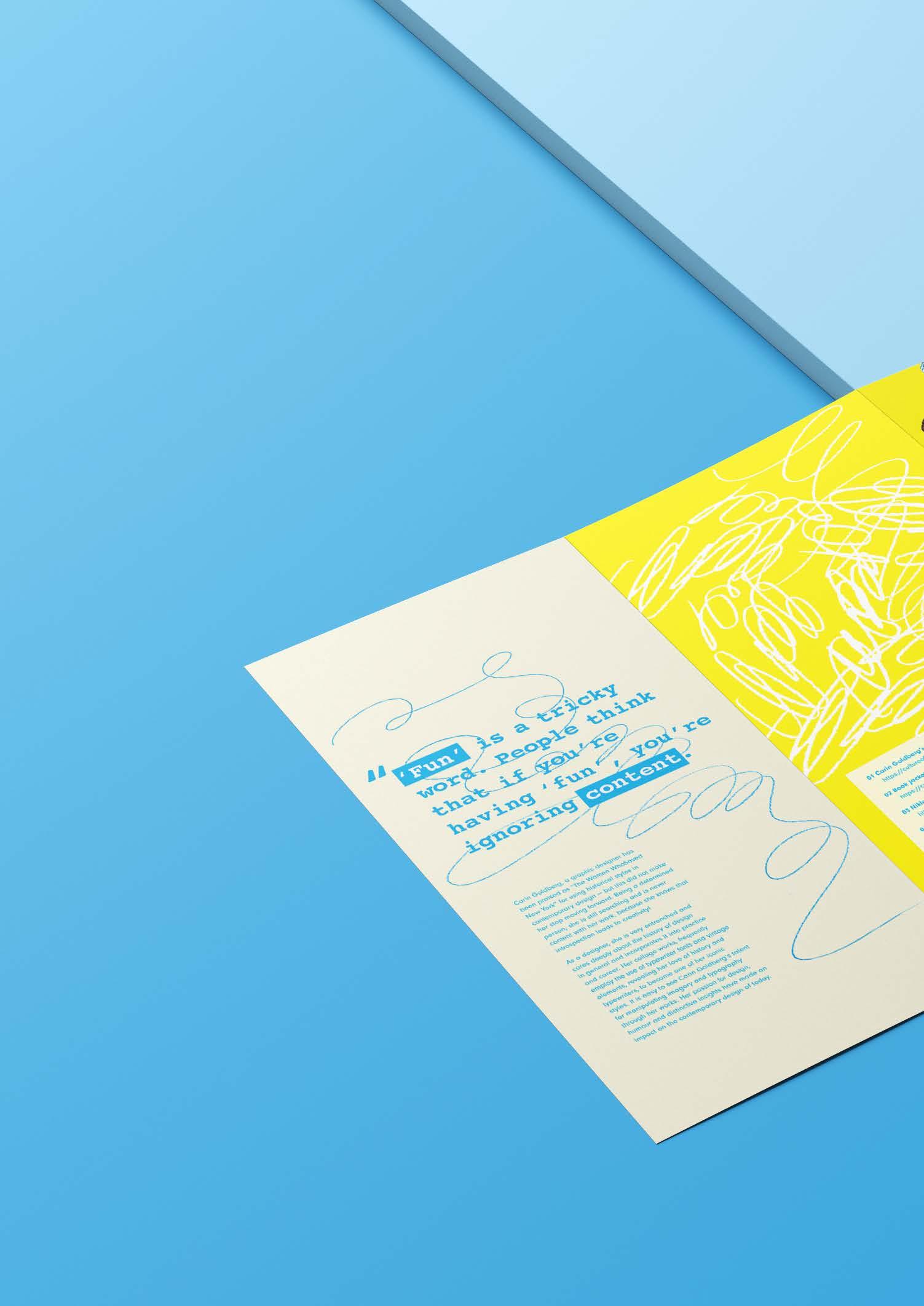
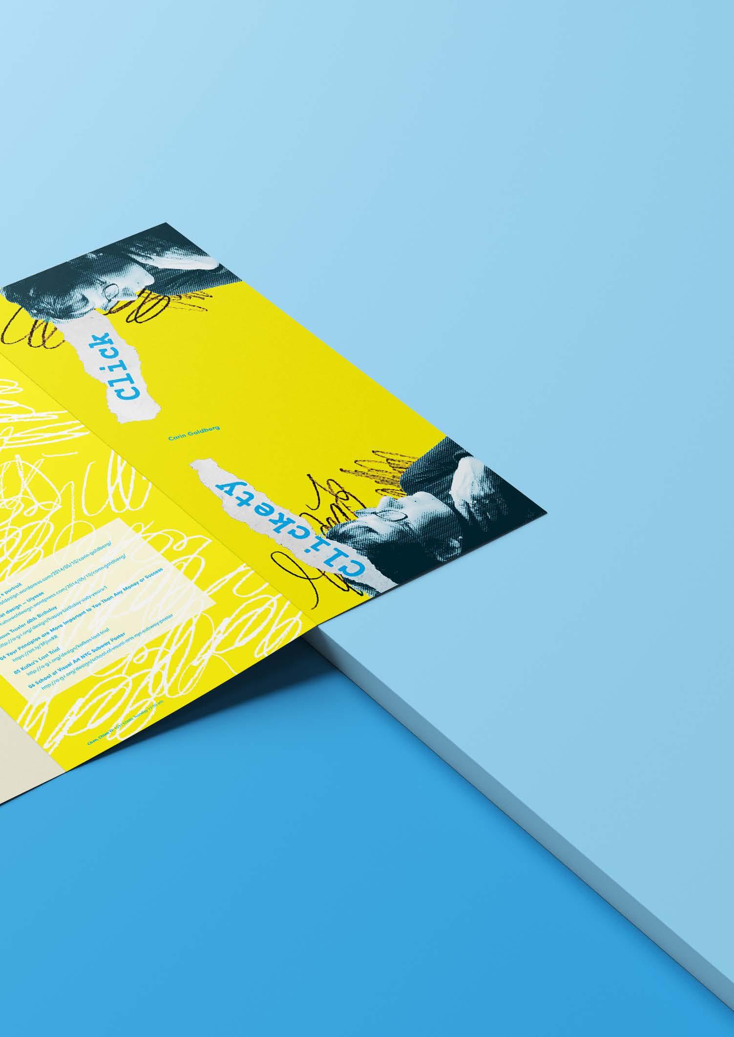
Design a brochure that presents the style, design philosophy and characteristics of Carin Goldberg's works.
Concept
Carin Goldberg is skilled at utilizing abundant elements to create a dense design style. As she extensively incorporates hand-drawn elements and typewriter fonts in her collage works, this brochure employs pencil strokes, typewriter fonts, and ripped paper textures as the core visual elements to reflect the characteristics of her work. Additionally, since she emphasizes both content and playfulness in design, the brochure uses yellow and blue to create a vibrant and engaging atmosphere.
Text
Introdution: Sourced Online
Reflective text: Written by myself
Image
Sourced Online
Category University Project
Size 297 x 420mm

Second Reveal
Third Reveal
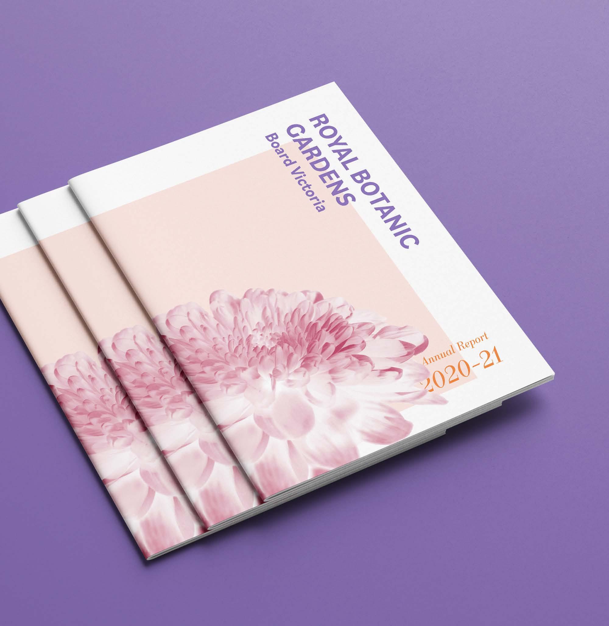
Goal
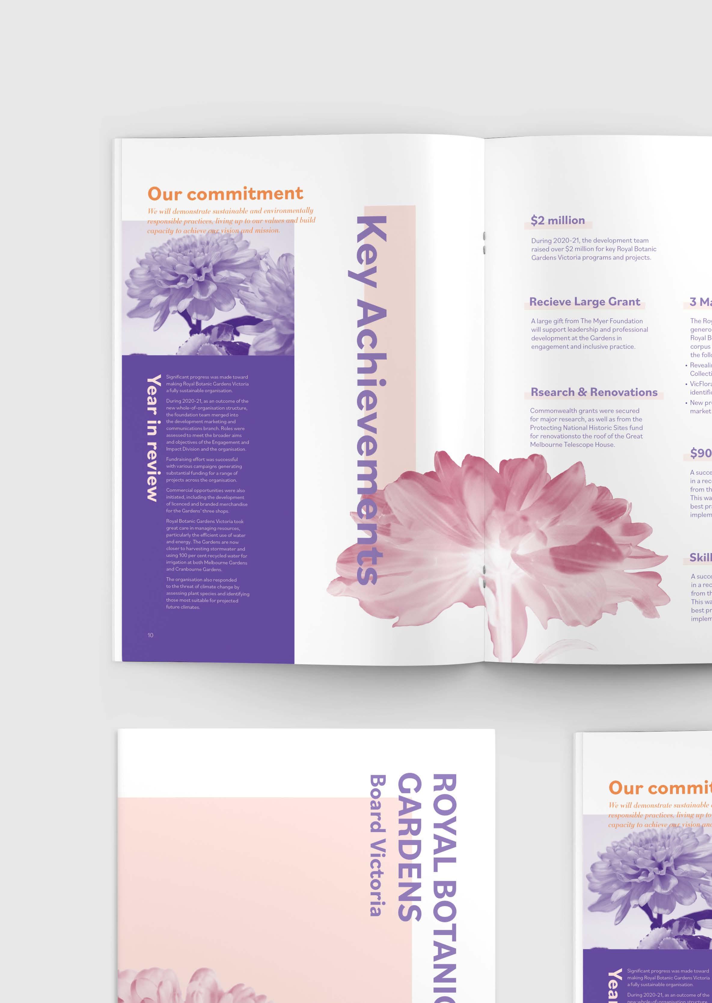
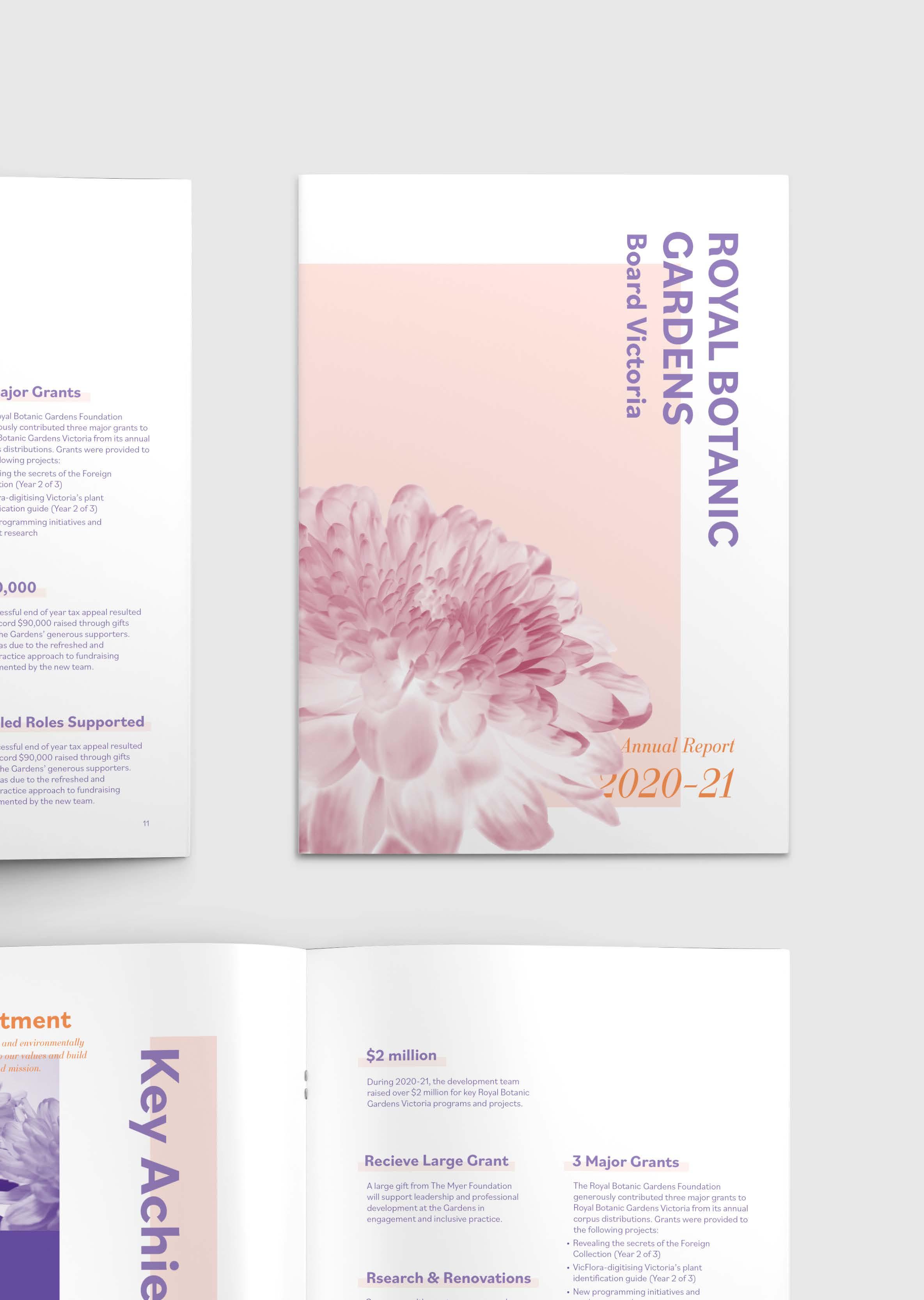
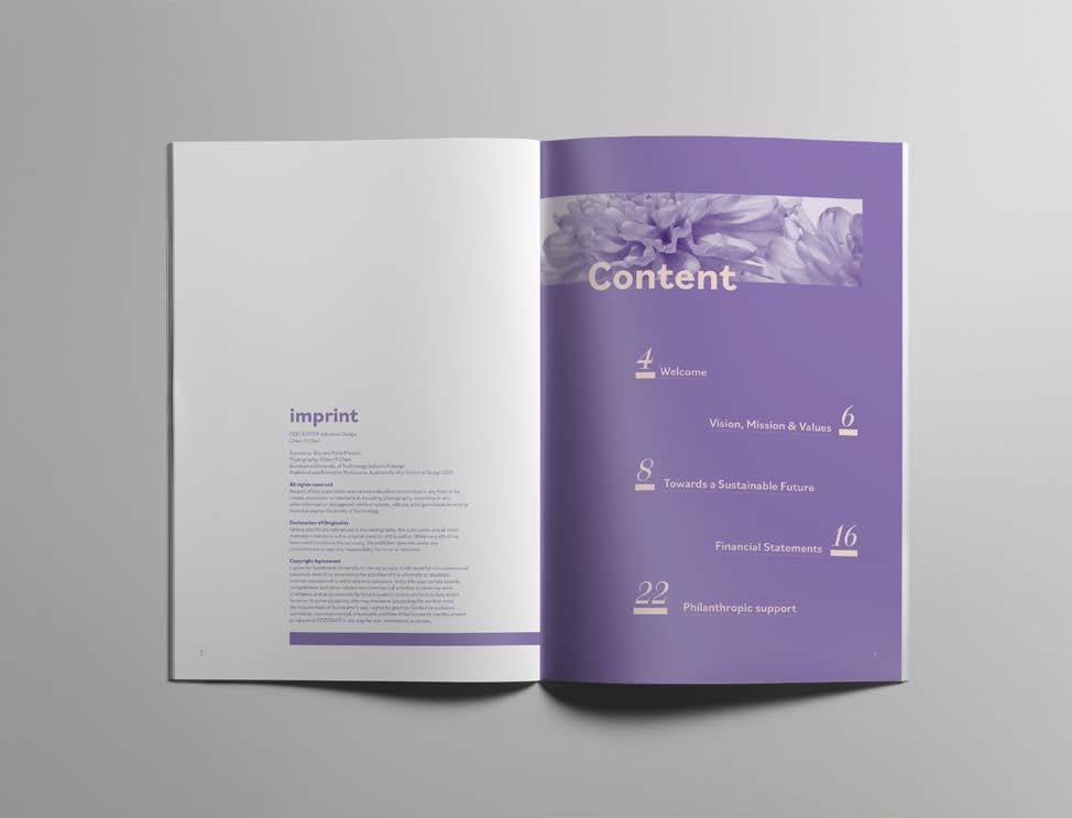
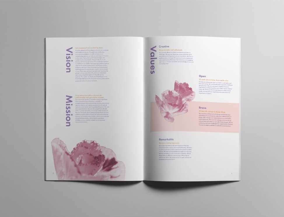
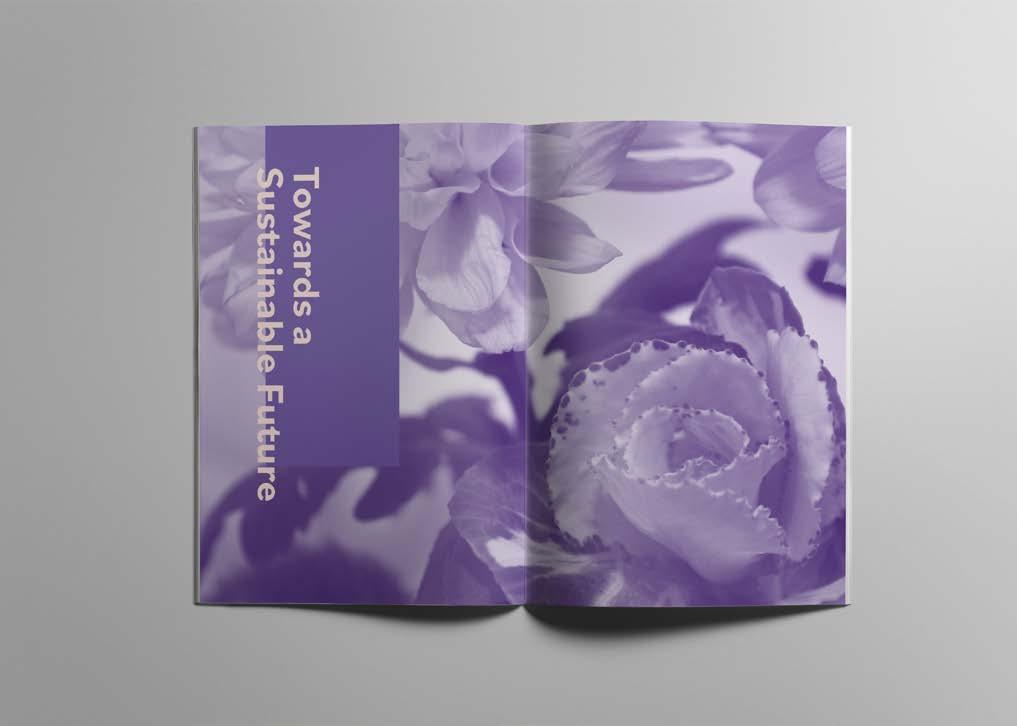
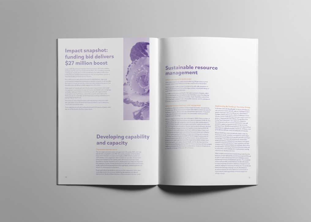
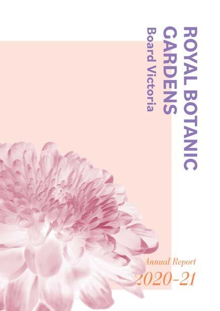
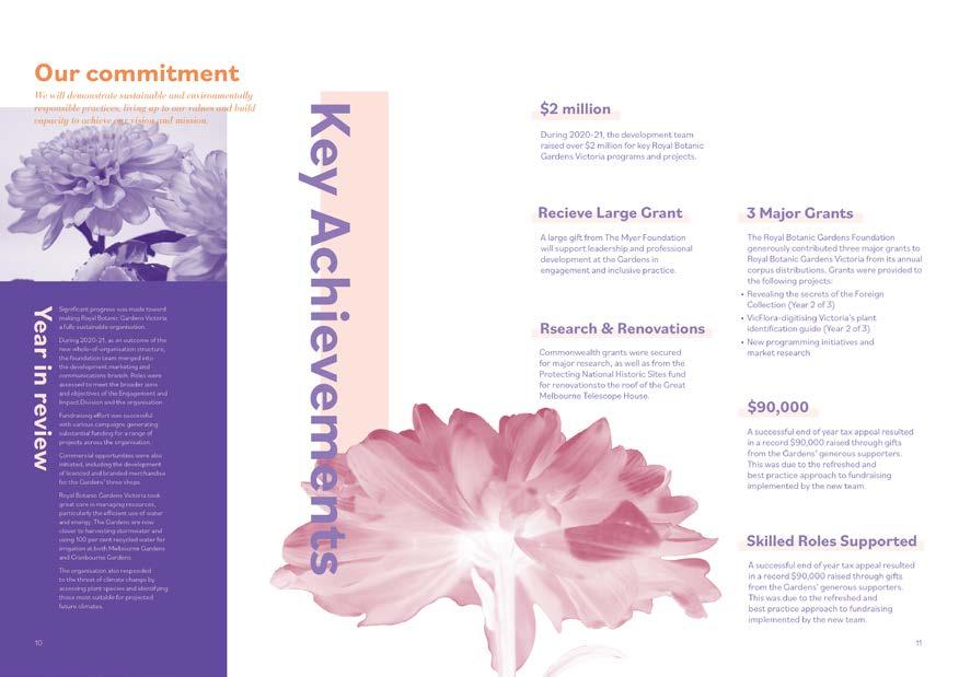
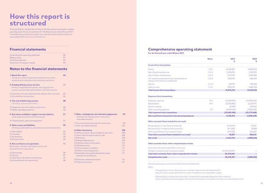
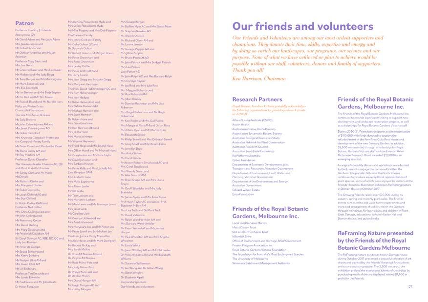
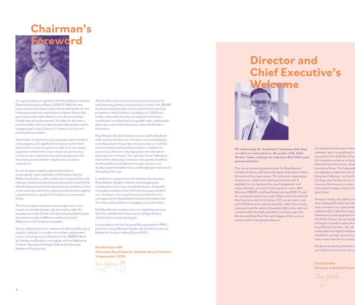
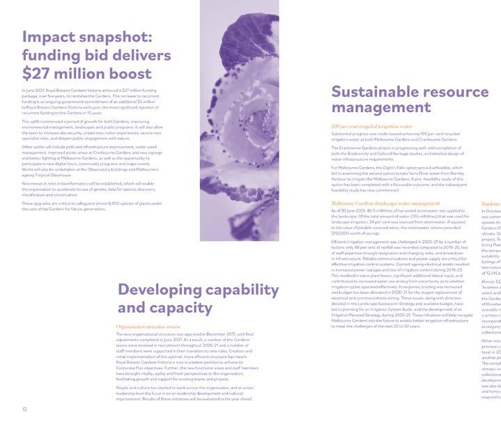
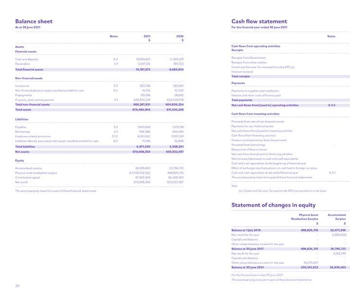
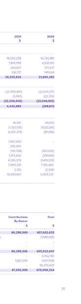
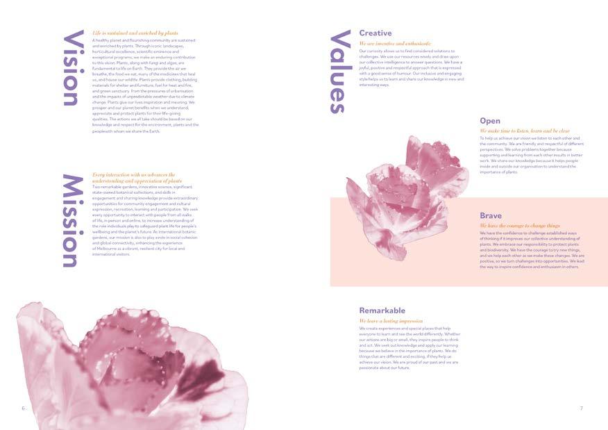
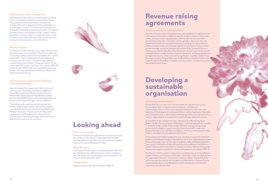
The goal of the annual report is to reflect the vision, mission and values of Royal Botanic Garden Board Victoria (RBGV) while responding to 2020's key theme of sustainability.
Concept
The creative direction aims to present the RBGV's scientific endeavor by utilizing the x-ray style images. As a framing device, it gives a lens to the shareholder and stakeholder to learn about the professional achievement of the botanic garden an appreciate the details of the unique plants.
Challenge
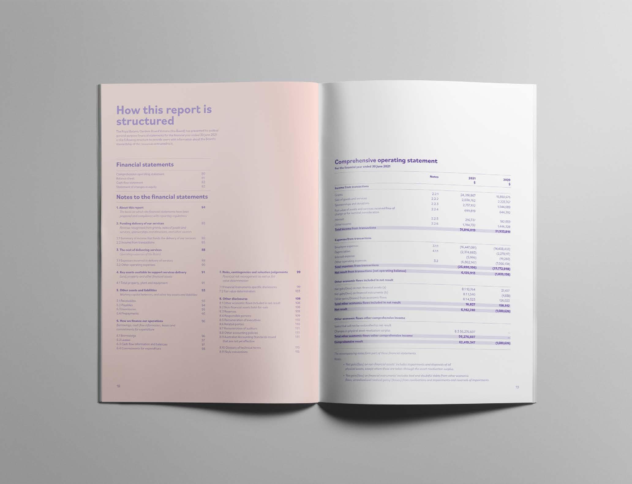
Due to the COVID-19 pandemic happened from 2020 to 2021, I am refrained from visiting the Gardens to take photos. Therefore, I am required to generate the imagery used in the annual report.
Image
My own images
Category University Project
Size 210 x 297mm


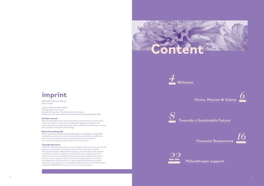
Entire Layout


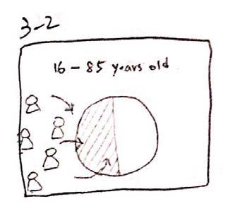
Topic
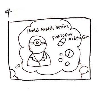
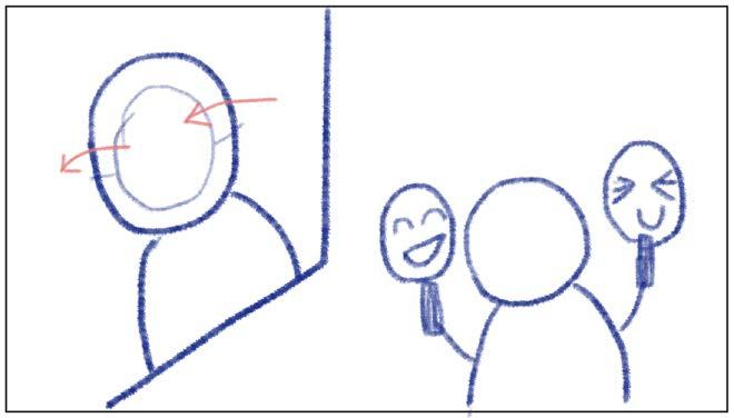
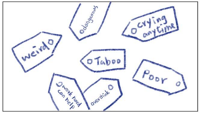
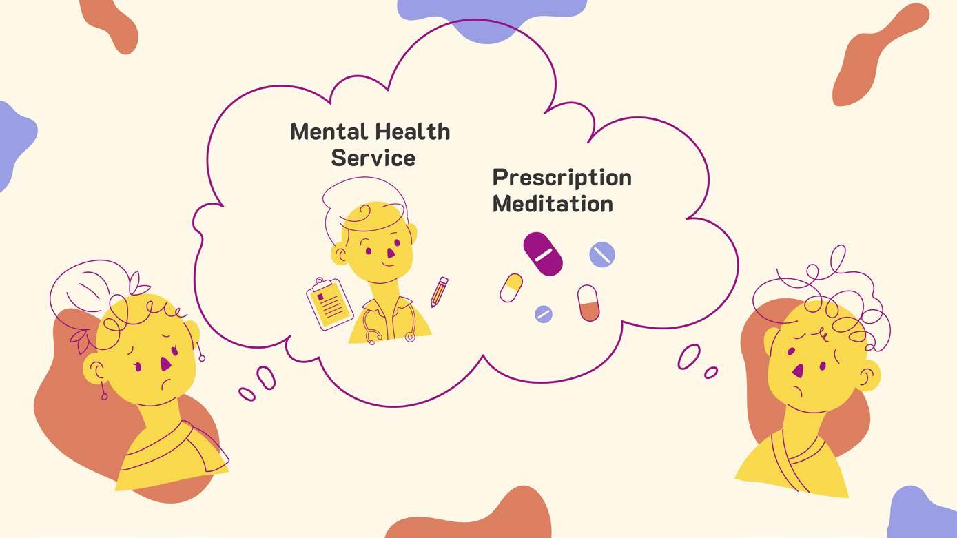
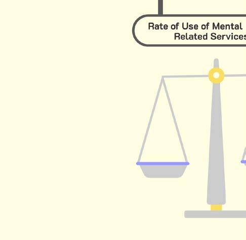
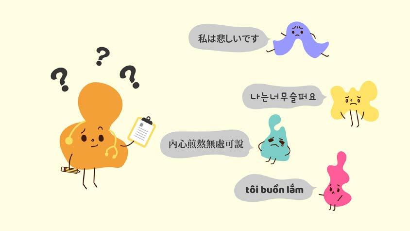
The use of mental health services of immigrants
Resource
Australian Bureau of Statistics(ABS)
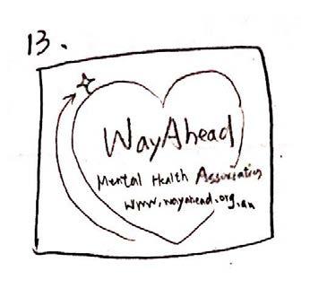
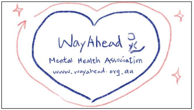
Client WayAhead Mental Health Association
Goal
Make a 60-second film to provide information to immigrants who are suffering from mental distress and need help.
Background
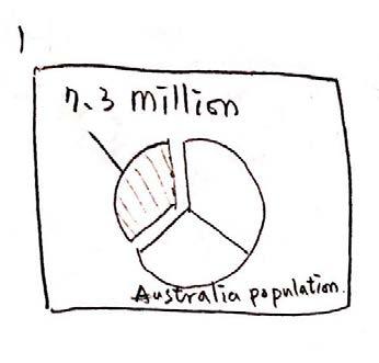
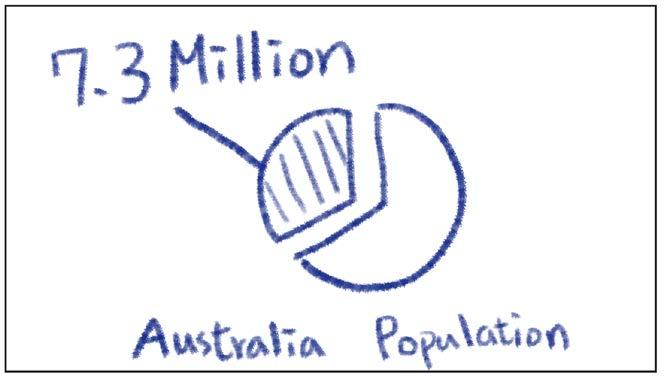
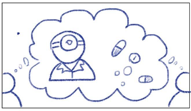
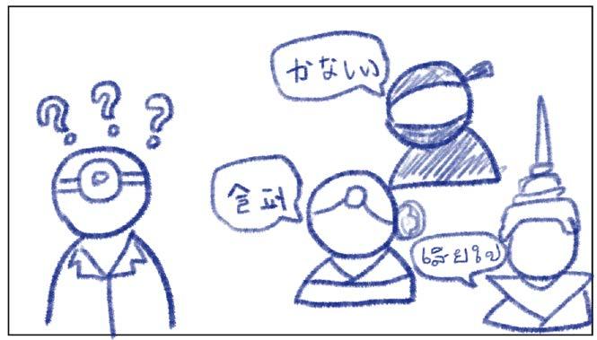
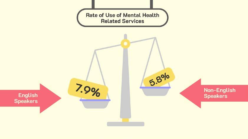
A quarter of Australia's population are immigrants, which is a considerable number. They are facing language and culture barriers when accessing mental health care. According to the statistics, only 5.6% of people who spoke a language other than English at home accessed an Medicare Benefits Schedule subsidised mental health-related service.
Please visit:
vimeo.com/581822450
Category University Project
Size 1920 x 1080px, H.264 format

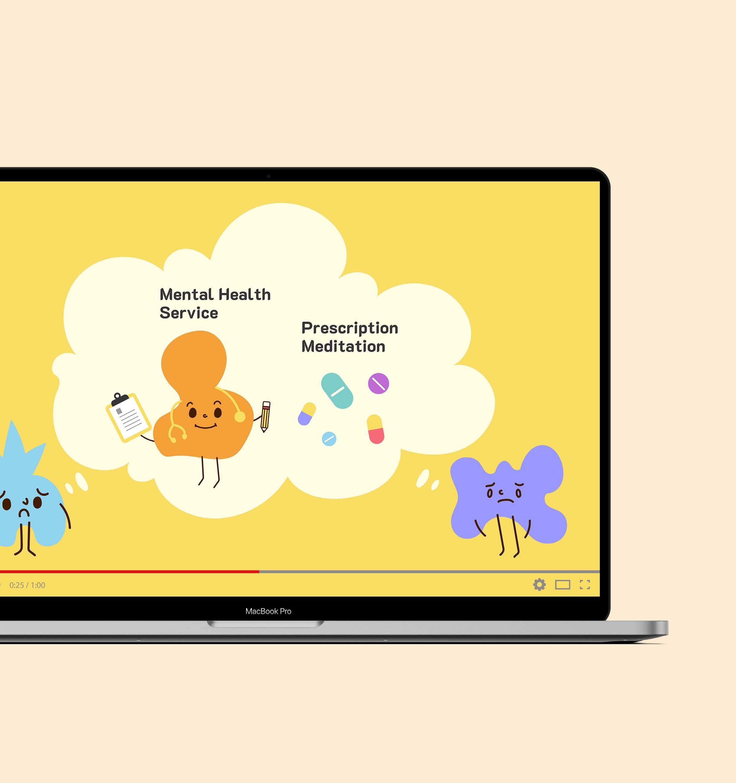
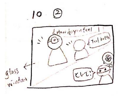
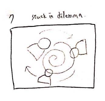
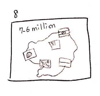
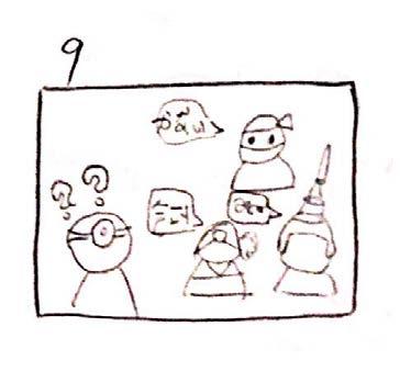
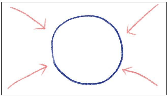
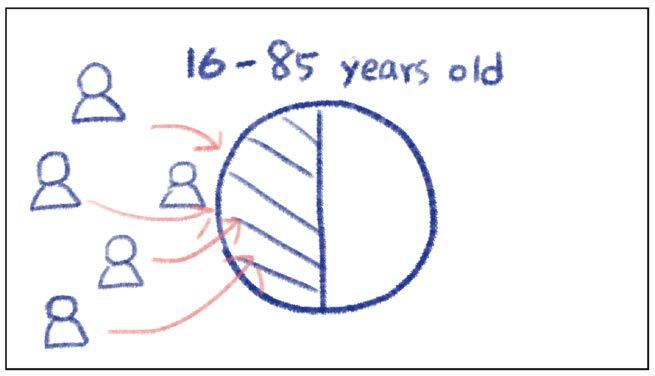
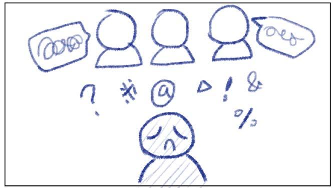
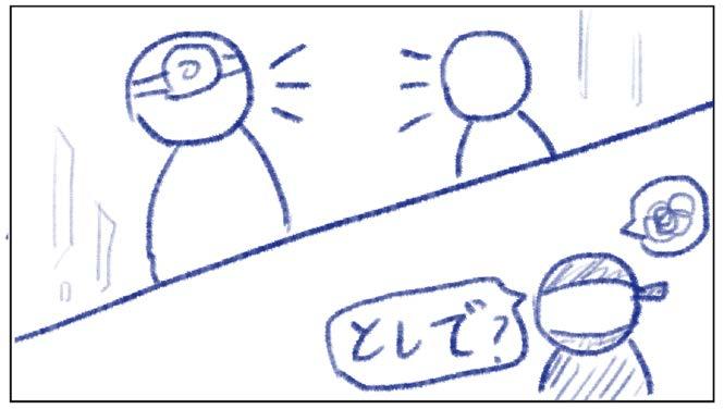
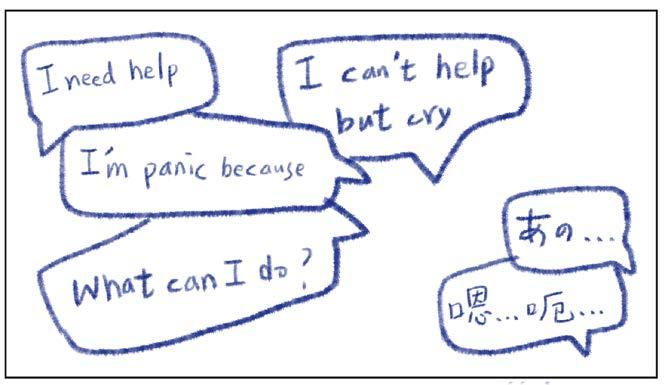
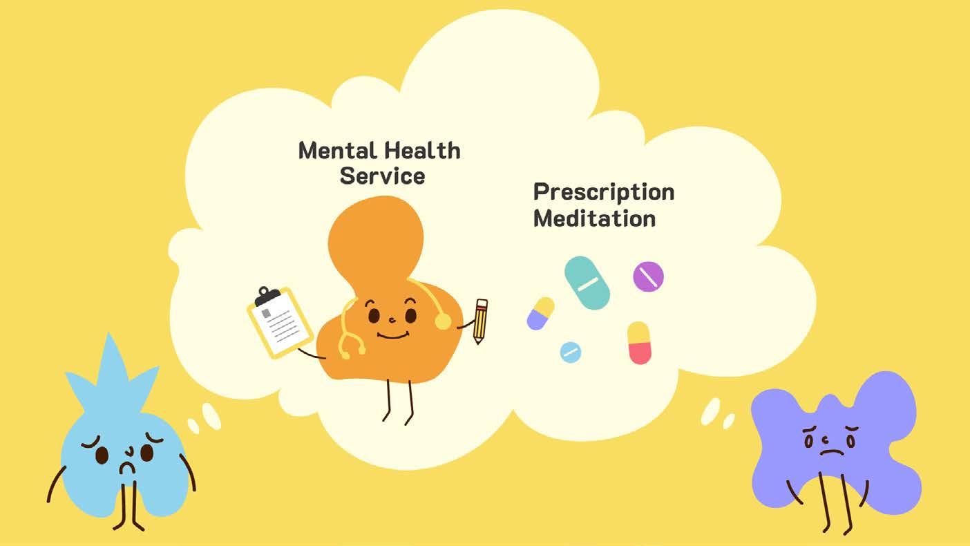
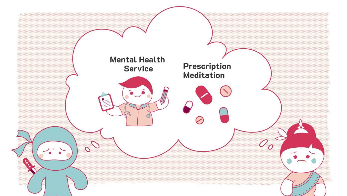
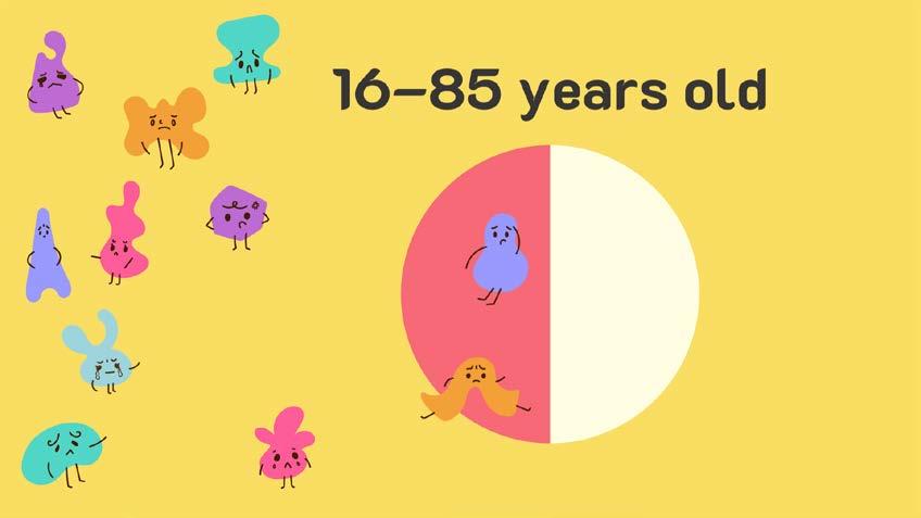
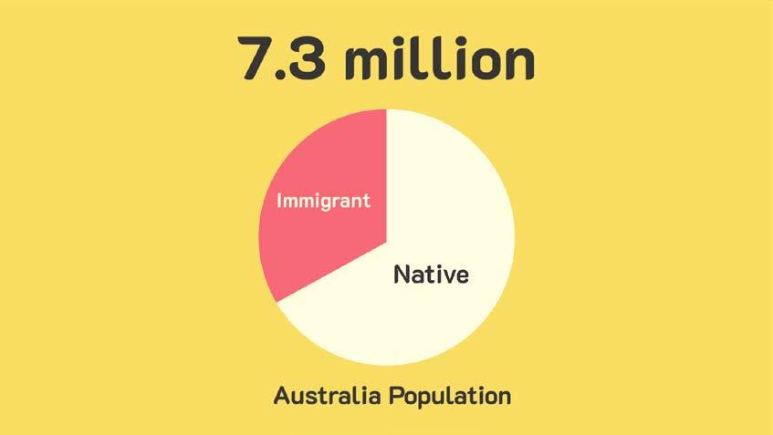
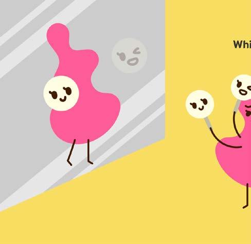
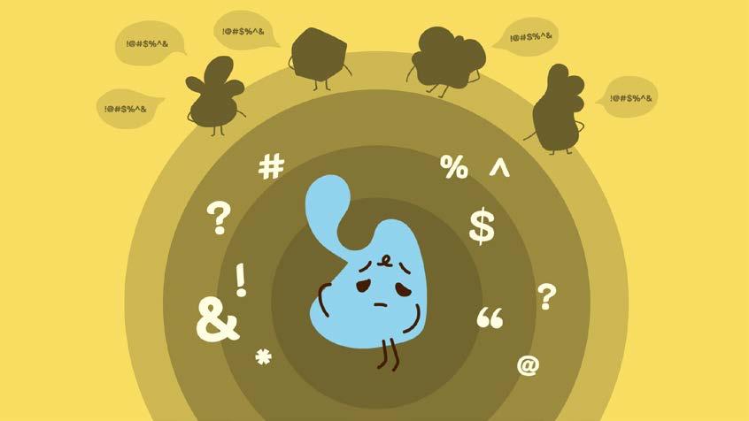
Do you know that 7.3 million Australians suffer from a lifetime mental disorder? That’s almost half of the amount in the group aged 16–85. How much of them actually reaching to the professionals and receiving help from them?
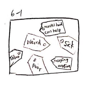
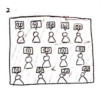
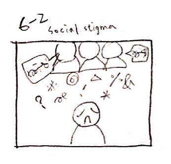
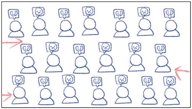
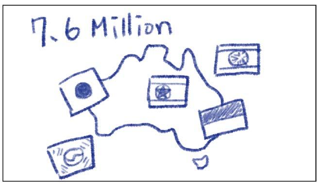
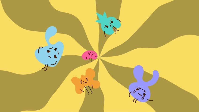
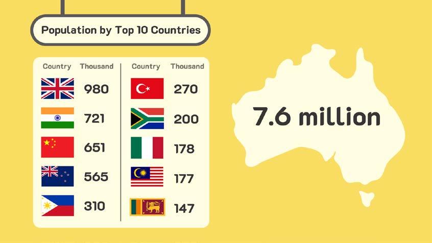
People tend to hide their mental issues from others since the social stigma and the fear of not being understood. There is a group of people now stuck in this dilemma and even worse. There are 7.6 million immigrants in Australia. Parts of them are facing language and cultural barriers when accessing mental health care.
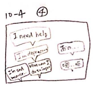
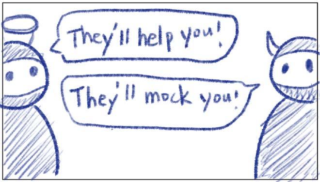
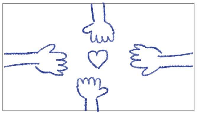
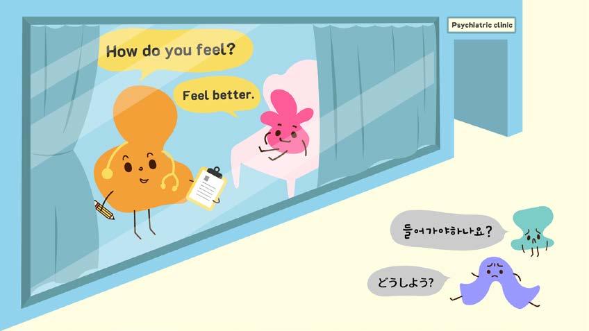
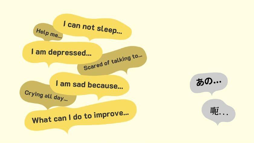
From the Bureau of Statistics, people who speak languages other than English are less likely to use mental healthrelated resources than English speakers. Who can help them if they need to talk to someone they trust and understand them? To seek further help, go to WayAhead.org.au
VO: That’s almost half of the amount in the group aged 16-85.
How much
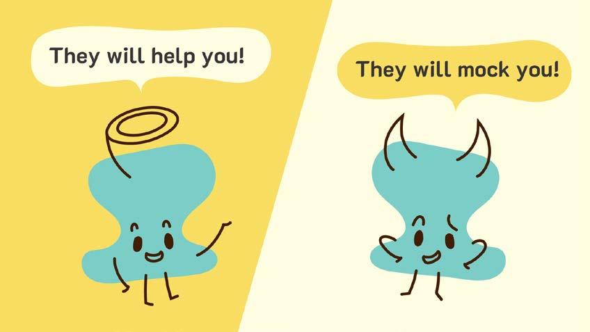
VO: People tend to hide their mental issues from others since the social stigma and the fear of not being understood.
VO: There is a group of people now stuck in this dilemma and even worse.
VO: There are 7.6 million immigrants in Australia.
VO: Parts of them are facing language and cultural barriers when accessing mental health care.
VO: From the Bureau of Statistics, people who speak languages other than English are less likely to use mental health-related resources than English speakers.
VO: Who can help them if they need to talk to someone they trust and understand them?
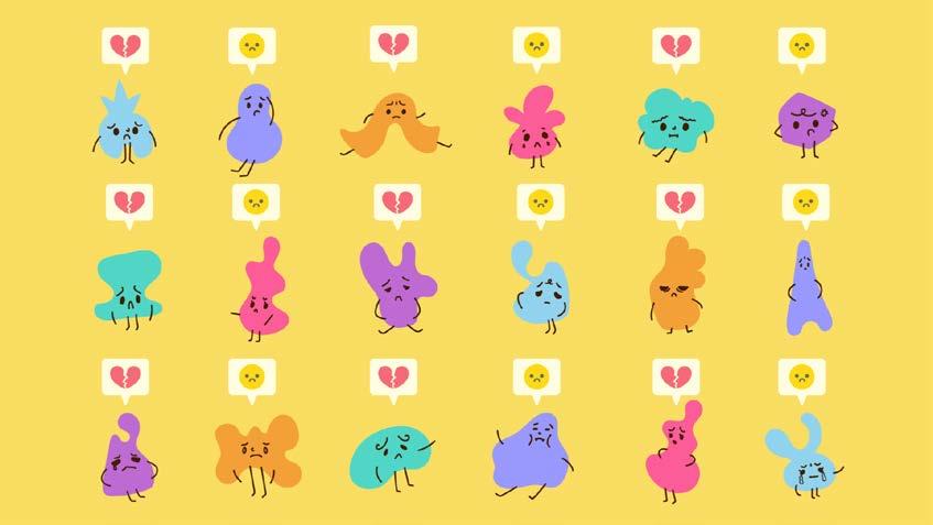
VO: To seek further help, go to WayAhead.org.au • Light dot tracing the outline of the heart shape
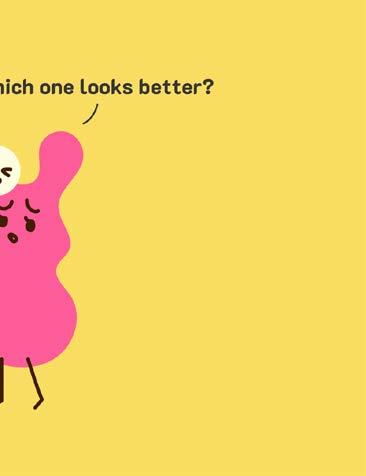
Chosen
Option 1
• Simple and fun characters
• Organic shapes
• Bright and vibrant colors
• Friendly atmosphere
• Filled–color illustration
Option 2
• Contrast–colored outline
• 3–4 colors
• Comic dot background
• Blank space
• Irregular border
Option 3
• Outline overlapping on the color block
• Bright colors
• 3–4 colors
• Warm color tone
• Decorative color block
• Round and smooth outline


Goal
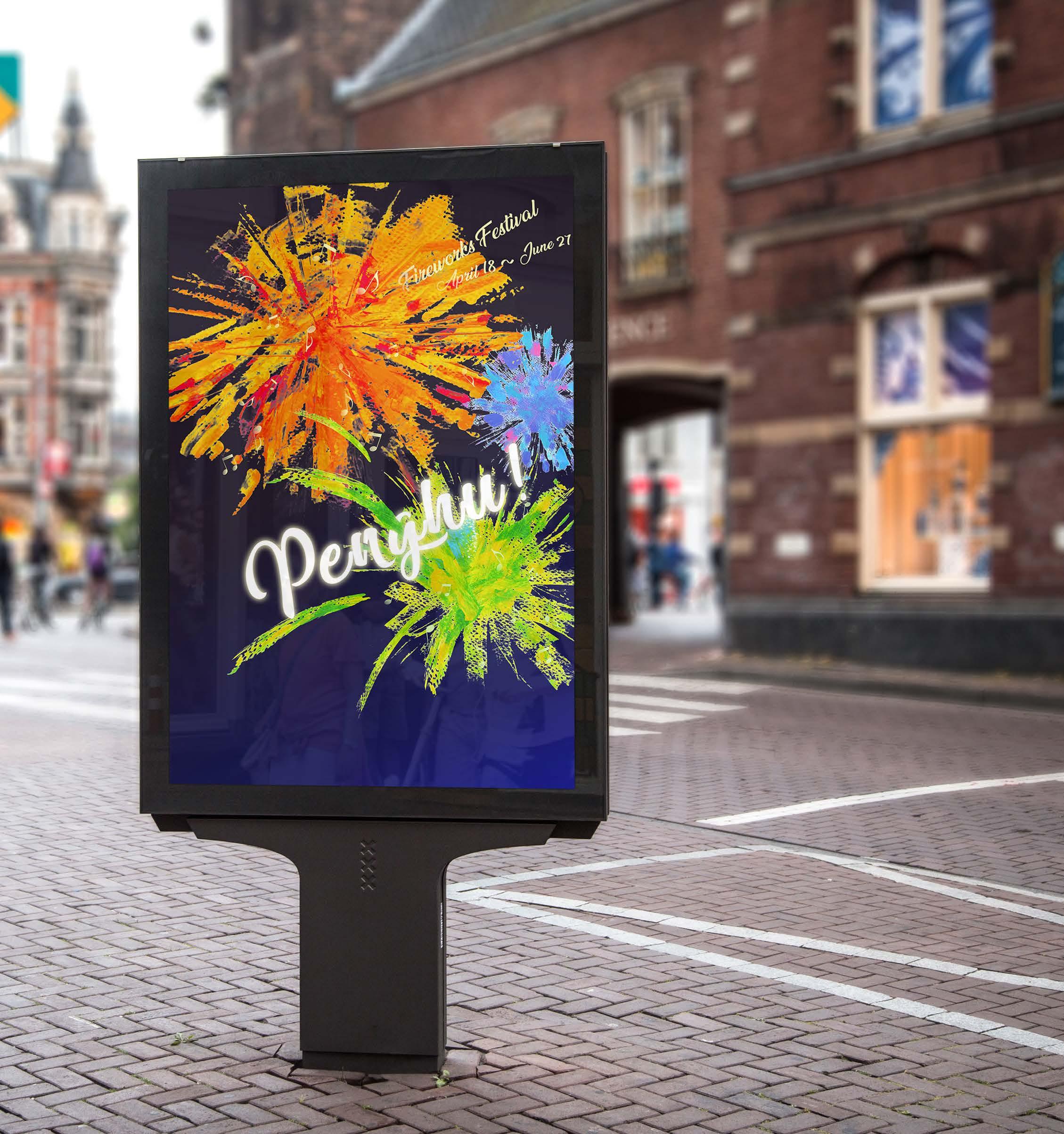
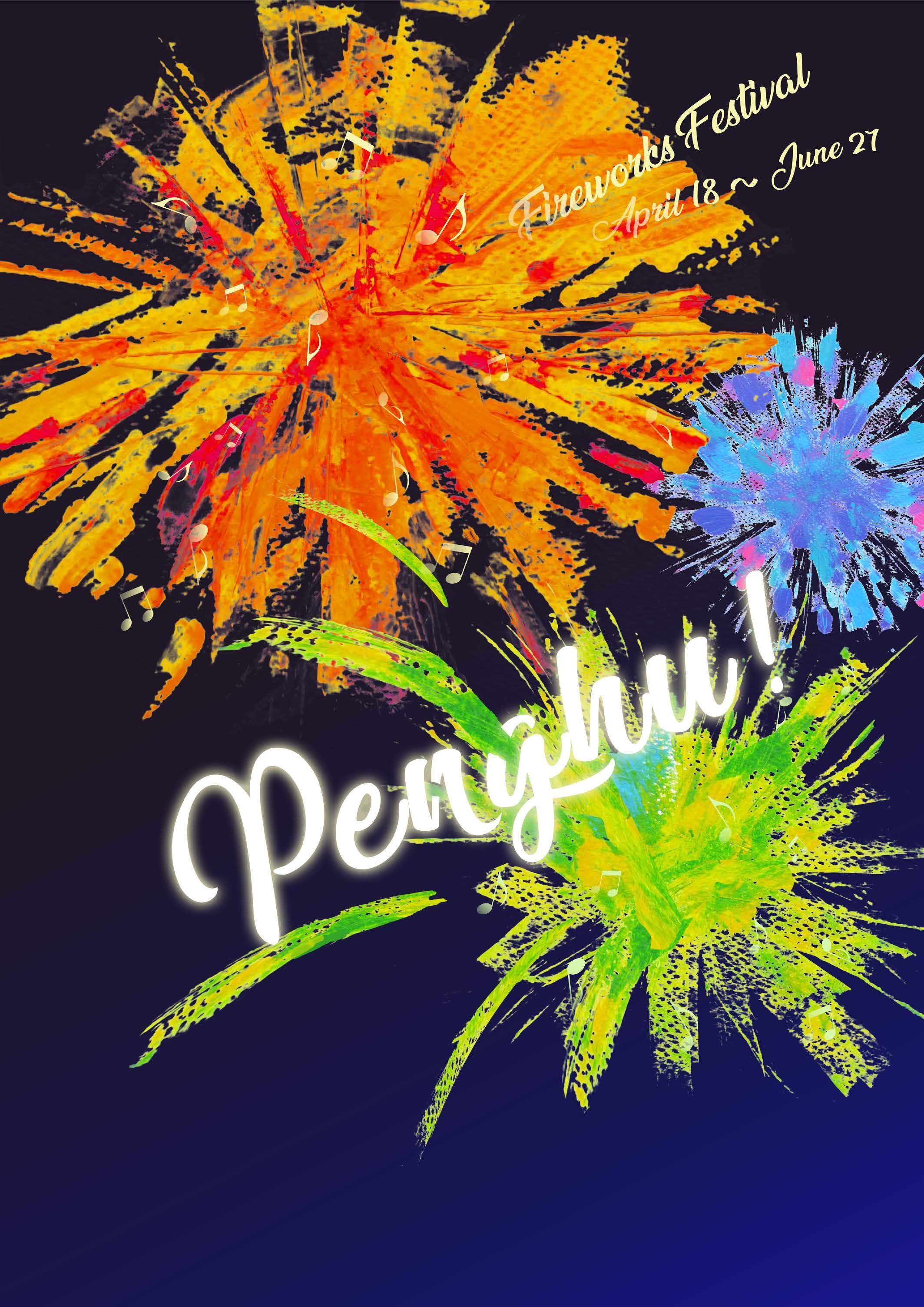
Design an inspiring promotional poster to promote tourism in Taiwan.
Concept: Sound of Firwork Festival
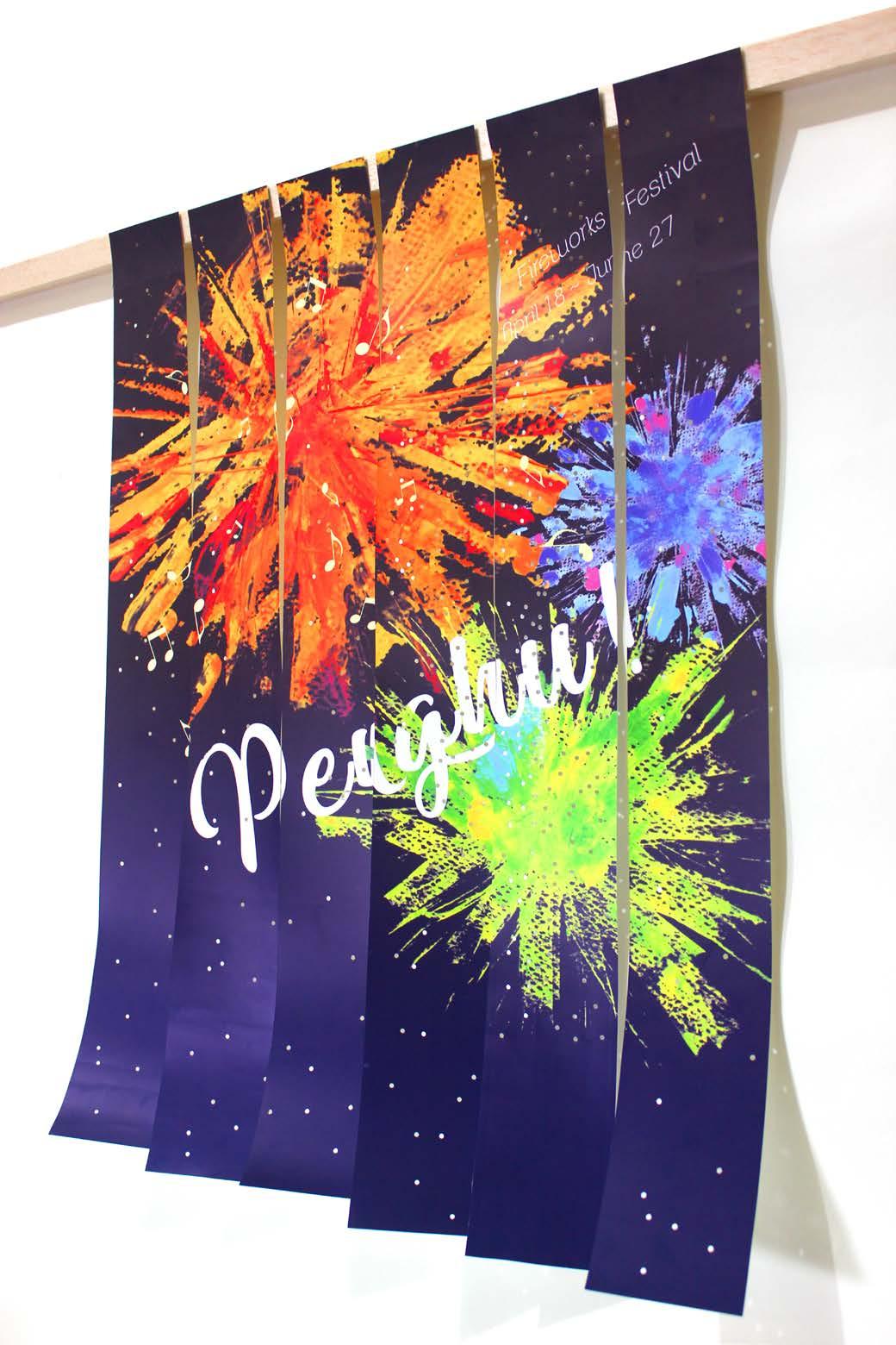
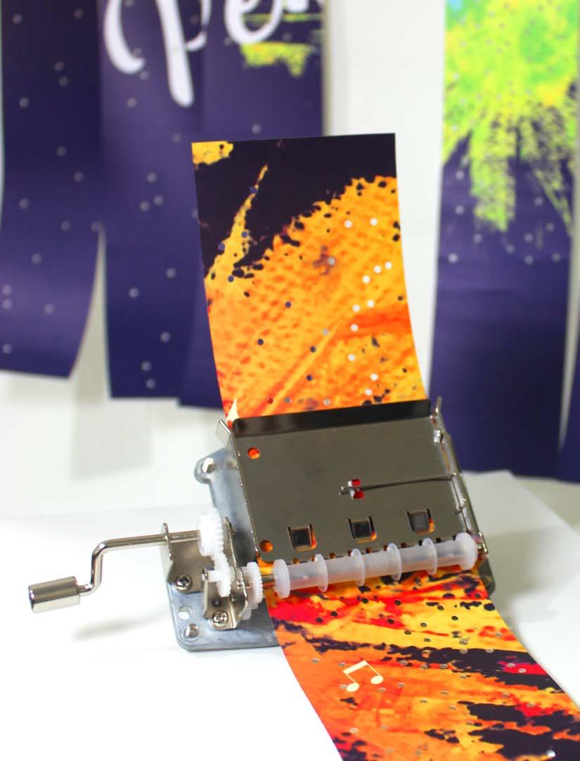
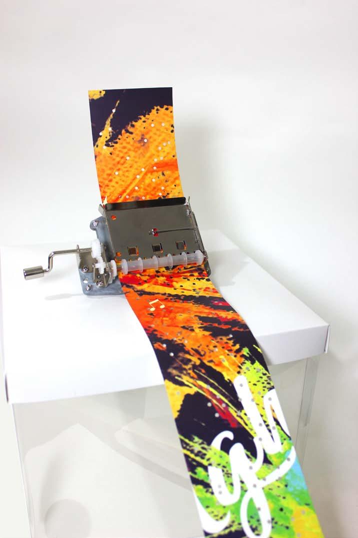
Penghu fireworks festival is held at Penghu island once a year. The firework show always goes with various musical and dancing performances, which can be called a feast of visual and audio.
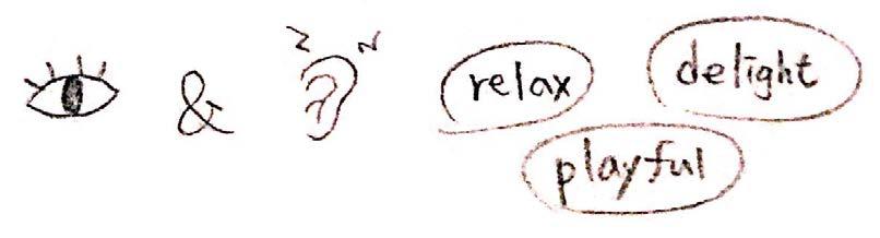
Since it is a delightful activity, I aim to design a playful interactive poster to catch tourists' eyes and encourage them to visit Taiwan in the future. The poster can turn into sheet music and play songs with the hand crank mechanical music box.
Category Competition Project, Experimental
Organizer Ministry of Education, Taiwan
Size 420 x 594mm (A2)

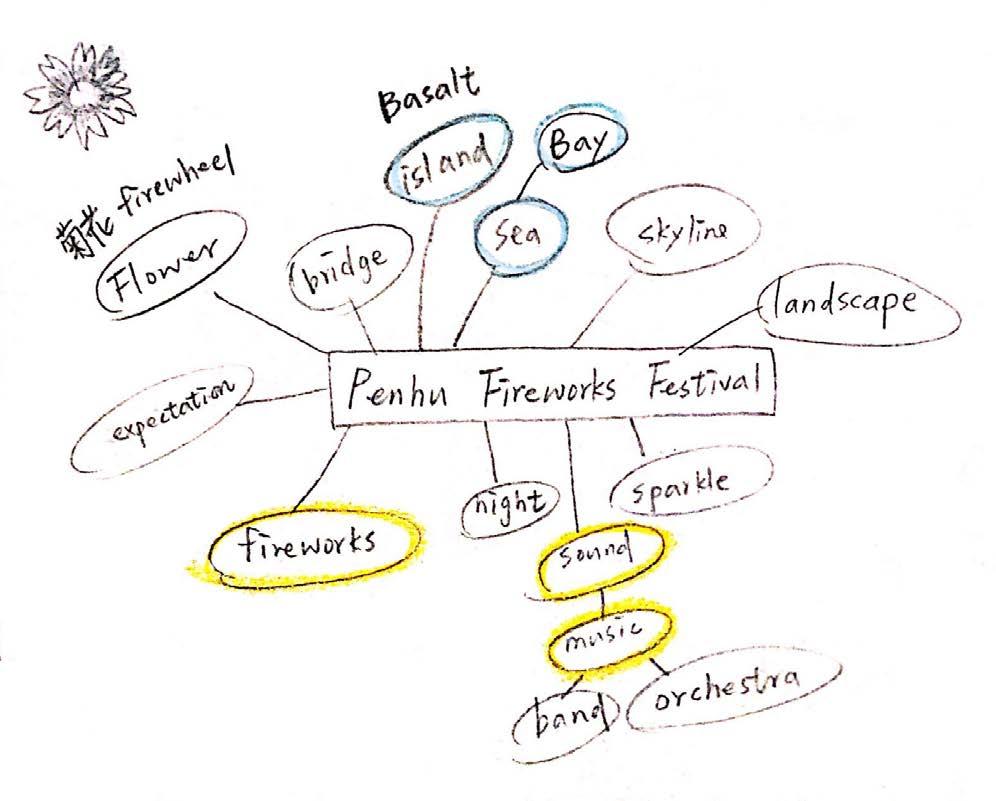
What Penghu Fireworks Festival
Who People love to travel
People enjoy music
Where Public space
Turism Exhibition
Why Interactive activity makes it memerable
When April–June
The poster can be cut into six equal paper strips. There are numerous tiny holes on the poster. Tourists can pick one of the paper strips and put it into the music box mechanisms. By turning the handle, the tourist can hear different melody form each of the paper strips.
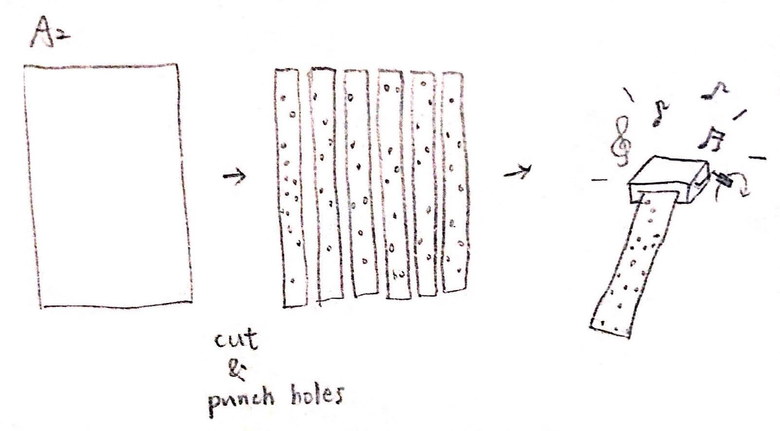
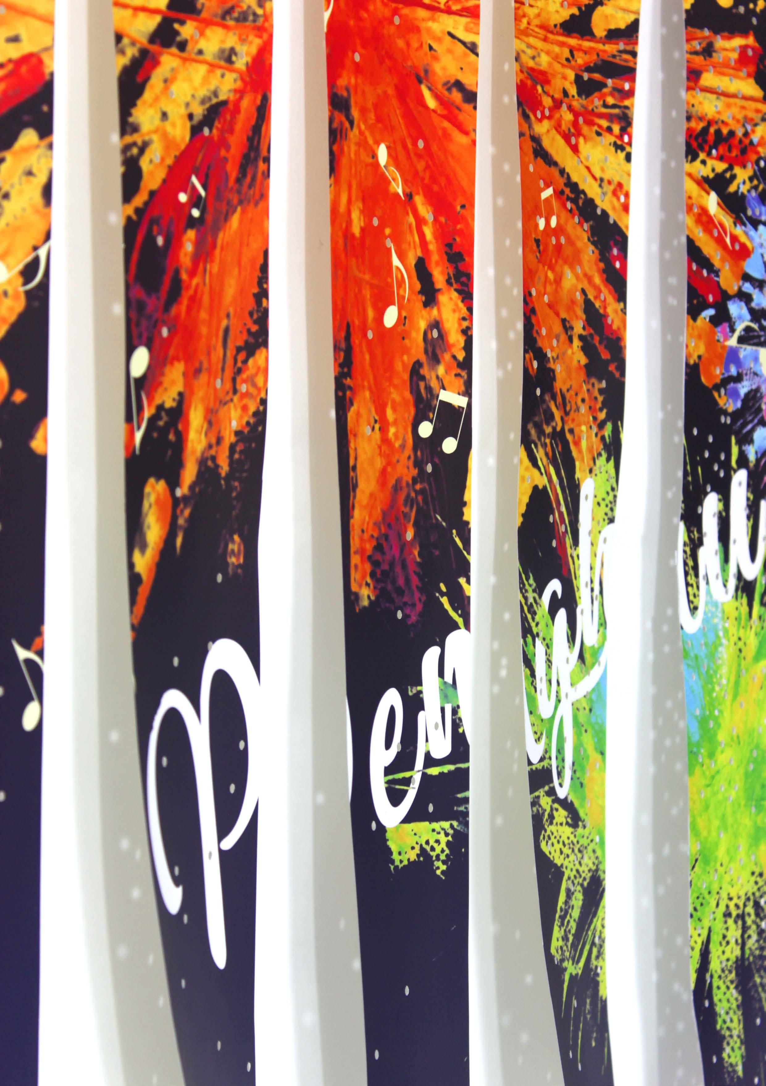
Every single paper strip is a different sheet music. I design a playful and memorable experience for the audience by utilizing this device. It connects the fireworks and music, meanwhile, attract people to learn more about Penghu Firework Festival in Taiwan.
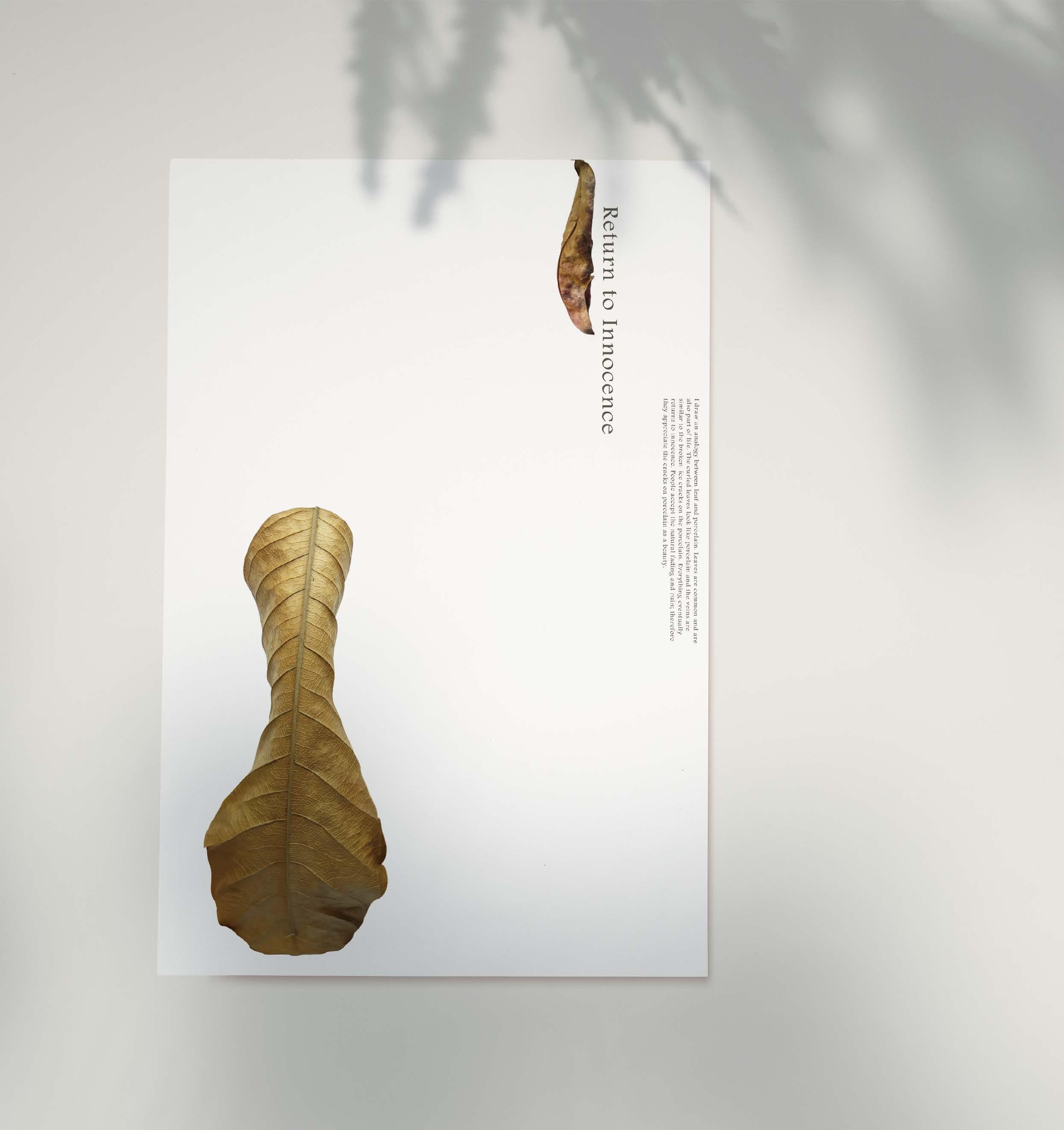
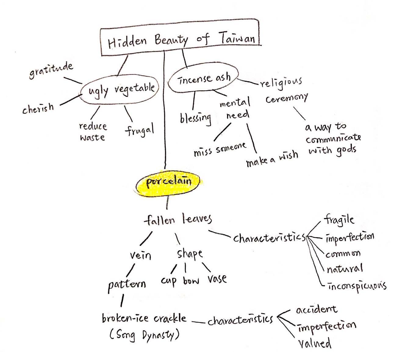
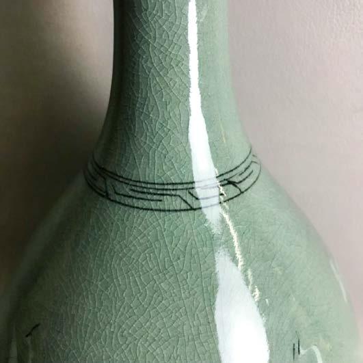
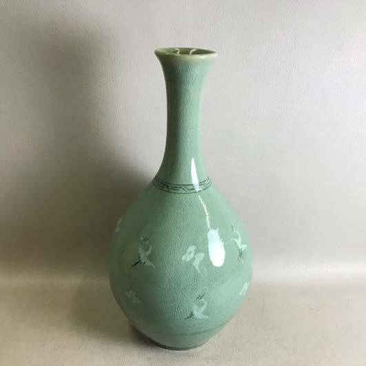
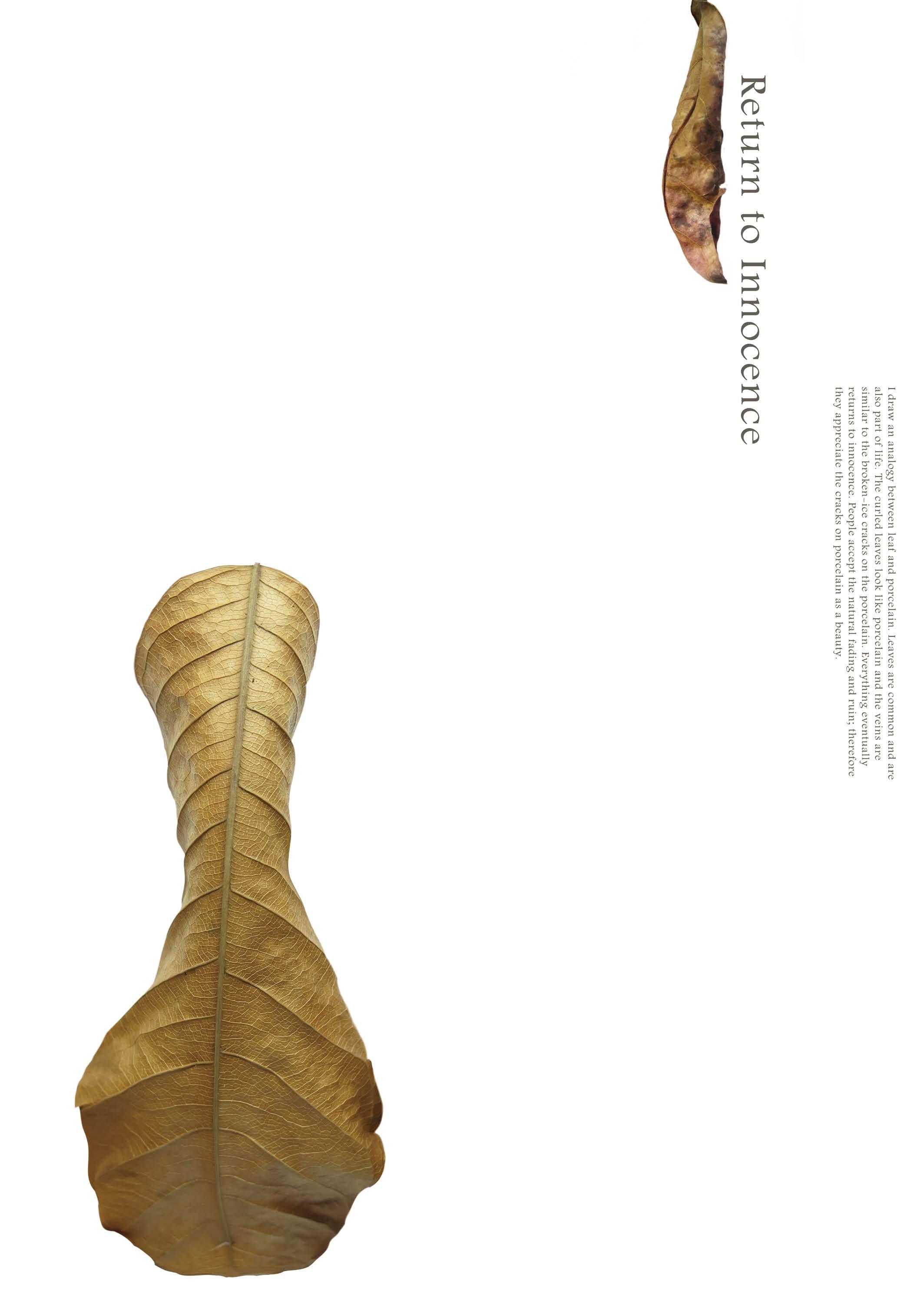
Goal
The goal of this project is to find hidden beauty of Taiwan which lives silently in invisible bushes rather than in well known appearance.
By observing the environment where the competition took place, I found that the shape of curled fallen leaves look like a vase and the veins are similar to the broken-ice crackle on the Chinese porcelain in Song Dynasty.
As been inspired by the fallen leaves, I came up with the connection between porcelain and nature. One of the essences of nature is imperfection. The broken-ice crackle on the porcelain was a beautiful accident by the craftsperson. Once people accept the fading of nature and imperfection, they can appreciate the cracks on porcelain as a beauty.
Category Competition Project
Organizer Ministry of Education, Taiwan
Size 594 x 841mm (A1)

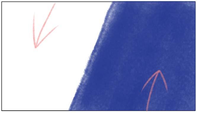
A worldview centered on the acceptance of transience and imperfection.
Professor Takaaki Bando enlightened me by the traditional culture of Japan, such as calligraphy, Wabi-Sabi and the spirit of Mokkei. As an Asian who also grow up in oriental culture, I feel a great respect of local culture from the professor and it makes me introspect my culture. The perspective of local culture was worth to be learned from. The lecture reminds me that only through a delicate mind could a designer finds the hidden beauty of ordinary life.
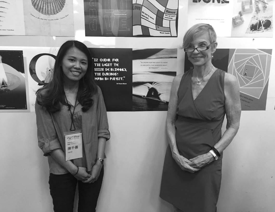
Goal
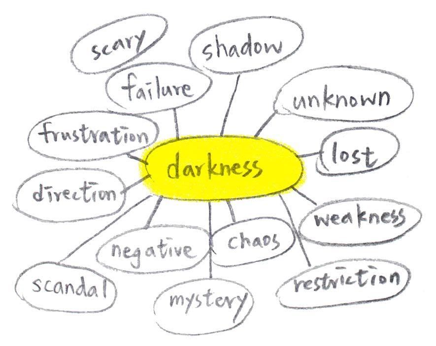
Communicate a quotation and its meaning using objective and subjective, analytical signs.
Quotation
"In order for the light to shine so brightly, the darkness must be present. " siad Sir Francis Bacon.
Category Competition Project Size 700 x 1000mm
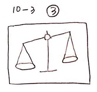
1 quotation, 2 perspectives.
“In order for the light to shine so brightly, the darkness must be present.” —Sir Francis Bacon
Thinking of the relationship between light and darkness in an objective way, I came up with the keyword coexistence. Therefore, I connected the alphabets together, which means the viewers should read the alphabets in between white and black in order to read through the sentence.

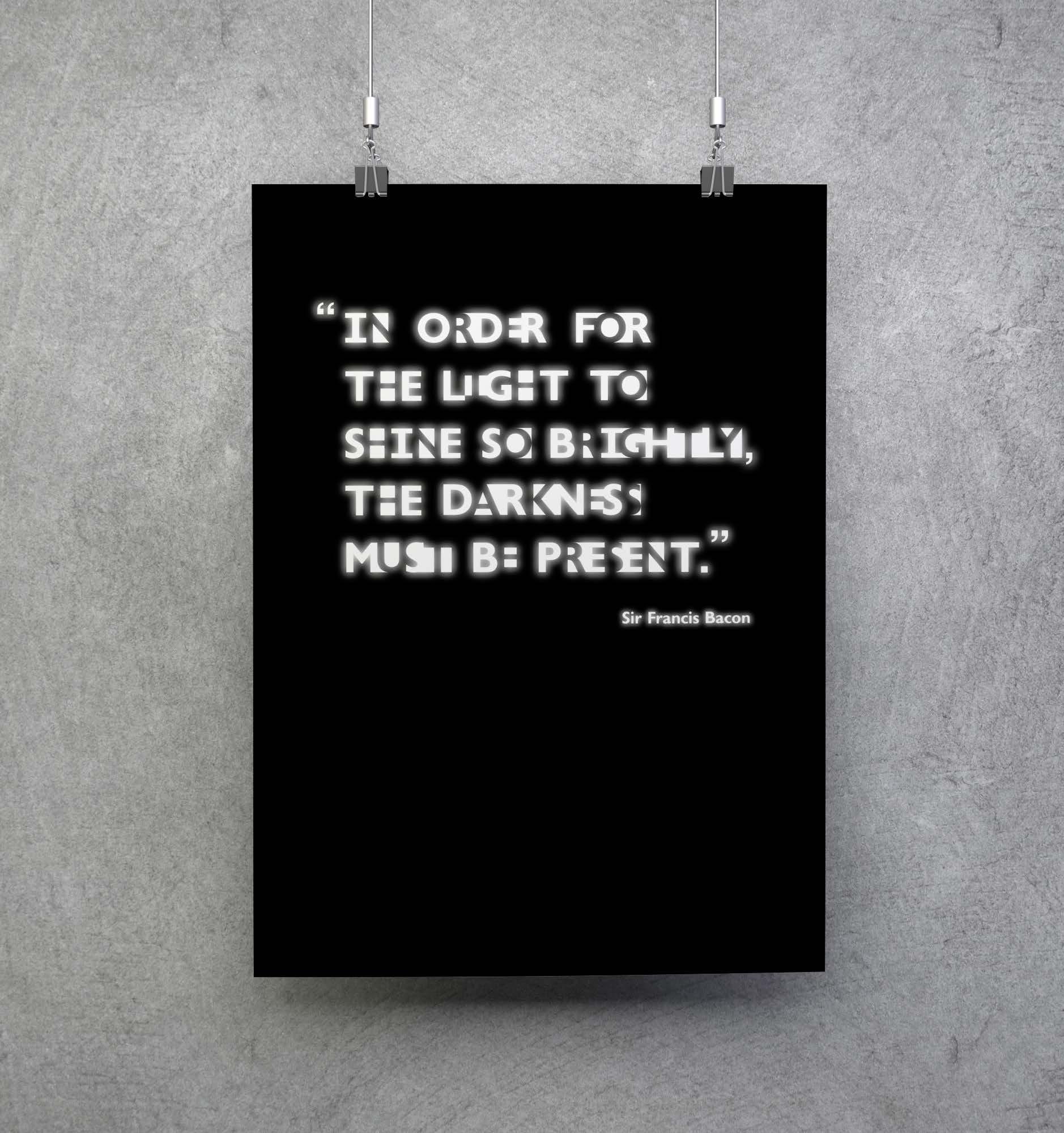
The subjective version is based on my stressful study experience in high University. I piled up the heavy thick books and the back of the book became a dark deep tunnel for me. As a student, the light stands for what I have learned; the darkness stands for unknown.In order to learn (light), the stress(darkness)must be present.


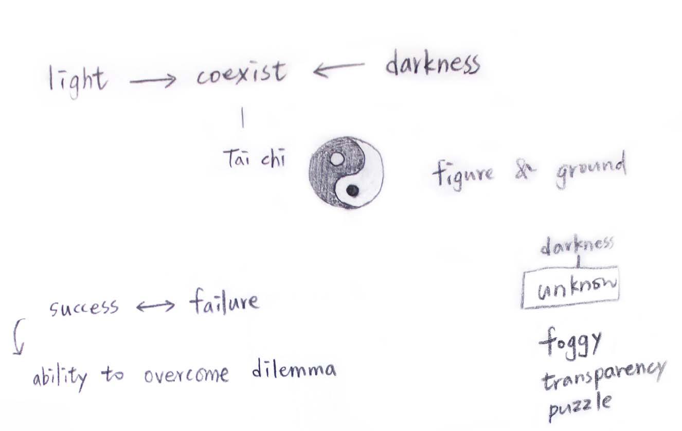
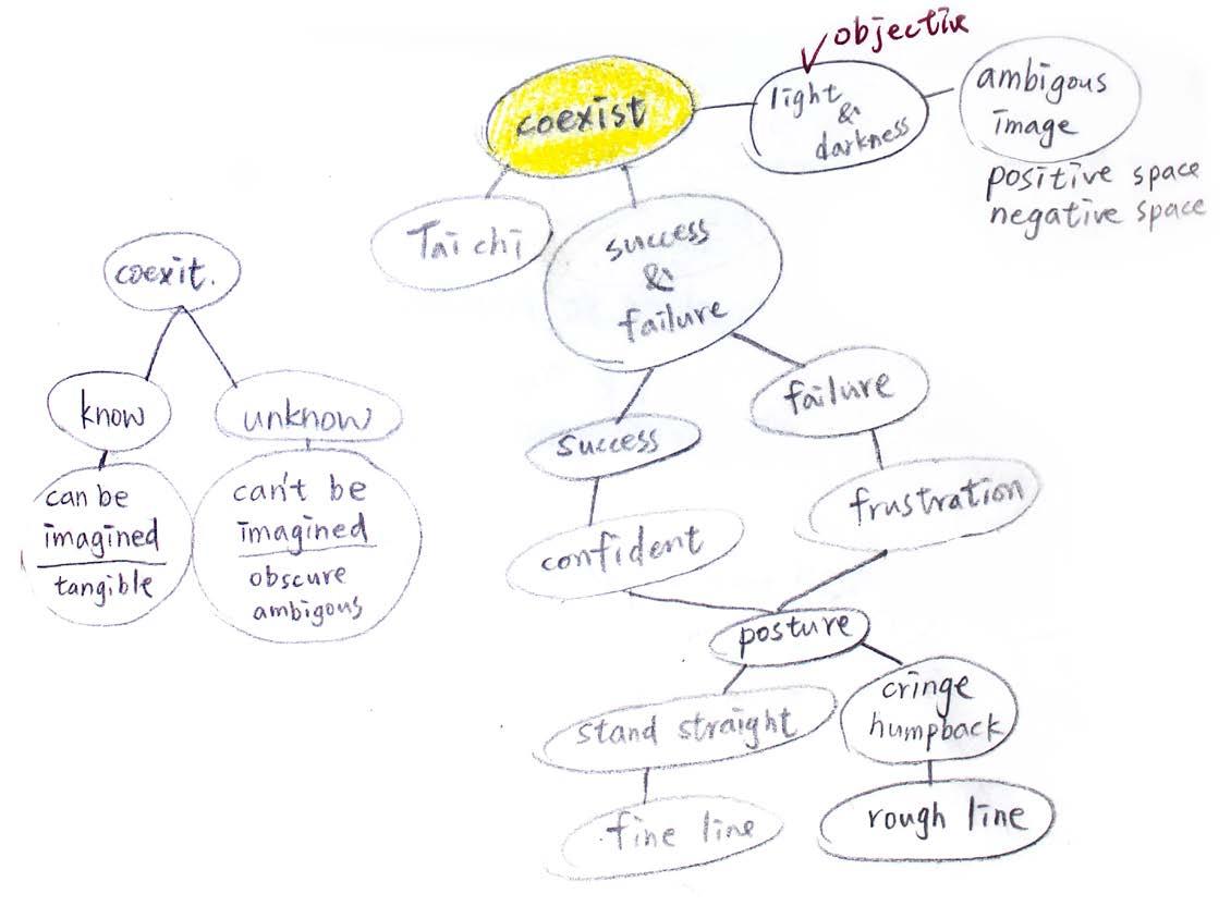
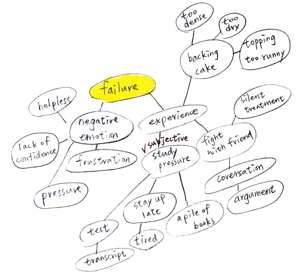
It could be a challenge for people to be objective while interpreting essays, sentences, and even words. Everyone may defend their objective interpretation. However, what they utilized to defend their stands might be a subjective opinion.
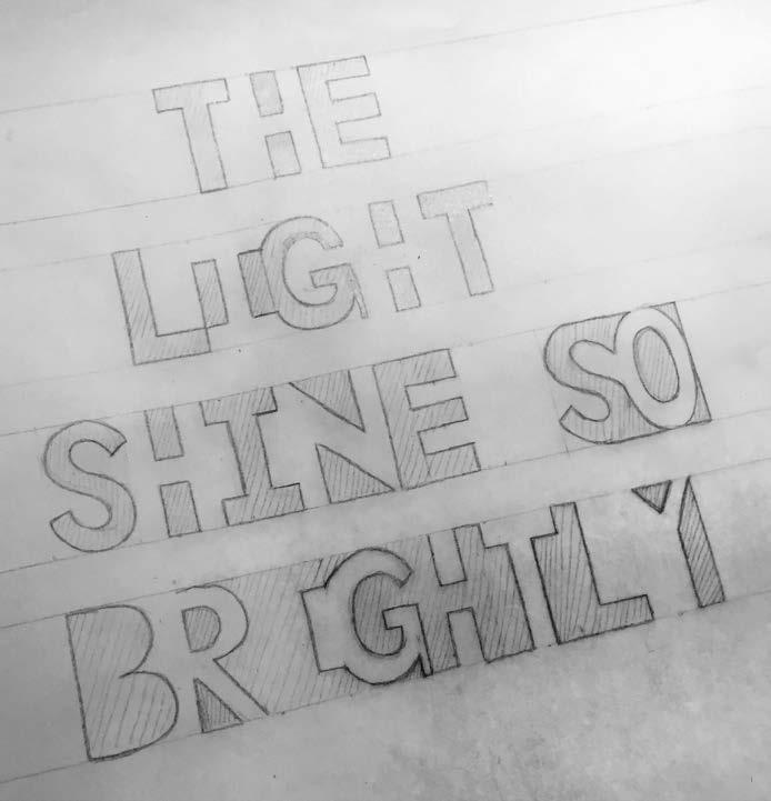
Initial sketch of objective interpretation of quote
I appreciate professor Ann Morris had guided me on how to activate design methods to develop design projects step by step. This experience helps me defining my own creed efficiently in designing the subjective version poster.


Subjective Interpretation
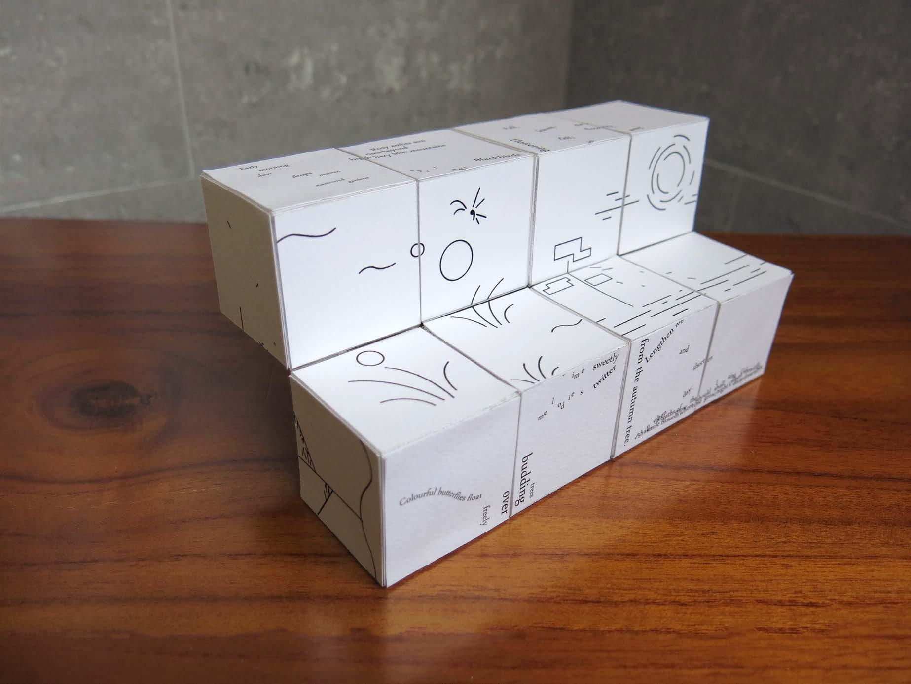
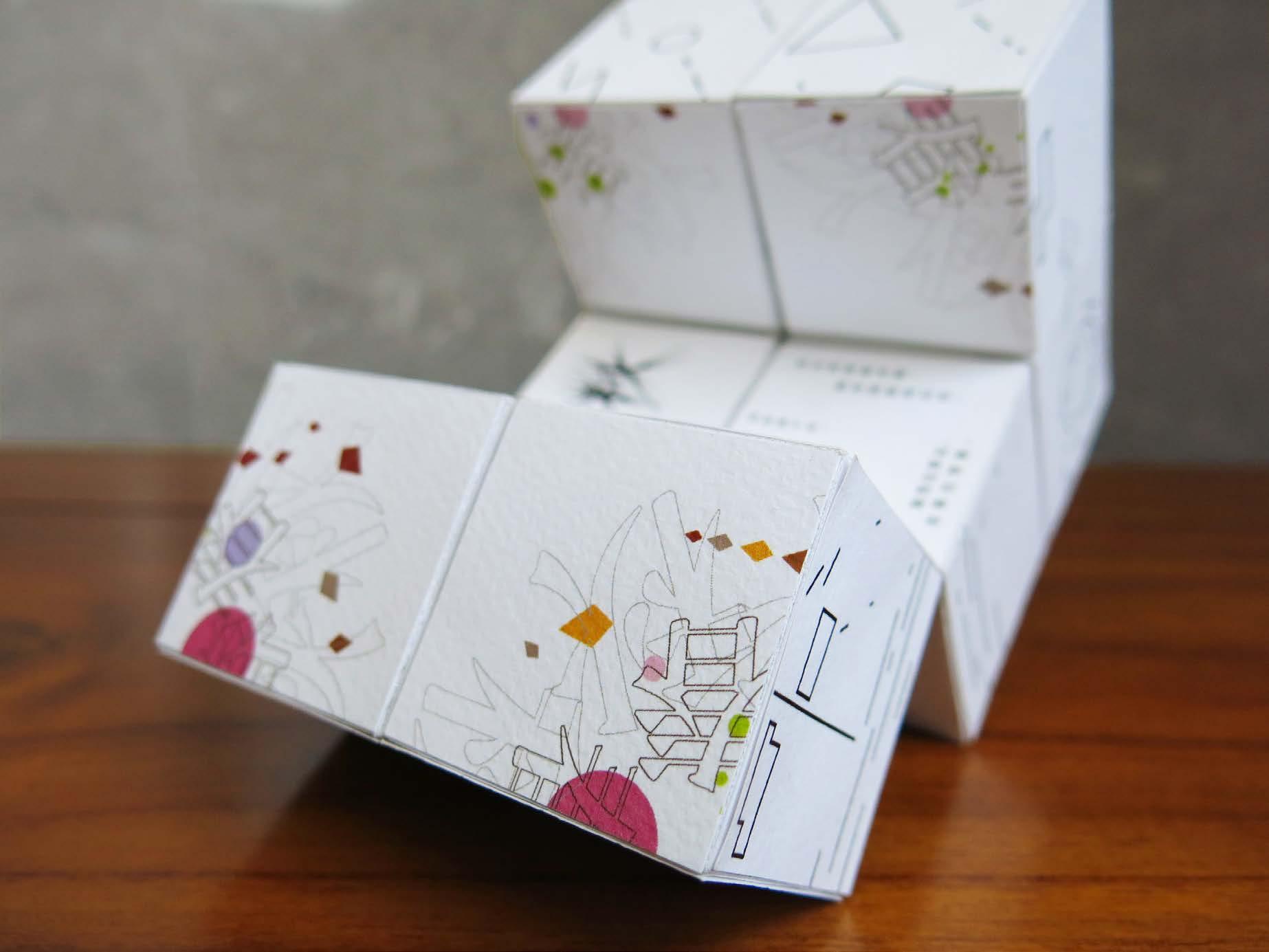
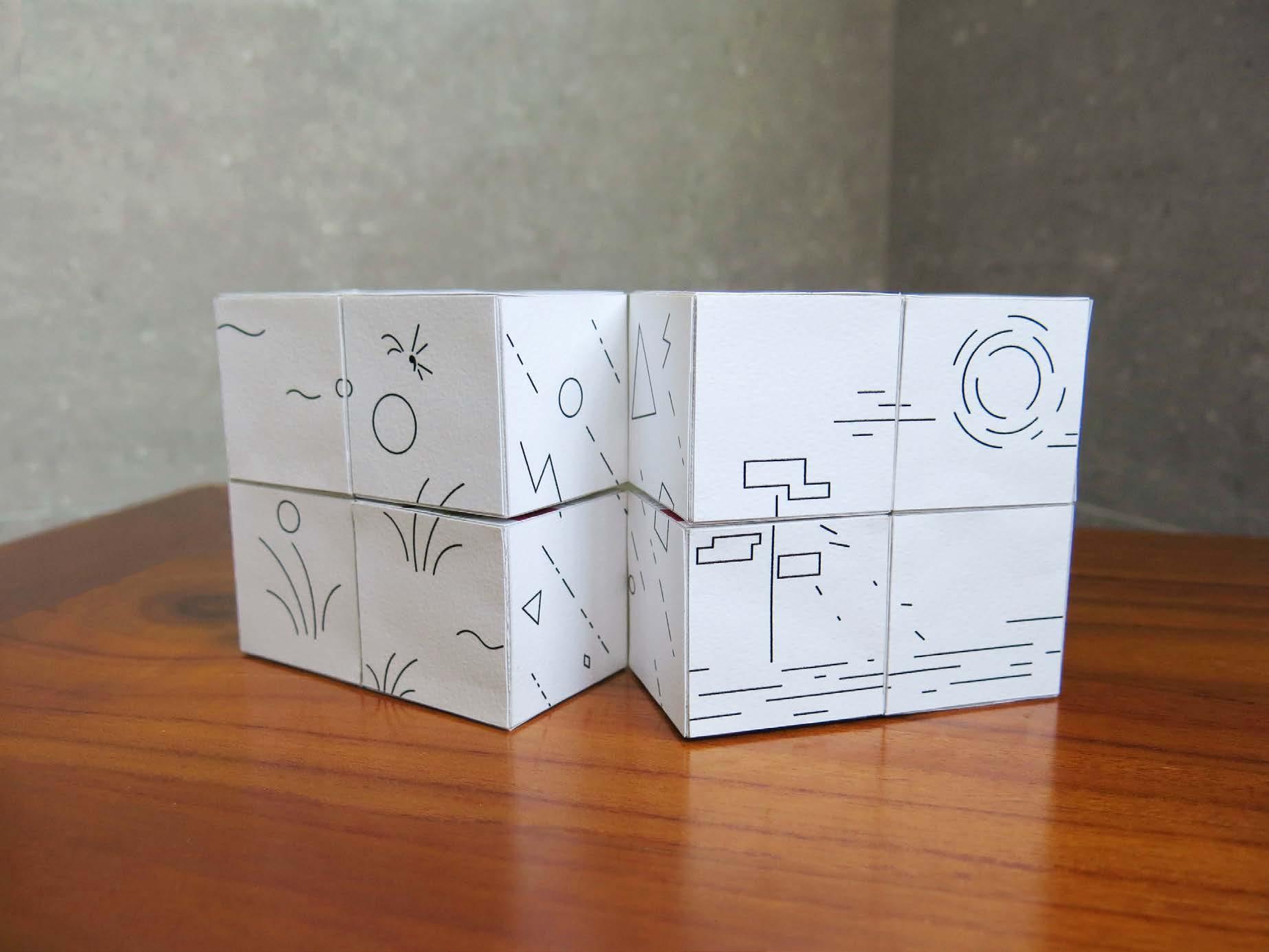
Goal
Interprete seasons in Taiwan by experimental layout and dimension.
Concept: Turn of four seasons
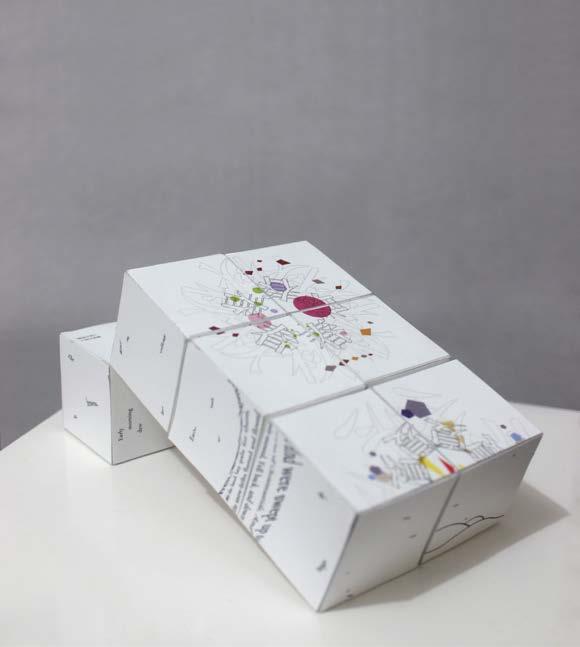
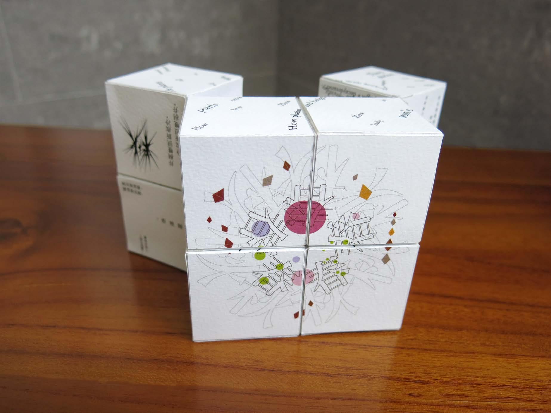
Taiwan as an island located in the subtropica lhas distinct seasonal variation. The beauty of the turn of four seasons fascinates me. Therefore, I utilize the structure of infinity cube to interpret the concept. The sides of the infinity cube contain three ways to show four seasons.
1. Geometry illustration
2. Chinese character
3. Visualize related Chinese and English poems
Category Side Project, Experiment
Size 80 x 80 x 80mm

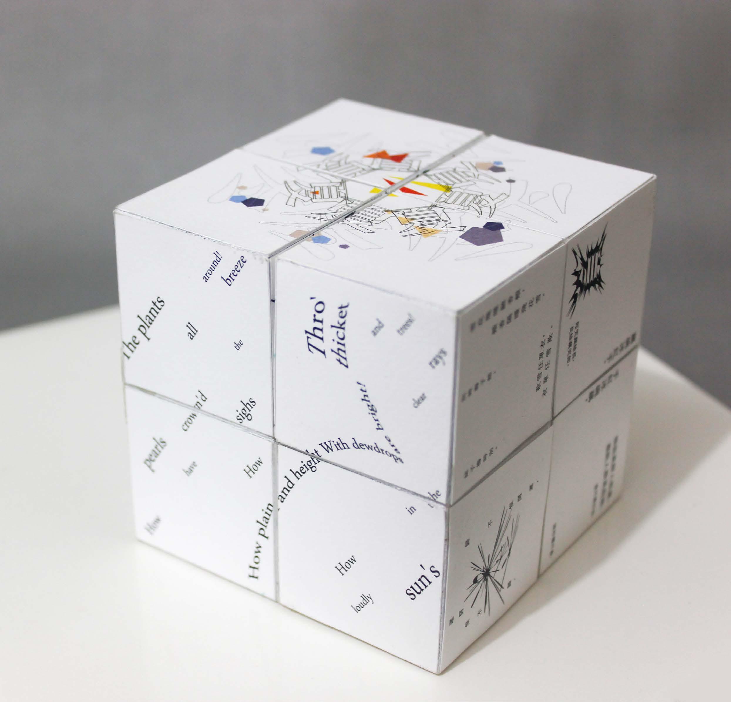
Geometry Illustration
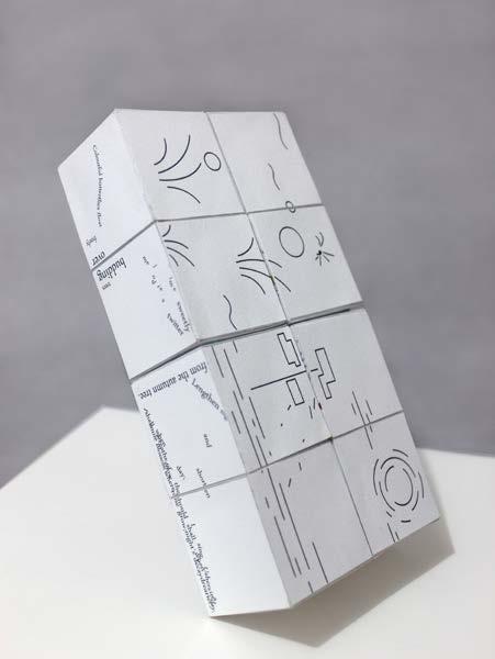
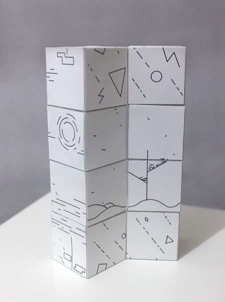
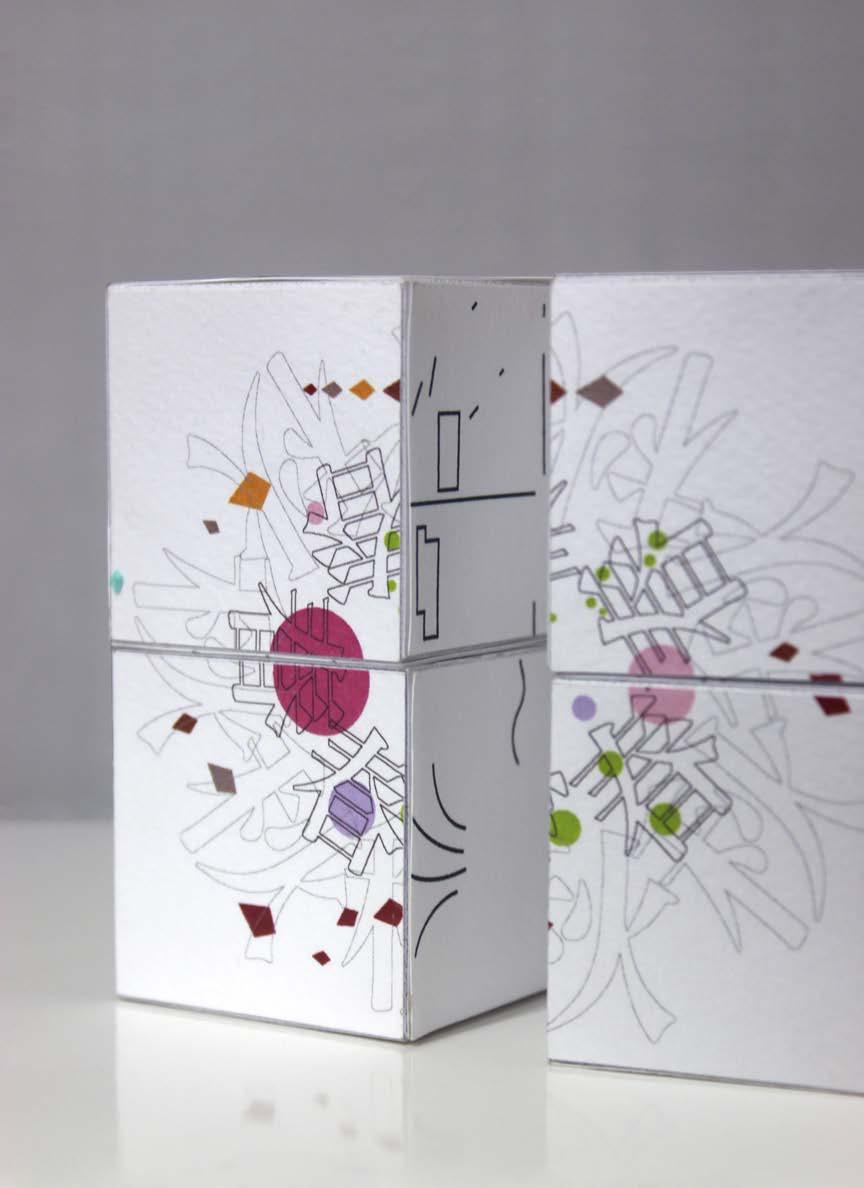
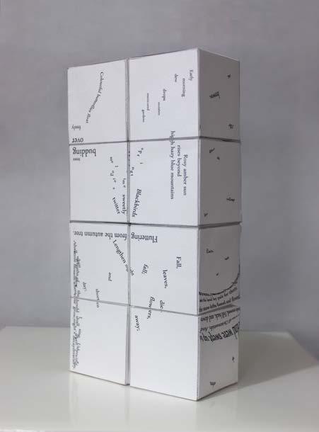
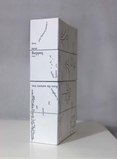
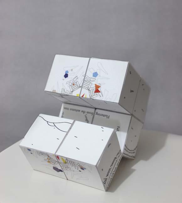
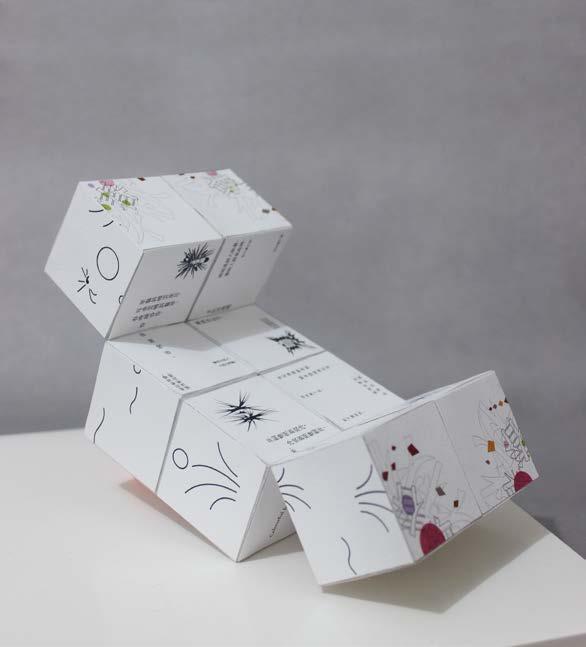
By turning the infinity cube, the four seasons on the cube are turning into a new image from the different sides of the cube in a cycle. Eventually, the mixture image of four seasons will turn back to the well-arranged images then circulate the process endlessly like the four seasons turning.
Goal
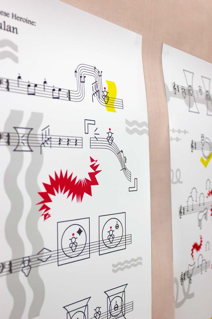
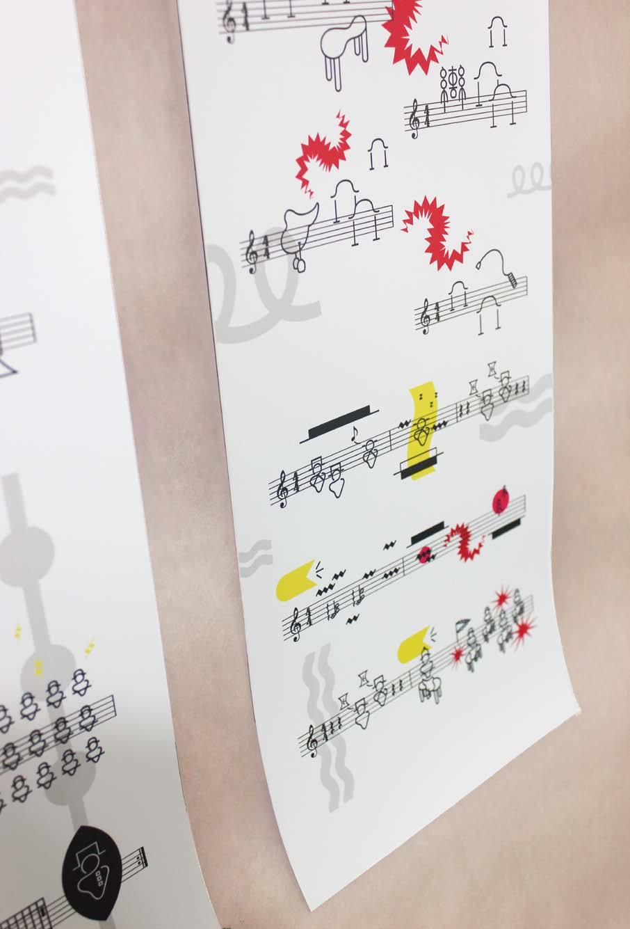
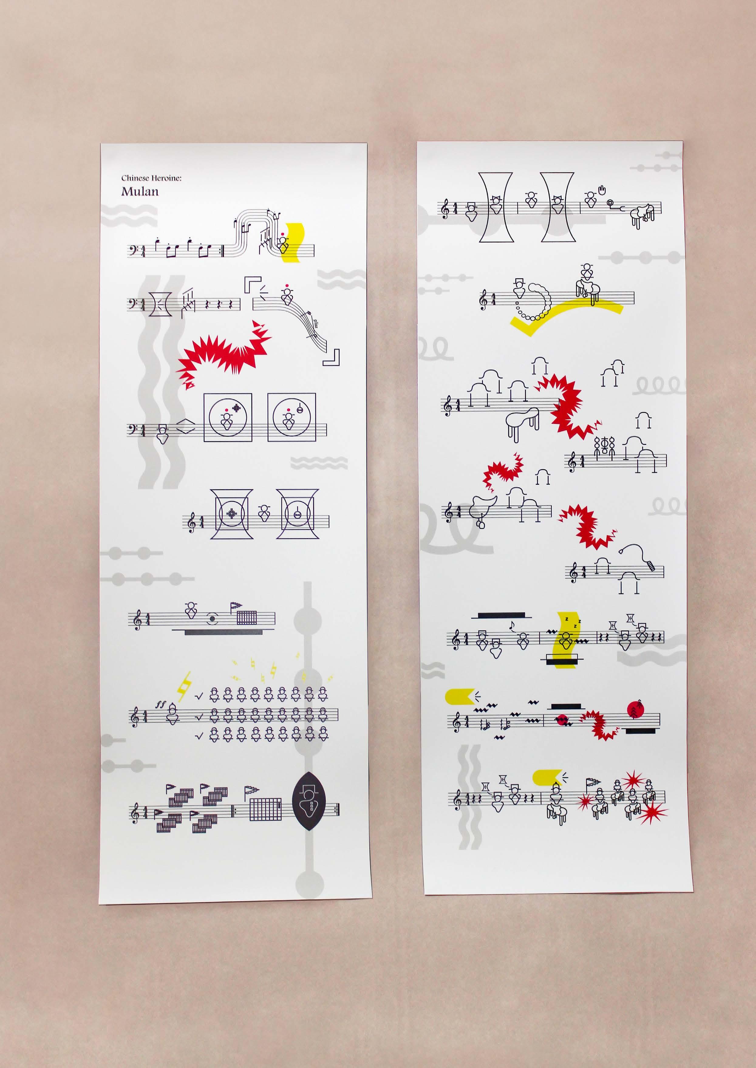
Create a set of visual language to interprete a Chinese folk tale.
Background
Mulan is a Chinese Heroine. Her story was written into a poem and as the lyric of a well-known Chinese folk songs as well.
Concept
As Mulan is a famous Chinese story that most of Taiwanese had read it before, I decide to design a constructed language based on visual forms, compile a small dictionary of the language to narrate the story of Mulan again. Mulan poem contains seven paragraphs. These story posters contain the first to the third paragraph.
Category Side Project, Experiment Size 210 x 594mm

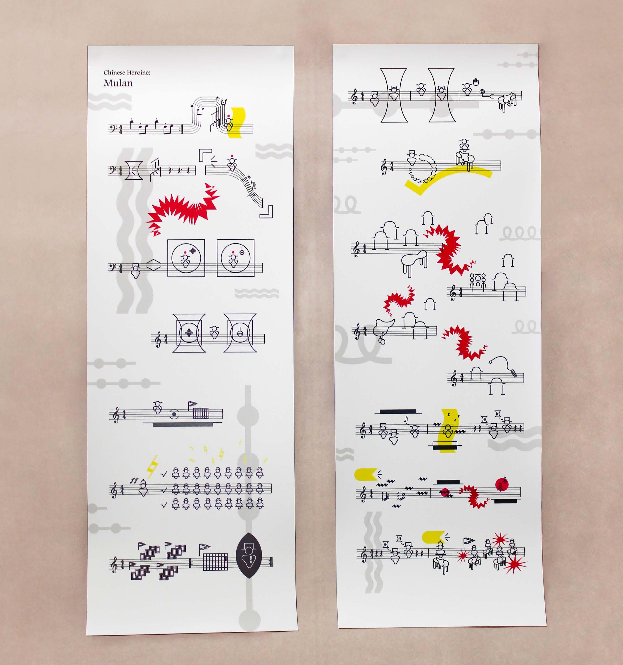
The dictionary is a book to explain the meaning of words and phrases to the readers. To read the story, readers need to utilize this dictionary.
[N]
livestocks
hourses
humans
/Gender/ female
/By Seniority/ oldest middle youngest
/By Seniority/ father mother older brother younger sister(Mulan)
/By Occupation/ soilder
/By Militar y Rank/ general brigadier
/By Militar y Rank/ general brigadier
[N] OTHERS
[ADJ/ ADV] only not/no what militar y instead willing hear ask think concern read review buy sleep have/has say farewell [V]
textile machine voice/sound enlistment paper name building(market)
saddle briddle
whip river mountain
[CONJ /PREP/IDENTIFIER] Dictionary
go [V]
[N/ONOMATOPOEIA] but along third person pronun
[N/ADJ/ PREP/Time] morning evening night past present future since whoop clip-clop
[ADJ / Music Symbols & Terms]
third peron-female (treble clef )
third peron-male (bass clef ) silent (quar ter rest )
longer silent (dotted quar ter rest )
high volume (for te)
higher volume (for tissimo)
sigh(gliss)
repeat/again(repeat sign)
gurgle(Arpeggio)
I corporates the musical notation to implies that this folk tale can be performed and sung as well. Furthermore, it is easier for the audience to understand the story because some of the music notes and symbols are common.
Goal
Create a digital poster that comprises a series of visual expesriments which conceptualise different kinds of music.
Genre Rock
Subgenre
(2 visual experiments per subgenre)
• Soft Rock
• Psychedelic Rock
• Heavy Rock
• Experimental Rock
Category University Project, Experiment
Size Single experiment: 210 x210mm
Square Poster: 420 x420mm

Psychedelic Rock Keywords
• in between reality and illusion
• imaginative
• listless
• vibrant colors
Soft Rock Keywords
• emotion(sweet, struggle)
• romantic
• soft
• symbolic stuff
Heavy Rock Keywords
• atmosphere(powerful, contagious)
• light
• smoke surrounded
• unique guitar
Experimental Rock Keywords
• experiment
• unconventional
• special notation
• spatial sense
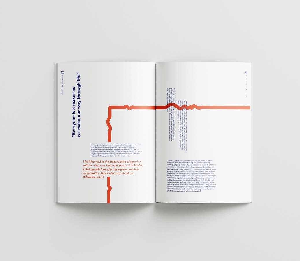
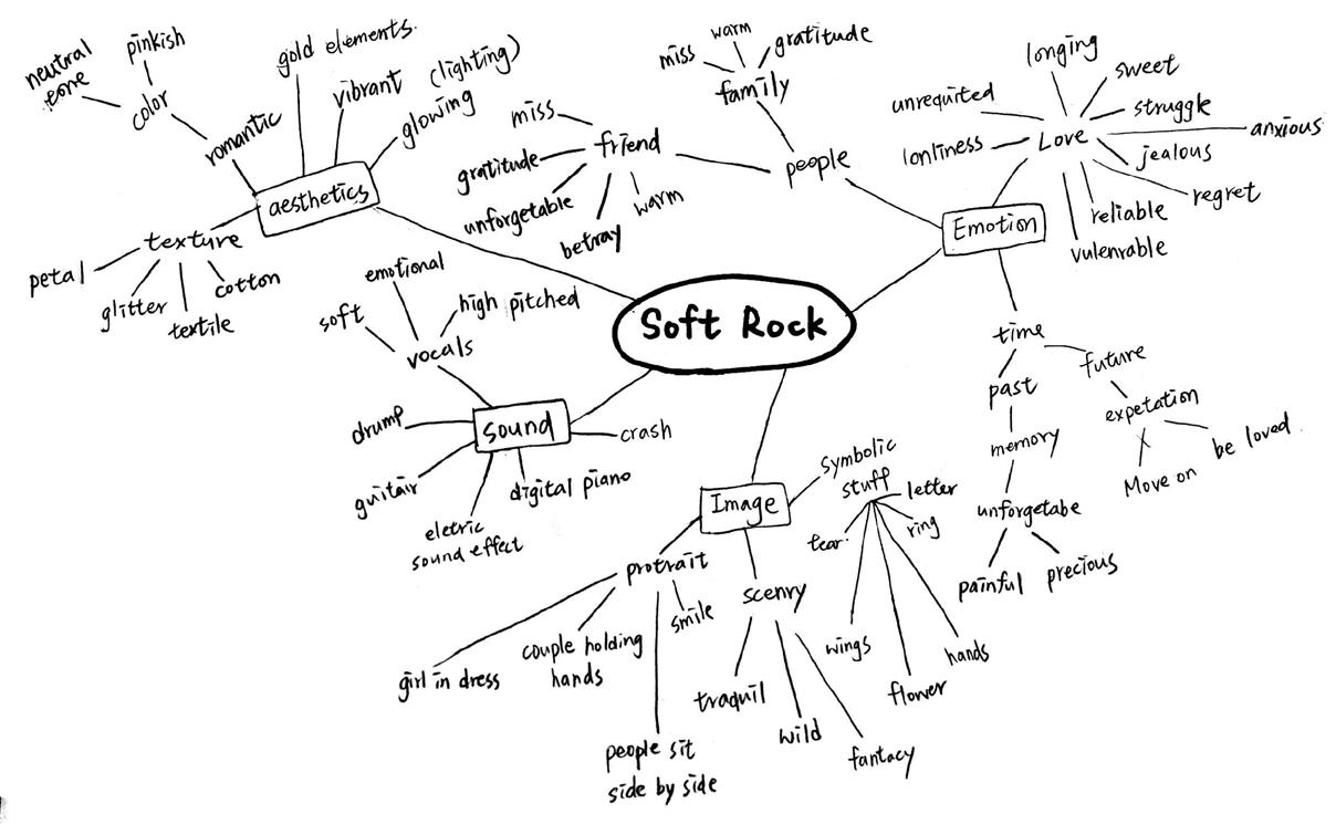
The charm of soft rock is that its lyrics well integrated with the tender melody so that it becomes a touch way for people to express their feeling in a relationship.
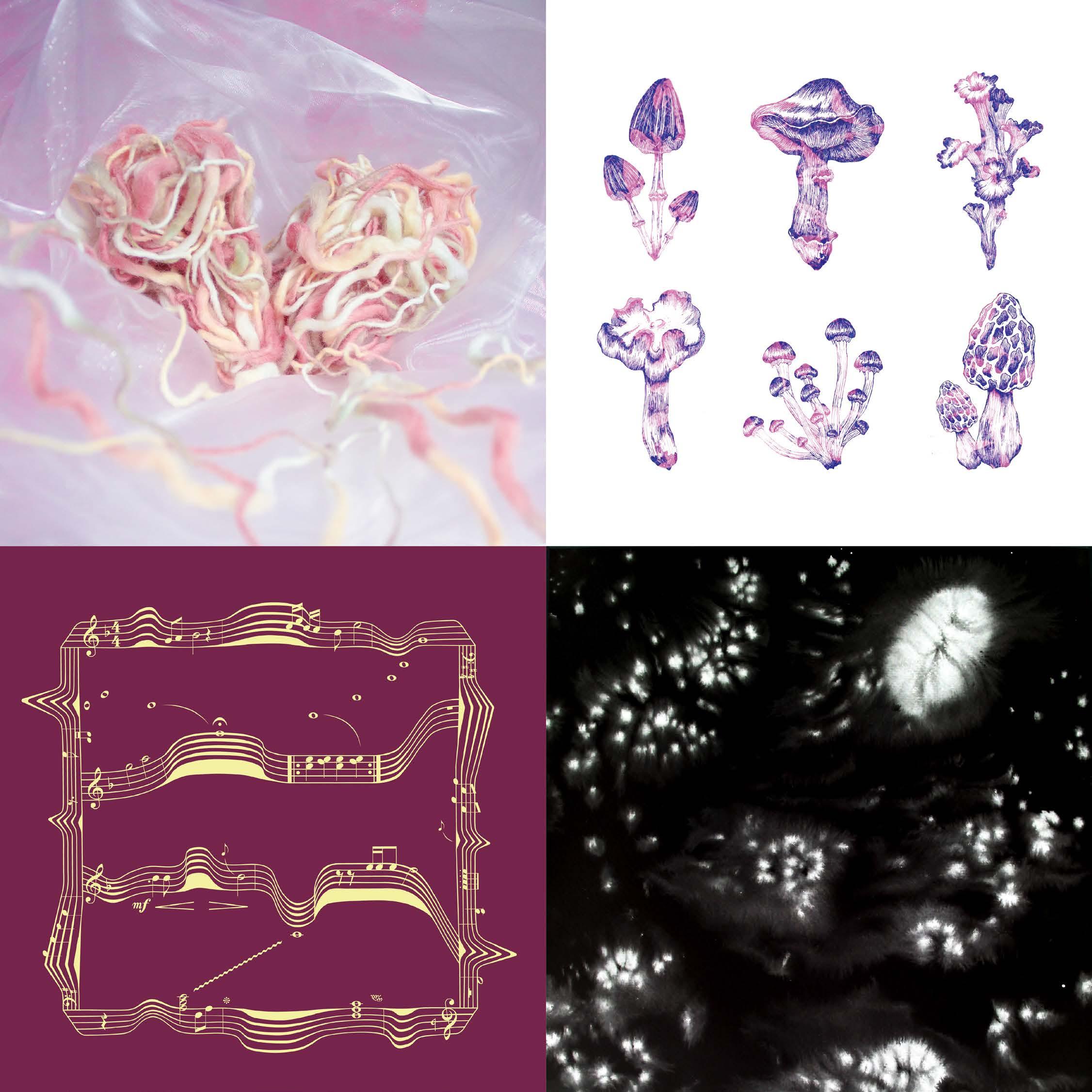
This experiment focuses on the sweet aspect of soft rock. The multi colored yarn presents varied wonderful feelings in love and has been shaped into a heart as a symbol of love.
The white tulle is added to express the sense of safety and dreamy atmosphere in a relationship. It is subtle and vague but well corporate with the yarn. The pinkish color scheme is chosen to create a lovely vibe of sweetness and integrate the elements cohesively.
The concept of this experiment is the coexistence of happiness and sadness in a romantic relationship. While falling in love with someone, is not all about happiness. There are sadness, depression and struggle.
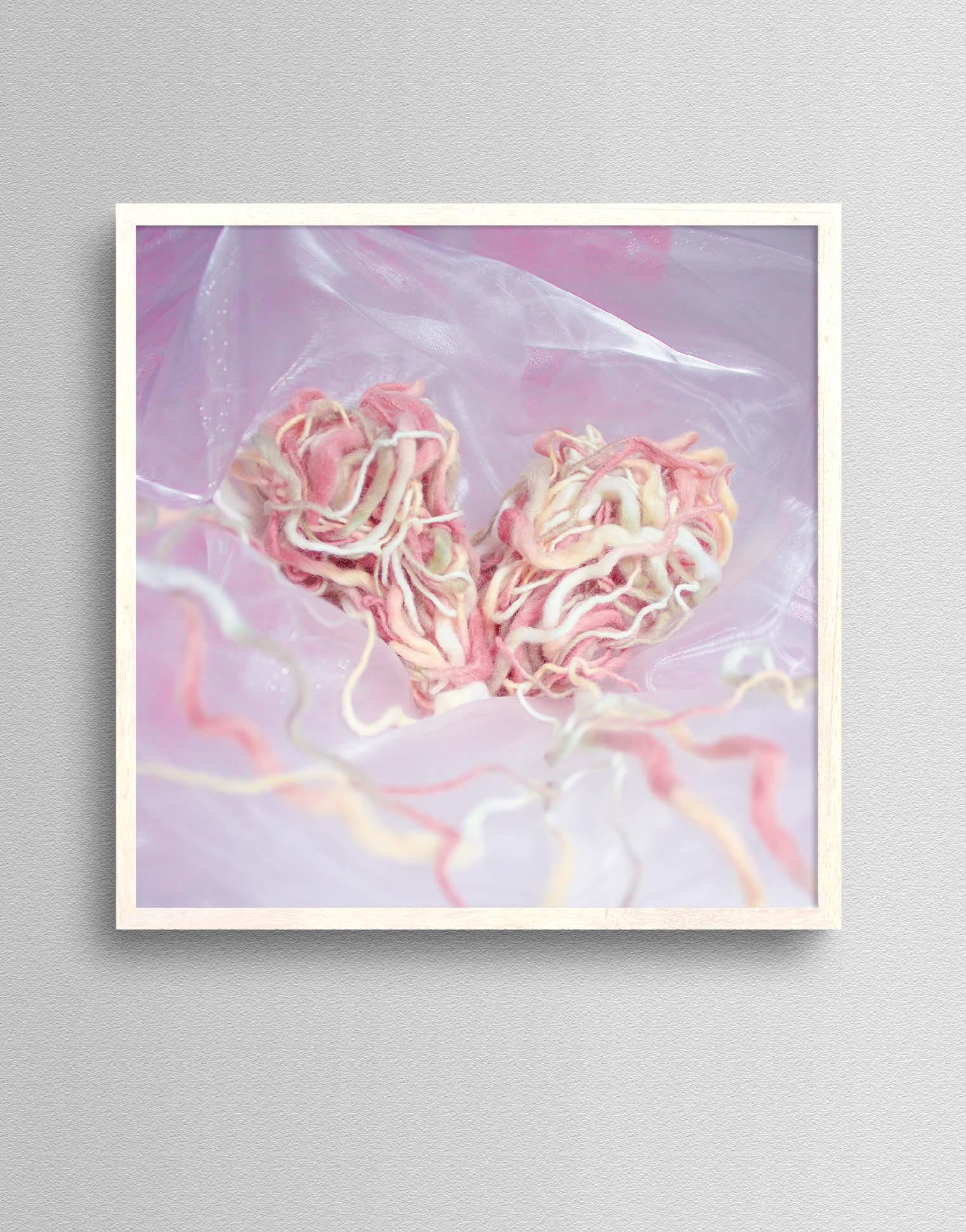
This experiment explores the photography toning technique to convey the mingled emotions in love. I utilized the metaphor as a framing device for the concept. The ripe fruit was viewed as the delight of love.
The thorns on the rind were viewed as the moody moment in a romantic relationship. That is why the saturation, vibrancy and lightness of the photography had been decreased. Besides, adding the tinge greyish blue tone to the image helps to reflect a bit of melancholy.
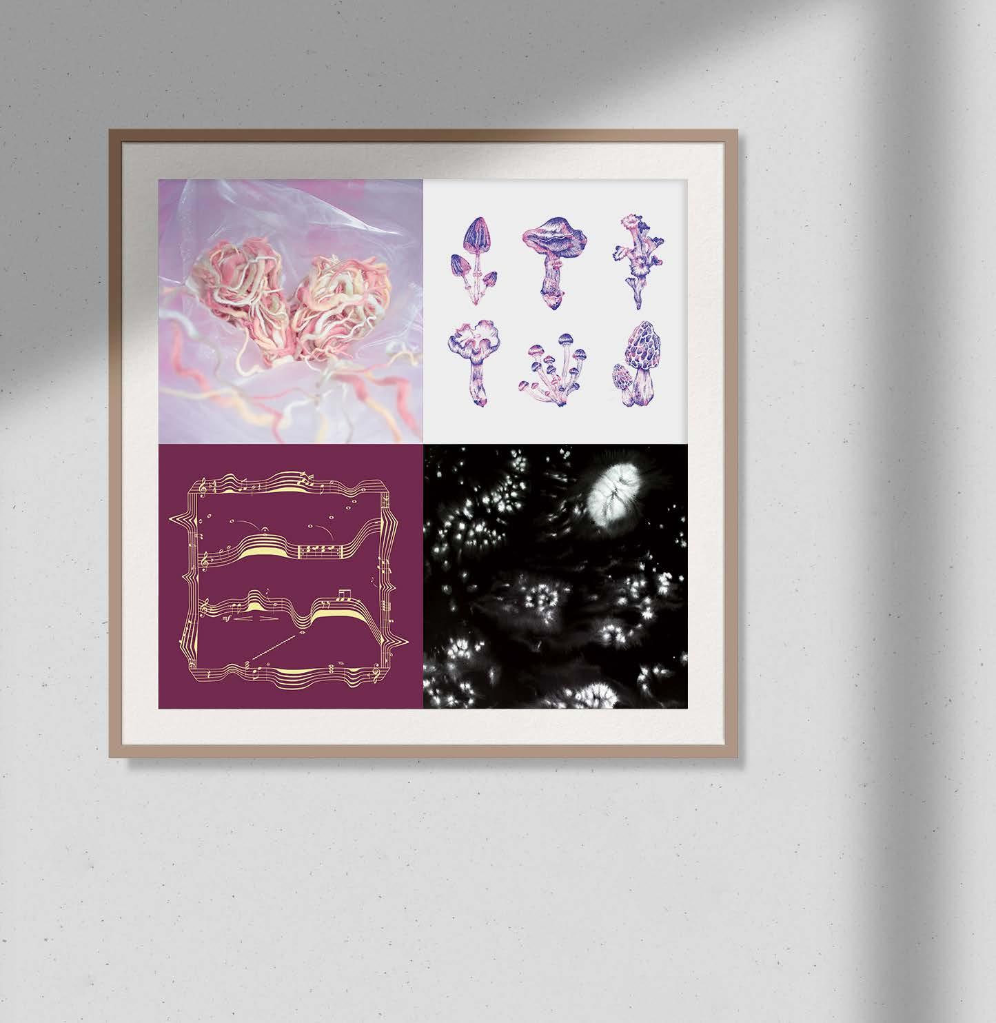
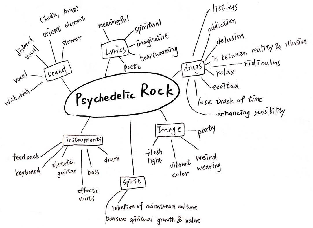
Psychedelic rock was influenced by the psychedelic culture. The spirit of this subgenre is rebelling the mainstream culture and pursue spiritual growth and value. People choose to use drugs to obtain the feeling that they never had, for instance, happiness, ease, and satisfaction.
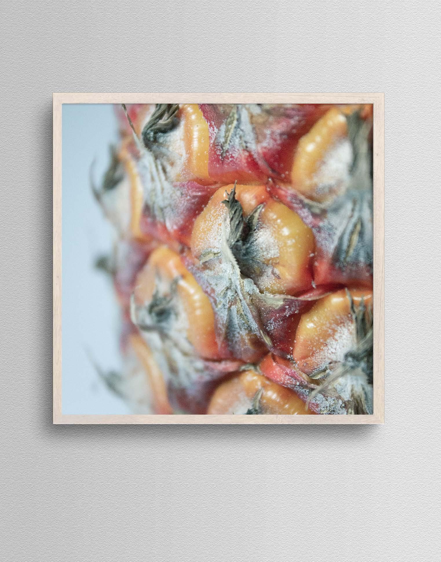
The experiment aims at communicating the feel after taking drugs. As the mushrooms give an impression of mystery and fantasy, I drew them with the needle drawing pen as the main element of the cover.
The overlapped pattern on the mushrooms not only gives depth to them but express the hallucinogenic feeling of this subgenre. White space allows the viewers to concentrate on the mushrooms themselves without any distraction.
This experiment focuses on the sense of uncontrolled after using the drugs. People tend to be more relax and listless while taking the drug. They would jump into a state in between reality and illusion.
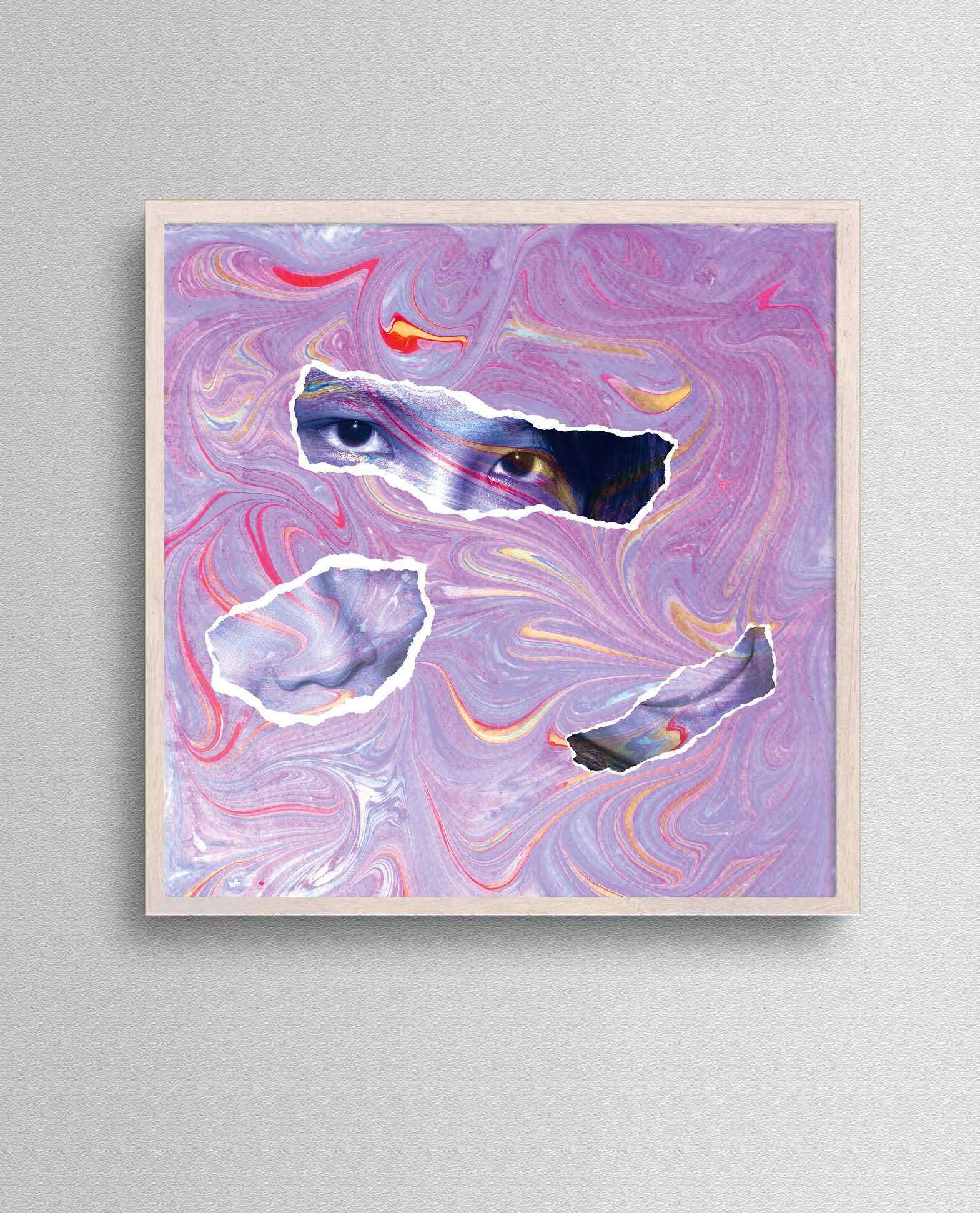
The torn paper effect is applied to the photographs to express the disorder after using drugs. I utilized a Turkish traditional painting skill called “Ebru” to create a fluid texture that makes it look like people lose control of themselves and fall into a whirlpool. I have changed the color of marble texture and decreased its saturation but kept the contrast and details of those smooth curves to convey the hallucinogenic feeling of psychedelic rock.
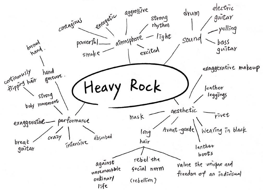
Heavy rock values the uniqueness and freedom of individual and you can find these characteristics from how they dress, for instance, male singers with long hair, exaggerated makeup and accessories. They rebel the social norms and express themselves out loud.
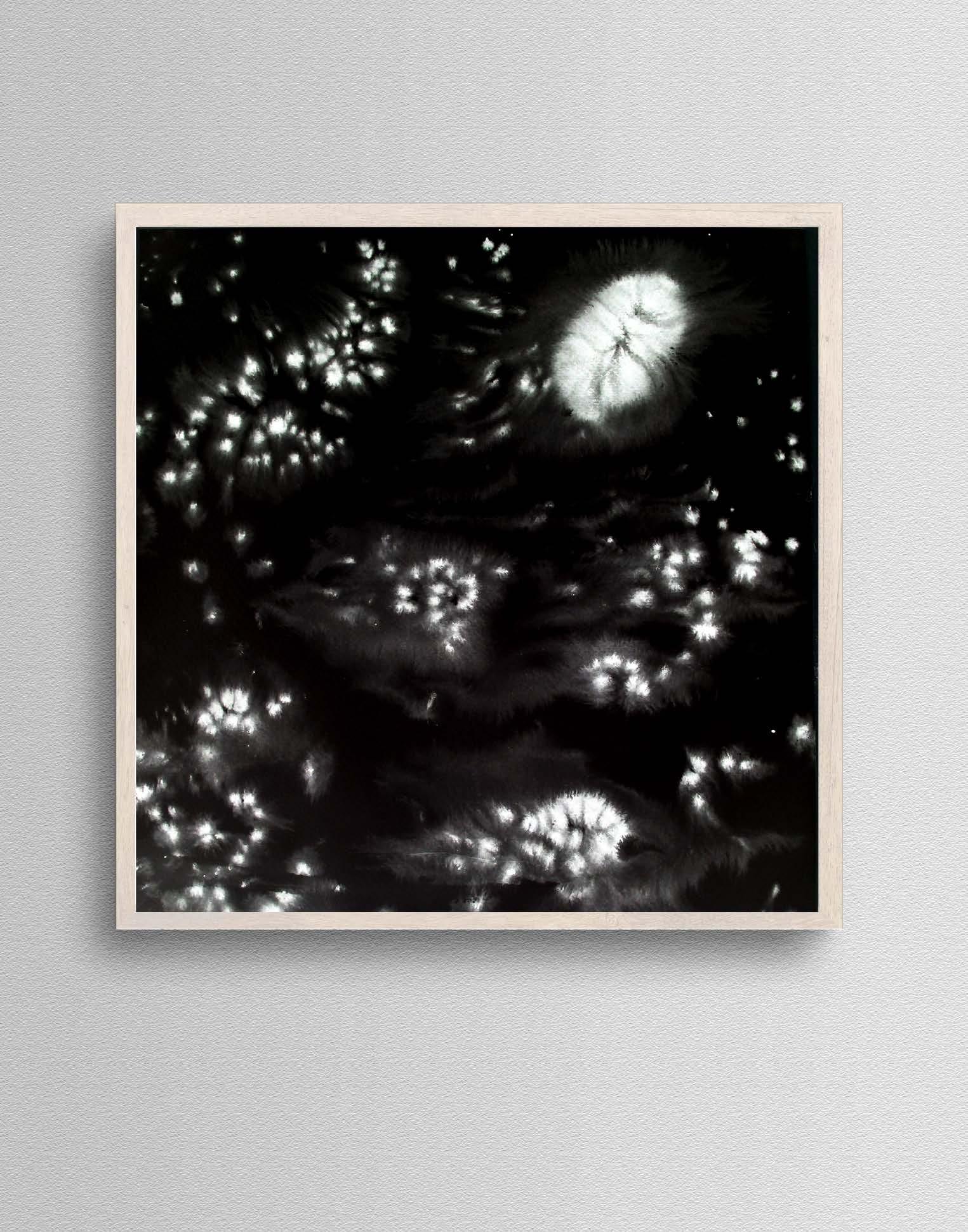
This experiment focuses on the powerful and contagious vibe of the performance style of heavy rock. Unexpectedly, I was drawn to heavy rock’s strong rhythm, energetic song composition and the atmosphere of the stage. Therefore, I utilized the ink technique to capture the power of heavy rock and the manner of dazzling light on the stage.
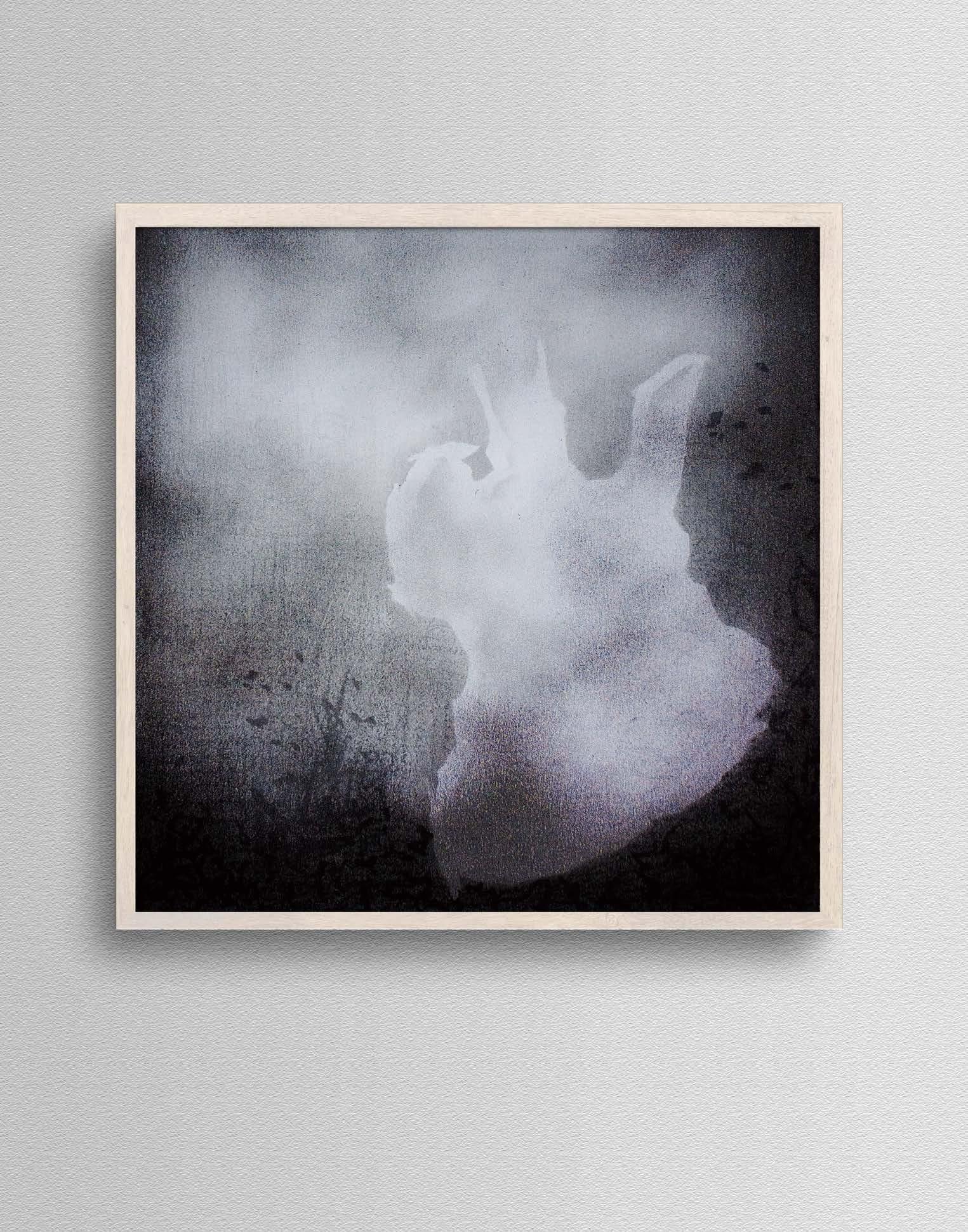
One of the features of heavy rock is that singers usually shake their guitar and body with the smoke surrounded while performing.
This experiment focuses on the performance of heavy rock on the stage. Therefore, smoke and guitar are chosen to be the representative visual elements of this subgenre.
To depict the smoke, I used oil pastels to create a hazy texture. A distinctive guitar was introduced to the right-hand side of this cover to capture the bold and unrestrained personality of heavy rock. The irregular outline of the guitar is created by the paper tape and its unique style represents how much heavy rock values the uniqueness of an individual. I manipulated the blending mode of the layers in photoshop to create an immersive and contagious effect that fit the concept.
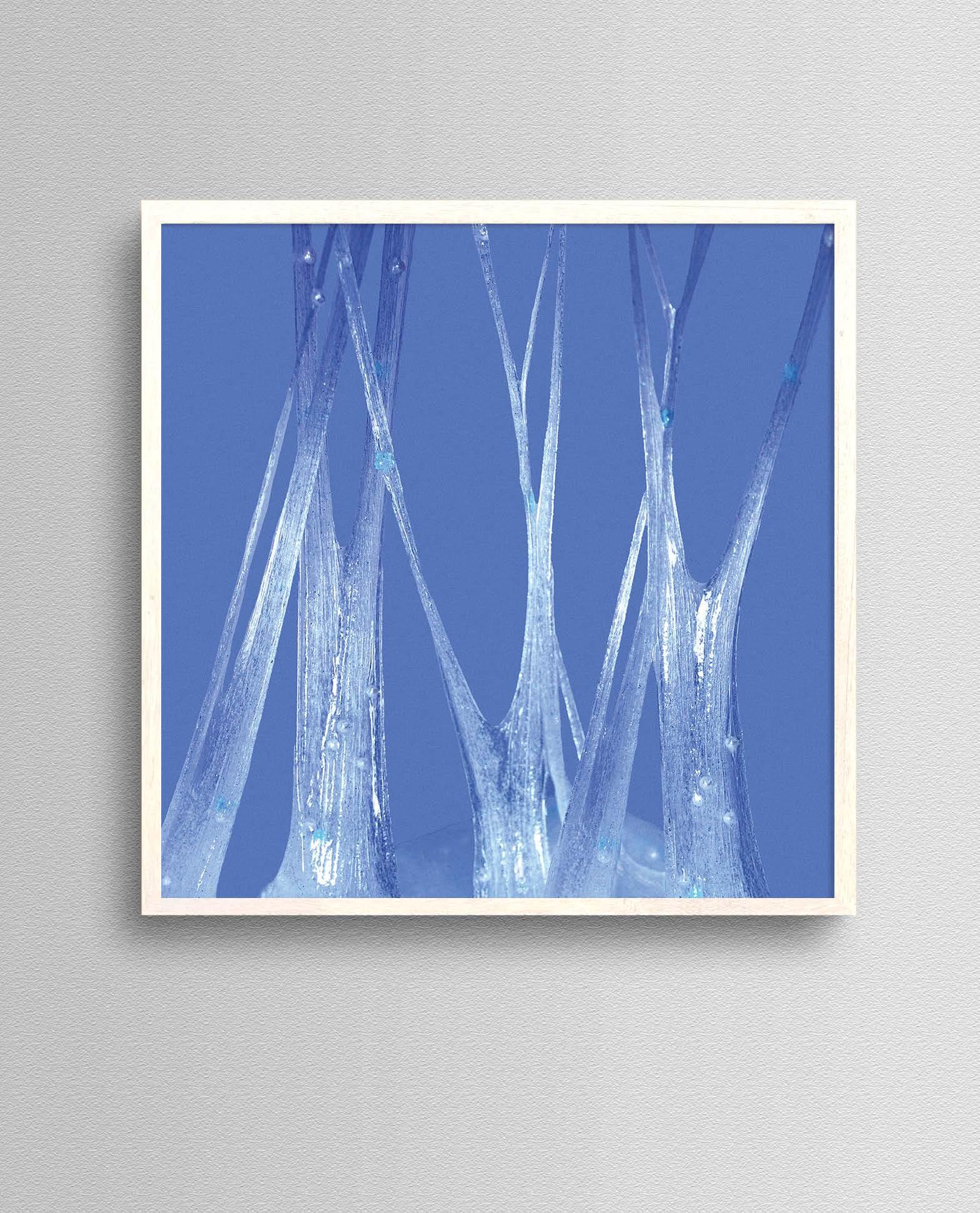
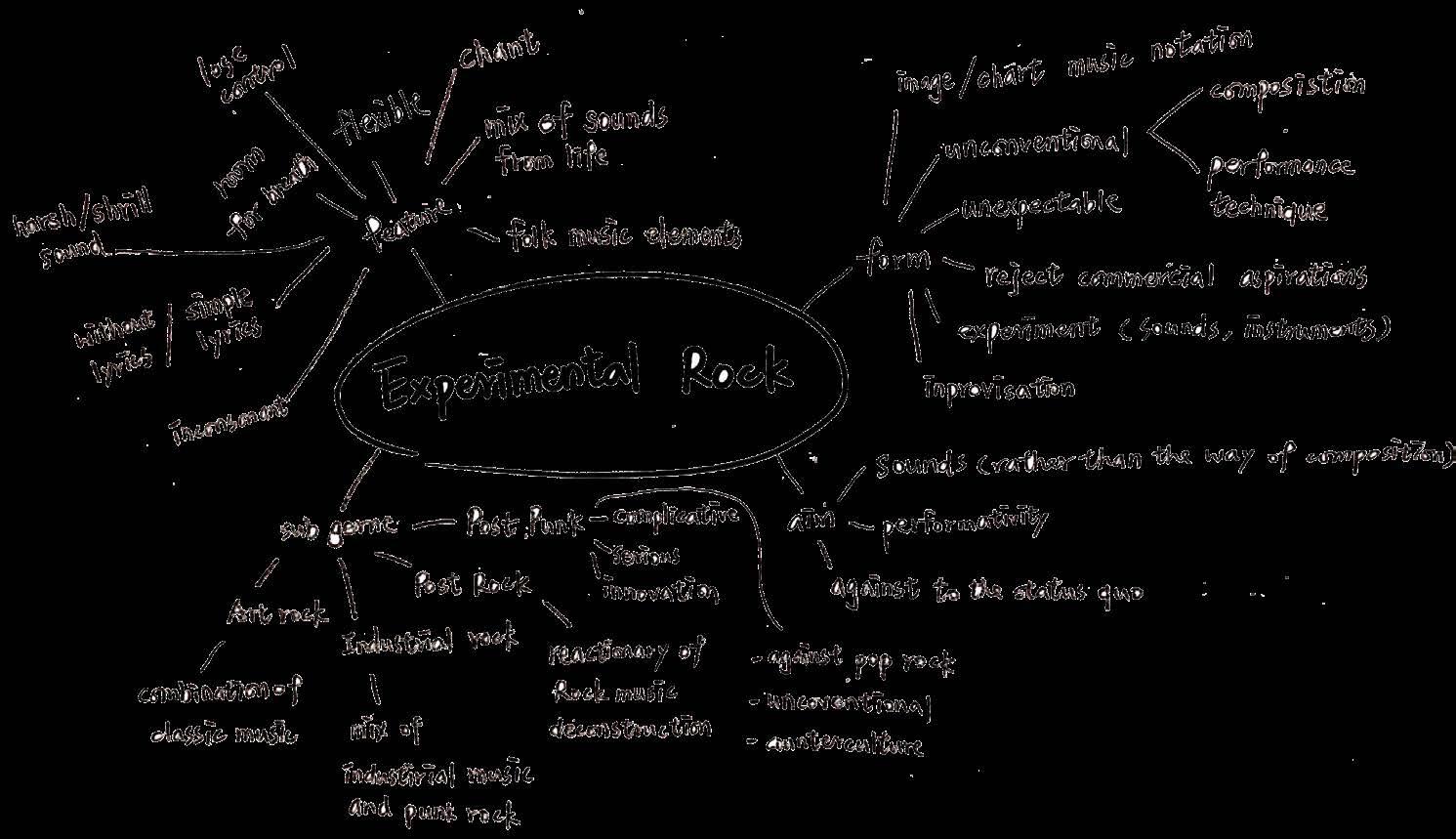
Experimental rock pushes the boundaries of conventional composition and performance techniques. The form of lyrics is simple, able to chant or even without lyrics and that is the reason why the music of this subgenre gives room for breath. Therefore, this cover focuses on the flexibility and sense of space of the experimental rock.
By utilizing the nature of the slime, I took photos of it and created an ethereal space.The slime looks like the crystal clear icicles after been adjusted in photoshop. The purple-blue tone color palette is chosen to expresses a sense of tranquillity. Furthermore, the grain is added to give it a film-like texture. It looks like the stillness and tranquillity of this icicle space is preserved in photography.
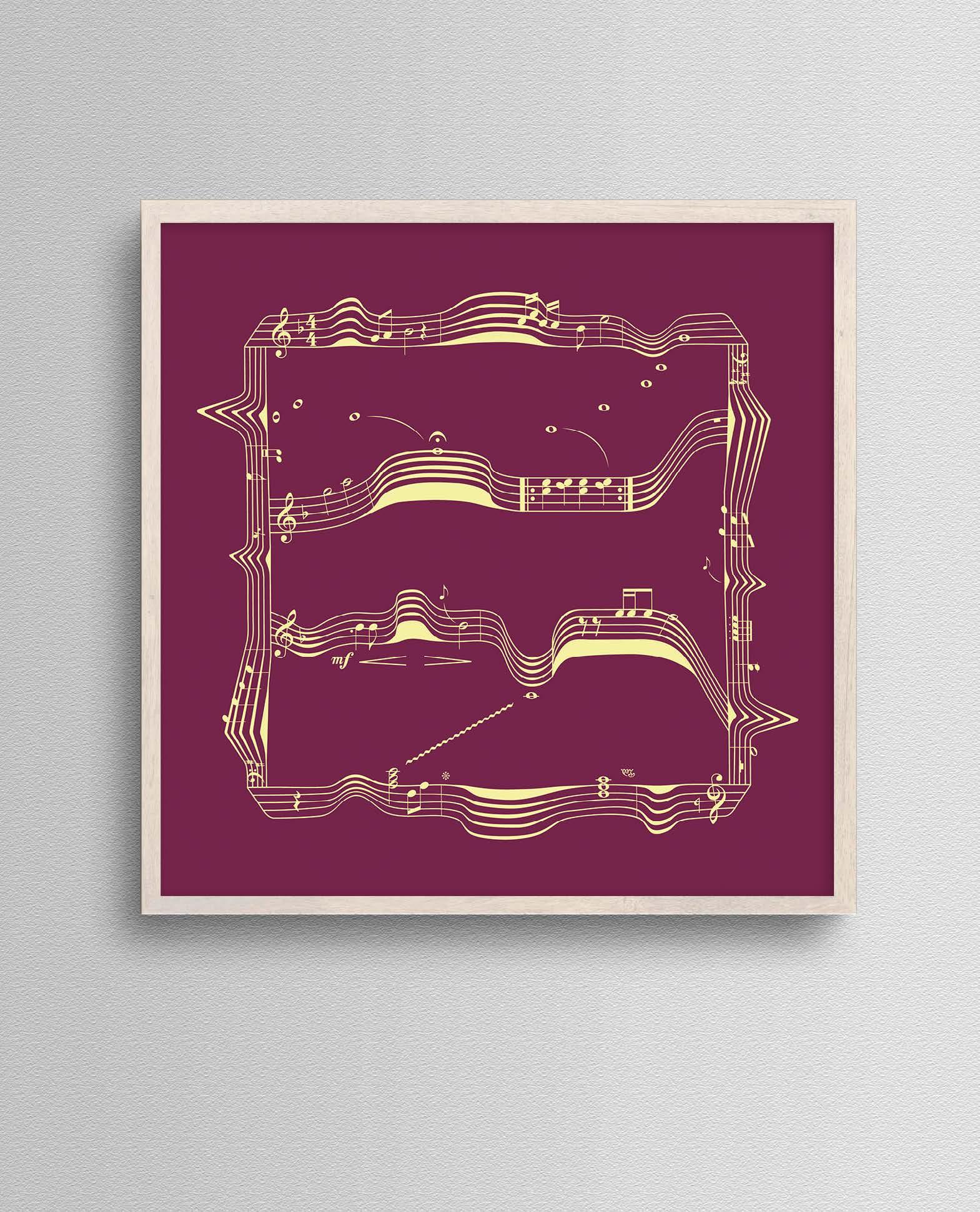
This experiment is focusing on the artistic notation of experimental rock. The singers and composers of this subgenre are pursuing an unconventional composition and performance technique. With the spirit of experimental rock, I played with staff and used it to create a dimensional structure in illustrator.
The wavy lines and dynamic notes push the boundaries of the conventional rules of notation. This graphic illustration is looking at drawing viewers’ attention to the unique and expressive notation thus the chosen color palette is strong yet simple. This experiment well communicates the spirit of experimental rock that is be open to any possibility.
Goal
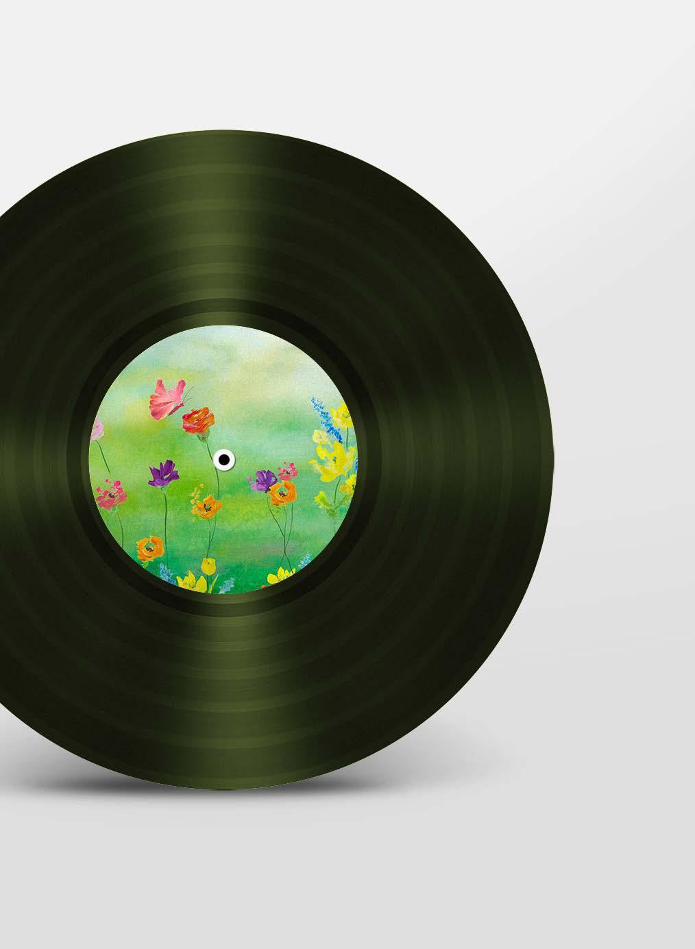
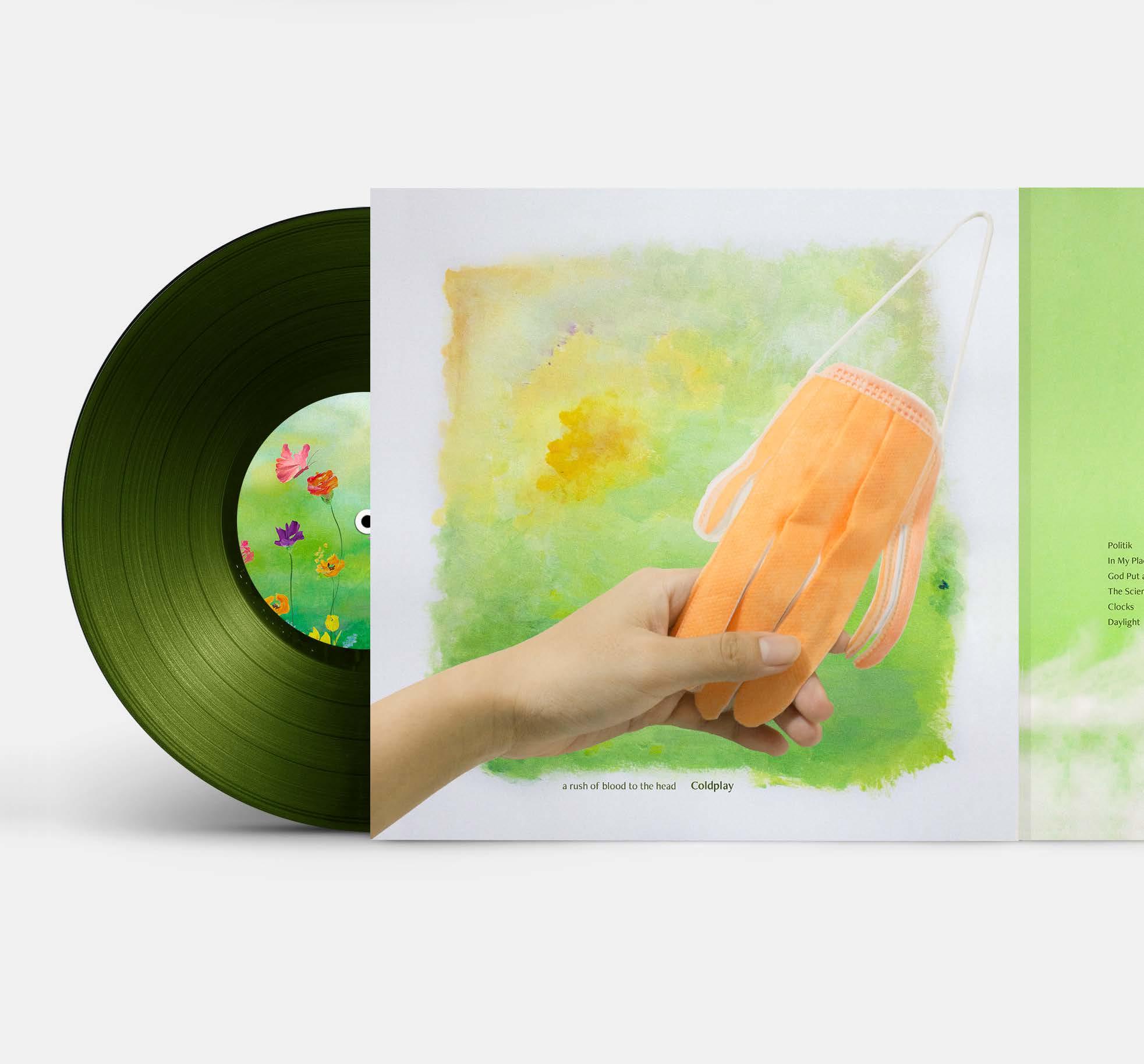
Apply advanced image-making techniques and conceptual knowledge to redesign the album package which articulates the artist’s vision.
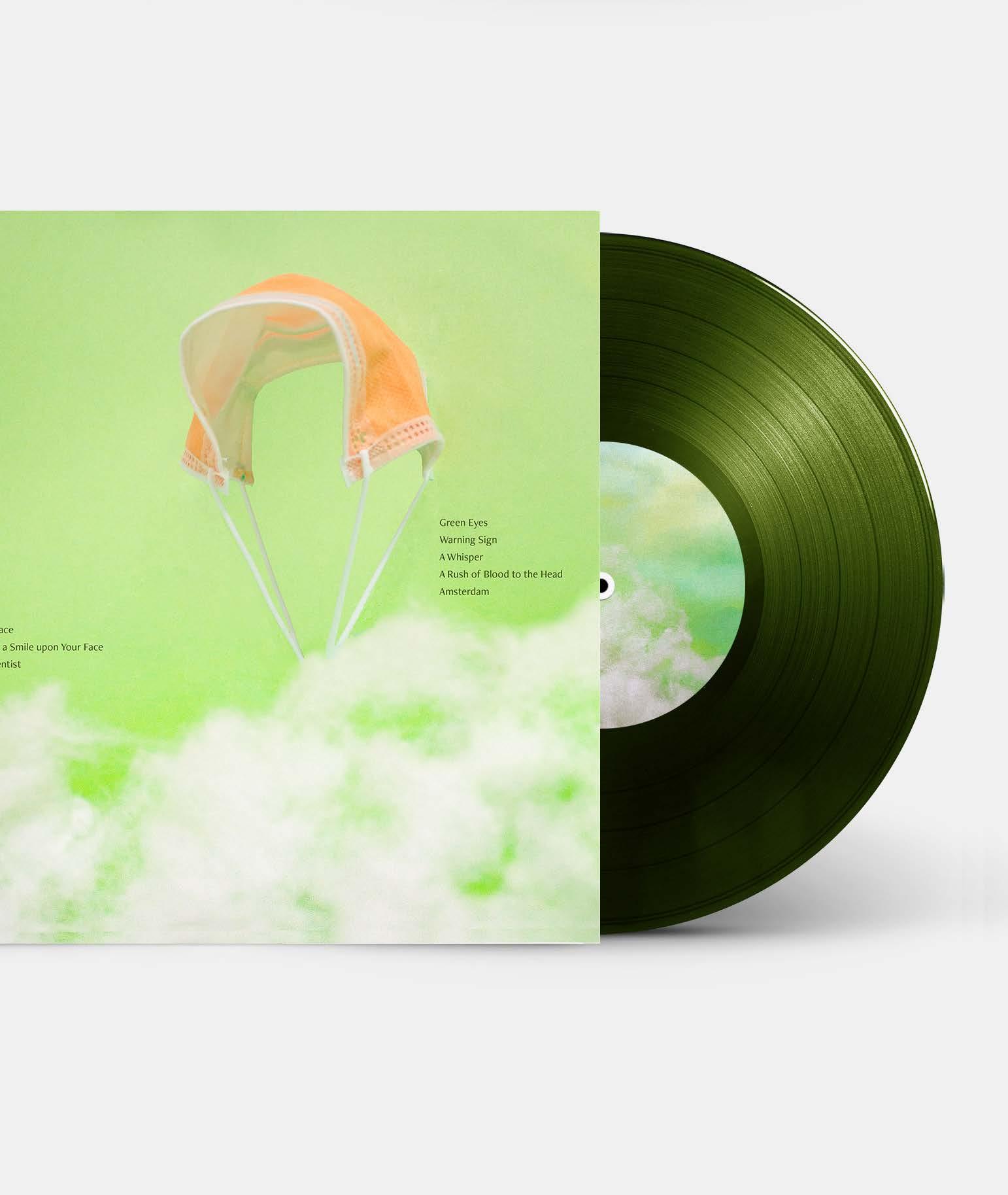
Album
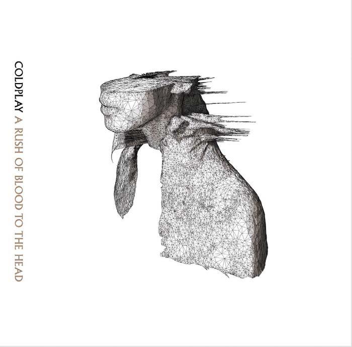
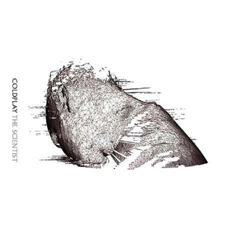
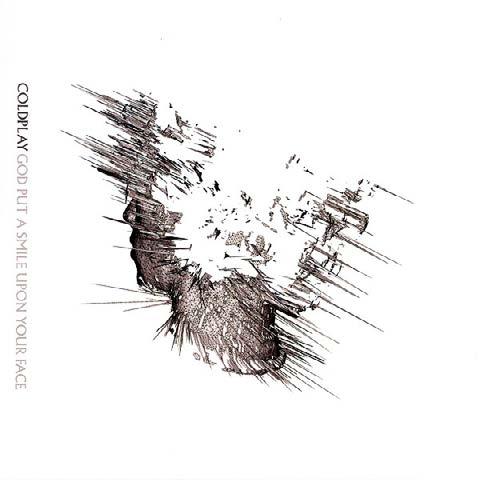
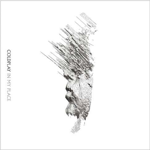
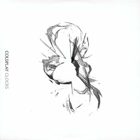
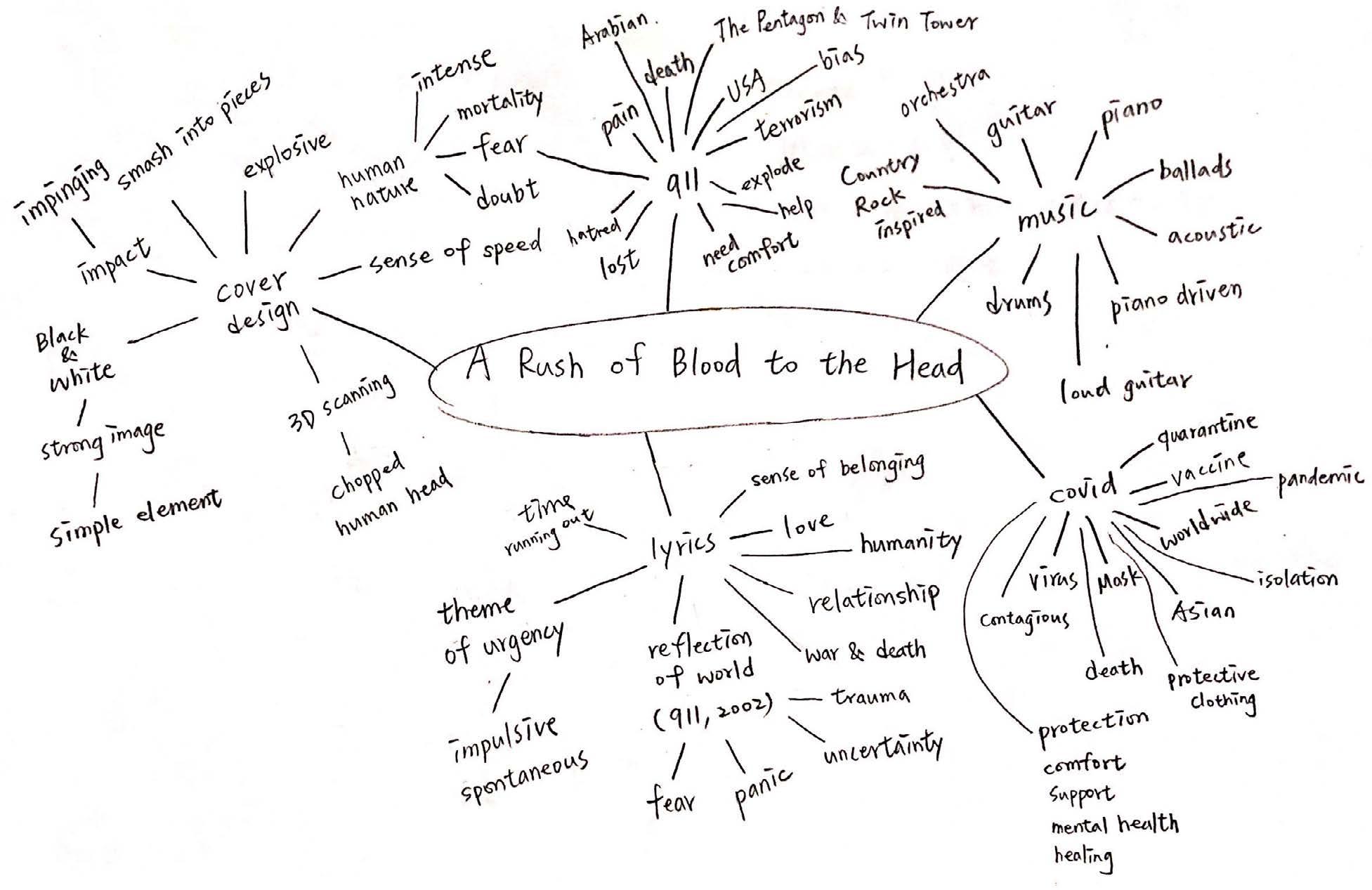
A Rush of Blood to the Head(2002)
Artist Coldplay
Concept: R
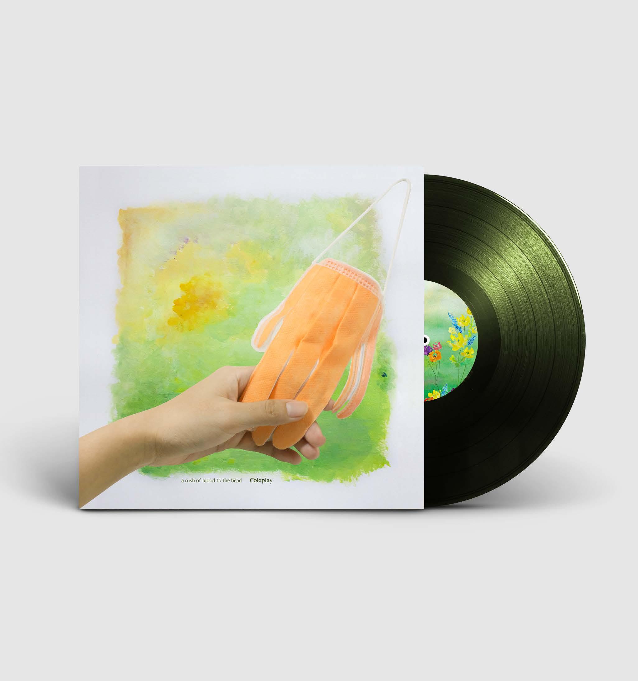
The album was released one year after the September 11th terrorist attacks. Coldplay had shown support and provided comfort to people through their music.
Nearly twenty years later, people are suffering from a global crisis— Corona virus. At the moment, I think Coldplay will remain the same idea which is conveying support and comfort to people as well. Therefore, with the time background, the redesign of this album aims to bring hope to the audience.
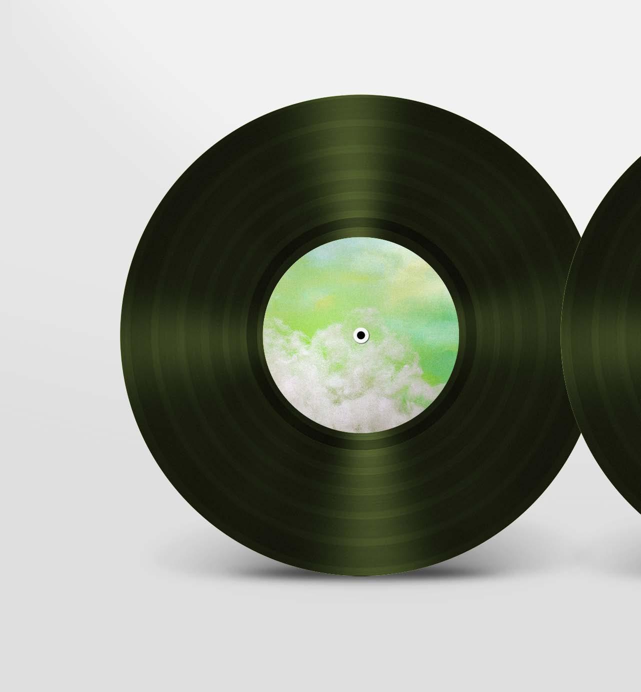
Category University Project , Redesign Size 315 x 315mm gate-fold sleeve

• Second album after the big success of the first album of Coldplay
• Received three Grammy Awards
• Released at a year after 911 attacks
• Included songs about 911 attacks
Intention?
• Expressing they care about the society and people’s feeling
• Caring about humanity
• Connecting people through the music
Message?
• Bring comfort and support to the people who felt hurt
• Caring about people and society
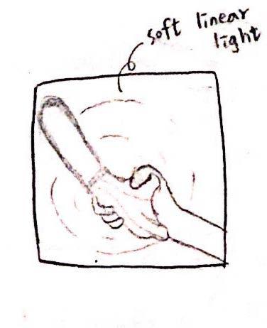
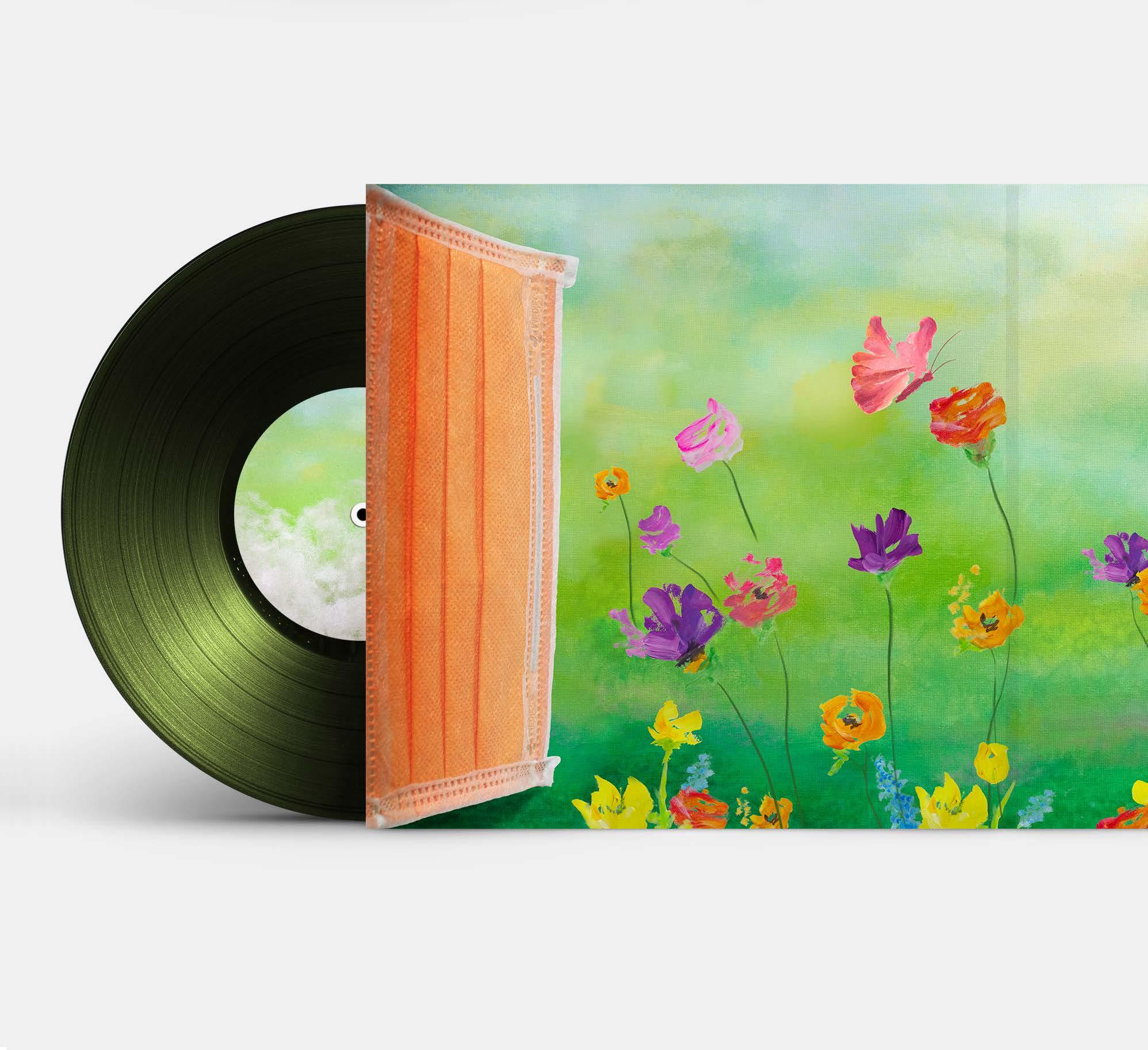
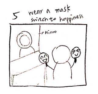
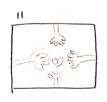
As a helper, the mask hand reaches out to people during the pandemic. People were pulled out of the coronavirous swamp.
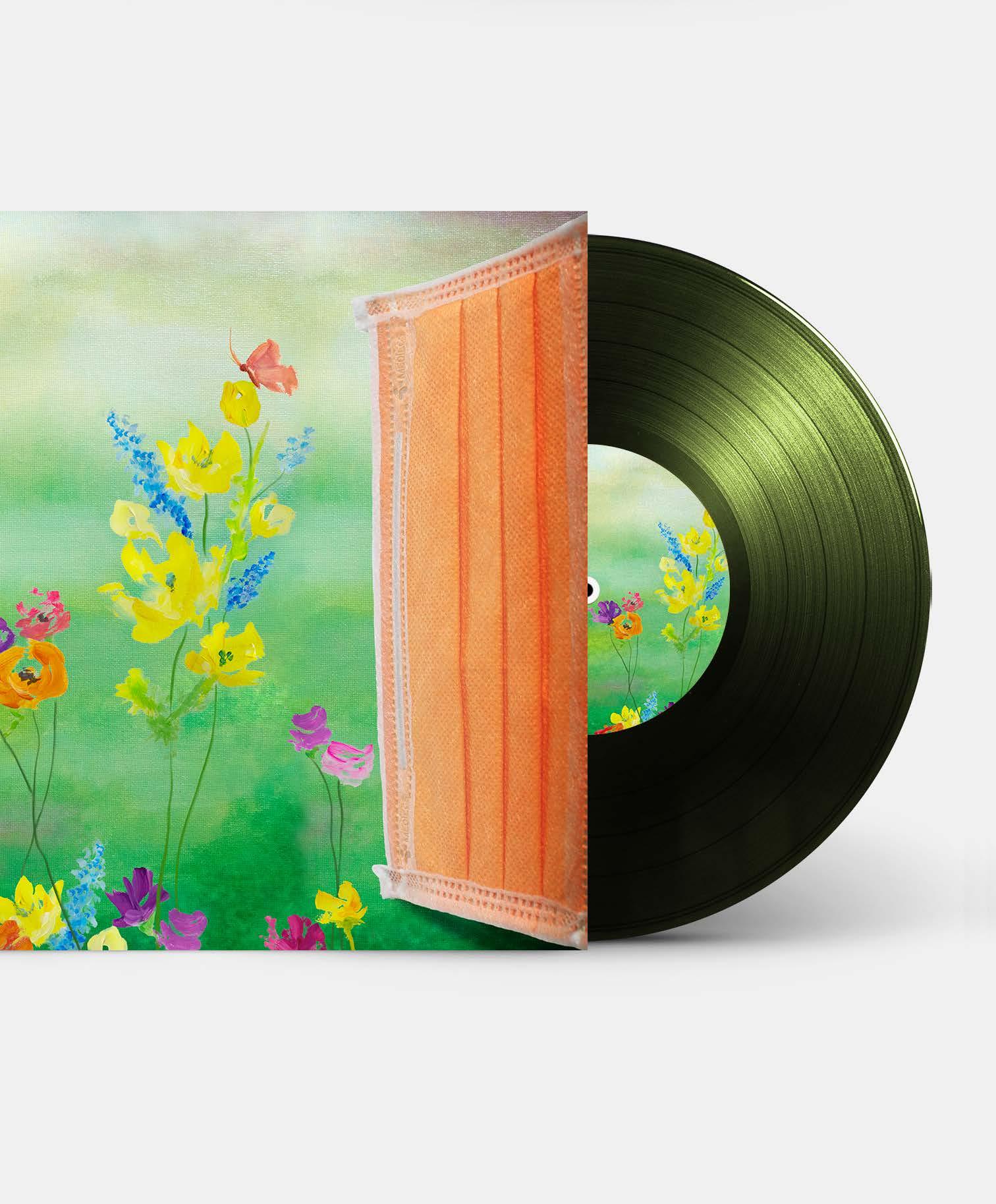
Inner gatefold
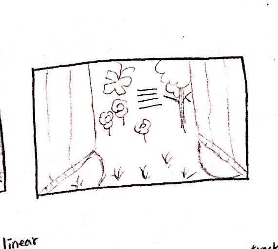
Behind the mask doors, a beautiful and luxuriant scene is waiting people who are suffered, feel hurt and need comfort.
Back cover
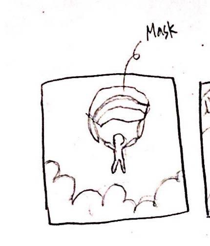
Eventually, the mask parachute takes people to a safe place where people can relax.
Front and Back Cover