

MAX
Versatile visual designer with over 8 years of experience across 12 industries. Proven record in leading creative projects and having collaborated with 50+ global brands. Skilled in Adobe Creative Suite and AI tools to deliver visually impactful designs that boost brand awareness and audience engagement. Focused on visual consistency and successfully managed large-scale international advertising shoots, demonstrating adaptability and cross-cultural collaboration skills.


CREATIVE SOLUTIONS FOR PG PRO GAME
PG Pro Game is a global entertainment platform offering a diverse range of gaming experiences. It supports multiple languages and currencies, serving players in Portuguese-speaking regions and other South American markets. The platform focuses on internationalization and innovation, aiming to provide players with high-quality gaming services and a seamless user experience.


PROJECT:


OBJECTIVE:

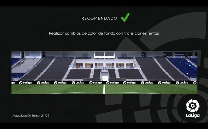
ICONS & BANNERS REDESIGN BEFORE/AFTER


ANALYSIS OF ISSUES:


Clearly differentiate between modules using color grading


The original design lacked a structured color scheme, with inconsistent and outdated iconography, as well as irregular typography and layout. The brand colors were not effectively utilized, resulting in a cluttered visual presentation that failed to highlight the brand's professionalism. These issues could lead to user attrition, a decline in brand value, and even a reduction in the company's standing and reputation in the industry.


BUSINESS STRATEGIES & GOAL:
By comprehensively optimizing and unifying colors and image styles, along with standardizing typography and layout design, the new design enhances brand recognition and aligns with the brand image. This not only improves user experience but also increases the brand's professionalism and credibility, further elevating the company's brand value and market competitiveness.


AI TOOLS FOR CREATIVE SOLUTIONS
Incorporating AI tools like Midjourney into my creative workflow enables me to explore diverse design possibilities and elevate visual storytelling. The iterative process of refining and adapting AI-generated materials ensures alignment with brand identity and high-quality standards. This seamless blend of technology and expertise modernizes visuals, adds creative depth, and enhances the uniqueness of each final output.


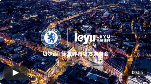
Throughout my career, I have collaborated with over 40 international brands, creating a wide range of visually captivating designs, including visual posters, social media promotion planning, video shoot planning, brand launch events, TVCs, and dynamic LED advertising at sports venues, successfully enhancing the brands' international image. By employing high-quality design techniques and international visual strategies, I crafted works with strong visual impact and brand recognition. I have completed over 50 medium to large-scale design projects, reaching tens of millions of viewers globally. These designs significantly increased brand exposure and recognition. They not only captured the attention of audiences worldwide but also demonstrated my professional skills and innovative thinking in the field of visual design. These collaborative cases are a testament to my ability to elevate brand value and enhance market influence.
ENHANCE BRAND IMAGE THROUGH STRATEGIC VISUAL DESIGN
In the market environment of collaborating with international brands, various visual projects serve as a medium for brand marketing through social media and regular match releases. By comparing the work of other designers with my optimized versions, my growth in utilizing high-quality design techniques to present atmospherics and international visual strategies to enhance visual appeal, ensure brand consistency, and improve overall communication effectiveness is highlighted. These projects demonstrate my ability to elevate brand value and increase market influence through thoughtful and impactful design solutions.


REASONS FOR DIFFERENTIATED DESIGN
A lack of aesthetic appeal and attention to detail in design can damage a brand's image, reducing user preference for the brand. A poor external image can lead to insufficient credibility and a lack of professionalism. Through professional design, a brand can regain control of its tone, transforming the audience's perception into a clearly understood and perceived brand image.

Other Designers' Works
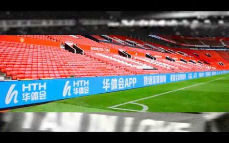


Dynamic LED advertising at sports venues
MULTI-BRAND VISUAL LEADER AND POST-PRODUCTION


POST-PRODUCTION
In the video production projects involving multiple international brands, the role of Visual Leader and Post-Production aims to maintain the quality of visual assets and enhance market influence through high-quality visual presentations. By integrating various resources and strategies, I ensure brand consistency and visual appeal in each project, thereby improving overall communication effectiveness and brand value. These projects not only demonstrate my professional skills in post-production but also highlight my leadership in project management and multi-brand collaboration, effectively helping brands achieve greater influence and recognition in the market. Achieved 2.1 million views on a single video, a 40% increase in brand awareness within 3 months, 80% traffic growth, a 15% ad conversion rate, and 30% above-industry benchmarks for sports and entertainment market engagement.


PROJECT OBJECTIVES:
1. Maintain Visual Asset Quality: Supervise and ensure the visual effects of each project meet the highest standards, enhancing the overall brand image.
2. Enhance Market Influence: Increase brand exposure and influence in the market through meticulously crafted visual content.
These projects showcase how I leverage high-quality visual assets and strategic video production to enhance brand value, increase market share, and ensure brand consistency and professionalism in multi-brand collaborations.
REDESIGN 50+ PACKAGING FOR FMCG
Pucci, a brand under MYBACO Group, has always been a leader in bakery products. By entering the market early, offering high-quality products at reasonable prices, the brand has successfully garnered consumer support and favor, which was key to its early success. However, to continue to distance itself from competing brands and without adjusting raw material and cost prices, a marketing strategy analysis and evaluation were conducted. A deep understanding of the cultural differences in the Myanmar market was also undertaken to optimize visual quality and modular design, thereby finding suitable entry points. Ultimately, this strategy successfully increased monthly sales by 5,000 to 7,000 units, achieving a monthly growth rate of 21.7%, helping Pucci maintain its leading position in the Myanmar bakery market.


SWOT ANALYSIS EVALUATION
Original Packaging
• A strong reputation
• Stable prices
• Many channels
• High brand awareness
• Lack of systematic modular design
• No brand image value established
• There is no difference between the packaging and other brands
• Wide range of ethnic groups
• Burmese potential preferences
• Alignment with national development trends
• Many competing products
• Price competition
• Increased environmental costs
VISUAL SETTING
(A) SMALL
‧Butter Cake Slice (260 x 160 mm │
‧Cake Pizza (260 x 150 mm│
‧Cream Pocket (260 x 150 mm│
‧Pucci Bean Cake (260 x 145 mm │
‧Strawberry Cream Pocket (260 x 150 │
‧Toy Cake (260 x 140 mm│
‧Smile Cake (260 x 130 mm│
‧Orange Swiss Roll (260 x 150 mm│
‧Coffee Swiss Roll (260 x 150 mm│
(B) LARGE
‧Cheese Custard Bread (420 x 310 mm│
‧Cheese Mayonnaise Bread (420 x 315 mm│
‧Chicken Floss Bread (380 x 295 mm│
‧Mini Cake (380 x 290 mm│
‧Carrot Bread (B) (400 x 390 mm│
(C) LONG
‧Baby Milk Bread (260 x 230 mm│
‧Chicken Roll Slice (230 x 210 mm│
‧Cream Donut (270 x 230 mm│
‧Muffin Cake (260 x 205 mm│
‧Onion Top Roll (260 x 210 mm│
‧Pillow Bread (270 x 230 mm│
‧Banana Cake (190 x 225 mm│
(D) MEDIUM
‧Banana Cake Slice (320 x 190 mm│
‧Carrot Bread (S) (395 x x 245 mm│
‧Custard Bun (320 x 180 mm│
‧Red Bean Bun (320 x 180 mm│
‧Coconut Bun (320 x 185 mm│
‧Mini Danish (320 x 180 mm│
‧Mix fruit Bread (320 x 215 mm│
‧Roissant (320 x 250 mm│
‧Raisin Roll (320 x 230 mm│
‧Oil Cake (320 x 250 mm
‧Special Pudding Bread (260 x 310 mm
Packages
Size Classification
Instructions
& BUR Product Name
1/2 Transparent Window


Based on a thorough analysis of the key points of weaknesses and opportunities, it was determined that the previous packaging design did not sufficiently stimulate consumer purchasing intent. Therefore, adjustments were made from this perspective. Although product sales were satisfactory, to further expand market share, it was necessary to rethink how to enhance brand competitiveness. After market assessment and discussions with senior management, it was understood that Myanmar consumers prefer designs that are "obvious" and have "strong visual effects." As a result, the decision was made to move away from the previous packaging style of "different windows representing different products" and instead adopt a design approach based on "consistent windows" and "highlighting product features," thereby establishing visual consistency for the brand.
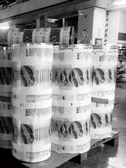
Carrying out the actual packaging and printing process, from the initial inspection of the color plate sent by the manufacturer to the printing supervision to confirm whether there is color cast or dispersion. The preliminary inspection needs to be particularly cautious. After the film printing is completed, the packaging machine test is carried out, and production and shipment are carried out after reconfirmation.
PRINTING PROCESS


White Swan, a four-star Western-style bakery and garden restaurant under the MYBACO Group, is located on the shores of Inle Lake in Yangon. Known for its high-end services, it offers a variety of Western cuisine, baked goods, and desserts. The restaurant plans to launch three ice cream flavors: rum raisin, mango, and chocolate, with the goal of expanding these products to the nationwide high-end market. The visual inspiration comes from the tasting experiences of various flavors, and the visual planning references Haagen-Dazs' design style.
KEY VISUAL


COMPREHENSIVE BRAND EXTENSION FOR FMCG
In this project, I focused on extending the Pucci brand across various offline channels and stores. By redesigning and enhancing the brand's visual identity, the aim was to create a cohesive and strong presence in the market. The work included designing signage, box trucks, posters, outdoor advertisements, uniforms, caps, branded pillows, outdoor canopies, billboards, social media content, directional signposts, stand designs, business cards, etc.


FMCG BAKERY OUTLETS


LOGO REDESIGN AND CIS CREATION FOR MYBACO
MYBACO Group, established in 1997, is a leader in Myanmar's food industry, an expert in bakery brands, and a pioneer in traditional Myanmar retail. With exceptional product quality and service, the company has become the leading manufacturer of bakery products in Myanmar. MYBACO upholds the philosophy of "everything for goodness" and is committed to giving back to society by promoting education, healthcare, and Buddhist faith, while also leading the development of Myanmar's future market.


MYBACO GROUP


RESEARCH AND ANALYSIS
AUXILIARY GRAPHICS
OVERALL VISUAL SYSTEM


Through the rebranding process, extensive data research and analysis were conducted to optimize and consolidate previously overlooked details. This included preliminary market research, brand insights, and internal information consolidation and clarification. The brand was redefined, and standard colors were researched and analyzed, resulting in the establishment of a comprehensive visual identity system for MYBACO.
AWARDWINNING WORKS


THE HAND OF KAVURUA, THE INHERITANCE OF TAKIARU
The 6th National Taiwan Aborigines Poster Contest, Excellent Work
Holy Shell festival is an ethnic group created by the La Aruwa people. According to the legend, the La Aluwa people and kavurua (dwarfs) lived together in the place Hlasunga and got along well. But one day, the ancestors of the La Aluwa tribe left Hlasunga. The dwarfs got very sad as they worshiped God Bei as their own god.
We have utilized black to represent the past. In the past, the hands of the dwarves passed on the Holy Beli to the people of La Aluwa, and the Holy Beri has twelve Bei Gods arched to express care and attachment to parting; the clothing totem on the La Aruwa tribe is seen as a symbol of La Aruwa.


Exhibition Experience
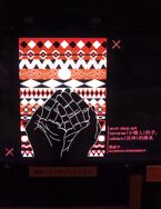
• Ethnology Museum Project Exhibition in Osaka, Japan "Taiwan Aboriginal People をめぐるイメージ", 2016
• Tokyo, Japan Poster Contest Theme Special Exhibition, 2017
• Special exhibition at University of Central Lancashire, Preston, UK, 2017
• East Asian Library, University of California, Berkeley, California, USA, 2018

FEEL OPEN
2016 Taiwan International Student Design Competition (TISDC), Finalist
People can feel.
In interactions, people inevitably perceive the exchange of information between one another.
am unsure what will be accepted, but I know this:
Only by opening our hearts and minds can we broaden our horizons, accept others, and embrace the future.

Total number of pieces: 14858 pieces, finalists: 431 pieces
Visual communication category: 9891 pieces, finalist: 192 pieces
Finalist rate: 1.9%


How many people are trapped in the confines of their own thoughts, falling into endless cycles of reincarnation? How many find themselves ensnared in the mundane and chaotic framework of the worldly, yearning to escape but unable to find the opportunity?


BLESSINGS FROM WINDOWS
2018 Golden Pin Rookie Award for Best Design of the Year Visual Communication Design, Finalist
2018 Digital Industry Agency, Ministry of Digital Development (Vision Get Wild, VGW) Graphic Category, Finalist
2018 Taiwan Creative Metal Co., Ltd., Invitation
2018 Graduation Design Exhibition of Colleges and Universities across the Taiwan Strait, Invitation
2018 Design Workshop for Colleges and Universities across the Taiwan Strait, Invitation
2018 Riding the Trend Co., Ltd., Invitation
2018 Mrs. Chestnut Packaging Design, Invitation
2018 "Designer's Hand", Collection
People in the past will cast blessings into window railings, means to place the philosophy of life. But with new technological advances, the houses are no longer like before, most of the forms have been designed by the businessman that has reached a complete anti-theft function, lacking of life aesthetics makes them too vulgar to be endured.
Find the lost culture through the beauty of words. So that modern people can also place philosophy of life through literature.


PEOPLE ARE EQUAL, PUTTING PALMS TOGETHER SYMBOLIZES PEACE
2019 Taiwan Creative Star Design Award (KCA), Silver Award
People are born "equal," "ordinary," and "without hierarchy," and "harmony" signifies unity.
When hands are joined in prayer, it is a humble expression of mature humility between people, devoid of conflict, symbolizing peace. Peace is like a mountain; as one's experiences grow richer and as one's body, speech, and mind become more abundant, the heart transcends worldly interests in pursuit of the eternal, finding refuge in the green mountains. Naturally, one finds tranquility.
