
11 minute read
WAYS WITH ART AND ANTIQUES


Ways with ART ANTIQUES &
Make the most of treasured objects, both antiques and works of art, by giving thoughtful consideration to the ways in which they are displayed
Introducing art and antiques to any room adds not only interesting and intriguing colour and patina, but also very welcome character. As Camilla Clarke, creative director of design studio Albion Nord, says: “A room without art is a room unfinished.” The same goes for older items of furniture and even smaller pieces, such as ceramics and glassware – from family heirlooms to carefully considered acquisitions. Here we look at how to ensure that such much-loved and unique possessions fully complement their setting and are shown to their best advantage, whether they are hung on the wall, arranged in a cabinet or simply placed against a complementary background and carefully illuminated.
LIGHTING FANTASTIC
Good lighting elevates a display enormously. The most effective (and expensive) option is to use a framing projector, which must usually be inset in the ceiling and will focus the light into a pattern to perfectly illuminate the artwork but not the surrounding wall. Much simpler choices are ceiling-mounted, adjustable spotlights, a track system, or picture lights fixed either to the wall or the picture itself. Experts recommend a colour temperature of 2,700 to 3,000 kelvins, which is a slightly yellowish to a neutral warm white (some say early paintings, created by candlelight, should be lit by ‘warmer’ bulbs). Colour rendition is important, too – a high-quality bulb will show off the vibrancy of all colours, including trickier reds; look for a colour rendering index (CRI) of at least 95. Kate Wilkins of Home Lighting Ideas adds: “If artwork is behind glass, it is important to check that it is non-reflective and protects against UV. The angle of light is significant to avoid glare.”
ABOVE TM Lighting supplied the Slim Light Pro picture light, a made-to-measure, minimal, contemporary design fi nished in antique bronze plate, for this chic townhouse space designed by Rebecca Hughes Interiors.
CAREFUL CO-ORDINATION


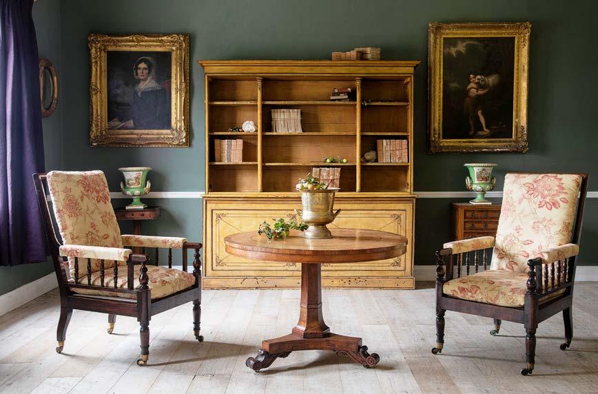
It is advisable to ensure that a work of art does not jar with its surroundings. One way to create an overall scheme in which a painting feels wholely, yet subtly, integrated in a room is by repeating colours found within the work in nearby furnishings and accessories. In this way, the delicate shades of an abstract oil could be replicated in a pair of lampshades; the tones of a favourite painting found in cushions and a rug; and the rich paint colours and gilt frame of a traditional portrait echoed in pieces of antique furniture.

Handsome tones of brown and cream, with metallic highlights, elegantly link this traditional portrait with the environment of fi ne antiques and beautiful architecture in which it is hung. The interior design is by Mark Gillette.

PERFECTLY FRAMED
Challenged by the sheer choice of picture mounts and frames available? There are conventions that help (though confidence does allow rule-breaking to create unusual effects). Mounts should increase in size according to the size of the picture; use extra-large mounts for additional impact and a more modern look. White and off-white mounts are subtle and easy to use anywhere, whilst coloured mounts are more decorative and can be used to co-ordinate with the colours within a room. Frames should also be proportionate to the picture size, their style chosen to complement the style and period of the picture, as well as the colours within it and those of the room in which it will be placed. An expert framer will give excellent advice, while further inspiration can be found in art galleries, museums, magazines and online.
RIGHT Round or oval frames make an interesting departure from the norm. Sandberg Ekeblad Blue wallpaper, £85 a roll, TM Interiors

Challenged by the sheer choice of picture mounts and frames available? There are conventions that help (though confidence does allow rule-breaking to create unusual effects). Mounts should increase in size according to the size of the picture; use extra-large mounts for additional impact and a more modern look. White and off-white mounts are subtle and easy to use anywhere, while coloured mounts are more decorative and can be used to co-ordinate with the colours within a room. Frames should also be proportionate to the picture size, their style chosen to complement the style and period of the picture, as well as the colours within it and those of the room in which it will be placed. An expert framer will give excellent advice, while further inspiration can be found in art galleries, museums, magazines and online.

COLLECTIONS ON DISPLAY
Objects en masse have great impact, with the end result being highly effective and at times greater than the sum of its parts. There are several tricks to help organise arrangements of grouped items. First, match the scale of the pieces on show with the area in which they will be displayed, so that they are neither too small nor too large for their shelf, cabinet or area of wall. There may be a rationale to grouping by colour, type, material, shape, artist, period and so on, but, if nothing obvious springs to mind, it makes sense to start by positioning one or two of the strongest, most striking items first, with larger pieces at the back of the display. Work towards a flow of shapes, a strong overall structure and an emphasis on the most interesting characteristics. If a piece jars within the group, remove it and display it separately.
LEFT This bespoke cabinet features shelving and display areas for books and decorative items, whilst the cupboards below allow for discreet storage. Green Kensington Library, from £3,600, Neville Johnson
COLOURFUL BACKDROP
Neutral walls are not the only way to show off a work of art, much-loved collection or valued antique; a splash of well-chosen background colour can prove invaluable in drawing the eye and providing a foil for the display itself. The darker the colour, the more drama is introduced, and dark colours are also, of course, perfect for contrasting with white or pale pieces. Charcoal, navy, deep green or crimson will add gravitas to a simple collection of white ceramics, for example. When deciding on a background, aim to complement one of the colours from within the object or objects on display. Creating a mood board using colour swatches may be a real help with this, and it may be useful to ask a paint showroom to colour-match an item exactly.

RIGHT Crockery, glassware and other kitchen paraphernalia take on a still-life quality when carefully arranged on the dark olive background of these open shelves. Chichester 5ft Open Rack Dresser, £2,235, Neptune BELOW The mustard wall in this Hampshire farmhouse creates a warm, welcoming room and also makes a handsome foil for the dark-wood antique tables, lamps and frames. The rug is also antique, and the bespoke Dean sofa is by Max Rollitt, who designed the room.

ON THE WALL
There are various options for hanging groups of photographs or paintings, with the simplest being to fit them in identical frames and hang them in ordered lines. Matching or similar frames will also help co-ordinate a less regular arrangement of pictures (this works well with, for example, family photographs on a stair wall). To pull together a disparate grouping, start by laying the potential artworks (which could also be mirrors, plates, embroideries or pressed seaweed, for example) on the floor and assessing how the elements work together. If necessary, remove some, make substitutions or consider reframing. One way to unite them is to group them into an overall rectangle, or at least align them on three sides. A completely freeform arrangement can be intriguing, though it helps if the ‘ingredients’ possess at least one common factor, whether it be shape, size, colour, texture or material.
RIGHT In this dining room by Henriette von Stockhausen of VSP Interiors, a collection of antique plates originates from a variety of different places, from the famous Portuguese Bordallo Pinheiro plates and the green Moroccan Tamegroute mountain pottery to German antique pieces. Their similarities in shape and colour pulls the hanging together, with its overall circular outline echoing the individual plates themselves.

SYMMETRY AND PAIRS
There is something very pleasing about the mirroring and doubling that results from a symmetrical arrangement of two identical objects. It often makes a great deal of sense to show off antiques or works of art in sets of two – a pair of silver candlesticks on a dining table, a pair of lamps on a hallway console or a pair of chairs either side of a window, for example – especially as plenty of antique pieces are more valuable when in pairs. That said, even everyday and modern items can look good when displayed symmetrically, as the resulting feeling of balance is calming and elegant.
LEFT This entirely symmetrical arrangement of antique furniture, works of art and accessories recreates the sparse beauty of a Regency room. All the pieces are from Lorfords.
OLD AND NEW
The ‘layered’ interior that combines pieces from different periods and places is always charming, welcoming and characterful. With even more intent, however, it is possible to juxtapose old with new more deliberately and dramatically. Henriette von Stockhausen of VSP Interiors says: “A strategically placed antique in a very modern interior adds an element of unexpected surprise, and the juxtaposition creates an even stronger statement. For a modern interior, if only having one antique, be brave and choose something extraordinary to make it a statement piece. The same goes for a period home. Make sure that your modern pieces are a bold choice and are in stark contrast to the antiques in the room. This gives each integrity and importance.”
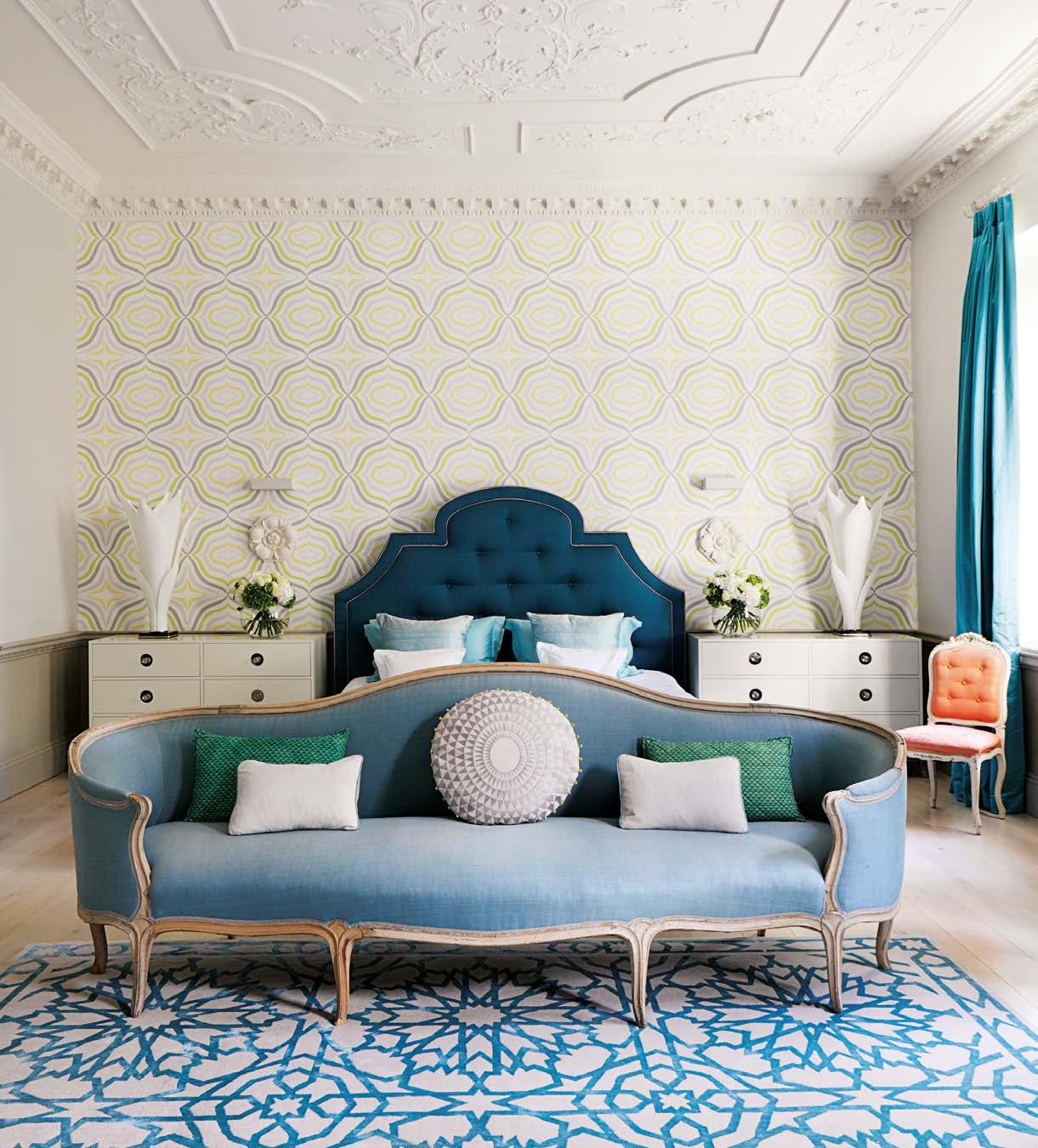
ABOVE In this dashing master bedroom by Rebekah Caudwell, an antique sofa contrasts with modern elements, including a geometric rug by Martyn Lawrence Bullard from The Rug Company, all unifi ed by a soothing range of blues.

BUYING ANTIQUES
Whether adding to a collection or buying a fi rst piece, these experts offer a few tips to help with making the right choice
BUYING A STAND-OUT PIECE
“One of the golden rules when considering buying a feature article is to buy what you like. Don’t buy for investment or if it’s on trend. Spend time browsing through websites and interior magazines to find your style. The item doesn’t need to be the same period as your home; mix and match, even new homes can still accommodate antiques well. If you’re a little unsure about your choice, ask the dealer if you could try it in situ before you commit. Most dealers, if logistically practical, will suggest this, a department store will never carry that service.” Lennox Cato, Lennox Cato Antiques
BUYING PAIRS
“Pairs of antique items are usually worth around three times as much as each individual item would fetch. Pairs can be items which were made to belong together, and it is pleasing to find a pair of objects which have survived without being separated. Similarly, there is serendipitous joy in finding an item which can be paired with one you already have to create a ‘matched pair’. Pairs can be used, for example, either side of a fireplace or window, and give a pleasing symmetry to a room. It’s worth bearing in mind that there is a virtue in not being too symmetrical in a design, it’s better not to be led by it. Pairs of mirrors, bedside tables or wall lights are particularly useful, but again not essential, I tend to take objects on their merit.” Max Rollitt, Max Rollitt Antiques
TOP In this eclectic scheme by Thompson Clarke, a pair of gilded-ceramic antique lamp bases make a subtle statement at either end of a carved-wood console table.

ONE KEY PIECE
Displaying just one single, large-scale work of art – a painting, wall hanging, ceramic or glass work, or perhaps a sculpture – is one of the simplest and most effective ways to create a dramatic statement. This works particularly well in a high-ceilinged room, stairwell or double-height space, where smaller pieces can get ‘lost’. On the other hand, there are times when one oversized piece in a small room can be highly striking. Consider how the work relates to the overall proportions and architectural detailing of the space, ensuring that it is balanced by a large-enough wall, shelf, table cabinet or other support or backdrop, so that it appears full of impact without being overwhelming. ■
ABOVE A bespoke bronze sculpture by Edward Waites takes centre stage in this private home designed by Nicky Dobree. It sits on a Christian Liaigre wenge table and is positioned in a hallway that connects several spaces. It has been spotlit for maximum effect so that it can be seen from all directions.


