


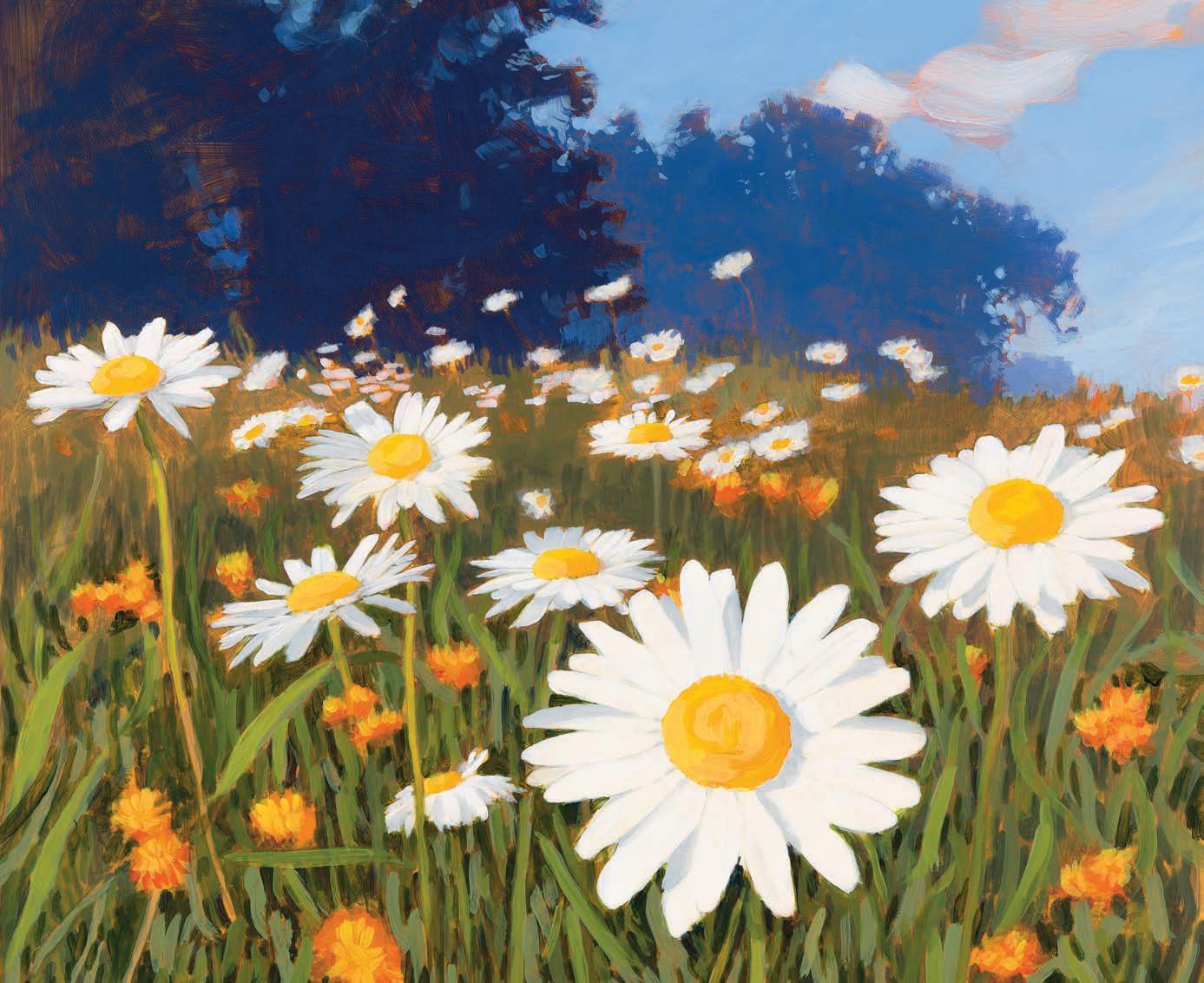


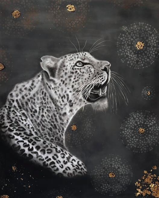
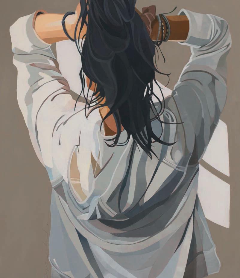
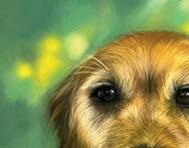
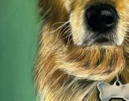
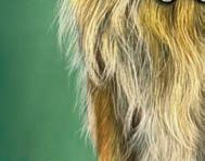
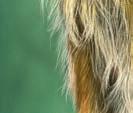
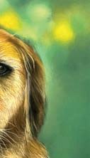
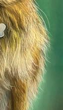
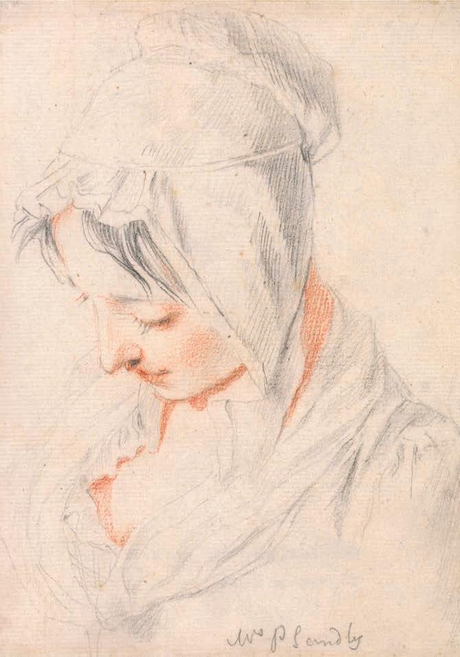
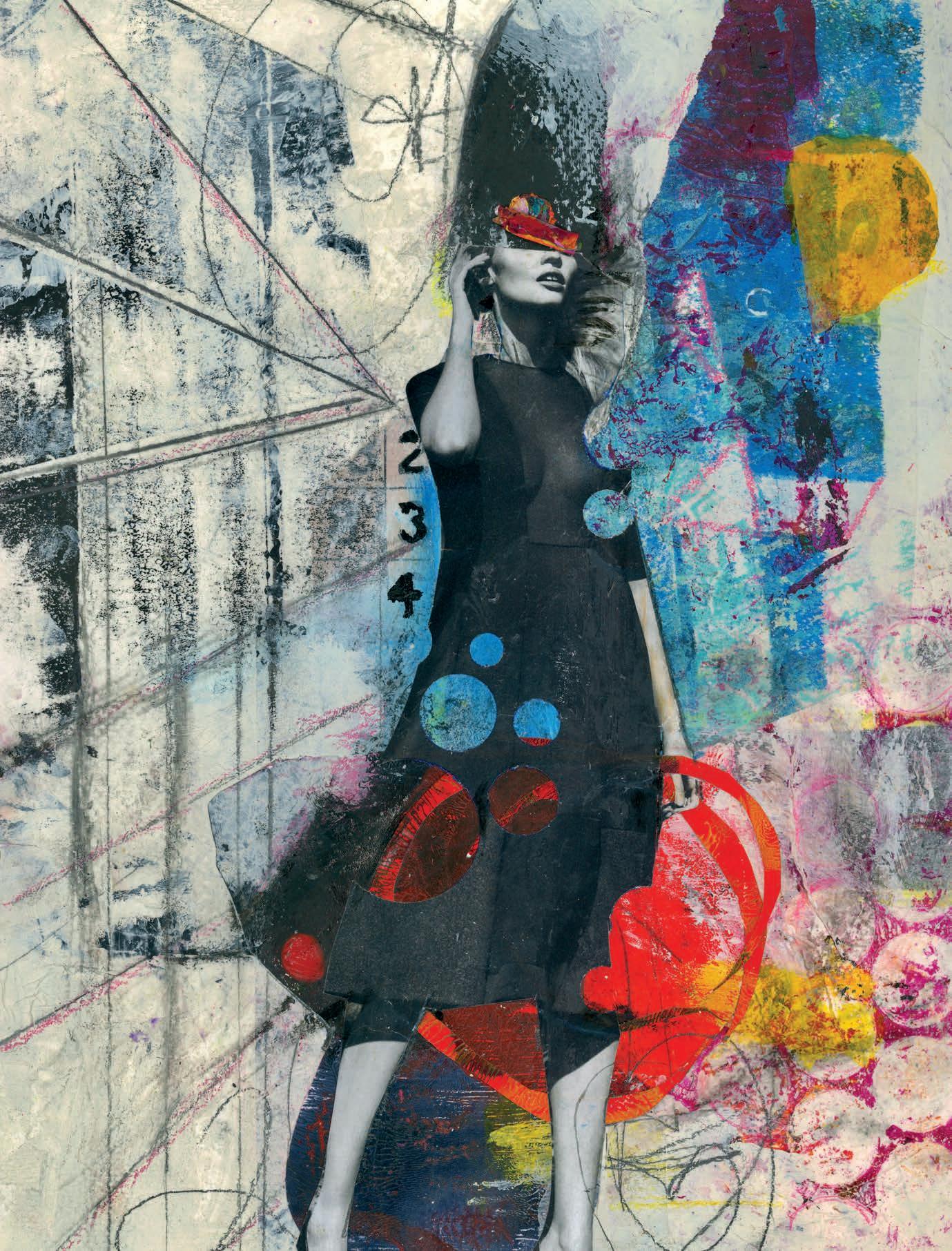
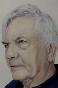
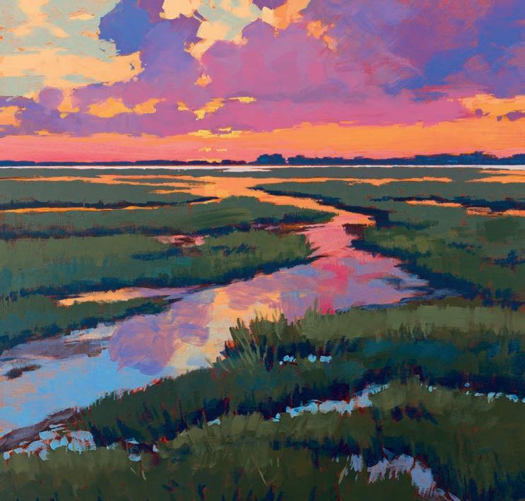
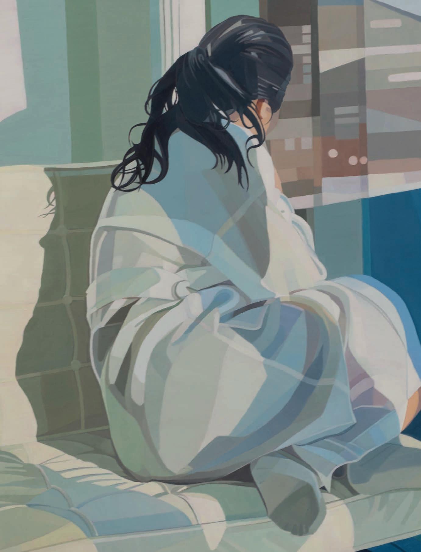
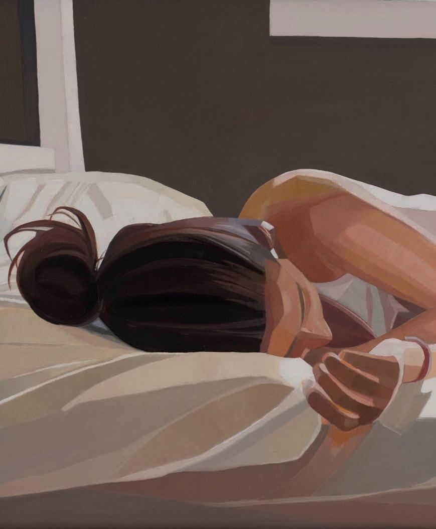
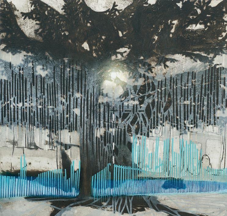
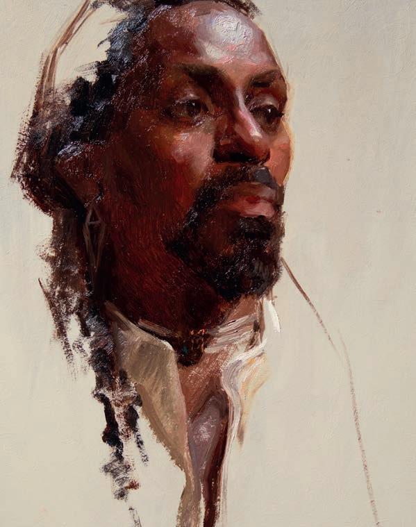
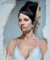
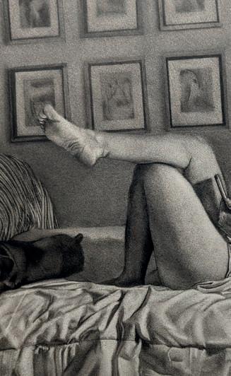
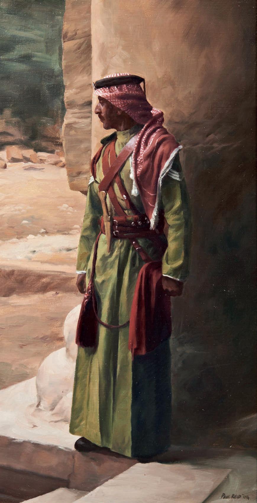
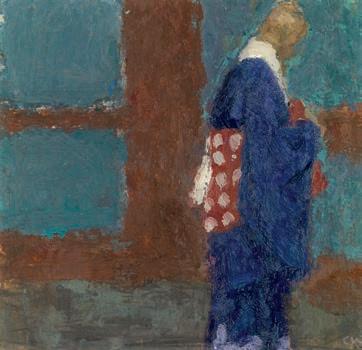
“Sandera”, 100 cm x 100 cm, Nitram Liquid Charcoal, charcoal and gold leaf on canvas
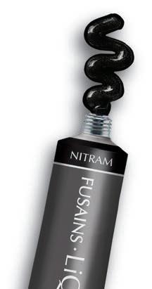
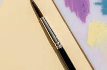
“Most of my pieces are large-scale, so backgrounds can take a lot of time to complete. Nitram Liquid Charcoal has been a huge help—it's richly pigmented, buildable and gives a beautiful matte finish.
In this painting, I used it for the background and for the hair details. It was especially satisfying to work on the finer elements—I was able to create many distinct shades of grey and black. This work was created on a gesso-primed canvas, the type typically used for oil or acrylic painting.
Overall, I really enjoy working with Nitram Liquid Charcoal. It’s been a game changer for me.”
~ Sara Noueihed
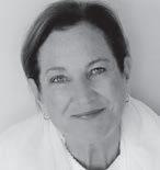
Introducing Sara Houeihed, a distinguished Lebanese contemporary self-made artist hailing from Ras El-Maten in the picturesque Mount Lebanon. She is the proud owner of the renowned Sara Houeihed Studio and Showroom, located in the El Ramleh al Bayda area of Beirut. Sara has generously shared her passion and expertise by engaging with ACS School, where she conducted enriching educational activities and hosted inspiring class visits over the span of two years. Her artistic journey has been marked by participation in numerous exhibitions across Lebanon, each graced with a commendable reception. Her work reflects a blend of diverse influences and experiences, skillfully expressed through the use of charcoal, graphite, and gold leaf. Sara's creations offer a profound exploration of the inherent beauty in our surroundings, the formidable force of empowerment, the essence of love and femininity, and the pursuit of purposeful existence. Instagram: @sara_noueihed | Website: https://saranoueihed.com
SKETCHBOOK Quick tips, ideas, and inspiration. Plus, this month’s exhibitions
PRIZE DRAW Win £1,000 towards art-inspired clothes
WE PRESENT British Art Club member Ken Roberts
HOW I MAKE IT WORK with portrait artist Sam Clayden
YOU TELL US Write in and tell us what inspires you
PICTURE THIS 12-year-old artist Abby Pham on what her painting means to her
IN THE STUDIO
with mixed media collage artist Kim Hamburg
HOW I PAINT Acrylic artist
Jim Musil tells how his bold, bright style evolved
THE BIG INTERVIEW
Oil painter Lori Mehta describes how she accentuates light in her gurative art
EXHIBITION Royal
Academician Katherine Jones presents nature-inspired prints at the
EXCLUSIVE A Royal brush with history, as the King’s Art Collection goes on display
SERIES Hashim Akib kicks o his acrylic series. This month, he talks about foregoing detail
ARCHITECTURE Andrew Lucas captures London in watercolour
ANIMAL Draw a sea turtle with Sema Martin in coloured pencil and pastel
ALLA PRIMA Al Gury shows you how to improve colour and
ARTISTS & ILLUSTRATORS
Phone:
+44 (0)1858 438789
Email:
artists@subscription.co.uk
Online: artistsandillustrators.co.uk
Post: Artists & Illustrators, Subscriptions Department, Chelsea Magazines, Tower House, Sovereign Park, Lathkill Street, Market Harborough, LE16 9EF
Renew:
subscription.co.uk/chelsea/solo
Annual subscription rates
UK: £77.87, US: $105 , RoW: £144
BECOME A MEMBER TODAY!
Our fabulous website for showcasing and selling your art
are ideal for moving your art onto the next stage, wherever you’re at in your artistic journey. And we’ve got some corkers for you here. We’re pleased to have acrylic mastermind Hashim Akib with us in this issue - and he’ll be returning in the next ve - as he embarks on his rst feature, which is all about how to underplay unnecessary detail, so you can focus on the focal points that are important to you and your painting.
Al Gury shows you how he created three very di erent landscape paintings in his rich and colourful, almost goodenough-to-eat, alla prima style, while Andrew Lucas shows you how to balance tone and mood with architectural detail in his watercolour of an iconic London scene.
For coloured pencil enthusiasts, Sema Martin shows you how she painted a sea turtle in rippling, sunlit water, while Laura Wall wanted to remember her special ve-week trip to France, so she painted scenes from each of the beautiful locations she visited, with enchanting e ects.
A visit to Buckingham Palace? Oh, go on then. This is to see some of King Charles’ art collection – much of which formerly belonged to the Queen and her ancestors – and the results may surprise you. It’s not as trad as you might presume.
Entries are now open for the annual British Art Prize – brought to you by Artists & Illustrators – and we wanted to share some exciting news. This year’s competition also o ers a standout opportunity for the rst prize winner. This once-in-a-lifetime prize is a week-long solo exhibition at Panter & Hall, home to contemporary artists from across the globe. More to follow but for now, get easel-facing for your chance to win big!


LORI MEHTA
Lori Mehta began her career as a painter later in life. As an adult, she had a successful career as a graphic designer. She took a break when she had children and, once they were adults, began taking workshops and painting classes. Lori nds much of her inspiration on the beaches of Cape Cod.
ANDREW LUCAS
Andrew is an artist based in Devon. His love of watercolour evolved in his teens with a developing appreciation of urban scenes, landscapes and seascapes. Over the years Andrew has exhibited many times and always enjoys sharing his passion with a wider audience.
SARAH EDGHILL
Sarah is a journalist and author, who loves discovering new artists. She has been so impressed by some of the talented artists she has interviewed for Artists & Illustrators that she has spent her fee buying their work to hang on her walls. She has been a major contributor to this issue.


LAURA WALL
Laura is an artist, author and illustrator, best known for her illustrative series of seaside artworks, inspired by the Devon coastline. She creates fun, uplifting paintings in her signature style using pen and watercolour. She has received several national awards for her artwork and art gallery.
Editor
Niki Browes
Art Editor
Stuart Selner
Assistant Editor
Ramsha Vistro
Contributors
Hashim Akib, Sarah Edghill, Al Gury, Amanda Hodges, Andrew Lucas, Sema Martin, Adrian Mourby, Laura Wall info@artistsandillustrators.co.uk
ADVERTISING
Acting Director of Commercial Revenue
Simon Temlett
Advertising Sales Team
Talk Media
Steve Pyatt
stevep@talk-media.uk 01732 445155
Advertising Production allpointsmedia.co.uk
MANAGEMENT & PUBLISHING
Managing Director
Marie Davies
Publisher Greg Witham
Associate P ublisher
Annabelle Lee
Chief Financial O cer
Vicki Gavin
Subs Marketing Manager
Parveen Bhambra
Head of Marketing
Seema Bilimoria
BACK ISSUES chelseamagazines.com/shop
GET IN TOUCH
Artists & Illustrators, © The Chelsea Magazine Company Ltd 2023, part of the Telegraph Media Group, 111 Buckingham Palace Road, London, SW1W ODT
Phone: (020) 7349 3700 artistsandillustrators.co.uk
Artists & Illustrators (ISSN No: 1473 - 4729, USPS No: 0950) is published monthly by The Chelsea Magazine Company Limited, and distributed in the USA by Asendia USA, 701 Ashland Ave, Folcroft PA, POSTMASTER: send address changes to Artists & Illustrators, 701 Ashland Ave, Folcroft, PA. 19032. Printed by Walstead Roche Ltd


EDITED BY RAMSHA VISTRO
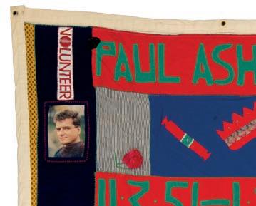
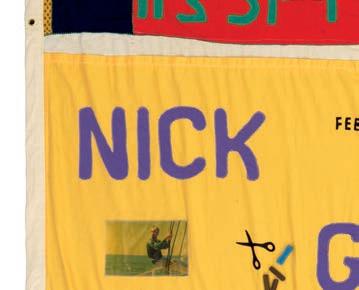
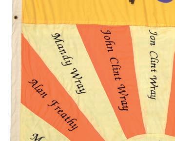
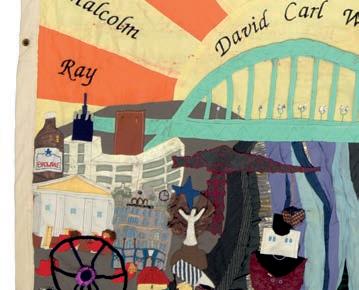
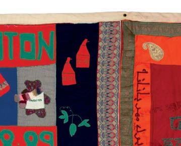
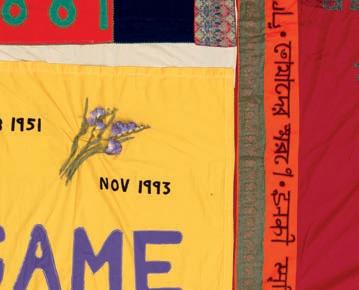
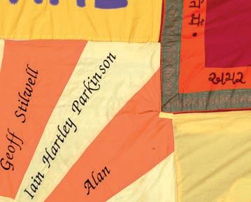
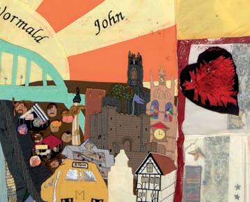
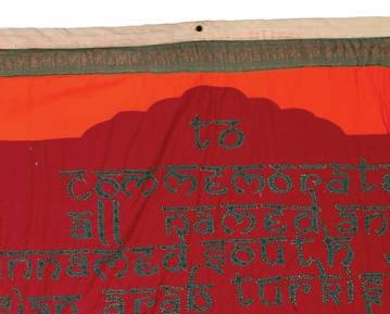

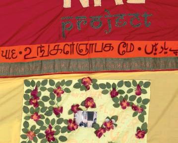
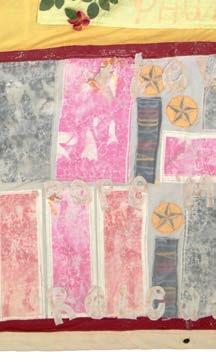
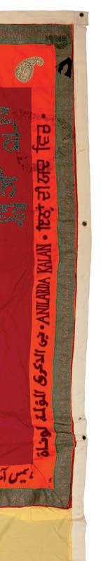
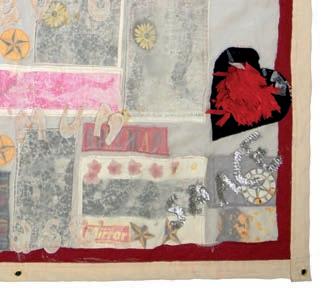
Editor's pick... The UK AIDS Memorial Quilt, featuring 42 quilts and 23 individual panels, honours 384 individuals a ected by HIV and AIDS. Part of the world’s largest community art project, it has been shown globally since the 1980s. This display at Tate Modern is the largest UK showing to date, aiming to raise awareness and break the stigma surrounding HIV. Admission is free. On from 12 to 16 June 2025 at Tate Modern’s Turbine Hall. tate.org.uk
Rare Earth, a striking solo exhibition by British painter Deborah Tarr. The show channels the raw energy of nature through abstract expressions, blending memory, landscape, and inner experience. Tarr’s emotionally resonant works explore geological forms and cosmic cycles, creating a profound dialogue between the organic and the constructed. A powerful meditation on nature, memory and presence, Rare Earth is a captivating showcase of Tarr’s evolving practice. On until 28 June 2025 at Cadogan Gallery, London. cadogangallery.com
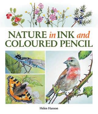
NATURE IN INK AND COLOURED
Helen Hanson
This practical book is an inspiring guide to combining ink and dry coloured pencil and explores a wealth of natural subjects, from berries to butter ies. Packed with examples and learning points, it explains the di erent methods of mark-making in both mediums and explores a new world of subjects. A treasure trove of ideas and examples that both artists and lovers of nature will enjoy. The Crowood Press, £20.00
Open calls, prizes and artist opportunities
INSIGHT
Discover how Rachel Jones blends bold colour, texture and symbolism to create emotionally charged works. Her unique fusion of abstract and gurative elements o ers valuable lessons for artists looking to experiment with multi-sensory language. By incorporating motifs like the mouth and bricks, Jones explores themes of selfrepresentation and cultural identity. Her innovative use of un-stretched canvases and oil pastels invites you to explore new ways of layering materials and expressing vulnerability in your own work. Rachel Jones: Gated Canyons, on from 10 June to 19 October 2025 at Dulwich Picture Gallery, London. dulwichpicturegallery.org.uk
29 JUNE


30 JUNE
Enter the Art Gemini Prize for a chance to win £2,000 and exhibit at The Exhibitionist Hotel, London. P rizes for art, photography and sculpture. Entry from £19. curatorspace.com
Submit work for the Malta Biennale 2026 at MUŻA, Valletta. Artist grants of up to €13,000 to create immersive experiences on the theme CLEAN, CLEAR, CUT. Free entry. maltabiennale.art

These pages are packed with artistic inspiration, but if you're after more, explore the fabulous Artists & Illustrators website. A go-to resource for artists across all disciplines, it o ers a wealth of practical guides, exciting competitions and engaging interviews. Discover even more creative resources and inspiration. See you there. artistsandillustrators.co.uk
4 JULY
Enter the Art Unlimited Open Competition to win £5,000 and a solo exhibition at Art Unlimited, Bridport. Open to international artists in all mediums . art-unlimited.uk
17 JULY
Enter the Beautiful Bizarre Art Prize to win up to $10,000 and a group show in New York. Categories include art and photography. beautifulbizarreartprize. art


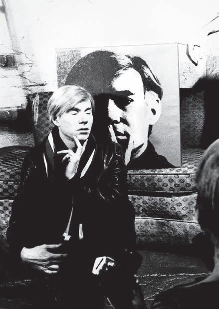
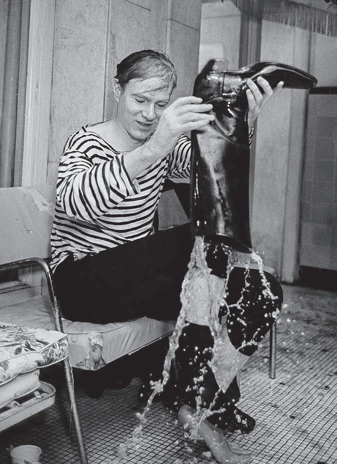
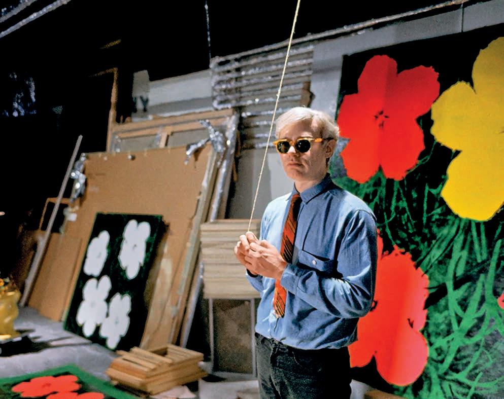
This exhibition o ers a unique exploration of Andy Warhol’s life and work. Featuring previously unseen artworks, photographs and recordings, it reveals a more intimate side of the artist, shedding light on his personal relationships and private life. Warhol’s fascination with repetition and consumerism is showcased, alongside his in uence on contemporary artists. The exhibition provides a deeper, more human understanding of the man behind the public persona. From 6 June to 14 September 2025 at Newlands House, Petworth. newlandshouse.gallery
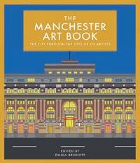
The Manchester Art Book, a stunning collection showcasing over 50 local artists’ interpretations of this vibrant city. From its iconic Gothic cathedral to the industrial beauty of its former cotton exchange, the book o ers a fresh perspective on Manchester’s rich history and creative legacy. A tribute to the city’s unique culture, architecture and artistic spirit, it is a visual journey through the heart of Manchester. 12 June 2025, Herbert Press, £16.99


26 July to 2 November 2025
To celebrate and commemorate the 250th anniversary of the birth of Jane Austen (1775-1817), one of the greatest writers in the English language, Hampshire Cultural Trust will be holding a series of special events and exhibitions throughout her home county of Hampshire, including Beyond the Bonnets. This exhibition explores working women in Jane Austen’s novels and Regency Hampshire. Through letters, historic objects and an immersive soundscape, visitors meet figures like Susannah Sackree, a beloved nursemaid, and Mrs Mary Martin, who ran an inn and draper’s shop.
The Gallery at The Arc, Winchester SO23 8SB. arcwinchester.org.uk
RICHARD ROGERS: TALKING BUILDINGS
18 June to 21 September 2025
This display offers a fresh look at legendary architect Richard Rogers’ life and work. More than a showcase of iconic projects like the Centre Pompidou and Millennium Dome, it reveals him as a humanist and activist who saw buildings as tools for social change.
Sir John Soane’s Museum, London WC2A 3BP. soane.org
SAHARA LONGE
28 June to 28 September 2025
Following her hauntingly personal exhibition Sugar (New York, 2024), where nudes were intimately enclosed within Symbolist imagery, Sahara Longe now returns to the clothed figure, capturing fleeting moments and the anonymity of the city against richly coloured backdrops inspired by post-war patterns. Arnolfini, 16 Narrow Quay, Bristol BS1 4QA. arnolfini.org.uk
EMMA TALBOT: HOW WE LEARN TO LOVE
5 July to 5 October 2025
This summer, Compton Verney presents the UK’s largest-ever show of Emma Talbot. How We Learn to Love features over 20 works across silk painting, sculpture, drawing, text and animation. Known for her ethereal, emotionally charged style, the artist explores love, power, loss and nature through personal and mythological lenses. Highlights include The Human Experience and The Tragedies Compton Verney Gallery, CV35 9HZ comptonverney.org.uk
SUNRISE MISSION
Until 3 July 2025
This exhibition is the rst major London solo show by Berlin-based artist Anselm Reyle. Featuring bold abstraction, chrome nishes and industrial materials, the show brings together new paintings, ceramics and neon works. Highlights include the artist’s celebrated foil and scrap metal pieces, alongside the debut of his chrome brushstroke series. Known for pushing boundaries between painting and sculpture, he reworks modernist ideas through a postmodern lens, creating immersive, high-impact pieces that play with colour, texture and unexpected materials.
Opera Gallery, New Bond St, London W1S 1RW. operagallery.com
IT TAKES A VILLAGE
5 July 2025 to 1 February 2026
This exhibition reimagines the Ditchling Museum of Art + Craft’s collection with contributions from over 50 creators. The show features objects from artists like Eric Gill, David Jones and Amy Sawyer, displayed alongside community-sourced items. This dynamic show includes interactive displays and live residencies, o ering fresh perspectives and encouraging community engagement.
Ditchling Museum of Art + Craft, Hassocks BN6 8SP.
ditchlingmuseumartcraft.org.uk
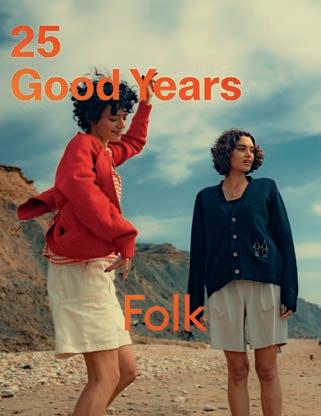
For more than two decades, Folk Clothing has been at the forefront of contemporary, design-led fashion, renowned for its distinctive approach that blends simplicity with artful sophistication. The brand was founded on the belief that clothing should be an expression of individuality, where every piece tells a story and serves as an extension of the wearer’s personality. Folk Clothing merges high-quality materials with innovative design, producing timeless garments that are both versatile and statement-making. Drawing inspiration from the world of art, each collection integrates subtle artistic influences, making it easy to incorporate high-end,
thoughtful design into everyday wear.
Folk Clothing’s collaborations with renowned artists such as Nick Goss, Tom Hammick and Kate Gibb further elevate their collections, infusing their garments with unique artistic vision. These collaborations bring together fashion and art in a way that feels fresh, original and inspiring. Whether through their signature prints, refined silhouettes, or the perfect balance of form and function, Folk’s collections are crafted with an unwavering focus on craftsmanship and attention to detail.
Now, here’s your chance to experience the creativity of Folk Clothing for yourself. folkclothing.com ▫
Four winners will each receive a £250 voucher to spend on Folk Clothing’s artist collections.
Submit your entry by noon on 31 July 2025 at artistsandillustrators.co.uk/ competitions.


SUMMER HOLIDAY & PART TIME COURSES
Life Drawing - Portrait - Still Life
Watercolour - Printmaking
Sculpture - Ceramics - Carving
DIPLOMAS & POST DIPLOMAS IN PORTRAITURE and SCULPTURE
This artist brings Scotland’s coast to life with vivid, intuitive landscapes
For Ken Roberts, wonder has always lived in the details. “All my life I’ve pondered in wonder at the beauty of design and engineering in small things such as plants, hummingbirds, butterflies and even the inner human ear,” he says.
This fascination still drives his acrylic landscapes today. Ken’s love of painting began when, aged eight, he was given a watercolour set and a jigsaw of Windsor Castle at sunset. “I recall vividly listening to Wuthering Heights on the radio while I copied the castle in vibrant colours. I was hooked on a lifetime’s love of painting and
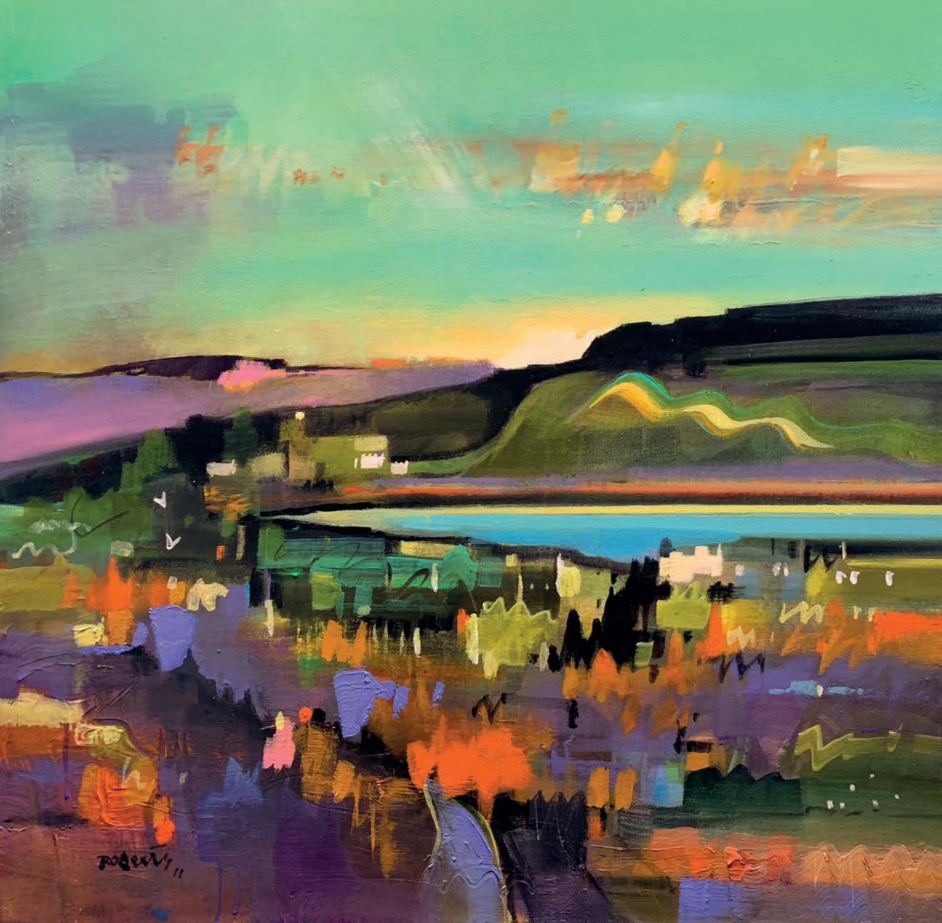
deep longing to be a full-time artist.”
Yet the post-war world had other ideas. With few opportunities for those who wanted to pursue art full-time, Ken built a successful career in graphic design, painting into the small hours after his family went to sleep. In 1999, he finally made the leap, moving to St Andrews – a place he had loved since boyhood – to paint as a career. It was a decision he never regretted. “I wouldn’t change it for a king’s ransom,” he laughs.
For Ken, painting is less about photorealism and more about feeling. “I am blessed with a memory for visual detail,” he explains. He prefers to trust his instincts
over rigid reference photos, and walks along Fife’s beaches and farmland to feed a mental library of light, movement and mood; all later poured into canvases that aim to “lift a room or the spirit of the observer.”
Ken isn’t precious about perfection either. Large bristle filberts and short-handled flats are his tools of choice, encouraging bold strokes over fussy detail. “I tend to use large brushes to avoid getting bogged down in extraneous detail,” he says, explaining this is a method that keeps his skies moving and his colourful landscapes alive.
Today, his palette is packed with drama: warm and cool primaries, earthy umbers
and his favourite, Azo Yellow Gold. These large brushes and fast-drying acrylics help him capture Fife’s shifting skies with energy and intuition. “I strive for an elusive ethereal dimension in my work by utilising strongly contrasting vivid colours which I’ve heard described as ‘emotionally engaging’, and if I achieve that, I’m a happy man.”
His advice to young artists? They must play the long game. “Don’t be afraid to take on paying jobs while you hone your skills in art, until it provides the satisfaction and income you deserve,” he says. “It’s the destination that’s important.”
britishartclub.co.uk/profile/kenroberts
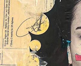
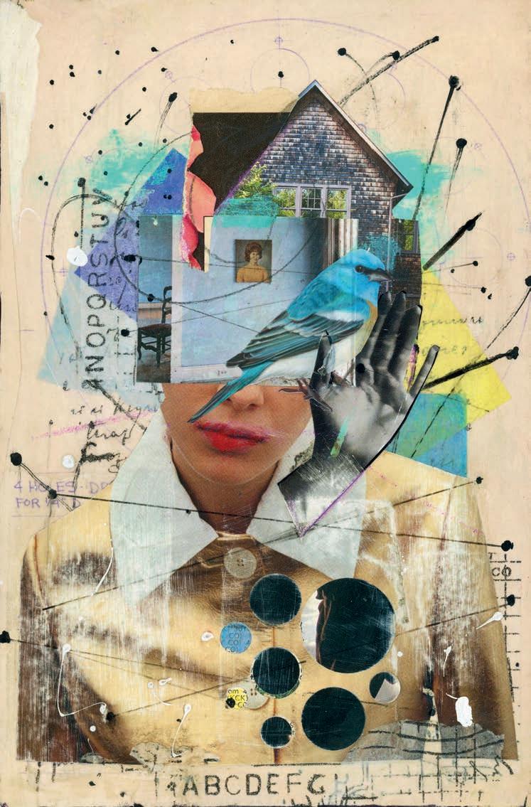
Lacking a separate studio of her own, this mixed media artist works wherever she can find an empty surface, she tells Sarah Edghill
The Covid lockdown had an impact on most of us in many different ways, but for Kim Hamburg it was lifechanging in that it introduced her to a new and completely unexpected career as an artist. While confined to the house, Kim began making mixed media collages as a way to pass the time and do something creative. “My daughters and I had already been making paint pour videos together, so collage felt like a natural next step,” she says. “I’d done a biology degree and a teaching certificate, then taught Life Science at middle school before having my family. For years, I was a stay-at-home mom who crafted on the side - making scrapbooks, cards, and small handmade gifts.”
While Kim’s daughter and two foster daughters were off school during lockdown, space was tight. “In the beginning, I worked on my side of the bed, using my nightstand as a surface,” she says. “I cleared off a shelf in my bedroom to store a few supplies. As I kept learning and experimenting, I moved into the kitchen. I used a bit of countertop space and tucked my materials into a couple of cabinets. Larger projects took over the kitchen table, but everything had to be cleared away before dinner. The living room floor became my cutting and pasting area. The top of the piano turned into storage. As I collected more materials, stacks of magazines and papers began forming in the corners of every room.”
Even when life returned to relative normality, Kim’s collages continued to play a major part in her life. But she still struggled to find a space to work. “For over a year, I worked wherever I could find a clear spot. I felt nomadic, always packing up and moving depending on the rhythms of the house and ▸
whether a new foster child had arrived. When my oldest foster daughter went off to college, I moved into half of her room. She still comes home for holidays and visits, so I’ve had to remain flexible. I set up a table along one wall and use some of her closet space for storage. To this day, I wish I could say I have a beautiful, dedicated studio space. But that’s just not my reality.”
When she started collaging, Kim had very few supplies. “Just some paper, glue, scissors,
and a few small canvases left over from our acrylic pours. I’ve always loved vintage papers and ephemera, especially paper dolls. In the beginning, I used what I had on hand, like an old ledger book and sewing patterns. I began making at least one collage a day, and I still try to keep up that daily practice. Malcolm Gladwell said it takes 10,000 hours to become proficient at something—and I can tell you, I’ve definitely put in my 10,000 hours.”
As Kim produced more collages, her
daughter created an Instagram account so that the rest of the family could watch her progress. “I started with just one followerher - and slowly my audience began to grow,” says Kim. “I’m deeply influenced by other collage artists, especially those I’ve come to know on Instagram. There are several I follow regularly, and I love seeing their posts and videos about their latest work. The wonderful collage community inspires me daily. I’m so passionate about collage that I’m ▸
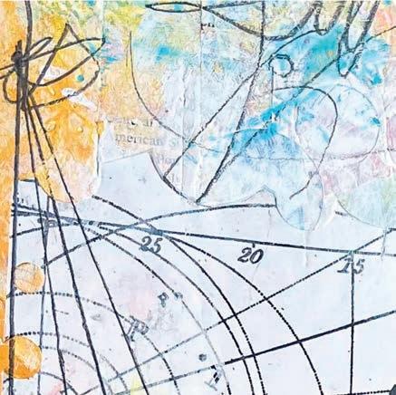
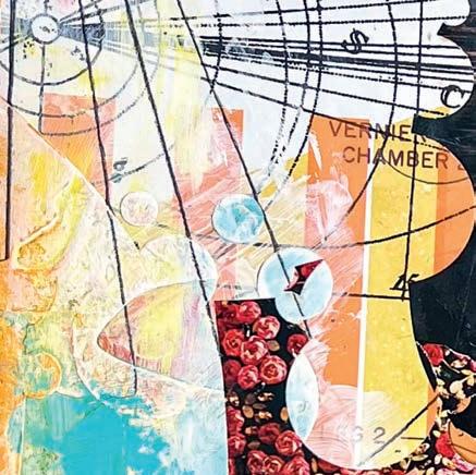
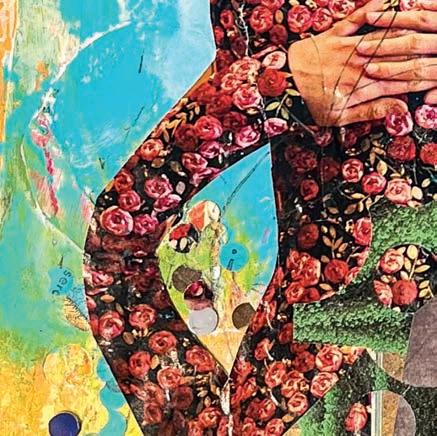
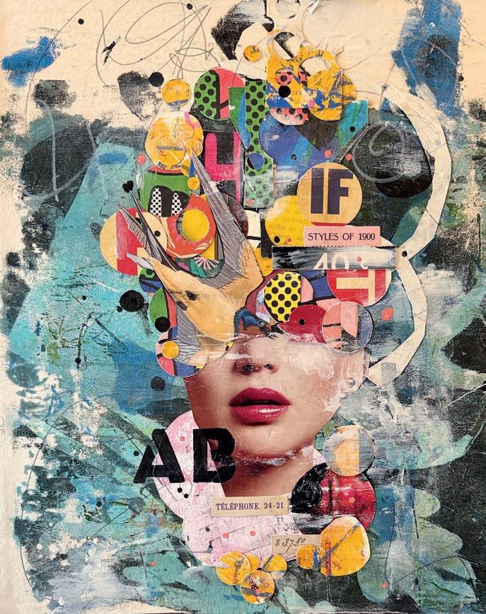
RIGHT Living Rent Free in My Head, 20.3x25.5cm, mixed media on vintage book board OPPOSITE PAGE Hearing That Sound When the Wall Moves You Forward, 28x35.5cm, mixed media on paper
always thinking about it, whether I’m working or not.”
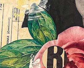
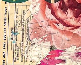
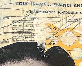
As a self-confessed autodidact, Kim revels in having the freedom to experiment without self-imposed limitations. “I’m a messy artist,” she says. “There are always papers on the floor, in every stage of use. Some are drying, some are waiting for a new collage, others are in piles to be cut. I have tubs, bags and boxes scattered throughout the house and even in the garage. My collages reflect my personal experiences as a wife and mother. I am an intuitive artist, often letting my emotions lead the way. Sometimes I finish a piece and only then realise I’ve woven a memory into it. The process is just as important to me as the design. I love sourcing materials, especially through treasure hunts at thrift stores where I look for vintage books, old magazines and unusual ephemera. You could say I’m a paper hoarder - but I’ve learned that many collage artists are, so I’m in good company.”
Kim loves experimenting with new materials and techniques. She frequently uses ordinary household items to create her work, from a kitchen spatula to a shaving brush. “I’ve developed my own tools and even created a PVA-based glue that works as both an adhesive and sealer. I’m always trying old techniques and putting my own spin on them - making the process better, faster or just more enjoyable. I work with a wide variety of paper: vintage book pages, tissue paper, wax paper, Bristol paper, tracing paper and medical exam table paper. I also use a Gelli Plate to create monoprinted collage fodder, often on translucent paper that allows layers underneath to show through. One of my signature techniques is punchwork. I use a variety of circle punches to create small cut-outs that add movement and let the viewer peek into the layers beneath. These circles also help guide the eye around the composition and bring a sense of rhythm to the piece.
“I’ve collaged in my car, on airplanes, trains, in hotel rooms - you name it. I can make art anywhere. The airline allows you to take scissors as long as they are under four inches and you can also take a glue stick. I also take a hole punch. When I’m on the plane, I put the tray table down and get to work. I have to keep it small, essentially four by six inches, or sometimes an index card. I use these smaller impromptu pieces to send as happy mail or turn them into
I am an intuitive artist, often letting my emotions lead the way
business cards with my information on the back. I have been known to search the airport trash cans for used lottery tickets. I also look for orphaned magazines and, of course, the airline instruction book that’s in the back of the seat.”
Despite the fact that she only took up collaging five years ago, and still maintains
a down to earth attitude about where and how she creates, Kim’s work has been featured in many magazines, won international collage awards and been exhibited in several galleries. At some stage she would love to have a studio space of her own but, in the meantime, she continues to create wherever the mood takes her. “I see the gorgeous spaces artists post on Instagram and can’t help but feel a little envious,” she admits. “But for now I make do with half a room, a shared kitchen table and the same daily ritual of clearing it all away before dinner. The truth is, I love making art. Nothing will stop me. But one day, I hope to have a space of my own where everything can stay in place.”
kimhamburg.com ▫
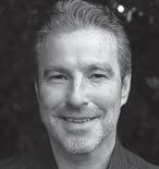
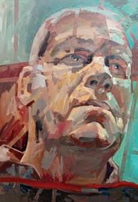
From freelance struggles to full-time success, this artist’s interesting journey proves the power of dedication
Ialways used to draw when I was young, but I didn’t have the most encouraging art teachers at school. At the same time, I had a fantastic English Literature teacher, so I ended up following a love of writing and becoming a journalist. I didn’t draw for many years. After moving to London for work, I was surrounded by art and my love for it was rekindled. I would spend lunch breaks walking through Tate Britain and would marvel at paintings by Sargent, Lawrence, Reynolds and Waterhouse.
The decision to become an artist wasn’t easy, but there was no going back. I remember telling my boss Heather Jameson – who I must thank for her support – that I was leaving. She assumed I had landed a job at a major news organisation or with one of our competitors.
I had to make enough money to support myself and London is an expensive city. Heather allowed me to work freelance in my old role. During that time, I did dog sitting around the country so I could live in people’s houses for free, while I was working freelance part-time and spending the rest of the time practising and trying to understand as much as I could about art.
London Fine Art Studios was helpful in my career. I stumbled across their studios when I went to investigate an art shop I found on Google Maps. They were incredibly supportive and gave me a job in their shop, allowed me to jump into the evening classes to practise and eventually gave me a teaching job, which helped me to keep the whole journey in motion. My approach


to portraiture has changed a lot since my time at London Fine Art Studios, but the school drilled the fundamentals into me.
Winning the Michael Harding Oil Painting Prize was a huge
SAM’S TIPS FOR BECOMING A FULL -TIME ARTIST
1
Develop a habit of sketching and do it for the love of it
Sketch every day, wherever you go and however comes naturally to you.
2
Make time to experiment, play and discover
surprise. I tend not to enter exhibitions with an eye on the awards, so I was a little taken aback. The winning piece was done on a whim and mostly in one go towards the end of the day. It was an experimental piece because it had unusual backlighting, so I just went at it as boldly and fearlessly as I could. It came at a time when I needed a boost in con dence.
The future for me is excitingly unclear. I have this desire to just capture a sense of ‘life’: what I feel all around me in the people and places I encounter. It’s a feeling of humanity, of our place in time and space which I think can be captured in portraiture. samclaydenart.com ▫
We all have to make a living, but it’s wise to keep some things sacred, personal and exploratory.
3
Get o Instagram and see art in person if you can
A 10cm image ltered through a camera is a false representation. You have to stand in front of a painting to truly feel its purpose.

Modern landscape artist, Jim Musil, tells Sarah Edghill how he developed his bold, colourful style
Acrylic artist Jim Musil rediscovered a love of painting twenty years after graduating from the University of Minnesota. Having starting as a hobby painter, he is now a successful full-time artist who describes his subjects as involving the natural world, but including a hint that humans are there too.
Jimmusil.com
I flunked painting at art school. I was so impatient when I was younger and struggled with the detailed craft of painting – colour mixing, prep work, brush care – I found it all pretty tedious. I did well in more immediate mediums like drawing, but not painting. Despite that, I loved being at art school – I met my wife
there! I grew up in the house of an artist. My mum was both an art teacher and a watercolour painter. We had a large library of those big art books and magazines like Art Forum that I loved looking over. I’d spend hours looking at work from Old Masters like Da Vinci, Rembrandt and Michelangelo, as well as modern artists like Cindy Sherman and Jenny Holzer.
I became obsessed with the idea of building a robot that could paint. I graduated with a double major in Studio Arts and Computer Science from the University of Minnesota. After college I mainly pursued a degree in technology, so when I started making art again, I instinctively wanted to combine the two of them somehow. I’m not talking about ▸
copying a photo like a printer would, but rather something that could constantly assess what new strokes and colours a painting needed. Conceptually, it’s not that far off from what Artificial Intelligence does today, but I wanted it to use physical paint and brushes.
As I dug into that concept, I realised that, in order to teach a robot to paint, I first needed to know how to paint, so I immersed myself in the very craft that turned me off in college. During that journey, I found I loved what I was learning and putting into practice myself. As I was painting, I was thinking about how I might get a robot to make various brushstrokes and how I might build a decision-making algorithm for each stroke. That led to a simplified painting style that featured big, bold brushstrokes with clear, simple compositions. It turns out people like that style of painting.
I’m a planner: I like to have my compositions worked out before I start painting.
I work from a combination of photos, hand drawn digital bits and AI-generated elements. I’ll often combine all three using a digital painting app in order to get the composition, colour and mood I’m after. I know this is a controversial topic, but I think AI can be a great tool for helping artists build up composition references.
I like the solid rigidity I get from a hardboard panel.
Because I come from a drawing background, I prefer a surface that’s closer to paper. I tried for some time to paint onto heavyweight cold press paper, but I didn’t care for the way the paper curled and buckled with my thin, wet mixes. Because the things I wanted to paint often involved a fair amount of detail – like a building – I found it frustrating working on the rougher surface of canvas. I know some painters like the spring of canvas, but that’s not for me.
Now I focus more on quality than quantity.
I used to create one or two paintings a week, but I’ve slowed down in recent years. When you’re just starting out or working through new ideas, I advocate painting small and fast. But now I have a clearer sense of what I want to paint, I find two to four paintings a month to be a better pace. I’ve tried painting multiple paintings at the same time, but found that to be problematic. I like the feeling of starting something, then focusing on finishing it.
I’ve never had a problem coming up with
what to paint – I just paint things I love and cherish in this world. I love storms, prairies, farms, coasts and wildflowers and have more ideas queued up than I have time left to paint.
There’s almost no natural light in my workspace.
I’ve never understood why painters want a studio with tons of natural light streaming in. What I want is consistent light 24 hours a day so I can work any time I want. Accurate colour mixing is vital to me and when the
light in your space is constantly changing it has a huge impact on how the colours turn out. My studio is in my home and it’s my sanctuary. It’s not that big and it’s fairly spartan and organised – I like to clean it before I start a new painting. I have a small team of people who assist me in running my art business and we maintain a much larger workshop for them. It was quite a revelation when I realised I could have my own quiet space to create that was separate from the bustle of the busy workshop.
None of the people who know me would call me a perfectionist.
Even though I paint real places and things, I don’t want to paint photo-realistically at all. I want you to know these are paintings, I want you to see my human hand at work. It actually stings me a tiny bit when people say they thought my painting was a photograph. Although my work can be detailed , it’s also very roughly painted. I’m a big fan of Edward Hopper - we think of his work as detailed and precise but, if you ▸
look closely, you can see he used some wild brushwork to get there.
My favourite paintings are the ones that have deep personal meaning for me. One of those is Northern England. I love to tour around on my bicycle and last summer I spent a week riding along the Coast to Coast and Hadrian’s Cycleway near the Lake District. I have such vivid memories of that beautiful scenery and I tried hard to capture what it felt like, pedalling along those stone walled country roads on a beautiful sunny late summer day. Painting a memory like that deepens it for me and that’ll always be special. I just paint the things I love - I’m too old to waste time on anything else. I want you to feel some of the love I feel when I’m thinking of the scenes I paint, because all my paintings have a really personal meaning for me. Through composition, lighting, colour and brushwork, I make choices to reach that goal. ▫


This artist explores ordinary moments with a focus on light, memory and intimate human connections, finds Ramsha Vistro ▸
Lori Mehta’s art is all about stripping away the excess to reveal what really matters. After years in graphic design and raising her children, Lori returned to painting, finding inspiration in the light and landscapes of Cape Cod. Her work, celebrated with more than 50 awards, focuses on moments that others might miss: moments full of light and simplicity. Her paintings, stripped down to the essentials, leave just enough space for viewers to fill in their own stories. lorimehtaart.com
I was raised in a small blue-collar town in a very small home in Connecticut. I was one of five girls. We had a brother who passed at six, so my elder sister and I tackled grief early and, as younger siblings arrived, we were thrust into adult roles at a young age. Money was scarce, so creativity was required. I helped with home repairs, cooking and plumbing. Somewhere in the necessity, I found joy. While not stereotypical creative endeavours, when working with limited supplies, creativity was a gift and I found I was able to think outside the box.
My father lived through the Great Depression so rarely threw things away. His basement and garage were packed floor to ceiling with odds and ends, rusty tools, half-used paint cans, mismatched hinges and screws. For most, it would’ve been chaos. For me, it was a wonderland. His garage and basement became my studios. I used leftover house paint or spray paint. My canvases were anything I could find. The town dump, where we scavenged for car parts and household supplies, felt like my art supply store. Everything was raw material and had potential.
Studying art was completely foreign to my family.
No one in my family had attended a university, so doing a four-year art course was out in left field. My grandmother encouraged me to apply for scholarships. Working with a high school art teacher, I prepared a rudimentary portfolio. There was a full art scholarship at a small college in New York. The application process involved interviews, portfolio reviews and live drawing sessions. When I walked into a live drawing class there was a nude male model. I recall feeling lost, but I was able to reign in my fears and proceed. My discomfort dissipated because I let intuition take over. To my surprise, I was ▸
awarded the scholarship. It taught me that fear should never hold you back.
I worked in graphic design before having my children.
Then, after years dedicated to raising them, re-entering the art world was daunting. One afternoon, playing with the children’s art supplies, I felt an incredible sense of release. Years of pent-up creativity came at me in all directions, but I questioned my ability and feared rejection. Initially, I took an adult education course at a local high school. I began painting in acrylic but did not think about developing a style. Gradually it emerged, and my background as a printmaker and graphic designer began to influence my work. As a printmaker, the process of layering distinct colours is fundamental. Similarly, in graphic design, understanding colour separation was key. Now, in my paintings, I see echoes of this.
Often, the models in my paintings are my two daughters.
But even when I do not have a personal connection to the person, it is a very intimate exercise to paint another human. You observe the slightest tilt of their head or how they fold their arms. When I began painting ordinary moments, I was fascinated by how light interacts with figures and objects. One of my early paintings shows a young girl sitting cross-legged, pulling her hair into a ponytail. I realised I was using light not as a main character, but as a tool to elevate the moment, bringing attention to an image, often overlooked in our fast-paced lives.
My creative process begins with observation as well as capturing overlooked moments.
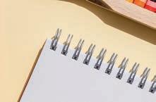
I always keep a sketchbook nearby, jotting down concepts, sketches and ideas that come to mind. When words fall short, a sketch helps solidify thoughts. I revisit these sketches, considering if any might translate into a painting. Light itself inspires me. In my studio, I arrange items like shirts to interact with light, photographing how the patterns evolve. I annotate these observations in my notebook, sometimes noting specific paint colours. When ready to begin a painting, I sift through my photo collection. I aim to begin a painting when my vision is clear and energy high.
My painting process is intertwined with memory.
A particular colour or gesture from the initial photograph often guides me toward
giving it more prominence on the canvas. While my subject matter can shift, I typically delve into a theme for an extended period, sometimes years, until my exploration feels complete. This organic evolution makes it impossible for me to replicate past works. The initial energy must be present for the work to feel authentic, which is also why I don’t accept commissions; creative freedom is essential.
I’m deeply absorbed in observing the world around me.
Sometimes that focus becomes so intense that other things fade into the background. This constant observation and mental notetaking are key to how I bridge the gap between painting from real life and working from photographs. Beyond visual details, I also find myself keenly aware of body language. It’s fascinating how gestures can reveal so much about someone’s true feelings, often in contrast to their spoken words. This awareness not only informs my painting but also gives me
a deeper understanding of the people I interact with every day.
My studio is above our garage on Cape Cod, which is separate from our home. The heart of the space is a large, versatile square table with integrated storage on wheels, allowing me to keep supplies available, yet out of sight. While I prefer to immerse myself in a single painting from start to finis h, I have a second easel for pieces where the flow has stalled. Only a select few of these ever make it to completion. The studio is my own. As a mother who raised three children and several dogs, the significance of a personal space resonates with me. I cultivate calm by keeping it sparse and organised.
Growing up in New England has influenced my work.
The water, the air, but mostly the seaside light influences my work. I spend summers on Cape Cod. During the wee small hours of morning and dusk, I photograph images
and figures. The low sun casts long blue shadows against the saturated orange of the setting or rising sun. These colour relationships and sharp definitions of form inform the bold, colourful shapes in my work. Beyond the visual, being near the sea offers clarity and peace. The start contrast of the New England winters also plays a role. While winter can bring isolation, I embrace it as a time for focused creation. The quiet solitude of a snow-covered landscape creates the perfect atmosphere for painting.
Summer brings back so many happy memories for me.
The long, relaxed days make it easy to slow down and really connect with people. In today’s busy world, we don’t get enough of that. Things like quiet bonfires on the beach, watching the fire fade as the sky darkens and the evening cools down. Summer is a nice break from a hectic pace, and I often feel like my art is a similar kind of escape. ▫
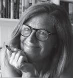
British printmaker KATHERINE JONES visits the Royal Academy’s Summer Exhibition as an Academician. This honour means she can provide six works that the Academy will display as part of its annual celebration of contemporary art
The Royal Academy’s Summer Exhibition makes its selection from approximately 1,800 submitted works. Royal Academicians like Katherine and also Vanessa Jackson, Philip Sutton, David Hockney and Michael Craig-Martin are allowed to display up to six works – or a maximum artwork of 80 square feet – annually but the majority of paintings, sculptures, prints, architectural follies and video extravaganzas are submitted blind, with no such guarantee.
That was Katherine Jones’ situation up until 2004. She was born in Sussex in 1979 but brought up in Herefordshire on the Welsh border. Before having children, her mother had been the editor of ‘Arts Review’ (antecedent to the current Art Review) and her aunt was Marion Jones (1952-2021), “A brilliant painter and teacher,” says Katherine.
Katherine studied printmaking at Cambridge School of Art and then moved to Camberwell to do an MA in Fine Art Printmaking. She then worked as a print editioner and technician (printing for people like Damien Hirst, Rachel Whiteread and Tracey Emin at Paupers Press). “I learned a lot from watching other artists at work. Often art schools promote a fairly set way of thinking, but in the outside world artists have their own rules and individual motivations.”
Her early submissions to the Royal Academy from 2004 to 2007 were unsuccessful. “I had just graduated from Camberwell. I can’t remember what I submitted exactly, but it would have been prints and most probably portraits. I think I then wrote the work off as being no good.
Katherine’s first successful submission to the Royal Academy was in 2008. “I had just moved house and did not receive a notification that the submission was successful, as I’d given them my previous address. In those days there was no online submission, so all the work had to be physically taken into the RA. You were then notified about the exhibition by post and the sales slips and receipts were also posted to you on yellow postcards.”
Katherine admits that by her fourth attempt at submission, she had been so disheartened by her earlier attempts that she’d begun to believe it was impossible to get her work accepted. “I remember where I was when I found out I had got in. It was at the City and Guilds of London Art School, where I worked as a research fellow in the print studio, and a friend who was making a print there mentioned seeing my piece, A Surrender to Impulse, on the wall at the RA with a healthy line of red [sold] dots underneath it. I was so pleased, and I went on to submit most years from then on.”
“For printmakers, the bonus of having an ▸
and block-print on paper, 82.5x69cm ABOVE Marion Jones Yellow Triangles 2, 2019, oil on canvas, 102x77x2.5cm
editioned work for sale in the Summer Exhibition is that you can sell more than one and occasionally, if you are lucky and the piece has been hung in a good spot at eye level, or what they refer to as ‘on the line’, things can go very well.”
Katherine was still rejected a few times from subsequent Summer Exhibitions “But I was lucky on other occasions.”
In 2014 she was awarded a significant prize, ‘The London Original Print Fair Prize’ for A Thaw. The next year she was invited to be in a group show in the RA Keeper’s House by the curator Katherine Oliver (with whom she has worked on several projects since, including a solo show ‘We Grew the Long Bones’, at Eton College in 2020).
“I have always found it thrilling to see my work up on the Royal Academy walls. Love it or hate it, the summer show is an uplifting thing for an artist to be a part of. It’s not a sleek or minimal show, but it is full of interest and beautiful, (occasionally absurd) juxtapositions. Submitting for any exhibition or open call is always a gamble. But rejection is part and parcel of being an artist and developing a thick skin when it comes to applications is a useful thing.”
Katherine describes her more recent work as experimental, using traditional printmaking, etching and collagraph (printing with a more textural plate) combined with painting and drawing: “I like the autographic handmade quality, and the embossed line and texture in printmaking, the repeats and surprises and the way one process relates to another.”
Much of her early work reflected concern for the fragility of the planet. “Then playgrounds and segregated spaces came to the fore with the shock of having children. Belisha Beacon was part of a routine walk to and from the park with my first child. But for the last six years plants and ecology have played a more significant part.”
Then, in 2022, Katherine received a surprise email from the RA saying she’d been nominated as an Academician “Then a while later, another saying that I’d been elected. It’s not something that the artists themselves have anything to do with. It is a decision taken by artists who are already in the cohort. I feel very lucky to be one now. There are only 100 of us.“
The Academy’s rules are strict. There must always be at least 14 sculptors, 12 architects and eight printmakers; the rest are all painters. At the age of 75, Academicians are semiretired as senior RAs
“Every year a new panel of six to eight RAs (usually a combination of painters, sculptors, printmakers and architects) form the Summer Exhibition committee. One artist takes the leading role as Summer Exhibition coordinator - this year it is architect Farshid
Moussavi - and the committee can comprise current RAs as well as senior RAs.
“I was put to work on the selection committee for the 2023 Summer Exhibition under David Remfry,” says Katherine. “There were six other artists, as well as the president. Our part of the process took three weeks in total, one week looking at the 1600 digital submissions and a further two later on in the spring, hanging the show. It is quite a commitment and not an easy task, but the RA has a fantastic team of curators and art handlers, and the whole thing runs unbelievably smoothly considering the size of the operation. Having seen the process now from the other side and seeing how difficult the decisions are to make, I understand that I should not have taken those early rejections so much to heart.”
Today Katherine lives in a flat in Brixton
Flash, collagraph on paper, 70x71.5cm LEFT Year After Year, 2024, collagraph on paper, 29.7x22.2cm ABOVE Of Creeping and Ramping Habit, 2024, collagraph and hand-colouring on paper, 22.5x30.5cm
with her partner and two children and has a studio opposite the Brixton Academy. This summer she has a one-woman show at the Gainsborough House in Sudbury until October 2025, ‘Fine Ladies and Gentle Men’, which relates the extravagant dresses of Gainsborough’s sitters to Katherine’s flower prints such as Dust to Pigment (2023).
Today her work is held in public collections throughout Britain, North America and China. She has completed residencies across the UK, including Eton College, Glasgow Print Studio and Rabley Drawing Schoo, as well as in the US and Germany. However, the Royal Academy Summer Exhibition was one of the first institutions to recognise her unique qualities.
“The RA is a remarkable institution with an art school at its heart,” she says.”It is a democratic and joyful exhibition to be part of and I look forward to this year’s Royal Academy Summer Exhibition.”
Katherine Jones is represented by Rabley Gallery, Wiltshire UK katherine-jones.co.uk ▫

We’re really pleased to be supporting this year’s RAW UMBER STUDIOS Paint Off again. It’s a live, free to enter portrait painting competition, and you could be one of the participants
Want to pit your artistic skills against the best of your competitors in a live painto at the Raw Umberstudios in Stroud? Last year, we went into partnership with Raw Umber for their Portrait Paint O competition. Our contribution was this stand-alone feature and a six-page feature on the winning artist, showcasing their process and stunning artwork.
That accolade went to largely self-taught Yorkshire based artist, RuthFitton, who believes thather music education was an unlikely tool in helping her become the artist she is today. “The shared experience of the competition is always great fun,” she says. “When painting alongside colleagues whose work you admire, there’s an electricity to the atmosphere that’s hard to beat The Paint O was de nitely one of those days. Fantastic painters of all kinds were united by our shared obsession with live portraiture, and the competition was erce. My only regret is that I didn’t have an hour or two longer and possibly a bigger canvas; the models sitting for us were so inspiring.”
We’re delighted to be involved in the Paint O again. We applaud Raw Umber’s commitment to supporting artists and look forward to featuring this year’s winner. So, get involved today! The Paint O will be on August 15th 2025. You can nd out more at rawumberstudios.com/paint-o #rawumberpainto

Deadline for entries: 21st June 2025


Artists & Illustrators is delighted to be back with The British Art Prize 2025. Enter today for the chance to win bigger and better prizes than ever before, have your work exhibited at two major London galleries and be featured in this magazine


We’re thrilled to be back withour annual British Art Prize,brought to you by Artists &Illustrators and supported by Raw Umber.This major international art competitionwill expose winning artists of all levels to afar-reaching platform to gain valuablepublicity and recognition for their work.Open to everyone – whether you’re anamateur, emerging or professional artist –all styles, media* and techniques will be considered.
Entering The British Art Prize couldn’t be easier. Visit: artistsandillustrators.co.uk/ britishartprize2025
The entry fee for the rst artwork is £22 and £18 for any additional artwork.


The overall winner of the British Art Prizewill receive a £2000 cash prize and a solo exhibition atPanter and Hall’s Cecil Court Gallery! Plus a £750 Royal Talens art materials voucher and a six-page featurein a future issue of Artists & Illustrators. The winning artwork will also be displayed at theexhibition at gallery@oxo from 26-30 November 2025. royaltalens.com
A £500 cash prize, £750 worth of Derwent art materials and inclusion in the Artists & Illustrators British Art Prize winners’ special issue where a branded 10-page editorial will include images of all the shortlist andwinners. The winning painting will also bedisplayed at the exhibition at gallery@oxofrom 26-30 November 2025. derwentart.com
£750 worth of Staedtler products andinclusion in the British Art Prize winners’special issue where a branded 10-page editorial will include images of all the shortlist and winners. The winning paintingwill also be displayed at the exhibition atgallery@oxo from 26-30 November 2025. staedtler.com/uk/en

£750 cash prize and inclusion in the Artists & Illustrators British Art Prize winners’special issue where a branded 10-page editorial will contain images of all the shortlist and winners. The winning paintingwill also be displayed at the exhibition atgallery@oxo from 26-30 November 2025. rawumberstudios.com
A Huion Kamvas Pro 19 pen display tablet worth £1,099 and inclusion in the Artists & Illustrators British Art Prize winners’special issue where a branded 10-page editorial will contain images of the shortlist and winners. The winning paintingwill also be displayed at the exhibition atgallery@oxo from 26-30 November 2025. huion.com/products/pen_ display/KamvasPro/Kamvas-Pro-19.html
Submissions close at 5pm on 19 September. Our panel of soon to be revealed judges will select a shortlist of 50 artworks, including the ve top prize winners. The shortlist and the People’s Choice Award will be decided by a public vote and will go live online on 24 October 2025.
* Works generated by AI will not be considered


To see some of King Charles’ art collection, formally belonging to the Queen, is a rare delight. Tuck in and visit Buckingham Palace at the same time says Amanda Hodges
“Painting transports me into another dimension which, quite literally, refreshes parts of the soul which other activities can’t reach.” For King Charles III, art has always been profoundly therapeutic. At the tender age of eight, his school report noted of the young Prince that ‘he simply loves drawing and painting,’ and at Gordonstoun, his Scottish boarding school, this early artistic inclination was further cultivated by his art teacher, Robert Waddell. After graduating from Cambridge, in 1971,
the King began painting in earnest and has subsequently become an accomplished amateur painter, having works both exhibited and sold, with proceeds going to charity. He prefers using watercolours, which he reputedly finds a relaxing and inherently fluid medium. The King enjoys painting in the open air, so landscapes are frequently his chosen milieu, often depicting scenes from royal estates such as Balmoral or Sandringham. In summer 2024, it was reported that, finally having some free time at his disposal, he resumed painting for the first time since his accession, spending time
sketching at the Castle of Mey in Caithness.
Since 1985, the King has also regularly appointed a Royal A rtist to chronicle every state visit he has undertaken abroad. This summer, visitors to Buckingham Palace can enjoy a new exhibition marking a significant occasion. Kate Heard, exhibition curator and Senior Curator of Prints and Drawings at the Royal Collection Trust, explains that Buckingham Palace Summer Opening exhibitions are often chosen to coincide with an event or anniversary. " Previous displays have marked the Diamond Jubilee and the Coronation," she says. "But this year we’re
celebrating 40 years since His Majesty first chose an artist to accompany him on an official overseas tour.”
What were the criteria for the art selected?
“There are more than 300 works by tour artists in The King’s collection, so plenty to choose from," Kate explains. "We were guided by a long list selected by His Majesty and have included at least one work from each tour in the exhibition. There’s a real range of media represented, including watercolours, pen and ink drawings and paintings in oil and egg tempera.”
There has been no single dynamic ▸
governing the choice of artists either. “Some were well established when they accompanied His Majesty on tour, others have been earlier in their careers. Many have explained how being chosen as a tour artist provided an important opportunity. For some, a chance to experience a new place, for others an interesting challenge to match creativity with the rapid pace of a royal tour.” With more than 70 works on display, Kate is optimistic that the sheer diversity will appeal, chronicling 40 years of official traavel and artistic patronage. “I think it will make for an exciting display,” she says.
The Earl of Rosslyn (Lord Steward and Personal Secretary to The King and Queen) conceived the accompanying book “By inviting an artist to join a royal tour in 1985, the King started a tradition that’s unbroken to the current day," he explains. "When interviewed, all the artists were united in gratitude for the memorable adventure it represented, knowing that they were working for someone in sympathy with the artistic craft, a patron of the arts and a
At least one work from each tour is included in the exhibition
passionate advocate for cultural life.”
The King has long amassed art for the Royal Collection, many paintings derived from artists active on his overseas visits which have, to date spanned 95 countries and 69 tours. The mission has always been to portray the places visited in a richer, more interpretative fashion than a straightforward photographic record might convey. Was there any specific brief given?
“His Majesty has always encouraged tour artists to frame their own approach rather than be restricted to the official programme or to certain views," says Kate Heard. " The freedom given to each artist to work as they wish has been consistent for the past 40 years and has continued unaltered since His Majesty’s accession. This artistic freedom has resulted in a rich and varied collection.”
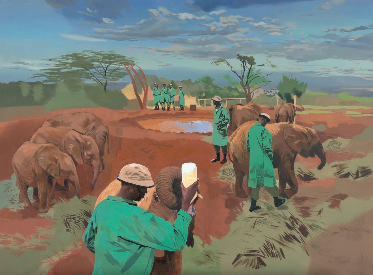
Some artists have captured memorable moments on the official tour, among them Richard Foster’s watercolour of a moment of contemplation for the royal couple on North Seymour Island, in 2009, or Phillip Butah’s painting of elephants and their keepers at an elephant sanctuary in Nairobi National Park ▸
in 2023. "Others have travelled ahead of the royal party to have time to capture landscape and detail," Kate says. "Like Mary Anne Aytoun Ellis, who captured a dramatic view of the Kaieteur Falls in Guyana in 2000.”
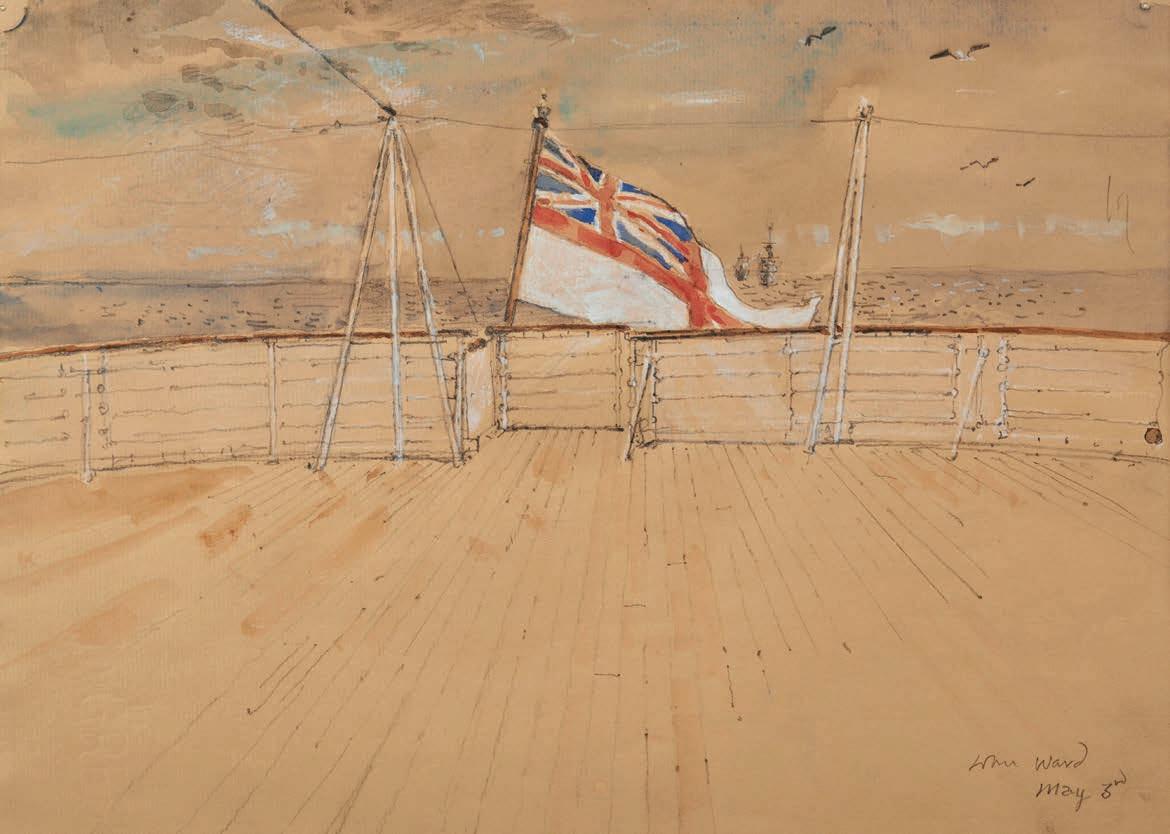
John Ward was the first artist ever commissioned; he was known to Prince Charles as he’d sketched the Royal Family at Balmoral during the Prince’s youth. In 1985, Ward joined the tour of Italy midway, boarding HMY Britannia in the port of Catania. He always carried a sketchbook to record memorable events and his work From The Afterdeck captures a peaceful moment aboard, something rare given the oftenhectic pace inevitable during overseas tours.
The wheel has come full circle this year as the most recent tour dates from April 2025, when Fraser Scarfe – the 42nd artist so employed – joined Their Majesties’ State Visit, again to Italy. Over four days in Rome and Ravenna, Scarfe, Head of Education Delivery at the Royal Drawing School, produced more than 15 digital works, along with sketchbook drawings and painted studies. He used an iPad to capture scenes, which marked the first time time digital art has been used within the tour tradition; apparently, the King follows with interest the evolving possibilities for creativity that such technology assists. Scarfe says of his
trip: “I was able to capture not only key events of the tour but also really lovely moments between the people who came to see Their Majesties – and the fantastic cultural and historical links between our great countries.”
Curator Kate Heard concludes that these works, encompassing landscapes, figure studies and still life subjects, are a testament to His Majesty’s deep engagement with artists over four decades. " I’ve really enjoyed putting very different works alongside each other for the exhibition and hope visitors will enjoy discovering the variety of approaches taken by the artists in response to the broad brief. Each work is captivating in its own right, but together they tell a fascinating story about The King’s interest in the arts and his encouragement of artists.”
The King’s Tour Artists is on from 10 July to 28 September 2025. The Ballroom, Buckingham Palace, SW1A 1AA rct.uk/collection/ exhibitions/the-kings-tour-artists/ buckingham-palace
The Art of Royal Travel: Journeys with The King (£25) is published on 19 June 2025 by Modern Art Press, in association with Royal Collection Trust. Available from Royal Collection Trust shops and royalcollectionshop.co.uk ▫
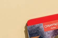
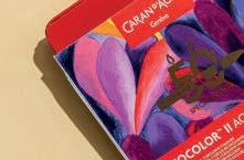
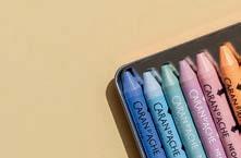
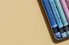
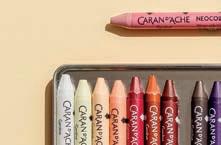
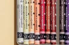
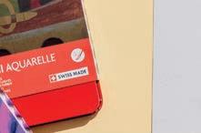
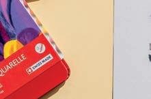
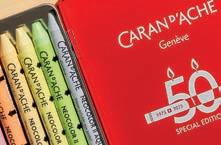
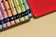
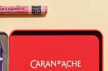
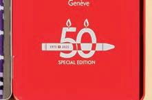
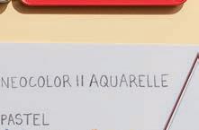
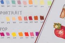
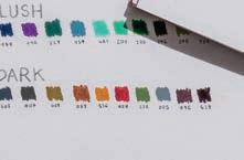
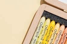
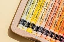
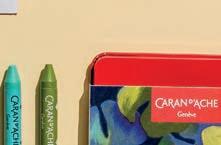
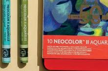
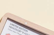
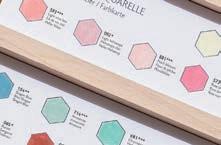
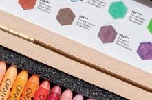
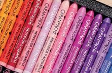
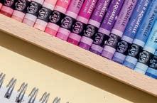
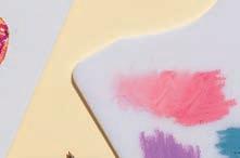
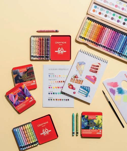
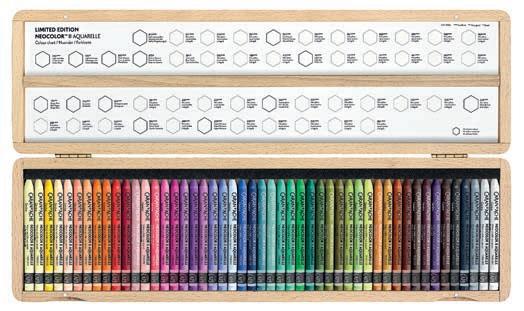
This year, Caran d’Ache marks a vibrant milestone, the 50th anniversary of its iconic Neocolor™ II Aquarelle Wax Pastels - a tribute to ve decades of creativity, innovation and artistic freedom. Since 1975, the watersoluble wax-based Neocolor™ II pastels have been treasured by artists worldwide for their exceptional quality, bold pigmentation and versatility across a wide range of surfaces, including paper, cardboard, wood, metal and even glass.
To commemorate this milestone, Caran d’Ache have released ve Special Edition 10-colour sets - Pop, Lush, Portrait, Pastel and Darkeach featuring three brand new, exclusive shades. These pastels o er fresh inspiration while honouring the rich legacy of Neocolor™ II. For collectors and devoted fans, the celebration

continues with a stunning Limited Edition Wooden Box containing 50 vibrant colours, including the 15 new hues, housed in a beautifully crafted beechwood case. Originally developed as a water-soluble alternative to Neocolor™ I, and famously favoured by the likes of Picasso and Miró, Neocolor™ II combines the intensity of wax pastels with the subtlety of watercolour techniques. Whether used dry for crisp detail or wet for soft blends and washes, the pastels deliver bold, blendable colour with a soft, velvety nish. With 84 brilliant shades in the full range, Neocolor™ II continues to inspire illustrators, designers, and creatives across disciplines. Celebrate 50 years of colour, expression and limitless artistic possibilities with this timeless tool.
info@jakar.co.uk jakar.co.uk


★ Join a community of artists
★ Create your personalised gallery page
★ Showcase unlimited pieces of artwork


★ Sell your artwork commission-free Share, showcase and sell your artwork commission-free from your own personalised online art portfolio for as little as £2.99 per month
★ Appear in online exhibitions
★ Share your art with 1000s of website visitors
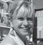
OKSANA ABDUKADYROVA is a London-based botanical artist and member of the British Art Club. Her delicate watercolour paintings explore the beauty of natural forms. Here, she shares her tips on painting flowers with softness and clarity
EVERYTHING YOU NEED TO PAINT AND CREATE
Observe and understand the plant
Before painting, I spend time studying the plant - how it looks and how it’s built. I observe the curves of petals, the direction of veins, the texture of leaves and how light moves across them. When possible, I work from life. Understanding a plant’s structure adds depth to the painting, and the process itself can be wonderfully meditative.
2
Build colour patiently
Watercolour is about working in layers. I start with the lightest tones and build depth, one wash at a time, preserving the transparency of the paint. It’s tempting to rush shadows or go in too dark, too soon, but holding back and letting the painting evolve gradually creates that luminous, delicate finish botanical illustration is known for.
3 1
Experiment with colour mixing
Getting the right colour in botanical work can take time. I often mix several shades to match a petal or leaf — and I always compare with the real plant, not a photo. Don’t be afraid to test and explore. Mix your own colours to create more natural results and better understand how watercolour behaves.
britishartclub.co.uk/profile/ArtOksanaA
Instagram and TikTok: @oksanaa.arts ▫
If
you like painting highly detailed or representational artworks,
but find the concentration and patience it takes hard, this feature may be for you, says HASHIM AKIB
I’ve come from a very technical background
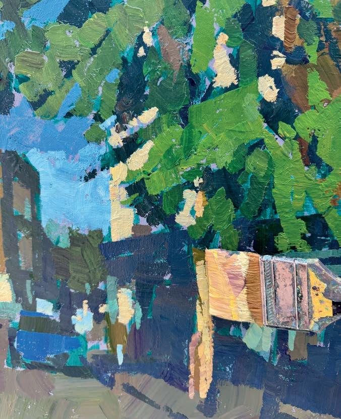
When I started getting busier and time spent on artwork became much more precious, I began looking for ways to streamline the process without losing the precision detail I was used to. I tried several options such as working to a stricter time limit or working with larger brushes. However, the way that proved most impactful was to find areas in a painting that I could meld into others. This way, I avoided looking at each individual element and treated those areas as one big shape. Most obvious were the areas in shadow as these also tend to mask out details and, conveniently, are the places people don’t really look at. Instead, they tend to follow the progression of light.
Immediately, I could play them down and spend that valuable time on the lit areas and especially on the focal points. I also found these large areas of
darks or mid-tones created calm spaces in amongst the light and busy spaces. If I used similar colours in the shadows, such as cool blues or neutral tones, the colours would harmonise and unify these shaded areas.
At the time this proved a revelation, and I spent more time considering how to underplay detail further, while I developed different colour schemes and even began loosening up.
It’s important that paintings aren’t particularly stress-inducing or mentally exhausting, as each time you’ll hesitate to go back for more. For a start, try the following exercise, and you’ll see how economical it is for your paintings to meld those shapes together.
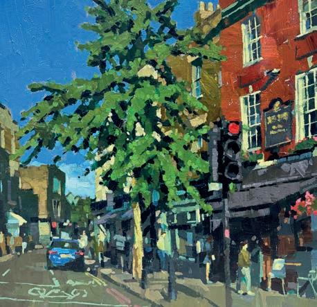
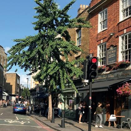
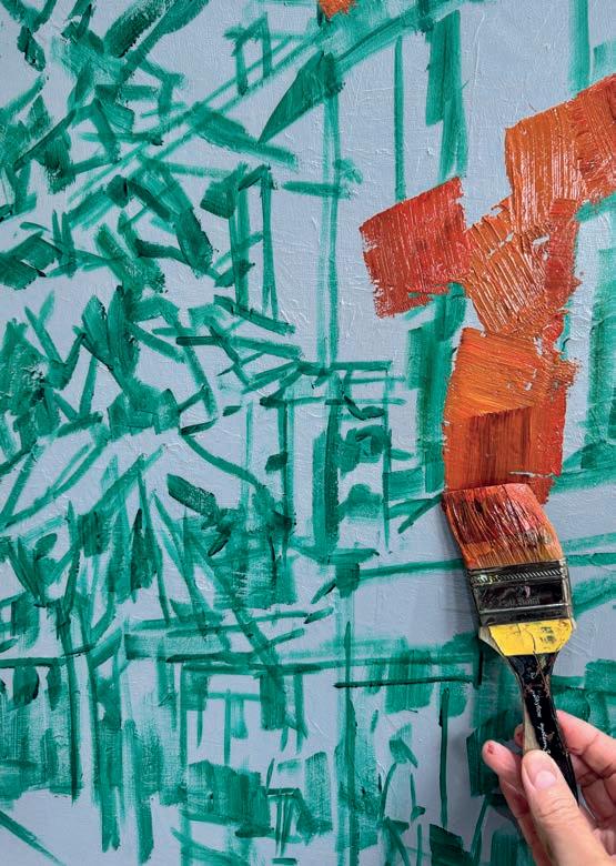
This exercise, using acrylics to recreate a sunny side street in London, shows how you can use the shadows to meld various shapes together to unify elements and disregard unnecessary details. Here we go. hashimakib.co.uk ▸
Paints
Amsterdam Acrylics
Yellow Ochre
Cadmium Yellow
Cadmium Orange
Burnt Sienna
Cadmium Red
Sap Green
Phthalo Green
Phthalo Blue
Permanent Blue Violet
Prussian
Titanium White
Brushes
Daler Rowney,
System 3 Sky Flow
Flat Head 2", 11/2", 1", 3/4"
Support
Pot of water, mixing
tray, canvas size
60x60cm
1
I apply a grey/blue base colour to my canvas, then allow it to dry while I sketch out the scene. I begin by mixing the terracotta colour for the main building. This is a mix of mainly red, orange, Yellow Och re, small amounts of violet and green with a touch of white to soften the colour. I use my largest barely damp 2"F lat brush and make crisscrossing marks over the building, leaving the windows.
2
Using a clean 2" brush, I mix Yellow Ochre, some of the terracotta colour and more green with a little white for the next building. The same colour can be used for the buildings in the distance and to imply the main tree trunk. I can then add more white and blue to dull and soften the ochre for the road and pavement. I’ll cover this in one swift go, varying the colours subtly as I do so
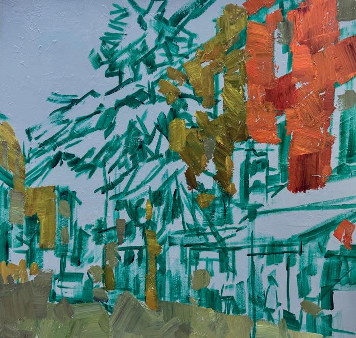
3
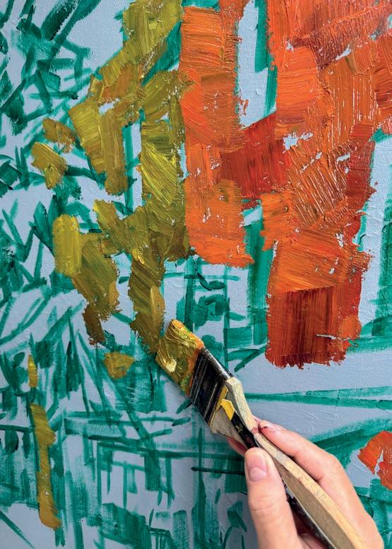
My paint tray contains pools of colour However, I can still use this as I mix large amounts of pigment. This allows for more consistency in colour mixing. I tend to use acrylic paint fairly neatly in one or two applications, as this retains the strength of pigment and avoids the painting being built up in multiple thin layers. The pavement has some combinations with more violet or blue or green in the colour mix.
4
From here, I mix darker shades which will help link everything together. Using the same 2" ochre brush I add more Prussian, violet, blue and greens into my general pool of colour. I try to look for subtle variations of this darker tone. I don’t want the dark to be extreme as this will be used later to produce definitive boundaries. The mid-dark is applied in several places, including buildings, tree, background and car.
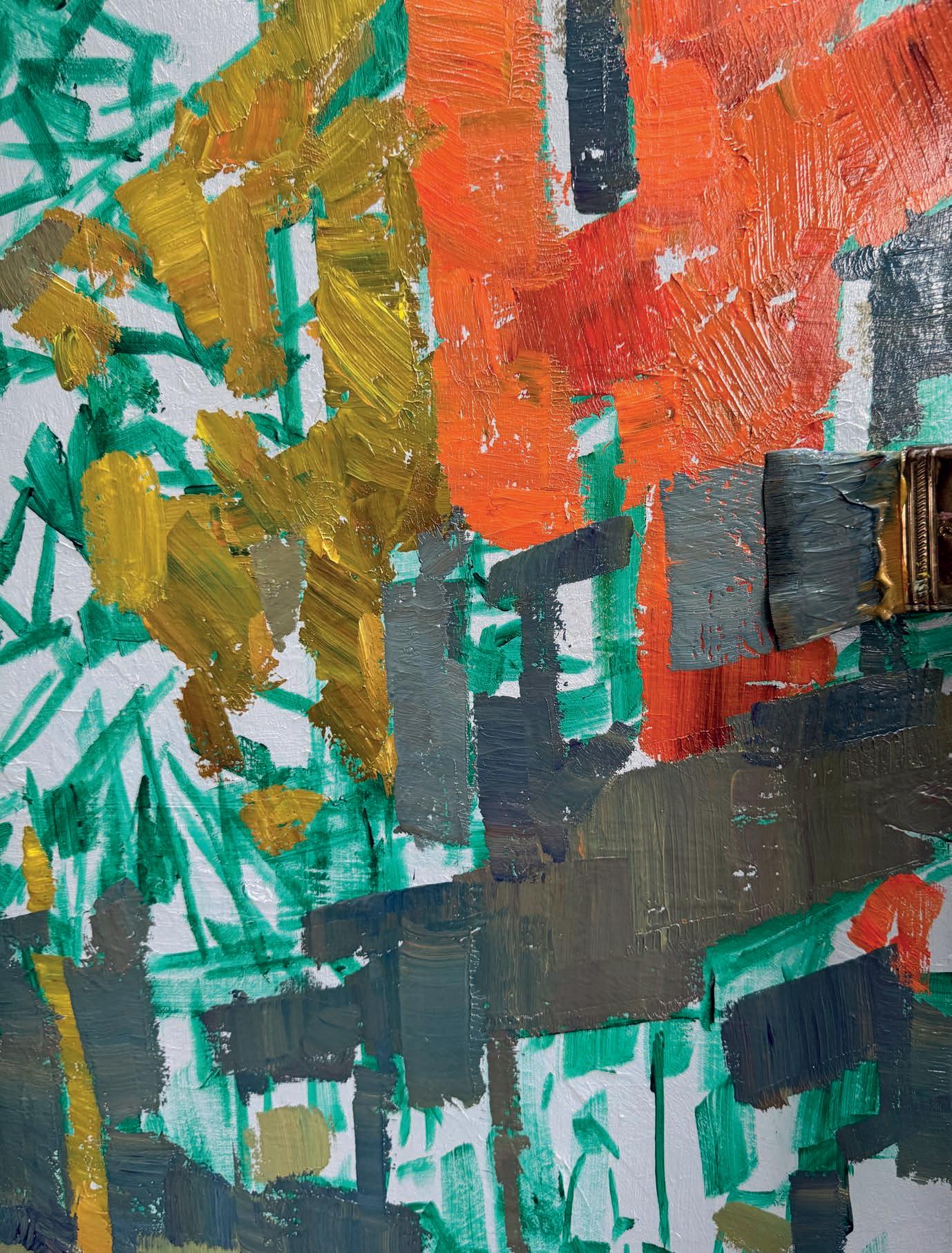
For the luminous tree I mix Phthalo Green and Sap Green with Yellow Ochre and a spot of white. I use a clean 2" brush to apply the greens and try to meld the colour as opposed to separating them too much. Where the green varies in tone, I include touches of v iolet and blue or lighten again with yellow and white. The greens then sit next to the darker tones to create depth.
I use a clean 2" brush and mix white and blue with a touch of v iolet. I use the edge of the brush to create small pockets of sky through the tree. I add more white and ochre for the light area of the sky where it meets the buildings in the distance. Adding more white to the mix encourages me to begin highlighting the buildings.
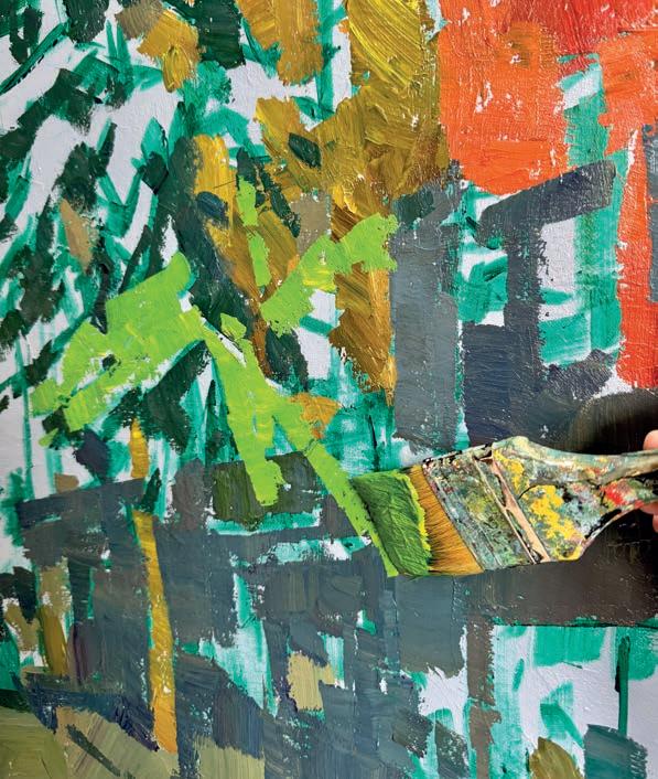
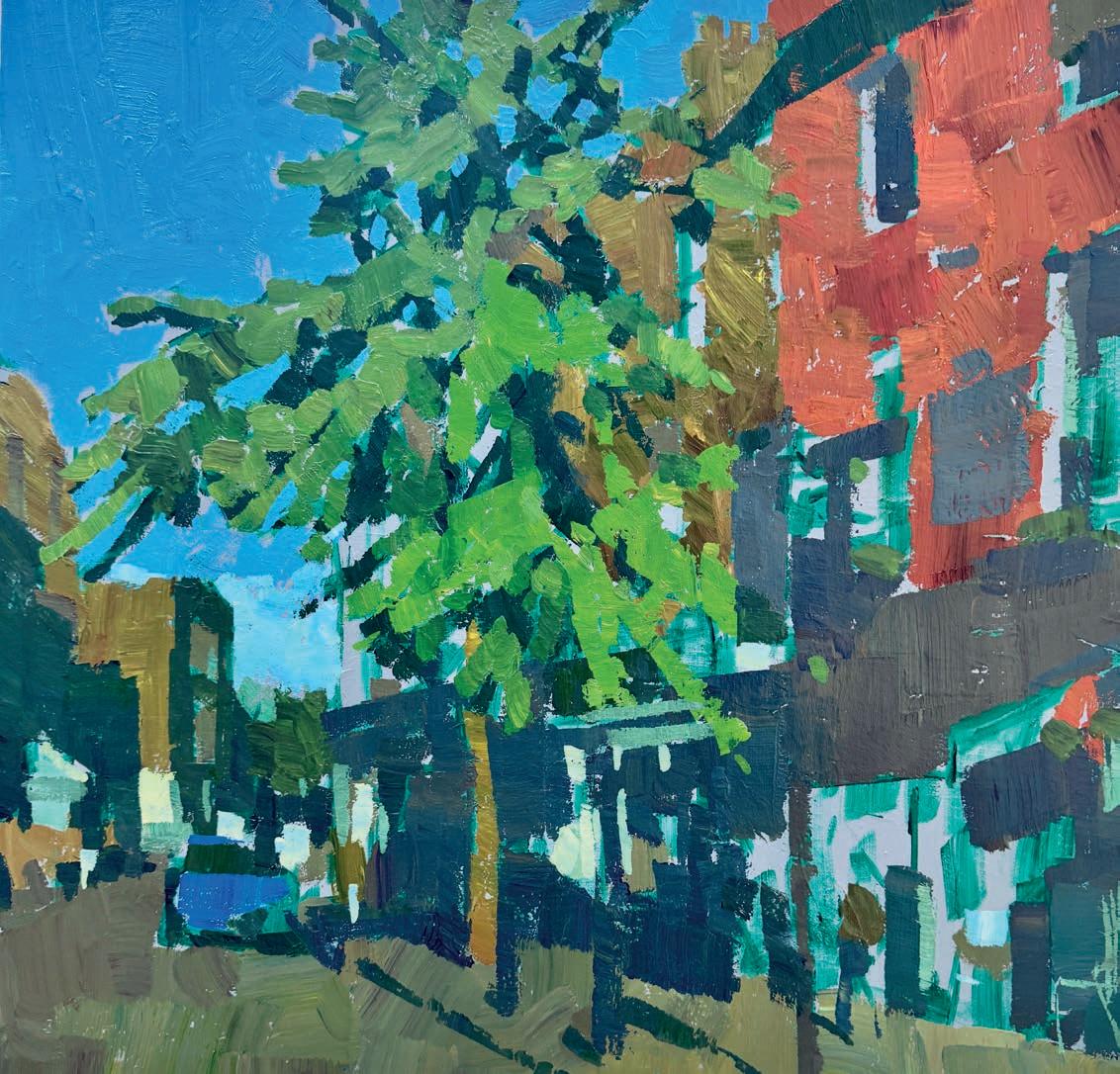
I now mix a strong dark using blue, green and violet. This will begin to define and crisp up the contrasts. I try to avoid overworking areas but use the darks to enhance and give weight to them. I also soften some of the darks to compensate for distance or to avoid unwanted distractions. It’s useful in exercises like this to overplay values to make a point, but do take a little time to consider the options.
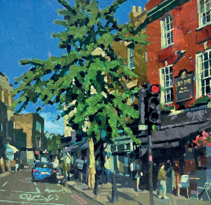
I mix lots of light cream colours for the light building and tree trunk, this is a combination of white, yellow, violet and ochre. Some green may be added to dull the richness. The same colour is used for multiple elements. The reference photo may show variations, but this keeps the overall consistency of the painting. The same tint is used for figures and a pinch of blue is added for the window frames.
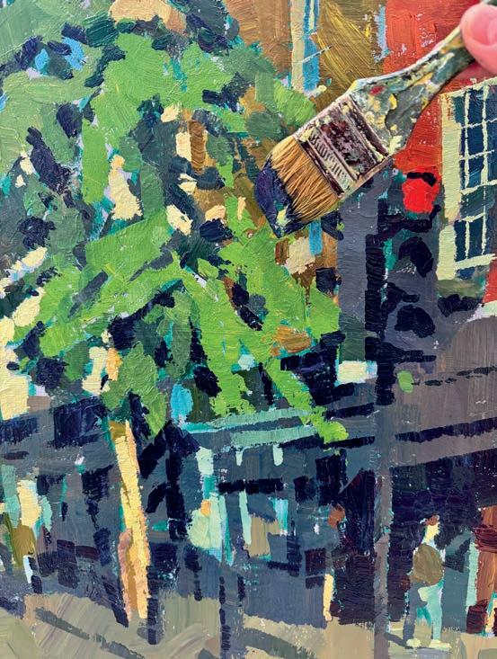
Once everything has been addressed and I have some kind of overall balance, I can spend time adding those precision details or finishing touches. I use a 1" or 3/4" brush and feel relatively fresh as the initial applications were quick. I use lighter yellows and greens on the tree, additional stronger highlights in the shops, add road signs and generally draw things forward. ▫
Hashim’s new book, The Acrylics Companion, published by Search Press, is available now from all good book retailers
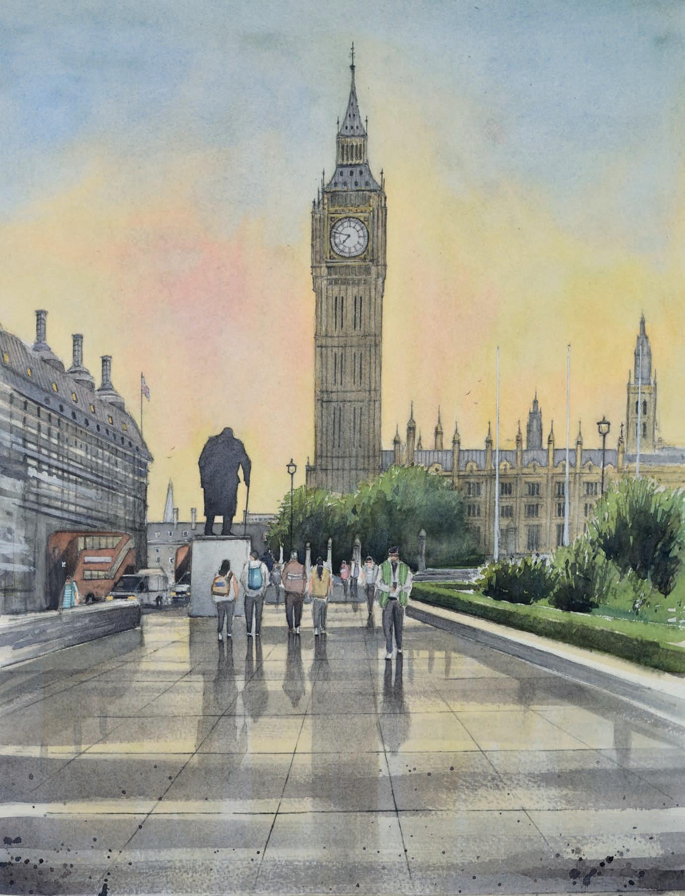
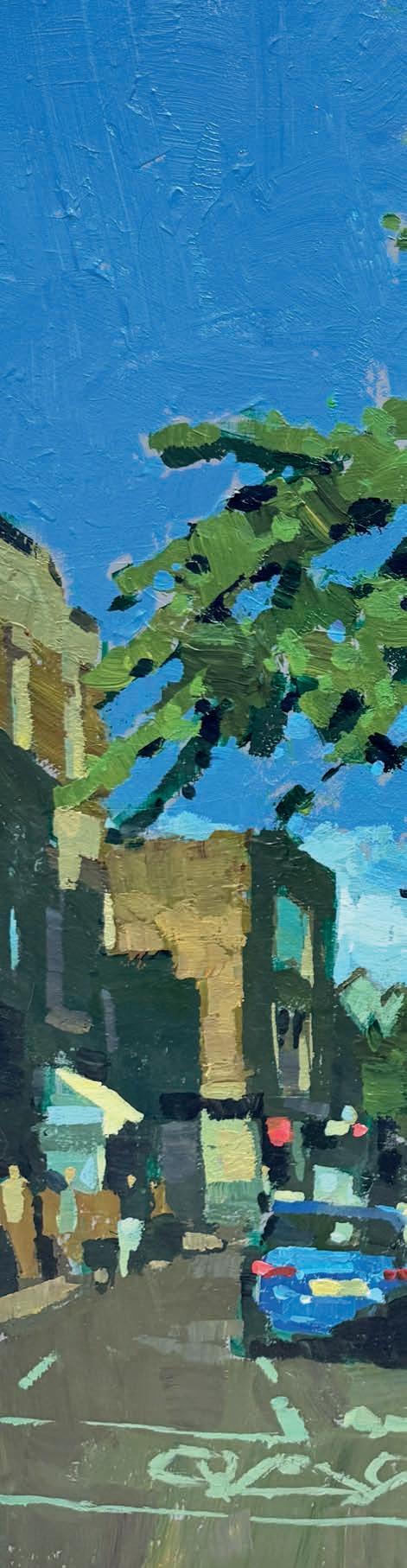
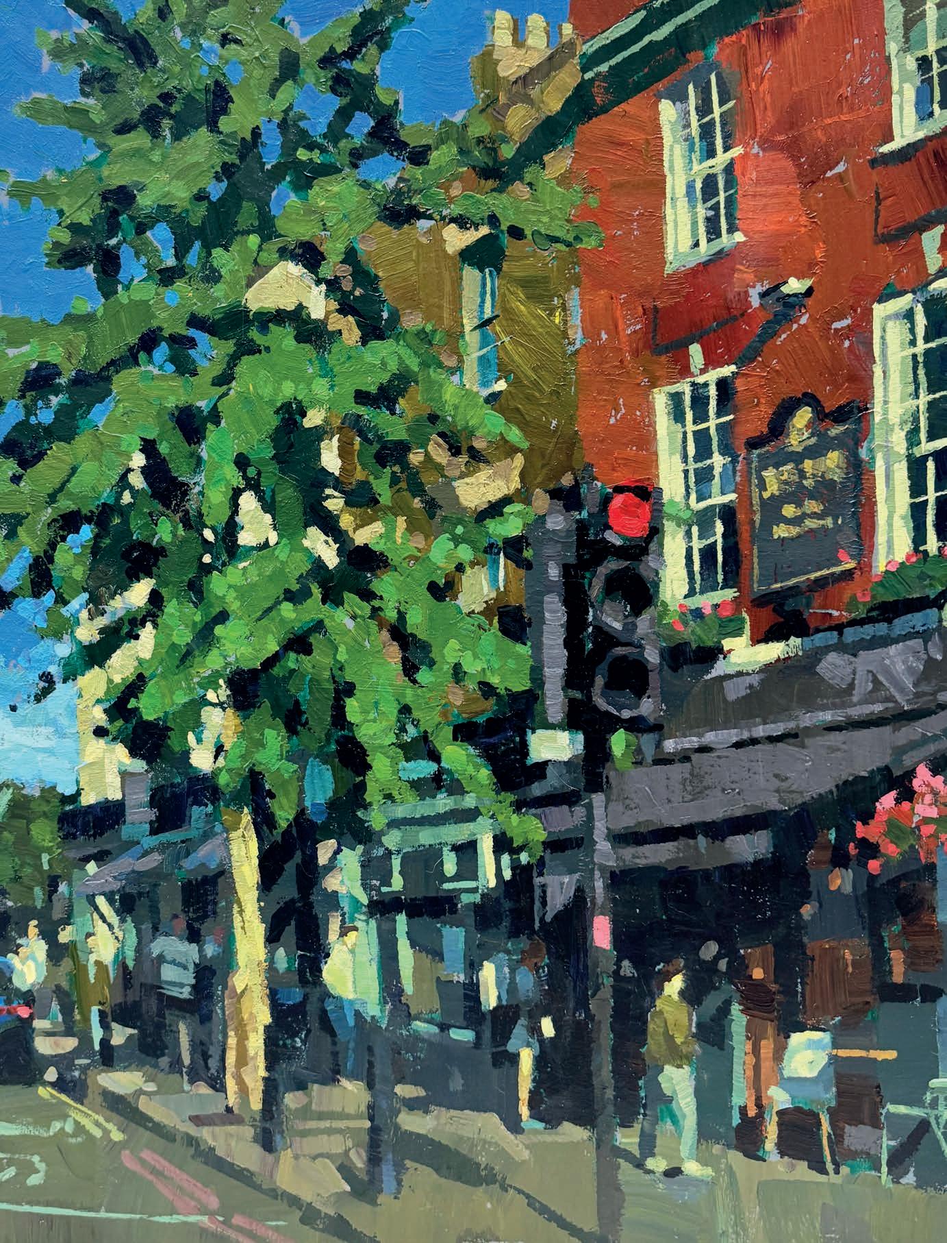
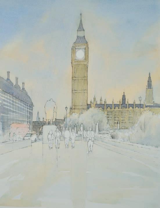
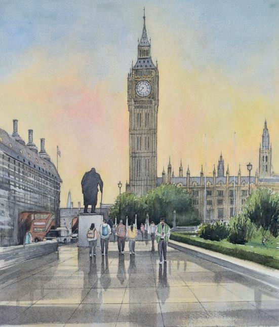
Architecture has always been of great interest to me.
There are many buildings that I have admired for years and their complicated shapes, angles and perspectives all lend themselves to the challenge of capturing these structures through drawing and watercolour. At first sight, these buildings can feel overwhelming to paint but, after careful planning, these challenges – which only add to the appeal of painting architecture in watercolour – can be overcome.
London has always offered different styles of architecture and, with so many well-known landmarks, it is the perfect location for an urban study. The changing atmosphere in the city throughout the day only adds to the interest when working up a painting of this historic place.
I have decided to paint a study looking towards Elizabeth Tower, or Big Ben as it is more affectionately known. This wellknown landmark in central London not only offers a challenge in its architectural beauty, but also the challenge of capturing the atmosphere from a warm summer evening. The mood also changes at this time as the pace slows down from the busy day. With this in mind, I aim to capture this mood and atmosphere, while ensuring an accurate depiction of the architecture itself. Although the painting will have detail, it will be important to exercise a mild approach to allow through as much of the atmosphere as possible. I hope you enjoy this piece and the process of how I created the work. theandrewlucasgallery.co.uk
ANDREW LUCAS guides you through painting this London landmark in watercolour, showing how to balance architectural detail with mood and tone 1
Paints
Winsor & Newton Professional Watercolours and White Nights Watercolours:
Cobalt Blue, Purple Lake, Yellow Ochre, Raw Sienna, French Ultramarine, Sap Green, Cadmium Lemon, Cadmium Red, Burnt Umber, Alizarin Red
Support
Daler-Rowney The Langton NOT prestige 100% cotton paper Brushes
I use a selection of brushes including Escoda Ultimo and Perla, both of which are excellent. I also use Winsor & Newton sable and synthetic brushes. I always have a mix of natural and synthetic brushes, and they are of equal use for me.
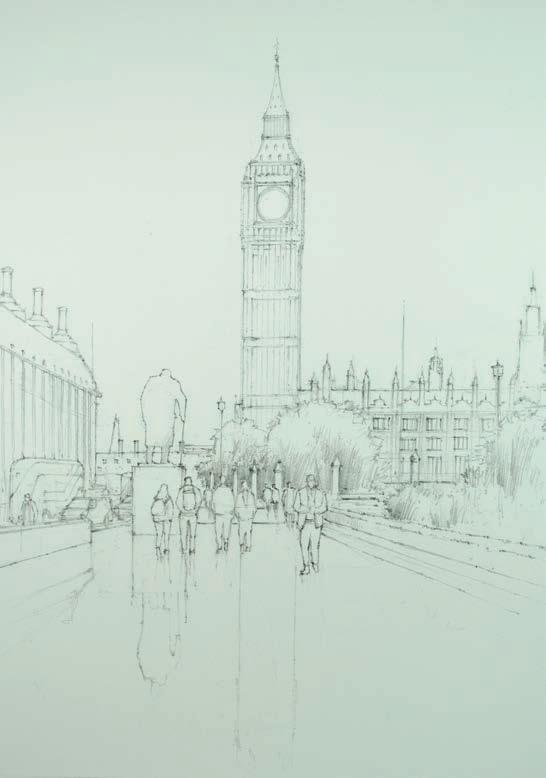
The initial freehand drawing is the first stage of the process, which I tend to work up by carefully observing the scene and getting a feel for the overall subject. Once the main structures have been achieved, I can build on them and add further detail. I find it important to give the painting room to develop as the piece progresses, so I try not to overwork this drawing stage by adding too much detail. ▸
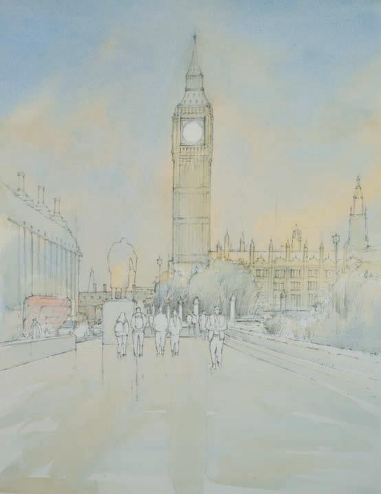
I begin the painting with a wash for the sky. Using a mix of Cobalt Blue, Purple Lake and Yellow Ochre, a weak wash is painted over the sky and into the buildings, which helps unify both sky and structure. Using a flat brush, I blend the pigment wet-in-wet to create a gentle variation of colour. This initial sky colour will help determine the atmosphere that will play through the painting.
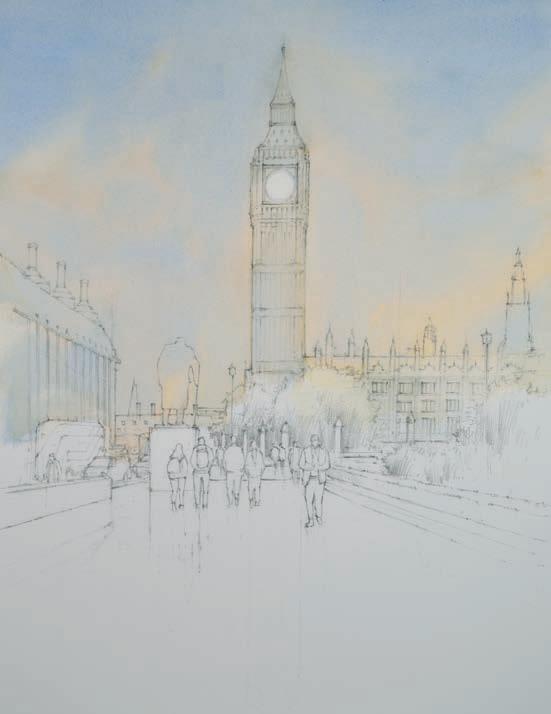
I now move on to the first wash, which will become the base tone for the buildings and foreground to build upon. A fairly light mix of Yellow Ochre, Raw Sienna and French Ultramarine is introduced, with a darker Yellow Ochre mix offered to the Houses of Parliament on the right. This darker mix will help with the main tonal structure, and at this stage it is simply to get the colour down.
I build up form in the buildings by applying the second wash, used to make defining shapes across the whole scene. I also start to pick out some details in the rendering. At this stage I am only concentrating on the buildings themselves as these will form the dominant parts of the study. The same mix of French Ultramarine, Yellow Ochre, Raw Sienna and Purple Lake is used, but in a stronger tone than before.
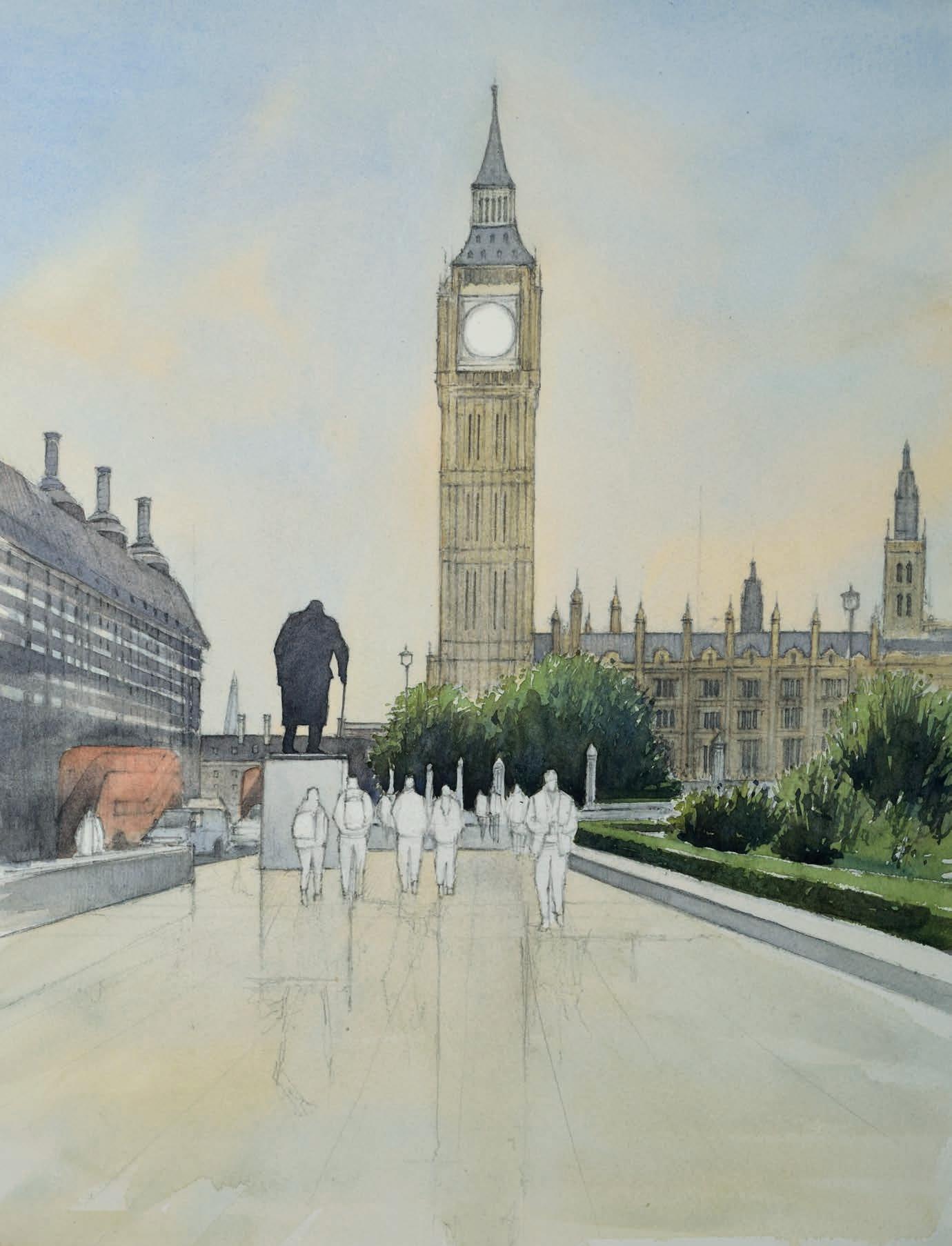
Now that the main washes have been introduced, it’s time to build up the shapes of the buildings, along with the other elements, such as the trees and pathways. It is very important to connect these shapes to help give the piece unity and allow the painting to grow as one piece. I use a mix of Sap Green, Cadmium Lemon and French Ultramarine for the trees and other foliage. ▸
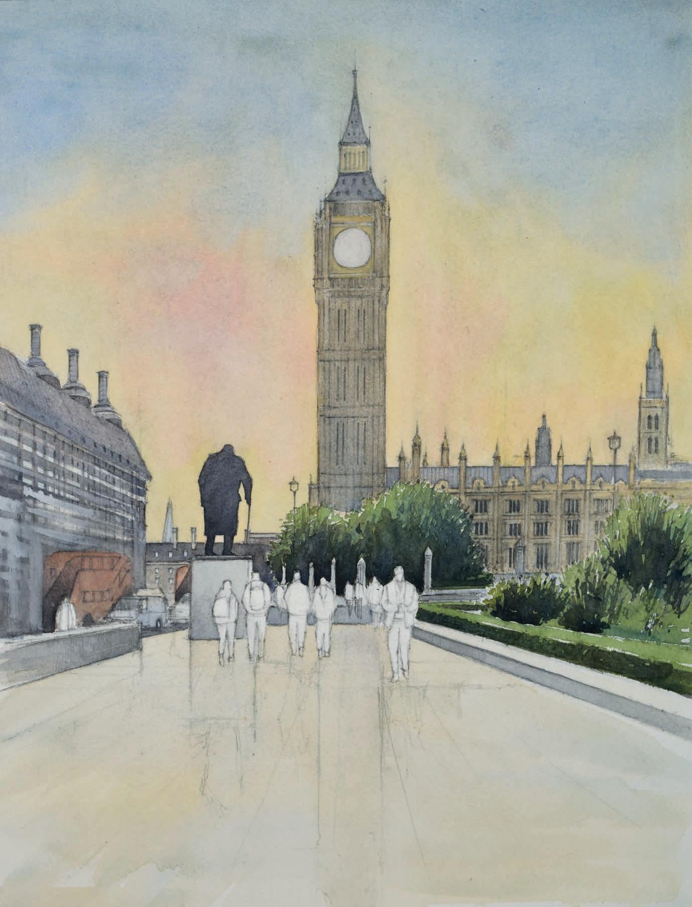
Additional and further detail is added at this stage, with loosely rendered detail to both left- and right-hand buildings. I introduce a slightly darker wash to the sky to help darken and deepen the initial tone. Then a wash of French Ultramarine, Yellow Ochre and Cadmium Red is carefully added to the sky. This in turn will help give a warmer contrast that helps complement the composition and the surrounding tone much better.
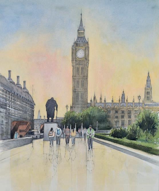
7
My attention now turns to painting the people and vehicles in the scene. This stage can be as important as the buildings themselves, because people give a sense of movement and scale to the piece. I use various different colours to pick out clothing and give shape and form to the people. Subtle details are added to the vehicles on the left, with care being taken not to overwork this stage.
I continue to add darker contrasting tones to the foreground which will help with the sense of recession. When painting wet pathways, it can be easy to create what looks like a puddle or lake. By using varying tones together with lines of perspective, the illusion of a wet surface can be created. I also decide to darken the shadows on the people slightly; this will help with the sense of recession.

8 9 10
Now the main elements are finished, I move to the foreground. I use a weak mix of French Ultramarine, Burnt Umber and Alizarin Red to add to the reflections on the path. I keep the initial reflections subtle in tone, as I may need to darken them slightly later on. Once I am happy with the reflections, I can render the pavement lines which help with perspective, structure and the illusion of a wet path
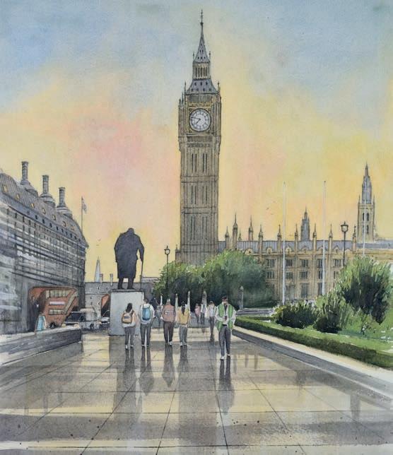
It can be easy to overwork the painting at this stage, so the last tweaks and subtle details are carefully thought through and added. Birds give a sense of movement, so these are added to the painting along with a slight suggestion of texture to the foreground. I add slightly darkened path lines in places, to help break up any sense of repetition in the path. Now, the painting is complete. ▫
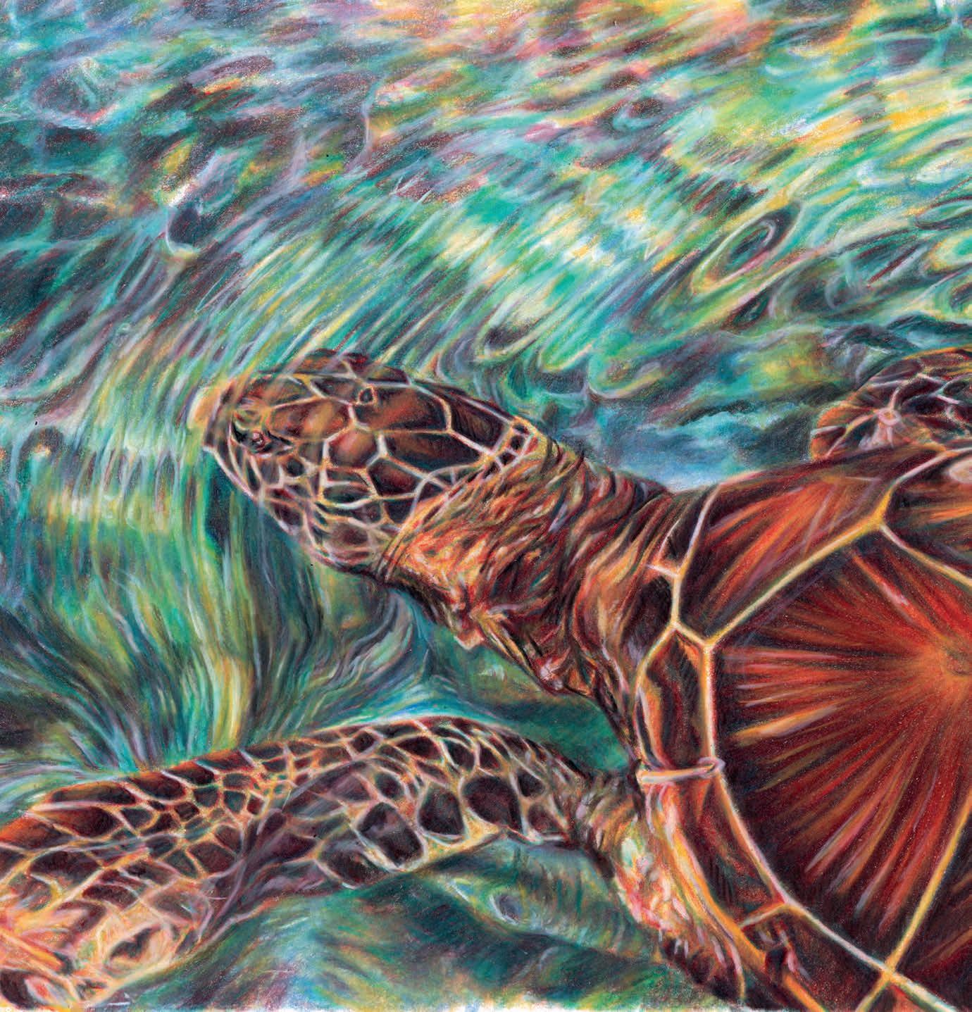
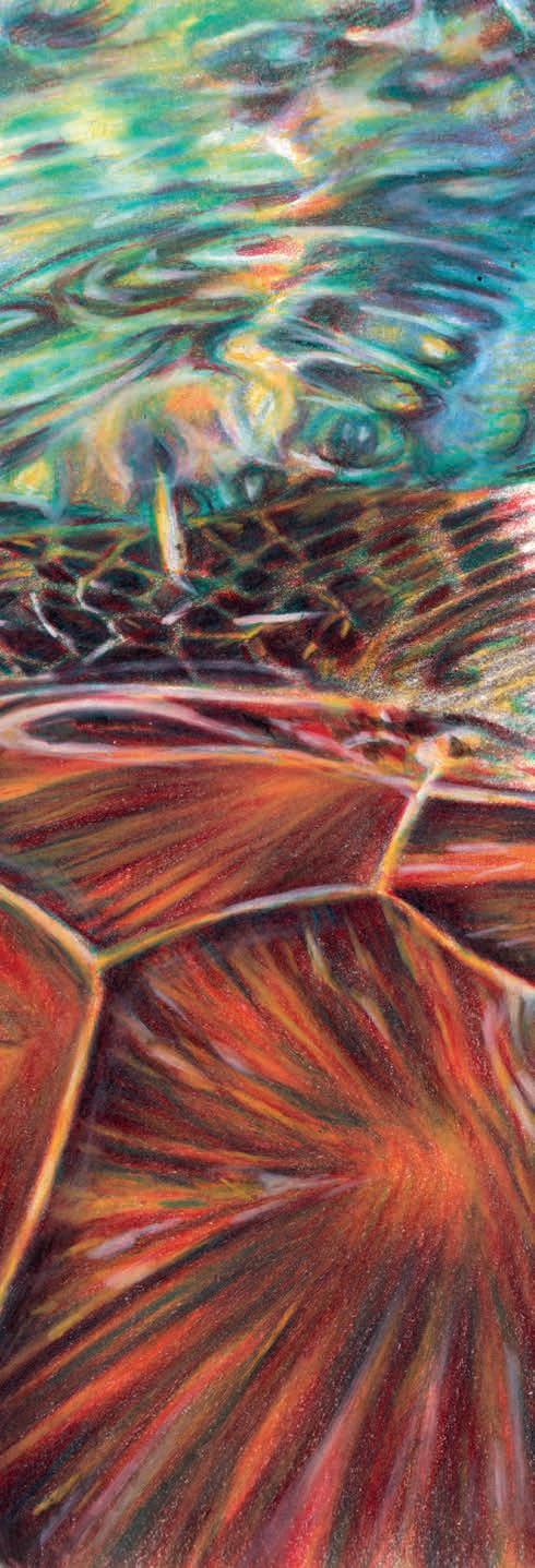
SEMA MARTIN wanted to challenge herself with something completely different from her usual work, so chose to draw a sea turtle, surrounded by rippling water, in coloured pencil
Coloured Pencils
Caran d’Ache
Luminance 093 Violet Grey, 820 Golden Bismuth Yellow, 070
Scarlet, 719 Beryl Green, 661 Genuine Cobalt Blue, 001 White
Faber-Castell
Polychromos Black Support
Derwent Lightfast Paper
Lightbox (for transferring the outline cleanly to the paper)
Sharpener (a good sharp point is essential for crisp detailing)
As someone who specialises in coloured pencil pet portraits, I’m very familiar with layering fur and capturing texture, but this time I wanted to explore smoother surfaces, bolder shapes and underwater light. It was my first time drawing both a turtle and a water scene, and I was genuinely excited to see what I could create.
To push the challenge further, I limited myself to just six pencils. Working with a reduced palette forced me to be more intentional with layering and colour mixing, especially when building the subtle glow of the water and the intricate pattern of the turtle’s shell. I quickly realised how much could be achieved with just a few well-chosen colours and a lot of patience.
Drawing water was surprisingly meditative, and I loved figuring out how to suggest movement and depth without relying on outlines. The contrast between the fluidity of the water and the structure of the turtle made the piece feel dynamic and alive.
This project was a refreshing break from fur and fluff, and it reminded me how powerful it is to try something new. If you’ve never drawn a scene like this before, I hope this tutorial gives you the confidence to go for it. You don’t need a huge range of materials, just curiosity, observation and a willingness to experiment. semamartin.com
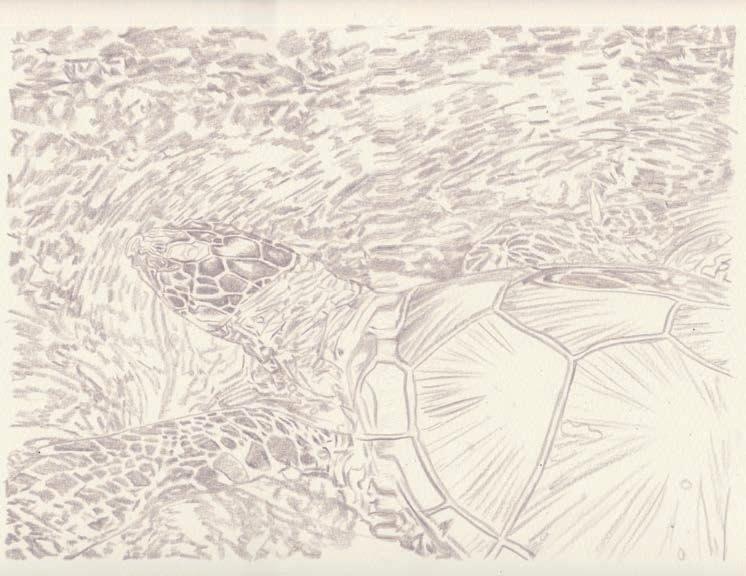
To begin this turtle piece, I used Derwent Lightfast paper, which is perfect for detailed layering and blending. Using a Caran d’Ache Luminance Violet Grey 093 pencil and a lightbox, I carefully traced the main outlines onto the paper. I focused on capturing the larger shapes of the turtle’s body and flippers, as well as the most prominent water movement patterns around it. The Violet Grey pencil is a great choice for this initial sketch, it’s light enough to blend into later layers but dark enough to guide your work clearly. At this stage, it’s all about setting yourself up with accurate proportions and avoiding any unnecessary detail. Keep your lines soft and clean so they don’t interfere with the coloured layers that will follow. ▸
To warm up the base of the drawing and unify the colours early on, I began by lightly toning the entire surface with Caran d’Ache Luminance Golden Bismuth Yellow 820. This soft layer gives the artwork a gentle glow that will shine through the later colours, especially in the water and highlights on the turtle. Next, I used Scarlet 070 to map out the tonal values on the turtle’s shell and flippers. I focused on identifying and building the darker areas and mid-tones, leaving the highlights untouched. This stage is a bit like a sketch in colour; it may feel tedious to draw out each shape, but it’s an essential step for creating depth and accuracy later on. By committing to this tonal underdrawing, I’m setting myself up with a solid value structure that will make layering the next colours much easier.
To start developing the dark brown areas of the turtle’s shell and flippers, I used a combination of Scarlet and Beryl Green from the Caran d’Ache Luminance range. It might seem like an unusual pairing, but together they create a rich, earthy tone perfect for those deeper areas. I began by layering Scarlet over the previously mapped mid-tones, then gradually introduced Beryl Green on top, adjusting the pressure to control the intensity. The more layers you add, the darker and more complex the colour becomes. So, feel free to experiment and adjust based on the lighting in the reference photo. It’s important to constantly refer back to your reference image during this step. Look closely at the direction of the light and how the shadows curve around the turtle’s shell. Take your time here; it’s this attention to tonal layering that will bring realism and depth to your finished drawing.
2 3 4
With the tonal base established, I began layering Golden Bismuth Yellow over the shell alongside Scarlet and Beryl Green, working all three together to build up the rich texture and natural pattern of the turtle’s shell. This stage is about applying many light layers. Don’t go in heavy to achieve those rich tones quickly, because pressing too hard too early will burnish the paper, making it difficult to layer further. Building up the colour gradually gives a smoother, more realistic finish. Pay attention to the direction and texture of the shell. For the lighter areas, use Golden Bismuth Yellow, applied softly to create a warm glow. In the darker sections, lean into Scarlet and Beryl Green, layering them to create depth and contrast without flattening the texture. Patience is key: the shell is full of character and this is the stage where it comes to life.
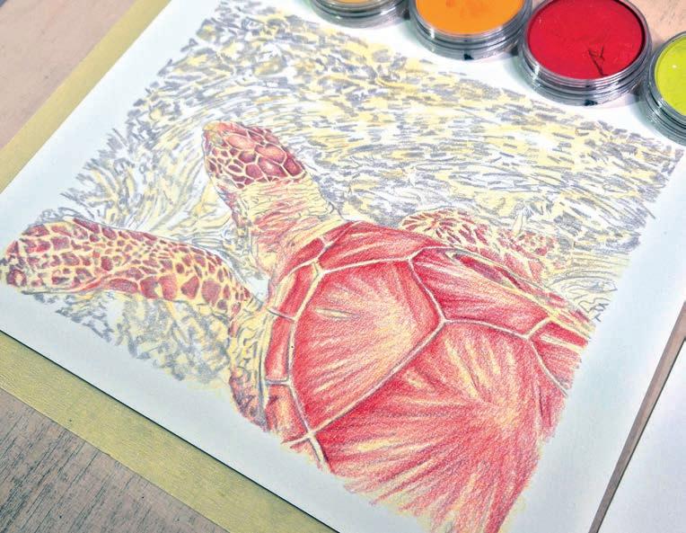
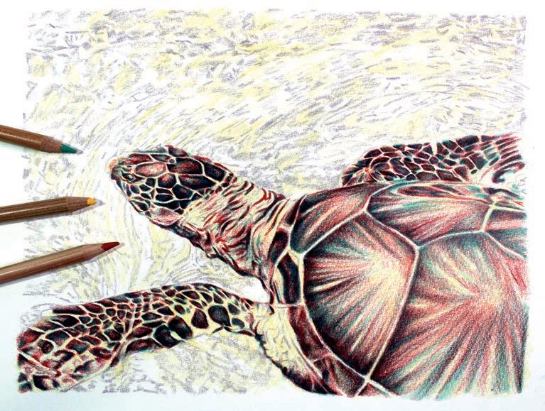
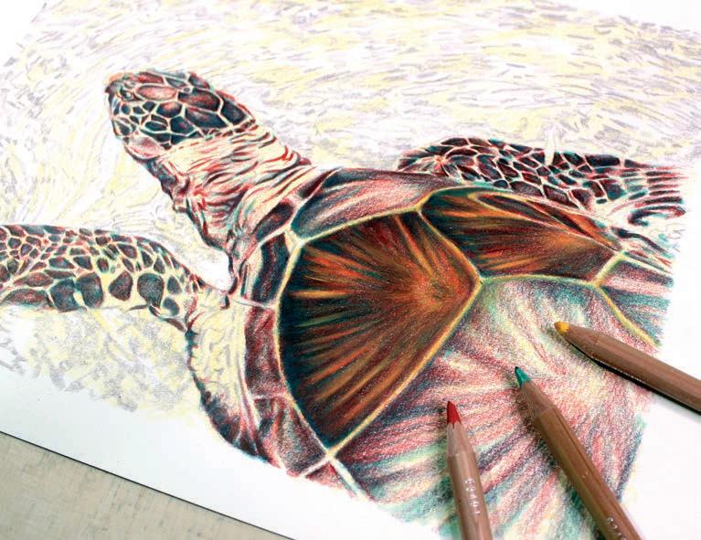
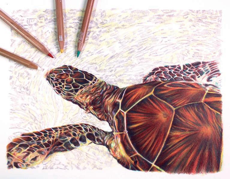
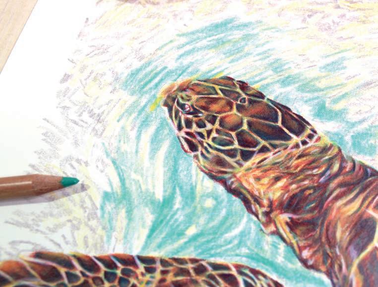
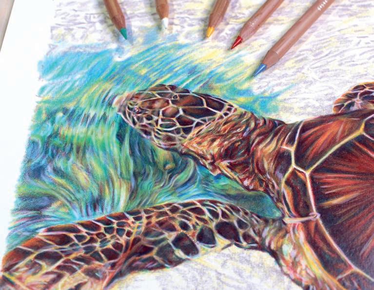
5
With the shell almost complete, I shifted my attention to the turtle’s head, neck and flippers, developing the scale patterns and skin texture with the same pencil trio: Scarlet, Beryl Green and Golden Bismuth Yellow, plus the addition of White to help separate highlights and build contrast. The key in this step was to keep the markings clean and controlled, using sharp pencils and short, deliberate strokes to follow the form of the turtle’s limbs. Stay patient and keep layering in light layers: you will see it suddenly transform. Now that the turtle is fully taking shape, it’s time to start on the water.
6
I began to carve out the flow and form of the water surrounding the turtle’s head using Caran d’Ache Luminance Beryl Green. This colour is perfect for capturing the vibrant, tropical feel of shallow water and helps build contrast against the warmer tones of the turtle’s shell and skin. Using light, sweeping pencil strokes, I followed the natural movement of the water, paying close attention to the direction and curves seen in the reference image. One key detail here is to allow the water to slightly overlap the edges of the turtle, especially around the head. This subtle layering helps give the illusion that the turtle is partially submerged, enhancing that underwater effect. Keep your pencil pressure light for now, you’ll want room to blend and layer additional colours later to soften transitions and add more depth to the water.
7
With the base tones in place, I enriched the water using Caran d’Ache Luminance Genuine Cobalt Blue, adding cooler blue and purple undertones that contrast beautifully with the warmth of the turtle. This helped create a more dynamic, immersive ocean effect. To develop the shadows and sense of depth, I layered Scarlet, Beryl Green, and Golden Bismuth Yellow, in that order. This unexpected combination created a rich dark turquoise, which added drama and structure to the rippling water. It also tied the palette back to the turtle itself, making the whole piece feel cohesive. I then used White to softly blend across sections of the water, helping to unify the colour transitions and blur edges just enough to mimic the way light refracts and dances through the water. ▸
I continued the same layering process, focusing on building a sense of movement and depth. Using Beryl Green to block in the major shapes and currents, I then layered over with Scarlet, Golden Bismuth Yellow, Genuine Cobalt Blue and White to add variation, vibrancy, and flow. Refer to the reference image to guide the direction and spacing of the water swirls, so they follow a natural, fluid motion around the t urtle. I added a final layer of Golden Bismuth Yellow and White over parts of the turtle’s head and front flippers - a soft glaze suggesting those areas are slightly submerged and catching the light refracted through the water above
Now that the majority of the water is complete, this step is all about fine-tuning the values and making sure everything flows harmoniously. I carefully went back over areas where the contrast needed boosting, especially in the darker ripples and shadows, by layering Scarlet and Beryl Green. To enhance the brightest highlights, I used White to softly blend and brighten selected sections, particularly in the top left area of the rippling water. These highlights are key to making the turtle look fully submerged, surrounded by reflective light. This step is about stepping back and observing, making small adjustments where needed and smoothing out any harsh transitions.
This last step is completely optional, but I think it’s a great way to make the entire piece really pop. Using a Black Faber-Castell Polychromos pencil, I added a soft glaze over selected areas—particularly the turtle’s fins, parts of the shell pattern and the darkest ends of the scutes (the segments of the shell). This subtle glazing enhances the contrast between the turtle and the vibrant, shifting colours of the water. The key here is restraint: use a light hand and refer closely to your reference photo. Darken only where needed to support the form and add clarity. And with that, your turtle is finished - surrounded by shimmering, moving water, and full of life and colour! ▫
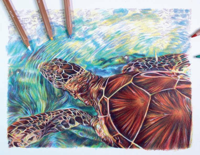
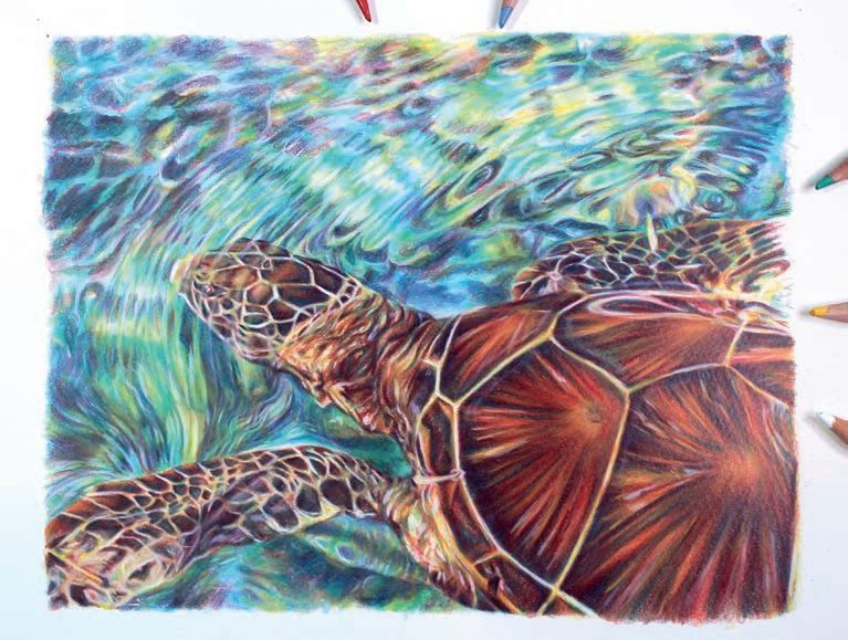
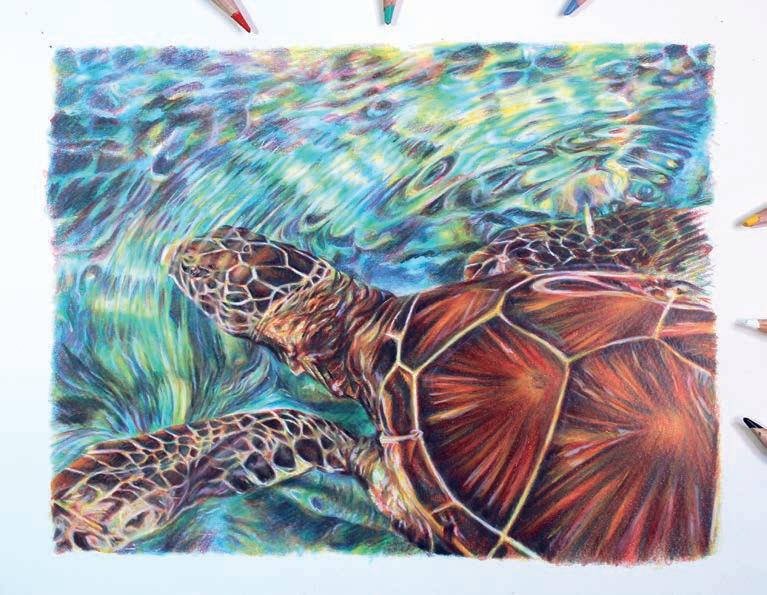
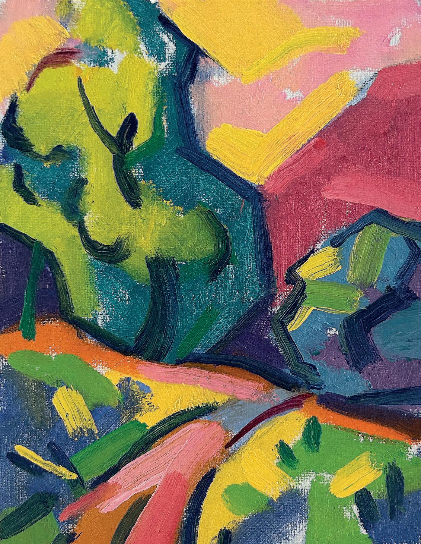
Recreating the same landscape, using three different colour palettes, allows for a wide interpretation of colour and composition. Oil artist AL GURY encourages you to experiment with palettes to open up new directions in your work
With the summer landscape painting season upon us, this is a great time to consider palette choices, new colou r additions and expression in brushwork for our landscapes.
Choosing a palette of oil colou rs can be done by working with time honou red and traditional colou rs, such as the earth colours along with a few bright pigments, as seen on the palettes of painters such as John Constable (1776-1837) in his lovely plein air studies. By constrast, the palette of Anders Zorn (1860-1920) is practical, limited and economical, and can easily be adapted to landscape painting with the addition of a blue and a green.Different again is the palette of Henri Matisse (1869-1954) from his Fauvist phase. This is one of the most exciting palettes to use because of the strong interactions of the primary and secondary colours, as well as the possibilities of endless interpretation of colour and design in nature.
A stimulating and informative approach to exploring options and new directions in one’s work is to do a series of paintings of the same subject using a variety of palettes. This can also include trying out the stylistic approaches that the colou r palettes will present. This can be in the nature of their colou r use, such as more tonal and spatial, more expressionistic and semi abstract
The goal of the exploration described here is not only to gain more knowledge of palettes and their possibilities for colour expression and style, but to also gain insight into adding to landscape paintings by creating a more personal colou r sensibility, enhanced poetic and expressive feel and greater connection to the joy of painting.
The following alla prima (directly painted) landscapes suggest just three of the possibilities for exploration of colou r, mood and expression.The three gessoed panels used for this project are 17.78x 12.7cm and the white mentioned in each is Titanium White. algury.com
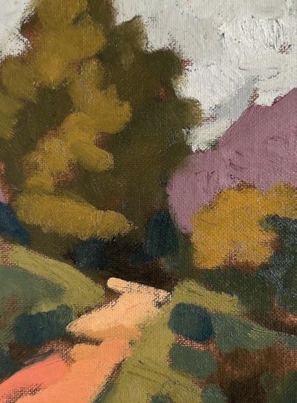
The photo chosen as the painting reference has clear possibilities for interpretation of colour, composition and brushwork. As always when using most landscape photo references, the painting must be translated through the artistic lens, which means the simplification and organisation of shapes, value blocks, textures, perspective and colour choices. Just copying the photo may not lead to a rich and colourful landscape painting.
In this first exercise, the Zorn palette includes colours such as Titanium White, Ivory Black, Cadmium Red and Yellow Ochre. Zorn is known to have added a blue and a green to his landscape palettes, so Ultramarine Blue is added here. The ground or surface colour of the panel is a transparent wash of Burnt Umber over the white gesso. This is similar to grounds Zorn would have used. This middle tone brown easily facilitates light and dark.This first stage shows the basic blocking in of colour shapes. The greens are made of Ivory Black, Yellow Ochre and Ultramarine Blue. The sky colour is made of Ivory Black and Titanium White. The lavender hill is a mixture of Cadmium Red, Ivory Black and Titanium White. Finally, the pathway is mixed from Yellow Ochre, Cadmium Red and Titanium White. ▸
Take a look at the colours you have in your paint kit and organise them into families of hues - earth colou rs, basic bright reds, yellows, blues and greens. This will help you assess which ones you most like using
3
Final touches here involve strokes of Ultramarine Blue and Titanium White in the sky, darker shadow colou rs made of Ultramarine Blue and Ivory Black, as well as lighter and slightly brighter greens made with Yellow Ochre, Ultramarine Blue and Titanium White. Bright pinks mixed from Cadmium Red and Yellow Ochre are stroked into the path with blue touches on the margins of the path. The Zorn palette strengthens values but cannot account for all varieties of colou r possible in an observed landscape, so the final effect is soft, gentle, neutral and somewhat moody.
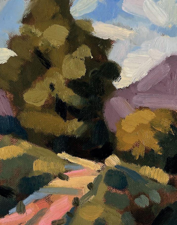
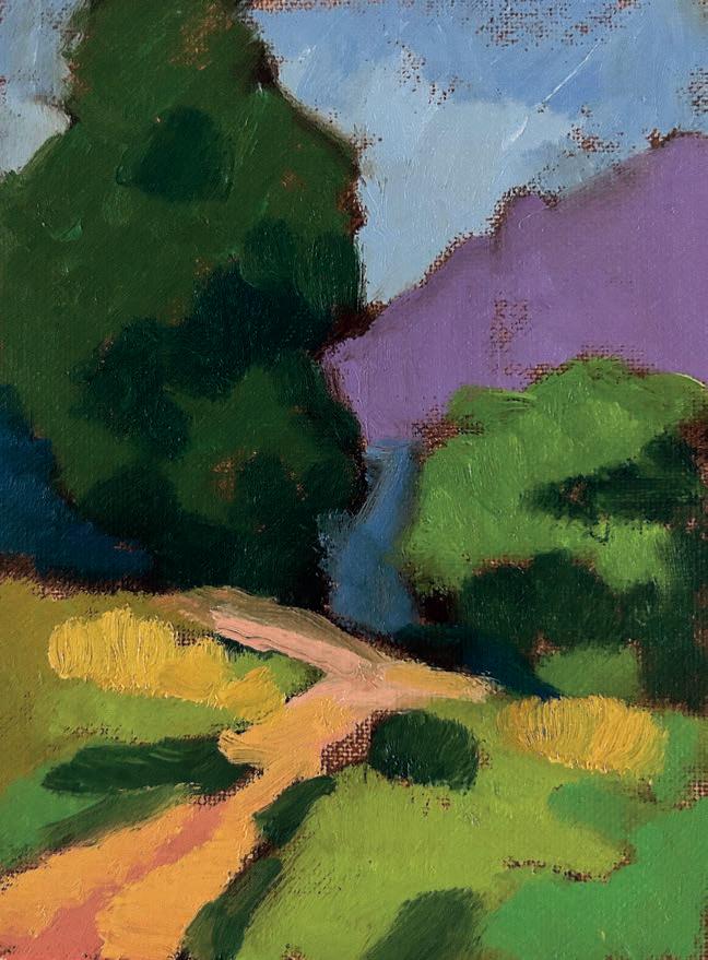
The second landscape study includes the colou rs commonly used by John Singer Sargent in his landscape sketches. These are Alizarin Crimson, Burnt Sienna, Cadmium Yellow, Cobalt Blue, Viridian Green, Cadmium Red, Yellow Ochre, Earth Red, Burnt Umber and Ivory Black. This is a versatile and broad palette and can match most colou r effects in nature. It can also have other colou rs added easily as needed. The ground colou r used is a transparent mid tone Burnt Umber wash over the white gesso panel.
This first stage shows large masses of colou r and value blocked in. The darker greens are made from Viridi an Green and Yellow Ochre. The brighter greens are mixed from the same colou rs with the addition of Cadmium Yellow and Titanium White as needed for lighter values. The sky is blocked in using Cobalt Blue and Titanium White and the hill in the distance is made from Alizarin Crimson, Cobalt Blue and Titanium White. The dark blues are made from Cobalt Blue and Ivory black. Yellow Ochre and Cadmium Yellow make the brighter, yellowish vegetation and Cadmium Red, Yellow Ochre and Titanium White create the varied colou rs of the pathway.
The dark greenery shadows are made by adding Cobalt Blue to the earlier green mixe s. Sargent’s palette allows us to describe most, if not all, of the possible observed or interpreted colou rs in a landscape. The final effect is one of colou r comple ments interacting richly within this essentially tonal painting.
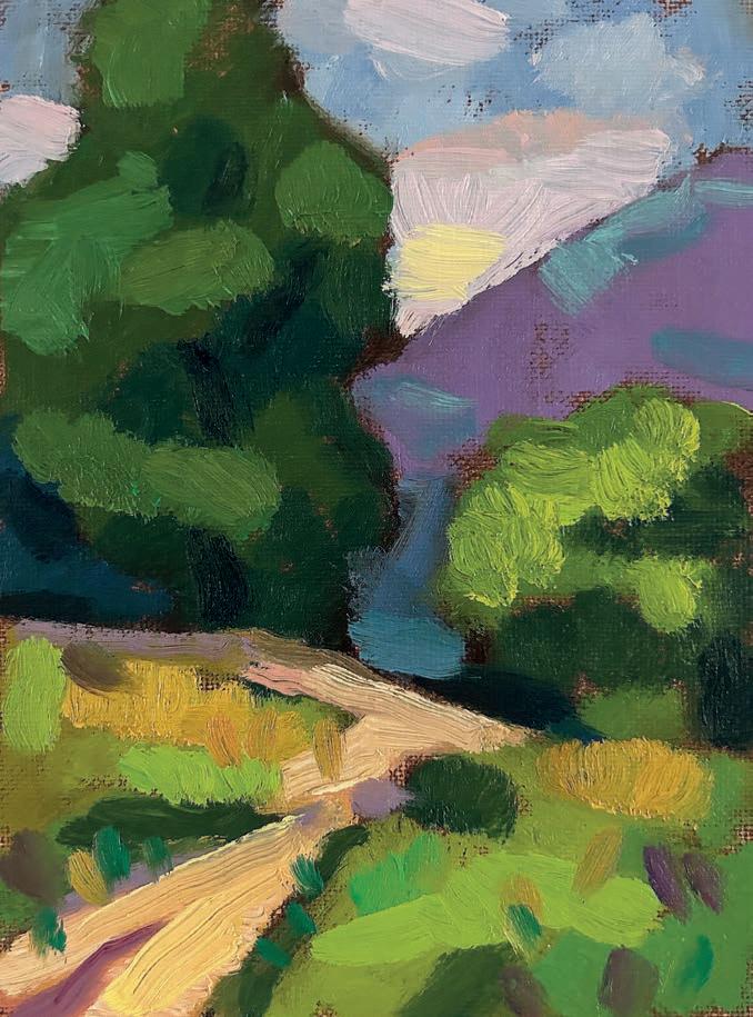
Lighter and brighter colours finish this painting, as well as darkest darks. Cadmium Yellow has enhanced the bright greens, rich blues made of Cobalt Blue have been added to shadow areas and light pink and yellow touches made of Titanium White with Cadmium Yellow and Cadmium Red have been added to the sky.
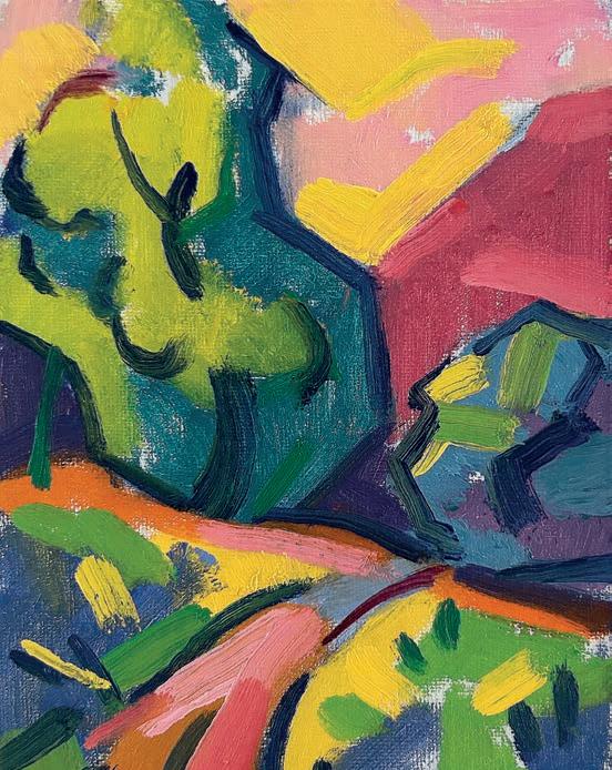
The third study is an example of interpretative and expressive colour in landscape, and explores the possibilities of the Matisse palette and Fauvist approaches to subjective colour, shape and personal expression. Matisse believed colour could be interpreted as one wished, rather than having to copy nature. He aimed to regain the simplicity of his childhood in his work, especially in the use of pure and joyful colour.
The first layer of this painting is made of large blocked in colour shapes. A white ground is used to provide a bit of luminosity coming through and between colours. Matisse’s colour choices are subjective, or simplifications of the subtle colours found in nature. So, the lavender hill on the right is now described using pure Alizarin Crimson and Titanium White.
The bright greens, made with Cadmium Yellow and Cobalt Blue, are brighter and more chromatic than in the photo reference, but these choices fit well with the Cobalt Blue and purple shadows around and under the trees. Pure Cadmium Orange and Cadmium Yellow suggest the sunny quality of the path, and a bright pink for the sky - made of Cadmium Red, Cadmium yellow and Titanium White - sets off the whole arrangement. Pure Cobalt Blue is used to outline and emphasise the simplicity of shapes and margins between colour.
The colour strokes used to complete this third painting are all comple ments: orange, yellow, purple, blue, blue green and yellow green. Most are right out of the tube, though Titanium W hite was added to the Alizarin Crimson to make the bright pinks.
The whole effect of this palette is one of movement, bright colour interactions and the joy of expression and personal and interpretative colou r choice. ▫
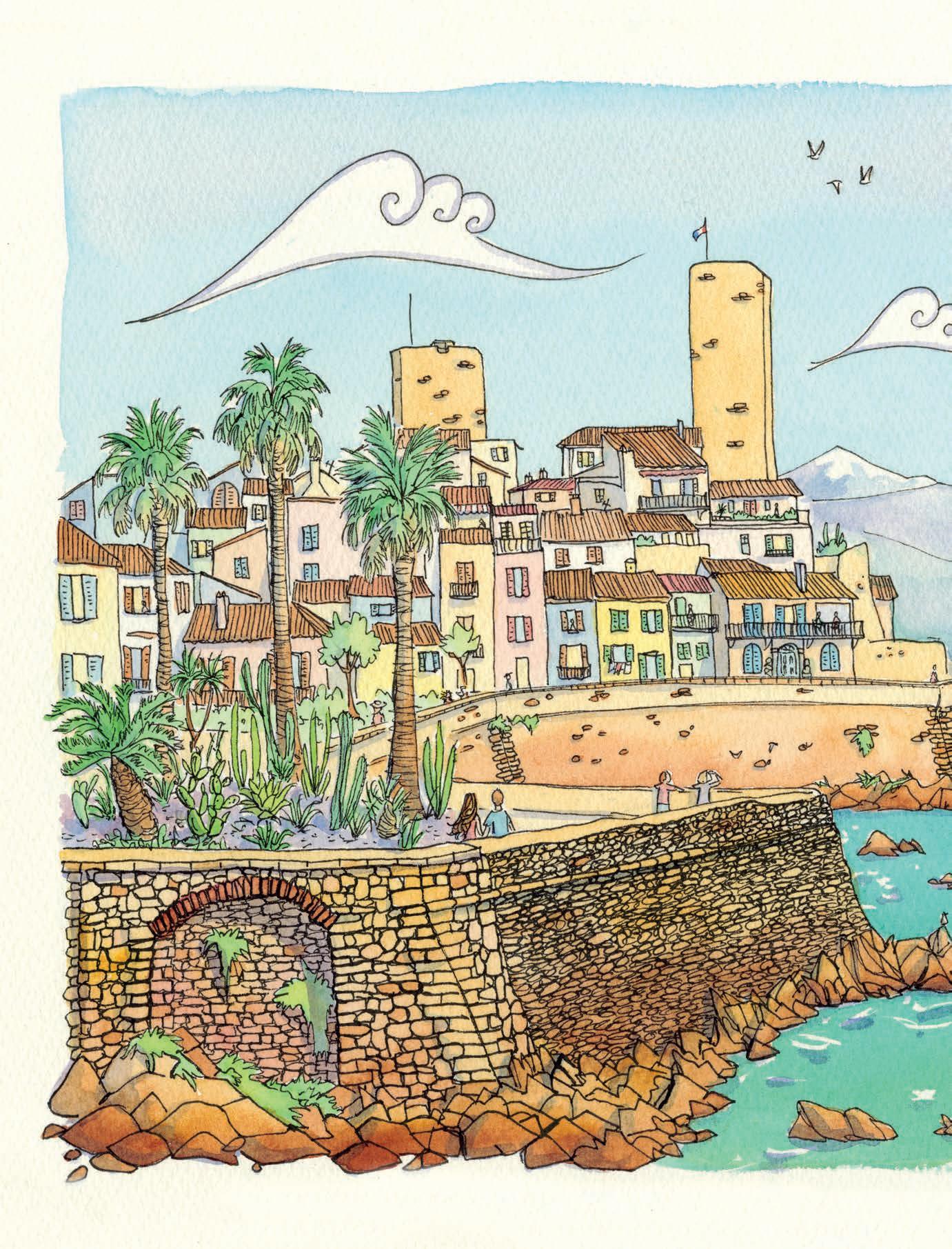
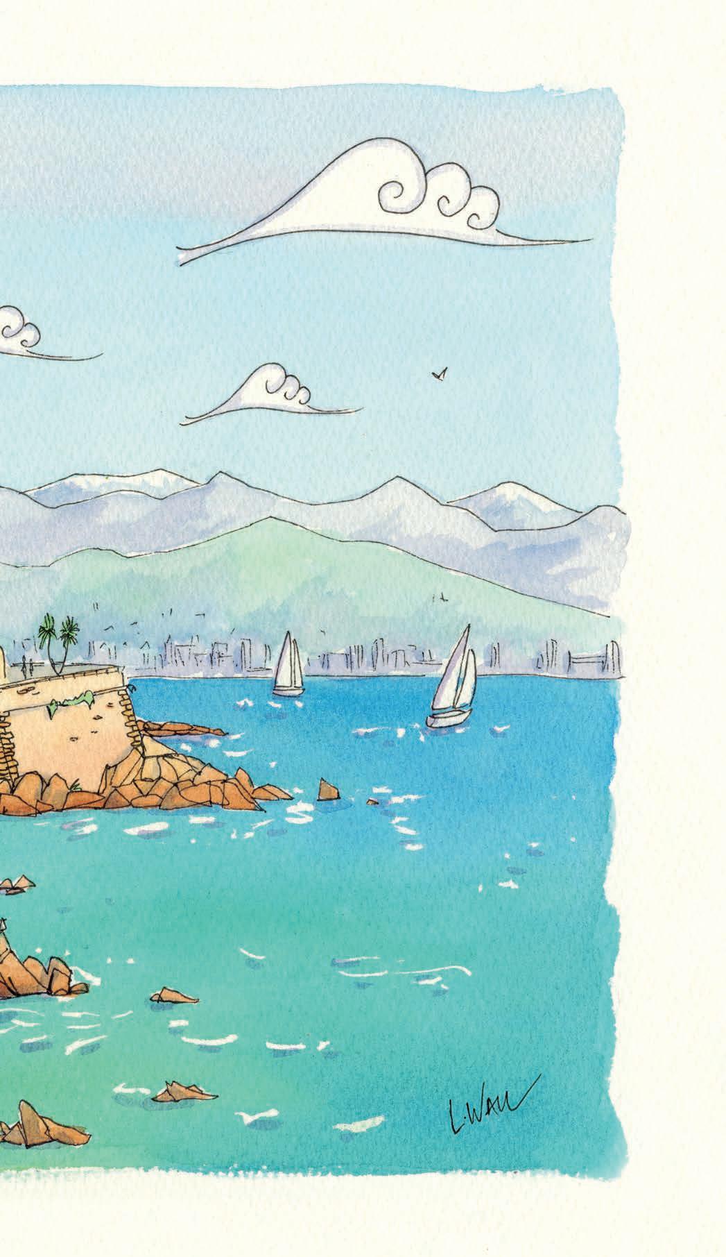
Let LAURA WALL tell you how she was inspired by her journeys in France
My husband and I have just returned home after spending an idyllic five weeks in the south of France. I am an artist and illustrator based in Teignmouth, south Devon, where my husband and I run our own gallery featuring my original paintings, limitededition prints and a variety of products featuring my designs. We chose the French Riviera for our trip, as it has long been a haven for artists, from Monet to Matisse, all drawn to its dazzling light, shifting colours, and Mediterranean charm. I love that each artist had a slightly different interpretation of the scenery, but they all agreed on its beauty and magnificence.
The light of the French Riviera is legendary, and for good reason. It has a luminous quality and a clarity that transforms everything it touches. I felt my process evolving throughout the five weeks in the French Riviera. Painting in watercolour was wonderful – the transparency of the medium allows the brilliance of the light to shine through, and I could layer it up to create deeper hues when required. Watercolour allows for such wonderful spontaneity. Later on, I would often work my sketches up into more developed and detailed compositions at the charming villa in Grasse where we stayed for the duration of our trip. laurawall.com
Instagram and Facebook: @laurawallartist ▸
Canson Artbook
Wirebound Saunders
Waterford Watercolour Cold Pressed (NOT)
300gsm
Winsor & Newton
Professional Watercolour pans, plus Intense Blue in a tube for the sea Cass Art Professional
Watercolour travel set
Handmade iridescent watercolour pans from Tressag’ART, Grasse, France
Staedtler pens – various sizes from 0.05 - 0.8 Posca pens, for creating highlights when painting in situ
In the studio
India ink: black Ellington fountain pen Jacksons Handmade Soft Pastels in white
Brushes: a variety of synthetic sizes from Pro Arte Plus series along with Pro Arte Renaissance Sable Flat series 1 – ½"
Winsor & Newton
Iridescent medium
Masking fluid, to mask off the light on the water
Saunders Waterford NOT watercolour sheets
640gsm (56x76cm)
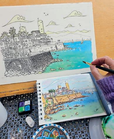
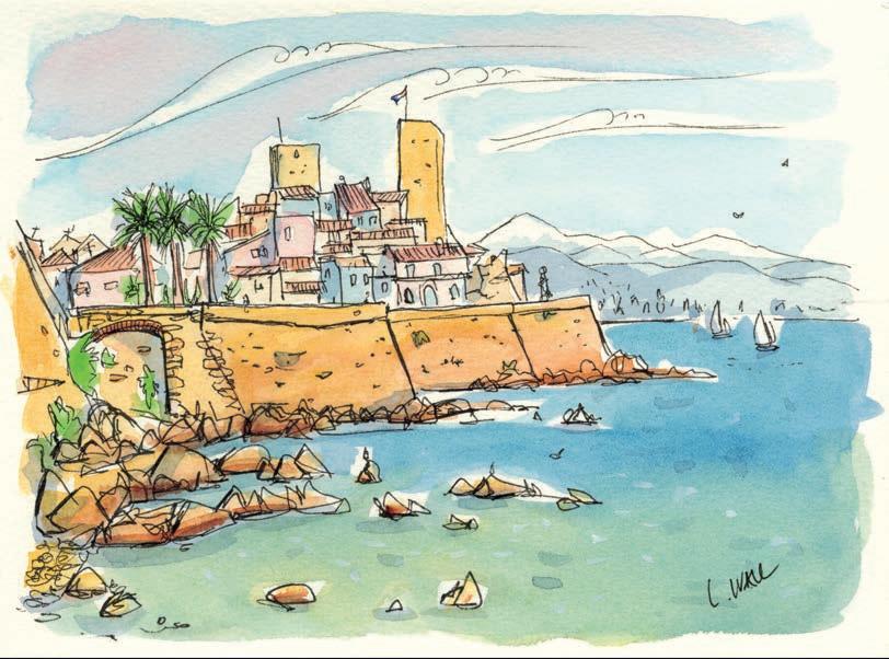
I painted this in situ as a preliminary sketch for my painting Les Jours Parfaits. I painted this rapidly so I could capture the changing light and transitory moment - the purply hazy sky is Crimson mixed with Cobalt Blue from my Cass Art travel pan set. For the water I mixed Prussian Blue with Cadmium Yellow and a hint of Hookers Green. Once dry I added a wash of my newly acquired French iridescent handmade paints which added a luminous green shimmer to the sea. To add light to the water I used a white Posca pen.
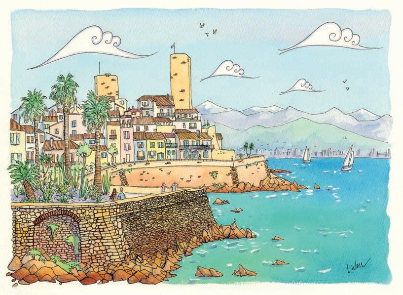
Once back at our villa in Grasse, I used the preliminary sketch as a reference to help me remember the colours and feelings I had while I painted this view. I began by sketching the composition in pencil on my watercolour paper. I changed the composition by adding height to reveal more of the gardens which I felt added more interest in the foreground. I used Staedtler pens to create crisp definition to my line work and to help indicate different textures of the scene – the stone walls, palm fronds and spiky cacti! Then comes the watercolour, breathing life into the glorious scene and giving vibrancy to the landscape itself. However, I made the sea deeper in colour to the preliminary by mixing Intense Blue from a tube rather than the Prussian that was in my travel palette (I love the intensity this gives) and an extra layer of watercolour.
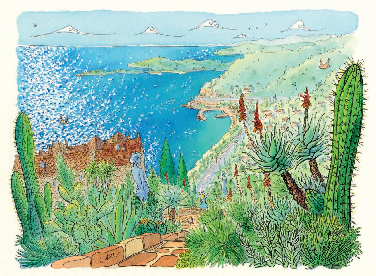
Eze was one of the first places we visited on our French travels this year. I was awestruck by the sheer beauty of the botanical gardens at Eze, which are perched on top of a hill against the spectacular backdrop of the intensely coloured Mediterranean sea behind. I took lots of photos of the cacti, statues and plants, so had them for reference back in the studio. For this image I used my watercolour paper and my Ellington fountain pen with india ink. I love a fountain pen as it creates a beautiful variety of line and fluidity. The light on the water was like a sweep of sparkles blowing towards the shore, which I tried to capture by masking off the areas of light with masking fluid before adding the watercolour, which I mixed with iridescent medium and a little definition in purple below (created by mixing Ultramarine Blue and Crimson). The vibrant cacti was a combination of Hookers and Viridian Green with Cadmium Yellow highlights.
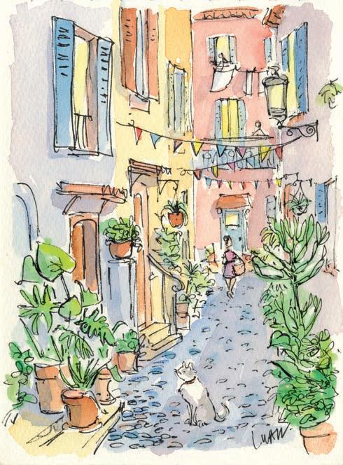
I couldn’t find the right place to set up my paints to create this little street scene in the charming medieval village of Biot, so I took photos, and found a sweet little cafe and painted accompanied by a glass of local wine. I used a simple soft palette for this sketch, consisting of Permanent Rose, Burnt Sienna and C admium Yellow and I created the shadows with a mix of C rimson and U ltramarine Blue. I added in the washing on the line and the little cat on the street, which was inspired by other little streets and combined together in this painting. ▸
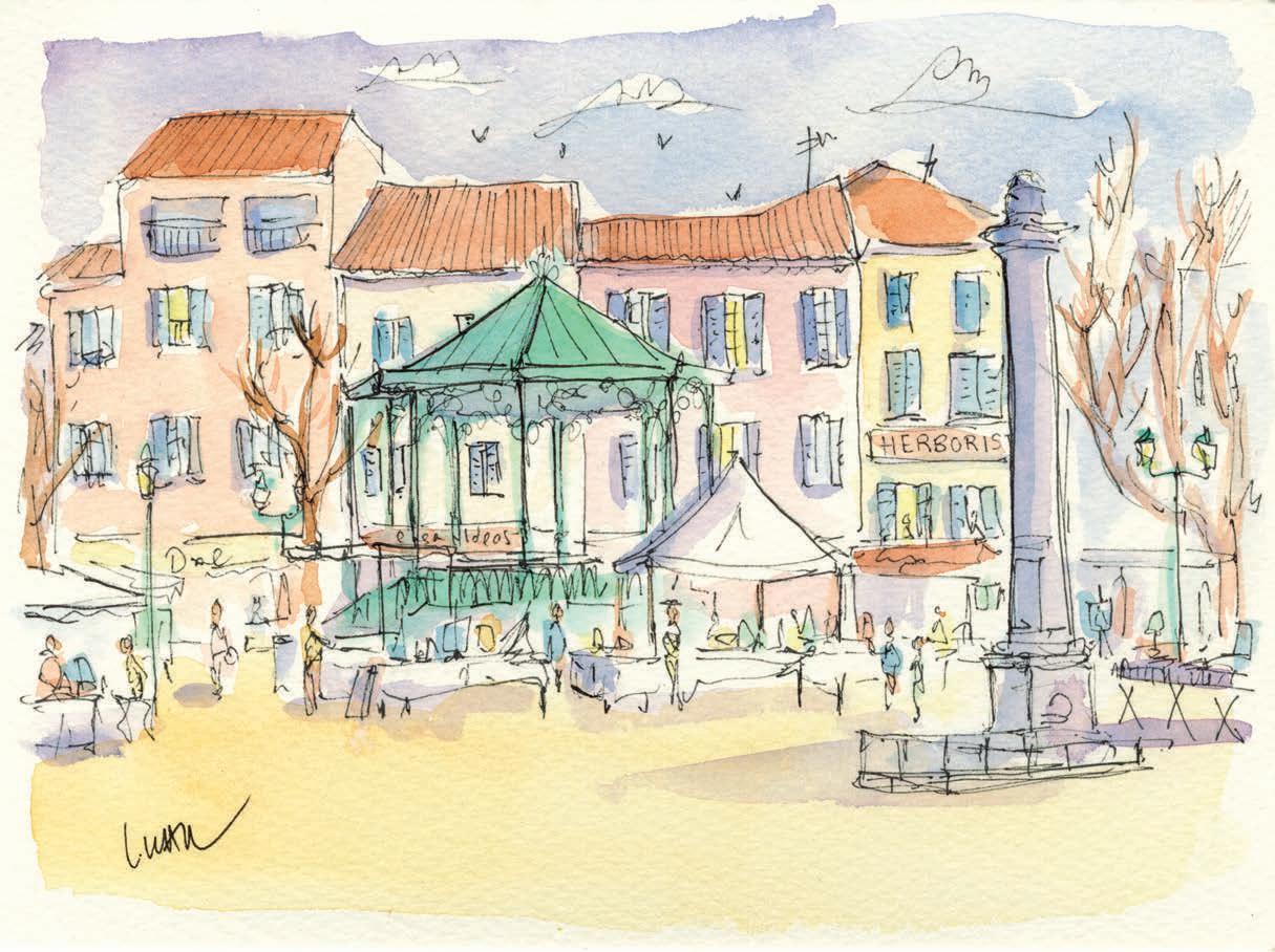
This picture was painted in situ in the soft, hazy morning light of Antibes market. I sketched and painted quite rapidly whilst enjoying a café crème. People were milling quietly about, it was early in the day and there was a slowness to it that I wanted to capture. This painting is all about being completely immersed in a moment in time, as I was that morning.
This was an incredible day, as we cycled from Antibes to Juan les Pins, but we just had to stop at this tranquil cove with its rich greens and blues, so I could sketch these fleeting impressions of colour and light. As I painted, my husband went to find lunch, and he returned just as I was finishing, so we sat back and enjoyed a tasty lunch of local fish, salad and fresh baguettes.
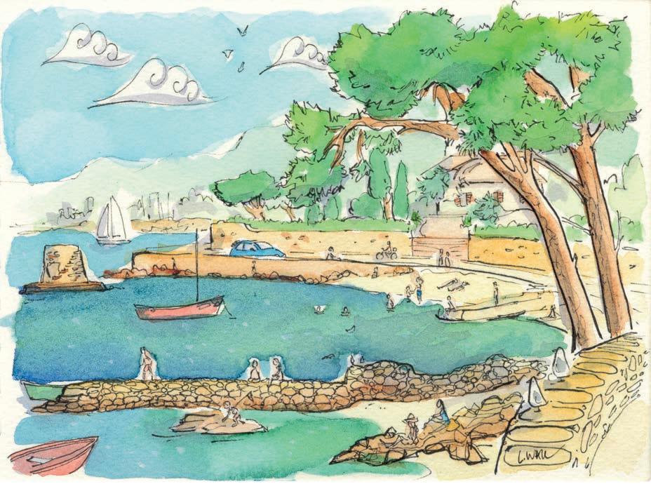
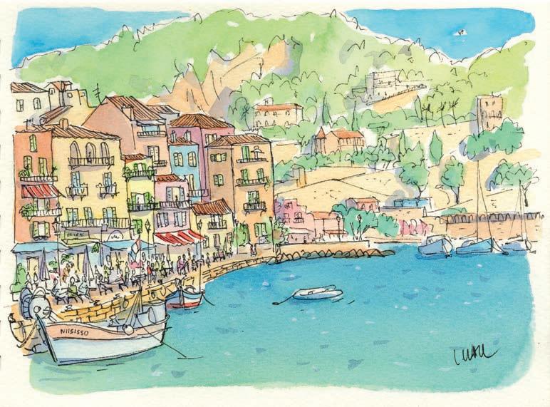
This was the last picture I painted in the Mediterranean this year, so by this time I was well versed with the palette of the Mediterranean landscape in winter. I had a familiar formula of paints to use in order to recreate the richness and vibrancy of the sea, sky and greens of the trees. By this point, instead of restricting myself to my travel set I was bringing I ntense Blue in a tube with me everywhere, so I could create the vibrancy the sea had in my studio watercolours. I was also bringing Cerulean Blue with me on location now too, which I prefer to the Cobalt Blue I was using in the travel set to create the vibrant French skies.
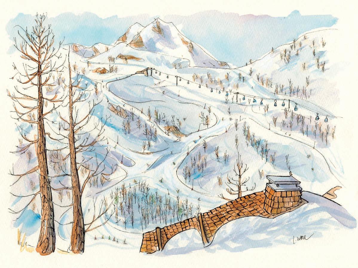
This was the view from the chalet we stayed in for a week’s skiing at Isola 2000 in the French Alps, to end our winter travels It’s quite a departure for me, as it’s so white - I don’t usually paint snowy scenes! This picture is all about shade and light. The shadows give this picture its depth and 3D effect. I used white pastel to emphasise the snow, and my new French-bought iridescent silver for the light on the snow, along with iridescent purple for the shadows. ▫

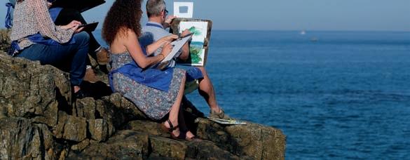


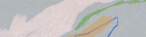

I am writing a book titled Love from, Creativity. It’s a collection of authentic letters addressed to an artistic soul. Imagine if your creativity could speak directly to you – what would it say? This book gives voice to that very question. I am a passionate advocate for creativity and have got so much support and encouragement from reading Artists & Illustrators.
I have been a subscriber to the magazine for many years and always look forward to the next issue. I often take the magazine to my mother’s house and we both enjoy having a go at the projects to try something new. My mum usually prefers to paint animals but during our latest art session, she surprised me by painting the eye from Jake Spicer’s article in the October 2024 issue. At 76 years old, she has now undergone two hip operations. Your magazine has helped keep us both going through these di cult times and has allowed us to escape for a few hours through the process of making art. Thank you Artists & Illustrators for a wonderful magazine.
I am a watercolour artist from Romania. I’m half Greek and half Romanian – born in 1985 in Fălticeni, Romania. I started to paint when I was a kid, as my father is a mural painter. We painted many orthodox icons and churches together in the Byzantine style. Since 2013, I have dedicated myself to watercolour. I have also participated in many exhibitions.
Send your letter or email to the addresses below:
Post: Your Letters, Artists & Illustrators, Chelsea Magazine Company Ltd, Telegraph Media Group, 111 Buckingham Palace Road, London SW1W ODT
Email: info@artists andillustrators.co.uk
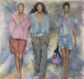
Reading the Rabia Farooqui article in the April 2025 edition reminded me of three paintings I did a number of years ago, with a similar theme. I decided to omit the faces because, for me, it was about the clothes and body positions. One was for a friend and her four college friends –fortunately because of their stance, dress and positioning, they all recognised each other! Share your stories and get adaily doseof Artists & Illustrators tips, advice and inspiration by following us on our social media channels...

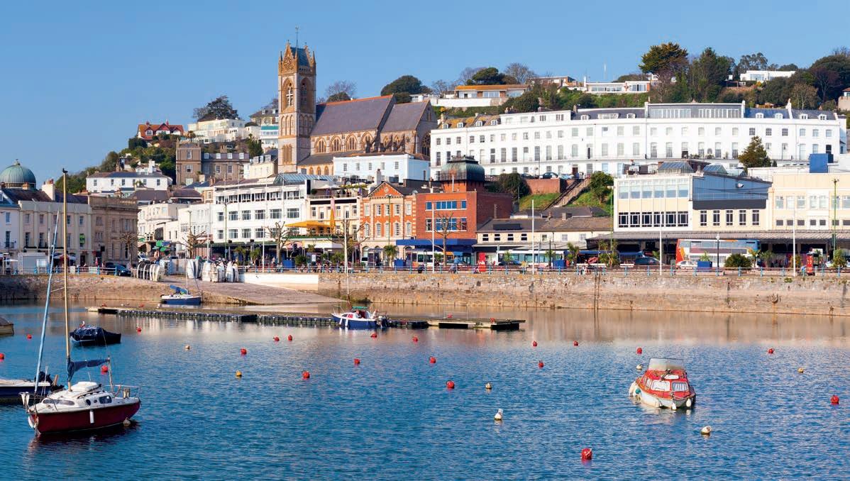
Torquay is a destination that brings to mind images of seaside promenades, palm trees, beautiful beaches and grand Italianate villas on the hills overlooking Tor Bay.
The hometown of Agatha Christie, it provided inspiration for some of her best-loved mysteries. This tour will immerse you in the life and times of the Queen of Crime.
You’ll be joined by historian and writer Dr Lucy Worsley – author of Agatha Christie: A Very Elusive Woman – at Burgh Island Hotel, which inspired the settings for And Then There Were None a nd the Poirot myster y Evil Under the Sun. Here you’ll have lunch, plus Lucy will give a talk and Q&A.
Lunch at Burgh Island Hotel with a talk and Q&A from Dr Lucy Worsley
Three nights’ accommodation at the Imperial Hotel in Torquay
Lunch at the Moorland Hotel
Murder on the Riviera murder-mystery dinner
Visits to several locations with links to Agatha Christie
Dr Lucy Worsley until recently was joint chief curator at Historic Royal Palaces and is the author of several books. She has presented TV shows for various channels

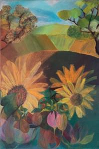
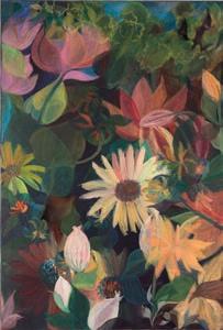
Friendly
‘26
annebarnham22@gmail.com www.annebarnhamsart.com 01526 320626 / 07895982441
HOLIDAYS
•
•
•
www.eyeswidedigital.com
• Giclée Fine Art Printing
• Greeting Cards
• Canvas Prints
• High Quality Reproductions Produced From
01306 875 150 info@eyeswidedigital.com

Floating
SOUTH WEST ART
Old Fore Street, Sidmouth EX10 8LP
Tel: 01395 514717
info@southwestartmaterials.co.uk www.southwestartmaterials.co.uk
Run by artists, for artists –extensive range of quality fine art materials & professional bespoke picture framing service. Friendly & knowledgeable service. Delivery or store collection of orders online or over the phone.
50 Station Road, Sudbury, Suffolk C010 2SP
Tel: 01787 371932
A family run business specialising in Bespoke Picture Framing and Artist Materials
www.artistsandillustrators.co.uk
THE ART TRADING COMPANY
55 Earsham Street, Bungay NR35 1AF Tel: 01986 897939
TheArtTradingCo@btinternet.com
www.thearttradingcompany.co.uk “...a truly excellent art materials shop” East Coast Net
THE ARTIST’S PALETTE
1 Millgate, Thirsk North Yorkshire YO7 1AA
Tel: (01845) 574457
Independent stockists of fine art materials by Winsor & Newton, Sennelier, Golden, Faber Castell, Pro Arte, Caran d’Ache, Panpastels and more. A great range of specialist papers, crafts and kits. Friendly service from experienced art tutor.
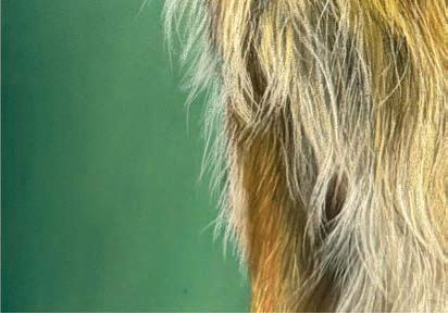
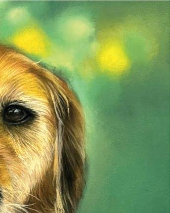
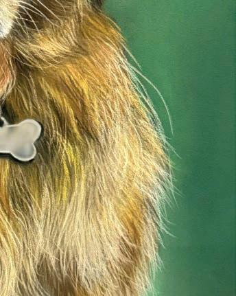
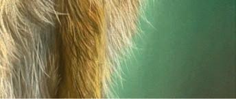
Every month, we ask an artist to tell us about a painting that’s special to them. This month, we speak to 12-year-old artist ABBY PHAM about a portrait which means a lot to her. Meet Connie
This was a commission for my friend Lucas, and it’s one of the most memorable pieces I’ve worked on. Connie, his golden retriever, was rescued from a farm and joined their family during lockdown. At rst, she was nervous, but over time she became con dent, silly and super a ectionate. She was always around during school pickup, and my friends and I would stop to pat her. Sometimes we’d even stay behind a bit longer, just to hang out with her.
I was excited to draw Connie as I already knew her and wanted the portrait to have a likeness. I focused on her eyes because that’s where you can see her personality best. She always had this calm but playful look. When I started the piece, I laid in the background rst using soft pastel
sticks, then used a sponge to blend it out evenly. Once the background was done, I moved on to Connie, starting with base layers and values using soft pastel sticks. I blended the base layer with a sponge to get a smooth surface before building up the details: her fur, eyes, collar and everything else that makes her recognisable. I used soft, careful strokes and warm colours to bring out the depth and texture of her golden coat. Drawing Connie showed me how personal a portrait can be, especially when you already know the subject. It made me realise how much I love drawing animals people care about, and how every little detail can hold so much meaning. I love the fact that she now sleeps in the same room where the portrait hangs. abby neart.com ▫
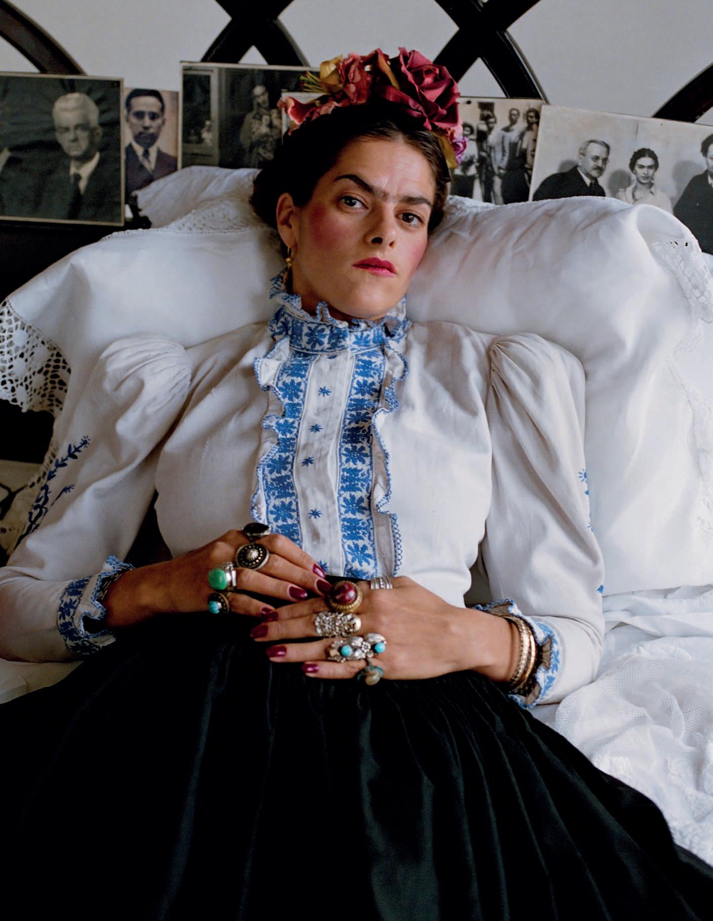

11-13 JUNE
LEARN A STRUCTURED, REPRODUCIBLE APPROACH TO PAINTING THE PORTRAIT

10-13 JULY
PORTRAITURE WITH A FOCUS ON FUNDAMENTAL ANATOMY

SARA MYERS 18-20 JUNE
SCULPT THE PORTRAIT IN CLAY
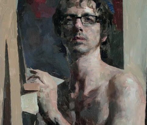
23-27 JULY
CREATE CONVINCING AND INTERESTING PAINTINGS

TIPS, TECHNIQUES AND TUTORIALS FOR ARTISTS OF ALL LEVELS
“There
It is the most di cult. It has also, I believe, the most simple kind of composition. Because no one can stop us from imagining the world in the way that pleases us most.” So said André Derain, one of the foremost practitioners of Fauvism. Most, if not all, of the artists in this special landscape supplement would agree.
Denis John-Naylor, known as The Man that Paints in the Park, shows you how to assess the scene, mix colours and evaluate your landscape painting as it progresses.
Watercolour favourite Grahame Booth describes the not-as-easy-as-it-looks concept of atmospheric perspective; while in a separate story he explains why this very subject can help when plotting cast light and shadows.
Hashim Akib guides us through an abstract painting of a stream, tree and rocks to show how applying paint directly to your canvas can icker acrylic colours to life.
Ever wonder about the correct ways of applying washes and glazes to your landscape painting? Let Rob Pepper and Stephen Coates show you the way.
For a wonderful landscape garden scene, Lancelot Richardson demonstrates how you can do this in the underrated medium of gouache, whilst Ann Witheridge shares her tips on landscape colour note studies. She then shows you how to tackle painting blue skies - an essential of a summer landscapes - using an intriguing mix of her own paintings.
Finally, landscape artist Lucy Marks shows o a beautiful range of her own landscape paintings. Now, go out and paint your favourite landscape – as only your eyes can see it.

Niki Browes Editor
6. PAINT IN THE PARK
Denis John-Naylor shows you why a local green space is all you need to get creating
46. SWEEPING VISTAS
Lucy Marks shows o some of her nest landscapes
10. CREATE DEPTH
Grahame Booth shows you how, with aerial perspective
14. USE THE LIGHT
Here, Grahame demonstrates how to utilise sunsets and shadows
18. DIRECT PAINTING
Hashim Akib shows you why applying paint direct to the canvas can have some startling results
22. HOW TO
Rob Pepper shares his tips
28. MIX IT UP
Stephen Coates shows why you can sometimes begin a painting without starting with the sky
32. BE LIBERAL WITH COLOUR
Lancelot Richardson shows you why the use of colour can make your picture really pop
36. PUSH YOUR PAINTS
Ann Witheridge talks about shapes and value patterns
British Art Prize
40. GET READY TO ENTER
For the chance to win big!
42. BIG SKY THINKING
A great landscape painting is often accompanied by a beautiful sky, says Ann Witheridge
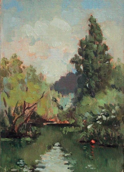
Denis John-Naylor is known as The Man that Paintsthe Park. Here, he shows why a local green space is all you need to get to grips with painting outdoors this summer
Field of Colour, oil on panel, 20x25cm
Avoid painting what you know is there, such as all those individual blades of grass. Look instead for signs of colour and group into bolder shapes, reducing contrast and colour intensity as the scene recedes.
Parks can be as inspirational as anywhere for the landscape painter. My local park has everything I need: sky, trees, water, elds of grass and other foliage. The sky can change frequently, sunlight continually moves, altering highlights and shadows, and seasonal changes signi cantly alter the scenery. Unmown summer elds are a gift to the artist. I could paint a di erent park picture every day. Painting outdoors – or en plein air – challenges our ability, creativity and perception of the world around us. We need to look for what we can actually see, not what we think is there; interpreting what we see into a painted image in our own unique way. React to the light and
try to forget about local colour (the colour which we know an object to be). Bright light can warm and brighten local colour, whereas shade will cool and darken it. Look carefully to judge where these changes have taken place.
Painting outdoors is a spontaneous and personal experience; every session presents different challenges. I never fail to find a subject because I will just paint anything. This gives me an experience I may never have had. Your goal should be to paint like you – not like me or anyone else. In meeting this challenge, you will then create original works of art through your own vision.
All en plein air painting is a compromise. From the time you select your subject to the moment you begin painting, the light will have changed the appearance of the scene. Try to think of it simply as making marks: marks in an arrangement that suggests the subject. I use all sides and edges of my brush to maximise my mark-making abilities.
Most of the artworks in this article were painted en plein air with alkyd oils in my local park and they took about two hours each. To remain focused for the duration of your session you will need to be comfortable and organised. Parks being public places, you will need to deal with inquisitive people. Be polite and you might even find a new buyer for your work.
I paint seated using a pochade painting box. A pochade box is an easel and palette all in one; all other equipment can be by your feet in the box’s detachable base. Everything you need should fit into a backpack, leaving one hand to carry your seat and one hand free.
Limiting your colours not only gives less to carry, but also unifies your painting and simplifies mixing. One of each primary colour – red, yellow and blue – will create most basic mixes. I also use Olive Green as a base green, Burnt Sienna for mixing greys and dull oranges, plus a cool yellow (I prefer Cadmium Yellow Lemon) to aid recession.
I like using alkyd oils for park painting as it speeds the drying time and helps avoid
ABOVE Sunlight and Shadow, oil on panel, 20x25cm Sunlight on grass can make it appear warmer and brighter. Cast shadows such as this one should be rendered approximately and rapidly.
ABOVE Bole Study, oil on panel, 20x25cm Park painting requires comparing contrasts in texture, colour and tone, then interpreting what you see into mark-making. Loose, exaggerated strokes suggested light falling here.
muddying the mixes when painting wet-intowet. Smaller panels are a good way to start; maybe 20x25cm. If you make small paintings, don’t use small brushes though. Larger brushes will encourage a more painterly approach and stop you fiddling with details. I like to use size 4 or 6 long flat brushes. ▸
En plein air painting is all about the light so observing and assessing a scene is important. Skies are normally lighter overall than the land. Light illuminates horizontal surfaces more than vertical surfaces. Note the tonal changes in the sky overhead compared to the sky at the horizon. Clouds change the mood by continually crossing in front of the light, calling for compromise. Do not ask yourself what colour is the sky; ask how many colours are there? Where are the lightest lights? Half closing your eyes reduces detail and simpli es the pattern of lights and darks. Reducing contrasts and subduing colours as the picture plane recedes, gives depth to your painting [see Aerial Perspective on page 10]. For e ective contrasts, I prefer a painting position where the light is coming from the side, rather than facing or directly behind me. Shield your eyes and head with a hat.
Knowledge of linear perspective is not necessarily required, simply look, measure, compare and check alignments instead.
Your palette is where you can compare new mixes with past mixes and sometimes the quickest route to a newmix is to modify an existing one. Avoid just using white to lighten a mix, look on your palette for another lighter colour that might work instead.
Remember warm colours mixed together will not tend to grey, neither will cool colours; only a warm and a cool colour mixed together will make true greys. Lay out two spots of white paint: one to mix with warm colours, one for cool colours. Keeping di erent brushes for warm and cool mixes will keep colours cleaner too. Mixing can also take place on the picture, as you pull and push paint to blend passages or soften edges. Pull unwanted paint from your brushes with a rag rather than washing it with thinner – this willsave time and will also keep your paint sti er.
Make yourself a view nder by cutting an aperture into a piece of card. I paint on 8x10"
Autumn Light, oil on panel, 25x30cm
This park picture was painted in the warm clear morning light of early autumn.
panels (25x30cm) so I made a 4x5" view nder; exactly half the size.
After selecting the subject, use your view nder to draw a border in your sketchbook. Inside this border, sketch your subject and apply shading to register the light e ect. Tonal variation throughout your painting provides major structural elements, so get this stage right.
When happy with your sketch, scale it up to
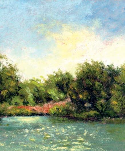
When painting contre-jour (or 'against the light'), you sometimes get those interesting sparkles on the water. However, you will also lose detail on the foliage.
your panel, drawing with fluid Yellow Ochre and a small soft brush. Now, scrub in the shaded areas with a varied dark fluid wash (oil paint mixed with thinners). I used Olive Green and Ultramarine Blue, loosely, applied with the flat of a size 6 bristle brush.
Start assessing lights and darks around your point of interest and lay down patches of colour to judge comparisons. Continue this process across all passages of your painting. I usually paint the sky colours just short of the tree block-in, then finish the trees by extending broken edges into the wet sky. Show texture where a change in tone takes place. Blend colour patches and soften shapes at the picture’s edges. High contrasts or a figure can draw further attention to the focal point. Spend more time looking than painting. It can also be a useful practice to take photographs before and after each session to compare the changes in light. harrowlodgepaintings.blogspot.com ▫
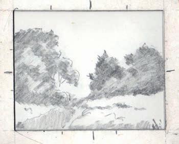
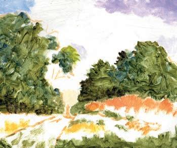
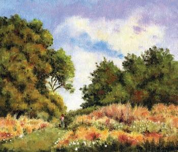
Here, you can see three stages of a painting. Pathways aided the composition, creating a lead into the scene. I noted individuals as they passed by to record their size and position in space.
Watercolourist Grahame Booth explains this tricky concept and how it can be used to give a sense of depth to your paintings
Painters frequently talk about “depth” in their paintings, which is slightly ironic as paintings in general are completely flat with absolutely no actual depth whatsoever. Of course, what we all mean by depth is really the illusion of depth. Our paintings are optical illusions that try to fool the brain into believing that our two-dimensional flat sheet of paper has a third dimension.
Aerial perspective – also known as atmospheric perspective – refers to a combination of various methods we can use to enforce that suggestion. Aerial perspective is real. Distance has a neutralising effect on all of the main attributes of the subject: detail is reduced, edges become softer, colour saturation is lowered, colour temperature changes, and extremes of tone are suppressed. These effects
are created by the uneven scattering of light by dust in the atmosphere. Very often we need to distort or exaggerate them to really make it work to our advantage.
Take the two photos below as an example. In the first, the effects of aerial perspective are very clear in the distant mountains where we are looking at tens of miles of depth; in the second, the distance to the far hills is shorter so the effect is more subtle. In order to create an illusion of depth we must consider the use of aerial perspective in every subject, irrespective of actual depth or the visibility of the effects. Photographers can influence this easily, but as painters we must be much more inventive. Here are five factors to consider that can help you amplify the effects of aerial perspective.
Most of you will have heard that old nugget of wisdom: “paint what you see, not what you know to be there”. While that is generally good advice, with distant detail we can often see much more than we need to, particularly with the aid of modern cameras, which produce ever-sharper photographs. Perhaps we should be thinking more along the lines of “paint what you need to see, not what you actually can see.”
It is all too easy to simply copy what we see instead of thinking about the effect on the painting. Being less aware of the detail of distant objects is exactly what our brain would expect, so straight away we help to create the illusion of depth if we suppress the detail in the distance, even if we can still make it out. ▸
In this painting, I exaggerated the aerial perspective in the distance by softening some edges, removing almost all detail and merging everything to a mid-toned purple grey. It is very important that aerial perspective should not be an excuse for boring passages of paint. Note the colour and edge variety in the distance – this allowed me to concentrate focus on the train. Even though the adjacent clutter was painted in warm hues, it still 'sat back' because of the lack of detail and softening of edges and tone.
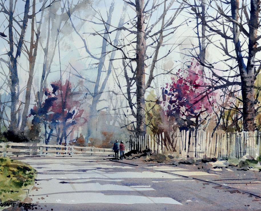
Tree Lined Road, watercolour on paper, 38x28cm
The most distant part of this subject was maybe only 150 metres away and there were no strong indications of aerial perspective. The far trees were almost identical in appearance to the closer trees, but my less detailed, less colourful, less tonal and softer treatment of these more distant trees pushed them back.
Notice how I have linked most of those background trees together. Another e ect of distance is that we tend to see groups of objects rather than individual, separated objects. When we have reasonably detailed similar objects closer to us our brains are very good at understanding the very much simpli ed distant version.
As well as simply leaving out detail in the distance, we can further enhance the feeling of depth in the landscape by minimising hard edges in the distance. The e ect on edges is very obvious on a hot summer’s day when the heat haze gently softens distant objects so that they blend together, whereas on a cold cloudy day distant edges may appear almost as sharp as edges in the foreground.
If we mimic that atmospheric softness, we will further enhance the illusion of depth even when we can’t see it.
We must be careful with colour. Aerial perspective doesn’t just turn everything in the distance blue. After all a distant eld of
ripe barley still has an ochre colour, but instead it is as if there is a pale blue lter in front of it.
For distant green elds and trees, you can easily add more blue to a mix that already contained blue anyway, whereas for something like the barley elds, we can instead create that pale lter by applying a wash of a slightly cool pigment such as Cobalt Blue over the warm colours.
The wash should be relatively weak: just enough to see the e ect, not so strong as to be obviously blue.
The Cobalt Blue layer should be applied as a glaze. Physically mixing it with your applied colour will not have the same e ect. Of course, that blue tint in the distance only applies during the day, and it is often only really obvious at the height of a sunny day – during a bright early morning or evening, the atmospheric conditions create a warm golden tone instead.
example, the complement to a blue mix would involve introducing orange. Only a small amount of the complement will be needed to su ciently desaturate the colour; too much will turn it grey.
A good way to suggest this without resorting to gaudy sunset colours is to wash over the entire paper with a warm wash before starting your painting. A mix somewhere between Raw Sienna and Burnt Sienna will do the job well.
The other e ect of aerial perspective on colour is a reduction in saturation. Colours seen in the distance simply do not have the same strength and intensity as those viewed up close. It is not simply that they become lighter (although that can happen) but that the colour itself becomes less powerful, as the chroma essentially shifts towards a greyer hue.
You can create a huge range of these bright and dull variants, but the simple addition of the complementary colour to your mix will e ectively reduce the saturation.
Complementary colours are those opposite each other in the colour wheel, so, for
If we think of our pale blue lter as being very slightly opaque, the e ect is to slightly dull all of our tones.
Remember that the slight opacity is a result of everything being somewhat scrambled by the dusty atmosphere and the result is a darkening of light tones and lightening of dark tones. In other words, the contrast is reduced and everything tends towards a light mid-tone.
If you think of the tones visible in the foreground as being plotted on a scale from 1 (lightest) to 10 (darkest), then all the tones visible in the background might be found between say 3 and 6 on that scale or 4 and 7.
Sticking to this as a guide will help suggest aerial perspective and depth. Avoid the temptation to leave any blank paper showing in the background or to add some punchy darks – save the extremes of tone for the much closer areas.
grahamebooth.com ▫
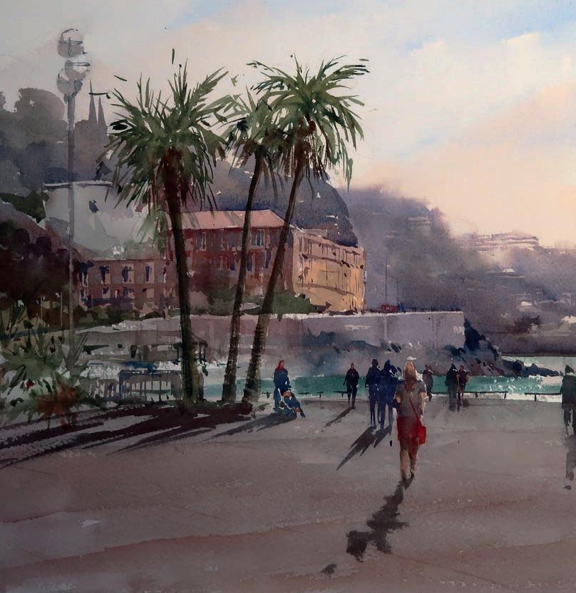
Grahame Booth explains why the laws of perspective can help when plotting cast shadows, and how contre-jour lighting a ects colour and contrasts in the landscape
Promenade des Anglais, Nice, watercolour on paper, 51x38cm
Contre-jour light created exciting tones and strong shadows
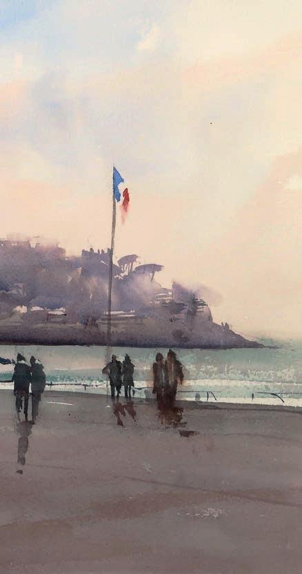
Sunsets are possibly one of the most popular painting subjects – at least when you’re starting out. More experienced painters are often wary of such subjects as it can be quite tricky to portray those beautiful sunset colours and tones without slipping into garishness.
In a sunset, almost all of the interest will be in the sky. The bright setting sun will be directly in front or slightly to the side of us, creating what is essentially a silhouette of the landscape. One of the challenges with this type of subject – especially in watercolour – is working out how to subdue the daytime colours and make the silhouettes appear dark enough while
maintaining sufficient light contrasts to avoid the painting becoming flat and uninteresting. You can’t shortcut this effect – painting an evening landscape with all of the varied colours and tones you would see in the middle of the day just doesn’t work. When it comes to sunsets, apart from the sky colour itself, it is this strong directional lighting in front of the subject – an effect known as contre-jour – that creates the drama.
If sunsets don’t appeal to you visually, much of that drama can be found at any time of the day as long as the sun is more or less directly in front of us. Unlike a sunset, the same type of lighting earlier in the day will almost completely bleach out any sky colour because of the more direct, brighter light, but the higher sun position will create more tonal variety in the ways in which the light hits the landscape.
Painting sunsets en plein air is particularly challenging, simply because the light changes very rapidly so, unless you are pretty quick with your brush, a photographic reference can often be better. The problem with such photos is that a camera is unable to render the full range of tone that is visible to the naked eye. As a result, either the colour will be lost from the sky and it will lack that beautiful richness, or the landscape will become a single, dark unyielding mass.
Many modern cameras are rather clever in that they effectively solve much of this problem by automatically superimposing two photographs, one with the exposure balanced for the sky and one balanced for the landscape. This is known as HDR (high dynamic range) and even many smartphones will have a setting to allow this to be used.
Something else we must consider with the sun in front of us is how it will affect shadows. With the light coming from such a great distance, the sun produces beams of light and cast shadows that will be subject to the usual laws of perspective.
Parallel receding horizontal lines will appear to slope towards eye-level and meet at a single point known as the 'vanishing point'. When the sun is from the side, any perspective angles are much less obvious but with the sun directly in front of us (or behind) the effects of perspective become very obvious indeed. ▸
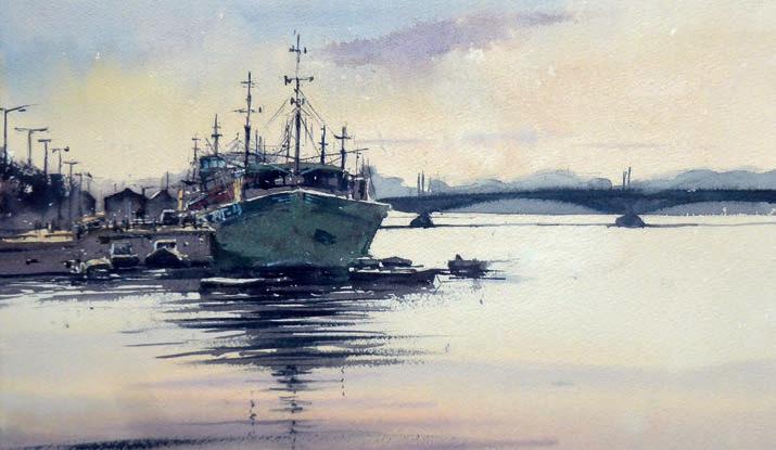
Wexford Quay, watercolour on paper, 51x38cm
For this en plein air painting, I got everything ready and waited until the light was just right. Most major shapes were created in a feverish few minutes as failing light prevented any fuss.
The vanishing point (VP) of shadows cast on horizontal ground is always at eye level, and always directly below the sun.
Horizon/eye level
Fortunately, the perspective rules for such shadows make it fairly easy to check our accuracy with the angle and the length of these cast shadows. The laws of perspective apply exactly only to lines that are both horizontal and parallel, but even in a landscape where shadows are being cast onto ground that may not be perfectly horizontal, the rule will still give su cient guidance to allow realistic shadows to be rendered.
The perspective of shadows being cast from the sun in front of us is similar to the single-point perspective that we would see in a street scene.
Say, for example, there is a fence post in the scene you wish to paint. The angle of the post’s shadow can be calculated by drawing a line from the base to the vanishing point and continuing this line in front of the post. Calculating the length of the shadow introduces another vanishing point, the vanishing point of light, which will always be the light source: the sun. The shadow length can be calculated by taking a line from the sun passing the top of the post and continuing until it meets the shadow.
It’s worth noting that the rules concerning arti cial light or light from the sun behind us are slightly di erent. Likewise, you may nd that the laws of perspective don’t always t exactly with reality. Take the photo opposite. The vanishing point sits in line with the sun, as it should be, but it is actually slightly below the horizon. How can this be?
In fact, the road sloped down very slightly towards the kerb, meaning that the shadows of the posts were not exactly horizontal. The posts (and shadows) were still parallel to one another, so they still created a vanishing point as they receded, but it was one that was slightly below eye level. You can see the opposite of this where the shadows run slightly uphill over the grass bank. If you check with a ruler, you will see that the vanishing point for these shadows is slightly above the horizon but still directly below the sun.
Reality will often appear not to correlate with perspective rules, but this will be simply because lines are not perfectly horizontal, perfectly parallel or both. The rules of perspective can be confusing but making an effort to understand and accurately apply them, however roughly, makes drawing so much simpler and takes away much of the guesswork.
Sunsets benefit from a simple approach. As the landscape is relatively dark at that time of day, much less detail is required in a painting in order for it to be convincing. More important is establishing that strong contrast between light and dark. Remember, the stronger you make your darks, the lighter your lights will appear to be.
The subject of Ballydorn Lightship was a boat used as a novel clubhouse for a sailing club on Strangford Lough in County Down. I began with an overall wash, creating the blue in the sky and continuing with warm colours in the lower sky and on to the bottom of the paper. This was my 'light' and I remembered that, with the sun so low in the sky, the light and colour needed to be very strongly reflected in the sea.
When this was completely dry, I added a second grey-blue wash to create some variety in the sky and to introduce the local colour and lighter tones of the landscape.
In the first stage I was really thinking only of the light, as I tried to create interest without things getting too dark tonally.
The land seen in the second photo of the painting was created as simply as possible, using two or three layers of increasingly dark washes but taking care to leave the all-important light on such places as the superstructure of the ship, the roadway and the lighter parts of the beach.
I was aiming to create strong tonal contrasts so, for example, I ensured that many of my darkest tones were adjacent to my lightest ones. I also avoided using any bright colours, apart from the sky and its reflections. All other colours, such as the natural bright red in the lightship or the green of the grass or trees, appeared significantly dulled at sunset.
grahamebooth.com ▫
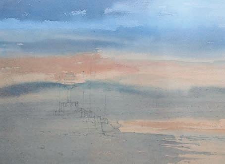
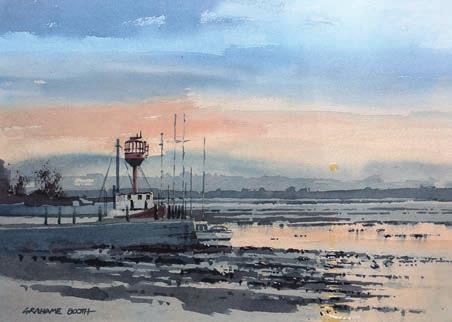
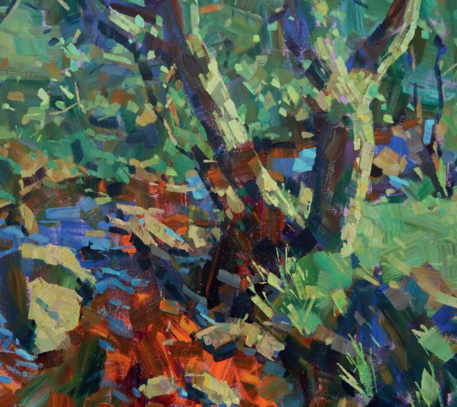
Azo Yellow Lemon, Azo Yellow Medium, Azo Orange, Ultramarine Violet, Permanent Blue Violet, Cobalt Blue (Ultramarine), Greenish Blue, Permanent Green Light, Phthalo Green, Yellow Ochre, Burnt Sienna and Titanium White, all Amsterdam
Standard Acrylics
Brushes
Daler-Rowney
Sky ow large at brushes, sizes 1/2" , 1", 1.5" and 2"
Support
Stretched cotton canvas, 60x75cm
Mixing tray
Water pot
Hashim Akib guides us throughan abstract painting of a stream,tree and rocks to show how applying paint directly to your canvas can spark acrylic colours to life
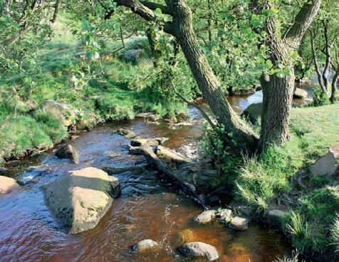
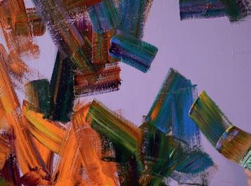
Have you ever looked at your mixing tray or scrap piece of paper and found the crudely mixed colours more striking than what eventually landed on your canvas? It is unfortunate that acrylic paint can quickly become dull, especially if it is mixed or diluted too much.
If you want vibrant, luminous paintings, mixing directly is a great technique to try. Begin by squeezing out plenty of paint on your palette or mixing tray.
To make it easier on your first attempt, consider either working on a smaller scale to get used to the larger quantities, or limiting the number of colours you use.
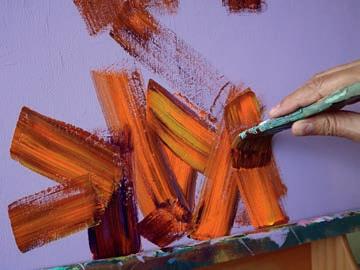
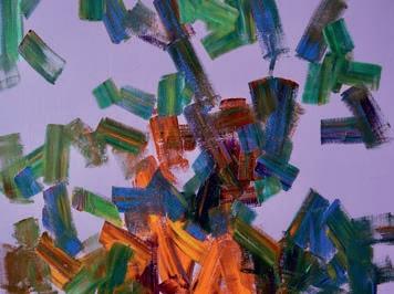
I began painting by dabbing a moist 2" flat brush into Cadmium Orange, Burnt Sienna and Yellow Ochre and then applying the colours directly onto my canvas. These harmonious colours should mix well and produce some streaks when applied directly. I then used the same brush to pick up more Cadmium Orange with touches of Permanent Blue Violet, Ultramarine Violet and Burnt Sienna to apply various diagonal strokes and create movement.
Without cleaning the brush, I dabbed it into Azo Yellow
Medium, Phthalo Green, Yellow Ochre and Burnt Sienna. With some orange still on the brush, these mixes produced a brownishgreen colour.
Be careful not to brush over the initial layers completely as this can muddy the colours. Essentially, you’re looking for the pigments to sit side by side or partly skim over each other. From here I added some dark tones using the same brush, mixing in Ultramarine Violet and Greenish Blue to dominate the other colours.
The advantage of these purer applications is that they can energise your paintings, ▸
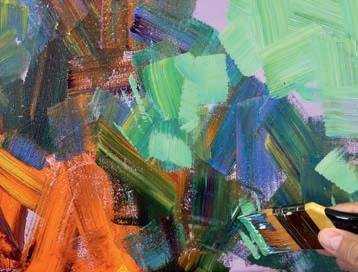
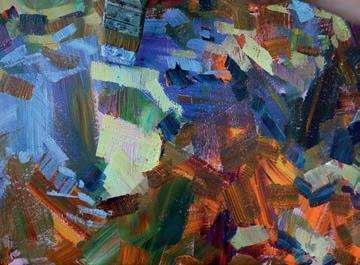
especially in the early stages, so the balance should be towards richer pigments there. As you progress and drawing comes into play, these will make way for less saturated colours and tints (those mixed with white). Here, I introduced richer greens, yellows and Yellow Ochre with less Cadmium Orange and Burnt Sienna, applied using a clean, damp 2" flat brush.
White is a tricky pigment to use with this technique as pure white streaks can be distracting. To avoid that, I did my first bit of pre-mixingadding white to create separate pools of lighter tints - on my mixing tray. I began by mixing a light green with various greens and Titanium White, plus a touch of Yellow Ochre. This tint was then used in combination with the other
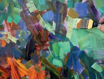
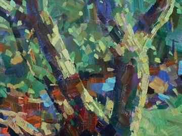
pure colours directly on the canvas. I used the tint to shape some of the forms and indicate grass by thin lines made with the edge of the brush.
I added more Lemon Yellow, Cobalt Blue and small amounts of Greenish Blue to the lighter green tint. I used a 1.5" brush to begin carving out the lights on the tree trunks and branches. I created other pools of light blue and light orangey-yellow tints too. It may be tricky to almost start the drawing halfway through a painting, but the refined lines provide a good contrast with the blocky ones.
With a clean 1.5" brush, I mixed a pool of blues to highlight ripples in the water. The early pure blues became mid-tones, and the
brushstrokes were now more controlled. I avoided overstating details in order to maintain the energy of the early marks. Once I’d added an overall impression of the tints, I then applied darks. To do this, I dabbed a clean 1.5" brush into the Ultramarine Violet, Phthalo Green and Burnt Sienna on my palette and applied the colour directly onto the canvas. These marks accentuated the water's edge.
All these refinements added to the dominant lights and darks and helped create a more orderly scene. Using a 1" flat brush, I added highlights. Lemon Yellow and Titanium White were used for the purest highlights. Darks were kept fairly minimal, with lines only teased at via lost and found edges. Opt for a balance. hashimakib.co.uk ▫


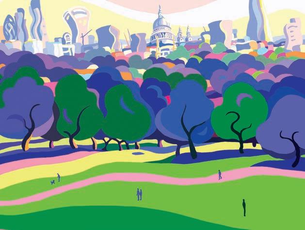


Art Academy’s Rob Pepper introduces an in-depth guide to incorporating various techniques into your next masterpiece
Awatercolour wash is a thin application of pigment mixed with water; there are many types, each with unique e ects. A glaze is when a wash is placed over existing dried washes to strengthen colour and tone.
The transparency created by layering and mixing colours is unique to watercolour painting and, with a bit of practice, can produce beautiful results. Both washes and glazes require the same three ingredients: water, pigment and paper.
The strength of a wash will vary depending on the proportion of water to pigment. For example, for rich colour you would add more pigment, whereas to achieve delicate colour, more water is added to produce a weaker mix. Glazes, on the other hand, are always weak and transparent, as their purpose is to alter subtly the colour or tone of the layers they a re applied to. The thinness of a glaze will a ect the way it dries and the e ect this produces.
Washes can be applied to dry, damp or wet paper – this will a ect the outcome, as will the paper’s texture, weight and sizing. The smoother the surface, the better it will show detail, while a rougher surface allows for more characterful washes and looser detail. The paper’s absorbency also a ects the result: heavier, more absorbent paper produces softer e ects than lighter paper, which dries more quickly. You can also control the e ect of your wash by tilting the paper after applying a layer of colour. Rough paper often causes the pigment in the wash to granulate (form into particles); smoother surfaces tend to allow the paint to run freely in all directions when tilted, so control is needed.
You can create a huge variety of e ects by changing the amount of water and pigment, the dampness of the paper, using a rougher or smoother surface and applying paint with a wet or dry brush.
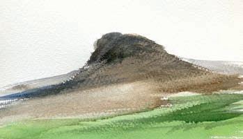
Dry brush washes create a textured e ect by using very little paint on the brush. Brush strokes look 'broken', which rough paper will exaggerate. This e ect is good for impressionistic depictions of nature and for creating a feeling of spontaneity.
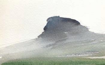
Graduated washes fade from strong to weak colour by adding more water to dilute the colour as the wash is applied and by tilting the paper to encourage the pigment to disperse. This is ideal for creating a sense of distance in landscapes.
Some pigments give a grainy appearance, adding texture
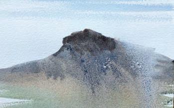
Granulated wash. This technique works best on medium or rough textured paper. It uses the natural granulation of pigment particles in the paint to give interesting textures to washes that may otherwise appear at.
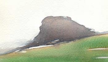
A at wash is a smooth application of even colour, which is laid on dry paper with lots of paint loaded onto the brush. It is ideal for large areas of background, such as a blue sky, but can also be used for a simple foreground.
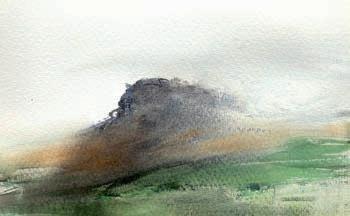
Wet-in-wet washes are applied to paper that’s wet to create soft edges. This is a versatile technique for both landscapes and portraits. The wetter the surface, the more the paint will spread and the less control you have over the outcome.
Glazes are useful for achieving tone and balance
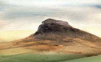
Glazed wash. A glaze enhances washes by adding or changing colour variations. Its success relies on the transparency of the washes. Keep to a maximum of three glazes to prevent the pigment from appearing dulled. ▸
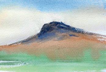
Colours blend into each other to set the tone
Variegated wash. This is where colours bleed into one another. Use a variegated wash for a rst layer – or underpainting – of a landscape, and for portraits, where light and colour e ects can enhance character. It is particularly e ective on a smooth paper surface.
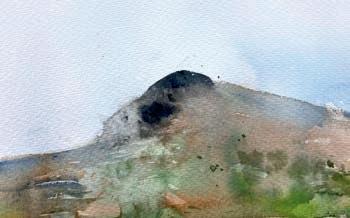
Separated washes can add layers of depth to your work
Separated washes. Mixed pigments in some paints can separate into di erent colours when combined in a wet-in-wet wash. When used with bright colours, the e ect is excellent for orals, still lifes and even for the impression of foreground detail in landscapes.
Di erent colours, brands and grades of paint vary widely in their granulating properties. Cheaper watercolours, such as student grade paints, often contain less pigment so don’t granulate as well as professional grade paints.


Mixing certain pigments together can encourage granulation and enhance the e ect.
Here, a graduated wash moves from darker to lighter, producing re ections in the water, which give a sense of depth.
A combination of washes in this landscape produce detail and depth. Dry brush washes add small details on the land; at washes depict large features such as the hillside; a separated wash suggests shrubbery; while a granulated wash brings detail to clouds and glazes add tone.
Commonly used with watercolours, this technique describes adding pigment or water to an existing wash on paper that has not completely dried. It is a must-have skill for watercolour painting. The wet-in-wet technique creates a soft and sensitive e ect in watercolours, and beautifully complements harder edges or areas of detail. Depending on how wet the rst wash is and the consistency of pigment in the second wash, the timing of adding the second wash is crucial to its success. Successful paintings have a good balance between light and dark tones. To change a tone in watercolour there are two techniques: glazing and wet-in-wet. Wet-in-wet allows you to control tone before the wash dries and lightens.
Flick water and wet paint into a damp wash to convey heaths and scrubland
Suggesting detail. Watercolour can have an impressionistic quality while retaining realistic detail. Wet-in-wet is a good technique for suggesting detail - such as corn elds, thistles, sea spray and beaches - without being too time-consuming.
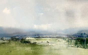
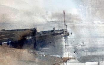
Add a sti er mix of pigment to a wet wash to darken, yet soften, re ections and create moodiness
Wet-on-damp de nes near hills
Using a wet wash on soaking wet paper suggests distant hills
Creating hard and soft edges. Wet-in-wet can create di used, soft edges, which tend to recede, helping harder edges to stand out. Aim for a balance of both in your work; too many soft edges can lead to a lack of any obvious focal point, while too many hard edges can make a painting look overworked.
The blue evening sky merges with the warm setting sun for an overall soft and atmospheric e ect
Merging colours. Use wet-in-wet to merge two or more colours and achieve a variegated e ect. Some pigments maintain their hue, while others dominate or combine to make new colours. Tilt the board to 45 degrees to achieve this e ect.
Spraying water on a damp wash is particularly e ective for suggesting re ections
Building depth. Paint dries much lighter when the wash is applied to a soaking wet area. To create depth, add the rst wash to soaking wet paper. As the paper dries, add the same mix to bring parts of the foreground into focus.
Adding natural re ections. A spray bottle can be used to add water to a strong damp wash, to create a very uid, dynamic painting. To create a wet and misty e ect, try tilting the paper before spraying so that the wash runs down the painting. ▫


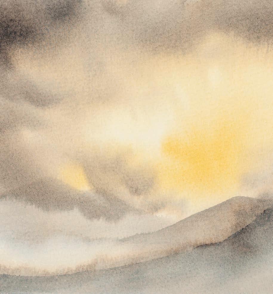
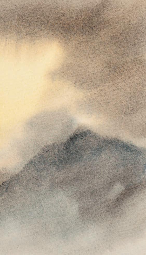
Paper
Saunders Waterford
300gsm cold-pressed watercolour paper, 31x23cm
Stephen Coates shows how carefully planning the wetness of your layers and applying glazes of colour can allow you to build a soft, atmospheric set of clouds in a landscape painting
Paints
Winsor & Newton
Cotman Watercolours:
Lemon Yellow Hue, Ultramarine, Cerulean
Blue Hue, Raw Sienna, Burnt Sienna, Light Red, Burnt Umber and Payne’s Gray
Brushes
Pro Arte Ron Ranson hake brushes, small and large
As an alternative to starting a painting with the sky first and then building up the landscape, it is possible to paint the mountains first and then glaze the clouds on afterwards. For this to work safely, it is essential to use a more absorbent cotton paper. This method requires that the mountains are painted first on dry paper. Once this has dried completely, the entire area of the paper can be glazed with clean water and the sky then applied in the traditional way.
I used a small sheet of Saunders Waterford paper for this example and prepared a strong mix of Ultramarine and Burnt Sienna. I also squeezed out a small blob of Raw Sienna. ▸
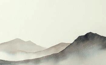
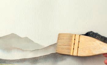
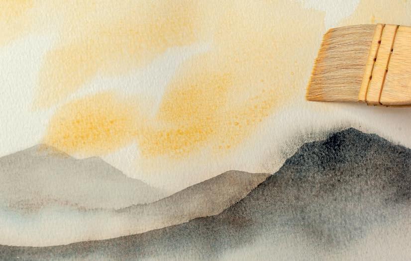
I created three layers of mountains, all done using a mini 1hake and varying strengths of the grey mix. After painting the first distant mountain, I added a little water underneath it while it was still wet to blend with the grey paint and create a smooth graduation. I left this first mountain for a moment and next painted the middle mountain, dragging the paint across into the wet area. This gave the mountain a crisp top edge and a misty effect. Once dry, I simply painted the foreground mountain with a loose
mix of the grey then immediately dropped some stronger grey along the top edge and blended it into the wet paint.
Once the mountains were dry, I filled a large hake with clean water and stroked the brush slowly across the paper from side to side, working my way down until there was an even film of water on the entire sheet. If you look at step 3, you can see how this water loosened a little paint on the foreground mountain as the brush passed across.
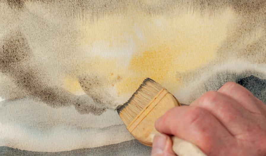
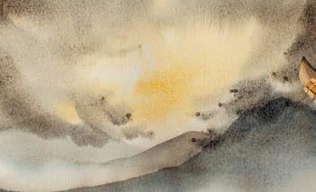
I then immediately picked up some Raw Sienna and paddled patchy shapes into the upper sky.
4
Then I plunged into the strong grey mix and created an arrangement of stormy clouds, making sure that the lower ones passed across the mountain tops.
5 BUILD CONTRASTS
To finish the sky, I picked up strong grey and,
using just the corner of the brush head, flicked in a few smaller patches of dark cloud. I let the paint develop naturally.
As the glazed water passed across the mountain tops, a little paint lifted away. But most held firm as it was embedded deep into the cotton paper. ▫
This is an extract from Stephen’s book, The Easy Guide to Painting Skies in Watercolour, published by Search Press. searchpress.com
What do we know about gouache?
It can produce broad colour notes and atmospheric e ects using thin washes, while more opaque applications can produce complex, naturalistic textures and re ned details. For those getting started with landscape painting, it’s a little more forgiving than purely working in watercolour and is simpler to set up than oils. Although well-suited to studio paintings – like this demonstration –gouache is also an excellent choice for en plein air painting. The necessary equipment is portable, lightweight and easy to clean up when nished, which is extremely handy when painting outside.
Gouache is best used for smaller paintings. The opacity and quick drying times are useful for working in layers too. The paint’s thickness is ideal for producing textured e ects common to landscapes, such as the leaves found in this scene. lancelotrichardson.com ▸
Winsor & Newton
Gouache: Permanent White, Lemon Yellow, Yellow Ochre, Magenta, Ultramarine Blue, Phthalo Blue, Burnt Sienna
Coloured pencil
Faber-Castell (Albrecht Dürer) water-soluble coloured pencil: Deep Scarlet Red
Brushes
Synthetic: 1" at, 3/8" at, and 8 and 4 round
Paper
Saunders Waterford watercolour paper cold press
Support
Jars for water
Plastic palettes
Gouache is a wonderfully versatile medium for approaching landscape painting, as demonstrated in this step-by-step guide by Lancelot Richardson
Using a water-soluble pencil, I sketch out the major elements of the composition. I stick to big, simple shapes of tone and colour. Don’t worry about adding detail now, as most of the sketch will be covered by layers of paint. I prefer water-soluble pencils as they melt into the wash to accent it with colour, but a rm graphite pencil or coloured pencil would work too.
When composing this painting, I tried to cultivate the diagonals of the footpath that lead the eye into the image and nudged the door to the right to ensure it wasn’t dead centre. Don’t be afraid to adjust the scene to serve composition.
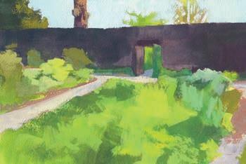
Typically, lights are painted with much thicker, opaque gouache, with the lightest whites often produced from paint mixed directly from the tube. I lay in the sky with White gouache mixed with the tiniest amounts of Phthalo Blue and Lemon Yellow. The darker base of green for the owerbed has been layered with a bright, lighter green containing more yellow, characteristic of spring growth. Now the shapes of the plants start to become de ned.
With the lighter tone of the path added as well, most of the base wash is gone, though it still peeks out with specks of colour.
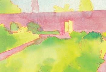
Covering the white of the paper as early as possible helps later layers of colour look more consistent. Depending on the scene, I may keep some areas white to achieve more intense highlights, or to break up at areas.
The colours chosen for a wash may either match or contrast with the scene as a whole. Here I follow the major areas of colour, using bright mixtures to help the layers on top look more vibrant.
Picking a complimentary colour to the scene can result in speckles of the wash peeking through for extra contrast; this is a possible technique for spicing up darker or greyer scenes.
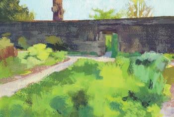
Dry-brush is a painting technique that is well-suited to gouache. It involves taking a at brush that has very little moisture in it, loading it with paint, dabbing o any excess, and dragging it along its side over the paper, almost parallel to the surface. This results in a textured look to the paint as it catches onto the tooth of the paper and is great for adding a naturalistic texture to a subject. This technique is especially e ective on textured watercolour papers.
Here, I’ve used dry-brush to add texture to the int wall at the back of the garden. Extra de nition will be added with a small round brush.
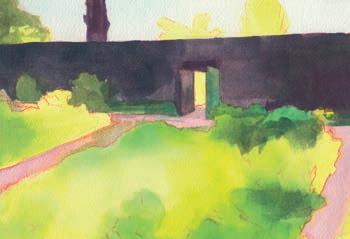
Using thinned out gouache, I add the shadow areas. To get a chromatic black, I mix Ultramarine Blue with Burnt Sienna and a little Magenta. This helps the shadows look richer than if you are using pure black paint, and the Magenta contrasts with the yellow-greens within the lighter areas.
The details in a scene can be seductive, especially when there are lots of leaves, but one must try and be patient. I’m still working with large areas and focusing on the composition as a whole. I’m using a 1" brush to restrict myself to large brushstrokes that cover the page swiftly.
Most of the painting in this stage is done with a small round brush. The shape of plant masses are defined, especially where they catch the light. In particular, wherever the leaves or blades of grass stand out against darker elements, I refine the shape. By prioritising these areas, the rest of the plant is implied.
I add the tree branches. To make sure that they remain crisp, I try to load up the brush with slightly watered-down paint so each branch can be created in a single brushstroke. This prevents the white paint underneath from reactivating and contaminating the line.
I imply large areas of greenery with broad brushstrokes of more opaque paint. I’m using a variety of greens and allowing the bright wash underneath to break through in places for a bit of vibrancy. Though spring scenes tend to have more saturated, yellow-leaning greens, I need a base of duller, cooler greens for these to stand out against. To mix a range of different greens, I’ve used combinations of Ultramarine Blue, Phthalo Blue, Lemon Yellow and Yellow Ochre. Ultramarine and Ochre produce a very dull green, while Lemon Yellow and Phthalo Blue result in a luminous lime, brighter than anything we see in nature.
I’ve saved the flowers for the end for a couple of reasons. First, leaving them until last means there is no chance of their bright colours being contaminated with additional layers of greens. The other reason is that by placing the flowers on the topmost layer, they’ll appear to sit above the green in space.
The tulips were painted with a small round brush, with Opaque Yellow added on top of the red. The blue and white flowers were created by using a dry-brush technique to lay in the blue, and then the white centres were added by hand. The complex dry brush texture helps imply the presence of many tiny flowers. ▫
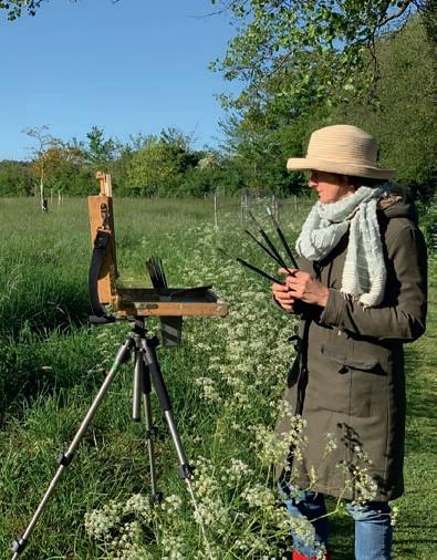
Artist and tutor Ann Witheridge shows you how to push colour and create colour notes within your landscapes
In this article we are going to push colour. The shapes and value patterns are the underlying structure of the painting but, rather than looking for accents and details, we are going to see if the painting works as a series of colour patterns within their correct shape and value.
These exercises are to help us understand that it is not the detail that makes a painting work but the big and simple compositional choices, firstly through values, then colour harmony and now colour balances.
We are not looking for the subtlety of values or colour variations, but reducing them to their largest forms. I think what we find most difficult about a landscape is to reduce the information.
In the studio, we are in an organised environment, with controlled light. We can create the ideal set up with our subject matter, taking it all in with one glance. Conversely, with a landscape, we first see the world before us and we have to select what works compositionally, and how to simplify and be selective with subject matter, values and colours. This is the key to landscape painting.
As an exercise, when thinking about the Old Master landscape paintings you are drawn to, don't consider how much they have put in, instead try to imagine how much they have left out. Think about what they are showing us and consider how they have been selective.
Think about how the Barbizon school and the Tonalists reduced colour variety. After this, the Impressionists used a myriad of colours, which seem to supersede subject matter; they were thinking about the effect of light and our perception of colour relationships.
At the time this seemed so radical and yet it is now so natural to us. The Fauvists take this even further, amplifying the colours and simplifing the subject matter. annwitheridge.com ▸
Canvas or gessoed wood, approx 8x6" and 6x4" . Working on small boards allows us to work quickly and forces us to simplify.
We use turpentine sparingly at the start so that it can quickly evaporate and this allows us to tone the panel. Use the linseed oil as the medium or the vehicle to help move the paint around the panel.
Brushes
3 x size 6 filberts , 1 x size 2 round. You can work with any brushes. Filberts are the most traditional and I also like to use rounds. For the hair I like a mixture of hogs and synthetic brushes (ivory). I think it is best to work with bigger brushes so we're less able to go into detail. You can have a small brush for the accents at the end; I use one brush for the accents and clean it with kitchen roll as I work.
Any combination of colours can work and it is good to work with what you are accustomed to; it is really about how we mix colours rather than the specific colour, as we can mix endless possibilities with a limited range of colours.
I like to have a warm and cold of each primary colour (blue, red, yellow) and a white. For these exercises I am going to reduce my palette:
Ultramarine Blue
Cadmium Red Light
Cadmium Yellow Light
Yellow Ochre
Titanium White
• You might nd it easier to rst copy some paintings but only allow yourself to attempt the painting in six brushstrokes of di erent colours.
• Look at your landscape in front of you and do the same when choosing what to paint.
• Tone your panel with a very thin layer of Cadmium Red Light.
• Do the drawing in a neutral tone, perhaps Ultramarine Blue and a little red.
• Block in the darks of the value pattern lightly with the same colours. Work lightly with your value patterns so that you feel comfortable that it works both in terms of design and values. Now, mix the paints on your palette to create the patterns. I would suggest spending time on your palette rather than on the canvas, creating nice buttery mounds of colour.
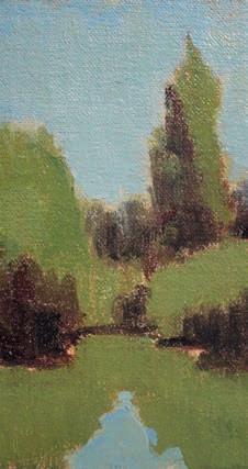
In this rst one I have created three colour mixes which are also three separate values. Each mix has Ultramarine Blue in it which helps keep the painting harmonised:
1. The sky and light of the water: Titanium White and Ultramarine Blue
2. The shadow pattern: Ultramarine Blue and Cadmium Red Light
3. The lights of the trees and re ection in the water: Ultramarine Blue and Cadmium Yellow Light
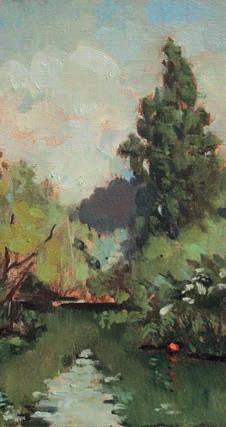
In the more developed painting, I have still kept my shadow colours as red and blue and my sky is simple, but I have graded the value in the sky and added a little yellow to soften. It is in the lights on the trees that I have varied the greens. I have still only used Ultramarine Blue but have used Cadmium Red Light and both Cadmium Yellow Light and Yellow Ochre. I have also used my round brush to create some more accents.
In this painting I have kept to the same composition in the colour note study, and added extra accents and a little red buoy, which I pulled over from the right of the picture plane as it added a fun colour note.
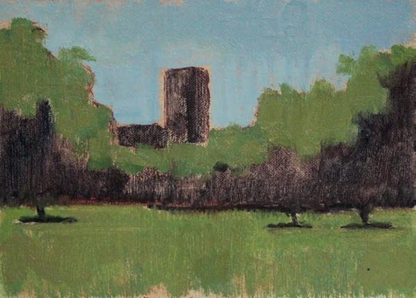
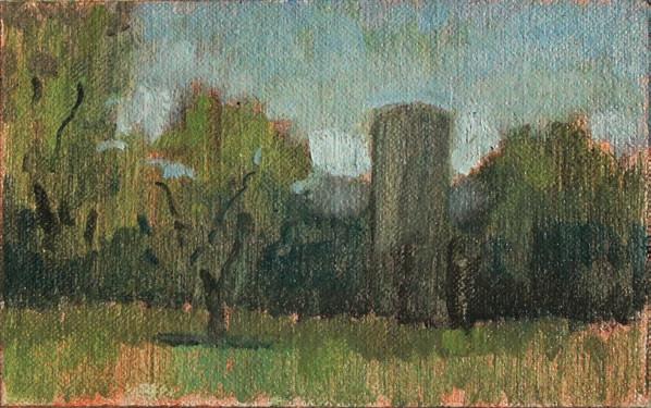
In the first painting I have done a small colour sketch using blue, two yellows and white. This is very much a tonal painting of greens, stepping into colour. I have added a little yellow to the sky so that the subtle green moves all around the painting.
I started with a red tone and red and blue with the drawing and value pattern. This takes very little time but is an important part of the painting.
I have shifted the second painting and done a much blockier start with stronger, clearer colour shapes. ▫
BROUGHT TO YOU BY


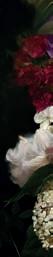

Artists & Illustrators is delighted to be back with The British Art Prize 2025. Enter today for the chance to win some fabulous prizes, have your work exhibited at two major London galleries and be featured in Artists & Illustrators PRIZE


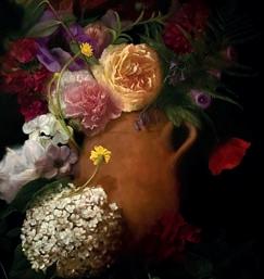


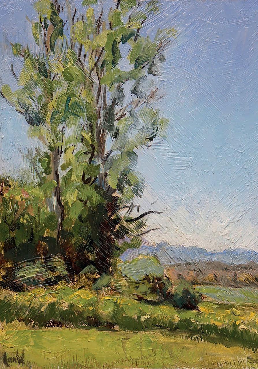
Ann Witheridge shows you how to tackle skies, essential for any successful landscape painting
Titanium White
Cadmium Red
Alizarin Crimson
Yellow Ochre
Ultramarine Blue
Cerulean
Turpentine, oil
I often work with PM2 by Michael Harding as it has a little siccative – drying agent – in the mix, which helps the paint dry quicker. This is useful when working outdoors and alla prima
Brushes
I like working with lberts or rounds. I would discourage ats and short ats in the sky as they rather dictate your paint handling; with the sky we are conveying atmosphere, created with soft shapes.
Canvas panels
We will be discussing skies, which are the most important element to think about, once we have done the composition and drawing. I love skies and their variety gives us an endless number of options for composition and for depicting the colours we see in nature.
Sky is the source of light: without it we would not see colours, so the colour and the mood of the sky dictates the mood of the painting; from sunrises to sunsets, overcast to sunshine, every sky will in uence the overall feeling.
A sky can make us stop in our tracks, especially when we see a yellow sky, an amazing sunset or shapes in the clouds. The colours we see are all due to the lengths of waves of light. The strongest wave is blue, which is why most often we see a blue sky and a blue sea –since it re ects the sky – and the blue is the harmonising colour holding the painting together. But even this varies from the top to the bottom of
the sky. Look above you and it is a redder blue, moving to purple, as the blue moves to the horizon line it becomes greener, for instance moving from Ultramarine Blue to Cerulean. The lower we look, the more atmosphere there is between us and the sky. We aren’t seeing a at surface, but a far greater distance than the landscape we see in front of us; imagine holding a card and tilting it towards you. If we think of Leonardo’s blue distant mountains, there is an even greater distance of view. Always tone your canvas with a little warmth. Then mix up piles of blues. Ultramarine Blue by itself is a little too inky so use blue with white and a touch of red for the top of the sky; as you move down the canvas add a touch of Yellow Ochre, or change blues and move into Cerulean
Phthalocyanine Blue; often the pigment used in Cerulean Blue Hue. It's very di erent and can be quite acidic, so add some Yellow Ochre to temper. ▸
Painting of Clouds, oil on linen 25.5x30.5cm
This shows clouds reducing in scale as they approach the horizon
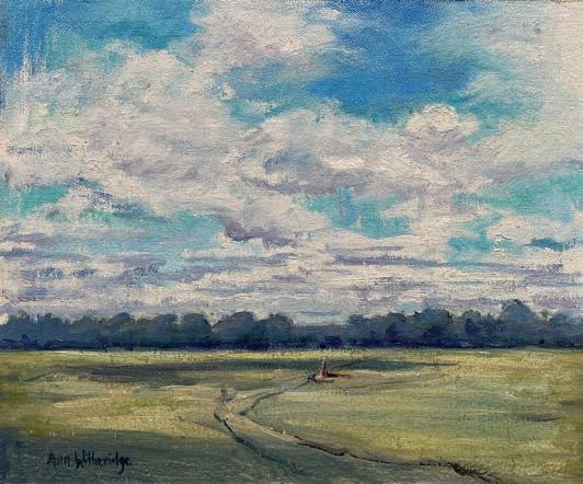
Perspective works similarly with clouds. The ones above us are much closer to us, they will be larger clouds with bigger under-planes. The clouds nearer the horizon are much further away, so their shapes are smaller and the under-planes are narrower. Imagine the clouds are boxes oating in the sky varying in scale, but with clear side- and under-planes: the transition can be soft and subtle, but they are still always there. Be careful not to over-soften or melt the edges.
Clouds and Pathway, oil on linen, 20x15cm
With this simple subject matter, the clouds added a nice balance to the composition
Painting boxes as clouds, oil on linen 14x20cm
This method helps understand under-planes and scale
The sky and clouds will change as you paint. Do we need the clouds? If your subject matter is already busy, you may want a clear sky to balance the landscape, adding calm and support; the sky doesn’t want to compete with the subject. As in a still life, you don’t need to paint every fold in the fabric behind, so the colour and value of the background is important but not the detail. With a landscape the sky is the equivalent of the background, but it does set the atmosphere. I nd it di cult to ignore or falsify the mood of the background when painting in the studio as it’s so essential when painting outside.
Cloud Study, Ultramarine
Blue base, oil on canvas
25.5x20cm
Sunset over Saint Pantaleon, oil on linen
25.5x11.5cm
A cloud is white, but every white has colour in it. Add a touch of Yellow Ochre to convert the warmth at the top with a touch of blue on the underplane. Avoid black or brown: try and nd the colour in the values, keep it light and fresh.
Just before sunset the sky is often a wonderful green or yellow. Try to look for the colour we wouldn’t expect in the sky; it’s often only when we push colour, that we start to see it. Don’t be formulaic with your skies; really look at what’s there and then borrow the colours you’ve used in the sky and incorporate them into your landscape. Every colour we see in the landscape is bathed in the light from the sky, the colours may have more chroma or value, but there will still be an overriding colour harmony.
Westminster, oil on canvas
20x25.5cm
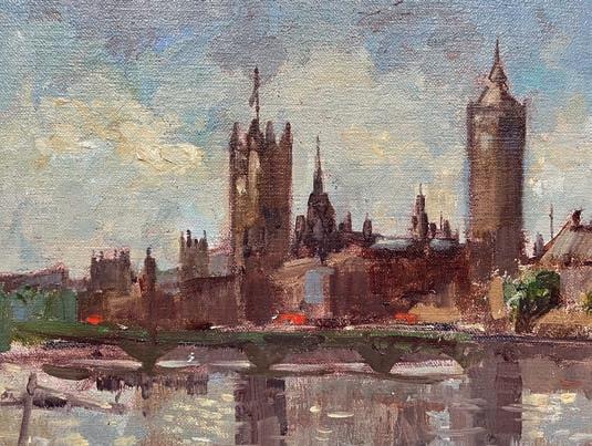
Cloud Study, Cadmium Red base, oil on canvas
25.5x25.5cm
In this painting looking at Westminster, the sun moved around so the buildings were a near silhouette. This was very helpful, but it’s not the windows and architectural details that make the painting iconic but the silhouette of the building. We have to learn what to leave out when looking at a complicated subject matter. The sky was so stunning with wonderful e ects in the water, so it would be too much to also put in the information in the building. In this case, is the real subject the sky and the re ection in the water? ▫
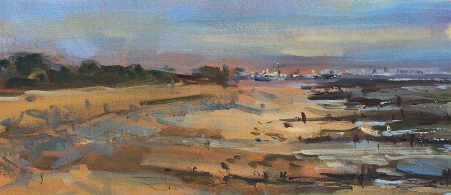
Lucy Marks works en plein air and from her large studio set in an early Victorian villa, with seagulls as background noise and Louis her chihuahua as an assistant. Here she shows o some of her best work
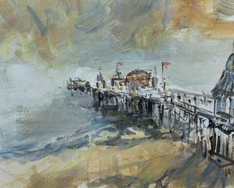
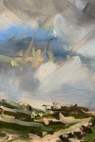
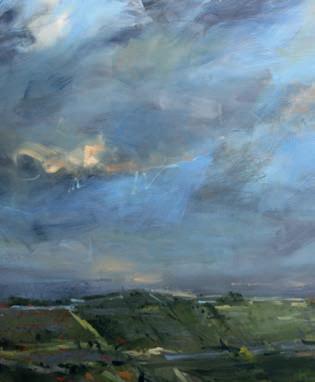
Lucy Marks starts all of her artwork en plein air. And when she is in the studio, she tends to bring the great outdoors in. Rain or shine, summer or winter, the French doors at the end of her studio are always open, overlooking her picturesque courtyard garden with overarching camellia trees.
Lucy takes inspiration from her mother, who showed her the joy of painting en plein air and taught her never to give up on a painting, leading her to discover plenty about her art and technical process. “I grew up in a very creative environment. One of my earliest memories is going out on a picnic with her and sitting in a field of poppies that she was painting.”
Her love for the British landscape comes from a deep heritage of the country and late 18th Century painters Turner and Constable, who inspire her to take the energy and movement of the landscape into a painting. She works hard to emulate the idea of capturing light and energy. “It gives me pleasure when someone comments on that aspect of my work.”
But how does she achieve this? “You just have to go outside. There is nothing better than standing out in the environment and catching the light and mood of the place,” she says. “There is great truth in the idea of having four seasons in one day here in the UK. This creates everchanging light, mood, energy
and, as the real seasons turn, a view from one place never looks the same twice. The skies move so fast that the challenge to capture the moment and movement at the same time is very real.”
Although she has a master’s degree in Coaching and Counselling, and worked in this field for many years, Lucy found herself gravitating toward the art world, which led her to pursue another master’s degree, this time, in Fine Art. “It taught me to be more critical in my working practice, to consider the narrative around my work and understand the challenge of preparing for exhibitions.” She was also encouraged to move away from landscapes and undertake portraiture. Lucy works in both oil and watercolour and likes her artwork to feel cohesive. She works interchangeably en plein air and in the studio with both mediums. She never works from a photograph. “As I am not a painter who creates figurative work, using a photograph isn’t really the process for me," she explains. "I don't need to know how many windows there are on a building or how many trees along a field edge.”
Lucy doesn’t believe in waiting for the “muse to take you” and her passion for painting means she has never found herself in a rut. "Being creative is a gift and getting to use that gift every day is something I am grateful for.” lucymarks.co.uk ▫