
How to... PAINT A LANDSCAPE IN OIL • DRAW USING A THREE COLOUR COMBO 9 7 7 0 2 6 9 4 6 9 2 1 4 1 0 TIPS • TECHNIQUES • IDEAS • OCTOBERINSPIRATION2022•£5.25THE FAVOURITE MAGAZINE FOR ARTISTS RothkoMark His iconic rememberedartbyhisson £1,000WIN! TO SPEND ON A FABULOUSHOLIDAYART marineMagicalart In oil watercolourand workshopWatercolour Create movement by painting loose Paint vibranta city scene Using bold brush strokes in acrylic


Contents ARTISTS & ILLUSTRATORS • OCTOBER 2022 ARTISTS & ILLUSTRATORS 3 Regulars SKETCHBOOK Quick tips, ideas and inspiration. Plus, this month’s exhibitions PRIZE DRAW Win £1,000 to put towards an art holiday with tutor Marilyn Allis HOW I MAKE IT WORK With eco-artist Emma Jane WE PRESENT... Portfolio Plus member Gill Bustamante YOU TELL US Write in and win a £50 Atlantis art voucher PICTURE THIS Pencil artist Frederick Terpstra on what his drawing means to him Inspiration IN THE STUDIO Landscape artist Lucy Marks invites us into her Brighton-based studio HOW I PAINT Sarah Jane Moon reveals how she paints between her two studios in London and New Zealand THE BIG INTERVIEW Marine artist Jenny Aitken on her deep love for the sea THE BIG DRAW Meet nine of the visual literacy charity’s ambassadors and patrons ART HISTORY A deep dive into American artist Winslow Homer’s work BOOK EXTRACT A look back at Mark Rothko’s life in a new book by his children Kate Prizel Rothko and Christopher Rothko Techniques IN DEPTH Jake Spicer demonstrates the aux trois crayons palette in the second of his ve-part series HOW TO Ingrid Sanchez creates a charming garden scene in mixed media MASTERCLASS Follow Hashim Akib as he paints a London street scene in acrylic STEP BY STEP Al Gury shows his techniques for an Alla Prima landscape in oil 6080201252882142230364248546672 225472


ALEXANDERMARTHA Martha Alexander is a freelance features journalist specialising in visual arts, societal trends and lifestyle. She is particularly interested in exploring art history and pro ling artists, making the Winslow Homer feature in this issue the perfect commission.
Award-winning marine painter Jenny Aitken lives on the edge of the Peak District in the UK, though family roots in the Channel Islands give her an enduring love for the sea and atmospheric coastal light. She is an associate member of the Royal Society of Marine Artists.
EDITOR'S LETTER
LUCY MARKS Lucy Marks is a contemporary landscape painter working in watercolour and oil. Her dynamic compositions express the energy and movement within the landscape. She regularly exhibits across Britain and has memberships of several London-based Societies.
THIS MONTH’S COVER ARTWORK INTRODUCING JENNY AITKEN
INGRID SANCHEZ Ingrid Sanchezis a andartworkswatercolouristMexican-BritishandteacherbasedinLondon.Sheisknownforhercolourfulinspiredbynature,aswellashervibrantbrushstrokes.Ingridhasbeenleadingcreativeonlinein-personworkshopsforoversevenyears.
4 ARTISTS & ILLUSTRATORS Send us your latest paintings, tips or artistic discoveries and you could win a £50 voucher: info@artistsandillustrators.co.uk@AandImagazine/ArtistsAndIllustrators@AandImagazine@AandImagazine EDITORIAL Editor Niki Browes Art Editor Stuart Selner Assistant Editor Ramsha Vistro Contributors Hashim Akib, Martha Alexander, Al Gury, Christopher Rothko, Ingrid Sanchez, Jake Spicer ADVERTISING Group Sales Director Catherine Chapman (020) 7349 chelseamagazines.comcatherine.chapman@3709 Business Development Manager Emily Driscoll (020) 7349 chelseamagazines.comemily.driscoll@3784 Advertising Production allpointsmedia.co.uk MANAGEMENT&PUBLISHING Chairman Paul Dobson Managing Director James Dobson Publisher Simon Temlett Chief Financial O cer Vicki Gavin EA to Chairman Sophie Easton Subs Marketing Manager Bret Weekes Group Digital Manager Ben Iskander ONLINE ENQUIRIES support@artistsandillustrators.co.uk BACK ISSUES chelseamagazines.com/shop ISSN NO. 1473-4729 GET IN TOUCH Artists & Illustrators, The Chelsea Magazine Company Ltd, Jubilee House, 2 Jubilee Place, London SW3 3TQ Phone: (020) 7349 artistsandillustrators.co.uk3700 Write to us! By Jenny Aitken Stay inspired by subscribing! Niki Browes Editor ARTISTS & ILLUSTRATORS Phone: +44 (0)1858 438789 Email: artists@subscription.co.uk Online: subscription.co.uk/chelsea/solo Post: Artists & Illustrators, Subscriptions Department, Chelsea Magazines, Tower House, Sovereign Park, Lathkill Street, Market Harborough, LE16 9EF Renew: subscription.co.uk/chelsea/soloAnnualsubscriptionratesUK:£75,US:$150,RoW:£110 …rewarding, immersive, frustrating and highly satisfying, all at the same time. It can be all of these things (and more) but it’s always a highly personal ride, no matter where you’re at on your art journey. Take cover artist Jenny Aitke n. “Art is more than a job,” she says. “It is the thing I think about most of my waking hours.” Landscape artist Lucy Marks (In the Studio, page 14) says that being creative is a gift, “and getting to use that gift every day is something I am very grateful for.” This month’s We Present Portfolio Plus member Gill Bustamante is never happier than when she’s up to her ears in art stu . “I love oil paint. I love the vibrancy, texture and smell of it,” she explains, an expression that many of us can agree with. Elsewhere in this issue, every page is bursting with ideas and inspiration that will help guide and motivate you. There are step-by-step guides on creating paintings in di erent mediums and styles and in-depth reporting on some of the art world’s most renowned masters, including a piece by the son of legendary American abstract painter Mark Rothko on why we shouldn’t merely focus on his father’s iconic rectangle paintings. “It’s essential we consider his earlier works on their own merits,” he says. “These are works that speak their own language and function in their own aesthetic realm.” All in all, I hope that after reading this issue, you feel encouraged to roll up your sleeves and paint and draw. After all, it’s like medicine for the mind.
Creating a piece of art can be many things…


NEELALICEOFESTATETHECOPYRIGHT
ARTISTS & ILLUSTRATORS 5
Sketchbook
EDITED BY RAMSHA VISTROTIPS • ADVICE • EXHIBITIONS • NEWS • REVIEWS
weThingslove... A feminist icon of the 20th century, American visual artist Alice Neel was known for defying the patriarchal gaze throughout art history with her courageously intimate portraits. An upcoming exhibition will be the rst to feature paired portraits of Neel’s sitters –canvases from the 1930-80s –including pairings of her family, lovers and acquaintances. It’s structured in two thematic parts: the class struggle and the struggle of the sexes. Visit the Victoria Miro Gallery between 11 October and 12 November to view her work.
John with Bowl of Fruit, 1949, oil on canvas, 76.2 x 61 cm

30 SEPTEMBER Visit the new annual visual arts festival in Falmouth, Cornwall and enjoy various exhibitions, talks and workshops to learn more about the visual arts. Free to visit. formfalmouth.com
Submit your works on ‘enriching lives through diversity’ for Embracing Our Di erences 2023 to win up to $3,000. Free to enter. embracingourdi erences. org 10 OCTOBER Enter the atwinInternationalPrismaArtPrize2022forthechanceto€500incashandtheopportunitytoshowcaseanexhibitionin Rome.€25forthreeartworks. prismaartprize.com
DIARYTHE 24 SEPTEMBER
6 ARTISTS & ILLUSTRATORS Sketchbook
Creators are opening their studio doors for Norfolk Open Studios. Artists will be sharing their work and o ering workshops to visitors. Free to visit. norfolkstudios.org.uk Open calls, prizes and opportunitiesartist
5 OCTOBER
This beautifully illustrated book is the rst ever overview of John Louis Petit’s art, whose work was lost for 120 years. The book compares Petit with his mid-century contemporaries in Britain and France while demonstrating that he foreshadowed Impressionism in contrast to the Pre-Raphaelites and mainstream classical artists. Petit painted almost exclusively in watercolours, completing well over 10,000 works although, sadly, only around half of his output survives. On discovering John Louis Petit ve years ago, the author Philip Modiano gave up his other activities to focus on researching and recovering the artist. RPS Publications, £20. OF THE MONTH
If you love the magazine’s redesign, you’re going to fall head over heels for the new look Artists & Illustrators website. It’s still one of the biggest resources for artists on the internet, but a fresh new feel makes our how to guides, competitions and interviews even more enjoyable to read. artistsandillustrators.co.uk
J.L. PETIT – BRITAIN’S LOST PRE - IMPRESSIONIST by Philip Modiano
Join us online!
BOOK
Explore... the legend of King Arthur within the imaginationVictorianthrough a series of works. The Legend of King Arthur: A PreRaphaelite Love Story will illustrate each strand of the legend, beginning with Merlin as depicted through Arthur Hughes’ painting The Rift with the Lute (1861-2) and Herbert Alfred Bone’s drawing The Head of King Arthur (1879). The exhibition will be accompanied by a specially wmgallery.org.uk Gallery2023Octoberlegends.internationalGregory,installationcommissionedbyartistJoyexploringmythsandItwillrunfrom142022to22JanuaryattheWilliamMorrisinLondon.
TRUST)MUSEUM(BIRMINGHAMIMAGESCOMMONSCREATIVE©


New Ecoline Duotip Markers available in 32 colours and 7 sets Ecoline Duotip markers contain concentrated, transparent watercolour paint. These brilliant watercolour markers feature two di erent nibs, a slim bullet for fine lines and small details and a broader chisel tip for thick lines and larger areas. Ecoline duotip markers can be used on their own or in combination with Ecoline Brush Pens and Inks o ering you a wide range of options in line weights, styles and colour variations. Perfect for sketches, graphics, illustrations, hand-lettering or calligraphy. Unit 2, Millars Brook, Molly Millars Lane, Wokingham, RG41 2AD Telephone: 0800 995 6500 | Email: sales.o ce@royaltalens.com Brilliant colours based on dye and gum arabic Blend colours with water and a brush for cardboardpaper,Adhereswet-on-wetApplyseamlesswatercolourbeautifuleectsandcolourtransitionstowetpaperfortechniqueswelltowatercolourdrawingpaperand Basic set (available in a set of 6 & 12) Primary set (set of 3) Secondary set (set of 3) Black and Grey set (set of 3) Botanic set (set of 6) Urban Landscape set (set of 6)


SUBSCRIBE NOW Go to chelseamagazines.com/CAAI1022 or phone +44 (0)1858 438 789 (quoting code CAAI1022) Prices and discounts based on the UK BAR rate of £75 1 YEAR (13 ISSUES) UK (USUALLY£44.95£75) Europe €79.95 • USA $99.95 • Australia $149.95 Rest of World £74.95 ReceivePLUS Faber-Castellasketchpadandgraphitesketchsetworth£12.99 MASTER CONTÉ CRAYONS TIPS TECHNIQUES IDEAS INSPIRATION JULY 2022 £5.25 THE FAVOURITE MAGAZINE FOR ARTISTS GREATNEWLOOK! The Learnpowerhealingofarttopaintrosesinoils WORTH000OVER Art Prize in oils yourmoneyfromart to improveTIPS TECHNIQUES IDEAS INSPIRATION SUMMER 2022 £5.25 THE FAVOURITE MAGAZINE FOR ARTISTS GREATNEWLOOK!Your summer of painting All the advice you need £15,000PRIZESWORTHOVERTOBEWON with The British Art Prize Jean-MichelBasquiatArtists’secretsrevealed How to... PAINT YOUR GARDEN 6 TIPS TECHNIQUES IDEAS INSPIRATION The ExhibitionSummerRAIsthisthebestconnectedmaninart? We ask Mark Cass from Cass Art Winners revealed AUGUST 2022 £5.25 THE FAVOURITE MAGAZINE FOR ARTISTS GREATNEWLOOK!Improveyourart skills Projects, ideas and challenges FINAL A TO N ER! £15,000PRIZESWORTHOVERTOBEWON with The British Art Prize cover_A&I_0822.indd FREE SAVE OVER £30 OFF THE FULL PRICE WHEN YOU SUBSCRIBE! How to... IMPROVE YOUR PAINTING • WORK WITH A LIMITED COLOUR PALETTE 9 7 7 0 2 6 9 4 6 9 2 1 4 0 9 TIPS • TECHNIQUES • IDEAS • INSPIRATION Capture landscapedramatica Great advice from the pros animalMasteringfur In mediaandwatercolourmixed SEPTEMBER 2022 • £5.25THE FAVOURITE MAGAZINE FOR ARTISTS pencilsColoured Draw portraits, pets and more! £1,000WIN! worth of Derwent LightfastMeetpencilscolouredtheartistbestknownasVICREEVES Jim Moir 01_September cover_A&I_0922.indd 1 25/07/2022 15:16 IT'S LIKE GETTING 5 FREE!ISSUES


MIROVICTORIACOURTESYARTIST,THE©
Secundino Hernández: New Paintings is on show at Victoria Miro, London from 10 October 2022 to 12 November 2022.
ARTISTS & ILLUSTRATORS 9 Sketchbook
Don’t miss...
SKETCHBOOKA5WATERCOLOUR,ANDPENSHELLS,BEAUTIFULLEYFIELD,EMMA
ARTEAVANTCOURTESYSMITH,TAYLOROAK©
Top tip outWatchfor...
BE INSPIRED
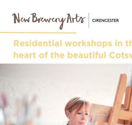
The last few years have seen a drastic spike in travel blogging. But before blogs, there were travel journals, which held vivid descriptions of people, places and cultures accompanied by expressive sketches. If you’re lacking inspiration and seeking mindfulness, a travel journaling weekend could be just what you need. New Brewery Arts, 22 to 23 October. newbreweryarts.org.uk Steer away from your regular practice and try something new by highlighting the canvas in your artwork. You can take inspiration from Spanish artist Secundino Hernández, whose methods involve erasing pigment, in a series of marks and gestures, to expose the canvas beneath. Hernández’s new works contrastingrepresentaspectsof his practice, derived from the processes of adding and subtracting paint.
GALLUPCDONALDOFGIFTART,BRITISHFORCENTREYALECOURTESY
the rst exhibition dedicated solely to the landscape sketches of famous nonsense poet Edward Lear, entitled Moment to Moment. Lear is best known for his limericks and poems but has also been recognised as ‘the nest bird artist there ever was’ by David Attenborough. His artistic output ranged from botanical illustrations to nished landscape paintings. A nomadic gure, he led an isolated life to conceal his epilepsy – which carried great social stigma at the time – spending more than 50 years travelling and making over 9,000 pictures as he went. The exhibition runs from 9 September to 13 November 2022 at Ikon, Birmingham.
the unveiling of a new large-scale bronze sculpture at King’s Cross by American artist Tschabalala Self. Known for her bold gurative paintings, Self is intrigued by themes of domesticity. This is her rst ever public sculpture, to be unveiled on 5 October 2022 to encourage onlookers to pause, sit down, and enjoy a moment of peace. The sculpture, called Seated will be complemented by 12 silkscreen prints, 25 small bronze sculptures, and a new lm in which the artist speaks with prominent personalities from the art world regarding the ability to occupy space in public. avantarte.com


THE LINDISFARNE GOSPELS
DENIS WIRTH MILLER: LANDSCAPES AND BEASTS
WILLIAM KENTRIDGE
This exhibition will celebrate the most spectacular surviving manuscript from early medieval Britain. It will also feature new work by Turner-Prizewinning artist Jeremy Deller. This will be the rst time the venerated book, on loan from the British Library, has been displayed in the city since 2000. The exhibition will be across three galleries featuring an immersive digital experience, a showcase of the Gospels themselves and a display of how art and spirituality have developed in the centuries since. Laing Art Gallery, New Bridge Street West, Newcastle upon Tyne, NE1 8AG laingartgallery.org.uk
1st October 2022 to 22nd January 2023
THE BEST ART SHOWS TO VISIT FROM SEPTEMBER ONWARDS
This exhibition is the largest retrospective of Denis Wirth-Miller’s work to date, with a display of over one hundred paintings that have never before been seen in public. Wirth-Miller’s striking series of ‘dog’ paintings will provide a highlight of the exhibition, demonstrating the artist’s ability to capture the movement and poise of our four-legged friends. Firstsite, Lewis Gardens, Colchester CO1 1JH rstsite.uk
10 ARTISTS & ILLUSTRATORS FIRSTSITECOURTESYARTIST,THE©IMAGESARTISTTHE©IMAGESBOARDLIBRARYBRITISH© Sketchbook
Exhibitions
This autumn, South Africa’s most celebrated living artist will take on the Main Galleries at the Royal Arts Academy with an immersive art experience. Visitors can enjoy tapestries, his signature charcoal trees and a three-screen lm. Royal Academy of Arts, Burlington House, London, W1J royalacademy.org.uk0BD
17th September to 3rd December 2022
24th September to 11th December 2022


This is a major new exhibition exploring the enduring appeal of ancient Egypt in art and design from the ancient past to the present day. Over 150 works drawn from collections in the UK and internationally will examine how ancient Egypt has shaped our cultural imagination. It also explores the ongoing engagement with ancient Egypt and charts its many forms across centuries of art and design. Sainsbury Centre, University of East Anglia, Norfolk Road, Norwich, NR4 7TJ sainsburycentre.ac.uk
CEZANNE 5th October 2022 To 12th March 2023 This distinctivepursuingbeforecomingjoining theobetweenfollowTheparadoxesnumerousfocusinginyetMediterraneanproudlyaspiringperspectiveCezanneseeks toexhibitioncomprehendinhisown–asanyoungartistfromtheSouthhungrytosucceedurbanParis–byontheconictsandinhiswork.programmewillhisstrugglepursuingcialrecognitionandup-and-impressioniststenaciouslyhisownlanguage. Tate Modern, Bankside, London SE1 9TG tate.org.uk INFINITE BEAUTY 9th September to 16th November 2022 Promoting nature as an inexhaustible source of truth and beauty much like Victorian art critic John Ruskin, this is a unique exhibition that investigates the enduring appeal of nature as a subject for leading contemporary artists. The Arc Winchester, Jewry Street, Winchester, SO23 8SB arcwinchester.org.ukYORKNEWART,OFMUSEUMMETROPOLITANTHECOURTESYGALLERYART&MUSEUMHARRIS© DRURYCHRISCOURTESYIMAGE VISIONS OF ANCIENT EGYPT 3rd September 2022 to 1st January 2023


A t some point, many artists will feel like they’re stuck in a rut, lacking inspiration and motivation to create something worthwhile. Breaking out of your studio and diving into a unique experience can provide that much-needed refresh.
HOW TO ENTER Enter by noon on 30 October 2022, either at competitions artistsandillustrators.co.uk/ or by lling in the form below and returning it to: Marilyn Allis Art Breaks, Artists & Illustrators, Chelsea Magazine Company Ltd, Jubilee House, 2 Jubilee Place, London SW3 3TQ
Five winners, chosen at random, will each receive a £200 voucher to put towards a Trio Break of their choice in 2022, 2023 or 2024.
TERMS & CONDITIONS
AN
THE PRIZE
We’ve teamed up with professional art tutor Marilyn Allis to o er you the chance to revitalise and advance your artistic ability by indulging in a painting holiday. With studio views of the Bournemouth coast, Marilyn and two other seasoned artists will o er their assistance and direction encompassing various techniques, subjects and demonstrations to pique your creative impulses over the length of the Trio Break. Five readers have the chance to each win £200 to put towards one of the three-day acrylic or watercolour-themed getaways consisting of a luxury seafront hotel stay, three-course meals and all the inspiration
ARTPRIZEGETAWAYDRAW
Please tick if you are happy to receive relevant information from The Chelsea Magazine Company Ltd. via email post or phone or Marilyn Allis via email you can gather. Each day, a di erent tutor leads the workshop, including live demonstrations in a range of areas as well as professional advice and feedback, with every lesson catering to a variety of skills.
WIN!GETAWAY
The prize is non-transferable. It is not valid in conjunction with any other o ers. No cash alternatives are available. For f ull terms and conditions, visit chelseamagazines .com/terms TO SPEND ON ART
£1,000
Telephone:Email:Postcode:Address:Name:Theclosingdate
for entries is noon on 30 October 2022.
Acrylic artists Jenny Aitken, Stephen Yates and Charles Evans make regular appearances as well as watercolourists Paul Talbot-Greaves, Phil Briggs and Denise Allen. You may remember Marilyn from Channel 4’s Watercolour Challenge. She is a loose impressionistic painter who has written three books and instructs on cruise ships, capturing light and movement. On her website, you can nd a few one-o video sessions that give you a glimpse of her tutorials. For those looking for scheduled online classes and painting content, monthly and yearly memberships are also available. To learn more, you can visit: marilynallis.com
PRIZE DRAW
Enter our prize draw for the chance to reclaim your artistic passion, courtesy of professional artist and tutor MARILYN ALLIS


Light ShorehamOverHarbour, oil, 40x40cm

This contemporary landscape artist works en plein air and from her large studio set in an early Victorian villa, with seagulls as background noise and Louis her chihuahua as an assistant, Ramsha Vistro discovers
MarksLucy
▸
HOW I WORK IN THE STUDIO ARTISTS & ILLUSTRATORS 15


Lucy works in both oil and watercolour and likes her artwork to feel cohesive. “Whether it’s sketches or full work in both oil and watercolour, these paintings and studies are the source material for all my other studio work. I have boxes of sketchbooks and often refer back to them over the years. This source material is so key. I only have to look at the sketch or painting and I remember the whole light, weather and sounds of the original time spent in the eld.” She works interchangeably enpleinairand in the studio with both mediums. “For example, if I paint an oil pleinair, I will happily work from that in the studio to create a larger watercolour. And vice versa. I like my ▸ WORK IN
THE STUDIO
16 ARTISTS & ILLUSTRATORS
Flags on Palace Pier, oil, 30x40cm Poppy Fields at Sunset, 120x200cmoil, Sand and Flags at the Pier, 20x25cmwatercolour,
HOW I
L ucy Marks starts all of her artwork enpleinair. And when she is in the studio, she tends to bring the great outdoors in. Rain or shine, summer or winter, the French doors at the end of her studio are always open, overlooking her picturesque courtyard garden with overarching camellia trees. Lucy takes inspiration from her mother, who showed her the joy of painting enplein airand taught her never to give up on a painting, leading her to discover plenty about her art and technical process. “I grew up in a very creative environment. One of my earliest memories is going out on a picnic with her and sitting in a large eld of poppies that she was painting. It reminds me of my early introduction to the wonderful joy that is art.” Her love for the British landscape comes from a deep heritage of the country and late 18th century painters Turner and Constable, who inspire her to take the energy and movement of the landscape into a painting. She works hard to emulate the idea of capturing light and energy. “It gives me great pleasure when someone comments on that aspect of my work.” But how does she achieve this? “You just have to go outside. There is nothing better than standing out in the environment and catching the light and mood of the place,” shares Lucy. “There is great truth in the idea of having four seasons in one day here in the UK. This creates ever-changing light, mood, energy and, and as the real seasons turn, a view from one place never looks the same twice. The skies move so fast when you are out painting that the challenge to capture the moment and movement at the same time is very real. My love for working with paint in the landscape isn’t going anywhere anytime soon.”Although she has a master’s degree in Coaching and Counselling and worked in this eld for many years, Lucy found herself gravitating toward the art world, which led her to pursue another master’s degree, this time, in Fine Art. “The MA in Fine Art taught me to be more critical in my working practise, to consider the narrative around my work and to start to understand the challenge of preparing for exhibitions, whether with one-o works or solo shows.” She was also challenged to move away from landscape artwork and undertake a range of portraiture during her time on the course. “However, I was always drawn back to the landscape.”


Brighton Bandstand,Beach oil on paper, 60x85cm


The Path Through, oil on wood panel, 20x25cm Lex’s Cafe, oil, 13x18cm 18 ARTISTS & ILLUSTRATORS
“Two of the walks took Constable and of course, my pochade and I, into the South Downs, away from the coast. Although they remain largely rural when looking back
work to be integrated and ‘talk to each other’.” Lucyalso never works from a photograph, “As I am not a painter who creates gurative work, using a photograph isn’t really the process for me. I do not need to know how many windows there are on a building or how many trees are along a eld edge.”
Recently, she started to capture landscape and townscape together, her con dence in which grew from preparing for her most recent solo show, ‘Constable’s Walks’. “It is always good to keep growing and challenging yourself to paint di erent subjects, yet keeping your signature evident in the work.”
Her latest show was themed around the three walks Constable regularly took during his time living in Brighton in the early 1800s.


Sunset at Low Tide, 20x55cmwatercolour, Hove Cafe, oil, 13x18cm Dusk Falling, 100x100cmwatercolour,
Lucy doesn’t believe in waiting for the “muse to take you” and her passion for painting means she has never su ered from a creative rut. “I work very seriously and because I go and paint for many hours every day, there is no time to decide if I feel like painting or not. If I am stuck on ideas for new full work, I will sketch, I may draw or simply mix some new colours. I often talk about ‘miles on the brush,’ another regular saying of my mother’s. ‘Miles on the brush’ allows for a life of paint and a relationship with your work.” Sheviews her work as a constant adventure.
She added, “The third walk is kept close to the Hove and Brighton seafront. The transformation that has taken place there is immense and has forced me to turn away from the comfort zone of the seascape and coast, and to turn towards the residential and tourist buildings in Brighton itself and along the industrial port of Shoreham by Sea. This walk has changed drastically since 1824 when Constable was painting there. Today, it is a mixture of unbroken cafes, bars, a large marina, a working seaport, and lots of residential property. I have found beauty in the industrial view and the challenge is so much fun. I will never be a classic gurative painter. However, capturing the essence, feel and suggestion of a townscape is something I will continue to do.”
A painting painted en pleinairgives so much sensory information to work from
ARTISTS & ILLUSTRATORS 19
HOW I WORK IN THE STUDIO towards the coast, it is impossible to ignore the urbanisation that has gradually moved inland and up the hills behind Brighton, Hove and Shoreham. What was open land and market gardens in Constable’s day is now the City of Brighton and its surroundings.” Lucy aimed to mirror Brighton’s architectural outlines while capturing the city’s development, in the artwork for her show. “Brighton’s skyline is dotted with cranes re ecting the continuing growth of the city which I could not ignore. This is very much how I like to paint: with suggestion rather than too much guration. At the same time, there are some locations that you cannot simply suggest; the famous Palace Pier being a great example.”
“Whether you are creating a large body of work for a show, or just creating a beautiful one-o piece, it is always an adventure. And that’s not including all the wonderful artists and art-related people I have met along the way. Being creative is a gift and getting to use that gift every day is something I amvery grateful for.” lucymarks.co.uk ▫


Believe in yourself. Building a business takes time but it’s a process you must go through to build momentum. Social media is a great place to test new designs and ideas. Put the work in. When you start a new business, you need to be prepared to work all hours. Be reliable, be consistent and keep the quality of your work to a high standard. Be open and honest. This especially applies to your online status. People want to know about you, your lifestyle, values as well as your artwork. This is how people connect with you and therefore, understand your artwork.
For five years, Emma Jane has been running her art business from her tiny studio in Cornwall. Here’s what she’s learnt along the way
Instagram:emmajanecollection.comemmajanecollection
1 2 3
EMMA’S TIPS ON HOW TO MAKE IT AS AN ECO - ARTIST I consider myself to be an eco-artist and knew I wanted my work to be as environmentally friendly as possible, so using recycled materials was the obvious answer. Wood seemed to be in abundance as a waste product. I have always loved wood and enjoyed the range of colours, markings and textures it has to o er, so I quickly decided this would be my medium of choice. In uenced by my love of nature and growing up in Cornwall, I began painting a range of ora and fauna. I took these to shops and galleries in my local area and, to my delight, every shop I entered accepted my work. Once my con dence started to gain momentum, I contacted shops and galleries further a eld and promoted myself through Instagram and Facebook. Social media has been a fantastic vehicle for building a following, receiving feedback and gaining a understandingbetterofmy client base and demographic, which you cannot get through shops and galleries. A year later my partner and I built a studio space in my garden and I created a website so I could have direct contact with my clients. Six years on, I have learned so much about business and social media. In particular, I have learned to believe in what I do and be con dent in myself, and my business. I have worked incredibly hard but have loved every minute and would not change a thing.
GUEST COLUMNIST
HOW I MAKE IT WORKABOVE Large Cow Parsley Intertwined on Dove Grey, Recycled 53x28x2cmemulsionwood,andacrylic LEFT Cow Parsley on Natural Wood, Recycled wood and 134x25x2cmacrylic 20 ARTISTS & ILLUSTRATORS
Emma Jane


www.schmincke.de 8 series in 1/2 pans and 15 ml tubes as well as a large selection of painting boxes! 40 SUPERGRANULATINGCOLOURS Finest artists’ watercolours 140 + 40 colours


22 ARTISTS & ILLUSTRATORS FALCONERHOLLY
MoonSarahJane
rowing up in New Zealand, Sarah Jane Moon didn’t come from an artistic background. But she loved drawing and colour from the moment she grasped a colouring-in book as a toddler and has happy memories of spending time at her mother’s hair salon in the back o ce, cheerfully immersed in colouring until mum nished work. An academic child, she started studying Japanese at university level when she was just 15. S he completed her degree in Japanese and combined this with other majors in English Literature and Art History as she wanted to
engage with the arts in some way. Eventually, she set upon the idea of becoming a curator and arts writer, which she pursued throughout her twenties after a few years of living and working in Japan. It wasn’t until she had a break in her career a few years later that she took an art course in life drawing and realised she wanted to explore drawing and painting seriously. After a few years of studying portraiture full-time at The Heatherley School of Art, she found a studio and dedicated herself to painting. She now teaches at Heatherleys on the very same programme that gave her the skills to pursue a painting career.
▸ HOW I WORK HOW I PAINT
Back to Life, oil on 102x102cmcanvas,
Working between studios in London and the Bay of Plenty in New Zealand, SARAH JANE MOON ’s academic career took a back burner once she’d discovered the joy of painting, finds Niki Browes G


Hindesight, oil on 90x66cmcanvas,

My current studio in the Bay of Plenty in New Zealand is a real treat. It’s on top of a hill surrounded by native trees, shrubs and palms. To the east is a river and estuary full of native birds, and to the west is a large harbour (totally undeveloped and very unlike harbours in the UK: no boats, just mangroves).
ARTISTS & ILLUSTRATORS 25
The studio itself is something of a compromise: smaller than I would like and the direct sun is often a challenge, but I really can’t complain about the surroundings. In London, I have a studio in Brixton which is a modest size and in a building that is artistic home to dozens of artists. I have worked there for over a decade now and love the feeling of solitude and calm amidst the bustle of Brixton life. The view is as far as one could get from my NZ studio: roof s and extractor fans. I’ve used oil ever since I started painting seriously and it has always been my favourite medium.
Leo and Roy, oil on 160x120cmcanvas, The Painter, oil on 53x49cmcanvas,
Portraiture weaves togethernarrativeidentity,andrelationship
The viscosity, physicality and organic quality of oil lends itself to my gestural way of working. I usually start with a very loose drawing in thinned oil and then build successive layers into the work. I have tried acrylics but nd they dry much too fast for my liking and watercolour just doesn’t have the body I’m looking for, though I do like to sketch with it occasionally.
Looking North from the oor-to-ceiling windows of the studio is the expanse of the Paci c with New Zealand’s most active volcano Whakaari/ White Island pu ng away on the horizon.
Portraiture appeals as it is such rich territory. It weaves together identity, narrative and relationship, and I have always found this a fascinating mix. I’m interested in the way one’s persona is constructed and the interplay between how we present and how we feel ourselves to be. I also enjoy the subtlety of body language and symbolism as it pertains to depicting people. I sometimes choose my sitters, sometimes they choose me. I occasionally work to commission if it is a good t, perhaps completing one or two large commissions a year. In this case, the client chooses me. In most of my other work, I choose the sitter and I try to involve them in the process as much as possible. I paint many friends and acquaintances, usually because there is something I admire or respect in them. The two ways of working are very di erent projects, not least because working to commission involves contracts and nancial transactions. The paintings I make of others usually sell to collectors or remain in my studio and so it is a very di erent dynamic. In some cases, there is more freedom when painting for myself but I do enjoy the challenge of a commission with certain constraints. My paintings are an attempt to relate how I see someone and what I appreciate in them. I think they are only ever a partial glimpse of a person as we are changing and evolving constantly. I trained to paint from life but, these days, prefer to solely work from photographs as it gives me more creative distance from my subject and allows more space for invention. In order to do this as truthfully as possible, I take around 50 to 100 photographs in a single sitting. These often comprise di erent out ts, poses, settings and various close-ups of details I ▸
HOW I WORK HOW I PAINT


I’ve lived in Japan, Malaysia and Australia but these days spend most of my time in the UK and visiting family in New Zealand where critics mention they see a de nite British sensibility to my mark-making and way of working.
The longest I have taken to complete a painting from beginning to end is about three years but most are completed within twelve months. I often work on a number of paintings at once and will ‘rest’ a painting for a month or two if there is something I can’t resolve or I have a more pressing deadline. I try not to rush my work if possible and allow things to take as much time as they need. It’s di erent for every painting.
I’m thrilled that my work is seen as important in terms of identity and diversity, but it’s not what drives me.
might like to include. I try not to overthink this stage; it is mostly an exercise in gathering as much information as possible. Afterwards, the painting is worked up in the studio using several photographs depending on what is needed. I may use one as the main reference for composition, for example, and another for the sitter’s expression. The photographs in this instance only ever serve as a jumping-o point or reference. My goal is not to reproduce a photograph but to take it somewhere else, to transform it. I also rely very heavily on my knowledge of painting from life.
I simply paint those who I know and would like to celebrate. Many of my friends and wider circle happen to be queer, feminist, non-binary or some combination of intersections that are not seen as normative. These people make up my world. I do think we need to see more representation of the di erence in people in the art world. This is slowly changing, which is great, and I’m really very happy to be considered a part of that. sarahjanemoon.com ▫
My goal is not to reproduce a photograph but to take it somewhere else, to transform it
26 ARTISTS & ILLUSTRATORS
Dr. Ronx , oil on 130x100cmcanvas, Nicole and Kai, oil on 112x91cmcanvas, Don’t Dream it’s Over, oil on 150x100cmcanvas,
Of all of these places, Japan, New Zealand and the UK have had the biggest impact on my work. There is a de nite graphic sensibility to my painting which I attribute to Japanese art and culture. And the particular quality of New Zealand light has de nitely in uenced my use of colour; the light is harsh there and the colours vibrant and saturated. But there is no getting away from the fact that I really honed and developed my painting skills in Britain.


VeniceMaggiore,GiorgioSanofChurchThe(1697-1768)Canaletto ImagesBridgemanGalleryArtManchester©canvasonoilc.1740, ©2019Venice’,Regatta,‘RedfromstillFilm(b.1969),McGillMelissa Pellegrini.GiovannibyVideoTorino.-LondonMazzoleni,McGillMelissa Book now Thelightbox.org.uk 16 July – 13 November A new exhibition celebrating Venice through the vision of two artists born 250 years apart Performance and Panorama Canaletto and Melissa McGill: £9.50 Day Pass | Lightbox Members and Under 21s Free Artists & Illustrators_Canaletto and Melissa McGill_202x129mm.indd 1 27/07/2022 16:26 ProArte Ltd, ParkMill, Brougham Street, Skipton, BD232JN admin@proar te.co.uk • www.proarte.co.uk Follow us on ProArteBrushesFollow us on Instagram @proartebrushes Brand New Products from your favourite brushmaker! Available through all good retailers Sablene is a fully synthetic version of Sable, fashioned from brand new synthetic filaments which mimic many of the properties that nature created. Pro Arte have taken a variety of these new filaments and blended them into brushes that now emulate both the look and the feel of sable like never before. For Sable lovers this is a breakthrough, for synthetic lovers these go to a new level and for animal lovers this is utopia! Development continues at a pace. We have lots of new ideas, so be sure to follow us on social media. Here you can discover more about what we already do, while being kept fully informed about Brand New Products! Sablene Here at Pro Arte we’ve been busy, very busy! Costs of both Squirrel and Sable hair have risen dramatically, necessitating a need for alternatives. After painstaking research and development in order to solve this problem, we bring you a brand new product... ARTISTS & ILLUSTRATORS 27


Caught in the Act, oil, 122x122cm

H ave you ever loved doing something so much that it compelled you to believe you did it in a former life?
bustamanteportfolio.artistsandillustrators.co.uk/gillspotlightmonth’sThison a PortfoliomemberPlusGILL
Gill describes her painting style as a blend of Impressionist, Art Nouveau and semi-abstract, where she tries to capture the ‘echo’ of her surroundings. “[It] involves walking through the countryside and then painting from memory once I am home,” she shares. “I see what emerges onto my canvas when I think about where I am trying to depict. It helps to capture the essence of a place and I nd it fascinating as a process. I call it ‘memory impressionism’.”
BUSTAMANTE
Portfolio Plus member Gill Bustamante trusts she was an oil painter in many former lives. “I love oil paint. I love the vibrancy and texture and smell of it,” she explains. “[I] realised I could mix colour and manoeuvre the paint quite instinctively.” Gill is happiest when she’s up to her ears in paint and likes to nurture the impulse to create in others. “I loved to draw for as long as I can remember but did not become passionate about painting until I was about eight. I had made a painting and then thrown it in the bin. To my amazement, a few weeks later, I found I had won a local painting competition as my dad had shed it out of the bin and entered it into the competition! It taught me that I did have a gift.” She was brought up in the suburbs but always longed for the countryside, which is what ignited her passion for landscapes. “I was painting things I could not have in real life at that time. Now that I do live in a semi-rural area, I am very happy and in uenced directly by the landscapes and nature that I see,” said the Sussex-based artist.
When you feast your eyes on Gill’s paintings, you’ll nd colour and vibrancy amalgamated with a sense of mystique. “I want to make people dream and give them the idea of space, hope and magic.”
▫ present...We
An artist who believes there is magic all around us
ARTISTS & ILLUSTRATORS 29

Award-winning marine artist JENNY AITKEN has strong family roots and connections to the Channel Islands and a deep love for the sea. Painting it from life is the most meditative thing she can do, finds Niki Browes
rom an early age, marine artists Jenny Aitken forged a strong association with the sea. Although she was born in Lincoln, she and her family moved around frequently whilst she was growing up, as her father was in the RAF. The place they always returned to was Alderney, in the Channel Islands, where Dad and his family were from. It felt more like home than anywhere else, and the coast of the English Channel ignited her fascination with marine life. Jenny’s grandfather, James Horne, was also a painter, and one of her earliest memories is of the smell of turps and oils in his studio. She remembers colouring in her mum’s drawings before she could read and doodled constantly throughout school. Whilst she studied art and art history at university, she specialised in photography on her degree course so her artistic skills are self-taught. A brief couple of years as a graphic designer followed only to become a full-time artist at the age of 24 after her first successful exhibition.
▸ THE BIG INTERVIEW 30 ARTISTS & ILLUSTRATORS
AitkenJennyF


Winter beach walk, oil on canvas , 40x40cm

THE BIG INTERVIEW
As a kid, I did what many artists do: I copied. I drew comic art, sci- illustration, famous people, portraits of my family, my dog, horses, parrots, boats; anything that caught my eye in a magazine. Later I had an obsession with drawing my hands and feet, which was good training. My rst landscape painting didn’t happen until I was 21, as, before that, everything had been gurative. It was an oil painting of the coastal path in Alderney, which sold in my rst exhibition. In my early days as a full-time painter, I went through much looser, abstract stages though always with a strong point of focus. A pivotal moment for me was going out painting en plein air for the rst time with friends. I realised how much there was to learn about colour in the real world, away from the cold, static photograph. I was immediately drawn to tonal, contre-jour landscapes and seascapes, with their subtle variations and vibrant accents. Discerning Forest light, oil on canvas , 100x80 cm Morning Sail, oil on canvas , 30x40 cm
32 ARTISTS & ILLUSTRATORS


ARTISTS & ILLUSTRATORS 33
the exact colours in these scenes resulted in the illusion of light on the canvas. Previously I had been focused on dramatic contrast, without much understanding of colour. I have since focused on accurate colour mixing, temperature, values and contrasts – all the while trying to stay loose, so not lose the atmosphere. I still have so much to learn. For me, there is no typical work day. If it is a studio day, which is often, I have co ee at 7am, then do the administrative stu , such as social media, emails, online painting course work, website stu , accounts and marketing and don’t start painting before about 11am. All the other stu that keeps my business as an artist going is obviously very important and things are changing all the time. I am constantly thinking of new ways to use my painting, as well as how to better my own skills. It is easier if it is an en plein air day. I get my stu together, get to the location and paint all day. Teaching days are great fun, although quite exhausting. I always plan to paint once the teaching is nished, as I’m often in lovely locations, but I’m pretty much always too tired. Whatever my day entails, I generally enjoy it but being laid back is key. My style of painting is certainly impressionistic and always grounded in realism. There is a romanticism to my work, as I do edit scenes to make them more painterly, even when working en plein air. I love to capture movement and am always pushing myself to be more economical with my brushwork, with this in mind. I am absolutely fascinated by the illusion of real light in the medium of paint. I love marine art. It’s the moving sea and the ever-changing light around it. Painting it from life is perhaps the most meditative thing I do. I sink into the rhythm of it and time seems to stop. Every ocean painting I create is a character lesson to me, of its waves, currents, patterns and▸
I am illusionfascinatedabsolutelybytheofreallight in the medium of paint Lola, jumping, gouache, 30x30 cm

Warm evening, St Maws, oil on canvas , cm Oyster catchers, oil on canvas , 40x30 cm
30x24
revelations. Equally, all the subject matter around the coast is a ected by the re ected light and moods of the sea. I will never get bored of painting any of it. My happy place is in my studio, not far from my kitchen and cats. But my favourite place to work is outside, with other artists. It is such a joy. There is a balance I suppose, and it is easy for artists to become quite isolated in their work. Working alongside others who have similar processes and lives is both reassuring and encouraging. However, I do very much enjoy the calm, controlled nature of the studio. My ideal situation is to work from my photos of a place where I have also painted. Then, my knowledge of colour is much stronger and my brushwork always feels more informed. I only really work from my own photos and then I edit those to try to achieve some of the ‘real’ colours. Photographs will never be a substitute for the richness outside but they are a very useful aid. I recently moved house and the whole of the upstairs is my studio, with storage and workspace for everything that comes with the job. You can see the hills, woods, farm animals and a big sky out of the windows, which I absolutely love. I have nally sorted out my lighting so that I can paint under a constant light any time of day. I feel incredibly lucky to have it. There is such freedom in this! I nd as my work changes,my in uences change, too. I love Edward Hopper and Van Gogh, Sorolla and Sargent. Their work provides endless inspiration for what is achievable on a two-dimensional surface. But then, there are various contemporary painters who inspire me. The skills of certain en plein air artists in the UK right now are incredible. I am always working to be better at my craft and dreaming up new ideas for what I might do next. There is so little time and so much I want to do that sometimes I forget to sit back and take stock. I always wanted to be able to use my art to support myself, and I have been doing that now for a long time. This de nitely feels like a success. But success itself isn’t a static thing; you have to keep investing. For me, it is toput my energies into what I do and those I love; the bene ts of that can be joyful. I bought a painting during lockdown from a contemporary artist which still thrills me every time I see it.
34 ARTISTS & ILLUSTRATORS


I often study it, marvelling at the colours and lighting and brushwork. It moves me. That is how I would hope some people feel when they see my own work.
THE BIG INTERVIEW
Obviously, life issues a ect my output, the same as everyone else. But I am never unmotivated to do my chosen job. Sometimes it isn’t a day for the studio, sometimes it isn’t a day for writing - I am working on a book - but there will always be an aspect of my job that I can turn to. I don’t think I have gone without painting much longer than a week or two since my rst exhibition when I was 24; I’m now 46. I always make time to paint as I know that it helps me, as well as being my income source. It is more than a job; it is the thing I think about most of my waking hours. I simply can’t imagine living without it. jennyaitken.co.uk Evening light at Harwich harbour, oil on canvas , 24x30 cm Following the Fox , oil on board , 40x40 cm
▫
ARTISTS & ILLUSTRATORS 35


TheDrawBigPosySimmonds
FESTIVAL
olour can be harmonising, soothing, emotional, experimental. It can lead to new discoveries and o er new hope. This is the thinking behind Come Back to Colour, the 2022 Big Draw Festival theme, a love letter to each other and the world around us. Director of The Big Draw, Kate Mason says, “This idea of reconnecting to colour and all it can o er encourages us all to try – to capture, to de ne, to crystalise and to celebrate how colour creates joy in so many ways – big and small. The dazzling beauty of all that is good, kind, and full of light and hope in our world. We hope that Come Back to Colour and The Big Draw will inspire people to create or encourage others to stay connected with the joy of creativity, and all that it brings.”
36 ARTISTS & ILLUSTRATORS
A pioneering visual literacy charity going strong since 2000, The Big Draw works with an array of talented and creative individuals as Ambassadors and Patrons for the organisation. Exploring colour, medium and style, these artists use watercolour, charcoal, pencil, acrylic, ink, gouache and much more. We introduce you to a selection, all champions and supporters of The Big Draw.
I became involved when The Big Draw rst started. In those days it was called the Campaign for Drawing. It’s always a pleasure seeing children draw and even more of a pleasure when adults join in, many of them for the rst time since they were small. People have told me how much they discovered about drawing, that it wasn’t just pleasurable self-expression, but was also about looking and recording, about precision and analysis.
Ahead of its 2022 festival with the theme, Come Back to Colour, we introduce you to nine of The Big Draw’s Ambassadors and Patrons C

▸
rst got involved with The Big Draw a few years ago when I attended an art class they organised at the Apple store in Regent Street. It came full circle in 2019 when they arranged for me to lead an Apple class of my own. Some of the best, most creative results came from the youngest students in the class. The Big Draw are fantastic at encouraging creativity in children; it’s such an important tool for self-expression and mental health.
I
Ilan Galkoff

◂ ◂ 38 ARTISTS & ILLUSTRATORS
I have loved The Big Draw since its beginning. All museums should be centres for drawing and making art with the public. The Big Draw says drawing is something all human beings should do – it’s a human right – so pick up a pencil and have a go. All art institutions should have that focus because drawing is developing something, improving and showing others a vision.
Bob Robertaand Smith (one artist, two names) Liz Atkin I share The Big Draw belief that creativity and self-expression are important for everyone. Finding drawing in my own life radically transformed my mental health. I have lifelong experience of compulsive skin picking and have found that art can be a powerful healer. Encouraging people of di erent backgrounds, cultures, and stages in life to communicate and connect, and make their mark is a truly fabulous and lifea rming thing.


Gary Andrews
I was a big fan of The Big Draw before winning The Great British Bake O in 2013, but it was actually winning Celebrity Pointless that really kickstarted the relationship. I named The Big Draw as the charity I’d like the winning cash prize to go to. Since then, I’ve continued to support and work with the organisation from creating big ‘Big Draw’ cheesecakes to producing illustrated recipes and sharing my creative process and sketchbook work.
My Doodle Diaries became a form of selfcounselling after my wife Joy died in 2017, so I was very aware of the link between creativity and mental health. It helped me navigate my grief journey to no end so I gured that, if I was able to help promote this in any way, then I would. I love The Big Draw’s approach; they’re so ‘hands-on’ and not at all elitists. It’s all about encouraging anyone to draw, even if they think they are not an artist.
Frances Quinn
▸ FESTIVAL ◂ ARTISTS & ILLUSTRATORS 39


40 ARTISTS & ILLUSTRATORS
I am an architect and artist and I head the Design Communications team at Foster + Partners, founded by Lord Foster. But I’ve been involved with The Big Draw since 2005, running drawing workshops and giving talks on drawing. The appeal for me is to share and inspire, and at the same time to be inspired myself by such incredible creative personalities.
This year’s Big Draw festival will run from October 1st - 30th . For moreinformation, visit: thebigdraw.org
FESTIVAL
I’m an artist based in the UK currently studying at The Ruskin School of Art. It was great to be featured in The Big Draw, while I was exhibiting in Nigeria. Having the opportunity to travel there and be instantly submerged in the creative community in Lagos was such an uplifting and exciting experience.
Narinder Sagoo
Paul Majek-Oduyoye
▫ ◂ ◂ ◂
Millie Marotta Drawing and art in general have always been a big part of my life, from as far back as I can remember. I’ve long admired The Big Draw, so it was fantastic to be invited to create artwork for their awards certi cates for the 2018 festival. I’m now a patron – and in great company, as you can see here. To be in a position to help others explore and unleash their own creativity is a huge honour.


For addi onal informa on and stockists please contact: Jakar Interna onal Limited, 410 Centennial Park, Els ee WD6 3TJ Tel: 020 8381 7000 email: TECHNALOinfo@jakar.co.ukRGBcarandache.comDiscover the power of graphite fused with the magic of water-soluble colour thanks to the Caran d’Ache RGB pencils and grafcubes. Caran d’Ache. Swiss Made excellence since 1915.


Homer’s paintings o er realism and deep respect for nature and the elements, no matter his location or the subject matter. He painted the horrors of war, the perils of the sea, the struggles of African Americans and the humdrum lives of ‘normal’ working ▸
WINSLOW HOMER: the quintessential American artist you’ve (probably) never heard of, says Martha Alexander W hen it comes to the British Americanembracingcultural icons, there has never been any stopping us. Andy Warhol, Mark Twain, Norman Rockwell, Georgia O’Kee e, Elvis – the list is extensive and glittering – have all been adopted into our lexicon of household names. If they’re big across the pond, they’ll be huge on our small island. Except, it seems, for Winslow Homer. Despite being a celebrated name in the States – often described as ‘the quintessential American painter’ and living in the UK for the best part of two years, the 19th-century artist remains essentially unknown here. But this is set to change as the National Gallery, in collaboration with the Met Museum in New York, stages a comprehensive exhibition of Homer’s work; some 50 pieces which will serve as both an introduction of – and homecoming for – the artist.
The Life Line, 72.7x113.7cm1884,
“It’s interesting how popular he’s always been in America and how so little of it transferred,” says Christopher Riopelle, the show’s curator. “So, one of the reasons for doing the exhibition now is simply to say, ‘here’s this absolutely fascinating highly original naturalist painter whom it would be worthwhile for us to know more about’.”
42 ARTISTS & ILLUSTRATORS
ARTOFMUSEUMPHILADELPHIAYORKNEWART,OFMUSEUMMETROPOLITANTHE
Returnin


EXHIBITIONS g Homer ARTISTS & ILLUSTRATORS 43 The Bather, 36.7×53.5cm1899,

“[This comes] early in the exhibition showing the confrontation between a Union o cer in the civil war and the captured southern troops,” explains Riopelle. “The war is very much over and the south has lost but they’re meeting almost as equals – as if Homer is suggesting there will be reconciliation in the future. That’s a very powerful picture.”
Promenade on the Beach, 50.8x76.5cm1880, The StreamGulf , 28.8x50.9cm1898,
His mother, waswatercolourist,enthusiasticanamateurhisrstteacher
EXHIBITIONS 44 ARTISTS & ILLUSTRATORS people with a depth of feeling that was completely without corny sentiment. His paintings are loved for their heart andHomer,nostalgia.itseems, had a commitment to authenticity, truth-seeking and the daily lives of ‘normal’ people, transcended location, and subject matter. Riopelle agrees, adding that Homer was very political – which was a hugely important anchor for his work. “He was very interested in the exercise of power and where America and the wider Atlantic world were going in the post-Civil War period,” he explains. Homer lived through the abolition of slavery – a period which massively informed his work. In the forthcoming show, audiences will have the chance to see, what is arguably, Homer’s most celebrated painting, Gulf Stream (1899), above, a dramatic scene showing a black man on a small, rudderless boat on a rough sea, surrounded by sharks. It is a scene rife with danger and peril. “But it is also an allegory on the fate of African Americans,” explains Riopelle, who points out that, in the distance, a ship can only just be made out. “A faint notion of hope, maybe this ship will see him and rescue him but who knows?”
SPRINGFIELDARTS,FINEOFMUSEUMD’AMOURDONALDANDMICHELEYORKNEWART,OFMUSEUMMETROPOLITANTHE
Winslow Homer was born in Boston, Massachusetts in 1836. His mother, an enthusiastic amateur watercolourist, was his rst teacher. After school, he began work as an apprentice lithographer which was hard but fairly dull work. Homer began to o er what we might now call a ‘side hustle’ in commercial illustration that gave way to an impressive freelance career in newspapers and magazines spanning some 20Whileyears.Homer took classes at the National Academy of Design in New York, he was largely self-taught. Perhaps his steepest learning curve began in 1861 when he embedded with Union troops as an artistreporter on the front line of the American Civil War for Harper’s Weekly Illustrated, which was at the time, one of the most popular newspapers in the country. He sketched every aspect of the con ict –the violence, the loneliness and the everyday routines of camp life – dispatching his drawings back to the New York newsroom, where they would be transformed into wood engravings and printed in the paper. As a reporter, Homer needed to be more than a skilled draftsman – and he was. He had a good nose for a story and a natural aptitude for observation. All of his instincts as a journalist are evidenced in his career as an artist and painter, which is why these early engravings from the frontline are so signi cant. The exhibition will showcase some of these early examples of his reportage, including Prisoners from The Front (overleaf).
After the war, Homer travelled to Paris where he captured life in the French capital for Harper’s readers. Then, back in the US


After Homer arrived in England he went to London, to visit the National Gallery and the British Museum. “He does all the things you’d expect someone to do on their rst trip to London, but it doesn’t particularly interest him,” explains Riopelle. “After about a week he goes up to Cullercoats and determines he will spend about six months▸
ARTISTS & ILLUSTRATORS 45 So, what led him to live and work in Cullercoats, a working-class coastal village in the northeast of England which was depicted in many of his paintings? Riopelle explains that before he arrived in the UK in 1881, the sea and those whose lives were lived at the mercy of it had been very much on Homer’s mind. “It sounds like he rst heard of Cullercoats on the boat over,” says Riopelle, citing the steamship Homer took from Boston to Liverpool. “We know that on that ship, there were certain emergencies and he was sketching what the sailors were doing and throughout the 1870s, Homer’s working life changed signi cantly. This was the decade in which he stopped working commercially and was entirely reliant on his painting to earn a living. It is also the decade in which he started painting in watercolour. His paintings were concerned with idyllic, homely landscapes often featuring genteel people enjoying leisurely activities. The work is picturesque, bright and unthreatening which is not surprising, given how much time had previously been given over to capturing the complexities of war. to deal with them. Someone said to [Homer] ‘oh if you’re interested in that sort of thing – perils of life at sea – well there’s a place called Cullercoats; other artists are going there and it’s the seat of one of these life-saving brigades.’”

, 36.8x53.3cm1885, Driftwood, 62.2x72.4cm1909, ABOVE)(ANDYORKNEWART,OFMUSEUMMETROPOLITANTHEMUSEUMOFFINEARTS,BOSTON,MASSACHUSETTS
EXHIBITIONS 46 ARTISTS & ILLUSTRATORS there… but he spends 19. So, you can see that whoever gave him the [information] was entirely right, it did absolutely fascinate him: the stalwartness of the sher people – these extraordinary lifesaving brigades that would rescue people from ships which were in peril; ordinary people who, in trying circumstances, rose to the level of heroism.” He was particularly interested in the role of women in Cullercoats and was keen to convey their hardiness and grit. They are in stark contrast to the delicate and immaculately turned-out ladies he had painted back in America. Cullercoats made a lasting impression on Homer and his work there was a turning point professionally and was taken much more seriously by critics and audiences alike. In the years – and indeed decades – after he returned to America, the things he saw on this Northumbrian coastline remained with him and continued to in uence his paintings.
One such painting is The Lifeline, which shows a man being rescued from a sinking ship. “It’s a scene he’d have seen in Cullercoats but he’s remembering it 10, 12 years later,” explains Riopelle. The Lifeline is dramatic, undoubtedly, but Riopelle warns that this is perhaps too simplistic a descriptor for not just this painting but all of Homer’s works. “Even when he homes in on speci c moments, there’s an implied narrative – but it’s not only the drama,” he says. “There’s the sense that heroism exists in modern life and can be evoked by perfectly ordinary people. That was very exciting to him. He was looking for heroism in American life, especially in the post-civil war period and here he was seeing a living example in the UK.” Homer had the ability to divorce himself from perceptions of his work – and more speci cally what his work was about. “He was always loath to explain what his paintings meant,” says Riopelle. “Once he had found an image and painted it, that was it - he did not tell you what he thought of it – he left the implications almost always open to your interpretation or mine.”
Winslow Homer: Force of Nature will be at The National Gallery, London from 10 September 2022 to 8 January 2023. A Garden in Nassau
Homer’s later work depicts vistas found in the more tropical climes of the Bahamas and Cuba. Some are sun-bleached idylls – like A Garden in Nassau – but for every calm, tranquil scene there is one which explores tempestuous weather. Indeed, his later years were spent on the coast of Maine where he lived a quiet life. And now, Homer crosses the Atlantic once more – as a force of nature, ready to be discovered anew.
▫ FrontFromPrisonersthe , 61x96.5cm1866,


Wild Flowers of North America By Pamela Henson RRP £47.50, 11th October A wonderful source of inspiration for aspiring and professional watercolour artists alike This new book features over 250 exquisite reproductions of Mary Vaux Walcott’s celebrated botanical paintings www.prestel.com @prestel_publishing KOLINSKY SABLE SYNTHETIC FIBRE sizesoriginalinshownBrusheswww.davinci-defet.com ARTISTS & ILLUSTRATORS 47


SPAINCOLLECTION,PRIVATE

EXTRACT ARTISTS & ILLUSTRATORS 49 OPPOSITE No. 9/No. 5/No. 18, 1952 [CR NO. 477] oil on canvas, 294.6 × 232.4 cm LEFT RothkoMarkwith his daughter, Kate, in the studio,artist’sc.1952–53 Rothko The American abstract painter MARK ROTHKO is renowned for his colour field paintings that depicted painterly rectangular regions of colour. But it’s essential that we also consider and appreciate his earlier works, says his son Christopher Rothko ▸

▸ ABOVE Untitled, c. 1945 watercolor, ink, scrubbing 51.9watercoloronpaper,x72.7cm RIGHT The Ochre (Ochre, Red on Red), 1954 [CR NO. 517], oil on 235.3canvas,×161.9 cm OPPOSITE Self-Portrait, 1936 [CR NO. 82] oil on canvas, 81.9 × 65.4 cm PRIZELROTHKOKATEOFCOLLECTION D.C.WASHINGTON,COLLECTION,PHILLIPSTHE
50 ARTISTS & ILLUSTRATORS
W hen an artist creates an iconic image, it often reshapes both the history and future of their work: a masterstroke that solidi es their career and reputation. It represents an essential moment captured from which all subsequent art ows and to which the perception of their prior work is funnelled in a great con uence, seemingly of intention and inevitability. Such was certainly the case for my father, Mark Rothko, who in 1949 created what has come to be known as his “classic” style. Thus was ROTHKO born, fully formed in that instant (the art world imagines), the decades of exploration and development (and ne painting) rendered irrelevant or at best preparatory to the creation of his rectangular format. Nor was the in uence of that icon limited to the perception of his work. My father once overheard someone announcing that they now had “a Rothko.”
In that moment, my father understood that his name was now a noun and his identity had been transformed into a stretched canvas of rectangles. And while my father once counselled a younger artist friend to wander a bit less and nd a readily identi able style, Rothko later found himself hemmed in by the public perception of just what “a Rothko” should be. None of this should be a cause for pity. My father


EXTRACT ARTISTS & ILLUSTRATORS 51 COLLECTIONPRIVATE

52 ARTISTS & ILLUSTRATORS Seagram Mural Study (Four-Barred Gate), 1958 watercolor, oil on watercolor paper, 60.8 x 47.8 cm COLLECTIONPRIVATE

EXTRACT ARTISTS & ILLUSTRATORS 53 often expressed how fortunate he had been to be recognised during his lifetime and to be able to support himself by means of his painting toward the end of his career. Fame always comes packaged with complications, and if my father did not always negotiate them so nimbly in his personal life, he used them as a stimulus to greater creativity as an artist. What may appear at rst glance a dogged commitment to the rectangle for the last twenty years of his career was, in fact, a daily reassessment and re-creation of a remarkably exible pictorial format that continued to serve him, not the other way around. Recognising the power and in uence of that iconic image will very much direct our process, however, as we examine, critically, both Rothko’s oeuvre and the arc of its development. For it is essential, even as we note the classic style as a beacon on the horizon, that we consider and appreciate his earlier works on their own merits. These are works that speak their own language and function in their own aesthetic realm, even if they pursue the same expressive ends as his well-known abstractions. The early work’s trajectory toward that transformational moment in 1949 is by no means linear, and one should not look too hard for similarities between it and the later work, for they may well be the product of chance. That said, if Rothko’s painterly means vary widely, the subject and the intent of his paintings remain remarkably consistent over the 45 years of his career (c. 1925 to 1970). His desire to communicate with his viewer about the timeless existential questions of our world remains constant, and each work within each period, no matter how disparate, is an expression of that subject matter. Indeed, the keyword of our inquiry should be continuity, since my father was remarkably unwavering in his commitment to this end over the course of his artistic journey. Again, this thought is perhaps ironic for an artist who is popularly regarded as having re-created himself at the age of 46 with his all-over, rectangular compositions. An examination of the paintings from across his career readily proves otherwise. ▫
Extracted from Rothko by Kate Prizel Rothko and
October,RizzoliPublishedRothko.ChristopherbyElectain£115.00 LEFT 76.2oil[CR1941–42Untitled,NO.195]oncanvas,×91.4cm BELOW No. 20, [CR1949NO. 404] oil on canvas, 142.2 × 121.9 cm ROTHKOCHRISTOPHEROFCOLLECTION CONNECTICUTHAVEN,NEWGALLERY,ARTUNIVERSITYYALE


54 ARTISTS & ILLUSTRATORS

In this second of his five-part series on exploring different coloured pencil portrait palettes,
ARTISTS & ILLUSTRATORS 55
T his month I’ll be using the three-colour combination favoured by artists like Jean-Antione Watteau and Peter Paul Rubens. Colloquially known as trios crayon it requires a black, a white and a coloured pencil –typically a reddish-brown – and mid-tone paper. The black, white and mid-tone paper provide a tonal range for the drawing, while the comparatively saturated red-brown pencil draws the viewer’s attention to areas of Watteauinterest. doesthis brilliantly in his fast and eloquent gure drawings, picking out hands and faces in red chalk amidst monochromatic drapery while Reubens uses it to guide the viewer’s attention around the features of the face. Originally applied to drawings made in a hard chalk or pastel, the colour palette predates the formulation of coloured pencils as we know them. To straddle that historical divide I used Derwent pastel pencils for a soft and smudgeable mark sharpened to as ne a point as their brittle cores allow – you could just as easily use wax or oil-based coloured pencils.
As a side note, I use the phrase aux trois crayon with my tongue rmly in cheek; English-speaking artists maintain the habit of using French or Italian turns of phrase to add gravitas to the ordinary notion of popping outside to paint or picking up three pencils to draw with. A French painter would hardly declare that they were o to paint en plein air and I doubt they’d make much of a fuss about drawing aux trois crayon. Nonetheless, the phrase encapsulates a useful idea and lacking a concise alternative, I’ll continue to use it and bear the giggles of French friends. While the business of drawing is one of profound importance, we should be careful not to take ourselves too seriously while we’re doing it.▸
Aux crayon troispalette
IN-DEPTH
JAKE SPICER demonstrates the aux trois crayon palette pencilportraitspalette
pencilColouredportraits


◂ ◂ 56 ARTISTS & ILLUSTRATORS
CONTOURS After lightly erasing the intuitive marks of the rst stage I made a second pass through all of the shapes of the face, clarifying important edges. As all of the major shapes have been established in the earlier under-drawing, this stage serves as a clari cation rather than an invention of the features and should focus more on contours than shadow shapes.
portraıtStep-by-steppapersMid-tone If you desaturate a photograph of a face you’ll see that the majority of its surface is mid-tone, varying in value with the local colour of the model’s skin and the play of light and shadow. When you are working aux trois crayon on mid-tone paper, the support itself does much of the tonal work for you; warm, neutral or cool papers of lighter or darker mid-tones can all work well, depending on your preference. SEEING WITH YOUR FINGERS To start this portrait, I chose an subjectmoreofmostintuitivelyestablishingandtouchcalledJohndraftsmanadvocatedapproachbythegreatandetcherT.Freemanthathe‘seeingwithyourngers.’Withalightyoumakeaswiftresponsivedrawing,recordingtheprominentshapestheheadandspendingtimelookingatthethanyourpaper.


SMOOTH In this stage, I started by dragging the broad edge of an eraser over the black pastel hatching to smooth the tonal transitions of the key features and the spaces in between them. It is important to be selective at this stage, deciding which areas will remain loose and simple while adding further tone to areas that need to be darker.
In the next stage, I introduced tonal values to the face, striking a balance between accurate visual representation and design choices. As I’m working on mid-tone paper, I left plenty of clean space in the areas that will later be heightened with white pastel pencils and kept to simple, hatched marks that follow the form of Sam’s face.
TONAL VALUES
IN-DEPTH
▸ ◂ ◂


Finally, I added the lightest lights and the darkest darks to the face. I left the eyes mostly blank until this stage as they contain some of the lightest and darkest tonal values in the face. The more time you spend working on an area of a drawing the more time your viewer will spend looking at that area, so it is important to step back and think consciously about how to vary the detail across the face to direct your viewer’s attention.
In the penultimate stage, I added red pastel pencil, hatching it gently onto selected features of the face and smoothing it into the underlying black with a plastic eraser. The viewer’s eye will be drawn to saturated colour and, while it is common to draw the attention to the features of the face, alternative decisions can create exciting tension – picking out clothing or an unusual feature like an ear rather than the more obvious eyes and lips.
◂ ◂
IN-DEPTH RED
BLACK AND WHITE


The nose starts between the eyes – we often draw it too long because we imagine that it starts below the eyes. Jot in the width of the bridge of the nose as it rises between the tear ducts to establish a reliable starting point. For the underside of the nose, imagine a ‘tray’ that encompasses the overall width nostrils.
NosesinFeaturesfocus:
SIMPLE SHAPES
Focusing in on features, we’ll look at the handle of the face. This month: the nose. As well as being an important structural feature with a little expressive potential, the nose tells us a lot about how the head of our model is turned and tilted: tilts back reveal more of the nostrils underneath, which are eclipsed by the esh of the nose in tilts forward. The symmetry of the eshy ala of the nostrils and the amount of cheek showing on either side of the nose will indicate how much the head is turned to the left or right.
CONTOUR
MONTHNEXT Jakewarmcoversandcool
◂ ◂ ◂ ◂ ARTISTS & ILLUSTRATORS 59
TONE Finally, the tone will help you to sculpt the forms of the nose. When lit from above light catches the ridge and tip of the nose, creating bright highlights that are easily picked out in white. The nostrils – a hole into the face – form two dark caves and the shadows of the rest of the nose sit andextremesbetweensomewheretheseoflightdark.▫
Building upon the earlier limits, establish the big shapes of the nose using an oval to accommodate the outer curves of both nostrils and a circle for the tip of the nose. The central ridge of the nose – flatter, sharper or smoother on different models connects the bridge of the nose to the tip, while the planes at the side rise up from the cheeks with a subtlety that is often difficult to clearly delineate.
The hints of likeness implicit within the shape of the nose reside in its contours. In profile the hard edge of the outline of the nose is characterful,particularlywhilethe nose seen from the front is defined by the shape of the nostrils; in three-quarters, both elements play a role.
LIMITS


T here is nothing more beautiful and grounding than plants, and I have felt an attraction to them ever since I can remember. As a child, I spent endless hours playing in my family garden. I loved to plant, move earth and create magic formulas in my head to make my plants bigger and prettier.
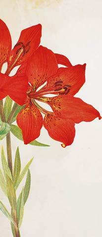
It is not a surprise that when I started painting, one of my rst artworks was inspired by this garden. I called it Dad’s Garden, and it was the rst of many paintings to be inspired by plants. Now that I have a garden of my own, I created an outside studio to teach workshops and share my love for watercolour and botanicals with my students. Sometimes we try an exercise that I call the Creative Garden, inspired by the plants that are in bloom in my garden. But the trick is to observe, study and paint them by memory. As the plants, light and seasons change, the nal pieces are always di erent and that is the point. The artworks will always be the result of the interpretation, imagination and memory of the artist that paints them. This is a relatively fast wet-on-wet technique where the brush jumps from very translucent to saturated paint. Everything bleeds to generate movement and capture the essence of my subject. For this painting, I have chosen the liliums as a focal point.
▸ Brushes Cass Art White Synthetic Brush Set of 6 Paints Cass Art PrimaryCrimson,Vermillion,watercolourArtists’paints:UltramarineBlue,AlizarinPyrroleOrange,LemonYellow,SapGreenCassArtArtists’WatercolourPencilSetof12:BrightPinkCassArtacrylicpaints:Yellow,CadmiumRedHue,TitaniumWhite Support Winsor & Newton Professional Watercolour Block Hot 300gsm, 12x16in MATERIALSINGRID'S INGRID SANCHEZ,AKA CREATIVEINGRID, paints this garden scene, featuring blooms and bleeds, in mixed media Creativegarden HOW TO 60 ARTISTS & ILLUSTRATORS at cassart.co.uk/sanchez with code SANCHEZ20* THESE20%GETOFFITEMS

1

4 WORK WITH THE DAMPNESS IN THE PAPER Smaller owers join the composition with a very delicate mix of yellow and pink water. All the elements in my watercolour are wet and very translucid, and even though they are separate owers, I want them to blend with the rst leaves and stems. Taking advantage of the dampness in the paper, I go back to the head of my liliums and with a knife, I shave a watercolour pencil to create some texture.
1 BE PREPARED When working with this technique, it is essential to have all the supplies prepared and to hand. I want to generate juicy bleedings, so I must work fast and focus on the process rather than looking for supplies. Once I have established that my focal point will be my liliums, I can start creating my palette and paint a very quick study to help me test how the colours bleed and the composition.
▸ 2 43 ARTISTS & ILLUSTRATORS 63
3 ADD STEMS AND LEAVES
HOW TO
2 USE COLOURED WATER To help me move the pigments while generating transparencies, I like to use water with some colour in it. For my liliums, I mix Vermilion and Pyrrole Orange in equal parts with a dash of Ultramarine Blue in a small jar with water. For additional owers and leaves, I do the same in a di erent jar using only Lemon Yellow. In a palette, I squeeze the same colours plus Sap Green and Alizarin Crimson.
Using the round brush no.8, I start painting the silhouettes of my liliums. For this, I use the mix of pink colourful water alternating with more saturation from a mix of paint from the palette. Using a mix of Sap Green and the yellow water, I start adding stems and leaves straight away. Allowing the di erent elements to touch each other, will create beautiful colour bleedings and gradations.


With a watery mix of Ultramarine Blue and Vermilion mixed on my palette, I start painting smaller leaves and stems. During this process, I alternate the saturation in my brush from blue to Vermillion, so I get a wide range of leaves that go from intense blue and purple. I want to connect all the small owers with stems, so with my round brush no.4 I paint lines resembling foliage.
7 NOW FOR CLEAN WATER
To paint a magical spell in the form of a splatter, I dip my no.8 round brush in the blue watery mix and let it drip over the paper, I repeat the process with the pink mix. Using clean water, I paint more leaves, allowing them to touch the blue drops. They are so translucid we can see the white of the paper, but I let it bleed with the colour of the drops.
HOW TO 5 6 7
To add contrast I start working with the paint on my palette. I use the tip of my brush, dipping it into various mixtures of yellow, orange and Alizarin Crimson. I like mixing my colours as I go, sometimes directly on the paper to see how new colours and gradations appear like magic. I keep using my colourful water, more saturation doesn’t mean dry paint, and it is important that all remains wet.
5 MIX COLOURS AS YOU GO
6 CONNECT THE SMALL FLOWERS


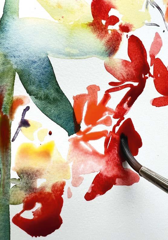
9
FINALISE WITH A TOUCH OF SWIRLS
MAINTAIN THE LOOSE STYLE OF PAINTING
8
Using a mix of P rimary Yellow, Cadmium Red and Titanium White acrylic and the no.8 lbert brush, I create an additional layer of botanical motifs. I dip my brush directly into the acrylic and paint petals alternating from one colour to another. I don’t wash my brush between brushstrokes, I prefer to see how the colours mix with each ower. I nalise with a touch of swirls and lines resembling leaves. @creativeingrid ▫ Find everything you need for this tutorial online at cassart.co.uk/sanchez and get 20% o ! Simply enter code SANCHEZ20 at the online checkout.*
98 ARTISTS & ILLUSTRATORS 65
OFFEREXCLUSIVEFROMCASSART!
HOW TO NOTONLY.CASSART.CO.UK/SANCHEZATONLINEAVAILABLEOFFERSANCHEZ.INGRIDBYSUGGESTEDPRODUCTSLIMITEDONVALIDISOFFERCONDITIONS:&*TERMS 2022.OCTOBER31STON23:59:59EXPIRESOFFERPERSON.PERUSEONEOFFER.OTHERANYWITHCONJUNCTIONINUSEDBECANNOTOFFERSTORE.INVALID
Liliums have very characteristic freckles, anthers, laments and a pistil that give them their distinctive personality. I want to maintain the loose style of my painting, so I want these details to be very discreet. For this, I use my no.4 round brush and the original mix of pink water to paint the freckles, laments and anthers. For the pistil, I use the yellow water and drop some yellow into the laments.
Instagram:


66 ARTISTS & ILLUSTRATORS
On the b
START SIMPLE Busy street scenes will eventually become quite technical, so starting with either a very simple sketch or launching in directly with paint will allow for some energetic mark-making. I begin with the big shapes and apply neat, weighty paint to broadly describe the main buildings. These range from creamy ochres, some with shots of green, to terracotta using my large damp 2-inch at. I mix plenty of paint on my mixing tray to create pools of the initial main colours.▸
1 1
HASHIM AKIB shows you how to paint this busy London scene in his signature style, in acrylics P ainting street scenes can overwhelmingappearatrstglance.There can be multiple elements vying for attention while linking everything together as a coherent whole can be tricky. Working in acrylic does have advantages as quick drying times make you decisive and able to add layers rapidly. I love working in acrylics and street scenes are my favourite theme. I work from my own photos as this provides greater insight into weather conditions or the atmosphere of the place. I use heavy body acrylics as this makes the painting look tactile and there’s less opportunity to fuss with minor details. My palette contains dominant colours which I can tone down while allowing for pops of vibrant pigment. I’ll be painting a central London scene looking from Trafalgar Square to the Houses of Parliament in the far distance.


uses ARTISTS & ILLUSTRATORS 67 Paints Amsterdam Standard Acrylics: PermanentMedium,PermanentLemonPermanentYellow,YellowPyrroleRed,PrimaryMagenta,BlueViolet,BrilliantBlue,PrimaryCyan,PhthaloGreen,YellowOchre,BurntSiennaandTitaniumWhite/artistquality. Brushes Daler Rowney Sky Flow 2, 1 1/2 inch and 3/4, 1/2 inch at head brushes. Support 24x36 inch stretched canvas with a Magenta and White mix base colour Plastic cards which I’ve cut down to provide various interesting crackly edges. Hard bits of cardboard will also do the TwoKitchenWatertrick.potrollmixingtrays MATERIALSHASHIM'S IMAGEORIGINAL


I add a little white to create some tints and violet for stronger darks. I make dabs to vaguely describe other shapes. The most important element at this stage is to apply paint liberally and concisely, with little concern for details. I’m conscious not to clean my brush, which allows some colour to embed into the brush as I start creating new blends. This way there will be a connection between colours. ACT DECISIVELY
68 ARTISTS & ILLUSTRATORS IGNORE THE DETAILS
3 2 2 3
Having applied a light blueish tint for the sky, mixed from plenty of white, blues and lemon, I can use variations of this colour to begin adding light elements for the foreground. My mixing tray contains plenty of colour from the previous applications which I can add to new mixes. It’s useful to act more decisively before the paint runs dry. I’m only estimating scales or shapes as these will be re ned over the course of the painting.


USE A PLASTIC CARD FOR THE EDGES
KEEP KITCHEN ROLL NEARBY A lot is conveyed with these more controlled marks. Variety in the marks is more important than simply describing a particular element. I use several plastic cards which have been cut down to provide mark-making options.
Do have plenty of damp kitchen roll ready in case you’re not happy with any application; make sure previous layers have dried before wiping away. I add white to my darks for a few combinations of grey.
I nd it really useful to establish some strong contrasts early on and the addition of darks immediately pulls out the tonal ranges. I use a combination of my 1 and 3/4-inch ats and the plastic cards to really accentuate di erent edges. I mix violet, green, sienna and cyan to create a dense dark. These are mixed on my mixing tray and picked up with the plastic cards and applied to the canvas.
▸45 4 5
MASTERCLASS ARTISTS & ILLUSTRATORS 69


TREAT THE SHAPES LIKE BOXES
6 7 6 7
MASTERCLASS 70 ARTISTS & ILLUSTRATORS
The red is the main contrasting colour, against darks, lights and earthy shades. The darker red contains more violet and the lightest is pure Pyrrole Red mixed with Yellow Medium. The buses are treated almost like boxes to start with, as are most shapes. I can then keep some relatively simplistic while others more de ned. USE OFAPPLICATIONSTHICKPAINT I also use light reds for umbrellas with additions of white to create pinks for highlighting the buses. I’m still using my plastic cards for these marks, again mixing thick consistencies on my tray and applying. Additional sparky colours lift the scene a little more, these include yellows with white added for opacity.


The lightest tints and crisp lines go in at the end. This way they will contrast against the more lively and larger early marks. I mix white, lemon and a touch of blue for car highlights and de ne the groupings of gures in the centre with highlights on umbrellas. The overall look of the nal painting still conveys the hustle and bustle of the scene but hopefully without too much fuss. hashimakib.com
LEAVE A LOT TO THE VIEWER’S IMAGINATION
I mix a cream colour using white, lemon and small dabs of blue and sienna. I apply the cream to pull-out window frames on the terracotta building with additional details on other buildings. The most intricate elements are the gures and cars. The secret is to provide a few clues to create the perception and leave a lot to the viewer’s imagination. I also leave fragments of the rst applications to come through at the end, with combinations of positive and negative painting techniques to keep things interesting.
ARTISTS & ILLUSTRATORS 71
TIME FOR THE DETAIL
▫ 89 8 9


Acrylic: Ultramarine Violet, Davy’s Grey Support Gessoed hardboard
The image was cropped out of a larger photo so as to focus on the potential for interesting visual elements. The photo does not offer all the possibilities that an artist might bring to the painting. Plans were made for greater colour variety and how the composition would lead the eye of the viewer through the painting, as well as to identify potential compositional problems.
Paint Oil: Titanium White, Yellow Ochre, Burnt Sienna, Tere Vert, Greenish Umber, Ivory Black, Cadmium Yellow Light, Cadmium Orange, Cadmium Red Medium, Permanent Rose, Ultramarine Blue, Chromium Oxide Green, Cadmium Green, Cinnabar Green Light.
▸ 1 1
En plein air Alla Prima studies by the great English landscape painter John Constable have been a primary role model for this thriving tradition in painting. The choice of a scene, whether on-site or from a photo, should have good possibilities for composition. These would include strong shapes, good light and shade and potential for movements and rhythms within the picture. Depth and aerial perspective are important factors in choosing a scene. Even if an interesting scene has these possibilities, the artist needs to edit the elements for the good of the nal image. This means possibly leaving something out, moving some elements and creatively interpreting the colour. This landscape image was chosen because all of these possibilities were present.
A approachdirect
THE REFERENCE PHOTO
Filbertshaped30.48x22.86cmpanelbristlebrush,largelbertbristlebrush AL GURY shows you how to create an Alla Prima landscape painting through purposeful amendments and interpretation
A lla Prima landscape painting is characterised by fresh, responsive brushwork, colour mixtures that capture the poetry, colour relationships in the scene and composition and depth that engages and stimulates the viewer’s eye. This could be said of most landscape paintings, but Alla Prima landscape painting stands out as responsive and creative while also being well organised.
MATERIALSAL'S STEP BY STEP
72 ARTISTS & ILLUSTRATORS


The rst layout sketch is placed on a gessoed hardboard panel. A toned acrylic middle-value grey ground, with a touch of purple in it, will assist both value organisation as well as initial colour interaction. The placement drawing is done with a lbert shaped bristle brush dipped into greenish umber. The basic shapes and composition are established in this layer.
ADDING THE GREENS Using direct paint and a larger lbert bristle brush, with no mediums added, large masses are started to be blocked in. The greens are chosen from the palette to approximate, as close as possible, the basic green colour of each mass and shape. Chromium Oxide Green is the base for this rst layer, with Ultramarine Blue added for cooler shapes, and Cadmium Green added for brighter greens.
▸ 2 43
THE PLACEMENT DRAWING
CONTINUE TO BLOCK IN The blocking in process continues in each area. Cadmium Yellow has been added to create the closer yellow greens whilst Greenish Umber is beginning to be used to add darks. The goal of the blocking in phase is to create a rst base layer upon which can be built modi cations in each area in a second layer. Details and small adjustments will be added in a third and nal layer. IN THE PATH
74 ARTISTS & ILLUSTRATORS 4 2 3 5 ADD
The pathway in the photo is an indeterminate colour. Choices of interpretation of colours are a necessary part of creating an image that makes sense and is creative and expressive. Yellow Ochre, Cadmium Orange and Burnt Sienna with white are used to create the broad strokes in the colour of the pathway.


5

76 ARTISTS & ILLUSTRATORS 67


In the nal phase of the basic blocking in of the rst layer, the sky colour is made of Ultramarine Blue and white, whilst the clouds are made with white mixed with a touch of Permanent Rose and Yellow Ochre. The rst base layer, which organises the image, is complete and ready for the next layer. This layer has been boldly and broadly blocked in with fairly dense paint.
SHAPES WITHIN SHAPES
An important aspect of the nishing layer is the nal small touches of colours that will enhance the scene and the feel of light and expression. Here, Cadmium Yellow is stroked onto the path to suggest light, texture and colour variation in the path.
FINAL SMALL TOUCHES
The next layer, which will modify and develop each area, requires consideration of the strokes and additions that are needed. For fresh wet paint strokes to glide over the wet underlayer, the new strokes on top need to be thicker than what is underneath. This follows the lean to fat model of layering and prevents the new strokes from seeming to ‘sink in’ and possibly become muddy by dragging into the rst layer of wet paint. Each area has added strokes to enrich the colours and develop value and warm and cool changes. These are typically shorter strokes that are not as large as those in the rst layer and are thicker than what is below.
The rst blocked-in layer has provided settings for a variety of colours and strokes that suggest value changes and shapes within shapes and textural variety.
STEP BY STEP TIME FOR THE SKY
THE LAST CHECK
▫ ARTISTS & ILLUSTRATORS 77 6 7 8 9 10 8 109
It is important to check the painting one last time for compositional weak spots or areas of colour that need enhancement. The four corners of the painting have to keep the eye from drifting out and the bottom 25 per cent of the image must prevent the scene from seeming to ‘fall o the bottom.’ This was accomplished by adding nal touches of darker blues in the corners of the sky, darks in the lower right corner, and darker colours and bolder brush strokes as the path descends to the bottom of the composition. Finish with consideration of the whole and its inner harmonies of value, colour and composition. algury.com
THE LEAN TO FAT MODEL


lines,
year
and
Bristlene is a fully synthetic version traditional another takes a whole Last saw the introduction of two new Sablene Sablesque, both created as an alternative to expensive Sable. This sees the introduction of another new synthetic
of a
product… Development continues and we are always looking at new opportunities, so be sure to follow us on social media. Here you can discover more about what we already do, while being kept fully informed about brand new products. Available through all good retailers 78 ARTISTS & ILLUSTRATORS
new level. Bristlene Here at Pro Arte, we never stop.
breakthrough for animal lovers and it
year
Hog or Bristle brush, designed for Oil and Heavy Acrylic painting. Joining the ‘Prolene’ and ‘Sablene’ stable, this is a brush that fulfils its brief superbly. The brushes contain a variety of filaments of different grades and natural hues to give a pleasing bristle look-a-like whilst performing in a truly magnificent way. The bend and spring that the fibres exude and the sharpness of point and edge allow precise control. All in all, they are a joy to use and a sight to behold! It’s
ARTISTS’ VALUE BRUSHES Available through a select group of www.artistsbrushes.co.ukstockists for full information on ranges, sets, prices. Great value! big savings! TONEEDYOUTOOLS MASTERPIECEYOURCREATE www.panartglobal.com TONEEDYOUTOOLS MASTERPIECEYOURCREATE www.panartglobal.com CONTACT : PREMIUM ART BRANDS LTD. Office: +44 1926 492213 Email: paul@premiumartbrands.comTONEEDYOUTOOLS MASTERPIECEYOURCREATE www.panartglobal.com CONTACT : PREMIUM ART BRANDS LTD. Office: +44 1926 492213 Email: paul@premiumartbrands.com artist handmadepaintingbrushesknivesartistcanvastravelbagsartistapronspaperpencilcases PREMIUM ART BRANDS LTD. paul@premiumartbrands.com ProArte Ltd, ParkMill, Brougham Street, Skipton, BD232JN admin@proar te.co.uk • www.proarte.co.uk Follow us on ProArteBrushesFollow us on Instagram @proartebrushes Brand New Products from your favourite brushmaker!
bristle brushes to


† No minimum spend, one use for new customers only* See shipping policy for full details ‡ Expires kenbromleyart31/10/22KenBromleyArtKenBromleyArtKenBromleyArt TEL: 01204 690 114 EMAIL: sales@artsupplies.co.uk AIM110‡your rst order when you quote: £ 5 OFF †OFFERREADER ART SUPPLIES.CO.UK GREAT DISCOUNTS UNBEATABLE SERVICE FREEovershippingonorders£50toUKmainland* CMYCYMYCMYMCK 2019 LAC ad 1-4.pdf 1 16/09/2019 08:28 book with confidence - deposits fully refundable situated in non-paintinginspirationalfabulouscountrysidebeautifulfoodcoastallocationsairyonsitestudiopartnerswelcome bigskyartcourses.com+44(0)7785439727 big sky art Luxury residential art breaks in North Norfolk with superb tutors based at The White House near Burnham Market ARTISTS & ILLUSTRATORS 79


Leo Hallam I was in the queue at a local food hall and spotted your magazine. I didn’t think twice about picking up a copy and I’m very glad I did. I got home and subscribed after reading and icking through some wonderful art andAfterinspiration. seeingletters from your readers, I felt compelled to share my recent experience: my rst ever trip to Ireland. I took myself and my car over on the ferry and stayed for a week in a little cabin near Dromahair in County Sligo. One early morning I left at 4.30am to try and catch the sunrise. The satnav got a bit confused and ended up taking me to Knocknarea Mountain, which is a breathtaking sight at 327 metres high (1,073 feet!). What a perfect place to sit and soak in my rst Irish sunrise. I drew a couple of views, one of which you see above. I hope they meet the reader’s approval and o er some joy. Mark Pickin
You tell us MESSAGES 80 ARTISTS & ILLUSTRATORS Write to us! Send your letter or email to the addresses below: Post: Your Letters, Artists & Illustrators, The Chelsea London2CompanyLtd.,MagazineJubileeHouse,JubileePlace,,SW33TQ Email: andillustrators.co.ukinfo@artistsThewriterofour
“Message of the month” receive a £50 gift voucher to spend with Atlantis Art, the UK’s largest art materials store. atlantisart.co.uk
Along the way, I met wonderful artists to whom I am extremely grateful for helping me overcome the fear of ridicule, rejection and failure.
Nataly Kenny In 2015, my mother was diagnosed with Alzheimer’s, which completely turned my life upside down. Her disease created a huge emptiness in my soul. I wanted to help her, but I felt extremely helpless, until, after a gap of 37 years, I felt a strong urge to paint again, as a form of meditation and healing. I started small and was very shy to share it, even with my closest people. When Covid hit, I used the lockdown periods as an opportunity to re ne my painting skills, this time discovering more of a painterly and colourist style, by immersing myself in online art courses and YouTube tutorials.
And what is this miracle, you might wonder? A dog. With a dog, you walk more slowly with time to look around and appreciate the shapes and the light. And when you stop, [there are] no complaints of “Can’t we keep going?” but a companion who will curl over your feet and admire your every scribble.
MESSAGE OF THE MONTH
Of course, none of this would have happened without the love, support, encouragement and patience of my family. Followingwonderfultheselast few years of art study experimentation,andInow feel that I am an established artist and I’m ready to share my works with the wider world; I hope that you enjoy the painting above. I also hope that my story will encourage others to overcome all limiting beliefs and start painting. It is never too late.
“Draw a line every day”. We are constantly advised on how important keeping a sketchbook is for any aspiring artist. And I have tried: every year I resolve anew and every year I fail. And I suspect that I am not the only one. But I have discovered the answer; the essential nal key to my en plein air kit.
◂ Share your stories and get adaily doseof Artists & Illustrators tips, advice and inspiration by following us on our social media
/ArtistsAndIllustrators@AandImagazinechannels...@AandImagazine@AandImagazine
will


THE CLASSIFIED DIRECTORY To advertise here please call 020 7349 3784 THE CLASSIFIED DIRECTORY PRINTINGARTISTS MATERIALS ARTISTS WANTED ART FOR SALE RANDOLPH KELLMAN CONTEMPORARY ARTIST. Visit my online galleries www.rakeart.co.uk www.artists.de Telephone 020 8889 4714 Mobile 07979842456 PAINTING WORKSHOPS ON ZOOM WITH JONATHAN NEWEY Learn how to draw and paint from the comfort of your own home. Media: watercolour, acrylic, pencils For more information: T: 07947 237505 E: W:jnewey210@gmail.comwww.jonathannewey.com ART TUITION COURSES COURSES Jacqueline Midgen Artist @hotmail.co.uk07854Commissionsandproducts734290jackiemidgen www.jacquelinemidgen.wordpress.com Visits by appointment only at Studio 126, Wimbledon Art Studios or Couture Collective, 659 Fulham Road Drawing/painting a live model, anatomy, colour theory/mixing. All abilities welcome. LINDY ALLFREY www.lindyallfrey.co.ukSTOW-ON-THE-WOLDART, THREE DAY PORTRAIT AND STILL LIFE PAINTING WORKSHOPS PEGASUS ART Finest Art Materials since www.pegasusart.co.uk2005 Workshops - Art Classes- Canvas Making - Stretcher bars 01453 886560 info@pegasusart.co.uk pegasusart.co.uk • Busy and varied programme of art and craft workshops • Enjoy our spacious, rural studio and grounds, with its covered outside area, separate dining room and car park • Fabulous tutors, exciting courses, great food! • Painting and creating is your escape Call Allison for details: 01255 820466 Email: www.watershedstudio.co.ukallison@watershedstudio.co.ukStClere’sHallLane,StOsyth,ClactononSea,Essex,CO168RX Watershed Studio Celebrating our 21st year! 01306 875 150 info@eyeswidedigital.com www.eyeswidedigital.com • Giclée Fine Art Printing • Greeting Cards • Canvas Prints • High Quality Reproductions Produced From Original Artwork Or Digital Files Fine Art Giclée Printing Service Hahnemühle Papers & Canvas Photography and Scanning Service Greeting Cards and Postcards Professional and Friendly Advice No Set Up Fees & Free Art Guides Call us on 01656 www.geminidigitalcolour.co.uk652447 ● ● ● ● ● ● Making Art Work www.pewseyvalestudio.co.uk Oil painting tuition in the heart of Wiltshire • One, two and three day courses for beginners and experienced artists • Specialist courses for artists new to oil painting • Landscape, Still Life, Skies, Plein Air & Impressionism To advertise in the Classified Directory please call Emily on 020 7349 3784 THE ART SHOP DIRECTORY DEVON SOMERSET/ DORSET GWENTGLOUCESTERSHIRE WEST SUFFOLKMIDLANDS/NORFOLKLONDON LONDONNORTHYORKSHIRESOUTH WEST ART Old Fore Street, Sidmouth EX10 8LP Tel: 01395 www.southwestartmaterials.co.ukinfo@southwestartmaterials.co.uk514717 Run by artists, for artists – extensive range of quality fine art materials & professional bespoke picture framing service. Friendly & knowledgeable service. Delivery or store collection of orders online or over the phone. PEGASUS ART – suppliers of the finest art materials Griffin Mill, London Road Thrupp, Stroud, Glos GL5 2AZ Tel: 01453 www.pegasusart.co.ukinfo@pegasusart.co.uk886560 THE ART SHOP & CHAPEL 8 Cross Street, Abergavenny NP7 5EH Tel: www.artshopandchapel.co.ukadmin@artshopandchapel.co.uk01873852690 Fine art supplies, exhibitions, workshops, talks, concerts and creative food from our Chapel kitchen. ATLANTIS ART MATERIALS – UK’s largest and one of Europes biggest art stores Unit 1 - Main Shop Unit 6 - Office & Warehouse Unit 7 - Paper Department Bayford Street Industrial Centre Bayford Street, London E8 3SE Tel: 020 7377 www.atlantisart.co.uk8855 Car parking, open 7 days. INTAGLIO PRINTMAKER The Specialist Supplier of Fine Art Printmaking Products 9 Playhouse Court, 62 Southwark Bridge Road, London SE1 0AT Tel: 020 7928 2633 Fax: 020 7928 www.intaglioprintmaker.cominfo@intaglioprintmaker.com2711 Wide range of tools available to try in our store (near Tate Modern). STUART R. STEVENSON Artists & Gilding Materials 68 Clerkenwell Road, London EC1M 5QA Tel: 020 7253 1693 SHOP www.stuartstevenson.co.ukONLINE ART4ALL & ARTYCRAFTY 5 Market Square, Crewkerne TA18 7LE Tel: 01460 www.artycraftysupplies.co.ukwww.art4allframing.co.uk78574 Bespoke framers, art, craft, hobby supplies. Open 6 days a week. EASY PARKING. GOSLINGS 50 Station Road, Sudbury, Suffolk C010 2SP Tel: 01787 371932 A family run business specialising in Bespoke Picture Framing and Artist Materials THE ART TRADING COMPANY 55 Earsham Street, Bungay NR35 1AF Tel: 01986 www.thearttradingcompany.co.ukTheArtTradingCo@btinternet.com897939 “...a truly excellent art materials shop” East Coast Net THE ARTIST’S PALETTE 1 Millgate, Thirsk North Yorkshire YO7 1AA Tel: (01845) 574457 Independent stockists of fine art materials by Winsor & Newton, Sennelier, Golden, Faber Castell etc; Wide range of papers, crafts, kits and models. Friendly knowledgeable service from experienced art tutor. HARRIS MOORE Fine Art Supplies Unit 12 Minerva Works 158 Fazeley Street, Birmingham B5 5RT Tel: 0121 633 www.harrismoore.co.uksales@harrismoorecanvases.co.uk3687 Specialists in Artists Canvases and Professional Painting Supplies.


82 ARTISTS & ILLUSTRATORS
I started to draw realistic faces in 2017 and then in 2020, I decided to try and make some of the old ones I’d done even better. I enhanced the contrast and found it to be an amazing moment, as if the subjects on the paper were coming to life. From then on, I’ve been spending a lot more time on my drawings. My goal with ACon dent Stride (above) was to show the important step in emancipation. I worked from a photo by Armin Haab called Männerblicke (‘men’s glances’), but I decided to change the name to
In every issue, we ask an artist to tell us about a piece of work that means a lot to them. This month, we speak to award-winning pencil artist FREDERICK TERPSTRA
A Con dent Stride, pencil , 21x29.7cm
Picture this
ACon dent Stride to emphasise the woman’s role in the picture in a positive way. I wanted viewers to embrace the beauty of the folds in the clothes, the sleek hairstyles and the shiny hats. I used three pencils: 2H, 2B and 6B and a putty rubber for mistakes. I created part of this at an airport, part of it in my Nan’s kitchen in England and the rest in my apartment in Switzerland. frederickterpstra.com

FULL VALUE R ANGE
~ Nicholas Beer, Founder & Director of the Sarum Studio
NITRAMTM MC FINE
The Nitram Assortment contains 2 x 5mm H, 2 x 5mm HB, 2 x 5mm B and 2 x 6mm B+ charcoal.
“I have been using Nitram for over thirty years since I first went to study at the Cecil Studios in Florence in 1991. I soon became the senior studio assistant, teaching in Florence for over twenty years until 2013. I had originally founded the Sarum Studio as a school that ran part time courses when I was not in Italy, but in 2013 the Sarum Studio became a full-time school, the first of its kind in the UK. I was responsible for encouraging the Compleat Artist in Salisbury to become the first shop in the UK to stock Nitram charcoal back in the late nineties. It is far superior to regular charcoal because it is graded according to hardness, which means that it can be sharpened to a point for fine work, and because it yields a full value range with rich velvety darks.”
Nicholas Beer working on “Drawing of Kit”, Nitram Charcoal on Fabriano Roma Paper, 66 cm x 48 cm www.nitramcharcoal.com ART CHARCOAL
WITH NITRAM C HARCOAL
Nicholas Beer is the author of 'On Sight-size Portraiture' which is the definitive guide to sight-size portrait painting, and which includes the original history of the method. He is tremendously proud of what the staff and students have achieved at the Sarum Studio. Set in the beautiful environs of Salisbury Cathedral Close, the Studio is an independent school of fine art committed to the practice of drawing and painting from life using the Sight-size method. www.sarumstudio.com | Instagram: @sarumstudio
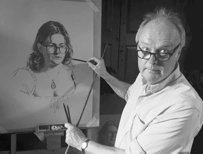


BOOK NOW RAWUMBERSTUDIOS.COM • 01453 497001 • 16 NELSON STREET, STROUD GL5 2HN VANTOM WOUWERDE LEARN TO PAINT THE PORTRAIT COLOUREDUNDERLIGHT 11-14 OCTOBER — £480 / 4 DAYS FERLANDDANNY LEARN TO PAINT DYNAMIC PORTRAITS FROM LIFE IN THIS INTENSIVE 3DAY MASTER CLASS 21-23 SEPTEMBER — £450 / 3 DAYS DINGEMANSLIZET A WEEKEND OF ALLA PRIMA STILL LIFE PAINTING 24-25 SEPTEMBER — £200 / 2 DAYS POLLARD PORTRAIT PAINTING IN OILS FROM LIFE WITH THIS BP PORTRAIT AWARD FEATURED ARTIST 10-11 SEPTEMBER — £200 / 2 DAYS MOREOUTFINDTOSCANME UPBRUSH BEGINNER OR EXPERT, IMPROVE YOUR ART SKILLS BY ATTENDING OUR WORLD-FAMOUS WORKSHOPS HOSTED BY LEADING ARTISTS IN OUR COTSWOLDS STUDIO. LIMITEDPLACES SOLDOUT! RSES UPCOMING COURSES UPCO


