


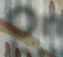
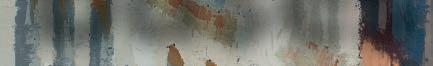
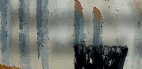
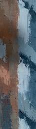


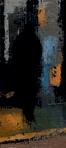

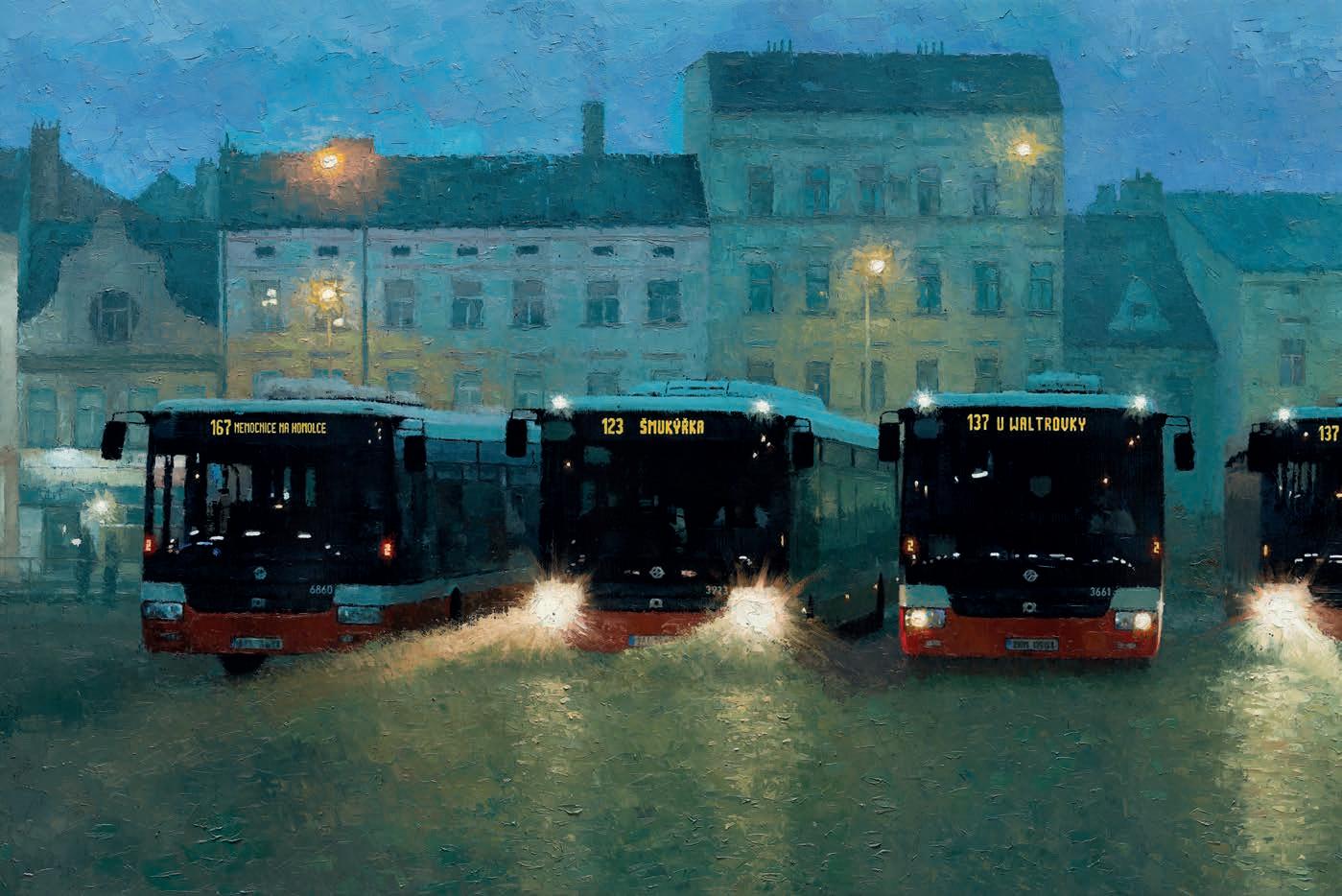
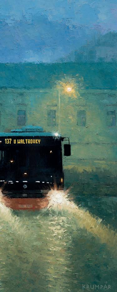
Prague Buses, oil on canvas, 150x80cm
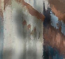
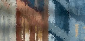
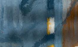
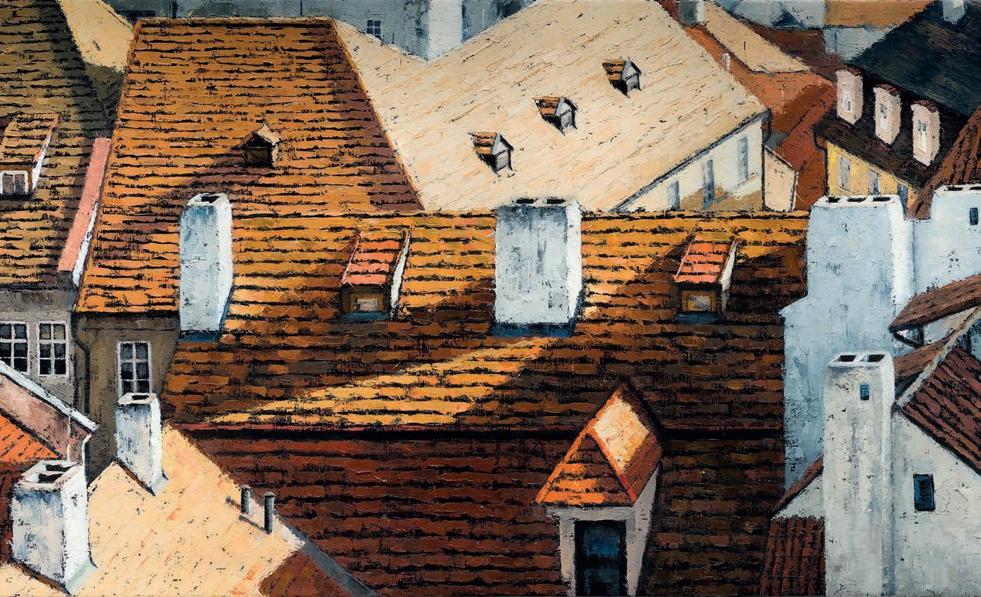
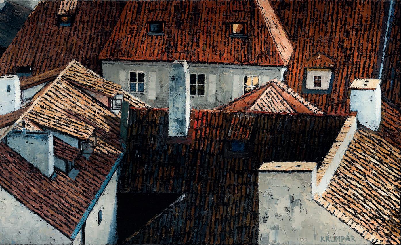
Roofs, oil on canvas, 180x55cm
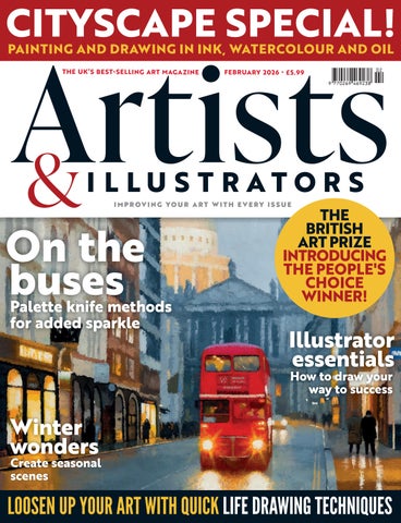
This Prague-based artist tells Sarah Edghill how he developed his unique style
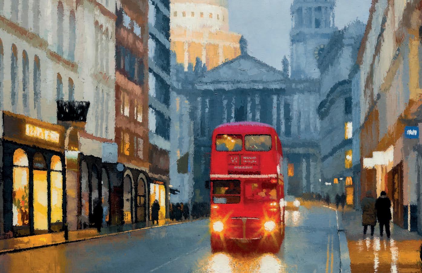
Although he had been painting for years, Marek Krumpár still remembers the precise moment when his approach to style and technique changed dramatically. ‘One day, by chance, I walked past a gallery in Prague – where I live – and noticed a painting created with a palette knife on a black canvas,” he says. “I stopped and stared at it for a long time. The texture, depth and intensity of colour completely fascinated me. The very next day, I bought a palette knife and started
experimenting. From that defining moment, a completely new world opened up for me.”
Although he had drawn and painted since childhood, Marek only began to take art seriously in his twenties, when he came to England to work as an au pair. Even then, he was painting with brushes in a traditional way. His palette knife epiphany outside the gallery in Prague meant that for a while afterwards, he used nothing else. “A palette knife makes colours more vibrant and luminous,” he says. “It leaves a different kind of mark to a brush, ▸
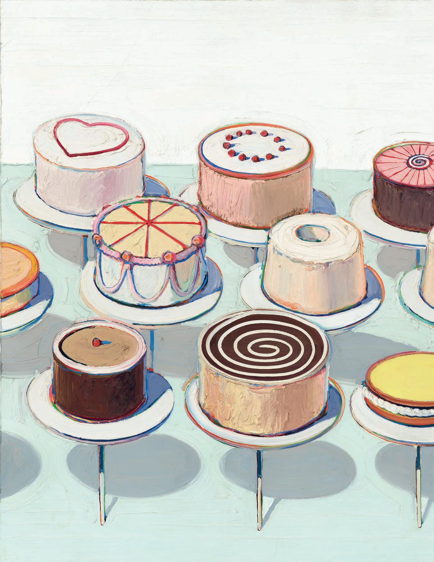
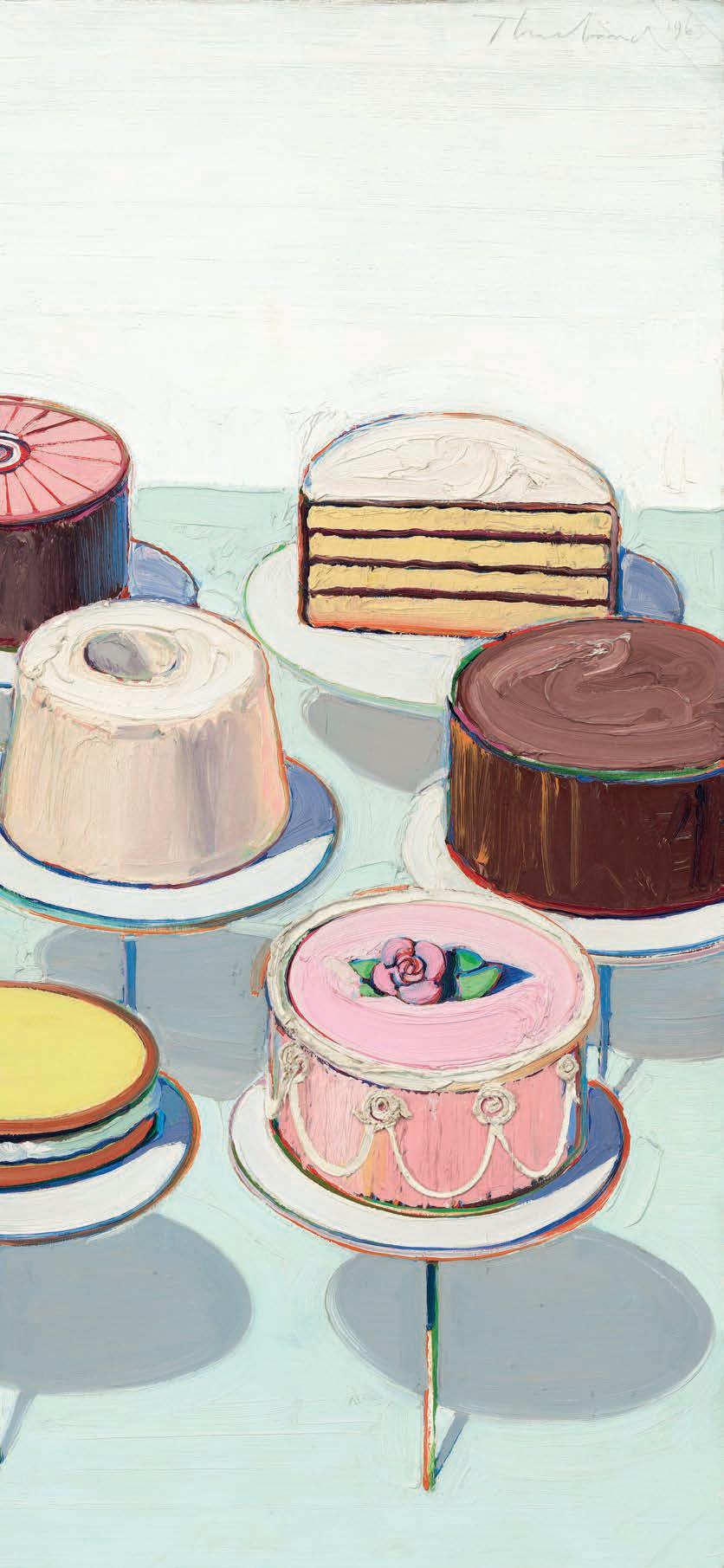
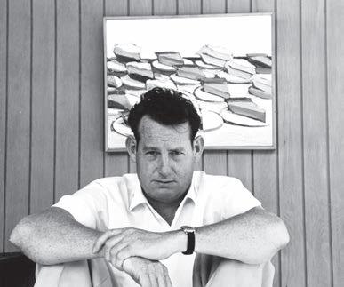
WAYNE THIEBAUD is now considered to be one of the greatest and most original 20th-century American artists, but his work has rarely been shown outside the United States. Sarah Edghill learns about a new exhibition where that’s being put right
Wayne Thiebaud’s work was based on close observation of the consumables that fascinated him and that he saw as a vital part of American life. He took commonplace objects – from cherry pies and hot dogs, to gumball dispensers and pinball machines – and made them the stuff of serious modern painting.
But although Thiebaud (1920-2021) is widely celebrated in the States, his work had never been exhibited in the UK until a team at the Courtauld Gallery began to discuss the possibility. “We’ve been thinking about this show for 10 years and actually working on it for more than three years,” explains the Courtauld’s Deputy Head, Dr Barnaby Wright. “It has been a complete joy to be involved in this exhibition. All the work we are borrowing is from major collections in the US. The big picture, Cakes, is from the National Gallery in Washington, and they have never lent outside the US before, so it’s a bit of a coup to get it.”
The exhibition, American Still Life, focuses on Thiebaud’s breakout works of the 1960s, which were the ones that made his reputation. It brings together some of the greatest paintings he ▸
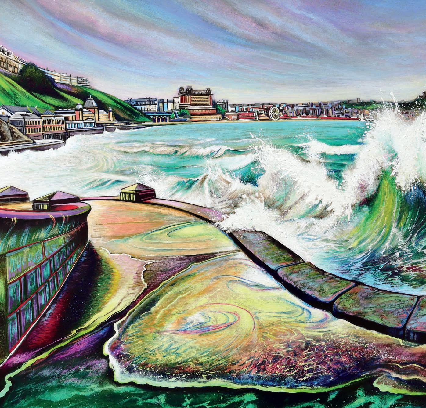
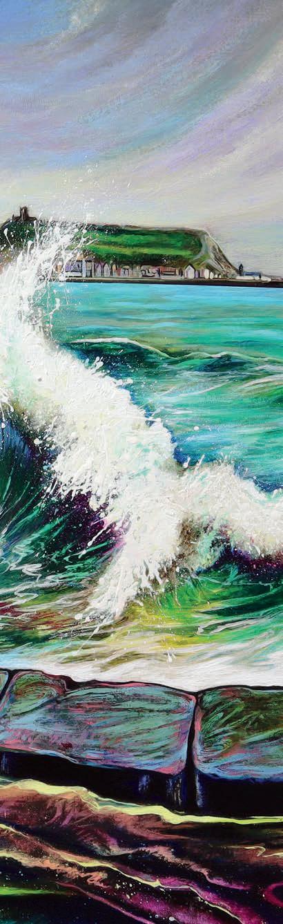
SHARON TIERNAN shows how to capture the power and beauty of a winter sea scene
Heavy Body
Acrylic Paint
Alizarin Crimson, Naphthol Red, Cadmium Red, Vat Orange, Cadmium Yellow, Nickel Azo Yellow, Benzimidazolone Yellow (medium), Naples Yellow, Permanent Green (light), Light Green (Yellow Shade), Permanent Sap Green, Veridian Green Hue, Phthalo Turquoise, Cobalt Teal, Light Blue Permanent, Ultramarine, Phthalo Blue (green shade), Phthalo Blue (red shade), Smalt Hue, Dioxazine Purple, Red Iron Oxide, Potters Pink, Medium Magenta, Quinacridone Magenta, Van Dyke
Brown Hue, Payne’s Gre y Carbon Black, Titanium White
Brushes
Pro Arte Prolene Plus 007 series, sizes 0, 1, 4, 6, 7 and 8; size 10 round; short flat ¾ inch; flat 2 inch; flat wash 1 inch; oval wash ½ inch; sword ¼ inch; dry soft-bristled ½ inch; 19mm mop; size 6 chisel
Support
Fabriano Artistico 640gsm
2B Pencil
Tear Off Palette
Gloss Medium
Diamond palette knife
Straight-edged palette knife
Natural sponge
Wet and dry paper
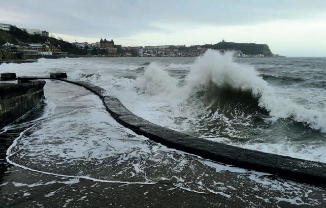
Ilove to watch a rough sea, especially in winter. There is something mesmerising about the rhythmic movement. This sheer power rejuvenates the mind, filling you with awe – it is uplifting and almost euphoric. I guess that, as an artist, it is only natural that I wanted to translate this into paint, prolonging the experience and preserving the memory.
With this step-by-step, it’s important to ‘chunk’ the task from simple to complex: block in simple colours and shapes first before progressing to medium-sized details and then graduating to smaller details. Work from light to dark to preserve the luminosity of the colour when glazing and wait between applying glazes so they’re thoroughly dry and have time to set, which prevents layers from damage when overpainting. ▸ britishartclub.co.uk/profile/Sharon_tiernan
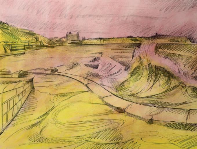
Drawing is the scaffolding for a good painting. Fix the drawing with a thin layer of gloss medium mixed with Potters Pink (applied using a flat 2-inch brush). This prevents the pencil from contaminating future layers of paint, creating a transparent isolation layer. You can add a thicker application once this preliminary layer is dry, which prevents the paper cockling. Apply Benzimidazolone Yellow as a transparent overlay and loosely pick out the wave, path and the headland in the background. ▸
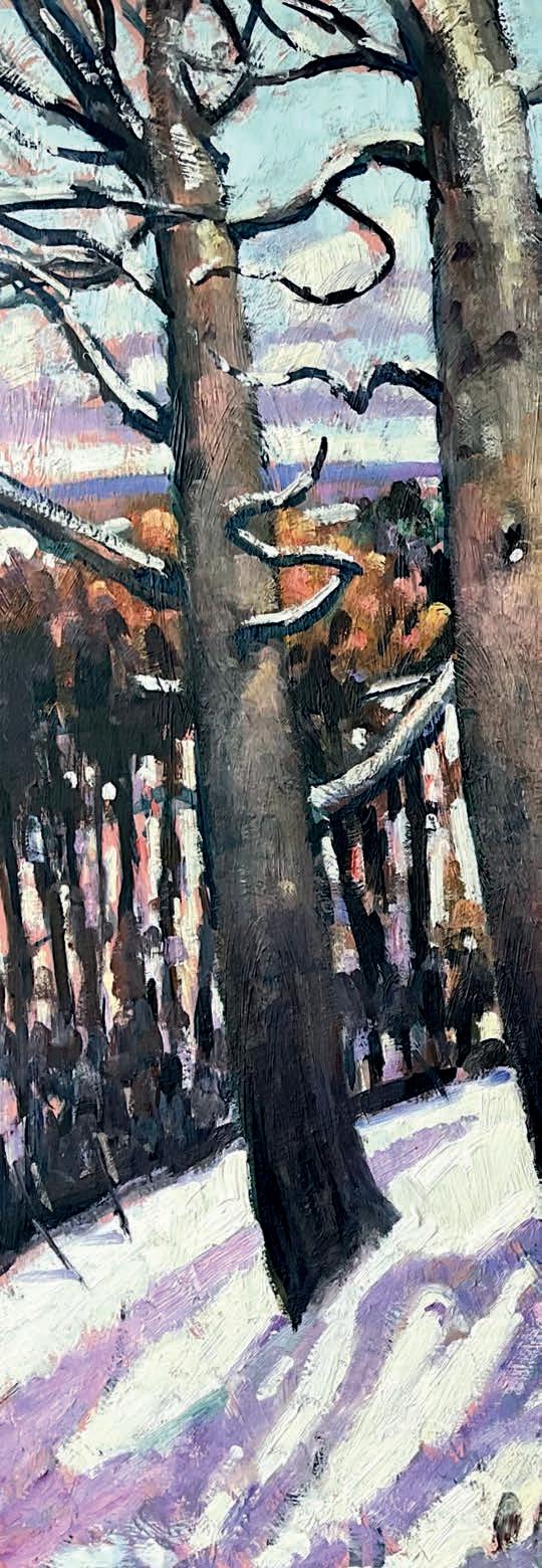
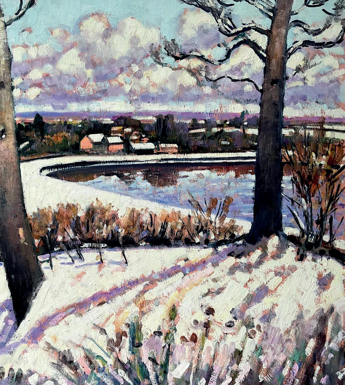
This chilly snowscape was the perfect composition to be painted in acrylic, says TERENCE CLARKE , all from the comfort of his home studio
Lukas Artists Oil
Titanium White
Senelli Artists’ Oil Paints
Ultramarine, Prussian Blue, Manganese Blue, Quinacridone
Magenta,Vermillion, Pthalo Green, Lemon Yellow, Indian Yellow
Brushes
Rosemary Ivory short filberts. Nos 1,2,3,5
Support
Galleria Heavy
Structure Gesso
Smooth hardboard
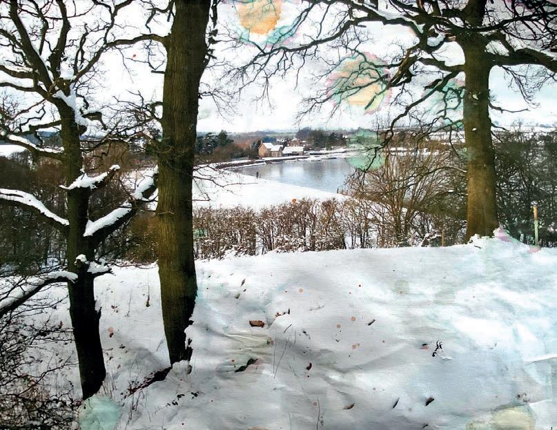
This view – across Bitell Lake in Worcestershire – had obvious painting potential, and though I had walked here before, the snow and the light gave me an immediate feeling of drama and structure. It’s very important to find good subject matter, but also to find scenes that are relevant to one’s style and technique. I have a love of strong colour in my work, but the richness of tonal colour here was very exciting. It offered me a way of making the landscape rich in colour despite the ubiquity of white in a snow scene. The way the trees seemed to draw one into the landscape and the large open space beyond was exciting. The quiet reflections in the lake nicely break up the whites and add to the sense of light in the picture. The distant landscape was subtle and evocative as the winter trees merged with the aerial perspective of the distant hills. Finally, this composition is very satisfying because it leads your eye from left to right, which is how we tend to read most paintings. ▸
Instagram: @terence_clarke_paintings
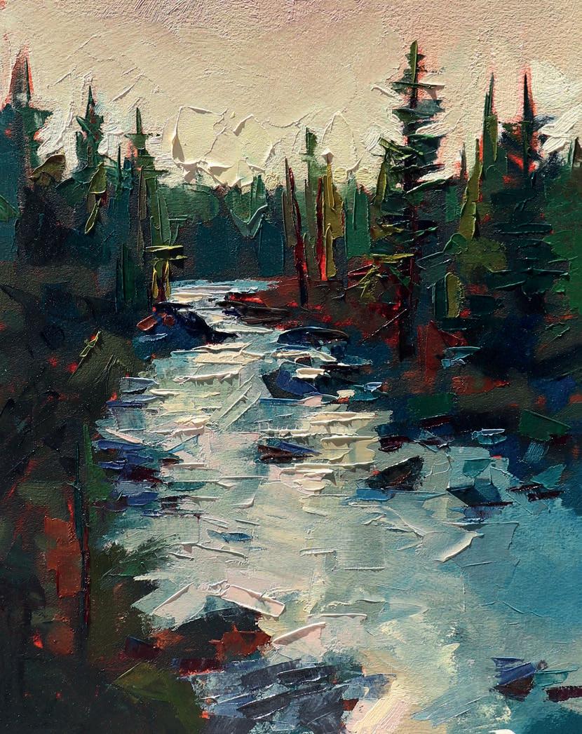
In every issue, we ask an artist to tell us about a piece of artwork that is important to them. This month, we speak to American landscape artist TAYLOR MANOLES
Passing Through, came after a season with a lot of change and unknowns. This is a location I’ve come to many times, and painting it helped me to ground myself. It’s a spot on the Deschutes River that I have walked along countless times. In the summer and early autumn, I find myself drawn to it for a nightly dip. It’s become my way to shed the noise and reset. I have many reference photos of the river at different times of the day. This isn’t a specific scene to me, but more a compilation of many times at the river’s banks. I knew I wanted to capture the feeling of the rushing water with the stillness of the evening light.
I was surprised by how quickly it came together. I had been thinking and dreaming about it for a long time before, which can sometimes put unnecessary pressure on the idea, but for this one it felt like a clear vision and was really exciting and fun to work on.
Passing Through helped me find the balance between movement and stillness within a piece. You need both, and they need to work together. I hope the viewer feels serene but not static. Like they are able to enjoy the quiet moment with the trees and the water, but that it also stirs movement inside of them. taylormanoles.com ▫