Chapter 2: Examining Relationships
2.1 (a) The cases are employees. (b) The label could be the employee’s name or ID. (c) Answers will vary. (d) The explanatory variable is how much sleep they get; the response is how effectively they work
2.2 (a) The cases are the individual orders; the variables are the size and the price. (b) The size is the explanatory variable; it explains the price. Price is the response. (c) The cases are the individual orders; the variables are the ounces and the price. Ounces is the explanatory variable and price is the response
2.3 State is the label; all other variables are quantitative.
2.4 (a)
(b)
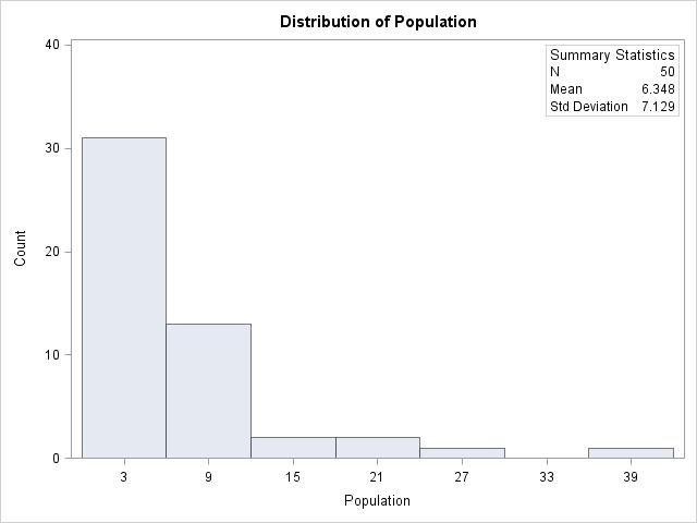
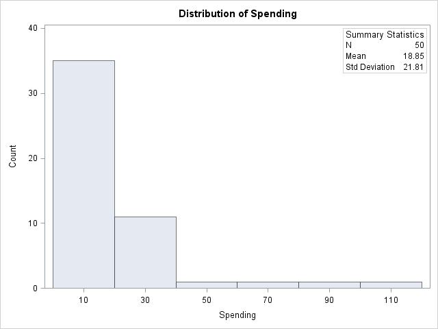
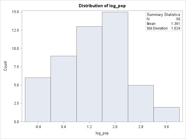
(c) Both spending and population are strongly right-skewed. The mean for spending is 18.85 with a 21.81 standard deviation. The mean for population is 6.348 with a standard deviation of 7.129.
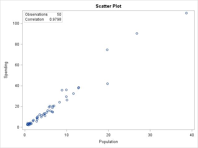
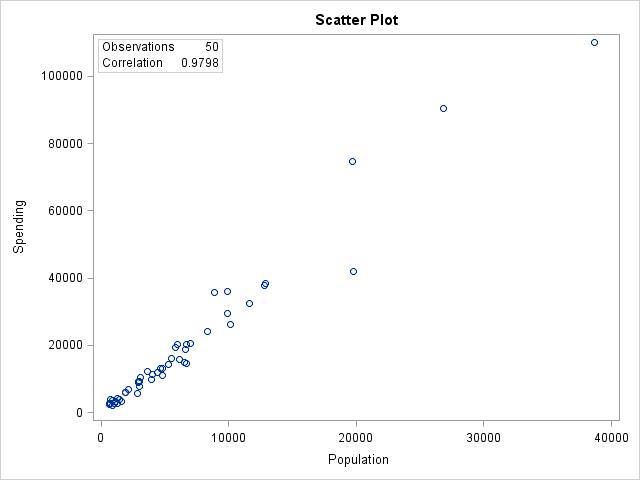
(c) The scatterplots are identical, just with the units changed.
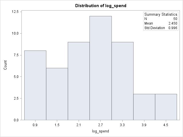
2.7 The skew is gone from both distributions. Both are close to symmetrical, with a single peak in the middle and roughly bell shaped.
2.8 (a) If two variables are negatively associated, then low values of one variable are associated with high values of the other variable. (b) A scatterplot can used to examine the relationship between two variables. (c) The response goes on the y axis, the explanatory goes on the x axis

2.9 (a) No apparent relationship.
(b) A weak negative linear relationship.
(c) A strong positive relationship that is not linear.
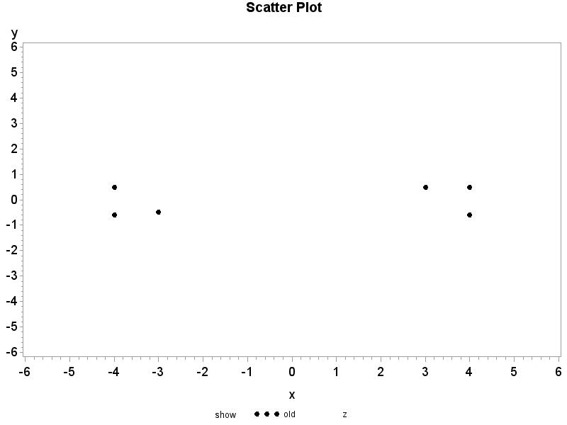
(d) A more complicated relationship. Answers will vary, below is an example of two distinct populations with separate relationships plotted together.
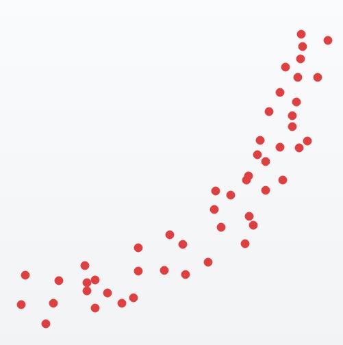

2.10 (a) The data for year 2002 would be the explanatory variable, the data for year 2012 would be the response. We would expect the 2002 data to explain, and possibly cause, changes in the 2012 data. (b)
(c) The form is linear; the direction is positive; the strength is very strong. (d) India and the United States appear to be outliers and have much larger values for both years than other countries
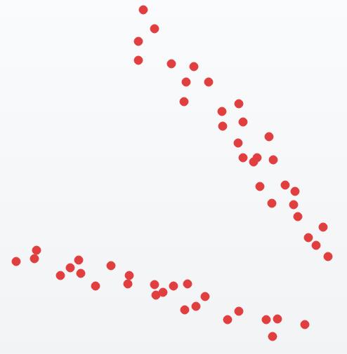
2.11 We expect the relationship between 2012 and 1992 to be weaker because the time difference is larger. (a) The data for year 1992 would be the explanatory variable; the data for year 2012 would be the response. We would expect the 1992 data to explain, and possibly cause, changes in the 2012 data. (b)
(c) The form is roughly linear; the direction is positive; the strength is moderate. (d) United States is the only outlier with a much larger value for the year 1992 than most other countries.
2.12 (a) The two variables calories and percent alcohol have fairly symmetric distributions with one potential outlier, O’Doul’s.
(c) The form is linear; the direction is positive; the strength is very strong. (d) O’Doul’s could be a potential outlier; it has a very small percent alcohol value
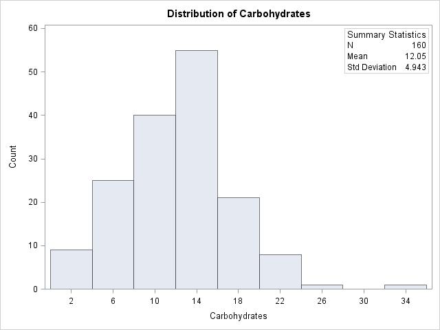
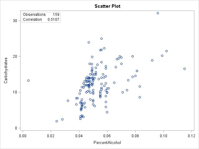
2.13 (a) From 1.156, percent alcohol is somewhat right-skewed. Carbohydrates, shown below, is fairly symmetric.
(c) The form is somewhat linear; the direction is positive; the strength is weak. (d) O’Doul’s could be a potential outlier; it has a very small percent alcohol value. Sierra Nevada Bigfoot could also be a potential outlier; it has a very high amount of carbohydrates.
2.14 (a)
(b) The form is fairly linear, the direction is negative, the strength is strong.
2.15 (a)
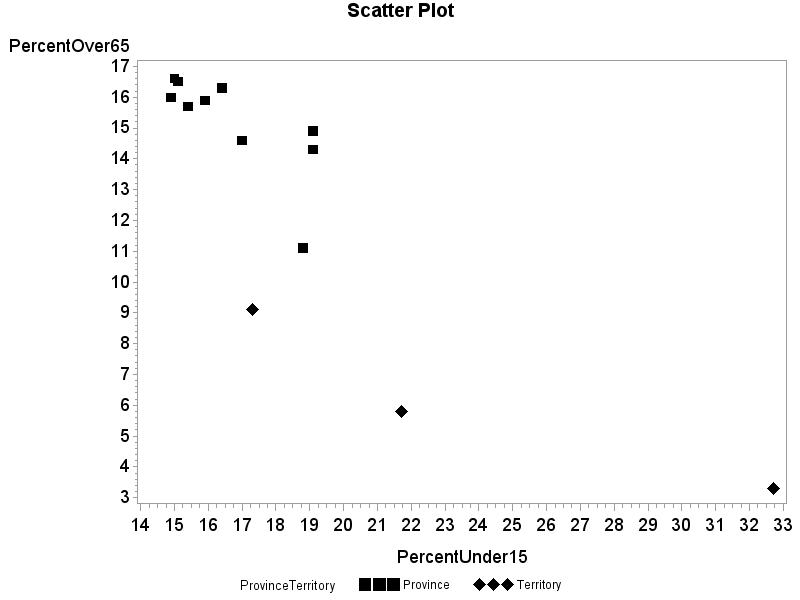
(b) The three territories have smaller percentages of the population over 65 than any of the provinces. Additionally two of the three territories have larger percentages of the population under 15 than any of the provinces.
2.16 (a) The explanatory variable is the time spent on your pages The response variable is the amount of their purchases. We would expect the time spent to explain the amount spent. (b) Both variables are quantitative. (c) Answers will vary. It is likely the association is positive because the more time they spend on your pages indicates they are likely successful during their shopping and should spend more. (d) Answers will vary
2.17 (a) We would expect time to explain the count, so time should be on the x axis.
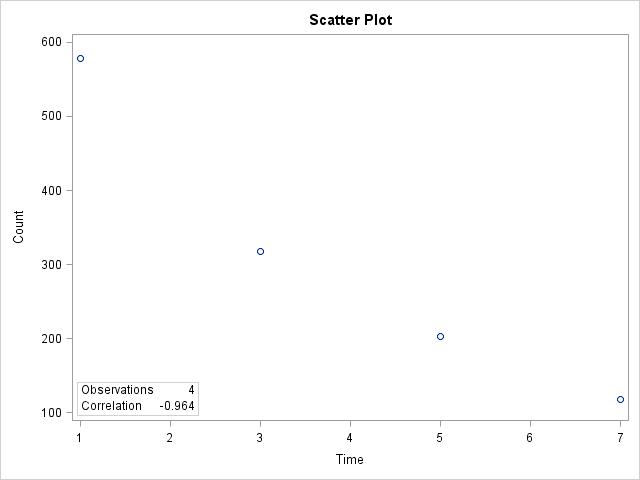
(b) As time increases, the count goes down. (c) The form is curved; the direction is negative; the strength is very strong. (d) The first data point at time 1 is somewhat of an outlier because it doesn’t line up as well as the other times do. (e) A curve might fit the data better than a simple linear trend.
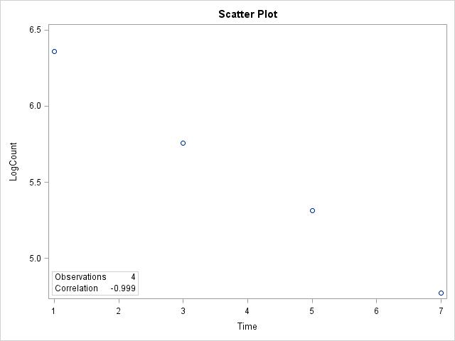
(b) As time increases, logcount goes down. (c) The form is linear; the direction is negative; the strength is extremely strong. (d) There are no outliers. (e) The relationship is very linear, almost a perfect line
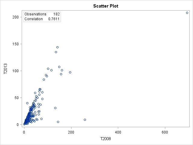
2.19 (a) 2008 data should explain the 2013 data. (b)
(c) There are 182 points; some of the data for 2008 are missing. (d) The form is somewhat linear; the direction is positive; the strength is moderate. (e) Suriname is an outlier for both 2008 and 2013. (f) The relationship is somewhat linear, though there are observations that don’t follow the linear trend well
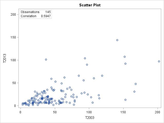
2.20 (a) The 2003 data should explain the 2013 data. Here there are only 145 data points because some of the data for 2003 are missing. The form is somewhat linear; the direction is positive; the strength is weak to moderate. There are a few semi-outlying observations but nothing that seems drastic. The relationship is not extremely linear as there is quite a bit of scatter throughout the plot. (b) The relationship between the 2008 and 2013 times is stronger than the relationship between the 2003 and 2013 times. This is likely
because the start times slowly change over time, so we would expect bigger differences between the 2003 and 2013 times and hence not as strong of a relationship as we saw in the 2008 and 2013 times.
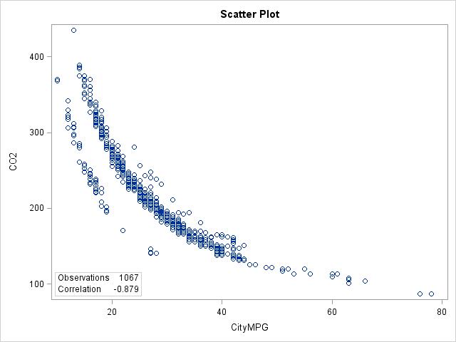
2.21 There is a negative relationship between City MPG and CO2 emissions; better City MPG is associated with lower CO2 emissions. The relationship, however, is not linear but curved. There also seems to be two distinct lines or groups. This relationship is very similar to what we found in Example 2.7 when using highway MPG, with the patterns seen in the plot nearly identical to the form we saw in Example 2.7.
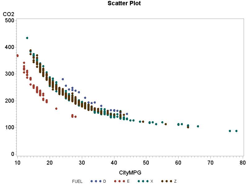
2.22 Each fuel type has a curved relationship between City MPG and CO2 emissions. Furthermore, the curves for the 4 fuel types are very similar, although some curves for some fuel types are shifted because they provide either better or worse City MPG than other types. However, the emissions for the 4 fuel types are all very similar and all within the same range.
2.23 r = 0.9798.
2.24 (a) r = 0.9798. (b) It did not change. (c) Changing the units has no effect on the correlation.
2.25 (a)
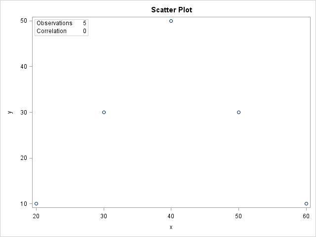
(b) The relationship between x and y is very strong but it is not linear; it has a curved relationship or parabola. (c) r = 0. (d) The correlation is only good for measuring the strength of a linear relationship
2.26 (a) r = 1. (b) r = 1.
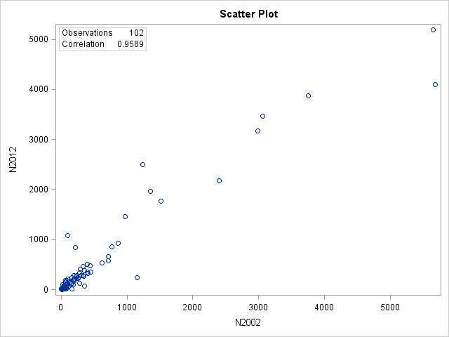
2.27 (a) r = 0.9589. (b) Yes, there is a very strong linear relationship between the 2002 and 2012 data
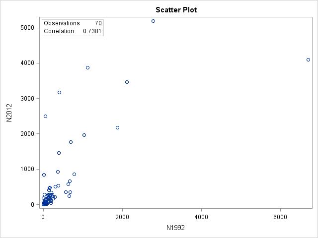
2.28 r = 0.7381. Overall, yes, because there is a moderate linear relationship between the 1992 and 2012 data. However, there is one outlier that doesn’t fit the pattern. The correlation for the 1992 and 2012 data is not as strong because the data are not as linear as they were for the 2002 and 2012 data.
2.29 (a) Yes, the relationship between time and count is quite strong because the data points form a nice curve. (b) r =
0.964. (c) The correlation is not a good numerical summary because the data form a curve, not a line, a transformation is needed to get a better relationship.
2.30 (a) The relationship between time and log of the counts is very strong; the data points follow nearly a perfect line. (b) r = –0.999. (c) The correlation gives a very good numerical summary of the relationship because the data show a very nice linear form. (d) The correlation wasn’t bad before the transformation (–0.964), but it is much better after the transformation (–0.999). A high correlation doesn’t automatically mean a linear fit, especially when we see a curve in the scatterplot. Here a transformation gave us a much better fit, straighter line, and an even higher correlation. (e) The correlation by itself isn’t enough to explain a relationship. If we had just calculated the correlation without looking at the scatterplot before transforming, we would have thought we had a very nice linear relationship when, in fact, a curve via the transformation provided a much better description of the actual relationship, and yielded a much higher correlation, and thus a better fit.
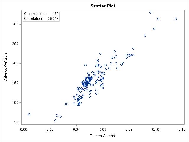
2.31 (a) r = 0.9048. (b) Yes, the relationship between percent alcohol and calories is quite linear, so the correlation gives a good numerical summary of the relationship.
2.32 (a) r = 0.9077. (b) We might expect outliers to always drastically change the correlation but as this example illustrates, that is not always the case. Here removing the outlier O’Doul’s didn’t change the correlation much at all. It really depends on where the outlier falls in the linear relationship as to how much it may or may not affect the correlation. Additionally, the number of observations does play some role, there are so many observations in this particular dataset that removing one that is only somewhat outlying doesn’t change much.
2.33 (a)
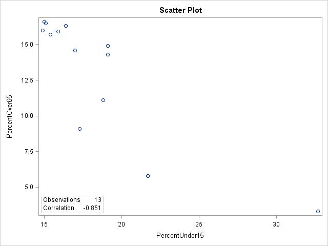
(b) r = –0.851. (c) No, although the relationship is mostly linear, there is an outlier, Nunavut, with a high percent of under 15 and a very low percent over 65.
2.34 (a) Yes, Nunavut is an outlier with a high percent of under 15 and a very low percent over 65. (b) r = –0.780 Nunavut was actually helping improve the linear relationship between percent under 15 and percent over 65. Without Nunavet, the correlation went down a little bit, from –0.851 to –0.780.
2.35 (a) r = 0.9808. (b) The correlation went up from 0.9798 before taking the logs to 0.9808 thereafter Though the correlation went up a little bit, the log didn’t help much with the explanation of the data.
2.36 (a) r = 0.9742. (b) r = 0.9753. (c) There is very little difference between the correlations before and after removing the potential outliers. Similarly, using the log transformation had very little effect as well, both before and after removing the potential outliers As long as the outliers follow the pattern of the linear trend, they have little effect on the correlation when removed.
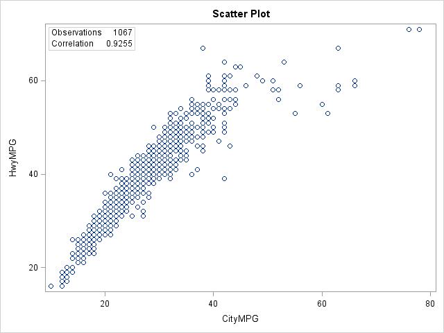
2.37 (a)
(b) The relationship is somewhat linear but may also be slightly curved. Hwy MPG and City MPG increase together. (c) r = 0.9255. (d) The correlation is a decent numerical summary because the data are somewhat linear, but a curve may provide a better description of the relationship
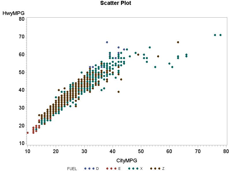
2.38 (a)
(b) The distinction between fuel types is difficult to see, especially because the relationship between City MPG and Hwy MPG is consistent regardless of fuel type. It is apparent that some fuel types get much better MPG than other fuel types, regardless of City vs. Hwy (type E has the smallest MPGs and types X and Z some of the largest), but overall the pattern is consistent across all fuel types. (c) For fuel type D: r = 0.9382 For fuel type E: r = 0.9560. For fuel type X: r = 0.8992. For fuel type Z: r = 0.9351. Although the correlations vary somewhat, they are all very similar in their description of the relationship between City MPG and Hwy MPG.
2.39 Applet, answers will vary.
2.40 (a)
(b)
(c) The correlation between x and y is 0.2531. The correlation is still 0.2531 for x * and y *. By multiplying and dividing by 10 we are essentially just changing the units for x and y, which we know does not change the straight line relationship as measured by the correlation.
2.41 The magazine report is wrong because they are interpreting a correlation close to 0 as a negative association rather than no association Answers will vary. “A new study shows no linear association (relationship) between how much a company pays their CEO and how well their stock performs.”
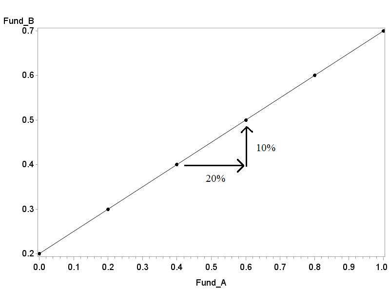
2.42 A correlation measures the strength of a linear relationship; or, that is to say, the relationship between Fund A and Fund B is consistent along a line. It doesn’t mean they have to change by the same amount. So as long as Fund A moves 20% and Fund B move 10% consistently, up or down, you will still remain on the same line.
2.43 (a) The correlation is not dependent on order and remains the same between two variables regardless of order. (b) A correlation is reserved for quantitative data; because color is categorical, it cannot have any correlation. (c) A correlation can never exceed 1, which indicates a perfect linear relationship
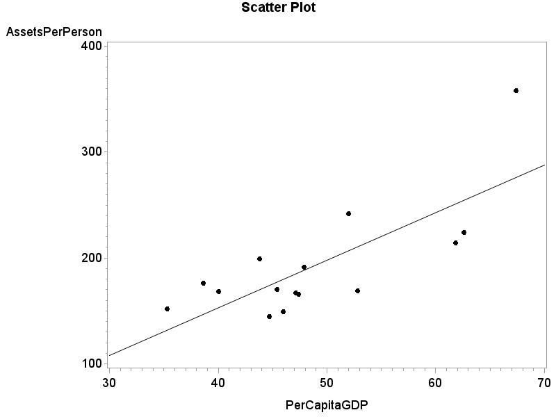
2.44 The estimated net assets per capita is about $160,000. The prediction error = observed y – predicted y = 170 – 160 = $10,000.
2.45 There are 7 (one is just barely above the line) positive prediction errors and 8 negative prediction errors.
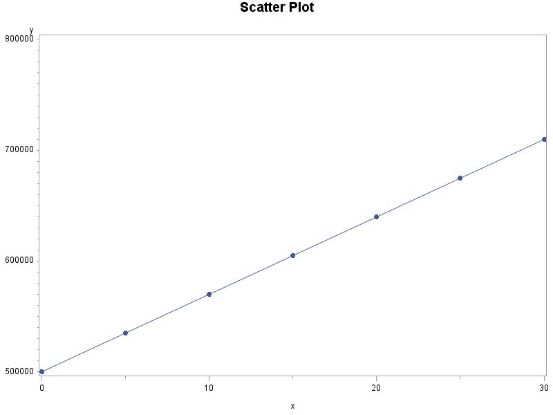
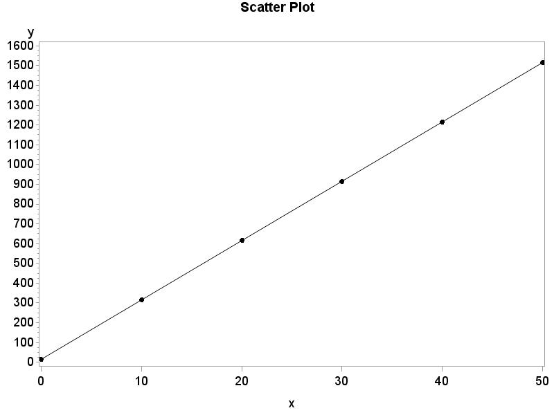
2.46 (a) 30. (b) 15. (c) For x = 10, y = 15 + 30(10) = 315. For x = 20, y = 15 + 30(20) = 615. For x = 30, y = 15 + 30(30) = 915. (d)
2.48 (a) r 2 = 35.52%. (b) ˆ y = 6.083 + 1.707x. (c) For x = 1.75, ˆ y = 6.083 + 1.707(1.75) = 9.07. We could have given this value immediately because it is y
2.49 Applet, answers will vary.
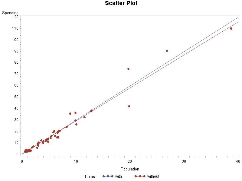
2.50 (a) For x = 26.8, ˆ y = –0.16251 + 2.99713(26.8) = 80.16. (b) Residual = y –ˆ y = 90.5 – 80.16 = 10.34.
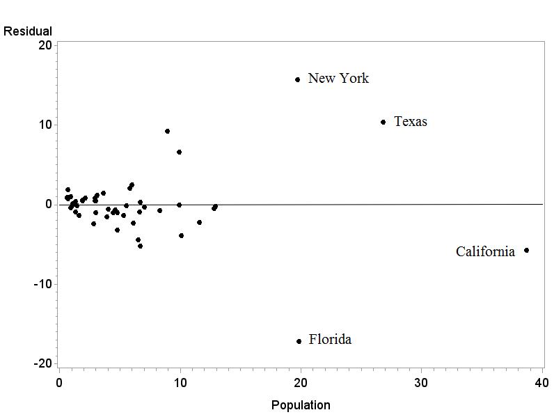
(c) Texas is further from the regression line because it has a bigger residual in magnitude (absolute value).
2.51 The residuals sum to –0.01 This is due to rounding error.
2.52 (a)
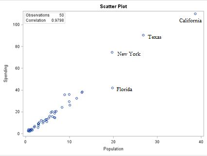
(b) It is easy to identify the points because the scatterplot and residual plot both have the x variable, population, on the x axis.
2.53 The lines are very similar, with and without Texas. Texas is not an influential observation.