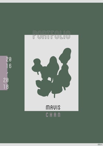
陳文美,1990年生。
自2012年立志以視覺設計為 未來職業路向。2013年大學 畢業後,旅居台灣,並開始自 學視覺設計。自2018年返回 香港定居,現職平面設計師。
喜愛文字與視覺設計,期望結 合在學時期接受的文字訓練, 朝向文字與視覺設計的行業。
Mavis Chan, an enthusiast about visual design, started her career as a graphic designer in September 2016. To take the road less travelled, her self-taught visual adventure began in 2013. With an academic background of cultural and political studies, she sees visual world in a contextual perspective.
Everything in life has its stories, from ordinary objects to abstract existences. She aspires to be a design narrator, sees the uniqueness of each tangible or intangible thing, tells stories behind.
Branding & Logo Design
Poster Design
Illustration
Photography
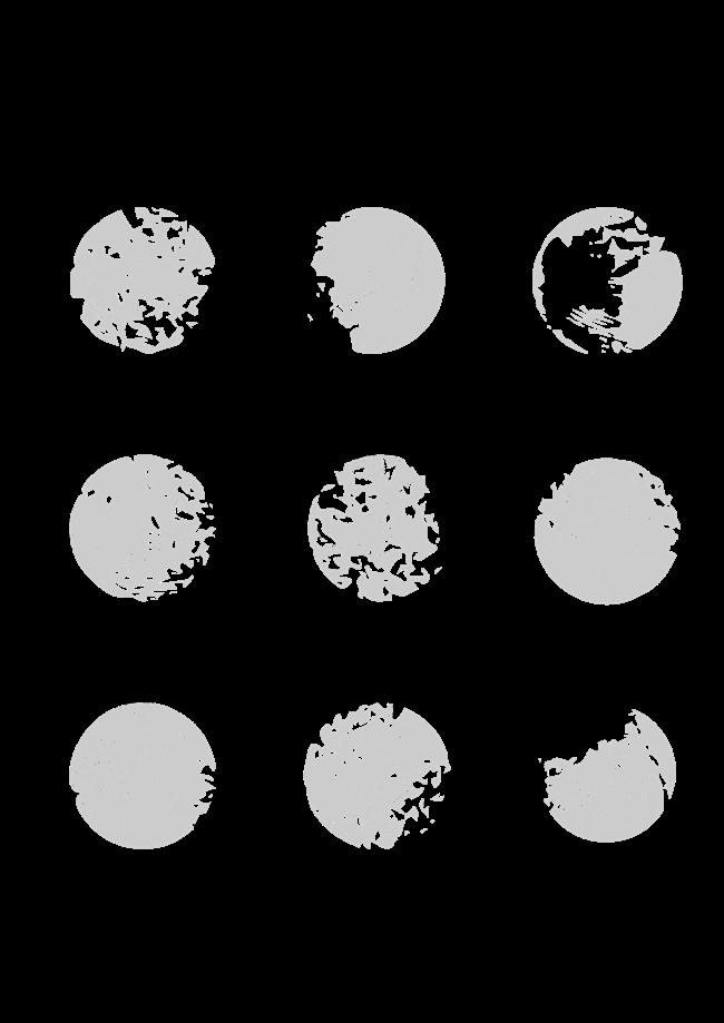
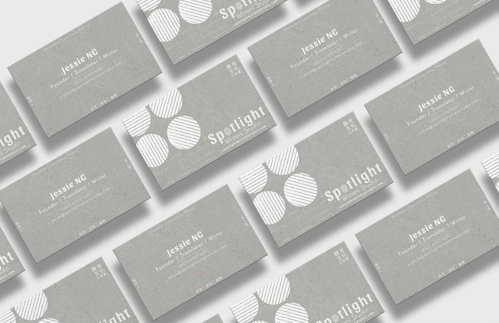
Project Type: Business Card Design
Client: Spotlight Writers' Studio
Year: 2017
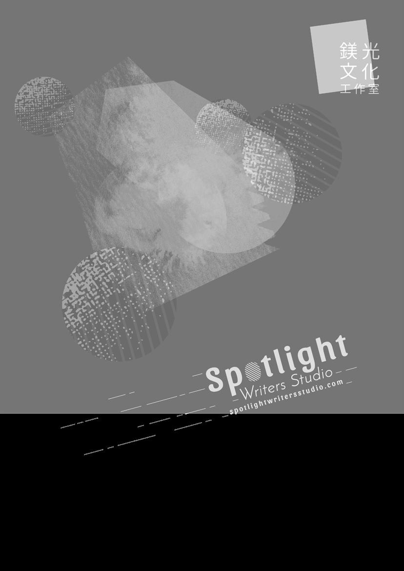
01-03. Proposed business card design / front 04. Business card design / back
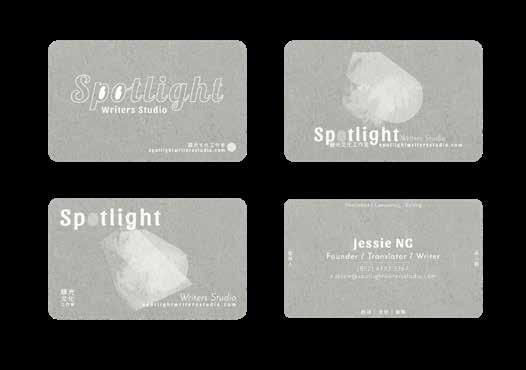
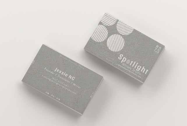
Concept
Circles with scattered texture represent silhouette of spotlight on the stage; Dashed lines represent the trajectory of spotlight as well as the strokes of the fountain pen. Colour grey is applied to present a quiet and subdued trait of writers.
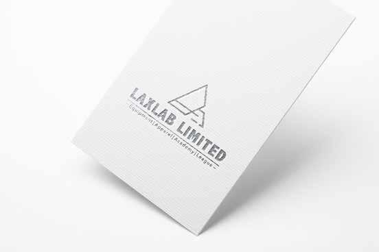
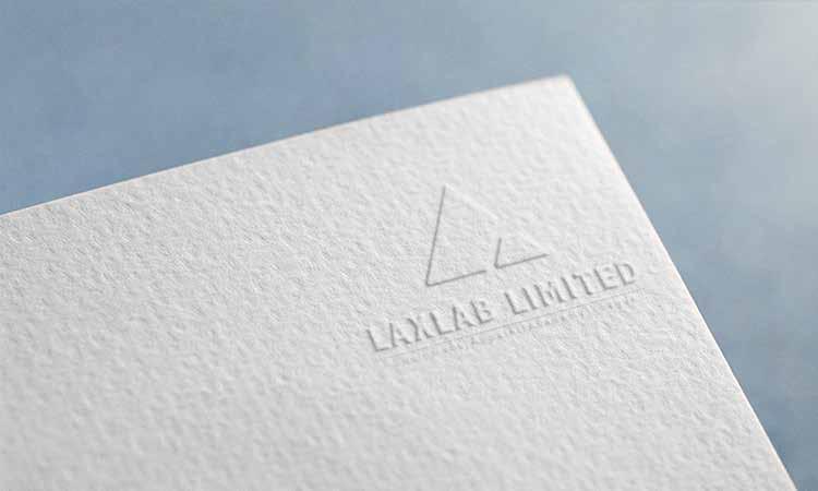
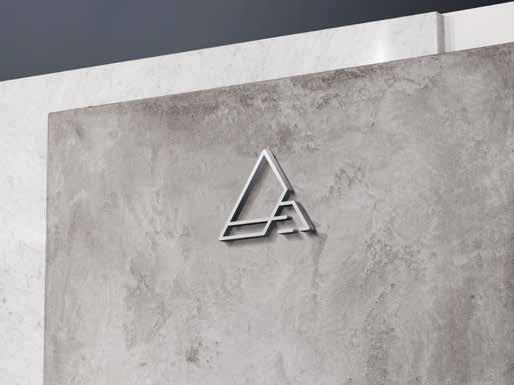
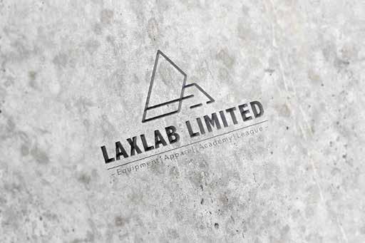
Project Type: Logo Design
Client: Lax Lab Limited
Year: 2016
Concept
LAXLAB Limited aims to develop as a reliable high-end provider of all branches of lacrosse.
Lacrosse is a high-speed sport equipped with heavy gear. A sense of high moving speed, a significant nature of lacrosse, is represented in the logo.
A regular triangle shows a feeling of moving with a rather solid bottom among geometrical shapes. A small triangle is cut to form an uppercase letter ‘L’. Three uppercase letters ‘LAX’ are also hidden within the main shape.
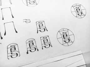
Project Type: Logo Design
Client: Lao Feng Yi Restaurant
Year: 2017
Concept
Lao Feng Yi is a local Taiwanese restaurant in Kaohsiung. It opened in 1990.
Chinese phoenix, Feng Huang, to some extent symbolizes female leader in Chinese culture. Since the restaurant was started by a mother who wanted to earn a living and nurture her children, calligraphic word ‘ 鳳 ’ is embedded
into the logo design, to tell this family story.
Lines around the bird symbolize the nest, shelter of chick. The chick is carefully protected by the nest (the restaurant) his mother built. It also aims to convey a sense of warmth and hospitality to their customers.
Another proposed logo design using Chinese word ‘ 鳳 ’.
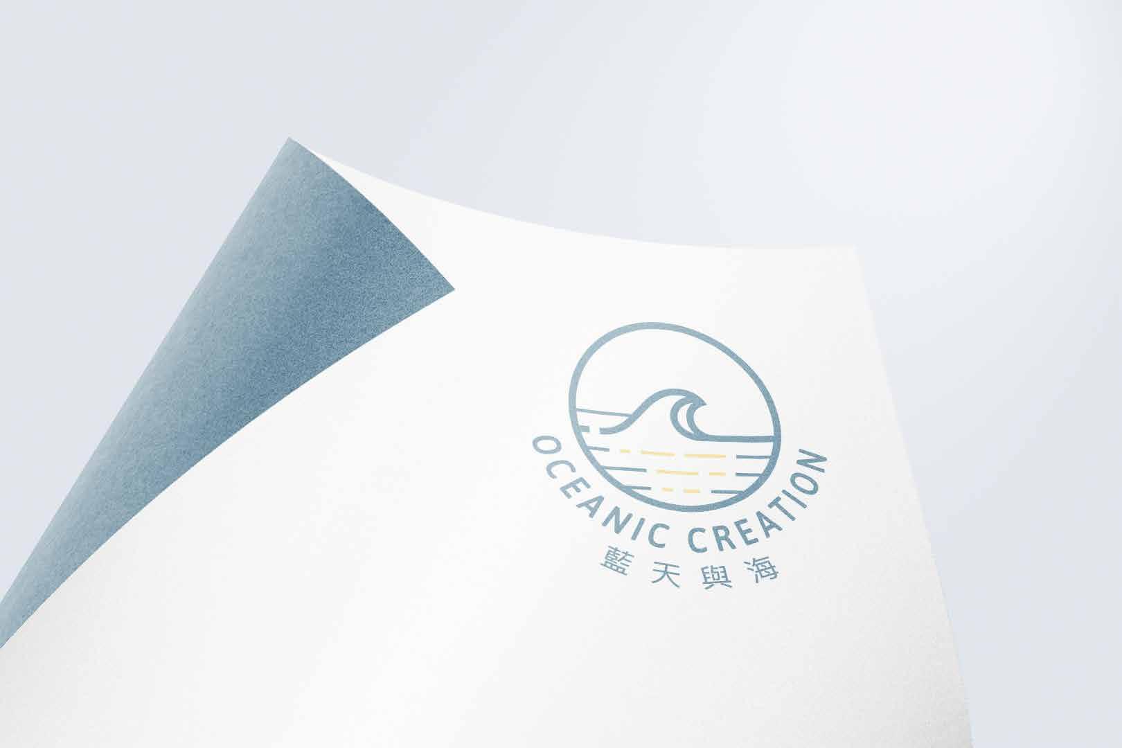
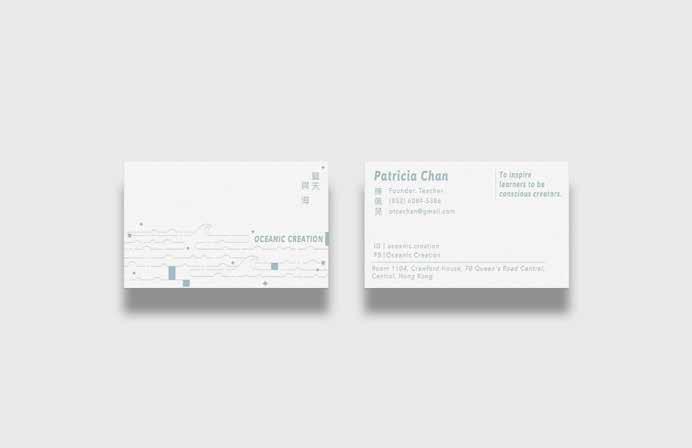
Project Type: Logo Design & Business Card Design
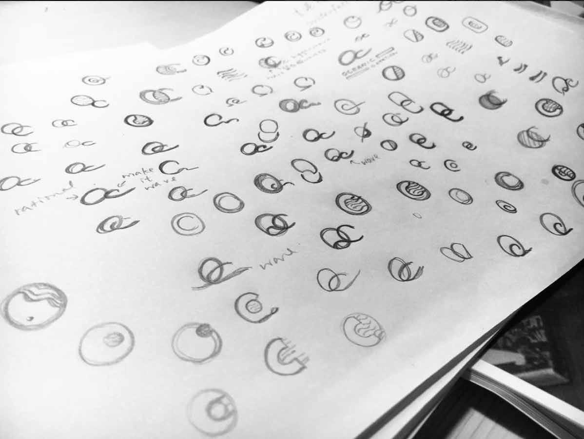
Client: Oceanic Creation (Education Company)
Year: 2017
Concept
To embed Capital Letter 'O' and 'C', the logo aims to convey a sense of vastness and creativity. Inspired by the canvas of children's drawing booklet, the logo is made as a canvas, you may fill out your distinct colours. Rather vague colours are employed in order to let people image out of conventional sky-and-ocean colours.
Proposed Logo Design 1 & 2
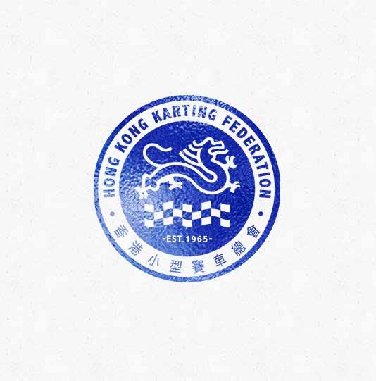
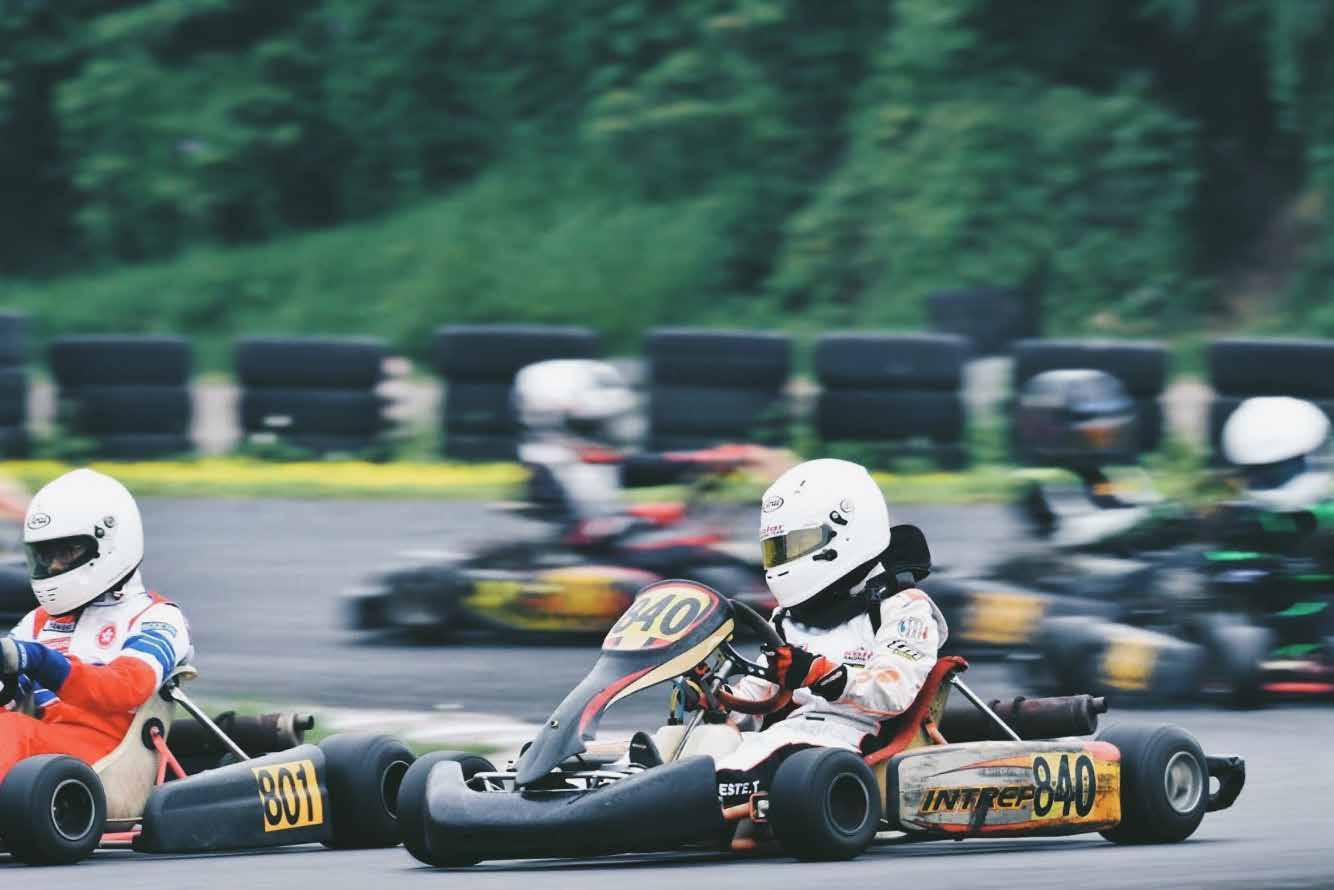
Project Type: Logo Redesign
Client: Hong Kong Kart Club
(Hong Kong Karting Federation)
Year: 2018
Branding & Logo Design
Poster Design
Illustration
Photography
Floating Time
Project Type: Poster Design
Client: Side Project
Year: 2017
Time is very much abstract yet so so authentic in our everyday life. ‘Floating Time’ represents such an ambiguous moment when you can somehow feel the time flowing.
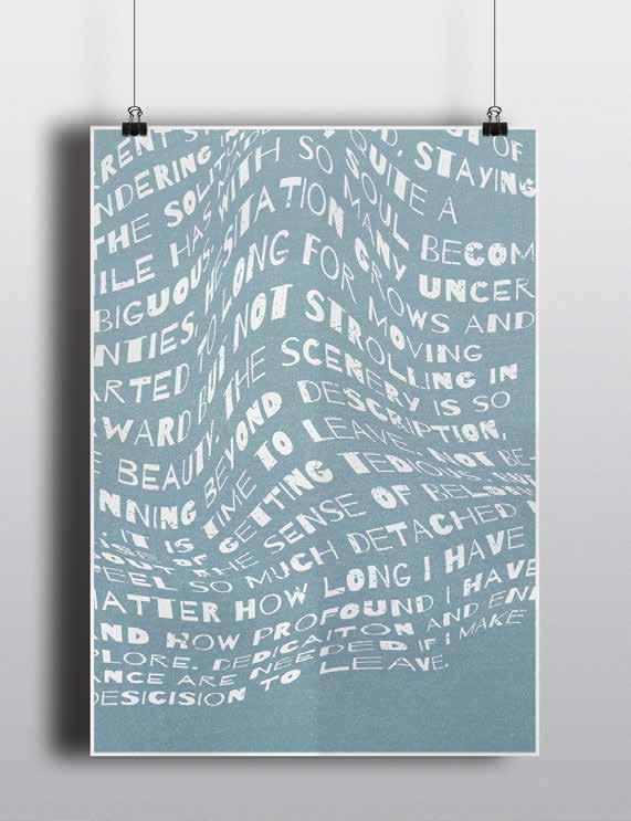
Take The Road Less Travelled
Project Type: Poster Design
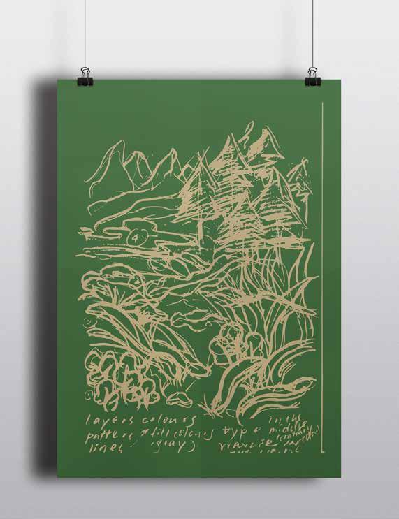
Client: Side Project
Year: 2017
No.1, this is a rare species with oval leaves. No. 4, a stream is just over there. The woods is covered in lush green vegetation. Oops! I stumble my shin against tree trucks along the trail. Such a stunning scenery it is!
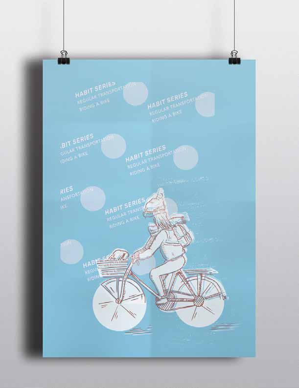
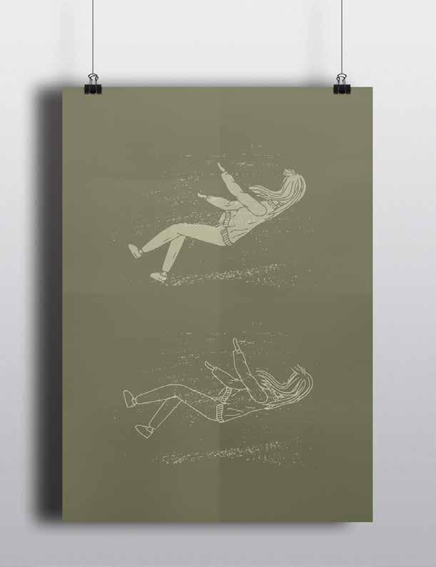
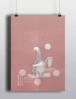
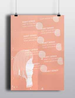
Practice In Life 1-7
Project Type:
Illustration & Poster Design
Client: Side Project
Year: 2017
Habits lead your mind and vice versa. The more you observe, the more unconscious habits you may discover in your day-to-day life. These are mine.
I bike as much as I can.
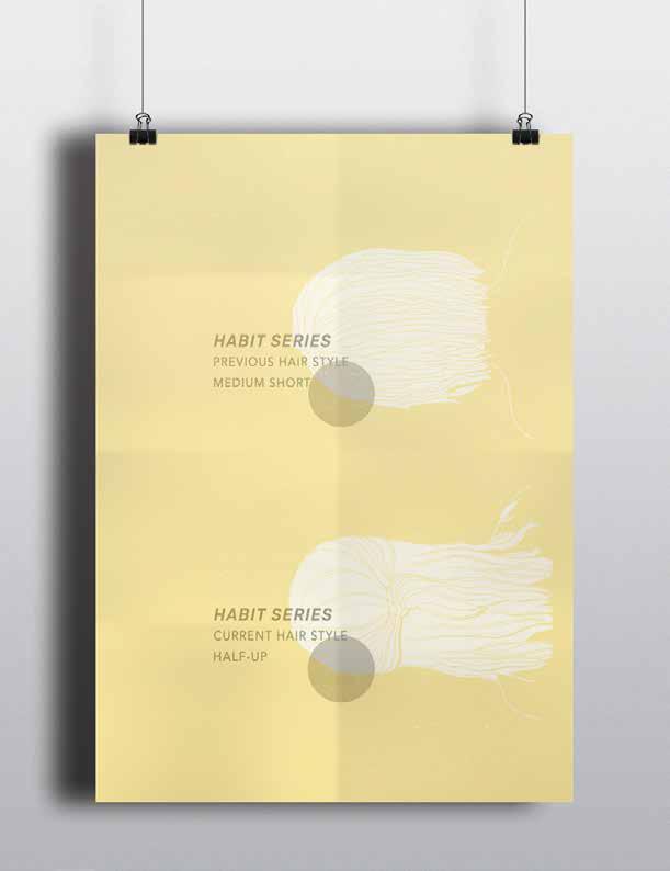
I usually cut my hair in the summer. Recently, I don’t.
It is not a rare state.
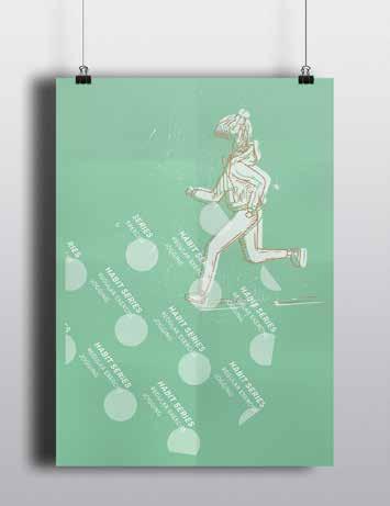
I jog at least three times a week.
Scarf is a must when winter comes.
Morning poo as a daily routine. Shh.
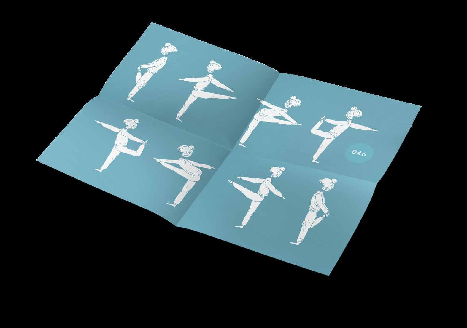
Stretching twice a day keeps the doctor away.
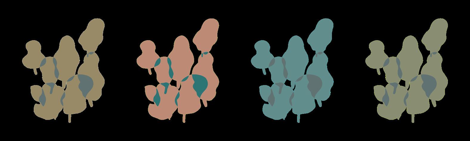
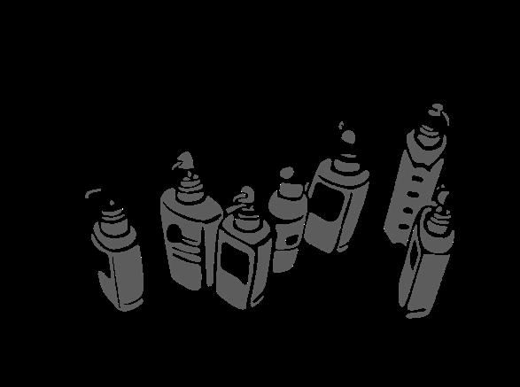
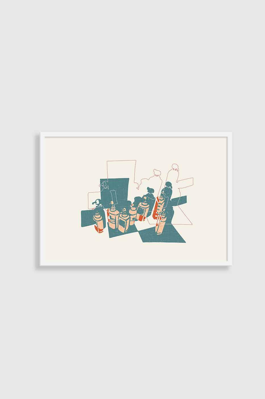
Cluster 01
Project Type: Illustration
Client: Side Project
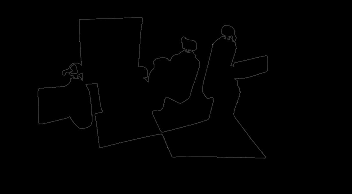
Year: 2017
Nearly every morning, I stare at these bottles while I am brushing my teeth, imagining if they are a cluster of creatures which have their own lives in a different world.
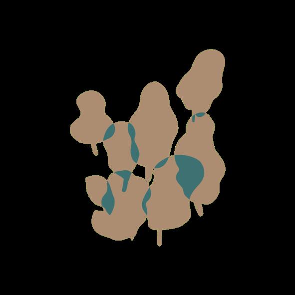
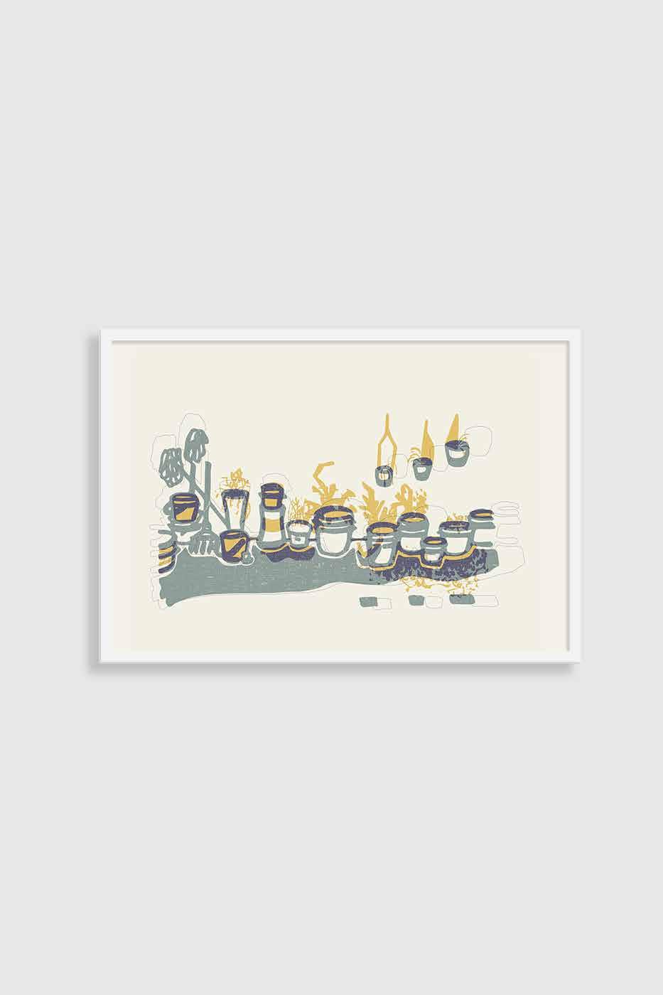
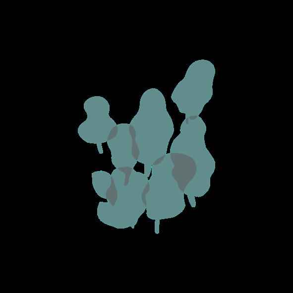
Cluster 02
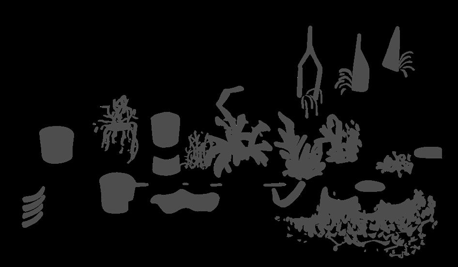

Project Type: Illustration
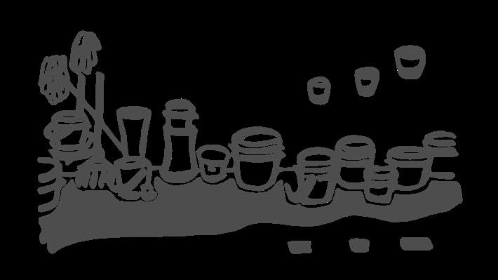
Client: Side Project
Year: 2017
One of the most significant scene in Taiwan is that plants were placed in lanes and streets. People plant different species in pots and buckets. This is such an ordinary scene in Taiwan yet so unique in the eyes of an outsider.
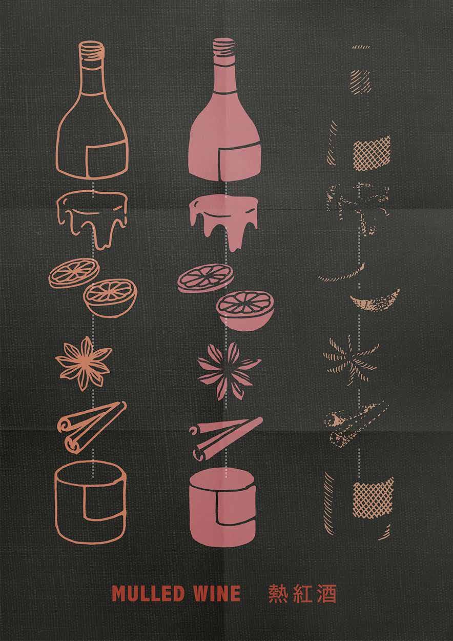
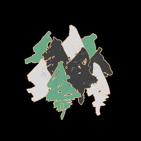
Disassemble Objects - Mulled Wine
Project Type: Poster Design
Client: Side Project
Year: 2017
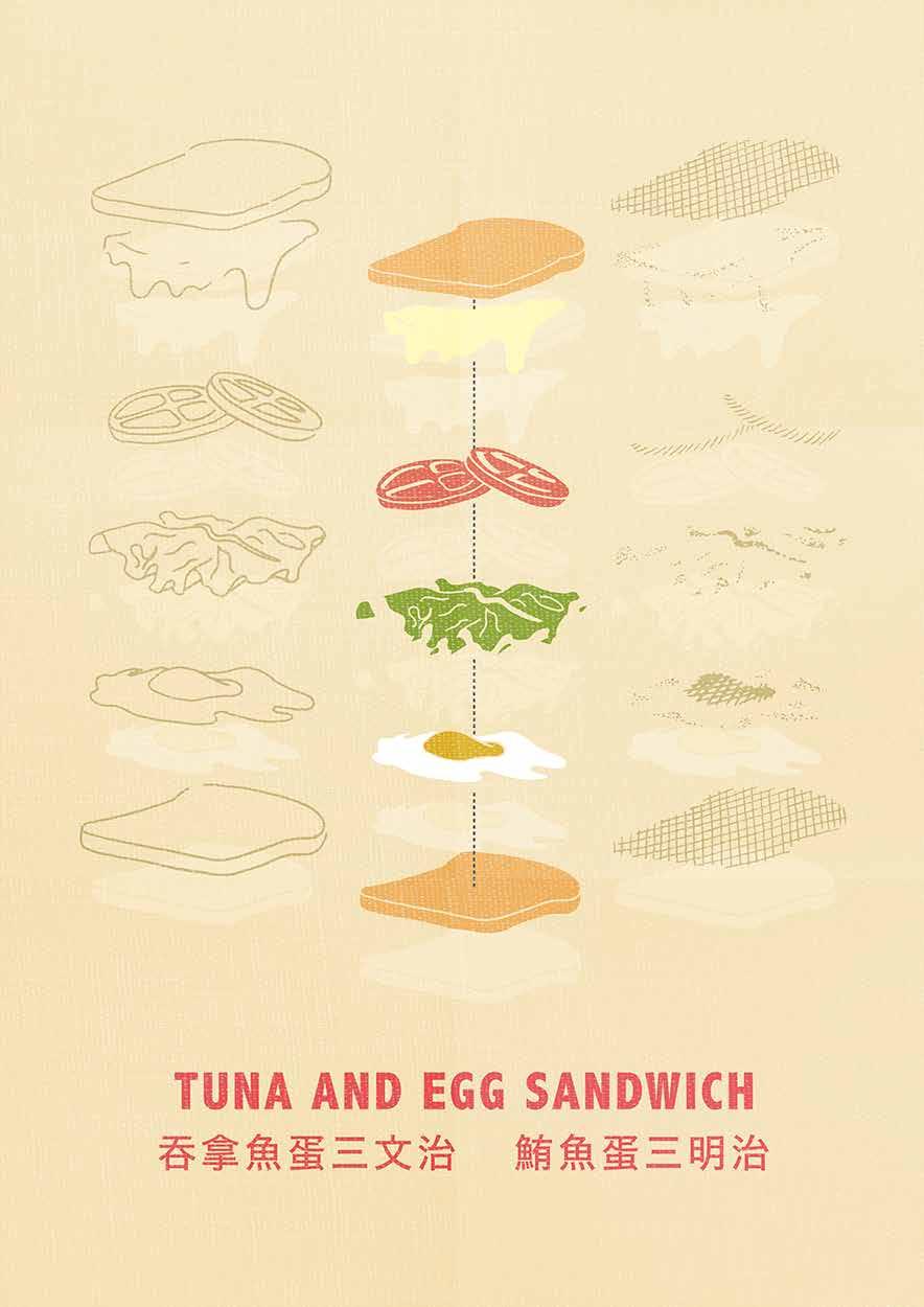
Disassemble Objects - Tuna and Egg Sandwich
Project Type: Poster Design
Client: Side Project
Year: 2017
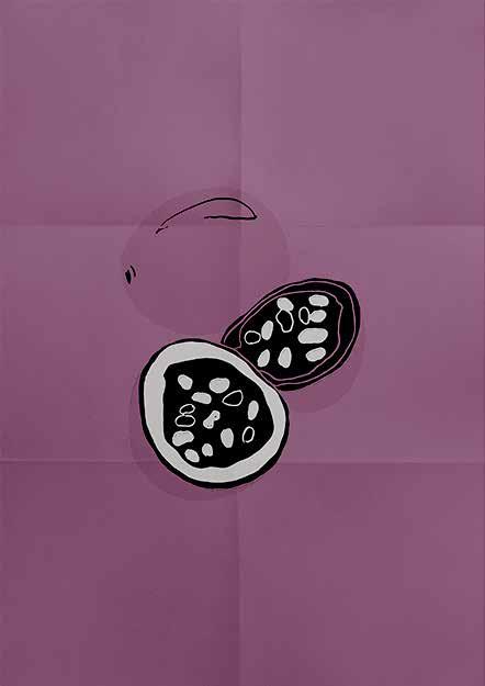
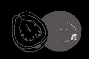
Passion Fruit
Project Type:
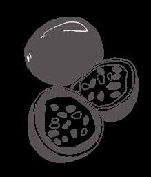
Illustration / Poster Design
Client: Side Project
Year: 2017
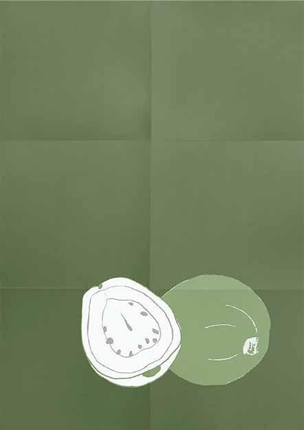
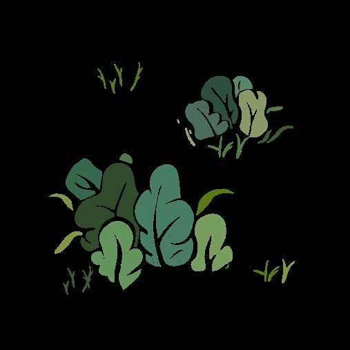
Guava
Project Type:
Illustration / Poster Design
Client: Side Project
Year: 2017
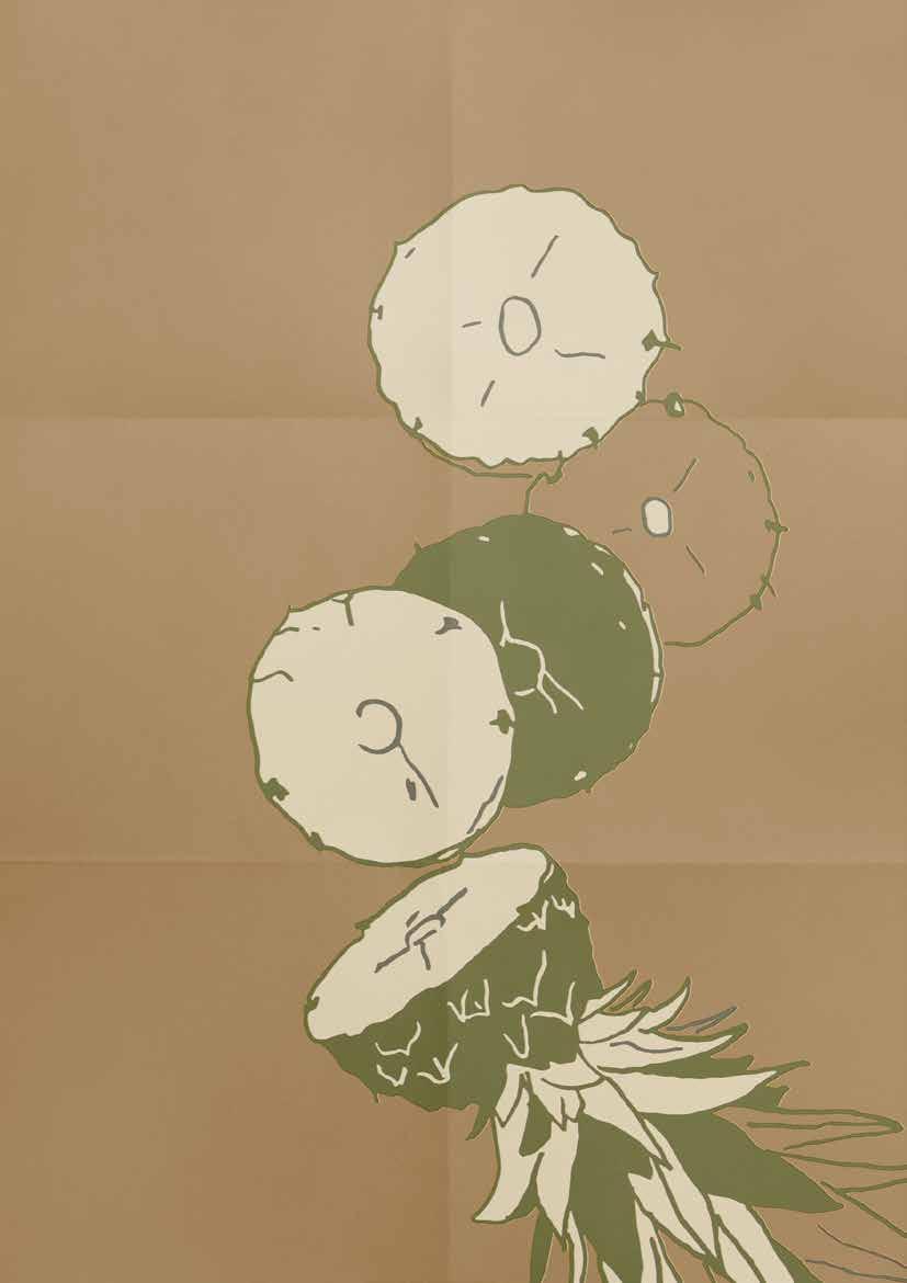
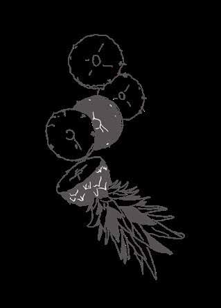
Pineapple
Project Type:
Illustration / Poster Design
Client: Side Project
Year: 2017
Branding & Logo Design
Poster Design
Illustration
Photography
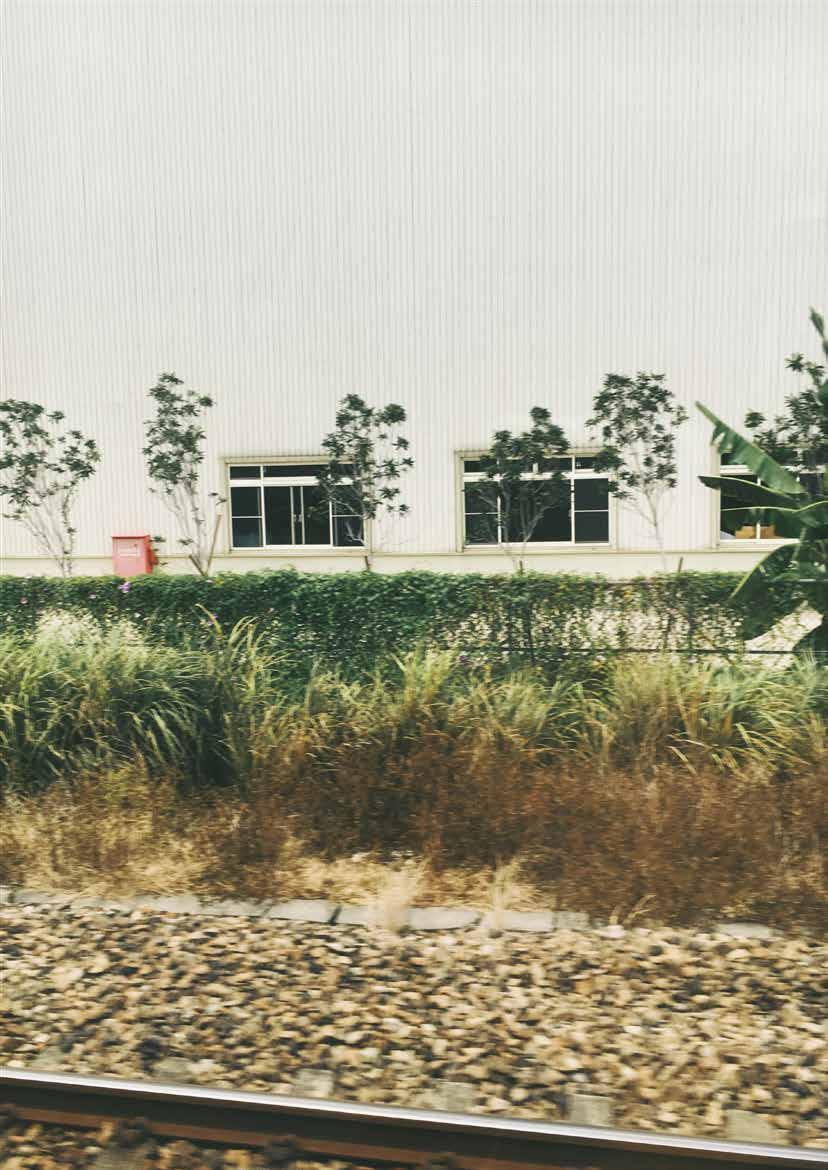
Moving Scenery II
On the train.
Somewhere near Hualien. 2016.
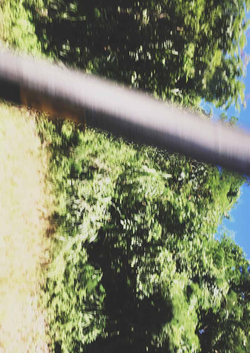
Moving Scenery III
On the train. Somewhere near Hualien. 2016.
Moving Scenery IV
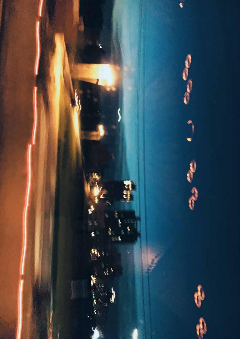
On the bus leaving Taipei. 2017.
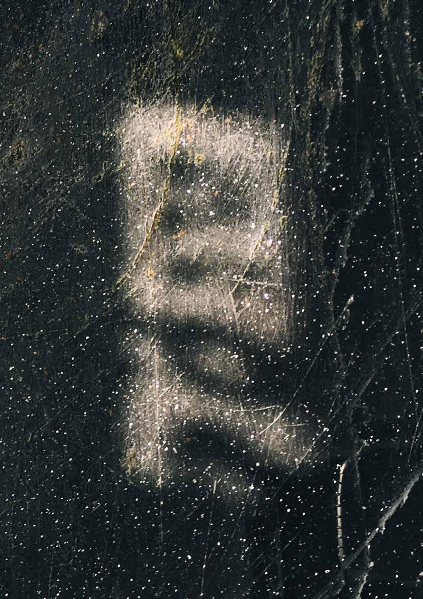
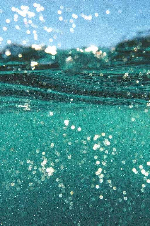
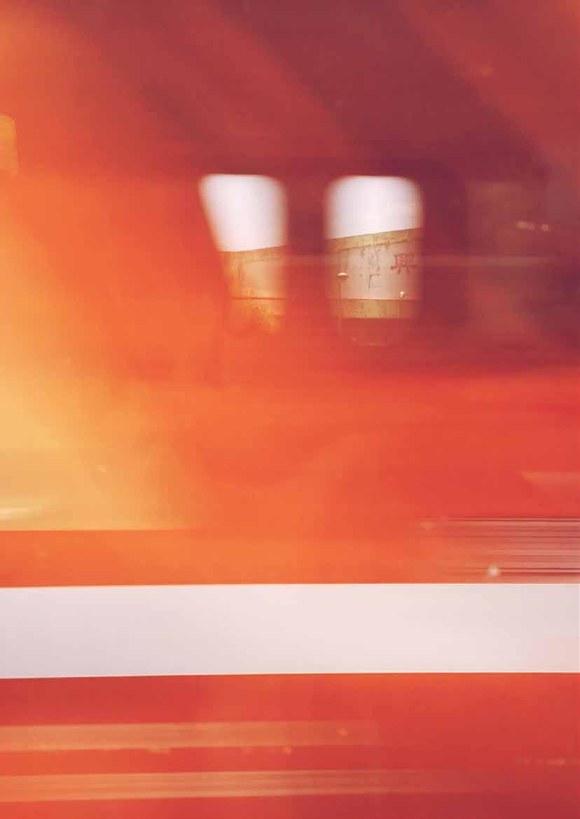
Fleeting II
The moment caught in Tainan. 2017.