


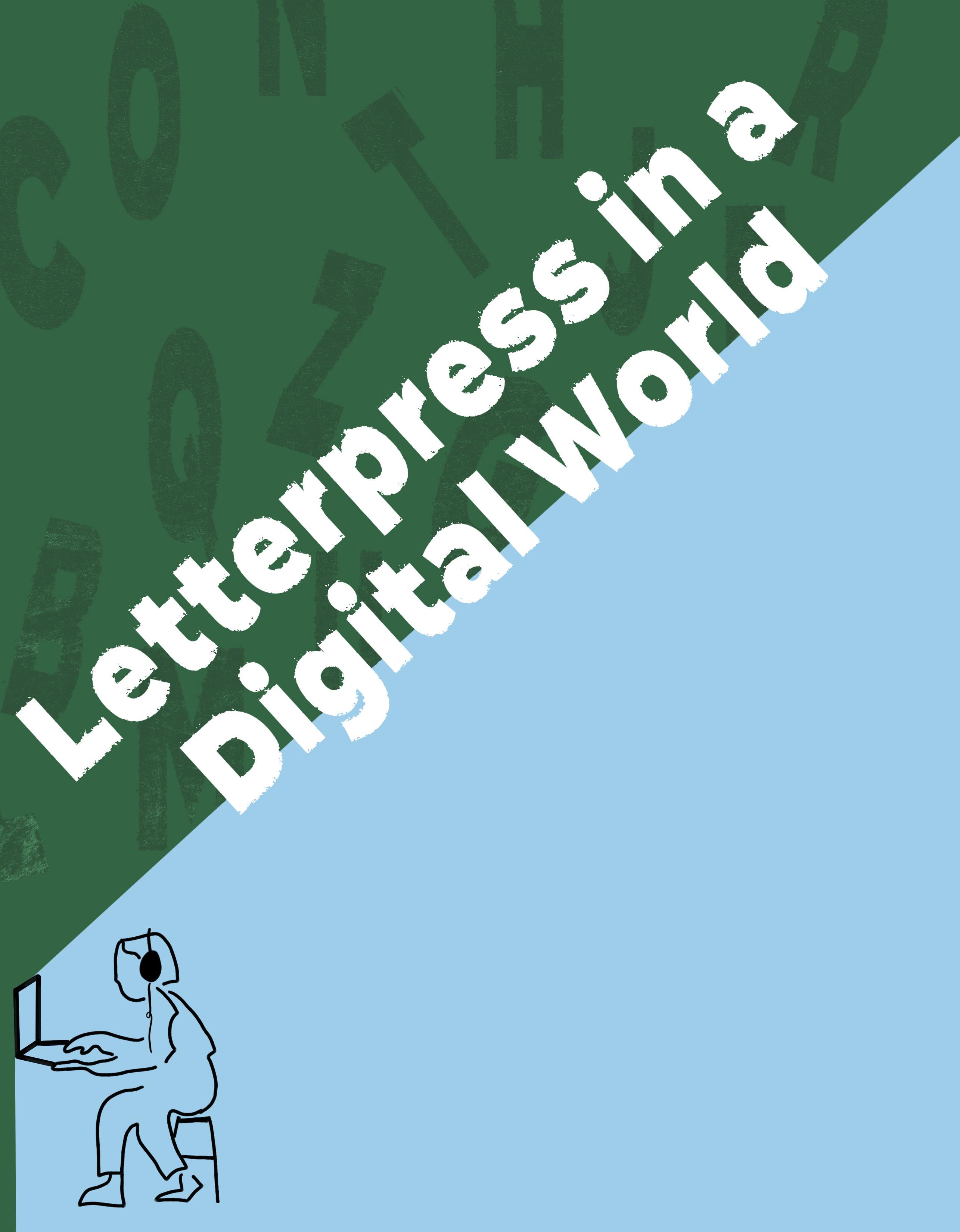
For my senior project in Art History, I became inspired by my work as the publicity chair of the Campus Activities Board (CAB), which placed me in charge of designing posters and merchandise for on-campus events. I found a love for working with different graphic identities and making collectible posters that line the walls of students’ dorm rooms. This creative outlet has driven my academic and professional aspirations, leading me to my thesis on the Hatch Show Print Shop in Nashville, Tennessee.
A family trip to Nashville in December of 2023 solidified my interest in this final thesis idea. I visited the Hatch Show Print Shop and the Country Music Hall of Fame, both of which explored the rich history of Nashville and its relationship with music and print culture. I asked about the importance of printmaking and continued to ask the question we constantly ask in the discipline: “Why does something look the way it does?” My senior project soon became the perfect opportunity to connect my academic interest in the history of the ways visual culture shapes our everyday experience, my artistic interest in graphic design, and my personal interest in music.
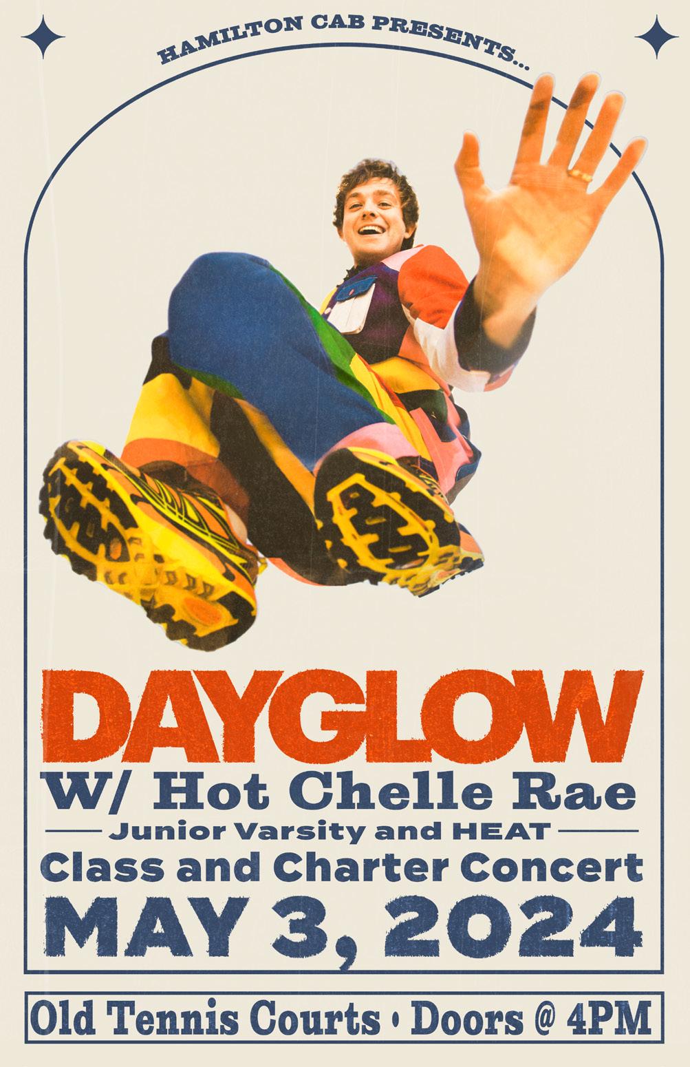
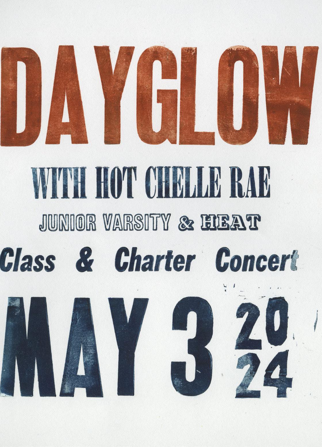
As part of my final project, I designed a poster for our spring Class and Charter concert. Through my work with the Campus Activities Board, I usually design using Photoshop but this time, I decided to use a letterpress to create my final design. The confluence of my responsibility in designing this poster and my research was too good to be true. When considering my research and experience with the Studio Art department here on campus, I also wanted to understand the physical labor and process of using a letterpress to be part of my final Art History thesis presentation.
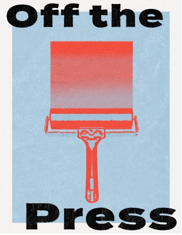
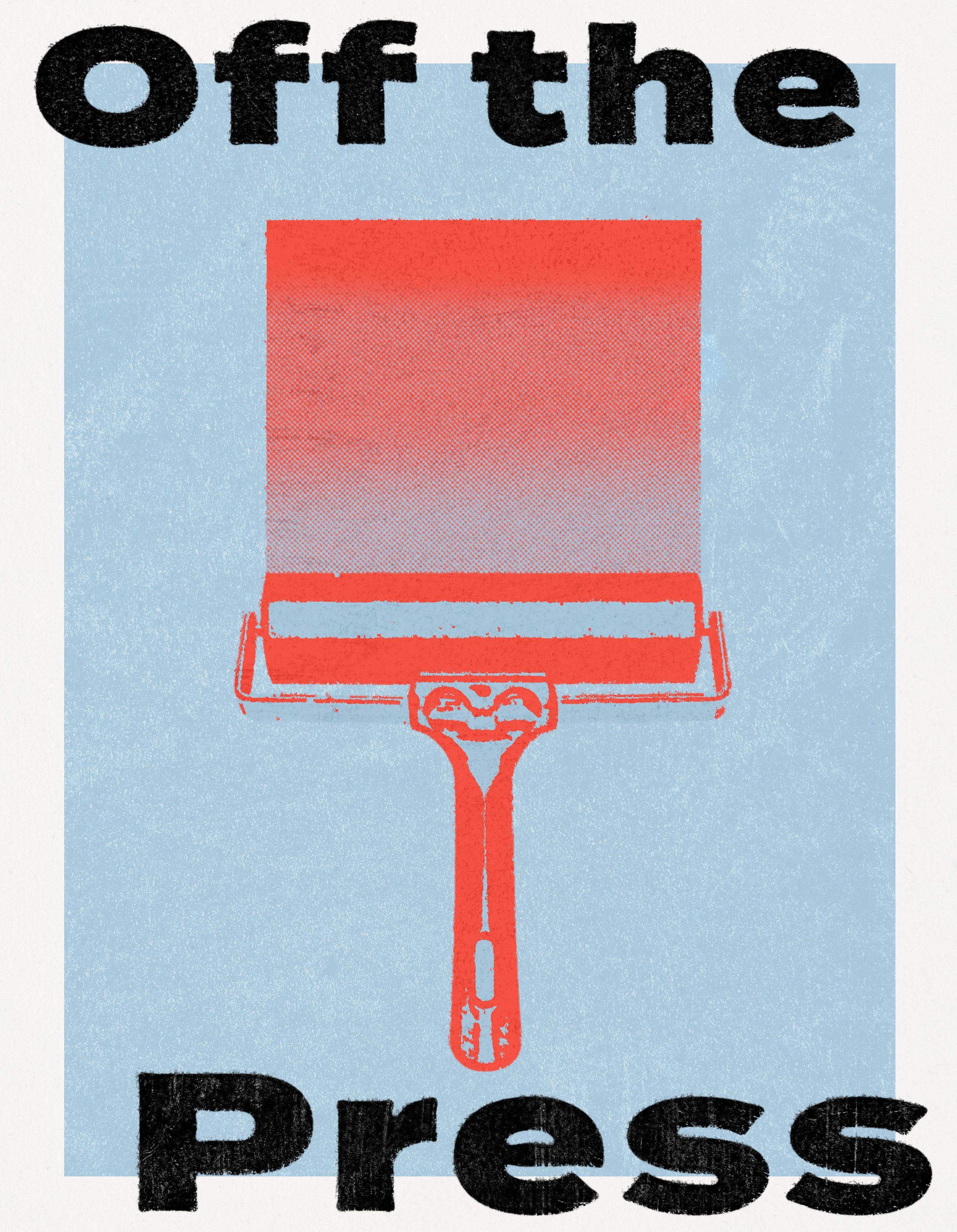
This magazine, which I’ve titled Off the Press, has allowed me to integrate my research and poster design skills and build on my rewarding experience in magazine design at the Wellin Museum of Art, in addition to the experiential and applied learning of my research topic. I have enjoyed every step of curating and designing this thesis magazine to represent an exploration of artistic production in the Art History Department. While examining the importance of print for my thesis, I am excited to create a printed magazine for my readers to hold in their hands and engage with. Print plays an essential role in my research, making the medium of a magazine possible for me to communicate everything I have learned about print culture in Nashville.
My thesis is a merging of all of my interests. It allows me to explore the question: How does the relationship between poster making (represented by the Hatch Show Print Shop) and Nashville’s music culture demonstrate the importance of graphic design within the music industry?
I hope you enjoy reading through my magazine as much as I loved creating it.

 This project was made possible by the support of the Steven Daniel Smallen Memorial Fund.
Information from Hatch Show Print: The History of a Great American Poster Shop.
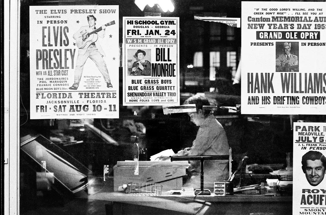
The Hatch Show Print Shop, founded in 1879, has a lasting legacy of nineteenthcentury printmaking on modern American culture. Their self-published book on their history states that the Hatch Show Print Shop “encompasses the history of the South, American entertainment, and graphic design” (Sherraden, 18). The location of the Hatch Show Print Shop also inherently ties it to the history of country music. The longevity of the print shop showcases the evolution of country music, American pop culture, and the city of Nashville through the lens of printmaking. The Hatch Show Print Shop shows how music and art are inherently tied together and visually represent the history of Nashville as a musical hub.
William T. Hatch, a reverend, moved to Nashville to open a publishing business and was drawn by the city’s success in the
post-Civil War period. Nashville became a hub for printing, religion, and transportation in the South, and this success drew many to the area. Nashville has over seven hundred churches, making it a very religious city. Much of the print culture
In 1879, the sons of William T. Hatch officially opened the Hatch Show Print Shop next to the site of Nashville newspapers. Hatch Show Print Shop was just one of fourteen print shops in Nashville, meaning many skilled laborers had logistical benefits from starting a printing business. Letterpress was fading in popularity as lithography (a faster way to print) was introduced. However, Hatch continued to use the letterpress as it originated in religious printing; the number of churches meant that events, periodicals, and Bible hymnals needed to be printed. William T. Hatch got involved in publishing because he saw a clear need and the potential for a family business in the Nashville area, as it was stated that Nashville was an “attractive destination”
for printers (18).
was a lower-cost process at the time, and for smaller show runs and part-time signage, it made the most sense. Using wood also allowed for a cheaper way of carving custom designs for clients.
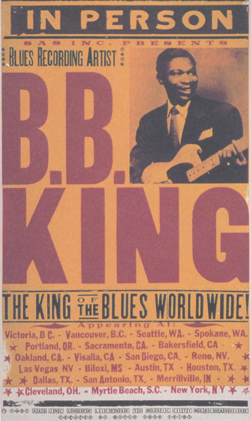
Photo from the Tennessean Poster from Hatch Show Print Shop, 1879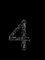
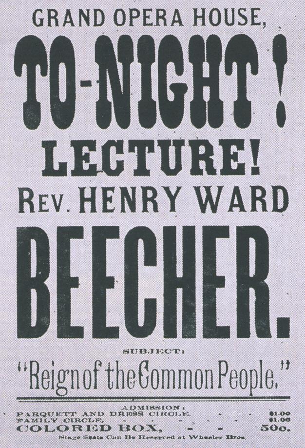
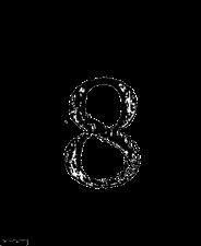
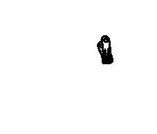
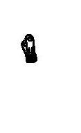
The first print produced was a flyer for Rev. Henry Ward Beecher, which remains the root of the Hatch Show Print Shop graphic identity,
seen on page 3. This flyer became representative of the Hatch Show Print Shop’s graphic identity and legacy (19). The shop continued to use the same typefaces for over a century after printing these first flyers. These typefaces are both wooden and metal types that, on a poster board, can draw the audience in. Specifics about typefaces and typography is discussed on page 6. Hatch Show Print Shop began making advertisements for vaudeville productions in New York City. This expanded the shop’s reach outside of the South and allowed for the shop to make designs for other cities. In its beginnings, the print shop was printing for everyone and anyone, not only for the entertainment industry but also for Vanderbilt University, religious services, and even election ballots. This gave Hatch Show Print Shop a strong beginning and created a base for the next generation of printers.
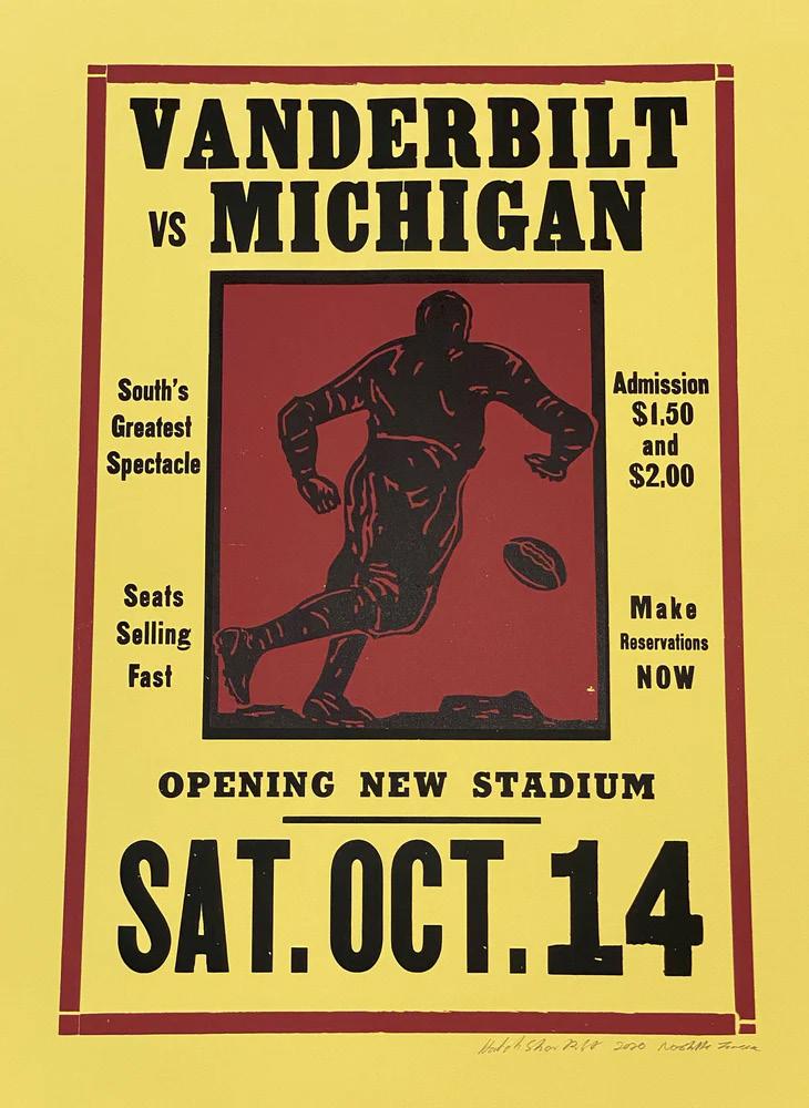
the Vanderbilt University football team in the 1920s, making game posters (35). This cemented a relationship to another aspect of Southern culture. Because Hatch Show Print Shop relied on advertisement for live events, it also experienced the economic “ups and downs” of live performances as performers’ ability to pay for advertising services was not always consistent (51).
By the 1920s, Hatch Show Print Shop was well-established and made posters for various clients. At the time, posters were the most effective way to advertise in “smalltown America” (29). They were common in many cities around the country, and globally, posters were a visual vocabulary many easily understood. Radio also became an important medium for many entertainers and played an essential role in the careers of touring artists. Hatch Show Print Shop took advantage of selling to all forms of entertainment, including traveling circuses, bands, and carnivals. These touring forms meant that people needed advertisements constantly as they came through Nashville and needed them quickly. Besides producing advertising for entertainment, Hatch Show Print Shop also created a relationship with
During this time, Hatch Show Print Shop moved to downtown Nashville, near the Ryman Auditorium. The Ryman originated at a similar time to Hatch; it originated as a church and later became a music venue. The Grand Ole Opry started in 1925 as a radio show and moved to a stage show in 1930. By 1943, the Grand Ole Opry had moved to the Ryman Auditorium. The Grand Ole Opry was the most popular country music show in the United States, and its success is tied to bringing Nashville to the hub of country music (58). While Hatch Show Print Shop was not necessarily tied to the Grand Ole Opry, it was tied to many artists who performed there. Many who went to perform on the Grand Ole Opry stage would commission Hatch Show Print Shop to make their posters; this soon became a formula for many artists performing in Nashville.
Hatch Show Print Shop was able to continue printing through both world wars and the Great Depression, as well as many technological advancements that could have shut it down entirely, showcasing its ability to persevere (63).
In the 1950s, the airtime of
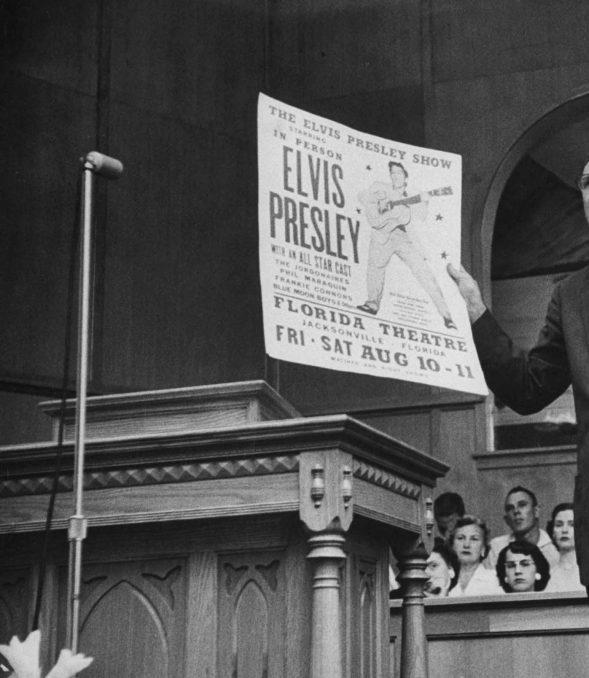
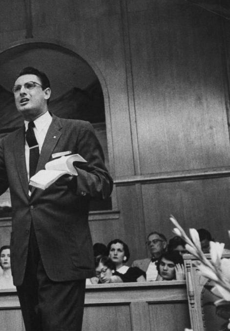
Poster from Hatch Show Print Shop, 1922 country music Photo from LIFE Magazine 1956began to diminish; Rock ‘n’ Roll became much more popular. Hatch Show Print Shop produced posters mostly for country music stars, but it continued to work for all kinds of entertainment, remaining flexible for its clients. By 1952, it had moved from hand-carved wood printing to the more iconic bold text we know today and adapted to halftone processing. This allowed the team to add photographs of performances, as seen on the now-infamous Elvis poster on page 7. Moving from hand-carved images also allowed Hatch Show Print Shop to print faster, as some events it printed for were one-night-only events (76). Colonel Tom Parker, the famous manager of Elvis Presley, began to use Hatch Show Print Shop to design posters for many of his clients at the time. This led to Hatch producing the first posters for Elvis Presley and running the first hundred posters of Elvis for his show in Jacksonville, Florida (75). Hatch got in before Elvis was the King of Rock ‘n’ Roll, and this poster they made put them on the national stage in a way they had never seen before. LIFE Magazine printed a photo in 1956 of a Reverend holding one of Hatch Show Print Shops posters of Elvis (Cosgrove, 2019). This poster became a visual identifier for Elvis. While the photo demonstrated the controversy of Elvis (his swinging hips and rock n roll nature), Hatch Show Print Shop was able to take on the mentality of “any press is good press” as a photo of its poster was now printed in a national magazine and associated with the biggest artist at the time.
over as a cultural craze. This led to a lower demand for posters coming out of Nashville. At the time, there were fewer long-term clients and more occasional clients. The latter kept Hatch Show Print Shop afloat and began making posters for professional wrestlers. The Ryman Auditorium was also abandoned as home to the Grand Ole Opry, which moved its location from downtown Nashville in 1974 (Sherraden, 97). The lack of events happening in downtown Nashville greatly affected the success of the Hatch Show Print Shop. During this time, there was a lot of back and forth from owners trying to keep the print shop in business.
During the 1960s and 1970s, there was a decline in the production of posters from the print shop. This decline mirrored the decreased popularity of country music as Rock ‘n’ Roll took
In 1984, Hatch Show Print Shop officially became part of the Country Music Hall of Fame, which protected the shop in many ways. The Hatch Show Print Shop portfolio began to be documented and restored, reviving the music history in Nashville and the print shop itself. In 1994, many artists banded together to bring the Ryman Auditorium back to its prime, once again making it a concert venue and showcasing the importance of the Ryman as a historic music venue. Emmylou Harris was at the forefront of this effort. She also commissioned the Hatch Show Print Shop to design a poster for her that became the cover of her album “Live at the Ryman” (the album cover can be seen on page 8). Harris’s commission revived the relationship between these two institutions (120).
The Hatch Show Print Shop was able to adapt to the ever-changing realities of a growing city and unpredictable industry for over a century. It has also adapted to design in the modern world, continuing to create letterpress posters in an industry dominated by Photoshop. Hatch Show Print Shop’s portfolio showcases how its craftsmanship and consistency have led to its success and value within the industry. Hatch has become a cultural institution that represents the values of Nashville. At its core, the posters resonate with its audience and clients locally, nationally, and globally.
 Poster from Hatch Show Print Shop, 1988/89
Over the last century, the Hatch Show Print Shop has rooted its design in nineteenth-century printmaking, making its poster style consistent and recognizable. The shop’s history and legacy are also reflected in and reliant on its graphic identity. The shop’s success is also due to the success of its designs and consistency over time. Its history is also represented visually through posters from 1879 until present-day activations.
The first ever flyer printed, as seen on page 3, represents the origins of the style of the Hatch Show Print Shop. Since this poster was first printed, technological advancements have caused much of this style and process to be lost due to faster modes of production becoming available (a more in-depth look at the history
of printmaking is continued on page 14). Yet, this poster set the standard for the kinds of designs that the Hatch Show Print Shop produces and reflects “late 19th-century typography, letterpress printing technology, woodblocks, and metal type” (Sherraden, 19). This poster for Reverend Beecher also set the standard for certain fonts at the print shop. To this day, the font that Beecher used is called the “Beecher” font, even though that is not the actual name of the font (Hatch Informational Tour). Stylistically, this flyer is simple: its most distinctive visual element occurs through the variation of fonts, but ultimately, it aims to promote an event, meaning the most important objectives are readability and catching a reader’s attention on a crowded bulletin board.
In the 1950s, Colonel Tom Parker represented Elvis Presley in his early years and used the Hatch Show Print Shop to make posters for his first shows outside Tennessee (Sherraden, 75). This poster has now become one of the most recognizable posters from the shop’s portfolio. The connection between Colonel Tom Parker and the Hatch Show Print Shop allowed the shop to be recognized nationally (and internationally). Due to the controversy of Elvis at the time, this poster became an identifier for the Elvis “brand.” The poster has his name in large, eyecatching red text and his image to the right. For advertising purposes, this poster is simple and visually interesting because of the photo and small elements like the stars around the image of Elvis.
This poster also demonstrates the technological advancement of using halftone printing to add a photo of Elvis
singing on the poster. Adding an image to this poster through halftone printing adds visual interest to the design and communicates the artist’s identity to the audience. Elvis, known for his performance presence in this photo, can be identified and recognized through this. As stated on page 4, this poster was featured in LIFE magazine, emphasizing the importance of having a visual identifier for an artist (Cosgrove 2019). The image in LIFE magazine showcased the ability of a poster to communicate information and demonstrates how a poster serves a practical purpose in addition to an artistic representation of an artist.
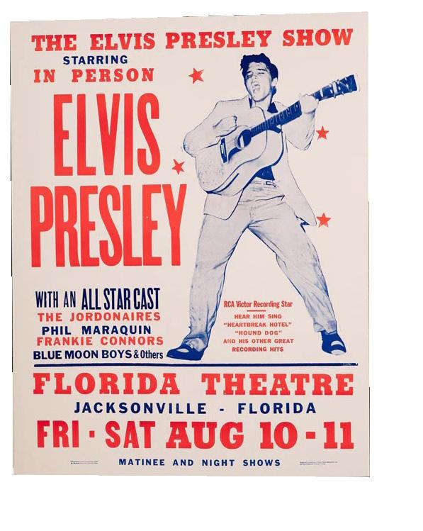 Poster from Hatch Show Print Shop, 1956
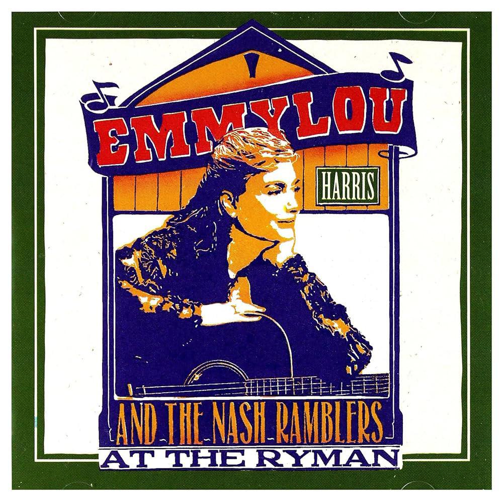
In the 1990s, Emmylou Harris led efforts to revive the Ryman Auditorium and included the Hatch Show Print Shop in her concert at the famous auditorium. This album cover revitalizes some of the older styles of Hatch graphics, such as the hand-carved photo of Harris, but also showcases how these designs can be used in a modern context. This image references many of the shop’s early designs that used handcarved imagery to make custom designs before technological advancements - such as those used on the Elvis poster. While the entire poster is designed through letterpress technology, it can be scanned and digitized for album covers, merchandise, etc. Although this style has limitations, it has been so valued that solutions have been found to keep it alive and allow the print shop to thrive.
To this day, Hatch Show Print Shop continues to make posters for modern-day performers. In 2019, following the release of her album, Kacey Musgraves performed at the Ryman and used the
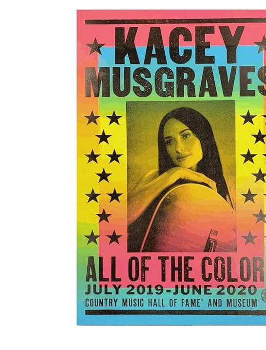
shop for her posters, referencing the history of country music. Posters for artists such as Johnny Cash and Patsy Cline were also made on the same presses, with the exact text and intention. The fact that Hatch has text that has been used since the shop was founded and continues to be used today physically connects different artists throughout country music. The consistent graphic identity and quality visually connect these artists over time.
The Kacey Musgraves poster also shows the limitations of letterpress and how Hatch Show Print Shop needed to find ways to experiment with the medium. Many of the shop’s posters are limited to three passes through a press, meaning that there are usually three individual colors that must be layered to create depth in the image. In this Kacey Musgraves “All the Colors” poster, the designer blended colors in one pass. The background is a gradient of blue, yellow, and pink inks that, when blended, created a rainbow but only needed one pass on the press to achieve. This
Poster from Hatch Show Print Shop, 2019 Album Cover of Emmylou Harris Live at the Ryman, Design from the Hatch Show Print Shop, 1992
allowed the design to have more than three colors in the final composition. There was a second pass for the interior rectangle and a final black layer for the image and text details.
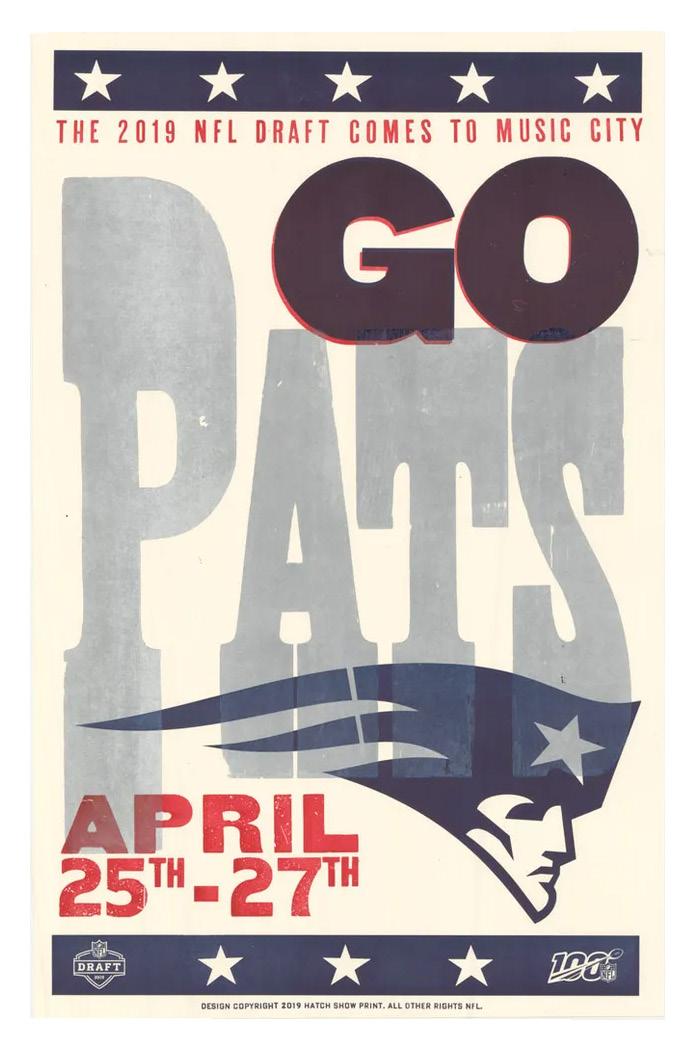
In addition to posters made for the entertainment industry, the Hatch Show Print Shop also makes content for other industries. In 2019, the NFL draft was held in Nashville, and the shop was tasked with making posters for all 32 teams. The Tennessean compiled a report on Hatch making these posters, citing that the NFL’s use of a Nashville poster shop to make promotional posters speaks to the desire to align with Nashville’s graphic identity and historically significant Nashville institutions. The Tennessean offered an article in which Hatch Show Print shop members were interviewed, stating, “To be able to tell the story of each team and their fans through a Hatch Show Print poster is unique and truly Nashville” and added, “it’s gratifying to experience the excitement fans everywhere have for something we make with our hands, using materials that have passed through
five generations of designers and printers working in this shop” (Rau 2019).
The collaboration with the NFL also shows the print shop’s challenges when working with clients; although its style is desirable, it also designs for clients with certain limitations. NFL teams have logos, colors, and graphic identity requirements that the shop has to accommodate while still making the graphics authentic to its style and history.
The Hatch Show Print Shop’s style highlights minimal color, bold text, and graphics to create impactful and memorable designs. The craftsmanship of the Hatch Show Print Shop designers showcases the importance of posters as an art form and a marketing tool. These posters are used to communicate information and advertise an event, but they are also bought by fans looking to connect with the respective artist. Thus, these posters use strong typography and bold graphics to achieve artistic and practical goals.
Poster from Hatch Show Print Shop, 2019


As an avid and graphic design-obsessed music listener, I’ve always questioned how and why musical artists make graphic choices - for their album covers, merchandise, etc. My recent visit to the Hatch Show Print Shop fed that curiosity. It gave me a unique opportunity to question specific artists’ graphic identities and how they were informed and shaped by this institution’s design style and capabilities. Across decades of music history, this print shop created a design style that set it apart from other designers. However, Nashville music listeners also influenced the Hatch Show Print Shop’s style and content. The Hatch Show Print shop style was successful because it resonated with country music fans. Fans of Nashville’s music scene have always looked to collect Hatch Show Print Shop prints of their favorite artists. And in so doing, the demand for these kinds of commemorative posters drove
the success of the print shop. The shop’s style and design have been described as “uniquely Nashville” (Rau 2019). The ritual of collecting Hatch Show Print Shop posters reflects the larger relationship between music and merchandise to commemorate a moment.
Music is an art form that connects people. Songs and lyrics connect with people on an individual level but also unite groups. Music elicits an emotional response and expects participation from his audience. The audience becomes super important after creating a song or an album. As a time-based medium, music can mark a moment in time for people, making the relationship to an individual song a visceral recalling of past life, emotions, and connections. Everyone listens to music that communicates something about their personality. Music can communicate where someone comes from, what their parents listened
to, how one is feeling, or what moments are meaningful. In his analysis of the public memory of folk music, Benjamin Filene writes that “People imbue them [songs/lyrics] with meanings that have cultural relevance and power to them,” and music allows people to “create meaning” that offers “insight into their values and worldview” (Filene 2008, 3). Music is open to interpretation, making it adaptable and accessible. People take lyrics and relate their own life experiences to them, making music a powerful tool for creating community and connections.
While graphic design is integral for its practical purpose of advertising or providing the cover for an album, it also shapes an artist’s visual identity. Artists want to represent themselves and their sound with visual cues that are intentional, consistent, and authentic to their values, their musical style, and their viewpoints.
The physicality of posters and other merchandise allows fans to connect with their favorite artist’s music and their visual identity - visual cues that are intentional, consistent, and authentic to their values, musical style, and viewpoints. These items also allow the artist and the listener to create and commemorate a moment. Where was I when I first heard this song? Who was I with? How did it make me feel? Musicians try to make their listeners feel the way they do through sound, lyrics, rhythm, and beat. Listeners then sometimes resonate with certain artists who speak to their taste and personal life experiences. This translates to people wanting to see their favorite artists live.
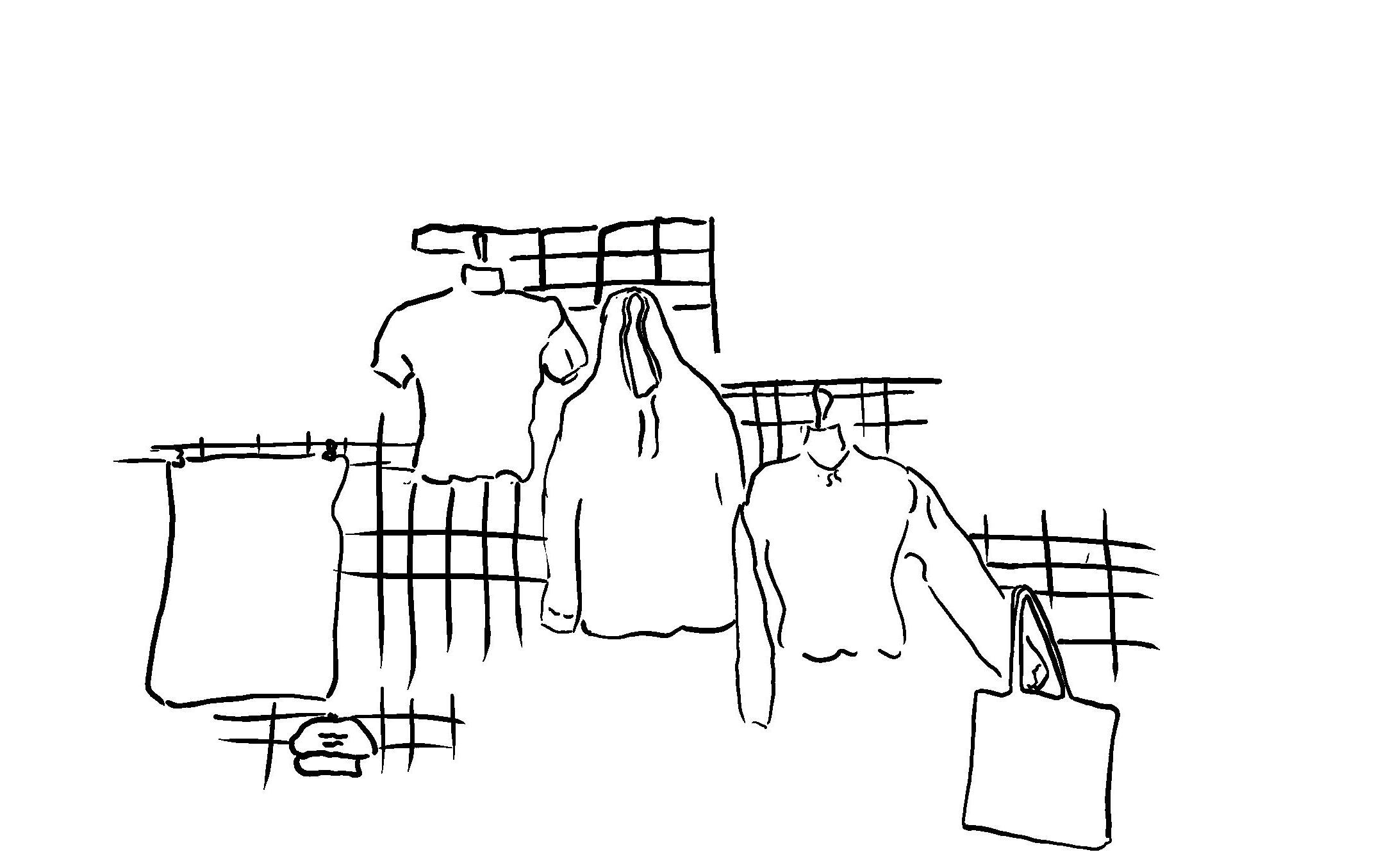
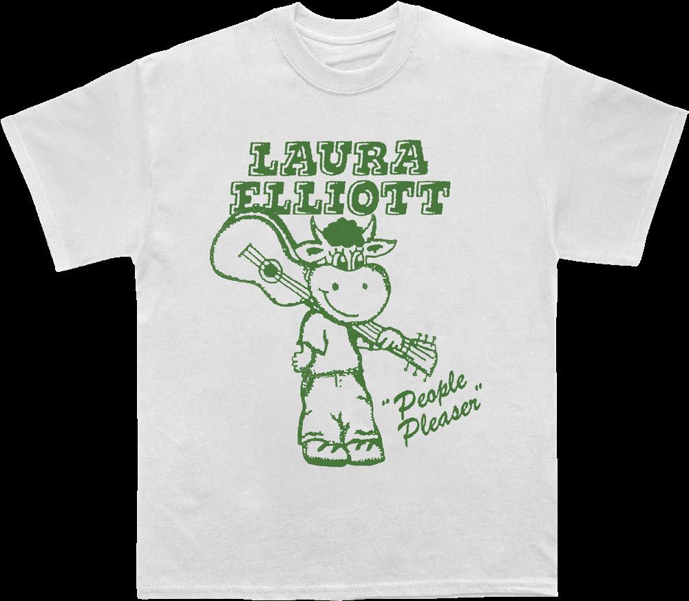
I asked my peers about their most memorable concert experiences and their favorite souvenirs from these concerts. Lizzie Herr ‘24 remembers a Campus Activities Board (CAB) Fall 2023 Acoustic Concert featuring Laura Elliott.
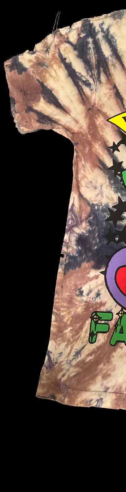
 Photo by Tate Suratt
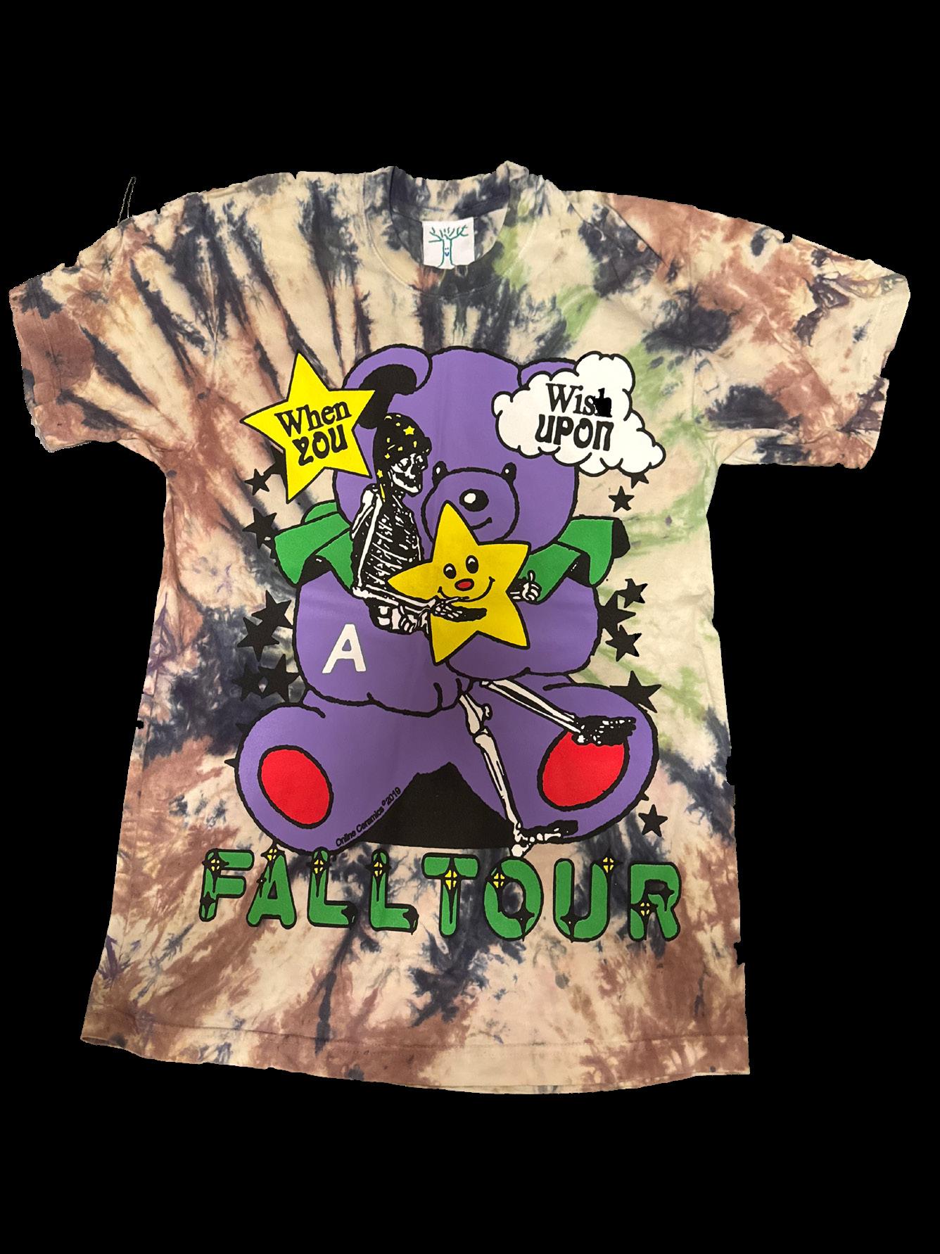
song, I ran into her mom selling her daughter’s t-shirts. I talked to her mom as I bought a shirt; she was so lovely! I thought it was adorable that her mom traveled on the road with her daughter, and we chatted about how Laura Elliot was getting much more famous after being on Lizzy McAlpine’s album. It was a great chat and buying concert merchandise from the artist’ mom felt so personal.” Following the acoustic concert with her friends, Herr bought a cow t-shirt, shown to the left on page 12. This t-shirt has become a way for Herr to remember this intimate concert moment in the Events Barn. This example of college campus concert-going represents what many music lovers do – find ways to commemorate a moment with friends while listening to live music. The merchandise becomes not only a decoration for the inside of a dorm room or garment to wear
but also a physical reminder of the moment and a conversation starter to recall that artist, that feeling, and that moment in community with others.
Another student remarked on his first time going to a concert alone. Jack Ritzenberg ‘24 was visiting his grandparents when he saw that Dead and Co. would be performing close to his family’s home. On a whim, he decided that he would go on his own. He bought a shirt at the back of the concert venue and says he still has it but doesn’t wear it often. He said he “can’t throw it away” because it is a fond memory of an adventurous moment of going to a concert alone.
Ticket stubs, t-shirts, hats, and other merchandise are physical reminders of many of these moments at a concert. For artists to maintain relationships with their fan bases, merchandise serves as visual reminders. Hatch Show Print Shop does more than just demonstrate artistic practices; it has also been shaped by the culture it has created within and for Nashville. Nashville has shaped Hatch Show Print Shop, and in turn, the shop has shaped Nashville’s music culture. Nashville has historically been a hub for country music, especially, and over time, the broader music industry. It is a city where people move to “make it big,” performing in hotel lobbies, restaurants, and cowboy boot stores. Artists who perform at the Ryman Auditorium also desire to become part of the culture of Nashville and call on the Hatch Show Print shop to produce their limitededition concert advertisements. The Ryman also attracts a certain kind of artist and a certain kind of audience member. There are often smaller artists, not necessarily the Taylor Swifts of the world, and the size and scale of the venue determine the artist but also create a more intimate concert-going experience not driven by large cinematic tours. These posters communicate not only the whats and whens of the event but also commemorate the moment more viscerally through recognizable typefaces and bold graphics, offering global audiences a tangible and shareable memento.
The history of graphic design is rooted in the history of printing. Until digital processes, printing was done in tandem with design. Therefore, to understand the importance of graphic design, I looked into the history of printing. For this project, I looked into the history of letterpress printing, as the Hatch Show Print Shop has used letterpress technology for over a century. The Hatch Show Print Shop's ability to master the medium of letterpress printing and continue its use into the twenty-first century sets it apart from other designers in the industry.
Printmaking began as a practical medium and later became a medium of artistic expression. Printers took on the role of craftsmen, designers, and artists to make a successful final product and maintain the printing system. In the case of the Hatch Show Print Shop, printmaking effectively communicated
and advertised across industries in the nineteenth century. Letterpress printing is a longer and more taxing process compared to digital design. Many believe letterpress can be replaced entirely by Photoshop. In reality, letterpress printing connects design through century-old typography and provides a certain quality that can only be achieved through the physical labor of printing on a press.
Printmaking originated in China as early as the fifth century and continued in many East Asian artist practices. Printmaking began as artists carving images into a woodblock and printing them onto fabric (Mayor 1964, 4). In the fifteenth century, Johannes Gutenberg mastered the printing press and movable type and printed the Gutenberg Bible, revolutionizing artistic reproduction and print culture. While the movable type existed for centuries in East Asia, the Gutenberg Bible is cited as the origin of print culture in the West. This moveable type system was then used for future centuries of printing, which Hatch Show Print Shop still uses for its printing.
In his book Graphic Design Before Graphic Design: The Printer as the Designer 1770-1914, David Jury explores the relationship between printmaking and graphic design. Jury details the overarching changes made within printmaking and how they have
informed contemporary understanding of design. He explains the artistic evolution of the nineteenth century as printmaking became widespread and one of the United States' largest industries (Jury 2012, 107). Alongside the expansion of printmaking, the Industrial Revolution changed American culture and connected parts of the world in ways they had never been before. Advances in transportation, too, physically connected parts of the United States, making it much easier to transport resources around the country (109). For printmakers, this meant sharing and moving typefaces and printing technology. Wooden typefaces became a uniquely American trend and the primary medium for printmakers. Wooden type became a way for printmakers to create new typefaces cheaply and quickly (107).
In the 1860s, there was a desire for graphics and illustration because of the rise in advertisements and the cultural influence of the United States on a global scale (107). Many print shops utilized the letterpress to create such advertisements. These print shops provided opportunities for businesses and companies to communicate their services and create a graphic identity that reflected their shop's goals. Printers provided a service as skilled workers but also became artists in their own right, and “creative intention was becoming part of the printer's domain” (107). To print on a large scale, print shops housed large teams of skilled workers to maintain a workflow and work machinery. At the time, there was also an increase in artistic printing, not just for practical purposes but also for using print technology for artistic expression. By the 1890s, printmaking had become one of the biggest industries in the United States. Leading into the twentieth century, printmaking was a highly valued medium for its practical
service to accommodate industrial advancements and as an artistic medium.
While the letterpress was the most common form of printing, printmaking advancements made text production and reproduction more efficient and less laborious. The introduction of halftone printing and lithography improved the tedious labor and quickly overtook letterpress as the primary printmaking process (202). As well, photography could reproduce and create images much faster than hand-carved images. Much of the moveable text processes began to lose popularity due to this labor-intensive process. However, Hatch Show Print Shop used halftone printing and photographic advancement to introduce photos onto their posters, as seen on pages 7 and 8.
Now, graphic design is seen as a highly digital and efficient medium deployed on PhotoShop while using a physical process like letterpress printing, which is long and laborious. While it is a much more complicated process, letterpress does serve as a physical way of communicating language. Johanna Drucker, in her essay “Letterpress Language: Typography as a Medium for the Visual Representation of Language,” dissects the importance of studying typography and looking at letterpress to understand the physicality of language (Drucker 1984). She explains that thinking intentionally about typography is an important part of understanding language, as type is an individual set, and each word is thought of with intense care. Meaning that when studying letterpress, the intention behind each word is more important than when studying digital work. Each letter is thoughtfully cared for and handplaced, making letterpress and design much more sculptural than what digital design is now. Hatch
Show Print Shop is an example of the importance of placing value on typography; it has a powerful ability to communicate with its audience and is an intuitive form of communication. The variation of thick or thin type or changing the size of specific letters communicates a specific message to its audience. The Hatch Show Print Shop continues the legacy of nineteenthcentury printmaking and showcases the benefit of using a physical process to create designs.
In a completely digital world, specifically in the design industry, the Hatch Show Print Shop stands out as a shop that continues to value the process of hand-crafting advertisements. The shop has continued using this technology to strengthen its graphic identity and recognition since its genesis. This technology places value on the human crafting of advertisements and on maintaining artistic processes. Handset type and handcrafted typefaces are said to have a “distinctly American spirit” (Jury, 202). Hatch Show Print Shop continues this “distinct American spirit” through its design process and by continuing to use its original typefaces from the 1870s. Through this relationship between spirit and medium, Hatch can communicate effectively with their audience; most of their work is seen by American audiences, making this medium an effective communication tool.
In our contemporary culture, this process stands out as it challenges our understanding of graphic design and marketing because it requires pre-thought on the maker's part in designing the layout and care in manipulating the wooden letters and ink. This manual/labor-intensive process challenges our understanding of design and marketing and allows both maker and viewer to interact with a piece more viscerally.

To dive even deeper into my exploration, I decided to take on the physical challenge of designing a poster on a letterpress. My role as the publicity chair of the Campus Activities Board gave me the perfect opportunity to create a poster and merchandise for the 2024 Class and Charter Concert.
In addition to making a poster, I wanted to think about the medium of printmaking and the materiality of the process for my research. As described earlier, the letterpress printmaking process is tedious and very different from using Photoshop to make posters, as I usually do. However, learning this process by hand would benefit my understanding of my topic. Printmaking is also a community-based medium; working as a team and learning from master printers is part of the process. In this way, my becoming part of a printmaking community (if only briefly) would also benefit my understanding of the letterpress process.
In my efforts to find a letterpress that would allow me to work on this project, I discovered First Proof in Brattleboro, Vermont. I grew up spending time in Brattleboro, which has a vibrant and lively art community. This printmaking studio also allowed me to think about printmaking on a local level and the big-picture printmaking themes I have been researching. Hatch Show Print Shop is an internationally recognized print shop, but printmaking also happens on smaller scales. First Proof Press is a community-oriented organization that runs afternoon school programs, workshops, and monthly memberships that service the local
community. I signed up for a one-on-one session with First Proof’s master printer, giving me access to their letter blocks in different fonts and presses.
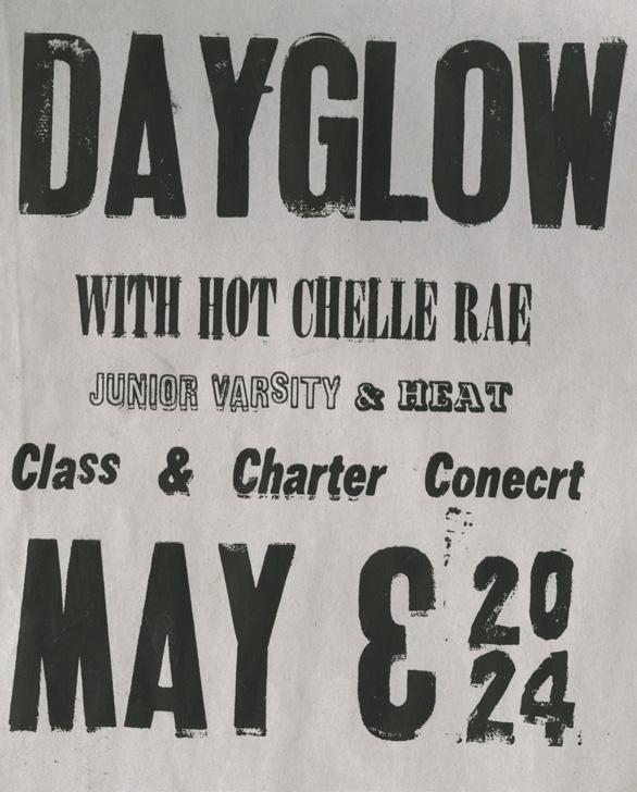
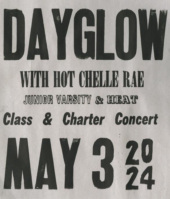
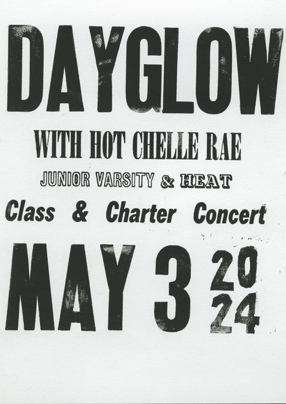
My first step in creating this poster was to make a digital sketch. I used the CAB team’s content and made a poster design feasible on a letterpress. I thought about simple colors and bold text, which reflected many of the posters that appealed to me from the Hatch Show Print Shop. My final digital poster that is being used for our concert program uses stylistic choices similar to those of a letterpress poster. In my digital poster, I added digital ink bleeds and scratches to mimic some of the details that come naturally from using old types and printing physically on paper. My digital poster and scan of my final letterpress poster can be found on page 19.
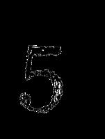
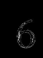
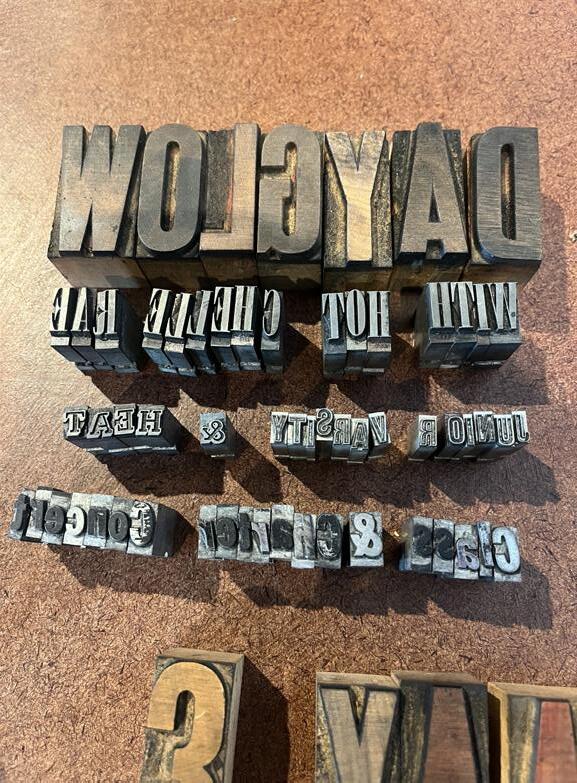
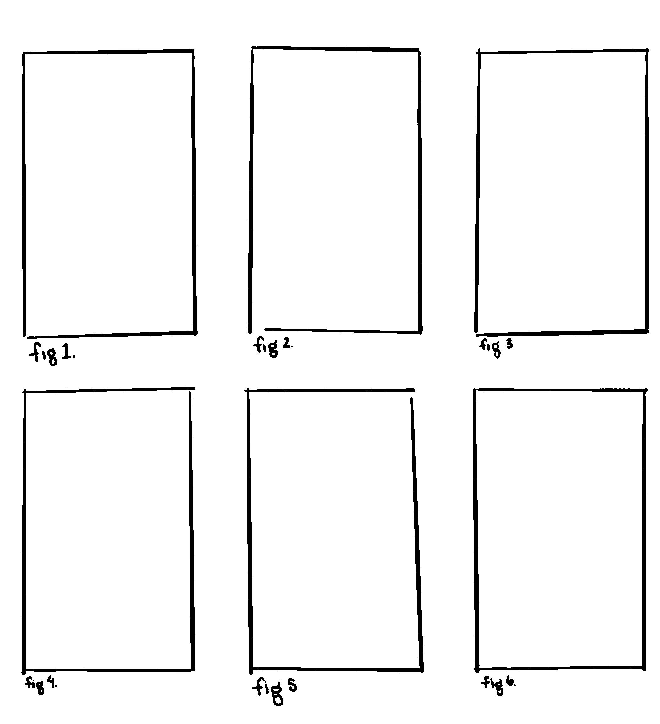
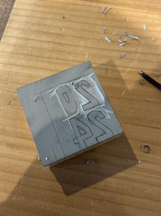
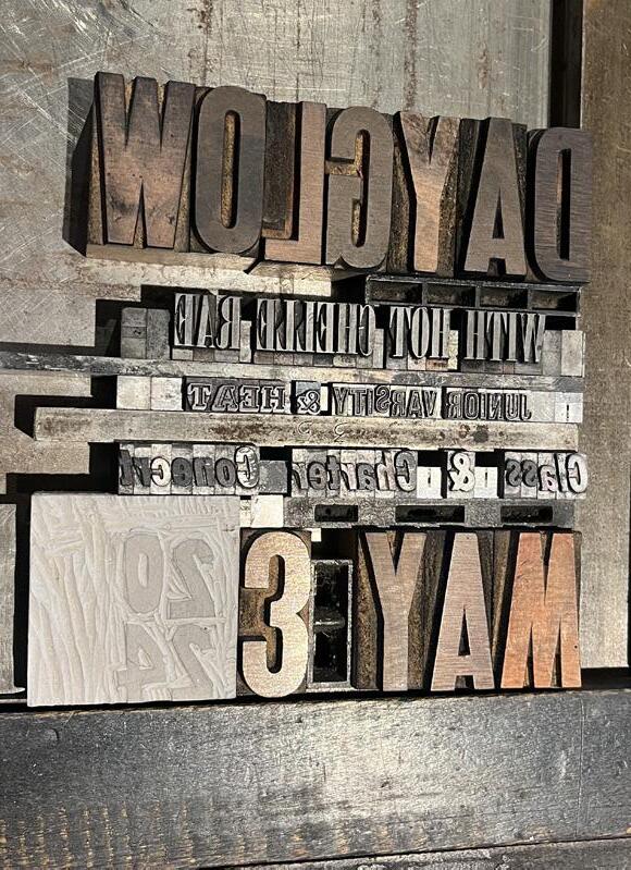
When I arrived at First Proof, I shared my digital sketch with the staff and discussed my options. Luckily, they had a bold wooden font that looked like many of the fonts on Hatch posters that I wanted to emulate. I started with this as the artist’s title. I then went to the many text drawers, sitting on the floor meticulously picking out each letter for all the information needed for my poster. I collected all of my letters and organized them in order (see Fig.1 pg. 18). I wanted to visualize the year in a specific way so that all the text lined up. To do that, I needed to carve my block. I carved a linoleum block to say 2024 and used the wooden type to guide my shape (see Fig. 2). Once this block was carved, I was ready to organize my final composition. Apart from setting each letter, I used spacers and “furniture” (small blocks that sit lower
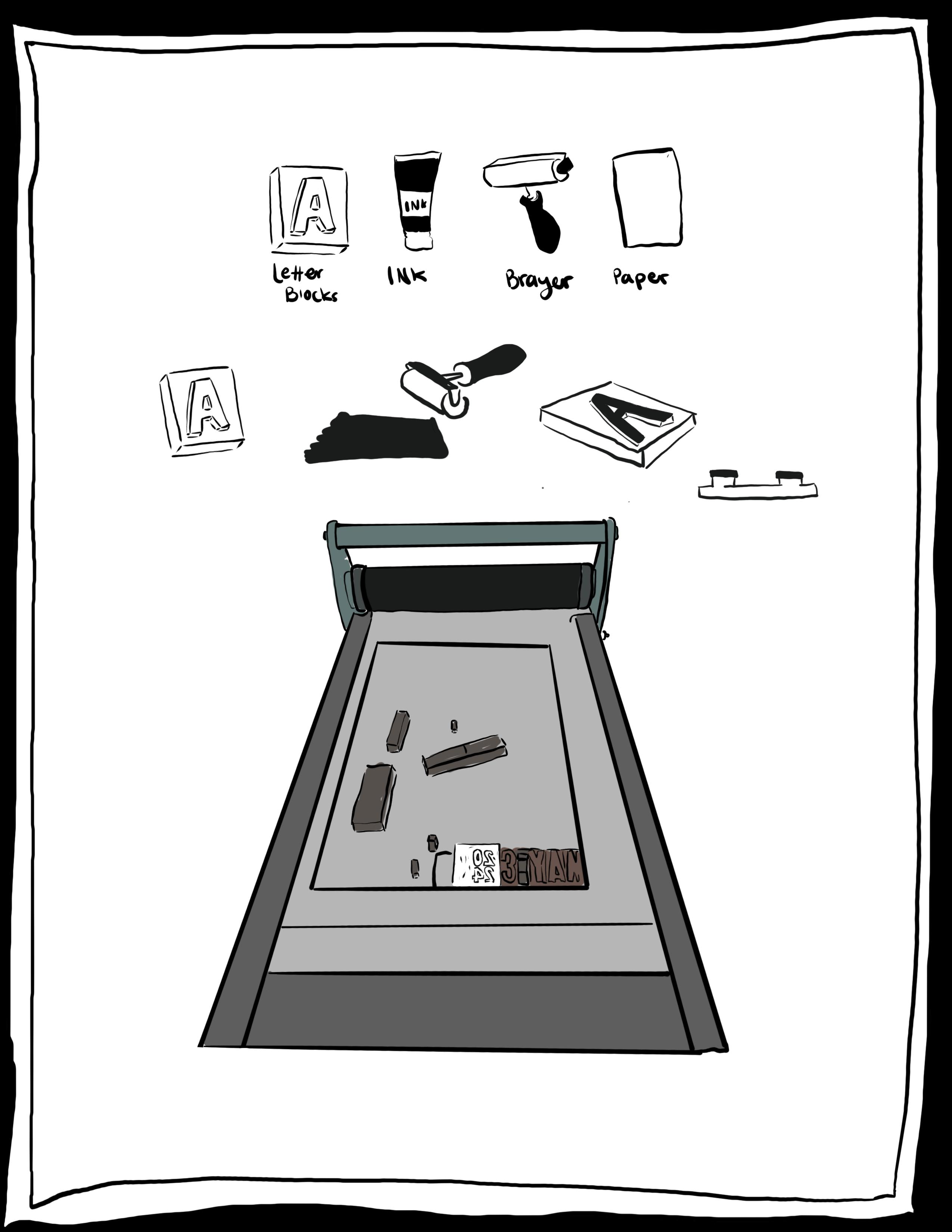
than the letter type) to create space between words (see Fig.3). I secured all the letters, spacers, and furniture with magnets to ensure that none of the pieces moved while printing. I then ran my first test print (see Fig. 4). From this test print, I could see that some letters were misplaced. I fixed the letters and then ran another print (see Fig.5). This print was successful in terms of letters, but I still wanted to change the spacing. I swapped some larger furniture for smaller furniture to achieve my desired composition. I ran another test print and was happy with my final result (see Fig. 6). Testing my design required patience
and attention to detail to achieve my desired outcome.
Once I had my final composition, I could get into a routine of printing around 30 copies. The printing process involves:
- Rolling ink onto the letters
- Make sure that the letters are all covered
- Aligning my paper
- Pressing the poster
- Setting it to dry on the drying rack
The specific steps in this experience taught me about the physicality of printmaking, as I had been writing and researching about it. I had experience designing digitally, but for this
process, I had to think very intentionally about each letter and the small details that made each line successful. As the origins of graphic design, letterpress showcases how physical you must be, how time and detail-intensive the process is, and how much patience is required to achieve a final design for a given project. First Proof also reflects the origins of printmaking - collaboration between printmakers who share space and materials as well as ideas and feedback.
My interest in the Hatch Show Print Shop and its posters allowed me to explore the value of lost art forms but also show that as a marketing product, the shop’s posters have always been and continue to be successful at connecting artists or other entertainers with their audiences. For me, the rich history of the Hatch Show Print Shop showcases the larger art world theme of placing value on the process and thinking
Letterpress Poster Design
intentionally about all aspects of a work of art or product to engage an audience in meaningful ways. My visit to First Proof Press allowed me to explore these same themes directly and, in the process of printmaking, synthesize my academic and historical understanding of how art informs the world around us. My final poster for Class and Charter Day allows my fellow students and me to engage in slow-looking and to think about design in ways we often take for granted. In this case, it allows us to think intentionally about how text and typography communicate feelings and information differently based on stylistic choices. Through this magazine, I hope to have showcased the importance of design-thinking and “care for process” in this small part of the art world and challenged the reader to think critically about the role of these same notions in their world.
Digital Poster Design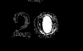
Page 3