Design de Comunicação Portfólio 2024
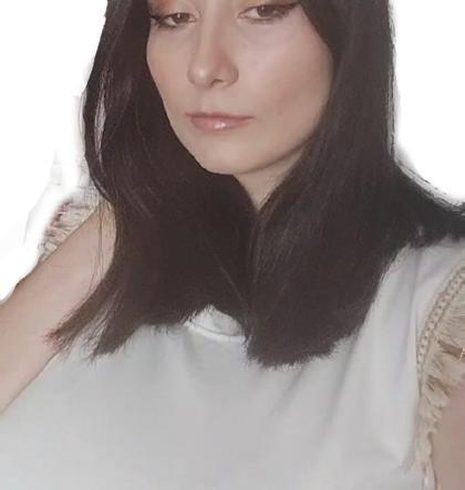
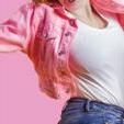
Chamo-me Cátia Marmelo, tenho 21 anos e sou Designer de Comunicação.
Eu nasci em Portalegre, mas eu sou de Estremoz, Portugal. Estudei na Escola Básica Sebastião da Gama e depois fui para a Escola Secundária Rainha Santa Isabel para fazer o Curso de Artes Visuais.
Ao concluir o curso decidi que eu gostaria de continuar a trabalhar em artes, então entrei candidatei me e entrei para o Licenciatura de Design de Comunicação
My name is Cátia Marmelo, I’m 21 years old and I’m a Communication Designer. I was born in Portalegre, but I’m from Estremoz, Portugal. I studied at Sebastião da Gama Elementary School and then went to Rainha Santa Isabel Secondary School to take the Visual Arts Course. Upon completing the course I decided that I would like to continue working in the arts, so I applied and entered the Degree in Communication Design


Contactos/ Contact


www.behance.net/ctiamarmelo
catiamarmelo1325@gmail.com
www.linkedin.com/in/catia-marmelo-582008305/
Áreas de trabalho/ Areas of work
Design de Identidade Visual ;
Design Vetorial ; Ilustração ;
Design Editorial ; Web Design; Publicidade ;
Design de Exposição
Branding and Identity Design; Vector Design ; Illustration; Design Editorial; Web Design; Advertising ; Exhibition Design


Idiomas/Language
Português Espanhol Inglês
Portuguese Spanish English

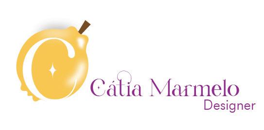
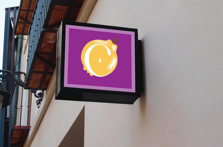
Para a minha marca gráfica eu decidi representar bem o meu nome e conseguir transmitir o meu design.
Com isso decidi utilizar o meu sobrenome que é um nome de uma fruta, uma fruta que dá para fazer um doce que poucos comem e é mais normal comer na zona onde eu moro, Alentejo.
Devido ao marmelo ser uma fruta única e o meu estilo de design também ser, então a fruta está a simbolizar os dois significados .
Utilizei uma tipografia diferente, fluida e redonda, com uma paleta cromática de amarelo torrado e roxo.
For my graphic brand I decided to represent my name well and be able to convey my design. With that I decided to use my surname which is a name of a fruit, a fruit that can make a sweet that few eat and it is more normal to eat in the area where I live, Alentejo. Because quince is a unique fruit and my design style is too, so the fruit is symbolizing both meanings. I used a different typography, fluid and round, with a chromatic palette of roasted yellow and purple.
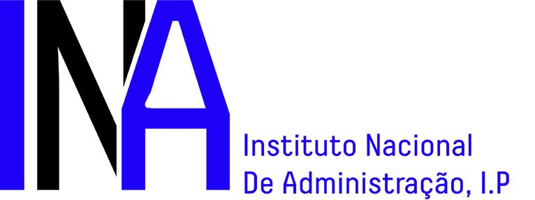
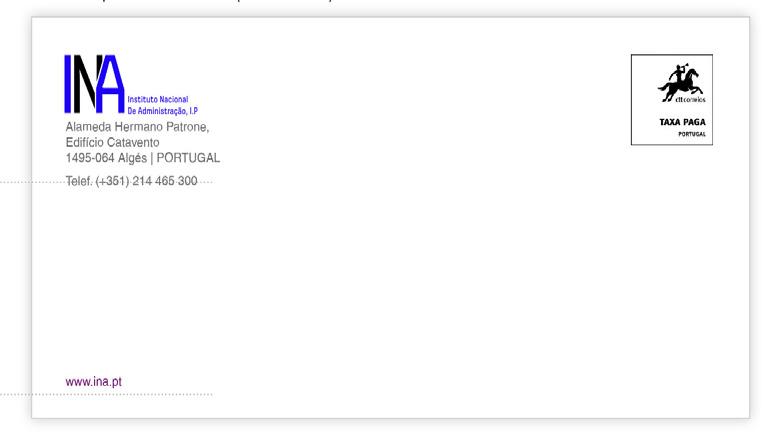
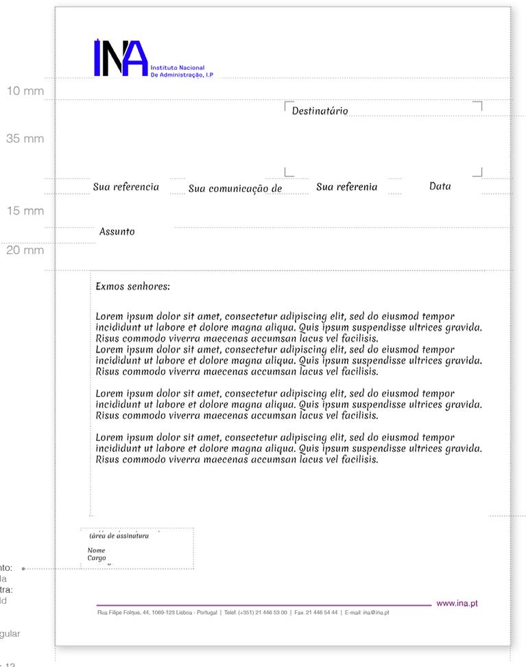
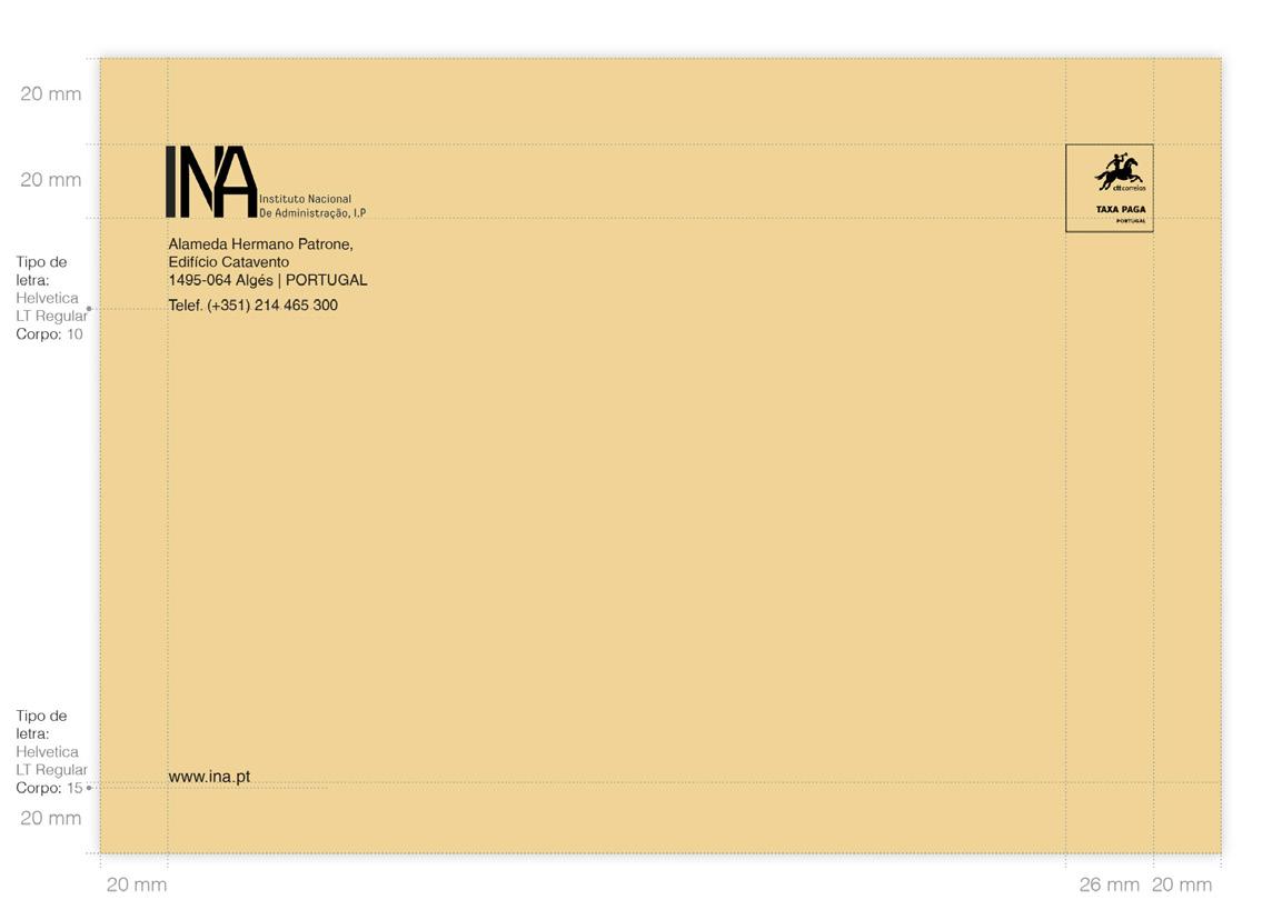
A marca Ina surgiu da oportunidade de participar no concurso de redesign da marca do Instituto Nacional da Administração I.P
Esta instituição é uma instituição que incentiva as pessoas a fazer formações, estudar, desenvolver a autonomia e terem responsabilidade individual e coletiva.
Com isso eu utilizei a cor azul e com uma tipografia simples , mas que transmite seriedade e educação.
The Ina brand arose from the opportunity to participate in the brand redesign contest of the National Institute of Administration I.P This institution is an institution that encourages people to train, study, develop autonomy and have individual and collective responsibility.
With that I used the color blue and with a simple typography, but that conveys seriousness and education.
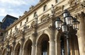
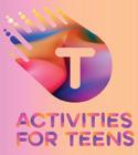
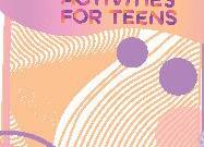
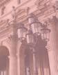
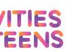
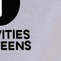
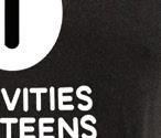
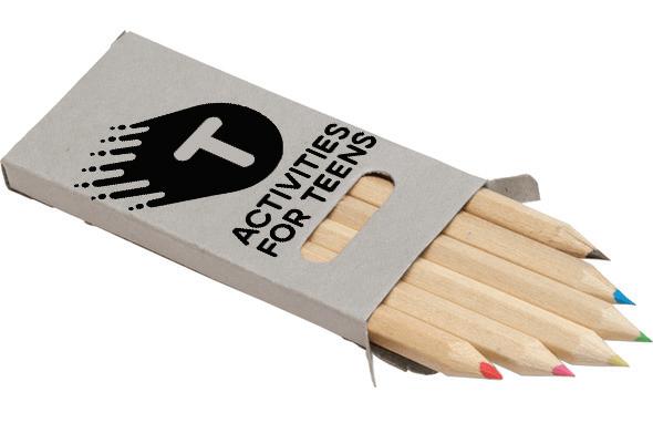
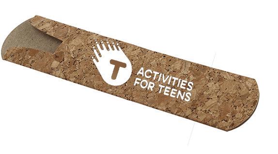
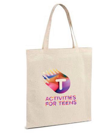
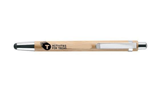
Marca Gráfica para um projeto para incentivar os jovens a visitar o museu
Graphic Brand for a project to encourage young people to visit the museum
A marca gráfica surgiu para um projeto para incentivar os jovens a visitar os museus, através das nossa atividades sustentáveis que utilizam os materiais impressos da publicidade do projeto e de atividades que os jovens costumam frequentar (concertos, workshops, aulas de dança).
A marca gráfica tem cores vivas, uma tipografia com chamativa e inovadora para cativar o nosso público alvo.


The graphic brand was created for a project to encourage young people to visit museums, through our sustainable activities that use the printed materials of the project’s advertising and activities that young people usually attend (concerts, workshops, dance classes). The graphic brand has bright colors, an eye-catching and innovative typography to captivate our target audience.


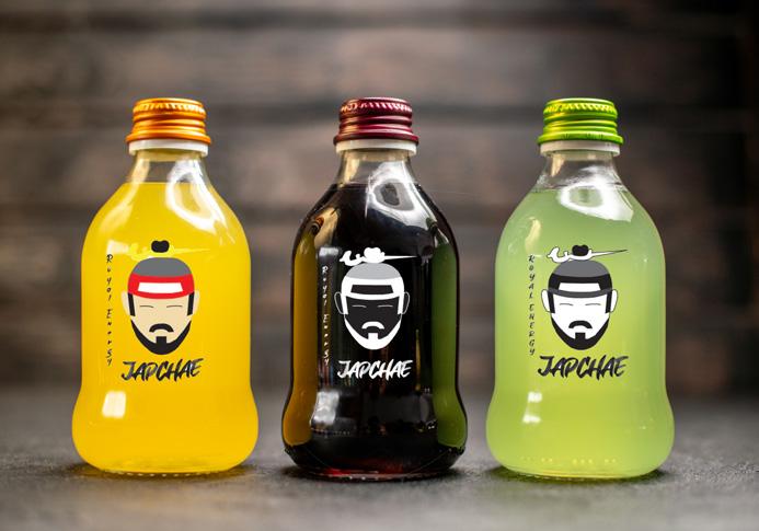
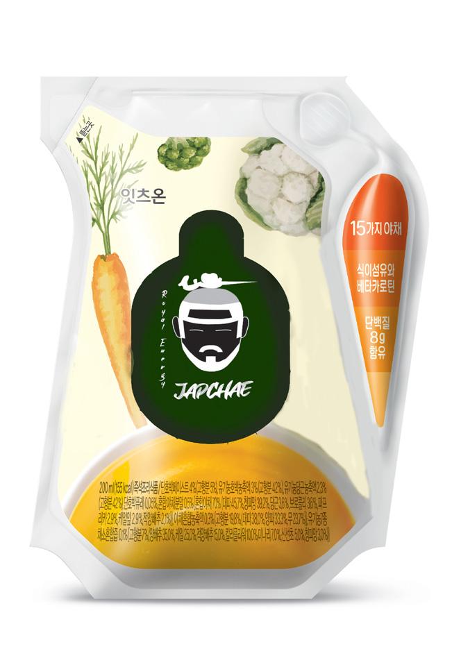
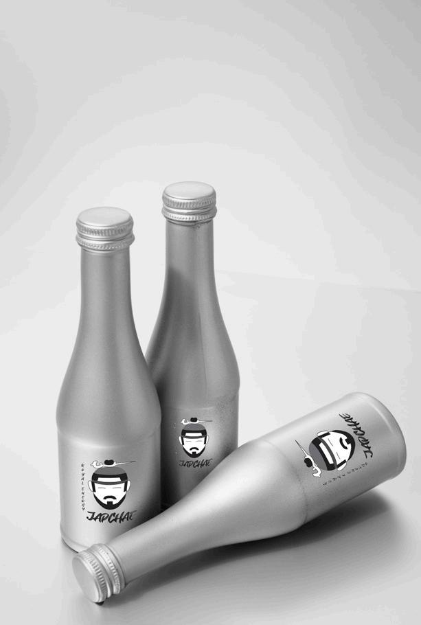
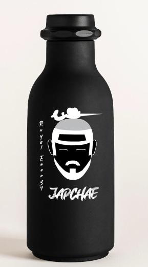
A marca gráfica surgiu como objetivo de criar uma marca gráfica de uma bebida energética e saudável. Ao fazer uma grande pesquisa e por eu gostar muito da cultura, decidi fazer uma bebida energética saudável de vegetais, especificamente do prato Japchae da Coréia do Sul.
Assim o cliente poderá treinar, beber a bebida e continuar saudável, sem prejudicar a sua saúde.
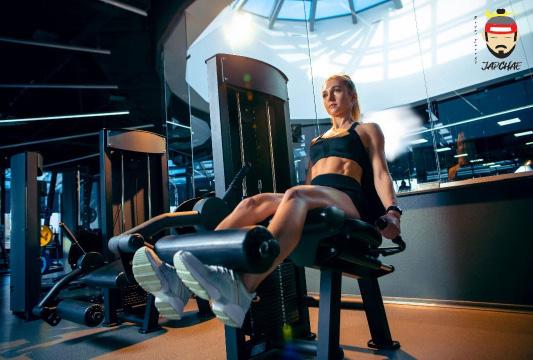
Graphic branding emerged as a goal to create a graphic brand of an energy and healthy drink. After doing a lot of research and because I really like the culture, I decided to make a healthy energy drink from vegetables, specifically from the Japchae dish from South Korea. This way the client will be able to train, drink the drink and remain healthy, without harming their health.
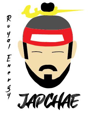
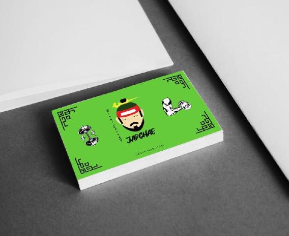
Marca gráfica em garrafas e em embalagem sustentável
Graphic branding on bottles and sustainable packaging
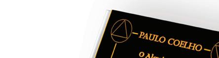
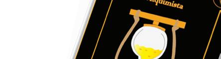
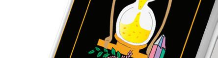
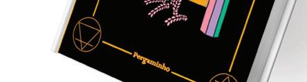
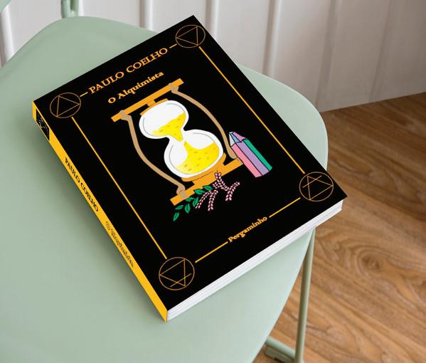
de capa do livro Alquimista, de Paulo Coelho
Para este trabalho começei por estudar vários escritores que escrevessem em português, vi várias coleções e acabei por selecionar os livros das coleção do Paulo Coelho. Ao analisar os livros da coleção um dos título chamou a minha atenção e decidi fazer o design da capa do livro Alquimista.
Com o livro decidido comecei a pensar em ilustrações que representa-se com o que o Alquimista trabalha, materiais e elementos da natureza.
For this work I started by studying several writers who wrote in Portuguese, I saw several collections and I ended up selecting the books from Paulo Coelho’s collection. While reviewing the books in the collection, one of the titles caught my attention and I decided to design the cover of the Alchemist book. With the book decided, I started to think about illustrations that represent what the Alchemist works with, materials and elements of nature.

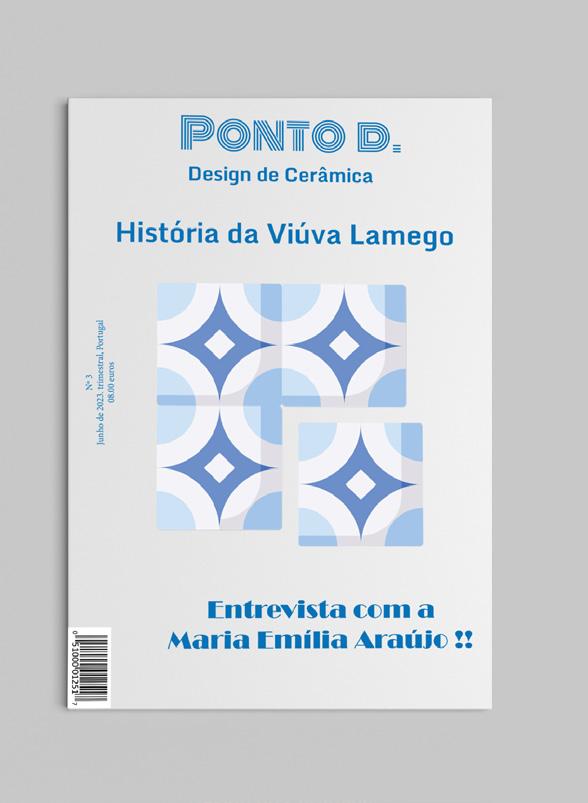
Esta revista surgiu para enaltecer a cultura do meu pais, Portugal. Enquanto designer, portuguesa e artista, percebi que as pessoas não valorizão a nossa cultura e que não percebem a riqueza que temos e que está aos poucos a desaparecer. Com cesta conclusão decidi fazer uma revista a falar sobre cerâmica, mais específicamento sobre uma fábrica de cerâmica mais conhecida e antiga de Portugal.
A revista fala sobre a sua história, o seu processo de criação, os seus materiais, os artistas que fizeram parcerias com a Viúva Lamego e eventos de cerâmica que iriam acontecer pelo país.
This magazine was created to praise the culture of my country, Portugal. As a Portuguese designer and artist, I realized that people don’t value our culture and that they don’t understand the richness we have and that is slowly disappearing. With this conclusion I decided to make a magazine talking about ceramics, more specifically about a better known and older ceramics factory in Portugal.
The magazine talks about its history, its creation process, its materials, the artists who partnered with Viúva Lamego and ceramic events that would take place around the country.
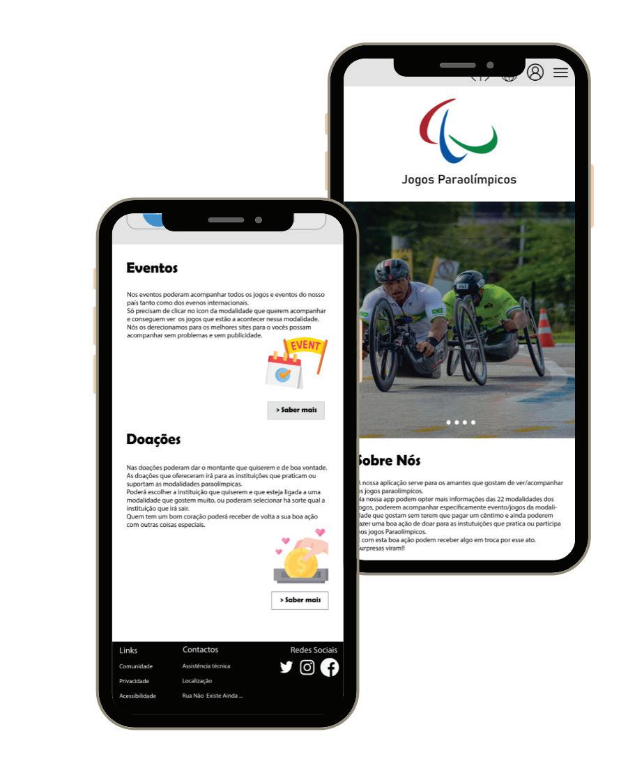
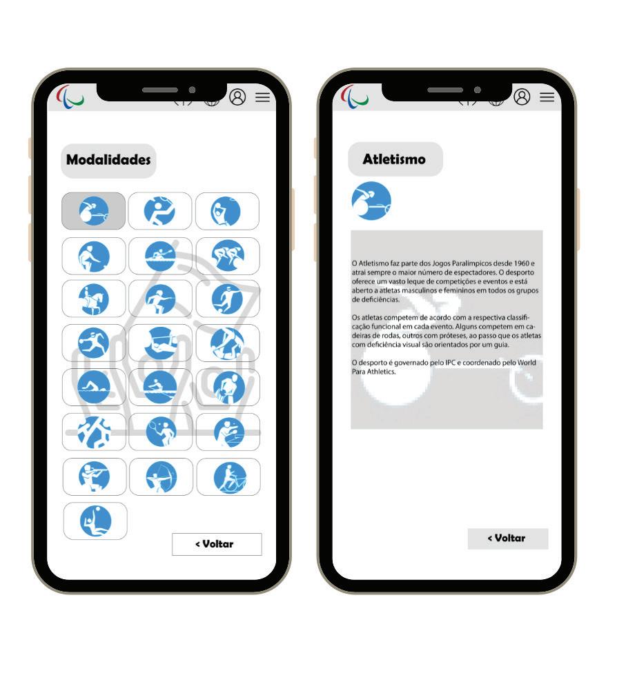
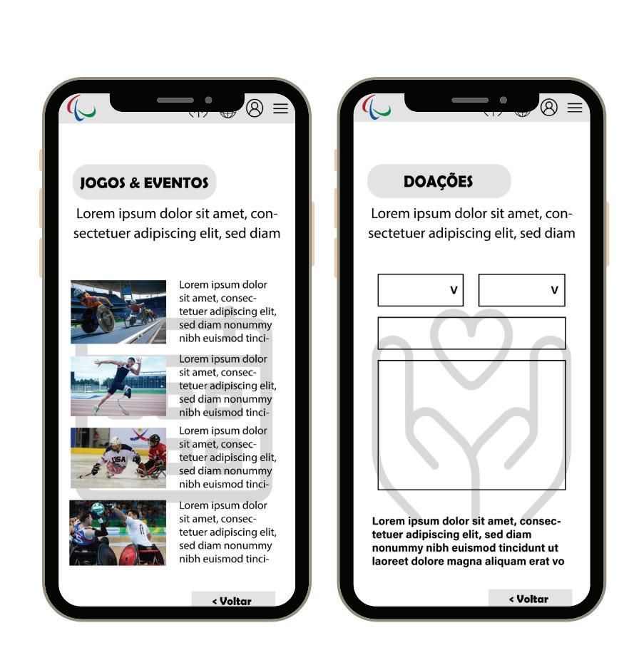
Esta aplicação surgiu da oportunidade de criar uma aplicação desportiva para os amadores de desporto. Ao fazer a pesquisa reparei que havia pouco conteudo sobre os jogos Paraolímpicos e de ajudas para manter as pequenas instituições ou ginásios para os jogadores paraolímpicos treinarem.
A aplicação seria uma aplicação que informaria todas as mobilidades presente nos jogos, informaria dos eventos que iram acontecer pelo país e selecionar a instituição que quiser para doar a quantia que poder.
E sem o cliente saber, cada vez que faz uma doação irá receber pequenas recordações na nossa loja.
This application arose from the opportunity to create a sports application for sports amateurs. While doing the research I noticed that there was little content about the Paralympic Games and aid to maintain the small institutions or gymnasiums for the Paralympic players to train.
The application would be an application that would inform all the mobilities present at the games, inform the events that will take place around the country and select the institution you want to donate the amount you can. And unbeknownst to the customer, every time you make a donation you will receive small souvenirs in our store.

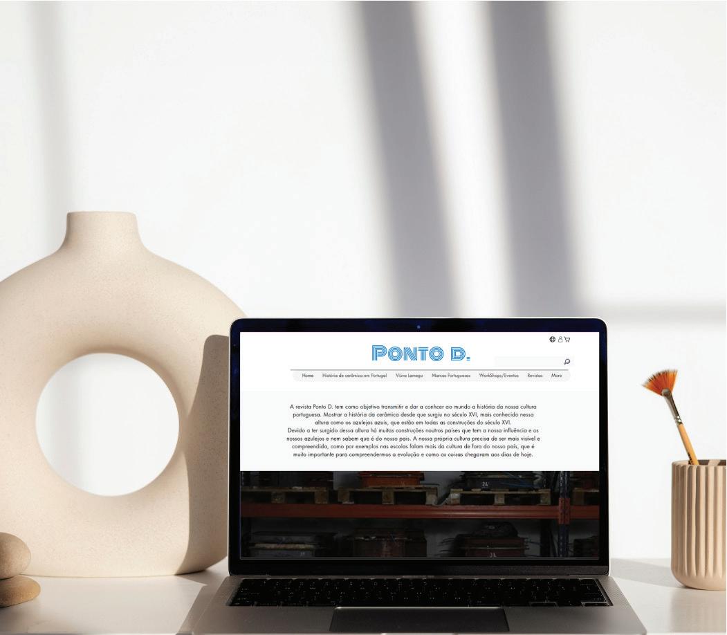
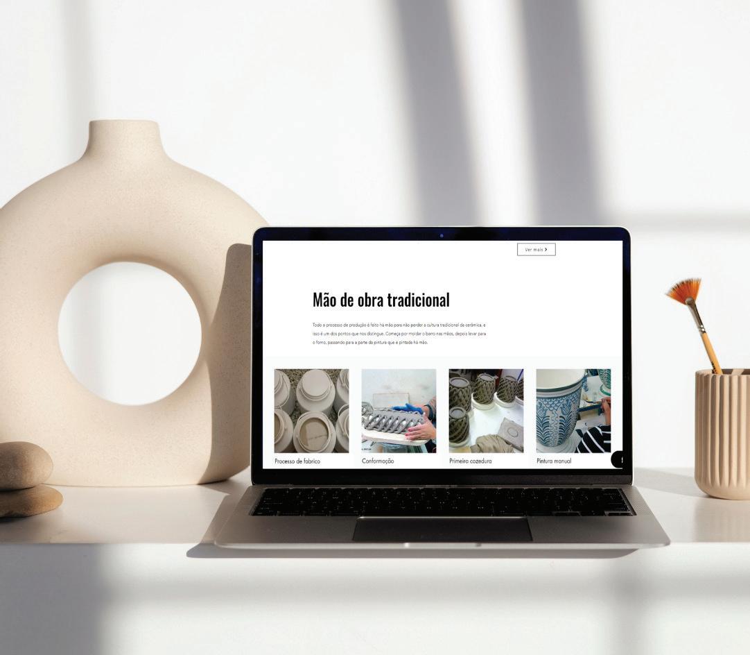
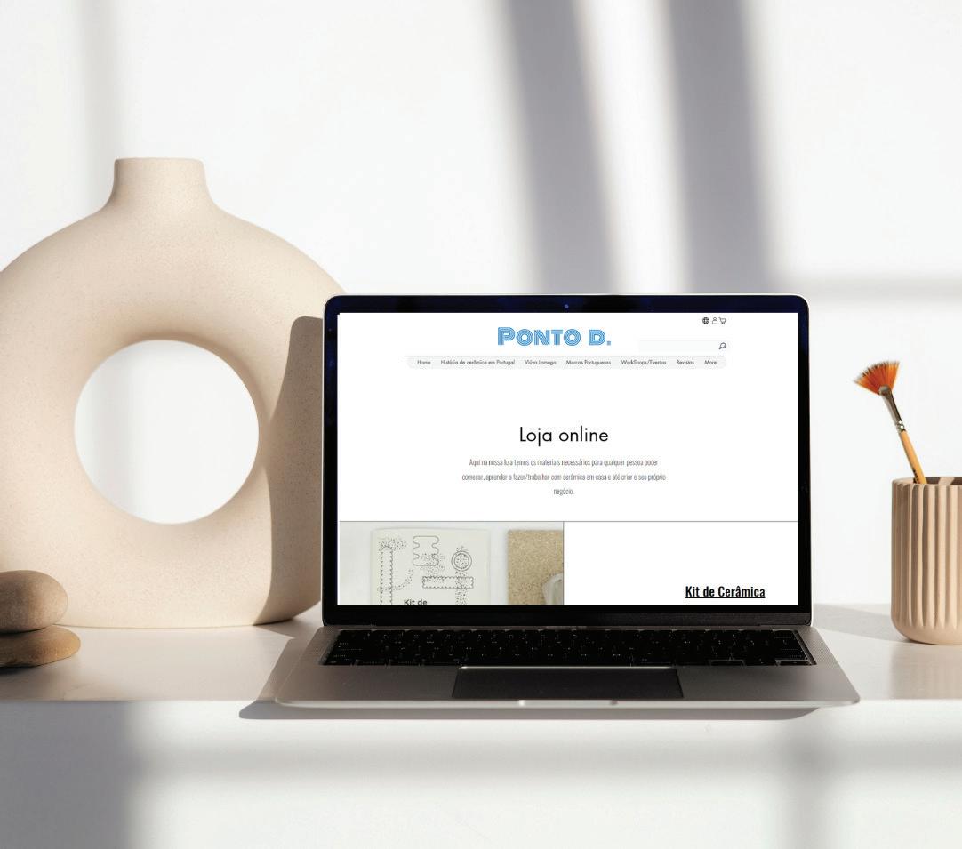
Eu criei este site na continuação da revista do Ponto D, de cerâmic.
O site do ponto D tem todas as informações que a revista tem, mas com uma parte diferente. O site tem uma loja para as pessoas ou estudantes que queiram começar a fazer cerâmica poderem ter todo o material necessário e comprar.
O objetivo é incentivar mais pessoas a fazer cerâmica, terem mais interesse na nossa cultura e para prevenir que a nossa cultura desapareça.
I created this site in the follow-up to Dot D’s magazine, by ceramic. The D-dot website has all the information that the magazine has, but with a different part.
The site has a store for people or students who want to start making ceramics to have all the necessary material and buy. The goal is to encourage more people to make pottery, to have more interest in our culture and to prevent our culture from disappearing
Site do Ponto D. do modo de visão do utilizador
Point D. Site of the User’s View Mode
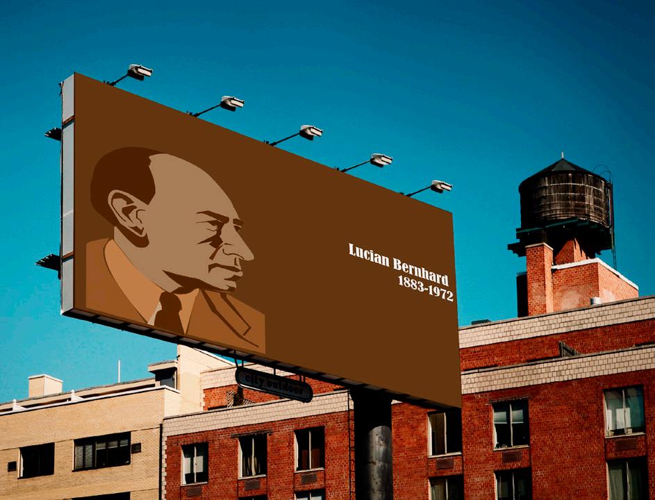
Neste trabalho tive que fazer uma pesquisa para conhecer todos os designer gráficos que existiram no passado até aos dias de hoje.
Ao fazer pesquisa deparei me com o Luician Bernhard, com o estilo PLakatsil e a sua historia pessoal.
Com isso começei a fazer o cartaz e o desdobrável com a história e as obras mais conhecidas.
In this work I had to do some research to get to know all the graphic designers that existed in the past until today.
While doing research I came across Luician Bernhard, the PLakatsil style and his personal story. With that, I started to make the poster and the leaflet with the history and the most well-known works.
Cartaz e desdobrável no ponto de vista do público Poster and leaflet from the public’s point of view
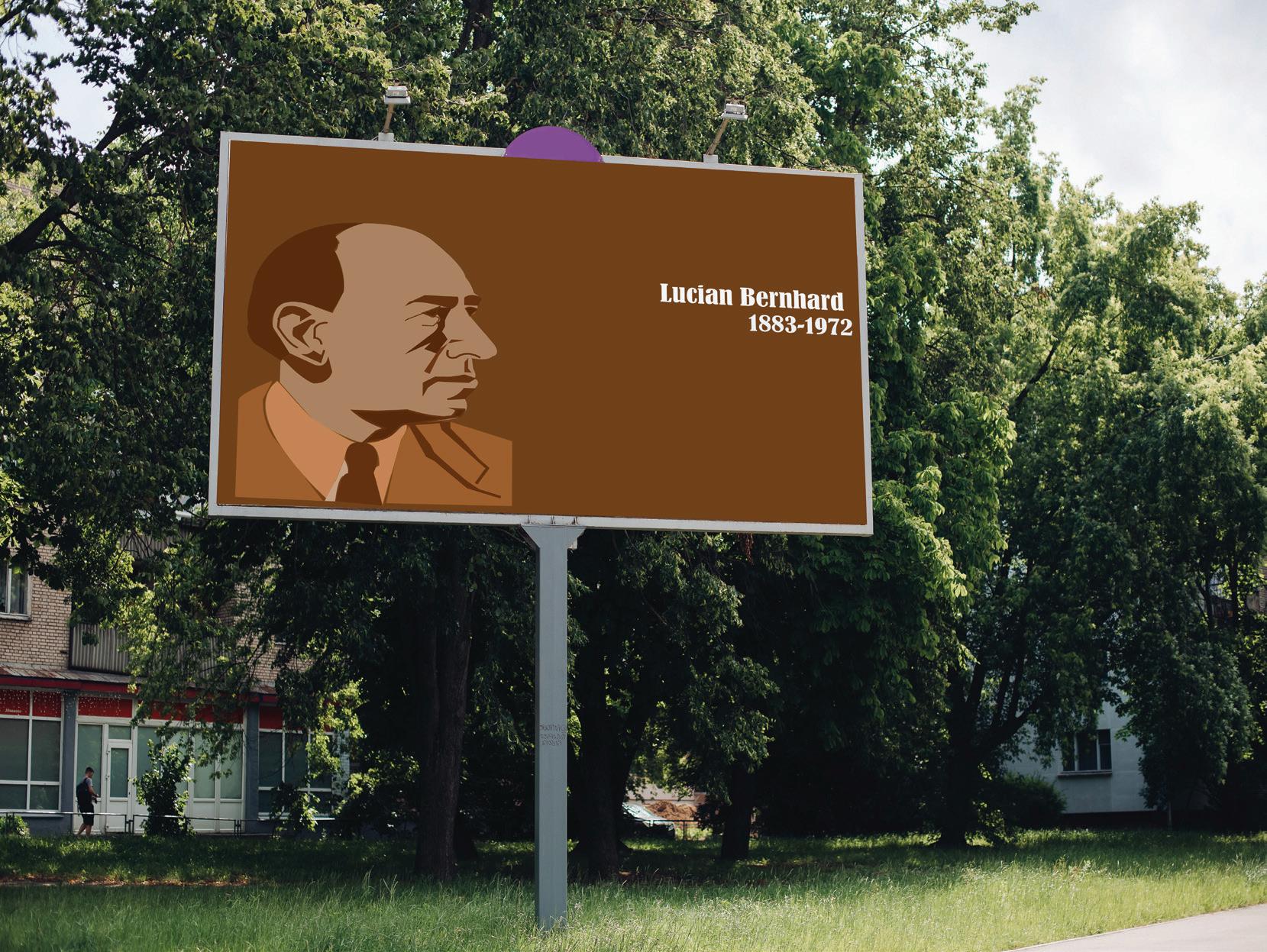
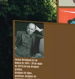
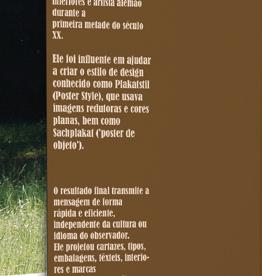
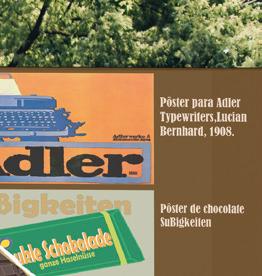
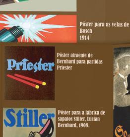
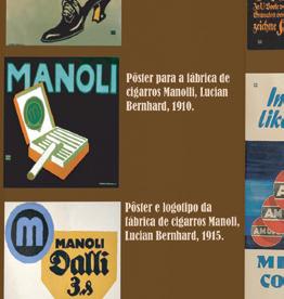
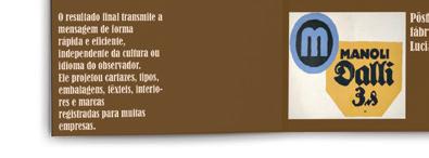
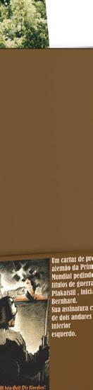
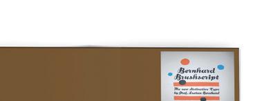
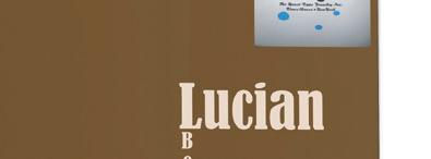
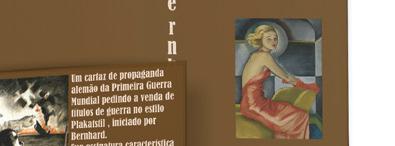
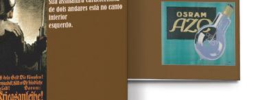
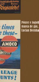
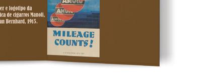
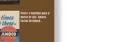


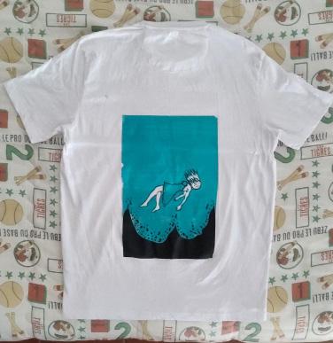
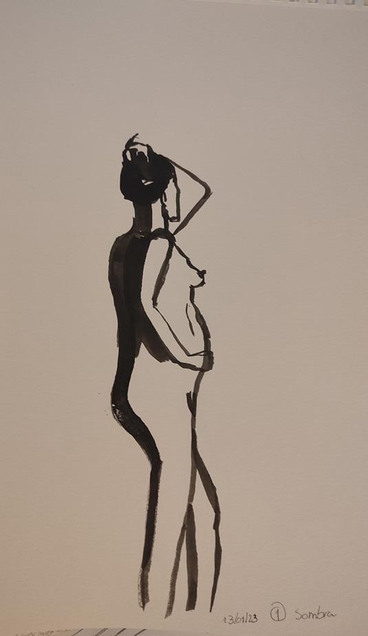
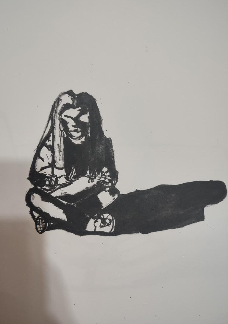
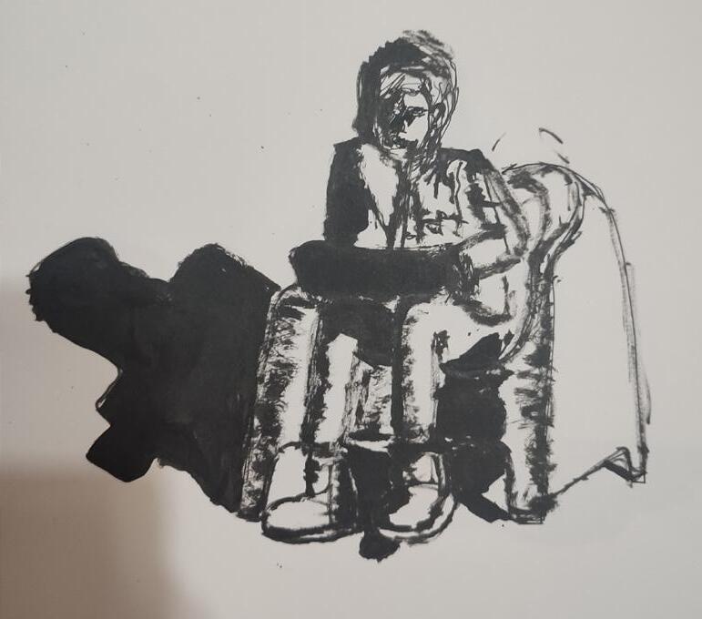
Ilustração que representa solidão, realizada em Serigrafia
Illustration representing loneliness, made in Screen Printing
Esta ilustração foi realizada para o último trabalho da disciplina de Serigrafia.
Foi me dito que tinha que fazer uma ilustração que me representa-se e tinha que ter só duas cores para a impressão.
Fiz o grafismo no Illustration que está a representar como me sinto várias vezes, no fundo no mar, submersa pela vida e por descobrir quem sou verdadeiramente
This illustration was made for the last work of the Serigraphy discipline.
I was told that I had to make an illustration that represented myself and I had to have only two colors for printing. I did the graphics in Illustration that is representing how I feel several times, at the bottom of the sea, submerged by life and discovering who I truly am
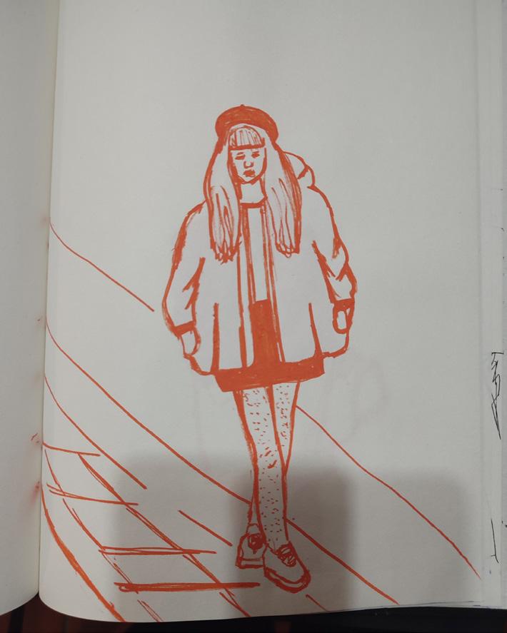
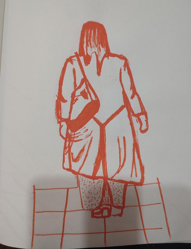
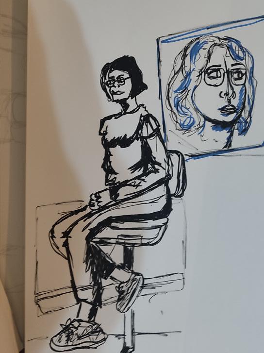
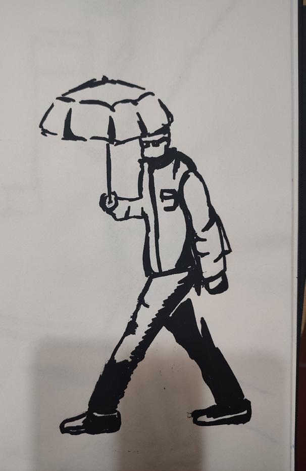
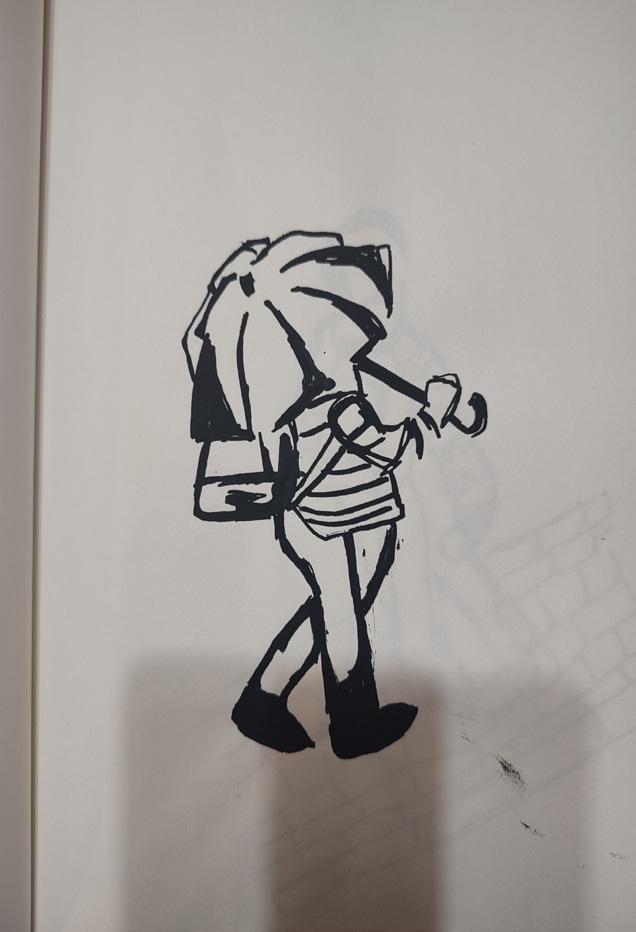
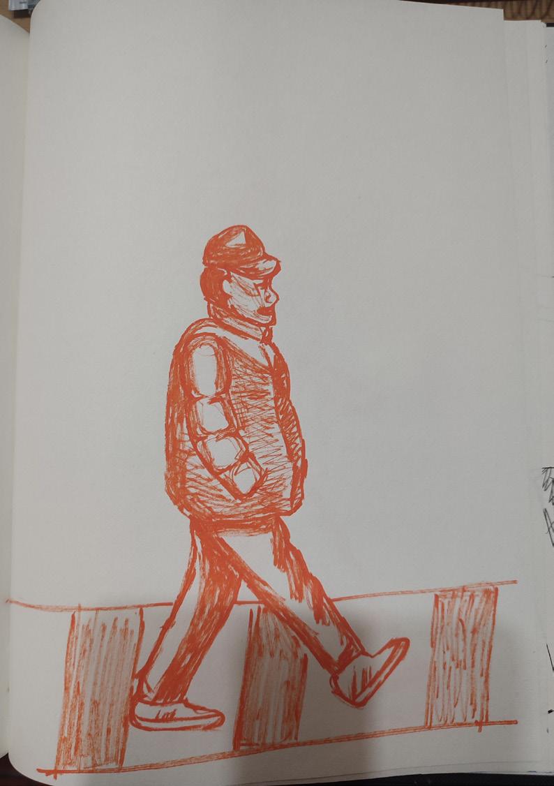
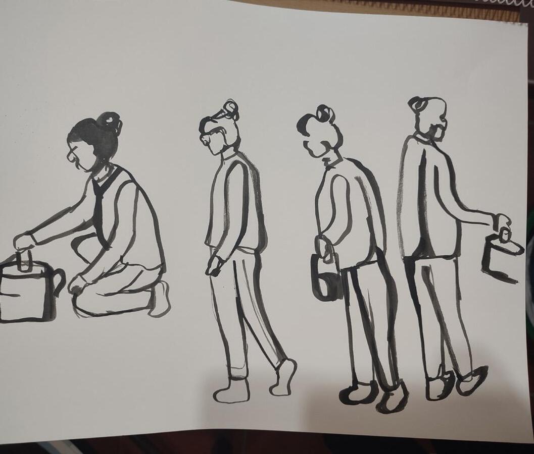
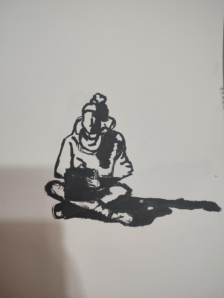
Ilustrações feitas durante as aulas/no diário gráfico
Illustrations made during lessons/in the graphic diary
Estas ilustrações foram feitas para treinar o meu traço do desenho e a maneira como eu vejo o mundo à minha volta.
Muitos dos desenhos foram feitos a tinta da china, com canetas e pinceis, e com marcadores de cor laranja e azul. Para os desenhos terem um pouco mais de cor.
These illustrations were made to train my drawing line and the way I see the world around me. Many of the drawings were made in Indian ink, with pens and brushes, and with orange and blue markers. For the drawings to have a little bit more color.
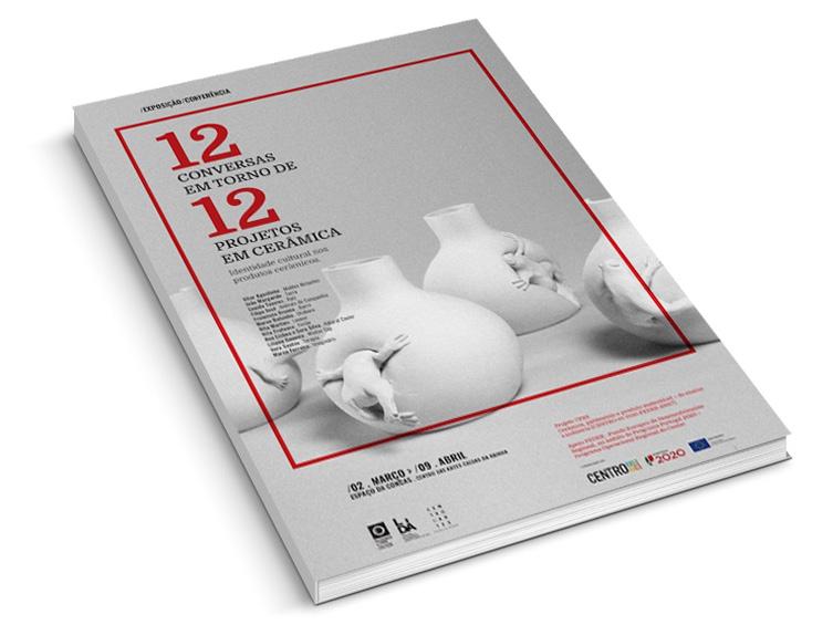
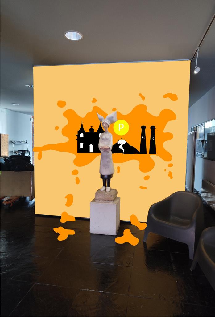
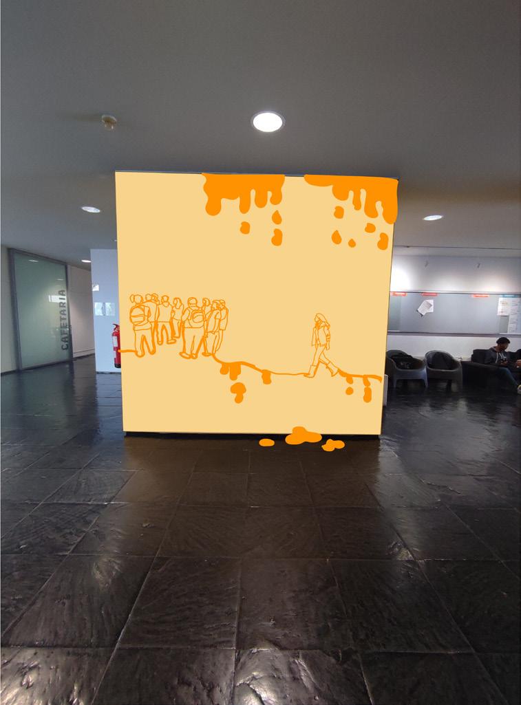
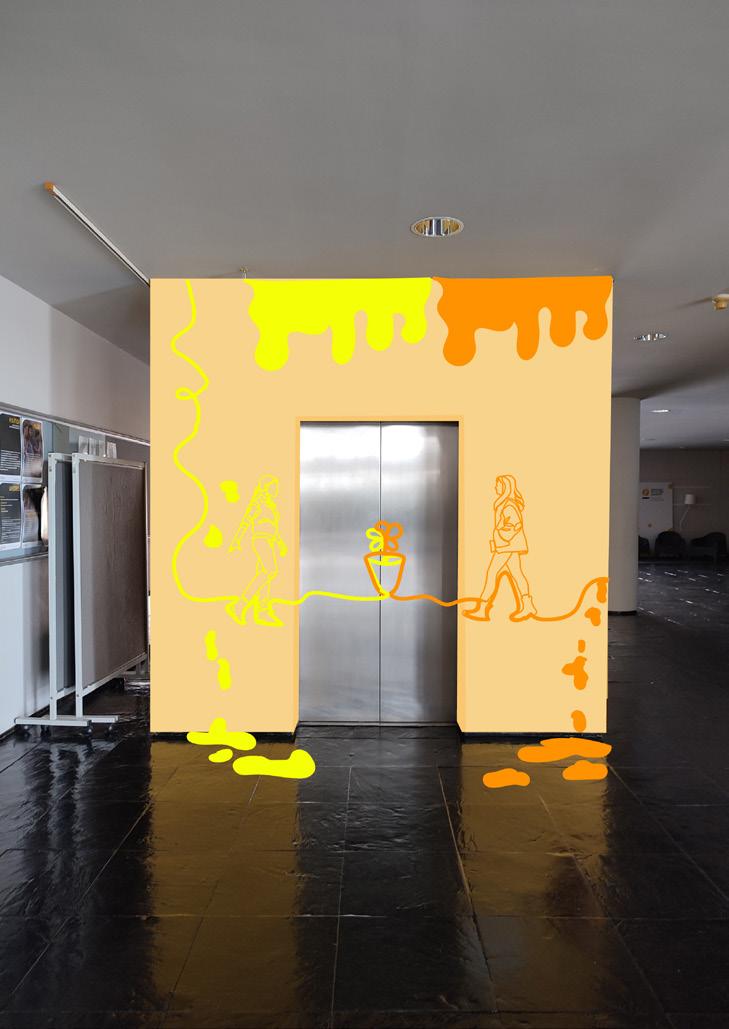
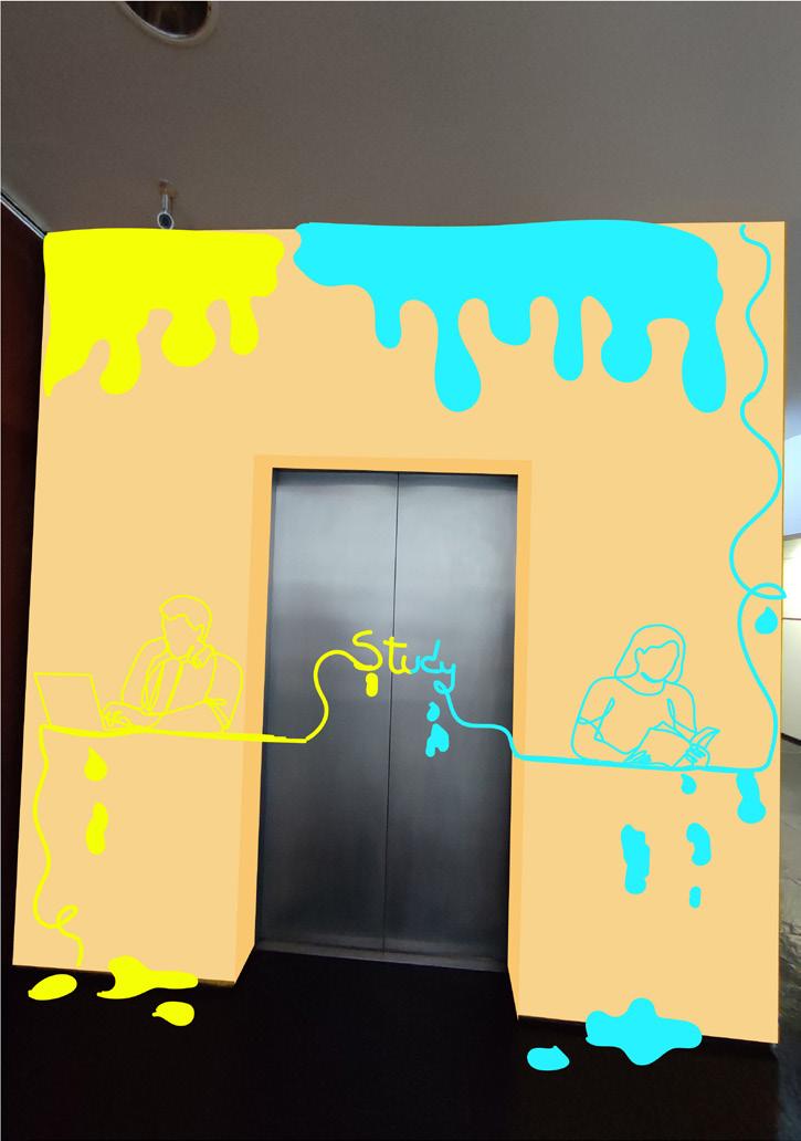
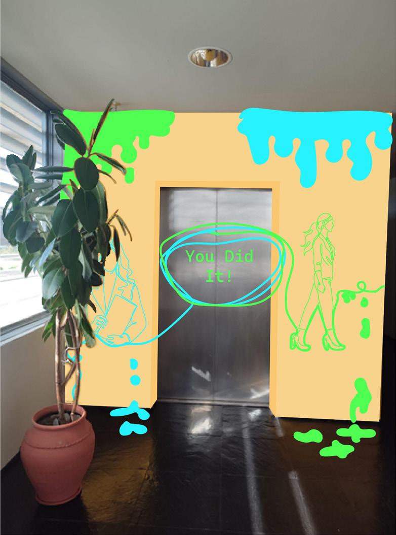
Projeto de design expositivo para criar uma criação do espaço com a comunidade académica.
Exhibition design project to create a connection between the space and the academic community.
Intervir graficamente num espaço designado para o projeto, desenvolvendo um ambiente gráfico que ligue a comunidade académica ao espaço que frequenta, a partir de um conceito que permita criar laços identitários e de identificação do espaço.
Com isso decidi utilizar os elevadores como meio de transmitir motivação para esta nova fase da vida do estudante.
To intervene graphically in a space designated for the project, developing a graphic environment that connects the academic community to the space they frequent, based on a concept that allows the creation of identity ties and identification of the space. With that, I decided to use elevators as a means of transmitting motivation for this new phase of the student’s life.
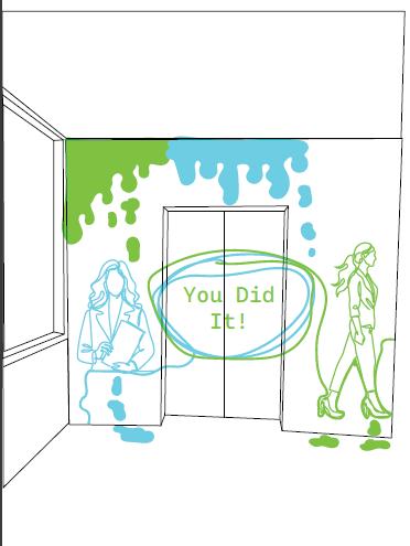
Mockups do meu design nas paredes do elevador da universidade Mockups of my design on the walls of the university elevator
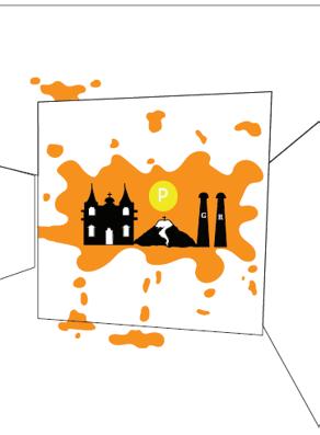
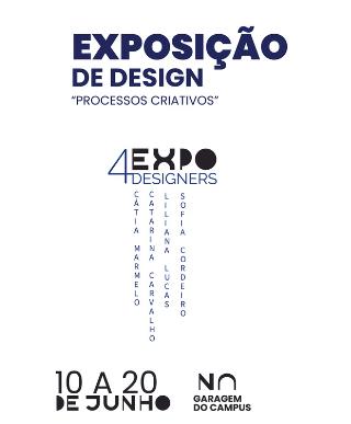
Projeto de design expositivo para criar uma ligação do espaço com os trabalhos dos alunos.
Exhibition design project to create a connection between the space and the students’ work.
No âmbito do desenvolvimento de projetos para a Unidade Curricular de Design de Ambientes Gráficos, foi-nos proposta a realização de um ambiente expositivo, tendo em consideração que o espaço estrutural será o espaço sugerido, (a garagem) nas instalações da ESTGD. Os objetos expositivos são as biografias e os projetos acadêmicos desenvolvidos ao longo do curso, pelos alunos que pertencem ao grupo de trabalho.
A intenção é elencar uma narrativa visual, cuja mensagem, apresente os percursos dos alunos, dando enfoque à área onde se destacaram no curso e onde pretendem vir a trabalhar profissionalmente.
As part of the development of projects for the Curricular Unit of Design of Graphic Environments, it was proposed to us to create an exhibition environment, taking into account that the structural space will be the suggested space, (the garage) in the ESTGD facilities. The expository objects are the biographies and academic projects developed throughout the course by the students who belong to the working group. The intention is to list a visual narrative, whose message presents the students’ paths, focusing on the area where they stood out in the course and where they intend to work professionally.
Mockups do design da exposição no espaço designado para o projeto.
Mockups of the exhibition design in the space designated for the project.
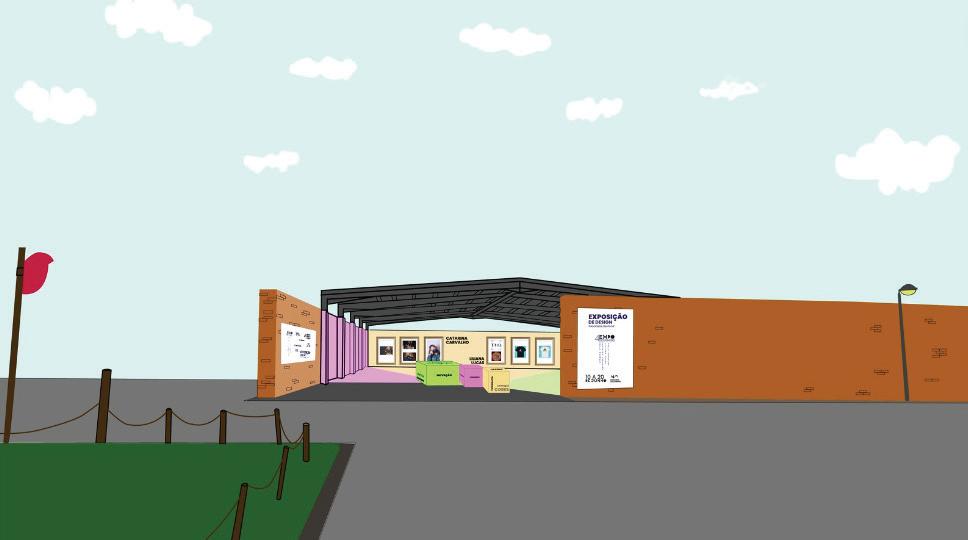
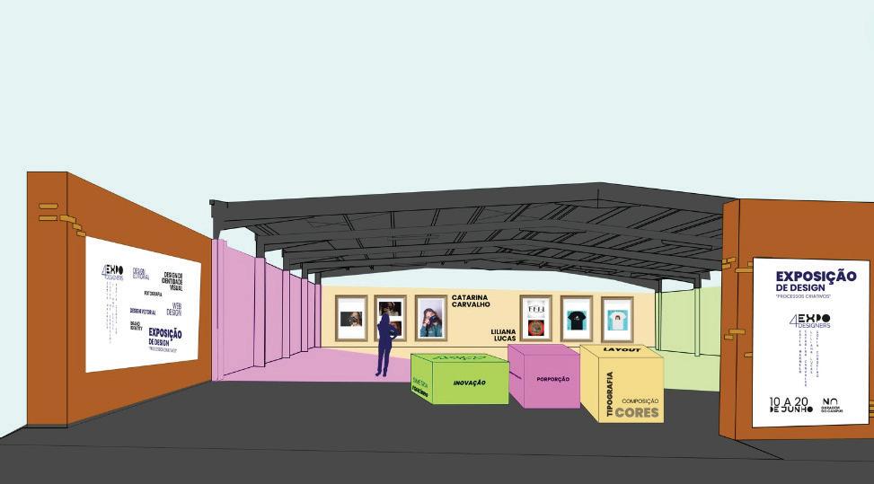
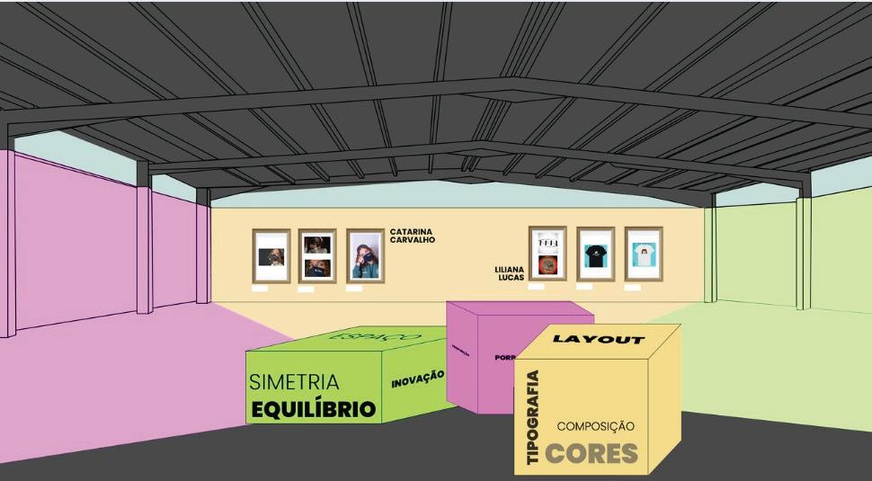
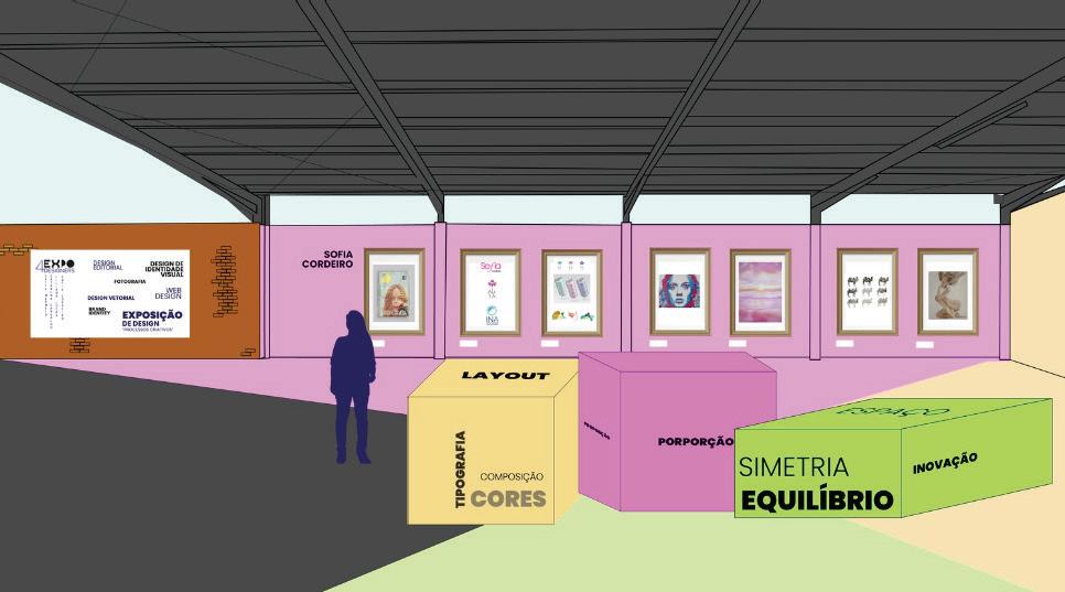
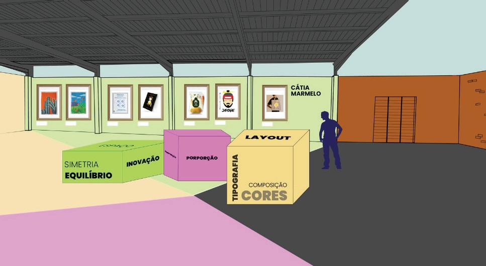
Nestas imagens/mockups consegue se ver como se iria expor os meus trabalhos e os trabalhos das minhas colegas de grupo, através dos destaques das cores que estão nas paredes para o chão criando um padrão, os nomes das designers nas paredes e blocos no meio do espaço para os visitantes poderem parar, ler e até poderem se sentar e apreciar a nossa exposição. Criando uma experiência única.
In these images/mockups you can see how my work and the works of my group mates would be exhibited, through the highlights of the colors that are on the walls to the floor creating a pattern, the names of the designers on the walls and blocks in the middle of the space for visitors to stop, read and even sit and enjoy our exhibition. Creating a unique experience.