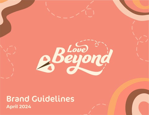
Brand Guidelines
April 2024
Introduction
Purpose of Guidelines — 04
Who are We? — 05
Mission — 06
Vision — 07
Brand Personality — 08
Brand Colors
Primary Colors — 19
Neutral Colors — 20
Color Pairings — 21
Identity
Primary Logo — 09
Clearspace & Min. Size — 10
Secondary Logo — 11
Clearspace & Min. Size — 12
Lettermark — 13
Clearspace & Min. Size — 14
Podcast Logo — 15
Clearspace & Min. Size — 16
Logo Misuse — 17
Typography
Brand Typography — 23
Rules + Hierarchy — 25
Visual Elements
Photography — 27
Illustrations — 29
Brand in Use
Brand Assets — 33
Social Media — 34
Website — 35
Table of Contents
Billboard — 36
Purpose of guidelines
Who are we?
Mission
Vision
Brand personality
Introduction
Purpose of Guidelines
In order to keep consistency for the Love Beyond brand, this set of guidelines have been formulated to insure the sucessful implimentation of the brand through logos, color, typography, and applicable products in use while helping the designer understand the brand story and values of Love Beyond. While it is okay to formulate new ideas from these guidelines, it is important to respect the original identity.
If you have any questions regarding the visual manual, please contact the design team.
Casie Bear
casiebeardesign@gmail.com 1234 Smith Lane Muncie IN 47304
Love Beyond Guidelines — 04
About
Love Beyond is an organization founded in 2024 that seeks to educate the current generation about transnational couples and marriages: These are people that live countries apart and persue relationships as they either come together eventually or stay long-distance. The founders seek to bring positive representation for transnational couples after seeing and experience the many negative stigmas put against them. They created Love Beyond to create a welcoming environment of learning to encourage the new generation and those who have only experience media perception of transnational marriages to reach out and learn there is much more than expectations
Love goes beyond. Beyond borders, beyond expectations, and beyond everything else.
Love Beyond Guidelines — 05
Brand Story
Mission
We aim to educate and inform the audience about transnational marriages and encourage to learn with open arms and open minds
Vision
Creating an environment of learning and acceptance by providing resources to those inspired to learn more about transnational marriages, creating positive conversation and decreasing stigma.
Love Beyond Guidelines — 06
Brand Personality
Love Beyond prioritizes uplifting transnational marriages and couples, striving to represent every couple of all walks of life.
Open Warm Inclusive Personal
It’s important to Love Beyond that their space is an open place of learning for those who aren’t familiar with transnational marriages.
While encouraging learning, it’s important that the information provided doesn’t come off as formal but as someone who can answer your questions while acting as a friend.
Love Beyond wants to create a friendly and accepting environment to ease newcomers into the topic and encourage them to learn.
Love Beyond Guidelines — 07
Identity
Primary Logo
Clearspace & Min. Size
Secondary Logo
Clearspace & Min. Size
Lettermark
Clearspace & Min. Size
Podcast Logo
Clearspace & Min. Size
Logo Misuse
Primary Logo
The logo is a representation of the brand’s core values and personality. It’s important that the logo’s content must be understood in order to keep consistency and must never be redesigned under any circumstance.
Our goal is to uplift transnational couples and marriages in to a wider audience. The heart-shaped paper airplane is used to represent the distance between these couples when they first meet or continue. The dashed lines represent the airplane’s trail and uses the audience to use the break of lines to create the airplane’s path through the swirled letters. This is used to represent the couples’ connection despite their circumstances and how the audience have a connection to the couples now that they’ve gone down the path. The warm coral color uses the romance of pink and the stimulation of orange to signal an environment of love and acceptance.
Love Beyond Guidelines — 09
Primary_Logo_RGB
Clearspace & Min. Size
Clear space and minimum size requirements areimportant when retaining readability and clarity to the logo. The primary logo needs at least approx. 1.935” of clear space around. This is approximately the heigth of the L in ‘Love’ in the logo.
The logo should only be scaled down to a minimum height of 1.5” or 108 pixels. Any smaller and the logo information will be lost.
Clear space requirements:
The height of the L in the logo
Minimum size requirements:
Print: 1.5”
Screen: 108 px clear space guide
Love Beyond Guidelines — 10
Secondary Logo
The primary logo is the most important asset to the Love Beyond brand as it is used the most used symbol to represent the brand.
If there is a situation where the original logo cannot be used for a piece of media, the secondary logo provides a more horizontal version of the primary logo while still containing the core values of Love Beyond of connection and transnational couples.
Love Beyond Guidelines — 11
Primary_Horizontal_Logo_RGB
Clearspace & Min. Size
Clear space and minimum size requirements areimportant when retaining readability and clarity to the logo. The secondary logo needs at least approx. 2.13” of clear space around. This is approximately the height of the d in Beyond in the logo.
The logo should only be scaled down to a minimum of 1.5” or 108 pixels. Any smaller and the logo information will be lost.
Clear space requirements:
The height of the d in the logo
Minimum size requirements:
Print: 1.5”
Screen: 108 px clear space
Love Beyond Guidelines — 12
guide
Lettermark
If the primary and secondary logos are not applicable for a certain piece of media, the monogram can be used in its place while still upholding the values of Love Beyond of connection and transnational relationships
Primary_Lettermark_Logo_RGB
Love Beyond Guidelines — 13
Clearspace & Min. Size
Clear space and minimum size requirements areimportant when retaining readability and clarity to the logo. The secondary logo needs at least approx. 1.48” of clear space around. This is approximately the height of the heart in the logo.
The logo should only be scaled down to a minimum of 1” or 72 pixels. Any smaller and the logo information will be lost.
clear space guide
Clear space requirements:
The height of the heart in the logo
Minimum size requirements: Print: 1” Screen: 72 px
Love Beyond Guidelines — 14
Podcast Logo
This logo is to be used concerning the podcast ‘Love Beyond: The Interviews’ and can only be used for the podcast’s platforms and advertisement through social media, web, and print material.
It bares similarities to the primary logo with the added curved text of ‘The Interviews’ using a solid sans-serif for readability and acting as a connecting path of learning.
Love Beyond Guidelines — 15
Primary_Podcast_Logo
Clearspace & Min. Size
Clear space and minimum size requirements areimportant when retaining readability and clarity to the logo. The primary logo needs at least approx. 1.935” of clear space around. This is approximately the heigth of the L in ‘Love’ in the logo.
The logo should only be scaled down to a minimum height of 1.5” or 108 pixels. Any smaller and the logo information will be lost.
Clear space requirements:
The height of the L in the logo
clear space guide
Minimum size requirements:
Print: 2.5”
Screen: 180 px
Love Beyond Guidelines — 16
Logo Misuse
The logos prior took a lot of work to create, in order to respect the designs and have consistency throughout the brand, do not do the following:
Do not add effects such as drop shadows and embossing.
Do not warp or scale disproportionally.
Do not change the typography of the logo.
Do not use colors outside of the assigned ones.
Do not alter or reposition the airplane of logo.
Do not add present logo rotated.
Do not portray the logo in just outlines.
Do not add stroke to the logo.
Do not change the icon of the logo to a different one.
Love Beyond Guidelines — 17
Brand Colors
Primary Colors
Neutral Colors
Color Pairings
Primary Colors
Ivory
RGB: 255, 244, 220
CYMK: 0, 3, 14, 0
HEX: fff5db
The color palette consists of brand-specific colors to Love Beyond. The warm tones are meant to create a friendly and inviting feeling while being stimulating to encourage learning, which is the main goal ofLove Beyond.
Each color is used equally depending on media, however ‘Warm Coral’ is the primary color of the identity.
Warm Coral
RGB: 255, 141, 118
CYMK: 0, 56, 49, 0
HEX: ff8c75
Bright Orange
RGB: 255, 186, 95
CYMK: 0, 31, 71, 0
HEX: ffba5e
Deep Cocoa
RGB: 248, 207, 255
CYMK: 5, 20, 0, 0
HEX: 5c3d1f
Love Beyond Guidelines — 19
Neutral Colors
Paper White
RGB: 255, 245, 245
CYMK: 0, 4, 1, 0
HEX: fff5f5
The neutral color options are meant for when the brand colors are not applicable for any given situation. The off-white and off-black shades were selected with Love Beyond’s branding colors in mind.
Screen Black
RGB: 31, 13, 0
CYMK: 61, 70, 74, 82
HEX: 21130a
Love Beyond Guidelines — 20
Color Pairings
This combo is good This combo is good This combo is good
Most color combinations using the brand colors are good as long as there is a strong contrast such as in the following examples. This can be used for both text and imagery.
This combo is good This combo is good This combo is good
This combo is good This combo is good This combo is good
Love Beyond Guidelines — 21
Typography
Brand Typography Rules + Hierarchy
Brand Typography
Our primary typeface is Ganache. Ganache is a display typeface primarily used for headers and our branding assets.
Our secondary typeface is Montserrat. It is a solid and legible sans serif while still posessing the roundness and curves of our primary typeface Ganache. Montserrat Medium is used for body copy. Montserrat Bold & Semi-Bold.
Please see Type Hierarchy on page 25 for specifications on the different Montserrat fonts used throughout Love Beyond. Ganache is a font that needs to be purchased or obtained through an Adobe subscription. Montserrat has an SIL Open Font License, so you may download it from Googlefonts or anywhere else applicable
Primary Typeface
Ganache Montserrat
Secondary Typeface
Medium, Semi-Bold, Bold
Love Beyond Guidelines — 23
Aa Bb Cc Dd Ee Ff Gg Hh Ii Jj Kk Ll Mm Nn Oo Pp Qq Rr Ss Tt Uu Vv Ww Xx Yy Zz Aa Bb Cc Dd Ee Ff Gg Hh Ii Jj Kk Ll Mm Nn Oo Pp Qq Rr Ss Tt Uu Vv Ww Xx Yy Zz
Typeface: Ganache, Leading: 110%, Kerning: Optical, Tracking: 5
CoconPro Typeface
When the primary typeface Ganache is unavailable, not applicable, or need more variety: Please use CoconPro Regular as its stand-in. The curves and points call back to Ganache while being more readable for longer text.
CoconPro is published by Adobe, therefore you must need an Adobe subscription to access it
CoconPro
Typeface: CoconPro Regular, Leading: 110%, Kerning: Optical, Tracking: 10
Love Beyond Guidelines — 24
Aa Bb Cc Dd Ee Ff Gg Hh Ii Jj Kk Ll Mm Nn Oo Pp Qq Rr Ss Tt Uu Vv Ww Xx Yy Zz
Each typeface we use for our brand should be used according to the rules stated here.
Rules + Hierarchy Love
H1:
Typeface: Ganache
Leading: 110%
Kerning: Optical
Tracking: 5
H2:
Typeface: Montserrat
Weight: Bold
Leading: 140%
Kerning: Optical
Tracking: 5
H3:
Typeface: Montserrat
weight: Semi-Bold
Leading: 140%
Kerning: Optical
Tracking: 5
H4:
Typeface: Montserrat
Weight: Bold
Leading: 140%
Kerning: Optical
Tracking: 5
Body:
Typeface: Montserrat
Weight: Semi-Bold
Leading: 180%
Kerning: Optical
Tracking: 10
Captions 2:
Typeface: Montserrat
Weight: Medium
Leading: 180%
Kerning: Optical Tracking: 10
Captions 1:
Typeface: Montserrat
Weight: Semi-Bold
Leading: 180%
Kerning: Optical
Tracking: 10
Everyone feels it
But
it’s not as conventional as you think.
Wanna Learn more? So Glad You Asked!
Transnational marriages is a marriage between two people from different countries. It’s also refered to as intercultural marriages. Some people meet overseas or meet online and fall in love. Afterwards, the couples can either work to live in the same country overtime, continue the distance for varying reasons, or separate for those reasons.
That seems cool, where do I find more info? you can find information here.
Love Beyond Guidelines — 25
Visual Elements
Photography
Illustrations
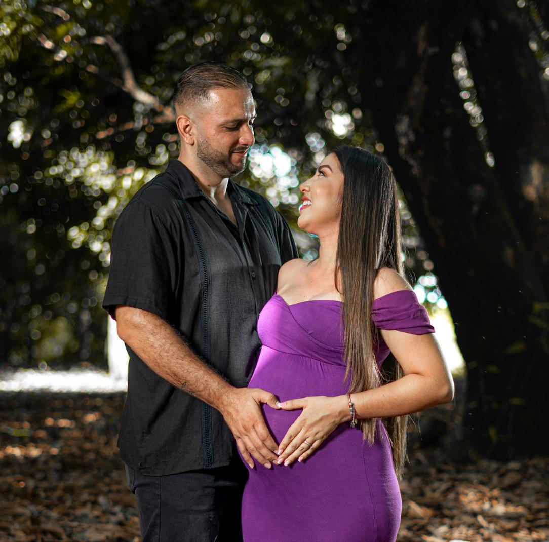
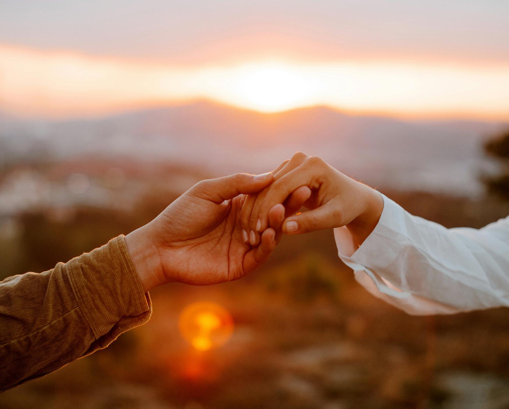
Photography
Photography is common throughout Love
Beyond’s branding and advertisement, please consider the follow guidelines for choosing photography:
- Mixed couples
- Candid
- Romantic scenes
- Long-distance relationship elements (video calling, online chatting)
- Subjects relaxed and smiling
Photo treatment should be an overlay of one of the brand colors at 50%.

Love Beyond Guidelines — 27
Photographs can be presented in a heart-shaped frame using one of the hearts from the airplane icon present in all logos. This is a secondary way of presenting photography. It must be used with 2-3 pt outline using the ‘Deep Cocoa’ color and must not use the overlay of the primary photography.
Love Beyond Guidelines — 28
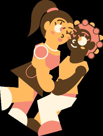
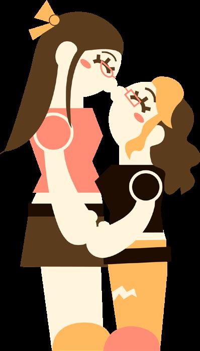
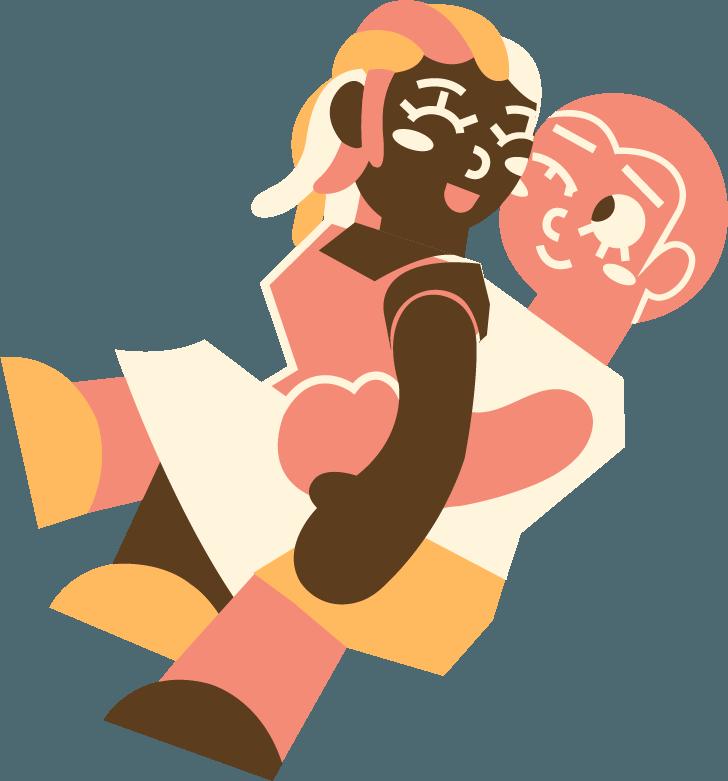
Illustrations
Illustration is a primary asset for Love
Beyond branding, as it helps achieve our friendly and welcoming environment.
For subject illustration, use solid colored geometric shapes, the pen tool, and use the combine feature within Illustrator’s pathfinder tool. Stroke can be use to differentiate shapes, stroke size ranges from 3 pt to 9 pt for porportion.
Assets can be reused with different color schemes. Please refer to already made assets for inspiration before creating new assets.


Love Beyond Guidelines — 29
For secondary illustrations: use the brush tool and create abstract waves with the brand colors, the intended use is for accenting an image or website. Afterwards, turn the opacity down to 60%.
Dashed lines should be created through the brush or pen tool before turning into rounded dashed lines with starting gap of 10 pt and a second gap of 9pt before hitting expand. The dashed lines are accents and should be turned to 40% opacity.
Text boxes should be rounded by 25% of the height with a 3 pt stroke around the box using any of the branding colors.
Assets can be reused with different color schemes. Please refer to already made assets for inspiration before creating new assets.
Love Beyond Guidelines — 29
Tertiary illustrations are to be used occasionally and mainly for the website. It uses the solid colored heart from the main logo and enlarged to create color blocking for an abstract background. It is to be used at 25% opacity and nothing higher.
Love Beyond Guidelines — 30
Our speciality pattern contains of the heart-shaped paper airplane from the Love Beyond logo in an alternating pattern. This can be recolored to the brand’s colors with appropriate contrast. This pattern’s opacity can be adjusted according to the elements layered on top. Expand the pattern before resizing to maintain consistency and sizing proportions
If the pattern clashes with the design elements, please lower the opacity to around 25% or omit it completely.
When laying text over the pattern, please use the outline text box we specify in page 29 to lay the text on top for readability.
Love Beyond Guidelines — 31
Brand in Use
Brand Assets
Social Media
Website
Billboard
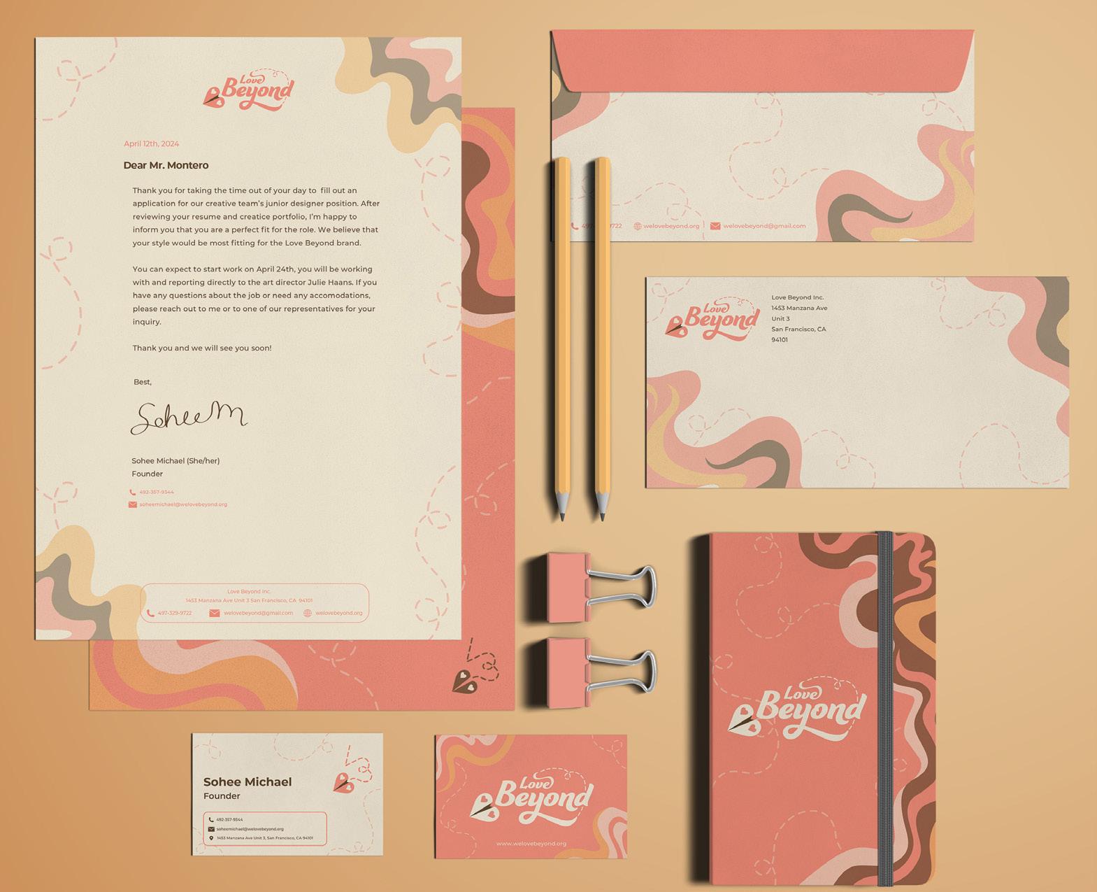
Brand Assets
Our brand assets bring visual interest in the Love Beyond brand both professionally and commercially. Business cards, envelopes, and letterheads were developed with enough clearspace and readability while keeping the brand identity in mind. These will contain important information.
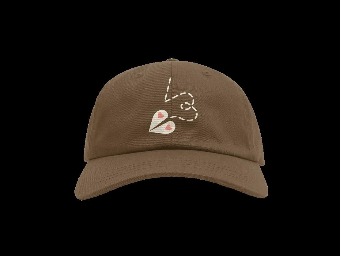
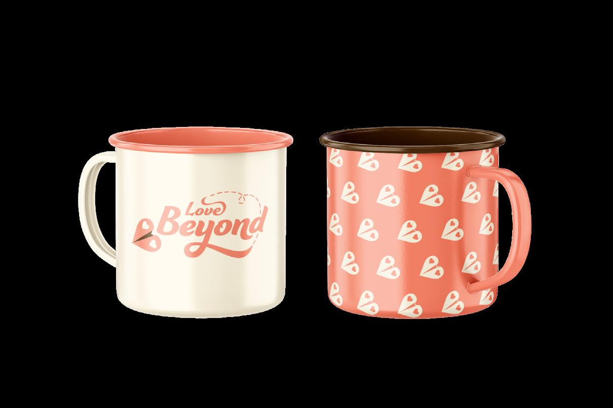
Commercially can extend to apparel and miscellaneous merchandise, these can be creatively more flexible following the brand guidelines.
Love Beyond Guidelines — 33
Social Media
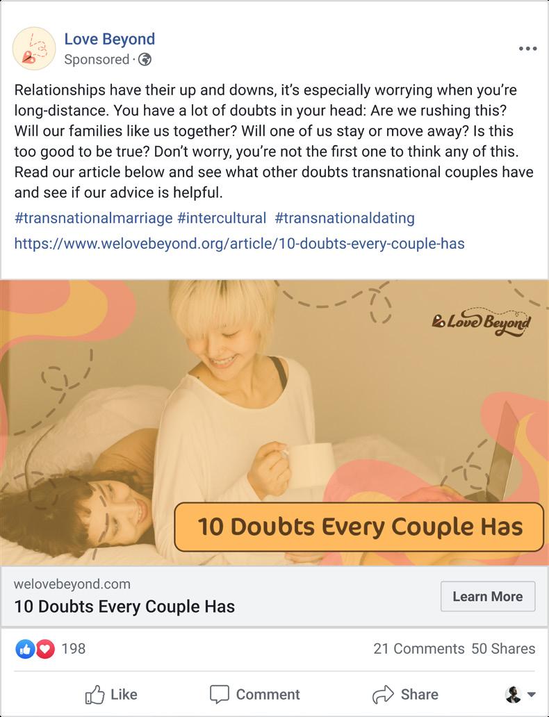
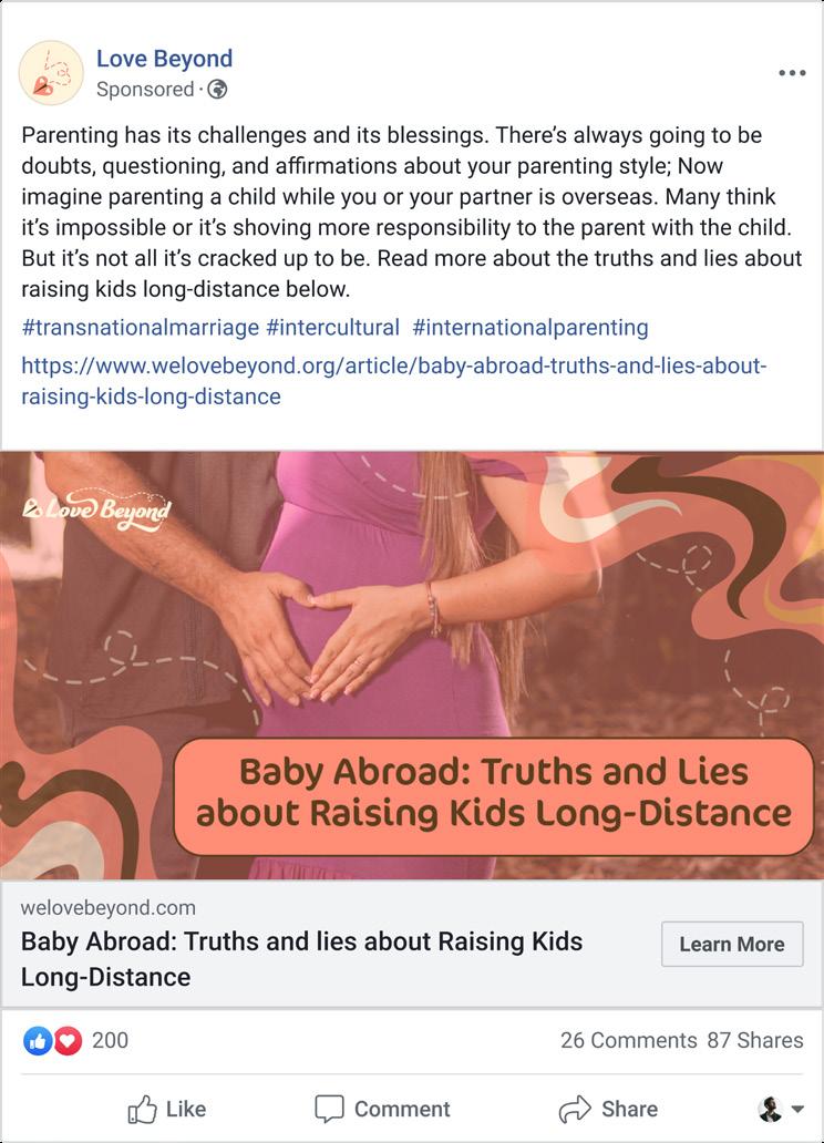
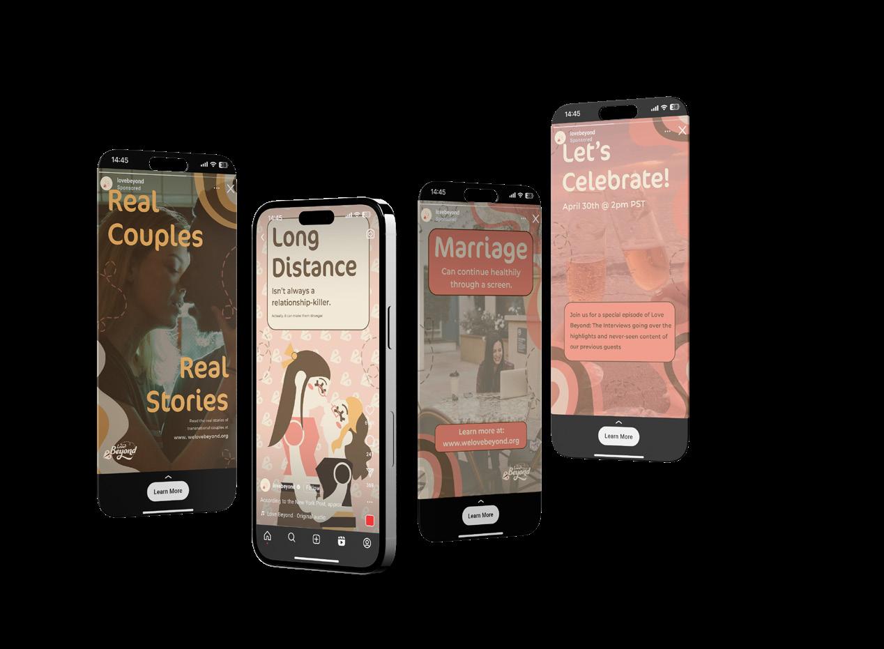
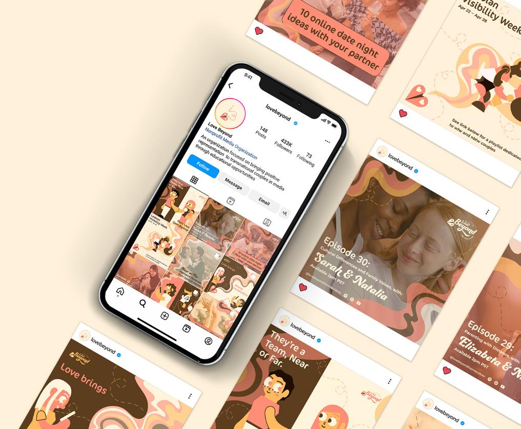
Almost all of Love Beyond’s presence is entirely digital, therefore our social media must support our brand personality, va lues, mission, and our vision clearly. Use our personality keywords as inspiration for captions. Utilize our brand colors to keep a consistent and cohesive feed.
Online advertisement aims to bring more awareness to the brand. Social media ads can include the illustration style, treated photography, or a call to action to bring people to either the website or the podcast.
Love Beyond Guidelines — 34
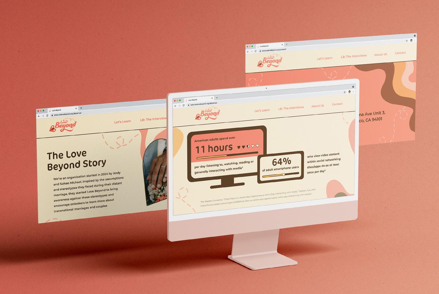
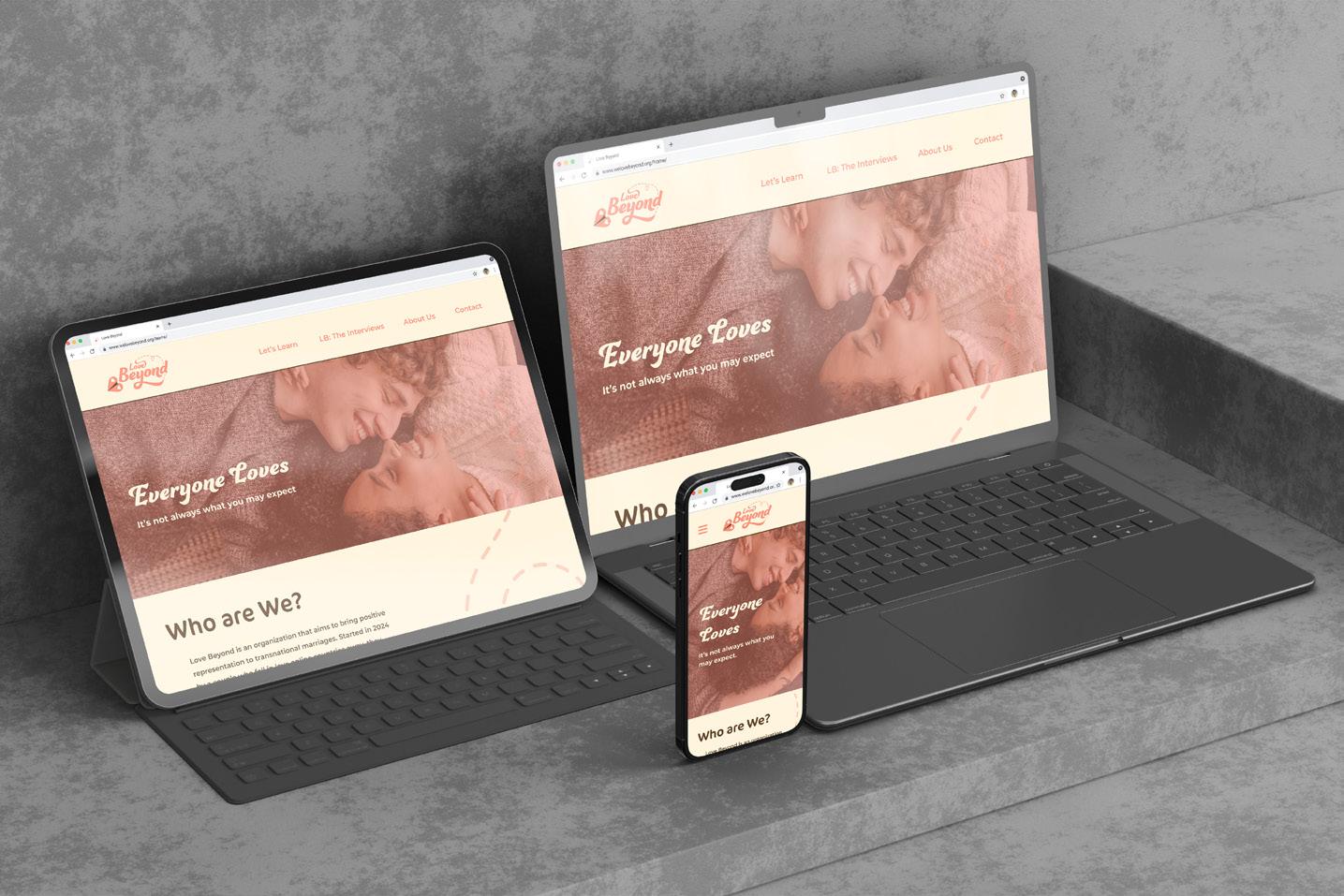
Website
The website is used to present articles, stories, is one of the sources to listen to the Love Beyond: The Interviews podcast. It’s important keep elements readable with the spirit of Love Beyond.
When adding pages or screens, please keep our brand colors, shapes and photography prevalent within the website and app. Consistent colors and shapes must be used to maintain the integrity of the brand. Add the information when it is necessary.
Love Beyond Guidelines — 35
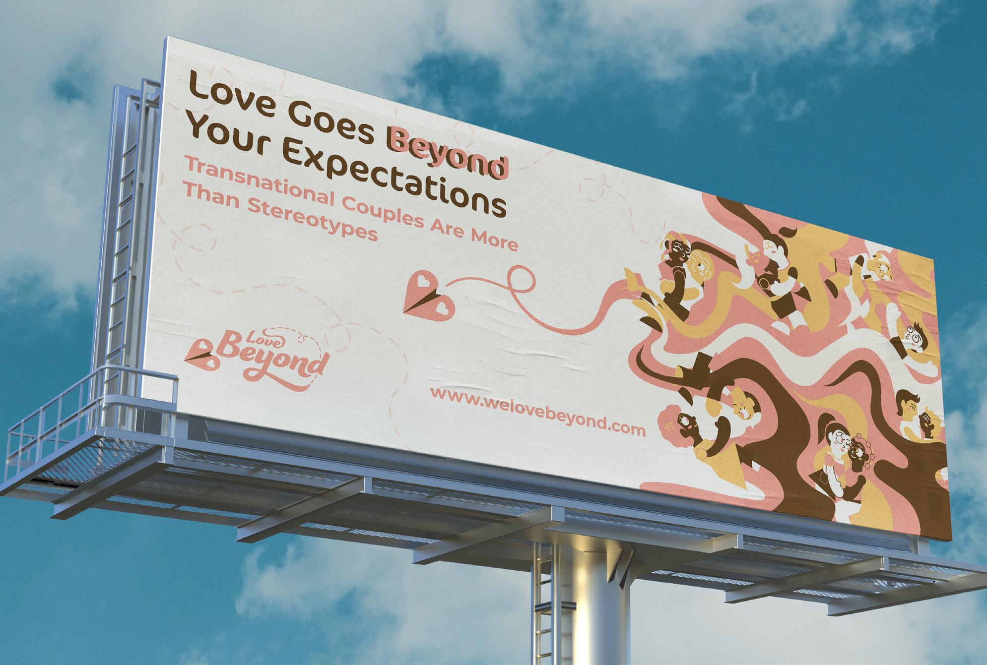
Billboard
Large print such as billboards are important to reach to an audience that aren’t online as much to see Love Beyond’s digital presence. Therefore, it’s important to show the brand personality clearly. To keep consistency, use the brand colors and typefaces. Illustration, treated photography, and a call to action for the website or Love Beyond’s social media can be printed on a billboard.
Love Beyond Guidelines — 36
Thank You If you have any questions, please contact the designer: Casie Bear casiebeardesign@gmail.com 1234 Smith Lane Muncie IN 47304