THE THE SPRING WINTERISSUE ISSUE
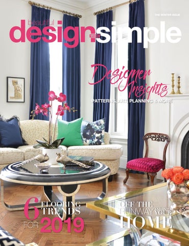
Designer
Insights
PATTERNS, ART, PLANNING & MORE
62019 FLOORING
TRENDS
FOR
OFF THE AND INTO
RUNWAY YOUR
HOME
The Carpet One Floor & Home Difference As a cooperative with 1,000 stores worldwide, Carpet One Floor & Home not only has enormous buying power but also has partners in all of the major brands, mills and manufacturers. They’ve done the research for you. Just tell them your needs, and they’ll satisfy you beyond your expectations. LOCALLY OWNED STORES All Carpet One Floor & Home stores are independently owned local businesses. You can feel good supporting your community as you shop.
COMPETITIVE PRICES As part of the largest buyer of floor covering in North America, Carpet One Floor & Home is able to negotiate great prices and pass those savings on to its customers.
EXCLUSIVE BRANDS With exclusive brands such as Lees®, Tigressa®, Bigelow®, Rustic River™ and Invincible™, Carpet One Floor & Home products set the industry standard for beauty, style and quality.
LEADING FLOORING EXPERTS Carpet One Floor & Home professionals are experts in their field, with training, certifications and years of industry experience. Customers feel confident in the process, from selection through installation.
COMMUNITY FOCUSED Carpet One Floor & Home is a community-focused business that believes in serving the employees, customers and communities in which it does business.
carpetone.com
CONTENTS WINTER 2019
expert advice THE ART OF MIXED PATTERNS
10
EIGHT-STEP DESIGN GUIDE
17
THE PERFECT KITCHEN
24
ARTFUL EXPRESSIONS
32
SWEET SPA-STYLE BATH
38
Interior designer Meredith Heron shares her passion for pattern
April Force Pardoe shares a must-have guide to decorating What makes a perfect kitchen? Designer Lisa Mende tells all Interior designer Linda Mazur offers insight into art selection
features
11
FLOORING TRENDS
28
LOWER-LEVEL LIVING
43
INTERIOR INSPIRATION
49
HYGGE DESIGN
65
FASHION MEETS HOME
70
Six trends to try in your home this year
Three ways to make good use of your basement
Fifteen interiors. Endless inspiration for your home
Bringing a little hygge into your home
Current trends that transcend the runway to interiors
2 | Beautiful Design Made Simple
Short on space? Designer Kate Davidson has you covered
CONTENTS
WINTER 2019
staples
47
INSPIRED BY…
7
MOOD BOARD
9
A snowy walk in the park The makings of a red-hot powder room
DESIGNER SPACES
21
BEHIND THE DESIGN
77
FLOORING 101
79
Two designers and two feature spaces
53
An exclusive Q&A with designer Rebecca Hay What you need to know to make the right selection for your home
3
Healthier.
It’s How We Install. The First
robialess Antimic stallation Proc Flooring In
Exclusively at
carpetone.com/healthier-living-installation
IN THIS ISSUE
IN THIS ISSUE “The horizon leans forward, offering you a space to place new steps of change.” – Maya Angelou From health goals to organizational ambitions, the New Year instills in so many of us an uninhibited sense of opportunity. What wasn’t possible in 2018 is suddenly within reach for 2019. Here at Beautiful Design Made Simple, we believe the home should be a reflection of those who reside within its wall. During this time of renewal, we’re excited to present a collection of inspiration, insight and advice that will incite a fresh outlook on your home’s ever-evolving design. No matter what your ambitions are for 2019, we hope the pages that follow will help you dream a little bigger, plan a little smarter, and get one step closer to the beautiful home of your dreams. Join us as we step into the world of hygge, explore art as an expression, dive into functional design, unveil three trends that transcend the runway to interiors and – from the cover – impart the principles of mixing patterns with designer Meredith Heron. These features and much more await you in the pages that follow. Welcome to the 2019 winter issue of Beautiful Design Made Simple magazine, brought to you by Carpet One Floor & Home. Warm Regards, Team BDMS
Beautiful Design Made Simple | 5
See the color you expect to, for as long as you expect to. You can tell when the color in the store doesn’t match the color on your wall. When we reinvented our paint, we created our exclusive Gennex® Color Technology which makes our paint simpler on the inside and truer on the outside. So you get exactly what you expect. That’s proudly particular. To find a local retailer, go to benjaminmoore.com ©2018 Benjamin Moore & Co. Benjamin Moore, Gennex, Paint like no other, and the triangle “M” symbol are registered trademarks licensed to Benjamin Moore & Co.
INSPIRED BY...
INSPIRED BY...
HC-110
DISCOVERY POINT BY RUSTIC RIVER
MAIDENHAIR FERN
500
HANDMADE PAPER
CSP-875
ARTICULO FLOOR TILE BY BEL TERRA
SILVER CHAIN
1472
CHANTILLY LACE
2121-70
CHAMBORD II BY TIGRESSA
Flooring by Carpet One Floor & Home
WETHERSFIELD MOSS
Paint Colors by Benjamin Moore
A Snowy Walk in the Park
When snow falls, New York City’s iconic central park is transformed into a winter wonderland. With soft blankets of white snow covering the ground, the park’s beautiful architecture shines. Combining the warmth of historical charm and the refreshing clean slate of the snow, this scene inspires a palette that is warm and subdued. City sophistication and natural beauty come together creating a balanced and welcoming space.
Beautiful Design Made Simple | 7
no other... with a 25 year a carpet like
†
No Exclusions Warranty
The toughest carpet with outstanding stain resistance and timeless style. LEES® featuring Ultra25® is the perfect blend of science and style combining groundbreaking stain protection and ultra-durable construction with a broad array of styles to express your taste. LEES® is the only carpet for the world you live in.
Shop and learn more about Relax, it’s… Lees at CarpetOne.com
8 | Beautiful Design Made Simple
MOOD BOARD
RED HOT MOOD BOARD BY REBECCA HAY
Powder rooms are a great opportunity to let your personality shine. You can be bold and crazy without being overwhelming. And you never get tired of the design. Here’s how we created a design for a very passionate powder room. The first step was to select the flooring that would run throughout the home. We chose a warm and durable engineered oak floor. Next we needed to find an inspiration tile to complement the floors. In this case, we selected a unique hex tile for the accent walls to balance the warm wood with cool greys and whites. This made the space feel fresh and modern. Lastly we selected the finishing touches: some matte black hardware and sexy red and black fabrics for the window treatments to add true personality! There’s no question that this powder room will make a real statement. Shop Rustic River™ Fort Chaffee Engineered White Oak Hardwood at CarpetOne.com
Beautiful Design Made Simple | 9
THE ART OF
MIXED
Patterns BY MEREDITH HERON
10 | Beautiful Design Made Simple
THE ART OF MIXED PATTERNS
Mixing patterns is a skill, but if you follow the principles of scale and proportion, along with the design element of repetition, you’ll be ahead of the game. INTERIORS BY MEREDITH HERON DESIGNS PHOTOGRAPHY BY ASA WEINSTEIN
11
THE ART OF MIXED PATTERNS
As a designer, I see myself as a professional storyteller – hired to tell the story of every client who has hired me to design their home. I use the rooms in their home to tell their story: weaving in anecdotes and treasured mementos and helping to push them just outside of their comfort zone to reflect their best selves back into the space. When you see a home in this manner, you quickly see how limiting neutral and unpatterned spaces are. Whenever we start a new project, I always ask clients if there are any patterns in particular that are off-putting to them. I have clients who forbid any sort of bird pattern/ motif in their homes (a superstitious motif often passed down by mothers-in-law, according to my anecdotal records), some really hate stripes, yet others find paisley or florals to be a no go. Almost inevitably, if a client forbids us from working with a pattern – those are the fabrics I find myself drawn to. Call it “design-related oppositional defiance disorder,” but I am always drawn to what I can’t have or use. I like to start any room off with fabrics because they really do convey a mood – casual to sophisticated and
12 | Beautiful Design Made Simple
everything in between. I especially like to find patterned fabric that speaks to our desired palette. Sometimes we have one patterned fabric that has all of our colors in it, and other times we have to mix and match to arrive at that scheme, or we draw from an area rug or piece of art. I often design our custom area rugs after all of the elements are in place and then choose a color and pattern that will unite the remaining elements in the room as if we started with the rug in the first place. Mixing patterns is a skill, but if you follow the principles of scale and proportion, as well as the design element of repetition, you’ll be ahead of the game. I usually like to put a large-scale pattern on the floor as my area rug. If it is a geometric, I will want to find a pattern for chairs that has softer lines but still a larger and more dramatic scale. On average, in a room that my firm designs, we use upward of 15 - 30 patterns, varying scale/proportions and a mixture of different sheens, hues and textures for added visual appeal.
13
THE ART OF MIXED PATTERNS
In this living room we designed, you’ll notice that the floor is without an area rug, but it has a large-scale herringbone design. The black and white bench is our geometric: a raised velvet Greek key. The yellow accent charge is the softer lined, large-scale damask pattern and is tone on tone. It has a strong feminine appeal to it, with its curved back and bold color. We’ve then opted for two different style sofas in the room: One is a curvaceous settee with another tone-on-tone giraffe burned out woven chenille and the other a contrasting dark blue tufted tuxedo sofa. We chose
14
a cream chenille fabric for the curvier of the two sofas to allow the sofa to disappear into the background and angled it to also open up the room to allow for these multiple seating areas or zones. The navy silk drapery was chosen to repeat the sofa color from the other side of the room, unifying the space while still maintaining these distinct zones. Our pillow fabrics, again, help to repeat other colors from around the room and to pull the space together visually to create a sense of balance.
We’ve mixed an array of silks/wovens/patterns/solids together, but they also tell a story about the people who call this home. The Greek key sofa was purchased by them while in Thailand. We added feather trim to one of the pillows because we all love feather trim! They love animal print and bold jewel tones. The husband hated the mirror, but we told him it was a hill we were prepared to die on. He now agrees it’s utterly perfect for the space, and the convex mirror makes the room dance before your eyes. The Jeffrey Milstein airplane photograph above the sofa was a surprise 40th birthday present for our client. We worked
with her husband to arrive at this amazing surprise. She says that she walked in the room to see her gift, and before she turned around, she could feel its presence in the room. The room also displays many mementos from their many travels around the world – and these add context and a layer that you can’t just buy in a store or from a catalogue. The artwork too has a personal lore and binds our patterns together into a reflective, yet dynamic space that has had many a friend declare, “You got them!!! This room absolutely feels like it is them.” I can’t think of any better compliment for a designer to hear than this.
Beautiful Design Made Simple | 15
The Softer, Richer, Stronger, Ultra-Protective Carpet Our premier all-nylon carpet collection, TigressaÂŽ SoftStyle, was created to stand out in the jungle of ordinary carpet. With its unique fiber design that allows for richer, more striking colors, and its densely tufted fibers that protect against matting and wear, TigressaÂŽ SoftStyle maintains superior softness and strength year after year. Shop and learn more about Tigressa SoftStyle carpet at CarpetOne.com
EIGHT-STEP DESIGN GUIDE
Eight-Step
Design Guide
BY APRIL FORCE PARDOE
Have you ever felt overwhelmed at the thought of decorating your home? There are many steps involved, so it’s no wonder so many of us become so discouraged before we even begin. I’ve spent the last 10 years fine-tuning my design process, so I can take my clients through the steps of decorating their homes with ease. If you’ve ever wished for a user-friendly guide to decorating your home, you’re in luck! With these simple steps, you can begin to create a home you love. Here is my eight-step decorating guide to move you from overwhelmed to done! For the steps below, I’m going to use a family room as the space to be designed.
Beautiful Design Made Simple | 17
1. Assess your needs, style and budget. These are the three core pieces of any good design project: •
How does your room need to function? Who uses it and how do they use it? Make a list of how you use the space, how you want to use the space and what you need to accomplish those activities. For example, if you like to read in your family room, you’ll likely need a comfortable chair, a light source and a table to rest a drink or book. Do you prefer a stationary seat with a foot stool? Without a foot stool? A recliner? Or is a spot on the sofa an ideal reading spot for you?
•
Look through images of rooms online and in magazines. Collect pictures of spaces that you love. Really love. What are the similarities among them? What colors are repeated? What furniture styles are repeated? Shapes, patterns, lighting — notice it all! This is your style. It doesn’t matter what you call it, just that you can identify and embrace it.
•
How much do you want to spend? If you’re not sure what furniture costs, visit furniture stores and look at the prices of pieces you like. Look at pieces that have the quality you want. Talk to the salespeople to find out how pieces are made so you understand quality. Look at accessories online or in stores. Take notes on prices of items. You’ll use this information later.
2. Create a space plan. This is a key step in the design process. The plan is your guide to what size furniture will fit in your room and where it will fit. It will become the foundation for your budget and your shopping list. It will provide you piece of mind that the furniture you select will fit the room. The basics of creating a space plan include measuring the length and width of your room, noting all entrances and windows and drawing that to scale on grid paper or via an online space-planning program to create the outline of your space. Then add in pieces you will need to accomplish all of your activities (see step 1). Once your plan is complete, list every item shown. Then add a cost to each based on your recent shopping trip. Add all of the costs up and you now have your budget for your room. Note the sizes of all pieces on the plan to help you with the next step.
3. Select furniture and fabrics. Now that you know your room’s function, your style, your budget, the pieces you need and the sizes of those pieces, it’s time to shop. Take your space plan with you as your shopping guide. Begin by selecting the largest pieces and choosing the fabrics for them. Make sure the fabrics you select meet the needs of the piece (a sofa that will get heavy use needs a very durable upholstery fabric). Then select smaller upholstered pieces and pillows and their fabrics to make sure everything works together to provide the style and feeling you want for the room. Next select any tables and cabinets. You will now have all of your large furniture selected. 18 | Beautiful Design Made Simple
EIGHT-STEP DESIGN GUIDE
and durability, just to name a few) and then select a paint color to support all of the items you selected. If you paint first, you may box yourself in and add another restriction to your fabric selections (sofa fabric has to coordinate with the wall color). You might have a color in mind (let’s say blue), but since there are thousands of blues with many undertones (some are greenblue, some gray-blue) you should select your exact blue after you have all the other items selected for your room and can look at them all in the space with the color samples.
4. Select rugs, lighting and window treatments. Now that you have your general color palette selected (via seating fabrics), it’s time to consider area rugs to complete your room. Look at rugs in person if possible so you can see the colors and feel the rug and its quality. Then make all your table lamp, floor lamp and chandelier lighting selections. A tip for selecting lamps is that if you need a pair and they are on matching side tables, the lamps don’t have to match. If the lamps are on nonmatching side tables, then select a matching pair of lamps. Consider your windows and what treatments are needed to block light, provide privacy and/or look great in your space. Select a window treatment style that meets those needs. Select the treatment fabric/materials based on everything else you’ve selected. Your window treatments can stand out and be the star of the show (with a bold, flashy fabric), or they can fade back and let the other items in the room shine (use a neutral material to blend in).
7. Room review. I like to present complete rooms to my clients because it shows them how the items relate to each other versus just seeing one lamp and one sofa. The way items work together is the key to a great design. Make all of your selections and review them together as one room before making any purchases. Adjust items as needed until the room sings!
5. Select art and accessories. A room really feels complete once you add art and accessories. It’s great if you can order those when you order the furniture, so your room will be complete all at once. Your art should speak to you and reflect your lifestyle. It doesn’t have to “match” your room. For a cohesive look you can use the same color frames on a variety of artworks. Consider adding a few decorative elements to side tables or cabinets to tell your story and complete the space. Odd number groupings work well when planning accessories. If you want to collect your art over time, make a note of the size pieces you will need and keep that with you on your travels. Vacations are a great time to find art that will make you smile once you’re home!
6. Select your paint colors. This is always the last thing I select for a space. Why? Because it is the least restrictive thing in a room. Think about it: you can literally create any paint color. So it makes sense to select all fabrics for a room (which have restrictions – price, color
8. Purchase furnishings. If you can purchase everything at once, it helps ensure the items you selected are available. If you have to wait a few months, the items you select might not be in stock anymore. That said, if you have a full room plan and have to purchase in phases, you can use the plan as your guide for easy reselection if an original item is out of stock when you are ready to buy. Chances are you can find a similar item with some research. The goal is to keep the unified look you created! You now have an eight-step guide to decorating your family room (or any room in your home!). Some of these steps — three, four and five — can be mixed up and done in any order that works well for you. The goal is to stay on track and make sure you’re building on previous selections as you move through the process.
19
AMERICA’S PREMIER CARPET FEATURING STAINMASTER GIVES YOU THE BEST POSSIBLE CHOICES FOR YOUR HOME. Shop and learn more about Bigelow® STAINMASTER® at carpetone.com
DESIGNER SPACES
Open Concept
SPACES FEATURING CYNTHIA SODA
Open concept is the most sought-after design of the modern-day interior, and for good reason. Visually pleasing and all-inclusive, open concept spaces lend themselves to modern life perfectly: from day-to-day with children to weekend entertaining with friends. In a Beautiful Design Made Simple exclusive video, interior designer Cynthia Soda offers a look into these beautiful kitchen meets dining room meets living room designs, offering expert insight into the planning and execution of open-concept spaces. From integrating a three-way fireplace to defining island zones, get up close and personal with the making of this stunning space. carpetone.com/bdms
Photography: Stephani Buchman Beautiful Design Made Simple | 21
ultra tough.
Shop and learn more about Oath by Resista at CarpetOne.com
DESIGNER SPACES
Master Bedroom
SUITE FEATURING DVIRA OVADIA
Interior designer Dvira Ovadia was tasked by her client – a frequent traveler – to create a space that provided all of the luxurious amenities of hotel suite living, all while offering the elements of warmth and comfort that only a home can provide. Through color, fabrics, furniture and décor, Dvira blended the best of both worlds to create casual luxury that anyone would be happy to come home to. Step into the casual luxury in a Beautiful Design Made Simple exclusive video with the designer as she offers insight into the making of this stunning master bedroom retreat. carpetone.com/bdms
Photography: Stephani Buchman
Beautiful Design Made Simple | 23
designing the
Perfect Kitchen BY LISA MENDE
24 | Beautiful Design Made Simple
DESIGNING THE PERFECT KITCHEN
Is there such a thing as the perfect kitchen? The way one person may cook, store food, entertain or live in one’s kitchen can be so different from another person’s that the very idea of designing the “perfect kitchen” is a daunting task. Today’s consumers have so many more resources at their fingertips than those of previous decades. The advent of Pinterest and Houzz can give the novice design enthusiast the confidence to choose Hale Navy for a lacquered bookcase or to create the all-white kitchen complete with Calcutta gold countertops, but when it comes to designing a kitchen, this is when it is smart to call in a pro or study tips from a pro kitchen designer. The difference in mimicking a kitchen design online versus actually designing a kitchen that functions for how you live is what sets a well-designed kitchen apart from one that is merely pretty. I’m sure every designer has their jumpingoff points for kitchen design, but mine are relatively straightforward. Let’s discuss my steps to the perfect kitchen. For me, it is all about a design that is functional, as I have designed many kitchens for so many clients. We like to refer to the kitchen as “the heart of the home.” I think the kitchen sets the tone for the entire home. It’s where our
Interior Design: Lisa Mende Photography: Kelli Boyd
families gather for meals together, which is a sacred time. If you aren’t a designer like myself and cannot afford to hire a designer to help with the design of your kitchen, what do you do? There are five key steps I follow to make sure I am designing the perfect kitchen for my clients. So if you are planning your kitchen yourself, you can follow my steps to success. Take a deep dive approach into each level to determine your individual path to a kitchen that is not only perfectly designed to meet your needs but also well designed. The first and foremost step when designing a kitchen is choosing your appliances. Cabinetry cannot be planned until the appliances are picked. Do you prefer a cooktop or a range? Do you need two dishwashers or will one suffice? Will you forego the microwave for the hot new steam oven? The appliances must be chosen before the cabinets can be decided. What is the best way to select appliances? I always send my clients to the local appliance showroom to meet with an appliance specialist. If you are not working with a designer, call your local appliance showroom and schedule a meeting with the appliance specialist. An appliance specialist can listen to your needs and direct you to the appliances that will meet those needs.
25
The second item to consider when designing a kitchen is the layout or floor plan of your space. When designing for new construction, one has the opportunity to control the limits of the space, but if working with a renovation, the scope is somewhat defined. Either way, one must determine how to design the space to function for the homeowner. Things to take into consideration are work areas intended for functions such as prepping, cooking, clean up and storage. As a designer, the work triangle is critical to me. Today’s kitchens may incorporate two or even three work triangles with the introduction of two islands, as well as the multiple refrigerators or dishwashers meant to accommodate those who love to entertain. The work triangle is under much debate, but I like to think of the larger kitchens today as designed into work zones. The primary work zone might be the sink, range and refrigerator, but often kitchens of today have several work zones. For example, one might have a food storage work zone, prep work zone, a cooking work zone and cleanup work zone. Again, whether you are a short order cook or a gourmet cook can determine the functionality. The best way to establish the optimum floor plan and work zones for you and your family is to think about how you cook and store your food. Thinking of your kitchen as work zones will help you lay out the space to meet your needs. 26 | Beautiful Design Made Simple
The third item of importance in designing a kitchen that functions for you and your family is to decide what your storage needs are for your kitchen. This will help you determine how many cabinets you need to incorporate in the space. Do you prefer to cook farm to table, or do you like quick-fix meals that require using frozen or canned items? The answers to the questions about how you cook can determine your storage needs. For instance, someone who likes to buy fresh items daily does not need the same storage space as someone who loves to keep a full larder. The refrigerator size may be more important to you than the pantry. Once you have determined your storage needs, the opportunity for custom features can come into play. Would you like a drawer to store your Keurig pods, or do you have a built-in coffee maker? I always suggest to clients to make a list of the items that need individual-sized storage space. Do you have large platters? Do you have a mixer? Do you like to make smoothies and have a blender or juicer? Any appliances that need a home need to be considered in the design process if you are like me and don’t like appliances on the counters.
DESIGNING THE PERFECT KITCHEN
The fourth item of importance in designing a kitchen is lighting. Lighting has become a hot topic in kitchen design. Let’s talk about the different types of lighting one might have in a kitchen, such as task, accent, ambient and décor. Do we need all these types of lighting? I think we do. Layered lighting can add so much to the kitchen. Task lighting can be found under cabinets or counters and above the kitchen island and provide the illumination needed for performing tasks. Accent lighting highlights a specific area or art in the kitchen. Ambient light provides a feeling or mood and also offers warmth. Decorative lighting can be pendants or a chandelier and are typically there just for decoration. The latest trend in lighting in kitchens is inside the cabinets and drawers. Interior lighting isn’t a must but once introduced to this fantastic phenomenon, it is definitely a desired item. When one can eliminate the dark corners of a cabinet and suddenly see objects that would be totally hidden in an unlit interior cabinet, well let’s just say the genie is out of the bottle, and there is no going back.
Truth be told, you can make any kitchen look a certain way once you have the function in place. The fifth or last item that I consider in kitchen design might surprise you, but it is the aesthetics of the room. What will the kitchen look like? Will the kitchen design be traditional, transitional or contemporary in style? Will the kitchen be glam or sleek? I know, I know, you thought that was the first item to be decided right? Truth be told, you can make any kitchen look a certain way once you have the function in place. The kitchen is the workhorse room of the house. If it doesn’t function properly, I don’t care how beautiful the room is, you will not enjoy it! Taking the time to design your kitchen correctly will make your life more functional as well as beautiful. Having a beautiful kitchen that doesn’t function well is like owning a foreign sports car that spends most of its time in the repair shop. More often than not, that car gets traded. The only difference between your kitchen and that broken-down car is that you cannot exchange your kitchen: you are stuck with it until you renovate. This process is both costly and time-consuming. Design your kitchen right the first time. If you cannot hire a professional, always make sure you do your homework. 27
SIX FLOORING TRENDS TO TRY in
Your Home
Texture & Patterns
Through a technique called cut and loop, where some of the carpet fibers are cut, leaving exposed ends while others remain looped, carpet manufacturers can create beautiful textures and patterns. Textures and patterns make carpet interesting and give the home a more distinct look. From more organic vines and waves to structured waffle patterns and geometric shapes, a subtle carpet pattern can drastically change the look of a room.
1
2
3
Luxury Vinyl
4
5
A relatively new flooring option, luxury vinyl, is taking the flooring world by storm. With realistic replications of hardwood and tile, these floors are easier to install, durable and low maintenance. Luxury vinyl flooring typically falls into two categories: luxury vinyl tile (LVT) and luxury vinyl plank (LVP). Plank styles are designed to mimic hardwood and are now available in wide plank styles up to six feet in length.
6 1 Heathers Heart in Crater Rim by Tigressa Cherish, 2 Longbranch in Lamp Post by Bigelow, 3 Summit Point in Beechnut by Relax, Its‌ Lees, 4 Excelsior Tile Plus in Glacier by Invincible, 5 Cathedral Plank in Genoa by Special Value, 6 Anthony Meadows in Carrington by Invincible H2O 28 | Beautiful Design Made Simple
SIX FLOORING TRENDS TO TRY IN YOUR HOME
Wood Look Tile
Realistic printed visuals aren’t only beneficial in the vinyl category. Wood looks have also found their way into the tile selection. Ceramic tiles with realistic wood textures and colors are great for giving any room in your home a nature-inspired look. From bathrooms to kitchens and entryways, wood-look tile is versatile on the floors and walls.
7
8
9
Matte Finish
With a shift to more casual, comfortable homes, the gloss level on hardwood flooring has decreased. Matte finishes have a softer, more natural look that complements more casual, modern décor. These finishes carry through to other hard surface flooring as well, including tile and luxury vinyl.
10
11
12
Double (& Triple) Staining
There’s no need to choose one stain color for your hardwood floors. Manufacturers are adding dimension to floors with multiple layers of staining. You’ll frequently see options with two or three distinct color variations. These floors are great for coordinating with different colors throughout your home.
16
17
18
13
14
15
Smooth
While more texture has been added with color, less actual texture is being incorporated into flooring, making them smoother to the touch. Knot holes are filled in, and scraping is minimal. Rustic flooring we saw several years ago has transitioned to be sleeker and more modern but has not lost all of its rustic charms.
7 Zumwalt Passage in Grandfather Clock by BelTerra, 8 Season Wood Field Tile in Redwood Grove by Bel Terra, 9 Yorktown Woods in English Gray by BelTerra, 10 Sundance in Desert Field Oak by Rustic River, 11 Eastview in Watchtower by Laminate for Life, 12 Artisan Plank in Claro by Special Value, 13 Altenburg Treasure in Cool Breeze by BelTerra, 14 Hamilton Park in Walnut by High Tide, 15 Hometown in Mustang by Rustic River Hardwood, 16 Gala in Burnished Amber by Private Branded, 17 Ozark Ridge in Hickory Natural by Rustic River, 18 Wellington Bluffs Red Oak in Coffee House by Rustic River
29
SOLIDCORE CONSTRUCTION INVINCIBLE INTENSITY SURFACESHIEL Dâ„¢ 3D PROTECTIVE BACKING
THE TECH BEHIND FLOORING
THE TECH BEHIND
FLOORING When you think of technology in the home, flooring is probably not the first thing you think of. Flooring is, well, flooring. It doesn’t have buttons or flashy lights. You can’t talk to it, and it won’t automatically adjust the temperature of your house based on your habits. But, that doesn’t mean technology hasn’t played an enormous role in the flooring products offered today. Each year, flooring gets better, stronger, softer and more durable. New materials and manufacturing technology are responsible for the wide variety of beautiful, durable floors available today. Here’s a look at some of the attributes you can now find in flooring – no matter what your style – thanks to technology.
WATERPROOF
Gone are the days of worrying that a missed spill could ruin your floors forever. You can now find both hard surface and soft surface flooring options that are waterproof. That means the product itself will not absorb or be damaged by water. Waterproof carpet resists water (and liquid stains) and won’t let those pesky spills seep through to the carpet pad and subfloor. This is a game-changer for households with pets. Luxury vinyl tile (LVT) products are made of a material that is completely waterproof and they are available in textures so realistic, you’ll hardly be able to tell it’s not hardwood or ceramic tile.
SUPER SOFT If carpet is what you’re looking for, you probably love the feel of something soft underfoot. Whether you have kids playing on the floor, love to walk around barefoot or just want a soft place to sit during movie night, you’ll be pleased to hear that carpet is now softer than ever. With finer, smoother fibers, the finished product feels soft and silky to the touch. But soft doesn’t mean weak. These carpets are just as stain resistant and strong as their less soft counterparts.
DURABLE From carpet to hardwood and everything in between, flooring today is ready to take what life has to throw at it. It’s not uncommon to see carpet with warranties of 15 years or more and hardwood with warranties over 25 years. This is all due to materials and finishes that truly stand the test of time. Scratch-resistant finishes on hardwood are great for standing up to pet scratches or those house guests who refuse to take their shoes off.
STAIN RESISTANT Stains, especially on carpet, are a worry of most homeowners. With stain-resistant products, that worry can disappear. Even if you don’t have kids or pets in the home, spills and stains are bound to happen occasionally. Fibers that don’t absorb stains are easy to clean no matter how quickly you rush to rescue your carpet from a spill. Beautiful Design Made Simple | 31
A rtful
EXPRESSIONS BY LINDA MAZUR
32
ARTFUL EXPRESSIONS
Artwork is often thought of as the part of the finishing touches of your décor. However, if you have dramatic or large-scale pieces of art, are they to be considered the finishing touches or the subject of inspiration within the space? Many would feel that great artwork should stand alone and really have nothing to do with the finished décor of your space. However, when working with clients who have an impressive art collection, I often find that artwork always has a greater impact and looks better within the space when the décor supports the pieces in question. So the question remains: how to design a space to highlight your art collection? One of the first and easiest ways to coordinate your artwork within your living spaces is to draw on color. This is not about having your art “match” your furniture, but rather developing a color palette
throughout the room design that will help enhance your artwork. This could be as simple as a repetition of some of the colors found within the canvas, which will help to strengthen the visual impact of your piece of art. A coordination and balance of certain colors within your décor will draw you in to the room and allow the intensity of the artwork to truly be felt. If you consider the artwork in the below space, the small repetition of the earthy ochre and muted blue was just enough to enhance this awesome canvas that is full of bold, dominant colors, truly making it stand out in the space. The repetition of lines is another great way to enhance and coordinate your artwork. In this same image, the adjacent chair not only supports the color of the canvas but also provides a subtle repetition of the brushstrokes within the canvas therefore complementing the artwork as opposed to fighting with it.
Interior Design: Linda Mazur Photography: Stephani Buchman
Beautiful Design Made Simple | 33
Sometimes the design of a room needs to be subtle to truly enhance the artwork within. Exercising a bit of restraint in your dĂŠcor can definitely allow the artwork to be the star of your room. In this space, we had a pair of large, gorgeous abstracts with bold colors and a beautiful, yet intense metallic sheen. We designed the space to be
34 | Beautiful Design Made Simple
calm, understated and monochromatic to support these canvases. The fabrics are a play on texture, which echoes the texture you see in the artwork. The addition of a few cushions with a soft metallic sheen and the simple tray was just enough to tie the artwork in to the space, but without creating any distractions.
ARTFUL EXPRESSIONS
Lighting is also an important factor when working with expressive art. You can easily highlight your artwork with strategically placed lighting that will accent your art and immediately draw your eye to it when you enter a room. When considering lighting in the design of your space it is best to have a proper lighting plan developed to highlight your artwork. As you can see, artwork does not need to be the last pieces of the puzzle when designing or decorating your new space. As a matter of fact, it can be the inspiration. When working with impactful or large-scale pieces of art, put some thought into how you’d like to display your wall art and make the design or dÊcor of your space complement these wonderful pieces, instead of just making the artwork fit.
35
STAIN
HELP! I SPILLED MILK.
NOW WHAT? From cereal to sipping, milk is a beloved beverage staple in so many homes. And given its particular popularity among the adolescent crowd spills are simply inevitable.
36 | Beautiful Design Made Simple
While milk might not pack a pigmented punch, if gone undetected, a spill can not only damage your carpet but also cause a particularly unpleasant odor as it sours. Like other spills, the sooner you can get to it the better. Here’s what you will need on hand to make sure you’re prepared for any accidental milk mishap: • • • • • • •
Clear dishwashing detergent White vinegar White towels Warm water Sponge Paper towels Books
CLEANING STEPS 1.
Creating your cleaning solution: Mix ½ teaspoon clear dishwashing detergent with one cup of warm (not hot) water.
2.
Scrape or blot up excess spill.
Blotting Tip: Absorb the excess liquid from the carpet by pressing straight down with a clean, dry, white paper towel. Do not rub.
3.
Apply detergent solution using a damp towel.
4.
Blot, don’t rub.
5.
Apply undiluted white vinegar using a damp towel.
6.
Blot, don’t rub.
7.
Apply water with a damp sponge.
Note: Not all carpet fibers react the same way when treated for stains. Before proceeding with any of the preceding cleaning procedures, we recommend you contact the appropriate fiber company for their suggested maintenance guidelines. Failure to follow these carpet stain removal guidelines may void your warranty. For more information, please contact your Carpet One Floor & Home retailer.
SPILLS AND STAINS ARE A PART OF LIFE... But they don’t have to stay with you forever. Be prepared to tackle any stain that life throws at you with Carpet One Floor & Home’s Stain First Aid app. It’s free for your iPhone, iPad, Android phone or Android tablet. Learn the basics of cleaning up a stain with easy-to-follow video instructions. Have the right tools on hand with recommended cleaning supplies. Never panic again when spills happen. Stain First Aid has over 50 of the most common household stains covered, including detailed cleaning instructions and video tips.
SWEET
Bath
SPA-STYLE BY KATE DAVIDSON
As condos and compact homes become the new normal, bathrooms have taken a hit in square footage. But we’ve all heard the saying, “good things come in small packages,” right? As a designer, I’m here to prove that theory true. Creating a luxurious, decadent bathroom when you’re challenged with limited space may sound like a daunting task, but it doesn’t have to be. You just have to know where to start. 38 | Beautiful Design Made Simple
Step one to creating a fabulous bathroom – or any room, for that matter – is investing in an equally stand-out centerpiece. In a bathroom, the focal point is the bathtub 99 percent of the time, so this is one fixture that’s definitely worth the splurge.
SWEET SPA-STYLE BATH
I’ve always loved the romance and sculptural elegance of a freestanding bathtub. This is the ultimate in indulgence. Beyond its obvious “wow” factor, this style of tub has a couple of practical things going for it. First, a freestanding tub visually occupies less space, making it ideal for a compact bathroom layout. Second, this style of bathtub physically takes up less floor space, leaving a little extra room to move around. Slim silhouettes: Research different shapes, styles and sizes of bathtubs before you select one. Luxury British bath brand
Victoria + Albert offers a few compact-friendly options that are definitely worth checking out. V+A recently released the Vetralla and Vetralla 2 freestanding tubs, designed expressly with small spaces in mind. Their simple, sleek design features an elegant, crisp rim that works well with modern or contemporary aesthetics. Also check out V+A’s Marlborough bath, which boasts a compact footprint that complements a small space. I love the romantic shape of this double-ended slipper tub – it’s perfectly suited to classic or modern bathroom styles.
Vetralla 2 in Matte White by Victoria + Albert 39
Before diving into a bathtub decision, here are some things to consider: What are your needs? How do you bathe? What’s your routine? Do you like to read while taking a soak? Do you lounge alone? Who else is using the tub, and do they have any special needs? Your answers will help determine the type of bathtub that will best suit your practical needs. For instance, if the tub will be used to bath a baby, or if you have mobility issues, a shallower design could be your best bet. What are your space specifics? It’s important to remember that not all bathrooms are created equal. More or less space, different floor plans and what you have in them will all affect the size and location of your bathtub. What’s the overall style? Is your bathroom’s decor clean and modern, classic and traditional, or something in between? Your bathtub can add to the style theme, or throw it off entirely, so choose wisely. Try it before you buy it. You would never purchase a bed without first testing the springs. Sit inside the bathtub and take it for a “test drive,” if you will. Ensure the tub is as comfortable as it is beautiful. Finish your spa-inspired bathroom with some pure indulgence in the form of fluffy towels, cushy bathrobes, aromatic incense, bath oils and candles. Creating a serene bathroom that invites you to relax in total luxury is all about the details – big and small. You deserve it, no matter the size of your space. Marlborough in Light Grey by Victoria + Albert.
Design: Kate + Co Design Inc. | Photography: Jason Hartog
40 | Beautiful Design Made Simple
SWEET SPA-STYLE BATH
Design: Kate + Co Design Inc. | Photography: Jason Hartog
41
Vibrant natural stone and wood plank visuals that transform environments into extraordinary spaces. Shop and learn more about BelTerra™ Tile at carpetone.com
LOWER-LEVEL LIVING
LOWER-LEVEL
LIVING UTILITARIAN BY NATURE: A BLANK SLATE BY DESIGN. IT’S TIME FOR A NEW OUTLOOK ON YOUR BASEMENT. THESE THREE LOWER-LEVEL DESIGNS ARE SURE TO INSPIRE.
Beautiful Design Made Simple | 43
LOWER-LEVEL LIVING
FAMILY ROOM Creating a family room in the basement is an investment that is well worth your while. Part family room, part play space, this original design by Catherine-Lucie Horber offers a little something for everyone. For the kids, it’s the best space in the house and keeper of toys: a kidsonly zone where dining is exclusive and forts need not be taken down the day of creation. For the teens, it’s a sleepover suite: where dance parties know no bounds and late night chats and giggles go undetected. For the adults, it’s a place to find privacy: where comfort and quiet take precedence. Together, it’s a space where family memories are made.
Design: Catherine-Lucie Horber | Photography: Stephani Buchman 44
GAME ROOM If the kids have flown the coop, or you simply decide that you’ve earned an adult-only zone (because you have), a game room is the way to go. This rustic, lower-level retreat designed by Cynthia Soda offers all the essential amenities: a bar, entertainment, a place for play and seating. From pool tournaments and poker nights to Sunday games and shared drinks, a game room offers endless options for leisure and entertainment. A bonus of an open-concept layout like this one: this space can easily be rearranged or temporarily refurnished to host something of a different nature, like a craft night or kids party.
Design: Cynthia Soda | Photography: Stephani Buchman Beautiful Design Made Simple | 45
LAUNDRY ROOM If a first-floor laundry room filled with light, workspace and storage is out of reach or simply not an option, that’s no reason to abandon your laundry room dreams. We’re here to tell you that the difference between housing your washer and dryer in the basement and having a basement-level laundry room is worth paying attention to. This basement laundry room design by Rebecca Hay offers all the conveniences of an upper-level laundry space: cabinetry and countertops for storage and work space; a sink for soaking and stain treatments; and design details that make the space feel bright, warm and welcoming.
Design: Rebecca Hay | Photography: Stephani Buchman 46 | Beautiful Design Made Simple
LOWER-LEVEL LIVING
47
bcrf.org
INTERIOR INSPIRATION FOR THE NEW YEAR
As one season comes to a close, another begins, bringing with it not only changes in weather but also a welcomed sense of renewal. We think it’s safe to say that this never rings truer than as we transition from fall to winter, moving toward a brand new year of possibilities. With that, we hope this collection of eleven unique interiors will inspire something new in your home’s design in the coming year.
Beautiful Design Made Simple | 49
ENTRY
Custom brass handles and hardware offer elevated style to an otherwise utilitarian feature in this entryway designed by Rebecca Hay. Fort Chaffee High Gloss in Natural Oak BY RUSTIC RIVERâ„¢ HARDWOOD
Photography: Stephani Buchman
GET THE LOOK
50 | Beautiful Design Made Simple
INSPIRATION
BEDROOM
From plush carpet to supple leather seating, everything about this Kate Davidson bedroom design makes us long for some immediate R&R. Unconditional Style Plus in Softly INNOVIA TOUCH XTREME CLEANâ„¢ DREAM
Photography: Jason Hartog
GET THE LOOK
51
DINING
Statuesque all by itself with its curved lines, clean palette and endless light, designer William MacDonald dared to go striking with drapery – and the result is just dashing. Marble I in Stormy Mist BY BEL TERRA
Photography: Stephani Buchman
GET THE LOOK
52 | Beautiful Design Made Simple
INSPIRATION
53
KITCHEN
With a show-stopping, black-lacquered finish and brushed brass details, this kitchen island selected by designer Cynthia Soda creates the perfect balance of depth and glamour. Hamilton Park in Still Shadow BY RUSTIC RIVERâ„¢ HARDWOOD
Photography: Stephani Buchman
GET THE LOOK
54 | Beautiful Design Made Simple
INSPIRATION
BATHROOM
Easy on the eyes and feet: painted pebble tiling lends a soothing, from-the-earth feel, all while pairing perfectly with the arresting white aesthetic of this bathroom oasis. Venetian Pebbles in Medici BY EMSER TILE
GET THE LOOK
55
56 | Beautiful Design Made Simple
INSPIRATION
LIVING
Photography: Stephani Buchman
Combining silk, wool, velvet, marble and wood, designer Kate Davidson creates tonal and textural depth to add interest to this soothing monochromatic scheme.
57
INSPIRATION
NURSERY
A starry statement wall creates the best kind of magic in this gender-neutral nursery design by Rebecca Hay.
Sandalwood in Seamist BY INNOVIA
Photography: Stephani Buchman
GET THE LOOK
58
BEDROOM
A beautiful hygge sleep space – modestly styled and soft in its palette – encourages less stress, more appreciation and an extra hour in bed.
Cataldo in Brown Bear BY RUSTIC RIVER™ HARDWOOD
GET THE LOOK
Beautiful Design Made Simple | 59
60
Photography: Jason Hartog
INSPIRATION
KITCHEN
Through paint, wood and mixed metals, designer Linda Mazur merged rich, neutral hues to create a sense of warmth and welcome in this character-rich kitchen.
Beautiful Design Made Simple | 61
STAIRS
Stairs were born to make a statement, and this high-style runner is certainly evidence of that.
Rumba in Mist by Prestige BY STANTON
GET THE LOOK
62 | Beautiful Design Made Simple
Photography: Jason Hartog
INSPIRATION
DINING
Small in scale: vast in value. This custom breakfast nook designed by Linda Mazur offers an added layer of comfort to the kitchen space, and a secondary eating area when dining need not be formal. Eagle Crest in Hidden Path BY RUSTIC RIVERâ„¢ HARDWOOD
GET THE LOOK
63
THE INSPIRATION NEVER STOPS Now, you don’t have to wait for our next issue to get inspiration, ideas and tips on creating and maintaining your beautiful home.
Find out more tips at carpetone.com/beautiful-design-made-simple.
BRINGING A LITTLE HYGGE INTO YOUR HOME
H YGGE BRINGING A LITTLE
INTO YOUR HOME
Hygge is a Danish word, a way of life – one of those beautiful things that doesn’t directly translate into English. If dated back to the 18th century, the word can be loosely connected to the English word for hug. If we had an exact word for it, it would be the combination of comfort, warmth and togetherness. Moments of hygge can be anything: drinking tea in front of the fire, eating ice cream before turning in for the night, enjoying dinner around your dining room table with friends or even just reading this magazine while your dog is asleep at your feet. Everyone wants to be more relaxed and comfortable and what better way than to embrace the hygge lifestyle? Hygge can be used as a concept for interior design in your home to make your rooms look happy and cozy. Here are a few hygge-inspired tips to make your home cozier this upcoming year. Consider the addition of a fireplace as it’s the perfect space to gather friends and family with its representation of warmth and togetherness.
Beautiful Design Made Simple | 65
BRINGING A LITTLE HYGGE INTO YOUR HOME
By using natural materials such as wood and wool, you can give your room a warm texture while also being environmentally conscious. Use different types of flowers such as lavender and daisies to keep with the all-natural theme and give your room a nice pop of color. Invest in some candles that aren’t too overpowering in odor but add a nice glow and exude some calming scents into your room. Indirect lighting is your best friend. Try buying small lamps to set on end tables or installing a few wall sconces. Don’t use a big overhead light to brighten up the whole room; these are too overwhelming and can sometimes make a space too bright. Use twinkle lights to light up the darker corners of your room or even just to add an extra bit of light to your living space.
Adding texture to your room creates another dimension to your interior and piques interest in an otherwise minimalistic design.
66
By using pastel colors such as light grays, browns and creams, you can create a room that matches everything. Be sure to use the idea of creating harmony with your color schemes when thinking about the décor of each room. Layering of blankets and pillows gives your room a soft ambience. Create cozy nooks such as window bench or a love seat where people will naturally gravitate to find some comfort. Use soft comforters and fluffy pillows in your bedroom.
The addition of a fireplace encourages loved ones to stay close and huddle in together for warmth. Transform your bathroom into a relaxing retreat space – make it a place you want to rest and rejuvenate. To do this, you want to keep your clutter out of sight by utilizing lots of hidden storage space. Keep your toiletries and other bathroom essentials in cabinets and shelves that are out of sight when you’re enjoying a long bath. Make it laid back and serene.
Design a spa-style bathroom and transform that morning rush into a morning hush.
Beautiful Design Made Simple | 67
BRINGING A LITTLE HYGGE INTO YOUR HOME
Make the space your own. Consider buying some small nesting tables to put in your living room. Keep decorations minimalistic and remember that a few well-chosen accessories should do just fine. Create various atmospheres instead of just one big room. Buy soft rugs and colored cashmere plaids and invest in some smooth patterned blankets to throw over your couches and chairs. You want to make your space a safe haven, so adding relaxing music will help to create that atmosphere. But don’t forget to hide your speakers in a TV cabinet or a desk where they are out of sight. Most importantly, when all is said and done, don’t forget to relax and take a good moment to enjoy the space around you! And remember, hygge is best shared by those you’re closest to, so invite over a few friends or gather your family to enjoy your new cozy spaces.
68 | Beautiful Design Made Simple
Creating comfortable spaces through soft accessories like a faux fur rug and cashmere throw adds the key cozy factor to hygge.
CARPET’S MOST ADVANCED SOFT FIBER TECHNOLOGY Breakthrough stain technology and carpet’s most advanced soft fiber technology meet to create Innovia Touch Xtreme Clean™ Dream. Offering ultimate softness and enduring performance, the new Dream collection proves that families can have it all. Shop and learn more about Innovia Touch Xtreme Clean™ Dream at CarpetOne.com
FASHION MEETS HOME
FROM THE RUNWAY TO YOUR HOME, THESE THREE FASHION TRENDS FOR WINTER 2019 TRANSCEND THE RACKS OF DEPARTMENT STORES TO BECOME STAPLE INTERIOR ELEMENTS
Animal Print
A style statement as old as time, this trend is certainly not new. But, this winter, its reach will expand in such a way that industry experts are predicting a Great Animal Print Revival.
1
Design: Cynthia Soda | Photography: Stephani Buchman
2
4
70 | Beautiful Design Made Simple
3
FASHION MEETS HOME
5
Design: Cynthia Soda | Photography: Stephani Buchman
6 1. Nourison Pillow 2. Momeni Faux Hide Rug 3. Uttermost Chair 4. Carpet One Carpet 5. Kaleen Runner 6. Momeni Faux Hide Rug 71
High Shine
From rich leather to supple silk to lustrous velvet, textiles are set to acquire high shine this coming season.
Design: William MacDonald | Photography: Stephani Buchman
1
2
3
4
72 | Beautiful Design Made Simple
FASHION MEETS HOME
5
6 Design: William MacDonald | Photography: Stephani Buchman
7
1. Couristan Runner 2. Uttermost Lamp 3. Carpet One Tile 4. Uttermost Table 5. Kas Rug 6. Uttermost Chair 7. Nourison Pillows
73
Western
3
Design heads west this winter, with cowboy style characterized by leather and hide, rustic metals and classic fringe.
1
4
Design: Kris Bridgen | Photography: Lisa Petrol
2
74 | Beautiful Design Made Simple
5
FASHION MEETS HOME
6
7
9
1. Kas Pouf 2. Kaleen Rug 3. Momeni Faux Hide Rug 4. Uttermost Art 5. Uttermost Chair 6. Kas Pillow 7. Pillow Decor Throw Pillow 8. Carpet One Hardwood 9. Momeni Rug
Design:Kris Bridgen | Photography: Lisa Petrole
8
75
TOTAL
FLOOR CARE
A COMPLETE LINE OF FLOOR CARE PRODUCTS UNIQUELY FORMULATED TO HELP YOU EASILY CLEAN AND MAINTAIN YOUR FLOORS.
SHOP RESISTA FLOOR CARE AT CARPETONE.COM
BEHIND THE
DESIGN WITH REBECCA HAY
Beautiful Design Made Simple | 77
BEHIND THE DESIGN
What were your clients’ needs for this space? The plan for this basement was to create a full entertainment space, specifically a bar zone where they could play cards with their friends. Were there any challenges designing this space?
Why did you choose these colors?
We removed a lot of old orange shag carpet to make this transformation possible. The big challenge was that the floor was completely unlevel. We had to use a flexible and forgiving flooring to mitigate the inconsistencies.
Because it’s a basement, we wanted to make sure we added life and warmth. The bold blue tile backsplash was a nobrainer since it goes with just about any other color you could add to the space. The natural wood and materials help maintain a relaxed cottage vibe for this country home.
Do you have any special considerations or requirements when creating a home bar?
What is your favorite aspect of this room?
Always think about if you need water. So many home bars are simple cabinets with a wine fridge but then you end up having to truck up and down the stairs for ice and to pour your drinks. I always suggest a sink whenever possible to avoid this. You may not think you need one, but oh boy, you sure won’t regret putting one in. How does the flooring play into your design? We opted for a great luxury vinyl plank. It is almost an exact match with the solid hardwood flooring on the main floor of the house but functions perfectly for a large basement.
Interior Design: Rebecca Hay Designs | Photography: Jason Hartog 78
Especially since this basement is a walk-out to the backyard, and snow and mud are tracked in, it’s a great option because vinyl is impervious to water. We almost always use this in basements.
The chalkboard: its frame is made from recycled red barn boards from our client’s family farm. We painted a large rectangle in chalkboard paint on the wall and then framed it in the barn board. It is a truly original feature, and the first thing you see when you walk down the stairs. It serves as a scoreboard for card games and a menu board for parties. What did your client like the most? Our client loved the custom card table we commissioned for them. The height is adjustable, so the table can be great for table games or cranked up for cocktails!
FLOORING 101
FLOORING 101 CARPET ONE FLOOR & HOME HAS THE WIDEST SELECTION OF COLORS AND STYLES AVAILABLE TO FIT YOUR SPECIFIC FLOORING NEEDS. BUT BEFORE YOU CHOOSE, HERE ARE SOME BASIC GUIDELINES FOR DETERMINING WHICH FLOORING OPTION IS RIGHT FOR YOU.
Beautiful Design Made Simple | 79
CARPET
Carpet is a great choice for almost any room within your home due to its warm, comforting and quiet qualities. With today’s advanced flooring technologies, carpet is softer, stronger and more stain resistant than ever before. Carpet comes in a variety of colors, patterns and styles and is a key design element for your room remodel.
HARDWOOD
Hardwood flooring has beauty, strength and character, along with options for every look. From smooth, glossy, traditional strips to wide, weathered planks, hardwood creates a beautiful backdrop for any room. Today’s hardwood floors are also milled and finished using techniques that require much lower maintenance than in years past.
VINYL
Vinyl flooring offers an elegant appearance and an enduring value. Modern, cutting-edge technologies and digital design make natural-looking textures and great visual depth possible. Luxury vinyl tile is one of the newest, most popular flooring choices today, offering trendy finishes that closely resemble wood, tile and stone.
80 | Beautiful Design Made Simple
FLOORING 101
TILE Both timeless and trendy, tile can complement any style, ranging from traditional to contemporary. Tile is available in a wide variety of colors, patterns and sizes, allowing for creativity in design. The flooring also resists most spills and is a great option for moisture-prone areas such as kitchens, bathrooms and foyers.
LAMINATE
Laminate flooring offers the look of hardwood, tile or stone at a more affordable price point. The unique construction of laminate flooring makes the product highly durable and water resistant, therefore a great candidate for hightraffic and moisture-prone areas.
AREA RUGS Area rugs make a wonderful addition to hard surface flooring, adding a level of protection, along with increased warmth and comfort. Available in a wide variety of colors, designs and sizes, area rugs can play a major role in a room’s dÊcor.
81
C R A F T S M A N S H I P
Q U A L I T Y
I N T E G R I T Y
NOTHING SURPASSES THE RICHNESS, THE WARMTH AND PERSONALITY OF SEASONED AND WEATHERED HARDWOOD. Shop and learn more about Rustic Riverâ„¢ Hardwood at CarpetOne.com
CHOOSING HARDWOOD
CHOOSING
HARDWOOD TYPES SOLID
Solid hardwood flooring consists of single pieces of wood planks, which can easily be customized and re-sanded to change finishes.
ENGINEERED
Engineered hardwood flooring is made of 3 to 5 layers laminated together with grains running at different angles. Although engineered hardwood looks like solid hardwood, it is actually more structurally stable and can be used anywhere, even in spaces where moisture may be an issue.
Beautiful Design Made Simple | 83
DESIGN SPECIES
STAIN
PLANK SIZE
EDGES
Hardwood floors come in a variety of different wood species. Species determines the specific grain and the performance of a hardwood floor. The three most popular hardwood flooring types are maple, oak and hickory.
Plank size refers to the width of the wood floor and varies between 2 and 7.5 inches in width. Narrow planks are often referred to as strips and typically have a more traditional look. Narrow planks can make a small room look larger. Wide planks typically have a more rustic look and can create a more intimate feel in a large space.
GLOSS
The gloss of your flooring ranges from extra shiny to matte. A high gloss, shiny finish lends a more formal look, while a low gloss, matte finish creates a more casual aesthetic.
84 | Beautiful Design Made Simple
Wood floors come in a variety of colors. From light to dark, the color of your floor can make a big impact on the overall design foundation of your room. Dark-colored stains work well with modern dĂŠcor, and medium stains, such as honey colored, pair nicely with traditional dĂŠcor.
Some hardwood floors are cut at an angle, creating a beveled edge on the sides of the planks. A beveled edge floor gives a casual look and disguises any unevenness in your flooring. A square edge provides a smooth surface and gives a more contemporary look to your room.
FLOORING GUIDE - 5 QUESTIONS TO ASK
FIVE QUESTIONS TO ASK YOUR FLOORING SALES PROFESSIONAL
1.
IS THIS PRODUCT COMPATIBLE WITH MY LIFESTYLE?
2.
WHAT ARE THE HIDDEN COSTS?
3.
WHAT ARE THE PRODUCT WARRANTIES AND GUARANTEES?
4.
ARE THERE SAMPLES AVAILABLE?
5.
WHAT IS THE INSTALLATION PROCESS?
Try not to choose a floor simply because it looks good. Be sure that it fits your lifestyle. Think about whether the room is a high-traffic area, if there are or will be kids or pets in the home or if you like to host parties frequently. Also consider factors such as humidity, moisture and traffic level when shopping for floors. Knowing your room’s environment can help narrow down options and avoid potential problems after the floors have been installed.
Depending on where you purchase your flooring, things like floor padding, delivery, moving furniture and installation can cost extra. Be sure to ask about possible outside costs associated with buying new floors and factor them into the final price before making a decision.
Find out what will be included in your purchase, what will cost extra and what type of coverage you’ll receive with a warranty. While there is no guarantee that you will use or need your warranty, it’s still important to consider the pros and cons. Warranties can offer peace of mind by providing guaranteed protection against a variety of factors. Warranty coverage can vary by flooring type, region and even lifestyle, so you’ll want to do some research and choose a warranty that aligns with your specific needs.
Certain floors may look great in-store or online but don’t translate well once you get them home. To avoid this issue, ask to take home flooring samples. This will allow the opportunity to see how the floor ties into your current décor, as well as how it will look in various types of lighting throughout the day. This will give you a better idea of how the floor will coordinate with your room.
Ask how long it will take to have the floor installed, what’s included and not included, what you’ll need to do in preparation for the installation and whether they’re able to dispose of the old flooring. A warranty on installation can help cover problems that result from a poorly installed floor and guarantee repairs or total replacement if you’re not happy with the way your new floor looks. 85
GET ALL THE INFORMATION YOU NEED TO HELP YOU CHOOSE THE BEST FLOOR FOR YOUR HOME. carpetone.com/expert-advice
CONTRIBUTORS MEREDITH HERON
LISA MENDE
Meredith Heron is a designer and television host whose work is an extensive conversation with color, form, pattern and texture. Elements of fashion, architecture and interior design blend seamlessly in Meredith’s classic reinterpreted style.
Founder and creative director of Lisa Mende Design, Lisa is known for creating bold, modern interiors that are rooted in tradition. Antiques and vintage pieces, mixed with fresh, modern classics and original art, are the hallmarks of her designs.
meredithheron.com
lisamende.com
APRIL FORCE PARDOE
LINDA MAZUR
April Force Pardoe is an award-winning residential interior designer and owner of April Force Pardoe Interiors. Beyond creativity, April hones her problem-solving, organizing and relationship-building skills to successfully present design challenge solutions and stylish interiors to her clients.
Linda Mazur is a nationally publicized designer and principal of Linda Mazur Design Group. Backed by over 15 years of experience in both residential and commercial design, Linda’s multidisciplinary design firm is known for creating innovative, stylish interiors and fullscale design builds.
afpinteriors.com
lindamazurdesign.com
REBECCA HAY
DVIRA OVADIA
Principal of Rebecca Hay Designs, Rebecca is known and celebrated for her work and appearances on various acclaimed HGTV shows. With a focus on quality and craftsmanship, Rebecca and her team design beautiful, functional spaces, creating a signature blend of traditional and contemporary design.
Principal of Dvira Interiors, Dvira is known for a vast number of successful endeavors, including her role as the designer and art director for the TV show “Income Property.” The award-winning designer is praised for creating approachable designs that are both beautiful and practical.
rebeccahaydesigns.com
dvira.com
Meredith Heron Design
April Force Pardoe Interiors
Rebecca Hay Designs
Lisa Mende Design
Linda Mazur Design Group
Dvira Interiors
CYNTHIA SODA
KATE DAVIDSON
Cynthia Soda is the owner and principal interior designer of Soda Pop Design Inc. Cynthia believes in and uses her design filter to successfully merge her clients’ lifestyle, personality and architecture to create customized, liveable luxury that tells each client’s unique story.
Designer and principal of Kate + Co Design Inc., Kate Davidson is known and respected for envisioning and creating stylish, adaptable and liveable spaces. For more than a decade, her multidisciplinary firm has been providing complete residential and commercial design services.
sodapopdesign.ca
kateandcodesign.com
Soda Pop Design Inc.
Kate + Co Design
Beautiful Design Made Simple | 87
BEYOND this
Issue
FACEBOOK: facebook.com/carpetone
INSTAGRAM: instagram.com/carpetonefh YOUTUBE: youtube.com/user/carpetonefh TWITTER: twitter.com/carpetone PINTEREST: pinterest.com/carpetonefh BLOG: carpetone.com/beautiful-design-made-simple
A room should never allow the eye to settle in one place. It should smile at you and create fantasy. ~ Juan Montoya ~
88 | Beautiful Design Made Simple
THERE’S A LOCALLY OWNED CARPET ONE FLOOR & HOME NEAR YOU.
WE ARE A COOPERATIVE.
LOCALLY OWNED. OVER 1000 STORES STRONG.
GOOD DEALS.
Our cooperative unites independent businesses to gain buying power and scale. Together, we are North America’s largest floor covering buying group. We provide competitive pricing and value to you.
GOOD DEEDS.
As an independent family business supported by our membership in a cooperative, we are dedicated to giving back to our local community and helping others.
GOOD BUSINESS.
Our cooperative is owned by us and other independent family businesses like us. We are focused on giving you – our customers – the positive shopping experience you deserve.
FIND A STORE LOCATION NEAR YOU AT CARPETONE.COM
OUR GUARANTEE THAT IF YOU DON’T LOVE YOUR NEW FLOOR, WE’LL REPLACE IT FOR FREE †.
† View warranty guide for details by visiting carpetone.com/the-beautiful-guarantee.