
Chapter 2: Summarizing and Graphing Data
Section 2-2 Frequency Distributions
1. No. For each class, the frequency tells us how many values fall within the given range of values, but there is no way to determine the exact IQ scores represented in the class.
2. If percentages are used, the sum should be 100%. If proportions are used, the sum should be 1.
3. No. The sum of the percentages is 199% not 100%, so each respondent could answer “yes” to more than one category. The table does not show the distribution of a data set among all of several different categories. Instead, it shows responses to five separate questions.
4. The gap in the frequencies suggests that the table includes heights of two different populations: students and faculty/staff.
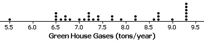
5.
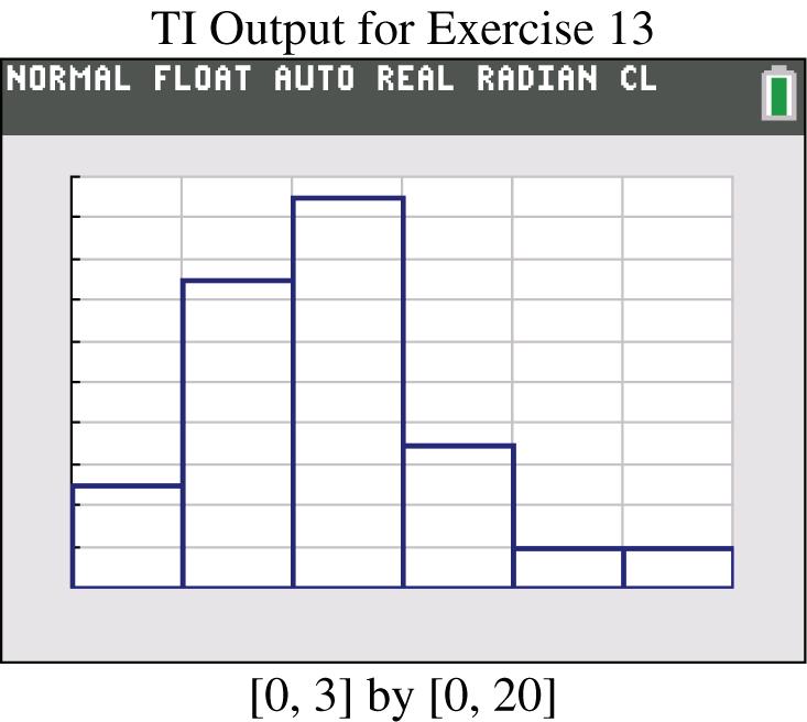
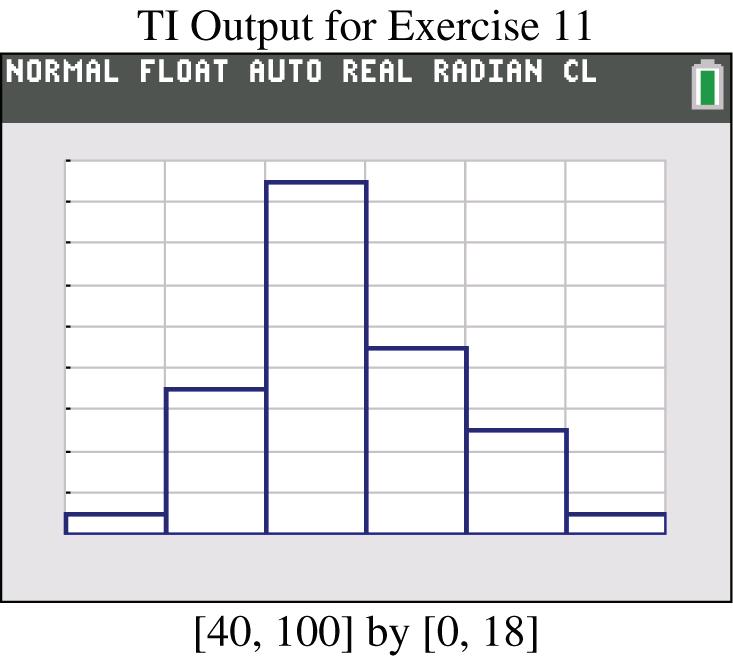
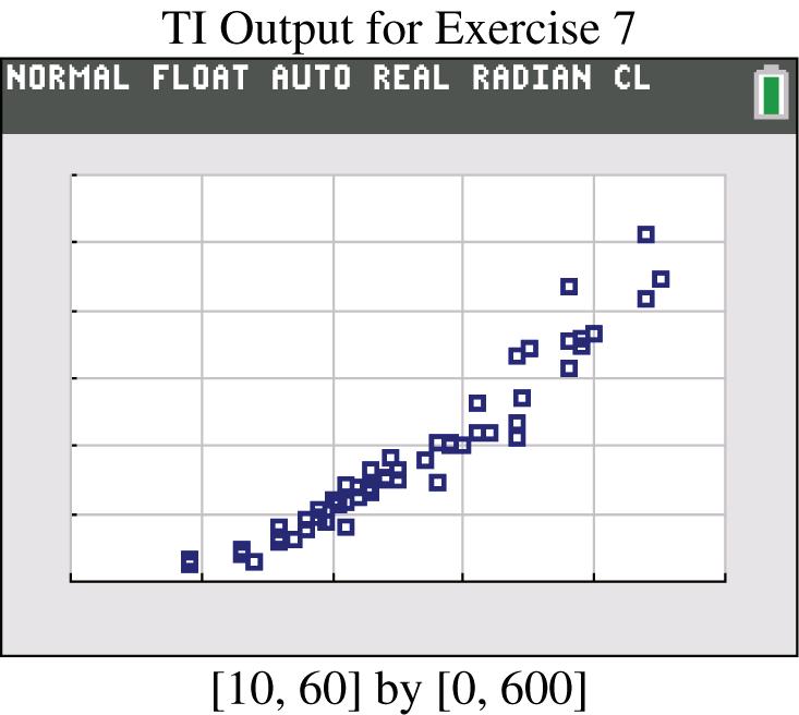
11. No. The frequencies do not satisfy the requirement of being roughly symmetric about the maximum frequency of 34.
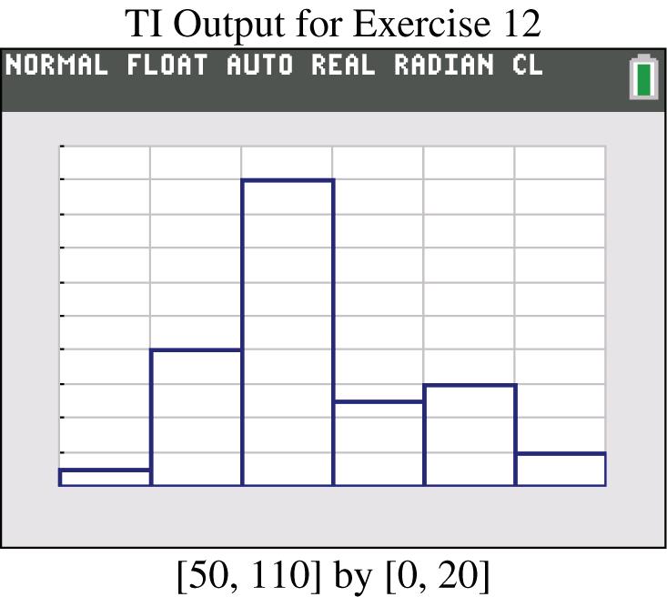
12. Yes. The frequencies start low, increase to the maximum frequency of 43, and then decrease. Also, the frequencies are approximately symmetric about the maximum frequency of 43.
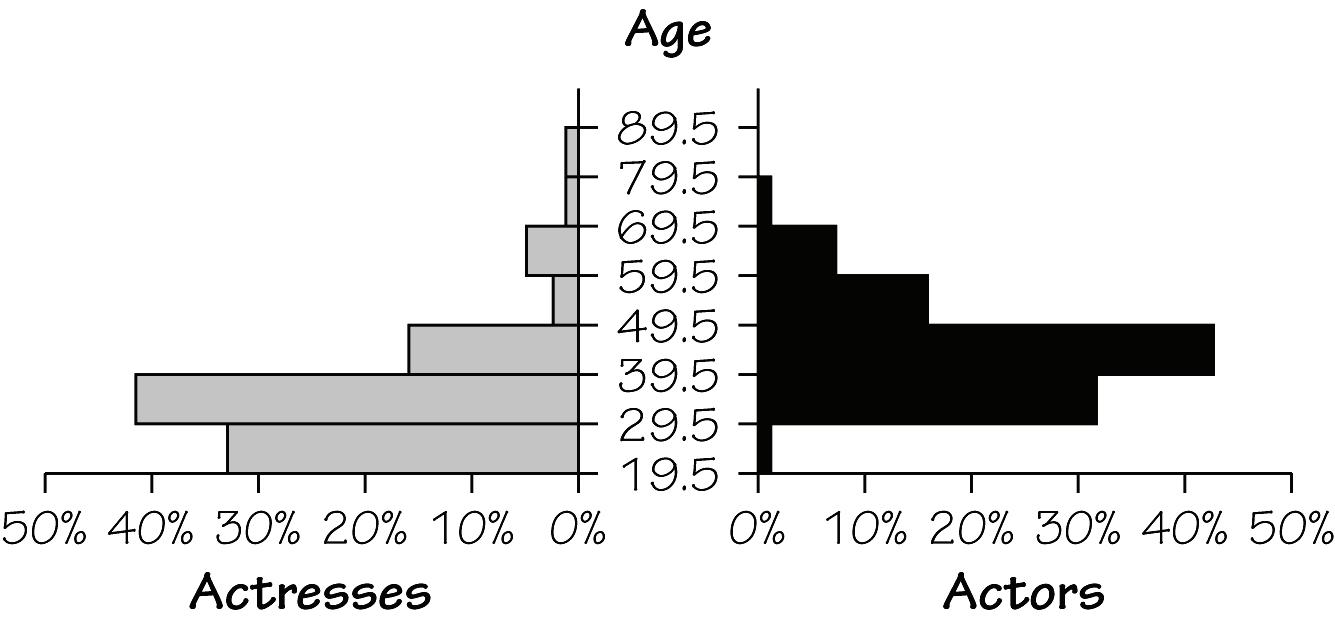
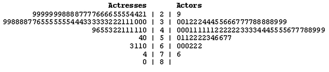
15. On average, the actresses appear to be younger than the actors.
16. The differences are not substantial. Based on the given data, males and females appear to have about the same distribution of white blood cell counts.
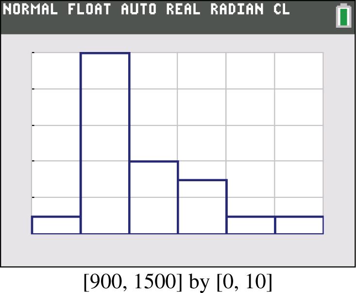
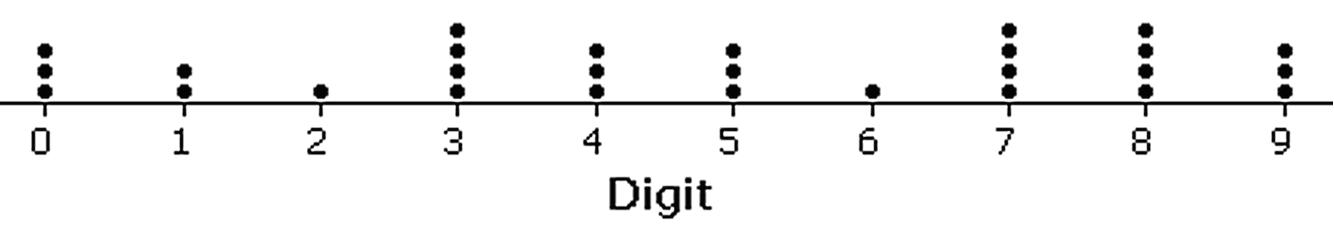
19. Because there are disproportionately more 0s and 5s, it appears that the heights were reported instead of measured. Consequently, it is likely that the results are not very accurate.
20. Because there are disproportionately more 0s and 5s, it appears that the heights were reported instead of measured. Consequently, it is likely that the results are not very accurate.
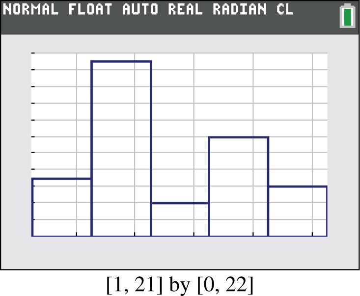
21. Yes, the distribution appears to be a normal distribution.
22. Yes. The pulse rates of males appear to be generally lower than the pulse rates of females.
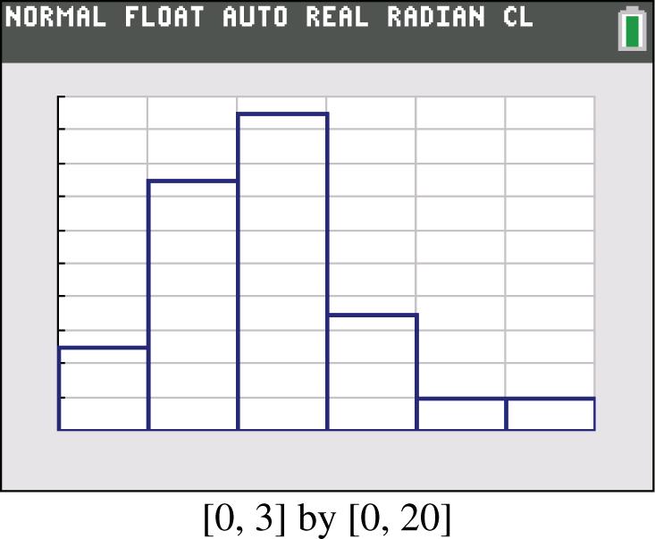
23. No, the distribution does not appear to be a normal distribution.
24. No, the distribution does not appear to be a normal distribution.
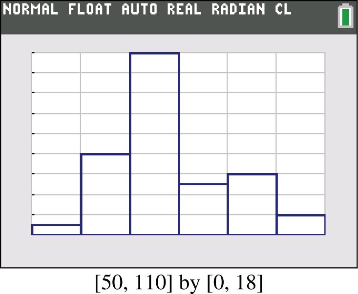
25. Yes, the distribution appears to be roughly a normal distribution.
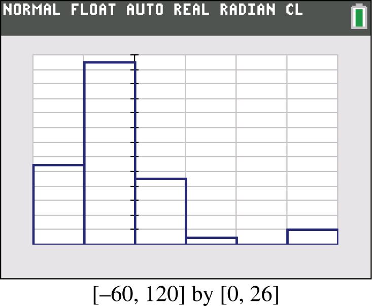
26. Yes, the distribution appears to be roughly a normal distribution.
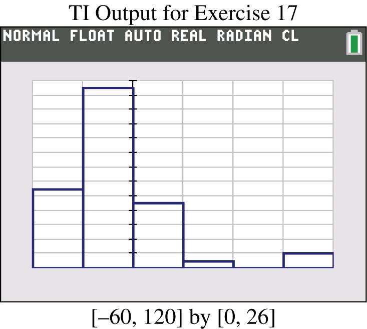
27. Yes. Among the 48 flights, 36 arrived on time or early, and 45 of the flights arrived no more than 30 minutes late.
28. No. The times vary from a low of 12 minutes to a high of 49 minutes. It appears that many flights taxi out quickly, but many other flights require much longer times, so it would be difficult to predict the taxi-out time with reasonable accuracy.

31. Pilot error is the most serious threat to aviation safety. Better training and stricter pilot requirements can improve aviation safety.
32. The digit 0 appears to have occurred with a higher frequency than expected, but in general the differences are not very substantial, so the selection process appears to be functioning correctly. The digits are qualitative data because they do not represent measures or counts of anything. The digits could be replaced by the first 10 letters of the alphabet, and the lottery would be essentially the same.
33. An outlier can dramatically affect the frequency table.
Section 2-3 Histograms
1. It is easier to see the distribution of the data by examining the graph of the histogram than by the numbers in the frequency distribution.
2. Not necessarily. Because those with special interests are more likely to respond, and the voluntary response sample is likely to consist of a group having characteristics that are fundamentally different than those of the population.
3. With a data set that is so small, the true nature of the distribution cannot be seen with a histogram. The data set has an outlier of 1 minute. That duration time corresponds to the last flight, which ended in an explosion that killed seven crew members.
4. When referring to a normal distribution, the term normal has a meaning that is different from its meaning in ordinary language. A normal distribution is characterized by a histogram that is approximately bell-shaped. Determination of whether a histogram is approximately bell-shaped does require subjective judgment.
5. Identifying the exact value is not easy, but answers not too far from 200 are good answers.
6. Class width of 2 inches. Approximate lower limit of first class of 43 inches. Approximate upper limit of first class of 45 inches.
7. The tallest person is about 108 inches, or about 9 feet tall. That tallest height is depicted in the bar that is farthest to the right in the histogram. That height is an outlier because it is very far from all of the other heights. The height of 9 feet must be an error, because the height of the tallest human ever recorded was 8 feet 11 inches.
8. The first group appears to be adults. Knowing that the people entered a museum on a Friday morning, we can reasonably assume that there were many school children on a field trip and that they were accompanied by a smaller group of teachers and adult chaperones and other adults visiting the museum by themselves.
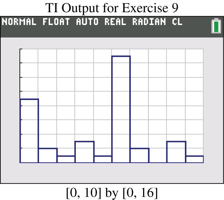
9. The digits 0 and 5 seem to occur much more than the other digits, so it appears that the heights were reported and not actually measured. This suggests that the results might not be very accurate.
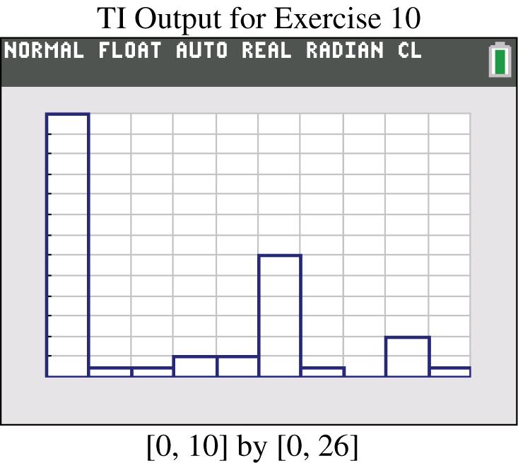
10. The digits 0 and 5 seem to occur much more often than the other digits, so it appears that the heights were reported and not measured. This suggests that the results might not be very accurate.
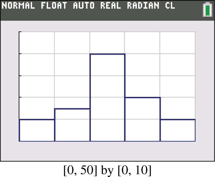
11. The histogram does appear to depict a normal distribution. The frequencies increase to a maximum and then tend to decrease, and the histogram is symmetric with the left half being roughly a mirror image of the right half.
Copyright © 2015 Pearson Education, Inc.
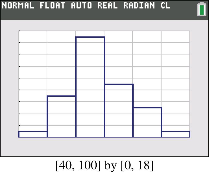
12. The histogram appears to roughly approximate a normal distribution. The frequencies generally increase to a maximum and then tend to decrease, and the histogram is symmetric with the left half being roughly a mirror image of the right half.
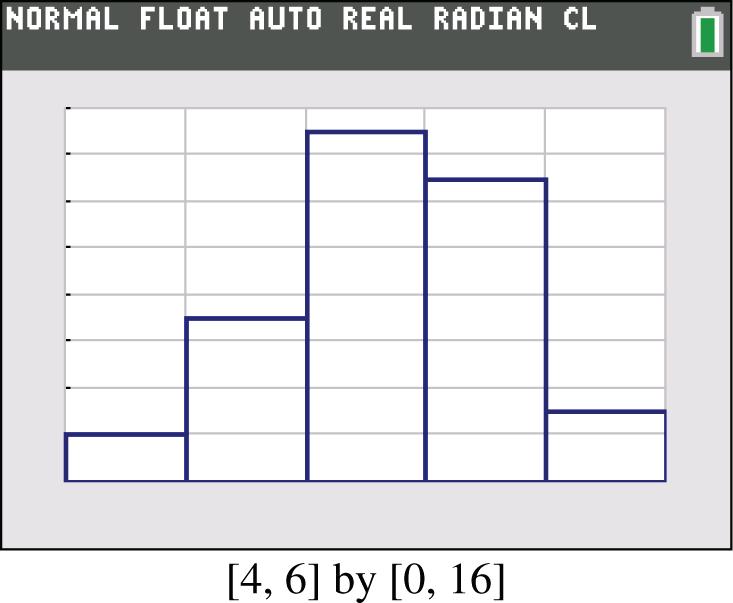
13. The histogram appears to roughly approximate a normal distribution. The frequencies increase to a maximum and then tend to decrease, and the histogram is symmetric with the left half being roughly a mirror image of the right half.
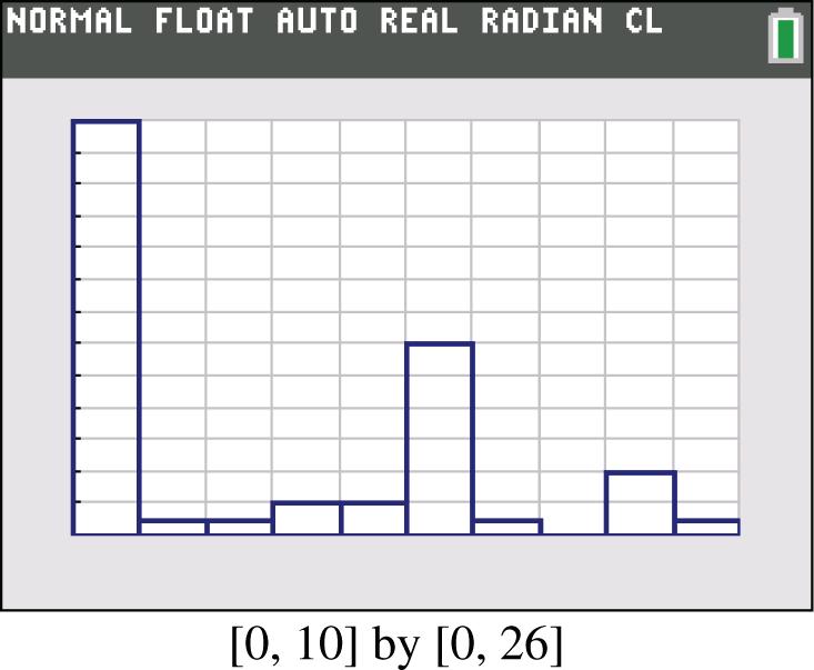
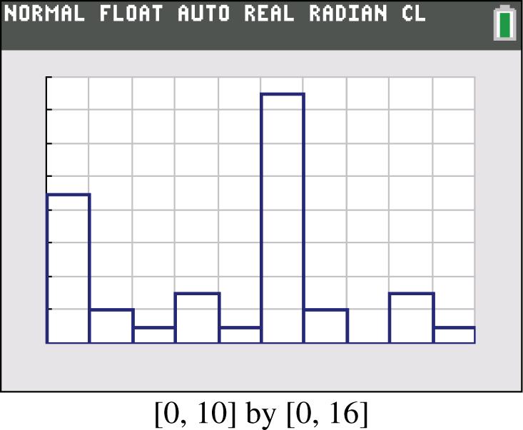
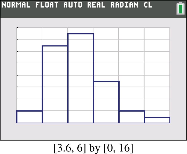
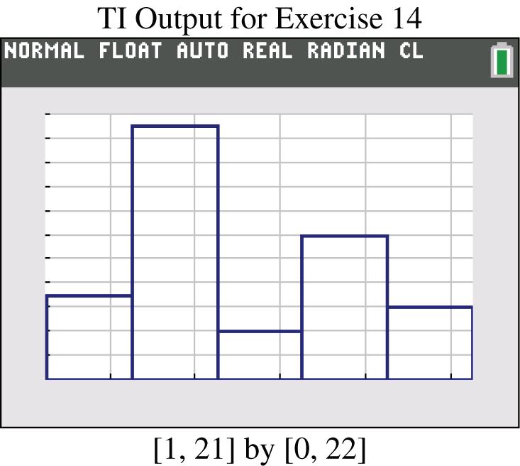
14. No, the histogram does not appear to approximate a normal distribution. The frequencies do not increase to a maximum and then decrease, and the histogram is not symmetric with the left half being a mirror image of the right half.
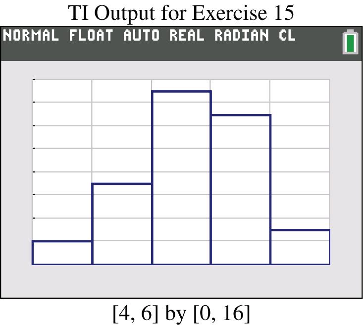
15. The histogram appears to roughly approximate a normal distribution. The frequencies increase to a maximum and then tend to decrease, and the histogram is symmetric with the left half being roughly a mirror image of the right half.
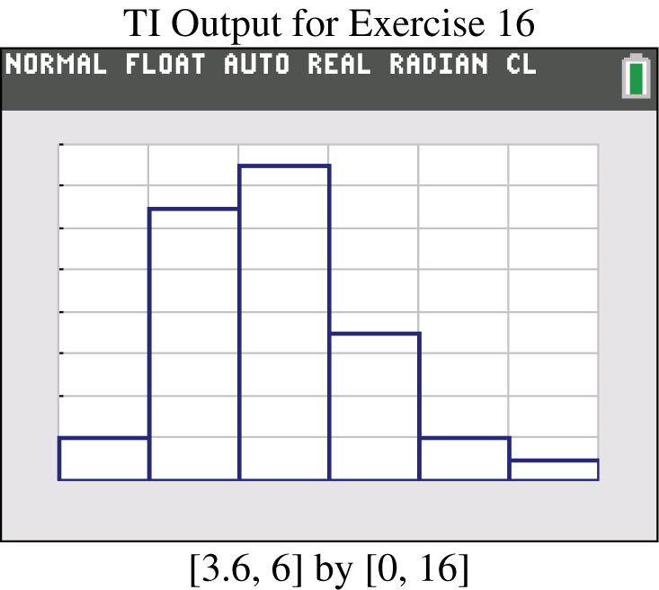
16. The histogram appears to roughly approximate a normal distribution. The frequencies increase to a maximum and then tend to decrease, and the histogram is symmetric with the left half being roughly a mirror image of the right half.
Copyright © 2015 Pearson Education, Inc.
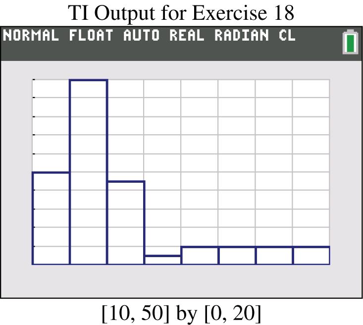
17. The two leftmost bars depict flights that arrived early, and the other bars to the right depict flights that arrived late.
18. Yes, the entire distribution would be more concentrated with less spread.
19. The ages of actresses are lower than those of actors.
20. a. 107 inches to 109 inches; 8 feet 11 inches to 9 feet 1 inch.
b. The heights of the bars represent numbers of people, not heights. Because there are many more people between 43 inches tall and 55 inches tall, they have the tallest bars in the histogram, but they have the lowest actual heights. They have the tallest bars because there are more of them.
Section 2-4 Graphs That Enlighten and Graphs That Deceive
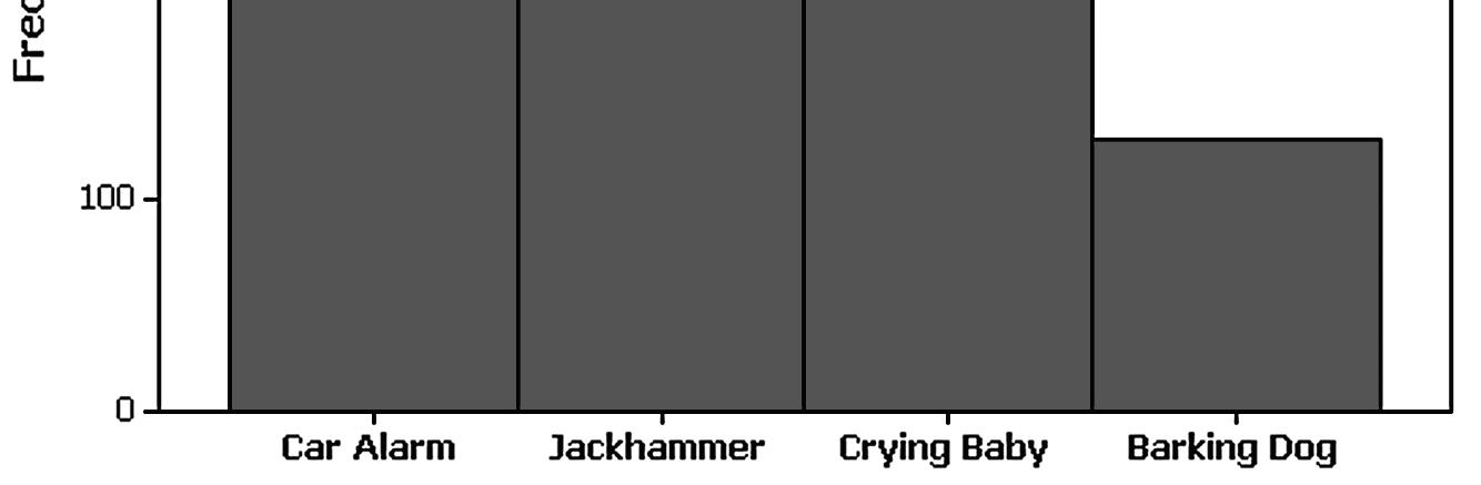
1. In a Pareto chart, the bars are arranged in descending order according to frequencies. The Pareto chart helps us understand data by drawing attention to the more important categories, which have the highest frequencies.
2. A scatter plot is a plot of paired quantitative data, and each pair of data is plotted as a single point. The scatterplot requires paired quantitative data. The configuration of the plotted points can help us determine whether there is some relationship between two variables.
3. The data set is too small for a graph to reveal important characteristics of the data. With such a small data set, it would be better to simply list the data or place them in a table.
4. The sample is a voluntary response sample since the students report their scores to the website. Because the sample is a voluntary response sample , it is very possible that it is not representative of the population, even if the sample is very large. Any graph based on the voluntary response sample would have a high chance of showing characteristics that are not actual characteristics of the population.
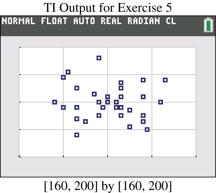
5. Because the points are scattered throughout with no obvious pattern, there does not appear to be a correlation.
6. The configuration of the points does not support the hypothesis that people with larger brains have larger IQ scores.
Copyright © 2015 Pearson Education, Inc.
7. Yes. There is a very distinct pattern showing that bears with larger chest sizes tend to weigh more.
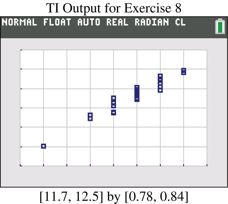
8. Yes. There is a very distinct pattern showing that cans of Coke with larger volumes tend to weigh more. Another notable feature of the scatterplot is that there are five groups of points that are stacked above each other. This is due to the fact that the measured volumes were rounded to one decimal place, so the different volume amounts are often duplicated, with the result that points are stacked vertically.
9. The first amount is highest for the opening day, when many Harry Potter fans are most eager to see the movie; the third and fourth values are from the first Friday and the first Saturday, which are the popular weekend days when movie attendance tends to spike.
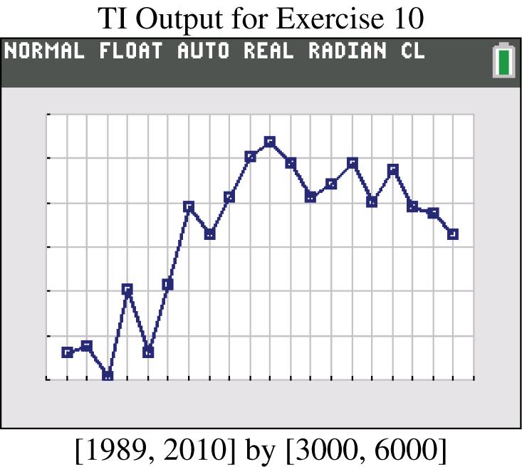
10. The numbers of home runs rose from 1990 to 2000, but after 2000 there was a very gradual decline.
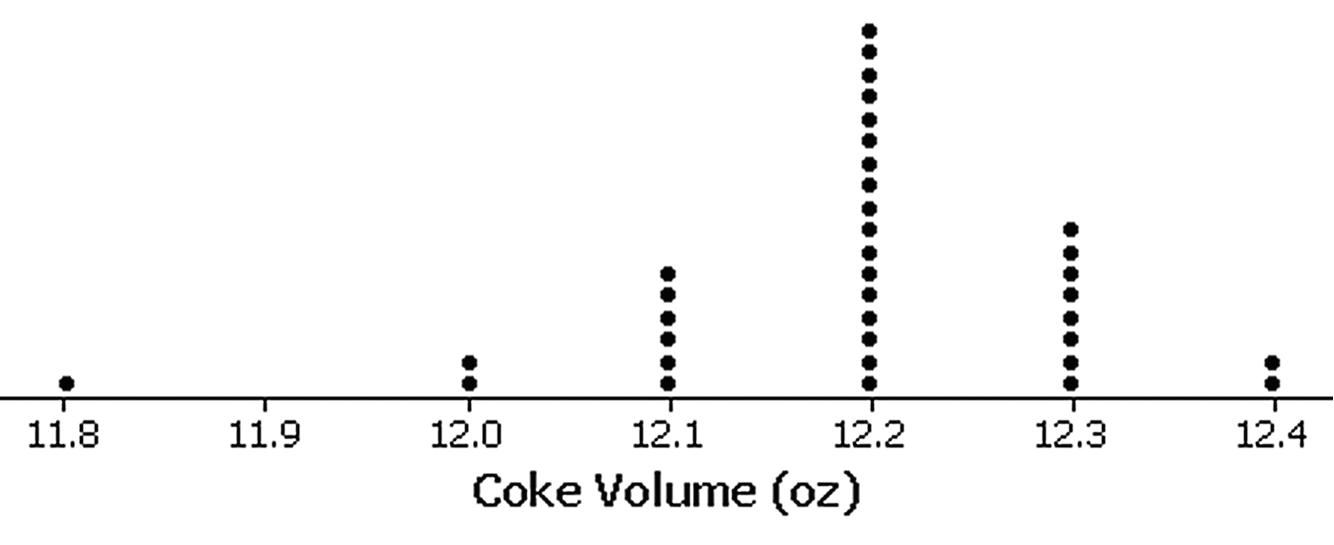
11. Yes, because the configuration of the points is roughly a bell shape, the volumes appear to be from a normally distributed population. The volume of 11.8 oz. appears to be an outlier.

Copyright © 2015 Pearson Education, Inc.
12. No, because the configuration of points is not at all a bell shape, the amounts do not appear to be from a normally distributed population.
13. No. The distribution is not dramatically far from being a normal distribution with a bell shape, so there is not strong evidence against a normal distribution.
14. There are no outliers. The distribution is not dramatically far from being a normally distribution with a bell shape, so there is not strong evidence against a normal distribution.
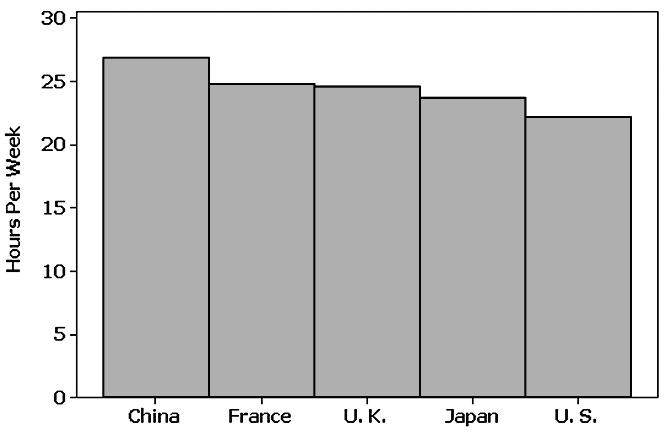
16. To remain competitive in the world, the United States should require more weekly instruction time.
Copyright © 2015 Pearson Education, Inc.
18. Because there is not a single total number of hours of instruction time that is partitioned among the five countries, it does not make sense to use a pie chart for the given data.

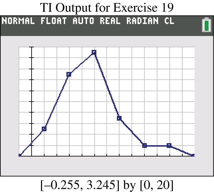
19. The frequency polygon appears to roughly approximate a normal distribution. The frequencies increase to a maximum and then tend to decease, and the graph is symmetric with the left half being roughly a mirror image of the right half.
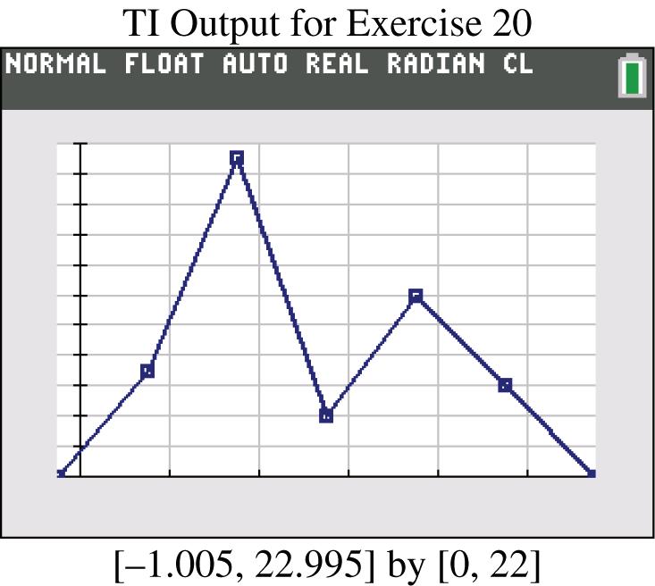
20. No, the frequency polygon does not appear to approximate a normal distribution. The frequencies do not increase to a maximum and then decrease, and the graph is not symmetric with the left half being a mirror image of the right half.
21. The vertical scale does not start at 0, so the difference is exaggerated. The graphs make it appear that Obama got about twice as many votes as McCain, but Obama actually got about 69 million votes compared to 60 million to McCain.
22. The fare doubled from $1 to $2, but when the $2 bill is shown with twice the width and twice the height of the $1 bill, the $2 bill has an area that is four times that of the $1 bill, so the illustration greatly exaggerates the increase in fare.
23. China’s oil consumption is 2.7 times (or roughly 3 times) that of the United States, but by using a larger barrel that is three times as wide and three times as tall (and also three times as deep) as the smaller barrel, the illustration has made it appear that the larger barrel has a volume that is 27 times that of the smaller barrel. The actual ratio of US consumption to China’s consumption is roughly 3 to 1, but the illustration makes it appear to be 27 to 1.
24. The actual braking distances are 133 ft, 136 ft, and 143 ft, so the differences are relatively small, but the illustration has a scale that begins at 130 ft, so the differences are grossly exaggerated.
Copyright © 2015 Pearson Education, Inc.
25. The ages of actresses are lower than those of actors.
b. The condensed stemplot reduces the number of rows so that the stemplot is not too large to be understandable.
6 – 7 | 79 * 778 8 – 9 | 45678 * 049
10 – 11 | 348 * 234477
12 – 13 | 01234 * 5
14 – 15 | 05 * 4569
16 – 17 | * 049
Chapter Quick Quiz
1. The class width is 1.00
2. The class boundaries are –0.005 and 0.995
3. No
4. 61 min, 62 min, 62 min, 62 min, 62 min, 67 min, and 69 min.
5. No
6. Bar graph
7. Scatterplot
8. Pareto Chart
9. The distribution of the data set
10. The bars of the histogram start relatively low, increase to a maximum value and then decrease. Also, the histogram is symmetric with the left half being roughly a mirror image of the right half.
Review Exercises
1.
2. No, the distribution does not appear to be normal because the graph is not symmetric.
3. Although there are differences among the frequencies of the digits, the differences are not too extreme given the relatively small sample size, so the lottery appears to be fair.
4. The sample size is not large enough to reveal the true nature of the distribution of IQ scores for the population from which the sample is obtained.
5. A time-series graph is best. It suggests that the amounts of carbon monoxide emissions in the United States are increasing.
6. A scatterplot is best. The scatterplot does not suggest that there is a relationship.
7. A Pareto chart is best.
Copyright © 2015 Pearson Education, Inc.
Cumulative Review Exercises
1. Pareto chart.
2. Nominal, because the responses consist of names only. The responses do not measure or count anything, and they cannot be arranged in order according to some quantitative scale.
3. Voluntary response sample. The voluntary response sample is not likely to be representative of the population, because those with special interests or strong feelings about the topic are more likely than others to respond and their views might be very different from those of the general population.
4. By using a vertical scale that does not begin at 0, the graph exaggerates the differences in the numbers of responses. The graph could be modified by starting the vertical scale at 0 instead of 50.
5. The percentage is 241 0.37637.6% 641 == . Because the percentage is based on a sample and not a population that percentage is a statistic.
6.
7. Because the frequencies increase to a maximum and then decrease and the left half of the histogram is roughly a mirror image of the right half, the data appear to be from a population with a normal distribution.
Copyright © 2015 Pearson Education, Inc.
Elementary Statistics Using the TI-83 84 4th Edition Triola Solutions Manual
Full Download: http://testbanktip.com/download/elementary-statistics-using-the-ti-83-84-4th-edition-triola-solutions-manual/