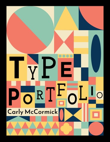
Carly McCormick
TABLE OF CONTENTS
02
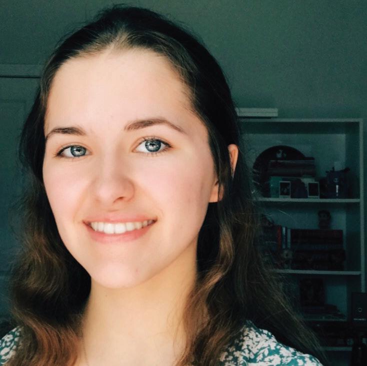
MEET THE ARTIST
TYPOGRAPHY I TYPOGRAPHY II
04 Pictorial Mark & Portrait of Artist 05 Written Description Project #1 • Nine Image Series 08 Pattern of Nine Images 09 Project 1 Details 10 Project 1 Process 11 Project 1 Final Draft Project #2 • Three Grid Structures 12 Project 2 Details 13 Project 2 Process Photograph 14 Project 2 Written Process 15 Project 2 Final Draft Project #3 • Flowering Type 16 Project 3 Final Draft 17 Project 3 Details 18 Project 3 Written Process 19 Project 3 Written Process Cont. Project #4 • Remaking Language 20 Project 4 Details 21 Project 4 Final Drafts 22 Project 4 Process 23 Project 4 Process Cont. Project #5 • Airline Rebranding 24 Project 5 Airline Pattern 25 Project 5 Details & Logo 26 Project 5 Process 27 Project 5 Design Applications Project #1 • Music Festival Design System 30 Project 1 Final Poster Draft 31 Project 4 Details 32 Project 4 Instagram Mockup 33 Project 4 Logo & Merch Design Project #2 • UCDA Poster Competition Entry 34 Project 2 Details 35 Project 2 B & W Process 36 Project 2 Final Poster Draft 37 Project 2 Process Cont. 40 Written Reflection 41 Visiting Artist Notes & Photograph 42 Written Reflection 43 Process Photographs 03
ART TALKS FINAL THOUGHTS


04
MEET THE ARTIST
Carly McCormick
Hello! My name is Carly McCormick, and I am a student at the School of Visual Arts and Design at the University of South Carolina. My major is Studio Art, with a concentration in Graphic Design and Illustration. Before transferring to USC in Spring 2022, I completed my Associate’s Degree in Arts and Humanities at Horry Georgetown Technical College. I plan to continue my education in Graphic Design and graduate with a Bachelor of Fine Arts in Graphic Design and Illustration in 2025.
Through my journey of taking Typographic Design I and II, I have discovered a newfound love and appreciation for the art form of typography. This portfolio is a testament to my growth as an artist and designer, showcasing my typographic work and how I have applied the fundamental principles learned in my typography courses - such as composition, color, layout, text, visual hierarchy, anatomy, and type pairings. From initial sketches to finalized files this book will take you through my creative process, from initial sketches to finalized designs.
05
This course delves into the basic concepts of graphic design, with a particular focus on composition, color, typography, and layout. It examines fundamental principles of visual communication and how they can be applied to create effective designs. By exploring traditional and modern digital applications, students gain a comprehensive understanding of the tools and techniques used in contemporary graphic design.
06
07


NINE IMAGE SERIES PATTERN


08
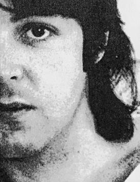
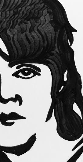
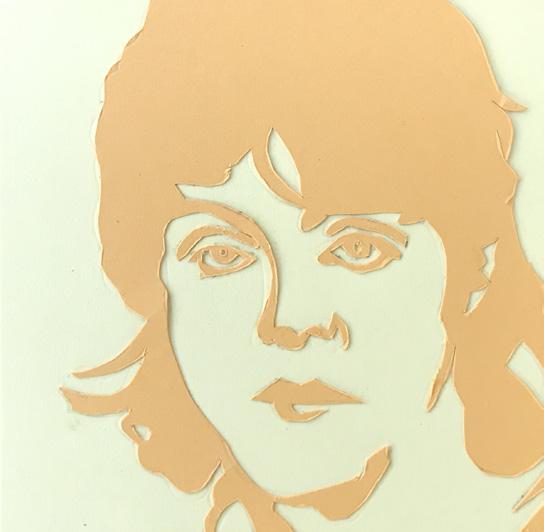
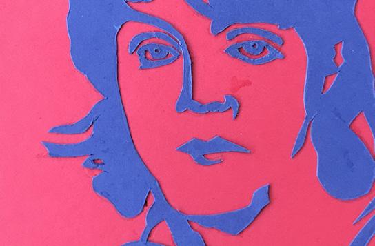
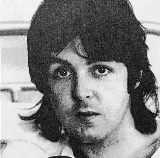
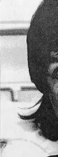
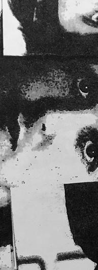
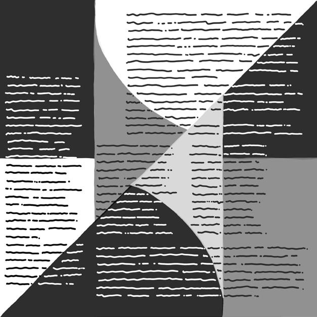
Photographs of nine images of Paul McCartney made from a xerox machine, black ink, cardstock, textured paper, and an xacto blade.
PROJECT 1: NINE IMAGE SERIES
Background | September 1st, 2023
For Project 1, I interpreted a famous individual’s personality using a nine-square grid to convey a personal concept. The goal was to challenge my ability to create visual interest in a clean and organized space while controlling the overall message and feel of the piece.
I completed the project using a Xerox machine, micron pens, colored pencils, an xacto knife, a ruler, cardstock, textured paper, and rubber cement. No final work or additional research was done using a computer.
Exploration | Paul McCartney
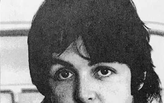
For Project 1, I created nine 4” x 4” squares that represent the personality of a famous person. I chose Paul McCartney from a black-and-white photograph in People’s Magazine, which covered the Beatles’ influence on the music industry. To showcase his personality, I used visual elements from albums he contributed to when he was with the Beatles. The image could not come from a computer or online source but rather from traditional media.
Reflection | Craftsmanship
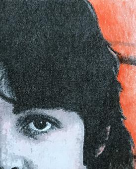
After receiving feedback from my peers, I reviewed my work’s strengths and weaknesses. The simple design of the first square in the top row captured Paul McCartney’s appearance during that period. This design was influenced by the minimalistic style of the Revolver album, which helped emphasize the original image’s details and shapes. Additionally, the stippling effect added shading to the minimalist style. The first square in the second row was also noteworthy for its ability to capture the high contrast of the image. The blue and red colors complemented each other and produced a pleasing visual contrast.
“The image could not come from a computer or online source but rather from traditional media.”
09
DEVELOPMENT
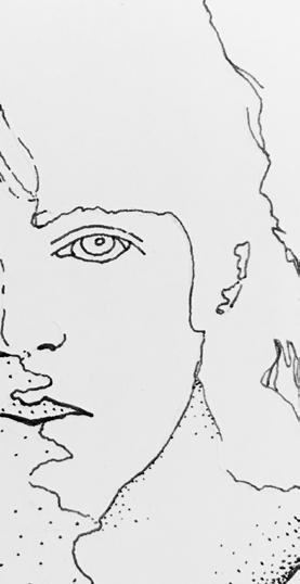
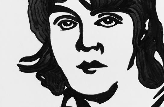
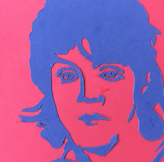
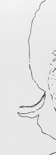
I created a series of nine squares inspired by an image of Paul McCartney from People’s Magazine. The first square shows the original image, while the second square is a black line drawing inspired by the Beatles album cover “Revolver.” In the third square, I used black ink to outline only the image’s negative portions, allowing me to experiment with different line widths. To ensure consistency in the middle row of squares, I created thick outlines that were easy to cut and replicate accurately with an xacto blade. The fourth square outlines the image’s positive and negative space, but this time, it’s traced onto colored cardstock. I drew inspiration from the color palette of the “Hard Day’s Night” album, mostly dark blue with red accents, to create a high-contrast version of the original image.
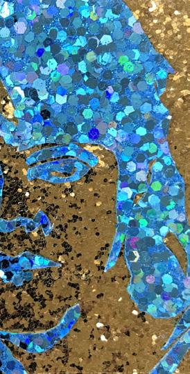
In the fifth square, I repeated the same process as the previous one but used a different color palette to create a low-contrast image. Here, I drew inspiration from the artwork of the “Yellow Submarine” album, which included different variations of yellow. In the sixth square, I experimented with different textured papers to recreate the In the fifth square, I repeated the same process as the previous square but used different colors to create low-contrast images, drawing inspiration from the “Yellow Submarine” album. In the seventh square, I experimented with different textured papers inspired by “Sargent Pepper’s Lonely Hearts Club Band” album cover. I used a golden paper with a glittery texture for the background and blue sequin paper for the profile to capture the look and feel of Paul McCartney’s iconic outfit from that same album.
WORKING ON PROJECT 1
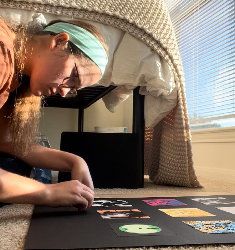
While finalizing the project, I spent most of my time working on the floor of my apartment due to the large scale of the project.
10
ONE STEP AT A TIME
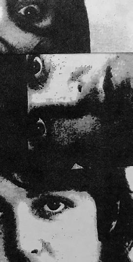
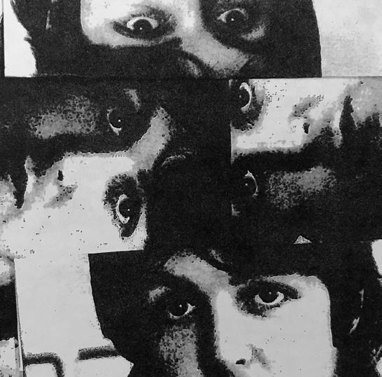
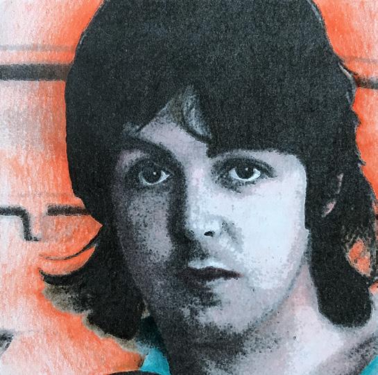
In the seventh square, I used a Xerox machine to copy the image. I added four sets of eyes in various positions to represent all four band members. This was a way to reference the other band members while highlighting Paul McCartney as one of the main reasons for their success. For the eighth square, I colored a Xerox copy of the image with colored pencils, inspired by the color palette of the “Rubber Soul” album.
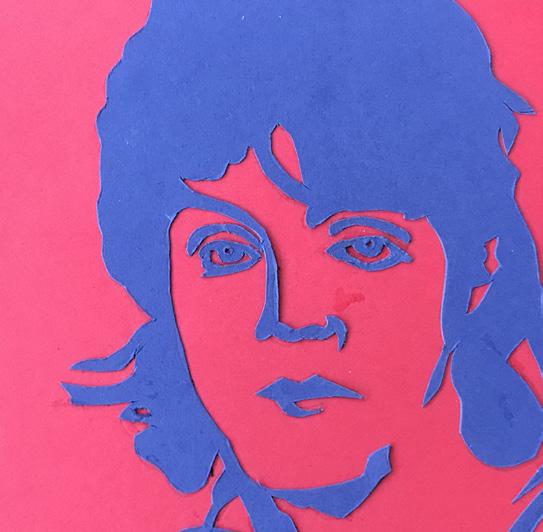
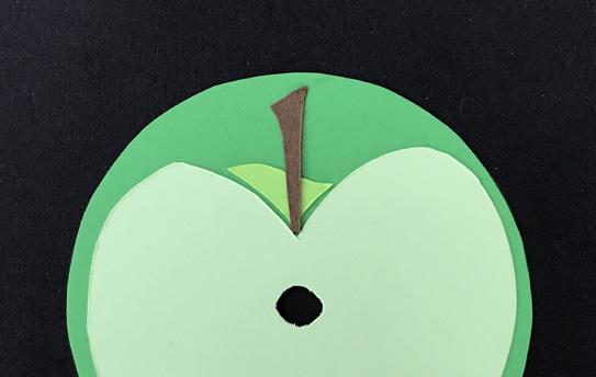
In the ninth and final square, I used multiple colors of cardstock to create a conceptual interpretation of the image. The purpose of this square was not to see the person in the image but to provide visual clues as to who they might be. I drew inspiration from the iconic Apple label. As a collector of Beatles albums on vinyl, I recall the band whenever I see the Apple label. It felt appropriate to incorporate it into the final square.
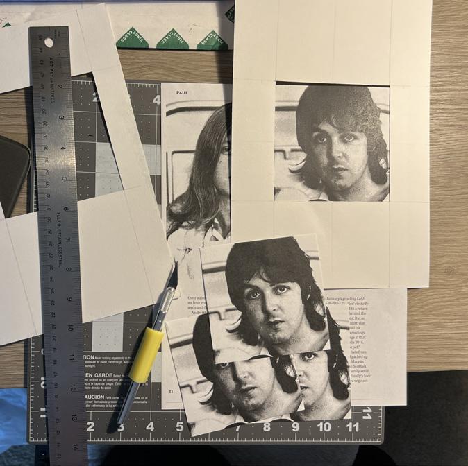
TEMPLATE USED TO CUT THE SQUARES
Framed and cropped the image using a 4”x 4” template I created with mixed media paper, a ruler, and an xacto knife.
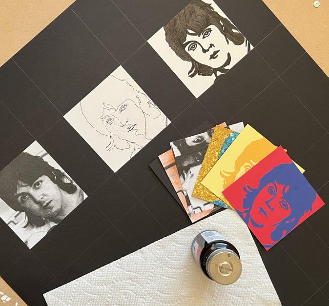
LAYING OUT THE SQUARES
The squares were glued onto the large paper using Elmer’s Rubber Cement. I utilized a ruler and pencil to measure the space equally to determine the position of each image.
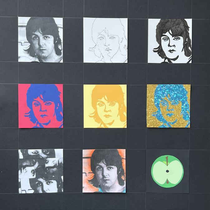
FINAL LAYOUT OF NINE SQUARES
The final layout of the nine squares onto black canson mix media paper.
11
PROJECT 2: THREE GRID STRUCTURES
Background | September 14th, 2023
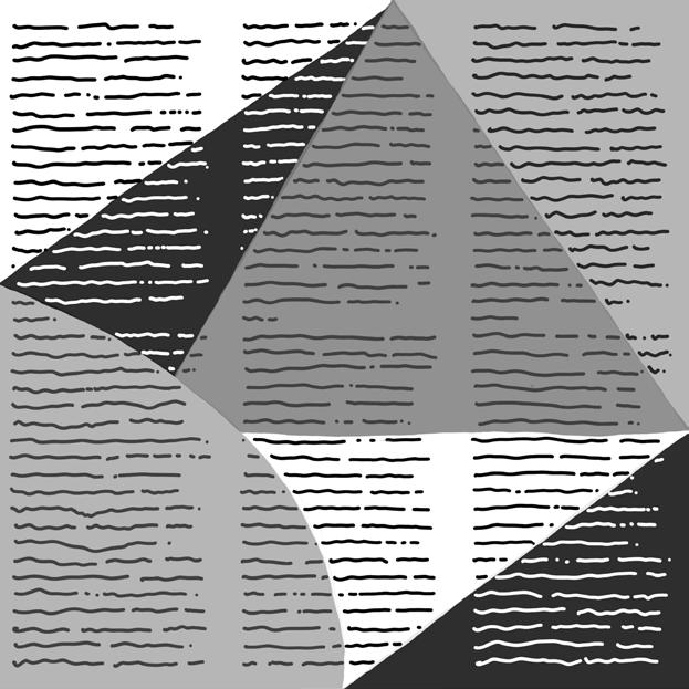
My goal for Project 2 was to create three separate grid designs using different fonts, sizes, and type spacing. To choose the typefaces, I referred to three magazines: PEOPLE Beatles 1969, 2023 Queens of Pop: Taylor Swift, and HISTORY: Walt Disney.
Exploration | Black, White, & Gray
I separated the type into three Ziploc bags to help me keep it organized. I used three different grid methods to arrange the text: a column grid, a hierarchical grid, and an asymmetrical grid. I then created different layouts and designed geometric shapes for each grid—the final product aimed to show balance, contrast, and structure.
Reflection | Learning from Mistakes
I incorporated large, circular shapes in my geometric design to enhance its visual appeal. My design features a contrast of light and dark colors, with a mix of loose
and tight kerning. To represent different grid types, I used grid paper to create simple shapes from various magazines. I then used Elmer’s rubber cement to glue my typography onto the black foam core.
Although I did not achieve the desired outcome for this assignment, I gained valuable knowledge about various grid structures. This experience will help me make better choices for future design projects. Although I still have much to learn, I am grateful for this project’s lesson on grids and structures.
“The final product aimed to demonstrate balance, contrast, and structure.”
12
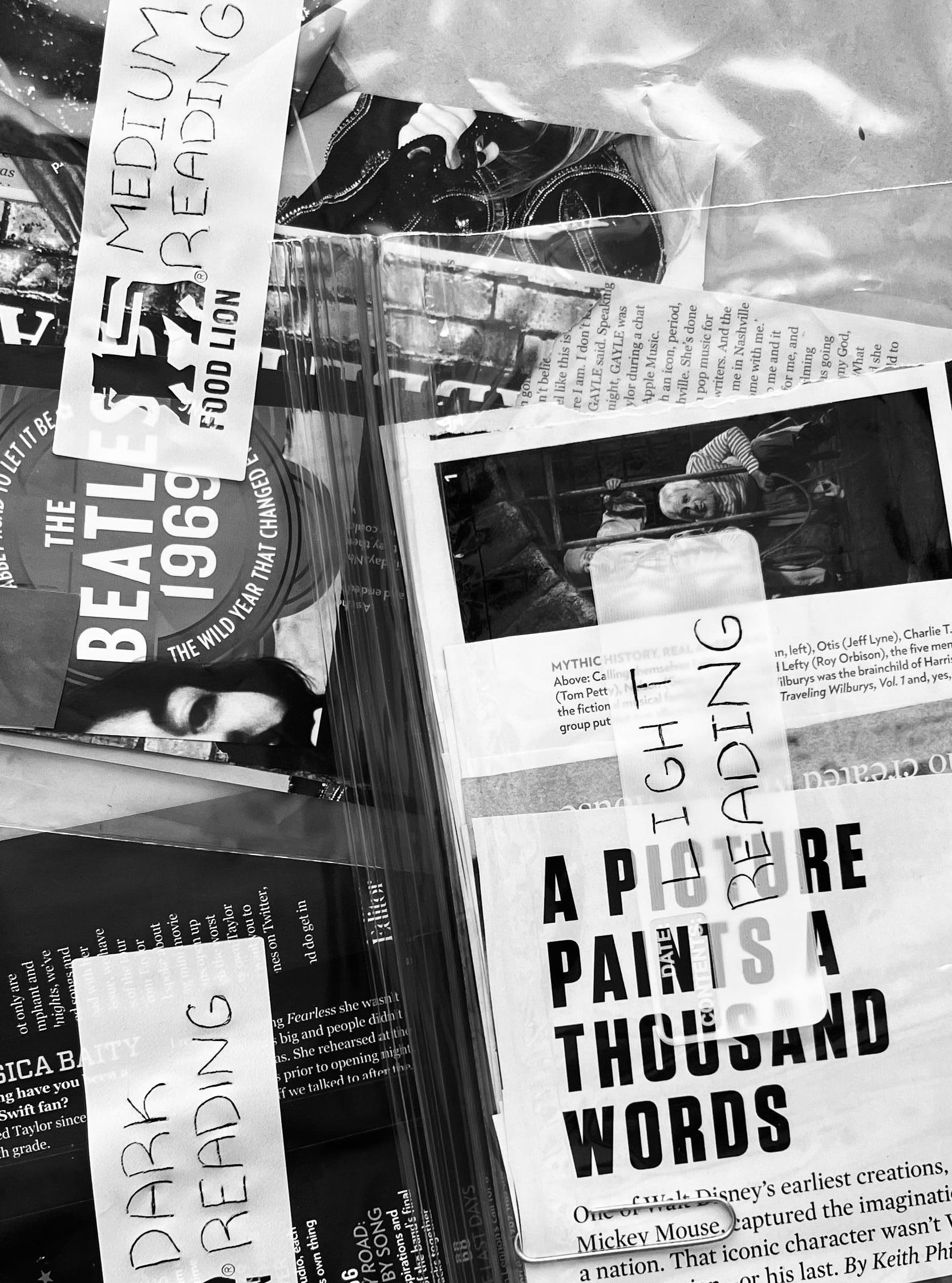
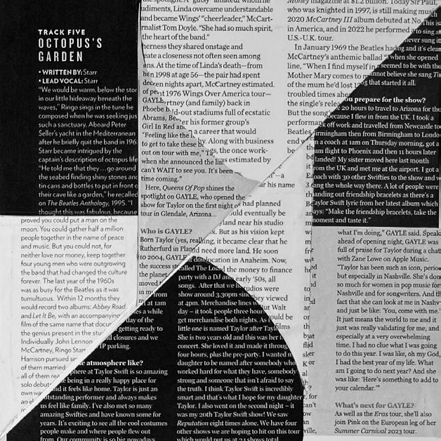
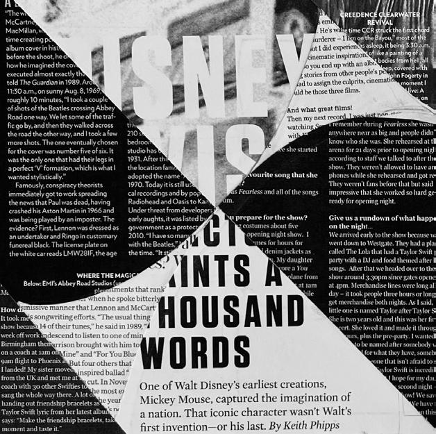
IMAGE OF LIGHT, DARK, & MEDIUM READING MAGAZINE CLIPPINGS
To find my type, I referred to these magazines: PEOPLE Beatles 1969, 2023 Queens of Pop: Taylor Swift, and HISTORY: Walt Disney.
13

PHOTOGRAPH OF FOUND TYPE FROM MAGAZINES
To find my text, I consulted three magazines: PEOPLE’s Beatles 1969, Queens of Pop: Taylor Swift 2023, and HISTORY’s Walt Disney.
WORK IN PROGRESS
To get started, I looked through various magazines to find the typography that would work best with my vision. Once I found the text I needed, I organized it into three Ziploc bags for easy access. This made it easier to experiment with different font sizes and styles without having to sort through a disorganized pile of typography. To incorporate the text into the design, I used three different grid methods: a column grid, a hierarchical grid, and an asymmetrical grid. These were chosen because they create a visual hierarchy, balance, and contrast in the design. With these grids in mind, I created multiple layouts, each with its unique geometric design. I worked hard to create a design that would stand out, and this involved a lot of trial and error. I focused on achieving a final product that would showcase balance, contrast, and structure in a visually appealing way. I paid close attention to the spacing between the letters, the font sizes, and the overall layout of the design.
14
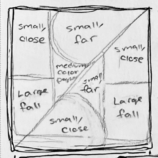
STEP 1: CREATE THE SKETCH
Sketch out the asymmetrical grid, determine where light, medium, and dark text will go, and figure out the geometric design.
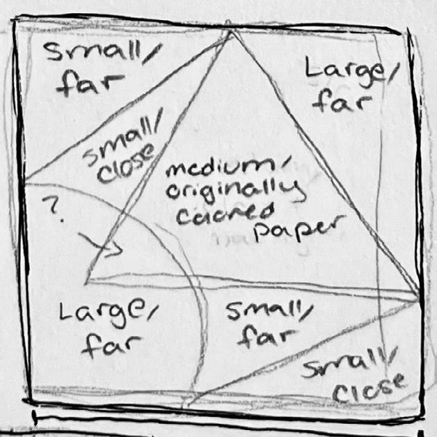
STEP 1: CREATE THE SKETCH
Sketch out the column grid, determine where light, medium, and dark text will go, and figure out the geometric design.
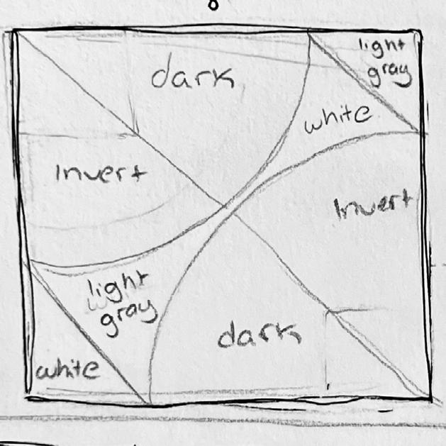
STEP 1: CREATE THE SKETCH
Sketch out the hierarchical grid, determine where light, medium, and dark text will go, and figure out the geometric design.
STEP 2: TRANSLATE IDEA DIGITALLY
Convert the sketch into a digital format and further develop the idea.
STEP 2: TRANSLATE IDEA DIGITALLY
Convert the sketch into a digital format and further develop the idea.

STEP 2: TRANSLATE IDEA DIGITALLY
Convert the sketch into a digital format and further develop the idea.
STEP 3: EXECUTE IDEA ASYMMETRICAL GRID
Execute the idea using an xacto blade, found type, and rubber cement to glue everything together.

STEP 3: EXECUTE IDEA COLUMN GRID
Execute the idea using an xacto blade, found type, and rubber cement to glue everything together.
STEP 3: EXECUTE IDEA HIERARCHICAL GRID
Execute the idea using an xacto blade, found type, and rubber cement to glue everything together.
15
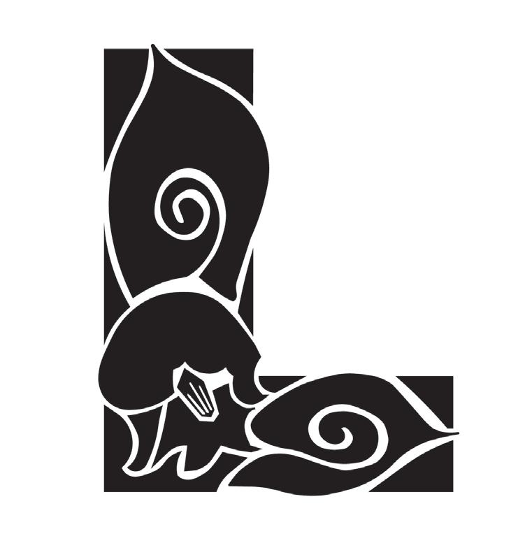
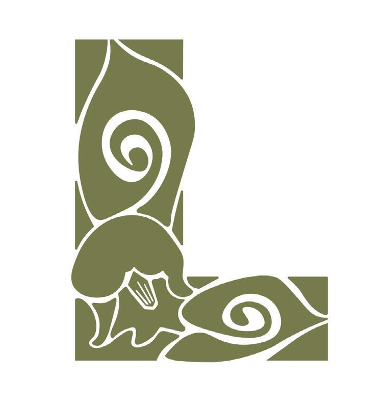
FINAL FILE FOR FLOWERING TYPE DESIGN
final color selection and design inspired by the lily of the valley.
16
PROJECT 3: FLOWERING TYPE
Background | September 21st, 2023
For Project 3, I was assigned to create a unique flower using a specific letter. To achieve this, I used the Monsterrat Black typeface and a color palette called Italian primitive. These guidelines helped me decide on the final product’s flower design and color scheme.
Exploration | Finding Inspiration
I explored various flower options and finally settled on Lily of the Valley. It is a small, white, bell-shaped flower that grows in the hills and mountains of North Carolina during spring. I picked this flower because it has a free-flowing shape.
Reflection | What did I Learn?
After reviewing my design compared to others in the class, I discovered a few things that could have improved the overall execution. First and foremost, the swirls on the leaves were too large and distracting. While I initially chose them for their aesthetic appeal, they drew attention away from the flower itself and made the design appear unbalanced. While I initially chose a hand-drawn style for the aesthetic appeal, the swirl should either be removed or made smaller so that it doesn’t compete with other elements. Ultimately, creating a balanced design is crucial.
Second, the flower itself needs to stand out more. The outline around the shapes is too thin and inconsistent, making it difficult to see the negative space between the flower and other shapes from a distance. This makes the design look constricted and makes it hard to identify the type of flower added to the letter.
To improve the design, it would be best to thicken and clean up the outline of the flower. Also, the design should emphasize the flower more than the leaves. This would make the flower stand out more and be the focal point of the design. Although the design has a whimsical feel, the errors and inconsistencies make it look too simple.
17
PROCESS
To create my design, I started by selecting one of the 16 sketches I had made on tracing paper using a light table and a mechanical pencil. Then, I scanned the final sketch using a Canon flatbed scanner and Adobe Acrobat software. Next, I imported the PDF of the sketch into a new Illustrator file with a 5” x 5” artboard. After adjusting the shape placement, I created a new layer and carefully traced the form using the pen and Pathfinder tools. Once I traced all the shapes from my original sketch, I went back with the pen tool and removed any floating or unnecessary anchor points. This process helped me to clean up the shapes and smooth out the lines, resulting in clean curves. To add line details in the middle of the shape, I clicked on “Object,” selected “Compound Path” from the dropdown menu, and then clicked “Make” to remove the middle elements of my shape. Finally, I used the Pathfinder tool to merge all the individual shapes and form a unified shape for the letter, completing the vectorized letter.

INSPIRATION PHOTOGRAPH OF LILY OF THE VALLEY
Credit for photograph: Océane George from Unsplash.com.
ITALIAN PRIMITIVE COLOR PALETTE
I filled in the color by entering the color code in the fill option of the color picker. For my final design, I picked the olive color from the color palette to incorporate into the letter. I decided to go with an olive color, as it resembled the stem of a lily of the valley flower.
18
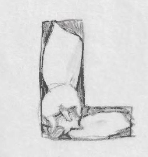
STEP 1: SKETCH THE DESIGN
I chose one of the 16 sketches made on tracing paper using a light table and a mechanical pencil. Then, I scanned the final sketch with a Canon flatbed scanner and Adobe Acrobat.
STEP 2: DESIGN ROUGH DRAFT
I imported the PDF of the sketch into a new Illustrator file with a 5” x 5” artboard. After adjusting the shape placement, I created a new layer and meticulously traced the form using the pen and Pathfinder tools.
“I chose this flower for its whimsical and free-flowing shape.”
STEP 3: FINAL DESIGN FILE
To create the vectorized letter, I used the Pathfinder tool to merge all individual shapes into a single shape.
19
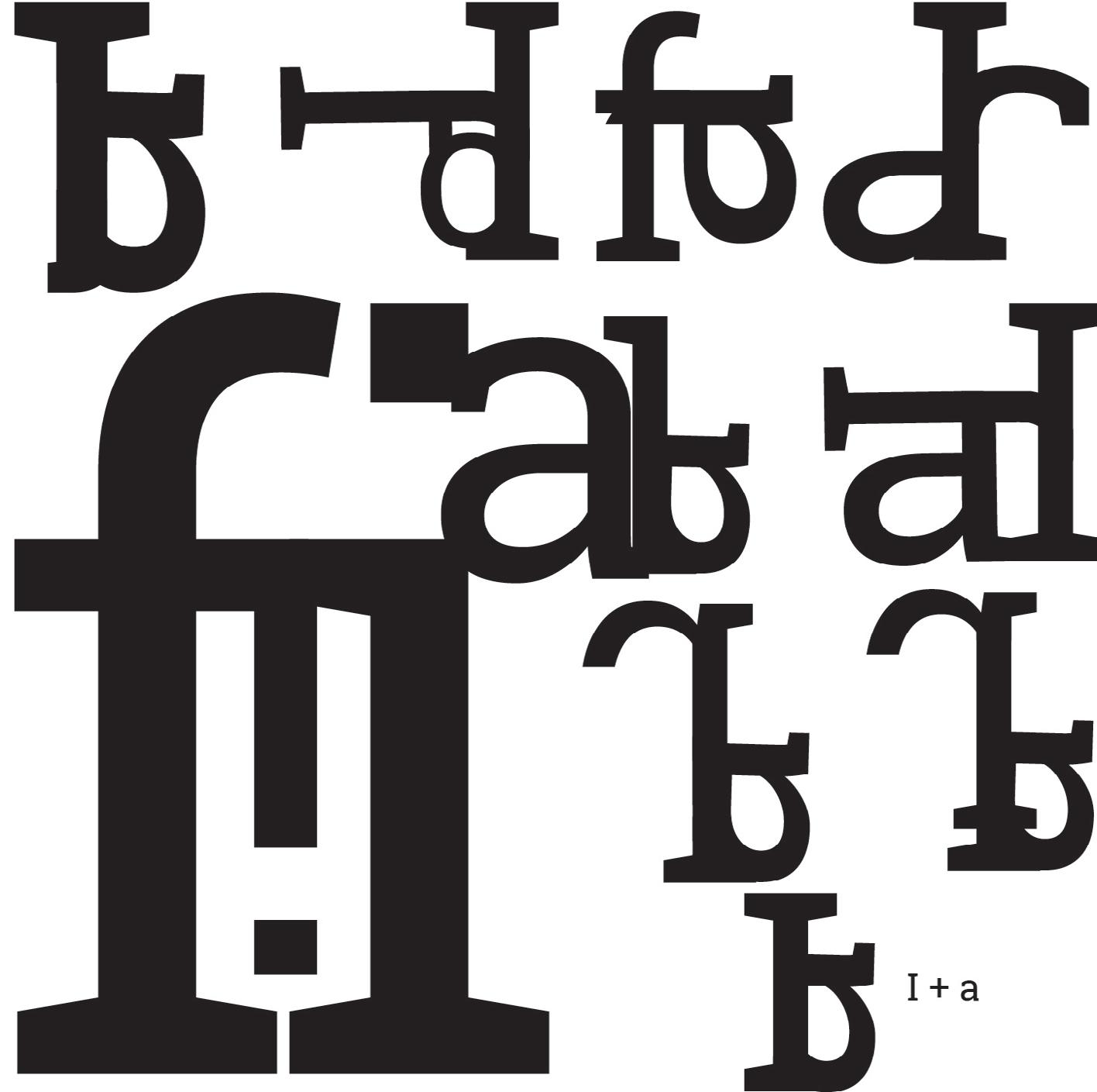
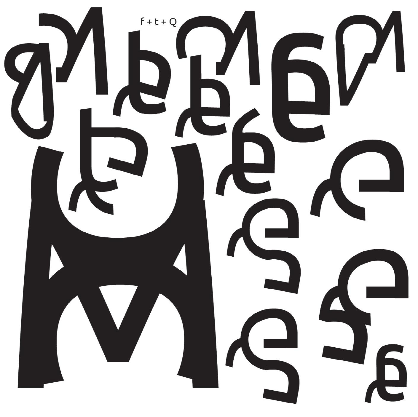
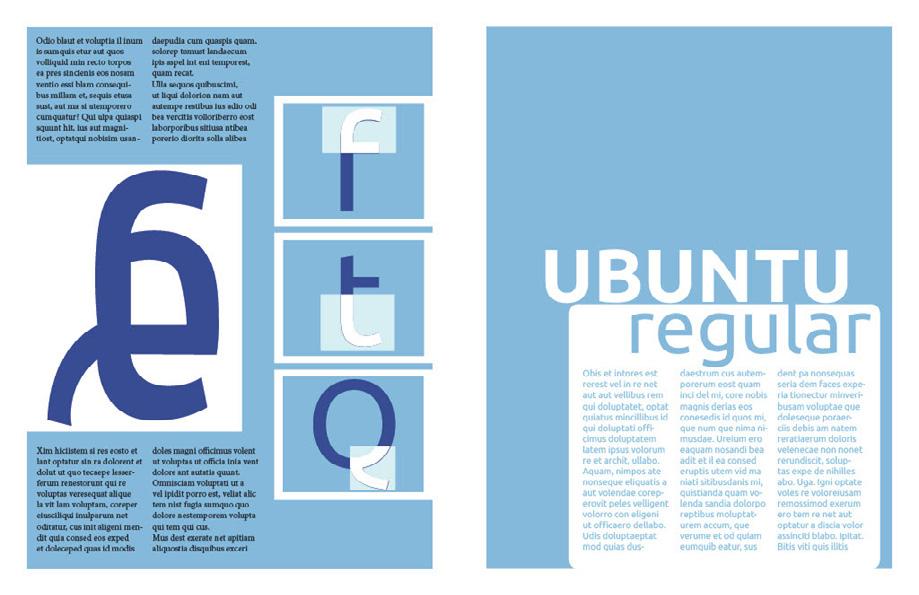
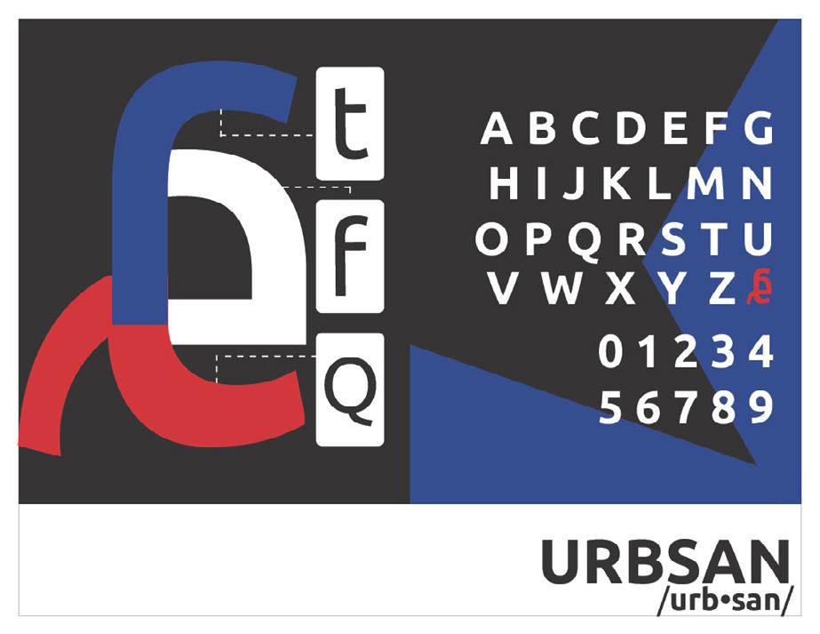
PROJECT 4: REMAKING LANGUAGE
Background | October 27th, 2023
My goal for Project 4 was to create the 27th letter of the English alphabet. This project taught me about typography and the significance of serifs and sans serifs in typefaces.
Exploration | Creating Letters
While experimenting, I spent most of my time exploring different fonts to understand letterforms and their structures. After testing various options, I chose Roboto Slab (regular) for my serif letter form and Ubuntu (regular) for my sans-serif letter form. I selected these fonts because they have a timeless and structured feel, and their styles and shapes are similar. I created 21 sketches that included several concepts for a potential 27th letter. I had 12 ideas for the serif letter form and 9 for the sans-serif letter form.
Reflection | Final Spread Layouts
I received mainly positive feedback on my design, with helpful suggestions for improving it. The abstract modern design complemented the letterforms well. However, upon closer inspection, it was pointed out that the letterforms appeared smaller when compared to the rest of
the alphabet. This could be because my letters were made up of uppercase and lowercase letters while being placed in an alphabet with only uppercase letters. This inconsistency also threw off the design’s consistency and carried over into my san serif alphabet. To fix this issue, make the letterforms slightly larger or try a lowercase alphabet to see if it fits better.
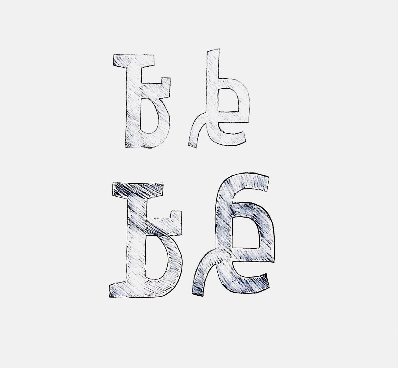
27TH LETTER ORIGINAL SKETCHES
I created 21 sketches encompassing multiple concepts for a potential 27th letter, 12 of which were in serif form and 9 in sans-serif form.
20

TYPE FAMILY BREAKDOWN SPREAD
Designing the second spread of my project was quite challenging as I wanted to ensure that there were no elements that would distract the audience from the information presented on the page. Though I tried several abstract and creative elements, I eventually decided to focus on creating an organized, asymmetrical, and hierarchical grid that would present the information in a simple and easy-to-understand manner.
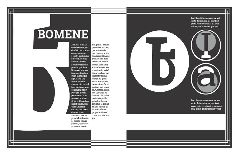
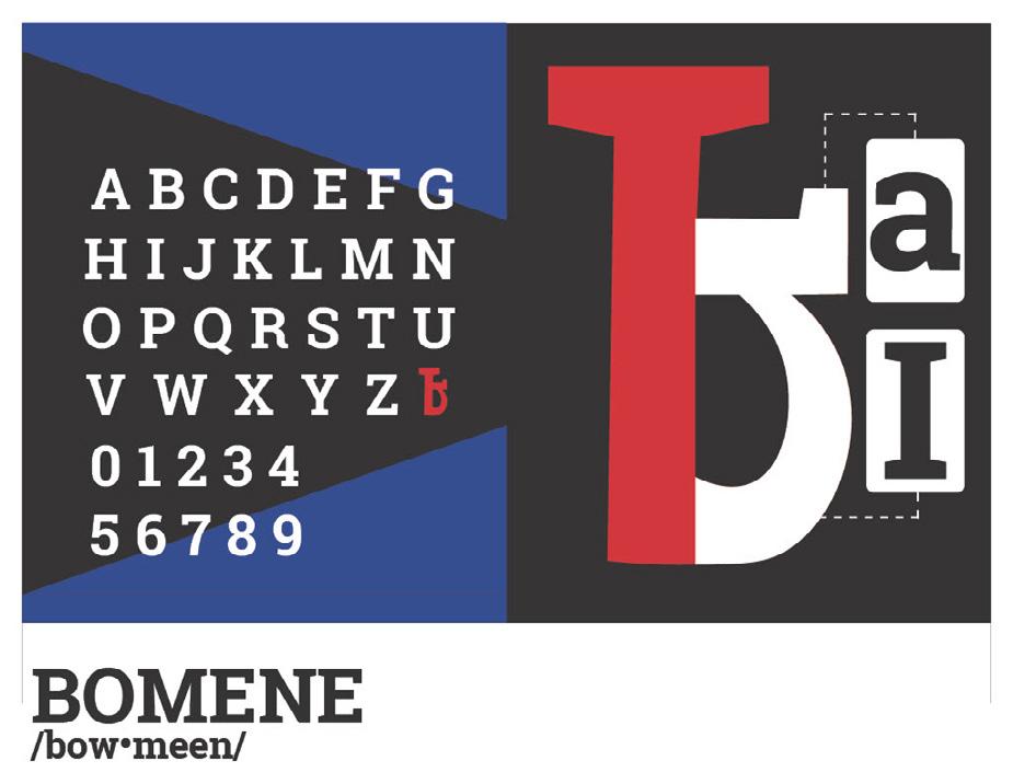
SERIF 27TH LETTER SPREAD
I drew inspiration from the sharp and angular features of the Roboto Slab typeface. I integrated more of those pointy and straight-line elements into the final design of the spread. Additionally, I included my letterform within the actual uppercase alphabet of the typeface, resulting in the creation of the 27th letter of the alphabet.
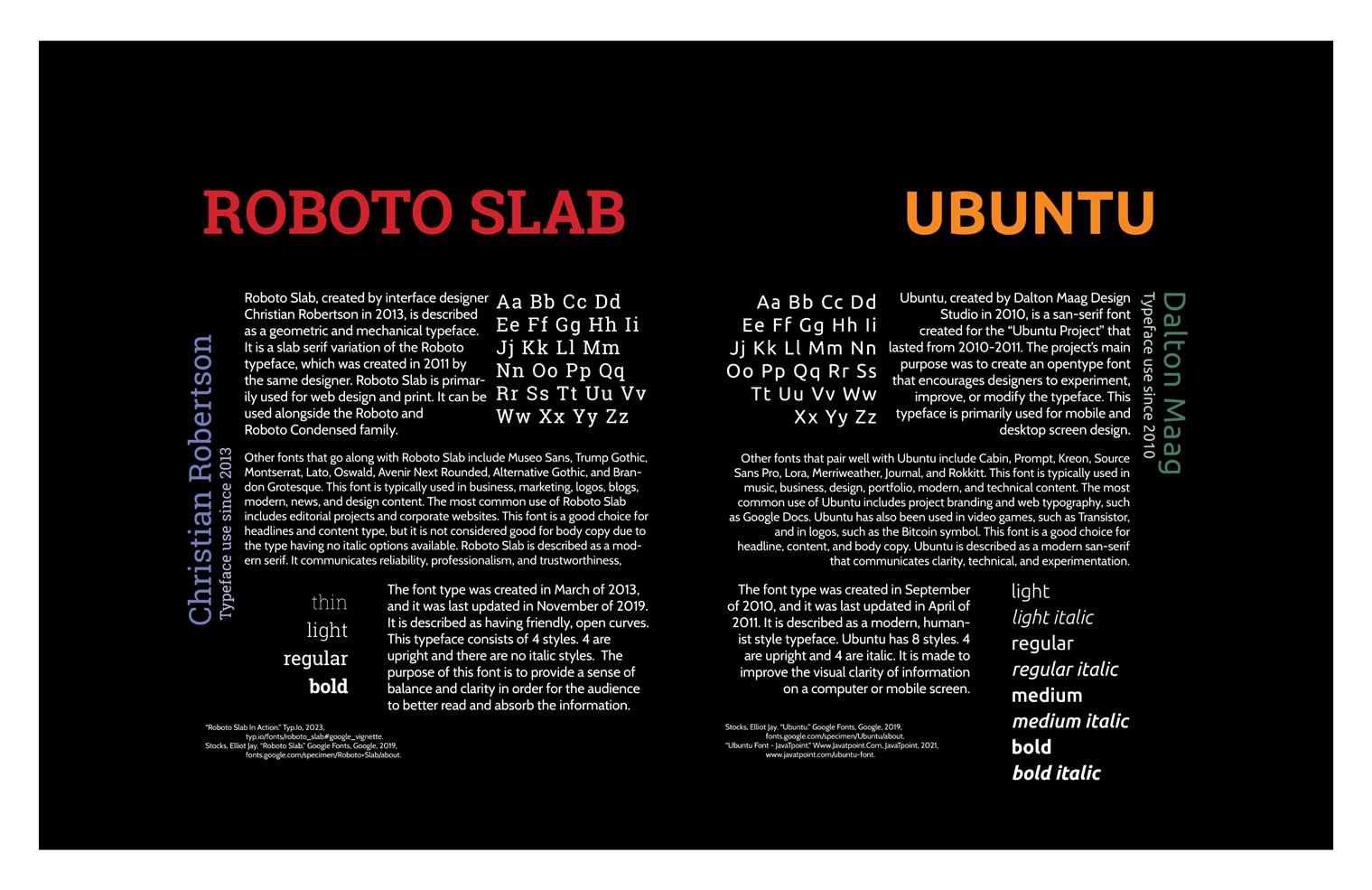
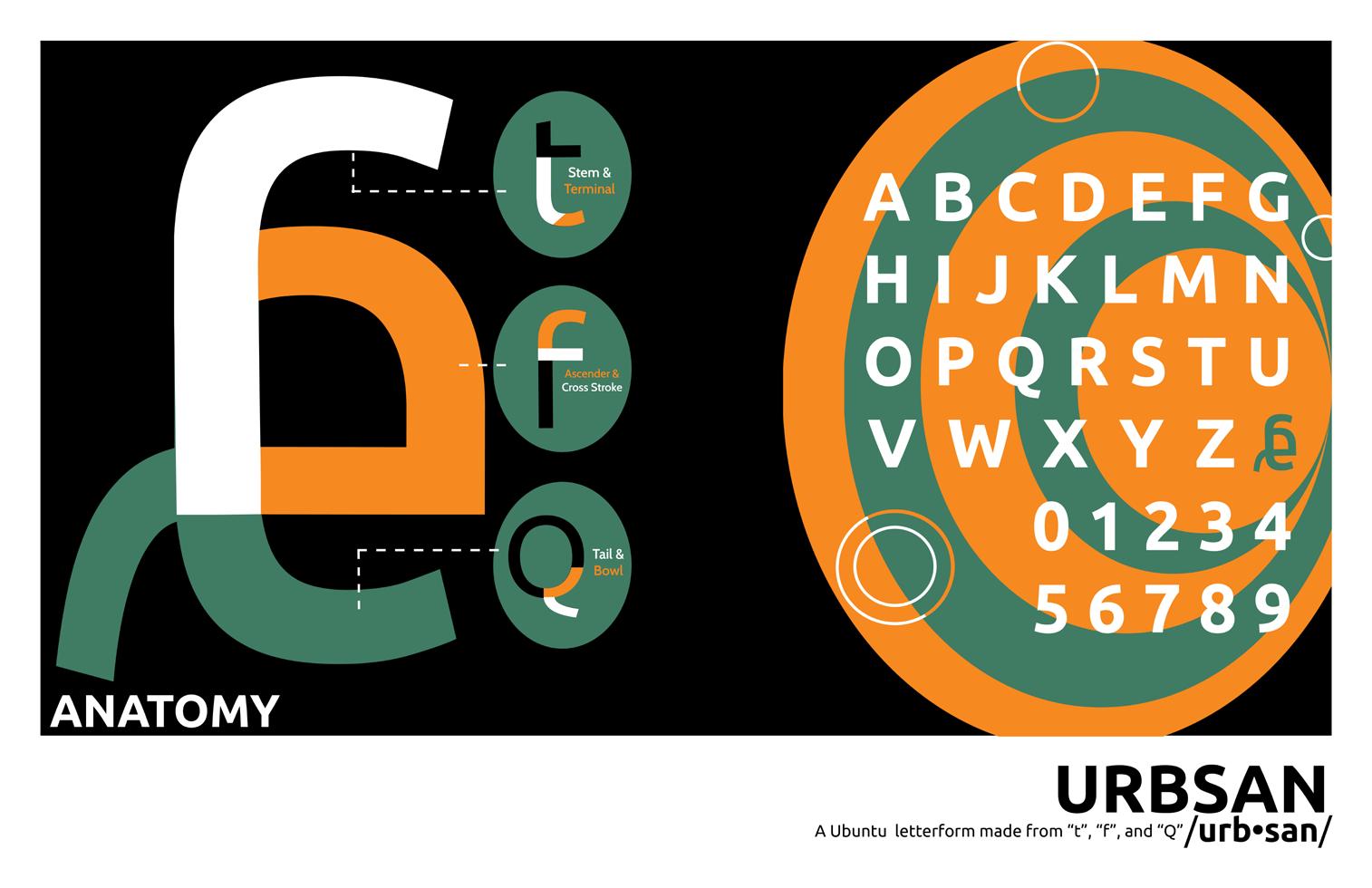
SAN SERIF 27TH LETTER SPREAD
I took inspiration from the curves of the Ubuntu Sans Serif typeface to create my letterform, which I then incorporated into an illusion graphic. To maintain consistency throughout my design, I also added my letterform to the typeface’s uppercase alphabet.
21
PROCESS
When I needed to create layouts and spreads for the letters, I had difficulty developing a theme. To get past this, I drew multiple ideas, selected a module grid, and made a theme for the spreads. Once I had a draft, I sought feedback from my professor and classmates and was advised to ensure the design elements were consistent and clear. I was also advised to be careful with borders and diagrams, as they could be misleading. The feedback was helpful, and I used it to improve my design by researching the history of the typefaces and Incorporating inspiration from De Stiji and the modernism movements. I was also inspired by Matisse’s “Jazz” series and Mondrian’s “Composition II in Red, Blue, and Yellow” artworks to create more balanced, symmetrical, and visually appealing spreads.
22
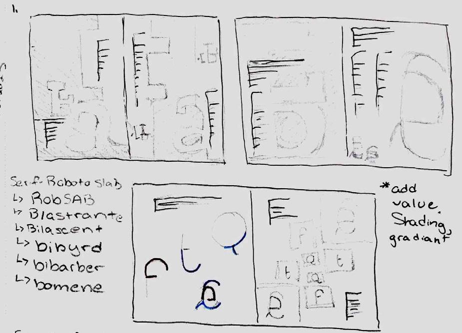
STEP 1: SKETCH IT OUT!
Quick early sketches are needed to create a general layout for the 27th letter of the serif and san serif typeface alphabet.
STEP 2: ROUGH DRAFT OF SPREAD 1
Rough Drafts of Spread 1 included the work-in-progress name and breakdown of the letter component for the Serif typeface.
STEP 3: CLOSER TO FINAL DRAFT!
The layout for the 27th serif letter specimen is nearly finalized, testing the color palette and visual placement of spread 1.
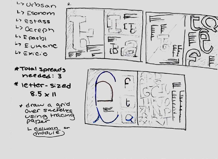
STEP 1: SKETCH IT OUT!
Quick early sketches are needed to create a general layout for the 27th letter of the serif and san serif typeface alphabet.
STEP 2: ROUGH DRAFT OF SPREAD 3
Rough Drafts of Spread 3 included the work-in-progress name and breakdown of the letter component for the San Serif typeface.
STEP 3: CLOSER TO FINAL DRAFT!
The layout for the 27th san serif letter specimen is nearly finalized, testing the color palette and visual placement of spread 3.
23

CONTINENTAL AIRLINES REBRANDING PATTERN VARIATION
There are three patterns used in the rebranding, but this particular variation is the most commonly used in marketing and branding materials.
24
PROJECT 5: AIRLINE REBRANDING
Background | October 30th, 2023
For my Typography I final project, I had the chance to rebrand an airline company that no longer exists, Continental Airlines. To achieve this, I researched the airline industry to determine the factors that made the company successful. With this information, I identified the areas that required modernization to help the brand stand out in the current highly competitive airline market. The project entailed extensive research, analysis, and creativity to develop a unique and compelling rebranding strategy for Continental Airlines.
Exploration | Finding the Archetype
First, I aimed to modernize the brand to make it more affordable and family-friendly. To achieve this, I followed the Innocent archetype, promoting a genuine, kind, straightforward message. Our motto became “Free to be you and me,” reflecting our goal to provide customers with peace, paradise, safety, happiness, and independence. To determine what worked and what didn’t, I analyzed previous branding ideas and developed a new color palette that fosters a sense of safety, security, and playfulness. The target audience was middle-income families to promote a family-friendly and affordable atmosphere with a playful
tone. To accomplish this, I changed the font system. I incorporated a new color palette into various branding products, such as coffee cups, crew lanyards, digital posters, plane wraps, and boarding passes. By doing so, I achieved the desired look and feel for my rebranding.
Reflection | An Exciting Opportunity
I worked on a project to revive an extinct airline company. My goal was to create a family-friendly and affordable look and feel. To achieve this, I analyzed previous branding ideas to identify what worked and what didn’t. The target audience for the rebranding was middle-income families. I aimed to promote a family-friendly and affordable atmosphere with a playful tone. The project was challenging but rewarding as it introduced me to brand identity and the creative process of rebranding an entire company.
25

CONTINENTAL AIRLINES
BOARD—
REVISED SKETCH OF CONTINENTAL AIRLINES LOGO— Adobe Photoshop
ORIGINAL SKETCH OF CONTINENTAL AIRLINES’ LOGO—
VECTORIZED LOGO FOR CONTINENTAL AIRLINES REBRANDING— Adobe Illustrator
REVISED VECTORIZED LOGO FOR CONTINENTAL AIRLINES REBRANDING— Adobe Illustrator
B&W FINALIZED LOGO MARK FOR CONTINENTAL AIRLINES REBRANDING—
COLOR FINALIZED LOGO MARK FOR CONTINENTAL AIRLINES REBRANDING—
Illustrator
FINALIZED WORD MARK FOR CONTINENTAL AIRLINES REBRANDING—
Illustrator
Adobe Illustrator
Adobe
Adobe
REBRANDING MOOD
Adobe Illustrator
26
Adobe Photoshop

CONTINENTAL AIRLINES NEW LANYARD MOCKUP
These badges will be reserved for the crew and staff members who work for with Continental Airlines.
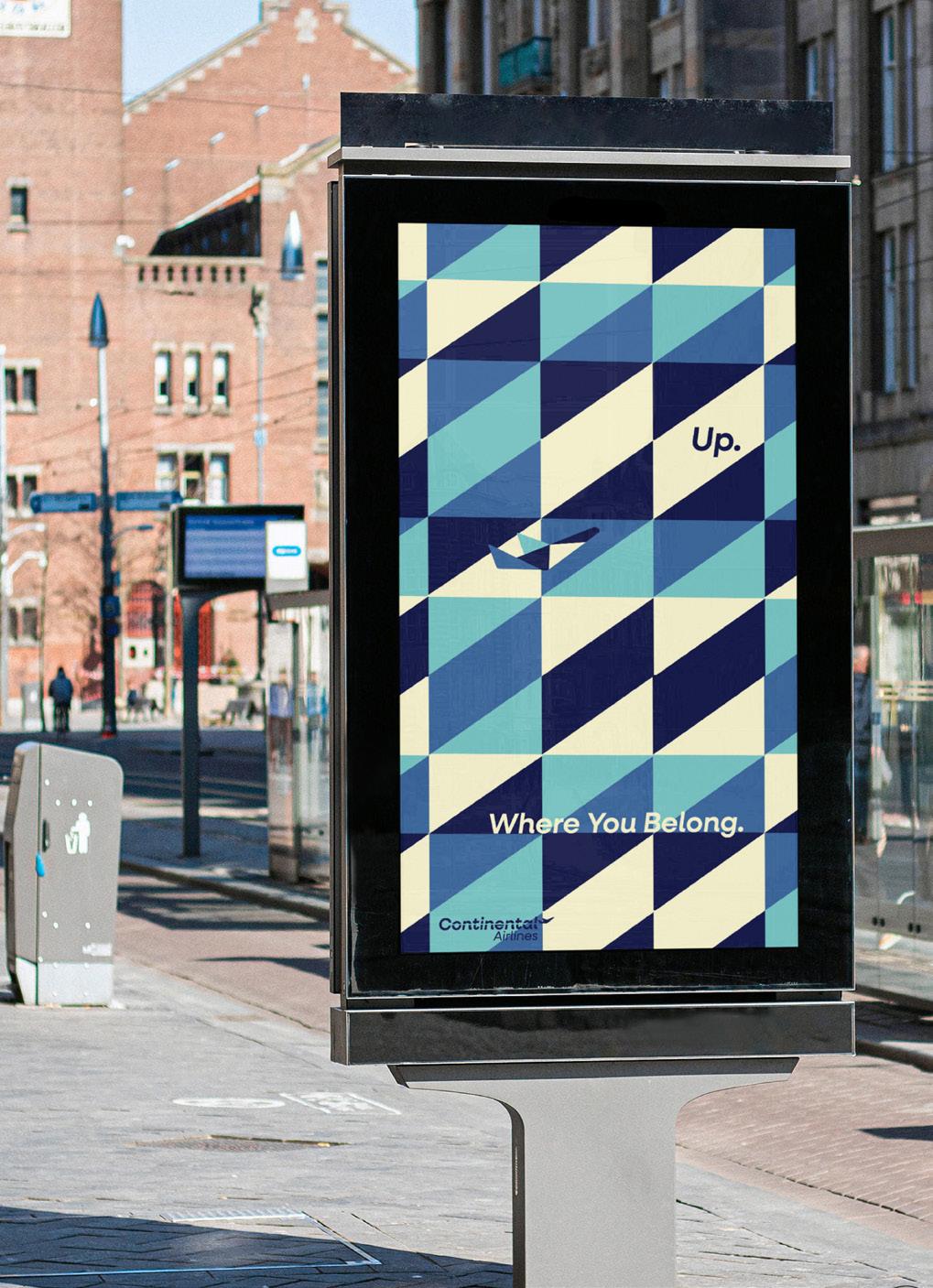
NEW URBAN POSTER DESIGN FOR CONTINENTAL AIRLINES Created for the purpose of promoting the company’s return throughout cities and urban areas.
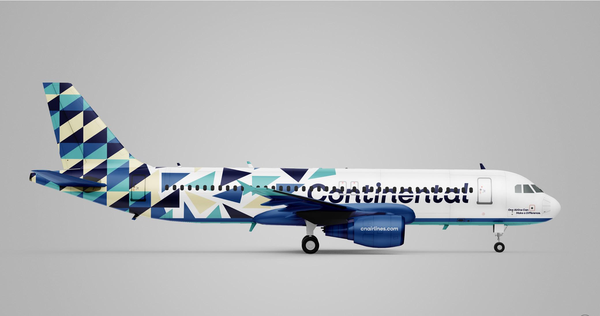
NEW PLANE WRAP FOR CONTINENTAL AIRLINES REBRANDING
The design is created using a geometric pattern made up of triangles. These triangles are derived from the logo mark and are manipulated several times to produce a playful, repeating pattern.
27
The course provides an in-depth exploration of typography and its fundamental principles. It focuses on effective use of typography in long-form text, emphasizing visual hierarchy, anatomy, and type pairings. The course also explores traditional and modern grid systems and relevant digital applications. To provide knowledge and techniques to create engaging typography that communicates messages effectively.
II
28
29
T HE L UMINEER S B ON IVER B LE ACHERS T HE N ATION AL B OYGENI US H AI M T HE C IVIL W AR S E D S HEERAN SATURDAY SUNDAY FRIDAY July 12th14th, 2024 CONGAREE NATIONAL PARK T RAIN VANCE JOY M UMFORD & S ONS N OAH K AHAN H OZIER NIALL HORAN A MERICAN A UTHORS FINAL DRAFT FOR PROJECT 1 POSTER DESIGN FOR CONGAREE MELODY MUSIC FEST Final layout, color choice, typeface, and abstract image. 30
PROJECT 1: MUSIC FESTIVAL
Background | February 15, 2024
The goal for Project 1 is to make a design system for a music festival. This system has a hand-drawn logo, posters featuring the logo, the date and location, the headliners, and four additional bands. The design system also includes a matching typeface, merchandise, and an instagram post to promote the event.
Exploration | Congaree National Park
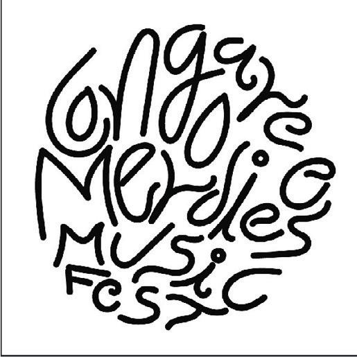
I was tasked to create 40 sketches of hand-drawn and digital logos. In class, we watched videos with tips on designing logos. I picked three tips that stood out to me. The first tip was using a shape and working within its boundaries to experiment with letter form, style, and width. The second tip was to use tracing paper to figure out which components of the initial sketch stood out and to rework those elements for a more solid design. The third tip was to use traditional tools like paint brushes, ink, and markers, as these materials tend to be unpredictable and can help create unique, organic, unpredictable marks and lines. During our first meeting, the professor applied these tips and instructed me to push my logo design in a more circular direction. Out of the 40 sketches, I chose to pursue the more circular design that fit the overall vibe of Conagree National Park.
To experiment with the circular design, I traced various circular objects like the bottom of a water bottle, a case of mints, and a circular tape measure using a pencil or pen. Then, I used my Posca paint pens to play around with different strokes, line widths, and marks. This exercise encouraged me to view the letters in my logo as shapes rather than lines. My favorite component of this process was having the opportunity to experiment with various markers and paint pens.
Reflection | Trust the Process
This project taught me a lot about myself as a designer and artist. I spent much time researching, taking photographs, and studying my surroundings in Congaree National Park. The most valuable lesson I learned is to start without fear and not overthink the process. As I began creating each component, I became more confident and comfortable with my designs. If I didn’t know how to do something, I found a way to learn by simply looking it up on YouTube or Google.
“ The most important lesson I learned: Just start.”
31

INSTAGRAM ADVERTISING FOR CONGAREE MELODY MUSIC FEST MOCKUP
I had the chance to work on a social media component for this project. It was enjoyable because I got to learn about social media advertising, which I always wanted to do. Although I had no experience with creating social media ads, I found inspiration from Instagram’s music festival ads and similar content. I drew inspiration from my original poster design and abstract photographs. Instead of using images, I used illustrative elements to represent the swampy water of Congaree. I included a similar color palettes to connect the social media posts to the poster designs.
Designing the merch component was my most challenging task in this project. I had no experience in merch design and had to learn the process from scratch. I spent over four hours searching for mockups that matched my requirements. However, I had difficulty finding suitable mockups as most well-designed ones required payment to create an account and access their content. This was quite frustrating as
I had to search for realistic and affordable mockups that would match the look and feel I wanted to achieve for my music festival’s advertising.
I found some mockups that suited my advertising goals and downloaded a tote bag mockup from Creatsy. I picked the tote bag as my main item to sell because the people who would be interested in this music festival are individuals who like indie and folk music and enjoy nature and national parks. I researched this group of people and found that tote bags are the most frequently bought and used item at any festival, be it music, craft, or local festival.
32
An Adobe Illustrator Mockup of an Instagram carousel that will be used to promote the festival.
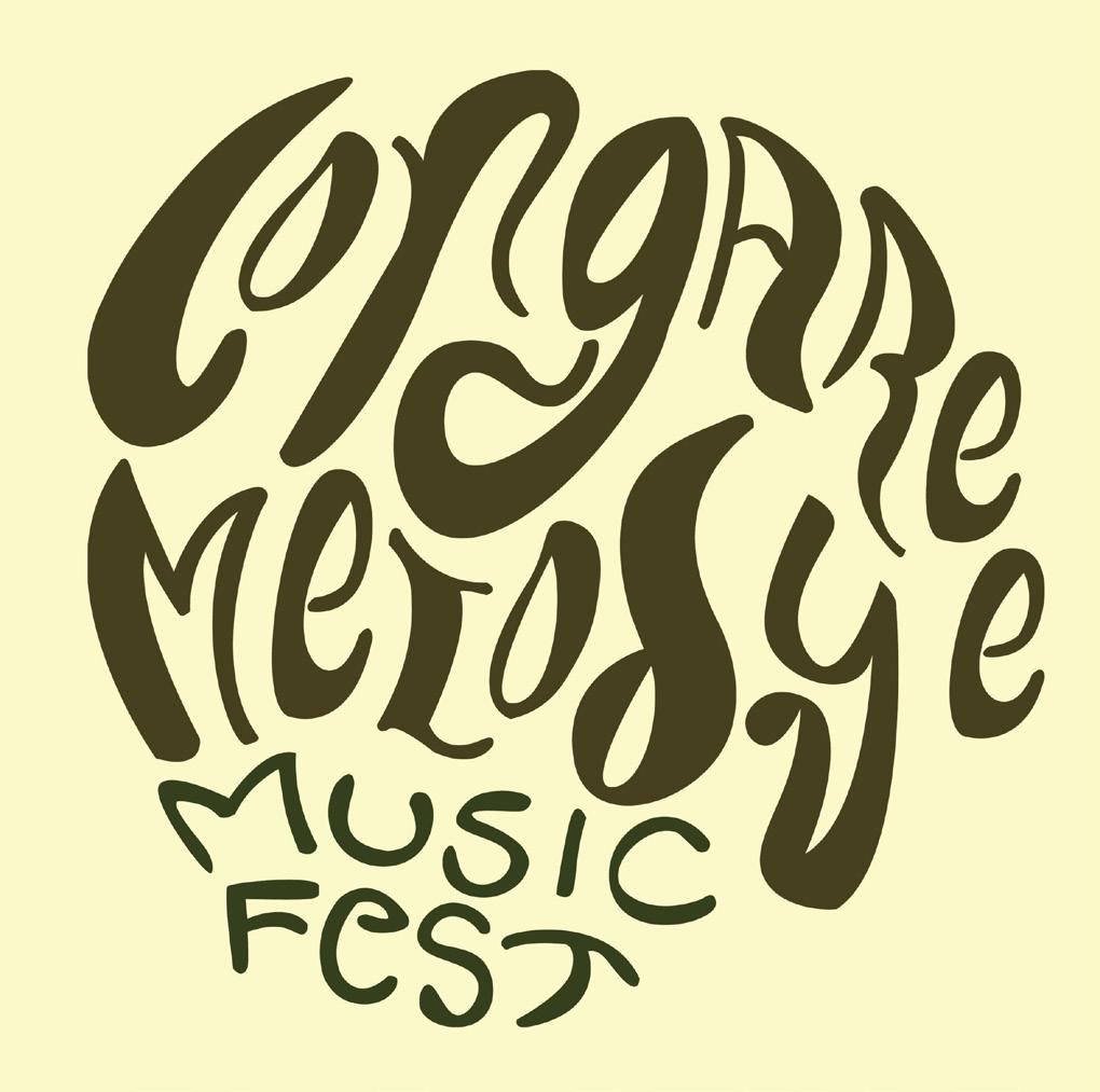
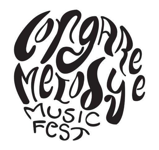
OFFICIAL LOGO DESIGN FOR CONGAREE MELODY MUSIC FEST
The official logo for Congaree Melody Music Fest. It was created using Adobe Photoshop.

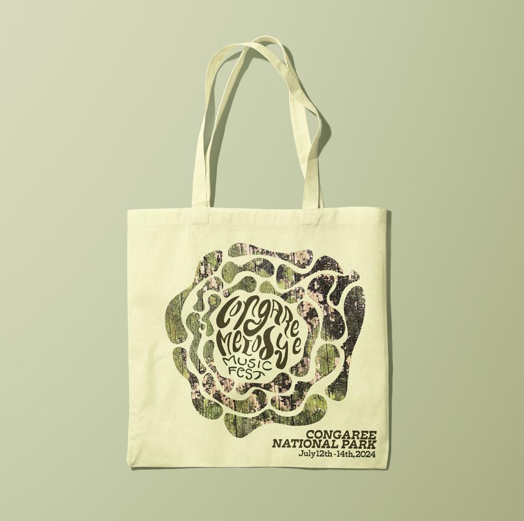
MERCHANDISE FOR CONGAREE MELODY MUSIC FEST MOCKUP
Inspired by the original poster design for the music festival. Includes the name, location, and date of the festival on the bottom left corner. Created using Adobe Illustrator & Photoshop.
33
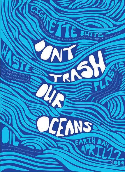
PROJECT 2: UCDA POSTER
Background | March 21st, 2024
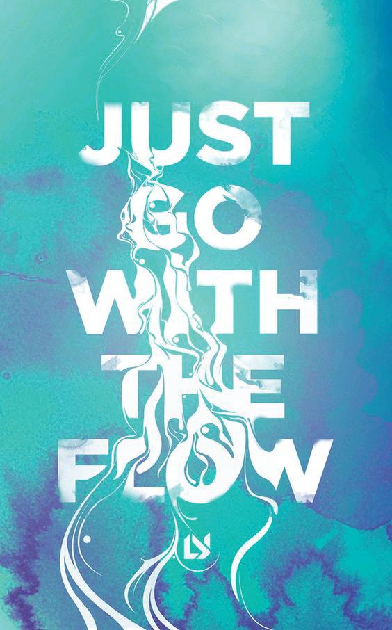
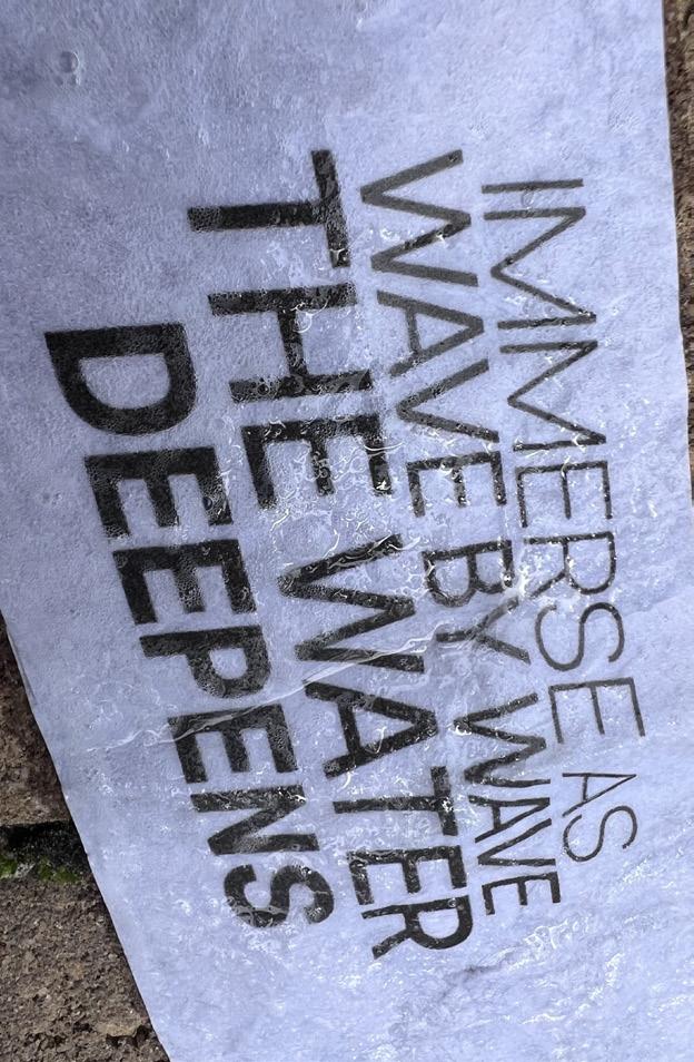
For Project 2, I was tasked with designing a poster for the UCDA Poster Competition, an annual contest organized by the University & College Designers Association, and its aim is to inspire positive thinking through student artwork. This year’s theme is Immerse, which invites participants to explore the possibilities of immersive design through augmented reality, using software such as Artivive and Adobe Aero. Students can design an original poster for print or online use.
Exploration | Playing with Water
I wanted to experiment with typography. To do this, I printed my type on paper, cut it down, and tried different solutions like water, dish soap, vinegar, baking soda, and body wash. I put my type under a glass jar and poured the liquids into it to see how they interacted with the ink and paper. I also crumpled up the paper and submerged it in the solutions for a more unique effect. During the process, I took photos from different angles to use later. I used Adobe Illustrator’s image tracing tool to manipulate the photos to create an impression of the type being submerged in the ocean. Finally, I used Adobe Photoshop to experiment with different color gradients until I found
blue and turquoise gradients that worked well. I then sent the files to be printed on glossy poster paper for the final critique. This quote encourages the audience to dive deeper into the waves and immerse themselves in the endless sea. By doing so, they can become lost in the zone and forget about the troubles of the outside world.
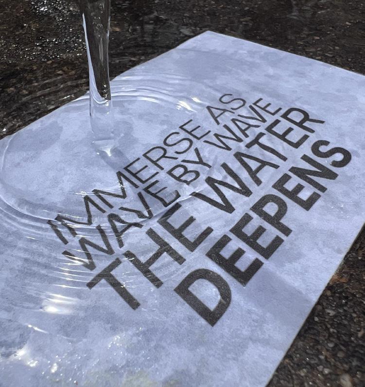
SUBMERGING MY TYPE IN WATER
I am experimenting with how physical type and paper react to water, playing with various textures to achieve exciting results.
34
ROUGH DRAFT FOR PROJECT 2 IMMERSE POSTER DESIGN
35
Linework and testing various texture effects in illustrator.

FINAL DRAFT FOR IMMERSE POSTER DESIGN Final color choice edited using Adobe Photoshop & final texture and custom typeface created using Adobe Illustrator. 36

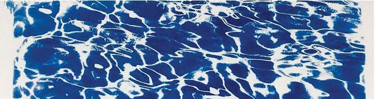

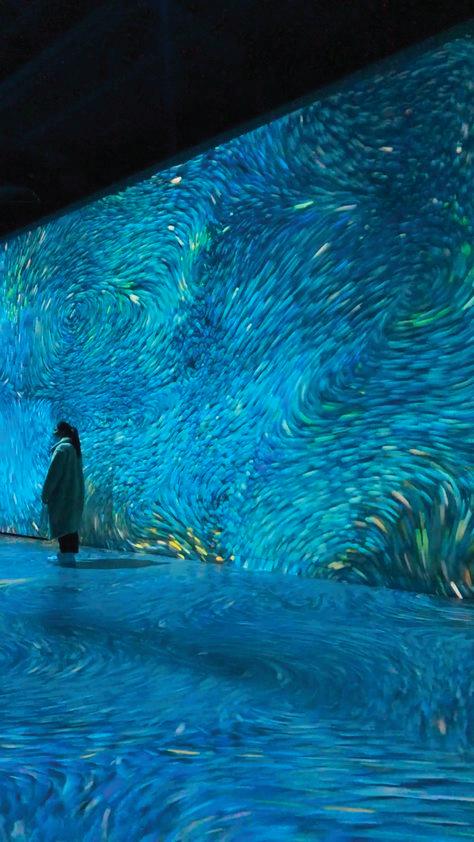
MOODBOARD FOR IMMERSE POSTER DESIGN
Inspired by 3D-Immersive art exhibitions, the fluidity of the water, and color combinations that remind me of the ocean.
STEP 1: TAKE THE PICTURE
Printed quote onto copy paper and experimented with submerging type into various liquid solutions.
STEP 2: DIGITIZE PHOTO IN ADOBE ILLUSTRATOR
Scanned photograph and brought it into Illustrator to manipulate the texture and type.

STEP 3: ADD COLOR TO DESIGN IN ADOBE PHOTOSHOP
Brought final JPEG into Photoshop to manipulate the contrast and add color to the image.
37
Visiting artists and professionals in the fields of design and illustration present entertaining and educational multimedia art lectures. These talks can be attended in person at the School of Visual Arts and Design at the University of South Carolina or online via Zoom. All events are free and open to students; most are also open to the public.
38
39
“ Always stay curious and don’t be afraid to ask questions.”
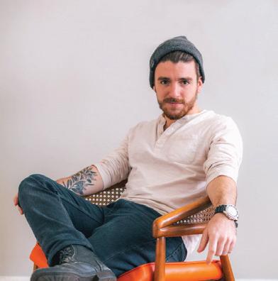
(1) Image of Jon Sorrentino taken from the designer’s official website at jonsorrentino.com.
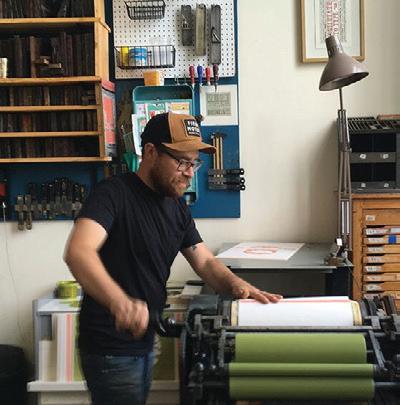
(2) Image of Brad Vetter taken from the artist’s official website at bradvetterdesign.com.
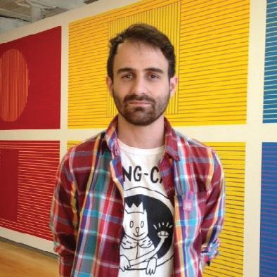
(3) Image of Sam Spina taken from the artist’s LinkedIn Profile on linkedin.com.
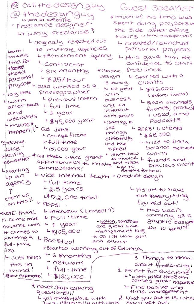
The Design Guy | February 22nd, 2024
During a GD+I Club event, Jon Sorrentino, a freelance designer, provided valuable insights on the world of freelancing and the corporate experience. Sorrentino explained that freelancing may not be a suitable option for everyone, as it requires individuals to possess excellent time management skills and a sense of responsibility to balance their workload and enjoy their freedom. Sorrentino also emphasized that as a designer, the key to improving one’s skills is through consistent practice and the effort put forth into their work. Additionally, he emphasized the importance of staying curious and asking clients relevant questions to communicate effectively and achieve successful outcomes.
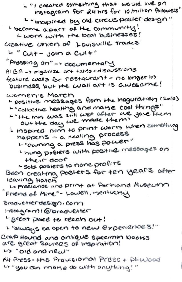
Brad Vetter | February 29th, 2024
I recently attended an art talk by Brad Vetter, a talented letterpress artist and designer based in Louisville, Kentucky. His work combines traditional letterpress techniques and modern digital design, which I aspire to achieve.
During the art talk, I learned some valuable lessons. First, connect with the local community is essential, so never hesitate to contact them. Second, experiment and challenge your aesthetic by working beyond your usual tools. Third, keep an open mind and look for inspiration, as it can come from anywhere. Don’t let the fear of failure hold you back.
“ The best experience you can have is learning on the job.”
“ Never hesitate to reach out and connect with your local community.”
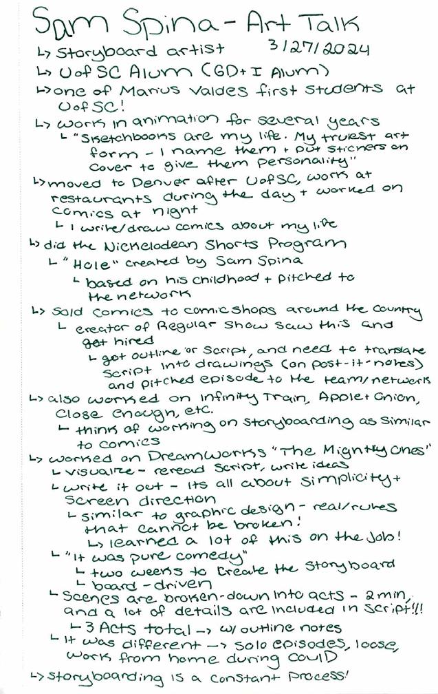
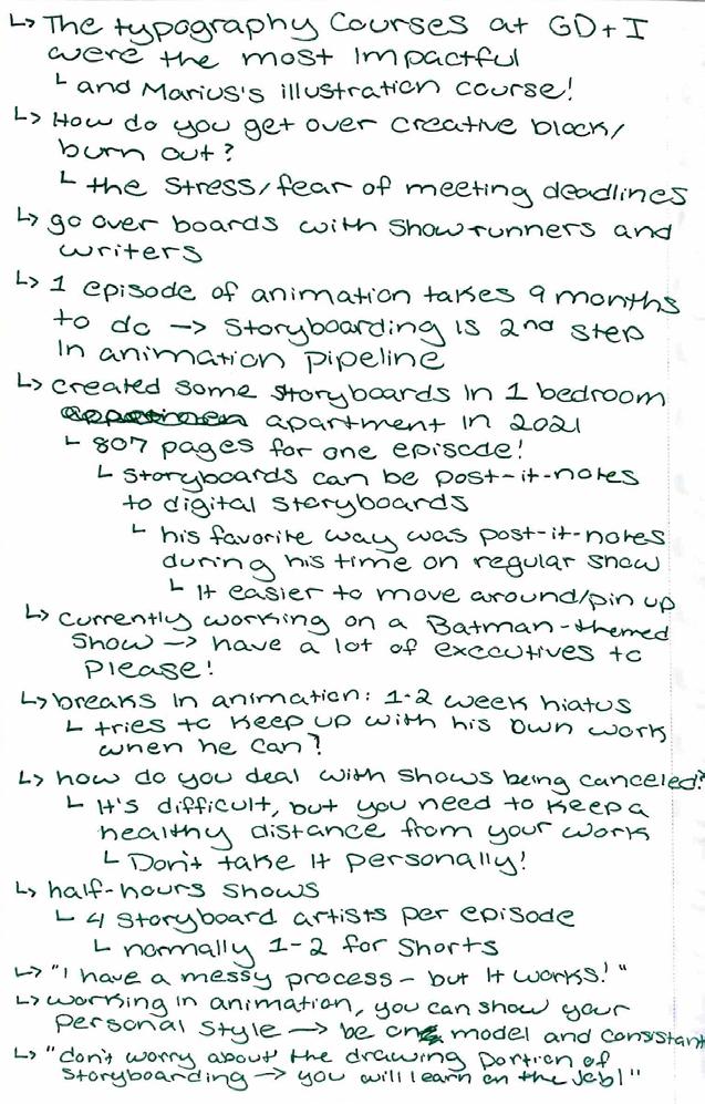
Sam Spina | March 27th, 2024
Sam Spina, a former Graphic Design and Illustration student at the University of South Carolina, shared his method of creating storyboards for television and streaming networks. He recounted his journey of beginning his career by working in restaurants during the day and making comics at night, which he eventually sold to local comic book stores. He revealed how these comics helped him secure his first job in animation and explained the process of pitching an episode to network executives. He also elaborated on how he translates the script and director’s vision into images by producing a series of panels to plan the shots and ensure continuity between them. These panels serve as the foundation for the animation in the following production phase.
1. 2. 3. IMAGES
OF GUEST ARTISTS
40
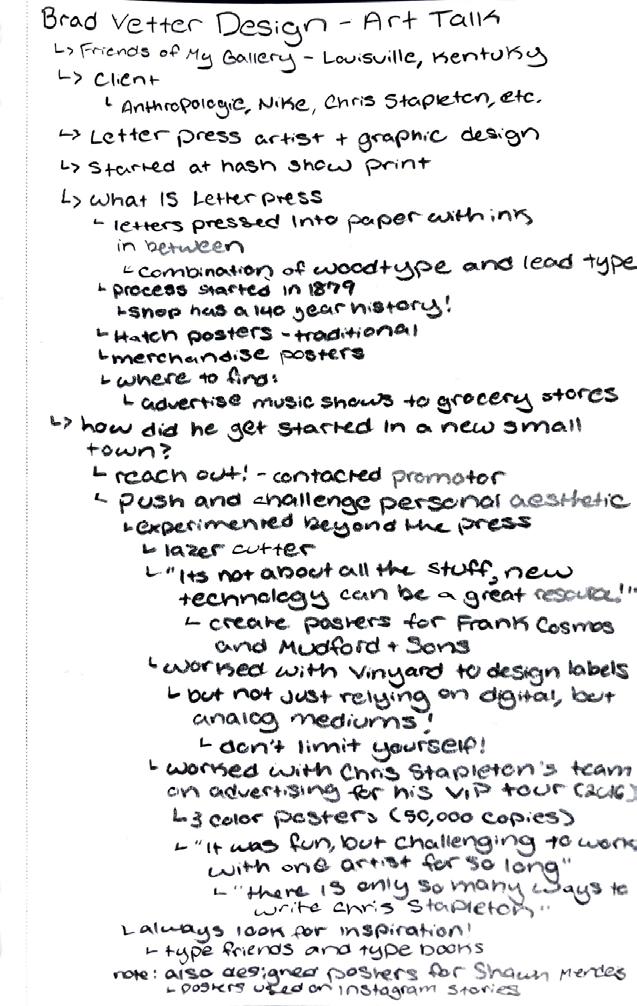
NOTES TAKEN FROM EACH ART TALK
A digital scan of notes that I took during several art lectures held at the School of Visual Arts and Design at the University of South Carolina. Each scan comprehensively accounts for the artist’s unique approach to creating and their creative process. The notes also shed light on how each artist started their respective careers, including any noteworthy milestones or challenges they encountered. Moreover, these notes capture the priceless insights the artists generously shared towards the end of their lectures, making them an invaluable resource for anyone interested in pursuing a career in an art-centered field.
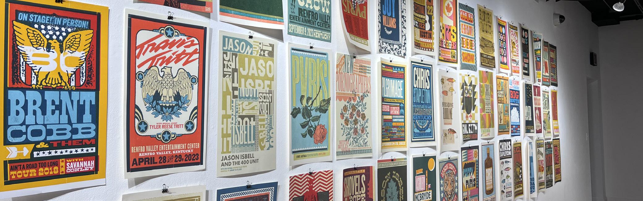 ART EXHIBITION BY BRAD VETTER AT MCMASTER GALLERY AT THE SCHOOL OF VISUAL ART AND DESIGN
41
Showcased over 100 commissioned letterpress posters created over the past decade, highlighting his collaborations with acclaimed artists.
FINAL THOUGHTS
I enjoyed starting from the design basics and using analog tools like xacto blades, rulers, and glue. The projects that required these tools were challenging since achieving clean cuts and precise details was tough. Later on, we moved on to the digital aspect of the course, and I appreciated that each project covered a wide range of design principles. Though some of the projects were tough, they helped introduce me to new concepts and encouraged me to develop various ideas before settling on the best one to work on.
Through these courses, I have explored the wonders of typography, experimented with different styles, and pushed the boundaries of type. The Typography I course helped me learn the fundamentals of typography and how to use Adobe software effectively. Although challenging, I am grateful for the experience because it helped me grow in Typography II. With the help of this course, I have become proficient in using various tools in Illustrator, mainly the pen tool. Are my designs perfect? No, of course not. I am still a student, and I have a lot to learn. However, I am proud of my progress and grateful for the opportunity to express myself through typography.
42


“I am grateful for the challenges because it helped me grow as a designer.”
43
Carly McCormick