DESIGN TECHNOLOGY AND CONCEPTS
CARLY MCCORMICK
CARLY MCCORMICK


Graphic Design. Such a generalized word can mean an abundance of different things. Before taking my first graphic design course in college, I had a narrow view of what graphic design was and what potential career paths such a person could pursue. After completing the design technology and concept course at the University of South Carolina, I now realize that such previous notions were rather narrow-minded, as a graphic designer can be almost anything. As I have learned to navigate Adobe’s software, I have grown a deep
appreciation and love for utilizing digital media as well as the timeless tradition of creating physical artwork with mediums such as drawing and painting. I have always had a passion for creating and have always had an interest in visual storytelling. I firmly believe my continuation in upper-level graphic design courses can allow me to be challenged creatively, while also allowing me to further explore my artistic style and establish a sense of clear purpose and direction when beginning my career in the field of design.
“This is not your grandmother’s graphic design. Nor is it your older brother’s or sister’s. The rate of speed at which the practice moves is cyclonic. All you have to do is look around to see that the world of design involves media that were inconceivable when grandmas were starting their careers.”
The Preface of 4th Edition of “BECOMING A GRAPHIC & DIGITAL DESIGNER: A GUIDE TO CAREERS IN DESIGN” by Steven Heller & Véronique
VienneDesign Technology and Concepts serves as an introduction to the broad field of graphic design, encouraging students to engage with the visual through introductions to Adobe software such as Photoshop, Illustrator, and InDesign. These programs are universally acknowledged throughout the design industry, and this course has allowed me to be formally introduced to these programs with the guidance of a professional mentor who has experience within the industry. By providing broad guidelines, as well as providing helpful due dates to aid in maintaining time management, these projects not only reflect my use of creative space in the digital medium but also reflect my progression and growth as I learn to navigate the ever-changing realm of Graphic Design and Illustration.
Hello there! My name is Carly McCormick, and I am an undergraduate student at the University of South Carolina. In the summer of my senior year of high school, I struggled with my decision to choose whether or not to attend community college or attend a four-year university. During this time, the COVID-19 pandemic occurred, my senior year was cut short, and my future remained unknown. This scary, uncertain time allowed me to reflect on my education, and how I should choose to live my life going forward. I have always had an interest in visual storytelling and dreamed of having a creative-driven career. I chose to begin my academic journey toward obtaining a graphic design degree by enrolling in classes at my local community college, in which I would complete work for my courses in the mornings, and work during the afternoons and nights at my part-time job. After I received my Associate in Arts and Humanities in the Spring of 2022, I decided to continue my education at the University of South Carolina. My long-term goal is to accumulate the necessary skills and resources to better be prepared to enter the graphic design industry, in which I hope to further explore and challenge my artistic ability by utilizing the resources that coincide with the endless possibilities of the digital age.
Music has the ability to create a deep connection with the human spirit. To create a connection with a stranger in a way that no relationship has managed to replicate. While the music sounds captivating to the listener, the stories in the song touch the human soul and take the listener to another place. Perhaps a distant memory or an imaginative scene. My work for Project 1 is an examination of how song lyrics manage to inspire and shape the imagination, and the creative thought process that lies behind them.
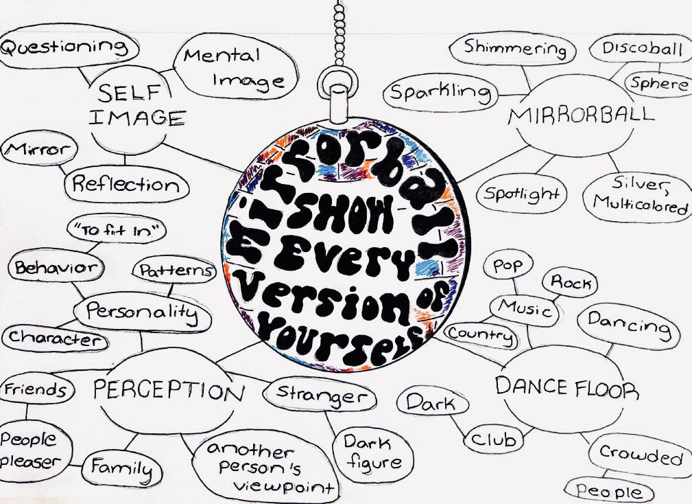
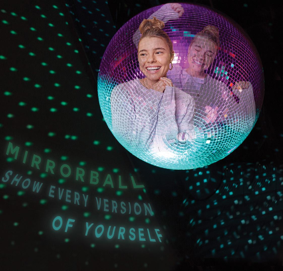
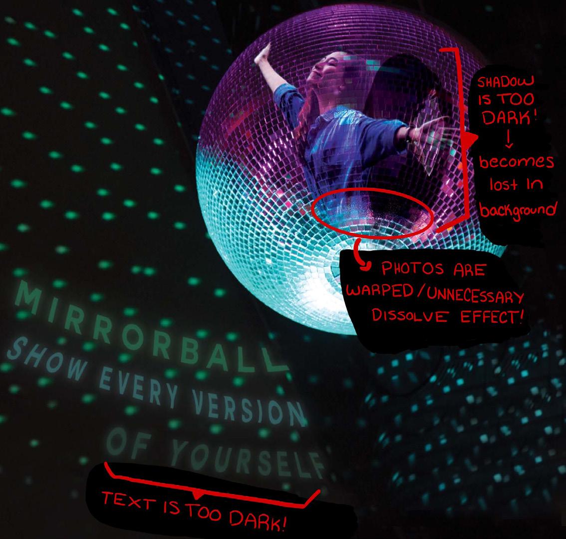
I first wrote down ideas to form two separate word maps in my sketchbook. The first concept drew inspiration from the song “Mirrorball” by Taylor Swift. The phrase “mirrorball, show every version of yourself” was influenced by the original lyrics “I’m a mirrorball, I’ll show you every version of yourself tonight.” These lyrics compared the different sides and personalities of a human being to the infinite surfaces of a mirrorball (or disco ball), in which an individual feels the constant need to showcase their various personalities in an attempt to “fit in” or to please the other person. This idea was further developed using Adobe Photoshop, in which I blended the typeface into the background to give the words the appearance of being reflected off the disco ball. The figures inside were meant to represent the various sides of a human being, such as being energetic and excited, or calm and happy. The idea was critiqued and revised to correct the visibility of the typeface and to allow the original idea to be translated more clearly.
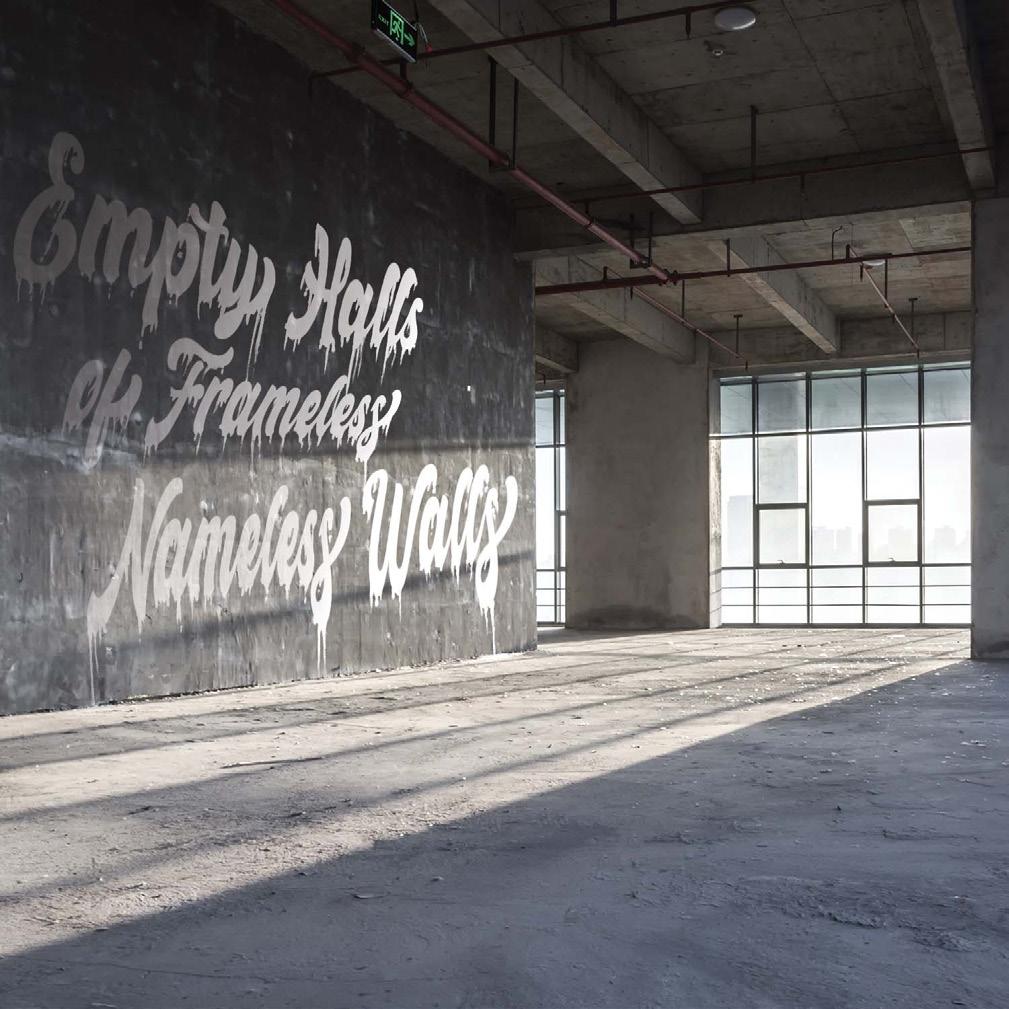
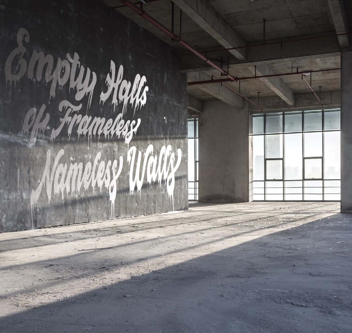
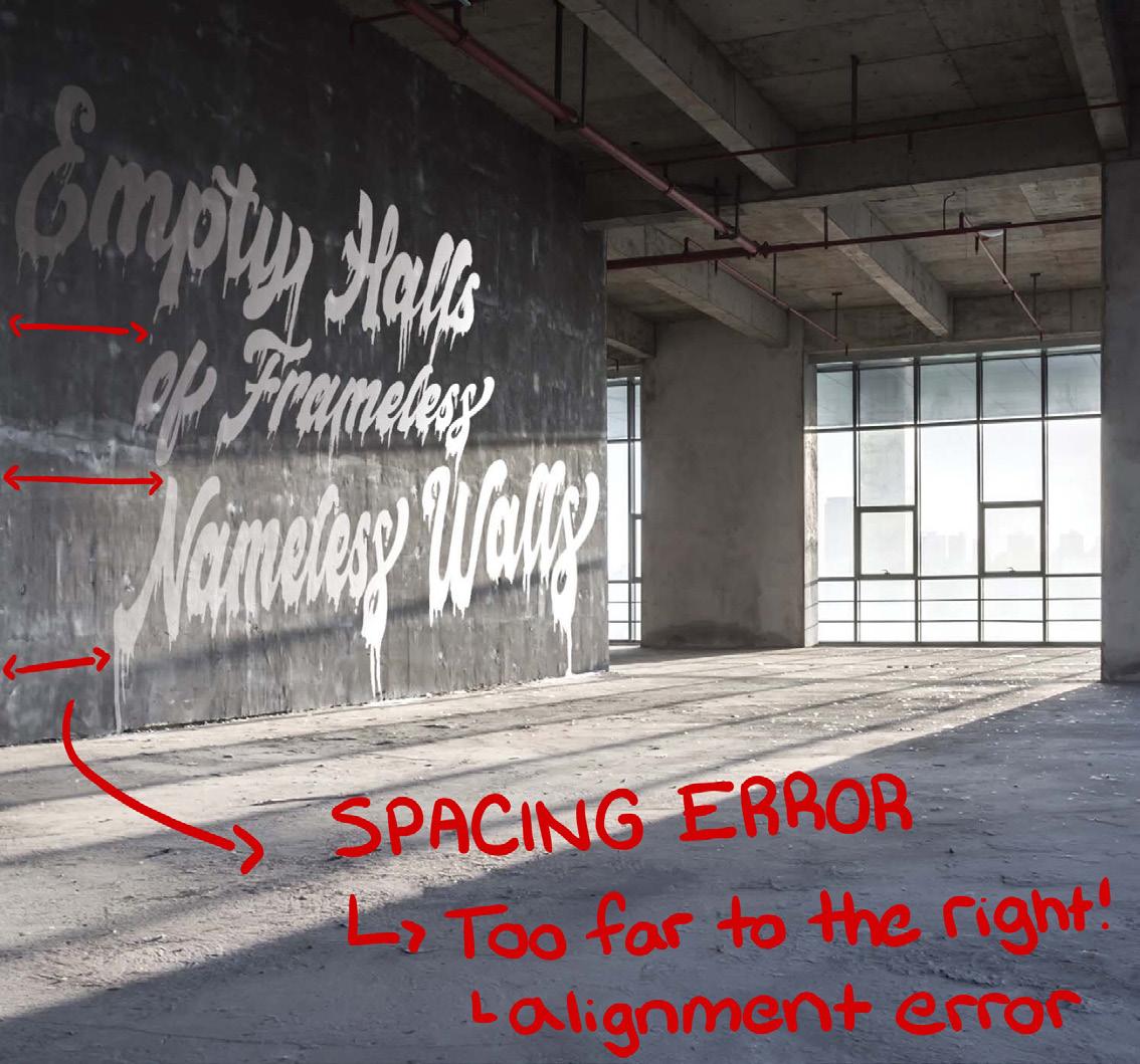
The second concept followed a similar process to the first concept by drawing inspiration from the song “Vincent” by Don McLean. The phrase “empty halls of frameless, nameless walls” was inspired by the lyrics “Portraits hung in empty halls. Frameless heads on nameless walls.” These lyrics not only display a satisfying rhythmic pattern but also allow the audience to experience visual imagery. By listening to the song many times, I imagined an empty warehouse in which a person decided to paint a phrase to make the space feel less empty. Similar to the first concept, the idea was critiqued and further developed using Photoshop.
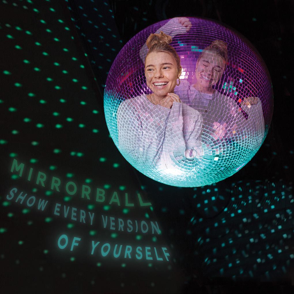
Photoshop concept inspired by Taylor Swift’s “Mirrorball”, the sixth track on the album “Folklore” (2020).
Photoshop concept inspired by Don McLean’s “Vincent”, the third track on the album “American Pie” (1971).
The concept is further developed by visually drawing word maps and matching to discover which words, phrases, or images match the six-word story. Several words and phrases were selected, such as disco ball, spotlight, multicolor, self-image, and perception. These words were visually translated and incorporated into the final result.
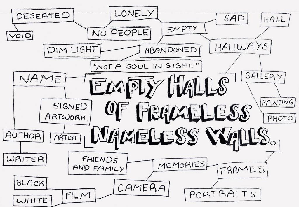
The concept is further developed by visually drawing word maps and matching to discover which words, phrases, or images match the six-word story. Several words and phrases were selected, such as deserted, abandoned, empty, lonely, and painting. These words were visually translated and incorporated into the final result.
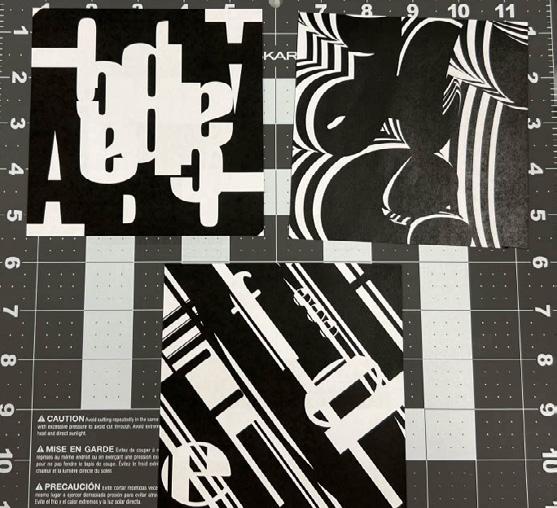
Background | September 27th, 2022 Letters. These seemingly basic elements of the alphabet enable communication to occur across different lifetimes. Letters simply make up the foundation of speech and language, allowing people from all walks of life to be allowed to form genuine human connections. While some words may appear insignificant, it is the person’s responsibility to determine how one may use such words. Whether or not to give words powerful meaning, for better or worse. Rather than limiting the potential of words, artists, and designers manage to take that idea a step further by combining visual imagery and words, letters, or phrases to create meaningful, visually appealing, and perceptive messages.
In Project 2, my goal was to experiment with a variety of fonts to create visually appealing images that push the visual boundaries of using text while following
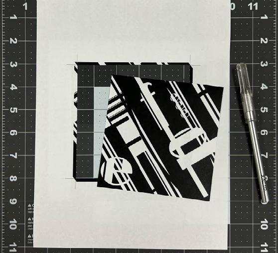
the four basic principles of design (composition, repetition, alignment, and proximity). All concepts were finalized in Adobe Illustrator, in which they were converted to PRESS PDF files with trim and 0.125” bleed marks. These images were then printed and cut out using an x-acto blade and a metal ruler.
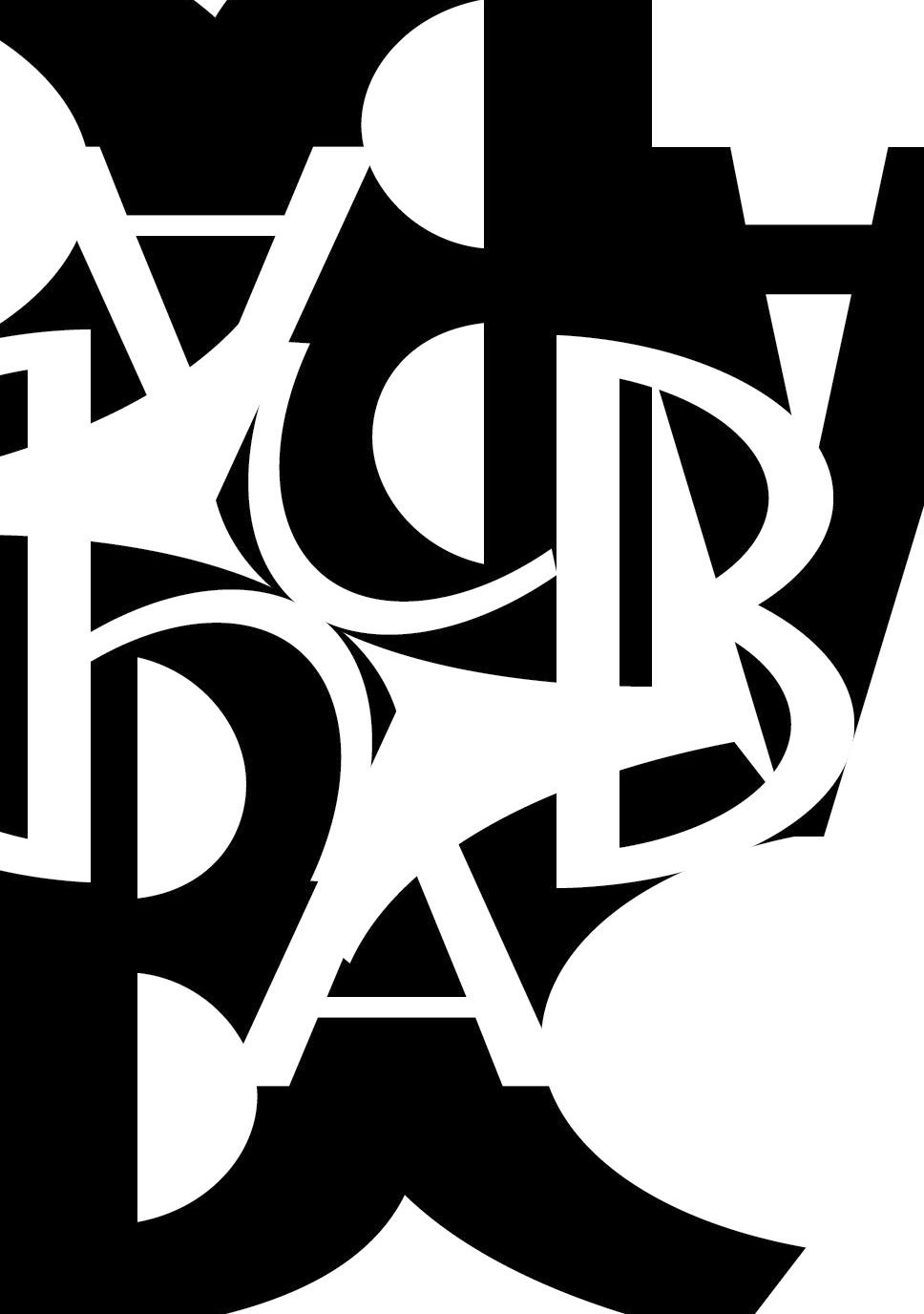
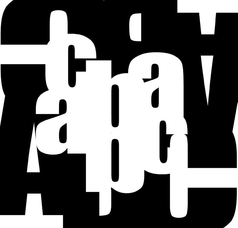
Concept #1 focused on the exploration of positive and negative space, and how such space could be shared to form an interesting typeface design.
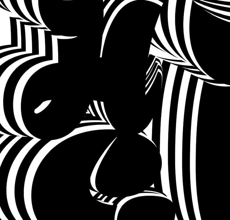
Concept #2 draws inspiration from the Abstract Art and Art Deco movements of the 1920s. By combining classic Art Deco typefaces with various line positions and orientations, I was able to capture the classic abstraction of type design while also capturing unique elements of the Art Deco movement.
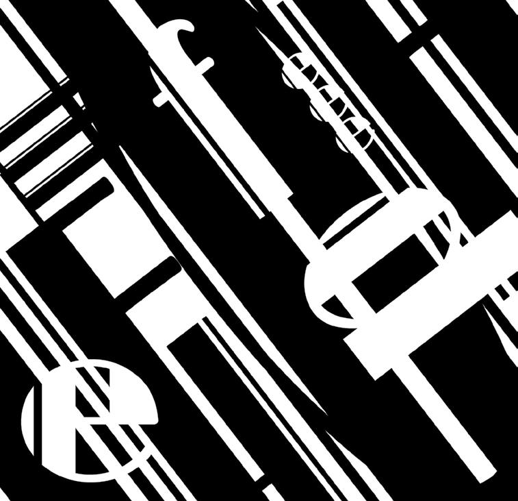
Concept #3 was inspired by the counterculture movement of the 1960s and 70s, in which younger generations rejected traditional social norms in favor of exploring identity and fighting injustice. Much of the artwork of this period reflected these ideas, as the psychedelic typography style began to emerge with artists and designers who turned their turmoil into works of art. Concept #3 draws directly from that period, as the design uses the illusion of peripheral drift to give the typeface a sense of movement.
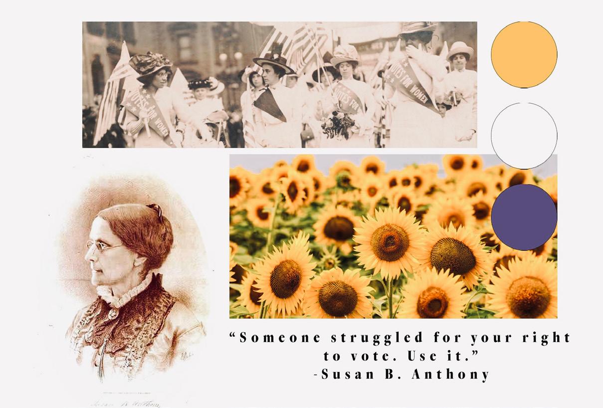
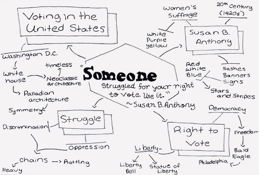
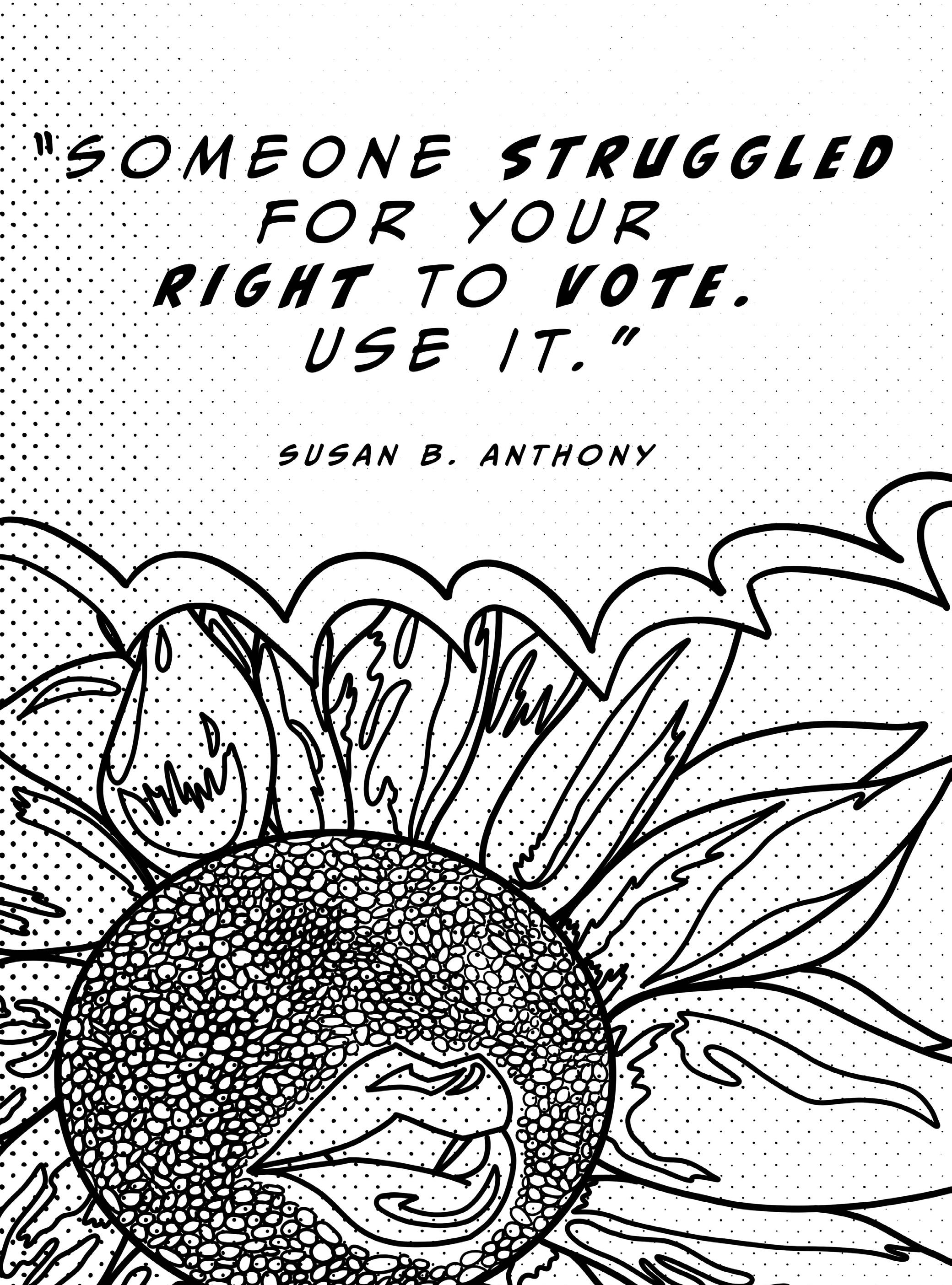
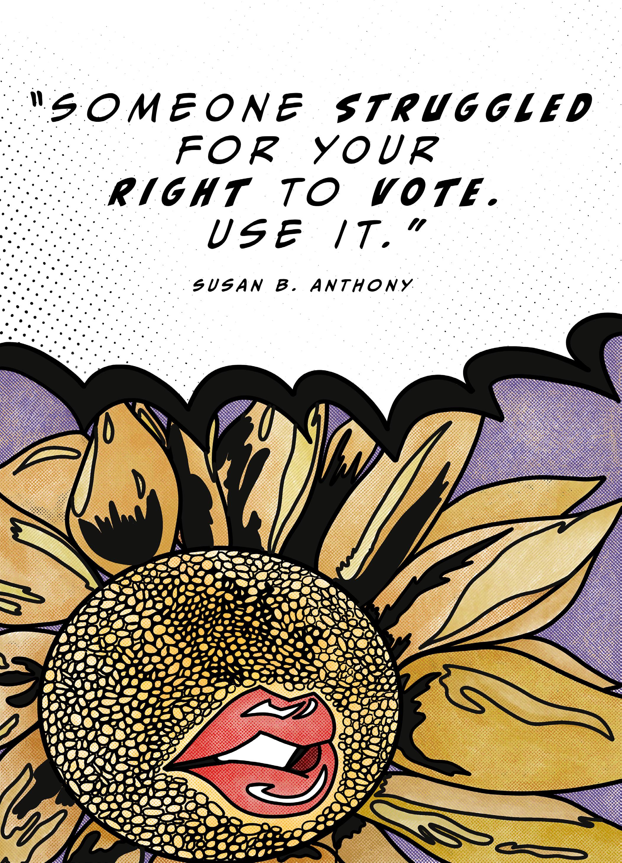
Voting is a fundamental right that every United States citizen is responsible for. The process of submitting ballots to determine the trajectory of an entire country, and to preserve democracy by voting to get different people into office. A campaign is an important tool in an election, as the public is granted the opportunity to learn about a candidate’s beliefs and goals for the nation. For a contender’s message to be sent across various platforms, designers are granted the responsibility of fulfilling advertising tasks (such as creating posters, designing websites, creating social media accounts, etc.) My work in Project 3 is a modern interpretation of symbolism from the Women’s Suffrage Movement in America during the early 1920s.
I started by creating a number of concept sketches to further explore the ideas that came out of Susan B. Anthony’s quote. Next, I created two main rough drafts to get an idea of what the final result would look like on paper. The first Rough Draft sketch received feedback in a class critique, in which I followed the advice of choosing a slightly different drawing than the original concept. Next, I further expanded on the rough draft by experimenting with the placement of the flower and implemented small changes in the typeface.
Logos. An impactful element in the realm of graphic design and the general field of advertising. A well-designed logo follows several key principles for creating and growing a brand. These principles include engaging the viewer, communicating the message clearly, being memorable, and being scalable.
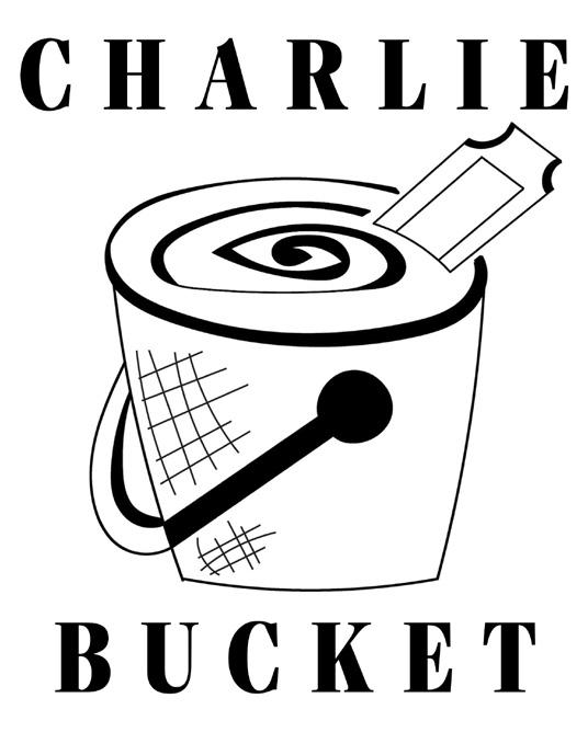
In Project #4, my goal was to provide my translation and interpretation of two characters from a movie of my choice into an effective logo design. These logos must follow all the principles previously listed above, while also having the ability to be translated in black and white and in color. The characters I chose to further study and develop various logo concepts for are Willy Wonka and Charlie Bucket from the awardwinning film “Willy Wonka and the Chocolate Factory” (1971.)
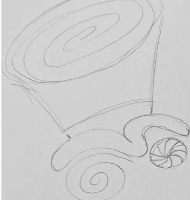
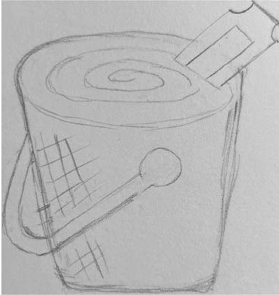
I start by drafting thumbnail sketches of various potential concepts for the final design of each logo. Willy Wonka was a fairly easy character to generate ideas for, due to his spontaneous, crazy, and memorable personality and mannerisms.
However, Charlie Bucket proved to be a challenge because the more I researched his character, the more two-dimensional he appeared to be. While he has moments in the film that allow him to shine as a character, his overall personality proves to be difficult to generate ideas for.
Next, I took these rough concepts a step further by importing the image files into Adobe Illustrator and experimenting with line length and thickness using the pen tool.
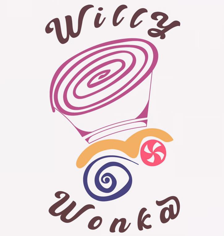
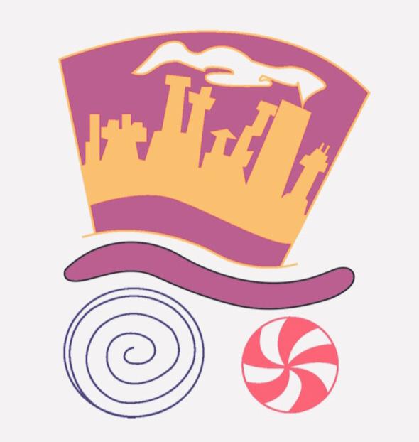
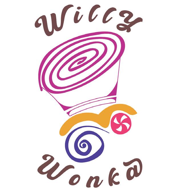
Willy Wonka is an innovative mastermind who founded a magical, yet mysterious chocolate factory. The final design is mainly composed of circular swirls to represent the nonsensical craziness of Wonka’s character, and his iconic top hat is the focal point of the logo. The hat’s brim is supposed to represent Wonka’s eyebrows, and the circular swirl and peppermint are meant to represent the eyes of the character. The color choices are meant to reflect the color palette of Wonka’s costume in the film. The typeface was inspired by Wonka’s candy bars and sweets’ packaging. The typeface is arranged in an arched-circular fashion, which frames the design to give it a more finished look.
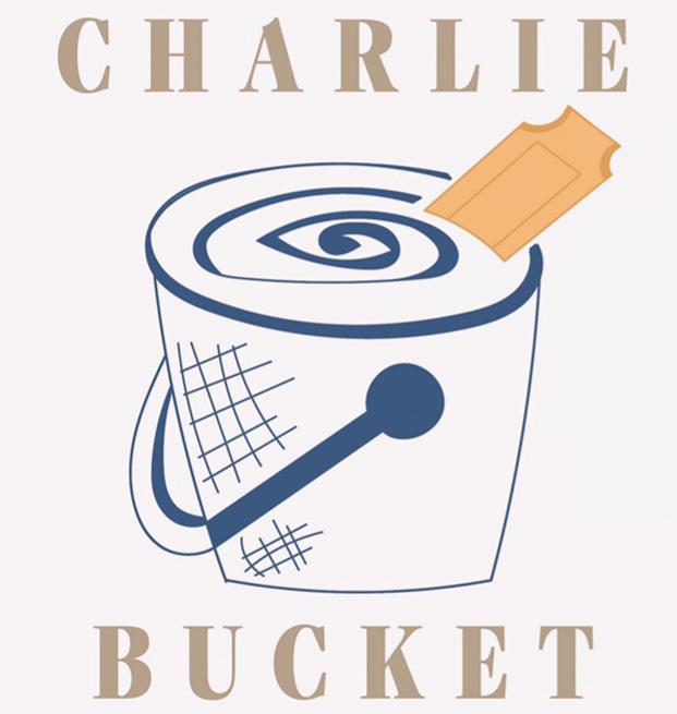
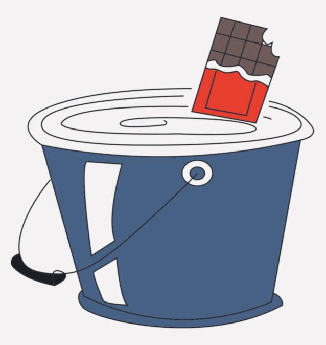
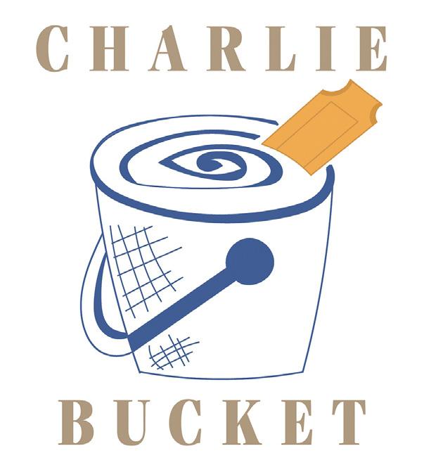
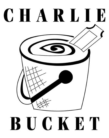
Charlie Bucket is often described as the embodiment of virtue, as his selfless and kind-hearted personality is showcased throughout many moments in the film. The bucket design was chosen to reflect the character belonging to the poor/ lower class, and the ticket peeking out the top of the logo is meant to be symbolic of the golden ticket that allowed him to visit Willy Wonka’s Chocolate Factory. The swirl at the top of the design is meant to represent water, and is also purposefully similar to the swirl detail in Willy Wonka’s logo design, foreshadowing Charlie eventually becoming the next Willy Wonka. The color palette is meant to reflect the colors used for Charlie’s character in the film. The typeface is meant to be simple, yet reflect the character’s shining virtue throughout the film. The typeface also frames the design to give it a more finished and finalized look.


Writing plays a crucial role in the creative process, as artists are often required to submit an artist statement, a statement of intent, or need to further explain or describe their work to their intended audience. To fulfill such requirements, writing courses or practice is often encouraged to develop the necessary skills needed to explain one’s artistic vision clearly and professionally.
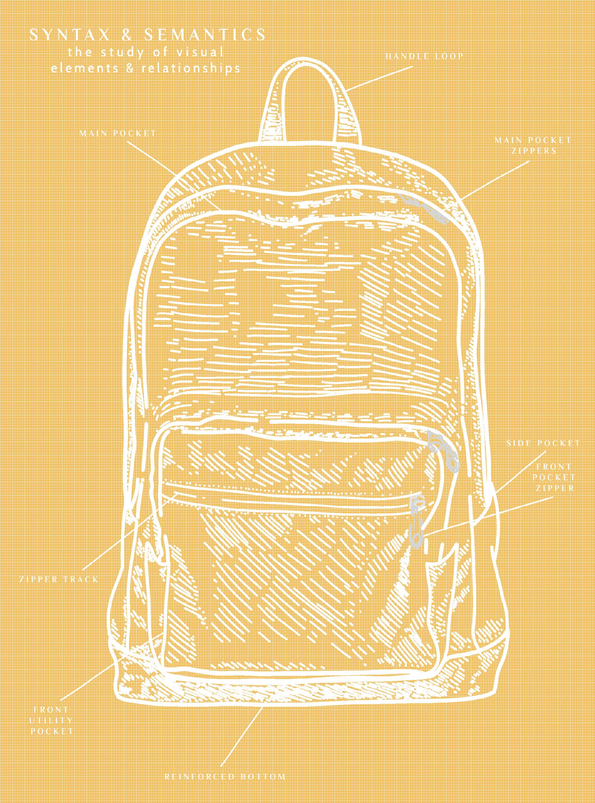
Before completing Project #5, I was unaware of what words such as “syntax” and “semantics” meant or stood for. The definition “To write meaningful words” tended to perplex me, as I found it rather difficult to write or explain my artwork. Phrases such as “because I found the subject interesting,” or “It just felt right,” always seemed to come to mind.
However, this project allowed me the opportunity to further explore the meaning or intention behind a product and taught me how to better explain a design’s artistic choices, and description, as well as its intended audience. This project also allowed me to experiment more with the InDesign program, as it served as an introduction to layout design. The design choice I chose to explore was the various styles of backpacks.
Before completing research on the subject, I mainly viewed backpacks as practical items used to carry various types of supplies. While this statement is still true, there are many types of backpacks used for a variety of different purposes, and their designs often reflect those uses, as well as the aesthetic interests of their target audience.
SYNTAX (visual elements & relationships)
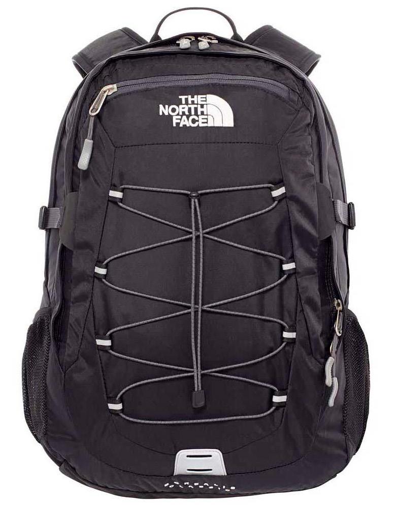
The object is primarily black with shades of grey and white. The fabric is made of nylon and polyester material that is accented with white and grey geometric elements. The logo is embroidered onto the bag using white thread, and the openings of the fabric are lined with aluminum zippers. The light gray fabric is threaded through the eye of the zippers. There is an elastic string-like material located on the front of the bag to create pocket-like compartments. A black nylon material is sewn to the top of the bag to create a circular, handle-like shape. The black fabric is sewn together to create an object intended to hold or carry items.
SEMANTICS: DENOTATION (specified)
Accessory > Backpack > Hiking bag
SEMANTICS: EXPRESSION (feelings)
Mature, practical, adventerous
SEMANTICS: CONNOTATION (associations)
Hiking, traveling, college
PRESENCE (contextual)
Little: On the bench of a college campus
Lots: In a middle schooler’s locker
SYNTAX (visual elements & relationships)
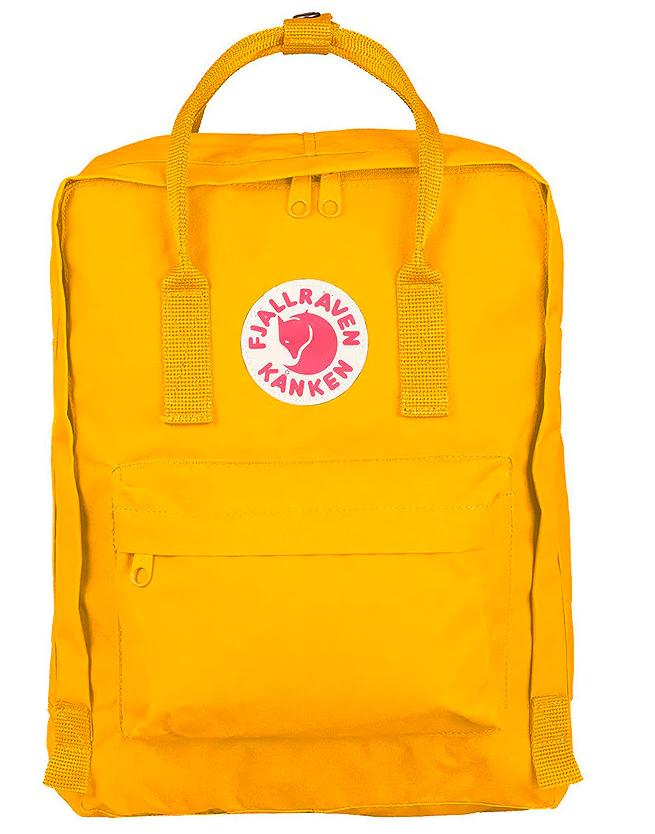
The object is predominately shades of yellow with minor shades of red and white. The rough ribbon-like dark yellow fabric is sewn in a circle-like fashion to resemble straps. There is also that same ribbon-like fabric in the middle of the straps, fastened with brass pressure buttons. The logo is composed of geometric elements to resemble a fox-like creature. The logo is printed and sewn onto a circle made of white fabric, which is sewn onto light yellow fabric. The openings of the material are lined with aluminum zippers painted in the same shade as the primarily present light-yellow fabric. The shades of yellow fabric are sewn together to create an object intended to hold or carry items.
SEMANTICS: DENOTATION (specified)
Accessory > Backpack > Daypack
SEMANTICS: EXPRESSION (feelings)
Youthful, adventurous, mainstream
SEMANTICS: CONNOTATION (associations)
Social media, influencers, outdoors
PRESENCE (contextual)
Little: Outdoors along a hiking trail or campsite
Lots: In the bedroom of a nursing home
SYNTAX (visual elements & relationships)
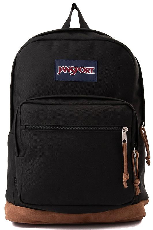
Objects are predominantly black with slight garnet and navy tones. The fabric on the bottom half of the product is decorated in a brown faux leather, and there are accents of that same brown faux leather that are threaded through the eye of the aluminum zippers. A black ribbon made of nylon is sewn to the top of the item to create a loop/ handle. The logo is made of garnet and white embroidery thred, which is framed and stitched onto piece of navy fabric. The black fabric and brown faux leather are sewn together to create an object intended to hold or carry items.
SEMANTICS: DENOTATION (specified)
Accessory > Backpack > School bag
SEMANTICS: EXPRESSION (feelings)
Classic, practical, traditional
SEMANTICS: CONNOTATION (associations)
American, students, 2010s
PRESENCE (contextual)
Little: A high schooler’s locker in 2010s
Lots: At a fancy dinner party or event
SYNTAX (visual elements & relationships)
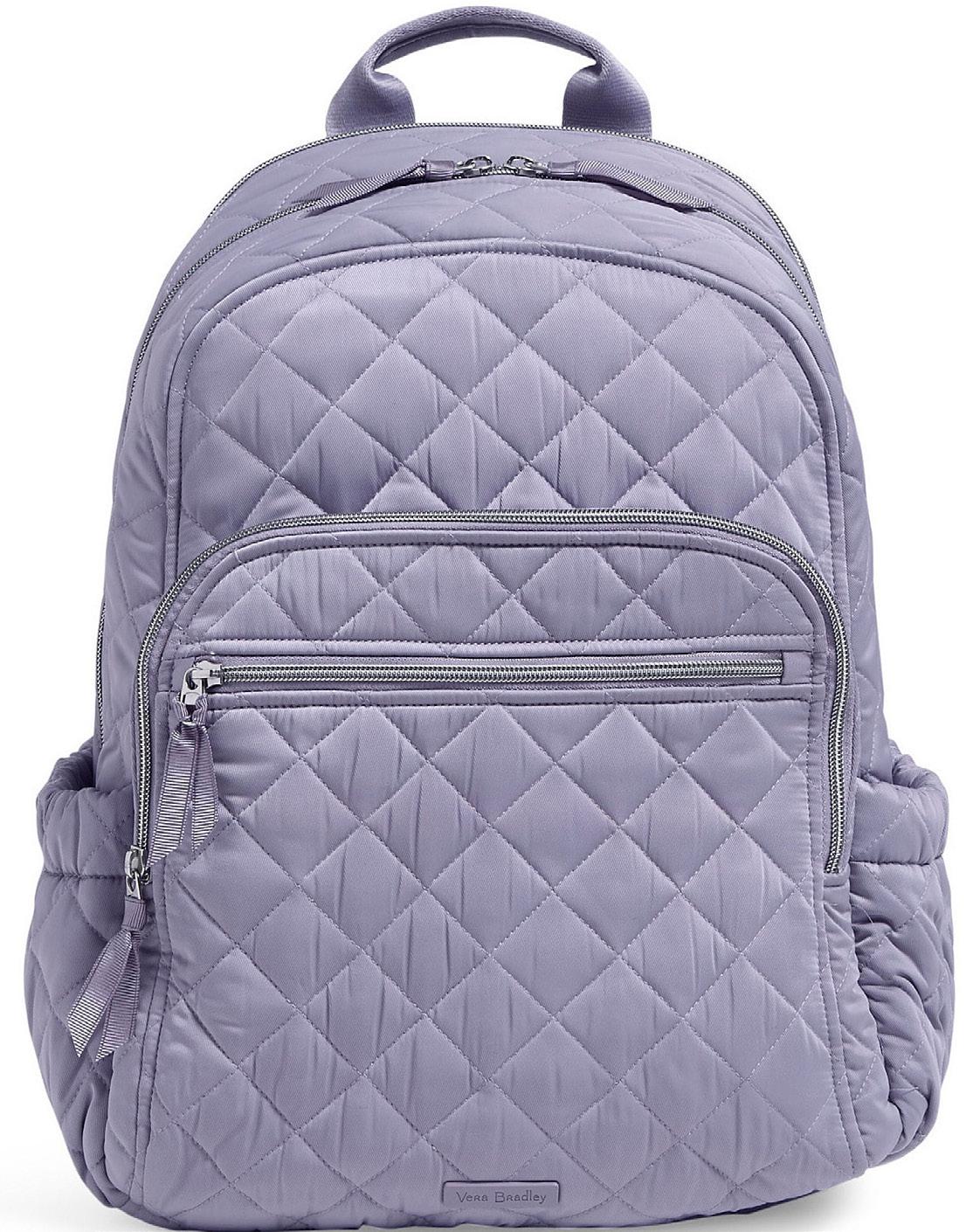
The object is made of various shades of purple and silver. The fabric is decorated with basic stitched lines to resemble a geometric diamond pattern. Purple nylon fabric is sewn to the top of the bag to create a handle-like shape. The openings of the fabric are lined with aluminum zippers. Purple reflective fabric is threaded through the eye of the zippers. That same purple reflective fabric is used on the sides of the object to create pocket-like compartments. The reflective light purple fabric is sewn together to create an object intended to hold or carry items.
SEMANTICS: DENOTATION (specified)
Accessory > Backpack > Women’s travel bag
SEMANTICS: EXPRESSION (feelings)
Luxury, playful, elegent
SEMANTICS: CONNOTATION (associations)
Older women, quilting, french
PRESENCE (contextual)
Little: In a middle-age woman’s hotel room
Lots: In the male lockeroom at the gym
Background | October 31st, 2022
Color theory is an important component and skill for any creative person to learn and master. Being able to acknowledge and understand how and when to use color is not only important for aesthetic reasons, but is also essential for the creation of a tasteful palette, as well as being able to capture a specific feeling, or mood, or create the desired effect or emotion. Knowing how to apply color rules and principles to one’s work can allow the artwork or graphics to feel balanced and appear professional to the audience. In Project #6, I
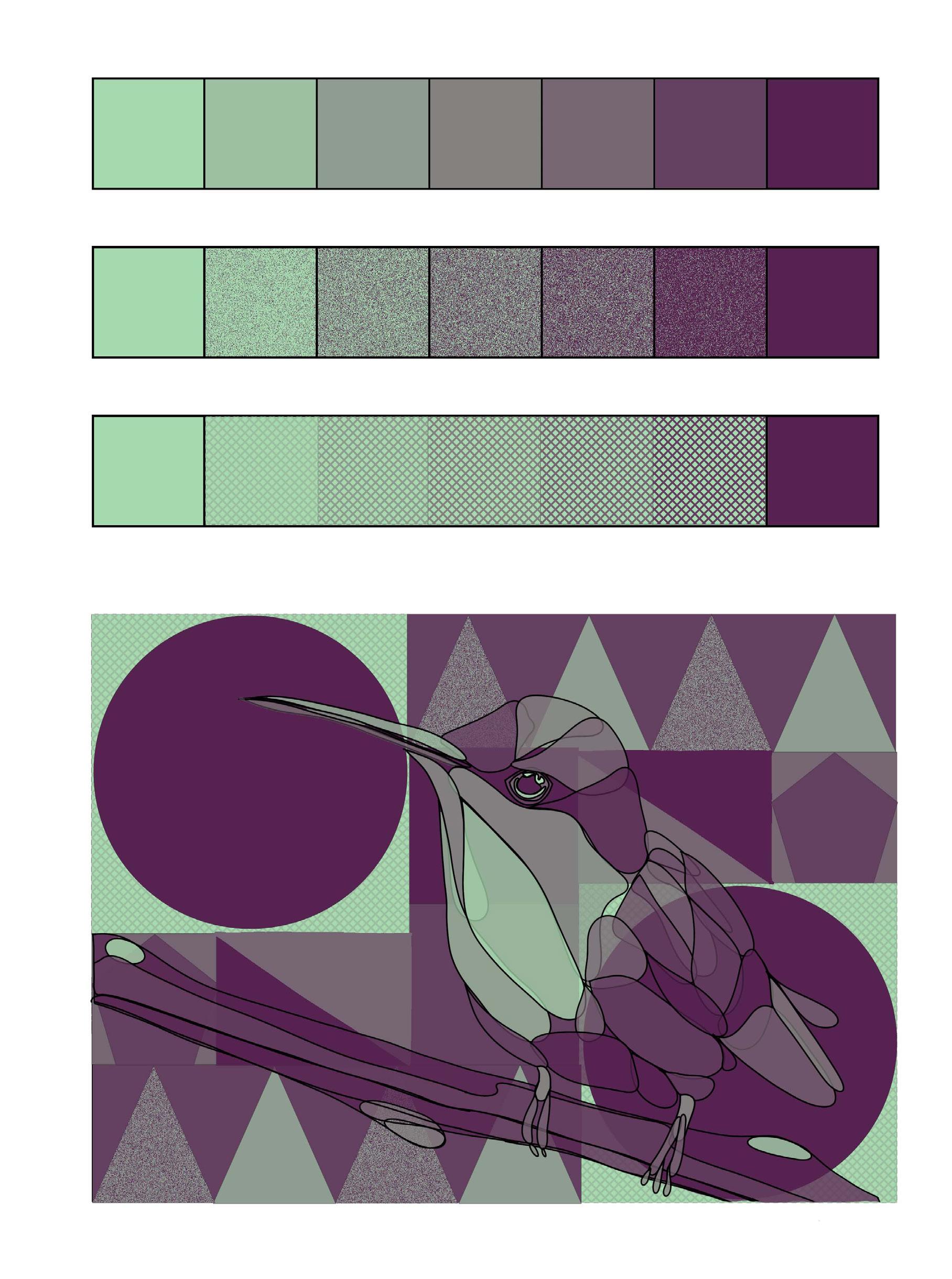
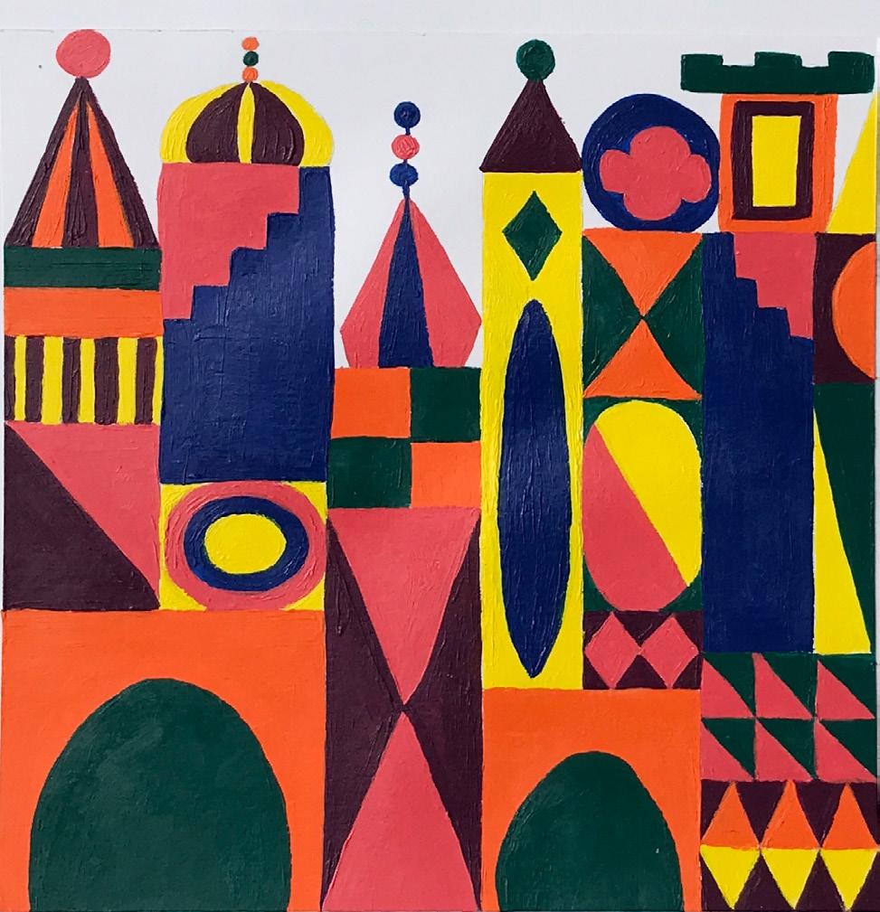
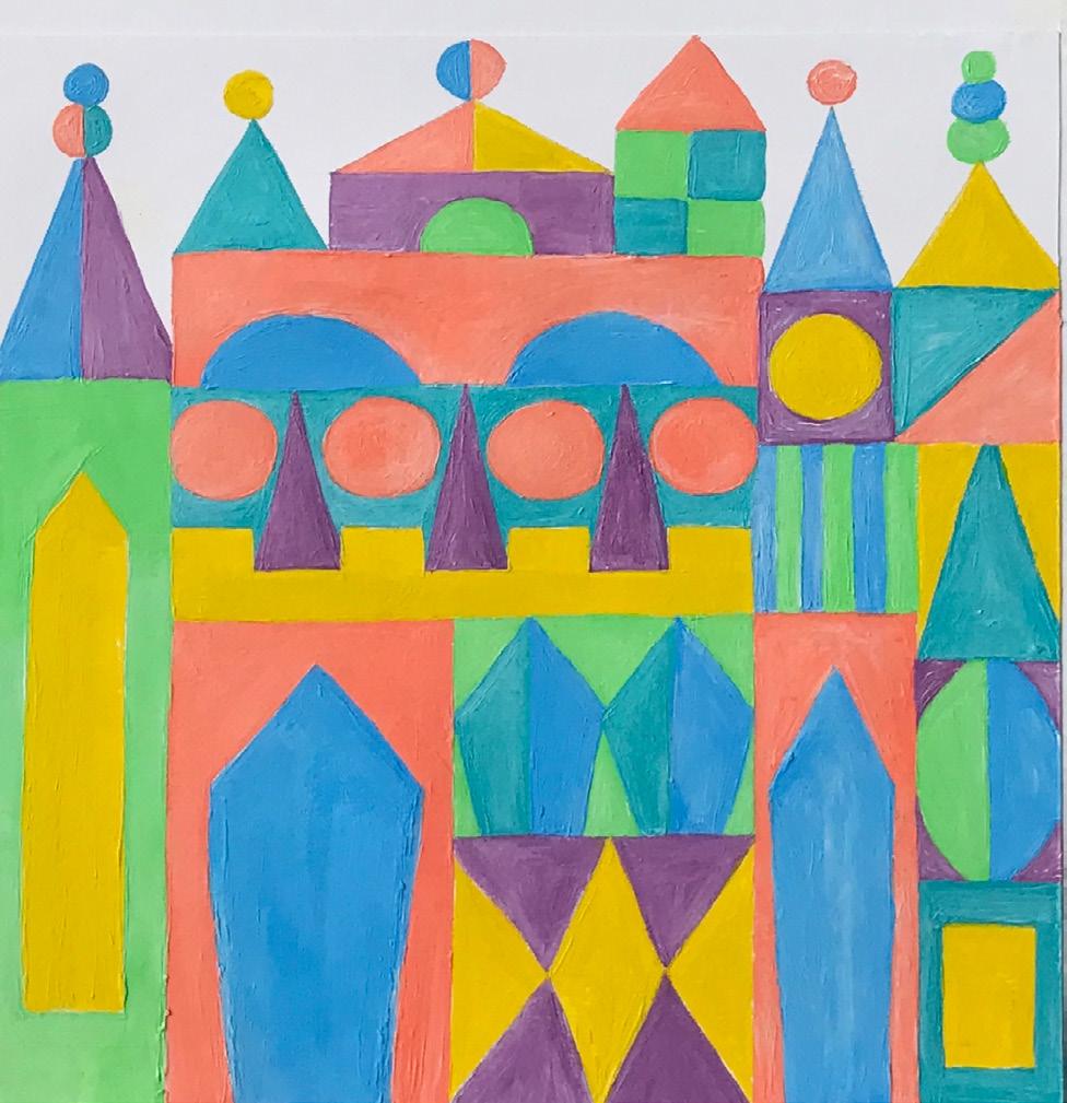
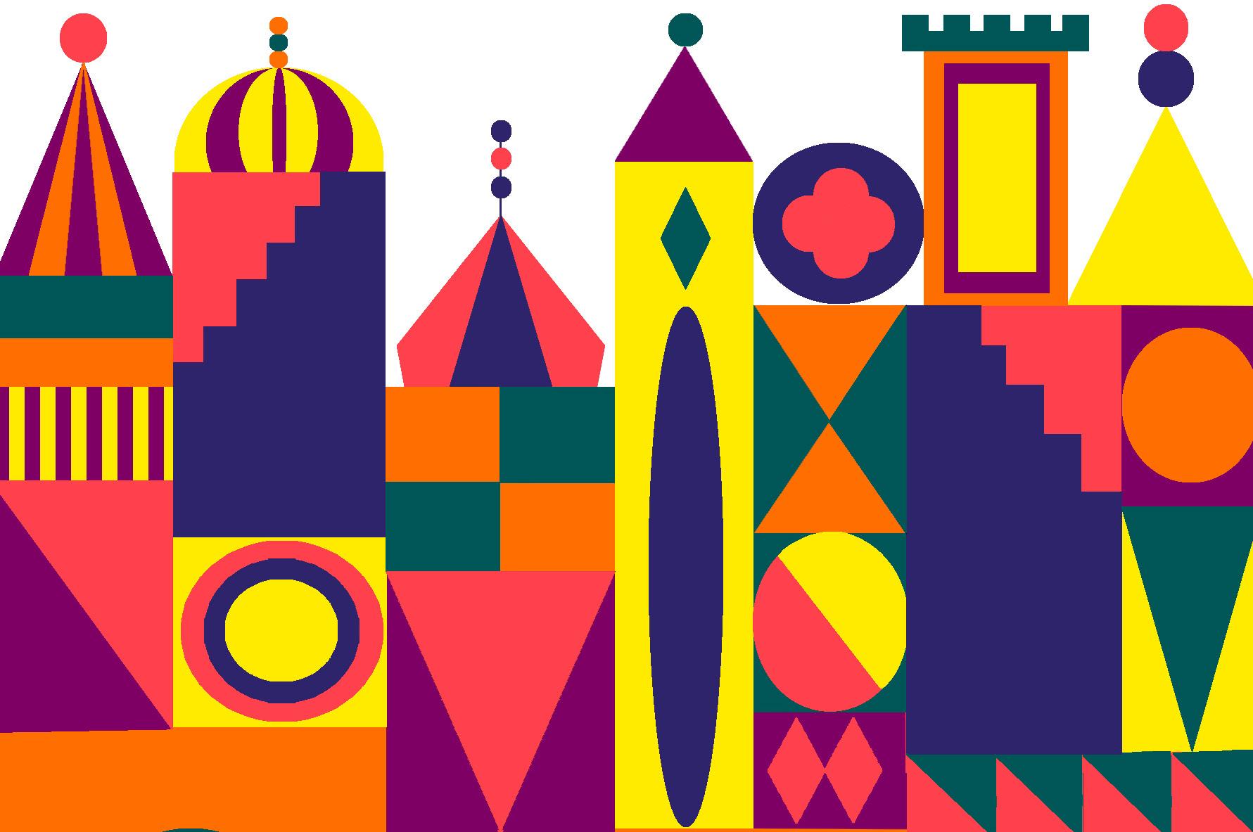
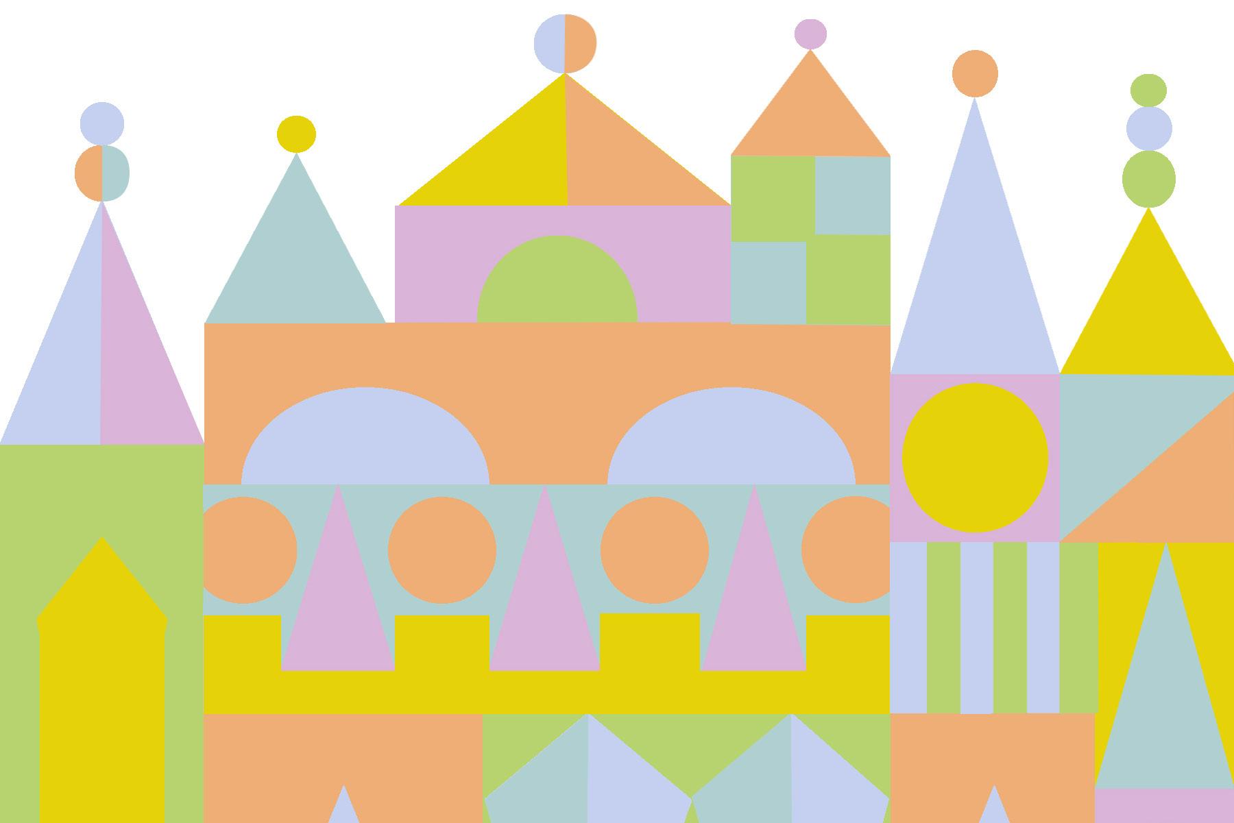
experimented with contrasting the hues and values of color, as well as experimenting with contrasting temperatures of color (cool to warm.)
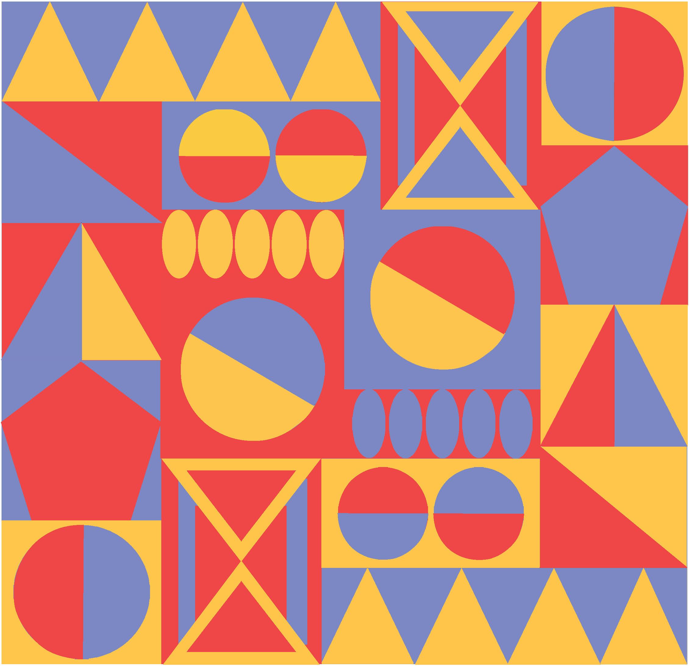
When reviewing my work from Project #6, the main component that tends to stand out is the color choices. Normally, I would not group these colors to create a color palette, but these projects allowed me to further explore the contrast and temperature of color by experimenting with various
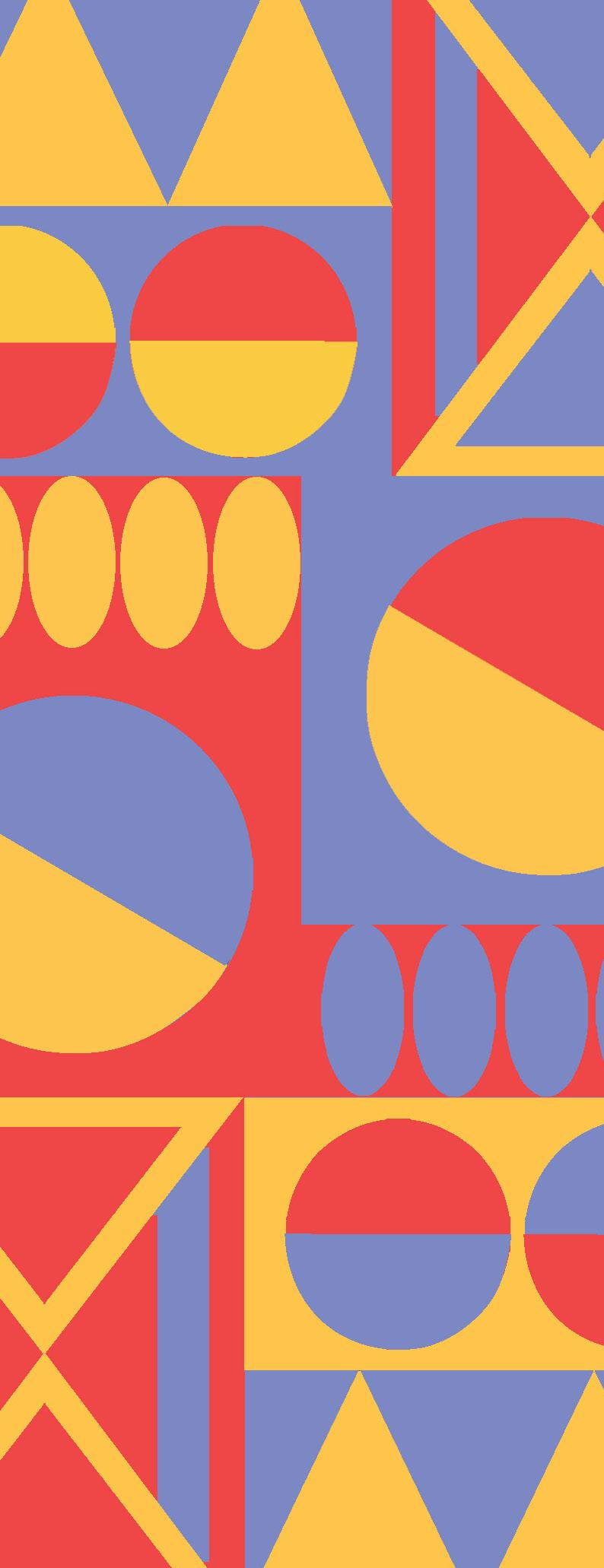
tints, hues, and shades on the color wheel. These two pieces of art are inspired by the works and creations of legendary Disney artist and designer Mary Blair. Blair had a distinct modernist art style that concentrated primarily on utilizing primary colors and shapes to create contrasting forms. My project allowed me to further explore her design style, while also providing a chance to experiment, apply, and expand my knowledge of color theory. The contrasting hues and values allowed me to focus more on the contrasting colors and how various color choices tend to complement or contrast each other. Contrasting temperatures (warm and cool) allowed me to focus more on how the temperature of color can allow the entire image to blend when converted to grayscale. What was perhaps the most surprising factor in completing these assignments is the ability for such simple shapes to be combined to form a rather interesting image. While creating precise lines and edges tended to be quite complicated for each project, I would enjoy applying what I have learned from these projects to my future graphic and illustrative work.
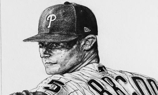
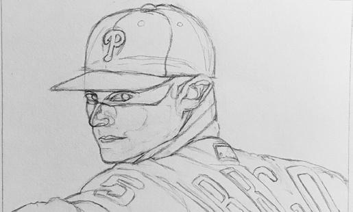
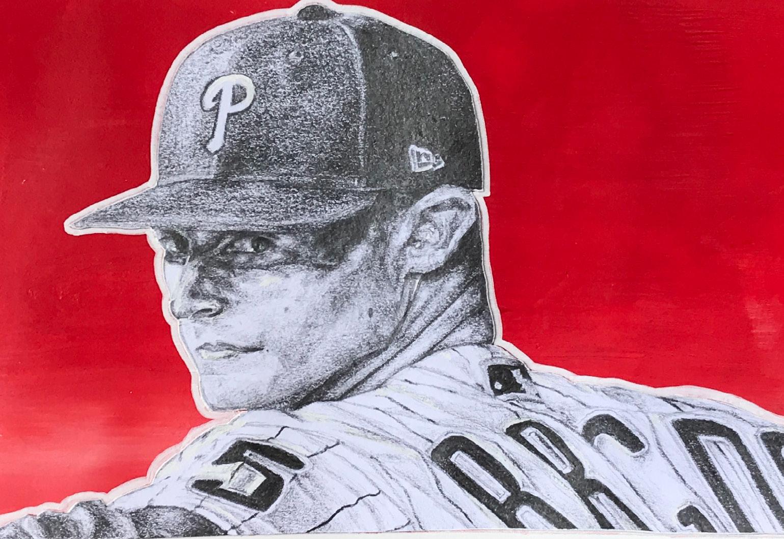
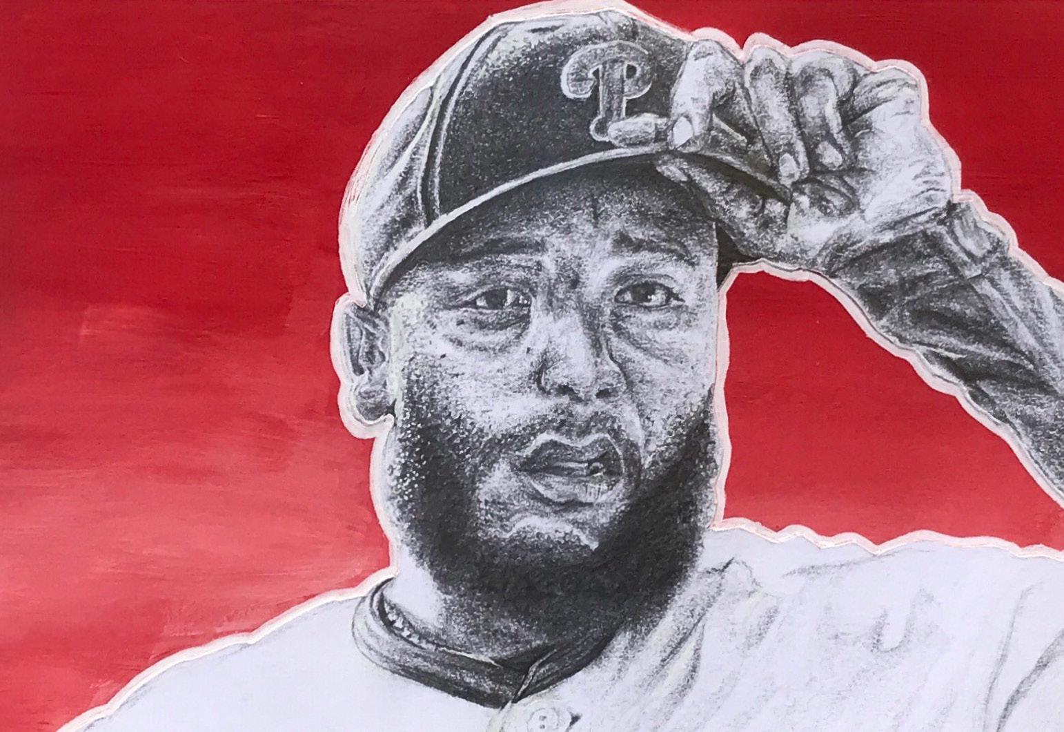
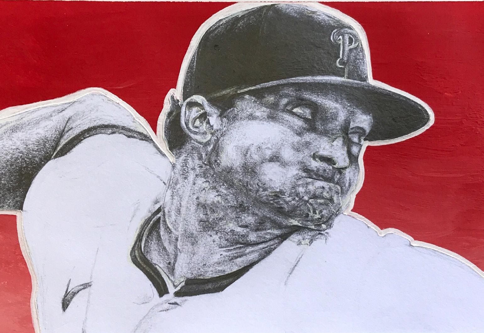
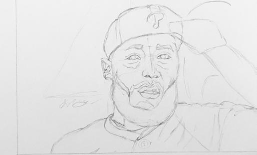
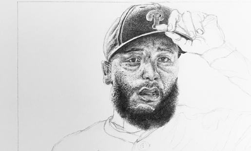
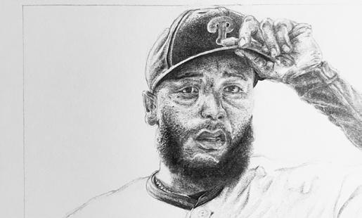
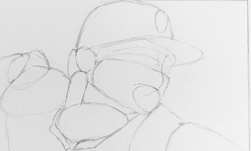
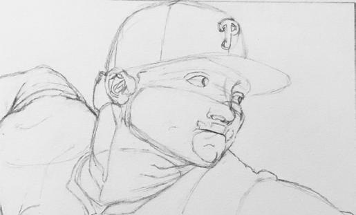
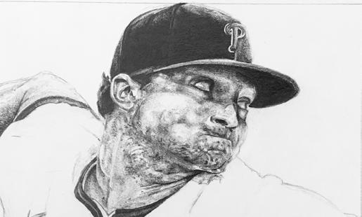
Perhaps one of the oldest and most well-known mediums, graphite is a tool used in the creation of hand-drawn artwork. Many people often start with a pencil when they are first learning to draw. The reason why graphite is such a wide-range medium in the field of art is due to a pencil’s versatility, as there is a range of softness and tone when applying pressure to the tool. Project #7 is my exploration of the medium of graphite using famous baseball players as inspiration.
My experience with graphite has been a humbling one over the years. It was not until my sophomore year of high school, in which I was tasked with completing projects using primarily graphite. From those projects, I was able to gain a better understanding of tonal range,
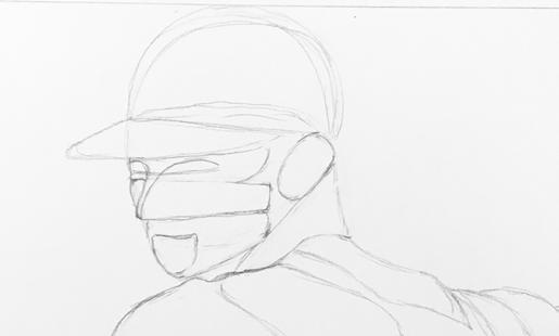
depth, light, proportions, and space. After graduating from high school, I decided to continue my exploration of graphite while also combining my pencil drawings with other art mediums.
Throughout my childhood and into my adult years, I have always been a fan of the Philadelphia Phillies. Watching baseball games with my family has always brought a sense of comfort and nostalgia, as well as a sense of community among finding others who follow and cheer on the team. I also started this project with the goal to improve on drawing accurate proportions. Combining my love of baseball with my love of graphite and photo collages, I have managed to create a series of art pieces that combine my two passions. I chose to incorporate an acrylic painted background to reflect the team’s color palette, while also giving the drawing a pop-art quality.
Carly McCormick
ARTS102-004
Donna Smith
University of South Carolina
Columbia, SC 2022