INTD 456 - CAPSTONE
INTD 456 - CAPSTONE
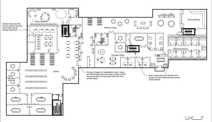
Senior capstone project spanning two semesters. One for research and preplanning, the second for designing I chose to design a community center with additional resources focused on addiction rehabilitation
Located in Loveland, CO
Building is three stories and around 90,000 sq ft
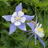
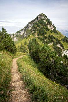
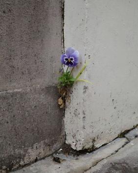
Somehow, in the rocky and dry Rocky Mountains, beautiful flora and fauna have found a way to thrive. Through years of evolution and growth, these natural wonders have adapted to their environments to make it uniquely work for them. This space fosters that growth and resilience seen in the near by mountains. This space is all about the unique journey each person takes to self improvement. Whether it be socially, physically, mentally, or emotionally. By building confident community members, people are more likely to contribute to the community allowing it to also flourish. Like the creatures of the Rocky Mountains, users persevere and shine by taking their unique journey.

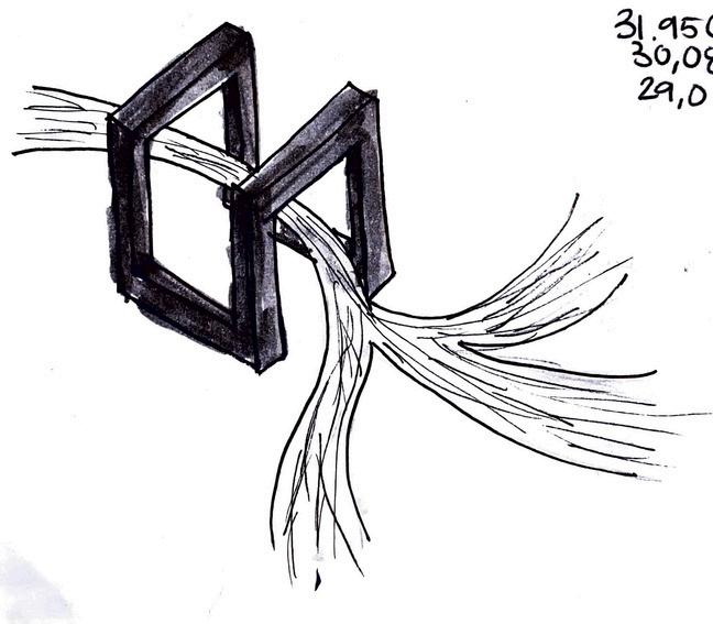
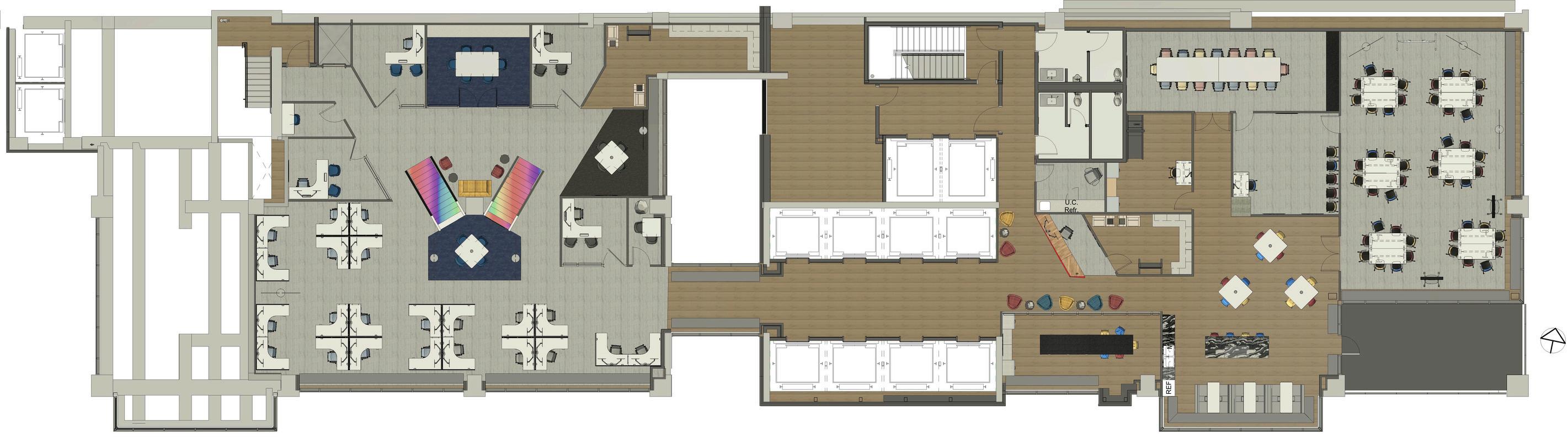
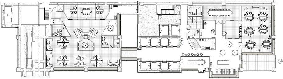
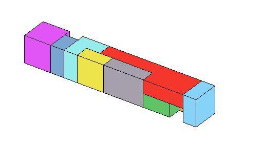
Parti Diagrams
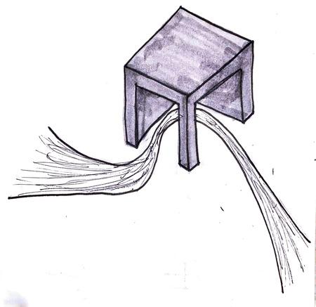
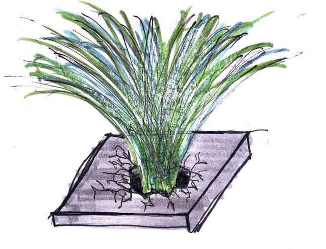
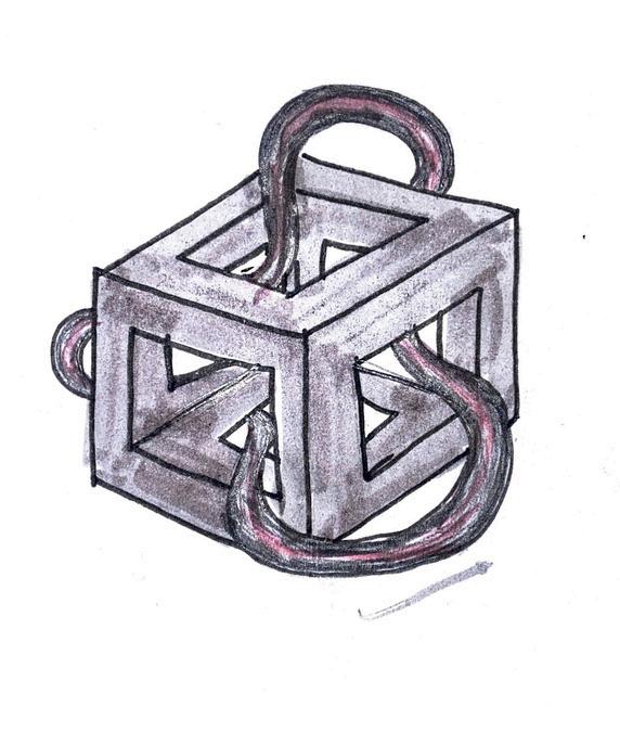
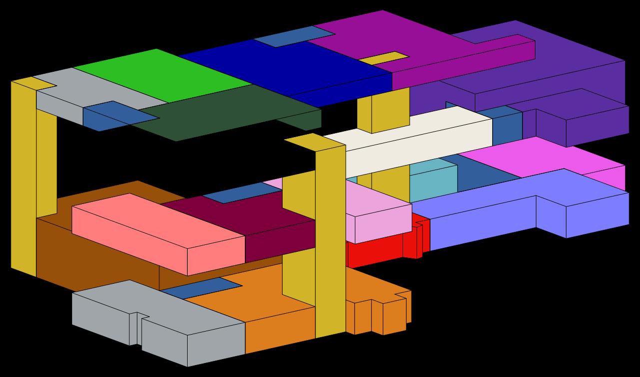
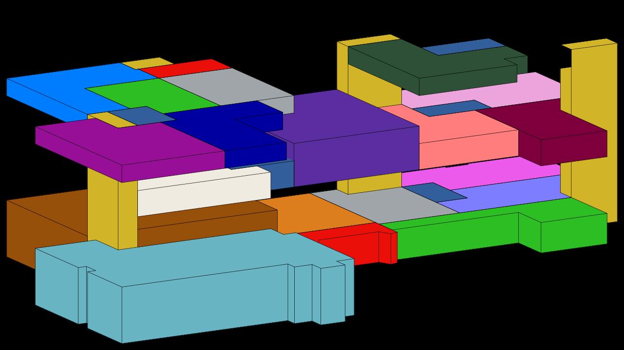
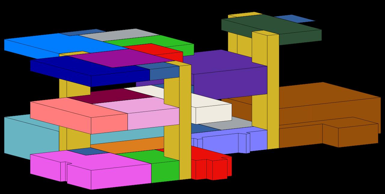
Three Iteration of Block & Stack Diagrams
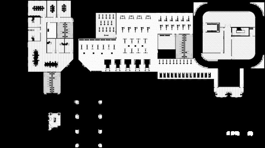
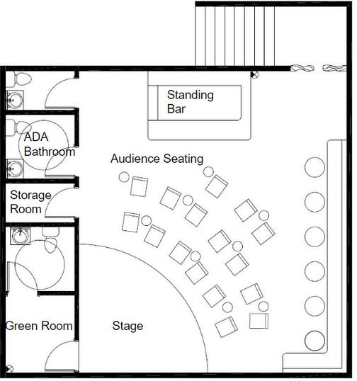
Schematic Floor Plans
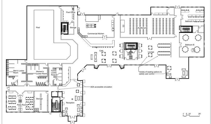

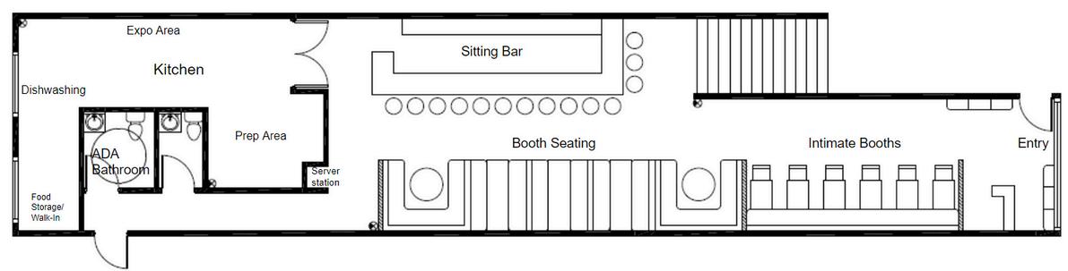
1 RECEPTION
2.INDOOR BIKE STORAGE
3.GENERAL STORAGE
4.PARTY ROOMS
5.WOMEN’S LOCKER ROOM
6 MEN’S LOCKER ROOM
7 FAMILY LOCKER ROOMM
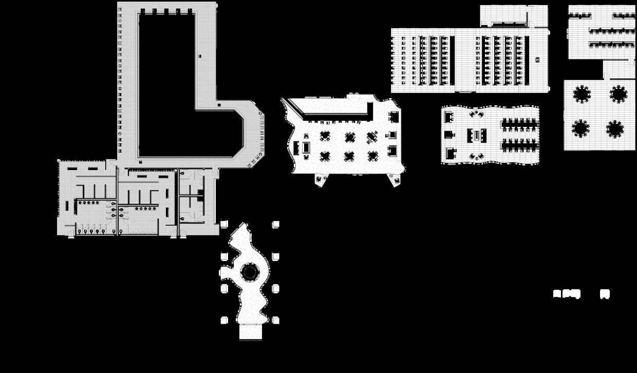
8.POOL
9.POOL OFFICE
10.COMMERCIAL KITCHEN
11.CAFE
12
13
14.BALLROOM A
15.BALLROOM B
16.ADMINISTRATIVE OFFICE
17.CHILDCARE CENTER
A CLASSROOM A
B CLASSROOM B C.INFANT ROOM
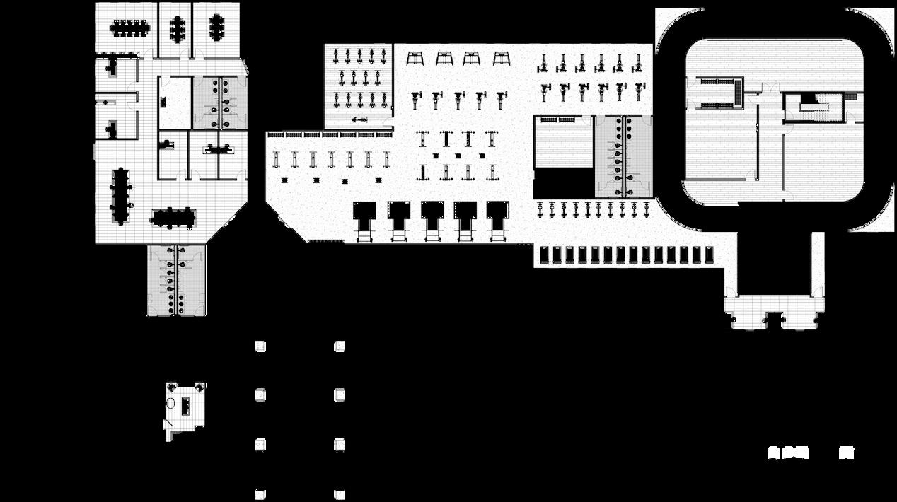
18.GYM
19.FITNESS STUDIOS
20.FITNESS OFFICE
21 MUSIC STUDIO
22 ART STUDIO
23.LIBRARY
24.SMALL MEETING ROOMS
25.CONFERENCE ROOMS
26.REHABILITATION
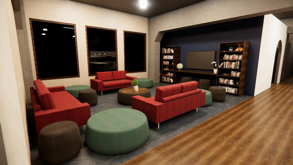
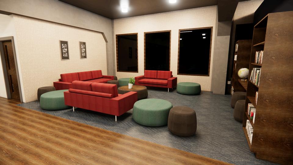
As users go up the floors, the spaces transfer from more public to private. The most public spaces are on Level 1, while the more private are on Level 3.
28.REHABILITATION LOUNGE
29.REHABILITATION GROUP MEETING ROOMS
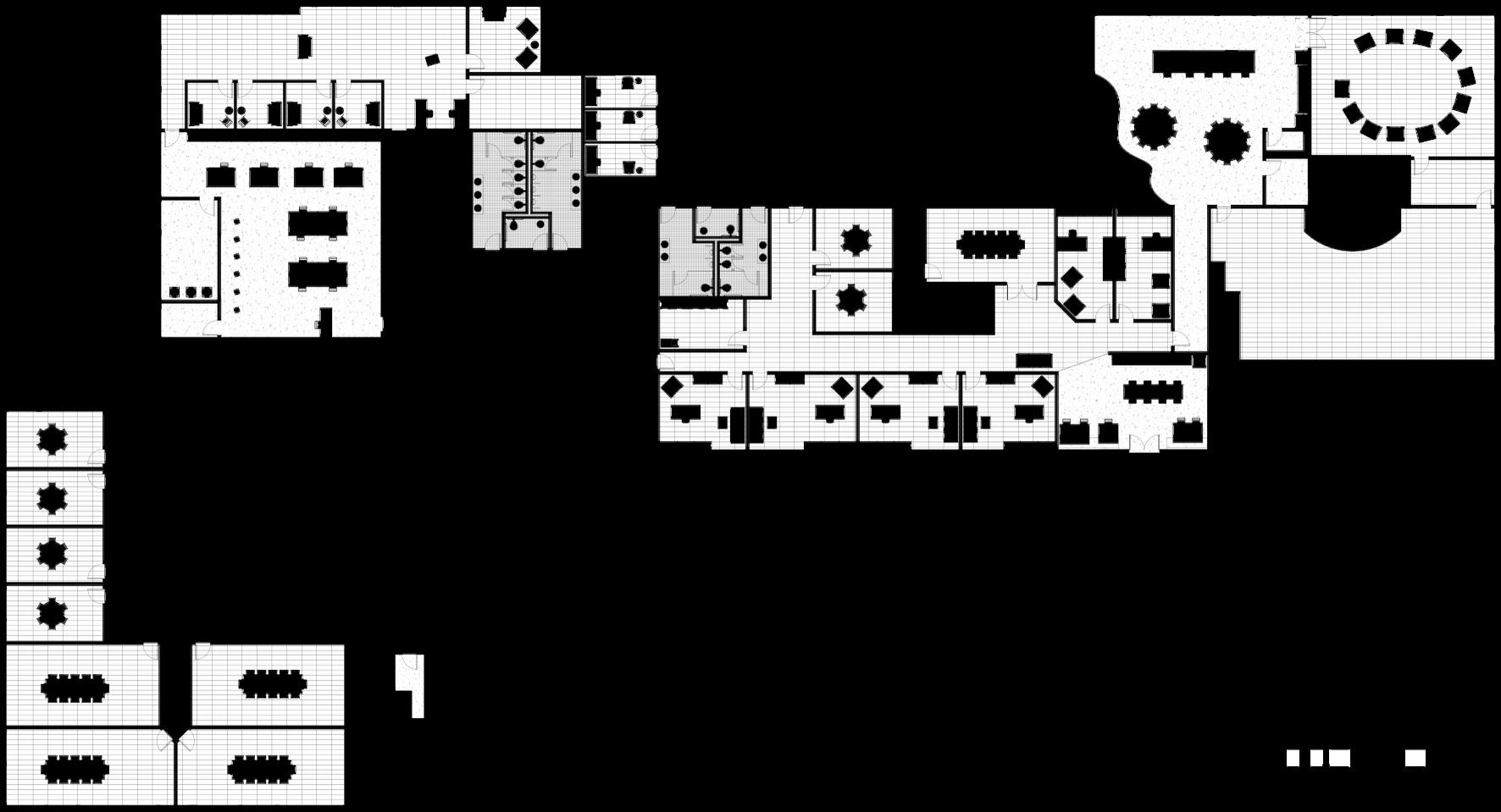
*Floor plans created using Revit
*Renderings created using Revit and Enscape
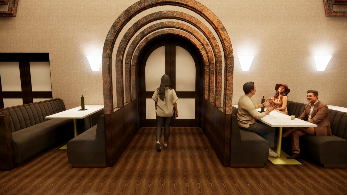
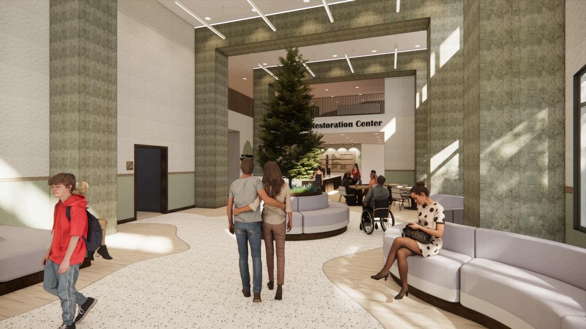
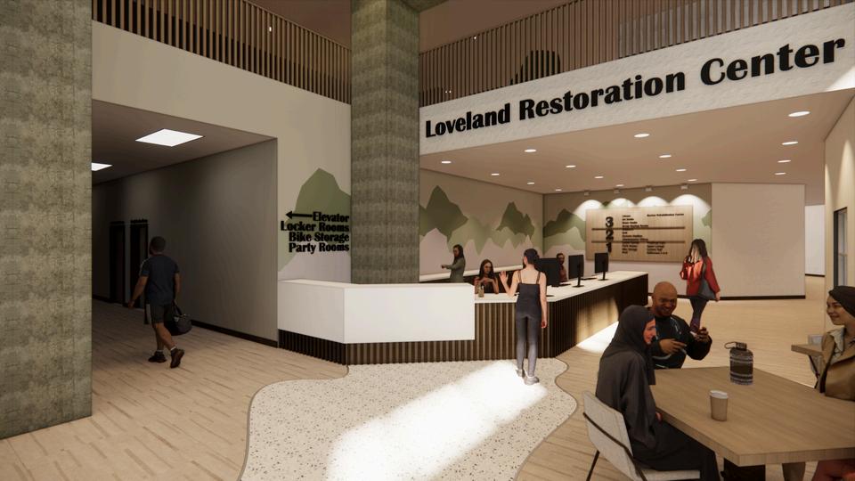
Airy space to welcome the diverse users to the community center. The blue spruce tree in the center anchors the space as the state tree of Colorado. The bounding columns and flooring lead users into the space and to the reception desk. A variety of seating is available to accommodate diverse uses.
Here, users are greeted with their first decision. Wayfinding signs help lead the users in the direction of their desired amenity. The lounge on the second floor over looks the space below.
*Renderings created using Revit and Enscape
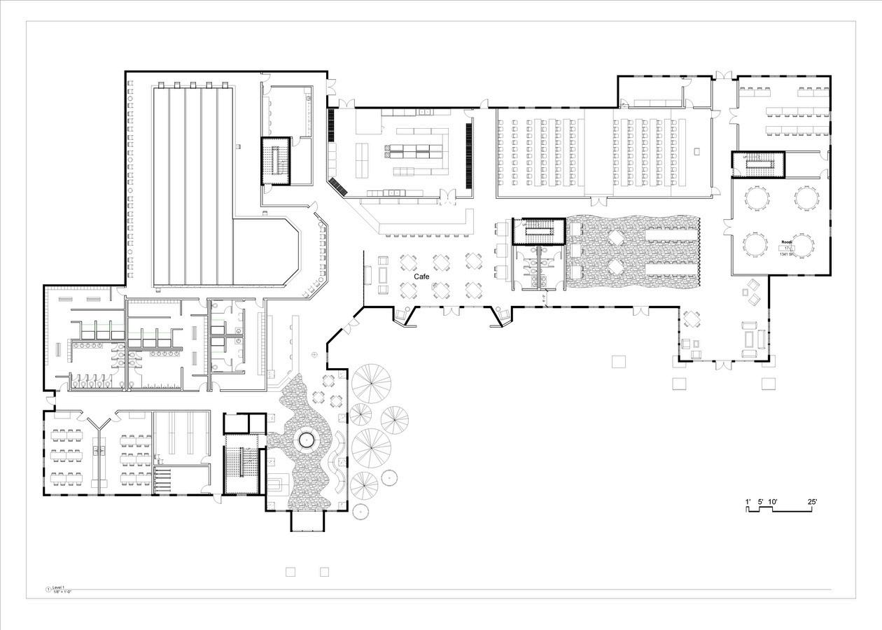
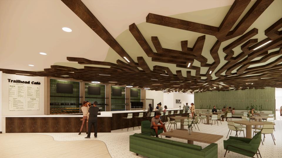
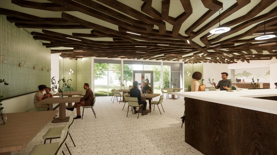
This space can act on it’s own, while still being connected to the rest of the community center. This acts as the front of house for a full restaurant and non-alcoholic bar. The space within a space is defined by the change in flooring and the ceiling element.
A variety of seating options are available including banquets, couches, bar top, standard chairs. Allows users to pick the choice that works best for their needs. This space has a separate entrance so users can access the cafe as a separate entitiy.
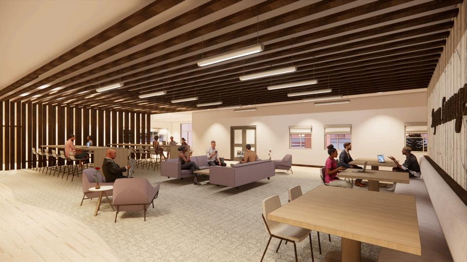
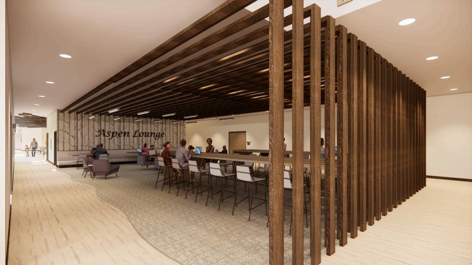
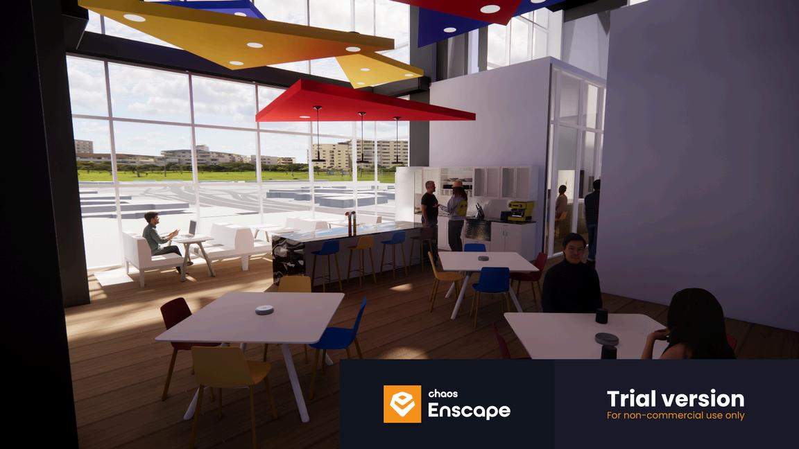
A space for people to hangout and get work done. The space is defined by a flooring change and a ceiling element connected to a partition wall. This space also has a variety of seating options, all in close proximity to power outlets.
The space features a branding wall to help communicate to users what the space is. The partition wall into the ceiling element has lights integrated.
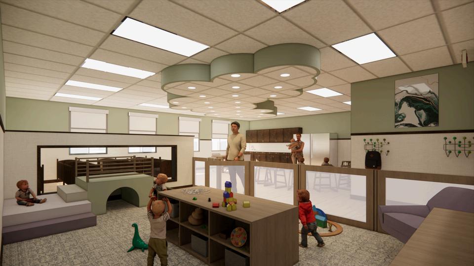
This space highlights how the community center was designed with all ages in mind. This space has all of the needed resources for the infants and teachers who will occupy this room. The gated in play area features a crawl accessible play structure and furniture to aid with standing development.


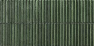
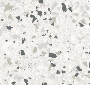


The materials throughout the space are all commercial grade with sustainability in mind. The use of greens, greys, purples, and wood tones are used to convey and connect to Colorado’s landscape. The consistent use of the same materials throughout helps to make the entire community center feel cohesive.
Group project with Francesca McMahon
Located in a historic Kissock Block building in Old Town Fort Collins, CO
The space is 20 ft wide by 91 ft deep and features and 500 sq ft basement
High end Italian restaurant with an entertainment lounge in the basement
Individual contribution: concept development, space planning, and digital rendering
Starlight
Its lavish design inspired by the cosmos, the milky way, and our solar system.
Each space is inspired by a different planet.
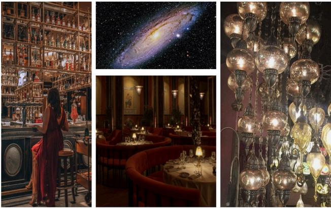
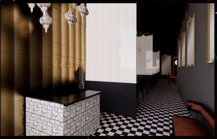
Inspired by Jupiter, this space welcome guests into the restaurant and the stardust the awaits.
Featuring a collection of pendent lights varying in height, color, and shape to define the space
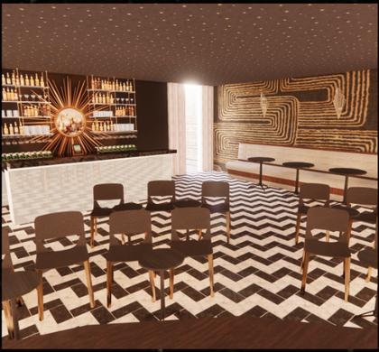
Outfitted for live performances in a moody and glittery lounge
*Renderings created using Revit and SketchUp and Enscape. Floor plans with AutoCAD
INTD 310 - STUDIO III
Architecture and Interior Design firm focused on PROJECT OVERVIEW
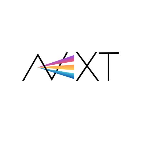
LOGO DESIGN
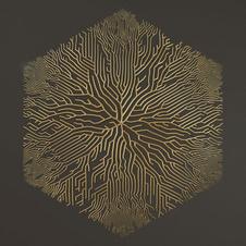
This logo design connects to the ethos of NEXT. It represents the three teams that form the company and the progression and growth they foster.
CONCEPT Prism
Represents the structure of the three departments to make up the prism. Architectural projects are the light that go into the prism and come out as complex and beautiful solutions.
CONCEPT IMAGES
Collaboration


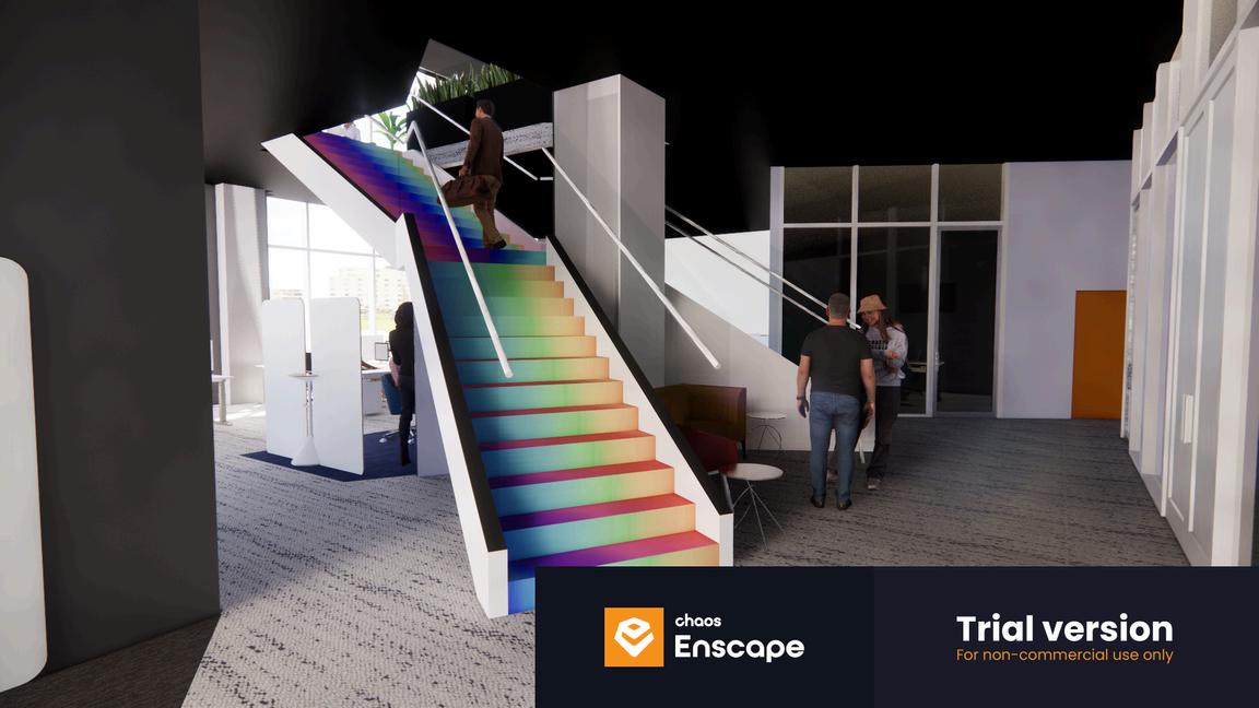
Inspired by how light interacts with a prism, this staircase is the driving force of circulation in the employee area.
*Renderings created using Revit and Enscape
Acts as the hub for this interior design firm where clients and employees mix and mingle. Overlapping suspended ceiling panels help to fill the 30ft ceilings and define the ethos of the space.
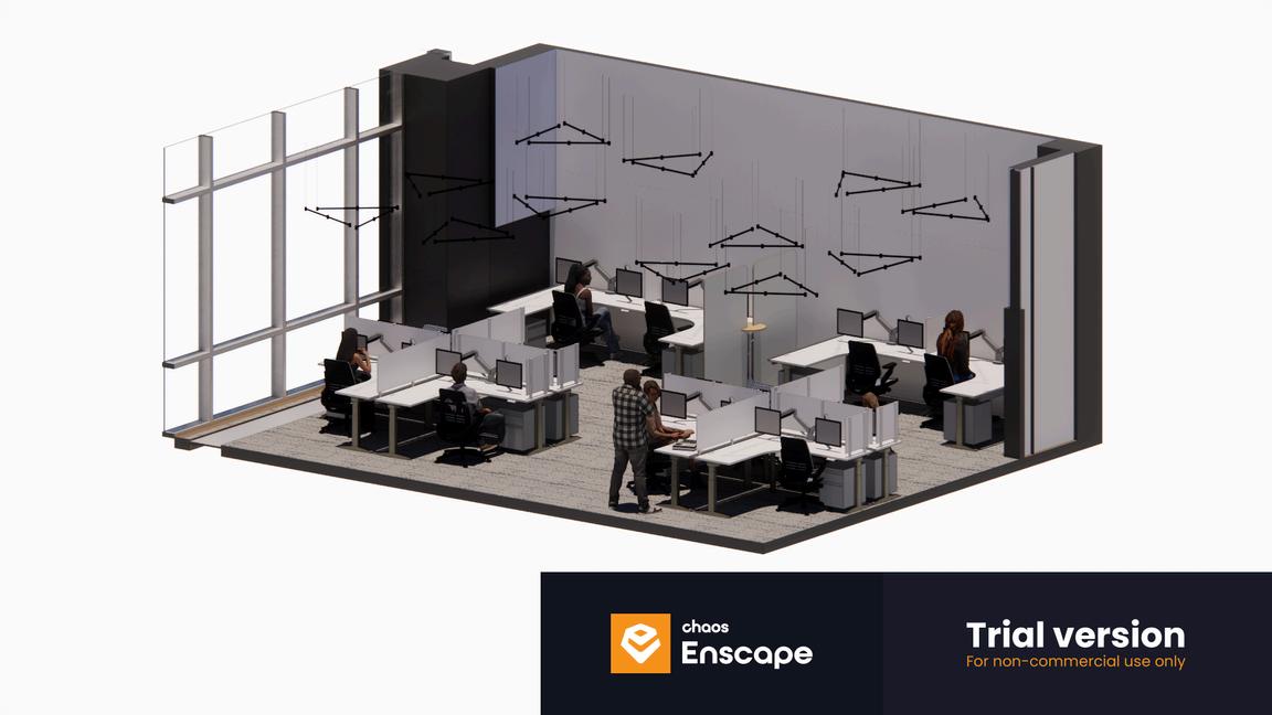
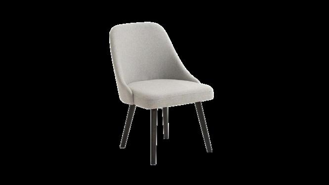
Stations by department are defined by the color of the chair. Stations feature an L shaped desk for plenty of workspace and storge underneath. All tables are height adjustable to accommodate all users comfortability. *Isometrics created using Revit and Enscape
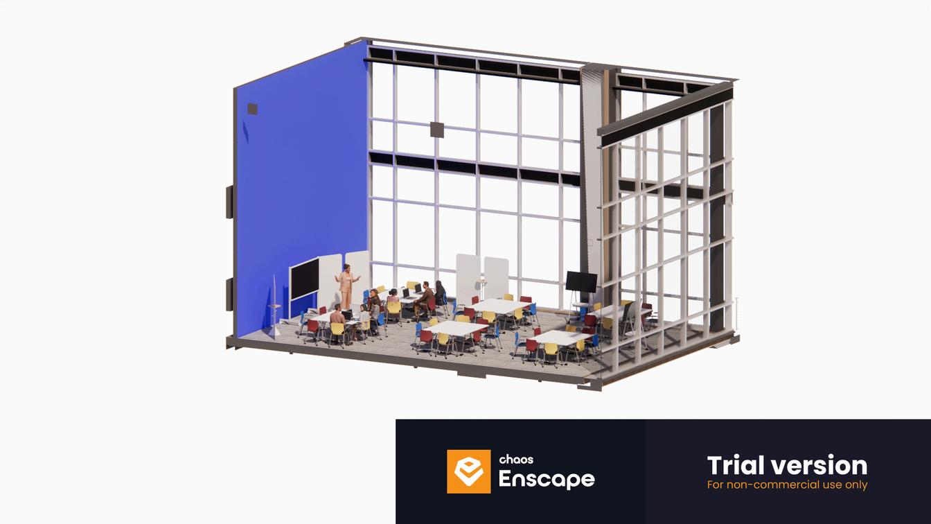
All of the furniture in this space is modular to accommodate the variety of events held in this space. Mix of red, yellow, and blue chairs to signify the collaboration that takes place within this space.
Hillsides is a non-profit organization providing support services to at risk youth and young adults
Dedicated to healing, strengthening families, and transforming communities through quality comprehensive services and advocacy
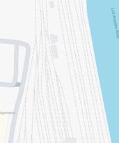
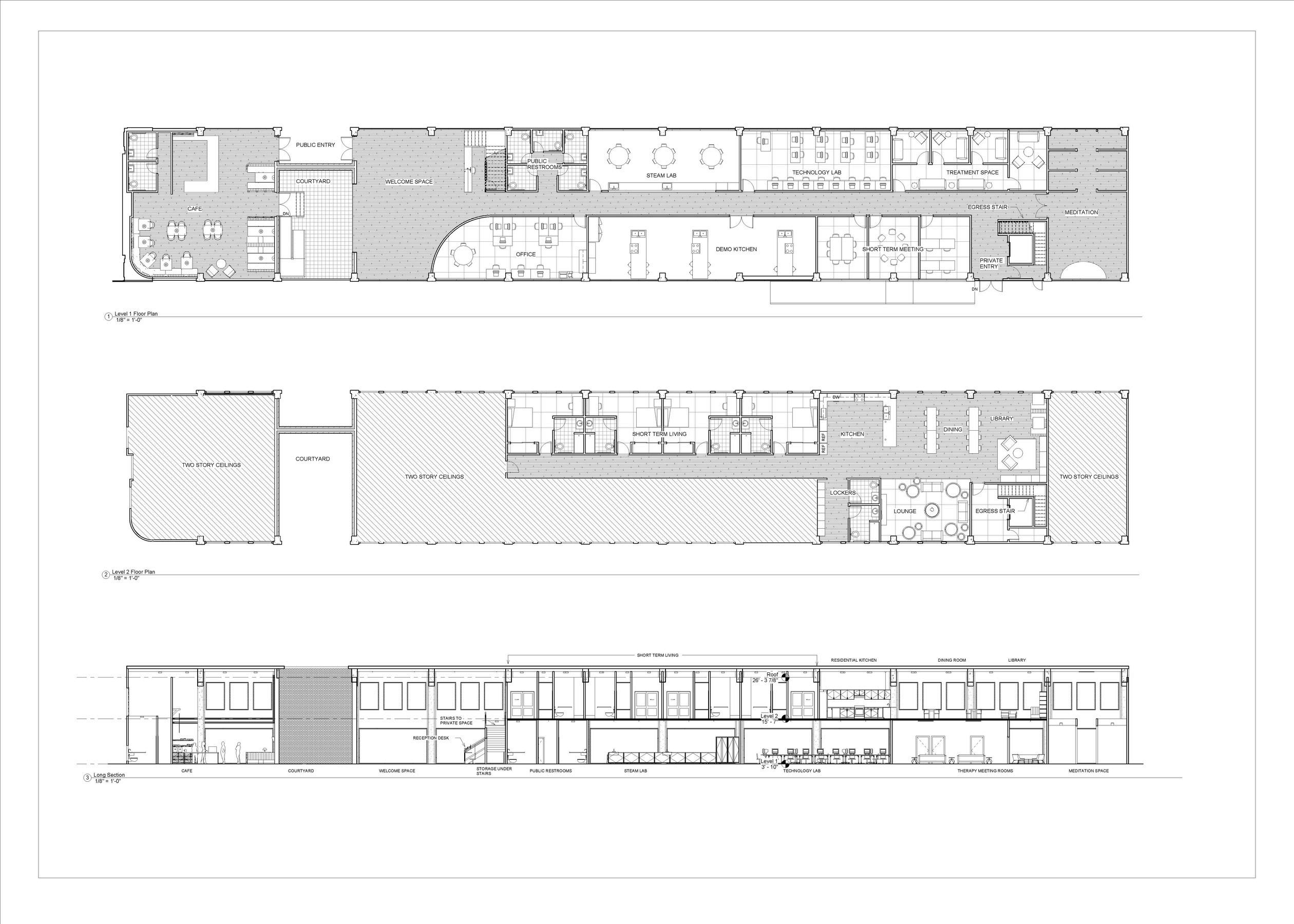
Located in the Historic Santa Fe Freight Depot in the arts district of Los Angeles, CA building is on the National Register of Historic Places
Large and important example of reinforced concrete construction
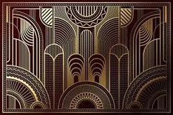
This word implies moving beyond difficulties or limitations, symbolizing the journey of growth and transformation. It connects to the buil a train depot by suggesting movemen the idea of overcoming obstacles to re place. Drawing on the historic nature o the space features bold colors and sle remanent of the Art Deco style. The am space utilize universal design to make functional for the diverse user group.


1.CAFE
2.PUBLIC ENTRANCE
3.COURTYARD
4.WELCOME SPACE 5 OFFICE
DINING
LIBRARY
LOCKERS
LOUNGE
VERTICAL CIRCULATION 6. PUBLIC BATHROOMS
KITCHEN
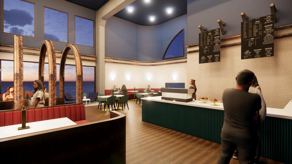
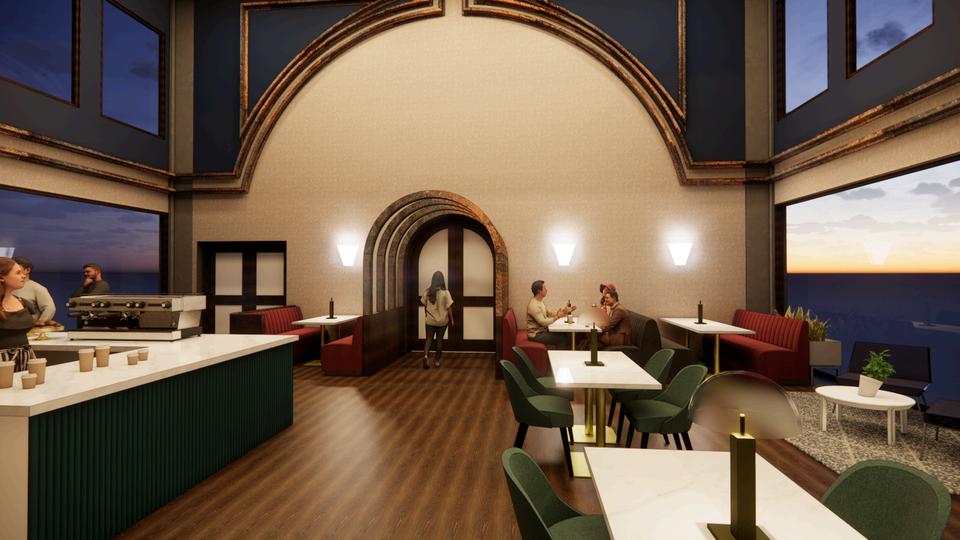
Inspired by the history of this building, I wanted to keep its original identity intact. The exposed concrete beams are an ode to why this building is an historic place. Rusted iron archways lead to a courtyard

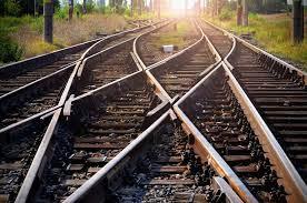
The molding around the room is old train tracks, again as an ode to the building’s original use. The shape of the molding on the South wall is a reflection of the North exterior façade of the building.
A variety of couches and poofs allow for the space to be modular and accommodate more people if needed.
*Renderings created using Revit and Enscape
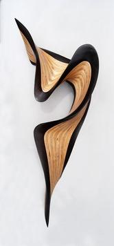
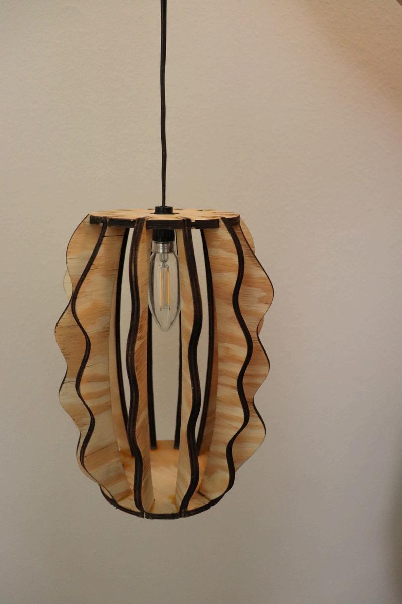
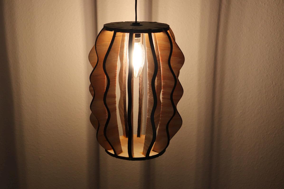
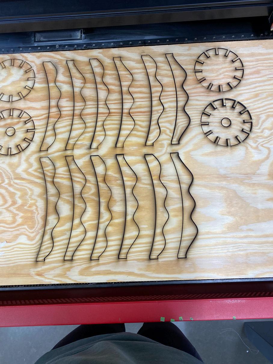
Tasked with creating a unique and custom luminaire. I utilized plywood and a lamp kit. I created the shapes of the pieces on Rhino, then utilized a laser cutter to cut out the pieces. I used wood glue to attach the pieces together. I was inspired by traditional paper lanterns for the shape.
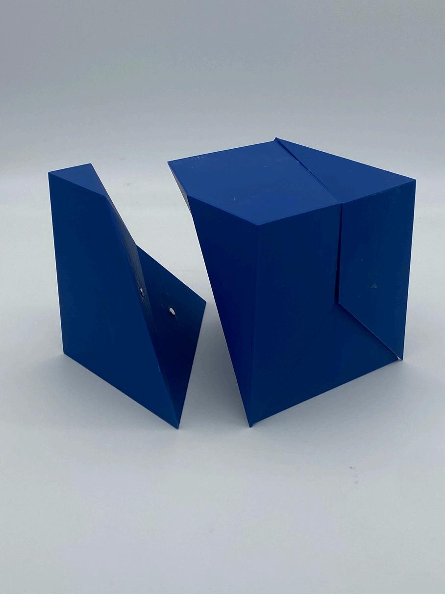
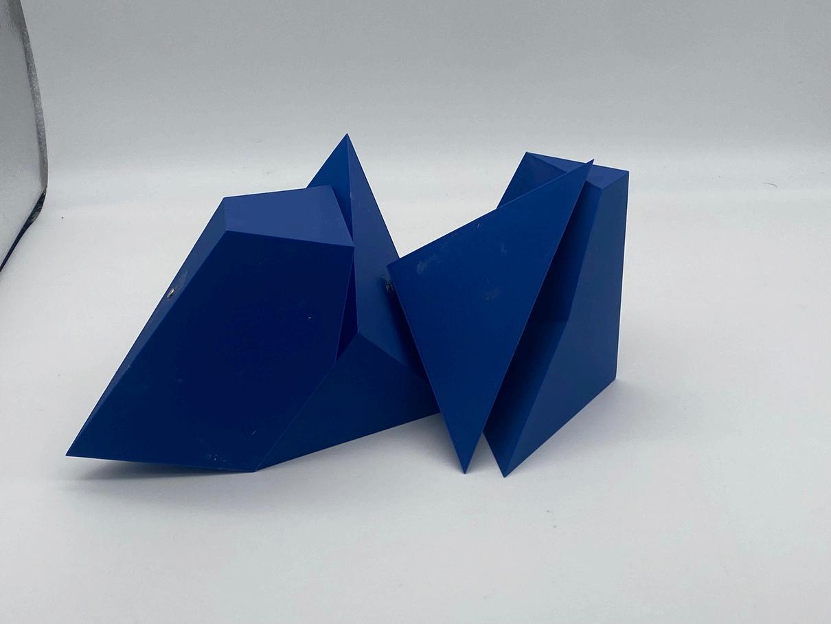
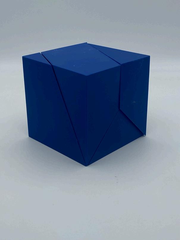
This was a part of a conceptual analysis project. I selected the word COMMUNITY. From there, I researched the word and what I thought represented it. From that research, we were tasked with creating a physical model that we thought represent the word. Using StetchUp, I modeled these four pieces that came together to form a cube. I then 3D printed them. The pieces stayed together with small magnets on the matching sides. It represents the individual pieces or people that come together to form a unique new whole.
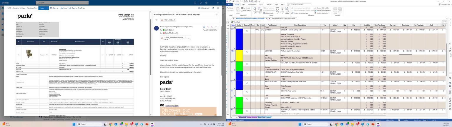
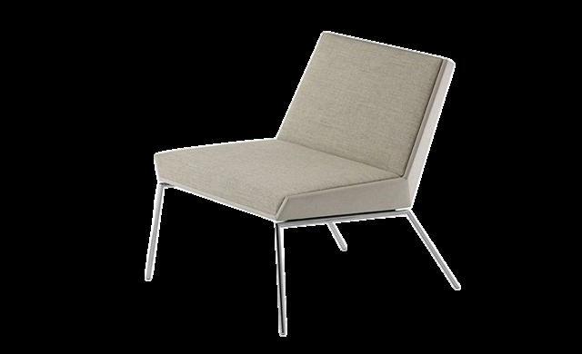
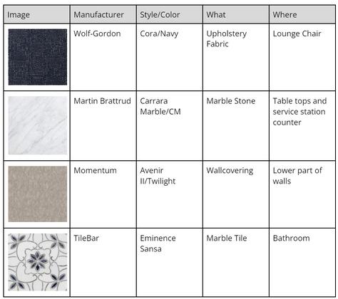
I filled out rows for each of the furniture selections and input finishes, quantity, and pricing. I requested formal quotes from vendors and input that the dealer discount and calculated the selling price. Furniture selections and finishes were collaborated with Catie MacDonald.
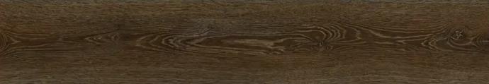
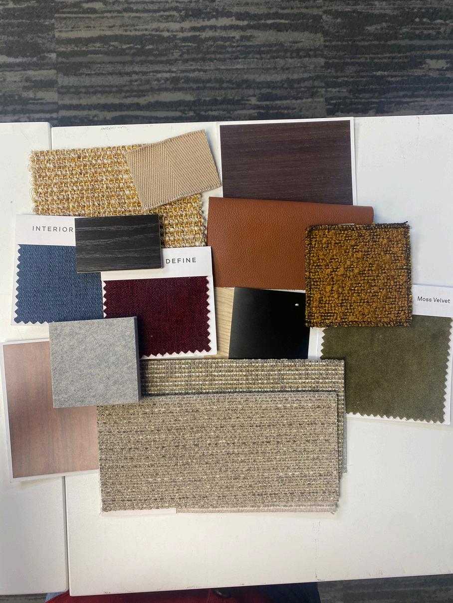
After a client finish meeting, and seeing what selections lead times fit into this project schedule, these are the finishes selected. These range from a variety of manufactures. These were selected in collaboration with the clients and Catie MacDonald.
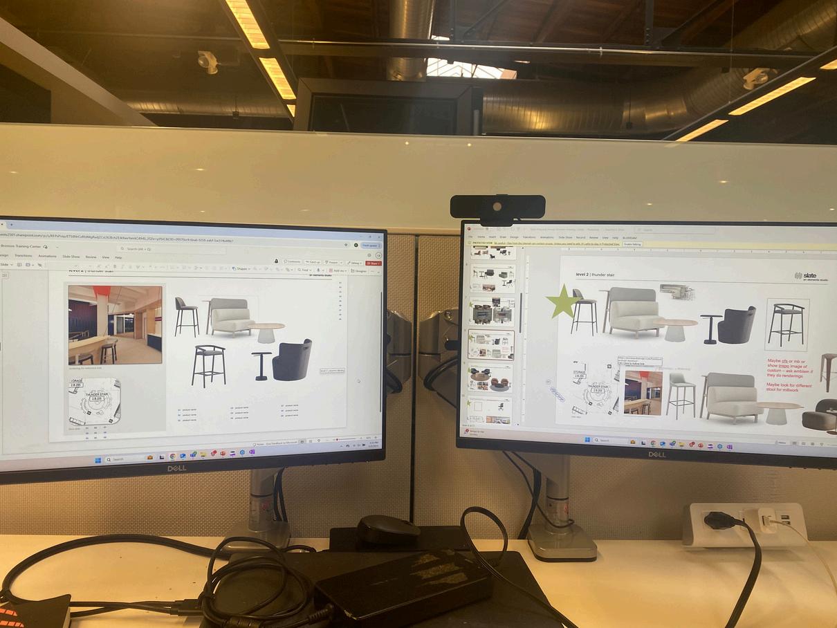
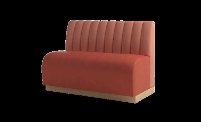
Laid out and labeled furniture selections for an RFP. I made sure the furniture selections corresponded with the provided floor plan and were clearly labeled. Furniture selections were made by Maddie Mulhern
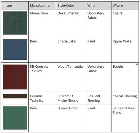
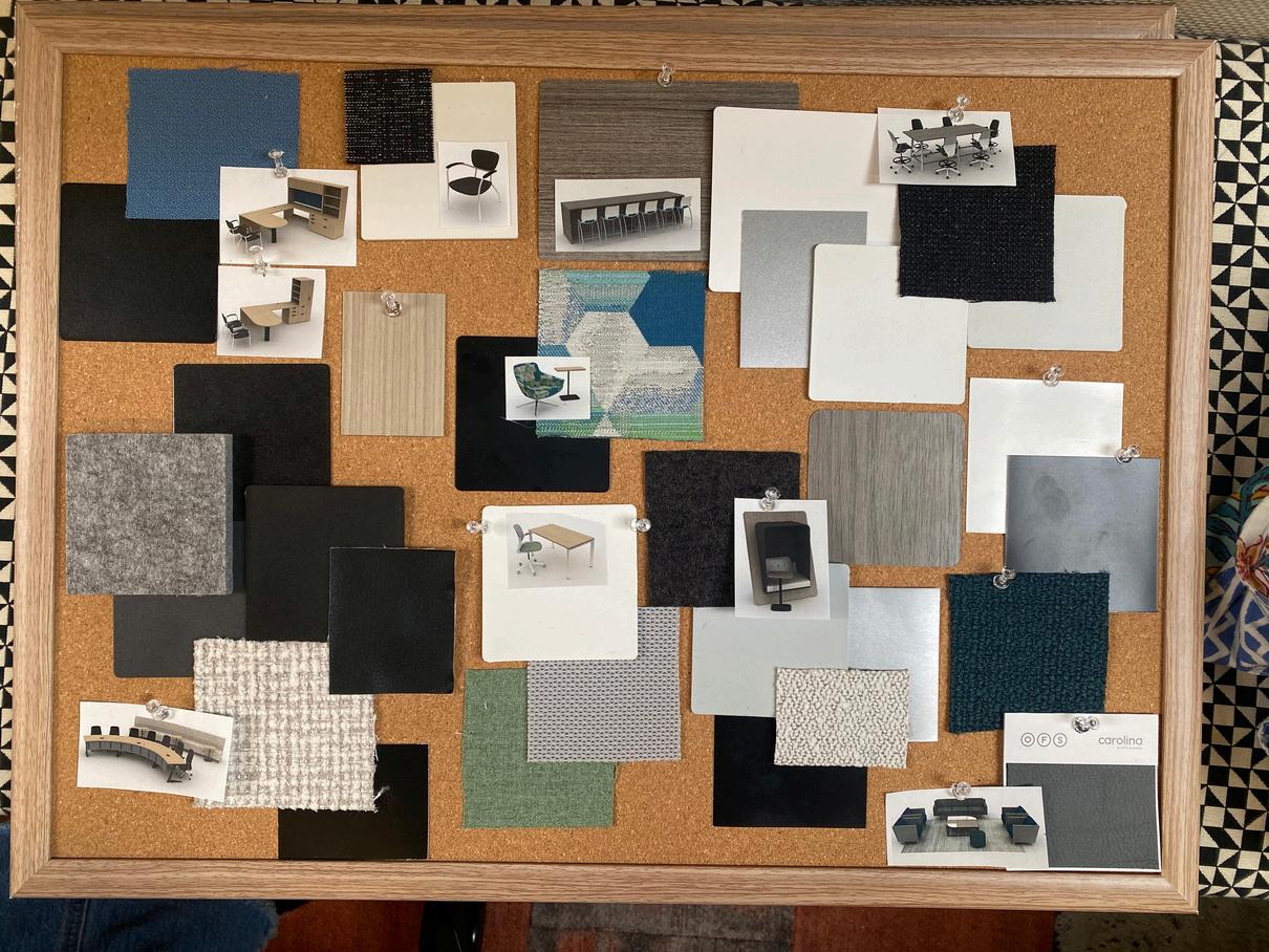
Collected and laid out the selected finishes with corresponding renderings for a client. All finishes and renderings were made by Kirk Williams