Your creative brain has been nudging you lately… and honestly, it’s right. It is time to play.
We see you testing new typefaces, getting cozy with florals, and exploring every color palette. Whether you’re crafting wedding invitations, party pieces, or your next boutique card line, you’re a designer who treats “playing it safe” like a distant acquaintance.
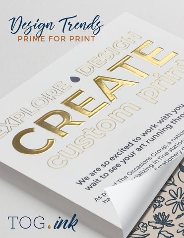
This year’s Design Trends Prime for Print is here to fuel that spark. Ten trends worth your attention, plus the print methods that make them feel real, tactile, and completely swoon-worthy.
Here’s to experimenting, finding your groove, and creating pieces people can’t stop holding in their hands.
Ready to wander into something inspiring?
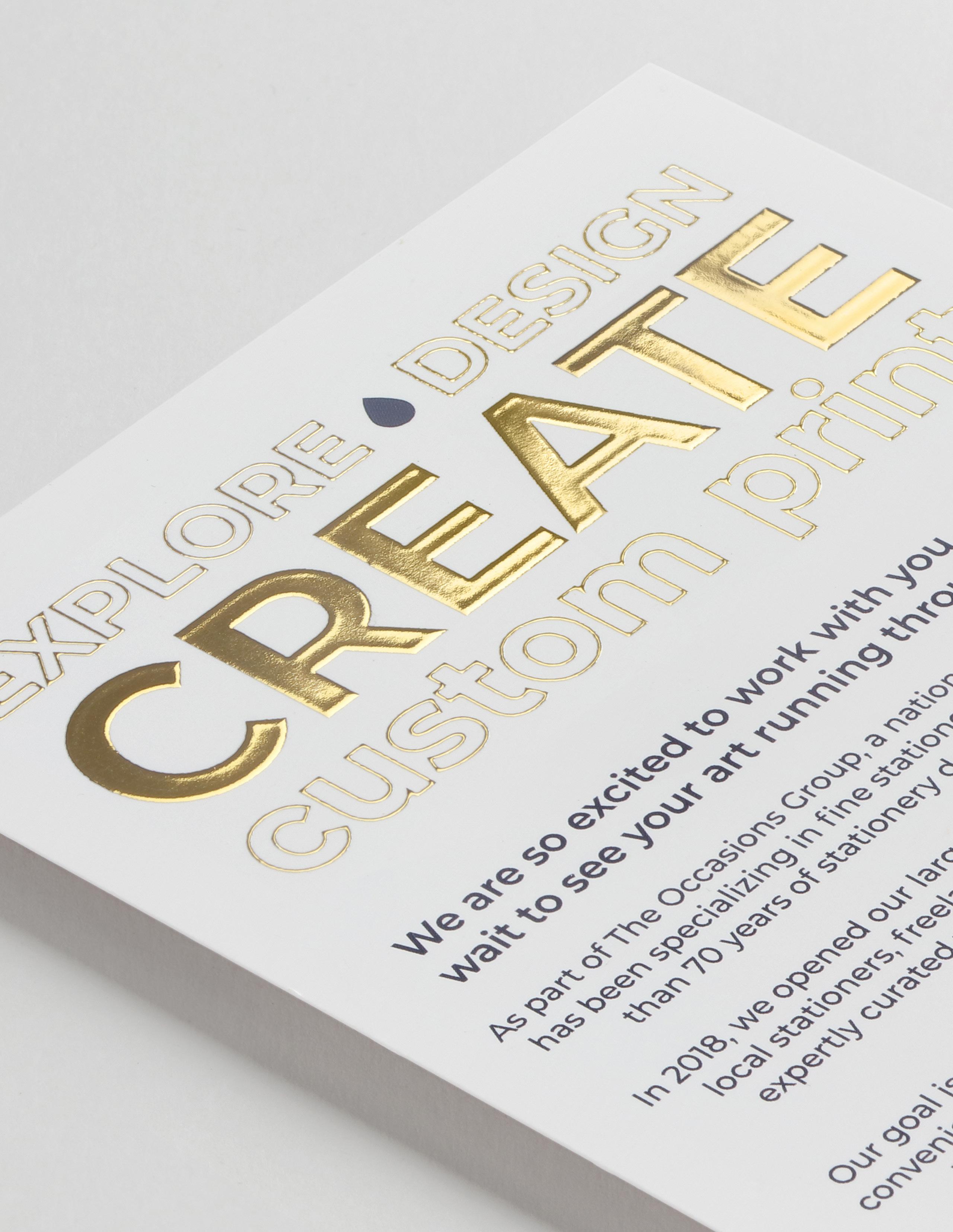
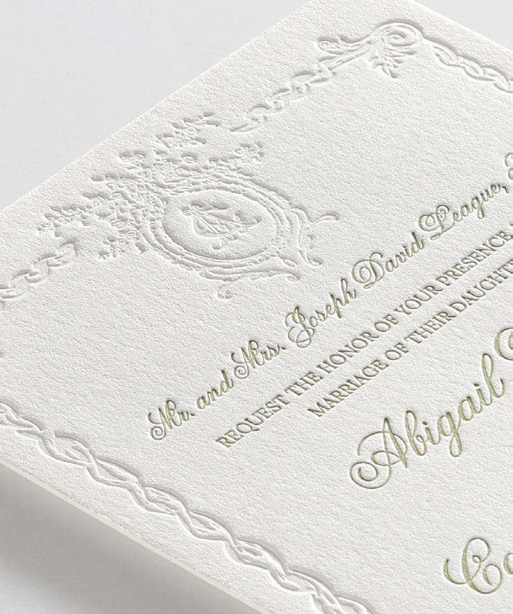
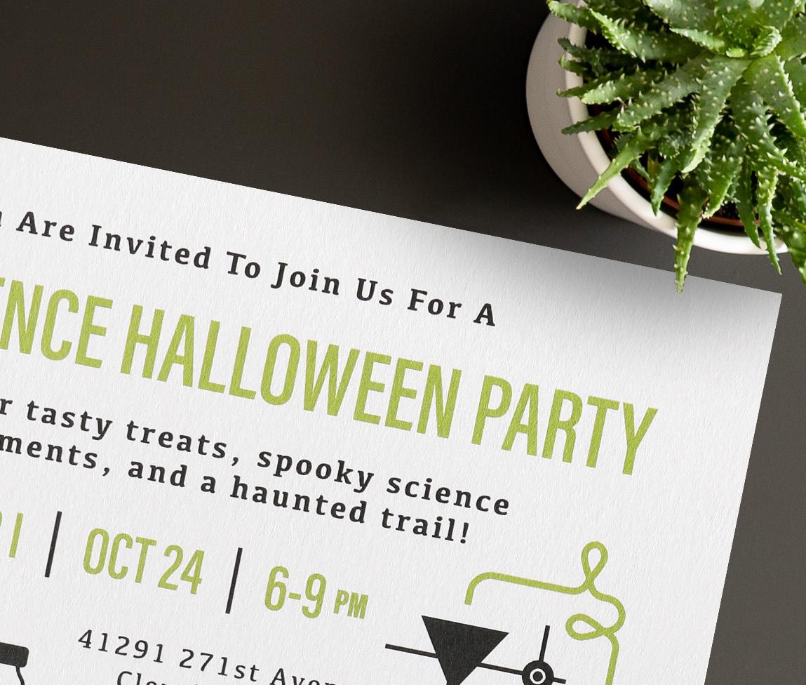
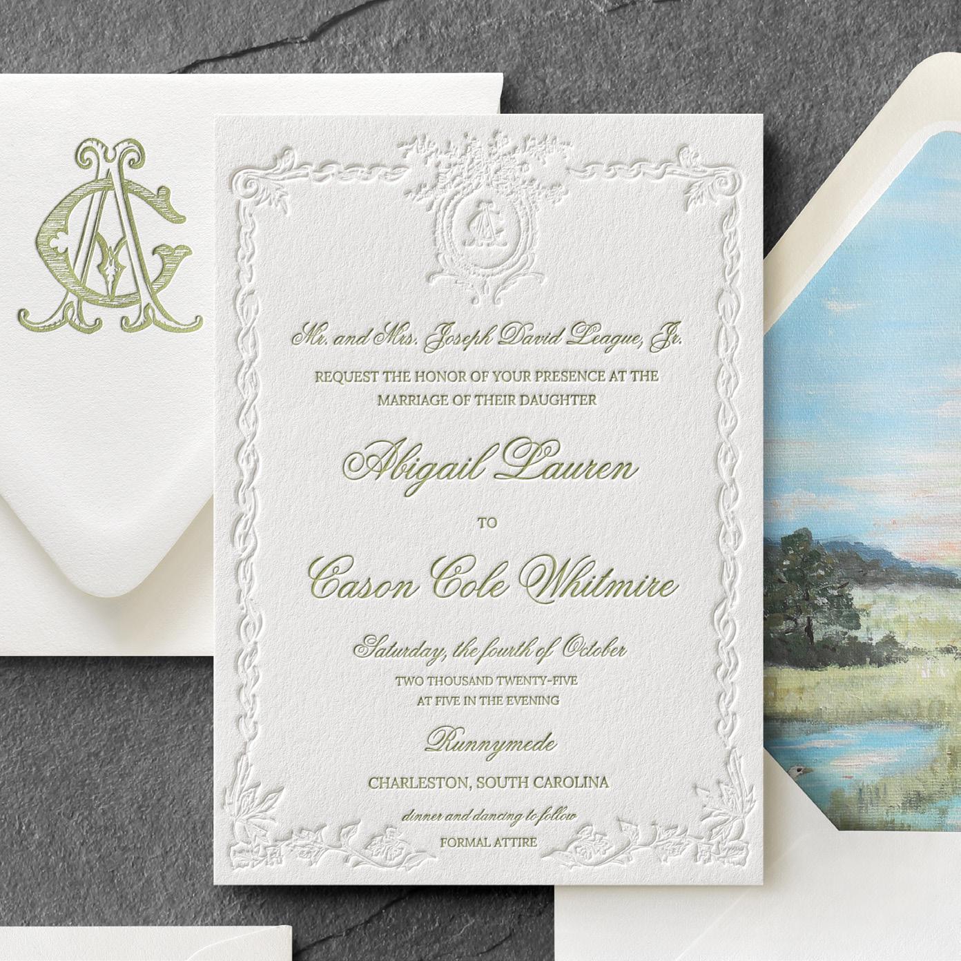
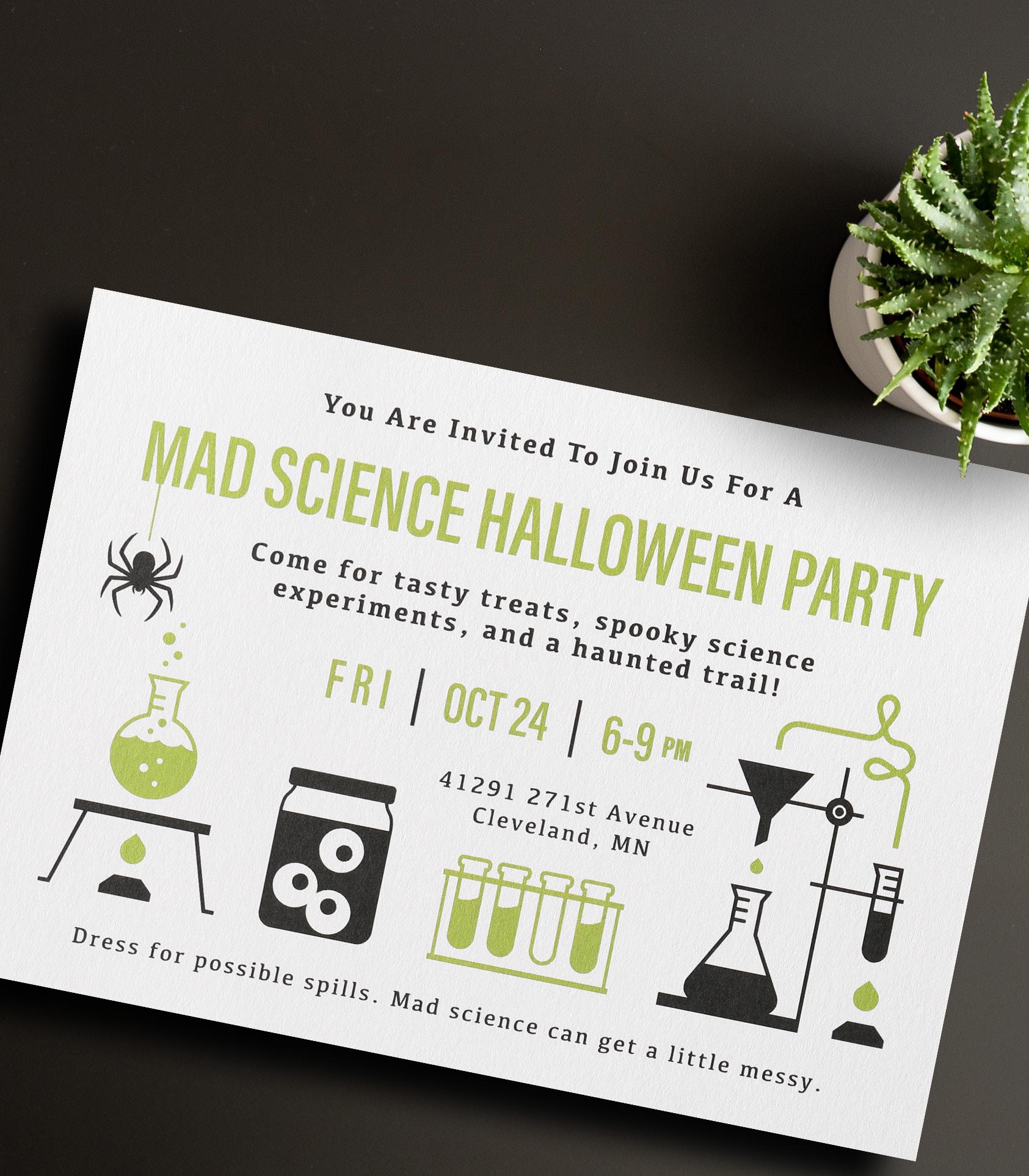
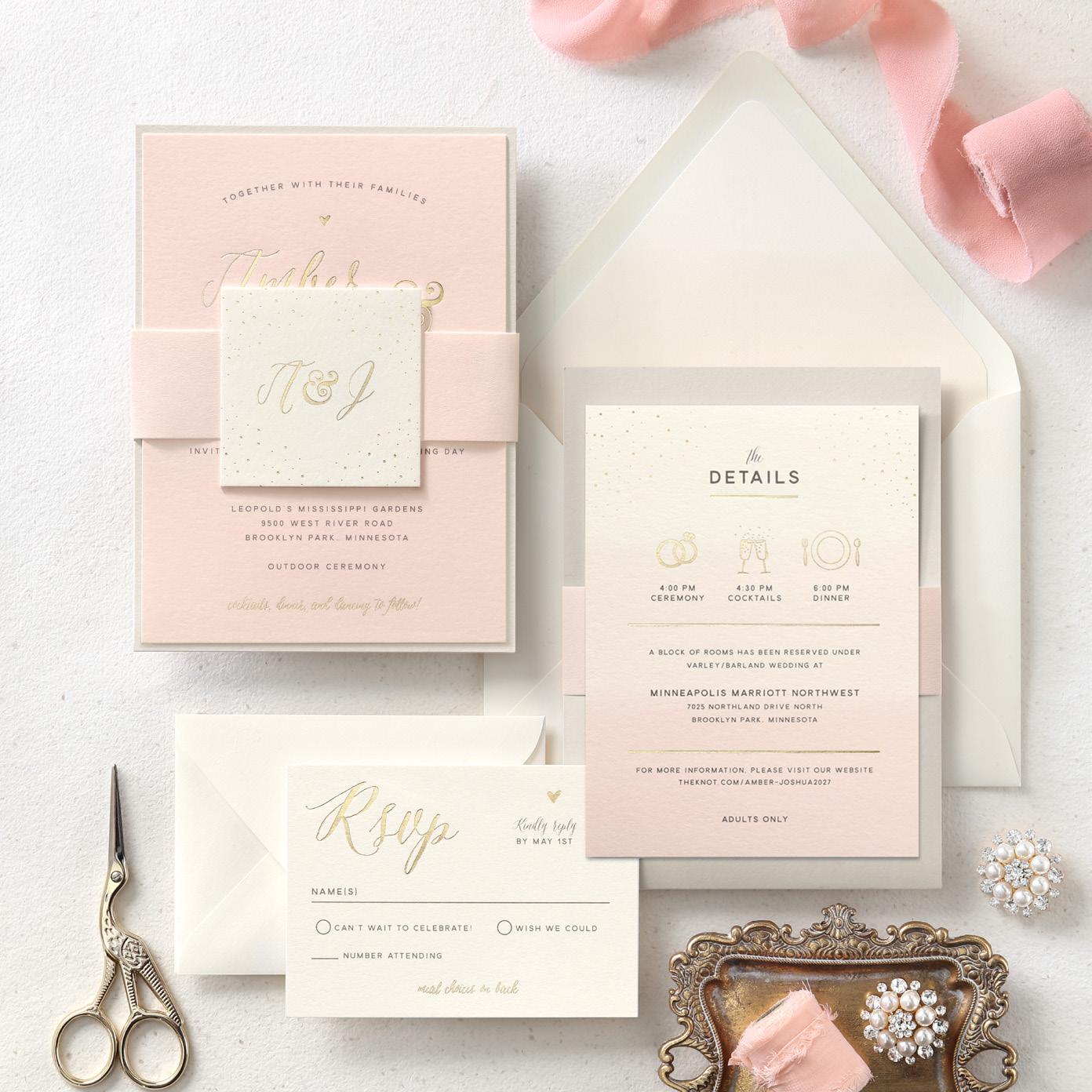
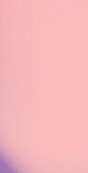
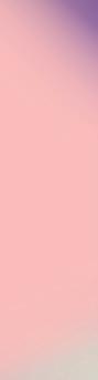
1. Trend: Pantone Color of the Year
Designers can embrace Cloud Dancer by leaning into a calm and serene feel. Use this tone in designs to impart a sense of serenity and elegance.
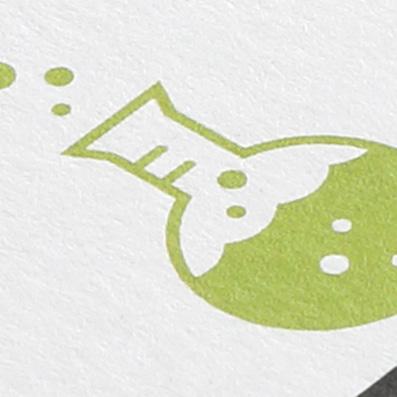
Shown: 2-color letterpress
PRO TIP:
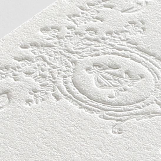
Print Process Matchup: Blind Letterpress
Letterpress is the perfect choice. Its deep impression, natural texture, and handcrafted feel enhance everything from loose sketch lines to organic motifs. Whether printed in one color or two, letterpress adds depth and authenticity. Check out our blog post about How to Order Blind Letterpress.
by
Pearl Cotton paper is a fantastic match for the Cloud Dancer color. This elegant stock is only offered with foil or letterpress processes, and will make your designs luminous.
Designed
Abbey League, TikTok Influencer
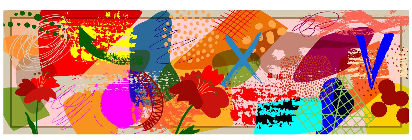
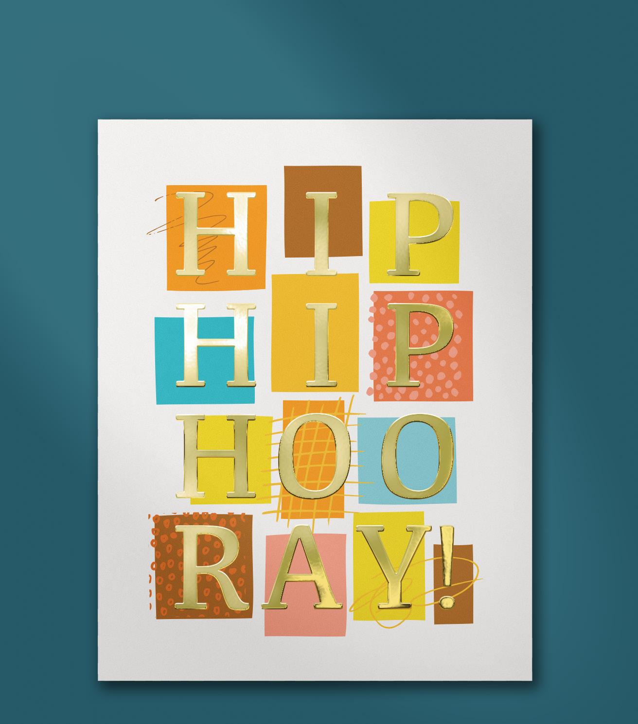
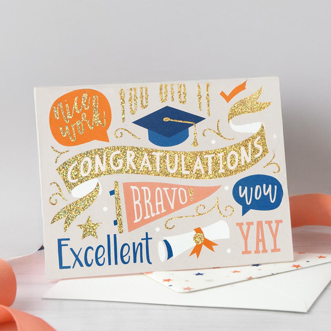
2. Trend: Modern Maximalism
Modern maximalism celebrates an expressive, anything-goes aesthetic. Designers are mixing motifs, blending textures, and leaning into bold compositions that reflect individuality and joy.
Ma IMALISM
Print Process Matchup:
Combining digital printing with specialty processes brings out the richness of a layered maximalist design. Adding enhanced foil, raised thermography, or other tactile finishes enhances the depth of patterns and typography, giving the artwork a dynamic, dimensional feel.
Maximalism encourages contrast. Mix patterns, textures, and print finishes to create designs that feel full of personality and life.
Shown: digital + gold enhanced foil
Digital PLUS
Designed by Anna Cleveringa
3. Trend: Tactile Craft
Tactile Craft celebrates the charm of handmade details like organic shapes, imperfect lines, and artwork that feels drawn rather than digitally engineered.
Print Process Matchup: Laser Cutting
Laser cutting brings incredible dimension to this trend by turning illustrated motifs into physical cutouts. The precision of the laser preserves every curve and organic detail, adding sculptural depth that enhances the handcrafted feel.
Paired with digital print, it creates a layered, artful look. Available by Custom Quote only.
Designed by TOG.ink Design Team
Read: Most Popular Custom Quote Requests Shown: laser and digital
PRO TIP:
Use laser cutting for weddings and major milestones. Its sculpted edges create a keepsake-level finish.
4. Trend: Bold Color
Print Process Matchup:
Thermography
Thermography pairs beautifully with bright palettes by adding raised, glossy texture that makes bold hues stand out even more. The dimensional finish amplifies contrast and gives vibrant color stories an extra level of impact. It’s a great way to highlight titles, accents, or graphic elements.
Bold Color pushes stationery into high-energy territory with vivid palettes, sharp contrasts, and fearless combinations. This trend brings excitement and a lively visual beat to any piece. digital and granny apple thermography
Designed by Anna Cleveringa
Read: Use Custom Thermography Like a Pro
Use bold color intentionally. Anchor your palette with one dominant shade and let supporting colors add rhythm, contrast, and movement.
PRO TIP:
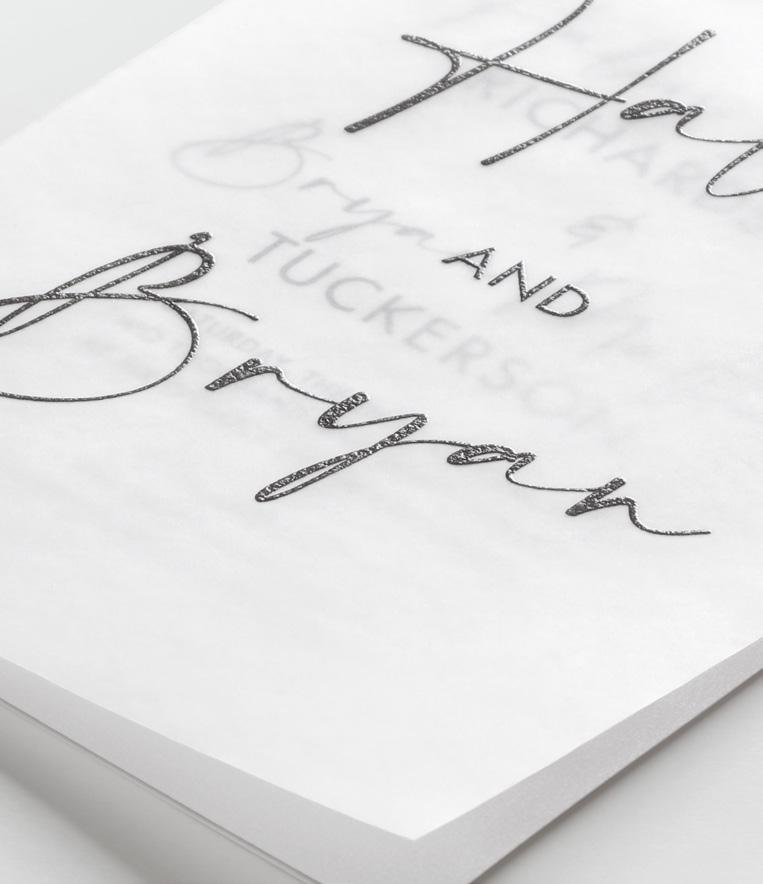
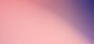
5. Frosted Glass Effect
The frosted glass effect adds a dreamy layer of transparency that feels soft, surreal, and romantic. It’s subtle, elegant, and perfect for creating depth without overpowering the artwork.
Print Process Matchup:
printed translucent wraps
Printed translucent wraps are the ideal way to bring this trend to life in print. The semi-opaque material softens the artwork beneath it, creating a layered look that feels both contemporary and ethereal. Try full-color digital printing for adding vibrant color or raised thermography print for texture and subtle sparkle.
PRO TIP:
Use minimal artwork on the wrap and let the design underneath peek through. This contrast is what makes the frosted look feel oh-so magical.
Shown: thermography on translucent paper
Designed by Carynn Klingel Read: Blog Post
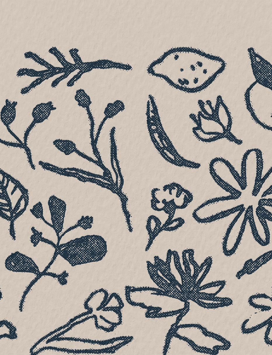
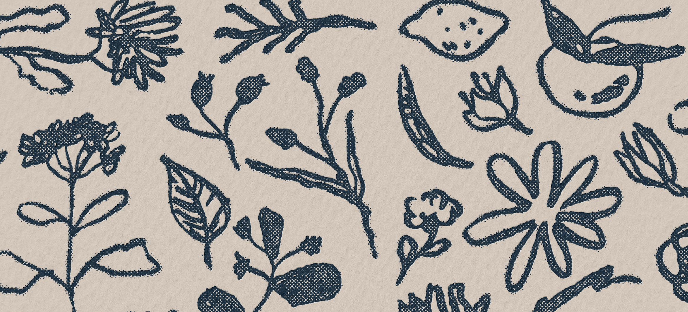
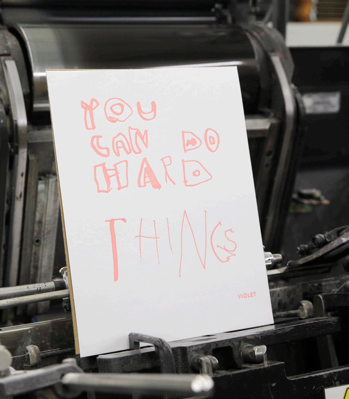
6. Playful Imperfection
Playful Imperfection embraces hand-drawn shapes, wobbly lines, and wobbly doodles. It’s the opposite of traditional polish, leaning into expressive marks that feel raw and full of personality.
Print Process Matchup: all print processes
This trend works beautifully across all print methods because the charm is in the artwork itself. Whether printed digitally, in letterpress, foil, or thermography, imperfect lines and expressive shapes translate with clarity while keeping their handmade character.
When illustrating in this style, move loosely and draw with expression. Too much control tightens the artwork and takes away the charm.
Shown: coral letterpress
Designed by Violet
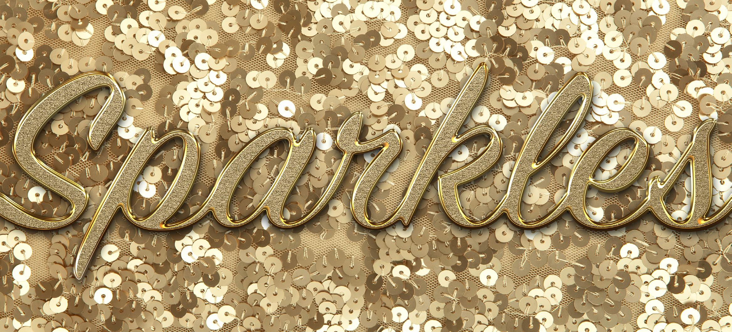
7. Champagne and Sparkles
Head-to-toe sparkles and sequins are looking big in fashion this year. Think glitter, shimmer, and glam. Pair with champagne tones for sophistication, or bold color for modern glamour.
Print Process Matchup: glitter foils
Glitter foils add instant shine and texture, making celebratory designs feel joyful and high-impact. The reflective finish highlights lettering, icons, and decorative motifs, bringing a touch of luxe to milestone moments. It’s an easy way to add sparkle without overwhelming the design.
Designed by TOG.ink Design Team
PRO TIP: Shown: digital + gold glitter foil
Use glitter foil to accentuate specific design elements. Small pops of shimmer make the message stand out while keeping the design polished.
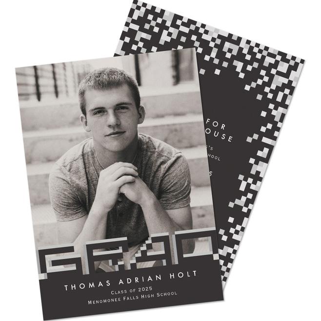
8. Pixel Illustration
Evoking the 80’s by featuring the look of early digital graphics and fonts, this trend mixes retro nostalgia with modern sensibilities.
Shown: digital
Print Process Matchup: digital
Digital printing captures the crisp edges and blocky details that define pixel artwork, preserving the retro aesthetic with modern clarity. It’s perfect for bold patterns, geometric layouts, and stylized illustrations that rely on clean repetition. The flexibility of digital allows designers to explore playful compositions inspired by early computer graphics.
Designed by Anna Cleveringa
Keep your pixel grids consistent. Uniform spacing helps the design feel intentional while still tapping into that nostalgic digital vibe.
PRO TIP:
9. Gradients
Gradients continue to grow in popularity with smooth color transitions, soft blends, and dynamic multi-tone palettes. They add movement and depth to stationery, creating an effortless sense of flow.
Shown: digital + gold foil
Print Process Matchup:
digital and foil
Digital printing captures the smooth shifts and blended tones of gradient artwork. When paired with foil, gradients take on extra dimension. Foil creates contrast, focal points, and adds a polished finish. It’s a versatile combo that works beautifully for invitations, announcements, and modern celebration designs.
Designed by Ginger P Designs
See more Ginger P. Designs sold by our sister company, Carlson Craft.
PRO TIP: Use gradients to guide the eye. Soft transitions can lead attention toward names, dates, or key event details.
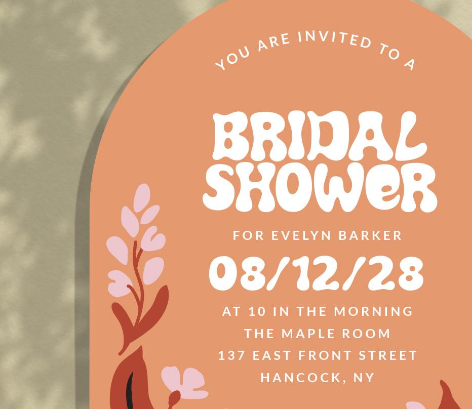
10. Organic Typography
Organic typography features soft edges, fluid curves, and hand-drawn letterforms that feel warm and approachable. Inspired by nature and retro type movements, these fonts bring personality and playfulness.
Print Process Matchup: die cut shapes
Die cut shapes pair naturally with organic lettering by reinforcing the soft, sculpted look of the typography. Rounded edges, arches, and custom silhouettes help the type feel integrated with the overall composition. This combination creates stationery that feels cohesive, modern, and full of character.
by Anna Cleveringa
Read our Typography Tips blog post.
Choose typefaces with natural movement. Subtle variations in stroke width help organic lettering feel lively without overwhelming the design.
Shown: digital with arch die cut
Designed
PRO TIP:
SHOWCASE YOURdesigns
Interested in being featured on the TOG.ink Blog?
Email a few examples of your work to creativeteam@tog.ink
Your artwork could be showcased in our next Hot Trend Off the Press or Designer Spotlight!