SKILLS
Photography (Sony a6400)
Graphic Design (Ai, Ps,Id, Canva, Procreate)
Studio Setup (Lighting, Set)
Photos Editing (Lr, Capture One)
Fashion Styling
Video Editing (Davinci Resolve, Final Cut Pro, Capcut)
EDUCATION
Bachelor of Design at Queensland University of Technology (year 2)
Majoring in Visual Communication and Fashion Communication
EXPERIENCE
I am a dedicated and enthusiastic creative professional with a strong passion for fashion and photography. My background spans graphic design, fashion communication, and photography, providing me with a well-rounded understanding of the fashion industry and an eye for capturing its essence. I am self-motivated, proactive, and confident in my communication, always striving to learn and grow. I approach my work with reliability and a strong work ethic, continually seeking opportunities to develop my skills and become a better version of myself.
Media Partner at Vietnam International Fashion Week (2022)
Studio Assistant at GPHA Production House (Fashion image production and consulting services) (6 months) (July 2022 - December 2022)
Photographer at GapGap Studio (May 2021 - August 2021)
Freelance Photographer (Fashion, Lookbook, Streetstyle, Portrait,...) (2023present)
Freelance Designer (2023 - present)
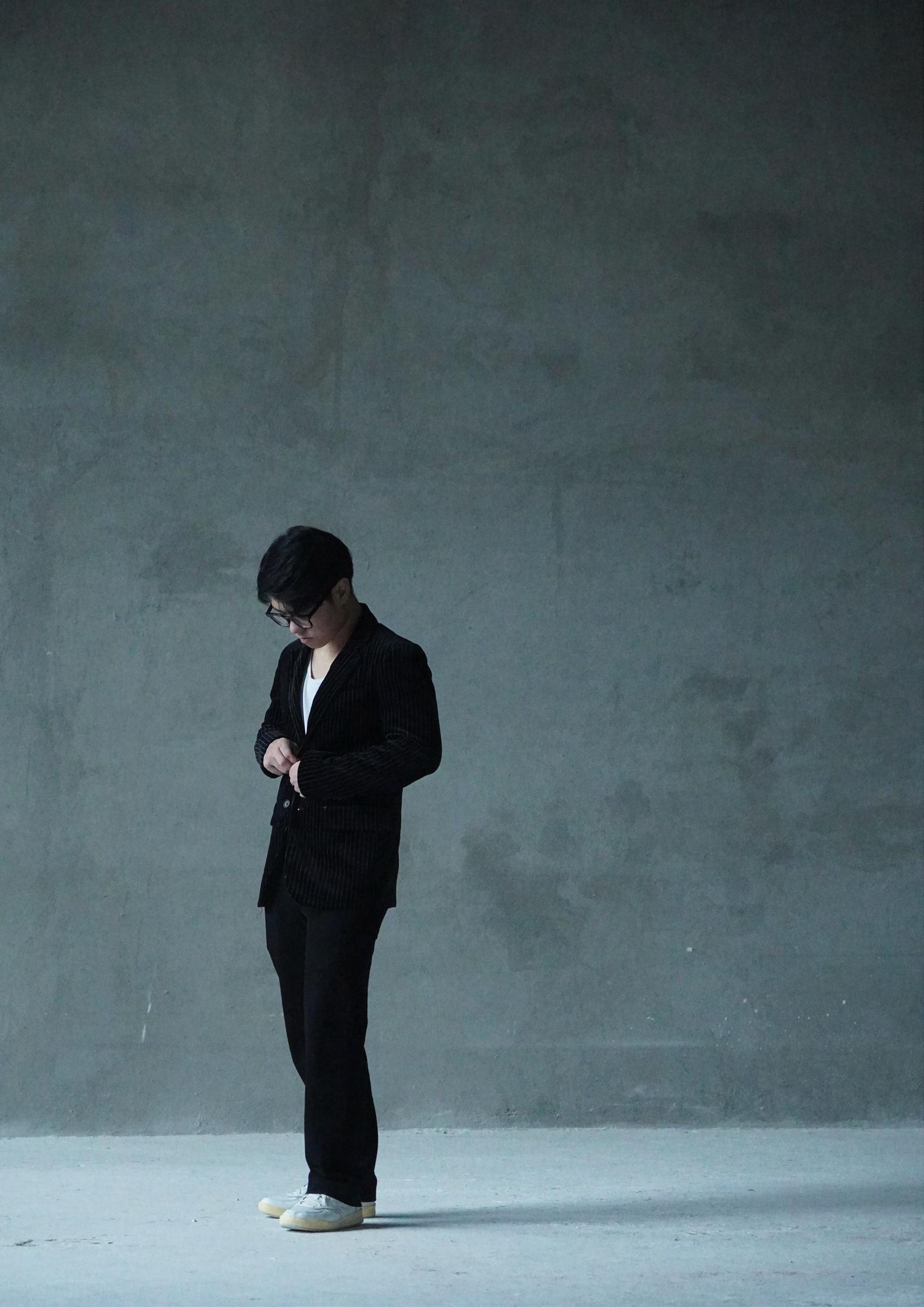
[01.1] LOOK BOOK
LookBook photoshoot for a local fashion brand in Vietnam.
Brand: HAEIN
Photographer/ Lighting/ Editor: Tyler Cao
Stylist/Producer: Khang Tran
[01.1] LOOK BOOK
FASHION LOOKBOOK
BY TYLER CAO
Fashion Photography
Fashion Photography
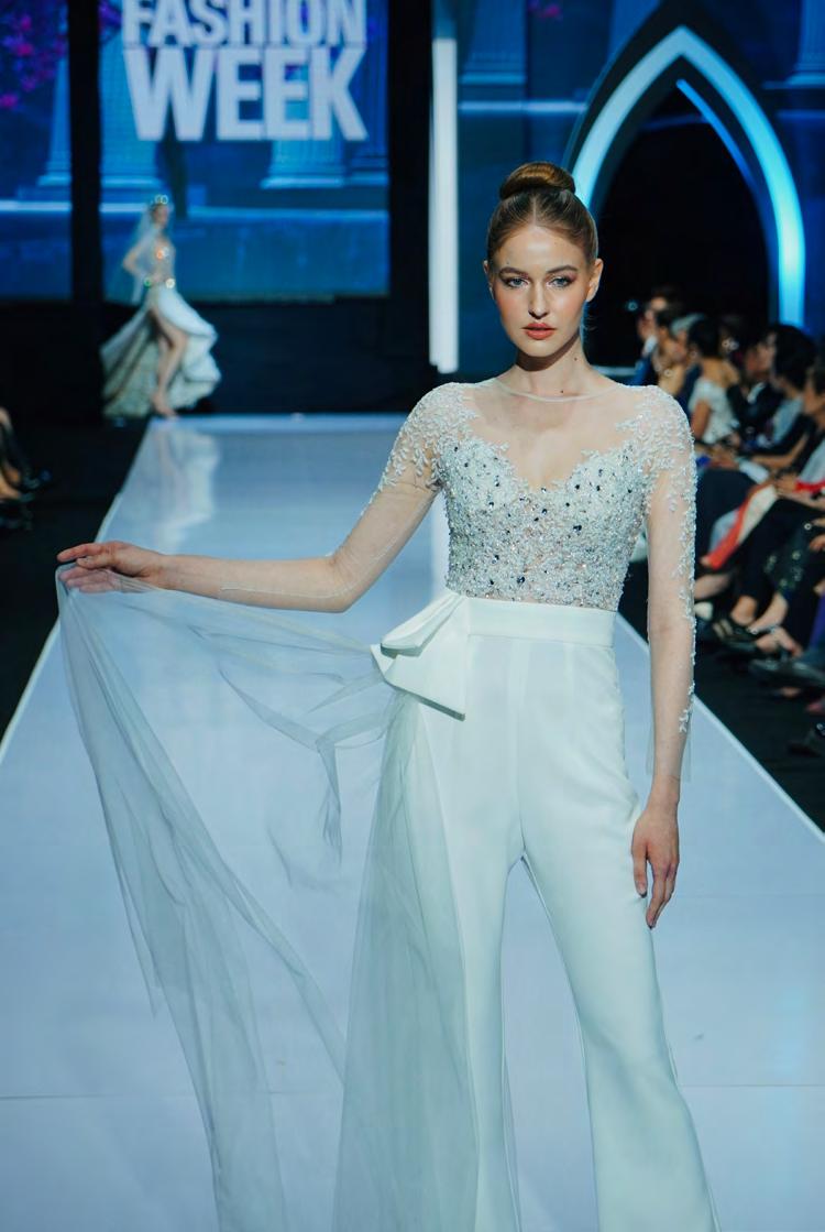
VIETNAM INTERNATIONAL FASHION WEEK
As a photographer at this illustrious event, I have the opportunity to document the intricate details and exquisite craftsmanship that define each collection. The vibrant colors, luxurious fabrics, and avant-garde designs provide a rich tapestry of visual elements to work with. From the dynamic energy of the runway to the candid moments backstage, every shot tells a story of artistry and passion.
This unique typeface, aptly named “WaspFig,” draws its inspiration from the intricate and harmonious relationship between wasps and figs.
“WaspFig” features organic curves and sharp angles, reflecting the natural forms found in fig trees and the delicate structure of wasp body. Each character is carefully crafted to balance fluidity with precision, embodying the dynamic interaction between these two organisms. The bold, striking lines are reminiscent of the wasp’s industrious nature, while the subtle, rounded terminals hint at the softness of the ripe fig fruit. This contrast creates a typeface that is both robust and graceful, perfect for a variety of applications ranging from branding to editorial design.
[02.2] EDITORIAL
[02.2] EDITORIAL
This zine is an exploration and celebration of the Milka typeface, particularly focusing on its “Soft” variant. The driving concept behind this design is to showcase the readability and aesthetic versatility of the “Milka” stencil font, even when subjected to effects like gradient and blur. The aim is to highlight how the unique qualities of “Milka”, specifically its geometric simplicity and strategic use of negative space, maintain legibility and visual appeal across various design treatments.
The overarching theme of this zine is minimalism, emphasizing clean lines, ample negative space, and a restrained color palette. The complementary colors of blue and orange were chosen to create a dynamic yet harmonious visual experience. The application of gradients and blur effects serves to highlight the font’s adaptability and enduring readability.
[02.2] EDITORIAL
[02.2] EDITORIAL
This zine is an exploration and celebration of the Milka typeface, particularly focusing on its “Soft” variant. The driving concept behind this design is to showcase the readability and aesthetic versatility of the “Milka” stencil font, even when subjected to effects like gradient and blur. The aim is to highlight how the unique qualities of “Milka”, specifically its geometric simplicity and strategic use of negative space, maintain legibility and visual appeal across various design treatments.
The overarching theme of this zine is minimalism, emphasizing clean lines, ample negative space, and a restrained color palette. The complementary colors of blue and orange were chosen to create a dynamic yet harmonious visual experience. The application of gradients and blur effects serves to highlight the font’s adaptability and enduring readability.
VISUAL COMMUNICATION
[02.3] BOOK COVER DESIGN
My book cover for the book “Flight Behavior” is the scene of a girl who is running uphill and sees a magnificent swarm of monarch butterflies hovering over the mountain. The orange color of the monarch butterflies makes them almost look like a fire on the top of the mountain, making her think that it is a fire and turn back. This is the beginning scene of the whole story “Flight Behavior”, the monarch butterfly swarm is the tension of the story and leads to a significant character development of the protagonist.
Medium: Procreate, Illustrator and Indesign
[02.3] BOOK COVER DESIGN
Creating a book cover using the lino print technique adds a unique and tactile dimension to the artwork, infusing it with an artisanal quality that is both visually striking and rich in texture.
The texture of the lino print cover is immediately noticeable. The surface is slightly raised, with the inked areas having a rough, organic feel that invites touch. The imperfections inherent in the lino print process add character and authenticity, giving each cover a one-of-a-kind look.
The deliberate, hand-carved lines create a sense of depth and movement, guiding the eye across the cover in a dynamic yet harmonious flow.
Medium:
Lino print, Procreate and Indesign
A simple and elegant logo can be applied in various ways, various platforms from interial design to advertisement to funiture and cutleries to create a unified branding for the restaurant. All the elements around this logo can create a brand identity that fit the high-end segment of the restaurant. A optimal efficiency in visual communication is fundamental to attract and seed unforgettable memories to customers.
[02.4] LOGO DESIGN
“deliver
the pure taste of nature through the unique culture of Japan in a luxurious experience”
VISUAL COMMUNICATION
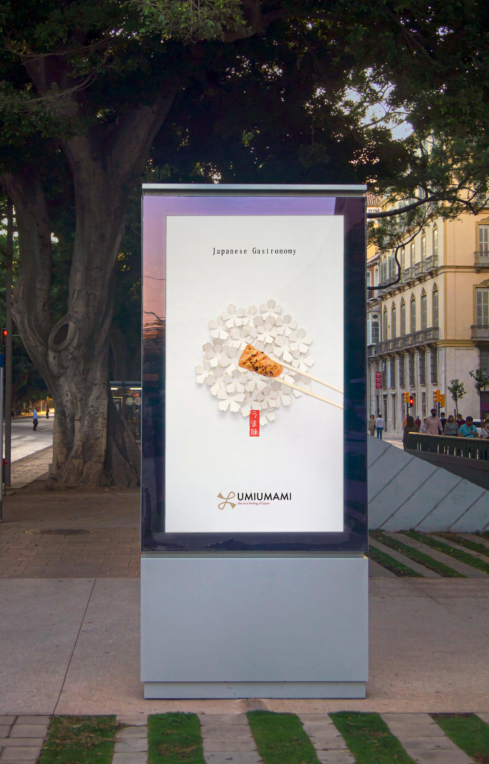
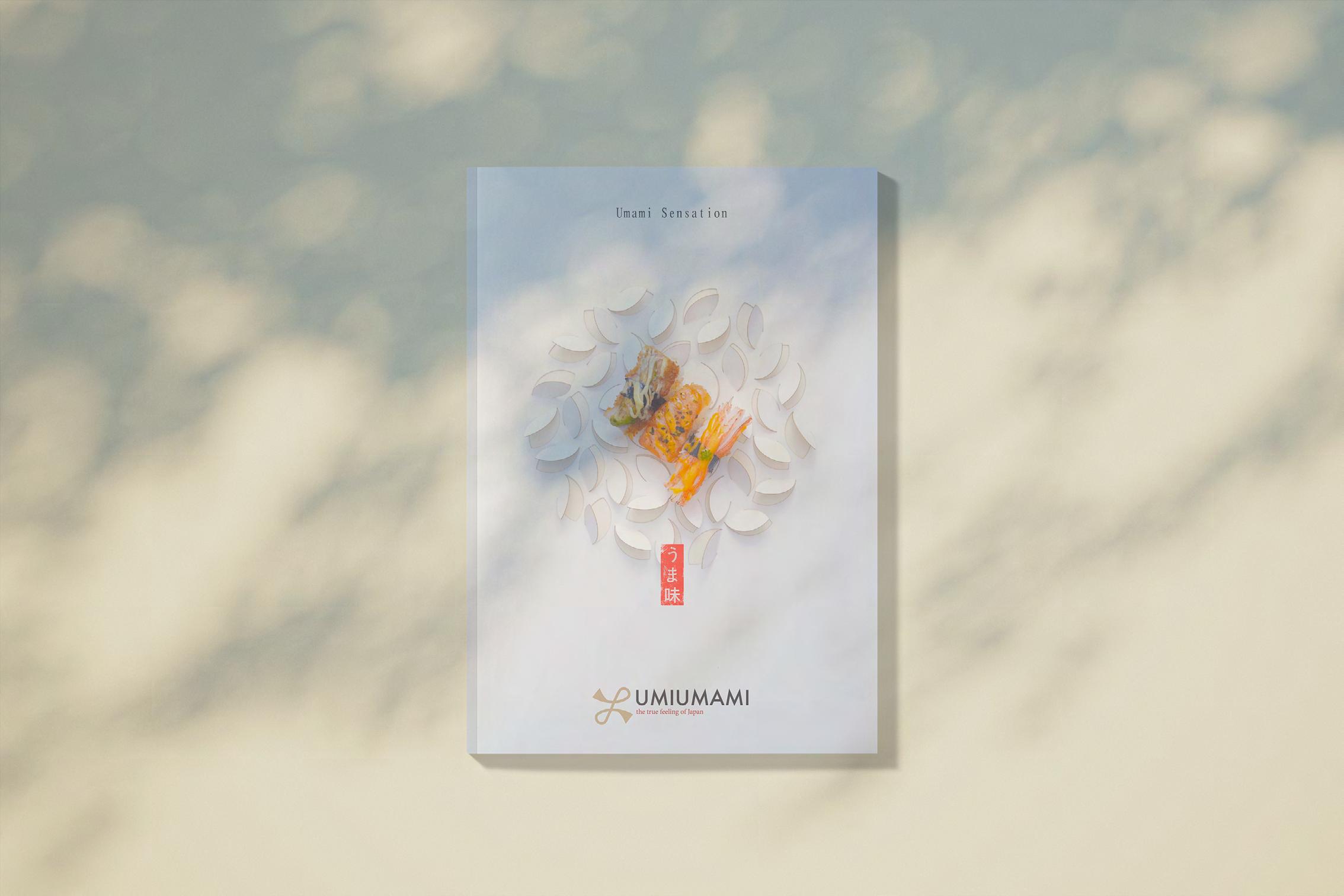
[02.5] BRAND CAMPAIGN
This campaign purpose is to trigger the desire, appetite of our customers and deliver our brand’s key value which are “Symphony of flavor”, “Japanese gastronomy” and “Umami sensation”. The message of the campaign is “every dishes we served is a work of art” so this campaign images have show that message via the way I displayed the sushi. This is a love-based campaign provoke our desire to try UMIUMAMI by the images of the sushi in a aesthetic background. This campaign images can be displayed in luxurious environments such as 5-star hotels, malls, business lounges, magazines, digital platforms,...
The origami, cherryblossom and the papercut part in the background have create 3 circles and these circles act as directional lines leading the eyes to the sushi.
My brand values have been place elegantly at the top of the images while the logo is in the bottom create a straight layout. Every components is in the center line of the page.
Art director: Tyler Cao
Photographer: Tyler Cao
Retoucher: Tyler Cao
Set designer: Tyler Cao