COR MEUM TIBI OFFERO DOMINE PROMPTE ET SINCERE
CALVIN THEOLOGICAL SEMINARY
BRAND & STYLE GUIDE
Our presence continues to grow in online spaces
And we’ve found it increasingly necessary for a scalable & digital-friendly icon. While our seal of a hand offering a heart carries our legacy and posture, we have found we need an additional way to represent our place, people & ethos. One way to do this is by turning to who we are, what we do, and where we do it: our spaces.


WHAT DO PEOPLE EXPERIENCE WHEN THEY VISIT OUR SPACES?
“Buildings at the University of Chicago, buildings at Yale — they want to impress you … And implicitly, there’s a sense of: ‘Do I deserve to be here? Is this building for me? Am I good enough?’
“[Calvin] is different, it ‘doesn’t suggest a kind of mastery of the surrounding landscape, … It’s not hierarchical. It’s a very peaceful, coexisting form of architecture.’
...whatever is going to happen on this campus, it will matter in the present, not in the past. And, implicitly, it will matter in the future.”
-Calvin Chimes, Oct 2022

“Architecture is basically a container of something. I hope they will enjoy not so much the teacup, but the tea.”
- Yoshio Taniguchi, Architect


OUR BUILDINGS WERE DESIGNED FOR THE STUDENT EXPERIENCE
They “get out of the way,” cultivating a welcoming community focused on learning and whole person growth. Our buildings offer a beautiful, memorable space for gathering, study, worship, and reflection, welcoming all who enter.
The importance, and our focus, is what happens within our “walls.”
Still, just like tea, our activity requires a vessel, which has the potential to greatly influence the student and faculty experience.
This includes distance and hybrid students as well as they visit for intensives, special events, and just like our residential student body, come to identify with Calvin Theological Seminary as a place of holistic formation.

Our seal remains a part of our official marketing and style guide. It sets us apart from other seminaries as it illustrates an action rather than a concept. Because of the difficulties in scaling, use of the seal is primarily for printed assets or as space and design allow in digital spaces. It will no longer be paired with our word mark, but will be incorporated as a design element and motivation for our existence.

Elegant but approachable, the icon is reminiscent of our welcome center, echoing a sense of place. Students, alumni, and stakeholders are reminded of walking in our front doors and the formation they receive within our walls - both physical and digital.
The icon is inspired by the prairie architecture ethos of being “in” a space. The ideal of working in harmony with the surroundings, to reconcile building and nature, a poignant image of our Reformed ethos.

Modern, Rooted & Approachable
We draw our design cue from our architectural and theological heritage. Logo and design should have clean, defined elements, yet able to adapt to different contexts. Stakeholder and student facing elements may differ significantly, yet retain our central identity.


Variations on a theme
Student intramural athletic emblem and jersey, sample postcard, and design element using the icon.


Allow spacing to other content of one-half shortest side (excluding background)
If space or scale limits readability, the logo may be used without “est. 1876”

For use over images, use only the icon


Both vertical and horizontal versions may be used in the three above colors, or over a dark background either page white or “linen” may be used.
Icons may be used in any seminary official color, providing the department using them also uses that color.


When placing on product, a reverse color is acceptable to use, or in the case of laser etching, the substrate is acceptable.

Understanding how other seminaries use imagery, we see some patterns mostly comprising of literal to abstract representations of Christian symbolism.


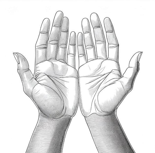
The seal we’ve carried as a logo since 1935 is unique, and portrays our mission and posturelearning to serve by offering our hearts promptly and sincerely. It also avoids the tendency to use a watered-down symbol.
The difficulty is when we begin to use this logo in digital and scaled formats. When minimized, the detail of heart and hand is quickly obscured, and the Latin motto is no longer legible.
This is why we will continue to use the seal when design and space allow, but use our new branding for our main icon.

How we can continue to acknowledge and utilize our seal alongside our new brand identity:
In the sample ad opposite, pairing the seal as a design element with the summation of our motto “head, heart & practice” reinforces our distinct approach to theological education.
It is standard to pair a headline “head heart & practice” with a single call to action “fully embrace your calling” and a brief way that Calvin Theological Seminary is uniquely equipped to answer their need.
In the sample back of postcard below, we line up the 150th anniversary icon, our logo, and the sealthe front of the postcard had the headline and call to action. This is acceptable as long as the seal is after the logo.
Artistic representation of the seal is also acceptable on a case-by-case basis, such as the “sunburst glass” version of the seal here. Ask the communications team for assistance when using this approach.
The main thought is that we are not retiring the seal and it’s significance, but changing how and why we use it, letting it become a more thematic element that we can continue to redefine to the context of our students, faculty, and constituency, making it more impactful.
The seal will continue to be used on official documents such as diplomas, or may be embossed on documents such as letterhead.


FULLY EMBRACE YOUR CALLING
with whole person theological education rooted in the rich soil of reformed scholarship and practice

AN IMPACTFUL HEADLINE COULD LOOK LIKE THIS.
Gotham Bold
AN IMPACTFUL HEADLINE COULD LOOK LIKE THIS.
Gotham Book
AN IMPACTFUL HEADLINE COULD LOOK LIKE THIS.
An Impactful Headline Could Look Like This. Latino URW Black
Latino URW Bold Italic
An Impactful Headline Could Look Like This.
Latino URW Bold
An Impactful Headline Could Look Like This.
We have two font families for Seminary assets
Gotham + Latino URW comprise the typography we use for all primary communications and marketing. Our institutes, centers, and student groups may continue to use their assigned fonts.
The options laid out here have the goal of flexibility to apply across various assets and delivery methods, digital, print, social, etc. The key is to maintain consistency within a specific asset. Opposite is a traditional layout example for print documents.
Gotham Bold
HEADERS HAVE MULTIPLE OPTIONS
Headers have multiple options depending on length
Gotham Book
HEADERS HAVE MULTIPLE
OPTIONS
Headers have multiple options depending on length
Latino URW Bold
Headers have multiple options
Gotham Book
Body text may take one form per paragraph in either font
Latino URW Regular
Body text may take one form per paragraph in either font