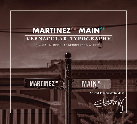
A Street Typography Guide by MARTINEZ CA MAIN ST VERNACULAR TYPOGRAPHY COURT STREET TO BERRELLESA STREET
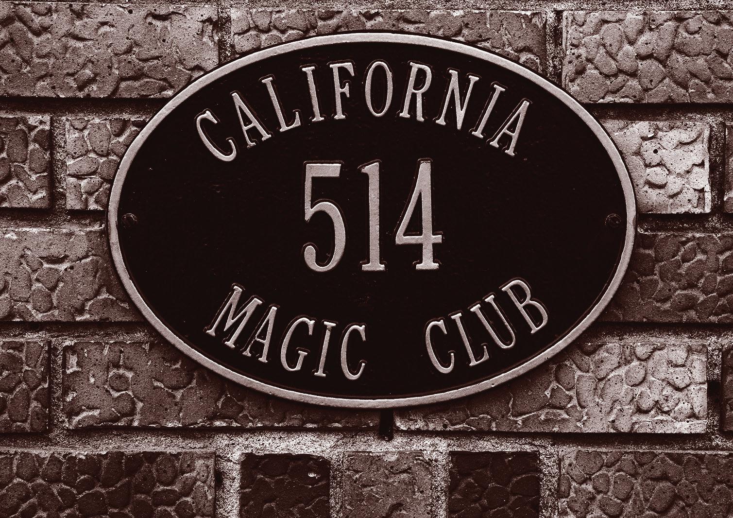
1 2 5 6 7 9 16 18 & 19 10 17 22 24 23 26 25 27 29 39 40 37 38 30 31 33 32 34 35 36 28 11 12 20 21 13 14 15 8 4 3 Front cover: Main Street Central decorative street sign Back Cover: Magic Club address metal plaque All photography, writing, and design by Sheldon McV


CONTENTS HISTORY 4 METAL 6 Freestanding 7 ELECTRIC 10 NEON 11 LEDs 12 STONE 14 HAND-LETTERED 17 Hand-Drawn Type 18 Painted 19 Mural 21 Ghosts 22 1 Contra Costa Court House 2 Contra Costa County Finance Building
HISTORY
The Main Street area of Martinez, California weaves modern trends and historical references together through its use of typography in signage.
The lettering style, placement, and materials used have a way of echoing the city’s storied past while representing its bustling present. Since serving as the transit point for ferryboats crossing the Carquinez Strait heading to the gold fields in the late 1840s, the clarity of signage on Main Street has always been a big deal.
This became a crucial matter when the city became the seat and capital of Contra Costa County. Very soon after, Main Street Martinez tied into the Transcontinental Railroad. As a multi-modal transportation hub, the area experienced a big boom in population, diversity, and foot traffic. This critical economic center brought visitors from distant regions of the country. Signage became a major investment for businesses on Main Street.
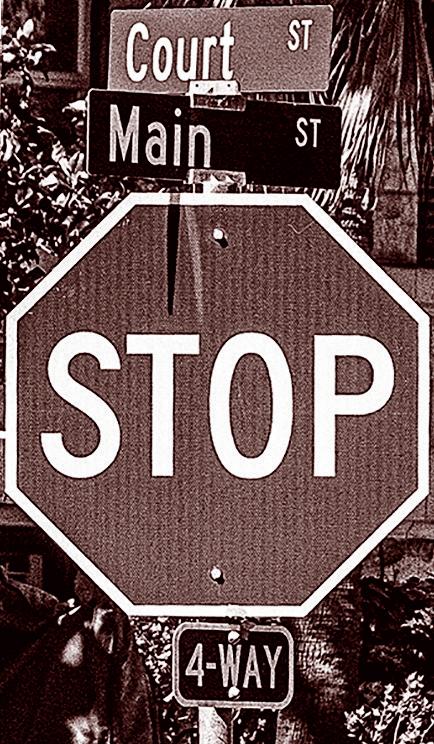
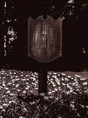
4 3 Street Sign at intersection of Main and Court
5
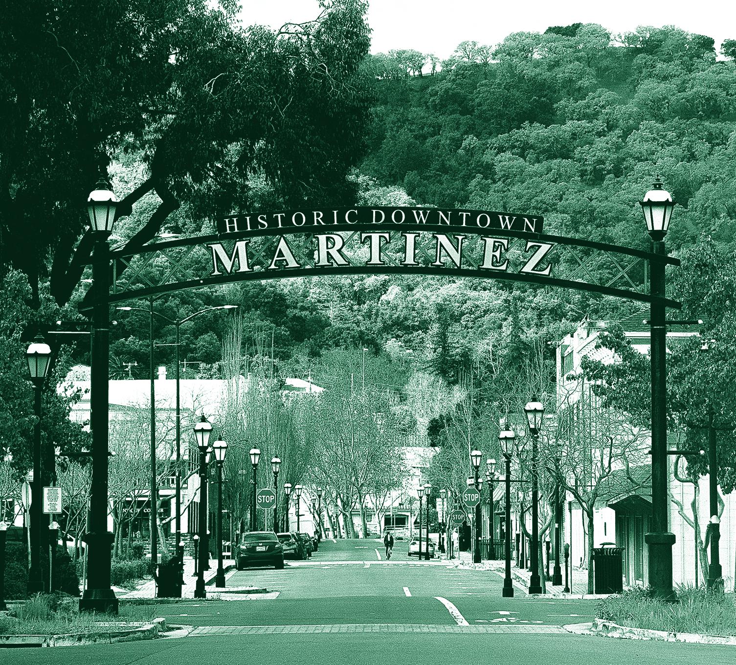
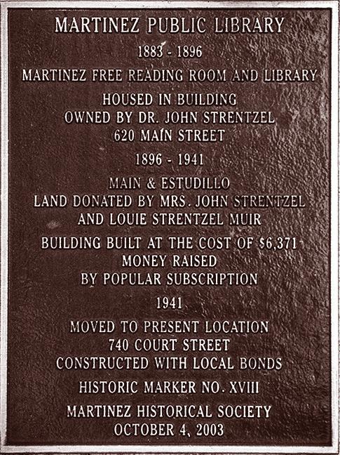
4 Historical Downtown Martinez District Sign
METAL
The evolution of Metal Type in signage is a testament to its endurance.
Since the days of handset letterpress printing to modern digital formats, typography has been expressed in countless ways. Designers and artisans have taken advantage of the structural grace
and strength of metal. Whether freestanding letters, hanging words, or embossed/engraved text, we can see Metal Type on display all throughout Martinez’s Historical District and Main Street.
6
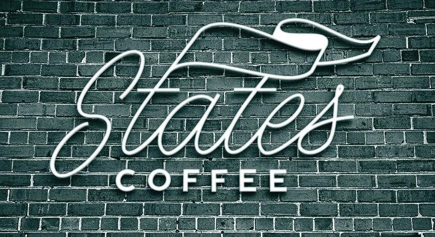
States
St. Presence Signage
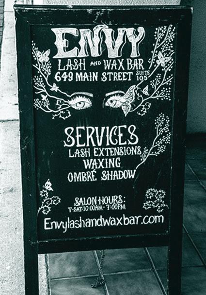
7
Coffee Main
5 Five Suns Brewing Patio Bar Sign
FREESTANDING
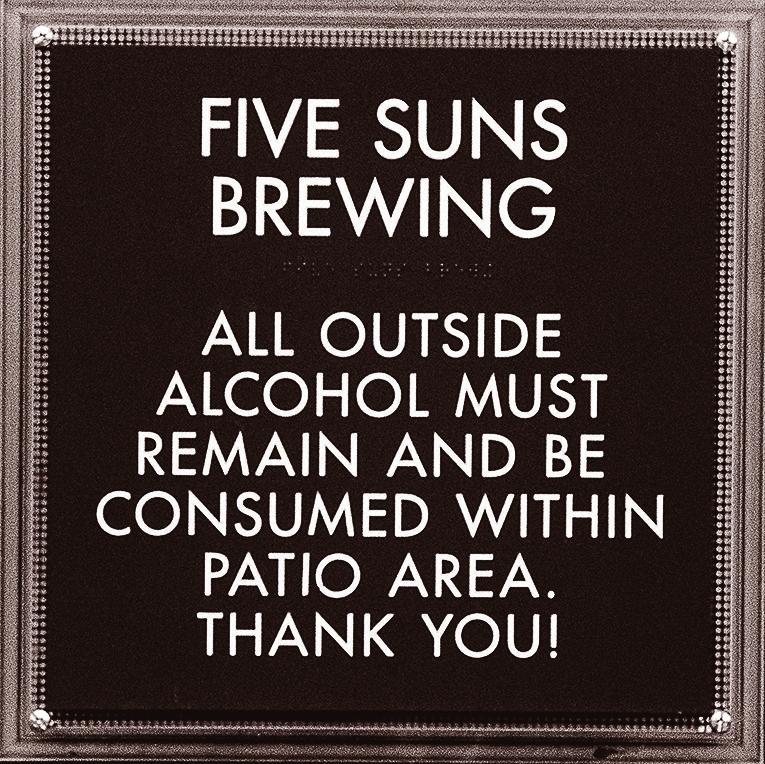
Freestanding Metal Type is rare on Main Street, but definitely present. At Five Suns Brewing Company, there is a back patio bar where freestanding metal letters are on full display. They can be seen in the images above.
When groups of people are imbibing outdoors (in public), it is probably best to make everyone else aware.
Martinez is a bold town, but it’s not Las Vegas.
7
6 Five Suns Brewing Patio Bar Sign
8 Five Suns Brewing Patio Bar Sign
PLAQUES
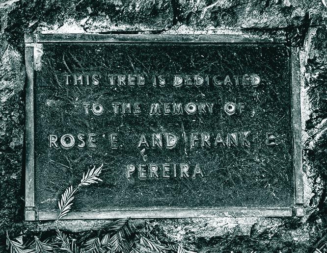
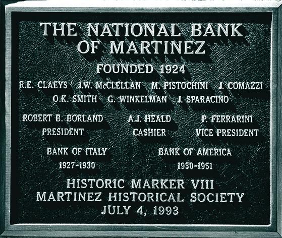
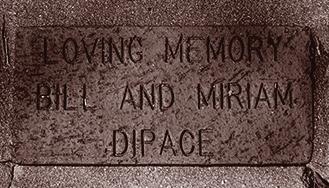
One of the most notable aspects of the vernacular typography of Main Street Martinez is the abundance of metal plaques. Martinez loves to share its history with visitors. Plaque placement is just one of the various ways Main Street accomplishes this.
8
10 Memoriam for the Rose and Frank 11 NB Martinez Founding Plaque
9 Martinez Public Library Locations Notice
12
Plaqued
9
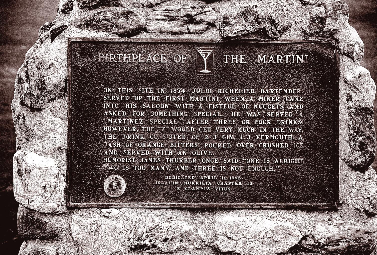
Fact: Martinez Main Street is the birthplace of the world famous Martini Cocktail.
Birth Certificate of the Martini
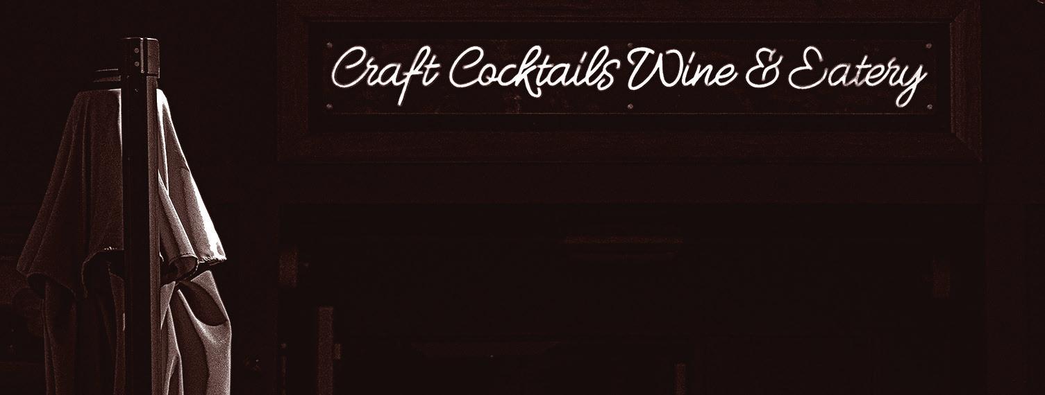
ELECTRIC
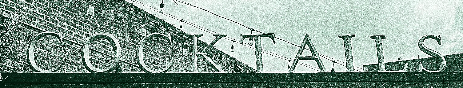
The radiance of Electric Type is eye-catching. Neon lights, LEDs, or incandescent bulbs are visually dominant. These signs stand out against the others because their bright, energetic, high-contrast, and sometimes colorful lights create a dynamic effect that static signs do not.
When taking a stroll down Main Street, you will Electric type in nearly every storefront.
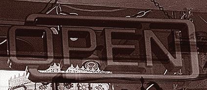
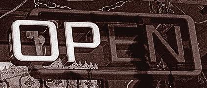
13 Antiques on Main open sign
10
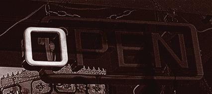
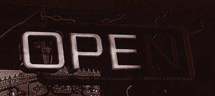
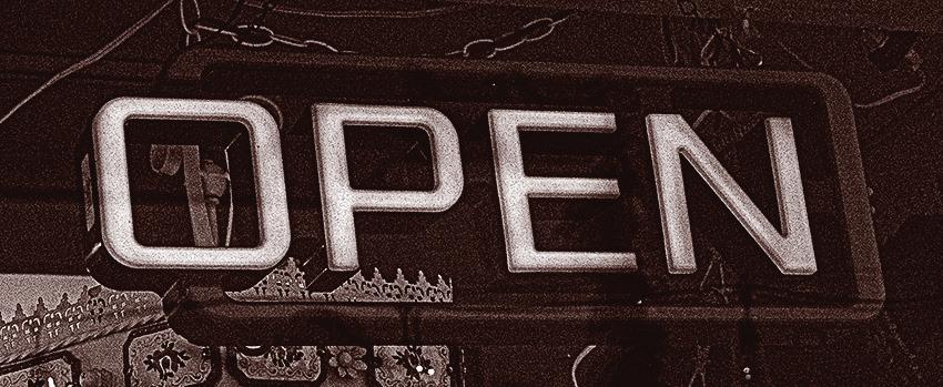
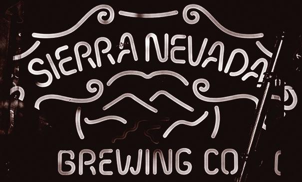
NEON
14 Sign for sell at Antiques on Main
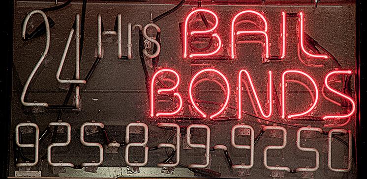
15 All-Pro Bail Bonds open sign
Neon Type has flourished along Main Street diners, theaters, and boutiques. The Carquinez theater marquee was once ablaze with neon.
Today, there are preservationists in Martinez who want to see a revival through Main Street’s vintage signs being restored.
Neon evokes memories of a simpler time, showcasing community pride and the luminous warmth of the heart of Martinez, CA.
11
16 Sign at Brix & Craft
LEDs
LED Type is a bright way to get attention. Mostly used for open signs, LEDs offer cost-effective and electrifying signage.
Many of the businesses on Main Street prefer LED Type for window signage. Some are designed to look like neon lights.
The use of LED signage is just as present on Main Street as the desire for a revival of neon signage.
12
13 17 Lemongrass Bistro open sign
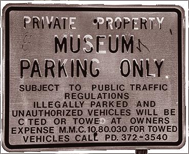
STONE
Stone Type exudes permanence and longevity; seamlessly blending its historical charm with the contemporary aesthetics along Main Street.
County Buildings and municipal access areas utilize stone as the material of choice because it symbolizes the resilience of the Martinez architecture and community spirit.
Concrete Type favors clean lines and avoids decorative typefaces and flourishes.
Stone seems to get right to the point. Sans-serif typefaces etched into concrete surfaces exude min
imalistic elegance while representing the directness of the business being adorned.
Stores, cafes, and boutiques employ this style to communicate clarity and sophistication. Local
14
Memoriam at the Plaza 20
artisans collaborate with businesses in an effort to create bespoke concrete signage; assuring each letter is cast or carved to a level of perfection befitting the art form.
The tactile quality of concrete invites touch. It is a sensory experience that bridges history and modernity. The matte finish contrasts beautifully alongside glass, steel, and wood.
The smoothness or roughness of the stone adds both tactile and visual texture to the urban landscape in ways other man-altered materials cannot.
The way light and shadow dance across the raised or recessed letter forms creates a visually dynamic interplay that lends to the character of the medium.
Stone signage is innately long-lasting, and increasing the longevity of signage reduces waste.
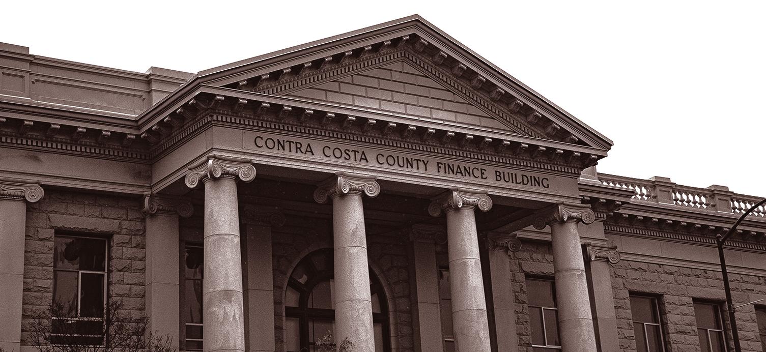
The lettering on the Contra Costa Finance Building is sculpted concrete put into place. It shows a grandeur befitting of a critical County building.
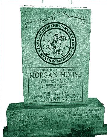
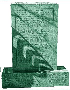
15 19 Pony Express Monument 18 & Memoriam at the Plaza 21
That type of grandeur makes for a grand entryway welcoming visitors and natives alike. Concrete Type has a solid way of uniting the community.
By reinforcing a sense of strength and establishment, Martinez citizens feel more involved with county affairs. Like stone architecture, Stone Type stands tall in its longevity.
16
2 2
Contra Costa Court House
HAND-LETTERED
In the late 19th and early 20th centuries, hand-lettered signs adorned Main Street. Skilled sign painters meticulously crafted each letter, using brushes and paint.
These signs announced businesses, theaters, and services while reflecting the character of Martinez
Main Street; both citizens and those passing through.
17
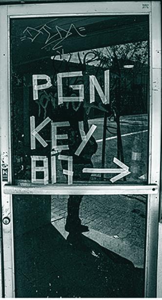
22 A line of A-Frame hand-lettered sides lining the sidewalk
HAND-DRAWN TYPE
Hand-drawn Type is an art form. Sign painters honed their skills, creating custom fonts and custom layouts to scale.
All of the imperfections, gentle curves, and variations in stroke weight make each sign unique.
Hand-lettering evokes nostalgia and transports us to a simpler era when signs were crafted by hand, not machines.
Businesses along Main Street embrace HandDrawn Type, in all of it’s authenticity, by commis-
sioning local artists to hand-paint signs for storefronts, and interiors.
A resurgence of interest in hand-lettering has emerged. Young artists are learning the craft; blending tradition and contemporary design.
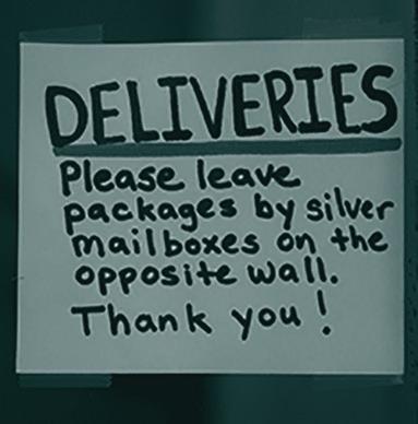
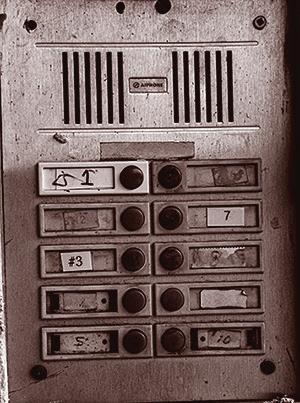
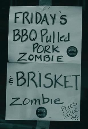
18 23 Martinez residential note 24 Case Hall Call-box 25 Rob Zombies Friday Special
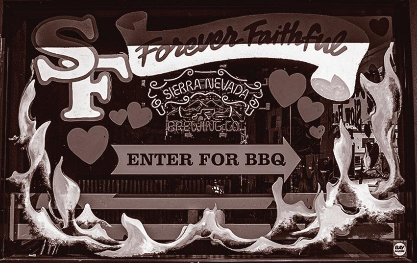
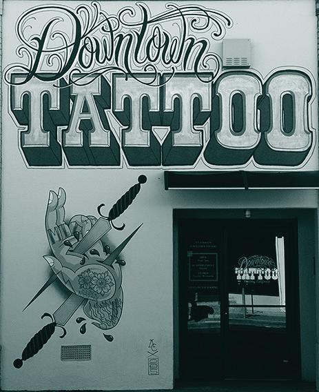
PAINTED
Bold and brilliant serif fonts are used to announce cafes, boutiques, and the many antique shops lining the street. The brush strokes reveal the character, spirit, and nature of the painter and the shop owner.
19
26 the abandoned note
27 Slow Hand BBQ painted window
28 The parlor paint job
20
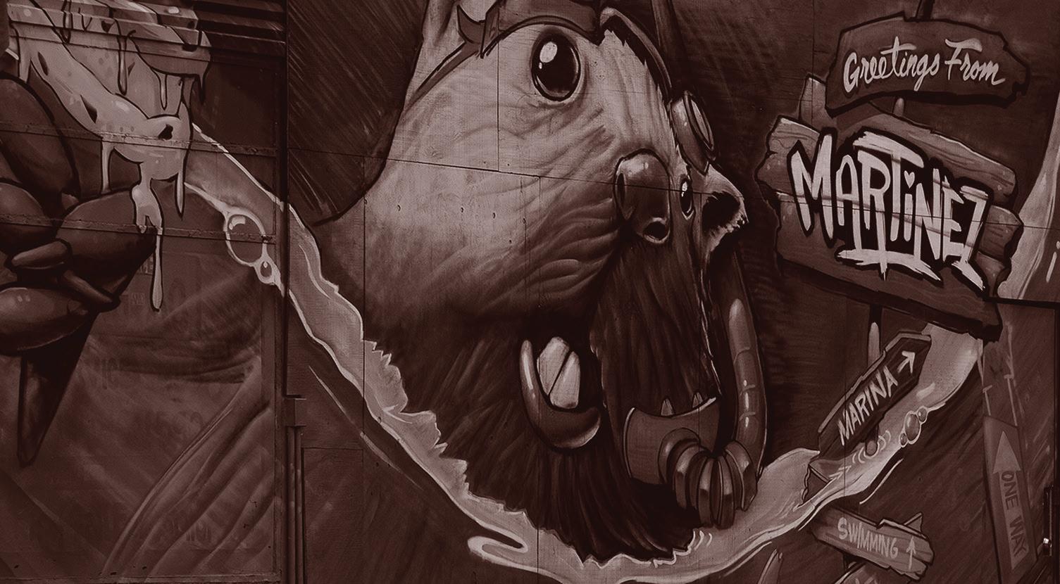
30 Martinez Historical Society Mural
29 Old Gas Station Mural
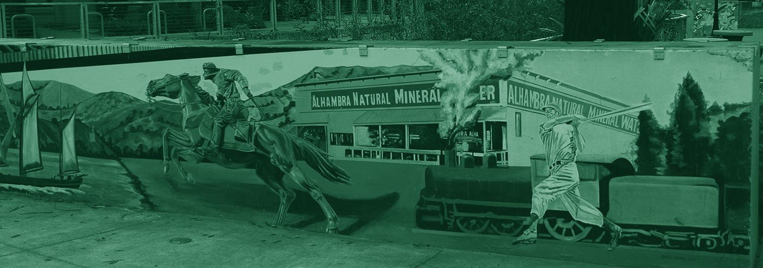
Murals stretch across the Main Street some of the brick-and- mortar facades to breathe life into forgotten corners of Main Street. They’re not just art; they’re conversations with the town and visitors.
The Martinez Historical Society mural whispers tales of pioneers, gold rush dreams, and resilience. Hand-lettered signs blend with graffiti tags, creating a visual symphony of artistry and angst.
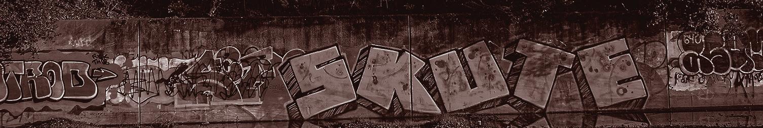
MURAL
The old and new harmonize as dusk settles and neon signs begin to flicker. Murals come to life at dusk and the short-lived Main Street nightlight begins its two-to-three hour stretch. Martinez is a town known for it’s early bedtime.
21
31 The Tiny Door Main & Castro
32 Random memorial tagging
34 The Children’s Historic Mural
33
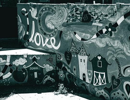
Martinez’s most-loved Graffiti wall.
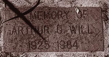
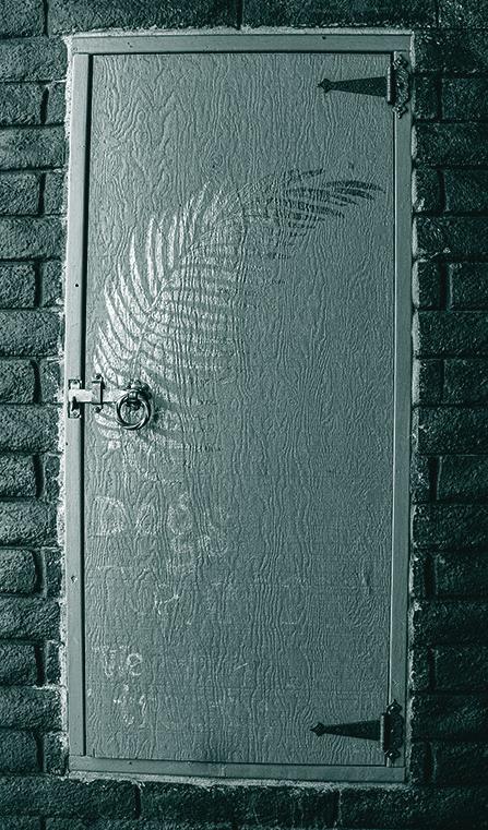
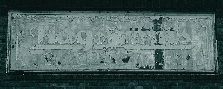
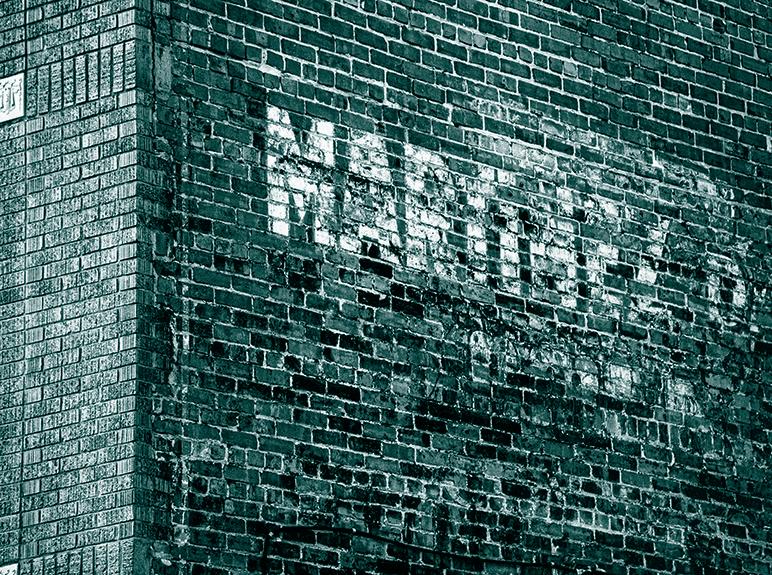
GHOSTS
Ghost Type haunts Main Street; whispering their secrets through long-faded paint and peeling vinyl.
They serve as a visual diary of urban life over generations. Each of them tells a story in a language of nostalgic decay if you dare to look.
22
Old sign on Main and Castro 35
37 Old
38 CC Finance Building lawn 39 Old sign in back
The Ghost of Court Alley 36
museum site
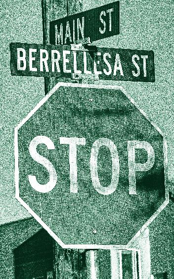
Antiques on Main 10 Brix & Craft 12 Concrete 14 Contra Costa County 4 Court House 3 Finance Building 16 Electric Type 10 Incandescent 12 LEDs 12 Neon 12 Five Suns Brewing 7 Hand-Drawn Type 18 Hand-lettering 18 Sign painters 17 Graffiti 21 Ghost Type 22 Lemongrass Bistro 13 Martini Cocktail 9 Metal Type 6 Mounted/Embedded 8 Embossed/engraved 6 Free-standing letters 6 Hanging words 6 States Coffee 6 Stone Type 14 Concrete typography 14 Transportation 4 Big boom 4 Gold rush 21 Transcontinental RR 4 Transit point 4 Typography 4 Letterpress printing 6 Vernacular Typography 8 23 Street Sign at intersection of Main and Berrellesa 40
Index

514 Main Street Martinez, CA 94553 510.555.7663 | MyType.com | info@MyType.com Follow us on Facebook & Instagram facebook.com/Mytype & @MyType