
ADV. Portfolio 2021 2022 Ca. Rivera
Adv. Design A
Stan Russell
Fall 2021
Page 21
Adv. Design C
Jan Wampler

Spring 2021
Page 35
Thinking and Making

Levent Kara

Spring 2022
Page 59
Adv. Design B

Olaf Drehsen
Spring 2022
Page 3
Works
Das Tor (The Gateway)
Project : Ministry of Finance Tower

Location : Dusseldorf, Germany
Professor : Olaf Drehsen
Professor Drehsen’s studio provided a unique opportunity to provide alternate proposals for a project JSWD Arkitekten has already won the competition for. The resulting design unified the old city with the growing “Green Ring” concept being implemented throughout Dusseldorf. The resulting Gateway became Das Tor.
3
The project was to construct a new tower to house the Ministry of Finance. The site lies between two man made lakes, and directly to the East of a Parliament building. Across the street is another ministry building and to the North is the Old town. To the immediate left a bank is being constructed.
Site Analysis
 Site Footprint
Parliament
Site Footprint
Parliament
Rhine Lakes 5
Ministry
The first portion of the course divided students into groups of two. The primary task was to develop the master plan for the project. After 6 weeks, a jury chose one group’s plan and we moved forward individually to design the Ministry Tower. We began by exploring relationships between the site’s natural elements and the urban fabric.The driving quality of our group’s proposal was an extended bike path with extended across the Rhine, wrapped around the southernmost point of the site and shot up through the lake. This decision was made to provide alternative forms of transportation throughout the city, and to introduce anchor points of entry and exit in between the tower and the bank. This would create a better flow of movement through the site.

Channel Lake Juncture
Chosen Final Plan by Alyssa Pippilo and Luka Beitia
The plan chosen after the mid-review took advantage of the natural elements of the site as well, by linking the two western lakes. Additionally, an new water feature was added by creating a channel through the North end of the site. It created and emphasized a unique “natural” element which further pushed “The Green Ring” concept further being used to develop the surrounding areas in Dusseldorf.

Floor Plans


 Group Urban Plan
Draft Volume Models
Eastern Tower Section
7
Final Site Plan
The site plan was modified slightly to introduce two bridges over the channel. Green spaces were designed to aid in reading for building entraces and introduce exterior gathering spaces. The orientation of the new building volumes came from the openings and junctions created by the channel’s introduction. The main entrance was situated slightly Northeast, opening up to a spacious central plaza. The South Plaza functions as a secondary entrance for workers while the Parking Entrance and Loading Area were situated for easy street access.The entrances inform the organization of public programming on floors 1-4.

9

Southeast Section 11
Circulation Core
Second Level Loft
Double Height Lobby
Underground Parking
Sectional Development shows organization around the entrances, and the core of the tower. It organizes the building around essential elements like vertical circualtion and each floors’ restroom. The Lobby was organized for public usage, therefore the ceiing height was raised by creating a lofted second level. The central idea for the design of the tower within the context of the urban plan was to construct a “gateway” through creating a central line of passage. The wide lobby introduces a feeling of engagement, by removing unnecessary barriers.
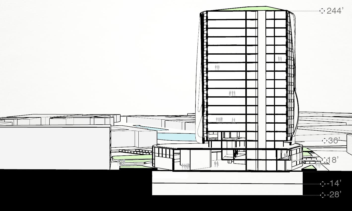
Northeast Section
13 13
The layout of the lobby is a microcosm of the urban plan. The lakes were joined together which necessarily formed a junction where they meet. This idea was used for the lobby, where both interances form a central “artery” which the building’s traffic is directed trhough. From this central space, the rest of the building is easy to read as the core is visible from the ground, directing the building’s inhabitants vertically. The second most trafficed entrance on the Southeastern side serves the restaurant as it’s main entrance, as well as a smaller reception area. The South side entrance was designed with Ministry workers in mind, though it provides a straight shot through the core to the Lobby. The second level is comprised of meeting rooms, lofted “New Work” spaces, and a green terrace.


Lobby Plans
15
Central Lobby Junction
The tower begins volumetrically on the third level. It functions as an IT and storage level, as well as housing the server rooms for the building. It is mostly cell offices, but this is counteracted by the elevated green space that serves as the level’s balcony.
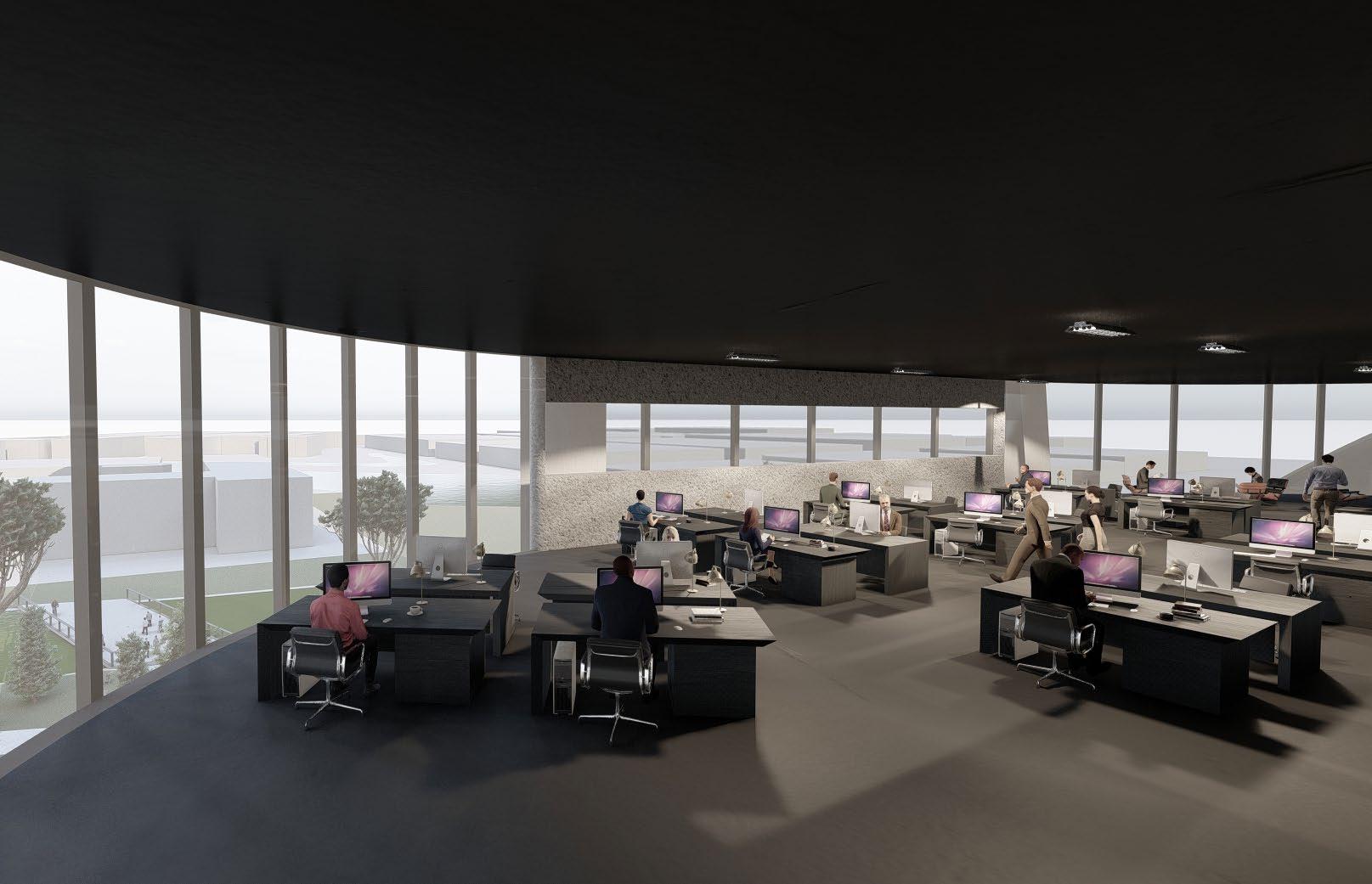
Levels 4-18 are split down the middle around the core. The Southeastern side contains offices and meeting spaces which wrap around the core, while the Northwestern side is an open plan office. The majority of the workers will share the space, but it is situated towards the channel and Northern lake to take advantage of the site’s beauty.

Tower Plans

17


First Volume Draft Final Model 1:50 Final Model 1:100 19
Physical Models
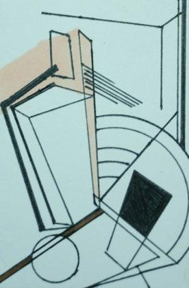
Proclamation Hall
Project : Historic Celebration

Location : Paris, France
Professor : Stanley Russell
Trio : Caleb Rivera, Morgan
McClure, Jessica Lord
Bricktop’s was a Dance Hall founded by visionary Ada Smith. The club’s name comes from her own preferred name, Bricktop. It was favored by the bohemians of the 1930’s in Paris. It was unfortunately destroyed by Nazi shelling in WWII. The task then was to create a space which echoed the energy of Bricktop’s through improvisational tactics.
21
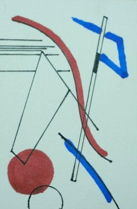
This project began in a highly conceptual way and without a determined site. The first task was to create a generative diagram, which became the projects anchor. Students were restricted to utilize images of instruments, or paintings by Wassily Kandinsky from his Improvisation series.


Preliminary Diagramming
First Draft Diagram
Diagram Source Images
Trio Improv Diagram
23
Final Diagram
The diagram was deconstructed into is core shapes to study the relationships between the elements. These elements were laser etched or affixed (as basswood) to acrylic panels. These were used to make woodblock prints of the reverse image of the diagram. They took on a more organic feel through the “blobbing” of the acrylic paint in the dry point method. Cyanotyping was preformed as well. It produced a more subdued verson of the diagram, with only its boldest movements coming forward. The panels were subsequently assembled into a model, with vertical elements introduced to begin to explore the diagrams relationship to itself across a new dimension.
Print Making


 Cyanotyping
Dry Point on Watercolor Paper Dry Point on Bristol
Cyanotyping
Dry Point on Watercolor Paper Dry Point on Bristol
25
Print Panel Model


Shadow Development
Photos of the print panel model were taken in high contrast lighting conditions to producee stark shadows. The trios used the digrams to begin modeling the diagram in 3D, this was combing with the photographs to create a buildout of the shadow which added depth and detail to the construction.
Shadow Photography
27
Shadow Buildout
The Shadow Buildout was collaged over itself, with perspective renders from within the matrix. The collage was used to determine an envelope and begin to introduce the intial driver, The Bricktops Memorial.


Collaging
29
Shadow Buildout
Sectional development of the object helped to situate programmatic elements as they were introduced. The requirements were for a Large Permformance Space, a Small Performance Space, a Restaurant, a Common Area, and a Recording Studio. Locating these elements was key in determining the envelope. Different uses informend the scale of each space.


Sectional Development
Section Perspectives Program Perspectives
31
The final design favored the original parti. The overall gesture of the Hall emplolys the main movement of the preliminary diagram, through elements were changed. Elements where separated creating a central courtyard. The brick surfaces where used as driving elements as well as making up part of he envelope. They stand as ruins from the original Bricktop’s.


Final Renders

Entrance Central Atrium Courtyard
33
Hilltop Bahia, Ecuador
Project : Village Community
Location : Bahia, Ecuador
Professor : Jan Wampler
Team : Communal Worm
Members : Caleb Rivera, Dawson McKeel, Brandon Boudreaux
Bahia de Caraquez is a small city on the Western shore of Ecuador. Professor Wampler assigned us a Hilltop site as the location for a small self sustainable village.
35
Tread Suggests Major Connection Between Red and Grey Gears
La Perla, Puerto Rico and Ovieto, Italy were studied to determine how urban areas of this size were organized. A “Junk Model” was constructed out of a printer, a cd player, and a modem. The model became more of a psychogeographic exercise than being a representative example usage. The pieces were painted different colors to symbolize things like points of high traffic, significant or religious sites, or flows through the village.


 Junk Model
35
Simple trace diagrams of general blocks began to break the site into sections. These would become different buildings types. Red denotes single family housing while yellow stands for multi-family housing. Blue represents educational institutions and purple is civic buildings. The green spaces move throughout the village.

Site Development

37
Trace Diagram
The streets in the vilage are completely pedestrian, but there are bike paths. Cars have access up to the central vein of the village which runs North to South through the center of the village. There is roundabout to allow easy access for people to be dropped off of picked up. With sustainability in mind, the village being walkable is key. Most public program is centrally located, with small stores and business distributed throughout the rest of the village. Utilizing a sort of warped grid system


Program and Circulation
Public Framework
Transit Render
39
Circulation Diagram
The team opted to employ a solar farm in addition to solar panels for housing units. This should ensure a consistent energy grid for the people living in the village, especially in the event of a weather event or disaster which might knock the power out. Additionally, in the event of low storage in an individual panel, the farm functions as a backup. Water conservation is accomplished through a system of “rain chains” installed on housing units. This should mitigate the villages reliance on outside support, fostering a strong community.

Water and Energy
 Solar Farm
41
Water Chains
One of the pieces of the main village strip is a K-12 school to the North, and a trade school to the South. The schools provide programs which can help prepare a student for work in the village as they grow. This is meant to help bridge the difficult to navigate path to work while growing up and after graduating. Additionally it strengths the community by retaining its members. Classroom feature open air class rooms. These were designed to mitigate the passing of germs, and to stimulate learning by creating a more dynamic environment.

Education
K-12 School Trade School 43
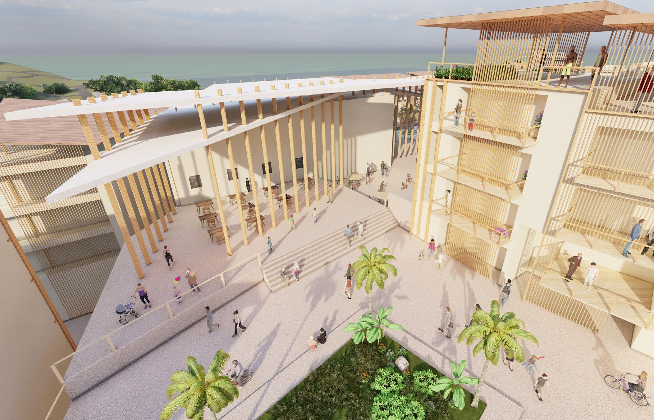
The central vein of the village is anchored by two plazas. The Northern plaza features the church and Spanish Steps. It is oriented towards the coast and is open air as well, with a roof and stained glass fixtures surrounding an ampitheatre. The Southern plaza is anchored by the city hall. Small plazas run throughout the village, creating moments of pause withing the snaking streets.


Plazas
 Small Plaza
South Plaza
Small Plaza
South Plaza
45
North Plaza and Church

Single Family Housing 47
The single family housing unit was created for a family of 5, comprised of parents, two children and a grandparetn. It is a courtyard house, with the bedrooms organized around the open space in the center. The plan is repeated above but with a smaller central room. The living room and kitchen are combined into a galley as it was a requirement to come in between 1200 and 1500 sq feet.


Single Family Housing
49


Apartment Block
51
Dawson McKeel
Single Family Housing


53
Brandon Boudreaux
These street sections were used to find the “space between”. Using them helped to organize the rhythm between the building as well as the relationship to the street each block would have. We south ideally to not make a building taller then 3 stories, though some closer to the center of the village have 5 stories.


These spaces construct the more intimate moments of the day, where people are close by virtue of the surounding elements. These moments were sometimes refered to as “lovers spaces”.

Street Sections
North Street Section
Northeast Street Section
55
South Street Section

Elevation 57
Thinking and Making
Project : Explorative Studies

Professor : Levent Kara
Explorative studies were conducted using a variety of techniques and materials.
59
Drawings
After examining Daniel Liebskind’s Micromegas and Chamberworks, our assignment was create two drawings. There were no restrictions for methods, materials, or scale. I opted to give myself one square and one rectangular canvas. The motions and movements were an attempt at an automatic drawing. I allowed one form to influence the next in an attempt to create something systemic. These movements are disjointed, but functions as a whole, whether they’re lines, forms or voids.


61
Elevation Preliminary
The previous drawings needed to be pushed further, and the result was a new set. The first set was composed of red and blue, the second featured browns, purples and yellows. The compositions were thrown together quickly, without much thought as to what they would be.

In the end, The first one that was produced informed the creation of a small sculpture. It is constructed of musem board. The photographs show the play it has with light and the interesting shadows it created.


The drawing and construction were automatic drawing, an attempt at constructing a work without a final aim.


Automatic Drawings
First Automatic Drawing
Automatic Work 63
Drawing Constuction Shadows
After the museumboard sculpture, plaster molds were made and broken apart. It created a more stereotomic form to explore the interaction the compositions would have with light. The molding process distored the forms from the drawings somewhat.

Plaster Casts

65
Plaster Mold Set
The final object made was a piece of warped plexi which was wamed in an oven and formed by hand. The painted portions obscure light while the warped plexy creates interesting glares and shadows. This charts the course of the initial automatic drawing from a 2D plane, through a 3D object and finally to becoming elements of light.

Light Catcher

67
Light Catcher Acrylic Object
Contact: Caleb Rivera 850-619-1940 calebrivera@usf.edu Thank You. 69
