| Volume 41
Cal Poly, SLO
An Anthology
California polytechnic state university technical association of the graphic arts
Volume 41 | an anthology
© Copyright 2024 California Polytechnic State University, San Luis Obispo Technical Association of the Graphic Arts Student Chapter
Published in the United States of America
By Cal Poly, San Luis Obispo TAGA Student Chapter
1 Grand Ave
San Luis Obispo, CA 93407-0381
Printed in the Graphic Communication Department at California Polytechnic State University, San Luis Obispo
Sustainable Packaging Option for Dietary Supplement
Alex Chen
House of Bread
Phoenix Challenge
Agora
Lexi Berryhill and Taylor Leslie
Paso Robles Children’s Museum
Redesign
Hannah Chan and Shreya Hambir
Ris Magazine
Von G. Balanon
President’s Letter
Dear Reader,
It is an honor to present the 2024 Helmut Kipphan Cup Journal Competition entry for California Polytechnic University, San Luis Obispo’s TAGA student chapter. This journal is the product of the collective effort of our executive board and could not have been created without our department faculty and club members.
We developed our journal with interactivity, community, and intentionality in mind which has culminated in our theme, “By Humans, For Humans”. Every element of this journal, from structure to content, is designed with the human experience in mind. This theme also permeates into the work we have chosen to feature which all carry themes of community engagement. “By Humans, For Humans” encompasses our intent to infuse this journal with a sense of humanity that makes complex research an enriching and accessible experience for a diverse audience.
The visual identity of this year’s journal is centered around the symbolism of circles representing unity and harmony alluding to interconnectedness within a community. In Bauhaus design, the use of circles represents a desire for a harmonious relationship between form and function. Grids act as a framework for organizing information within our design which contributes to a sense of order and clarity. The consistent and balanced nature of grids mirror the need for coherence and collaboration within our community. These design elements come together with a bold color palette to form our community centered design.
As for the physical form of our journal, we decided to create an anthology of articles as opposed to a bound, singular journal as a way to extend the visual design themes into the journal’s physical form. Each article is individually bound and designed with one color from our color palette, and all five articles come together through an interconnected illustration across the five article covers. We chose this physical design as a way to portray how a community is built from individuals and they come together to form this greater whole.
6 | cal poly taga
Our chapter is proud to present this journal which has been produced by students within the Cal Poly Graphic Communication department. We uphold the Cal Poly “Learn by Doing” philosophy by utilizing our own facilities along with resources provided by our sponsors. Our executive board collaborated with Poor Richard’s Press where we were engaged in every step of the production process to bring this journal to fruition and gained invaluable hands-on experience.
I would like to especially thank our chapter advisor Dr. Rachel Ma for her unwavering support of our team, invaluable knowledge, and insightful feedback that has allowed us to actualize this journal. Her commitment to our growth as not only a team, but as individuals is evident and we are all very thankful for her guidance. I would also like to thank the entire Cal Poly Graphic Communication Department faculty, our general members, and Poor Richard’s Press as well as our generous sponsors. Lastly, I would like to acknowledge the 2024 judges panel for fostering an environment that promotes curiosity and growth in the field of printing and design.
Sincerely,
Emily Vitanatchi
President’s letter | 7
Augmented Reality
This journal offers augmented reality experiences powered by Adobe Aero and RealityBLU. Simply scan the QR code located in any corner of the full-page illustration. Upon scanning, open Adobe Aero, as demonstrated in the second step. In the third step, click the blue ‘open’ button to launch the Aero App Clip through your camera. Once launched, press the blue ‘continue’ button to scan your surroundings, select a surface, and click the screen to anchor the AR experience. You can then explore the illustration in augmented reality without the need to download the Adobe Aero app.

Audio Transcripts
To be accessible for users with vision impairments, we have created an audio transcript for all five articles through Descript®. Scan the QR code below to access all audio transcripts.


8 | cal poly taga
Open Adobe Aero Copy Link Share... Click ‘Open Adobe Aero’ Adobe Aero Interactive Augmented Reality Open Click
2.
‘Open’
3.
See More of Cal Poly TAGA Intro to AR All Audio
1.
Scan QR Code
Practice by scanning this QR Code and watch this page come to life.

Augmented reality | 9
meet the team 2024

President
Emily Vitanatchi
Emily Vitanatchi is a fourth-year student studying Graphic Communication concentrating in User Experience/User Interface with a minor in Sociology. She is from Los Angeles, CA and enjoys pottery, photography, and spending time outdoors. As a general member of TAGA 2023, she was inspired to join the executive board after seeing the process that went into creating the journal from start to finish. As President, Emily oversees the entire production process and feels so lucky to be able to work creatively with her fellow board members and bring ideas to fruition as a team.
12 | cal poly taga

vice President
Jessica Yu
Jessica Yu is a second-year Graphic Communication student with a concentration in User Experience/User Interface and minors in Computer Science and Media Arts, Society, and Technology. Serving as the Vice President, Jessica is responsible for leading the general member meetings, overseeing the budget and funding, keeping the team on track with deadlines, and assisting the President in executive tasks. As the youngest board member of TAGA, she is honored and thankful for the opportunity to work alongside a team of talented and driven females whom she looks up to as role models.
Meet the team | 13

Design Coordinator
Allison Maranta
Allison Maranta is a fourth-year student studying Graphic Communication with a concentration in Design Reproduction Technology. As the Design Coordinator, Allison had the pleasure to oversee the design of the 2024 journal. In her role, she established a cohesive visual identity of the journal and design system. She worked closely with both the production and web coordinator to ensure the smooth integration of design elements into the package of the journal and website. Allison is grateful to be apart of such a hardworking and creative team.
14 | cal poly taga

Communication Coordinator
Lydia Tomayko
Lydia Tomayko is a third-year Graphic Communication student with a concentration in User Experience/User Interface design. She is from Durango, CO and loves to play guitar, surf, and read. As Communication Coordinator, Lydia selected the articles for this year’s journal by sifting through the high-level academic writing of Cal Poly’s undergraduate and graduate students. She loved playing a role in curating the theme, which centers unity and sustainability, and learned so much about editing technical writing.
Meet the team | 15

production Coordinator
Camilla Ferry is a fourth-year Graphic Communication student from Eugene, Oregon with a concentration in Design Reproduction Technology. In her role as a production coordinator, Camilla plans and leads the physical production of the 2024 TAGA technical journal and packaging. She collaborates closely with the design coordinator to select substrates and production processes that exhibit the most innovative printing, finishing, and binding technologies. She is grateful to have had the opportunity to make a journal with her hard working team that they can be proud of.
16 | cal poly taga
Camilla Ferry

AR Coordinator
Keilana Calder
Keilana Calder is a third-year Graphic Communication student with a concentration in an individualized course of study that focuses on intertwining human-computer interaction, UX/UI, and a minor in biotechology. In her role as AR coordinator for the 2024 journal, Keilana is mastering the art of blending digital experiences with physical products to bring the illustrations in the journal to life. Through self-teaching Adobe Aero, she successfully incorporates augmented reality experiences throughout the journal.
Meet the team | 17

web
Coordinator
Callie Russo is a third-year Graphic Communication student with a concentration in Design Reproduction Technology. As Web Coordinator for TAGA, Callie was determined to create a website that embodies human-centered design while reflecting the unique elements of the 2024 journal. She also applies TAGA branding elements and smart animations on each page to promote memorable engagement. She is incredibly grateful to be working with such a talented, supportive team.
18 | cal poly taga
Callie Russo

Peer Advisor
Mary Wood
Mary Wood is a fourth-year Graphic Communication student with a concentration in Management. She is from Los Angeles, CA and enjoys spending time with her family and friends. With her experience as the Vice President of the journal last year, Mary feels privileged to resume her involvement as the Peer Advisor this year. In this capacity, she shares her insights and oversees the production process, bringing a technical perspective to the process. She’s drawn to this role because of the unique opportunity it provides to creatively inspire and encourage the team.
Meet the team | 19

Advisor
Rachel Ma
Rachel Ma joined Cal Poly in 2018 and has been teaching classes with a focus on paper and printing science ever since. She enjoys the technology side of GrC, and loves working on printing presses to produce tangible products that offer lasting impressions. Her responsibility is to listen to the team members, facilitate open communications with other departments in GrC, provide resources and support to the areas of need, and cheer for her team. It’s been a gratifying experience for her to help her team grow, and she can’t wait to showcase their journal project with students, faculty, and professionals from the industry.
20 | cal poly taga
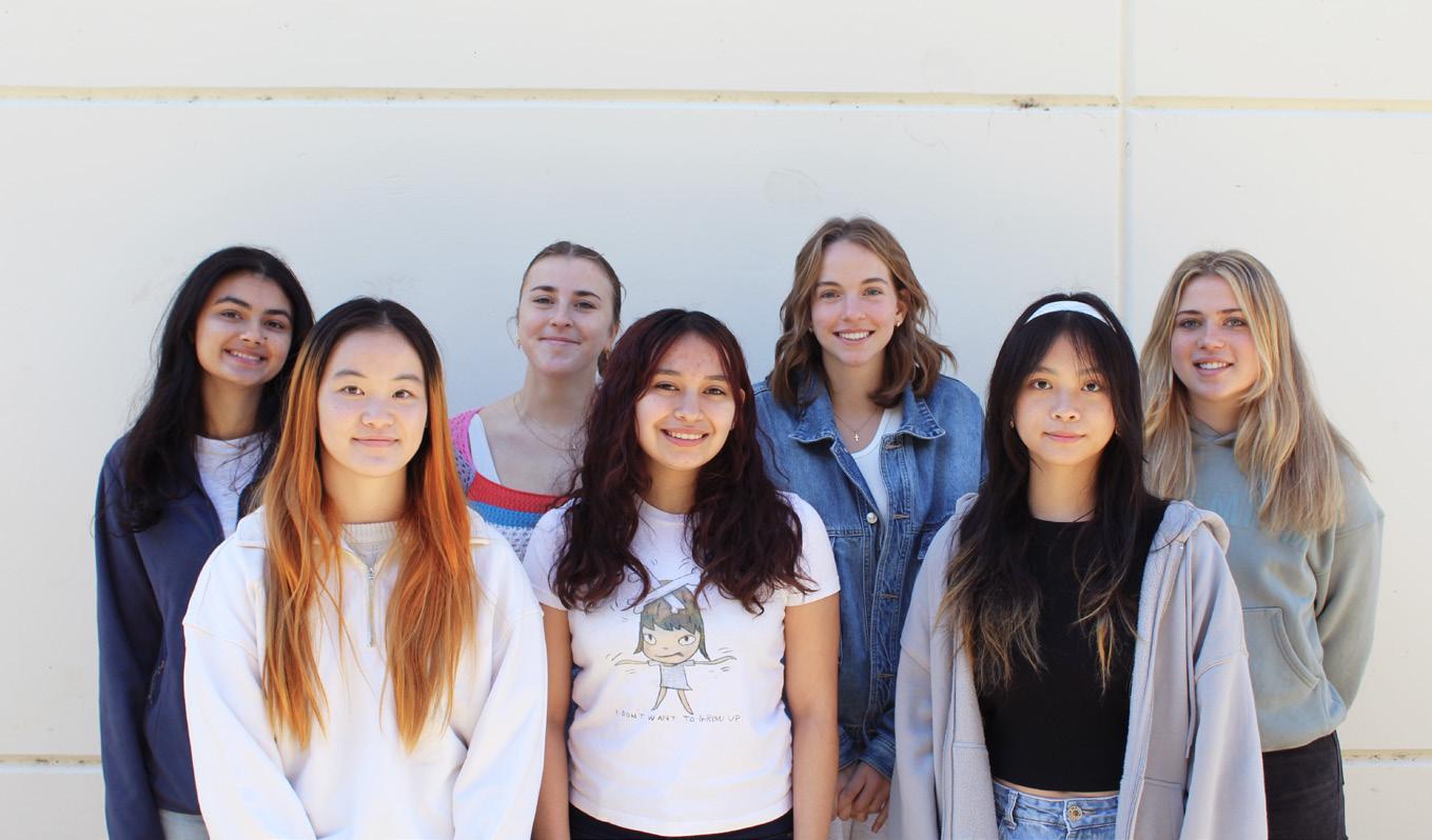
TAGA 2023–2024 General Members
Pictured are the general members of the 2023–2024 Cal Poly TAGA chapter. This group consists of both underclassmen and upperclassmen who assist the executive board with design and production of the journal. Many of these involved members will go on to become part of the chapter’s executive board in coming years.
Meet the team | 21
Pictured, from left to right: Bhavi Dhillon, Kaia Salverda, Kathryn Grossenbacher, Annie Bosche, Caitlyn Chailitilerd, Alexandra Castro, Fionn Kha
Acknowledgments
Thank You
The 2023-2024 Cal Poly TAGA Student Chapter would like to thank the following people and organizations for their support and generous contributions:
Sponsors and Supporters
Ian Flynn, Visual Media Alliance
Todd and Ethan Ventura, Poor Richard’s Press at San Luis Obispo
Lou Caron, Printing Industries Association, Inc. of Southern California
The Cal Poly, San Luis Obispo Graphic Communication Department
Dr. Rachel Ruoxi Ma, Chapter Advisor
Professor Donna Templeton
Professor Dina Vees
Professor Bruno Ribero
Dr. Hocheol Yang
Dr. Xiaoying Rong
Colleen Twomey, Department Chair
22 | cal poly taga
Colophon
Design
This book was designed using Adobe InDesign and Adobe Illustrator. All illustrations inside the book were created by Allison Maranta.
The article titles, headings, and subheadings were set in Calder Dark, an all-caps typeface designed by Mariya Lish. The body text of this journal was set in FreightSans Pro, a typeface designed by Joshua Darden in 2005 for the Brooklyn-based Darden Studio type foundry. Initially designed as a serif typeface, FreightSans Pro has since evolved into an expansive family of 156 fonts, proving its versatility in meeting the diverse needs of designers in every weight, width, and optical size. The simplicity and legibility of this typeface perfectly complements the bold, all-caps Calder.
Production
All work was done under the guidance of Dr. Rachel Ruoxi Ma, Professor of Graphic Communication. The journal articles were edited for this publication. The journal covers were printed on Neenah Classic Techweave Digital Cover 100 lb. in Classic Neutral White. The inside of the journals was printed on Mohawk Smooth Warm White 80 lb. stock. Files were printed in-house using EFI’s Fiery Command Workstation and the Konica Minolta C1100 digital press.
Finishing
The journals were creased using the Dupo DC-648, saddle-stitch bound using the Horizon StitchLiner 5500, and sheets were cut down to size using the Polar 92X Cutter. The substrate used for the journal package is Neenah Environment Cover 100 lb. in Grocer Kraft. The journal package was cut on the Morgana ColorCut FB 9000 digital die cutter, and Spot UV was applied using the Duplo DDC 810 digital spot UV coater.
Electronic Publishing
This journal was published using Issuu and embedded on the Cal Poly TAGA 2024 website. The Cal Poly TAGA website (calpolytaga.com) was published using Squarespace.
Augmented reality elements are powered by Adobe Aero and RealityBLU.
colophon | 23
Sustainable Packaging Option for Dietary Supplement
1
California polytechnic state university technical association of the graphic arts
Article 1
1
Sustainable Packaging Option for Dietary Supplement

Sustainable Packaging Option for Dietary Supplement
Alex Chen
The increasing preference for sustainability have significantly transformed consumption patterns, particularly within the packaging industry. Businesses have recognized this shift as an opportunity to align their operations with more sustainable practices, simultaneously attracting conscientious consumers and contributing to environmental conservation.
This project study focuses on the packaging option offered within K1 Packaging Group, a printing and sourcing company in Southern California to Everest Formulation, a dietary supplement contract manufacturer under K1 Packaging Group, and how it could utilize green marketing strategies to create and leverage business opportunities in the packaging printing sector for its supplement customers.
Problem Statement
The burgeoning global awareness of environmental consequences associated with packaging materials has been a significant catalyst for a marked shift in consumer preferences and regulatory frameworks worldwide. This change is particularly pronounced in product packaging, necessitating the packaging industry’s response in offering sustainable options to brands and consumers (PR Newswire, 2023 & Packaging Europe, 2022).
While large corporations frequently hold considerable market share and production capacity, small to mid-sized companies within the packaging industry grapple with the rising trend of sustainable packaging. The article “Using world making to understand the role of design in the sustainability agenda” discussed these businesses, smaller organizations particularly, are compelled to undertake exhaustive research before investing in specific machinery or materials due to their relative financial limitations (Ritch, E., & Brennan, C., 2010).
Navigating the abundant options for sustainable packaging solutions proves to be challenging for businesses operating with limited resources. The pivotal question, then, is which area should such a small business prioritize? This project is designed to deliver a near-term solution for K1 Packaging Group, a family-owned enterprise specializing in the provision of primary and secondary printed packaging, encompassing paper, plastic, and glass materials.
The objective is to guide strategic investment of resources to cater to both present and future generations of buyers. In doing so, we aim to gain a deeper understanding and stay ahead of prevailing industry trends.
Purpose of Study
This project was initiated to understand the following key questions:
1. What are the feasible sustainable packaging options that K1 Packaging Group could employ?
2. Do consumers for sustainable options vary across different materials?
3. What are the regulations around sustainable packaging?
4. What are the prevailing sustainable-related logos and organizations?
6 | cal poly taga
Hypothesis Considerations
H1: Consumers, especially Gen Z, show a readiness to transition towards more sustainable packaging options, even if it entails a modest price increase.
H2: Among the current sustainable packaging materials available in the market, consumers tend to favor bio-based packaging more than fiber-based or glass alternatives, with polymer-based packaging being their least preferred choice.
H3: Consumers are likely unfamiliar with existing sustainable certification logos and make decisions based on the accompanying text information.
H4: When it comes to dietary supplement products, consumers tend to lean towards traditional packaging styles, such as bottles (whether glass or plastic), rather than alternative styles like plastic pouches or paper tubes.
Current Everest Formulation Capability
K1 Packaging offers a broad spectrum of packaging solutions to cater to a diverse range of customer sectors. However, Everest Formulation’s expertise is distinctly positioned in providing comprehensive, turnkey solutions tailored for supplement products for various brands. As of 2023, the company manages a broad product format portfolio, including encapsulation, powders, tablets, and liquid-based items.
Predominantly, Everest Formulation employs plastic containers with plastic caps for packaging, which is primarily due to their extensive acceptance and prevalent use. However, the company’s versatility in packaging capabilities is evident in their advanced machinery that supports co-packing of products into a variety of formats, such as stand-up pouches, three-side sealed pouches, and stick packs. Moreover, Everest Formulation operates a specialized production line specifically for blister packaging, which adds another layer of diversity to their packaging options.
Nonetheless, it should be noted that several of these packing options may still be semi-automatic. Competitors or specific packaging offerings, such as stand-up pouches, are more commonly provided via fully automated in-line machinery. This project will also serve to inform K1 Packaging Group about popular sustainable packaging forms and the appropriate machinery to invest in for future developments.
Sustainable packaging | 7
Sustainable Options for Supplement Industry
What material counts as sustainable and can be provided? Sustainability has swiftly ascended to prominence, cementing its place as a fundamental cornerstone in the packaging business models of an increasing number of supplement brands (Euromonitor International. 2021). With mounting concerns over environmental degradation and a palpable shift in consumer behavior, brands have found themselves needing to reorient their operational practices towards a more sustainable model. Based on the research “Packaging in a circular economy: Sustainable packaging insights” from McKinsey & Company in 2020, this has led to brands focusing their sustainability efforts on both e-commerce and retail channels, which each come with their own unique sets of challenges and opportunities (McKinsey & Company, 2020).
Before looking at what K1 Packaging Group should be investing in, it is important to understand what sustainable packaging options are currently available on the market and the material within K1’s supply chain:
Recycled Plastic Packaging: This form of packaging leverages plastic, which, after thorough cleaning and reprocessing, is repurposed into new packaging materials. This strategy significantly reduces the demand for virgin materials and curtails the volume of waste destined for landfills. Commonly referred to as PCR (Post-Consumer Recycled) plastic, this option is recognized for its role in diminishing the carbon footprint associated with the production of virgin plastic (Euromonitor International, 2021).
Biodegradable or Plant-Based Plastics: These represent the current sustainable alternatives that are engineered to substitute traditional plastic. Derived from entirely natural plant materials such as corn oil, starch, orange peels, and various plants, these materials decompose faster than conventional plastic when discarded (Rujnic-Sokele, M., & Pilipovic, A., 2017). Within K1 Packaging’s supply chain, biodegradable plastics like Polylactic Acid (PLA) can be converted into film products. However, it’s worth noting that the barrier characteristics of these products aren’t as robust as those of traditional plastic pouches (Wu, Misra, M., & Mohanty, A. K., 2021). This restricts their application, particularly liquid or lotion products. The table below (Figure 1) depicts the typical barrier features (oxygen transfer rate and moisture vapor transfer rate) of PLA film, which is approximately ten times higher compared to PET/PE plastic film.
8 | cal poly taga
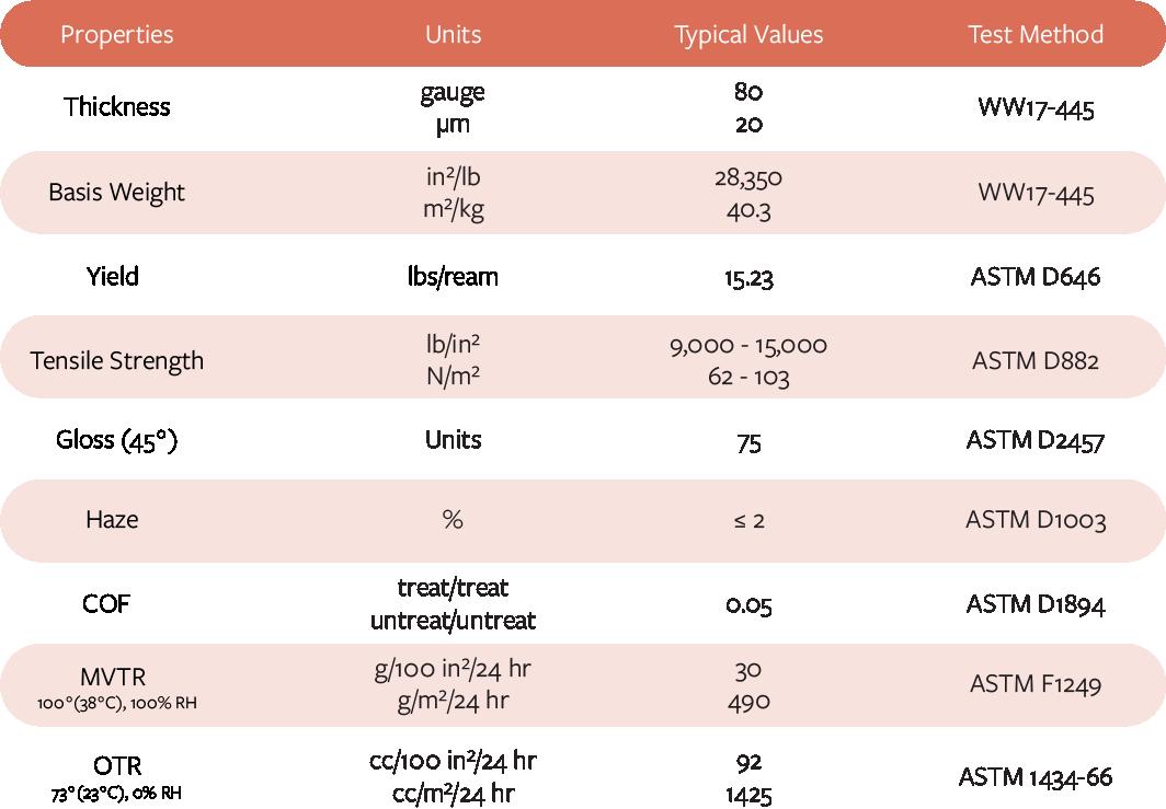
Glass Packaging: Glass, being non-toxic and 100% recyclable, can be reused an indefinite number of times (Moustakas, K., Loizidou, M., & Rovolis, A., 2020). This eco-friendly alternative is gaining traction among K1 Packaging and Everest Formulation’s client base, mainly as a primary packaging solution.
Compostable Packaging: This packaging variant can be decomposed into its natural constituents within a composting environment, without leaving any harmful residues in the soil. The majority of the fiber-based packaging options fall under this category. While it’s not typically used as a primary packaging that comes into direct contact with supplement products, it is widely employed as a secondary packaging, most commonly in the form of folding cartons (Twede, D., Selke, S. E. M., & Shires, D., 2014).
It’s important to note that there are other sustainable packaging solutions, such as metal or tin packaging and mushroom pulp packaging. However, these fall outside the purview of what K1 Packaging can currently offer. By comprehending the above-mentioned options that K1 Packaging can provide, we can delineate the scope of offerings by posting the project’s analysis.
Sustainable packaging | 9
Table 1 Barrier feature data of current biodegradable plastic film
Current Supplement Brands Business Model
Prior to the pandemic, supplement packaging was pretty simple. The majority of business came from retail or the placement of products on retail shelves. This means most of the packaging is restricted by the retailer’s rule, and often the product is provided in a secondary folding carton with a plastic primary packaging and with a label. However, during the pandemic, e-commerce has totally changed the landscape. According to the journal “E-commerce and e-business. In Strategic E-Business: Strategic Thinking and Practice,” the requirements of the packaging have also been altered. Below we will touch on the two sales channels and the packaging requirements:
E-commerce: The digital revolution and the subsequent meteoric rise of online shopping have ushered in a new era for packaging practices, especially after the pandemic. Packaging now needs to cater to the nuances of e-commerce, and this comes with an array of considerations. Products need to be encased in such a manner that their integrity and quality are preserved during transit, reducing the risk of damage or spoilage. This necessitates robust packaging that can withstand the rigors of transport and delivery (Chaffey, D., 2020).
Accompanying the escalation in e-commerce is a surge in packaging waste, a problem that urgently requires addressing. Therefore, brands are tasked with the challenge of minimizing packaging waste without compromising product safety. This calls for creative and innovative solutions, such as using modular designs or developing minimalist packaging that uses fewer materials but maintains the desired level of protection.
Consider the case of Roman Health, a client of K1 Packaging that primarily conducts its business via e-commerce. Their packaging requirements underline the high priority accorded to transit protection. Since the retail environment doesn’t need to be factored into their considerations, they are more inclined to use glass jars, which aren’t as susceptible to damage during shelf stacking. Directly printing artwork on the glass jars with a minimalistic design is a common strategy adopted by the company. This is because there’s no need to vie for attention against other competitors on a retail shelf.
Retail: In the retail sector, sustainable packaging is crucial not only from an environmental viewpoint but also as a decisive factor in customer purchasing decisions.
10 | cal poly taga
Packaging serves as a silent salesperson, and research indicates that customers are more likely to purchase eco-friendly products. Consequently, packaging becomes a critical medium to communicate a brand’s sustainability commitment (Rokka, J., & Uusitalo, L., 2020).
Brands must use their packaging to visually express their environmental ethos, which could be achieved through eco-labels, recycling instructions, or even the choice of packaging design and materials. Green colors, earthy tones, and natural imagery can subtly signal a brand’s environmental commitment (Luchs, M. G., & Kumar, M., 2017).
Additionally, for retail products, packaging sustainability extends beyond the product itself to secondary and tertiary packaging like shelf-ready packaging and display units. Brands must consider the full lifecycle of their packaging materials, from production to disposal, aiming for sustainability at each stage.
Take HUM Nutrition, another K1 Packaging customer. As they primarily operate in the retail channel, they ensure maximum product protection during shelving and customer interaction by heavily using plastic containers. Labeling is also significant; while it may not be sustainable, it’s necessary due to regulations requiring certain messages to be displayed.
Sustainable requirement
Given the varying sustainability regulations across different regions, companies must pay close attention to the standards set in their primary markets. As K1 Packaging’s customer base is mainly in Europe and North America (particularly California), the sustainable packaging options will need to align with these regions’ regulations.
USA: In the United States, a market characterized by its massive size and diversity, a variety of sustainability standards and guidelines have been put forth, often on a voluntary basis. One such notable standard is the Sustainable Packaging Coalition’s (SPC) guidelines. These guidelines serve as a comprehensive resource for companies seeking to incorporate sustainability into their packaging practices (Sustainable Packaging Coalition., 2021).
The SPC’s guidelines lay particular emphasis on three major elements: recyclability, composability, and the reduction of packaging materials. Recyclability is a cornerstone of the guidelines, encouraging companies to use materials that can be effectively
Sustainable packaging | 11
collected, sorted, and reprocessed into new packaging or other products. This encourages a circular economy approach, with materials constantly being reprocessed and reused, reducing the demand for virgin materials.
Composability is another key aspect, focusing on the use of materials that can decompose under specific conditions into nutrient-rich compost, further promoting the concept of the circular economy and reducing the amount of waste that ends up in landfills (Narodoslawsky, M., & Shazad, K., 2020).
Finally, the SPC guidelines stress the reduction of packaging materials. Companies are urged to rethink their packaging designs to minimize material usage, without compromising the functionality and integrity of the packaging. This concept, often referred to as ‘source reduction’, reduces both material costs and environmental impacts associated with packaging (Sustainable Packaging Coalition., 2021). On the other hand, since K1 Packaging is located in California, and known for its progressive environmental policies, California has been a pioneer in the USA in terms of limiting plastic waste. The state has enacted a number of laws aimed at reducing the use of single-use plastics:
Assembly Bill 1884 (2018): This law prohibits full-service restaurants from automatically providing plastic straws with beverages, allowing them only upon customer request (California Assembly, 2018).
Senate Bill 270 (2014): This law banned single-use plastic carryout bags at certain locations like grocery stores and pharmacies (California Senate, 2018).
Assembly Bill 341 (2011): This law established a policy goal of diverting 75% of solid waste away from landfills by recycling, composting, or source reduction, which includes plastic waste (California Assembly, 2011).
In 2020, California attempted to pass a broader bill, the California Circular Economy and Plastic Pollution Reduction Act (Senate Bills 54 and AB 1080), which would have required a significant reduction in single-use packaging and product waste, but the bill did not pass.
Several California cities have also enacted their own restrictions on single-use plastics. For instance, San Francisco banned single-use plastic bags as early as 2007, and has
12 | cal poly taga
since banned plastic straws and other single-use plastic items (City of San Francisco Environmental Department, 2020).
Europe: In Europe, a region well-known for its strong commitment to environmental concerns, regulations regarding sustainable packaging tend to be stricter. The European Packaging and Packaging Waste Directive provides a regulatory framework aimed at preventing the production of packaging waste and promoting its reuse, recycling, and other recovery forms.
The Single-Use Plastics Directive (EU) 2019/904, which came into effect in July 2019, specifically targets the ten single-use plastic products most often found on Europe’s beaches and seas (European Commission, 2019).
The directive has several key elements:
• Certain products will be banned in the EU markets from 2021, including single use plastic cutlery (forks, knives, spoons, and chopsticks), plastic plates, straws, and sticks for balloons.
• For products without straight-forward alternatives, the goal is to limit their use through a national reduction in consumption. This includes single-use burger boxes, sandwich boxes, or food containers for fruits, vegetables, desserts, or ice creams.
• Producers will help cover the costs of waste management and clean-up, as well as awareness-raising measures for food containers, packets, and wrappers (such as for crisps and sweets), drinks containers and cups, tobacco products with filters (such as cigarette butts), wet wipes, balloons, and lightweight plastic bags.
• Certain products will require a clear and standardized labeling which indicates how waste should be disposed of, the negative environmental impact of the product, and the presence of plastics in the products.
• The directive also sets a target to incorporate 25% of recycled plastic in PET bottles from 2025 and 30% in all plastic bottles from 2030.
The directive imposes strict rules on packaging waste, seeking to minimize its environmental impact. This involves setting stringent targets for the recovery and recycling of packaging materials. It also encourages companies to reduce their packaging waste at the source, similar to the SPC guidelines in the US.
Sustainable packaging | 13
Material usage is another crucial aspect regulated by the directive. Companies are encouraged to optimize their use of packaging material, focusing on the principle of ‘doing more with less’. This principle encourages innovation and creative thinking in packaging design to minimize material usage.
The directive also sets mandatory recycling targets for member countries, which companies need to take into account when designing and choosing packaging materials. This drives the use of materials that are easily recyclable, thus promoting the development of a circular economy within the packaging industry.
Given the current sustainable packaging regulations in the EU and USA, it’s evident that K1 Packaging must adapt to new materials and acquire machinery capable of processing these materials. This adaptation is crucial to keeping up with trends and ensuring future business continuity. With a clear understanding of the regional regulatory requirements, sustainable material options, and unique packaging requirements for both retail and e-commerce setups, the next step would be to conduct a feasibility survey study. This study would help identify the most suitable sustainable materials and technologies that align with K1 Packaging’s operations, customers’ needs, and regional regulations. Following this, K1 Packaging could consider investing in the necessary machinery and training its workforce to handle the new materials and technologies. Additionally, engaging with suppliers who already adhere to these sustainability practices could be beneficial. Building robust relationships with these suppliers would help ensure a smooth transition to more sustainable practices.
Objective – Pool of Options
Product Options
Given K1 Packaging Group’s extensive in-house capabilities, it’s beneficial to understand the main types of packaging currently utilized by their customers and to propose a range of sustainable alternatives within those categories. The bulk of K1 Packaging and Everest Formulation’s supplement fulfillment services, comprising about 77%, are for powder-based products, followed by liquid formulations. Tablets and encapsulated products constitute approximately 8% and 5%, respectively (Figure 1).
Among the powder-based products, which constitute the majority, most are packaged in plastic containers and sachets. This focus helps narrow down the potential
14 | cal poly taga
sustainable alternatives that need exploration. Presently, most of the packaging is done in plastic containers with secondary labels or directly filled into multi-layered plastic pouches in stand-up or sachet formats.
It’s evident that the dietary supplement business segment relies heavily on polymer-based packaging (Zhang, Y., et al., 2020). This dependency presents a significant opportunity for introducing sustainable solutions, especially considering the industry-wide push towards reducing single-use plastic and regulatory efforts to curb plastic waste.
Sustainable Material Options
Chapter 2 outlined a variety of potential options to replace the current polymer-based packaging. Firstly, bio-based packaging offers a viable alternative as it is derived from biological sources instead of fossil-based materials (Rujnic-Sokele, M., & Pilipovic, A., 2017). Secondly, biodegradable and compostable packaging, designed to break down and degrade naturally in the environment, presents another promising solution. Thirdly, recyclable packaging made from materials readily processed by our recycling systems can be considered. Lastly, post-consumer recycled (PCR) packaging, which is manufactured from recycled content, could be another viable choice. These types of packaging are the principal sustainable options that can be considered for K1 Packaging’s dietary supplement business.
Types of Packaging
To maximize the impact of sustainable alternatives within the highest proportion of K1 Packaging’s operations, we need to focus on four frequently used types of packaging. Firstly, the stand-up pouch is a widely adopted format. Secondly, glass containers, known for their recyclability and reuse potential, are also common.
Sustainable packaging | 15
Figure 1 Percentage of business based on product type from Everest Formulation
Everest Formulation Percentage of Business by Product Type 77% 10% 8% 5% Powder Encapsuled Tablet Liquid
Thirdly, plastic containers currently constitute a significant portion of packaging types, but they offer substantial room for sustainable improvements. Lastly, fiberbased tubes, which can be both biodegradable and compostable, are also in regular use. These four packaging formats represent the primary targets for integrating more sustainable material options.
Survey, Methodologies, and Findings
To gather insights about readily available sustainable packaging options within K1 Packaging’s supply chain, a choice-based survey was deployed. This survey was meticulously segmented into sections that align with specific factors, such as material selection and marketing strategies.
We received valuable feedback from 140 participants spread across North America and Asia, providing a comprehensive understanding of the most viable and advantageous sustainable packaging options. Any participants that are under the age of 18, or repeated entry, as well as unfinished surveys have been eliminated from the counting (Figure 2).
Total Survey Participant by Age
Moreover, the survey was stratified according to distinct age demographics, focusing on current buyers of K1 Packaging Group and Everest Formulation (Gen X to Baby Boomers, aged 43 and above in 2023) and future buyers or young professionals (Gen Z to Millennials, aged 18 to 42 in 2023).
This approach allowed for capturing a nuanced understanding of the differing perspectives and preferences across generations.Survey questions primarily revolved
16 | cal poly taga
Figure 2 Survey participation by age group
Under 18 18 - 26 27 - 42 43 - 58 0 10 20 30 40 59+ 50 60
around three core categories: Price, Material, and Marketing considerations. The following sections provide a detailed overview of the survey questionnaire and the corresponding findings.
Price Sensitivity
Based on K1 Packaging Group’s sale feedback, one of the most critical considerations for any packaging provider is whether the unit price aligns with the buyer’s budget. Therefore, understanding the acceptable price range for both buyers and end consumers is crucial. Questions in this section aimed to pinpoint the optimal pricing ‘sweet spot’ that delivers value without compromising affordability.
The inaugural question posed to the survey participants was, “Would you be willing to pay a premium of 1-5% extra for a product packaged sustainably?” Out of the 140 participants, 39 indicated they would not be inclined to pay more for sustainably packaged products (Figure 3).
An intriguing detail emerges when the data is scrutinized further, splitting it among generational lines. Contrary to popular marketing research “New data reveals consumers increasingly choose products in sustainable packaging globally, despite rising prices” suggesting that Gen Z, born between the mid-1990s and the early 2010s, are the most eco-conscious, 32% of participants from this demographic were not amenable to paying a premium (PR Newswire, 2023). Conversely, Gen X (born between the early 1960s and the early 1980s) emerged as the group most willing to bear an additional cost for sustainability, with a mere 17% not willing to pay more.
Sustainable packaging | 17
Figure 3 Chart of willingness to pay a premium for sustainable packaging, by generation
Willingness to Pay 1% - 5% Premium for Sustainable Packaged Product 27 - 42 43 - 58 59+ 80 60 40 20 0 18 - 26 Total Yes No
To ascertain whether cost was the solitary inhibiting factor, a follow-up question was asked to the 39 individuals who initially declined. They were presented with a hypothetical situation where two versions of a product existed—one packaged with virgin material, the other with sustainable packaging—with both retailing at the same price. They were then asked which one they would prefer to purchase. The results demonstrated that 21 out of the 39 respondents leaned towards the sustainable option, with the majority (19 individuals) belonging to the Gen X to Millennial demographic.
Material Preferences
With reference to the sustainable packaging options that K1 Packaging currently has access to, this part of the survey delved into preferences regarding the choice of packaging materials. It was further divided into primary and secondary packaging, exploring distinct choices for each. These insights help in comprehending which sustainable materials are more favored and are likely to be more widely accepted.
Primary Packaging Preferences


The survey offered four material options for primary packaging, inquiring which was most appealing to participants when purchasing dietary supplements. Glass jars and paper tubes emerged as top choices, each securing 30% of the votes. Many respondents selected these options due to their sustainability. Surprisingly, 25% of participants still preferred the stand-up pouch option. Despite awareness of its non-recyclability, respondents who favored this option cited its convenient storage and space-saving attributes as compelling reasons for their choice (figure 4).
When presented with variations of the stand-up pouch post-consumer waste (non-recyclable), bio-based film from renewable raw material, and biodegradable material an overwhelming 65% of participants preferred the biodegradable material. This was followed by 22% favoring the post-consumer waste material and a mere 13% opting for the bio-based material, assuming equal protective capabilities across the options.
18 | cal poly taga
Figure 4 Primary packaging preferences
Sustainable packaging | 19
Gen Z Millennials Gen X Baby Boomer 35% 32% 17% 53% Percentage of Generation
to Pay Premium
Figure 5 Chart of percentage that each generation is not willing to pay premium
That Are Not Willing
Willingness to Choose Sustainable Packaging if No Change in Price of Product Yes No 53.8% 46.2%
Figure 6 If the price is unchanged, willingness to pick a more sustainable packaging
Material Options for Stand-Up Pouch
Glass Jar
Paper Tube
Stand-Up Pouch
Plastic Bottle
Post-consumer Waste (Non-Recyclable)
Bio-based Film From Renewable Raw Material
Biodegradable Material
20 | cal poly taga
Figure 7 Data regarding 4 sustainable packaging options
Percentage of Sustainable Packaging Options 25.7% 31.1% 31.1% 12.2%
Figure 8 Most popular material option for stand-up pouch
65% 22% 13%
Secondary Packaging Preferences
The dietary supplement industry commonly utilizes standard folding cartons for secondary packaging, providing a simpler and more streamlined choice compared to primary packaging. This practice applies to various business models, including both e-commerce-based and retail-based operations.
Given the ubiquity of fiber-based materials in secondary packaging, our survey focused on the type of paper suitable for forming the carton. Options included kraft paper board, FSC certified paper board, and post-consumer recycled paper board (Figure 9).

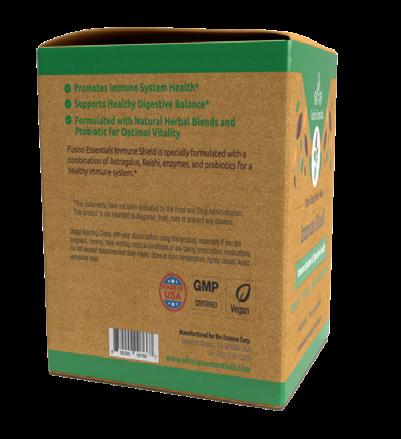

Kraft Paper
100% Recycled Content Paper
FSC Paper
Sustainable packaging | 21
Figure 9 Secondary option provided to the survey. Left to Right – FSC certified paper, kraft paper, 100% recycled paper
Figure 10 Secondary packaging results based on sustainability preferences
Secondary Packaging Result Based on
31% 40% 8% 21%
No Preference
Figure 9
The results suggested a strong bias towards Kraft materials, with 40% of participants opting for this. This was followed by 31% preferring recycled paperboard. Interestingly, despite the Forest Stewardship Council (FSC) being a leading organization in chain of custody certification, FSC certified paper was the least favored option, garnering only 8% of votes (Figure 10). These insights could potentially guide K1 Packaging’s future decisions, ensuring they align with the sustainability preferences of their target market.
Marketing Choices
This section of the survey delved into marketing aspects related to packaging. These aspects included certification logos signifying sustainability, preferred color schemes, and the use of environmentally conscious messages. Understanding these preferences is crucial since packaging serves as a potent tool to convey a brand’s ethos and identity to its consumers.
Sustainable Related Logo
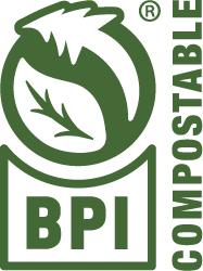
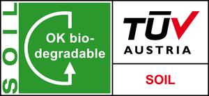
The survey first focused on discerning participant familiarity and perception of common logos printed on packaging, ones that K1 Packaging often encounters with its clientele. Based on Figure 11, the recycle symbol (Figure 11.1) is widely recognized and indicates that the packaging can be recycled. The Biodegradable Products Institute Compostable logo (Figure 11.2) signifies that the packaging is compostable and can break down into natural elements in a composting environment, and certified packaging or product meet ASTM D6400 testing standards in the US. The Seedling logo (Figure 11.3) represents certified compostable packaging materials that are offered by German certifier DIN CERTCO. Forest Stewardship Council certification (Figure 11.4) indicates that the packaging materials come from responsibly managed forests. TUV OK Biodegradable logo (Figure 11.5) indicates that the packaging material will break down naturally over time. TUV OK Biobased logo (Figure 11.6) indicates that the packaging material is derived from renewable raw materials. These logos help consumers make informed choices and support brands’ sustainability efforts.
The survey findings revealed that 98% of respondents recognized the universally familiar recycling logo. In contrast, only 20% were aware of the FSC certification logo. Knowledge of other logos was even lower: 7% for the BPI Certificate, 5% for the TUV logo, and a mere 3% for the compostable seed logo. However, when asked which logo would increase their likelihood to purchase a product, the dynamics shifted
22 | cal poly taga
significantly. The BPI Certificate saw a jump from 7% to 40% in positive responses, the TUV logo increased from 5% to 38%, and the compostable seed logo saw an uptick from 3% to 25%. Interestingly, the FSC logo saw a decline from 20% to 15%.



Color Preferences
When participants were asked about their color preferences associated with sustainable packaging, 42% chose green, indicating a strong association between the color and sustainability. 13% opted for blue, 7% chose brown, and 2% selected red. Intriguingly, about one-third of the participants did not believe color would affect their purchasing decisions regarding sustainable packaging. This result matches the article “Persuasive packaging? The impact of packaging color and claims”. (Hallez, Vansteenbeeck, H., Boen, F., & Smits, T, 2023).


Sustainable packaging | 23
Figure 12
Color options given
Figure 11.1
Recycle Symbol
Figure 11.2
Biodegradable Products Institute
Figure 11.3 Seedling
Figure 11.4
Forest Stewardship Council
Figure 11.5
TUV OK Biodegradable SOIL
Figure 11.6
TUV OK Biobased
Environmental Messaging Preferences
Given the current trend of incorporating sustainability messages on packaging, participants were asked about their preferences for three common environmental slogans:
• “Keep waste away from landfill” - generally associated with materials made from post-consumer waste recycling.
• “Lower the carbon footprint” - typically related to packaging that is lighter or smaller than previous versions or packaging produced without using virgin materials.
• “Reduce greenhouse gas emission” - commonly linked to recyclable and bio-based products, or products that help decrease plastic usage.
Among the respondents, 76% felt that any of these messages were important. However, an additional 17% expressed more concern about reducing the carbon footprint and greenhouse gas emissions, both of which tie in closely with polymer-based packaging.
It’s important to briefly address the issue of sustainability messaging and material specificity in packaging labels. A prevalent practice involves labeling on bottles, a method that inadvertently compromises the recyclability of the bottle by creating a non-mono material. This means that the bottle can’t be recycled unless the label is peeled off— a step often overlooked by consumers, leading to the bottle’s eventual disposal in a landfill. To counter this, K1 Packaging offers a specific label featuring a unique adhesive; though the label itself isn’t recyclable or compostable, it facilitates a higher bottle recycling rate within the current U.S. recycling system. A diagram explaining this system is provided for user understanding. In the conducted survey, a significant majority (83%) of respondents indicated a willingness to buy containers utilizing this specific label once they comprehended the recycling infrastructure and the label’s sustainability message.
By thoroughly examining the survey responses across these critical areas, a more profound and multifaceted understanding of sustainable packaging preferences among key consumer demographics is gained. This in-depth knowledge can subsequently guide K1 Packaging’s strategic decisions moving forward in a world increasingly concerned with sustainability.
24 | cal poly taga
Analysis and Conclusion
Analysis
Upon analyzing the survey data, numerous intriguing points emerged, diverging significantly from my initial hypotheses. Nevertheless, a predominant theme that surfaced from the survey responses and feedback was the confusion surrounding sustainable materials.
Based on the article “Factors influencing consumer purchase intentions of sustainable products”, purchasers and consumers are voicing a demand for clarity and transparency (González-Prida, V. M., Torres-Ruiz, F. J., & Barba-Sánchez, V., 2021). As new sustainability initiatives emerge, there are no established norms, and different organizations are setting their own benchmarks or standards. There’s a clear need for a unified set of rules and standards, as well as precise guidelines to help end-users understand each material and its relationship to sustainability.
In addition, the globally varying labeling systems intensify the uncertainty surrounding sustainable disposal instructions. One survey respondent remarked, “I don’t understand the concept of biodegradability, but as long as it’s labeled with this term, it must be good for the environment”. However, this isn’t necessarily true. Many commonly used biodegradable materials require specific environmental conditions to degrade effectively and designated drop-off locations to be collected correctly (Manimaran, S., & Kannan, G., 2018). Aligning sustainable material infrastructures, providing clear labeling, and offering comprehensive education about sustainable materials are all crucial factors that could drive consumer engagement in sustainable packaging waste disposal.
The conclusions drawn from the hypothesis in this research are contingent on the limited data available from this specific survey. The majority of participants were primarily from Taiwan, New York, and California, locations where there might be a more profound understanding of sustainable options due to the nature of the local state or national legislation. It’s crucial to note that these findings may not necessarily apply on a global scale, and further research, as well as more comprehensive surveys, are necessary to gain a broader perspective on this subject. However, for the immediate and near-future needs of K1 Packaging, this survey offers valuable insights into the preferences and demands of their current and potential future buyers.
Sustainable packaging | 25
Conclusion
Conclusions from the hypotheses made at the beginning of this report are as follows:
H1: Consumers, especially those from Gen Z compared to Gen X, show a readiness to transition towards more sustainable packaging options, even if it entails a modest price increase.
At the beginning of this project, based on the research of gen Z has a strong commitment to sustainability and with high percentage expressing concern about the state of the planet (PR Newswire, 2023 & Packaging Europe, 2022), I would assume the younger generation (Gen X) would be more willing to use sustainable packaging with a slight of price increase in the overall product.
However, based on the data, it shows 50% of both Gen X are not willing to pay a premium. While 53% of Gen X are willing to pick a sustainable packaging if the unit cost remains the same, this percentage is not what I expected.
H2: Among the current sustainable packaging materials available in the market, consumers tend to favor bio-based packaging, more than fiber-based or glass alternatives, with polymer-based packaging being their least preferred choice based on this survey.
Based on the findings from the survey, it appears that the hypothesis H2 holds up to a certain extent. The survey responses demonstrated that consumers show an inclination towards more sustainable options, including bio-based and fiber-based packaging, over traditional polymer-based options.
However, when it came to specific packaging preferences, respondents showed a balanced preference for glass jars and paper tubes, which each garnered 30% of the vote. This implies that consumers have a clear preference for packaging perceived as more sustainable. However, surprisingly, stand-up pouches (generally non-recyclable) were also chosen by about 25% of respondents due to their ease of storage and space efficiency.
Interestingly, when focusing specifically on stand-up pouches, participants were given the choice to select between pouches made from post-consumer waste, bio-based
26 | cal poly taga
film, and biodegradable material. Here, a majority (65%) favored the biodegradable option, 22% chose post-consumer waste, and only 13% chose the bio-based material.
So, while bio-based packaging does hold appeal, consumers seem to prefer biodegradable and fiber-based (paper) packaging options, provided they offer similar protection and functionality as traditional packaging. This reveals a nuanced view on consumers’ preference, highlighting that while they are indeed willing to transition towards more sustainable packaging options, factors like functionality and disposal convenience also play a significant role in their choices.
Honorable to mention, the biodegradable plastic infrastructure in the USA is currently in a state of transition, grappling with multiple challenges. While biodegradable plastics present a promising alternative to traditional plastics due to their eco-friendly disposition, the lack of a robust composting infrastructure hinders their widespread adoption (Huerta-Fontela, M., Gómez, M., Martínez, M. A., & Martínez, A., 2020). Furthermore, inconsistencies in regulations and labeling often lead to the incorrect disposal of biodegradable plastics. These materials also cannot be mixed with conventional plastic recycling streams due to their distinct decomposition process. Moreover, the longer decomposition timeline of biodegradable plastics compared to organic waste can pose issues (Sánchez, C., Martínez, M., & Sánchez-Soto, M., 2021). Hence, while biodegradable plastics hold considerable potential in promoting sustainability, the current infrastructure in the US requires significant improvement to harness their full potential.
In conclusion, the hypothesis H2 is partially confirmed. Consumers indeed favor bio-based packaging over polymer-based options, but it seems that biodegradable and fiber-based packaging are more appealing alternatives, given certain conditions.
H3: Consumers are likely unfamiliar with existing sustainable certification logos, and make decisions based on the accompanying text information.
The survey results lend significant support to the hypothesis H3. In terms of familiarity with sustainable certification logos, a staggering 98% of respondents recognized the universal recycling logo. However, the awareness of other sustainability-related logos was comparatively low, with only 20% recognizing the Forest Stewardship Council (FSC) logo, 7% familiar with the Biodegradable Products Institute (BPI) Certificate, 5% recognizing the TUV logo, and 3% knowing about the compostable seed logo.
Sustainable packaging | 27
In spite of this limited awareness, when asked which logo would increase their willingness to purchase a product, the scenario shifted dramatically. Here, the BPI Certificate’s influence jumped from 7% to 40%, TUV logo’s impact rose from 5% to 38%, and the seeding logo’s effect ascended from 3% to 25%. In contrast, the influence of the FSC logo decreased from 20% to 15%. These findings underscore the impact of the accompanying text information in shaping consumer decision-making. For instance, a participant noted not fully understanding the concept of biodegradability but assumed that any packaging labeled with “biodegradable” must be beneficial for the environment.
In conclusion, the survey results confirm the hypothesis H3. While consumers might not recognize sustainable certification logos, the associated text does indeed play a pivotal role in their purchasing decisions. It appears that clear, straightforward messages about the sustainability of a product significantly influence consumers’ willingness to purchase.
H4: When it comes to dietary supplement products, consumers in this survey tend to lean towards traditional packaging styles, such as bottles (whether glass or plastic), rather than alternative styles like plastic pouches or paper tubes.
The survey results partially support the hypothesis H4. When participants were asked to select their preferred material for dietary supplement packaging, it was found that 30% chose glass jars and another 30% selected paper tubes. This suggests that a substantial proportion of consumers indeed lean towards traditional packaging styles, such as glass jars (bottles). However, the equal preference for paper tubes, an alternative style, challenges this hypothesis, suggesting that consumers are open to non-traditional, innovative packaging solutions as well.
Moreover, it’s interesting to note that about 25% of respondents chose the stand-up pouch option. Despite acknowledging that this option is non-recyclable, participants indicated that the stand-up pouch was easier to store and took up less space during shipment. This points to practical considerations influencing packaging preferences, beyond just the traditional versus alternative dichotomy.
In a follow-up question specifically about stand-up pouches, when given the choice between multilayer pouches made from post-consumer waste (non-recyclable), bio-based film pouches made from renewable raw material, and biodegradable
28 | cal poly taga
pouches made from biodegradable material, 65% chose the biodegradable material as their preferred packaging option. This finding indicates that, when it comes to flexible packaging formats like pouches, sustainability is a key determinant of consumer preference.
In conclusion, while some consumers do still gravitate towards traditional packaging styles like bottles for dietary supplements, there is also a significant inclination towards sustainable and practical alternative packaging styles. Hence, the hypothesis H4 is only partially substantiated by these findings.
Sustainable packaging | 29
References
Bain & Company. (2019). Making sustainability a part of the brand DNA. Bain & Company. https://www.bain.com/insights/making-sustainability-a-part-of-thebrand-dna/
California Assembly. (2011). Assembly Bill 1884. Solid waste: diversion. California Legislative Information. https://leginfo.legislature.ca.gov/faces/billNavClient.xhtml?bill_id=201120120AB341
California Assembly. (2018). Assembly Bill 1884. Food facilities: single-use plastic straws. California Legislative Information. https://leginfo.legislature.ca.gov/faces/ billTextClient.xhtml?bill_id=201720180AB1884
California Senate. (2014). Senate Bill 270. Solid waste: single-use carryout bags. California Legislative Information. https://leginfo.legislature.ca.gov/faces/billNavClient.xhtml?bill_id=201320140SB270
Chaffey, D. (2020). E-commerce and e-business. In Strategic E-Business: Strategic Thinking and Practice (pp.85-118). Routledge. https://doi. org/10.4324/9780429341927-3
City of San Francisco. (2020). Single-use plastics reduction ordinance. San Francisco Department of Environment. Retrieved from https://sfenvironment.org/reduceplastic
Euromonitor International. (2021). The Future of Sustainable Packaging: Unwrapping Packaging Industry Prospects to 2026. Euromonitor International. https:// go.euromonitor.com/rs/805-KOK-719/images/WP_Future-of-Sustainable-Packaging-Unwrapping-Packaging-Industry-Prospects-to-2026_v2.pd
European Commission. (2019). Directive (EU) 2019/904 of the European Parliament and of the Council of 5 June 2019 on the reduction of the impact of certain plastic products on the environment. Official Journal of the European Union, L 155/1. Retrieved from https://eur-lex.europa.eu/eli/dir/2019/904/oj
González-Prida, V. M., Torres-Ruiz, F. J., & Barba-Sánchez, V. (2021). Factors influencing consumer purchase intentions of sustainable products: A meta-an-
30 | cal poly taga
alytic review. Journal of Cleaner Production, 311, 127465. https://doi.org/10.1016/j. jclepro.2021.127465
Lund, E. (2021, March). Packaging in the Circular Economy. Lazard Asset Management. https://www.lazardassetmanagement.com/us/en_us/references/fundamental-focus/packaging-in-the-circular-economy
Luchs, M. G., & Kumar, M. (2017). “Yes, but this other one looks better/works better”: How do consumers respond to trade-offs between sustainability and other valued attributes? Journal of Business Ethics, 140(3), 567–584. https://doi. org/10.1007/s10551-015-2674-5
Manimaran, S., & Kannan, G. (2018). Biodegradable Plastics: A Review on Recent Developments and Perspectives. Journal of Polymers and the Environment, 26(6), 2338-2357.
https://doi.org/10.1007/s10924-018-1303-7
McKinsey & Company. (2020). Packaging in a circular economy: Sustainable packaging insights. McKinsey & Company. https://www.mckinsey.com/~/media/mckinsey/ industries/paper%20and%20forest%20products/our%20insights/packaging%20 in%20a%20circular%20economy%20sustainable%20packaging%20insights/ sustainable-packaging-insights.ashx
Moustakas, K., Loizidou, M., & Rovolis, A. (2020). Recycling and Reuse of Glass Cullet. In Waste: A Handbook for Management (pp. 299-312). Academic Press. https://doi.org/10.1016/B978-0-12-815060-3.00023-7
Narodoslawsky, M., & Shazad, K. (2020). The sustainable process index (SPI): Analysing products and processes in the context of the circular economy. Resources, Conservation and Recycling, 159, 104853. https://doi.org/10.1016/j. resconrec.2020.104853
Packaging Europe. (2022, May 5). More than half of gen Z consumers influenced by packaging sustainability. https://packagingeurope.com/news/more-than-halfof-gen-z-consumers-influenced-by-packaging-sustainability-according-to-new-research/8176.article
Sustainable
31
packaging |
PR Newswire. (2023). New Data reveals consumers increasingly choose products in sustainable packaging globally, despite rising prices. https://www.prnewswire. com/news-releases/new-data-reveals-consumers-increasingly-choose-products-in-sustainable-packaging-globally-despite-rising-prices-301804243.html
Ritch, E., & Brennan, C. (2010). Using worldmaking to understand the role of design in the sustainability agenda. Design Studies, 31(4), 385-403.
Rokka, J., & Uusitalo, L. (2020). Sustainable packaging design: Examining the effects of packaging design on consumer perceptions of products. Journal of Cleaner Production, 244, 118710.
https://doi.org/10.1016/j.jclepro.2019.118710
Rujnić-Sokele, M., & Pilipović, A. (2017). Challenges and opportunities of biodegradable plastics: A mini review. Waste Management & Research, 35(2), 132-140.
Sánchez, C., Martínez, M., & Sánchez-Soto, M. (2021). Challenges and opportunities for the adoption of biodegradable plastics: A review. Resources, Conservation and Recycling, 170, 105632.
https://doi.org/10.1016/j.resconrec.2021.105632
Sustainable Packaging Coalition. (2021). Sustainable Packaging Guidelines. Sustainable Packaging Coalition.
https://sustainablepackaging.org/resources/
Tariq, A., Li, J., & Zafar, M. A. (2020). Environmental sustainability and its growth towards green marketing: a systematic review. Journal of Cleaner Production, 259, 120838.
Twede, Selke, S. E. M., Kamdem, D.-P., & Shires, D. B. (2014). Cartons, crates and corrugated board: handbook of paper and wood packaging technology (Second edition). DEStech Publications.
Wu, Misra, M., & Mohanty, A. K. (2021). Challenges and new opportunities on barrier performance of biodegradable polymers for sustainable packaging. Progress in Polymer Science, 117, 101395–. https://doi.org/10.1016/j.progpolymsci.2021.101395
Zhang, Y., et al. (2020). Environmental Performance Assessment of Dietary Supplement Packaging: A Case Study of a Company in China. Journal of Cleaner Production, 261, 121125.
https://doi.org/10.1016/j.jclepro.2020.121125
32
| cal poly taga
Sustainable packaging | 33
| A
Article Title

About the Author
Alex Chen
Alex Chen, a June 2023 graduate from California Polytechnic State University, San Luis Obispo, earned his M.S. in Packaging Value Chain. His interest in the intersection of marketing decisions and packaging led him to explore innovative, sustainable, and efficient packaging solutions. Outside of his professional and academic life, Alex is a devoted parent to two children, embodying the spirit of perseverance and commitment in both his personal and professional endeavors.
2
House of bread
Article Title | A
California polytechnic state university technical association of the graphic arts
Article 2
2
house of bread

A | Article Title
Article Title | A
House of Bread
Phoenix Challenge
A woman-owned and operated bakery, House of Bread bakes breads, pastries, sweets, and beyond at its corner location off of Highway 101 in San Luis Obispo, CA. House of Bread proudly serves good taste naturally, where hearty grains and dietaryfriendly options are prioritized. The storefront’s cozy country atmosphere and all-natural ingredients reflect its Montana origins. The bakery’s philosophy is centered around harvesting the highest quality wheat for bread, which comes from the high mountains in Montana.
With high quality and natural ingredients, House of Bread aims to bring customers the same nostalgic tastes of fresh, homemade bread, just like that of a comforting family recipe. The bakery was founded in 1996 by Sheila McCann and has remained a beloved storefront in the San Luis Obispo area ever since.
Introduction
Founder, Sheila McCann, is a creative pioneer with a passion for sharing exceptional breads and baked goods. Upon our initial meeting, our team was inspired by her persistence and craft which has maintained House of Bread for 27 years and counting. Not only has Sheila cultivated a close-knit community of House of Bread customers, she is continuously striving to grow her business. In the upcoming year, House of Bread will be opening a second location and expanding their product range.
With a second location opening in the upcoming year, we hope to support Sheila and House of Bread through our proposed flexographic packaging solutions. Sheila’s vision for House of Bread’s second location is to expand their current menu offerings, tapping into specialty coffee drinks and pastries.
With this in mind, we saw potential to refine House of Bread’s current branding and packaging solutions to better align with the second location’s mission. Through our partnership with House of Bread, we want to highlight the quality taste and Sheila’s passion for making and sharing exceptional baked goods.
Research
Consumer Behavior
As the workforce returns in-person after the COVID-19 remote work modality, people have less time to prepare meals and tend to opt for convenient and nutrient-dense foods, in essence, bread (Berry, Lisa). Rich Products explores the ways consumer behavior has shifted to save time and money, observing that cost-conscious consumers in 2022 tend to select anytime treats (pastries, rolls, baked goods). Anytime treats are essentially bakery products. They are considered grab-and-go bites that conveniently deliver quick energy to people with fast-paced lifestyles. The research explores the importance of cost-efficiency, “among shoppers who have increased their planned fresh bakery purchases, 66% plan to purchase more bread and roll to save money”. An increase in baked goods purchases may take precedence over going out to eat as consumers invest in foods that last longer and require less food preparation.
Data reveals that ingredient transparency is important to the consumer, with 42% of survey respondents seeking “clean labels, healthier positioning, and high-quality ingredients.”
6 | cal poly taga
Demographic Research
National: Carbohydrates are an essential part of the diet, and bread is an excellent source of these nutrients. Media Mark Simmons details the primary consumers of bread to be men and women around the age of 47 with a median household income of $67,443 (women) and $83,689 (men). In a study on pastry purchasing habits of Millennials as well as Gen Z students, three-quarters of the members of the survey had purchased bread in the last 2-3 days (Sherred, 2019). Purchases of breads and baked goods are expected to propel the bakery market In North America, the bakery market by a CAGR of 4.8% from the time frame of 2022 to 2027. Commercial bakeries generate 80% of total bakery profits, as convenience food culture becomes more prominent.
Local: The current population in the city of San Luis Obispo is around 47,545 (World Review). Downtown San Luis Obispo is 52.46% male and 47.54% female. The median age is around 36 years old for the average downtown San Luis Obispo employee. Another primary sector of the market is college-age students who make up 21.94% of San Luis Obispo, whereas those under 18 years of age make up 2.93%. The primary market segment for House of Bread are locals as well as college students. This is a sizable market for House of Bread. San Luis Obispo is a college town but also has a large number of families who are invested in buying fresh and specialty breads.
Customer: People who work downtown have access to fresh bread and sandwiches from House of Bread. Our team facilitated a survey to obtain demographic data on a sample of House of Bread customers in which we observed 79% of respondents to be between the ages of 19-21. While most customers were local to San Luis Obispo, a few were from out of state, which may indicate visiting families of college students or tourists purchasing baked goods from House of Bread. These findings align with Sheila’s observations of her patrons as families, women who shop for their families, and those employed in downtown San Luis Obispo.
Industry Research
From 2023 to 2027, the Global Bread Market is expected to grow by $118.37 billion, accelerated by a CAGR growth rate of 7.27% (GlobeNewswire). This trend is propelled by the rise in convenience food purchases, which is projected to grow annually by 6.03%. The United States has one of the highest shares in the Bread Improver Market (Digital Journal), hence, bread as convenience food is positioned to grow in trends
house of bread | 7
of purchase and revenue. In light of the post-pandemic inflation driving up food prices, 46% of consumers have been buying less from restaurants and spending more on baked goods, which allows profitable opportunities for dedicated bakeries, with Baking Business reporting.
Target Market Research
Sheila, the owner of House of Bread, observes that the majority of customers are students, middle-aged women, and male and female workers of downtown San Luis Obispo. One of our goals is to increase brand awareness as well as increase the customer base at the second House of Bread location, which may consist of a new demographic: travelers. This location is close to the airport, and may cater to students returning from travels, tourists visiting San Luis Obispo, those with a connecting flight, and more. This widens the market for House of Bread.
Customer Insight and Behavior
A primary segment of bread and baked goods, Millennials and Gen Z provide valuable insights into consumer behavior. Through evaluation of this demographic it was determined that food waste, sustainability, and nutrition are major factors that influence this demographic and their purchasing decisions. Many young consumers, especially Gen Z, are concerned about food waste when it comes to purchasing baked goods. According to the American Bakers Association, around 75% of consumers are bothered by wasting bread, and more than 1 in 5 consumers often or always skip buying bread after having thrown away bread from their previous purchase.
8 | cal poly taga
SWOT Analysis
Strengths
Baked goods fresh and packaged
Established bakery with regular customers, holiday shoppers
Location draws a lot of foot traffic, travelers
Variety of gluten-free options and foods
New location: by airport, happy hour, late hours, coffee
Opportunities
Brand redesign
Appropriate Packaging for products
Cohesive labels and branding
Expand target market
Explore pastry packaging and bread packaging
Heat sealing on BOPP for aesthetics and usability
Weaknesses
Digital assets
Signange: hierarchy, font size, legibility
Price compared to grocery stores
Cookie packaging
Threats
Local bakeries of lower cost/decent quality bread
Bakeries with more of an online and social media presence
Bakeries with online ordering
Competition and Positioning
Seeing that there are several local bakeries specializing in bread, there are strong competitors in the area including Bread Bike and Proof & Gather. The largest source of competition would be grocery stores with less expensive prices, and the ranking of grocery stores tends to be from traditional to mass merchandise stores. House of Bread is prominent in positioning due to their large variety of breads and other baked goods as well as their cheap pricing, and location in Downtown San Luis Obispo. Though the bread may be a bit more expensive than the grocery store, the price of bread at House of Bread for specialty bakeries compared to other local bakeries are significantly cheaper. House of Bread is distinguished from other competitors because of their gluten-free option, deli options, and coffee.
house of bread | 9
Figure 1 SWOT analysis




Breadth and Depth of Research
This year, the Phoenix Challenge gathered research and supporting evidence through digital databases including the Cal Poly Kennedy Library, the Media Mark Simmons database, and various articles on bread and baked goods. Our team evaluated feedback through surveys that were sent to our Graphic Communication department and offered to House of Bread customers. Interviews with Sheila McCann informed many of our decisions.
FDA Nutritional Labeling
The Federal Food, Drug, and Cosmetic Act mandates that all packaged foods are appropriately and accurately labeled with nutrition facts. Section 136.110 details the requirements of bakery product labeling, instructing “Each of the foods enriched bread, enriched rolls, and enriched buns conforms to the definition and standard of identity and is subject to the requirements for label statement of ingredients
10 | cal poly taga
Figure 2 Perception map
High
Quality
Low Price
High Price
Low Quality
prescribed for bread, rolls, or buns by § 136.110” (U.S Food & Drug Administration). While exemptions excuse low-volume products from businesses that employ fewer than an average of 100 full-time employees, House of Bread surpasses this minimum employee count and therefore requires nutrition labels as seen on the existing packaging labels.
Industry Resources and Consults
Dina Vees | Phoenix Challenge Advisor
Professor, Graphic Communication Cal Poly
Dina Vees earned a Bachelor of Science in Graphic Communication from Carroll University and a Master of Fine Arts in Media Design from Full Sail University. Her favorite part about teaching is seeing the ‘light bulb’ turn on when a student grasps a concept. Her teaching and research interests are prepress, workflow automation, variable data, marketing, and HTML/CSS/JavaScript. Dina worked at Harley-Davidson MotorClothes and used her skills in the textile industry. Her specialty is prepress and the highlight of her career has been working at Cal Poly.
Nick Cooper | Press
Lecturer, Graphic Communication Cal Poly
Nick Cooper graduated from California Polytechnic State University, San Luis Obispo with a Bachelor of Science in Graphic Communication concentrating in Graphics for Packaging. After graduation, he worked as the Prepress Manager for Custom Label & Decal, LLC, where he created proofs for customers, set up press-ready files for both flexo and digitally printed narrow web labels, and was heavily involved in flexo platemaking. He has returned to Cal Poly as a Graphic Communication lecturer and Equipment Technician for the department. Nick was an integral part of the prepress and printing process, assisting our team in preparing files for plate making using the Esko software.
Mike Ferrari | Sustainability
Consortium For Waste Circularity President | Key Largo, FL
Mike Ferrari is president of Consortium For Waste Circularity, a 501(c)(3) nonprofit focusing on science-based solutions to return waste into an endless loop of circularity. Mike was recruited to The Procter & Gamble Co in Cincinnati, OH and completed a successful 32-year career as a global R&D director including 6.5 years as an international manager living in Germany. He delivered initiatives to the marketplace for leading billion-dollar brands. He holds several patents and is the winner of the
house of bread | 11
2009/2010 DuPont Global Packaging Innovation Award and also served on the FTA board. Upon retirement, Mike founded Ferrari Innovation Solutions, coaching consumer product companies to delight consumers. Mike is a guest lecturer at the University of Florida to the Packaging Engineering program, teaching “Consumer Driven Innovation Methodology.”
Lorraine Donegan | Design Professor, Graphic Communication Cal Poly
Lorraine Donegan is a professor at the California Polytechnic State University with more than 20 years of experience in the graphic design and production industries. In her teaching, she links design with technology in an effort to prepare students to understand the language and role of the graphic designer, the print provider, and the final product. The design team was fortunate to speak with Lorraine about design considerations for packaging and labels. She provided advice on how to streamline the prototyping process by working backwards from existing samples. Additionally, she gave valuable insight on how to properly communicate our client’s existing brand while developing new solutions for their packaging.
Malcolm Keif | Press
Professor, Graphic Communication Cal Poly
Dr. Malcolm Keif, a Graphic Communication California Polytechnic State alumnus, has taught at the university level since 1990. He primarily taught a flexographic printing course where he went over FIRST specifications and certain characteristics of flexo printing. He previously served as the Phoenix Challenge advisor for multiple years. His experience was valuable during our press run as he guided us throughout the printing process. He helped to explain why we came across certain issues and how to navigate them. Over the years, Malcolm has shifted his passion, as new technologies and methodologies are developed. Recently, he is interested in how data is used and managed in GrC, which includes digital marketing, managing assets, analytics, visualization, and various other applications. He has also been involved in the Flexo packaging area and is interested in marking and coding, particularly for tracking, brand-security, and anti-counterfeiting.
Javier de la Funte | Packaging Structure
Lecturer & Researcher, Industrial Technology & Packaging Cal Poly
Dr. Javier de la Fuente serves as the Chair of the Industrial Technology and Packaging Area in the Orfalea College of Business at California Polytechnic State University. He
12 | cal poly taga
is an Associate Professor who teaches undergraduate and graduate courses on design thinking, product and packaging design and development, and healthcare packaging. Dr. de la Fuente also serves as Adjunct Faculty at Universidad de Monterrey, where he teaches product usability and innovation at the graduate level. Dr. de la Fuente’s background includes industrial design, graphic design, packaging, and scientific research. He is particularly interested in design-driven innovation, the role of affordances in usability, and inclusive design. His research group develops novel methods for using mobile eye-tracking technology in usability testing of physical products.
Concept
Original Packaging Issues
Based on our evaluation of House of Bread’s current state, we identified opportunities for growth and refinement of their current packaging solutions. The first touchpoint that our team identified as a potential growth opportunity was inconsistent branding and unappealing design. The current House of Bread labels feature a low-resolution image, derived from an in-store mural. However, due to poor-quality printing and graphics, the image is blurry and difficult to identify. As a result, the poor quality labels reflect negatively on customers and fail to showcase the natural, homemade origins of the business. Additionally, the current typography featured on the labels is hard to read upon first glance, making it difficult to identify key information like pricing and ingredients from both a customer and employee standpoint. To address these issues, our team worked to enhance current branding by establishing a clear and consistent branding standard that speaks to House of Bread’s country farmhouse origins. By refining the company’s branding and developing a series of label designs, the packaging will be able to reflect the high-quality standards of House of Bread.
Another main component of the bakery’s packaging that we aimed to reimagine was the use of Ziploc bags to package the bakery’s cookies and brownies. When speaking with Sheila, she felt that this solution gave customers an easy way to reseal the packaging. However, the sandwich bags display an inconsistent message to customers, poorly reflecting the quality and standards of the company as a whole. The sandwich bag packaging solution failed to reflect the high-quality ingredients that make House of Bread a well-loved company across the San Luis Obispo community. Additionally, this packaging solution offered little to no protection of the product itself. By aligning with Sheila’s priority of resealability, we decided it was important to execute a packaging concept that cultivates a higher quality image for the company.
house of bread | 13
Cost Considerations
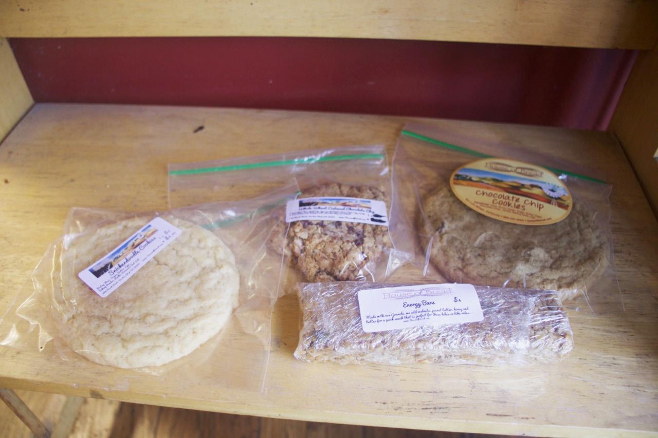
To label baked goods, Sheila used Avery labels printed by inkjet which amounted to approximately $0.1690 per piece. While the individual cost of our flexographic label is difficult to pinpoint as our team has just completed short runs, it is holistically more advantageous to pivot towards flexographic printing as opposed to other forms of printing, in this case, inkjet. Primarily because it is more cost-effective to print flexo in bulk and for House of Bread which is the desired outcome for the many pastries they produce. As more labels are printed, the click charge is reduced, and therefore printing with flexo is more advantageous in the long run. Additionally, with the two spot colors we use, the print quality will be higher than having the inkjet reproduce the colors through the 4-color process.
Technical and Environmental Considerations
Flexographic ink has been historically associated with high amounts of volatile organic compounds, resulting in toxic byproducts that harm the environment. If there are changes that need to be made in the design, it requires an entirely new flexographic plate to be created, which adds up in financial, material, and environmental costs.
14 | cal poly taga
Figure 3
Current House of Bread packaging
Initial Survey Results
As a part of our initial research, our team released a survey to Cal Poly students and House of Bread customers to compare our new branding efforts with House of Bread’s original logo design. Based on our survey, we asked respondents to assess which of our logos best emphasized the country origins and natural aspect of House of Bread. The survey found that 85.7% of respondents felt that the new logos better reflected House of Bread as a brand and bakery. Additionally, 89.3% of respondents felt that our label designs better aligned with their expectations of the bakery and its brand. Respondents shared feedback on which of our logo iterations best represented the bakery as a whole, which we continued to refine and finalize based on our survey feedback. The survey helped inform our design decisions moving forward, shaping our typography, logo, and label designs to align with our target market preferences.
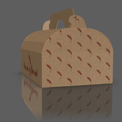
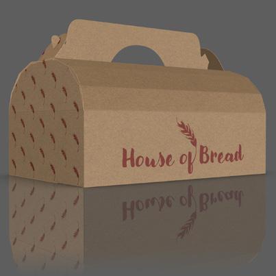
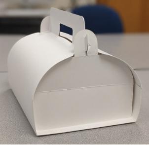
Packaging Revisions
While creating the structure of the pastry takeout box, our team wanted to develop a structure that did not have any glue. Upon further research and meeting with Industrial Technology and Packaging professor Javier de la Fuente, we decided to switch our zero glue package to an auto-bottom, self-erecting package. The new dieline also was more appropriate for the uses of House of Bread, increasing efficiency.
A minimal amount of water-based glue would still make the structure sustainable and does not impact the recyclability of the package. The glue for the structure allowed for the packages to ship flat and allow for easier storage. The auto-bottom allows for a quicker assembly to keep up with the fast-paced environment of
house of bread | 15
Figure 4.1-4.3 Evolution of our pastry box designs, from initial concept stages to adding graphics and 3D rendering
packing pastries. Finally, we decided to add life to House of Bread’s pastry box by integrating our branding elements into our dieline. In addition to the pastry box, the dieline we created for the coffee sleeve did not use any glue. Our team felt that the coffee sleeve that fastened without glue would be unique, sustainable, and easy to implement into their business.
Design
Original Branding
Since the founding of House of Bread in 1996, House of Bread’s logo has undergone minimal changes, despite the company’s evolution and success over time. With the opening of a second location tapping into a new San Luis Obispo market base, the storefront was in need of a modernized brand identity that still stays true to its homemade origins. House of Bread harvests wheat from the same Montana fields where owner, Sheila McCann, draws inspiration for her passion. Wheat is an integral aspect of House of Bread and Sheila uses the symbolic bundles of wheat in her logo today.
The current logo uses deep red and brown tones and the Papyrus typeface to communicate the natural, organic roots of House of Bread. The logo is also frequently paired with a bread house graphic, which takes away from the business’s cohesive brand identity. The wordmark emphasizes House of Bread’s country origins while the simplistic bread house fails to properly reflect the quality of their products and the company as a whole. In hopes of expanding House of Bread’s customer reach, we chose to rebrand the logo while maintaining the company’s current color palette to cultivate a more cohesive brand identity.
Branding Solutions
Branding Elements
16 | cal poly taga
Figure 5
Current logo
Figure 6 House of Bread current website
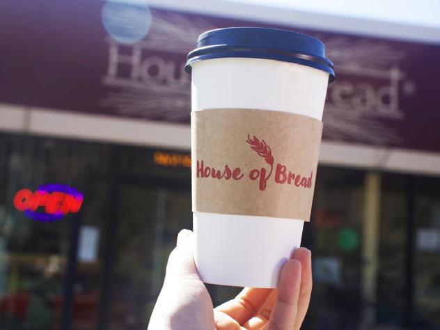
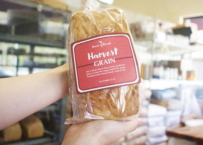
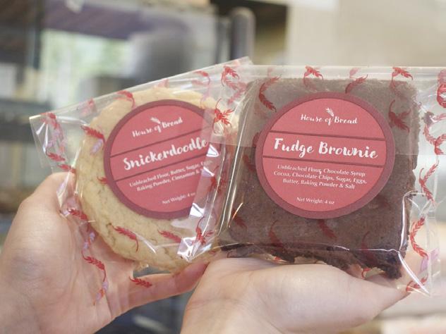
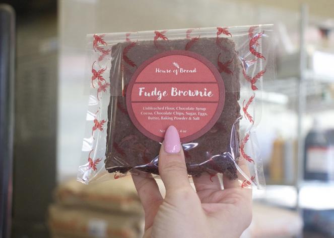
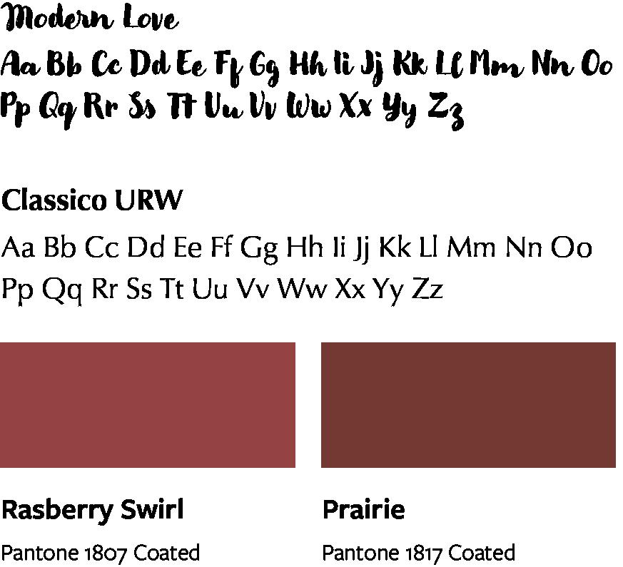
house of bread | 17
Figure 7.1-7.4 Pastry labels
Figure 8 Style guide
FIRST Specifications
When designing our branding for House of Bread we went through several iterations to ensure that the typeface would follow FIRST specifications as well as ensure high-quality press runs. For the first of three press-runs, we printed the labels for the pastry and cookie bag we later created. We decided to make our point size 24 for the type of baked good on the label, and 9 for the ingredients. Though we used more of a script font we ended up enlarging the typeface from our original design in order for it to print more effectively on the coffee sleeve labels. All text and graphic elements were trapped, and barrer marks were used to prevent misregistration and press-run errors. After consulting professor Dina Vees about our prepress files, we integrated her feedback and added more of a stroke and enlarged the type in order for the script font to print legibly, and effectively.
On the third press run, the translucent substrate, registration marks, and regulations were imperative for a successful outcome of the run, especially with the detail in the sheaths of wheat on the packaging we printed with flexo. We used overprint by first printing with the white ink, and then printing the PMS 1807 over the white ink which allowed for the quality of print on the clear substrate. By following design guidelines and proper protocols, we were able to have efficient and successful press runs for each element of our design.
Execution
Sustainability Efforts
With sustainability as a primary focus of our project goals, we consulted with Michael Ferrari, President of Consortium For Waste Circularity. Ferrari built a refined professional background in packaging and print, working to identify solutions to reduce waste and promote a circular economy within the packaging industry. After reviewing our selected materials and substrates used for our project, we wanted to ensure that our products could be recycled or repurposed in a way that could reduce House of Bread’s contribution to excess packaging waste. Ferrari’s advocacy for ending landfill practices and incineration inspired us to investigate alternative recycling methods that could be potentially used by companies like House of Bread. Based on our conversation with Ferrari, we learned about Regenerative Robust Gasification that is able to downcycle all waste without exception to produce Syngas. According to Ferrari’s research, “Syngas is a clean chemical feedstock for subsequent production of many products—fuels, fertilizers, pharmaceuticals and other chemical feedstocks
18 | cal poly taga
such as methanol, useful for production of plastics" (Ferrari 2023). Based on this robust recycling solution, our BOPP film pastry bags, product labels, Avery Dennison polyethylene coated labels, kraft paperboard coffee sleeves and pastry boxes are all capable of being downcycled and transformed into Syngas. Ferrari’s solution to the landfill crisis introduces exceptional possibilities for the food packaging and flexographic industry, promoting a circular waste economy.
Aside from investigating sustainable efforts that can be integrated after a package’s life, we made several decisions during our prepress operations to promote sustainable flexographic printing practices. We chose to make our coffee sleeves require no glue for assembly. Not only does this promote easy assembly for House of Bread employees but it acts as a more sustainable way to reduce waste processing and recycling costs. Most traditional glues and adhesives used in the packaging industry contain plastics which optimize bonding properties but in turn, are not biodegradable (Davis 2020). Knowing the impact plastic glue has on the packaging industry, we decided to manufacture a no-glue solution for our coffee sleeves.
Prepress
We established clear guidelines to achieve a successful press run that aligns with FIRST specifications. Most notably, we ensured that our plates were “flexo-friendly” and our lines were within necessary specifications. Based on our feedback from design expert, Lorraine Donegan, we limited our frequent usage of thin lines to improve registration during our press run. Additionally, we made sure to compare our small type with FIRST specifications to ensure the best final outcome for our products. For our prepress procedures, we decided to impose our product labels one up due to the size limitations of our press. While we were limited in size for our product labels, we chose to create a single plate for both our brownie and cookie labels, optimizing space and efficiency for our press runs.
Additionally, we were able to impose our coffee sleeve plates two up, further encouraging waste reduction. When setting up our plate finals, we made sure to integrate i-cut registration marks into our files. After the digital files were completed, our group was ready to begin the platemaking process.
The first step was creating the plate’s back exposure to create the base for the plate. Next, we placed our plate into the ESKO Cyrel Digital Imager or CDI. During this process, the CDI’s laser etches the plate design into the flexible material while also
house of bread | 19
receiving a UV exposure. Finally, the development stage allows the image areas to rise before finishing the plate with UV ray and UVC light, producing the final plate.
To achieve an efficient press run, we decided to utilize a two-color process for our product labels and integrate the creme-colored substrate as a part of our design. By selecting a colored substrate, this minimizes the set-up costs and production time. We separated our press runs into two separate days, ensuring that the first run utilized our Pantone 1817 and 1807 colors and the second day was solely dedicated to our 1807 and Spot White color runs. Overall, this helps reduce plate and ink changes during operation.
Production Files
Product Labels
When speaking with Sheila, she expressed her interest in reconfiguring her current labeling system. She felt that her current labels were difficult to read and identified several inconsistencies within label quality and resolution. We wanted to create a more cohesive series of labels that displayed House of Bread’s reimagined brand identity. We chose to also expand the labels to products outside of the bread category, hoping to elevate the experience of enjoying any House of Bread baked good. Additionally, Sheila emphasized the importance of including necessary information like net weight onto the labels, which was lacking in her current labels. Not only do the labels achieve a clean and simplistic design that effectively communicates
20 | cal poly taga
PMS1807 PMS1817 PMS1807 PMS1817 Harvest GR AIN Hon Sunfl Seed 9-G ain Mi P Seed Fl Seed p g Harvest GR AIN 100 % Whole Wh lou Hon Sunfl - opp Pu in Seed S Seed Y & Salt N W 32 Harvest GR AIN Seed 9-G ain Mi P Seed Fl Seed eed eed & Salt g Harvest GR AIN 100 % Hon Sunfl eed - ain Mi eed Fl eed p N W 32 PMS1807 PMS1817 PMS1807 PMS1817 Snickerdoodle Bu S g wde Cinnamon & Salt h Snickerdoodle Bu S g Ba P wde Cinnamon & Salt N W h Fudge Brownie y up Co Cho ol e Chip Ba g N W h Fudge Brownie y up Co Cho ol e Chip Ba g PMS1807 White PMS1807 White PMS1807 White PMS1807 White
Figure 9 Production files
the product information to customers but they serve a practical purpose as well. The labels allow customers to reseal their pastry bags easily and conveniently with our product sticker labels, elevating Sheila’s current Ziploc packaging solution with something of higher quality.
Coffee Sleeve
Pantone
Press Specification
Pantone 1807
house of bread | 21
Color Management Report Bread, Browine, & Cookie Labels PMS 1807 1817 Density (proof) 1.15 1.05 Avg Density (final) 1.25 1.10 L*a*b (proof) L*: 47.6 a*: 31.6 b*: 21.6 L*: 41.9 a*: -17.0 b*: -8.9 L*a*b (final) L*: 47.6 a*: 31.6 b*: 21.6 L*: 41.9 a*: -17.0 b*: -8.9 Avg E∆2000 0.9 5.3
Figure 10 Label color management report
Bread,
Substrate Anilox Plates Ink Fasson #70 Eggshell Felt WS/S100Rb/1 Spec = 19195
Browine, & Cookie Labels
600 Vol = 2.24
1807 Harper
= 6.53 Cyrel
0.023"
3m
EEE
23 x
Harper 630 Vol
Fast 0.067" thickness
relief
1015 sticky back tape 4,000 dpi RIP
067 mils, 1.70 mm
762 mm
= 20
pH = 9.19
Pantone 1807 V
sec
V = 19
pH = 9.44
Pantone 1807
sec
Figure 11 Label press specification
Unit 2: Pantone 1807
Unit 3: Pantone 1817
Environmental Conditions
Temperature: 69°F
Humidity: 50.9 Rh
With the emergence of a second location, House of Bread’s menu and product range is expanding significantly. The bakery is shifting to diversify their coffee and drink selection. Currently, the bakery serves coffee in standard coffee cups, which fail to showcase any branding elements. Coffee cups and sleeves are primary opportunities for generating natural advertising, which is why we decided to design a signature coffee sleeve for House of Bread. With the bakery hoping to increase their sales and serve more specialty coffee drinks and beverages, the coffee sleeve design felt like a necessary step to drive brand recognition.
Placing House of Bread’s logo primarily onto the coffee sleeve, customers are now able to establish a sense of brand familiarity between the House of Bread identity. During production, we wound the coffee sleeves to later cut using our Kongsberg machine. In our initial press run, we found that our Pantone 1807 was less visible on the kraft paper substrate. To resolve this issue, we decided to print with a spot white underneath to enhance the visibility of the House of Bread logo.
22 | cal poly taga
Figure 12 Press run #1 specifications
Press Specification
Pantone 1807
Harper 360
Vol
3m 1015 sticky back tape 4,000 dpi RIP
EEE 067 mils, 1.70 mm 25 x 30 in 23 x 762 mm
Spot White
Pantone 1807 V = 15 sec
pH = 9.15
house of bread | 23
Coffee Sleeve PMS Spot White 1807 Density (proof) 0.15 0..95 Avg Density (final) 0.16 0.95 L*a*b (proof) L*: 81.9 a*: 1.2 b*: -5.1 L*: 71.2 a*: 3.7 b*: 53.0 L*a*b (final) L*: 86.6 a*: 1.4 b*: -5.4 L*: 70.2 a*: 4.2 b*: 54.7 Avg E∆2000 0.9 3.3
Color Management Report
Figure 13 Coffee sleeve color management report
Coffee
Substrate Anilox Plates Ink
Oaoer Roll
Weight - 30lb
White Harper 600
= 2.24
Sleeve
Kraft
Basis
Spot
Vol
= 6.53 Cyrel Fast 0.067" thickness 0.023" relief
V
18
=
sec
pH = 9.37
Figure 14 Coffee sleeve press specifications
Unit 2: Spot Ink
Unit 3: Pantone 1807
Environmental Conditions
Temperature: 70°F
Humidity: 41 Rh
Pastry Bag
When developing our pastry box design, we wanted to integrate the House of Bread logo and symbolic elements into the box itself. As a group, we decided to develop a pastry bag with our wheat pattern to create a more cohesive branding identity across all product categories. Sheila’s current packaging system to sell her pastries are Ziploc bags. We identified this as a strong opportunity for growth and refinement and felt that our high-quality, delicious pastries deserved a more high-quality packaging solution. We found it important to integrate House of Bread’s symbolic wheat pattern on the pastry bags, serving as a consistent reminder of the brand and its natural, homemade core values.
Using Biaxially oriented polypropylene film (BOPP), we experimented with different color jobs on the press to produce a series of pastry bags. After winding the film into a roll, we cut the film into sheets to heat seal and make into pastry bags. BOPP is a common film utilized in the food industry due to its strength, ability to improve product longevity, and protect the product from environmental and physical abuses (Kingchaun Packaging 2022). This shift away from traditional Ziploc bags to higher quality BOPP pastry bags with our signature wheat pattern truly helps to enhance customers’ perceptions of House of Bread’s pastries.
24 | cal poly taga
Figure 15 Press run #2 specifications
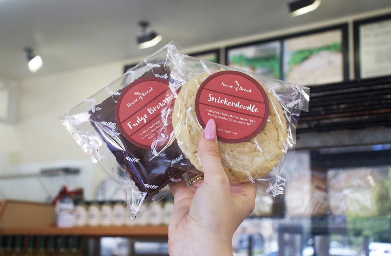
house of bread | 25
Figure 16 Pastry bags
Pastry Bag PMS Spot White 1807 Density (proof) 0.15 1.05 Avg Density (final) 0.16 1.07 L*a*b (proof) L*: 81.9 a*: 1.2 b*: -5.1 L*: 41.9 a*: -17.0 b*: -8.9 L*a*b (final) L*: 86.4 a*: 1.4 b*: -5.4 L*: 43.0 a*: -17.1 b*: -8.8 Avg E∆2000 1.0 3.3
Color Management Report
Figure 17 Color management report
Press Specification
Pastry Bags
Substrate Anilox Plates Ink
Multi-Plastics Inc. Biaxially oriented polypropylene film (BOPP)
Thickness = 13.5 µm
Spot White
Harper 600
Vol = 2.24
Pantone 1807
Harper 360
Vol = 6.53
Unit 2: Spot Ink
Unit 3: Pantone 1807
Cyrel Fast 0.067" thickness 0.023" relief
3m 1015 sticky back tape 4,000 dpi RIP
EEE 067 mils, 1.70 mm 25 x 30 in 635 x 762 mm
Spot White
V = 18 sec
pH = 9..37
Pantone 1807
V = 15 sec
pH = 9.15
Environmental Conditions
Temperature: 69°F
Humidity: 50.9 Rh
26 | cal poly taga
Figure 18 Pastry bag press specifications
Figure 19 Press run #3 specifications
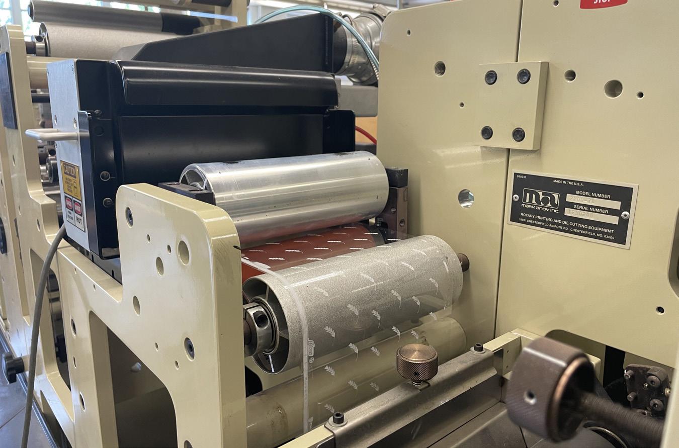
Press Limitations and Issues
Throughout our project, we encountered several limitations as a result of supply chain issues and press limitations that forced us to adapt our expectations and product outcomes. When printing on the BOPP film, we had to navigate some challenges in the tension and alignment of the material. When shifting from the kraft paperboard to the BOPP film, there were some difficulties achieving proper web tension. This caused the film to overstretch to the point of potential breakage. However, we were able to identify this web tension issue immediately and halted production, giving us time to consult our FIRST specification guide.
After adjusting several segments on the press, the web tension was able to achieve an ideal tension control, allowing the film to align properly on the press. Additionally, due to budget limitations, we chose readily available materials like kraft paperboard and BOPP film, which were supplied by our department. Additionally, being cognizant of House of Bread’s current materials and packaging applications, we developed products that would be easily integrated into the bakery’s production workflow and supply stock. However, if we were to have access to a more expansive budget, our team would have liked to explore alternative materials that allowed for a more
house of bread | 27
Figure 20 Process photo from press run #3
sustainable, eco-friendly solution for our products. Based on our extensive research, we discovered Polylactic Acid which is a renewable, biodegradable source made from primarily sugar cane and starch (McCauley 2018). This PLA material has been transformed into biodegradable bread packaging that offers an environmentally-friendly alternative to traditional petroleum-based bakery packaging that House of Bread uses today (BioPak 2023).
The PLA material has received certifications from the British Retail Consortium and International Organization for Standardization, therefore meeting industry standards for food packaging regulations (360 Packaging 2018). With the flexibility this material offers, we would plan to integrate this biodegradable packaging material to replace our BOPP film and House of Bread’s current plastic packaging if given a wider budget.
Mixing Our Own Ink
Due to some supply chain issues, our team was not able to get the inks that we wanted. We resolved this issue by hand mixing our own inks to use on the press. The ink colors that we used were PMS 1807 and PMS 1817. We already had PMS 1807, the brighter red color, in stock but could not get PMS 1817, the darker brown color. To mix PMS 1817, the team started with 1,600 ml of PMS 1807. PMS 1807 is one part black and sixteen parts Pantone Red 032, while PMS 1817 is 6 parts black and sixteen parts Pantone Red 032.
Since PMS 1807 is already one part process black our team needed to add an additional five parts of black. We measured 100 ml of process black ink and weighed it for consistency. The process black was added into the measured out 1,600 ml of PMS 1807 and mixed. As small amounts of black ink were added, the team used an ink brayer to swatch the colors on paper. However, while swatching the ink on the paper, consistency was hard to obtain. There were challenges in creating a clean swatch and managing the amount of ink applied to the paper. The final proportions of the mixed PMS 1817 are six parts black and sixteen parts Pantone Red 032, or five parts black and sixteen parts PMS 1807.
28 | cal poly taga
References
Berry, Lisa. “Bakery Survey Shows Consumer Behavior Has Changed.” Baking Business, Baking Business, 1 Dec. 2022, https://www. bakingbusiness.com/articles/57917-bakery-survey-shows-consumer-behavior-has-changed.
ByTheExpressWire. (2022, October 10). Bread improver market size with CAGR value 2022 in-depth qualitative insights, growth dynamics, top manufacturers, demand status, trends and future insights till 2027. Digital Journal. Retrieved April 4, 2023, from https:// www.digitaljournal.com/pr/bread-improver-market-size-withcagr-value-2022-in-depth-qualitative-insights-growth-dynamics-top- manufacturers-demand-status-trends-and-future-insights-till-2027.
Davis, L. D. (2020, May 1). Creating environmentally-friendly packaging with biodegradable adhesive. Industrial Glue Blog . Retrieved from https://blog.lddavis. com/plastic-free-environmentally-friendly-packaging#:~:text=Using%20plastic%2Dfree%20glue%20 prevents,place%20to%20protect%20the%20environment.
Eco-friendly pla material biodegradable transparent bread packaging bags. BioPack. (n.d.). Retrieved from https://www.biopacktech. com/Eco-friendly-PLA-Material-Biodegradable-Transparent-Bread-Packaging-Bags-pd46314755. html
FDA Reader. (2018, December 11). Exemption from nutrition labeling requirements. https://www.fdareader.com/blog/2018/12/11/ exemption-from-food-labeling-requirements%EF%BB%BF
Ferrari, M. (2023). (tech.). Circularity of All Waste-Packaging’s Sustainable Future. FFTA. (2015). First 5.1: Flexographic image reproduction specifications & tolerances.
Kingchuanpackaging. (2022, March 6). Advantages of bopp film for Food Packaging. Kingchuan Packaging. Retrieved from https://www. kingchuanpackaging.com/ advantages-of-bopp-film-for-food-packaging/
North America Bakery Products Market Size & Share Analysis - Industry Research Report - Growth Trends. (n.d.). Retrieved March 30, 2023, from https://
house of bread | 29
www.mordorintelligence.com/industry-reports/north-america-bakery-products-market
McCauley, K. (2023, January 26). 8 things you need to know about PLA plastic. Law Print & Packaging Management. Retrieved from https://lawprintpack.co.uk/packaging/8-things-you-need-to-know-about-pla-plastic/#:~:text=PLA%20stands%20 for%20Polylactic%20 Acid,plastic%20films%20and%20food%20containers.
Meszaros, E. (2012). Research spotlight: Bread on the rise. Specialty Food Association. Retrieved April 2, 2023, from https://www.specialtyfood.com/news/article/ bread-rise/#:~:text=Bread%20usage%20is%20highest%20among,peaks%20 among%20those%20 18%E2%80%9324.
Polylactic acid: A sustainable bioplastics packaging option. Packaging 360. (2020, December 26). Retrieved from https://packaging360. in/insights/polylactic-acid---a-sustainable-bioplastics-packaging-option/
ReportLinker. (2022, December 12). The global bread market is expected to grow by $118.37 bn during 2023-2027, accelerating at a CAGR of 7.27% during the forecast period. GlobeNewswire News Room. Retrieved April 3, 2023, from https:// www.globenewswire. com/en/news-release/2022/12/12/2572166/0/en/The-GlobalBread-Market-is-expected-to-grow-by-118-37-bn-during-2023-2027- acceleratingat-a-CAGR-of-7-27-during-the-forecast-period.html
San Luis Obispo, California population 2023. (2023). Retrieved March 30, 2023, from https://worldpopulationreview.com/us-cities/san- luis-obispo-ca-population
San Luis Obispo. Ed. (n.d.). Retrieved April 2, 2023, from http://www.ed-data.org/ county/San-Luis-Obispo
Super Glue all plastics, 2G + 4ml. Lepage . (2008, December 24). Retrieved from https://www.lepage.ca/en/know-how/everything- glue/plastic-glue.html
U.S Food & Drug Administration. “CFR - Code of Federal Regulations Title 21.” Accessdata.fda.gov, Jan. 2023, https://www.accessdata. fda.gov/scripts/cdrh/cfdocs/ cfcfr/CFRSearch.cfm?CFRPart=136&showFR=1&subpartNode=21%3A2.0.1.1.27.2.
30 | cal poly taga
U.S. Food and Drug Administration. (2017, November 11). Small business nutrition labeling exemption. https://www.fda.gov/food/ labeling-nutrition-guidance-documents-regulatory-information/small-business-nutrition-labeling-exemption
house of bread | 31
Article Title | A
About the author
Rayna Farkas
Rayna Farkas is a fourth-year student studying Graphic Communication with a Packaging minor at Cal Poly, San Luis Obispo. When she was the design lead for the 2022-2023 Phoenix Challenge Team, they received an Excellence in Research award at the annual Phoenix Challenge College Competition. This experience has been so transformative, and she feels fortunate to have been able to meet such talented students and professionals who are all making an impact in the flexographic industry.
Agora
3
California polytechnic state university technical association of the graphic arts
Article 3
House of Bread
Phoenix Challenge
A woman-owned and operated bakery, House of Bread bakes breads, pastries, sweets, and beyond at its corner location off of Highway 101 in San Luis Obispo, CA. House of Bread proudly serves good taste naturally, where hearty grains and dietaryfriendly options are prioritized. The storefront’s cozy country atmosphere and all-natural ingredients reflect its Montana origins. The bakery’s philosophy is centered around harvesting the highest quality wheat for bread, which comes from the high mountains in Montana.
3
agora
With high quality and natural ingredients, House of Bread aims to bring customers the same nostalgic tastes of fresh, homemade bread, just like that of a comforting family recipe. The bakery was founded in 1996 by Sheila McCann and has remained a beloved storefront in the San Luis Obispo area ever since.

Agora
Lexi Berryhill and Taylor Leslie
Agora is a mobile application that aims to connect live event-goers with safety protocol and information about the event’s safety measures and plans. We are targeting live events with many attendees because there is a need for more safety and group planning support.
Through initial conversations with friends, family, and peers, we discovered that it is constantly challenging to coordinate schedules, determine meeting points, message group members, and find medical and safety protocols at live events. This app will improve the user experience of live events and benefit attendees and event holders.
Problem Statement
Attending large-scale live events often faces logistical challenges that detract from their overall experience. Currently, there is a lack of infrastructure and software available to manage these logistical issues, resulting in increased stress effectively and decreased enjoyment for attendees. In order to enhance the event experience and ensure attendees are fully immersed in the activities, there is a need for a comprehensive logistics management system that can alleviate these challenges and provide a seamless experience.
Proposal
Agora’s prototype will feature solutions such as planned activities, location sharing, emergency information and resource system, interactive maps, group meetup, chat, schedule sharing, event information, and meditation guides to solve user needs when attending live events. The scheduling screen will be used so attendees’ friends can see where and when they will be during music festivals. Users can plan meetups and notify their group when they get separated. The emergency information will house where the nearest exits are, an emergency siren, medical attention locations, a meditation guide to decrease stress, and an incident report form. An interactive map in the application will allow users to always see the event’s layout.
Literature
Graphic Communication practices are applied in Agora by implementing storytelling, user-centered design, and user experience principles. Agora needs to apply these practices to be an enjoyable prototype or possible product. To craft a successful prototype, specific design principles must be used to support better decision-making (Rosala, 2020). Agora implements storytelling through consistent brand identity, copywriting that describes events, and defining the scope of our project. Storytelling is useful when expressing brand values and creating a solid connection between consumers and brands (Fog et al., 2010). It allows the people at the company to share their values and culture with consumers, enabling the bond between the two.
Agora will foster a connection with its users by sharing a compelling brand story by describing why the application was made, whom it was created by, and its purpose in the large-scale event planning industry. In addition, the copywriting within the application will guide users through storytelling. Combining storytelling and copywriting persuades users to keep reading throughout an application (Marlsen, 2015).
6 | cal poly taga
Lastly, when defining the scope of our project, we will use storytelling to create a compelling connection between potential users and reviewers. From our research, we will create a user persona that is a fictional story of a potential user (Harley, 2015). This persona will act as a bridge to persuade people to understand the purpose of the application and who will be utilizing its benefits. Through storytelling, Agora connects users meaningfully with an event mobile application.
Agora employs user-centered design by designing with the users at the core of everything we do. Designers must dig deeper than just hypothesizing about the user’s needs themselves to create a product that fits the needs of those using it. The users must test products to see what is and needs to be fixed. The article “Design Methods and Critical Historiography: An Example from Swedish User-Centered Design. Design Issues” clearly shows how Swedes in the 70’s utilized user testing.
Ergonomic design groups changed their way of working to put users at the forefront of their decision-making. They first “work[ed] with the people using the products, rather than those who purchased them or made decisions about their manufacture,” helping them to get accurate reviews of their product in an unbiased way (Goransdotter et al., 2018). We will replicate this approach by finding user-testing subjects from all backgrounds to get the most genuine feedback possible. Second, the Ergonomic group changed their process by doing more than just asking users about what they wanted. They observed how their users worked during a workday (Goransdotter & Redstrom, 2018). This method helps to solve problems users may not vocalize. By doing observational testing with our product, we hope to see how our users naturally interact with the product. We can alter our interface to create a more streamlined and understandable task flow by watching where they struggle or get frustrated.
Ensuring the right users are selected for user testing is paramount when evaluating results. The article “Encyclopedia of Human-Computer Interaction” outlines the three types of users. Some primary users use the product, secondary users will occasionally use the product, and tertiary users are affected by the use of the product or make decisions about its purchase (Abras et al., 2004). A successfully designed product will consider each type of user to include a wide range of stakeholders. This ensures that all user groups are considered in design decisions. We will be sure to select participants for our user testing who fall into all three of these categories. We will find live event goes who would use the app, people who have worked at live
Agora | 7
events and perhaps would be on the receiving end of a help request in the app, and lastly, other types of people involved in the production of live events which would be affected by the app. This method will help us receive unbiased feedback that considers all user needs.
Usability is another core part of user-centered design. For a design to be focused on the user, it must be easy to interact with. In the article, “User-Centered Design and Usability Testing of a Web Site: An Illustrative Case Study,” Jakob Neilsen is quoted to define the usability of a system. He explains that it comprises five attributes: 1. learnability, 2. efficiency, 3. memorability, 4. errors, and 5. satisfaction (Corry, 1997). These five points will guide us in making our application easy to use.
We will strive to implement learnability by having clear instructions and tutorials when tasks need explanation. We will make our tasks flow as efficiently as possible. This will help our users be able to focus on the event they are at and not spend excess time navigating an app. We will use memorability to our advantage by creating a compelling design that keeps users engaged and excited to use our interface. We will avoid errors in our app by user testing and eliminating confusion in our designs.
When we see users struggling to complete a task or ending up on the wrong screen, we will make the flow more straightforward to avoid the errors encountered. Lastly, we will aim to satisfy users and measure this during testing. By asking how users feel while completing tasks, we can see where they are satisfied and implement those methods to create a more satisfactory experience. In addition to user-centered design and storytelling, Agora will successfully use user experience design principles to enhance engagement with the application. The Gestalt principle of perception, commonly known as the proximity principle, will positively impact our application. The principle states that humans can perceive relationships with objects that are closer together.
On the other hand, humans perceive objects that are further apart to have less relation. So, it is easier to perceive an application when groupings are based on function (Lowdermilk, 2013). The principle of hierarchy is inspired by the Gestalt principle of perception, meaning that it ties in space and alignment with the Gestalt principle of perception. However, it also includes color, contrast, and size to create compelling visuals (Blair-Early et al., 2008).
8 | cal poly taga
Finally, the flexibility-usability tradeoff blends hierarchy and the Gestalt principle of perception. Flexible functions are like a Swiss Army Knife, and it is considered the jack of all trades, master of none (Lidwell et al., 2003). So, when a design is over complicated and has too many functions, it makes perception and hierarchy need to be clarified. Agora will employ hierarchy, the Gestalt principle of perception, and the flexibility-usability tradeoff to create a simple, elevated design.
The design will allow users to feel comfortable using the app and leave them wanting to continue using the technology. Storytelling, user-centered design, and user experience design principles help create a better application. Agora will be a more recognizable and usable app due to these graphic communication practices.
Research
Background Research
The event industry is ever-growing, especially in a post-Covid-19 world. The media industry is stressing the importance of event software to achieve better business outcomes, which means that Agora would help the event attendees, creating more business for event stakeholders.
For instance, the global events industry will bring in a whopping $2.194 trillion by 2028, significantly more than the $887 billion the market commanded in 2020 from COVID-19. (Bizzabo, 2022). In addition to the market growing, there is predicted to be a 2X increase in hybrid and in-person events over the last three months of 2022 (Bizzabo, 2022). 94% of respondents within the media industry, from a Bizzabo survey, believe event software makes it easier to achieve business outcomes (Bizzabo, 2022). 40% of event planners are unsatisfied with the tech options available to them (Howarth, 2022).
User Surveys
To better understand our users, we surveyed the Graphic Communication student body, friends, and family to get the most accurate and diverse responses. We asked 60+ users about their experiences at live events through multiple choice, a scale of one to ten, and open-ended questions. We used our findings to shape our app to solve problems users were facing. We mapped out valuable insights and highlighted some critical survey responses below.
Agora | 9
How often do you attend live events with large audiences?
Frequently
Sometimes
Rarely
Have you ever been at an event and not been able to contact the people you went with due to lack of service, phone barrery, or stolen device?
Frequently
Maybe Once A Few Times
Never
Would you like to use your phone as a resource to navigate an event and contact your friends?
Yes
Maybe No
10 | cal poly taga
47% 36% 18%
47% 36% 6% 3%
92% 3% 5%
Figure 1.1 - 1.3 Survey results
Make a designated meeting spot in case someone is gone for more than 1 hour
How do you find friends when you get seperated at live events?
If it’s a camping festival no, otherwise Uber
Wait in the area we were at last
Choose a designated meeting place, buddy system, texting/calling
Yes, shuttles are normally pretty effective, but relying on uber is not
Yes unless public transportation
Memorize their phone number and contact through another individuals phone
Meet at the next set time we planned to attend
Yes, Ubers are always pricey and public transportation is packed
Yes, especially with the ride share and surge pricing
Do you find it difficult to coordinate transportation home after events?
Agora | 11
How do you find your friends after an event has ended?
Usually via group text with friends we are with
Hope I’m still with them by the end
Meeting spot normally blocks away from the entrance
Texting, often by then phones are dead
By referring to the lineup times or event start times on my phone
Sharing locations and clear communication, buddy system
Existing plan or phone if able to work
How do you find your friends when you get separated when there is no cell service or wifi offered?
Keep looking
How do you keep track of your friends schedules and whereabout when you are at a live event?
Attempt to go to a meeting point
Look around frantically
Go make new friends and hope to see your old ones again
Go to the meet up place and wait forever
12 | cal poly taga
How do you meet up with your group when you are leaving an event when you are coming from different places?
Hopefully, I am with a few people who know where the meetup spot is
We usually end up at a local bar
Pregame at someone’s place
Usually via group text
At a pre-decided location, usually by transportation or parking
Personas
After researching the demographics of live eventgoers, surveying potential users, and speaking with frequent event attendees, we created two personas. These personas helped us to better empathize with the user and understand their journey in the app.
Natalia
Natalia is a 22-year-old student who loves going to live music with her friends. She frequents festivals like Lightning in a Bottle and Coachella. She likes to go to smaller concerts and raves near her college town as well as an occasional sporting event.
Wants and Needs
• Wants to find friends, food & drinks, bathrooms
• Wants a way to remember meeting points to make finding friends easier
• Wants to track lines so she doesn’t miss a set while waiting for food or a bathroom
• Wants a way to contact friends when service is spotty
• Wants to know where her friends are
• Needs to know where exits are located
• Needs to be able to get medical/security help quickly when necessary
Agora | 13
Figures 2.1 - 2.5 Short answer question survey results
Frustrations
• Finds it easy to lose friends in a crowd and doesn’t like getting separated
• Doesn’t want to miss part of the concert because she has to look for friends
• Is stressed when service is bad and she gets separated from parts of her group
• The setup or size of a venue is unfamiliar and/or not what she expected
• Struggles to remember plans and keep track of friends and meeting points when using recreational drugs or drinking
• Difficult to coordinate transportation home with friends after an event
Chris
Chris is a 52-year-old from Mill Valley, CA and is an avid 49er fan and loves seeing live music. He enjoys attending all the 49er home games with his friends and family, catching a few Dead and Co. shows, and Outside Lands or BottleRock.
Wants and Needs
• Consistency in coordination when attending live events
• Clear map system with marked exits
• Location finder
• Track his kids when they are also at the festival
• A way to find VIP bathrooms and food areas
• An easy way to meet up with his kids at the end of the festival
Frustrations
• Overwhelmed with the amount of people at events, especially as he is getting older and appreciates getting away from the crowds
• No clear understanding where resources are at events
• Doesn’t like having a rigid schedule, likes checking out unknown artists but wants his friends and family to still know where he is
• Transportation is frustrating around the Bay Area
• Unclear where VIP area is when attending event
Competitive Landscape
We analyzed eleven competitors to get a feel for what event goers are familiar with and to see what does or does not work well. We first explored each app as much as possible and took screenshots of effective pages or something we wanted to avoid. We gathered all the information on FigJam and made a list of what we liked and disliked about each app (including opinions we saw in the app store reviews). We
14 | cal poly taga
then created a matrix of what apps had each feature we thought was valuable. This helped us show how our app would stand out from the competition.
User Friendly
Interactive Map
Collaborative Or Shareable Schedule
Customizable Lineup
Information Is In-App
Attractions (Not Music) Included
Safety Information/Locations
Ways To Find Friends
A Way To Directly Contact Security
Weather Info
Food/Drinks/Water Fountain Locations
Phone Charging Support
General Information
Brainstorming
How Might We
Our “how might we” turns our problem statement into a question that can be solved. From our brainstorming and background research, we crafted a “how might we” statement based on what solutions best answered the needs and wants of our users: How might we create an application for live events that keeps track of logistics so attendees can feel safe, stress-free, and focus on immersing themselves in the experience?
Features
We determined that the essential features necessary to be featured in Agora must include:
• Scheduling/itinerary screen
• Groups screen
• Safety information
Agora | 15
Figure 3 Competitive landscape
Agora Coachella EF 2022 Stagecoach Portola GV Fest Lost Lands Lost Village
Has these features
Does not have these features, they are hard to access, or feature is not functional Has some of these features
• Health and well-being support
• Customizable event screens
• Location services
Execution Information Architecture
Once we had decided on the features we felt were most important, we created the information architecture. This helped us map out which information would go where and understand how each feature would be connected.
Home
Set Times
Lineup
Vendors/ Concessions
FAQ/General Info
Toggle Between Events
Other Attractions
Safety
Siren
Emergency Report
Find Friends?
Call Even Eupport
Meditation/ Other Solutions for Medical Support
Personal Health Info
Lost
Friend Mode
Map
Interactive Map with Key for
◦ Bathrooms
◦ Charging Ports
◦ Medical Tent
◦ Food
◦ Stages
◦ Closest Exits
◦ Lockers
◦ Meeting
Toggle to See Friends on Map
Groups
Group Chats
Group Schedules
Meetups/ Locations
16 | cal poly
taga
Figure 4 Information architecture
Sketching
Finishing the site map allowed us to start our initial sketches that include our main features. The sketches below display our design thinking strategies in our screens.
Wireframes
Finishing the site map allowed us to start our initial sketches, including our main features. The sketches below display our design thinking strategies on our screens.
Design Guideline
Typography
Switzer is sans-serif, inspired by 90s magazine typography with a new twist (Dafont, 2022). This font is readable, familiar, and not too complex, allowing it to be legible and suitable for a user interface easily.
Switzer Medium
Switzer Regular
Color Palette
These colors are strategically chosen to evoke a positive emotion. Additionally, bright colors are often represented at music festivals, one of the live-scale events we target.
Iconography and Illustrations
Icons are used throughout Agora to speak the user’s language and increase usability. They are designed to be simple and adhere to our style guidelines. The illustrations
Agora | 17
Figure 6 Color palette
Switer Semibold
Figure 5 Switzer family
used in the prototype will represent features. The map is drawn to mimic the Outside Lands map, which we used as our theoretical live event a user would attend using Agora. The illustrations of people are used as visual cues for users. These illustrations are subject to change depending on what type of event the user is attending.
Results - High Fidelity Screens Lineup and Schedule
The lineup and schedule pages are an interactive way to see who is performing, when, and what friends are planning to go. Each artist has an about page so attendees can learn about the performer. They additionally see set details, what type of music each artist is, and explore external information about them (Figure 8.1-8.3).
Home
Users can access information about each event they attend from the home page. This is where they can navigate to see schedules, vendors, activities, tips and tricks, FAQs, etc. (Figure 9).
18 | cal poly taga
Figure 7 Illustrations
Vendors
Attendees can browse a list of vendors to see what food or drink options suit them, then locate them on a map (Figure 10).
Map
An interactive and searchable map where users can find everything they are looking for and more (Figure 11).
Safety
A section of the app is dedicated to live event safety. Here, users can play a siren for times of distress, file a report for help, access medical resources, notify friends when lost, explore a mindfulness guide, and have quick access to emergency help lines (Figure 12.1-12.5).
FAQs
A fast and easy way to get answers to frequently asked questions (Figure 13).
Groups
A way for users to interact with friends in their groups, plan meetups and view each other’s schedules. New or returning users can intuitively create or join groups for each event they attend (Figure 14.1-14.6)
Reflection
Looking back at this senior project, we are very proud. Despite the ups and downs we experienced, we became a stronger team in the end and genuinely cared about the design outcome of our project. The IRB was the most challenging part of the project because the approval process took a very long time. However, it was worth it because Cal Poly now protects our research. While conducting our background research and sending out our first survey, it was very humbling to receive around 60 responses. We were very excited about how much data we could use to influence our design choices.
Implementing our background in user experience design from prior internships and clubs at Cal Poly helped us structure how we want to begin our research, designing, and user testing. This senior project was an excellent opportunity for both of us to
Agora | 19
grow as junior user experience designers and hopefully will help us with our careers in the future. Although we still created a thorough prototype, some limitations disrupted us from getting as much done as we wanted in our timeline.
One limitation that we had time with was completing the IRB because it took a lot more time than we thought. On that note, the quarter needed to be longer—we wish we could have done it over a year or two quarters to maximize the amount of quality work produced. Lastly, meeting with professionals in the live event industry to gather their feedback on Agora would be beneficial. We have a meeting with an event coordinator at BottleRock, a music festival in Napa, CA, to have her provide constructive insight.
20 | cal poly taga
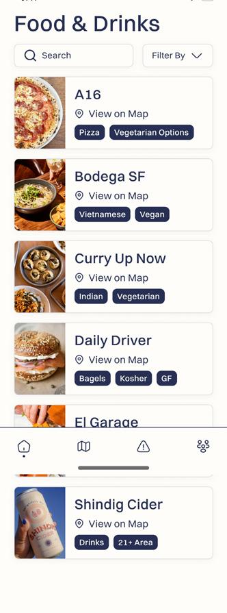
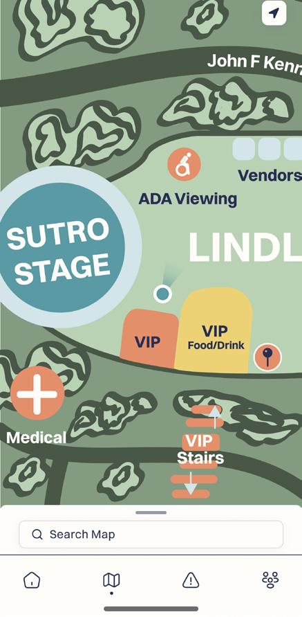
Agora | 21
Figure 8.1-8.3 Lineup and schedule screens
Figure 9 Home screen
Figure 11 Map Screen
Figure 10 Vendor screen
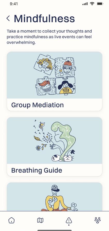
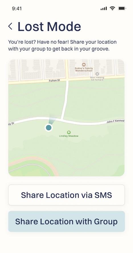
22 | cal poly taga
Figure 13 FAQ screen
Figure 12.4-12.5 Safety screens
Figure 12.1-12.3 Safety screens

Agora | 23
Figure 14.1-14.6 Group screens
References
Abras, C., Maloney-Krichmar, D., Preece, J. (2004) User-Centered Design. In Bainbridge, W. Encyclopedia of Human-Computer Interaction. Thousand Oaks: Sage Publications.
Blair-Early, A., & Zender, M. (2008). User Interface Design Principles for Interaction Design.
Corry, M. D., Frick, T. W., & Hansen, L. (1997). User-Centered Design and Usability Testing of a Web Site: An Illustrative Case Study. Educational Technology Research and Development, 45(4), 65–76. http://www.jstor.org/stable/30221343
Design Issues, 23(3), 85-107. http://www.jstor.org/stable/2522418
Domingo, Muriel Garreta. “User Stories: As a [Ux Designer] I Want to [Embrace Agile] so That [I Can Make My Projects User-Centered].” The Interaction Design Foundation, Interaction Design Foundation, 23 Feb. 2023, https://www.interaction-design.org/literature/article/user-stories-as-a-ux-designer-i-want-t o-embraceagile-so-that-i-can-make-my-projects-user-centered.
Fog K, Budtz C, Munch P, Blanchette S. Storytelling Branding in Practice. New York: Springer; 2010. [Google Scholar]
Goldenvoice. (2022). Portola Music Festival (1.0.3) [Mobile app]. Goldenvoice. https://apps.apple.com/us/app/portola-music-festival/id1625200339
Goransdotter, & Redstrom, J. (2018). Design Methods and Critical Historiography: An Example from Swedish User-Centered Design. Design Issues, 34(2), 20–30. https://doi.org/10.1162/DESI_a_00483
SENIOR PROJECT: AGORA 15 Harley, Aurora. “Personas Make Users Memorable for Product Team Members.”
Norman Group, 15 Feb. 2015, https://www.nngroup.com/articles/persona.
Lidwell, W., Holden, K., & Butler, J. (2010). Universal principles of design (2nd ed.).
24 | cal poly taga
Rockport. Lowdermilk. (2013). User-centered design (1st edition). O’Reilly.
Maslen, Andy. “Persuasive Copywriting: Using Psychology to Engage, Influence and Sell”. Kogan Page Publishers, 2015.
Pastoureau, Michel. “Red: The History of a Color.” Google Books, Princeton University Press, 14 Feb. 2017, https://books.google.com/books/about/Red. html?id=5W18DQAAQBAJ.
PGATOUR.com LLC. (2022). PGA TOUR (2023.2.7) [Mobile app]. PGATOUR.com. https://apps.apple.com/us/app/pga-tour/id489689106
Rosala, Maria. “Crafting Product-Specific Design Principles to Support Better Decision Making” Nielsen Norman Group, 2 Aug. 2020, https://www.nngroup.com/ articles/design-principles/
Agora | 25
26 | cal poly taga
about the authors

Lexi Berryhill
Taylor Leslie graduated in Spring of 2023 from California Polytechnic State University, San Luis Obispo where she obtained a bachelor of science in Graphic Communication with a concentration in User Experience/User Interface. She works as a freelance photographer and the founder of Taylor Leslie Photography. Her mission is to learn while allowing her creativity to flourish, seeking adventure through new experiences, and being responsible for quality work and a way of life.
Lexi Berryhill graduated in Spring of 2023 from California Polytechnic State University, San Luis Obispo with a degree in Graphic Communication, with a concentration in User Experience/User Interface. Her passion for creating and improving experiences for others led her to a career in product design. Learning from friends’ stories from music festivals, conferences, and concerts, they found ways to improve scheduling, wayfinding, and access to safety resources in their app: Agora.

Taylor Leslie
Agora | 27
4
Paso Robles Children’s Museum Redesign
California polytechnic state university technical association of the graphic arts
Article 4
4
Paso Robles
Children’s Museum Redesign

Paso Robles
Children’s Museum
Redesign
Hannah Chan and Shreya Hambir
For this project, we plan to redesign the Paso Robles Children’s Museum website, utilizing Squarespace. Currently, the website has an outdated look and feel, and the information is somewhat disorganized. Having intuitive navigation is a crucial part of good user experience, as users should not have to dig through the site to find what they are looking for (Hallman, 2022).
Our project aims to improve upon the museum’s online presence and recognition in general. Redesigning the website with a focus on functionality and implementing good UX/UI design will help users navigate the site with ease, minimize confusion, and ultimately increase user retention.
Introduction
In our redesign, we plan to regroup related content into sections that mimic websites of other established museums, so the structure is more familiar. The other main issue we want to address is the site’s aesthetic; our goal is to modernize the website while still retaining its core branding.
To do this, we will work with the museum director to find the most fitting template for the new site on Squarespace, and then customize it accordingly with a revamped color palette, new photos, and new fonts. We want to capitalize on visuals to draw visitors to the museum, using ample, updated photos of exhibits, events, and visitors and making them stand out on the page.
Our project will align Paso Robles Children’s Museum’s website with the current market standards and trends, while placing the museum’s educational value and community impact at the forefront. A well-designed website can help any business differentiate itself in a crowded marketplace and maintain awareness among both existing and prospective customers (Ijaz, 2022). Having a strong design is also important in establishing a business’s credibility; users are more likely to trust a business with a website that is aesthetically pleasing (Hallman, 2022).
Literature
The concept of usability and user experience (UX) surpasses the qualification of a system as meeting the basic requirements of the users and stakeholder involved. Moving on to examine the usefulness of a system, both utility and usability are taken into account, with utility referring to the application’s ability to serve its main function, and usability examining to what extent that function can be utilized by the user to achieve a goal in a specific context of use. User experience involves the user’s perception of the system, with respect to previous expectations (Hassan, 2017, p. 217).
Usability is a multi-faceted concept that encompasses multiple components and properties of a user interface, and can be examined through five attributes: learnability, efficiency, memorability, errors, and satisfaction. Learnability and satisfaction are two attributes that are often at the forefront of usability in UX design. Learnability is regarded as the ”most fundamental usability attribute” (Nielsen, 1993, p.27). Users need to be able to learn how to use and navigate through the system easily, and learnability often can dictate the user’s general attitude towards the system as the
6 | cal poly taga
first user interaction is often something along the lines of learning how to use the application.
In the case of redesigning the Paso Robles Children’s Museum website and essentially creating an upgraded version, the standard learning curve may not apply; given that the new site maintains consistency with the old site, users should be able to transfer some of the old skills and knowledge. Satisfaction is another attribute that is often a deciding factor when it comes to the evaluation of user experience. In reference to the subjective satisfaction a user feels when using a system, in our case, this places value on the speed with which users can find information and take certain actions on the site (Donahue, 2001, p.28).
When examining usability and user experience, three major elements emerge at the forefront: current trends, factors, and benefits. Regarding usability and UX in the design of a website or application, current trends often dictate design direction and user perception/attitudes. The UX/UI landscape is constantly shifting and evolving; in order to achieve usability among these changes, the baseline of standard compliance must first be addressed, then attention should be shifted towards adapting to the current UX/UI trends. Some recent trends include minimal design, increase in micro-interaction, and long scrolling. Minimalism has been on the rise over the past few years, with this trend utilizing simple layouts and “minimizing complexity” through straightforward content and communication (Joo, 2017, p. 9932).
Micro interaction entails implementing subtle animations in the UI design for transitions such as entries into a new page. Long scrolling is another trend that has become standardized among websites, and can be utilized on full-screen main pages, or confined to sections with horizontal scrolling.
One of the main factors that influence usability and UX is consistency. The “usability of a system is improved when similar parts are expressed in similar ways’’ (Byrne, 2006, p. 56). Consistency isn’t simply limited to aesthetic consistency like screen design, but also includes and depends upon functional consistency, internal consistency, and external consistency. Consistent functions, structures and systems facilitate usability and enhance user experience; users are able to efficiently apply their knowledge to a new context and learn new flows and processes naturally and with ease. Internal consistency can be exercised through a consistent theme and aligned UI throughout the system. External consistency specifically involves aligning the UX/UI
paso robles children's museum | 7
design with market standards, and maintaining a sense of consistency across related applications and systems. Menu hierarchies and site architecture are aspects of UX design that are often used to gauge consistency in accordance with other similar systems; many websites, for instance, utilize broad menus that have minimal levels, reducing the user’s need to navigate through multiple pages to reach a desired destination. Essentially, consistency allows for familiarity, which goes hand-in-hand with intuitiveness and ease of use (Kiruthika, 2016).
The main element businesses focus on when thinking about usability and UX is the benefits of creating and implementing intuitive user flows and processes. Good usability and user experience are deciding factors when it comes to the success of a business based on its online presence. When systems and applications are built after examining to what extent functions can be utilized to achieve the user’s goals, the potential for good user experience is increased. With respect to attributes of usability like learnability, efficiency, memorability, errors, and satisfaction, companies reap the benefits when they shift the focus from visuals to function and usability, which inherently enhance user experience (Sauer, 2020, p. 135).
Synthesis/thesis
These attributes and elements of usability and user experience discussed above not only dictated our approach to redesigning the website, but also led us to focus on certain aspects of the website that had the most influence on usability and UX. In our project, one of the overarching changes we made was the redesign of the menu; reorganizing the site architecture and layout, and regrouping related content into sections that closely mimic websites of other established museums made the structure and processes within the site more familiar and thus intuitive (Ritter, 2017, p. 32).
Maintaining both internal and external consistency was also a driving force in the redesign; we strived to strike a balance between placing the museum’s educational value and community impact at the forefront, while incorporating UX/UI trends that modernized the site. Ultimately, good usability and user experience translate well when users interact with a website; not only will the fulfillment of user goals and intuitive navigation improve user retention, a well-design website will help the museum differentiate itself in a crowded marketplace and maintain awareness among both existing and prospective customers (Ijaz, 2022).
8 | cal poly taga
Results
We began the website redesign process by assessing the current website. After doing so, we created a problem statement to guide us through the design process: the museum currently lacks an organized and comprehensive website that is easy and intuitive to navigate. Design principles and styles on the site are outdated, lacking a modern aesthetic that aligns with other established museums in the market. We also defined three main objectives of the new website:
1. Align the museum’s website with the current market standards and trends
2. Place the museum’s educational value and community impact at the forefront
3. Help users navigate with ease, minimize confusion, and ultimately increase user retention
With those in mind, Shreya and I reorganized the information architecture of the website to allow for intuitive and familiar navigation, and created a new design system that would aid in modernizing the site while still maintaining the museum’s history and connection to the firehouse (Figure 1). One of the main things we noticed on the current museum site was the display of the visuals and imagery; there were inconsistencies in the editing and sizing of the photos.
Reflection & limitation
Shreya and I encountered and overcame many obstacles during the website redesign process. As novice Squarespace users, we had to familiarize ourselves with the website creation tool while still keeping up with the project timeline. One of the main problems we encountered was transferring the museum’s domain name prematurely, leading to the loss of the previous public site; this forced us to adjust accordingly and we utilized a resource called The Wayback Machine to access the old site.
paso robles children's museum | 9
Indiv. Exhibit Pages Exhibits Visit Directions Group visits Hours + Admission Events Calendar Parties Cioppino and Vino Mission + Story About Current Stats Join + Give Membership Support Donation Requests Amazon Wishlist Donors + Sponsors Donate Homepage
Figure 1 Information architecture
Regarding future development of the project, Shreya and I are still in the process of finalizing some aspects of the website, then plan to gather feedback from peers, professors, and the museum director.

10 | cal poly taga
Figure 2 Design system
References
Byrne, K. (2006). William Lidwell, Kritina Holden and Jill Butler. Universal Principles of Design: 100 ways to enhance usability, influence perception, increase appeal, make better design decisions, and teach through design. Information Design Journal, 14(2), 185–186. https://doi.org/10.1075/idj.14.2.11byr
Donahue, G. M. (2001). Usability and the bottom line. IEEE Software, 18(1), 31–37. https://doi.org/10.1109/52.903161
Hallman, M. (2022, October 7). The importance of good website design for your business. Evergreen Digital Marketing. Retrieved January 22, 2023, from https:// evergreendm.com/the-importance-of-good-website-design-for-your-business/
Hassan, H. M., & Galal-Edeen, G. H. (2017). From usability to user experience. 2017 International Conference on Intelligent Informatics and Biomedical Sciences (ICIIBMS). https://doi.org/10.1109/iciibms.2017.8279761
Ijaz, A. (2022, April 21). Bad UX/UI design really that big of a problem for businesses. Medium. Retrieved January 22, 2023, from https://medium.com/codex/ bad-ui-ux-design-really -that-big-of-a-problem-for-businesses-b4f5c3606667
Joo, H. (2017). A Study on Understanding of UI and UX, and Understanding of Design According to User Interface Change. International Journal of Applied Engineering Research, 12(20). https://doi.org/10.37622/ijaer
Kiruthika, J., Khaddaj, S., Greenhill, D., & Francik, J. (2016). User experience design in web applications. 2016 IEEE Intl Conference on Computational Science and Engineering (CSE) and IEEE Intl Conference on Embedded and Ubiquitous Computing (EUC) and 15th Intl Symposium on Distributed Computing and Applications for Business Engineering (DCABES). https://doi.org/10.1109/cse-eucdcabes.2016.253
Nielsen, J. (1993). Usability Engineering (1st). CA: Morgan Kaufmann Publishers Inc. Ritter, M., & Winterbottom, C. (2017). Ux for the web build websites for user experience and usability. Packt Publishing.
paso robles children's museum | 11
Sauer, J., Sonderegger, A., & Schmutz, S. (2020). Usability, user experience and accessibility: Towards an integrative model. Ergonomics, 63(10), 1207–1220. https:// doi.org/10.1080/00140139.2020.1774080
12 | cal poly taga
paso robles children's museum | 13
14 | cal poly taga
about the authors
 Hannah Chan
Shreya Hambir graduated in June 2023 with a B.S. in Graphic Communication, and a concentration in User Experience/ User Interface design and a minor in Computer Science. During her time at Cal Poly, Shreya served on the design and marketing teams for UX Fest SLO and led a project to redesign the website for the University Honors Program. The fulfillment and experience she gained from this project inspired her to take on redesigning the Paso Robles Children’s Museum for her senior project.
Hannah Chan graduated in June 2023 from Cal Poly, San Luis Obispo with a B.S. in Graphic Communication, and a concentration in User Experience/User Interface. Following Cal Poly’s motto of Learn by Doing, Hannah had many opportunities outside of the classroom to apply and expand upon her abilities in the realm of UX design. For her senior project, Hannah and classmate Shreya Hambir worked to redesign the museum’s website from end-to-end.

paso robles children's museum | 15
Shreya Hambir
Ris magazine 5
California polytechnic state university technical association of the graphic arts
Article 5
Ris Magazine

5
Ris Magazine
Von G. Balanon
Risograph printing is not often discussed when it comes to the print world. What is it? How can creatives utilize it to its fullest potential? There is an opportunity to inform more about Risograph printing through the design of Ris Magazine—a fictitious online magazine. Ris Magazine teaches Risograph printing practices as well as features artists, stores, and creatives in the Riso world. For this project, my goal was to create a branding style guide, a functional website, and an Instagram feed promoting stories from the website.
Objectives
1. Project Management
• Create a project plan with strict deadlines
• Follow the requirements of the course schedule with activities and milestones
2. Website Design
• Demonstrate and develop technical skills of Squarespace to create a functional website
• Branding Design
3. Ensure branding is cohesive with color palettes, fonts, and overall look throughout the website
• Demonstrate and develop technical skills in Adobe Suite
Research and Inspiration
Case Study – Redesigning the website for ‘The Intersectional Feminist’
This source gave invaluable insight into redesigning the Ris Magazine website. Since this study focused on creating a more engaging experience with their magazine readers, while educating first-time readers about the breadth of topics they specialize in, I found it significant in what I wanted to do with the redesign. A strength I wish to include in my website redesign is figuring out the high-level problems on the website that can be fixed—specifically the confusion of brand identity. I want to make sure a cohesive brand identity is created in order to step forward into the website redesign especially since it made ‘The Intersectional Feminist’ redesign successful. A weakness I found was including user testing when it came to the final product. I didn’t realize this step was an important stage in the process since it made them relook at the design from the user’s perspective & further refine the website. I plan to also implement user testing to ensure I get user feedback on the redesign.
Case Study – Riso Workshop
This case study helped me envision what I can do to promote the online magazine. Since this workshop also works with Risograph printing, I found it very relevant to the way the promotional material can be designed. A strength I found was the simple branding that allows the promotional material to go through a simple color variation. This can really help with creating a dynamic feed and making sure events and stories
6 | cal poly taga
displayed vary. A weakness I found was the use of simple animations throughout the social media posts. This can really draw user attention to the Facebook and Instagram platforms and I didn’t think about including them from the beginning. I will for sure find a way to animate some of the text on the website as well as social media posts to draw user attention.
Newspaper – Arts community grows for some ‘silenced voices’
This newspaper article is about Palabras Bilingual Bookstore and Wasted Ink Zine Distro and how they have become safe spaces for historically marginalized communities in Phoenix. Wasted Ink’s Roosevelt location, has a Risograph zine collection that aims to represent marginalized voices such as that of BIPOC, LGBTQIA+, disabled and chronically ill, and neurodivergent creators.’ Through community space, they have been able to host writing and art work-shops, and readings and will have a garden to grow produce. This article helps promote the community aspect of Ris Magazine where the promotion of these stores and spaces can be highlighted throughout the digital magazine.
Case Study – Consulat
This presentation shows the identity of the Consulat—a company whose mission is to support Photographers and Directors and to team them up with the best. The overall usability of this site is again like a physical printed magazine. The concept of a place where creatives can be paired is similar to how Ris Magazine will promote creatives and artists. The grid of photos presented is appealing and the headers for each subpage are consistent with a mix of serif fonts for important words and a skinny sans serif font for less important words.
Case Study – The definitive guide to making a digital magazine
This study dives into how digital magazines are making a comeback through higher-quality content published online. It covers the different digital magazine mediums there are from apps, Kindle e-magazines, or CMS. It gives tips on how to make a successful digital magazine by making the type easy to read, including interactive elements and infographics, embracing quality, animating stories, working with templates, and automating. Overall, this study’s guide will help with the creation of the SquareSpace site and give tips on successfully creating a digital magazine.
ris magazine | 7
Trade Journal – Riso and shine: the colourful world of the Risograph
This trade journal covers Candice Jezek—the owner of Dream Press in Cape Town. It expands on how Risograph printers, which are made of upcycled plastic using soy-based Riso ink, are increasingly used by a niche worldwide collection of artists, printers, and designers to create distinctive products. Furthermore, Dastgir includes how much artists are selling their Riso prints and how they are successfully collaborating with other artists to promote their art. This journal helps showcase the community aspect of Riso printing. This can be translated through Ris Magazines’ community-oriented magazine and its potential of promoting artists and Riso presses.
Article – RISO BAR Brings Together Printing Enthusiasts With a Cause
This article covers how a RISO BAR—a shop that promotes community events and sells local Riso art in Dallas—navigated the pandemic. It also gives a brief background of the Risograph printing world and its niche audience. Similar to the previous journal, this article helps articulate how Riso printing creates communities that Ris Magazine can promote through the website.
Case Study – News Website Redesign
This source presents the process of creating the website for the online arts and culture magazine Aesthetica. It includes before and after photos of grid setups for the website. It utilizes similar branding to the Ris Magazine look with sans serif body text, serif headings, and red text. Its usability is similar to a physical printed magazine with an emphasis on photogra- phy and respected columns and grids.
Case Study – Paradise
This presentation showcases the visual identity of PARADISE—a new-age production company that thrives on a connection by exploring novel modes of storytelling. The creation of the website design along with the consistency of visuals on the poster helped define this new production company. The poster’s grids are emphasized throughout the mockups. This website utilizes a lot of white space and emphasizes the company’s photos/stills.
Case Study – An Intro to Risograph Printing
This study dives deep into what Risograph Printing is and how to start one’s own Riso print. Burke covers the perks of environmentally friendly inks Riso uses and how this unique process can be used for a multitude of print mediums—books, zines, art prints, posters, flyers, business cards, tags, menus, postcards, greeting cards,
8 | cal poly taga
calendars, LP record inserts, boxed card sets and more. This study will help with the learning aspect of Riso printing on the website.
Brand Style Guide
About
I started off with the copy for the brand’s ‘About’ section. This included the mission statement, a description of the magazine, and the purpose of Ris Magazine.
Logos
The primary logotype consists of the name of the magazine in the font Meno Banner Condensed Italic. The “Ris” is replaced with our Ris graphic. The primary logotype is to be used at 100% opacity at all times, with no exception. It should be used on light-colored backgrounds—such as Ivory. It should be instantly recognizable, so consistency is essential.
The secondary logotype consists of the name of the magazine in the font Meno Banner Condensed Italic without the Ris graphic. The secondary logotype is to be used at 100% opacity at all times, with no exception. It should be used when the primary logotype cannot be used throughout the website. In addition, it could be used as a reverse logotype.
The minimum sizing for the primary logotype differs from the secondary logotypes. There is no maximum sizing for any version of the logotype. The primary logotype should have a minimum height of 55 pixels and a minimum width of 184 pixels. The secondary logotype should have a minimum height of 28 pixels and a minimum width of 184 pixels as well.


ris magazine | 9
Figure 2 Secondary logotype
Figure 1 Primary logotype
Color Palette
The primary color palette consists of Crimson Red and Ivory White. Crimson Red represents the attention-grabbing effects of risograph printing. It is used for headings and as an accent color. Ivory White represents clarity and balance. It is primarily used as a background color.
Crimson
Hex #db402e
RGB 219, 64, 46
CMYK 8, 90, 94, 1
Ivory
Hex #fef2d8
RGB 254, 242, 216
CMYK 0, 3, 16, 0
The secondary color palette consists of Charcoal Gray and Canary Yellow. Charcoal Gray represents strength and is primarily used for body copy. Canary Yellow represents optimism. It is primarily used as an accent color and a contrast for imagery.
Charcoal
Hex #444444
RGB 68, 68, 68
CMYK 67, 60, 59, 44
Typography
Canary
Hex #fabd3d
RGB 250, 189, 61
CMYK 2, 27, 87, 0
When setting type, establishing a hierarchy is important. Specific sizes are not outlined in this example but try to maintain the relationship between these fonts and weights for various levels of copy.
Condensed Semi-Bold
Grotesk Text Bold
10 | cal poly taga
Figure 3 Primary color palette
Figure 4 Secondary color palette
1. Headline Meno Banner
2. Standfirst Copy Neue Haas
3. Byline Copy Neue Haas
Grotesk Text Roman
4. Body Copy Neue Haas
Grotesk Text Roman
5. Accent Text Meno Banner
Condensed Semi-Bold Italic
Imagery
Images should be edited to include a duo-tone of our Crimson Red and Canary Yellow palette. A grainy effect and riso-like overlay should be included for consistency purposes. Images should not have poor resolution—anything less than 72 PPI. If text is to be included on top of the image, utilize a black overlay set to multiply at 65% opacity for contrast.


ris magazine | 11
Figure 5 Imagery
Website Design
Sitemap
I started off the website redesign by mapping out the navigation of the site and found online articles relevant to the magazine’s purpose. Everything is linked through the homepage and trickles to the learn, feature, artists, and about pages.
Wireframes
I then sketched out wireframes of each page. Since the learn, feature, and artists pages are all similar compilations of stories, I grouped them together. Included in the wireframes are how the story layouts would look as well as the about page.
12 | cal poly taga
Figure 6 Sitemap
iii Éi
Learn All About Riso An Intro to Riso Feature About Artists Laguna Collective Lost Bratislava Watson Library Eight Riso Instagram Lost Bratislava Home
Figure 7 Wireframes
Collection of Articles
I then compiled the articles and downloaded relevant photos to be edited later. I also adjusted the copy for some of the articles to fit in with the magazine’s purpose. Each article’s credit is provided throughout the site and I made it clear that the use of these articles is for educational uses only.
Editing Photos
Once I compiled all the article images, I edited the thumbnail images with Adobe Photoshop. I edited each photo to include a duotone effect with a slight grain texture.

Design
Once all the assets were ready, I put them in Squarespace. I adjusted the copy, edited the site type styles, created a gallery, and edited all the small details throughout the site.
User Testing
Once I finished the functional site, I user-tested it with three people. As I was user testing, I included feedback on a note template on Figma to compile user stories. I grouped these notes on things I had to do, might do, and not do. I also placed the notes on a scale of how easy or difficult it was to implement as well as if they barely improved or tremendously improved the user experience.
ris magazine | 13
Figure 8 Instagram mockup
Final Edits
Finally, I implemented the feedback from user testing. I adjusted the spacing for certain areas, adjusted the type styles, removed unnecessary periods or text, and implemented the open-in new tab feature in the photo gallery.
Social Media
Instagram Feed

Prototype
I started off the Instagram social media expansion by designing a 3x3 grid for 9 posts on Adobe Illustrator. Next, I used Adobe Express to animate some of the posts. I brought assets from the Illustrator file into the app and used the animation feature. I exported the animated posts and created a prototype of the Instagram feed utilizing Adobe InDesign’s publish online feature.
14 | cal poly taga
Figure 9 Instagram mockup

Reflection


Throughout this project, I felt confident about making deadlines and keeping a good pace of what I needed to get done week by week. Previous project design experiences with campus organizations reassured me that I could adjust deadlines as well as pace myself depending on how busy each week would be. The overall project gave me a deeper understanding of Squarespace—which will translate into website/portfolio creation in the future.
Overall, I’m really proud of how this project turned out. I enjoyed expanding my knowledge of the Adobe Suite and learning about the Adobe Express app. This project was a good exercise in applying what I’ve learned during my time in the Graphic Communication department and on-campus organizations.
ris magazine | 15
Figure 10.1-10.2 Instagram prototype
References
Behance. (2018, Jul 12). Riso Workshop. Retrieved April 6, 2022, Retrieved from https://www.behance. net/gallery/67727273/Riso-Workshop?tracking_ source=search_projects%7Crisograph% 20flyer
Behance. (2022, Jan 22). Paradise. Retrieved April 4, 2022, Retrieved from https:// www.behance. net/gallery/127607637/PARADISE?tracking_ source=search_projects%7Cposter%20and%20 website
Behance. (2022, Feb 16). News Website Redesign. Retrieved April 5, 2022, Retrieved from https://www.behance.net/ gallery/136653793/News-Website-Redesign?tracking_ source=search_projects%7Cmagazine%20redesign% 20online
Behance. (2022, Feb 17). Consulat. Retrieved April 5, 2022, Retrieved from https:// www.behance.net/ gallery/134431103/Consulat?tracking_source=- search_projects%7Cartist%20collective%20 website
Burke, L. (2022, January 14). An Intro to Risograph Printing (& How to Start Your First Project). Dribbble. Retrieved April 4, 2022, from https://dribbble.com/ resources/ risograph-printing
Dastgir, R. (2021). Riso and shine: The colourful world of the risograph. FT.Com, Retrieved April 4, 2022
Frizzell, A. (2020). RISO BAR brings together printing enthusiasts with a cause.
Gopalaswamy, L. (2021, August 5). Case Study: Redesigning the website for ‘The Intersectional Feminist’. Muzli - Design Inspiration. Retrieved April 4, 2022, from https://medium.muz.li/case-study-redesigning-the-web- site-for-the-intersectional-feminist-8a6c9900e675
Robinson, K. (2021, Mar 14). Arts community grows for some ‘silenced voices’. Arizona Republic. Retrieved from http://ezproxy.lib.calpoly.edu/login?url=https:// www.proquest.com/newspapers/arts-community- grows-some-silenced-voices/ docview/2500932826/ se-2?accountid=10362
16 | cal poly taga
Shorthand Staff. (2022). The definitive guide to digital magazines in 2022. Shorthand. Retrieved April 4, 2022, from https://shorthand.com/the-craft/how-to-makea-dig- ital-magazine/index.html
ris magazine | 17

about the author
Von Garcia Balanon (he/they) is a multidisciplinary designer based in Fresno, CA. They graduated in June 2022 from California Polytechnic State University, San Luis Obispo with a B.S. in Graphic Communication, and a concentration in Design Reproduction Technology. Passionate about uplifting marginalized voices and community-oriented products, Von created Ris Magazine to explore and promote the full potential of Risograph printing.
Von G. Balanon


 Hannah Chan
