

Interior design has this amazing ability and power to change people’s lives. It might be the smallest change, but creating positive impacts is what I strive for in my designs. Positive impacts comes from meaningful design and integrating a true understanding of the true problem at hand. As I have grown as an interior designer, I have also learned that design needs to not only have positive impacts on to only impacts people but also the environment. Growth comes from innovation and by understanding and harnessing innovation, designs can be made that help both people and the planet.
Delray Beach, FL Spring 2022 Miami, FL Winter 2022 Miscellaneous Spring 2021 & Fall 2020 Chicago, IL Fall 2022-Current
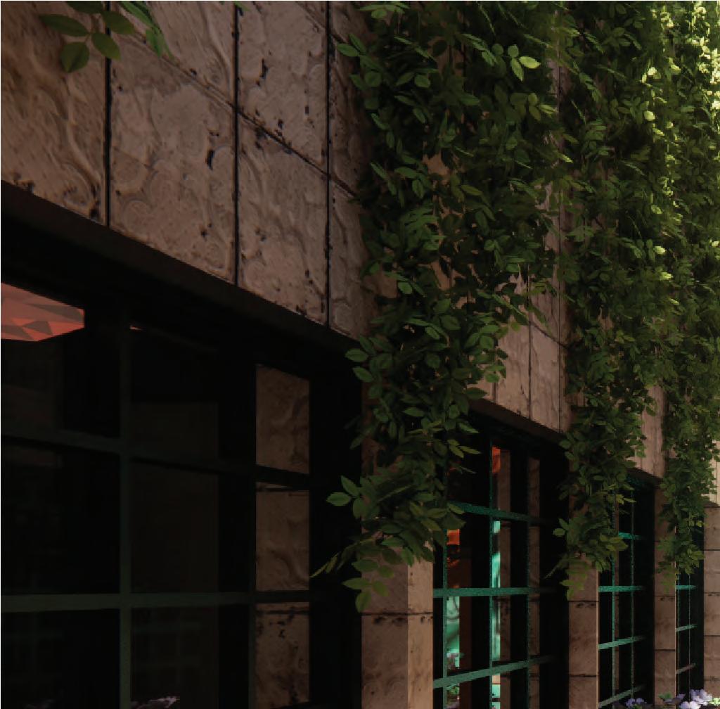
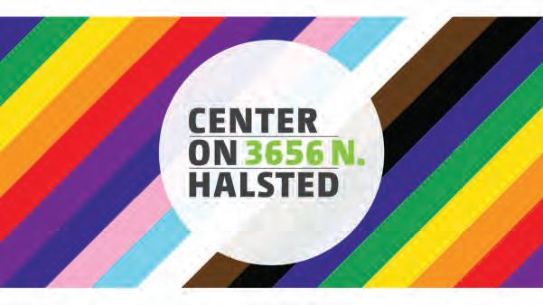
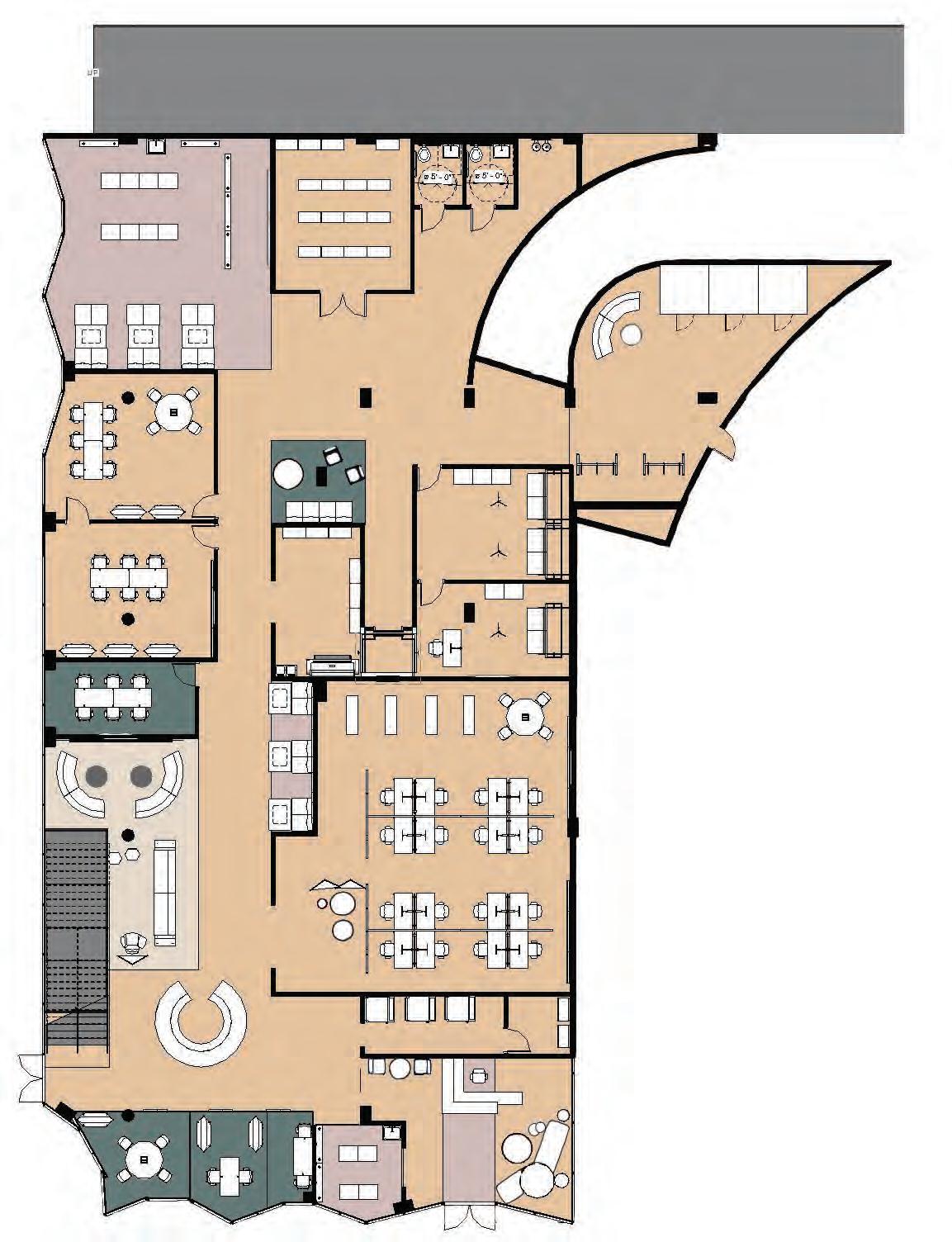
2537 N Pulaski Rd. Chicago, IL
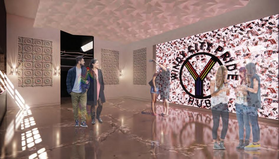
Creating a space that is equal for everyone who comes inside and makes a feeling of pride in its users


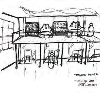
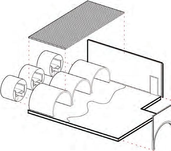
Due to the overall feeling of isolation and rejection felt by many LGBTQ+ people, a space needs to be designed that helps connect them with shared experiences and mitigate a sense of loneliness to create a community create a community. The goals and objectives of this project are as follows: to provide youth with resources to combat injustices today, to support elder LGBTQ members in their discovery or rediscovery of their sexuality, to advocate for the often overlooked and misrepresented members of the community, and to educate allies and the community at large. This project was worked on for two quarters and is a full development of the building.
14,000 SQ. FT.
“Center on Halsted advances community and secures the health and well-being of the LGBTQ people of Chicagoland.”
The primary users for this space are LGBTQ+ individuals from generation X to generation Z Z. Secondary users are allies and other members from the community.
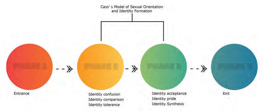
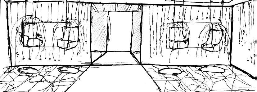
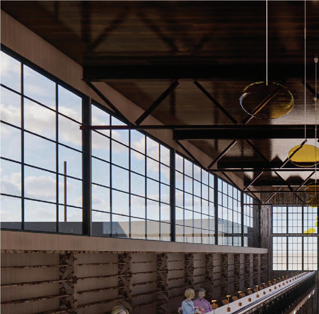
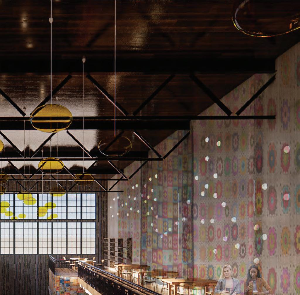
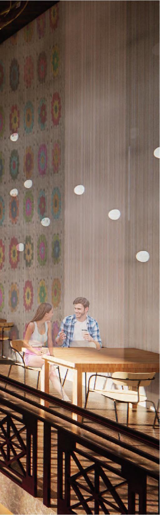
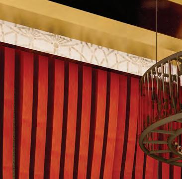
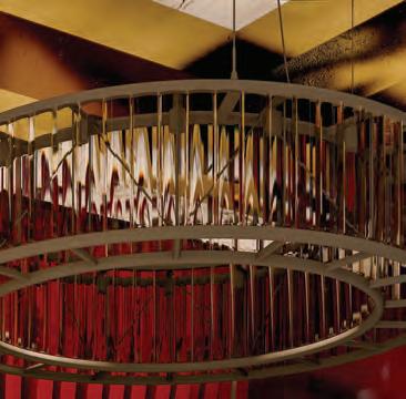
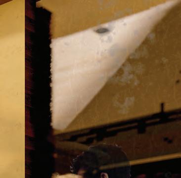
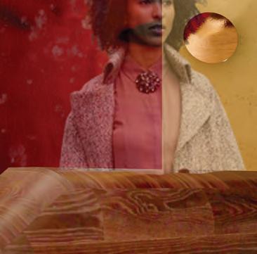
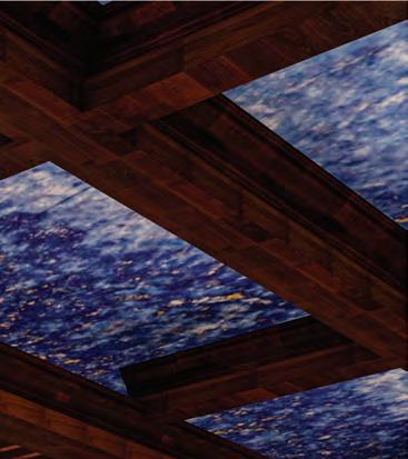
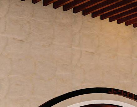
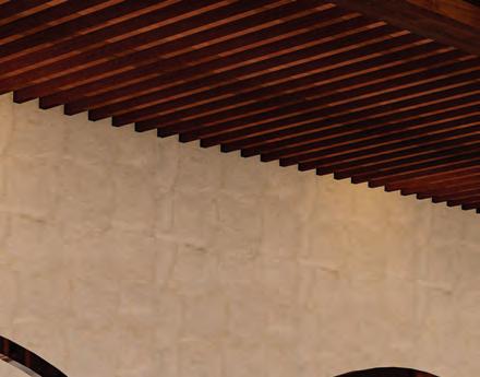
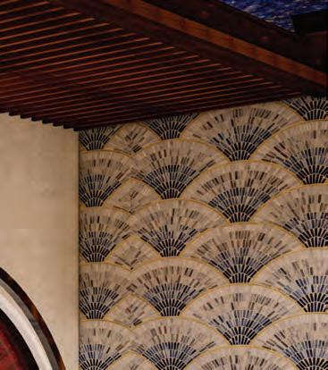
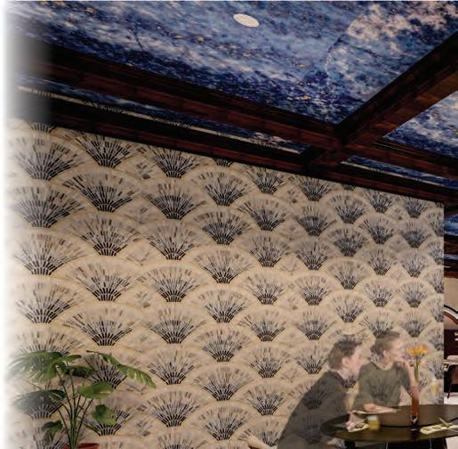
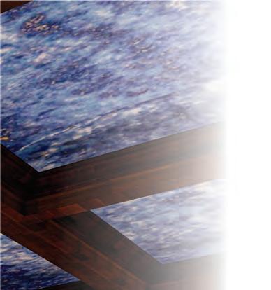
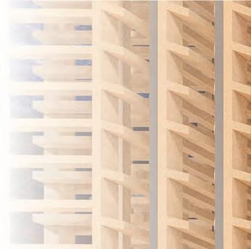
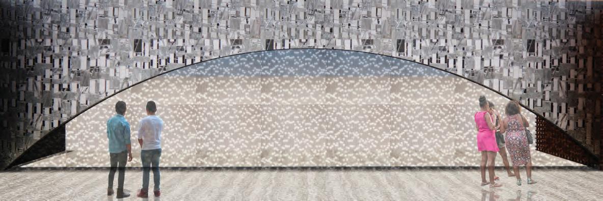
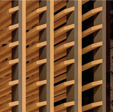
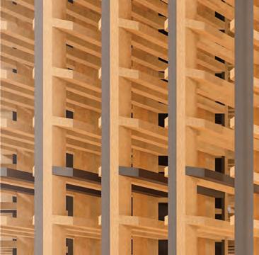
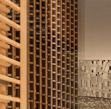
The concept for this design is embracing illumination illumination. It is dealing with illumination of different issues of the LGBTQ+ community, different experiences erent experiences of the generations, and more. Embracing these differences will work to connect generations and create a safe community community environment that is cultivated through a deep understanding of one another. The concept will function in the design by focusing on daylight harvesting and warm atmospheres warm atmospheres in each of the spaces.

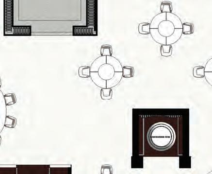
1. Reception
2. Lobby
3. Cafe
4. Kitchenette
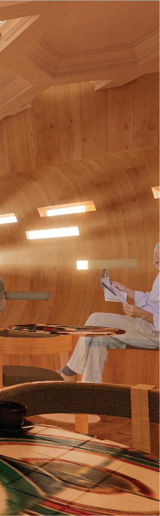
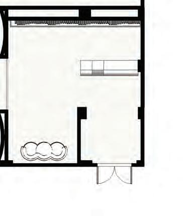
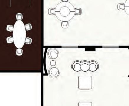
5. Area of Respite
6. Storage
7. Lecture Halls
8. Interactive User Experience
9. Area of Respite
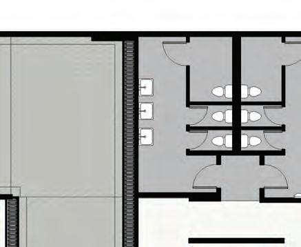
10. Gender Neutral Restroom
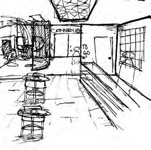
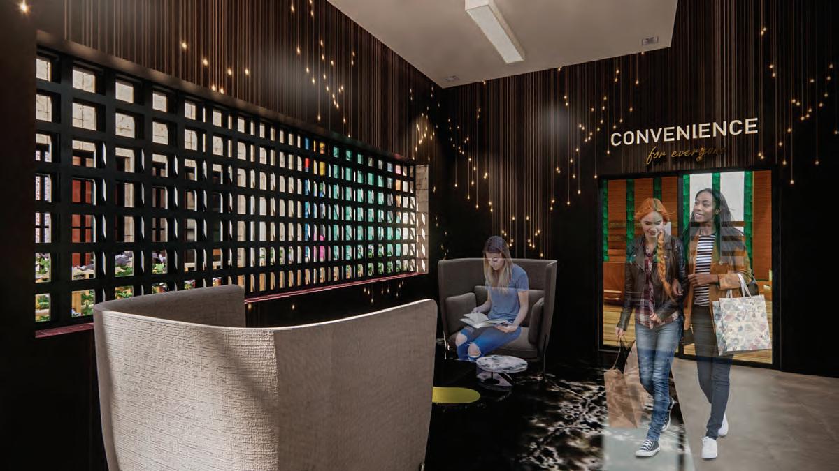
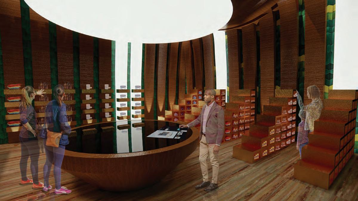
11. Convenience Store
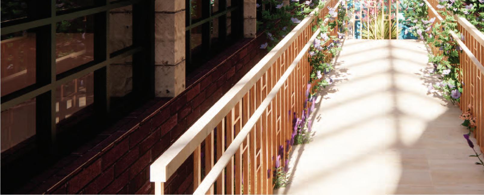
12. Interior Garden
13. Storage
14. Employee Break Room
15. Utilities/Mechanical Room
16. Venue Space
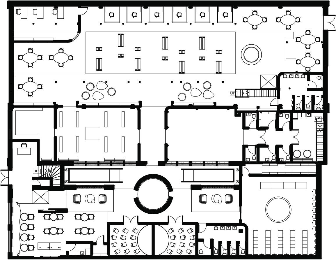
17. Gender Neutral Restroom
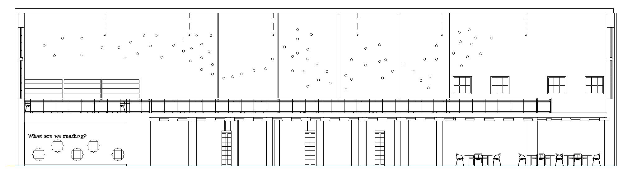
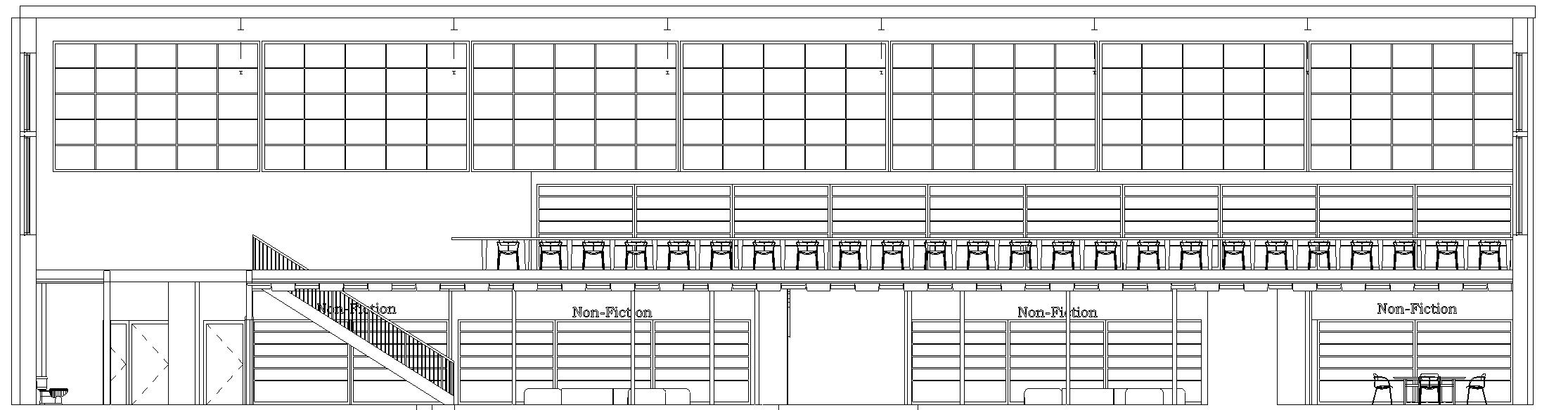
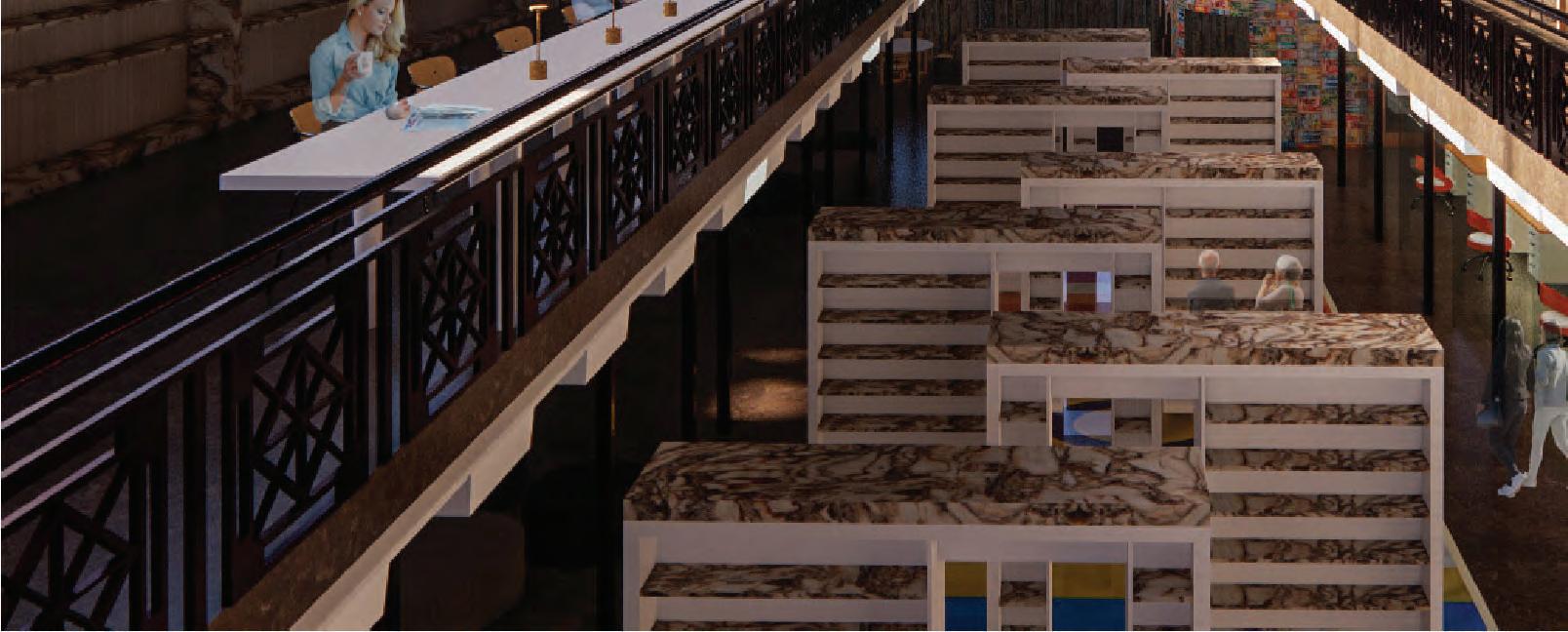
18. Library
19. Librarians’ O
20. Interior Light Garden
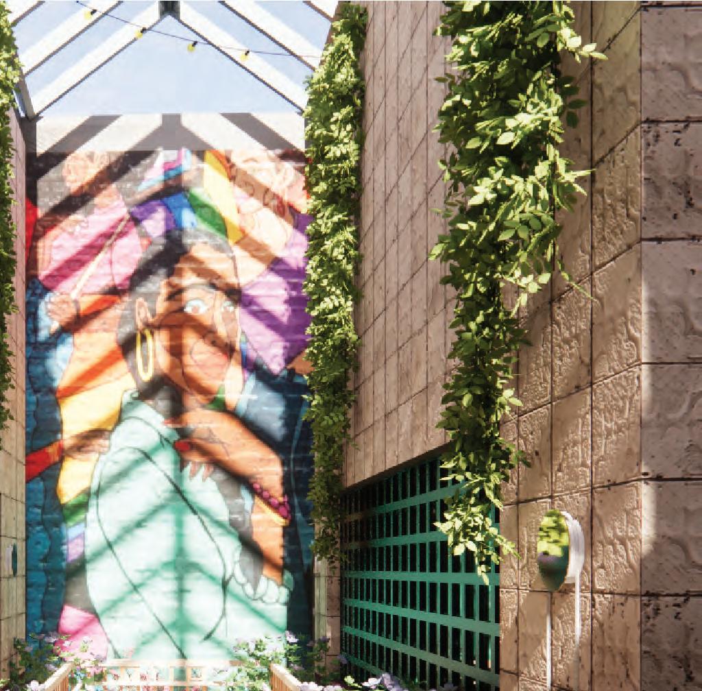
21. Art Gallery
22. Interior Garden
ffice
1.
6.
9. 10.
12.
2. 3. 4. 5.
7. 8.
11.
13. 14. 15. 16.
17.
18. 19.
20. 21. 22.
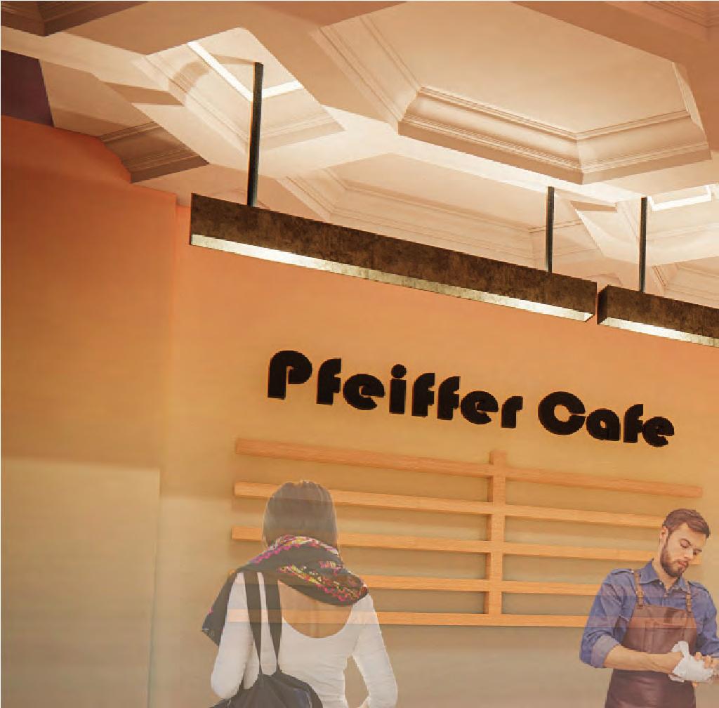
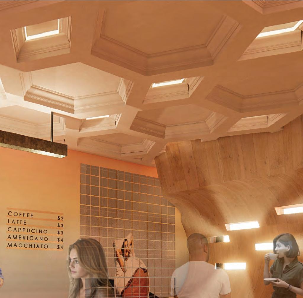
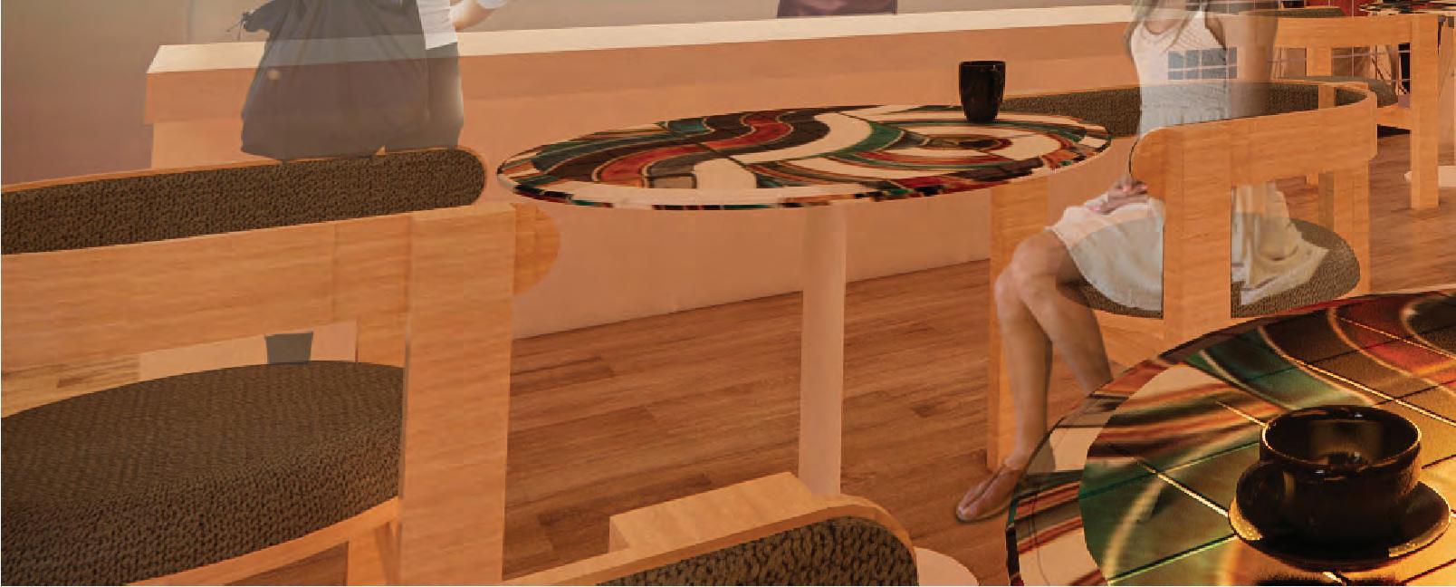
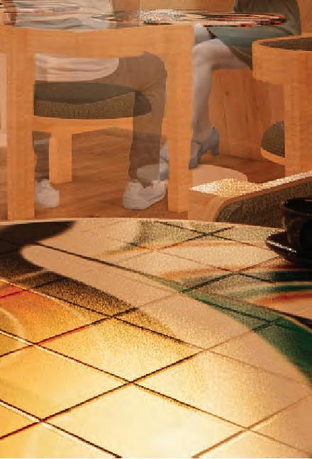
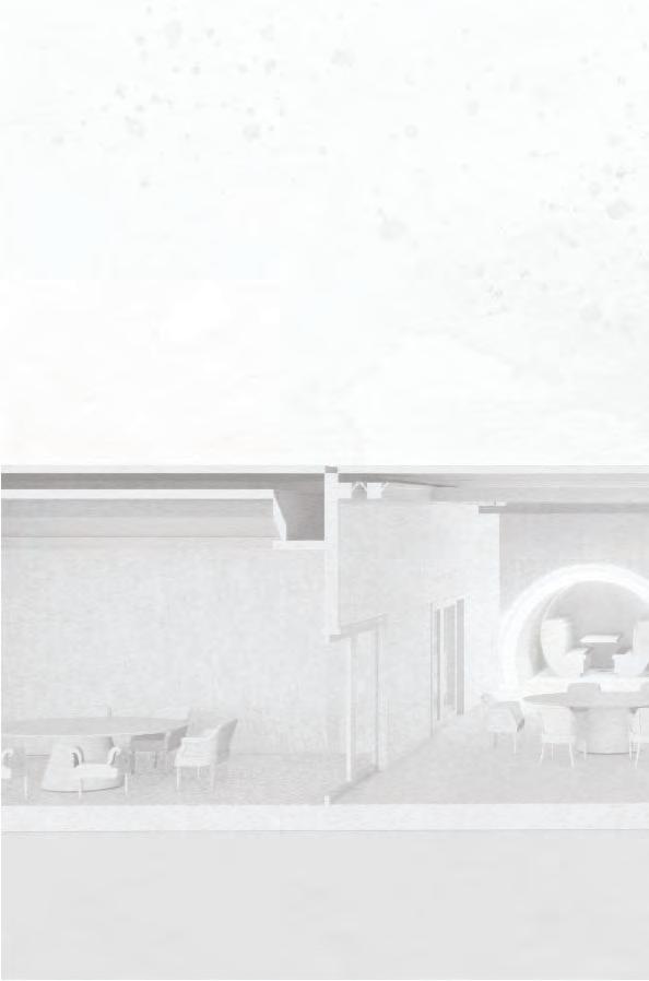
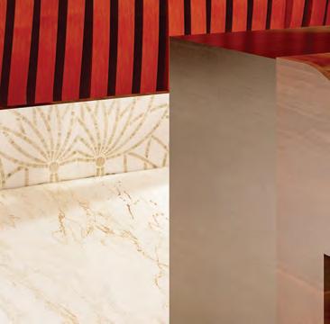
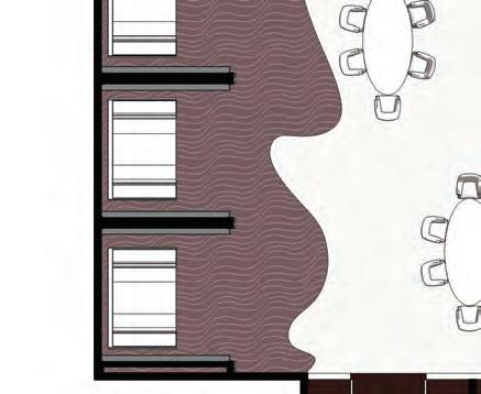
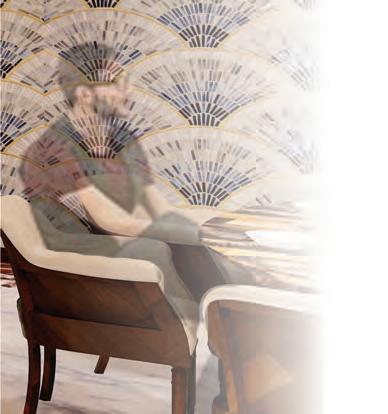
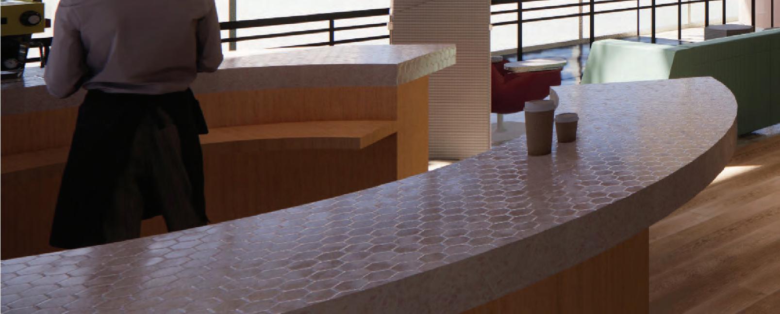
As the welcome space of the hub, the cafe is a great place to grab a coffee or pastry and sit around to talk with friends or other people in the community.
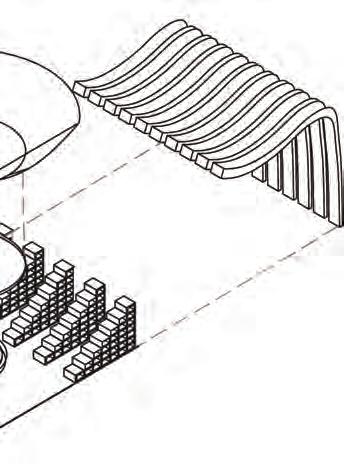
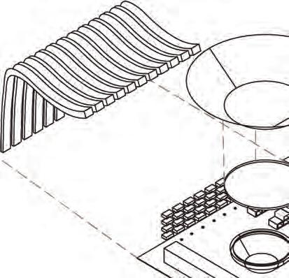
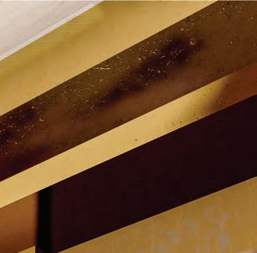
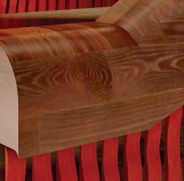
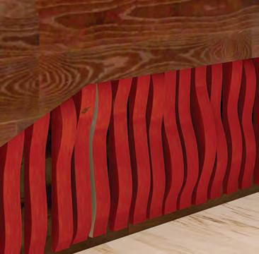
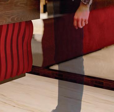
This custom bench filters the light coming in through the windows on the front of the building as well as blocking some of the noise noise coming off of the street. It additionally creates a unique volume in the overall space of the cafe.

The convenience store will be here to provide items that are specifically for LGBTQ+ users for LGBTQ+ users like binders, t-tape, etc. It will also have products from local LGBTQ owned small businesses.

If users need a space to take a break from the energy of the hub, these areas of respite are great to sit, relax, and be comfortable be comfortable.
Users will be able interact with touch screen table and the panel behind the shelf will illuminate to assist in wayfinding for products.
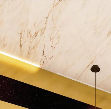
The concept is directly embraced through LED lights incorporated into wallcovering and special artificial lights that mimic daylight to counter seasonal depression.
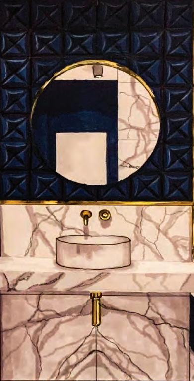
No one should have to feel worried about where they go to the bathroom. These gender neutral bathrooms create a safe and open environment for all users.
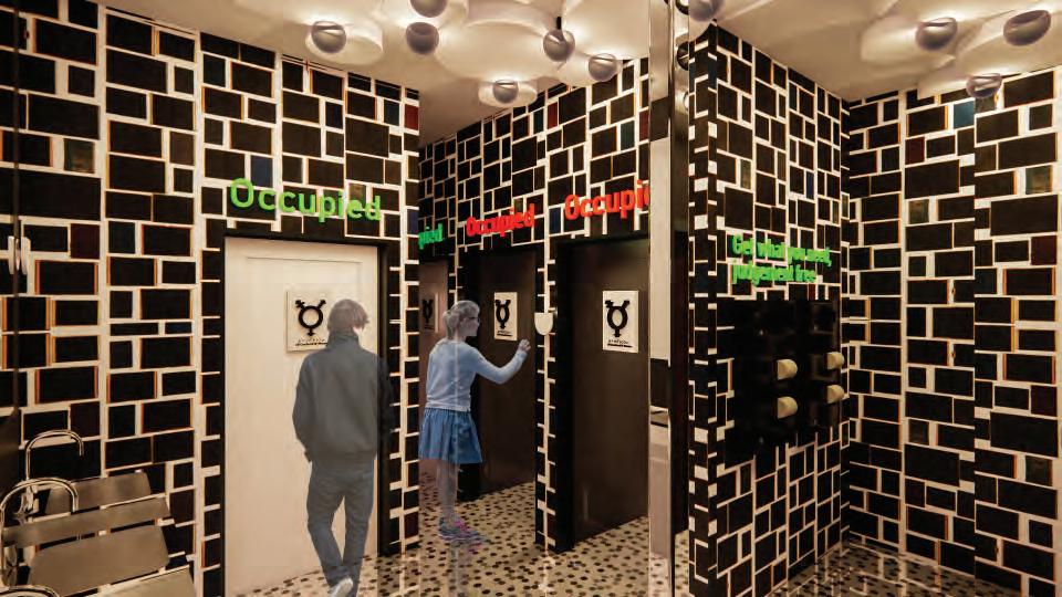
Universal design features include:
- Smart glass doors
- Signs that change color to know when a stall is occupied
- Full walls Full walls surrounding toilets for complete privacy
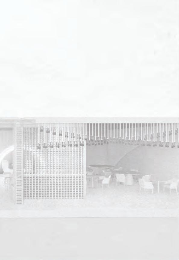
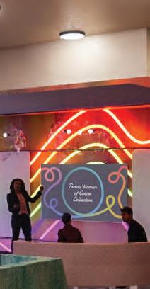
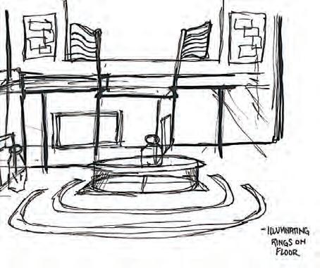
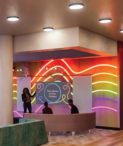
While users should feel free to celebrate their identity through the whole hub, the venue space is where parties can be thrown as a community.
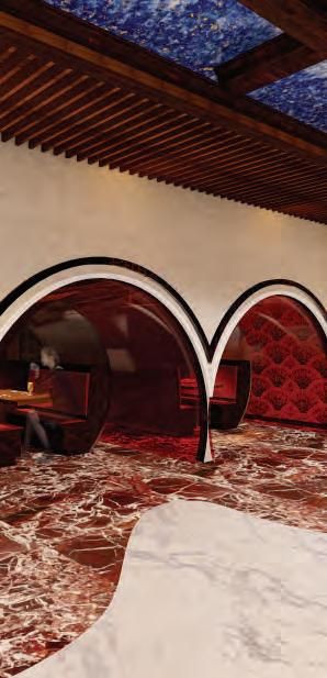
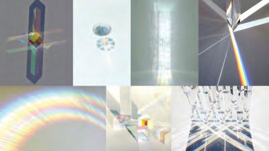
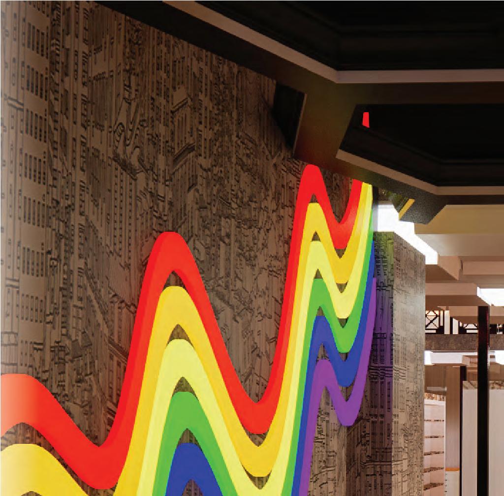
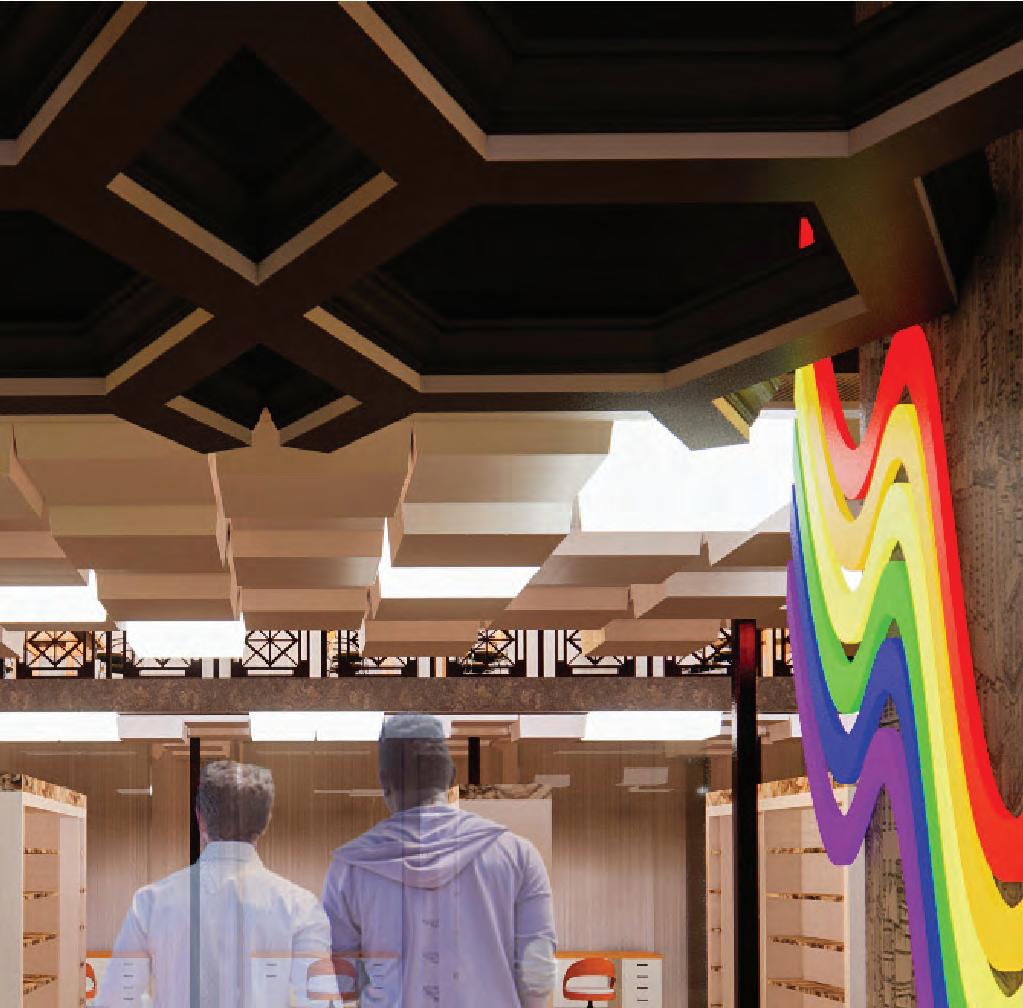
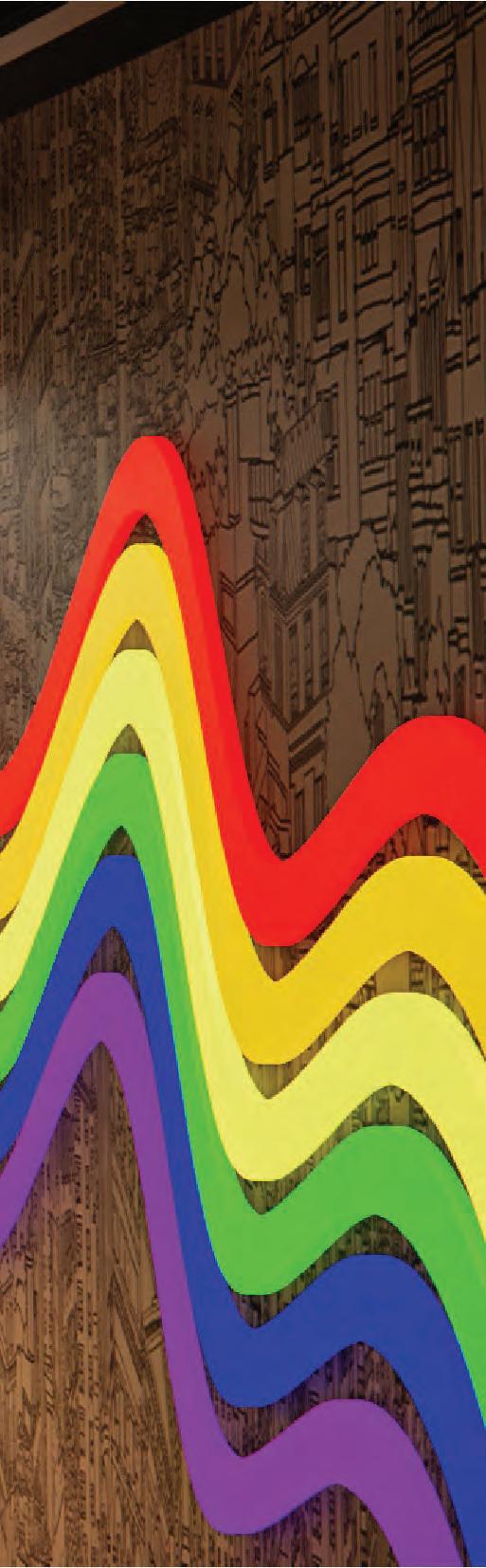
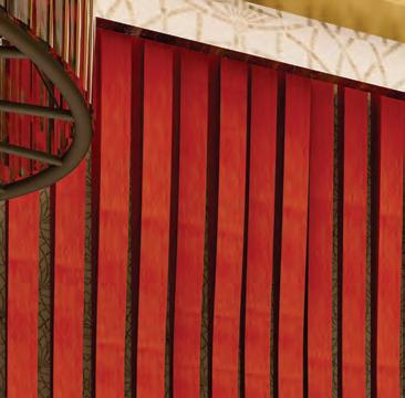
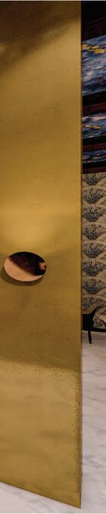
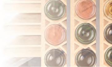
This design was based off of the reflection of light and rainbows re ection rainbows created by prisms prisms. Illuminated sensitile sensitile is a unique material in the space that creates an accent wall.
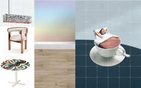
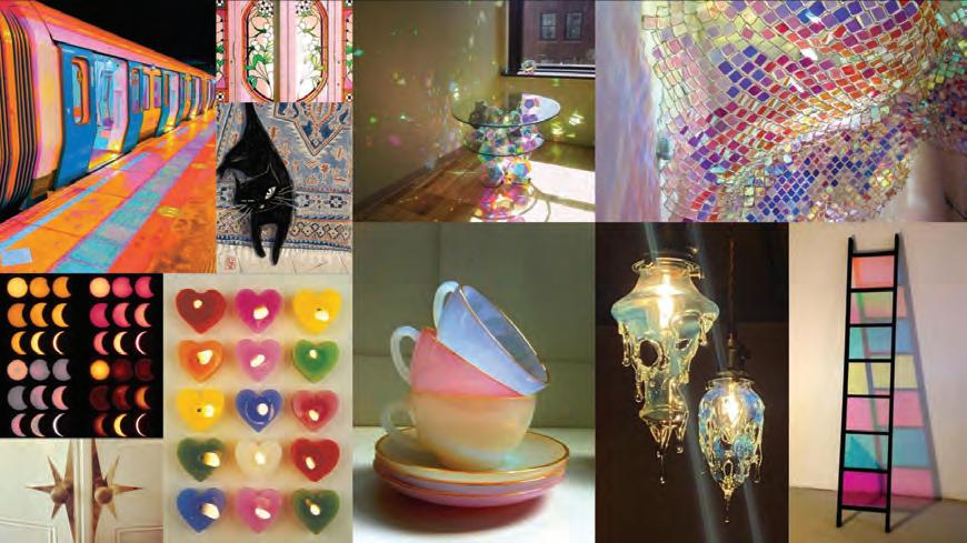
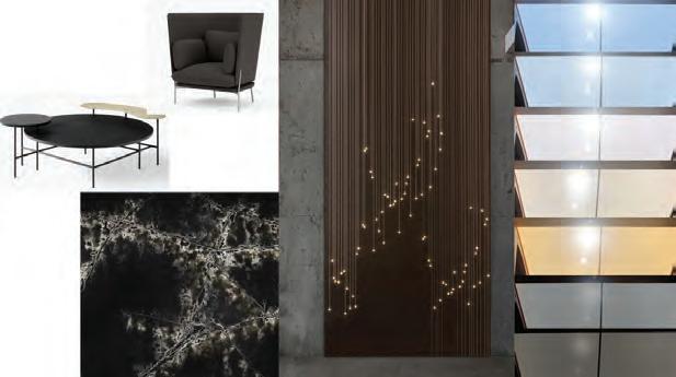
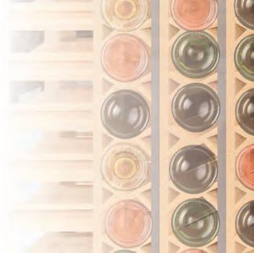
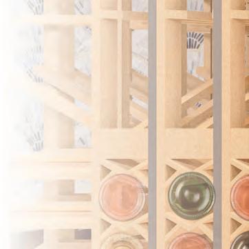
 Mood Board
Mood Board
Mood Board
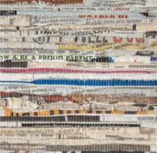
To combat the erasure of LGBTQ+ stories and spread community education to different ages, this library will only contain queer literature and media. It will be a fun and open space for all.

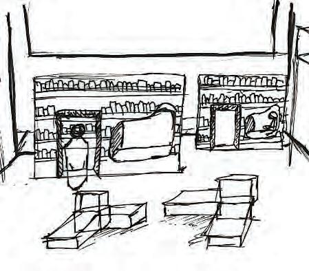


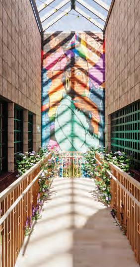
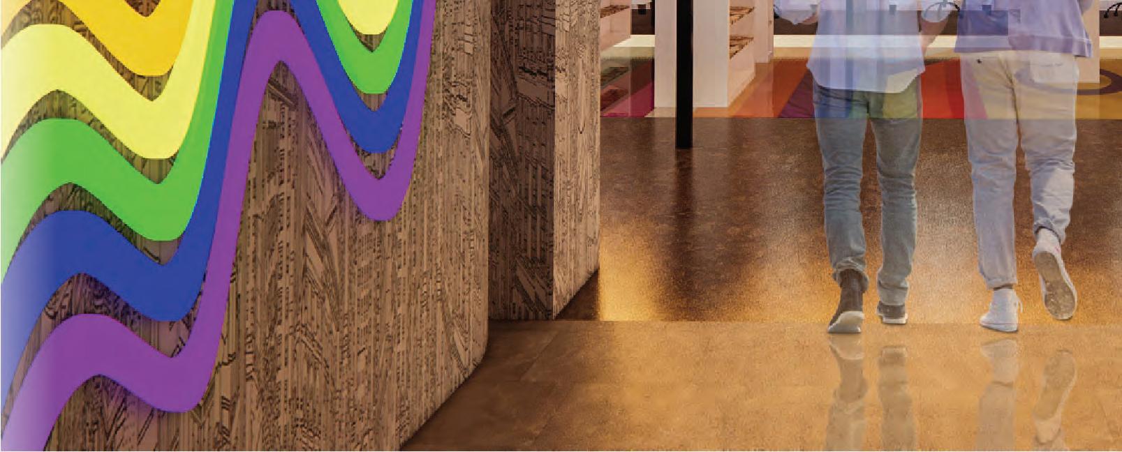
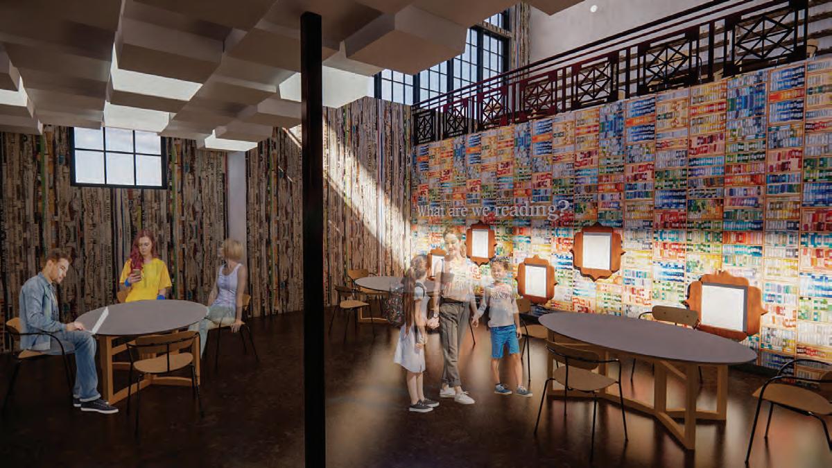
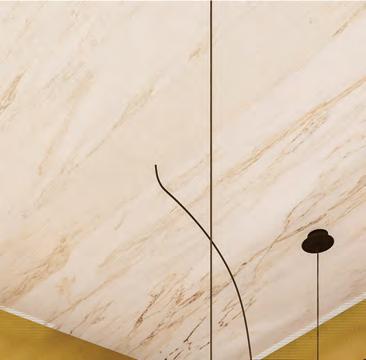
In the hallway leading to the library, custom LED lights have been created to assist in wayfinding and create a feeling of pride.
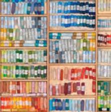
These bookshelves were customed were designed so that users are able to walk through them as they go to look at books.
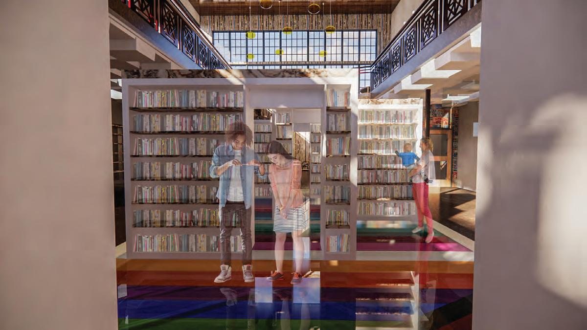

The flooring contains many of the LGBTQ+ flags underneath glass glass.
Along this wall, librarians will be able to write book recommendations within the frames to help assist users who want to learn more.
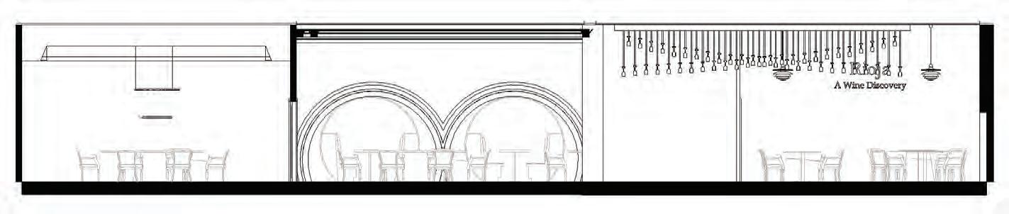
RA GASTRONOMICAL DINING EXPERIENCE FOR OPAL GRAND RONOMICAL RIENCE ORT AND S
PROJECT DESCRIPTION:


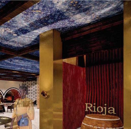
Rioja is a Michelin rated restaurant that is a feature space space located in the Opal Grand Oceanfront Resort and Spa. Through this project, the focus was on the ability to highlight user experience in the space. Additionally, this restaurant was only a part of a larger design for the hotel that was worked on with two other designers. Learning how to collaborate collaborate with other designers and make each of our individual spaces part of a cohesive whole was crucial to the success of the hotel.
Creating a luxury design that provides unique experiences for all users


10 N Ocean Blvd. Delray Beach, FL
6,314 SQ. FT.


“We have reimagined this Delray Beach oceanfront hotel to provide guests with an unforgettable seaside escape escape immersed in laid-back sophistication, thoughtfully composed American-Caribbean design and modern comforts.”

The primary users in this space are from the baby boomer generation and generation X . They will spend a few hours in the space dining on large course meals and wine tasting.

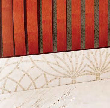
The concept of this design, an earnest discovery earnest discovery, is inspired by the experimentation of food done by Michelin rated chefs. Unlike other Michelin restaurants, this space will reflect the fun that the chefs bring through in their food and make the customers open to having a new experience. Vibrant colors and patterns will be used on the walls and ceilings while lighting will be optimized to highlight the food.
SCALE: 0’-1/8”= 1’-0”
NTS ABOVE

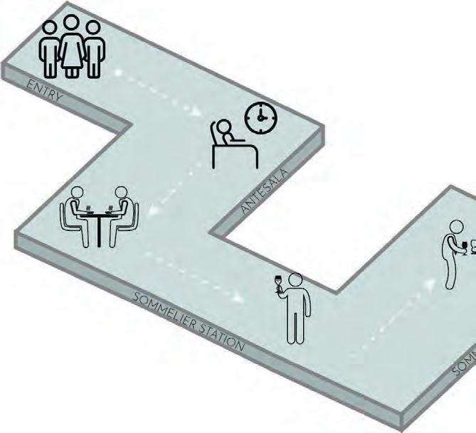
1- Entry


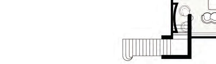
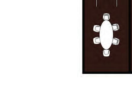
2- Antesala
3- Dining Experience
4- Private Dining Rooms
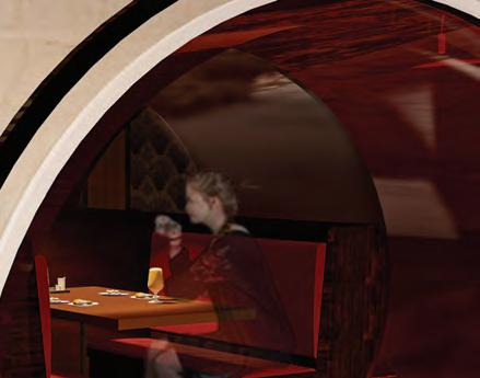
5- VIP Booths
6- Sommelier Station


Inside of the wine glass
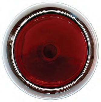
Wine spilling on the ground

Stem of the wine glass

Mother of pearl tablecloth


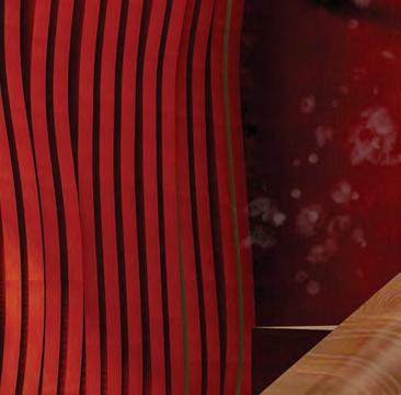
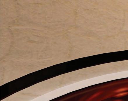
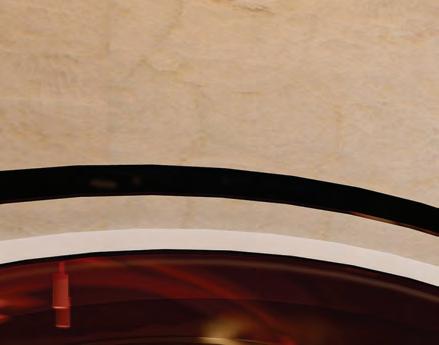
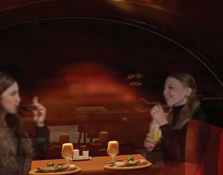
These wine booths were designed to simulate wine glasses that were spilled on a table a table. The guests are able to sit in the middle of the glass booth like they are sitting in the center of the wine glass.
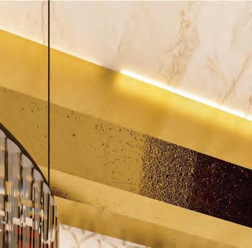
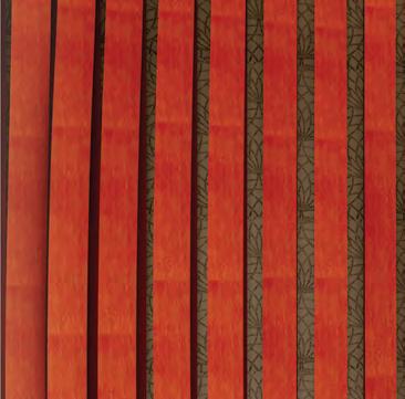
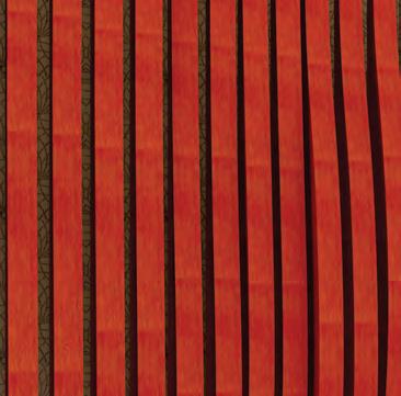
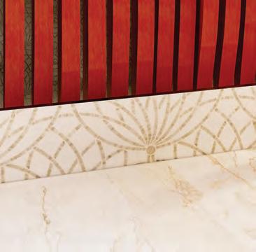
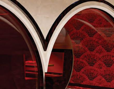
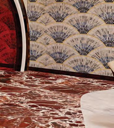
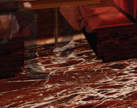
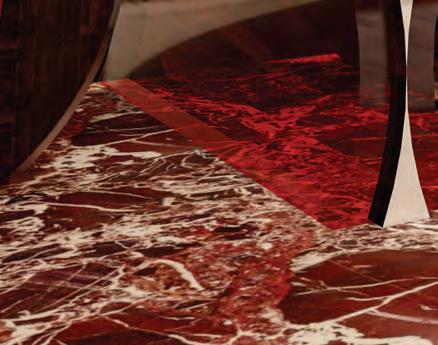
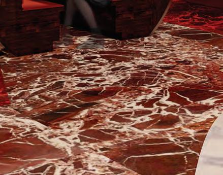
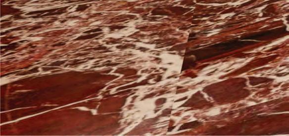
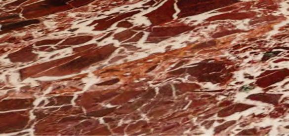
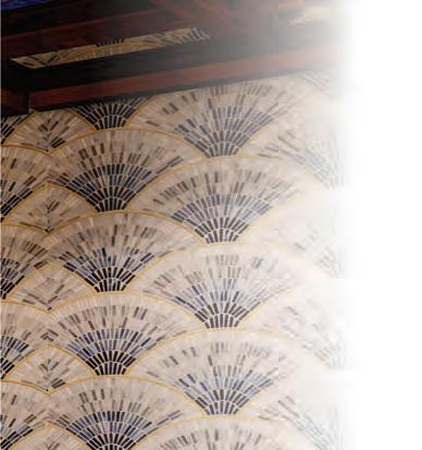
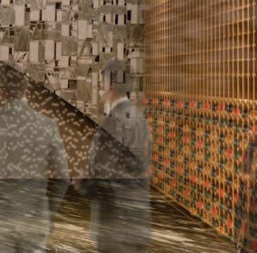
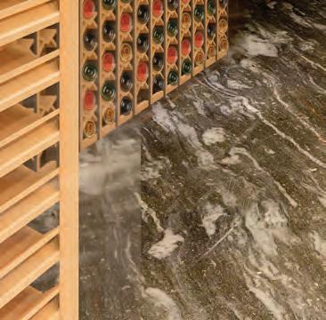
The flooring and wall materials were chosen to create a sense of liveliness of liveliness that enlives the users’ attention in the space. It also brings an element of Spanish flair air to the space, reminiscent of the origins of many wines.
Full view of dining experience
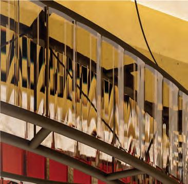
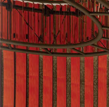
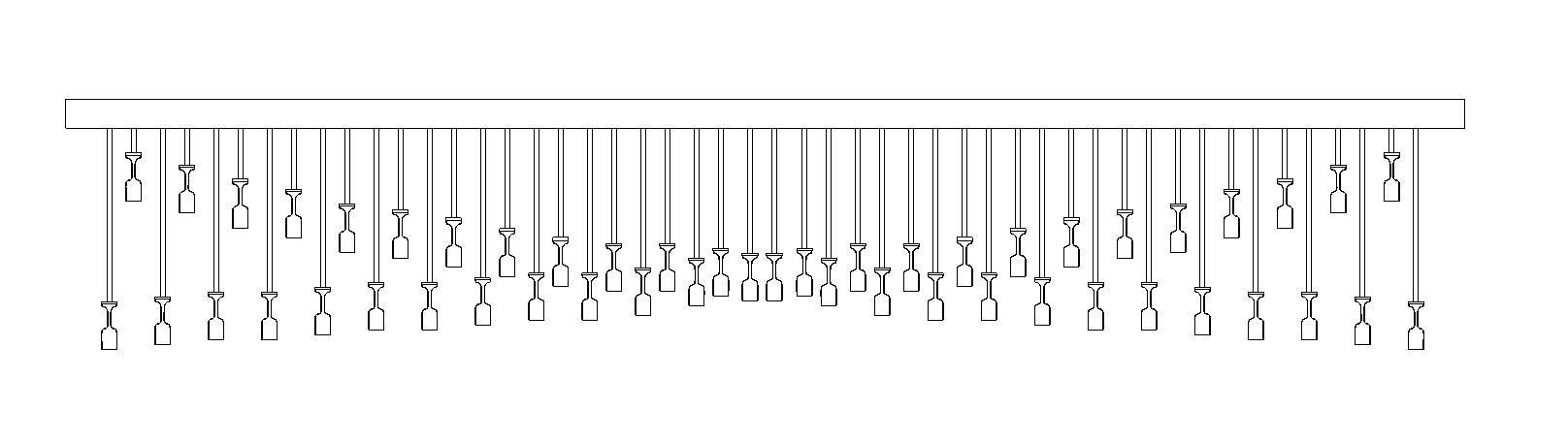
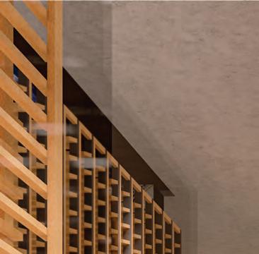
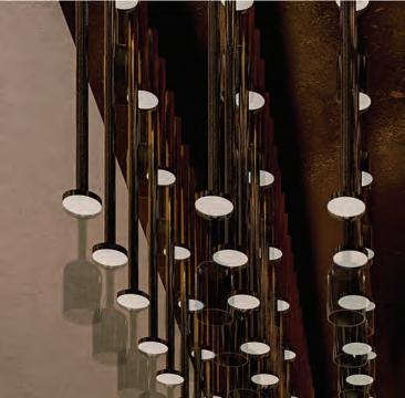
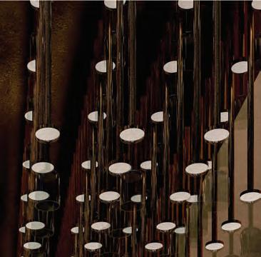
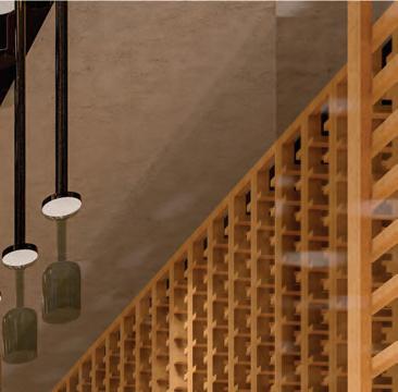
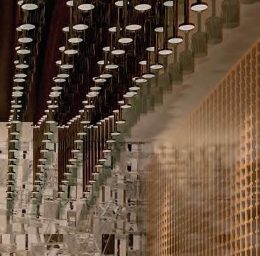
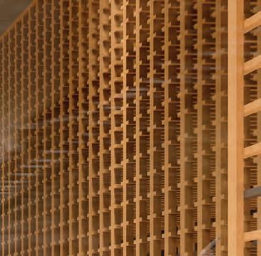
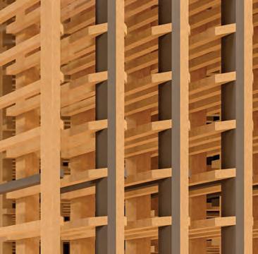
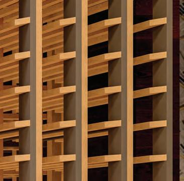
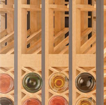
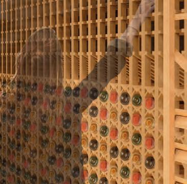
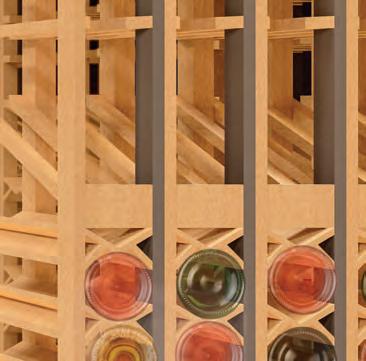
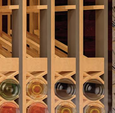
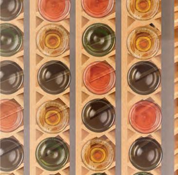
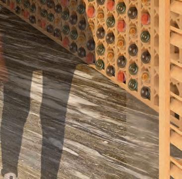
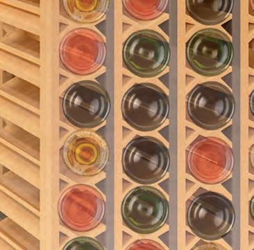
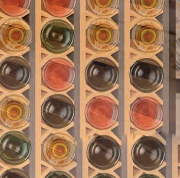
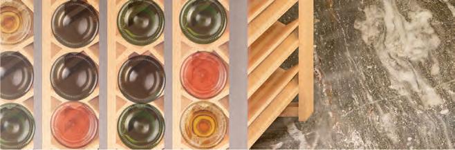
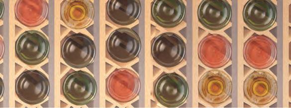
The custom wine glass chandelier and 13’ tall wine racks wine racks encapsulate the user in the space and draw their eye upwards while also acting as a wayfinding tool.
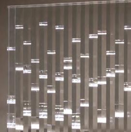
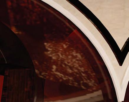
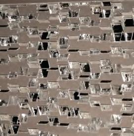
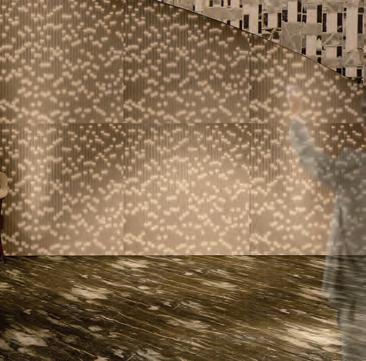
Sensitile is used as an accent wall feature and reflects the movement of champagne bubbles champagne bubbles and the look of crushed glass glass.
Unique experiences Unique experiences and custom pieces pieces make users want to continue to discover what a true luxury dining experience experience can feel like


1111 Lincoln Road
Miami Beach, FL
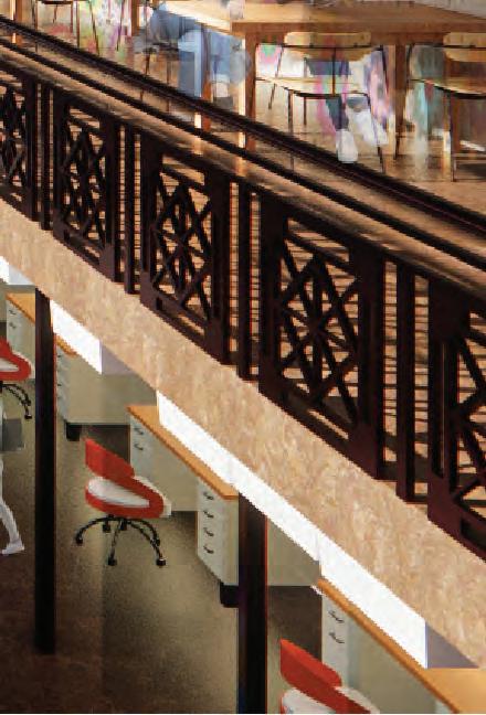
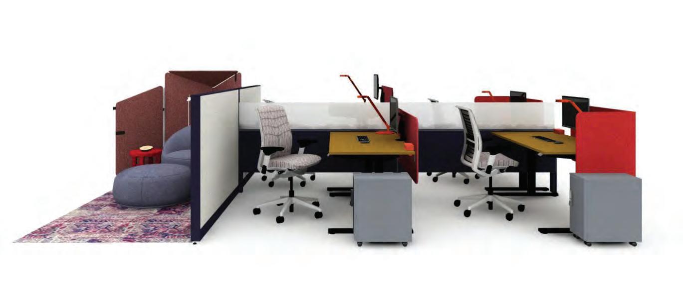
The spacial layout and considerations that need to be considered to make an office space that is equally accessible and open to all.
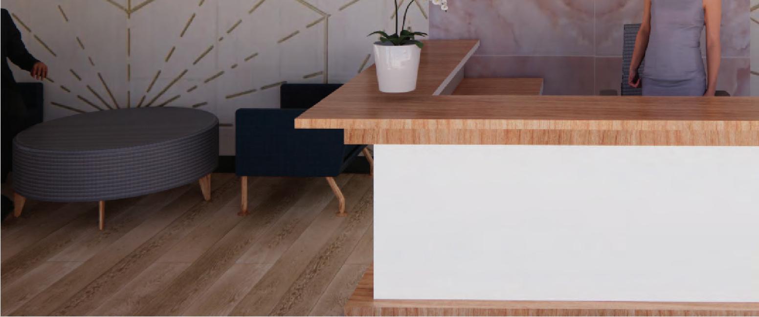
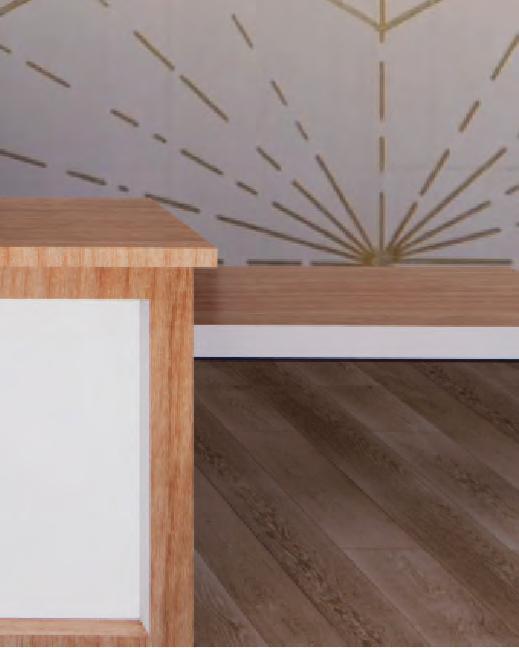
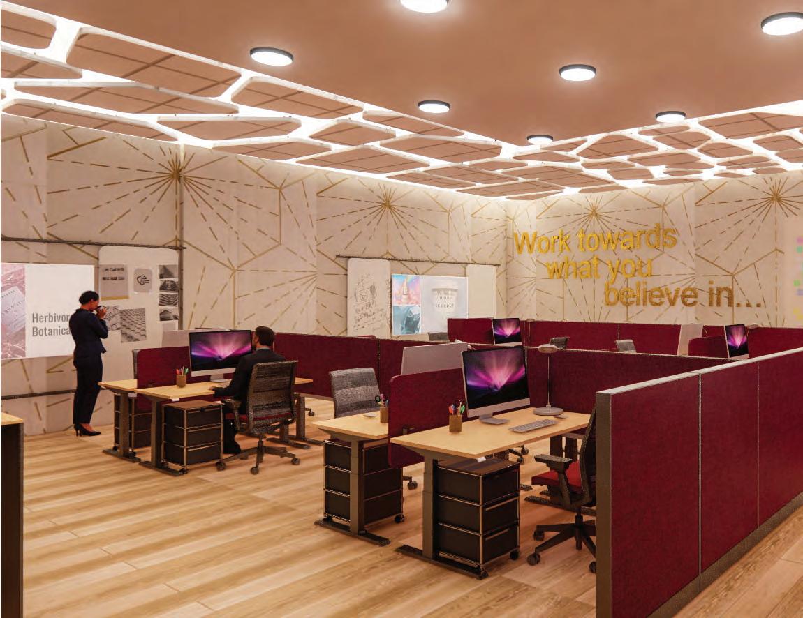
The goal of this design is to make a new office space for a branch of the corporate offices of the skin care brand Herbivore Botanicals. In this office space, universal design is crucial to making a space where all employees feel comfortable to work. This plan has been analyzed based on these factors to ensure a healthy working environment environment: access to nature, sensory changes, noise control and air quality, human factors and ergonomics, personalization, employee engagement and nutrition, technology and virtual environments, and design strategies for a nuerodiverse workplace.

: 9772 SQ. FT.
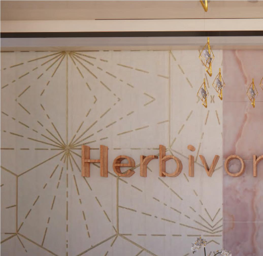
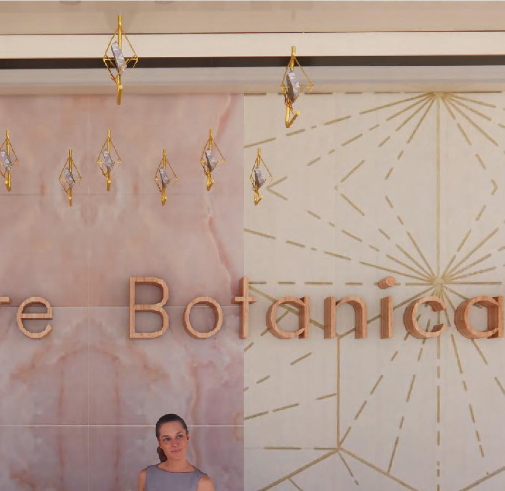
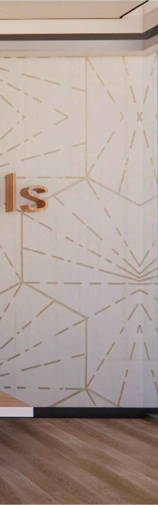
Inspired by the unique color scheme and liquid qualities of Herbivore Botanical products, the concept for this project is ethereal flow. Through maintaining their values of transparency and movement, users will be transported to a new world of creativity and brightness.


There will be 51 employees working in this office. They will be aged anywhere between 2550 and it is important to consider any nuerodivergent users users.

“Herbivore believes in the power of nature to bring tangible results you can see and feel.”
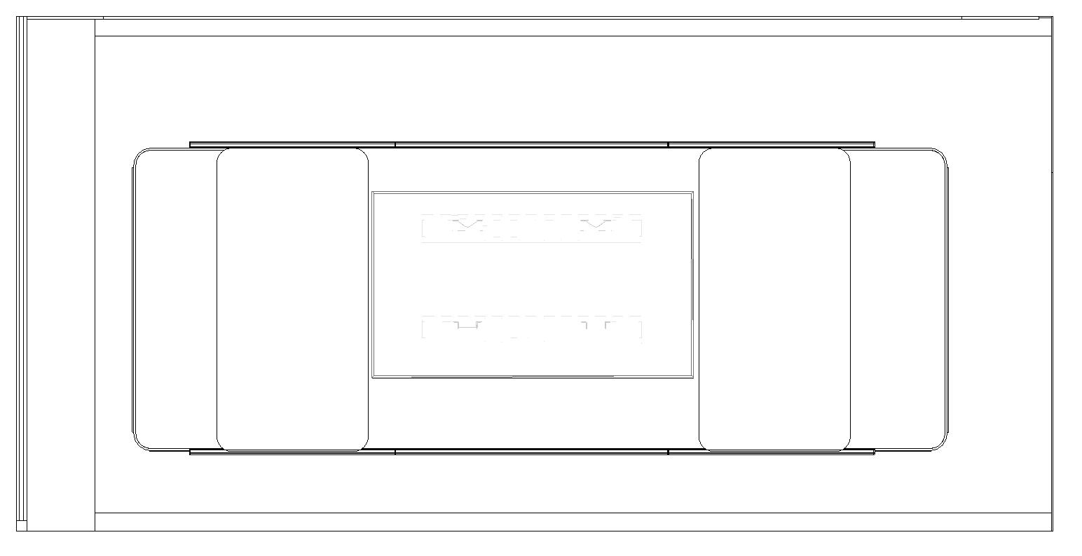
FINAL FLOOR PLAN
1- Reception
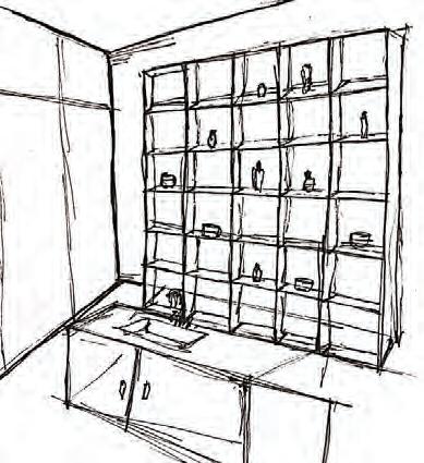
2- Retail space
3- Small meeting rooms
4-
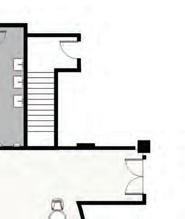
5- Stairs
6- Wellness space
7- Community engagement center
8- Secondary corridor
9- Medium meeting room
10- Marketing room
11- Product development
12- Retail development
13- Storage
14- Restrooms
16- Primary Corridor
17- Photo studio
18- Video studio
19- Elevator
Coffee bar
15- Employee welcome space
20- Resource center
21- Open office
22- Storage LEGEND
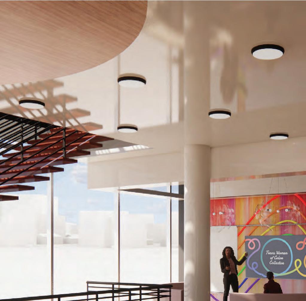
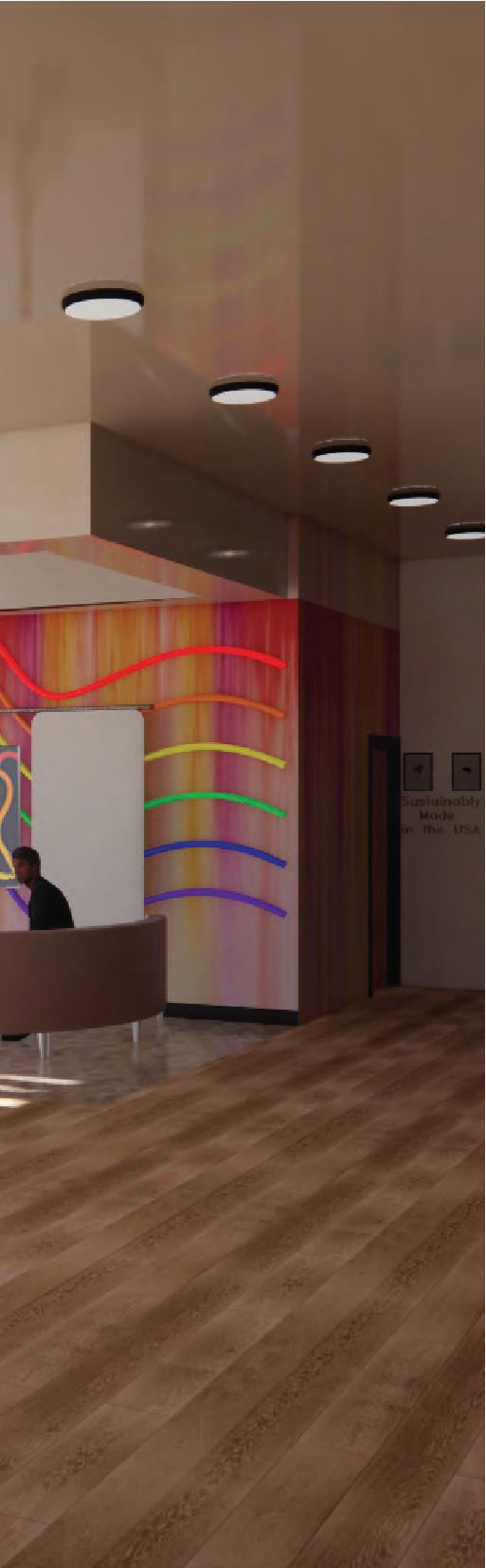
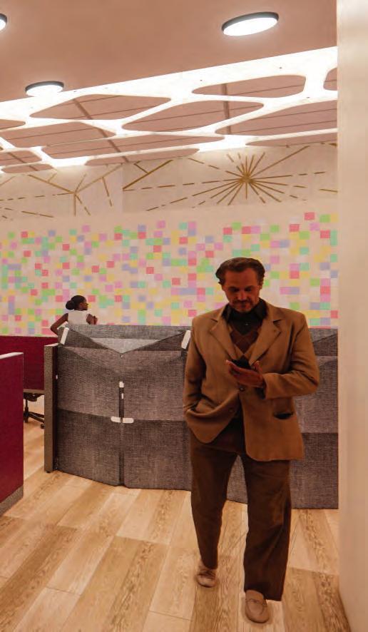
As a brand, Herbivore Botanicals donates large portions of their profits to different charities in their community. In this space, employees can come to learn from different organizations in the communtiy during their free time in a safe, and open environment.

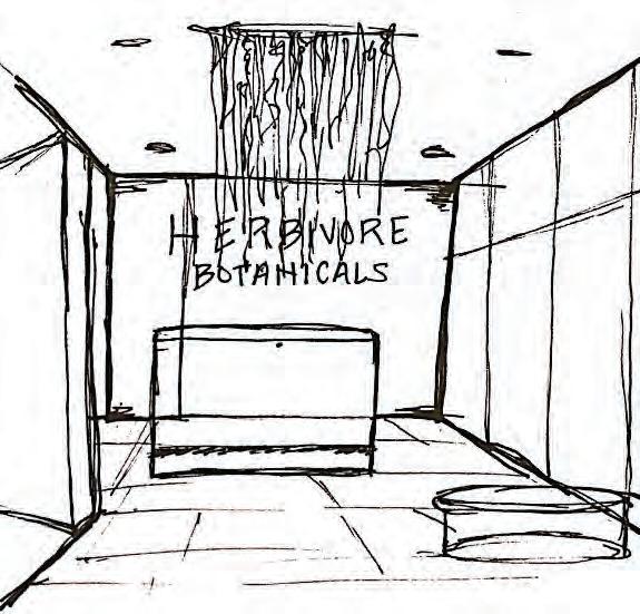
The customized LED light illuminates in the evening and shows support for the many LGBTQ+ groups LGBTQ+ groups Herbivore Botanicals donates to.


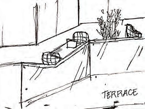
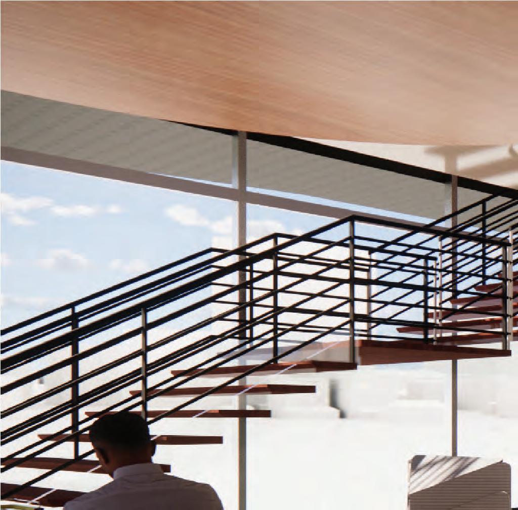
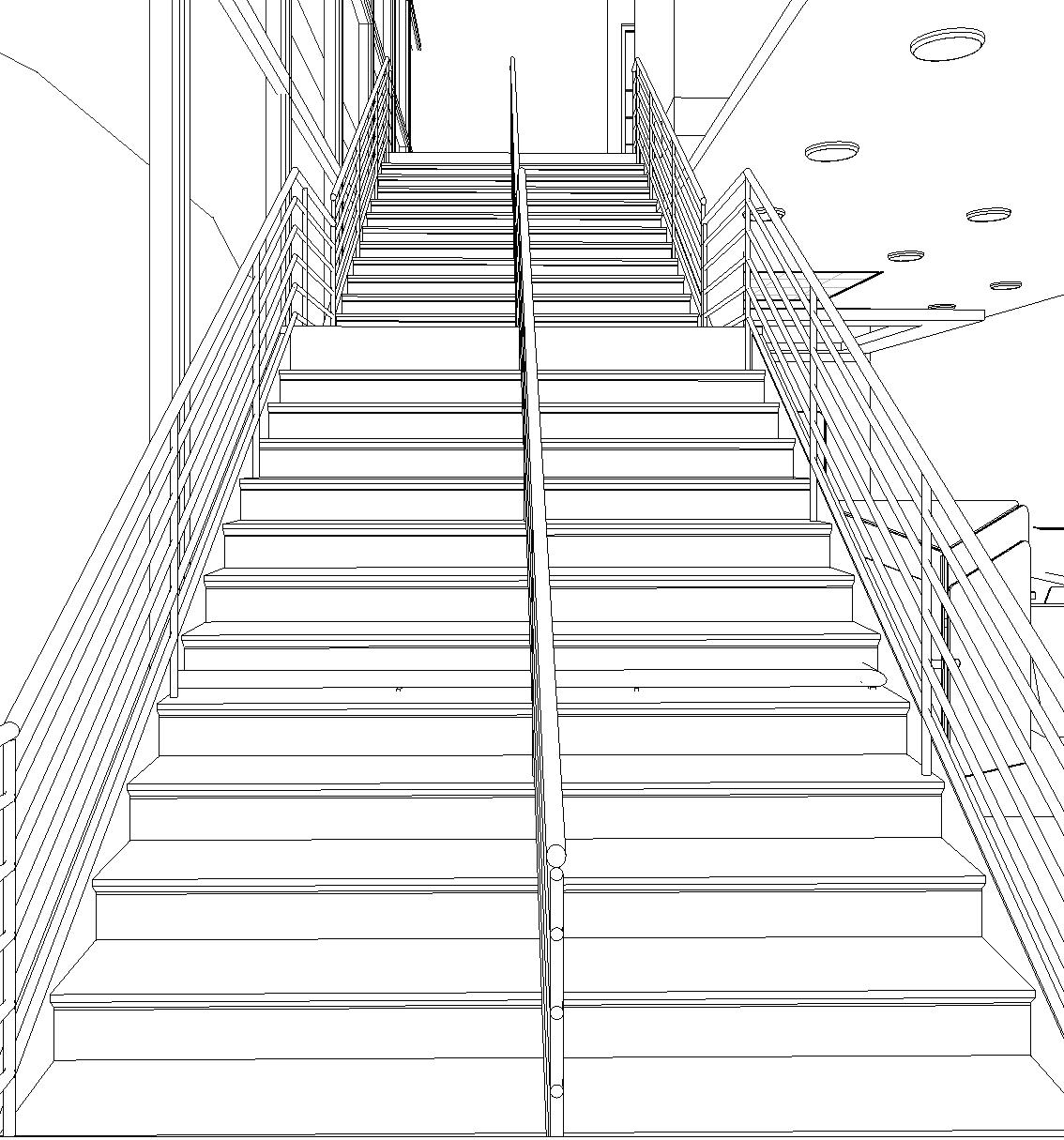
In order to encourage employee health, a customized staircase is located in the central circulation route with a direct view to the outdoors so people who are able to are more apt to take the stairs stairs.

 Glass
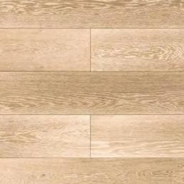
White Oak Wood
Black Aluminum
Glass
White Oak Wood
Black Aluminum
Hidden uplighting above the ceiling provides a sense of wayfinding along the edge of space and also eliminates glare on the presentation televisions. Lighting can be adjusted by employees throughout the day.
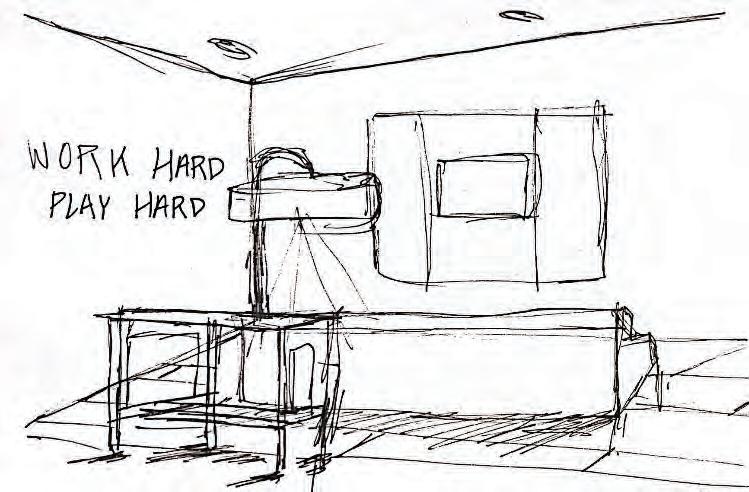
By creating a sticky note wall, employees are encouraged to motivate themselves and others motivate themselves and others by reminding them why they are working in and believe in Herbivore Botanicals.
The main objective for the open office space is to allow workers to have a personal desk that allows them
flexibility exibility. While they can sit, their desks also raise to be standing desks or they can relocate to one of the fixed standing desks to work temporarily. By providing this choice in work, it will give employees independence and allow a change in pace in their workday if they so desire.

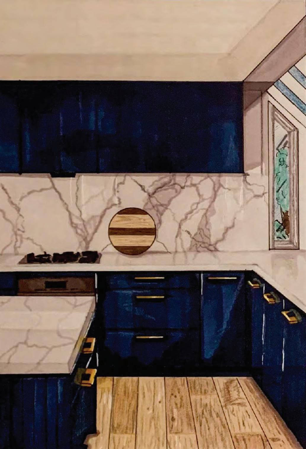
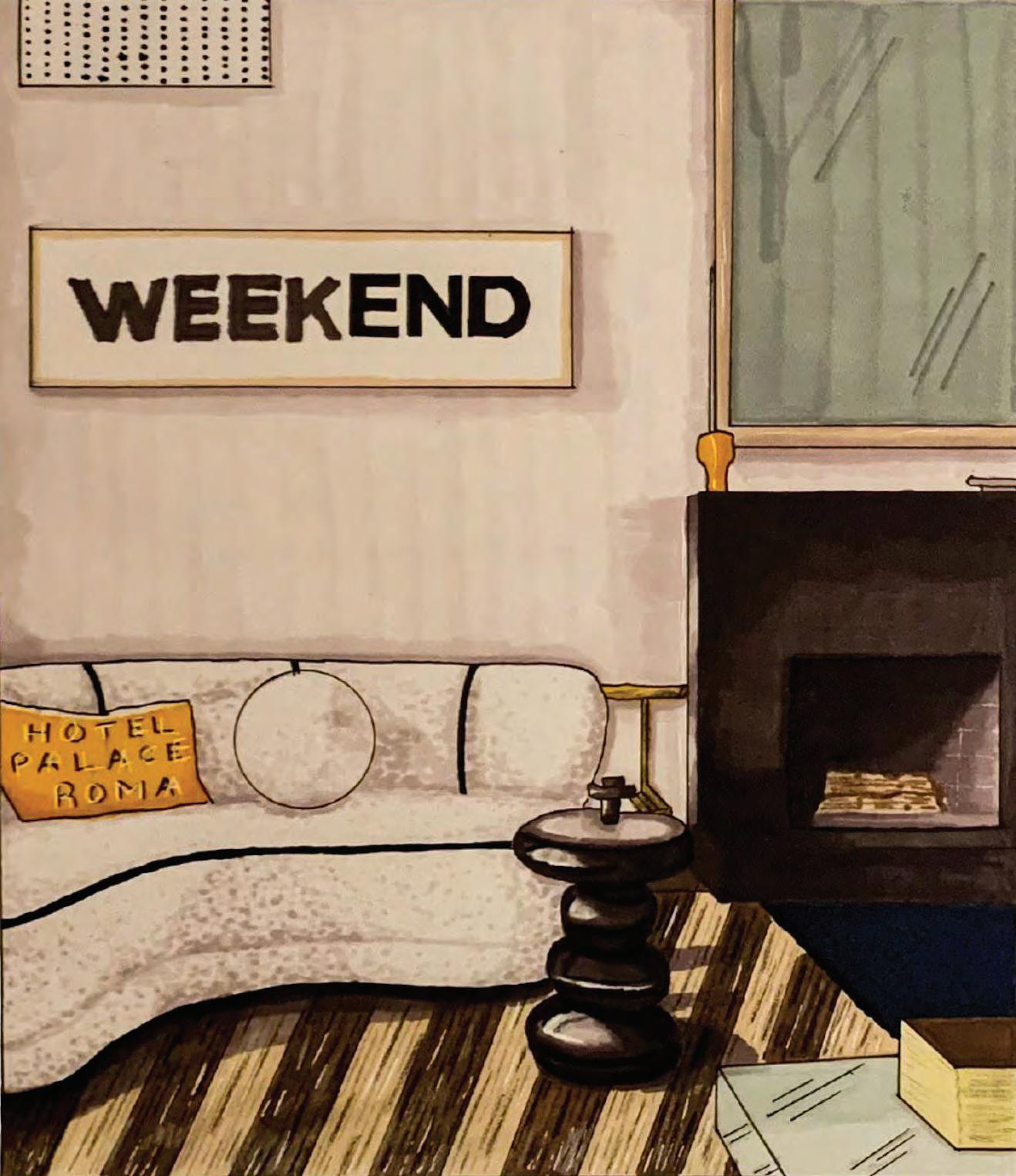
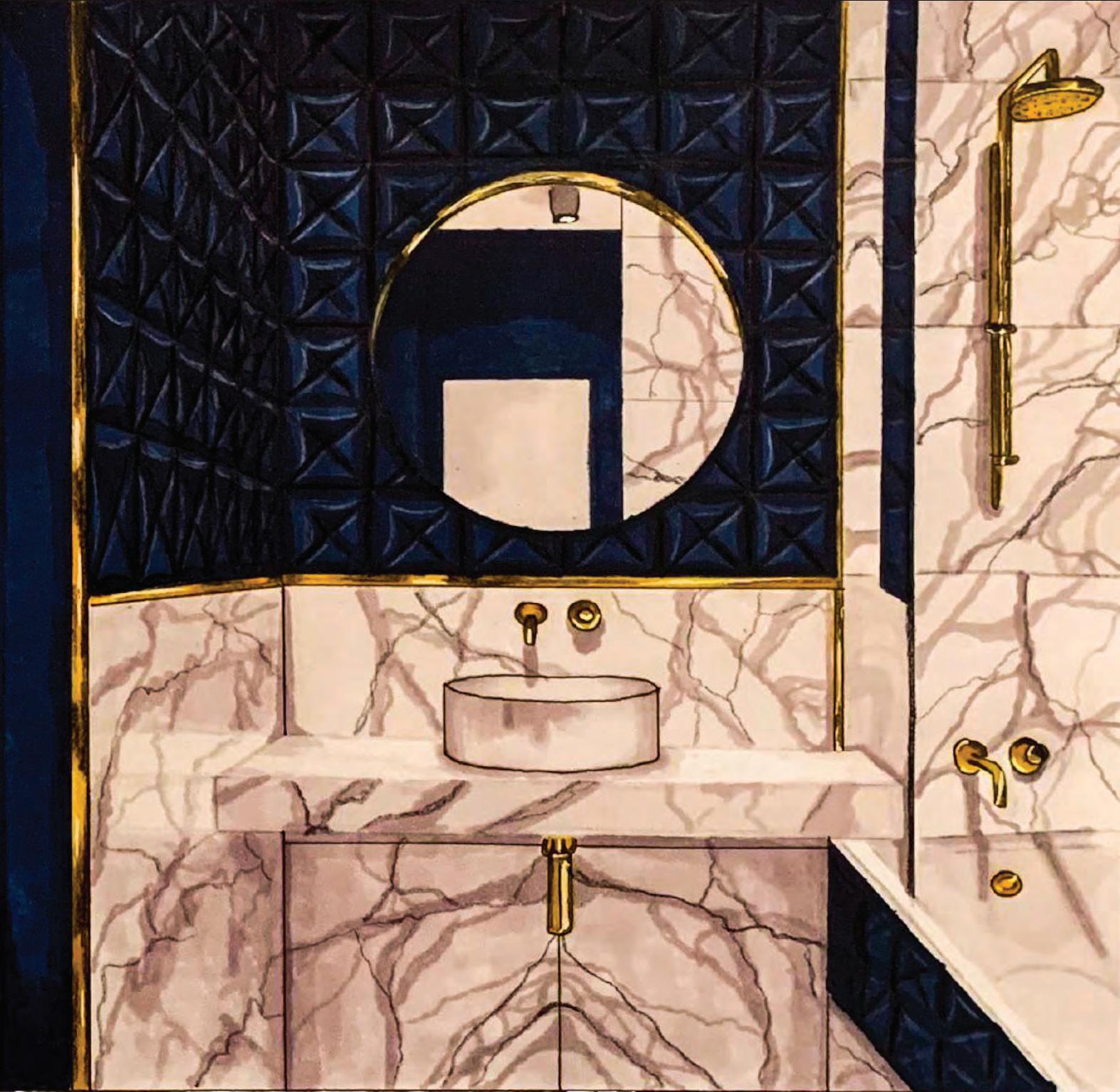
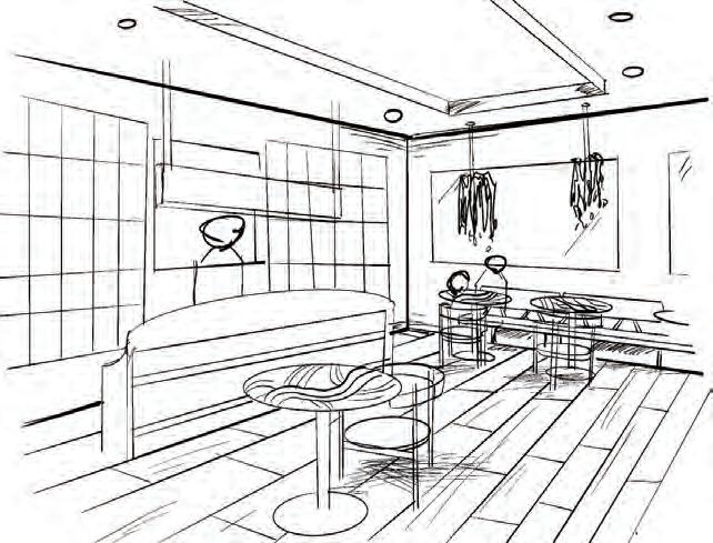
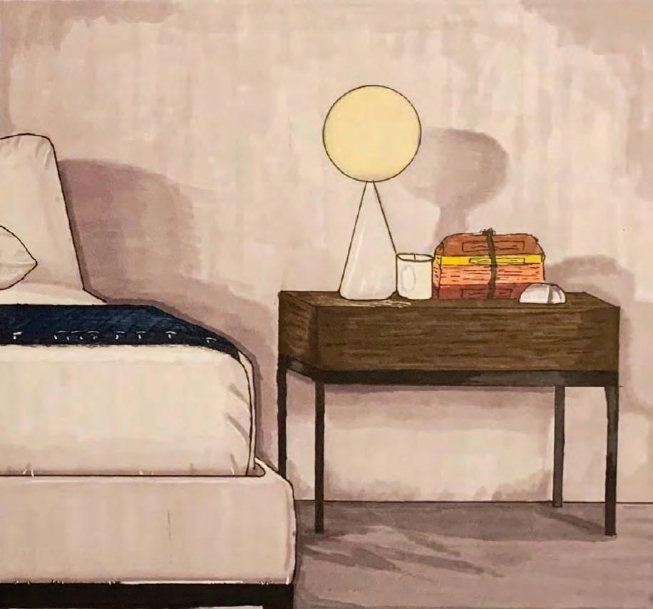
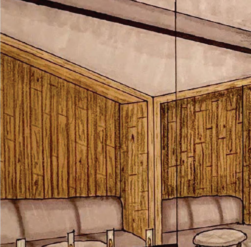
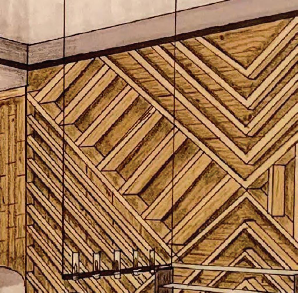
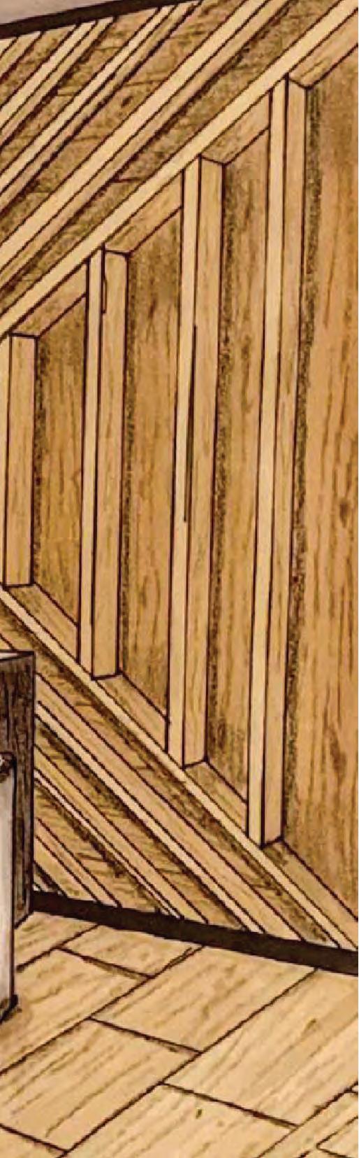
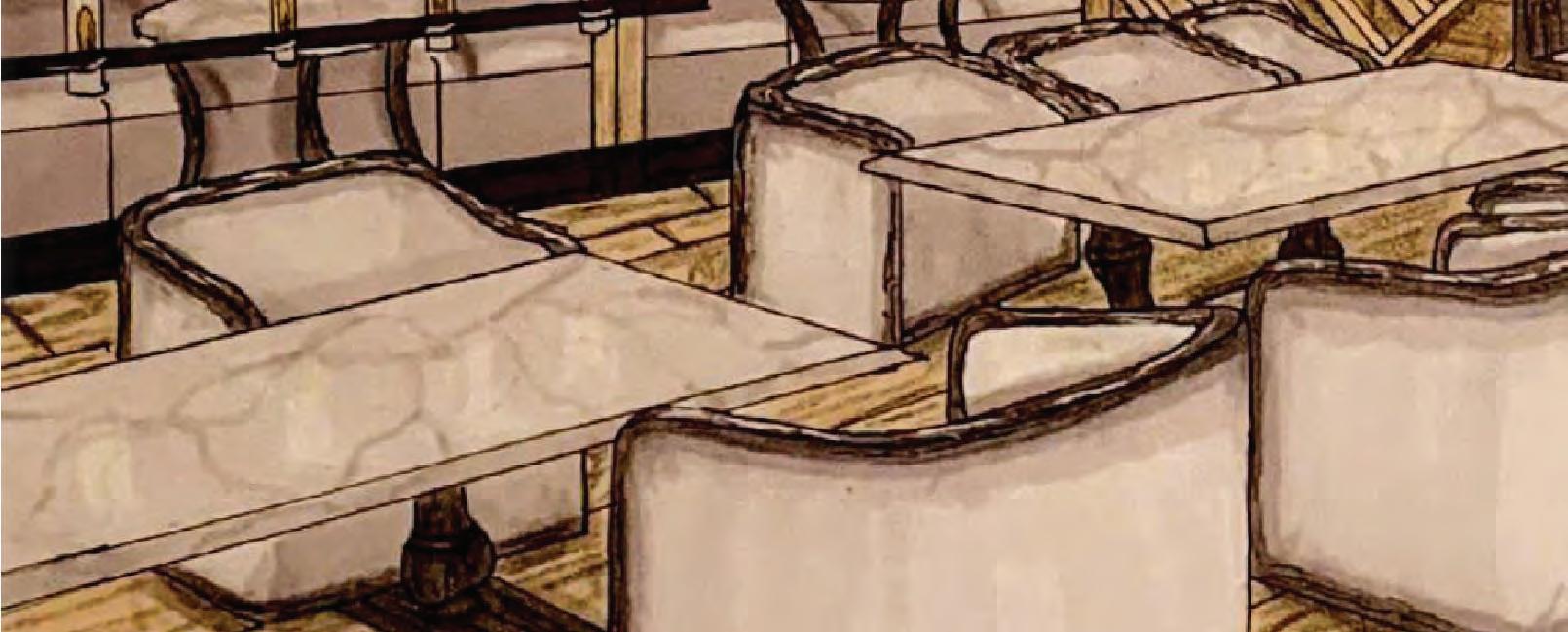
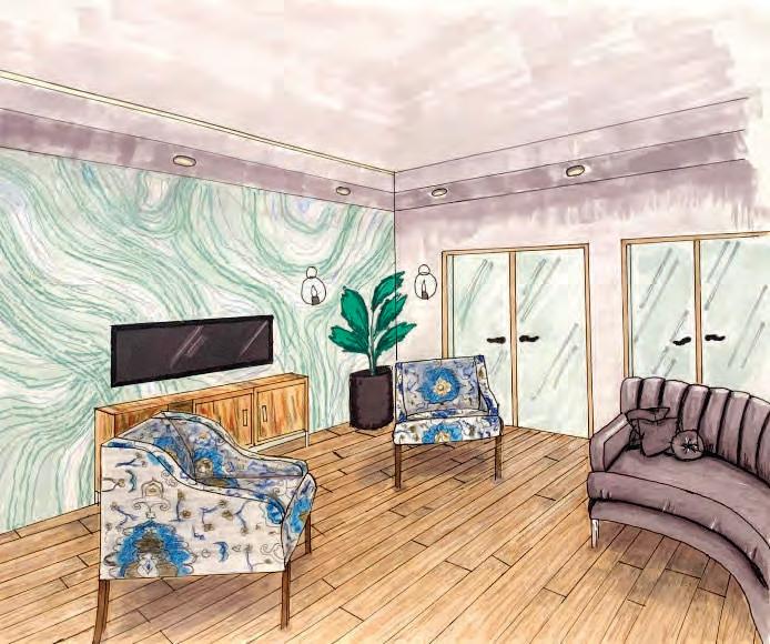
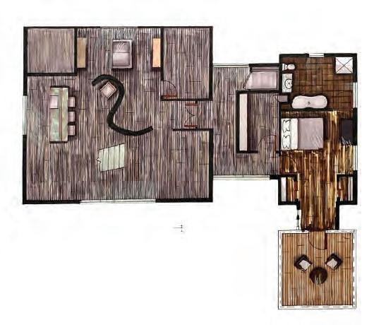
Hand Renderings
The importance of learning how to render spaces through the use of traditional media.
These next renderings come from a multitude of different projects where deliverables had to be produced using traditional media. Each of these renderings were completed using Prismacolor markers and colored pencils.

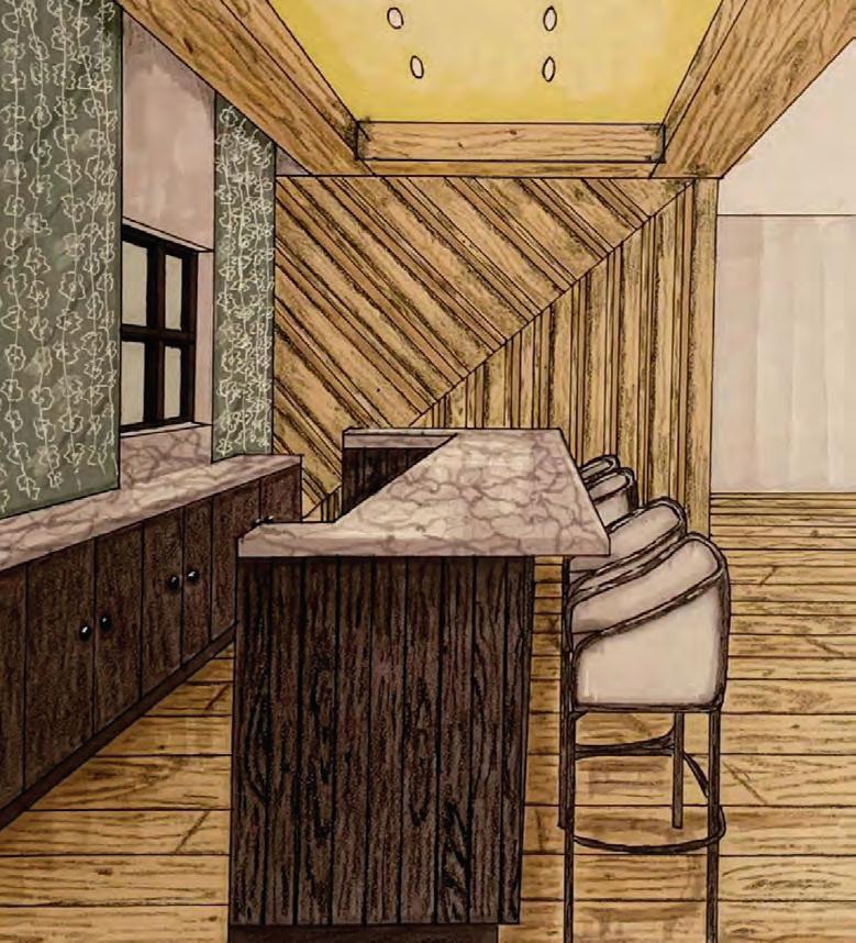

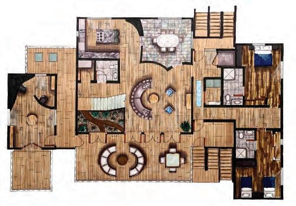
The concept behind this design is juxtaposition juxtaposition. Juxtaposition can primarily be seen in the juxtaposing curvilinear and straight lines of the design. Key considerations in this design include sustainable materials and combinations of both of the client’s husband and her own style.
For these next renderings, the designs are not my own but were placed together to make what would look like a cohesive house.