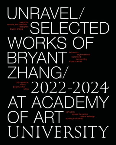
book title: unravel, bfa portfolio designer: bryant zhang
keywords: asymmetrical balanced contrasting experimental
color palette: black polychrome white
book title: unravel, bfa portfolio designer: bryant zhang
keywords: asymmetrical balanced contrasting experimental
color palette: black polychrome white
-
-
software: adobe illustrator adobe indesign adobe photoshop
book title: unravel, bfa portfolio designer: bryant zhang
keywords: asymmetrical balanced contrasting experimental
color palette: black polychrome white
software: adobe illustrator adobe indesign adobe photoshop
The word “unravel” means to investigate or to explain things that are complicated. To me, the essence of graphic design is about offering solutions; I also interpret it as a means to explore complexities and communicate ideas with clarity and purpose.
Based on this concept, I intentionally offset the type on my cover and chapter openers to resemble scrambled threads. Unlike conventional chapter openers, which are easily understood at a glance, my design requires the viewer to read all the type to understand the basics of my project. To fully grasp the whole design, the viewer will need to finish the entire chapter.
This approach allows the viewer to engage with the theme and thus become a part of my design. In “Unravel,” ten selected works are presented to unveil my creative journey at Academy of Art University.

 YOHJI YAMAMOTO, PHOTO BY L UKASZ WOLEJKO
course title:
gr 330: typography 3
instructor:
laurie makela
-
keywords: asymmetrical balanced contrasting minimalism color palette: black red orange white
,
software: adobe indesign adobe photoshop adobe xd
deliverables: book app design web design page: 008–031
Being my favorite fashion designer, Yohji Yamamoto has redefined the essence of contemporary fashion, and Yohji’s unique aesthetic perspective has always been fascinating to me. In this project, the goal is to create an image-based book showcasing Yohji’s life stories, his extraordinary artistic philosophies, and his fashion designs.
This book, Anti-Fashion: Yohji Yamamoto , provides both visual and textual views for readers, along with one comprehensive gallery of Yamamoto’s design work and garments. All contents are organized and presented in an asymmetrical, balanced grid system. Furthermore, a promotional website (which comes in three different device formats: portable, tablet, and laptop) is designed for this book.


 PHOTO BY DANIEL TOROBEKOV
gr 350: visual system 1
instructor:
troy alders
course title:
keywords:
deliverables:
poster billboard
page: 032–045
In recent years, the plastic pollution has posed a significant threat to aquatic ecosystems and the marine life. Since waste can accumulate in oceans, marine animals may mistake it for food and thus accidentally ingest the plastic waste; some may become entangled in plastic debris, leading to injury or death.
As a graphic designer, I do believe this serious sustainability issue requires more social attention. Also, in my opinion, posters can be a feasible way to serve as a means of exposition and discussion for this important topic. Therefore, I created a series of posters to raise awareness about plastic pollution and emphasize the significance of health of marine animals.

PRELIMINARY LAYOUT SKETCHES


 GENESIS, GENERATED BY MIDJOURNEY
course title: gr 360: graphic design 3 instructor: lloyd
mitchellkeywords: artificial-intelligence efficient informative profitable
software: adobe illustrator adobe indesign adobe photoshop adobe xd
deliverables: app billboard magazine page: 046–069
In recent years, artificial intelligence (AI) has evolved from a mere concept of the future to a significant part of our daily lives. AI’s pervasive influence is reshaping the landscape of nowadays living and revolutionizing the way we live and work. Thus, combing AI technologies into the financial industries will potentially benefit the investors.
Based on this concept, I created a branding project for an AI-based investment assistant, ECON X, capable of assisting users in making better financial decisions and predicting future markets and trends. In this campaign, I created three main promotional mediums: one small deliverable (portable device), a medium deliverable (financial magazine), and a large deliverable (billboards) for ECON X.


PRELIMINARY LOGO SKETCHES


ECON X utilizes its AI algorithm to generate accurate analyses and provide predictions on the market trends.


 BMW M5, PHOTO BY GLEBIY
course title:
gr 425: visual system 2 instructor: hunter wimmer
color palette:
software: adobe illustrator adobe indesign adobe photoshop adobe xd
deliverables: brochure scorecards
media ads
website
page: 070–109
Founded in 1916 in Munich, Germany, BMW AG (Bavarian Motor Works) is a renowned German multinational corporation, specializing in the manufacturing of luxury and performance automobiles and motorbikes. Today, BMW has become the world’s leading automotive group that demonstrate luxury, performance, and sustainable mobility.
This project aims to develop a visual system for BMW AG via different deliverables, which include a CSR brochure and scorecards that align BMW’s actions with its values and commitments. In order to convey BMW’s values to the society, the goal of this project is to utilize a well designed visual system to communicate BMW’s efforts to sustainable business practices to both external and internal communities.


 WHITE CHOCOLATE, GENERATED BY MIDJOURNEY
course title:
gr 321: package design instructor: kathryn morgan
color palette: black
beige white dark red gold
keywords: delicateness balanced exquisite minimalism
software: adobe illustrator adobe photoshop
deliverables:
toiletry packaging poster social media posts
page: 110–129
When I was just a child, chocolate had always been my favorite treat for snacks, and among all the chocolate brands, I loved Meiji Chocolate the most for its flavorful taste and affordable price. However, as I grew older, I often thought about how the manufacturer could make the package more attractive.
In my opinion, its current packaging is a bit too cliché with one huge brand mark printed on it; it looks not only cheesy but also too bold and boring. Thus, with what I have learned as a graphic designer, I have decided to give my beloved Meiji Chocolate a “facelift.” In this project, my design objective is to critique Meiji’s current packaging and create a brand new look that appears elegant and exquisite.


PRELIMINARY LAYOUT SKETCHES


 LAKE LUCERNE, PHOTO BY LUIS
course title: gr 370: package design 3 instructor: peter chun
software: adobe illustrator adobe photoshop
deliverables: toiletry packaging poster social media posts
page: 130–155
LA PRAIRIE was founded in 1978 in Montreux, Switzerland, by Dr. Niehans. Renowned for its high-end, elegant, and advanced beauty products, the brand derives its name from the picturesque region of La Prairie. As a frequent consumer of LA PRAIRIE , I thought that it would be fitting to select it for this packaging project.
LA PRAIRIE now offers skin care goods, masks, and anti-aginig products. The main design objective is to extend LA PRAIRIE’s accessories with additional toiletries products as a potential brand extension. In short, the goal is to attract existing customers who trust and admire this brand and potentially appeal to a broader clients by leveraging the brand’s existing design with new toiletries.

PRELIMINARY STRUCTURE SKETCHES


Immediately recognisable as a symbol of Swiss precision and excellence, Helvetica is the chosen font of La Prairie, conveying the House’s innate Swissness. At once expressing the heritage and a forward-looking aesthetic, it is only natural that LA PRAIRIE embraced Helvetica and embellished the brand’s vessels with the lean lines of this singularly Swiss typeface.
Borrowing from the Swiss for “wash clean,” designs are to embody and reflect the idea of water, elegance, and the Swiss elements with these newly designed toiletries. The “tvätta” series is the lineup for the adults.

In order to make the toiletries more complete, the baby series, “Bollä,” is created. “Bollä” translates to “bubble”in Swiss, giving the toiletries of the baby sub-line a more playful and childish touch.
BOLLÄ , LOGO DESIGN
The cross is inspired by the Swiss flag, which consists of a cross in the middle. Moreover, it reflects the idea of repair, which aligns with the repairative toiletries from the adult series.
The heart is often associated with care and love, an emotion that people often have when they see babies, and these babies usually have sensitive skin. As a result, it is adopted in the baby series.
The water droplet is a direct indication of the new toiletry product line. Water is how we clean ourselves, and this water droplet icon is designed to indicate the essence of bathing.


 TVÄTTA CONDITIONER
TVÄTTA BODY WASH
BOLLÄ BODY WASH & SHAMPOO
TVÄTTA CONDITIONER
TVÄTTA BODY WASH
BOLLÄ BODY WASH & SHAMPOO
 TVÄTTA SHAMPOO
TVÄTTA FACE WASH
TVÄTTA LOTION
TVÄTTA SHAMPOO
TVÄTTA FACE WASH
TVÄTTA LOTION


 MAX MIEDINGER, CREATOR OF THE HELVETICA FONT
course title: gr 310: typography 2 instructor: becky waite
keywords: contrasty constructional linear experimental
software: adobe illustrator adobe indesign adobe photoshop
deliverables: typography card set packaging page: 156–169
As a foreign student, it has always been pleasing to appreciate the beauty of English typeface and typography. I like to experiment and explore with different typography layouts and fonts; and Helvetica is one of my favorite sans serif typefaces. On the other hand, I am also a fashion lover, and Off-White is my favorite streetwear brand.
Typically, I would find comfort in achieving aesthetic harmony when I finished an organized and customary typography layout. However, this time, I wanted to explore the impact of using the conventional typeface unconventionally. Thus, I merged Helvetica with Off-White elements to create a set of typographic cards. Additionally, I made an extra package for the card set as a coordinating container.

PRELIMINARY LAYOUT SKETCHES


 WHITE RABBIT CREAMY CANDIES, PHOTO BY XIANG YANG
course title:
gr 370: package design 3
instructor: peter chun
color palette: light blue light brown light pink white
software: adobe illustrator adobe photoshop
deliverables: candy packaging collaboration page: 170–189
White Rabbit Creamy Candy is a classic confectionery company with its origins in Shanghai, China. Founded in 1943, it gained wide recognition for its iconic milk flavored candies. Over the years, these treats have not only stood the test of time but have also turned into an integral part of my fondest childhood memories.
Since elementary school, I have always carried a bag of White Rabbit Candies with me wherever I go. Even here in California, I keep them by my side when I work late at night. I often think about how nice it would be to introduce the White Rabbit to the Western market. Therefore, the objective of this project is to leverage modern and Western design elements to redesign its packaging for the American market.

PRELIMINARY LAYOUT SKETCHES


course title: gr 327: graphic design 2 instructor: kathryn morgan
color palette:
keywords: colorful imaginative lego & minifigure playfulness
software: adobe illustrator adobe indesign adobe photoshop adobe xd
deliverables: redesigned logo convention guide souvenirs
page: 190–211
BrickFair Convention is the largest LEGO exhibition held annually in the Eastern United States. As a four-day event, the convention is held to display LEGO models, architecture, and all kinds of other innovations. In other words, BrickFair is a toy and design exhibition for both the kids and adults.
Growing up with LEGO has left me with so many great and precious memories. I can still remember the first time I interacted with these plastic bricks, and their unlimited wonders instantly fascinated me. Therefore, I rebranded this BrickFair Convention with a redesigned convention logo, a convention guide, an companion site along with a few social media posts, and a few souvenir giveaways.


PRELIMINARY LOGO & LAYOUT SKETCHES


course title:
n/a, it’s a personal project instructor: me, myself & i
keywords: balance blue & red contrast experimental
software: adobe illustrator adobe indesign adobe photoshop
deliverable: fanzine
page:
212–227
Among all the iconic figures in the SW franchise, Anakin Skywalker, also known as “Darth Vader” in the SW sequels, has always been my favorite character. He used to be a very talented Jedi warrior with a bright future, and the prophesy said that he would destroy the Sith. Yet sadly, he ended up being the most famous villain of all time.
In my perspective, Anakin is a complex yet tragic character. His inner struggle between the light and dark sides resonates deeply with the themes of balance, conflict, and duality, which align precisely with the concepts I seek to incorporate into my designs. Hence, I created this fanzine in an experimental manner to showcase the transformation of this iconic character.

PRELIMINARY LAYOUT SKETCHES


M ay the F orce B e with Y ou
To my mom, dad, grandparents, brother, and sisters, I am sorry that I haven’t been around with you for these years, but your love, understanding, and support have always been with me. For that, I can’t thank you enough. To Stormi, thank you for being my girlfriend, and thanks for looking after me over these months.
To Conner and Charlie, my best bros in this world, thank you for keeping me company and making me happy all the time. To James and Peter, thanks for going fishing and to the gym with me. To Ingrid and Cindy, thanks for sharing those helpful design tips. To Ivan, Yendy, and Marie, thank you for taking good care of me when I was busy studying.
To Peter Chun, thank you for your encouragement and advice in both my studies and life, and for keeping pushing me to create good designs. To Troy Alders, thank you for your guidance and the recommendation letter. To Hunter Wimmer, thanks for the knowledge, the robust feedback, and the pro tips. To Mary Scott, thank you for the inspiration.
To Stella, my soul mate cat, thank you for being by my side every single day and supporting me emotionally. Thanks for always being a wellbehaved kitty and watching the sunrise with me when I felt pressure or frustration. Lastly, to myself, thanks for working hard on the things I want and never giving up on me and my studies. Thank you.
typefaces: goudy classic helvetica poppins
email:
bryant981216@gmail.com
instagram: anakino008
printing & binding: blurb, blurb.com paper: mohawk superfine 100lb text eggshell
department: academy of art university, school of graphic design
Copyright © 2024 by Bryant (YiChen) Zhang: All rights reserved. No part of this publication may be reproduced, stored, or transmitted in any form without written permission from Bryant (YiChen) Zhang, except as permitted by U.S. copyright law.
*This publication is only designed to be a student project, no part of this book shall be used for commercial purposes.