Monster.a
A Brand
Concept by Brooklyn Brown
The principals of punk center around sustainable practices and resistance to conformity. The idea behind this particularly punk brand design is to embody those principals. Upon researching different plant shop brand designs I realized they all kind of look… the same. The pastels, the earthy boho aesthetic, greens and earth tones; it all screamed “plants sold here”. I guess if that is their only message it is great; I wanted to convey a greater message. What does it mean to own a plant?
Plants are something we care for– we are their lifeline; we get nothing in return from them for this, besides the reward of their earthy ambiance. Plants are an aesthetic decoration that are sustainable in nature;
we can propagate them to make more at home, rather than mindlessly shop for decorations that come from an unethical factory overseas. There is a certain sense of pride given to the individual who successfully keeps their plants alive and happy. Plant owners find community within each other; they participate in socialist practices like sharing ideas and even gifting excess plants to one another.
Plants also help us slow down. In a fast paced society, plants force us to be patient. Every plant is different, they are never carbon copies of the other even if they are the same species. That’s when it really hit me– plants are punk as f***! But recently, plant-owner culture has taken a turn for the worse.
“Plant Parent” merch is being mass produced to be shipped to us at the click of a button on our screens. The most luxurious
cross breeds of plants are sold at prices so high that keeping them alive becomes more pressure than fun. Mass-produced hats with succulent embroidery, self-watering smart devices that you can stick in the soil, pots with screens that turn your plant into a tamagochi-esque character; this is not the brand of plant culture I would ever endorse.
How could I create a concept that combats this in a clever way? How might I pivot overconsumption into a plant punk rebellion?
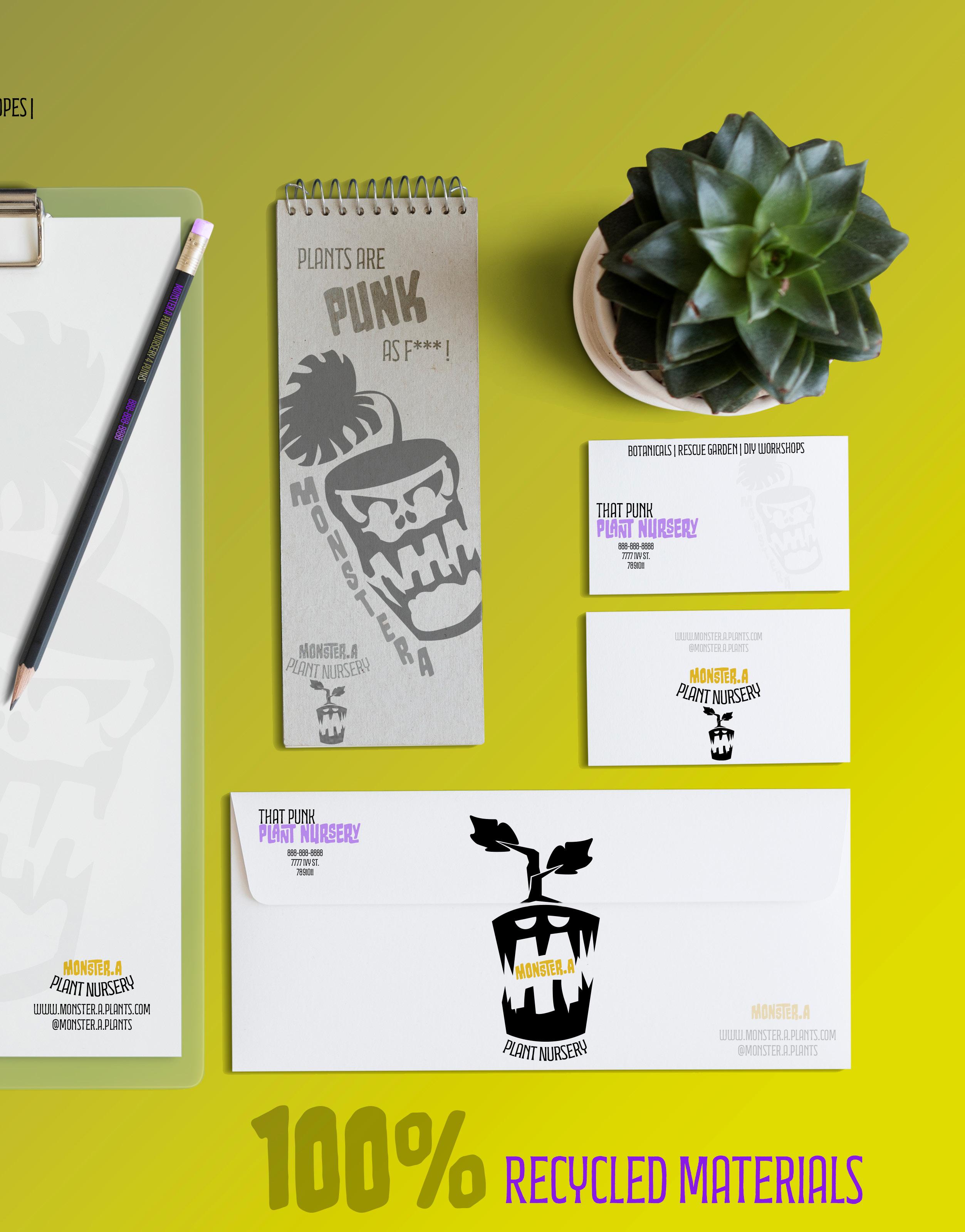
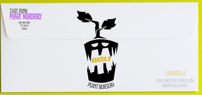
What separates Monster.a — the brand name I decided on — from other plant brands is emphasized through the design. This hypothetical plant shop has some uncommon practices; they pick up dying plants from overstocked super-stores and they nurse them back to health to the best of their ability. They offer workshops to make DIY plant-related crafts out of sustainable materials. They work with local artisans to create their merch, pots, and decorations. They recycle as much as possible. Monster.a is the punk plant store the world doesn’t realize it needs.
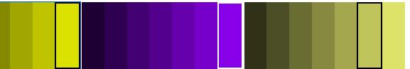
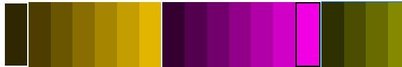
When choosing the color scheme for this brand I tried to deviate from the norm– that is what punk is all about. I started with green, because after all, you just cannot call it a plant store without green somewhere. However, I tried to choose the most baby-puke, diarrhea, toxic-waste shade of green that I could. If I could make this green look appealing then that would certainly solidify my confidence as a designer. I paired this green with other colors, thanks to the help of adobe colors, and
was happy with the results. Shades of greens and purples really felt right for the funky monster logo I was preparing to complete.
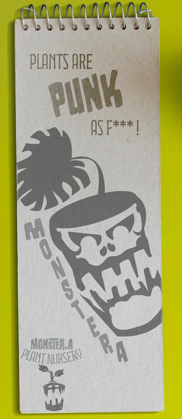
It felt supernatural, but in a nostalgic way. I kept the nostalgia when I chose the text. By using text reminiscent of the old horror posters of the 80’s I really deviated from the plant-store boho “normal” aesthetic. Somehow this harsh, blocky text really worked; the text still felt organic, just different. If any of the other plantbrand fonts were organic, they were organic in the way that vines are organic— my font was organic like fungi. I loved it!
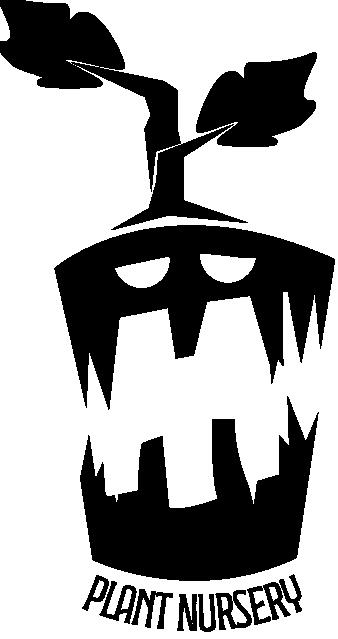
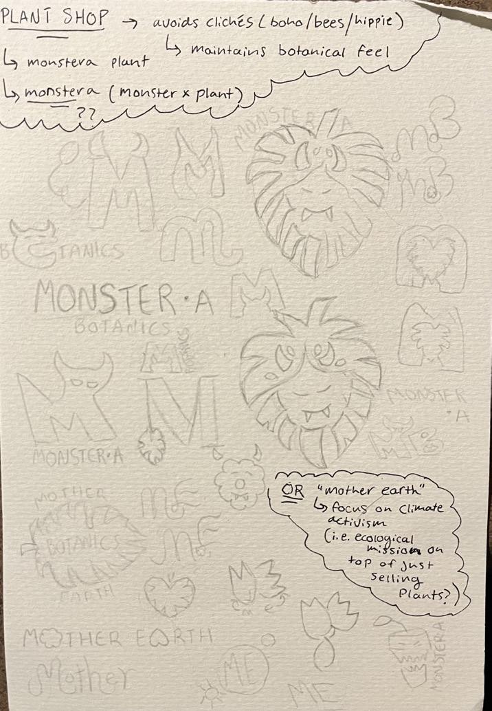
This strange, silly idea was starting to come together. I knew this logo had to be intriguing, and if I was going to be so basic as to include an actual plant in my design; I needed an element of surprise.
The mon
ster idea came early on; the name of the popular “Monstera” plant easily helped with that. I certainly had never seen a monster-themed punk plant store before. I imagine my made-up plant store would be blaring heavier music than the average plant nursery– just at
lower volumes so as to not disturb the plants’ growth; did you know that’s a real thing? Plants really do react to the sounds of their environments.
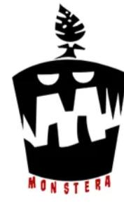
When designing the logo I needed to make sure the plant really had a personality; plants are alive after all. I wanted to convey emotion while also incorporating an M somewhere (for Monster.a) and also making sure the logo was readable from far away and close up. It took a lot of different designs, but eventually… I got there.
The perfect amount of “different” and “nostalgic” to convey the message I want.
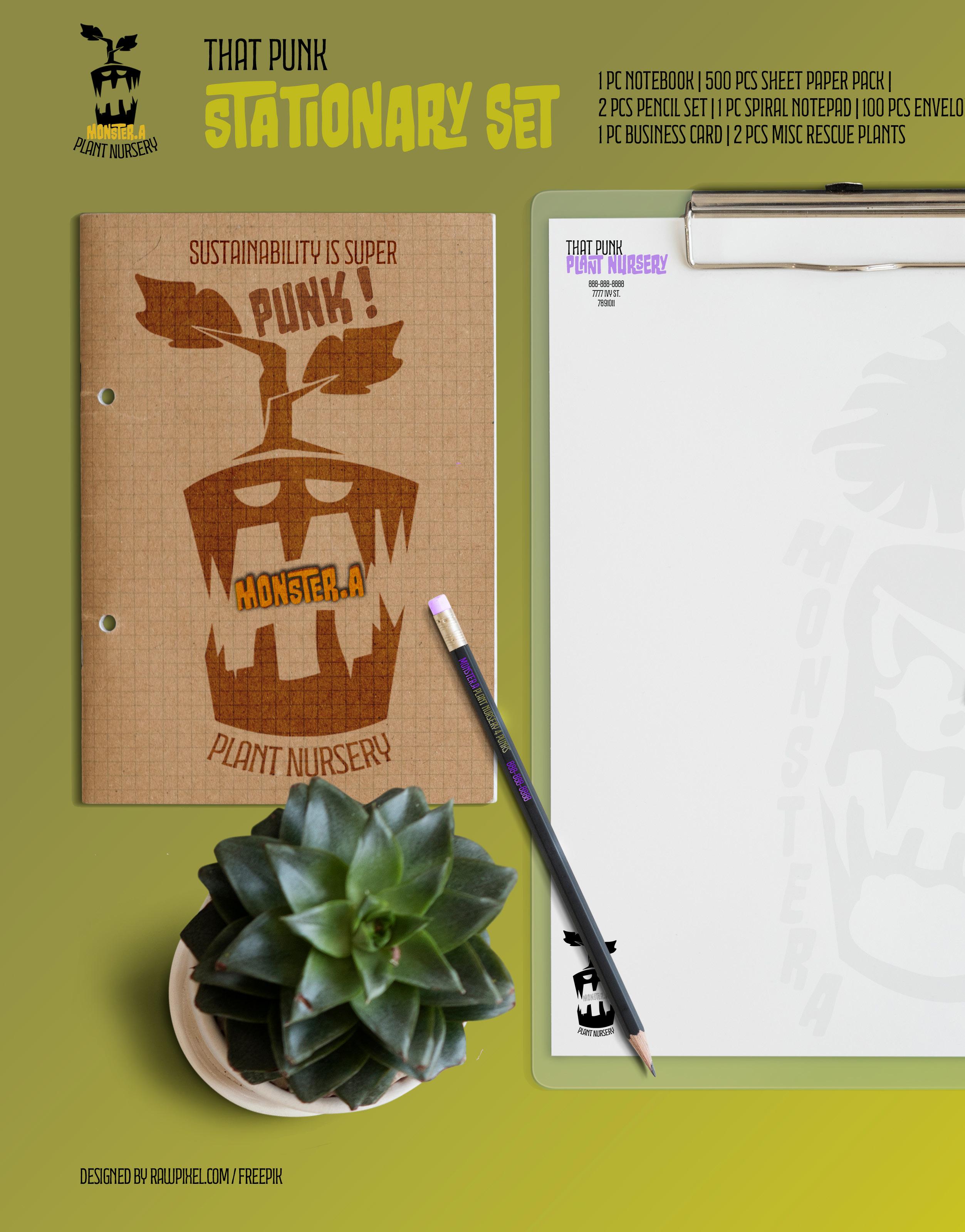
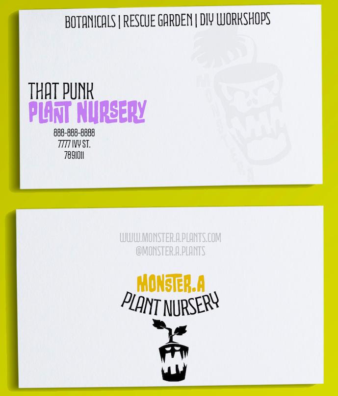
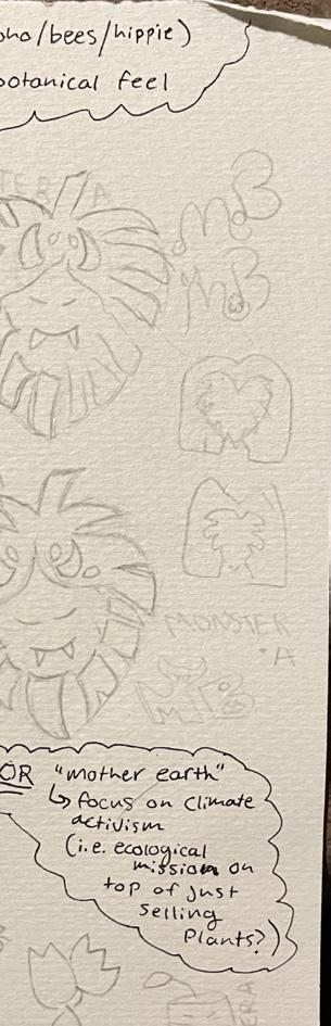
Pictured to the right are the three main stages of the logo progress. I started with something very detailed. I got mostly positive feedback for this design, but in general I was told that it likely would not be readable on smaller scales and simple prints. You can see on the stationary mockup I did still include this earlier version of the logo in some of the designs. After the critique, I decided on a simpler design, but I just was not at all pleased. .

IMa
t looked too plain and the leaf looked weird. So I played around with that version, added more elements of the original, and eventually came up with something I was very pleased with. In my original thumbnail sketches, the version closest to my final result is actually only pictured as a tiny little drawing at the bottom corner of the page.
This accurately represent the design process; you never quite know what you will decide on. I found it was important to keep an open mind and not be stubborn about one single idea from the beginning.
Allowing fluidity in my ideas made it easier to reach my final design and be happy with the results.
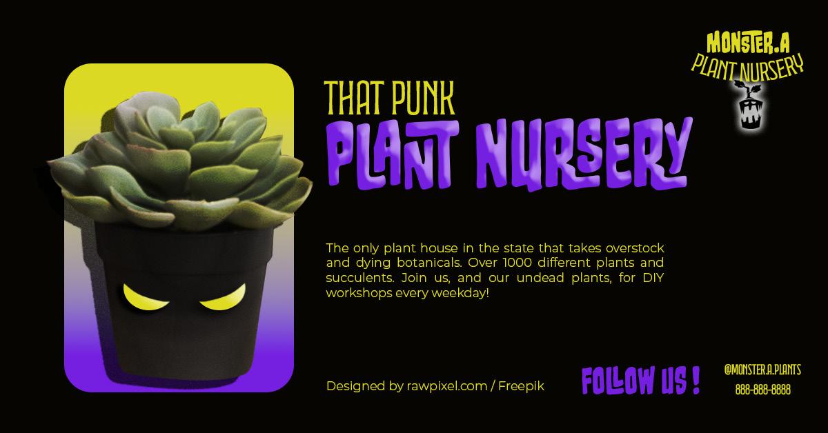
Some additional mock-ups I did were a facebook add (pictured above) and a paper bag (pictured to the write) — I tried to, again, incorporate some nostalgia within the add; not the vintage, hand drawn, period-drama type style we see at botanical shops most often. I wanted create something that made me think of an early 2000’s pop-up add; the era when a new wave of punk was picking up after the 90’s made it main stream.
Itried to make it retro, without being too tacky. The high contrast with the black background really embodies the mood I was going for.
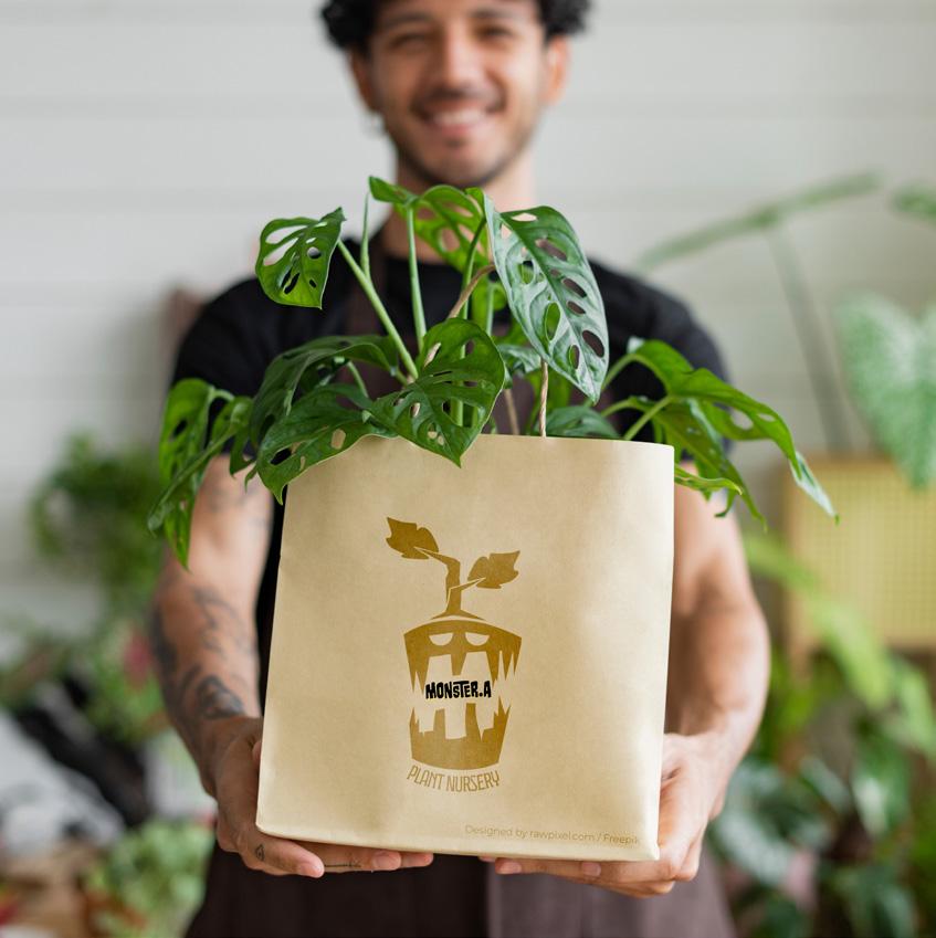
On the contrary, the bag is a bit more reminiscent of an ordinary
plant shop. I imagine anything more fancy would make the production of the bags a less sustainable practice. I decided on the simplest version of the logo and brand name with a light-wash transparent sort of print. The simplicity contrasts slightly with the vibe of the other products, but it felt more realistic to me than anything elaborate.
As I get a feel for what is and is not realistic, I imagine what I would charge for this kind of service. It is hard to say; I have never charged more than $400 for a piece in the past. However, this project has opened up a new skill
that I can incorporate with design; brand communication.
By completely demonstrating a brand message through design I think I would charge more.