An App and Responsive Website to Help Young Adults Learn Technical Skills
 by Brittney Banning

by Brittney Banning
The product: This concept was designed with teenagers in mind to help them build on interests in coding, video game design, and robotics.


Project duration: September 3 - September 27, 2022

The problem: Many apps and websites in this area are designed for adults.
The goal: To create a product designed with young adult users in mind.
My role: UX Researcher and Designer.
Responsibilities: Conducting interviews, researching other apps and websites on the market, paper and digital wireframing, low and high-fidelity prototyping, conducting usability studies, accounting for accessibility, iterating on designs, determining information architecture, and responsive design.

I drew upon my experience working as a teacher for many years as well as talking to other teachers and friends I have who are engineers to come up questions to ask young adults. The feedback received was an enthusiasm about this type of product as well as some ideas of how to make it more fitting to younger users, such as high use of imagery, animations/transitions, projects they would find interesting, and language geared more toward teenagers. Often products already on the market require payment, and for young adults a free option is more accessible.
Jackson is a high school student who has been learning about coding since elementary school who needs intermediate-level courses because he wants to continue to expand his coding knowledge and skills..

Damaris is a middle schools who loves math and science who needs to learn more about technology with beginner courses because she is a highly self-driven learner who is interested in learning more to explore future career options.


The most prominent issue I found is that most apps that teaching coding and other technical skills are geared more toward adults and require a payment or subscription.
I used Crazy Eights to quickly ideate concepts for wireframing.
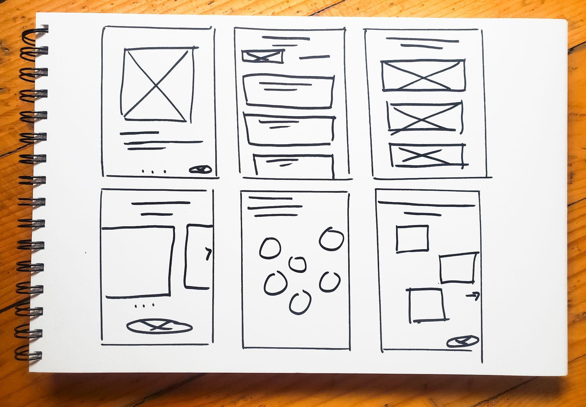
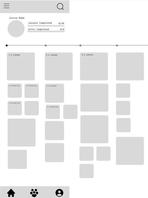
For the course page I was curious to find out what most young adults responded to with the layout, and came up with a responsive design that the user can intuitively scroll both vertically and horizontally through course units and lessons.
Users call scroll down to see the courses expand by lessons in the unit, or right to move through course units.
This section tracks progress through the course. It also contracts to show a more simplified progress bar as users scroll down.
I wanted to keep navigation intuitive and took user feedback where points didn’t feel intuitive in the user flow and improved that. Here is a link to the low-fidelity prototype.

Study type: Unmoderated usability study
Location: Salt Lake City, Utah, USA, remote
Participants: 7 participants Length: 15-20 minutes
Insert a one to two sentence introduction to the findings shared below.
Users were interested in having an online community component to this app.
User wanted more class options of varying levels.
Users were very interested in concept of learning how to create video games with coding skills.
Users are interested in being a part of an online community. Here I added a “Groups” section to the homepage.


I wasn’t sure what images would be a fit here, talking to users about their interest in video games helped me to incorporate video game-related project ideas into the mockup.


I used three into slides to help with the sign-up and class choice process for first-time users. I made additions using user feedback such as more course options. Here is a link to the high-fidelity prototype.

Used high contrast to make text easier to read.
Bold imagery and icons with screen reader integration.
I designed some of the screens to have dynamic type and auto layout features.
After designing the app I designed a complementary responsive website. I used a sitemap to plan the user flow.


I made sure to transition elements to work with varied screen sizes. Phone Tablet

Users seem excited about this concept, the impact would be giving a fun, simple, and free program for young adults to learn technical skills and possibly further hobby or career interests in coding, programming, video game design, and more.
What I learned: I learned about the importance of user feedback and iterating on designs.
I would like to make sure the colors meet accessibility standards.
It would be great to use a translation tools so this app can give more young users opportunities around the world.
It would be helpful to continue to do usability tests and iterate on designs.
Thank you for viewing my work!
If you would like to get in touch, I can be contacted at brittneyleighb@gmail.com