
Responsive Web Design for an Art Courses Site Using Adobe XD

This website offers classes and tutorials in art, with a variety of options in both physical and digital art mediums.

Project duration: September 3 - Sept 26, 2022

Current websites have a broad array of classes, we wanted to simplify a niche for art.
The goal: Offer a minimalist and straightforward, art-specific experience for users.
Responsibilities:
Conducting interviews, paper and digital wireframing, low and high-fidelity prototyping, conducting usability studies, accounting for accessibility, iterating on designs and responsive design.

I conducted user interviews, which I then turned into empathy maps to better understand the target user and their needs. I discovered that many target users use art classes with both personal and professional goals in mind. However, many websites offering online courses are overwhelming and confusing to navigate, which frustrated many target users. Many users were looking for a more straightforward way to take art classes online.
Current websites tend to be overwhelming to navigate.
The cost structure is often not clear and sometimes deceiving.
Course certificates are not offered on some course sites.
Extra fees to earn course certificates deter some users from signing up for the platforms.
Problem statement: Becky is a community college student who needs affordable online classes because she would like to explore different art mediums and supplement her current education..

A user journey map using the art site to identify user pain points and give insight into area of needed improvement.

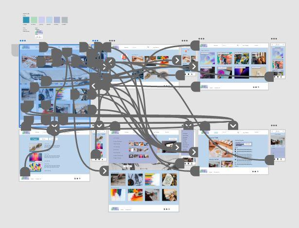
An overwhelming amount of choices was a primary pain point for users, so I used that knowledge to create a sitemap.

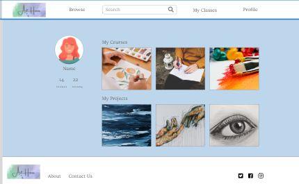
I wanted to make the process of finding classes streamlined, as well as picking up with current classes a user is enrolled in.


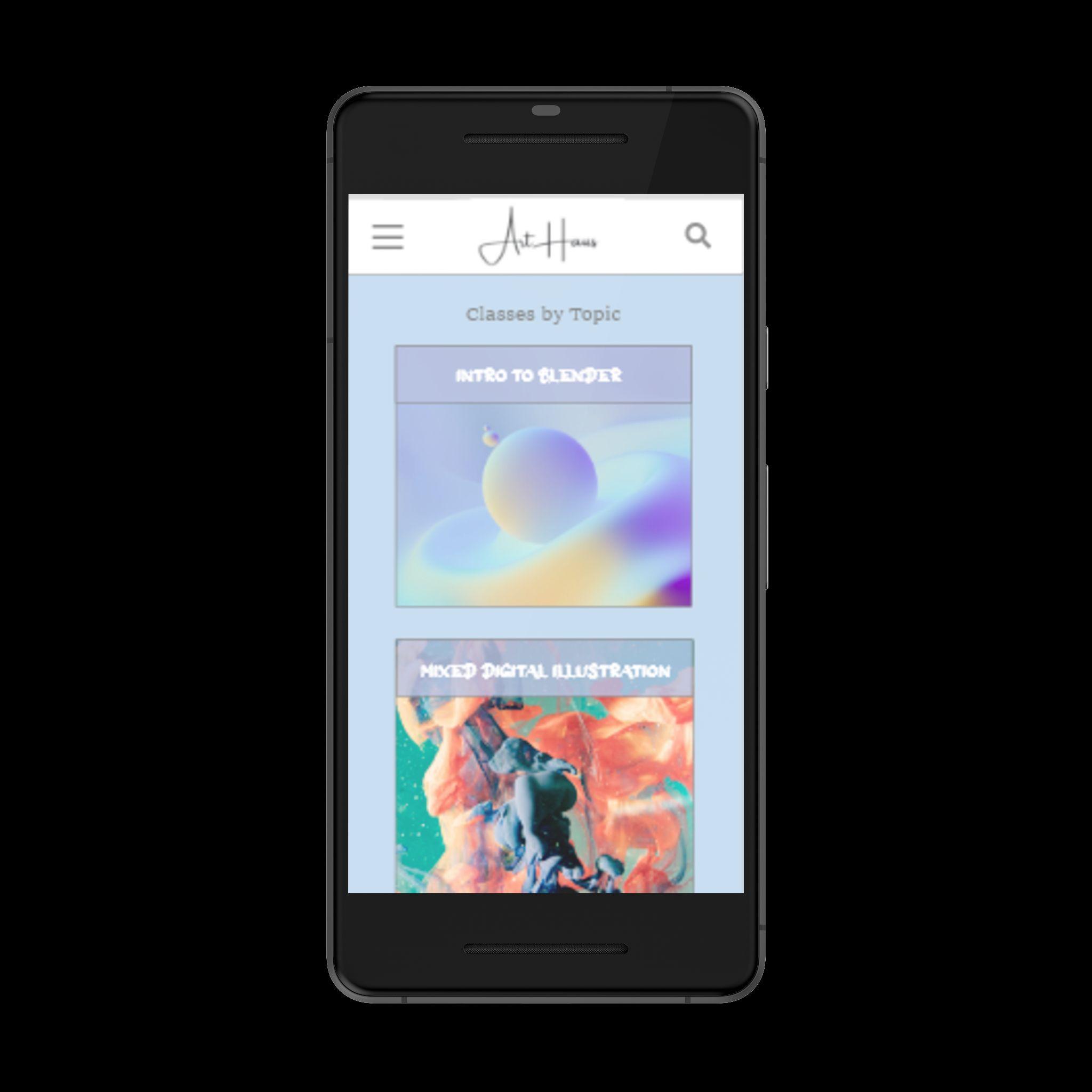
I adapted the screens in the mobile version to be responsive.
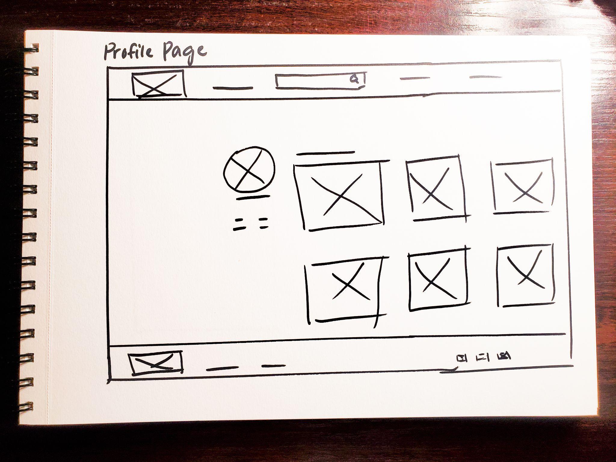
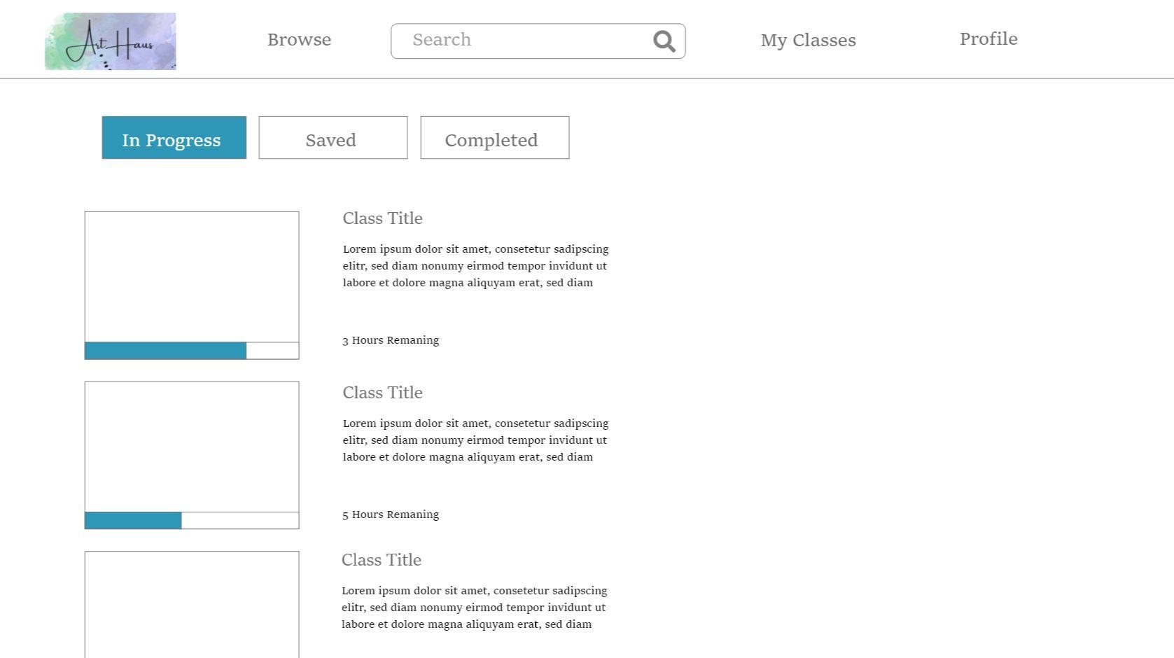
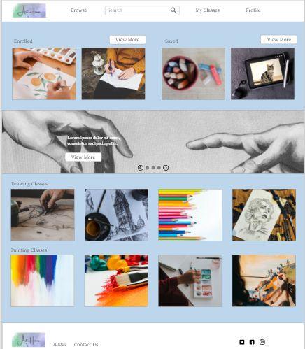
This course page showcases some of the implementation of user research, based on a request for a straightforward course structure to see which sections are completed and which are still in progress.

Ability to review recent videos and keep track of course progress
Sections of each unit show have check marks to gauge progress.
Digital wireframe screen size variations desktop and mobile version of the same page.

This low-fidelity prototype highlights the main user flow through the website. Link to the prototype.

Study type: Unmoderated usability study
Participants: participants
Location: United States, remote
Length: 15-20 minutes
Insert a one to two sentence introduction to the findings shared below.
Users weren’t sure how to enroll or save courses for later; the prototype was missing these buttons.
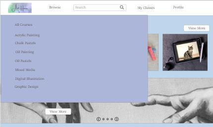
User would like to be able to see more course options user the fly open menu.
“Courses by Topic” could use a clear course name to identify it on or near the course image link.
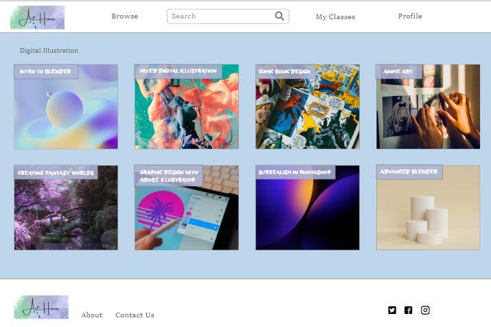
From insights of the usability study I made changes to improve the visuals here by adding the course names to the “Courses by Topic” page.

Here I added more navigation options and visual elements to the browse fly-out page.


Color, photos, and a unique font were added to create a more unique style to the website.
Link to the high-fidelity prototype.
To help users navigate the site landmarks were used.
I used a contrast checker to make sure the colors and text aligned with standards.
I used heading hierarchies to structure organize content.
“The website is easy to navigate through and browse courses. The colors popped and the layout is clean and simple.” - From a user tester
What I learned: I learned to make sure my prototype is set up thoroughly and the interactions are intuitive. I learned that people tend to get overwhelmed by complex websites with a lot of options and simple websites can make users feel less stressed. It’s important to always have the user not only in mind but at the forefront of your design decisions.
Conduct another usability test to ensure designs are meeting user needs.
Create a version of this site that works with tablets.
Incorporate more accessibility features such as language translation.
If you would like to get in touch, you can reach me at brittneyleighb@gmail.com