
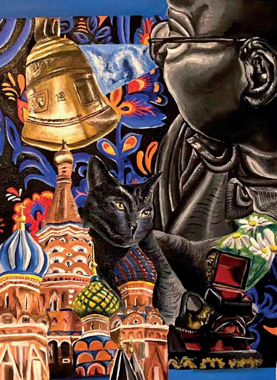
the International Baccalaureate Visual Arts, Students’ Show 2022
to excel since 1969
learning

Creativity enriches the life of the mind. It is also a necessary skill in the modern world, where imaginative solutions are required for complex problems. The British School of Milan celebrates creativity in all its forms - intellectual, imaginative and aesthetic.
The school’s Art department enjoys an outstanding reputation in this respect. It was identified as ‘exceptional’ in a recent Inspection; it was recognised as a Centre of Excellence by the Edexcel Examination Board, and examples of the high standard of artwork achieved by our students are on display throughout the school.
The IB Art Exhibition provides the Art department with a unique opportunity to show the local and international community in Milan some of the finest work produced by our graduating Year 13 students, some of whom will progress to Art and Design courses at prestigious universities and colleges around the world.
We are delighted to showcase the art in this brochure. We hope that you enjoy looking at it and appreciating it as much as we do.
Dr Chris Greenhalgh Principal & CEO The British School of Milan
The Art department has a long-standing reputation, and we continuously strive for a high standard of artwork across all key stages. We celebrate this success in the weekly Newsletter, the school corridors and our final GCSE and IB examinations. The COVID pandemic has challenged our department to teach Art in non-specialist rooms and online, but we have been relentless in continuing our enthusiasm for teaching the subject, encouraging creativity, and promoting the talents of our students. The final IB exhibition will be digital this year and the students have embraced this decision with diplomacy and maturity. We hope to exhibit the artwork in ‘real life’ as the restrictions ease. The Year 13 students this year have been an incredibly conscientious group and some I have taught from Year 7. It is such a pleasing thing to see our students continue with that same excitement and love for the subject that they had when first commencing Senior School. The students that joined the school later in Senior have most certainly ‘hit the ground running’ working with the energy and excitement needed.
The IB Visual Arts course is an incredibly demanding subject that requires students to reflect on the world around them whilst exploring a diverse range of artistic mediums. It is a personal and meaningful two-year journey, and one of the most rewarding. This exhibition certainly reflects the student’s journey in such unusual times, and we hope you enjoy the work created and take time to reflect on their experiences.

 Kate Michael head of art
Kate Rigby art teacher
Kate Michael head of art
Kate Rigby art teacher
Mixed mediums 30cm x 30cm

Make Believe
Acrylic on paper

 Big City Blues
Acrylic on canvas
60cm x 60cm
30cm x 40cm
Big City Blues
Acrylic on canvas
60cm x 60cm
30cm x 40cm
Young Folks
Acrylic on paper
30cm x 40cm

Rips


and
 Transient Harmony Acrylic on paper 67cm x 47cm
Coloured pencil
graphite 20cm x 22cm
Hope Acrylic on canvas 63cm x 68cm
Transient Harmony Acrylic on paper 67cm x 47cm
Coloured pencil
graphite 20cm x 22cm
Hope Acrylic on canvas 63cm x 68cm

30cm

42cm x 59cm
Repent
Charcoal and tracing

paper on paper
17cm x 13cm
16cm x 11cm
26cm x 33cm
 paper
Static Graphite and Ink on paper
x 42cm
paper
Static Graphite and Ink on paper
x 42cm
Imprint
Acrylic on canvas
38cm x 54cm

Trevi
Acrylic on canvas
70cm x 50cm
Sky Gazing
Acrylic and tempera on canvas
30cm x 40cm
Onerous Pandemic

Acrylic and oil on canvas

200cm x 80cm

Inner Abandonment
Acrylic and watercolour on canvas
60cm x 80cm


 Conformity: a Series of Seven Acrylic on canvas 18cm x 13cm (x7)
Take The Medal Acrylic on paper 45cm x 65cm
Looking North Acrylic and biro on canvas 30cm x 41cm
Conformity: a Series of Seven Acrylic on canvas 18cm x 13cm (x7)
Take The Medal Acrylic on paper 45cm x 65cm
Looking North Acrylic and biro on canvas 30cm x 41cm


 Clueless
Acrylic on canvas
75cm x 85cm
Empty Acrylic on canvas 48cm x 31cm
Society Acrylic on canvas 48cm x 65cm
Clueless
Acrylic on canvas
75cm x 85cm
Empty Acrylic on canvas 48cm x 31cm
Society Acrylic on canvas 48cm x 65cm
Unfamiliar Reflection
Acrylic on canvas
45cm x 70cm

My art primarily aims to raise awareness of the mental repercussions as a resulting from of quarantine and isolation. More specifically my artwork represents the struggles I faced during and after quarantine, including the feeling of being alone, feeling distant from others, and body image issues. I was predominately influenced by Edward Hopper and his portrayal of isolation through unconventional imagery. Edward Hopper reflected his solitude by painting empty streets, shops and generally a lack of people.
I approached my investigation by taking elements form Hopper’s art journey and combining them with my interest in surrealism. From an early age I have felt an affinity for the eerie and sinister, often indulging in movies or books set in dystopian societies such as Orwell’s 1984 and Margret Atwood’s The Handmaid’s Tale. In my exhibition, I wanted to represent isolation from the perspective of someone living in a post-apocalyptic society in order to manifest a feeling of eeriness that can be paralleled to what I felt during Covid.
To achieve this, I depicted a variety of dystopian screens, all with a lack of humans to represent the lack of interaction during lockdown. Some of my pieces were more clearly dystopian and surrealist such as the studio piece with the tentacle holding the spaceship as a giant Tsunami is engulfing an empty city. Other studio pieces, were more subtly eerie: the studio piece with the empty street is meant to represent a city that has just been abandoned similarly to Pripyat and Chernobyl in early 1986 right after the explosion of the nuclear plant. I achieved this through the lack of light from within the building to show a lack of human life and through the placements of human objects such as street signs, a bicycle and cars, all whilst there was a lack of life and urban movements.

My exhibition examines our relationship with nature. Nature has a broad inclusion of everything that grows and exists naturally in the environment. I explored how mentally and physically nature can nurture and give us a supportive influence as human beings.

I have selected 10 artworks to show the different relationships that I have with nature. In my experience Nature can be healing and restorative and I want to communicate this to the viewers.
As my IB journey started, the sudden occurrence of Covid-19 influenced my perceptions and understanding of nature. The invisible organisms that exist in nature, such as the virus, made me curious about their existence and visual presentation. I noticed the abstract and mysterious aspects of nature, the complex, intricate organic systems and the varied textures, forms. This let me start my first studio piece “The Pale Leaf”. I used curvy, smooth lines on the subjects and straight, geometric lines in the background to build a contrast in texture. I quoted Ellen Gallagher’s marine creature in her paper An Experiment of Unusual Opportunities. Through emphasis on the textures and colours of subjects I want the viewer to see the difference between vitality and death. As the organisms on the left side with vibrant colours represent vitality, the falling pale leaf represents death.
In my artwork, I explore the weight of memory on the self. By depicting the imprints of past faces and events, I have recorded a part of my identity, and explore the shared memory of the society I live in.

I chose to embody memory primarily through essentiality; many of my pieces imply an imprint, rather than a realistic image. I was largely inspired by Gerhard Richter and Luc Tuymans, who imitate fading photographs and leave ambiguity for the viewer to interpret. I am interested in how contemporary artwork uses the spectator’s participation to influence the meaning behind an image.
Though I naturally tend towards expressionist oranges, I have begun exploring unsaturated colours, which allow me to blur the lines of a subject. My more essential portraits are in a simple black charcoal or graphite. “Repent,” a cross- shaped series of portraits (the catalogue only displays a section), represents the negative effects of dated Christian doctrines in childhood. In my own experience, religious regulations only led to an aversion to organised ideals. I hope to use colour to amplify the emotions of the people I draw.
I also focused extensively on childhood memory, and its significant effects on identity. Dolls are a recurring symbol I use to represent the duality of innocence and manipulation. “Dress up” contrasts the light act of playing make-believe with a sinister, monochrome darkness. I wanted to portray the children as dolls themselves to represent a corrupt sense of identity.
Every image I create is a portrait of someone that I know personally, or a scene from my own memory. I focus on portraiture because I find facial expressions to be an extremely impactful call to empathy. Personal memory is crucial to my artistic process, as it creates the closest image to my honest reality.
The world was struck by a global pandemic which caused people to stay indoors for several months and avoid social interactions. With this unexpected experience I decided to focus my exhibition on the theme of disconnection through surrealism and Op art. Personally, the lockdown was a hard period where social interactions with people outside of the household were limited, at times prohibited. As time passed I started feeling overwhelmed, stressed, lonely, isolated. This is why I decided to focus my paintings on disconnection. By developing ideas and techniques from artists such as Kay Sage, Leon Golub, Rene Magritte and Victor Vasarely, I clearly expressed myself and the main theme to the audience through my work. Initially my work had a naturalistic approach to show disconnection in my paintings. Two pieces I researched “Le Territoire” and “Natural Graces” both by Rene Magritte, focused on nature and alienating human figures, strengthening the idea of isolation. By focusing on nature rather than people, it also reflected back on the lockdown where the population wasn’t able to go outdoors. This same technique of addressing desolation and disconnection was used in my artworks “Sky Gazing” and “Trevi”. However, for “Trevi” I also looked at Victor Vasarely’s untitled sculpture found in Pecs, France, which differently from the other paintings, focused on the Op art movement. The art movement was derived for this piece because the feeling of loneliness and disconnection can also be expressed through Op art. The idea of not including human figures was later changed throughout the process. This is because rather than only focusing on the nature, feelings and emotions people couldn’t experience due the lockdown, I also wanted the viewer to reflect back on how myself and others felt, stuck at home. Some artworks I looked at specifically for this were “Vietnam II” by Leon Golub and “Le Passage” by Kay Sage. Both these pieces helped me choose the right facial and body expressions for the individuals included in my artworks “Onerous Pandemic and “Inner Abandonment”. Expressions are crucial to give the wanted message to the audience, which is why these two pieces were chosen. Lastly, there were other features and techniques I developed and decided to use such as the large dead space, the similar yet different colour palettes or the composition in which the human figures were displayed to invigorate detachment and disunion.

Through the course, I initially focused on isolation, which later shifted to my self-identity and experiences. I was influenced by Dali, Jean-Baptiste Greuze, Yue Minjun, Wayne Thiebaud during my artistic journey. Intrigued by the psychological and memorial aspect from fragmentation of oneself, I decided to shift my work looking at my personal identity as Sinophobia has taken place more frequently than ever amid the pandemic. My exhibition is centred around the exploration of personal growth based on my experience and building my narrative as an artist. I felt that my identity was dissolving in which I found myself connecting with surrealism - I felt out of place in a strange world to which I didn’t belong. As a result, I began to create “Broken Clocks” with muted colours and spaces between objects to enhance the hollowness. Stemming from this, my intention is to break down my identity into rituals as the building blocks of my identity and finding my origin. To connect with my heritage, I looked at Yue Minjun to further learn about my country’s take on art while creating ‘Take the Medal’. I was able to absorb his inventive style dealing with the indispensable suffering of human existence and the disorientation we experience from aspects such as the painting style with long, sharp, and exuberant brush strokes and compositions. His plastic-like texture conceptually enriches the theme of duplicity as we are not offering our authentic self. Memory is also captured as I freely recall my recent summer activity – baking. Overall, through my artistic course I have dealt with different themes focusing on my personal growth and resilience over this period. I have selected pieces which represent pivotal moments in my life. Thanks to the IB course, I was able to deepen my understanding on the effects and techniques of art and have the freedom to explore.

During my Visual Art’s journey, I started to find strategies to express my internal state through reflective moods. My work has reflected the shared journey of the challenges experienced through the Covid-19 Pandemic and the forced isolation and impact this has had on our sense of community. This led me to develop artworks that capture the protagonist’s interior state. My later artwork developed into pieces that were more introspective and embedded in my life. I gave visuals to the sensations I was feeling. This was expressed through faces and the emotion derived from body language. I depicted my struggle with emotions and exposed my inner afflictions during mundane life. I was influenced by Frida Kahlo, Francis Bacon and Lucian Freud. After researching their motivations and techniques I became more subtle at introducing elements of colour and composition. For example, how Bacon’s negative space amplified the feeling of loneliness and the banality of human life due to its emptiness. The cathartic work of Francis Bacon was of great importance to my work, I was enticed by his use of abstracted figures and his raw unsettling imagery. He focused on the human form, showcasing the pain and experience of the subject through blurred lines and disfigured expressions. I mimicked his distortion through disfiguring my subjects in an unsettling, enigmatic way. The slight deformation was a way of expressing the struggle with finding one’s identity and the dysmorphia of the journey to healing. The dominant colors are cold greens and blues, verging on a dull pink. These color contrasts amplified the sense of nostalgia. I was also inspired by Frida Kahlo’s collective embrace of her Mexican Identity and her expressive art explaining the many difficulties she faced during her life. Through her pieces, the backgrounds are nothing short of significant. Frida used them to present her inner turmoil whilst surrounding the emotions of the subject through the environment. In one of my pieces, I created a metaphor of emotional emptiness and numbness using an empty bathtub and vacant, unresponsive eyes. Stemming from this, using both Bacon and Frida’s advice, in a following piece I contrasted the subject with a darker and unoccupied background. This was vital to impact the audience to feel drawn by the protagonist of the piece and amplify its presence with the dark, void surrounding it. In addition, I ensured that my subjects were making direct eye-contact to personally direct and involve the viewer and to challenge their apathy on people’s suffering. The fragmentation of Lucian Freud’s figurative art was also of great involvement to my techniques. I mimicked his expressionist style of portraiture with harsh, heavy brushstrokes and similar warm tones of color. I liked the way his bright background contrasted his subject. This motif recurs throughout my work, I used a dark mirror as a metaphor for my personal turmoil in contrast to the white, light background showcasing society and its lack of empathy.


 Charles Donvito Year 11
Mila Pretolani Year 11
Alice Rangone Year 11
Eva Schilton Year 11
Livia Daveri Year 11
Costanza Oriani Year 11
Charles Donvito Year 11
Mila Pretolani Year 11
Alice Rangone Year 11
Eva Schilton Year 11
Livia Daveri Year 11
Costanza Oriani Year 11


 Nico Noseda Year 11
Chiara Franzin Year 11
Sara Deangelis Year 10
Sebastiano Alden Year 11
Sylvia Pratico Year 11
Nico Noseda Year 11
Chiara Franzin Year 11
Sara Deangelis Year 10
Sebastiano Alden Year 11
Sylvia Pratico Year 11
Our success has been continuously noted externally by awarding bodies and the ‘exceptional’ rating in the recent Inspection. We can say with full confidence that it is the BSM students who are exceptional. I would like to thank Ms Rigby who joined the BSM last year and has led this group from year 12 whilst I was absent on maternity. She has relentlessly strived for each student to be their personal best and I thank her for her dedication to the Art department.
Kate Michael Head of Art