

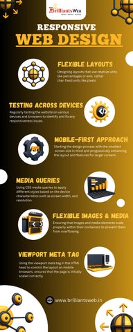
Flexible Layouts
Designing layouts that use relative units like percentages or ems rathar than fixed units like pixels
Designing layouts that use relative units like percentages or ems rathar than fixed units like pixels
Regularly testing the website on various devices and browsers to identify and fix any responsiveness issues


Starting the design process with the smallest screen size in mind and progressively enhancing the layout and features for larger screens
Using CSS media queries to apply different styles based on the device characteristics such as screen width, and resolution

Ensuring that images and media elements scale properly within their containers to prevent them from overflowing
Using the viewport meta tag in the HTML head to control the layout on mobile browsers, ensures that the page is initially scaled correctly www.brilliantsweb.in