Introductions Glossary
Type
Classifications
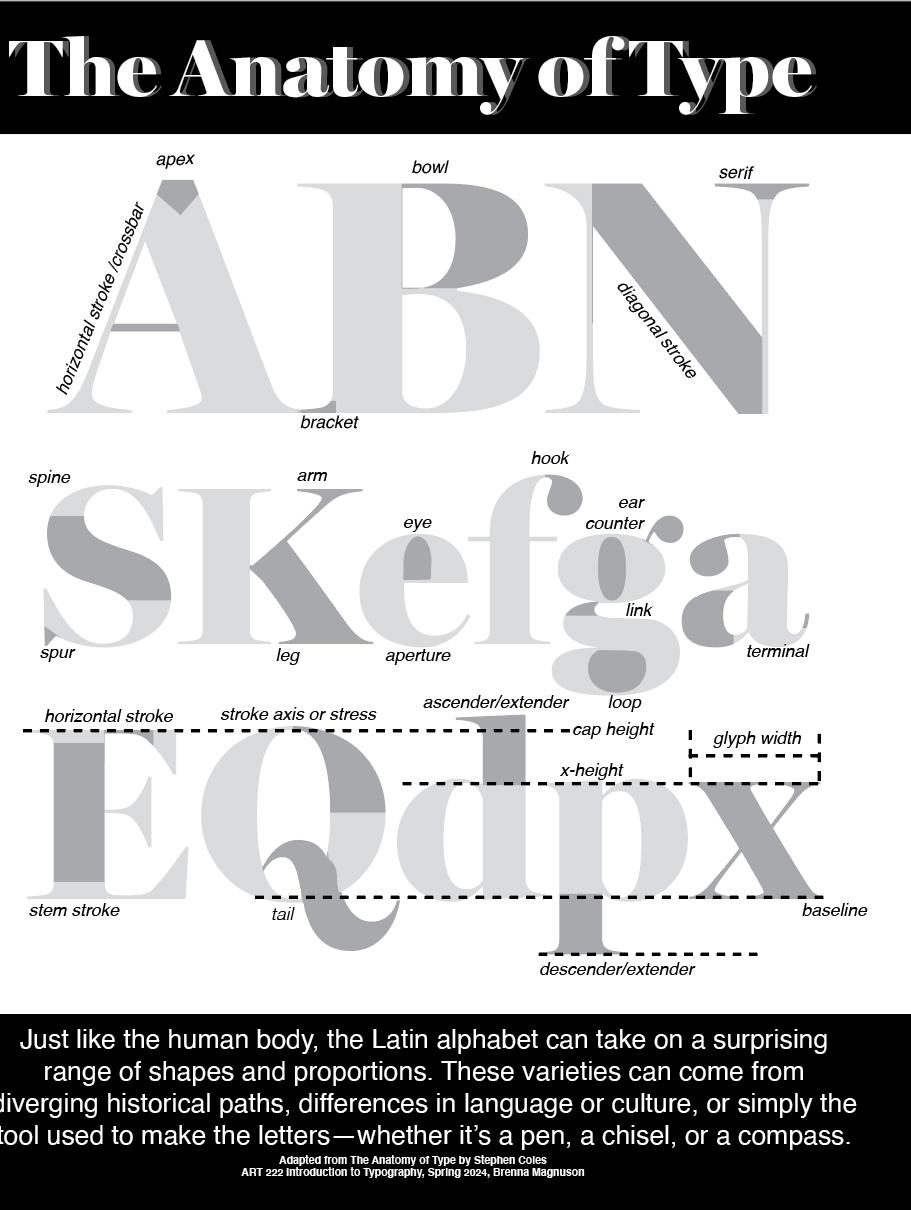
Anatomy of type
Setting Type
Type Sizes
widows and orphans
allignment
line length & leading
Type Designers

My Portfolio
 Giambattista Bodoni
Victoria Rushton
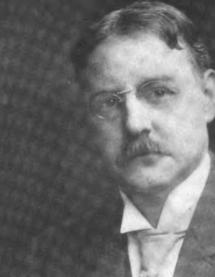
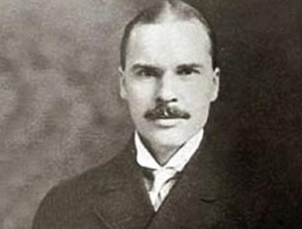
Frank Hinman
Giambattista Bodoni
Victoria Rushton
Frank Hinman
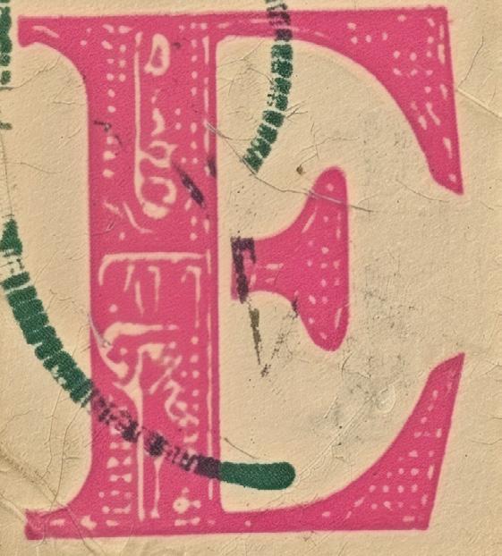
1
2


3


4
5
Rg a
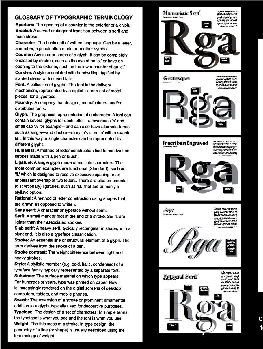
In the last forty years, type designers have borrowed the most pragmatic aspects of the previous styles to develop a new breed of highly functional Text faces, designed to solve the problems of various substrates and reading environments. These designs generally sport a much larger x-height and lower stroke contrast than traditional serif typefaces, but are otherwise not directly related. They range from the spatially economical Swift to the informal and energetic Doko.
Typeface shown: Manofa
Geometric Slab R g a
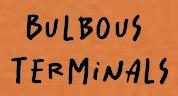
As we move further away from type’s calligraphic roots, contrast increases and the stress axis turns more upright and variable within each typeface rather than staying consistent as it does in the Humanist serifs. Letters in these typefaces are more regular in shape and proportion and apertures are slightly smaller. Transitional serifs still have a gradual, bracketed transition from the stem, and terminals are often bulbous.
Huministic Serif
Rg a
When sans serif printing type first appeared in the early to mid-1800s, some found the style so strange they called it grotesque. These typefaces kept the nickname even after they gained popularity and Grotesque (or Grotesk in German-speakers) is now associated with any sans serif in this early style. The characteristics of Grotesque typefaces are similar to those of the Transitional and Rational serifs: regular proportions, relatively static forms based on the oval and fairly closed apertures, with some strokes turning inward.
Typeface shown: Rokkitt
Typeface shown: Garamond Premier
Inscribed/Engraved
6
Contemporary Serif
R g a
In the last forty years, type designers have borrowed the most pragmatic aspects of the previous styles to develop a new breed of highly functional Text faces, designed to solve the problems of various substrates and reading environments. These designs generally sport a much larger x-height and lower stroke contrast than traditional serif typefaces, but are otherwise not directly related. They range from the spatially economical Swift to the informal and energetic Doko.
Typeface shown: Tisa Pro
Transitional Serif
aRAs we move further away from type’s calligraphic roots, contrast increases and the stress axis turns more upright and variable within each typeface rather than staying consistent as it does in the Humanist serifs. Letters in these typefaces are more regular in shape and proportion and apertures are slightly smaller. Transitional serifs still have a gradual, bracketed transition from the stem, and terminals are often bulbous.
Grotesque Sans
RWhen sans serif printing type first appeared in the early to mid-1800s, some found the style so strange they called it grotesque. These typefaces kept the nickname even after they gained popularity and Grotesque (or Grotesk in German-speakers) is now associated with any sans serif in this early style. The characteristics of Grotesque typefaces are similar to those of the Transitional and Rational serifs: regular proportions, relatively static forms based on the oval and fairly closed apertures, with some strokes turning inward.
Neo-Grotesque Sans
agRTypeface shown: Feilds Display
Typeface shown: Pragmatica
Neo-Grotesques (Neo-Grotesk in German-speaking parts of Europe) are even more rationalised extensions of the Grotesque style. These typefaces, pioneered by Helvetica and Univers, have very little stroke contrast, horizontal terminals and quite closed apertures. Their homogenized forms are graphically appealing at large sizes, so they often fare better in Display settings.

Neo-Humanist Sans
R g a Geometric sans

R g a
The digital era gave birth to new sans serifs that share characteristics with other classifications but are individual enough to deserve a label of their own. Many of these have a dynamic structure that could be considered an evolution of the Humanist sans, but stroke contrast is reduced and apertures are even more open. The round shapes of typefaces in this category tend to be more square than their predecessors and x-heights are larger on the whole
The most static and clinical of all the classifications. Geometric sans serifs are constructed out of geometric forms with round parts that are circular or square. It’s important to note that, while shapes like the ‘o’ appear to be exactly round, most proper typefaces do not contain perfect circles, but are optically corrected to appear as round as possible while harmonious with other letters. Geometrics have minimal stroke contrast, and italics are commonly slanted versions of the romans rather than cursive in form.

g
g a
7
Humanistic Slab
R g a
Put simply, you could take a Humanist sans serif and add unbracketed, rectangular serifs and get pretty close to a Humanist slab. These typefaces often have less stroke contrast than their sans counterparts, and the serifs are sometimes wedge shaped.

Humanistic Sans
Rg a
Like their serif counterparts, Humanist sans serifs have roots in calligraphy. Their round, dynamic, open forms have higher stroke contrast than the other sans serif classifications (though not as much as most serifs). These typefaces sometimes share the binocular ‘g’ and variable letter widths of their serif sisters. Their italics are true italics with cursive forms of ‘a,’ ‘g,’ ‘e,’ and sometimes a descending ‘f.’
Grotesque Slab
R g a
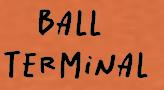
If one were to weigh the typical example of each classification, these bulky beasts would tip the scale furthest. Although they aren’t simply Grotesque sans serifs with slab serifs slapped on, these typefaces reflect the proportions, structure, and stroke contrast of their serif-less counterparts. Ball terminals are common among Grotesque slabs, as are heavy bracketed serifs and closed apertures. The effect of these attention grabbers can be decorative and eye-catching, and is usually very bold.
Gothic Sans
Rg a
Some English and American variants of the Grotesque style are known as Gothics. While the differences are sometimes in name alone, there are a few distinctions that can be drawn. These include a large x-height, forms that are simpler and more static, very low contrast, and often a condensed width with an upright stance derived from flat-sided rounds. Typefaces like DIN—designed by engineers for industrial use—could be considered Geometric sans serifs but also share many traits with these Gothics.
Script Rational Serif
Rg a
At the opposite end of the spectrum from the Humanists. Rational serifs have a strong, vertical contrast between thick vertical stems and fine horizontal hairlines. Because these typefaces are not so much written as constructed, their letterforms are very even in proportion and structure. Serifs are generally symmetrical, and can be bracketed, like Melior and Miller, or thin and abrupt, like the Didones (Bodoni and Didot).
Rg a
Traditionally, a script typeface emulates handwriting, whether its letters are a graceful, connected cursive or the staccato scribbles of a daily shopping list. Besides formal and informal categories. Scripts can also be sorted by the writing tool, such as pen or brush. Script fonts have become increasingly sophisticated in recent years thanks to technical developments like OpenType. Discretionary ligatures and contextual alternatives yield a more convincing emulation of real handwriting and offer a variety of decorative options.
horizontal graphically structure of more other stroke
Typeface shown: Neighbor
shown: Adelle Sans Typeface shown: Josefin Sans Typeface shown: Brevia Typeface shown: FF meta Typeface shown: Rokkitt Typeface shown: Brush Script MT Typeface shown: Proxima Nova Typeface shown: Didot 8
Typeface
apex crossbar bracket bowl serif strokediagonal spine spur leg arm eye hook loop ear counter aperture link horizontal stroke stem stroke stroke axis ascender/extender tail 9
ascender/extender
descender/extender
ear counter terminal link
width
cap height baseline 10
glyph
x-height
11

12
point
py e 4 8pointtype 6 0iop
iop-24
27epy
13
e
ttn
tn t
n t ty p e 8p o in ttyp e 9p o i n t ty p e 1 0p o i n t t 11epyiopttn21epyiop-ttn41epyiopttn y p e 16pointtype18-point type20-poi
iop-5tn tepy iop-6tn tepy iop-7
epy iop-03tn t
n ttepy 14
nttyp e 24p o i ttn
iop-63epy
An Orphan page. It is usually the last distracting. appears at the top of the An Orphan is a short line that in a setting. uncorrected widows and orphans designers are leaving Two unforgivable sins for line of a paragraph from the preceding column or page. It is more obvious and therefore
15
There
is no rule for just
The longer the line the more noticable depends upon the constitute a widow as much how few words or letters line length. widow.
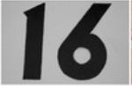
16
Left
There are five ways of arranging lines of type on a page. The first is justified: all the lines are the same length and align both on the left and the right. The second is unjustified: The lines are of different lengths aligned on the left and are ragged on the right. The third is a similar arrangement, except now the lines align on the right and are ragged on the left. The fourth possibility is centered: the lines are unequal lengths
Alignment
There are five ways arranging lines of type page. The first is justified: all the lines are the length and align both left and the right. The is unjustified: The lines of different lengths aligned the left and are ragged right. The third is a arrangement, except lines align on the right are ragged on the left. fourth possibility is the lines are unequal
Centered
Justified
17
Alignment Right
There are five ways of arranging lines of type on a page. The first is justified: all the lines are the same length and align both on the left and the right. The second is unjustified: The lines are of different lengths aligned on the left and are ragged on the right. The third is a similar arrangement, except now the lines align on the right and are ragged on the left. The fourth possibility is centered: the lines are unequal lengths ways of type on a justified: the same both on the The second lines are aligned on ragged on the a similar now the right and left. The centered:
lengths
Centered Justified
There are five ways of arranging lines of type on a page. The first is justified: all the lines are the same length and align both on the left and the right. The second is unjustified: The lines are of different lengths aligned on the left and are ragged on the right. The third
unequal
18
leading, like wordspacing and letterspacing, can be used to improve readability. Your choice of typeface, type size, line length, and copy will all affect
Linespacing, or leading, wordspacing and letterspacing, be used to improve readability. Your choice of typeface, type line length, and copy will affect the amount of linespacing.
With so many factors involved, can see why proper linespacing more a matter of visual judgement than of mathematics.
Linespacing, or leading, like wordspacing and letterspacing, can be used to improve readability. Your choice of typeface, type size, line length, and copy will all affect the amount of linespacing. With so many factors involved, you can see why proper linespacing is more a matter of visual judgement than of mathematics.
Linespacing, leading, wordspacing letterspacing, be used to readability. choice of typeface, type size, line and copy will affect the amount linespacing. many factors you can see why linespacing a matter of judgement than mathematics.
19
leading, like letterspacing, can readability. size, will all linespacing. involved, you linespacing is judgement mathematics.
In general, the length of a line of type should be comfortable to read: to short and it breaks up words or phrases: too long and the reader must search for the beginning of each line, which can be if you have ever found yourself reading the same line twice, the lines were probably too long and the text insufficiently linespaced. Linespacing, or like wordspacing and letterspacing, can improve readability. Your typeface, line length, will all amount of With so involved, why proper is more visual than of mathematics.
20


21


22
g i a m b a t t i s t a b o d o n i
23
BODONI
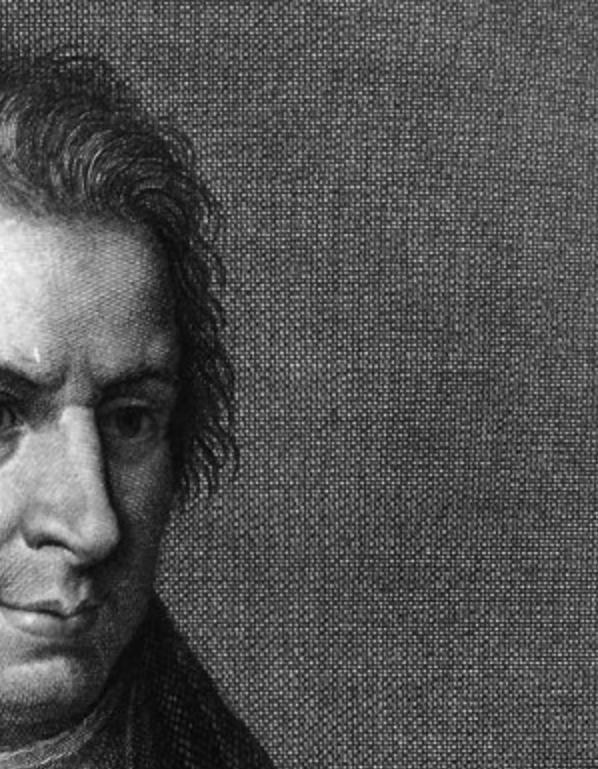
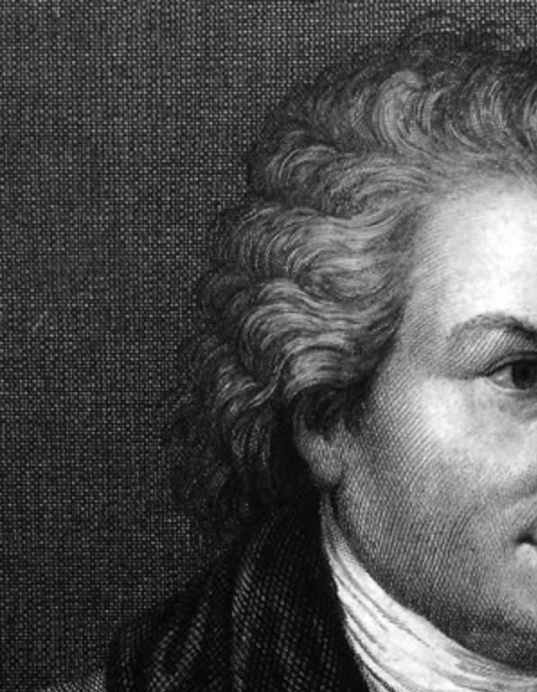
Giambattista Bodoni was an Italian graphic designer and typographer. He was also worked as type-designer, compo sitor, publisher and printer. His type designs were modeled after Pierre Simon Fournier’s typeface but later felt inspired by the typography of John Baskerville. With the help of an associate he evolved the type called ‘New Face’.
24
MARCIA V I C T O
R I A R U S H T O N

25
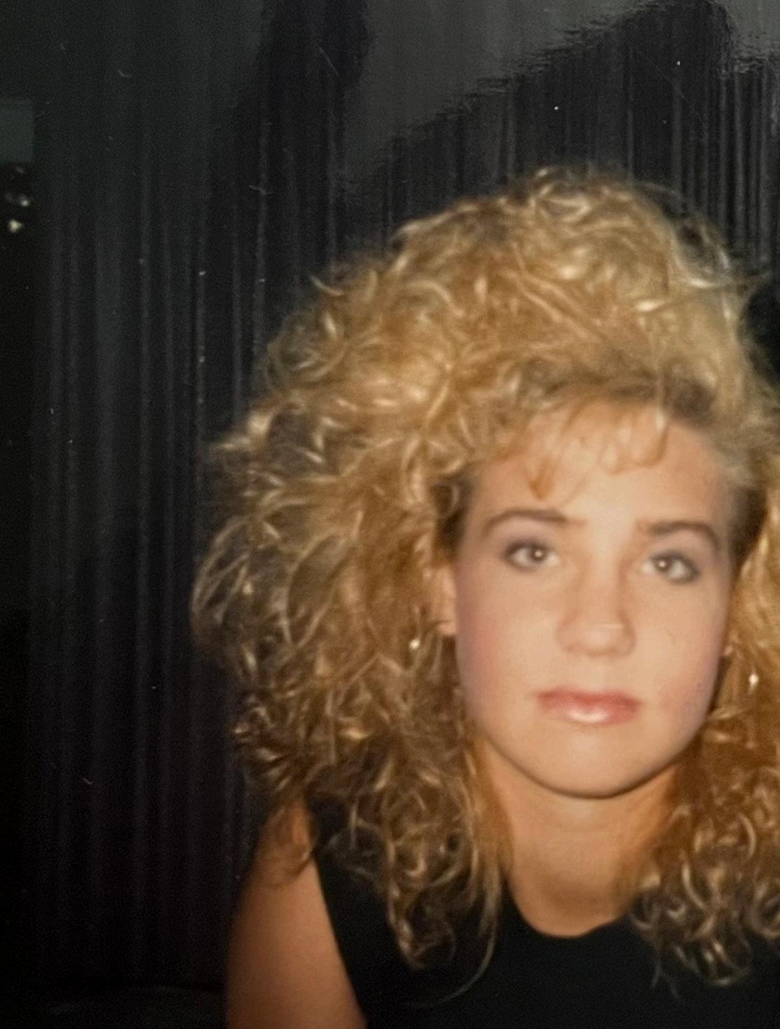
MARCIA
Victoria Rushton was an Illustration major in college until she took a graphic design class. There, she discovered that type design was the best direction for her. While in school, she began working on the typeface that would become Marcia. When she encounters Marcia now, she sees the bad ideas, redraws, and subsequent fixes along with the resulting learning, practice, and success.
26
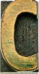
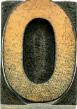
The original name for Rockwell was Litho Antique and it was produced by Inland Type Foundry in 1910 and designed by William Schraubstadter originally, later it was revived by Morris Fuller Benton in the 1920s and named Rockwell and lastly the last version of Rockwell was released in 1934 by Monotype and it was redesigned by Frank Hinman Pierpont. Rockwell is a Geometric Slab Serif constructed almost by straight lines, perfect circles, and sharp angles. The x-height with the stroke width helps Rockwell to provide a strong presence with some blocky feel, and the perfect use for Rockwell typeface is for headlines in printed or digital surfaces, but it’s not suitable for body copy because it will be hard to read it.
ROCKWELL
27 S C H R A U B S T A D T E R W I L L I A M
ROCKWELL
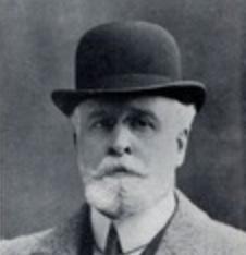
28 F U L L E R H I N M A N F R A N K M O R R I
S


29


30
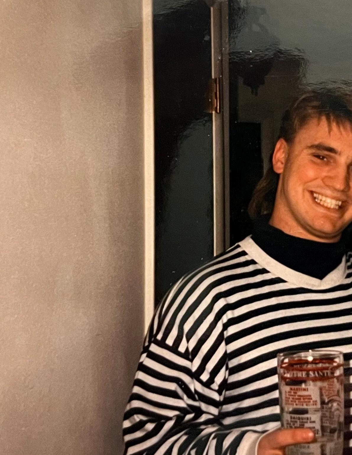
PROJECT 1
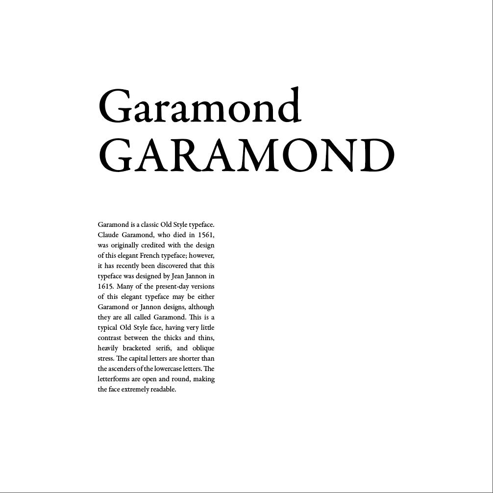
The Five Classic Typeface project was a practice of letterspacing, wordspacing, and linespacing. Adjusting these three factors affects the readability of the typeface. I experimented with Garamond, Baskerville, Bodini, Century, and Helvetica.
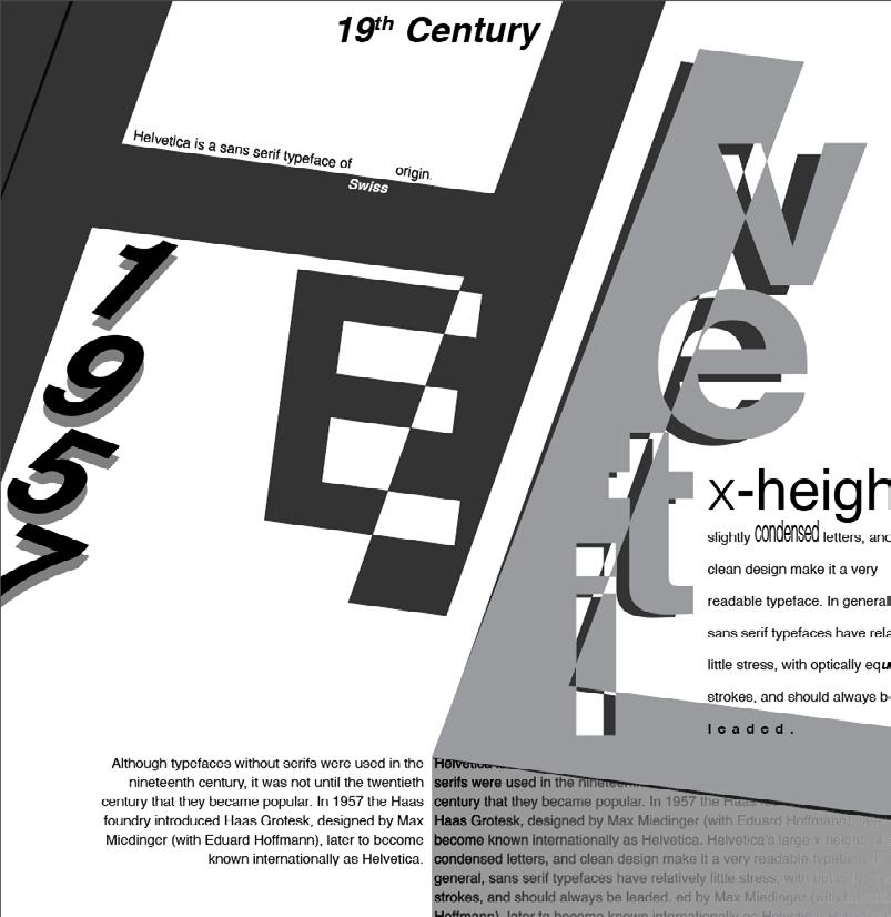
31
Now experiments with the typefaces. Allowing us to explore and express a composition using the information given about typefaces. I chose Helvetica: I put the main letters large and incorporated everything around them. I like the different shades of black and tried to make the composition appealing to the eye.
R O J E C T 2
32
P
The Grids project page structure. paragraph styles, imagery. The title Garamond while but in different
33
project focused primarily on structure. I made use of grid guides, styles, layouts, text boxes, and title and subtitles are set in the body text is also Garamond different sizes and strokes.
P R O J E C T 3
34
The Anatomy of Type & Classification poster project served as a tool to learn the fifteen classifications, glossary terms, and anatomy of type established by the textbook. This includes all elements in a balanced poster design. I decided to go very neutral with black greys and whites. I think it makes it look clean and presentable.
35
PROJECT 4
36
P R O J E C T
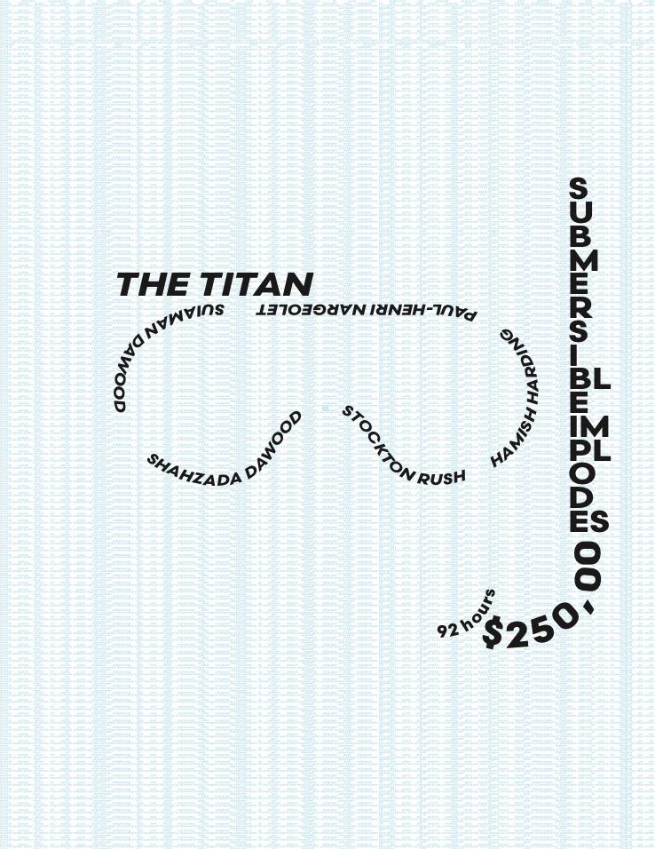
5

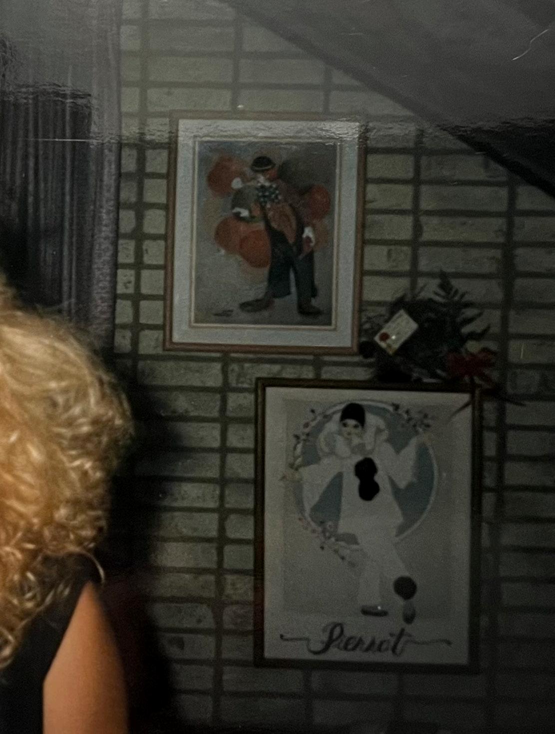
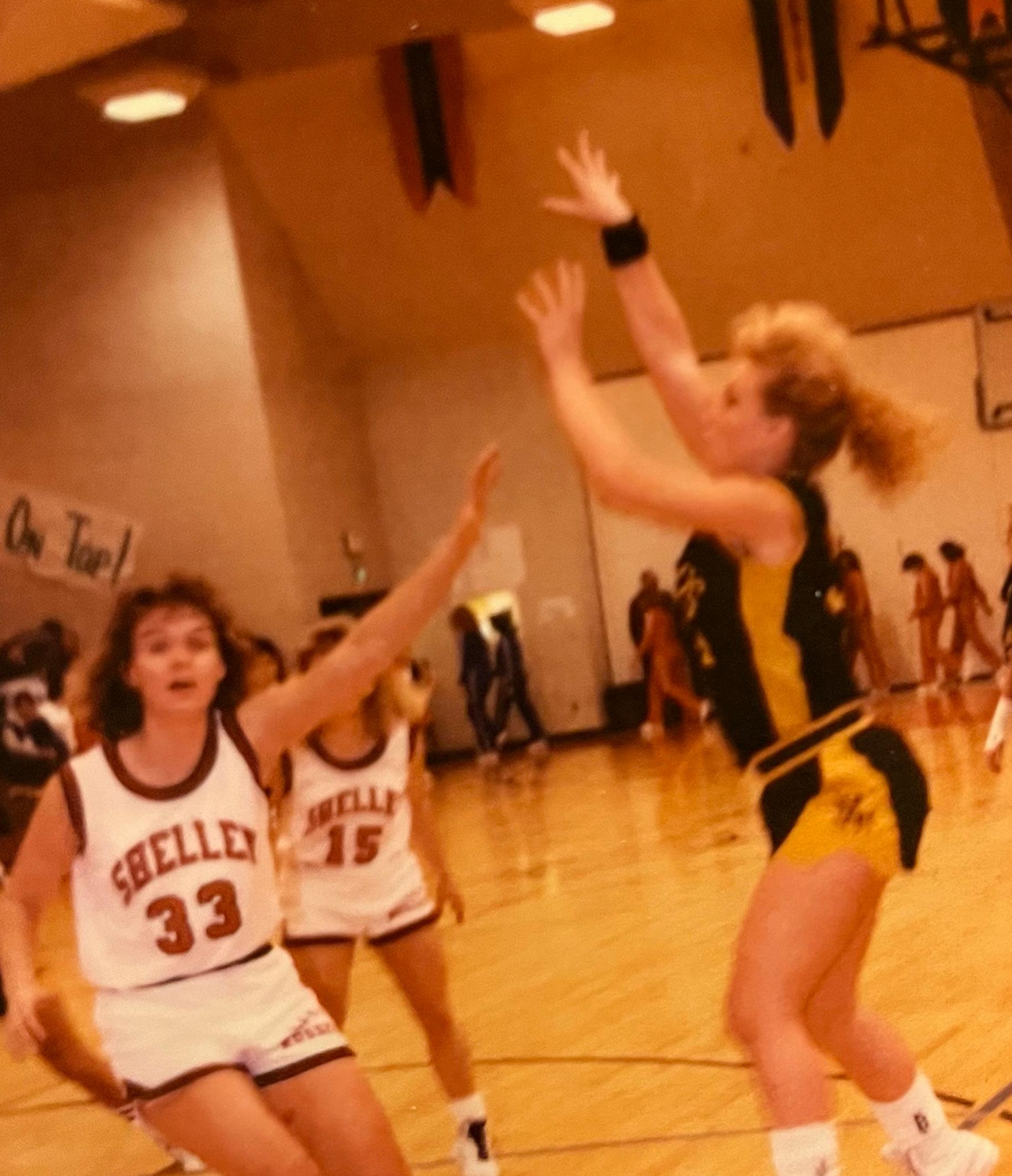
For my Historical Event Poster, I chose to do the sinking of the submersible. This oddly enough was going on during my birthday of last year. I think it is a fascinating and tragic event that took place and people were doing this for $250,000 each just to go see the Titanic very willingly knowing the consequences.
37

38
39
PROJECT 6
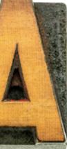
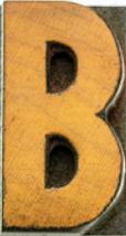
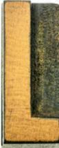
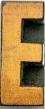
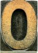
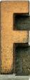
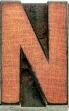
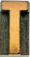
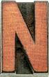
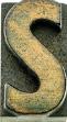
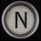
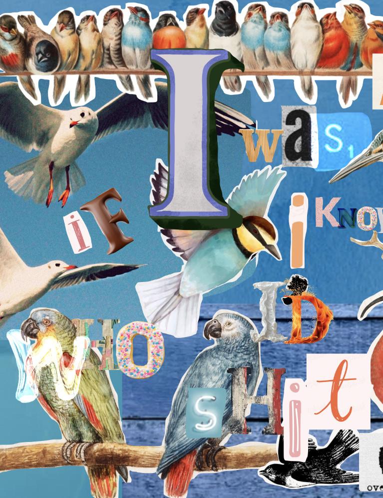
The Ransom Note Collage Project was by far the best one to express myself in my artwork. I found fonts online screenshotted them and composed this note in Photoshop.
I love how much color it has and the messiness of the note.
40
content
Designing with Type: The Essential Guide to Typography
Design by James Craig and Irene Korol Scal, William Bevington
Published by Watson- Guptill Publications, New York
Candace Raney, Executive Editor
Susan E. Meyer, Editor (first edition through fourth edition)
Alison Hagger, Edition (fifth edition)
Ellen Greene, Production Manager
type
Prestige Elite Std
Rafaella Rockwell
Helvetica
design
Brenna Magnuson
41
42