Brand identity Guidelines
Welcome to the Valley Public Brand Guide.
These instructions will acquaint you with the fresh Valley Public image and will serve as inspiration for your upcoming projects.
View these not as rigid design instructions, but as a creative catalyst to maintain a cohesive and clear style in all our brand materials.
Brand Narrative
Empowering Individual Excellence in a Respectful, Caring Community.
This mission encapsulates the core values of fostering individuality and respect for differences, emphasizing the importance of a supportive and proactive community school environment. By nurturing a caring and secure atmosphere, the school aims to provide a foundation where each student is encouraged to learn from others, appreciating diverse perspectives and experiences.
The commitment to inspiring and supporting students goes beyond academic achievements; it is about preparing them for a successful and enjoyable life. This involves not only reaching their full potential in terms of skills and knowledge but also developing as responsible citizens who exhibit empathy and respect towards others.
The focus is on holistic development, ensuring students are well-rounded, compassionate, and ready to contribute positively to society.
Aspiration
Students are encouraged to fulfil their full potential and confident to achieve their goals.
Collaboration
Students develop skills to work and achieve in groups and teams to achieve greater results.
Compassion
Service and action at School, locally and nationally.
Consideration
Integrity, honesty, harmony, tolerance and respect for others.
Commitment
Recognition of our place and responsibilities within the community in which we live to challenge ourselves as individuals and as a community Resilience: strength to recover from adversity.
Learning, Leading, Thriving: The Valley Public Way
At Valley Public High School, we embody a commitment to holistic education, centered around our core values: Learning, Leading, and Thriving.
Learning: Our dynamic approach to education sparks curiosity and critical thinking, preparing students to engage with the world innovatively and knowledgeably.
Leading: We empower our students to be leaders, instilling confidence and collaborative skills, enabling them to make meaningful contributions to their communities.
Thriving: In our nurturing environment, each student is encouraged to flourish academically and personally, fostering well-being, resilience, and a sense of belonging.
The Valley Public Way: Our ethos, "Learning, Leading, Thriving: The Valley Public Way," captures our dedication to not just educate but to inspire a journey of continuous growth and success. This is more than just education; it's about shaping well-rounded individuals ready to face the world's challenges with grace and confidence.
Visual Identity
3.1 Logo
Our logo is a powerful blend of tradition and aspiration, comprising two distinct elements: the Logomark, featuring a stylized lotus within a protective shield, symbolizes the nurturing and enlightenment we offer our students.
The Wordmark presents our name in a modern, strong typeface, reflecting our commitment to academic excellence.
The color palette speaks to our values: the regal purple for wisdom and pride, and the vibrant red for passion and energy. This logo is designed for versatility, to be recognized and respected whether on a student's uniform or a digital screen, embodying the spirit of Valley Public High School wherever it appears.
Logomark Wordmark
3.2
Logo Ideation
A symbol of growth, enlightenment, and untapped potential, the lotus stands as a testament to our educational philosophy. It's a reflection of the school's commitment to fostering student development and celebrating academic milestones.
At the heart of the shield lies an abstract white 'V,' a creative nod to the first letter of our school's name: Valley Public. It also mirrors the form of a lotus petal, tying back to our logo's floral motif, representing the purity and originality of our educational values.


Red is the color of zeal and determination. It represents our school's drive and passion for imparting knowledge and strength, embodying the vibrant spirit of our school community.
Lotus petal
Initial Letter “V” Academic Shield
The Lotus Emblem
The Power of Red
The Shield with 'V' Insight
Logo Anatomy
Logomark
Lotus Petal
3.4
Horizontal Logo
Our logo represents our brand, and it can be used in different ways while keeping our identity intact. Here are three ways to use our horizontal logo,
Color Options
Our main logo has two colors: red for the emblem and purple for the logomark. Use this version when you can use colors and want to show our brand in its full glory.
Colored Background with White Text
When you need to place our logo on a colored background, keep the red emblem as it is, but change the text color to white. This ensures the logo stands out and remains recognizable.
Single Color Use
Sometimes, you may need a simpler logo. In such cases, both the logomark and text can be a single color of your choice while still representing our brand.
Primary uses
Background uses
Single Color uses
3.5
Vertical Logo
Our vertical logo, like our horizontal one, is versatile and can be adapted to different color schemes and backgrounds while preserving our brand's identity. Here are three primary ways to use our vertical logo, ensuring it remains effective and recognizable:
Primary Use
Our main vertical logo consists of two colors: red for the emblem and purple for the logomark. This is the recommended choice for most situations, as it showcases our brand in full color.
Background Use
When placing our vertical logo on a colored background, maintain the red emblem but change the text color to white. This creates a strong contrast, making the logo stand out clearly and preserving brand recognition.
Single Color Use
For instances where a full-color logo isn't suitable, opt for a simplified, single-color version. In this variation, both the logomark and the text are converted to a single color of your choice, ensuring brand consistency and adaptability.
Secondary use
Background use
Single Color use
3.6 Logomark
Our logomark, which represents the essence of ValleyPublic, can be used in various ways while maintaining our brand's identity. Here are three primary ways to use our logomark alone, ensuring it remains effective and recognizable:
Primary Use
The logomark itself features two colors: red and purple. This version is recommended for most situations when you can use colors and want to showcase our brand in its full vibrancy.
Background Use
When placing our logomark on a colored background, keep the red and purple elements unchanged. However, consider adding a white border or outline around the logomark to ensure it stands out clearly against the background, preserving brand recognition.
Single Color Use
In cases where a full-color logomark isn't practical, opt for a simplified, single-color version. You can choose any single color that suits your context while still representing our brand effectively.
Primary use
Background use
Single Color use
3.7
Safe Margin
Ensuring a safe margin around our logo is essential to maintain its visibility and impact. This buffer space helps prevent any visual clutter that may detract from our brand's identity. Here's how to apply a safe margin of at least 10mm around both our horizontal and vertical logos:
Horizontal Logo Safe Margin
When using our horizontal logo, make sure there is a clear space of at least 10mm on all sides of the logo. This ensures that no other elements, text, or graphics encroach upon the logo, allowing it to shine and remain easily recognizable.
Vertical Logo Safe Margin
For our vertical logo, the same rule applies. Maintain a minimum 10mm clear space around all sides of the logo. This guarantees that our logo maintains its impact and brand identity, even in crowded layouts or busy backgrounds.
3.7
Logo Do’s & Don’ts
The School logos cannot be modified in any way. Manipulations of our logo are strictly prohibited. These logos are licensed by the Valley Public High School and must not be altered or incorporated into any other designs.
Correct and incorrect logo usage is specified in the examples to the right.
Do not use unapproved colours in the logo

Do not add drop shadows

Do not add additional text to logo
Do not place the
on visually distracting backgrounds
logo
Correct Logo Use
Do not crop part of the logo
Do not place the logo in a container or shape
Do not rotate
Do not Skew
Kathmandu, Nepal
Design Elements
We've chosen the Google font "Lexend" for our brand's typography because it's accessible and easy to find. Here's why:
Heading Use - Lexend
Readability: Lexend's clean and well-spaced characters ensure our headings are easy to read, making a strong first impression.
Consistency: Using Lexend for headings maintains a cohesive look across all our branding materials, reinforcing our brand identity.
Body Use - Lexend
Accessibility: Lexend's readability benefits those with different reading abilities, emphasizing our commitment to inclusivity.
Versatility: Its versatility suits various content types, from web pages to print materials, ensuring our message is clear and engaging.
Almost before we knew it, we had left the ground.
4.2
Brand Color
Our brand colors have been thoughtfully selected to resonate with our identity. Here's why we've chosen these primary and secondary colors:
Primary Colors
Purple : This rich, deep purple symbolizes our brand's uniqueness and creativity, making a bold statement in our visual identity.
Red : Red embodies our brand's passion and energy, creating a strong, memorable impression and conveying our commitment to excellence.
Secondary Colors
Blue: Blue represents trust and reliability, reflecting our commitment to delivering dependable solutions.
Orange: Orange adds a touch of warmth and friendliness, emphasizing our approachable and customer-centric values.
Green: Green symbolizes growth and innovation, highlighting our dedication to staying at the forefront of our industry.
Primary Color
4.3
Color Ratio Do’s
Primary Color Uses
To maintain a harmonious and balanced visual identity, we recommend using our brand colors in specific proportions, either in an 80/20 or 90/10 ratio. Here's how:
80/20 Proportion
Purple: Use this as the dominant color, occupying 80% of the visual space. It represents our brand's uniqueness and creativity.
Red: Use red sparingly as an accent color, comprising the remaining 20%. This adds vibrancy and emphasis where needed without overwhelming the overall design.
90/10 Proportion
Purple: Continue to use purple as the dominant color, making up 90% of the visual space for a stronger brand presence.
Red: Limit the use of red to 10%, using it strategically to draw attention to specific elements and create a dynamic contrast.
Blue, Orange, Green: You can incorporate these secondary colors in up to 10% of the design to infuse liveliness and variety while maintaining our brand's core identity.
Secondary Color Uses ( use one secondary color at a time in a given color ratio)
Color Ratio Don’ts
Dont use this way
Accessibility: When creating content that needs to be accessible to everyone, such as printed materials or web content, avoid relying solely on color to convey information. Ensure that text and visual elements have sufficient contrast to be readable by individuals with color vision deficiencies.
Monochromatic Printing: In cases where color printing is unavailable or cost-prohibitive, ensure that our branding materials still maintain their integrity. Use grayscale or black and white versions of our logo and content to guarantee readability and visual consistency.
Legal and Official Documents: When preparing legal documents, official reports, or any paperwork requiring formality, stick to black and white to maintain professionalism and conformity to industry standards.
High Contrast Requirements: In situations where a high level of contrast is necessary, such as signage or labels, ensure that the contrast is achieved through grayscale or black and white design rather than color alone.
Photocopies and Faxing: Recognize that color may not always reproduce accurately in photocopies or faxed documents. Therefore, it's advisable to have alternative versions of materials that rely on legibility rather than color coding.
- do not use all bright color at once, - do not use more the 2-3 bright colors. - do not reduce purple color uses less then 50%.
4.5
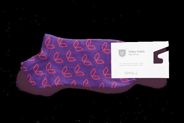
Brand Pattern
Our Lotus V pattern is a symbol of growth, harmony, and progress, adding sophistication to our branding. Here's how to use it effectively:
Pattern Usage
Backgrounds: Use it as a backdrop in various materials for an elegant touch.
Borders and Frames: Frame content to draw attention and create a seamless look.
Textures: Apply it subtly for depth and character.
Print and Digital: It works for both, maintaining its beauty and relevance.
Color and Variations
Color Choices: Use our brand colors or adapt it to grayscale or single-color variations.
Size and Scaling: Adjust to match your desired impact.
Orientation: Experiment with different arrangements to complement your content.
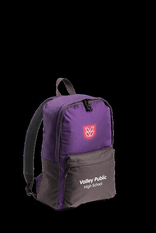
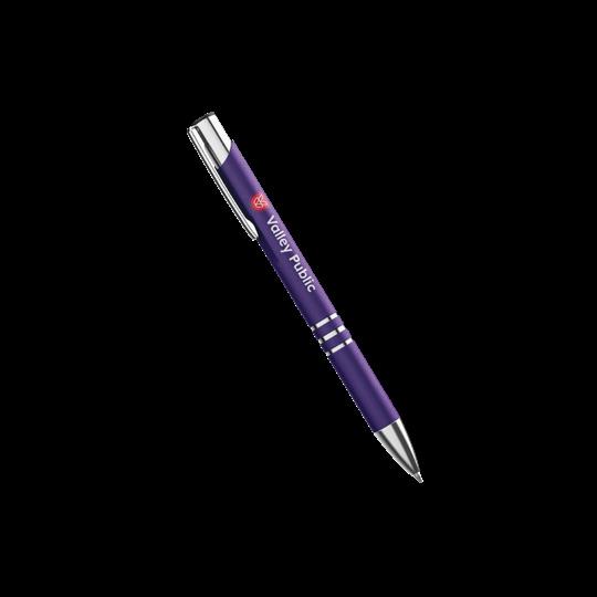
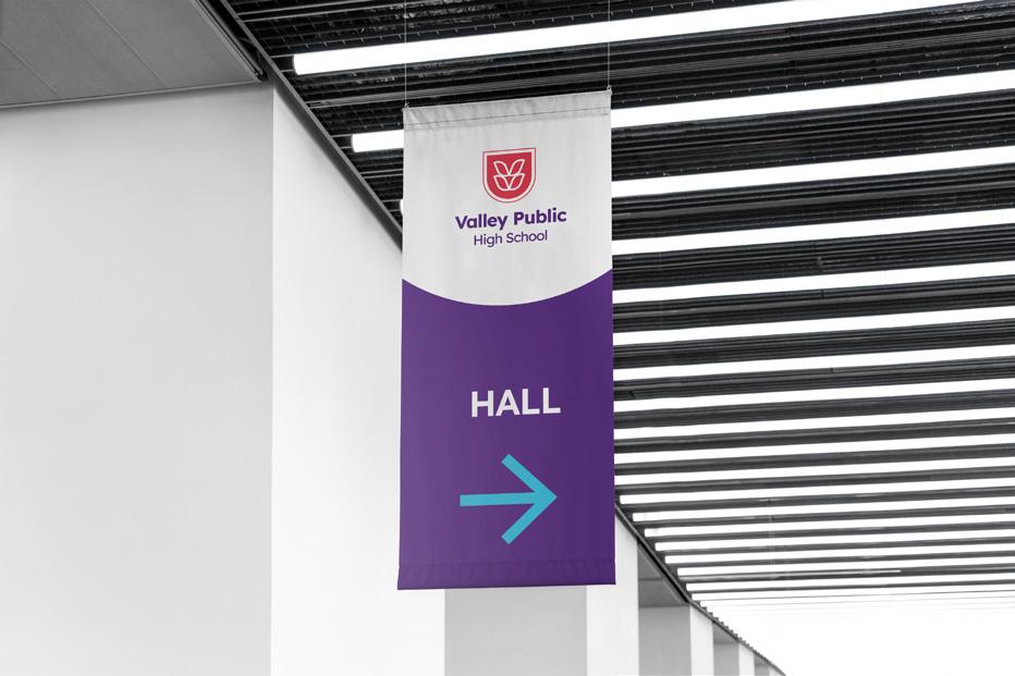
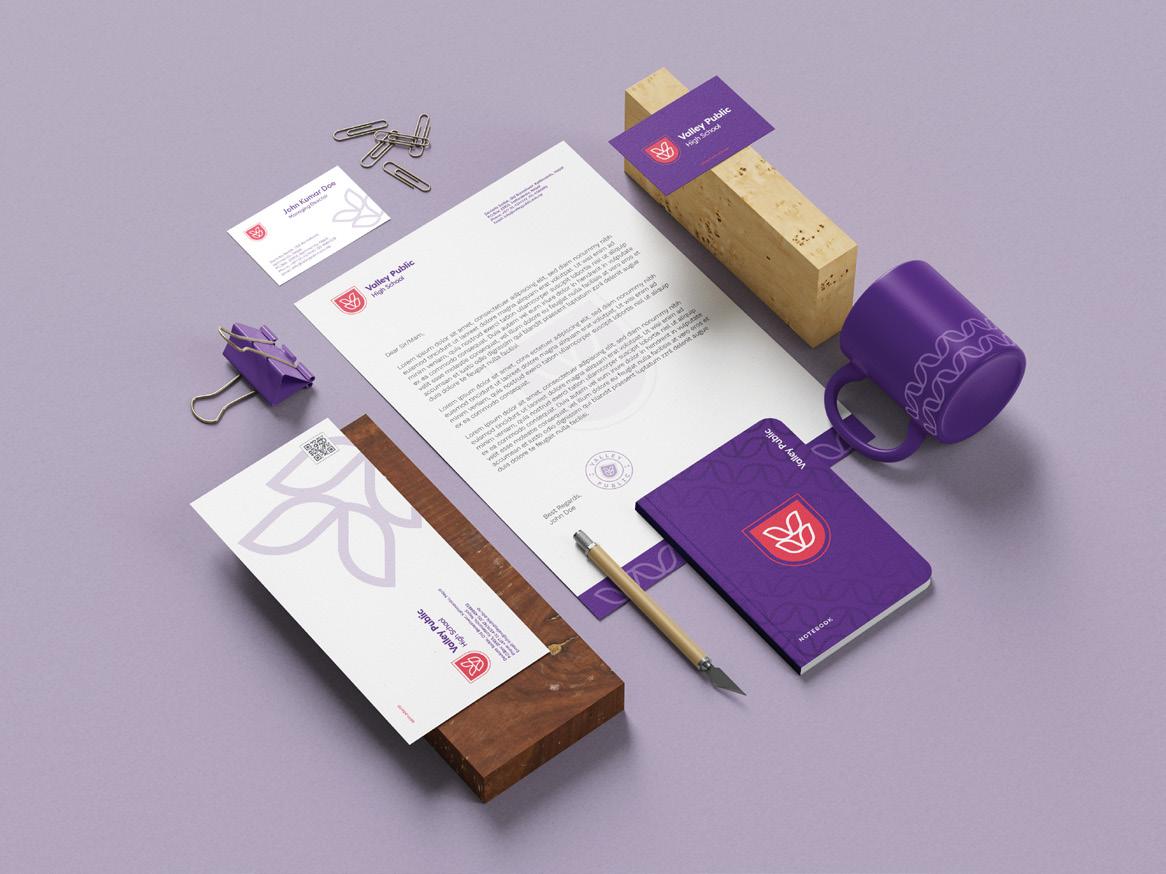
Incorporate the Lotus V pattern to add sophistication and reinforce our values. It sets ValleyPublic apart as a unique and recognizable brand.
In Applications
Design Elements
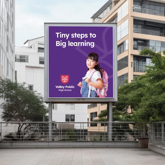

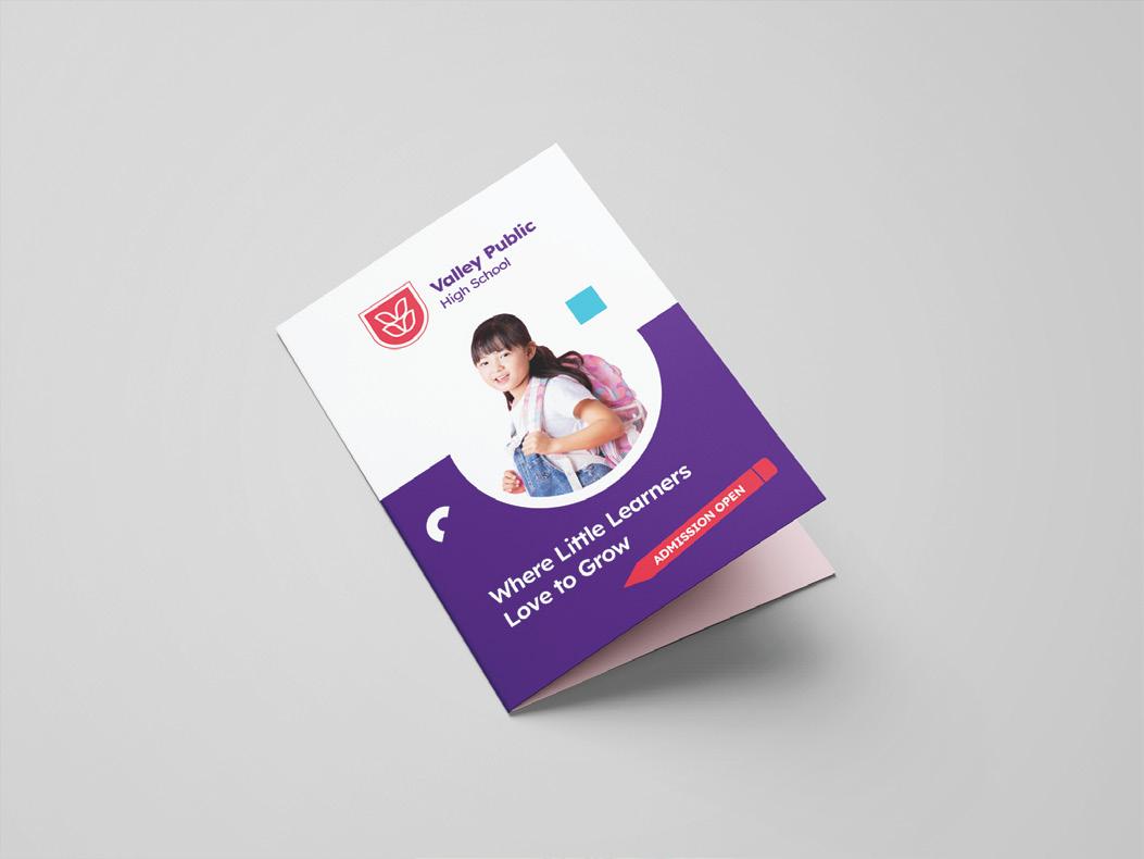
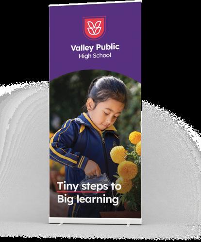
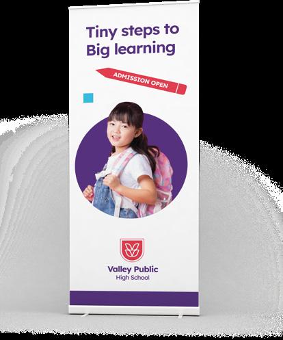
Tiny steps to Big learning


http://valleypublicschool.edu.np/