3 minute read
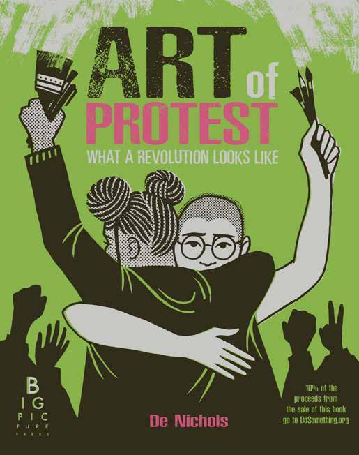
NON FICTION THE WINNER ART OF PROTEST


BIG PICTURE PRESS (BONNIER BOOKS UK)
UNITED KINGDOM
Advertisement
TEXT BY DE NICHOLS
Non Fiction
SPECIAL MENTION
ILLUSTRATIONS
BY DIANA
DAGADITA, SADDO, OLIVIA TWIST, MOLLY MENDOZA, DIEGO BECAS
WHAT THE JURY SAID
“Everything is Art. Everything is Politics”. Combining photography, graphic design, meaningful quotes, high level of craftsmanship and exquisite binding, all the layers of Art of Protest inspire artistic political expression. A homage to art as protest, this innovative layout includes poster art, infographic, and clever use of typeset, promoting art as protagonist and protester. In the pages, the invitation to “Try this…” is a powerful yet gentle encouragement with a range of graphic examples, ending with an empowering call to action “Over to you. Our world right now is ripe for change…” This is a book filled with mission and purpose.
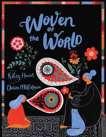
Woven Of The World
CHRONICLE BOOKS
USA
TEXT BY KATEY HOWES
ILLUSTRATIONS BY DINARA MIRTALIPOVA
WHAT THE JURY SAID
In Woven of the World the language of the loom is used to create a rhythmical story and becomes an intergenerational invitation and celebration of traditional textile artwork. In this book the subject matter of weaving is dealt with a combination of poetic language, elaborate illustration and typography, and is enriched by a substantial amount of historical and technical information inviting the reader to discover the topic in a beautiful and lyrical way. The success of this as a non-fiction book is the way in which it reflects deep informational, emotional and cultural research: the perfect book to share in this post pandemic age with the increasing resurgence of interest in traditional skills and sustainable handicrafts.
Non Fiction Special Mention
OGLEDALO BEZ MANA
MALA ZVONA D.O.O.
CROATIA
TEXT AND ILLUSTRATION BY AGATA LUČIĆ
WHAT THE JURY SAID
This book is an expression of teenage angst in the selfie age, an era when the smart phone has become a mirror. Unwanted body hair and pimples become art in a journey to self-acceptance. Breaking traditional concepts with artistic means, the use of lines and colour solicit acceptance, encourages self-reflection and challenges the standardization of beauty in Western society. Uncomfortable at times, these images bring our distorted constructions of beauty to the surface, body hair becoming it’s own character. The very reduced text and clever typography sometimes fills a double spread and at times a single word on a page. This gives the text a space to echo selftalk and the spreads transform not just singular images into portraits, but into a body, a fragment of the body, and then the book becomes the body. On one page the body expands out of the frame, opening up a new perspective on feminine and beauty.
New Horizon Special Jury Prize El Bolso

ALBOROTO EDICIONES
MEXICO
TEXT BY MARÍA JOSÉ FERRADA
ILLUSTRATIONS BY ANA PALMERO CÁCERES

What The Jury Said
Read this book with your eyes closed! To discover the treasure of The Purse delve into this book as if you are reaching into a bag to uncover what’s inside. The basic concept is the accessible notion of going through a bag without looking. The joy of this book is an invitation for visually able and visually impaired readers to read together. The lyrical rhythm of the language corresponds to the touchable images, and the reduced text, simple graphics, tactile images and braille transform a humble format into a charming product that rejoices in the everyday. The inclusion of the Braille alphabet inspires everyone to read this book through the medium of touch, and this simple act makes it particularly special.
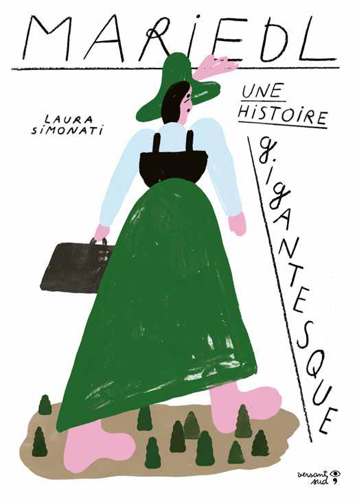
Opera Prima The Winner
MARIEDL. UNE HISTOIRE GIGANTESQUE
VERSANT SUD
BELGIUM
TEXT AND ILLUSTRATION BY
LAURA SIMONATI
WHAT THE JURY SAID
An unusual story about being unusually big. Inspired by a true story from the rural Sud Tyrol in the 19th century, the gigantic protagonist moves from invisibility to visibility on a physical journey that parallels her journey to self-acceptance. The impressive printing technique using an antitechnicolor approach and mixing of brown, dark green and pink creates a down to earth, grounded feeling throughout the book, and the naïve folk-art style painting is very modern in it’s approach. The interplay between the painted images and hand lettering, presented in a sequence of double spreads each with an original layout, enables the reader to share the story from a personal point of view. This is a strong debut, and we would like to commend the bold selection of subject matter and upcoming artist.
Opera Prima Special Mention
THE BLUE: BENCH

STUDIO WOOM
SOUTH KOREA
TEXT AND ILLUSTRATION BY MIA
WHAT THE JURY SAID
You never know who will sit next to you when you are on a bench! This understated french door structure is like a stage with two small booklets inside, facing one and other. This design deals with two possible story lines that encounter one and other - people, objects, and landscapes all change to make a total of 121 scenes. The special monochromatic nature of the book makes the reader focus on the unique format and creates a lingering attachment to the book. This creative design layout creates a story that starts with the individual and evolves to culminate in a group gathering and a community panorama.


