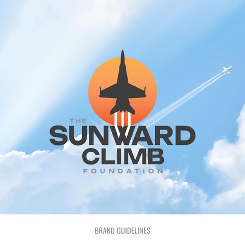

BRAND GUIDELINES

This document contains the rules for our visual communication system. Follow these rules strictly to maintain brand consistency.
This includes all of the elements you may need: logos, typefaces, colors, and more to create a consistent tone, look, and feel for your brand. We invite you to absorb this information and reference it often to become an informed keeper of the brand.
If you should have any questions please feel free to contact us at fanmail@triadbrandmarketing.com.
PRIMARY LOGO
The Sunward Climb Foundation primary logo is a combination mark.
The primary logo should be used in most cases ensuring brand consistency across all communications. It is essential to the success of the brand that the logo always be applied with care and respect in every application according to these guidelines.
Do good. Be good. Find the good.
SECONDARY LOGO
The secondary logo should only be used when limited by size constraint and never separated from other individual elements.
LOGO MARK
The logo mark is best for minimalist branding needs, such as watermarks, favicons, or when a standalone symbol is needed to represent the brand.
LOGO TYPE
Use the logo type only when simplicity and clarity are key, such as in small spaces, digital applications, or when the full logo mark isn't necessary for brand recognition.
KNOCK OUT LOGOS
In certain cases, such as on solid backgrounds or minimally detailed photos, using these knocked-out versions of the logo suite is appropriate.

LOGO SPACING
To preserve The Sunward Climb Foundation logo’s integrity, always maintain minimum space around the logo. The importance of whitespace around brand elements and throughout all layouts cannot be overstated. It adds confidence and clarity to the visual messaging. The more white space, the better.
The minimum whitespace around the logo is equivalent to the 'C' in the word "Climb". A margin of clear space equivalent to this height is drawn around the logo to create the invisible boundary of the area of isolation. These visuals are used to define minimums.
MINIMUM LOGO SIZE
For readability, scale needs to have special considerations. Do not reduce these elements below the designated pixel values.
Web 144 pixels @ 96 PPI
Print 1.5"
Web 48 pixels @ 96 PPI
Print .5"
LOGO DON'TS
To make sure our logo appears as consistent as possible throughout our communications, we've identified a number of ways it should never be used.
A. Do not squeeze or stretch vertically.
B. Do not squeeze or stretch horizontally.
C. Do not add shadows or filters to the logo.
D. Do not contain the logo in box when placed on a background image or color.
E. Do not alter the logo colors.
F. Do not rearrange or resize the logo elements individually.
G. Do not add other elements within the clear space allotment.
H. Do not rotate.
I. Do not place borders around logo

A.
D.
G.
PRIMARY COLOR PALETTE
Color is foundational to the visual identity of a brand in all its expressions and executions. This includes logos, packaging, products, environments and all forms of marketing communications.
The primary palette helps consumers to quickly identify a brand. These core colors represent the earth tones in which the company coincides with.
COURAGE FLAME RESILIENT EMBER IRON SHADOW STEEL RESOLVE
RGB: 251, 176, 64
CMYK: 0, 35, 85, 0
Hex: FBB040
Pantone: 142C
RGB: 241, 90, 41
CMYK: 0, 80, 95, 0
Hex: F15A29
Pantone: 165C
RGB: 65, 64, 66
CMYK: 0, 0, 0, 90
Hex: 414042
Pantone: 4287C
RGB: 147, 149, 152
CMYK: 0, 0, 0, 50
Hex: 939598
Pantone: Cool Gray 7
SECONDARY COLOR PALETTE
The secondary palette is used to highlight and complement the primary colors. Use these secondary colors to complement primary colors and break up white space.
The brand palette will cover the majority of your needs. It’s intentionally small in variety so as to not dilute the brand visuals, which adds confusion.
STEADFAST BLUE
RGB: 42, 58, 78
CMYK: 86, 71, 47, 40
Hex: 2A3A4E
Pantone: 4145C
VALOR OLIVE
RGB: 138, 154, 91
CMYK: 49, 26, 78, 5
Hex: 8A9A5B
Pantone: 5773C
RGB: 232, 213, 183
CMYK: 8, 14, 29, 0
Hex: E8D5B7
Pantone: 7506C
TYPE FACES
Our font families should be used for all communications, ensuring a consistent look and feel in all online and print literature.
To guarantee a cohesive look, make sure brand fonts are used in a consistent manner and the weights of each font have been considered, using heavier weights to highlight key messages.
Header Font - Oswald Regular, All Caps
Body Copy Font - Roboto, Family
Accent Font - Parslay Regular
AaBbCcDdEeFfGgHhIiJjKk
LlMmNnOoPpQqRrSsTt
UuVvWwXxYyZz
0123456789
Body Copy Font
AaBbCcDdEeFfGgHhIiJjKk
LlMmNnOoPpQqRrSsTtUu
VvWwXxYyZz
0123456789
AaBbCcDdEeFfGgHhIiJjKk
LlMmNnOoPpQqRrSsTtUu
VvWwXxYyZz
0123456789
TYPE SYSTEM
Oswald Regular should be used for all headers on a large scale, 3-6x that of the body copy font size (all caps or case sensitive dependent on layout and use of additional copy).
Roboto should also be used for all other copy (body, lists etc).
Parslay Regular is the accent font and it is to be used sparingly to covey important messaging. This font can also be used for subheaders to add an unexpected pop of fun.
Sub Header
MAIN HEADER
Body text. Lorem ipsum dolor sit amet, consectetur adipiscing elit, sed do eiusmod tempor incididunt ut labore et dolore magna aliqua. Ut enim ad minim veniam, quis nostrud exercitation.
Triad Brand Marketing is a creative agency purposely founded to fuse our passion for creative design with our love of innovative marketing. If you should have any questions please feel free to contact us at fanmail@triadbrandmarketing.com.
Thank you.
