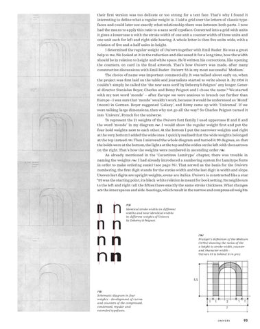
their first version was too delicate or too strong for a text face. That’s why I found it interesting to define what a regular weight is. I laid a grid over the letters of classic typefaces and could later see exactly what relationship there was between both parts. I now had the means to apply this ratio to a sans serif typeface. Converted into a grid with units it gives a lowercase n with the stroke width of one unit a counter width of three units and one unit each for left and right side bearing. A whole letter is then five units wide, with a relation of five and a half units in height. I determined the regular weight of Univers together with Emil Ruder. He was a great help to me. We looked at it in the reduction and discussed it for a long time, how the width should be in relation to height and white space. He’d written his corrections, like opening the counters, on card in the final artwork. That’s how Univers was made, after many constructive discussions with Emil Ruder. Univers 55 is my most successful ‘Medium’. The choice of name was important commercially. It was talked about early on, when the project was first laid on the table and journalists started to write about it. By 1956 it couldn’t simply be called the ‘the new sans serif by Deberny & Peignot’ any longer. General director Stanislas Boyer, Charles and Rémy Peignot and I chose the name.10 We started with my test word ‘monde’ – after Europe we were anxious to branch out further than Europe – I was sure that ‘monde’ wouldn’t work, because it would be understood as ‘Mond’ (moon) in German. Boyer suggested ‘Galaxy’, and Rémy came up with ‘Universal’. If we were talking large dimensions, then why not go all the way? So Charles Peignot turned it into ‘Univers’, French for the universe. To represent the 21 weights of the Univers font family I used uppercase H and E and the word ‘monde’ in my diagram /16/. I would show the regular weight first and put the four bold weights next to each other. At the bottom I put the narrower weights and right at the very bottom I added the wide ones. I quickly realised that the wide weights belonged at the top instead /17/. Then I mirrored the whole diagram and turned it 90 degrees, so that the bolds were at the bottom, the lights at the top and the wides on the left with the narrows on the right. That’s how the weights were numbered in ascending order /18/. As already mentioned in the ‘Caractères Lumitype’ chapter, there was trouble in naming the weights /16/. I had already introduced a numbering system for Lumitype fonts in order to make ordering easier (see page 76). That served as the basis for the Univers numbering, the first digit stands for the stroke width and the last digit is width and slope. Uneven last digits are upright weights, evens are italics. Univers is constructed like a star. “55 was the starting point; its black-white relation is meant for book setting. Its neighbours to the left and right (all the fifties) have exactly the same stroke thickness. What changes are the inner spaces and side-bearings, which result in the narrow and compressed weights
n n nn nn nn
/13/
Identical stroke widths in different widths and near-identical widths in different weights of Univers by Deberny & Peignot.
/14/
Frutiger’s definition of the Medium (1970s) showing the ratios of the x-height to stroke width, counter and character width – Univers 55 is behind it in grey.
5,5
/12/
Schematic diagram in four weights – development of curves and counters of the compressed, condensed, regular and extended typefaces.
1
1
3
1
7
UNIVERS
11 UNIV_31_EN def_PS.indd 93
1
93
21.9.2008 13:21:41 Uhr