B I A O C A O 2018 - 2022
Master of
Tel: 213-274-3820
Emali: biaocao.arch@gmail.com
Southern California Institute of Achitecture
Graduate Thesis Merit Award
Jilin Jianzhu University
Graduate with Award
Shanghai DDB Architects
Participated in many projects, including two high-rise projects(one is over 250 meters and the other is over 150 meters), the main work was to draw plans and sections, and make booklets.
Furksas Studio(Shenzhen)
Participated in an international competition project, working on floor plans and research. Regu larly go to the construction site to inspect and take pictures every week.
Shenzhen Santien Architectural Company
Participated in many government public construction projects, including two large-scale com pleted projects, the main work was schematic design and preparation of bidding documents.
Shenzhen Wuye International Architecture Co. LTD
Participated in the schematic design of a parking building project, the main work was to use SketchUp to model and provide assistance for architects.
Guangdong (Zhongshan) Huafang Architecture Co. LTD
Using SketchUp to model and provide assistance for design team.
2018.09-2022.09 2021.03-2021.08
2012.09-2016.06 2020.12-2021.01 2016.11-2018.07
2016.06-2016.10
2015.06-2015.09
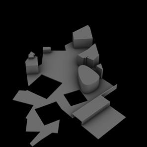
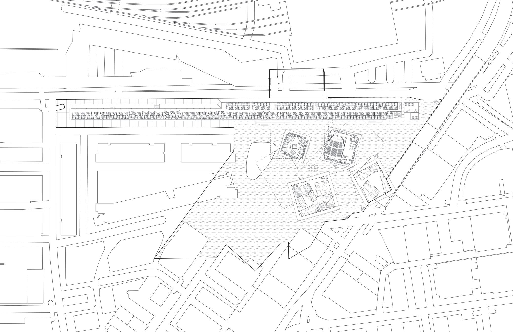
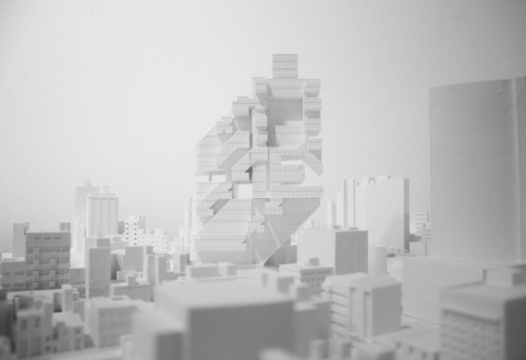
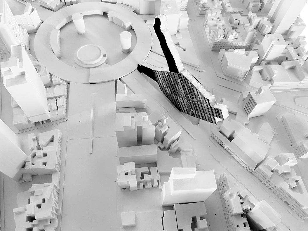
GRADUATE THESIS PROJECT Urban Textures: A Campus in Shenzhen
3GB VETICAL STUDIO Earth Protector
3GA VETICAL STUDIO Post War Tactics
2GB DESIGN STUDIO Ciudad Casa de Arte
1GB DESIGN STUDIO The Urban Bathhouse
04-11 12-19 20-31 32-39 40-46
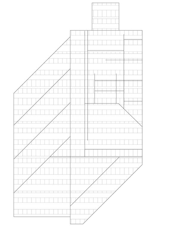
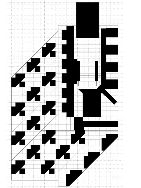
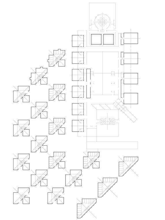
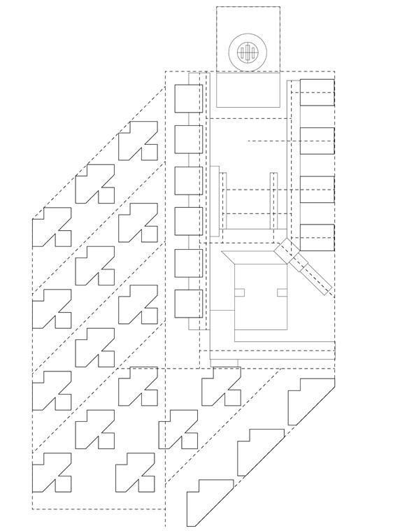
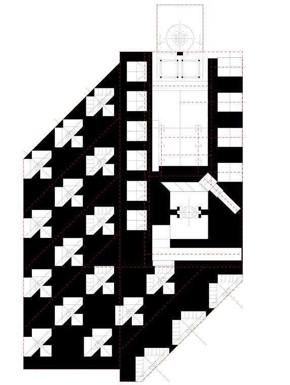
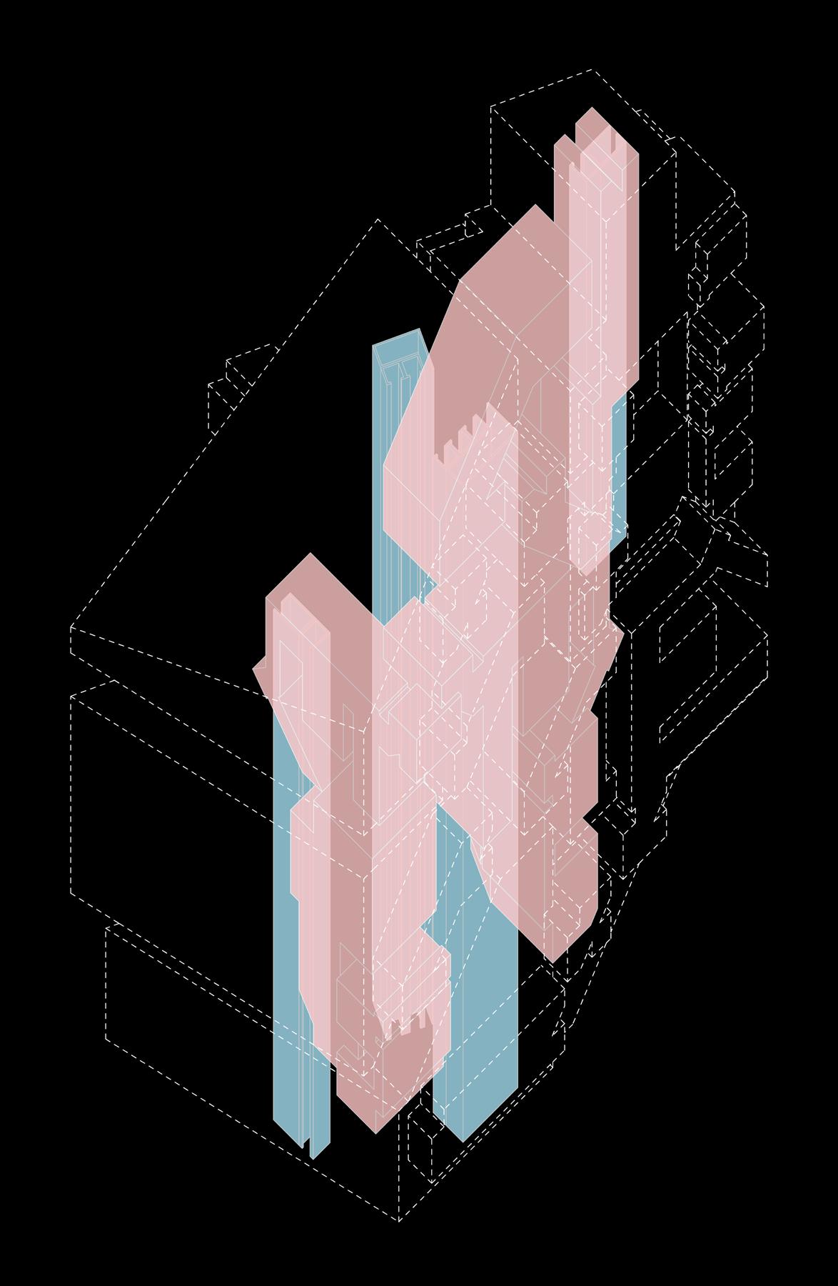
The thesis project is about urban textures, by designing a campus to explore urban textures and their scale and function. The campus is a very important place. It provides people with many vital spaces, private and public. When we discuss the campus, we must address both: architecture and landscape. Build ings alone can exist anywhere, in the city or in the countryside, but buildings alone do not make communities.
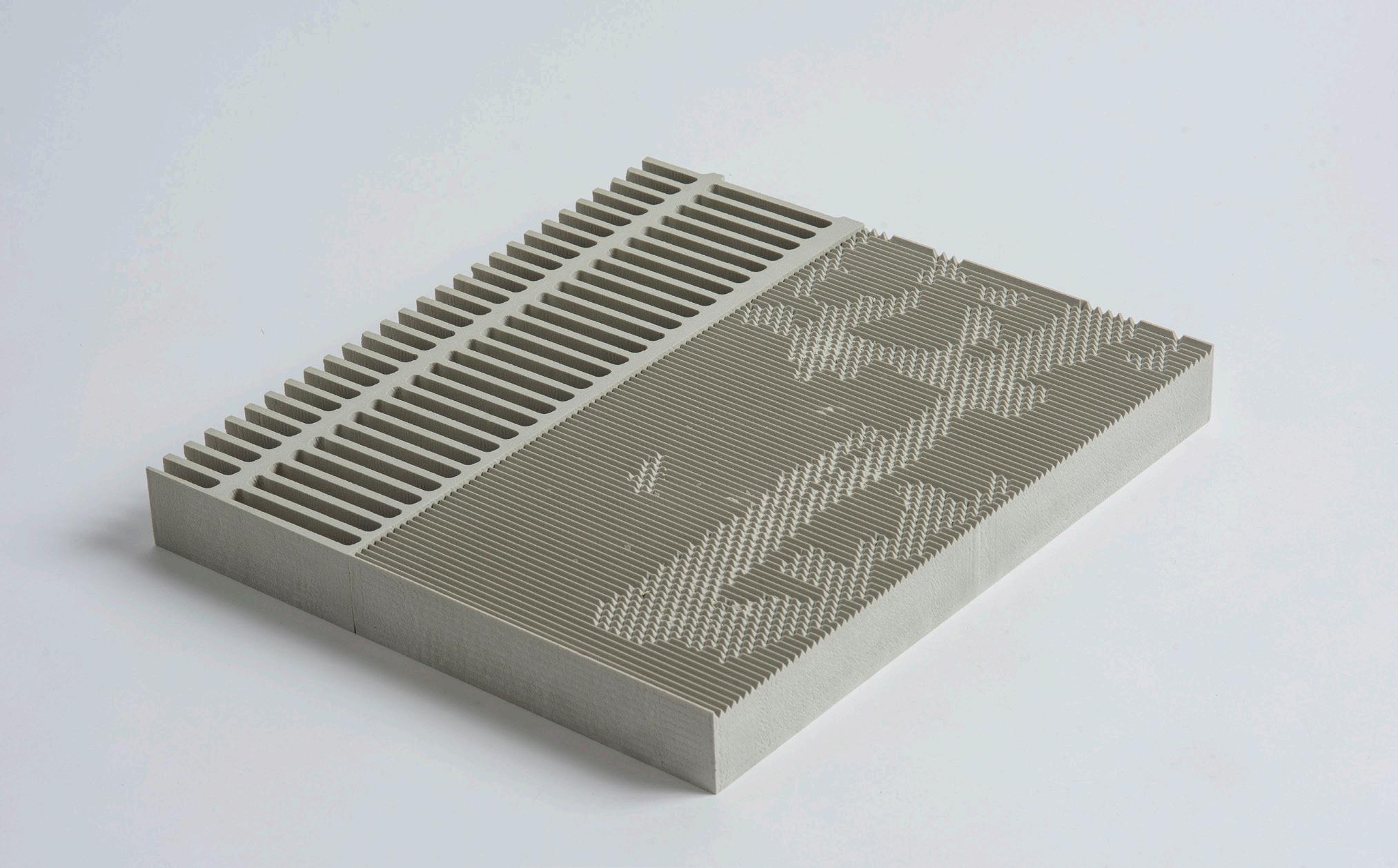
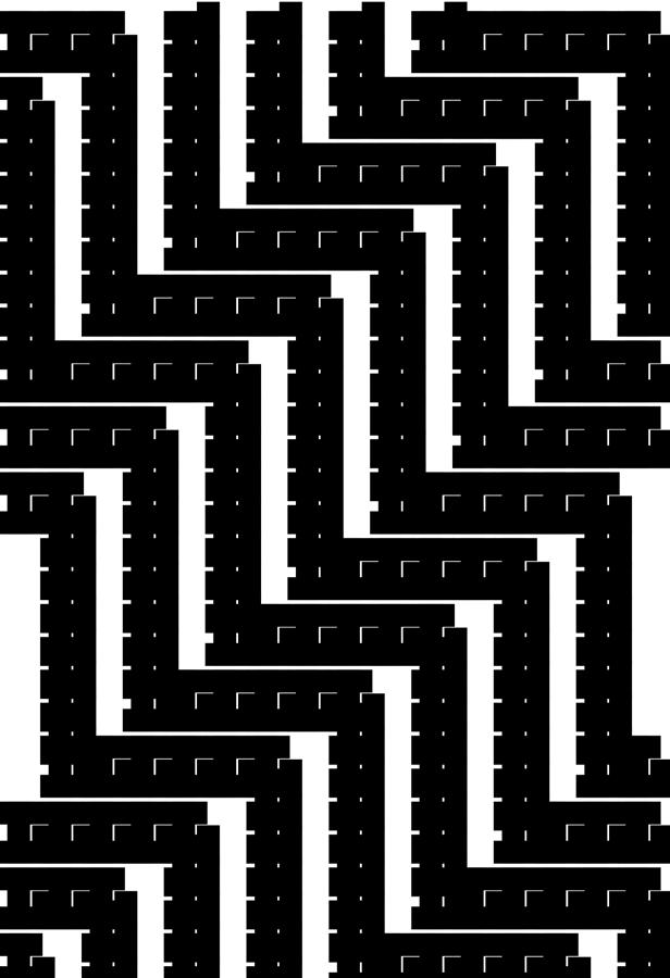
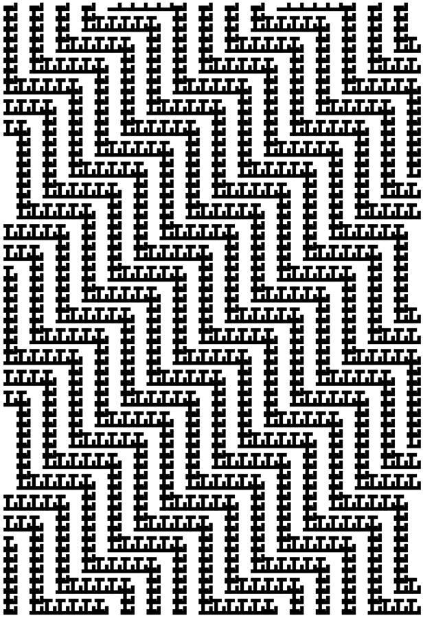
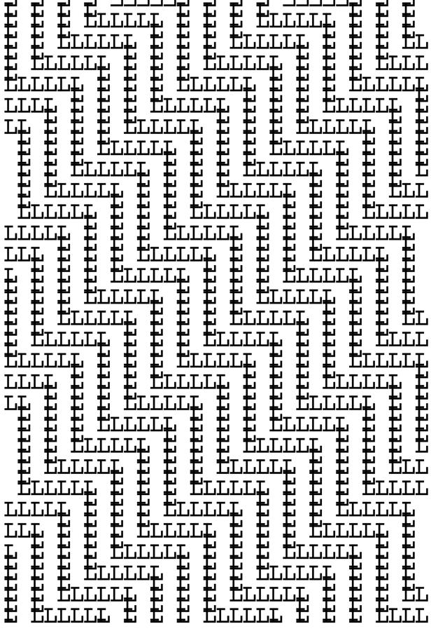
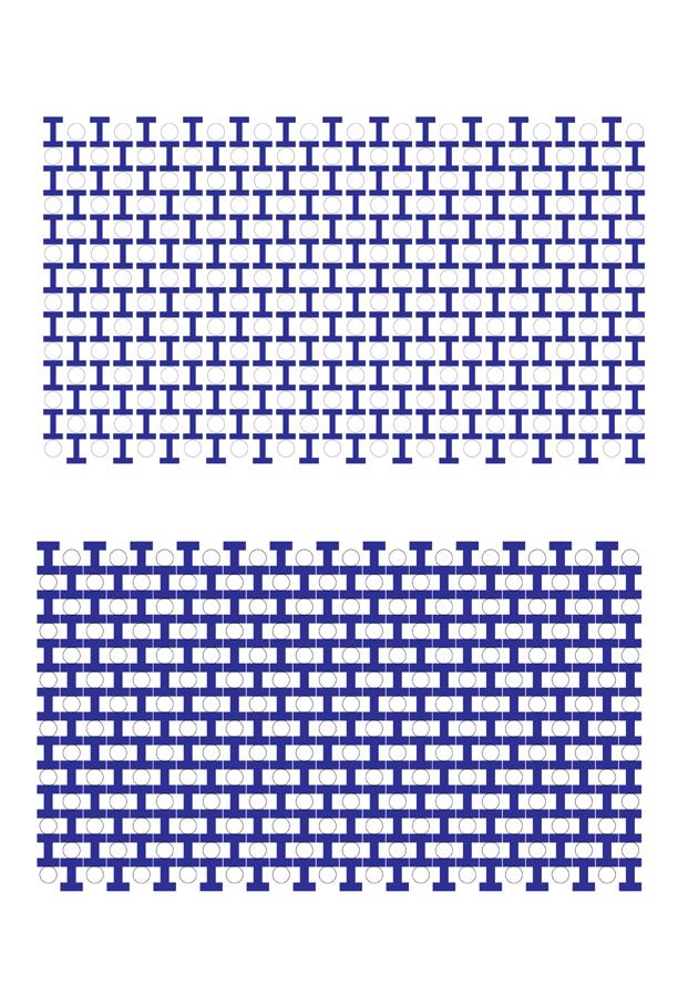
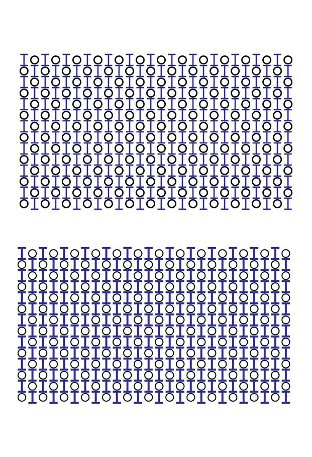
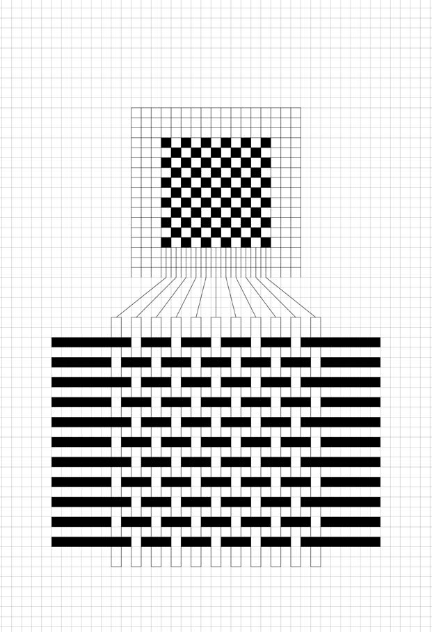
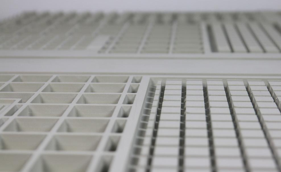
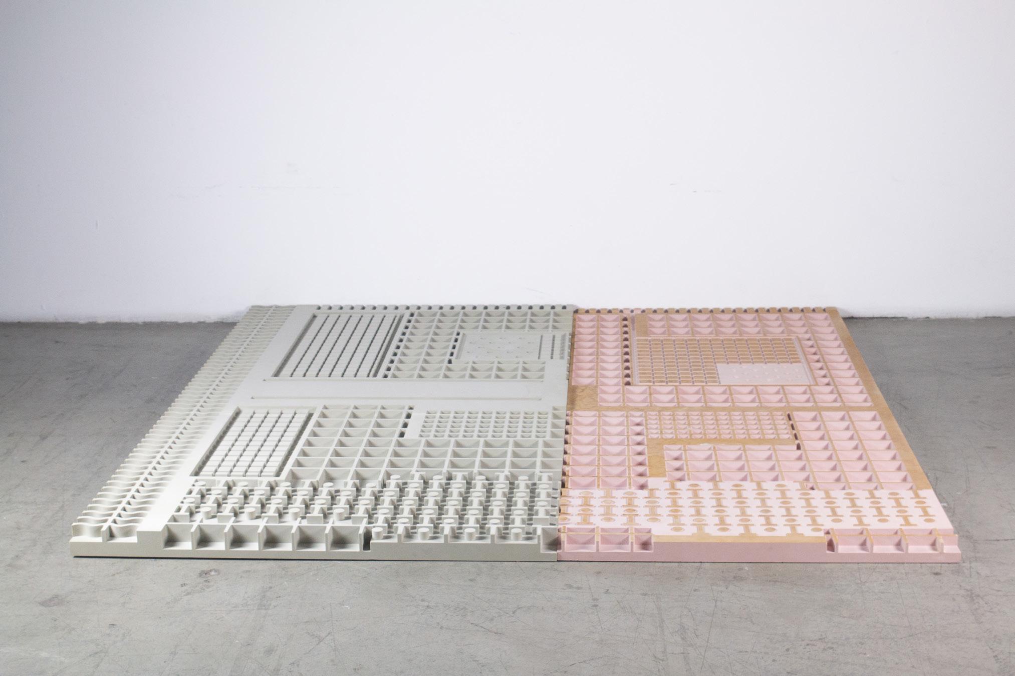
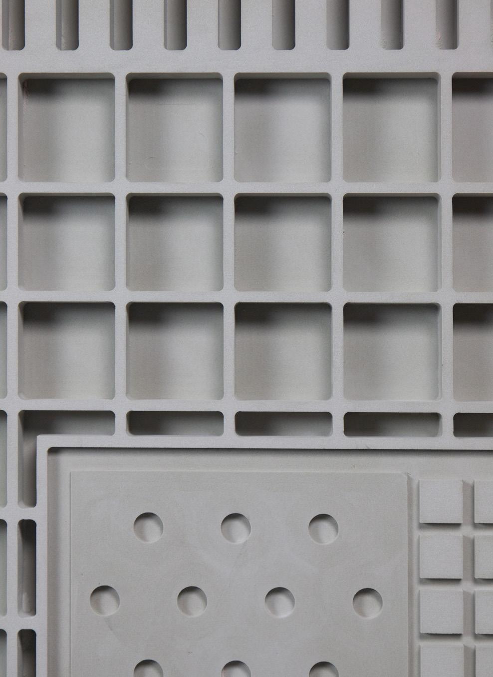
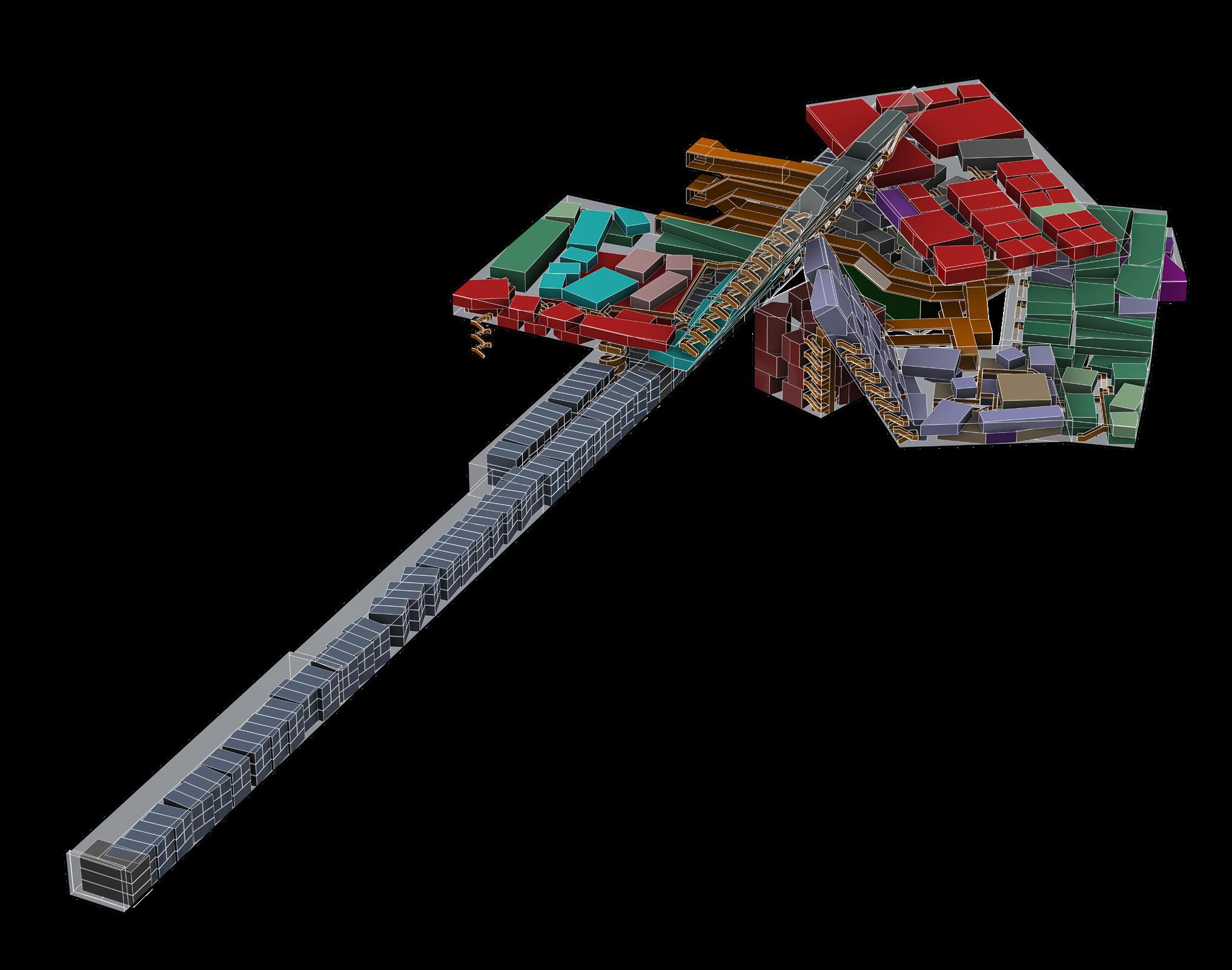
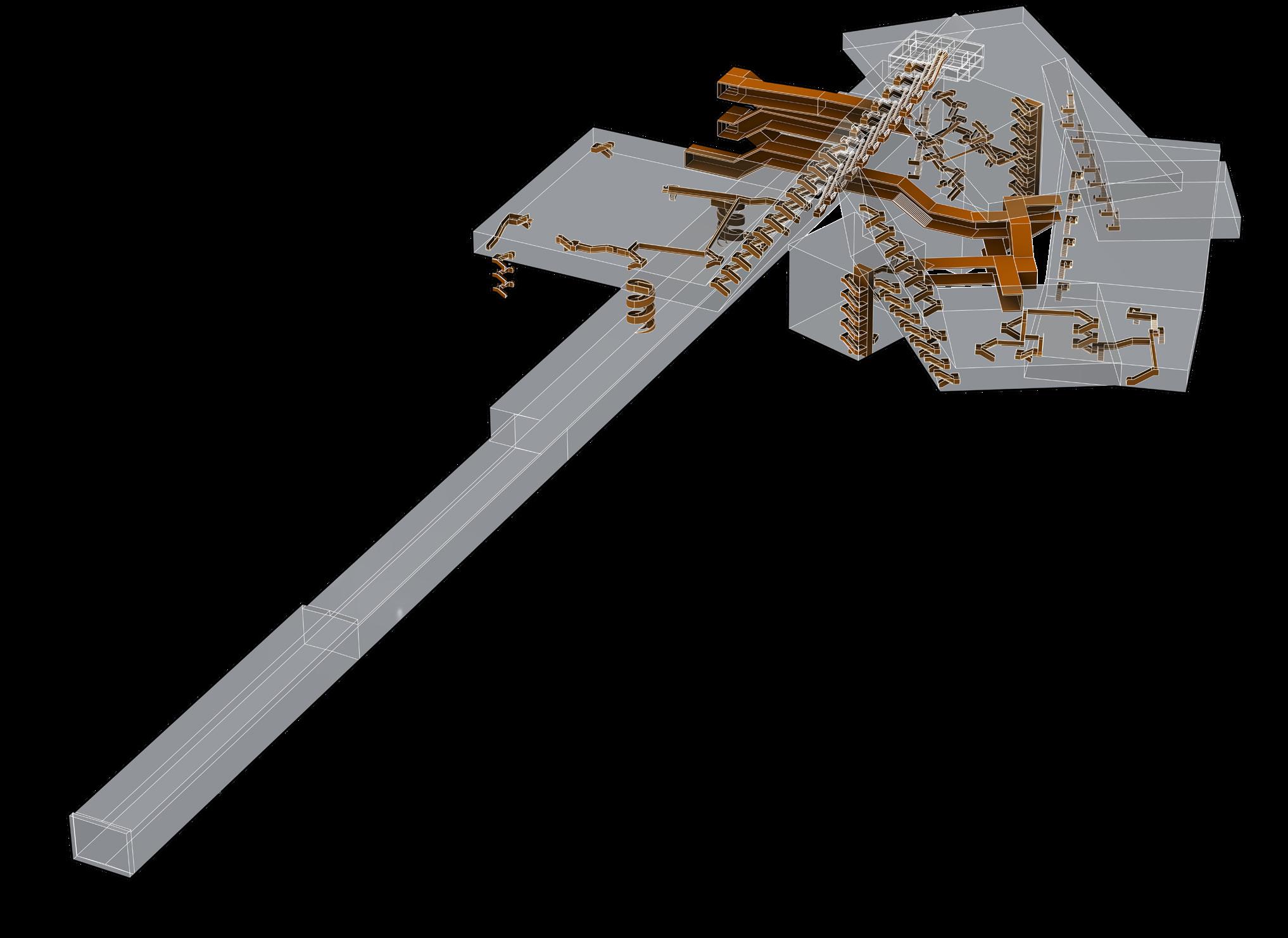
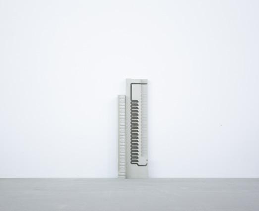
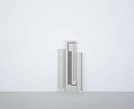
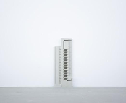
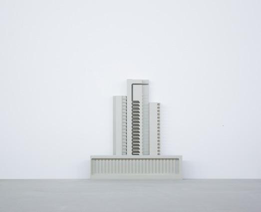
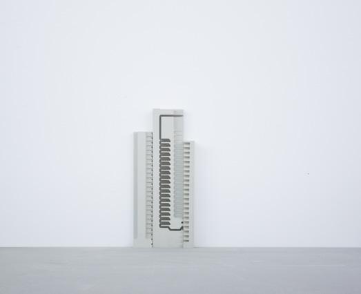
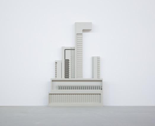
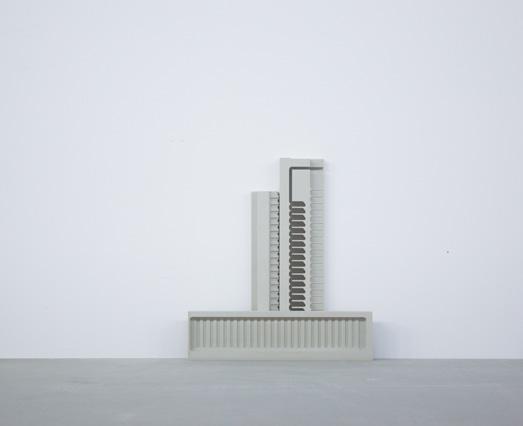
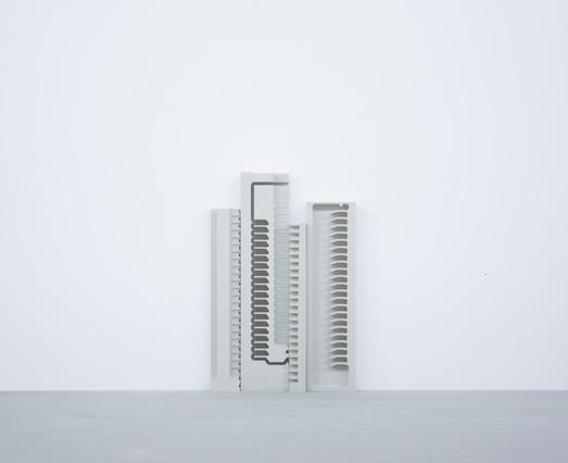
The campus will be designed as a project including landscape and infrastructure, where the landscape will be composed of multiple textures, and then a new infrastructure will be designed to connect the buildings. This project uses CNC milling techniques to create a physical model of the multiple urban textures. Make landscape and infrastructure into different layers, and stack them together
to form a physical model. In this way, you can not only see how many different urban textures such as landscape and infrastructure are presented on the plan, but also how these urban textures are related to the site and building, and how it presented in the section, making it a campus or community.
The concept of campus is derived from Anni Albers’ artwork, simple geometric composition, but by changing the scale to create more negative space. This campus is like the city of Shenzhen, it is used as a testing ground to provide people with a better environment, making this a real community. People can work and live here and enjoy the joy of communicating with others. Children have a place to play, and parents can stop overload work and accompany their children to grow up.
The rapid construction in the past made planners always ignore the importance of the site and the infrastructure, and the current infrastructure no longer meets the current needs. When the city is being built higher and higher, my design purpose is to explore another possibility of the city. Contrary to reality, keep the low-rise buildings of the past and do the design on the site. The concept of campus is derived from Anni Albers’ artwork, simple geometric composition, but by changing the scale to create more negative space.
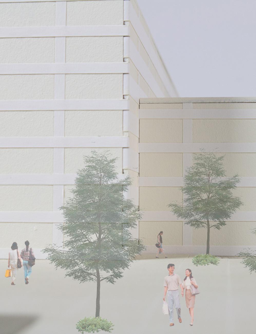
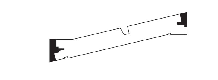
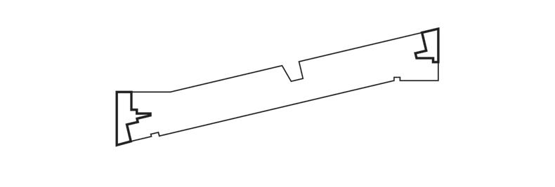
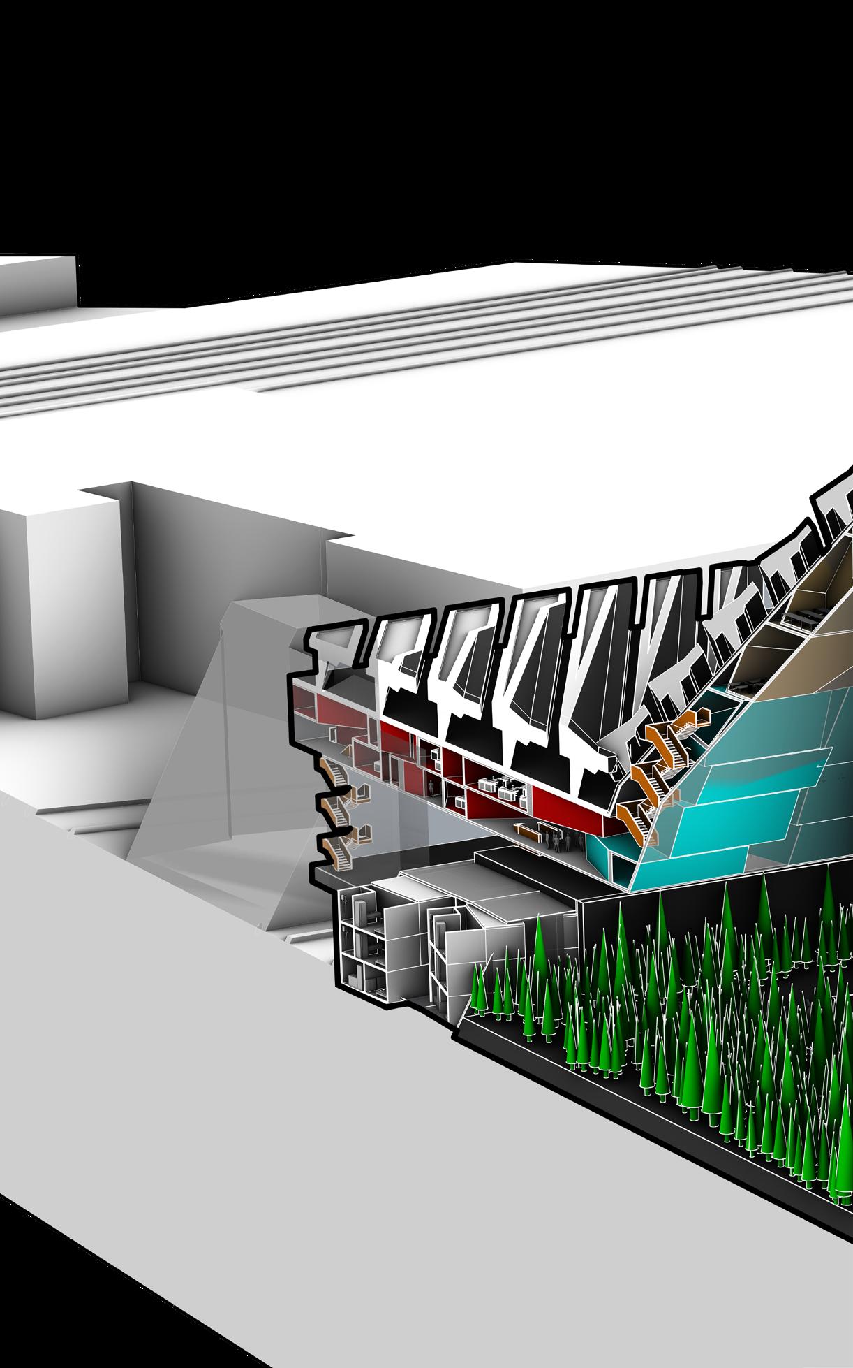
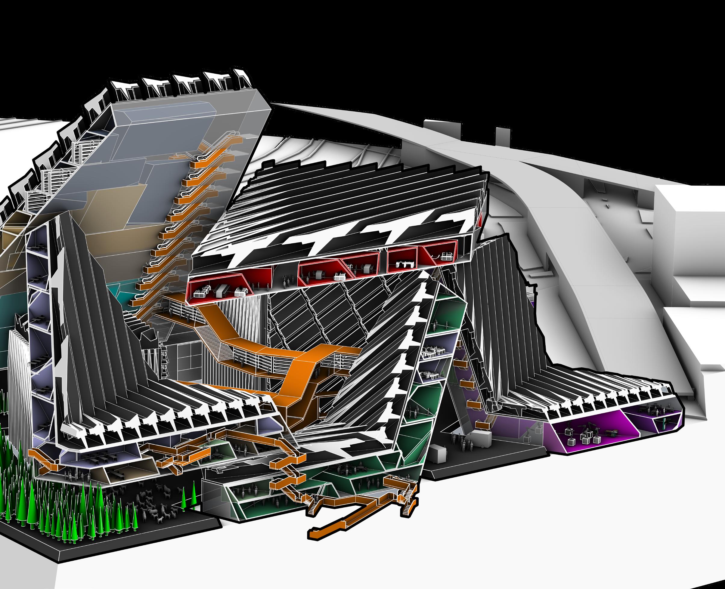
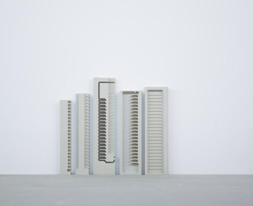
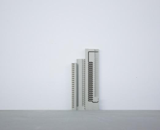
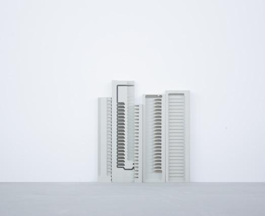
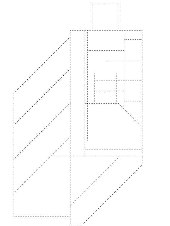
This is a physical model, which is mainly used to try to study how to design new infrastructure to improve the city or the current predicament faced by Shenzhen people. The design of the campus places the main traffic roads on the outermost side, and the circulation inside the campus is mainly used by people and fire trucks. This is to reduce the impact of external traffic on people’s daily life so that people on campus can slow down and walk and enjoy the public space.
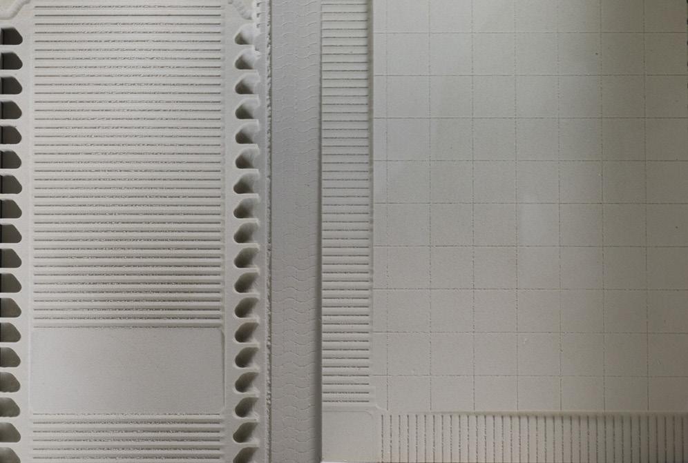
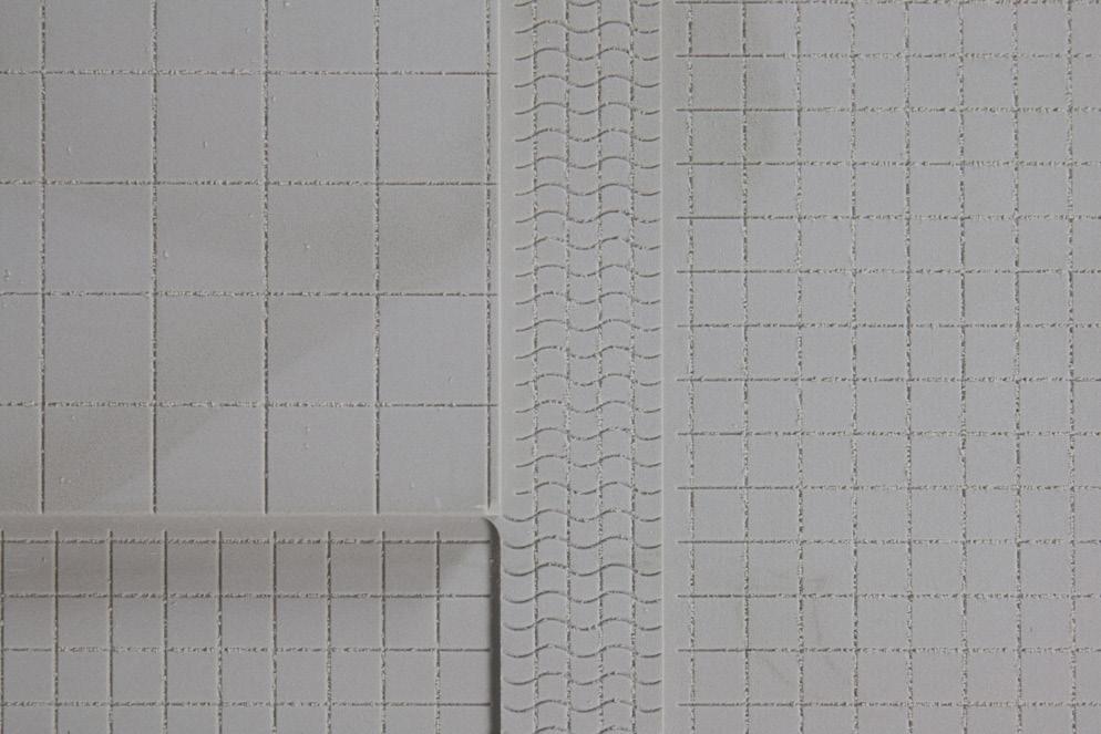
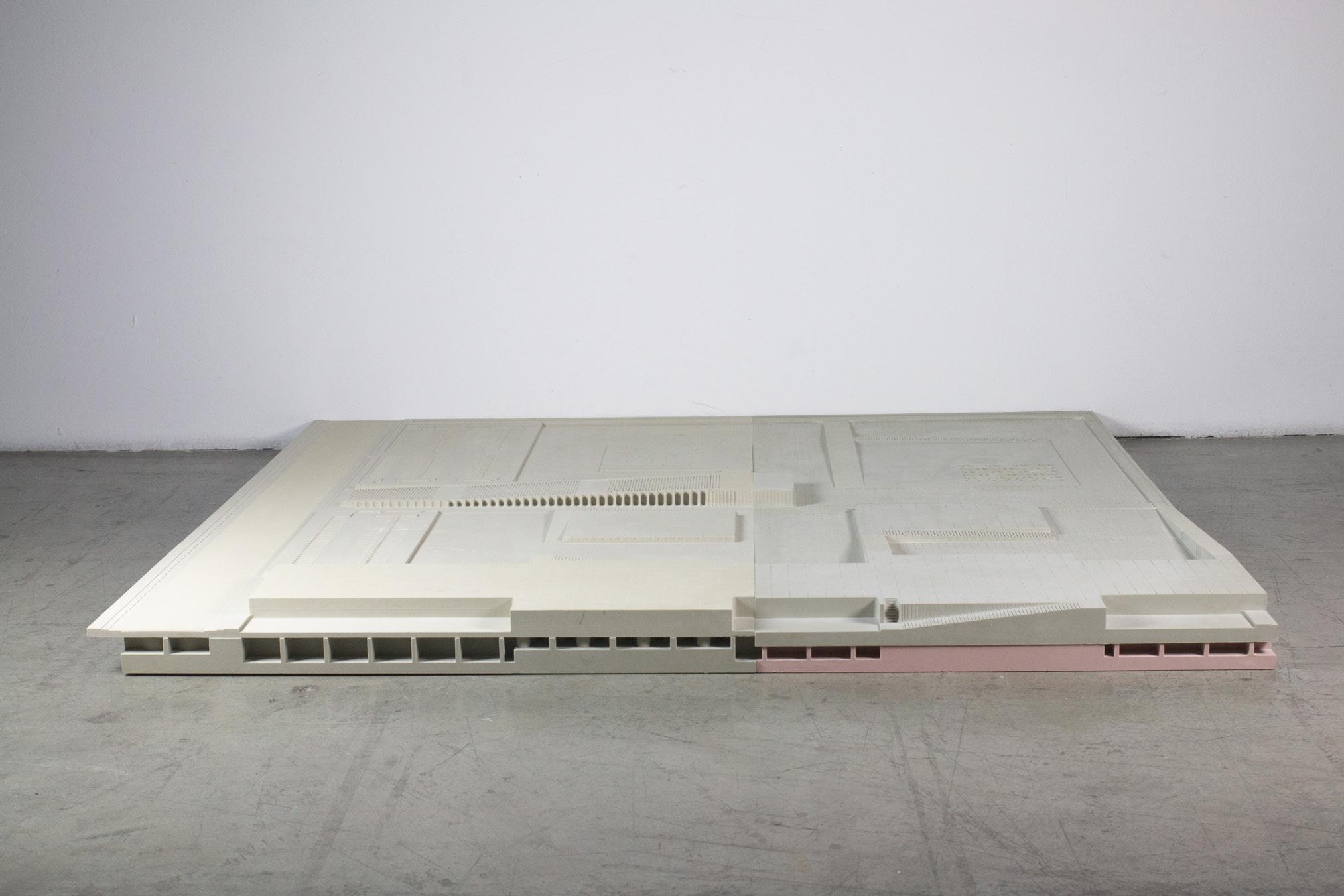
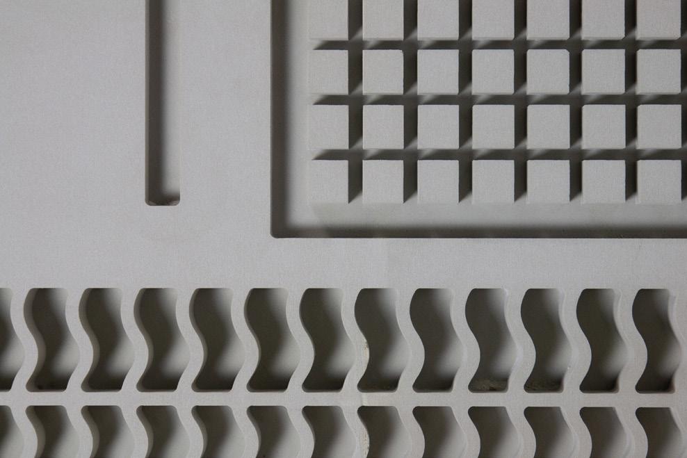
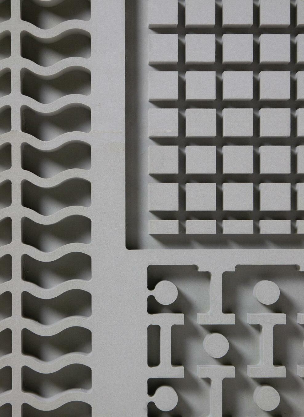
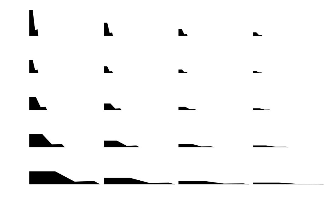
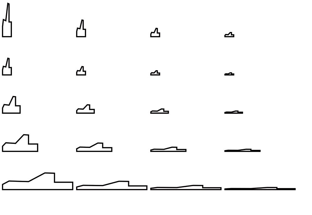
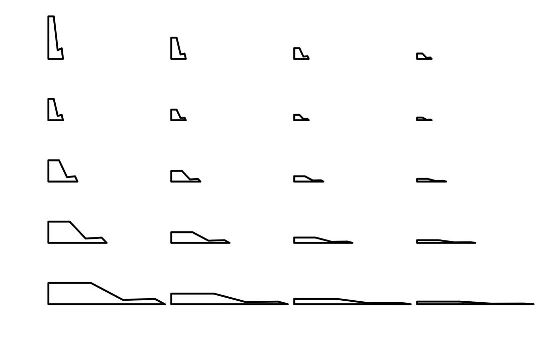
When the building is removed, it can be seen that there are many different textures. Some are from my designs, some are traces of CNC milling. But these traces of CNC milling get even more interesting here, and surprise means new in spiration. To make these textures not only present a flat vision, different textures have different functions by changing the scale. Ramps and roads are designed to slow down the cars and make sure people live in the campus more safety.

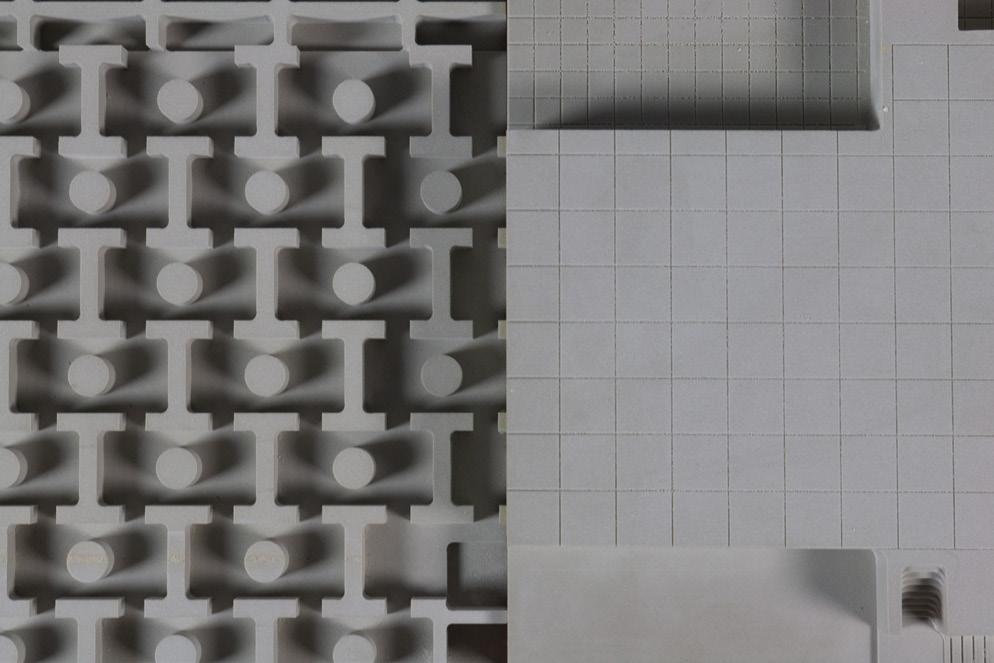
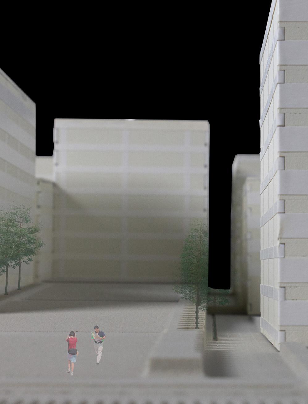
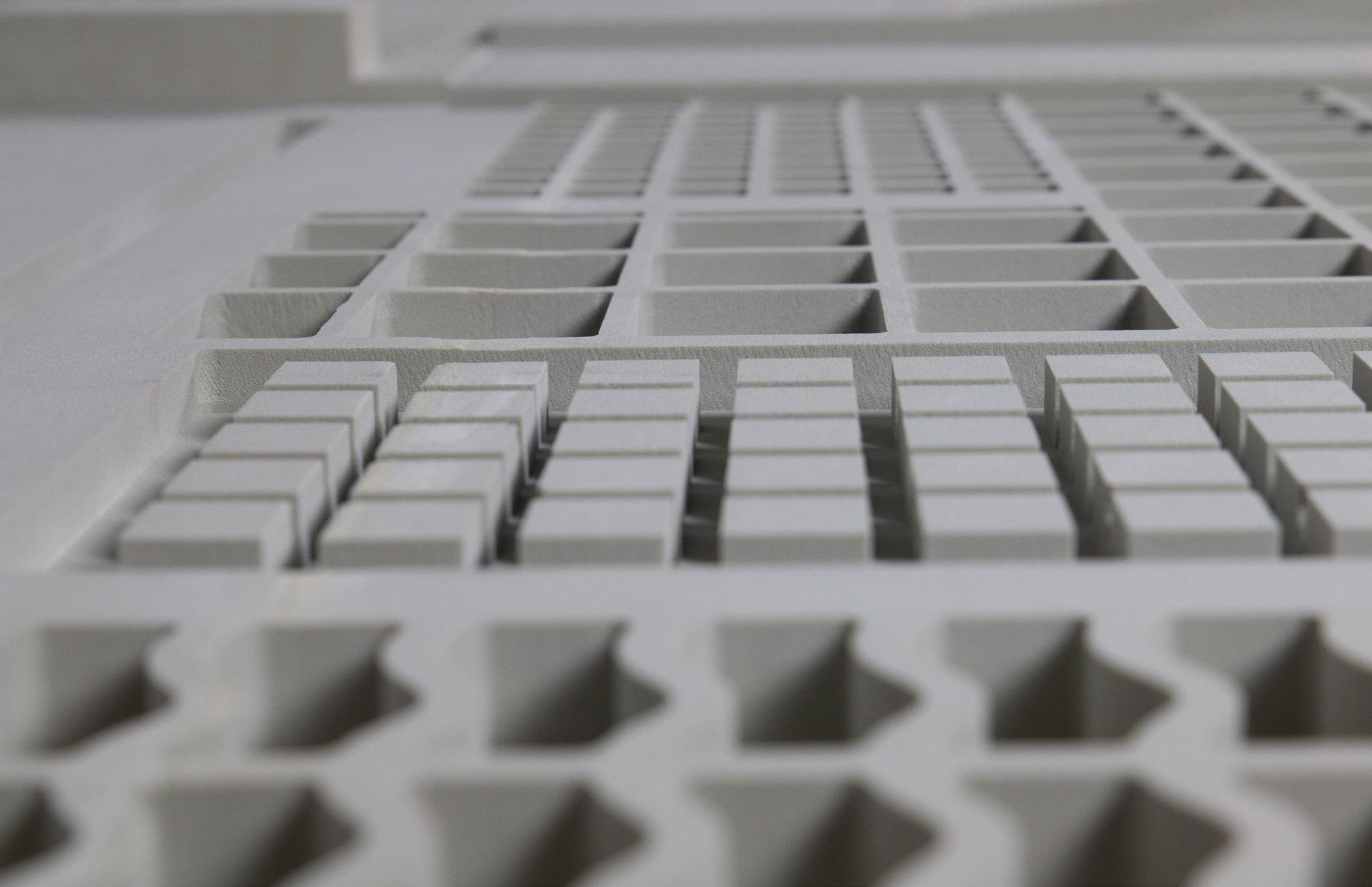
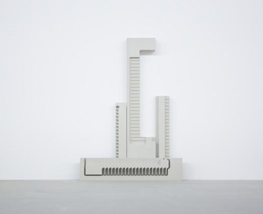
The structure and drainage system below the site is even more important. In China’s rapid construction in the past few decades, underground works have seriously affected people’s daily life. Narrow roads and poor drainage systems
are particularly serious problems in southern Chinese cities. Many larger drain age spaces are designed under the building and the site, which are connected by tunnels to make it a continuous system.
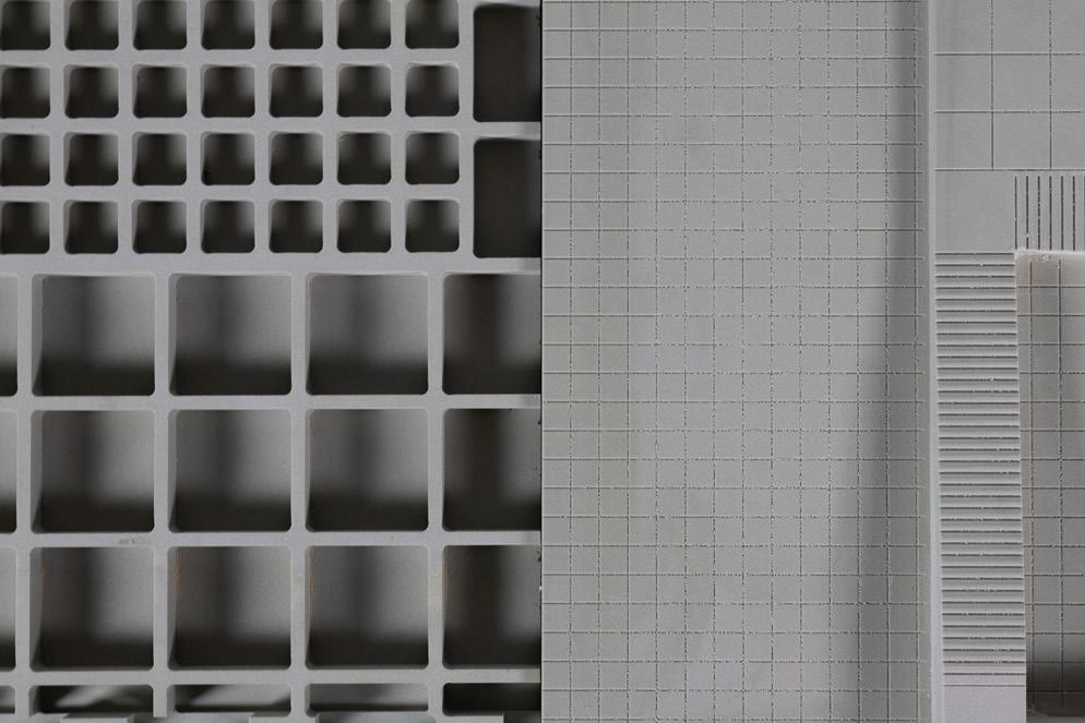
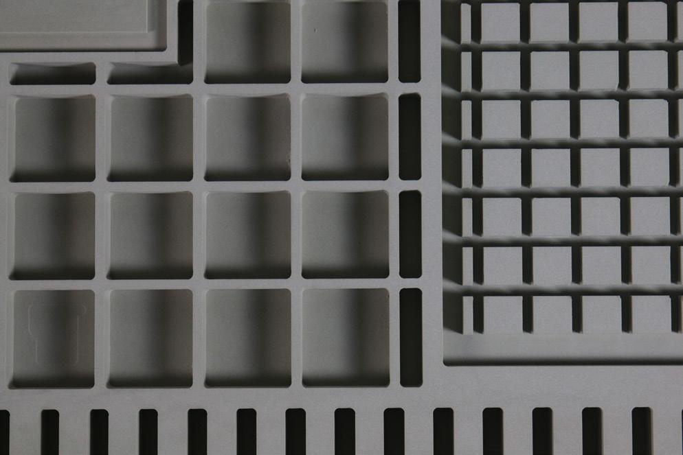
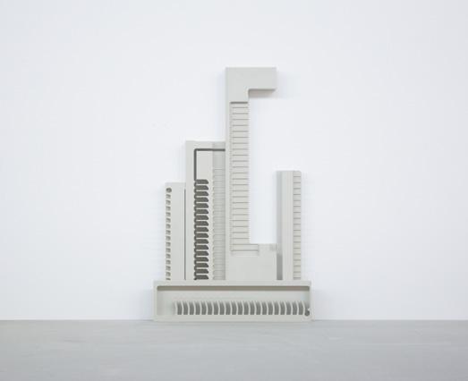
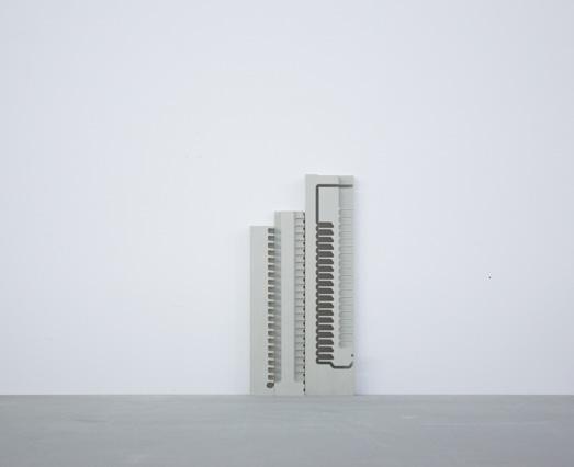
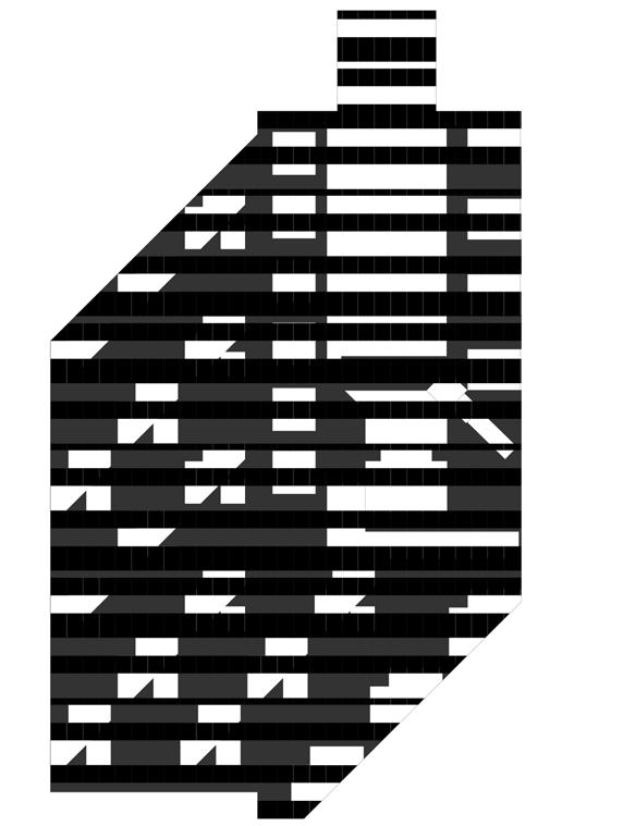
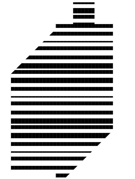
And it’s interesting to see the same texture in different scales, when the scale changes, the function changes. The grid on the ground of the building is the smallest, and this scale is to meet the needs of people. The grid of the Plaza underground structure is the largest and larger than the structure under the building because the plaza needs to be used for more drainage space.
This is the overall view of the underneath infrastructure layers, it’s clear to see how these textures work together. They are continuous and systematic. Roads and courtyards are also designed with many underground structures and drain age spaces. And a lot of spaces are designed under the plaza and courtyard for plants, and these circles represent trees.
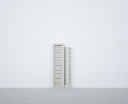
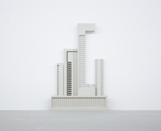
From the images, you can see how the vertical depth of textures makes sense.
Infrastructure is an important part of connecting buildings and sites. These textures should also have the sufficient vertical depth to ensure that they have a good drainage system. They are not only an important part of the drainage system but also the underground load-bearing structure.
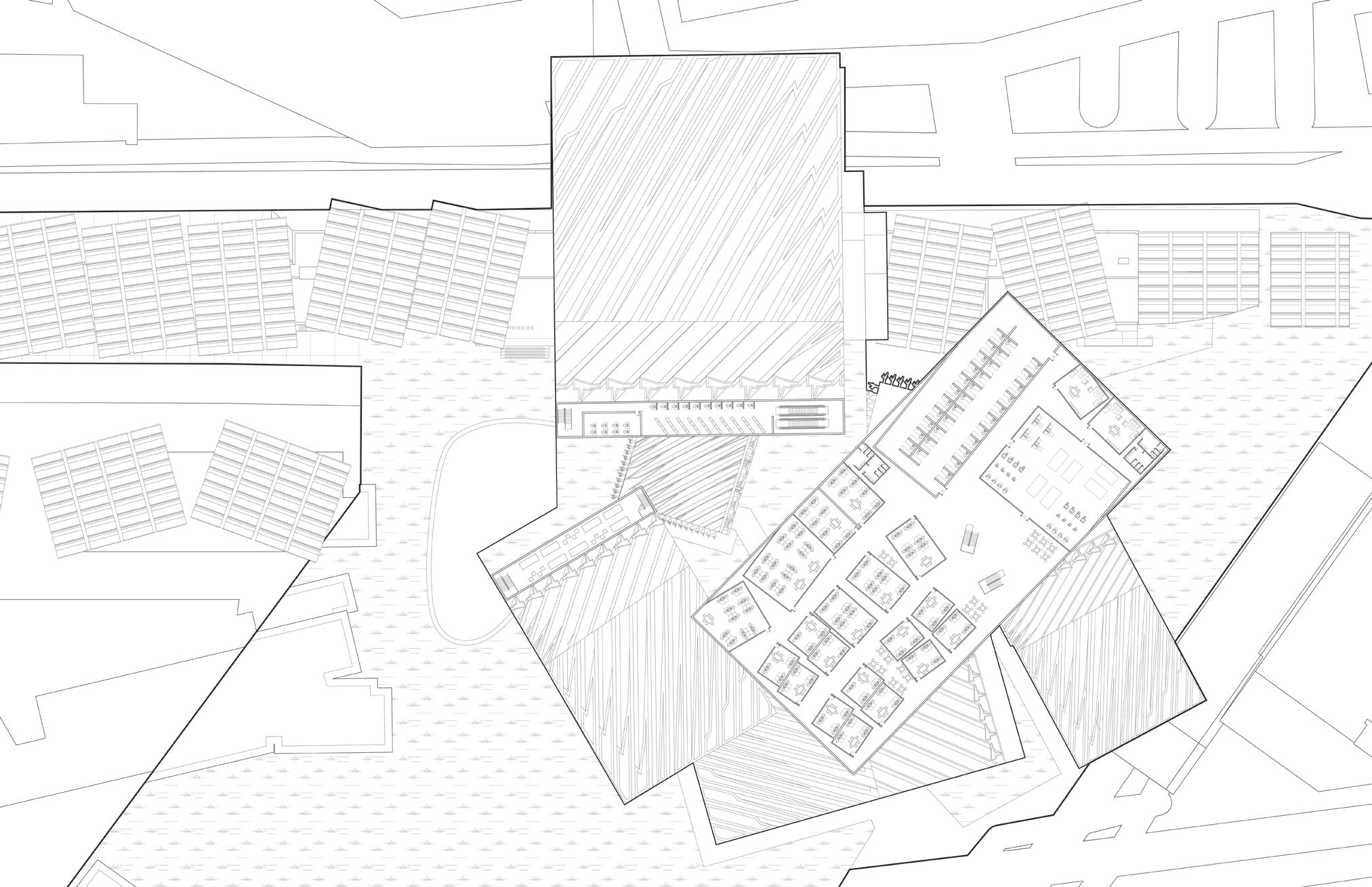
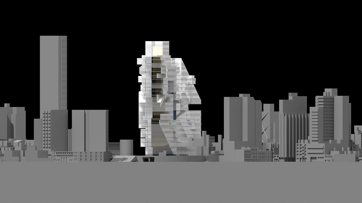
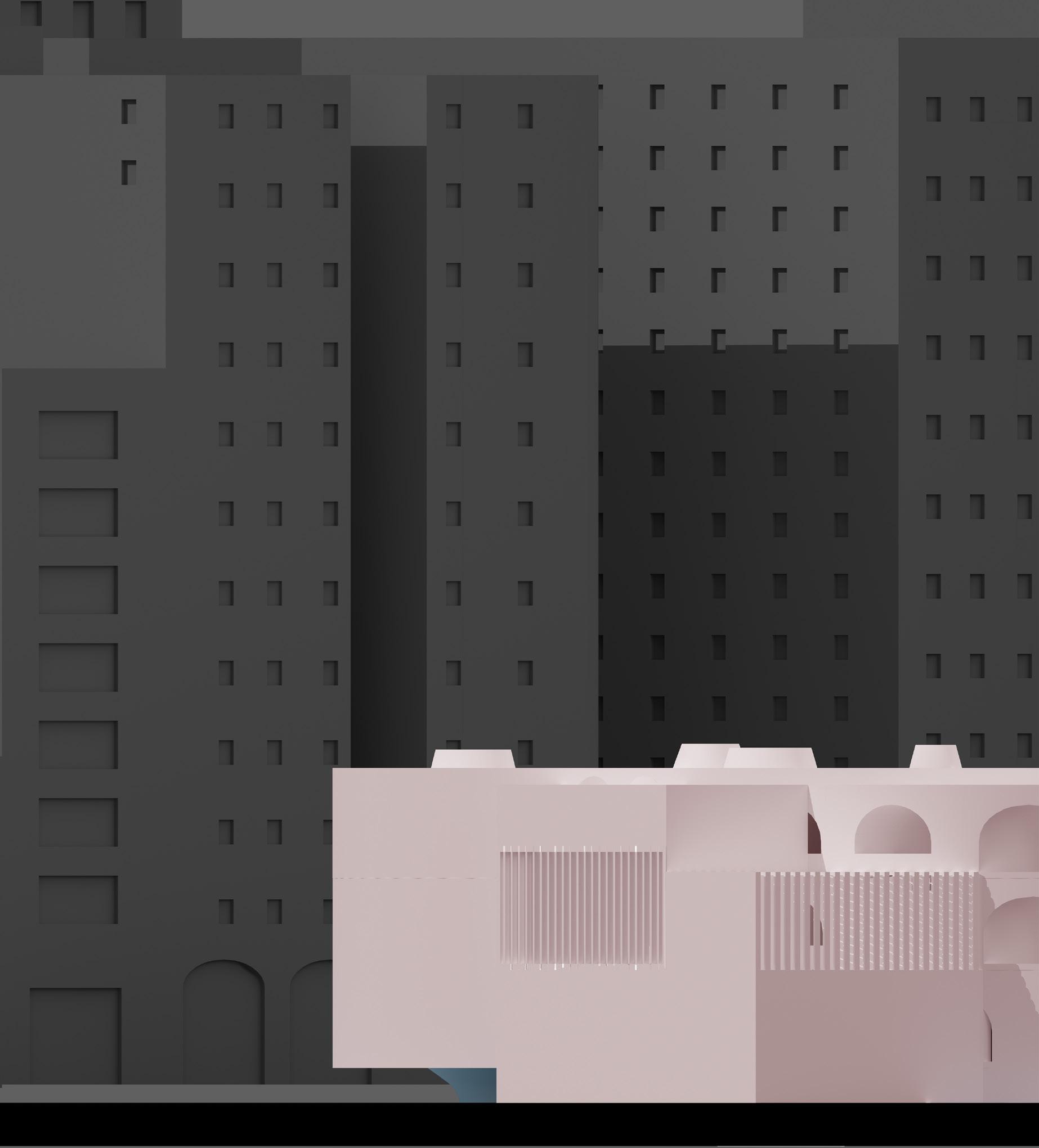
SCI-Arc is an independent school of architecture, its building is very special, a very long building. This makes SCI-Arc compared to other schools, it does not have many elements of a real campus, such as landscape, plaza, grass, and so on.
The most critical problem is that there are no apartments, and students have to live in apartments or other places near the school. All activities of the school’s faculty, staff, and students are almost in the same building, with little outdoor activity. Most of the SCI-Arc’s outdoor spaces are used for parking, and cars become the occupants of those spaces. This means that SCI-Arc lacks many spaces where people can enjoy life and commu nicate, which is very unfavorable for students. The busy curriculum of the School of Architecture means that students rarely have access to many rec reational activities, and the campus is a place where students can relax. So a good campus must have many public spaces where students can relax.
So this project is designed to protect SCI-Arc and the place where it is located. I think the best way to protect it is to use these spaces and keep them active, to allow these places has more activities.
The new scheme is designed on the roof and parking lot of the existing SCIArc building. The new scheme design consists of two cubes of different scales and five slabs of different scales. Four of the slabs are folded to form a mass ing with large flats and vertical spaces. The two cubes not only have many public space programs but also have structural functions that support the new design of the entire project. Each building is connected through circu lation, and programs such as library and cafe are designed in some large outdoor circulations so that everyone can communicate with others here.
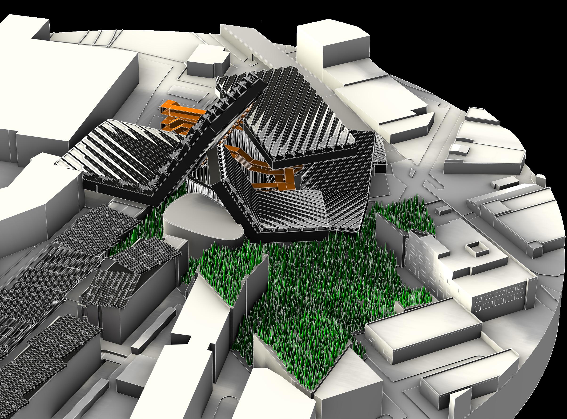
The shadow cast by the entire project under the sunlight is designed as a new object and becomes the new site of the project, making it paved on the ground and the roofs of surrounding buildings like a piece of cheese. The current parking lot of SCI-Arc has also become a part of the shadow object. The entire shadow object is designed as a landscape and filled with trees and grass to make it a small forest, then making the entire campus look like it stands in a forest.
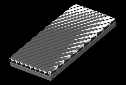
The facade and roof of the building are also designed with many textures. These textures are designed as solar panels to provide a lot of green energy for the future SCI-Arc.
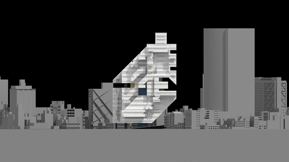
In the scheme design, a large number of solar panels are designed on the roof and facade of the building. This is designed so that the future SCI-Arc campus will have a lot of environmentally friendly sustainable energy for all teaching, living, and other activities. The solar panel is a very important part of the scheme
design, and its texture is inspired by the buildings around SCI-Arc. Using ele ments from around SCI-Arc to design on the roofs and facades of new campus buildings in the future, this will not only make SCI-Arc part of the urban texture of the LA arts district but also make SCI-Arc a real campus with special signs.
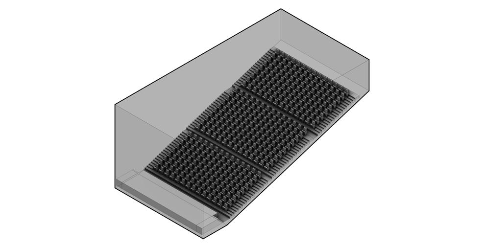
I.M. 01 - AUDITORIUM
I.M. 02 - HOUSING UNIT(STUDIO)
I.M. 03 - HOUSING UNIT(1B1B)
I.M. 04 - HOUSING UNIT(2B1B)
I.M. 05 - EXHIBITION
I.M. 06 - CORE STUDIO
I.M. 07 - CAFE
I.M. 08 - CLASSROOM
I.M. 09 - OFFICE
I.M. 10 - MEDIA ROOM
I.M. 11 - ROBOT HOUSE
I.M. 12 - WOODSHOP
I.M. 13 - SUPPLY STORE
I.M. 14 - LIBRARY
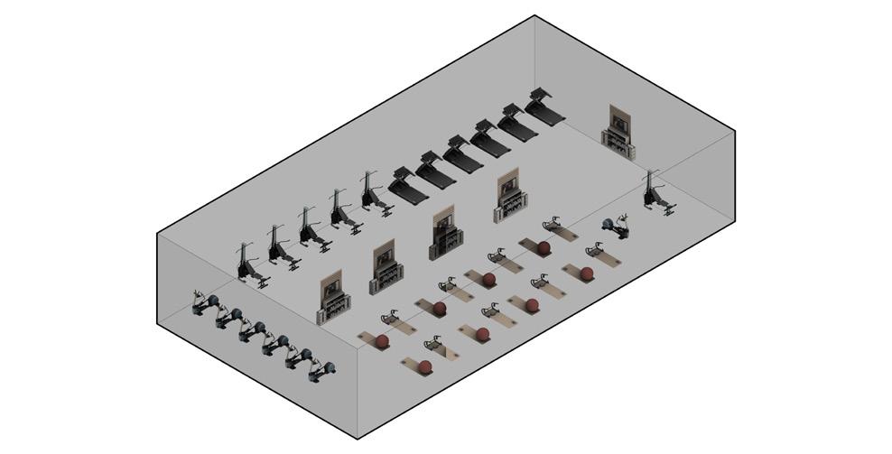
I.M. 15 - GYM
I.M. 16 - GAP SPACE FOR RECREATION
I.M. 17 - THESIS STUDIO
I.M. 18 - BIG STUDIO
I.M. 19 - VERTICAL STUDIO
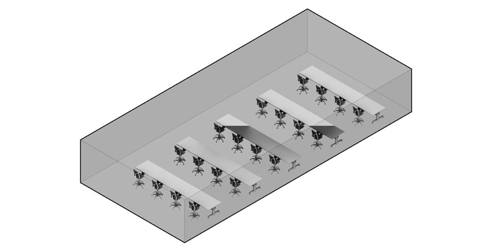
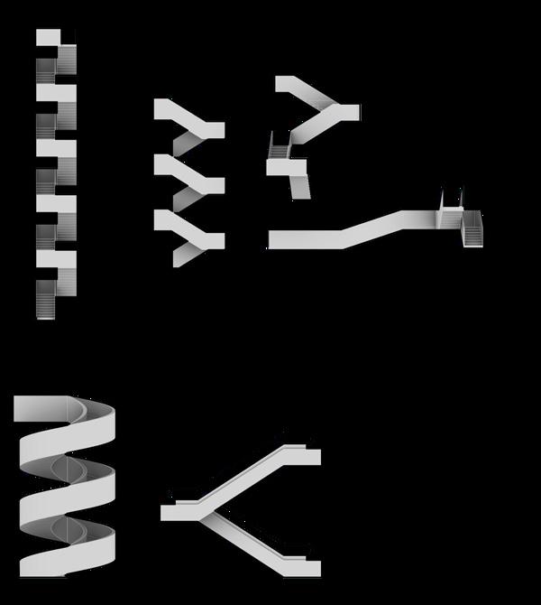
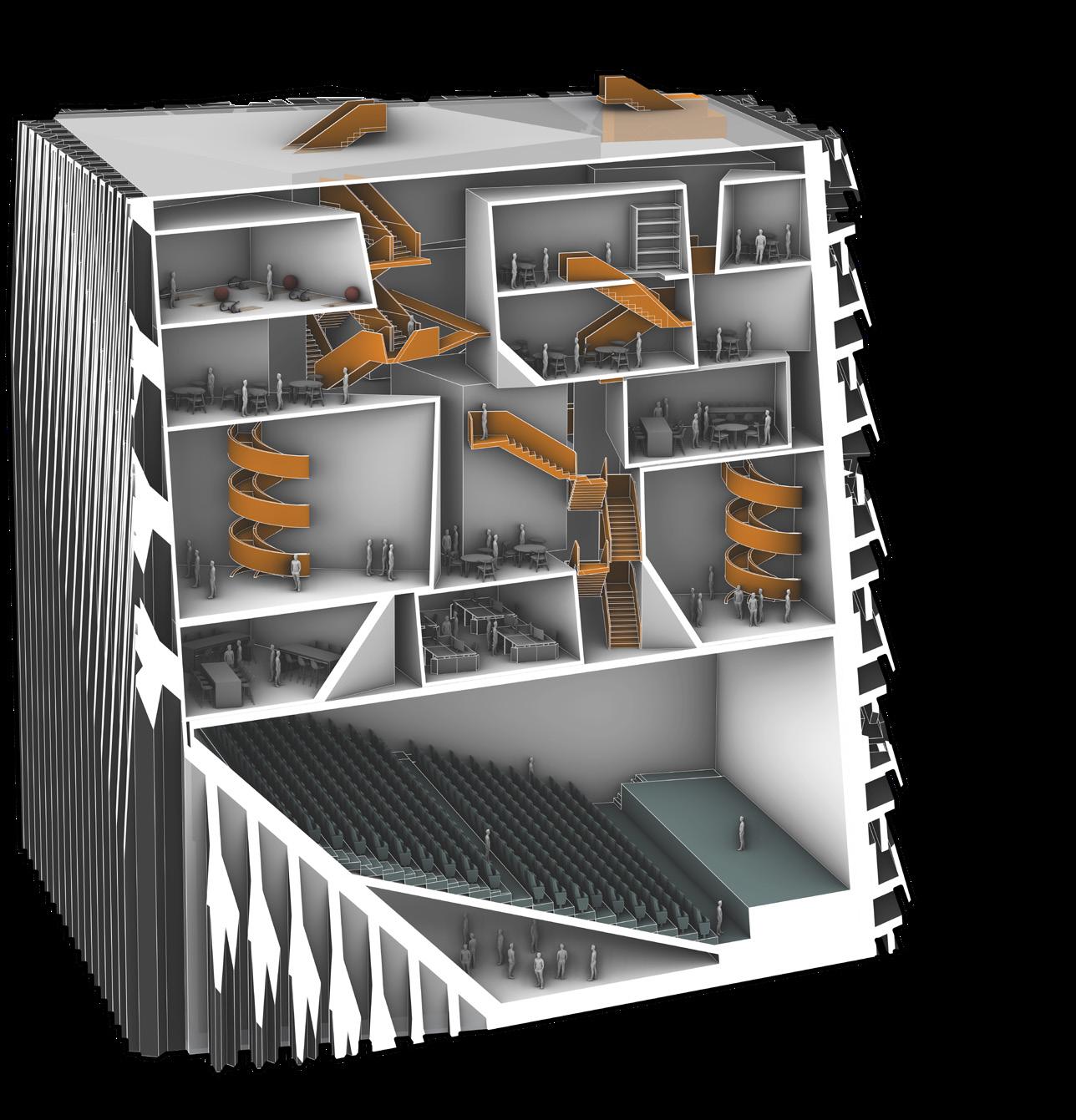
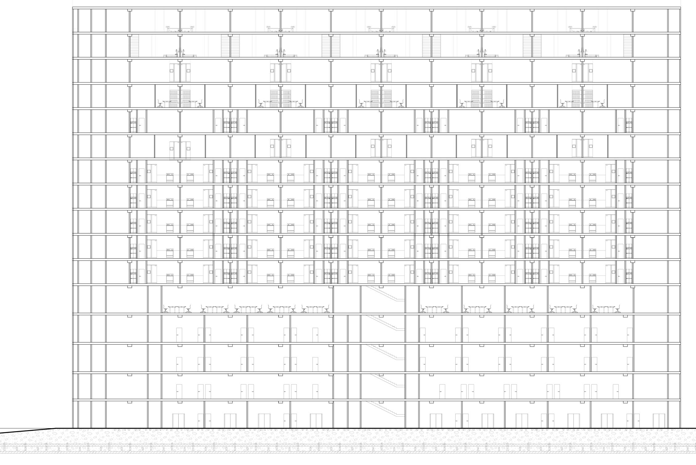
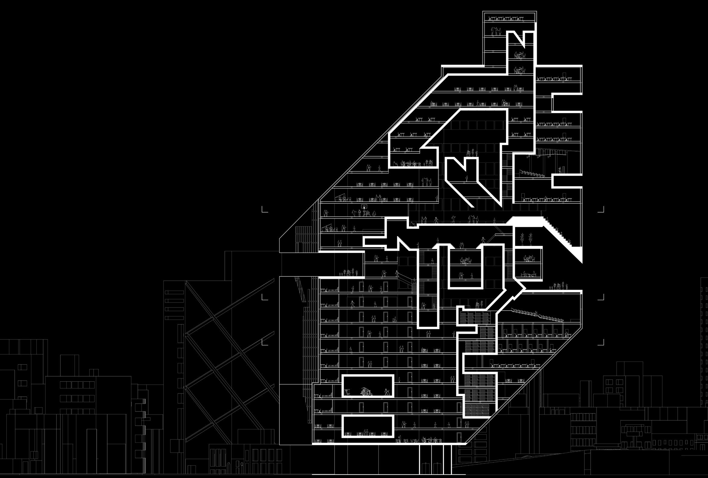
Circulation is a very important part of this project. It is divided into two parts: the indoor is a systematic circulation composed of many small-scaled stairs, eleva tors, and escalators, connecting different programs in the indoor; the outdoor is composed of large-scaled bridges and ramps, connecting different buildings, and putting public spaces such as libraries and cafes here to provide people
convenient space for chatting. Since many SCI-Arc students live in the OSF apartments, the new scheme design also designs a circulation connecting the SCI-Arc and OSF apartments, entering the school directly from the apartments.
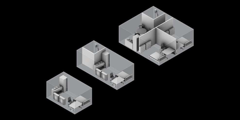
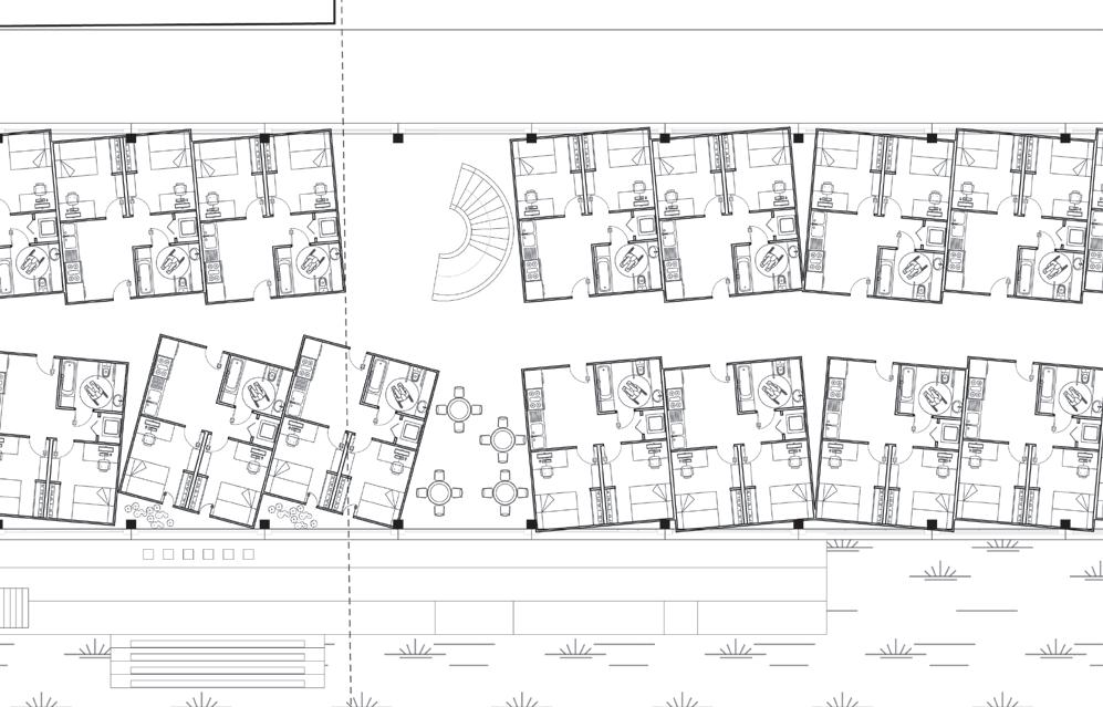
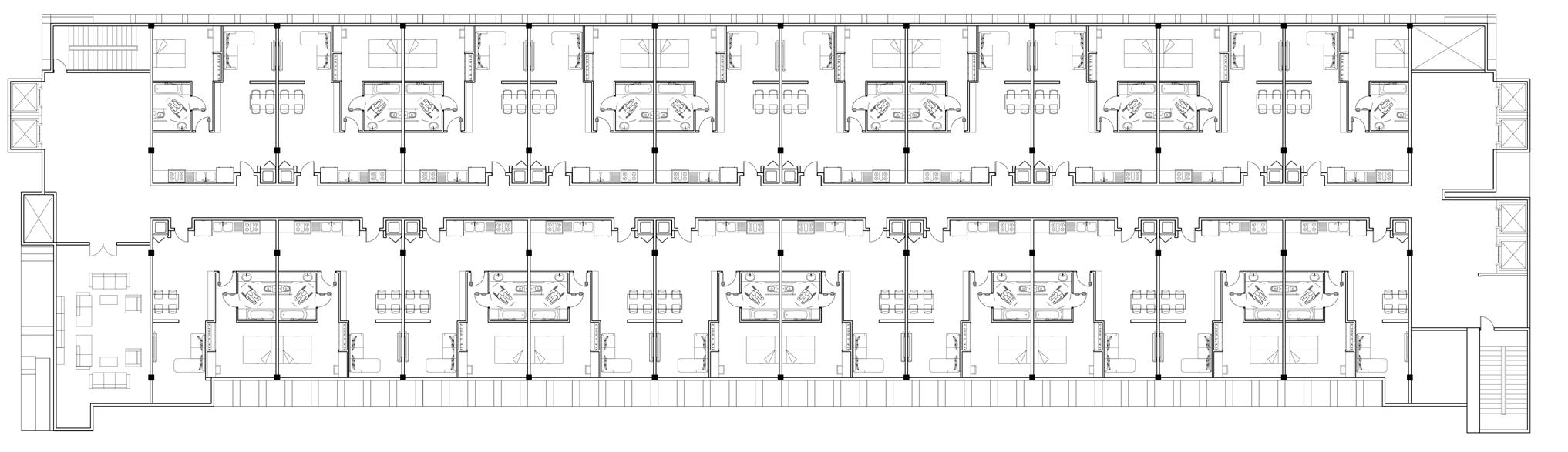
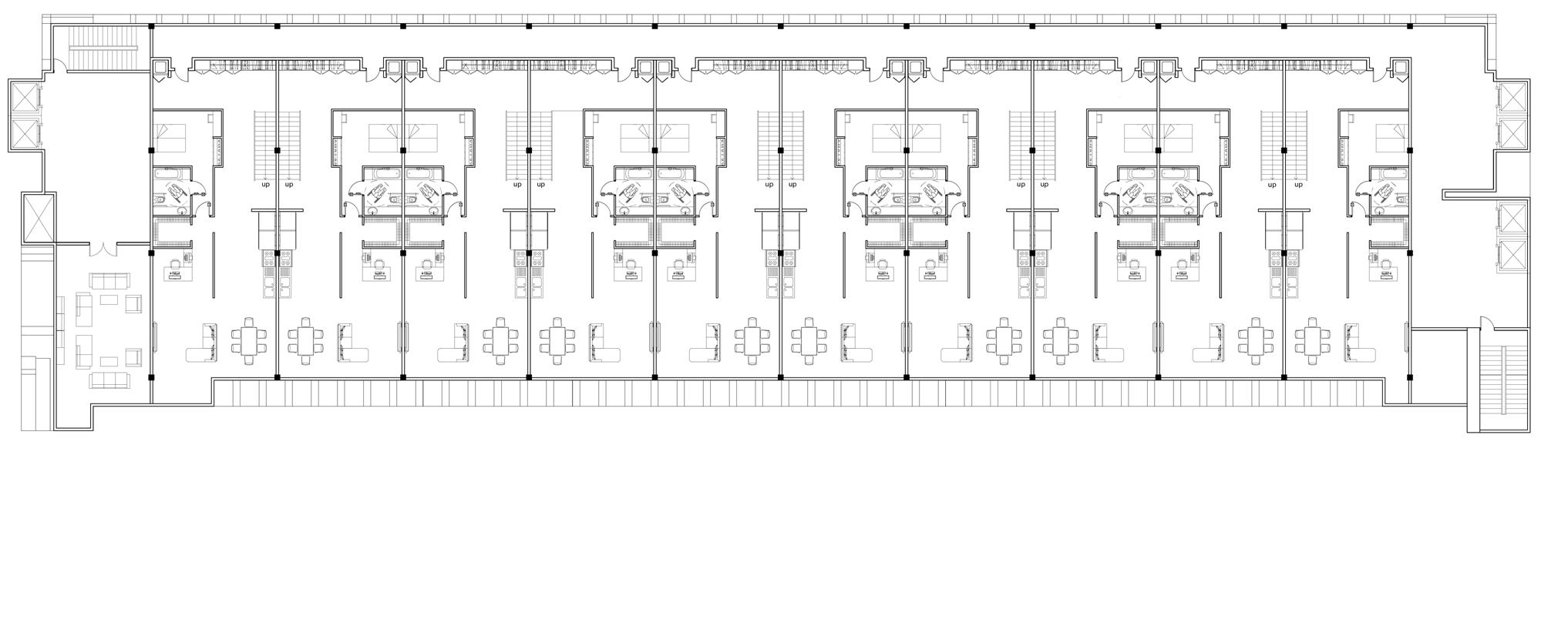
To meet the needs of SCI-Arc students to live in, all the programs in the current SCI-Arc building would be removed then converted the entire building into apartments for students to live in. These include 208 studio units, 156 1B1B units and 152 2B2B units, with a total capacity of 438 people. This design also responds to the fact that the site is surrounded by apartment buildings. The OSF apartment to the east of SCI-Arc is a very long apartment, where many SCI-Arc students live.
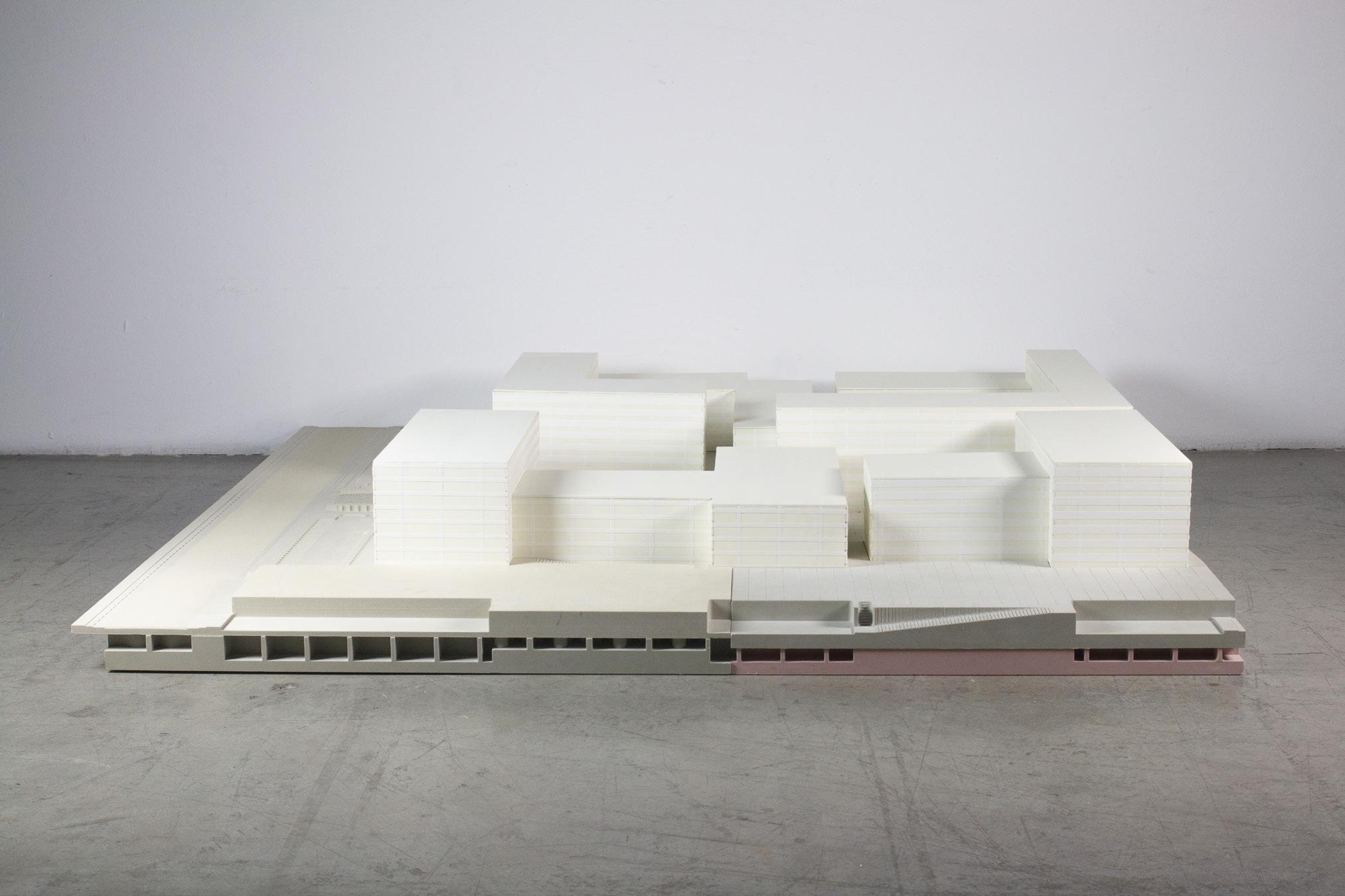
All of SCI-Arc’s teaching, administrative and other recreational activities were then designed in the new building. The shape of the new building is folded like a book. Through the combination of these different scales of folding slabs, many negative spaces are formed between the buildings. These spaces provide the faculty and students with a lot of outdoor activities.
The design of this project is very playful, all the elements that make up the project are designed as kits of different scales, including the interior program, facade texture and circulation, and other components.
The interior program is inspired by the different programs currently available in the school. In addition, in order to improve the needs of the current school, many new program kits are also designed, such as a larger auditorium, gym, and cafe. These are all important parts that can improve the school environment and the leisure li faculty and students.
And to creat more public spaces for recreation, all programs are designed as kits of different scales, and these kits are randomly combined, creating a lot of negative space between program massing. These spaces are designed as places for people to rest and chat. These spaces are very important to the whole project because the current SCI-Arc lacks these places. All the designs are like Lego, through random collocation and combination, so that there is a lot of negative space. The negative space between these program kits can be used for both circulation and recreation space.
I.M. 01 -
I.M. 02 - HOUSING UNIT(STUDIO)
I.M. 03 - HOUSING UNIT(1B1B)
I.M. 04 - HOUSING UNIT(2B1B)
I.M. 05 - EXHIBITION
I.M. 06 - CORE STUDIO
I.M. 07 - CAFE
I.M. 08 - CLASSROOM
I.M. 09 - OFFICE
I.M. 10 - MEDIA ROOM
I.M. 11 - ROBOT HOUSE
I.M. 12 - WOODSHOP
I.M. 13 - SUPPLY STORE
I.M. 14 - LIBRARY
I.M. 15 - GYM
I.M. 16 - GAP SPACE FOR RECREATION
I.M. 17 - THESIS STUDIO
I.M. 18 - BIG STUDIO
I.M. 19 - VERTICAL STUDIO
M.K. 01 - STAIRS M.K. 02 - STAIRS M.K. 03 - STAIRS M.K. 04 - STAIRS AND BRIDGE M.K. 05 - SPIRE STAIRS M.K. 06 - CROSS ESCALATOR M.K. 07 - STAIRS AND BRIDGE M.K. 08 - STAIRS AND BRIDGE M.K. 09 - STAIRS AND BRIDGE M.K. 10 - THEATER M.K. 11 - GRADUATE STUDIO M.K. 12 - HOUSING UNIT(STUDIO) M.K. 13 - HOUSING UNIT(1B1B) M.K. 14 - HOUSING UNIT(2B1B) M.K. 15 - SHADOW OBJECT M.K. 16 - SOLAR PANEL M.K. 17 - SOLAR PANEL M.K. 18 - SOLAR PANEL M.K. 19 - SLAB M.K. 20 - FOLDED SLAB M.K. 21 - SOLAR PANEL

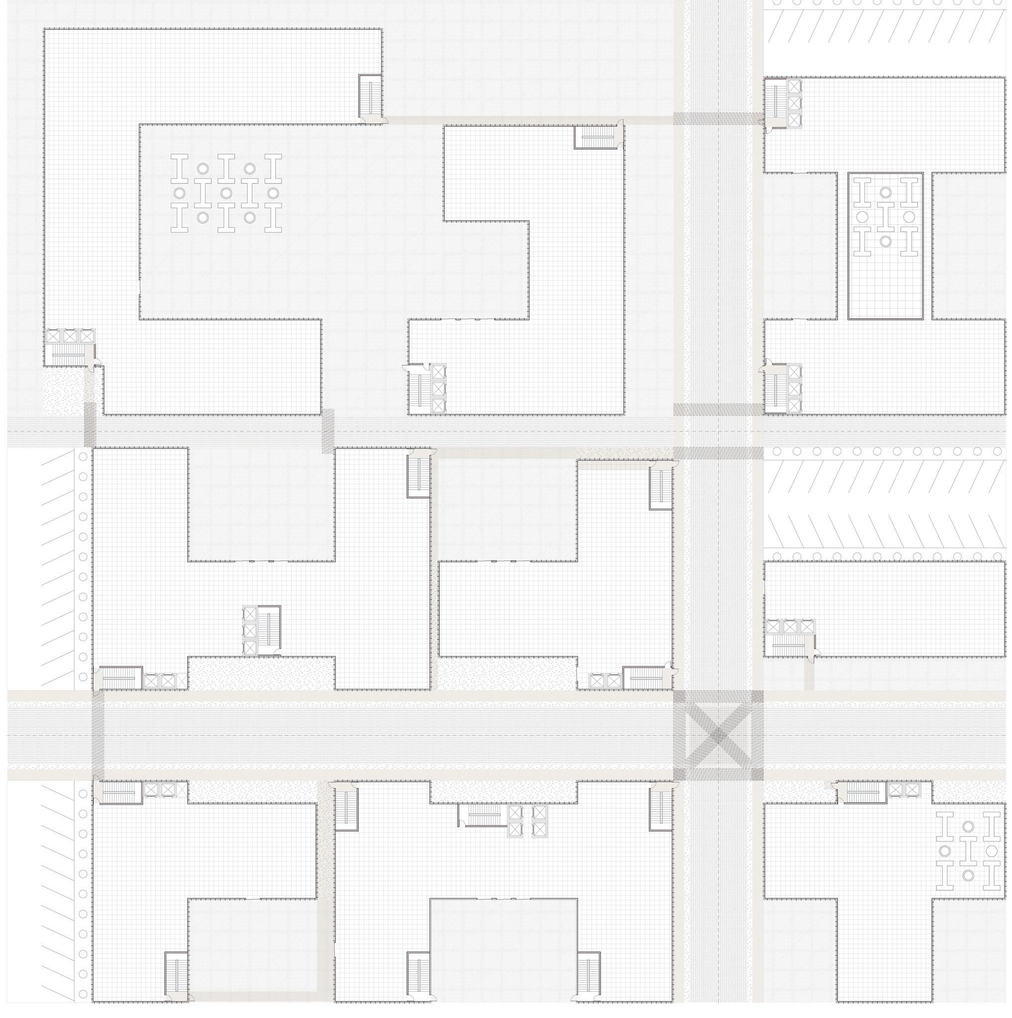
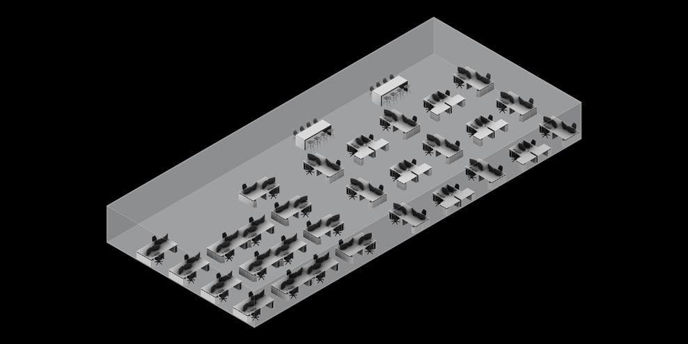
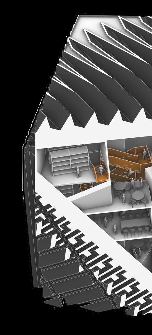
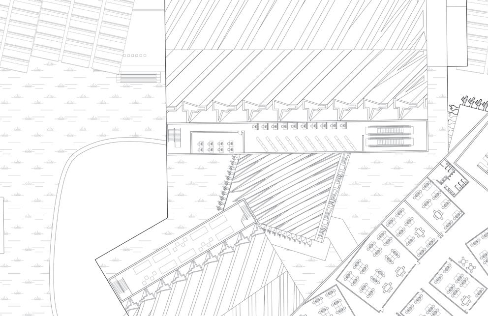
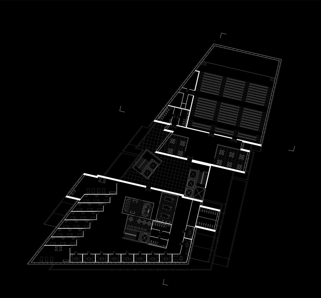
As can be seen from the ground floor plan, the negative space formed between each building not only separates the individual building but also provides a lot of outdoor recreational space. The old buildings were transformed into apart ments, and the new buildings kept a certain distance from the old buildings, so that not only life was relatively separated from study and work, but the short distance also made all aspects more convenient.
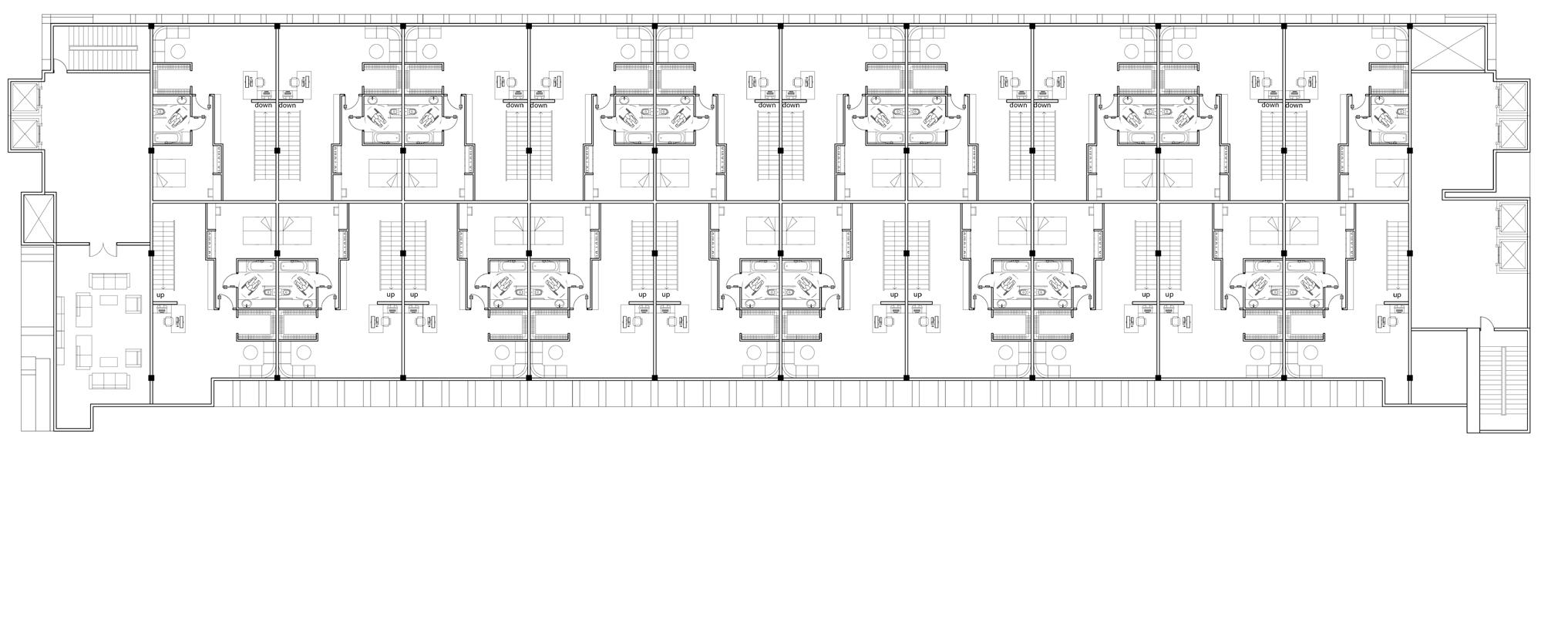
The interior of the apartment is composed of many housing units. The staggered arrangement creates some gap spaces between the units. These spaces can be used as a circulation to the upper floor, or as a landscape or recreational place.
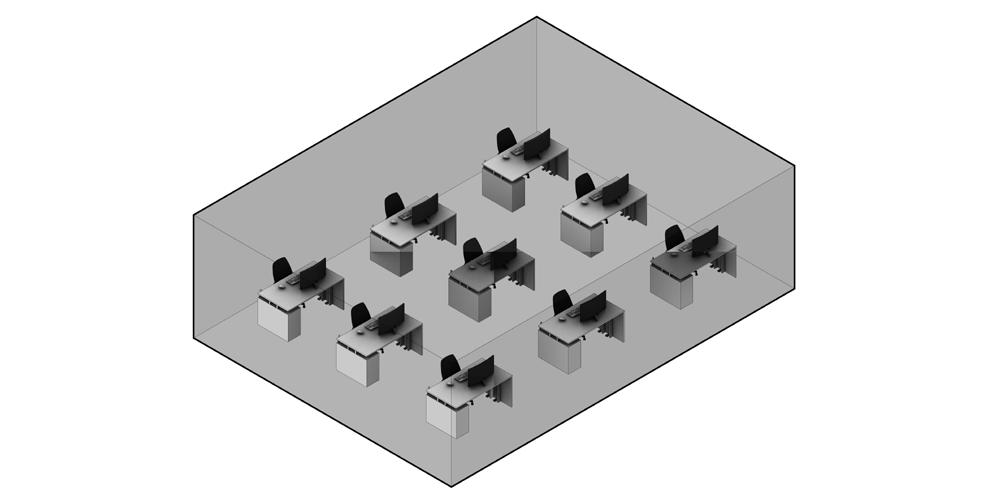
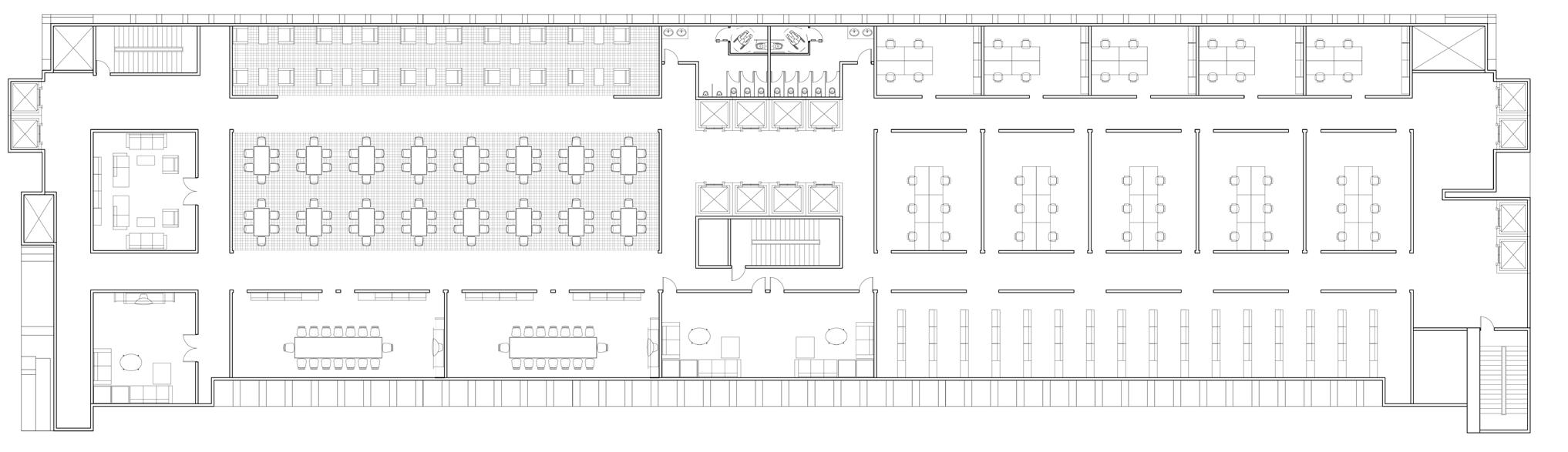
The two cubes with different scales in the middle are designed as a place to support the whole project. From a spatial point of view, this is also a transitional space. All internal programs are designed for assisted living and teaching, such as auditorium, gymnasium, and recreation room.
The first floor of the big cube is designed as the new Kerk Hall. This new audi torium will be much larger than the old Kerk Hall and can accommodate larger academic events held by the school in the future. The first-floor program of the small cube has many study rooms, small meeting rooms, and recreation rooms.
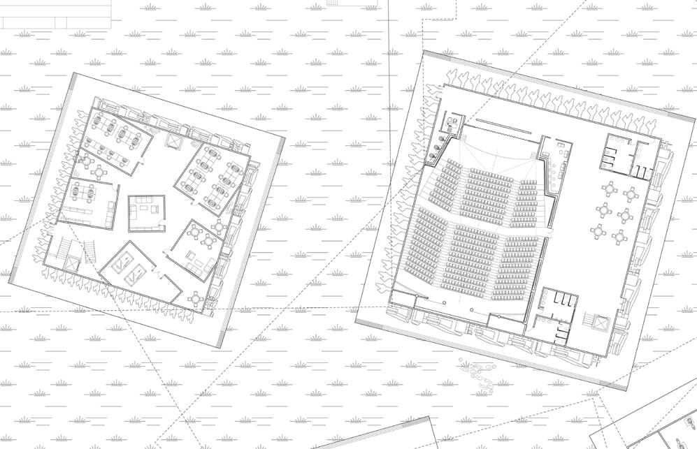
This project has both horizontal and vertical spaces. The upper floor of the folded slab is a vertical, slender space, and the height of the floor allows it to see the skyline of DTLA. Therefore, part of the library and exhibition are placed in this location, so that people can occasionally see the beautiful scenery outside the window.
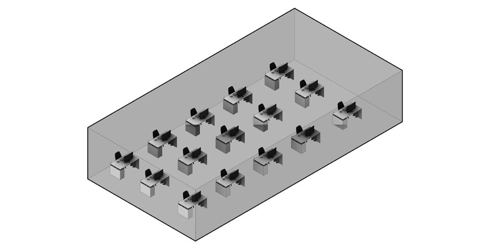
As the main program of the School of Architecture, the studio is the most used space in the school. Architecture students spend at least ten hours a day busy with their creations in the studio. Therefore, it is very necessary and important to have a large space with many public spaces for them to rest and
chat. Therefore, in the new design, most of the studios of SCI-Arc are set in a slab which is on top of the large cube, and the height of the building is higher than the surrounding area so that students can see the vast scenery outside the window, and keep the Bright light.
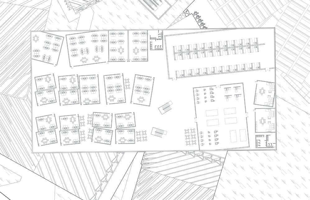
In addition, many circulations are also designed in each studio, which can be connected with the folding slab below, which is convenient for the faculty and students to go to various areas for activities. To facili tate and enrich students’ learning and creativity, woodshops and some lounges are also designed in other areas on this floor for students to use.
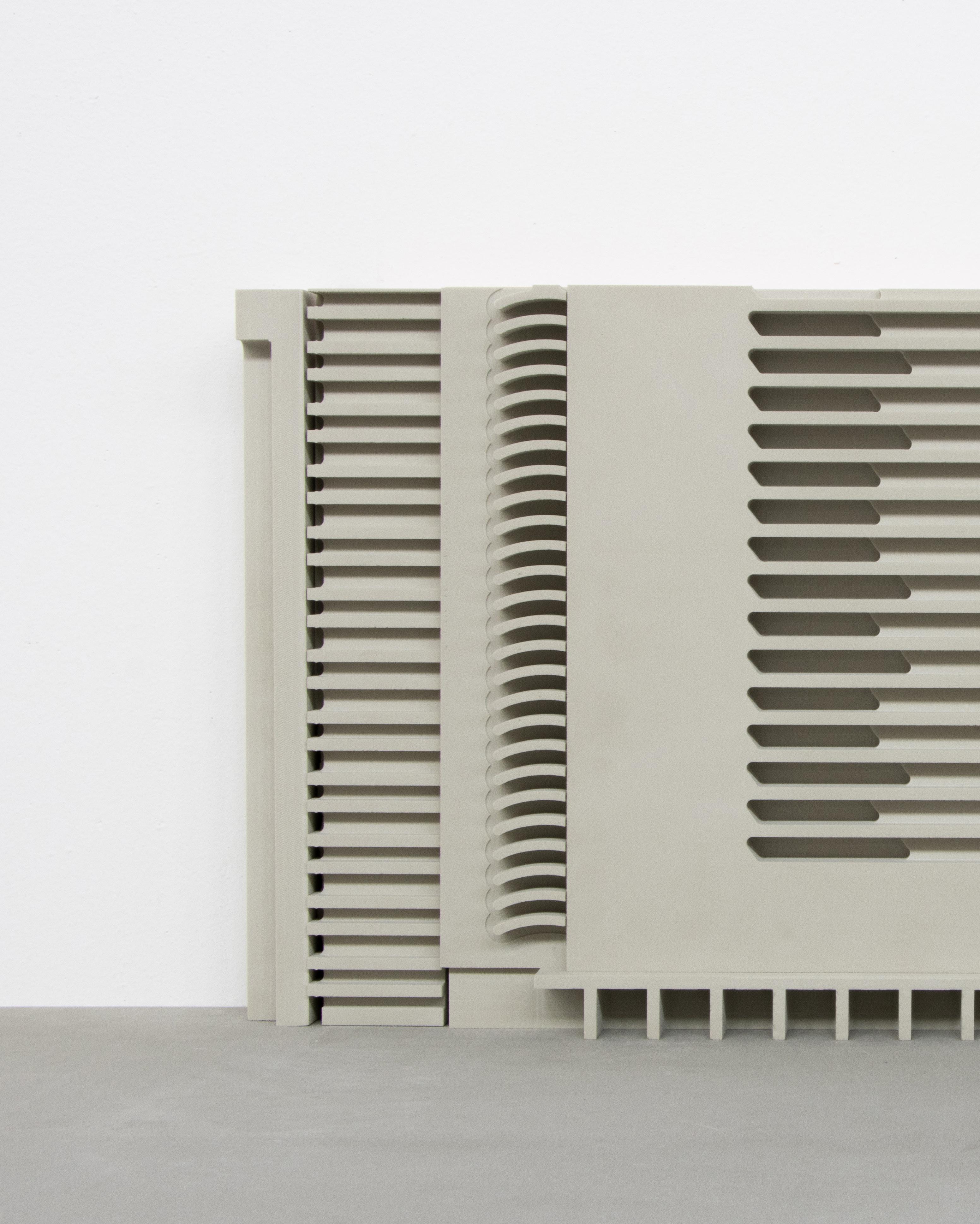
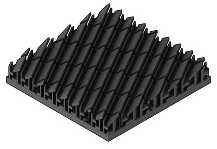
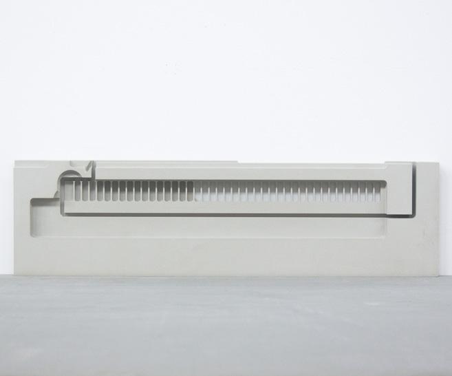
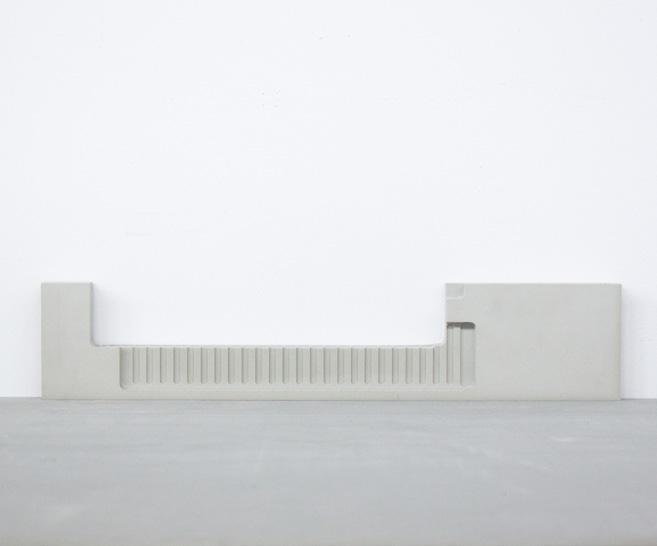
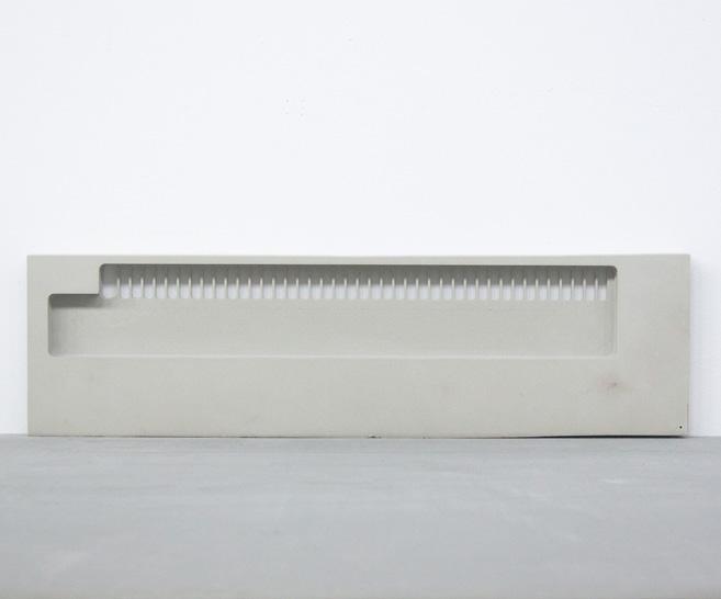
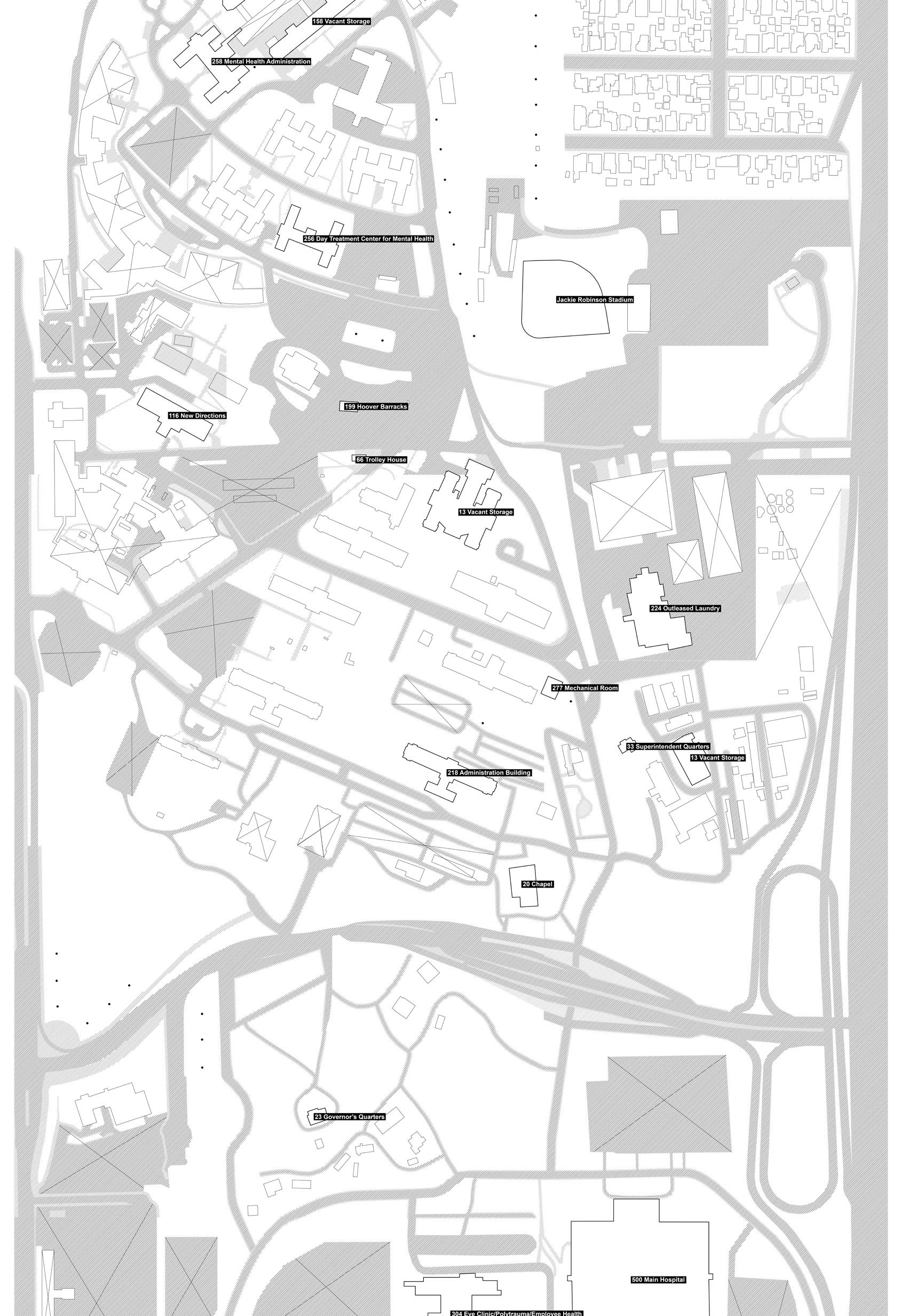
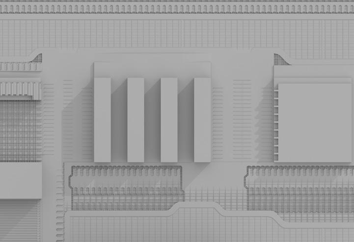
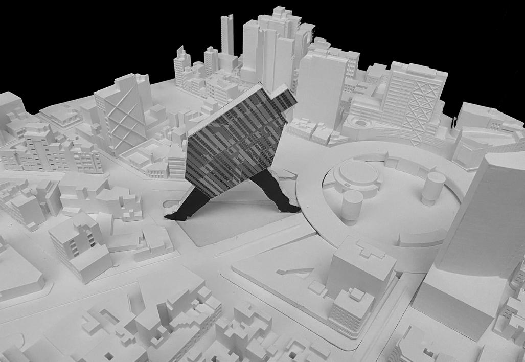
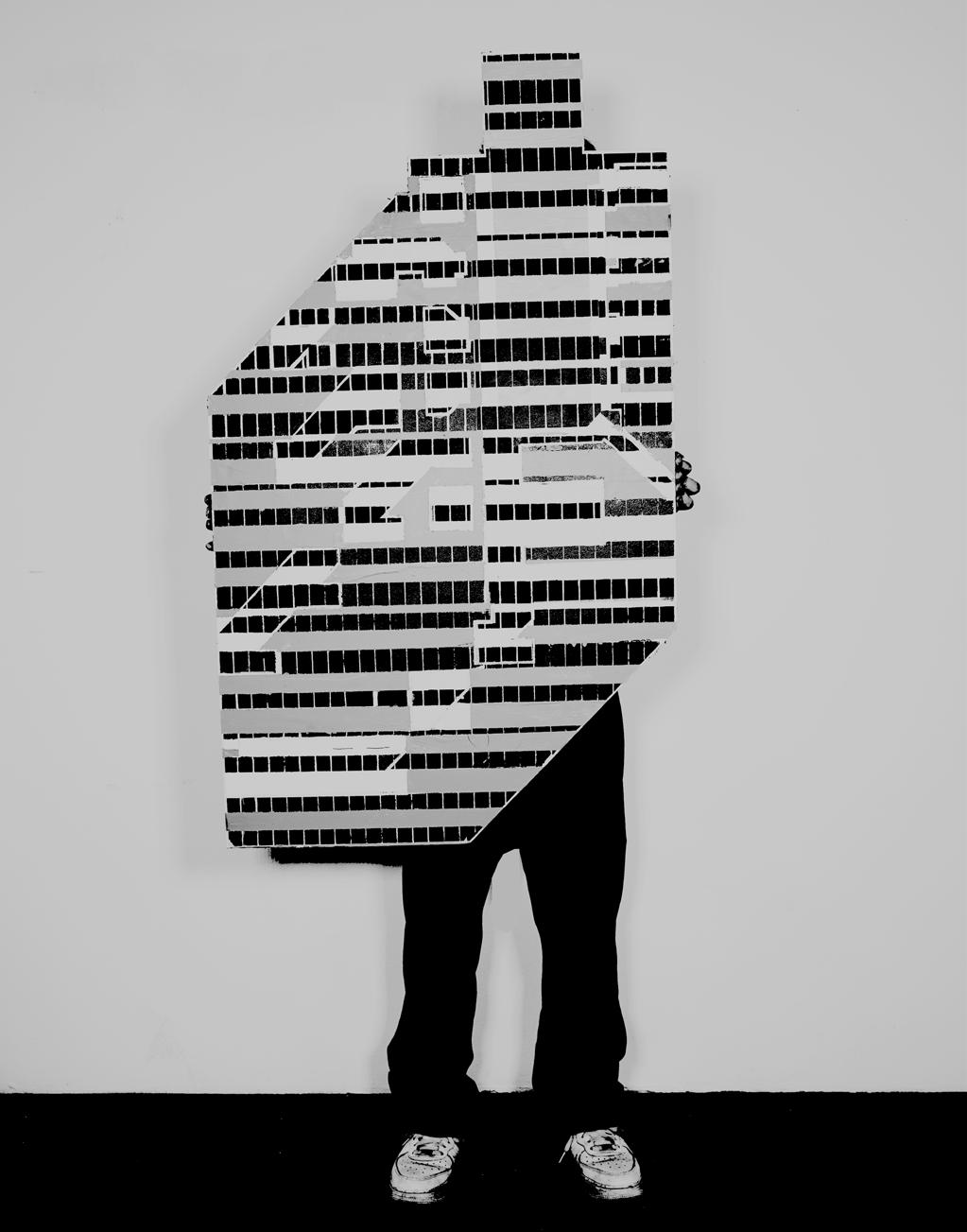
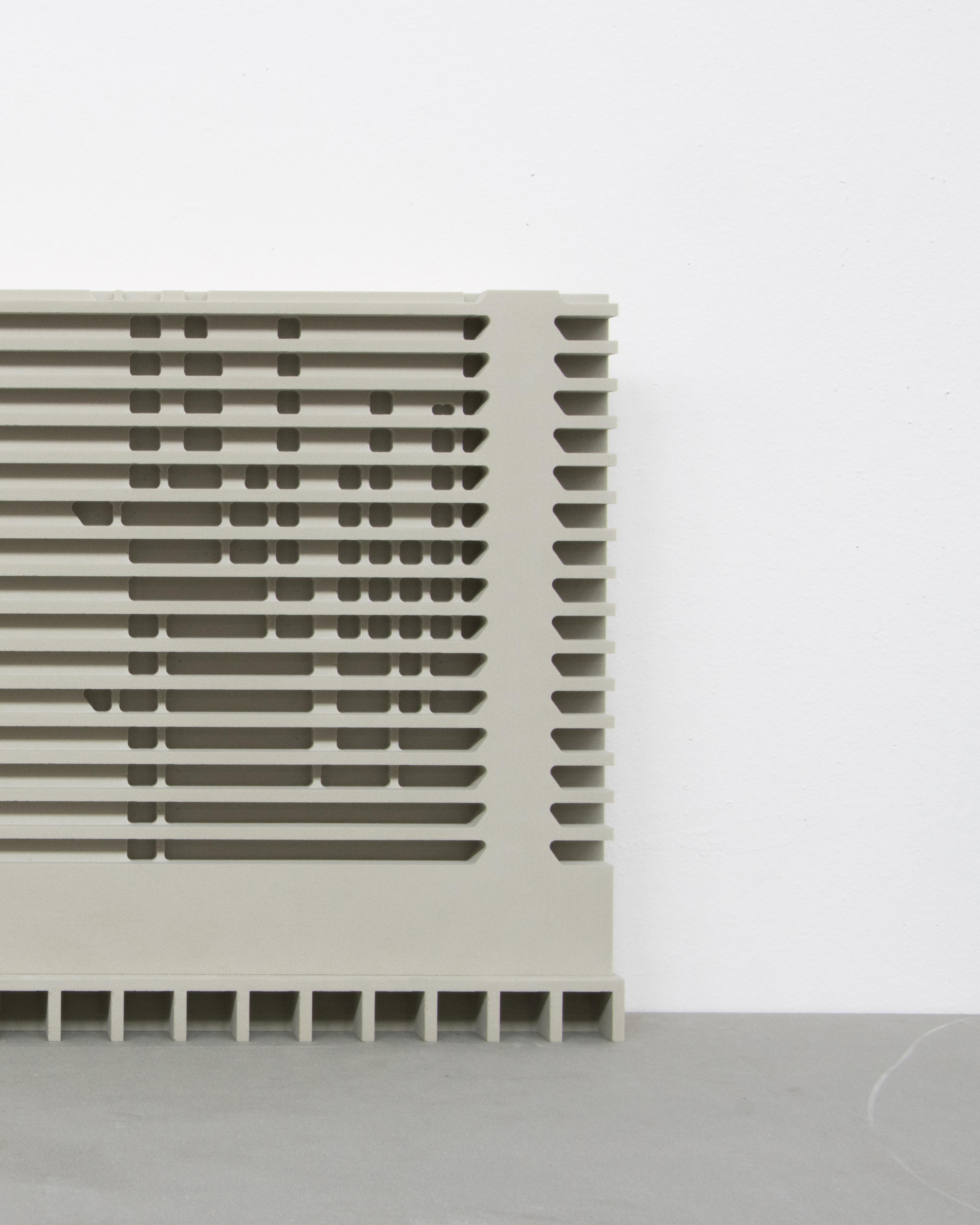
West LA VA Campus is a great place, each building contains many details, these details make people think. Just like seeing those buildings, We can see all the graphics, but what is inside these figures, we can’t see. When I see this air conditioner, I would also imagine and think about what is inside of it.
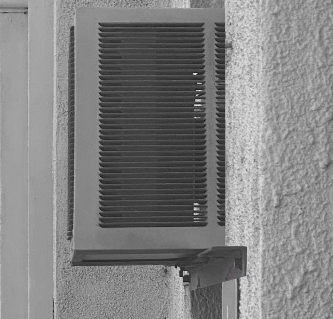
What is inside of the air conditioner?
Look carefully at the details in the air conditioner, it is no longer an air condition er. There are many spaces and geometric figures in it. It is not only a building, but also the texture of the city.
It is a new architectural language.
IMAGE OF AIR CONDITIONER IN WEST LA VA CAMPUS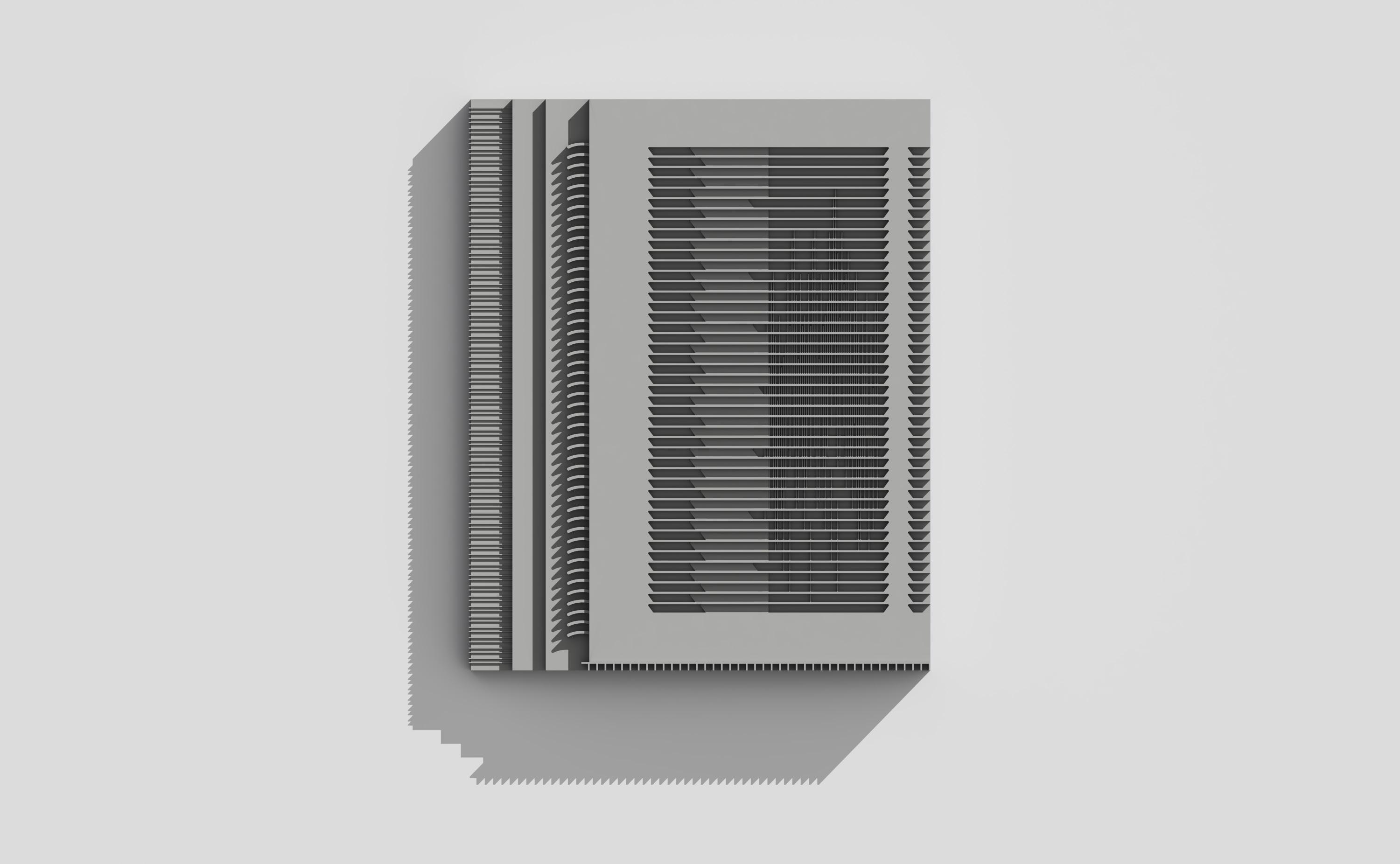
Making a
another
and the
what
it is
But this imperfection is a

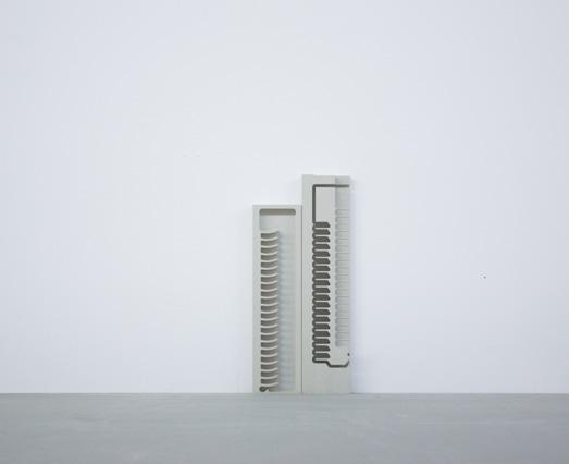
This project was inspired by the air conditioning in an administrative building in the VA Campus.
The air conditioner is a small but imaginative space. It is like a building, like a building on the VA campus, it would make me wonder what’s inside of it.
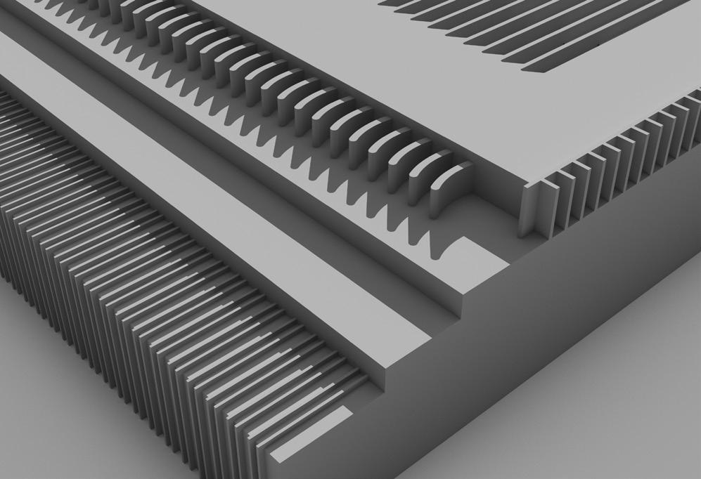
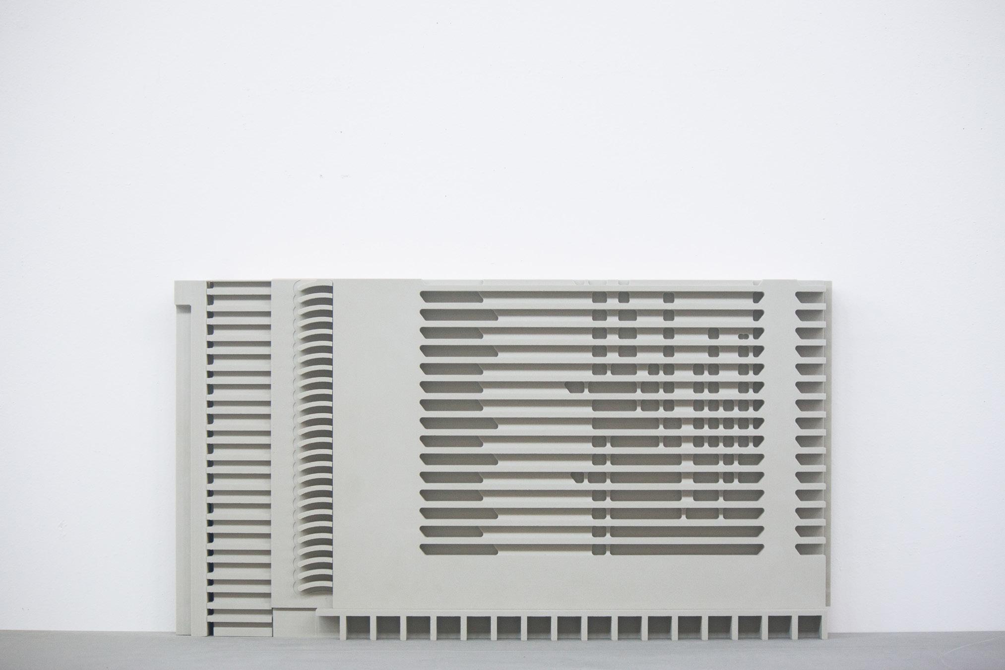
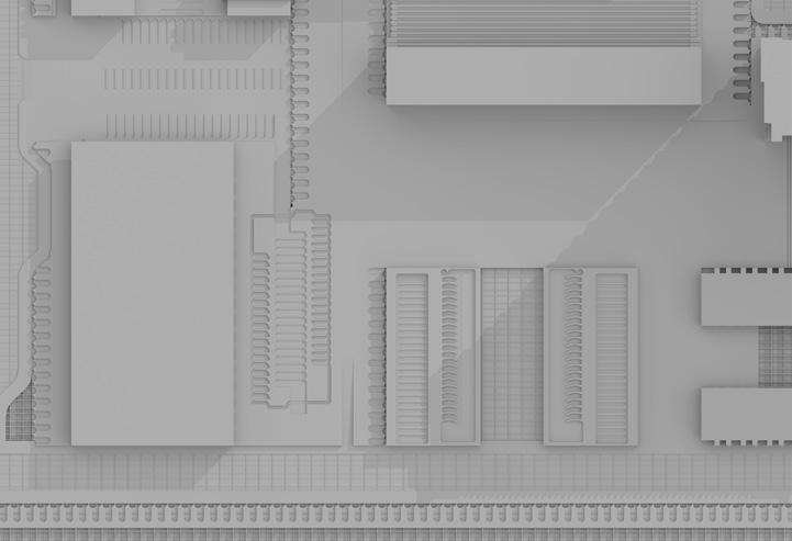
Zooming in on the air conditioner, you can see it looks like a building, and if
you continue to zoom in, the air conditioner becomes a city. What’s inside of the air conditioner, what is the relationship between air conditioning, buildings, and cities?
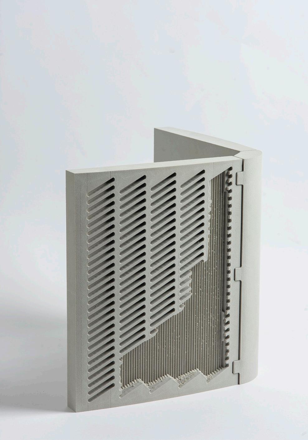
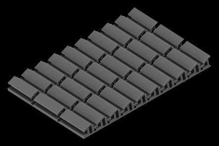
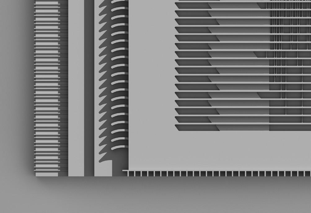
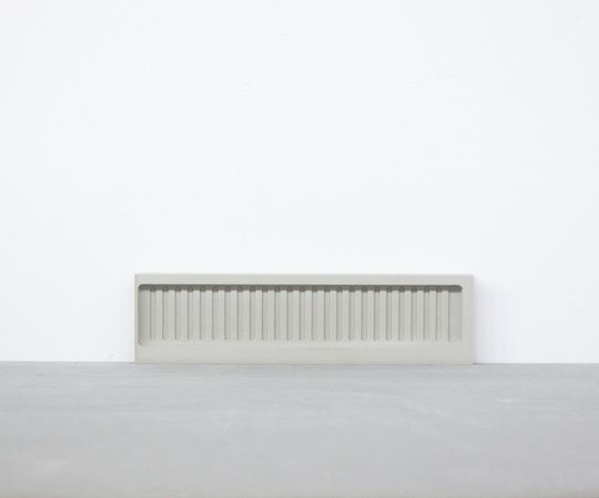
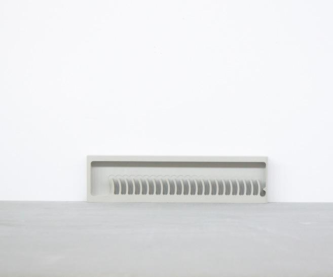
Zooming in the model continuously, you will find that this is no longer an air conditioner. These textures are more like the texture of a city. These positive spaces look like the interlacing roads in the city.
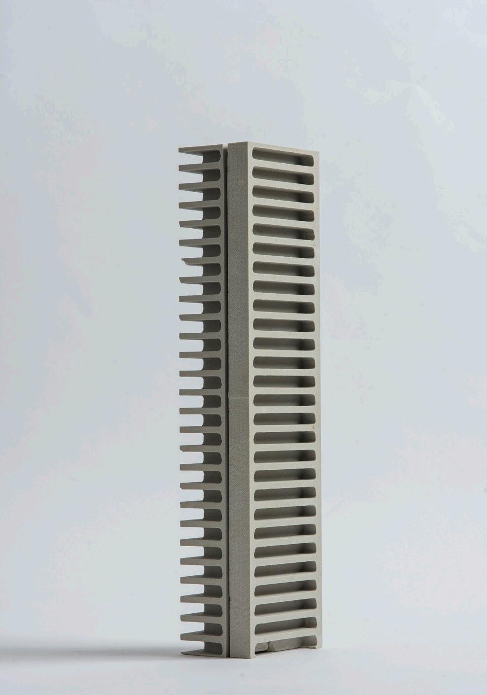
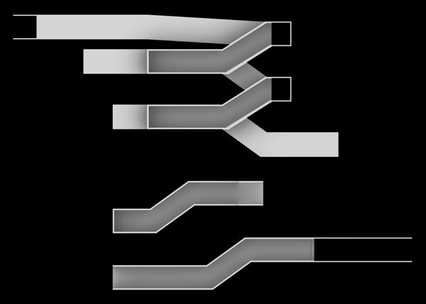
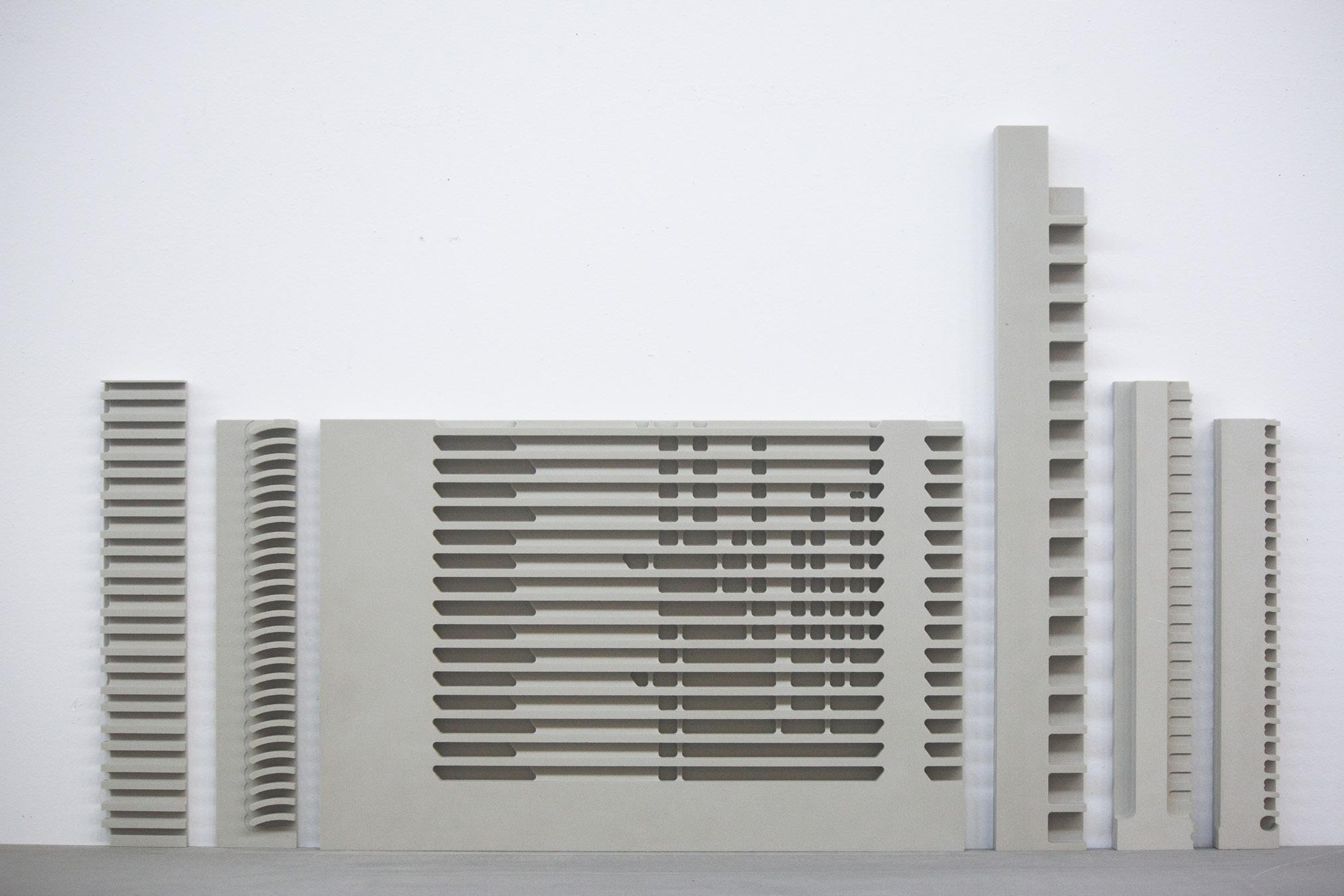
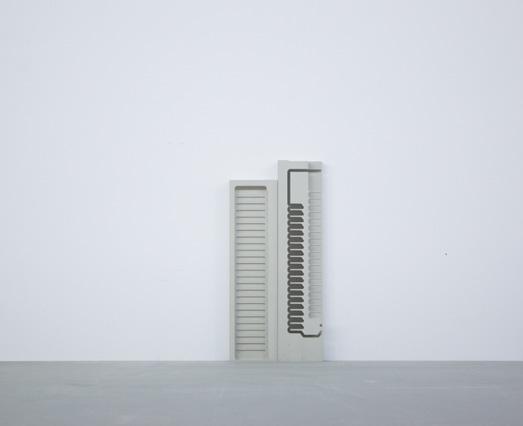
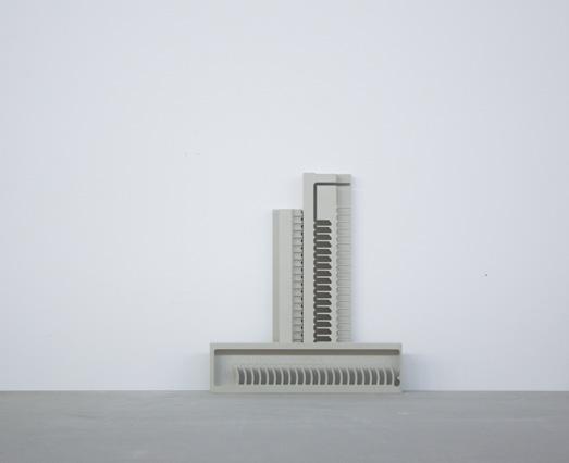
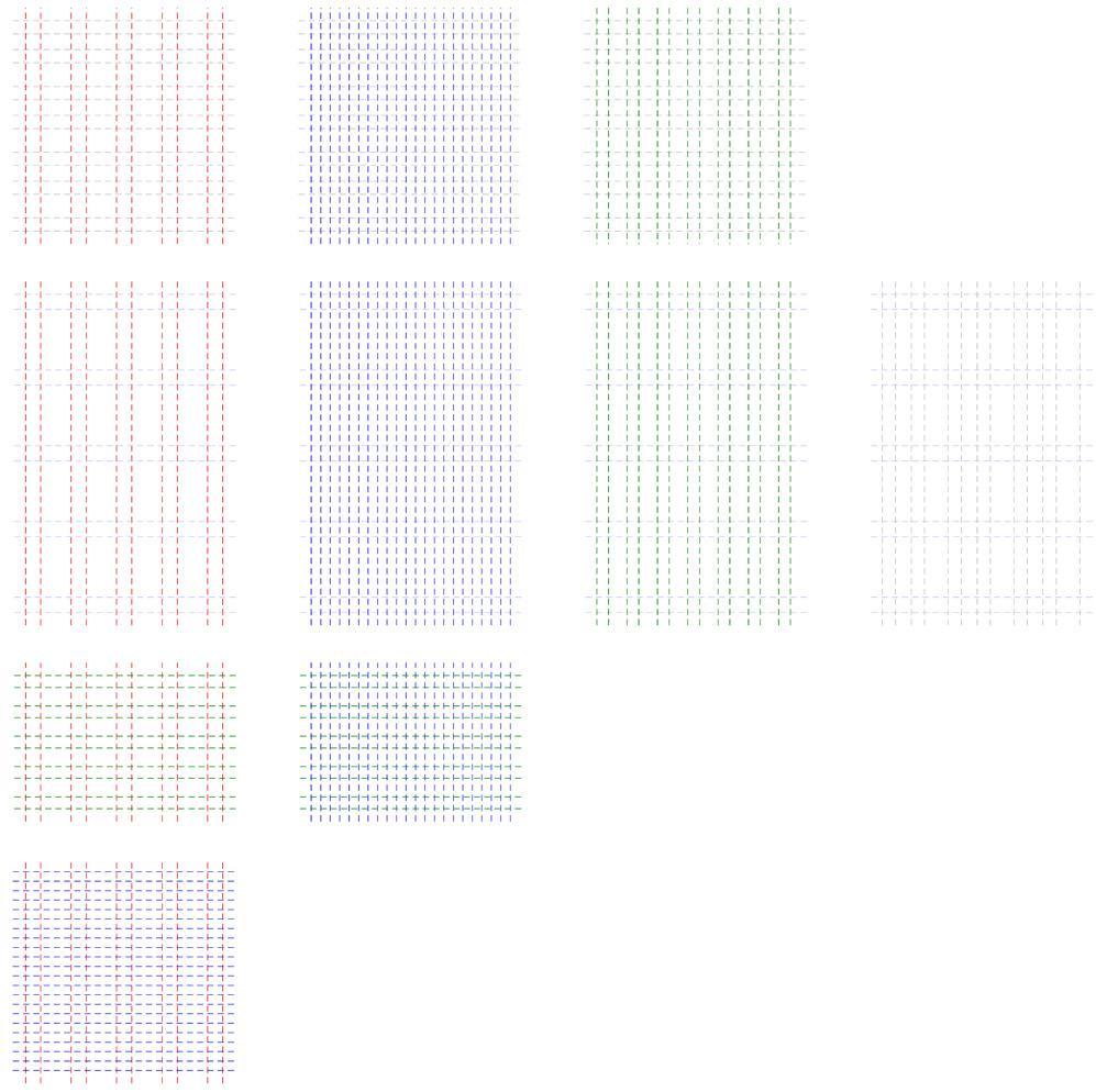
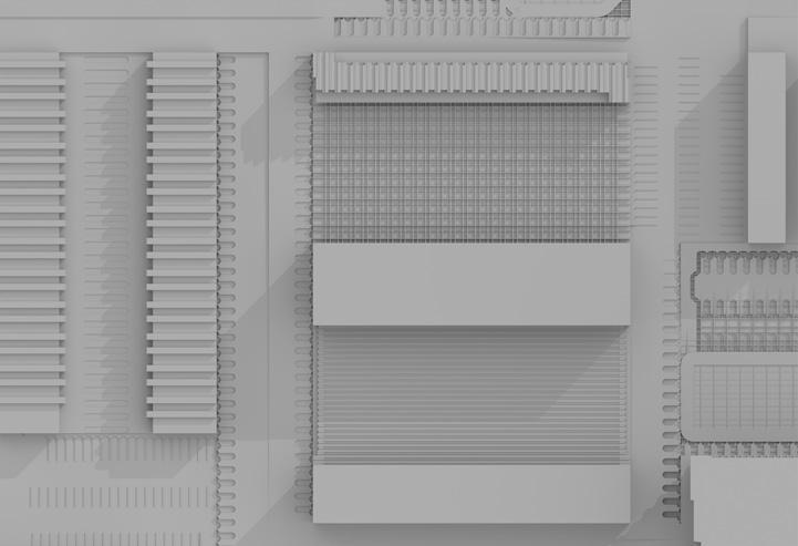
By measuring the last element of the previous model, many new measurement systems have been generated. These new measurement systems can be used to design new campuses and landscapes.
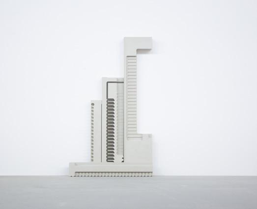
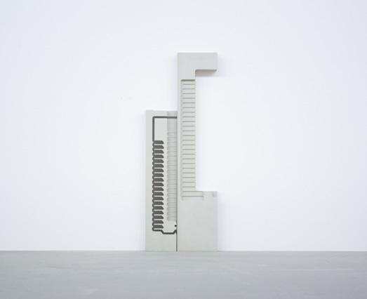
The five new measurement systems are all derived from previous models. Five measurement systems with completely different scales can bring a new architectural language.
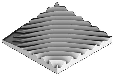
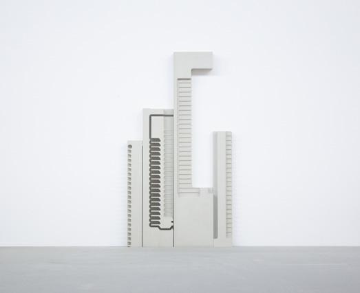
By combining five new measurement systems, many new grids are generated. It called New Grids. These grids can be used as a starting point for the design of campus and landscape, to explore what scale is suitable for the campus design, and how is the new VA campus becomes more comfortable for the veterans.
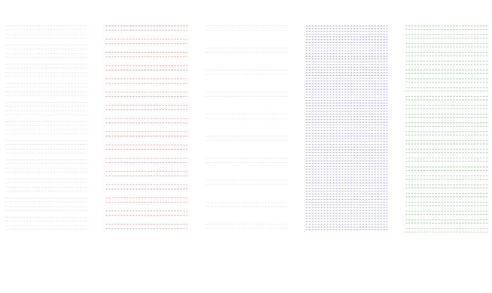
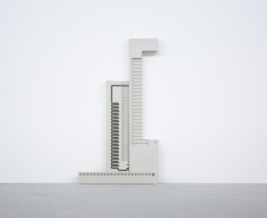
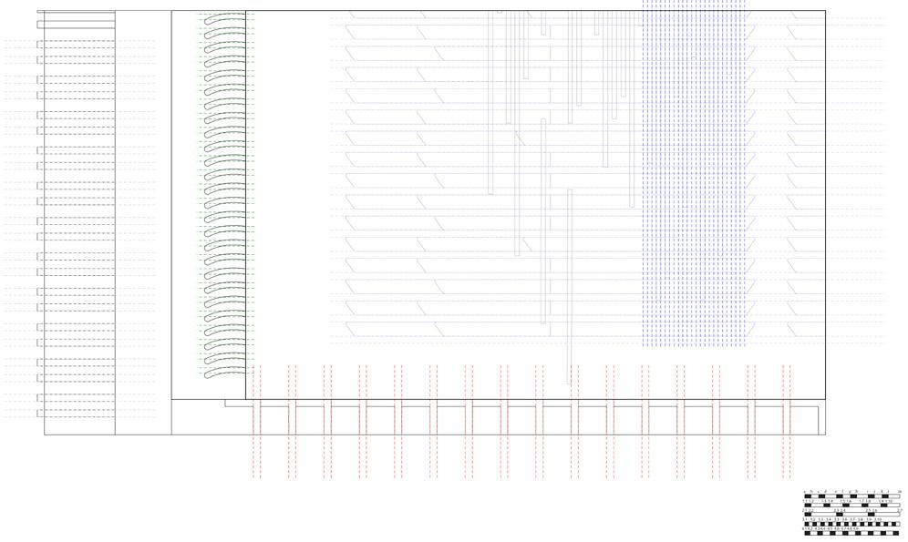
In the end, a suitable grid was selected as the scale for the design of VA campus. The dotted lines respectively represent the sidewalks. All the designs will be based on the scale that people feel comfortable with as the starting point. The scale of the design is entirely to facilitate the lives of the veterans.
Credit:
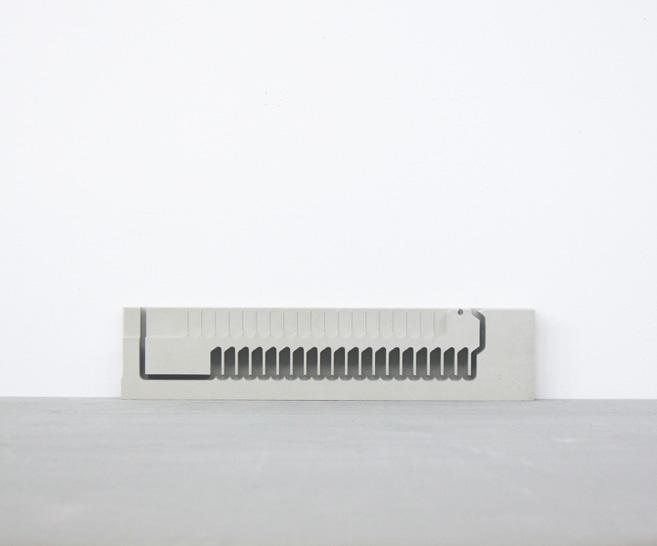
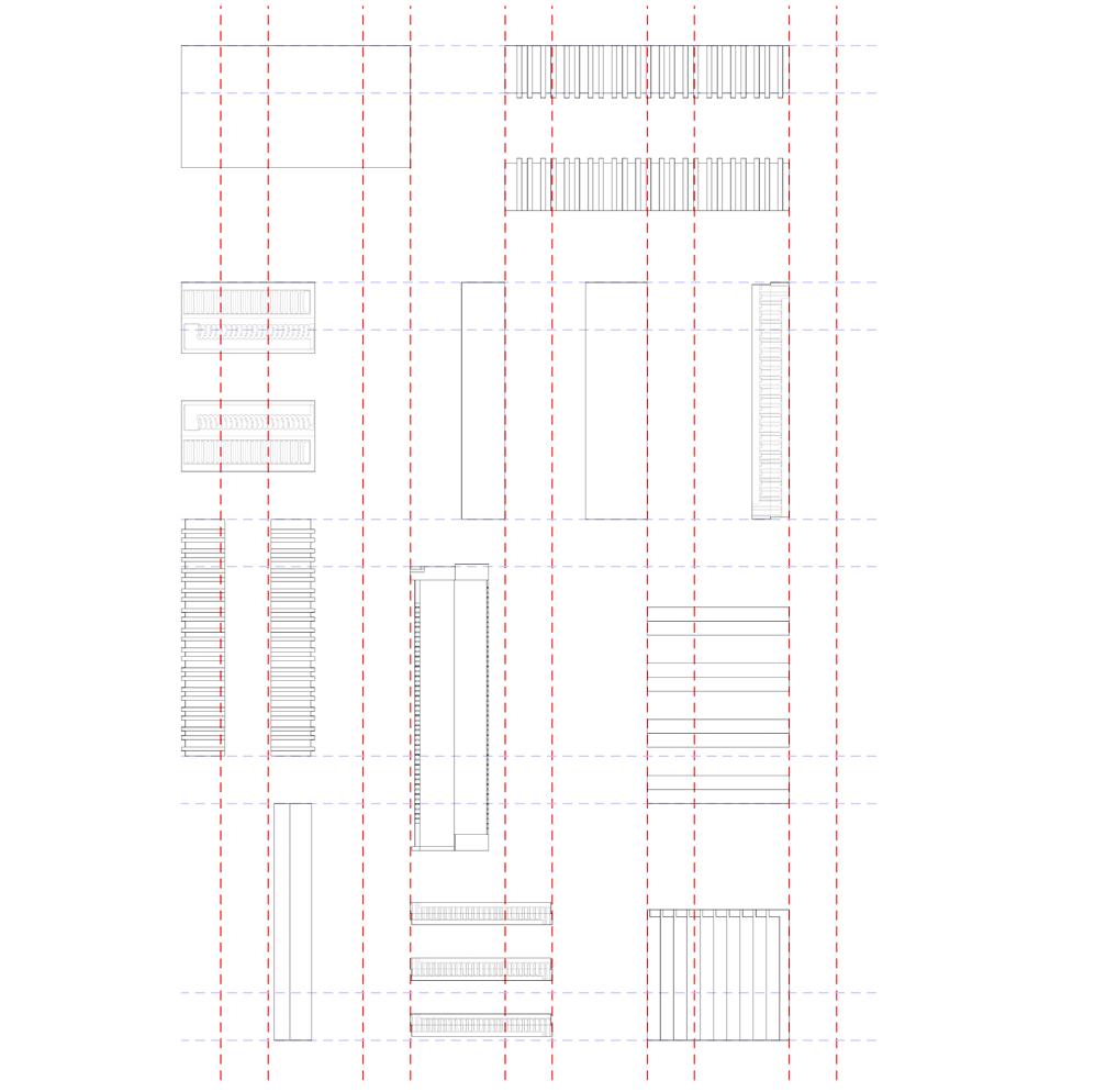
By reinterpreting the model produced by CNC milling, many new architectural vocabularies have been generated. These architectural vocabularies can be used to design new campuses and landscapes, all of which have different meanings.
The grid on the bottom layer represents the road and bumps. Different from the traditional road and bump design, the texture of the grid is to slow down the vehicles entering the campus so that they can maintain respect for the veterans living in the campus. And not to disturb the life of the veterans.
The arched elements along the sidewalk represent plants, which exist as a landscape in the campus, and at the same time are used to separate the range of activities of people and cars.
This campus has designed four parking lots of different sizes, which are designed according to the primary and secondary roads. The arch elements of different scales used in the parking lot represent parking spaces. The parking lot and the various plazas are connected by ramps, but the landscape elements are designed to separate them to ensure that the ramps are only used for people’s walking.
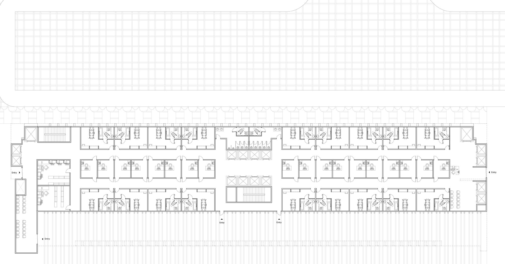
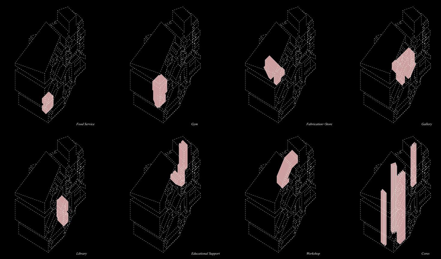
As the main building in the Campus, this project provides residential and healthcare services for veterans. The first and second floors are used as healthcare to provide many veterans with the health services they need.
The third and fourth floors are the administrative offices. These administrative offices are also to provide more convenient public services to the veterans. The fifth floor is an open floor, which can provide veterans with catering, leisure, library, and other services.
There are many different core tubes designed in the whole building. The middle core tube is mainly used for healthcare and administrative office floors and ends at the fifth floor of the public space. The core tubes on both sides of the building are provided for apartments above the 6th floor.
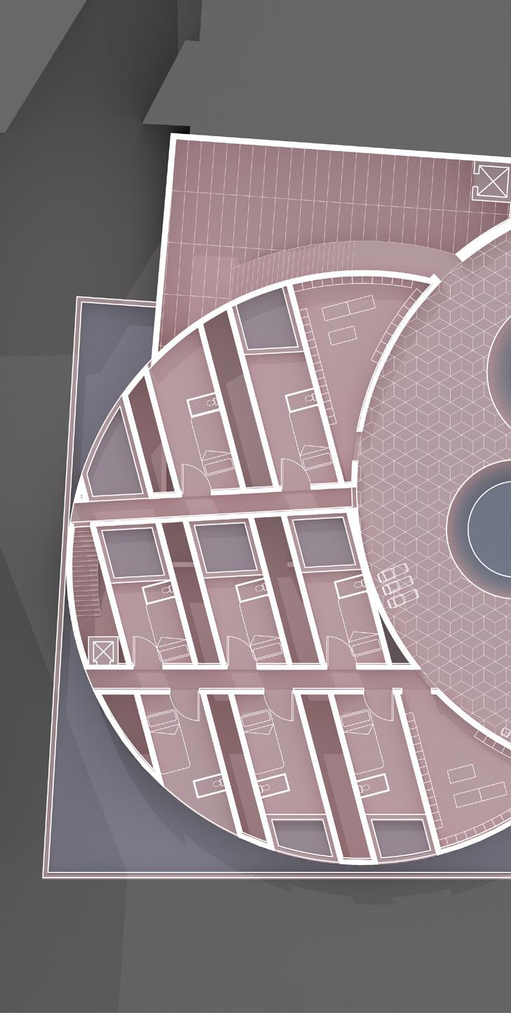
The core part of this building is residential. The whole building is designed with three different types of apartment units, one is a single veteran apartment unit, the total number is 100, and there are 2 different apartment units for veteran families to live in, the total number is 40.
The design of each apartment complies with ADA, providing a very convenient space for veterans. The apartments on floors 11 to 14-a are inspired by Le Corbusier’s Marseille apartment. You enter the apartment from the middle floor and use the indoor stairs to reach the lower or upper floors respectively. The apartments on floors 14-b to 16 are inspired by Robin Hood Gardens London, designed by Alison and Peter Smithson. This apartment unit enters the apartment from the upper and lower floors and enters the middle floor through the indoor stairs.
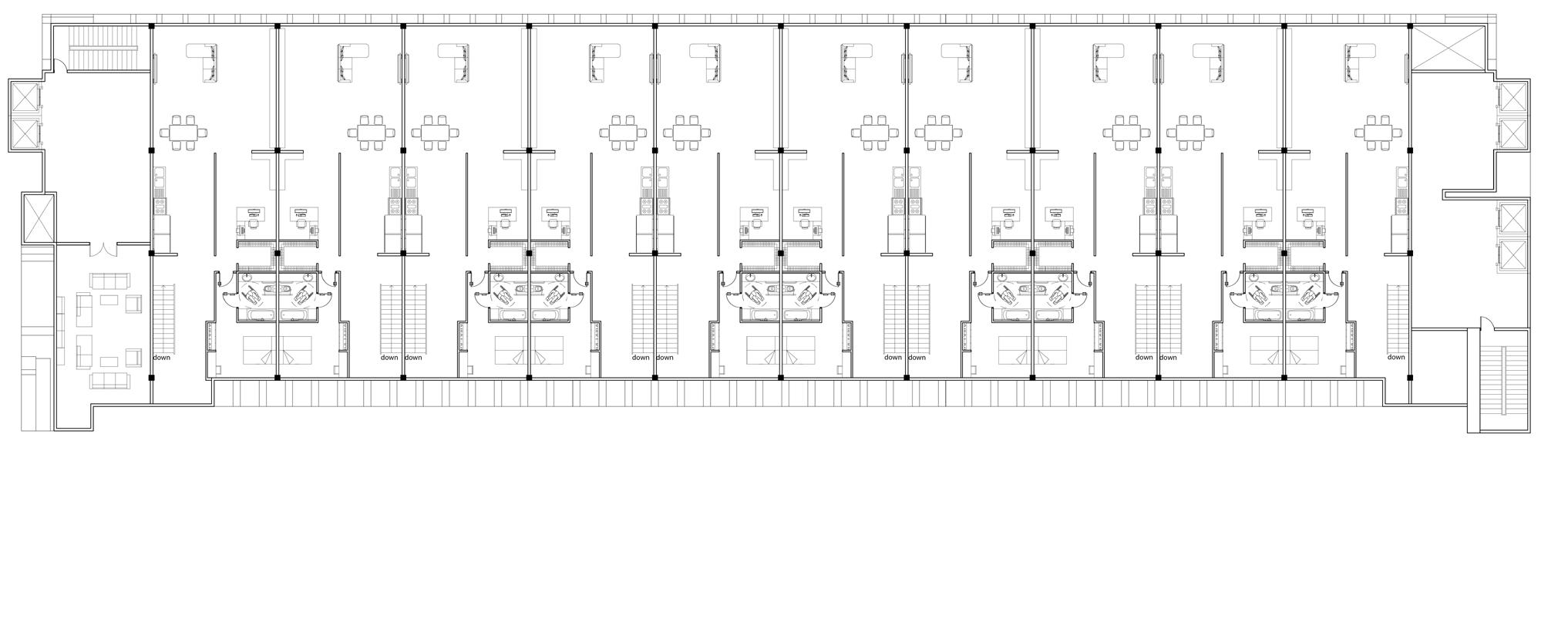
 MAIN BUILDING 6TH-10TH FLOOR PLAN-APARTMENT TYPE-A
MAIN BUILDING 5TH FLOOR PLAN-TRANSIT FLOOR
MAIN BUILDING 6TH-10TH FLOOR PLAN-APARTMENT TYPE-A
MAIN BUILDING 5TH FLOOR PLAN-TRANSIT FLOOR
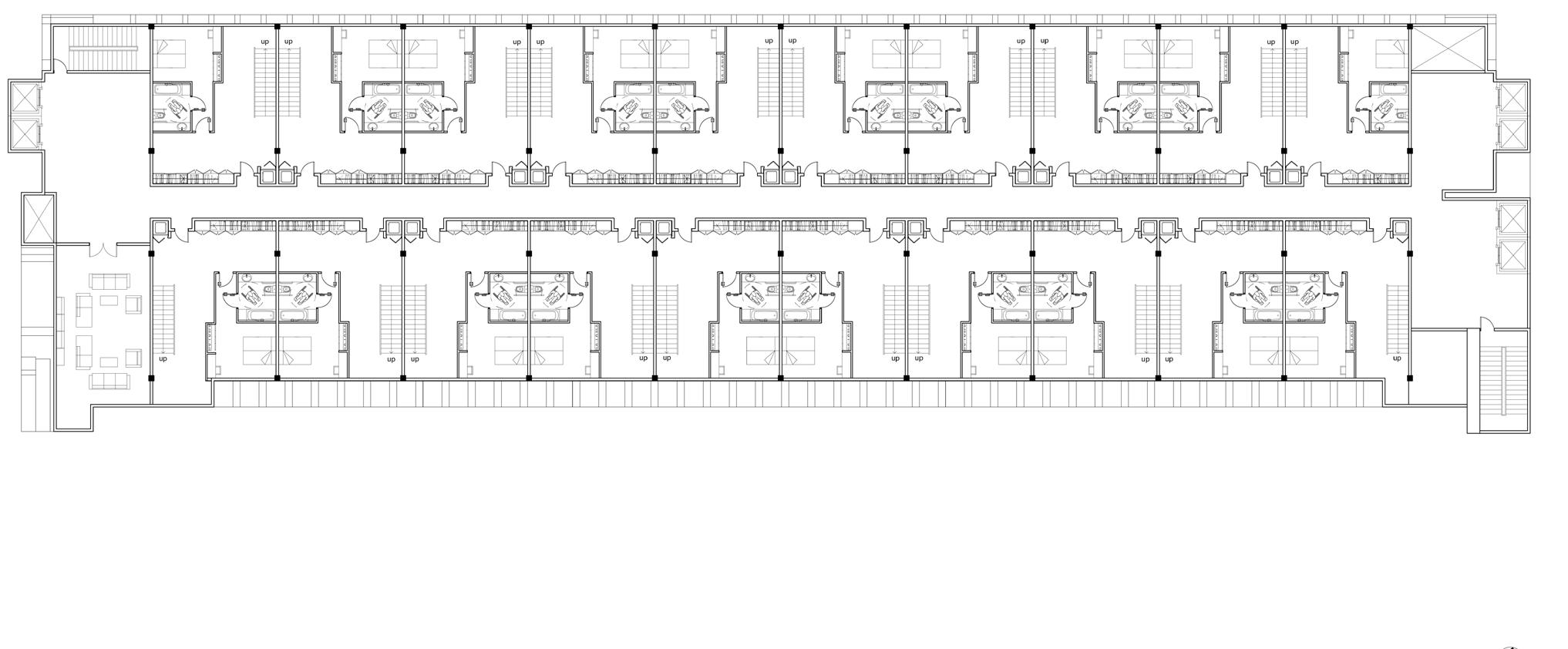
MAIN BUILDING 11TH FLOOR PLAN-APARTMENT TYPE-B
MAIN BUILDING 12TH FLOOR PLAN-APARTMENT TYPE-B
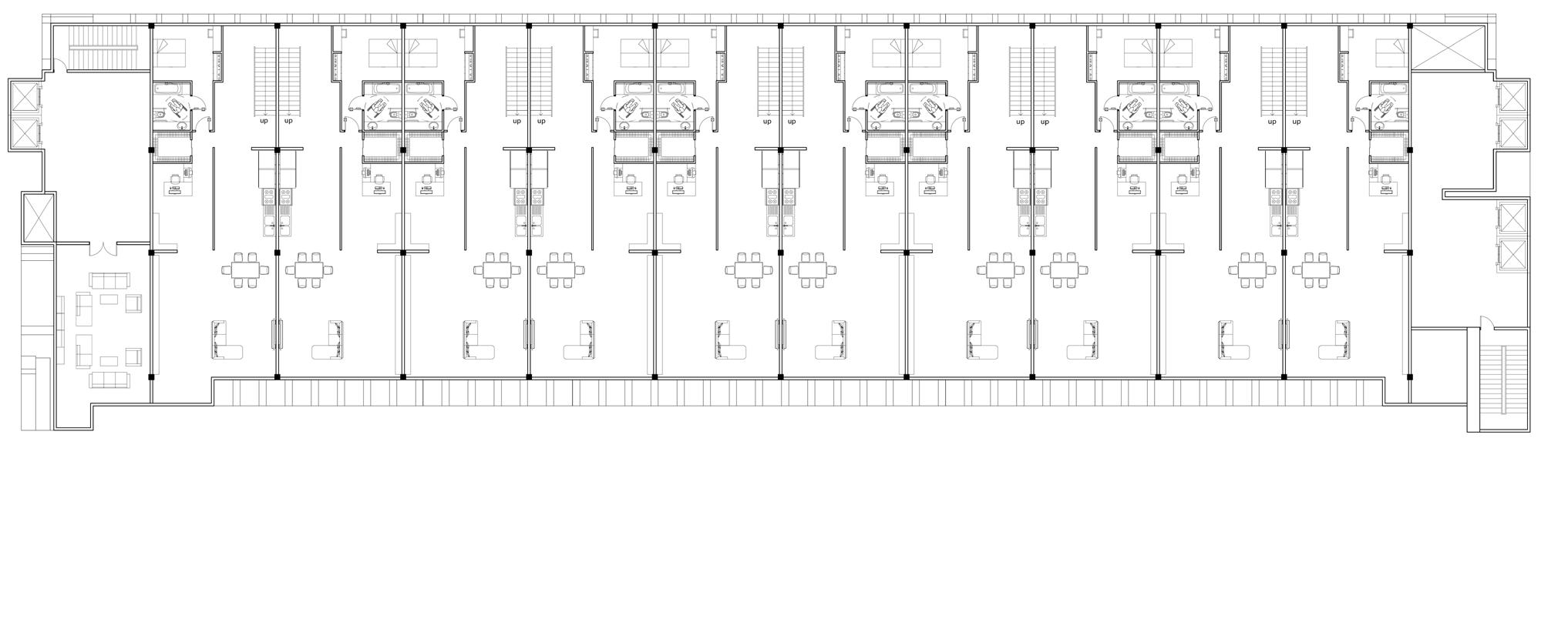
MAIN BUILDING 14-A FLOOR PLAN-APARTMENT TYPE-B
MAIN BUILDING 14-B FLOOR PLAN-APARTMENT TYPE-C
MAIN BUILDING 15TH FLOOR PLAN-APARTMENT TYPE-C
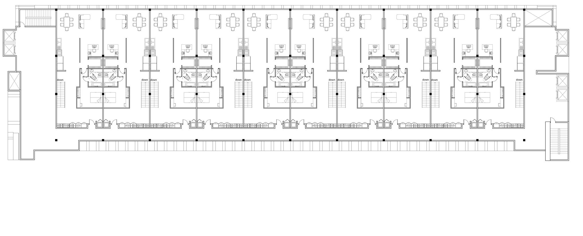
MAIN BUILDING 16TH FLOOR PLAN-APARTMENT TYPE-C
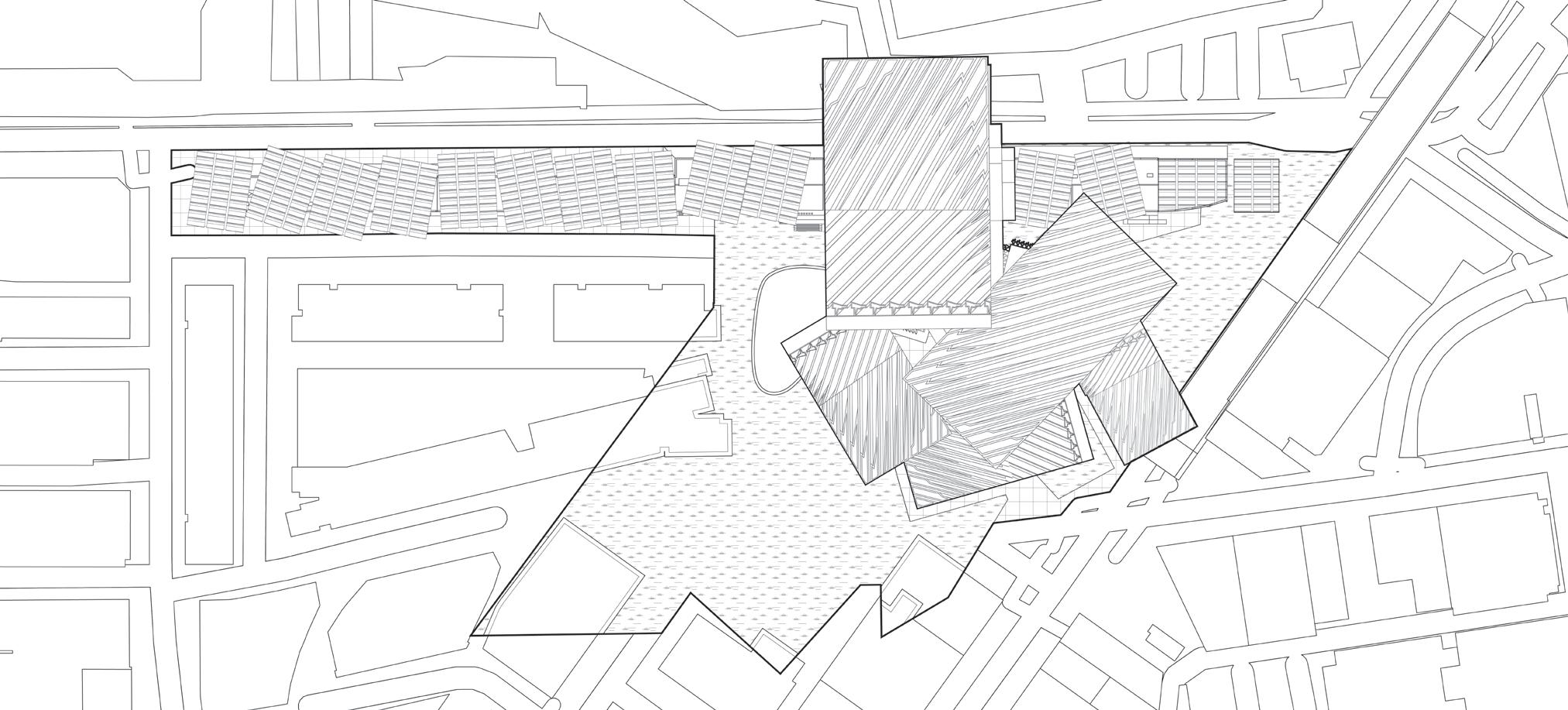
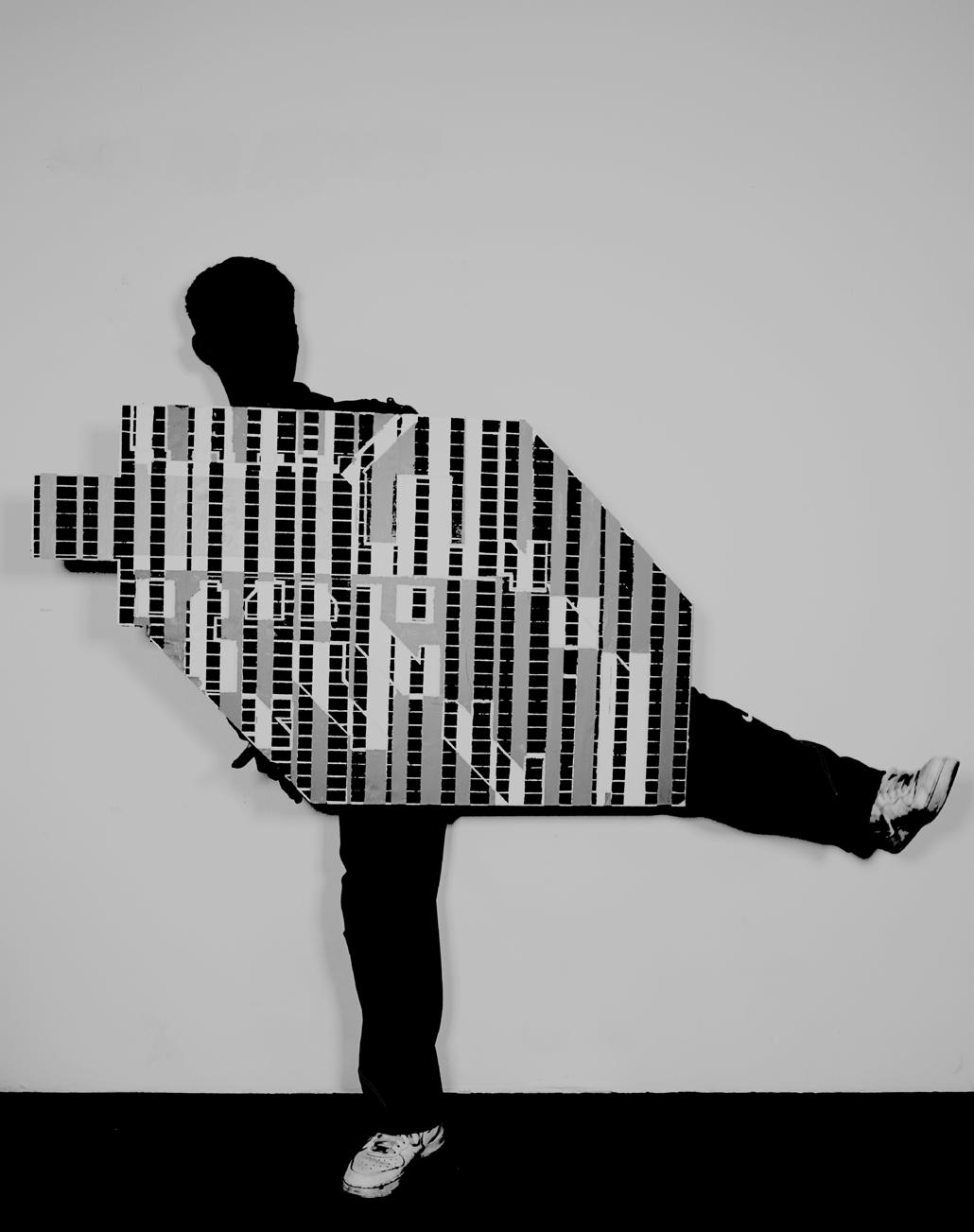
My precedent studies are the Indian Institute of Management campus designed by Louis Kahn and the facade of Palmas 555 in Mexico City, which are two very impressive projects. By transforming the figures of the campus of IIM, new geo metric figures were generated, and then by transforming the facade windows of Palmas 555 to match the figures of campus, new grids were generated.
Then by overlapping the different layers of the diagram, which is the standing diagram. Through this standing diagram, you can see that many geometric fig ures are stacked together to form different degrees of color. These photos show how to transform the standing diagram into my project and put it on site.
Based on a series of diagrams, I made a plane model, and at the same time, I took the model to take photos, so that some parts of my body merged with the model to form a new model. Then put this new model on the project site, try to find its connection with the project site, and how to integrate it into the city of Mexico City.
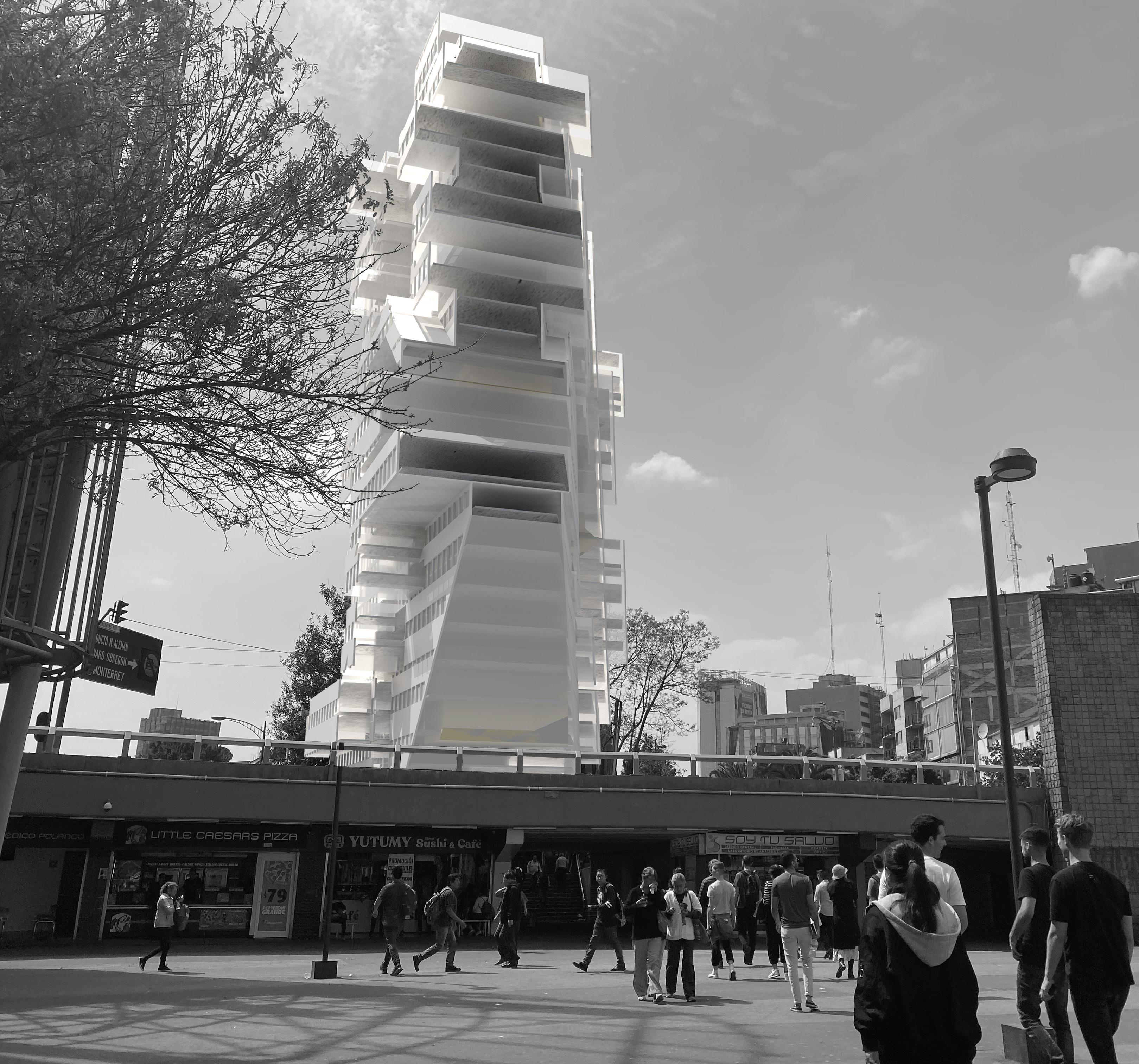
Finally, by transforming the 2D model, a 3D model is created. It can be seen from the elevations of the model that some of the facades of this project are flat vertical IIM campuses, and some of the facades are fluctuating, like the facade of Palmas 555 in Mexico City.
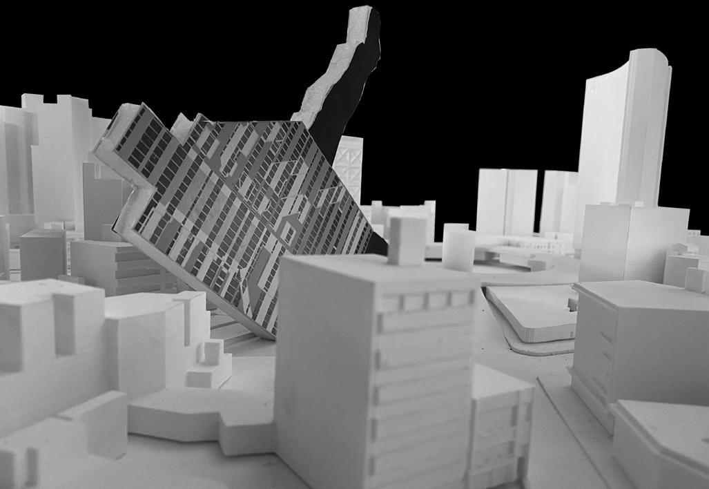
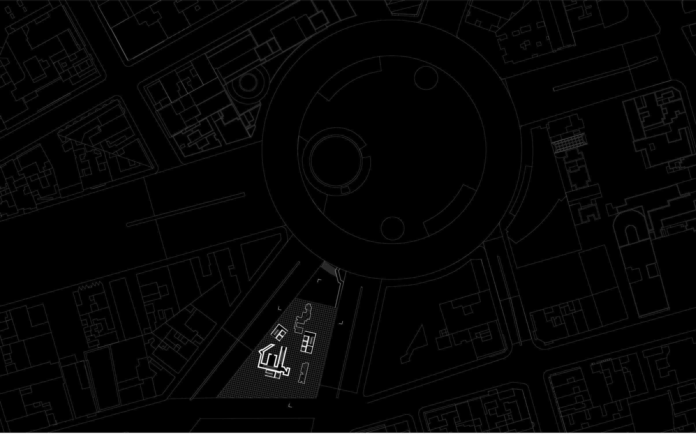
This project is located in Mexico City. Mexico City was originally a floating city centered on small islands in Lake Texcoco and gradually filled with lakes. Af ter conquering this place, the Spaniards intensified their efforts to fill most of the lake, so Mexico City is today Most urban areas are built on unstable backfills.
At the same time, Mexico City, because of its beautiful buildings, makes the whole city like an architecture museum, and various buildings can be seen everywhere. This is the embodiment of Mexico’s art and diversity.
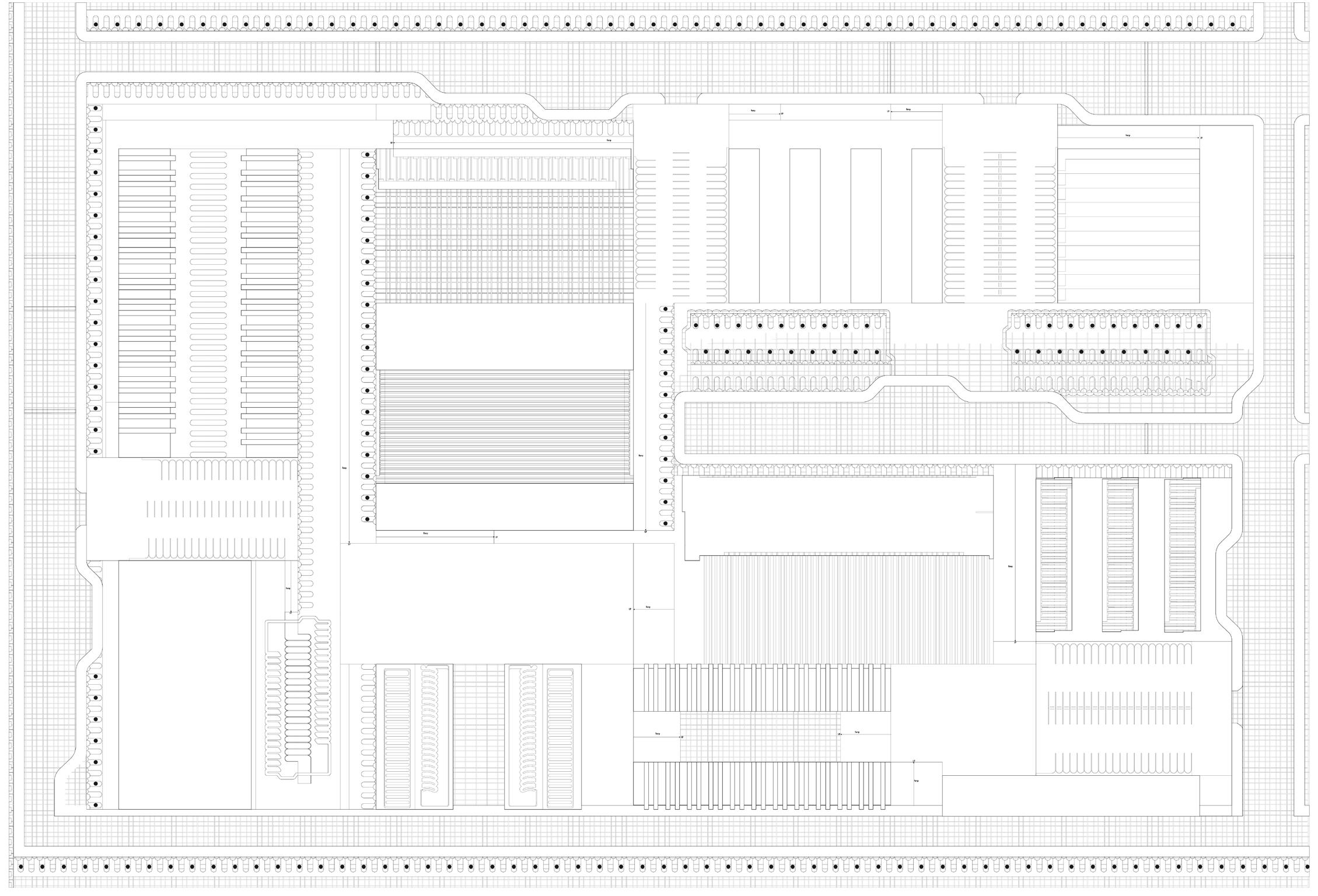
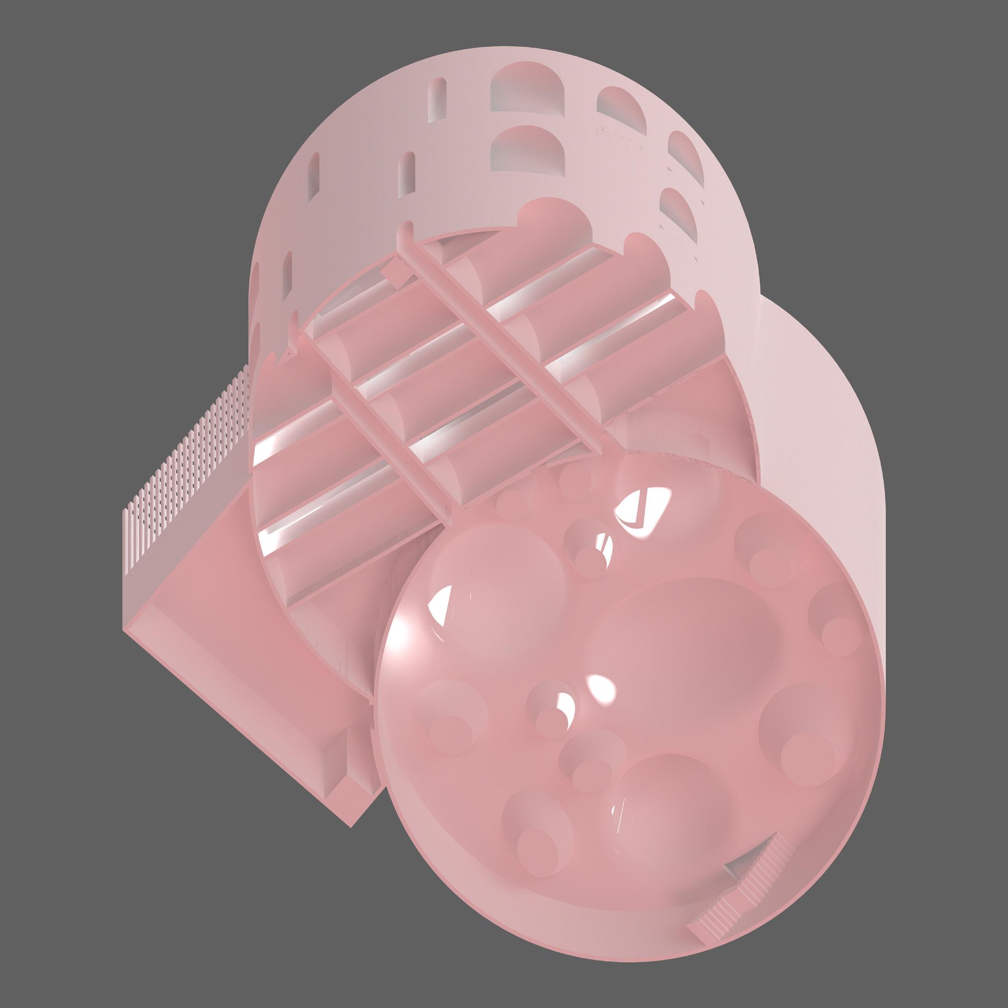
This is a ground plan. You can see that the ground plan is a very open area. People could en ter the building through several Cores, and as a stuctural part, these Cores also support the whole building. In response to the history and context of Mexico City, I designed two pools in the ground plan, and also wanted a separate small campus for the ground plan, although this project is a vertical university.
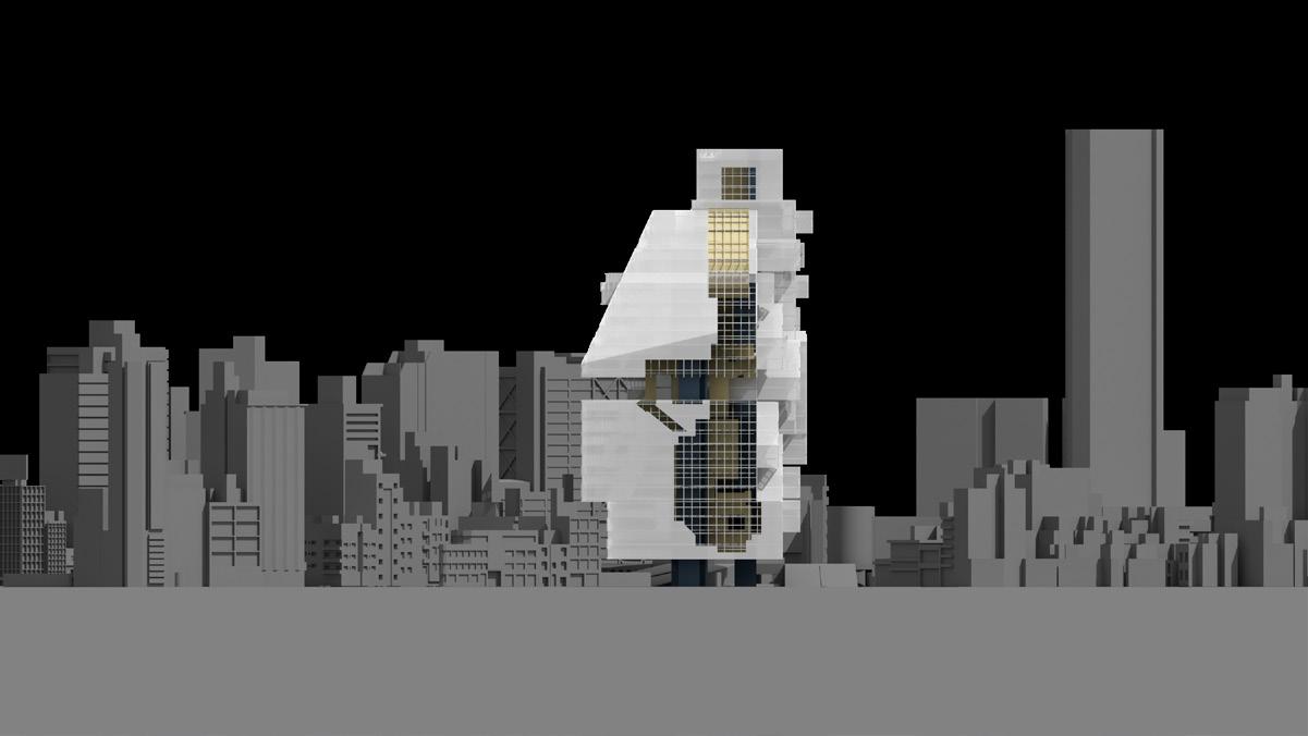
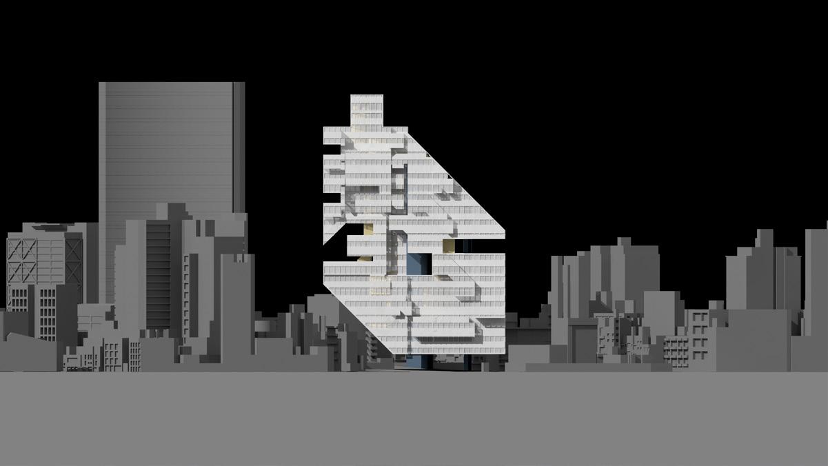
This is a section, through which you can clearly see the relationship between internal massing and this project. The basic concept of this project is to separate the public program and the private program and to separate the resi dential area from the teaching area and administration.
The first and second floors are administration areas, and then the area on the left is residential, and the geometric

figures in the middle show the food services, gym, and library. large classrooms and small study rooms for students to use alone. open space is designed above the gallery. Finally, going up support.

library. The right part is the teaching area, there are some alone. The library goes up to the gallery. A large outdoor further is the area of communication and educational

“Men have sorrow and joy; they part or meet again. The moon is bright or dim and she may wax an wane.”
As the one of the most beautiful ancient Chinese poem which is described, moon has different conditions, which is also like human. The shape of this project is come up with lunar, the left part of this project is a curved moon which is a symbol of unperfect beauty, while the right side ia a full moon which ia a symbol of perfect.
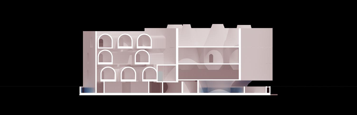
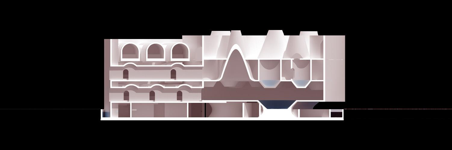
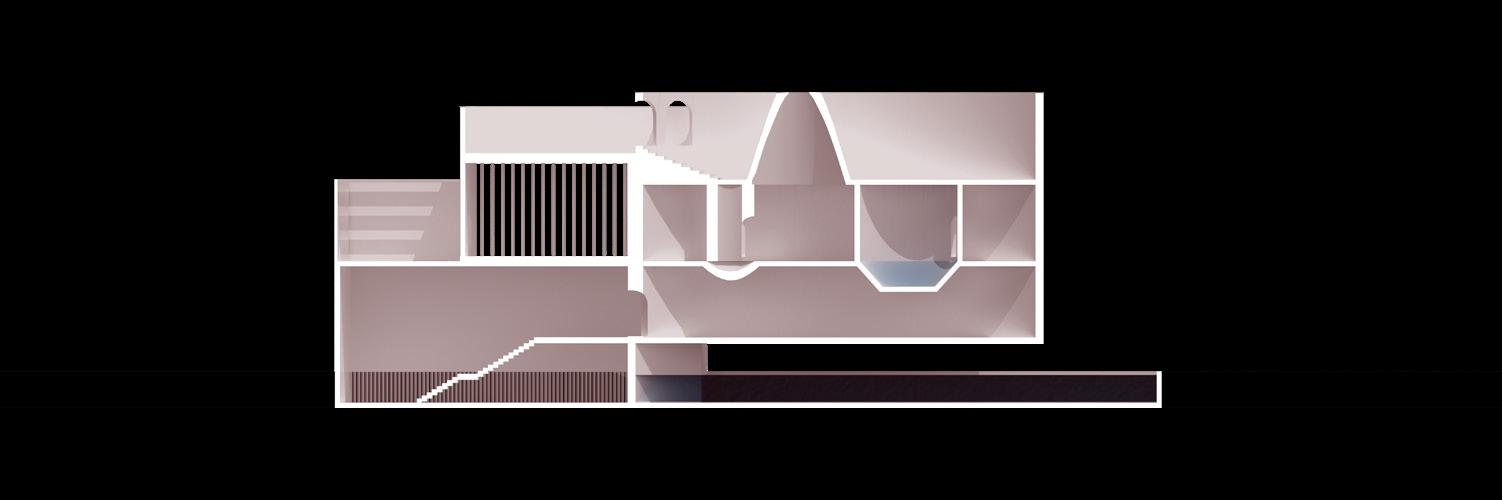
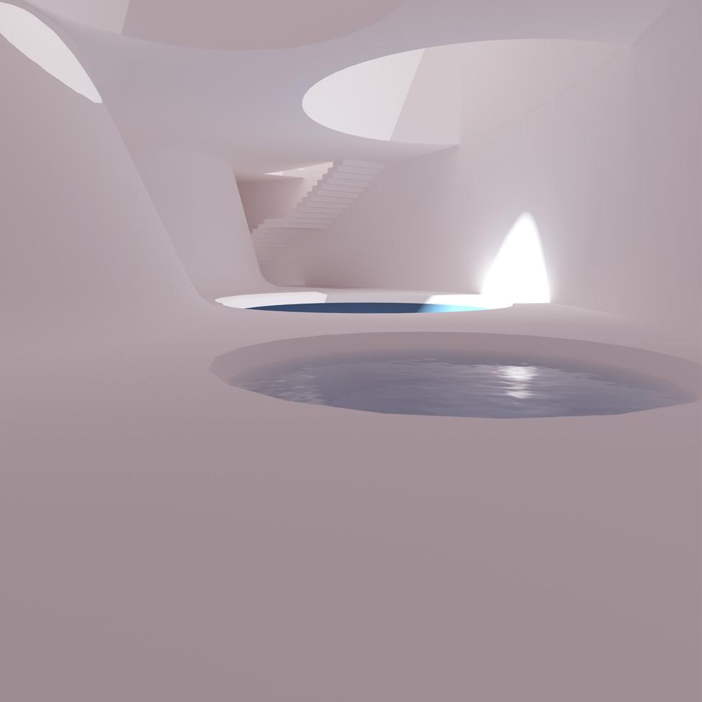
On the first plan, people enter the building through a long curved entrance, where it is also covered by waters, seems like get into water. Cafe and reception are both designed on the first floor, while circulation takes ad vantage of the negative space between the walls to the far left.
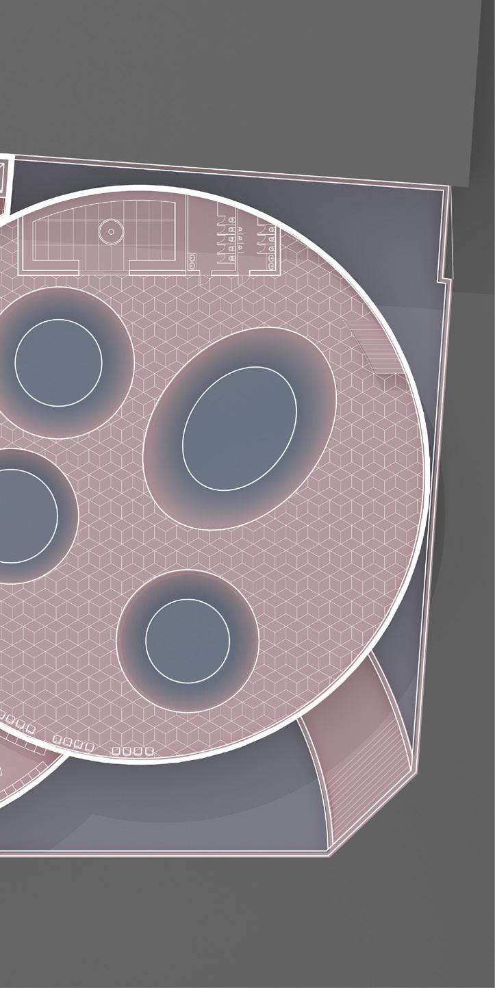
FLOORThe circle on the left of the second floor is designed as Two long corridors connect the hotel rooms area and the locker rooms between the two areas, so that the two locker
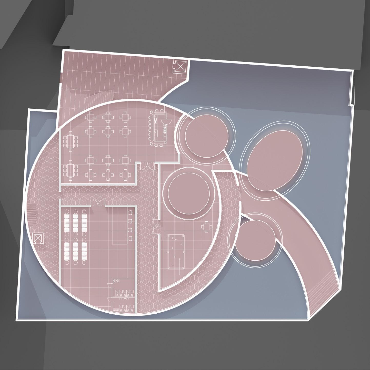
as the hotel rooms, and on the right is the public baths. the public baths area, and separate the male and female locker rooms and the public area become a whole system.
The left side of this floor is still designed as many hotel rooms, but the right side is a public area that is open, providing people with a leisure area and enjoying the beautiful and warm sunshine of Los Angeles.
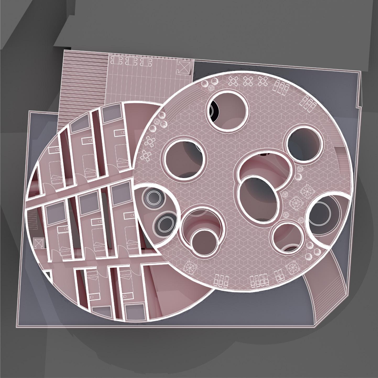
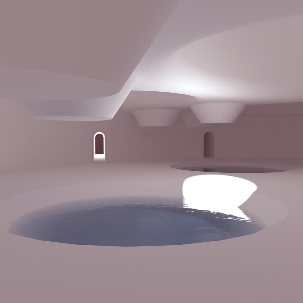
This project focus on how to combine two different shapes as a whole and constinuouly system. Designing these elements for XY/XZ/YZ three directions, and then using those elements to create negative spaces and positive spaces. There are lots of contrast in this project. In the right side circle, there are some smaller interior spaces which are formed by arches in horizal. while in the left side circle, there are a lot of cones which is vertical and constinuously, and it looks like moutains. Lights through these cones ge into first and second level.
Smaller interior is designed as hotel room which shows a comtrast between negative spaces and positive spaces. Bigger spaces are designed in the left side, that in order to seperate those public spaces from private spaces, but they are still connected and constinuous.
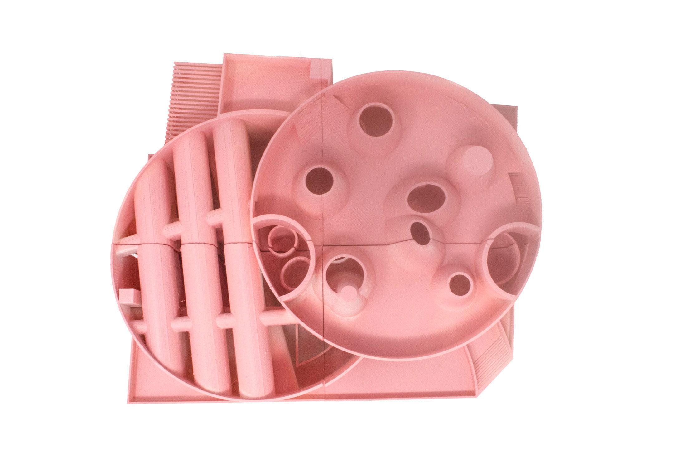
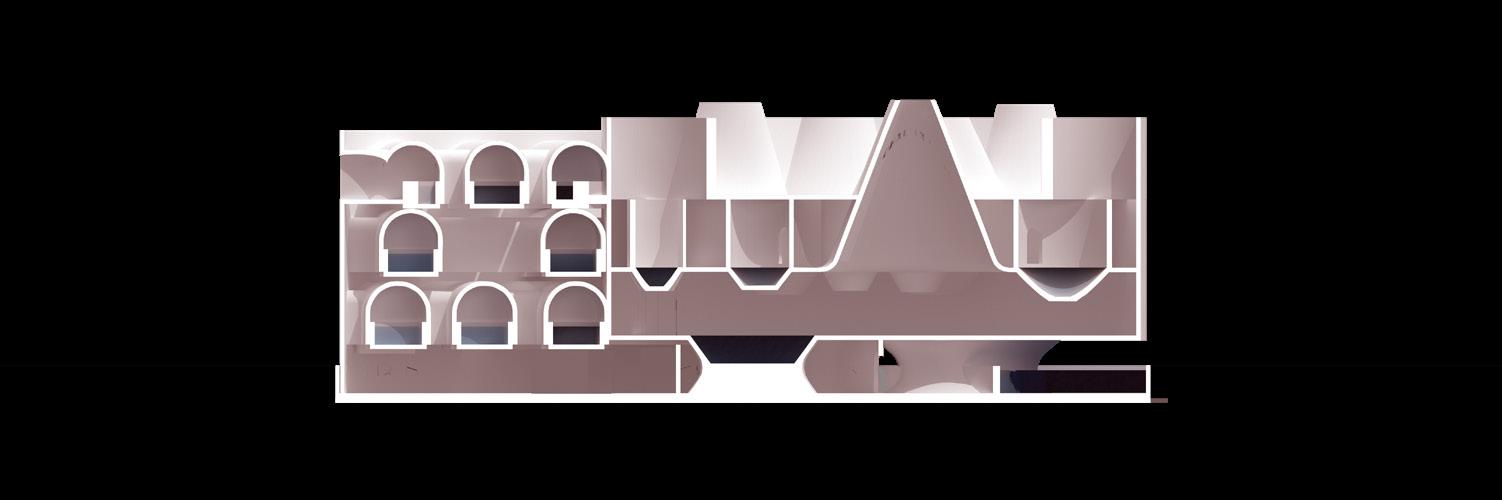
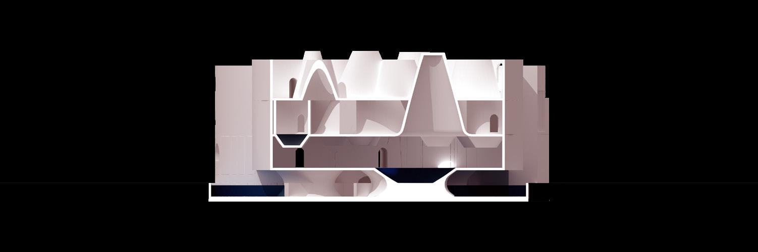
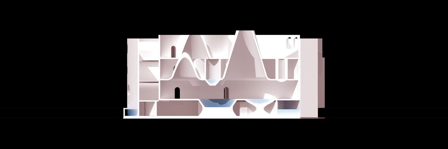
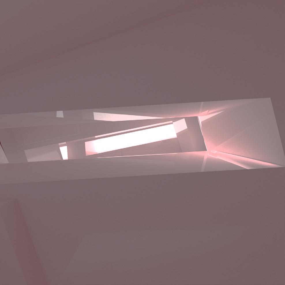
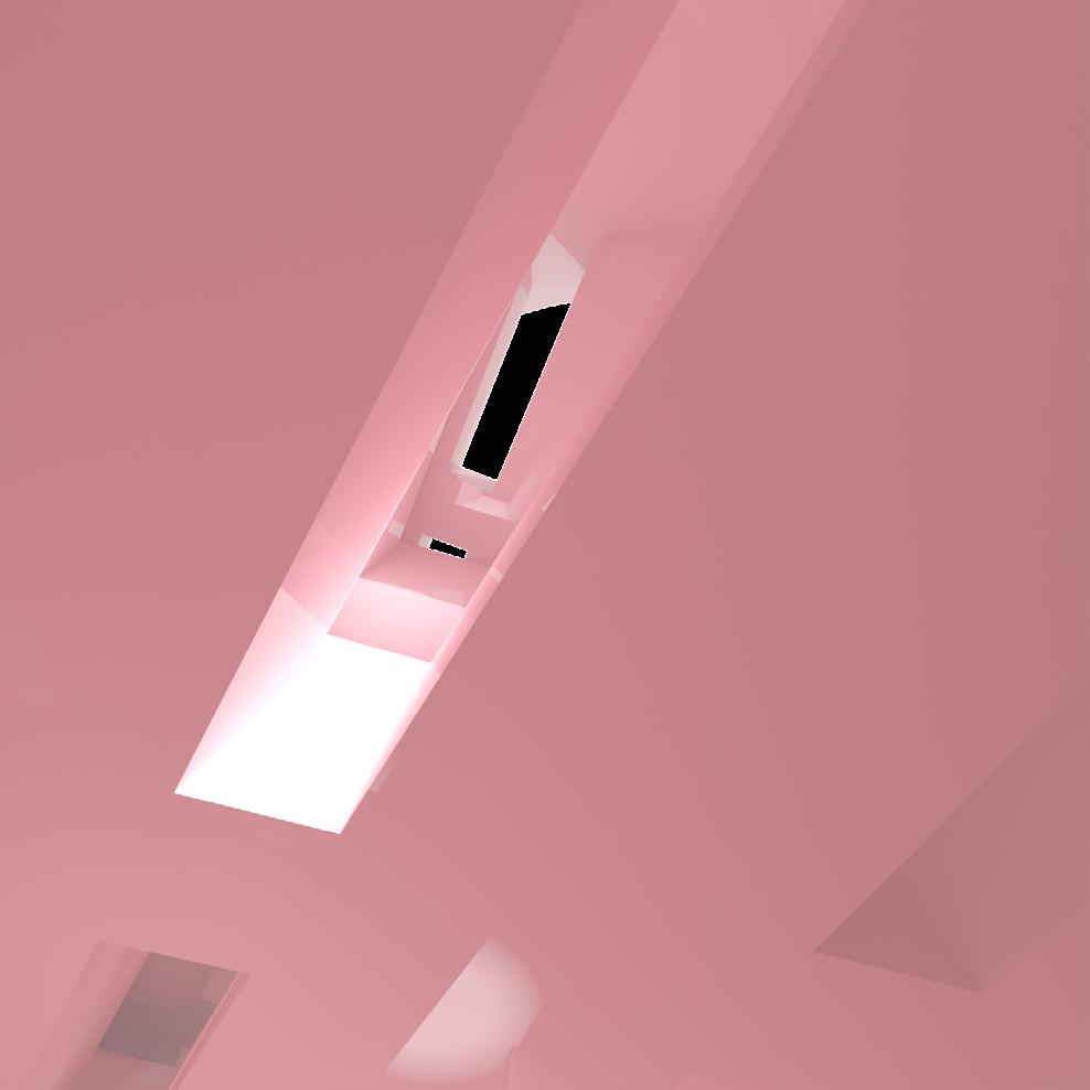
Lights gets into the bathhouse through these cones, some lights directly gets into the 2nd level where is public baths, and some lights gets into the 3rd level where is private baths.
As God said “Let there be light, and there was ligtht.”
Using negative spaces and positive spaces to create a chemistry between lights and shadows. which is also create an empty and sacred atmosphere.
 MADE BY BIAO CAO