(COMING SOON)
EXAMPLES
TEACHING: VISUAL ARTS GRADES 6 8 My student example portfolio is coming soon! I spent an amazing two years teaching the youth of Providence Public School Department. Thank you for your patience as I work dilligently to update my professional portfolio with exampes of student work.
SKILLS USA ‘19: ADVERTISING DESIGN PRINT/MARKETING
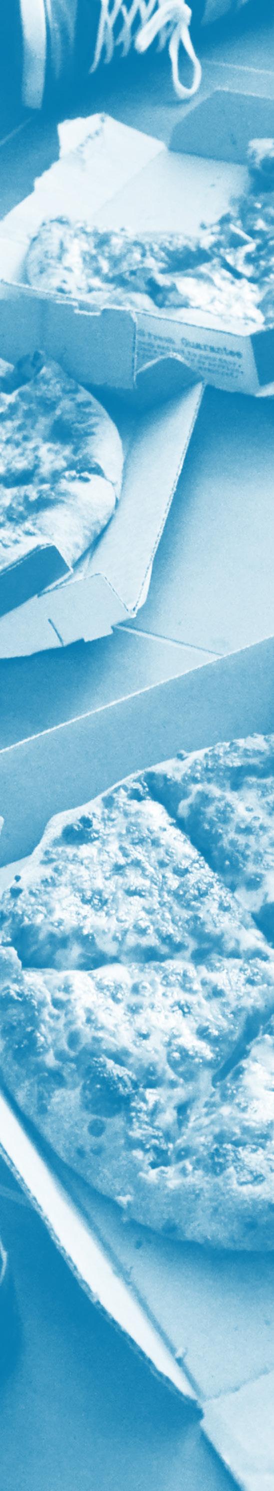
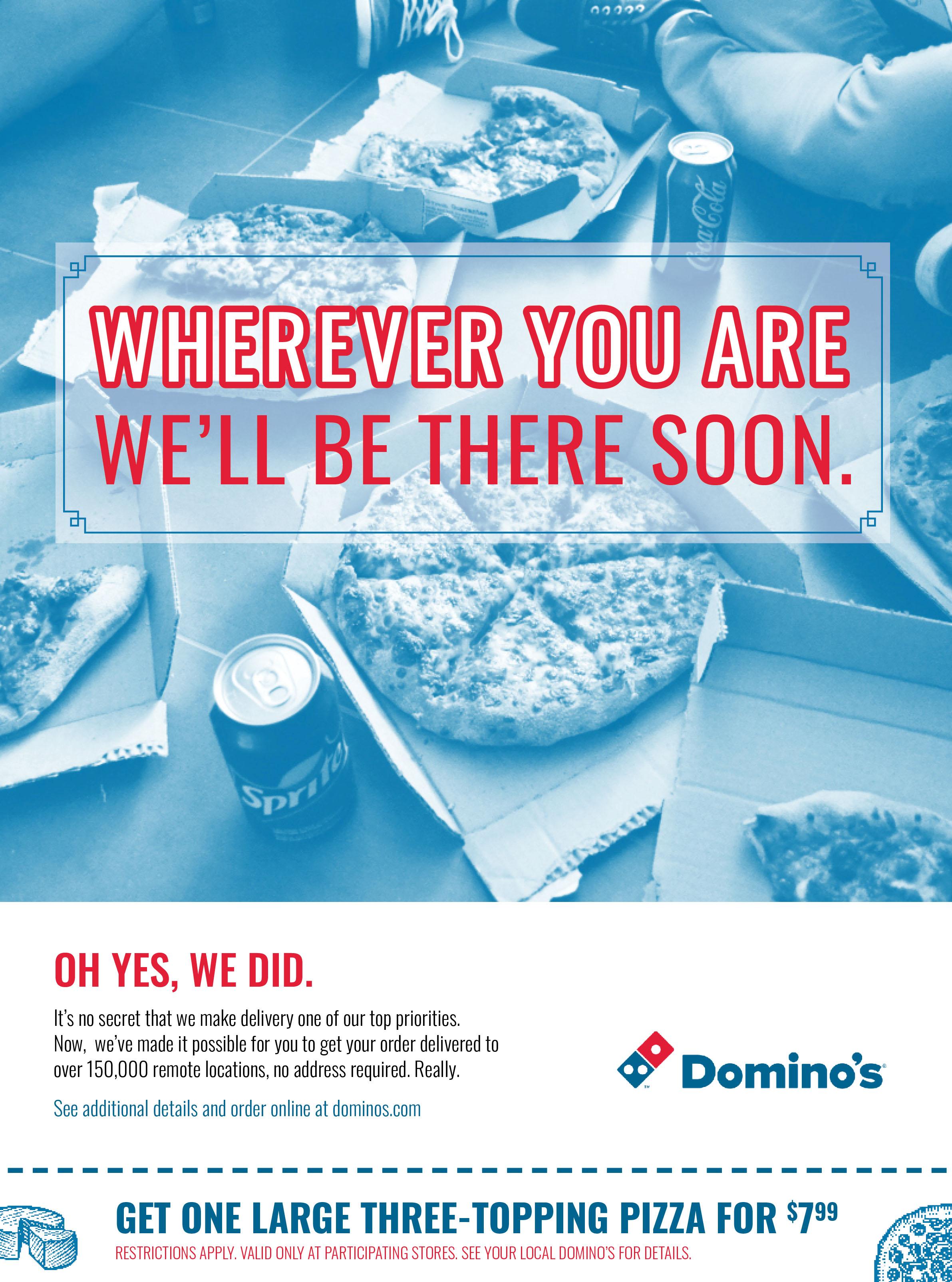
We’ll be there soon. In my third year as an undergrad, I decided that I needed a little competition in my life. I entered as an advertising design contestant to SkillsUSA’s 2019 Rhode Island State Conference. I was given just about six hours to research the brand of the year, Domino’s, and create an effective advertising campain consisting of three pencil rough drafts and one completely fleshed out advertisement. Additionally, I had to include a coupon for one of their products. I was provided with a folder of officially branded domino’s materials to use in my designs such as the iconic pencil sketches that decorate the boxes. Over the course of my research, I sorted through dozens of Domino’s previous ad campaigns as well as competitiors. Focusing on the brand voice that Domino’s established in previous campaigns, I set off to put together an adverisement that would lend itself wholly to the professional, inviting, and approachable brand. To my delight and surprise, I was awarded with the 1st place Gold Medal for my efforts. I really enjoyed working on this project because it was a lot of fun, being it was my first design competition, and although it was nerve-wracking it taught me more about staying on brand and extending that effect across a possible campaign.
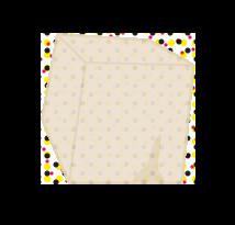
MOMA PRESENTS: EDUCATION FOR ALL PRINT/ILLUSTRATION
Education without exception! For this project in a Print Production class, I was tasked with creating a poster series for a hypothetical museum exhibition of my choice, to showcase three different paper stocks. I chose to design peripherals for a sculpture exhibition to be displayed at the Museum of Modern Art in New York. I printed utilizing the Neenah Astroparche line in Natural, White, and Aged because this particular stock of paper roused memories of my own grade school experience. The exhibition focuses on the philosophy of accessible and intentional education for all, without exception. I drew inspiration from propaganda posters and utilized a primary and secondary color palette.
SCULPTU MUS ST C ULPTURE EXHIBITIONATTHE M U SEUM OFMODERNART T H R OUGHAUGUST2018
NEENAH
ASTROPARCHE “NATURAL”
NEENAH ASTROPARCHE “WHITE”
URE EXHIBITION AT THE SEUM OF MODERN ART THROUGH AUGUST 2018 S C U L P T U R E E X H I B I T I O N M U S E U M O F M O D E R N A R T T H R O U G H A U G U S T 2 0 1 8 NEENAH ASTROPARCHE “AGED”
 NEENAH ASTROPARCHE “NATURAL” NEENAH ASTROPARCHE “WHITE” NEENAH ASTROPARCHE “AGED”
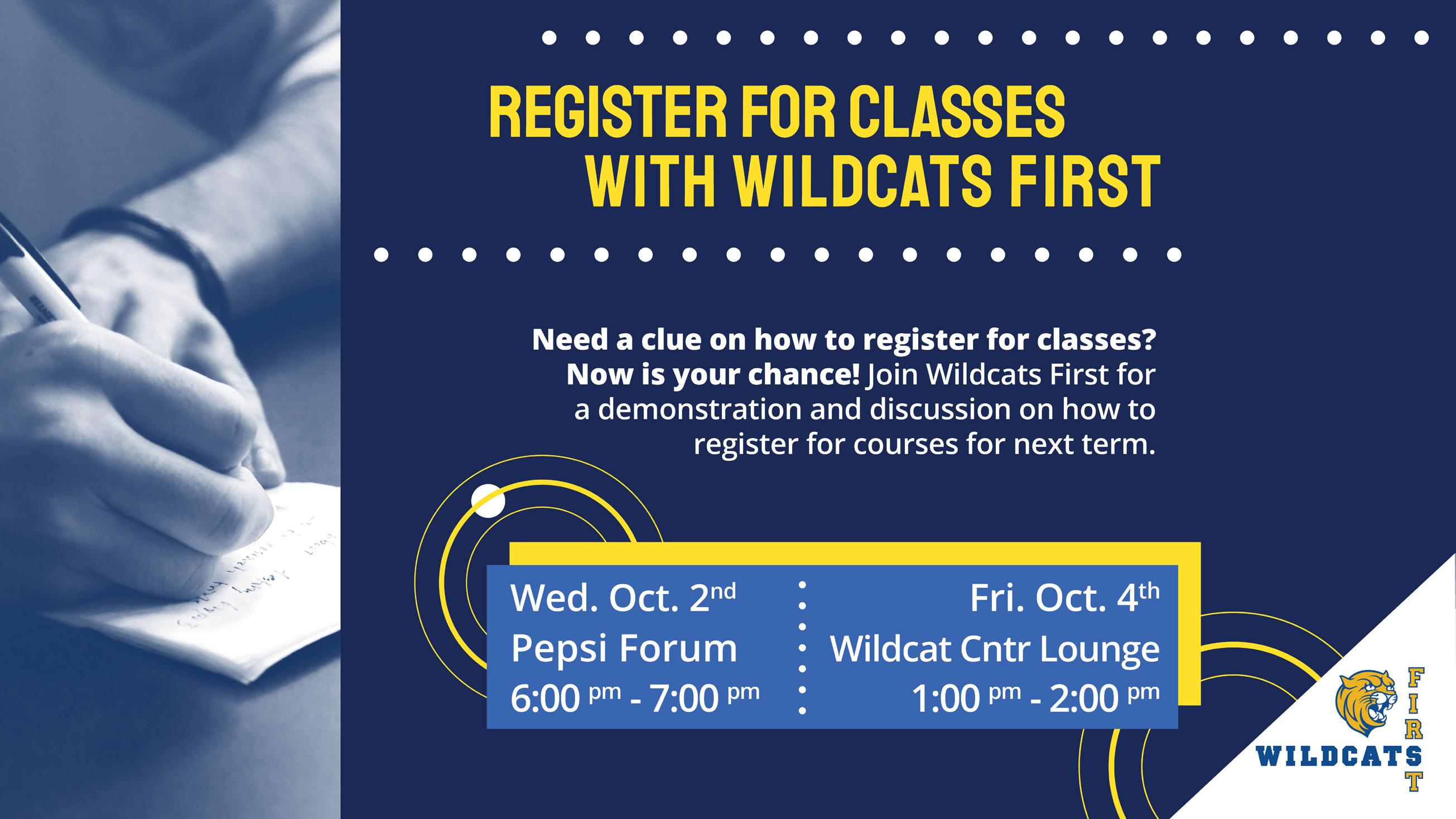
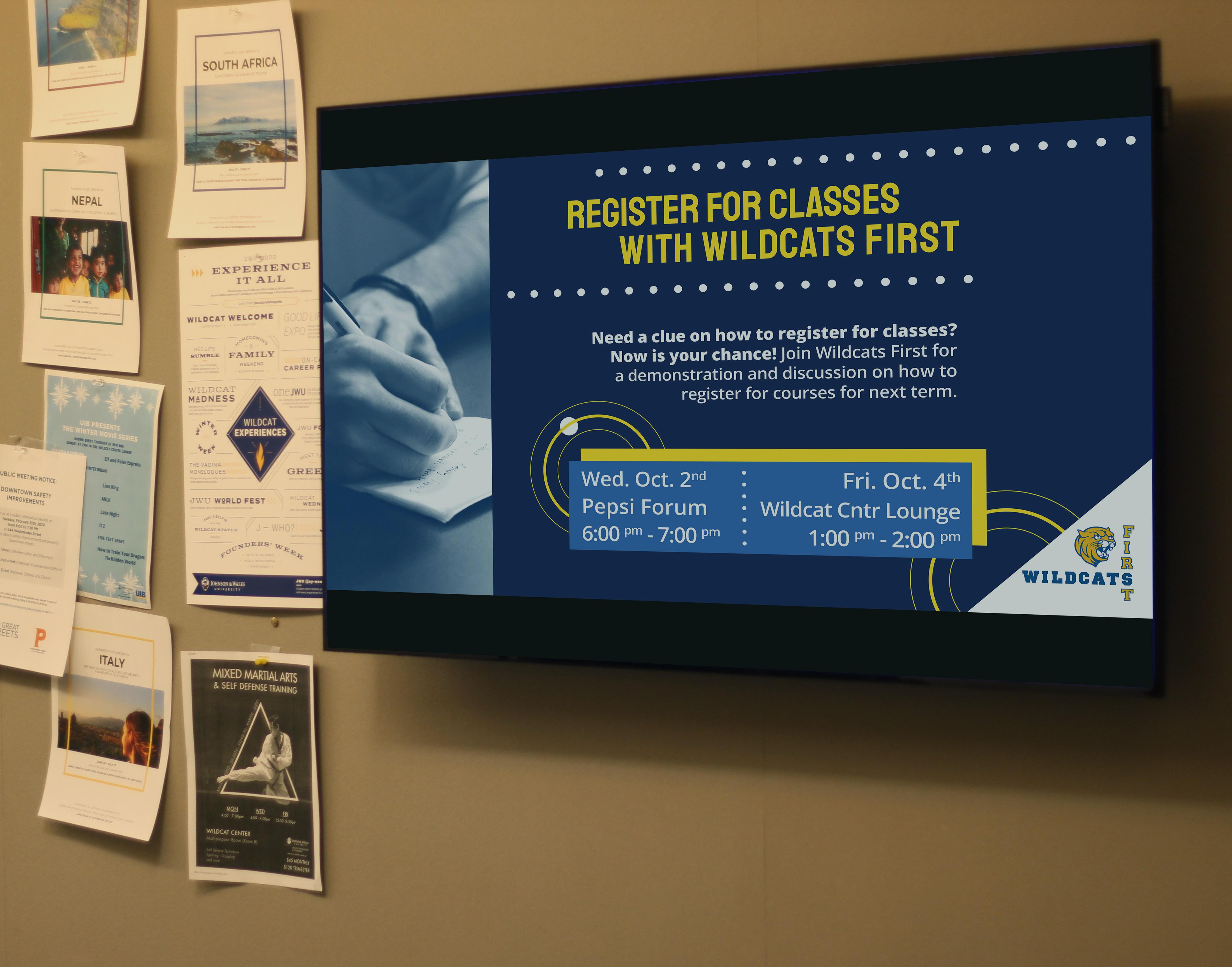
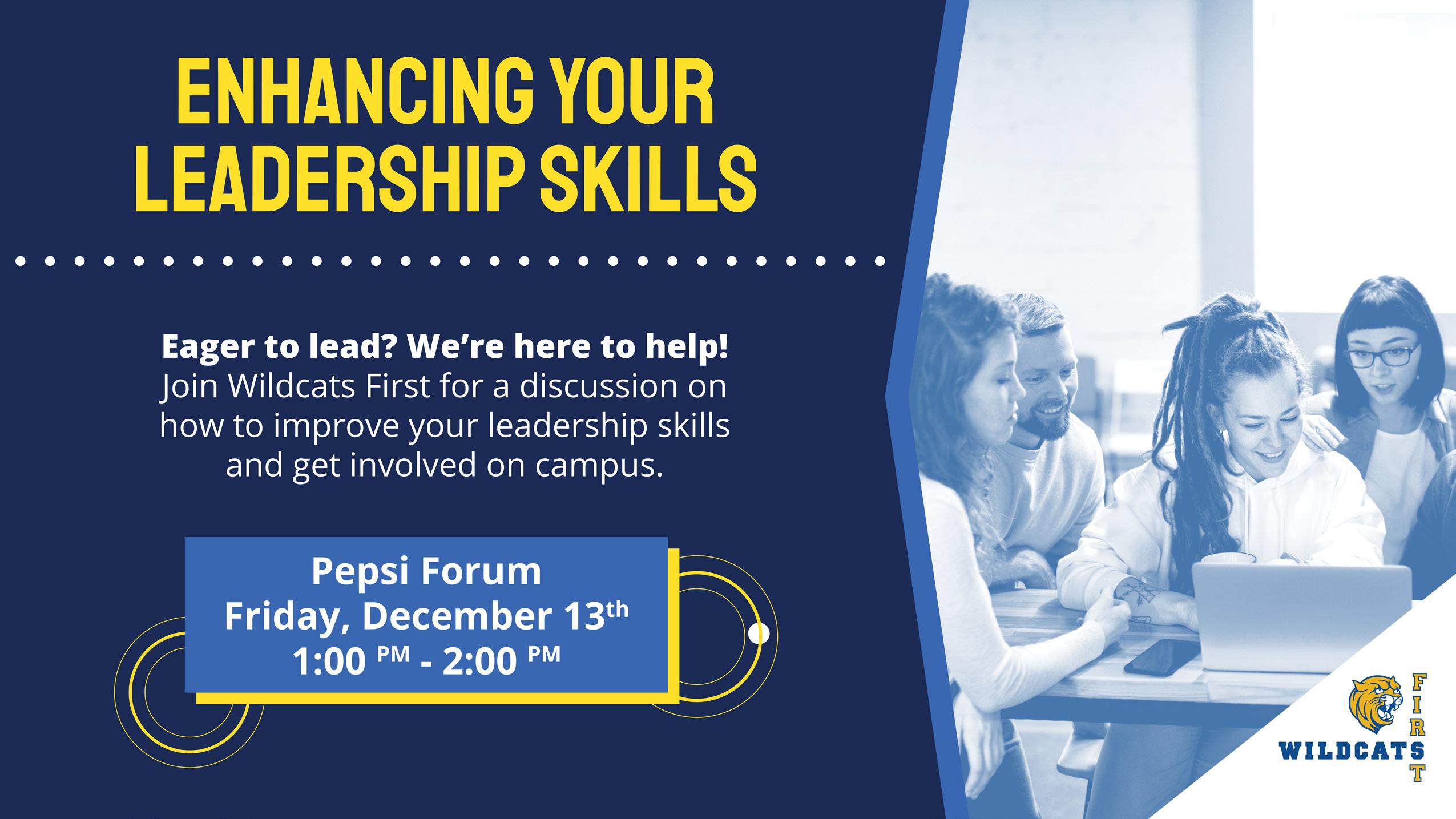
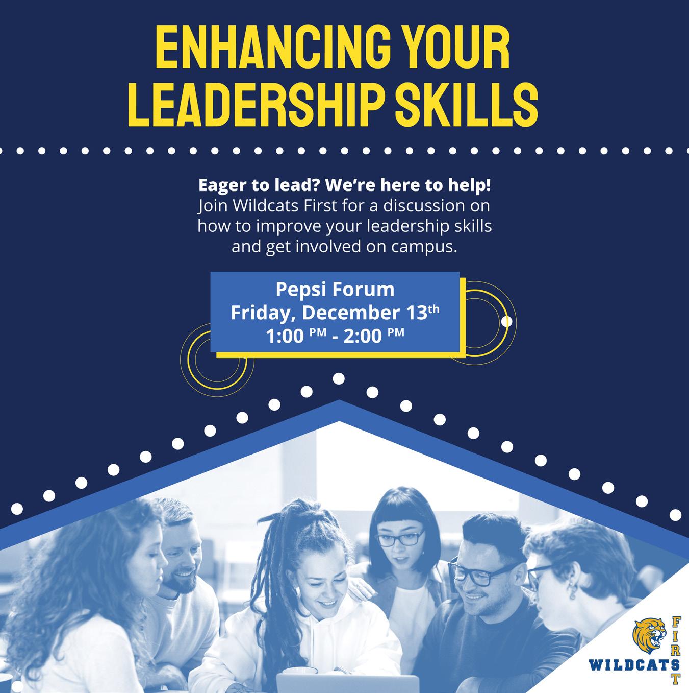
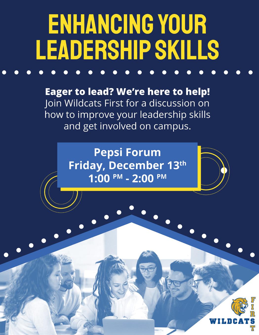
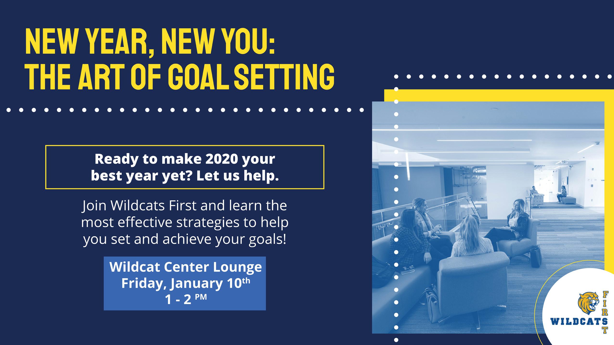
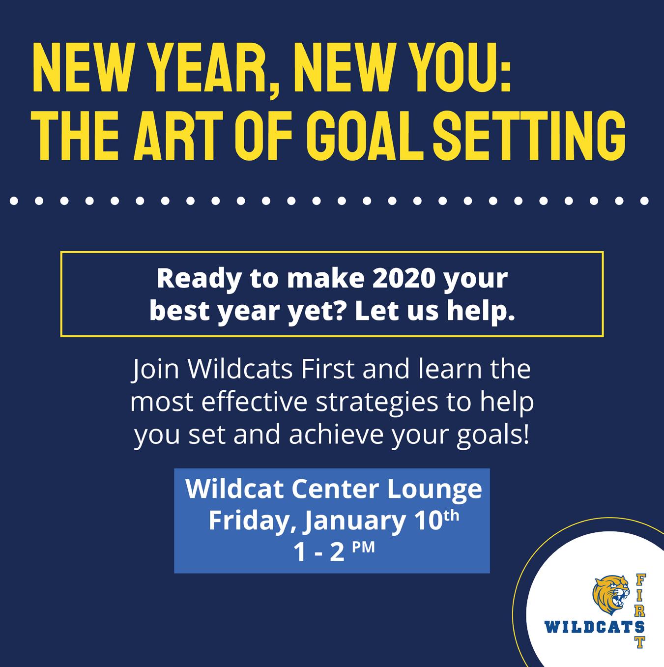
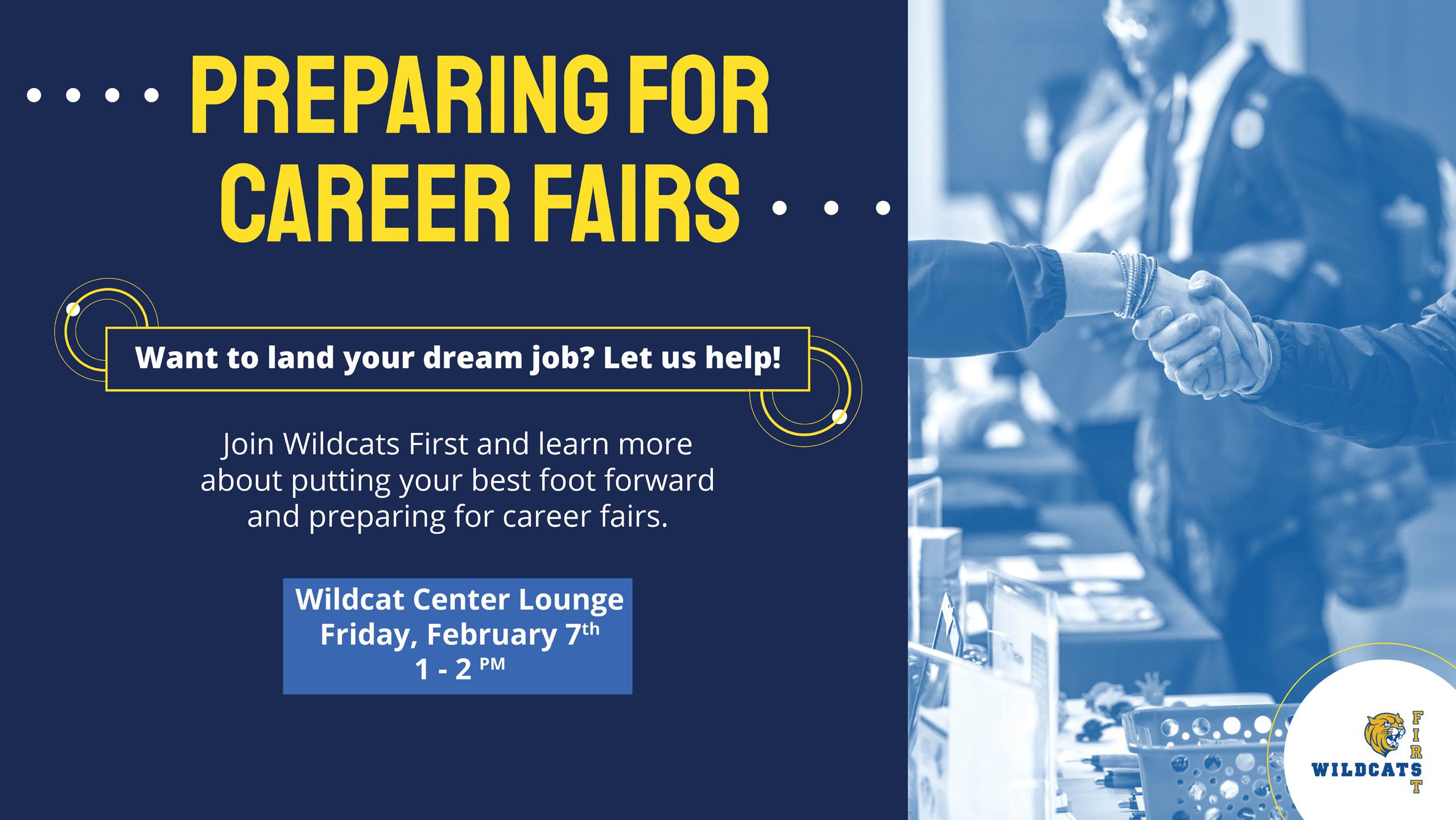
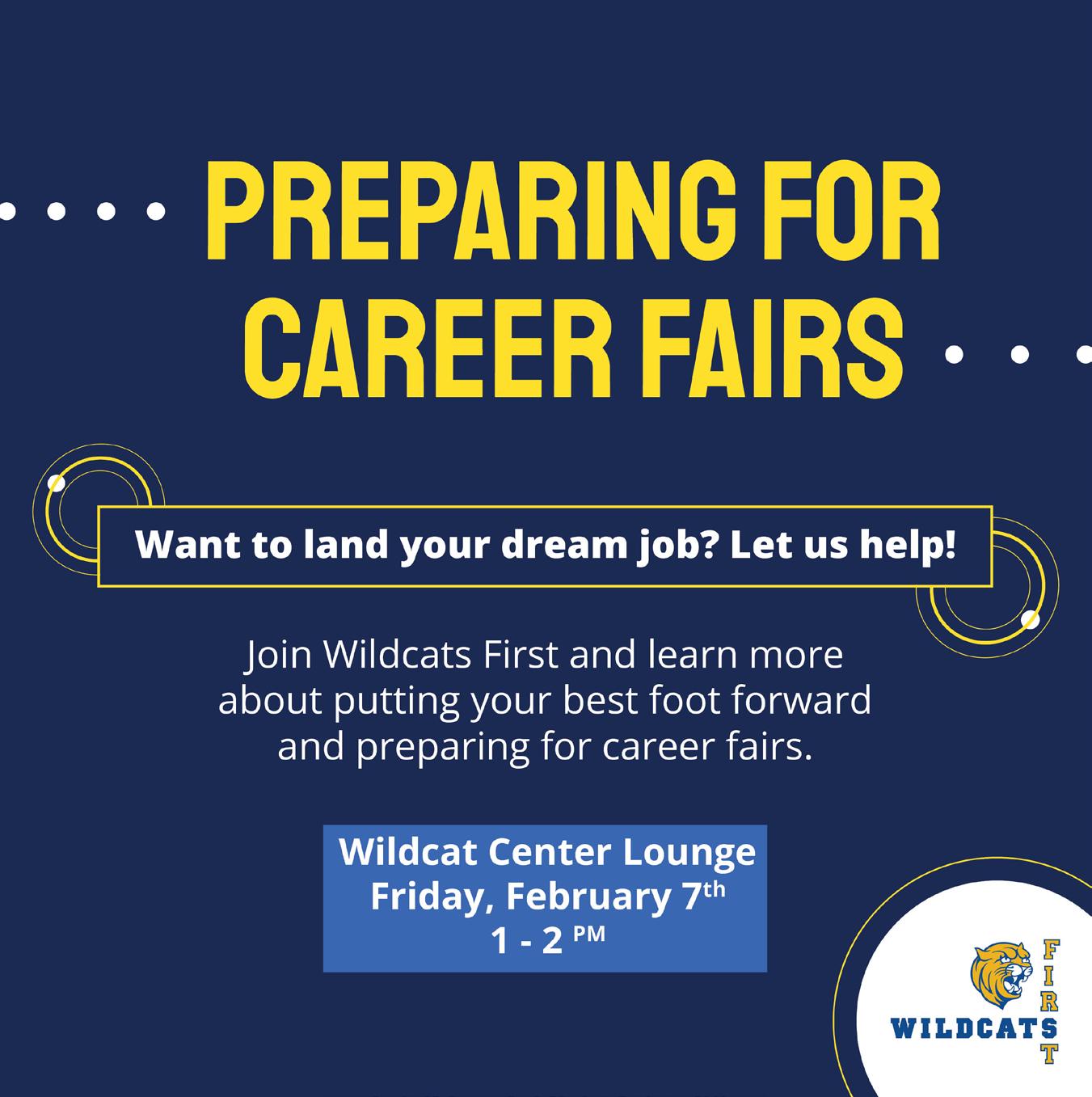
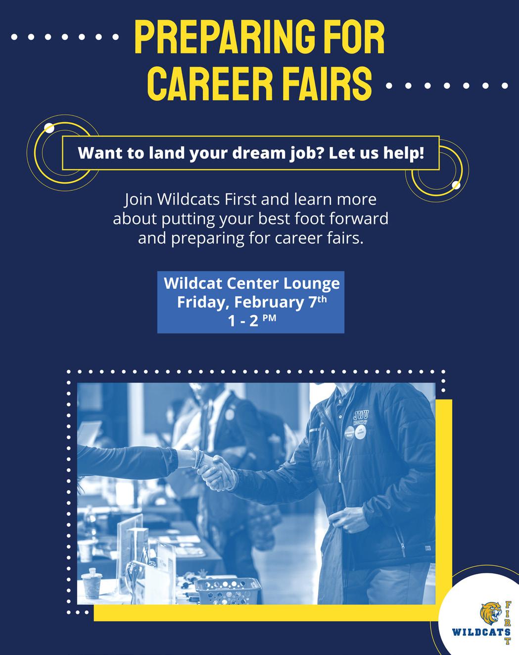
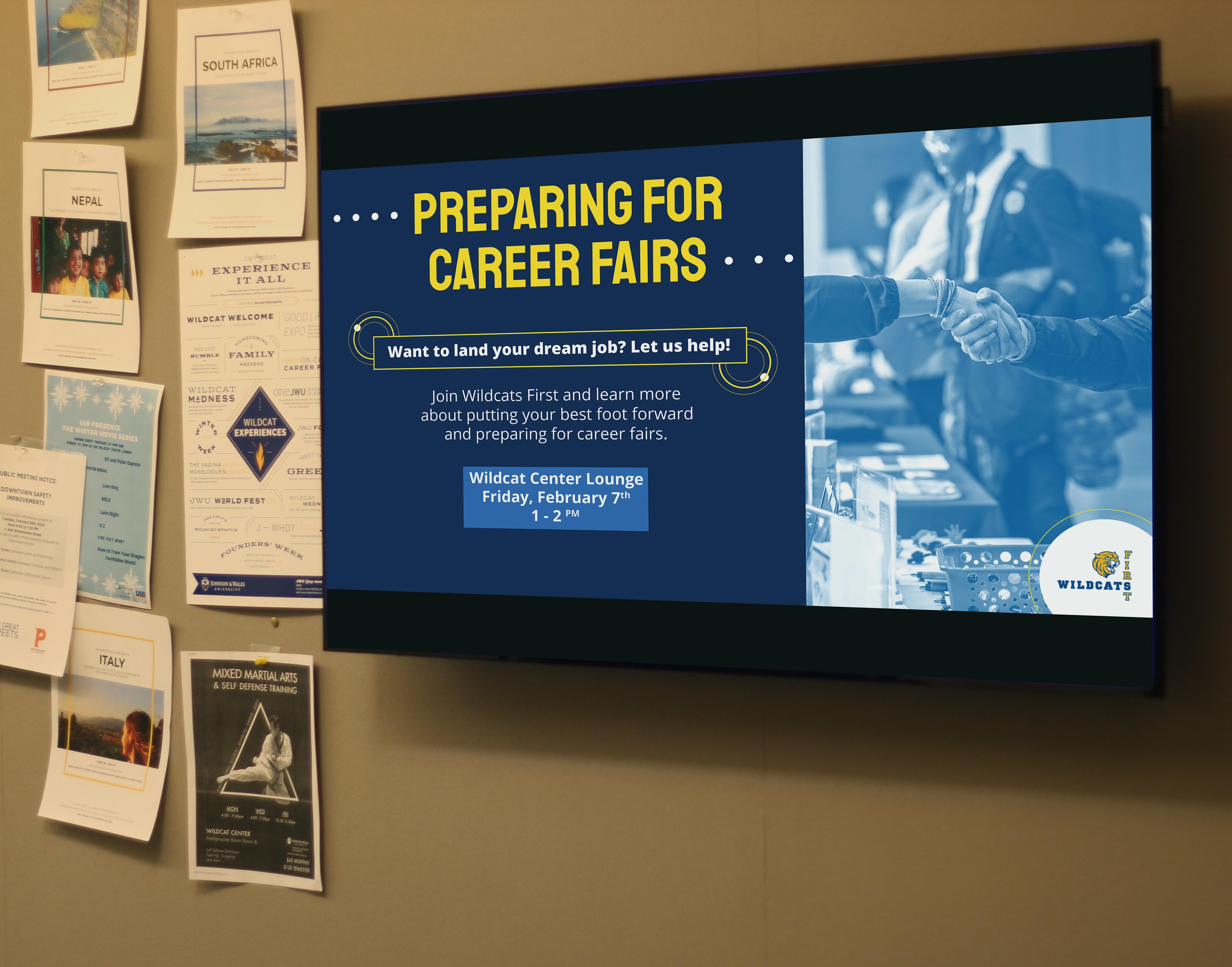
WILDCATS FIRST
PRINT/SOCIAL MEDIA
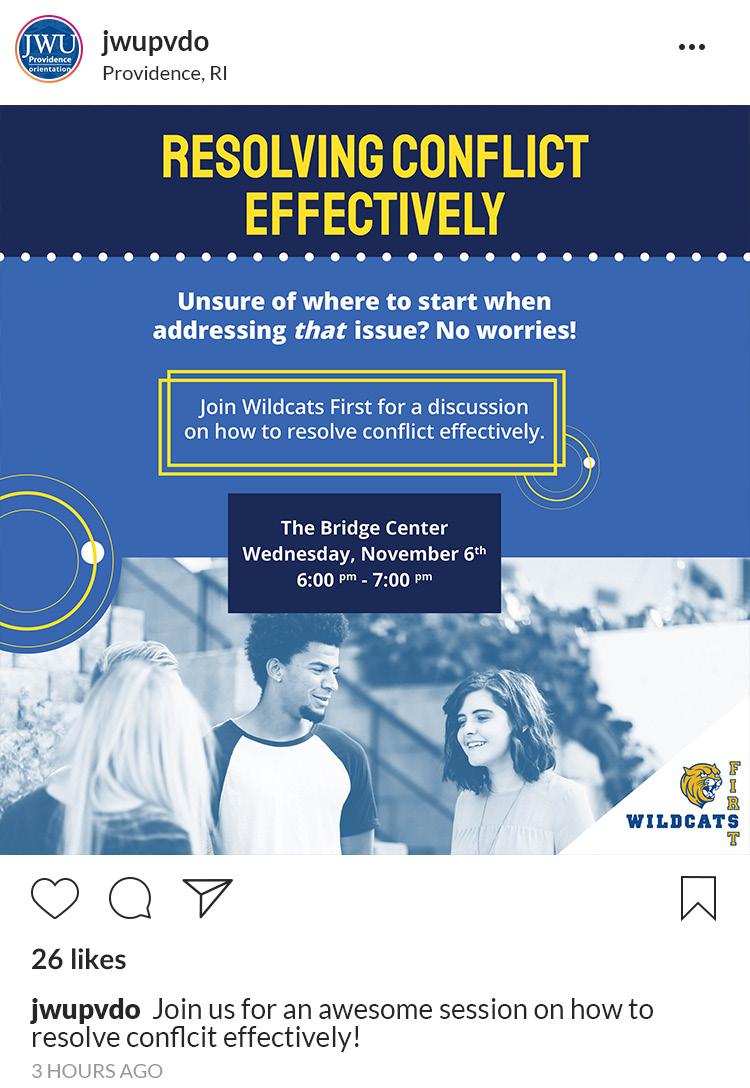
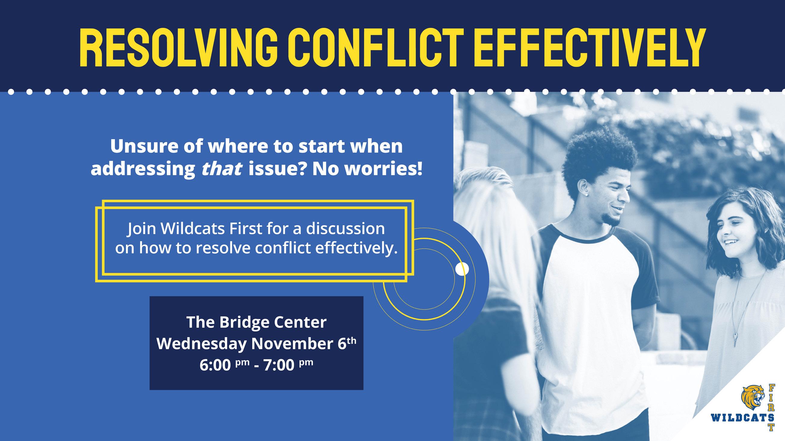
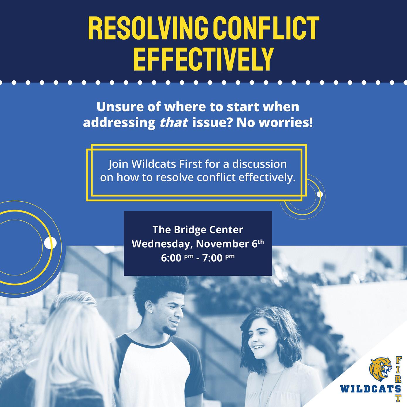
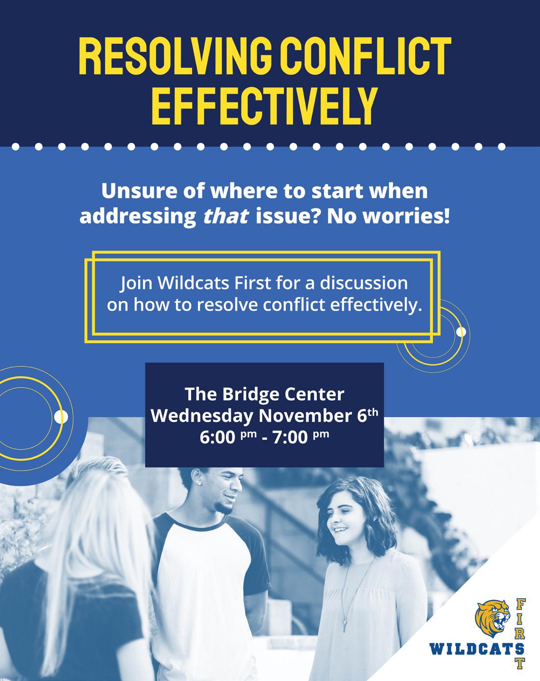
Wildcats helping Wildcats. As part of a work project I was assigned to create an ongoing campaign for Johnson & Wales’ Orientation & Support Programs’ information initiative: Wildcats First. The campaign, which advertises events for learning various tips and tricks, includes resume building and networking, to registering for classes and teaching good financial habits. The monthly installment for the initiative needed to remain cohesive month-to-month. After deciding on a design direction with the client regarding use of color and the general feeling, professional yet inviting, I hit the ground running. I took inspiration from an ad produced using Canva. Using the traditional blues and yellow associated with JWU combined with a library of decorative symbols to structure callouts, I established harmony among elements of the composition that translated well across the collateral to follow. I really enjoy working on this project because I am a past member of the orientation team and I love being able to help the organization after moving on from my participation in it.


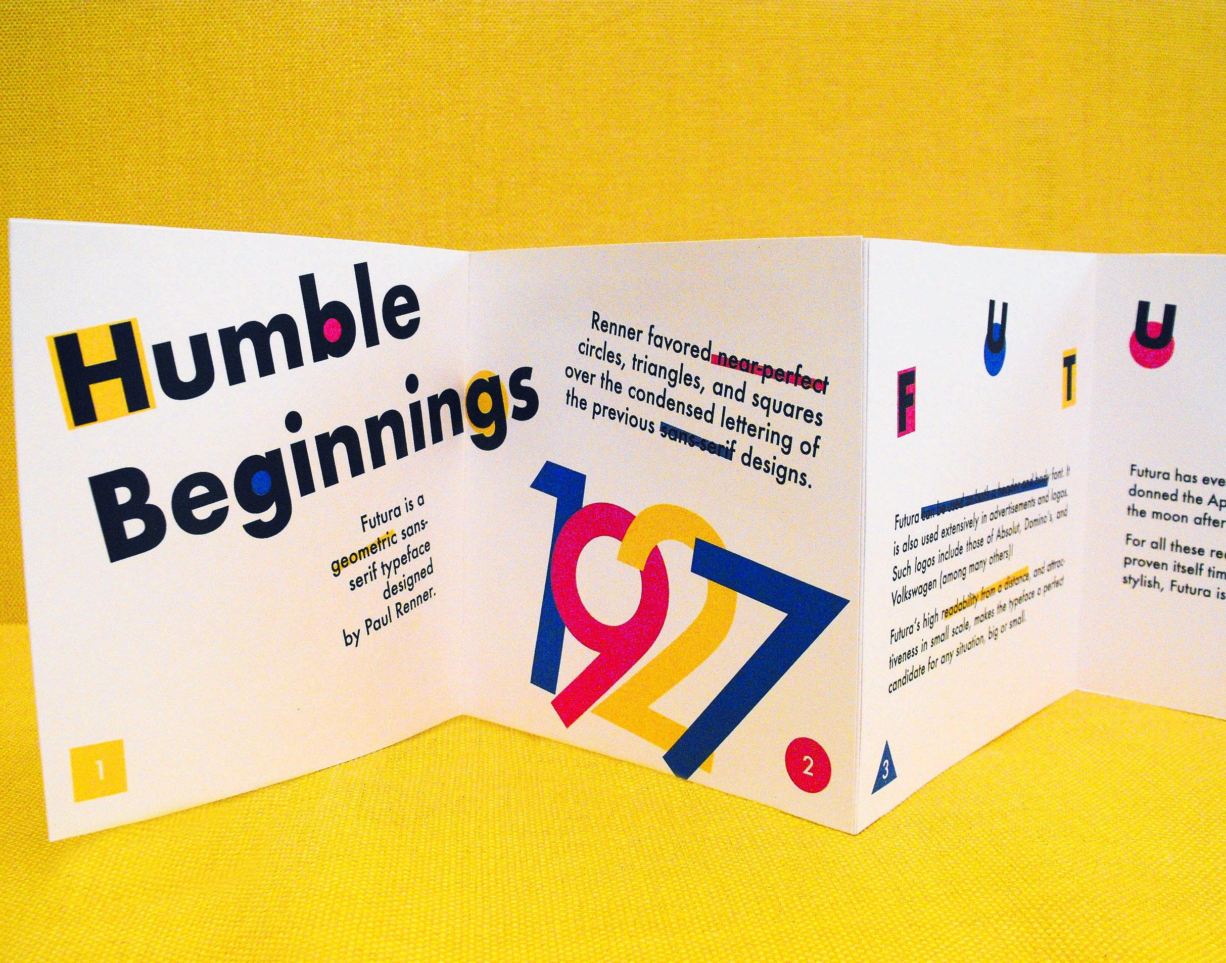
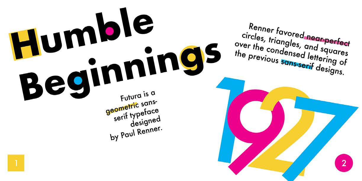
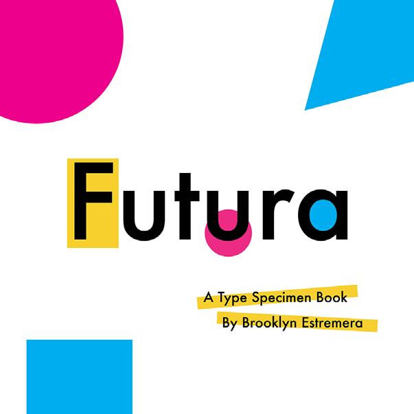
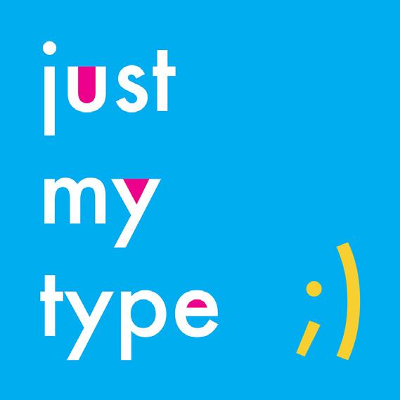
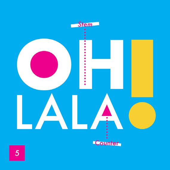
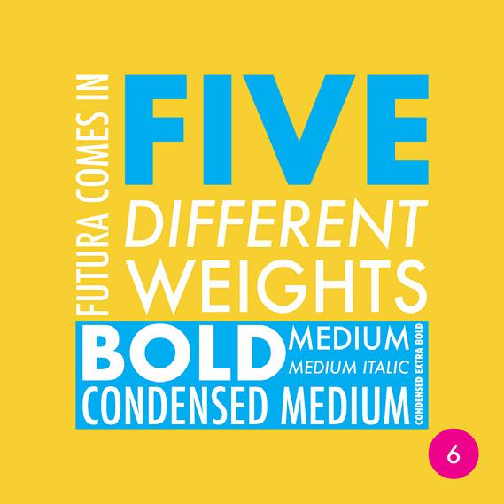
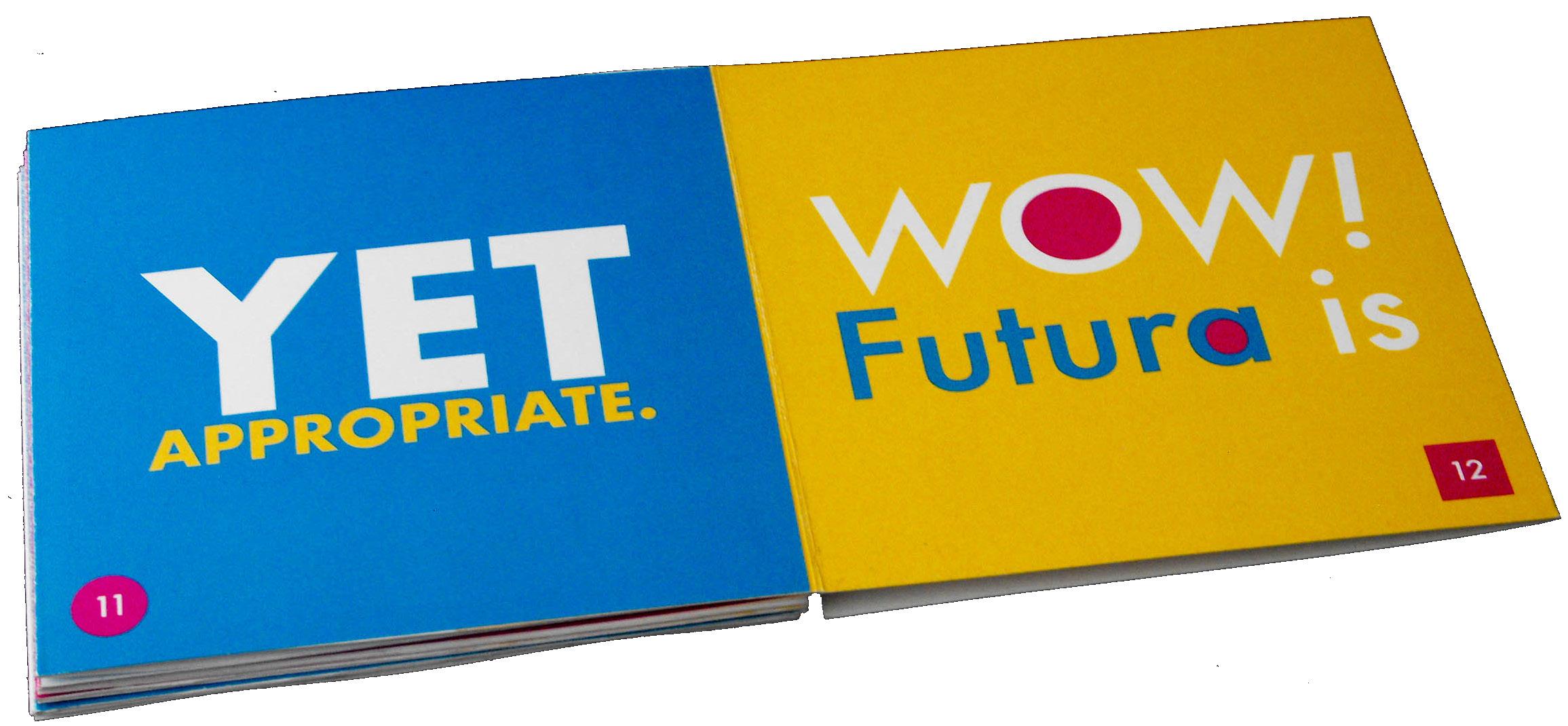
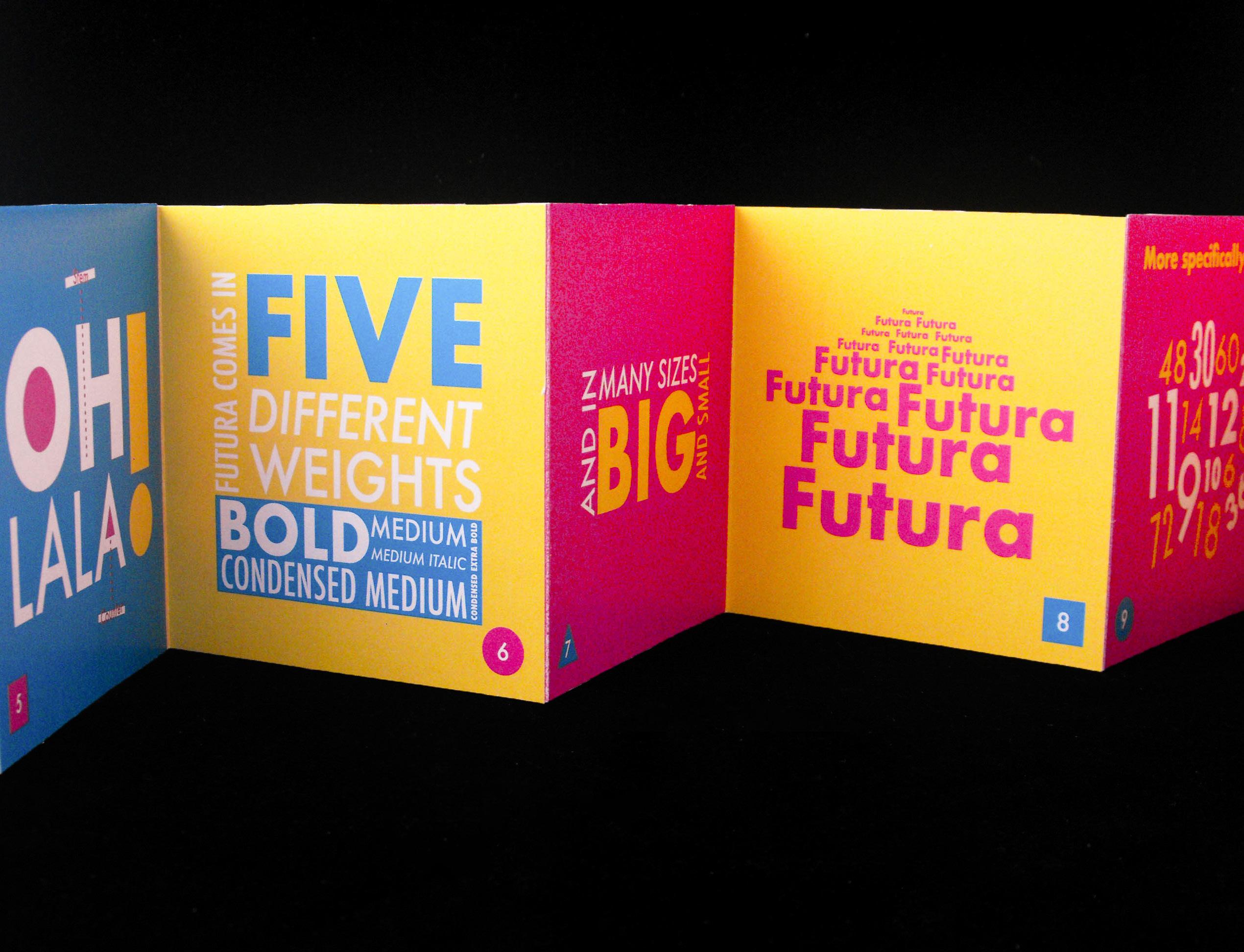
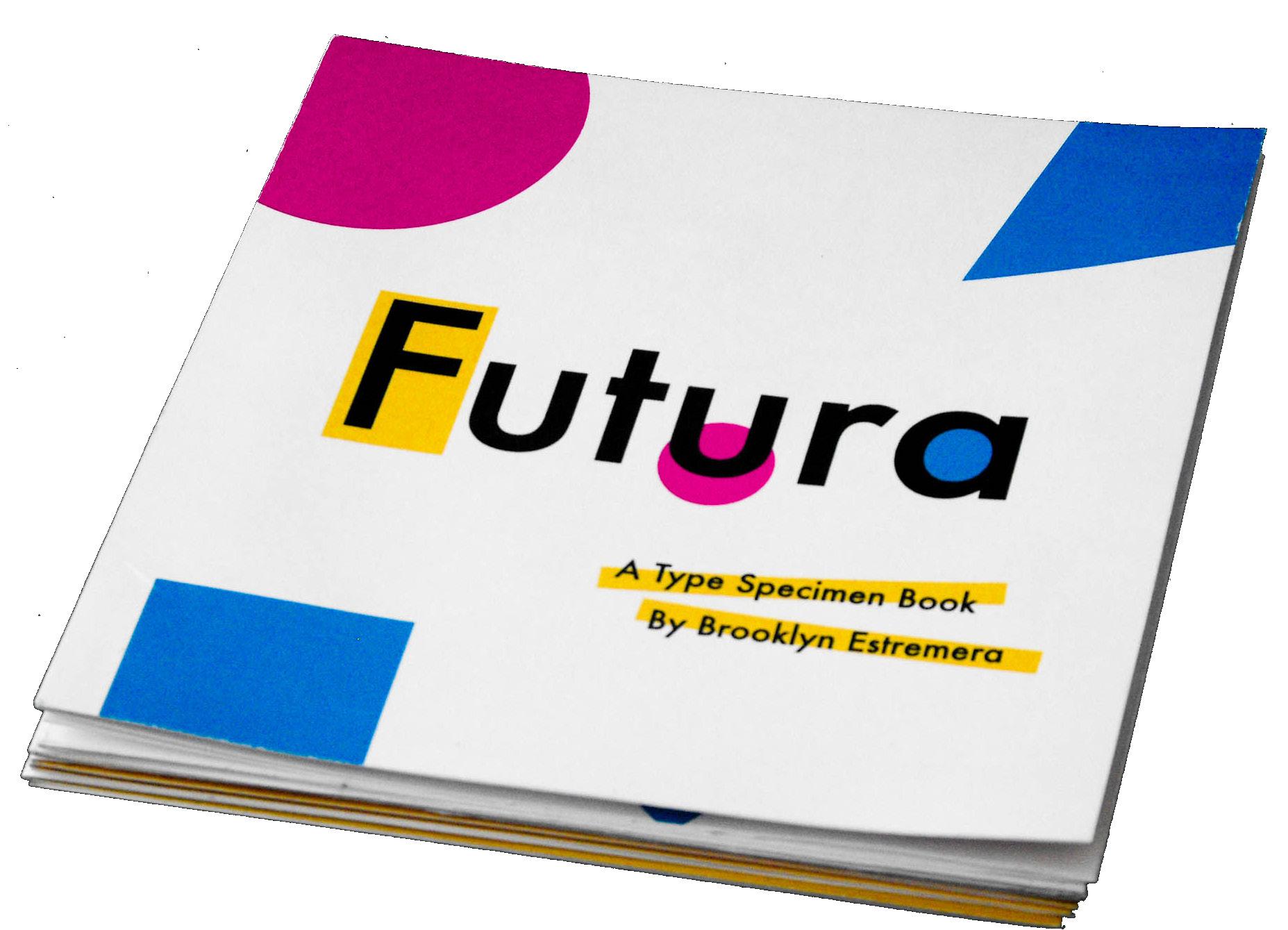
FUTURA TYPE BOOK
PRINT/TYPOGRAPHY
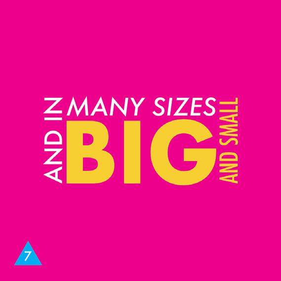
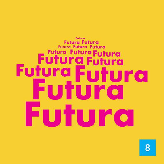
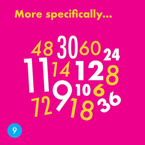
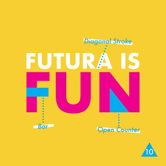
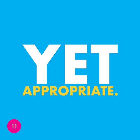
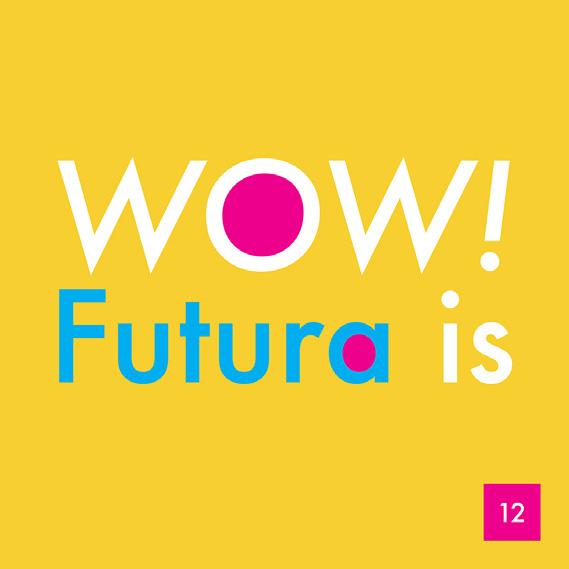
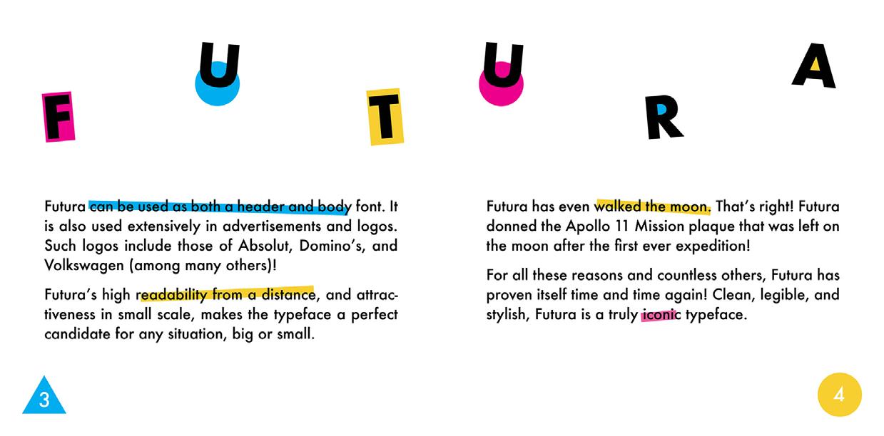
Shape up or get out! For a Typography class in my freshman year I was tasked with creating an 8-page print booklet that showcased a font-family of my choosing. I chose to feature Futura because I was very interested in the fact that it was based off geometric shapes. My project drew inspiration from Swiss Modernism/Design, Bauhaus, abstract art, and of course geometric shapes themselves. I chose a vibrant color palette of pink, blue, and yellow that was popular in Swiss Design and used geometric shapes to call out and enhance the anatomy of the typography. I made use of a structured grid, and arranged type lockups to look like, or otherwise resemble, a given geometric shape.
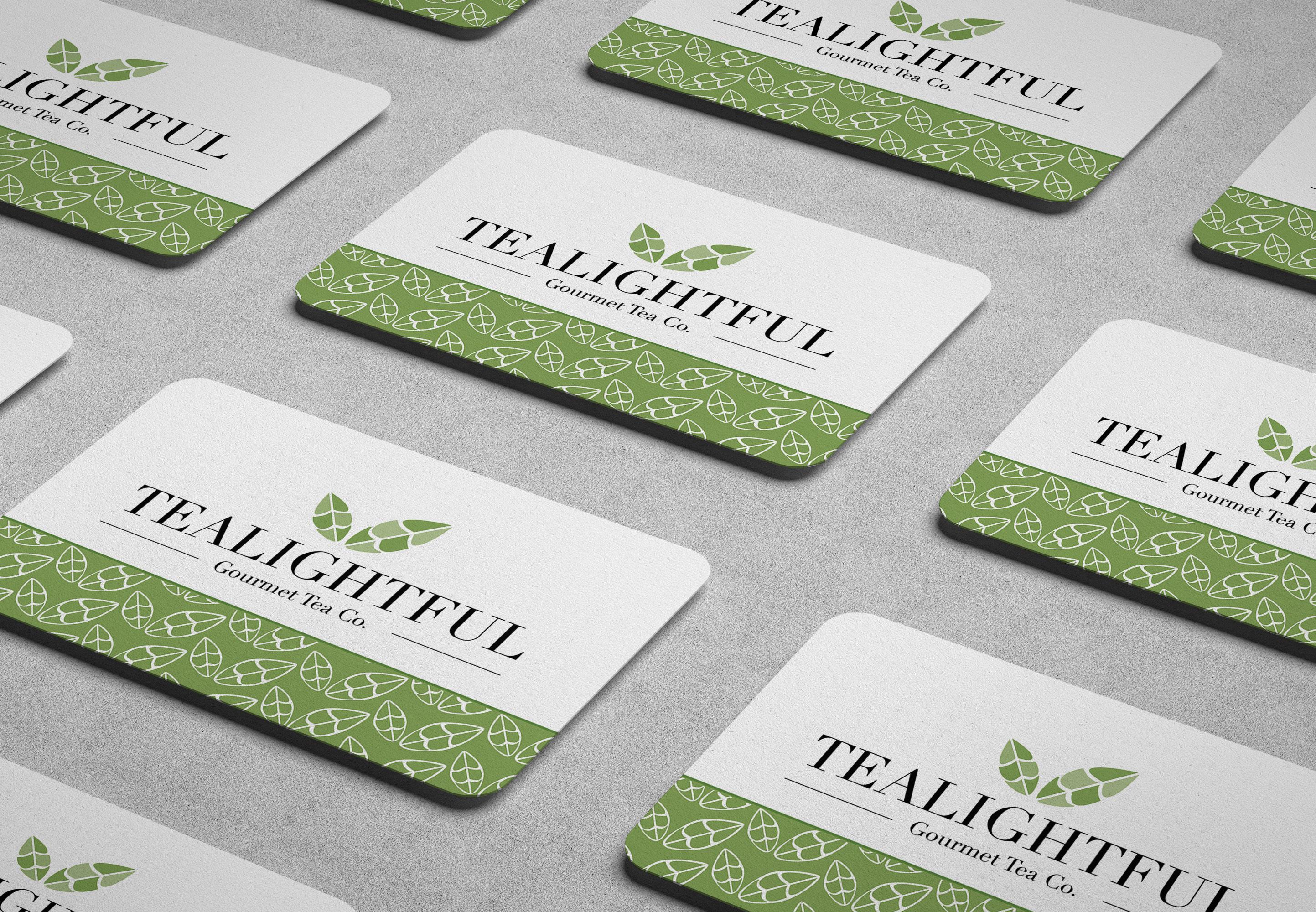
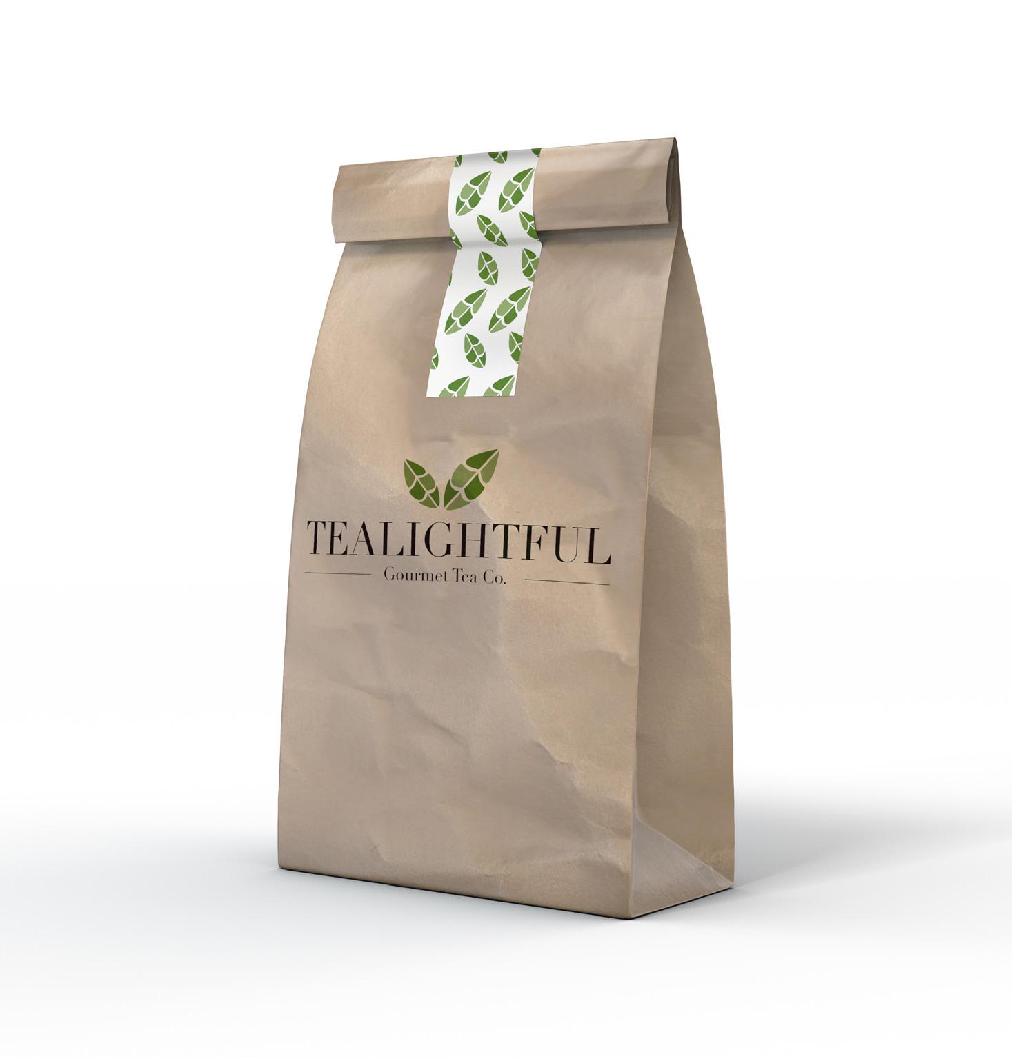
TEALIGHTFUL
BRANDING
Just delightful! In this project, I was asked to create a business card for a hypothetical company of my choice. I chose to design a brand for a gourmet tea shop, as I stand with those who prefer tea to coffee. I named the company Tealightful Gourmet Tea Co. to give a nod towards the delightfulness of the drink itself, as well as the high quality of the product. I used serif typefaces to illusrate the upscale aspect of my brand, and kept accompanying graphics to those with minimal line work, so as not to take away from the type. A color palette of greens, black, and white were used to communicate the calming aesthetic of the brand, much like the drink itself. I also made use of rounded edges to link to the curvature of a teacup.
Founder/CEO Tealightful Gourmet Tea Co. Providence, RI 02909 (401) 808-1508 contactbrook@tealightful.com tealightful.com Brooklyn Estremera
THROWBACK TRIVIA
POSTER DESIGN
Throwback! For this project from my work docket, I was given total creative freedom in creating an advert for the University Involvement Board’s annual trivia night. The theme for the event was the Roaring ‘20s, and I channeled that feeling and aesthetic heavily when designing this composition from my color choices to the type. I made sure to incorporate a color-blind safe color palette to encourage inclusive design, varying type sizes to ensure everything was readable and legible. I really enjoyed working on this composition because I very much enjoy the aesthetic of the 20th century which I was encouraged to follow.
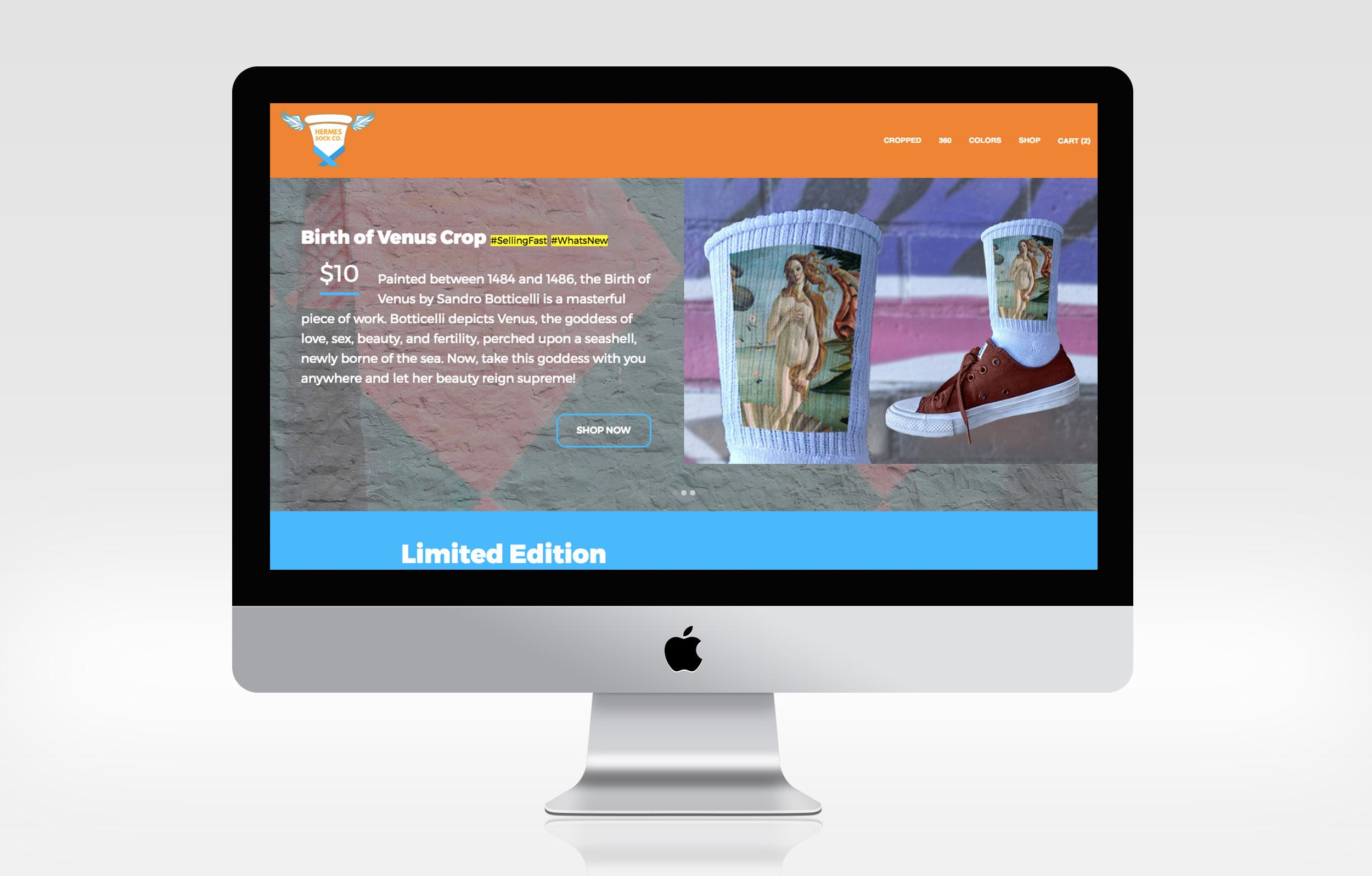
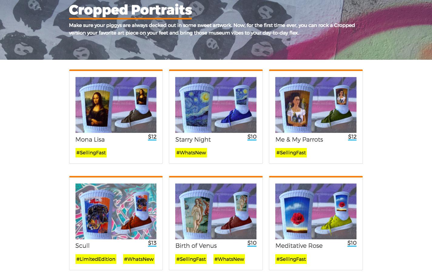
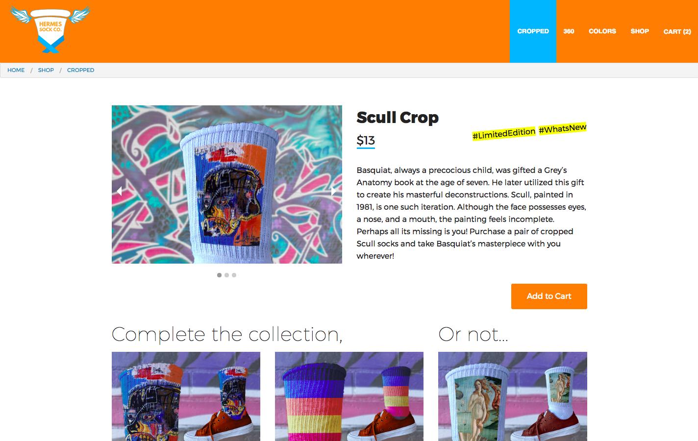
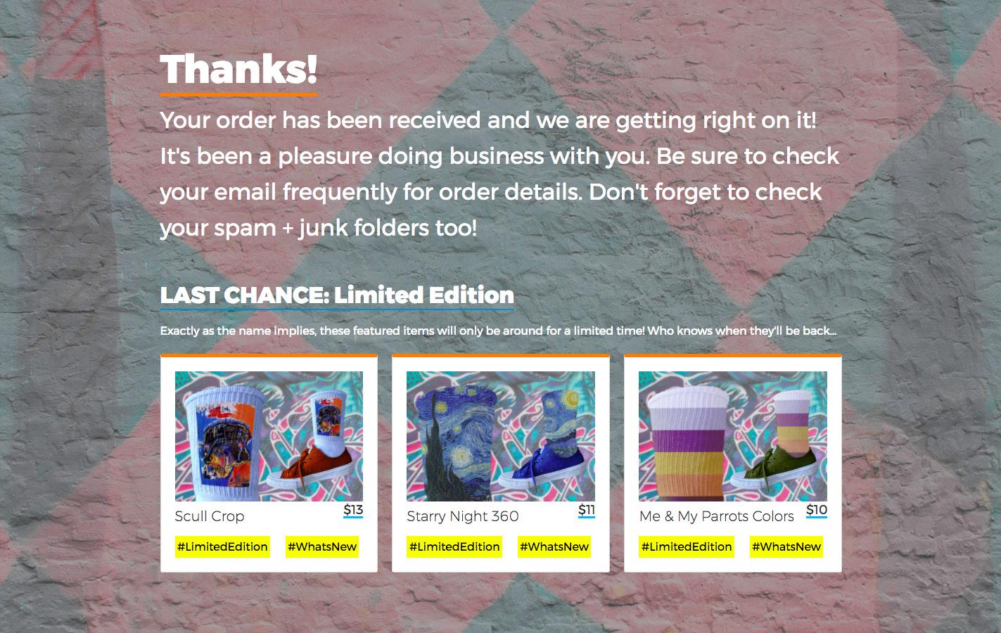
HERMES SOCK CO.
WEB DEVELOPMENT
Socks with sandals?! In this project, I was tasked with creating a responsive e-commerce site for a hypothetical business of my choosing. Hermes Sock Co. is a sock company dedicated to excellence, by providing its customers with socks decorated with famous artwork of geniuses’ past. I targeted this project towards sock lovers like myself. The namesake for the company belongs to Hermes, a Greek god who wears sandals with wings, and might also want to wear my socks because they were so fly. Some of the artworks featured include the Mona Lisa, Scull, Birth of Venus, and Meditative Rose. All sock mockups were created by me, while I photographed the accompanying background images around the neighborhoods of my city.
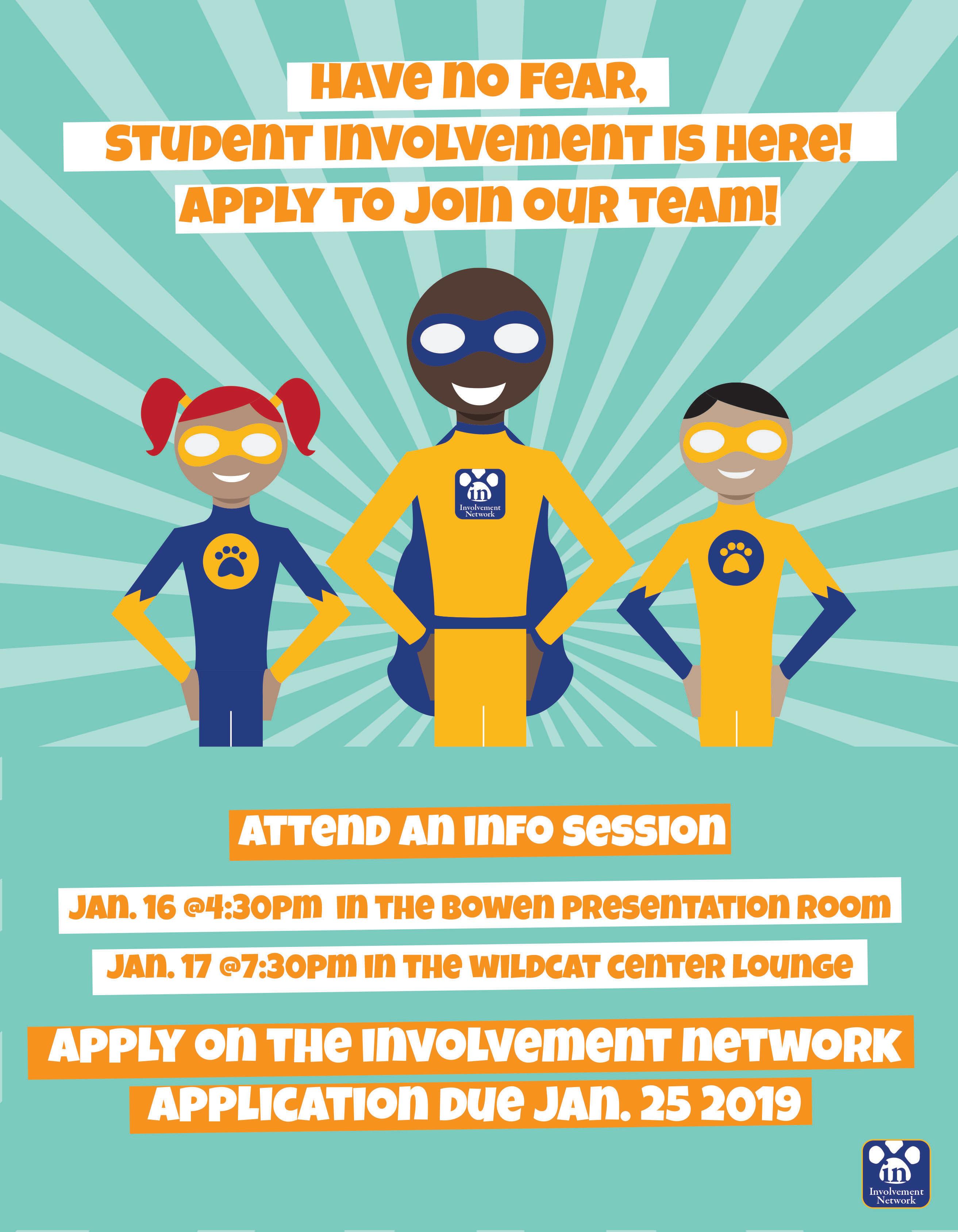
RECRUITMENT FLYER
ILLUSTRATION/PRINT
Have no fear, SIL is here! As part of a work-related project for a JWU faculty member, I was asked to create a flyer advertising numerous positions to be filled in the Student Involvement and Leadership office. The faculty desired an attentiongrabbing advert that utilized superheroes to connect to the student population. I knew that for this flyer the illustration was key, so I chose to stick to a bright but limited color palette of blues and orange to place emphasis on the real heroes of the shot. I deduced that fostering a connection between students from Johnson & Wales and heroes could mirror the faculty’s desire while empowering students to apply.
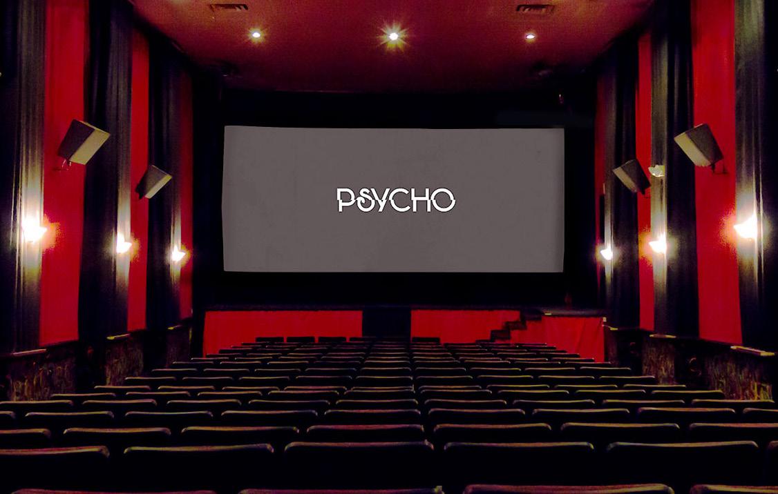
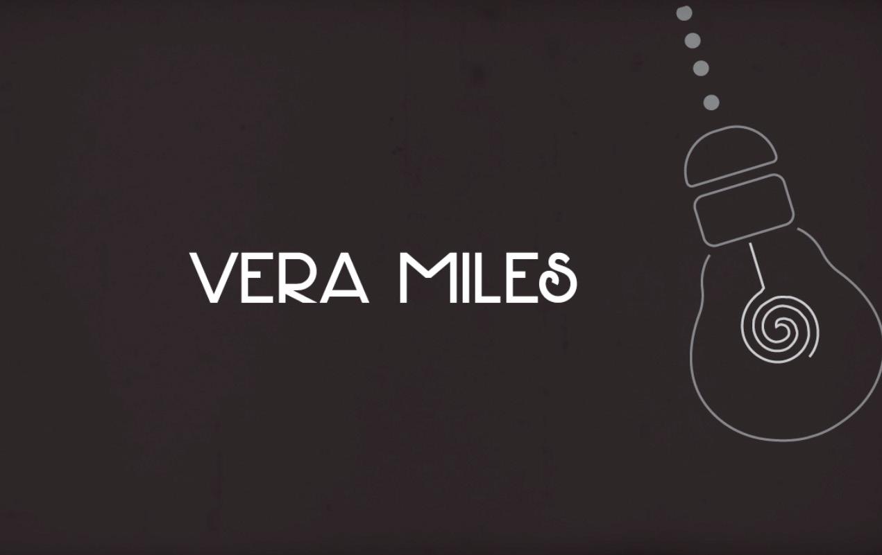
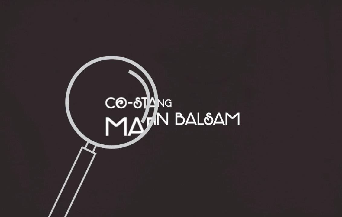
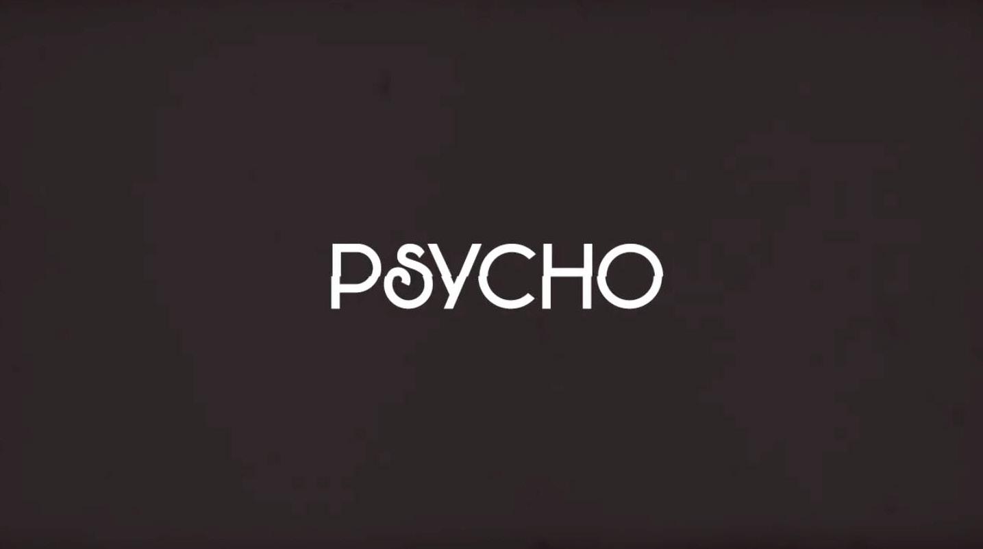
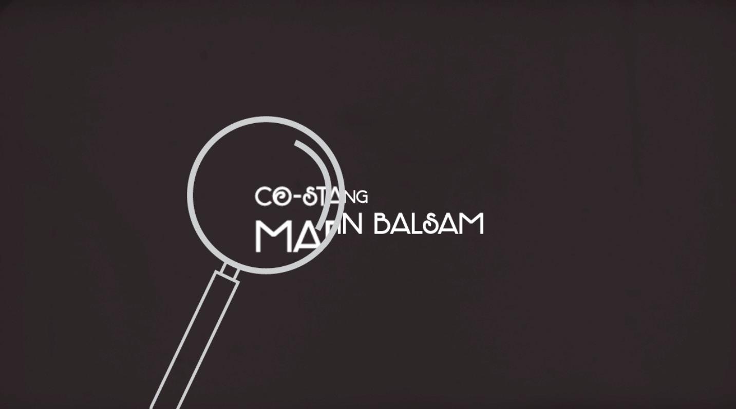
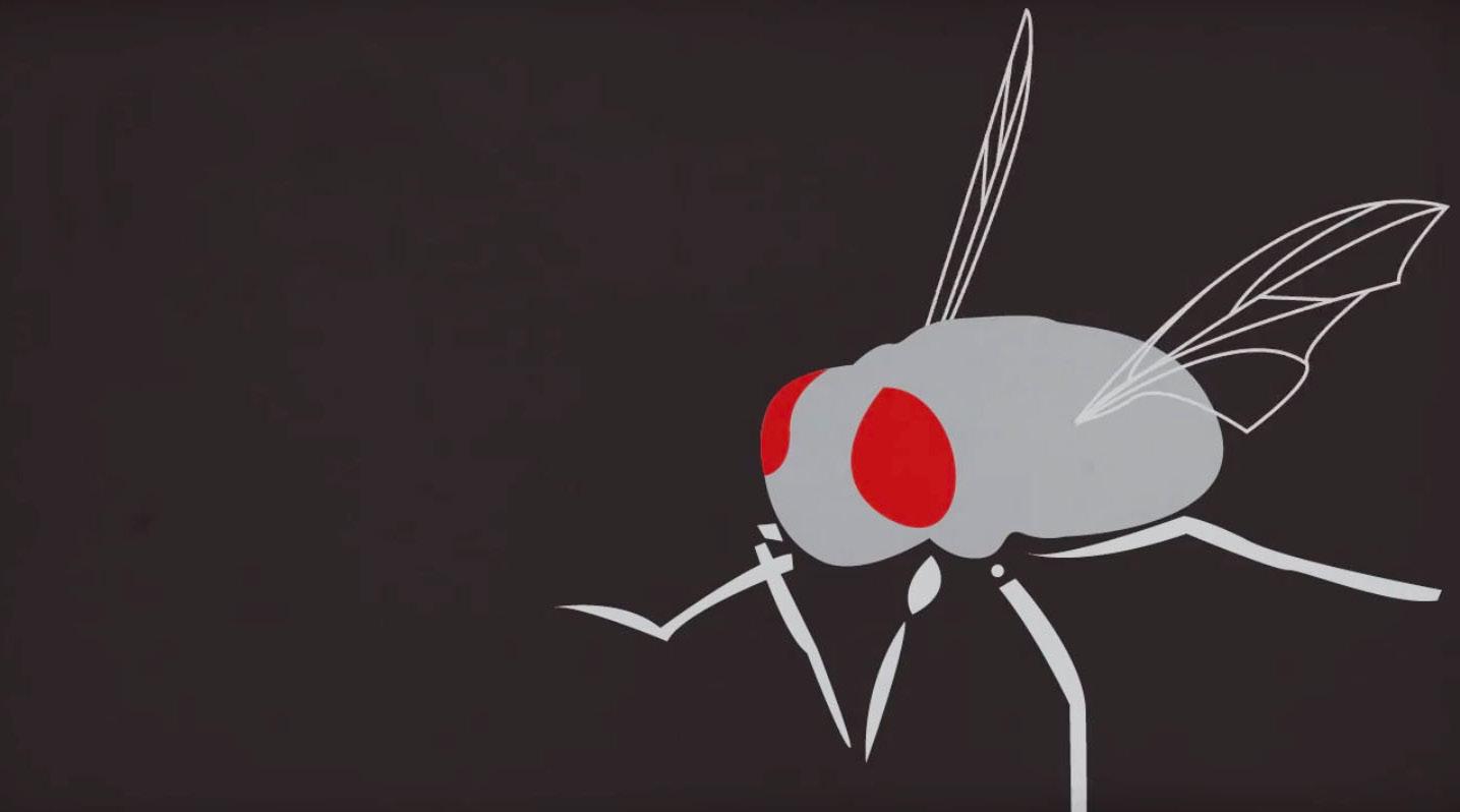
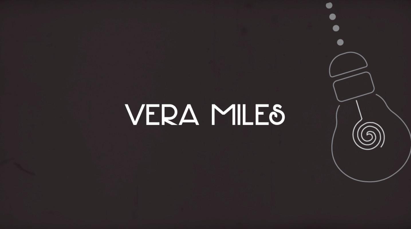
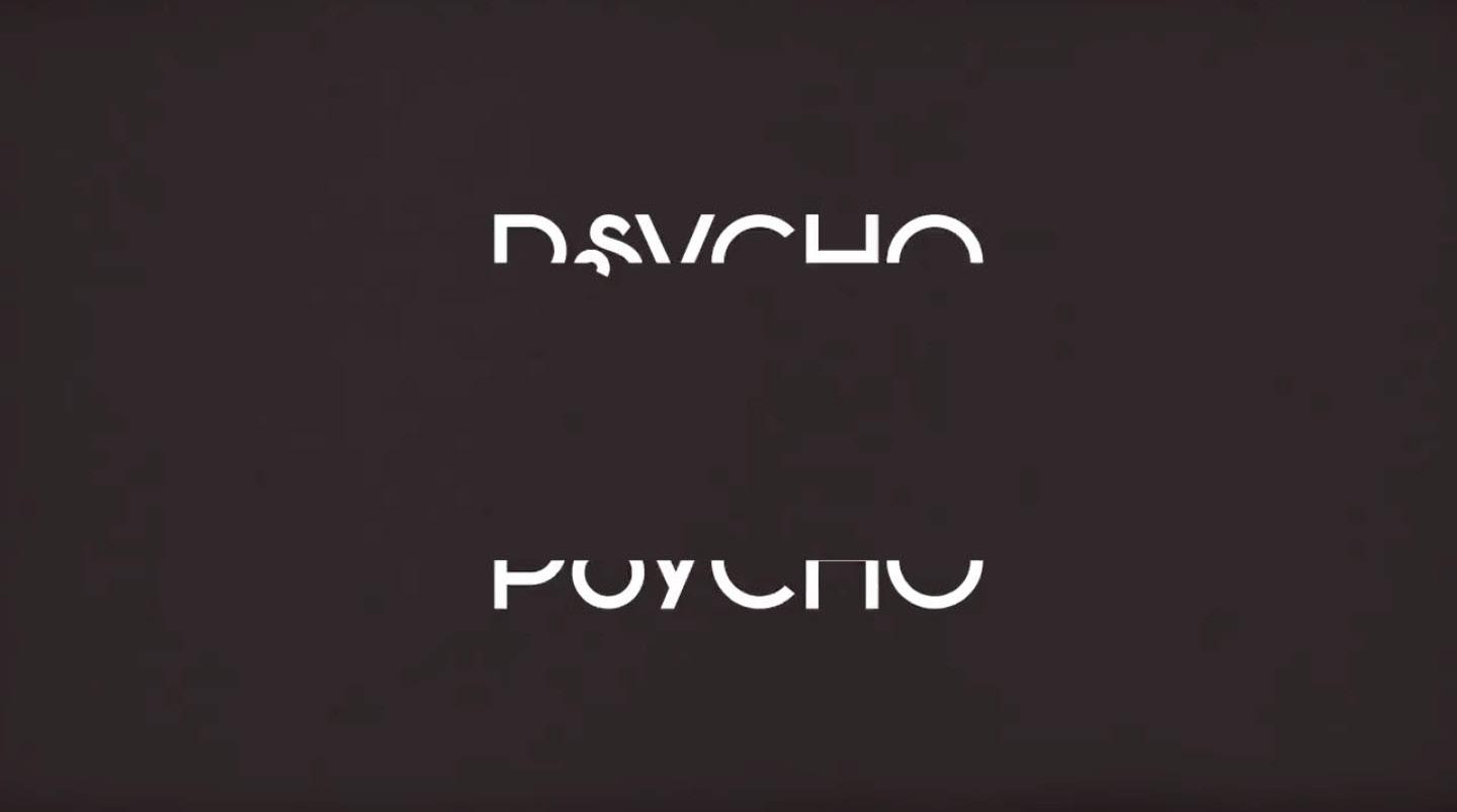
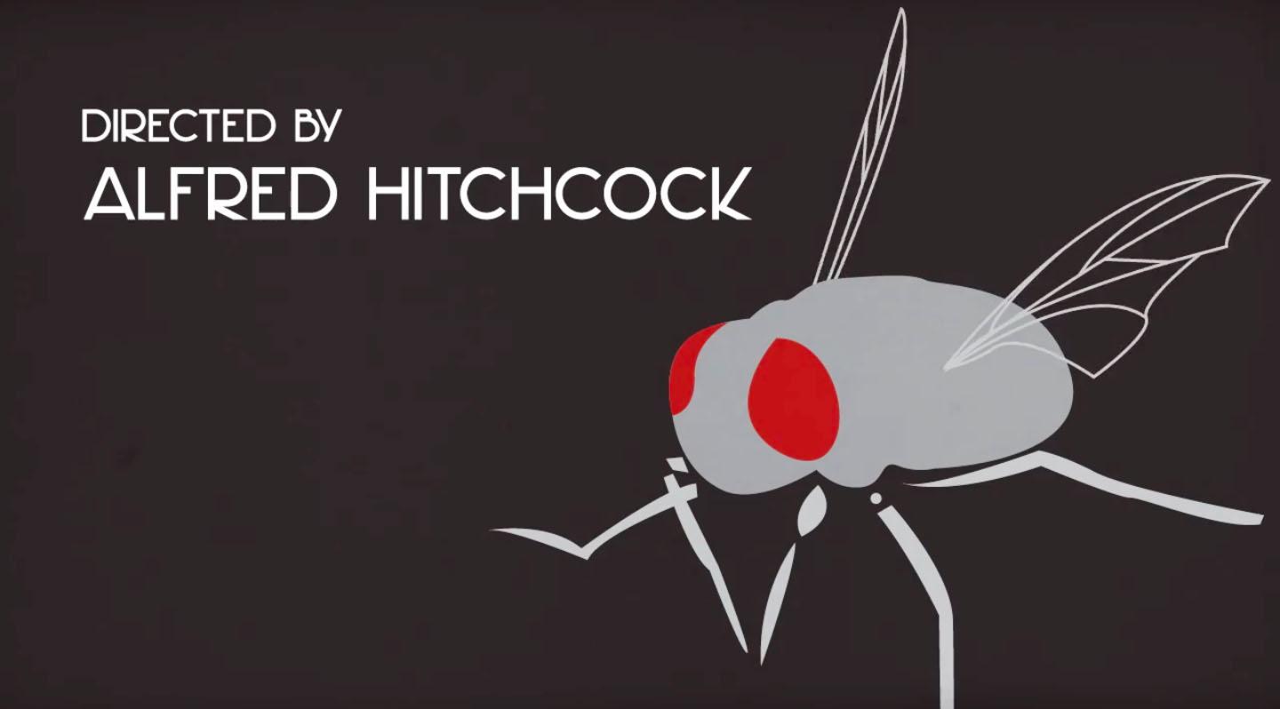
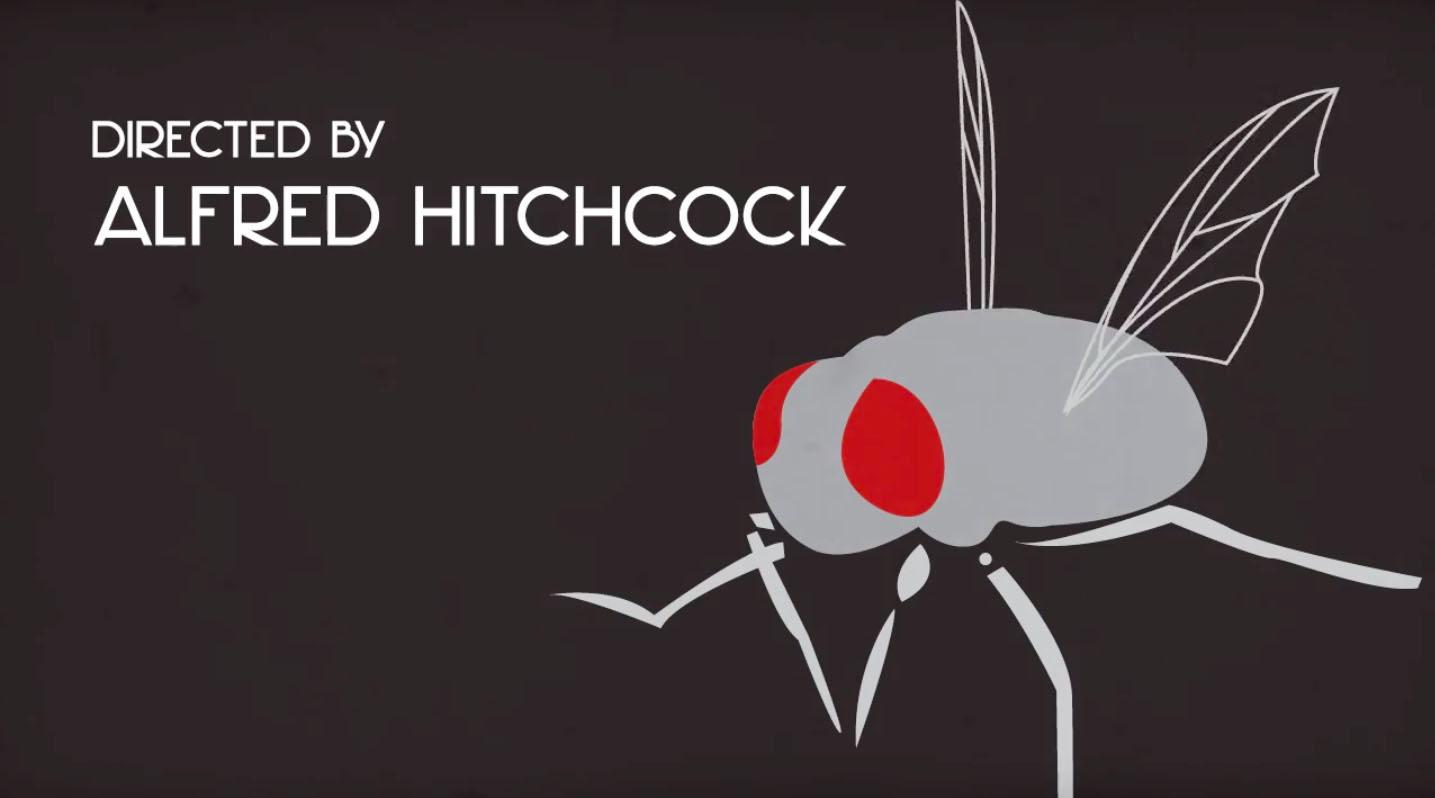
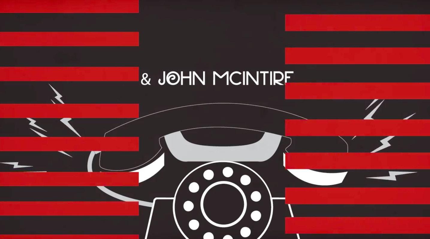
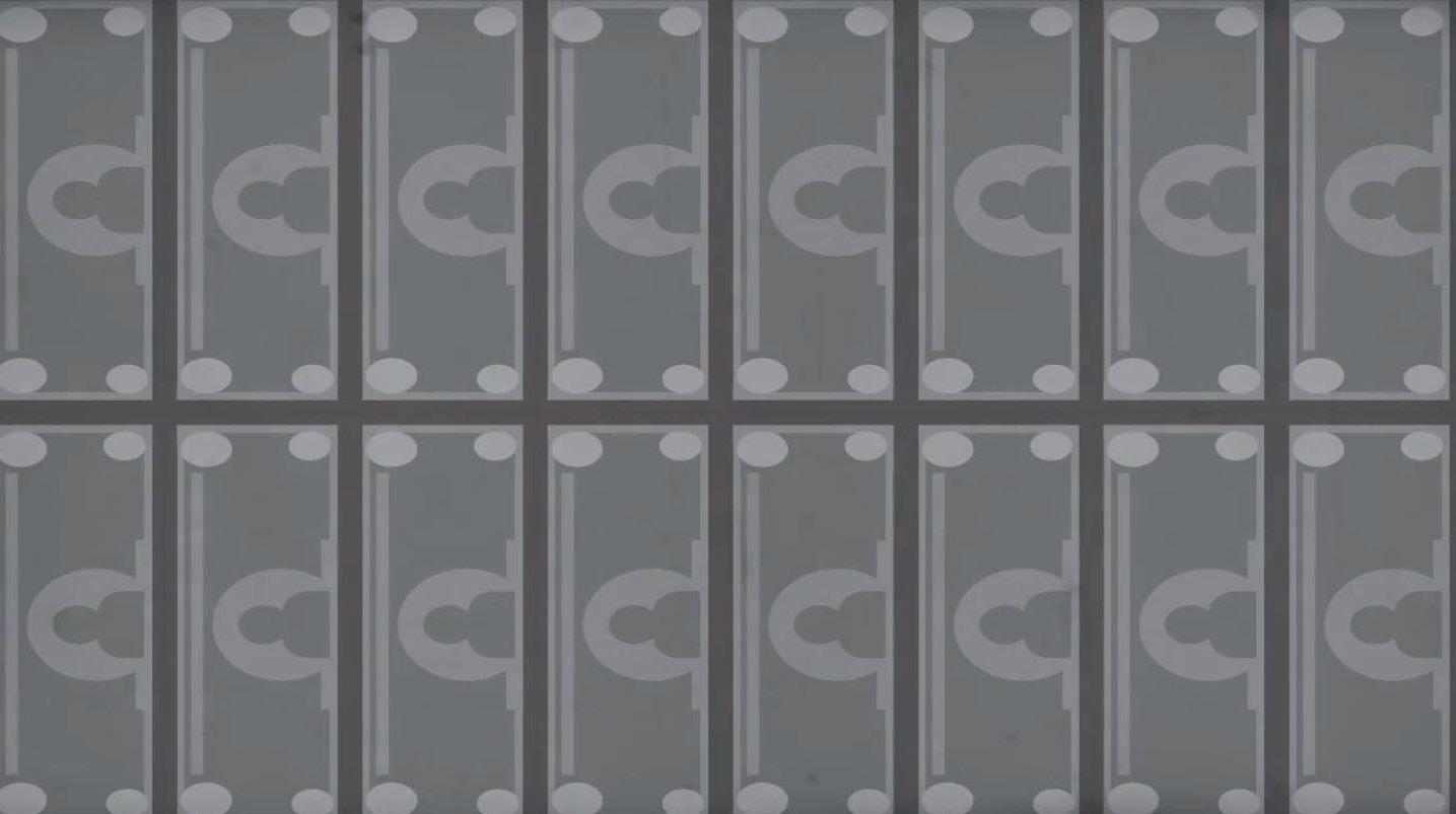
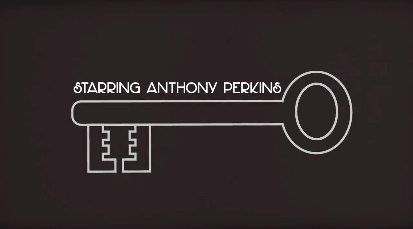
PSYCHO: REIMAGINED
MOTION GRAPHICS
Oh mother! For this project in a motion graphics class, I was tasked with creating a 60-second title sequence for a movie/television show of my choosing. I decided to reimagine the opening title sequence for the 1960 slasher/thriller Psycho, directed by Alfred Hitchcock. I drew much of my inspiration from Saul Bass, who created the original title sequence. To pay homage to Bass’ unmistakable design work, each title card was created very intentionally for the character they depict by featuring a vector object that is specific to that character. The eerie music compliments the old-film look that each of my assets have about them, and abrupt transitions between title cards tie the opening sequence together.
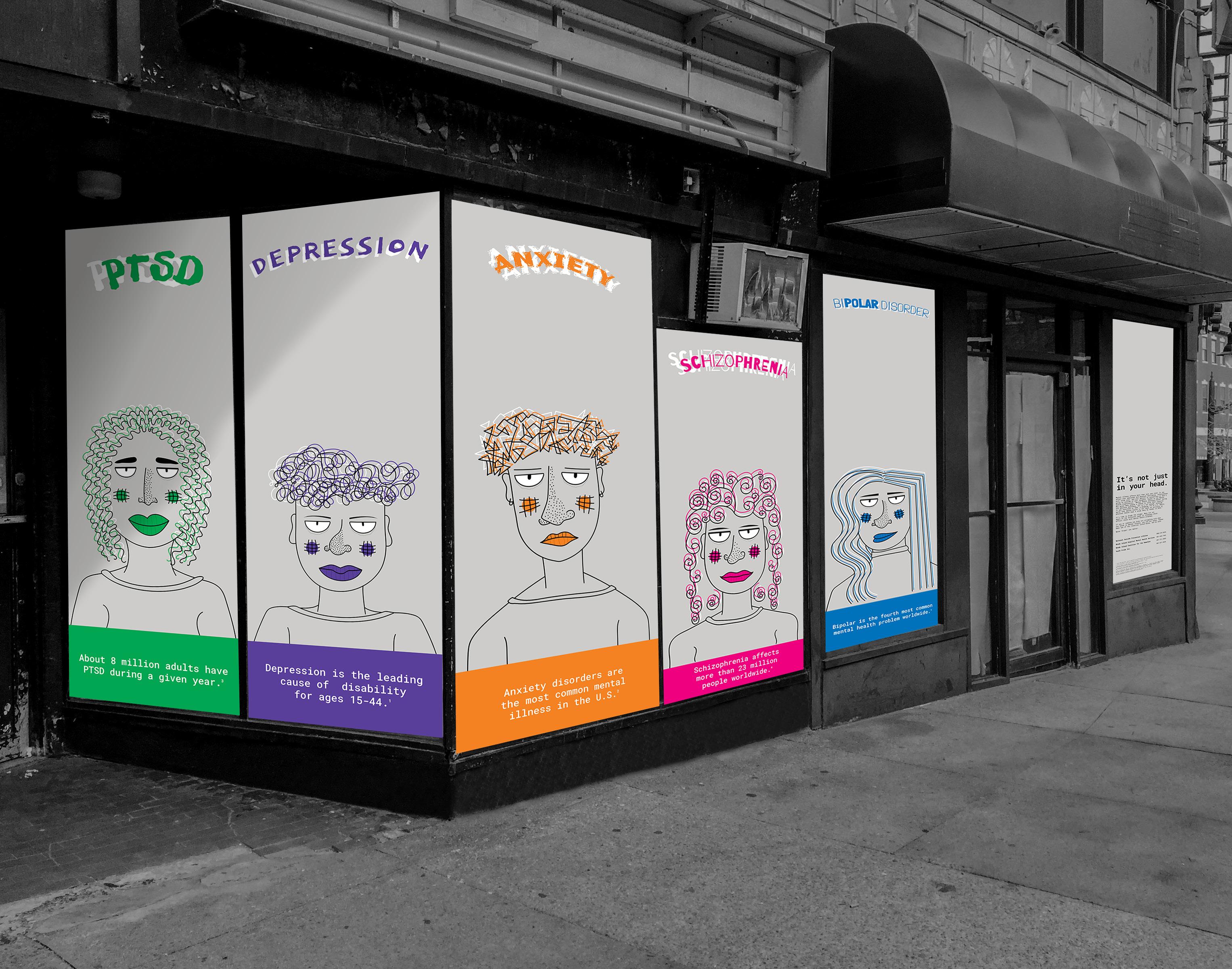
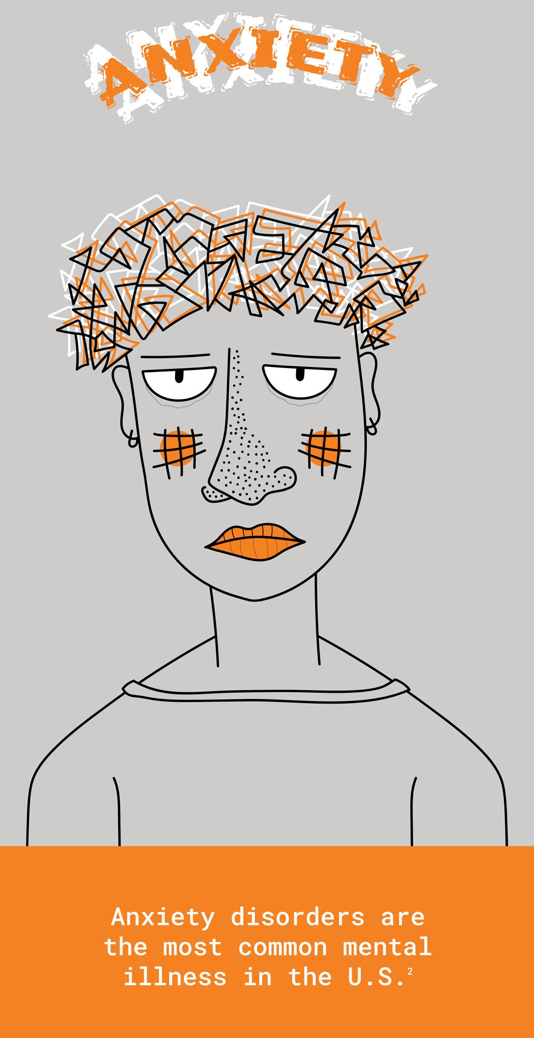
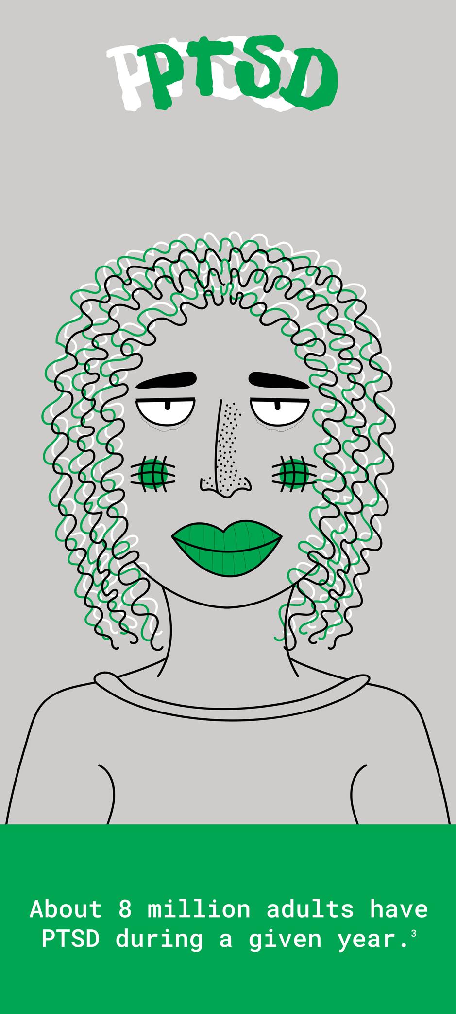
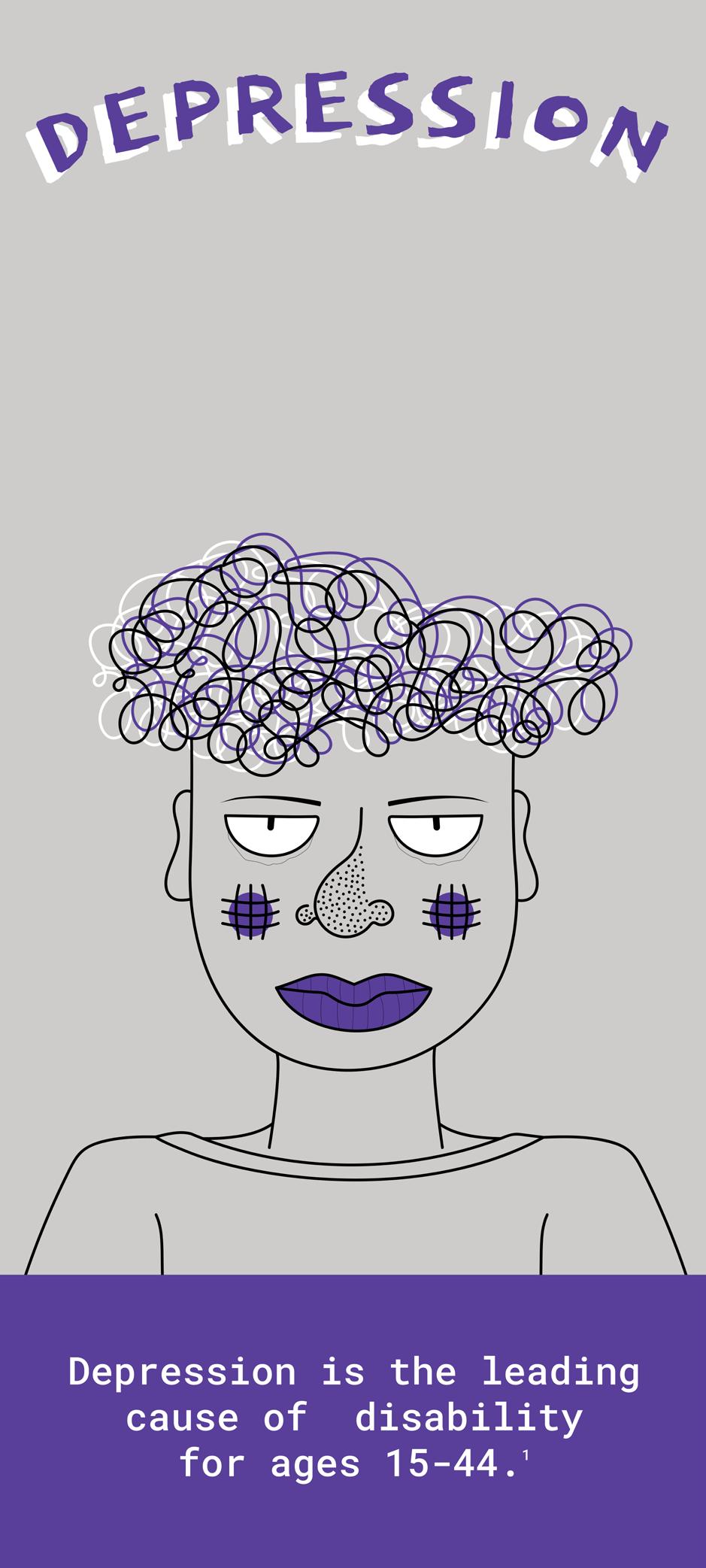
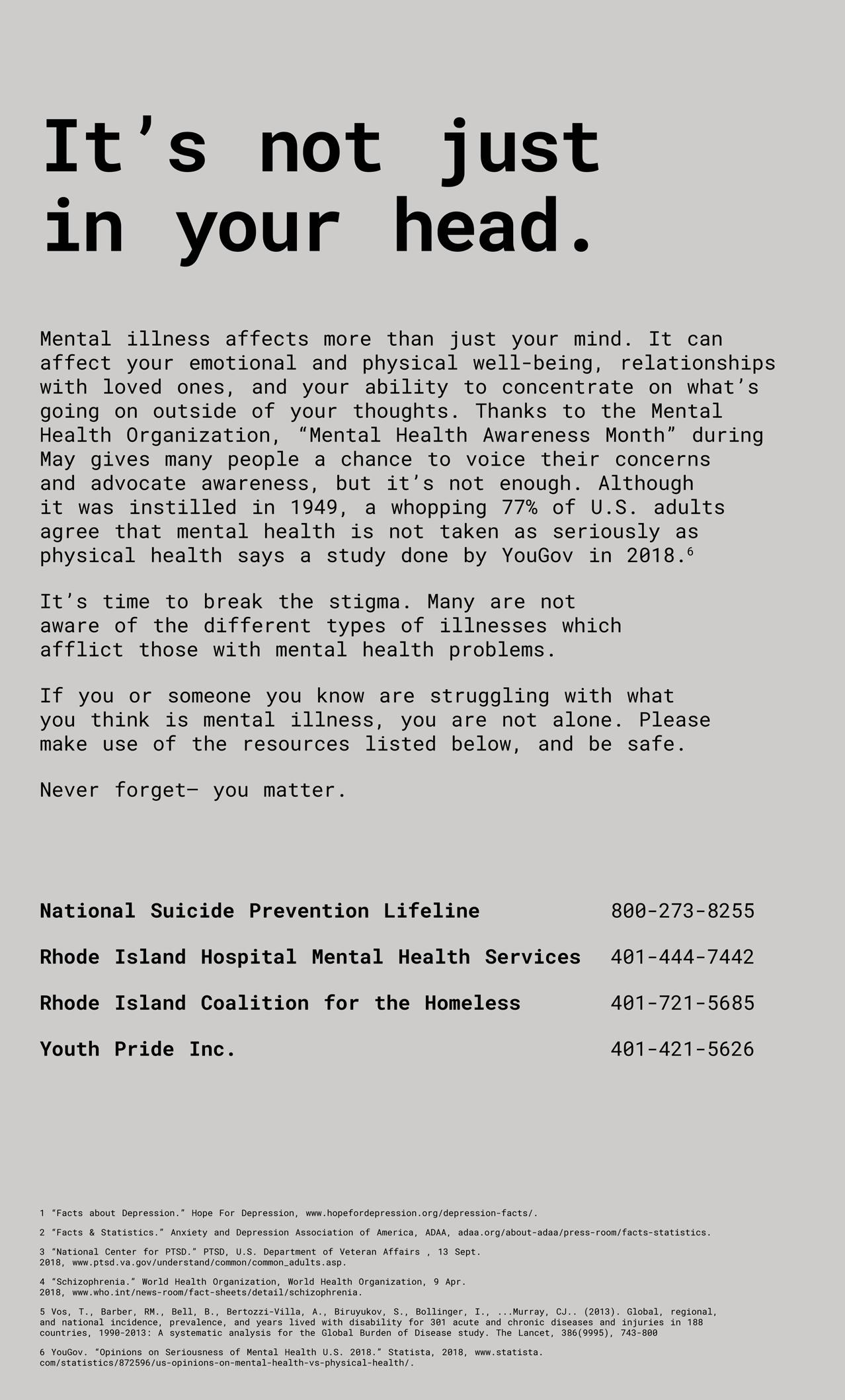
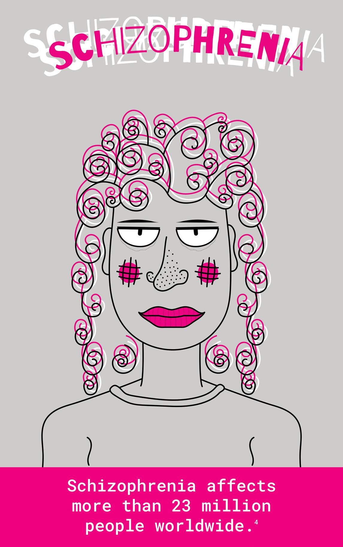
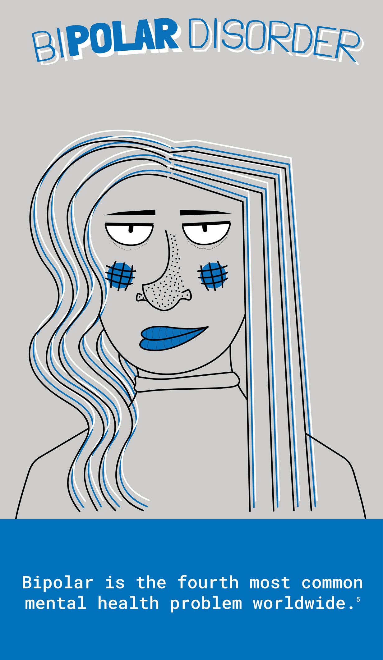
A MENTAL HEALTH WINDOW SPOTLIGHT ILLUSTRATION/RESEARCH
You’re less alone than you think. Mental health awareness is something that has been of great importance to me for as long as I can remember. That’s why when I was tasked with creating a window spotlight for a subject of my choice in a Digital Media Studio class I jumped at the chance to provide education about different mental illnesses. My goal for this project was to create a relatable experience for those suffering from mental illnesses, offering guidance and support to those affected without contributing to the negative stigma associated with the epidemic. Combining expressive illustration and research, this project provides a sobering look into the mental health crisis. The stigma around mental illness paints sufferers as violent and dangerous, unable to hold a job or be a productive member of society, although this is far from the truth. Sufferers of mental illness are just like any other, deserving of a chance at success and good health, free from the judgment of others. Proudly, this project was one of the top 6 projects of the class, voted in by other students.
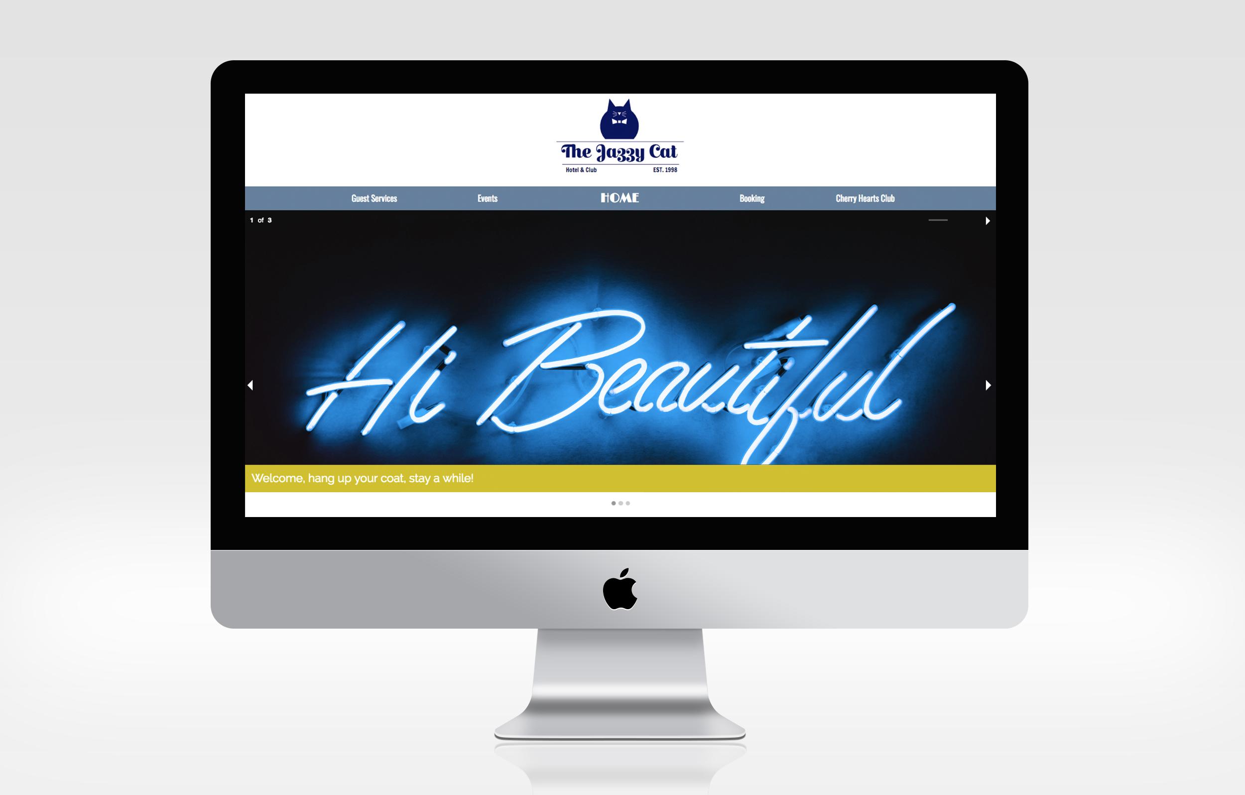
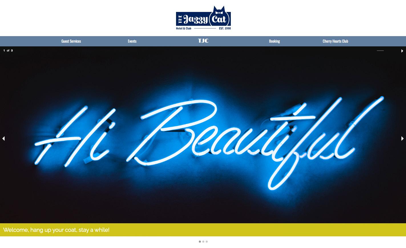
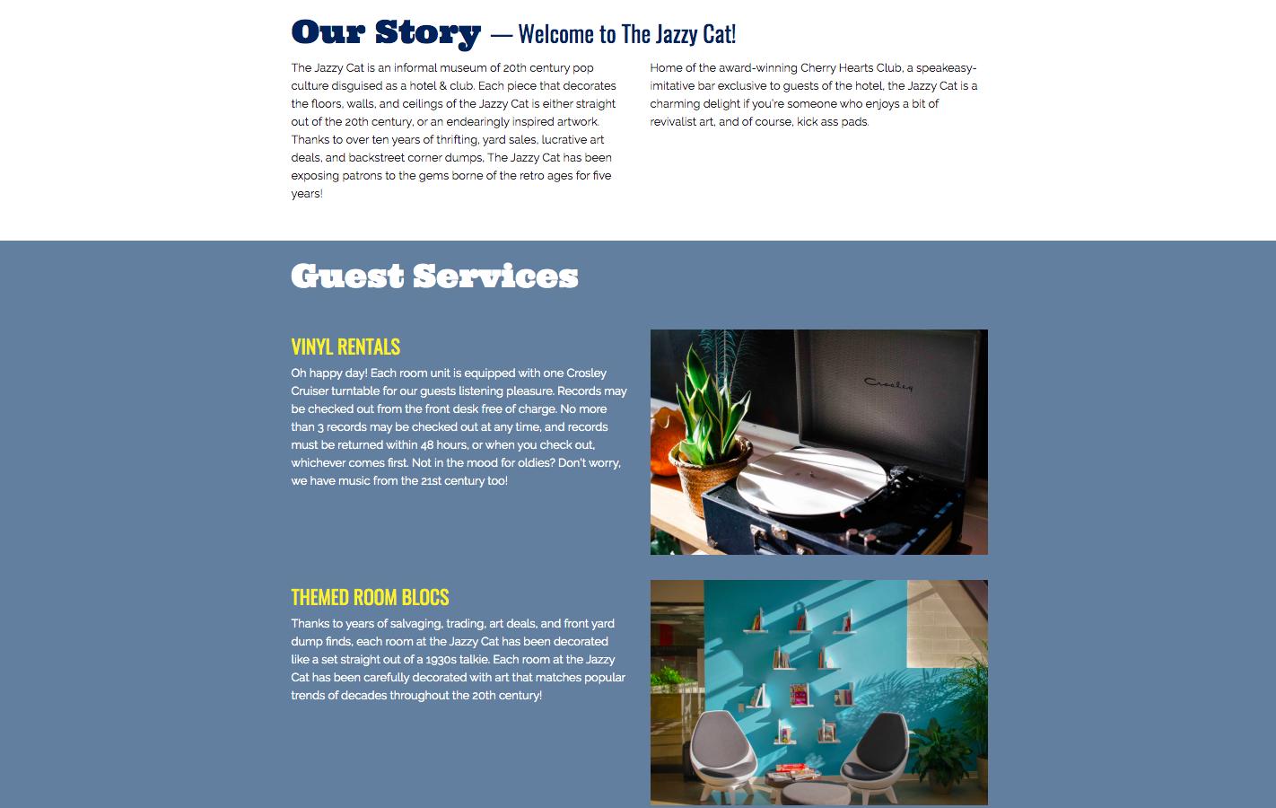
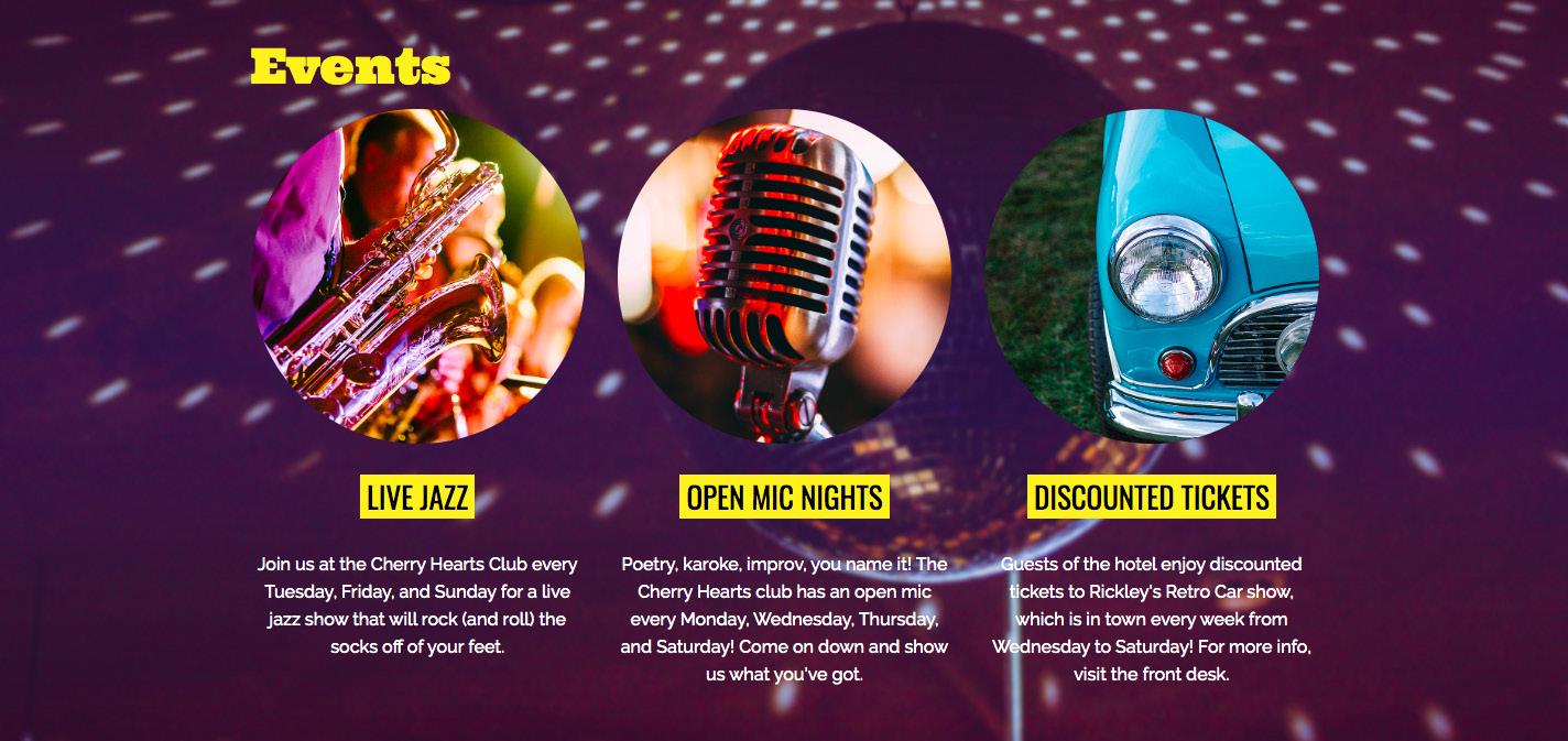
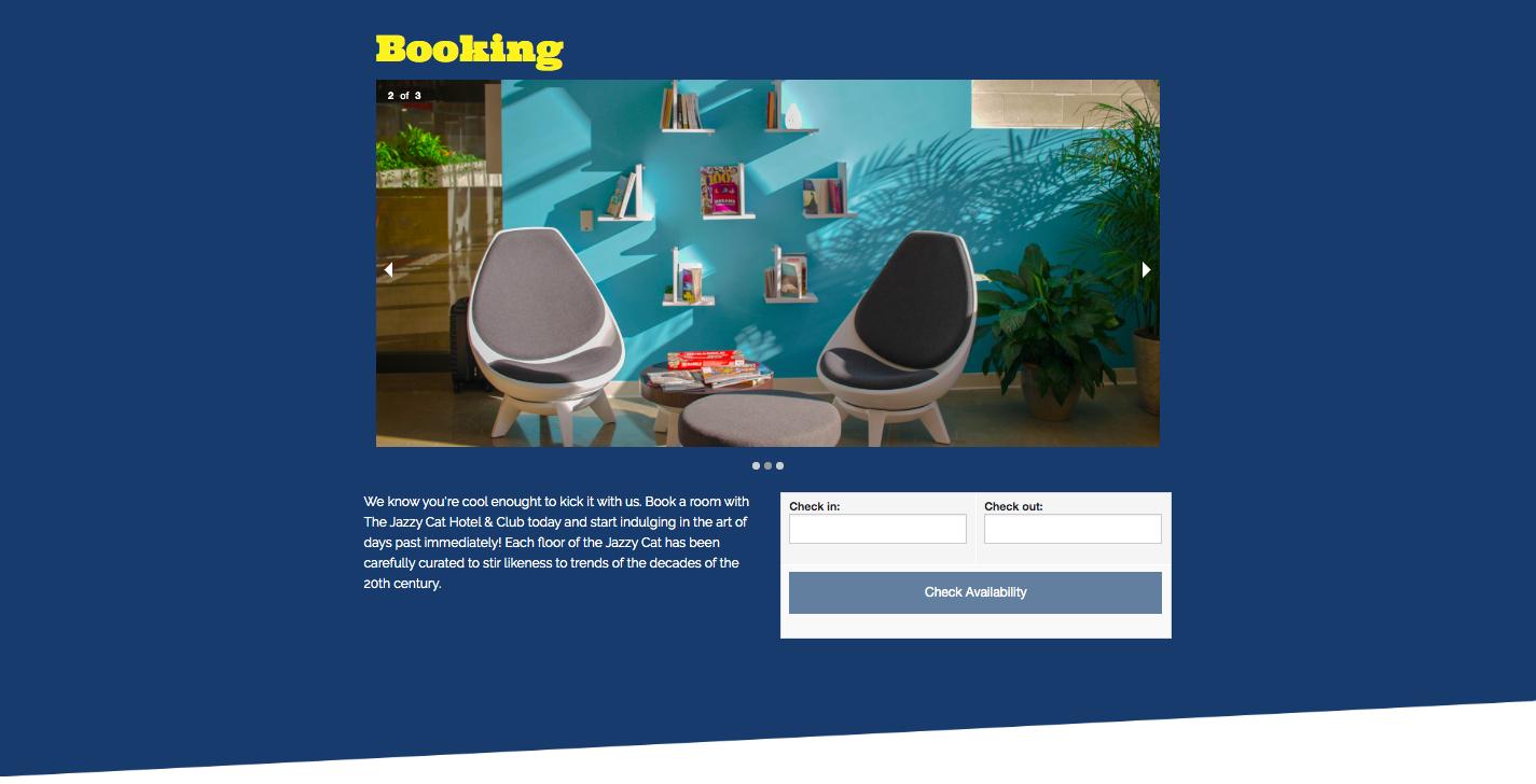
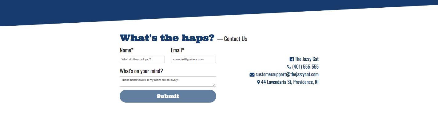
THE JAZZY CAT HOTEL AND CLUB WEB DEVELOPMENT
Can ya dig it? For this project, I was challenged with creating a one page website for a boutique hotel. I have always been a fan of 20th century pop culture, music, and art, so I decided to put my self-proclaimed “old soul” mentality to work. I created a hotel that I dubbed The Jazzy Cat Hotel & Club, home to the Cherry Heart’s Club, a speakeasy imitative bar exclusive to patrons of the hotel. This site is easily navigable, informative, and personable. Hotel services, such as vinyl rentals, themed room blocks, and happy hour promotions are featured for the patron’s enjoyment. I made sure to allow each brand element, from the brand story, down to the contact form, to shine in its own light by breaking up information into meaningful sections. To unify the project and solidify the novelty connection to its inspiration, I sprinkled popular 20th century language throughout.
COLLABORATIVE COLORING PAGES
ILLUSTRATION
Time for a PAWS! As part of a work-related project I sat down with a JWU faculty member to speak about creating coloring pages for one of the university’s most attended events, PAWS to De-stress. PAWS to De-stress aims to alleviate the stress of each hardworking student on campus, bringing to campus a space for students to pet therapy animals, participate in activities like sand-castle building, stress-ball making, and more. The focus of these pages was to inspire students to connect with those around them. During the process, I hand illustrated and then digitized numerous iconic pet items. Then, to foster collaboration, I placed each element specifically on the page so that it may be accessed from virtually any near corner. This encouraged students to circle up and put their paws together.
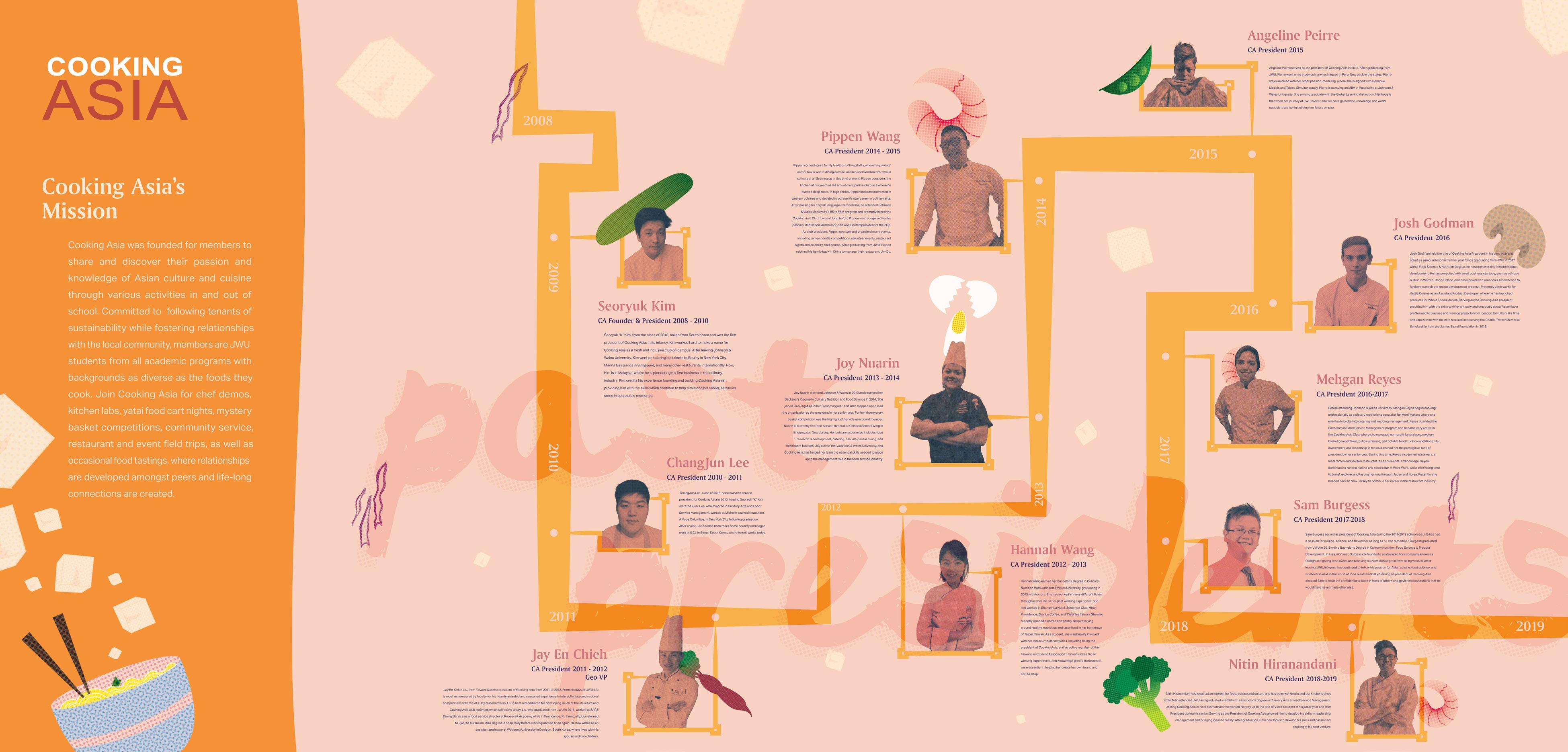
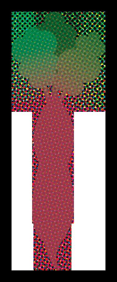
PAST PRESIDENTS
TIMELINE FEATURE ILLUSTRATION
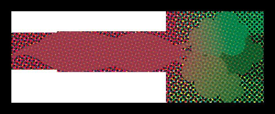
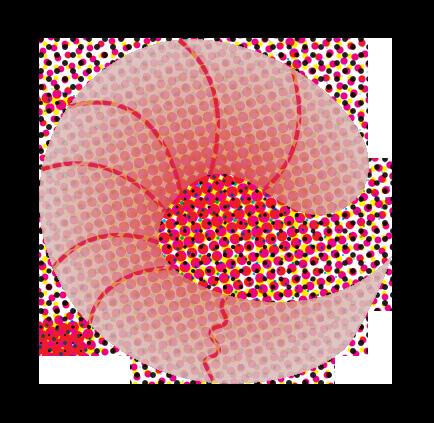
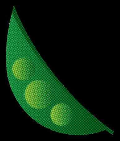
Now we’re cooking with fire! In this project for a Design Solutions class in my junior year a teammate and I were tasked with designing a window display for one of the amazing student-led organizations at our university, Cooking Asia. Cooking Asia is an organization that is filled with members who are bonded under the similar love for Asian cuisine. The group regularly hosts workshops and events that showcase Asian dishes, and even put on special food carts for the community. The organization wished to dedicate a timeline piece to their past presidents showcasing their commitment to community excellence. Over the course of this project I was responsible for creating all the illustrations used within the layout. During the process, I choose each illustration intentionally as the goal was to integrate each seamlessly into the grand scheme of the layout. To do this, I visualized how each piece of food could interact with the other elements on the page and designed accordingly. The design team was inspired by natural textures, and utilized a duotone halftone effect to provide an upbeat attitude to the composition.
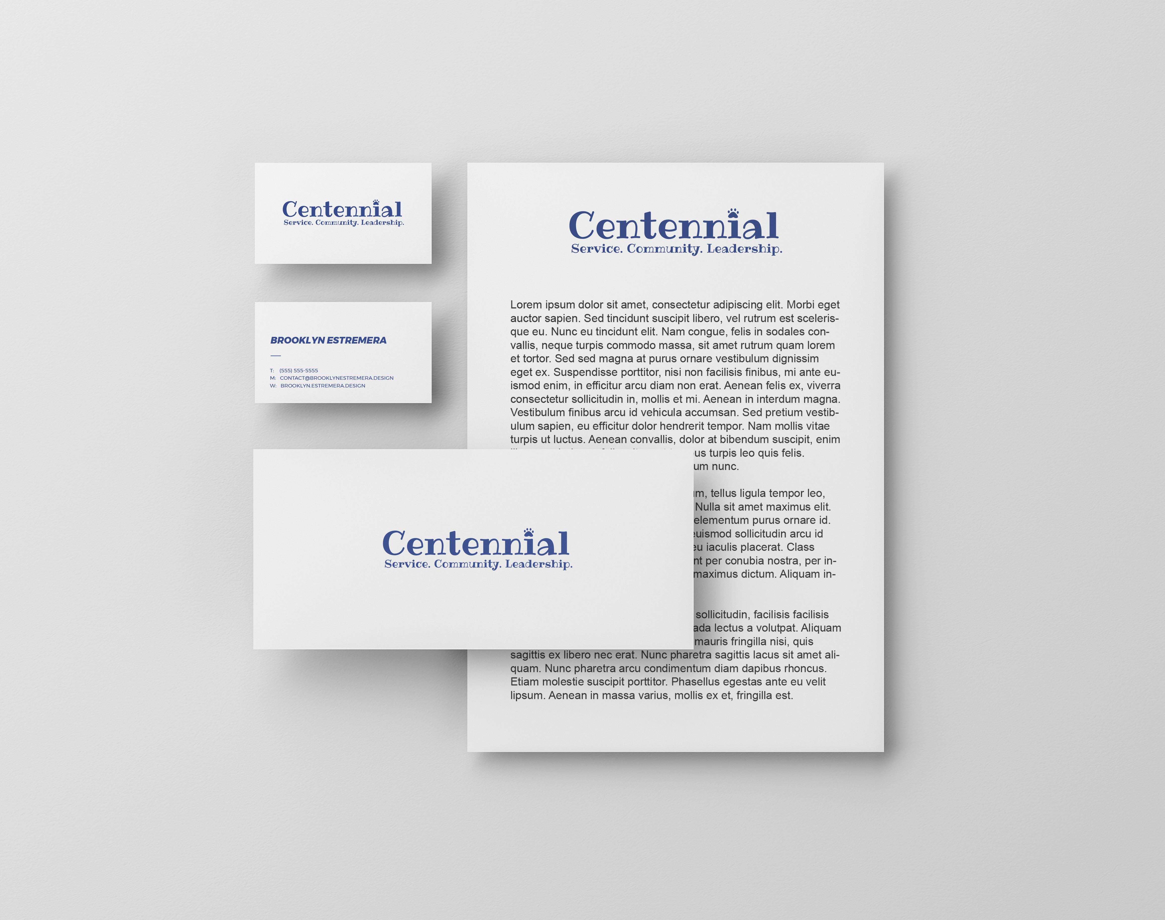
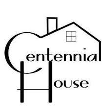
CENTENNIAL REBRAND
BRANDING
New name, same Centennial! As part of a work project I was tasked with rebranding a well-known organization on campus, Centennial, formerly known as Centennial House. The client wanted professional and personable logo that felt fun and approachable. After an intensive drafting process, Centennial rejoiced at their new identity, they said it was just what they wanted and needed! This project reinforced the principle of clear communication and was a wonderful learning experience! I was very glad to deliver a solution the organization enjoyed.
OLD LOGO
NEW
LIGHT BACKGROUNDS
DARK BACKGROUNDS
LOGO,
NEW LOGO,
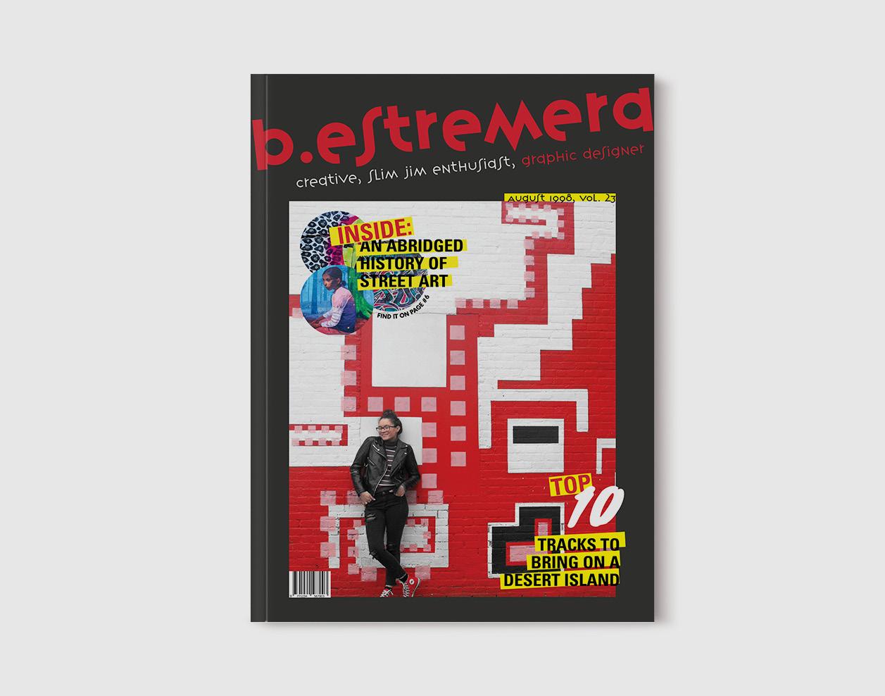
A “ME” - NIZINE
EDITORIAL
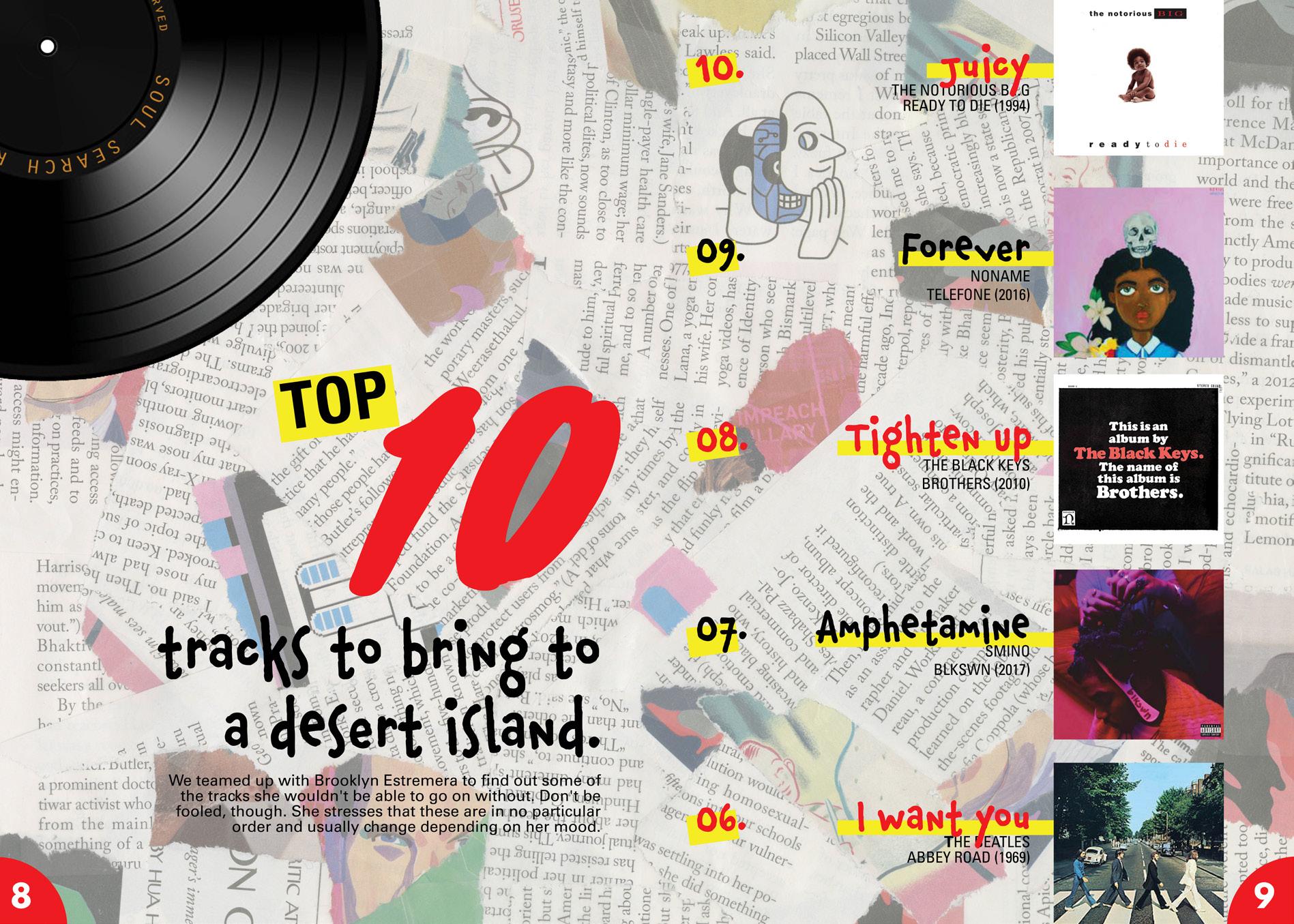
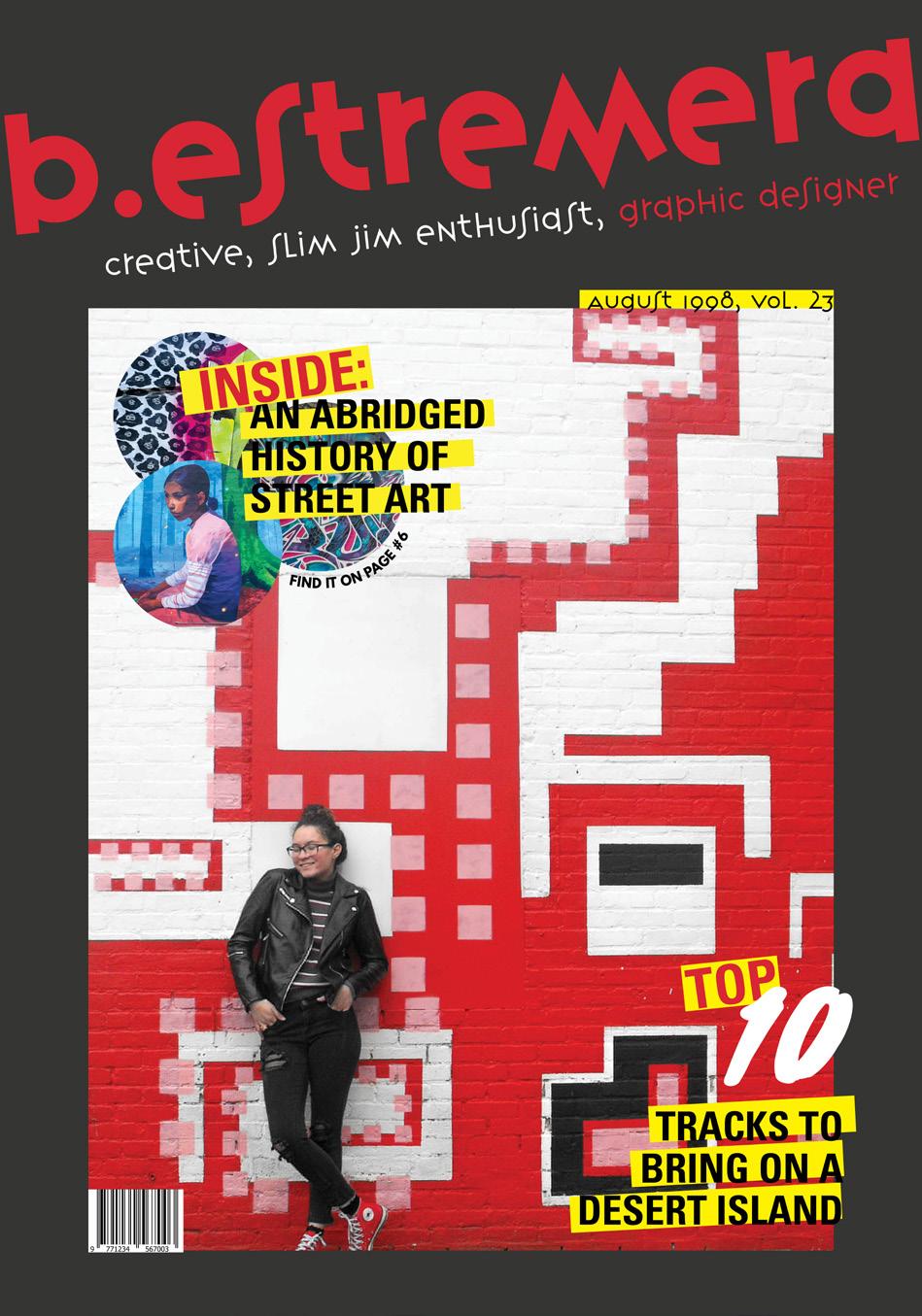
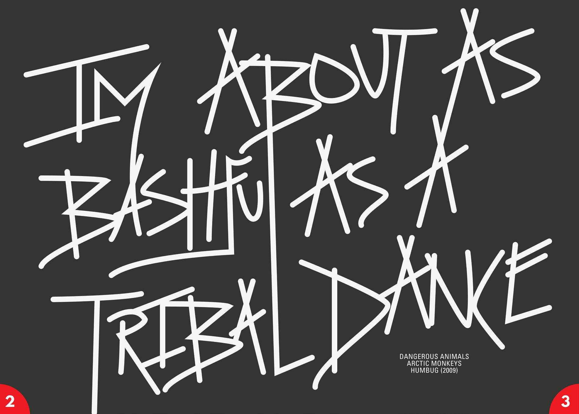
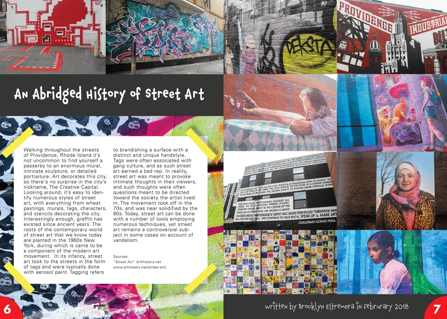
Who does she think she is? For this project I was tasked with creating a personal magazine. The publication had to include original photography, a creative piece, a researched article, an exclusive interview, two advertisements (one for JWU), and an original cover. Throughout this project, I drew inspiration from the street art the decorates my hometown, and showcased the impression its left on me in my spreads. My magazine relies heavily on a grid structure to maintain balance and harmony among the photography and copy, breaking the grid when acceptable. A color palette of red, yellow, black, and white nods towards the era of Rock n ‘Roll, another staple in my personality, and was chosen specifically to enhance the photography.
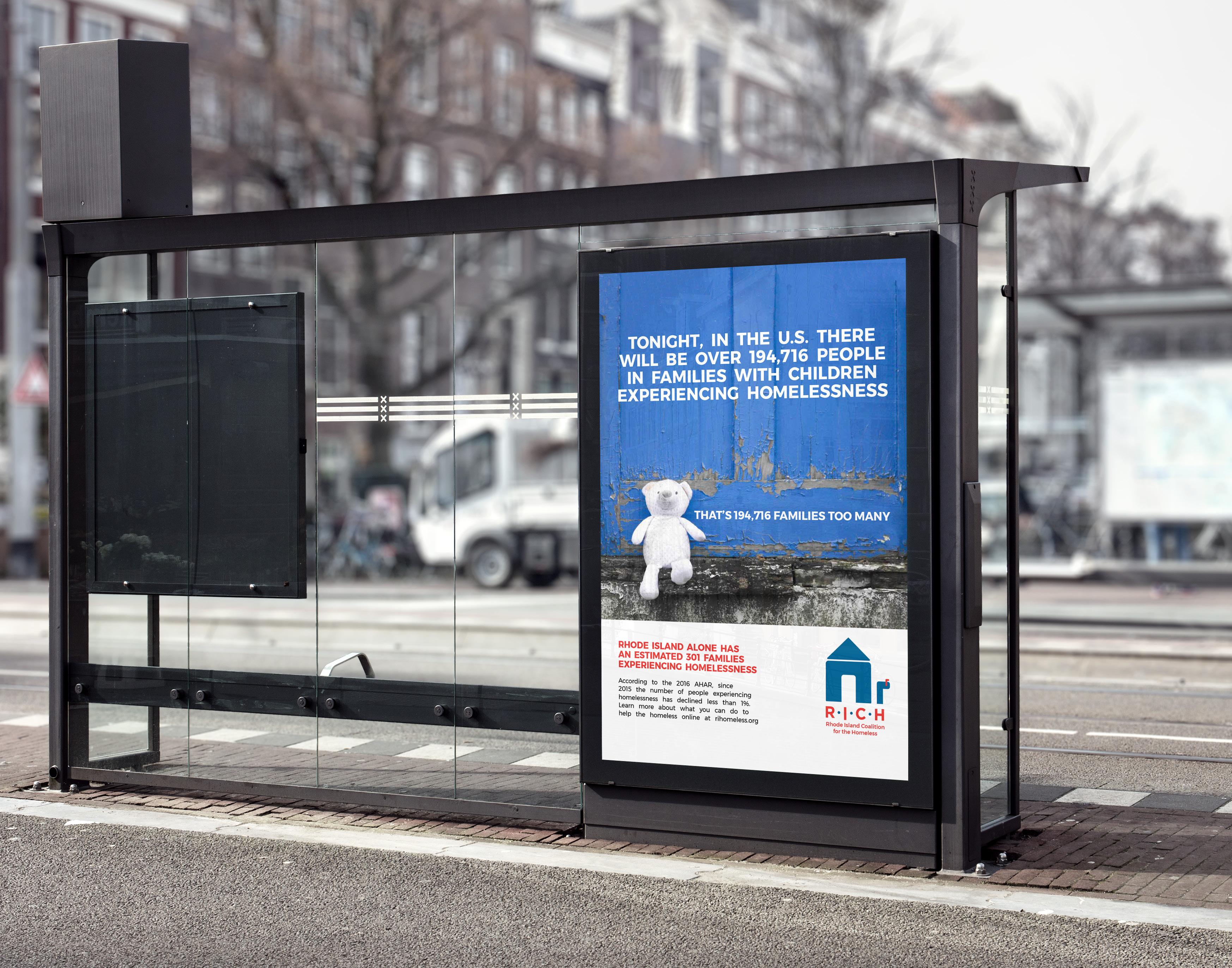
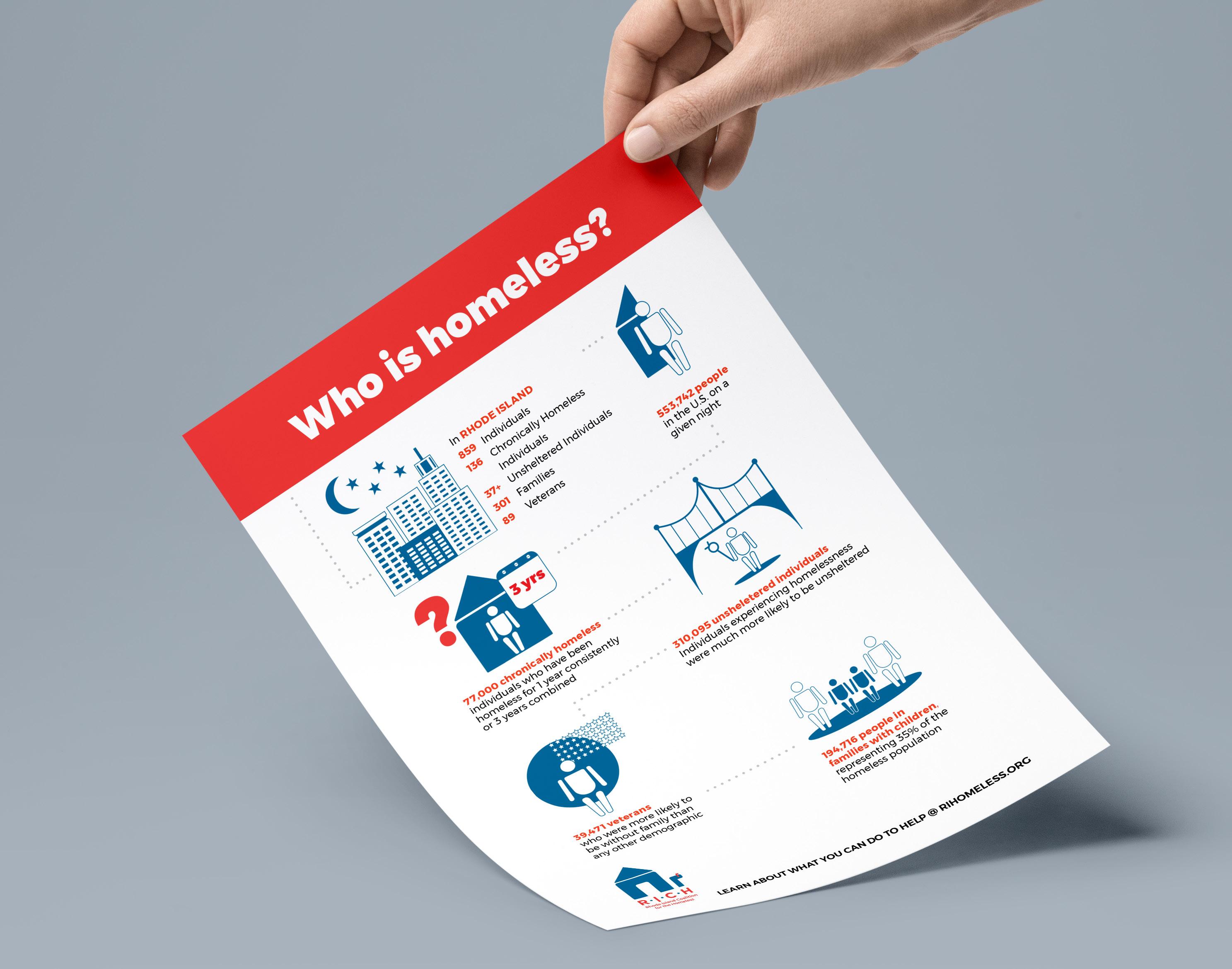
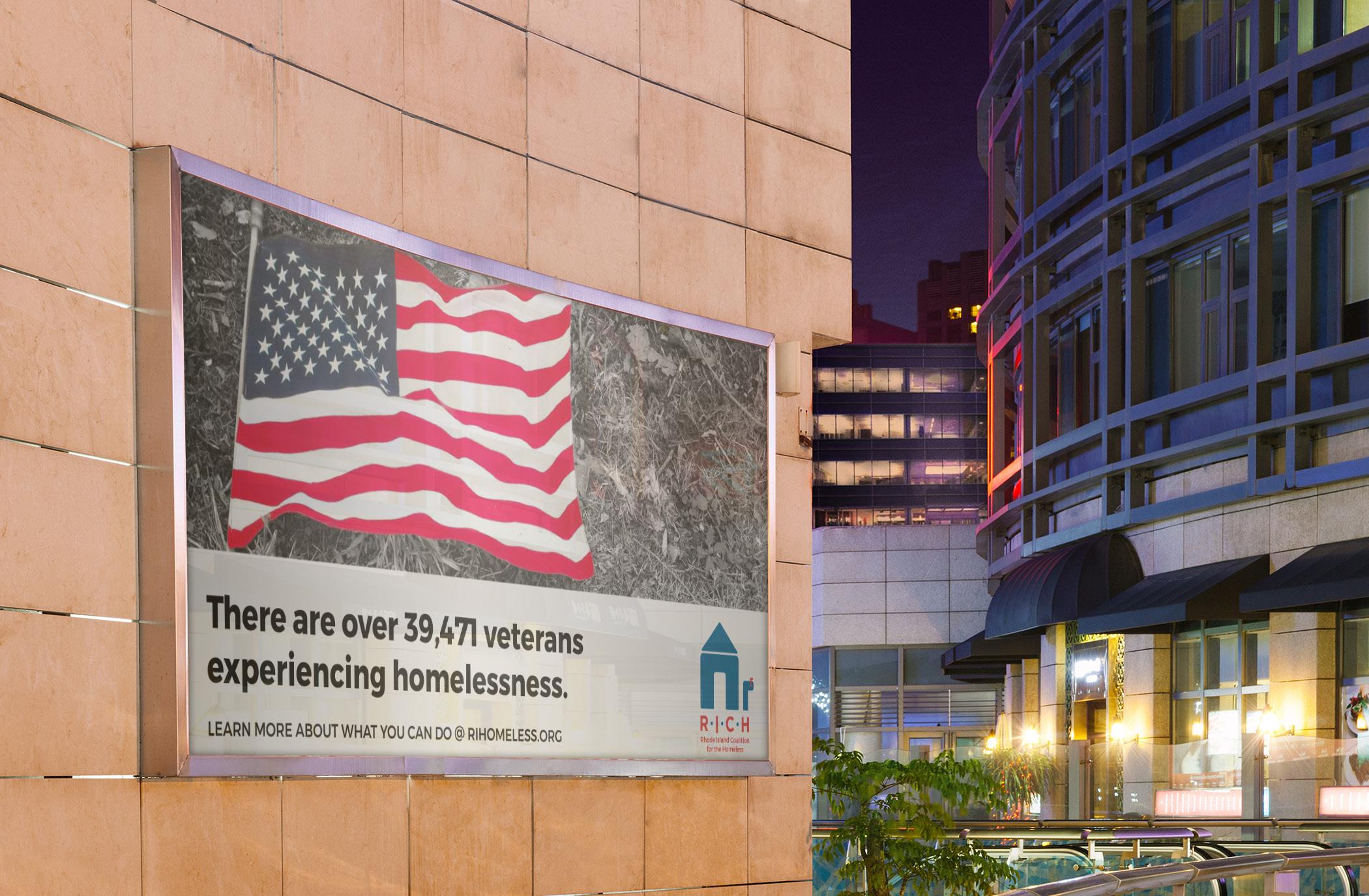
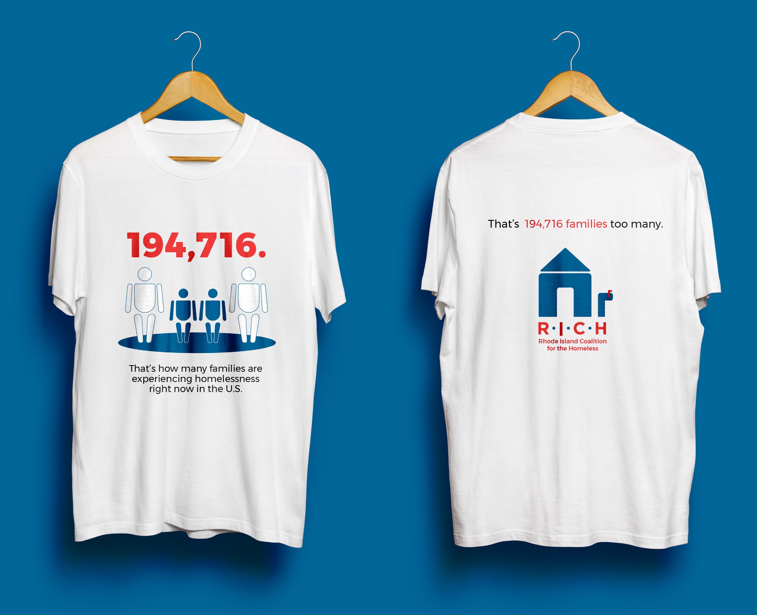
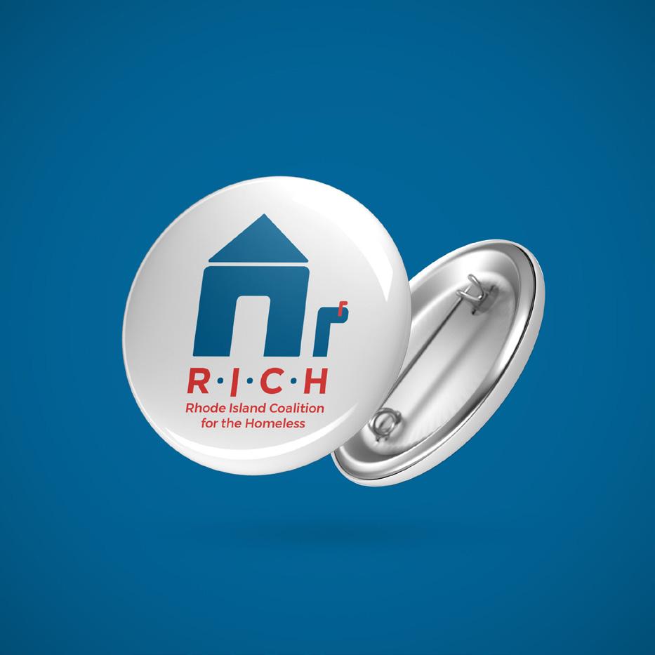
A R.I.C.H. CAMPAIGN FOR GOOD PRINT/ADVERTISING
Taking it one step at a time. For this project I was tasked with developing a campaign for a cause/organization of my choice. I decided to design a campaign for the Rhode Island Coalition for the Homeless (also known as R.I.C.H.), being homelessness is a social issue close to my heart. My campaign aimed to increase public awareness of the various homeless populations across the United States. To maximize reach, the collateral created consists of billboard and bus stop kiosk ads, an 8.5 x 5.5 infographic to be handed out to passerbys, buttons, and t-shirts. I rebranded the non-profit’s logo to include a mailbox, a nod towards the permanent address that homeless individuals lack, a disadvantage which proves to be a major road block when applying for employment. Throughout my campaign, calls of action send traffic towards the non-profit’s website, urging individuals to learn more about what they can do.