VISUAL IDENTITY GUIDELINES


TO THOSE WHO DARE TO CHALLENGE THE STATUS QUO


TO THOSE WHO DARE TO CHALLENGE THE STATUS QUO
The world of luxury real estate is fractured and in need of disruption. Bespoke Real Estate is changing that.
®

Known in ultra-luxury as a platform of innovation, Bespoke delivers unrivaled competitive advantages and a redefined experience in client service. To work with Bespoke is to unlock exclusive access to our integrated Ecosystem of verticals, exclusive offerings, and data, as well as entry into a network that boasts the world’s most esteemed UHNW audiences.
BESPOKE WAS BORN TO REJECT CONFORMITY AND BREAK THE RULES
We recognized the need for a centralized platform where intelligent data, powerful technology, excellent service, and great people work synergistically to serve UHNW clients. Bespoke was born out of a desire to take an antiquated industry and make it better, and we continue to work endlessly to strengthen our capabilities every day.

®
Bespoke’s uncompromising focus on data-driven innovation propels us towards a future where UHNWIs are empowered to make the most informed decisions and achieve more powerful results than ever before in real estate.
To elevate the future of luxury real estate. OUR BRAND The symbol of luxury, exclusivity—and impeccable delivery.
®

®

NOTE: TM SHOULD ALWAYS BE INCLUDED IN THE LOGO

1/2 OF





Leave plenty of space around the wordmark. The minimum clear space equals at least 1/2 of the cap height of the Bespoke “B ”. Ensure clear space goes around “TM”. MINIMUM SIZE
The minimum sizes, noted above, are measured by the total height of the wordmark.
PRIMARY LOGO: PREFERRED COLOR ON BLACK OR DARK BACKGROUND
PRIMARY LOGO: PREFERRED COLOR ON BLACK OR DARK BACKGROUND
The Primary Logo preferred color is gold. We have discontinued usage of our gradient logo.
PRIMARY LOGO: ALTERNATE COLOR ON BLACK OR DARK BACKGROUND
We only use the white logo for digital applications over a video in small sizes when the gold logo is not visible.
PRIMARY LOGO: ALTERNATE COLOR ON BLACK OR DARK BACKGROUND
PRIMARY LOGO: PREFERRED COLOR ON BLACK OR DARK BACKGROUND
PRIMARY LOGO: PREFERRED COLOR ON BLACK OR DARK BACKGROUND
The Primary Logo preferred color is gold. We have discontinued usage of our gradient logo.
PRIMARY LOGO: ALTERNATE COLOR ON WHITE OR LIGHT BACKGROUND
We only use the black logo for digital applications over a video in small sizes when the gold logo is not visible.
PRIMARY LOGO: ALTERNATE COLOR ON WHITE OR LIGHT BACKGROUND
VERSION
Do not use old versions without TM.
ORIENTATION
Do not use rotate.
PROPORTION
Do not use stretch, squeeze, or skew the logo.
GRADIENT
Do not use old version with gradient, or any other gradient.
EMBELLISHMENT
Do not add any elements to the logo (no shadows, outlines, or borders.
LOREMVID UT EXPLIA CON CON PLAUT EXCEARION PERUMQUI AD EIUM RE VENT FUGIATES MODIPSUSCI DIGNIS NUME NIMI, QUAM
CONTEXT
Do not use the logo in place of the words Bespoke Real Estate.
Preferred positioning is upper left adjacent to copy, or bottom right.

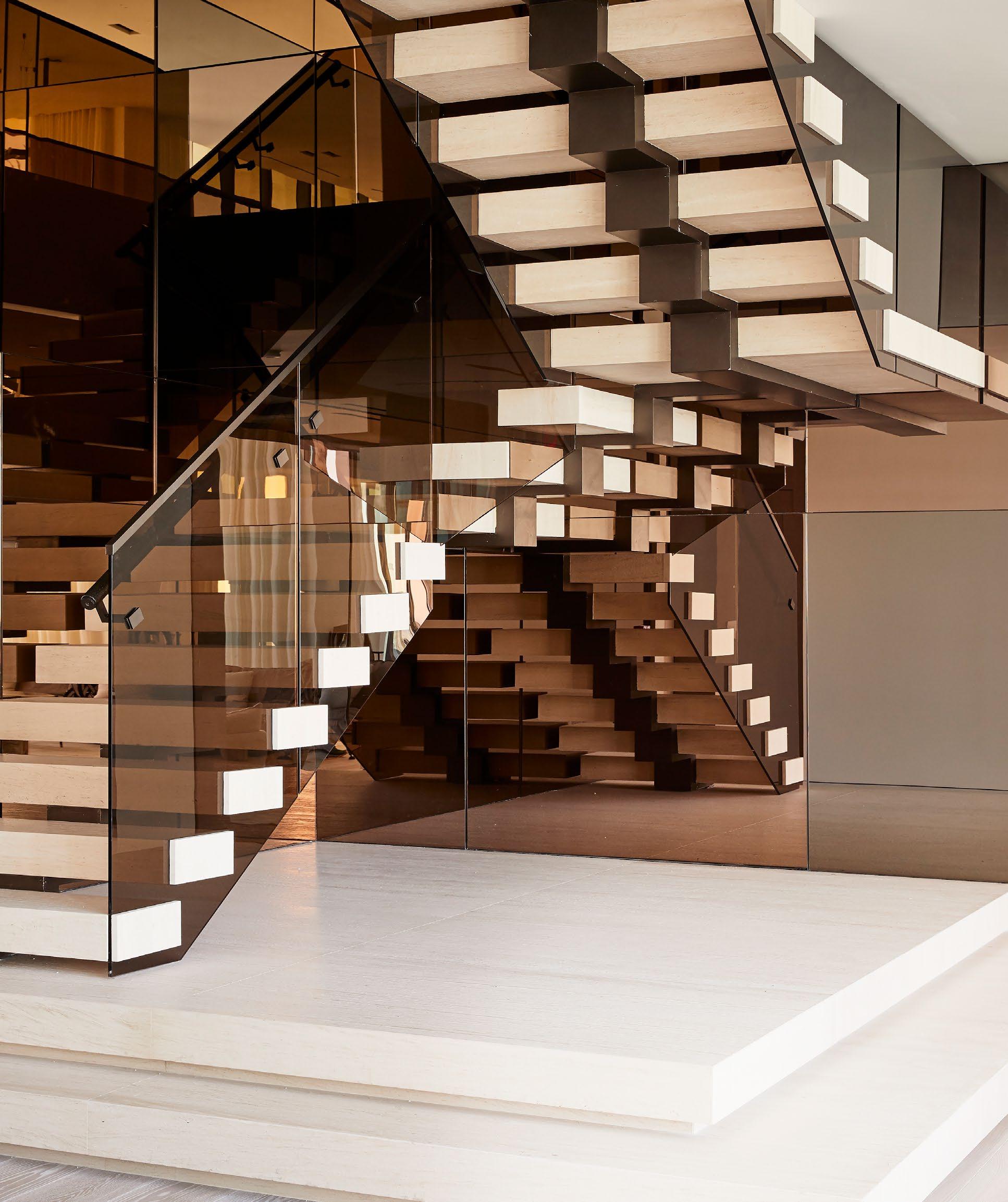


Do not place the logo over backgrounds that are busy and have high contrast.


Do not place the B Icon over backgrounds that are busy and have high contrast.
NOTE: REGISTERED MARK® SHOULD ALWAYS BE INCLUDED IN THE B ICON
Leave plenty of space around the wordmark. The minimum clear space equals at least 50% of the cap height of the Bespoke “B ”. Ensure clear space goes around “®”.
The minimum sizes, noted above, are measured by the total height of the wordmark.
PRINT: .55 INCHES HIGH
DIGITAL: 36 PIXELS HIGH
B ICON: PREFERRED COLOR ON BLACK OR DARK BACKGROUND
B ICON: PREFERRED COLOR ON BLACK OR DARK BACKGROUND
The B Icon preferred color is gold. We do not use gradients.
B ICON: PREFERRED COLOR ON BLACK OR DARK BACKGROUND
B ICON: PREFERRED COLOR ON WHITE OR LIGHT BACKGROUND
The B Icon preferred color is gold. We do not use gradients.
LOGO POSITIONING
Preferred positioning is bottom right, or centered below copy.
CENTERED
®

®
•
Bespoke
•
•
•
•
•
The Following is a guide for Number Styling. Please follow exactly how we have depicted to ensure consistency throughout all material.
$10M+ is preferred over $10 million+.
DIDOT REGULAR
When using Didot Regular, the number (including the dollar sign) must be set in Didot Italics. The plus-sign must be lined up to the cap height of the letters,
DIDOT ITALIC
When using Didot Italic, the plus-sign must be lined up to the cap height of the letters.
PROXIMA NOVA
When using Proxima Nova, the plus-sign must be lined up to the cap height of the letters.
THE HAMPTONS $10M + MARKET REPORT
FOR ALL TYPEFACES
When million is written out with a plus-sign in sentence case, we use the default alignment for the plus-sign.
The Hamptons $10 million+ market was extremely impressive in Q3 2021.
The Following is a guide for Stat Styling. Please follow exactly how we have depicted to ensure consistency throughout all material.
STAT ONLY DIDOT ITALIC We always use Didot Italic to style big stats.
STAT ONLY WITH TEXT DIDOT ITALIC & PROXIMA NOVA SEMIBOLD
INCREASE IN $10M + SALES QUANTITY
®
SOPHISTICATED
The best compliment we can get. A simple elegance. Chicness and savvy born from intelligence, experience, and depth. Not gaudy, showy, driven by ego or showmanship.
SIGNIFICANT
Having a presence so powerful that the absence would be felt. It’s about completely meaningful inclusions that require no explanation.
TRANSPARENT
This is about being clear, concise, unmistakable and open. Operating with integrity, setting and managing expectations based on fact and honesty.
INSIGHTFUL
To be aware, thoughtful, original and relevant. A maintained perspective that is informed, reliable, and based on a deep understanding.
Completely contingent on significance - focusing only on meaningful bits. Minimalism that demonstrates taste. Polished and streamlined. Smart customization that comes from truth and knowing, designed specially for a particular person or project.
CONCISE
Time is one of our client’s most valuable assets. Clean, concise communication shows our appreciation for that.
DISRUPTIVE
While we are humble, we don’t shy away from talking about the issues so often found in real estate, nor are we shy to say what we are doing to change the industry for the better.
Like all innovators, we look to what is possible today and what a better future can be. We indicate in our voice that while we have already brought about change, we work endlessly to further our advancements every day for an even better future.
®
DESIGN ELEMENTS
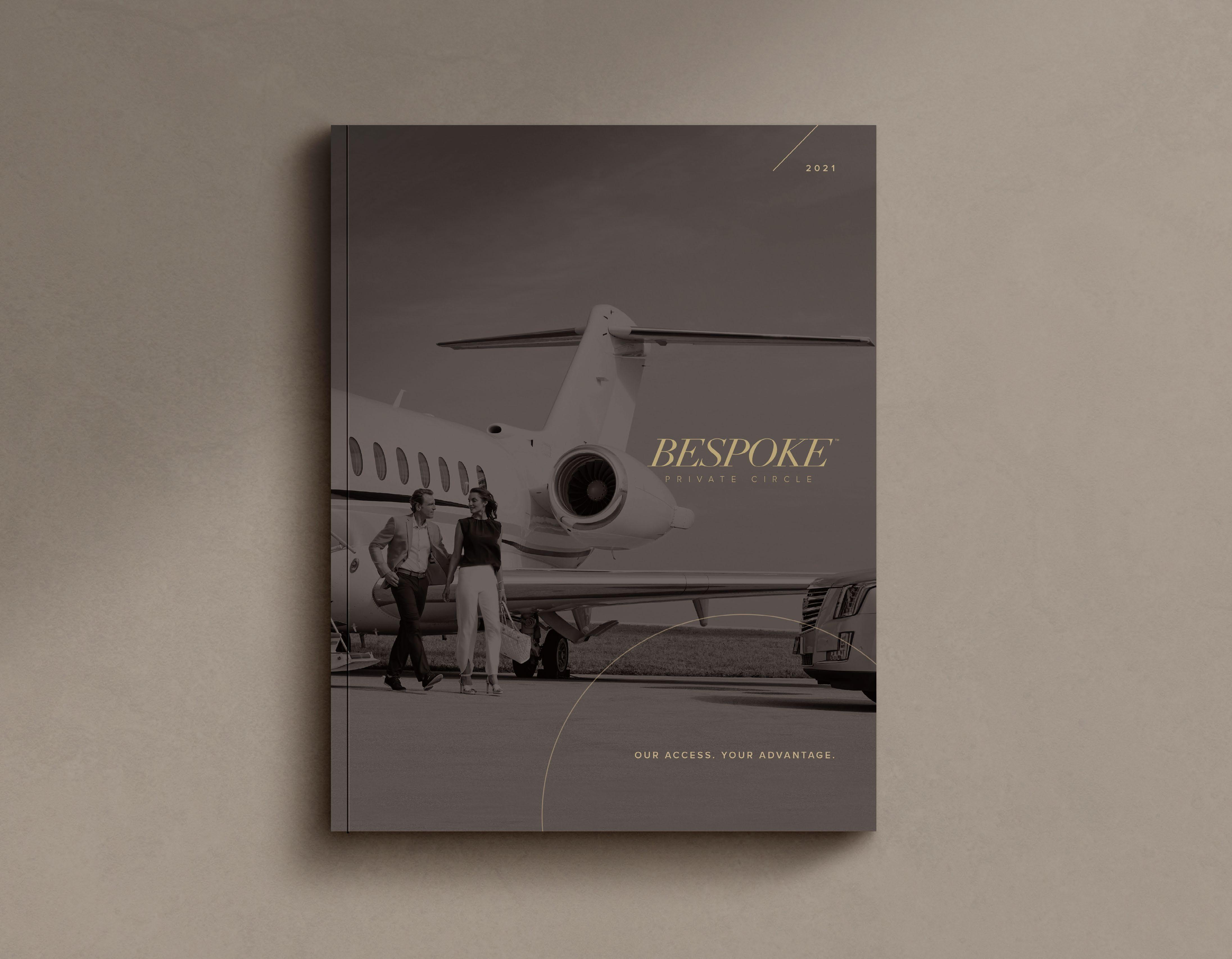
BESPOKE PRIVATE CIRCLE LOGO
The logo is to be used only on Bespoke Private Circle communications. The same clear space and minimum space guidelines apply from our Primary Logo.


DESIGN ELEMENTS
We use the circle as a design element on brochure covers, branding pages and website landing pages.
PHOTOGRAPHY
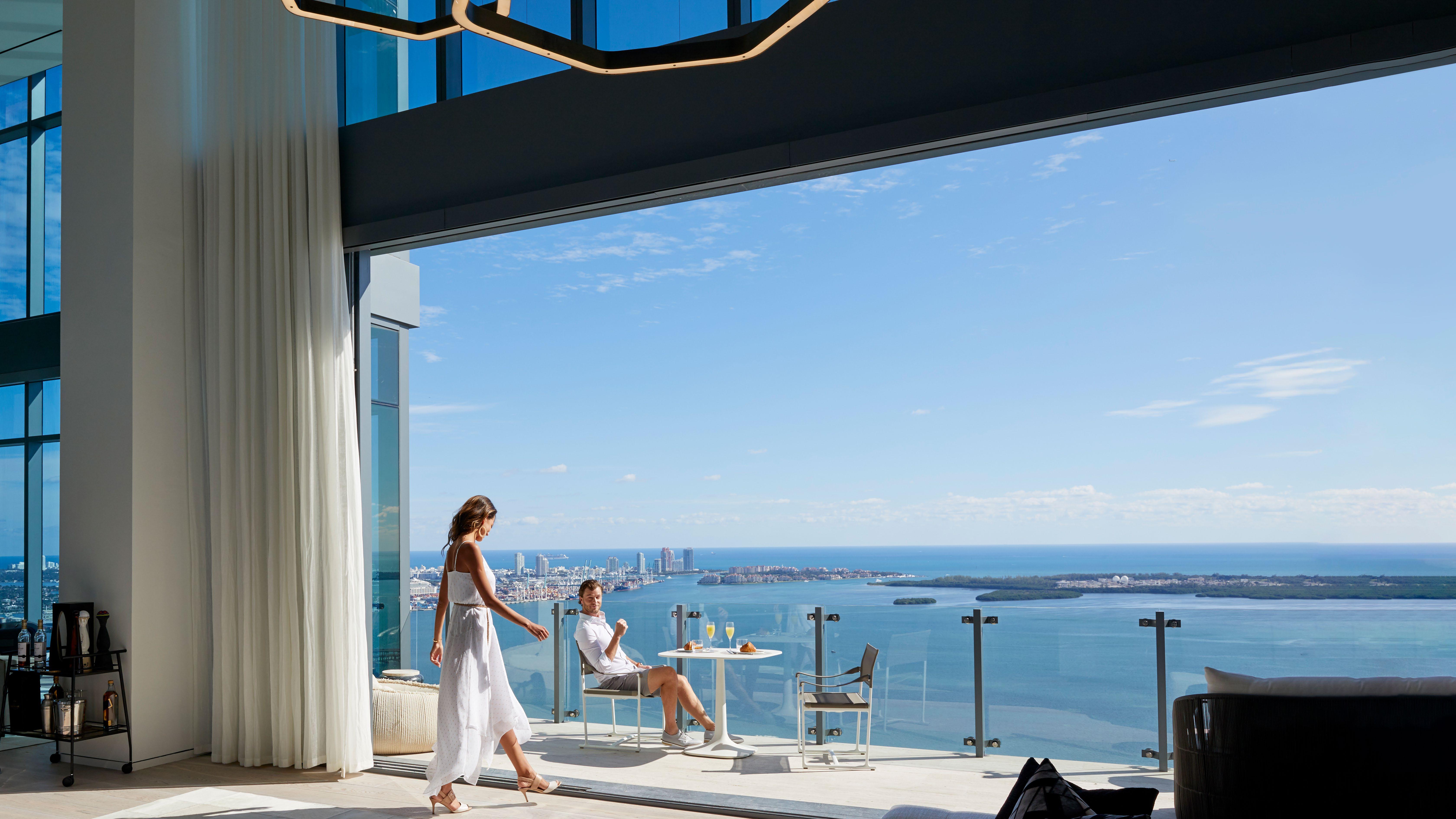
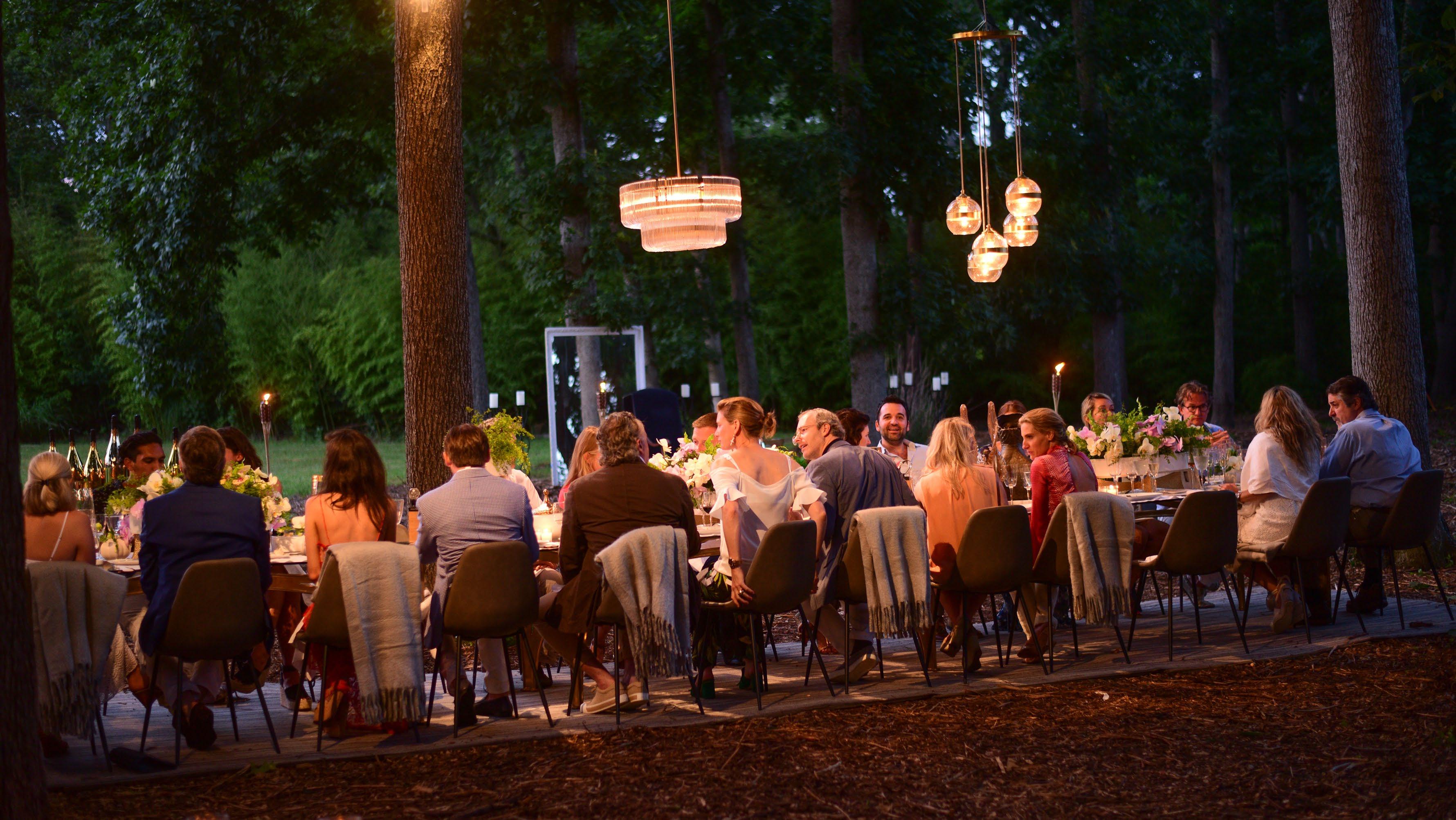
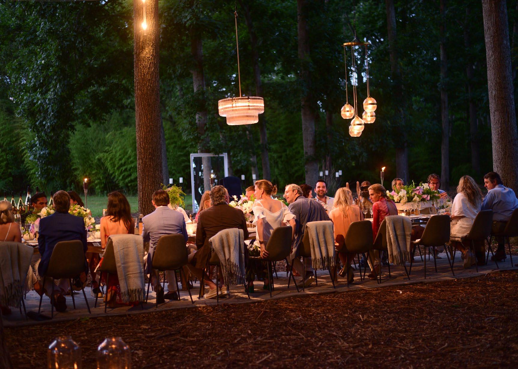
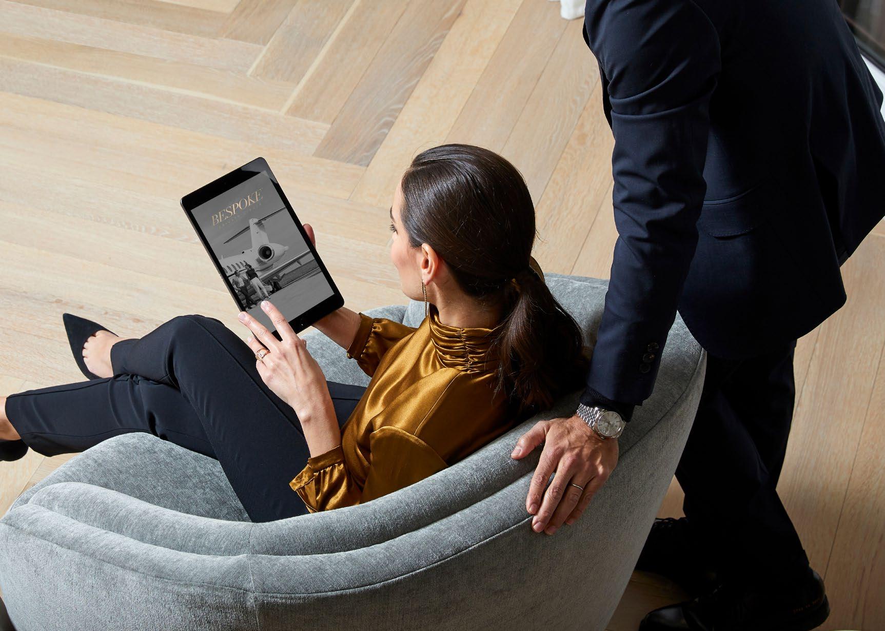
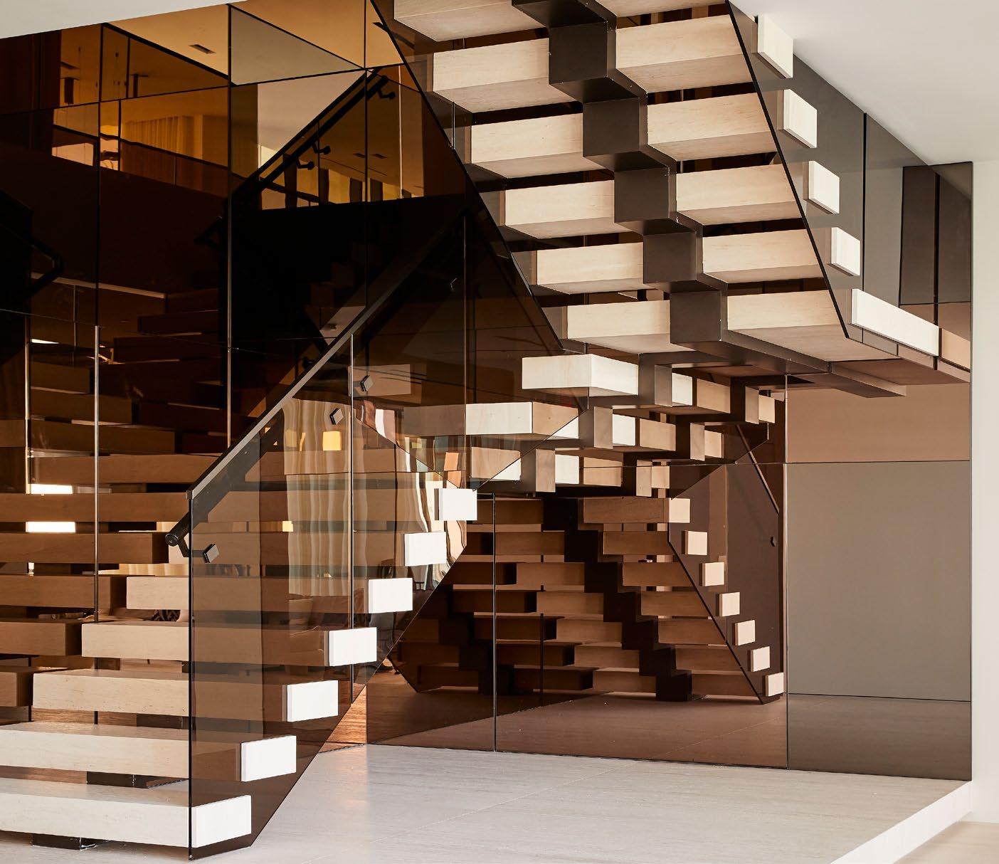
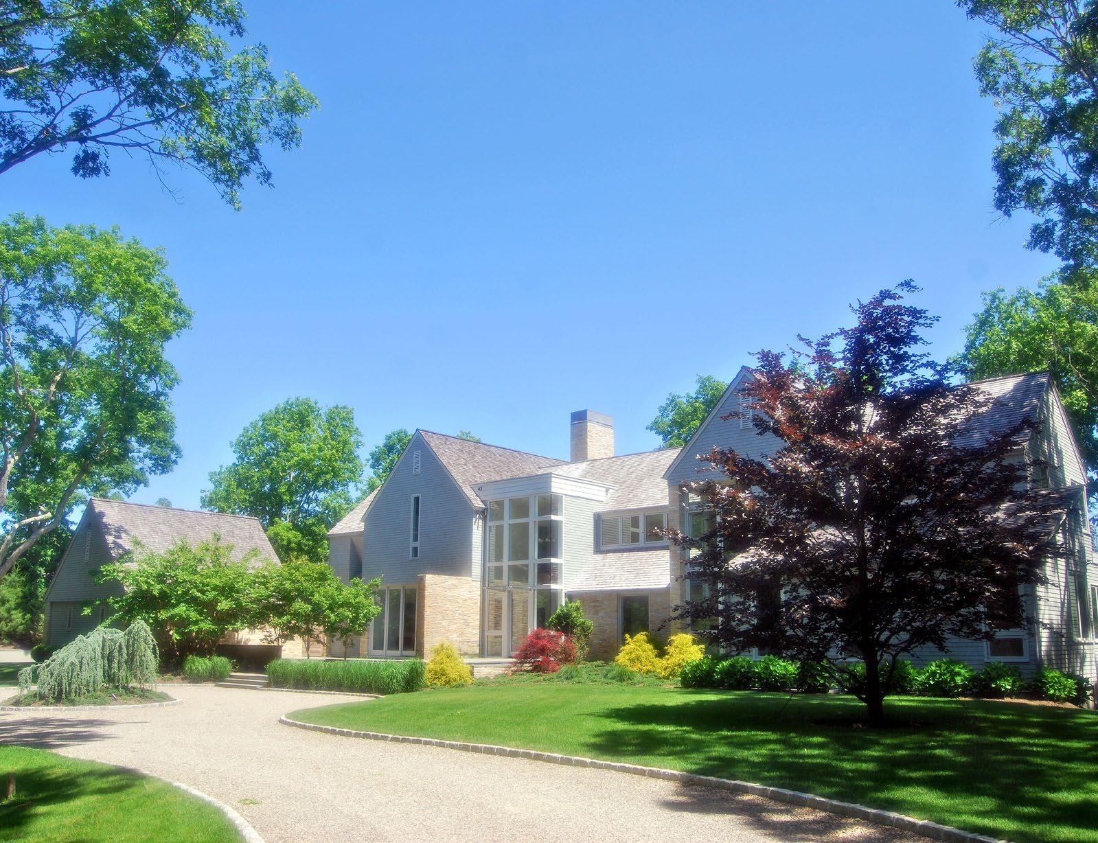
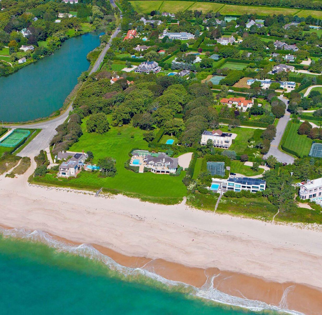
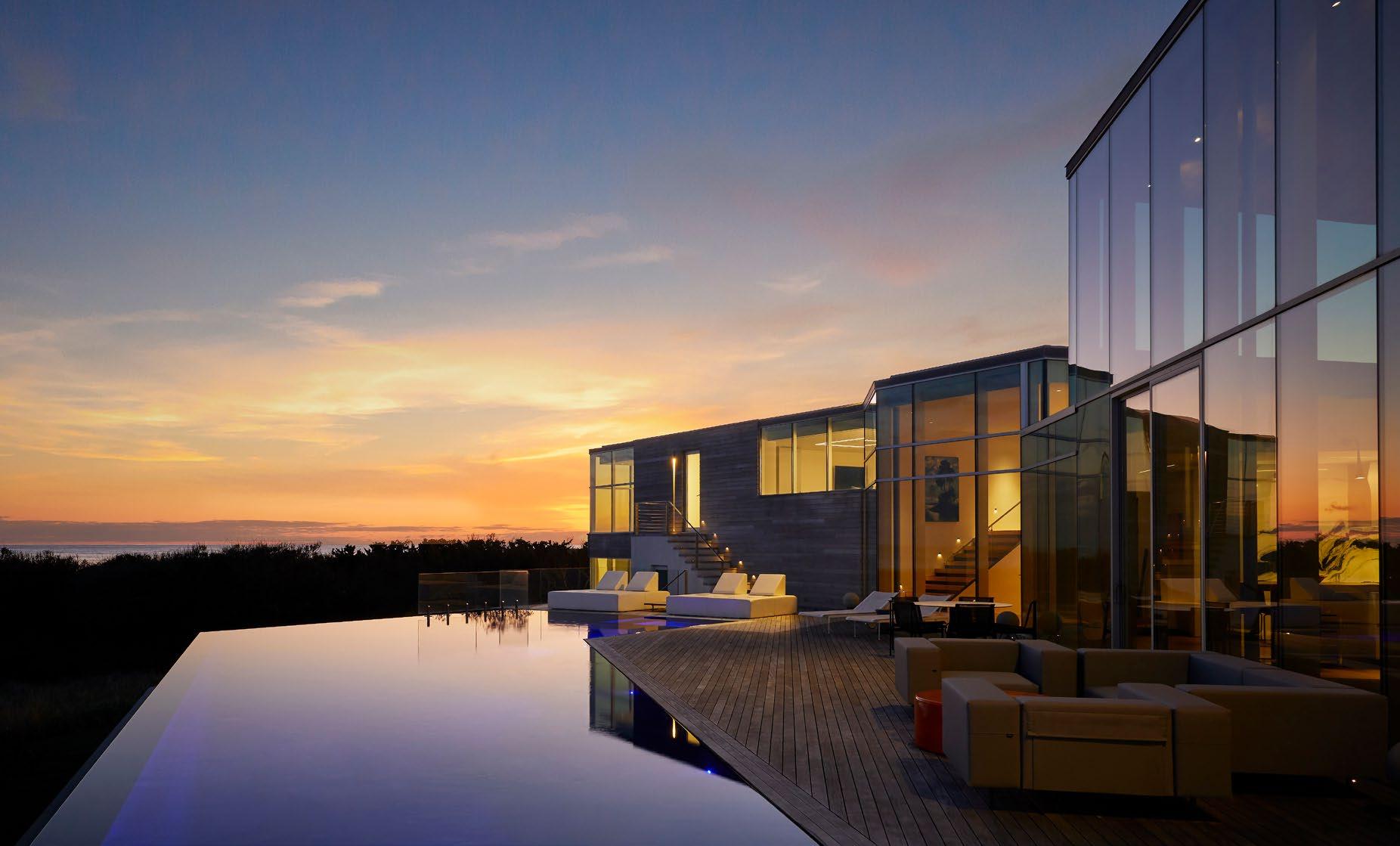
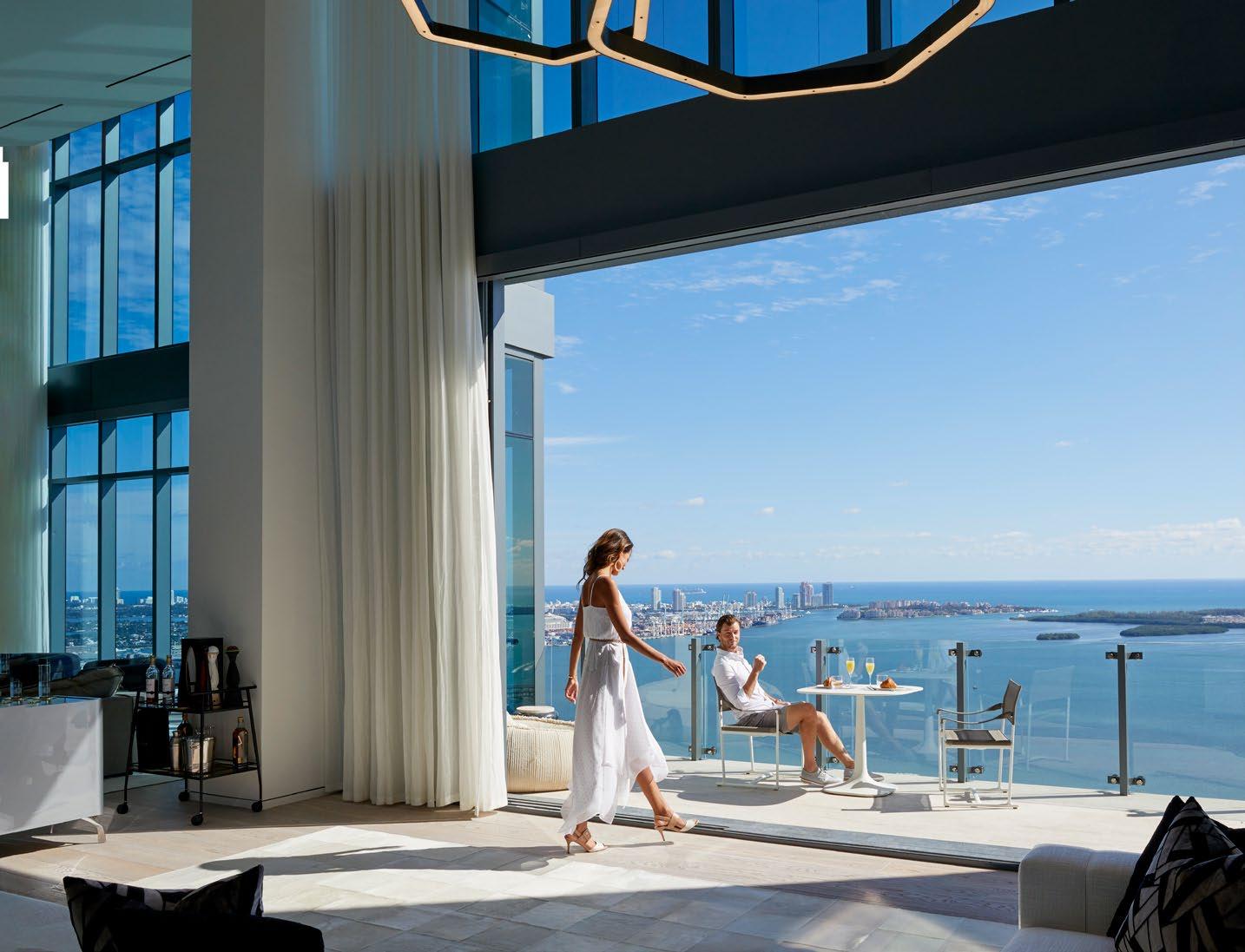
We always use photography that focuses on people to bring to life the human element.
®


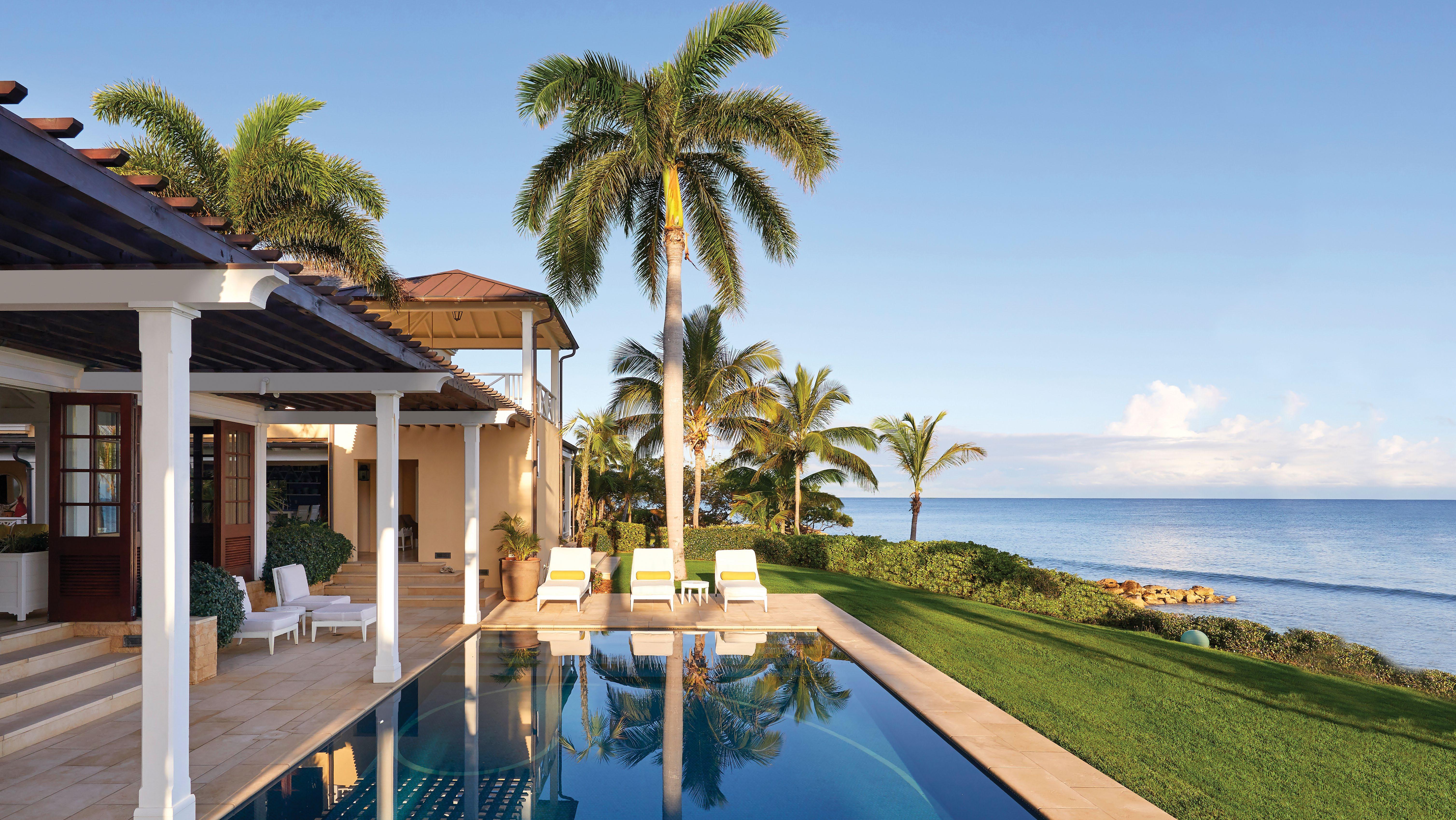
GOOD PHOTOGRAPHY
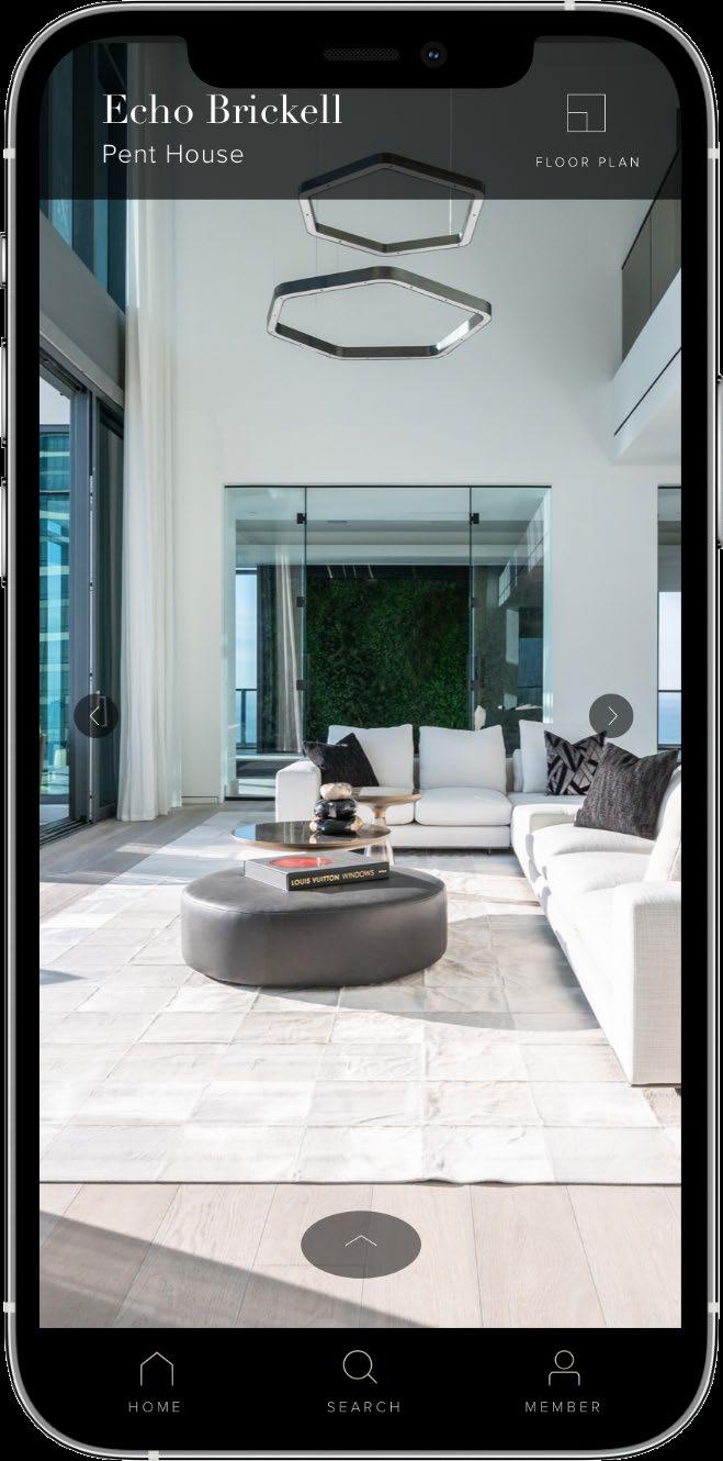
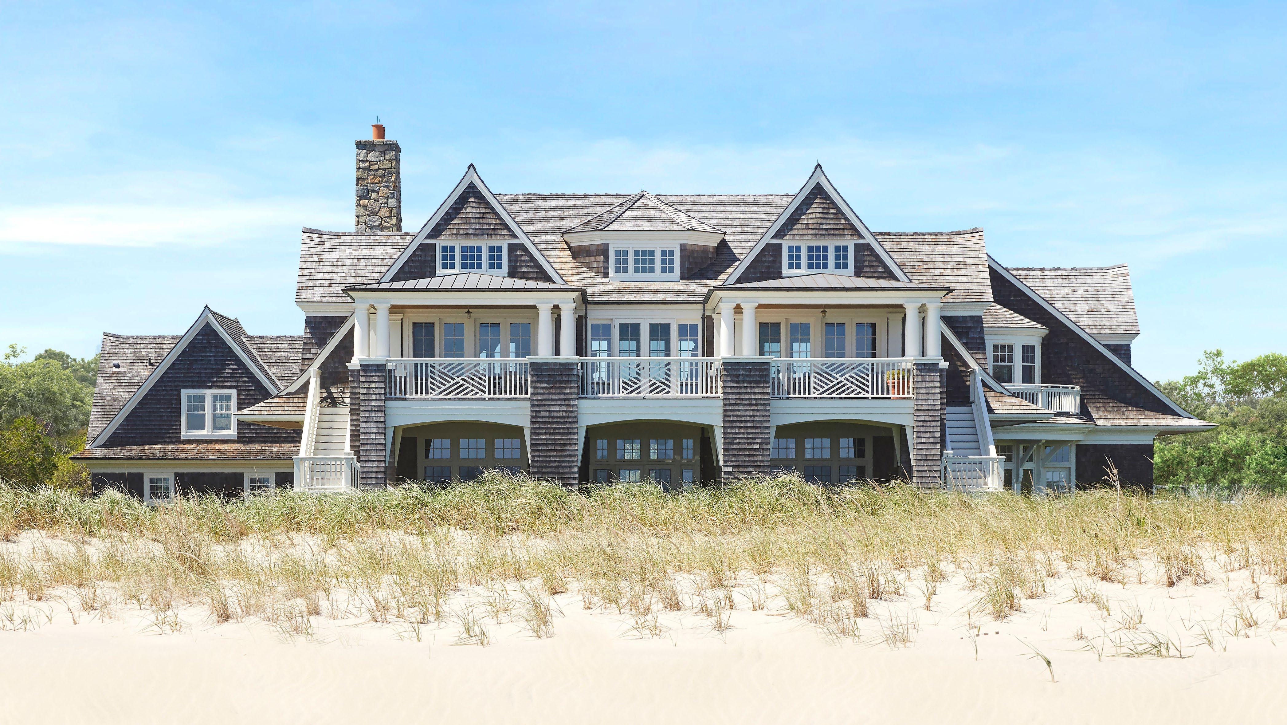
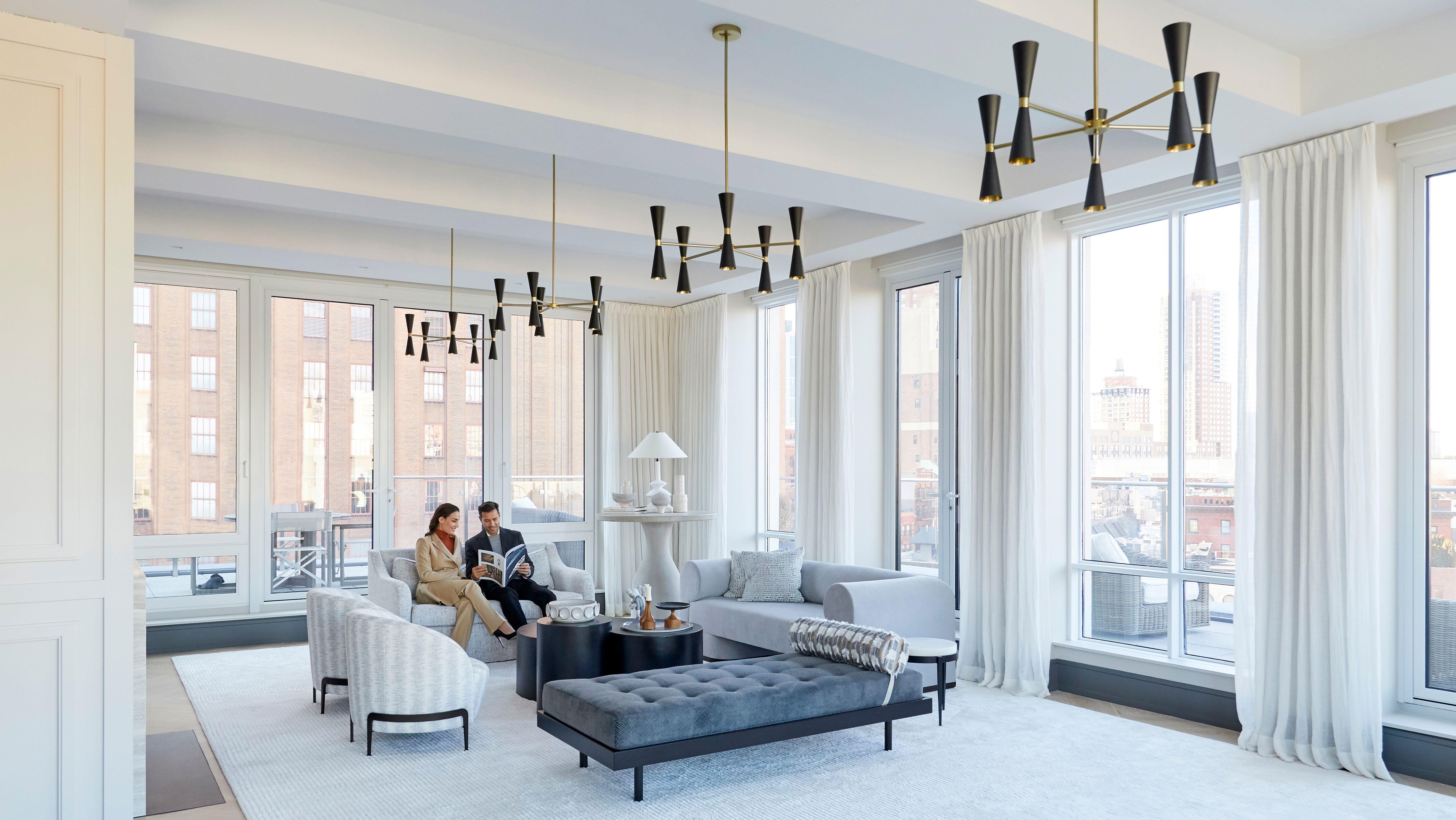
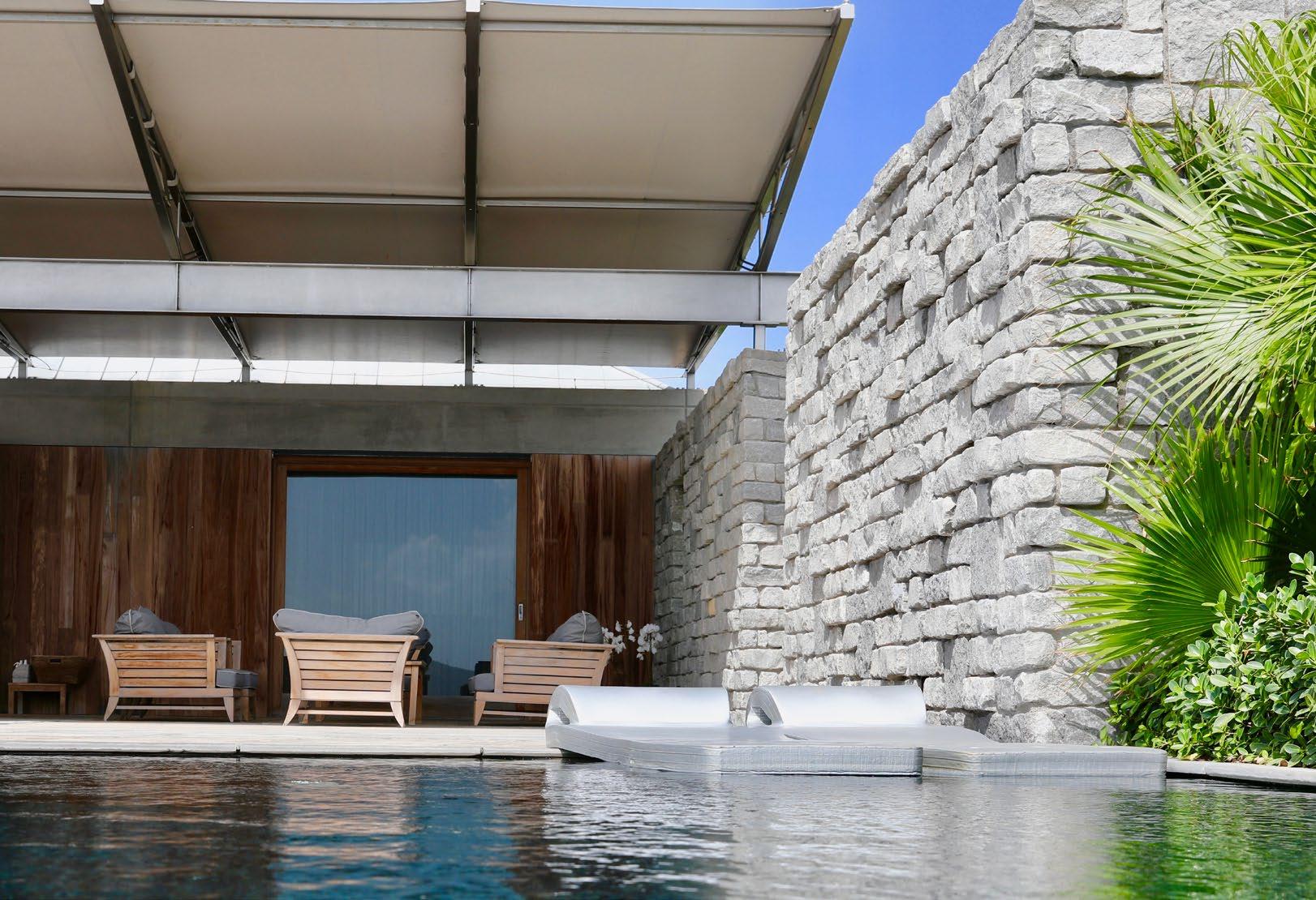
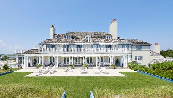
Photography should enhance architectural features. Models always become secondary so the space is the focal point of the image. Detail shots are always a great idea.
Do not use overly saturated images. Do not use images that appear distorted.
®
BROCHURE
DESIGN ELEMENTS We
These branding page are to be used in the beginning of every brochure. This is the only version and styling option. Please do not stray away from this. INSTAGRAM END-SLIDE This
INDIVIDUAL PROPERTY LISTING
INDIVIDUAL PROPERTY LISTING
This Instagram Branding Slide should be used only for Individual Property Listings. The background color can be black, or white.
CORPORATE BRANDING
CORPORATE BRANDING
This Instagram Branding Slide should be used only for Corporate Branding. The background color can be black, or white.
COLLECTIONS
COLLECTIONS
This Instagram Branding Slide should be used only for Collections. The background color can be black, or white.


LAMBORGHINI DRIVING EXPERIENCE
Bespoke is flexible with their typefaces. Above are examples on how we expand our standards while still maintaining the Bespoke aesthetic. INSIGHT STYLING PAGE NUMBERS
DIDOT ITALIC
We use a short line as a design element to break up the space. The line is always 24px long and the stroke weight is 1pt. We also use longer lines to break up the space (between Stats), and we use our B Icon to bring brand recognition. PAGE NUMBERS AND DIDOT ITALIC
Page numbers should be designed in Proxima Nova Semibold. Using Gold is the preferred color, but we can also use Black or White if the Gold is not visible. We use Didot Italic within Didot Regular copy to draw attention to specific words.


Digital Ads should be minimal and straightforward. When we say Bespoe Real Estate, we can use the B Icon instead of the Primary Logo. Note that this is a video, not still imagery. REAL ESTATE LISTING:




Simple, minimal photography allows the text to stand out without feeling too crowded. Note that this is a video, not still imagery.
MARKET REPORT:


Digital Ads should be minimal and straightforward. Since we are not mentioning Bespoke Real Estate in the copy, we must use Primary Logo instead of the B Icon. Note that this is a video, not still imagery. REAL ESTATE LISTING:



ORGANIC SOCIAL
Simple, minimal photography allows the text to stand out without feeling too crowded.
