PORTAFOLIO

Peter
historia de la arquitectura diciembre 2022
he western world of the 1990’s was defined by an accelerated dynamism fuelled by the economic prosperity that followed the end of the Cold War and the subsequent collapse of the Soviet Union. The consolidation of capital-markets and neoliberalism generated an environment hungry for technological advancement and consumer culture. It is no coincidence that this decade saw the development of the World Wide Web, gene therapy and cloning, alongside that of international economic cooperation manifested in the creation of the North Atlantic Free Trade Agreement, the foundation of the World Trade Organization of the final establishment of the European Union. This renewed global prosperity brought about a society progressively more open to diversity but very much worried for the superfluous and ephemeral. It is in this context that a new branch of architecture emerged. It is a branch of slow architecture that opposes superficiality and advocates for a well-thought-out work that doesn’t respond to the current times but instead responds to the greater fundamentals of the discipline.
Peter Zumthor and John Pawson are architects whose work, extending from the 1990’s onward, has been classified within the minimalist movement. While they indeed share many core concerns regarding architecture, their approaches to minimalism, however, differ. Peter Zumthor, on one hand, has based his work on the principles of Atmospheres, spiritual characters inherent to space, about which he elaborates in his written work of the same name. On the other hand, John Pawson’s work is illuminated by the principles of simplicity he recognizes in his book Minimum. While there are similarities between both books and the concepts they expose, Pawson’s simplicity levitates more towards a series of characteristics which, however abstract, remain tied to the physicality of the completed work. Instead, Zumthor’s atmosphere appears as a spatial idea that guides the design and construction of a project from the very beginning to the very end; a sort of ghost that becomes less immaterial as the construction process progresses.
This essay seeks to compare one of Pawson’s most recognized works, his flagship
Calvin Klein Store in Manhattan, to one of Zumthor’s main principles of atmospheres, namely, the magic of the real. This essay starts from the assumption that this work in Madison Avenue exemplifies in a certain manner what Zumthor thinks of as real. Confirmation, or rebuttal, of this assertion will emerge as certain elements of Pawson´s work are scrutinized through the lens of three of Zumthor´s answers for the magic of the real. This essay will approach the Calvin Klein Store via its photographs published in John Pawson´s official website. Peter Zumthor´s idea of reality will be extracted from his own book Atmospheres, as well as from academic articles about his thought. Through the comparison of certain traits in said photographs with the indications the three principles of reality suggest, the essay will finally assert to what extent does Pawson´s work contemplate and utilize atmosphere for the creation not only of Calvin Klein´s flagship store but also its brand aesthetic.
To begin with, it is important to define what the concept of atmosphere is. Peter Zumthor (2006), describes it in the simplest way, as follows:
How do people design things with such a beautiful, natural presence, things that move me every single time. One word for it is atmosphere. This is something we all know about. Our first impression of a person. (…) It is a bit like that with architecture, too. I enter a building, see a room, and – in the fraction of a second – have this feeling about it. (p. 10)
By comparing an atmosphere with first impressions, Peter Zumthor appeals to one’s subjectivity and empiricism to give an idea of his concept. Every person is familiar with a first impression, but hardly anyone can define it in a more precise manner. It is mostly a spontaneous emotional reaction to the perception (with all senses) of another person. When Zumthor suggests the same occurs with spaces, he implies that there is also a kind of spirit that surrounds them. He goes on to list twelve parameters that characterize this spirit. They are the following: The Body of Architecture, Material Compatibility, the Sound of Space, the Temperature of a Space, Surrounding Objects, Between Composure and Seduction, Tension Between Interior and Exterior, Levels of Intimacy, the Light on Things, Architecture as Surroundings, Coher-
ence, and the Beautiful Form. These appear not as ingredients that in sum make up an atmosphere but rather as qualities whose observation translates into the observation of atmosphere. The concept is elusive of concrete definition, but somehow it is omnipresent in space, as in people, and can only be read emotionally by the observer.
However nebulous his definition of atmospheres might be, Zumthor’s vision of what makes quality architecture is nothing but clear. “Quality architecture to me is when a building manages to move me” (Zumthor, 2006, p. 10). John Pawson’s philosophy about architecture goes roughly along the same lines: “the only universal measure is whether space feels comfortable and right to the people who use it” (Pawson, 2005, p.7). Both consider architecture as a realm that deals with the experience of space rather than the construction of matter, but their emphasis differs. While Zumthor places special importance on the emotional aspect of the experience, Pawson reckons at efficient functionality, using the least number of elements, as its key and the source of the space’s quality ambiance.
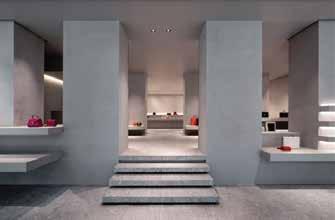
Pawson’s work in the Calvin Klein Store reflects this view. He was commissioned to renovate an old, 2.000-square-metre neoclassical bank in Manhattan’s exclusive Madison Avenue into the brand’s flagship store. The work of both Calvin Klein and John Pawson, it set out to “create a comfortable costumer experience that would allow the clothing to speak for itself” (Corcoran, 2019, par. 6). Again, experience is key in the definition of the architecture of the project, and it is the principle that guides its decisions. The renovation consisted of “three selling floors, additional support spaces, a newly added mezzanine level, and a major renovation of the first two floors of the building’s façade” (Kenne Shephard Interior Design Architecture, 2022). The 6-metre-tall retail environment is defined by soaring vertical elements, while strong horizontal ones guide people through the space and provide a human scale. Clean, white walls and ceilings, natural sanded stone flooring and a neutral palette offer a serene background to display the brand’s Collections and provide a quiet stage from which they speak for themselves.
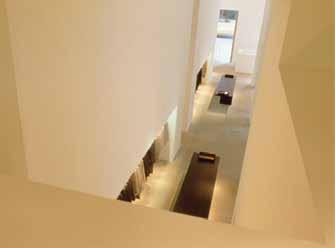
When the store opened in 1995, both Pawson and Klein were surprised to notice people came in just for sightseeing, and many sat several hours on the benches simply experiencing the space. On one hand, the store’s function of exteriorising the brand’s aesthetic of the elegance of simplicity had been fulfilled so wonderfully that it attracted not only costumers but also people who shared the same views and values. On another hand, there was some immaterial quality that drew people emotionally: an atmosphere attractive because of its authentically serene character. This kind of character is exactly what Peter Zumthor referred to as he revealed the Magic of the Real as the main quality of Atmospheres. To examine this reality in Pawson’s Calvin Klein Store it is first convenient to observe the Body of its Architecture in Figure 1.
This photograph of the first floor of the store shows the detail of the composition of walls that define its space. It also offers a small peek into the layout of display fixtures and benches that signal the space’s programme, but its focus is undoubtedly on the white, thick plans that frame it. Although the image is not very communicative about what happens in the space, it does highlight the characteristics of said walls. Massive, tall, or uninterrupted are all adjectives that could be used to describe them. Their evident physicality sustains one key element for the reality of the space: the body of architecture. Peter Zumthor (2006) defines this quality as “the material presence of things in architecture, its frame” (p. 23). Architect Lene Steinsland Kvinge (2018) adds to this definition the following: “the different materials, the different layers of a building, the different compo-
nents that create a body, a space. The architecture as a bodily mass. ‘A body that can touch me’. Meaning, the physical elements architecture is built up by” (p. 9).
Figure 1 openly communicates this characteristic by focusing on the tangibility of the walls that make up the store. The photograph invites its viewer to imagine the feel of their solidity, the coolness of their touch or to marvel at their height. Observing these characteristics, one is bound to admit the true existence of such space though the corporality of its components. After all, how can one question the reality of something if one can reach out and touch it? Tact carries a special kind of inherent assuredness that no other sense possesses. One can imagine visions, sounds, or even smells, but imagining the touch of something is simply impossible. Said assuredness also points to the anatomy of the architectural body as a whole. The solidity one feels meets a function that is related to loads of other physical elements that one cannot see, but that are certainly there to make the building supported and supportable. Indeed, John Pawson also recognizes this as a principle of simplicity in Minimum. He calls these characteristics the principles of Mass, Structure, and Containment (Pawson, 1996).
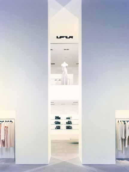
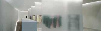
Unlike in Figure 1, the photographs of the Calvin Klein store in Figures 2 and 3 focus more on the spatial qualities of the first floor instead of on the mass of its defining elements. Figure 2 concentrates particularly on the layout of the display of clothing in that floor. The long fixtures and mannequins, subtle and slight elements that seem to deny their own body in favour of that of the

garments they hold, are arranged in the periphery of the space, while the centre is occupied by more solid, compact elements. The pieces of the Women’s Collection seem to float on the sides of the room, while the simpler, more massive volumes in the middle appear to be immovable and to hold the exhibited items only temporarily, since they do not give up their own corporality for their function as showcases. What catches the eye of the viewer is the apparent harmony of the whole composition. Besides the architectural qualities of the space, like the proportions of the elements of structure and masonry or the controlled entry of light through the large windows, what sticks out is the variety of materials, all in consonance with one another. This is what Peter Zumthor calls material compatibility, and it is the second of the answers he finds for achieving the magic of the real.
“Materials react with one another and have their radiance, so that the material composition gives rise to something unique. Material is endless” (Zumthor, 2006, p. 24). As is so often the case with Zumthor, what seems obvious about the relationship of materials is really a great challenge for the sensitive architect. Van Haeren and Havik (2016), faculty of Architecture and the Built Environment at Delf University of Technology, state the following regarding material:
The landscape makes its way in through moments and materials that make up the interior experience, creating a place that resonates the rhythm of the spatial context through a focused vision. The segregation from some aspects, and selective choice of others, enables a place to be centered and specific, established on clear foundations that allow each depicted aspect of the environment to take on a new, noticeable presence (p. 16)
Even though they are talking about three specific projects in the Netherlands, one could easily say the same about the use of materiality in the Calvin Klein store.
The specific selection of stone flooring and plain white plaster, juxtaposed to stainless steel display fixtures, dark walnut tables, glass shelving on top of a polished concrete slab, honey-coloured pine wood chairs and austere mirrors indeed enable the store to be
centred not only in its cosmopolite context of Manhattan but also specific to the brand’s character. The limited number of materials and their mostly raw (polished at the most) finish refer to the brands fashion view; “words used to describe his [Calvin Klein’s] style include modern, clean, sleek, practical, sensuous, and, above all, American” (Cody, 2013, p. 7). The fact that Pawson’s architecture and the fashion house share the same design principles, gives both the store and the brand the feeling of holistic coherence that can only be achieved through authenticity. Thus, the real becomes part of the space once again.
Figure 3 is a photograph showing a view from the first floor to a vertical dilatation that unifies the three floors of the store. One doesn’t get a clear idea of how the space is organized beyond the massive, soaring vertical elements. However, it is clear thar their slight separation creates not only a narrow passage to the space behind but also, possible more important, a frame to highlight specific elements of the Collection. The sparsely packed display cases and the garments or accessories they hold, all dialogue harmoniously with the built environment around them. This congruence between a space and the
objects it accommodates recalls what Peter Zumthor called Surrounding Objects, and it is the fifth of the answers he proposes to create a real architecture, soaked up in atmosphere.
“The idea of things that have nothing to do with me as an architect taking their place in a building, their rightful place – it’s a thought that gives me an insight into the future of my buildings: a future that happens without me” (Zumthor, 2006, p. 39). The view Zumthor sets about surrounding objects in Atmospheres is a rather nostalgic one. He imagines objects deeply related to the people who use the space taking a place in it and giving the whole architecture a tint of the person’s essence, intensely bonding the architecture with its user. Can this be the case in Calvin Klein’s flagship store? After all, the users have nothing to do with the objects within the space. The only person who could have some relation with the objects in the store, if anyone, is Calvin Klein himself, and his goal is not to keep and cherish those objects but, on the contrary, to sell them. The question remains, are the items of the Collections displayed in the store true objects that contribute to the space’s reality and, in consequence, atmosphere?
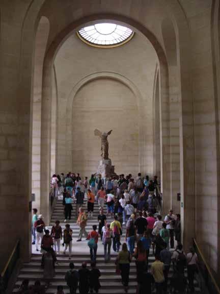
At this point, it is relevant to evaluate John Pawson’s general approach to store design analysing two other store renovations of his career: Jigsaw Store, 1996, and Valextra Store, 2015. For Jigsaw Store (Figure 4), Pawson’s “scheme draws on principles explored in earlier gallery designs, creating a condition of visual clarity where the focus falls on contents rather than container” (Márquez and Poveda, 2005, p. 34). Likewise, in the design for Valextra store (Figure 5), “the architectural language of simplicity produces a gallery-like interior, whose charged character derives from the restrained use of colour and light” (Levy, 2019, par. 8). The common characteristic for both stores and the Calvin Klein Store is, no doubt, the approach from gallery-design. In a gallery, objects are not exhibited for their personal meaning to their user, but, quite the opposite, because their value extends beyond an individual and encompasses the collective. Moving his store design toward this idea accentuates the brand’s value and elevate their products to artworks. Therefore, it is not hard to notice the
similarity between the mannequin in the Calvin Klein Store and the Winged Nike of Samothrace (Figure 6), exhibited in the Louvre Museum. In both cases, the architecture serves to frame the element and elevate it, quite literally, from the common ground. Having observed the way Pawson treats objects, as monumental beings by themselves instead of instruments tied to their users and the value they give them, it is hard to find Zumthor’s conception of Surrounding Objects in the Calvin Klein Store. However, the highly designed space and objects do indeed contribute to the store’s total atmosphere. In this case, they participate of it not by linking the space to the people who use but by strengthening the body and compatibility of the overall composition. Ultimately, what makes Calvin Klein’s flagship store attractive is unquestionably its atmosphere, not as a familiar, approachable space, but as an elevated, superior place where the brand’s elegant austerity reigns supreme: a temple to the principles of Calvin Klein.
As observed, Pawson’s work in the Calvin Klein Store is exemplary in the use of atmosphere as a means to highlight and strengthen the brand’s aesthetic. His minimalist style offers a quiet, self-reflective space in the middle of Manhattan that extends an almost tourist attraction of a moment of peace in the dynamism of the 1990’s. Peter Zumthor’s idea of the magic of the real, the main feature of atmospheres, is quite present
in the architectural decisions of Pawson’s store. The physicality of its defining elements or the careful material composition give out a sense of inherent reality that translates into the space’s spirit of coherent and authentic simplicity. The use architecture as a stage for the objects it holds indicates a conscious manipulation of the space’s character to serve a function: being so intensely Calvin Klein-esque that simply experiencing the space is participating in the brand’s spirit. This manipulation is indeed the composition of its atmosphere, considering it as the “dynamic interaction among objective architectonic aspects and their subjective perception (Havik, Teerds and Tielens, 2013, p.7). Ultimately, Pawson’s store clearly reflects what Zumthor conceives as real and the atmosphere it creates is very much successful in achieving an authentic spatial experience of what Calvin Klein is.
References
- Cody, M. (2013). Calvin Klein. Infobase Learning.
- Corcoran, H. (2019, January 15). John Pawson Reflects on Calvin Klein's Iconic Flagship. AD Pro. Retrieved December 17, 2022, from https://www.architecturaldigest.com/story/john-pawson-calvin-klein-flagship.
- Havik, K., Teerds, H., & Tielens, G. (2013). Building atmosphere. OASE Journal for Architecture, 91(1), 3-12.
- Kenne Shepherd. (2022, September 19). Calvin Klein Madison avenue store. Kenne Shepherd. Retrieved December 16, 2022, from https://www.kenneshepherd.com/project/calvin-klein-madison-avenue-store/
- Levy, N. (2019, May 20). John Pawson completes gallery-style interiors for Milan's Valextra store. Dezeen. Retrieved December 16, 2022, from https://www.dezeen.com/2019/05/20/valextra-milan-store-minimal-interiors-john-pawson/.
- Márquez Cecilia, F., & Poveda, P. (Eds.). (2005). Jigsaw Store. El Croquis, 127,
- Pawson, J. (1996). Minimum. Phaidon.
- Pawson, J. (2005). The Simple Expression of Complex Thought. El Croquis. Pause for Thought, 127, 7.
- Steinsland, L. (2018). Atmospheres and Construction. Peter Zumthor’s philosophy on Architecture. Norwegian University of Science and Technology.
- Van Haeren, K., & Havik, K. (2016). A Story of Three: A Narrative Approach to Reading Atmosphere and Making Place. Spool. Journal of Architecture and the Built Environment, 3(2), 5-24. https://doi.org/10.7480/spool.2016.2.1137
- Zumthor, P. (2006). Atmospheres: Architectural environments: Surrounding objects. Birkhäuser.
Coraza del Augusto de Prima Porta como reflejo la Ambigüedad Augusta
historia del arte diciembre 2022
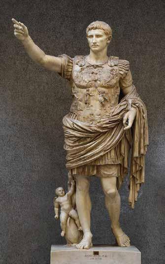
El Augusto de Prima Porta es una escultura latina de finales del s. I a.C. que fue redescubierta en 1863 en las ruinas de la villa de Livia, en la localidad de Prima Porta, cerca de Roma. La escultura retrata a Augusto, primer emperador romano, dirigiéndose a una audiencia con el brazo derecho extendido en señal de adlocutio. Pese al alto nivel de refinamiento formal de la obra (o quizá engrandecidas gracias a él), se pueden notar una serie de ambigüedades selectas que generan inquietud en el espectador. Entre ellas, una que destaca se observa en la coraza de la escultura; si la coraza era una prenda de vestir militar forjada de bronce ¿por qué la de Augusto, que muestra una escena narrativa laboriosamente tallada, incluye también figuras anatómicas como el ombligo y los pezones del cuerpo debajo? En este sentido, existe una dualidad sobre la desnudez del torso del Augusto de Prima Porta. Esta, y otras imprecisiones de la obra, sirven para reflexionar sobre el empleo deliberado de la ambigüedad por parte Octaviano en el proceso de transición de Roma de República a Imperio.
Para empezar, vale la pena repasar los datos principales de la biografía de Augusto. Nacido bajo del nombre de Cayo Octavio en el año 63 a.C., fue el sobrino nieto de Julio César y su hijo político. Tras el asesinato de César en el 44 a.C., Octavio formó parte del Segundo Triunvirato, junto con Marco Antonio y Lépido. A pesar de la cooperación de Marco Antonio y Octavio contra Bruto y Casio, asesinos de César que controlaban partes orientales del territorio romano, su rivalidad no tardó en hacerse notar. Pronto estalló una guerra civil que terminó con la victoria de Octavio después de que Marco Antonio y Cleopatra fueran vencidos en la batalla de Accio y se suicidaran en Egipto. Con Marco Antonio fuera del panorama político, Octavio tuvo rienda suelta tomar progresivamente el poder absoluto del Estado, efectivamente desplazando poco a poco al Senado a un segundo plano. De hecho, recibió del Senado los títulos de prínceps (31 a.C.) y después de augusto (27 a.C.), hasta que finalmente le fue cedido el poder imperial en el 23 a.C. Es famosa su frase “Encontré Roma como una ciudad de ladrillo y la dejé como una ciudad de mármol” y, en efecto, su mando marcó un antes y un después en todo el territorio romano, logrando importantes avances gracias a su Pax Romana. Tras la muerte de Augusto en el año 14 d.C., Roma no retornó a la República y quedó instituido el Imperio para la posterioridad hasta su colapso en el s. V.
Habiendo ya definido quién fue Augusto, ahora cabe regresar la mirada a la escultura de Prima Porta, con especial enfoque en su coraza. La obra consiste en una escultura de mármol tallado de 2.04 metros de alto, de tamaño mayor al natural. Augusto, reconocible por su fisionomía idealizada y su distintivo peinado, se muestra de pie en contraposto, con su peso distribuido principalmente en su pierna derecha y la izquierda consecuentemente relajada. Su brazo izquierdo descansa a un costado sosteniendo su paludamentum, una especie de capa militar utilizada por los generales de mayor grado. Siguiendo los pliegues de este “textil” rodeando la cintura, se observa la figura de un niño alado que sigue al emperador pegado a su pierna, montado sobre un delfín. Esa figura es la representación de Cupido, hijo de Venus, y sirve para relacionar a Augusto con su supuesta ascendencia divina, a través de Eneas. Otros expertos han apuntado a este personaje como una representación de su sobrino Tiberio, su futuro heredero; sin embargo, la hipótesis más plausible, como se observará a continuación, es la de la polisemia del personaje. Final-
mente, el brazo derecho de la escultura se muestra extendido con todos los dedos recogidos a excepción del índice. Este gesto sumado a la expresión grave y mirada directa apuntan a un sentimiento de interlocución entre Augusto y el espectador.
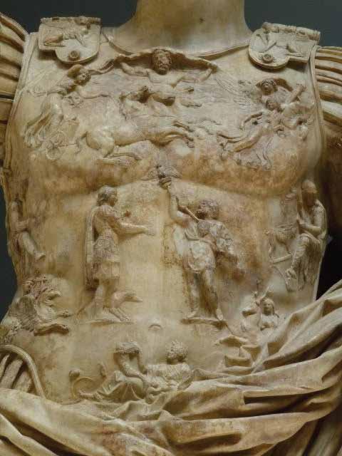
En esta macroestructura corporal del Augusto de Prima Porta, el elemento que más sobresale es la coraza del emperador. La coraza muestra una escena narrativa compuesta por múltiples personajes ubicados simétricamente sobre una base anatómica. La coraza toma la forma del torso del emperador, marcando los músculos desde los pectorales hasta las crestas ilíacas. En el centro de esta pieza, a la altura del diafragma se encuentra la escena principal de la coraza: un soldado romano recibiendo el estandarte aquilino de un soldado oriental. Esta escena representa uno de los eventos bélicos más importantes del mando de Augusto: la recuperación de los estandartes romanos que Craso había perdido contra los partos en la Batalla de Carras. La pacificación de Roma con el Imperio Parto fue uno de los eventos más representativos del mandato de Augusto, y el retorno de los estandartes a Roma fue el tema más utilizado en su imagen retórica.
Así, en la coraza de la escultura de Prima Porta, este evento se mostró como un acto capital en torno al cual giraron el cielo, la tierra y todo en medio. Los personajes alrededor de las dos figuras centrales son, en consecuencia, representaciones simbólicas de estos elementos. Sobre los soldados, entre los pectorales de la coraza se observa al dios del cielo, Caelus, acompañado a la derecha (de Augusto) por el dios Sol en su cuadriga, y a la izquierda por Aurora y Luna. Encima de estos personajes, en los sostenedores de la coraza, a la altura de los hombros, se observan dos esfinges, con su cuerpo dirigido al interior y su mirada al espectador. A los lados de la escena central, hacia las costillas, se encuentra la representación de dos provincias romanas en la forma de dos mujeres sometidas: por sus atributos se las ha identificado como Hispania, a la derecha, y Galia, a la izquierda. Bajo estas dos mujeres cautivas, justo sobre las crestas ilíacas, se ven dos personajes divinos: por su lira y el grifo que monta se ha reconocido al hombre de la derecha como Apolo y a la mujer de la izquierda como Diana, por sus flechas y el ciervo que la acompaña. Finalmente, en la parte de la pelvis, por debajo del ombligo y de la escena central, se ve a una mujer
recostada sosteniendo una cornucopia. Este último personaje se ha identificado como Tellus, Tierra. De esta, se cierra el círculo del cosmos romano que rodea al hito del mandato de Augusto.
Si bien la identificación de estos personajes y la decodificación de sus símbolos es aún sujeto de discusión y análisis, resulta más interesante notar ciertos “fallos” (o señales) intencionales que comunican rasgos propios del mandato de Augusto y su persona. El primero de estos, como se mencionó al inicio, es la presencia de figuras anatómicas en la coraza de Augusto. La inclusión de los pezones o el ombligo en la prenda de vestir hacen dudar al espectador de si el cuerpo que ven está desnudo o no. En la Roma del s. I a.C., la desnudez en las esculturas era un tema de amplio debate. Para la cultura helénica, absorbida por Roma poco antes del tiempo de Augusto en el s. II a.C., la desnudez de una escultura era un rasgo de valor. Dioses, héroes y personajes importantes de la sociedad civil griega eran representados desnudos, su proeza reflejada en la perfección anatómica de sus cuerpos. Por el contrario, en Roma, las personas más importantes eran esculpidas con elaboradas togas que indicaban su elevada posición social, si acaso eran representados de cuerpo entero. Si no, el retrato de los romanos destacados se centraba exclusivamente en su rostro, produciendo gran cantidad de bustos.
En el momento en que Roma anexó la región helena a su dominio, ocurrió un choque entre estas dos concepciones de representación. Los pueblos del oriente, más familiarizados con el lenguaje heleno, tendieron a retratar a los personajes romanos de su estima desnudos, mientras en Roma y el resto de los territorios occidentales esto resultaba controversial, si no insultante. Al escoger incluir rasgos anatómicos en la coraza de Augusto, y difuminar la línea entre lo desnudo y vestido de su cuerpo, el artista logró atar en su obra las preconcepciones visuales de ambos lados del Egeo.
Otra discusión que surge de la cuestión de la desnudez del Augusto de Prima Porta es su definición divina. En este punto se hacen importantes dudas de datación de la obra; si la obra hubiese sido realizada posterior al 14 d.C., se podría intuir una intención de divinizar la figura del primer emperador, mientras que, si fue realizada en vida de Augusto, tendría más que ver con su autoimagen y autodefinición. Si bien la respuesta de esta cuestión provee puntos crucia-
les para esclarecer la realidad, se la dejará de lado para observar rasgos visuales que indican paralelismo entre lo mortal y divino de Augusto. El primero de estos rasgos se relaciona con la similitud de la gran escultura con ciertos personajes del tallado de su coraza. Por un lado, el dios Caelus en los pectorales de la escultura aparece con el pecho descubierto, como saliendo del plano de bronce. Si se asume que Augusto también tiene el pecho desnudo, se puede notar una correspondencia con Caelus, lo que indicaría la divinidad de su persona. Por otro lado, el soldado de la escena central de la coraza aparece vestido exactamente igual que Augusto, con una coraza metálica y el paludamentum. Si se establece el símil entre los dos personajes, cabría reconocer a Augusto como mortal. Nuevamente, surge la ambigüedad respecto de la definición de Augusto dependiendo de su cualidad de vestido o desnudo.
Finalmente, los últimos rasgos que se han evaluado para definir la divinidad o mortandad del Augusto de Prima Porta son su falta de calzado y el niño alado que lo acompaña. El primero de estos rasgos es otro de los que parece no encajar con el resto de la imagen. Después de todo, es improbable que en la realidad un general vestido para el combate esté descalzo. Se ha regresado a ver al mundo griego, nuevamente, para hallar una explicación de esta cuestión. En el lenguaje heleno, era una característica de dioses y héroes la representación descalza; en consecuencia, el Augusto de prima porta sería la representación de un dios. Por otro lado, la respuesta a la pregunta de si el niño al costado de Augusto se trata de Cupido o Tiberio también suma a ambos lados de la discusión. Al final, parecería que este personaje, casi irrelevante a primera vista, es la manifestación más explícita de la polisemia de la retórica augusta. Este niño parecería ser, finalmente, Tiberio representado en Cupido o Cupido representado en Tiberio, sin que la selección de ninguno altere significativamente la concepción de Augusto.
Con estos dos últimos puntos parecería, cuantitativamente, que la balanza entre la divinidad o mortandad de la figura de Augusto se inclina más hacia la primera. No obstante, el gesto adlocutio de la escultura amarra definitivamente a Augusto al plano terrenal. Su interlocución directa con la audiencia, y con el mismo espectador, no dejan cabida a la duda de si Augusto es un hombre, y el primero entre ellos. Estas dos visiones opuestas y complementarias, una tan
argumentada una como la otra, dejan en manifiesto el empleo deliberado de la ambigüedad en retórica augusta. Más allá de un elemento de propaganda, el Augusto de Prima Porta comunica en sí una característica fundamental del ascenso al poder de Augusto: la ambigüedad como herramienta para la transición progresiva.
Como digno heredero de Julio César, parecería que Augusto notó que la concentración del poder del Estado en una persona era lo ideal para la cohesión del vasto territorio romano. Sin embargo, también parecería que se dio cuenta de que un cambio abrupto, como el que intentó César, era una táctica que ponía en peligro al imperator. En consecuencia, Augusto abrazó la ambigüedad y aprovechó su opacidad para dar pasos pequeños que inclinen la balanza de la polisemia más hacia un significado que otro. Esto se hace evidente en el proceder de su ascenso al poder. Aunque después de derrotar a Marco Antonio pudo haber tomado fácilmente la primacía del Estado prefirió mostrarse como un defensor del Senado y la República. Fue acumulando posiciones públicas que poco a poco concentraron el poder en su persona hasta eventualmente llegar a definiciones de su estatus; primero prínceps, años más tarde augusto y finalmente, casi dos décadas después del inicio de facto de su mandato, imper-
ator. La transición romana de República a Imperio sólo pudo darse gracias a un personaje tan abierto y acogedor la indefinición intermedia como Augusto. En síntesis, la escultura de Prima Porta, con su manejo magistral de la ambigüedad, refleja, a más de una imagen poderosa del César Augusto, la herramienta esencial que permitió el éxito de su mandato y persona.
Referencias Bibliográficas
- Governorate of Vatican City State – Directorate of the Museums and Cultural Heritage. (n.d.). Augustus from Prima Porta. Musei Vaticani.
- Ingholt, H. (1969). The Prima Porta Statue of Augustus. Archaeology, 22(3), 177–187. http://www.jstor.org/stable/41667995
- Montiel Alvarez, T. (2015). Estudio iconográfico de la coraza de Augusto de Prima Porta. ArthyHum 18, 125-134.
- Squire, M. (2013). Embodied Ambiguities on the Prima Porta Augustus. Art History, 36(2), 242-279.
- Zanker, P., Ojeda, P. D., & Trillmich, W. (1992). Augusto y el poder de las imágenes. Madrid: Alianza.