

I am a graphic designer passionate about creating bold, engaging, and memorable visuals. My work focuses on colour, illustration, and strong visual communication to craft designs that captivate and connect with audiences. I specialise in marketing materials, merchandise graphics, and apparel design, blending creativity and strategy to produce impactful designs.
• Story-Driven Design – Every project tells a compelling visual story that resonates with the audience.
• Expressive Use of Color – I use colour strategically to evoke emotion and strengthen brand identity.
• Engaging Illustration – Custom, hand-drawn elements that bring a unique touch to any project.
• Merchandise & Apparel Friendly – Designs that stand out on clothing, accessories, and product packaging.
• Brand Identity & Logo Design
• Marketing & Promotional Materials (Posters, Flyers, Social Media Graphics)
• Merchandise & Apparel Design (T-shirts, Hoodies, Accessories)
• Illustration & Custom Graphics
• Packaging & Product Graphics
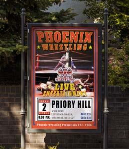
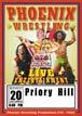
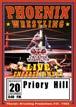
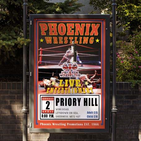
For this wrestling event poster, my approach was to capture the raw intensity and energy of professional wrestling while honoring its rich history. I utilized high-energy colors to evoke excitement and action, ensuring the design immediately grabs attention. Bold, heavy typography reinforces the strength and impact of the wrestlers, visually mirroring their power and presence.
To connect with the audience, I incorporated event photos, making the action feel real and immersive. The overall layout follows the traditional wrestling poster style, paying tribute to the legacy of Phoenix Wrestling Promotion. However, I introduced modern design elements to refresh the look, creating a dynamic balance between nostalgia and contemporary appeal. The result is a visually compelling poster that celebrates the past while driving anticipation for the future.
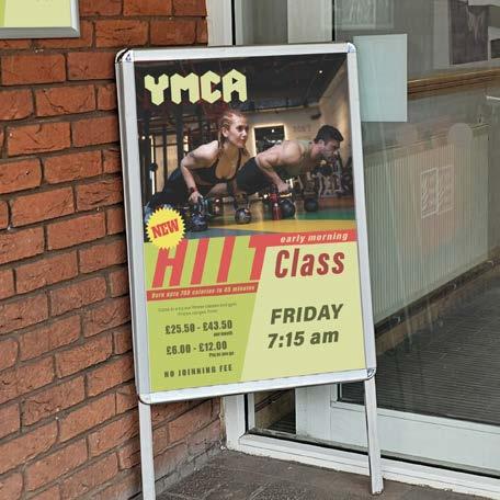
YMCA H.I.I.T Class (2024)
For this HIIT class poster, my goal was to create a high-energy, attention-grabbing design that effectively promotes the class while maintaining brand consistency. I used the Impact Font in italics and red to convey intensity and movement, reflecting the fast-paced nature of HIIT workouts.
To reinforce brand identity, I integrated the brand’s signature green, ensuring a cohesive look that aligns with existing visual elements. Dynamic exercise photography was incorporated to instantly communicate the purpose of the class and inspire engagement.
Clarity and accessibility were key considerations, so I prioritised the time and day of the class, making sure this essential information stands out at a glance. The result is a bold and energetic poster that captures the essence of HIIT training while effectively guiding potential participants to take action.
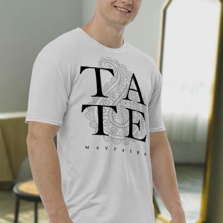
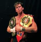
For this T-shirt design, my approach focused on creating a refined merchandise piece that highlights Tate Mayfairs’ brand identity. The design is text-based, emphasising the wrestler’s name as the focal point, ensuring strong recognition among fans.
To maintain brand consistency, I incorporated Tate Mayfairs’ logo in the center, subtly faded to prevent it from overpowering the text while still reinforcing his identity. The use of a serif typeface adds a class and sophistication to the graphic, aligning with his persona and setting the design apart from standard wrestling merchandise.
The result is a versatile and stylish T-shirt that not only appeals to wrestling fans but also serves as a statement piece that reflects the character and brand of Tate Mayfairs.
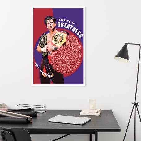
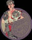
For this merchandise poster design, my goal was to create a visually appealing piece that resonates with a younger audience while maintaining Tate Mayfairs’ strong brand identity. The design is based on a reference photo provided by the client. To appeal to a younger demographic, I utilised illustration techniques, as I feel a comic-based graphic would connect more to a younger audience. The wrestler’s logo was incorporated to ensure brand consistency, reinforcing his identity within the design. Through extensive color exploration, I finalized a royal blue and burgundy red palette, chosen for its ability to convey class and sophistication while maintaining a strong visual impact. The result is a striking, highquality merchandise piece that not only celebrates Tate Mayfairs but also appeals to his fanbase in an exciting and contemporary way.
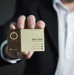
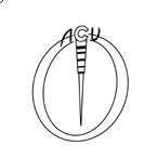
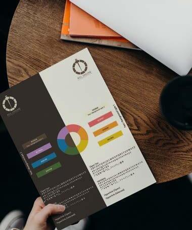
For ACU Healing’s brand design and logo, my approach was to create a calming and professional identity that reflects the essence of acupuncture and holistic therapy while emphasising its roots in Chinese medicine.
To establish a clear connection to acupuncture, I incorporated a needle as the key focal point. However, to ensure the design remained welcoming and non-intimidating, I focused on the handle and top ring of a traditional acupuncture needle while omitting the sharp edge. This subtle approach conveys the practice’s precision and care without evoking discomfort.
To further reinforce the Chinese medicine influence, I integrated trigram patterns, a fundamental element in traditional Chinese philosophy, symbolising balance and harmony. This adds cultural authenticity and visually communicates the clinic’s holistic approach.
For the brand colour palette, I selected a radish brown and light cream combination. The earthy brown evokes stability and grounding, while the light cream provides a nurturing and soothing feel, ensuring the brand radiates warmth, comfort, and trust.
The final design establishes ACU Healing as a professional, culturally rooted, and approachable acupuncture clinic, creating a strong and memorable brand identity.
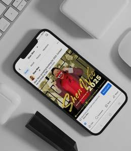
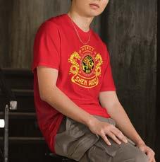
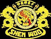
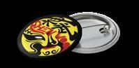
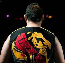
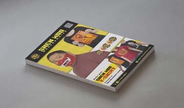
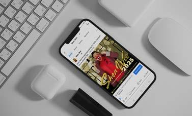
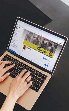
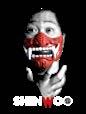
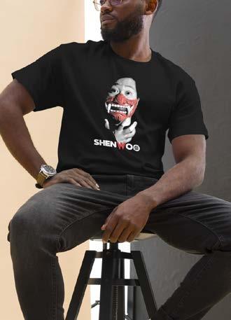
For Shen Woo’s brand design and logo, my approach was to create a bold and culturally significant identity that reflects his Chinese heritage while ensuring strong market appeal. Drawing inspiration from traditional Chinese opera masks, I incorporated this visual element as a key theme, symbolising strength, identity, and theatrical presence—qualities that align with Shen Woo’s wrestling persona.
To further reinforce his heritage, I included Chinese text featuring his name, adding authenticity and a deeper cultural connection to the brand. The logo is designed in a circular shape, making it merchandise-friendly and adaptable for various applications such as T-shirts, pin badges, and other promotional items.
The colour palette of yellow, red, and black was carefully selected to represent energy, power, and resilience—essential traits in both wrestling and Chinese symbolism. This consistent colour theme extends across all promotional materials, ensuring a cohesive and instantly recognisable brand identity for Shen Woo.

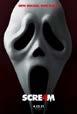
For this special Halloween collection of Shen Woo merchandise, I took inspiration from the Scream 4 movie poster, drawing a parallel between the infamous Ghost Face and Shen Woo— both masked figures who embody mystery and intimidation. This cinematic reference not only enhances the design’s thematic impact but also creates an instant visual connection for fans of both wrestling and horror.
The composition is primarily monochrome, reinforcing the eerie and suspenseful atmosphere associated with both Halloween and horror aesthetics. However, I kept the wrestler’s mask in bold red, ensuring it remains the focal point of the design. This selective use of colour highlights the mask as a defining characteristic of Shen Woo’s persona, making it both striking and memorable.
The result is a dramatic and high-impact design, perfect for a seasonal merchandise collection that merges wrestling, horror, and bold visual storytelling.
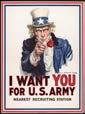
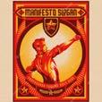
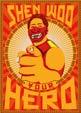
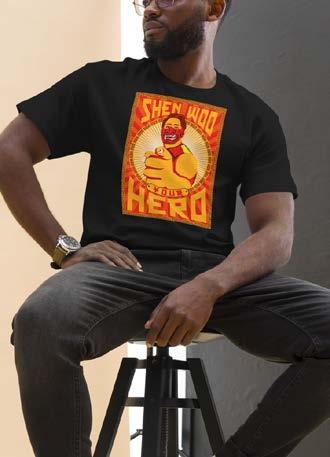
For this merchandise illustration, I drew inspiration from the iconic Uncle Sam poster, reinterpreting it to reflect Shen Woo’s villainous persona, “The HERO”—a character who imposes his ideology onto others with unwavering conviction. This approach not only amplifies his largerthan-life presence but also reinforces his role as a compelling antagonist.
To emphasise his villainous nature, I adopted a propaganda-style colour scheme, evoking the bold, authoritative aesthetics commonly seen in historical political posters. This design choice strengthens the thematic impact while also subtly linking back to Shen Woo’s Chinese heritage, ensuring that audiences can make an immediate visual and cultural connection.
The result is a striking, statement-making illustration that merges classic propaganda art with wrestling storytelling, making it a powerful and marketable piece for Shen Woo’s merchandise line.
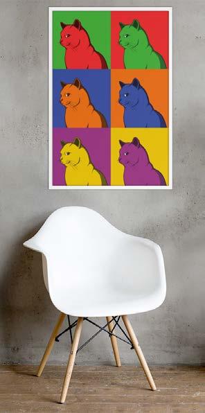
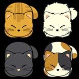
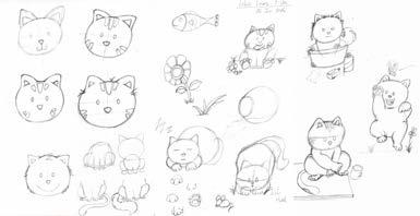
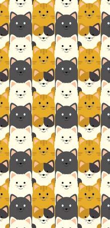
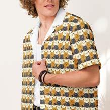
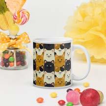
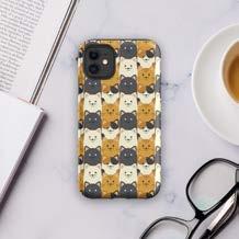
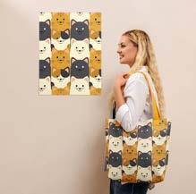
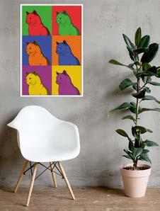
LOLO’s Family is a personal illustration project that reflects my passion for cute cartoon cats, capturing their adorable mannerisms and unique personalities. The design focuses on round shapes, reinforcing a soft and lovable aesthetic that enhances the overall charm of each character.
The series features four main characters, each representing a common and beloved cat type: Black Cat, White Cat, Tabby, and Calico. Through their playful expressions and poses—whether sleeping, begging for food, or simply being mischievous—the illustrations bring out the everyday cuteness that cat lovers adore.
A subtle but meaningful hidden detail differentiates male and female cats: Ovalshaped eyes signify male cats, while circular eyes represent female cats. This small touch adds depth to the character design while keeping the overall style simple and engaging.
The result is a heartwarming and visually appealing series that celebrates the quirky and lovable nature of cats, making it an expressive and fun project for fellow cat enthusiasts.


Hello.Bens (2018)
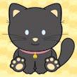
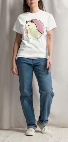
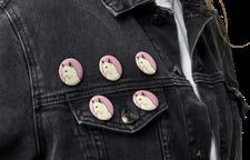
For my illustration Cheeky Kitty, I aimed to capture the playful and mischievous personality of a cat, specifically the moment when they’ve done something wrong and gives their human a signature side-eye glance. This expression is something cat owners instantly recognize, adding a sense of humour and relatability to the piece.
To enhance the soft and inviting feel, I applied a cream and light pink colour palette, creating a warm and comforting visual that contrasts with the cat’s cheeky attitude. The result is an illustration that balances cuteness, personality, and humour, making it an engaging and visually appealing piece.
Hello.Bens (2022)
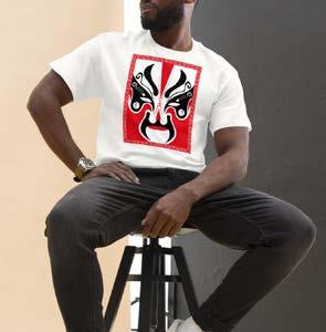
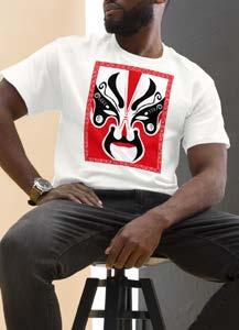
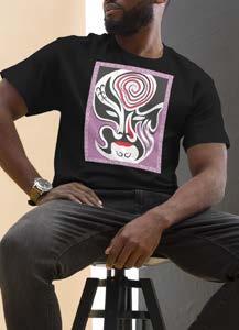
For my Chinese Opera Masks illustration series, I aimed to capture and celebrate the rich cultural heritage of Chinese opera through a visually striking and symbolic design. This series highlights the intricate artistry and deep storytelling found in traditional opera masks, which are essential in representing character traits and emotions in Chinese theatre.
Designed in celebration of the 2022 Chinese New Year, the illustrations pay tribute to tradition, symbolism, and festivity, making them both culturally meaningful and visually engaging. Through this series, I sought to honour Chinese opera’s historical significance while presenting it in a way that resonates with contemporary audiences.
My portfolio showcases a diverse range of graphic design and illustration projects, focusing on visual storytelling, strong composition, and engaging branding. I specialise in wrestling merchandise and promotional materials, using bold typography, striking colours, and thematic design to enhance a wrestler’s persona.
My illustration work, including LOLO’s Family and Chinese Opera Masks, highlights character design and cultural storytelling, using expressive details and thoughtful colour choices. From merchandise-friendly logos to cinematic and propaganda-inspired graphics, my work balances tradition with modern aesthetics.
Across all my projects, I ensure each design is visually impactful and communicates a strong message, creating memorable and marketable visuals that resonate with the target audience.
• Phoenix Wrestling Promotion [2023 - 2024]
Designed engaging wrestling event posters, meet-and-greet merchandise posters, and promotional materials. Created digital assets to enhance brand presence and boost audience engagement. Ensured visually striking designs supporting marketing campaigns and event ticket sales.
• ACU Healing [2022]
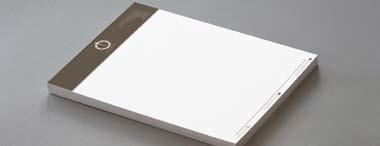
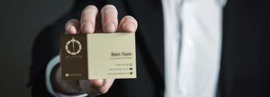
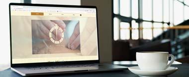
Developed a cohesive brand identity, including a brief branding guideline and logo design. Designed promotional materials such as business cards and headed letter paper. Revamped the website to align with the refreshed branding, ensuring consistency across digital and print media to strengthen the business’s professional image.
• Tate Mayfairs (Professional Wrestler) [2022]
Designed custom t-shirt graphics and merchandise to enhance brand appeal and fan engagement. Created visually compelling designs that reflected the wrestler’s persona, ensuring high-quality print compatibility. Contributed to the expansion of his merchandise line, supporting brand recognition and revenue growth.
• Josh Faulkner (Comedian) [2022]
Designed a professional logo with both colour and monochrome variations for versatile promotional use. Captured the comedian’s personality through bold and memorable branding, ensuring adaptability across digital and print platforms. Provided design assets that enhanced his marketing presence for social media, and promotional materials.
• UAL level 3 certificate in photography | September 2021 – July 2022
• BTEC level 3 certificate in graphic design | September 2018 – July 2019